Chapter 6: Statistics © 2013 W. H. Freeman and Company 1 Quantitative Literacy: Thinking Between the Lines Crauder, Noell, Evans, Johnson

Welcome message from author
This document is posted to help you gain knowledge. Please leave a comment to let me know what you think about it! Share it to your friends and learn new things together.
Transcript

Chapter 6:
Statistics
© 2013 W. H. Freeman and Company 1
Quantitative Literacy:Thinking Between the Lines
Crauder, Noell, Evans, Johnson

Chapter 6: Statistics
Lesson Plan
2
Data summary and presentation: Boiling down the numbers
The normal distribution: Why the bell curve?
The statistics of polling: Can we believe the polls?
Statistical inference and clinical trials: Effective drugs?

Chapter 6 Statistics
6.1 Data summary and presentation: Boiling down the
numbers
3
Learning Objectives:
Know the statistical terms used to summarize data
Calculate mean, median, and mode
Understand the five-number summary and boxplots
Calculate the standard deviation
Understand histograms

Chapter 6 Statistics
6.1 Data summary and presentation: Boiling down the
numbers
4
The mean (average) of a list of numbers is the sum of the
numbers divided by the number of entries in the list.
The median of a list of numbers is the middle number, the
middle data point. If there is an even number of data points,
take the average of the middle two numbers.
The mode is the most frequently occurring data points. If
there are two such numbers, the data set is called bimodal.
If there are more than two such numbers, the data set is
multimodal.

Chapter 6 Statistics
6.1 Data summary and presentation: Boiling down the
numbers
5
Example: The Chelsea Football Club (FC) is a British soccer
team. The following table shows the goals scored in the games
played by Chelsea FC between September 2007 and May 2008.
The data are arranged according to the total number of goals
scored in each game.
Find the mean, median, and mode for the number of goals
scored per game.
Goals scored by either team 0 1 2 3 4 5 6 7 8
Number of games 7 14 20 11 3 2 1 2 2

Chapter 6 Statistics
6.1 Data summary and presentation: Boiling down the
numbers
6
Solution:
To find the mean, we add the data values (the total number of
goals scored) and divide by the number of data points.
To find the total number of goals scored, for each entry we
multiply the goals scored by the corresponding number of games.
Then we add.
The total number of goals scored:
7 × 0 + 14 × 1 + 20 × 2 + 11 × 3 + 3 × 4 + 2 × 5+ 1 × 6 + 2 × 7 + 2 × 8 = 145
The number of data points or the total number of games:
7 + 14 + 20 + 11 + 3 + 2 + 1 + 2 + 2 = 62

Chapter 6 Statistics
6.1 Data summary and presentation: Boiling down the
numbers
7
Solution (cont.):
The mean: the total number of goals scored divided by the
number of games played:
Mean =145
62= 2.3
The median: the total number of games is 62, which is even, so we
count from the bottom to find the 31st and 32nd lowest total goal
scores. These are both 2: Median = 2
The mode: because 2 occurs most frequently as the number of
goals (20 times): Mode = 2
Thus on average, the teams combined to score 2.3 goals per game.
Half of the games had goals totaling 2 or more, and the most
common number of goals scored in a Chelsea FC game was 2.

Chapter 6 Statistics
6.1 Data summary and presentation: Boiling down the
numbers
8
Example: The following list gives home prices (in thousands of dollars)
in a small town:
80, 120, 125, 140, 180, 190, 820
The list includes the price of one luxury home. Calculate the mean and
median of this data set. Which of the two is more appropriate for describing
the housing market?
Solution: Mean =80+120+125+140+180+190+820
7=
1655
7
Or about 236.4 thousand dollars. This is the average price of a home.
The list of seven prices is arranged in order, so the median is the fourth value,
140 thousand dollars.
Note that the mean is higher than the cost of every home on the market
except for one—the luxury home. The median of 140 thousand dollars is
more representative of the market.

Chapter 6 Statistics
6.1 Data summary and presentation: Boiling down the
numbers
9
An outlier is a data point that is significantly different from
most of the data.
The first quartile of a list of numbers is the median of the
lower half of the numbers in the list.
The second quartile is the same as the median of the list.
The third quartile is the median of the upper half of the
numbers in the list.
The five-number summary of a list of numbers consists of
the minimum, the first quartile, the median, the third quartile,
and the maximum.
Chapter 6 Statistics
6.1 Data summary and presentation: Boiling down the
numbers
10
Example: Each year Forbes magazine publishes a list it calls
the Celebrity 100. The accompanying table shows the top nine
names on the list for 2009, ordered according to the ranking
of Forbes. The table also gives the incomes of the celebrities
between June 2008 and June 2009.
Calculate the five-number summary for this list of incomes.

Chapter 6 Statistics
6.1 Data summary and presentation: Boiling down the
numbers
11
Celebrity Income (millions of dollars)
Angelina Jolie 27
Oprah Winfrey 275
Madonna 110
Beyonce Knowles 87
Tiger Woods 110
Bruce Springsteen 70
Steven Spielberg 150
Jennifer Aniston 25
Brad Pitt 28
Chapter 6 Statistics
6.1 Data summary and presentation: Boiling down the
numbers
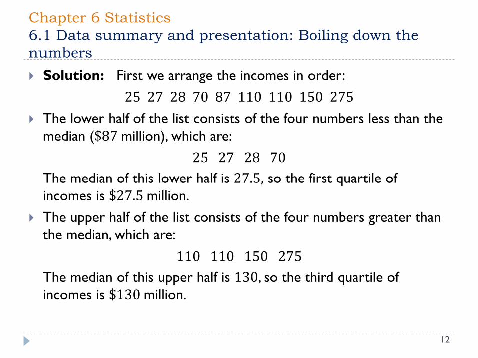
12
Solution: First we arrange the incomes in order:
25 27 28 70 87 110 110 150 275
The lower half of the list consists of the four numbers less than the
median ($87 million), which are:
25 27 28 70
The median of this lower half is 27.5, so the first quartile of
incomes is $27.5 million.
The upper half of the list consists of the four numbers greater than
the median, which are:
110 110 150 275
The median of this upper half is 130, so the third quartile of
incomes is $130 million.

Chapter 6 Statistics
6.1 Data summary and presentation: Boiling down the
numbers
13
Solution (cont.):
Thus, the five-number summary is:
Minimum = $25 million
First quartile = $27.5 million
Median = $87 million
Third quartile = $130 million
Maximum = $275 million
Chapter 6 Statistics
6.1 Data summary and presentation: Boiling down the
numbers
14
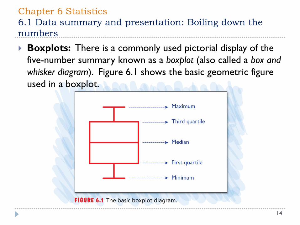
Boxplots: There is a commonly used pictorial display of the
five-number summary known as a boxplot (also called a box and
whisker diagram). Figure 6.1 shows the basic geometric figure
used in a boxplot.

Chapter 6 Statistics
6.1 Data summary and presentation: Boiling down the
numbers
15
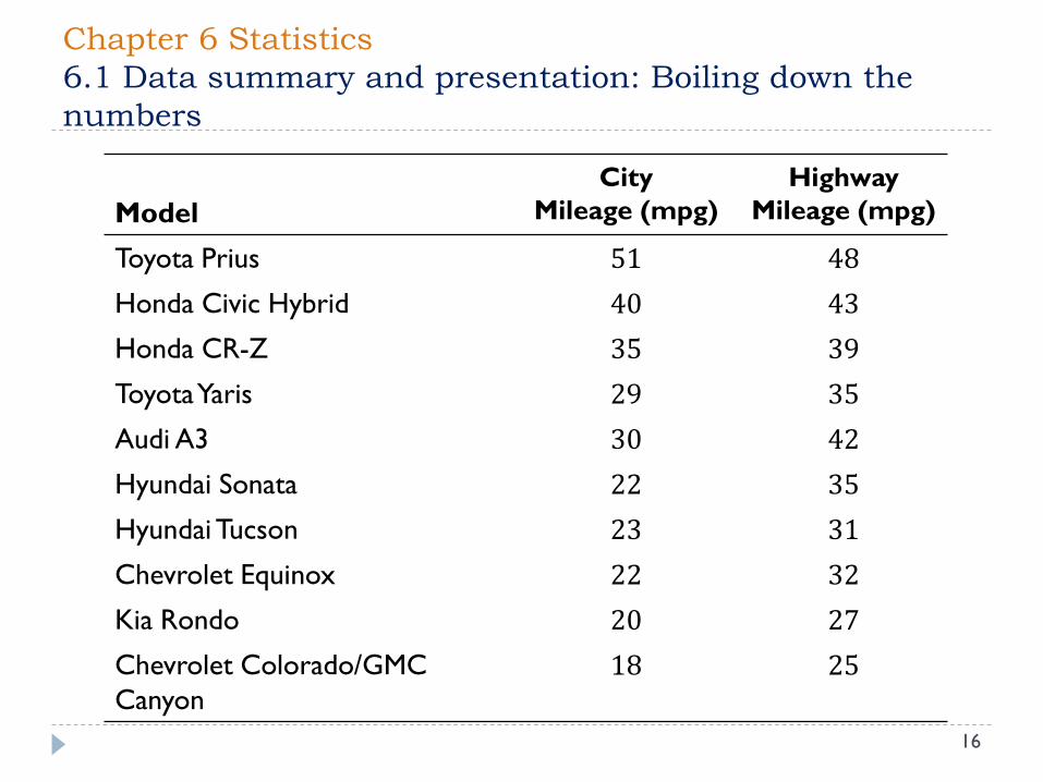
Example: A report on greenercars.org shows 2011 model
cars with the best fuel economy.
1. Find the five-number summary for city mileage.
2. Present a boxplot of city mileage.
3. Comment on how the data are distributed about the median.
Chapter 6 Statistics
6.1 Data summary and presentation: Boiling down the
numbers
16
Model
City
Mileage (mpg)
Highway
Mileage (mpg)
Toyota Prius 51 48
Honda Civic Hybrid 40 43
Honda CR-Z 35 39
Toyota Yaris 29 35
Audi A3 30 42
Hyundai Sonata 22 35
Hyundai Tucson 23 31
Chevrolet Equinox 22 32
Kia Rondo 20 27
Chevrolet Colorado/GMC
Canyon
18 25

Chapter 6 Statistics
6.1 Data summary and presentation: Boiling down the
numbers
17
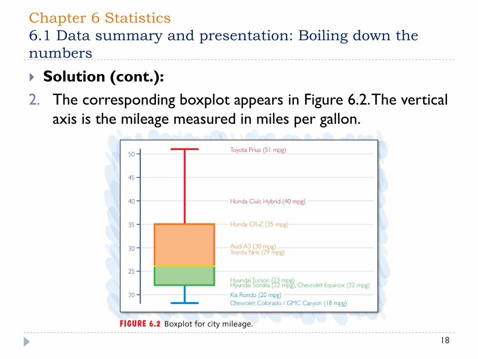
Solution:
1. The list for city mileage, in order from lowest to highest:
18, 20, 22, 22, 𝟐𝟑, 𝟐𝟗, 30, 35, 40,51
To find the median, we average the two numbers in the
middle:
Median =23 + 29
2= 26 mpg
The lower half of the list is 18, 20, 22, 22, 23, and the
median of this half is 22. Thus, the first quartile is 22 mpg.
The upper half of the list is 29, 30, 35, 40, 51, and the
median of this half is 35. Thus, the third quartile is 35 mpg.
Chapter 6 Statistics
6.1 Data summary and presentation: Boiling down the
numbers
18
Solution (cont.):
2. The corresponding boxplot appears in Figure 6.2. The vertical
axis is the mileage measured in miles per gallon.
Chapter 6 Statistics
6.1 Data summary and presentation: Boiling down the
numbers
19
Solution (cont.):
3. Referring to the boxplot, we note that the first quartile is not
far above the minimum, and the median is barely above the
first quartile. The third quartile is well above the median, and
the maximum is well above the third quartile. This
emphasizes the dramatic difference between the high-mileage
cars (the hybrids) and ordinary cars.
Chapter 6 Statistics
6.1 Data summary and presentation: Boiling down the
numbers
20
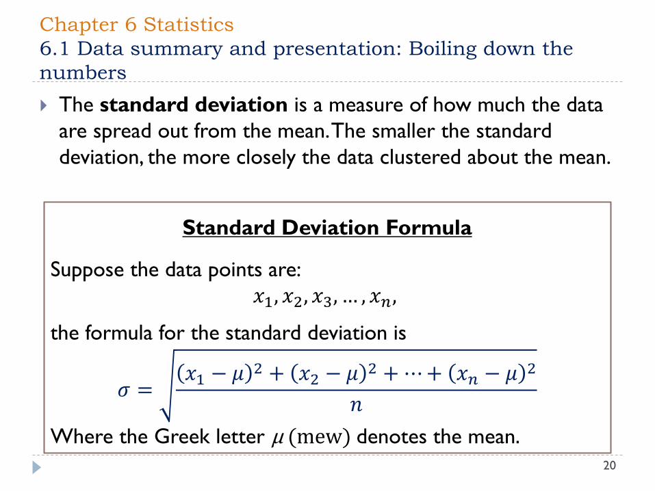
The standard deviation is a measure of how much the data
are spread out from the mean. The smaller the standard
deviation, the more closely the data clustered about the mean.
Standard Deviation Formula
Suppose the data points are:
𝑥1, 𝑥2, 𝑥3, … , 𝑥𝑛,
the formula for the standard deviation is
𝜎 =𝑥1 − 𝜇 2 + 𝑥2 − 𝜇 2 +⋯+ 𝑥𝑛 − 𝜇 2
𝑛
Where the Greek letter μ (mew) denotes the mean.
Chapter 6 Statistics
6.1 Data summary and presentation: Boiling down the
numbers
21
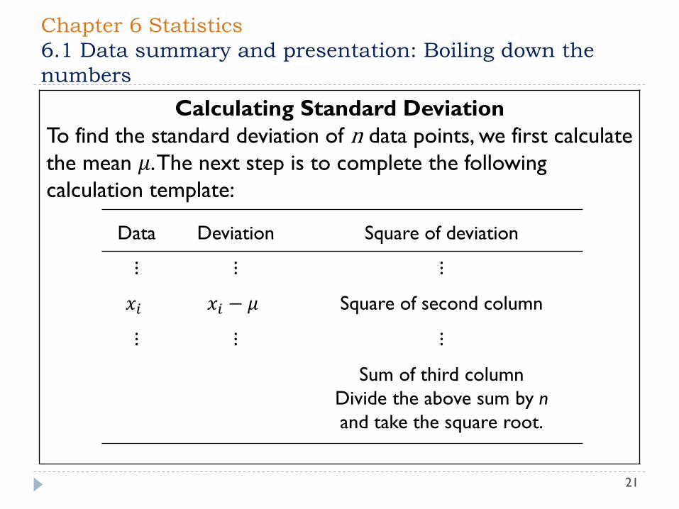
Calculating Standard Deviation
To find the standard deviation of n data points, we first calculate
the mean 𝜇. The next step is to complete the following
calculation template:
Data Deviation Square of deviation
⋮ ⋮ ⋮
𝑥𝑖 𝑥𝑖 − 𝜇 Square of second column
⋮ ⋮ ⋮
Sum of third column
Divide the above sum by n
and take the square root.

Chapter 6 Statistics
6.1 Data summary and presentation: Boiling down the
numbers
22
Example: Two leading pitchers in Major League Baseball for 2011 were
Roy Halladay of the Philadelphia Phillies and Felix Hernandez of the Seattle
Mariners. Their ERA (Earned Run Average―the lower the number, the
better) histories are given in the table below.
Calculate the mean and the standard deviation for Hallady’s ERA history. It
turns out that the mean and standard deviation for Hernandez’s ERA history
are µ = 3.33 and σ = 0.85. What comparisons between Halladay and
Hernandez can you make based on these numbers?
Pitcher
ERA
2006
ERA
2007
ERA
2008
ERA
2009
ERA
2010
R. Halladay 3.19 3.71 2.78 2.79 2.44
F. Hernandez 4.52 3.92 3.45 2.49 2.27

Chapter 6 Statistics
6.1 Data summary and presentation: Boiling down the
numbers
23
ERA
𝑥𝑖
Deviation
𝑥𝑖 − 2.98Square of deviation
(𝑥𝑖−2.98)2
3.19 3.19 − 2.98 = 0.21 (0.21)² = 0.044
3.71 3.71 − 2.98 = 0.73 (0.73)² = 0.533
2.78 2.78 − 2.98 = −0.20 (−0.20)² = 0.040
2.79 2.79 − 2.98 = −0.19 (−0.19)² = 0.036
2.44 2.44 − 2.98 = −0.54 (−0.54)² = 0.292
Sum of third column 0.945
Sum divided by n = 5, square root 𝜎 = 0.945/5 = 0.43
Solution: The mean for Halladay is:
𝜇 =3.19 + 3.71 + 2.78 + 2.79 + 2.44
5= 2.98

Chapter 6 Statistics
6.1 Data summary and presentation: Boiling down the
numbers
24
Solution (cont.): We conclude that the mean and the
standard deviation for Halladay’s ERA history are µ = 2.98 and
σ = 0.43.
Because Halladay’s mean is smaller than Hernandez’s mean of
µ = 3.33, over this period Halladay had a better pitching
record.
Halladay’s ERA had a smaller standard deviation than that of
Hernandez (who had σ = 0.85), so Halladay was more
consistent—his numbers are not spread as far from the mean.

Chapter 6 Statistics
6.1 Data summary and presentation: Boiling down the
numbers
25
Example: Below is a table showing the Eastern Conference
NBA team free-throw percentages at home and away for the
2007–2008 season. At the bottom of the table, we have
displayed the mean and standard deviation for each data set.
What do these values for the mean and standard deviation tell us
about free-throws shot at home compared with free-throws shot
away from home?
Does comparison of the minimum and maximum of each of the data
sets support your conclusions?

Chapter 6 Statistics
6.1 Data summary and presentation: Boiling down the
numbers
26
Team
Free-throw
percentage
at home
Free-throw
percentage
away
Team
Free-throw
percentage
at home
Free-throw
percentage
away
Toronto
Washington
Atlanta
Boston
Indiana
Detroit
Chicago
New Jersey
81.2
78.2
77.2
77.1
76.8
76.7
75.6
73.6
77.6
75.4
75.2
74.3
75.7
74.4
76.6
76.8
Milwaukee
Miami
New York
Orlando
Cleveland
Charlotte
Philadelphia
73.3
72.7
72.7
72.1
71.7
71.4
70.6
76.6
75.5
73.9
75.4
74.8
74.7
77.2
Mean 74.73 75.61
Standard
deviation 2.95 1.09

Chapter 6 Statistics
6.1 Data summary and presentation: Boiling down the
numbers
27
Solution: The means for free-throw percentages are 74.73 at
home and 75.61 away, so on average the teams do somewhat better
on the road than at home.
The standard deviation for home is 2.95 percentage points, which
is considerably larger than the standard deviation of 1.09
percentage points away from home. This means that the free-
throw percentages at home vary from the mean much more than
the free-throw percentages away.
The difference between the maximum and minimum percentages
shows the same thing: The free-throw percentages at home range
from 70.6 to 81.2%, and the free-throw percentages away range
from 73.9% to 77.6%.
Chapter 6 Statistics
6.1 Data summary and presentation: Boiling down the
numbers
28
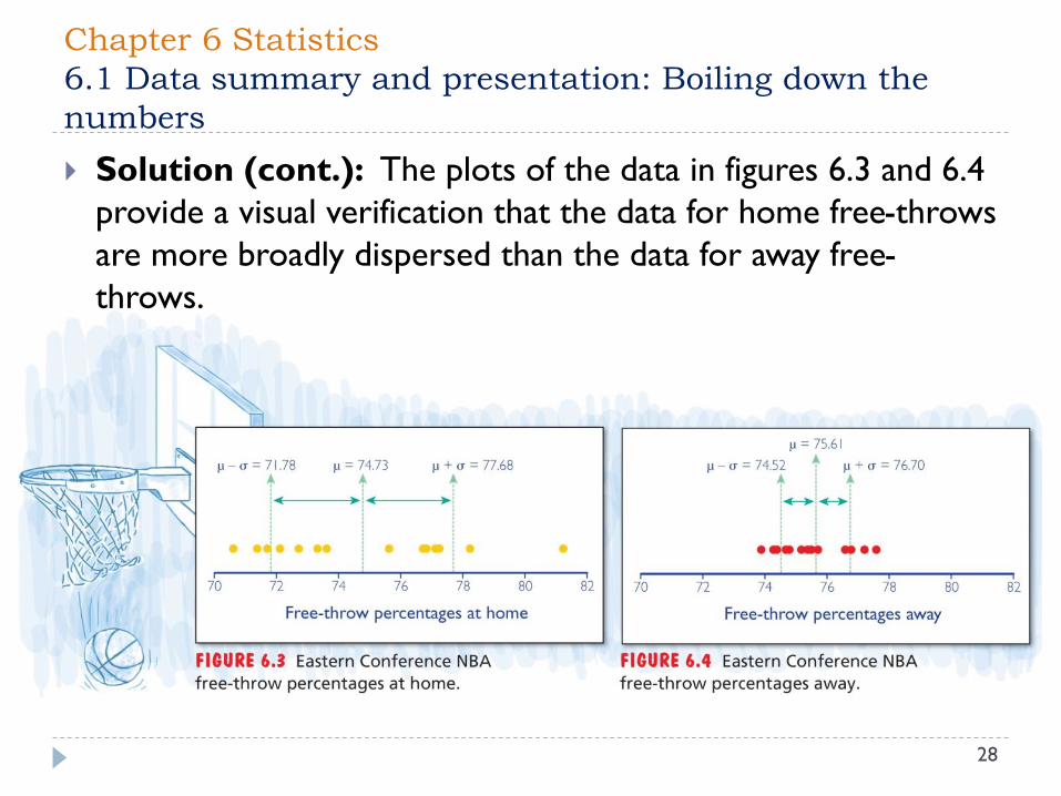
Solution (cont.): The plots of the data in figures 6.3 and 6.4
provide a visual verification that the data for home free-throws
are more broadly dispersed than the data for away free-
throws.

Chapter 6 Statistics
6.1 Data summary and presentation: Boiling down the
numbers
29
A histogram is a bar graph that shows the frequencies with which certain
data occur.
Example: Suppose we toss 1000 coins and write down the number of
heads we got. We do this experiment a total of 1000 times. The
accompanying table shows one part of the results from doing these
experiments using a computer simulation.
The first entry shows that twice we got 451 heads, twice we got 457 heads,
once we got 458 heads, and so on. The raw data are hard to digest because
there are so many data points. The five-number summary provides one way to
analyze the data.
An alternative way to get the data is to arrange them in groups and then draw
a histogram.
Number of heads 451 457 458 459 461 462 463 464 465 467
Number of tosses (out of 1000) 2 2 1 3 3 2 1 3 1 1

Chapter 6 Statistics
6.1 Data summary and presentation: Boiling down the
numbers
30
Example (cont.): Suppose it turns out that the number of
tosses yielding fewer than 470 heads is 23. Because 470 out of 1000
is 47%, it means that 23 tosses yields less than 47% heads. We find
the accompanying table by dividing the data into groups this way.
Percent heads Less than 47% 47% to 48% 48% to 49% 49% to 50%
Number of
tosses
23 75 140 234
Percent heads 50% to 51% 51% to 52% 52% to 53% At least 53%
Number of
tosses
250 157 94 27
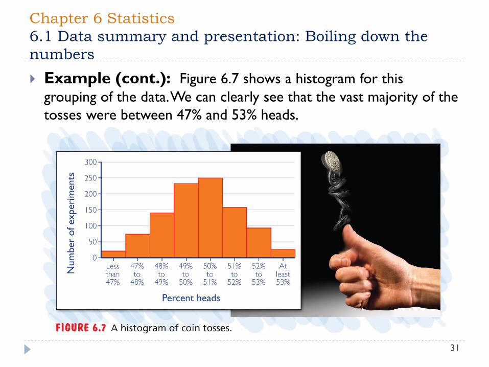
Chapter 6 Statistics
6.1 Data summary and presentation: Boiling down the
numbers
31
Example (cont.): Figure 6.7 shows a histogram for this
grouping of the data. We can clearly see that the vast majority of the
tosses were between 47% and 53% heads.
Chapter 6 Statistics: Chapter Summary
32
Data summary and presentation: Boiling down
Four important measures in descriptive statistics:
mean, median, mode, and standard deviation
The normal distribution: Why the bell curve?
A plot of normally distributed data: the bell-shape curve.
The z-score for a data point
The Central Limit Theorem
Chapter 6 Statistics: Chapter Summary
33
The statistics of polling: Can we believe the polls?
Polling involves: a margin of error, a confidence level, and a
confidence interval.
Statistical inference and clinical trials: Effective
drugs?
Statistical significance and p-values.
Positive correlated, negative correlated, uncorrelated or
linearly correlated
Related Documents