CORPORATE IDENTITY GUIDE

Welcome message from author
This document is posted to help you gain knowledge. Please leave a comment to let me know what you think about it! Share it to your friends and learn new things together.
Transcript

CORPORATE IDENTITY GUIDE

- 2 -
Corporate Identity Guide
table of contents3 ● RECOMMENDATIONS AND USE OF THE GUIDE4 ● BRAND IDENTITY5 ● LOGO SIZES6 ● B&W (POSITIVE AND NEGATIVE) AND GREYSCALE VERSIONS7 ● THE COMBINED LOGO VERSION8 ● COLORS AND FONTS (BRAND AND GENERAL)
A P P L I C A T I O N S
10 ● LETTER 1st. SHEET11 ● LETTER 2nd. SHEET12 ● FAX SHEET13 ● AGENDA SHEET14 ● ENVELOPE (WITH AND WITHOUT WINDOW)15 ● CD COVER AND CD LABEL16 ● FOLDER17 ● FLAG18 ● POSTER19 ● ACCREDITATION CARD AND BUSINESS CARD20 ● PRESENTATION TEMPLATE21 ● MERCHANDISING

- 3 -
Corporate Identity Guide
RECOMMENDATIONS AND USE OF THE GUIDE
This manual serves as a guide for the identification and visual communication of HOMER.
It includes the identity of the brand, the versions, colors, fonts and applications that should not vary in any case. Adaptations or applications not included in this guide should not be correct and could damage the global image of the project.
In addition, we recommend working with the digital version of the manual, rather than extract original for printing directly from the printed manual, insofar as the quality is significantly reduced and the institutional image could deteriorate.
If there are any doubts and/or questions in relation to the implementation of this guide, you can contact:
Agencia de Gestión Agraria y Pesquera de Andalucía [email protected]+34955921322 / 323

- 4 -
Corporate Identity Guide
BRAND IDENTITY
The visual identity is made up by the link between a solid and sober typeface with a blue tone, characteristic of the Mediterranean zone, and a symbol shaped (balloon) containing a text in binary code, characteristic of the computer language.
The opening of the letter “O” and the code included in the balloon, transmit the general concept of HOMER. In other words, the idea of communication and transmission of open data through technological media. Together, we obtain a compact, elegant and timelessness brand.
x
35x
6,98
x
13,2
9 x
2x
6,62 x
45º7,98º
- 5 -
Corporate Identity Guide
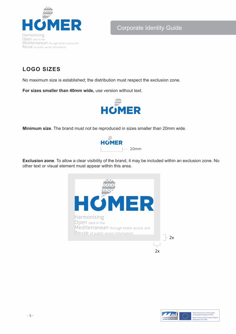
LOGO SIZES
No maximum size is established; the distribution must respect the exclusion zone.
For sizes smaller than 40mm wide, use version without text.
Minimum size. The brand must not be reproduced in sizes smaller than 20mm wide.
Exclusion zone. To allow a clear visibility of the brand, it may be included within an exclusion zone. No other text or visual element must appear within this area.
- 6 -
Corporate Identity Guide
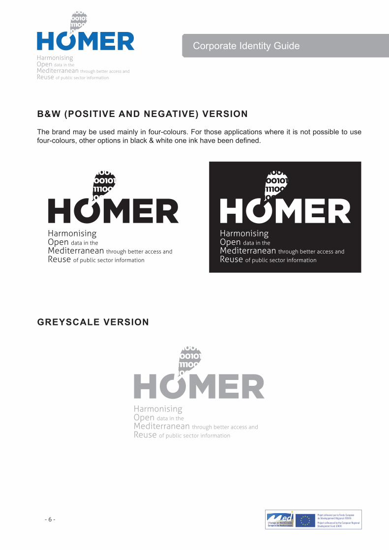
B&W (POSITIVE AND NEGATIVE) VERSION
The brand may be used mainly in four-colours. For those applications where it is not possible to use four-colours, other options in black & white one ink have been defined.
GREYSCALE VERSION

- 7 -
Corporate Identity Guide
THE COMBINED LOGO VERSION
HOMER Logo has to be used compulsory with the MED Logo, and the reference to ERDF (“European Regional Development Fund”) for all kind of published materials and/or activities both addressed to the public, and for internal project documents. Please note that these obligations do not only relate to printed publications, but also to audio-visual, digital or electronic material (websites, web tools, videos, etc.). These elements have to be compulsory used in any of the project events (e.g. PPT presentations, agendas, bags and other event advertising material).
Please be aware that products or activities not taking into account these obligations can be considered as ineligible!
Horizontal combined version
Vertical and combined versions
As a general rule, please note that all texts used in these combinations must be readable, therefore you should use, at least, the minimun size! In case this is not possible and individual solutions have to be found, please contact Communication and Dissemination WP responsibles.

- 8 -
Corporate Identity Guide
COLOURS
Below are shown the colours defined for the brand and the percentages and codes for the different variations of graphical reproductions.
BRAND FONTS
The following fonts have been used to build the brand:
Gotham regular Lorem ipsum dolor sit amet, consectetuer adipiscing elit, seddiam nonummy nibh tincidunt ut laoreet.+/1234567890&@!?%
Aller Light Lorem ipsum dolor sit amet, consectetuer adipiscing elit, seddiam nonummy nibh tincidunt ut laoreet.+/1234567890&@!?%
GENERAL FONTS
Arial font will be used as primary corporate font because of its general availability and its unique and contemporary appearance. It should be used as the primary font in all internal and external documents and in publications and advertisements.
Arial bold Lorem ipsum dolor sit amet, consectetuer adipiscing elit, sed diam nonummy nibh tincidunt ut laoreet.+/1234567890&@!?%
Arial bold italic Lorem ipsum dolor sit amet, consectetuer adipiscing elit, sed diam nonummy nibh tincidunt ut laoreet.+/1234567890&@!?%
Arial regular Lorem ipsum dolor sit amet, consectetuer adipiscing elit, sed diam nonummy nibh tincidunt ut laoreet.+/1234567890&@!?%
Arial italic Lorem ipsum dolor sit amet, consectetuer adipiscing elit, sed diam nonummy nibh tincidunt ut laoreet.+/1234567890&@!?%

- 9 -
Corporate Identity Guide
APPLICATIONS

- 10 -
Corporate Identity Guide
LETTER 1st. SHEETReproduction of 1st sheet, reduced to 60%. ISO-A4 format. 210x297mm.

- 11 -
Corporate Identity Guide
LETTER 2nd. SHEETReproduction of 2nd sheet, reduced to 60%. ISO-A4 format. 210x297mm.

- 12 -
Corporate Identity Guide
FAX SHEETReproduction of fax sheet, reduced to 60%. ISO-A4 format. 210x297mm.

- 13 -
Corporate Identity Guide
AGENDA SHEETReproduction of agenda sheet, reduced to 60%. ISO-A4 format. 210x297mm.

- 14 -
Corporate Identity Guide
ENVELOPE (WITH AND WITHOUT WINDOW)Reproduction reduced to 75%. Format 110x210mm.

- 15 -
Corporate Identity Guide
CD LABEL
CD COVER

- 16 -
Corporate Identity Guide
FOLDER

- 17 -
Corporate Identity Guide
FLAGReproduction reduced to 10%. Format 200x85 cm.

- 18 -
Corporate Identity Guide
POSTERReproduction reduced to 25%. Format 70x50 cm.

- 19 -
Corporate Identity Guide
ACCREDITATION CARDFormat 58x90 mm.
BUSINESS CARDFormat 55x55 mm.

- 20 -
Corporate Identity Guide
PRESENTATION TEMPLATEFormat 1024X768 pixels.
(Cover)
(Interior)

- 21 -
Corporate Identity Guide
MERCHANDISING
Ballpen
Notebook
T-shirt
Related Documents