Construction Of Contents Page

Construction of contents page
Aug 08, 2015
Welcome message from author
This document is posted to help you gain knowledge. Please leave a comment to let me know what you think about it! Share it to your friends and learn new things together.
Transcript
Construction Of Contents Page
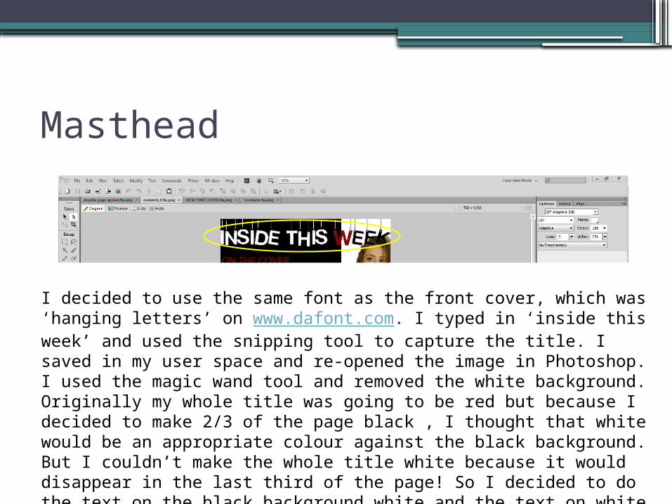
Masthead
I decided to use the same font as the front cover, which was ‘hanging letters’ on www.dafont.com. I typed in ‘inside this week’ and used the snipping tool to capture the title. I saved in my user space and re-opened the image in Photoshop. I used the magic wand tool and removed the white background. Originally my whole title was going to be red but because I decided to make 2/3 of the page black , I thought that white would be an appropriate colour against the black background. But I couldn’t make the whole title white because it would disappear in the last third of the page! So I decided to do the text on the black background white and the text on white background black. But the ‘W’ was in the middle so I decided to fill this letter in red. I used the paint bucket on Photoshop.

Cover Model Images.
Deciding where to put the images of the cover model on the contents page was really difficult because I knew that I needed to put a lot of text on this page and therefore did not want to over crowd the page. After trying loads of different layouts I decided to create a white third where I would put three small images. I liked this layout because there were three pictures, yet they were separate from the text. After editing the photos in Photoshop, I imported them into fireworks and aligned them on my magazine.

Sub-titles
Instead of putting the information on what was in the magazine down all together I decided to section my contents information into three categories:• On the cover• Monthly's• Also insideTo do this I simply used the text tool on fireworks and selected the red colour fill to match the colour scheme. I decided to make this text italic and underlined to make it really stand out.
Sub-sub-headings and page info.
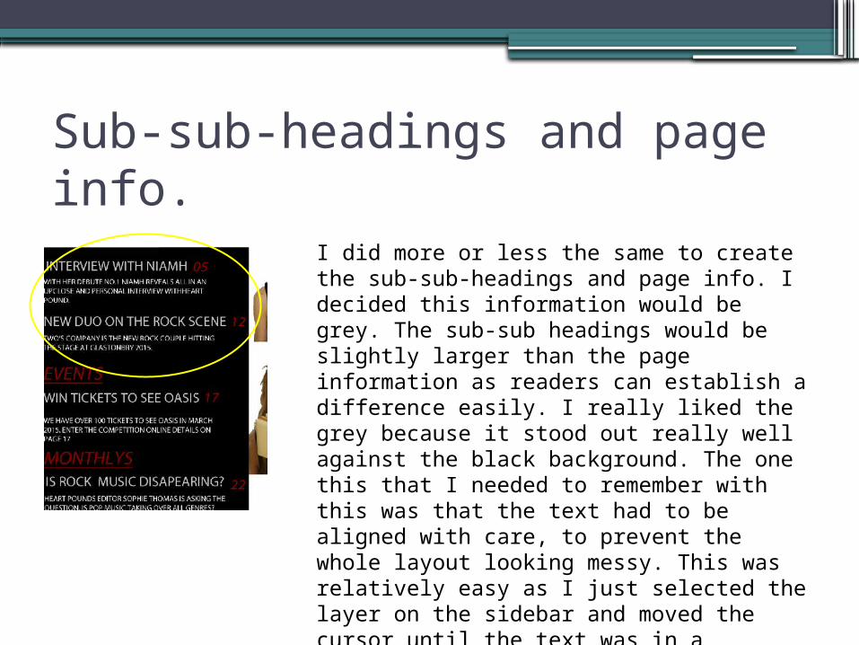
I did more or less the same to create the sub-sub-headings and page info. I decided this information would be grey. The sub-sub headings would be slightly larger than the page information as readers can establish a difference easily. I really liked the grey because it stood out really well against the black background. The one this that I needed to remember with this was that the text had to be aligned with care, to prevent the whole layout looking messy. This was relatively easy as I just selected the layer on the sidebar and moved the cursor until the text was in a position that I liked.

Secondary Models Also in my magazine there would be information about other artists, so I needed to include some sort of image on my contents of this. I asked my peers Josh and Amelia to pose so that I could take a mid shot of them. I chose Amelia and josh because they both have blue hair. I think this looks really good and at the time, I thought it would fit in nicely to my rock theme. However when putting the original picture into my magazine, nothing was blue so it looked out of pace. Do I decided to edit the hair colour in Photoshop from blue to red . Here are some screen shots to show you how I did this.

Page numbers
So to make the page numbers I pretty much did the same. I selected the text tool then selected the layer and positioned. To make sure I made the page numbers exactly the same shade of red, when I clicked the coloured square next to the paint bucket on the left had side bar I moved the cursor over something else that was the shade of red I was using throughout the magazine. In this case it was in the title. Fireworks then recognised this colour and made the page numbers the same shad of red.
Related Documents