Charts and Graphs in Excel SCLS BrainSnack April 25, 2008

Charts and Graphs in Excel SCLS BrainSnack April 25, 2008.
Dec 29, 2015
Welcome message from author
This document is posted to help you gain knowledge. Please leave a comment to let me know what you think about it! Share it to your friends and learn new things together.
Transcript

Charts and Graphs in Excel
SCLS BrainSnack
April 25, 2008

Why Statistics?Statistics are powerful tools to:
– Report to your board– Support budget requests– Assist with building/space planning– Document library’s importance in community– Review staffing patterns– Compare yourself to other libraries (
http://dpi.wi.gov/pld/dm-lib-stat.html)
– Other?

Info Desk—Daily Statistics—Week of Sept. 14-20 Day: _____________
Date: _____________
Type of Ques. 9am-11am 11am-1pm 1pm-3pm 3pm-6pm 6pm-9pm
Reference
Directional
Online Catalog
Equipment
Assistance
Instruction

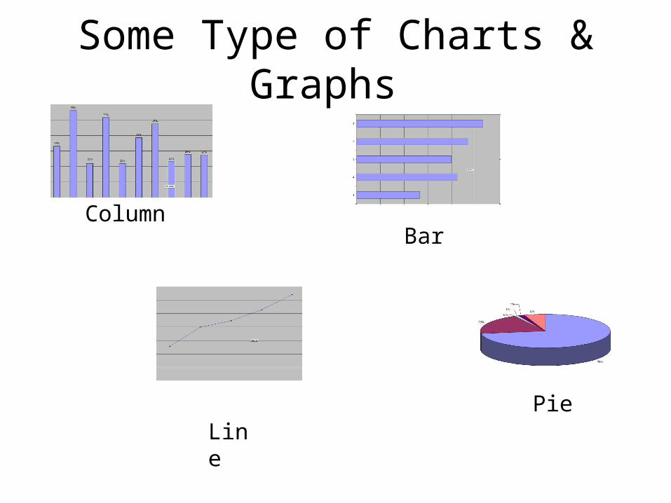
Some Type of Charts & Graphs
ColumnBar
LinePie

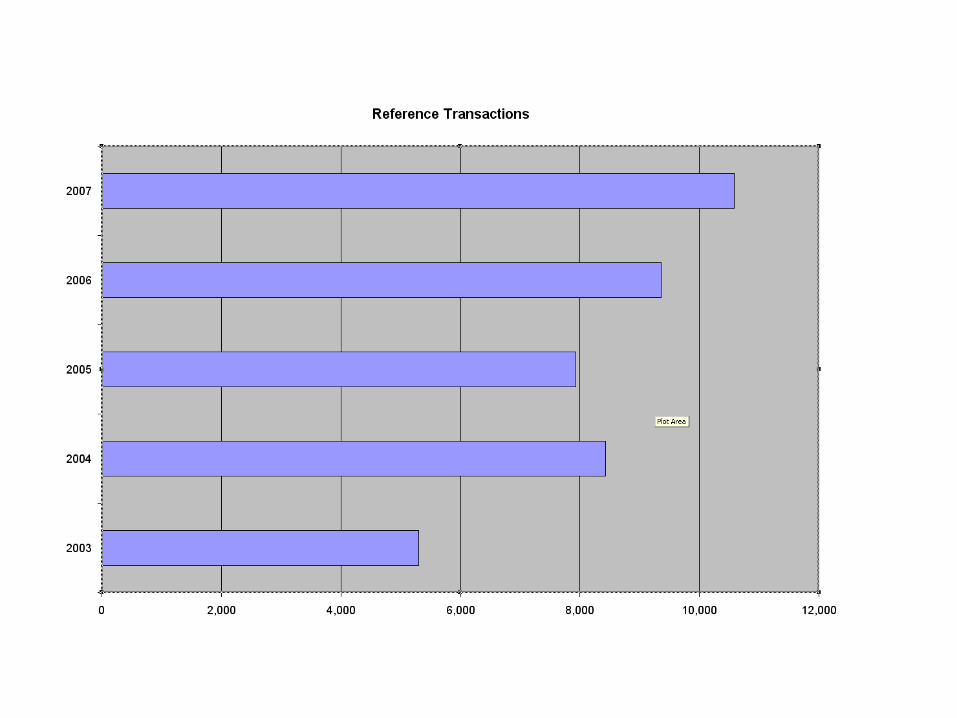
Column and Bar• Present data about 2 variables
• Rank size or importance of something over time
• A single data element over time
• Examples: – Circulation and year– Program attendance and year

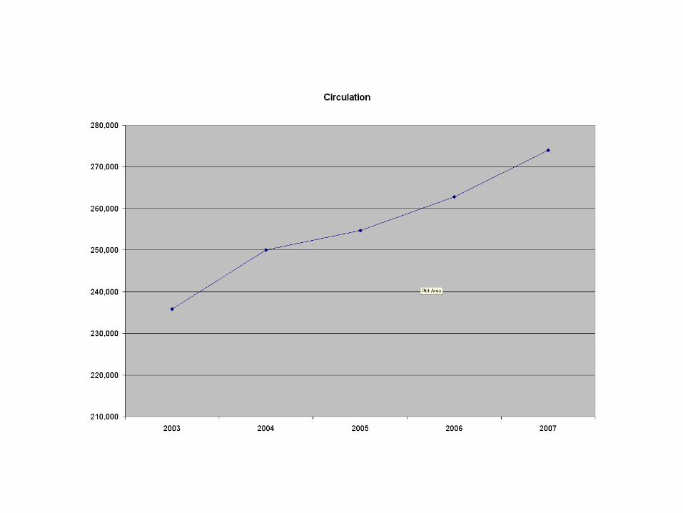
Line
• Series of points, connected by a line
• Best suited for showing trends in multiple data elements over time
• Example:– Circulation by type of media over time

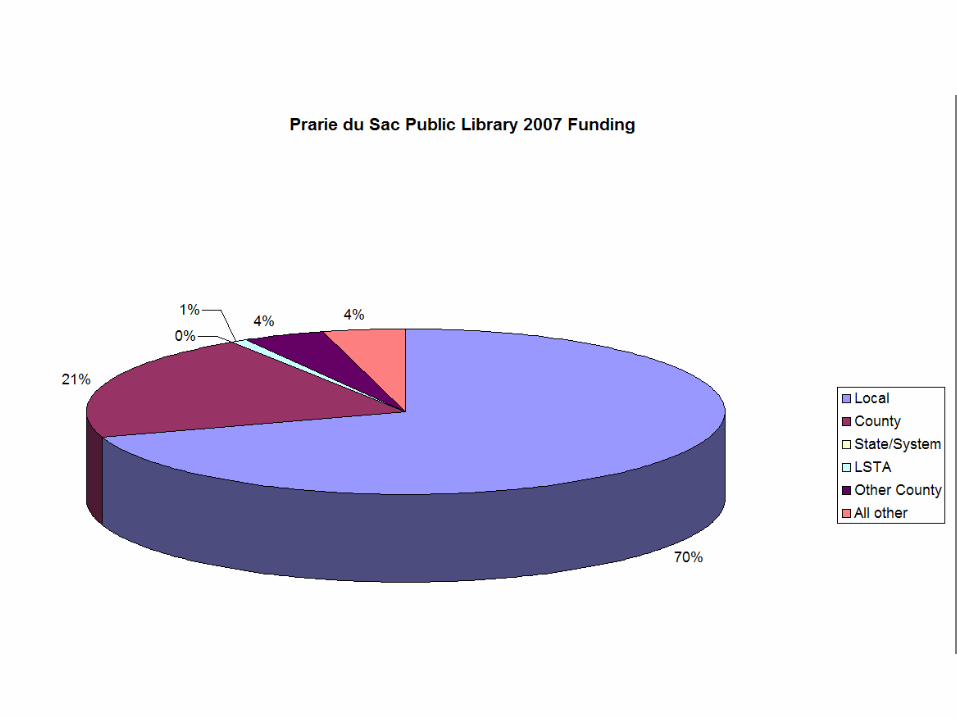
Pie
• Shows percentage values of one group of data as slices of pie.
• Examples: – Circulation to different types of patrons– Sources of funding


What chart when?
• There are many other types of charts!
• For more info see: – Wikipedia article (http://en.wikipedia.org/wiki/Chart)
– “Chart types” (from IBM) (http://tinyurl.com/5bcxx4)
– Strategic Planning for Results

Good Example of a Bad Chart
Source: http://lilt.ilstu.edu/gmklass/pos138/datadisplay/badchart.htm

Let’s Create a Chart
• Create a spreadsheet (or open an existing one)
• Formatting is key!– Especially with dates
• Be flexible
Step by Step
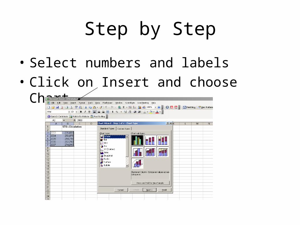
• Select numbers and labels
• Click on Insert and choose Chart

Step by Step
• Chart Wizard will guide you through the process
• Make sure Standard Types tab is selected
• Click the type of chart or graph – feel free to explore the various types
• To see a sample of your chart, click on the “Press and Hold to View Sample” button

Step by Step

Step by Step
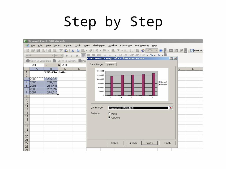
• Once you’ve chosen a type of chart, click on Next
• Data Range should appear with your data source in the box
• Make sure the button in front of columns is marked – if needed for your chart
• Click on Next
Step by Step
Step by Step
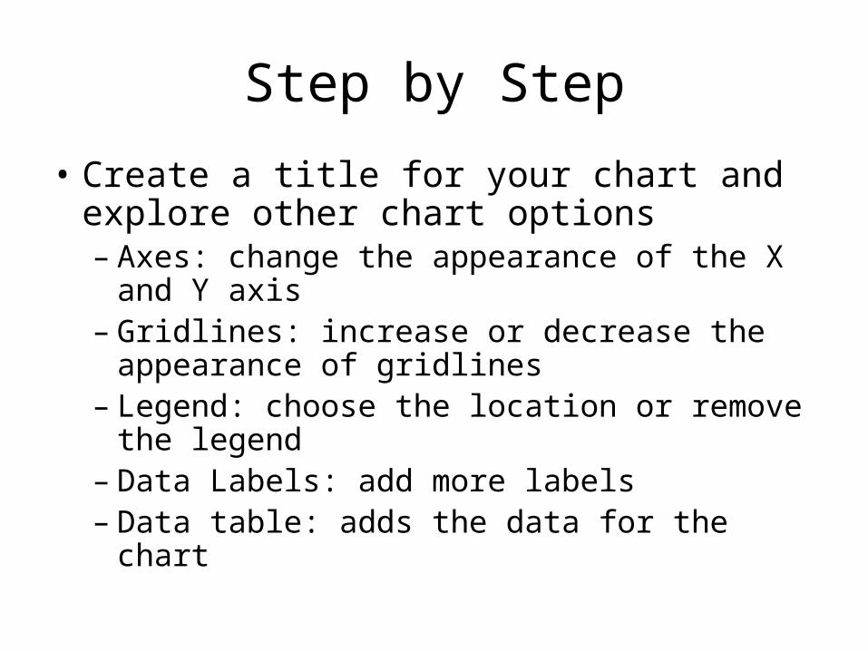
• Create a title for your chart and explore other chart options– Axes: change the appearance of the X and Y
axis– Gridlines: increase or decrease the
appearance of gridlines– Legend: choose the location or remove the
legend– Data Labels: add more labels– Data table: adds the data for the chart

Step by Step

Step by Step
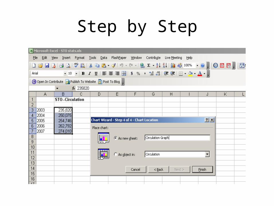
• Click on Next
• Select “As New Sheet” for your chart
• Give your chart a name
• Click on Finish
• Your graph or chart will appear on a separate worksheet within your spreadsheet
Step by Step

Step by Step

Step by Step

Want to know more?
• Ed2Go Courses– http://www.slis.wisc.edu/continueed/ed2go.html
• WebJunction Courses– www.webjunction.org
• Excel Help – right in the program• Books on Excel
– Some available through NetLibrary
• Microsoft Online Help– http://office.microsoft.com

Related Documents