UNIVERSITY OF NAIROBI ASSESSMENT OF THE TEMPORAL AND SPATIAL CHARACTERISTICS OF DROUGHTS IN KENYA BY HANNAH W. KIMANI REG. NO: I56/87111/2016 A Dissertation Submitted In Partial Fulfilment for the Requirement of Masters of Science Degree in Meteorology, Department of Meteorology, University of Nairobi June 2019

Welcome message from author
This document is posted to help you gain knowledge. Please leave a comment to let me know what you think about it! Share it to your friends and learn new things together.
Transcript

UNIVERSITY OF NAIROBI
ASSESSMENT OF THE TEMPORAL AND SPATIAL
CHARACTERISTICS OF DROUGHTS IN KENYA
BY
HANNAH W. KIMANI
REG. NO: I56/87111/2016
A Dissertation Submitted In Partial Fulfilment for the Requirement
of Masters of Science Degree in Meteorology, Department of
Meteorology, University of Nairobi
June 2019

ii
DECLARATION
I hereby declare that this dissertation is my original work and has not been presented in any University
or learning institution for any academic award. Where other people’s work has been used, this has
properly been acknowledged and referenced in accordance with the University of Nairobi
requirements.
Signature…………………………. Date…../……/…….
Hannah Kimani
REG. NO: I56/87111/2016
This Dissertation has been submitted with our approval as University Supervisors.
Signature……………………… Date…../……/…….
Prof. Francis Mutua
Department of Meteorology
University of Nairobi
Signature…………………………. Date…../……/…….
Dr. Christopher Oludhe
Department of Meteorology
University of Nairobi

iii
DEDICATION
I dedicate this project to my mother, husband and children for their continued support and resilient
prayers

iv
ACKNOWLEDGEMENTS
I would like first and foremost to thank the Almighty God for the strength and time He gave me to
pursue this course. Without His grace I would not have come this far.
I wish to express my sincere gratitude to my supervisors Prof. Francis Mutua and Dr. Christopher
Oludhe for their guidance, encouragement and technical assistance in this work. Without their
continued support, this work would not have been successful.
I extend my special and sincere gratitude to the University of Nairobi through the Department of
Meteorology for awarding me the scholarship to pursue my studies.
Special thanks to the entire teaching and non-teaching staff of the Department of Meteorology
University of Nairobi for the friendly and unconditional support they gave me during the study period.
Special thanks to the Director and staff of the Kenya Meteorological Department for providing me
with the data for the study.
I also extend my gratitude to all my family members who continuously prayed for me and persevered
with me even when we needed quality time together. Your sacrifice and prayers have brought me this
far.
Finally, I wish to thank my classmates and friends who encouraged and supported me in one way or
the other during the study period.
v
ABSTRACT
Drought in Kenya is ranked among the top and most expensive natural disaster to deal with due to its
creeping phenomena. The frequency and intensity of droughts in the country have been increasing in
recent years leading to great social, economic and environmental impacts. A lot of effort has been
made to assess past droughts in the country with little or no information on the occurrence of future
droughts. The studies carried out have only used rainfall to characterize droughts yet droughts are
caused by a combination of many factors. The objective of this study was to assess the temporal and
spatial characteristics of drought in the study area using a combined drought index (CDI) that
incorporated three drought indices; the Precipitation Drought Index (PDI), the Humidity Drought
Index (HDI) and the Temperature Drought Index (TDI). In this study, relative humidity was used
instead of NDVI because NDVI is used as a proxy to monitor the condition of vegetation which is
determined by the amount of soil moisture available. Information on soil moisture can better be
obtained from a combination of rainfall falling in an area, temperature and relative humidity because
the amount of water lost into the atmosphere through evapotranspiration depends on the amount of
humidity in the atmosphere.
Data used in the study was obtained from the Kenya Meteorological Department (KMD) from 1979
to 2015 and included observed annual and dekadal rainfall, dekadal maximum temperature and
dekadal relative humidity at 1200 GMT.
To achieve the objective of the study, the country was first delineated into climatologically
homogenous zones using the Principal Component Analysis (PCA) after which the principal of
communality was used to pick the representative station in each homogenous zone. The drought
characteristics in each zone were determined using various drought categories based on CDI values.
A drought forecast model was then developed using past CDI values and stochastic time series
modelling (Auto Regressive Model). Nine homogenous rainfall zones with distinct rainfall
characteristics were delineated by PCA. Rainfall in the zones showed high spatial and temporal
variability with the highest variability being observed over the northern parts of the country, while
the lowest variability was observed over the coast, western and central parts of the country. CDI is
able to effectively capture drought characteristics in the study area.

vi
The country experiences all categories of droughts (mild, moderate, severe and extreme) with the
mild category being dominant in most of the zones. CDI and time series modelling can be used to
develop a drought forecast model in the study area. Drought forecasts in the study area can be made
with reasonable accuracy up to the ninth dekad which marks the end of a season. Since the more
severe drought categories tend to be experienced during the major rainfall season of MAM, there is
need for drought assessment both on the short and long term basis. Dekadal data therefore should be
used in conjunction with monthly and annual data to take care of both the short and long term drought
characteristics. In order to fully capture all aspects of droughts, more parameters should be
incorporated into the CDI.
.

vii
TABLE OF CONTENTS
DECLARATION................................................................................................................................ ii
ACKNOWLEDGEMENTS ............................................................................................................. iv
ABSTRACT ........................................................................................................................................ v
LIST OF TABLES ............................................................................................................................. x
LIST OF FIGURES .......................................................................................................................... xi
CHAPTER ONE: INTRODUCTION ............................................................................................. 1
1.0 Background .............................................................................................................................. 1
1.1 Characteristics of Drought ....................................................................................................... 2
1.2 Problem Statement ................................................................................................................... 2
1.3 Objectives of the Study ............................................................................................................ 3
1.4 Justification and Significance of the Study .............................................................................. 3
1.5 Area of Study ........................................................................................................................... 3
1.5. 1 Geographical Location of the Study Area ............................................................................... 4
1.5. 2 Topography .............................................................................................................................. 4
1.5. 3 Climatology of the Study Area ................................................................................................ 6
1.5. 3.1 Rainfall .................................................................................................................................. 6
1.5. 3.2 Temperature ........................................................................................................................... 7
1.5.3.3 Relative Humidity .................................................................................................................... 7
CHAPTER TWO: LITERATURE REVIEW ................................................................................. 8
2.0 Introduction .............................................................................................................................. 8
2.1 Drought Definition ................................................................................................................... 8
2.2 Types of Droughts.................................................................................................................... 9
2.3 Drought Indices ...................................................................................................................... 10
2.4 Evolution of Drought ............................................................................................................. 13
2.5 Drought Monitoring ............................................................................................................... 14
2.6 Drought Forecasting............................................................................................................... 18
2.7 Conceptual Frame Work ........................................................................................................ 20
CHAPTER THREE: DATA AND METHODOLOGY ............................................................... 21
3.0 Introduction ............................................................................................................................ 21
3.1 Data ........................................................................................................................................ 21

viii
3.1.1 Estimation of Missing Data and Quality Control .................................................................. 23
3.2 Data Analyses ........................................................................................................................ 24
3.2.1 Demarcating Kenya into Homogenous Rainfall Climatic Zones. ......................................... 24
3.2.1.1 Standardization ...................................................................................................................... 24
3.2.1.2 Regionalization ...................................................................................................................... 24
3.2.1.3 Number of Significant Principal Components ....................................................................... 25
3.2.1.4 Rotation of Principal Components ......................................................................................... 26
3.2.1.5 Picking Representative Stations ............................................................................................. 26
3.2.2 Determining Past Drought Characteristics and Their Respective Relative Frequency ......... 27
3.2.2.1 General overview of the CDI Software ................................................................................. 27
3.2.2.2 Computation of PDI, TDI and HDI ....................................................................................... 29
3.2.2.3 Computation of the CDI......................................................................................................... 30
3.2.2.4 Assessing Drought Characteristics ........................................................................................ 31
3.2.2.5 Comparison of Droughts Computed by CDI with Previous Drought Reports in the
Country .................................................................................................................................. 32
3.2.2.6 Drought Relative Frequency .................................................................................................. 32
3.2.3 Developing a Drought Forecast Model. ................................................................................. 32
3.2.3.1 Model Selection ..................................................................................................................... 32
3.2.3.2 Model fitting .......................................................................................................................... 34
3.2.3.3 Model Diagnostics ................................................................................................................. 35
3.2.3.4 Forecasting Droughts ............................................................................................................. 36
3.3 Data Requirements and Limitations....................................................................................... 36
CHAPTER FOUR: RESULTS AND DISCUSSIONS .................................................................. 38
4.0 Introduction ............................................................................................................................ 38
4.1 Results from Data Quality Control ........................................................................................ 38
4.2 Delineation of The Study Area into Rainfall Homogenous Zones ........................................ 40
4.2.1. Rainfall Characteristics .......................................................................................................... 44
4.2.1.1. Coefficient of Variability. .................................................................................................... 44
4.2.1.2. Long Term Monthly Mean .................................................................................................. 48
4.3 Droughts Characteristics as Measured by the CDI ................................................................ 51
4.3.1. Weighting ............................................................................................................................... 51
4.3.2. Drought characteristics .......................................................................................................... 52
ix
4.3.3 Drought Relative Frequency .................................................................................................. 61
4.3.4 Comparison of Droughts Computed by CDI with Previous Drought Reports in the Study
Area ........................................................................................................................................ 62
4.3.5 Severity of Droughts Computed by CDI ............................................................................... 63
4.4 Developing a Drought Forecast Model. ................................................................................. 64
4.4.1 Model Selection. .................................................................................................................... 64
4.4.2 Model Fitting ......................................................................................................................... 68
4.4.3 Model Diagnostics ................................................................................................................. 70
4.4.4 Forecasting Droughts and Evaluating Forecasts Accuracy ................................................... 73
CHAPTER FIVE: CONCLUSIONS AND RECOMMENDATIONS ........................................ 77
5.0. Introduction ............................................................................................................................ 77
5.1. Conclusion ............................................................................................................................. 77
5.2. Recommendations .................................................................................................................. 78
REFERENCES ................................................................................................................................. 79

x
LIST OF TABLES
Table 1: Summary of selected drought indices .................................................................................. 12
Table 2: Summary of stations used to delineate the study area into homogenous zones .................. 23
Table 3: Classification of drought categories based on CDI ............................................................. 31
Table 4: Statistical characteristics of annual rainfall in the study area .............................................. 40
Table 5: List of Homogenous zones with their representative stations ............................................. 43
Table 6: Results from different models used for weighting .............................................................. 52
Table 7: Summary of droughts in the study area ............................................................................... 56
Table 8: Seasonal Analysis of Droughts in the zones ........................................................................ 60
Table 9: Relative Frequency of Droughts in the study area ............................................................... 61
Table 10: Summary of areas affected by droughts more than half of the year .................................. 62
Table 11: History of drought incidences in Kenya (1980-2011) ....................................................... 63
Table 12: Number of moderate to extreme droughts per 5 year period ............................................. 64
Table 13: Statistical analysis of parameters used to fit the models in the zones ............................... 69
Table 14: Nash-Sutcliffe Model Efficiency coefficient for training and validation .......................... 70
Table 15: R squared for the nine leads in the zones .......................................................................... 73
Table 16: Contingency Table for Nyahururu lead 1 .......................................................................... 74
Table 17: Contingency table for Nyahururu lead 9 ........................................................................... 74
Table 18: Contingency table for Malindi lead 1 ................................................................................ 75
Table 19: Contingency table for Malindi lead 9 ................................................................................ 75
Table 20: Hit Skill Score for the leads ............................................................................................... 76

xi
LIST OF FIGURES
Figure 1: Map of Africa showing the position of Kenya ..................................................................... 4
Figure 2: Map showing the Topography of the study region ............................................................... 5
Figure 3: Sequence of drought occurrence and impacts for commonly accepted drought types
(Source: WMO-No 1006, 2006) ......................................................................................... 9
Figure 4: Conceptual framework of the study ................................................................................... 20
Figure 5: Spatial Distribution of stations used to delineate the study area into homogenous zones . 22
Figure 6: Single mass curve for Lodwar Temperature ...................................................................... 38
Figure 7: Single mass curve for Kericho rainfall ............................................................................... 39
Figure 8: Single mass curve for Garissa Relative Humidity .............................................................. 39
Figure 9: Spatial distribution of the First to Sixth Rotated Principal Components ........................... 42
Figure 10: Homogenous zones of the twenty eight stations derived from the annual rainfall totals . 43
Figure 11: Coefficient of variability for the zones............................................................................. 47
Figure 12: Monthly long term mean for the zones ............................................................................ 50
Figure 13: CDI Time series for Lodwar ............................................................................................ 52
Figure 14: CDI Time series for Moyale ............................................................................................. 53
Figure 15: CDI Time series for Garissa ............................................................................................. 53
Figure 16: CDI Time series for Malindi ............................................................................................ 53
Figure 17: CDI Time series for Machakos ........................................................................................ 54
Figure 18: CDI Time series for Narok ............................................................................................... 54
Figure 19: CDI Time series for Meru ................................................................................................ 54
Figure 20: CDI Time series for Nyahururu........................................................................................ 55
Figure 21: CDI Time series for Kericho ............................................................................................ 55
Figure 22: Spatial distribution of Mild to Extreme categories of droughts ....................................... 57
Figure 23: Auto Correlation Function for the Zones ......................................................................... 66
Figure 24: Partial Auto Correlation Function for the zones .............................................................. 67
Figure 25: Residual Auto Correlation Function and Partial Auto Correlation Function for the
zones ................................................................................................................................. 71
Figure 26: Plots of residuals against fitted values for the zones ........................................................ 72

xii
LIST OF ACRONYMS AND ABBREVIATIONS
ACF Auto Correlation Function
AMSL Above Mean Sea Level
AR Autoregressive
ARIMA Autoregressive Integrated Moving Average
ASAL Arid and Semi-Arid Lands
APARCH Asymmetric Power Autoregressive Conditional
Heteroskedasticty
AVHRR Advanced Very High Resolution Radiometer
CDI Combined Drought Index
CORDEX Coordinated Regional Downscaling Experiment
CMI Crop Moisture Index
CSIRO Commonwealth Scientific and Industrial Research Organization
CV Coefficient of Variation
DI Drought Index
DJF December January February
DMC Drought Monitoring Centre
DSI Drought Severity Index
ECMWF European Centre for Medium range Weather forecasts
ENSO El Nino Southern Oscillation
ESP Ensemble Streamflow Prediction
FAO Food Agricultural Organization
FAPAR Fraction Absorbed Photo synthetically Active Radiation
GMT Greenwich Meridian Time
GDP Gross Domestic Product
GHA Greater Horn of Africa
GIS Geographical Information System

xiii
HDI Humidity Drought Index
HSS Hit Skill Score
ICPAC IGAD Climate Prediction and Applications Centre
IGAD Inter-Governmental Authority on Development
IP Interest Period
ITCZ Inter Tropical Convergence Zone
JF January February
JJA June July August
JJAS June July August September
KMD Kenya Meteorological Department
KM Kilometres
LEV Logarithm of Eigen Value
LTM Long Term Mean
m Metres
MAM March April May
mm Millimeters
MS Micro Soft
NASA National Aeronautics and Space Administration
NDMA National Drought Management Authority
NDVI Normalized Drought Vegetation Index
NHMs National Hydrological and Meteorological services
NIR Near Infra-Red
NSE Nash-Sutcliffe model efficiency Coefficient
OND October -November -December
PACF Partial Autocorrelation Function
PCA Principal Component Analysis
PDI Precipitation Drought Index

xiv
PDSI Palmer’s Drought Severity Index
PRECIS Providing Region Climate for Impact Studies
RL Run Length
RACF Residual Auto Correlation Function
RPCA Residual Partial Auto Correlation Function
RPC Rotated Principal Component
SPI Standardized Precipitation Index
SACF Sample Autocorrelation Function
SPACF Sample Partial Autocorrelation Function
SARIMA Seasonal Auto-Regressive Integrated Moving Average
SON September -October -December
SWALIM Somali Water And Land Information Management
SWSI Surface Water Supply Index
TDI Temperature Drought Index
TFRCD Task-Force for Regional Climate Downscaling
UNDP United Nations Development Program
UNICEF United Nations International Children Emergency Fund
USA United States of America
UN United Nations
VDI Vegetation Drought Index
WFP World Food Program
WHO World Health Organization
WMO World Meteorological Organization

1
CHAPTER ONE: INTRODUCTION
1.0 Background
There are many types of natural hazards that have negative impacts on both humans and the
environment. Some of the most common hazards incorporate geological and meteorological
phenomena and include droughts, floods, cyclonic storms, volcanic eruptions, earthquakes,
wildfires and landslides. Among all these hazards, drought is the most devastating because of its
creeping phenomena. Drought creeps in gradually without being noticed and its impacts are
cumulative, making it one of the most expensive natural disasters to deal with. Droughts have been
experienced worldwide for a very long time. From 1900 to date, more than eleven million people
have died globally as a result of drought and more than 2 billion have been affected by drought
more than any other hazard (Zahid et al 2016).
Kenya like other East African countries is susceptible to drought due to its eco-climatic conditions.
Nearly 80% of Kenya’s land mass is arid and semiarid characterized by mean annual rainfall of
between 200-500 millimeters (mm). Over the years, Kenya has experienced droughts of various
intensity. The drought cycle has become shorter with droughts becoming more frequent and
intense. During the 1960’s/70’s, Kenya experienced one major drought in each decade which
increased to once every five years in the 1980’s. In the 1990’s, the droughts occurred once every
two to three years and their frequency of occurrence became increasingly unpredictable from 2000
(Huho and Mugalavai, 2010). According to Balint et al., 2011, Kenya has been experiencing
drought almost every year since 2000. The 2010/2011 drought that affected over 3.7 million people
in Kenya was the worst in sixty years. (World Food Program report, 2011).
Since drought is a problem that affects many people all over the world than any other natural
hazard, a lot of studies have been carried out worldwide on drought. Drought is a short term
anomaly caused by oscillation of climatic parameters. Therefore, a long term oscillation of these
parameters in any part of the world will lead to droughts. In this study, the drought characteristics
were assessed using a revised combined drought index that incorporated rainfall, temperature and
relative humidity.

2
1.1 Characteristics of Drought
Drought is a very complex natural phenomenon that is usually characterized by lower than average
precipitation, high temperatures, high wind speeds, low relative humidity, reduced cloud cover
and long periods of sunshine (Wilhite, 1993). In general terms, drought refers to a shortage in
precipitation over a prolonged period of time, usually a season, year or more which leads to water
shortage and has adverse effects on vegetation, animals and/or people. Drought is characterized
with reference to a certain amount of rainfall that falls during a given period of time in a given
area commonly referred to as normal. Deviations from the normal leads to extremes with amounts
above normal leading to floods and those below normal leading to droughts.
1.2 Problem Statement
Droughts have increased in frequency, magnitude and severity over several parts of the world,
Kenya included leading to great economic, social and environmental impacts in the affected areas.
Most of the studies carried out in the region to assess droughts are based on rainfall. Yet
development of drought is caused by a combination of many climatic variables such as high
temperature, strong winds, less cloud cover, long periods of sunshine and the amount of humidity
in the atmosphere.
Using only one parameter to assess drought fails to fully trace the footprints of drought. Use of
temperature, rainfall and relative humidity in this study have taken into more than one climatic
variables that lead to drought development thus capturing more drought aspects. Most of the
studies have concentrated on past drought characteristics, hence give us a better understanding of
past droughts. However, their usefulness is limited due to lack of forecasting skills which would
enhance our preparedness in dealing with future droughts. Planning for future droughts would
reduce the impacts associated with them. Hence the need to develop a drought forecast model that
can accurately predict droughts.

3
1.3 Objectives of the Study
The main objective of this study was to assess the temporal and spatial characteristics of droughts
in Kenya. The specific objectives of this study are:
(i) To determine Kenya’s dominant homogenous rainfall zones and the associated rainfall
characteristics in each zone.
(ii) To determine drought characteristics and the relative frequency of droughts using the
revised combined drought Index.
(iii) To develop a drought forecast model using the revised combined drought index.
1.4 Justification and Significance of the Study
Drought is one of the most complex and expensive natural disasters to deal with due to its creeping
phenomena. It sets in gradually without being noticed and its impacts are cumulative. In Kenya,
drought is a major concern and is ranked among the top natural disasters. From 1990 to 2017,
droughts accounted for seven out of the nine natural disasters that were declared as national
disasters. These include the 1992-93, 1995-96, 1999-2000, 2004-06, 2008-09, 2010-11 and 2016-
17 droughts. The other two were floods that were experienced in 1997-98 and 2003 respectively.
In Kenya, droughts affect many economic sectors and especially agriculture which is the back
bone of the country’s economy leading to economic instability. Droughts can easily be
misunderstood due to their complexity and this can lead to poor or inappropriate decision making
by policy makers. Thus the occurrence of frequent droughts in most parts of the country and the
negative socio economic impacts associated with it requires that more research on drought be
carried out and especially drought forecasting. The results obtained from this study will help
reduce the impacts of droughts as the appropriate measures can be put in place once it is known
where and when droughts are likely to occur.
1.5 Area of Study
This subsection describes the location, topography and climatology of the study area.

4
1.5. 1 Geographical Location of the Study Area
Kenya lies on both sides of the equator between Longitudes 340 E to 420 E and latitudes 5.5 0 N to
50 S. It is bordered to the west by Uganda, to the east by Somalia, to the north by Ethiopia and
parts of South Sudan and to the south by Tanzania and Indian Ocean. The country’s total area is
582,646 Kilometres squared (km2) (Figure 1).
1.5. 2 Topography
Kenya has tremendous topographical diversity as a result of volcanic eruptions and slow tectonic
movements that occurred during the formation of the Great Rift Valley, a trough that runs through
Kenya from north to south and divides the country into two. From the eastern coastal line of the
Indian Ocean, the country rises gradually from 5 metres Above Mean Sea Level (AMSL) through
the south-eastern lowlands which ranges from 500-1600m to the central highlands up to about
5199m (Mt. Kenya). From the central highlands, the land falls off steadily to the west of Rift
Valley to about 1200m around the Kenyan part of the Lake Victoria. North of the Lake, the land
Ethiopia
Tanzania Indian
Ocean
S
o
m
a
l
i
a
S. Sudan
U
g
a
n
d
a
Figure 1: Map of Africa showing the position of Kenya

5
again rises gently up to about 4321m around Mt. Elgon that lies along the Kenya Uganda Border
and falls again around Lake Turkana and areas bordering south western Ethiopia. The southern
part of the country bordering northern Tanzania is characterised by high altitude above 3800m in
areas neighbouring Mt. Kilimanjaro. The north eastern parts of the country constitutes mainly of
low lying land below 500m, except areas east of Lake Turkana (Marsabit and Moyale) where the
land rises above 800m. (Figure 2).
Figure 2: Map showing the Topography of the study region

6
1.5. 3 Climatology of the Study Area
This sub section gives a brief summary of the climatology of the study area.
1.5. 3.1 Rainfall
Rainfall over the study area is governed by large scale (global), synoptic and mesoscale factors.
The large scale factors arise from global teleconnections which are in turn brought about by
hemispheric abnormalities in the general circulation of the atmosphere and include the El Nino
Southern Oscillation (ENSO), Quasi-Biennial Oscillation (QBO) and Madden Julianne Oscillation
(MJO) among others. The synoptic factors include the Inter Tropical Convergence Zone (ITCZ),
subtropical anticyclones, tropical cyclones, jet streams, easterly waves, upper air troughs and extra
tropical weather incursions.
The most significant synoptic feature responsible for the seasonal variation of rainfall in the study
area is the ITZC. This is a belt of low pressure where the northeast and southeast trade winds from
both hemispheres converge. The ITCZ follows the northward and southward movement of the sun
with a lag of approximately two to three weeks and brings rainfall to the study area twice in a year.
The position of ITCZ is mainly determined by the overhead sun as well as by the position, intensity
and orientation of the Azores and Arabian high pressure cells to the north and the Mascarene and
Saint Helena high pressure cells to the south.
Most parts of the country experiences a bimodal rainfall distribution with two rainy seasons and
two dry seasons. The long rain season is experienced from March to May when the ITCZ is moving
north and is locally referred to as MAM. The short rain season is experienced from October to
December when the ITCZ is moving to the south and is locally referred to as OND. The two dry
periods run from mid-December to February and from June to September. However, areas west of
the Rift Valley, Isolated areas over the central highlands (Nyahururu) and over the coast experience
a third rain season from June to August, locally referred to as JJA. Rainfall over Kenya is further
modified by local factors such as large water bodies (Indian Ocean and Lake Victoria) which
induce land-sea breeze circulations, Orography, Marsabit Jetstream and the Great Rift Valley
among others.

7
The rainfall is highly variable both in time and space with some regions west of the Rift Valley
experiencing high amounts of rainfall annually, while others especially in the Arid and Semi-Arid
Lands (ASALs) receiving very low rainfall. For example Kisii Meteorological station receives
over 2000mm of rainfall annually, while Lodwar Meteorological station receives about 200mm
of rainfall annually.
1.5. 3.2 Temperature
Temperatures in Kenya are modified by orography, water surfaces and wind flow patterns. They
vary from one area to another and from season to season. In general, high maximum temperatures
of above 30 degrees Celsius (0C) are recorded over the north western parts of the country (Lodwar
Meteorological station) and parts of northeast (Garissa, Wajir and Mandera Meteorological
stations) during the December, January February (DJF) season. The northern parts of the country
have less cloud cover during this season, hence receive maximum insolation which leads to high
day time temperatures.
The lowest maximum temperatures below 20 degrees Celsius (0C) are recorded over the central
highlands during the June July August (JJA) season depicting the influence of high altitudes and
low insolation on temperature. The highest minimum temperatures of about 240C are recorded
along the coast, parts of northeast and northwest most of the year showing the effect of water
bodies (Indian Ocean and Lake Turkana) and low altitude on temperature. The lowest minimum
temperature of less than 100C are recorded over the highlands during the DJF season. Compared
to lowlands and water surfaces, highlands undergo more radiational cooling as the downslope
winds (Katabatic) descend over the highlands at night and early morning causing low night time
temperatures.
1.5.3.3 Relative Humidity
Relative humidity varies from one place to another and from season to season. Generally it is high
around large water bodies such as the Indian Ocean and Lake Victoria and also over areas
characterized by convergence such as the highlands. It is low over the lowlands which are mainly
characterized by divergence. Relative humidity tends to be high during the wet season and low
during the dry seasons.

8
CHAPTER TWO: LITERATURE REVIEW
2.0 Introduction
This section gives an overview of drought concepts as well as drought studies that have been
carried out in the study area and other parts of the world.
2.1 Drought Definition
There is no precise and universally accepted definition of drought (WMO report, 2006).
Developing a universal and precise definition of drought is difficult because definitions are
governed by among other things discipline, varying frequency with which drought occurs, time of
scale, location, land use and the context of the impacts (Yevjevich, 1967; Wilhite and Glantz,
1985, Wilhite, 1992; Sepulcre et al, 2012) Lack of a universal drought definition is a major
problem especially to policy makers who do not understand the concepts of drought (Glantz and
Katz 1977). This is because they can fail to take action when it is needed or come up with
unplanned responses which they don’t understand especially in the context of social and
environmental implications associated with them (Wilhite et al, 1984).
In general, drought can be defined as “extreme persistence of precipitation deficit over a specific
region for a specific period of time” ((Gonzalez and Valdes, 2006, Correia et al, 1994, Beran and
Rodier, 1985). Drought definitions are broadly grouped in two categories: Conceptual and
operational definitions (Wilhite and Glantz, 1985). Conceptual definitions are formulated in
general terms to assist people understand the concept of drought and establish drought policies
(National Drought Mitigation Centre, NDMC, 2006b). They are of the “Dictionary” type and vary
from one dictionary to another. Conceptual definitions offer little guidance to real time drought
assessment. Operational definitions quantitatively define the criteria for the onset, development,
cessation and severity of drought events for a particular application (Wilhite, 2000; Mishra and
Singh, 2010; Balint et al, 2011). They vary from one discipline to another.

9
2.2 Types of Droughts
Droughts can be classified as Meteorological, agricultural, and hydrological. Meteorological
droughts compare the duration and extent of dryness in an area to the normal conditions for that
area. Agricultural droughts arise when Meteorological droughts affect soil moisture,
evapotranspiration and plant development. Hydrological droughts deals with effects of
precipitation deficits on surface and/or subsurface water supply (Wilhite, 1993). Different types
of droughts therefore reflect the same process but at different stages. Meteorological drought
explains the primary cause of this process, while agricultural and hydrological drought describes
the impacts associated with this process (Balint et al, 2011). This relationship has been illustrated
in Figure 3.
Figure 3: Sequence of drought occurrence and impacts for commonly accepted drought types
(Source: WMO-No 1006, 2006)

10
2.3 Drought Indices
The process of monitoring how drought evolves is intricate and involves measuring and calculating
all variables integrated in the definition of drought. This is done through the use of drought indices
which are computed by integrating various drought indicators into a single numerical value. These
indices provide a broad picture for the analysis of drought and decision making that is more
practical than that provided by raw data from indicators (Hayes, 2006). Numerous drought indices
have been developed in different parts of the world to measure the magnitude of drought (Szinell
et al., 1998, Wu et al., 2001, Morid et al., 2006, Shakya and Yamaguchi, 2010). Currently, there
are more than one hundred and fifty drought indices being used (Niemeyer, 2008) and more are
being proposed ( Cai et al., 2011, Karamouz et al., 2009, Rhee et al., 2010, Vicentre- Serrano et
al., 2010; Vasiliades et al., 2011). While none of these indices is superior to the rest in all
situations, certain indices are suitable in specific areas than others.
Drought indices are broadly divided into two groups: statistical indices which are based on time
series analysis and indices based on water balance calculations. Most statistical indices are based
on one or two climatic variables, mostly rainfall and occasionally temperature. Examples include
the Standardized Precipitation Index (SPI) (McKee et al., 1993) and Percent Normal Index. Water
balance indices are based on several climatic and physical variables. The main objective of water
balance indices is to determine the water deficit of the crop at a given time and space based on a
distributed parameter model. Examples include the Palmer Drought Severity Index (PDSI)
(Palmer, 1965), Crop Moisture Index (CMI) (Palmer, 1968) and Surface Water Supply Index
(SWSI) (Shafer and Dezman, 1982).
Drought indices can also be classified according to the impacts associated with them (Zargal et al,
2011) variables they relate to (Steinemann et al, 2005) and by use of disciplinary data (Niemeyer,
2008). The most common categories are Meteorological, Agricultural and Hydrological. However
indices can also be classified as comprehensive, combined and remotely sensed drought indices
(Niemeyer, 2008). Comprehensive indices take into account multiple meteorological, hydrological
and agricultural parameters to describe drought. An example in this category is the United States
Drought Monitor, USDM (Svoboda et al, 2002).

11
Combined indices integrate several drought indices into a single index such as the CDI (Balint et
al, 2011). Remotely sensed indices uses data obtained from remote sensors to map the situation on
the ground. An example is the Normalized Difference Vegetation Index, NDVI (Tarpley et al,
1984; Kogan, 1995). Table 1 gives a summary of selected drought indices highlighting the
advantages and disadvantages of each. However, more information on other drought indices can
be obtained from the handbook of drought indicators and indices (WMO, G & GWP, G, 2016).

12
Table 1: Summary of selected drought indices
DI , Source and
parameters
Advantages Disadvantages
Percent of Normal
Precipitation
-Quick and easy to compute
-Flexible time scales
-Effective in a single location,
season or particular time in the
year
-Not suitable for comparison in different
climatic systems
-Difficult to differentiate normal
precipitation from its mean
-Assumes a normal distribution
SPI (McKee et al,
1993)
Precipitation
-Useful in all climate regimes
-Effective in areas with poor
data network;
-Determines the duration,
magnitude and intensity of
droughts
-Effective for both solid and
liquid precipitation
-Assumes a theoretical probability
distribution
-Inaccurate in arid areas and during dry
periods
-Requires long periods of data
-Incapable of identifying drought prone
areas
Deciles (Gibbs and
Maher 1967),
Precipitation
-Flexible hence can be applied in
many situations.
-Suitable for both wet and dry
conditions
-Requires data for a long period.
-Ignores other factors that contribute to
drought
PDSI (Palmer, 1965)
Precipitation and
temperature
-Effective in detecting drought
anomalies in a region
-Provides both the temporal and
spatial representation of past
droughts
-Lags in drought detection
-Not suitable for frozen ground and/or
precipitation
-Does not incorporate stream flow,
longer term hydrologic impacts, lake and
reservoir level and snow
-underestimates runoff condition
USDM
(Svoboda et al, 2002)
Several drought
indicators
Robust and flexible since it uses
multiple indices and indicators
-Requires expert interpretation of results
-Accuracy depends on the most current
inputs
NDVI (Several)
Visible Red and NIR
bands
(Tarpley et al,1984;
Kogan, 1995)
-High resolution and covers a
big land area
-Efficient in differentiating
between vegetated and non-
vegetated surfaces
-Measures actual droughts and
does not interpolate or
extrapolate droughts
-Values may vary with differences in
soil moisture
-Not accurate in riparian buffer zones
and urban areas;
-Assumes vegetation stress is caused by
soil moisture alone
-Tends to saturate in areas with large
biomass.
CDI (Balint et l,2011)
Precipitation,
Temperature and
NDVI
-Takes into account effects of
temperature and soil moisture
-Effective in data scarce areas
-Works well with daily and dekadal data
only. Not very accurate with time scales
of one month and above
(Source Zargar et al, 2011)

13
2.4 Evolution of Drought
Drought is considered as a hydro meteorological risk as it has an atmospheric or hydrological
origin (Landsberg, 1982). Therefore, it becomes difficult to isolate the onset of a drought as its
development is only recognized when human activities and/or the environment are affected
(Serrano and Sergio, 2006). In addition, the impacts of a drought can continue for many years after
its cessation (Changnon and Easterling, 1989). Droughts are different from other natural disasters
in that they do not occur suddenly but evolve over a long period of time (Rossi, 2003). Like any
hydro-meteorological event, drought evolution depends on the intial conditions and climate
forcings as discussed by among others Wood and Lettenmaier, 2008; Shukla and Lettenmaier,
2011.
The spatial evolution of drought is complicated because of the intricacy of atmospheric circulation
patterns and also by the fact that droughts cannot be linked to a single type of atmospheric
condition. (Serrano and Sergio, 2006). Droughts in different parts of the world have been attributed
to more than one atmospheric circulation patterns. In Kenya, droughts have been attributed to the
El Nino Southern Oscillation (ENSO) and particularly La Nina (Ininda et al., 2007; Okoola et al.,
2008 and Ngaina and Mutai, 2013). Shanko and Camberlin, 1998 attributed droughts in East Africa
to variations in the regional atmospheric circulation and associated rain generating weather
systems.
Several studies in the United States attributed the 2012 flash droughts to “the development of a
persistent upper tropospheric ridge that inhibited convection and caused exceptionally warm
temperatures to occur across the region for several months’’ (Kumar et al., 2013; Wang et al.,
2014; Hoerling et al.,2014. In Moldova, Bogdan et al., 2008 and Corobov et al., 2010 attributed
the 2007 drought to a heat wave that resulted from persistent anticyclonic conditions that favoured
the advection of dry air mass. Studies have shown that it is possible for an area to experience
drought while neighbouring areas experience normal or humid conditions (Oladipo, 1995;
Nkemdirim and Weber, 1999; Fowler and Kilsby, 2002). On the other hand, temporal evolution
of drought can vary significantly and a drought event can be restricted to distinct areas (Serrano
and Sergio, 2006).

14
2.5 Drought Monitoring
Zahid et al., 2016 used the 12 month SPI to assess the temporal and spatial characteristics of
meteorological droughts in Sindh province in Pakistan and found that meteorological drought
events in Sindh province had increased from the year 2000 as compared to previous years. In the
1980’s Sindh province suffered only one drought in 1988. No drought was recorded in the 1990’s
but in the 21st century, the province experienced three major droughts in 2000, 2002 and 2004.
According to their findings, these droughts were caused by, high temperatures, low rainfall and
variability in the rainfall patterns. Using the 12 month SPI may not capture short term droughts
that occur within the year. The authors also attributed the droughts to high temperatures and SPI
uses rainfall for drought assessment.
Jahangir et al., 2013 carried out a research in Barind region in Bangladesh using SPI and Markov
chain model to monitor meteorological and agricultural droughts respectively. They found out that
these two drought indices exhibited a statistically significant temporal correlation but poor spatial
correlation especially during the pre-monsoon season. Meteorological drought exhibited a similar
pattern in pre-monsoon season but during the monsoon season, rainfall deficits varied from time
to time and was recurrent in some areas of Barind than others. On the other hand, agricultural
drought exhibited a prolonged pattern during the pre- monsoon season over the entire Barind
region but during the monsoon season, it had a low prevalence and it varied from one region to
another. They established that meteorological drought does not always lead to agricultural drought
but prolonged agricultural drought can occur due to rainfall deficit. They also noted that the
frequency of meteorological drought was increasing in the 1990’s compared to the 1970’s and
1980’s. SPI is only useful when dealing with long term droughts and tends to ignore short term
droughts.
Sepulcre et al., 2012 used a Combined Drought Indicator comprising of SPI 3, soil moisture
anomalies and Fraction of Absorbed Photo synthetically Active Radiation (FAPAR) to detect
agricultural drought in Europe. They noted that the CDI was able to illustrate the spatial extent of
a drought condition and give a general idea of the possible consequences for agriculture. Using the
2000-2011 drought events in Europe, they demonstrated the indicator’s ability to differentiate
between areas affected by agricultural droughts. They noted that in some areas such as Romania,

15
short but very extreme precipitation deficit accompanied by high temperatures can have significant
agricultural impacts. They adopted this indicator as an operational and early warning indicator for
drought. Like in many countries they noted that drought occurrence in Europe increased after the
21st century. This approach is good as it incorporated various drought indicators. However it used
a single SPI value which may not work in all situations and is incapable of representing situations
that may roll over from one season to another.
Habibi et al., 2018 used the SPI, Markov chain model, the Drought Index (DI) and time series
modelling to characterize Meteorological drought in Cheliff Zahrez basin in Algeria. Using SPI,
they found that droughts in this basin have been increasing since 1970 in most of this region. The
DI which was derived from transition probabilities of wet and dry years was used to classify areas
that are prone to drought. The probability of occurrence of consecutive droughts was investigated
using the Markov Chain model which showed that the southern basins were likely to experience
droughts every two years. The SPI was used as input data for stochastic modelling of the return
period of droughts in the area of study. The researchers used various statistical models and found
out that the Asymmetric Power Autoregressive Conditional Heteroskedasticty (APARCH) model
was the best in representing the return periods of drought. The approach is good as it incorporated
two drought indices to assess drought. However it used SPI which is more appropriate in long term
drought assessment.
Hassan et al., 2014 used the 3 month (SPI-3) and 12 month (SPI-12) to study drought patterns
along the coast of Tanzania and found that this region experienced numerous meteorological
droughts ranging from mild, moderate, severe and extreme in the course of both the short and long
rains growing seasons. They noted that drought duration, intensity and frequency varied from one
area to the other. Even though Tanzania’s mainland experienced droughts less frequently as
compared to other areas, it experienced the highest occurrence of extreme droughts They also
discovered that the droughts were more prominent during OND than in MAM. In addition they
noted that the drought duration, intensity and extent during the study period (1952-2011) was
increasing with time. The study fails to capture meteorological drought in other seasons/months
which may aggravate the impacts of droughts experienced during MAM and OND. It also fails to
capture short term droughts that may occur within the seasons. It also uses one parameter to
quantify drought.

16
Awange et al., 2007 used the percent normal and the Drought Severity Index (DSI) to investigate
drought frequency and severity in the Lake Victoria region of Kenya and found out that the 1980’s
and 1990’s were drier decades as compared to the 1960’s and 1970’s. The 1980’s had the most
severe droughts during the study period starting from 1961 to 1999. According to their findings,
the return period for severe droughts varied from one season to the other and ranged from three to
eight years. The September October November (SON) season had the shortest return period of
three to four years, while the December January February (DJF) season had the longest return
period of seven to eight years. MAM season had a return period of three to eight years, while JJA
had no clear return cycle. This approach is good as it used more than one drought index.
Balint et al., 2011 used a Combined Drought Index (CDI) that incorporated a precipitation,
temperature and vegetation component to study drought in three areas with different climatic
characteristics (arid, semi-arid and sub-humid) in Kenya, The study showed that the CDI values
changed more rapidly in dry areas than in wet areas. A comparison between the dekadal and
monthly values of the CDI showed that the 5- dekadal analysis exhibited the highest fluctuation,
while the 3-month analysis was much smoother. However they established that the 5-dekadal
analysis detected short term droughts, while the long term droughts were detected by the 9-month
analysis. The study noted that the number and frequency of severe and/or extreme droughts were
increasing with more intense droughts being experienced from the 1980’s to 2000’s. Using Embu
station, they concluded that the CDI could be used for short term forecasts and early warning tool
up to the end of the season. The approach was good as it incorporated various drought indices to
quantify droughts. However, it concentrated more on past droughts and only mentioned that CDI
could be used to forecast short term droughts without showing how.
Wanjuhi, 2016 used both observed and downscaled ensemble rainfall data from the Coordinated
Regional Climate Downscaling Experiment (CORDEX) and SPI to assess past and future drought
characteristics over north eastern Kenya. His study found out that the region experiences two
categories of drought, the mild and moderate during the two rain seasons of MAM and OND. He
however noted that the mild category had a higher probability of occurrence in both seasons as
compared to the moderate category.

17
Projected SPI analysis showed that droughts are expected to increase both in magnitude and
frequency. The moderate category is expected to have a higher probability in both seasons than
the mild category. Droughts of varying intensity are also expected to last for several seasons once
they occur. This study looked at both the past and future characteristics of droughts in the study
area hence useful in drought preparedness. However, it used rainfall only to characterize drought.
Onyango, 2014 used the 3-month SPI (SPI-3) to investigate the drought characteristics over the
northeastern region comprising of Wajir, Garissa, Mandera and Moyale in both MAM and OND
seasons. The study showed that this region experiences two categories of droughts, mild and
moderately dry conditions. Mild drought had a high probability of occurrence in both seasons
across the whole region with Wajir recording the highest probability. The probability of occurrence
of moderate drought varied from one station to another and from season to season. The study also
noted that the duration of droughts varied from year to year and from one season to another. Like
in many studies, the frequency of drought increased during the period 1998- 2008 which
experienced nine drought events in 1999-2001 and 2004-2008. The researcher noted that there was
need to use other indices to monitor drought in this region since SPI could not explain the water
shortage caused by evapotranspiration, deep filtration, runoff, soil moisture and recharge. The
study concentrated on past drought characteristics and gave no indication of future drought
occurrence. It also left out drought characteristics in other seasons/months outside MAM and OND
and only used one parameter to quantify droughts.
Ngaina et al., 2014 investigated the past, present and future drought characteristics in Tana River
County using the 12 month SPI and model data from Providing Region Climate for Impact Studies
(PRECIS) and the Commonwealth Scientific and Industrial Research Organization (CSIRO). They
noted that rainfall and temperature have been increasing monotonically, with rainfall exhibiting
the highest spatial variability. From the past drought patterns, droughts have been increasing with
time from only two droughts in the 1970’s to four in 1980’s and early 2000’s. According to the
research, the magnitude and frequency of these drought events are expected to increase in future
despite the fact that wet and dry conditions are expected to alternate in almost equal magnitude
and frequency.

18
They also noted that the central and northern parts of Tana River will be more prone to drought
occurrence than any other part of the county. The study looked at both the past and future drought
characteristics. However, it used the 12 month SPI which does not capture drought patterns within
the year. It also utilized SPI as a drought indicator and drought is caused by a combination of other
meteorological parameters.
2.6 Drought Forecasting
Using a stochastic approach based on analytical derivation of transition probabilities of different
drought categories at different time scales and auto covariance matrix of monthly SPI time series,
Cancelliere et al, 2005 developed a suitable model to predict short medium term droughts in Sicily
Italy. The study showed that the observed and forecasted values were fairly close and hence
adopted the model for short medium term forecasting tool in Italy. The study used precipitation
only to characterize drought.
Using the SPI at different time scales (3, 6, 9, 12 and 24 months) as a drought quantifying
parameter, Mishra and Desai, 2005 developed an Auto Regressive Integrated Moving Average
(ARIMA) and the Seasonal Auto Regressive Integrated Moving Average (SARIMA) models to
predict droughts in Kansabati river basin (India). The study showed that the ARIMA model
predicted droughts with reasonable precision up to two months lead time in all the timescales.
However, the accuracy of the forecast decreased with increasing lead time, especially for the lower
SPI series (3 and 6). For higher SPI series (9, 12 and 24), drought prediction would be reasonably
accurate up to 3 months lead time. The study is good as it used SPI at different time scales, hence
captured various drought durations. However, it used precipitation only to characterize drought.
Karavitis et al, 2015 showed that the 24 months Seasonal Auto Regressive Intergrated Moving
Average (SARIMA) model was more reliable in predicting droughts up to the first 6 months in
Greece both at regional and country levels. Using monthly SPI as input data to various models,
they found out that the 24 month SARIMA model had the best fit both at the local and national
level and picked it to forecast drought using SPI 6 and SPI 12. Comparative analysis based on
Krigging approach in a GIS environment between the observed and forecasted SPI values showed
that SPI 6 predicted droughts accurately for the first few months both nationally and regionally,

19
while SPI 12 underestimated droughts at both levels. This study used precipitation only to
characterize drought.
Aghakouchak, 2015 investigated the possibility of producing persistent based drought predictions
in the Greater Horn of Africa (GHA) using the Ensemble Streamflow Prediction (ESP) and the
Multivariate Standardized Drought Index (MSDI). His study showed that this model was able to
forecast drought severity, persistence as well as the probability of drought occurrence with a lead
time of four months, Using the 2010-2011 droughts in east Africa, he demonstrated that the multi-
index, multivariate drought predictions from MSDI and ESP were consistent with the observations
and concluded that the model could be used for probabilistic drought early warning in the study
region. The study used multivariate drought index that incorporated both precipitation and soil
moisture hence predicting two types of droughts simultaneously.
Using dynamical seasonal model forecasts from the European Centre for Medium range Weather
Forecasts (ECMWF) and SPI, Mwangi et al., 2014 showed that it is possible to forecast the
duration, magnitude and spatial extent of droughts in GHA. The prediction skill was found to be
higher during the OND than in MAM season and decreased with increasing lead time. They found
out that ECMWF rainfall seasonal forecasts had significant skills for the major rain seasons (MAM
and OND) in East Africa when evaluated against observed rain gauge data but could not give
adequate information on drought. However, when SPI was used instead of raw rainfall data,
information on the intensity and spatial extent of drought was obtained. They therefore concluded
that the use of drought indices such as SPI in conjunction with seasonal rainfall forecasts would
go a long way in the drought decision making process. The study used precipitation only to
characterize and predict drought.
In Kenya, drought forecasting is carried out indirectly by KMD and the IGAD Climate Prediction
and Application Centre (ICPAC) through the generation of seasonal rainfall forecasts. However,
these forecasts give the general performance of rainfall and do not indicate if droughts will occur
or not. Drought thresholds can only be obtained from rainfall performance and may be user
specific. The forecasts produced by ICPAC are too general as they cover the Greater Horn of
Africa (GHA) and do not concentrate on any particular country.

20
2.7 Conceptual Frame Work
The conceptual frame work of the study is displayed in Figure 4. The study used standardized
annual rainfall anomalies for specific objective one and dekadal rainfall, temperature and relative
humidity for specific objective two. Output from specific objective two were then used together
with time series modelling for specific objective three. The output of the study was past drought
characteristics over the study area and a drought forecasting model was also developed.
Figure 4: Conceptual framework of the study
Determine drought
characteristics and the
relative frequency of
droughts using the CDI
Develop drought
forecast model
using past CDI
values
Excel,
Systat
Systat,
Surfer, Excel
Forecasting droughts
(Autoregressive Model, Time
series of CDI (1990-2015)
To determine the
dominant homogenous
rainfall zones and the
rainfall characteristics
in each zone
Use dekadal rainfall, temperature and
relative humidity to calculate CDI values
Categorise drought using computed CDI
values
Determine drought characteristics s and
relative frequency for each drought
category
CDI
software
Activities Specific Objectives Tools
Zoning (Perform PCA on standardized
annual rainfall totals (1979-2015)
Picking representative stations
(Principle of communality)
Background information (Compute
Mean and Coefficient of Variation)

21
CHAPTER THREE: DATA AND METHODOLOGY
3.0 Introduction
This section describes the data and the various methods that were used in the study to achieve the
objectives described in section one.
3.1 Data
This study used observed rain gauge data, maximum temperature and Relative Humidity at 1200
GMT obtained from the Kenya Meteorological Department.
Two sets of rainfall data were used in this study. The first set composed of annual rainfall totals
from the period 1979-2015 from twenty eight meteorological stations. Kenya Meteorological
Department has over one hundred rainfall stations spread all over the country. However, most of
the stations do not have up to date records and the concentration of these stations is around the
high potential areas of western, Lake Basin and central highlands with very few stations over the
northern parts of the country. Thus, based on data availability and considering that using the many
stations concentrated in the high potential areas may not add value to the study, twenty eight
stations with reliable data were picked.
Table 2 gives a summary of the stations used while figure 5 shows their spatial distributions. The
second set of data was dekadal rainfall data from the period 1990-2015 from nine representative
stations. Dekadal maximum temperature and dekadal relative humidity for the period 1990-2015
from nine representative stations was also used.

22
34 35 36 37 38 39 40 41
-4
-3
-2
-1
0
1
2
3
4
5
LODW
MARS
MOYA
MAND
WAJI
GARI
KITA
KAKA
ELDO
KERI
KISI
KISUNAKU
NARO
NYEREMBU
MERUNANY
DAGO
MAKI
VOI
LAMU
MALI
MOMBMTWAP
NYAH
THIKA
MACH
Figure 5: Spatial Distribution of stations used to delineate the study area into
homogenous zones

23
Table 2: Summary of stations used to delineate the study area into homogenous zones
S/No Station Number Station Name Latitude Longitude Altitude in
metres
Long Term Annual
Mean
1 8635000 Lodwar 3.11N 35.61E 505 207 2 8639000 Moyale 3.54N 39.05E 1110 650 3 8737000 Marsabit 2.31N 37.98E 1345 739 4 8641000 Mandera 3.93N 41.86E 330 273 5 8840000 Wajir 1.75N 40.06E 244 323
6 9039000 Garissa 0.48S 39.63E 128 347 7 9240001 Lamu 2.26S 40.83E 6 996 8 9340009 Malindi 3.23S 40.10E 20 1039 9 9439021 Mombasa 4.03S 39.61E 5 1065 10 9339036 Mtwapa 3.93S 39.73E 21 1319 11 9137020 Machakos 1.58S 37.23E 1600 681
12 9237000 Makindu 2.28S 37.83E 1000 568 13 9338001 Voi 3.40S 38.56E 558 572 14 8937065 Meru 0.08N 37.65E 1524 1301 15 9037112 Embu 0.50S 37.45E 1494 1251 16 9036288 Nyeri 0.43S 36.96E 1798 967 17 9136164 Dagoretti 1.30S 36.75E 1798 1017
18 9137048 Thika 1.01S 37.10E 1463 952 19 9135001 Narok 1.10S 35.86E 1585 742 20 8937022 Nanyuki 0.05N 37.03E 1890 636.3 21 9036135 Nyahururu 0.03S 36.35E 2377 992 22 9036020 Nakuru 0.26S 36.10E 1901 944.6 23 8935181 Eldoret 0.53N 35.28E 2120 1077
24 8834098 Kitale 1.00N 34.98E 1840 1280
25 8934096 Kakamega 0.26N 34.75E 1582 1956 26 9034025 Kisumu 0.10S 34.75E 1149 1356 27 9035279 Kericho 0.36S 35.26E 1976 1988 28 9034001 Kisii 0.68S 34.78E 1771 2036
3.1.1 Estimation of Missing Data and Quality Control
The data was subjected to quality control measures where any stations with more than 10% data
missing was disregarded. Missing data was estimated using the correlation and regression method.
In this method the correlation between pairs of stations is computed using (Equation 1) and the
station that is highly correlated to the station with missing data.is picked and used to compute the
missing record using the relationship in equation 2. For zones with only one station, the long term
mean was used to fill the missing gaps. Consistency of the data was carried out using the single
mass curve. In a single mass curve cumulated values for each station are plotted against time. A
regression line is then drawn through the scatter diagram. A straight line shows a consistent record.

24
𝑟 =𝑁 ∑ 𝑋𝑌−(∑ 𝑋)(∑ 𝑌)
√[∑ 𝑋2−(𝑋)2][𝑁 ∑ 𝑌2−(∑ 𝑌)2] ………………… (1)
𝑆𝐴𝑖 = 𝑟𝐴𝐵∗𝑆𝐵𝐼 ………………….……………. (2)
Where SAi is the missing record in station A, RAB is the correlation coefficient of station B that is
highly correlated with the station A that has missing data and SBI is the value of the data from
station B that has full record.
3.2 Data Analyses
The various methods used in the study are described in this subsection.
3.2.1 Demarcating Kenya into Homogenous Rainfall Climatic Zones.
In order to achieve this objective, the annual rainfall totals were first standardized and PCA
performed on the standardized rainfall anomalies to come up with the homogenous zones. The
number of significant principal components were determined using the Kaisers criterion method
while the representative stations were picked using the principal of communality.
3.2.1.1 Standardization
The standardized yearly anomaly indices for each year and station were obtained using Equation
3.
𝒁𝒊𝒋 =𝑻𝒊𝒋−�̅�
𝝈𝒋 …………………………. (3)
Where (Zij) is the standardized rainfall anomaly, Tij is the annual rainfall totals for a station i in a
given year j, T bar is the long term mean of rainfall and σ is the standard deviation. Standardization
is done to ensure the rainfall totals have a mean of zero and a unit variance.
3.2.1.2 Regionalization
Kenya has previously been demarcated into homogenous rainfall zones using different time scales.
(Agumba, 1988; Barring, 1988; Ogallo, 1989; Indeje et al, 2000 and Drought Monitoring Centre,
DMC 2000, 2001). This demarcation was carried out using rainfall data ranging from 1922 to
2000. This study thus aimed at demarcating the country into homogenous zones using annual
rainfall totals from 1979-2015 to account for the most recent changes in rainfall patterns. Several

25
methods are used to zone a country into homogenous zones such as the graphical method, cluster
and discriminant analysis and the Principal Component Analysis (PCA). Of all these methods,
PCA is the most popular and has been used in Kenya and East Africa in general to come up with
homogenous zones. (Ogallo, 1980 and 1989; Oludhe, 1987; Basalirwa; 1991, Ininda, 1994;
Okoola, 1996) among others.
In this study, PCA was used to delineate the country into homogenous zones. This is a data
compression skill where a large data set is reduced to a small data set while maintaining most of
the information in the original data set. PCA uses an orthogonal transformation to convert a set of
variables that are correlated to a set of linearly uncorrelated variables called principal components.
The first principal component accounts for the highest possible variance in a data set, with each
subsequent component accounting for the remaining variance. According to Richman 1986, PCA
can be performed in various ways which are determined by the way in which the input matrix of
observation is organized. If the parameter being studied is fixed, then one can either use the S or
T mode.
In the S- mode, the correlation data matrix is produced between locations over a set of periods.
This mode therefore produces a group of localities with similar temporal patterns. In the T- mode,
the correlation matrix is produced between periods over a set of localities. Thus this mode produces
a group of periods with the same spatial patterns (Ogallo, 1989).
In this study, the S- mode was used to demarcate Kenya into homogenous rainfall zones. The basic
PCA model for any variable j is given by Equation 4.
𝒁𝒋 = ∑ 𝒂𝒋𝒌𝑭𝒌𝒎𝒌=𝟏 (𝒋 = 𝟏, 𝟐, … … 𝒎) …….. (4)
Where Zj is the variable j (rainfall) in standardized form, Fk is the hypothetical factor k and Ajk is
the standardized multi-regression coefficient.
3.2.1.3 Number of Significant Principal Components
Since there are as many principal components as there are stations in the matrix data, it is important
to select the number of significant principal components to be used in the study. Many methods
have been proposed by several authors on how this can be done. They include but not limited to
the Kaisser’s criterion (Kaiser 1959), Scree’s test (Cattell, 1966), Logarithim of Eigen value (LEV)

26
method (Craddock, 1973) and the Sampling Errors of Eigenvalues (North et al, 1982). This study
used the Kaisser;s criterion method, which assumes that all principal components whose values
are equal to or greater than one are significant. Thus it only retains those PCs that excerpt variance
at least as much as that equal to the intial variable.
3.2.1.4 Rotation of Principal Components
Eigenvectors are mathematically orthogonal and the underlying processes related to the variables
are not orthogonal, hence there is need to adjust the frames of references of the eigenvectors
through rotation in order to overcome the uncertainties produced by direct solutions of
eigenvectors. Several authors have shown that rotated solutions describe the interrelations among
variables better than unrotated solutions (Hsu and Vallace, 1985; Richman, 1981, 1986; Barnston
and Livezey, 1987).
There are two main methods of rotation, the orthogonal and oblique rotations .In orthogonal
rotation, the reference axes are retained at 90 degrees such that each factor is orthogonal to all
other factors. Examples include Varimax, quartimax, equimax, orthomax, among others. In
oblique rotation, the rotated factors are allowed to identify the extent to which they are correlated.
Examples include Oblimax, Oblimin, Quartimin, covarimin among others. Details about these
rotations can be obtained from Richman, 1986.
In this study, Kaisser’s Varimax rotation was used. The significant rotated components were
mapped using the Surfer software in order to delineate the homogenous climatic zones.
3.2.1.5 Picking Representative Stations
After the climatic zones were delineated, representative stations were picked from each zone.
Basalirwa, 1979 and Ouma, 2000 have described the various methods that can be used to pick a
representative station. They include the unweighted Arithmetic mean method, use of PCA
weighted Averages and the principle of communality. In order to identify the most representative
station within each homogenous zone, the principal of communality was applied. The
communality Cj for any given locality j in a homogenous zone is given by Equation 5.
𝐶(𝒋) = ∑ (𝒂𝒋𝒌)𝟐𝒎𝒌=𝟏 (𝒋 = 𝟏, 𝟐, … . 𝒏) …….. (5)
Where:

27
ajk is the standardized multiregression coefficient of variable j on factor k (factor loading)
m is the number of significant principal components, n is the number of variable
The communality of a variable, in this case a station represents the degree of a station’s association
with other stations in the zone. Child, 1990 showed that Cj gives the extent to which the various
variables are interrelated. Thus the location with the highest value of Cj in any homogenous zone
can imply that this location is highly correlated with all the other stations within the homogenous
region. The best representative station will therefore be the one with the highest communality in
the homogenous zone. This principle has been used in the country to pick representative stations
(Ogallo, 1980 and Opere 1998).
3.2.2 Determining Past Drought Characteristics and Their Respective Relative Frequency
3.2.2.1 General overview of the CDI Software
The CDI software is a Microsoft (MS) excel- based software that was developed by Balint et al,
2011 in conjunction with the Food Agricultural Organization Somalia Water and Land Information
Management (FAO-SWALIM) as a tool to improve drought monitoring in the data scarce areas of
the Greater Horn of Africa (GHA). It provides an easier way of computing drought indices and
was initially designed to compute four drought indices; the Precipitation Drought Index (PDI),
Temperature Drought Index (TDI), Vegetation Drought Index (VDI) and the Combined Drought
Index (CDI) which incorporates all the three preceeding drought indices.
The CDI is a statistical index that measures how much the current hydro meteorological
conditions depart from the long term mean during a certain interest period. It combines three
drought indices the PDI, HDI and TDI. In simple words, the index for the various components of
the CDI can generally be expressed by Equation 6.
𝑫𝒓𝒐𝒖𝒈𝒉𝒕 𝒊𝒏𝒅𝒆𝒙 =𝑨𝒄𝒕𝒖𝒂𝒍 𝒂𝒗𝒆𝒓𝒂𝒈𝒆 𝒇𝒐𝒓 𝑰𝑷
𝑳𝑻𝑴 𝒇𝒐𝒓 𝑰𝑷∗ √
𝑨𝒄𝒕𝒖𝒂𝒍 𝒍𝒆𝒏𝒈𝒕𝒉 𝒐𝒇 𝒄𝒐𝒏𝒕𝒊𝒏𝒐𝒖𝒔 𝒅𝒆𝒇𝒊𝒄𝒊𝒕 𝒐𝒓 𝒆𝒙𝒄𝒆𝒔𝒔 𝒊𝒏 𝒕𝒉𝒆 𝑰𝑷
𝑳𝑻𝑴 𝒍𝒆𝒏𝒈𝒕𝒉 𝒐𝒇 𝒄𝒐𝒏𝒕𝒊𝒏𝒐𝒖𝒔 𝒅𝒆𝒇𝒊𝒄𝒊𝒕𝒐𝒓 𝒆𝒙𝒄𝒆𝒔𝒔 𝒊𝒏 𝒕𝒉𝒆 𝑰𝑷 ……. (6)
Where IP refers to the interest period (9 dekads in this study), LTM is the long term mean and
deficit applies to rainfall and relative humidity while excess applies to temperature.
Computation of the CDI was done using six different time series which include the following
(i) Dekadal (10 day) rainfall data

28
(ii) Time series of the rainfall run lengths (RL(p)) for a particular interest period (IP)
(iii) Dekadal Relative Humidity
(iv) Time series of the humidity run lengths (RL(H)) for a particular interest period (IP)
(v) Dekadal Temperature
(vi) Time series of the temperature run lengths (RL(T)) for a particular interest period (IP)
The run length in the time series describes the persistence of the unfavourable weather conditions
in the course of continuous drought occurrence. For rainfall, the run length is the duration within
the IP in which the rainfall is constantly below the long term average value. For humidity, the run
length is the duration within the IP in which the humidity is constantly below the long term average
value. For temperature, the run length is the length of time within the IP in which the temperature
is constantly above the long term average value representative of the same time unit such as a
dekad, month or year. The time series described above can be grouped into two classes A and B.
In A, small values of the data specify dry conditions while larger values specify wet conditions.
Rainfall and relative humidity belong to this group. In B, large values in the time series point to
conditions that may cause drought, while small values indicate better than drought conditions.
Temperature belongs to this category.
Since the drought indices described above are used to compare the actual drought conditions with
the long term average conditions, it is necessary to standardize the data used in CDI computation
in order to attain homogenous mathematical interpretation. In this study, this was achieved by
shifting the X-axis to the level of (𝑇𝑚𝑎𝑥 + 1) for temperature, (𝑅𝐿𝑀𝑎𝑥 + 1) for run length and
(𝑅𝐻𝑀𝑖𝑛 − 0.01) for relative humidity, where Tmax is the maximum temperature, RLmax is the
longest run length in the complete data set used and RHmin is the minimum relative humidity for
the station being considered. For rainfall, the X-axis was shifted by adding one millimeter (mm)
to the actual rainfall amount. This was necessary because some parts of the study area (northern
parts of the country) are characterized by prolonged dry seasons with no rain. In these areas, one
may find a whole period characterized by zero values, including the LTM, which can result to
unrealistically large values when dividing by very small values close to zero. This standardization
ensured that no parameter would be divided by zero, hence simplified the calculation process. The
X-axis shift gave rise to modified data series given by Equations 7a to 7d.

29
𝑇∗ = (𝑇𝑚𝑎𝑥 + 1) − 𝑇 ……….. (7a)
𝑅𝐿∗ = (𝑅𝐿𝑚𝑎𝑥 + 1) − 𝑅𝐿 ………. (7b)
𝑅𝐻∗ = 𝑅𝐻 − (𝑅𝐻𝑚𝑖𝑛 − 0.01) ………. (7c)
𝑃∗ = 𝑃 + 1 ……… (7d)
Where T*, RL*, RH* and P* are the standardized temperature, run length, relative humidity and
precipitation respectively.
3.2.2.2 Computation of PDI, TDI and HDI
The formula for computing individual drought indices for year i and dekad m are given by
Equations 8 to 10.
𝑷𝑫𝑰𝒊,𝒎 =𝟏
𝑰𝑷∑ 𝑷𝒊,(𝒎−𝒋)
∗𝑰𝑷−𝟏𝒋=𝟎
𝟏
(𝒏×𝑰𝑷)∑ [∑ 𝑷(𝒎−𝒋),𝒌
∗𝑰𝑷−𝟏𝒋=𝟎 ]𝒏
𝒌=𝟏
∗ √[𝑹𝑳𝒎,𝒋
(𝑷∗)
𝟏
𝒏∑ 𝑹𝑳𝒎,𝒌
(𝑷∗)𝒏𝒌=𝟏
] ………… (8)
𝑻𝑫𝑰𝒊,𝒎 =𝟏
𝑰𝑷∑ 𝑻𝒊,(𝒎−𝒋)
∗𝑰𝑷−𝟏𝒋=𝟎
𝟏
(𝒏×𝑰𝑷)∑ [∑ 𝑻(𝒎−𝒋),𝒌
∗𝑰𝑷−𝟏𝒋=𝟎 ]𝒏
𝒌=𝟏
∗ √[𝑹𝑳𝒎,𝒋
(𝑻∗)
𝟏
𝒏∑ 𝑹𝑳𝒎,𝒌
(𝑻∗)𝒏𝒌=𝟏
] ………… (9)
𝑯𝑫𝑰𝒊,𝒎 =𝟏
𝑰𝑷∑ 𝑯𝒊,(𝒎−𝒋)
∗𝑰𝑷−𝟏𝒋=𝟎
𝟏
(𝒏×𝑰𝑷)∑ [∑ 𝑯(𝒎−𝒋),𝒌
∗𝑰𝑷−𝟏𝒋=𝟎 ]𝒏
𝒌=𝟏
∗ √[𝑹𝑳𝒎,𝒋
(𝑯∗)
𝟏
𝒏∑ 𝑹𝑳𝒎,𝒌
(𝑯∗)𝒏𝒌=𝟏
] …….. (10)
Where IP is the interest period (9 dekads)
n is the number of years where relevant data is available (25 years)
j is the summation running parameter covering the IP
k is the summation parameter covering the years where relevant data are available
RL (p*) is the run length which describes the maximum number of consecutive dekads below
long term mean rainfall in the interest period

30
RL (T*) is the maximum number of consecutive dekads above long term mean maximum
temperature in the interest period
RL (H*) is the run length which describes the maximum number of consecutive dekads
below long term mean relative humidity in the interest period
PDI, TDI, and HDI represent the precipitation, temperature, and humidity drought indices
respectively. These indices are dimensionless and measure the severity of droughts in a certain IP,
where smaller values indicate serious drought conditions while large values indicate mild drought
conditions.
The actual drought index signifies the severity of drought for the IP terminating in time unit m. In
this study, since the IP was nine dekads, an index value say of 0.25 indicates the real drought
conditions from the first to the ninth dekad of a given month and year.
Each of the indices has two components. The first component (part of the indices’ equation without
the square root) represents the ratio of the seasonal performance of the mean modified rainfall,
temperature and humidity to the overall performance of the same parameters over all the years
under consideration. The numerator measures the present conditions while the denominator gives
the LTM of each parameter. The second component (Part of equation under the square root sign
in all the equations) represents the ratio of the drought run length in a given season to the average
run length over the years in that season and it measures the persistence of dryness.
3.2.2.3 Computation of the CDI
After individual drought indices were computed by the software, the CDI was then computed as
a weighted average of the PDI, TDI and HDI as shown by Equation 11
𝑪𝑫𝑰𝒊,𝒎 = 𝒘𝑷𝑫𝑰 ∗ 𝑷𝑫𝑰𝒊,𝒎 + 𝒘𝑻𝑫𝑰 ∗ 𝑻𝑫𝑰𝒊,𝒎 + 𝒘𝑯𝑫𝑰 ∗ 𝑯𝑫𝑰𝒊,𝒎 …………………… (11)
Where w are the weights of the individual drought index.
The intial weights as designed by Balint et al, 2011 for PDI was 50%, TDI 25% and NDVI 25%.
In the case of missing data for temperature and NDVI, then the weight for PDI was assigned 67%,
while all the others were allocated a weight of 33%. In this study, the coefficient of variation (CV)
computed by dividing standard deviation with the mean (Equation 12) was used as a guide to

31
assign the weights to individual drought indices. Different sets of weights were assigned to PDI,
TDI and HDI and CDI time series for every set was developed. A total of twelve different sets of
weights were used to develop twelve CDI time series. The CV for each CDI series was then
calculated and the series that had the lowest CV was picked to assign the weights that were used
in the final calculation of CDI.
𝐶𝑉 =√
1
𝑁∑ (𝑋𝑖−�̅�)2𝑁
𝑖
�̅� …………………… (12)
The numerator is the standard deviation and the denominator is the mean. In the numerator, N is
the sample size, Xi is the selected value and Xbar is the mean.
3.2.2.4 Assessing Drought Characteristics
To assess the drought characteristics in the study area, the corresponding values of the CDI in the
various representative stations were interpreted using Table 3.
Table 3: Classification of drought categories based on CDI
CDI Value Drought Severity
>1 No Drought
>0.8 - ≤ 1 Mild drought
> 0.6 - ≤ 0.8 Moderate drought
>0.4 - ≤ 0.6 Severe drought
< 0.4 Extreme drought
The annual drought characteristics were determined by counting the number of dekads that were
affected by different categories of droughts per year. In order to determine how the droughts were
spread out in each season, the number of droughts computed as a percentage of total droughts in
each drought category was determined using Equation 13.
𝐷𝑠 =𝑑𝑐
𝑁∗ 100 ………… (13)
Where Ds is the percentage of droughts in a given season, dc is the number of dekads affected by
a drought category c and N is the total number of droughts observed during the study period. The

32
various drought categories in the study area were mapped using the Geographical Information
System (GIS) and in particular the Inverse Distance Weighting (IDW) interpolation technique. In
order to determine whether droughts are becoming more severe or not, the whole time series was
divided into five years period and the number of moderate to extreme droughts cumulated over
every five years.
3.2.2.5 Comparison of Droughts Computed by CDI with Previous Drought Reports in the
Country
In order to know if the CDI captured droughts well in the study region, all the years which were
affected by more than 18 dekads of droughts in each zone were tabulated and the results compared
with previous drought reports issued by the government.
3.2.2.6 Drought Relative Frequency
If the number of times a certain drought category occurs is denoted by m and the total number of
droughts recorded in a given station is denoted by N, then the relative frequency of drought
category RFc is given by Equation 14.
𝑹𝑭𝒄 =𝒎
𝑵 ………………… (14)
Relative frequency was used to approximate the probability that a certain drought category will
affect a certain area at any given time in the study area.
3.2.3 Developing a Drought Forecast Model.
Three major steps were carried out in order to achieve this specific objective and include model
selection, fitting, diagnostic and forecasting.
3.2.3.1 Model Selection
Model selection involves identifying a suitable ARIMA model that best represents the behaviour
of the time series. Graphical analysis is an important tool in model identification as it easily
identifies patterns and anomalies in a time series. (Chatfield, 2000). In this study, the correlogram
which is a plot of the sample autocorrelation at lag k (rk) against the lags was used to look for
seasonality, trend and stationarity and also to identify the type of model to be used in the study. In
general, a high value of rk at a particular time indicates the presence of seasonality at that particular

33
time. The tendency of rk not coming down to zero until a high lag (more than half of the length of
time series) is attained may indicate the presence of trend in a time series.
Stationarity was checked using the sample Auto Correlation Function (SACF) which were
computed by the Systat software. Since the stochastic process that governs a time series is usually
unknown, SACF are computed from the time series and used instead of the theoretical ACF. The
theoretical autocorrelation function denoted by 𝑝𝑘 at lag k is given by Equation 15.
𝑝𝑘 =𝑌𝑘
𝑌0 ………………… (15)
Where Yk is the theoretical auto covariance coefficient at lag K for K=0, 1, 2....n and Y0 is the
auto covariance at lag zero (Variance of the time series). The SACF is given by Equation 16.
𝑟𝑘 =𝐶𝑘
𝐶𝑜 ………………… (16)
Where rk is the sample Auto correlation function, Ck is the sample auto covariance at lag k and
Co is the sample auto covariance at lag 0. It has been shown that for data from a stationary
process, the correlogram usually provides an approximation of the theoretical ACF (Chatfield,
2000). Thus the plot of ACF against lag can be used to check if the time series is stationary or
not.
It has been shown (Box and Jenkins, 1976; 1994 Chatfield, 2000) that for an AR (p) process, the
roots of the characteristic equation of the ACF must lie outside the unit circle for the series to be
stationary. For an MA (q) process, the roots of the characteristic equation of the ACF must lie
outside the unit circle for the time series to be invertible. Therefore to know if the time series is
stationary or not, the estimated ACF (rk) was plotted against the lags and the nature of this plot
investigated. Since the estimated ACF tends to behave like the theoretical ACF (Pk), the tendency
of rk not dying off rapidly will show that the time series is not stationary and may have to be
differenced to make it stationary. Also if the series is stationary, the first few values of rk show a
short term correlation where the first few values of rk are significantly different from zero
(Chatfield, 2000).

34
The SACF and the Sample Partial Autocorrelation Function (SPACF) plots were then used to
identify the model type and order. For a stationary AR process, the ACF will tail off at lag p while
its PACF will have a cut off at lag p. For a stationary Moving Average (MA) process, the ACF
will have a cut off after lag q, while its PACF will tail off after lag q. For a mixed process, both
the ACF and PACF will tail off. Besides determining the class of the ARIMA models to use, PACF
is also useful in determining the order of the model. The PACF of an AR (p) process will be zero
at all lags larger than p. Thus the order of the model will be given by the lag value where the PACF
is significantly different from zero. The converse is true for an MA process and the order of the
model will be the lag value where the PACF tails off. Thus graphical analysis of ACF and PACF
were used to identify the model to be used in the study.
3.2.3.2 Model fitting
Model fitting involves looking for a suitable method to estimate model parameters. There are three
basic methods that are used to estimate parameters in stochastic modelling. These include the
maximum likelihood estimate, least squares estimate and the Yule Walker estimates (Box and
Jenkins, 1976). For this particular study, model fitting was carried out using the Least squares
method. This method involves minimizing the sum of all the squares of the deviations of the
observed points. For a given function, the sum to be minimized is given by Equation 17.
𝑠 = ∑ (𝑌𝑖 − �̂�𝑖)2𝑁
𝑖=1 = ∑ (𝑌𝑖 − 𝐹(𝑋𝑖 , 𝛼, 𝛽 ))2𝑁
𝑖=1 ………………… (17)
Where Xi and Yi are coordinates of the observed points, Ŷ is the mean value of Y, 𝞪 and 𝞫 are
parameters and N is the sample size. Equation 17 is then differentiated with respect to the
parameters 𝞪 and 𝞫 and equated to zero as shown in Equation 18
𝜕 ∑(𝑌𝑖−�̂�𝑖)
𝜕𝛼
2
= 0, 𝜕𝑁𝑖=1 ∑ (
(𝑌𝑖−�̂�𝑖)
𝜕𝛽)
2𝑁𝑖=1 = 0 …………………..… (18)
The solutions obtained from solving the above equation gives the number of parameters to be
estimated. The number of parameters to be used in fitting the model was determined by looking at
the P value, where parameters with a small value of p (as close to zero as possible) were picked

35
3.2.3.3 Model Diagnostics
This step looks at the shortfall of the fitted model and any possible modifications to the model.
There are various methods that are used to test the goodness of fit of a model such as examining
the residuals for the analysis of Variance as discussed by Anscombe and Turkey, 1963, over fitting
(Box and Jenkins, 1976) and also the criticism of factorial experiments, leading to Normal plotting
(Daniel, 1959). Over fitting involves fitting a model that has a higher order than the model being
diagnosed and examining whether the additional parameters are significant. It is useful in
improving model adequacy as it detects inadequacies that may not be identified by examining the
residuals. However, over fitting is suitable only when the nature of the high order model is known
and in most cases, this information is not known and hence other methods need to be used in
conjunction with over fitting.
Residuals refer to the difference between the observed and the fitted value and their analysis is a
very useful tool in model diagnostic. When fitting data to a model, it is assumed that the error term
has a mean of zero and a constant variance, the errors are not correlated and they are normally
distributed. Examination of residuals therefore checks if the assumptions made to the data are true.
If the residuals tend to behave like the random errors, then the model is taken to be adequate.
Analysis of residuals can be done either using numerical or graphical methods or a combination
of both.
In this study, both the numerical and graphical methods were used. The numerical method used
was the Nash- Sutcliffe model efficiency coefficient (NSE) that was developed by Nash and
Sutcliffe in 1970. NSE is calculated using Equation 19.
𝑁𝑆𝐸 = 1 − (1
𝑁∑ (𝑌𝑜−𝑌𝑝)
2𝑛𝑖=1
1
𝑁∑ (𝑌𝑜−�̅�)2𝑛
𝑖=1
) ………………… (19)
Where N is sample of the test size, Yo is the observed value, Yp is the predicted value and Y bar is
the mean of the observed data. NSE ranges from -1 to 1.A good model should have an NSE close
to 1. Moriasi et al, 2007, Carpena and Ritta, 2013 suggested that for a model to be adequate, NSE
36
thresholds values should range between 0.5 and 0.65. In this study, the CDI time series was divided
into the training and validation sets where the training set was used to fit the model and the
resulting parameters used to validate the model. The NSE for both the training and validation sets
were then compared. If the model is adequate, the difference in the NSE value should be minimal.
Graphical analysis was carried out using plots of Residual Autocorrelation Function (RACF),
Residual Partial Autocorrelation Function (RPACF) and plots of residuals against fitted values.
RACF and PACF plots were developed using Systat, while excel was used to develop plots of
residuals against fitted values. For the RACF and PACF plots, if the residuals are significantly
different from zero, then the model is inadequate. In the plot of residuals against fitted values, the
residuals should be evenly distributed around the mean if the model is adequate. (Mishra and
Desai, 2005).
3.2.3.4 Forecasting Droughts
After confirming that the model was adequate, the fitted model was used to produce forecast at
lead 0, which is simply the fitted values. Forecasts at consecutive leads up to lead 11 were produced
using the previous lag’s predicted values as the input parameters to the model. The coefficient of
determination (R2) for each lead time was computed and a graph of R2 against the leads was drawn
for every station to determine how far into the future the model could forecast. The forecast
accuracy was evaluated using the coefficient of determination (R2) and the Hits Skill Score (HSS).
R squared and the HSS for every lead time were computed and their respective values compared
to see if they were consistent. The higher the value of HSS and R2, the more accurate the forecast
was and vice versa. A Hit was realized any time the model predicted a drought category that was
similar to the observed data. An alarm was realized when the model predicted a drought category
that was different from the observed data.
3.3 Data Requirements and Limitations
Data used in the study has been described at the introductory part of this section (3.1) and include
rainfall annual totals, dekadal rainfall, maximum temperature and relative humidity at 1200 GMT.
A few limitations were however encountered throughout the study.
(i) There were very few stations over the northern parts of the study area. Hence the spatial
rainfall characteristics over this area may not have been accurately represented.

37
(ii) The CDI used in the study incorporated three climatic variables (temperature, rainfall and
humidity). Since drought is caused by more variables, all aspects of droughts were not
taken into account
(iii)The CDI utilized dekadal data in its computation thus only short term drought prediction
was carried out.

38
CHAPTER FOUR: RESULTS AND DISCUSSIONS
4.0 Introduction
This section gives a detailed discussion of the results obtained from all the methods used in the
study. These include results from regionalization, historic drought characteristics obtained using
CDI, model building and forecasting.
4.1 Results from Data Quality Control
Results from the single mass curves displayed in this subsection for rainfall, temperature and
humidity show that the data was consistent in all the zones (Figures 6 to 8). However, only three
single mass curves from three stations randomly selected are displayed as examples. They include
Lodwar for temperature, Kericho for rainfall and Garissa for relative humidity. All the other single
mass curves can be found in the appendix
Figure 6: Single mass curve for Lodwar Temperature

39
Figure 7: Single mass curve for Kericho rainfall
Figure 8: Single mass curve for Garissa Relative Humidity

40
4.2 Delineation of The Study Area into Rainfall Homogenous Zones
This section presents the results obtained from PCA of the standardized annual rainfall totals. The
rotated PCA factor loadings were mapped to examine the spatial variability of rainfall in the study
area. Results from Kaiser’s criterion show that six components accounting for a total variance of
81% were significant (Table 4). The rotated PCAs tend to reflect the influence of local and regional
factors such as topography, large water bodies and other thermally induced circulations such as
the mountain/valley winds and land/sea breeze on the rainfall patterns of the study area. Use of
annual rainfall totals to perform PCA tends to filter out seasonal characteristics (Ogallo, 1980),
thus results from this study may not accurately represent the seasonal rainfall characteristics of the
study region but give a general classification of areas that have the same annual rainfall
characteristics.
Table 4: Statistical characteristics of annual rainfall in the study area
Factor Percent of Total Variance
1 42.2
2 15.6
3 7.5
4 6.1
5 5.7
6 4.0
The spatial distribution of the RPCs are shown in Figure 9. The first component was dominant
over the coast (zone 4) reflecting the interaction of the Indian Ocean and the local land/sea breeze
circulations over this region. The second and third components were dominant over the highlands
and southeastern lowlands (zones 8 and 5) respectively. These components depict the influence of
high/ low topography on the rainfall patterns.

41
The fourth component was dominant over the Lake Basin (zone 9) reflecting the effect of the Lake
Victoria on the rainfall patterns in this region. The fifth and sixth components were dominant over
north east and north west (zones 3 and 1) respectively. These two regions are in the arid category
and their spatial distribution reflects the effect of both topography on rainfall as well as the
influence of the Turkana- Marsabit jet. Using the six RPCs and comparing the spatial distribution
of the dominant PCA components as well as considering other factors, nine homogenous zones
were derived as shown in Figure 10. These zones and their representative stations are shown in
Table 5
The additional three zones (2, 6 and 7) that were not represented by the six RPCs were picked
according to their annual rainfall amounts and altitude. Moyale and Marsabit could not be
classified with Mandera, Wajir and Garissa because their altitude is 1110m and 1345m
respectively compared to between 128-330m in Garissa Wajir and Mandera. The total annual
rainfall for Moyale and Marsabit is 650 and 739mm respectively while those of Mandera, Wajir
and Garissa range from 273 to 347mm. Zone 7 comprising of Meru, Embu, Nyeri, Dagoretti and
Thika could not be grouped with Narok (zone 6) because its annual rainfall is 742mm compared
with a range of 1463 to 1798mm in zone 7. Information on the altitude and annual rainfall totals
of the stations can be obtained from table 2 in section 3(data and methods of analyses section).

42
34 35 36 37 38 39 40 41 42
-5
-4
-3
-2
-1
0
1
2
3
4
5
LODW
MARS
MOYA
GARI
WAJI
MAND
KITA
KAKA
ELDO
KERI
KISI
KISMNYAH
NAKU
NARO
NYEREMBU
MERUNANY
DAGO
THIK
MACH
MAKI
VOI
LAMU
MALI
MTWAMOMB
34 35 36 37 38 39 40 41 42
-5
-4
-3
-2
-1
0
1
2
3
4
5
LODW
MARS
MOYA
GARI
WAJI
MAND
KITA
KAKA
ELDO
KERI
KISI
KISMNYAH
NAKU
NARO
NYEREMBU
MERUNANY
DAGO
THIK
MACH
MAKI
VOI
LAMU
MALI
MTWAMOMB
34 35 36 37 38 39 40 41 42
-5
-4
-3
-2
-1
0
1
2
3
4
5
LODW
MARS
MOYA
GARI
WAJI
MAND
KITA
KAKA
ELDO
KERI
KISI
KISMNYAH
NAKU
NARO
NYEREMBU
MERUNANY
DAGO
THIK
MACH
MAKI
VOI
LAMU
MALI
MTWAMOMB
34 35 36 37 38 39 40 41 42
-5
-4
-3
-2
-1
0
1
2
3
4
5
LODW
MARS
MOYA
GARI
WAJI
MAND
KITA
KAKA
ELDO
KERI
KISI
KISMNYAH
NAKU
NARO
NYEREMBU
MERUNANY
DAGO
THIK
MACH
MAKI
VOI
LAMU
MALI
MTWAMOMB
34 35 36 37 38 39 40 41 42
-5
-4
-3
-2
-1
0
1
2
3
4
5
LODW
MARS
MOYA
GARI
WAJI
MAND
KITA
KAKA
ELDO
KERI
KISI
KISMNYAH
NAKU
NARO
NYEREMBU
MERUNANY
DAGO
THIK
MACH
MAKI
VOI
LAMU
MALI
MTWAMOMB
34 35 36 37 38 39 40 41 42
-5
-4
-3
-2
-1
0
1
2
3
4
5
LODW
MARS
MOYA
GARI
WAJI
MAND
KITA
KAKA
ELDO
KERI
KISI
KISMNYAH
NAKU
NARO
NYEREMBU
MERUNANY
DAGO
THIK
MACH
MAKI
VOI
LAMU
MALI
MTWAMOMB
Figure 9: Spatial distribution of the First to Sixth Rotated Principal Components

43
Table 5: List of Homogenous zones with their representative
stations
Zones Stations Factors squared Representative station
Zone1 Lodwar 0.69 Lodwar
Zone 2 Moyale 0.85 Moyale
Marsabit 0.82
Zone 3 Garissa 0.88
Wajir 0.87
Mandera 0.78
Zone 4 Malindi 0.87
Malindi Mombasa 0.86
Lamu 0.85
Mtwapa 0.81
Zone 5 Machakos 0.87
Machakos Makindu 0.79
Voi 0.65
Zone 6 Narok 0.62 Narok
Zone 7 Meru 0.89
Meru
Thika 0.85
Embu 0.84
Nyeri 0.83
Dagoretti 0.78
Zone 8 Nyahururu 0.92
Nyahururu
Nakuru 0.83
Nanyuki 0.81
Kitale 0.79
Eldoret 0.76
Zone 9 Kericho 0.88
Kericho Kakamega 0.81
Kisumu 0.80
Kisii 0.74
Figure 10: Homogenous zones of the twenty eight stations
derived from the annual rainfall totals

44
4.2.1. Rainfall Characteristics
The characteristics described in this subsection include the variability and long term monthly
mean of rainfall in the zones.
4.2.1.1. Coefficient of Variability.
The coefficient of variability (CV) of the zones showed that precipitation in the study area is highly
variable both in space and time. Figures 11 shows the CV for the various zones.
Zone 1
This zone shows high rainfall variability with CV values ranging from 0.9 in the month of April
to 2.5 in the month of September. Highest variation occurs between the months of June to
February, with a slight reduction of variability in July and October, while the lowest is observed
during the MAM season. This zone therefore experiences high variability throughout the year.
Zone 2
Rainfall in this zone is highly variable with the highest variability being observed in Marsabit over
most of the months except July and August when Moyale has the highest variation. The CV values
range from 0.5 in Moyale in the month of April to 2.0 in Marsabit in February. Highest variation
occurs from May to February (excluding November). The lowest variation is seen in the months
of April and November. Thus this zone is characterized by high rainfall variability most of the
year.
Zone 3
In this zone Mandera meteorological station shows the highest rainfall variability with CV values
ranging from 0.5 in April to 4.7 in February. Wajir and Garissa show more or less a similar pattern
in rainfall variability as compared to Mandera. Highest variation occurs from January to March
and again from May to October, while the lowest occurs in April and November. This zone
therefore is characterized by high rainfall variability throughout the year except the peak months
of April and November.

45
Zone 4
The variation of rainfall in this zone is not much across all the stations throughout the year except
over Mtwapa which exhibits inconsistency in January and February. CV values range from 0.4 in
Malindi Meteorological station in May to 3.4 in Lamu in January. Lamu shows the highest
variation of rainfall throughout the year except February when the highest variation is observed in
Mtwapa Meteorological station.
Zone 5
The highest variation in this zone is observed in Makindu Meteorological station throughout the
year except in February when Voi shows the highest variation. CV values range from 0.4 in
Machakos in April and November and 2.5 in Makindu in August. More variation is observed from
June to October and in January and February as compared to MAM, November and December.
Zone 6
In this zone, rainfall varies highly throughout the year with CV values ranging from 0.5 in April
to 1.1 in July. Highest variation occurs from June to February with a slight reduction in August
and November. Lowest variation is observed during the MAM season, indicating that rainfall in
this season varies highly throughout the year except during MAM.
Zone 7
This zone is characterized by an almost similar pattern in rainfall variability throughout the year
except Nyeri and Embu which shows a different pattern in January and February and Dagoretti
which exhibits a different pattern from May to October. Thika exhibits the highest variation
throughout the year except in January, February, November and December when Dagoretti and
Embu record the highest variability respectively. CV values range from 0.4 in Embu and Meru
during the months of April and November to 1.7 in Embu in February. Less variation is observed
during MAM and OND as compared to JJAS and the months of January and February.

46
Zone 8
Variation of rainfall among the stations in this zone is not much from the month of October to
April except Nakuru which shows inconsistency in January and February. Nyahururu shows the
highest variation in most of the months, except June to August when Nanyuki exhibits the highest
variation. CV values range from 0.3 over Kitale in April, July and August to 1.5 over Nyahururu
in January. Highest variation occurs in the months of January and February.
Zone 9
In this zone, Kisumu shows the highest variation throughout the year except in January and March
when Kericho records the highest variation. CV values range from 0.3 to 0.6 throughout the year
except the relatively dry months of January February and December when the CV values range
from 0.7 to 0.9 in all the stations except Kisii which exhibits low variation below 0.6 throughout
the year. This zone records the lowest rainfall variability across the study area.
In general, the highest rainfall variability is observed in the arid areas over the northern parts of
the country, while the lowest variability is observed over the highlands, Coast and the Lake Basin.
The variability is more pronounced during the dry months of January, February and from June to
September in most of the zones except zone 9 which shows relatively low variability in JJAS.
MAM and OND are characterized by generally low rainfall variability. However zones 1 and 3
shows high variability throughout the year except in April and November.

47
Figure 11: Coefficient of variability for the zones

48
4.2.1.2. Long Term Monthly Mean
The long term monthly mean of the zones are displayed in figure 12 and show the annual rainfall
distribution across the study area.
Zone 1
This zone exhibits a tri modal rainfall distribution with a major peak during MAM and two minor
peaks in JJAS and OND. The highest monthly rainfall above 38 millimeters (mm) is recorded in
April, while the lowest amount less than 4mm being recorded in February.
Zone 2
A bimodal rainfall distribution is observed in this zone during MAM and OND with Marsabit
recording both the highest and lowest amount of rainfall in April and September respectively. The
period from June to September and January to February remain generally dry with monthly rainfall
of less than 20mm.
Zone 3
This zone is characterized by a bimodal rainfall distribution with two wet seasons (MAM and
OND) across all the stations. The highest monthly rainfall of about 100mm is recorded in Garissa
during the month of November, while the lowest monthly rainfall of less than a millimeter is
recorded in Mandera in the month of August.
Zone 4
The monthly patterns in this zone shows a tri modal rainfall distribution during MAM, JJA and
OND. However, MAM is the major season in this zone with JJA and OND remaining relatively
wet. The highest monthly rainfall of about 350mm is recorded in Mtwapa in the month of May,
while the lowest monthly rainfall of 2mm is recorded in Lamu in the month of February. January
and February remain generally dry with monthly rainfall of less than 30mm.
Zone 5
This zone is also characterized by two wet seasons (MAM and OND) and two dry seasons (JF and
JJAS). However the OND season is more conspicuous than the MAM season. The highest monthly

49
rainfall (160mm) is recorded in Makindu in November and the lowest monthly rainfall of less than
a millimeter is recorded in Makindu in July.
Zone 6.
The monthly means in this zone show two wet seasons (MAM and OND) and one major dry season
(JJAS). January and February are relatively wet compared to JJAS recording monthly rainfall of
79 and 69 mm respectively. The highest monthly rainfall above 130 mm is recorded in April, while
the lowest monthly rainfall below 20 mm is recorded in July.
Zone 7
This zone is characterized by two wet seasons (MAM and OND) and two dry seasons (JF and
JJAS). Meru records both the highest and lowest monthly rainfall above 300 mm in November and
less than 15 mm in June and July.
Zone 8
Most of the months in this zone remain relatively wet throughout the year with monthly rainfall of
above 40mm except January and February where rainfall is below 40mm across all the stations.
However major rainfall seasons are observed in MAM, JJAS and OND even though Nanyuki and
Nakuru records relatively low amounts during the JJA season. The highest monthly rainfall above
180mm is recorded in Kitale in April, while the lowest is recorded in Nanyuki in February (Less
than 15mm).
Zone 9
This zone is characterized by wet conditions throughout the year with monthly rainfall amounts
above 50mm. However, three major wet seasons are observed in MAM, JJAS and OND. The
highest monthly rainfall above 160mm is recorded in Kakamega and Kisii in April, while the
lowest is recorded in Kisumu in February(less than 65mm). In general Kisumu records the lowest
monthly rainfall throughout the year.

50
Figure 12: Monthly long term mean for the zones

51
The monthly long term means across the country depicts a bimodal rainfall distribution with two
rainy seasons (MAM and OND) and two dry seasons (JF and JJAS) in most of the zones except
zones 4, 8 and 9 which shows three wet seasons (MAM, JJAS and OND) and only one dry season
in January and February. The peaks months in MAM and OND in most of the zones are April and
November respectively, except in zone 4 where the peak months are realized in May and October.
April, May and November are the wettest months in the country while February, June, July, August
and September are the driest months. The highest monthly rainfall in the whole country is recorded
in the month of May in zone 4(Mtwapa station with a LTM of 350mm). The lowest monthly
rainfall is recorded in the month of August in zone 3 (Mandera station with a LTM of 0.6mm).
Zone 1 shows the lowest monthly rainfall totals ranging from 4mm in February to less than 40mm
in April. Zone 9 records the highest monthly rainfall totals ranging from 64 mm in Kisumu during
the month of February to 265 mm in Kakamega during the month of April.
4.3 Droughts Characteristics as Measured by the CDI
This section describes results obtained from calculation of CDI which include weighting, drought
characteristics and drought relative frequency.
4.3.1. Weighting
Results from the twelve models that were assigned different weightings indicated that the model
that assigned temperature the highest weighting had the lowest CV (2 and 7), while those that
assigned rainfall the highest weighting had the highest CV (1, 4 and 5). Relative humidity also
affected the outcome and in general models that assigned relatively higher weightings to relative
humidity also had low CV but not as low as those that assigned temperature more weighting (3
and 9). Models 2 and 7 had the lowest CV value of 0.32 and since temperature contributed most
to low CV followed by relative humidity, model 7 was picked for CDI computations with a weight
of 0.2, 0.5 and 0.3 for rainfall, temperature and relative humidity respectively. The results of the
weighting are displayed in Table 6.

52
Table 6: Results from different models used for weighting
Model Rainfall Temperature Relative humidity CV
1 0.6 0.2 0.2 0.62
2 0.2 0.6 0.2 0.32
3 0.2 0.2 0.6 0.34
4 0.5 0.3 0.2 0.54
5 0.5 0.2 0.3 0.54
6 0.3 0.5 0.2 0.39
7 0.2 0.5 0.3 0.32
8 0.3 0.2 0.5 0.40
9 0.2 0.3 0.5 0.33
10 0.4 0.3 0.3 0.46
11 0.3 0.4 0.3 0.39
12 0.3 0.3 0.4 0.39
4.3.2. Drought characteristics
Results from CDI computations displayed in figures 13 to 21 shows that CDI is able to capture the
various drought categories as well as climate variability and especially variability in rainfall. The
high CDI values in all the zones correspond to extremely wet periods while the very low values
corresponds to extremely dry periods such as those associated with El Nino and La Nina
respectively.
Figure 13: CDI Time series for Lodwar

53
Figure 14: CDI Time series for Moyale
Figure 15: CDI Time series for Garissa
Figure 16: CDI Time series for Malindi

54
Figure 19: CDI Time series for Meru
Figure 17: CDI Time series for Machakos
Figure 18: CDI Time series for Narok

55
Figure 20: CDI Time series for Nyahururu
Figure 21: CDI Time series for Kericho
Table 7 shows the number of dekads that were affected by each drought category and the total
number of dekads affected by droughts throughout the study period. From the table, it is evident
that most parts of the country are affected mainly by mild droughts except zone three which
experiences mild and moderate droughts almost equally at 186 and 188 dekads respectively. Most
of the zones experienced drought more than half of the period under study (more than 450 dekads)
except zones 4, 8 and 9. The highest drought prevalence was recorded in zone 1 with 521 out of
900 dekads of droughts throughout the study period, while the lowest drought prevalence was
recorded in zone 9 with 424 dekads of droughts recorded during the study period.

56
Table 7: Summary of droughts in the study area
Zones Mild Moderate Severe Extreme Total Number of dekads
affected by droughts
1 222 174 94 31 521
2 202 182 80 31 495
3 186 188 116 10 500
4 219 150 58 11 438
5 267 139 70 20 496
6 208 173 59 18 458
7 263 138 59 10 470
8 169 127 93 44 433
9 242 128 49 5 424
The spatial distribution of the various categories of droughts is displayed in figure 22. From the
figure, the lowest prevalence of the mild category is around zone eight represented by Nyahururu,
while the highest prevalence is in zones five and seven represented by Machakos and Meru
respectively. In the moderate category, the Lake basin and the highlands (zones nine, eight and
seven) represented by Kericho, Nyahururu and Meru respectively record the lowest prevalence
while the highest prevalence is over the northeastern parts of the country (zones two and three)
represented by Moyale and Garissa respectively. Zone nine represented by Kericho records the
lowest incidences of the severe category and zone three represented by Garissa records the highest
incidences. In the extreme category, the lowest occurrence is recorded in zone nine represented by
Kericho, while the highest occurrence is recorded in zone eight represented by Nyahururu.
In general, zone nine represented by Kericho records the lowest incidences of most of the drought
categories except the mild category which is lowest in zone eight represented by Nyahururu. It is
important to note that even though zone eight reports the lowest incidences of the mild and drought
categories, it experiences the highest incidences of the most devastating drought category
(extreme). This should be of concern because this zone is in the food basket of the country hence
occurrence of extreme droughts in this region can have adverse effects on food security. Even
though zone one experiences the highest number of dekads affected by droughts (Table 7), the
individual drought categories tend to occur moderately over this region.

57
Figure 22: Spatial distribution of Mild to Extreme categories of droughts

58
Table 8 shows how droughts are spread out within the zones in different seasons of the year.
In zone 1, the prevalent drought category in most of the seasons is the mild category with above
40% except in JJA where moderate droughts prevail at 40%. Moderate to extreme droughts during
this season accounts for 66%, implying more severe droughts during the JJA than in any of the
other seasons.
In zone 2, the mild category dominates in all the seasons with above 40% except MAM where
moderate droughts dominate at 37% with the mild category accounting for 30%. Moderate to
extreme droughts during this season is at 70%, showing that this zone is prone to more severe
droughts during the MAM season.
In zone 3, the mild category is dominant during the SON and DJF seasons with 44 and 40%
respectively. In MAM and JJA, the moderate category prevails at 40 and 35% respectively. The
moderate to extreme droughts in MAM and JJA account for 68% showing more severe droughts
during these seasons.
In zone 4, mild droughts are dominant in MAM, SON and DJF at 53, 58 and 43% respectively. In
JJA the moderate category dominates at 47% with the mild category following at 46%. However,
more severe droughts are experienced during DJF as the moderate to extreme droughts take up
57% of all the droughts.
Mild droughts are dominant in zone 5 in all the seasons accounting for above 50% of the drought
categories except MAM which takes up 38%. The moderate to extreme drought categories
however take the highest percentage (62) in MAM indicating that droughts are more severe in
MAM. Mild droughts are more dominant in zone 6 in most of the seasons ranging from 45% in
JJA, 46% in DJF and 59% in SON. However, in MAM moderate droughts prevail at 36% with the
mild category at 31%. Moderate to extreme droughts take up 69% during MAM in this zone,
implying the severity of droughts is more pronounced in MAM than in any seasons in this zone.
In zone 7, mild droughts prevail in all the seasons with a higher percentage (above 60) except in
MAM where mild droughts account for 36%. Even though the mild droughts are dominant, the
moderate and severe droughts also take a big percentage of the total droughts experienced during

59
this season at 31% and 30% respectively. Drought are more severe in this season as moderate to
extreme droughts account for 64%.
In zone 8, the mild category dominates in DJF (59%), SON (40%) and JJA (38%). In MAM the
moderate category prevails at 36% with the severe category following closely at 34%. The
moderate to extreme droughts during MAM accounts for 81%, the highest in the country. This
zone records the highest percentage of severe droughts (34% during MAM) and the highest
percentage of extreme droughts (14% during SON).
In zone 9, the mild drought category prevails in most of the seasons with a higher percentage
(above 60%), except during MAM where moderate droughts prevail at 48% with the mild category
at 36%. Moderate to extreme droughts account for 48%, the lowest in the country.
In general, even though most of the zones experiences mainly mild droughts in most of the seasons,
the severity of these droughts is more pronounced in MAM than in any other season. Moderate to
extreme droughts are more in MAM in most zones except zones 1and 4 which have more moderate
to extreme droughts in JJA and DJF respectively. Zone 8 experiences the highest moderate to
extreme droughts at 81% during the MAM season, while zone 4 experiences the lowest moderate
to extreme droughts at 47% during the same season.

60
Table 8: Seasonal Analysis of Droughts in the zones
Zone Season Mild (%) Moderate (%) Severe (%) Extreme (%)
1
MAM 48 27 23 2
JJA 34 40 24 2
SON 47 35 9 9
DJF 42 31 16
2
MAM 30 37 21 12
JJA 42 36 15 7
SON 48 37 15 0
DJF 43 38 13 6
3
MAM 32 40 27 1
JJA 32 35 29 4
SON 44 31 23 2
DJF 40 42 17 1
4
MAM 53 35 7 5
JJA 46 47 7 0
SON 58 23 16 3
DJF 43 33 22 2
5
MAM 38 28 23 11
JJA 59 28 9 4
SON 61 29 10 0
DJF 58 27 14 1
6
MAM 31 36 28 9
JJA 45 34 18 3
SON 59 40 1 0
DJF 46 40 9 5
7
MAM 36 31 30 3
JJA 64 23 12 1
SON 60 30 6 4
DJF 64 33 3 0
8
MAM 19 36 34 11
JJA 38 33 22 7
SON 40 27 19 14
DJF 59 22 10 9
9
MAM 36 43 20 1
JJA 64 30 6 0
SON 65 25 10 0
DJF 65 22 9 4

61
4.3.3 Drought Relative Frequency
The relative frequency of droughts in the region vary from one category to another and from one
zone to the other. Table 9 shows the relative frequency in percentage for each drought category in
each zone. The highest relative frequency is observed in the mild category, while the lowest is in
the extreme category. In the mild category, the relative frequency is below 50% in most of the
zones except zones 9, 7, 5 and 4 which are at 57, 56, 53 and 50% respectively. The lowest in this
category is observed in zone 3 at 37%. In the moderate category, the relative frequency ranges
from 29 to 38% with zone 3 recording the highest frequency at 38% while zones 5, 7 and 8
recording the lowest at 29% each. In the severe category the relative frequency is below 20% in
most of the zones except zones 3 and 8 which have a relative frequency of 23 and 22% respectively.
The relative frequency in the extreme category is below 10% in most of the zones except zone 8
which is at 10%. From the table it is clear that even though the country is mainly affected by mild
droughts, the more severe categories take a higher percentage with more than half of the country
having relative frequency above 50% in the moderate to extreme droughts.
Table 9: Relative Frequency of Droughts in the study area
Zones Mild (%) Moderate (%) Severe (%) Extreme (%)
1 43 33 18 6
2 41 37 16 6
3 37 38 23 2
4 50 34 13 3
5 53 29 14 4
6 45 38 13 4
7 56 29 13 2
8 39 29 22 10
9 57 30 12 2
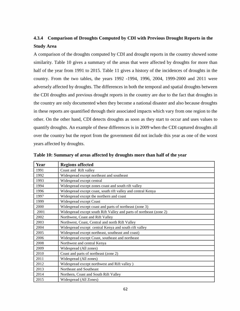
62
4.3.4 Comparison of Droughts Computed by CDI with Previous Drought Reports in the
Study Area
A comparison of the droughts computed by CDI and drought reports in the country showed some
similarity. Table 10 gives a summary of the areas that were affected by droughts for more than
half of the year from 1991 to 2015. Table 11 gives a history of the incidences of droughts in the
country. From the two tables, the years 1992 -1994, 1996, 2004, 1999-2000 and 2011 were
adversely affected by droughts. The differences in both the temporal and spatial droughts between
the CDI droughts and previous drought reports in the country are due to the fact that droughts in
the country are only documented when they become a national disaster and also because droughts
in these reports are quantified through their associated impacts which vary from one region to the
other. On the other hand, CDI detects droughts as soon as they start to occur and uses values to
quantify droughts. An example of these differences is in 2009 when the CDI captured droughts all
over the country but the report from the government did not include this year as one of the worst
years affected by droughts.
Table 10: Summary of areas affected by droughts more than half of the year
Year Regions affected
1991 Coast and Rift valley
1992 Widespread except northeast and southeast
1993 Widespread except central
1994 Widespread except zones coast and south rift valley
1996 Widespread except coast, south rift valley and central Kenya
1997 Widespread except the northern and coast
1999 Widespread except Coast
2000 Widespread except coast and parts of northeast (zone 3)
2001 Widespread except south Rift Valley and parts of northeast (zone 2)
2002 Northwest, Coast and Rift Valley
2003 Northwest, Coast, Central and north Rift Valley
2004 Widespread except central Kenya and south rift valley
2005 Widespread except northeast, southeast and coast)
2006 Widespread except Coast, southeast and northeast
2008 Northwest and central Kenya
2009 Widespread (All zones)
2010 Coast and parts of northeast (zone 2)
2011 Widespread (All zones)
2012 Widespread except northwest and Rift valley )
2013 Northeast and Southeast
2014 Northern, Coast and South Rift Valley
2015 Widespread (All Zones)

63
Table 11: History of drought incidences in Kenya (1980-2011)
Year Region Remarks
1980 Widespread 40,000 people affected
1983/1984 Central, Rift Valley eastern and
northeastern
Severe food shortages in eastern province
and less in central
1987 Eastern and central province 4.7 million people dependent on relief
power and water rationing
1991/1992 Northeastern, Valley eastern and
coast provinces
1.5 million people affected
1993/1994 Northern, central and eastern
provinces
1995/1996 Widespread 1.41 million people affected
1997 Northern parts of the country 2 million people affected
1999/2000 Countrywide except west and coast
provinces
4.4 million people affected (worst drought
in 37 years)
2004 Widespread 2.3 million people affected
2005 Northern parts of Kenya 2.5 million people affected
2010/2011 Widespread 3.5 million people affected
Source: Republic of Kenya (2004), Republic of Kenya (2011)
4.3.5 Severity of Droughts Computed by CDI
Table 12 shows that drought severity in most of the zones have been increasing over the years
except the period between 2001 to 2005 when the number of moderate to extreme droughts
decreased all over the country except zones 3 and 4 which recorded the least number of moderate
to extreme droughts in the period 1996 to 2000. The highest number of moderate to extreme
droughts was recorded from 2011 to 2015 in most of the zones except zones` 6, 9 and 1 which
recorded their highest number of moderate to extreme droughts in the period 1996 to 2000 and
2006 to 2010 respectively.
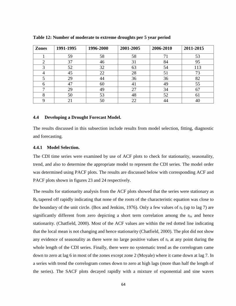
64
Table 12: Number of moderate to extreme droughts per 5 year period
Zones 1991-1995 1996-2000 2001-2005 2006-2010 2011-2015
1 59 58 58 71 53
2 37 46 31 84 95
3 52 32 63 54 113
4 45 22 28 51 73
5 29 44 36 36 82
6 47 60 41 49 55
7 29 49 27 34 67
8 50 53 48 52 61
9 21 50 22 44 40
4.4 Developing a Drought Forecast Model.
The results discussed in this subsection include results from model selection, fitting, diagnostic
and forecasting.
4.4.1 Model Selection.
The CDI time series were examined by use of ACF plots to check for stationarity, seasonality,
trend, and also to determine the appropriate model to represent the CDI series. The model order
was determined using PACF plots. The results are discussed below with corresponding ACF and
PACF plots shown in figures 23 and 24 respectively.
The results for stationarity analysis from the ACF plots showed that the series were stationary as
Rk tapered off rapidly indicating that none of the roots of the characteristic equation was close to
the boundary of the unit circle. (Box and Jenkins, 1976). Only a few values of rk (up to lag 7) are
significantly different from zero depicting a short term correlation among the rks and hence
stationarity. (Chatfield, 2000). Most of the ACF values are within the red dotted line indicating
that the local mean is not changing and hence stationarity (Chatfield, 2000). The plot did not show
any evidence of seasonality as there were no large positive values of rk at any point during the
whole length of the CDI series. Finally, there were no systematic trend as the correlogram came
down to zero at lag 6 in most of the zones except zone 2 (Moyale) where it came down at lag 7. In
a series with trend the correlogram comes down to zero at high lags (more than half the length of
the series). The SACF plots decayed rapidly with a mixture of exponential and sine waves

65
indicating an AR (p) model. The SPACF plots indicated that the SPACF had significant spikes up
to lag 10 for some stations and lag 11 for others indicating an AR model of order 10 and 11
respectively.

66
Figure 23: Auto Correlation Function for the Zones

67
Figure 24: Partial Auto Correlation Function for the zones

68
4.4.2 Model Fitting
After determining the type and order of the model, model parameters were estimated using the
least squares method. The statistical analysis of the parameters for each zone are shown in Table
13. The estimates that were selected to fit the model were those whose P value was less than or
equal to 0.05 and whose standard errors were less than the model values. In most of the zones, the
first three parameters and one of the last three parameters (7, 8 or 9) were used to fit the model
implying that the first three dekads and one of the last three dekads in a season may play a role in
drought development and cessation.

69
Table 13: Statistical analysis of parameters used to fit the models in the zones Zone/Station Model Parameter Parameter Values Standard Error T-Stat P-Value
Lodwar A0 0.0849 0.0146 5.8049 0.0000
A1 1.2711 0.0400 31.7526 0.0000
A3 -0.2618 0.0609 -4.2984 0.0000
A5 0.1629 0.0614 2.6554 0.0081
A7 -0.1464 0.0614 -2.3849 0.0174
A10 -0.2407 0.0606 -3.9683 0.0001
A11 0.5872 0.0614 9.5668 0.0000
Moyale A0 0.0406 0.0123 -7.1276 0.0000
A1 1.2969 0.0399 3.3003 0.0010
A2 -0.1537 0.0661 32.4707 0.0000
A3 -0.1674 0.0665 -2.3273 0.0203
A9 -0.2857 0.0661 -2.5189 0.0120
A10 0.2739 0.0393 -4.3201 0.0000
Garissa A0 0.0633 0.0140 4.5317 0.0000
A1 1.3698 0.0408 33.5746 0.0000
A2 -0.3442 0.0661 -5.2057 0.0000
A9 -0.4113 0.0652 -6.3064 0.0000
A10 0.5471 0.0657 8.3246 0.0000
A11 -0.1886 0.0399 -4.7266 0.0000
Malindi A0 0.0673 0.0133 5.0506 0.0000
A1 1.2673 0.0412 30.7540 0.0000
A2 -0.1957 0.0653 -2.9965 0.0028
A3 -0.1737 0.0650 -2.6705 0.0078
A9 -0.2505 0.0651 -3.8466 0.0001
A10 0.3456 0.0654 5.2830 0.0000
A11 -0.1261 0.0411 -3.0708 0.0022
Machakos A0 0.0621 0.0135 4.5998 0.0000
A1 1.2521 0.0412 30.3619 0.0000
A3 -0.1925 0.0647 -2.9738 0.0031
A8 -0.1274 0.0650 -1.9607 0.0504
Narok A0 0.0597 0.0115 5.1858 0.0000
A1 1.4404 0.0405 35.5605 0.0000
A2 -0.2406 0.0694 -3.4664 0.0006
A3 -0.3160 0.0698 -4.5269 0.0000
A8 -0.1714 0.0704 -2.4341 0.0152
A10 0.4876 0.0690 7.0693 0.0000
A11 -0.2295 0.0401 -5.7275 0.0000
Meru A0 0.0583 0.0145 4.0270 0.0001
A1 1.3038 0.0408 31.9281 0.0000
A2 -0.2330 0.0676 -3.4477 0.0006
A3 -0.1712 0.0683 -2.5062 0.0125
A9 -0.1350 0.0677 -1.9931 0.0467
A10 0.1753 0.0405 4.3257 0.0000
Nyahururu A0 0.0538 0.0094 5.7334 0.0000
A1 1.4875 0.0399 37.2866 0.0000
A2 -0.3161 0.0711 -4.4472 0.0000
A3 -0.2013 0.0723 -2.7852 0.0055
A8 -0.1593 0.0726 -2.1961 0.0285
A10 0.4663 0.0710 6.5633 0.0000
A11 -0.2857 0.0394 -7.2524 0.0000
Kericho A0 0.0741 0.0118 6.2544 0.0000
A1 1.4015 0.0396 35.4355 0.0000
A2 -0.2056 0.0682 -3.0151 0.0027
A3 -0.2637 0.0687 -3.8395 0.0001
A7 -0.1617 0.0690 -2.3438 0.0194
A10 0.4299 0.0680 6.3228 0.0000

70
4.4.3 Model Diagnostics
After the models were fitted, the NSE and graphical residual examination were used to check if
the models were adequate or not. The NSE for both the training and validation periods were
computed and compared to check if there was consistency among the two. The higher the NSE
and the lower the disparity between the training and validation sets, the more adequate the model.
Table 14 below shows that the NSE for both the training and validation period was high and the
two did not have a large variation indicating the models were adequate.
Table 14: Nash-Sutcliffe Model Efficiency coefficient for training and validation
Zone Nash Sutcliffe model efficiency
coefficient For Training
Nash Sutcliffe model efficiency
coefficient For Validation
1 0.935 0.935
2 0.956 0.945
3 0.948 0.942
4 0.927 0.937
5 0.939 0.923
6 0.957 0.949
7 0.936 0.905
8 0.853 0.869
9 0.964 0.958
The plots of RACF and RPACF (Figure 25) showed that there was no significant correlation
among the residuals as most of the values in most zones were within the confidence intervals (red
line). Only a few values appeared large compared to the confidence intervals and this is expected
in large lags. This indicates that the models were adequate. The plots of residuals against fitted
values (figure 26) showed that most of the residuals are evenly distributed around the mean
indicating that the models were adequate.

71
Figure 25: Residual Auto Correlation Function and Partial Auto Correlation Function for the zones

72
1.1.73
Figure 26: Plots of residuals against fitted values for the zones

73
4.4.4 Forecasting Droughts and Evaluating Forecasts Accuracy
After ascertaining that the model was adequate, forecasts at every lead were produced as discussed
in section three above. The model produced forecasts at eleven leads but only nine leads are
displayed in the results because after lead nine, the model started a new cycle that was similar to
the first cycle from leads ten and eleven. Thus it was concluded that the model could forecast
droughts up to lead nine which marks the end of the season. From the high values of R squared in
Table 15, it is seen that the model could predict droughts with reasonable accuracy. The table
shows an almost similar pattern in all the zones where the value of R squared in lead one decreases
and picks in lead two and remains constant from leads 3 to 8 in most zones and reduces again in
lead 9. However in zones 5, 6 and 9, the R squared starts decreasing in lead 7 and 8 respectively.
This implies that the developed model’s ability in predicting the onset of droughts may not be as
good as compared to when the drought sets in.
The contingency tables show that in most of the zones, the model is able to forecast most of the
drought categories with relatively high hits and low alarms at the beginning of a season. At the
end of the season, the model predicts the severe and extreme categories with relatively low hits
but is good at the other categories both at the beginning and at the end of the season. (Tables 16
and 17) as examples. However, in some zones (zone 4 and 5), the model is only able to predict the
no drought category with high hits and low alarms both at the beginning and end of the season.
For all the other categories, the model predicts with low hits and high alarms. (Tables 18 and 19)
as examples.
Table 15: R squared for the nine leads in the zones

74
Table 17: Contingency table for Nyahururu lead 9
Table 16: Contingency Table for Nyahururu lead 1

75
Table 18: Contingency table for Malindi lead 1
Table 19: Contingency table for Malindi lead 9

76
The Hit Skill Score (HSS) shown in Table 20 also shows that the model is capable of producing
forecasts with reasonable accuracy up to the end of the season.
Table 20: Hit Skill Score for the leads
Zone Lead 0 Lead 1 Lead 2 Lead 3 Lead 4 Lead 5 Lead 6 Lead 7 Lead 8 Lead 9
1 81.8 67.6 67.6 77.4 77.4 77.4 77.4 77.4 77.4 63.4
2 84.9 76.4 80.8 82.8 82.8 82.8 82.8 82.8 82.8 68
3 79.2 64.2 76.2 78.1 78.1 78.1 78.1 78.1 78.1 61.8
4 77.3 60.3 64.2 65.7 65.7 65.7 65.7 65.7 65.7 62.4
5 74.3 56.9 59.1 59.1 59.9 59.9 59.9 59.9 59.8 61.2
6 81.4 63.1 70.8 74.2 74.2 74.2 74.2 74.2 65.2 65.2
7 87.8 69.9 81.3 88.8 88.8 88.8 88.8 88.8 88.8 82.4
8 85.3 77.9 83.4 81 81 81 81 81 73.1 72.3
9 83.9 65.4 74.2 81 81 81 81 75.5 75.5 75.5

77
CHAPTER FIVE: CONCLUSIONS AND RECOMMENDATIONS
5.0. Introduction
This section provides conclusions derived from all the results obtained in the study as well as give
recommendations for future work and also for policy makers.
5.1. Conclusion
Regionalization based on PCA of standardized annual rainfall data delineated the study area into
nine homogenous zones with distinct rainfall characteristics. The rainfall is highly variable both
in space and time. The highest variability occurs over the northern parts of the country and the
southeastern lowlands, while the lowest variability occurs over the highlands, Coast and the Lake
Basin. Rainfall is also highly variable during the dry months of June to September and Mid
December to February in most of the zones except zone 9 which exhibits low variability most of
the year.
The region is mainly characterized by a bimodal rainfall distribution with two wet seasons (MAM
and OND) and two dry seasons (JF and JJAS) except over the Coast, highlands west of Rift Valley
and Isolated areas in the highlands east of Rift Valley which experience a third season from June
to August. The CDI is able to capture drought characteristics in the study area effectively as well
as climate variability. The region is mainly affected by mild drought but the droughts have been
shifting from the mild to more severe drought categories. The severe categories are more dominant
during the long rain season of MAM than in any other season.
An effective drought forecasting model can be developed using CDI, dekadal data and Time series
modelling in the study area. Dekadal data has been shown to predict droughts with reasonable
accuracy up to the end of the season. Hence it is useful in short term drought prediction.

78
5.2. Recommendations
The use of twenty eight stations to carry out regionalization may not have brought out the spatial
rainfall distribution especially over the northern parts of the country where stations are sparsely
distributed. It is therefore recommended that regionalization be carried out using blended satellite
data which will take care of the spatial disparity over the study region.
Drought is caused by a combination of more than one climatic variable. Hence it is important for
the CDI to use more parameters such as wind, sunshine duration and cloud cover in order to
effectively capture all aspects of droughts. Since droughts in the study area tend to be more severe
during the long rain season of MAM, there is need for frequent drought assessment both on a short
and long term basis. Therefore, dekadal data should be used in conjunction with both monthly and
annual data to take care of the short and long term droughts
Results obtained from this study show that drought can be forecasted with reasonable accuracy up
to the end of the season. Since drought can extend beyond a season, there is need for further studies
to explore the possibility of forecasting droughts beyond a season. Results obtained from this study
can be used to make timely decisions and reduce the socio- economic impacts of droughts.

79
REFERENCES
Adhikari, R., and Agrawal, R. K. (2013). An introductory study on time series modeling and
forecasting. arXiv preprint arXiv:1302.6613.
AghaKouchak, A. (2015). A multivariate approach for persistence-based drought prediction:
Application to the 2010–2011 East Africa drought. Journal of Hydrology, 526, 127-135.
Agumba, F. O. (1988). Regional homogeneity of long rains in Kenya. Kenya Journal of Sciences.
Series A, Physical and Chemical Sciences, 9(1-2), 99-110
Awange, J. L., Aluoch, J., Ogallo, L. A., Omulo, M., & Omondi, P. (2007). Frequency and severity
of drought in the Lake Victoria region (Kenya) and its effects on food security. Climate
Research, 33(2), 135-142.
Balint, Z., Mutua, F.M., and Muchiri, P., 2011. Drought Monitoring with the Combined Drought
Index. Methodology and Software, FAO-SWALIM Nairobi, Kenya.
Barring, L. (1988): Regionalization of daily rainfall in Kenya by means of common factor analysis.
J. Climatol. 8. 371-389.
Barnston, A. G., & Livezey, R. E. (1987). Classification, seasonality and persistence of low-
frequency atmospheric circulation patterns. Monthly weather review, 115(6), 1083-1126.
Basalirwa, C. P.K., (1979). Estimation of Areal rainfall in some catchments of the upper Tana
river (Doctoral dissertation).
Basalirwa C.P.K. 1991: Rain gauge Network Design for Uganda. PhD Thesis University of
Nairobi
Beran, M., and Rodier, J.A. 1985. Hydrological aspects of drought. Studies and reports in
hydrology 39. UNESCO-WMO, Paris
Bhuiyan, C., Singh, R.P., and Kogan, F.N. (2006), Monitoring drought dynamics in the Aravalli
region (India) using different indices based on ground and remote sensing data.
International Journal of Applied Earth Observation and Geoinformation 8, 289-302
Bogdan O, Marinică I, Mic LE (2008) Characteristic of the summer drought 2007 in Romania. In:
Proceedings of the BALWOIS 2008 conference, Ohrid, Republic of Macedonia 27–31
May 2008

80
Box, G., and Jenkins, G. (1970). Time Series Analysis-Forecasting and Control. San Francisco:
Holden Day. 553 p.
Cai, G., Du, M., and Liu, Y. 2011. Regional drought monitoring and analyzing using MODIS
data—A case study in Yunnan Province. In Computer and Computing Technologies in
Agriculture IV. Edited by D. Li, Yande Liu, and Y. Chen. Springer, Boston. pp. 243–251.
Cancelliere, A., Di Mauro, G. I., Seppe., Bonaccorso, B. , and Rossi, G. I. U. S. E. P. P. E. (2005,
September). Stochastic forecasting of standardized precipitation index. In Proceedings of
XXXI IAHR Congress Water Engineering for the future: Choice and Challenges, Seoul,
Korea (pp. 3252-3260).
Cancelliere, A., Di Mauro, G., Bonaccorso, B., and Rossi, G. (2007). Drought forecasting using
the standardized precipitation index. Water resources management, 21(5), 801-819.
Cattell, R.B. (1966): The Scree test for the number of factors. Multivar. Behav. Res.. 1, 245-259.
Changnon, S. A. & Easterling, W. E. (1989) Measuring drought impacts: the Illinois case. Water
Resour. Bull. 25, 27–42.
Chatfield, C. (2000). Time-series forecasting. Chapman and Hall/CRC.
Child. D. (1990): The essentials of factor analysis. Cassell Educational Ltd., Second Edition.
120pp.
Corobov R, Sheridan S, Overcenco A, and Terinte N (2010) Air temperature trends and extremes
in Chisinau (Moldova) as evidence of climate change. Clim Res 42:247–256
Correia, F., Santos, M.A., and Rodrigues, R. 1994. Reliability in regional drought studies. Water
Resources Engineering Risk Assessment. Porto. Karras. NATO ASI Series, 29: 43–62
Correia, Francisco Nunes, Maria Alzira Santos, and Rui Raposo Rodrigues. 1991 "Reliability in
regional drought studies." Water resources engineering risk assessment. Springer Berlin
Heidelberg. 43-62.
C.P.K. Basalirwa, L.J. Ogallo and F.M. Mutua (1993).The design of a regional minimum
raingauge network. International Journal of Water Resources Development, 4, 411-424,
Craddock, J. M, (1973): Problems and Prospects for eigenvector analysis in meteorology. Statist.,
22, pp. 133 – 145

81
Daniel, C. (1959). Use of half-normal plots in interpreting factorial two-level
experiments. Technometrics, 1(4), 311-341.
Fowler, H. J. & Kilsby, C. G. (2002) A weather-type approach to analysing water resource drought
in the Yorkshire region from 1881–1998. J. Hydrol. 262, 177–192.
Gibbs, W.J. and J.V. Maher, 1967: Rainfall Deciles as Drought Indicators. Bureau of Meteorology
Bulletin No. 48, Commonwealth of Australia, Melbourne,
Glantz, M. H., and Katz, R., 1977. When is a drought a drought? Nature, 267 192–193.
González, J., and Valdés, J. 2006. New drought frequency index: Definition and comparative
performance analysis. Water Resour. Res. 421 (11): W11421
G. Sepulcre-Canto, S. Horion, A. Singleton, H. Carrao, and J. Vogt., 2012. Development of a
Combined Drought Indicator to detect agricultural drought in Europe. Nat. Hazards Earth
Syst. Sci., 12, 3519–3531
Habibi, B., Meddi, M., Torfs, P. J., Remaoun, M., & Van Lanen, H. A. (2018). Characterisation
and prediction of meteorological drought using stochastic models in the semi-arid Chéliff–
Zahrez basin (Algeria). Journal of Hydrology: Regional Studies, 16, 15-31.
Hayes, M.J, , Svoboda, M.D, Wilhite, D.A and Vanyarkho, O.V (1999) Monitoring the 1996
Drought Using the Standardized Precipitation Index, Bulletin of the American
Meteorological society 80 (3), 429-438.
Hayes, M. J. (2006). What is drought? Drought indices. National Drought Mitigation
Center.(Online).< http://drought. unl. edu/whatis/indices. htm.
Hayes, M.M., Svoboda, N.W. and Widhalm, M. (2011). The Lincoln Declaration on Drought
Indices: Universal Meteorological Drought Index. Bulletin of the American
Meteorological, 92, 485-488.
Henry K. Ntale1, Thian Yew Gan, 2003. Drought Indices and their Application to East Africa.
International Journal of Climatology, Vol 23, 11, 1335-1357:
Henry N. Le Hou´erou. 1996. Climate change, drought and desertification. Arid environments 34
133-185
Hoerling, M., Eischeid, J., Kumar, A., Leung, R., Mariotti, A., Mo, K., Schubert, S., Seager, R.,
(2014). Causes and predictability of the 2012 Great Plains drought. Bull. Am. Meteorol.
Soc. 95, 269–282.

82
Hsu, H. H., & Wallace, J. M. (1985). Vertical structure of wintertime teleconnection patterns.
Journal of the atmospheric sciences, 42(16), 1693-1710.
https://climate.nasa.gov/news/2408/drought-in-eastern-mediterranean-worst-of-past-900-years/
Huho, J. M., & Mugalavai, E. M. (2010). The effects of droughts on food security in Kenya.
International Journal of Climate Change: Impacts and Responses, 2(2), 61-72.
Hu, Q., and Willson, G.D. 2000. Effects of temperature anomalies on the Palmer Drought Severity
Index in the central United States. Int. J. Climatol. 20 (15): 1899–1911.
Iddi H. Hassan., Makarius V. Mdemu., Riziki S. Shemdoe, Frode Stordal., 2014. Drought Pattern
along the Coastal Forest Zone of Tanzania. Atmospheric and Climate Sciences. 4, 369-384
Indeje. M.. Semazzi. F.H.M., and Ogallo, L.J (2000): ENSO signals in East African seasons. Intl
J. Climatol, 20. 19-46.
Ininda. J. M. (1994): Numerical simulation of the influence of the sea surface temperature
anomalies on the East African seasonal rainfall. PhD. Thesis, Department Of Meteorology,
University of Nairobi, Kenya
Ininda. J.M, Opijaj. F.J and Muhati D.F (2007). Relationship between Enso parameters and the
trends and periodic fluctuations in east Africa. Journal of the Kenya Meteorological
Society 1(1) 20-43
Jahangir Alam A.T.M, Sayedur Rahman M, Saadat A.H.M.,2013. Monitoring meteorological and
agricultural drought dynamics in Barind region Bangladesh using standard precipitation
index and Markov chain model international journal of geomatics and geosciences 3
Kaiser. H.F. (1959): Computer program for Varimax rotation in factor analysis. Educ. Psych.
Meas., 19.413-426.
Karamouz, M., Rasouli, K., and Nazif, S. 2009. Development of a hybrid index for drought
prediction: case study. J. Hydrol. Eng. 14 (6): 617–627. doi:10.1061/(ASCE)HE.1943-
5584.0000022
Karavitis, C. A Alexandris, S. G., Fassouli, V. P., Stamatakos, D. V., Vasilakou, C. G., Tsesmelis,
D. E., and Skondras, N. A., 2013b. Assessment of Meteorological Drought Statistics and
Patterns in Central Greece. In: 13th International Conference on Environmental Science
and Technology, 5-7 September 2013, Athens, Greece
83
Karavitis, C. A., Vasilakou, C. G., Tsesmelis, D. E., Oikonomou, P. D., Skondras, N. A.,
Stamatakos, D., and Alexandris, S. (2015). Short-term drought forecasting combining
stochastic and geo-statistical approaches. European Water, 49, 43-63
Keyantash, J., and J. Dracup, (2002). The quantification of drought: An evaluation of drought
indices. Bull. Amer. Meteor. Soc., 83, 1167–1180
Kogan, F.N., 1995: Droughts of the late 1980s in the United States as derived from NOAA
polarorbiting satellite data. Bulletin of the American Meteorology Society, 76(5):655–668.
Kumar, A., Chen, M., Hoerling, M., Eischeid, J., (2013). Do extreme climate events require
extreme forcings? Geophys. Res. Lett. 40, 3440–3445
Landsberg, H. E. (1982) Climatic aspects of droughts. Bull. Am. Met. Soc. 63, 593–598
McKee, T. B., Doesken, N. J., and Kleist, J. 1993. The relationship of drought frequency and
duration to time scales. Proceedings of the 8th Conference of Applied Climatology,
Anaheim, CA, Am.Meterol. Soc., 179–184
Mishra A K & Singh V.P (2010). A review of drought concepts. Journal of hydrology, 391 (1-2)
202-216
Mishra, A. K., Singh, V. P., 2011. Drought modeling – A review. Journal of Hydrology, 403(1-
2): 157–175
Mishra, A. K., Desai, V. R., 2005. Drought Forecasting Using Stochastic Models. Stoch Environ
Res Risk Assess 19: 326–339.
Morid, S., Smakhtin, V., Moghaddasi, M., 2006. Comparison of seven meteorological indices for
drought monitoring in Iran. Int. J. Climatol. 26, 971–985.
Moriasi, D. N., Arnold, J. G., Van Liew, M. W., Bingner, R. L., Harmel, R. D., and Veith, T. L.
(2007). Model evaluation guidelines for systematic quantification of accuracy in watershed
simulations. Transactions of the ASABE, 50(3), 885-900.
Mwangi,E., Wetterhall,F., Dutra, E., DI Giuseppe, F and Pappenberger,F. (2014) Forecasting
droughts in east Africa. Hydrology and earth system sciences 18(2) 611-620
Nash, J. E., and Sutcliffe, J. V. (1970). River flow forecasting through conceptual models part I—
A discussion of principles. Journal of hydrology, 10(3), 282-290.
NDMC. 2006b. What is drought? Understanding and Defining Drought. National Climatic Data
Center. http://www.drought.unl.edu/whatis/concept.htm

84
Ngaina J. N, and Mutai B. K (2013). Observational evidence of climate change on extreme events
over East Africa. J. Global Meteorol., 2(1): 6-12.
Ngaina JN, Mutua FM, Muthama NJ, Kirui JW, Sabiiti G, Mukhala E, Maingi NW, and Mutai
BK.( 2014): Drought monitoring in Kenya: A case of Tana River County. International
Journal of Agricultural Science Research Vol. 3(7), 126-135,
Niemeyer, S. 2008. New drought indices. Options Méditerranéennes.Série A: Séminaires
Méditerranéens, 80: 267–274.
Nkemdirim, L. & Weber, L. (1999) Comparison between the droughts of the 1930s and the 1980s
in the southern praires of Canada. J. Climate 12, 2434–2450.
North. G.R.. Bell, T. L„ Cahalan, R. F. and Moeng, F.J (1982): Sampling errors in estimation of
empirical orthogonal functions. Mon. Wea. Rev., 110. 699-706.
Oba G (2001). The effect of multiple droughts on cattle in Obbu, Northern Kenya. J of Arid
Environ 49: 375-386.
Ogallo, L.J., (1980): Time series analysis of rainfall in East Africa. Doctoral Thesis, Department
of Meteorology, University of Nairobi, Nairobi, Kenya
Ogallo, L.J. 1989: The temporal and spatial patterns of the East African rainfall derived from
principal component analysis. J. Clim., 9, 145-167.
Ogallo, L.J. and Ambenje, P.G. (1996) Monitoring Drought in Eastern Africa. WMO/TD No. 753,
World Meteorological Organization, Geneva
Okoola R.E., 1996: Space – time characteristics of the ITCZ over Equatorial East Africa during
Anomalous Rainfall Years. PhD. Thesis, Department of Meteorology, University of
Nairobi. pp 27 – 37, 54 – 55.
Okoola, R., Camberlin, P., and Ininda, J. (2008). Wet periods along the East Africa Coast and the
extreme wet spell event of October 1997. Journal of the Kenya Meteorological Society,
2(1), 67-83.
Oladipo, E. O. (1995). Some statistical characteristics of drought area variations in the savanna
region of Nigeria. Theoret. Appl. Clim. 50, 147–155.
Oludhe, C., (1987); Statistical Characteristics of Wind Power in Kenya. M.Sc. Thesis, Department
of Meteorology, U.O.N.
Onyango A. O., (2014): Analysis of Meteorological Drought in North Eastern Province of Kenya.
J Earth Sci Clim Change, 5:8.

85
Ouma, O. G. (2000). Use of satellite data in monitoring and prediction of rainfall over Kenya.
Doctoral Thesis, Department of Meteorology, University of Nairobi, Kenya
Ntale, H.K. and Gan, T.Y. and Mwale, D. (2003) Prediction of East African Seasonal Rainfall
Using Simplex Canonical Correlation Analysis. Journal of Climate, 16, 2105-2112.
Opere. A. O. (1998): Space-time characteristics of streamflow in Kenya. Doctoral Thesis,
Department of Meteorology, University of Nairobi, Kenya
Palmer, W. C., (1965). Meteorological drought. U.S. Weather Bureau Research Paper 45, 58 pp.
Palmer, W. C., (1968). Keeping track of crop moisture conditions, nationwide: The new crop
moisture index. Weatherwise, 21, 156–161.
Rao. Zahid, Muhammad. Arslan., and Badar.Ghauri., (2016). SPI based Spatial and Temporal
Analysis of Drought in Sindh Province, Pakistan. SCI.int, 28(4) 3893-3896
Rhee J, Im J, and Carbone GJ. (2010). Monitoring agricultural drought for arid and humid regions
using multi-sensor remote sensing data. Remote Sensing of Environment 114: 2875-2887.
Richman, M. B. (1981): Obliquely rotated principal components: An improved meteorological
map typing technique. J Appl. Meteorol. 20, 1145-1159.
Richman. M. B. (1986): Rotation of principal components. A review article. J. Climatol., 6. 293-
335
Ritter, A., and Muñoz-Carpena, R. (2013). Predictive ability of hydrological models: objective
assessment of goodness-of-fit with statistical significance. J Hydrol, 480(1), 33-45.
Rossi, S. and Niemeyer. (2012) S. Drought Monitoring with estimates of the Fraction of Absorbed
Photosynthetically-active Radiation (fAPAR) derived from MERIS, in Remote Sensing for
Drought: Innovative Monitoring Approaches. Boca Raton, FL, USA, 95–116.
Rossi, G. (2003) Requisites for a drought watch system. In: G. Rossi et al. (Eds.) Tools for
Drought Mitigation in Mediterranean Regions, Kluwer Academic Publishers, Dordrecht,
pp. 147–157.
Sepulcre-Canto, G., S. Horion, A. Singleton, H. Carrao and J. Vogt. (2012): Development of a
Combined Drought Indicator to detect agricultural drought in Europe. Natural Hazards
and Earth Systems Sciences, 12:3519–3531.
Shafer, B. A. (1982). Development of a surface water supply index (SWSI) to assess the severity
of drought conditions in snowpack runoff areas. In Proceedings of the 50th Annual Western
Snow Conference, Colorado State University, Fort Collins.

86
Shakya, N., and Yamaguchi, Y., (2010). Vegetation, water and thermal stress index for study of
drought in Nepal and central Northeastern India. Int. J. Remote. Sens. 31, 903–912.
Shanko, D., and Camberlin, P. (1998). The effects of the Southwest Indian Ocean tropical cyclones
on Ethiopian drought. International Journal of Climatology, 18(12), 1373-1388.
Shatanawi, K., Rahbeh, M., and Shatanawi, M., (2013). Characterizing, Monitoring and
Forecasting of Drought in Jordan River Basin. Journal of Water Resource and Protection,
5: 1192-1202.
Shukla, S., and Lettenmaier, D., (2011). Seasonal hydrologic prediction in the United States:
understanding the role of initial hydrologic conditions and seasonal climate forecast skill.
Hydrol. Earth Syst. Sci. 15 (11), 3529
Steinemann, A.C., Hayes, M.J., and Cavalcanti, L.F.N., 2005. Drought Indicators and Triggers,
in: Wilhite, D.A (eds.). Drought and Water Crises: Science, Technology, and Management
Issues. CRC Press, pp. 71-92.
Svoboda, M., LeComte, D., Hayes, M., Heim, R., Gleason, K., Angel, J, Rippey, B., Tinker, R.,
Palecki, M., Stooksbury, D., Miskus, D., and Stephens, S.,( 2002). The Drought Monitor,
Bull. Am. Meteorol. Soc., 83, 1181–1190
Szinell, C.S., Bussay, A., and Szentimrey, T., (1998). Drought tendencies in Hungary. Int. J.
Climatol.18, 1479–1491.
Tarpley, J.D., S.R. Schneider and R.L. Money, (1984): Global vegetation indices from the NOAA-
7 meteorological satellite. Journal of Climate and Applied Meteorology, 23:491–494.
Vasiliades L, Loukas A, and Liberis N. (2011). A Water Balance Derived Drought Index for Pinios
River Basin, Greece. Water Resources Management 25:1087–1101.
Vicente-Serrano, Sergio M. (2006) Spatial and temporal analysis of droughts in the Iberian
Peninsula (1910–2000), Hydrological Sciences Journal, 51:1, 83-97
Vicente-Serrano, S. M., Beguera, S., and Lopez-Moreno, J. I. (2010). A multi scalar drought index
Sensitive to global warming: The Standardized Precipitation Evapotranspiration Index. 61
Journal of Climate, 23, 1696 (1718)
Wang, H., Schubert, S., Koster, R., Ham, Y.-G., and Suarez, M., (2014). On the role of SST forcing
in the 2011 and 2012 Extreme U.S. Heat and Drought: A study in contrasts. J.
Hydrometeor. 15, 1255–1273.

87
Wanjuhi, D.M (2016). Assessment of meteorological drought characteristics in north eastern
counties of Kenya. M.Sc. Dissertation Department of Meteorology, University of Nairobi,
Kenya.
Wilhite, D. A., Rosenberg, N. J., and Glantz, M. H. (1984). Government response to drought in
the US, Completion Report to the National Science Foundation. CAMaC Progress Reports
84-1 to 84-4, University of Nebraska, Lincoln, 1984
Wilhite, D.A. and Glantz, M.H. (1985) Understanding the Drought Phenomenon: The Role of
Definitions. Water International, 10, 111-120
Wilhite, D.A., (1992) (a) Preparing for Drought: A Guidebook for Developing Countries, Climate
Unit, United Nations Environment Program, Nairobi, Kenya
Wilhite, D. A. (1992) (b)“Drought,” Encyclopaedia of Earth System Science, 2, pp. 81–92, San
Diego, CA: Academic Press.
Wilhite, D.A., (1993). Understanding the phenomenon of drought. Hydrol. Rev. 12 (5), 136–148.
Wilhite, D.A. (2000). Drought as a natural hazard: Concepts and definitions. In Drought: A global
assessment. Natural hazards and disasters series, ed. D.A. Wilhite, 245–255. London:
Routledge
Wood, A.W., and Lettenmaier, D.P.,(2008). An ensemble approach for attribution of hydrologic
prediction uncertainty. Geophys. Res. Lett. 35 (14), L14401.
World Food Program, (WFP, 2011): Drought and famine in the Horn of Africa.
World Meteorological Organization (1975) “Drought and agriculture,” WMO Technical Note No.
138, Report of the CAgM Working Group on the Assessment of Drought, Geneva,
Switzerland: WMO.
World Meteorological Organization (WMO), (1986). Report on Drought and Countries affected
by Drought during 1974–1985, WMO, Geneva, p. 118.
World Meteorological Organization – WMO: Drought monitoring and early warning: Concepts,
progress and future challenges, WMO No. 1006, 2006.
WMO, G, and GWP, G (2016). Handbook of Drought Indicators and Indices. Geneva: World
Meteorological Organization (WMO) and Global Water Partnership (GWP)
Wu, H., Svodoba, M. D., Hayes, M. J., Wilhite, D. A., and Wen, F (2007). Appropriate application
of the Standardized Precipitation Index in arid locations and dry seasons, Int. J. Climatol.,
27, 65–79

88
Wu, H., Hayes, M.J., Weiss, and A., Hu, Q., (2001). An evaluation of the standardized
precipitation index, the China-z index and the statistical z-score. Int. J. Climatol. 21, 745–
758.
Yevjevich, V. M., (1967): An objective approach to definitions and investigations of continental
hydrologic droughts. Colorado State University, Hydrology Paper 23, Fort Collins, CO, 18
pp.
Zargar, A., R. Sadiq, B. Naser and F.I. Khan, (2011): A review of drought indices. Environmental
Reviews, 19:333–349.

89
APPENDIX: Single mass curves for Rainfall, Temperature and Relative humidity for the
Zones

90

91

92

93

94

95
Related Documents


