ANCIENT EGYPTIAN JEWELLERY THE DESIGN AND MANUFACTURE OF THE PECTORALS OF TUTANKHAMUN by Jeanne Morgan-Le Fay Submitted in accordance with the requirements for the degree of Doctor of Literature and Philosophy in the subject Ancient Near Eastern Studies at the UNIVERSITY OF SOUTH AFRICA SUPERVISOR: Prof: Magdel Le Roux and Dr. Nicolaas Van Blerk February 2018

Welcome message from author
This document is posted to help you gain knowledge. Please leave a comment to let me know what you think about it! Share it to your friends and learn new things together.
Transcript
ANCIENT EGYPTIAN JEWELLERY
THE DESIGN AND MANUFACTURE OF THE PECTORALS OF
TUTANKHAMUN
by
Jeanne Morgan-Le Fay
Submitted in accordance with the requirements for the degree of
Doctor of Literature and Philosophy
in the subject
Ancient Near Eastern Studies
at the
UNIVERSITY OF SOUTH AFRICA
SUPERVISOR: Prof: Magdel Le Roux and Dr. Nicolaas Van Blerk
February 2018
DECLARATION
Name: Jeanne Morgan-Le Fay
Student number: 48272744
Degree: Doctor of Literature and Philosophy
Ancient Near Eastern Studies
ANCIENT EGYPTIAN JEWELLERY
THE DESIGN AND MANUFACTURE OF THE PECTORALS OF TUTANKHAMUN,
I declare that the above thesis is my own work and that all the sources that I have used or
quoted have been indicated and acknowledged by means of complete references.
________________________ _____________________
SIGNATURE DATE
Acknowledgements
My sincere gratitude to everyone who has supported me to finish my studies
To my daughter Faybienne Le Fay for being my cheerleader
To my father, Hendrik Kleynhans, who has been deceased since 1986, for
encouraging me in my interest in Ancient Egypt
To my Promoters, Prof. Magdel Le Roux and Dr. Nicolaas Van Blerk for their
assistance in helping me to finish my studies.
To the staff of the UNISA Library for their assistance
To C.S. Welthagen for editing
To loyal friends and family who always supported my endeavours
ABSTRACT This research was inspired by the rich examples of the treasure of the 18th Dynasty Pharaoh Tutankhamun who reigned during the New Kingdom period of Ancient Egypt. The content of this tomb was found by Howard Carter in Thebes in the Valley of the Kings. It is the richest and most famous treasure ever discovered. The researcher was drawn to this topic, being an artist and goldsmith herself, and was intrigued by the Design and Manufacture of the jewellery in this treasure. This study firstly examines the technology of mining, metallurgy and the techniques of the goldsmith as it was applied during the period in question. It also introduces the reader to the different materials that were used to create the jewellery. The pieces of jewellery that are used in this study, are introduced and each piece is categorised according to jewellery type and analysed to determine its iconographical meaning. This is necessary because the iconographical content plays a huge role in the motivation of the design. Once this is done, each design is analysed in terms of Design Principals and Design Elements to establish the style and trend of the period from which it dates. The jewels are also analysed to identify the manufacturing techniques that were used by the Ancient Egyptians. Key Terms: Ancient Egyptian Jewellery; Ancient jewellery manufacturing; Ancient metal working techniques; Jewellery tools; Jewellery design; Design Principals; Design Elements; Iconography in jewellery; Pectorals; Tutankhamun
INDEX
Front Page
Declaration
Acknowledgements
Abstract
CHAPTER PAGE NUMBER
CHAPTER 1: INTRODUCTION AND LAYOUT OF DISSERTATION 1
1. Introduction and background 1
2. Research Questions 3
2.1 Research questions relating to the design process 3
2.2. Research Questions relating to Manufacturing aspects of jewellery 3
3. Aims and objectives 4
4. Hypothesis 6
5. Methodology and approach 7
5.1. Generic approach 7
5.2. The evaluation of design 8
5.3. The Analysis of the Manufacturing Aspects 9
6. Deliminations and Scope 11
7. Literature review 12
7.1. Primary Sources applicable to this study 12
7.2. Secondary Resources 14
8. Layout of the chapters 15
CHAPTER 2: THE TECHNOLOGY NEEDED FOR JEWELLERY MAKING 19
1. Introduction 19
2. Mining and the source of gold and other precious metal 20
3. Gold metallurgy 21
4. Goldsmiths and Gold Workshops 21
5. Other workers 23
6. Precious Metal working techniques and tools: 25
6.1 The production of plate and gold leaf 25
6.2. Production of wire and tube. 27
6.3. Casting using different types of moulds and techniques. 31
6.4. Manufacturing techniques and tools 32
7. Conclusion 56
CHAPTER 3: MATERIALS USED IN JEWELLERY 58
1. Introduction: 58
2. Egyptian faience. 58
3. Stones used in jewellery. 61
4. Other materials that were used in jewellery. 64
5. Conclusion. 66
CHAPTER 4: INTRODUCTION TO DESIGN 67
1. Introduction 67
2. Design Principals 68
2.1. Composition 68
2.2 Balance 71
2.3. Weight: Physical and Visual weight 72
2.4. Movement: Physical and Visual movement 73
2.5. Rhythm and Direction 73
2.6. Emphasis/ Focal point 73
2.7. Proximity 74
2.8. Similarity 74
2.9. Economy/ Simplicity 74
3. The different laws governing Design Principal 75
4. Design Elements 76
4.1. Line 77
4.2. Shape/Form 78
4.3. Texture 78
4.4. Colour 79
4.5. Volume 79
5. Conclusion. 80
CHAPTER 5: ICONOGRAPHICAL INTRODUCTION OF PECTORALS 82
1. Introduction 82
2. Iconographical analysis of the Pectorals. 83
3. Conclusion 99
CHAPTER 6: GROUPING OF PECTORALS 101
1. Introduction 101
2. Pendants 102
2.1. Bird pendants 103
2.2. Circular Name Pendants 104
3. Necklaces 104
3.1. Udjat Eye Necklace with Djed and Tet counterpoise 105
3.2. Turquoise Faience Eye of Ra Necklace 105
3.3. Moon bark necklace and counterpoise 106
3.4. Nekhbet Necklace with fastening detail 106
3.5. Coronation Necklace 107
4. Pictographic Compositions 108
4.2. Complex Pictographic Compositions. 108
4.3. Miniature pictographic Kiosk Pectorals 109
4.4. Last Judgement Shrine Pectoral 113
5. Conclusion 114
CHAPTER 7: DESIGN ANALYSIS OF BIRD PENDANTS 115
1. Introduction 115
2. Design analysis of Bird Pendants 116
2.1. Illustrations of the bird pendants of Tutankhamun 116
2.2. Analysis of the Bird Pendants 117
2.3. Summary 119
3. Design analysis of udjad eyes Necklaces 119
3.1. Illustrations of udjad eyes 120
3.2. Analysis of udjad eys 120
3.3. Summary 124
4. Design analysis of the Moon Bark Necklace 126
4.1. Illustration of Moon Bark Necklace 126
4.2. Analysis of Moon Bark Necklace 126
4.3. Summary 131
5. Design analysis of the Coronation Necklace 131
5.1. Illustration of the Coronation Necklace 131
5.2. Analysis of Coronation Necklace 132
5.3. Summary 138
6. Design analysis of the Nekhbet Necklace 139
6.1. Illustration of the Nekhbet Necklace 139
6.2. Analysis of the Nekhbet Necklace 140
6.3. Summary 144
7. Design analysis of complex composite pectorals 145
7.1. Illustration of complex composite pectorals 145
7.2. Individual analysis of complex composite pectorals 146
7.3. Summary 153
8. Design analysis of circular name pendants 158
8.1. Illustration of circular name pendants 158
8.2. The analysis of circular name pendants 158
8.3. Summary 164
9. Design analysis of pictographic kiosk pectorals 165
9.1. Illustrations of kiosk pectorals 165
9.2. Individual analysis of kiosk pectorals 167
9.3. Summary 188
10. Design of clasps and minor pectorals 190
10.1. Illustrations 190
10.2. Brief overview of the clasps and counterpoise 191
10.3. Summary 193
11. Conclusion 194
CHAPTER 8: MANUFACTURING ANALYSIS OF ALL THE PECTORALS 196
1. Introduction 196
2. Analysis of manufacturing 196
2.1. Ba-bird Pendant 196
2.2. Ra- Falcon Pendant 198
2.3. Nekhbet Pendant 199
2.4. Vulture Pendant 200
2.5. The Eye of Ra fiance Pendant/ Necklace 201
2.6. The Eye of Horus with Counterpoise 203
2.7. Moon Bark necklace 204
2.8. Nekhbet Necklace with Counterpoise 207
2.9. The Coronation Necklace Frontal Pectoral 209
2.10. Coronation Necklace Counterpoise 211
2.11. The Rebus Pectoral 213
2.12. The Rectangular Winged Scarab Pectoral 214
2.13. Name Clasp 215
2.14. 3D Scarab Name Clasp 216
2.15. Heh Counterpoise 217
2.16. Moon Disc circular Pendant with Counterpoise 218
2.17. Red Solar Disc Name Pendant 219
2.18. Orange Solar Disc Name Pendant 219
2.19. Osiris Pectoral 220
2.20. Vulture Pectoral 221
2.21. Winged Scarab Pectoral 222
2.22. Nut Pectoral 222
2.23. Djed Pillar Pectoral 223
2.24. Scarab Pectoral 224
2.25. Pectoral Amulet of the Last Judgement 225
3. Conclusion 226
CHAPTER 9: ANSWERING RESEARCH QUESTIONS RELATED TO DESIGN AND MANUFACTURING 228
1. Introduction 228
2. Answers to research questions related to Design 230
2.1. What is the size and dimension of the piece of jewellery in question? 230
2.2. How were the Design Elements applied in the pectorals? 231
2.3. How was the Design Principals applied in the pectorals? 264
2.4. Do the pieces of jewellery tell a story, myth or convey some religious idea? 286
2.5. Which pectorals were funerary jewels? 287
2.6. Which pectorals were for use during life? 289
2.7. Does any piece of jewellery have something unique in the design that other pieces of jewellery don’t have? 291
2.8. Is there a style and fashion trend during the reign of Tutankhamun? 293
2.9. What can be said about the Aesthetics during this period? 294
3. Answers to research questions related to Manufacturing 294
3.1. What is the quality of the jewellery of the early 18the Dynasty period? 294
3.2. Is there a possibility that more than one craftsman worked on the piece of jewellery?
If yes, can different craft specialisations be identified? 300
3.3. What techniques were used during the manufacturing process? 302
3.4. Can a particular technique be identified as being a favourite during the
period when Tutankamun’s jewellery was manufactured? 303
3.5. How many different techniques were used for a particular piece of jewellery? 303
3.6. How were the different parts assembled? 303
3.7. What materials were used? 303

4. Conclusion 304
CHAPTER 10: CONCLUSION 307
Summary 307
Conclusion 309
BIBLIOGRAPHY 318
GLOSSARY OF TERMS
GLOSSARY OF SYMBOLS
[Type text]
1
CHAPTER 1:
INTRODUCTION AND LAYOUT OF DISSERTATION
1. Introduction and background
As a qualified goldsmith and designer I have the privilege to have prior
knowledge of jewellery manufacturing and design. I have a BA degree in
jewellery design and manufacture and I also had the privilege to work as a
goldsmith apprentice in one of South Africa’s largest jewellery manufacturing
workshops while they were busy manufacturing a first prise De Beers
Diamonds International award winning piece of jewellery.
As a designer, the aim is to break away from preconceived ideas, and to
develop original pieces of jewellery. This often leads to the development of
new manufacturing techniques to accommodate the design.
Based on this experience, it is my opinion that a piece of quality jewellery
cannot be attempted without a pre-determined plan which constitutes the
design and planning, because the manufacturing can be a challenge and a
disaster if the craftsman has no clear idea of how all the different pieces will fit
together.
I am adept in a wide variety of manufacturing techniques, including, smelting,
metalworking, the setting of gemstones, and enamelling. In addition, I am also
familiar with the history and the philosophy of art. This gives me a substantial
knowledge to understand the motivation and deeper meaning underlying
objects of art.
I was inspired to do this study because I have found that researchers that
discuss ancient jewellery have insufficient practical experience to take note of
the fine nuances when it comes to the actual manufacturing of jewellery. They
[Type text]
2
often discuss it from a theoretical perspective but not from practical
experience. This was an area that I felt I could provide some insight into.
I have chosen to focus on the contents of the grave of Tutankhamun found by
Howard Carter in Thebes in the Valley of the Kings in 1922 because it is the
largest treasure of Egyptian jewellery discovered up to date. Of these jewels I
have decided to study the pectorals because there are a sufficient number of
examples to analyse and study in terms of manufacturing technique that was
used during the New Kingdom period. Also, the examples provide enough
information to determine style and trend for the same period. The
iconographical depictions that the pectorals portray give a lot of information
regarding religious thought and ideology of the time period of the 18th Dynasty.
My approach to this study will be from two directions. Firstly I will analyse the
pectorals from an academic and theoretical view to identify the design style or
trend. This will incorporate the visual aspects of what it looks like in terms of
fashion trend. To determine this I will analyse each pectoral using pres
selected design principles and elements to use as parameters to create a
standard. Then I will take a deeper look into the ideas behind the design.
What does the piece of jewellery represent in terms of “ideas”?
Once these steps are completed, I will examine the pectorals for physical
clues to identify the method of construction and manufacturing method based
on my own personal experience as goldsmith. To do this I will use the
practice-based and practice-led research as developed by Malins & Gray (as
discussed under “Literature review”, where the focus is on the practical
experience of the researcher and not just done from a historical, theoretical
approach. This is discussed in more detail in the “Methodology” section.
Where possible, examples of technical issues and problems will be pointed
out.
[Type text]
3
2. Research Questions
My main research question is to find out whether it is a prerequisite to have a
design before manufacturing a piece of jewellery like one of the pectorals o
Tutankhamun. To do this, all the aspects of the planning and manufacturing
processes must be reviewed.
The questions related to this investigation, can be sub-divided into two focus
areas. There are questions relating to the technical aspects of the jewellery,
while other questions concern the design aspects.
2.1 Research questions relating to the design process
2.1.1. What is the size and dimension of each pectoral that is examined?
2.1.2 How were the Design Elements of line, shape, form, texture, colour,
patter and contrast applied in the pectorals?
2.1.3. How were Design Principles applied in the pectorals?
2.1.4. Do the pieces of jewellery tell a story, myth or convey some religious
idea?
2.1.5. Which pectorals were funerary jewels in the collection?
2.1.6. Which pectorals were for use during life?
2.1.7. Does any piece of jewellery have something unique in the design that
other pieces of jewellery do not have?
2.1.8. Is there a style and fashion trend during the reign of Tutankhamun?
2.1.9. What can be said about the aesthetics during this period?
2.2. Research questions relating to manufacturing aspects of jewellery
2.2.1. What is the quality of the jewellery of the early 18th Dynasty period?
2.2.2. Is there a possibility that more than one craftsman worked on each o
the pieces of jewellery examined in this study? If yes, can different craft
specialisations be identified?
2.2.3. What techniques were used during the manufacturing process?
[Type text]
4
2.2.4. Can a particular technique be identified as being a favourite during the
period when Tutankamun’s jewellery was manufactured?
2.2.5. How many different techniques were used for a particular piece of
jewellery?
2.2.6. How were the different parts assembled?
2.2.7. What materials were used?
During the examination of the jewellery, all of these questions will be taken
into consideration to determine the role that each step in the process played
from the start to the end product. In other words, from the birth of the idea up
until the finished pectoral was ready for use or wear.
3. Aims and Objectives
This dissertation aims to start with tracing the process from when the gold
was initially extracted and how the different metallurgical techniques were
used to extract the metal.
Once this has been established, I will analyse the design of each pectoral in
terms of “ideas”, to identify what its underlining purpose was. I will use a
process of analysis, using certain pre determined parameters, to determine
the planning of the layout and dimensions of the design to create a blueprint
that would have been used to plan the construction of the pectoral. Finally, I
will use my own experience as goldsmith to examine how the product was
produced, using various materials and manufacturing techniques. This last
part will include the preparation of the metal, stone and materials before the
actual manufacturing was completed.
The possibility will be investigated to determine whether themes were
constantly repeated in specific time periods and whether the myths that were
shown in religious iconography were reflected in the jewellery as well. This
way it can be determined if some sort of fashion existed, and how jewellery
could have been influenced by religious and/ or political ideas.
[Type text]
5
Once the subject matter had been selected, the materials must be prepared
and gathered. For example: If the jewel is going to have a scarab as part of
the composition, the scarab must be selected from several possible sources.
It could be a scarab carved from stone, cast from gold or another metal, or it
could be made from glazed ceramic. Size and colour must be decided on. If a
Red Jasper scarab is not available, it had to be ordered or had to be replaced
with a Lapis Lazuli scarab for example. This could then change the use of
colour of the rest of the components.
This scarab could then be combined with other elements, like wings. The
components of the wings must be found. Pieces of semi-precious stone could
be used for inlay, or the wing segments could be filled with different colours of
enamel. Another possibility is that the wings could be cast as a solid piece of
gold if the size permits and this does not impair the wear ability of the jewel.
Then there is the question of what type of jewel this is going to be. Is it a
bracelet, pectoral or part of a girdle?
Finally, it had to be decided on how the jewel was going to function. Was the
bracelet going to be threaded using thin wire or string and what type of clasp
was going to be suitable for the size and shape of the final product?
If all of these aspects are taken into account, the number of possible designs
and variations of a scarab in a piece of jewellery is almost infinite.
Only once all the components were identified and assembled for the final
product, could manufacturing start. Otherwise the artisan could discover that
the enamel of the wings should have been fired before the centre stone was
mounted, because some stones would be burned or discoloured by the firing
process.
The argument here is that for a goldsmith to make jewellery, prior knowledge
of the materials and their uses are essential. Ordered planning must play a
[Type text]
6
part. If this is not for the sake of the art, it must be for the sake of practical
application of knowledge.
This research will use the primary resources of the content of the discovery of
the tomb of Tutankhamun. The archaeological discovery was made by
Howard Carter in 1922 in the Valley of the Kings which is close to modern day
Luxor in Egypt. Currently the content of this tomb is on display at the Cairo
museum in Egypt. Comments and commentaries of authors who have studied
and written about this content will be consulted as part of this research.
Historical references and records about gold and the goldsmiths and their
craft by authors like Scheel, Nicholson and Shaw and authors like Forbes and
TGH James, who wrote extensively about metallurgy and ancient metal
technologies, will be used to help with analysis of metal working techniques to
establish a clearer understanding of the designing and manufacturing of the
jewellery made during the 18th Dynasty of the New Kingdom period.
Particularly the way it was applied in the making of the pectorals of
Tutankhamun. The pectorals will also be compared with each other to identify
different or similar styles, fashion, quality and technique of the period.
4. Hypothesis
It is my hope as researcher to illustrate that jewellery manufacture is not just a
combination of techniques, but a complex combination of manufacture, and
design. A practice based or practice-led approach might illuminate whether it
is a prerequisite to have a design before manufacturing a piece of jewellery.
Based on my own experience as a Goldsmith, it is proposed that a piece of
jewellery cannot be made without a plan to depict what the final product
should look like, for the simple reason, that unless a craftsman has a
preconceived idea or plan of how the pieces must be assembled, he stands a
good chance that he might have to abandon the piece before it can be
completed, because of some unexpected technical difficulty.
[Type text]
7
Each piece of jewellery, with its own unique design, is an experience and a
learning curve. With repetition or variation of design and technique, it
becomes easier to make and the technical pitfalls become more apparent.
Generally, the first thing that the designer has to decide on, is the subject
matter of the jewel. This refers to the visual content in terms of what the piece
is going to look like, or what it must represent.
Ancient Egyptian jewellery, in most cases if not all, represented some
religious idea, whether this was related to a cult or royal ideology. Some
examples showed the portrayal of a myth or idea.
5. Methodology and approach
5.1. Generic approach
The research methodology I will use is the one developed by Malins & Gray in
1995. They propose a generic approach. It uses practice-based and practice-
led research where the focus shifts from historical, theoretical approaches and
evaluations done by critics, to pro-active research done by practitioners who
focus on action and reflects in and on action. (Malins & Gray 1995: 3)
Their article argues that the practitioner has a greater insight based on
experience of doing the craft and can therefore contribute to the development
of research into the critical and theoretical aspects of it.
There are very few guidelines for practice-based research that can be used
for a researcher following this type of methodology. The success of the
research is determined by the ability of the crafts-person to transfer his or her
critical faculties and skills to the research. (Malins & Gray 1995: 4) Instead of
using objective and scientific criteria, the practitioner is more concerned with
the nature and context of the art or craft.
[Type text]
8
For the purpose of this research, tacit knowledge and personal experience of
working with gold, silver, precious and semi-precious stones will determine
the outcome of the research.
Along with this approach, the selected jewellery samples will be evaluated
using technical knowledge of manufacturing and design.
During the examination of the designs, the iconography and symbolism of the
jewellery will be analysed as well, to determine to what extent the subject
matter was influenced by religion, myth and politics.
In order to achieve a proper overview of the design and manufacture of the
Pectorals of Tutankhamun, this research project will be divided into two parts
namely the evaluation of design and the analysis of the manufacturing
aspects.
5.2. The Evaluation of design
The design component of the analyses will examine which design elements
and principles were used in Ancient Egypt. Even though the Egyptians
probably did not analyse their art and jewellery in the same way that modern
artists do, this does not mean that basic art and design principles were not
employed. The theory of art and design principles is a modern discipline of
thought, but it is based on the examination of art from pre-historic art to
modern art. Through the assessment of this art, the elements and principles
were eventually defined.
Although design has a strong creative aspect, it is by no means without
structure and the aim is to blend science and art in such a way that it might
open a new world with an extra dimensional view on objects of art.
It will be determined which of the design elements and principles are
appropriate to use in an investigation of ancient jewellery. Authors like in
[Type text]
9
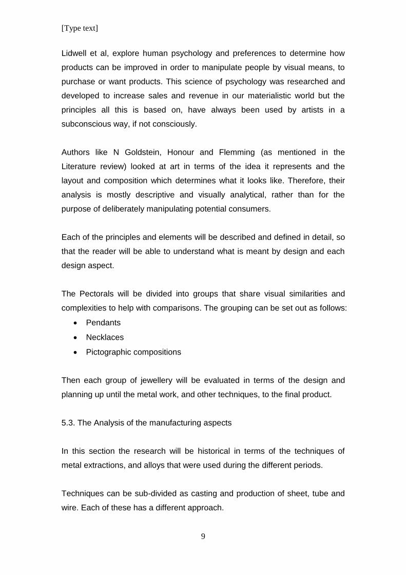
Lidwell et al, explore human psychology and preferences to determine how
products can be improved in order to manipulate people by visual means, to
purchase or want products. This science of psychology was researched and
developed to increase sales and revenue in our materialistic world but the
principles all this is based on, have always been used by artists in a
subconscious way, if not consciously.
Authors like N Goldstein, Honour and Flemming (as mentioned in the
Literature review) looked at art in terms of the idea it represents and the
layout and composition which determines what it looks like. Therefore, their
analysis is mostly descriptive and visually analytical, rather than for the
purpose of deliberately manipulating potential consumers.
Each of the principles and elements will be described and defined in detail, so
that the reader will be able to understand what is meant by design and each
design aspect.
The Pectorals will be divided into groups that share visual similarities and
complexities to help with comparisons. The grouping can be set out as follows:
Pendants
Necklaces
Pictographic compositions
Then each group of jewellery will be evaluated in terms of the design and
planning up until the metal work, and other techniques, to the final product.
5.3. The Analysis of the manufacturing aspects
In this section the research will be historical in terms of the techniques of
metal extractions, and alloys that were used during the different periods.
Techniques can be sub-divided as casting and production of sheet, tube and
wire. Each of these has a different approach.
[Type text]
10
Different types of casting and moulding techniques will be investigated and
how these techniques were combined to create different effects for the
resulting products.
The use of clay and stone moulds were common. Other types of moulds were
cut into stone to use as templates. Sheet metal was then hammered into
these stone depressions in order to produce a certain shape, form or pattern.
Moulds and casting will form part of a discussion on mass production
techniques.
Different metal forming techniques like hammering, shaping, etching,
engraving, filigree work, chasing and repoussѐ, and so on, will be investigated
and how all of these techniques were combined to create a style or trend
within the context of the specific time frame of the 18th Dynasty New Kingdom
period.
This cannot be done without looking at the tools that were used during ancient
times. Here, tools that were found at archaeological digs will be examined.
Writers like Scheel and Forbs wrote extensively about these tools and their
uses. Their contributions are discussed under Literature review.
These tools will be compared with the tools that are being used today,
because after all these years, they are still very similar and the methods of
their use are also similar to how they were used in the past. The main
difference is that modern tools are now made from stronger materials and
some are electrically driven. Oppi Untracht discusses this in his book which is
referred to in the Literature review.
It cannot be denied that, although ancient tools were not as sophisticated as
modern tools, the resulting jewellery were mostly of exceptional quality,
depending on the skill of the craftsman. The pectorals under discussion in this
research have examples of good and poor quality jewels. The Rebus Pectoral
is exceptional and stands out as an example of very good craftsmanship. The
Rectangular Winged Scarab Pectoral that was made with similar iconography
[Type text]
11
as the Rebus pectoral is of an inferior quality but they are both from the same
archaeological discovery.
Accurate accounts of all relevant technological data of ancient times will be
given and photographs of tools will be given to construct a picture that can be
understood by the modern individual.
A mental picture of the hardships that the craftsmen underwent to produce the
work that they did, will be created by describing their work conditions.
The scientific and creative components of the ancient, as well as the modern
goldsmith will be blended in a way that can bring this picture to life.
6. Deliminations and Scope
For the purpose of this study, the focus will be on the pectorals of
Tutankhamun. They come from the richest and most detailed archaeological
find in history and have the most diverse, elaborate, rich and complex
examples of jewellery during any period in Ancient Egypt. The pectorals
illustrate techniques, design, style and the trend of the 18th Dynasty, with the
largest selection of treasure objects and jewels ever found.
Furthermore, the emphasis is on gold jewellery. Gold has always been a
sought after metal, because it represents wealth and has always been an
expensive commodity that has been exclusive to the rich and powerful
throughout the ages.
[Type text]
12
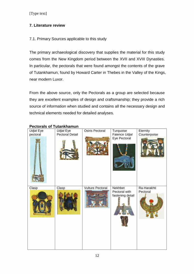
7. Literature review
7.1. Primary Sources applicable to this study
The primary archaeological discovery that supplies the material for this study
comes from the New Kingdom period between the XVII and XVIII Dynasties.
In particular, the pectorals that were found amongst the contents of the grave
of Tutankhamun, found by Howard Carter in Thebes in the Valley of the Kings,
near modern Luxor.
From the above source, only the Pectorals as a group are selected because
they are excellent examples of design and craftsmanship; they provide a rich
source of information when studied and contains all the necessary design and
technical elements needed for detailed analyses.
Pectorals of Tutankhamun Udjat Eye pectoral
Udjat Eye Pectoral Detail
Osiris Pectoral
Turquoise Faience Udjat Eye Pectoral
Eternity Counterpoise
Clasp
Clasp
Vulture Pectoral
Nekhbet Pectoral with fastening detail
Ra-Harakhti Pectoral
[Type text]
13
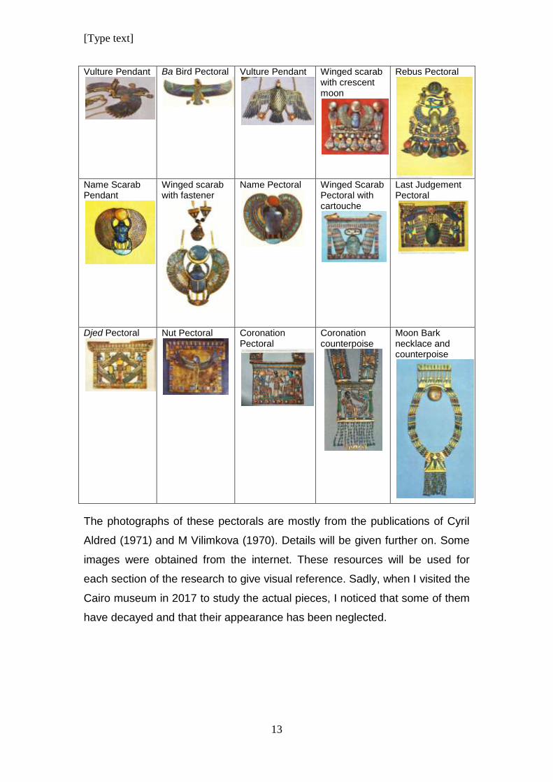
Vulture Pendant
Ba Bird Pectoral
Vulture Pendant
Winged scarab with crescent moon
Rebus Pectoral
Name Scarab Pendant
Winged scarab with fastener
Name Pectoral
Winged Scarab Pectoral with cartouche
Last Judgement Pectoral
Djed Pectoral
Nut Pectoral
Coronation Pectoral
Coronation counterpoise
Moon Bark necklace and counterpoise
The photographs of these pectorals are mostly from the publications of Cyril
Aldred (1971) and M Vilimkova (1970). Details will be given further on. Some
images were obtained from the internet. These resources will be used for
each section of the research to give visual reference. Sadly, when I visited the
Cairo museum in 2017 to study the actual pieces, I noticed that some of them
have decayed and that their appearance has been neglected.
[Type text]
14
7.2. Secondary Resources
There are several books on the ancient Egyptian technologies that give
detailed descriptions of the mining and manufacture of jewellery over the large
span of time from pre-history to the beginning of the present era, but nothing
that focuses specifically on the period of the 18th Dynasty of the New Kingdom
Period.
Over several volumes, RJ Forbes gives a very detailed and interesting
breakdown of the various manufacturing and production processes of a
variety of different materials in ancient times in his series “Studies in Ancient
Technologies”(1964).
The book “Ancient Egyptian Materials and Technology” edited by Paul T
Nicholson and Ian Shaw (2000) is a compilation of studies done by specialists
in different fields about the raw materials that were used by the Ancient
Egyptians over a period of five thousand years. It is highly scientific and
provides details of processes and uses a variety of testing methods to identify
materials that were used by different cultures during different time periods.
Alix Wilkinson’s book on “Ancient Egyptian Jewellery” (1973) focuses mainly
on a chronology of jewellery dating from all the different periods from the Pre-
dynastic period until the Late Period. He discusses all jewellery in terms of
those periods and breaks down his discussions into the different types of
jewellery such as bracelets, amulets and collars and so on. His approach is
mainly technical but he lacks the full comprehension of an experienced gold
smith. He gives a very concise and detailed overview of both of these aspects
which makes for informative and interesting reading.
Cyril Aldred’s book “Jewels of the Pharaohs, Egyptian Jewellery of the
Dynastic Period” (1971) discusses the recovery of Ancient Egyptian Jewels
and their different uses. He gives a brief summary of techniques used for
metal shaping and the production of other materials used for jewellery as well
as an account of the craftsmen and their tools.
[Type text]
15
The book “Jewellery Concepts and technology” by Oppi Untracht (1982) is a
valuable source that gives detailed descriptions of techniques together with
photographs that show how certain results are achieved for the creation of
modern jewellery. Except for more modern tools, and the way modern
goldsmiths heat the metal, most basic techniques remain the same as in
ancient times
To add to this, I will look at the information that writers like Sir Allen Gardiner,
in his book Egyptian Grammar: Being an Introduction to the Study of
Hieroglyphs wrote and the extensive publications of E.A. Wallis Budge who
wrote about the Egyptian gods and religious practices and beliefs.
In addition to this, there are also several journals with articles on Egyptian
jewellery that can be explored. Examples of these are Andrews, Carol AR.
1990-1996. Ancient Egyptian Jewellery, C.L.R. 1915 “Three Sets of Egyptian
Gold Pendants”, Edwards, I.E.S. 1976 “Tutankhamun’s Jewelry”, Gwinnett, AJ
and Gorelick, L. 1993 “Beads, Scarabs and Amulets: Methods of Manufacture
in Ancient Egypt”, Scott, NE. 1964 “Egyptian Jewelry”, Terrace, ELB. 1963
“Ancient Egyptian Jewelry in the Horace L. Mayer Collection”, Ward, WA.
1994 “Beetles in Stone: The Egyptian Scarab”, Wilkinson, A. 1973 “Ancient
Egyptian Jewellery”
8. Layout of the chapters
The study will be set out as follows:
Chapter Two: The technology needed for jewellery making.
This chapter will introduce the different branches of technology needed for
jewellery manufacturing.
The discussion will start with the mining and metallurgy of the metals that
were used. The investigation will trace the processes gold goes through from
when it was mined or found, to the manufacturing techniques that were used
[Type text]
16
to produce jewellery. The following will be discussed briefly: The different
locations where gold was mined along with other sources of gold; the
processes of mining gold and some basic metallurgy.
The goldsmith as craftsman will be introduced and the various skill levels will
be discussed. The chapter will explore the possibility that there were more
than just one type of craftsman that worked on jewellery.
This chapter will also include a general discussion of the different metal
techniques and the tools that were used to achieve certain results. Photos of
modern manufacturing and tools will be used to illustrate and explain the
processes visually.
Chapter Three: Materials used in jewellery.
The chapter will be a summary introduction of the other materials that were
used in conjunction with gold, to make jewellery.
Faience production will be discussed in relative detail, because it is a man-
made semi-precious material that was used to make beads and inlays in
jewellery. It was also used for other objects of different shapes and sizes.
Semi-precious stones and other organic material will be discussed along with
what they were most often used for in terms of jewellery manufacture.
Chapter Four: Introduction to design.
Design will be introduced as a field of study and how the different principles
and elements come together to produce the design of a top quality piece of
jewellery.
Chapter Five: Iconographical introduction of pectorals.
This chapter explores the iconographical significance of each pectoral that is
analysed in this study. A brief discussion of the symbolism of each piece of
jewellery will be done to familiarise the reader with the philosophical and
religious content that influenced or motivated the design.
[Type text]
17
In most cases, if not all, Ancient Egyptian jewellery conveyed a symbolic
meaning. That is why, as part of this chapter, it is necessary to look at the
iconographic significance of each piece of jewellery to reveal its purpose. In
part, Cyril Aldred in his book that was published in 1971 Jewels of the
Pharaohs: Egyptian jewellery of the dynastic period, he tentatively explores
this aspect. M Vilimkova seems to be the writer who first attempted such a
discussion in her book that she published the year before that (in 1970).
Chapter Six: Grouping of pectorals.
In this chapter the pectorals will be grouped according to their size, shape and
complexity. These aspects will determine whether they are necklaces,
pectorals or pendants. Furthermore, the pectorals will be analysed and
compared to other pectorals of Tutankhamun that share similar iconographical
content, composition functionality.
Chapter Seven: Design analysis of pectorals.
A Design analyses of the different groups of pectorals as set out in Chapter 6
will be done.
Chapter Eight: Manufacturing analysis of all pectorals.
The purpose of this chapter is to identify and discuss the numerous metal
working techniques that were used to make each pectoral. First, the
manufacturing of each pectoral is analysed separately. Then the frequency of
use is determined to establish a trend or style that might be specific to the
jewellery that fall into this group.
Chapter Nine: Answering research questions related to design and
manufacturing.
This chapter aims to encompass all the knowledge obtained from the
analyses of the jewellery and to answer all the research questions that were
identified at the beginning of this study that are related to design and to
manufacturing such as
What was the function of the pectoral? Was it made for religious,
funerary or another purpose? Was it worn as an amulet during the
[Type text]
18
lifetime of the owner or was it to show wealth and status or rank and so
on?
What is the style and trend? What does it look like? How do
manufacturing techniques influence fashion trend? How do the use
colours and materials contribute to the fashion of the 18th Dynasty New
Kingdom?
What was the size of the pectorals? How does this influence the use,
function or purpose of the pectoral? How do design elements and
principles tie in with the manufacturing?
These are research questions that will be considered so that the reader can
identify how everything ties in together to produce a final product.
Chapter Ten: Conclusion.
[Type text]
19
CHAPTER 2:
THE TECHNOLOGY NEEDED FOR JEWELLERY MAKING
This chapter will familiarise the reader with the different
branches of technology needed for jewellery making.
The discussion will start with the mining and metallurgy of the
metals that were used. The investigation will follow the steps of
gold from when it was mined or found, till the manufacturing
techniques that were used to produce jewellery. The following
will be included: The locations where gold was mined and basic
metallurgy. Also other sources of gold.
The workmen found in gold workshops will be introduced and
their various skill levels will be discussed. The chapter will
explore the possibility that there were more than just one type of
craftsman that worked on jewellery.
This chapter will also include a general discussion of the
different metal techniques and the tools that were used.
Photographs of modern tools will be used to illustrate and
explain the processes visually.
1. Introduction
From early times in the history of ancient Egypt, gold was a precious
commodity. Its initial source was alluvial gold. (James 1972; 38) As mining
and metallurgy technologies developed, gold obtained through mining
became a large source for the metal. (Scheel 1989)
Before any jewellery could be made, or a design implemented, the raw
materials had to be prepared by using different metallurgical processes. The
metal was then cast in the form of small bars which were then given to metal
workers. Once these bars were received the goldsmiths had to process it into
smaller units like different thicknesses and sizes of wire and plate. From these
basic forms of processed metal most of the different components of a jewel
could be made. (Forbes 1964, Scheel 1989),
[Type text]
20
During the process of changing the form of the metal, different types of tools
were used. Tools came in various shapes and sizes. Each tool had a
specialised application. Some tools were developed over time and became
standardised. As the technology of manufacturing improved, so did the tools
and the materials that the tools were made of. (Scheel 1989)
2. Mining and the source of gold and other precious metal
During the Old Kingdom period, the Egyptians started to mine gold in the
Eastern desert in the mountainous region between the Red sea and the Nile
(James 1972; 38). Ancient records supply details of the most notable mines. A
map dating from the New Kingdom provides comprehensive details about the
mining district. (Scheel 1989; 11) Gold was found in quartz rock and as
alluvial deposits. (James 1972; 38)
During the Middle Kingdom, gold was mined in Nubia and by the New
Kingdom, the mining operations were extended. Mining conditions were very
harsh and most often criminals and prisoners of war were used as miners
according to the Greek historian Agatharchides who observed them during the
Ptolemaic period. (Scheel 1989; 12) There was such a demand for cheap
labour that even unjustly accused people were used according to this account
but there is no evidence that suggests that the same conditions were relevant
during the Pharaohnic period.
On the other hand it can be assumed that the actual mining technique didn’t
change much. According to Agatharchides, the quartz gold bearing rock face
was burnt to make it brittle and crumble. The strongest workers would then
hammer it in order to break it into smaller pieces. This method was used to
dig tunnels and shafts. The workers wore oil lamps on their foreheads to
provide light. Cut blocks were thrown on the ground and then taken to the
surface. Then the rocks were crushed into pieces the size of a pea. The
weaker workers like women, would then crush the pieces into a powder with
[Type text]
21
grinding mills. (Scheel 1989; 13) In James’ view, the level of skill of these
craftsmen was of a high standard. (James 1972; 38)
After the quarts was pulverised, it was washed on a sloping surface until only
the gold dust remained and the gangue was washed away. (Scheel 1989; 14)
Another precious metal that was found is Electrum. It is a natural alloy of gold
and silver that was mostly imported from the land of Punt. It was often used
for jewellery because of its rarity. By the New Kingdom, it was artificially
produced by alloying the right proportions of gold and silver. (Scheel 1989; 16)
Silver was not mined in Egypt, but was imported from Mesopotamia, Crete
and Cyprus. Silver was extracted during the gold refining process and used
for all sorts of precious objects. It was called the “White metal” by the
Egyptians and it was believed that the bones of the gods were made from
silver and their flesh from gold. (Scheel 1989; 17, Forbes 1964)
3. Gold metallurgy
Techniques of metal extractions used in the different periods.
There is an ongoing debate about the origins of metallurgy. (Forbes 1964; 16)
but it is not the purpose of this dissertation to investigate that aspect. The
focus will be on the processes that were applied to the precious metals
relevant in this study.
Initially metal was used in its native form. Only later was proper metallurgy
developed. True metallurgy started with the casting of metal from ore, which
meant that the ore had to be identified first. Fire making with the correct fuel
had to be developed. Fire and furnaces had to be controlled by blast air and
tools like crucibles for molten metal had to be developed. (Forbes 1964; 23)
[Type text]
22
Gold occurs as nuggets of native metal in the detritus of gold-bearing rocks or
gold-bearing minerals enclose small particles of comparatively pure metal. To
produce gold, this gold bearing ore had to be collected and crushed to
separate the gold particles from the fragments of rocky material by washing or
panning and melting the gold dust or nuggets into bigger lumps.
Compared to other metals, extracting gold was a simple metallurgical process.
Copper production on the other hand presented a far bigger challenge and its
process was really the beginning of true metallurgy. (Forbes 1964; 25)
4. Goldsmiths and Gold Workshops
In primitive society, the smith was either honoured or despised, but always
held in awe because the occupation was associated with a superior or
supernatural knowledge. (Forbes 1964; 68)
In Egypt, craftsmen formed one of the biggest occupational groups. Single
trade groups like metalworkers were strictly organised and inspected.
Overseers supervised the inspectors. Large workshops were usually attached
to a temple. The workshop of the royal palace was a state owned workshop.
Then there were the private workshops of the king or some high officials.
Sometimes craftsmen from these workshops were lent to selected individuals
as a favour.
There was no craftsman who had his own little enterprise. Craftsmen were
dependant on their employers for work and materials. The employers also
kept strict control of raw materials. Metal workers were hard labourers and
worked under harsh conditions. According to Khety, who was instructing his
son to rather become a scribe, metal workers’ hands were like crocodile skin
and they stank worse than scraps of fish. (Scheel 1989; 60)
It is true that workshops, even today have a distinct smell. During the casting
process flux is used and it gives off fumes. Other fumes include the smells of
[Type text]
23
different types of metal that becomes oxidised during the heating process.
During the refinery of metals certain poisonous gasses are also released. In
addition there would have been fumes from the furnaces. The different fuels
would have given off an assortment of odours. The use of abrasives would
have added their special odour to the collection of smells.
Some of these fumes and microscopic pollutants would have been bad for the
workers. In modern workshops safety measures are encouraged. Face masks
are worn for the fumes and small particles that can be inhaled and plastic
goggles are worn to prevent dust particles from getting into the eyes. This I
can confirm through my own experience by using the practice-based
methodology developed by Malins and Grey. (Malins & Grey 1995; 3)
5. Other workers
In ancient times, similar to today, the workshop employees were divided into
skilled workers and unskilled workers.
Unskilled workers included the men heating the fires with bellows or blow
pipes, men pouring the metal into open moulds and men for cleaning and
polishing the end products.
Skilled workers were the goldsmiths who had to be knowledgeable in a
specialised skill like chasing, annealing, casting and producing tube, plate and
wire. Other skilled workers would have been engravers and gilders. (Scheel
1989; 60)
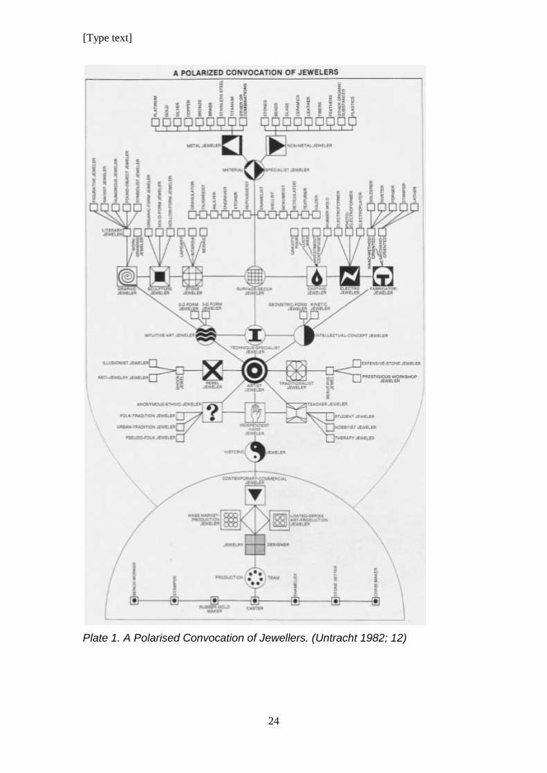
A workshop could have included stone setters and cloisonnѐ setters which
was a specialised field in itself. One likely also found bead stringers that had
to string beads for certain parts of some jewels.
Plate 1 below shows a “Polarised Convocation” of modern jewellers. (Untracht
1982; 12) A similar model can be drawn up for the ancient craftsmen.
[Type text]
24
Plate 1. A Polarised Convocation of Jewellers. (Untracht 1982; 12)
[Type text]
25
Further social status of the employees would have been determined based on
whether they worked for the royal workshop, temple workshop or private
workshop of some official. It is natural to assume that the royal workshops
employed the best craftsmen and these people enjoyed a higher status than
workers employed in workshops of lower social status. The workmen with a
higher social status also got better wages and would have enjoyed a better
quality of life.
6. Precious metal working techniques and tools:
6.1 The production of plate and gold leaf
6.1.1. Plate production
The metal was placed on a flat stone anvil that rested on a wooden block that
absorbed the shock of the hammering. Otherwise, according to the applied
skills of the researcher, the hammer bounces back instead of making indents
in the metal.
Two types of hammers were used. One type had a flat face and the other had
a rounded face. The flat hammer stone was used to flatten the metal and the
rounded stone was used for chasing. (Scheel 1989; 28) During the process of
plate production, the metal had to be annealed regularly, because the
hammering caused the metal to crystallise, making it brittle. By heating it to a
red hot temperature, the metal relaxes again and becomes malleable to be
shaped by the hammering. (Untracht 1982)
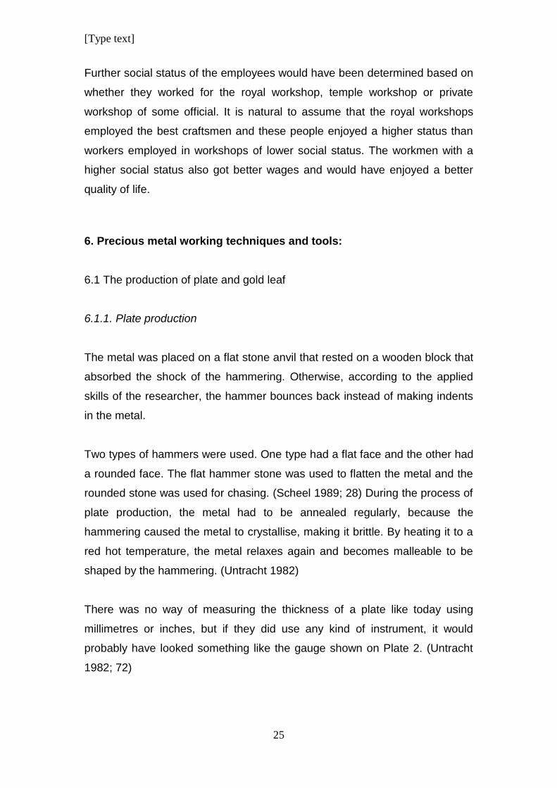
There was no way of measuring the thickness of a plate like today using
millimetres or inches, but if they did use any kind of instrument, it would
probably have looked something like the gauge shown on Plate 2. (Untracht
1982; 72)
[Type text]
26
Plate 2 (Untracht 1982; 72) Gauge for measuring sheets
To anneal the metal, it was held with tongs and placed in the glowing charcoal
in the brazier while the fire was fanned by a blowpipe. (Scheel 1989; 30)
Large pieces had to be annealed in the more effective dish bellows.
6.1.2. Gold leaf
From metal sheet even thinner metal in the form of gold, silver or electrum
leaf was produced that was used to cover less valuable materials to give it a
richer appearance.
Gold leaf was used to overlay other materials like wood, copper or even
metals like lead. A thin layer of gesso or fine plaster was applied to the
surface that was intended for gilding. Then the gold was glued into place with
an adhesive that has not been identified yet. (James 1972; 41) When copper
was used, the surface was made rough so that the gesso could stick better. A
[Type text]
27
thin layer of adhesive like albumen or animal glue was applied and then the
gold leaf was probably attached by using a feather in the same way as was
mentioned in medieval literature. (Nicholson & Shaw 2000; 160)
6.2. Production of wire and tube.
6.2.1. Producing wire
The oldest method of making wire was probably by making sheets from ingots
which were then cut into thin strips that were hammered and cut again. This
type of wire shows variations in the diameter of the wire along its length. It has
a faceted surface and non-circular cross section. The faceted areas would
then be smoothed out by rolling the wire between two flat pieces of hard wood.
(Scheel 1989)
By the New Kingdom period, the block-twisting method was used. An ingot
was hammered out to form a square rod. This rod was then twisted to form a
spiralling screw thread. The metal would have been annealed many times
during this process to keep it malleable. Further hammering and twisting
would have resulted in the wire getting longer and thinner. To eliminate the
screw-like effect from the final product the wire would have been rubbed
between two flat hard pieces of wood to smooth out the marks. (Scheel 1989;
44) The technique of strip-drawing was already known by the ancient
Egyptians during the Old Kingdom.
Wire that was probably prepared using one of the above methods to first form
a thin square rod. Then it was drawn through holes drilled in precious stone
that progressively got smaller, making the wire thinner each time it was drawn
through a smaller hole. Gold wire was also produced by rolling thin strips of
gold sheet (James 1972; 42)
[Type text]
28
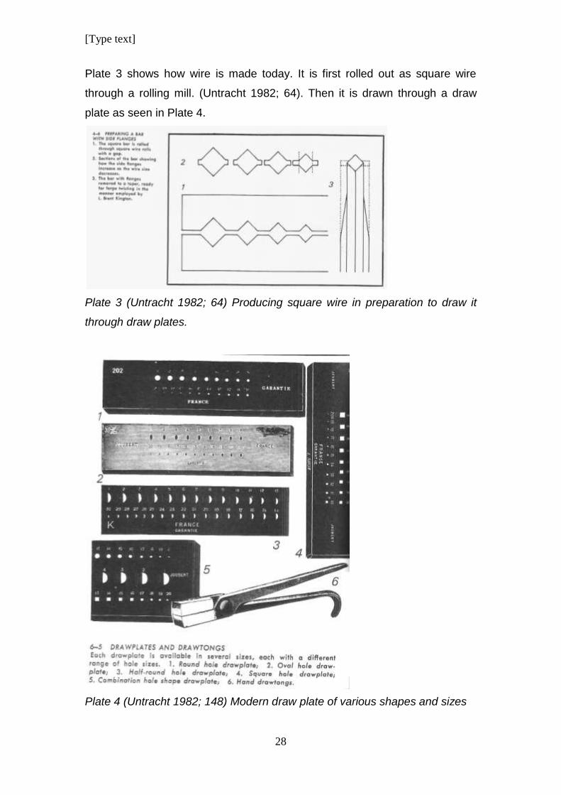
Plate 3 shows how wire is made today. It is first rolled out as square wire
through a rolling mill. (Untracht 1982; 64). Then it is drawn through a draw
plate as seen in Plate 4.
Plate 3 (Untracht 1982; 64) Producing square wire in preparation to draw it
through draw plates.
Plate 4 (Untracht 1982; 148) Modern draw plate of various shapes and sizes
[Type text]
29
Today there is quite an assortment of shapes that can be used. Holes in a
draw plate become progressively smaller to make the wire thinner after every
hole. (Untracht 1982; 148)
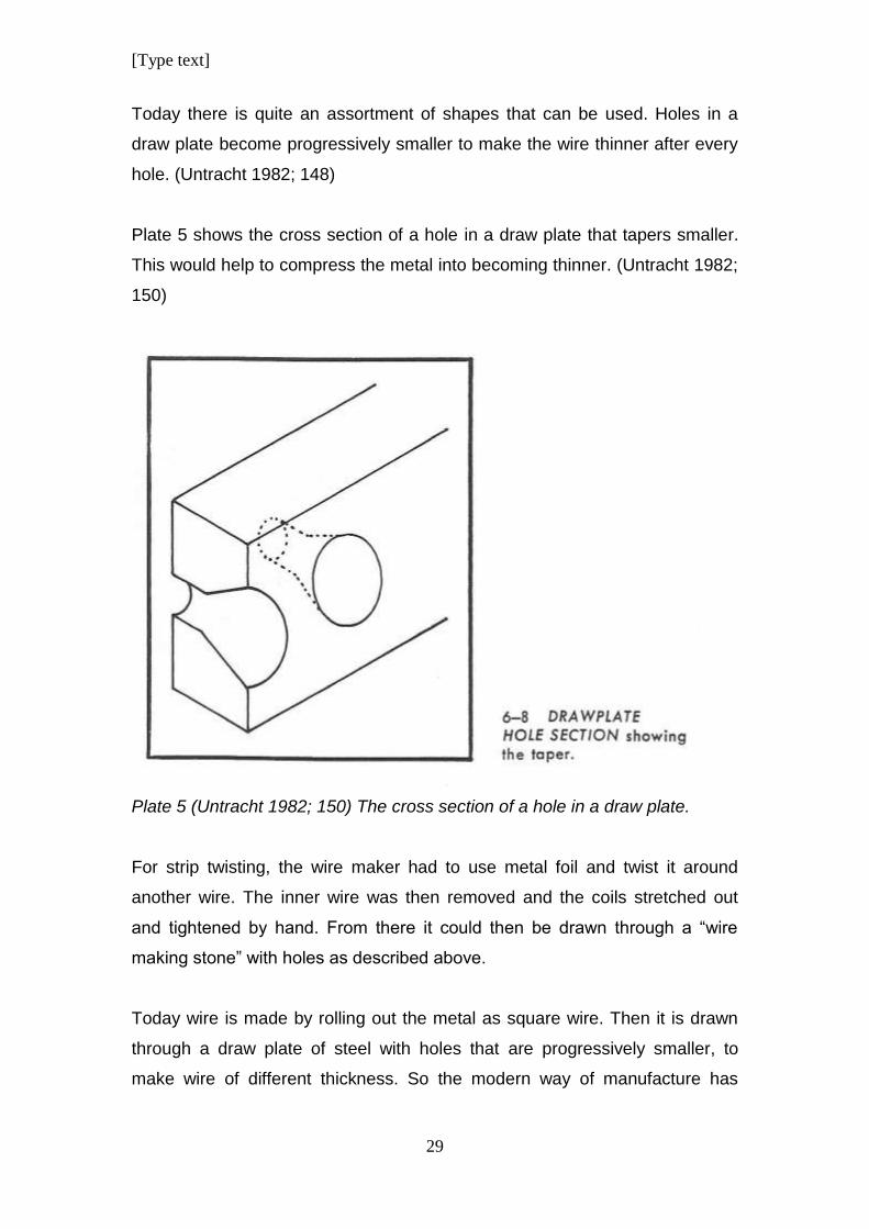
Plate 5 shows the cross section of a hole in a draw plate that tapers smaller.
This would help to compress the metal into becoming thinner. (Untracht 1982;
150)
Plate 5 (Untracht 1982; 150) The cross section of a hole in a draw plate.
For strip twisting, the wire maker had to use metal foil and twist it around
another wire. The inner wire was then removed and the coils stretched out
and tightened by hand. From there it could then be drawn through a “wire
making stone” with holes as described above.
Today wire is made by rolling out the metal as square wire. Then it is drawn
through a draw plate of steel with holes that are progressively smaller, to
make wire of different thickness. So the modern way of manufacture has
[Type text]
30
changed very little from thousands of years ago. Just the tools have improved
to make it easier for the metal worker.
During the 19th Dynasty an ingenious new way was developed to make wire.
Granules of metal were soldered together to form beaded wire that was then
straightened by rolling it between flat pieces of wood. (Scheel 1989; 44) This
method is flawed. The points where the wire was soldered together, would
have been weak points in the wire and would have resulted in manufacturing
difficulties when it was bent or shaped. Therefore, according to the practical-
base methodology of the applied experience of the researcher, as developed
by Malins and Grey, (Malins & Grey 1995; 4), there would have been a
limitation of what such wire could have been used for.
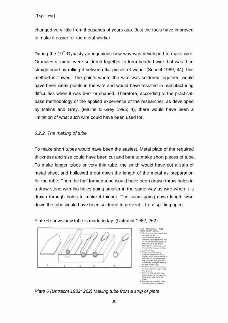
6.2.2. The making of tube
To make short tubes would have been the easiest. Metal plate of the required
thickness and size could have been cut and bent to make short pieces of tube.
To make longer tubes or very thin tube, the smith would have cut a strip of
metal sheet and hollowed it out down the length of the metal as preparation
for the tube. Then the half formed tube would have been drawn throw holes in
a draw stone with big holes going smaller in the same way as wire when it is
drawn through holes to make it thinner. The seam going down length wise
down the tube would have been soldered to prevent it from splitting open.
Plate 6 shows how tube is made today. (Untracht 1982; 262)
Plate 6 (Untracht 1982; 262) Making tube from a strip of plate
[Type text]
31
6.3. Casting using different types of moulds and techniques.
Moulds like the small limestone moulds found at a foundry at the funerary
temple of Seti I at Karnak, were used to cast the metal onto smaller portions
for further treatment by the goldsmiths. (Scheel 1989; 27). Various methods of
casting were used for different metals.
6.3.1. The First casting techniques
Open moulds were used during Pre-Dynastic times. By the Old Kingdom
period, two part moulds of clay or stone was already in use as a casting
technique.
6.3.2. Lost wax casting
The process of “Lost wax” casting was already known during this period and
had become common during the Middle Kingdom period.
According to Scheel, several artisans had to be involved in the mould making
process. First, the original sculpture or object was made by an artist, probably
using bees’ wax. Then, probably a potter, shaped the clay correctly around
the wax. The structure was then heated in a charcoal fireplace to harden the
clay and to allow the wax to melt out of the mould. The remaining cavity would
then have had the negative form of the original object.
The next phase was the founder who poured the molten metal into the hollow
mould. Once the metal had cooled down the clay mould would have been
broken to reveal the cast object inside. (Scheel 1989; 41).
According to the researcher’s own experience, another way of exposing the
cast metal is to quench it in cold water while it is still sizzling hot, as is done in
contemporary workshops. This cools and solidifies the metal and the sudden
change in temperature lets the clay break away from the metal, making it
easier to clean away the residue of the mould.
[Type text]
32
The lost wax method of casting eventually led to mass production of small
items.
Large items resulted in the waste of expensive products like bees wax and
therefore the process of core casting was developed. A core of clay or sand
was used and the wax shape was then sculptured around it. The core was
stabilised by pins or wire attached to the outer mould. When the mould was
heated in the fire, the core remained in position and the metal was then cast
into the cavity between the core and the mould. (Scheel 1989; 42)
6.4. Manufacturing techniques and tools
Jewellery making is engineering on a miniature scale. In order for the
manufacturing of quality jewellery, the metal had to be manipulated and
shaped to form the intended result. Precise measuring had to be done to
ensure that the end result was accurate and neat.
6.4.1. Measuring
Measuring and marking tools had to be used to achieve dimensional accuracy.
It is unknown whether a standardised system for measuring size was used by
the ancient Egyptians on small scale objects, but accuracy could still be
achieved by other means as discussed by Untracht.
“Straight Edges” are lengths of metal that are similar to rulers but are
unmarked. There edges are “true” and they could be used to mark straight
lines and test the trueness of a surface or edge.
“Squares” are right angles used to check 90° corners. Protractors with semi
circular forms have a centre mark on a straight edge; it can mark out angles
and doesn’t have to be marked with measurement in order to get accurate
angles.
[Type text]
33
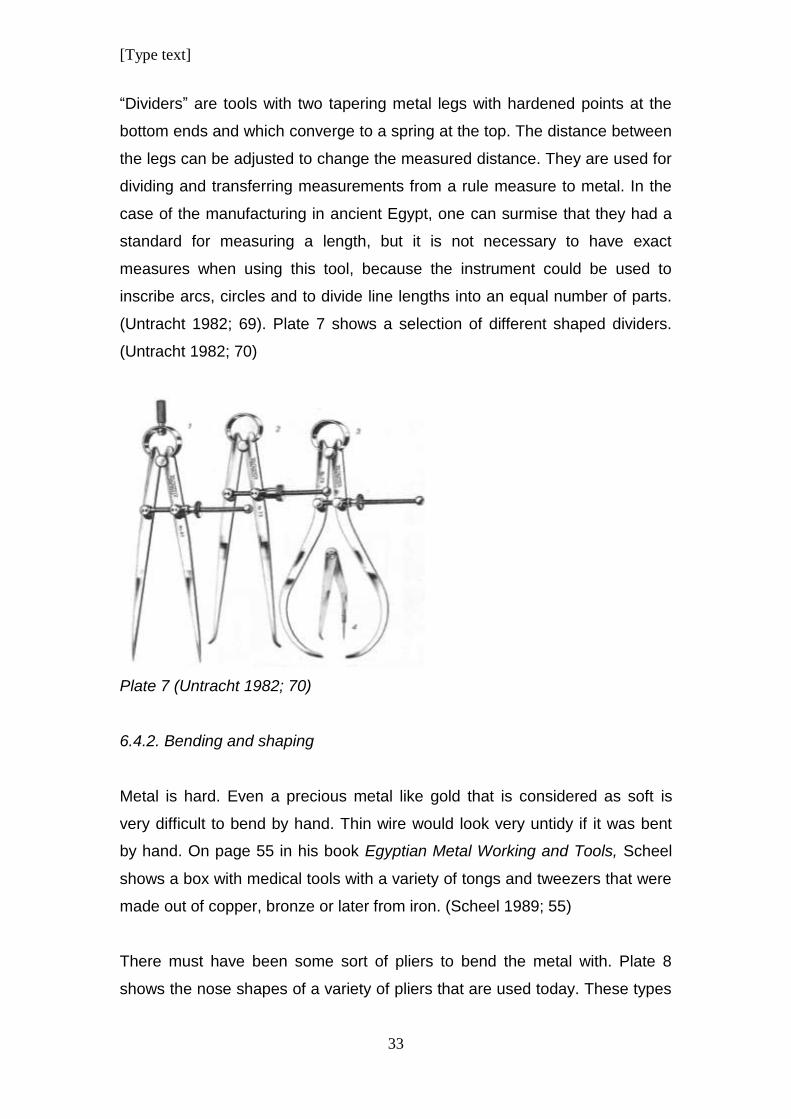
“Dividers” are tools with two tapering metal legs with hardened points at the
bottom ends and which converge to a spring at the top. The distance between
the legs can be adjusted to change the measured distance. They are used for
dividing and transferring measurements from a rule measure to metal. In the
case of the manufacturing in ancient Egypt, one can surmise that they had a
standard for measuring a length, but it is not necessary to have exact
measures when using this tool, because the instrument could be used to
inscribe arcs, circles and to divide line lengths into an equal number of parts.
(Untracht 1982; 69). Plate 7 shows a selection of different shaped dividers.
(Untracht 1982; 70)
Plate 7 (Untracht 1982; 70)
6.4.2. Bending and shaping
Metal is hard. Even a precious metal like gold that is considered as soft is
very difficult to bend by hand. Thin wire would look very untidy if it was bent
by hand. On page 55 in his book Egyptian Metal Working and Tools, Scheel
shows a box with medical tools with a variety of tongs and tweezers that were
made out of copper, bronze or later from iron. (Scheel 1989; 55)
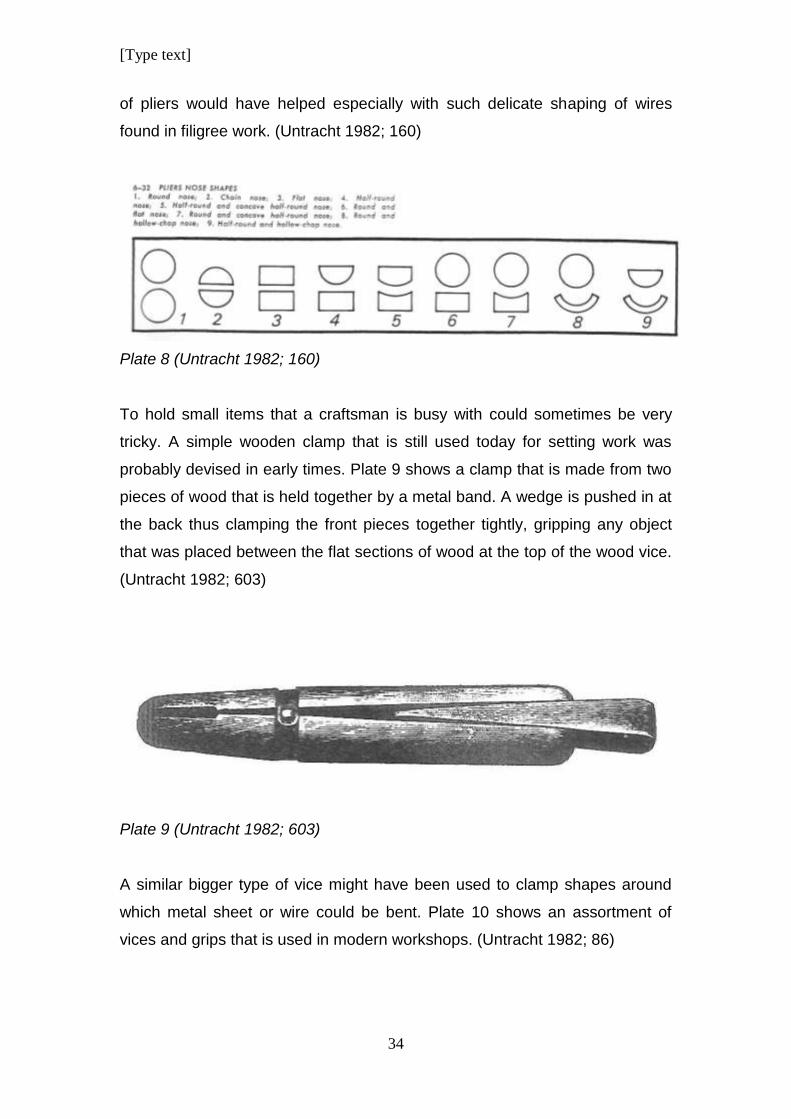
There must have been some sort of pliers to bend the metal with. Plate 8
shows the nose shapes of a variety of pliers that are used today. These types
[Type text]
34
of pliers would have helped especially with such delicate shaping of wires
found in filigree work. (Untracht 1982; 160)
Plate 8 (Untracht 1982; 160)
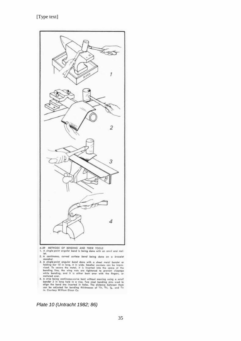
To hold small items that a craftsman is busy with could sometimes be very
tricky. A simple wooden clamp that is still used today for setting work was
probably devised in early times. Plate 9 shows a clamp that is made from two
pieces of wood that is held together by a metal band. A wedge is pushed in at
the back thus clamping the front pieces together tightly, gripping any object
that was placed between the flat sections of wood at the top of the wood vice.
(Untracht 1982; 603)
Plate 9 (Untracht 1982; 603)
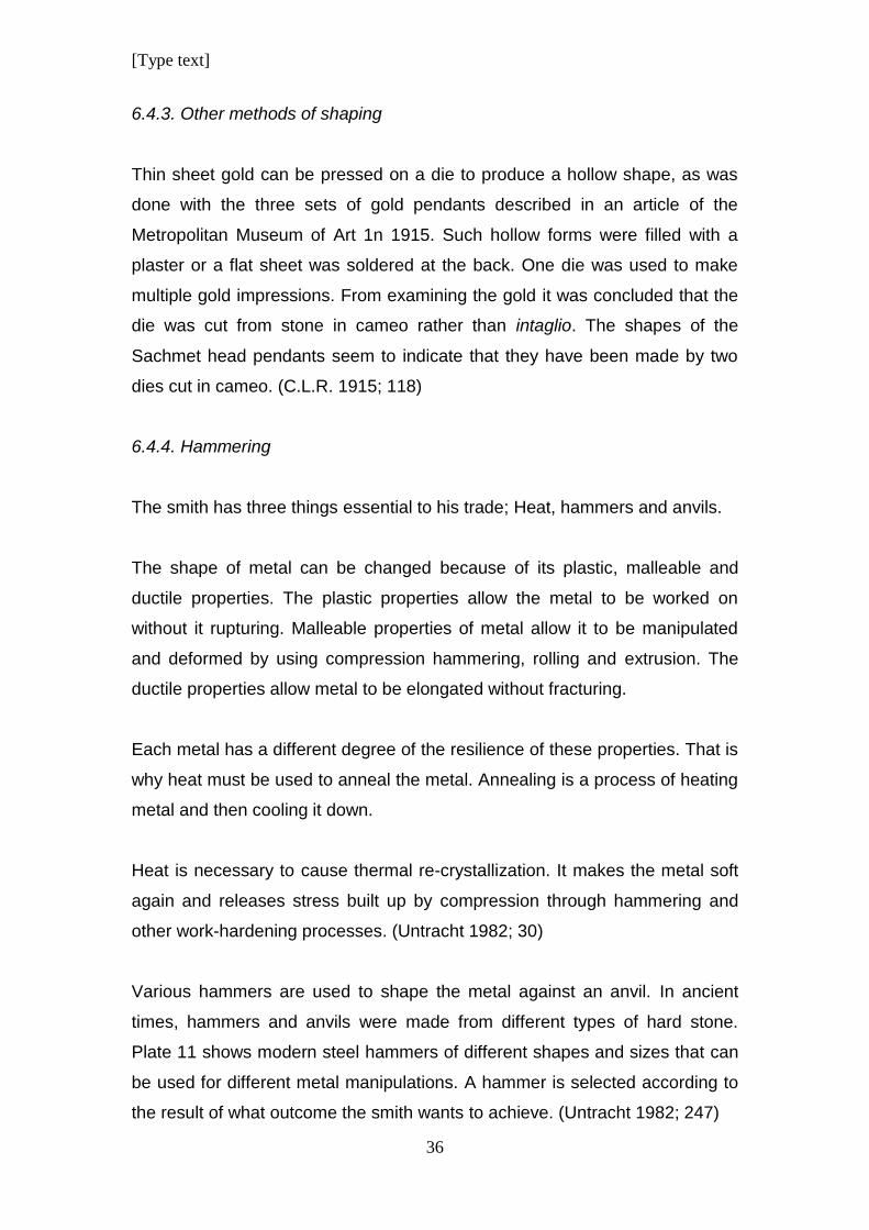
A similar bigger type of vice might have been used to clamp shapes around
which metal sheet or wire could be bent. Plate 10 shows an assortment of
vices and grips that is used in modern workshops. (Untracht 1982; 86)
[Type text]
35
Plate 10 (Untracht 1982; 86)
[Type text]
36
6.4.3. Other methods of shaping
Thin sheet gold can be pressed on a die to produce a hollow shape, as was
done with the three sets of gold pendants described in an article of the
Metropolitan Museum of Art 1n 1915. Such hollow forms were filled with a
plaster or a flat sheet was soldered at the back. One die was used to make
multiple gold impressions. From examining the gold it was concluded that the
die was cut from stone in cameo rather than intaglio. The shapes of the
Sachmet head pendants seem to indicate that they have been made by two
dies cut in cameo. (C.L.R. 1915; 118)
6.4.4. Hammering
The smith has three things essential to his trade; Heat, hammers and anvils.
The shape of metal can be changed because of its plastic, malleable and
ductile properties. The plastic properties allow the metal to be worked on
without it rupturing. Malleable properties of metal allow it to be manipulated
and deformed by using compression hammering, rolling and extrusion. The
ductile properties allow metal to be elongated without fracturing.
Each metal has a different degree of the resilience of these properties. That is
why heat must be used to anneal the metal. Annealing is a process of heating
metal and then cooling it down.
Heat is necessary to cause thermal re-crystallization. It makes the metal soft
again and releases stress built up by compression through hammering and
other work-hardening processes. (Untracht 1982; 30)
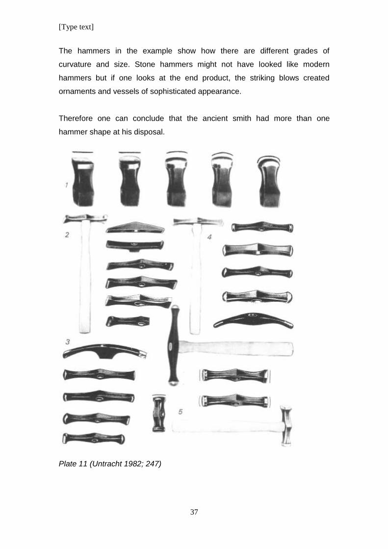
Various hammers are used to shape the metal against an anvil. In ancient
times, hammers and anvils were made from different types of hard stone.
Plate 11 shows modern steel hammers of different shapes and sizes that can
be used for different metal manipulations. A hammer is selected according to
the result of what outcome the smith wants to achieve. (Untracht 1982; 247)
[Type text]
37
The hammers in the example show how there are different grades of
curvature and size. Stone hammers might not have looked like modern
hammers but if one looks at the end product, the striking blows created
ornaments and vessels of sophisticated appearance.
Therefore one can conclude that the ancient smith had more than one
hammer shape at his disposal.
Plate 11 (Untracht 1982; 247)
[Type text]
38
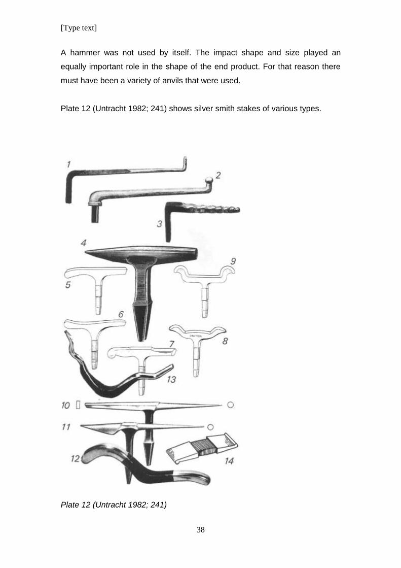
A hammer was not used by itself. The impact shape and size played an
equally important role in the shape of the end product. For that reason there
must have been a variety of anvils that were used.
Plate 12 (Untracht 1982; 241) shows silver smith stakes of various types.
Plate 12 (Untracht 1982; 241)
[Type text]
39
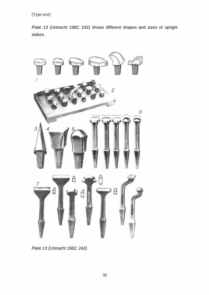
Plate 13 (Untracht 1982; 242) shows different shapes and sizes of upright
stakes.
Plate 13 (Untracht 1982; 242)
[Type text]
40
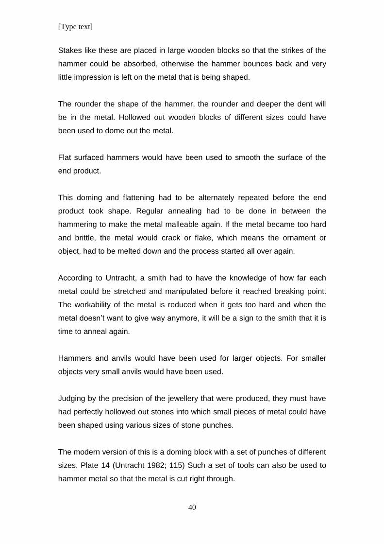
Stakes like these are placed in large wooden blocks so that the strikes of the
hammer could be absorbed, otherwise the hammer bounces back and very
little impression is left on the metal that is being shaped.
The rounder the shape of the hammer, the rounder and deeper the dent will
be in the metal. Hollowed out wooden blocks of different sizes could have
been used to dome out the metal.
Flat surfaced hammers would have been used to smooth the surface of the
end product.
This doming and flattening had to be alternately repeated before the end
product took shape. Regular annealing had to be done in between the
hammering to make the metal malleable again. If the metal became too hard
and brittle, the metal would crack or flake, which means the ornament or
object, had to be melted down and the process started all over again.
According to Untracht, a smith had to have the knowledge of how far each
metal could be stretched and manipulated before it reached breaking point.
The workability of the metal is reduced when it gets too hard and when the
metal doesn’t want to give way anymore, it will be a sign to the smith that it is
time to anneal again.
Hammers and anvils would have been used for larger objects. For smaller
objects very small anvils would have been used.
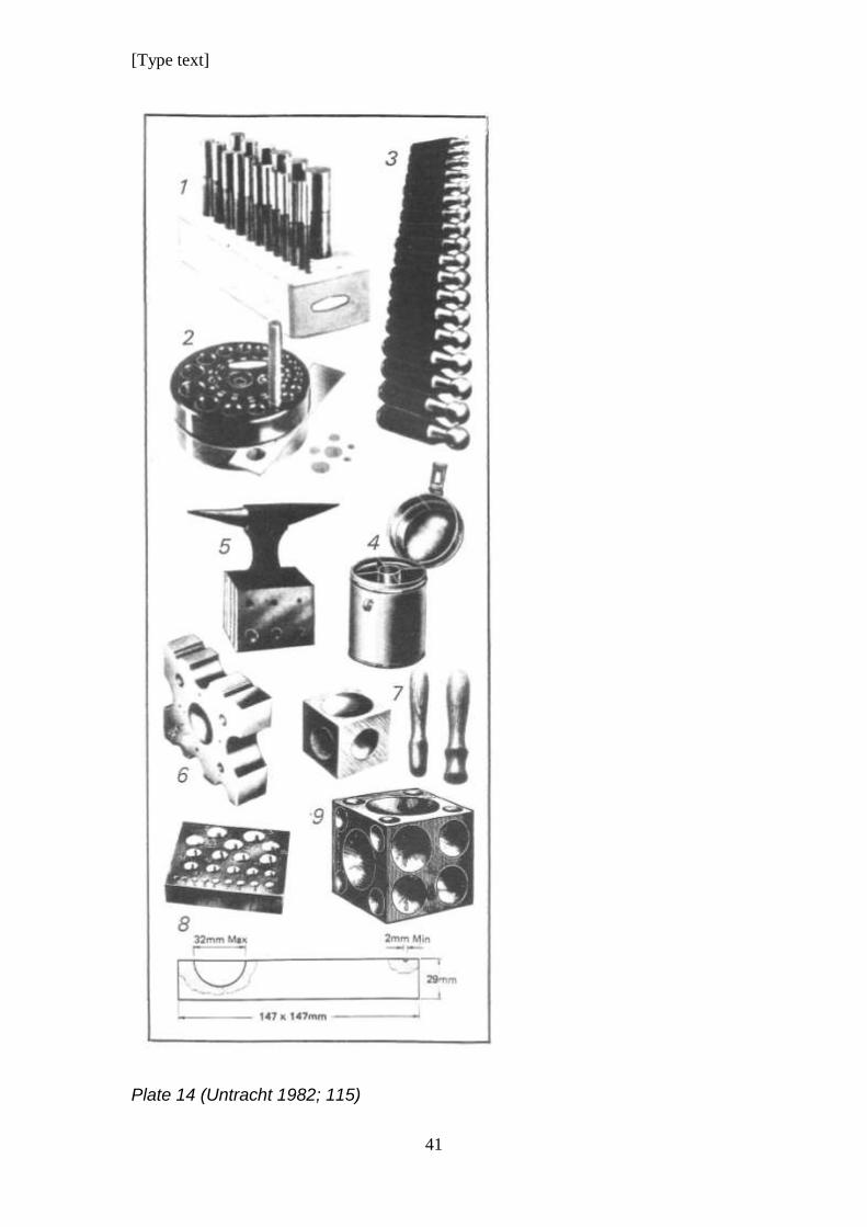
Judging by the precision of the jewellery that were produced, they must have
had perfectly hollowed out stones into which small pieces of metal could have
been shaped using various sizes of stone punches.
The modern version of this is a doming block with a set of punches of different
sizes. Plate 14 (Untracht 1982; 115) Such a set of tools can also be used to
hammer metal so that the metal is cut right through.
[Type text]
41
Plate 14 (Untracht 1982; 115)
[Type text]
42
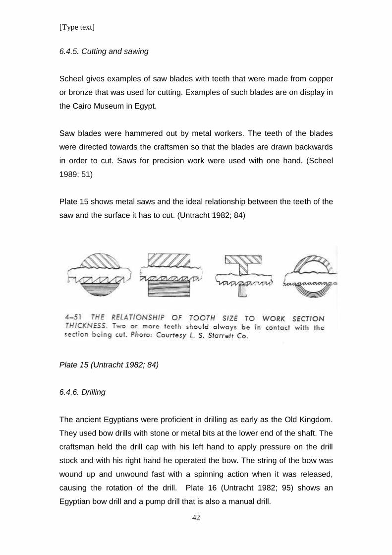
6.4.5. Cutting and sawing
Scheel gives examples of saw blades with teeth that were made from copper
or bronze that was used for cutting. Examples of such blades are on display in
the Cairo Museum in Egypt.
Saw blades were hammered out by metal workers. The teeth of the blades
were directed towards the craftsmen so that the blades are drawn backwards
in order to cut. Saws for precision work were used with one hand. (Scheel
1989; 51)
Plate 15 shows metal saws and the ideal relationship between the teeth of the
saw and the surface it has to cut. (Untracht 1982; 84)
Plate 15 (Untracht 1982; 84)
6.4.6. Drilling
The ancient Egyptians were proficient in drilling as early as the Old Kingdom.
They used bow drills with stone or metal bits at the lower end of the shaft. The
craftsman held the drill cap with his left hand to apply pressure on the drill
stock and with his right hand he operated the bow. The string of the bow was
wound up and unwound fast with a spinning action when it was released,
causing the rotation of the drill. Plate 16 (Untracht 1982; 95) shows an
Egyptian bow drill and a pump drill that is also a manual drill.
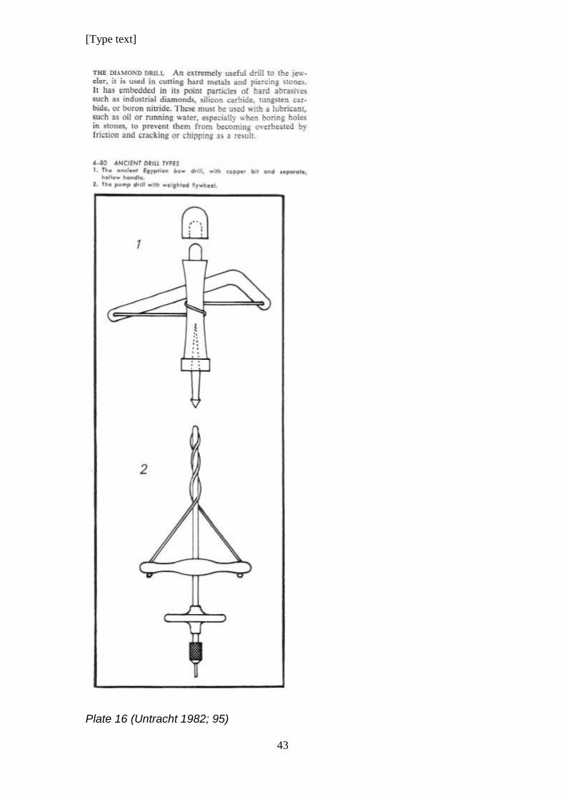
[Type text]
43
Plate 16 (Untracht 1982; 95)
[Type text]
44
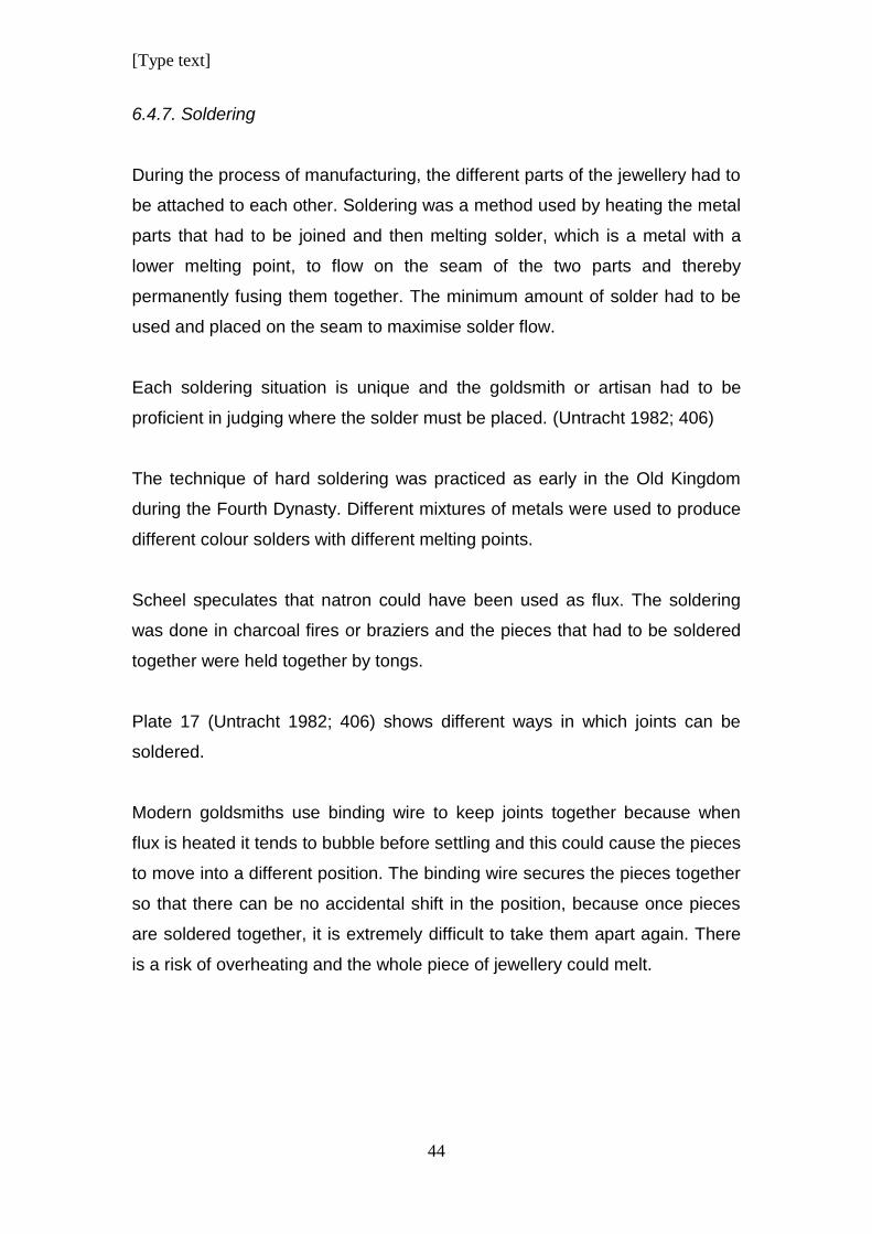
6.4.7. Soldering
During the process of manufacturing, the different parts of the jewellery had to
be attached to each other. Soldering was a method used by heating the metal
parts that had to be joined and then melting solder, which is a metal with a
lower melting point, to flow on the seam of the two parts and thereby
permanently fusing them together. The minimum amount of solder had to be
used and placed on the seam to maximise solder flow.
Each soldering situation is unique and the goldsmith or artisan had to be
proficient in judging where the solder must be placed. (Untracht 1982; 406)
The technique of hard soldering was practiced as early in the Old Kingdom
during the Fourth Dynasty. Different mixtures of metals were used to produce
different colour solders with different melting points.
Scheel speculates that natron could have been used as flux. The soldering
was done in charcoal fires or braziers and the pieces that had to be soldered
together were held together by tongs.
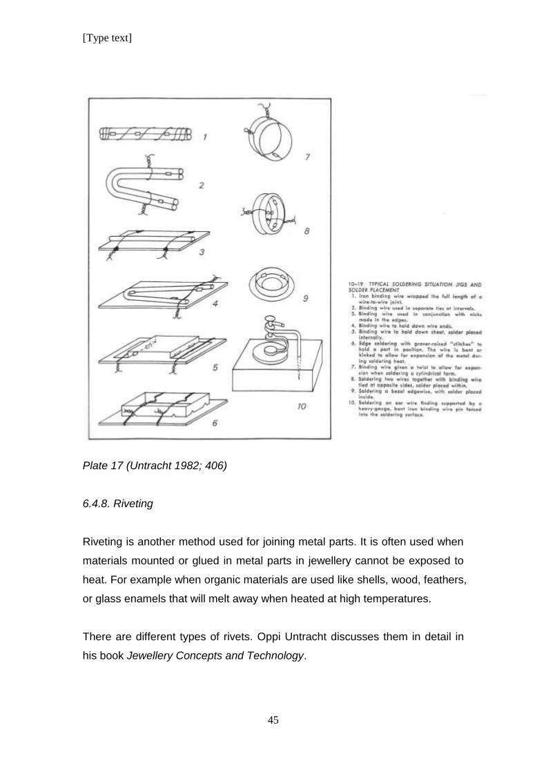
Plate 17 (Untracht 1982; 406) shows different ways in which joints can be
soldered.
Modern goldsmiths use binding wire to keep joints together because when
flux is heated it tends to bubble before settling and this could cause the pieces
to move into a different position. The binding wire secures the pieces together
so that there can be no accidental shift in the position, because once pieces
are soldered together, it is extremely difficult to take them apart again. There
is a risk of overheating and the whole piece of jewellery could melt.
[Type text]
45
Plate 17 (Untracht 1982; 406)
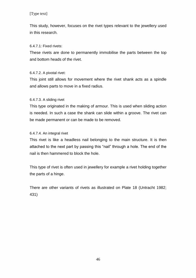
6.4.8. Riveting
Riveting is another method used for joining metal parts. It is often used when
materials mounted or glued in metal parts in jewellery cannot be exposed to
heat. For example when organic materials are used like shells, wood, feathers,
or glass enamels that will melt away when heated at high temperatures.
There are different types of rivets. Oppi Untracht discusses them in detail in
his book Jewellery Concepts and Technology.
[Type text]
46
This study, however, focuses on the rivet types relevant to the jewellery used
in this research.
6.4.7.1: Fixed rivets:
These rivets are done to permanently immobilise the parts between the top
and bottom heads of the rivet.
6.4.7.2. A pivotal rivet:
This joint still allows for movement where the rivet shank acts as a spindle
and allows parts to move in a fixed radius.
6.4.7.3. A sliding rivet
This type originated in the making of armour. This is used when sliding action
is needed. In such a case the shank can slide within a groove. The rivet can
be made permanent or can be made to be removed.
6.4.7.4. An integral rivet
This rivet is like a headless nail belonging to the main structure. It is then
attached to the next part by passing this “nail” through a hole. The end of the
nail is then hammered to block the hole.
This type of rivet is often used in jewellery for example a rivet holding together
the parts of a hinge.
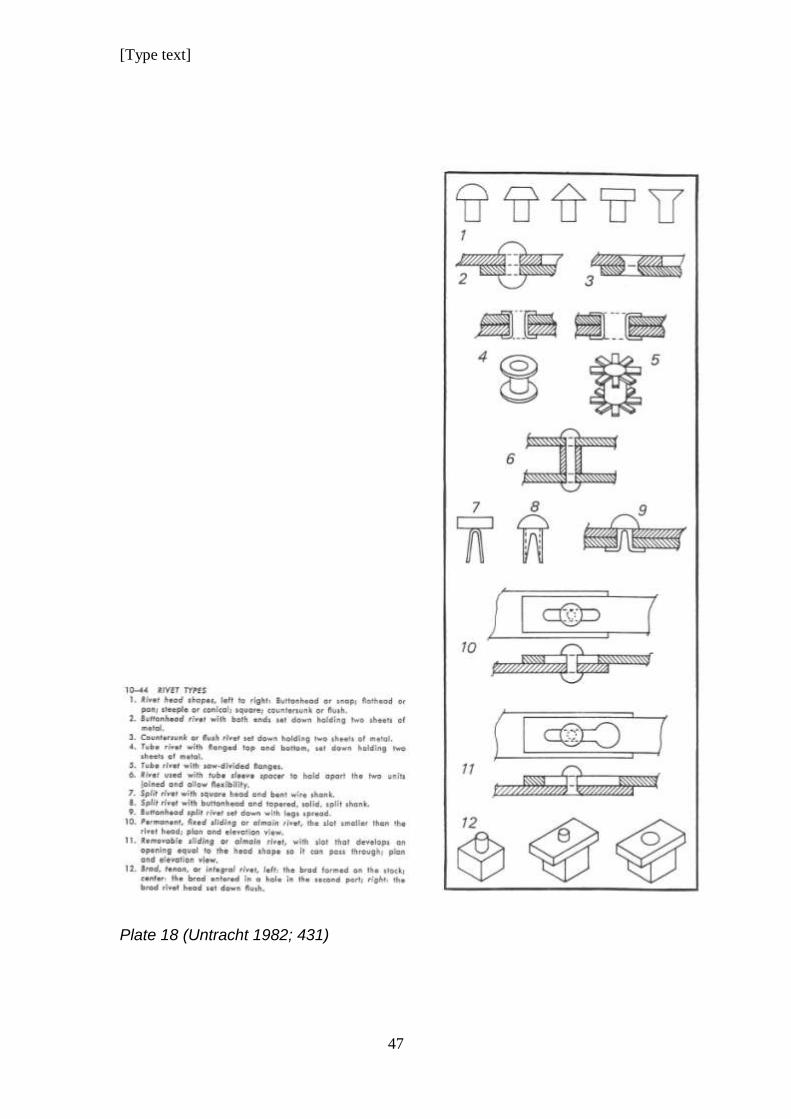
There are other variants of rivets as illustrated on Plate 18 (Untracht 1982;
431)
[Type text]
47
Plate 18 (Untracht 1982; 431)
[Type text]
48
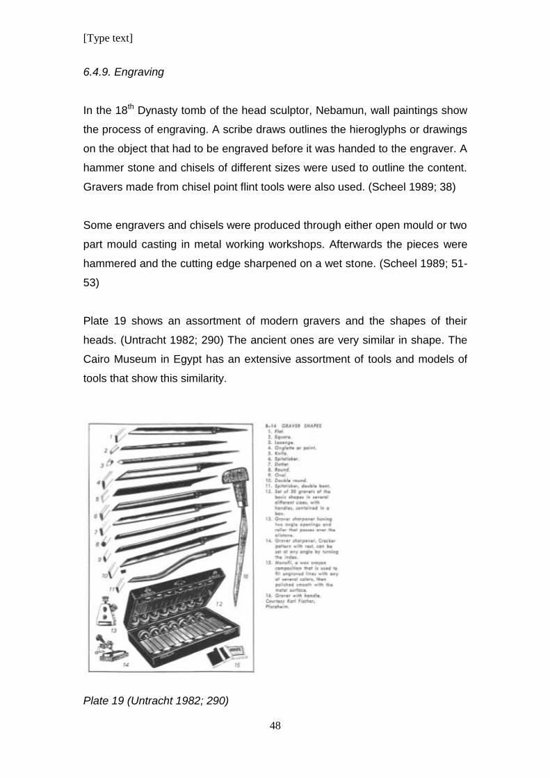
6.4.9. Engraving
In the 18th Dynasty tomb of the head sculptor, Nebamun, wall paintings show
the process of engraving. A scribe draws outlines the hieroglyphs or drawings
on the object that had to be engraved before it was handed to the engraver. A
hammer stone and chisels of different sizes were used to outline the content.
Gravers made from chisel point flint tools were also used. (Scheel 1989; 38)
Some engravers and chisels were produced through either open mould or two
part mould casting in metal working workshops. Afterwards the pieces were
hammered and the cutting edge sharpened on a wet stone. (Scheel 1989; 51-
53)
Plate 19 shows an assortment of modern gravers and the shapes of their
heads. (Untracht 1982; 290) The ancient ones are very similar in shape. The
Cairo Museum in Egypt has an extensive assortment of tools and models of
tools that show this similarity.
Plate 19 (Untracht 1982; 290)
[Type text]
49
6.4.10. Chasing and Repoussѐ
This was used to produce raised reliefs in thin metal sheet by first hammering
on the one side of the sheet and then turning it over and hammering on the
other side. While the piece was being hammered it was held in place by
melting it onto a pitch bowl.
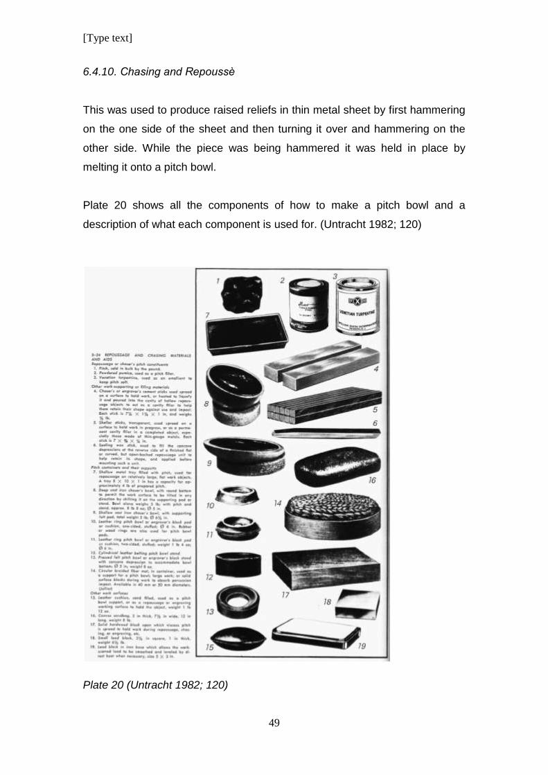
Plate 20 shows all the components of how to make a pitch bowl and a
description of what each component is used for. (Untracht 1982; 120)
Plate 20 (Untracht 1982; 120)
[Type text]
50
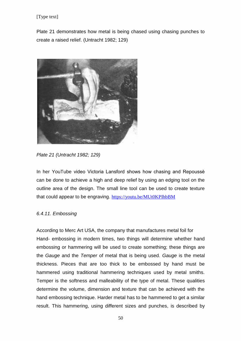
Plate 21 demonstrates how metal is being chased using chasing punches to
create a raised relief. (Untracht 1982; 129)
Plate 21 (Untracht 1982; 129)
In her YouTube video Victoria Lansford shows how chasing and Repoussѐ
can be done to achieve a high and deep relief by using an edging tool on the
outline area of the design. The small line tool can be used to create texture
that could appear to be engraving. https://youtu.be/MUt0KPIhbBM
6.4.11. Embossing
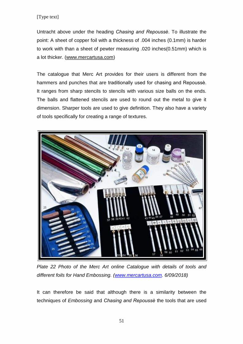
According to Merc Art USA, the company that manufactures metal foil for
Hand- embossing in modern times, two things will determine whether hand
embossing or hammering will be used to create something; these things are
the Gauge and the Temper of metal that is being used. Gauge is the metal
thickness. Pieces that are too thick to be embossed by hand must be
hammered using traditional hammering techniques used by metal smiths.
Temper is the softness and malleability of the type of metal. These qualities
determine the volume, dimension and texture that can be achieved with the
hand embossing technique. Harder metal has to be hammered to get a similar
result. This hammering, using different sizes and punches, is described by
[Type text]
51
Untracht above under the heading Chasing and Repoussѐ. To illustrate the
point: A sheet of copper foil with a thickness of .004 inches (0.1mm) is harder
to work with than a sheet of pewter measuring .020 inches(0.51mm) which is
a lot thicker. (www.mercartusa.com)
The catalogue that Merc Art provides for their users is different from the
hammers and punches that are traditionally used for chasing and Repoussѐ.
It ranges from sharp stencils to stencils with various size balls on the ends.
The balls and flattened stencils are used to round out the metal to give it
dimension. Sharper tools are used to give definition. They also have a variety
of tools specifically for creating a range of textures.
Plate 22 Photo of the Merc Art online Catalogue with details of tools and
different foils for Hand Embossing. (www.mercartusa.com. 6/09/2018)
It can therefore be said that although there is a similarity between the
techniques of Embossing and Chasing and Repoussѐ the tools that are used
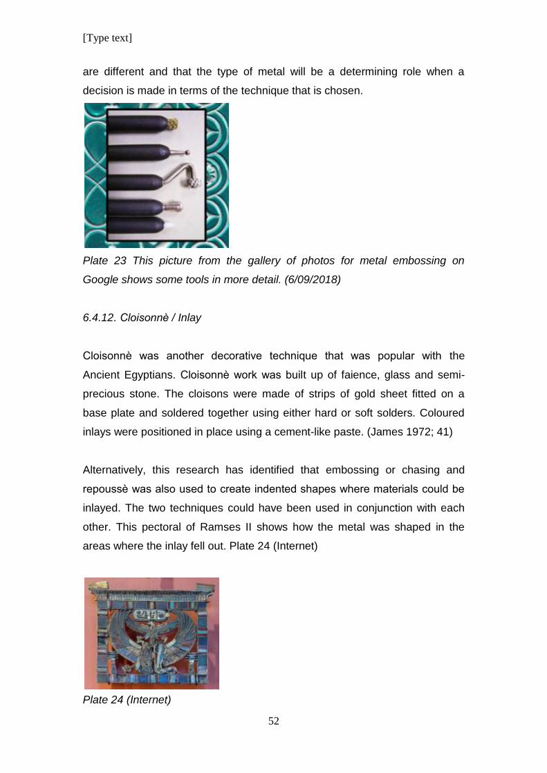
[Type text]
52
are different and that the type of metal will be a determining role when a
decision is made in terms of the technique that is chosen.
Plate 23 This picture from the gallery of photos for metal embossing on
Google shows some tools in more detail. (6/09/2018)
6.4.12. Cloisonnѐ / Inlay
Cloisonnѐ was another decorative technique that was popular with the
Ancient Egyptians. Cloisonnѐ work was built up of faience, glass and semi-
precious stone. The cloisons were made of strips of gold sheet fitted on a
base plate and soldered together using either hard or soft solders. Coloured
inlays were positioned in place using a cement-like paste. (James 1972; 41)
Alternatively, this research has identified that embossing or chasing and
repoussѐ was also used to create indented shapes where materials could be
inlayed. The two techniques could have been used in conjunction with each
other. This pectoral of Ramses II shows how the metal was shaped in the
areas where the inlay fell out. Plate 24 (Internet)
Plate 24 (Internet)
[Type text]
53
6.4.13. Filigree
Filigree was delicately bent and shaped wire work that was soldered together
to form intricate shapes and patterns. This was then added to pieces of
jewellery to enhance and decorate them. The technique consists of delicate
open backed wire work made in precious metals. Sometimes it was decorated
with tiny balls of metal.
There are four basic types of filigree:
6.4.12.1:“Open work filigree”
This is the most commonly used style. It is wirework without any backing and
is typically made from heavier wire frames with lighter wire units within the
frame. The points of contact are soldered together.
6.4.12.2. Ground supported filigree
The second type is “Ground supported Filigree” where the delicate wire is
soldered to a background of sheet metal or woven wire mesh. By using a
background as support, it makes the construction and soldering easier. Only
when the design is dominated by wire can this type of work be referred to as
filigree.
6.4.12.3. Combined method A
The third type of filigree is the combination of the previous two methods.
Completed units of openwork filigree is attached to sheet metal or other
grounds by using non-soldering techniques of fastening like split rivets, rivets,
bezels or claws.
6.4.12.4. Combined method B
The fourth type of filigree is when another material like enamel or resin is
added to fill in the spaces between the wires.
The benefit of filigree work is that the maximum visual impact is created with
the minimum weight of metal; but the labour costs are high. It takes a lot of
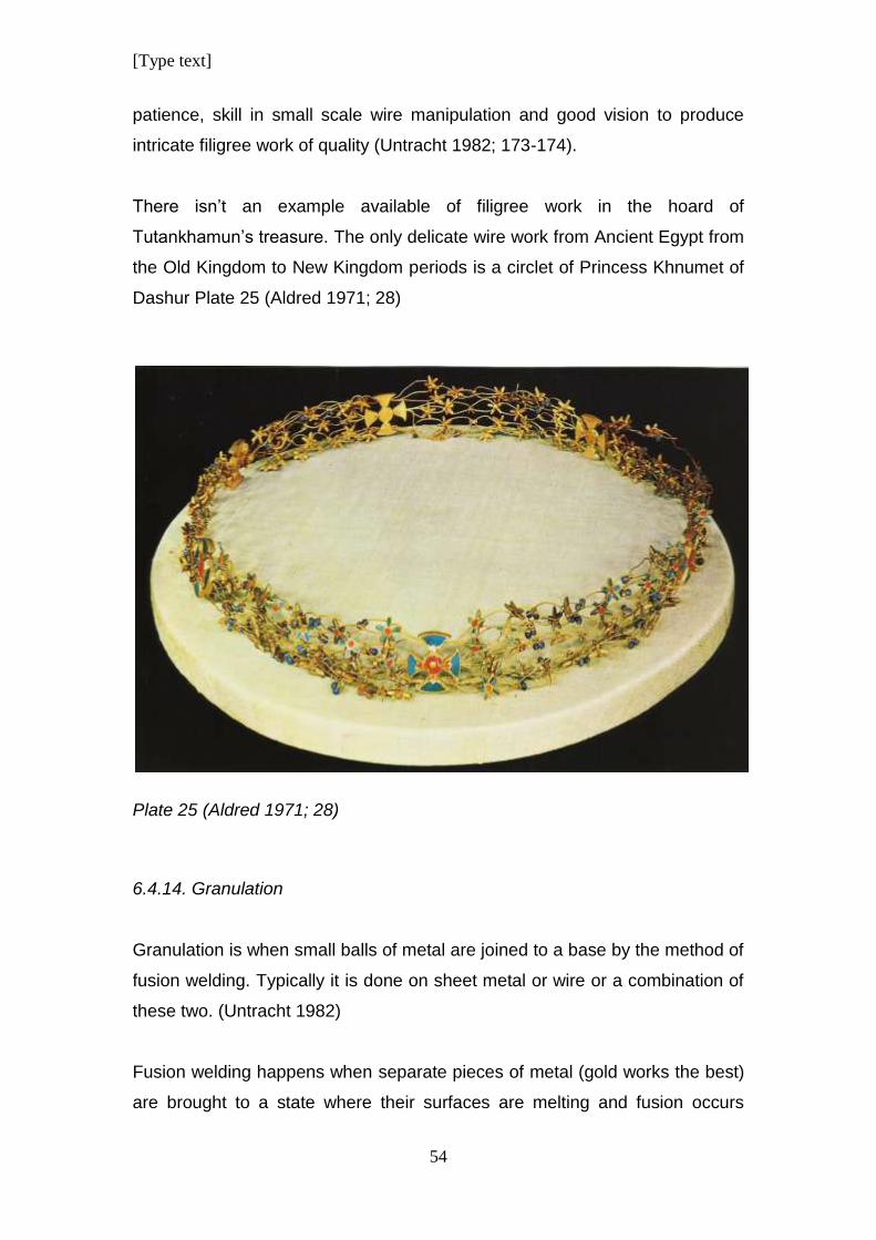
[Type text]
54
patience, skill in small scale wire manipulation and good vision to produce
intricate filigree work of quality (Untracht 1982; 173-174).
There isn’t an example available of filigree work in the hoard of
Tutankhamun’s treasure. The only delicate wire work from Ancient Egypt from
the Old Kingdom to New Kingdom periods is a circlet of Princess Khnumet of
Dashur Plate 25 (Aldred 1971; 28)
Plate 25 (Aldred 1971; 28)
6.4.14. Granulation
Granulation is when small balls of metal are joined to a base by the method of
fusion welding. Typically it is done on sheet metal or wire or a combination of
these two. (Untracht 1982)
Fusion welding happens when separate pieces of metal (gold works the best)
are brought to a state where their surfaces are melting and fusion occurs
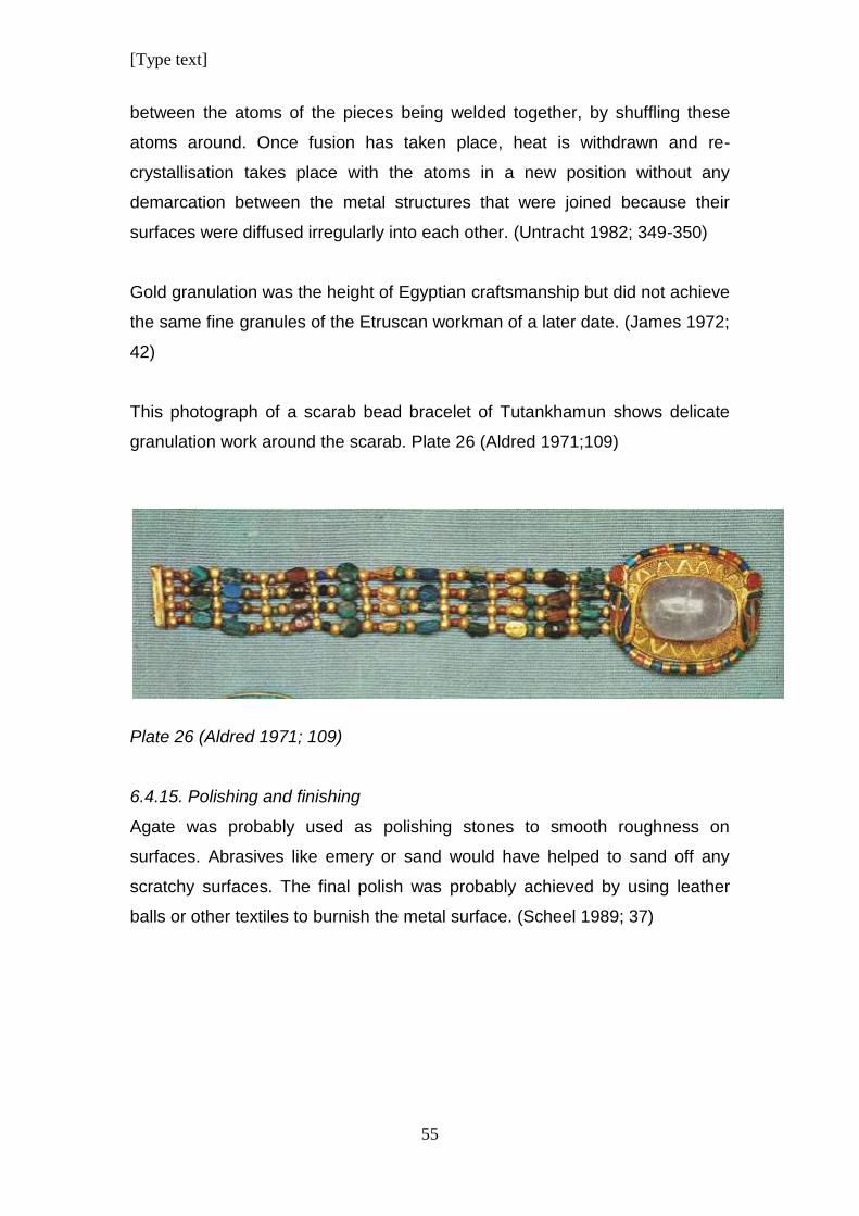
[Type text]
55
between the atoms of the pieces being welded together, by shuffling these
atoms around. Once fusion has taken place, heat is withdrawn and re-
crystallisation takes place with the atoms in a new position without any
demarcation between the metal structures that were joined because their
surfaces were diffused irregularly into each other. (Untracht 1982; 349-350)
Gold granulation was the height of Egyptian craftsmanship but did not achieve
the same fine granules of the Etruscan workman of a later date. (James 1972;
42)
This photograph of a scarab bead bracelet of Tutankhamun shows delicate
granulation work around the scarab. Plate 26 (Aldred 1971;109)
Plate 26 (Aldred 1971; 109)
6.4.15. Polishing and finishing
Agate was probably used as polishing stones to smooth roughness on
surfaces. Abrasives like emery or sand would have helped to sand off any
scratchy surfaces. The final polish was probably achieved by using leather
balls or other textiles to burnish the metal surface. (Scheel 1989; 37)
[Type text]
56
7. Conclusion
Mining, metallurgy and metal working improved over thousands of years in the
Ancient Near East.
Egyptian records that are available do not give accounts of how metal was
processed from when it was mined to the final product. Our information is
based on the writings of the Greek traveller Agatharchides of Cnidus who
observed workers during the Ptolemaic Period.
According to his eye witness account, the conditions of the workers were very
harsh. A large number of the workers were criminals or prisoners of war.
In general it seems as though the Egyptian goldsmith was shown more
respect from the upper classes in their society than other craftsmen or
goldsmiths from other cultures.
The god Sokar was worshipped as the creator of craftsmen. (Scheel 1989; 60)
but the god Ptah was the patron deity of all craftsmen. They were sometimes
called his children.
Ptah was sometimes depicted as a dwarf and it is pertinent that mural
paintings during the Old Kingdom show that the last stages of jewellery
production were done by a certain type of pigmy. This could be because of
some religious reverence of the god Ptah.
If one examines the manufacturing techniques used in Ancient Egypt, it is
very similar to techniques being used today.
The biggest difference is the tools that have evolved into more effective
implements. Copper tools and wooden hammering blocks have been replaced
by harder, steel tools although wood is still used for the absorption of the
shocks from hammering. Modern steel tools are harder and more durable and
[Type text]
57
are made with more precision than in ancient times, but they still look similar
in shape to their ancient counterparts.
The Cairo museum in Egypt has a large variety of ancient tools and models of
tools that show this similarity to modern tools. This aspect could be explored
further in more detail but it is not the primary focus of this study.
The most significant difference in jewellery manufacturing today as opposed
to a few thousand years ago is the use of gas torches to heat metal instead of
very large and cumbersome coal fires. Two or sometimes three people were
needed to regulate the temperature during the delicate process of soldering in
ancient workshops.
Using the practice-based methodology which uses the tacit knowledge of the
researcher, it can be said that today only one person is needed to control the
heat of a gas torch. An assortment of nozzles of different sizes can be used to
achieve different temperatures.
During soldering, heat is distributed through the metal which could cause
areas to melt and fall apart where it had already been soldered. This was a
high risk for the ancient goldsmiths. Today a goldsmith can do spot soldering
by mixing oxygen with other gasses and using very tiny nozzles. This means
that a very small area can be heated to the right temperature for the solder to
melt without affecting the rest of the jewel.
Therefore it can be concluded that manufacturing methods of a few thousand
years ago are still used today. It has been the introduction of gas torches that
has revolutionised the industry.
[Type text]
58
CHAPTER 3:
MATERIALS USED IN JEWELLERY
The chapter will be a summary introduction of the other
materials that were used in conjunction with gold to make
jewellery,
Faience production will be discussed in relative detail, because
it is a man-made semi-precious material that was used to make
beads and inlays in jewellery. It was also used for other objects
of different shapes and sizes.
Semi-precious stones and other organic material will be
discussed and what they were mostly used for in terms of
jewellery.
1. Introduction:
We have already looked at the various metals that were used in jewellery and
their metallurgy, but other precious materials were also used.
Various types of precious and semi-precious stones were used. The
production of manmade imitations of semi-precious materials was done very
early in the history of ancient Egypt. Faience production is one of these
methods. (Clark 1950; 154)
2. Egyptian faience.
The term “faience” has caused a lot of controversy, because the product was
not made from any clay material.
Experiments with faience were already done as early as Pre-dynastic times.
The working of faience had much in common with the cold working of stone. A
[Type text]
59
core was used and then shaped using abrasion. (Nicholson & Shaw 2000;
179)
During the Old Kingdom and First Intermediary periods, the size of the
products increased, but the most common products were still beads and
amulets. Beads were formed over straw that would burn away when it was
fired (Clark 1950; 155). From tomb paintings Clark deduces that a linen thread
was waxed to stiffen the end to push through the bead during the stringing
process because there is no apparent use of a needle when beads were
strung. (Clark 1950; 155)
The exception of mass produced products of the time, were the tiles made for
the Step Pyramid complex of King Djoser during the Third Dynasty.
(Nicholson & Shaw 2000; 179)
Middle Kingdom and Second Intermediary Period show diversity of
experimentation. Modelling was used, forming took place and there is
evidence of moulding. Decoration techniques were developed for example
using two different coloured body pastes mixed together to form a marble
effect.
Incising and inlaying of faience became popular as well. (Nicholson & Shaw
2000; 181)
By the time of the New Kingdom, a sophisticated production of faience was
achieved. The open-faced mould was used to produce large quantities of
beads, amulets and rings. At Thebes at the palace of Amunhotep III,
hundreds of bright coloured pendants were found together with the red pottery
moulds that were used to mass produce them. (Clark 1950; 154)
Paste was pressed in the mould, removed and dipped in different coloured
glaze and then fired. Moulds that had paste stuck in them were discarded.
(Clark 1950; 155)
[Type text]
60
Some techniques of making faience had the result of producing glass,
probably due to the efflorescence process. Glass was also used deliberately
to increase the variances of colours during the reign of Thutmose III, the
pharaoh credited for establishing glass production in Egypt. (Nicholson &
Shaw 2000; 182)
Faience is an artificial precious stone and a non-clay product. It is made up of
crushed quartz or sand with small amounts of lime with some natron or plant
ash. The body is then coated with a soda-lime-silica glaze which is mostly of a
blue colour due to copper. (Nicholson & Shaw 2000)
Desert sand was probably a source of silica, but from the products, it can be
assumed that there were superior sources of raw materials. The sand would
have been mixed with impurities like chalk, limestone and iron. The iron can
cause discolouration of the end product, so it is more likely that a non-sand
source was used. Evidence suggests that a high quality of silica was made
from crushing quartz pebbles. The resulting powder would be free from
unwanted impurities and as an added benefit, it was a brilliant white. The
reflective qualities would enhance the gem-like impression. (Nicholson &
Shaw 2000)
Lime comprises about 1 to 6% of faience. This could be limestone or chalk.
There is no evidence that suggests whether this substance was added
deliberately or accidently as impurities in the sand. Approximately 0.3- 5% of
faience was made up of an alkali or soda. The most common source is natron.
The other source comes from certain halophytic plants.
Lime and soda was essential to the making of faience because it cemented
the quartz and prevented crumbling.
Faience products have two layers. The core was course and discoloured. The
top layer was a brilliant white that was glazed. (Nicholson & Shaw 2000; 186)
[Type text]
61
Faience is related to soda-lime-silicate glass in that is has the same three
main ingredients, but in different proportions. The higher proportion of silica
combined with a lower firing temperature that is of shorter duration, results in
a crystalline material. The small quantities of glass that is formed this way
fuses the material together. (Nicholson & Shaw 2000; 187)
3. Stones used in jewellery.
3.1. Chalcedony was a common stone that was used in ancient Egyptian
jewellery. Examples of Chalcedony are chrysoprase, agate, cornelian and
onyx (black Chalcedony).
Chalcedony is a form of quartz that is translucent and microcrystalline.
(Nicholson & Shaw 2000; 25) The colours are caused by impurities in the
crystals. Iron oxides and tiny particles of haematite cause the red colour of
cornelian. The green of chrysoprase is caused by nickel oxide.
3.2. Agate is spherical nodules found in volcanic rock. The stripes in the stone
are caused by rhythmic crystallisation. (Nicholson & Shaw 2000)
3.3. Chrysoprase is a yellowish-green variation of chalcedony. It was mostly
used for beads, amulets and pendants. (Nicholson & Shaw 2000; 26)
3.4. Cornelian is known for its reddish colour and is often used in Ancient
Egyptian jewellery as beads, amulets, rings, scarabs and inlays. Sometimes it
was also used for small vessels. Cornelian was imitated by using rock crystal
or milky quartz pasted on red painted cement. (Nicholson & Shaw 2000)
3.5. Onyx is black or striped chalcedony. It is different from agate because its
stripes are parallel and not irregular. (Nicholson & Shaw 2000; 27)
3.6. Red Jasper is a bright variation of chert. The colour is caused by red and
yellow iron oxides and haematite and can appear striped, spotted or marbled.
[Type text]
62
It can be green, yellow or brown as well. It was used for beads, amulets,
scarabs, inlay, earrings and hair rings. It lends itself to larger objects as well in
the form of small vessels and parts of statues. (Nicholson & Shaw 2000; 29)
3.7. Fluorite was a translucent or transparent crystalline form of calcium
fluoride and was mostly green or yellowish. It was used for beads. (Nicholson
& Shaw 2000; 31)
3.8. Garnets come from magnesium, iron or calcium aluminosilicate minerals
and appear in most colours except blue. It was a precious stone native to
Egypt. The red variation was preferred and was used for beads. During the
Middle Kingdom it was used as inlay. (Nicholson & Shaw 2000; 32)
3.9. Haematite is an opaque iron oxide mineral and was used for beads,
amulets and small vessels. (Nicholson & Shaw 2000; 38)
3.10. Lapis lazuli was a favourite stone for the use in jewellery. It is composed
of the blue alumino-silicate mineral lazurite. It contains grains of pyrite which
has a goldish colour and has veins or patches of white calcite. Some other
minerals could also be present. There is no verified native source of lapis
lazuli in Egypt. It was imported from Badakhshan in Afghanistan. It was
initially used for beads and inlay but was then carved into amulets and
scarabs and seals. After the Third Intermediate period, it was less commonly
used in jewellery. (Nicholson & Shaw 2000; 39-40)
3.11. Mica is a potassium aluminosilicate mineral with iron and magnesium.
The colours can be colourless, shades of yellow and brown, dark brown or
black biotite. Some can also be coloured in the range between pink and
purple. They look glistening and is quite soft to manipulate the shape.
Therefore it was a good choice to use as beads, pendants and mirrors.
(Nicholson & Shaw 2000; 45)
3.12. Microline or amazonite is a form of feldspar and is opaque green to
bluish green that is caused by traces of lead and crystalline water. Due to the
[Type text]
63
colour, it is sometimes confused with turquoise or beryl. It was regarded as
amongst the six most precious stones in ancient Egypt. It was made into
beads, amulets and inlay. It reached its highest popularity during the Middle
Kingdom. (Nicholson & Shaw 2000; 46)
3.13. Olivine or peridot is a gemstone native to Egypt. It is a silicate mineral
known as chrysolite and comes in a variety of green colours. It was used for
jewellery as beads, pendants and amulets, but only reached popularity during
the Ptolemaic period. (Nicholson & Shaw 2000; 47)
3.14. Quartz is a silicon dioxide mineral gemstone that comes in a variety of
colours. It was one of the hardest materials that the ancient Egyptians worked
with. (Nicholson & Shaw 2000)
3.15. Amethyst is a violet coloured macro crystalline form of quartz. The
colour is caused by trace amounts of ferric oxide. It was primarily used in
jewellery during the Middle Kingdom or Roman period. It was sometimes used
for beads and small vessels between the Late Pre-dynastic period and the
end of the Old Kingdom. Some evidence suggests that amethyst was used in
trade for other commodities. (Nicholson & Shaw 2000; 50-51)
3.16. Other forms of quartz include milky quartz. Rock crystal (Colourless,
transparent quartz), rose quartz (pink), prase (leek-green), citrine (yellow) and
smokey quartz which has a transparent, charcoal hue. (Nicholson & Shaw
2000)
3.17. Rose quartz was used for funerary vessels during the Early Dynastic
period and the Old Kingdom. Prase was used for beads during the
Pharaohnic period. (Nicholson & Shaw 2000; 52-53).
3.18. Turquoise is a hydrated phosphate of copper and aluminium. It is
opaque and the colours range between blue-green and sky blue. The greener
variety of turquoise was the favourite choice of the Egyptians because the
blue, more porous type faded when exposed to sunlight and water. It was
[Type text]
64
used for jewellery from Pre-Dynastic to Greco-Roman times as beads,
amulets, inlay and small vessels. (Nicholson & Shaw 2000; 62)
The stones discussed above vary in hardness. Some would be a challenge for
the ancient craftsmen to shape. Gwinnett J.A & Gorelick L examined ancient
lapidary technology to determine how hard stone was drilled. Even if no tools
found, the marks left by the tools gave clues as to what type of tools were
used for drilling and shaping. (Gwinnett & Gorelick 1993; 125)
4. Other materials that were used in jewellery.
Organic materials were used as decoration and for utilitarian purposes.
Feathers were used in fans. Bone and ivory were carved into amulets,
bangles, inlays, game pieces, seals, sculpture, furniture inlay and decorative
pieces. Ostrich egg, shells and mother of pearl and amber were also used for
jewellery. Tortoise shell and horn were used for knife handles, combs and
inlays. (Gänsicke et al 2003). Rare wood was also considered as a precious
material suitable for jewellery. These materials are all natural and non-
crystalline. (Nicholson & Shaw 2000)
4.1. Ivory
Ivory mostly refers to the tusks of elephants, but it has become acceptable to
include teeth of large animals like hippopotamus as ivory as well. By dynastic
times, elephants were extinct in Egypt and would have had to be imported
from other areas, whereas ivory of hippopotamus were indigenous to Egypt. It
is also possible that bone was used in some cases and had been
misidentified as ivory. (Nicholson & Shaw 2000; 320)
Ivory was used to carve figurines, gaming pieces, amulets and other
commodities. It was also used as inlays on chests and furniture.
By the 18th Dynasty, ivory was mostly “imported”. Egypt dominated large parts
of Nubia and a lot of ivory was received as gifts or tribute. An abundant
[Type text]
65
amount of ivory was found in the tomb of Tutankhamun. (Nicholson & Shaw
2000; 324- 325)
4.2. Bone.
Uncooked bone was used for inlays and jewellery like pins, pendants, rings
and amulets. (Nicholson & Shaw 2000; 327)
4.3. Wood.
Wood found in the tomb of Tutankhamun includes chests, statues, furniture
and other expensive commodities. Sometimes wood was gilded or painted. It
was also inlayed using materials like semi-precious stones, glass, glazed
terracotta, ebony and ivory. An example of this is the ecclesiastical seat of
Tutankhamun. (Desroches-Noblecourt 1965)
4.4. Feathers.
Ostrich feathers were used in headdresses and crowns of royalty and the
gods and in elaborately designed fans.
4.5. Adhesives and Binders
These materials were used extensively in Ancient Egyptian artefacts.
Materials used for jewellery inlay are usually referred to as coloured cement,
but unless it has been analysed using various scientific methods, the
assumptions are just guess work. FT-IR spectrometry can detect proteins.
Further chemical analyses can be done by chromatography. (Nicholson &
Shaw 2000)
Organic adhesives include bees’ wax, albumen, honey, gum and resin. Gum
could be harvested from various species of Acacia trees that were found in
Egypt by cutting the bark and tapping the gum from these wounds. (Nicholson
& Shaw 2000; 476) Glue was made using the protein collagen that was
obtained from various animal products like skins, hides and bones from
animals or fish. Glues made this way could decompose, causing it to smell
bad but in spite of this, it could still be used. (Nicholson & Shaw 2000; 475)
[Type text]
66
Plant resins and bitumen were also used as binders. Examples were found
where resins were mixed with paint or gesso. Bitumen was used on mummies
and it was identified as being used in some 18th Dynasty varnishes.
(Nicholson & Shaw 2000; 491)
5. Conclusion.
A large variety of materials were considered as precious. Rarity equalled
exclusivity and was a factor for exclusive jewellery for the upper class in
ancient times and it is still the case today in modern society. In ancient Egypt
most of the gold products belonged to royalty and temples.
These materials included precious and semi-precious stones, different types
of metal, wood ivory and feathers.
These rare commodities could only be afforded by the royals and very rich
people, who were affiliated with royalty is some way or another in any case.
Some precious materials were native to ancient Egypt but some articles had
to be imported from other areas in Africa and the Ancient Near East. The most
detailed recording of trade for rare and precious articles can be found at the
Temple of Hatshepsut at Deir el-Bahri near modern day Luxor. The
inscriptions on the walls of the temple dates back to the 18th Dynasty of the
New Kingdom and give extensive lists of what the pharaoh brought back from
the land of Punt. (Hatshepsut preceded Tutankhamun.).
It wasn’t only the rich that wanted precious objects but poorer people had to
be content with cheap imitations of inferior material and quality that mimicked
the real thing or substituted the desired material for something more available.
[Type text]
67
CHAPTER 4: INTRODUCTION TO DESIGN
Design will be introduced as a field of study and how Principles
and Elements of design come together to produce the final
product namely, a top quality piece of jewellery.
1. Introduction
This chapter looks at how perception is influenced by the interplay of directed
tension (Arnheim 2001; 2) by using design principles and design elements
The relationship between all the different design laws and elements form the
basis of the design process. (Wood et al 2006; 632)
To understand the design of any object, one has to look at the interaction
between the different principles governing design and how design elements
were used to create interplay with each other, resulting in a work of art or
product.
Design principles are the main umbrella under which the different elements
fall to create a visual response in the viewer. This can be achieved by the
creator of art in a subconscious way. The artist can intuitively feel that
positioning certain elements in a specific way creates the desired effect. Even
if this process is subconscious, the visual areas in the brain will interpret the
effect in the same way for the creator and observer of the creation.
(Ramachandran & Hirstein, )
Design theory as a modern science doesn’t have to rely on the intuition of the
artist. It has definite guidelines that predict how a viewer will respond to art or
products based on psychological studies of human responses. This science
can be applied to create pleasing commodities for the benefit of the company
or person that produces them, as well as the targeted client. This knowledge
[Type text]
68
can also be used subliminally to influence prospective users without their
knowledge. (Lidwell et al; 2010)
Let us assume that the ancient Egyptians did not consciously know that their
art or jewellery had certain effects on people and let us explore how the
jewellery was designed by the subconscious, collective interaction of the
various aspects of their culture, and their identity within culture.
It is from this perspective that the principles and elements will be discussed
and explained. The two aspects will be applied to the samples of the
Pectorals being studied in later chapters and then it can be determined to
what degree of importance design took place and whether the ancient
Egyptians used a process of design before manufacturing jewellery.
2. Design Principles
2.1. Composition
Goldstein postulates that design is a language of visuality and that
“Composition” is the structural and organisational aspects of that language.
(Goldstein 1989; 2) Therefore, design is the image or object created by
abstract and spatial relationships that are formed from a combination of
images or elements.
The combination of “Balance”, “Emphasis” and “Simplicity”, establish a
hierarchy of visual occurrences where visual themes are ranked according to
their importance. It divides a design into the major and minor strategies that
show the artist’s intentions, but is not like “Emphasis” that deliberately directs
visual impact. (Goldstein 1989; 15)
All these principles come together in the final composition of the design. The
compositional structures will usually fall under one of the compositions as
follows:
[Type text]
69
2.1.1. The Grid composition
It is based on the crisscross pattern in a work based on horizontal and vertical
lines. (Goldstein 1989; 204)
2.1.2. The circular composition
Everything has a centre. “Circularity” suggests that there is a central focal
point. The circle also marks the point of balance of any object or element, or a
group of objects. Where different shapes are grouped, they create their own
collective centre. (Goldstein 1989; 204) This centre is the point of balance, but
will not necessarily be the same as the measured centre of the design.
2.1.3. A triangular composition
It has a high tension, unless it is positioned on a vertical midline. In such a
case it can create a stately stability. (Goldstein 1989; 208) Otherwise, it has a
lot of aggressive energy going outwards in three different directions. It can
produce a strong expressive point, or it could be used in a more subtle way by
balancing it with a combination of the surrounding shapes. According to the
“Contour Bias”, tests show that humans have a fear response to sharp objects.
Angular objects increased brain activity/ thought, in contrast to contoured
objects which cause positive emotional and aesthetic responses. (Lidwell
2010; 62). Angular and pointy features can be used to provoke thought and
attention.
2.1.4. The diamond composition
When the diamond is a dominant composition, it is as a result of the artist
being aware of the vertical and horizontal lines that divide the design. It often
has a stabilising effect on the different elements in the design. (Goldstein
1989; 212)
2.1.5. A central composition
When a composition has a centrally placed subject, it causes a stabilizing
effect but can become overbearingly dominant or isolated in its central
position if it is not off-set by other elements. (Goldstein 1989; 212) Sometimes
a design can have two centres. This occurs when there are two major
[Type text]
70
configurations combined to cause a tension between them, depending on
their orientation in the format and their struggle for dominance. (Goldstein
1989; 215) For the sake of balance, one of the centres can be shown as
dominant otherwise there is a risk of splitting the image in two. This creates a
confrontation between the elements, but can be balanced out by using a grid
composition in combination with the two centres. Another stabilising effect can
be created by offsetting the design by inserting a third shape.
2.1.6. The bridge composition
The bridge is similar to the two centre configuration, but instead of
confrontation, the parts are joined by combining them with either bridging
shapes or strong implied rhythmic movement. (Goldstein 1989)
2.1.7. An even composition
When the composition uses an even spread, this avoids any emphasis and
the elements are usually evenly placed. Nothing draws specific attention to
itself and the visual characteristics have an all over sameness, preventing the
onlooker from selecting any particular feature. (Goldstein 1989)
2.1.8. A radial burst composition
This type of composition usually has a rounded configuration and a centre
and is the opposite of a centred design. It is more spontaneous than a centred
design and is more expressive, linking it to emotion. (Goldstein 1989)
2.1.9. A horizontal composition
Horizontal emphasis is created when elements are in parallel to the ground
plane and suggests low tension and tranquillity. It does not resist the pull of
gravity. (Goldstein 1989)
2.1.10. A vertical composition
Dominantly vertical compositions suggest action and energy and create
tension with horizontal elements. It is the direction that defies gravitational pull
the most. (Goldstein 1989)
[Type text]
71
2.1.11. The L-shape composition
When a composition is L-shaped, it is a part of a rectangular or square shape
and is an asymmetrical composition which can be balanced by the remainder
of the square or rectangle by using a combination of different elements.
(Goldstein 1989)
2.1.12. Other compositions
Some other compositional possibilities are when the elements are placed as
dominantly straight edged or curved lines. Straight edged lines can give a
geometric simplification while curved lines suggest organic sensation.
(Goldstein 1989; 240)
There are numerous laws or principles that affect design in general, but they
will not be discussed here, because they are not applicable to jewellery
design or this study, but will be included in the “Design Terms” section.
2.2 Balance
“Balance” in a design is determined by imagining a vertical axis running
through the centre, dividing the work into two equal halves. These two halves
can be examined to find equilibrium between the different design elements of
the two sides. The observer does not merely weigh the visual parts against
each other, but assesses how the components are distributed between the
two halves. Elements should be aligned with each other to create stability and
unity.
Deliberate misalignment creates tension. (Lidwell 2010; 24)
A well balanced composition, every directed action is countered in some way
to return stability to the whole. The stability is based on the mutual restraint of
the moving forces. Or in other words: the push and pull of directed actions.
(Goldstein 1989; 5)
[Type text]
72
Balance can be achieved in two ways: By using symmetry or asymmetry.
Symmetrical designs tend to look artificial and rigid, but could also emphasise
a subject’s grandeur or solemnity. Sometimes this type of symmetry can keep
a complex design from becoming overcrowded or confused.
Asymmetrical design on the other hand, can look more natural and is not
forced. (Goldstein 1989; 5)
The best way to achieve balance is to avoid destructive extremes of change
of too many varied elements on the one hand and boring sameness and
inaction on the other. (Goldstein 1989; 9)
2.3. Weight: Physical and Visual weight
Goldstein states that there are two ways in which to weigh the visual material.
The first is caused by the contrast of elements that will determine the eye
appeal of the observer. An intense colour in a work that is mostly comprised
of muted colour, or a sharp diagonal line in a work that is mostly made up of
horizontal lines will have a strong effect on the eye of the observer. This
substantial attention becomes the weight for measuring balance (Goldstein
1989; 3) Visual weight is also influenced by the location of an object in a
design. (Arnheim 2001; 2)
The basic geometric shapes that are formed in the composition will influence
how balance is achieved, even if the subject matter or content is based on
representations of natural forms like a flower.
The second form of weight is the type that can be weighed on a scale.
When the form in a work, seems to be in the grip of a gravitational pull, the
impression becomes a compositional consideration. The representation of a
feather will imply less weight than the representation of a rock. (Goldstein
1989; 3)
[Type text]
73
In the design of jewellery, this weight can literally mean the actual weight of
the different parts of the jewel. All these kinds of weights have an implied
movement of direction. “Visual Weight” causes the eye to move in a direction
of an attracting feature in the design where “Physical Weight” makes use of a
sense of downward direction. (Goldstein 1989, Lidwell et al 2010)
2.4. Movement: Physical and Visual movement
“Physical Movement” refers to the way an object like a piece of jewellery
moves in terms of its construction. Parts that link into each other are more
movable than when it is soldered or riveted together. A chain bracelet is more
movable than a bangle made from one piece of metal that is rigid.
“Visual Movement” can be caused by the interplay of colours impacting on the
eye. Line or pattern that causes the eye to move from one place to another
can also be termed as visual movement. (Goldstein 1989)
2.5. Rhythm and Direction
“Direction” can also be in the arrangement of the horizontal axis. Multiple
vertical lines of the same height can become predominantly horizontal through
repetition. The gravitational direction of an object in a design has an influence
on its visual weight. (Arnheim 2001; 4)
“Direction” is a potent force that can be used to integrate a design. It guides
the eye to follow a certain direction. Different elements can be used to
accomplish this, but very often diagonal lines give this result (Goldstein 1989)
2.6. Emphasis/ Focal point
Another way of creating an interesting design is by using “Emphasis”. This is
achieved by creating a variation in the design that attracts visual attention.
[Type text]
74
When employing this technique, the designer must make sure that the visual
connection to the other elements is integrated in order to maintain the
harmony and synthesis of the design. Otherwise it will appear foreign or
artificial. (Goldstein 1989; 10)
2.7. Proximity
Objects that are placed close to each other use the principle of “Proximity”.
When this technique is employed, elements will have a tendency to blend in,
even though they are not similar to the rest of the components in a specific
grouping, and will result in creating a visual bond of the elements. (Goldstein
1989; 11)
2.8. Similarity
“Similarity” is achieved when components attract attention because they are
similar and share common qualities that show they belong together, even
though they are separated in a design. An example of similarity is when
different shapes have the same colour. They might be separated in the overall
composition, but the colour stimulation on the eye makes the brain group
them together as a group. (Goldstein 1989; 11) According to the Principle of
“Uniform Connectedness”, elements with uniform visual properties (like
colour), are perceived as being grouped together. (Lidwell 2010; 246)
2.9. Economy/ Simplicity
“Simplicity” in a design refers to the technique of utilising the most economical
means possible to represent something; by using elements like shape, mass
location and colour etc. This is where “Gestalt Principles” play a role in design.
To simplify the subject matter, is to summarise the essence of the
components and to amplify the meaning the artist wants to convey. This
technique can result in a very elegant design, but if ineffective, it can become
a boring generalisation. (Goldstein 1989; 15)
[Type text]
75
3. The different laws governing Design Principle
Most of these laws are connected to the “Gestalt” laws that are an offshoot of
“Gestalt” psychology; it was developed in 1910 in Germany. (Behrens 1998)
Gestalt is when the whole is not simply the sum of its parts, but a synergistic
“whole effect” as Christian Von Ehernfels argued when he pointed out that a
melody is still recognisable even when it is played in a different key and the
notes are not the same. In the same way Wertheimer discovered that, the
effects of apparent movement are not generated by its individual elements but
by their dynamic interrelation. (Behrens 1998; 299)
The study of this psychology resulted in the formulation of laws that are
applied to design theory. This study will briefly examine some of these laws.
The “Figure Ground Principle” is based on the way human perception
separates elements into a figure or ground element. Figure elements are
elements of focus. Ground elements are part of the undifferentiated
background. A design is stable when there is a distinct difference between the
figure element and background. This is accomplished when the figure element
receives more attention and is better remembered than the ground elements.
If the figure ground relationship is unstable, there is an ambiguity between the
figure and ground elements, which leads to different interpretations of the
elements. (Hartson 2003; 99)
Graham theorises that we identify objects as distinct from their background,
by means of contrast. This is one of the Gestalt laws that were developed.
(Graham 2008; 3) She postulates that the parts in a design must be visible for
the whole to be understood. This visibility enhances the communication of the
visual .impact
The law of “Closure” is the tendency of people to see a set of individual
elements as belonging to a single recognisable pattern, instead of multiple
individual elements. The viewer will fill in the missing information or fill gaps to
[Type text]
76
complete the pattern. This happens subconsciously and automatically.
(Lidwell 2010, Behrens 1998) A designer can add subtle clues to help
complete shapes and patterns. By using less visual information, the resulting
design can be made more interesting. (Lidwell et al 2010; 44)
The proximity of visual data determines whether they are perceived as being
part of a group or separate entities. The Law of similarity applies to visual
elements that are similar, in shape size, proximity, colour and direction are
seen as part of a group. The Law of closure is the tendency to want to close
gaps in form. (Graham 2008; 7). The Law of continuation affects the way the
eye tends to follow the continuation between shapes by following a line, curve
or sequence of shape. This law can also be applied to the graduation or
progression of hue, value and chroma. (Graham 2008; 9)
The Gestahlt psychology is popular amongst artists, because it legitimises
and gives scientific validation of traditional rules of composition and page
layout. (Behrens 1998; 301)
Perception is the attention of the viewer that is controlled by top-down
cognitive driven responses and is bottom-up- stimulus driven. (Wood et al
2006; 590) The viewer experiences perceptual “wholes”, not isolated parts.
We never see figures alone, but figure- ground relationships. (Behrens 1998;
300), (Hartson 2003; 99)
4. Design Elements
“Design Elements” are the visual data that is combined with laws and
principles of design to produce a result that we refer to as the “design”. There
are several visual elements that can be identified as “Design Elements”: Line,
shape, value, colour, mass, space, texture and contrast. In Goldstein’s view,
line, value and colour can be regarded as the most important elements,
because together they form the rest.
[Type text]
77
4.1. Line
“Line” has always been the primary means of visual communication. Line is
used to visualise many kinds of information. It can be used to exactly record
or loosely suggest forms. Line measures the limits of a plane, colour, or tone.
It can subdivide the design, show direction, produce shape and create rhythm,
tones, texture and mood. Line does not just create an image but can add to its
creative expression by using varying thickness and curves. Line can also be
used to indicate distance, volume and space. (Goldstein 1089; 32) Line also
has the unique ability to create recognisable objects in outline drawings.
(Kennedy 1974)
“Diagrammatic Line” gives a general state of the subjects form and space. It
gives the basic observed or envisioned conditions of special depth, directions,
dimensions, shapes, location and structural essentials. An inquiring,
measuring line is used to create the design (Goldstein 1089; 32)
“Structural Lines” are used to create shape, dimension, direction, space and
volume. It creates optical values that explain a subject’s surface terrain in
planar terms and could even suggest the effects of light on the subject, thus
expressing curves. For this purpose, cross-contour lines are usually used.
“Calligraphic Lines” are dynamic and animated lines which create powerful
rhythms and curves that generate a feeling of animation. (Goldstein 1989; 36)
Line can have different characteristics, like length, consistence, variation of
width or texture and what it does. It also exists as a visual consideration in the
edges of a form. (Goldstein 1989; 28)
A line that meets its own starting point creates a new visual element and
becomes a shape. (Goldstein 1989; 44) Shapes made by line that are two
dimensional, show strong tendencies of movement energy especially in
rounded shapes.
[Type text]
78
The character of a line can be altered by its density and volume. Dense lines
are packed tightly together and concentrated, creating an intensity and can
contrast with areas with little or no lines. (Goldstein 1989; 50)
Densely packed lines produce value. An individual line can also have value. A
dark line can suggest closeness in a special field and a line with less value
can indicate distance. (Goldstein 1989; 52)
Line can be used in conjunction with colour.
4.2. Shape/Form
“Shape” is the next element to discuss. A shape is a bounded area defined by
line, colour or texture or a combination of these elements. Shapes are two
dimensional and has no volume and do not occupy a position in spatial depth.
Geometric shapes are shapes associated with “Geometry”, for example a
circle, triangle, or square. Organic shapes are irregular and have undulating
contours and have a softer naturalistic look (Goldstein 1989; 64). Shape is
determined by its boundaries. Perceptual shape can change if its spacial
orientation or boundaries change. (Arnheim 2001; 5)
When shapes are defined by colour, the shapes of the same colour will relate
to each other. Shapes of different colours will contrast with each other.
(Goldstein 1989; 81) A small shape in a corner will often have less impact
than a shape of the same colour that is larger and has been placed in the
centre of a design. A shape of a different colour causes contrast with the rest
of the colours will also create a visual impact.
4.3. Texture
“Tactile texture” in jewellery design can be deliberately applied by using
various technical methods during manufacturing. Tactile texture also applies
to the texture and feel of the different materials like the gold and semi-
[Type text]
79
precious gemstones. It can be used more specifically in the quality of the
finish of the final product.
“Visual texture” can be created by colour combinations, line and pattern and
how this combination creates texture that is visual but cannot necessarily be
felt. (Goldstein 1989)
4.4. Colour
“Colour” as element can create interesting visual and aesthetics effects.
Colour can group elements in a design together and re-enforce their
organisation and meaning. Colour can also cause harm if used incorrectly and
can visually interfere with each other and cause eye fatigue. Lidwell suggests
that colours should be limited to about five in one design. Pure hues attract
attention and are in harmony if colours are used similar to the way nature
combines them. Different cultures associate different symbolism with colour.
(Lidwell 2010; 48)
4.5. Volume
“Volume”, as element, can be defined as three dimensional substance or
mass that occupies space. It can be classed as geometric or organic. Basic
volumes are the block, cone, pyramid, cylinder and sphere. (Goldstein 1989;
107) Representations of volume suggest visual as well as physical weight in
design terms.
According to Goldstein, the Egyptian way of rendering perspective creates a
holistic visual mode. It has a way of showing fractional or multiple
perspectives. (Goldstein 1989; 138) This can be seen in the art and in
jewellery.
[Type text]
80
5. Conclusion.
Design is not an incidental throwing together of random parts to reach a result
that hopefully has a pleasing or striking affect.
Rather, it is the result of careful planning and considering of different options
to come up with a range of possibilities which is further developed by using
different “Design Principles” and “Design Elements” to explore variations of
the initial design.
Design is a series of reflective moments where potentialities are turned into
actualities. It involves rational problem solving which involves the following:
“Design space”: The space spanned by the design parameters
“Design Object”: A single point in design space
“Design cluster”: A cluster of design parameters that are related to each other
“Design quality”: The goodness of fit of a particular design object in the design
context.
“Design Context”: The designer with his knowledge, experience and style that
influences the design.
The potential of “Design Elements” can be used to consider colour options,
different direction or thickness of line, size and duration of pattern or options
of texture creation.
“Design Principles” can be used to play around with variations of composition,
focus, balance and their harmonious combination, to result in a pleasing final
product.
“Design Principles” are strongly motivated by psychological drives as the
above discussion shows. Human beings have a natural desire to create
something aesthetically pleasing unless the intention is to create something
that is deliberately intended to create a reaction of the opposite. In such a
case, conscious or subconscious understanding of the principles is needed to
make a statement, as is often the intention of “Modern” and “Post Modern” art.
[Type text]
81
If one looks at the examples of jewellery in this study, it is obvious that it was
the intention of the designers to create something beautiful. The
iconographical content of the jewellery is not just spiritual in nature, but the
materials that were used were the most expensive, rare and precious.
The design context as described by Wuytens and Willems of the ancient
Egyptian jewellery designer would have had a preconceived idea of what the
religious and decorative purpose a particular piece of jewellery must have
been, but, the shapes still had to be arranged to be functional, and decisions
had to be made regarding the manufacturing techniques that would have
been best suited to accomplish the desired outcome.
The final results of this process are examples of jewellery that create a
visually vibrant and spiritual touching experience.
[Type text]
82
CHAPTER 5:
ICONOGRAPHICAL INTRODUCTION OF PECTORALS
This chapter will explore the iconographical significance of each
pectoral that is analysed in this study. A brief discussion of the
symbolism of each piece of jewellery will be done to familiarise
the reader with the philosophical and religious content that
influenced or motivated the design.
In most cases, if not all, ancient Egyptian jewellery conveyed a
symbolic meaning. That is why, as part of this study, it is
necessary to look at the Iconographic and symbolic significance
of each piece of jewellery to reveal its purpose.
1. Introduction
According to the Oxford Universal Dictionary, Iconography is the pictorial
representation of something or the description of any subject by using
drawings or pictures. It is the branch of knowledge that deals with
representing art. (Little et al 1959; 950)
The Encyclopaedia of Religion’s definition is that Iconography is the
“description of images” but it is also the research program in art history that
exposes the different meanings of images.
In religious iconography there is a relationship between the pictorial scheme
and the word which follows its own logic. Images do not represent their
message sequentially but simultaneously. (Eliade, ed 1985) This means that
all images within a design are interrelated and has to be interpreted as a
whole.
The pectorals in this study are rich with iconographical content. They are not
just a composition of shapes, colours and line to create pictures in an attempt
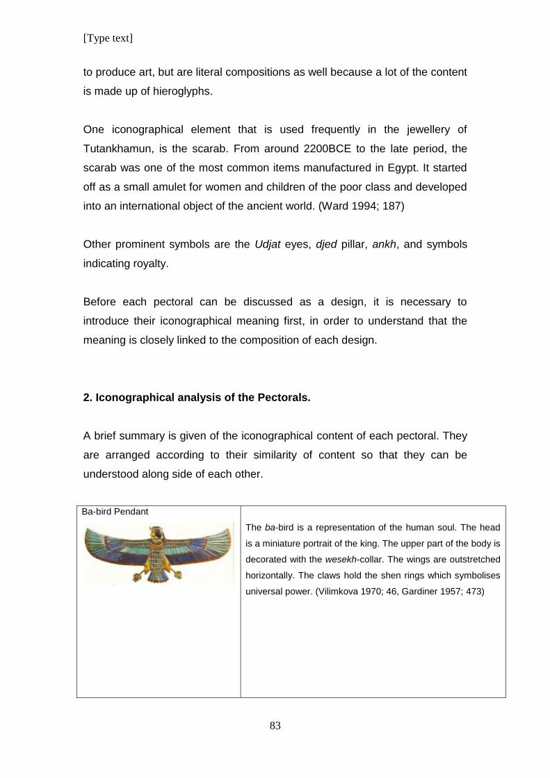
[Type text]
83
to produce art, but are literal compositions as well because a lot of the content
is made up of hieroglyphs.
One iconographical element that is used frequently in the jewellery of
Tutankhamun, is the scarab. From around 2200BCE to the late period, the
scarab was one of the most common items manufactured in Egypt. It started
off as a small amulet for women and children of the poor class and developed
into an international object of the ancient world. (Ward 1994; 187)
Other prominent symbols are the Udjat eyes, djed pillar, ankh, and symbols
indicating royalty.
Before each pectoral can be discussed as a design, it is necessary to
introduce their iconographical meaning first, in order to understand that the
meaning is closely linked to the composition of each design.
2. Iconographical analysis of the Pectorals.
A brief summary is given of the iconographical content of each pectoral. They
are arranged according to their similarity of content so that they can be
understood along side of each other.
Ba-bird Pendant
The ba-bird is a representation of the human soul. The head
is a miniature portrait of the king. The upper part of the body is
decorated with the wesekh-collar. The wings are outstretched
horizontally. The claws hold the shen rings which symbolises
universal power. (Vilimkova 1970; 46, Gardiner 1957; 473)
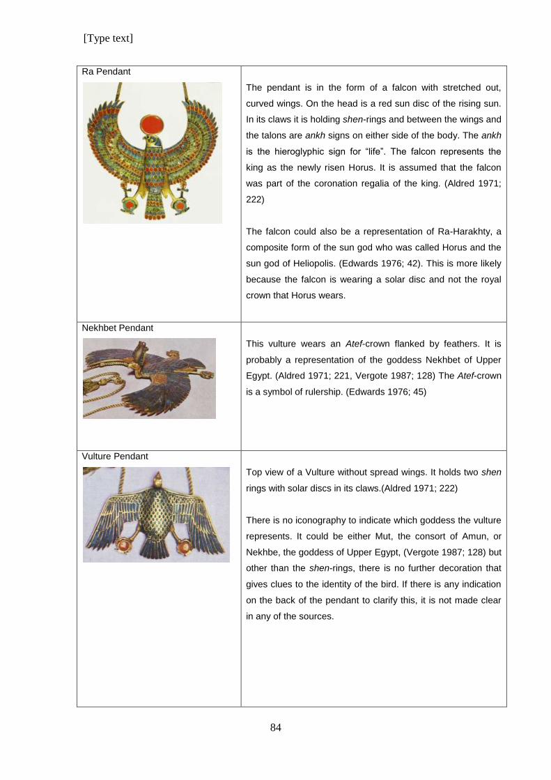
[Type text]
84
Ra Pendant
The pendant is in the form of a falcon with stretched out,
curved wings. On the head is a red sun disc of the rising sun.
In its claws it is holding shen-rings and between the wings and
the talons are ankh signs on either side of the body. The ankh
is the hieroglyphic sign for “life”. The falcon represents the
king as the newly risen Horus. It is assumed that the falcon
was part of the coronation regalia of the king. (Aldred 1971;
222)
The falcon could also be a representation of Ra-Harakhty, a
composite form of the sun god who was called Horus and the
sun god of Heliopolis. (Edwards 1976; 42). This is more likely
because the falcon is wearing a solar disc and not the royal
crown that Horus wears.
Nekhbet Pendant
This vulture wears an Atef-crown flanked by feathers. It is
probably a representation of the goddess Nekhbet of Upper
Egypt. (Aldred 1971; 221, Vergote 1987; 128) The Atef-crown
is a symbol of rulership. (Edwards 1976; 45)
Vulture Pendant
Top view of a Vulture without spread wings. It holds two shen
rings with solar discs in its claws.(Aldred 1971; 222)
There is no iconography to indicate which goddess the vulture
represents. It could be either Mut, the consort of Amun, or
Nekhbe, the goddess of Upper Egypt, (Vergote 1987; 128) but
other than the shen-rings, there is no further decoration that
gives clues to the identity of the bird. If there is any indication
on the back of the pendant to clarify this, it is not made clear
in any of the sources.
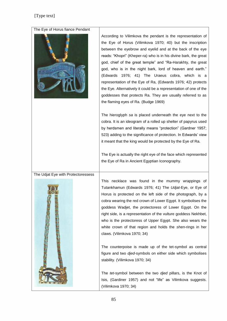
[Type text]
85
The Eye of Horus fiance Pendant
According to Vilimkova the pendant is the representation of
the Eye of Horus (Vilimkova 1970; 40) but the inscription
between the eyebrow and eyelid and at the back of the eye
reads: “Khopri” (Kheper-ra) who is in his divine bark, the great
god, chief of the great temple” and “Ra-Harakhty, the great
god, who is in the night bark, lord of heaven and earth.”
(Edwards 1976; 41) The Uraeus cobra, which is a
representation of the Eye of Ra, (Edwards 1976; 42) protects
the Eye. Alternatively it could be a representation of one of the
goddesses that protects Ra. They are usually referred to as
the flaming eyes of Ra. (Budge 1969)
The hieroglyph sa is placed underneath the eye next to the
cobra. It is an ideogram of a rolled up shelter of papyrus used
by herdsmen and literally means “protection” (Gardner 1957;
523) adding to the significance of protection. In Edwards’ view
it meant that the king would be protected by the Eye of Ra.
The Eye is actually the right eye of the face which represented
the Eye of Ra in Ancient Egyptian Iconography.
The Udjat Eye with Protectoressess
This necklace was found in the mummy wrappings of
Tutankhamun (Edwards 1976; 41) The Udjat-Eye, or Eye of
Horus is protected on the left side of the photograph, by a
cobra wearing the red crown of Lower Egypt. It symbolises the
goddess Wadjet, the protectoress of Lower Egypt. On the
right side, is a representation of the vulture goddess Nekhbet,
who is the protectoress of Upper Egypt. She also wears the
white crown of that region and holds the shen-rings in her
claws. (Vilimkova 1970; 34)
The counterpoise is made up of the tet-symbol as central
figure and two djed-symbols on either side which symbolises
stability. (Vilimkova 1970; 34)
The tet-symbol between the two djed pillars, is the Knot of
Isis, (Gardiner 1957) and not “life” as Vilimkova suggests.
(Vilimkova 1970; 34)
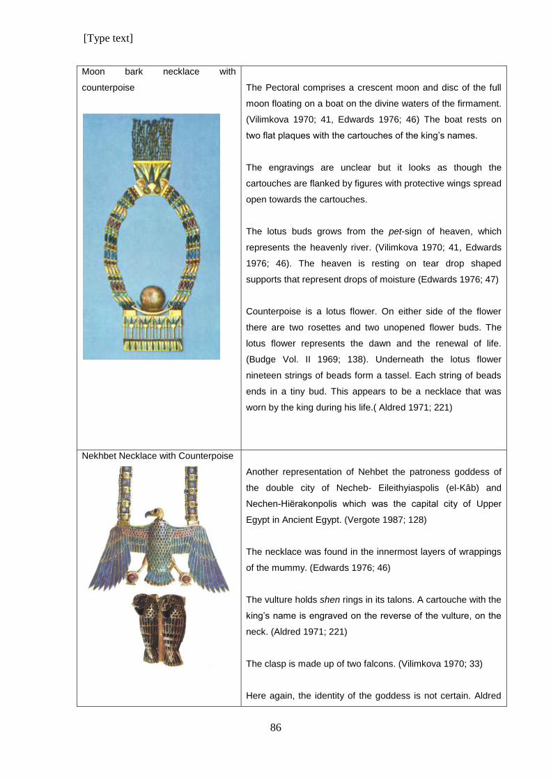
[Type text]
86
Moon bark necklace with
counterpoise
The Pectoral comprises a crescent moon and disc of the full
moon floating on a boat on the divine waters of the firmament.
(Vilimkova 1970; 41, Edwards 1976; 46) The boat rests on
two flat plaques with the cartouches of the king’s names.
The engravings are unclear but it looks as though the
cartouches are flanked by figures with protective wings spread
open towards the cartouches.
The lotus buds grows from the pet-sign of heaven, which
represents the heavenly river. (Vilimkova 1970; 41, Edwards
1976; 46). The heaven is resting on tear drop shaped
supports that represent drops of moisture (Edwards 1976; 47)
Counterpoise is a lotus flower. On either side of the flower
there are two rosettes and two unopened flower buds. The
lotus flower represents the dawn and the renewal of life.
(Budge Vol. II 1969; 138). Underneath the lotus flower
nineteen strings of beads form a tassel. Each string of beads
ends in a tiny bud. This appears to be a necklace that was
worn by the king during his life.( Aldred 1971; 221)
Nekhbet Necklace with Counterpoise
Another representation of Nehbet the patroness goddess of
the double city of Necheb- Eileithyiaspolis (el-Kâb) and
Nechen-Hiёrakonpolis which was the capital city of Upper
Egypt in Ancient Egypt. (Vergote 1987; 128)
The necklace was found in the innermost layers of wrappings
of the mummy. (Edwards 1976; 46)
The vulture holds shen rings in its talons. A cartouche with the
king’s name is engraved on the reverse of the vulture, on the
neck. (Aldred 1971; 221)
The clasp is made up of two falcons. (Vilimkova 1970; 33)
Here again, the identity of the goddess is not certain. Aldred
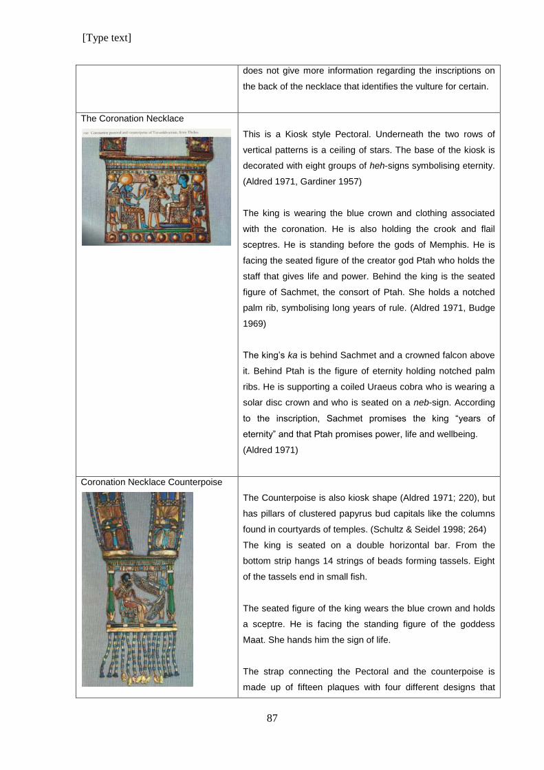
[Type text]
87
does not give more information regarding the inscriptions on
the back of the necklace that identifies the vulture for certain.
The Coronation Necklace
This is a Kiosk style Pectoral. Underneath the two rows of
vertical patterns is a ceiling of stars. The base of the kiosk is
decorated with eight groups of heh-signs symbolising eternity.
(Aldred 1971, Gardiner 1957)
The king is wearing the blue crown and clothing associated
with the coronation. He is also holding the crook and flail
sceptres. He is standing before the gods of Memphis. He is
facing the seated figure of the creator god Ptah who holds the
staff that gives life and power. Behind the king is the seated
figure of Sachmet, the consort of Ptah. She holds a notched
palm rib, symbolising long years of rule. (Aldred 1971, Budge
1969)
The king’s ka is behind Sachmet and a crowned falcon above
it. Behind Ptah is the figure of eternity holding notched palm
ribs. He is supporting a coiled Uraeus cobra who is wearing a
solar disc crown and who is seated on a neb-sign. According
to the inscription, Sachmet promises the king “years of
eternity” and that Ptah promises power, life and wellbeing.
(Aldred 1971)
Coronation Necklace Counterpoise
The Counterpoise is also kiosk shape (Aldred 1971; 220), but
has pillars of clustered papyrus bud capitals like the columns
found in courtyards of temples. (Schultz & Seidel 1998; 264)
The king is seated on a double horizontal bar. From the
bottom strip hangs 14 strings of beads forming tassels. Eight
of the tassels end in small fish.
The seated figure of the king wears the blue crown and holds
a sceptre. He is facing the standing figure of the goddess
Maat. She hands him the sign of life.
The strap connecting the Pectoral and the counterpoise is
made up of fifteen plaques with four different designs that
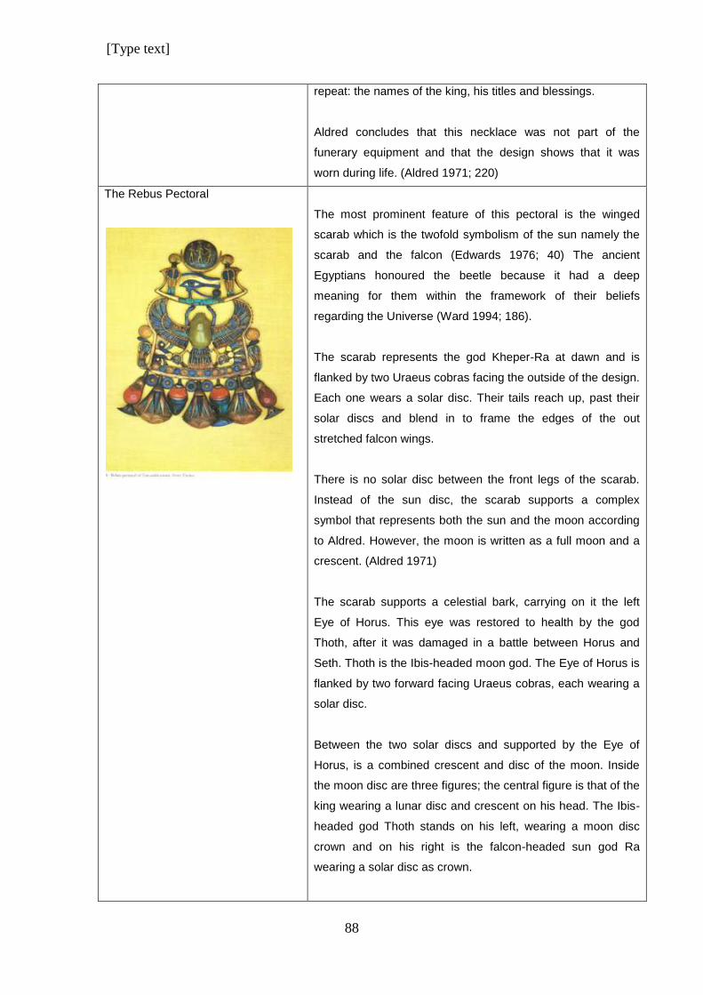
[Type text]
88
repeat: the names of the king, his titles and blessings.
Aldred concludes that this necklace was not part of the
funerary equipment and that the design shows that it was
worn during life. (Aldred 1971; 220)
The Rebus Pectoral
The most prominent feature of this pectoral is the winged
scarab which is the twofold symbolism of the sun namely the
scarab and the falcon (Edwards 1976; 40) The ancient
Egyptians honoured the beetle because it had a deep
meaning for them within the framework of their beliefs
regarding the Universe (Ward 1994; 186).
The scarab represents the god Kheper-Ra at dawn and is
flanked by two Uraeus cobras facing the outside of the design.
Each one wears a solar disc. Their tails reach up, past their
solar discs and blend in to frame the edges of the out
stretched falcon wings.
There is no solar disc between the front legs of the scarab.
Instead of the sun disc, the scarab supports a complex
symbol that represents both the sun and the moon according
to Aldred. However, the moon is written as a full moon and a
crescent. (Aldred 1971)
The scarab supports a celestial bark, carrying on it the left
Eye of Horus. This eye was restored to health by the god
Thoth, after it was damaged in a battle between Horus and
Seth. Thoth is the Ibis-headed moon god. The Eye of Horus is
flanked by two forward facing Uraeus cobras, each wearing a
solar disc.
Between the two solar discs and supported by the Eye of
Horus, is a combined crescent and disc of the moon. Inside
the moon disc are three figures; the central figure is that of the
king wearing a lunar disc and crescent on his head. The Ibis-
headed god Thoth stands on his left, wearing a moon disc
crown and on his right is the falcon-headed sun god Ra
wearing a solar disc as crown.
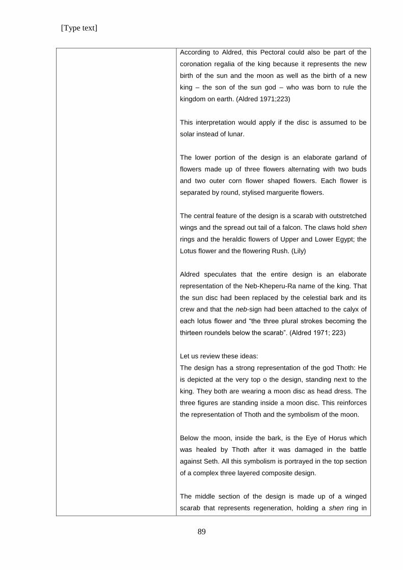
[Type text]
89
According to Aldred, this Pectoral could also be part of the
coronation regalia of the king because it represents the new
birth of the sun and the moon as well as the birth of a new
king – the son of the sun god – who was born to rule the
kingdom on earth. (Aldred 1971;223)
This interpretation would apply if the disc is assumed to be
solar instead of lunar.
The lower portion of the design is an elaborate garland of
flowers made up of three flowers alternating with two buds
and two outer corn flower shaped flowers. Each flower is
separated by round, stylised marguerite flowers.
The central feature of the design is a scarab with outstretched
wings and the spread out tail of a falcon. The claws hold shen
rings and the heraldic flowers of Upper and Lower Egypt; the
Lotus flower and the flowering Rush. (Lily)
Aldred speculates that the entire design is an elaborate
representation of the Neb-Kheperu-Ra name of the king. That
the sun disc had been replaced by the celestial bark and its
crew and that the neb-sign had been attached to the calyx of
each lotus flower and “the three plural strokes becoming the
thirteen roundels below the scarab”. (Aldred 1971; 223)
Let us review these ideas:
The design has a strong representation of the god Thoth: He
is depicted at the very top o the design, standing next to the
king. They both are wearing a moon disc as head dress. The
three figures are standing inside a moon disc. This reinforces
the representation of Thoth and the symbolism of the moon.
Below the moon, inside the bark, is the Eye of Horus which
was healed by Thoth after it was damaged in the battle
against Seth. All this symbolism is portrayed in the top section
of a complex three layered composite design.
The middle section of the design is made up of a winged
scarab that represents regeneration, holding a shen ring in
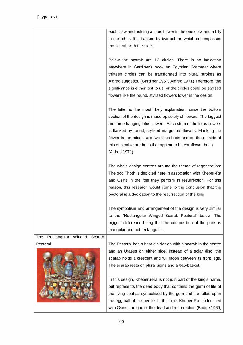
[Type text]
90
each claw and holding a lotus flower in the one claw and a Lily
in the other. It is flanked by two cobras which encompasses
the scarab with their tails.
Below the scarab are 13 circles. There is no indication
anywhere in Gardiner’s book on Egyptian Grammar where
thirteen circles can be transformed into plural strokes as
Aldred suggests. (Gardiner 1957, Aldred 1971) Therefore, the
significance is either lost to us, or the circles could be stylised
flowers like the round, stylised flowers lower in the design.
The latter is the most likely explanation, since the bottom
section of the design is made op solely of flowers. The biggest
are three hanging lotus flowers. Each stem of the lotus flowers
is flanked by round, stylised marguerite flowers. Flanking the
flower in the middle are two lotus buds and on the outside of
this ensemble are buds that appear to be cornflower buds.
(Aldred 1971)
The whole design centres around the theme of regeneration:
The god Thoth is depicted here in association with Kheper-Ra
and Osiris in the role they perform in resurrection. For this
reason, this research would come to the conclusion that the
pectoral is a dedication to the resurrection of the king.
The symbolism and arrangement of the design is very similar
to the “Rectangular Winged Scarab Pectoral” below. The
biggest difference being that the composition of the parts is
triangular and not rectangular.
The Rectangular Winged Scarab
Pectoral
The Pectoral has a heraldic design with a scarab in the centre
and an Uraeus on either side. Instead of a solar disc, the
scarab holds a crescent and full moon between its front legs.
The scarab rests on plural signs and a neb-basket.
In this design, Kheperu-Ra is not just part of the king’s name,
but represents the dead body that contains the germ of life of
the living soul as symbolised by the germs of life rolled up in
the egg-ball of the beetle. In this role, Kheper-Ra is identified
with Osiris, the god of the dead and resurrection.(Budge 1969;
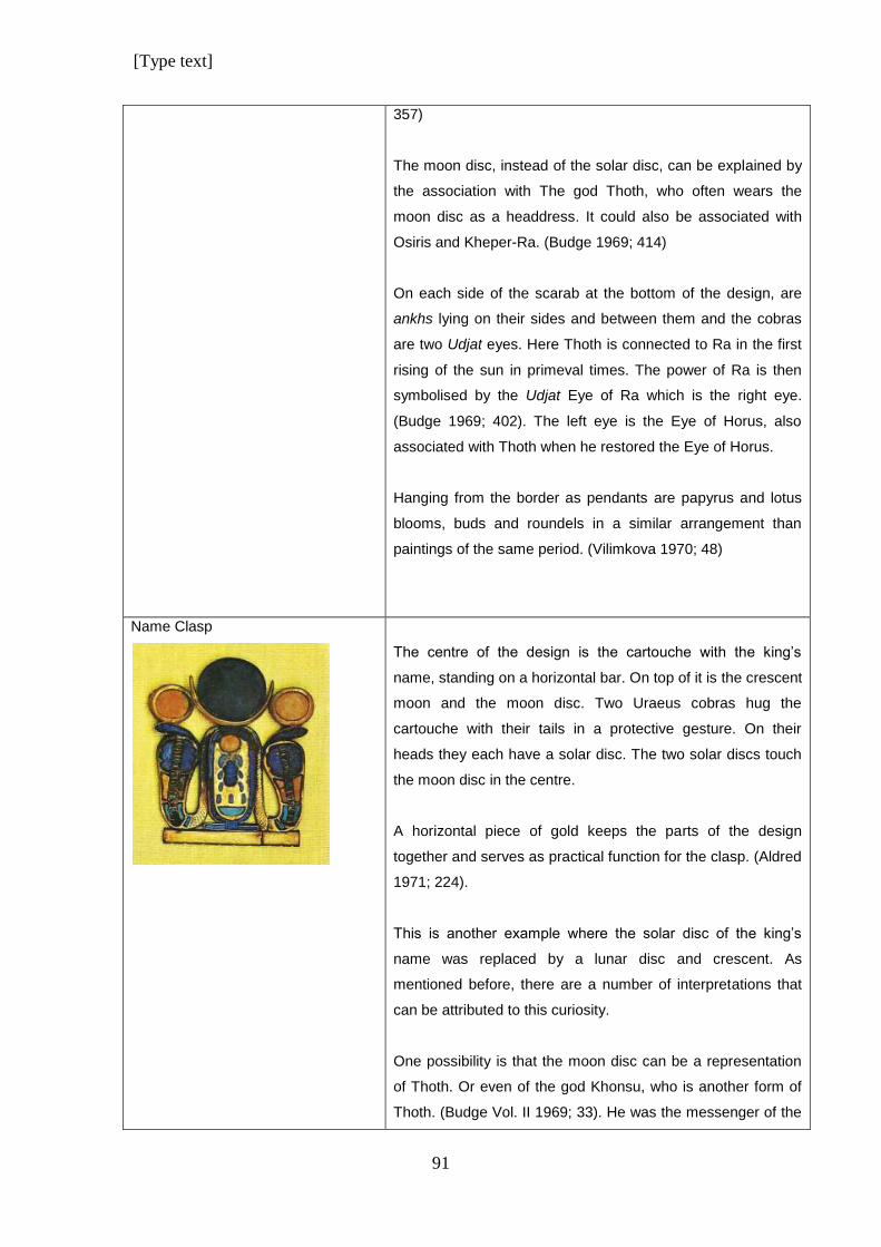
[Type text]
91
357)
The moon disc, instead of the solar disc, can be explained by
the association with The god Thoth, who often wears the
moon disc as a headdress. It could also be associated with
Osiris and Kheper-Ra. (Budge 1969; 414)
On each side of the scarab at the bottom of the design, are
ankhs lying on their sides and between them and the cobras
are two Udjat eyes. Here Thoth is connected to Ra in the first
rising of the sun in primeval times. The power of Ra is then
symbolised by the Udjat Eye of Ra which is the right eye.
(Budge 1969; 402). The left eye is the Eye of Horus, also
associated with Thoth when he restored the Eye of Horus.
Hanging from the border as pendants are papyrus and lotus
blooms, buds and roundels in a similar arrangement than
paintings of the same period. (Vilimkova 1970; 48)
Name Clasp
The centre of the design is the cartouche with the king’s
name, standing on a horizontal bar. On top of it is the crescent
moon and the moon disc. Two Uraeus cobras hug the
cartouche with their tails in a protective gesture. On their
heads they each have a solar disc. The two solar discs touch
the moon disc in the centre.
A horizontal piece of gold keeps the parts of the design
together and serves as practical function for the clasp. (Aldred
1971; 224).
This is another example where the solar disc of the king’s
name was replaced by a lunar disc and crescent. As
mentioned before, there are a number of interpretations that
can be attributed to this curiosity.
One possibility is that the moon disc can be a representation
of Thoth. Or even of the god Khonsu, who is another form of
Thoth. (Budge Vol. II 1969; 33). He was the messenger of the
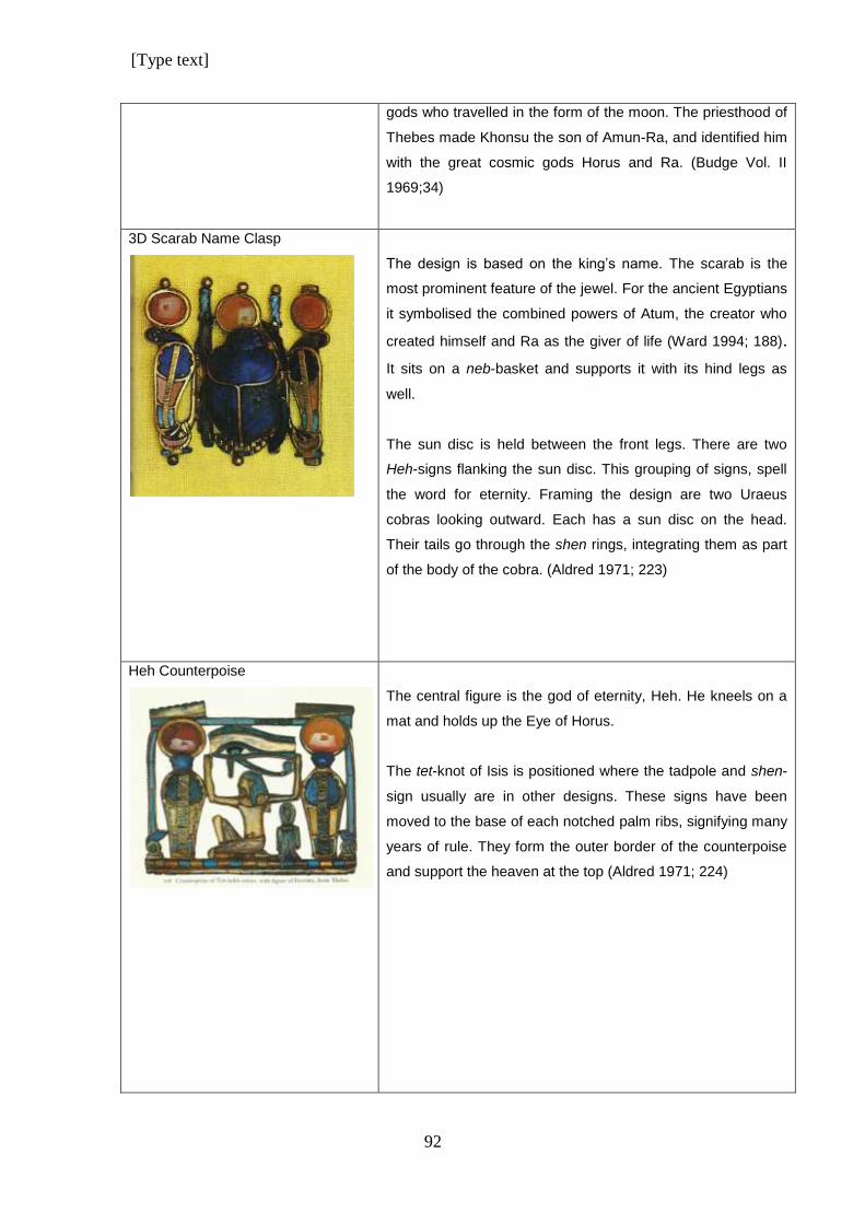
[Type text]
92
gods who travelled in the form of the moon. The priesthood of
Thebes made Khonsu the son of Amun-Ra, and identified him
with the great cosmic gods Horus and Ra. (Budge Vol. II
1969;34)
3D Scarab Name Clasp
The design is based on the king’s name. The scarab is the
most prominent feature of the jewel. For the ancient Egyptians
it symbolised the combined powers of Atum, the creator who
created himself and Ra as the giver of life (Ward 1994; 188).
It sits on a neb-basket and supports it with its hind legs as
well.
The sun disc is held between the front legs. There are two
Heh-signs flanking the sun disc. This grouping of signs, spell
the word for eternity. Framing the design are two Uraeus
cobras looking outward. Each has a sun disc on the head.
Their tails go through the shen rings, integrating them as part
of the body of the cobra. (Aldred 1971; 223)
Heh Counterpoise
The central figure is the god of eternity, Heh. He kneels on a
mat and holds up the Eye of Horus.
The tet-knot of Isis is positioned where the tadpole and shen-
sign usually are in other designs. These signs have been
moved to the base of each notched palm ribs, signifying many
years of rule. They form the outer border of the counterpoise
and support the heaven at the top (Aldred 1971; 224)
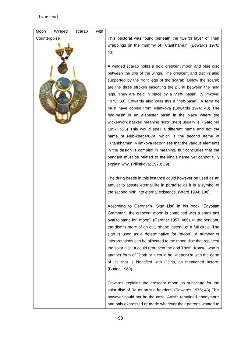
[Type text]
93
Moon Winged scarab with
Counterpoise
This pectoral was found beneath the twelfth layer of linen
wrappings on the mummy of Tutankhamun. (Edwards 1976;
43)
A winged scarab holds a gold crescent moon and blue disc
between the tips of the wings. The crescent and disc is also
supported by the front legs of the scarab. Below the scarab
are the three strokes indicating the plural between the hind
legs. They are held in place by a “heb- basin”. (Vilimkova;
1970; 39). Edwards also calls this a “heb-basin”. A term he
must have copied from Vilimkova (Edwards 1976; 43) The
heb-basin is an alabaster basin in the place where the
wickerwork basked meaning “lord” (neb) usually is. (Gardiner
1957; 525) This would spell a different name and not the
name of Neb-kheperu-ra, which is the second name of
Tutankhamun. Vilimkova recognises that the various elements
in the design is complex in meaning, but concludes that the
pendant must be related to the king’s name yet cannot fully
explain why. (Vilimkova; 1970; 39).
The dung beetle in this instance could however be used as an
amulet to assure eternal life in paradise as it is a symbol of
the second birth into eternal existence. (Ward 1994; 188).
According to Gardner’s “Sign List” in his book “Egyptian
Grammar”, the crescent moon is combined with a small half
oval to stand for “moon”. (Gardner 1957; 486). In the pendant,
the disc is more of an oval shape instead of a full circle. The
sign is used as a determinative for “moon”. A number of
interpretations can be allocated to the moon disc that replaced
the solar disc. It could represent the god Thoth, Konsu, who is
another form of Thoth or it could be Kheper-Ra with the germ
of life that is identified with Osiris, as mentioned before.
(Budge 1969)
Edwards explains the crescent moon as substitute for the
solar disc of Ra as artistic freedom. (Edwards 1976; 43) This
however could not be the case. Artists remained anonymous
and only expressed or made whatever their patrons wanted to
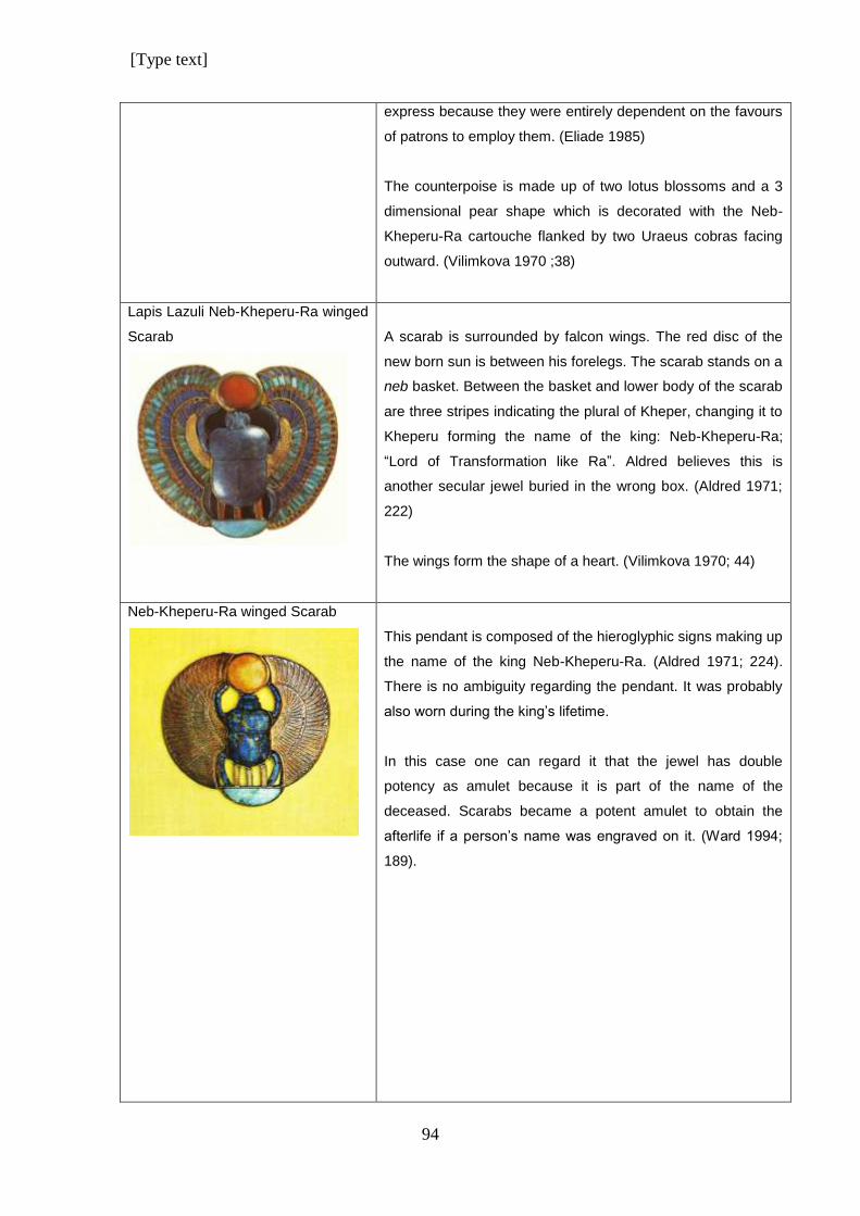
[Type text]
94
express because they were entirely dependent on the favours
of patrons to employ them. (Eliade 1985)
The counterpoise is made up of two lotus blossoms and a 3
dimensional pear shape which is decorated with the Neb-
Kheperu-Ra cartouche flanked by two Uraeus cobras facing
outward. (Vilimkova 1970 ;38)
Lapis Lazuli Neb-Kheperu-Ra winged
Scarab
A scarab is surrounded by falcon wings. The red disc of the
new born sun is between his forelegs. The scarab stands on a
neb basket. Between the basket and lower body of the scarab
are three stripes indicating the plural of Kheper, changing it to
Kheperu forming the name of the king: Neb-Kheperu-Ra;
“Lord of Transformation like Ra”. Aldred believes this is
another secular jewel buried in the wrong box. (Aldred 1971;
222)
The wings form the shape of a heart. (Vilimkova 1970; 44)
Neb-Kheperu-Ra winged Scarab
This pendant is composed of the hieroglyphic signs making up
the name of the king Neb-Kheperu-Ra. (Aldred 1971; 224).
There is no ambiguity regarding the pendant. It was probably
also worn during the king’s lifetime.
In this case one can regard it that the jewel has double
potency as amulet because it is part of the name of the
deceased. Scarabs became a potent amulet to obtain the
afterlife if a person’s name was engraved on it. (Ward 1994;
189).
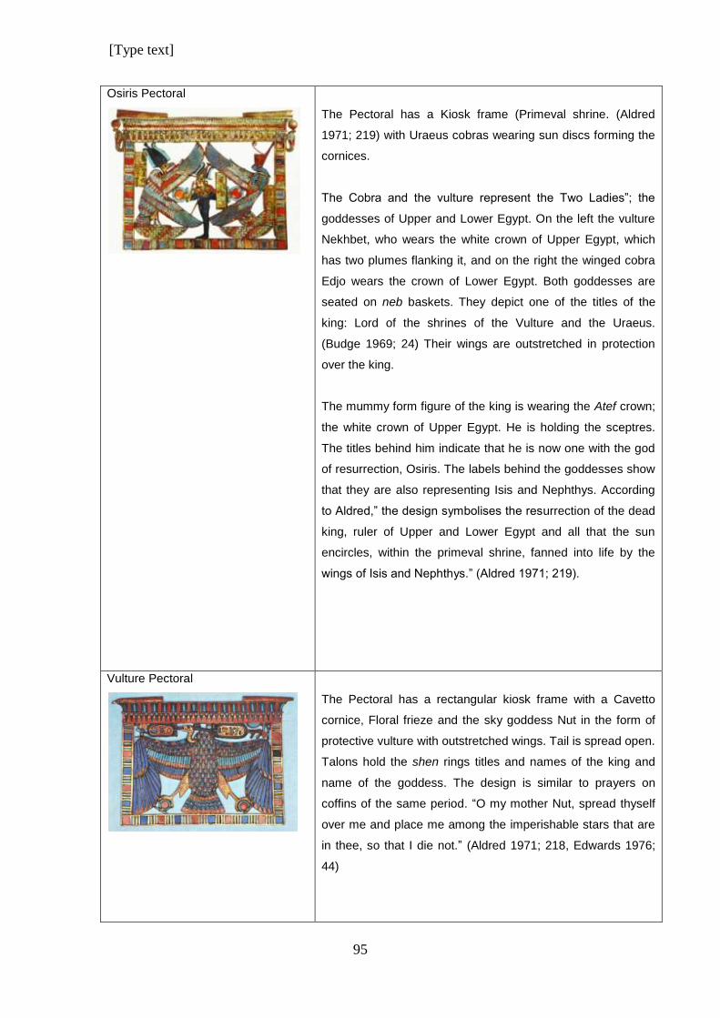
[Type text]
95
Osiris Pectoral
The Pectoral has a Kiosk frame (Primeval shrine. (Aldred
1971; 219) with Uraeus cobras wearing sun discs forming the
cornices.
The Cobra and the vulture represent the Two Ladies”; the
goddesses of Upper and Lower Egypt. On the left the vulture
Nekhbet, who wears the white crown of Upper Egypt, which
has two plumes flanking it, and on the right the winged cobra
Edjo wears the crown of Lower Egypt. Both goddesses are
seated on neb baskets. They depict one of the titles of the
king: Lord of the shrines of the Vulture and the Uraeus.
(Budge 1969; 24) Their wings are outstretched in protection
over the king.
The mummy form figure of the king is wearing the Atef crown;
the white crown of Upper Egypt. He is holding the sceptres.
The titles behind him indicate that he is now one with the god
of resurrection, Osiris. The labels behind the goddesses show
that they are also representing Isis and Nephthys. According
to Aldred,” the design symbolises the resurrection of the dead
king, ruler of Upper and Lower Egypt and all that the sun
encircles, within the primeval shrine, fanned into life by the
wings of Isis and Nephthys.” (Aldred 1971; 219).
Vulture Pectoral
The Pectoral has a rectangular kiosk frame with a Cavetto
cornice, Floral frieze and the sky goddess Nut in the form of
protective vulture with outstretched wings. Tail is spread open.
Talons hold the shen rings titles and names of the king and
name of the goddess. The design is similar to prayers on
coffins of the same period. “O my mother Nut, spread thyself
over me and place me among the imperishable stars that are
in thee, so that I die not.” (Aldred 1971; 218, Edwards 1976;
44)
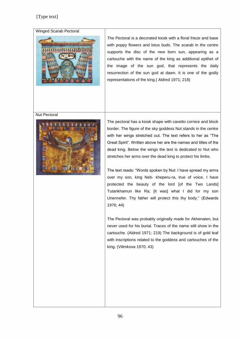
[Type text]
96
Winged Scarab Pectoral
The Pectoral is a decorated kiosk with a floral frieze and base
with poppy flowers and lotus buds. The scarab in the centre
supports the disc of the new born sun, appearing as a
cartouche with the name of the king as additional epithet of
the image of the sun god, that represents the daily
resurrection of the sun god at dawn. It is one of the godly
representations of the king.( Aldred 1971; 218)
Nut Pectoral
The pectoral has a kiosk shape with cavetto cornice and block
border. The figure of the sky goddess Nut stands in the centre
with her wings stretched out. The text refers to her as “The
Great Spirit”. Written above her are the names and titles of the
dead king. Below the wings the text is dedicated to Nut who
stretches her arms over the dead king to protect his limbs.
The text reads: “Words spoken by Nut: I have spread my arms
over my son, king Neb- kheperu-ra, true of voice, I have
protected the beauty of the lord [of the Two Lands]
Tutankhamun like Ra; [it was] what I did for my son
Unennefer. Thy father will protect this thy body.” (Edwards
1976; 44)
The Pectoral was probably originally made for Akhenaten, but
never used for his burial. Traces of the name still show in the
cartouche. (Aldred 1971; 219) The background is of gold leaf
with inscriptions related to the goddess and cartouches of the
king. (Vilimkova 1970; 43)
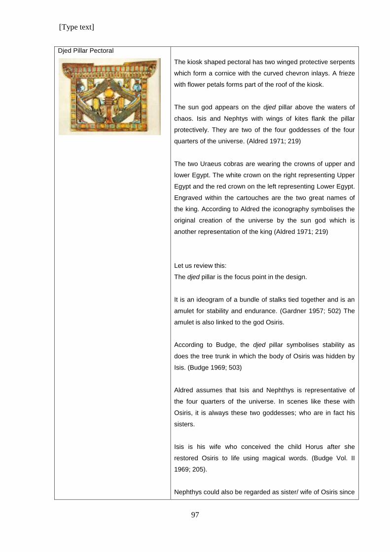
[Type text]
97
Djed Pillar Pectoral
The kiosk shaped pectoral has two winged protective serpents
which form a cornice with the curved chevron inlays. A frieze
with flower petals forms part of the roof of the kiosk.
The sun god appears on the djed pillar above the waters of
chaos. Isis and Nephtys with wings of kites flank the pillar
protectively. They are two of the four goddesses of the four
quarters of the universe. (Aldred 1971; 219)
The two Uraeus cobras are wearing the crowns of upper and
lower Egypt. The white crown on the right representing Upper
Egypt and the red crown on the left representing Lower Egypt.
Engraved within the cartouches are the two great names of
the king. According to Aldred the iconography symbolises the
original creation of the universe by the sun god which is
another representation of the king (Aldred 1971; 219)
Let us review this:
The djed pillar is the focus point in the design.
It is an ideogram of a bundle of stalks tied together and is an
amulet for stability and endurance. (Gardner 1957; 502) The
amulet is also linked to the god Osiris.
According to Budge, the djed pillar symbolises stability as
does the tree trunk in which the body of Osiris was hidden by
Isis. (Budge 1969; 503)
Aldred assumes that Isis and Nephthys is representative of
the four quarters of the universe. In scenes like these with
Osiris, it is always these two goddesses; who are in fact his
sisters.
Isis is his wife who conceived the child Horus after she
restored Osiris to life using magical words. (Budge Vol. II
1969; 205).
Nephthys could also be regarded as sister/ wife of Osiris since
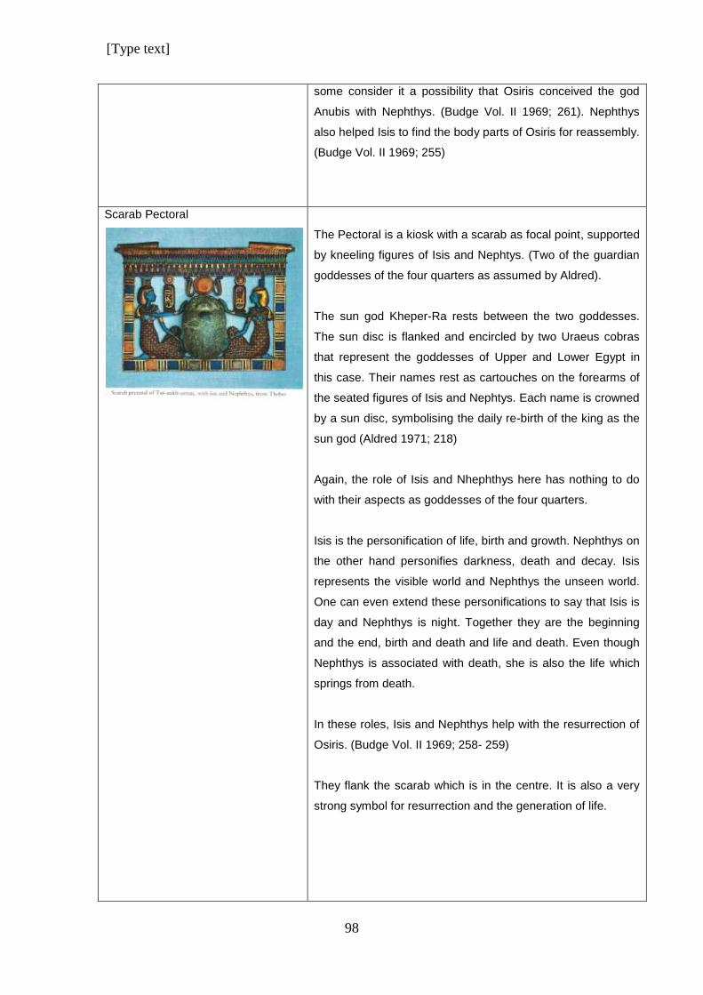
[Type text]
98
some consider it a possibility that Osiris conceived the god
Anubis with Nephthys. (Budge Vol. II 1969; 261). Nephthys
also helped Isis to find the body parts of Osiris for reassembly.
(Budge Vol. II 1969; 255)
Scarab Pectoral
The Pectoral is a kiosk with a scarab as focal point, supported
by kneeling figures of Isis and Nephtys. (Two of the guardian
goddesses of the four quarters as assumed by Aldred).
The sun god Kheper-Ra rests between the two goddesses.
The sun disc is flanked and encircled by two Uraeus cobras
that represent the goddesses of Upper and Lower Egypt in
this case. Their names rest as cartouches on the forearms of
the seated figures of Isis and Nephtys. Each name is crowned
by a sun disc, symbolising the daily re-birth of the king as the
sun god (Aldred 1971; 218)
Again, the role of Isis and Nhephthys here has nothing to do
with their aspects as goddesses of the four quarters.
Isis is the personification of life, birth and growth. Nephthys on
the other hand personifies darkness, death and decay. Isis
represents the visible world and Nephthys the unseen world.
One can even extend these personifications to say that Isis is
day and Nephthys is night. Together they are the beginning
and the end, birth and death and life and death. Even though
Nephthys is associated with death, she is also the life which
springs from death.
In these roles, Isis and Nephthys help with the resurrection of
Osiris. (Budge Vol. II 1969; 258- 259)
They flank the scarab which is in the centre. It is also a very
strong symbol for resurrection and the generation of life.
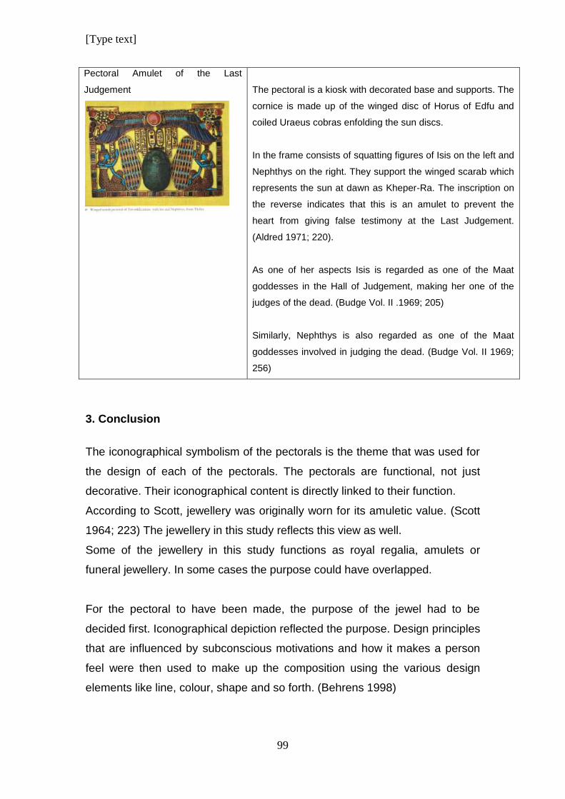
[Type text]
99
Pectoral Amulet of the Last
Judgement
The pectoral is a kiosk with decorated base and supports. The
cornice is made up of the winged disc of Horus of Edfu and
coiled Uraeus cobras enfolding the sun discs.
In the frame consists of squatting figures of Isis on the left and
Nephthys on the right. They support the winged scarab which
represents the sun at dawn as Kheper-Ra. The inscription on
the reverse indicates that this is an amulet to prevent the
heart from giving false testimony at the Last Judgement.
(Aldred 1971; 220).
As one of her aspects Isis is regarded as one of the Maat
goddesses in the Hall of Judgement, making her one of the
judges of the dead. (Budge Vol. II .1969; 205)
Similarly, Nephthys is also regarded as one of the Maat
goddesses involved in judging the dead. (Budge Vol. II 1969;
256)
3. Conclusion
The iconographical symbolism of the pectorals is the theme that was used for
the design of each of the pectorals. The pectorals are functional, not just
decorative. Their iconographical content is directly linked to their function.
According to Scott, jewellery was originally worn for its amuletic value. (Scott
1964; 223) The jewellery in this study reflects this view as well.
Some of the jewellery in this study functions as royal regalia, amulets or
funeral jewellery. In some cases the purpose could have overlapped.
For the pectoral to have been made, the purpose of the jewel had to be
decided first. Iconographical depiction reflected the purpose. Design principles
that are influenced by subconscious motivations and how it makes a person
feel were then used to make up the composition using the various design
elements like line, colour, shape and so forth. (Behrens 1998)
[Type text]
100
The Iconography of the pectorals were multi-layered and complex. From the
analysis above, it can be seen that the meaning embedded in each design
can be interpreted on more than one level. Sometimes it can also be
misunderstood. Especially by modern onlookers who do not fully grasp the
symbolic significance of the content.
Over thousands of years, the true meaning of ancient iconography has been
lost and modern scholars can only understand it partially, conveying only a
portion of the significance of what it really means.
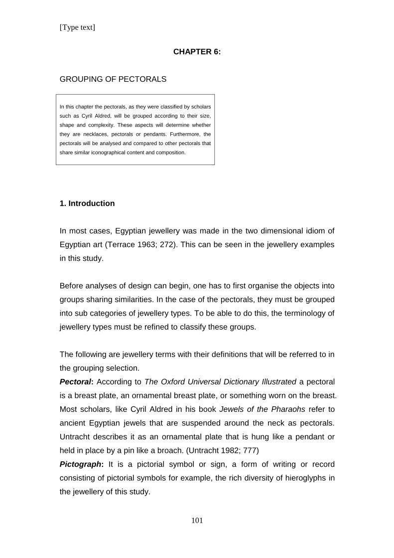
[Type text]
101
CHAPTER 6:
GROUPING OF PECTORALS
In this chapter the pectorals, as they were classified by scholars
such as Cyril Aldred, will be grouped according to their size,
shape and complexity. These aspects will determine whether
they are necklaces, pectorals or pendants. Furthermore, the
pectorals will be analysed and compared to other pectorals that
share similar iconographical content and composition.
1. Introduction
In most cases, Egyptian jewellery was made in the two dimensional idiom of
Egyptian art (Terrace 1963; 272). This can be seen in the jewellery examples
in this study.
Before analyses of design can begin, one has to first organise the objects into
groups sharing similarities. In the case of the pectorals, they must be grouped
into sub categories of jewellery types. To be able to do this, the terminology of
jewellery types must be refined to classify these groups.
The following are jewellery terms with their definitions that will be referred to in
the grouping selection.
Pectoral: According to The Oxford Universal Dictionary Illustrated a pectoral
is a breast plate, an ornamental breast plate, or something worn on the breast.
Most scholars, like Cyril Aldred in his book Jewels of the Pharaohs refer to
ancient Egyptian jewels that are suspended around the neck as pectorals.
Untracht describes it as an ornamental plate that is hung like a pendant or
held in place by a pin like a broach. (Untracht 1982; 777)
Pictograph: It is a pictorial symbol or sign, a form of writing or record
consisting of pictorial symbols for example, the rich diversity of hieroglyphs in
the jewellery of this study.
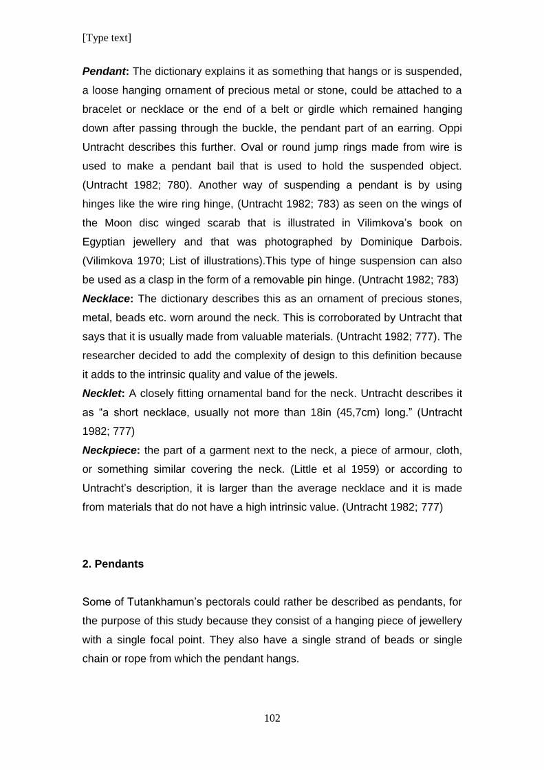
[Type text]
102
Pendant: The dictionary explains it as something that hangs or is suspended,
a loose hanging ornament of precious metal or stone, could be attached to a
bracelet or necklace or the end of a belt or girdle which remained hanging
down after passing through the buckle, the pendant part of an earring. Oppi
Untracht describes this further. Oval or round jump rings made from wire is
used to make a pendant bail that is used to hold the suspended object.
(Untracht 1982; 780). Another way of suspending a pendant is by using
hinges like the wire ring hinge, (Untracht 1982; 783) as seen on the wings of
the Moon disc winged scarab that is illustrated in Vilimkova’s book on
Egyptian jewellery and that was photographed by Dominique Darbois.
(Vilimkova 1970; List of illustrations).This type of hinge suspension can also
be used as a clasp in the form of a removable pin hinge. (Untracht 1982; 783)
Necklace: The dictionary describes this as an ornament of precious stones,
metal, beads etc. worn around the neck. This is corroborated by Untracht that
says that it is usually made from valuable materials. (Untracht 1982; 777). The
researcher decided to add the complexity of design to this definition because
it adds to the intrinsic quality and value of the jewels.
Necklet: A closely fitting ornamental band for the neck. Untracht describes it
as “a short necklace, usually not more than 18in (45,7cm) long.” (Untracht
1982; 777)
Neckpiece: the part of a garment next to the neck, a piece of armour, cloth,
or something similar covering the neck. (Little et al 1959) or according to
Untracht’s description, it is larger than the average necklace and it is made
from materials that do not have a high intrinsic value. (Untracht 1982; 777)
2. Pendants
Some of Tutankhamun’s pectorals could rather be described as pendants, for
the purpose of this study because they consist of a hanging piece of jewellery
with a single focal point. They also have a single strand of beads or single
chain or rope from which the pendant hangs.
[Type text]
103
As pendants, they would be sub-divided further according to their subject
matter. The single birds will be grouped together and the scarab pendants will
be categorised into a separate group for the purpose of analysis.
The ba-Bird pendant is large and should be termed a breast plate due to its
size, but it is grouped together with the other jewels with the same
iconographical subject matter for the purpose of analysis.
2.1 Bird pendants
2.1.1. Ba Bird Pendant/ Breast plate
2.1.2. Ra-Harakhti Pendant
2.1.3. Nekhbet Pendant
2.1.4. Vulture Pendant
[Type text]
104
2.2. Circular Name Pendants
2.2.1. Winged scarab
with clasp
2.2.2. Name Pendant
with red solar disc
2.2.3. Name Pendant
with orange solar disc
3. Necklaces
Necklaces in this study will be the more complex pieces of jewellery made
from large amounts of different precious materials. As illustrated above, the
pendants, that are smaller in size, are composed of one feature that hangs
from a single chain, rope or string of beads.
The necklaces on the other hand, are more complex and are suspended from
multiple strings except for the Eye of Ra pendant that is on a single string of
large beads, but with delicate and detailed granulation on gold beads.
Each necklace is composed of multiple elements, using many materials that
form a complex design. Each necklace has more than one string that it hangs
from and in addition, they each have a counterpoise with its own complex
design.
The group of jewels below consists of necklaces that are categorised
according to the parameters listed above.
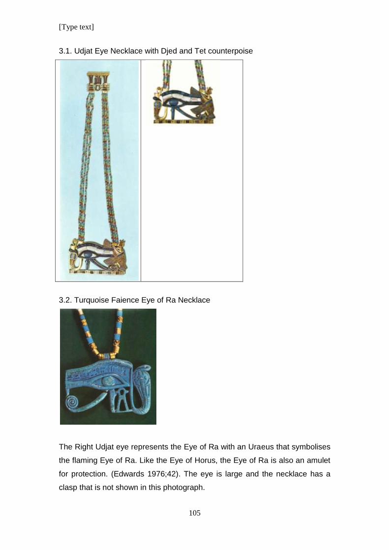
[Type text]
105
3.1. Udjat Eye Necklace with Djed and Tet counterpoise
3.2. Turquoise Faience Eye of Ra Necklace
The Right Udjat eye represents the Eye of Ra with an Uraeus that symbolises
the flaming Eye of Ra. Like the Eye of Horus, the Eye of Ra is also an amulet
for protection. (Edwards 1976;42). The eye is large and the necklace has a
clasp that is not shown in this photograph.
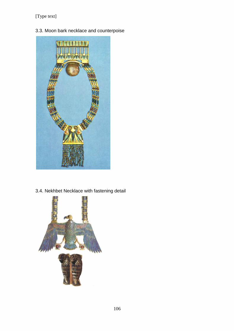
[Type text]
106
3.3. Moon bark necklace and counterpoise
3.4. Nekhbet Necklace with fastening detail
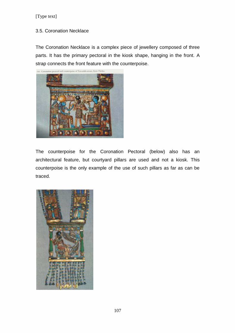
[Type text]
107
3.5. Coronation Necklace
The Coronation Necklace is a complex piece of jewellery composed of three
parts. It has the primary pectoral in the kiosk shape, hanging in the front. A
strap connects the front feature with the counterpoise.
The counterpoise for the Coronation Pectoral (below) also has an
architectural feature, but courtyard pillars are used and not a kiosk. This
counterpoise is the only example of the use of such pillars as far as can be
traced.
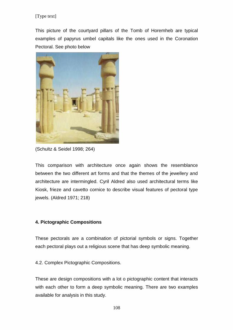
[Type text]
108
This picture of the courtyard pillars of the Tomb of Horemheb are typical
examples of papyrus umbel capitals like the ones used in the Coronation
Pectoral. See photo below
(Schultz & Seidel 1998; 264)
This comparison with architecture once again shows the resemblance
between the two different art forms and that the themes of the jewellery and
architecture are intermingled. Cyril Aldred also used architectural terms like
Kiosk, frieze and cavetto cornice to describe visual features of pectoral type
jewels. (Aldred 1971; 218)
4. Pictographic Compositions
These pectorals are a combination of pictorial symbols or signs. Together
each pectoral plays out a religious scene that has deep symbolic meaning.
4.2. Complex Pictographic Compositions.
These are design compositions with a lot o pictographic content that interacts
with each other to form a deep symbolic meaning. There are two examples
available for analysis in this study.
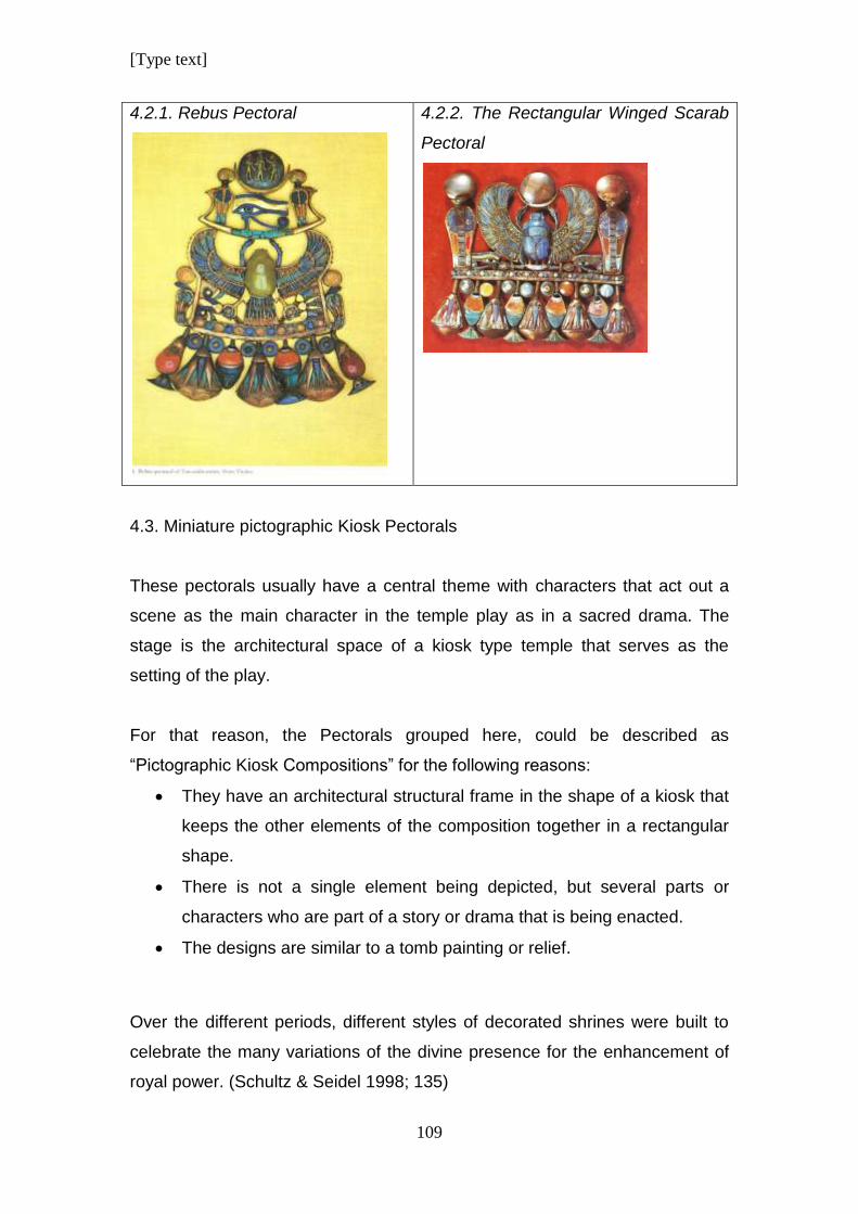
[Type text]
109
4.2.1. Rebus Pectoral
4.2.2. The Rectangular Winged Scarab
Pectoral
4.3. Miniature pictographic Kiosk Pectorals
These pectorals usually have a central theme with characters that act out a
scene as the main character in the temple play as in a sacred drama. The
stage is the architectural space of a kiosk type temple that serves as the
setting of the play.
For that reason, the Pectorals grouped here, could be described as
“Pictographic Kiosk Compositions” for the following reasons:
They have an architectural structural frame in the shape of a kiosk that
keeps the other elements of the composition together in a rectangular
shape.
There is not a single element being depicted, but several parts or
characters who are part of a story or drama that is being enacted.
The designs are similar to a tomb painting or relief.
Over the different periods, different styles of decorated shrines were built to
celebrate the many variations of the divine presence for the enhancement of
royal power. (Schultz & Seidel 1998; 135)
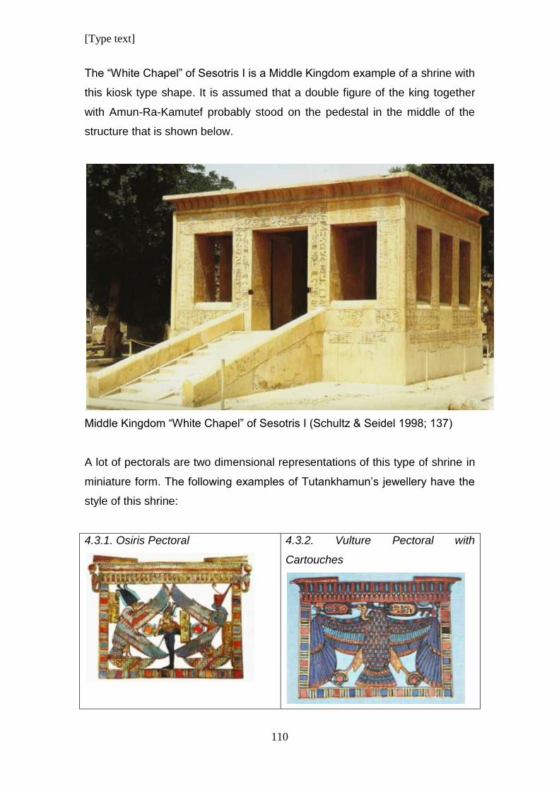
[Type text]
110
The “White Chapel” of Sesotris I is a Middle Kingdom example of a shrine with
this kiosk type shape. It is assumed that a double figure of the king together
with Amun-Ra-Kamutef probably stood on the pedestal in the middle of the
structure that is shown below.
Middle Kingdom “White Chapel” of Sesotris I (Schultz & Seidel 1998; 137)
A lot of pectorals are two dimensional representations of this type of shrine in
miniature form. The following examples of Tutankhamun’s jewellery have the
style of this shrine:
4.3.1. Osiris Pectoral
4.3.2. Vulture Pectoral with
Cartouches
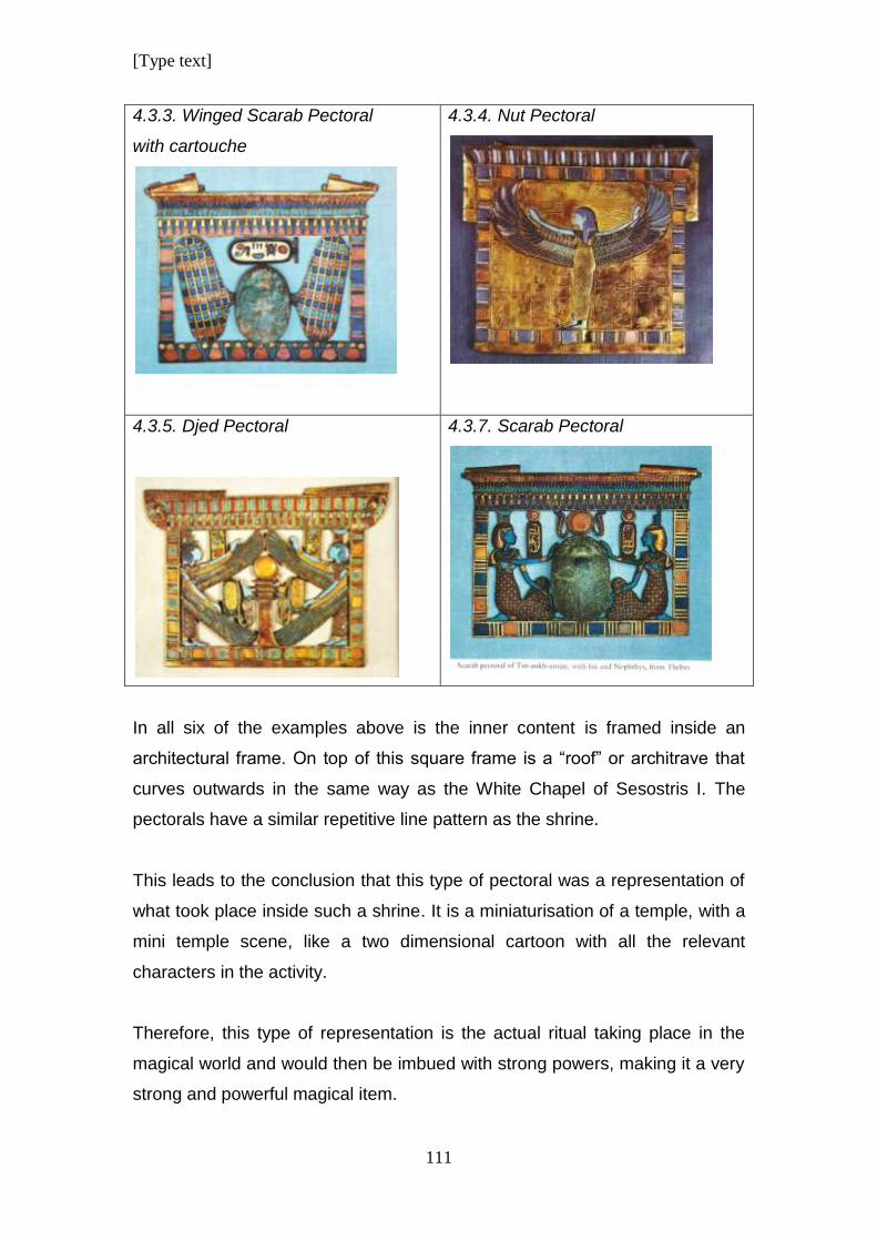
[Type text]
111
4.3.3. Winged Scarab Pectoral
with cartouche
4.3.4. Nut Pectoral
4.3.5. Djed Pectoral
4.3.7. Scarab Pectoral
In all six of the examples above is the inner content is framed inside an
architectural frame. On top of this square frame is a “roof” or architrave that
curves outwards in the same way as the White Chapel of Sesostris I. The
pectorals have a similar repetitive line pattern as the shrine.
This leads to the conclusion that this type of pectoral was a representation of
what took place inside such a shrine. It is a miniaturisation of a temple, with a
mini temple scene, like a two dimensional cartoon with all the relevant
characters in the activity.
Therefore, this type of representation is the actual ritual taking place in the
magical world and would then be imbued with strong powers, making it a very
strong and powerful magical item.
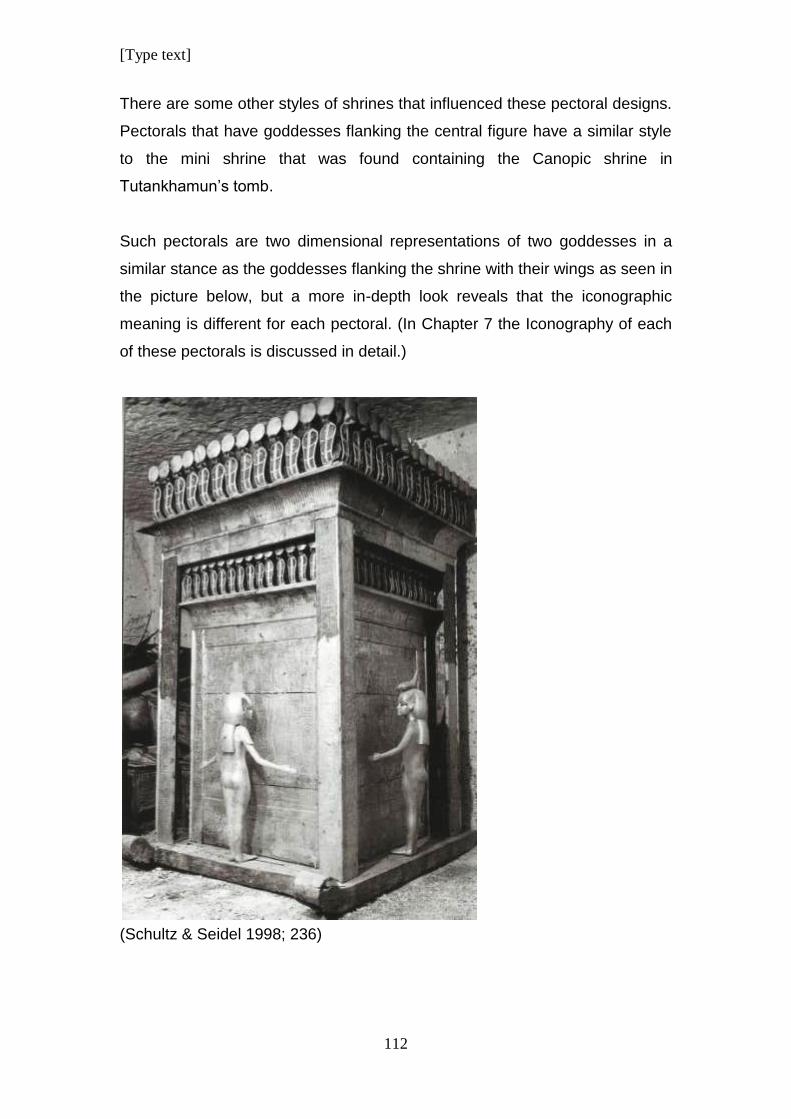
[Type text]
112
There are some other styles of shrines that influenced these pectoral designs.
Pectorals that have goddesses flanking the central figure have a similar style
to the mini shrine that was found containing the Canopic shrine in
Tutankhamun’s tomb.
Such pectorals are two dimensional representations of two goddesses in a
similar stance as the goddesses flanking the shrine with their wings as seen in
the picture below, but a more in-depth look reveals that the iconographic
meaning is different for each pectoral. (In Chapter 7 the Iconography of each
of these pectorals is discussed in detail.)
(Schultz & Seidel 1998; 236)
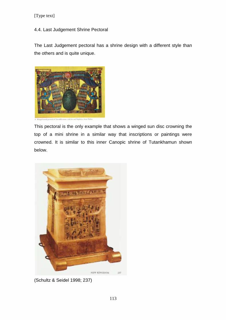
[Type text]
113
4.4. Last Judgement Shrine Pectoral
The Last Judgement pectoral has a shrine design with a different style than
the others and is quite unique.
This pectoral is the only example that shows a winged sun disc crowning the
top of a mini shrine in a similar way that inscriptions or paintings were
crowned. It is similar to this inner Canopic shrine of Tutankhamun shown
below.
(Schultz & Seidel 1998; 237)
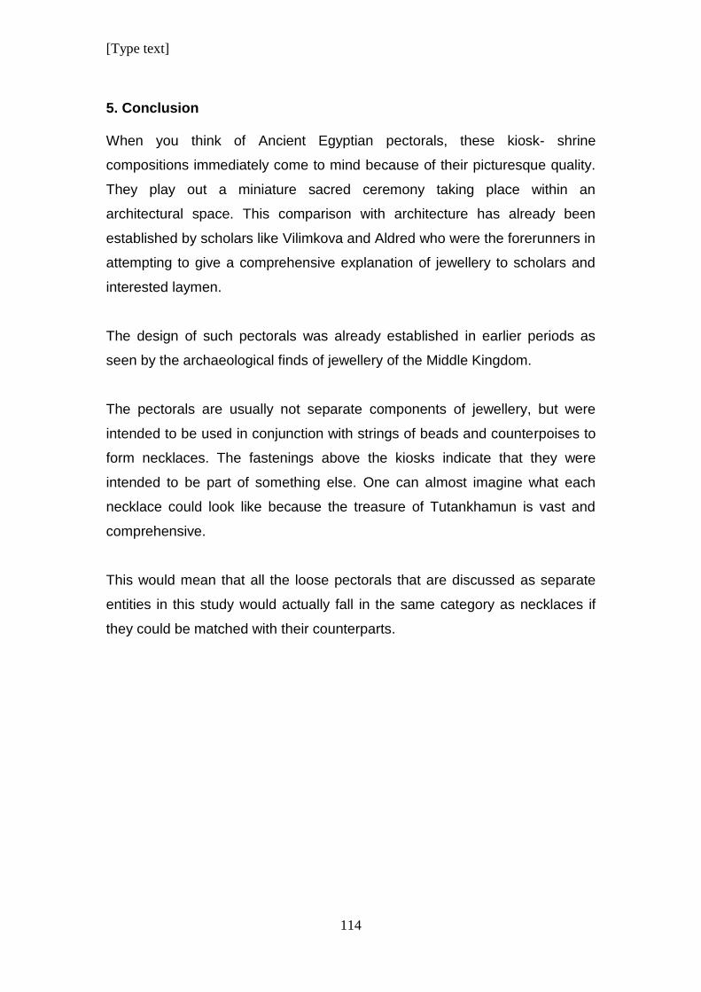
[Type text]
114
5. Conclusion When you think of Ancient Egyptian pectorals, these kiosk- shrine
compositions immediately come to mind because of their picturesque quality.
They play out a miniature sacred ceremony taking place within an
architectural space. This comparison with architecture has already been
established by scholars like Vilimkova and Aldred who were the forerunners in
attempting to give a comprehensive explanation of jewellery to scholars and
interested laymen.
The design of such pectorals was already established in earlier periods as
seen by the archaeological finds of jewellery of the Middle Kingdom.
The pectorals are usually not separate components of jewellery, but were
intended to be used in conjunction with strings of beads and counterpoises to
form necklaces. The fastenings above the kiosks indicate that they were
intended to be part of something else. One can almost imagine what each
necklace could look like because the treasure of Tutankhamun is vast and
comprehensive.
This would mean that all the loose pectorals that are discussed as separate
entities in this study would actually fall in the same category as necklaces if
they could be matched with their counterparts.
[Type text]
115
CHAPTER 7:
DESIGN ANALYSIS OF PECTORALS
The different groups of pectorals will be discussed in this
chapter. Each pectoral within a group will be analysed and
compared according to Design Principles and Design Elements
as it appears in the composition of the individual design. The
findings of each group will be summarised to identify similarities
and differences.
1. Introduction
In Chapter 6 all the different pectorals were grouped into categories that
determine what type of jewellery it is related to. They are all hanging objects
and have been generally referred to as pectorals, (Alderd 1971, Andrews
1996, Edwards 1976, Vilimkova 1970) by scholars who have studied them
before, but this study wants to refine on that for the purpose of analysis and
because they can be divided into sub-groups of pectorals for better
identification.
Each pectoral will be analysed as an individual object using design principles
and design elements to see how these factors play a role in its design.
Pectorals within a group will be compared to each other to determine what the
similarities and differences are within the group. Some pectorals, are really
complex necklaces and are discussed as separate entities with distinct parts
and how these parts relate to each other in the overall design.
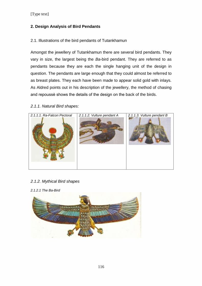
[Type text]
116
2. Design Analysis of Bird Pendants
2.1. Illustrations of the bird pendants of Tutankhamun
Amongst the jewellery of Tutankhamun there are several bird pendants. They
vary in size, the largest being the Ba-bird pendant. They are referred to as
pendants because they are each the single hanging unit of the design in
question. The pendants are large enough that they could almost be referred to
as breast plates. They each have been made to appear solid gold with inlays.
As Aldred points out in his description of the jewellery, the method of chasing
and repoussѐ shows the details of the design on the back of the birds.
2.1.1. Natural Bird shapes: 2.1.1.1. Ra-Falcon Pectoral
2.1.1.2. Vulture pendant A
2.1.1.3. Vulture pendant B
2.1.2. Mythical Bird shapes 2.1.2.1 The Ba-Bird
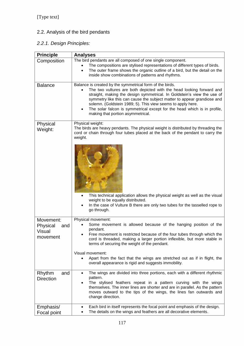
[Type text]
117
2.2. Analysis of the bird pendants 2.2.1. Design Principles:
Principle Analyses
Composition
The bird pendants are all composed of one single component.
The compositions are stylised representations of different types of birds.
The outer frame shows the organic outline of a bird, but the detail on the inside show combinations of patterns and rhythms.
Balance
Balance is created by the symmetrical form of the birds.
The two vultures are both depicted with the head looking forward and straight, making the design symmetrical. In Goldstein’s view the use of symmetry like this can cause the subject matter to appear grandiose and solemn. (Goldstein 1989; 5). This view seems to apply here.
The solar falcon is symmetrical except for the head which is in profile, making that portion asymmetrical.
Physical Weight:
Physical weight: The birds are heavy pendants. The physical weight is distributed by threading the cord or chain through four tubes placed at the back of the pendant to carry the weight.
This technical application allows the physical weight as well as the visual
weight to be equally distributed.
In the case of Vulture B there are only two tubes for the tasselled rope to go through.
Movement: Physical and Visual movement
Physical movement:
Some movement is allowed because of the hanging position of the pendant.
Free movement is restricted because of the four tubes through which the cord is threaded, making a larger portion inflexible, but more stable in terms of securing the weight of the pendant.
Visual movement:
Apart from the fact that the wings are stretched out as if in flight, the overall appearance is rigid and suggests immobility.
Rhythm and Direction
The wings are divided into three portions, each with a different rhythmic pattern.
The stylised feathers repeat in a pattern curving with the wings themselves. The inner lines are shorter and are in parallel. As the pattern moves outward to the tips of the wings, the lines fan outwards and change direction.
Emphasis/ Focal point
Each bird in itself represents the focal point and emphasis of the design.
The details on the wings and feathers are all decorative elements.
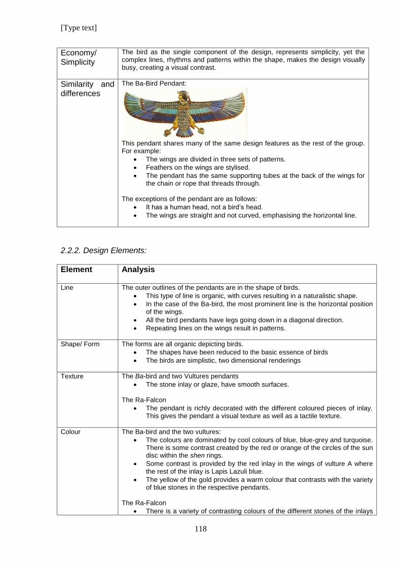
[Type text]
118
Economy/ Simplicity
The bird as the single component of the design, represents simplicity, yet the complex lines, rhythms and patterns within the shape, makes the design visually busy, creating a visual contrast.
Similarity and differences
The Ba-Bird Pendant:
This pendant shares many of the same design features as the rest of the group. For example:
The wings are divided in three sets of patterns.
Feathers on the wings are stylised.
The pendant has the same supporting tubes at the back of the wings for the chain or rope that threads through.
The exceptions of the pendant are as follows:
It has a human head, not a bird’s head.
The wings are straight and not curved, emphasising the horizontal line.
2.2.2. Design Elements:
Element
Analysis
Line
The outer outlines of the pendants are in the shape of birds.
This type of line is organic, with curves resulting in a naturalistic shape.
In the case of the Ba-bird, the most prominent line is the horizontal position of the wings.
All the bird pendants have legs going down in a diagonal direction.
Repeating lines on the wings result in patterns.
Shape/ Form
The forms are all organic depicting birds.
The shapes have been reduced to the basic essence of birds
The birds are simplistic, two dimensional renderings
Texture
The Ba-bird and two Vultures pendants
The stone inlay or glaze, have smooth surfaces.
The Ra-Falcon
The pendant is richly decorated with the different coloured pieces of inlay. This gives the pendant a visual texture as well as a tactile texture.
Colour
The Ba-bird and the two vultures:
The colours are dominated by cool colours of blue, blue-grey and turquoise. There is some contrast created by the red or orange of the circles of the sun disc within the shen rings.
Some contrast is provided by the red inlay in the wings of vulture A where the rest of the inlay is Lapis Lazuli blue.
The yellow of the gold provides a warm colour that contrasts with the variety of blue stones in the respective pendants.
The Ra-Falcon
There is a variety of contrasting colours of the different stones of the inlays
[Type text]
119
in the body and wings of the pendant.
Warm and cool colours are mixed, and in combination with the gold, creates a richly decorative pattern.
Pattern The patterns in all the bird pendants are similar in that they all are stylised representations of the feathers of the birds.
The patterns are vibrant alternations of colours and gold.
Contrast The stone inlay and metal surrounding creates a decorative and repetitive pattern that is in contrast with the stylised legs.
The undecorated legs of the birds stand in contrast to the detail of the wings.
2.3. Summary
The bird pendants are designs with one main component namely a bird. Each
bird looks different but they are similar because, as Goldstein writes, they
share common qualities that show they belong together. Therefore, they can
be grouped together as a style.(Goldstein 1989;12)
They are classified as “pendants”, because each bird is by definition, a
hanging object in the way Untracht discusses in his definitions of jewellery.
(Untracht 1982;780)
Each bird holds shen rings in their talons, but this feature is secondary and
the rings are small in size compared to the body of the bird.
The birds each hangs from a cord that has been strung through tube
fastenings at the back of the birds. A chain could have been used instead of
the cord. An example of such a chain can be seen attached to the circular
“name” pendant with the moon disc. The Ba-bird has no cord or chain.
In the case of these bird pendants, the lack of a composite design is
counteracted by the use of decorative patterns and colour in a style that is
typical of ancient Egyptian jewellery.
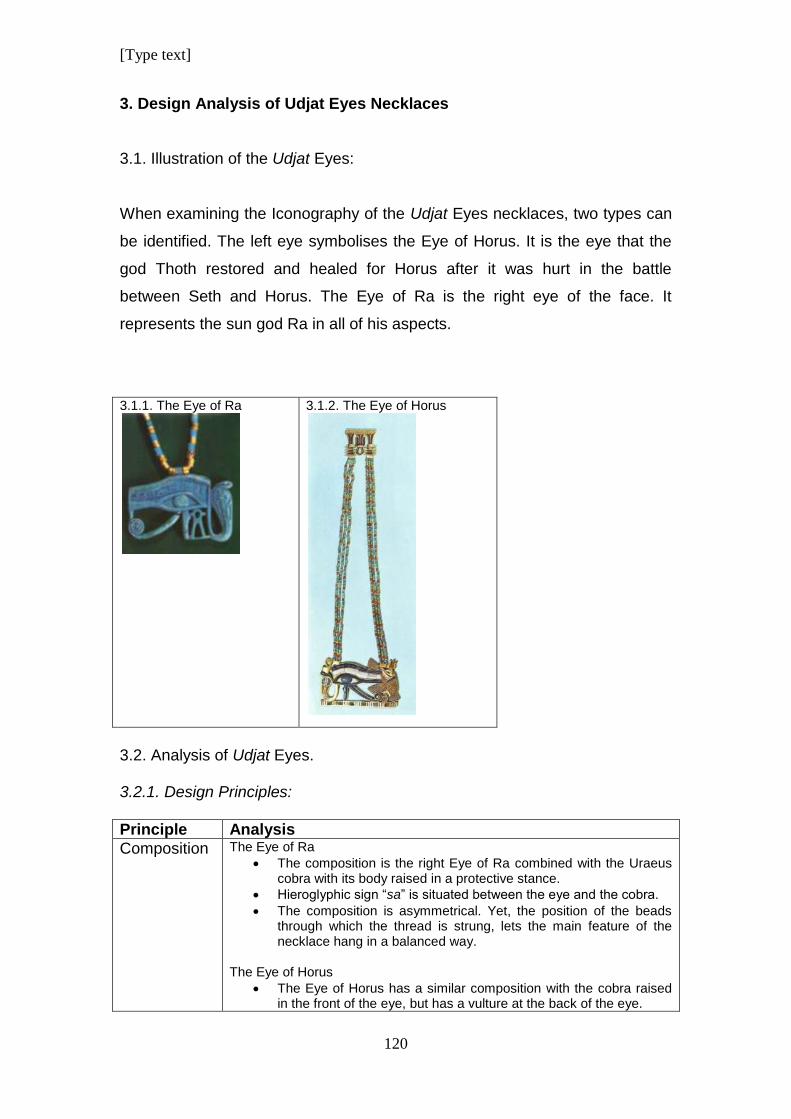
[Type text]
120
3. Design Analysis of Udjat Eyes Necklaces
3.1. Illustration of the Udjat Eyes:
When examining the Iconography of the Udjat Eyes necklaces, two types can
be identified. The left eye symbolises the Eye of Horus. It is the eye that the
god Thoth restored and healed for Horus after it was hurt in the battle
between Seth and Horus. The Eye of Ra is the right eye of the face. It
represents the sun god Ra in all of his aspects.
3.1.1. The Eye of Ra
3.1.2. The Eye of Horus
3.2. Analysis of Udjat Eyes. 3.2.1. Design Principles:
Principle Analysis
Composition
The Eye of Ra
The composition is the right Eye of Ra combined with the Uraeus cobra with its body raised in a protective stance.
Hieroglyphic sign “sa” is situated between the eye and the cobra.
The composition is asymmetrical. Yet, the position of the beads through which the thread is strung, lets the main feature of the necklace hang in a balanced way.
The Eye of Horus
The Eye of Horus has a similar composition with the cobra raised in the front of the eye, but has a vulture at the back of the eye.
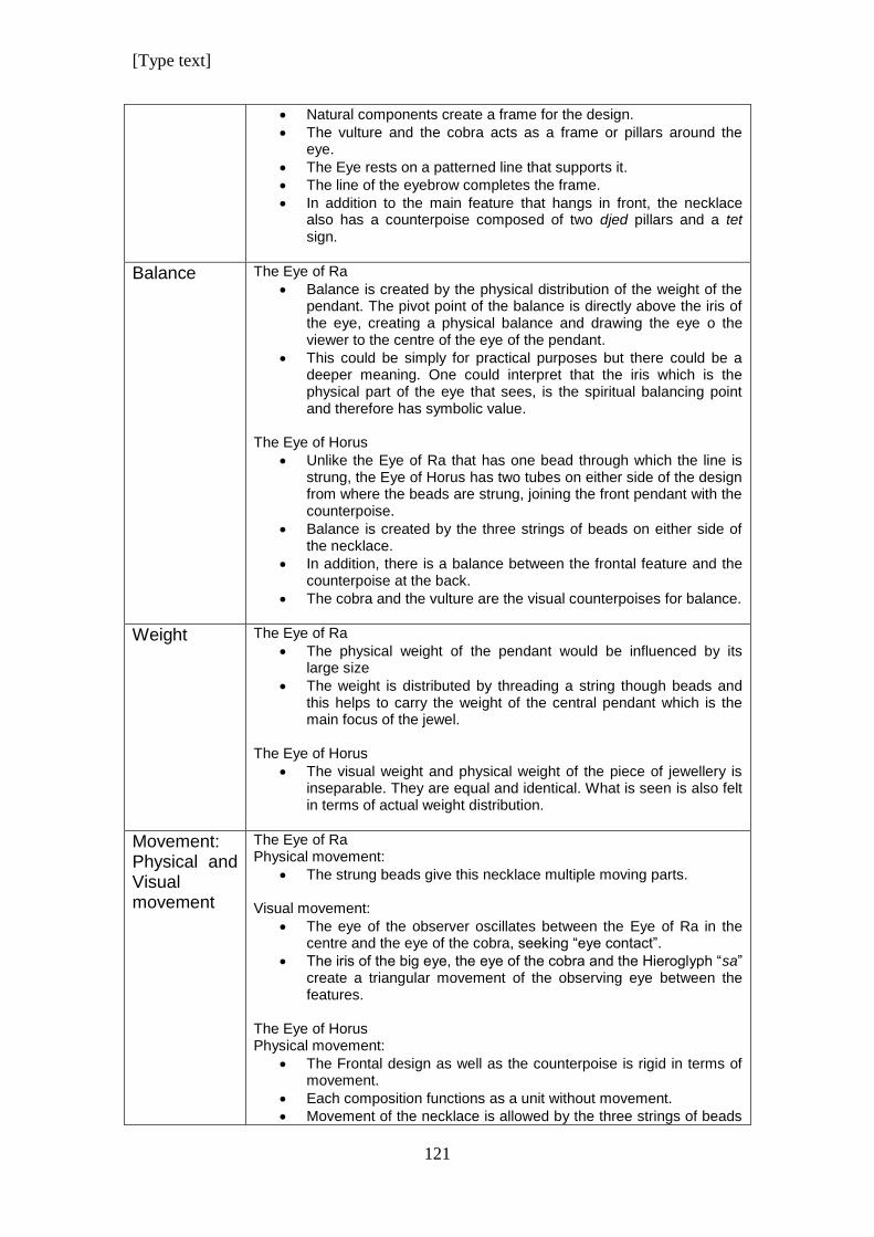
[Type text]
121
Natural components create a frame for the design.
The vulture and the cobra acts as a frame or pillars around the eye.
The Eye rests on a patterned line that supports it.
The line of the eyebrow completes the frame.
In addition to the main feature that hangs in front, the necklace also has a counterpoise composed of two djed pillars and a tet sign.
Balance
The Eye of Ra
Balance is created by the physical distribution of the weight of the pendant. The pivot point of the balance is directly above the iris of the eye, creating a physical balance and drawing the eye o the viewer to the centre of the eye of the pendant.
This could be simply for practical purposes but there could be a deeper meaning. One could interpret that the iris which is the physical part of the eye that sees, is the spiritual balancing point and therefore has symbolic value.
The Eye of Horus
Unlike the Eye of Ra that has one bead through which the line is strung, the Eye of Horus has two tubes on either side of the design from where the beads are strung, joining the front pendant with the counterpoise.
Balance is created by the three strings of beads on either side of the necklace.
In addition, there is a balance between the frontal feature and the counterpoise at the back.
The cobra and the vulture are the visual counterpoises for balance.
Weight
The Eye of Ra
The physical weight of the pendant would be influenced by its large size
The weight is distributed by threading a string though beads and this helps to carry the weight of the central pendant which is the main focus of the jewel.
The Eye of Horus
The visual weight and physical weight of the piece of jewellery is inseparable. They are equal and identical. What is seen is also felt in terms of actual weight distribution.
Movement: Physical and Visual movement
The Eye of Ra Physical movement:
The strung beads give this necklace multiple moving parts.
Visual movement:
The eye of the observer oscillates between the Eye of Ra in the centre and the eye of the cobra, seeking “eye contact”.
The iris of the big eye, the eye of the cobra and the Hieroglyph “sa” create a triangular movement of the observing eye between the features.
The Eye of Horus Physical movement:
The Frontal design as well as the counterpoise is rigid in terms of movement.
Each composition functions as a unit without movement.
Movement of the necklace is allowed by the three strings of beads
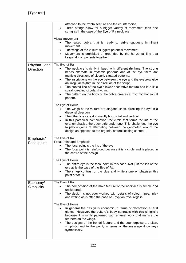
[Type text]
122
attached to the frontal feature and the counterpoise.
Three strings allow for a bigger variety of movement than one string as in the case of the Eye of Ra necklace.
Visual movement
The raised cobra that is ready to strike suggests imminent movement.
The wings of the vulture suggest potential movement.
Movement is prohibited or grounded by the horizontal line that keeps all components together.
Rhythm and Direction
The Eye of Ra
The necklace is richly imbued with different rhythms. The strung beads alternate in rhythmic patterns and of the eye there are multiple directions of cleverly situated patterns.
The inscriptions on the eye between the eye and the eyebrow give an irregular rhythm in the direction of the script.
The curved line of the eye’s lower decorative feature end in a little spiral, creating circular rhythm.
The pattern on the body of the cobra creates a rhythmic horizontal pattern.
The Eye of Horus
The wings of the vulture are diagonal lines, directing the eye in a diagonal direction.
The other lines are dominantly horizontal and vertical
In this particular combination, the circle that forms the iris of the eye, emphasise the geometric undertone. This challenges the eye to play a game of alternating between the geometric look of the design as opposed to the organic, natural looking content.
Emphasis/ Focal point
The Eye of Ra Focal Point and Emphasis
The focal point is the iris of the eye.
The focal point is reinforced because it is a circle and is placed in the centre of the design.
The Eye of Horus
The entire eye is the focal point in this case. Not just the iris of the eye as is the case of the Eye of Ra.
The sharp contrast of the blue and white stone emphasises this point of focus.
Economy/ Simplicity
The Eye of Ra
The composition of the main feature of the necklace is simple and uncluttered.
The design is not over worked with details of colour, lines, inlay and writing as is often the case of Egyptian royal regalia
The Eye of Horus
In general the design is economic in terms of decoration at first glance. However, the vulture’s body contrasts with this simplicity because it is richly patterned with enamel work that mimics the feathers on the wings.
The designs of the frontal feature and the counterpoise are plain, simplistic and to the point; in terms of the message it conveys symbolically.
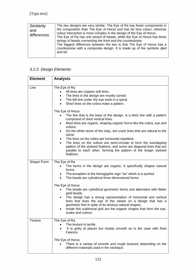
[Type text]
123
Similarity and differences
The two designs are very similar. The Eye of Ra has fewer components in the composition than The Eye of Horus and has far less colour, whereas colour interaction is more complex in the design of the Eye of Horus. The Eye of Ra has one strand of beads, while the Eye of Horus has three strings of beads connecting the front and the counterpoise. The biggest difference between the two is that The Eye of Horus has a counterpoise with a composite design. It is made up of the symbols djed and tet.
3.2.2. Design Elements:
Element Analysis
Line
The Eye of Ra
All lines are organic soft lines.
The lines in the design are mostly curved.
The left line under the eye ends in a spiral.
Short lines on the cobra make a pattern.
The Eye of Horus
The line that is the base of the design, is a thick line with a pattern comprised of short vertical lines.
Most lines are organic, shaping organic forms like the cobra, eye and vulture.
On the white stone of the inlay, are crack lines that are natural to the stone.
The lines on the cobra are horizontal repetitive.
The lines on the vulture are semi-circular to form the overlapping pattern of the stylised feathers, and some are diagonal lines that are parallel to each other, forming the pattern of the longer stylised feathers.
Shape/ Form
The Eye of Ra
The forms in the design are organic. It specifically shapes natural forms.
The exception is the hieroglyphic sign “sa” which is a symbol.
The beads are cylindrical three dimensional forms. The Eye of Horus
The beads are cylindrical geometric forms and alternates with flatter gold beads.
The design has a strong representation of horizontal and vertical lines that fixes the eye of the viewer on a design that has a geometric feel in spite of its obvious natural shapes.
Inside this subliminal grid are the organic shapes that form the eye, snake and vulture.
Texture
The Eye of Ra
The texture is tactile.
It is gritty at places but mostly smooth as is the case with fired Faience.
The Eye of Horus
There is a variety of smooth and rough textures depending on the different materials used in the necklace.
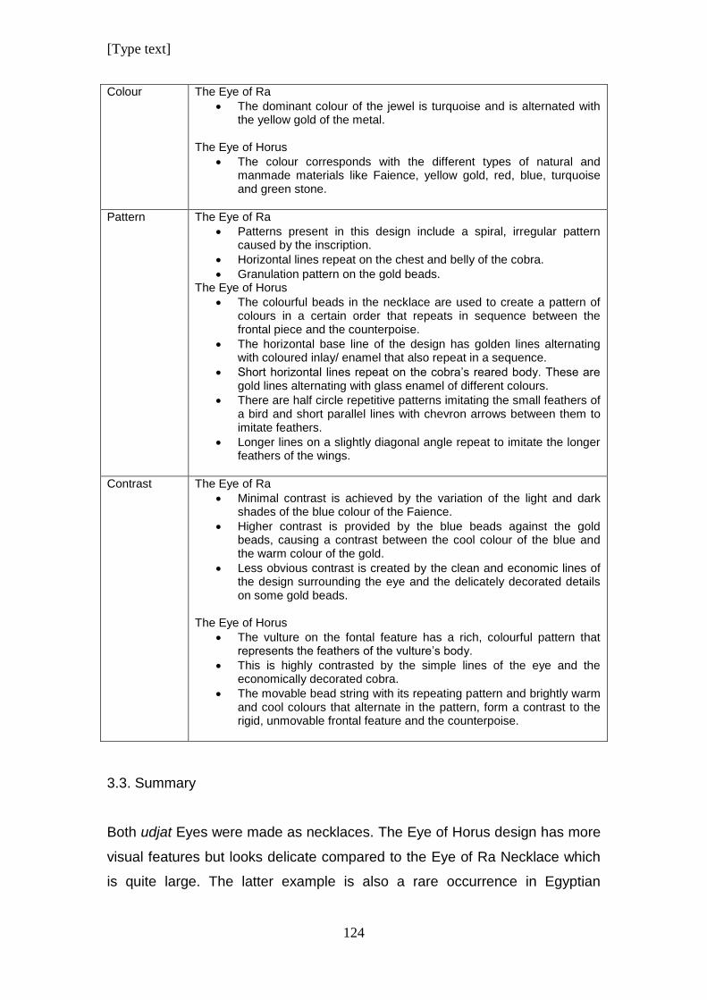
[Type text]
124
Colour
The Eye of Ra
The dominant colour of the jewel is turquoise and is alternated with the yellow gold of the metal.
The Eye of Horus
The colour corresponds with the different types of natural and manmade materials like Faience, yellow gold, red, blue, turquoise and green stone.
Pattern The Eye of Ra
Patterns present in this design include a spiral, irregular pattern caused by the inscription.
Horizontal lines repeat on the chest and belly of the cobra.
Granulation pattern on the gold beads. The Eye of Horus
The colourful beads in the necklace are used to create a pattern of colours in a certain order that repeats in sequence between the frontal piece and the counterpoise.
The horizontal base line of the design has golden lines alternating with coloured inlay/ enamel that also repeat in a sequence.
Short horizontal lines repeat on the cobra’s reared body. These are gold lines alternating with glass enamel of different colours.
There are half circle repetitive patterns imitating the small feathers of a bird and short parallel lines with chevron arrows between them to imitate feathers.
Longer lines on a slightly diagonal angle repeat to imitate the longer feathers of the wings.
Contrast The Eye of Ra
Minimal contrast is achieved by the variation of the light and dark shades of the blue colour of the Faience.
Higher contrast is provided by the blue beads against the gold beads, causing a contrast between the cool colour of the blue and the warm colour of the gold.
Less obvious contrast is created by the clean and economic lines of the design surrounding the eye and the delicately decorated details on some gold beads.
The Eye of Horus
The vulture on the fontal feature has a rich, colourful pattern that represents the feathers of the vulture’s body.
This is highly contrasted by the simple lines of the eye and the economically decorated cobra.
The movable bead string with its repeating pattern and brightly warm and cool colours that alternate in the pattern, form a contrast to the rigid, unmovable frontal feature and the counterpoise.
3.3. Summary
Both udjat Eyes were made as necklaces. The Eye of Horus design has more
visual features but looks delicate compared to the Eye of Ra Necklace which
is quite large. The latter example is also a rare occurrence in Egyptian
[Type text]
125
jewellery in as far as utilising the “Simplicity Principle” of design. (Goldstein
1989; 15)
The simplicity in this necklace was achieved by using the most economical
way possible to represent the eye by using elements like shape, mass
location and colour. The Design Principles of Simplicity was used. (Lidwell et
al 2010, Graham 2008) Fortunately this does not distract from its beauty and
elegance. It is a simple representation of an eye with almost no decoration
other than one colour. Goldstein, in his book Design and Composition, warns
that an over simple design runs the risk of being boring. (Goldstein 1989;
15).This is not the case of this design. It has only one string of thick faience
and gold beads and it does not have the variety of materials that was used for
the Eye of Horus Necklace.
The clasp of the necklace was made of gold with delicate granulation as
decoration which have a similar triangular pattern as the granulation on the
beads, with the exception that the granulation of the beads are closely packed
to form solid triangles and the triangles of the pattern on the clasp is made up
of one line of granulation. A technical sketch of the clasp can be seen in
Chapter 16 where the manufacturing of each pectoral is discussed in detail.
The Eye of Horus Necklace is made up of three parts; the frontal pectoral, the
counterpoise and three strings of beads on either side that connect the parts.
The frontal pectoral has a different design as the counterpoise, but together
they are in harmony as a unit. The necklace has a rich variety of materials
used for inlays and different coloured beads. (Vilimkova 1970) The beads are
very small and look delicate. The overall appearance of the necklace is very
luxurious.
The two necklaces are opposites in design even though they share similar
iconography and subject matter. The Eye of Ra necklace has a simple, large
design but in contrast the Eye of Horus necklace is a delicate piece of
jewellery full off small bits of colour with visual and physical movement. Visual
movement is created by the interplay of different colours of the beads as small
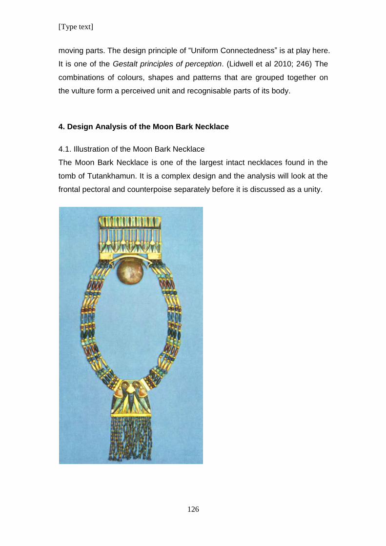
[Type text]
126
moving parts. The design principle of “Uniform Connectedness” is at play here.
It is one of the Gestalt principles of perception. (Lidwell et al 2010; 246) The
combinations of colours, shapes and patterns that are grouped together on
the vulture form a perceived unit and recognisable parts of its body.
4. Design Analysis of the Moon Bark Necklace
4.1. Illustration of the Moon Bark Necklace
The Moon Bark Necklace is one of the largest intact necklaces found in the
tomb of Tutankhamun. It is a complex design and the analysis will look at the
frontal pectoral and counterpoise separately before it is discussed as a unity.
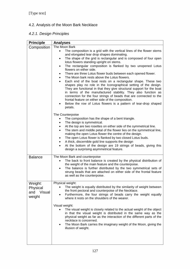
[Type text]
127
4.2. Analysis of the Moon Bark Necklace 4.2.1. Design Principles
Principle Analyses
Composition
The Moon Bark
The composition is a grid with the vertical lines of the flower stems and elongated tear drop shapes dominating.
The shape of the grid is rectangular and is composed of four open lotus flowers standing upright on stems.
The rectangular composition is flanked by two unopened Lotus flowers on either side.
There are three Lotus flower buds between each opened flower.
The Moon bark rests above the Lotus flowers.
Each end of the boat rests on a rectangular shape. These two shapes play no role in the Iconographical setting of the design. They are functional in that they give structural support for the boat in terms of the manufactured stability. They also function as connection for the four strings of beads that are connected to the frontal feature on either side of the composition.
Below the row of Lotus flowers is a pattern of tear-drop shaped petals.
The Counterpoise
The composition has the shape of a bent triangle.
The design is symmetrical.
At the top are two rosettes on either side of the symmetrical line.
The stem and middle petal of the flower lies on the symmetrical line, making the open Lotus flower the centre of the design.
The open Lotus flower is flanked by two closed Lotus buds.
A thick, discernible gold line supports the design
At the bottom of the design are 19 strings of beads, giving this design a surprising asymmetrical feature.
Balance
The Moon Bark and counterpoise
The back to front balance is created by the physical distribution of the weight of the main feature and the counterpoise.
The balance is further distributed by the two symmetrical sets of strung beads that are attached on either side of the frontal feature as well as the counterpoise.
Weight: Physical and Visual weight
Physical weight:
The weight is equally distributed by the similarity of weight between the front pectoral and counterpoise of the Necklace.
Furthermore, the four strings of beads carry the weight equally where it rests on the shoulders of the wearer.
Visual weight:
The visual weight is closely related to the actual weight of the object in that the visual weight is distributed in the same way as the physical weight as far as the interaction of the different parts of the necklace is concerned.
The Moon Bark carries the imaginary weight of the Moon, giving the illusion of weight.
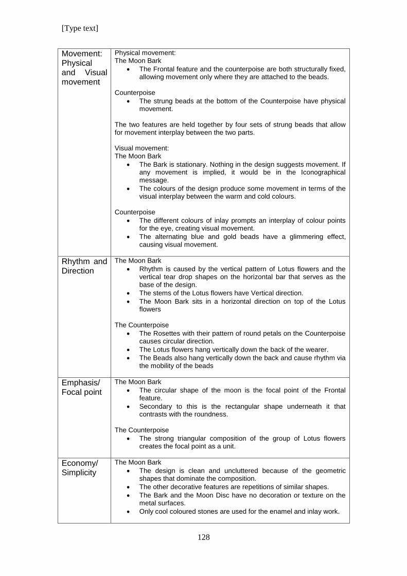
[Type text]
128
Movement: Physical and Visual movement
Physical movement: The Moon Bark
The Frontal feature and the counterpoise are both structurally fixed, allowing movement only where they are attached to the beads.
Counterpoise
The strung beads at the bottom of the Counterpoise have physical movement.
The two features are held together by four sets of strung beads that allow for movement interplay between the two parts. Visual movement: The Moon Bark
The Bark is stationary. Nothing in the design suggests movement. If any movement is implied, it would be in the Iconographical message.
The colours of the design produce some movement in terms of the visual interplay between the warm and cold colours.
Counterpoise
The different colours of inlay prompts an interplay of colour points for the eye, creating visual movement.
The alternating blue and gold beads have a glimmering effect, causing visual movement.
Rhythm and Direction
The Moon Bark
Rhythm is caused by the vertical pattern of Lotus flowers and the vertical tear drop shapes on the horizontal bar that serves as the base of the design.
The stems of the Lotus flowers have Vertical direction.
The Moon Bark sits in a horizontal direction on top of the Lotus flowers
The Counterpoise
The Rosettes with their pattern of round petals on the Counterpoise causes circular direction.
The Lotus flowers hang vertically down the back of the wearer.
The Beads also hang vertically down the back and cause rhythm via the mobility of the beads
Emphasis/ Focal point
The Moon Bark
The circular shape of the moon is the focal point of the Frontal feature.
Secondary to this is the rectangular shape underneath it that contrasts with the roundness.
The Counterpoise
The strong triangular composition of the group of Lotus flowers creates the focal point as a unit.
Economy/ Simplicity
The Moon Bark
The design is clean and uncluttered because of the geometric shapes that dominate the composition.
The other decorative features are repetitions of similar shapes.
The Bark and the Moon Disc have no decoration or texture on the metal surfaces.
Only cool coloured stones are used for the enamel and inlay work.
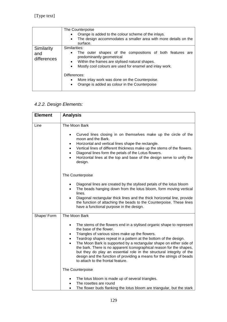
[Type text]
129
The Counterpoise
Orange is added to the colour scheme of the inlays.
The design accommodates a smaller area with more details on the surface.
Similarity and differences
Similarities:
The outer shapes of the compositions of both features are predominantly geometrical
Within the frames are stylised natural shapes.
Mostly cool colours are used for enamel and inlay work. Differences:
More inlay work was done on the Counterpoise.
Orange is added as colour in the Counterpoise
4.2.2. Design Elements:
Element Analysis
Line
The Moon Bark
Curved lines closing in on themselves make up the circle of the moon and the Bark.
Horizontal and vertical lines shape the rectangle.
Vertical lines of different thickness make up the stems of the flowers.
Diagonal lines form the petals of the Lotus flowers.
Horizontal lines at the top and base of the design serve to unify the design.
The Counterpoise
Diagonal lines are created by the stylised petals of the lotus bloom
The beads hanging down from the lotus bloom, form moving vertical lines.
Diagonal rectangular thick lines and the thick horizontal line, provide the function of attaching the beads to the Counterpoise. These lines have a functional purpose in the design.
Shape/ Form
The Moon Bark
The stems of the flowers end in a stylised organic shape to represent the base of the flower.
Triangles of various sizes make up the flowers.
Teardrop shapes repeat in a pattern at the bottom of the design.
The Moon Bark is supported by a rectangular shape on either side of the bark. There is no apparent Iconographical reason for the shapes, but they do play an essential role in the structural integrity of the design and the function of providing a means for the strings of beads to attach to the frontal feature.
The Counterpoise
The lotus bloom is made up of several triangles.
The rosettes are round
The flower buds flanking the lotus bloom are triangular, but the stark
[Type text]
130
geometric feel is softened by the rounded edges of the shape, giving it a more organic look, even though it is stylised.
Texture
The Moon Bark
There are no textures on the metal of the Moon or the Bark.
Metal surfaces have a polished finish.
Some texture is provided by the stones that were used for the inlays. The Counterpoise
The pattern of circles of the rosette provides the only texture on the design.
Metal surfaces are polished.
The blue and gold beads give an appearance of visual texture.
Colour
The Moon Bark
The yellow of the gold is a warm colour with a high gloss finish.
The inlayed stones are cool colours of blue, and turquoise. The Counterpoise
The yellow gold and the inlayed orange stone are warm colours.
The different shades of blue comprise the cool colours of the design.
The beads in the necklace are a combination of warm and cold colours.
Pattern
The Moon Bark
The bark rests on a pattern created by lotus flowers and stems that repeat.
Below the sign for heaven is a pattern of tear drop shapes forming a pattern of alternating colours.
The Counterpoise
The texture on the rosettes creates a stylised pattern radiating from the centre outwards to the edge of the flowers.
The beads hanging from the counterpoise are strung to create alternating colours of blue and gold.
The beads attaching the frontal piece with the counterpoise provide patterns using different coloured and different shaped beads. Different combinations of beads are used to create a variety of patterns.
Contrast The Moon Bark
Strong contrast is created by large geometric shapes within the composition.
The strong presence of a circle contrasts with the strong rectangular shape underneath it.
The thin stems of the Lotus flowers represent a strong contrast with the solid round circle above it.
The diagonal lines on the lotus flowers are in contrast with horizontal and vertical lines.
The Counterpoise
The solid triangular shape contrasts with the mobility of the beads underneath it.
[Type text]
131
Contrast is also created between the large shape of the triangular composition and the tiny beads underneath it.
The warm colour of the gold beads is in contrast with the cool colour of the blue beads.
The gold beads are polished and contrasts with the gritty, glassy feel of the Faience beads.
The solid, unmovable masses of the Moon Bark and the Counterpoise are in contrast with the mobility of the strung beads.
4.3. Summary
The Moon Bark necklace is a beautiful composition with a strong presence of
geometric shape. The rigid, angular appearance of these shapes is softened
by organic shapes that are placed with it to harmonise the design. The
rectangular shapes versus triangular shapes add to the dynamic display.
The principle of “Proximity”, as discussed by Goldstein is at work here.
(Goldstein 1989; 11) The lotus blooms in the grid composition are placed very
close to each other, thus bonding the visual elements together. The Gestalt
law of similarity, as discussed by Graham, (Graham 2008; 7) also applies
here to the same visual elements of the lotus flowers with their stems that are
similar, in shape size, colour and direction as they appear in the grid
composition.
The necklace is large and heavy and needs three strings of beads to help
carry the weight. The beads are made up of a combination of warm and cool
colours that provide vibrant contrast. There is a contrast between the cool
aloof elegance of the frontal pectoral and the counterpoise that has been
tempered by the addition of warm colours that enhance the aesthetics of the
piece as described by Lidwell where the influence of colour on a design is
discussed. (Lidwell et al 2010; 48)
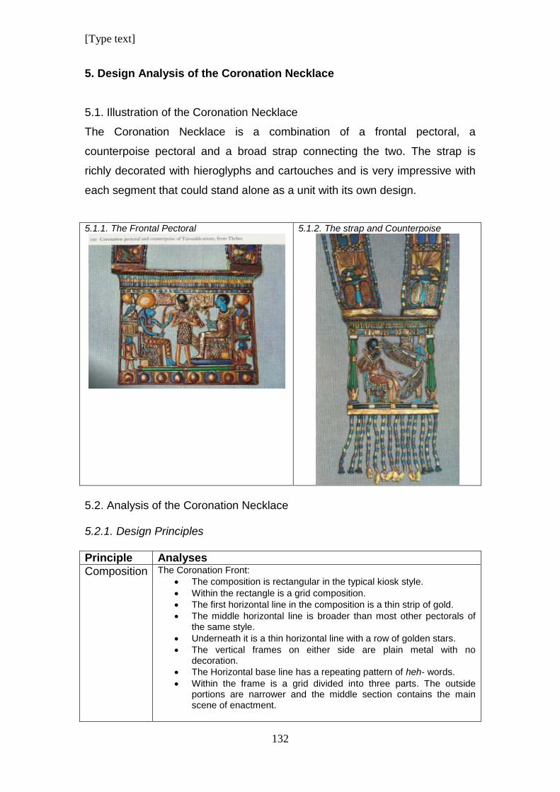
[Type text]
132
5. Design Analysis of the Coronation Necklace
5.1. Illustration of the Coronation Necklace
The Coronation Necklace is a combination of a frontal pectoral, a
counterpoise pectoral and a broad strap connecting the two. The strap is
richly decorated with hieroglyphs and cartouches and is very impressive with
each segment that could stand alone as a unit with its own design.
5.1.1. The Frontal Pectoral
5.1.2. The strap and Counterpoise
5.2. Analysis of the Coronation Necklace 5.2.1. Design Principles
Principle Analyses
Composition
The Coronation Front:
The composition is rectangular in the typical kiosk style.
Within the rectangle is a grid composition.
The first horizontal line in the composition is a thin strip of gold.
The middle horizontal line is broader than most other pectorals of the same style.
Underneath it is a thin horizontal line with a row of golden stars.
The vertical frames on either side are plain metal with no decoration.
The Horizontal base line has a repeating pattern of heh- words.
Within the frame is a grid divided into three parts. The outside portions are narrower and the middle section contains the main scene of enactment.
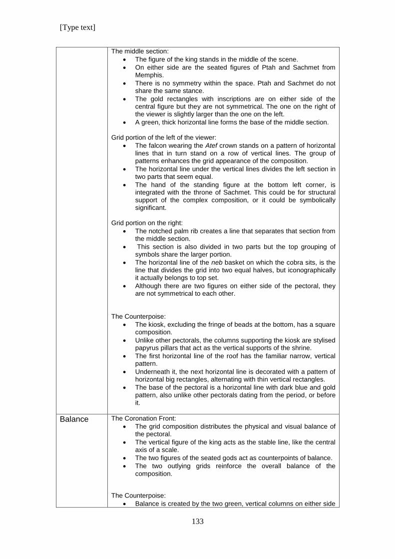
[Type text]
133
The middle section:
The figure of the king stands in the middle of the scene.
On either side are the seated figures of Ptah and Sachmet from Memphis.
There is no symmetry within the space. Ptah and Sachmet do not share the same stance.
The gold rectangles with inscriptions are on either side of the central figure but they are not symmetrical. The one on the right of the viewer is slightly larger than the one on the left.
A green, thick horizontal line forms the base of the middle section.
Grid portion of the left of the viewer:
The falcon wearing the Atef crown stands on a pattern of horizontal lines that in turn stand on a row of vertical lines. The group of patterns enhances the grid appearance of the composition.
The horizontal line under the vertical lines divides the left section in two parts that seem equal.
The hand of the standing figure at the bottom left corner, is integrated with the throne of Sachmet. This could be for structural support of the complex composition, or it could be symbolically significant.
Grid portion on the right:
The notched palm rib creates a line that separates that section from the middle section.
This section is also divided in two parts but the top grouping of symbols share the larger portion.
The horizontal line of the neb basket on which the cobra sits, is the line that divides the grid into two equal halves, but iconographically it actually belongs to top set.
Although there are two figures on either side of the pectoral, they are not symmetrical to each other.
The Counterpoise:
The kiosk, excluding the fringe of beads at the bottom, has a square composition.
Unlike other pectorals, the columns supporting the kiosk are stylised papyrus pillars that act as the vertical supports of the shrine.
The first horizontal line of the roof has the familiar narrow, vertical pattern.
Underneath it, the next horizontal line is decorated with a pattern of horizontal big rectangles, alternating with thin vertical rectangles.
The base of the pectoral is a horizontal line with dark blue and gold pattern, also unlike other pectorals dating from the period, or before it.
Balance
The Coronation Front:
The grid composition distributes the physical and visual balance of the pectoral.
The vertical figure of the king acts as the stable line, like the central axis of a scale.
The two figures of the seated gods act as counterpoints of balance.
The two outlying grids reinforce the overall balance of the composition.
The Counterpoise:
Balance is created by the two green, vertical columns on either side
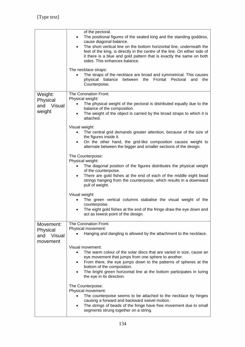
[Type text]
134
of the pectoral.
The positional figures of the seated king and the standing goddess, cause diagonal balance.
The short vertical line on the bottom horizontal line, underneath the feet of the king, is directly in the centre of the line. On either side of it there is a blue and gold pattern that is exactly the same on both sides. This enhances balance.
The necklace straps:
The straps of the necklace are broad and symmetrical. This causes physical balance between the Frontal Pectoral and the Counterpoise.
Weight: Physical and Visual weight
The Coronation Front: Physical weight:
The physical weight of the pectoral is distributed equally due to the balance of the composition.
The weight of the object is carried by the broad straps to which it is attached.
Visual weight:
The central grid demands greater attention, because of the size of the figures inside it.
On the other hand, the grid-like composition causes weight to alternate between the bigger and smaller sections of the design.
The Counterpoise: Physical weight:
The diagonal position of the figures distributes the physical weight of the counterpoise.
There are gold fishes at the end of each of the middle eight bead strings hanging from the counterpoise, which results in a downward pull of weight.
Visual weight:
The green vertical columns stabalise the visual weight of the counterpoise.
The eight gold fishes at the end of the fringe draw the eye down and act as lowest point of the design.
Movement: Physical and Visual movement
The Coronation Front: Physical movement:
Hanging and dangling is allowed by the attachment to the necklace.
Visual movement:
The warm colour of the solar discs that are varied in size, cause an eye movement that jumps from one sphere to another.
From there, the eye jumps down to the patterns of spheres at the bottom of the composition.
The bright green horizontal line at the bottom participates in luring the eye in its direction.
The Counterpoise: Physical movement:
The counterpoise seems to be attached to the necklace by hinges causing a forward and backward swivel motion.
The strings of beads of the fringe have free movement due to small segments strung together on a string.
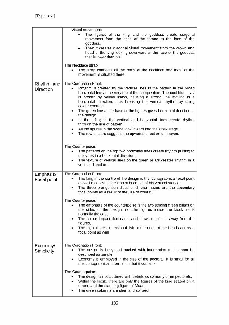
[Type text]
135
Visual movement:
The figures of the king and the goddess create diagonal movement from the base of the throne to the face of the goddess.
Then it creates diagonal visual movement from the crown and head of the king looking downward at the face of the goddess that is lower than his.
The Necklace strap:
The strap connects all the parts of the necklace and most of the movement is situated there.
Rhythm and Direction
The Coronation Front:
Rhythm is created by the vertical lines in the pattern in the broad horizontal line at the very top of the composition. The cool blue inlay is broken by yellow inlays, causing a strong line moving in a horizontal direction, thus breaking the vertical rhythm by using colour contrast.
The green line at the base of the figures gives horizontal direction in the design.
In the left grid, the vertical and horizontal lines create rhythm through the use of pattern.
All the figures in the scene look inward into the kiosk stage.
The row of stars suggests the upwards direction of heaven.
The Counterpoise:
The patterns on the top two horizontal lines create rhythm pulsing to the sides in a horizontal direction.
The texture of vertical lines on the green pillars creates rhythm in a vertical direction.
Emphasis/ Focal point
The Coronation Front:
The king in the centre of the design is the iconographical focal point as well as a visual focal point because of his vertical stance.
The three orange sun discs of different sizes are the secondary focal points as a result of the use of colour.
The Counterpoise:
The emphasis of the counterpoise is the two striking green pillars on the sides of the design, not the figures inside the kiosk as is normally the case.
The colour impact dominates and draws the focus away from the figures.
The eight three-dimensional fish at the ends of the beads act as a focal point as well.
Economy/ Simplicity
The Coronation Front:
The design is busy and packed with information and cannot be described as simple.
Economy is employed in the size of the pectoral. It is small for all the iconographical information that it contains.
The Counterpoise:
The design is not cluttered with details as so many other pectorals.
Within the kiosk, there are only the figures of the king seated on a throne and the standing figure of Maat.
The green columns are plain and stylised.
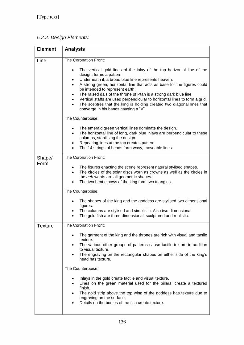
[Type text]
136
5.2.2. Design Elements:
Element Analysis
Line
The Coronation Front:
The vertical gold lines of the inlay of the top horizontal line of the design, forms a pattern.
Underneath it, a broad blue line represents heaven.
A strong green, horizontal line that acts as base for the figures could be intended to represent earth.
The raised dais of the throne of Ptah is a strong dark blue line.
Vertical staffs are used perpendicular to horizontal lines to form a grid.
The sceptres that the king is holding created two diagonal lines that converge in his hands causing a “V”.
The Counterpoise:
The emerald green vertical lines dominate the design.
The horizontal line of long, dark blue inlays are perpendicular to these columns, stabilising the design.
Repeating lines at the top creates pattern.
The 14 strings of beads form wavy, moveable lines.
Shape/ Form
The Coronation Front:
The figures enacting the scene represent natural stylised shapes.
The circles of the solar discs worn as crowns as well as the circles in the heh words are all geometric shapes.
The two bent elbows of the king form two triangles.
The Counterpoise:
The shapes of the king and the goddess are stylised two dimensional figures.
The columns are stylised and simplistic. Also two dimensional.
The gold fish are three dimensional, sculptured and realistic.
Texture
The Coronation Front:
The garment of the king and the thrones are rich with visual and tactile texture.
The various other groups of patterns cause tactile texture in addition to visual texture.
The engraving on the rectangular shapes on either side of the king’s head has texture.
The Counterpoise:
Inlays in the gold create tactile and visual texture.
Lines on the green material used for the pillars, create a textured finish.
The gold strip above the top wing of the goddess has texture due to engraving on the surface.
Details on the bodies of the fish create texture.
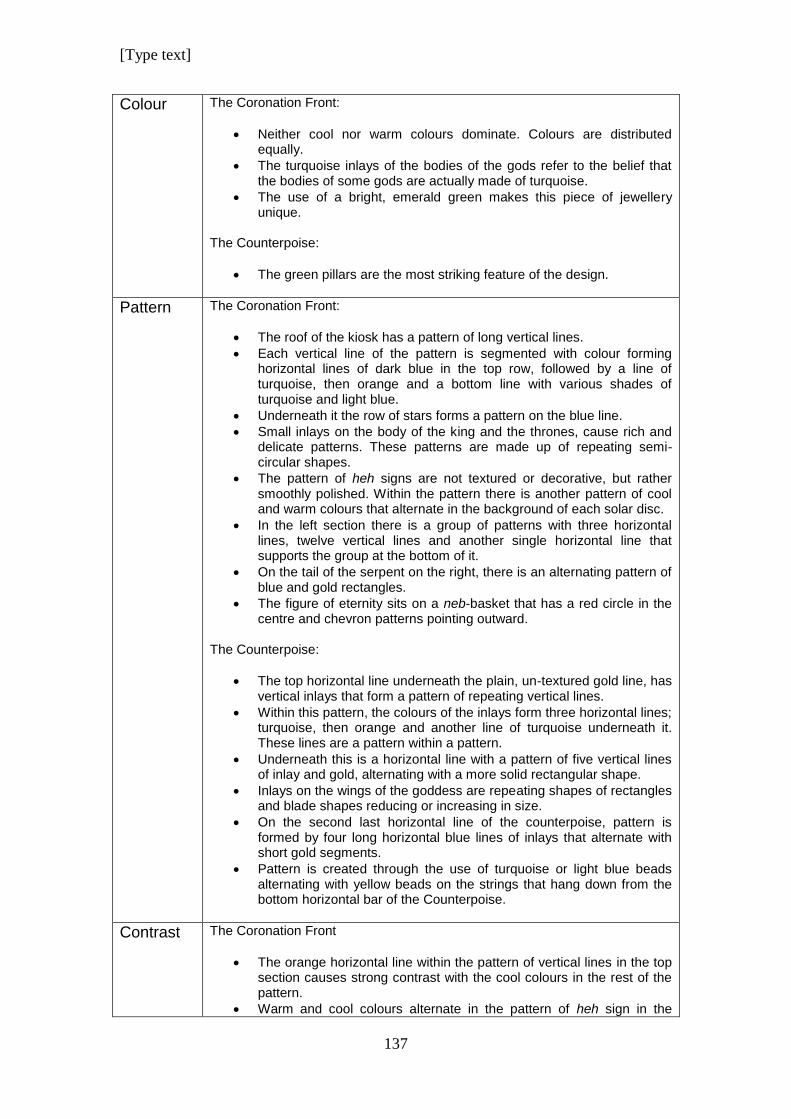
[Type text]
137
Colour
The Coronation Front:
Neither cool nor warm colours dominate. Colours are distributed equally.
The turquoise inlays of the bodies of the gods refer to the belief that the bodies of some gods are actually made of turquoise.
The use of a bright, emerald green makes this piece of jewellery unique.
The Counterpoise:
The green pillars are the most striking feature of the design.
Pattern
The Coronation Front:
The roof of the kiosk has a pattern of long vertical lines.
Each vertical line of the pattern is segmented with colour forming horizontal lines of dark blue in the top row, followed by a line of turquoise, then orange and a bottom line with various shades of turquoise and light blue.
Underneath it the row of stars forms a pattern on the blue line.
Small inlays on the body of the king and the thrones, cause rich and delicate patterns. These patterns are made up of repeating semi-circular shapes.
The pattern of heh signs are not textured or decorative, but rather smoothly polished. Within the pattern there is another pattern of cool and warm colours that alternate in the background of each solar disc.
In the left section there is a group of patterns with three horizontal lines, twelve vertical lines and another single horizontal line that supports the group at the bottom of it.
On the tail of the serpent on the right, there is an alternating pattern of blue and gold rectangles.
The figure of eternity sits on a neb-basket that has a red circle in the centre and chevron patterns pointing outward.
The Counterpoise:
The top horizontal line underneath the plain, un-textured gold line, has vertical inlays that form a pattern of repeating vertical lines.
Within this pattern, the colours of the inlays form three horizontal lines; turquoise, then orange and another line of turquoise underneath it. These lines are a pattern within a pattern.
Underneath this is a horizontal line with a pattern of five vertical lines of inlay and gold, alternating with a more solid rectangular shape.
Inlays on the wings of the goddess are repeating shapes of rectangles and blade shapes reducing or increasing in size.
On the second last horizontal line of the counterpoise, pattern is formed by four long horizontal blue lines of inlays that alternate with short gold segments.
Pattern is created through the use of turquoise or light blue beads alternating with yellow beads on the strings that hang down from the bottom horizontal bar of the Counterpoise.
Contrast The Coronation Front
The orange horizontal line within the pattern of vertical lines in the top section causes strong contrast with the cool colours in the rest of the pattern.
Warm and cool colours alternate in the pattern of heh sign in the
[Type text]
138
bottom row.
The dark face of the king contrasts with the turquoise bodies of the gods.
The Counterpoise
The strongest contrast in the design is caused by the bright green pillars opposed to the dark blue colour just underneath it.
The segments of inlayed stone in the vertical settings of the roof of the kiosk, causes contrast between warm and cold colours.
The alternating pattern of blue and gold beads on the strings comprising the fringe, causes contrast.
5.3. Summary
The frontal pectoral of the design is similar in style than most other pectorals
of the period or before. Within the kiosk frame the composition is divided by
horizontal and vertical lines to form a well divided grid pattern as it is
described by Goldstein. (Goldstein 1989)
The design of the counterpoise is unique. The kiosk frame is unlike any
pectoral that had been discovered from a previous period or even afterwards.
The green papyrus style columns mimic columns found in larger temple
complexes. Furthermore, they are a bright, emerald green colour, which also
had not been used before in any jewellery familiar to us. This colour also
appears in the front of the necklace as a horizontal line that acts as stage for
the figures of the king and the two gods. This particular green results in a
different visual interplay between the components of the necklace as opposed
to other necklaces where the colours are standard according to Egyptian style.
Although other greens were used in jewellery, significantly less than blue or
turquoise, the Coronation necklace is the only pectoral with this particular hue.
Pectorals or counterpoises with a fringe of beads seem to be a new fashion
trend during this time, as there is no indication that it was done during a
period prior or afterwards as far as examples that are available show.
[Type text]
139
The designs on the two sides of the strap of the necklace, are symmetrical
and mirror images of each other. Lidwell et al divides symmetry into three
categories; reflection, rotation and translation symmetry. (Lidwell 2010; 234)
Reflection symmetry is used here on the strap.
The principle of “Similarity” plays a role here as well. Although the images on
the strap are separated in the overall composition, their similarity and colour
makes the brain group them as belonging together. (Goldstein 1989; 11)
According to the Principle of Uniform Connectedness, elements with uniform
visual properties, like colour and shape, are perceived as being grouped
together. (Lidwell 2010; 246)
The figures face each other in the same way as inscriptions do on either side
of paintings and murals. Nine segments of the necklace strap are aligned like
the front pectoral and will be in the upright position when worn. Six segments
and the counterpoise look upside down when displayed flat, but will look
upright when the necklace is worn.
6. Design Analysis of the Nekhbet Necklace
6.1. Illustration of the Nekhbet Necklace
According to Cyril Aldred’s description, the vulture of the Nekhbet Necklace is
two dimensional, and the details on the back of the bird had been chased.
(Aldred 1971; 221).The head was cast and is three dimensional. The
counterpoise is made up of two three dimensional falcon shapes that were
inlayed. The necklace strap is made up of alternating stone and gold discs
with inlays. To finish it off, the discs are framed by a string of small beads on
either side of the string of discs.
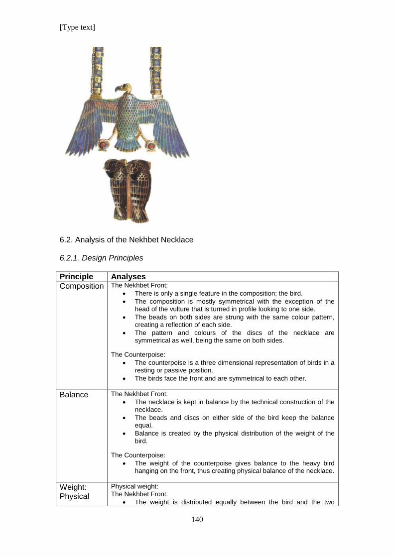
[Type text]
140
6.2. Analysis of the Nekhbet Necklace 6.2.1. Design Principles
Principle Analyses
Composition
The Nekhbet Front:
There is only a single feature in the composition; the bird.
The composition is mostly symmetrical with the exception of the head of the vulture that is turned in profile looking to one side.
The beads on both sides are strung with the same colour pattern, creating a reflection of each side.
The pattern and colours of the discs of the necklace are symmetrical as well, being the same on both sides.
The Counterpoise:
The counterpoise is a three dimensional representation of birds in a resting or passive position.
The birds face the front and are symmetrical to each other.
Balance
The Nekhbet Front:
The necklace is kept in balance by the technical construction of the necklace.
The beads and discs on either side of the bird keep the balance equal.
Balance is created by the physical distribution of the weight of the bird.
The Counterpoise:
The weight of the counterpoise gives balance to the heavy bird hanging on the front, thus creating physical balance of the necklace.
Weight: Physical
Physical weight: The Nekhbet Front:
The weight is distributed equally between the bird and the two
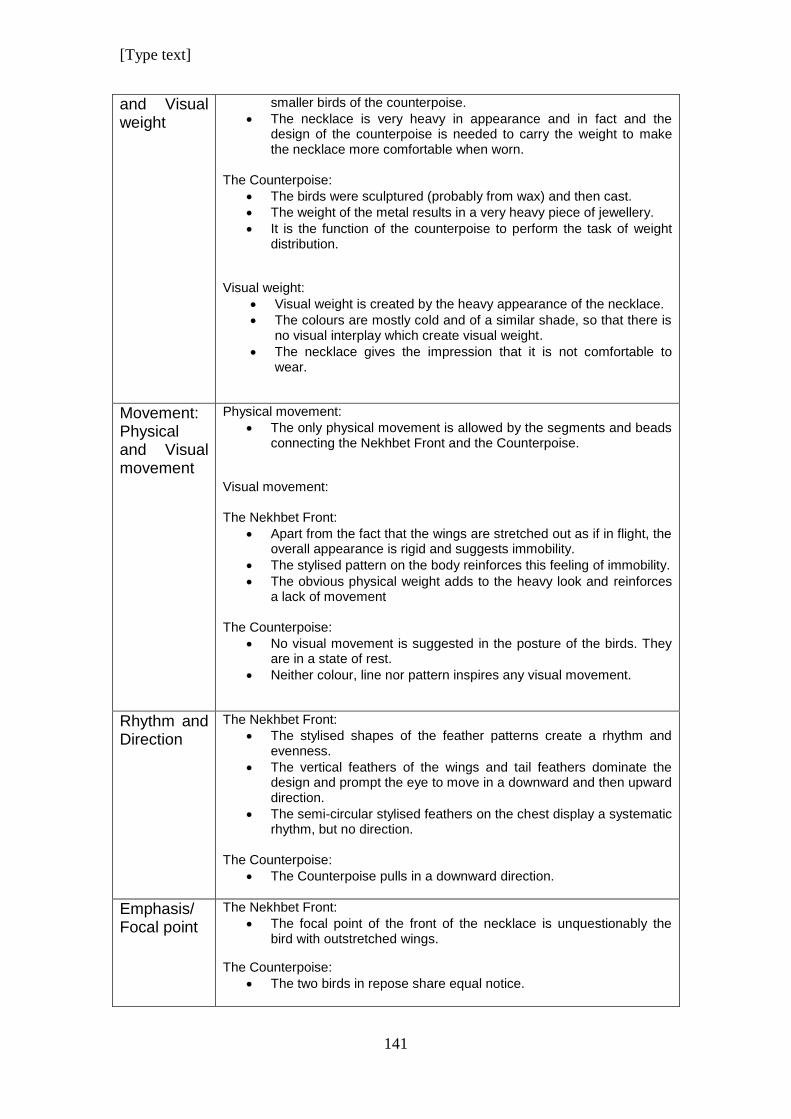
[Type text]
141
and Visual weight
smaller birds of the counterpoise.
The necklace is very heavy in appearance and in fact and the design of the counterpoise is needed to carry the weight to make the necklace more comfortable when worn.
The Counterpoise:
The birds were sculptured (probably from wax) and then cast.
The weight of the metal results in a very heavy piece of jewellery.
It is the function of the counterpoise to perform the task of weight distribution.
Visual weight:
Visual weight is created by the heavy appearance of the necklace.
The colours are mostly cold and of a similar shade, so that there is no visual interplay which create visual weight.
The necklace gives the impression that it is not comfortable to wear.
Movement: Physical and Visual movement
Physical movement:
The only physical movement is allowed by the segments and beads connecting the Nekhbet Front and the Counterpoise.
Visual movement: The Nekhbet Front:
Apart from the fact that the wings are stretched out as if in flight, the overall appearance is rigid and suggests immobility.
The stylised pattern on the body reinforces this feeling of immobility.
The obvious physical weight adds to the heavy look and reinforces a lack of movement
The Counterpoise:
No visual movement is suggested in the posture of the birds. They are in a state of rest.
Neither colour, line nor pattern inspires any visual movement.
Rhythm and Direction
The Nekhbet Front:
The stylised shapes of the feather patterns create a rhythm and evenness.
The vertical feathers of the wings and tail feathers dominate the design and prompt the eye to move in a downward and then upward direction.
The semi-circular stylised feathers on the chest display a systematic rhythm, but no direction.
The Counterpoise:
The Counterpoise pulls in a downward direction.
Emphasis/ Focal point
The Nekhbet Front:
The focal point of the front of the necklace is unquestionably the bird with outstretched wings.
The Counterpoise:
The two birds in repose share equal notice.
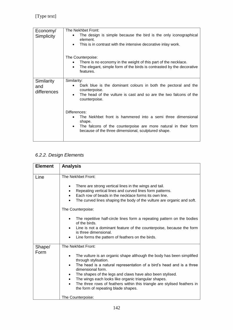
[Type text]
142
Economy/ Simplicity
The Nekhbet Front:
The design is simple because the bird is the only iconographical element.
This is in contrast with the intensive decorative inlay work.
The Counterpoise:
There is no economy in the weight of this part of the necklace.
The elegant, simple form of the birds is contrasted by the decorative features.
Similarity and differences
Similarity:
Dark blue is the dominant colours in both the pectoral and the counterpoise.
The head of the vulture is cast and so are the two falcons of the counterpoise.
Differences:
The Nekhbet front is hammered into a semi three dimensional shape.
The falcons of the counterpoise are more natural in their form because of the three dimensional, sculptured shape.
6.2.2. Design Elements
Element Analysis
Line
The Nekhbet Front:
There are strong vertical lines in the wings and tail.
Repeating vertical lines and curved lines form patterns.
Each row of beads in the necklace forms its own line.
The curved lines shaping the body of the vulture are organic and soft. The Counterpoise:
The repetitive half-circle lines form a repeating pattern on the bodies of the birds.
Line is not a dominant feature of the counterpoise, because the form is three dimensional.
Line forms the pattern of feathers on the birds.
Shape/ Form
The Nekhbet Front:
The vulture is an organic shape although the body has been simplified through stylisation.
The head is a natural representation of a bird’s head and is a three dimensional form.
The shapes of the legs and claws have also been stylised.
The wings each looks like organic triangular shapes.
The three rows of feathers within this triangle are stylised feathers in the form of repeating blade shapes.
The Counterpoise:
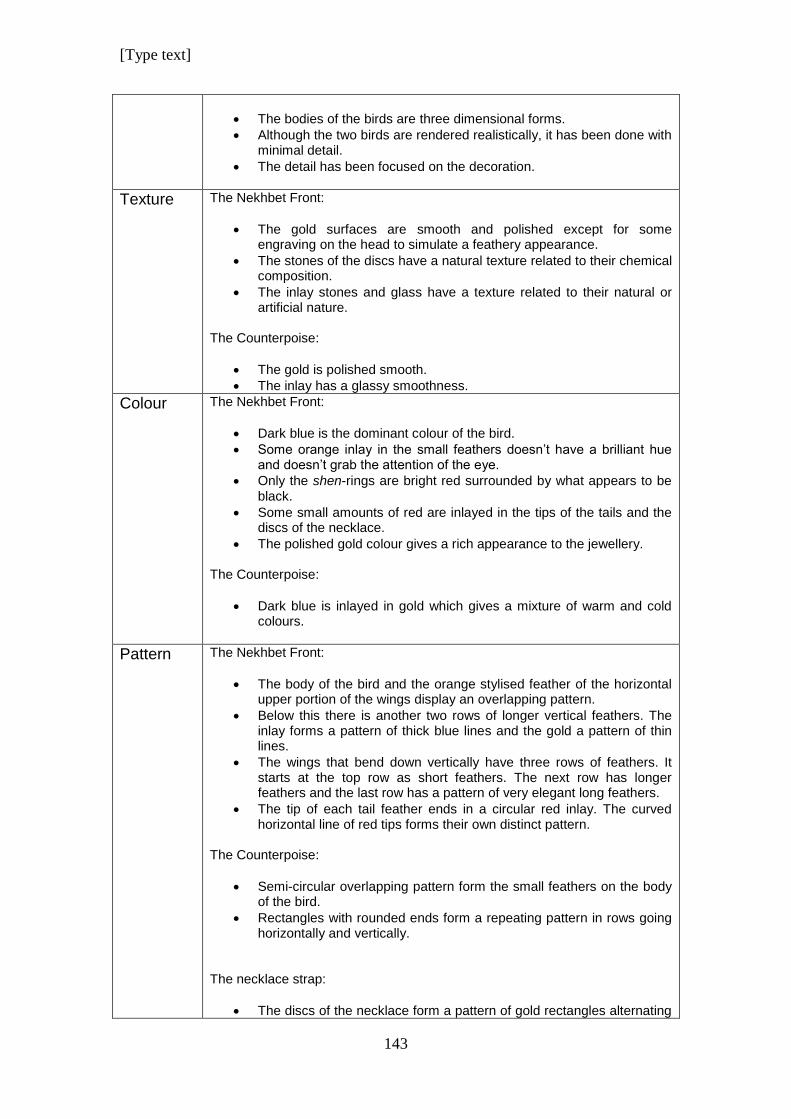
[Type text]
143
The bodies of the birds are three dimensional forms.
Although the two birds are rendered realistically, it has been done with minimal detail.
The detail has been focused on the decoration.
Texture
The Nekhbet Front:
The gold surfaces are smooth and polished except for some engraving on the head to simulate a feathery appearance.
The stones of the discs have a natural texture related to their chemical composition.
The inlay stones and glass have a texture related to their natural or artificial nature.
The Counterpoise:
The gold is polished smooth.
The inlay has a glassy smoothness.
Colour
The Nekhbet Front:
Dark blue is the dominant colour of the bird.
Some orange inlay in the small feathers doesn’t have a brilliant hue and doesn’t grab the attention of the eye.
Only the shen-rings are bright red surrounded by what appears to be black.
Some small amounts of red are inlayed in the tips of the tails and the discs of the necklace.
The polished gold colour gives a rich appearance to the jewellery.
The Counterpoise:
Dark blue is inlayed in gold which gives a mixture of warm and cold colours.
Pattern
The Nekhbet Front:
The body of the bird and the orange stylised feather of the horizontal upper portion of the wings display an overlapping pattern.
Below this there is another two rows of longer vertical feathers. The inlay forms a pattern of thick blue lines and the gold a pattern of thin lines.
The wings that bend down vertically have three rows of feathers. It starts at the top row as short feathers. The next row has longer feathers and the last row has a pattern of very elegant long feathers.
The tip of each tail feather ends in a circular red inlay. The curved horizontal line of red tips forms their own distinct pattern.
The Counterpoise:
Semi-circular overlapping pattern form the small feathers on the body of the bird.
Rectangles with rounded ends form a repeating pattern in rows going horizontally and vertically.
The necklace strap:
The discs of the necklace form a pattern of gold rectangles alternating
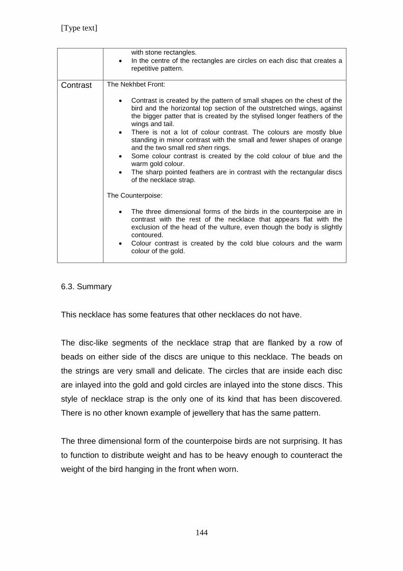
[Type text]
144
with stone rectangles.
In the centre of the rectangles are circles on each disc that creates a repetitive pattern.
Contrast The Nekhbet Front:
Contrast is created by the pattern of small shapes on the chest of the bird and the horizontal top section of the outstretched wings, against the bigger patter that is created by the stylised longer feathers of the wings and tail.
There is not a lot of colour contrast. The colours are mostly blue standing in minor contrast with the small and fewer shapes of orange and the two small red shen rings.
Some colour contrast is created by the cold colour of blue and the warm gold colour.
The sharp pointed feathers are in contrast with the rectangular discs of the necklace strap.
The Counterpoise:
The three dimensional forms of the birds in the counterpoise are in contrast with the rest of the necklace that appears flat with the exclusion of the head of the vulture, even though the body is slightly contoured.
Colour contrast is created by the cold blue colours and the warm colour of the gold.
6.3. Summary
This necklace has some features that other necklaces do not have.
The disc-like segments of the necklace strap that are flanked by a row of
beads on either side of the discs are unique to this necklace. The beads on
the strings are very small and delicate. The circles that are inside each disc
are inlayed into the gold and gold circles are inlayed into the stone discs. This
style of necklace strap is the only one of its kind that has been discovered.
There is no other known example of jewellery that has the same pattern.
The three dimensional form of the counterpoise birds are not surprising. It has
to function to distribute weight and has to be heavy enough to counteract the
weight of the bird hanging in the front when worn.
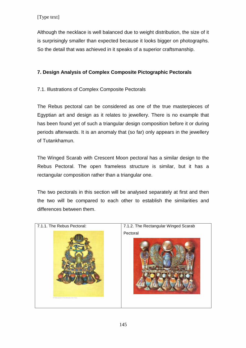
[Type text]
145
Although the necklace is well balanced due to weight distribution, the size of it
is surprisingly smaller than expected because it looks bigger on photographs.
So the detail that was achieved in it speaks of a superior craftsmanship.
7. Design Analysis of Complex Composite Pictographic Pectorals
7.1. Illustrations of Complex Composite Pectorals
The Rebus pectoral can be considered as one of the true masterpieces of
Egyptian art and design as it relates to jewellery. There is no example that
has been found yet of such a triangular design composition before it or during
periods afterwards. It is an anomaly that (so far) only appears in the jewellery
of Tutankhamun.
The Winged Scarab with Crescent Moon pectoral has a similar design to the
Rebus Pectoral. The open frameless structure is similar, but it has a
rectangular composition rather than a triangular one.
The two pectorals in this section will be analysed separately at first and then
the two will be compared to each other to establish the similarities and
differences between them.
7.1.1. The Rebus Pectoral:
7.1.2. The Rectangular Winged Scarab
Pectoral
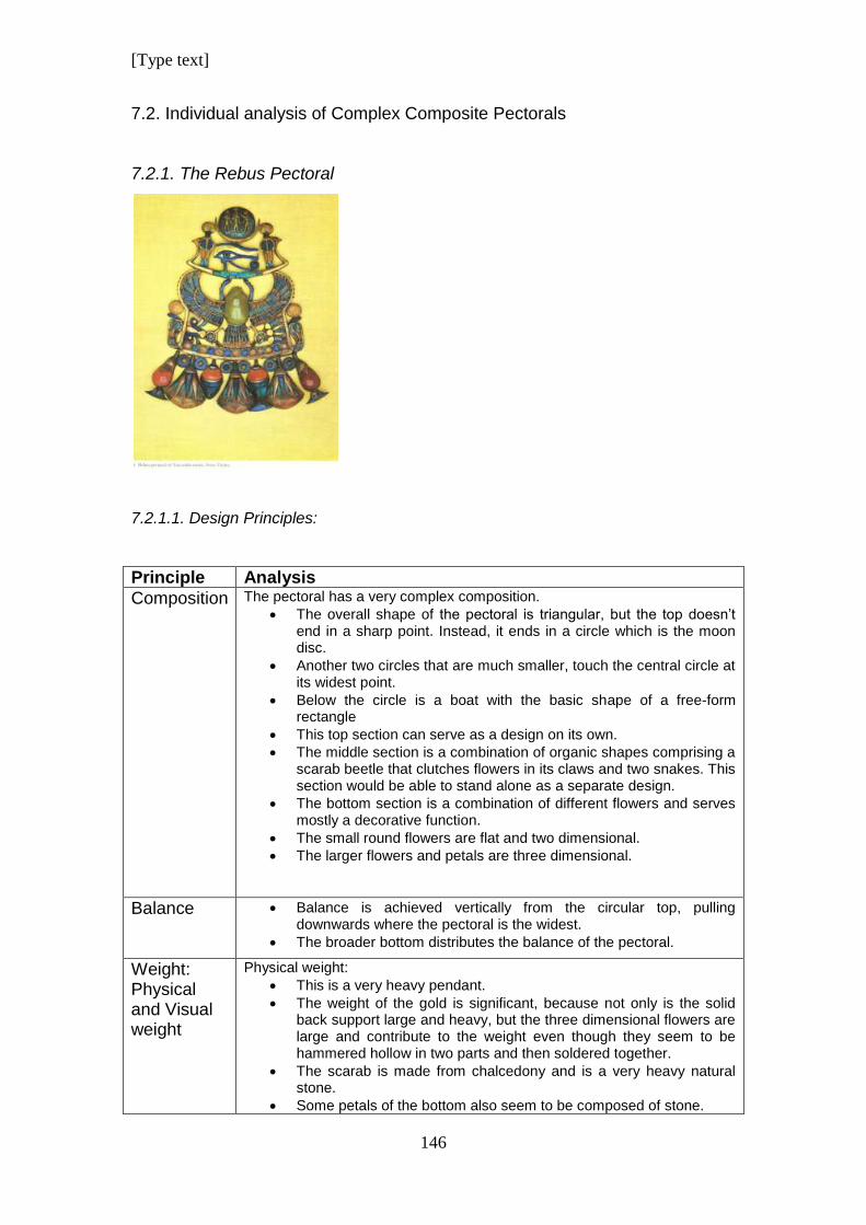
[Type text]
146
7.2. Individual analysis of Complex Composite Pectorals
7.2.1. The Rebus Pectoral
7.2.1.1. Design Principles:
Principle Analysis
Composition
The pectoral has a very complex composition.
The overall shape of the pectoral is triangular, but the top doesn’t end in a sharp point. Instead, it ends in a circle which is the moon disc.
Another two circles that are much smaller, touch the central circle at its widest point.
Below the circle is a boat with the basic shape of a free-form rectangle
This top section can serve as a design on its own.
The middle section is a combination of organic shapes comprising a scarab beetle that clutches flowers in its claws and two snakes. This section would be able to stand alone as a separate design.
The bottom section is a combination of different flowers and serves mostly a decorative function.
The small round flowers are flat and two dimensional.
The larger flowers and petals are three dimensional.
Balance
Balance is achieved vertically from the circular top, pulling downwards where the pectoral is the widest.
The broader bottom distributes the balance of the pectoral.
Weight: Physical and Visual weight
Physical weight:
This is a very heavy pendant.
The weight of the gold is significant, because not only is the solid back support large and heavy, but the three dimensional flowers are large and contribute to the weight even though they seem to be hammered hollow in two parts and then soldered together.
The scarab is made from chalcedony and is a very heavy natural stone.
Some petals of the bottom also seem to be composed of stone.
[Type text]
147
Visual weight:
The broadest section of the bottom gives the impression of weight in two ways: It is the widest part of the pectoral and looks the heaviest due to the large three dimensional flowers.
Movement: Physical and Visual movement
Physical Movement:
The different parts of the pectoral seem to be in a fixed position with no obvious mobility except for the dangling flowers and petals at the bottom of the jewel.
Visual Movement: There is a lot of indirect movement in the piece.
The stances of the figures at the top inside the moon disc suggest movement, similar to a cartoon.
The moon bark is a boat which has the function to move.
The two cobras facing forward, suggest that they are stationary. They are quietly guarding.
The eye is stationary and watchful.
Although the scarab has wings, there is not a suggested movement of the wings themselves. The pattern on the wings however, causes visual movement
The cobras flanking the scarab are in profile and give the impression that they are ready to strike- ready for movement.
The garland of flowers at the bottom appears moveable, but this is based on their actual physical movement.
The interaction of the focal points creates visual movement. See Focal Point)
Rhythm and Direction
Rhythm:
Rhythm is created by the pattern of inlays on the wings and tail of the scarab.
Direction:
The figures in the circle of the moon disc create direction with their arms pointing in different directions.
The cobras and the eye looking towards the front suggest an absence of direction.
The scarab has wings spread to the sides, extending the view to create width.
The cobras on either side of the scarab are shown in profile, extending direction outward and away from the centre of the pectoral.
The hanging petals and flowers have a downward direction.
Emphasis/ Focal point
The pectoral is very complex and has four separate focal points which give the design the potential to be broken up in separate parts.
The moon disc with figures is at the top and is the narrowest portion of the design and thus creates a focal point.
The eye staring directly at the viewer, invites eye contact.
Underneath that, the scarab with outstretched wings, is larger and impressive with intricate inlay and colour play.
The flower garland at the bottom is the broadest part of the design and creates a thick border that draws attention towards it.
The complexity of the interaction of the multiple focal points has a strong correlation with movement. The eye of the viewer jumps from one focal point to another as each one competes for attention. This causes a visual dynamic and makes the piece of jewellery very interesting.
[Type text]
148
Similarity and differences
Similarities:
Two cobras flanking the Udjat Eye on the moon disc face forwards and are symmetrical to each other.
Two cobras in profile supporting the wings of the scarab are symmetrical counterparts.
The design of the three open lotus blooms at the bottom of the pectoral is the same.
Differences:
The two bunches of flowers that the scarab holds in its claws are different and represent different regions in Egypt.
The two flower petals on either side of the central lotus flower in the bottom row of garlands are the same in colour and type of flower, but the one on the right of the viewer’s perspective has an additional component that is similar to the petals on the end of either side.
These two similar flowers are the same but the colour of the flower on the right side is a darker red.
Economy/ Simplicity
The design is a mixture of clean simplicity versus details of pattern:
The moon disc at the very top of the design is made from metal, with a smoothed and polished finish.
The figures on the moon disc are cartoon like in the typical stylised ancient Egyptian style with details that are for identification, not decoration.
The moon bark, Udjat Eye and cobras are simplistic in appearance. As the design progresses downward, more details are added to the parts.
Although the body of the scarab is smoothed cut stone, the wings are highly decorative. So are the tail feathers.
The flowers that the scarab holds are stylised and have no unnecessary detail.
The cobras flanking the scarab are stylised but has slightly more detail than the two cobras at the top facing forward.
Each individual flower in the garland at the bottom is stylised, but all of them together make an impressive display in the design.
Comments The design is very complex; in terms of the iconographical content and components of the design. It is also the only known Ancient Egyptian triangular pectoral spanning thousands of years from Pre-Dynastic times up until the late period. It is truly a unique design.
7.2.1.2. Design Elements
Element Analysis
Line Two semi-circular lines make up the crescent moon.
A smooth curved line that closes in on itself, composes the moon.
The moon bark and the Udjat Eye is made up of curved lines
There is a strong vertical line down the centre of each front facing cobra, dividing each of them in half, causing a line of symmetry.
[Type text]
149
Repetitive lines in different directions make the pattern on the wings and tail of the scarab.
A solid, prominent gold line frames the scarab from the tip of its wings, enclosing the lower body and bunches of flowers. It then serves to underline the row of round stylised flowers inside this grouping.
Diagonal lines on the lotus flowers at the bottom of the pectoral, create triangular shapes that make up the petals of the flowers.
Shape/ Form
The round shape of the moon is geometrical. So is the crescent moon.
The moon bark is a stylised form.
The cobras facing forward are reduced shapes and are stylised.
The Udjat Eye is a stylised symbolic representation of a magic eye with power.
The winged scarab is a combination of the shapes of the dung beetle and a bird.
The inlayed stone scarab has a three dimensional form.
The cobras and flowers in the section with the scarab are all stylised shapes.
The row of big flowers and petals at the base of the design are stylised three dimensional forms.
Texture The design is not very rich in texture.
Considering the complexity of the design, texture would have distracted from the overall appearance.
The textured wings and tail of the scarab is in beautiful contrast with the rest of the design that is clean from any unnecessary detail and creates an even balance between smoothness and texture.
Colour The scarab at the centre of the design is a light green chalcedony. This is not a colour that appears very often.
The moon disc is silver and the rest of the metal is gold.
The cool colours are blue, dark blue and turquoise.
Warm colours include yellow, different shades of orange, red and dark red.
Although cool colours are used in more inlays in the design, the huge red flowers tip the balance of colour to make the quantity of cool and warm colours more or less even.
Pattern The design is mostly free of pattern.
The orange semi-circle patterns in the top row of the wings emulate feathers.
The inlays on the wings of the scarab are parallel vertical lines that form patterns.
The inlays of the bigger feathers flare outward towards the tip of the wings.
Red triangles repeat in a pattern on the outer edge of the wings.
The scarab sits on a curved line of circles forming a pattern alternating with red, orange and blue circles.
The bottom garland of flowers has a more complicated pattern of alternating flowers-types and colours.
Stylised circular flowers are placed in a sequence between the stems of the flowers.
Inside each circle is a coloured dot that repeats in a pattern.
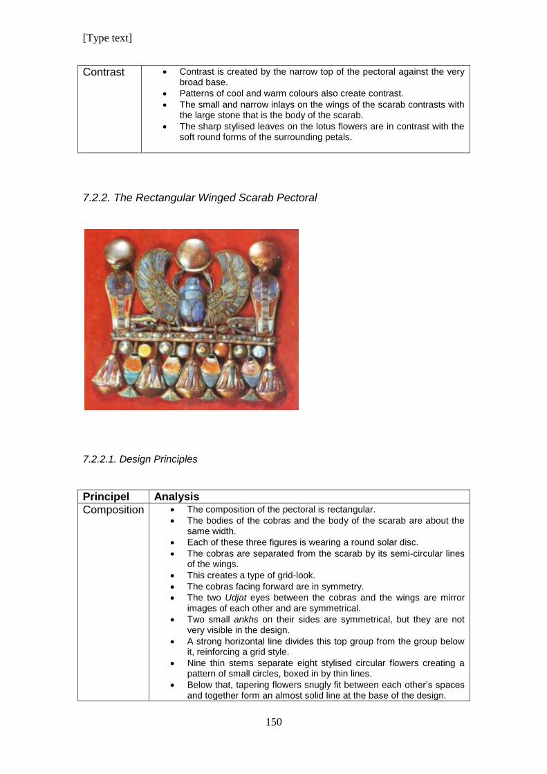
[Type text]
150
Contrast Contrast is created by the narrow top of the pectoral against the very broad base.
Patterns of cool and warm colours also create contrast.
The small and narrow inlays on the wings of the scarab contrasts with the large stone that is the body of the scarab.
The sharp stylised leaves on the lotus flowers are in contrast with the soft round forms of the surrounding petals.
7.2.2. The Rectangular Winged Scarab Pectoral
7.2.2.1. Design Principles
Principel Analysis
Composition
The composition of the pectoral is rectangular.
The bodies of the cobras and the body of the scarab are about the same width.
Each of these three figures is wearing a round solar disc.
The cobras are separated from the scarab by its semi-circular lines of the wings.
This creates a type of grid-look.
The cobras facing forward are in symmetry.
The two Udjat eyes between the cobras and the wings are mirror images of each other and are symmetrical.
Two small ankhs on their sides are symmetrical, but they are not very visible in the design.
A strong horizontal line divides this top group from the group below it, reinforcing a grid style.
Nine thin stems separate eight stylised circular flowers creating a pattern of small circles, boxed in by thin lines.
Below that, tapering flowers snugly fit between each other’s spaces and together form an almost solid line at the base of the design.
[Type text]
151
The result of the lines and spacing emulates a grid of line alternating with bigger solid shapes.
Balance
The design is well balanced within the rectangular frame:
The body of the scarab acts as a centre with a cobra on each side, the same distance away.
Three discs balancing on legs and heads reinforce balance.
The two cobras facing rigidly forward enforces the stability of the balance.
The two Udjat eyes on either side of the scarab give balance as well.
Two ankhs on their sides that are symmetrical, give balance in a horizontal direction. Unfortunately they are so small compared to the other components of the design that they create a size imbalance.
The strong horizontal line below the scarab creates visual and structural balance and stability.
Weight: Physical and Visual weight
Physical weight:
From the size of the pectoral it can be ascertained that the physical weight is significant.
The big stones and heavy metal construction contributes to the weight.
Visual weight:
The strong thick line of flowers tightly packed together pulls the visual weight down.
Although the lotus blooms are hammered hollow, it creates an illusion of weight at the bottom.
The visual weight of the Udjat eyes, the two ankhs and the tiny neb-basket under the scarab are too small when compared to the rest of the design.
Movement: Physical and Visual movement
Physical movement:
The portion of the design above the horizontal line is rigid.
The flowers and petals below the line seems to be able to move.
Visual movement:
Although the scarab has wings, it remains stationary.
There is no line or colour in the design to create visual movement.
The grid composition of horizontal and vertical lines that cross creates a rigid, fixed appearance.
The petals at the bottom give a dangling impression.
Rhythm and Direction
Rhythm is created in the top section by the upright cobras and scarab being divided by the curves of the wings.
There is no direction above the dividing horizontal line. The figures are static and stationary.
The garland of flowers below the horizontal line is arranged in an intricate pattern, causing interesting rhythms of pattern and colour.
Emphasis/ Focal point
Emphasis and focus is evenly distributed in the grid-like pattern.
For this reason, focus is shared.
The flowers fit closely together like pieces of a puzzle. Therefore the focus is on the whole, not on separate parts.
[Type text]
152
Similarity and differences
The two cobras above the dividing horizontal line are identical.
The three discs are similar in size and colour. The central disc is different because it has a lunar crescent as an extra component.
There are two eyes but they represent two opposite eyes in a face. Symbolically they also have different meanings.
The circular stylised flowers between the stems of the bigger flowers look the same at first glance, but they have different colours.
Economy/ Simplicity
There is no excessive decoration.
The Wings of the scarab has inlay for decoration as is usual in Egyptian jewellery.
Squeezing the two eyes in between the wings of the scarab and the base of the cobras could be an attempt to save or utilise space, but the result is unsuccessful. The eyes seem redundant and look as though they should not be there.
Two ankhs are squeezed in below the eyes, over-using the space.
Comments The design has a lot of potential, but unfortunately it does not inspire. It is too static and the size of different components is out of proportion in some cases.
7.2.2.2. Design Elements
Element Analysis
Line Line is used to create a grid pattern by utilising the vertical figures.
The horizontal line dividing the design in two portions is untidy and not straight.
Shape/ Form
The shapes of the cobras are stylised and flat.
The scarab has a three dimensional form.
The three-dimensional lotus flowers are rounded.
Organic shapes are used to impersonate line to create a grid.
Texture The inlay work creates textured surfaces.
Unfortunately the inlay wasn’t done neatly and adds to a rough, untidy appearance.
Colour Colours are dull.
Blues appear dark grey as though they have lost some of their original colour.
There is little colour contrast as a result of poor materials.
Some discolouration of red can be seen on the bodies of the cobras.
The colours of the inlays on the lotus lowers are very poor and dull.
Pattern Pattern is created by stylised feathers on the wings of the scarab.
Short horizontal lines on the chests of the cobras repeat vertically, creating pattern.
There is a pattern of small circles, almost dots, on the horizontal line the divides the design.
There is a row of circles making a pattern below the horizontal line.
The alternating, different flowers hanging at the bottom of the design cause an alternating pattern of shape and colour.
Triangular stylised petals on the lotus flower cause pattern.
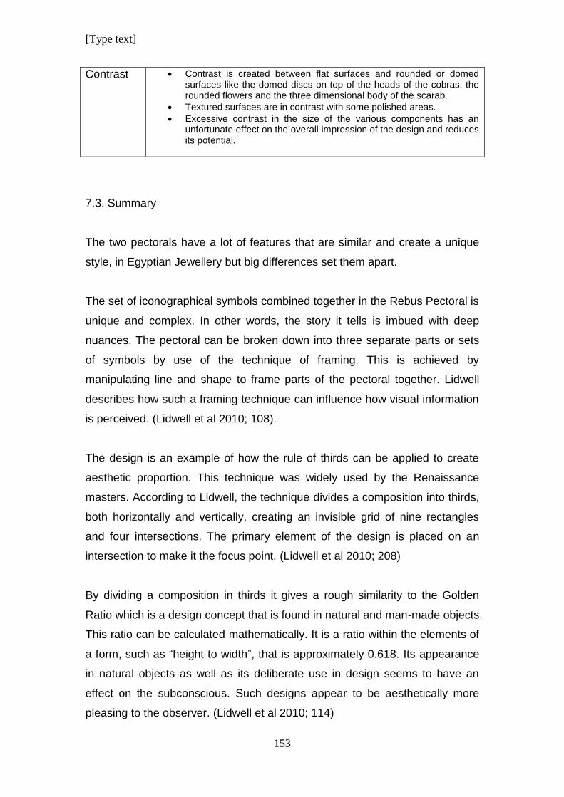
[Type text]
153
Contrast Contrast is created between flat surfaces and rounded or domed surfaces like the domed discs on top of the heads of the cobras, the rounded flowers and the three dimensional body of the scarab.
Textured surfaces are in contrast with some polished areas.
Excessive contrast in the size of the various components has an unfortunate effect on the overall impression of the design and reduces its potential.
7.3. Summary
The two pectorals have a lot of features that are similar and create a unique
style, in Egyptian Jewellery but big differences set them apart.
The set of iconographical symbols combined together in the Rebus Pectoral is
unique and complex. In other words, the story it tells is imbued with deep
nuances. The pectoral can be broken down into three separate parts or sets
of symbols by use of the technique of framing. This is achieved by
manipulating line and shape to frame parts of the pectoral together. Lidwell
describes how such a framing technique can influence how visual information
is perceived. (Lidwell et al 2010; 108).
The design is an example of how the rule of thirds can be applied to create
aesthetic proportion. This technique was widely used by the Renaissance
masters. According to Lidwell, the technique divides a composition into thirds,
both horizontally and vertically, creating an invisible grid of nine rectangles
and four intersections. The primary element of the design is placed on an
intersection to make it the focus point. (Lidwell et al 2010; 208)
By dividing a composition in thirds it gives a rough similarity to the Golden
Ratio which is a design concept that is found in natural and man-made objects.
This ratio can be calculated mathematically. It is a ratio within the elements of
a form, such as “height to width”, that is approximately 0.618. Its appearance
in natural objects as well as its deliberate use in design seems to have an
effect on the subconscious. Such designs appear to be aesthetically more
pleasing to the observer. (Lidwell et al 2010; 114)
[Type text]
154
In the case of the Rebus Pectoral the Rule of Thirds technique manifests itself
in dividing it from top to bottom in three parts of iconographical groups: 1) The
Moon Bark, 2) The Winged Scarab, 3) The Flower Garland.
The first part would be the top section with the moon disc and crescent riding
on the lunar bark with the Udjat Eye. It would be able for this portion to stand
alone as a unit in terms of design as well as iconography.
The section with the scarab holding the flowers and the flanking cobras can
stand separate as well. It is unusual though that the scarab is crowned by a
moon bark and not a solar or lunar disc. Thus, the elaborate top section with
the bark replaces the usual discs. The bottom section with its row of flowers
serves as decoration but it is not the intention here to diminish its importance
in iconography.
The Winged Scarab with Crescent Moon Pectoral has some similarities to the
Rebus Pectoral.
It is not triangular in composition but rectangular. It has the lunar discs with
crescent moon resting on the front legs of the scarab. The wing span of the
scarab is more circular and compact and not as sleek and spread out as the
wings of the scarab of the Rebus Pectoral.
The pectoral does not display the principle of the Rule of thirds incorporated
into the design. It is a grid composition divided in two separate parts. The top
half of the composition has three thick prominent vertical “lines” namely the
two upright cobras and the body of the scarab. The bottom grid has five, thin
flower stems that make up the lines. The proportions of the top and bottom
parts reflect the Golden Ratio as discussed by Lidwell et al, making it
aesthetically pleasing because of its proportions.
The aestheticism of the design is sabotaged by elements that seem forced
into it. The Eye of Ra and the Eye of Horus are resting on the horizontal line
squashed in between the wings and cobras. The ankhs lying on the sides are
[Type text]
155
squashed even more. They are small compared to the rest of the parts in the
design and are not noticeable at first glance.
There is a similar garland of flowers decorating the bottom of the design. The
flowers are also three dimensional, made in the same way as the ones in the
Rebus Pectoral.
The question arises whether the two pectorals were designed by the same
person.
Let us first consider this in terms of the design quality based on the above
discussed design principles:
The compositions of the two pectorals are different. One is triangular
and is dynamic. The other is rectangular with ankhs lying on their sides
that look like they were squashed in artificially as though in afterthought.
The triangular design is balanced from top to bottom. It elegantly tapers
down while each section of it is larger as it accumulates at the bottom
in an impressive garland of large flowers that compliments the design
rather than distracting from it. In the Rectangular Winged Scarab
design, the scarab, cobras and flowers are similar in size, giving a grid
like appearance. The eyes of Ra and Horus on the other hand are
small and insignificant in proportion.
The physical weight of the two pectorals look similar but the visual
weight is different. The weight of the Rebus pectoral cascades down
elegantly from light to heavier as it goes down. The weight of the
Rectangular Winged Scarab Pectoral is spread evenly over the design.
In both cases, the garland of flowers has the gravitational orientation
that gives it the most visual weight in the design as argued by Arnheim.
(Arnheim 2001)
The physical movement of the two pectorals are similar but the visual
movement differs. The Rebus Pectoral invites eye contact with the
Udjat Eye. Then the viewer’s eye moves downwards to the broad base
[Type text]
156
of the triangle and upwards again to the apex of the triangle, to then
move down again slightly to settle on the eye again. The Rectangular
Pectoral invites no eye contact with the eyes on either side of the
design. For this the eyes are too small. The grid-like appearance
causes visual movement in a horizontal linear movement in the same
way as when reading printed text.
Similar observations can be made in terms of rhythm and direction.
The Rebus Pectoral has three separate focal points causing an
interplay with the eyes and this results in visual dynamics. The
Rectangular Pectoral doesn’t really have a particular focal point unless
the three round discs at the top of the design can be referred to as
such. Unfortunately they are the same size and rather reinforce the
feeling of a grid.
The Rebus Pectoral is rich in contrast between colour, sizes and
patterned areas compared to plain, smooth areas. The Rectangular
Pectoral has contrast between broad and narrow section and vertical
and horizontal lines and direction which again reinforce a grid-like
effect.
Secondly, we could repeat this process to consider the design quality
according to design elements, but the results will be similar and would
reinforce the impression that the Rebus Pectoral design is superior and
unique from an aesthetic point of view according to Lidwell’s reasoning.
Regardless, these two pectorals are the only two in ancient Egyptian jewellery
that combine two dimensional elements with three dimensional flowers in a
pectoral design.
Despite their similarities, there is a big difference in the quality of the two
pieces. Not only as far as design is concerned, but in manufacturing as well.
The Rebus Pectoral was assembled neatly and precisely. It has a beautiful
smooth polished finish and has very precise and neat inlay work.
[Type text]
157
The Rectangular Pectoral Looks like the copy. The design is not as balanced
and the proportions of the Udjat Eyes and ankhs are small in comparison with
the rest of the components. It looks forced into the design; either an
afterthought or their sizes were adjusted to fit in to provide structural support.
Although the three dimensional flowers were neatly made and hammered and
shaped with skill, their inlay or enamelled surface is untidy without proper
straight lines to define their shape.
The rest of the metal work is far inferior to that of the Rebus Pectoral. The
horizontal lines on which the scarab rests are not even straight. They are bent,
irregular and rough. The eyes look skew and don’t line up with precision. The
finish and polish of the metal surface was not done with pride.
The design of the Rectangular Winged Scarab Pectoral has a lot of potential,
but sadly, appears worse due to inferior manufacturing skills.
It is possible that the same person designed both, but it seems unlikely. The
rectangular pectoral looks derived from the Rebus Pectoral as though it tried,
unsuccessfully to emulate the essence and uniqueness of the design. It is a
watered down version of the first. For that reason it will be classified as the
copy in this study.
A perfectly proportioned design can be varied successfully to produce a
design of similar style in the hands of a gifted designer.
Someone who copies designs does not have the insight to reproduce a
variation of a masterpiece. The outcome would be something like the
Rectangular Pectoral-Stiff, with nothing to inspire the onlooker other than a
vague recognition that it looks similar to something seen before.
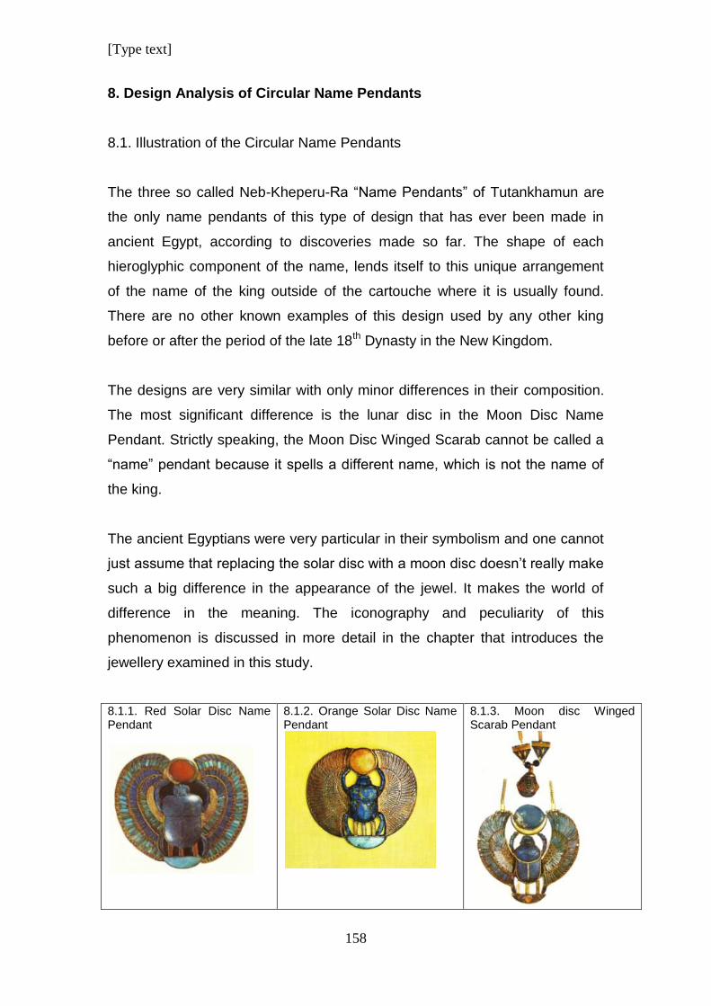
[Type text]
158
8. Design Analysis of Circular Name Pendants
8.1. Illustration of the Circular Name Pendants
The three so called Neb-Kheperu-Ra “Name Pendants” of Tutankhamun are
the only name pendants of this type of design that has ever been made in
ancient Egypt, according to discoveries made so far. The shape of each
hieroglyphic component of the name, lends itself to this unique arrangement
of the name of the king outside of the cartouche where it is usually found.
There are no other known examples of this design used by any other king
before or after the period of the late 18th Dynasty in the New Kingdom.
The designs are very similar with only minor differences in their composition.
The most significant difference is the lunar disc in the Moon Disc Name
Pendant. Strictly speaking, the Moon Disc Winged Scarab cannot be called a
“name” pendant because it spells a different name, which is not the name of
the king.
The ancient Egyptians were very particular in their symbolism and one cannot
just assume that replacing the solar disc with a moon disc doesn’t really make
such a big difference in the appearance of the jewel. It makes the world of
difference in the meaning. The iconography and peculiarity of this
phenomenon is discussed in more detail in the chapter that introduces the
jewellery examined in this study.
8.1.1. Red Solar Disc Name Pendant
8.1.2. Orange Solar Disc Name Pendant
8.1.3. Moon disc Winged Scarab Pendant
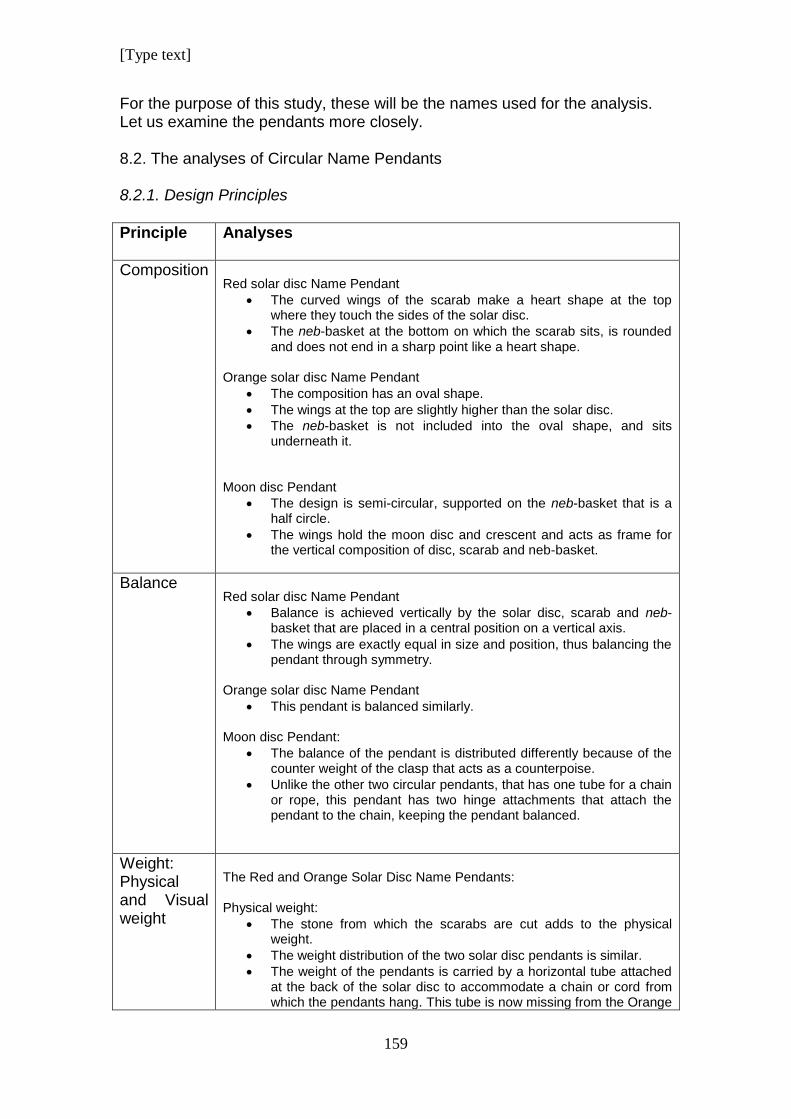
[Type text]
159
For the purpose of this study, these will be the names used for the analysis. Let us examine the pendants more closely. 8.2. The analyses of Circular Name Pendants 8.2.1. Design Principles
Principle Analyses
Composition
Red solar disc Name Pendant
The curved wings of the scarab make a heart shape at the top where they touch the sides of the solar disc.
The neb-basket at the bottom on which the scarab sits, is rounded and does not end in a sharp point like a heart shape.
Orange solar disc Name Pendant
The composition has an oval shape.
The wings at the top are slightly higher than the solar disc.
The neb-basket is not included into the oval shape, and sits underneath it.
Moon disc Pendant
The design is semi-circular, supported on the neb-basket that is a half circle.
The wings hold the moon disc and crescent and acts as frame for the vertical composition of disc, scarab and neb-basket.
Balance
Red solar disc Name Pendant
Balance is achieved vertically by the solar disc, scarab and neb-basket that are placed in a central position on a vertical axis.
The wings are exactly equal in size and position, thus balancing the pendant through symmetry.
Orange solar disc Name Pendant
This pendant is balanced similarly.
Moon disc Pendant:
The balance of the pendant is distributed differently because of the counter weight of the clasp that acts as a counterpoise.
Unlike the other two circular pendants, that has one tube for a chain or rope, this pendant has two hinge attachments that attach the pendant to the chain, keeping the pendant balanced.
Weight: Physical and Visual weight
The Red and Orange Solar Disc Name Pendants: Physical weight:
The stone from which the scarabs are cut adds to the physical weight.
The weight distribution of the two solar disc pendants is similar.
The weight of the pendants is carried by a horizontal tube attached at the back of the solar disc to accommodate a chain or cord from which the pendants hang. This tube is now missing from the Orange
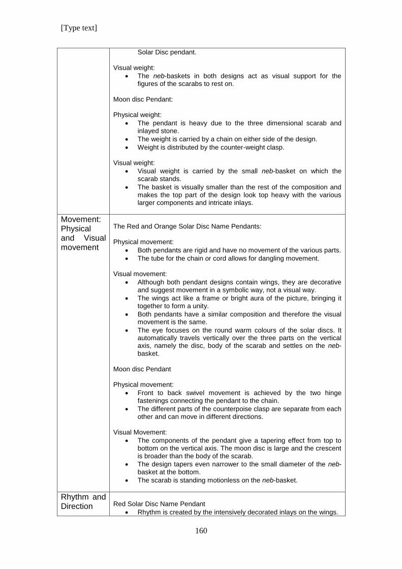
[Type text]
160
Solar Disc pendant.
Visual weight:
The neb-baskets in both designs act as visual support for the figures of the scarabs to rest on.
Moon disc Pendant: Physical weight:
The pendant is heavy due to the three dimensional scarab and inlayed stone.
The weight is carried by a chain on either side of the design.
Weight is distributed by the counter-weight clasp.
Visual weight:
Visual weight is carried by the small neb-basket on which the scarab stands.
The basket is visually smaller than the rest of the composition and makes the top part of the design look top heavy with the various larger components and intricate inlays.
Movement: Physical and Visual movement
The Red and Orange Solar Disc Name Pendants: Physical movement:
Both pendants are rigid and have no movement of the various parts.
The tube for the chain or cord allows for dangling movement.
Visual movement:
Although both pendant designs contain wings, they are decorative and suggest movement in a symbolic way, not a visual way.
The wings act like a frame or bright aura of the picture, bringing it together to form a unity.
Both pendants have a similar composition and therefore the visual movement is the same.
The eye focuses on the round warm colours of the solar discs. It automatically travels vertically over the three parts on the vertical axis, namely the disc, body of the scarab and settles on the neb-basket.
Moon disc Pendant Physical movement:
Front to back swivel movement is achieved by the two hinge fastenings connecting the pendant to the chain.
The different parts of the counterpoise clasp are separate from each other and can move in different directions.
Visual Movement:
The components of the pendant give a tapering effect from top to bottom on the vertical axis. The moon disc is large and the crescent is broader than the body of the scarab.
The design tapers even narrower to the small diameter of the neb-basket at the bottom.
The scarab is standing motionless on the neb-basket.
Rhythm and Direction
Red Solar Disc Name Pendant
Rhythm is created by the intensively decorated inlays on the wings.
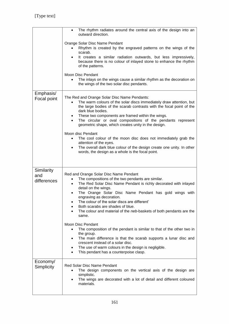
[Type text]
161
The rhythm radiates around the central axis of the design into an outward direction.
Orange Solar Disc Name Pendant
Rhythm is created by the engraved patterns on the wings of the scarab.
It creates a similar radiation outwards, but less impressively, because there is no colour of inlayed stone to enhance the rhythm of the patterns.
Moon Disc Pendant
The inlays on the wings cause a similar rhythm as the decoration on the wings of the two solar disc pendants.
Emphasis/ Focal point
The Red and Orange Solar Disc Name Pendants:
The warm colours of the solar discs immediately draw attention, but the large bodies of the scarab contrasts with the focal point of the dark blue bodies.
These two components are framed within the wings.
The circular or oval compositions of the pendants represent geometric shape, which creates unity in the design.
Moon disc Pendant
The cool colour of the moon disc does not immediately grab the attention of the eyes.
The overall dark blue colour of the design create one unity. In other words, the design as a whole is the focal point.
Similarity and differences
Red and Orange Solar Disc Name Pendant
The compositions of the two pendants are similar.
The Red Solar Disc Name Pendant is richly decorated with inlayed detail on the wings.
The Orange Solar Disc Name Pendant has gold wings with engraving as decoration.
The colour of the solar discs are different’
Both scarabs are shades of blue.
The colour and material of the neb-baskets of both pendants are the same.
Moon Disc Pendant
The composition of the pendant is similar to that of the other two in the group.
The main difference is that the scarab supports a lunar disc and crescent instead of a solar disc.
The use of warm colours in the design is negligible.
This pendant has a counterpoise clasp.
Economy/ Simplicity
Red Solar Disc Name Pendant
The design components on the vertical axis of the design are simplistic.
The wings are decorated with a lot of detail and different coloured materials.
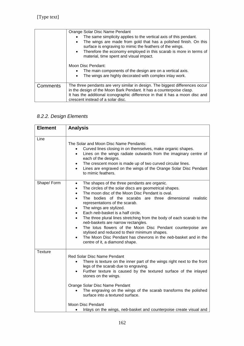
[Type text]
162
Orange Solar Disc Name Pendant
The same simplicity applies to the vertical axis of this pendant.
The wings are made from gold that has a polished finish. On this surface is engraving to mimic the feathers of the wings.
Therefore the economy employed in this scarab is more in terms of material, time spent and visual impact.
Moon Disc Pendant:
The main components of the design are on a vertical axis.
The wings are highly decorated with complex inlay work.
Comments The three pendants are very similar in design. The biggest differences occur in the design of the Moon Bark Pendant. It has a counterpoise clasp. It has the additional iconographic difference in that it has a moon disc and crescent instead of a solar disc.
8.2.2. Design Elements
Element Analysis
Line The Solar and Moon Disc Name Pendants:
Curved lines closing in on themselves, make organic shapes.
Lines on the wings radiate outwards from the imaginary centre of each of the designs.
The crescent moon is made up of two curved circular lines.
Lines are engraved on the wings of the Orange Solar Disc Pendant to mimic feathers.
Shape/ Form The shapes of the three pendants are organic.
The circles of the solar discs are geometrical shapes.
The moon disc of the Moon Disc Pendant is oval.
The bodies of the scarabs are three dimensional realistic representations of the scarab.
The wings are stylized.
Each neb-basket is a half circle.
The three plural lines stretching from the body of each scarab to the neb-baskets are narrow rectangles.
The lotus flowers of the Moon Disc Pendant counterpoise are stylised and reduced to their minimum shapes.
The Moon Disc Pendant has chevrons in the neb-basket and in the centre of it, a diamond shape.
Texture Red Solar Disc Name Pendant
There is texture on the inner part of the wings right next to the front legs of the scarab due to engraving.
Further texture is caused by the textured surface of the inlayed stones on the wings.
Orange Solar Disc Name Pendant
The engraving on the wings of the scarab transforms the polished surface into a textured surface.
Moon Disc Pendant
Inlays on the wings, neb-basket and counterpoise create visual and
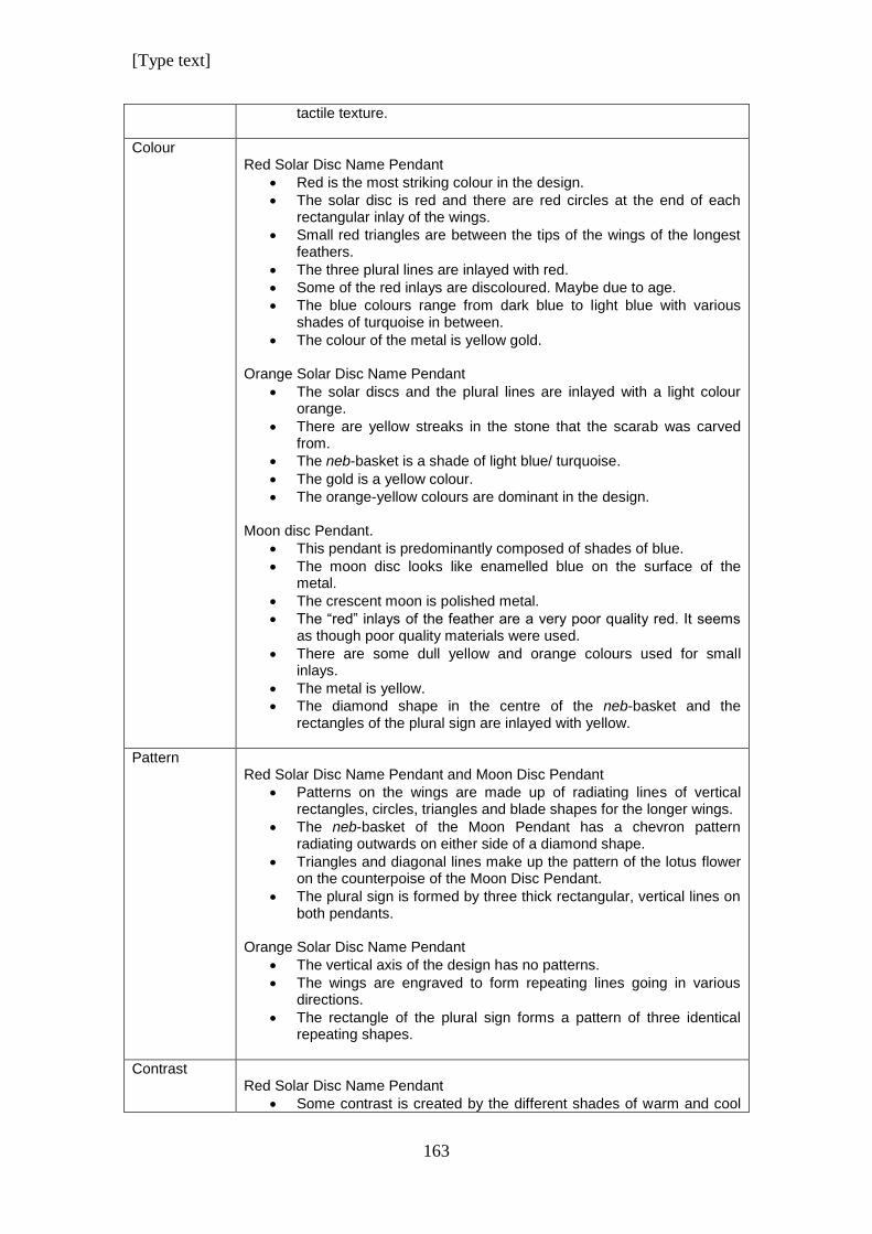
[Type text]
163
tactile texture.
Colour Red Solar Disc Name Pendant
Red is the most striking colour in the design.
The solar disc is red and there are red circles at the end of each rectangular inlay of the wings.
Small red triangles are between the tips of the wings of the longest feathers.
The three plural lines are inlayed with red.
Some of the red inlays are discoloured. Maybe due to age.
The blue colours range from dark blue to light blue with various shades of turquoise in between.
The colour of the metal is yellow gold.
Orange Solar Disc Name Pendant
The solar discs and the plural lines are inlayed with a light colour orange.
There are yellow streaks in the stone that the scarab was carved from.
The neb-basket is a shade of light blue/ turquoise.
The gold is a yellow colour.
The orange-yellow colours are dominant in the design.
Moon disc Pendant.
This pendant is predominantly composed of shades of blue.
The moon disc looks like enamelled blue on the surface of the metal.
The crescent moon is polished metal.
The “red” inlays of the feather are a very poor quality red. It seems as though poor quality materials were used.
There are some dull yellow and orange colours used for small inlays.
The metal is yellow.
The diamond shape in the centre of the neb-basket and the rectangles of the plural sign are inlayed with yellow.
Pattern Red Solar Disc Name Pendant and Moon Disc Pendant
Patterns on the wings are made up of radiating lines of vertical rectangles, circles, triangles and blade shapes for the longer wings.
The neb-basket of the Moon Pendant has a chevron pattern radiating outwards on either side of a diamond shape.
Triangles and diagonal lines make up the pattern of the lotus flower on the counterpoise of the Moon Disc Pendant.
The plural sign is formed by three thick rectangular, vertical lines on both pendants.
Orange Solar Disc Name Pendant
The vertical axis of the design has no patterns.
The wings are engraved to form repeating lines going in various directions.
The rectangle of the plural sign forms a pattern of three identical repeating shapes.
Contrast Red Solar Disc Name Pendant
Some contrast is created by the different shades of warm and cool
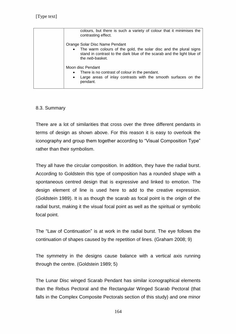
[Type text]
164
colours, but there is such a variety of colour that it minimises the contrasting effect.
Orange Solar Disc Name Pendant
The warm colours of the gold, the solar disc and the plural signs stand in contrast to the dark blue of the scarab and the light blue of the neb-basket.
Moon disc Pendant
There is no contrast of colour in the pendant.
Large areas of inlay contrasts with the smooth surfaces on the pendant.
8.3. Summary
There are a lot of similarities that cross over the three different pendants in
terms of design as shown above. For this reason it is easy to overlook the
iconography and group them together according to “Visual Composition Type”
rather than their symbolism.
They all have the circular composition. In addition, they have the radial burst.
According to Goldstein this type of composition has a rounded shape with a
spontaneous centred design that is expressive and linked to emotion. The
design element of line is used here to add to the creative expression.
(Goldstein 1989). It is as though the scarab as focal point is the origin of the
radial burst, making it the visual focal point as well as the spiritual or symbolic
focal point.
The “Law of Continuation” is at work in the radial burst. The eye follows the
continuation of shapes caused by the repetition of lines. (Graham 2008; 9)
The symmetry in the designs cause balance with a vertical axis running
through the centre. (Goldstein 1989; 5)
The Lunar Disc winged Scarab Pendant has similar iconographical elements
than the Rebus Pectoral and the Rectangular Winged Scarab Pectoral (that
falls in the Complex Composite Pectorals section of this study) and one minor
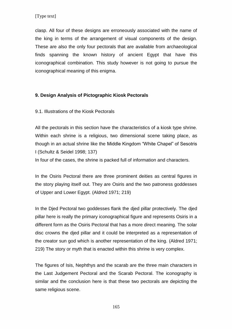
[Type text]
165
clasp. All four of these designs are erroneously associated with the name of
the king in terms of the arrangement of visual components of the design.
These are also the only four pectorals that are available from archaeological
finds spanning the known history of ancient Egypt that have this
iconographical combination. This study however is not going to pursue the
iconographical meaning of this enigma.
9. Design Analysis of Pictographic Kiosk Pectorals
9.1. Illustrations of the Kiosk Pectorals
All the pectorals in this section have the characteristics of a kiosk type shrine.
Within each shrine is a religious, two dimensional scene taking place, as
though in an actual shrine like the Middle Kingdom “White Chapel” of Sesotris
I (Schultz & Seidel 1998; 137)
In four of the cases, the shrine is packed full of information and characters.
In the Osiris Pectoral there are three prominent deities as central figures in
the story playing itself out. They are Osiris and the two patroness goddesses
of Upper and Lower Egypt. (Aldred 1971; 219)
In the Djed Pectoral two goddesses flank the djed pillar protectively. The djed
pillar here is really the primary iconographical figure and represents Osiris in a
different form as the Osiris Pectoral that has a more direct meaning. The solar
disc crowns the djed pillar and it could be interpreted as a representation of
the creator sun god which is another representation of the king. (Aldred 1971;
219) The story or myth that is enacted within this shrine is very complex.
The figures of Isis, Nephthys and the scarab are the three main characters in
the Last Judgement Pectoral and the Scarab Pectoral. The iconography is
similar and the conclusion here is that these two pectorals are depicting the
same religious scene.
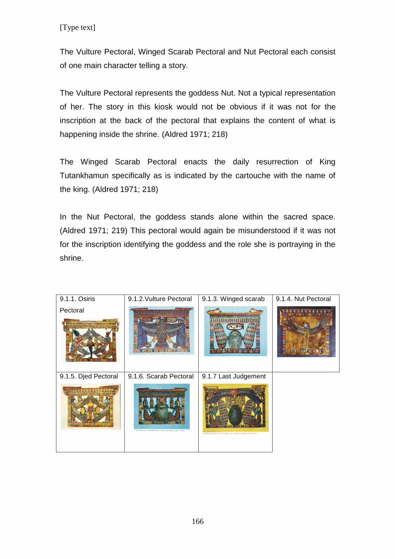
[Type text]
166
The Vulture Pectoral, Winged Scarab Pectoral and Nut Pectoral each consist
of one main character telling a story.
The Vulture Pectoral represents the goddess Nut. Not a typical representation
of her. The story in this kiosk would not be obvious if it was not for the
inscription at the back of the pectoral that explains the content of what is
happening inside the shrine. (Aldred 1971; 218)
The Winged Scarab Pectoral enacts the daily resurrection of King
Tutankhamun specifically as is indicated by the cartouche with the name of
the king. (Aldred 1971; 218)
In the Nut Pectoral, the goddess stands alone within the sacred space.
(Aldred 1971; 219) This pectoral would again be misunderstood if it was not
for the inscription identifying the goddess and the role she is portraying in the
shrine.
9.1.1. Osiris
Pectoral
9.1.2.Vulture Pectoral
9.1.3. Winged scarab
9.1.4. Nut Pectoral
9.1.5. Djed Pectoral
9.1.6. Scarab Pectoral
9.1.7 Last Judgement
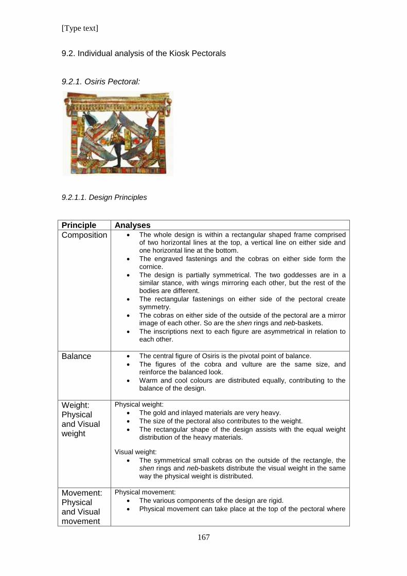
[Type text]
167
9.2. Individual analysis of the Kiosk Pectorals
9.2.1. Osiris Pectoral:
9.2.1.1. Design Principles
Principle Analyses
Composition
The whole design is within a rectangular shaped frame comprised of two horizontal lines at the top, a vertical line on either side and one horizontal line at the bottom.
The engraved fastenings and the cobras on either side form the cornice.
The design is partially symmetrical. The two goddesses are in a similar stance, with wings mirroring each other, but the rest of the bodies are different.
The rectangular fastenings on either side of the pectoral create symmetry.
The cobras on either side of the outside of the pectoral are a mirror image of each other. So are the shen rings and neb-baskets.
The inscriptions next to each figure are asymmetrical in relation to each other.
Balance
The central figure of Osiris is the pivotal point of balance.
The figures of the cobra and vulture are the same size, and reinforce the balanced look.
Warm and cool colours are distributed equally, contributing to the balance of the design.
Weight: Physical and Visual weight
Physical weight:
The gold and inlayed materials are very heavy.
The size of the pectoral also contributes to the weight.
The rectangular shape of the design assists with the equal weight distribution of the heavy materials.
Visual weight:
The symmetrical small cobras on the outside of the rectangle, the shen rings and neb-baskets distribute the visual weight in the same way the physical weight is distributed.
Movement: Physical and Visual movement
Physical movement:
The various components of the design are rigid.
Physical movement can take place at the top of the pectoral where
[Type text]
168
beads can be attached as necklace for the pectoral to hang from.
Visual movement:
Seeming symmetry mixed with asymmetry provides the eye with an incentive to look from the one side of the design to the other and back again to compare which parts of the design reflects the other side and which parts create the illusion of symmetry.
The wings pointing diagonally serve to give direction.
Rhythm and Direction
Rhythm is generated by the continuous vertical repetition of the patterns on the top twp horizontal lines of the frame.
This rhythm is offset by horizontal rectangles on the vertical sides of the frame.
Emphasis/ Focal point
The vertical figure of Osiris with his arms forming a triangle in the centre of the design is the focal point.
The wings of the goddesses form a horizontal diamond shape framing Osiris and emphasises him as focal point.
Similarity and differences
Similarity is created by the portions of the jewel that are exact mirror images on either side. These include the following:
The engraved snakes on the fastenings.
The cobras crowned with the sun discs positioned on the outside of the rectangle.
The shen rings.
The neb-baskets.
The wings of the goddesses are similar with a similar stylised pattern.
The differences are:
The bodies of the goddesses. One is a snake and the other is a vulture.
Their headdresses are different.
The sceptres that Osiris holds are not the same on both sides.
None of the plates with inscriptions on them line up. They slope down diagonally, going down towards the right side of the design as seen by the viewer.
The wings of the goddesses don’t have the same colours reflected on either side of the design.
Economy/ Simplicity
The design is packed full of small detail:
There are a multitude of line directions, and line is repeated in the combinations of different rhythmic patterns and colours.
The rectangular shape provides a strong structure for keeping the design together.
Comments There is a lot of detail in the design. Although there is a lot of asymmetry, the design appears as a unit of shapes that flow into each other. Organic shapes are reduced to geometric shapes, creating stylisation.
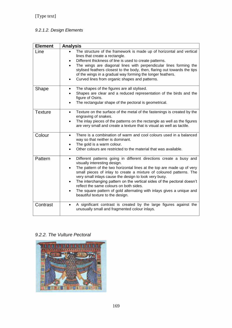
[Type text]
169
9.2.1.2. Design Elements
Element Analysis
Line The structure of the framework is made up of horizontal and vertical lines that create a rectangle.
Different thickness of line is used to create patterns.
The wings are diagonal lines with perpendicular lines forming the stylised feathers closest to the body, then, flaring out towards the tips of the wings in a gradual way forming the longer feathers.
Curved lines from organic shapes and patterns.
Shape The shapes of the figures are all stylised.
Shapes are clear and a reduced representation of the birds and the figure of Osiris.
The rectangular shape of the pectoral is geometrical.
Texture Texture on the surface of the metal of the fastenings is created by the engraving of snakes.
The inlay pieces of the patterns on the rectangle as well as the figures are very small and create a texture that is visual as well as tactile.
Colour There is a combination of warm and cool colours used in a balanced way so that neither is dominant.
The gold is a warm colour.
Other colours are restricted to the material that was available.
Pattern Different patterns going in different directions create a busy and visually interesting design.
The pattern of the two horizontal lines at the top are made up of very small pieces of inlay to create a mixture of coloured patterns. The very small inlays cause the design to look very busy.
The interchanging pattern on the vertical sides of the pectoral doesn’t reflect the same colours on both sides.
The square pattern of gold alternating with inlays gives a unique and beautiful texture to the design.
Contrast A significant contrast is created by the large figures against the unusually small and fragmented colour inlays.
9.2.2. The Vulture Pectoral
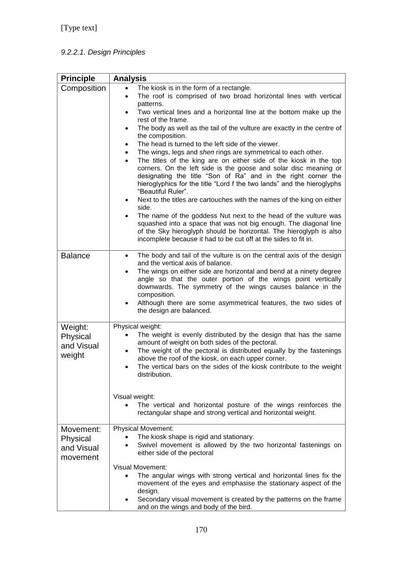
[Type text]
170
9.2.2.1. Design Principles
Principle Analysis
Composition
The kiosk is in the form of a rectangle.
The roof is comprised of two broad horizontal lines with vertical patterns.
Two vertical lines and a horizontal line at the bottom make up the rest of the frame.
The body as well as the tail of the vulture are exactly in the centre of the composition.
The head is turned to the left side of the viewer.
The wings, legs and shen rings are symmetrical to each other.
The titles of the king are on either side of the kiosk in the top corners. On the left side is the goose and solar disc meaning or designating the title “Son of Ra” and in the right corner the hieroglyphics for the title “Lord f the two lands” and the hieroglyphs “Beautiful Ruler”.
Next to the titles are cartouches with the names of the king on either side.
The name of the goddess Nut next to the head of the vulture was squashed into a space that was not big enough. The diagonal line of the Sky hieroglyph should be horizontal. The hieroglyph is also incomplete because it had to be cut off at the sides to fit in.
Balance
The body and tail of the vulture is on the central axis of the design and the vertical axis of balance.
The wings on either side are horizontal and bend at a ninety degree angle so that the outer portion of the wings point vertically downwards. The symmetry of the wings causes balance in the composition.
Although there are some asymmetrical features, the two sides of the design are balanced.
Weight: Physical and Visual weight
Physical weight:
The weight is evenly distributed by the design that has the same amount of weight on both sides of the pectoral.
The weight of the pectoral is distributed equally by the fastenings above the roof of the kiosk, on each upper corner.
The vertical bars on the sides of the kiosk contribute to the weight distribution.
Visual weight:
The vertical and horizontal posture of the wings reinforces the rectangular shape and strong vertical and horizontal weight.
Movement: Physical and Visual movement
Physical Movement:
The kiosk shape is rigid and stationary.
Swivel movement is allowed by the two horizontal fastenings on either side of the pectoral
Visual Movement:
The angular wings with strong vertical and horizontal lines fix the movement of the eyes and emphasise the stationary aspect of the design.
Secondary visual movement is created by the patterns on the frame and on the wings and body of the bird.
[Type text]
171
The round shen rings serve as anchors.
Rhythm and Direction
The wings of the vulture stretch out horizontally and bend in a 90 degree angle at the joints.
Vertical patterns on the kiosk roof are set off by horizontal lines on top and bottom of the pectoral.
In the same way, the square and narrow rectangles that form the patterns on the frame, cause visual direction in opposite directions.
The long rectangular and blade shape feathers all give a downward vertical direction.
The small pattern on the tail, body and wings gives a different rhythm to the design.
Emphasis/ Focal point
The vulture, as largest component, is the focal point of the design.
The position of the wings that are parallel to the frame, reinforces it as focal point.
Similarity and differences
The vertical sides of the frame and the horizontal base have the same pattern.
The second horizontal row of inlay on the wings and the inlay of the body is the same and is rarely found in other jewellery.
There are two cartouches, but the inscription in each writes a different name.
Economy/ Simplicity
The design is simple in that the vulture is the main feature and smaller inserts do not distract from it.
Although some areas have intensive inlays, the long vertical shapes of the wings and their inlays give an elegant, simple look.
Comments The pectoral has a beautiful design and had been manufactured with skill. Unfortunately, the skew hieroglyphs spelling the name of Nut, looks like it was stuck in at the last minute using pieces that were too big to fit into the frame with the rest of the design.
9.2.2.2. Design Elements
Element Analysis
Line The usual vertical and horizontal lines make up the frame of the kiosk.
Small patterns are mostly made up of vertical lines.
The broad vertical lines of the frame have horizontal rectangles as pattern.
Lines dividing the segments of the tail are diagonal.
The golden legs of the vulture form thick diagonal lines.
Repeating vertical and horizontal lines form a pattern.
Shape The kiosk frame is rectangular.
The vulture is a stylised organic shape.
The cartouches are elongated horizontal oval shapes.
The shen rings are circular.
Texture The gold has a polished surface with some engraving that causes texture.
The inlayed stone causes varied degrees of texture, depending on the
[Type text]
172
material.
The different colours together in the inlays form visual texture.
Colour Blue is the dominating colour in the design.
The second row of patterns of the roof depicts blossoms, but strangely, because of the blue that is so dominant, the negative spaces or pattern between the flowers gets more attention and the viewer tries to identify what it represents. Only afterwards comes the realisation that the pattern is about the flowers.
Smaller portions of red create a pleasing interaction with the cool blue colours.
Pattern The top line of the roof of the kiosk has a pattern of vertical rectangles of alternating colours of red, blue and turquoise. Each rectangle has a rounded top.
The pattern on the second line alternates with turquoise, dark blue, orange and gold colours to form a repetition of flowers.
The rest of the frame has patterns of three rectangular lines alternating with squares or large rectangles that ware maybe supposed to be square. In spite of this, the pattern appears neat and consistent.
The top horizontal line of the wings has a pattern of tapering half oval shapes that repeat and grows smaller towards the bend of the wings. Colours alternate in this pattern.
The pattern on the second horizontal line on the wings and the pattern on the body is the same. This pattern is unique; each stylised feather has a red circle at the tip, followed by a turquoise arrow and ending in a triangular shape that looks similar to a claw. This is the only example that we know of with such a composite type of inlay for a single feather.
The medium sized feathers on the wings are thick, vertical lines of turquoise on the top line and dark blue on the middle line. Each of these feathers is curved at the bottom and end in a half-oval red inlay.
The two vertical portions of wing on either side have long, blade shaped stylised wings that repeat in a pattern that goes from big and long on the outside of the wing to progressively smaller towards the inside.
The bottom row of red inlays on the tail is circular at the bottom and ends in an arrow at the top.
The next five rows going up are arrows becoming smaller towards the top.
In addition to the arrows forming a repetitive pattern to the top and the sides, horizontal lines of colour are formed. Red at the bottom, dark blue, turquoise, dark blue and then starting with red to begin the sequence again.
Contrast Colour contrast is created between the cool and warm colours, although the blue colours dominate.
The large vulture stands in contrast to the smaller visual components in the design.
Vertical lines at a ninety degree angle to horizontal lines cause strong contrast.
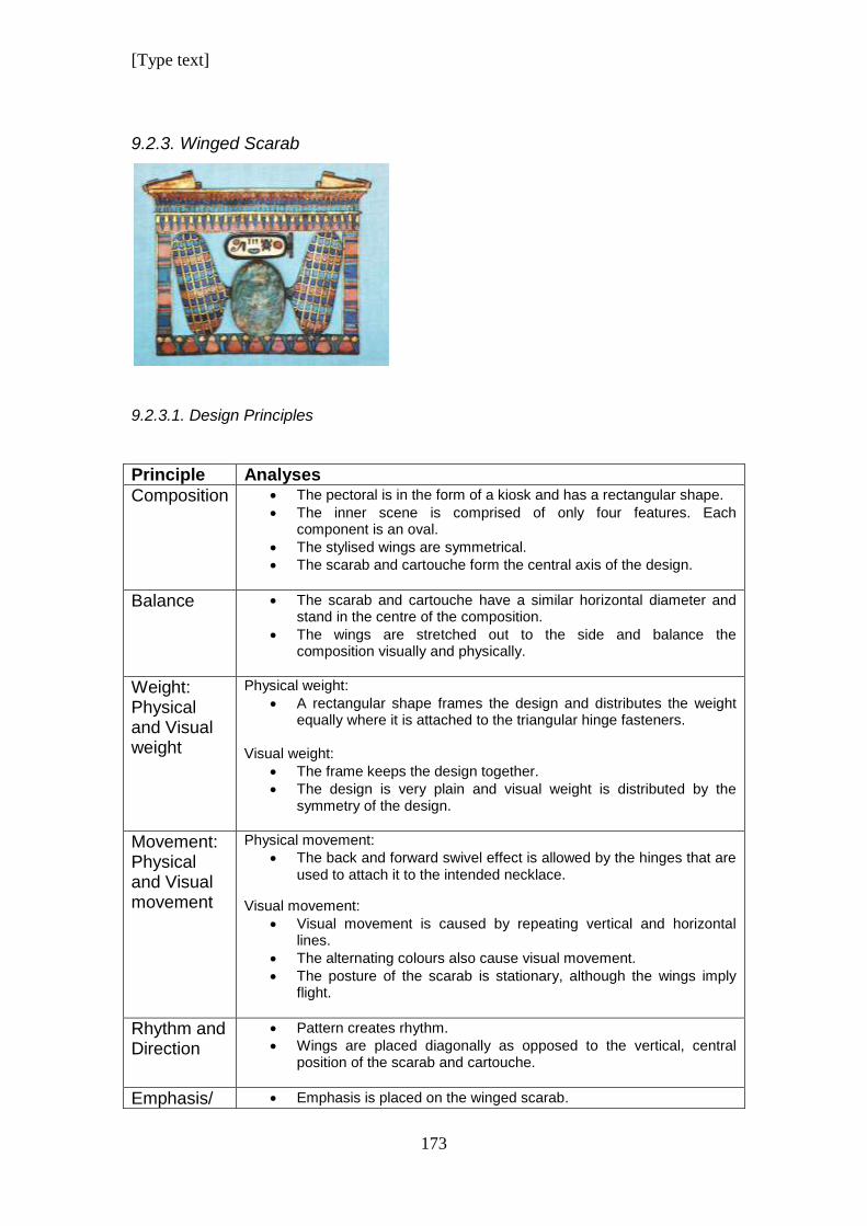
[Type text]
173
9.2.3. Winged Scarab
9.2.3.1. Design Principles
Principle Analyses
Composition
The pectoral is in the form of a kiosk and has a rectangular shape.
The inner scene is comprised of only four features. Each component is an oval.
The stylised wings are symmetrical.
The scarab and cartouche form the central axis of the design.
Balance
The scarab and cartouche have a similar horizontal diameter and stand in the centre of the composition.
The wings are stretched out to the side and balance the composition visually and physically.
Weight: Physical and Visual weight
Physical weight:
A rectangular shape frames the design and distributes the weight equally where it is attached to the triangular hinge fasteners.
Visual weight:
The frame keeps the design together.
The design is very plain and visual weight is distributed by the symmetry of the design.
Movement: Physical and Visual movement
Physical movement:
The back and forward swivel effect is allowed by the hinges that are used to attach it to the intended necklace.
Visual movement:
Visual movement is caused by repeating vertical and horizontal lines.
The alternating colours also cause visual movement.
The posture of the scarab is stationary, although the wings imply flight.
Rhythm and Direction
Pattern creates rhythm.
Wings are placed diagonally as opposed to the vertical, central position of the scarab and cartouche.
Emphasis/ Emphasis is placed on the winged scarab.
[Type text]
174
Focal point
It is the dominating component of the pectoral.
The kiosk frame helps to emphasise its solitary presence in the shrine.
Economy/ Simplicity
The wings are stylised to a basic elongated oval geometric shape.
The scarab is a sculptured scarab which is realistic yet simplified.
Comments The wings of the scarab look like stylised representations of actual scarab wings and not the typical bird wings that is used more often. This type of representation was used for the first time during this period, judging by the lack of any examples dating to earlier periods. This is a fashion trend that was copied during periods that followed and can be regarded as a preferred representation of a winged scarab during the 21
st Dynasty.
9.2.3.2. Design Elements
Element Analysis
Line Vertical and horizontal lines form the frame of the pectoral.
Line is used to create pattern going into different directions.
Line closing in on itself forms the shape of the wing.
Shape/ Form
The scarab is a three dimensional form.
The outer shape is rectangular.
The inner design is made up of four oval shapes; the scarab, cartouche and two elongated oval wings.
The hinges are triangular in shape.
Texture The surface of the gold is not textured.
The inlayed materials cause different tactile and visual textures.
Colour Colours are the typical colour spectrum of materials used in Egyptian jewellery.
The colour of the scarab in the centre of the design is a very dull bluish grey as opposed to the rest of the vibrant colours.
Pattern The top line of the kiosk has a row of vertical lines to form a pattern, but the inlay is done with three different colours forming an additional pattern of coloured horizontal lines.
The second line from the top has a pattern of repeating stylised flowers and an alternating pattern of red and dark blue.
The pattern on the wings looks like stylised scales.
Colour patterns form horizontal lines of pattern on the wings.
The flowers at the bottom alternate between closed blue flowers and open red flowers.
On the closed flowers there is a light blue leaf on the left and a dark blue leaf on the right of each flower.
Contrast Cool and warm colours contrast with each other.
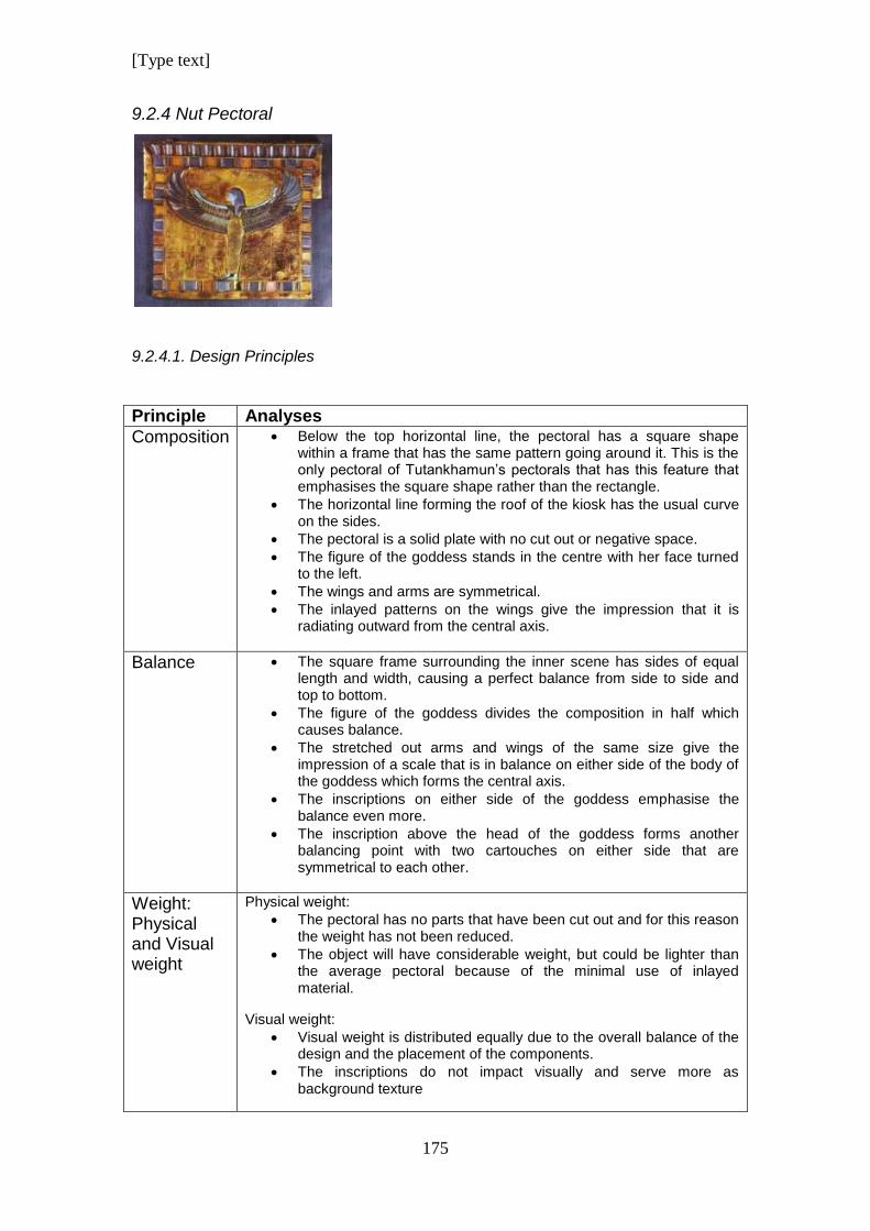
[Type text]
175
9.2.4 Nut Pectoral
9.2.4.1. Design Principles
Principle Analyses
Composition
Below the top horizontal line, the pectoral has a square shape within a frame that has the same pattern going around it. This is the only pectoral of Tutankhamun’s pectorals that has this feature that emphasises the square shape rather than the rectangle.
The horizontal line forming the roof of the kiosk has the usual curve on the sides.
The pectoral is a solid plate with no cut out or negative space.
The figure of the goddess stands in the centre with her face turned to the left.
The wings and arms are symmetrical.
The inlayed patterns on the wings give the impression that it is radiating outward from the central axis.
Balance
The square frame surrounding the inner scene has sides of equal length and width, causing a perfect balance from side to side and top to bottom.
The figure of the goddess divides the composition in half which causes balance.
The stretched out arms and wings of the same size give the impression of a scale that is in balance on either side of the body of the goddess which forms the central axis.
The inscriptions on either side of the goddess emphasise the balance even more.
The inscription above the head of the goddess forms another balancing point with two cartouches on either side that are symmetrical to each other.
Weight: Physical and Visual weight
Physical weight:
The pectoral has no parts that have been cut out and for this reason the weight has not been reduced.
The object will have considerable weight, but could be lighter than the average pectoral because of the minimal use of inlayed material.
Visual weight:
Visual weight is distributed equally due to the overall balance of the design and the placement of the components.
The inscriptions do not impact visually and serve more as background texture
[Type text]
176
Movement: Physical and Visual movement
Physical movement:
Fasteners are on the side. Presumably to be used with a belt rather than as a necklace. It does not allow for a lot of physical movement.
Visual movement:
The square frame causes the design to appear stationary and does not allow for a lot of eye movement jumping from one component to another.
The composition conveys stability which has a beauty in itself, but risks being visually unexciting.
The open wings imply movement.
Rhythm and Direction
The wings stretching outward cause outward direction.
The rhythmic pattern of the wings radiates outwards from the imagined centre and causes a visual outward burst.
Emphasis/ Focal point
The body of the goddess is the central focal point in the design and has the appearance of a scale.
This is emphasised even more by the turquoise colour of the head and arms of the goddess.
The outstretched wings add to the elegance of the design.
Similarity and differences
Although the wings are symmetrical, the colours of the inlays are not exactly the same on both sides.
The two cartouches engraved above the goddess are symmetrical to each other but the inscriptions inside are different.
There are four vertical columns on either side below the wings of the goddess with inscriptions, but the inscriptions are different and not a mirror image of each other.
The two parallel horizontal lines of the frame have the same pattern which is different than other pectorals of the period.
Economy/ Simplicity
The design is simple and uncluttered, but could be described as plain compared to the more elaborate examples that is known.
On the other hand, the design has a simple elegance.
The specific preferences of the viewer will determine which one of the above applies.
Comments The pectoral is unique in that it has no negative space. It also has only one component and is not packed with iconographical information. The significance of the pectoral could only be understood once the inscription is read.
9.2.4.2. Design Elements
Element Analysis
Line The top horizontal line of the kiosk is thin plain gold.
The bottom horizontal line is also of plain gold but is broader.
The outer frame of the pectoral has broad patterned lines.
Underneath each wing of the goddess are four engraved lines dividing the background into eight columns for inscriptions.
There are diagonal lines engraved on the dress of the goddess that form a criss-cross pattern.
[Type text]
177
The wings of the goddess are made up of curved lines.
Shape The top inlayed row of the kiosk has rectangular shape inlays that have a curved end at the top on either side.
The pattern on the square frame has alternating narrow rectangles with larger square/ rectangles in between.
The inlays on the wings have blade shapes for big feathers, rectangles and half circles for smaller feathers.
There are two narrow, vertical rectangles on either side of the pectoral that serve as fasteners.
The shape of the goddess is organic.
Texture The smoothing of the final product was not done very well and therefore the metal has a slight uneven, textured appearance.
The different inlayed materials have different textures.
The engraving on the background gives some texture without repeating as a pattern.
The engraving in the goddesses’ dress is more intensive and causes a rougher texture.
Colour Gold is the dominant colour and shades of blue are secondary.
Some orange, red and yellow cause interaction of warm colours.
Some of the colours are of poor quality or faded through time.
Pattern The top line of the kiosk has rectangular shaped inlays that form a repeating pattern with alternating colours.
The square frame has a pattern of rectangles alternating in different sizes. And colour.
The engraved lines on the dress of the goddess form a diagonal grid pattern.
The first line of small feathers under the arms has half oval horizontal shapes.
The next two rows of small feathers have semi-circular shapes with the curved end facing down.
The two rows of narrow feathers are comprised of shades of blue rectangles to form a repeating pattern. Below each rectangle is a reddish half circle that forms a row of red shapes.
There are blade shaped feathers from the tip of the wings that decrease in size and alternate between dark blue and light blue colours.
Contrast The warm colour of the gold is in contrast with the cool colours of the inlay.
Smooth surfaces contrast with textured surfaces.
Narrow shapes contrast with broad shapes.
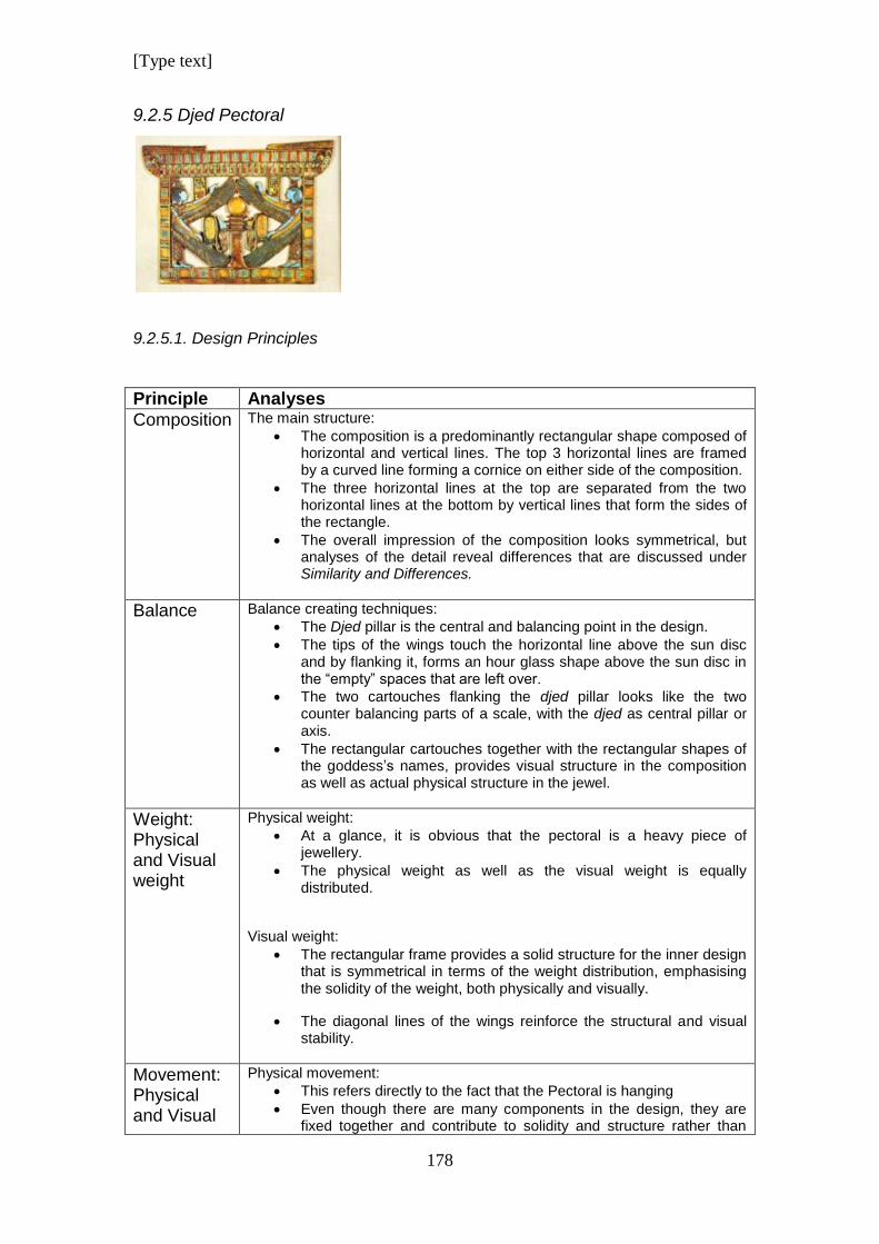
[Type text]
178
9.2.5 Djed Pectoral
9.2.5.1. Design Principles
Principle Analyses
Composition
The main structure:
The composition is a predominantly rectangular shape composed of horizontal and vertical lines. The top 3 horizontal lines are framed by a curved line forming a cornice on either side of the composition.
The three horizontal lines at the top are separated from the two horizontal lines at the bottom by vertical lines that form the sides of the rectangle.
The overall impression of the composition looks symmetrical, but analyses of the detail reveal differences that are discussed under Similarity and Differences.
Balance
Balance creating techniques:
The Djed pillar is the central and balancing point in the design.
The tips of the wings touch the horizontal line above the sun disc and by flanking it, forms an hour glass shape above the sun disc in the “empty” spaces that are left over.
The two cartouches flanking the djed pillar looks like the two counter balancing parts of a scale, with the djed as central pillar or axis.
The rectangular cartouches together with the rectangular shapes of the goddess’s names, provides visual structure in the composition as well as actual physical structure in the jewel.
Weight: Physical and Visual weight
Physical weight:
At a glance, it is obvious that the pectoral is a heavy piece of jewellery.
The physical weight as well as the visual weight is equally distributed.
Visual weight:
The rectangular frame provides a solid structure for the inner design that is symmetrical in terms of the weight distribution, emphasising the solidity of the weight, both physically and visually.
The diagonal lines of the wings reinforce the structural and visual stability.
Movement: Physical and Visual
Physical movement:
This refers directly to the fact that the Pectoral is hanging
Even though there are many components in the design, they are fixed together and contribute to solidity and structure rather than
[Type text]
179
movement
movement.
The cartouches give structural support to the wings.
The two Uraeus snakes link the cartouches to the djed pillar symbolically by joining them together and at the same time, causes further structural support
Visual movement:
The diagonal positions of the wings of the goddesses suggest an up and down motion or flapping effect like cartoon wings.
The engraving of the curving snakes in the top line suggests motion.
The Uraeus snakes coiling up suggest movement and the anticipation of snakes ready to strike.
Rhythm and Direction
The top three lines of the kiosk have repetitive vertical lines causing rhythm in a vertical direction.
The cornice curving around the top two horizontal lines of the roof have a pattern of inlayed chevrons causing direction in the way that the chevrons are pointing.
Within the wings there is a pattern of repeating lines caused by the individual feathers that repeat in a diagonal direction.
Emphasis/ Focal point
Focal Point:
The djed pillar with the yellow coloured stone that emphasizes the richness of the yellow gold, is the central and focal point of the design
The tips of the wings of the goddesses above the sun disc emphasises the sun disc as focal point.
The tips of the wings that touch the base of the djed pillar reinforce the symbolic and actual stability of the djed pillar causing a solid base in terms of the actual physical jewel as well as the structured visual solidness
Emphasis:
As the central axis of a seemingly symmetrical design, the djed pillar is emphasised by the elements of the composition immediately surrounding it.
The wings of the goddesses cause a frame around the central part of the design.
Similarity and differences
The design of the Pectoral looks symmetrical, but a closer look reveals a lot of differences:
The position of the two goddesses is symmetrical and mirrored, but their headdresses are different.
The position of the names of the goddesses is the same but the inscriptions differ.
In the same way, the cartouches are in opposing similar positions, but the inscriptions differ.
The two Uraeus snakes flanking the djed pillar coil in a mirrored way, but they are wearing the different crowns of Upper and Lower Egypt
The pattern on the vertical columns is the same, but the colours do not correspond.
The engraving of the two snakes on the fastening, are symmetrical, but, they look in opposite directions.
The posture of the goddesses is mirrored. The position of the wings and the feet are the same. The hair styles are identical and the pattern of the stylised feathers on the wings is the same.
[Type text]
180
Likewise, the pattern on the dresses is symmetrical
Economy/ Simplicity
The design is by no means simple. It has a multi-layered complexity that can be summed up as follows:
There are a multitude of line directions, and line is repeated in the combinations of different rhythmic patterns and colours.
Different textures provide minute details and provide for a busy and interesting visual interaction between the different elements.
In spite of the busy detail, the overall impression of the design is one of simplicity and balance.
The rectangular shape keeps the whole design together through defined structure. This structure is echoed by the rectangular shapes of the cartouches and the rectangular shapes on which the names of the goddess are inscribed.
Comments Snakes are a recurrent theme in the composition, but not obvious and dominant. There are 2 snakes on the top line, slightly obscured, and there are the two Uraeus snakes representing the two lands of the United kingdoms.
The hourglass shape above the sun disc could be interpreted as some reference about time in symbolic analyses.
The deliberate pseudo symmetrical balance is cunningly belied by tiny details that have been worked into the design, making it a very interesting, complex design that shows great skill in the ability of the designer to mislead the eye and create a game of comparison.
9.2.5.2. Design Elements
Element Analysis
Line
There are seven lines forming the boarder of the design.
The top line is smooth gold.
The second horizontal line has a pattern of vertical lines that ends on either side with an outward curving line that frames the circular shape of the inside of the cornice.
Line three is also horizontal, with a vertical lotus bud pattern.
Line two as well as three is framed by a curved line that envelops the gold circles, which is the focal point of the cornice on either side.
The two outer lines on the sides of the design serve as pillars. They are vertical lines with horizontal lines that form a repeating pattern.
The bottom two lines of the design are horizontal, The top of the two lines have vertical lines in a pattern to contrast with the dominant horizontal line.
The line at the very bottom is a horizontal line without texture or pattern.
The dominant lines on the inside of the design are the outlines of the wings of the goddesses that emphasis the diagonal direction of the wings and serves as frame of the djed as focal point.
Shape/ Form
The overall structure of the outside borders of the design is rectangular in shape. This alternates with the organic shapes on the inside of the design. The rectangular shape is reflected by the names of the goddesses and king and also finds an echo in the pattern of lines and squares on the outer parameters.
[Type text]
181
The djed pillar with the sun disc on top is itself composed of geometric shapes.
The vertical shapes of the names of the goddesses and the cartouches of the king’s names provide an echo to the vertical lines on the outside of the design. These names are also in a parallel position in relationship to the outside frame.
Texture
The snake engraving on the gold in the top, broken line of the pectoral provides texture.
The smooth horizontal lines of the djed pillar are alternated with vertically engraved texture of the sections in between. This contrasts with horizontal lines on the bottom half of the pillar.
The engraving of the king’s names in the cartouches gives a creative texture to an otherwise smooth appearance.
The gold under the turquoise arms of the goddesses is richly textured with engraving, emulating the feathery pattern. The feathers are attached to the arms with bangles of gold. On these bangles are engraved lines in alternating horizontal and vertical patterns creating a textured effect.
Each of the materials has a different texture related to their chemical composition.
Colour
The contrast of hot and cold colours is used to maximise the colour impact of the jewel.
The yellow stone used for the sun disc and the yellow enamelling emphasises the richness and warmth of the gold, giving the article a more expensive and valuable appearance.
Pattern The first, broken line at the very top of the design, has the engraving of a snake on either side. Their bodies have a curving rhythm that ebbs lower as the tails reach the end of the line towards the centre.
Both horizontal rows underneath this have vertical repeating patterns on them. The first row has vertical lines using alternating colours of red, turquoise and faded green, ending on either side with an outward curving line, hugging the gold circular centre of the cornice on either side. The lowest line of the top 3 lines, has repeating, vertical lotus bud designs in red, gold and green.
The vertical columns representing the sides of the rectangle, has a rhythmic pattern of horizontal lines and squares.
The bottom of the design is made up of two horizontal lines. The inner line carrying on with the pattern of lines and squares, but the lines are vertical in contrast with the dominant horizontal line. The outer line is of plain, polished gold.
Each wing is comprised of three parts. The gold portion beneath the arm is rhythmically textured and attached with bangles to the arms of the goddesses.
The stylised pattern of the feathers repeats diagonally, but is in contrast with the direction of the wings themselves. The inner lines are shorter and are in parallel. As the pattern moves outward to the tips of the wings, the lines fan outwards and change direction, not being parallel any more.
Contrast The red contrasts best with the turquoise and contrasts to a minor degree with the dark blue stone.
The blue and turquoise areas are big and in contrast with the small red bits on the tips of the wings and the tiny pieces in the dress.
The vertical red in the unbroken top horizontal line of the design
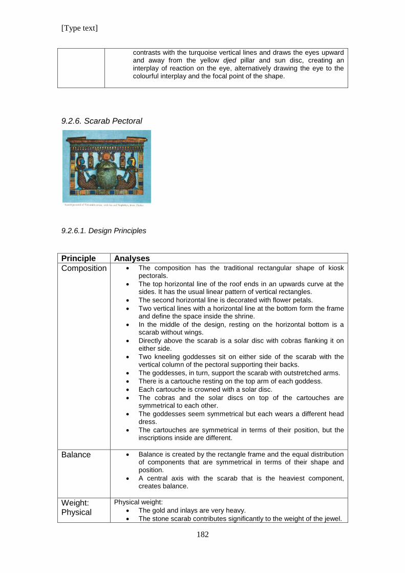
[Type text]
182
contrasts with the turquoise vertical lines and draws the eyes upward and away from the yellow djed pillar and sun disc, creating an interplay of reaction on the eye, alternatively drawing the eye to the colourful interplay and the focal point of the shape.
9.2.6. Scarab Pectoral
9.2.6.1. Design Principles
Principle Analyses
Composition
The composition has the traditional rectangular shape of kiosk pectorals.
The top horizontal line of the roof ends in an upwards curve at the sides. It has the usual linear pattern of vertical rectangles.
The second horizontal line is decorated with flower petals.
Two vertical lines with a horizontal line at the bottom form the frame and define the space inside the shrine.
In the middle of the design, resting on the horizontal bottom is a scarab without wings.
Directly above the scarab is a solar disc with cobras flanking it on either side.
Two kneeling goddesses sit on either side of the scarab with the vertical column of the pectoral supporting their backs.
The goddesses, in turn, support the scarab with outstretched arms.
There is a cartouche resting on the top arm of each goddess.
Each cartouche is crowned with a solar disc.
The cobras and the solar discs on top of the cartouches are symmetrical to each other.
The goddesses seem symmetrical but each wears a different head dress.
The cartouches are symmetrical in terms of their position, but the inscriptions inside are different.
Balance
Balance is created by the rectangle frame and the equal distribution of components that are symmetrical in terms of their shape and position.
A central axis with the scarab that is the heaviest component, creates balance.
Weight: Physical
Physical weight:
The gold and inlays are very heavy.
The stone scarab contributes significantly to the weight of the jewel.
[Type text]
183
and Visual weight
Weight is carried by the fasteners on either side of the pectoral.
Visual weight:
The scarab has a visual weight in addition to a physical weight and causes a downward pull.
The large amount of red in the dresses of the goddesses acts as counter weight for the eye grabbing red solar disc in the top of the design.
Movement: Physical and Visual movement
Physical movement:
Front to back swivel movement would be allowed by the fasteners on either side of the pectoral.
The components within the kiosk shape are attached to each other and have no movement.
Visual Movement:
The rhythmic distribution of colour and pattern has a soothing effect on the eye.
Although there are several visual components in the design, they do not compete with each other for attention. Therefore the design serves as one entity in balance. The strong presence of seeming symmetry reinforces this look.
Rhythm and Direction
The patterns on the frame cause rhythm in horizontal and vertical directions.
The patterns on the dresses of the goddesses give diagonal rhythm and direction.
Emphasis/ Focal point
The scarab is the focal point of the design. It is placed centrally and is large. This compensates for the lack of colour that reduces its claim as focal point.
Similarity and differences
Some components are similar like the solar disc and cobras.
Some components seem similar, like the cartouches and goddesses. These differences were discussed above.
Economy/ Simplicity
The design is simple, without over packed visual and iconographical information.
The simplicity gives it elegance.
The balanced mixture of design elements makes this a beautiful piece of jewellery
Comments The iconographical content of this pectoral is much less than some other examples in this study. The amuletic value or spiritual message is conveyed without an over cluttered design.
9.2.6.2. Design Elements
Element Analysis
Line Horizontal lines dominate the broad lines.
Vertical lines dominate the patterns.
Organic, curved lines shape the figures.
Shape/ The scarab is minimised to its basic form and is three dimensional.
[Type text]
184
Form The three circular red solar discs is an eye catching feature of the design.
The goddesses are stylised and have minimum detail. There are no details on the face, just inlayed turquoise.
The cobras are stylised and minimalistic.
Texture The most striking texture in the pectoral is the intricate pattern on the dresses of the goddesses. It is made up of small shapes and is done very neatly. This excellent craftsmanship contributes to the overall success of the jewel
Inlayed materials set in metal causes various tactile and visual texture.
The engraved tassels and headdresses on the heads of the goddesses and the bracelets, create texture as well as pattern.
As does the engraving on the cobras.
Colour A rich mixture of colour has been used.
The red solar discs are eye catching.
The pectoral has more red than most other pectorals and it can be said that red is the dominant colour due to its use on large areas.
Pattern Vertical long shapes on the top horizontal line of the pectoral cause a repeating pattern.
Within each vertical portion there is a colour pattern going down, starting with red, then dark blue and turquoise at the bottom.
In the same section, the colours cause a pattern of horizontal lines with the first line being red, followed by a dark blue and then turquoise line at the bottom.
The pattern of flowers on the second horizontal line is inlayed with dark blue. This makes it difficult to distinguish the difference between the positive and negative shapes of the pattern.
The flowers have colours causing a pattern from top to bottom using gold, red and dark blue at the bottom.
The frame of the kiosk has the popular pattern of three narrow rectangles alternating with big rectangles or squares.
The collars of the goddesses have half-circle lines starting small and going bigger to the bottom.
The last curved line of the necklace has a pattern of diagonal cross- hatching lines
The straps of the dresses have the same type of pattern that was used on the frame of the pectoral.
The pattern on the dresses is made up of rows of small lens shapes with small gold balls spaced between them. These lenses cross each other perpendicular forming a grid pattern. In the centre of each square that is formed by the grid, a red square is inlayed. This causes a pattern like decorative paving.
Contrast The smooth surfaces of gold of the hair of the goddesses and the large smooth surface of the scarab contrasts with the abundance of texture.
The large oval shape of the scarab contrasts with the smaller elongated oval shapes of the cartouches.
Dark blue rectangles/ squares contrast with yellow and orange rectangles in the frame of the kiosk.
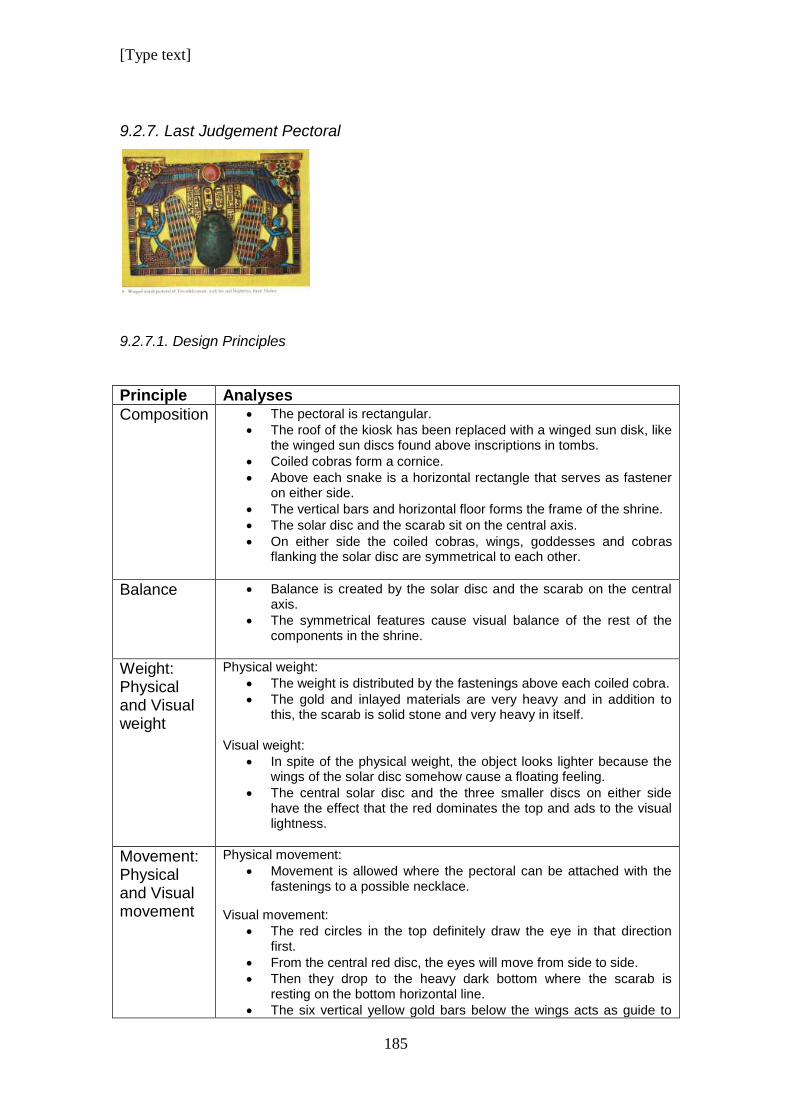
[Type text]
185
9.2.7. Last Judgement Pectoral
9.2.7.1. Design Principles
Principle Analyses
Composition
The pectoral is rectangular.
The roof of the kiosk has been replaced with a winged sun disk, like the winged sun discs found above inscriptions in tombs.
Coiled cobras form a cornice.
Above each snake is a horizontal rectangle that serves as fastener on either side.
The vertical bars and horizontal floor forms the frame of the shrine.
The solar disc and the scarab sit on the central axis.
On either side the coiled cobras, wings, goddesses and cobras flanking the solar disc are symmetrical to each other.
Balance
Balance is created by the solar disc and the scarab on the central axis.
The symmetrical features cause visual balance of the rest of the components in the shrine.
Weight: Physical and Visual weight
Physical weight:
The weight is distributed by the fastenings above each coiled cobra.
The gold and inlayed materials are very heavy and in addition to this, the scarab is solid stone and very heavy in itself.
Visual weight:
In spite of the physical weight, the object looks lighter because the wings of the solar disc somehow cause a floating feeling.
The central solar disc and the three smaller discs on either side have the effect that the red dominates the top and ads to the visual lightness.
Movement: Physical and Visual movement
Physical movement:
Movement is allowed where the pectoral can be attached with the fastenings to a possible necklace.
Visual movement:
The red circles in the top definitely draw the eye in that direction first.
From the central red disc, the eyes will move from side to side.
Then they drop to the heavy dark bottom where the scarab is resting on the bottom horizontal line.
The six vertical yellow gold bars below the wings acts as guide to
[Type text]
186
assist the eye to move from the top to the bottom.
Rhythm and Direction
Horizontal direction is very strong. The outstretched wings sweep the eye in a horizontal direction. As do the red solar discs.
The horizontal coils of the snakes assist in this on a subtle level, because the longer parts of the snakes are horizontal.
Vertical lines on the bird wings and scarab wings give vertical direction.
All four cobras look to the outside of the shrine causing outward direction as well.
Emphasis/ Focal point
The red solar disc and the scarab compete as focal point. The red of the disc is an alluring colour for the eye and the circle is a focal point.
The scarab on the other hand is a dark, uninteresting colour, but it is bigger than the solar disc.
Similarity and differences
The sets of cobras, the wings and goddesses are symmetrical to each other and reflect similarities.
Although the goddesses are symmetrical, they are different because each one wears a different head dress.
Economy/ Simplicity
The design is the opposite of economy. It is richly decorated with details and colour.
Comments The design is unique. The roof of the shrine is strangely open. The winged solar disc had been used more for wall inscriptions and not jewellery. This is the only known example of application in jewellery.
9.2.7.2. Design Elements
Element Analysis
Line The frame is made up of two vertical and one horizontal line.
The intended vertical lines are skew. This can especially be noticed on the left side of the jewel. If the line was intended to be at an angle, both lines would have been placed at the same angle.
The four gold strips of inscriptions above the scarab and the cartouches are also placed at random angles, giving the pectoral a very untidy look.
The lines for the inlays on the scarab and bird wings are neat and straight.
Diagonal lines dominate the lines on the scarab wings.
Shape/ Form
The solar discs are all geometric shapes.
The scarab is a stylised sculpture with minimum detail.
The cobras are stylised representations.
The wings are organic shapes that have been stylised but have a lot of intricate decoration.
The seated goddesses are reduced shapes of humans with some parts facing the front and some parts in profile.
[Type text]
187
Texture The inlay of various materials causes texture.
The surface of the gold is smooth.
The intricate pattern of inlay on the dresses of the goddesses gives visual as well as tactile texture.
Colour Cool and warm colours are more or less used in equal proportions.
There is an intense and busy use of colour which causes an interesting visual display.
The colour of the scarab is very dark and dull compared to the rest of the colours. This tones down the colour display and ads some moderation.
Pattern A horizontal pattern of colour alternating with gold can be found on the coiled tail of the cobras forming the cornice.
This pattern blends in with the top horizontal line of the pectoral which has a similar pattern but with half ovals, not squares.
The vertical sides and horizontal base that form the frame of the shrine, has the typical alternating three narrow rectangles alternating with one big rectangle/ square that is familiar in other pectorals.
The top segment of the wings of the solar disc has three rows of half circles with the curves facing downwards.
The middle has repetitive turquoise rectangles. Each rectangle ends in a red half oval that forms the tip of each wing. The longer feathers towards the tip of the wing are blade shapes that flare out towards the end of the wing and their colour is dark blue.
The bottom row of feathers has a similar pattern to the middle row. The smaller feathers are rectangular ending in a red half oval. The longer wings are blade shaped and flare open towards the end of the wing. All the feathers in this row is dark blue.
The last two long feathers on either side of the wings have a new feature of design unlike other pectorals. The top of the two feathers have a pattern of three turquoise rectangles with half oval ends at the bottom of each stylised feather.
Diagonal lines divide each wing of the scarab into six columns of equal width. The seventh column is irregular in shape. Inside these columns curved lines point upwards to form the setting for half oval inlay material. This pattern of half ovals goes upwards in a repeating pattern.
Horizontal lines of alternating colour are formed by the inlays on the scarab wings, thus creating diagonal and horizontal patterns on the wings.
The pattern on the dresses of the goddesses is intense and composed of rows of small lens shapes. These lines cross each other perpendicular forming a grid. In each square that is formed by this grid, a red square is inlayed causing a pattern similar to paving.
Small gold circles that are used to keep the inlays in place form rows of dots going in diagonal directions.
A pattern similar to the frame is reflected on the engraved headbands on the hair of the goddesses.
The collars around the necks of the goddesses are repeating half- circle lines going bigger towards the bottom.
Contrast The intense red of the solar discs stand in strong contrast to the surrounding dark blue colours.
The difference in direction of the two sets of wings causes contrast in direction.
The intensely packed inlays on the dresses of the goddesses and on the wings of the scarab and solar disc are in contrast with the large
[Type text]
188
smooth surface of the scarab.
9.3. Summary
The complexity and intricacy of the designs vary. Each pectoral shows a
variety of design principles at play. Most Principles manipulate design
elements to create the final result. (Goldstein 1989). Other principles like the
“Rule of Three” and the “Golden Ratio” effect they way the observer responds
to the design. (Lidwell et al 2010). The analyses above looked primarily at the
principles that influenced composition and design elements. These principles
determine to a large degree the aesthetic quality of each pectoral, but a
principle like the “Golden Ratio” has a big impact on the subconscious
response of the observer. (Lidwell et al 2010; 114)
It cannot be denied that each pectoral is a beautiful piece of art, but now it is
necessary to identify why this is so.
The “Golden Ratio” can be identified in the pectorals above. Not in their
rectangular compositions, but on the inside of the frames. As Lidwell et at
says, the ratio is found in natural forms like the bodies of humans and animals,
so it is understood that these types of shapes in the design will display the
ratio.
The Osiris Pectoral doesn’t have a lot of examples that display the “Golden
Ratio”. The neb baskets, on which the cobras sit on inside the kiosk, are
“Golden Ratios” of the bottom horizontal bar of the inside of the frame. The
ratio can also be identified in the following hieroglyphs that are numbered
according to the sign list in Sir Alan Gardiner, Egyptian Grammar. The
herdsman shelter (V 17), the milk jug carried in a net (W19), the crook (S38),
a cloth wound on a pole (R8), and the building (O7).
If one looks at the Vulture Pectoral it can be seen that the horizontal
cartouches are the “Golden Ratio” of the horizontal wingspan of the bird
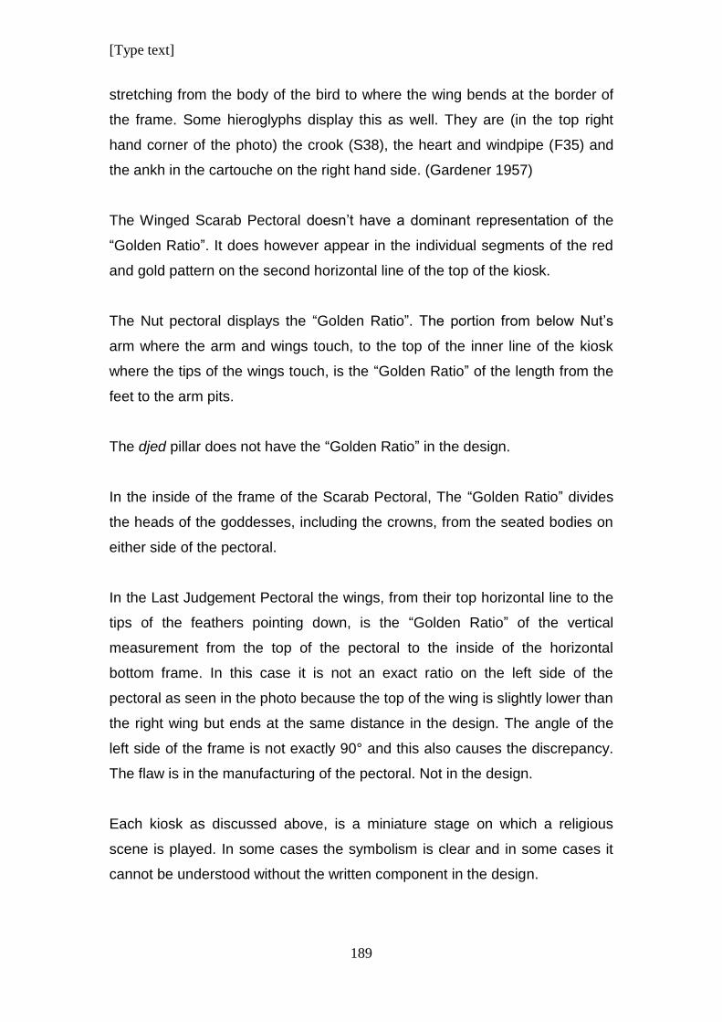
[Type text]
189
stretching from the body of the bird to where the wing bends at the border of
the frame. Some hieroglyphs display this as well. They are (in the top right
hand corner of the photo) the crook (S38), the heart and windpipe (F35) and
the ankh in the cartouche on the right hand side. (Gardener 1957)
The Winged Scarab Pectoral doesn’t have a dominant representation of the
“Golden Ratio”. It does however appear in the individual segments of the red
and gold pattern on the second horizontal line of the top of the kiosk.
The Nut pectoral displays the “Golden Ratio”. The portion from below Nut’s
arm where the arm and wings touch, to the top of the inner line of the kiosk
where the tips of the wings touch, is the “Golden Ratio” of the length from the
feet to the arm pits.
The djed pillar does not have the “Golden Ratio” in the design.
In the inside of the frame of the Scarab Pectoral, The “Golden Ratio” divides
the heads of the goddesses, including the crowns, from the seated bodies on
either side of the pectoral.
In the Last Judgement Pectoral the wings, from their top horizontal line to the
tips of the feathers pointing down, is the “Golden Ratio” of the vertical
measurement from the top of the pectoral to the inside of the horizontal
bottom frame. In this case it is not an exact ratio on the left side of the
pectoral as seen in the photo because the top of the wing is slightly lower than
the right wing but ends at the same distance in the design. The angle of the
left side of the frame is not exactly 90° and this also causes the discrepancy.
The flaw is in the manufacturing of the pectoral. Not in the design.
Each kiosk as discussed above, is a miniature stage on which a religious
scene is played. In some cases the symbolism is clear and in some cases it
cannot be understood without the written component in the design.
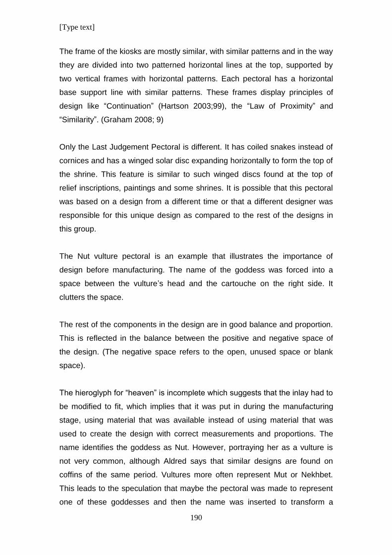
[Type text]
190
The frame of the kiosks are mostly similar, with similar patterns and in the way
they are divided into two patterned horizontal lines at the top, supported by
two vertical frames with horizontal patterns. Each pectoral has a horizontal
base support line with similar patterns. These frames display principles of
design like “Continuation” (Hartson 2003;99), the “Law of Proximity” and
“Similarity”. (Graham 2008; 9)
Only the Last Judgement Pectoral is different. It has coiled snakes instead of
cornices and has a winged solar disc expanding horizontally to form the top of
the shrine. This feature is similar to such winged discs found at the top of
relief inscriptions, paintings and some shrines. It is possible that this pectoral
was based on a design from a different time or that a different designer was
responsible for this unique design as compared to the rest of the designs in
this group.
The Nut vulture pectoral is an example that illustrates the importance of
design before manufacturing. The name of the goddess was forced into a
space between the vulture’s head and the cartouche on the right side. It
clutters the space.
The rest of the components in the design are in good balance and proportion.
This is reflected in the balance between the positive and negative space of
the design. (The negative space refers to the open, unused space or blank
space).
The hieroglyph for “heaven” is incomplete which suggests that the inlay had to
be modified to fit, which implies that it was put in during the manufacturing
stage, using material that was available instead of using material that was
used to create the design with correct measurements and proportions. The
name identifies the goddess as Nut. However, portraying her as a vulture is
not very common, although Aldred says that similar designs are found on
coffins of the same period. Vultures more often represent Mut or Nekhbet.
This leads to the speculation that maybe the pectoral was made to represent
one of these goddesses and then the name was inserted to transform a
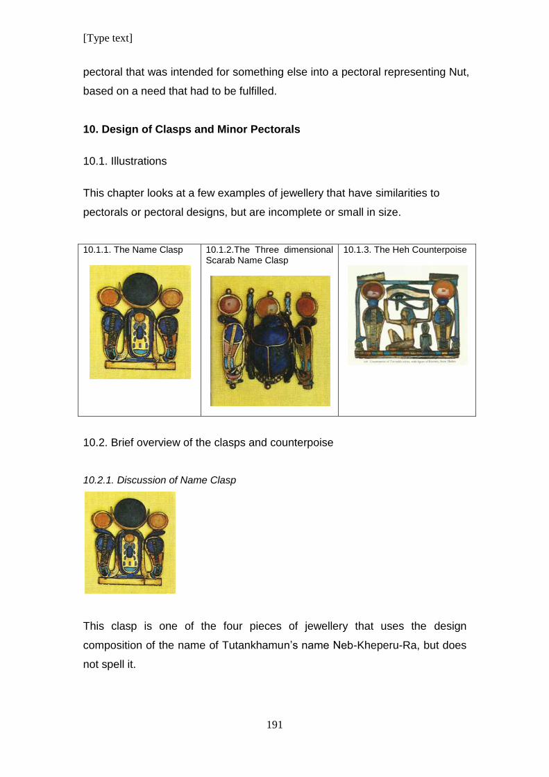
[Type text]
191
pectoral that was intended for something else into a pectoral representing Nut,
based on a need that had to be fulfilled.
10. Design of Clasps and Minor Pectorals
10.1. Illustrations
This chapter looks at a few examples of jewellery that have similarities to
pectorals or pectoral designs, but are incomplete or small in size.
10.1.1. The Name Clasp
10.1.2.The Three dimensional Scarab Name Clasp
10.1.3. The Heh Counterpoise
10.2. Brief overview of the clasps and counterpoise
10.2.1. Discussion of Name Clasp
This clasp is one of the four pieces of jewellery that uses the design
composition of the name of Tutankhamun’s name Neb-Kheperu-Ra, but does
not spell it.
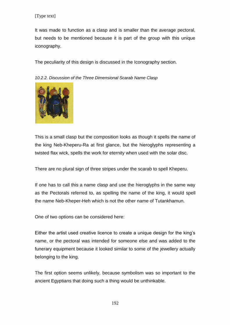
[Type text]
192
It was made to function as a clasp and is smaller than the average pectoral,
but needs to be mentioned because it is part of the group with this unique
iconography.
The peculiarity of this design is discussed in the Iconography section.
10.2.2. Discussion of the Three Dimensional Scarab Name Clasp
This is a small clasp but the composition looks as though it spells the name of
the king Neb-Kheperu-Ra at first glance, but the hieroglyphs representing a
twisted flax wick, spells the work for eternity when used with the solar disc.
There are no plural sign of three stripes under the scarab to spell Kheperu.
If one has to call this a name clasp and use the hieroglyphs in the same way
as the Pectorals referred to, as spelling the name of the king, it would spell
the name Neb-Kheper-Heh which is not the other name of Tutankhamun.
One of two options can be considered here:
Either the artist used creative licence to create a unique design for the king’s
name, or the pectoral was intended for someone else and was added to the
funerary equipment because it looked similar to some of the jewellery actually
belonging to the king.
The first option seems unlikely, because symbolism was so important to the
ancient Egyptians that doing such a thing would be unthinkable.
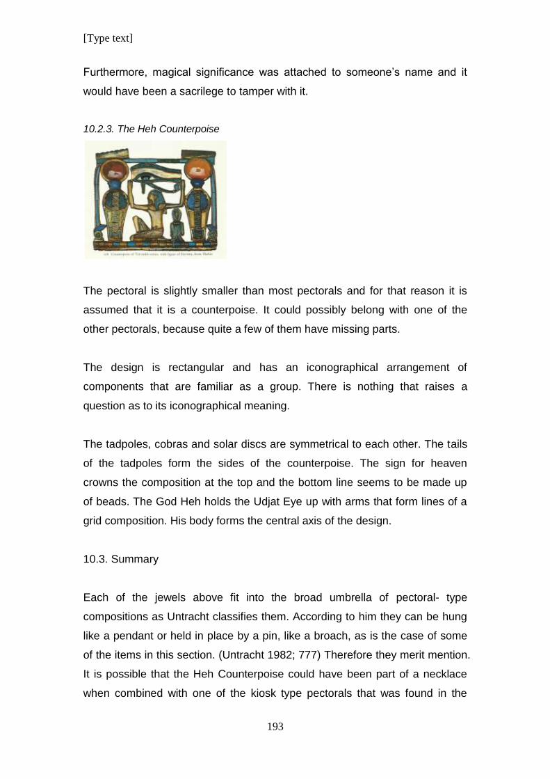
[Type text]
193
Furthermore, magical significance was attached to someone’s name and it
would have been a sacrilege to tamper with it.
10.2.3. The Heh Counterpoise
The pectoral is slightly smaller than most pectorals and for that reason it is
assumed that it is a counterpoise. It could possibly belong with one of the
other pectorals, because quite a few of them have missing parts.
The design is rectangular and has an iconographical arrangement of
components that are familiar as a group. There is nothing that raises a
question as to its iconographical meaning.
The tadpoles, cobras and solar discs are symmetrical to each other. The tails
of the tadpoles form the sides of the counterpoise. The sign for heaven
crowns the composition at the top and the bottom line seems to be made up
of beads. The God Heh holds the Udjat Eye up with arms that form lines of a
grid composition. His body forms the central axis of the design.
10.3. Summary
Each of the jewels above fit into the broad umbrella of pectoral- type
compositions as Untracht classifies them. According to him they can be hung
like a pendant or held in place by a pin, like a broach, as is the case of some
of the items in this section. (Untracht 1982; 777) Therefore they merit mention.
It is possible that the Heh Counterpoise could have been part of a necklace
when combined with one of the kiosk type pectorals that was found in the
[Type text]
194
tomb of Tutankhamun. Proximity to other jewels during discovery would be a
clue as to which pectoral necklace it belongs to.
11. Conclusion
After an in depth analysis of each pectoral, one has to come to the conclusion
that the process of design played a very important role in the process of
developing an iconographical idea into a blueprint for a concrete piece of
manufactured jewellery.
Design is the image or object created by abstract and spatial relationships
that are formed from a combination of images or elements that are expressed
in composition which is the structural and organisational aspects of this
language. (Goldstein 1989; 2) A clever designer can used a variety of artistic
application to make designs more interesting. (Lidwell et al 2010; 44) The
ancient Egyptians have proved themselves as top designers of rich and
aesthetically pleasing jewellery.
The relationship between all the different design laws and elements form the
basis of design process (Wood et al 2006; 632) and was applied to the
jewellery in this study. All these principles come together in the final
composition of the designs. Most of these are connected to the “Gestalt Laws”.
The Ancient Egyptians had no idea that such laws existed. The Gestalt
psychology was only developed in 1910 in Germany (Behrens 1998) but the
psychology that motivates the human mind in the process of design already
existed for humans in ancient times. They were not aware of it but evidence of
this can be identified where it was applied to art.
Design principles are the main umbrella under which the different design
elements are used to create a visual response in the viewer. This can be
achieved by the creator of art in a subconscious way. The artist can intuitively
feel that positioning certain elements in a specific way creates the desired
effect. This intuition of “what feels right” would have been the guideline for the
ancient designer because there is no evidence to suggest a “Philosophy of Art”
[Type text]
195
that gave an artist instructions on how to apply his craft. The process would
have been subconscious, in the visual areas in the brain that interpreted the
effect in the same way for the creator and observer of the creation.
(Ramachandran & Hirstein, Behrens 1998)
Although there is no evidence of a “Philosophy of Art”, there is evidence that
the ancient Egyptians had a set of rules that were applied to planning
proportions and style in art and designs. (Robins; 1994)
The Kiosk type jewellery in this study was designed within a frame. The
figures in the foreground are given clear identification due to the negative
empty space around them. There is no attempt to employ ambiguous interplay
between the figure and ground elements to cause confusion to the viewer.
This visibility in these designs enhances the communication of the visual
impact of the designs. (Graham 2008; 3) None of the jewellery in this study
use ambiguity between the figure and ground elements; for the purpose of
different interpretations of the elements as is a trend amongst modern artists.
(Hartson 2003; 99) It can be supposed that the ancient Egyptians had no use
for such psychological tricks in their art.
Other pieces of jewellery do not have frames around them but the same clear
distinction between the figure and ground elements are achieved.
Most of the elements in the various designs are composed of organic shapes
(Goldstein 1989; 64, Arnheim 2001; 5) making the designs naturalistic.
(Lidwell et al; 2010) The simplicity of the figures results in a stylistic
representation which is one of the main characteristics of Egyptian Art.
(Robins; 1994)
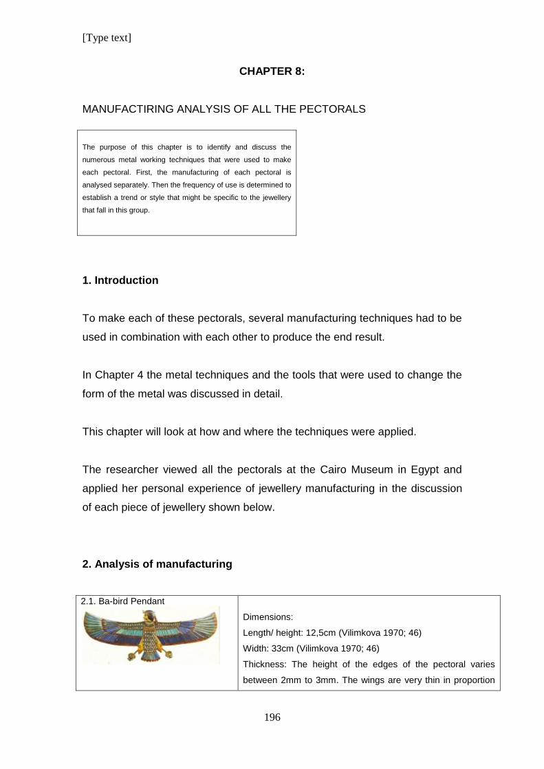
[Type text]
196
CHAPTER 8:
MANUFACTIRING ANALYSIS OF ALL THE PECTORALS
The purpose of this chapter is to identify and discuss the
numerous metal working techniques that were used to make
each pectoral. First, the manufacturing of each pectoral is
analysed separately. Then the frequency of use is determined to
establish a trend or style that might be specific to the jewellery
that fall in this group.
1. Introduction
To make each of these pectorals, several manufacturing techniques had to be
used in combination with each other to produce the end result.
In Chapter 4 the metal techniques and the tools that were used to change the
form of the metal was discussed in detail.
This chapter will look at how and where the techniques were applied.
The researcher viewed all the pectorals at the Cairo Museum in Egypt and
applied her personal experience of jewellery manufacturing in the discussion
of each piece of jewellery shown below.
2. Analysis of manufacturing
2.1. Ba-bird Pendant
Dimensions:
Length/ height: 12,5cm (Vilimkova 1970; 46)
Width: 33cm (Vilimkova 1970; 46)
Thickness: The height of the edges of the pectoral varies
between 2mm to 3mm. The wings are very thin in proportion
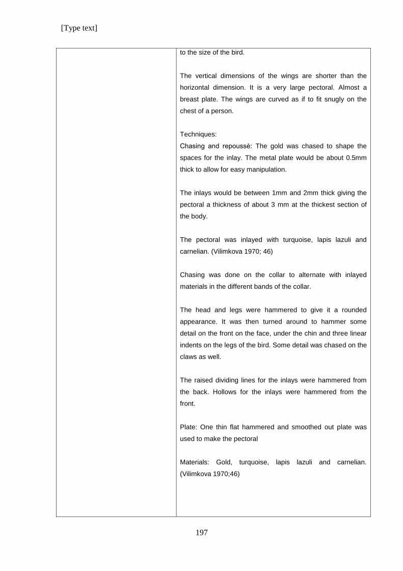
[Type text]
197
to the size of the bird.
The vertical dimensions of the wings are shorter than the
horizontal dimension. It is a very large pectoral. Almost a
breast plate. The wings are curved as if to fit snugly on the
chest of a person.
Techniques:
Chasing and repoussѐ: The gold was chased to shape the
spaces for the inlay. The metal plate would be about 0.5mm
thick to allow for easy manipulation.
The inlays would be between 1mm and 2mm thick giving the
pectoral a thickness of about 3 mm at the thickest section of
the body.
The pectoral was inlayed with turquoise, lapis lazuli and
carnelian. (Vilimkova 1970; 46)
Chasing was done on the collar to alternate with inlayed
materials in the different bands of the collar.
The head and legs were hammered to give it a rounded
appearance. It was then turned around to hammer some
detail on the front on the face, under the chin and three linear
indents on the legs of the bird. Some detail was chased on the
claws as well.
The raised dividing lines for the inlays were hammered from
the back. Hollows for the inlays were hammered from the
front.
Plate: One thin flat hammered and smoothed out plate was
used to make the pectoral
Materials: Gold, turquoise, lapis lazuli and carnelian.
(Vilimkova 1970;46)
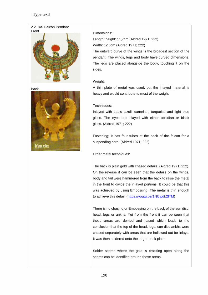
[Type text]
198
2.2. Ra- Falcon Pendant Front
Back
Dimensions:
Length/ height: 11,7cm (Aldred 1971; 222)
Width: 12,6cm (Aldred 1971; 222)
The outward curve of the wings is the broadest section of the
pendant. The wings, legs and body have curved dimensions.
The legs are placed alongside the body, touching it on the
sides.
Weight:
A thin plate of metal was used, but the inlayed material is
heavy and would contribute to most of the weight.
Techniques:
Inlayed with Lapis lazuli, carnelian, turquoise and light blue
glass. The eyes are inlayed with either obsidian or black
glass. (Aldred 1971; 222)
Fastening: It has four tubes at the back of the falcon for a
suspending cord. (Aldred 1971; 222)
Other metal techniques:
The back is plain gold with chased details. (Aldred 1971; 222).
On the reverse it can be seen that the details on the wings,
body and tail were hammered from the back to raise the metal
in the front to divide the inlayed portions. It could be that this
was achieved by using Embossing. The metal is thin enough
to achieve this detail. (https://youtu.be/1NCipdk2fTM)
There is no chasing or Embossing on the back of the sun disc,
head, legs or ankhs. Yet from the front it can be seen that
these areas are domed and raised which leads to the
conclusion that the top of the head, legs, sun disc ankhs were
chased separately with areas that are hollowed out for inlays.
It was then soldered onto the larger back plate.
Solder seems where the gold is cracking open along the
seams can be identified around these areas.
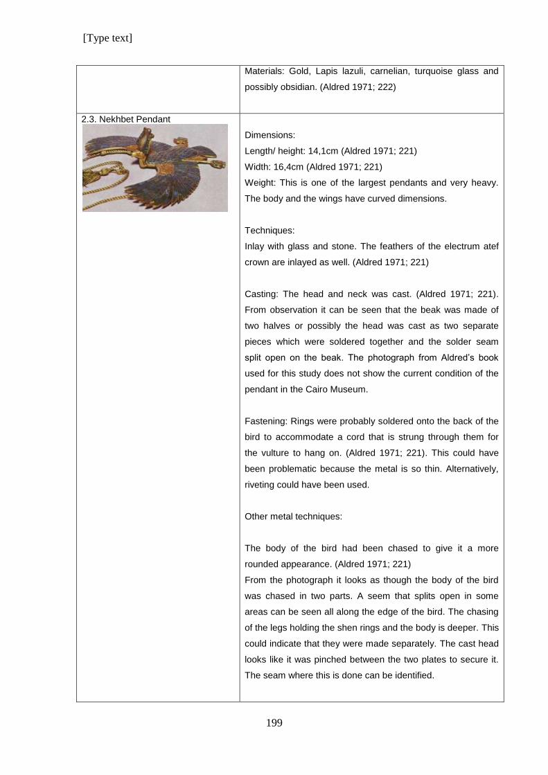
[Type text]
199
Materials: Gold, Lapis lazuli, carnelian, turquoise glass and
possibly obsidian. (Aldred 1971; 222)
2.3. Nekhbet Pendant
Dimensions:
Length/ height: 14,1cm (Aldred 1971; 221)
Width: 16,4cm (Aldred 1971; 221)
Weight: This is one of the largest pendants and very heavy.
The body and the wings have curved dimensions.
Techniques:
Inlay with glass and stone. The feathers of the electrum atef
crown are inlayed as well. (Aldred 1971; 221)
Casting: The head and neck was cast. (Aldred 1971; 221).
From observation it can be seen that the beak was made of
two halves or possibly the head was cast as two separate
pieces which were soldered together and the solder seam
split open on the beak. The photograph from Aldred’s book
used for this study does not show the current condition of the
pendant in the Cairo Museum.
Fastening: Rings were probably soldered onto the back of the
bird to accommodate a cord that is strung through them for
the vulture to hang on. (Aldred 1971; 221). This could have
been problematic because the metal is so thin. Alternatively,
riveting could have been used.
Other metal techniques:
The body of the bird had been chased to give it a more
rounded appearance. (Aldred 1971; 221)
From the photograph it looks as though the body of the bird
was chased in two parts. A seem that splits open in some
areas can be seen all along the edge of the bird. The chasing
of the legs holding the shen rings and the body is deeper. This
could indicate that they were made separately. The cast head
looks like it was pinched between the two plates to secure it.
The seam where this is done can be identified.
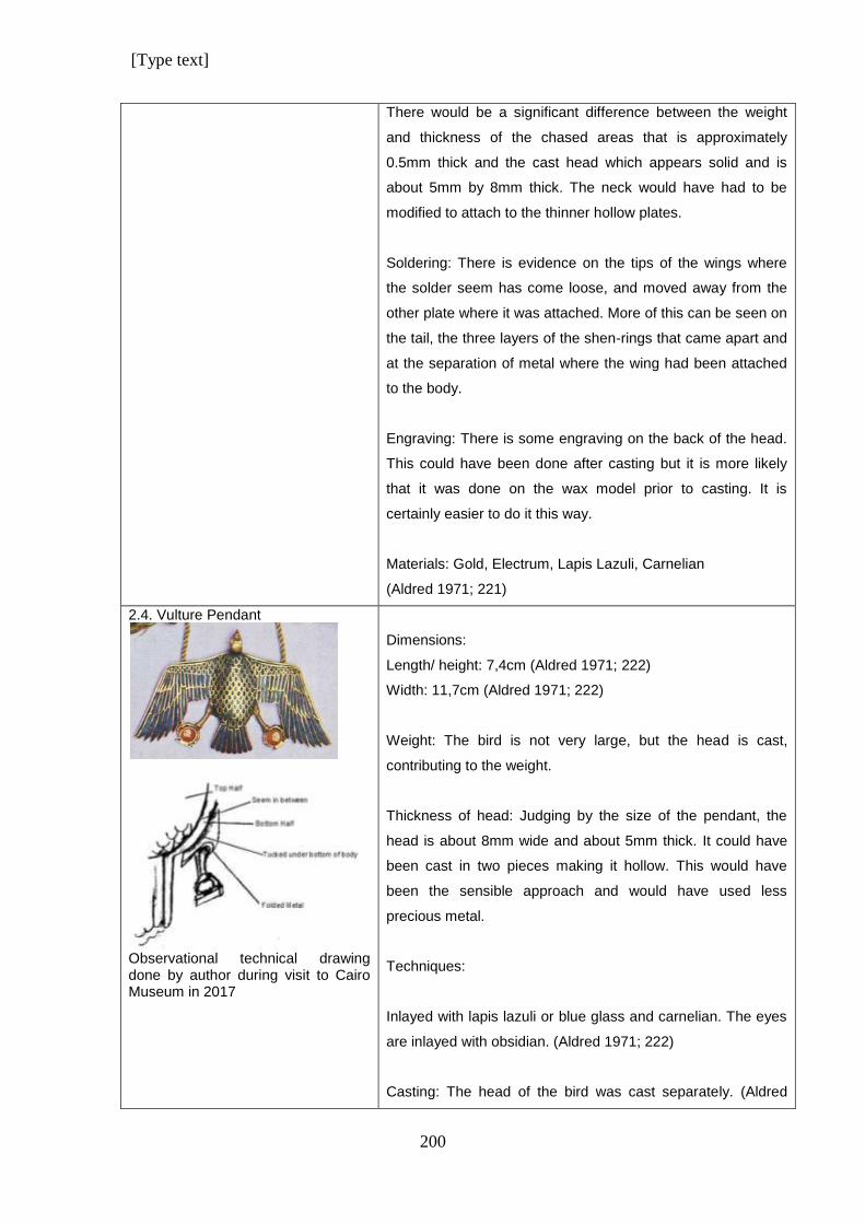
[Type text]
200
There would be a significant difference between the weight
and thickness of the chased areas that is approximately
0.5mm thick and the cast head which appears solid and is
about 5mm by 8mm thick. The neck would have had to be
modified to attach to the thinner hollow plates.
Soldering: There is evidence on the tips of the wings where
the solder seem has come loose, and moved away from the
other plate where it was attached. More of this can be seen on
the tail, the three layers of the shen-rings that came apart and
at the separation of metal where the wing had been attached
to the body.
Engraving: There is some engraving on the back of the head.
This could have been done after casting but it is more likely
that it was done on the wax model prior to casting. It is
certainly easier to do it this way.
Materials: Gold, Electrum, Lapis Lazuli, Carnelian
(Aldred 1971; 221)
2.4. Vulture Pendant
Observational technical drawing done by author during visit to Cairo Museum in 2017
Dimensions:
Length/ height: 7,4cm (Aldred 1971; 222)
Width: 11,7cm (Aldred 1971; 222)
Weight: The bird is not very large, but the head is cast,
contributing to the weight.
Thickness of head: Judging by the size of the pendant, the
head is about 8mm wide and about 5mm thick. It could have
been cast in two pieces making it hollow. This would have
been the sensible approach and would have used less
precious metal.
Techniques:
Inlayed with lapis lazuli or blue glass and carnelian. The eyes
are inlayed with obsidian. (Aldred 1971; 222)
Casting: The head of the bird was cast separately. (Aldred
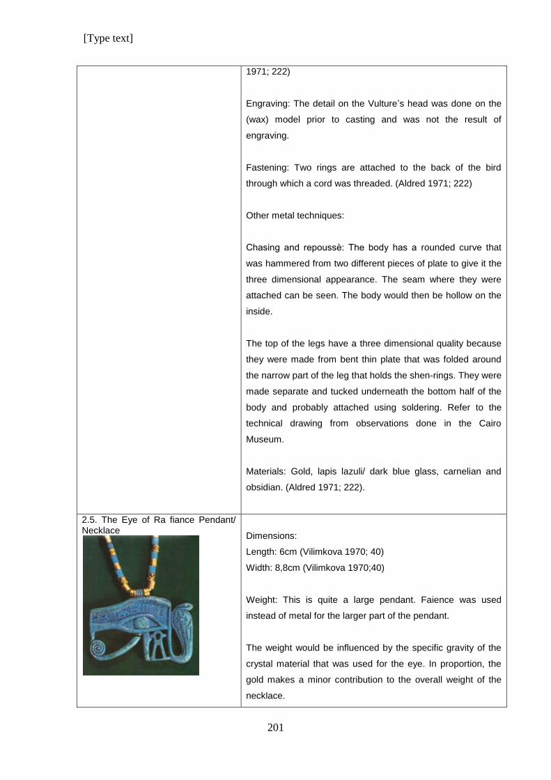
[Type text]
201
1971; 222)
Engraving: The detail on the Vulture’s head was done on the
(wax) model prior to casting and was not the result of
engraving.
Fastening: Two rings are attached to the back of the bird
through which a cord was threaded. (Aldred 1971; 222)
Other metal techniques:
Chasing and repoussѐ: The body has a rounded curve that
was hammered from two different pieces of plate to give it the
three dimensional appearance. The seam where they were
attached can be seen. The body would then be hollow on the
inside.
The top of the legs have a three dimensional quality because
they were made from bent thin plate that was folded around
the narrow part of the leg that holds the shen-rings. They were
made separate and tucked underneath the bottom half of the
body and probably attached using soldering. Refer to the
technical drawing from observations done in the Cairo
Museum.
Materials: Gold, lapis lazuli/ dark blue glass, carnelian and
obsidian. (Aldred 1971; 222).
2.5. The Eye of Ra fiance Pendant/ Necklace
Dimensions:
Length: 6cm (Vilimkova 1970; 40)
Width: 8,8cm (Vilimkova 1970;40)
Weight: This is quite a large pendant. Faience was used
instead of metal for the larger part of the pendant.
The weight would be influenced by the specific gravity of the
crystal material that was used for the eye. In proportion, the
gold makes a minor contribution to the overall weight of the
necklace.
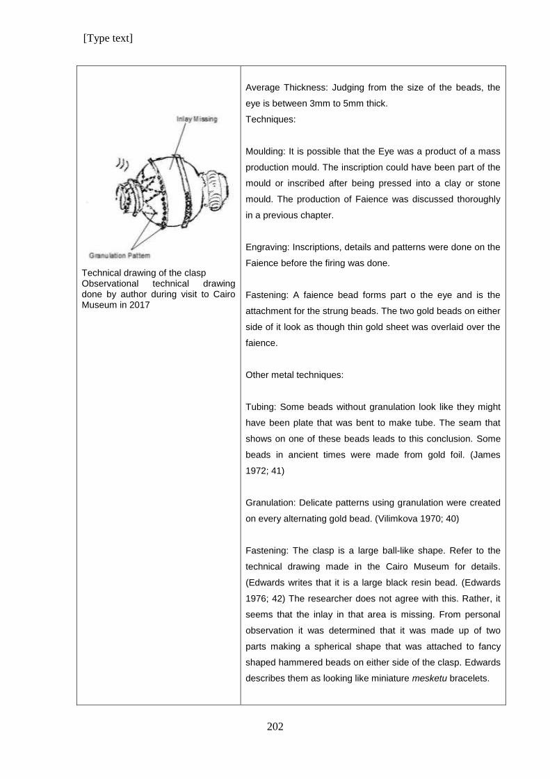
[Type text]
202
Technical drawing of the clasp Observational technical drawing done by author during visit to Cairo Museum in 2017
Average Thickness: Judging from the size of the beads, the
eye is between 3mm to 5mm thick.
Techniques:
Moulding: It is possible that the Eye was a product of a mass
production mould. The inscription could have been part of the
mould or inscribed after being pressed into a clay or stone
mould. The production of Faience was discussed thoroughly
in a previous chapter.
Engraving: Inscriptions, details and patterns were done on the
Faience before the firing was done.
Fastening: A faience bead forms part o the eye and is the
attachment for the strung beads. The two gold beads on either
side of it look as though thin gold sheet was overlaid over the
faience.
Other metal techniques:
Tubing: Some beads without granulation look like they might
have been plate that was bent to make tube. The seam that
shows on one of these beads leads to this conclusion. Some
beads in ancient times were made from gold foil. (James
1972; 41)
Granulation: Delicate patterns using granulation were created
on every alternating gold bead. (Vilimkova 1970; 40)
Fastening: The clasp is a large ball-like shape. Refer to the
technical drawing made in the Cairo Museum for details.
(Edwards writes that it is a large black resin bead. (Edwards
1976; 42) The researcher does not agree with this. Rather, it
seems that the inlay in that area is missing. From personal
observation it was determined that it was made up of two
parts making a spherical shape that was attached to fancy
shaped hammered beads on either side of the clasp. Edwards
describes them as looking like miniature mesketu bracelets.
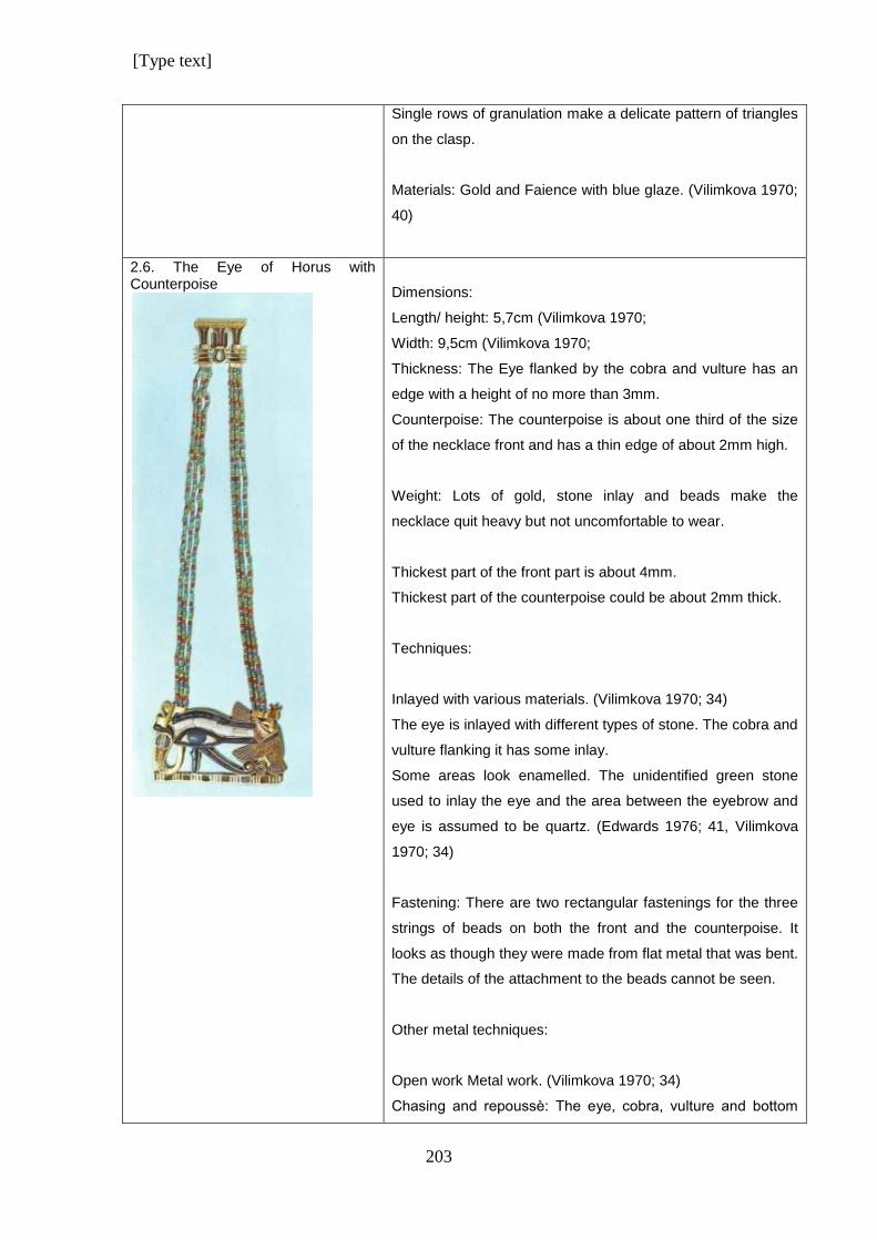
[Type text]
203
Single rows of granulation make a delicate pattern of triangles
on the clasp.
Materials: Gold and Faience with blue glaze. (Vilimkova 1970;
40)
2.6. The Eye of Horus with Counterpoise
Dimensions:
Length/ height: 5,7cm (Vilimkova 1970;
Width: 9,5cm (Vilimkova 1970;
Thickness: The Eye flanked by the cobra and vulture has an
edge with a height of no more than 3mm.
Counterpoise: The counterpoise is about one third of the size
of the necklace front and has a thin edge of about 2mm high.
Weight: Lots of gold, stone inlay and beads make the
necklace quit heavy but not uncomfortable to wear.
Thickest part of the front part is about 4mm.
Thickest part of the counterpoise could be about 2mm thick.
Techniques:
Inlayed with various materials. (Vilimkova 1970; 34)
The eye is inlayed with different types of stone. The cobra and
vulture flanking it has some inlay.
Some areas look enamelled. The unidentified green stone
used to inlay the eye and the area between the eyebrow and
eye is assumed to be quartz. (Edwards 1976; 41, Vilimkova
1970; 34)
Fastening: There are two rectangular fastenings for the three
strings of beads on both the front and the counterpoise. It
looks as though they were made from flat metal that was bent.
The details of the attachment to the beads cannot be seen.
Other metal techniques:
Open work Metal work. (Vilimkova 1970; 34)
Chasing and repoussѐ: The eye, cobra, vulture and bottom
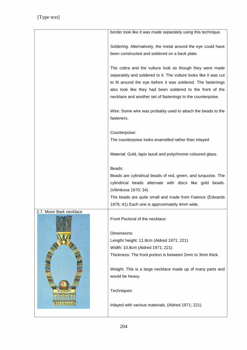
[Type text]
204
border look like it was made separately using this technique.
Soldering: Alternatively, the metal around the eye could have
been constructed and soldered on a back plate.
The cobra and the vulture look as though they were made
separately and soldered to it. The vulture looks like it was cut
to fit around the eye before it was soldered. The fastenings
also look like they had been soldered to the front of the
necklace and another set of fastenings to the counterpoise.
Wire: Some wire was probably used to attach the beads to the
fasteners.
Counterpoise:
The counterpoise looks enamelled rather than inlayed.
Material: Gold, lapis lazuli and polychrome coloured glass.
Beads:
Beads are cylindrical beads of red, green, and turquoise. The
cylindrical beads alternate with discs like gold beads.
(Vilimkova 1970; 34)
The beads are quite small and made from Faience (Edwards
1976; 41) Each one is approximately 4mm wide.
2.7. Moon Bark necklace
Front Pectoral of the necklace:
Dimensions:
Length/ height: 11.8cm (Aldred 1971; 221)
Width: 10.8cm (Aldred 1971; 221)
Thickness: The front portion is between 2mm to 3mm thick.
Weight: This is a large necklace made up of many parts and
would be heavy.
Techniques:
Inlayed with various materials. (Aldred 1971; 221)
[Type text]
205
Chasing and repoussѐ: The frontal pectoral looks like it was
made from one piece of metal. The dominant techniques were
chasing to get the rounded semi-three dimensional look.
To get the open areas between the stems of the flowers, the
metal could have been hammered with a sharp stencil to cut
the metal away instead of shaping it.
The cartouches with the king’s names were probably chased
and not engraved on the plaques that hold the four strings of
the necklace. They could have been made as part of the
frontal piece or soldered on afterwards. This needs closer
inspection.
Fastening: The two plaques on which the moon bark rests,
serves as attachment of the four strings of the necklace.
(Vilimkova 1970; 41). They are three dimensional box shapes
made from gold.
The moon and crescent were made from a different colour
metal and was hammered and shaped. The moon and
crescent were soldered together using wire to attach them.
They were soldered onto the bark afterwards. The bark was
made separately.
Counterpoise:
Dimensions:
Length: 6,2cm (Without tassels) (Aldred 1971; 221)
Width: 6,8cm (Aldred 1971; 221)
Techniques:
Inlayed with different materials. (Aldred 1971; 221)
Chasing and repoussѐ was the technique used in
manufacturing the counterpoise. Details of texture and flowers
were hammered.
Fastening: The clasp fastens on the right side of the
[Type text]
206
counterpoise with a retractable pin. A tasselled cord is used to
attach to the lunar crescent to keep it in position when it is
worn. (Aldred 1971; 221)
Other metal techniques:
Wire: There was probably some wire that was used to attach
the counterpoise to the beads.
The lotus flower shaped beads at the end of each tassel has a
gold pin with a flat end that goes through the bead that was
made from thin wire.
The flat horizontal gold bar that attaches the beads to the
triangular shape has a different thickness and could be hollow
to accommodate the fastenings for the beads that are
attached to the lotus flowers.
The Strap:
The strap attaching the Pectoral to the counterpoise, is
comprised of four strings of mixed beads: Lapis Lazuli, gold,
carnelian and black resin barrel beads alternating with Lapis
Lazuli, Feldspar and gold ball shaped beads. The last row of
gold beads were soldered together to form the spacer bar.
(Aldred 1971; 221)
Various materials were used for the beads
There are elongated oval beads and various sizes of round
beads.
Material: Gold, Electrum. (Moon and crescent), Lapis Lazuli,
Green Feldspar, Calcite, Glass of different colours. (Aldred
1971; 221)
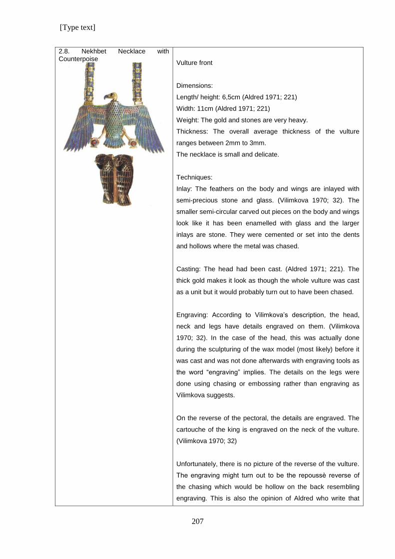
[Type text]
207
2.8. Nekhbet Necklace with Counterpoise
Vulture front
Dimensions:
Length/ height: 6,5cm (Aldred 1971; 221)
Width: 11cm (Aldred 1971; 221)
Weight: The gold and stones are very heavy.
Thickness: The overall average thickness of the vulture
ranges between 2mm to 3mm.
The necklace is small and delicate.
Techniques:
Inlay: The feathers on the body and wings are inlayed with
semi-precious stone and glass. (Vilimkova 1970; 32). The
smaller semi-circular carved out pieces on the body and wings
look like it has been enamelled with glass and the larger
inlays are stone. They were cemented or set into the dents
and hollows where the metal was chased.
Casting: The head had been cast. (Aldred 1971; 221). The
thick gold makes it look as though the whole vulture was cast
as a unit but it would probably turn out to have been chased.
Engraving: According to Vilimkova’s description, the head,
neck and legs have details engraved on them. (Vilimkova
1970; 32). In the case of the head, this was actually done
during the sculpturing of the wax model (most likely) before it
was cast and was not done afterwards with engraving tools as
the word “engraving” implies. The details on the legs were
done using chasing or embossing rather than engraving as
Vilimkova suggests.
On the reverse of the pectoral, the details are engraved. The
cartouche of the king is engraved on the neck of the vulture.
(Vilimkova 1970; 32)
Unfortunately, there is no picture of the reverse of the vulture.
The engraving might turn out to be the repoussѐ reverse of
the chasing which would be hollow on the back resembling
engraving. This is also the opinion of Aldred who write that
[Type text]
208
details on the back have probably been done by hammering
and chasing. (Aldred 1971; 221).
Other metal techniques:
The body is worked in the round, (Aldred 1971; 221) and has
a three dimensional form which looks hollow.
A pectoral with the king’s cartouche hangs around the neck of
the bird. (Aldred 1971; 221)
Metal was bent and folded around the leg to form the upper
part of it. It was then tucked under the body and secured in
place, probably using soldering.
Materials: Gold, and lapis lazuli,(Aldred 1971; 221)
Counterpoise:
Dimensions:
Length: 3,6cm (Vilimkova 1970; 33)
Techniques:
Inlay: Cloisonnѐ work on the bodies of the falcons was done.
(Aldred 1971; 221) with semi-precious stones. (Vilimkova
1970; 32)
Casting: The two resting falcons were cast. (Aldred 1971;
221) after being moulded. (Vilimkova 1970; 32)
Fastening: The clasp is made up of the two falcons of the
counterpoise. (Aldred 1971; 221) A slip catch is used to attach
the chain to the two hawks. (Vilimkova 1970; 32)
Materials: Gold, Lapis Lazuli,(Aldred 1971; 221), feldspar,
black chalcedony, carnelian and green glass. (Vilimkova
1970; 33)
Unfortunately, as discovered from the closer inspection in the
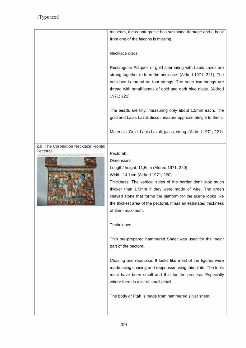
[Type text]
209
museum, the counterpoise has sustained damage and a beak
from one of the falcons is missing.
Necklace discs:
Rectangular Plaques of gold alternating with Lapis Lazuli are
strung together to form the necklace. (Aldred 1971; 221). The
necklace is thread on four strings. The outer two strings are
thread with small beads of gold and dark blue glass. (Aldred
1971; 221)
The beads are tiny, measuring only about 1,5mm each. The
gold and Lapis Lazuli discs measure approximately 5 to 6mm.
Materials: Gold, Lapis Lazuli, glass, string. (Aldred 1971; 221)
2.9. The Coronation Necklace Frontal Pectoral
Pectoral:
Dimensions:
Length/ height: 11,5cm (Aldred 1971; 220)
Width: 14.1cm (Aldred 1971; 220)
Thickness: The vertical sides of the border don’t look much
thicker than 1.5mm if they were made of wire. The green
inlayed stone that forms the platform for the scene looks like
the thickest area of the pectoral. It has an estimated thickness
of 3mm maximum.
Techniques:
Thin pre-prepared hammered Sheet was used for the major
part of the pectoral.
Chasing and repoussѐ: It looks like most of the figures were
made using chasing and reppoussѐ using thin plate. The tools
must have been small and thin for the process. Especially
where there is a lot of small detail
.
The body of Ptah is made from hammered silver sheet.
[Type text]
210
The inscriptions on the rectangles on either side of the king
must have been done using chasing as technique. The metal
is too thin for engraving which is a technique by which the
metal is carved out to leave grooves.
The domes of the sun discs and the flax wicks between them
were done with chasing and repoussѐ. Here it can be seen
that the metal is very thin, because detail of the flax wicks is
sharp. This is further evidence that the tools were very
delicate to be able to achieve this fine detail.
It is most likely that the rest of the patterns for inlays were
done using this same method as well, for the following
reasons:
a) The metal is very thin and would have allowed the
technique with ease.
b) Because of the thin metal too much soldering and heating
would have melted the metal.
c) Also, if the pectoral was constructed out of many different
parts, there would have been too many solder joints and the
whole would have fallen apart while repeatedly soldering more
and more pieces together.
Fastening: A box-like fastening that looks like it was soldered
to the pectoral. It is made from thin sheet metal and is dented
and looks untidy due to poor manufacturing skills, not age.
Wire: The frame and grid divisions of the pectoral were
constructed from wire. Staffs are made from wires that were
hammered and shaped and form the grid lines.
Materials:
Poor quality gold, Silver, Electrum, Translucent quarts and
calcite set with coloured cement, Green, red, black, light blue
and dark blue Glass. (Aldred 1971; 220)
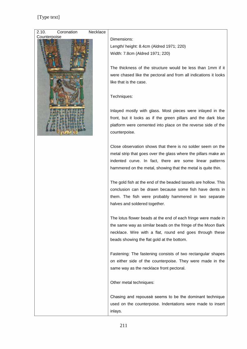
[Type text]
211
2.10. Coronation Necklace Counterpoise
Dimensions:
Length/ height: 8.4cm (Aldred 1971; 220)
Width: 7.8cm (Aldred 1971; 220)
The thickness of the structure would be less than 1mm if it
were chased like the pectoral and from all indications it looks
like that is the case.
Techniques:
Inlayed mostly with glass. Most pieces were inlayed in the
front, but it looks as if the green pillars and the dark blue
platform were cemented into place on the reverse side of the
counterpoise.
Close observation shows that there is no solder seem on the
metal strip that goes over the glass where the pillars make an
indented curve. In fact, there are some linear patterns
hammered on the metal, showing that the metal is quite thin.
The gold fish at the end of the beaded tassels are hollow. This
conclusion can be drawn because some fish have dents in
them. The fish were probably hammered in two separate
halves and soldered together.
The lotus flower beads at the end of each fringe were made in
the same way as similar beads on the fringe of the Moon Bark
necklace. Wire with a flat, round end goes through these
beads showing the flat gold at the bottom.
Fastening: The fastening consists of two rectangular shapes
on either side of the counterpoise. They were made in the
same way as the necklace front pectoral.
Other metal techniques:
Chasing and repoussѐ seems to be the dominant technique
used on the counterpoise. Indentations were made to insert
inlays.
[Type text]
212
The inscriptions look like they were made by chasing and not
engraving. All the patterns seem to have been done in the
same way. There is pattern on the pillars, the kilt of the king
and the dress of the goddess. The feather on the head of the
goddess show the undulating curves of how the shape of the
metal was manipulated with chasing.
It is possible that some pieces were added by soldering it to
the main structure. This could be other chased parts or some
thin strips of plate for securing inlays.
Beads: Dark blue glass beads. (Aldred 1971; 220). Some
beads are made from gold and some could have been made
from faience. The beads have three distinct different sizes.
Necklace straps:
Dimensions:
Length: 34.3cm (Aldred 1971; 220)
Each of the segments was made separately. In places where
the inlay is missing it shows clearly where the gold was raised
in some areas and indented in other areas by chasing and
repoussѐ. Inlays were cemented in the hollow areas.
Details were chased on the wings of the wasps and the
hieroglyphs on the cartouches. The ankhs and was-sceptres
on the third set of segments have chased surfaces as well.
The neb-baskets on which they stand have a pattern of
squares that looks like they have been chased as well. Glass
was inlayed into the indented squares. The raised squares are
gold.
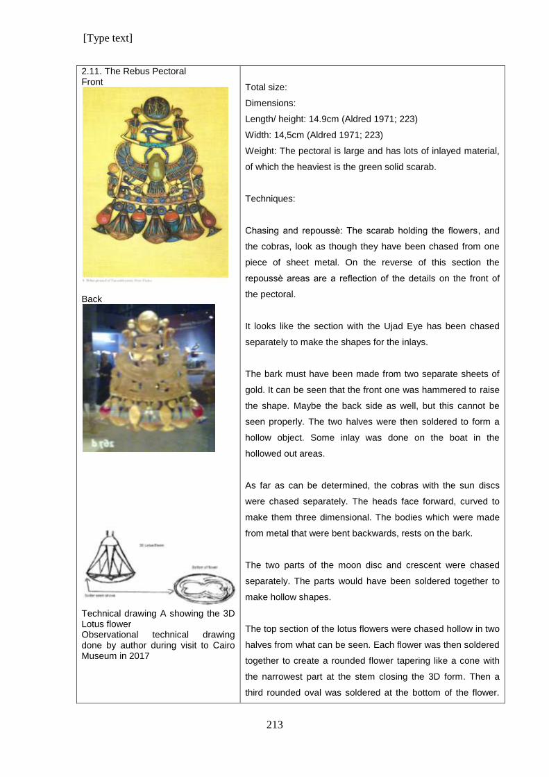
[Type text]
213
2.11. The Rebus Pectoral Front
Back
Technical drawing A showing the 3D Lotus flower Observational technical drawing done by author during visit to Cairo Museum in 2017
Total size:
Dimensions:
Length/ height: 14.9cm (Aldred 1971; 223)
Width: 14,5cm (Aldred 1971; 223)
Weight: The pectoral is large and has lots of inlayed material,
of which the heaviest is the green solid scarab.
Techniques:
Chasing and repoussѐ: The scarab holding the flowers, and
the cobras, look as though they have been chased from one
piece of sheet metal. On the reverse of this section the
repoussѐ areas are a reflection of the details on the front of
the pectoral.
It looks like the section with the Ujad Eye has been chased
separately to make the shapes for the inlays.
The bark must have been made from two separate sheets of
gold. It can be seen that the front one was hammered to raise
the shape. Maybe the back side as well, but this cannot be
seen properly. The two halves were then soldered to form a
hollow object. Some inlay was done on the boat in the
hollowed out areas.
As far as can be determined, the cobras with the sun discs
were chased separately. The heads face forward, curved to
make them three dimensional. The bodies which were made
from metal that were bent backwards, rests on the bark.
The two parts of the moon disc and crescent were chased
separately. The parts would have been soldered together to
make hollow shapes.
The top section of the lotus flowers were chased hollow in two
halves from what can be seen. Each flower was then soldered
together to create a rounded flower tapering like a cone with
the narrowest part at the stem closing the 3D form. Then a
third rounded oval was soldered at the bottom of the flower.
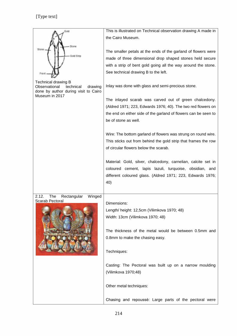
[Type text]
214
Technical drawing B Observational technical drawing done by author during visit to Cairo Museum in 2017
This is illustrated on Technical observation drawing A made in
the Cairo Museum.
The smaller petals at the ends of the garland of flowers were
made of three dimensional drop shaped stones held secure
with a strip of bent gold going all the way around the stone.
See technical drawing B to the left.
Inlay was done with glass and semi-precious stone.
The inlayed scarab was carved out of green chalcedony.
(Aldred 1971; 223, Edwards 1976; 40). The two red flowers on
the end on either side of the garland of flowers can be seen to
be of stone as well.
Wire: The bottom garland of flowers was strung on round wire.
This sticks out from behind the gold strip that frames the row
of circular flowers below the scarab.
Material: Gold, silver, chalcedony, carnelian, calcite set in
coloured cement, lapis lazuli, turquoise, obsidian, and
different coloured glass. (Aldred 1971; 223, Edwards 1976;
40)
2.12. The Rectangular Winged Scarab Pectoral
Dimensions:
Length/ height: 12,5cm (Vilimkova 1970; 48)
Width: 13cm (Vilimkova 1970; 48)
The thickness of the metal would be between 0.5mm and
0.8mm to make the chasing easy.
Techniques:
Casting: The Pectoral was built up on a narrow moulding
(Vilimkova 1970;48)
Other metal techniques:
Chasing and repoussѐ: Large parts of the pectoral were
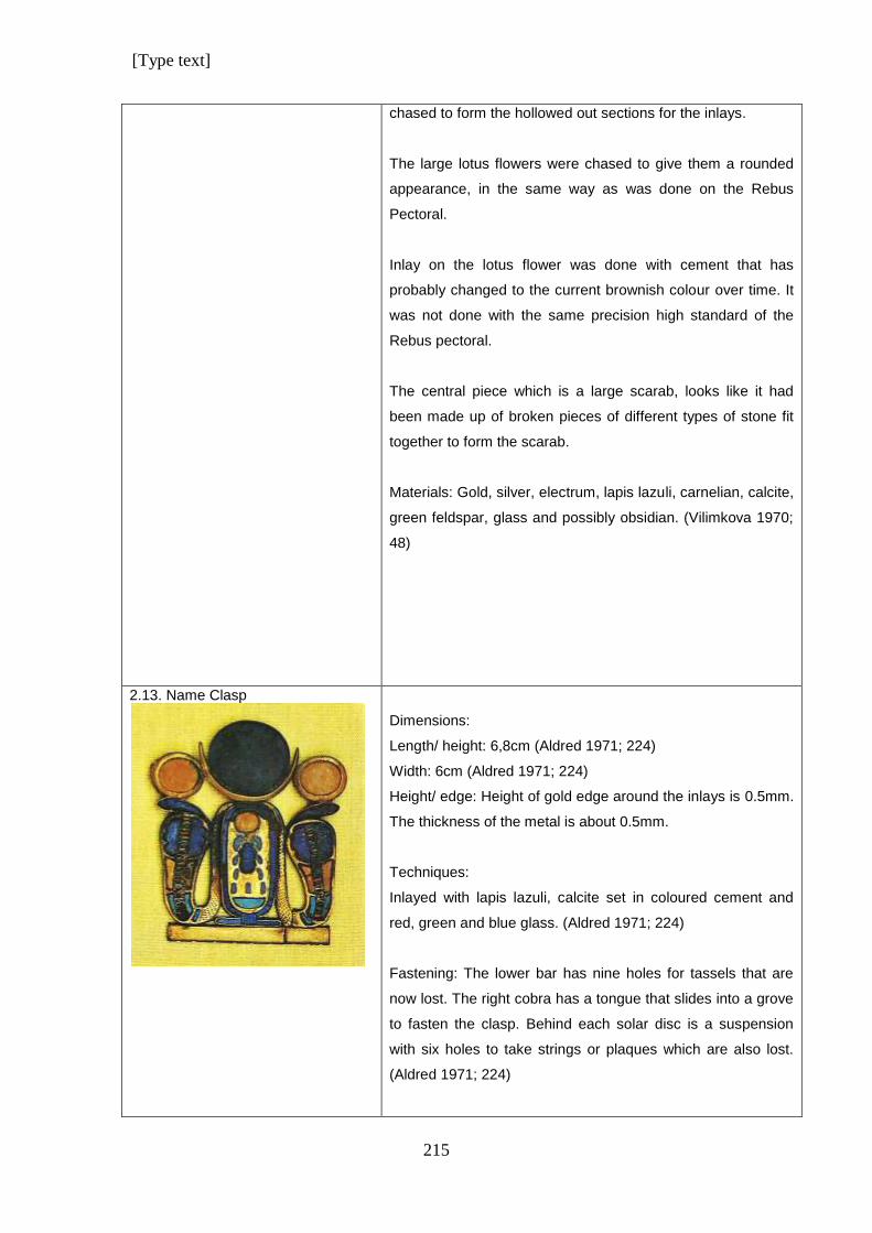
[Type text]
215
chased to form the hollowed out sections for the inlays.
The large lotus flowers were chased to give them a rounded
appearance, in the same way as was done on the Rebus
Pectoral.
Inlay on the lotus flower was done with cement that has
probably changed to the current brownish colour over time. It
was not done with the same precision high standard of the
Rebus pectoral.
The central piece which is a large scarab, looks like it had
been made up of broken pieces of different types of stone fit
together to form the scarab.
Materials: Gold, silver, electrum, lapis lazuli, carnelian, calcite,
green feldspar, glass and possibly obsidian. (Vilimkova 1970;
48)
2.13. Name Clasp
Dimensions:
Length/ height: 6,8cm (Aldred 1971; 224)
Width: 6cm (Aldred 1971; 224)
Height/ edge: Height of gold edge around the inlays is 0.5mm.
The thickness of the metal is about 0.5mm.
Techniques:
Inlayed with lapis lazuli, calcite set in coloured cement and
red, green and blue glass. (Aldred 1971; 224)
Fastening: The lower bar has nine holes for tassels that are
now lost. The right cobra has a tongue that slides into a grove
to fasten the clasp. Behind each solar disc is a suspension
with six holes to take strings or plaques which are also lost.
(Aldred 1971; 224)
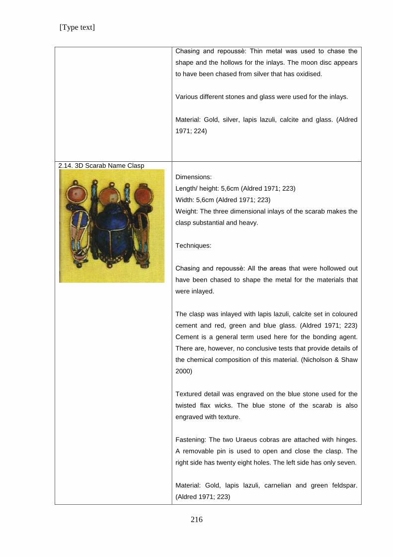
[Type text]
216
Chasing and repoussѐ: Thin metal was used to chase the
shape and the hollows for the inlays. The moon disc appears
to have been chased from silver that has oxidised.
Various different stones and glass were used for the inlays.
Material: Gold, silver, lapis lazuli, calcite and glass. (Aldred
1971; 224)
2.14. 3D Scarab Name Clasp
Dimensions:
Length/ height: 5,6cm (Aldred 1971; 223)
Width: 5,6cm (Aldred 1971; 223)
Weight: The three dimensional inlays of the scarab makes the
clasp substantial and heavy.
Techniques:
Chasing and repoussѐ: All the areas that were hollowed out
have been chased to shape the metal for the materials that
were inlayed.
The clasp was inlayed with lapis lazuli, calcite set in coloured
cement and red, green and blue glass. (Aldred 1971; 223)
Cement is a general term used here for the bonding agent.
There are, however, no conclusive tests that provide details of
the chemical composition of this material. (Nicholson & Shaw
2000)
Textured detail was engraved on the blue stone used for the
twisted flax wicks. The blue stone of the scarab is also
engraved with texture.
Fastening: The two Uraeus cobras are attached with hinges.
A removable pin is used to open and close the clasp. The
right side has twenty eight holes. The left side has only seven.
Material: Gold, lapis lazuli, carnelian and green feldspar.
(Aldred 1971; 223)
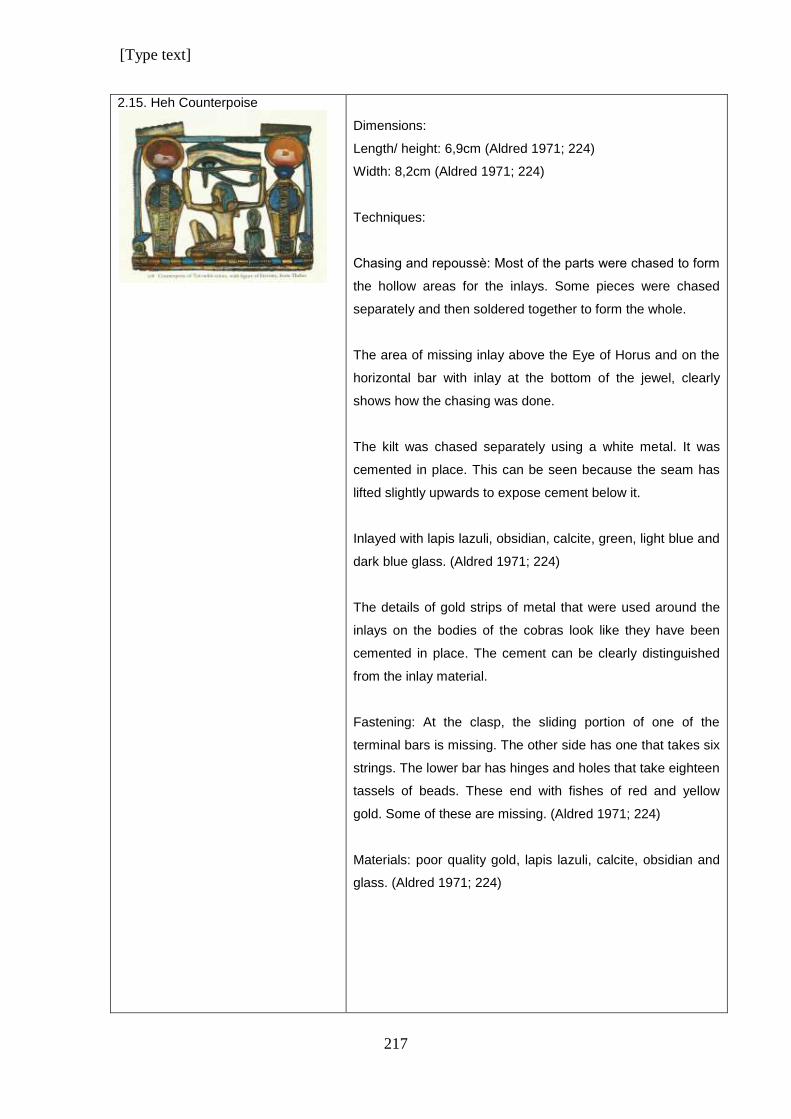
[Type text]
217
2.15. Heh Counterpoise
Dimensions:
Length/ height: 6,9cm (Aldred 1971; 224)
Width: 8,2cm (Aldred 1971; 224)
Techniques:
Chasing and repoussѐ: Most of the parts were chased to form
the hollow areas for the inlays. Some pieces were chased
separately and then soldered together to form the whole.
The area of missing inlay above the Eye of Horus and on the
horizontal bar with inlay at the bottom of the jewel, clearly
shows how the chasing was done.
The kilt was chased separately using a white metal. It was
cemented in place. This can be seen because the seam has
lifted slightly upwards to expose cement below it.
Inlayed with lapis lazuli, obsidian, calcite, green, light blue and
dark blue glass. (Aldred 1971; 224)
The details of gold strips of metal that were used around the
inlays on the bodies of the cobras look like they have been
cemented in place. The cement can be clearly distinguished
from the inlay material.
Fastening: At the clasp, the sliding portion of one of the
terminal bars is missing. The other side has one that takes six
strings. The lower bar has hinges and holes that take eighteen
tassels of beads. These end with fishes of red and yellow
gold. Some of these are missing. (Aldred 1971; 224)
Materials: poor quality gold, lapis lazuli, calcite, obsidian and
glass. (Aldred 1971; 224)
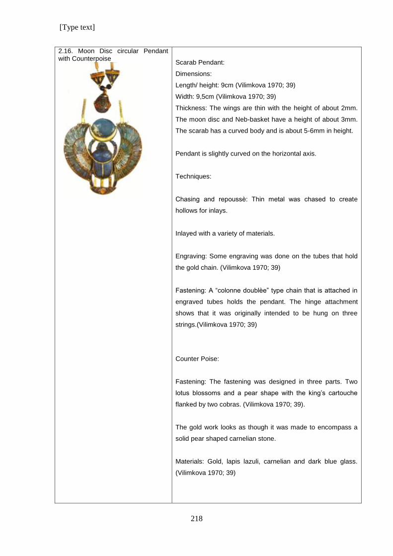
[Type text]
218
2.16. Moon Disc circular Pendant with Counterpoise
Scarab Pendant:
Dimensions:
Length/ height: 9cm (Vilimkova 1970; 39)
Width: 9,5cm (Vilimkova 1970; 39)
Thickness: The wings are thin with the height of about 2mm.
The moon disc and Neb-basket have a height of about 3mm.
The scarab has a curved body and is about 5-6mm in height.
Pendant is slightly curved on the horizontal axis.
Techniques:
Chasing and repoussѐ: Thin metal was chased to create
hollows for inlays.
Inlayed with a variety of materials.
Engraving: Some engraving was done on the tubes that hold
the gold chain. (Vilimkova 1970; 39)
Fastening: A “colonne doublѐe” type chain that is attached in
engraved tubes holds the pendant. The hinge attachment
shows that it was originally intended to be hung on three
strings.(Vilimkova 1970; 39)
Counter Poise:
Fastening: The fastening was designed in three parts. Two
lotus blossoms and a pear shape with the king’s cartouche
flanked by two cobras. (Vilimkova 1970; 39).
The gold work looks as though it was made to encompass a
solid pear shaped carnelian stone.
Materials: Gold, lapis lazuli, carnelian and dark blue glass.
(Vilimkova 1970; 39)
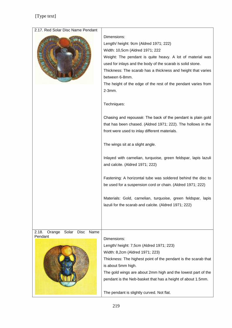
[Type text]
219
2.17. Red Solar Disc Name Pendant
Dimensions:
Length/ height: 9cm (Aldred 1971; 222)
Width: 10,5cm (Aldred 1971; 222
Weight: The pendant is quite heavy. A lot of material was
used for inlays and the body of the scarab is solid stone.
Thickness: The scarab has a thickness and height that varies
between 6-8mm.
The height of the edge of the rest of the pendant varies from
2-3mm.
Techniques:
Chasing and repoussѐ: The back of the pendant is plain gold
that has been chased. (Aldred 1971; 222). The hollows in the
front were used to inlay different materials.
The wings sit at a slight angle.
Inlayed with carnelian, turquoise, green feldspar, lapis lazuli
and calcite. (Aldred 1971; 222)
Fastening: A horizontal tube was soldered behind the disc to
be used for a suspension cord or chain. (Aldred 1971; 222)
Materials: Gold, carnelian, turquoise, green feldspar, lapis
lazuli for the scarab and calcite. (Aldred 1971; 222)
2.18. Orange Solar Disc Name Pendant
Dimensions:
Length/ height: 7,5cm (Aldred 1971; 223)
Width: 8,2cm (Aldred 1971; 223)
Thickness: The highest point of the pendant is the scarab that
is about 5mm high.
The gold wings are about 2mm high and the lowest part of the
pendant is the Neb-basket that has a height of about 1.5mm.
The pendant is slightly curved. Not flat.
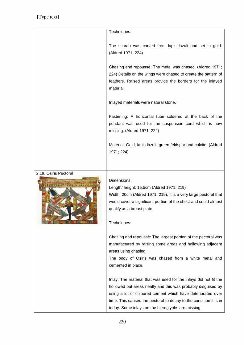
[Type text]
220
Techniques:
The scarab was carved from lapis lazuli and set in gold.
(Aldred 1971; 224)
Chasing and repoussѐ: The metal was chased. (Aldred 1971;
224) Details on the wings were chased to create the pattern of
feathers. Raised areas provide the borders for the inlayed
material.
Inlayed materials were natural stone.
Fastening: A horizontal tube soldered at the back of the
pendant was used for the suspension cord which is now
missing. (Aldred 1971; 224)
Material: Gold, lapis lazuli, green feldspar and calcite. (Aldred
1971; 224)
2.19. Osiris Pectoral
Dimensions:
Length/ height: 15,5cm (Aldred 1971; 219)
Width: 20cm (Aldred 1971; 219). It is a very large pectoral that
would cover a significant portion of the chest and could almost
qualify as a breast plate.
Techniques:
Chasing and repoussѐ: The largest portion of the pectoral was
manufactured by raising some areas and hollowing adjacent
areas using chasing.
The body of Osiris was chased from a white metal and
cemented in place.
Inlay: The material that was used for the inlays did not fit the
hollowed out areas neatly and this was probably disguised by
using a lot of coloured cement which have deteriorated over
time. This caused the pectoral to decay to the condition it is in
today. Some inlays on the hieroglyphs are missing.
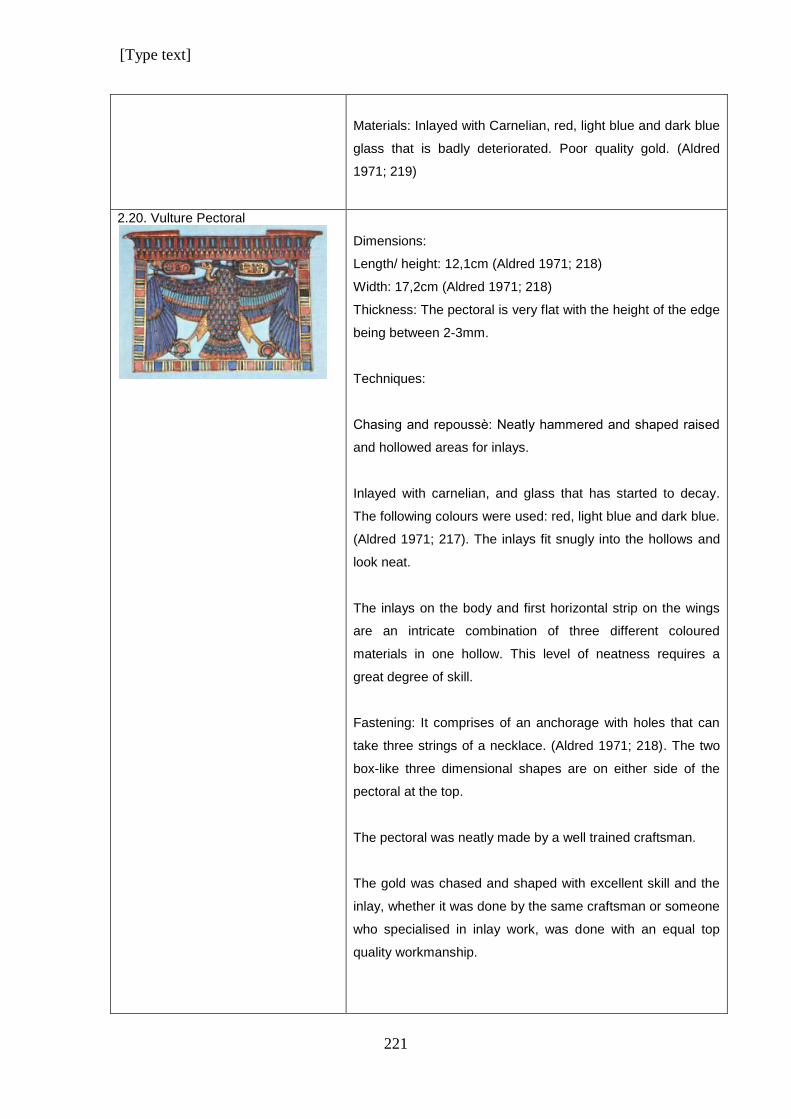
[Type text]
221
Materials: Inlayed with Carnelian, red, light blue and dark blue
glass that is badly deteriorated. Poor quality gold. (Aldred
1971; 219)
2.20. Vulture Pectoral
Dimensions:
Length/ height: 12,1cm (Aldred 1971; 218)
Width: 17,2cm (Aldred 1971; 218)
Thickness: The pectoral is very flat with the height of the edge
being between 2-3mm.
Techniques:
Chasing and repoussѐ: Neatly hammered and shaped raised
and hollowed areas for inlays.
Inlayed with carnelian, and glass that has started to decay.
The following colours were used: red, light blue and dark blue.
(Aldred 1971; 217). The inlays fit snugly into the hollows and
look neat.
The inlays on the body and first horizontal strip on the wings
are an intricate combination of three different coloured
materials in one hollow. This level of neatness requires a
great degree of skill.
Fastening: It comprises of an anchorage with holes that can
take three strings of a necklace. (Aldred 1971; 218). The two
box-like three dimensional shapes are on either side of the
pectoral at the top.
The pectoral was neatly made by a well trained craftsman.
The gold was chased and shaped with excellent skill and the
inlay, whether it was done by the same craftsman or someone
who specialised in inlay work, was done with an equal top
quality workmanship.
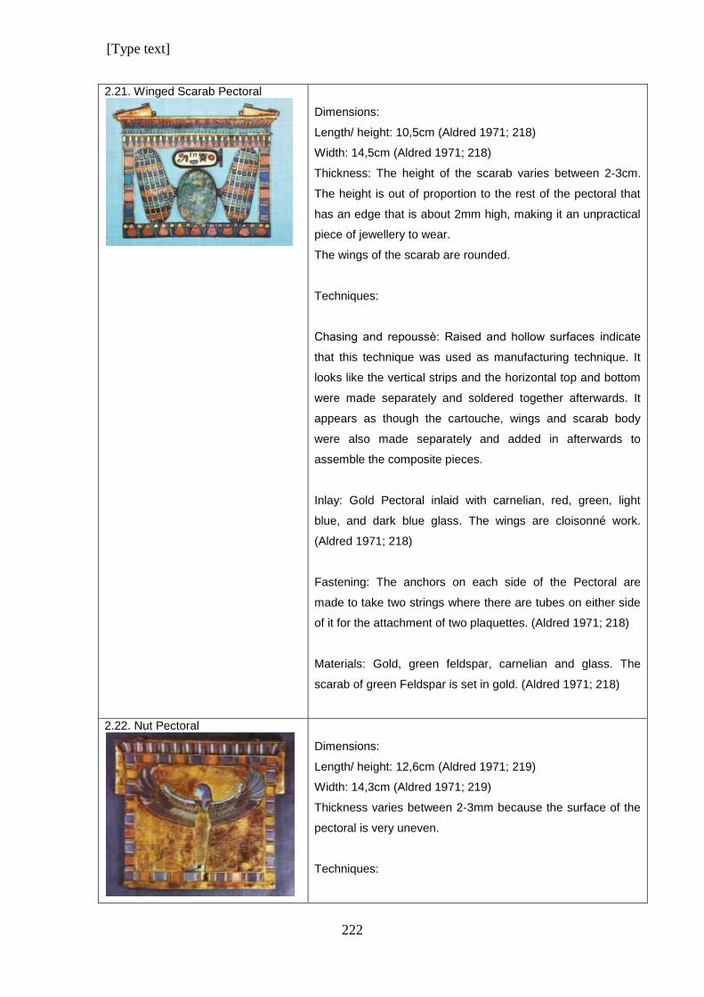
[Type text]
222
2.21. Winged Scarab Pectoral
Dimensions:
Length/ height: 10,5cm (Aldred 1971; 218)
Width: 14,5cm (Aldred 1971; 218)
Thickness: The height of the scarab varies between 2-3cm.
The height is out of proportion to the rest of the pectoral that
has an edge that is about 2mm high, making it an unpractical
piece of jewellery to wear.
The wings of the scarab are rounded.
Techniques:
Chasing and repoussѐ: Raised and hollow surfaces indicate
that this technique was used as manufacturing technique. It
looks like the vertical strips and the horizontal top and bottom
were made separately and soldered together afterwards. It
appears as though the cartouche, wings and scarab body
were also made separately and added in afterwards to
assemble the composite pieces.
Inlay: Gold Pectoral inlaid with carnelian, red, green, light
blue, and dark blue glass. The wings are cloisonné work.
(Aldred 1971; 218)
Fastening: The anchors on each side of the Pectoral are
made to take two strings where there are tubes on either side
of it for the attachment of two plaquettes. (Aldred 1971; 218)
Materials: Gold, green feldspar, carnelian and glass. The
scarab of green Feldspar is set in gold. (Aldred 1971; 218)
2.22. Nut Pectoral
Dimensions:
Length/ height: 12,6cm (Aldred 1971; 219)
Width: 14,3cm (Aldred 1971; 219)
Thickness varies between 2-3mm because the surface of the
pectoral is very uneven.
Techniques:
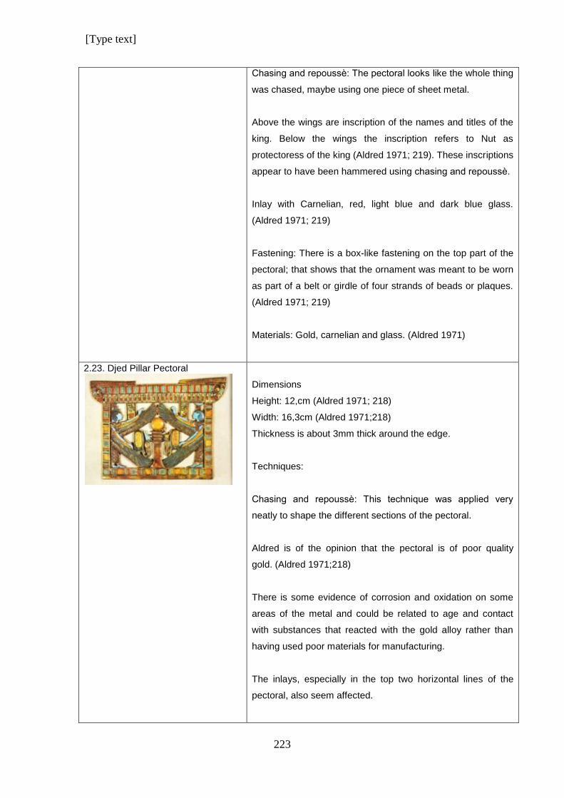
[Type text]
223
Chasing and repoussѐ: The pectoral looks like the whole thing
was chased, maybe using one piece of sheet metal.
Above the wings are inscription of the names and titles of the
king. Below the wings the inscription refers to Nut as
protectoress of the king (Aldred 1971; 219). These inscriptions
appear to have been hammered using chasing and repoussѐ.
Inlay with Carnelian, red, light blue and dark blue glass.
(Aldred 1971; 219)
Fastening: There is a box-like fastening on the top part of the
pectoral; that shows that the ornament was meant to be worn
as part of a belt or girdle of four strands of beads or plaques.
(Aldred 1971; 219)
Materials: Gold, carnelian and glass. (Aldred 1971)
2.23. Djed Pillar Pectoral
Dimensions
Height: 12,cm (Aldred 1971; 218)
Width: 16,3cm (Aldred 1971;218)
Thickness is about 3mm thick around the edge.
Techniques:
Chasing and repoussѐ: This technique was applied very
neatly to shape the different sections of the pectoral.
Aldred is of the opinion that the pectoral is of poor quality
gold. (Aldred 1971;218)
There is some evidence of corrosion and oxidation on some
areas of the metal and could be related to age and contact
with substances that reacted with the gold alloy rather than
having used poor materials for manufacturing.
The inlays, especially in the top two horizontal lines of the
pectoral, also seem affected.
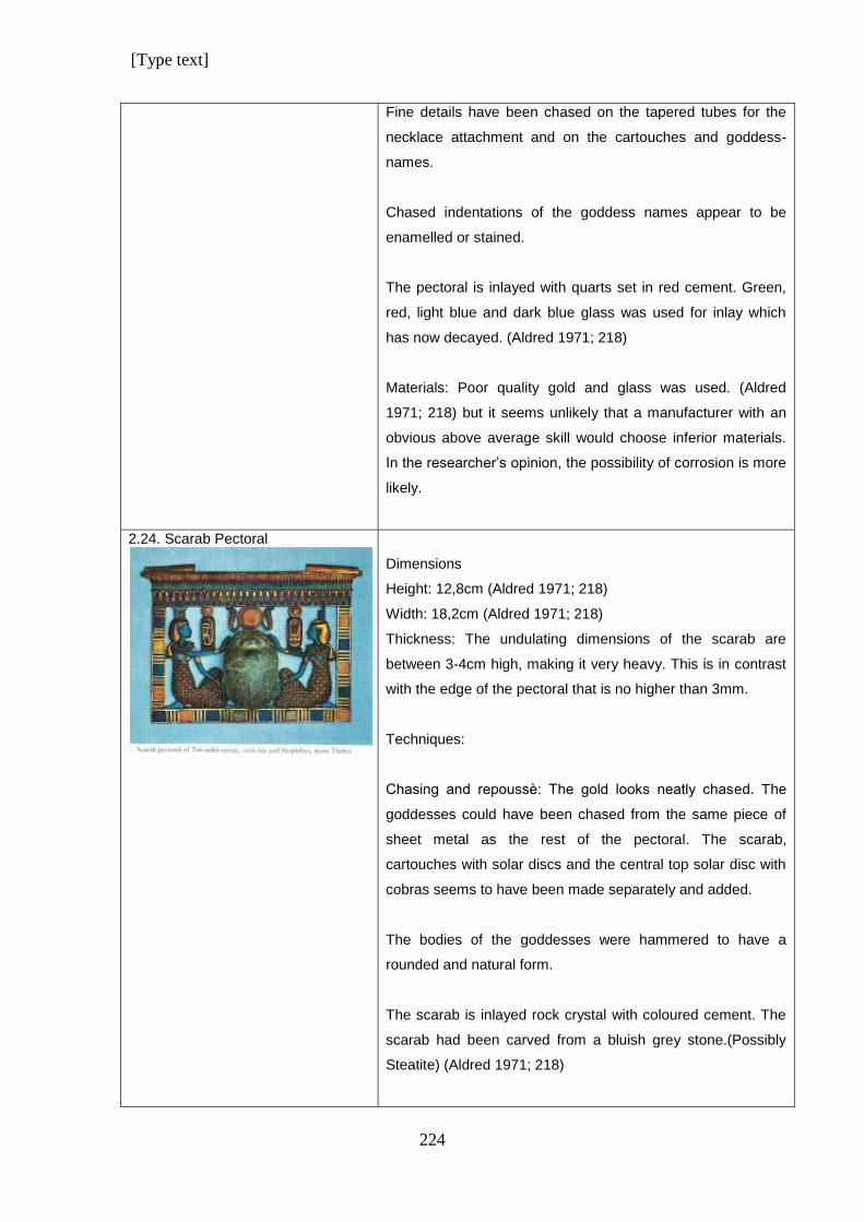
[Type text]
224
Fine details have been chased on the tapered tubes for the
necklace attachment and on the cartouches and goddess-
names.
Chased indentations of the goddess names appear to be
enamelled or stained.
The pectoral is inlayed with quarts set in red cement. Green,
red, light blue and dark blue glass was used for inlay which
has now decayed. (Aldred 1971; 218)
Materials: Poor quality gold and glass was used. (Aldred
1971; 218) but it seems unlikely that a manufacturer with an
obvious above average skill would choose inferior materials.
In the researcher’s opinion, the possibility of corrosion is more
likely.
2.24. Scarab Pectoral
Dimensions
Height: 12,8cm (Aldred 1971; 218)
Width: 18,2cm (Aldred 1971; 218)
Thickness: The undulating dimensions of the scarab are
between 3-4cm high, making it very heavy. This is in contrast
with the edge of the pectoral that is no higher than 3mm.
Techniques:
Chasing and repoussѐ: The gold looks neatly chased. The
goddesses could have been chased from the same piece of
sheet metal as the rest of the pectoral. The scarab,
cartouches with solar discs and the central top solar disc with
cobras seems to have been made separately and added.
The bodies of the goddesses were hammered to have a
rounded and natural form.
The scarab is inlayed rock crystal with coloured cement. The
scarab had been carved from a bluish grey stone.(Possibly
Steatite) (Aldred 1971; 218)
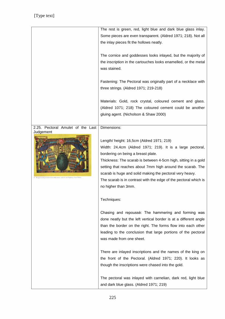
[Type text]
225
The rest is green, red, light blue and dark blue glass inlay.
Some pieces are even transparent. (Aldred 1971; 218). Not all
the inlay pieces fit the hollows neatly.
The cornice and goddesses looks inlayed, but the majority of
the inscription in the cartouches looks enamelled, or the metal
was stained.
Fastening: The Pectoral was originally part of a necklace with
three strings. (Aldred 1971; 219-218)
Materials: Gold, rock crystal, coloured cement and glass.
(Aldred 1071; 218) The coloured cement could be another
gluing agent. (Nicholson & Shaw 2000)
2.25. Pectoral Amulet of the Last Judgement
Dimensions:
Length/ height: 16,5cm (Aldred 1971; 219)
Width: 24,4cm (Aldred 1971; 219). It is a large pectoral,
bordering on being a breast plate.
Thickness: The scarab is between 4-5cm high, sitting in a gold
setting that reaches about 7mm high around the scarab. The
scarab is huge and solid making the pectoral very heavy.
The scarab is in contrast with the edge of the pectoral which is
no higher than 3mm.
Techniques:
Chasing and repoussѐ: The hammering and forming was
done neatly but the left vertical border is at a different angle
than the border on the right. The forms flow into each other
leading to the conclusion that large portions of the pectoral
was made from one sheet.
There are inlayed inscriptions and the names of the king on
the front of the Pectoral. (Aldred 1971; 220). It looks as
though the inscriptions were chased into the gold.
The pectoral was inlayed with carnelian, dark red, light blue
and dark blue glass. (Aldred 1971; 219)
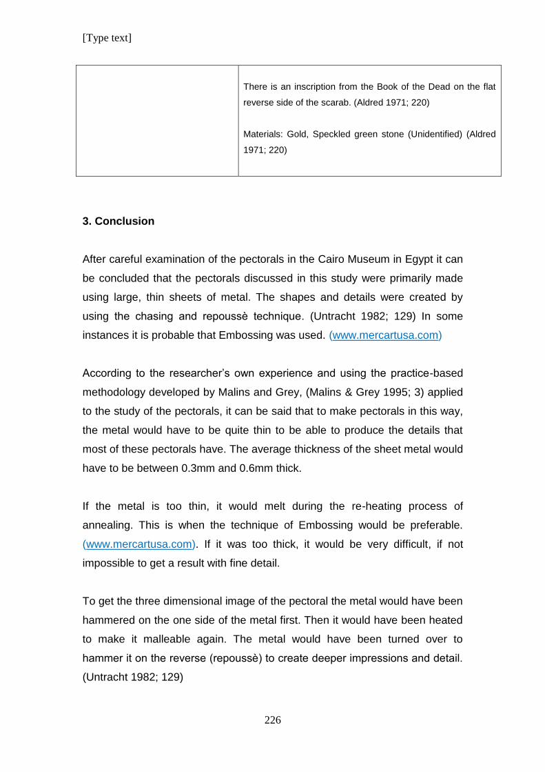
[Type text]
226
There is an inscription from the Book of the Dead on the flat
reverse side of the scarab. (Aldred 1971; 220)
Materials: Gold, Speckled green stone (Unidentified) (Aldred
1971; 220)
3. Conclusion
After careful examination of the pectorals in the Cairo Museum in Egypt it can
be concluded that the pectorals discussed in this study were primarily made
using large, thin sheets of metal. The shapes and details were created by
using the chasing and repoussѐ technique. (Untracht 1982; 129) In some
instances it is probable that Embossing was used. (www.mercartusa.com)
According to the researcher’s own experience and using the practice-based
methodology developed by Malins and Grey, (Malins & Grey 1995; 3) applied
to the study of the pectorals, it can be said that to make pectorals in this way,
the metal would have to be quite thin to be able to produce the details that
most of these pectorals have. The average thickness of the sheet metal would
have to be between 0.3mm and 0.6mm thick.
If the metal is too thin, it would melt during the re-heating process of
annealing. This is when the technique of Embossing would be preferable.
(www.mercartusa.com). If it was too thick, it would be very difficult, if not
impossible to get a result with fine detail.
To get the three dimensional image of the pectoral the metal would have been
hammered on the one side of the metal first. Then it would have been heated
to make it malleable again. The metal would have been turned over to
hammer it on the reverse (repoussѐ) to create deeper impressions and detail.
(Untracht 1982; 129)
[Type text]
227
This process would have been repeated, until the final result was achieved.
Once the metal work was finished, the inlays would have been inserted and
cemented in.
By observing the samples of jewellery in the Cairo Museum closely, it was
identified that the thickness of the inlayed material was not always the same.
This problem was remedied by using cement or glue to fill up a hollowed out
area to the correct height before the inlay piece was put in. As a result, the
inlayed material of the final product would have appeared to be of equal
thickness. This technique was used extensively as observed from the
multitude of damaged inlayed objects in the museum. The gluing compound
that was used for inlays were previously referred to as cement by scholars
that have examined the jewellery, but there is no scientific proof of the exact
chemical structure of the compound in question. (Nicholson & Shaw 2000)
A variety of stones were used as inlays. These had to be cut and prepared
first before they were ready to be used in jewellery. Stone workers would have
done this before it was sent to the goldsmith’s workshop to be used.
Faience was a technique that was mastered and sophisticated already during
the 18th Dynasty. Required shapes and sizes would have been mass
produced for the use of inlay in jewellery making. (Nicholson & Shaw 2000;
181)
Glass was sometimes used as well. (Aldred 1971, Vilimkova 1970)
Sometimes faience was mistaken for glass and sometimes enamelling was
referred to as glass. Scholars tend to generalise vaguely about such details.
James argues that true enamel was not produced for inlay work at this time.
(James 1972; 41) The fact is that proper tests to identify the materials in all
the commodities in Ancient Egypt have not been done yet. (Nicholson & Shaw
2000)
[Type text]
228
These materials are similar and each piece of jewellery would have to be
studied to determine which of these options apply to it individually. (Nicholson
& Shaw 2000; 182)
Some other techniques were used as well. Various ways of making clasps
were identified to attach the different pieces of the jewels to each other.
In the case of some of the pectorals, portions like a bird’s head was cast and
then attached to the rest of the pectoral. The counterpoise of the Nekhbet
Necklace was made using three dimensional cast falcons.
Beads of different materials and shapes were used to create variety. Most of
the beads were made using Faience to simulate precious stones. (Clark 1950;
154)
A variant of the Loop-in-Loop chain was used with the Moon Disc Circular
Pendant and Counterpoise. Earliest known examples of such chains date
from the VI Dynasty in Egypt. The links from chains like these are uniform in
size and has no joints. Chains made with this technique were very durable.
(Athanassopoulus 1983; 548).
The way these necklaces and pendants were made was very clever.
Craftsmen used the minimum weight of gold and created an illusion of huge,
heavy and rich objects with an impressive colour range of inlayed material to
make the maximum visual impact of wealth.
These craftsmen were truly skilled and cunning to have created beautiful
works of art in this way.
[Type text]
229
CHAPTER 9:
ANSWERING RESEARCH QUESTIONS RELATED TO DESIGN AND
MANUFACTURING
This chapter aims to encompass all the knowledge obtained
from the analyses of the jewellery and to answer all the research
questions that were identified at the beginning of this study that
are related to Design and to Manufacturing. The research
questions are discussed and answered accordingly.
1. Introduction
The design of any piece of jewellery entails many aspects. Before the
jewellery can be made, the materials function and look must be decided on as
first step.
Then one has to find out whether the materials that are needed are available.
Based on this, the original idea can be realised or might need to be adapted,
depending on availability of materials. (Wuytens and Willems 2009)
The research questions about design will be answered with these factors in
mind.
When answering questions concerning manufacturing, the different
manufacturing techniques that were discussed in detail for this study show
that the Ancient Egyptian goldsmith was proficient in many manufacturing
techniques.
The second part of this chapter explores how these techniques apply to the
pectorals that were examined in the analysis of manufacturing techniques,
and answers the research questions related to manufacturing.
[Type text]
230
2. Answers to research questions related to Design
2.1. What is the size and dimension of the piece of jewellery in question?
The pectorals vary in size. They all appear to be made with solid gold and
look heavy, but they were actually made from thin beaten metal sheet.
For this research, the jewellery was divided into Pendants, Necklaces and
Pictographic Pectorals which depicted religious scenes within an architectural
frame as design.
Some assorted odd pieces of jewellery were added to the samples for study
because they have a similar design as some of the pieces that have been
classified under pectorals by previous researchers.
Amongst the pendants, the bird pendant that is the widest is the Ba-Bird
pendant with a wing span of 33cm. The other bird pendants have an average
width of 14cm. The bird pendant that is the longest is the Nekhbet pendant
with a length of 14,1cm. The other birds have an average length of 12cm. The
Vulture pendant is the shortest but has a wide wing span.
The Eye of Ra Pendant has small dimensions of 6cm by 8.8cm. The string of
beads that is attached to it could put it in the necklace category. The Eye of
Horus Necklace has similar proportions, but it has a counterpoise in addition
to the frontal pendant.
The name pendants are similar in size with an average size of 10cm by 10cm.
The circular pendant with the moon disc is smaller in size but has a
counterpoise.
The necklaces are the largest samples of jewellery in this study. Some of the
other pectorals would also have been considered as necklaces, but they are
missing parts.
[Type text]
231
The Rebus Pectoral is the only triangular pectoral. Its dimensions are 14.9cm
by 14,5cm.
Of all the rectangular kiosk pectorals, the Last Judgement Pectoral is the
biggest with dimensions of 16,5cm by 24,4cm. This is followed by the Osiris
Pectoral that is slightly smaller with dimensions of 15,5cm by 20cm. The width
of the other rectangular pectorals falls within the range of 12cm to 13cm and
their lengths range from 13cm to 18cm.
The clasps are smaller than 7cm in width and length and the Heh
counterpoise is the smallest “pectoral” with dimensions of 6,9cm by 8,2cm.
2.2. How were the Design Elements applied in the pectorals?
2.2.1. Line
Line is used to create shape when it meets its own starting point. The way the
line is applied will determine what the shape will look like. Line does not just
create an image but can add to its creative expression by using varying
thickness and curves.
The character of a line can be altered by the density and volume. Dense lines
are packed tightly together and concentrated, creating intensity and can
contrast with areas with little or no lines.
Line has measurement and creates dimension. It can have a length and a
width or thickness. It can create the borders of a plane, colour, or tone and it
can be used to divide a design into smaller parts.
Lines can also show or change direction. By repeating line in a group it can
create pattern, rhythm, texture and mood. A skilled use of line can produce an
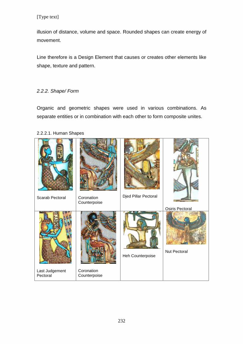
[Type text]
232
illusion of distance, volume and space. Rounded shapes can create energy of
movement.
Line therefore is a Design Element that causes or creates other elements like
shape, texture and pattern.
2.2.2. Shape/ Form
Organic and geometric shapes were used in various combinations. As
separate entities or in combination with each other to form composite unites.
2.2.2.1. Human Shapes
Scarab Pectoral
Coronation Counterpoise
Djed Pillar Pectoral
Osiris Pectoral
Last Judgement Pectoral
Coronation Counterpoise
Heh Counterpoise
Nut Pectoral
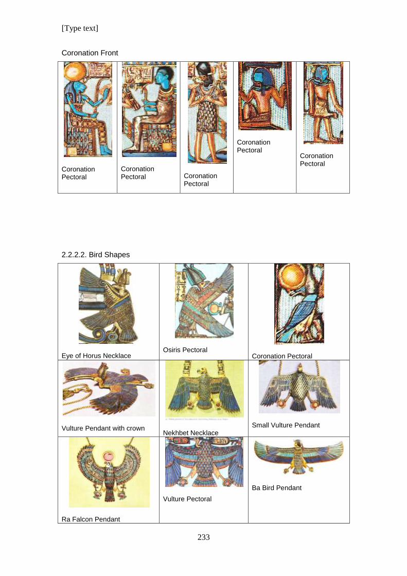
[Type text]
233
Coronation Front
Coronation Pectoral
Coronation Pectoral
Coronation Pectoral
Coronation Pectoral
Coronation Pectoral
2.2.2.2. Bird Shapes
Eye of Horus Necklace
Osiris Pectoral
Coronation Pectoral
Vulture Pendant with crown
Nekhbet Necklace
Small Vulture Pendant
Ra Falcon Pendant
Vulture Pectoral
Ba Bird Pendant
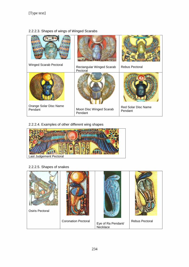
[Type text]
234
2.2.2.3. Shapes of wings of Winged Scarabs
Winged Scarab Pectoral
Rectangular Winged Scarab Pectoral
Rebus Pectoral
Orange Solar Disc Name Pendant
Moon Disc Winged Scarab Pendant
Red Solar Disc Name Pendant
2.2.2.4. Examples of other different wing shapes
Last Judgement Pectoral
2.2.2.5. Shapes of snakes
Osiris Pectoral
Coronation Pectoral
Eye of Ra Pendant/ Necklace
Rebus Pectoral
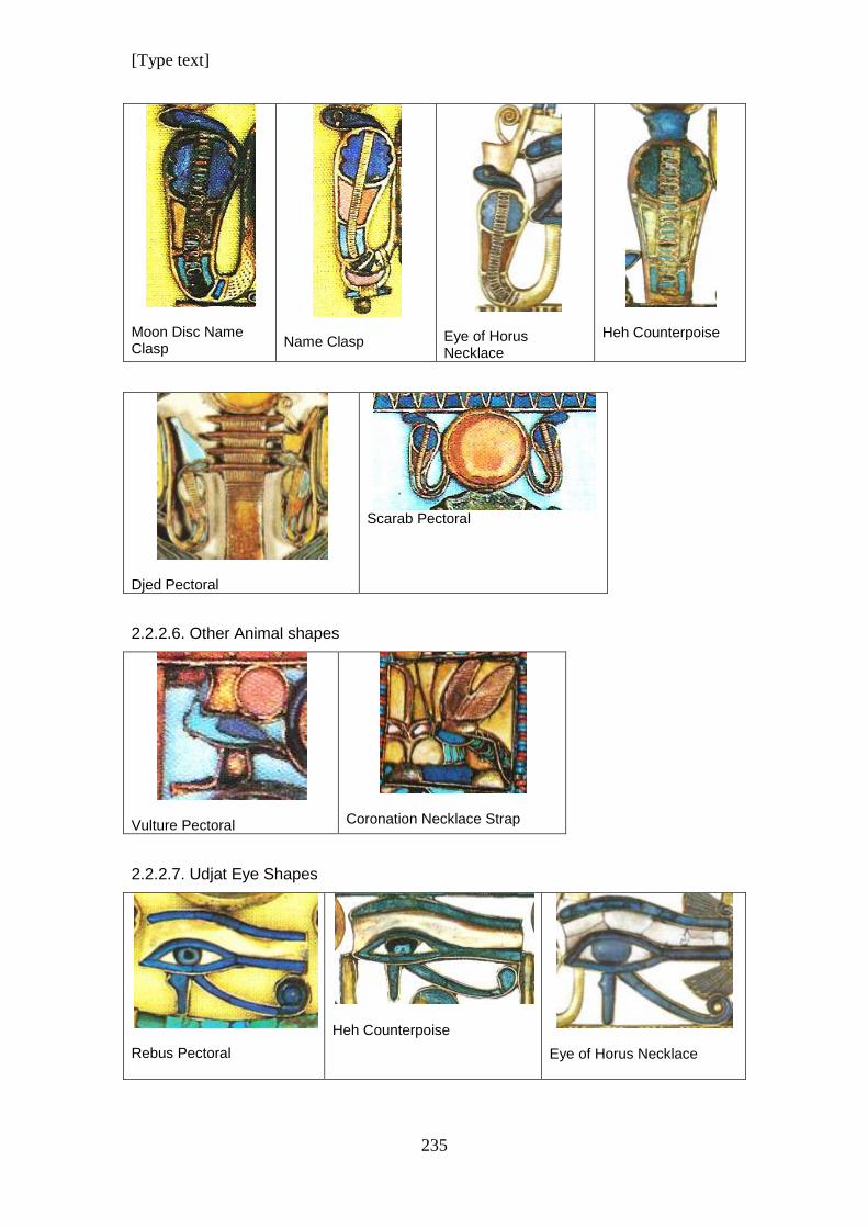
[Type text]
235
Moon Disc Name Clasp
Name Clasp
Eye of Horus Necklace
Heh Counterpoise
Djed Pectoral
Scarab Pectoral
2.2.2.6. Other Animal shapes
Vulture Pectoral
Coronation Necklace Strap
2.2.2.7. Udjat Eye Shapes
Rebus Pectoral
Heh Counterpoise
Eye of Horus Necklace
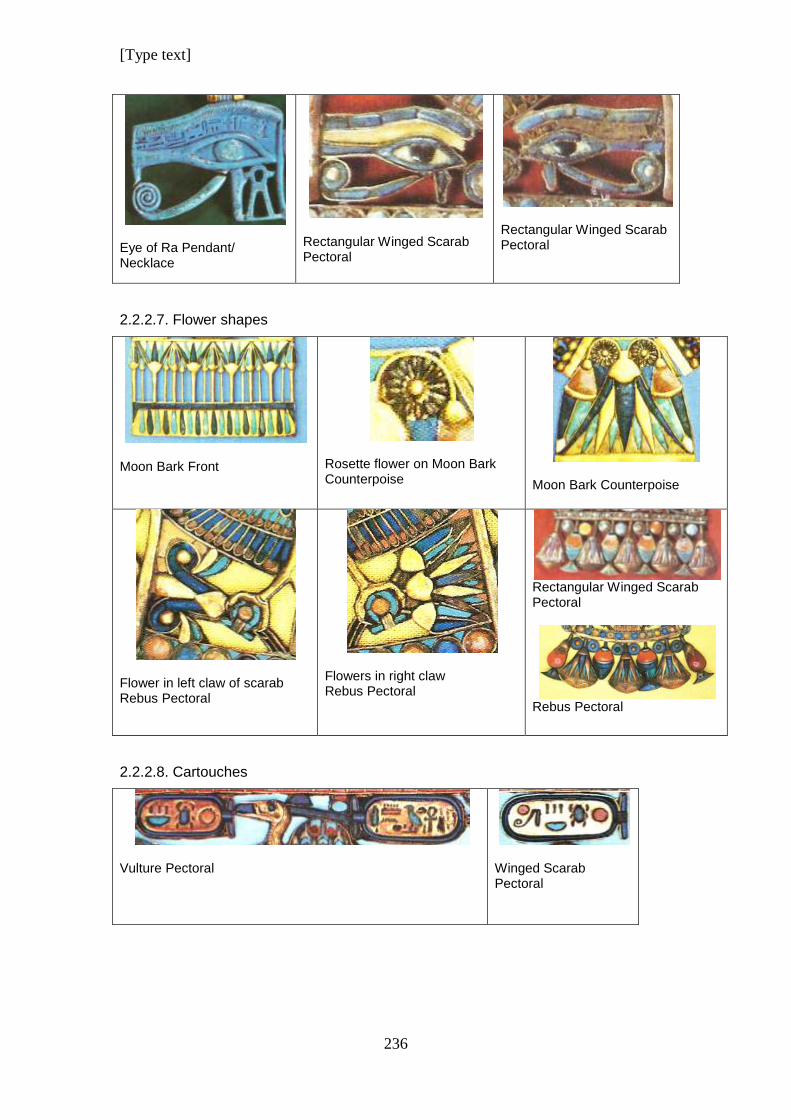
[Type text]
236
Eye of Ra Pendant/ Necklace
Rectangular Winged Scarab Pectoral
Rectangular Winged Scarab Pectoral
2.2.2.7. Flower shapes
Moon Bark Front
Rosette flower on Moon Bark Counterpoise
Moon Bark Counterpoise
Flower in left claw of scarab Rebus Pectoral
Flowers in right claw Rebus Pectoral
Rectangular Winged Scarab Pectoral
Rebus Pectoral
2.2.2.8. Cartouches
Vulture Pectoral
Winged Scarab Pectoral
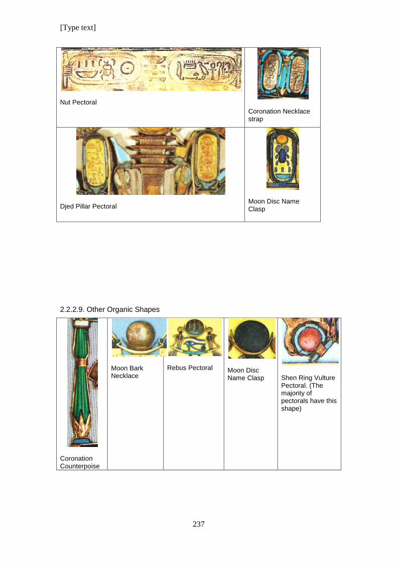
[Type text]
237
Nut Pectoral
Coronation Necklace strap
Djed Pillar Pectoral
Moon Disc Name Clasp
2.2.2.9. Other Organic Shapes
Coronation Counterpoise
Moon Bark Necklace
Rebus Pectoral
Moon Disc Name Clasp
Shen Ring Vulture Pectoral. (The majority of pectorals have this shape)
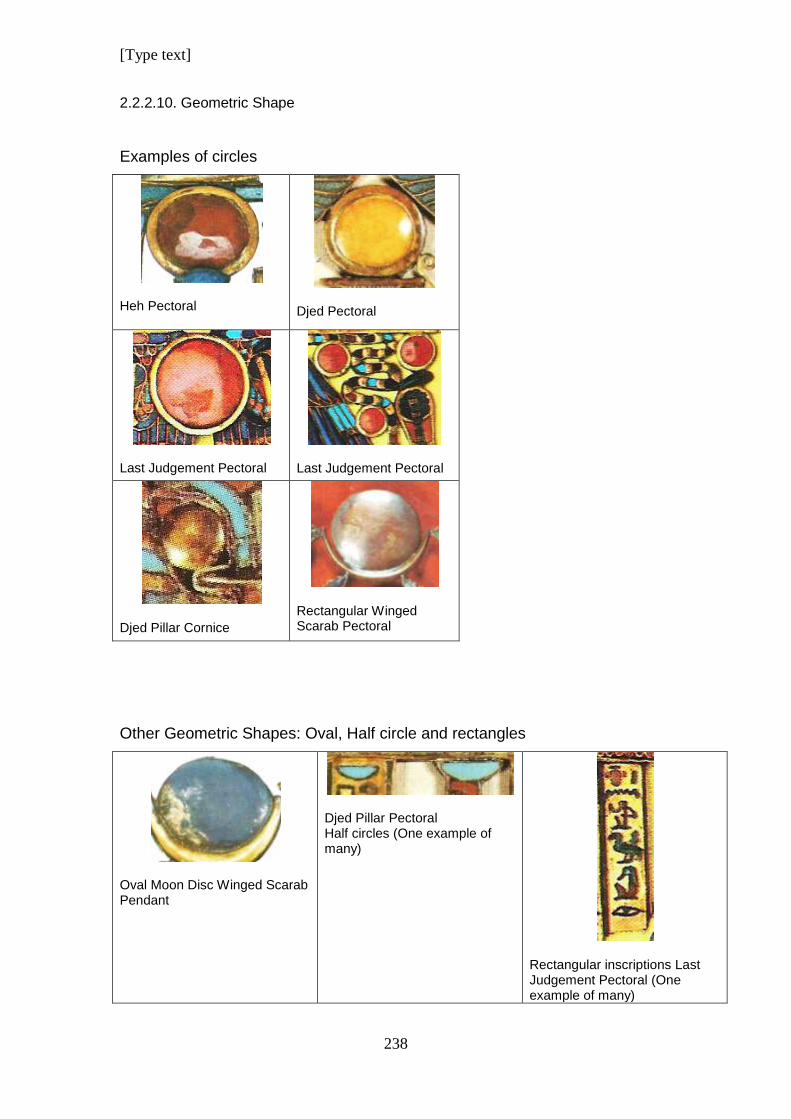
[Type text]
238
2.2.2.10. Geometric Shape
Examples of circles
Heh Pectoral
Djed Pectoral
Last Judgement Pectoral
Last Judgement Pectoral
Djed Pillar Cornice
Rectangular Winged Scarab Pectoral
Other Geometric Shapes: Oval, Half circle and rectangles
Oval Moon Disc Winged Scarab Pendant
Djed Pillar Pectoral Half circles (One example of many)
Rectangular inscriptions Last Judgement Pectoral (One example of many)
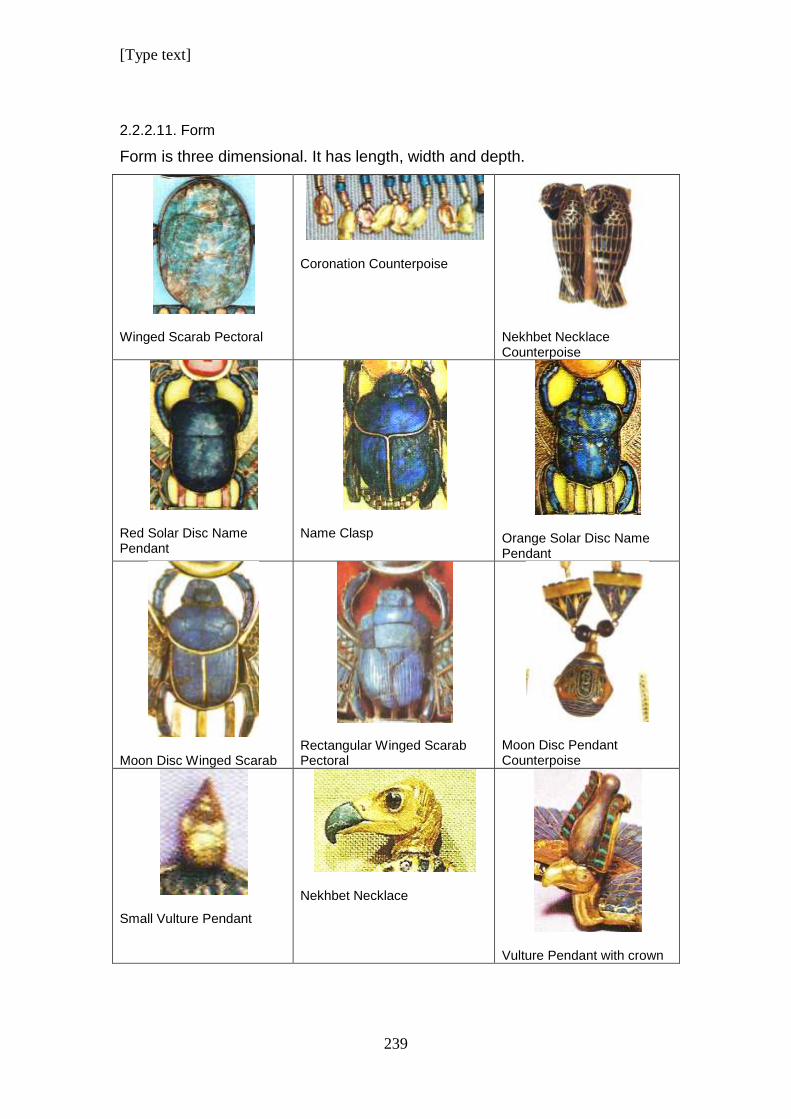
[Type text]
239
2.2.2.11. Form
Form is three dimensional. It has length, width and depth.
Winged Scarab Pectoral
Coronation Counterpoise
Nekhbet Necklace Counterpoise
Red Solar Disc Name Pendant
Name Clasp
Orange Solar Disc Name Pendant
Moon Disc Winged Scarab
Rectangular Winged Scarab Pectoral
Moon Disc Pendant Counterpoise
Small Vulture Pendant
Nekhbet Necklace
Vulture Pendant with crown
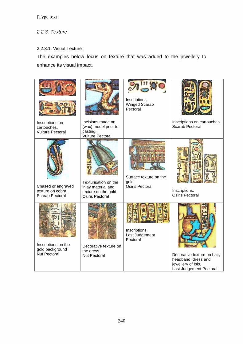
[Type text]
240
2.2.3. Texture
2.2.3.1. Visual Texture
The examples below focus on texture that was added to the jewellery to
enhance its visual impact.
Inscriptions on cartouches. Vulture Pectoral
Incisions made on (wax) model prior to casting. Vulture Pectoral
Inscriptions. Winged Scarab Pectoral
Inscriptions on cartouches. Scarab Pectoral
Chased or engraved texture on cobra. Scarab Pectoral
Texturisation on the inlay material and texture on the gold. Osiris Pectoral
Surface texture on the gold. Osiris Pectoral
Inscriptions. Osiris Pectoral
Inscriptions on the gold background Nut Pectoral
Decorative texture on the dress. Nut Pectoral
Inscriptions. Last Judgement Pectoral
Decorative texture on hair, headband, dress and jewellery of Isis. Last Judgement Pectoral
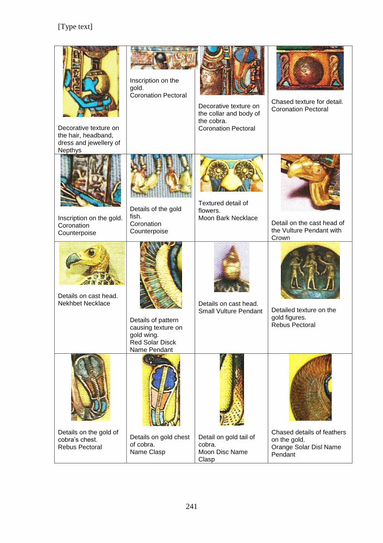
[Type text]
241
Decorative texture on the hair, headband, dress and jewellery of Nepthys
Inscription on the gold. Coronation Pectoral
Decorative texture on the collar and body of the cobra. Coronation Pectoral
Chased texture for detail. Coronation Pectoral
Inscription on the gold. Coronation Counterpoise
Details of the gold fish. Coronation Counterpoise
Textured detail of flowers. Moon Bark Necklace
Detail on the cast head of the Vulture Pendant with Crown
Details on cast head. Nekhbet Necklace
Details of pattern causing texture on gold wing. Red Solar Disck Name Pendant
Details on cast head. Small Vulture Pendant
Detailed texture on the gold figures. Rebus Pectoral
Details on the gold of cobra’s chest. Rebus Pectoral
Details on gold chest of cobra. Name Clasp
Detail on gold tail of cobra. Moon Disc Name Clasp
Chased details of feathers on the gold. Orange Solar Disl Name Pendant
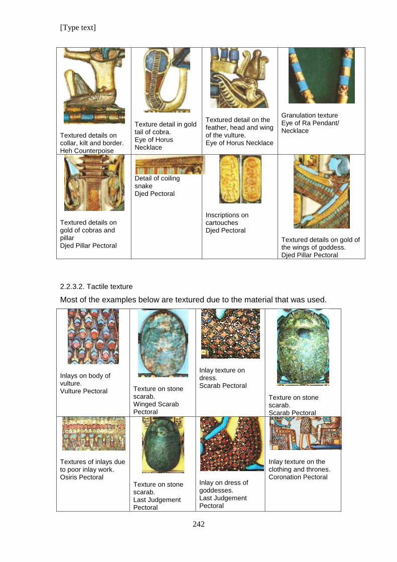
[Type text]
242
Textured details on collar, kilt and border. Heh Counterpoise
Texture detail in gold tail of cobra. Eye of Horus Necklace
Textured detail on the feather, head and wing of the vulture. Eye of Horus Necklace
Granulation texture Eye of Ra Pendant/ Necklace
Textured details on gold of cobras and pillar Djed Pillar Pectoral
Detail of coiling snake Djed Pectoral
Inscriptions on cartouches Djed Pectoral
Textured details on gold of the wings of goddess. Djed Pillar Pectoral
2.2.3.2. Tactile texture
Most of the examples below are textured due to the material that was used.
Inlays on body of vulture. Vulture Pectoral
Texture on stone scarab. Winged Scarab Pectoral
Inlay texture on dress. Scarab Pectoral
Texture on stone scarab. Scarab Pectoral
Textures of inlays due to poor inlay work. Osiris Pectoral
Texture on stone scarab. Last Judgement Pectoral
Inlay on dress of goddesses. Last Judgement Pectoral
Inlay texture on the clothing and thrones. Coronation Pectoral
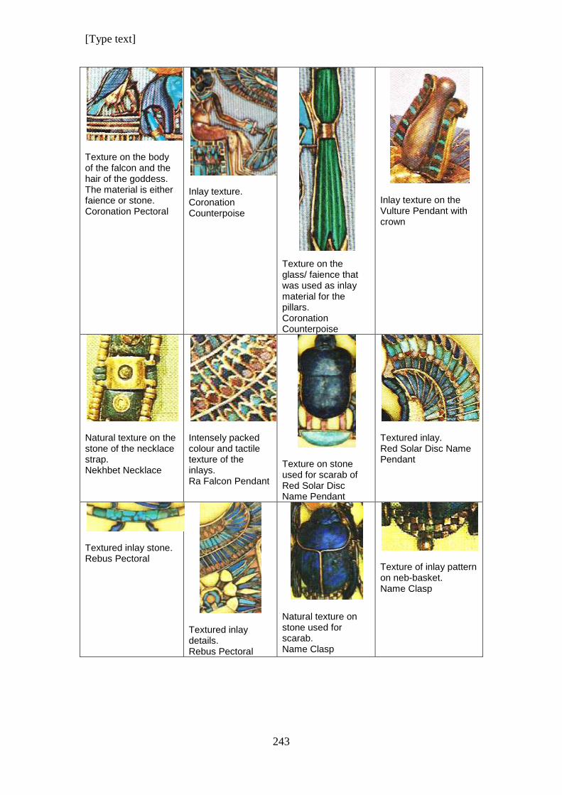
[Type text]
243
Texture on the body of the falcon and the hair of the goddess. The material is either faience or stone. Coronation Pectoral
Inlay texture. Coronation Counterpoise
Texture on the glass/ faience that was used as inlay material for the pillars. Coronation Counterpoise
Inlay texture on the Vulture Pendant with crown
Natural texture on the stone of the necklace strap. Nekhbet Necklace
Intensely packed colour and tactile texture of the inlays. Ra Falcon Pendant
Texture on stone used for scarab of Red Solar Disc Name Pendant
Textured inlay. Red Solar Disc Name Pendant
Textured inlay stone. Rebus Pectoral
Textured inlay details. Rebus Pectoral
Natural texture on stone used for scarab. Name Clasp
Texture of inlay pattern on neb-basket. Name Clasp
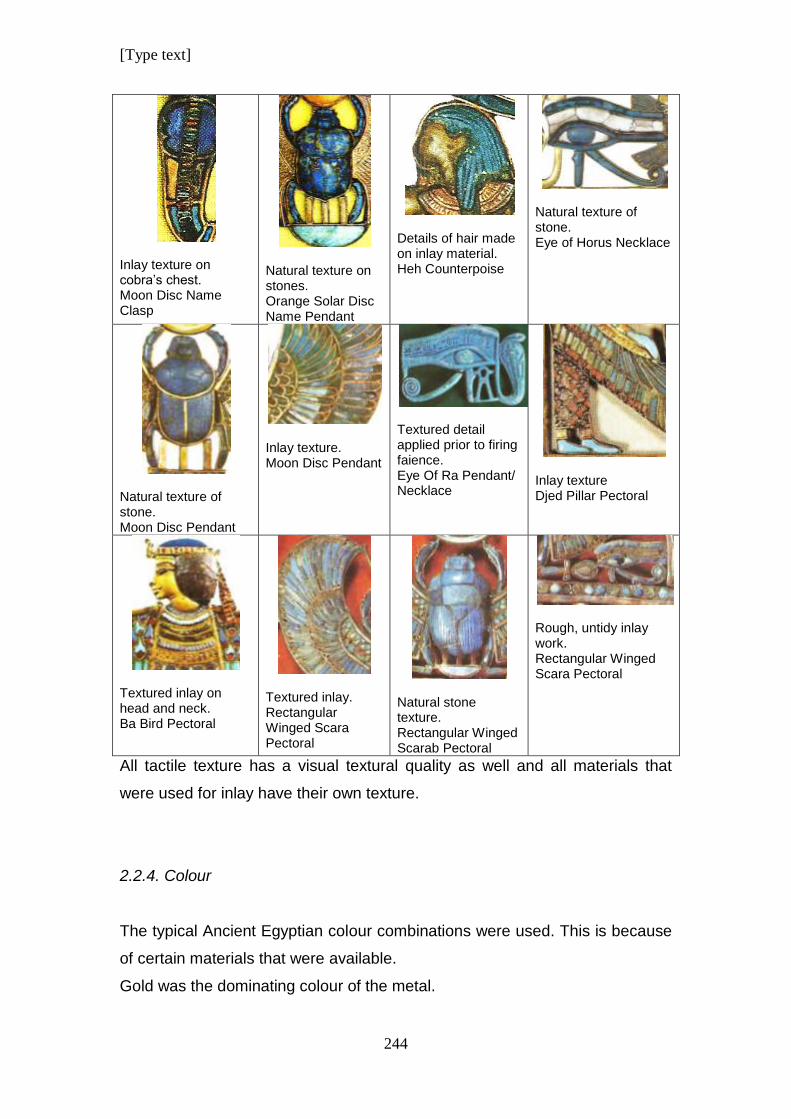
[Type text]
244
Inlay texture on cobra’s chest. Moon Disc Name Clasp
Natural texture on stones. Orange Solar Disc Name Pendant
Details of hair made on inlay material. Heh Counterpoise
Natural texture of stone. Eye of Horus Necklace
Natural texture of stone. Moon Disc Pendant
Inlay texture. Moon Disc Pendant
Textured detail applied prior to firing faience. Eye Of Ra Pendant/ Necklace
Inlay texture Djed Pillar Pectoral
Textured inlay on head and neck. Ba Bird Pectoral
Textured inlay. Rectangular Winged Scara Pectoral
Natural stone texture. Rectangular Winged Scarab Pectoral
Rough, untidy inlay work. Rectangular Winged Scara Pectoral
All tactile texture has a visual textural quality as well and all materials that
were used for inlay have their own texture.
2.2.4. Colour
The typical Ancient Egyptian colour combinations were used. This is because
of certain materials that were available.
Gold was the dominating colour of the metal.
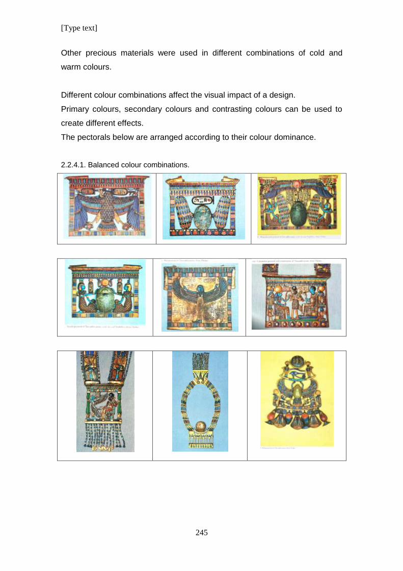
[Type text]
245
Other precious materials were used in different combinations of cold and
warm colours.
Different colour combinations affect the visual impact of a design.
Primary colours, secondary colours and contrasting colours can be used to
create different effects.
The pectorals below are arranged according to their colour dominance.
2.2.4.1. Balanced colour combinations.
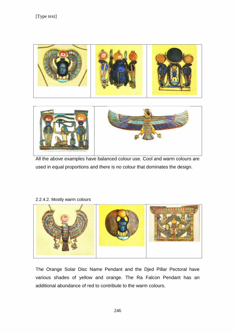
[Type text]
246
All the above examples have balanced colour use. Cool and warm colours are
used in equal proportions and there is no colour that dominates the design.
2.2.4.2. Mostly warm colours
The Orange Solar Disc Name Pendant and the Djed Pillar Pectoral have
various shades of yellow and orange. The Ra Falcon Pendant has an
additional abundance of red to contribute to the warm colours.
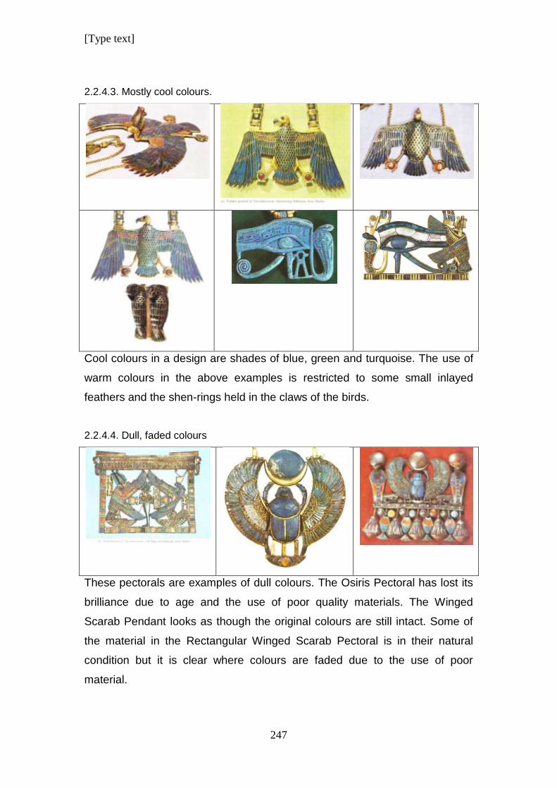
[Type text]
247
2.2.4.3. Mostly cool colours.
Cool colours in a design are shades of blue, green and turquoise. The use of
warm colours in the above examples is restricted to some small inlayed
feathers and the shen-rings held in the claws of the birds.
2.2.4.4. Dull, faded colours
These pectorals are examples of dull colours. The Osiris Pectoral has lost its
brilliance due to age and the use of poor quality materials. The Winged
Scarab Pendant looks as though the original colours are still intact. Some of
the material in the Rectangular Winged Scarab Pectoral is in their natural
condition but it is clear where colours are faded due to the use of poor
material.
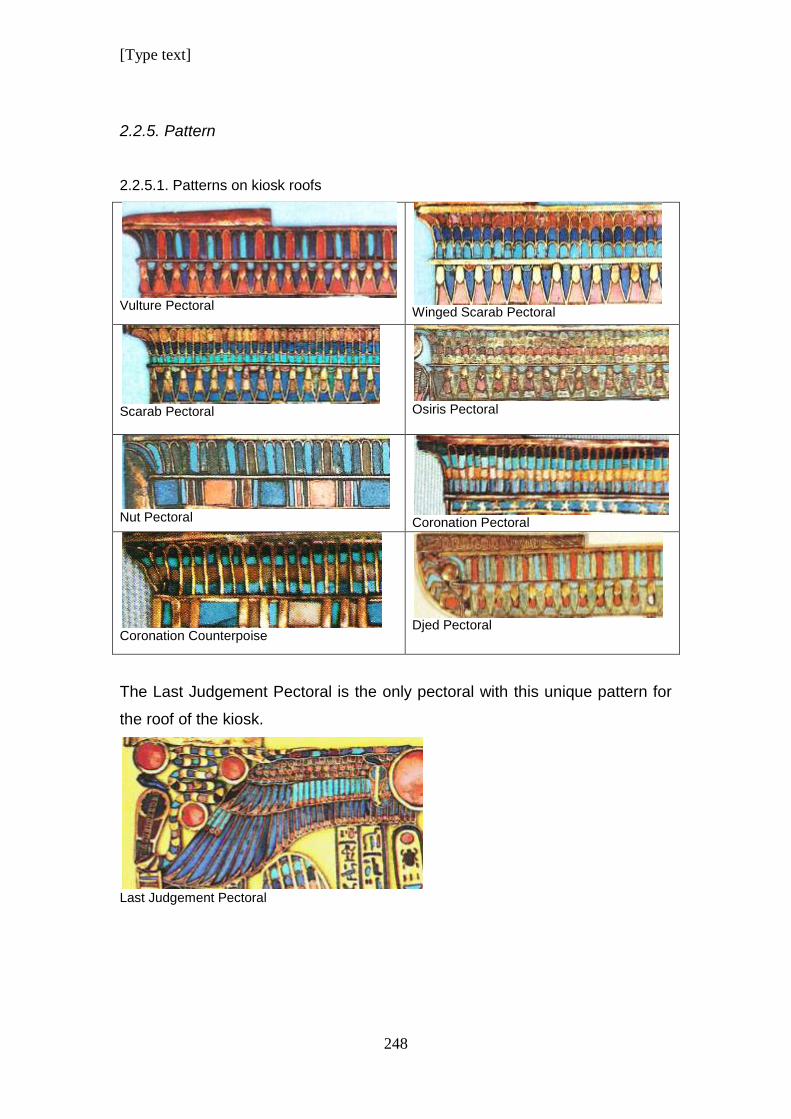
[Type text]
248
2.2.5. Pattern
2.2.5.1. Patterns on kiosk roofs
Vulture Pectoral
Winged Scarab Pectoral
Scarab Pectoral
Osiris Pectoral
Nut Pectoral
Coronation Pectoral
Coronation Counterpoise
Djed Pectoral
The Last Judgement Pectoral is the only pectoral with this unique pattern for
the roof of the kiosk.
Last Judgement Pectoral
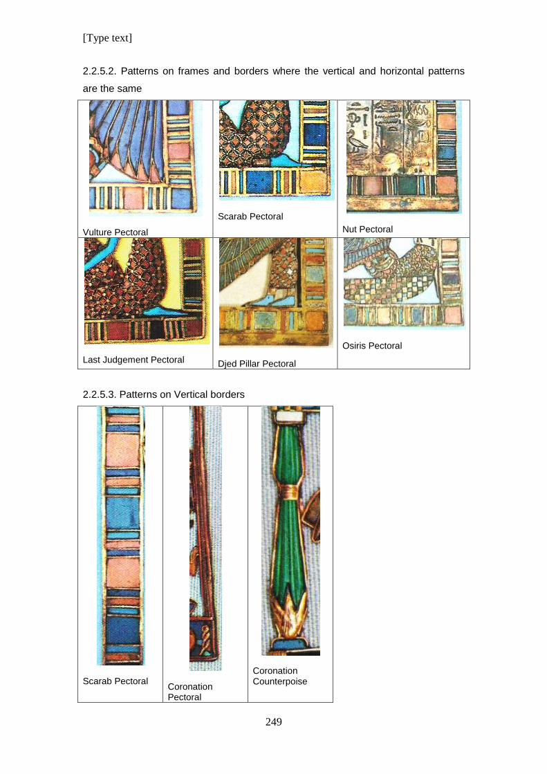
[Type text]
249
2.2.5.2. Patterns on frames and borders where the vertical and horizontal patterns
are the same
Vulture Pectoral
Scarab Pectoral
Nut Pectoral
Last Judgement Pectoral
Djed Pillar Pectoral
Osiris Pectoral
2.2.5.3. Patterns on Vertical borders
Scarab Pectoral
Coronation Pectoral
Coronation Counterpoise
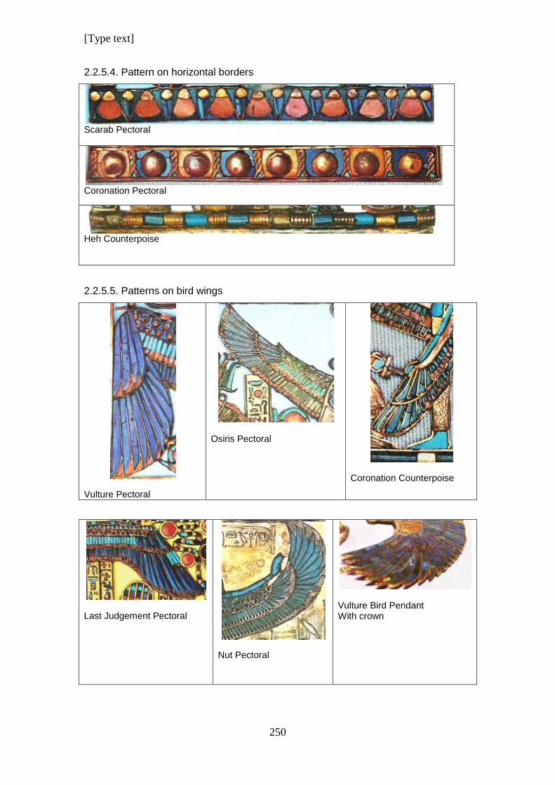
[Type text]
250
2.2.5.4. Pattern on horizontal borders
Scarab Pectoral
Coronation Pectoral
Heh Counterpoise
2.2.5.5. Patterns on bird wings
Vulture Pectoral
Osiris Pectoral
Coronation Counterpoise
Last Judgement Pectoral
Nut Pectoral
Vulture Bird Pendant With crown
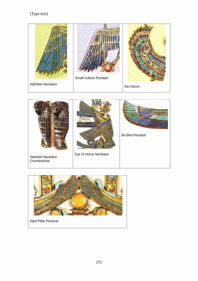
[Type text]
251
Nekhbet Necklace
Small Vulture Pendant
Ra Falcon
Nekhbet Necklace Counterpoise
Eye of Horus Necklace
Ba Bird Pendant
Djed Pillar Pectoral
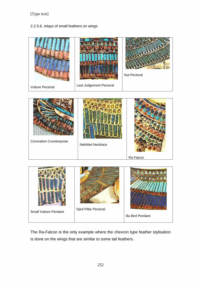
[Type text]
252
2.2.5.6. Inlays of small feathers on wings
Vulture Pectoral
Last Judgement Pectoral
Nut Pectoral
Coronation Counterpoise
Nekhbet Necklace
Ra Falcon
Small Vulture Pendant
Djed Pillar Pectoral
Ba Bird Pendant
The Ra-Falcon is the only example where the chevron type feather stylisation
is done on the wings that are similar to some tail feathers.
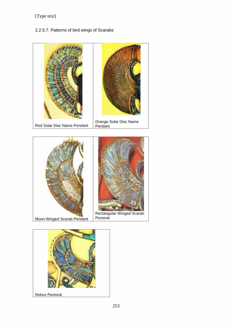
[Type text]
253
2.2.5.7. Patterns of bird wings of Scarabs
Red Solar Disc Name Pendant
Orange Solar Disc Name Pendant
Moon Winged Scarab Pendant
Rectangular Winged Scarab Pectoral
Rebus Pectoral
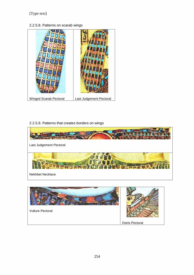
[Type text]
254
2.2.5.8. Patterns on scarab wings
Winged Scarab Pectoral
Last Judgement Pectoral
2.2.5.9. Patterns that creates borders on wings
Last Judgement Pectoral
Nekhbet Necklace
Vulture Pectoral
Osiris Pectoral
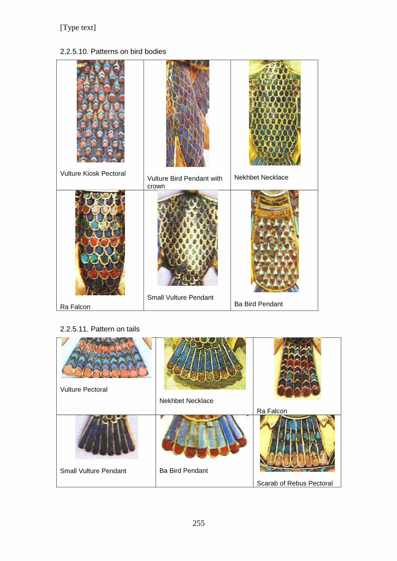
[Type text]
255
2.2.5.10. Patterns on bird bodies
Vulture Kiosk Pectoral
Vulture Bird Pendant with crown
Nekhbet Necklace
Ra Falcon
Small Vulture Pendant
Ba Bird Pendant
2.2.5.11. Pattern on tails
Vulture Pectoral Nekhbet Necklace
Ra Falcon
Small Vulture Pendant
Ba Bird Pendant
Scarab of Rebus Pectoral
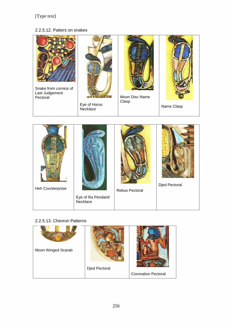
[Type text]
256
2.2.5.12. Patters on snakes
Snake from cornice of Last Judgement Pectoral
Eye of Horus Necklace
Moon Disc Name Clasp
Name Clasp
Heh Counterpoise
Eye of Ra Pendant/ Necklace
Rebus Pectoral
Djed Pectoral
2.2.5.13. Chevron Patterns
Moon Winged Scarab
Djed Pectoral
Coronation Pectoral
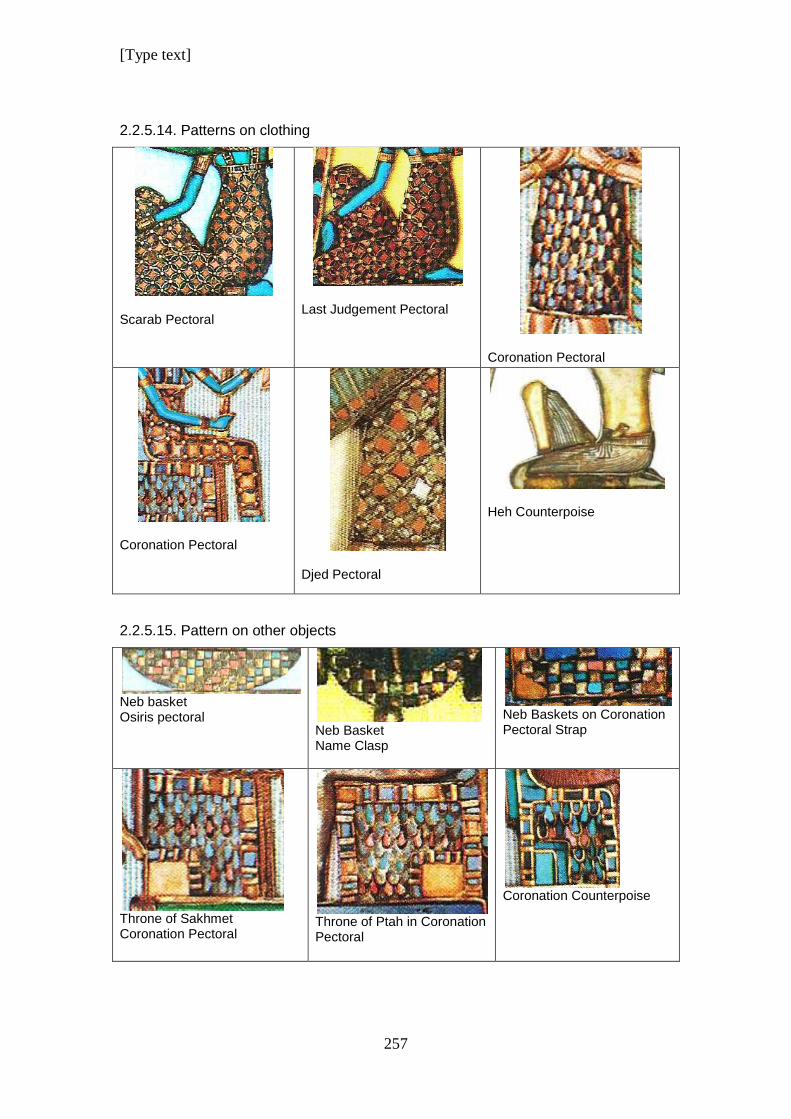
[Type text]
257
2.2.5.14. Patterns on clothing
Scarab Pectoral
Last Judgement Pectoral
Coronation Pectoral
Coronation Pectoral
Djed Pectoral
Heh Counterpoise
2.2.5.15. Pattern on other objects
Neb basket Osiris pectoral
Neb Basket Name Clasp
Neb Baskets on Coronation Pectoral Strap
Throne of Sakhmet Coronation Pectoral
Throne of Ptah in Coronation Pectoral
Coronation Counterpoise
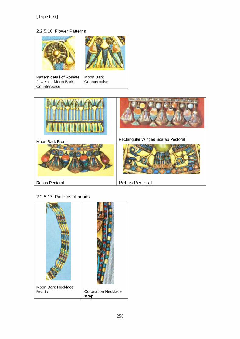
[Type text]
258
2.2.5.16. Flower Patterns
Pattern detail of Rosette flower on Moon Bark Counterpoise
Moon Bark Counterpoise
Moon Bark Front
Rectangular Winged Scarab Pectoral
Rebus Pectoral
Rebus Pectoral
2.2.5.17. Patterns of beads
Moon Bark Necklace Beads
Coronation Necklace strap
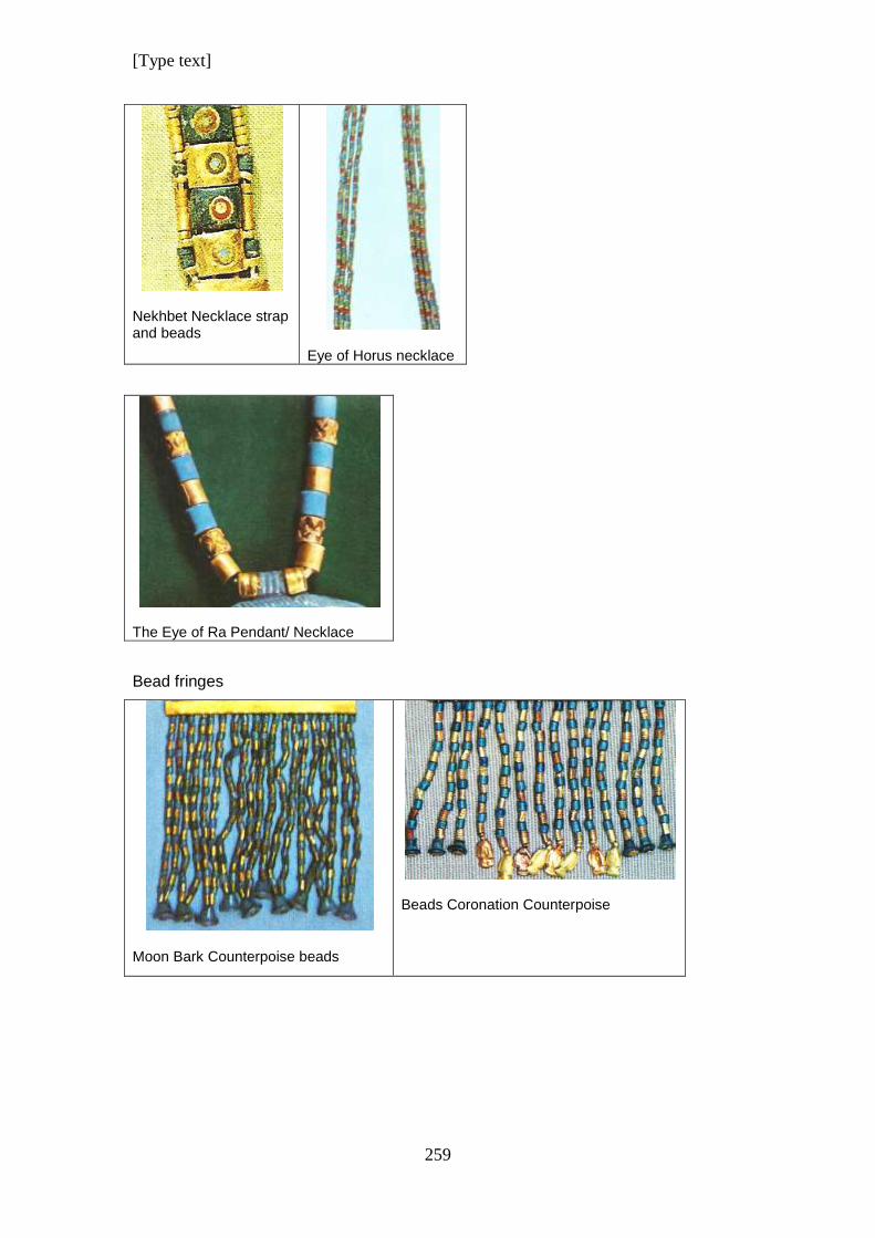
[Type text]
259
Nekhbet Necklace strap and beads
Eye of Horus necklace
The Eye of Ra Pendant/ Necklace
Bead fringes
Moon Bark Counterpoise beads
Beads Coronation Counterpoise
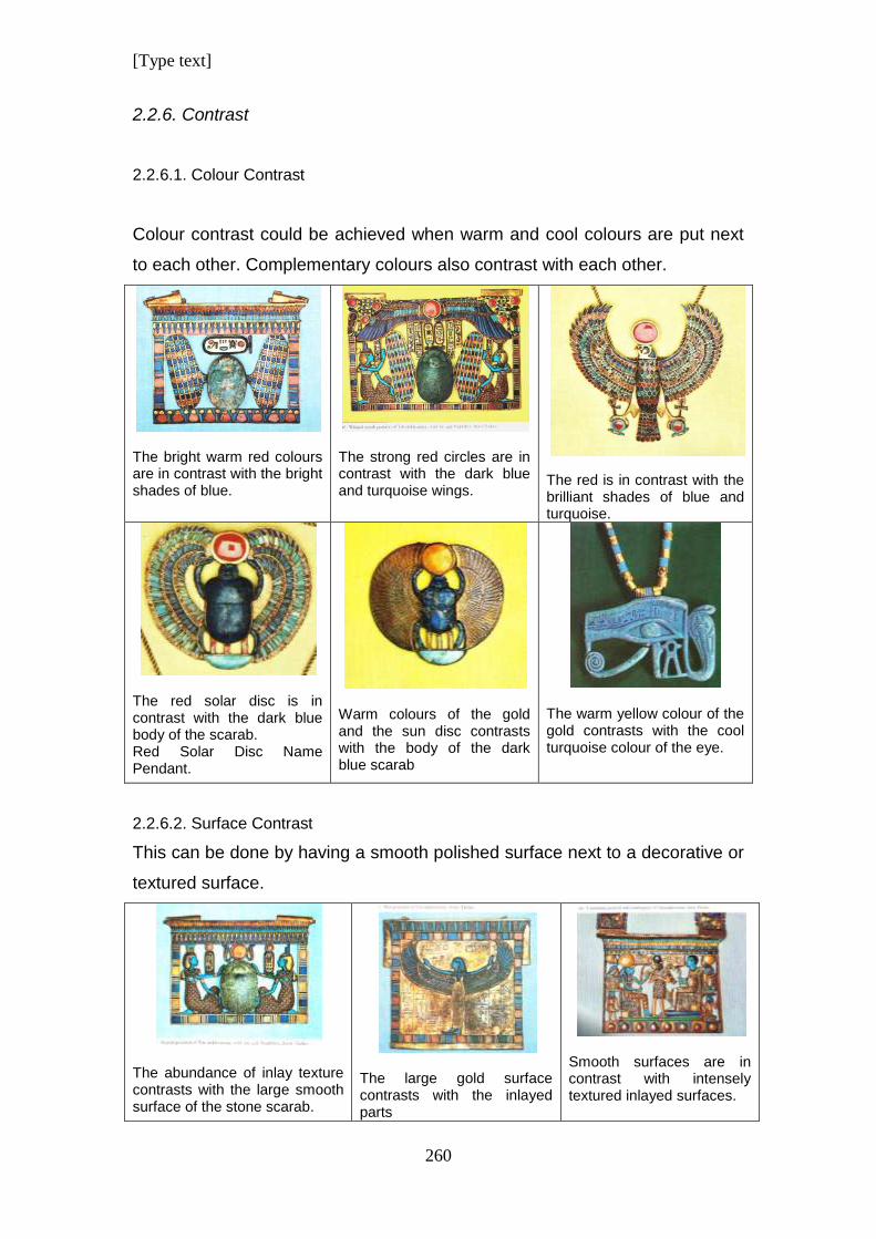
[Type text]
260
2.2.6. Contrast
2.2.6.1. Colour Contrast
Colour contrast could be achieved when warm and cool colours are put next
to each other. Complementary colours also contrast with each other.
The bright warm red colours are in contrast with the bright shades of blue.
The strong red circles are in contrast with the dark blue and turquoise wings.
The red is in contrast with the brilliant shades of blue and turquoise.
The red solar disc is in contrast with the dark blue body of the scarab. Red Solar Disc Name Pendant.
Warm colours of the gold and the sun disc contrasts with the body of the dark blue scarab
The warm yellow colour of the gold contrasts with the cool turquoise colour of the eye.
2.2.6.2. Surface Contrast
This can be done by having a smooth polished surface next to a decorative or
textured surface.
The abundance of inlay texture contrasts with the large smooth surface of the stone scarab.
The large gold surface contrasts with the inlayed parts
Smooth surfaces are in contrast with intensely textured inlayed surfaces.
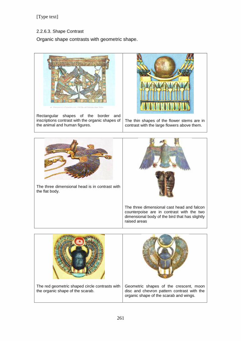
[Type text]
261
2.2.6.3. Shape Contrast
Organic shape contrasts with geometric shape.
Rectangular shapes of the border and inscriptions contrast with the organic shapes of the animal and human figures.
The thin shapes of the flower stems are in contrast with the large flowers above them.
The three dimensional head is in contrast with the flat body.
The three dimensional cast head and falcon counterpoise are in contrast with the two dimensional body of the bird that has slightly raised areas
The red geometric shaped circle contrasts with the organic shape of the scarab.
Geometric shapes of the crescent, moon disc and chevron pattern contrast with the organic shape of the scarab and wings.
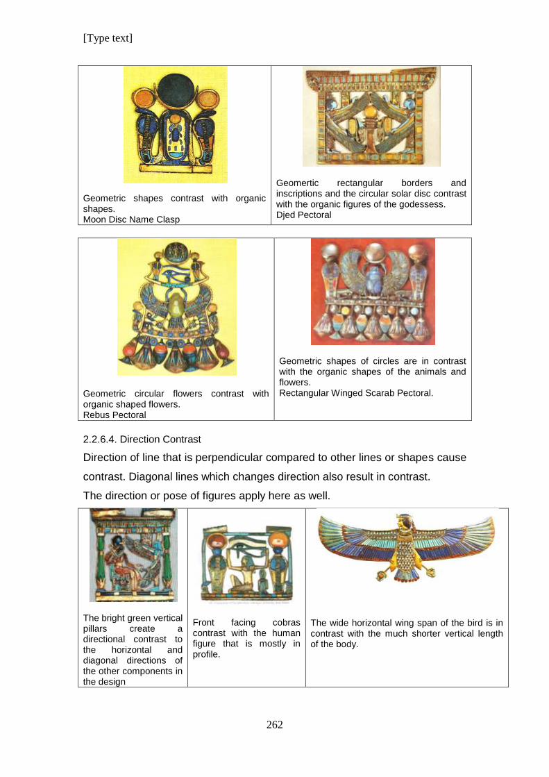
[Type text]
262
Geometric shapes contrast with organic shapes. Moon Disc Name Clasp
Geomertic rectangular borders and inscriptions and the circular solar disc contrast with the organic figures of the godessess. Djed Pectoral
Geometric circular flowers contrast with organic shaped flowers. Rebus Pectoral
Geometric shapes of circles are in contrast with the organic shapes of the animals and flowers. Rectangular Winged Scarab Pectoral.
2.2.6.4. Direction Contrast
Direction of line that is perpendicular compared to other lines or shapes cause
contrast. Diagonal lines which changes direction also result in contrast.
The direction or pose of figures apply here as well.
The bright green vertical pillars create a directional contrast to the horizontal and diagonal directions of the other components in the design
Front facing cobras contrast with the human figure that is mostly in profile.
The wide horizontal wing span of the bird is in contrast with the much shorter vertical length of the body.
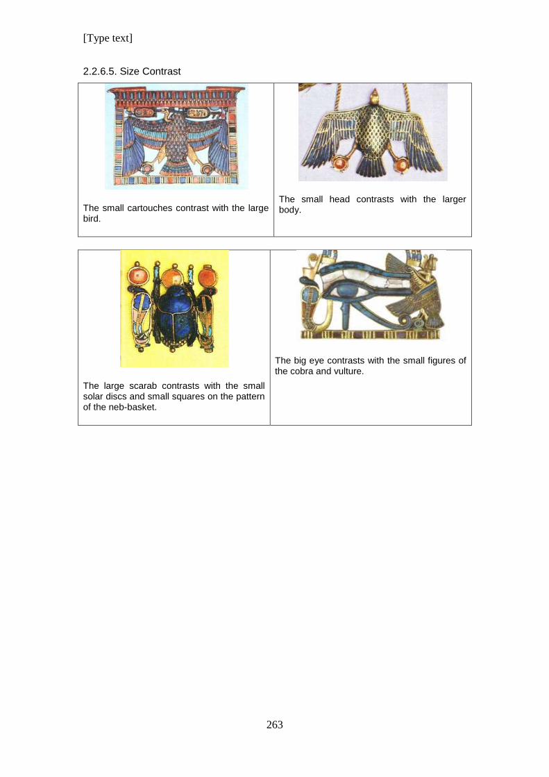
[Type text]
263
2.2.6.5. Size Contrast
The small cartouches contrast with the large bird.
The small head contrasts with the larger body.
The large scarab contrasts with the small solar discs and small squares on the pattern of the neb-basket.
The big eye contrasts with the small figures of the cobra and vulture.
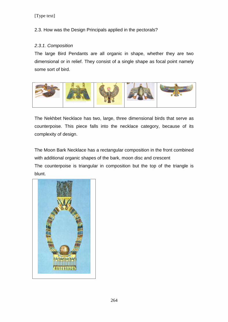
[Type text]
264
2.3. How was the Design Principals applied in the pectorals?
2.3.1. Composition
The large Bird Pendants are all organic in shape, whether they are two
dimensional or in relief. They consist of a single shape as focal point namely
some sort of bird.
The Nekhbet Necklace has two, large, three dimensional birds that serve as
counterpoise. This piece falls into the necklace category, because of its
complexity of design.
The Moon Bark Necklace has a rectangular composition in the front combined
with additional organic shapes of the bark, moon disc and crescent
The counterpoise is triangular in composition but the top of the triangle is
blunt.
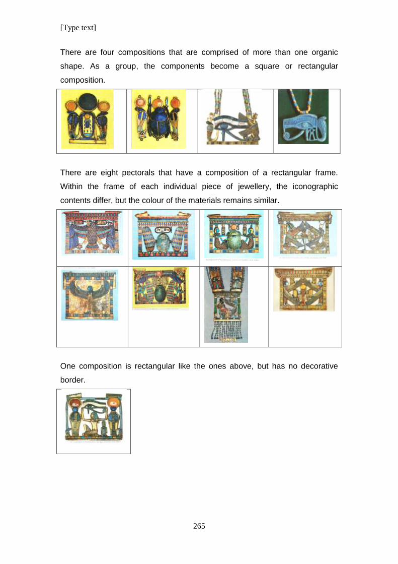
[Type text]
265
There are four compositions that are comprised of more than one organic
shape. As a group, the components become a square or rectangular
composition.
There are eight pectorals that have a composition of a rectangular frame.
Within the frame of each individual piece of jewellery, the iconographic
contents differ, but the colour of the materials remains similar.
One composition is rectangular like the ones above, but has no decorative
border.
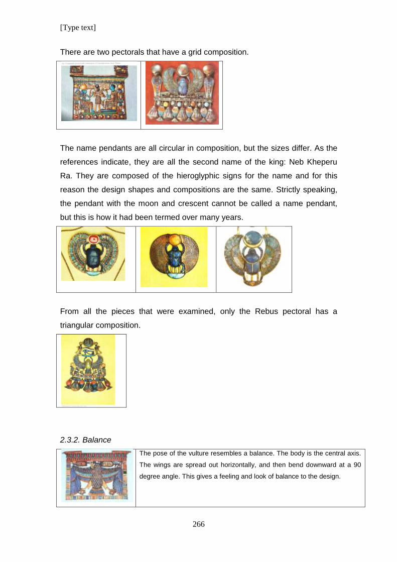
[Type text]
266
There are two pectorals that have a grid composition.
The name pendants are all circular in composition, but the sizes differ. As the
references indicate, they are all the second name of the king: Neb Kheperu
Ra. They are composed of the hieroglyphic signs for the name and for this
reason the design shapes and compositions are the same. Strictly speaking,
the pendant with the moon and crescent cannot be called a name pendant,
but this is how it had been termed over many years.
From all the pieces that were examined, only the Rebus pectoral has a
triangular composition.
2.3.2. Balance
The pose of the vulture resembles a balance. The body is the central axis.
The wings are spread out horizontally, and then bend downward at a 90
degree angle. This gives a feeling and look of balance to the design.
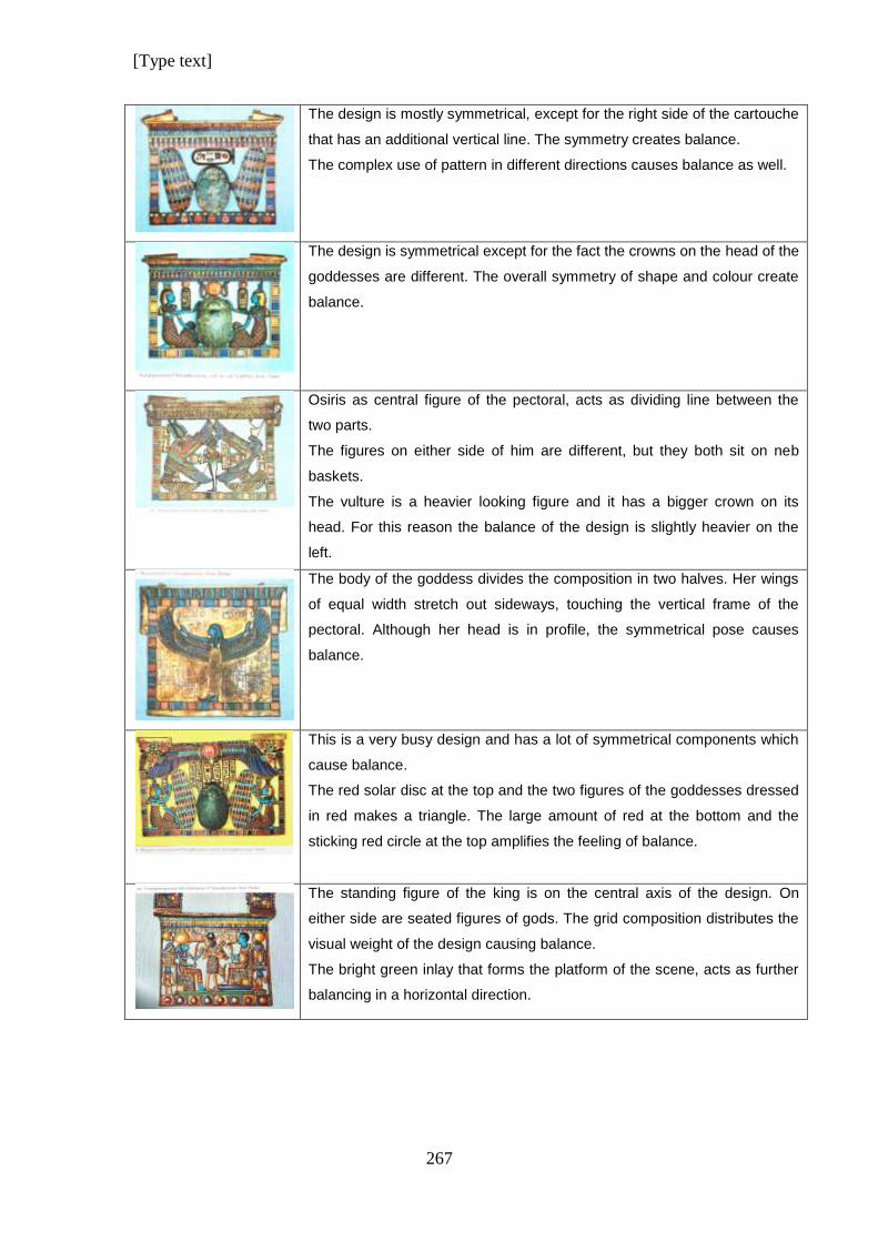
[Type text]
267
The design is mostly symmetrical, except for the right side of the cartouche
that has an additional vertical line. The symmetry creates balance.
The complex use of pattern in different directions causes balance as well.
The design is symmetrical except for the fact the crowns on the head of the
goddesses are different. The overall symmetry of shape and colour create
balance.
Osiris as central figure of the pectoral, acts as dividing line between the
two parts.
The figures on either side of him are different, but they both sit on neb
baskets.
The vulture is a heavier looking figure and it has a bigger crown on its
head. For this reason the balance of the design is slightly heavier on the
left.
The body of the goddess divides the composition in two halves. Her wings
of equal width stretch out sideways, touching the vertical frame of the
pectoral. Although her head is in profile, the symmetrical pose causes
balance.
This is a very busy design and has a lot of symmetrical components which
cause balance.
The red solar disc at the top and the two figures of the goddesses dressed
in red makes a triangle. The large amount of red at the bottom and the
sticking red circle at the top amplifies the feeling of balance.
The standing figure of the king is on the central axis of the design. On
either side are seated figures of gods. The grid composition distributes the
visual weight of the design causing balance.
The bright green inlay that forms the platform of the scene, acts as further
balancing in a horizontal direction.
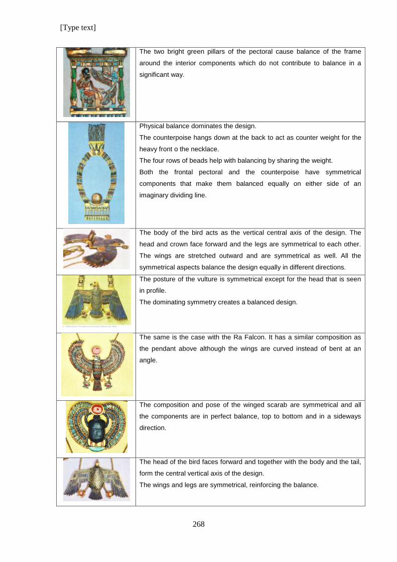
[Type text]
268
The two bright green pillars of the pectoral cause balance of the frame
around the interior components which do not contribute to balance in a
significant way.
Physical balance dominates the design.
The counterpoise hangs down at the back to act as counter weight for the
heavy front o the necklace.
The four rows of beads help with balancing by sharing the weight.
Both the frontal pectoral and the counterpoise have symmetrical
components that make them balanced equally on either side of an
imaginary dividing line.
The body of the bird acts as the vertical central axis of the design. The
head and crown face forward and the legs are symmetrical to each other.
The wings are stretched outward and are symmetrical as well. All the
symmetrical aspects balance the design equally in different directions.
The posture of the vulture is symmetrical except for the head that is seen
in profile.
The dominating symmetry creates a balanced design.
The same is the case with the Ra Falcon. It has a similar composition as
the pendant above although the wings are curved instead of bent at an
angle.
The composition and pose of the winged scarab are symmetrical and all
the components are in perfect balance, top to bottom and in a sideways
direction.
The head of the bird faces forward and together with the body and the tail,
form the central vertical axis of the design.
The wings and legs are symmetrical, reinforcing the balance.
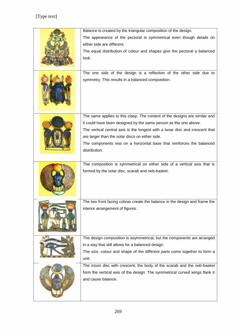
[Type text]
269
Balance is created by the triangular composition of the design.
The appearance of the pectoral is symmetrical even though details on
either side are different.
The equal distribution of colour and shapes give the pectoral a balanced
look.
The one side of the design is a reflection of the other side due to
symmetry. This results in a balanced composition.
The same applies to this clasp. The content of the designs are similar and
it could have been designed by the same person as the one above.
The vertical central axis is the longest with a lunar disc and crescent that
are larger than the solar discs on either side.
The components rest on a horizontal base that reinforces the balanced
distribution.
The composition is symmetrical on either side of a vertical axis that is
formed by the solar disc, scarab and neb-basket.
The two front facing cobras create the balance in the design and frame the
interior arrangement of figures.
The design composition is asymmetrical, but the components are arranged
in a way that still allows for a balanced design.
The size, colour and shape of the different parts come together to form a
unit.
The moon disc with crescent, the body of the scarab and the neb-basket
form the vertical axis of the design. The symmetrical curved wings flank it
and cause balance.
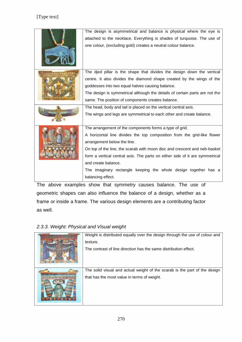
[Type text]
270
The design is asymmetrical and balance is physical where the eye is
attached to the necklace. Everything is shades of turquoise. The use of
one colour, (excluding gold) creates a neutral colour balance.
The djed pillar is the shape that divides the design down the vertical
centre. It also divides the diamond shape created by the wings of the
goddesses into two equal halves causing balance.
The design is symmetrical although the details of certain parts are not the
same. The position of components creates balance.
The head, body and tail is placed on the vertical central axis.
The wings and legs are symmetrical to each other and create balance.
The arrangement of the components forms a type of grid.
A horizontal line divides the top composition from the grid-like flower
arrangement below the line.
On top of the line, the scarab with moon disc and crescent and neb-basket
form a vertical central axis. The parts on either side of it are symmetrical
and create balance.
The imaginary rectangle keeping the whole design together has a
balancing effect.
The above examples show that symmetry causes balance. The use of
geometric shapes can also influence the balance of a design, whether as a
frame or inside a frame. The various design elements are a contributing factor
as well.
2.3.3. Weight: Physical and Visual weight
Weight is distributed equally over the design through the use of colour and
texture.
The contrast of line direction has the same distribution effect.
The solid visual and actual weight of the scarab is the part of the design
that has the most value in terms of weight.
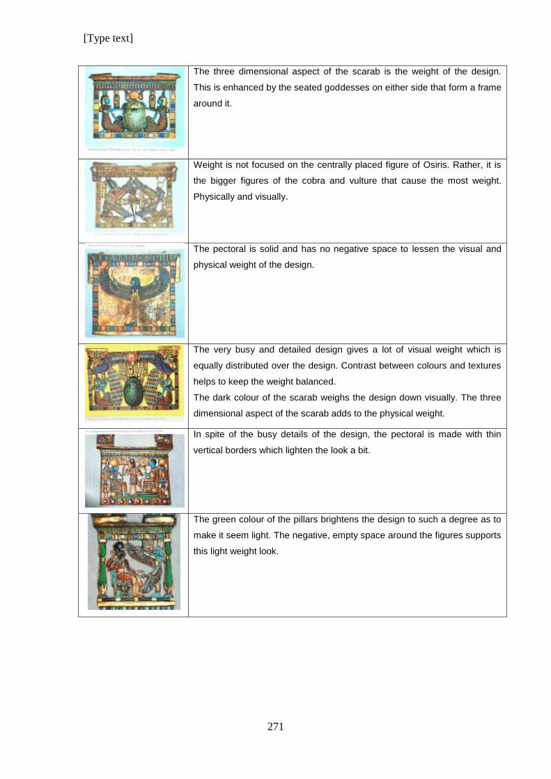
[Type text]
271
The three dimensional aspect of the scarab is the weight of the design.
This is enhanced by the seated goddesses on either side that form a frame
around it.
Weight is not focused on the centrally placed figure of Osiris. Rather, it is
the bigger figures of the cobra and vulture that cause the most weight.
Physically and visually.
The pectoral is solid and has no negative space to lessen the visual and
physical weight of the design.
The very busy and detailed design gives a lot of visual weight which is
equally distributed over the design. Contrast between colours and textures
helps to keep the weight balanced.
The dark colour of the scarab weighs the design down visually. The three
dimensional aspect of the scarab adds to the physical weight.
In spite of the busy details of the design, the pectoral is made with thin
vertical borders which lighten the look a bit.
The green colour of the pillars brightens the design to such a degree as to
make it seem light. The negative, empty space around the figures supports
this light weight look.
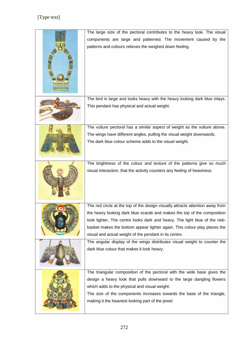
[Type text]
272
The large size of the pectoral contributes to the heavy look. The visual
components are large and patterned. The movement caused by the
patterns and colours relieves the weighed down feeling.
The bird is large and looks heavy with the heavy looking dark blue inlays.
This pendant has physical and actual weight.
The vulture pectoral has a similar aspect of weight as the vulture above.
The wings have different angles, pulling the visual weight downwards.
The dark blue colour scheme adds to the visual weight.
The brightness of the colour and texture of the patterns give so much
visual interaction, that the activity counters any feeling of heaviness.
The red circle at the top of the design visually attracts attention away from
the heavy looking dark blue scarab and makes the top of the composition
look lighter. The centre looks dark and heavy. The light blue of the neb-
basket makes the bottom appear lighter again. This colour play places the
visual and actual weight of the pendant in its centre.
The angular display of the wings distributes visual weight to counter the
dark blue colour that makes it look heavy.
The triangular composition of the pectoral with the wide base gives the
design a heavy look that pulls downward to the large dangling flowers
which adds to the physical and visual weight.
The size of the components increases towards the base of the triangle,
making it the heaviest looking part of the jewel.
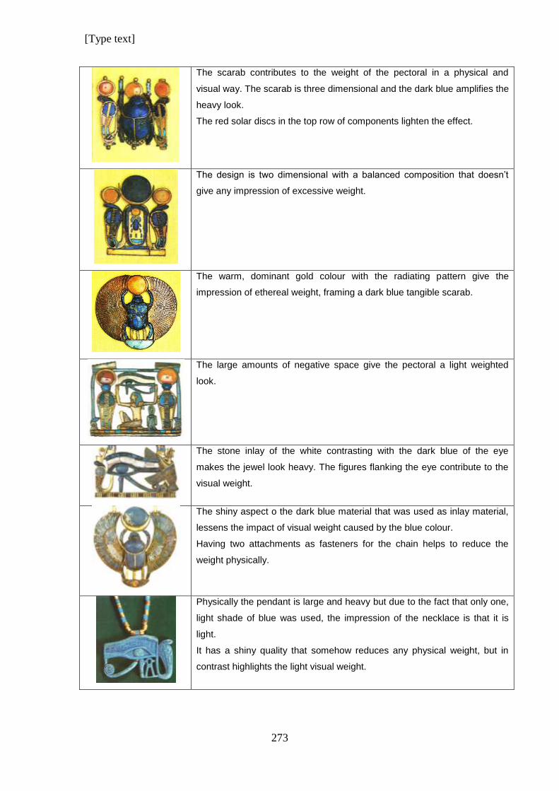
[Type text]
273
The scarab contributes to the weight of the pectoral in a physical and
visual way. The scarab is three dimensional and the dark blue amplifies the
heavy look.
The red solar discs in the top row of components lighten the effect.
The design is two dimensional with a balanced composition that doesn’t
give any impression of excessive weight.
The warm, dominant gold colour with the radiating pattern give the
impression of ethereal weight, framing a dark blue tangible scarab.
The large amounts of negative space give the pectoral a light weighted
look.
The stone inlay of the white contrasting with the dark blue of the eye
makes the jewel look heavy. The figures flanking the eye contribute to the
visual weight.
The shiny aspect o the dark blue material that was used as inlay material,
lessens the impact of visual weight caused by the blue colour.
Having two attachments as fasteners for the chain helps to reduce the
weight physically.
Physically the pendant is large and heavy but due to the fact that only one,
light shade of blue was used, the impression of the necklace is that it is
light.
It has a shiny quality that somehow reduces any physical weight, but in
contrast highlights the light visual weight.
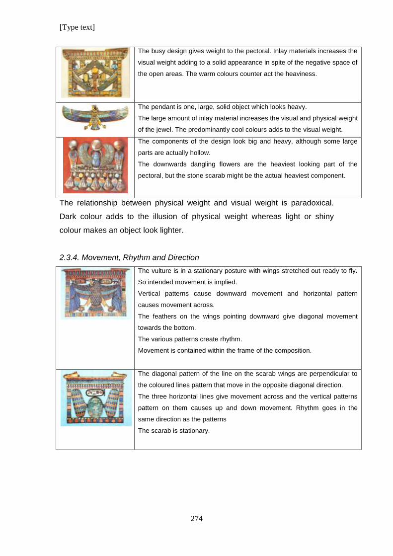
[Type text]
274
The busy design gives weight to the pectoral. Inlay materials increases the
visual weight adding to a solid appearance in spite of the negative space of
the open areas. The warm colours counter act the heaviness.
The pendant is one, large, solid object which looks heavy.
The large amount of inlay material increases the visual and physical weight
of the jewel. The predominantly cool colours adds to the visual weight.
The components of the design look big and heavy, although some large
parts are actually hollow.
The downwards dangling flowers are the heaviest looking part of the
pectoral, but the stone scarab might be the actual heaviest component.
The relationship between physical weight and visual weight is paradoxical.
Dark colour adds to the illusion of physical weight whereas light or shiny
colour makes an object look lighter.
2.3.4. Movement, Rhythm and Direction
The vulture is in a stationary posture with wings stretched out ready to fly.
So intended movement is implied.
Vertical patterns cause downward movement and horizontal pattern
causes movement across.
The feathers on the wings pointing downward give diagonal movement
towards the bottom.
The various patterns create rhythm.
Movement is contained within the frame of the composition.
The diagonal pattern of the line on the scarab wings are perpendicular to
the coloured lines pattern that move in the opposite diagonal direction.
The three horizontal lines give movement across and the vertical patterns
pattern on them causes up and down movement. Rhythm goes in the
same direction as the patterns
The scarab is stationary.
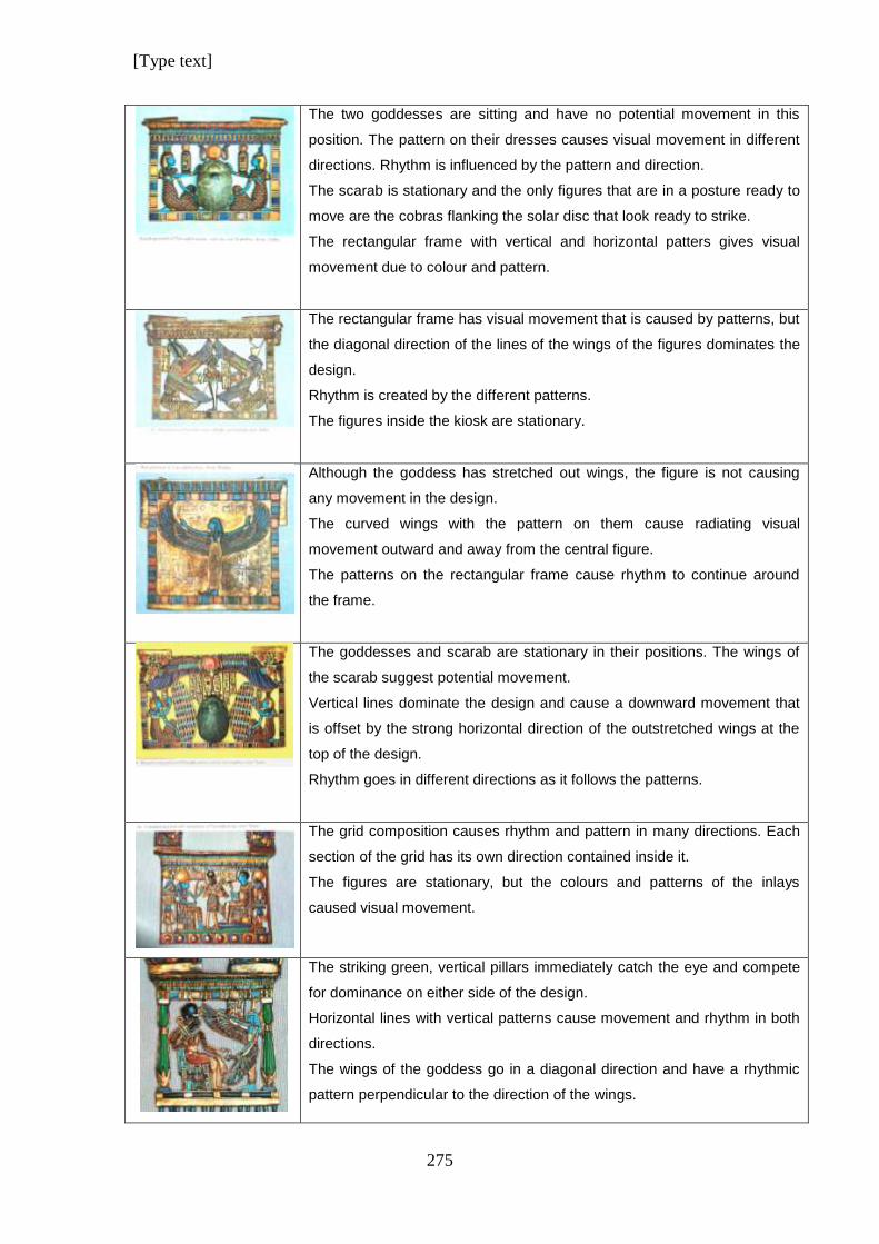
[Type text]
275
The two goddesses are sitting and have no potential movement in this
position. The pattern on their dresses causes visual movement in different
directions. Rhythm is influenced by the pattern and direction.
The scarab is stationary and the only figures that are in a posture ready to
move are the cobras flanking the solar disc that look ready to strike.
The rectangular frame with vertical and horizontal patters gives visual
movement due to colour and pattern.
The rectangular frame has visual movement that is caused by patterns, but
the diagonal direction of the lines of the wings of the figures dominates the
design.
Rhythm is created by the different patterns.
The figures inside the kiosk are stationary.
Although the goddess has stretched out wings, the figure is not causing
any movement in the design.
The curved wings with the pattern on them cause radiating visual
movement outward and away from the central figure.
The patterns on the rectangular frame cause rhythm to continue around
the frame.
The goddesses and scarab are stationary in their positions. The wings of
the scarab suggest potential movement.
Vertical lines dominate the design and cause a downward movement that
is offset by the strong horizontal direction of the outstretched wings at the
top of the design.
Rhythm goes in different directions as it follows the patterns.
The grid composition causes rhythm and pattern in many directions. Each
section of the grid has its own direction contained inside it.
The figures are stationary, but the colours and patterns of the inlays
caused visual movement.
The striking green, vertical pillars immediately catch the eye and compete
for dominance on either side of the design.
Horizontal lines with vertical patterns cause movement and rhythm in both
directions.
The wings of the goddess go in a diagonal direction and have a rhythmic
pattern perpendicular to the direction of the wings.
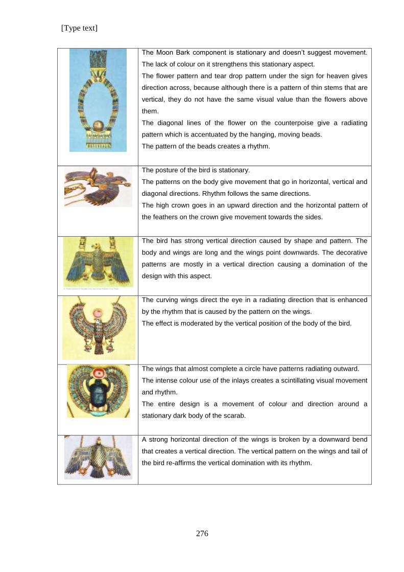
[Type text]
276
The Moon Bark component is stationary and doesn’t suggest movement.
The lack of colour on it strengthens this stationary aspect.
The flower pattern and tear drop pattern under the sign for heaven gives
direction across, because although there is a pattern of thin stems that are
vertical, they do not have the same visual value than the flowers above
them.
The diagonal lines of the flower on the counterpoise give a radiating
pattern which is accentuated by the hanging, moving beads.
The pattern of the beads creates a rhythm.
The posture of the bird is stationary.
The patterns on the body give movement that go in horizontal, vertical and
diagonal directions. Rhythm follows the same directions.
The high crown goes in an upward direction and the horizontal pattern of
the feathers on the crown give movement towards the sides.
The bird has strong vertical direction caused by shape and pattern. The
body and wings are long and the wings point downwards. The decorative
patterns are mostly in a vertical direction causing a domination of the
design with this aspect.
The curving wings direct the eye in a radiating direction that is enhanced
by the rhythm that is caused by the pattern on the wings.
The effect is moderated by the vertical position of the body of the bird.
The wings that almost complete a circle have patterns radiating outward.
The intense colour use of the inlays creates a scintillating visual movement
and rhythm.
The entire design is a movement of colour and direction around a
stationary dark body of the scarab.
A strong horizontal direction of the wings is broken by a downward bend
that creates a vertical direction. The vertical pattern on the wings and tail of
the bird re-affirms the vertical domination with its rhythm.
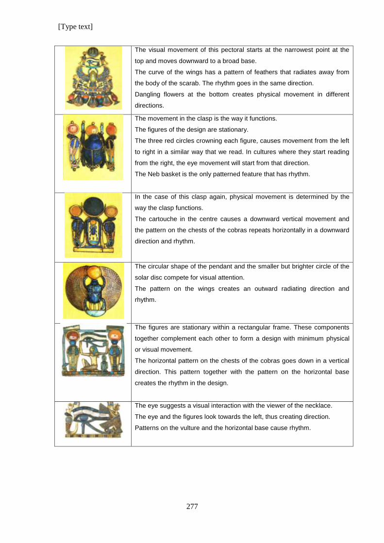
[Type text]
277
The visual movement of this pectoral starts at the narrowest point at the
top and moves downward to a broad base.
The curve of the wings has a pattern of feathers that radiates away from
the body of the scarab. The rhythm goes in the same direction.
Dangling flowers at the bottom creates physical movement in different
directions.
The movement in the clasp is the way it functions.
The figures of the design are stationary.
The three red circles crowning each figure, causes movement from the left
to right in a similar way that we read. In cultures where they start reading
from the right, the eye movement will start from that direction.
The Neb basket is the only patterned feature that has rhythm.
In the case of this clasp again, physical movement is determined by the
way the clasp functions.
The cartouche in the centre causes a downward vertical movement and
the pattern on the chests of the cobras repeats horizontally in a downward
direction and rhythm.
The circular shape of the pendant and the smaller but brighter circle of the
solar disc compete for visual attention.
The pattern on the wings creates an outward radiating direction and
rhythm.
The figures are stationary within a rectangular frame. These components
together complement each other to form a design with minimum physical
or visual movement.
The horizontal pattern on the chests of the cobras goes down in a vertical
direction. This pattern together with the pattern on the horizontal base
creates the rhythm in the design.
The eye suggests a visual interaction with the viewer of the necklace.
The eye and the figures look towards the left, thus creating direction.
Patterns on the vulture and the horizontal base cause rhythm.
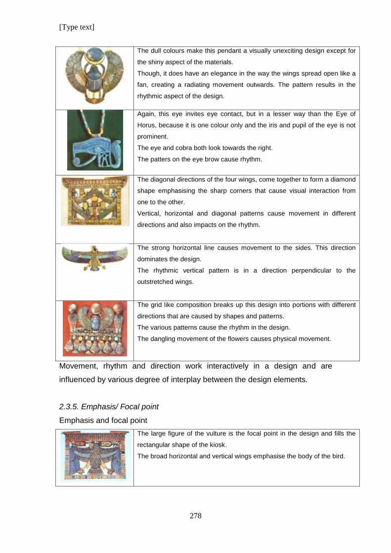
[Type text]
278
The dull colours make this pendant a visually unexciting design except for
the shiny aspect of the materials.
Though, it does have an elegance in the way the wings spread open like a
fan, creating a radiating movement outwards. The pattern results in the
rhythmic aspect of the design.
Again, this eye invites eye contact, but in a lesser way than the Eye of
Horus, because it is one colour only and the iris and pupil of the eye is not
prominent.
The eye and cobra both look towards the right.
The patters on the eye brow cause rhythm.
The diagonal directions of the four wings, come together to form a diamond
shape emphasising the sharp corners that cause visual interaction from
one to the other.
Vertical, horizontal and diagonal patterns cause movement in different
directions and also impacts on the rhythm.
The strong horizontal line causes movement to the sides. This direction
dominates the design.
The rhythmic vertical pattern is in a direction perpendicular to the
outstretched wings.
The grid like composition breaks up this design into portions with different
directions that are caused by shapes and patterns.
The various patterns cause the rhythm in the design.
The dangling movement of the flowers causes physical movement.
Movement, rhythm and direction work interactively in a design and are
influenced by various degree of interplay between the design elements.
2.3.5. Emphasis/ Focal point
Emphasis and focal point
The large figure of the vulture is the focal point in the design and fills the
rectangular shape of the kiosk.
The broad horizontal and vertical wings emphasise the body of the bird.
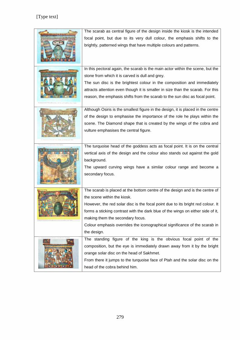
[Type text]
279
The scarab as central figure of the design inside the kiosk is the intended
focal point, but due to its very dull colour, the emphasis shifts to the
brightly, patterned wings that have multiple colours and patterns.
In this pectoral again, the scarab is the main actor within the scene, but the
stone from which it is carved is dull and grey.
The sun disc is the brightest colour in the composition and immediately
attracts attention even though it is smaller in size than the scarab. For this
reason, the emphasis shifts from the scarab to the sun disc as focal point.
Although Osiris is the smallest figure in the design, it is placed in the centre
of the design to emphasise the importance of the role he plays within the
scene. The Diamond shape that is created by the wings of the cobra and
vulture emphasises the central figure.
The turquoise head of the goddess acts as focal point. It is on the central
vertical axis of the design and the colour also stands out against the gold
background.
The upward curving wings have a similar colour range and become a
secondary focus.
The scarab is placed at the bottom centre of the design and is the centre of
the scene within the kiosk.
However, the red solar disc is the focal point due to its bright red colour. It
forms a sticking contrast with the dark blue of the wings on either side of it,
making them the secondary focus.
Colour emphasis overrides the iconographical significance of the scarab in
the design.
The standing figure of the king is the obvious focal point of the
composition, but the eye is immediately drawn away from it by the bright
orange solar disc on the head of Sakhmet.
From there it jumps to the turquoise face of Ptah and the solar disc on the
head of the cobra behind him.
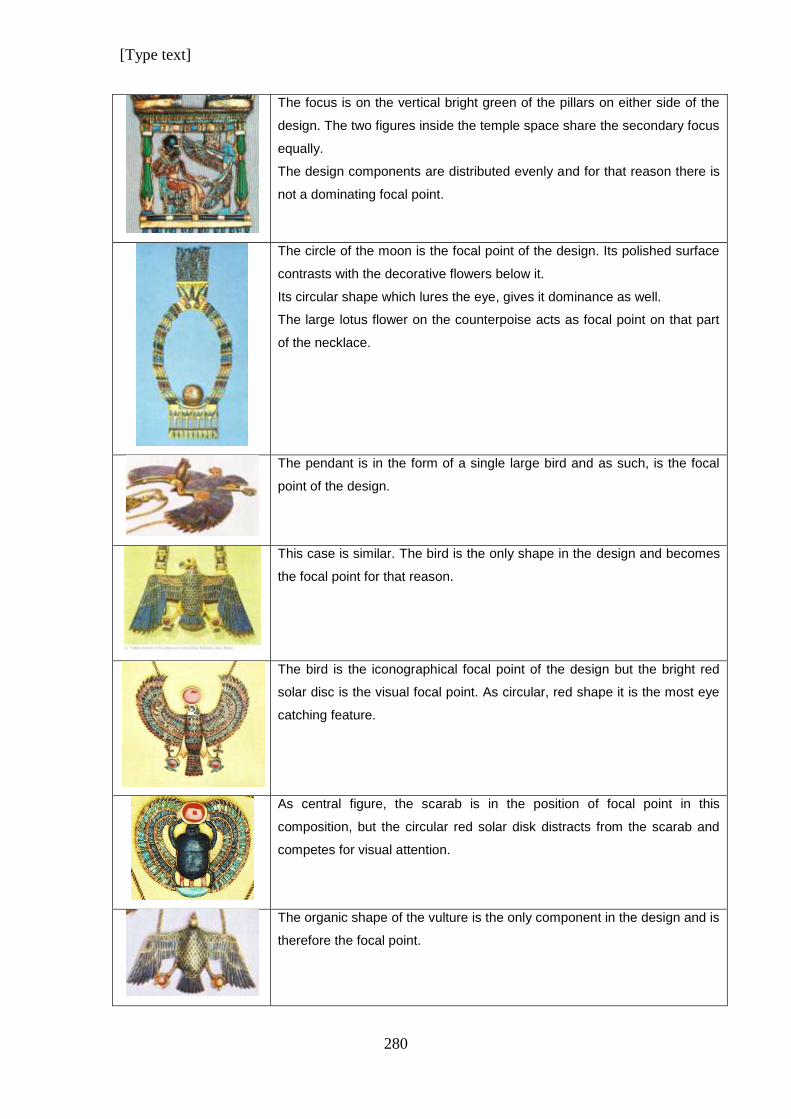
[Type text]
280
The focus is on the vertical bright green of the pillars on either side of the
design. The two figures inside the temple space share the secondary focus
equally.
The design components are distributed evenly and for that reason there is
not a dominating focal point.
The circle of the moon is the focal point of the design. Its polished surface
contrasts with the decorative flowers below it.
Its circular shape which lures the eye, gives it dominance as well.
The large lotus flower on the counterpoise acts as focal point on that part
of the necklace.
The pendant is in the form of a single large bird and as such, is the focal
point of the design.
This case is similar. The bird is the only shape in the design and becomes
the focal point for that reason.
The bird is the iconographical focal point of the design but the bright red
solar disc is the visual focal point. As circular, red shape it is the most eye
catching feature.
As central figure, the scarab is in the position of focal point in this
composition, but the circular red solar disk distracts from the scarab and
competes for visual attention.
The organic shape of the vulture is the only component in the design and is
therefore the focal point.
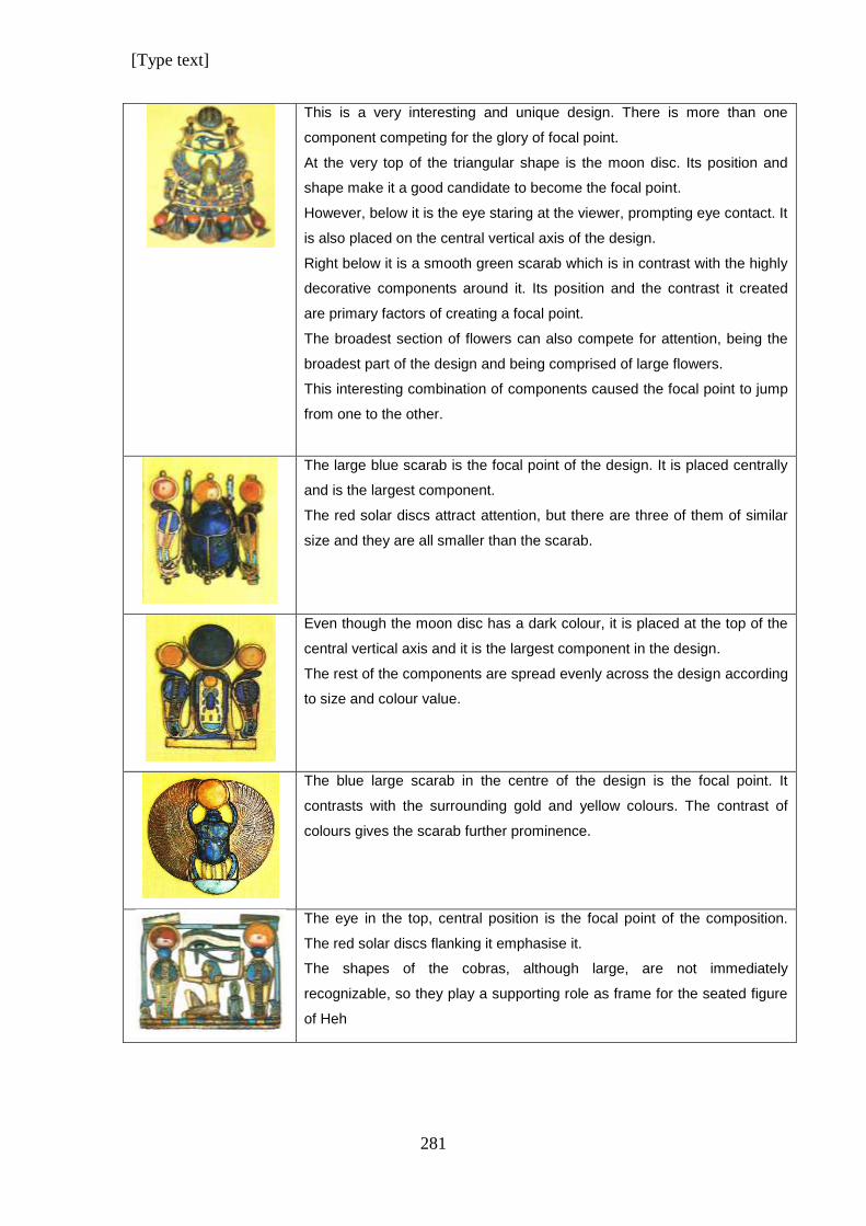
[Type text]
281
This is a very interesting and unique design. There is more than one
component competing for the glory of focal point.
At the very top of the triangular shape is the moon disc. Its position and
shape make it a good candidate to become the focal point.
However, below it is the eye staring at the viewer, prompting eye contact. It
is also placed on the central vertical axis of the design.
Right below it is a smooth green scarab which is in contrast with the highly
decorative components around it. Its position and the contrast it created
are primary factors of creating a focal point.
The broadest section of flowers can also compete for attention, being the
broadest part of the design and being comprised of large flowers.
This interesting combination of components caused the focal point to jump
from one to the other.
The large blue scarab is the focal point of the design. It is placed centrally
and is the largest component.
The red solar discs attract attention, but there are three of them of similar
size and they are all smaller than the scarab.
Even though the moon disc has a dark colour, it is placed at the top of the
central vertical axis and it is the largest component in the design.
The rest of the components are spread evenly across the design according
to size and colour value.
The blue large scarab in the centre of the design is the focal point. It
contrasts with the surrounding gold and yellow colours. The contrast of
colours gives the scarab further prominence.
The eye in the top, central position is the focal point of the composition.
The red solar discs flanking it emphasise it.
The shapes of the cobras, although large, are not immediately
recognizable, so they play a supporting role as frame for the seated figure
of Heh
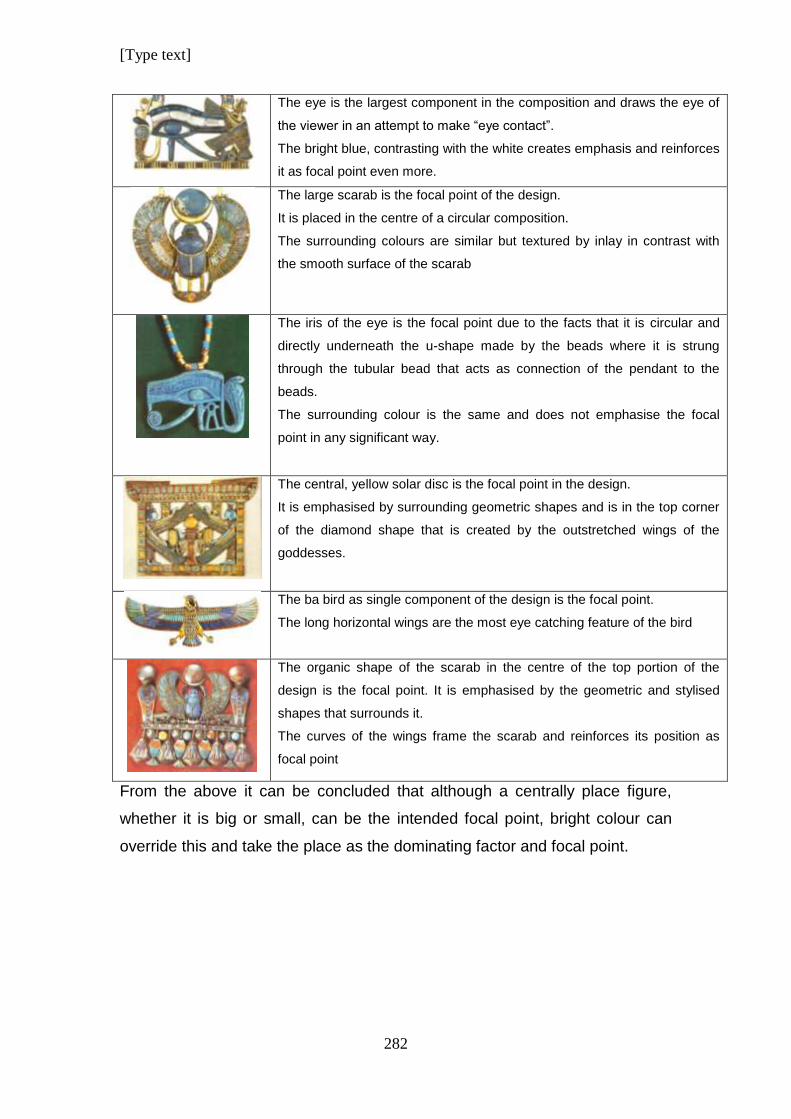
[Type text]
282
The eye is the largest component in the composition and draws the eye of
the viewer in an attempt to make “eye contact”.
The bright blue, contrasting with the white creates emphasis and reinforces
it as focal point even more.
The large scarab is the focal point of the design.
It is placed in the centre of a circular composition.
The surrounding colours are similar but textured by inlay in contrast with
the smooth surface of the scarab
The iris of the eye is the focal point due to the facts that it is circular and
directly underneath the u-shape made by the beads where it is strung
through the tubular bead that acts as connection of the pendant to the
beads.
The surrounding colour is the same and does not emphasise the focal
point in any significant way.
The central, yellow solar disc is the focal point in the design.
It is emphasised by surrounding geometric shapes and is in the top corner
of the diamond shape that is created by the outstretched wings of the
goddesses.
The ba bird as single component of the design is the focal point.
The long horizontal wings are the most eye catching feature of the bird
The organic shape of the scarab in the centre of the top portion of the
design is the focal point. It is emphasised by the geometric and stylised
shapes that surrounds it.
The curves of the wings frame the scarab and reinforces its position as
focal point
From the above it can be concluded that although a centrally place figure,
whether it is big or small, can be the intended focal point, bright colour can
override this and take the place as the dominating factor and focal point.
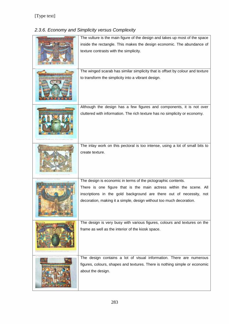
[Type text]
283
2.3.6. Economy and Simplicity versus Complexity
The vulture is the main figure of the design and takes up most of the space
inside the rectangle. This makes the design economic. The abundance of
texture contrasts with the simplicity.
The winged scarab has similar simplicity that is offset by colour and texture
to transform the simplicity into a vibrant design.
Although the design has a few figures and components, it is not over
cluttered with information. The rich texture has no simplicity or economy.
The inlay work on this pectoral is too intense, using a lot of small bits to
create texture.
The design is economic in terms of the pictographic contents.
There is one figure that is the main actress within the scene. All
inscriptions in the gold background are there out of necessity, not
decoration, making it a simple, design without too much decoration.
The design is very busy with various figures, colours and textures on the
frame as well as the interior of the kiosk space.
The design contains a lot of visual information. There are numerous
figures, colours, shapes and textures. There is nothing simple or economic
about the design.
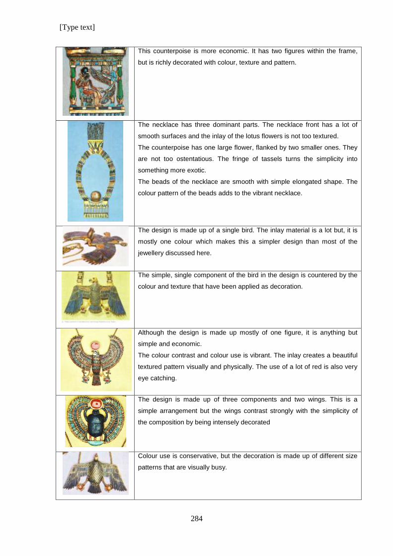
[Type text]
284
This counterpoise is more economic. It has two figures within the frame,
but is richly decorated with colour, texture and pattern.
The necklace has three dominant parts. The necklace front has a lot of
smooth surfaces and the inlay of the lotus flowers is not too textured.
The counterpoise has one large flower, flanked by two smaller ones. They
are not too ostentatious. The fringe of tassels turns the simplicity into
something more exotic.
The beads of the necklace are smooth with simple elongated shape. The
colour pattern of the beads adds to the vibrant necklace.
The design is made up of a single bird. The inlay material is a lot but, it is
mostly one colour which makes this a simpler design than most of the
jewellery discussed here.
The simple, single component of the bird in the design is countered by the
colour and texture that have been applied as decoration.
Although the design is made up mostly of one figure, it is anything but
simple and economic.
The colour contrast and colour use is vibrant. The inlay creates a beautiful
textured pattern visually and physically. The use of a lot of red is also very
eye catching.
The design is made up of three components and two wings. This is a
simple arrangement but the wings contrast strongly with the simplicity of
the composition by being intensely decorated
Colour use is conservative, but the decoration is made up of different size
patterns that are visually busy.
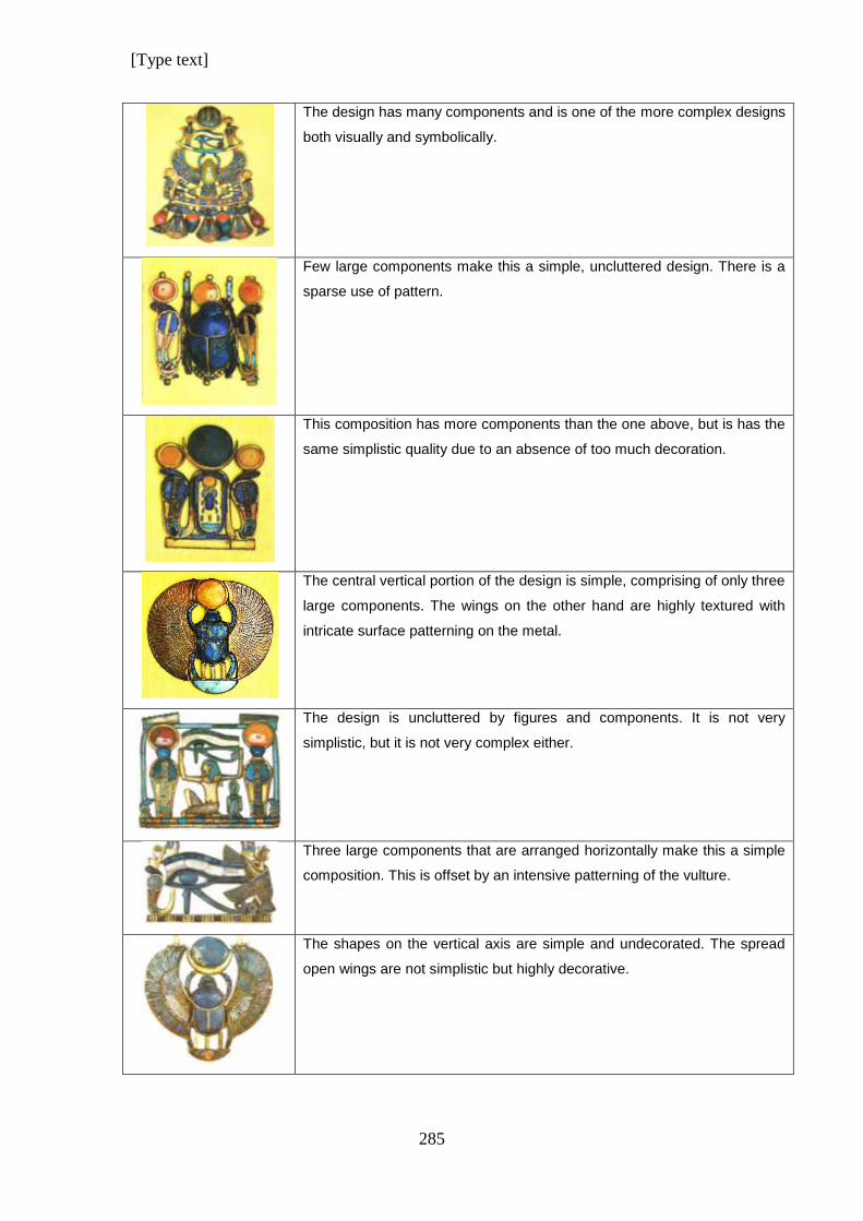
[Type text]
285
The design has many components and is one of the more complex designs
both visually and symbolically.
Few large components make this a simple, uncluttered design. There is a
sparse use of pattern.
This composition has more components than the one above, but is has the
same simplistic quality due to an absence of too much decoration.
The central vertical portion of the design is simple, comprising of only three
large components. The wings on the other hand are highly textured with
intricate surface patterning on the metal.
The design is uncluttered by figures and components. It is not very
simplistic, but it is not very complex either.
Three large components that are arranged horizontally make this a simple
composition. This is offset by an intensive patterning of the vulture.
The shapes on the vertical axis are simple and undecorated. The spread
open wings are not simplistic but highly decorative.
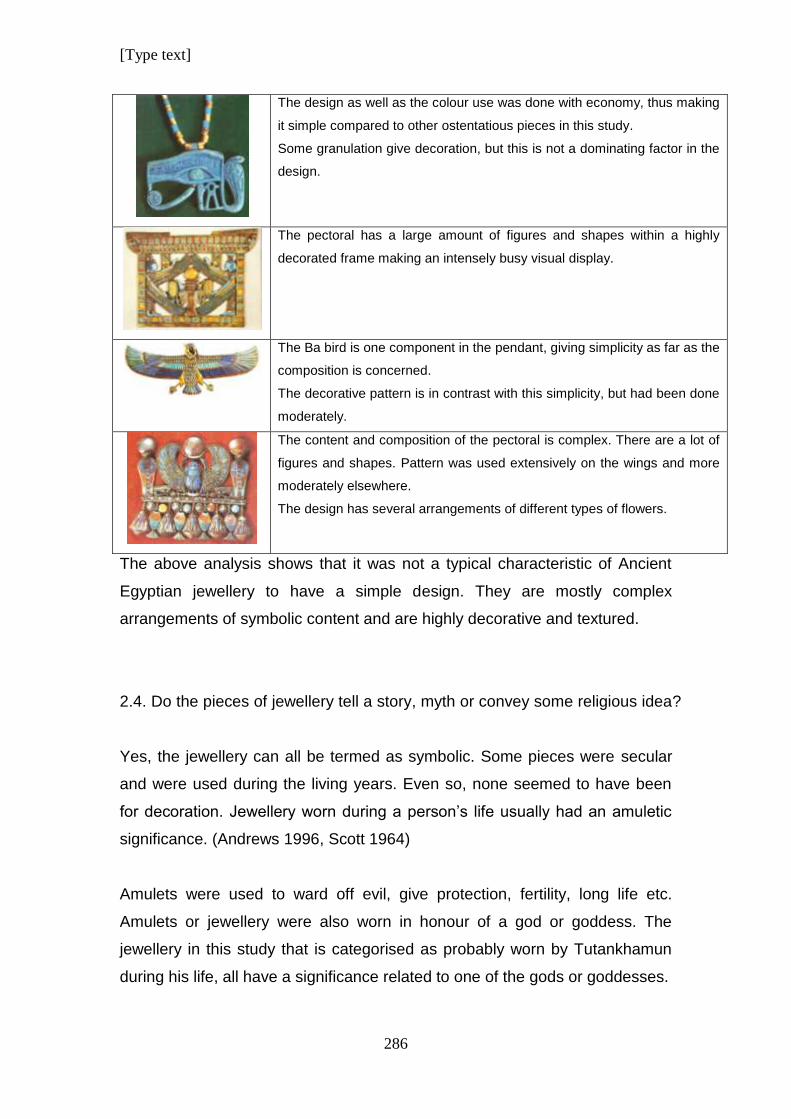
[Type text]
286
The design as well as the colour use was done with economy, thus making
it simple compared to other ostentatious pieces in this study.
Some granulation give decoration, but this is not a dominating factor in the
design.
The pectoral has a large amount of figures and shapes within a highly
decorated frame making an intensely busy visual display.
The Ba bird is one component in the pendant, giving simplicity as far as the
composition is concerned.
The decorative pattern is in contrast with this simplicity, but had been done
moderately.
The content and composition of the pectoral is complex. There are a lot of
figures and shapes. Pattern was used extensively on the wings and more
moderately elsewhere.
The design has several arrangements of different types of flowers.
The above analysis shows that it was not a typical characteristic of Ancient
Egyptian jewellery to have a simple design. They are mostly complex
arrangements of symbolic content and are highly decorative and textured.
2.4. Do the pieces of jewellery tell a story, myth or convey some religious idea?
Yes, the jewellery can all be termed as symbolic. Some pieces were secular
and were used during the living years. Even so, none seemed to have been
for decoration. Jewellery worn during a person’s life usually had an amuletic
significance. (Andrews 1996, Scott 1964)
Amulets were used to ward off evil, give protection, fertility, long life etc.
Amulets or jewellery were also worn in honour of a god or goddess. The
jewellery in this study that is categorised as probably worn by Tutankhamun
during his life, all have a significance related to one of the gods or goddesses.
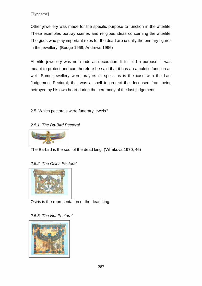
[Type text]
287
Other jewellery was made for the specific purpose to function in the afterlife.
These examples portray scenes and religious ideas concerning the afterlife.
The gods who play important roles for the dead are usually the primary figures
in the jewellery. (Budge 1969, Andrews 1996)
Afterlife jewellery was not made as decoration. It fulfilled a purpose. It was
meant to protect and can therefore be said that it has an amuletic function as
well. Some jewellery were prayers or spells as is the case with the Last
Judgement Pectoral; that was a spell to protect the deceased from being
betrayed by his own heart during the ceremony of the last judgement.
2.5. Which pectorals were funerary jewels?
2.5.1. The Ba-Bird Pectoral
The Ba-bird is the soul of the dead king. (Vilimkova 1970; 46)
2.5.2. The Osiris Pectoral
Osiris is the representation of the dead king.
2.5.3. The Nut Pectoral
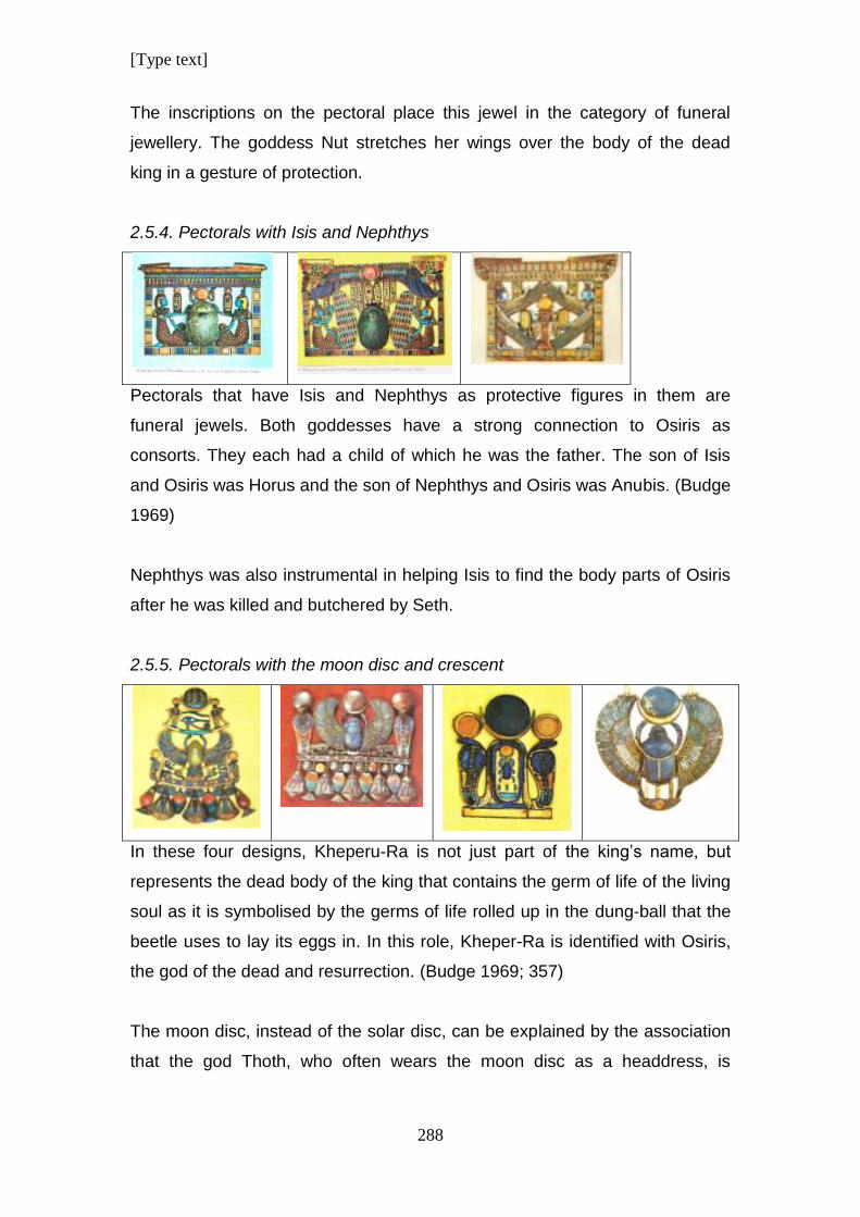
[Type text]
288
The inscriptions on the pectoral place this jewel in the category of funeral
jewellery. The goddess Nut stretches her wings over the body of the dead
king in a gesture of protection.
2.5.4. Pectorals with Isis and Nephthys
Pectorals that have Isis and Nephthys as protective figures in them are
funeral jewels. Both goddesses have a strong connection to Osiris as
consorts. They each had a child of which he was the father. The son of Isis
and Osiris was Horus and the son of Nephthys and Osiris was Anubis. (Budge
1969)
Nephthys was also instrumental in helping Isis to find the body parts of Osiris
after he was killed and butchered by Seth.
2.5.5. Pectorals with the moon disc and crescent
In these four designs, Kheperu-Ra is not just part of the king’s name, but
represents the dead body of the king that contains the germ of life of the living
soul as it is symbolised by the germs of life rolled up in the dung-ball that the
beetle uses to lay its eggs in. In this role, Kheper-Ra is identified with Osiris,
the god of the dead and resurrection. (Budge 1969; 357)
The moon disc, instead of the solar disc, can be explained by the association
that the god Thoth, who often wears the moon disc as a headdress, is
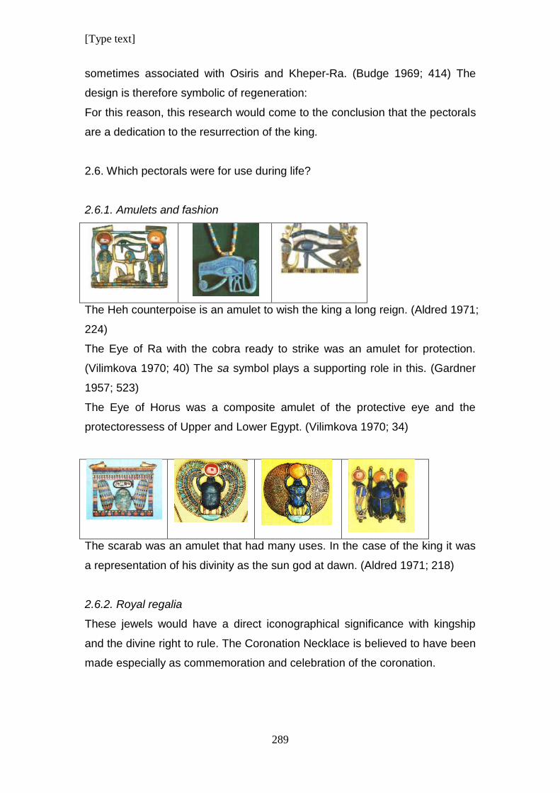
[Type text]
289
sometimes associated with Osiris and Kheper-Ra. (Budge 1969; 414) The
design is therefore symbolic of regeneration:
For this reason, this research would come to the conclusion that the pectorals
are a dedication to the resurrection of the king.
2.6. Which pectorals were for use during life?
2.6.1. Amulets and fashion
The Heh counterpoise is an amulet to wish the king a long reign. (Aldred 1971;
224)
The Eye of Ra with the cobra ready to strike was an amulet for protection.
(Vilimkova 1970; 40) The sa symbol plays a supporting role in this. (Gardner
1957; 523)
The Eye of Horus was a composite amulet of the protective eye and the
protectoressess of Upper and Lower Egypt. (Vilimkova 1970; 34)
The scarab was an amulet that had many uses. In the case of the king it was
a representation of his divinity as the sun god at dawn. (Aldred 1971; 218)
2.6.2. Royal regalia
These jewels would have a direct iconographical significance with kingship
and the divine right to rule. The Coronation Necklace is believed to have been
made especially as commemoration and celebration of the coronation.
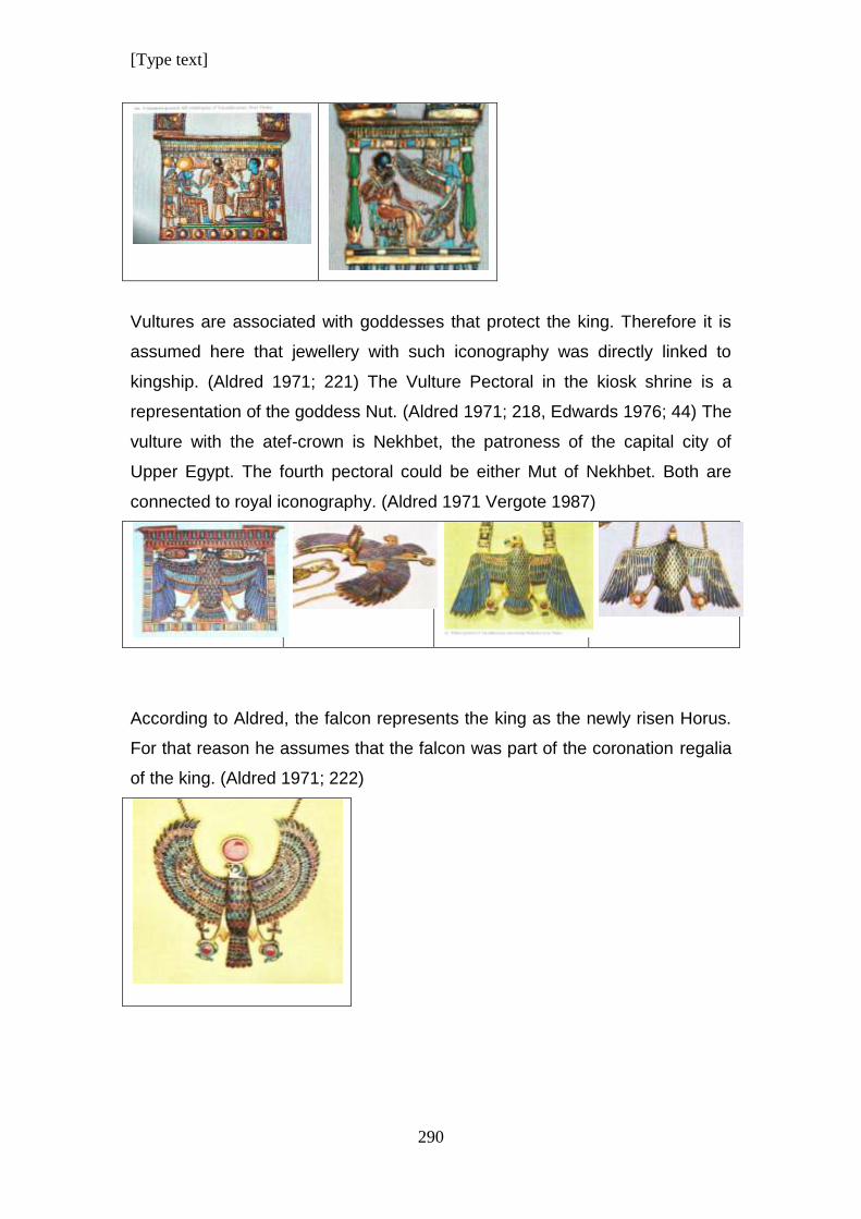
[Type text]
290
Vultures are associated with goddesses that protect the king. Therefore it is
assumed here that jewellery with such iconography was directly linked to
kingship. (Aldred 1971; 221) The Vulture Pectoral in the kiosk shrine is a
representation of the goddess Nut. (Aldred 1971; 218, Edwards 1976; 44) The
vulture with the atef-crown is Nekhbet, the patroness of the capital city of
Upper Egypt. The fourth pectoral could be either Mut of Nekhbet. Both are
connected to royal iconography. (Aldred 1971 Vergote 1987)
According to Aldred, the falcon represents the king as the newly risen Horus.
For that reason he assumes that the falcon was part of the coronation regalia
of the king. (Aldred 1971; 222)
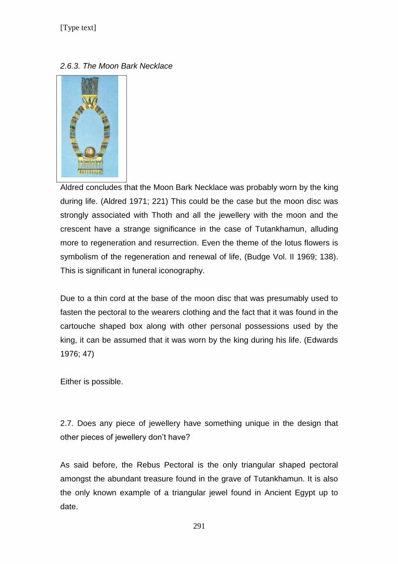
[Type text]
291
2.6.3. The Moon Bark Necklace
Aldred concludes that the Moon Bark Necklace was probably worn by the king
during life. (Aldred 1971; 221) This could be the case but the moon disc was
strongly associated with Thoth and all the jewellery with the moon and the
crescent have a strange significance in the case of Tutankhamun, alluding
more to regeneration and resurrection. Even the theme of the lotus flowers is
symbolism of the regeneration and renewal of life, (Budge Vol. II 1969; 138).
This is significant in funeral iconography.
Due to a thin cord at the base of the moon disc that was presumably used to
fasten the pectoral to the wearers clothing and the fact that it was found in the
cartouche shaped box along with other personal possessions used by the
king, it can be assumed that it was worn by the king during his life. (Edwards
1976; 47)
Either is possible.
2.7. Does any piece of jewellery have something unique in the design that
other pieces of jewellery don’t have?
As said before, the Rebus Pectoral is the only triangular shaped pectoral
amongst the abundant treasure found in the grave of Tutankhamun. It is also
the only known example of a triangular jewel found in Ancient Egypt up to
date.
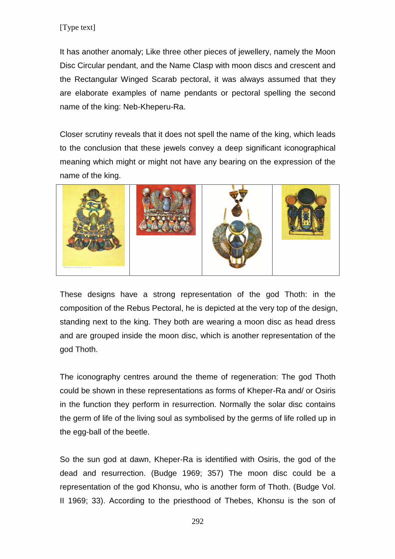
[Type text]
292
It has another anomaly; Like three other pieces of jewellery, namely the Moon
Disc Circular pendant, and the Name Clasp with moon discs and crescent and
the Rectangular Winged Scarab pectoral, it was always assumed that they
are elaborate examples of name pendants or pectoral spelling the second
name of the king: Neb-Kheperu-Ra.
Closer scrutiny reveals that it does not spell the name of the king, which leads
to the conclusion that these jewels convey a deep significant iconographical
meaning which might or might not have any bearing on the expression of the
name of the king.
These designs have a strong representation of the god Thoth: in the
composition of the Rebus Pectoral, he is depicted at the very top of the design,
standing next to the king. They both are wearing a moon disc as head dress
and are grouped inside the moon disc, which is another representation of the
god Thoth.
The iconography centres around the theme of regeneration: The god Thoth
could be shown in these representations as forms of Kheper-Ra and/ or Osiris
in the function they perform in resurrection. Normally the solar disc contains
the germ of life of the living soul as symbolised by the germs of life rolled up in
the egg-ball of the beetle.
So the sun god at dawn, Kheper-Ra is identified with Osiris, the god of the
dead and resurrection. (Budge 1969; 357) The moon disc could be a
representation of the god Khonsu, who is another form of Thoth. (Budge Vol.
II 1969; 33). According to the priesthood of Thebes, Khonsu is the son of
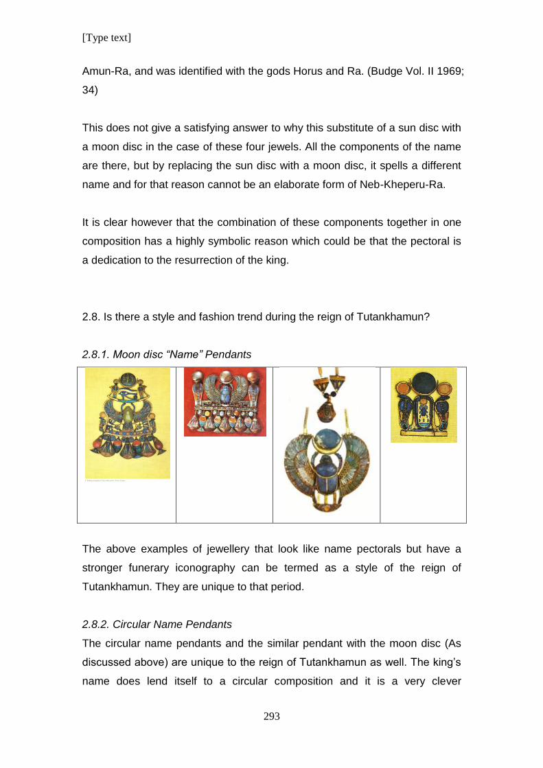
[Type text]
293
Amun-Ra, and was identified with the gods Horus and Ra. (Budge Vol. II 1969;
34)
This does not give a satisfying answer to why this substitute of a sun disc with
a moon disc in the case of these four jewels. All the components of the name
are there, but by replacing the sun disc with a moon disc, it spells a different
name and for that reason cannot be an elaborate form of Neb-Kheperu-Ra.
It is clear however that the combination of these components together in one
composition has a highly symbolic reason which could be that the pectoral is
a dedication to the resurrection of the king.
2.8. Is there a style and fashion trend during the reign of Tutankhamun?
2.8.1. Moon disc “Name” Pendants
The above examples of jewellery that look like name pectorals but have a
stronger funerary iconography can be termed as a style of the reign of
Tutankhamun. They are unique to that period.
2.8.2. Circular Name Pendants
The circular name pendants and the similar pendant with the moon disc (As
discussed above) are unique to the reign of Tutankhamun as well. The king’s
name does lend itself to a circular composition and it is a very clever
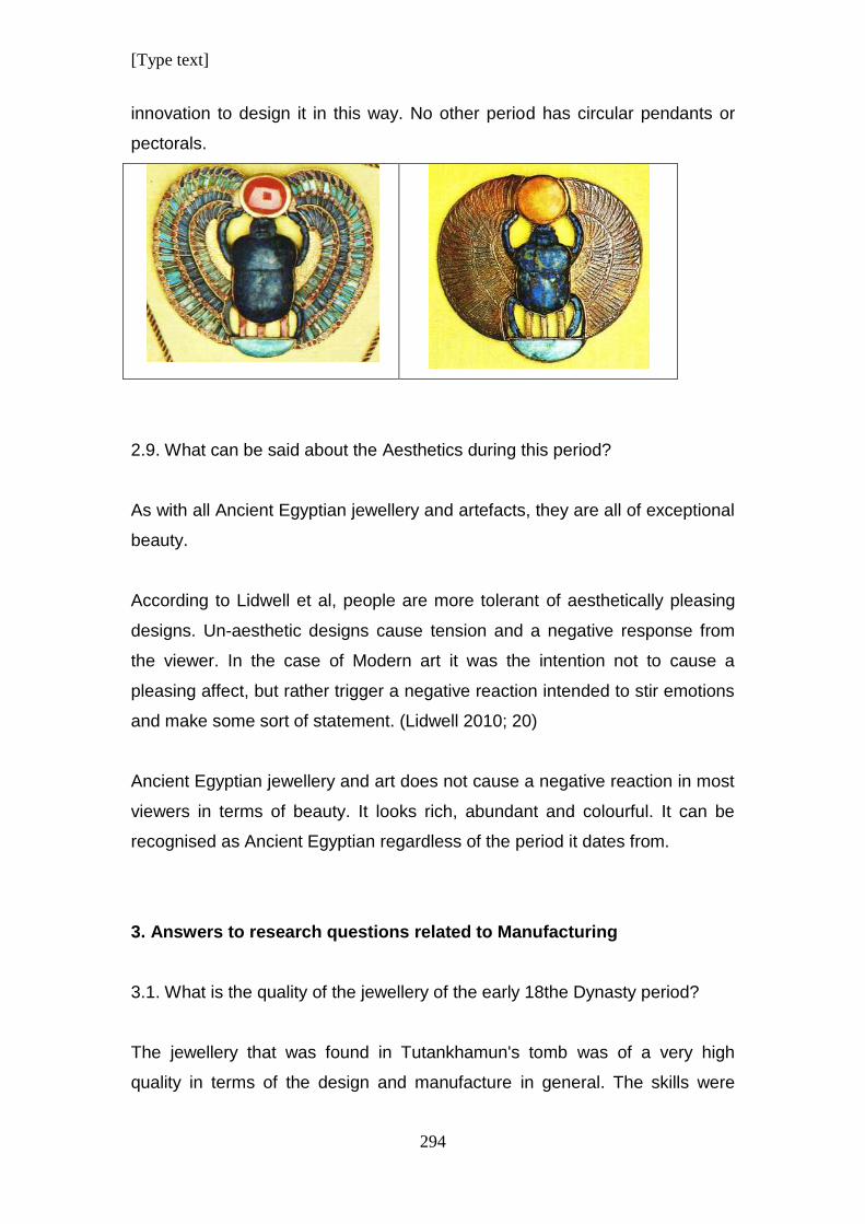
[Type text]
294
innovation to design it in this way. No other period has circular pendants or
pectorals.
2.9. What can be said about the Aesthetics during this period?
As with all Ancient Egyptian jewellery and artefacts, they are all of exceptional
beauty.
According to Lidwell et al, people are more tolerant of aesthetically pleasing
designs. Un-aesthetic designs cause tension and a negative response from
the viewer. In the case of Modern art it was the intention not to cause a
pleasing affect, but rather trigger a negative reaction intended to stir emotions
and make some sort of statement. (Lidwell 2010; 20)
Ancient Egyptian jewellery and art does not cause a negative reaction in most
viewers in terms of beauty. It looks rich, abundant and colourful. It can be
recognised as Ancient Egyptian regardless of the period it dates from.
3. Answers to research questions related to Manufacturing
3.1. What is the quality of the jewellery of the early 18the Dynasty period?
The jewellery that was found in Tutankhamun's tomb was of a very high
quality in terms of the design and manufacture in general. The skills were
[Type text]
295
those of experienced and well trained workmen that were competent in using
a large variety of manufacturing techniques.
The jewels below are arranged according to quality, based on manufacturing
technique and not according to their deterioration over time.
3.1.1. Some examples of excellent workmanship
3.1.1.1. Nekhbet Pendant
3.1.1.2. Vulture Pendant
3.1.1.3. Ra Pendant
3.1.1.4. The Moon Bark Necklace
3.1.1.5. Nekhbet Necklace with Counterpoise
3.1.1.6. The Rebus Pectoral
3.1.1.7. Name Clasp
3.1.1.8. 3D Scarab Name Clasp
3.1.1.9. Lapis Lazuli Neb-Kheperu-Ra winged Scarab
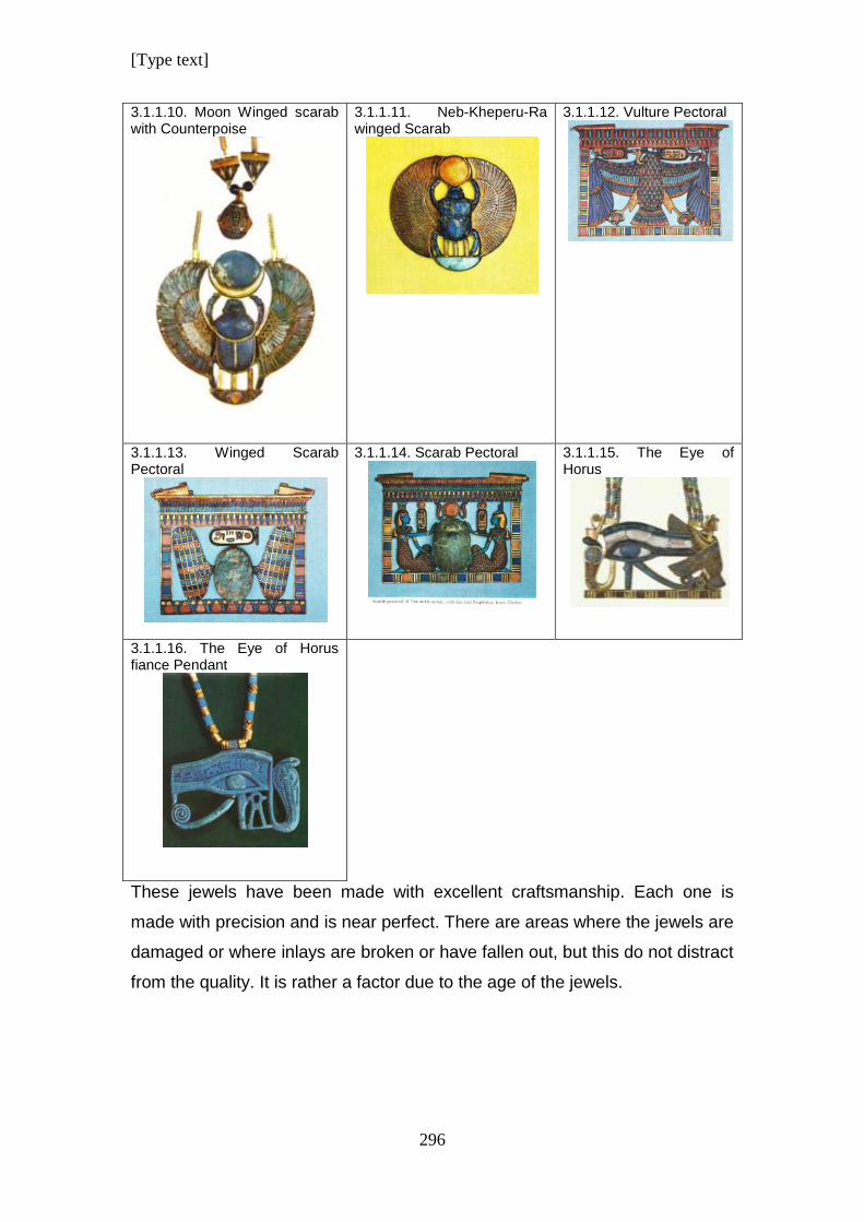
[Type text]
296
3.1.1.10. Moon Winged scarab with Counterpoise
3.1.1.11. Neb-Kheperu-Ra winged Scarab
3.1.1.12. Vulture Pectoral
3.1.1.13. Winged Scarab Pectoral
3.1.1.14. Scarab Pectoral
3.1.1.15. The Eye of Horus
3.1.1.16. The Eye of Horus fiance Pendant
These jewels have been made with excellent craftsmanship. Each one is
made with precision and is near perfect. There are areas where the jewels are
damaged or where inlays are broken or have fallen out, but this do not distract
from the quality. It is rather a factor due to the age of the jewels.
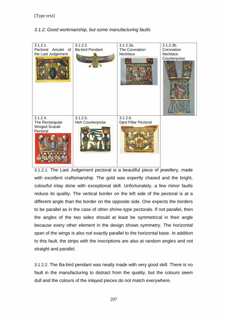
[Type text]
297
3.1.2: Good workmanship, but some manufacturing faults
3.1.2.1. Pectoral Amulet of the Last Judgement
3.1.2.2. Ba-bird Pendant
3.1.2.3a. The Coronation Necklace
3.1.2.3b. Coronation Necklace Counterpoise
3.1.2.4. The Rectangular Winged Scarab Pectoral
3.1.2.5. Heh Counterpoise
3.1.2.6. Djed Pillar Pectoral
3.1.2.1. The Last Judgement pectoral is a beautiful piece of jewellery, made
with excellent craftsmanship. The gold was expertly chased and the bright,
colourful inlay done with exceptional skill. Unfortunately, a few minor faults
reduce its quality. The vertical border on the left side of the pectoral is at a
different angle than the border on the opposite side. One expects the borders
to be parallel as in the case of other shrine-type pectorals. If not parallel, then
the angles of the two sides should at least be symmetrical in their angle
because every other element in the design shows symmetry. The horizontal
span of the wings is also not exactly parallel to the horizontal base. In addition
to this fault, the strips with the inscriptions are also at random angles and not
straight and parallel.
3.1.2.2. The Ba-bird pendant was neatly made with very good skill. There is no
fault in the manufacturing to distract from the quality, but the colours seem
dull and the colours of the inlayed pieces do not match everywhere.
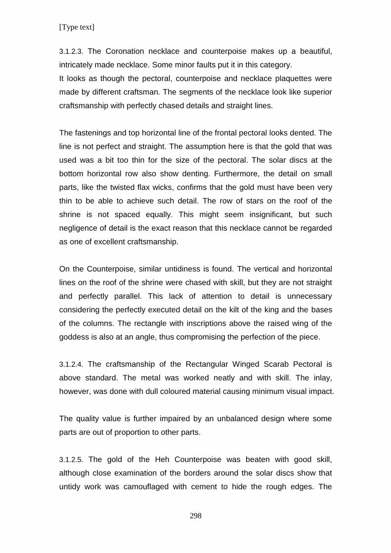
[Type text]
298
3.1.2.3. The Coronation necklace and counterpoise makes up a beautiful,
intricately made necklace. Some minor faults put it in this category.
It looks as though the pectoral, counterpoise and necklace plaquettes were
made by different craftsman. The segments of the necklace look like superior
craftsmanship with perfectly chased details and straight lines.
The fastenings and top horizontal line of the frontal pectoral looks dented. The
line is not perfect and straight. The assumption here is that the gold that was
used was a bit too thin for the size of the pectoral. The solar discs at the
bottom horizontal row also show denting. Furthermore, the detail on small
parts, like the twisted flax wicks, confirms that the gold must have been very
thin to be able to achieve such detail. The row of stars on the roof of the
shrine is not spaced equally. This might seem insignificant, but such
negligence of detail is the exact reason that this necklace cannot be regarded
as one of excellent craftsmanship.
On the Counterpoise, similar untidiness is found. The vertical and horizontal
lines on the roof of the shrine were chased with skill, but they are not straight
and perfectly parallel. This lack of attention to detail is unnecessary
considering the perfectly executed detail on the kilt of the king and the bases
of the columns. The rectangle with inscriptions above the raised wing of the
goddess is also at an angle, thus compromising the perfection of the piece.
3.1.2.4. The craftsmanship of the Rectangular Winged Scarab Pectoral is
above standard. The metal was worked neatly and with skill. The inlay,
however, was done with dull coloured material causing minimum visual impact.
The quality value is further impaired by an unbalanced design where some
parts are out of proportion to other parts.
3.1.2.5. The gold of the Heh Counterpoise was beaten with good skill,
although close examination of the borders around the solar discs show that
untidy work was camouflaged with cement to hide the rough edges. The
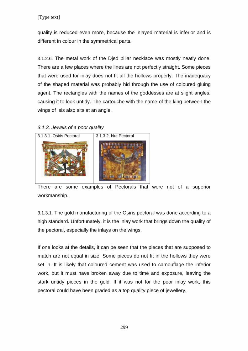
[Type text]
299
quality is reduced even more, because the inlayed material is inferior and is
different in colour in the symmetrical parts.
3.1.2.6. The metal work of the Djed pillar necklace was mostly neatly done.
There are a few places where the lines are not perfectly straight. Some pieces
that were used for inlay does not fit all the hollows properly. The inadequacy
of the shaped material was probably hid through the use of coloured gluing
agent. The rectangles with the names of the goddesses are at slight angles,
causing it to look untidy. The cartouche with the name of the king between the
wings of Isis also sits at an angle.
3.1.3. Jewels of a poor quality
3.1.3.1. Osiris Pectoral
3.1.3.2. Nut Pectoral
There are some examples of Pectorals that were not of a superior
workmanship.
3.1.3.1. The gold manufacturing of the Osiris pectoral was done according to a
high standard. Unfortunately, it is the inlay work that brings down the quality of
the pectoral, especially the inlays on the wings.
If one looks at the details, it can be seen that the pieces that are supposed to
match are not equal in size. Some pieces do not fit in the hollows they were
set in. It is likely that coloured cement was used to camouflage the inferior
work, but it must have broken away due to time and exposure, leaving the
stark untidy pieces in the gold. If it was not for the poor inlay work, this
pectoral could have been graded as a top quality piece of jewellery.
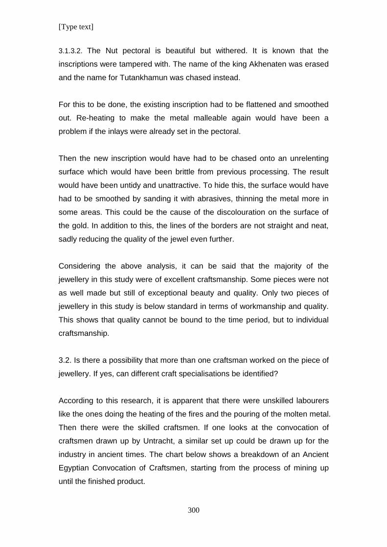
[Type text]
300
3.1.3.2. The Nut pectoral is beautiful but withered. It is known that the
inscriptions were tampered with. The name of the king Akhenaten was erased
and the name for Tutankhamun was chased instead.
For this to be done, the existing inscription had to be flattened and smoothed
out. Re-heating to make the metal malleable again would have been a
problem if the inlays were already set in the pectoral.
Then the new inscription would have had to be chased onto an unrelenting
surface which would have been brittle from previous processing. The result
would have been untidy and unattractive. To hide this, the surface would have
had to be smoothed by sanding it with abrasives, thinning the metal more in
some areas. This could be the cause of the discolouration on the surface of
the gold. In addition to this, the lines of the borders are not straight and neat,
sadly reducing the quality of the jewel even further.
Considering the above analysis, it can be said that the majority of the
jewellery in this study were of excellent craftsmanship. Some pieces were not
as well made but still of exceptional beauty and quality. Only two pieces of
jewellery in this study is below standard in terms of workmanship and quality.
This shows that quality cannot be bound to the time period, but to individual
craftsmanship.
3.2. Is there a possibility that more than one craftsman worked on the piece of
jewellery. If yes, can different craft specialisations be identified?
According to this research, it is apparent that there were unskilled labourers
like the ones doing the heating of the fires and the pouring of the molten metal.
Then there were the skilled craftsmen. If one looks at the convocation of
craftsmen drawn up by Untracht, a similar set up could be drawn up for the
industry in ancient times. The chart below shows a breakdown of an Ancient
Egyptian Convocation of Craftsmen, starting from the process of mining up
until the finished product.
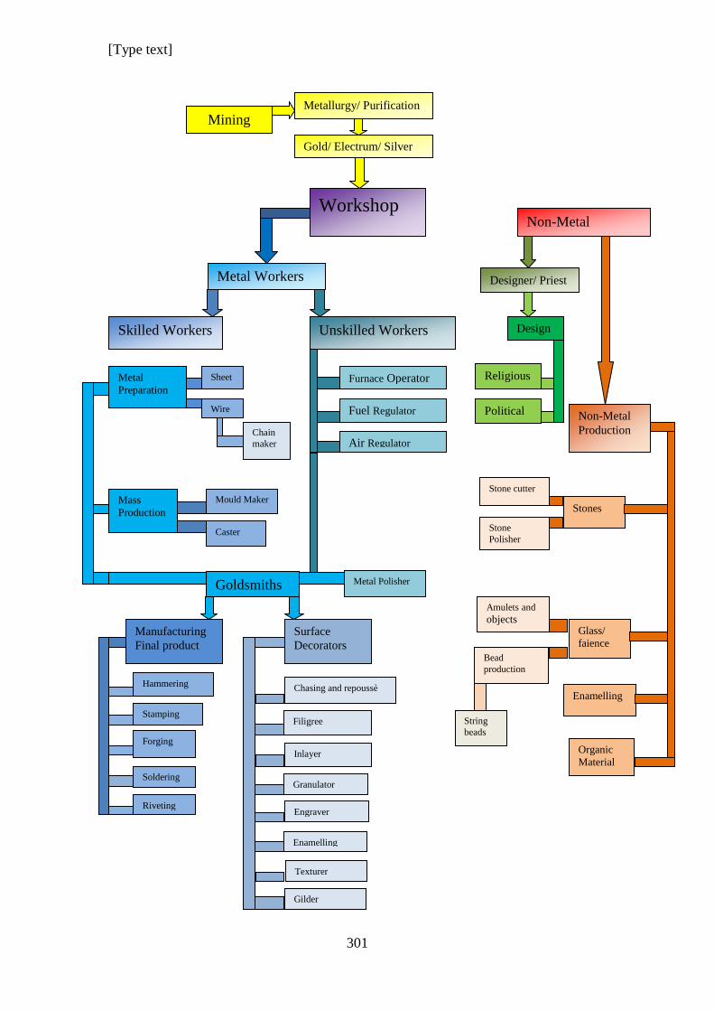
[Type text]
301
Mining
Metallurgy/ Purification
Gold/ Electrum/ Silver
Workshop
Designer/ Priest
Design
Political
Religious
Metal Workers
Skilled Workers Unskilled Workers
Furnace Operator
Fuel Regulator
Air Regulator
Non-Metal
Workers
Stones
Glass/
faience
Organic
Material
Amulets and
objects
Bead production
Stone
Polisher
Stone cutter
String
beads
Metal
Preparation
Mass
Production
Goldsmiths
Sheet
Wire
Chain
maker
Mould Maker
Caster
Manufacturing
Final product
Surface
Decorators
Hammering
Stamping
Forging
Soldering Granulator
Filigree
Inlayer
Non-Metal
Production
Engraver
Enamelling
Texturer
Riveting
Gilder
Chasing and repoussè Enamelling
Metal Polisher
[Type text]
302
3.3. What techniques were used during the manufacturing process?
All techniques discussed in Chapter 4- Metal techniques and Tools were used
to some degree.
For the most part, sheet had to be produced to use for the chasing of the
pectorals. Some pectorals were made from one sheet and judging by the size
of some pectorals, the sheet that had to be produced was quite big. This
means a lot of hammering and heating to make thin sheets of gold.
Once the shaping of the metal was complete, and the metal smoothed and
polished, the inlay material was cemented into the hollows left by the chasing.
Wire was used to attach pieces to each other, for fastenings, hinges and
riveting. Tube was made by bending sheet. It was then soldered on and was
often used on pendants where the chain or cord was strung through.
Sometimes pieces were cast. Examples of casting in this study are the heads
of the vulture pendants, the head and counterpoise of the Nekhbet Necklace
and possibly tiny gold fish at the ends of the tassels of the Coronation
Necklace Counterpoise. (Alternatively these could be hammered hollow
forms.)
Although engraving was used, it could be mistaken for chasing and vice versa.
None of the pectorals in this study has filigree work and only one, the
turquoise faience Udjat Eye of Ra has granulation on some gold beads.
[Type text]
303
3.4. Can a particular technique be identified as being a favourite during the
period when Tutankhamun’s jewellery was manufactured?
The jewellery found in the tomb of Tutankhamun, shows examples of all
techniques known to the Ancient Egyptians, but judging by the photographs,
most of the pectorals were made by chasing and repoussѐ.
Images were drawn on thin sheet metal. Then it was hammered to raise some
areas and flatten other areas. The hollowed areas were used to insert inlay
materials.
3.5. How many different techniques were used for a particular piece of
jewellery?
This varies from piece to piece, but as chasing and repoussѐ has been
identified as the primary means of making the pectorals, other techniques
would have been used in a supporting role. These techniques would include
the ones that were identified in answer to question 2.3.
3.6. How were the different parts assembled?
In general it can be said that a pectoral was made from one hammered sheet
of gold. It has been identified that some soldering and riveting were used to
attach some parts.
3.7. What materials were used?
This study, focused on precious materials.
The metals are primarily gold, silver and electrum, which is an alloy of
different proportions of gold and silver that occur naturally.
[Type text]
304
By the time the other metals are used by the goldsmith, it has already gone
through the process of metallurgical purification and alloying.
Sometimes alluvial gold was ready for use, depending on the size of the
nuggets. The same would have applied for electrum which occurred naturally.
Other materials include a variety of precious stones, glass, faience, enamel,
ivory and certain types of wood,
4. Conclusion
After careful analysis, it can be said that all the jewellery that was examined in
this study has some sort of symbolic significance. None of them seem to have
been made for decoration only.
The bird pendants each refer to one of the gods associated with life and
protection. The Udjat Eyes were for protection of a person during life, but
could have been used after death as well.
The Coronation necklace was probably made to celebrate the coronation of
the king. The Vulture necklace is assumed to be Nekhbet, who is the
patroness goddess of Upper Egypt.
The Moon Bark necklace is a celebration of the creation of life. The moon
bark floats on the divine river of the firmament and the lotus flowers are
symbolic of life and regeneration. It could have been intended for life and
death.
Jewellery that combines the scarab with the crescent moon could have been
intended as amulets.
There are designs that cleverly incorporated the hieroglyphs that spell the
name of the king. This is a design feature that is unique to this period and the
reign of Tutankhamun.
[Type text]
305
All the kiosk pectorals have scenes that enact some sort of religious ritual.
Therefore it could be concluded that such jewellery were religiously motivated,
whether it was concerned with life or death.
From the complex use of Design Elements and Principles, it can be seen that
even though the academic discipline of Design was not acknowledged during
ancient times, it was used in very complex and sophisticated ways.
It could be assumed further, that the people, who were responsible for
drawing the designs, were specialists in the symbolism of the images and had
in-depth knowledge of the written language. This leads to the conclusion that
designers were scribes and/ or priests who composed the arrangement of
writing and art on a miniature scale to be used as blue-prints for jewellery.
In terms of manufacturing, Chasing and repoussѐ had been identified as a
favourite metal working technique to make the pectorals.
The Ancient Egyptians used this technique with cunning. The goldsmiths used
this technique to create large objects that look heavy and rich, but were made
from very thin metal of an average thickness of 0.3mm to 0.5mm. If the metal
was any thicker, it would have made this technique very difficult to implement.
A lot of stone, glass and faience were used to further create the illusion of
thickness and weight.
The technique allowed for the minimum use of metal that created the best
impression of wealth.
In summary it can be said that, sixteen out of the twenty five pectorals that
were studied here were of a standard of above average workmanship, and
this is 64% of the pectorals.
[Type text]
306
Seven out of twenty five pectorals were of a good standard required for the
making of precious jewellery which makes it a total of 28% of the pectorals.
Only two out of twenty five pectorals were below standard. This is only 8% of
the total of pectorals that were studied.
This confirms the conclusion that the Ancient Egyptian craftsmen were highly
trained and had above average skill to be able to manufacture jewellery of an
excellent standard.
[Type text]
307
CHAPTER 10:
CONCLUSION
1. Summary
As an introduction to this thesis, the technology needed to make jewellery was
explored first to understand the different branches of expertise that went into
making a piece of jewellery.
At the start of the process metal had to be mined. Mining technology during
ancient times was an independent field of technology in the same way it still is
today. The evolution of mining methods developed independently from the
product at the end of the line. Better methods of ore extraction were
developed and the science of metallurgy became more effective in purifying
metal for use. Different alloys of metal were developed to create metal and
solders that improved their effectiveness. (Forbes 1964, Scheel 1989)
The artisan responsible for creating jewellery was the goldsmith. Yet, this
artisan had a support team and the field of the goldsmith branched out to
incorporate two different specialisation areas. A workshop had skilled workers
and unskilled workers. (Scheel 1989)
The unskilled workers were the lower ranking workers who were responsible
for regulating furnaces. The duties here included adding fuel and air to
regulate the temperature of the furnace depending on the operation demands.
Skilled workers included individuals that prepared metal ingots into sheet and
wire. This work was probably done by apprentice goldsmiths. It was hard work
that needed endless heating and many strokes with hammers to produce the
basic products of wire and sheet. Senior goldsmiths that were practiced and
skilled in finer application of techniques must have been entrusted with the
production of manufacturing the design. The field of expertise could have
[Type text]
308
branched out further to include smiths that specialised in surface decoration. It
was seen that there is a distinct possibility that techniques like filigree and
granulation could have been done by experts. (Untracht 1982)
Metal workers were not the only people involved in the manufacturing of
jewellery. Stone workers were trained individuals who cut precious and semi-
precious stone into shape. The stones were ground and sanded to remove
scratches and then they were polished. Only then were they sent to jewellery
workshops where it can be argued that specially trained goldsmiths did the
inlay.
It is even possible that the craftsmen who did the inlays were stone “setters”,
working exclusively with inlaying stones. The reason for this conclusion is that
there is no evidence of altering the metal to accommodate the stone once
inlaying was started, but there is definite evidence that the cavities wherein
the inlay was done, were filled up with cements to hide imperfections and to
insert inlays on the same level even though some stones were thicker than
others that were used in the same jewel. This clever trick is clearly visible
where inlays fell out, exposing the surface underneath.
Faience is another substance that was used extensively in jewellery and
represents another field of expertise that has been discussed in detail.
(Nicholson & Shaw 2000)
Now that all the materials that were used have been identified, attention can
be focused on the origin of the blueprint that must have been used by the
goldsmith for the manufacturing.
Goldsmiths were a specialised field of physical labour. It is doubtful that they
had the time to pursue the in-depth studies of religion and symbolism or even
language, in order to be able to create a design. The skills needed to do this
must have come from the scribes. They, or priests with the necessary
education, must have been the ones who designed the jewellery. An
[Type text]
309
iconographical analysis of all the jewels in this study shows clearly that the
symbolism of each design had multi layered meaning.
The analysis of each individual pectoral that investigates the application of
Design shows how designs were influenced by Design Principles and
Elements. The findings were compared and helped to identify the styles,
trends and anomalies of design in the period of the 18th Dynasty of Ancient
Egypt. It further shows how sophisticated the designs are. The complexity of
the designs indicates without a doubt that a plan must have been drafted prior
to manufacturing.
The last step in the process that this study looked at was the manufacturing of
the jewellery. This study analysed the pectorals to identify what manufacturing
techniques were used to make them. For this purpose, photographs were
used and the pectorals were viewed and examined in the Cairo museum.
Some technical drawings were used to illustrate details that are not shown on
photographs.
The careful study of the designs and the manufacturing led to the final
conclusions of this thesis.
2. Conclusion
After analysing all the jewellery, a final conclusion can be drawn about the
design and manufacture of gold jewellery during the period of Tutankhamun,
in particular, and periods before and after it in ancient Egypt.
The analysis of the jewellery shows clearly how design elements and
Principles were used extensively to produce designs of an exceptional quality.
The analysis of the design elements shows how they were used to manifest
and influence the design principles.
[Type text]
310
Design principles have a strong root in the human subconscious and have the
tendency to want to create order from chaos. It is unlikely to assume that the
ancient Egyptians had any suspicion that their subconscious minds were at all
involved in deciding what a design had to look like. The mind, as any part of
the human entity, was not recognised by them in any way as it is by modern
man. Disciplines of psychology and design did not exist in those days, but
their effects are visible in the jewellery that was produced by them.
A piece of jewellery does not happen by accident. It is the product of a
process that starts with planning. Let us consider this first in terms of the
material that is needed to make something. Wuytens and Willems argues that
during the design process, the designer has to continually reconsider
constraints like materials and make decisions whether to continue a design or
backtrack to a pervious option in order to make a design work.
To make a piece of jewellery doesn’t matter the size or shape, the goldsmith
needed materials that were pre-prepared for the use of a final product.
Materials such as stone that had already been cut, shaped and polished in a
range of sizes for final application in the jewellery, were probably mass
produced. There is clear evidence that faience was a mass produced
commodity. Shapes would include scarabs or amulets in a various range of
sizes, rectangular shapes of different widths and lengths that would later be
inserted as inlays. Blade shapes of various degree of shapes and sizes for the
use of inlay, must have been made in large quantities as well.
Another popular shape was the half oval red shape of different sizes that was
used as inlays at the bottom of vertical, rectangular wing inlays. Triangular red
shapes were used at the tips of some wings or between them on the edge of
the wing.
Rectangular pieces with a rounded end were needed as inlays for the kiosk
roofs of pectorals.
[Type text]
311
Other shapes would have been prepared, but probably to a lesser degree,
according to demand. It is possible that in some cases special pieces were
ordered for a specific design.
By the time of the rule of Tutankhamun, faience production had become a
mass production industry. A lot of inlays in jewellery were faience. It was a
man-made stone imitation and the shapes and sizes were easier to
manipulate than stone, making it a more easily accessible commodity.
Mass production of various shapes would have been produced in large
quantities for the jewellery making industry. By this time it was common to use
moulds for faience production. Therefore, it is likely that the majority of stone
and faience inlays were manufactured before a design was conceived,
especially the types that were used very often.
Before any workman could start a piece of jewellery, he needed to have exact
dimensions and guidelines so that the correctly prepared metal could be
selected. The design would determine the thickness, length and width of the
metal. The design space, which is the space spanned by the design
parameters, would therefore determine the size and dimensions.
From my personal experience as a goldsmith is hard and intense work and no
goldsmith would do it to himself to haphazardly start a jewel, just to have to
melt it down and start over by melting down all the hard work and hammering,
by hand, a new piece of flat metal of the right size, to restart the work.
It can be added here that a goldsmith starts a jewel with a surplus of metal.
Pieces are cut away and shaped towards the final result. It is the most
frustrating thing imaginable to be close to completion, just to realise that
something doesn’t fit or that not enough metal was prepared before
manufacturing started.
For reasons of pure economy of time and hard work, the goldsmith would
have needed a design before he could start with manufacturing.
[Type text]
312
Designers and artists in ancient Egypt would have been closely related to the
priesthood. Even in the case of royal workshops, designs would have come
from someone affiliated to the priesthood. The designers themselves were
anonymous. They worked for a temple, palace or private customer and were
dependant on these patrons.
We know that in the case of wall paintings and reliefs, the drawing and
inscriptions were done by the priest/ designer before the artisan started with
his work. In the case of jewellery, especially in the case when chasing or
embossing was used as manufacturing method, the logical thing to do was to
draw the design directly onto the metal before the goldsmith started with
hammering. This could have been done by a priest who was a designer, or by
the goldsmith who copied it from a design drawn on papyrus or some other
less expensive medium.
A sharp tool that could scratch the surface of the metal would have been used
to make the drawing. On the smoothed out metal surface, the design would
appear as shiny outlines. If it was done in this way, there would have been no
risk that the smith would end up without enough metal to work with. The
design would have been stencilled deeper into the metal to make sure details
were not lost. If the metal was thin enough and embossing was done, the
lines could have been pressed deeper into the metal by applying pressure
with a blunt tool with a small, needle-like tip. If the metal sheet was thicker,
chasing and repoussѐ would have been used. A punch with a small
rectangular surface with rounded edges could have been used to punch the
outlines of the design into the metal using a type of hammer. If the metal had
to be annealed again to make it soft, the design would have been secured
onto the surface. Stencil lines, would have become dull and obscure when
heated.
At this point, most of the inlay material was probably available and pre-
selected. If not, the pieces would have been ordered as soon as the design or
drawing was complete and the dimensions of the figures and shapes were
[Type text]
313
known. If not, these special pieces could have been made to specifications
after the gold work was completed, but that would cause delays in the
completion of the jewel.
Once the designing phase was finalised, it would have been handed over to
the goldsmith. Very often, the other materials that were going to be used for
inlay would have been provided as well.
Previously, scholars believed that Chasing and Repoussѐ was the method
used in the manufacturing of the pectorals, but judging from the thickness of
the observed jewellery in the Museum in Cairo, it is very probable that it could
have been used in conjunction with Embossing or that an entire jewel could
have been made using primarily the technique of Embossing.
If metal was thin enough, the latter technique would be preferable because it
could be done without re-heating of metal. From a practical point of view it
meant that it was unnecessary to have a furnace and furnace operators. The
goldsmith could have done the work without assistance or maybe in
conjunction with the lapidary worker.
Chasing and repoussѐ as manufacturing technique can be summed up as
follows:
The goldsmith would have started by hammering the outline of the design on
the piece of metal with a thin outlining tool that was blunt or rounded. This
would have been necessary, because as soon as the metal was heated to
make it soft and malleable again, the metal would have discoloured and
become dull. The shiny sketch of the scratched on design would become less
vivid or visible, resulting in errors as the hammering progressed.
As soon as the initial outlining was hammered, the metal would have been
heated. Then hammering would have been done on the reverse side of the
design. This is the process of repoussѐ. The process would have been
repeated several times. Once the design took from, and details became more
[Type text]
314
visible. The goldsmith would have had to constantly fit the inlay pieces into the
hollows to make sure that the chasing was precise and to compensate for the
variation of the initial drawing and the actual piece of stone or faience that had
to be inserted. Each piece of inlay would have been fitted and the metal
adjusted to accommodate it. This would mean that after the basic general
shapes of the design was done, hammering and shaping would focus on the
specific area where it had to be precisely manipulated for inlay.
Some examples like the Osiris pectoral, shows that the goldsmith took short
cuts in preparing the hollow shapes and subsequently, a lot of coloured
cement was used to do the inlay. It took a few thousand years, but eventually
the poor craftsmanship was revealed.
Re-heating of the gold would have been done at intervals to soften the metal
again. As soon as the chasing and repoussѐ was finished, tubes or clasps
had to be soldered. If any surface decoration that required heating was
intended on the design, this would have been done at this stage. This would
include a decoration using granulation or filigree.
Alternatively, the method of embossing could have been used. This required
different tools consisting of pen like metal tools with different types of tips.
Sharper tips or tips with small ball like tips could have been used to make
outlines. Tips with larger ball-like ends would have been used to press larger
areas to hollow them out. This technique also required the goldsmith to turn it
over repeatedly. Once outlines and basic shapes were pressed in, the metal
would have been turned over to press out the reverse side and sharpen lines.
By repeating this, the same effect as chasing and repoussѐ could be achieved
with less labour and simpler tools. Examples of these tools are shown in the
chapter discussing “Tools”.
Instead of attaching tubes and clasps through soldering, it is conceivable that
tubes and other parts could be cut, bent or shaped from the metal sheet that
was part of the sheet out of which the design was embossed. In such a case
[Type text]
315
no heat for soldering is necessary. The technique would be similar to the one
described by James for making beads using gold foil.
Once all heating processes were finished, the smoothing and sanding out of
unwanted marks or scratches would be done. This would usually be done until
the product had a high glossy finish. It is a laborious process and would have
been done by an apprentice or unskilled labourer.
Various abrasives would have been used, starting with a courser grain and
finishing with a very finely powdered grain to achieve a shiny finish.
All the processes discussed above are very time consuming. Each process
could be done over days or even weeks.
Decoration that did not require heating, like engraving, would have been done
as a finishing touch before, finally, that last task was started, namely the
inlaying of stone, glass and faience. Inlaying stone, like setting stones in
modern times, is a specialised field. Some goldsmiths are able to do it, but
very often this task was done by a craftsman that specialised in it.
Two things are important at this point. It would have taken almost as long to
do the inlay as it took to prepare the gold. The other is that if the goldsmith
created a high quality piece of work, it makes it easier for the inlayer. If the
goldsmith did not take pride in his work, the task of the inlayer is very difficult
and the result would be untidy or a piece of jewellery with an inferior quality.
One would assume that certain colours would be inlayed together especially
where coloured cement or gluing agent was used. One colour would have
been mixed at a time, depending on the time it took to dry properly. After a
while, the cement would cure and reach a consistency that would have made
it inefficient to use. If inlay was continued after this, the pieces would have
fallen out eventually. This part of the manufacturing process could take days
or weeks, depending on the size and intricacy of the jewel.
[Type text]
316
When this last part of manufacturing was complete, the jewel would have
been given a final cleaning and polishing before being handed over to the
lucky recipient.
All things considered, the process of designing and manufacturing was very
much the same in ancient times as it is today. Then and now, there were
certain rules that had to be followed. From my own experience as a goldsmith
and using the practice-based methodology of research method that was
developed by Malins & Gray in 1995, the process can be summed up as
follows:
Metal had to be smelted and prepared into plate or wire before it was ready to
be shaped and formed using processes like forging, hammering, bending,
twisting and chasing. A combination of processes was usually used on one
piece of jewellery. All of these had to have a plan of execution.
All metal shaping processes had to be finished before surface decoration
could be started. If a jewel had to be enamelled and then hammered again to
fix or change it, the enamelling would shatter and break off. Granulation would
be deformed and inlays would be shattered and broken.
Polishing had to be done before engraving. If one polished over engraving,
the sharpness of the effect would be ruined. In the case of inlaying, the
grittiness of abrasives would scratch polished surfaces of the glass, stone or
faience and damage it.
The process of manufacturing had to happen according to a plan. The plan
started with the designer. He predetermined the iconography of the jewel, so
that the proper meaning could be conveyed and so that the final product could
fulfil its proper function.
Shapes and sizes had to be determined so that the necessary materials could
be collected or manufactured.
[Type text]
317
Metal workers had to prepare the necessary sheet and wire that are the
primary forms of metal used for manipulation for the manufacturing of any
piece of jewellery. Metal would have had to be the correct sizes and thickness.
These factors have an enormous impact on manufacturing and had to be
done according to their intended purpose.
From here on, the details of the plan had to be implemented by the specialist
craftsman. He had to be assisted by the unskilled workers working and
manipulating the furnace according to his instructions. Sometimes he
participated in this when applying finer skills.
It was not in his power or his position in life to alter the plan or make changes.
He probably didn’t have the basics of the education to understand the
meaning of the object that he was creating in metal. He did his duty and
fulfilled his part and handed it to the next specialist.
After all metal processes, polishing and surface decoration was complete, the
jewel was ready for the final task of inlay.
The manufacturing stages had to happen according to plan for practical
purposes, not to flatter someone’s whim. It was a process that was developed
over time through trial and error. Finding out what worked and what didn’t
work until it became a well oiled machine and the efficient utilisation of
resources; including both material resources and human resources.
[Type text]
318
BIBLIOGRAPHY
Aldred, C. 1971. Jewels of the Pharaohs: Egyptian jewellery of the dynastic period.
London: Thames and Hudson.
Andrews, Carol AR. 1990-1996. Ancient Egyptian Jewellery. London: British
Museum Publications.
Arnheim, Rudolph. 2001 (September) Art and visual perception.
Arnheim, R. 1956. Art and Visual Perception: A Psychology of the Creative Eye.
Berkley, CA. University of California Press.
Aston, P et al. 2006. Egypt’s Sunken Treasures. Munich, New York: Prestal.
Athanassopoulus, F et al. 1983. The Technology of Loop-in Loop Chains in the Third
Millennium B.C. American Journal of Archaeology, 87 (4): 547-548, October.
11/9/2012
Behrens, R.R. 1998. Art, Design and Gestalt Theory. Leonardo, 31 (4): 299-303
Black, JA. 1981. A History of Jewelry. New York: Crown Publishers.
Brynner, I. 1968. Modern Jewelry: Design and Technique. New York: Van Nostrand
Reinhold Co.
Budge, E.A.Wallis. 1969. The Gods of the Egyptians or Studies in Egyptian
Mythology. Volume I and II. Dover Edition. New York: Dover Publications Inc.
Cellini, B. 1967. Treatises on the Arts of Goldsmithing and Sculpture. New York:
Dover Publications.
C.L.R. 1915. Three Sets of Egyptian Gold Pendants. The Metropolitan Museum of Art
Bulletin, 10 (6): 117-120, June. 11/9/2012
Clark, C.R. 1950. Costume Jewellery in Egypt in the XVIII Dynasty. The
Metropolitan Museum of Art Bulletin, New Series, 8 (5): 154-156, 5 January.
11/9/2012
Coatts, Margo. (Ed). 1997. Pioneers of Modern Craft: Twelve essays profiling key
figures in the history of contemporary craft. New York: Manchester University Press.
Crowfoot, G.M and Davies, N de G. 1941. The Tunic of Tut’ankhamūn. The Journal
of Egyptian Archaeology, 27: 113-130, December. 11/9/2012
Dawson, WR et al. 1968. Catalogue of Egyptian Antiquities in the British Museum.
London: British Museum
Desroches-Noblecourt, C. 1965. Tutankhamen. London: George Rainbird Ltd.
Translated from French by Claude.
[Type text]
319
Eckenstein, L. 1905. The Purpose and Value of Ancient Egyptian Art The Burlington
Magazine for Connoisseurs, 8 (33): 164-167+ 170-172, December. 11/9/2012
Edwards, I.E.S. 1976. Tutankhamun’s Jewelry. New York: The Metropolitan Museum
of Art. Inserted
Eliade. M ed. 1985. Encyclopaedia of Religion.
Flemming, W. 1991. Arts and Ideas. 8th
Edition. USA: Holt, Rinehart and Winston.
Forbes, RJ. 1964. Studies in Ancient Technologies. Vol 7, 8 and 9. Leiden: EJ Brill
Gänsicke S et al. 2003. The Ancient Egyptian Collection at the Museum of Fine Arts
Boston. Part 1, A Review of Treatments in the Field and Their Consequences. Journal
of the American Institute for Conservation, 42 (2), Article 3: 167-192 JAIC online.
5/11/2018
Gardiner, Sir A. 1957. Egyptian Grammar: Being an Introduction to the Study of
Hieroglyphs. Third Edition. Oxford: Griffith Institute Ashmolean Museum
Gardiner. A. 1957. The So-Called Tomb of Queen Tyie. The Journal of Egyptian
Archaeology, 43: 10-25, December. 11/9/2012
Garrison, W.E and Dowde, M.E. 1972. Handcrafting Jewelry: Design and Techniques.
Chicago: Henry Regnery.
Gentille, T. 1968. Step-by-Step Jewelry: A Complete Introduction to the Craft of
Jewelry. New York: Golden Press.
Goldstein, N. 1989. Design and Composition. New Jersey: Prentice Hall
Goldstein, S.M. 1990. Egyptian and Near Eastern Art Bulletin (St. Louis Art Museum)
New Series, 19 (4): 1-52. 11/9/2012
Graham L. 2008. Gestalt Theory and Interactive Media Design. Journal of
Humanities & Social Sciences, 2 (1)
Gwinnett, AJ and Gorelick, L. 1993. Beads, Scarabs and Amulets: Methods of
Manufacture in Ancient Egypt. Journal of the American Research Centre in Egypt, 30:
125-132. 11/9/2012
Hack, J. 1972. Metal: Designs, Material, Technique. New York: Von Nostrand
Reinhold Co.
Hamilton, R. 2005. Ancient Egypt. Kingdom of the Pharaohs. .Bath, UK. Parragon.
Printed in China. All photographs Copyright Werner Forman Archive (Inserted)
Hartson, H.R. 2003. Cognitive, Physical, Sensory and Functional Affordances in
Interaction Design. Behaviour and Information Technology. . 22 (5), pp. 315-338,
September- October.
[Type text]
320
Hellinckx, B.R. 1997. Tutankhamun’s Cornelian Swallow with Sun Disc: Part of a
Garment? The Journal of Egyptian Archaeology, 83: 109-125. 11/9/2012
Hendrickx, S et al. 2004. Egypt and Its Origins: Studies in Memory of Barbara Adams.
Leuven: MA Peeters.
Higgins, R. 1965. Jewellery from Classical Lands. Oxford: The University Press.
Honour, H and Flemming, J. 1985. A world History of Art. London: Macmillan
Publishers.
James T.G.H. 1972. Gold Technology in Ancient Egypt. Mastery of Metal Working
Methods The British Museum London. Gold Bulletin, Springer.
https://discoveringegypt.com/wp-content/uploads/2017/09
James, TGH. 1960. A Schist Statue of Ramesses IV. The British Museum Quarterly,
22 (¾): 75-77. 11/9/2012
Kennedy, J.M. 1974. A Psychology of Picture Perception. San Francisco, Washington,
London: Jossy-Bass Publishers
Lidwell, w et al. 2010. Universal Principals of Design. Beverly, Massachusetts:
Rockport Publishers.
Little, W et al. 1959. The Oxford Universal Dictionary Illustrated. Volume I and II.
London: Clarendon Press.
Màlek, Jaromir. 1999. Egyptian Art. London: Phaidon Press.
Malins, J et al. 1995. Appropriate Research Methodologies for Artists, Designers and
Craftspersons: Research as a Learning process. The Centre for Research and Design
Gray’s School of Art, Faculty of Design: 1-11. 11/9/2012
Montet, P. 1964. Eternal Egypt. (Translation). London: Weidenfeld and Nicolson.
Murray, K. 2010. Outsourcing the Hand: An Analysis of Craft-Design Collaborations
Across the Global Divide. Craft and Design Enquiry, 2. 11/9/2012
Nicholson, T and Shaw, I. 2000. Ancient Egyptian Materials and Technology. London:
Cambridge University Press.
Pemberton, D. 2001. The Egyptian Queen Beauty Book: Discover the Glamour
Secrets of the Queens of Ancient Egypt. London: British Museum Press.
Petrie, Sir W.M. 1909. The Arts and Crafts of Ancient Egypt. London: Foulis.
Pointon, M.R. 2009. Brilliant Effects: A Cultural History of Gem Stones and
Jewellery. New Haven: Yale University Press.
[Type text]
321
Ramachandran, V.S. and Hirstein, W. 1999. The science of art A Neurological Theory
of Aesthetic experience. Journal of Conscious Studies, 6, (6-7): 15-51,
Robins, G and Fowler, A.S. 1994. Proportion and Style in Ancient Egyptian Art.
University of Texas Press
Rose, A.F and Cirino, A. 1967. Jewelry Making and Design. New York: Dover
Publications.
Rosenthal, R. 1973. Jewellery in Ancient Times. Cassel and Company
Samson, J. 1977. Nefertit’s Regality. The Journal of Egyptian Archaeology, 63: 88-97.
11/9/2012
Schorsch, D. 2001. Precious Metal Polychromy in Egypt in the time of Tutankhamun.
The Journal of Egyptian Archaeology, 87: 55-71. 11/9/2012
Scott, N.E. 1964. Egyptian Jewelry. The Metropolitan Museum of Art Bulletin, New
Series, 22 (7): 223-234, March 1964. 11/9/2012
Scheel, B. 1989. Egyptian Metal Working and Tools. Shire Publications LTD
Aylesbury UK
Schulz, R and Seidel, M. (Editors). 1998. Egypt. The World of the Pharaohs. Köln:
Könemann.
Shurman, J.G. 1899. Kant’s Theory of the Priori Forms of Sense II. The Philosophical
Review, 8 (2): 113-127 March.
Silva, A and Simoes, R. (Editors). 2010. Handbook of Research on Trends and
Development: Technological and Organizational Perspectives. Hershey, Pa: IGI
Global.
Sutherland, CHV. 1969. Gold: Its Beauty, Power and Allure. 3rd
Edition. Thames and
Hudson.
Terrace, E.L.B. 1963. Ancient Egyptian Jewelry in the Horace L. Mayer Collection.
American Journal of Archaeology, 67 (3): 269-274, July. Jstor 11/9/2012
Terrace, Edward L.B. Ancient Egyptian Jewelry in the Horace L Mayer Collection
American Journal of Archaeology Vol. 67 No 3 July 1963 pp. 269- 274 Published by
Archaeological Institute of America
Untracht, O 1982. Jewellery Concepts and Technology. London: Rober Hale.
Van Eck, C and Winters, E. (Editors). 2005. Dealing with the Visual: Art History,
Aesthetic and Visual Culture. Ashgate: Aldershot.
Vergote, J. 1987. De Godsdienst van het Oude Egypte. Leuven: Peeters
[Type text]
322
Vilimkova, M. 1970. Egyptian Jewelry. New York: Tudor Publishing Co. London:
Paul Hamlyn.
Von Neuman, R. 1972. The Design and Creation of Jewelry. Revised. Pennsylvania:
Clinton Company, Book Division.
Ward, WA. 1994. Beetles in Stone: The Egyptian Scarab. The Biblical Archaeologist,
57 (4): 186-202, December. 11/9/2012
Webster, R. Revised by B.W. Anderson. 1987. Gems: Their Sources, Description and
Identification. Fourth Edition. London: Butterworths.
Wilkinson, A. 1973. Ancient Egyptian Jewellery. American Journal of Archaeology,
77 (2): 234, April. Jstor 11/9/2012
Wilkinson, A. 1971. Ancient Egyptian Jewellery. London: Methuen/ Barnes & Noble
Company.
Wood, S et al. 2006. Attention Design: Eight Issues to Consider. Computers in
Human Behaviour. 22, pp. 588-602
Wright, P and McCarthy, J. 2010. Experience-Centred Design: Designers, Users and
Communities in Dialogue. San Rafael, Calif: Morgan & Claypool.
Wuytens, K and Williams, B. 2009. Diversity in the Design process of studio
Jewellers. Eksig, Experiential knowledge, Method and Methodology, 19 June.
11/9/2012
Zauzich, K. 1992. Discovering Egyptian Hieroglyphs. A Practical Guide. London:
Thames and Hudson. Translated by Ann Macy Roth.
Websites:
www.britishmuseum.org/explore [June 2013]
www.flickr.com/photos/kotomi/jewelry/sets [June 2013]
www.lamadd.com/galleries/cairo/ [June 2013]
www.globalegyptianmuseum.org [June 2013]
www.virtualegypt.com/newimages/timeline.gif [June 2013]
www.akhet.co.uk/tutankh.htm [February 2014]
www.cumbavac.org/Ancient_Egypt.htm [June 2013]
www.ucl.ac.uk/museums/petrie [June 2013]
www.mercartusa.com [12 September 2018]
[Type text]
323
You Tube Videos 2 October 2018
https://youtu.be/1c6CxpWKpPo You Tube: Tutorial Tuesday Chasing and Repoussѐ
tool control SC Studios LLC [2 October 2018]
https://youtu.be/KJpsdHGJ4Ks Tutorial Tuesday #6 [2 October 2018]
https://youtu.be/1NCipdk2fTM Hand embossing: [2 October 2018]
https://Youtu.be/u8ODBt6Rhpk Chasing and repousse Part 1. Jewellery tips with
Nancy. [2 October 2018]
https://youtu.be/IZMwpT8BMw8 Chasing and repousse demo by Torch Song [2
October 2018]
https://youtu.be/IGc7Nd_xCY8 Introduction to Metal embossing Tutorial Elitia Hart
[2 October 2018]
https://youtu.be/MUt0KPIhbBM Eastern Repoussѐ and Chasing Tools with Victoria
Lansford. [15 November 2018]
Glossary of Terms A Abrasion: Rubbing against Abrasives: Used to smooth a surface Adhesive: Glue Aesthetic: That which is regarded as beautiful or pleasing to the eye. Amulet: Magical item Annealing: Heating metal to make it soft again Anthropomorphic form: Human-like form. Anvil: Hard surface used for hammering Archetype: An unconscious psychological motivation that influence perception. Armbands: Jewellery worn on the arms B Balance: Every directed action is countered in some way to return stability to the whole by using either symmetry or asymmetry. Bangle: Fixed circular band with no moving joints, ranging in width and thickness worn on the arm. Beads: small parts ranging in shape, which are strung together. Bellows: Ancient system for feeding compressed air through a tube Bend: Changing the shape Binding wire: Thin wire used to hold pieces together for soldering. It is discarded afterwards. Bracelet: Jewellery with hinges worn on the arm Burnish: Rubbing a surface until it shines C Casting: Pouring into a shape, usually molten metal Cement: The third substance used to join non-metallic inlay chemically to a metallic surface. Centrifugal casting: Casting using centrifugal force Chasing 122-26 Continuation: Linear progress in a design Contour: Soft and organic Corrosion: wearing away Crucible: Ceramic cup used for smelting metal in Crystal: structure of rocks that are usually transparent Cuttlebone: Bone from a fish that can be carved to shape for casting metal into. D Design: It is a visual composition made up of Design Elements and Principals. Diadem: Circlet worn on the head Doming: Rounding and shaping using hammering Drawing: Create outlines/ sketching
Drill: Making a hole E Ebony: Black wood used in jewellery Embossing: Making a texture Emphasis: Given extra attention Enamel: Melted glass Engrave: Scoop out thin slivers of metal to create a pattern or picture Etch: Using acid to make indentations F Fastenings: Mechanically attach pieces Fibonacci sequence: is a sequence of numbers in which each number is the sum of the 2 preceding numbers. This sequence occurs in nature and is generally regarded as aesthetic. Files: Textured metal used to rub away or smooth a surface Filigree: Bent intricate wire shapes Flexible: Being able to move easily Flux: Glass used to isolate a solder seam from oxygen Forging: Hammering to shape metal: Forging anvil: Surface used in conjunction with hammering to shape metal Forging hammer: Specialised hammer for forging Forming: To change a shape Fuel: Material used to burn Fumes: Gasses, usually toxic Furnace: Fire place used in forging and smithing Fusing: To join together G Gemstones: Precious stones Gestahlt: is a perception that is a dynamic interrelation of parts resulting in a “whole effect” usually related to the composition of art. Glass: Silicon based sand Golden Ratio: This phenomenon seems to come from a “fundamental, subconscious preference for the aesthetic resulting from the ratio.” Granulation: technique of fusing small balls of metal to a smooth surface Grid: Criss-cross pattern. Gum: Natural glue Gutenburg diagram: is a diagram that describes the pattern that the eye follows when looking at evenly distributed information H Headdress: Complex ornament worn on the head Highlighting: brings a certain element of a design into attention
I Impression stamping: Using stamps to hammer a shape repeatedly on a surface Ingot: A mass of cast metal in bar or rod form Inlay: A second material is physically joined to the surface of the first. Ivory: Elephant tusks used in jewellery or larger objects d’art J Joints: Area where two parts come together Jump rings: Small round, bent wire links to join links in a chain or to link different parts in jewellery K Kiln: Hot oven for melting or for baking dried out clay L Leaf metal: Metal that was hammered very thin Links: See jump links Lost wax casting: Casting metal into a cavity where a wax model was used and heated to melt and drain out, leaving a hollow where molten metal can be poured into. M Melting: Applying heat until a substance melts Moulds: An impression made from an original model to be used to mass produce N Necklace: An ornament of precious stones, metal, beads etc. worn round the neck. Necklet: A closely fitting ornamental band for the neck O Ockham’s razor: Cutting away unnecessary elements in a design causing an uncluttered end result. Oilstones: Used to sharpen tools. Oxidation: When metal is heated it reacts to oxygen P Patterning: Using dierent techniques to make patterns on a surface Pectorals: Jewellery worn on the breast Pendant: Something that hangs or is suspended Pitch: Sticky black substance Proximity: Relationship of closeness of elements.
Pumice abrasives: Powdery grains of different sizes made from pumice stone used for sanding and smoothing a surface Q Quenching: Suddenly cooling metal that was heated to a high temperature R Radial burst: Emanating from a centre and spreading outward. Relief: Slightly raised areas Repoussѐ: The reverse of chasing Rivet: Special technique to join parts without heat application S Sand abrasives: Different types of sand for polishing metal or stone Sand moulds: Hollowed out areas in sand where molten metal is cast into Similarity: Sharing the same qualities. Simplicity: Using economically. Setting: Securing a gemstone into metal Shape: Two dimensional area bounded area defined by line Specifications: meeting design requirements. Subject matter: Content of the design T Tension: Elements creating stress. U Unity: Belonging together. V Visual weight: the attention grabbing factor in a design Volume: Three dimensional substance or mass.
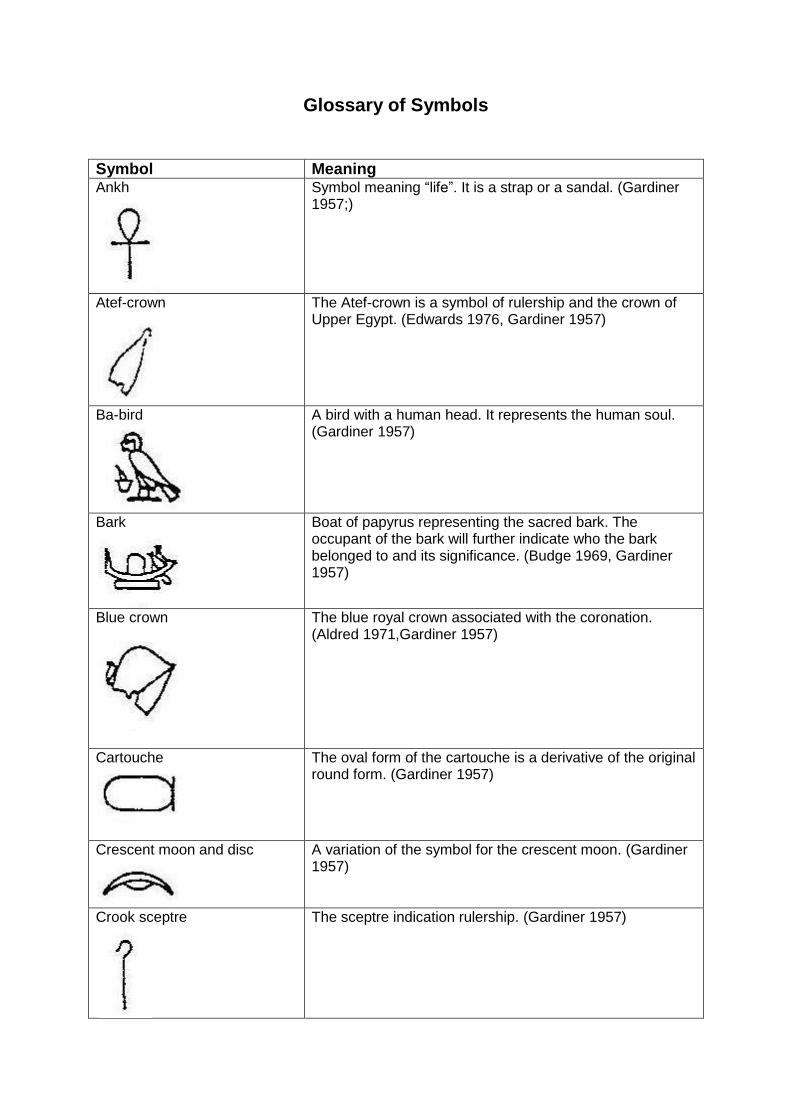
Glossary of Symbols
Symbol Meaning Ankh
Symbol meaning “life”. It is a strap or a sandal. (Gardiner 1957;)
Atef-crown
The Atef-crown is a symbol of rulership and the crown of Upper Egypt. (Edwards 1976, Gardiner 1957)
Ba-bird
A bird with a human head. It represents the human soul. (Gardiner 1957)
Bark
Boat of papyrus representing the sacred bark. The occupant of the bark will further indicate who the bark belonged to and its significance. (Budge 1969, Gardiner 1957)
Blue crown
The blue royal crown associated with the coronation. (Aldred 1971,Gardiner 1957)
Cartouche
The oval form of the cartouche is a derivative of the original round form. (Gardiner 1957)
Crescent moon and disc
A variation of the symbol for the crescent moon. (Gardiner 1957)
Crook sceptre
The sceptre indication rulership. (Gardiner 1957)
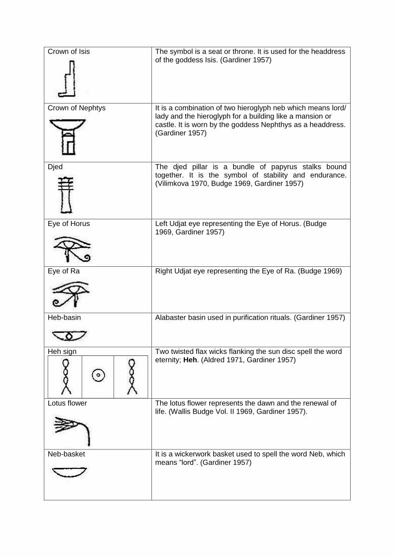
Crown of Isis
The symbol is a seat or throne. It is used for the headdress of the goddess Isis. (Gardiner 1957)
Crown of Nephtys
It is a combination of two hieroglyph neb which means lord/ lady and the hieroglyph for a building like a mansion or castle. It is worn by the goddess Nephthys as a headdress. (Gardiner 1957)
Djed
The djed pillar is a bundle of papyrus stalks bound together. It is the symbol of stability and endurance. (Vilimkova 1970, Budge 1969, Gardiner 1957)
Eye of Horus
Left Udjat eye representing the Eye of Horus. (Budge 1969, Gardiner 1957)
Eye of Ra
Right Udjat eye representing the Eye of Ra. (Budge 1969)
Heb-basin
Alabaster basin used in purification rituals. (Gardiner 1957)
Heh sign
Two twisted flax wicks flanking the sun disc spell the word eternity; Heh. (Aldred 1971, Gardiner 1957)
Lotus flower
The lotus flower represents the dawn and the renewal of life. (Wallis Budge Vol. II 1969, Gardiner 1957).
Neb-basket
It is a wickerwork basket used to spell the word Neb, which means “lord”. (Gardiner 1957)
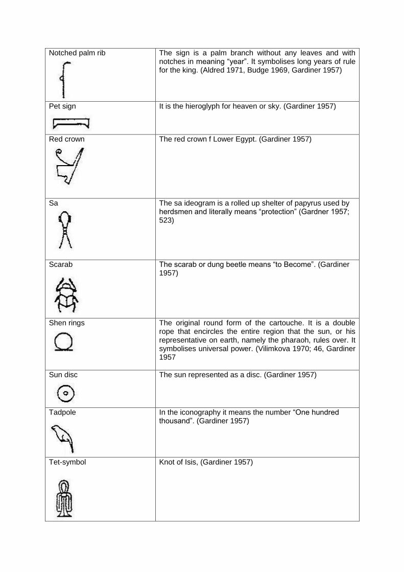
Notched palm rib
The sign is a palm branch without any leaves and with notches in meaning “year”. It symbolises long years of rule for the king. (Aldred 1971, Budge 1969, Gardiner 1957)
Pet sign
It is the hieroglyph for heaven or sky. (Gardiner 1957)
Red crown
The red crown f Lower Egypt. (Gardiner 1957)
Sa
The sa ideogram is a rolled up shelter of papyrus used by herdsmen and literally means “protection” (Gardner 1957; 523)
Scarab
The scarab or dung beetle means “to Become”. (Gardiner 1957)
Shen rings
The original round form of the cartouche. It is a double rope that encircles the entire region that the sun, or his representative on earth, namely the pharaoh, rules over. It symbolises universal power. (Vilimkova 1970; 46, Gardiner 1957
Sun disc
The sun represented as a disc. (Gardiner 1957)
Tadpole
In the iconography it means the number “One hundred thousand”. (Gardiner 1957)
Tet-symbol
Knot of Isis, (Gardiner 1957)
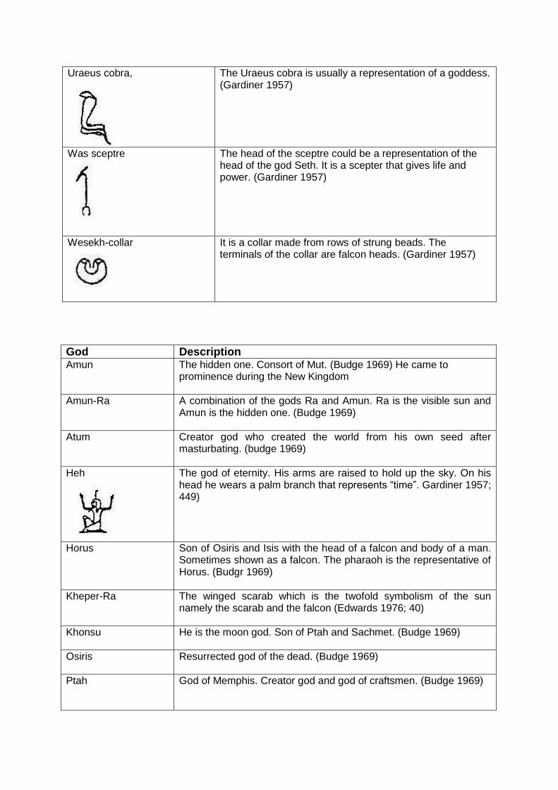
Uraeus cobra,
The Uraeus cobra is usually a representation of a goddess. (Gardiner 1957)
Was sceptre
The head of the sceptre could be a representation of the head of the god Seth. It is a scepter that gives life and power. (Gardiner 1957)
Wesekh-collar
It is a collar made from rows of strung beads. The terminals of the collar are falcon heads. (Gardiner 1957)
God Description Amun The hidden one. Consort of Mut. (Budge 1969) He came to
prominence during the New Kingdom
Amun-Ra A combination of the gods Ra and Amun. Ra is the visible sun and Amun is the hidden one. (Budge 1969)
Atum Creator god who created the world from his own seed after masturbating. (budge 1969)
Heh
The god of eternity. His arms are raised to hold up the sky. On his head he wears a palm branch that represents “time”. Gardiner 1957; 449)
Horus Son of Osiris and Isis with the head of a falcon and body of a man. Sometimes shown as a falcon. The pharaoh is the representative of Horus. (Budgr 1969)
Kheper-Ra The winged scarab which is the twofold symbolism of the sun namely the scarab and the falcon (Edwards 1976; 40)
Khonsu He is the moon god. Son of Ptah and Sachmet. (Budge 1969)
Osiris Resurrected god of the dead. (Budge 1969)
Ptah God of Memphis. Creator god and god of craftsmen. (Budge 1969)
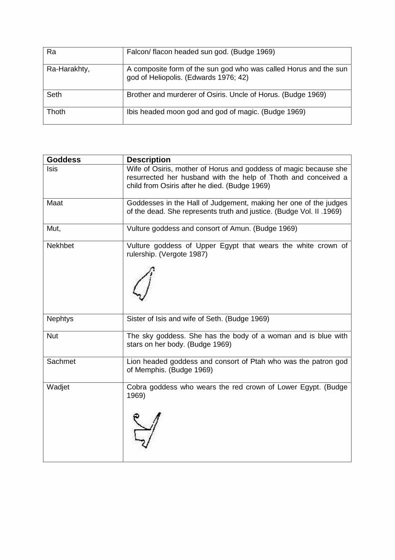
Ra Falcon/ flacon headed sun god. (Budge 1969)
Ra-Harakhty, A composite form of the sun god who was called Horus and the sun god of Heliopolis. (Edwards 1976; 42)
Seth Brother and murderer of Osiris. Uncle of Horus. (Budge 1969)
Thoth Ibis headed moon god and god of magic. (Budge 1969)
Goddess Description Isis Wife of Osiris, mother of Horus and goddess of magic because she
resurrected her husband with the help of Thoth and conceived a child from Osiris after he died. (Budge 1969)
Maat Goddesses in the Hall of Judgement, making her one of the judges of the dead. She represents truth and justice. (Budge Vol. II .1969)
Mut, Vulture goddess and consort of Amun. (Budge 1969)
Nekhbet Vulture goddess of Upper Egypt that wears the white crown of rulership. (Vergote 1987)
Nephtys Sister of Isis and wife of Seth. (Budge 1969)
Nut The sky goddess. She has the body of a woman and is blue with stars on her body. (Budge 1969)
Sachmet Lion headed goddess and consort of Ptah who was the patron god of Memphis. (Budge 1969)
Wadjet Cobra goddess who wears the red crown of Lower Egypt. (Budge 1969)
Related Documents