Analysis of Existing Back Covers Tara Burton

Analysis of existing back covers
Aug 14, 2015
Welcome message from author
This document is posted to help you gain knowledge. Please leave a comment to let me know what you think about it! Share it to your friends and learn new things together.
Transcript

Analysis of Existing Back Covers
Tara Burton

Barcode
List of tracks on album, numbered in order. Unconventionally the list of tracks is placed in an angle across the top rather than listed down the left hand side of the back cover.
Record label logo
In smaller print the name of the executive producer and further legal copyright information and artists website.
Clear colour scheme followed
Image of artist, similar to the front cover to show continuity.
Album name printed larger than the artists name, however they are shown in the largest font size and placed rather central on the back cover.
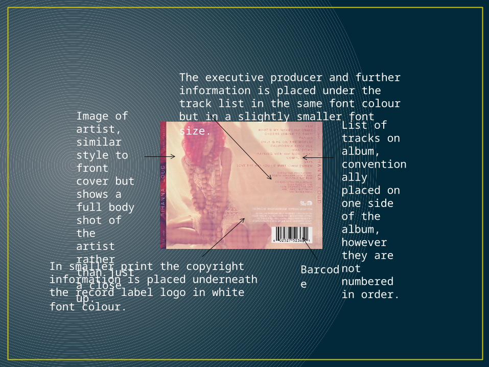
Barcode
Image of artist, similar style to front cover but shows a full body shot of the artist rather than just a close up.
List of tracks on album, conventionally placed on one side of the album, however they are not numbered in order.
In smaller print the copyright information is placed underneath the record label logo in white font colour.
The executive producer and further information is placed under the track list in the same font colour but in a slightly smaller font size.

Simple black and white colour scheme, basic design that is easy to understand and follow.
Uses the same image on the front cover but fills with track list information rather than the bands name.
The track list is unconventionally placed in the centre of the cover, however conventionally the tracks are numbered.
Barcode
There is no image of the band or their name placed on the back cover.
In smaller print the copyright information and record label logo is placed next to the barcode vertically in smaller font size.

Image of artist, similar style to front cover.
The track list is conventionally placed to the side of the cover, however the tracks are not numbered.
Barcode
Record label logos are placed at the bottom of the cover, also the bottom of the cover and underneath the artists image is the copyright information and the artists websites.
Above the barcode – executive producer.
The name of the artist and album is not shown on the back cover, however there is simple conventional layout to the cover with the artist placed on the left and the track list on the right with the additional information on the bottom.

Unconventionally there is no barcode, legal/copyright information and image if the band or band name.
The track list is centred on the back cover, however they are not numbered.
Use of artwork and design is similar to the front cover.
Bright and vibrant design is used, also due to the fact the band being that well known this artwork is instantly associated with them, therefore no need to display an image of them or their name.
The font reflects the style of the design and is used on both the front and back cover, shows continuity.

Image of the band is integrated into the back cover design.
Barcode
List of tracks featured on the album, conventionally numbered in order.
Record label logos
Copyright information
A colour scheme is followed, darkness around the edge of cover, allows more focus on the track list and the band holding the sign. This is not a
typical design for album back covers, however the typical conventions are followed. The design promotes the band as the main focal point, because of their established fan base.

An image is shown of the artist, however only the back of her is exposed to the consumers, the shot reveals her dominance as she is looking over a city and because she is known all over the world there is no need to show her face, also her body is idolised as this shot reveals.
Barcode Copyright/
legal information
Record label logos
Executive producer and artists website address.
The track list is displayed to the right and they are numbered.
The artists name is branded across the top of the cover, in a bolder font than the rest of the text.

The track list is numbered and the font follows the style of the band and genre.
Barcode
Copyright and legal information
Record label logos
The main image used for the back cover design is of band members, it follows the style and genre the band are associated with. For example the blurred look of the image and the iconic symbol of the cigarette are connected with the indie/rock image and lifestyle which this band are associated with.
Simple but effective design, allows the audience to understand the type of music to expect from this album.

Conclusion In conclusion, similarly to my analysis of album front covers, I found there is a wide variety, in terms of design in album back covers. However I also established from my analysis that various features are unavoidable on album back covers, such as the barcode, track listing and copyright information. Even though these conventions are found on the majority of album back covers , there is a small minority that do not feature these conventions, for example Coldplays ‘Mylo Xyloto’ album does not include either a barcode or legal copyright information. The main convention I found that most album back covers include is listing of the tracks included on the album, most of the time the tracks are numbered and columned and think this is done so it is easy to follow and looks neat on the cover. When it comes to designing my own back cover I think that following a simple style that links to the front cover is professional decision. As from my analysis I found that most back covers follow a simple style because of the information that is generally included needs to be noticed and not emerged into the background of a complex artwork design.
Related Documents