You should spend about 20 minutes on this task. The table below provide information on rental charges and salaries in three areas of London. Write a report for a university lecturer describing the information shown below. You should write at least 150 words. Weekly rents per property (£/w) Salaries needed (£/year) Area Notting Hill Regent's Park Fulham 1 bed 2 bed 3 bed 375 485 738 325 450 650 215 390 600 1 bed 2 bed 3 bed 98,500 127,500 194,000 85,500 118,000 170,500 56,500 102,500 157,500 model answer: The table shows two sets of related information: the relative cost, in pounds, of renting a property with one, two or three bedrooms in three different suburbs of London and an indication of the kind of annual salary you would need to be earning to rent in these areas. Of the three areas mentioned, Notting Hill is the most expensive with weekly rents starting at £375 (salary approximately f 100,000) and rising to £738 per week for a 3-bedroom property. To afford this, you would require a salary in the region of £200,000 per annum. Alternatively, Fulham is the cheapest area shown with rents ranging from £215 per week for a one bedroom property to £600 per week for a 3-bedroom property. To rent in this area, salaries need to be somewhere between £85,000 and £170,000 depending on the number of bedrooms required. For those able to pay in the middle price range for accommodation, Regent's Park might be a more suitable district. (163 words) You should spend about 20 minutes on this task. The diagram below shows how a central heating system in a house works. Summarise the information by selecting and reporting the main features, and make comparisons where relevant. You should write at least 150 words. 1

Welcome message from author
This document is posted to help you gain knowledge. Please leave a comment to let me know what you think about it! Share it to your friends and learn new things together.
Transcript
You should spend about 20 minutes on this task.
The table below provide information on rental charges and salaries in three areas of London.
Write a report for a university lecturer describing the information shown below.
You should write at least 150 words.
Weekly rents per property (£/w) Salaries needed (£/year)
Area
Notting Hill
Regent's Park
Fulham
1 bed 2 bed 3 bed
375 485 738
325 450 650
215 390 600
1 bed 2 bed 3 bed
98,500 127,500 194,000
85,500 118,000 170,500
56,500 102,500 157,500
model answer:
The table shows two sets of related information: the relative cost, in pounds, of renting a property with one, two or three bedrooms in three different suburbs of London and an indication of the kind of annual salary you would need to be earning to rent in these areas.
Of the three areas mentioned, Notting Hill is the most expensive with weekly rents starting at £375 (salary approximately f 100,000) and rising to £738 per week for a 3-bedroom property. To afford this, you would require a salary in the region of £200,000 per annum. Alternatively, Fulham is the cheapest area shown with rents ranging from £215 per week for a one bedroom property to £600 per week for a 3-bedroom property. To rent in this area, salaries need to be somewhere between £85,000 and £170,000 depending on the number of bedrooms required. For those able to pay in the middle price range for accommodation, Regent's Park might be a more suitable district.
(163 words)
You should spend about 20 minutes on this task.
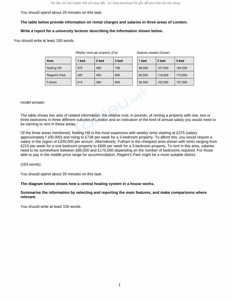
The diagram below shows how a central heating system in a house works.
Summarise the information by selecting and reporting the main features, and make comparisons where relevant.
You should write at least 150 words.
1
model answer:
This diagram provides an overview of a domestic central heating system. It shows how the tank, boiler and pipes ensure a constant flow of hot waterto both the radiators and the taps.
The cold water enters the house and is stored in a water storage tank in the roof. From there ü flows down to the boiler, located on the ground floor of the house.
The boiler, which is fuelled by gas or oil, heats up the water as it passes through it. The hot water is then pumped round the house through a system of pipes and flows into the radiators, located in different rooms. The water circulates through the radiators, which have small tubes inside them to help distribute the heat, and this warms each of the rooms. Some of the water is directed to the taps to provide hot water for the house.
Once the water has been through the pipes and radiators, it is returned to the boiler to be re-heated and circulated round the house again.
Introduction: First sentence. Overview: Second sentence.
Key features: Entry of cold water into boiler; circulation of hot waterto radiators and taps; return of waterto boiler.
Supporting information: direction of flow; types of boiler; location of radiators; radiator tubes
Paragraph breaks: The paragraph breaks mark stages in the process.
Linkers: and, from there, then, once, again Reference words: it, both, there, which, this
Topic vocabulary: enters, stored, roof, flows, ground floor, located, passes, pumped, system, circulates, heat, directed, returned, re-heated
2
Less common vocabulary: ensure, fuelled by, heats up, distribute the heat, warms
Structures: An appropriate mix of active and passive structures and a range of sentence types are used.
Length: 172 words
You should spend about 20 minutes on this task.
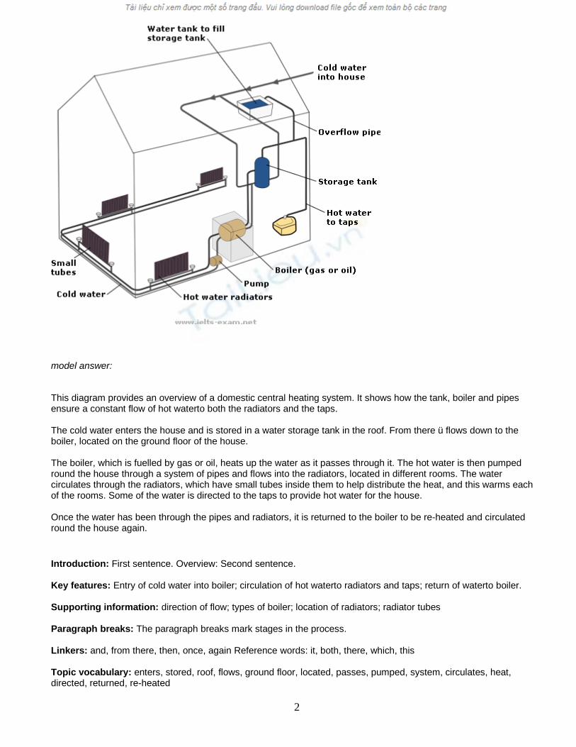
The graph below gives information about the preferred leisure activities of Australian children.
Write a report for a university lecturer describing the information shown.
You should write at least 150 words.
model answer:
The graph shows the preferred leisure sctivities of Australian children aged 5-14. As might be expected, it is clear from the data that sedentary pursuits are far more popular nowadays than active ones.
Of the 10,000 children that were interviewed, all the boys and girls stated that they enjoyed watching TV or videos in their spare time. In addition, the second most popular activity, attracting 80% of boys and 60% of girls, was playing electronic or computer games. While girls rated activities such as art and craft highly – just under 60% stated that they enjoyed these in their spare time – only 35% of boys opted for creative pastimes. Bike riding, on the other hand, was almost as popular as electronic games amongst boys and, perhaps surprisingly, almost 60% of girls said that they enjoyed this too. Skateboarding was relatively less popular amongst both boys and girls, although it still attracted 35% of boys and 25% of girls.
Writing Task 1
You should spend about 20 minutes on this task
The graph below shows the different modes of transport used to travel to and from work in one European city in 1960, 1980 and 2000.
Summarise the information by selecting and reporting the main features, and make comparisons where relevant.
3
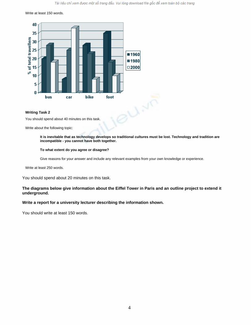
Write at least 150 words.
Writing Task 2
You should spend about 40 minutes on this task.
Write about the following topic:
It is inevitable that as technology develops so traditional cultures must be lost. Technology and tradition are incompatible - you cannot have both together.
To what extent do you agree or disagree?
Give reasons for your answer and include any relevant examples from your own knowledge or experience.
Write at least 250 words.
You should spend about 20 minutes on this task.
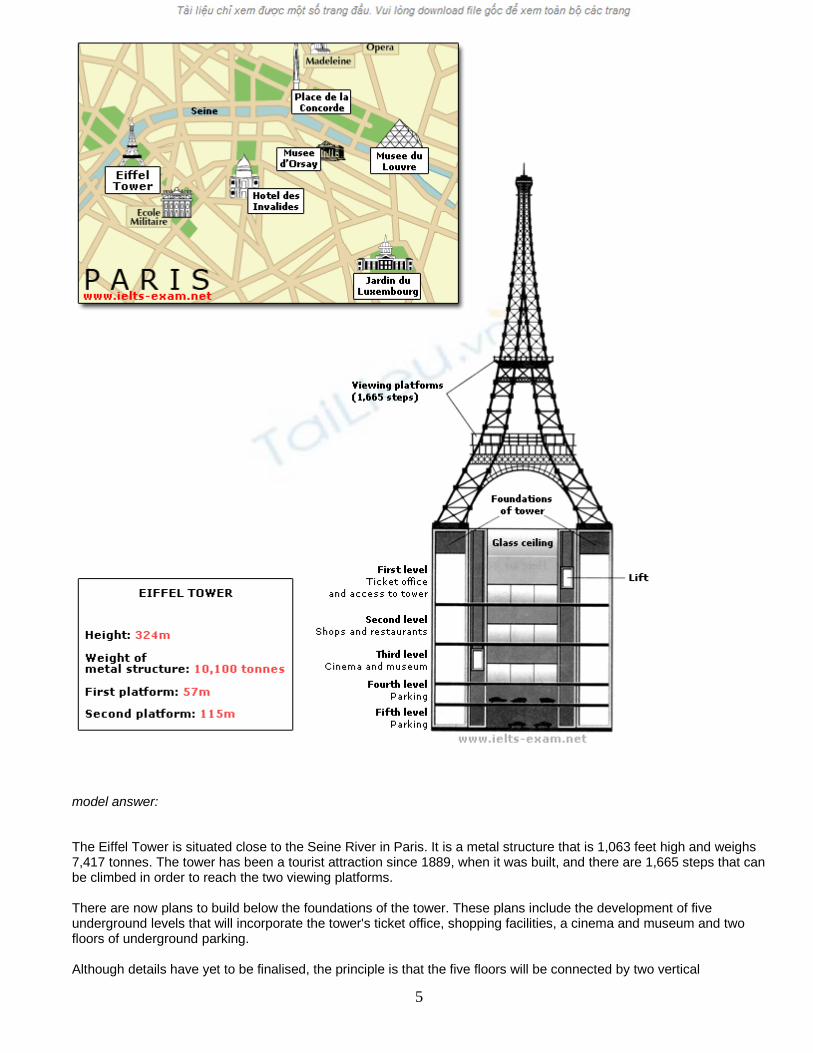
The diagrams below give information about the Eiffel Tower in Paris and an outline project to extend it underground.
Write a report for a university lecturer describing the information shown.
You should write at least 150 words.
4
model answer:
The Eiffel Tower is situated close to the Seine River in Paris. It is a metal structure that is 1,063 feet high and weighs 7,417 tonnes. The tower has been a tourist attraction since 1889, when it was built, and there are 1,665 steps that can be climbed in order to reach the two viewing platforms.
There are now plans to build below the foundations of the tower. These plans include the development of five underground levels that will incorporate the tower's ticket office, shopping facilities, a cinema and museum and two floors of underground parking.
Although details have yet to be finalised, the principle is that the five floors will be connected by two vertical
5
passenger lifts on either side of the tower. In addition, the floor immediately below the tower, which is planned to house the ticket office, will also consist of a large atrium with a glass ceiling so that visitors can look directly up at the tower itself.
You should spend about 20 minutes on this task.
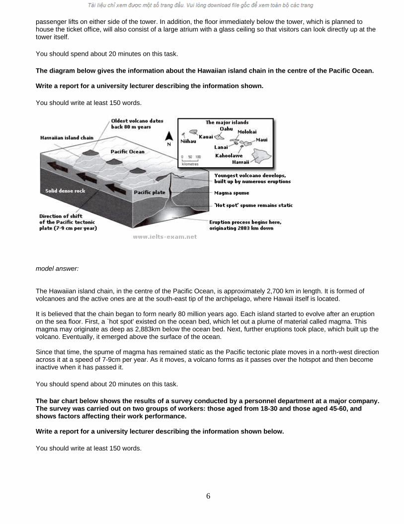
The diagram below gives the information about the Hawaiian island chain in the centre of the Pacific Ocean.
Write a report for a university lecturer describing the information shown.
You should write at least 150 words.
model answer:
The Hawaiian island chain, in the centre of the Pacific Ocean, is approximately 2,700 km in length. It is formed of volcanoes and the active ones are at the south-east tip of the archipelago, where Hawaii itself is located.
It is believed that the chain began to form nearly 80 million years ago. Each island started to evolve after an eruption on the sea floor. First, a `hot spot' existed on the ocean bed, which let out a plume of material called magma. This magma may originate as deep as 2,883km below the ocean bed. Next, further eruptions took place, which built up the volcano. Eventually, it emerged above the surface of the ocean.
Since that time, the spume of magma has remained static as the Pacific tectonic plate moves in a north-west direction across it at a speed of 7-9cm per year. As it moves, a volcano forms as it passes over the hotspot and then become inactive when it has passed it.
You should spend about 20 minutes on this task.
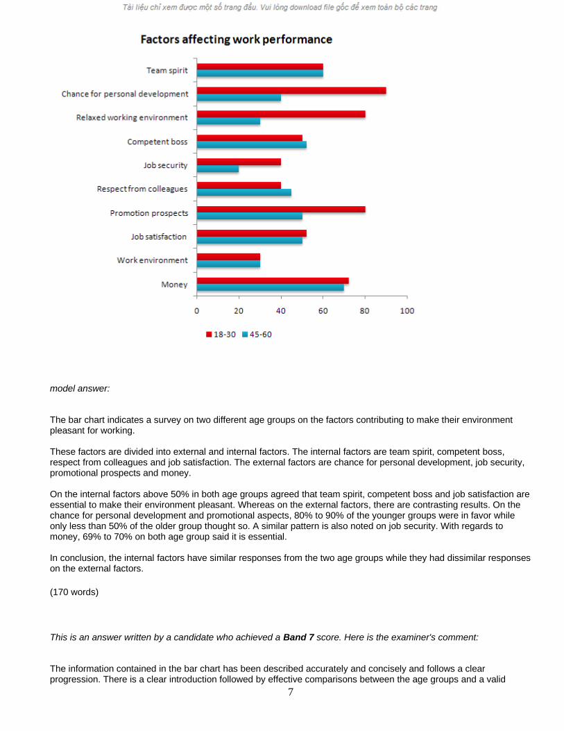
The bar chart below shows the results of a survey conducted by a personnel department at a major company. The survey was carried out on two groups of workers: those aged from 18-30 and those aged 45-60, and shows factors affecting their work performance.
Write a report for a university lecturer describing the information shown below.
You should write at least 150 words.
6
model answer:
The bar chart indicates a survey on two different age groups on the factors contributing to make their environment pleasant for working.
These factors are divided into external and internal factors. The internal factors are team spirit, competent boss, respect from colleagues and job satisfaction. The external factors are chance for personal development, job security, promotional prospects and money.
On the internal factors above 50% in both age groups agreed that team spirit, competent boss and job satisfaction are essential to make their environment pleasant. Whereas on the external factors, there are contrasting results. On the chance for personal development and promotional aspects, 80% to 90% of the younger groups were in favor while only less than 50% of the older group thought so. A similar pattern is also noted on job security. With regards to money, 69% to 70% on both age group said it is essential.
In conclusion, the internal factors have similar responses from the two age groups while they had dissimilar responses on the external factors.
(170 words)
This is an answer written by a candidate who achieved a Band 7 score. Here is the examiner's comment:
The information contained in the bar chart has been described accurately and concisely and follows a clear progression. There is a clear introduction followed by effective comparisons between the age groups and a valid
7
conclusion. Good formulaic phrases (the bar chart indicates, these factors are divided), although the candidate uses the same language to describe the factors in the bar chart and does not attempt to rephrase them in any way.
You should spend about 20 minutes on this task.
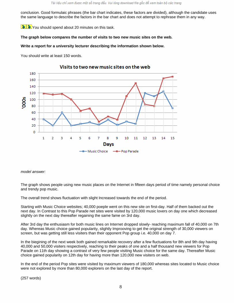
The graph below compares the number of visits to two new music sites on the web.
Write a report for a university lecturer describing the information shown below.
You should write at least 150 words.
model answer:
The graph shows people using new music places on the Internet in fifteen days period of time namely personal choice and trendy pop music.
The overall trend shows fluctuation with slight Increased towards the end of the period.
Starting with Music Choice websites; 40,000 poeple went on this new site on first-day. Half of them backed out the next day. In Contrast to this Pop Parade net sites were visited by 120,000 music lovers on day one which decreased slightly on the next day thereafter regaining the same fame on 3rd day.
After 3rd day the enthusiasm for both music lines on Internet dropped slowly- reaching maximum fall of 40,000 on 7th day. Whereas Music choice gained popularity, slightly Improoving to get the original strength of 30,000 viewers on screen, but was getting still less visiters than their opponent Pop group i.e. 40,000 on day 7.
In the biegining of the next week both gained remarkable recovery after a few fluctuations for 8th and 9th day having 40,000 and 50,000 visiters respectively, reaching to their peaks of one and a half thousand new viewers for Pop Parade on 11th day showing a contrast of very few people visiting Music choice for the same day. Thereafter Music choice gained popularity on 12th day for having more than 120,000 new visiters on web.
In the end of the period Pop sites were visited by maximum viewers of 180,000 whereas sites located to Music choice were not explored by more than 80,000 explorers on the last day of the report.
(257 words)
8
This is an answer written by a candidate who achieved a Band 6 score. Here is the examiner's comment:
Well organized with some good linking devices and collocations (gain popularity, remarkable recovery, decrease slightly) and some valid comparison of the music sites. However, some sentences are long and confusing (paragraph 5), some collocations are inaccurate (slight increased, reaching to their peaks) and there is some repetition (7th day, 3rd day, 11 th day). Some words are spelt incorrectly (poeple, Improoving, visiters, biegining).
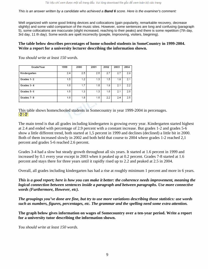
The table below describes percentages of home schooled students in SomeCountry in 1999-2004. Write a report for a university lecturer describing the information shown.
You should write at least 150 words.
This table shows homeschooled students in Somecountry in year 1999-2004 in percenages.
The main trend is that all grades including kindergarten is growing every year. Kindergarten started highest at 2.4 and ended with percentage of 2.9 percent with a constant increase. But grades 1-2 and grades 5-6 show a little different trend, both started at 1,5 percent in 1999 and declines (declined) a little bit in 2000. Both of them increased slowly in 2002 and both held that course to 2004 where grades 1-2 reached 2,1 percent and grades 5-6 reached 2.6 percent.
Grades 3-4 had a slow but steady growth throughout all six years. It started at 1.6 percent in 1999 and increased by 0.1 every year except in 2003 when it peaked up at 0.2 percent. Grades 7-8 started at 1.6 percent and stays there for three years until it rapidly rised up to 2.2 and peaked at 2.5 in 2004.
Overall, all grades including kindergarten has had a rise at roughly minimum 1 percent and more in 6 years.
This is a good report; here is how you can make it better: the coherence needs improvement, meaning the logical connection between sentences inside a paragraph and between paragraphs. Use more connective words (Furthermore, However, etc).
The groupings you’ve done are fine, but try to use more variations describing those statistics: use words such as numbers, figures, percentages, etc. The grammar and the spelling need some extra attention.
The graph below gives information on wages of Somecountry over a ten-year period. Write a report for a university tutor describing the information shown.
You should write at least 150 words.
9
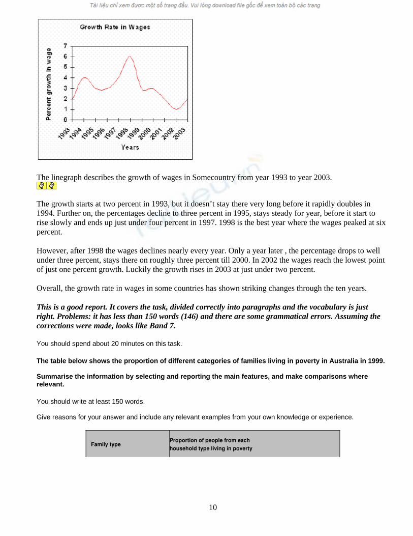
The linegraph describes the growth of wages in Somecountry from year 1993 to year 2003.
The growth starts at two percent in 1993, but it doesn’t stay there very long before it rapidly doubles in 1994. Further on, the percentages decline to three percent in 1995, stays steady for year, before it start to rise slowly and ends up just under four percent in 1997. 1998 is the best year where the wages peaked at six percent.
However, after 1998 the wages declines nearly every year. Only a year later , the percentage drops to well under three percent, stays there on roughly three percent till 2000. In 2002 the wages reach the lowest point of just one percent growth. Luckily the growth rises in 2003 at just under two percent.
Overall, the growth rate in wages in some countries has shown striking changes through the ten years.
This is a good report. It covers the task, divided correctly into paragraphs and the vocabulary is just right. Problems: it has less than 150 words (146) and there are some grammatical errors. Assuming the corrections were made, looks like Band 7.
You should spend about 20 minutes on this task.
The table below shows the proportion of different categories of families living in poverty in Australia in 1999.
Summarise the information by selecting and reporting the main features, and make comparisons where relevant.
You should write at least 150 words.
Give reasons for your answer and include any relevant examples from your own knowledge or experience.
Family type Proportion of people from eachhousehold type living in poverty
10
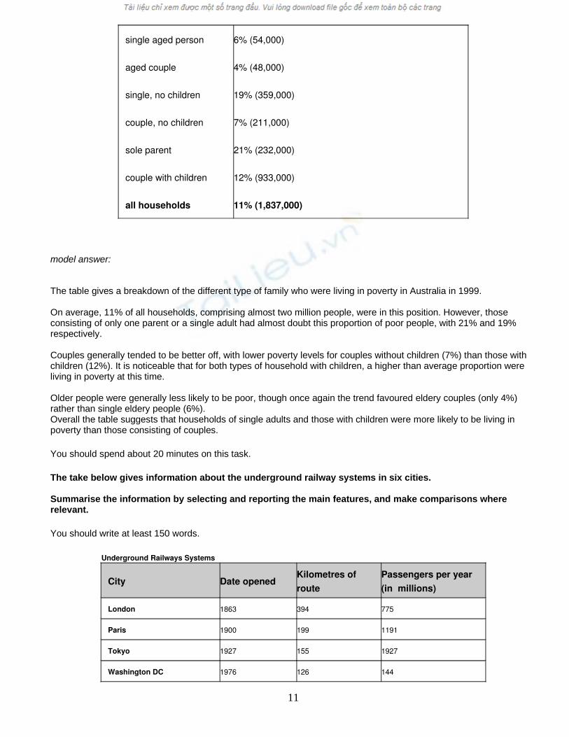
single aged person
aged couple
single, no children
couple, no children
sole parent
couple with children
all households
6% (54,000)
4% (48,000)
19% (359,000)
7% (211,000)
21% (232,000)
12% (933,000)
11% (1,837,000)
model answer:
The table gives a breakdown of the different type of family who were living in poverty in Australia in 1999.
On average, 11% of all households, comprising almost two million people, were in this position. However, those consisting of only one parent or a single adult had almost doubt this proportion of poor people, with 21% and 19% respectively.
Couples generally tended to be better off, with lower poverty levels for couples without children (7%) than those with children (12%). It is noticeable that for both types of household with children, a higher than average proportion were living in poverty at this time.
Older people were generally less likely to be poor, though once again the trend favoured eldery couples (only 4%) rather than single eldery people (6%).Overall the table suggests that households of single adults and those with children were more likely to be living in poverty than those consisting of couples.
You should spend about 20 minutes on this task.
The take below gives information about the underground railway systems in six cities.
Summarise the information by selecting and reporting the main features, and make comparisons where relevant.
You should write at least 150 words.
Underground Railways Systems
City Date opened Kilometres of route
Passengers per year(in millions)
London 1863 394 775
Paris 1900 199 1191
Tokyo 1927 155 1927
Washington DC 1976 126 144
11
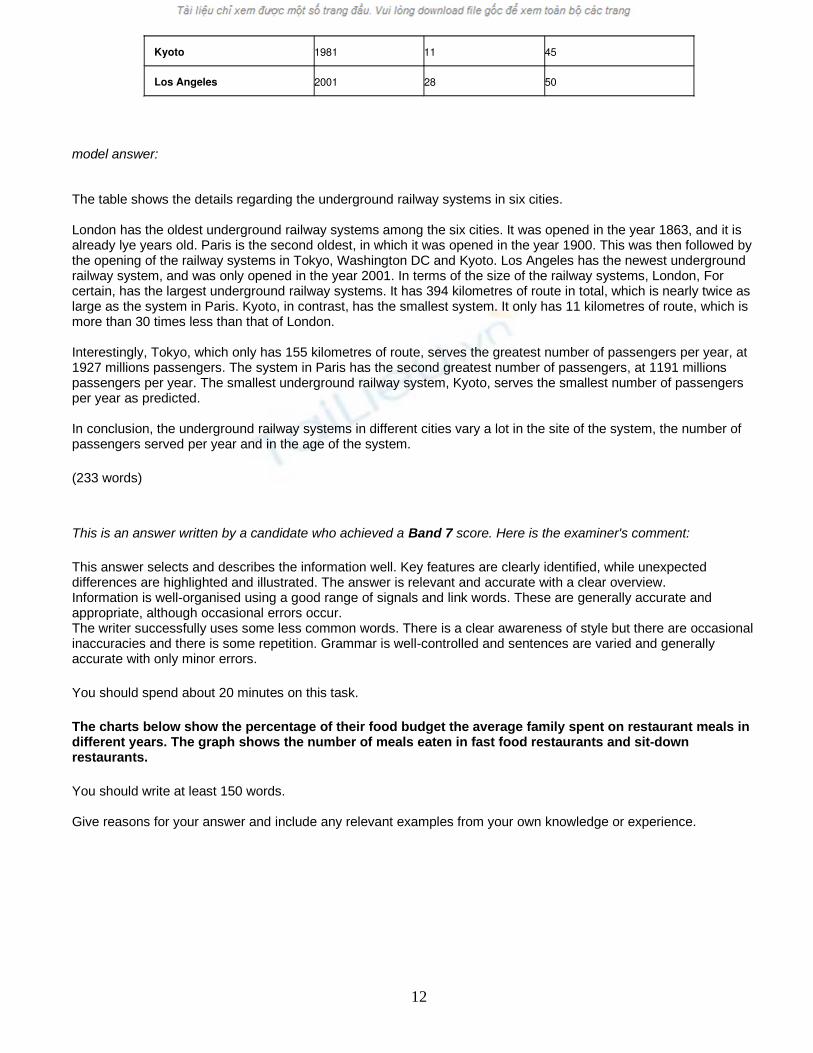
Kyoto 1981 11 45
Los Angeles 2001 28 50
model answer:
The table shows the details regarding the underground railway systems in six cities.
London has the oldest underground railway systems among the six cities. It was opened in the year 1863, and it is already lye years old. Paris is the second oldest, in which it was opened in the year 1900. This was then followed by the opening of the railway systems in Tokyo, Washington DC and Kyoto. Los Angeles has the newest underground railway system, and was only opened in the year 2001. In terms of the size of the railway systems, London, For certain, has the largest underground railway systems. It has 394 kilometres of route in total, which is nearly twice as large as the system in Paris. Kyoto, in contrast, has the smallest system. It only has 11 kilometres of route, which is more than 30 times less than that of London.
Interestingly, Tokyo, which only has 155 kilometres of route, serves the greatest number of passengers per year, at 1927 millions passengers. The system in Paris has the second greatest number of passengers, at 1191 millions passengers per year. The smallest underground railway system, Kyoto, serves the smallest number of passengers per year as predicted.
In conclusion, the underground railway systems in different cities vary a lot in the site of the system, the number of passengers served per year and in the age of the system.
(233 words)
This is an answer written by a candidate who achieved a Band 7 score. Here is the examiner's comment:
This answer selects and describes the information well. Key features are clearly identified, while unexpected differences are highlighted and illustrated. The answer is relevant and accurate with a clear overview.Information is well-organised using a good range of signals and link words. These are generally accurate and appropriate, although occasional errors occur.The writer successfully uses some less common words. There is a clear awareness of style but there are occasional inaccuracies and there is some repetition. Grammar is well-controlled and sentences are varied and generally accurate with only minor errors.
You should spend about 20 minutes on this task.
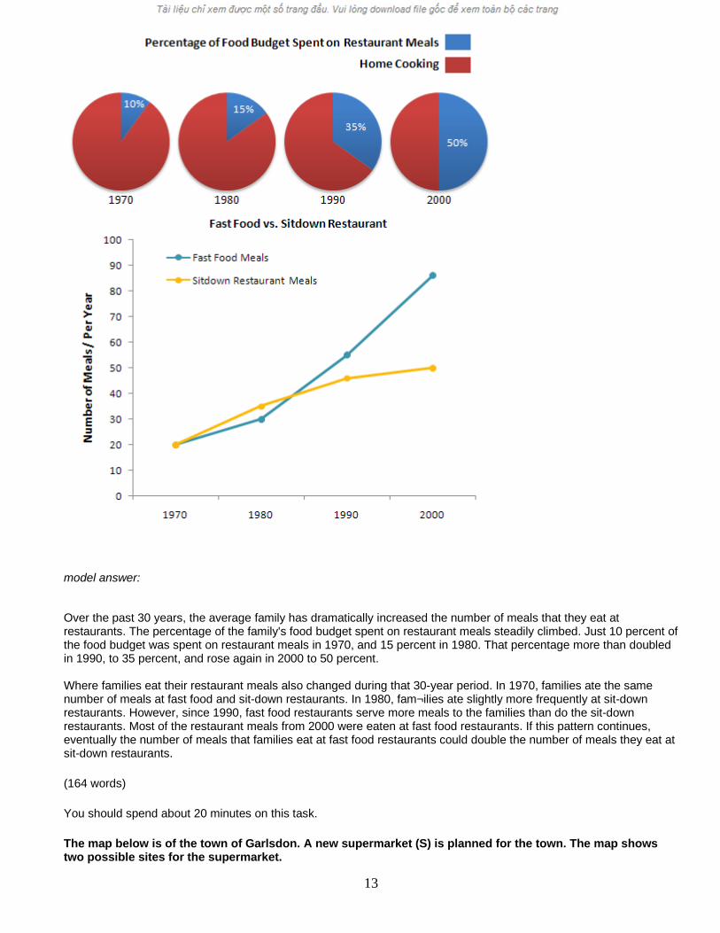
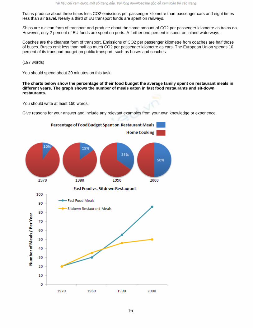
The charts below show the percentage of their food budget the average family spent on restaurant meals in different years. The graph shows the number of meals eaten in fast food restaurants and sit-down restaurants.
You should write at least 150 words.
Give reasons for your answer and include any relevant examples from your own knowledge or experience.
12
model answer:
Over the past 30 years, the average family has dramatically increased the number of meals that they eat at restaurants. The percentage of the family's food budget spent on restaurant meals steadily climbed. Just 10 percent of the food budget was spent on restaurant meals in 1970, and 15 percent in 1980. That percentage more than doubled in 1990, to 35 percent, and rose again in 2000 to 50 percent.
Where families eat their restaurant meals also changed during that 30-year period. In 1970, families ate the same number of meals at fast food and sit-down restaurants. In 1980, fam¬ilies ate slightly more frequently at sit-down restaurants. However, since 1990, fast food restaurants serve more meals to the families than do the sit-down restaurants. Most of the restaurant meals from 2000 were eaten at fast food restaurants. If this pattern continues, eventually the number of meals that families eat at fast food restaurants could double the number of meals they eat at sit-down restaurants.
(164 words)
You should spend about 20 minutes on this task.
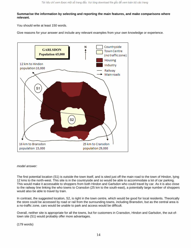
The map below is of the town of Garlsdon. A new supermarket (S) is planned for the town. The map shows two possible sites for the supermarket.
13
Summarise the information by selecting and reporting the main features, and make comparisons where relevant.
You should write at least 150 words.
Give reasons for your answer and include any relevant examples from your own knowledge or experience.
model answer:
The first potential location (S1) is outside the town itself, and is sited just off the main road to the town of Hindon, lying 12 kms to the north-west. This site is in the countryside and so would be able to accommodate a lot of car parking. This would make it accessable to shoppers from both Hindon and Garlsdon who could travel by car. As it is also close to the railway line linking the who towns to Cransdon (25 km to the south-east), a potentially large number of shoppers would also be able to travel by train.
In contrast, the suggested location, S2, is right in the town centre, which would be good for local residents. Theorically the store could be accessed by road or rail from the surrounding towns, including Bransdon, but as the central area is a no-traffic zone, cars would be unable to park and access would be difficult.
Overall, neither site is appropriate for all the towns, but for customers in Cransdon, Hindon and Garlsdon, the out-of-town site (S1) would probably offer more advantages.
(179 words)
14
You should spend about 20 minutes on this task.
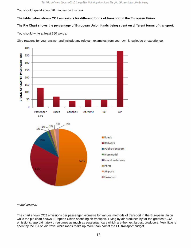
The table below shows CO2 emissions for different forms of transport in the European Union.
The Pie Chart shows the percentage of European Union funds being spent on different forms of transport.
You should write at least 150 words.
Give reasons for your answer and include any relevant examples from your own knowledge or experience.
model answer:
The chart shows CO2 emissions per passenger kilometre for variuos methods of transport in the European Union while the pie chart shows European Union spending on transport. Flying by air produces by far the greatest CO2 emissions, approximately three times as much as passenger cars which are the next largest producers. Very little is spent by the EU on air travel while roads make up more than half of the EU transport budget.
15
Trains produce about three times less CO2 emissions per passenger kilometre than passenger cars and eight times less than air travel. Nearly a third of EU transport funds are spent on railways.
Ships are a clean form of transport and produce about the same amount of CO2 per passenger kilometre as trains do. However, only 2 percent of EU funds are spent on ports. A further one percent is spent on inland waterways.
Coaches are the cleanest form of transport. Emissions of CO2 per passenger kilometre from coaches are half those of buses. Buses emit less than half as much CO2 per passenger kilometre as cars. The European Union spends 10 percent of its transport budget on public transport, such as buses and coaches.
(197 words)
You should spend about 20 minutes on this task.
The charts below show the percentage of their food budget the average family spent on restaurant meals in different years. The graph shows the number of meals eaten in fast food restaurants and sit-down restaurants.
You should write at least 150 words.
Give reasons for your answer and include any relevant examples from your own knowledge or experience.
16
model answer:
Over the past 30 years, the average family has dramatically increased the number of meals that they eat at restaurants. The percentage of the family's food budget spent on restaurant meals steadily climbed. Just 10 percent of the food budget was spent on restaurant meals in 1970, and 15 percent in 1980. That percentage more than doubled in 1990, to 35 percent, and rose again in 2000 to 50 percent.
Where families eat their restaurant meals also changed during that 30-year period. In 1970, families ate the same number of meals at fast food and sit-down restaurants. In 1980, fam¬ilies ate slightly more frequently at sit-down restaurants. However, since 1990, fast food restaurants serve more meals to the families than do the sit-down restaurants. Most of the restaurant meals from 2000 were eaten at fast food restaurants. If this pattern continues, eventually the number of meals that families eat at fast food restaurants could double the number of meals they eat at sit-down restaurants.
(164 words)
You should spend about 20 minutes on this task.
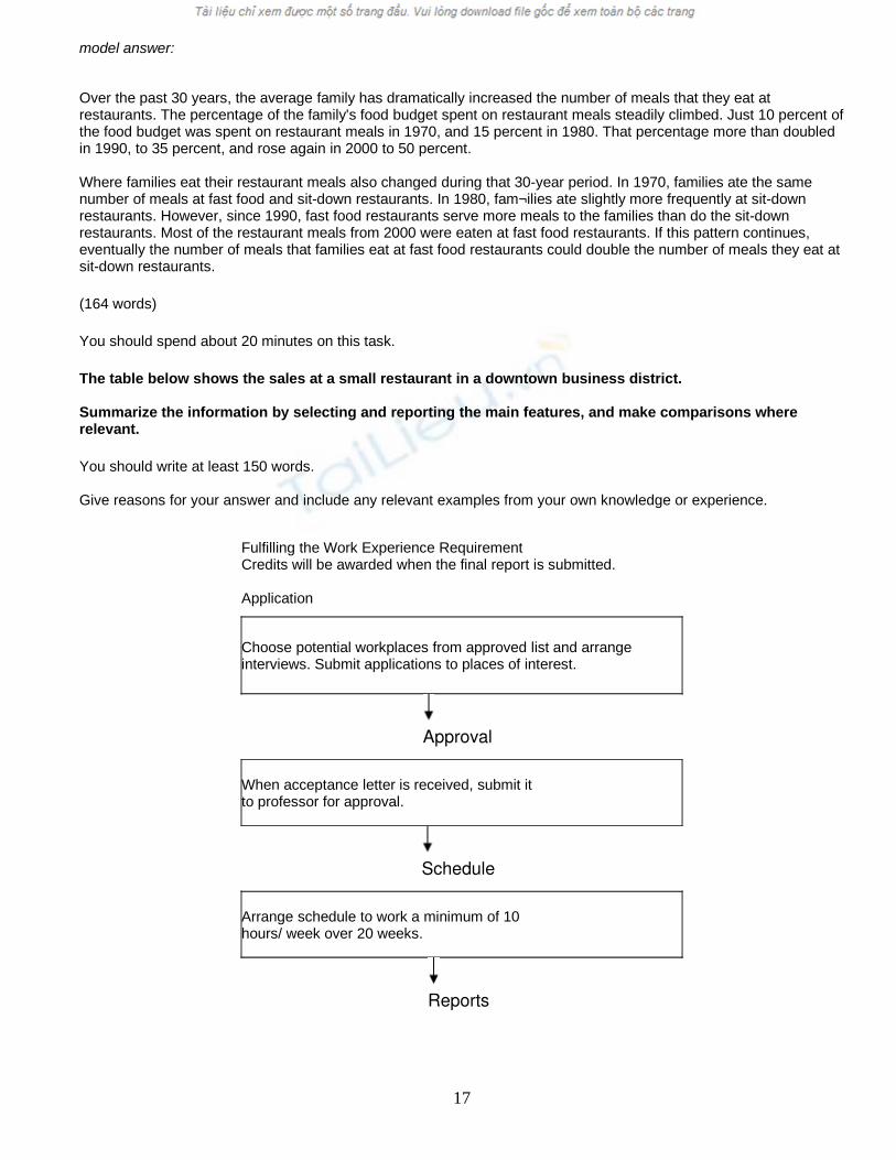
The table below shows the sales at a small restaurant in a downtown business district.
Summarize the information by selecting and reporting the main features, and make comparisons where relevant.
You should write at least 150 words.
Give reasons for your answer and include any relevant examples from your own knowledge or experience.
Fulfilling the Work Experience RequirementCredits will be awarded when the final report is submitted.
Application
Choose potential workplaces from approved list and arrange interviews. Submit applications to places of interest.
Approval
When acceptance letter is received, submit itto professor for approval.
Schedule
Arrange schedule to work a minimum of 10hours/ week over 20 weeks.
Reports
17

Complete weekly Report Form and submit toprofessor every Friday.
Evaluation
During final workweek, participate in evaluation meeting with work supervisor. Supervisor submits Evaluation Form.
Final Report
Submit Final Report before last week of spring term.
model answer:
Gaining work experience prior to graduation helps university students to succeed in getting their first job. For this reason, some universities insist that all students must complete a Work Experience Requirement. Completing the following six stages results in the requirements’ fulfillment.
The process begins with the Application stage. A student reviews an approved list of workplaces and submits applications to places where he would like to work. Next is the Approval stage. When a student receives an acceptance letter, he gives it to the professor for approval. The third stage, Schedule, requires a student to arrange his work schedule. The student should work at least 10 hours/week over 20 weeks. Reports are next. The student must complete a Weekly Report Form and turn it in to the professor every Friday.
The fifth stage, Evaluation, takes place during the final work week. A student participates in an evaluation meeting with his work supervisor, who submits an Evaluation Form. The last stage requires that a student submit a Final Report before the last week of spring semester.
By following these stages and subsequently submitting the final report, the student receives credit from the university.
(192 words)
Writing Task 1
You are advised to spend a maximum of 20 minutes on thistask.
In June 1996, an experimental flu vaccine was trialled in alarge country town on females only .
Write a report for a university tutor describing theinformation shown in the diagrams below.
You should write at least 150 words.
18

Writing Task 2
You are advised to spend a maximum of 40 minutes on this task.
Write an essay for a university lecturer on the following topic:
The costs of medical health care are increasing all the time. Governmentsare finding it difficult to balance the health care budget.Should citizens be totally responsible for their own health costs and takeout private health insurance, or is it better to have a comprehensive healthcare system which provides free health services for all? Discuss.
You should write at least 250 words.
You are required to support your arguments with relevant information and examples basedon your own ideas, knowledge and experience..
3.Writing
Writing Task 1:
19

The diagrams show data for a flu epidemic which hit a large country town in 1996. Figure 1 gives the number of persons who died; Figure 2 shows the percentage breakdown of females who received a new flu vaccine; and Figure 3 gives the number of cases of flu before and during the epidemic.
In Figure 1 it can be seen that the flu was responsible for the deaths of 2 females but no males in the period from March to May. However, from June to August, there were 4 female deaths and 1 male death.
According to the pie chart in Figure 2, only those females most at risk were given the new flu vaccine; 28% did not take part in the trial. Of those females who took part, 35% were aged (over 65 years old); 24% were babies or children; and 13% were either hospitalised or receiving other medical attention.
From Figure 3 it is clear that the new vaccine had a positive effect on the number of new cases of flu reported in females. There were just over 1000 cases reported in March, climbing rapidly to a peak of 3500 in June. Thereafter, the number of cases dropped slowly to about 2800 in August, before levelling off at 2500 for the rest of the year. For males, the figures were lower but showed a similar trend throughout the epidemic. (232 words)
Writing Task 2:
A much debated issue these days is whether citizens should take out private health insurance or not. The cost of providing free medical care for both the wealthy and the poor is far too great for any government, and most people agree that if you can pay for insurance, you should. In this essay, I will argue that all who can afford it should be insured, but free medical care must be made available for those too poor to do so.
The most important reason for encouraging people to take out private health insurance is the cost to the government of health care. Free health cover for people who are able to pay for it is a waste of public money. Of course, people will only pay health insurance premiums if they know that they are getting good value for their money. If they get sick, they should pay very little or nothing at all. In addition, the privately insured are entitled to special benefits such as having the choice of their own doctors, and being able to avoid long waiting lists for hospital beds.
On the other hand, those who really cannot afford to pay private insurance premiums, which are often very high, are still entitled as citizens to the best medical care available - they cannot be expected to pay their own medical bills. However, if they are working, they should still pay a percentage of their wage (say 1 to 2%) as a tax which pays towards the cost of providing 'free' medical services.
In conclusion, most people should privately insure their health, but it is unreasonable to suppose that all citizens can afford it. Therefore, a safety net in the form of a basic free health care system must exist for the very poor and the unemployed.
(301 words)
You should spend about 20 minutes on this task.
The table below shows the sales at a small restaurant in a downtown business district.
Summarize the information by selecting and reporting the main features, and make comparisons where relevant.
You should write at least 150 words.
Give reasons for your answer and include any relevant examples from your own knowledge or experience.
20
Related Documents