*Choose a sentence, phrase or col- lection of words related to a move- ment or set of movements. *Produce a stop-frame animation using the typographic letter forms from this sentence, phrase or col- lection of words. *Your stop-frame animation must have a minimum duration of 30 sec- onds, and a minimum frame-rate of 12 fps (frames per second). *You are expected to use photog- raphy, and may photograph your letter forms in places and spaces that relate to your ideas. You are discouraged from using pre-made images as backgrounds. ONE WEEK BRIEF

workbook trial 2
Mar 22, 2016
book trial
Welcome message from author
This document is posted to help you gain knowledge. Please leave a comment to let me know what you think about it! Share it to your friends and learn new things together.
Transcript
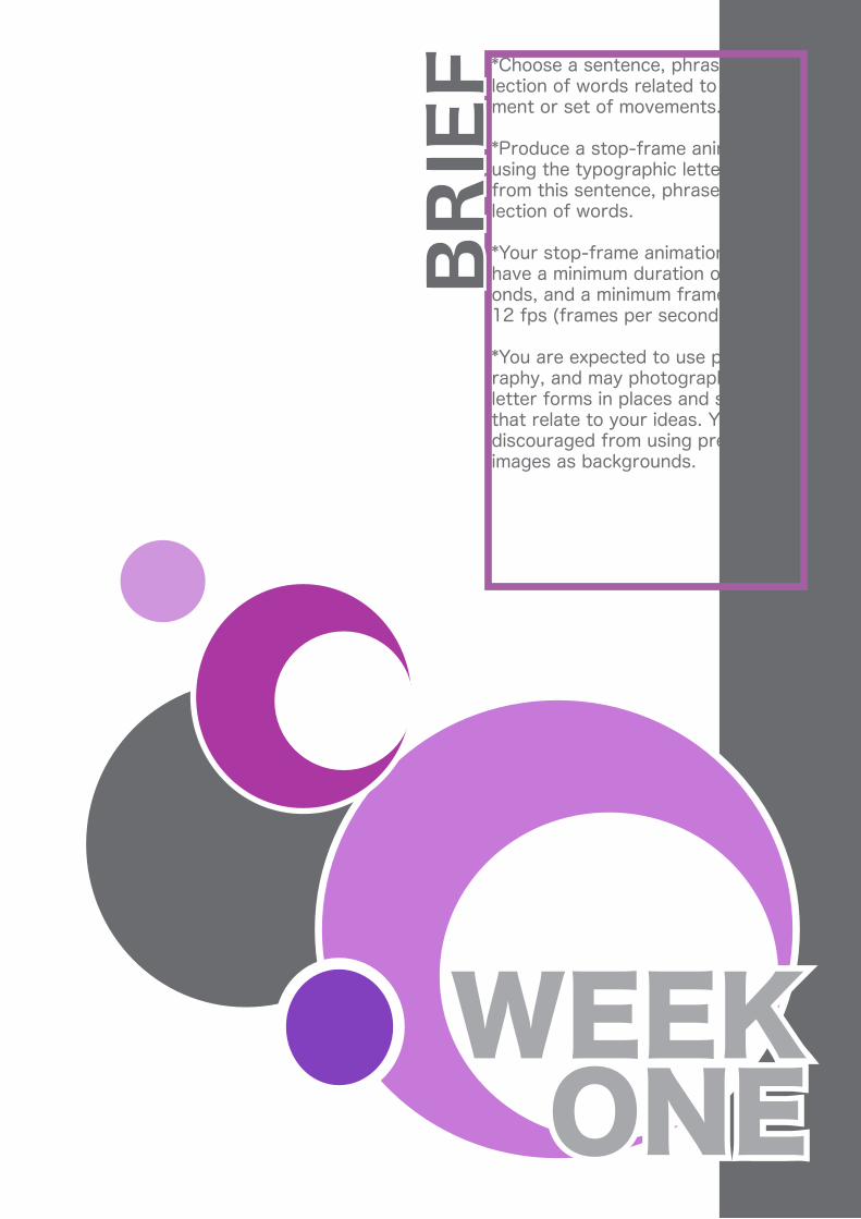
*Choose a sentence, phrase or col-lection of words related to a move-ment or set of movements.
*Produce a stop-frame animation using the typographic letter forms from this sentence, phrase or col-lection of words.
*Your stop-frame animation must have a minimum duration of 30 sec-onds, and a minimum frame-rate of 12 fps (frames per second).
*You are expected to use photog-raphy, and may photograph your letter forms in places and spaces that relate to your ideas. You are discouraged from using pre-made images as backgrounds.
ONEWEEK
BRIE
F
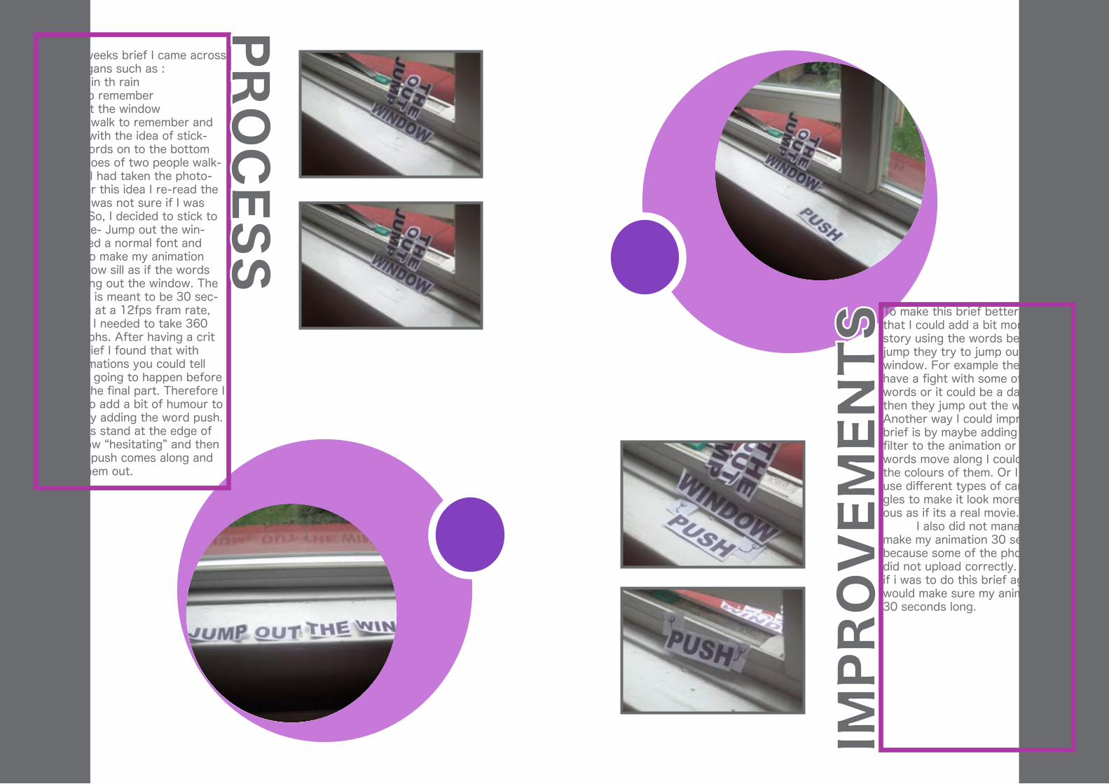
For this weeks brief I came across many slogans such as :-Dancing in th rain-A walk to remember-Jump out the windowI chose a walk to remember and came up with the idea of stick-ing the words on to the bottom of the shoes of two people walk-ing.Once I had taken the photo-graphs for this idea I re-read the brief and was not sure if I was on brief. So, I decided to stick to the phrase- Jump out the win-dow. I used a normal font and decided to make my animation on a window sill as if the words are jumping out the window. The animation is meant to be 30 sec-onds long at a 12fps fram rate, therefore I needed to take 360 photographs. After having a crit on this brief I found that with some animations you could tell what was going to happen before it got to the final part. Therefore I decided to add a bit of humour to the end by adding the word push. The words stand at the edge of the window “hesitating” and then the word push comes along and pushes them out.
To make this brief better I think that I could add a bit more of a story using the words before they jump they try to jump out the window. For example they could have a fight with some other words or it could be a dare, and then they jump out the window. Another way I could improve this brief is by maybe adding a photo filter to the animation or as the words move along I could change the colours of them. Or I could use different types of camera an-gles to make it look more humor-ous as if its a real movie. I also did not manage to make my animation 30 seconds because some of the photographs did not upload correctly. So, when if i was to do this brief again I would make sure my animation is 30 seconds long.
PRO
CESS
IMPR
OV
EMEN
TS

Compile the 3 illustrations into an A3 pdf.
Use the remaining A5 space to write a brief explanation of your use of colour and composition.Raw Material
1) Use photography to collect two alphabets, one of vernacular type, and one of abstract typographic forms.
2) Find/select a high-resolution im-age of an exterior/urban environ-ment. (Scan or re-photograph the image if it’s not in digital form.)
TWOWEEK
BRIE
F Conceptual Process1) Define the atmosphere of your selected image in words.
Technical Process1) Trace paths from your collected alphabets in Adobe Illustrator
2) Extract a colour palette from your high-resolution image using Adobe Illustrator.
Output
Make 3 A5 illustrations that evoke the atmosphere of your original im-age, using only your collected typo-graphic forms and your extracted colour palette.
Attitudes to colour: Of these il-lustrations, one must make use of complementary colour, and one must make use of subtractive col-our.
Attitudes to composition: Of these illustrations, one must employ the rule of thirds, and one must make use of the golden ratio.
I started off by collecting my raw material primarily using a slr camera. i started of by collect-ing my abstract type by taking photographs of things around the house which looked like the al-phabet. I found that the outcome from these photographs looked quite impressive. I then used in-Design to create paths that I can use to make my illustration. Once I had collected my fonts, I found a picture to work with in which I could extract my colour palette. I extracted a colour palette so that I could use it as a guide to make my illustration link to the photo-graph. I then had to come up with words and phrases that I could use within my designs. I used the phrase under the weather as its raining and the figure in the pho-tograph is under an umbrella. I used the idea of using the text in the shape of an umbrella so that the meaning was expressed through the shape as well as the words. This design uses the rule of thirds as the umberella is in the middle of the design. The second design reflects the feeling you get from the from the person in the pho-tograph- alone. Using my collated alphabet I used the letters ALON to-gether and E on its own to show the idea of girl being alone. This de-sign uses the golden ratio as the ALON is in a square of the design and the E is in a rec-tangle on its own. The last design reflects the environ-ment and the weather as its raining I wrote the word rain repetatively in the shape of a rain drop.
PRO
CESS
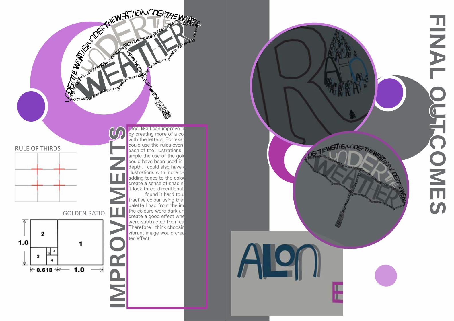
I feel like I can improve this brief by creating more of a concept with the letters. For example I could use the rules even more in each of the illustrations. For ex-ample the use of the golden ratio could have been used in more depth. I could also have created illustrations with more depth, adding tones to the colours to create a sense of shading to make it look three-dimentional. I found it hard to use sub-tractive colour using the colour palette I had from the image as all the colours were dark and did not create a good effect when they were subtracted from each other.Therefore I think choosing a more vibrant image would create a bet-ter effect
IMPR
OV
EMEN
TSRULE OF THIRDS
GOLDEN RATIO
FINA
L OU
TCO
MES

For this project I already had my vernacular typefaces from the brief for week two. I have cho-sen to work with the same image I have used from the previous brief. This is the first project I have been set in which I have had to use 3D Studio Max. I chose the idea of “singing in the rain”, as it is a well known song and relates to the picture because its raining. Using Adobe illustrator I created paths that I could then use in 3D Studio Max. During tutorials we learnt how to transform paths into three-dimentional objects, by adding a bevel effect, I had to do this to make the words look as if they are in its surroundings to make it look realistic to a certain extent. Adding a plane under the object allows me to create shad-ows on to the surface. 3D Stu-dio Max gives you a few options of what type of light you would like to shine on to ur object. For Singing in the rain I chose to use two types of lights a sky light- which gives my object a natural lighting effect. I also added a omni light so that I could shine the light in the same direction as the light in the background to create a realistic shadow. I chose to po-sition it near the figure so that the words link to her. The second image I chose ia a scenary with hills and a rainbow in the background. I chose the phrase pot of gold as its a norm that comes from a rainbow. And i chose to use a yellow/gold co-lour to represent the gold. Lastly I chose an image of a snowy backgr-ound and used the word win-ter, this time I added a texture to make the white in the typog-raphy look similar to the snowy surroundings.
PRO
CESS
This design was more complex as the text is placed behind the bench. Therefore, I had to use a mask on top of the text layer as this makes the design look as if the text is behind the object. I also decided to animate this design proposal using 3D studio max using key frames to record the movement of the three dimentional object i had created. adding the lights and shadows correctly to the object is an im-portant factor to make it look realistic and as if its in its sur-roundings.
Using outline paths from your own vernacular type collection (week 2), create three-dimensional typogra-phy in 3DStudio Max.
Composite your three-dimensional typography with a high-resolution image of a real-world environment (could be the image you chose for assignment 2 (week 2)).
Your typography should take the form of a word or a series of words that expresses – or contrasts with – an aspect of your chosen environ-ment.
Light your three-dimensional typog-raphy so that it matches the light in your backing plate (high-resolution image).
Render out a series of three stills OR a five second animation.
THREEWEEK
BRIE
F
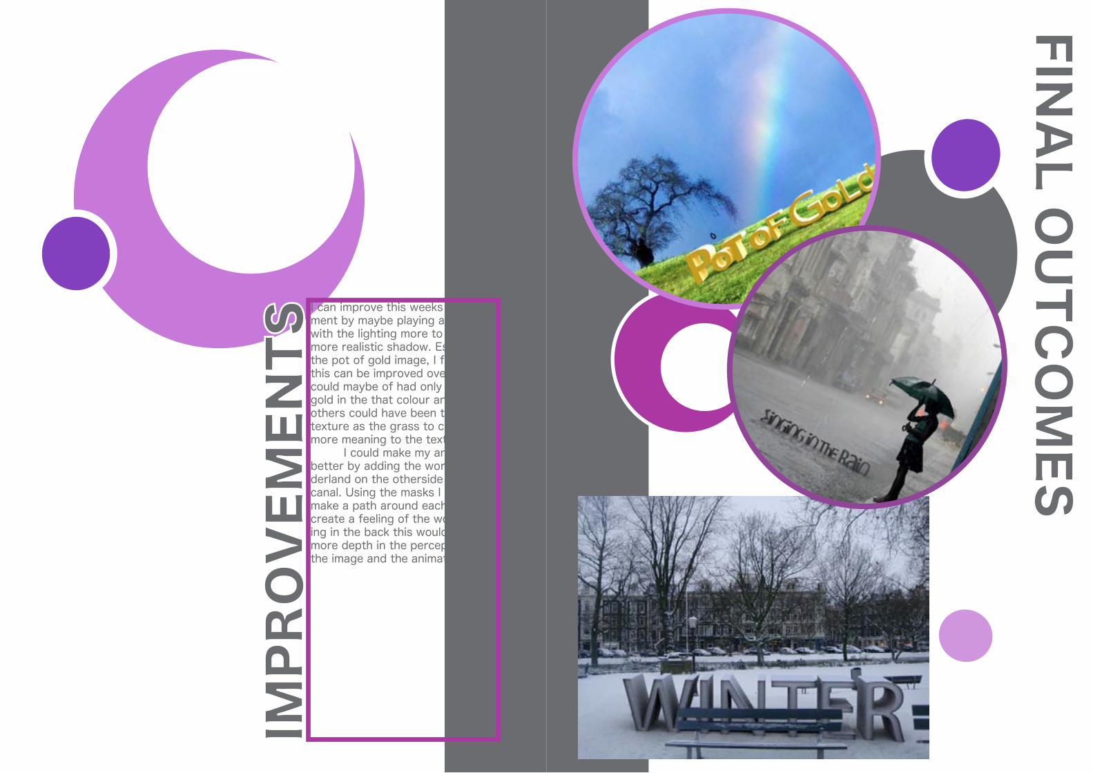
I can improve this weeks assign-ment by maybe playing around with the lighting more to create a more realistic shadow. Especially the pot of gold image, I feel like this can be improved overall. I could maybe of had only the word gold in the that colour and the others could have been the same texture as the grass to create more meaning to the text. I could make my animation better by adding the word won-derland on the otherside of the canal. Using the masks I could make a path around each tree to create a feeling of the word be-ing in the back this would create more depth in the perception of the image and the animation.
IMPR
OV
EMEN
TS
FINA
L OU
TCO
MES

I started this brief by recording of someone singing a song, I then analysed the sounds to find that they were all quite harmonious so I decided that my transitions for the digitl animation part was going to involve slow, light move-ments. The words are reflected in the movemet as for the first word “moment” I chose to use the opacity change and each letter flashes on its own. so each letter has its own moment. The sec-ond word is honesty and I chose to have this placed in the corner and again using opacity changes. For one of the transitions for the words “take the lead” I made the words follow each other one after the other off the screen. So, each word or phrase had a movement relating to its meaning. Most of my transitions and movements seem quite minimal but this is to reflect the meaning and the emotion you recieve from the song. When the word tonight appears on the screen I decided to change the hue of the back-ground to blue to reflect the col-our of the word being project-ed. After the colour change at this point the background goes through a phase of colour changes. I did this to show variation in the emotion and the fact that i have used pas-tel colours once again reflect the smooth and light emotion. For some of the motion in this brief I had to add a camera to change the orientation of the words and what direction they come into the screen from. These sort of movements were more complex than the opacity changes .
PRO
CESS
Use a voice recording and script of some song lyrics to derive ideas for a short digital animation in After Effects.
The voice recording will provide you with a structure for the animation, which should use only typographic forms.
Your animation must also include sound design, that either reflects the feel of the lyrics, or what is de-scribed in the lyrics, or both.
Please upload two versions of your work, one version with the lyrics recording left in, and one version with it removed (leaving only sound design and animation).
FOURWEEK
BRIE
F

I think i could improve this anima-tion in a few ways. I would start off by making my background a lot more interesting this will then start to put the video into some sort of context. I would then try to make my font more intersting, I chose this font in particular to reflect the soft and gentle emotion. However I think I could have found a font which makes the animation look alot more visually stimulating. Or, I could have used the same font but given the font a stroke to make it look more bold.. I would then maybe add a few more camera angles to make the compostion of the typography look more technical yet still por-tray the gentle movement.
IMPR
OV
EMEN
TS
1) What’s shown (wealth/power)/what’s hidden (exploitation/conse-quences).
2) Present monotony/future dreams.
3) Increase in envy/increase in de-mocracy.
The animation should last approxi-mately 30 seconds and should con-tain NO text.At the end of the animation, in-sert a title card detailing the time, money, and technical resources you dedicated to the work.The frame rate of the animation must be 12fps (frames per second )or above.Use Photoshop or software of your choice to assemble the animation stills, and output the work as a video file.
FIVEWEEK
BRIE
F Use a good quality print out of an oil painting (16th – 17th century) as a starting point for a stop-frame animation (wikimedia.org is a good place to look).Alter the painting as the animation progresses, by introducing other elements – backgrounds, objects, etc – and removing others.Consider developing your ideas along the following themes dis-cussed in “Ways Of Seeing”:
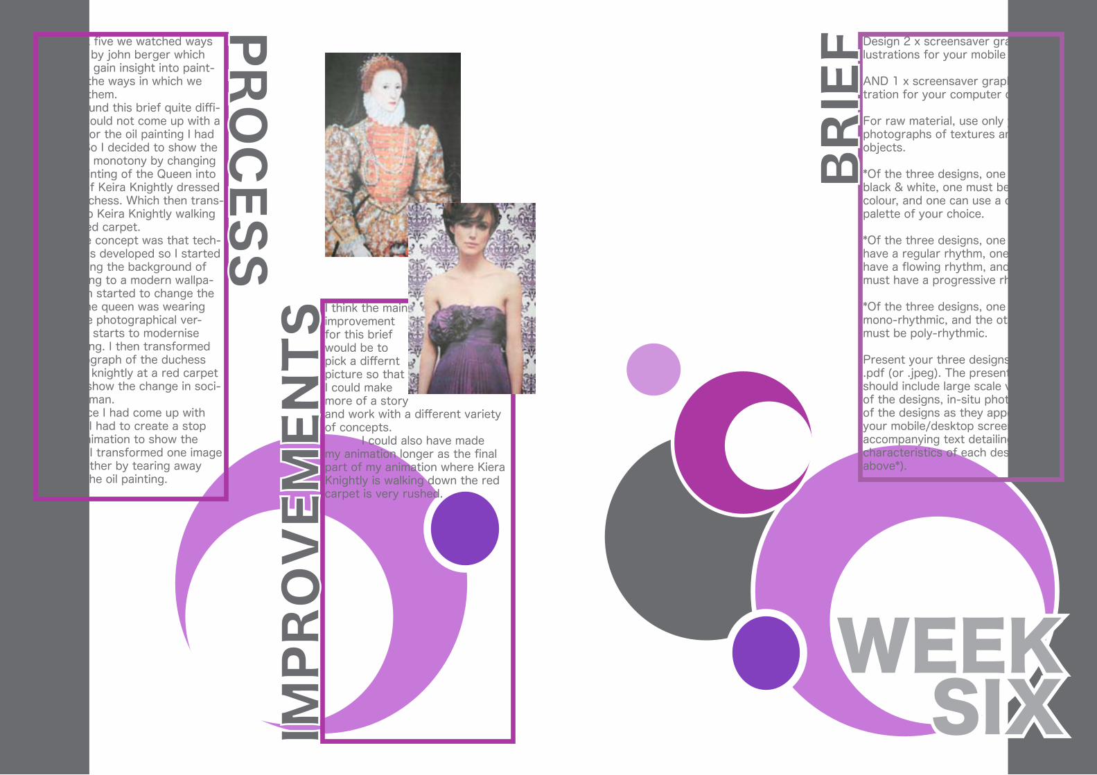
For Week five we watched ways of seeing by john berger which helped us gain insight into paint-ings and the ways in which we percieve them. I found this brief quite diffi-cult as I could not come up with a concept for the oil painting I had chosen. So I decided to show the change in monotony by changing the oil painting of the Queen into a image of Keira Knightly dressed as the duchess. Which then trans-forms into Keira Knightly walking down a red carpet. The concept was that tech-nology has developed so I started by changing the background of the painting to a modern wallpa-per, I then started to change the clothes the queen was wearing int a more photographical ver-sion. This starts to modernise the painting. I then transformed the photograph of the duchess into kiera knightly at a red carpet event to show the change in soci-ety of woman. Once I had come up with my ideas I had to create a stop motion animation to show the changes. I transformed one image into the other by tearing away parts of the oil painting.
PRO
CESS
I think the main improvement for this brief would be to pick a differnt picture so that I could make more of a story and work with a different variety of concepts. I could also have made my animation longer as the final part of my animation where Kiera Knightly is walking down the red carpet is very rushed.
IMPR
OV
EMEN
TS
Design 2 x screensaver graphics/il-lustrations for your mobile phone
AND 1 x screensaver graphic/illus-tration for your computer desktop:
For raw material, use only your own photographs of textures and/or objects.
*Of the three designs, one must be black & white, one must be two-colour, and one can use a colour palette of your choice.
*Of the three designs, one must have a regular rhythm, one must have a flowing rhythm, and one must have a progressive rhythm.
*Of the three designs, one must be mono-rhythmic, and the other two must be poly-rhythmic.
Present your three designs on a .pdf (or .jpeg). The presentation should include large scale versions of the designs, in-situ photographs of the designs as they appear on your mobile/desktop screen, and accompanying text detailing the characteristics of each design (see above*).
SIXWEEK
BRIE
F

I started this brief by collating textures from everyday life and things that i could find around uni. I then photographed the textures that I found interesting. Once I had photographed the texture I imported them into photoshop where I started to build up my own patterns and brushes. Once I had created my brushes and pattern I started to look at the differnt elemants that I had to incorrperate into the designs. So, I started off by making my mono-rhythmic black and white background. I chose to put these together so that I had a baseline to work from. Using my baseline I started to create patterns using my brushes and then i chose to make this one have a regular rhythm. Once I had created this design I found that it looked better in a colour than black and white there for I changed the colour of the design so it becam the two colour pro-posal. I then created my multi colour progressive-rhythm, poly-rhythmic multi-coloured design. This design has a progressive rhythm as the flower starts off small and increases in size from the same point. The last design is the flow-ing rhythm, Poly-rhythmic black and white design. It has a flow-ing rhythm as the shape is freely moving with no structure. It’s poly-rhythmic because it portrays different hights and curves.
PRO
CESS
This project can be imroved by me following the rule more strict-ly, for example I could try to make one of the designs more poly-rhythmic. I could then try to maybe incorparate more than one pat-tern in each design and make a more complex design. Some de-signs look better when they look minimal but if i got the opportu-nity to do this assignmnt again I would like to try and mix similar or contrasting textures. I would also collect photo graphs of objects that i could make into brushes to make my design complex and more crea-tive.
IMPR
OV
EMEN
TS

FINA
L OU
TCO
MES
Select one excerpt from a poem by one of the following three poets: Pablo Neruda; Walt Whitman; Edna St. Vincent Millay. You can find these at http://www.poemhunter.com/poets
Use this poem excerpt :
1) to inspire a ‘style sheet’ of im-ages/textures
2) as a starting point to embark upon a creative process.
Try to be as imaginative as possible when designing the process that you will travel through to create the work; combine methods and activi-ties that you haven’t tried before with other methods and activities that you have tried before.
Use both analogue and digital pro-cesses to create style sheets.
SubmitThe starting point for your process – your chosen poem excerpt.A textural style sheet that evokes the feel of your chosen poem.A diagram of your visual process – 9 steps minimum.Images of your work at each of the 9 steps of your process.The end point.
SEVENWEEK
BRIE
F

The starting point for this brief was to find a poem with a lot of description and imagery. Once i found my poem I went around taking pictures of textures that related to the poem and the de-scription. Once I had a collection of textures I made a style sheet of the textures that I found related to the poem more than the oth-ers. Using analogue and digital processes I started to change my patterns. The first process my style sheet went through was a gradient overlay- red/orange, I chose these colours because they relate highly to the weather de-scribed in the poem. I then in-versed the colours digitally to get a contrast in the meaning and the textures. This then went through a digital process of printing fol-lowed by an analogue process of drawing on top of the style sheet using a pen selcting only some areas and applying different types of mark making on top. This was then followed by another ana-logue process in which I cut out the Pen marks using a scalpel. I then scanned this in re-printed it and made a stencil of trees as the poem talks about trees. I then scanned this in again and changed the colour to blackand white. I liked the ef-fect of both colour andblack and white so I placed it underneath the stencil. I then went through the design pr-ocess digitally by adding and taking away coloursgrdients and patterns where i had cut the trees out.
PRO
CESS
The main way of improving this design propasal is by puting my style sheet through more pro-cesses. I feel like the processes i put my style sheet through did not change the look of them in a huge way. I could try to do differ-ent things like take pictures of the sttle sheet under water or reflet-ed into water or glass. I could then try and develp my final pice further so that you cannot see the ayout of the style sheet at all. This will mean that the design will have more relation to the poem.
IMPR
OV
EMEN
TS
If you forget me-Pablo Neruda
I want you to knowone thing.You know how this is:if I lookat the crystal moon, at the red branchof the slow autumn at my window,if I touchnear the firethe impalpable ashor the wrinkled body of the log,everything carries me to you,as if everything that exists,aromas, light, metals,were little boatsthat sailtoward those isles of yours that wait for me.

FINA
L OU
TCO
ME
Process:
*Design a one-colour protest graph-ic on a computer – the work must include text (slogan) AND image.
*Copy the work BY EYE (don’t print it) from your computer screen onto A2 size paper.
* Cut the A2 paper copy to make a stencil.
*Apply acrylic paint or aerosol paint through your stencil onto an A2 placard.
Final work:
- Post a pdf or jpeg that shows:
* The original design you made on computer
*A photograph of your painted plac-ard in use, perhaps in a demonstra-tion..
*A short written description of the design strategy you used (see PRO-TEST GRAPHICS presentation).
EIGHTWEEK
BRIE
F

This brief was based on the cur-rent situation on the rise of stu-dent tution fees. We were asked to make a placard that would get across a message using a slogan with the least amount of words. I came up with “Higher Fees Lower Opportunities”, I then thought about some designs I could make and minimal signs and pictograms I could use. I came to a final deci-sion of using arrows to represent the words higher and lower. I then went through the process of cutting out the black parts of the design so that I could use spray paint or acrylic paint to make a print. I made my design black and red but then I decided to stick to black and white just to keep my design simple and to he point and quite blunt.
PRO
CESS
FINA
L OU
TCO
ME
Create a 30-second digital anima-tion using software of your choice.
Audio:
A soundtrack composed of ambient and spot/incidental/diagetic sounds you have collected.
These sounds are to be structured around a slowed-down (50%) piece of music, which is to be removed from the mix when it has served its purpose as a structural model.
Video:
Progressively rhythmic animated forms.
4 x 3-second sections that have a strong visual relationship but are not the same.
5 x 2-second sections that have a strong visual relationship but are not the same.
8 x 1-second sections that have a strong visual relationship but are not the same.
NO type.
Organise the sections into a rhyth-mic structure of your choosing. Your work should maximise the dynamics of REPETITION and VARI-ATION.
NINEWEEK
BRIE
F

To create my structured anima-tion I started off by collecting sounds using a small sound re-cording device. Once I had a vari-ation in sounds, I chose a song which I had to slow down. I did this so that I could use the wave-forms to consrtuct my composi-tion. I used the different levels of the song to place the different sounds. Once I had made my audio composition I had to go through the process of planning the vis-ual compostion. Using the the 3 second , 2 second and 1 second animations I created individually I made a plan of what order I would place them in. But I found that this did not match up with the audio, so I decided to move the composition around. For my design I chose to use one image through the whole composition. I did this as the brief asks for a maximum of repetition, however i made varitions in the colour and sizes of the flowers. To bring the flower into afer effects I had to make create alpha channels so that it had a trans-parent background. I then had to make compostions in photoshop and take them into after effects.
PRO
CESS
The ways in which I can improve this brief is by making more va-ritions, either by using different flowers or maybe even different compositions of the flowers. I feel that if I had more audio in my composition I could make more variations, but when chosing my clip that i had to slow down I chose the chorus, which consisted of the same beat, so next time I will choose a different part of the song which will have more variation.
IMPR
OV
EMEN
TS
As I already had the design for my blog I decided to just use the same sort of influence for my work book design. I tried to go for a minimal yet exciting theme. Therefore I chose to use a white background but I stuck to calm colours. A way in which i can im-prove this design is my final out-comes page because I feel like it takes away from the actual final piece because there is a lot going on around it.
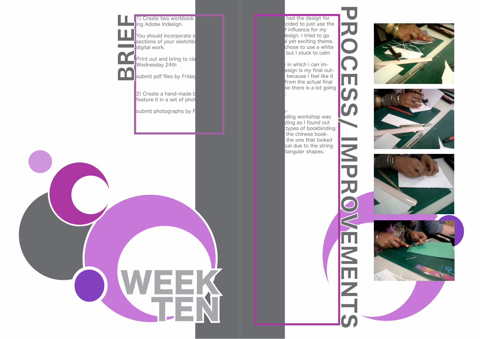
Bookbinding-The bookbinding workshop was quite interesting as I found out the differen types of bookbinding.I found that the chinese book-binding was the one that looked more graphical due to the string creating rectangular shapes.
PRO
CESS/ IM
PRO
VEM
ENTS
1) Create two workbook layouts us-ing Adobe Indesign.
You should incorporate scanned sections of your sketchbooks, and digital work.
Print out and bring to class on Wednesday 24th
submit pdf files by Friday 26th
2) Create a hand-made book and feature it in a set of photographs.
submit photographs by Friday 26th
TENWEEK
BRIE
F
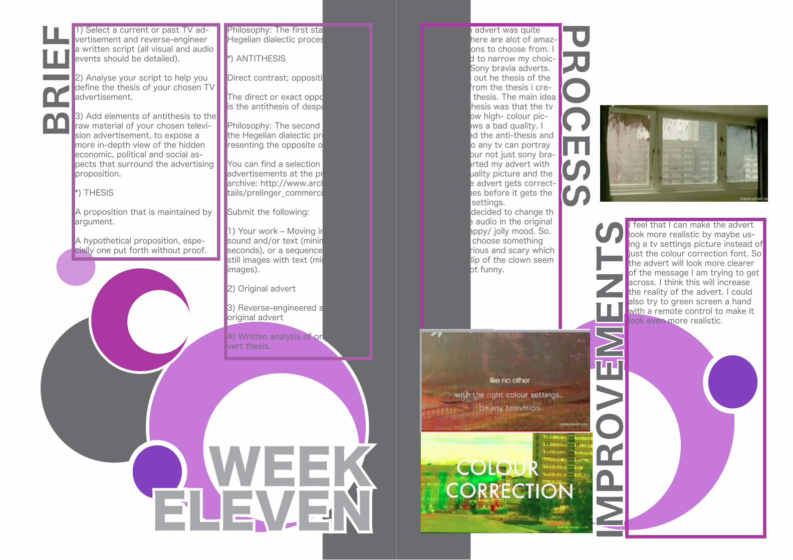
Choosing an advert was quite difficult as there are alot of amaz-ing productions to choose from. I then decided to narrow my choic-es down to Sony bravia adverts. I then wrote out he thesis of the advert and from the thesis i cre-ated my ant thesis. The main idea of the anti-thesis was that the tv does not show high- colour pic-ture but shows a bad quality. I then adjusted the anti-thesis and changed it to any tv can portray amazing colour not just sony bra-via. So I started my advert with really bad quality picture and the colour of the advert gets correct-ed a few times before it gets the right colour settings. I also decided to change th music as the audio in the original created a happy/ jolly mood. So. i decided to choose something quite mysterious and scary which makes the clip of the clown seem scary and not funny.
PRO
CESS
I feel that I can make the advert look more realistic by maybe us-ing a tv settings picture instead of just the colour correction font. So the advert will look more clearer of the message I am trying to get across. I think this will increase the reality of the advert. I could also try to green screen a hand with a remote control to make it look even more realistic.
IMPR
OV
EMEN
TS
Philosophy: The first stage of the Hegelian dialectic process.
*) ANTITHESIS
Direct contrast; opposition.
The direct or exact opposite: Hope is the antithesis of despair.
Philosophy: The second stage of the Hegelian dialectic process, rep-resenting the opposite of the thesis.
You can find a selection of old TV advertisements at the prelinger archive: http://www.archive.org/de-tails/prelinger_commercials
Submit the following:
1) Your work – Moving image with sound and/or text (minimum 60 seconds), or a sequence of digital still images with text (minimum 40 images).
2) Original advert
3) Reverse-engineered script of original advert
4) Written analysis of original ad-vert thesis.
ELEVENWEEK
BRIE
F 1) Select a current or past TV ad-vertisement and reverse-engineer a written script (all visual and audio events should be detailed).
2) Analyse your script to help you define the thesis of your chosen TV advertisement.
3) Add elements of antithesis to the raw material of your chosen televi-sion advertisement, to expose a more in-depth view of the hidden economic, political and social as-pects that surround the advertising proposition.
*) THESIS
A proposition that is maintained by argument.
A hypothetical proposition, espe-cially one put forth without proof.
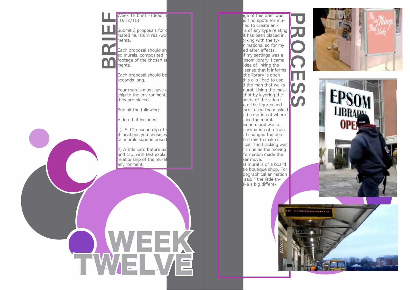
The first stage of this brief was to go out and find spots for mu-rals. I then had to create ani-mated murals of any type relating to the area it has been placed in. I enjoyed working with the ty-pographic animations, so for my designs I used after effects. One of my settings was a wall by on Epsom library, I came up with the idea of linking the mural in the sense that it informs people of if the library is open or not. For this clip I had to use mask around the man that walks across the mural. Using the mask showed me that by layering the different aspects of the video i could mask out the figures and objects. Before i used the masks I had to track the motion of where i wanted to place the mural. My second mural was a replacement animation of a train time display. I changed the des-tination of the train to make it more hysterical. The tracking was harder on this one as the moving train time information made the motion tracker move. My last mural is of a board outside a little boutique shop. For this I use typographical animation again which said “ the little th-ings that make a big differe-nce”.
PRO
CESS
Week 12 brief – (deadline 10/12/10)
Submit 3 proposals for digital ani-mated murals in real-world environ-ments.
Each proposal should show animat-ed murals, composited into video footage of the chosen environ-ments.
Each proposal should be at least 10 seconds long.
Your murals must have a relation-ship to the environments in which they are placed.
Submit the following:
Video that includes -
1) A 10-second clip of each of the 3 locations you chose, with the digi-tal murals superimposed.
2) A title card before each 10-sec-ond clip, with text explaining the relationship of the murals to the environment.
TWELVEWEEK
BRIE
F

I can improve these murals by placing them on walls instead of pre-designed advertising areas. I could have made the anima-tions more interesting if I used an abandoned builgding with broken windows, I would try to make the design look as if birds or but-terflies were flying out the bro-ken windows to a tree or a plant on the wall near the window. By making th murals interact with the space they are in would make them look alot more aesthetically pleasing and shows the indepth thought of the design.
IMPR
OV
EMEN
TS
Related Documents