winners

Welcome message from author
This document is posted to help you gain knowledge. Please leave a comment to let me know what you think about it! Share it to your friends and learn new things together.
Transcript

winners
design by furthercreative.co.uk

22
www.endpoint.co.uk
Here’s to this year’s vintage! A toast to all winners and nominees at the Transform Awards 2013.

1
Welcome
On page 38 of Communicate magazine’s very first issue five years ago, we documented the fascinating story of NCH, formerly known as National Children’s Home. That first four page article set the trend, and in every issue since, we have written about a brand that has transformed itself or its relationship with its audiences.
It’s still my favourite part of the magazine. Every rebrand that we chronicle in Communicate has its own narrative. There’s a trigger – a new arrival in the competitive landscape, a decline in fortunes or the realisation that a new strategy is needed. Then there’s a rite of passage – the journey of the rebrand. Once the organisation transforms itself, like a butterfly emerging from the pupal stage, there is an outcome. Almost formulaic, brand transformations yield themselves to compelling narratives, easily picked up by journalists in print and broadcast media.
Yet, in the five years that we have been writing the Brand:Rebrand feature, no two stories have been similar, let alone alike. The stories that captured our imaginations and our hearts have been tales of hard work, of fabulous creative thought and of stunning intellectual and strategic insight.
Those stories are also the ones being honoured here tonight at the Transform Awards. Tonight is their chance to celebrate. We are very proud to be a footnote in their organisations’ stories by providing a platform from which to recognise the excellence of their changing brand narratives.
Congratulations to all, Highly commended and trophy winners alike. Your story is told.
Andrew ThomasPublishing editor, Communicate magazine
03 Meet the judges06 Who won what
The Awards
Content08 Best visual identity Best use of a visual property09 Best brand architecture Best use of copy style/tone of voice
Process 11 Best internal communication of a rebrand Best implementation of a rebrand12 Best implementation of a rebrand across multiple markets
Strategy15 Best brand guidelines Best creative strategy16 Best brand evolution
Type18 Best corporate rebrand following a merger or acquisition Best corporate rebrand to reflect changed mission/values/ positioning19 Best brand consolidation Best rebrand of a digital property
Sector & region21 Best rebrand from a charity/NGO/non-profit Best rebrand from the financial services sector22 Best rebrand from the industrial and basic materials sector Best rebrand from the professional services sector23 Best rebrand from the property sector Best rebrand from the public sector24 Best rebrand from the technology, media & telecommunications sector Best rebrand from the tourism & leisure sector 25 Best rebrand from the utilities sector
Region 27 Best rebrand from Western Europe Best rebrand from Russia Best rebrand from the UK
28 Grand Prix

2
BRAND EVOLUTIONAs technology evolves, so must brands.
Establishing a relationship with your audience has
never been more difficult. Consumers now have
the power to choose how they interact with your
brand, and share their thoughts with a single click.
For more than 25 years we’ve helped brands to keep
their language in touch with their customers. Our
team comprises some of the UK’s top copywriters
– from national journalists to advertising creatives
and tone of voice consultants.
Get in touch to learn how we can develop
your voice, and make it stand out across all
communication channels.
Congratulations to all the winners.
www.strattoncraig.co.uk
t. 020 7593 4014IT’S ALL IN THE DETAIL
SC_transform_ad_REPRO.indd 1 05/03/2013 09:04

3
Meet the judges
Lars Bolle, Deutsche Telekom AGWithin his role as head of brand transformation - with his team - Lars is the focal contact for the consistent adaptation and implementation of the brand design for Deutsche Telekom AG worldwide. After his studies of politics, economics and sociology he worked as communications- and marketing manager, before joining T-Mobile Germany in 2000. During his 12 years working for Deutsche Telekom, Lars was in charge for almost all communication disciplines, such as POS-marketing, marcoms and live marketing. Since 2010, he is working as brand manager, connecting his practical experience with brand design and implementation.
Alexander Bours, ManutanAlexander, born in the Netherlands is an international B2B marketing and brand expert, currently holds a position as an executive director in Manutan, Paris. He has been working with leading industrial brands owned by companies like Dynamit Nobel AG, Wolters Kluwer Publishers and Manutan International. After his study in marketing he was leading one of the best known B2B brands in Holland, called Overtoom. Today he is directing a European commercial transformation of a French family-owned company in a multichannel environment.
Lene Bucelli, AvignonesiLene was born in Denmark and has lived in Tuscany for 15 years. With a degree in Marketing, she entered the wine business in 1998 and has worked for renowned brands like Biondi Santi, Col d’Orcia and Ruffino. Today, she is the marketing manager for the historic winery Avignonesi in Montepulciano in southern Tuscany. With an ownership change in 2009, the winery has undergone profound changes both production-wise and image-wise. Lene joined the brand in late 2010 and has led the process of rebranding corporate image, products, and implementing a consumer oriented communication and marketing strategy.
Eliza Burrows, BBCCurrently VP, brand strategy at BBC Worldwide, Eliza joined from the public service side of the BBC where she was most recently head of brand strategy and marketing planning, leading on brand strategy development for the BBC and acting as a key liaison on commercial branding with WW. Prior to that, Eliza spent five years at Discovery Networks International, where laterally she was channel director of animal planet, responsible for content, marketing and budget strategies and operations across UK/EMEA. Before that, Eliza was head of advertising and brand at the Millennium Dome.
Marc Cloosterman, VIM GroupMarc is CEO of VIM Group, the independent global network of companies specialised in brand implementation & management. Clients include TNT, SKODA, SkyTeam, ING, Bpost, Rentokil-Initial, British Gas, Mediclinic and Randstad. Marc’s ambition is to create global recognition for ‘brand implementation’ as one of the disciplines within the rebranding domain. Because organisations that look good, perform better and because every $ spent on strategy and creation, on average $ 20 is spent on rebrand implementation & management. Marc enjoys spending his professional time with those people who work on a strategic change and want to make that visible to their audiences by rebranding.
Irina Craske, Alliance Boots InternationalIrina Craske is a senior brand strategist with 17 years of classic marketing experience gained from: L’Oreal, Reckitt Benckiser, British American Tobacco, SSL International and Mars. Strengthening brand value, consumer-centred approach to brand equity building and strategic planning are key areas of her expertise. Irina has a demonstrable track record of long-term sustainable brand and business profitability growth across a range of sectors, including: consumer, retail, healthcare and B2B. She has excellent business knowledge of international arenas and currently holds a position of international head of consumer brands marketing with Alliance Boots.
Jos van Haastrecht, DSMJos is Director of global branding and integrated communications at DSM. He successfully rebranded DSM into a purpose-led global brand in the past years. Jos has over 25 years’ experience in branding, marketing and communications built through several positions within the publishing industry, the chemical industry and the biotech industry. DSM won Gold for Best internal communication of a rebrand in the 2012 Transform Awards.
Penny Hamilton, Imperial War Museums Penny Hamilton is head of brand and marketing at IWM (Imperial War Museums) and has over 20 years experience of working in high profile cultural organisations including the Arts Council of England, Tate, the Natural History Museum and the British Library. Penny has worked on a number of major projects throughout her career, including the launch of Tate Modern, the re-brand of the Natural History Museum and the development and marketing of the British Library’s public programme.
Amy Lou, HUAWEI Device Amy joined Motorola China in 1994 as the senior marketing manager in charge of marketing communications for Motorola category, which she grew to a 13% market share. In 2006 she joined HTC Europe Ltd, as head of EMEA brand and marketing communications, she took on the challenging journey to build HTC into a successful global brand. She featured in Top 100 Internationalists of the year, 2007, and in the top 100 leaders by Internationalist in 2011. After 5 years at HTC, she joined HUAWEI as director of global brand management.

4
Ready for lift off?We work with the world’s leading financial and professional services firms, transforming their brands and communications to help their businesses take off.
To discuss how we could help your business call Greg Hobden on 020 7739 8899.
www.living-group.com
London | Hong Kong
Communicate magazine. The single voice for stakeholder communication.
iPad edition available from the App Store or by pointing your iPad browser to
www.communicatemagazine.co.uk/onmyipad

5
Meet the judges
Andreas Merz, Bauwerk Group Andreas Merz is head of marketing and product management for the Bauwerk Group (Switzerland). He is responsible for the repositioning of the Bauwerk group to international, design-orientated premium brand. He works together with international architects and interior designers and leads the international marketing teams of the group. After his studies in Marketing and Finance he worked for a medical company in Germany and UK and was further responsible as head of marketing for the German-French premium Champaign brand Deutz & Geldermann / Champagné René James Lallier. Andreas is consulting member of the renowned YoungLeaderAward, Fachhochschule St. Gallen.
Kristian Millls, The Co-operative GroupKristian joined The Co-operative Group in 1998 following a degree in Marketing. He worked for the food business for six years before joining the corporate marketing department to work on the development of The Co-operative brand. After developing the brand proposition, standards and identity, from 2006, Kristian and his team began rolling out the brand across the 6,500 branches of The Co-operative movement and currently manages the governance of the £3bn Co-operative brand. Kristian lives in Lancashire with his wife Carla and 1 year old daughter Gracie. His main passions in life are travel and sports, especially football.
Jason Panudy, Orange Jason joined Orange UK in 2001, using his background in graphic design to add a creative spin to internal communications for their frontline customer service teams. He then moved to the UK brand team in London as their first in-house graphic designer, which soon developed into a wider design management role. In 2007 he joined the global brand team, working on international rebranding, brand training, copywriting, brand strategy, identity development and design. He currently heads up the creative & brand identity team, managing the Orange Group’s identities across multiple brands in more than 30 countries.
Rachel Penfound, CMS Cameron McKennaAn early refugee from the accountancy professional, Rachel has spent more years than she cares to remember building brands in the professional services sector. She’s worked at UK and international level and with internal and external audiences right across the industry - from some of the best known names to some of the best kept secrets. For the last 10 years, she has focused principally on engaging internal audiences, helping them to define and deliver a first class client experience and build brands from within.
Nicole Schareck, EADSNicole Schareck is vice president corporate brand communications at EADS. Her career started in 1986 at Mercedes-Benz where she worked on improving the foreign sales organisation and served as a project manager for sales and marketing passenger cars in Southern Europe. In 1991 she joined Behr Group, an automotive supplier, as director marketing. Schareck went on in 1993 to work for Deutsche Aerospace as head of advertising, later taking over as head of marketing communications. After the merger to EADS she was appointed vice president corporate brand communications. Schareck is married. In her free time she enjoys gardening, playing the piano, reading and travelling.
Leah Walsh, Team GBPrior to working at the British Olympic Association (BOA), Leah was an account director at advertising agency Ogilvy & Mather, working on global business across multiple industries. As marketing manager at BOA, her role involves developing and managing the marketing strategy for Team GB & growing recognition for the brand as a leading sports identity. For the London 2012 Games, the BOA created a campaign called ‘Our Greatest Team’ which aimed to engage the nation and inspire athletes’ success. From campaign creative development, through to multi-platform activation with our Olympic sponsors, media, sports, events, online channels and our celebrity programme, BOA delivered a groundbreaking campaign. strategies, stories and experiences.
Gideon Wilkinson, EndpointAs founding partner and director of Endpoint, Gideon is responsible for the company’s strategic development and its relationships with international partners and clients. Typically, he leads projects that involve significant organisational change. Gideon has directed international change programs for leading public and private sector clients, playing key roles in identity implementation. His experience covers a broad spectrum of industry sectors, including transport, technology, retail and leisure. Gideon has a BSc honours degree in Industrial Design from Brunel University and has also studied architecture at the Politecnico Di Milano in Italy.
Suzi Williams, BTSuzi is BT’s global brand chief, in charge of BT’s marketing and brand strategy in the UK and internationally. She led BT’s bid to become a London 2012 marketing partner, in particular ensuring maximum impact from the Games on the BT brand. Suzi’s career started in brand management at Proctor & Gamble, before she moved on to her first media role at the BBC. A short spell in consulting at KMPG and MIT in Boston convinced her of her love of media and technology and she went on to roles at Orange and Capital Radio Group before arriving at BT in 2005.

6
global video communications
world-television.comLondon / Geneva / Zurich / Cologne / Frankfurt / Madrid
Congratulations for being nominated on your rebrand!
A brand film is a powerful way to communicate a message of change and progress to your employees, customers and shareholders. Find out why these companies trust us to deliver their video communications:
t/ +44 (0)20 7243 7384 f/ +44 (0)20 7727 7768
World Television 3rd Floor, Astley House33 Notting Hill GateLondon W11 3JQ
Now discover thepower of video to helplaunch your brand and
kick-start the p
rocess
of engag
ement

7
Who won what
Content
Best visual identityGold – Cancer Research UK (Interbrand)Silver – America’s Cup Event Authority (Designwerk)Bronze – B&CE, The People’s Pension (Living Group)Highly commended – Destination Shrewsbury (& SMITH and We All Need Words)Highly commended – Max Fordham (David Carroll & Co)
Best use of a visual propertyGold – FastJet (SomeOne)Silver – B&CE, The People’s Pension (Living Group)Bronze – Majestic Shower Company (Appetite Consultancy)
Best brand architecture solutionGold – Mr & Mrs Smith (Goosebumps Brand Consultancy)Silver – Liberty Global (venturethree)Bronze – SWS UK (Native Studios)Bronze – University of the Arts London
Best use of copy style/tone of voiceGold – Cancer Research UK (Interbrand)Silver – Destination Shrewsbury (& SMITH and We All Need Words)Bronze – Almaren (me&dave)Bronze – Shakespeare School (Storience)
Process
Best internal communication of a rebrandGold – Legal & General (Smith & Milton)
Best implementation of a rebrandGold – B&CE, The People’s Pension (Living Group)Silver – Max Fordham (David Carroll & Co)Bronze – Kaiser Partner (Goosebumps Brand Consultancy)Highly commended – FastJet (SomeOne)Highly commended – SWS UK (Native Studios)
Best implementation of a rebrand across multiple markets Gold – Infront Sports and Media (Designwerk)Silver – HSBC (GLIMMA)
Strategy
Best brand guidelines Gold – Telenor Group (Pajama)Silver – HSBC (GLIMMA)
Best creative strategyGold – Max Fordham (David Carroll & Co)Silver – Destination Shrewsbury (& SMITH and We All Need Words)Silver – Worldmark (Goosebumps Brand Consultancy)Bronze – HomeProtect (The Allotment Brand Design)Highly commended – Corney and Barrow (venturethree)
Best brand evolution Gold – The Donkey Sanctuary (The Allotment Brand Design)Silver – Business Disability Forum (Fairley & Associates and Studio Blackburn)Bronze – Kaiser Partner (Goosebumps Brand Consultancy)Highly commended – Max Fordham (David Carroll & Co)Highly commended – Tata Consultancy Services
Type
Best corporate rebrand following a merger or acquisition Gold – Bank of Scotland (Rufus Leonard)Silver – FastJet (SomeOne)
Best corporate rebrand to reflect changed mission/values/positioning Gold – Worldmark (Goosebumps Brand Consultancy)Silver – Ranir (Appetite Consultancy)Bronze – Vlerick Business School (Landor Associates)Bronze – Ymens (Brandtailors)Highly commended – America’s Cup Event Authority (Designwerk)
Best brand consolidationGold – Shanks Group (PIN Creative)Silver – SWS UK (Native Studios)Bronze – Agricola (Brandtailors)
Best rebrand of a digital propertyGold – Thunderhead.com (Handsome and The Feral Creative)Silver – KoozaiBronze – McCarthy & Stone (Redweb)
Sector & Region
Best rebrand from a charity/NGO/non-profit Gold – The Donkey Sanctuary (The Allotment Brand Design)Silver – B&CE, The People’s Pension (Living Group)Silver – Cancer Research UK (Interbrand)Bronze – Alder Hey Children’s Charity (USP Creative)Bronze – Business Disability Forum (Fairley & Associates and Studio Blackburn)
Best rebrand from the financial services sectorGold – B&CE, The People’s Pension (Living Group)Silver – HomeProtect (The Allotment Brand Design)Bronze – Bellpenny (The Beautiful Meme)Highly commended – Kaiser Partner (Goosebumps Brand Consultancy)Highly commended – Smith & Williamson (Bell)
Best rebrand from the industrial and basic materials sector Gold – Shanks Group (PIN Creative)Silver – Beldam Crossley (Clock Creative)Bronze – INEOS (Corporate Edge)Highly commended – SWS UK (Native Studios)
Best rebrand from the professional services sector Gold – Benchmark (Attract)Silver – Max Fordham (David Carroll & Co)Bronze – Cornerstone Barristers (Thinkfarm) Highly commended – Investance Group (VGROUP)Highly commended – Thunderhead.com (Handsome and The Feral Creative)
Best rebrand from the property sectorGold – London & Quadrant (Bell)Silver – Almaren (me&dave)Bronze – GL Hearn (JohnstonWorks)
Best rebrand from the public sectorGold – The National Skills Academy for Social Care (Goosebumps Brand Consultancy)Silver – Destination Shrewsbury (& SMITH and We All Need Words)
Best rebrand from the technology, media & telecommunications sector Gold – Lotus (Mytton Williams)Silver – Tata Consultancy ServicesBronze – Ymens (Brandtailors)Highly commended – Unitymedia (venturethree)
Best rebrand from the tourism & leisure sector Gold – Weingut Erich Meier (Scholtysik Niederberger Kraft AG)Silver – Destination Shrewsbury (& SMITH and We All Need Words)Bronze – Brio Leisure (Studio North)
Best rebrand from the utilities sectorGold – EDF Energy (Corporate Edge)
Region
Best rebrand from Eastern Europe Silver – Grupa Topex (Dragon Rouge)Bronze – Agricola (Brandtailors)Highly commended – Petrocart (NON)Highly commended – Ymens (Brandtailors)
Best rebrand from Western EuropeGold – Vlerick Business School (Landor Associates)Silver – Unitymedia (venturethree)
Best rebrand from Russia Gold – Coral Travel (Carnegie Orr)Silver – Vipservice (Solovieva Team)Bronze – Biletix (Solovieva Team)
Best rebrand from the UK Gold – Heathrow ExpressBronze – Wyke FarmsHighly commended – Caffrey’s (Landor Associates)
Grand Prix
Cancer Research UK (Interbrand)

8
Cancer Research UK is the largest charity of its kind, with 40,000 volunteers and 7,000 employees. But the organisation was faced with plateauing funds at a time when crucial research technology was speeding up. This was due to partly to the recession, the problem of being mistaken for a public service or office and because donations had become split among niche cancer charities that had grown in reputation. Research showed that the existing CRUK brand seemed overbearing and authoritative and that the full extent of their work in the wider public was not sufficiently appreciated. Rebranding was the way forward.
Interbrand redeveloped the branding to include a flexible “Big C” logo as its centrepiece. After undertaking extensive internal and external research, Interbrand developed an identity that brought science and caring together under the same tone of voice. The agency replaced a lackluster visual identity with a warmer colour palette and softer typography alongside the versatile C that could be comprised of dots, people, flowers or other imagery. In putting a human face on CRUK, Interbrand has managed to transform the brand from one of science and bureaucracy into one of heroes in lab coats and groundbreaking research.
Fly540 Aviation, a Kenyan airline, was seeking a wider audience within Africa for its continental flight services. SomeOne was brought in to undertake the introduction of a new visual identity as the airline was renamed FastJet. In adopting the new moniker, SomeOne found that the word ‘jet’ served a functional purpose in reassuring customers that they would indeed be flying aboard a jet, not a propeller plane.
The existing branding was transformed from a geometric and one-dimensional design into a fresh look with a distinctly African personality. One of the rebrand’s key objectives was to reassure its target audience, many of whom have never flown before – Africa’s local liners can be dangerous, unreliable and of the most expensive in the world. In addressing this, SomeOne developed a quirky livery and marketing campaign featuring the African grey parrot – a creature loved by Africans who often keep it as a family pet. The new FastJet, however, takes a fresh approach with much cheaper price. The results have been dramatic, with the demand far outstripping the supply. In the first seven days after tickets went on sale, more than 8,000 seats, enough to fill 60 aircrafts, were sold on FastJet’s first two routes.
Content
Gold Cancer Research UK (Interbrand)Silver America’s Cup Event Authority (Designwerk)Bronze B&CE, The People’s Pension (Living Group)Highly commended Destination Shrewsbury (& SMITH and We All Need Words)Highly commended Max Fordham (David Carroll & Co)
Best visual identity
Gold FastJet (SomeOne)Silver B&CE, The People’s Pension (Living Group)Bronze Majestic Shower Company (Appetite Consultancy)
Best use of a visual property

9
Goosebumps Brand Consultancy was faced with the challenge of expanding the Mr & Mrs Smith business by incorporating services beyond the remit of the existing brand. Mr & Mrs Smith was renowned for providing romantic stays for couples, however, adding new types of accommodations services beyond the couples market was essential for growth. Goosebumps was charged with turning a brand synonymous with couples’ retreats into one equally as famous for family, business and group stays.
Instead of tampering with the established couples’ brand, the consultancy introduced a new parent brand, Smith Collections, and relegated Mr & Mrs Smith to sub-brand status. This bold move had the advantage of protecting the identity of the successful Mr & Mrs Smith brand, allowing it to retain its exclusive focus on seductive retreats. It also enabled the development of sibling brands Smith & Family, Smith & Friends and Smith & Co. Thus through a simple but ingenious reshuffling of the brand architecture four businesses were created at once. The judges say that Goosebumps employed a “simple execution which maintains the integrity of the master brand.” The new brand architecture allows for a clear and comprehensive mode of simplifying the continued expansion of the Smith Collections portfolio.
Cancer Research UK has been plagued since its inception in 2002 by a tone of voice that, like many other cancer charities, was shrouded in an aura of fear. Part of Interbrand’s task in the rebrand included changing the tone of voice “from fear to inspiration.” The agency focused on cancer patients’ bravery and humour as part of the reimagined tone of voice.
Interbrand interviewed many of CRUK’s employees and found that the organisation’s scientists and fundraisers were engaged in activities surrounding the removal of fear from cancer work. The branding sought to bring science back to life and remove its ‘lab coat-y’ image by combining cutting edge scientific research with the warmth, humour and humanity of fundraisers. In practice, sayings like “heroes wear lab coats,” and other approachable slogans were printed in booklets, slapped onto walls and screened onto t-shirts.
One of the judges called the branding, “A lovely piece of identity that is supported by a brave and bold tone of voice that doesn’t run from the fears of ‘the Big C’ but goes at them head on.” Interbrand also used photography to emphasise the human side of the charity’s research focus. The brand was launched last summer to an overwhelmingly positive reaction.
Gold Mr & Mrs Smith (Goosebumps Brand Consultancy)Silver Liberty Global (venturethree)Bronze SWS UK (Native Studios)Bronze University of the Arts London
Gold Cancer Research UK (Interbrand)Silver Destination Shrewsbury (& SMITH and We All Need Words)Bronze Almaren (me&dave)Bronze Shakespeare School (Storience)
Best brand architecture solution
Best use of copy style/tone of voice

10
Big ideas that get people talking.
To start a conversation, contact James Carnegie-Brown on 020 7610 6140. www.carnegieorr.co.uk

11
Before its rebrand, Legal & General, one of the UK’s largest financial services providers, suffered from the failure of its employees to understand the company’s strategic direction. Only 28% of employees were reported to understand the brand’s goals. That has since jumped to 78%.
Smith & Milton were tasked with unifying Legal & General’s more than 7,500 employees across a dozen locations under, one brand. In doing so, the agency first defined the brand’s strategy and proceeded to develop a new set of brand guidelines to better espouse the company’s strategic direction.
In engaging employees with the new branding, Smith & Milton delivered an engagement programme called “Every Day Matters,” that was co-created with Legal & General employees to ensure the internal audience was aware of the new branding and what it stood for. Smith & Milton placed branded materials in Legal & General workplaces, on employee web portals and in printed materials. One of the judges said the achieved results were “admirable as the rebrand engaged a significantly larger number of employees than the previous brand had been able to.” In the post-rebrand employee evaluation survey, 80% of respondents said they felt proud to work for Legal & General, up from just 26% in 2008.
The People’s Pension was a new brand developed by Living Group for B&CE, one of the UK’s largest pension providers. When the Government began to necessitate the use of auto-enrolment pensions schemes, B&CE was faced with the prospect of irrelevance. Instead, it has gained new life with a programme that offers a portable workplace pension solution.
Living Group was charged with transforming the existing B&CE remit and communicating the strategic shift to The People’s Pension. The rebrand focused on the new programme’s simplicity and approachability. Living Group targeted employees confused by the complexities of pensions and unable to pay for financial advice with the promise of a streamlined process. The rebrand was executed across an integrated communications campaign with simple visuals used to mirror the simplicity of the pension solution.
By introducing a dedicated web portal and mobile app for easy access to information and an employee’s individual pension scheme, Living Group saw a huge number of enrolments from the outset. One of the Transform judges notes, “it’s great to see that the agency started with brand positioning before moving into design. It’s definitely an interesting approach to creativity that supports the spirit of the brand.”
Process
Best internal communication of a rebrand Gold Legal & General (Smith & Milton)
Best implementation of a rebrand Gold B&CE, The People’s Pension (Living Group)Silver Max Fordham (David Carroll & Co) Bronze Kaiser Partner (Goosebumps Brand Consultancy) Highly commended FastJet (SomeOne)Highly commended SWS UK (Native Studios)

12
The FIM Superbike World Championship (SBK) celebrated its 25th anniversary last year. The gift it unwrapped, however, was a brand new visual identity by Designwerk. The challenge for the agency lay in rebranding an organisation with a major public presence in the world of motorsports in a dozen countries spread across four continents. Consistency of messaging was of chief concern when rebuilding the entire brand in multiple markets and for audiences that sprawled from athletes to media and fans to corporate sponsors. Designwerk not only reconstructed the brand, but developed individualised materials to integrate the new identity into SBK’s persona for each audience.
The previous logo and branding, which had been around since 1988, was reworked to incorporate a black and red chevron feature – part of the language of international racing. The branding has since been rolled out to all aspects of SBK’s organisation and communications, including promotional materials at superbike events around the world. The chevron mark is now synonymous with SBK itself and with motorsports in general. Designwerk’s overarching rebrand allowed SBK to fully integrate the new branding into both its 25th anniversary celebrations and its future as one of the premier sporting circuits in the world.
Process
Best implementation of a rebrand across multiple markets
Gold Infront Sports and Media (Designwerk)Silver HSBC (GLIMMA)

133
3M TRANSFORM BLEED PAGE AD 090213_Layout 1 08/02/2013 14:35 Page 1

14
Expect great thingsWe are world leaders in brand communication. Our work sets the benchmark for excellence, and positions our clients at the top of their market.
www.designwerk.co.uk
© 2013. Heathrow Express
Discover our transforming journey.15 minutes, every 15 minutes between Heathrow Airport and central London.
heathrowexpress.com
THE SMARTER WAY TO REBRAND

15
Brand guidelines set out the structure of a rebrand and establish a framework from which the company can operate in the future. Pajama’s work for Telenor Group has taken home the award in the best brand guidelines category. Telenor, with operations in 11 global markets and 155 years of telecommunications experience, had a range of interests to which the new branding would have to answer. Pajama’s branding solution reflects Telenor’s Scandinavian heritage and simplifies what could be a confusing telecoms business structure for both internal and external audiences.
In communicating the changes internally, Pajama introduced a web-based intranet portal specifically focusing on the Telenor brand. The intranet serves as a resource for employees by exhibiting not only the new brand guidelines but also the tone of voice for brand communications and acts as a hub for marketing and sponsorship activities. It houses an image library for employee use and clearly delineates the strategy of the rebrand for those who will be using the new visual identity in their daily work. With outposts ranging from Norway to India, Telenor’s brand guidelines offer localised resources for employees around the world. A judge described the portal as “very accessible to the internal audience, making it an effective tool during and post the rebrand.”
Since 1966 Max Fordham has been know as a pioneer in sustainable building services, operating a thriving practice and employing 130 people in Cambridge and Edinburgh. The practice however suffered from the economic downturn in 2009. Competition intensified with a number of key independent companies being acquired by larger corporations whose greater reach and financial stability left Max Fordham in danger of being marginalized. The company’s outdated identity lacked clarity, making it inaccessible for architects or new clients.
David Carroll & Co created a new brand identity that was applied across print and digital making Max Fordham more accessible and compelling. The designers chose to emphasise the engineering tradition that Max Fordham had relished for years through the use of striking photography and bold graphic devices, elevating the company’s work in building design to the art of crafting light, air, sound and space. Max Fordham has since been rejuvenated. A Transform judge says the rebrand is a “good example of strategic thinking and creativity stemming from brand positioning.” Max Fordham has seen its revenue increase by 15%, profits by 28% and new projects by 60%.
Strategy
Gold Telenor Group (Pajama)Silver HSBC (GLIMMA)
Best brand guidelines
Best creative strategy Gold Max Fordham (David Carroll & Co)Silver Destination Shrewsbury (& SMITH and We All Need Words)Silver Worldmark (Goosebumps Brand Consultancy)Bronze HomeProtect (The Allotment Brand Design)Highly commended Corney and Barrow (venturethree)

16
The Donkey Sanctuary is the world’s largest donkey and mule sanctuary with an annual budget of £24 million; working across 28 countries and providing 400,000 treatments to donkeys each year. The charity, however, suffered from the recession as well as having an aging target audience. The Donkey Sanctuary sought to strengthen its emotional connection with its donors and attract a younger and broader support group. Research showed stakeholders understood the existing brand’s failure to communicate the charity’s personality. The Allotment, through its research, found a palpable devotion and emotion in the organisation’s work that did not come across in the existing branding. The agency sought to highlight this in its modernisation of the brand.
The Allotment began its work by adapting some of the popular aspects of the existing brand, particularly the use of two illustrative donkey set in a holding device to signify protection. This formed the basis of the new iconography. Images were given a cleaner, more contemporary feel so as to connect with a younger audience. The rebrand led to a 76% increase in donations for July-August compared to the same period in 2011 and a 56% increase in merchandise sales. One judge succinctly summarised that The Allotment had done a “great job.”
Strategy
Gold The Donkey Sanctuary (The Allotment Brand Design)Silver Business Disability Forum (Fairley & Associates and Studio Blackburn)Bronze Kaiser Partner (Goosebumps Brand Consultancy)Highly commended Max Fordham (David Carroll & Co)Highly commended Tata Consultancy Services
Best brand evolution

17
We are Andy’s Ark - a UK charity that works for disabled and disadvantaged young people who have found the education system a challenge.
Working together, we help get them back on track by offering meaningful work in a trade they wouldn’t otherwise be able to try.
If you’d like to find out more or get involved, visit www.andys-ark.org.uk
Follow us @andys_ark This advert was donated by Rufus Leonard, proud supporter of Andy’s Ark.
BECAUSE THERE’S NO SUCH THING AS CAN’T.

18
Bank of Scotland has existed since 1695, arguably the oldest winner of the 2013 Transform Awards. While the bank thus has a celebrated position in Scottish history, its series of mergers in the 2000s diminished its brand significantly. Brand loyalty was at an all-time low after the financial crisis and the bank’s customers were least likely to recommend it to others. However, after decoupling from Halifax, Rufus Leonard was brought in to reestablish Bank of Scotland as one of Scotland’s most trusted banking institutions.
To do so, the consultancy sought to reinvigorate the brand with a sense of authenticity and realism by engaging the bank’s Scottish audience. Rufus Leonard developed the “Slices of Scottish life” campaign designed to bring the photographic beauty and personality of Scotland to its banking namesake’s branding. A photography contest was implemented to engage people with the brand. Huge amounts of images were generated by both professionals and the contest and duly applied to marketing materials. The new branding has been applied in outdoor as well as digital communications. Since the rebrand, the Bank of Scotland has seen an increase in current and savings accounts and in mortgage considerations.
Facing shareholders’ demands that the company raise its profile in the City, Worldmark needed a change of direction. Worldmark’s previous remit was as “a manufacturer of labels and die-cuts for consumer electronics devices.” This mission statement was misleading as Worldmark was perceived to be little more than a printing company, failing to reflect the advanced technology and scientific acumen that Worldmark employed in creating custom die-cut parts, laminate coatings and quality lens products.
Goosebumps Brand Consultancy was brought in to alter the perception of the company by emphasising its design capability and materials science focus. Goosebumps introduced the strapline “Innovate more, change less,” to emphasise that even small changes can influence the most ground breaking of innovations. This focus on scientific expertise was further reinforced by the division of the business into three labs: the insights lab, the design lab and the materials lab. The judges were impressed by the results of the project and congratulated the success of “being able to change the perceived category” in which the company fits.
Type
Best corporate rebrand following a merger or acquisition Gold Bank of Scotland (Rufus Leonard)Silver FastJet (SomeOne)
Best corporate rebrand to reflect changed mission/values/positioning Gold Worldmark (Goosebumps Brand Consultancy)Silver Ranir (Appetite Consultancy)Bronze Vlerick Business School (Landor Associates)Bronze Ymens (Brandtailors)Highly commended America’s Cup Event Authority (Designwerk)

19
The international nature of the waste management business has propelled Dutch company, Shanks Group, into markets around the world. For an operation that requires both local presence and local knowledge, maintaining a global standard for branding is a major priority, and a major challenge. Shanks though, is a company that has grown through acquisition, leading to a plethora of brands with long-standing local reputations operating under the Shanks banner.
PIN Creative was brought in to turn Shanks’ fragmented brand architecture into a single clear and cohesive visual identity. Subsidiary identities adopted the Shanks branding and were clearly identified as being “Part of Shanks Group.” The major challenge facing PIN Creative was communicating the rebrand to the individual Dutch brands under the Shanks umbrella. By allowing these brands to maintain their own names and colours within the Shanks brand guidelines, the subsidiary brands were brought into alignment.
The consolidation allowed Shanks to transform its disjointed brand structure into a singular overarching brand that has been more effective at communicating the organisation’s objectives across multiple markets. “A well done job,” a Transform judge notes, “from a very fragmented branded architecture to a nice and clear endorsed architecture,” adding that the consolidation and rebrand suited Shanks’ sector well.
Thunderhead.com is a sprawling digital property that works largely with financial services customers around the world. Despite its technological remit, Thunderhead’s focus lies in customer experience and engagement. The challenge posed to design agencies Handsome Brands and The Feral Creative was to maintain this outlook while highlighting the technological products the brand offers. It wasn’t enough to redevelop Thunderhead.com’s user platform - emphasis needed to be placed on Thunderhead.com’s status as a digital business. The rebrand was designed to put a human face on the company’s digital manifestation, creating maximum impact and a truer sense of organisation.
By incorporating a strong, playful identity into the online branding alongside people-centric photography, the brand guidelines have gained new life. The photography was intended to reflect the people that engage with the brand itself. A modernised logo and bold word mark was rolled out to mobile apps and printed materials. The new mobile apps have also revamped Thunderhead.com’s user experience, a core aspect of their business strategy. Since the launch of the rebrand online and on mobile, site traffic has increased by 32%. Handsome Brands and The Feral Creative were also tasked with developing a brand identity for the One platform, one of Thunderhead.com’s primary digital sub-brands.
Best brand consolidation Gold Shanks Group (PIN Creative)Silver SWS UK (Native Studios)Bronze Agricola (Brandtailors)
Best rebrand of a digital property Gold Thunderhead.com (Handsome and The Feral Creative)Silver KoozaiBronze McCarthy & Stone (Redweb)

20
Love the free booze
Hate the back-slapping self-congratulatory speeches with no mention of the person who
actually came up with the damn idea
#LoveHateAwards
not theonly bigbrandin ourportfolio
uspc
reat
ive.c
om
Untitled-2 4 21/02/2013 10:55

21
The Donkey Sanctuary, a 40 year old charity with an aging audience, appointed The Allotment to modernise its image with a new branding programme. The third sector had been hit particularly hard by the recession and The Donkey Sanctuary was faced with unsatisfactory donations and impact. It soon realised it needed to make a greater emotional impact with donors in the face of a decrease in donations.
The Allotment created a new brand proposition, “Selfless Devotion,” based on the care shown by volunteers, trustees and supporters. “The Allotment really did a sensational job in making the brand more contemporary and empathic,” a judge says. The logo with two donkeys intertwined within a heart was a popular element retained from the previous branding. It, and the rest of The Allotment’s work, makes an emotional appeal to a younger audience through photography and innovative use of donkey-related graphics.
With an existing support base, however, the agency was required to preempt the rebrand with internal communications to introduce the charity’s new direction to its volunteers and supporters. Thus, 90% of the staff received a direct presentation by The Allotment to discuss the rebrand.
B&CE is a not-for-profit provider of stakeholder pensions, and had the nondescript visual identity to match, until Living Group radically revamped the organisation’s branding. When auto-enrolment was introduced by the Government it put B&CE’s existing auto-enrolment offer at risk. Evolution and brand transformation has since revolutionised its business.
The rebrand, which overhauled the visual identity of B&CE, also saw the introduction of The People’s Pension, a new programme that works within the auto-enrolment space to provide multi-industry pensions solutions. A judge notes the compelling strategy, objective and execution as carried out by Living Group. As the change in direction involved not only a rebrand but the launch of a new service, addressing the relevant audience in an approachable and clear manner was essential. The branding itself was helpful in carrying out this strategy, as were the new digital properties and marketing efforts developed by Living Group.
The People’s Pension has since established partnerships with high profile British corporations like Next, the NHS and Pret a Manger. It has also been endorsed by Steven Webb, minister for pensions as playing a crucial role in auto-enrolment pensions.
Gold The Donkey Sanctuary (The Allotment Brand Design)Silver B&CE, The People’s Pension (Living Group)Silver Cancer Research UK (Interbrand)Bronze Alder Hey Children’s Charity (USP Creative)Bronze Business Disability Forum (Fairley & Associates and Studio Blackburn)
Best rebrand from a charity/NGO/non-profit
Best rebrand from the financial services sector Gold B&CE, The People’s Pension (Living Group)Silver HomeProtect (The Allotment Brand Design)Bronze Bellpenny (The Beautiful Meme)Highly commended Kaiser Partner (Goosebumps Brand Consultancy)Highly commended Smith & Williamson (Bell)
Sector & Region

22
In developing a new umbrella brand for the sprawling entity that was Shanks Group, PIN Creative honed in on the sustainability efforts of the waste management company. PIN Creative put the concept of “making more from waste” to work in the new brand strategy. It focused on Shanks’ involvement in science and technology, recycling and repurposing of resources. While Shanks is a refuse collection company, its remit includes heavy involvement into the science and technology surrounding the life cycle of waste. PIN Creative coopted this concept into the branding by reestablishing Shanks as a multifaceted company engaged in the management of solid, hazardous, municipal and organic waste.
While the branding itself helps this once fractious organisation come together under one heading, the rebrand has also made more from waste. By limiting the colours used in the branding, PIN Creative has saved 26% in printing costs for Shanks Group. A reasserted brand strategy has resulted in higher employee engagement and lower rates of absenteeism across the organisation. The clarity and suitability of the rebrand has breathed new life into a once confused brand architecture and established Shanks as an organisation on the cutting edge of science and technology in the industrial sector.
Benchmark Recruit faced a market saturated with competing recruitment agencies and consultants. The sector itself had developed a poor reputation based on unsavoury tactics. Benchmark Recruit brought in Attract to move the firm forward as a market leader in recruitment. The company possesses a diverse target audience, catering to five different sectors resulting in the lack of a consistent image.
Attract’s strategy derived from the benchmark moniker itself. The agency sought to redefine Benchmark as helping clients surpass their own personal benchmarks – a more client-focused remit. The new visual identity was required to exemplify this new personalised outlook. The new logo is the standard-bearer in launching the new strategy. With the simple adjustment of raising the crossbar in the wordmark’s “h,” Attract is able to exemplify through branding Benchmark’s refocused outlook. Attract also launched a campaign based on vintage and creative photography in order to emphasise Benchmark’s human-centric outlook. A photographic series of children in the guise of employees is used to reinvigorate the branding. This new visual identity has led to an increase in staff as well as an attraction of higher quality candidates and a redefinition of the company’s positioning within the sector.
Best rebrand from the industrial and basic materials sector
Gold Shanks Group (PIN Creative)Silver Beldam Crossley (Clock Creative)Bronze INEOS (Corporate Edge)Highly commended SWS UK (Native Studios)
Gold Benchmark (Attract)Silver Max Fordham (David Carroll & Co)Bronze Cornerstone Barristers (Thinkfarm) Highly commended Investance Group (VGROUP)Highly commended Thunderhead.com (Handsome and The Feral)
Best rebrand from the professional services sector
Sector & Region

23
The Council of Brent is regenerating the South Kilburn area with a modern, residential-led property development by London & Quadrant. Thus the Kilburn Wells site was born, named for the iron-rich waters that flow beneath the surface. London & Quadrant has plans to build approximately 1,200 homes. In promoting the new project, Bell was enlisted to change the preconceived notions the target audience would have about the area.
In order to tackle the reputation issue, Bell focused on South Kilburn’s rich pre-WWII history as a destination for upper-middle class and wealthy professionals. The area’s current gentrification has helped the Kilburn Wells profile as a choice residential location for young professionals and young families.
In its brand development, Bell introduced a logo reminiscent of the development’s cartographic footprint upon a bright, colourful backdrop. The two sub-brands – Watling Place and Bourne Place – developed for the two individual housing complexes, complement each other but provide the opportunity for differentiation. The properties themselves are rather different, thus the sub-brands succeed in representing the individual character of each. The results speak highly of the design’s success – Watling Place is 100% under offer and Bourne Place is 50% reserved.
Social care in Britain is not represented by any one organisation or even a unified set of skills. Thus it is frequently susceptible to reputational attacks and poor public perception. When presented with the opportunity to rebrand the National Skills Academy for Social Care (NSA), Goosebumps Brand Consultancy took it one step further and decided to transform the image of social care itself. The NSA is a government agency created to promote leadership in the sector. In undertaking the NSA’s branding, Goosebumps strove to overcome the anonymity that social care organisations usually exist within.
The consultancy not only gave a name to the NSA’s new skills academy – Careship – but developed distinct branding for both it and the NSA itself. The branding itself includes image-based digital wayfinding tools that feature simple graphics applied in a consistent manner. For the core NSA brand, Goosebumps focused on clarity of communications and the care aspect of social care. In bestowing an easily identifiable brand and moniker upon a previously amorphous sector, Goosebumps has repositioned the NSA to enable it to promote its own offer while simultaneously changing the perception of social care in the UK.
Best rebrand from the property sector Gold London & Quadrant (Bell)Silver Almaren (me&dave)Bronze GL Hearn (JohnstonWorks)
Best rebrand from the public sector Gold The National Skills Academy for Social Care (Goosebumps Brand Consultancy)Silver Destination Shrewsbury (& SMITH and We All Need Words)

24
Lotus possesses the unique claim of making the world’s only torsional ultrasonic scalpel for use in keyhole surgery, an innovative device that reduces damage and scar tissue. Lotus won the Queen’s Award for Enterprise innovation in 2010. However, this unique product was not supported by the company’s branding. Competing against multinational corporations such as Johnson & Johnson and Samsung, Lotus was at a disadvantage in terms of marketing budgets. What it required of Mytton Williams, then, was a clear, impactful brand that communicated Lotus’ industry-leading technologies in an accessible manner.
To communicate the key message of the product’s uniqueness, Mytton Williams focused on efficiency as communicated by a simple logo referencing both Lotus and the scalpel’s jaws. A further challenge was to assist the introduction of a wider selection of specialist blades which needed an identity system for surgeons and assistants to distinguish between the different products. This was achieved through the use of a bold graphic pattern for product packaging. This bestowed a distinctiveness crucial for use in hospitals upon Lotus products, enabling the correct product to be selected quickly. Since rebranding, confidence in the company has significantly increased and Lotus has entered into five new European markets.
Compared to other countries, the reputation of Swiss wine is underdeveloped. Even within Switzerland, the most well-known regions are the Canton of Ticino and the Graubunden domain. The Zurichsee area is known primarily for simple country wines and has a poor reputation with even the local population. The challenge for Scholtysik Niederberger Kraft was to sharpen winery Erich Meier’s profile and attempt, more broadly, to remove prejudices of perceptions of the wine region of Zurich.
To achieve this result, the agency focused on Erich Meier’s innovation and expertise within the industry to differentiate it from the traditional appearances of most other Zurich-area wines. The Erich Meier brand was reimagined with a strong and confident personality. The logo uses an upside-down wine bottle to reflect the winery’s independent spirit, while a minimalistic quality gives the branding a contemporary feel. To emphasise its quality, the agency focused on the lifestyle orientated private clients and premium gastronomic establishments that favour Erich Meier wines. The rebrand has led to a significant expansion of distribution to top restaurants, a significant increase in online sales via the web store and excellent feedback from stakeholders. Through that success, it has made inroads into redefining the position of Lake of Zurich wines in the wider market.
Best rebrand from the technology, media & telecommunications sector
Gold Lotus (Mytton Williams)Silver Tata Consultancy ServicesBronze Ymens (Brandtailors)Highly commended Unitymedia (venturethree)
Gold Weingut Erich Meier (Scholtysik Niederberger Kraft AG)Silver Destination Shrewsbury (& SMITH and We All Need Words)Bronze Brio Leisure (Studio North)
Best rebrand from the tourism & leisure sector
Sector & Region
25
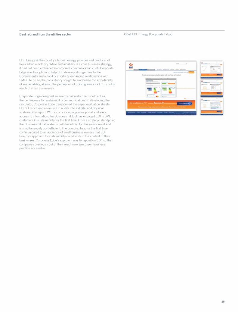
Gold EDF Energy (Corporate Edge) Best rebrand from the utilities sector
EDF Energy is the country’s largest energy provider and producer of low-carbon electricity. While sustainability is a core business strategy, it had not been embraced in corporate communications until Corporate Edge was brought in to help EDF develop stronger ties to the Government’s sustainability efforts by enhancing relationships with SMEs. To do so, the consultancy sought to emphasise the affordability of sustainability, altering the perception of going green as a luxury out of reach of small businesses.
Corporate Edge designed an energy calculator that would act as the centrepiece for sustainability communications. In developing the calculator, Corporate Edge transformed the paper evaluation sheets EDF’s French engineers use in audits into a digital and physical sustainability report. With a corresponding online portal and easy-access to information, the Business Fit tool has engaged EDF’s SME customers in sustainability for the first time. From a strategic standpoint, the Business Fit calculator is both beneficial for the environment and is simultaneously cost efficient. The branding has, for the first time, communicated to an audience of small business owners that EDF Energy’s approach to sustainability could work in the context of their businesses. Corporate Edge’s approach was to reposition EDF so that companies previously out of their reach now saw green business practice accessible.

26
C
M
Y
CM
MY
CY
CMY
K
wireworks_transform_ad_2013.pdf 1 01/03/2013 15:20

27
Vlerick Business School in Belgium, is a leading European institution, however, its outdated visual identity was a handicap when recruiting worldwide. The school has campuses in Brussels, Ghent, Leuven and St Petersburg, as well an MBA alliance with Peking University in Beijing, but an international growth strategy required a new brand identity. Landor Associates was brought in to make Vlerick’s branding representative of its status as a world-class institute of higher education.
Landor introduced a striking rebrand that sought to reflect the progressive outlook and energy of the school. Described as “Open minds for a better business world,” the rebrand gives the school a lively feel. In place of a uniform green look, bright colours are used to bestow a sense of vitality to the visual identity. The rebrand was rolled out to digital properties and in the form of physical wayfinding and promotional materials. The new identity also makes use of the simplified name Vlerick rather than Vlerick Leuven Gent Management School, essential to its expected growth outside of Belgium.
Region
Gold Vlerick Business School (Landor Associates)Silver Unitymedia (venturethree)
Best rebrand from Western Europe
Coral Travel, a leading tour operator in Russia and the Commonwealth of Independent States (CIS) wanted to refresh its brand identity with a view to becoming a global leisure travel business. As Coral Travel already held a strong market position, Carnegie Orr faced the challenge of developing the brand without undermining its existing identity.
Carnegie Orr’s new identity provides Coral with a revamped modernity and the ability to compete against other international leisure travel brands. The original branding failed to draw attention from a digital audience, despite the brand’s existing audience base. The new identity is both eye-catching and reflective of Coral Travel’s tradition and place in the European travel market. In implementing the new branding, Carnegie Orr focused on travel agents and online sales as key audiences. Communication of the rebrand began with travel agents and has continued on to both the online and physical consumer interfaces.
Best rebrand from Russia Gold Coral Travel (Carnegie Orr)Silver Vipservice (Solovieva Team)Bronze Biletix (Solovieva Team)
The Heathrow Express programme to redefine its corporate brand identity had two main aims: to align the rail company with air travel and to increase revenue. The new branding sought to transform Heathrow Express into an inclusive and desirable luxury brand.
To do so meant breaking with both the established Heathrow Express brand and the traditional tropes used by transport companies. In rebranding, Heathrow Express focused on premium service and usability. A new fleet of modernised trains with state of the art facilities and a new Silver logo were introduced to give the brand a premium identity. Focus was also directed to ease of use: airport terminals were redesigned, the website’s functionality was improved and new mobile ticketing apps were implemented.
The branding saw a significant increase in passenger numbers: in 2011 the Heathrow Express service carried a total of 5.68 million passengers, 5.9% higher than the 2010 total of 5.36 million. In 2012, Heathrow express managed to host 5.6 million passengers despite the challenges of the Olympic period which saw a significant reduction in overall airline passengers. The corporate client retention rate for 2012 grew to 88% and the number of corporate accounts grew to 94% year on year.
Best rebrand from the UK Gold Heathrow Express Bronze Wyke FarmsHighly commended Caffrey’s (Landor Associates)

28
One of Transform’s judges said Interbrand made the mark in its rebrand of Cancer Research UK, “I totally support the approach of changing the tone of voice from fear to inspiration.”
Cancer Research has been an iconic British brand for years, thanks largely to its remit and its high street presence. However, the branding itself was inconsistent bordering on confusing and dwelt in science and fear, rather than comfort and innovation. Interbrand worked with CRUK’s internal audience to find out what the organisation looked like from the inside out. It surveyed employees and investigated the work of the doctors and researchers who comprise Cancer Research’s workforce.
The “Big C” logo was introduced and has since been heralded as a triumph of third sector branding. While the logo harkens back to CRUK’s heritage, it is also a versatile, adaptable design that makes CRUK a friendlier, more comforting brand. Emphasis was also placed on the quality of research and scientific advancements that Cancer Research embodies. Doctors and scientists were transformed into superheroes as the old brand’s arrow motif was transformed into a more familiar logo.
Natasha Hill, Cancer Research UK marketing director says, “From a strategic point of view we wanted to celebrate that we are making progress and beating cancer every day. We wanted that optimism and energy and dynamism to come through in the new mark – the C takes centre stage.”
Within the new branding, CRUK can promote its scientific endeavours alongside the work it does with patients and families. It has put a new face on its high street outlets and it has put a new face on third sector, scientific and non-profit branding. Having been “blown away with the Cancer Research UK work” the judges voted this rebrand as the 2013 Transform Awards Grand Prix winner.
Grand PrixCancer Research UK (Interbrand)

296
Further is a design agency with a single purpose – to help companies go further by building stronger connections to stakeholders. Further creates brands, brings reporting to life and makes communications work harder.
Further77 KingswayLondonWC2B 6SR+44 (0)20 7543 2000furthercreative.co.uk@furtherthoughts

30
winners
design by furthercreative.co.uk
Related Documents