WINDSTAR CRUISES LOGO USE & APPLICATION GUIDELINES MARCH 15, 2014 Page | 1

Welcome message from author
This document is posted to help you gain knowledge. Please leave a comment to let me know what you think about it! Share it to your friends and learn new things together.
Transcript
WINDSTAR CRUISES
LOGO USE & APPLICATION GUIDELINES
MARCH 15, 2014
Page | 1

This is Windstar’s primary logo. When asked for the logo from vendors and third party partners, this is the one they should use. The Windstar logo is a perfect representation of the casual elegance which sets our company apart in the luxury cruising industry. The wordmark's classic, serif typeface with a slightly taller initial capital letter is a modern interpretation of the elegant type styles of yesteryear. This is balanced by the more casual flourish and star emblem. Placed behind the first letter and coming to rest above the "I", the emblem draws its inspiration from soft breezes, gentle waves and clear nights that are part of the intimate experience of small-ship cruising.
This logo is used only in two colors. No substitutions for this version. For print: Dark blue – PMS 648C (for all type and the registration mark) Lighter blue – PMS 549C (for the swash and star) For web: Dark blue – RGB Midnight Blue -- #191970 (25,25,112) In MS Word: Darkest Navy Blue on color panel Key points: Gradient swash and star – light blue color starts light on the left and builds
darker to the right Swash is behind the letter W Star slants slightly to the right
Page | 2

LOGO VARIATIONS
PRIMARY LOGO: Use all the elements together – emblem and words – in the configuration as shown. The words must remain center-stacked and in this size relationship. Always include the ® registration mark. The Primary Logo, wordmark and emblem combination, are designed to always be used together. And the words themsleves should remain in the size relationship and centerstacked configuration as shown. Improper usage will create an imbalance among the visual elements of the brand.
The wordmark and emblem combination without the 180˚ tagline should be used in most situations.
PRIMARY LOGO WITH THE TAG LINE: This treatment should be used with discretion and only with prior approval. Do not alter the position or size of the tag line if used in conjunction with the logo. The tag line may be used separately from logo in certain situations, and only with approval from the Windstar Marketing Department. For example, on the front and back side of embroidered goods (eg: ball cap).
Page | 3

W INSIGNIA: The W Insignia is an essential part of the unique Windstar brand image. It exudes confidence with a nod to luxury. It may be used in traditional monogram treatments, and as an elegant shorthand when the full brand image is well communicated. The Windstar Insignia should be used when the brand it references is fully understood within the context. It serves as a classic monogram component for the ships’ smokestacks, on board signage, and occasionally on clothing. Usage of the insignia other than on board Windstar’s ships requires prior corporate approval. Use all the elements together – emblem and W – in the configuration as shown. When placing it, visually center the mark rather than mechanically, or it will always look off-center. Always include the ® registration mark. Never use the W Insignia in conjunction with the full name logo.
Page | 4

NOTE: COLOR VARIATION OF ALL LOGO STYLES ARE
AVAILABLE IN WINDSTAR’S IMAGE LIBRARY.
ACCEPTABLE COLOR FORMATS ARE:
SOLID COLOR – BLACK, DARK BLUE, OR REVERSED
WHITE
TWO COLOR GRADIENT – DARK BLUE WITH
GRADIENT SWASH AND STAR
TWO COLOR – DARK BLUE WITH SOLID SWASH AND
STAR OR WHITE WITH LIGHT BLUE GRADIENT
SWASH AND STAR
ALL ART FILES ARE CLEARLY LABELED BY COLOR
VERSION IN THE IMAGE LIBRARY
Page | 5

TYPE FONT There is no ‘Windstar Logo’ type font. The letters used in the Windstar logo, the W Insignia, and in the names and ports on the actual ships are each hand designed and stand-alone art. There is no instance in which the ‘Windstar logo type font’ can be used for any other purpose. Windstar’s Corporate Fonts For headlines:
For text:
Page | 6
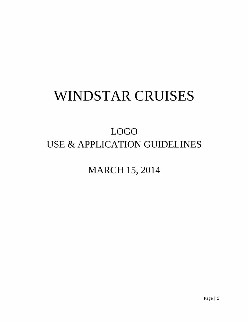
When these fonts are not available to your vendor, you may use other similar substitutions for headlines and text. These substitution fonts should be used only in situations where the corporate fonts cannot be found. Headline substitutions:
TIMES NEW ROMAN WINDSTAR STYLE. SMALL IS BEAUTIFUL.
Text substitutions:
CALIBRI LIGHT Tall billowing sails. Brilliant blue seas. Sun-drenched teak decks. And you, aboard a graceful sailing ship that’s large enough to pamper and entertain you, yet small enough to tuck into delightful, tiny harbors and hidden coves that others can’t reach. This is how it feels to sail on your own private yacht.
Page | 7

TERMS OF USE
GRAPHIC APPLICATIONS: There are two basic configurations of the Windstar logo — with a gradient flourish and a solid flourish. Versions of each have been created in CMYK, spot colors and 1-color (PMS 648, black or white only). These configurations apply to the primary logo and the primary logo + tag line. USE OF TAG LINE: The company tag line, “180 Degrees From Ordinary,” is in a lock-up position with the logo. Never use the tag line in an alternate font or in a position other than what’s shown. The tag line may be used separately from logo, only with approval from the Windstar Marketing Department. It may be used as a stand-alone element, but not as part of a sentence. Never use the tagline without a ® following it. The company tag line should never be used with the W Insignia. With approval from the Windstar Marketing Department, and only with such approval, the tag line may be used on the same piece with the W Insignia, but never in close proximity to it. REGISTERED TRADEMARK: The ® should always be a part of the logo and the W Insignia. For the logo with the tag line, it appears in 2 places.
Page | 8
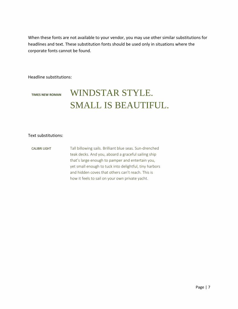
AREA OF ISOLATION: To ensure the visual impact of the Windstar logo, a surrounding area of isolation should be maintained by the use of the formula shown to the right. Do not allow other graphic elements within this area: The Windstar logo is a perfect representation of the casual elegance which sets our company apart in the luxury cruising industry. The wordmark's classic, serif typeface with a slightly taller initial capital letter is a modern interpretation of the elegant type styles of yesteryear. This is balanced by the more casual flourish and star emblem. Placed behind the first letter and coming to rest above the "I", the emblem draws its inspiration from soft breezes, gentle waves and clear nights that are part of the intimate experience of small-ship cruising. Examples:
Page | 9

USE OF COLOR:
The colors of both the primary Windstar logo and the W Insignia are a water blue used in the
flourish and star emblem, with a deep blue in the wordmark and tag line.
The blue flourish and star emblem may be used with a white wordmark or W when reversed out
of a distinct color or photograph – the emblem must clearly show. Consideration should also be
made for the compatibility of the background color with the emblem blue. If the colors clash or if
there is not enough contrast, the all-white version of the logo should be used instead.
All-blue (Pantone 648) or all-black versions of the logo are also acceptable. These should be
used only when color use is restricted or the contrast with surrounding elements is not sufficient
for the visibility of the entire logo.
Page | 10
INPROPER LOGO USE:
Use the Windstar logo only in the approved colors and with the correct area of isolation. The
logo must always be readable and have ample contrast with background elements.
The Windstar logo will occasionally be used in conjunction with outside logos. In accordance
with such usage, care must be taken to ensure that the logo remains prominent and uncluttered.
As with all logo usage, approval must be obtained from the Windstar Marketing Department
before placing the logo in concert with others, and guidelines with respect to the area of
isolation around the logo must be carefully followed.
▪ No unauthorized colors
Use the logo only in the approved colors outline in this document.
▪ No typeface or configuration alternatives
The logo type and tag line font should never be changed or substituted, nor altered from
center-stacked.
▪ No unauthorized background colors
Use the logo only with approved background colors, and use the logo version that provides
best and most pleasing visibility.
▪ Do not use with inappropriate imagery
Use the logo only on background images that provide sufficient readability of the logo and
tag line.
▪ No type within area of isolation
Keep all type outside the area of isolation surrounding the logo.
▪ Do not overlap with other graphics
Do not allow other graphics or logos to violate the Windstar logo’s area of isolation.
Page | 11
Related Documents