The point of rhetorical analysis is merely to read with understanding. (p. 320)

Welcome message from author
This document is posted to help you gain knowledge. Please leave a comment to let me know what you think about it! Share it to your friends and learn new things together.
Transcript

The point of rhetorical analysis
is merely to read with understanding.
(p. 320)

What’s that mean?

Aristotle: Rhetoric may be defined
as the faculty of observing in any given case
the available means of
persuasion.

Rhetorical analysis: to read/observe/critique any
“text” with an understanding of the context and available
means of persuasion.

What does that include?

everything.

ethos.

pathos.

logos.

kairos.

kairos:Fitting occasion or timing.
The “right” time or the “only” time…

style.

audience.

purpose.

context.

metaphor.

story.
delivery.

culture.


transition. Paging Bolin Carroll
You have built a mental database that
you can draw on to make conclusions about what a person’s looks tell you about
their personality.(p.46)

#iftheygunnedmedown


so let’s look at a few teachers and talk first impressions based on a
single photo.

heh. had to be fair.


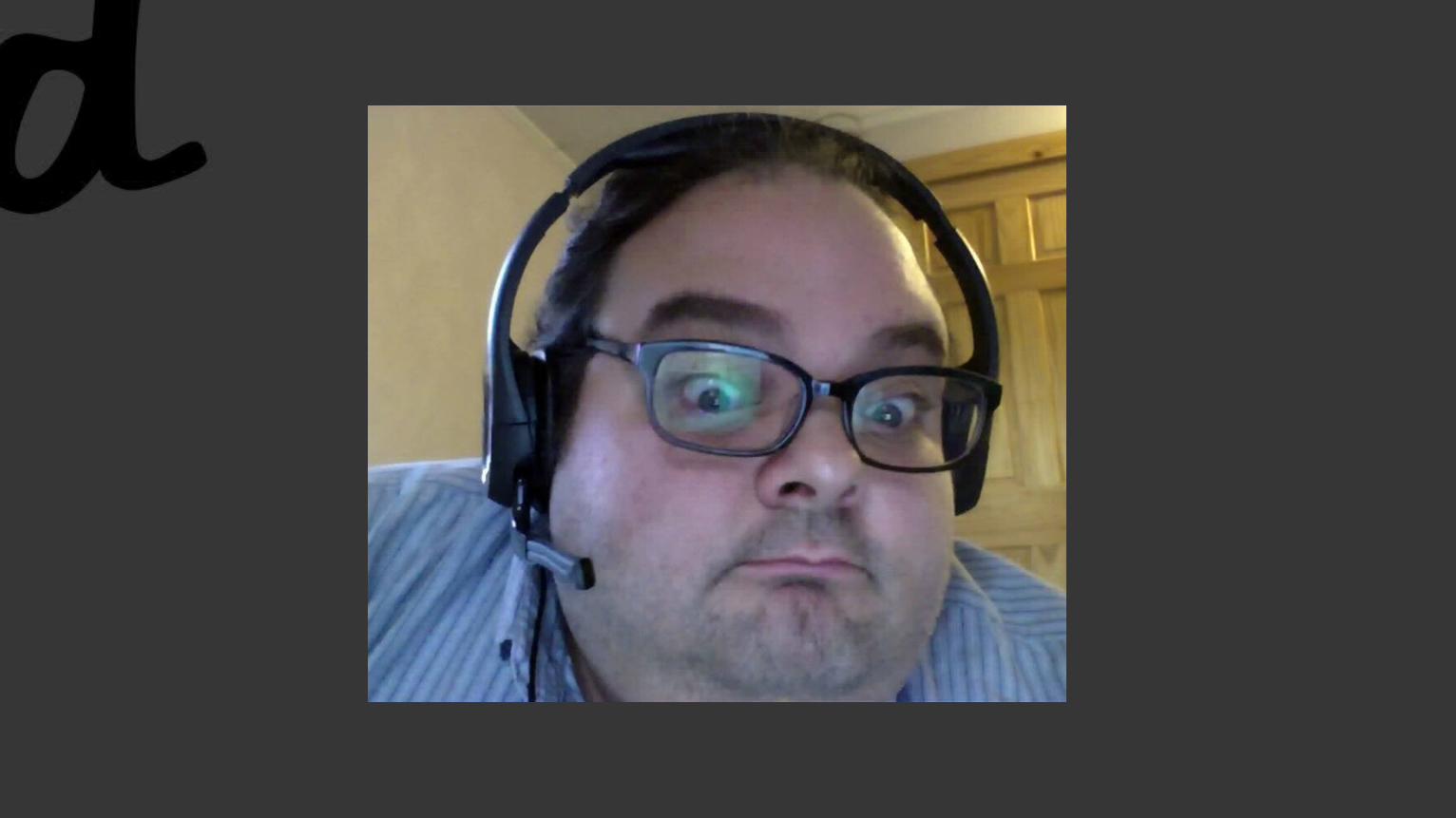
that is Dr. Julie Platt.Anyone know who she is?


that is Dr. Stephen Hawking.Super-genius. Seriously.


that is Cameron Diaz from the movie bad teacher.She was as the title made her.


that is Dr. Cornell West.Professor at the Union Theological Seminary.
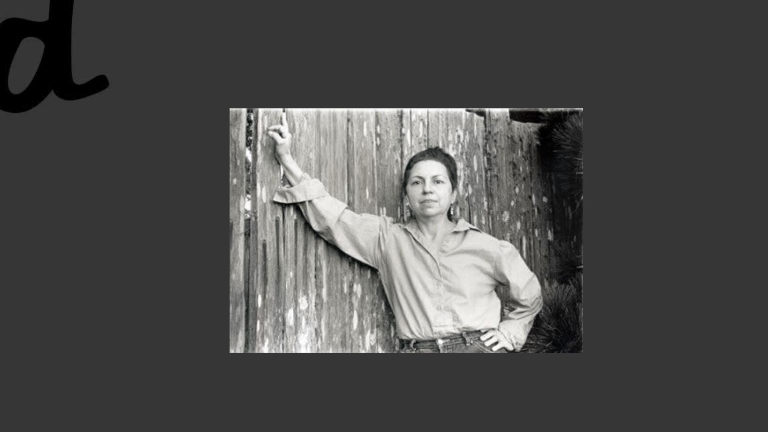
that is Dr. Gloria Anzaldua.She worked several places. She died in 2004. RIP.


that is Professor X.He’s not real.

Your first rhetorical analysis assignment (your Wednesday question of the day):
Rhetorical Analysis of a Movie Poster

Let me show you an example: Spider-Man Movie Poster
The first step, of course, is to look at the poster closely and make a list of things you notice that impact the design/think
about what those things mean.


Things of note:1)Bright-comic-book/cartoon like orange gold sunlight! 2)Spider-Man is present and is quite large.3)He’s on a skyscraper=NYC4)Wait… is that?

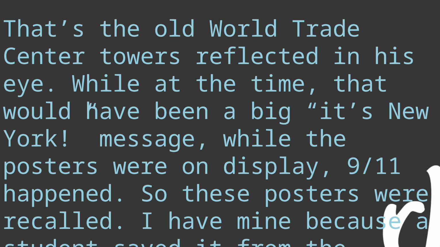
That’s the old World Trade Center towers reflected in his eye. While at the time, that would have been a big “it’s New York!” message, while the posters were on display, 9/11 happened. So these posters were recalled. I have mine because a student saved it from the dumpster for me.

I’d have two potential avenues to write an analysis, then:1)How this poster evokes the tradition of Spider-Man as a hero and tries to show the audience his world (to begin the films immersion)Or:2) I could write about the impact of the towers as
an image.

Robin Williams and C.R.A.P.
This is Robin Williams. She’s not Mork, of course.
She is responsible for a great many awesome design texts that are reader-friendly. She write the non-designer’s design handbook. It’s worth owning a copy, if you’re interested in design.

AND NOW SOME C.R.A.P.

As funny as it is…
… making CRAP jokes, it really is a foundational premise of design, and it’s deeply important (and thanks to our sense of humor usually quite memorable). The letters, of course, stand for:
Contrast Repetition Alignment Proximity

CONTRAST

ContrastBasically stated, contrast means that things that are similar look similar but things that are different look
clearly different. This keeps your reader from becoming confused and creating relationships that
aren’t present.
It comes, of course, from literal contrast, the light-to-dark or black-to-white of an image. In design it often
ends up being about color values.

This image is a great example, and it is also a hyperlink to a
great blog entry on
contrast, if you want to learn
more.

REPETITION
Repetition
Maybe the easiest of these four concepts to define, repetition is, just as you’d guess, repeating something– a color, a logo, a typeface, a type style.
It unifies and organizes.

ALIGNMENT

Alignment
Alignment is about positioning on a page. Nothing should be put on haphazardly. There should be a reason and a measurement that guides where things are placed in relation to each other.

The image to the right links to a post that has some cool
reflection on alignment. And there’s all kinds of alignment going on with the new Windows 8 start page.

PROXIMITY

Proximity
Proximity is very similar in theory to alignment, but it’s more about grouping and use of white space.
Basically: similar things are grouped together, different things require space.


SOMETHING BROKENTo see how well we’re grasping our C.R.A.P., I want to look at one poorly designed flyer and make it better. This is your Friday question of the day.
Prepare thyself! It’s… really bad.
Seriously. Are you sitting down?

From http://www.bignnastyprod.com/site/djdirty/djdirty.htm

Design choices
I’m not sure I precisely understand it, but there’s sort of a sub-genre of party flyers that look a bit like this one. Knowing that, I don’t want to act as if this is absolutely hideous, but I think you can safely say, based on our readings so far, that this is not a well designed flyer.
When addressing a flyer like this, we want to collect some key information. So let’s break down what we actually have here.

Elements
What is the event? What are the key brand info and what is critical to tell the audience?What is the key graphic thrust?

FIX IT!
Using whatever software you want (other than Word– no Word), make a better flyer than the one we have.Post it when done.
Related Documents