Web Design, Usability, and Aesthetics 1 Notes from book “Don’t Make Me Think: A Common Sense Approach to Web Usability” by Steve Krug

Web Design, Usability, and Aesthetics 1 Notes from book “Don’t Make Me Think: A Common Sense Approach to Web Usability” by Steve Krug.
Dec 21, 2015
Welcome message from author
This document is posted to help you gain knowledge. Please leave a comment to let me know what you think about it! Share it to your friends and learn new things together.
Transcript

Web Design, Usability, and Aesthetics 1
Notes from book
“Don’t Make Me Think:
A Common Sense Approach to Web Usability”
by Steve Krug
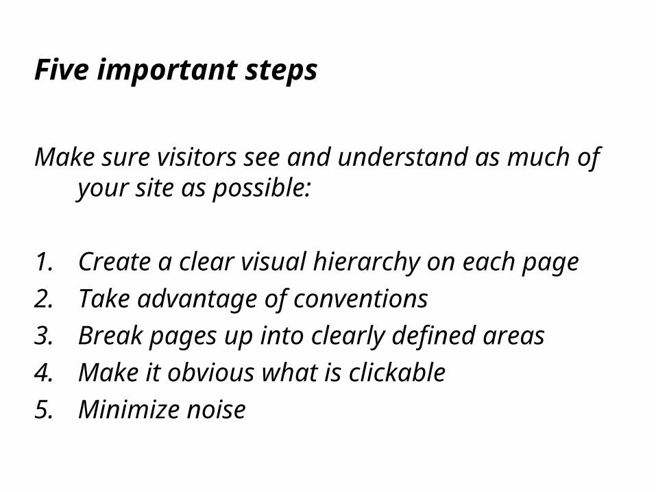
Five important steps
Make sure visitors see and understand as much of your site as possible:
1. Create a clear visual hierarchy on each page
2. Take advantage of conventions
3. Break pages up into clearly defined areas
4. Make it obvious what is clickable
5. Minimize noise

Clear visual hierarchy
Make sure that the appearance of the things on the page, all of the visual cues clearly and accurately portray the relationship between the things on the page
(Which things are related, and which things are part of other things, each page should have a clear visual hierarchy)
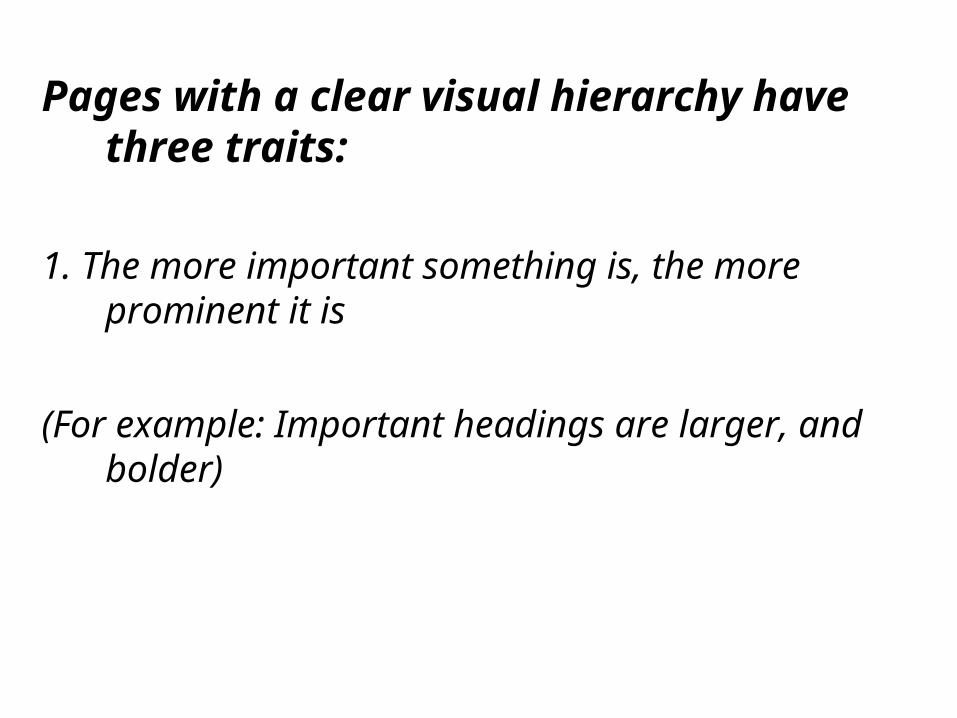
Pages with a clear visual hierarchy have three traits:
1. The more important something is, the more prominent it is
(For example: Important headings are larger, and bolder)
Pages with a clear visual hierarchy have three traits:
2. Things that are related logically are also related visually
(For example: Group similar items together in a heading, different style, or area)

Pages with a clear visual hierarchy have three traits:
3. Things are “nested” visually to show what’s part of what
(For example: The visual display on your page should be logical. Like newspapers, prominence, grouping, and nesting)

Parsing visual hierarchies:
We are forced to think when the visual cues, or their absence, don’t enable us to parse its visual hierarchy
(If everything looks equally important we are forced to scan and interpret importance)

Parsing visual hierarchies:
Good visual hierarchy saves us work by preprocessing a page for us
(Contents are organized and prioritized in an acceptable and easily understandable way)

Conventions are your friends:
Web has conventions and continues to refine them and develop new ones over time
(Most derived from newspaper and magazine conventions, and new ones continue to appear)

Conventions evolution:
How does an idea or method come to be accepted as a convention?
(Hint: Works well, frequently imitated, widely acceptable by users. Shopping cart icon for example)
Two important things to know about Web conventions:
1. They’re very useful
(They only become a convention if they work well! Easier for users to go from site to site, sense of familiarity, déjà vu)

Two important things to know about Web conventions:
2. Designers are often reluctant to take advantage of them
(Designers want to reinvent the wheel. But why? Only innovate when you are certain you have a better idea)

Break up pages into clearly defined areas:
Users should be able to easily identify the different areas on your page and know where they go or where they (the links) will take them
(Allows users to decide quickly which areas of the page to focus on and which areas they can safely ignore)

Make it obvious what’s clickable:
Make it obvious what’s clickable and what’s not
(Images or buttons that can be clicked on should be obvious. Hyperlinked text must stand out from the other text and is most often underlined)

Keep the noise down to a dull roar,
two kinds of visual noise:
1. Busyness
(Viewer should not have to wade through your content trying to find a desired item. Limit colors and attention getting components)

Keep the noise down to a dull roar,
two kinds of visual noise:
2. Background noise
(Numerous small bits of noise can be very distracting. Everything on your page could be considered visual noise)

“Animal, vegetable, or mineral”
“Why users like mindless choices …because its easier.”
Presenting simple choices to the user that are totally unambiguous, example of a mindless choice.

Krug’s second law of usability
“It doesn’t matter how many times I have to click, as long as each click is a mindless, unambiguous choice”

How hard each click is?
The number of clicks to get somewhere, may be useful…
… but how hard is each click?
The better question to ponder.
(The amount of thought required, and the amount of uncertainty about whether I’m making the right choice.)

Choices on the web should be clear but usually aren’t
Drop down menus confusing
Slang / verbage not understood
Non intuitive naming or buttons/ links
Unknown convention
Links not underlined or not distinquishable
Choice / option not listed

Make choices “mindless”
We face choices all the time on the Web and making the choices “mindless” is one of the main things that make a site easy to use
Don’t alienate your viewers by forcing them to work hard, or you run the risk of forever losing a visitor
Related Documents