Visualizing Data: An Economists’ Guide to Presenting Data Jonathan A. Schwabish Congressional Budget Office [email protected] @jschwabish The views expressed in this presentation are those of the author and should not be interpreted as those of the Congressional Budget Office. Note: All images and logos in this presentation are linked.

Welcome message from author
This document is posted to help you gain knowledge. Please leave a comment to let me know what you think about it! Share it to your friends and learn new things together.
Transcript

Visualizing Data: An Economists’ Guide to Presenting Data
Jonathan A. Schwabish Congressional Budget Office
[email protected] @jschwabish
The views expressed in this presentation are those of the author and should not be interpreted as those of the Congressional Budget Office. Note: All images and logos in this presentation are linked.

• As analysts and economists, we are used to graphical representations of our work
• People tend to spend a lot of time on the analysis and the words, but less time on thinking about the best presentation of their work
• Data visualization is an emerging field where economists, statisticians, analysts, journalists, programmers, and graphic designers are coming together to present data in new, clear and informative ways
Data Visualization: An Emerging Field
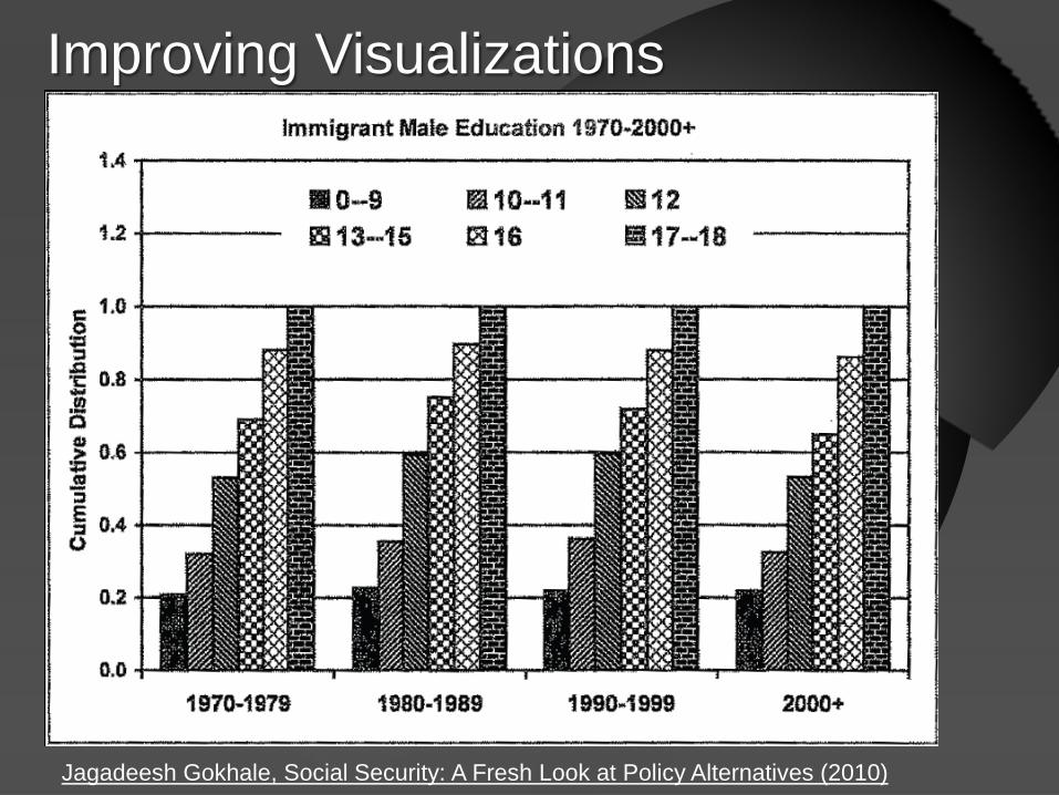
Improving Visualizations
Jagadeesh Gokhale, Social Security: A Fresh Look at Policy Alternatives (2010)
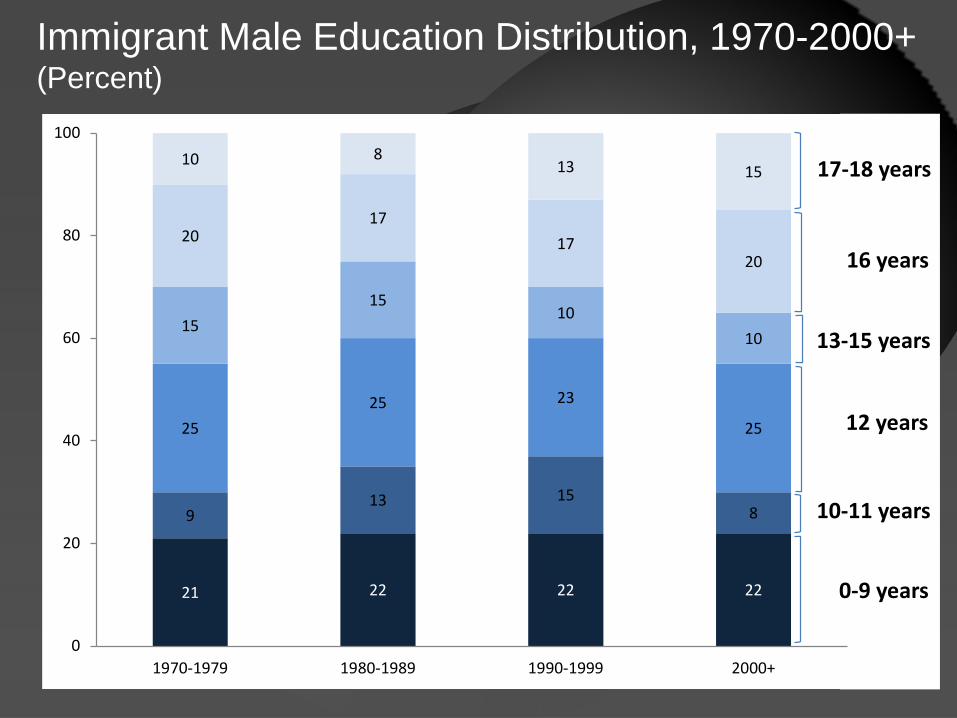
21 22 22 22
913 15
8
2525 23
25
1515
1010
2017
1720
10 813 15
0
20
40
60
80
100
1970-1979 1980-1989 1990-1999 2000+
17-18 years
16 years
13-15 years
12 years
10-11 years
0-9 years
Immigrant Male Education Distribution, 1970-2000+ (Percent)
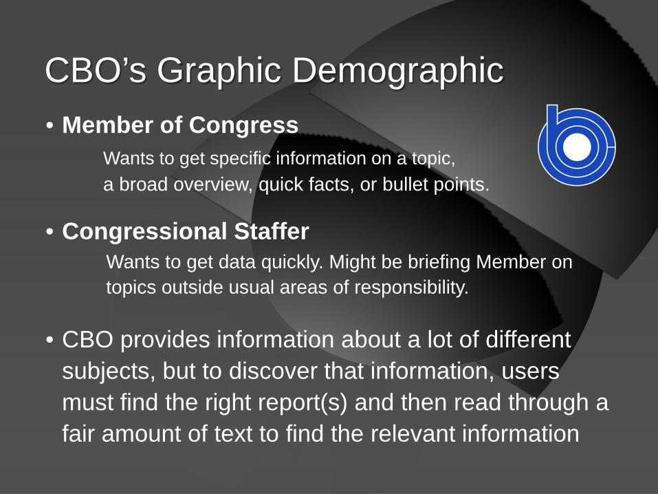
• Member of Congress Wants to get specific information on a topic, a broad overview, quick facts, or bullet points.
• Congressional Staffer Wants to get data quickly. Might be briefing Member on topics outside usual areas of responsibility.
• CBO provides information about a lot of different subjects, but to discover that information, users must find the right report(s) and then read through a fair amount of text to find the relevant information
CBO’s Graphic Demographic

Leaders in the Field

Visualization Showcase Websites

• There are a lot of tools available
• Microsoft Office (Excel, Visual Basic, NodeXL, Word)
• Adobe Creative Suite (Illustrator, InDesign, Photoshop) Fireworks, After Effects Adobe Edge (Beta version) Adobe Kuler (for color)
Available Tools—Production Software
• Programming Languages HTML, HTML5, Flash, JavaScript, R, Python, Processing, d3
• Mapping MapInfo, ArcGIS, StatPlanet, Stata
• Software Tableau, Google Labs, HCIL at UMaryland
• Color Adobe Kuler, ColorScheme Designer, Color Brewer
More Visualization Tools
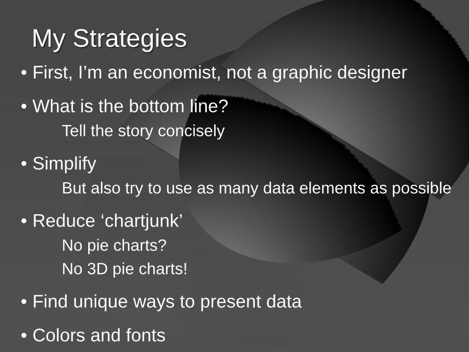
• First, I’m an economist, not a graphic designer
• What is the bottom line? Tell the story concisely
• Simplify But also try to use as many data elements as possible
• Reduce ‘chartjunk’ No pie charts? No 3D pie charts!
• Find unique ways to present data
• Colors and fonts
My Strategies

No pie charts?

By comparison, column charts make comparing data easier
0%
10%
20%
30%
40%
50%
Company B Company C Company D Company A Company E Company F

Definitely no 3D pie charts!
Source: http://blog.visual.ly/ 2ds-company-3ds-a-crowd/

In fact, avoid 3D altogether • Only use 3D charts if you have 3 dimensions otherwise, turn 3D charts into 2D charts

• Budget & Economic Outlook August 2011 and January 2012
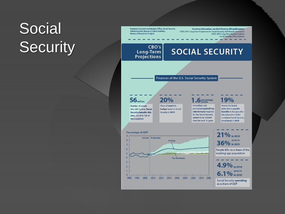
• Static Infographics Social Security Federal Budget TARP SNAP Deforestation
CBO Showcase

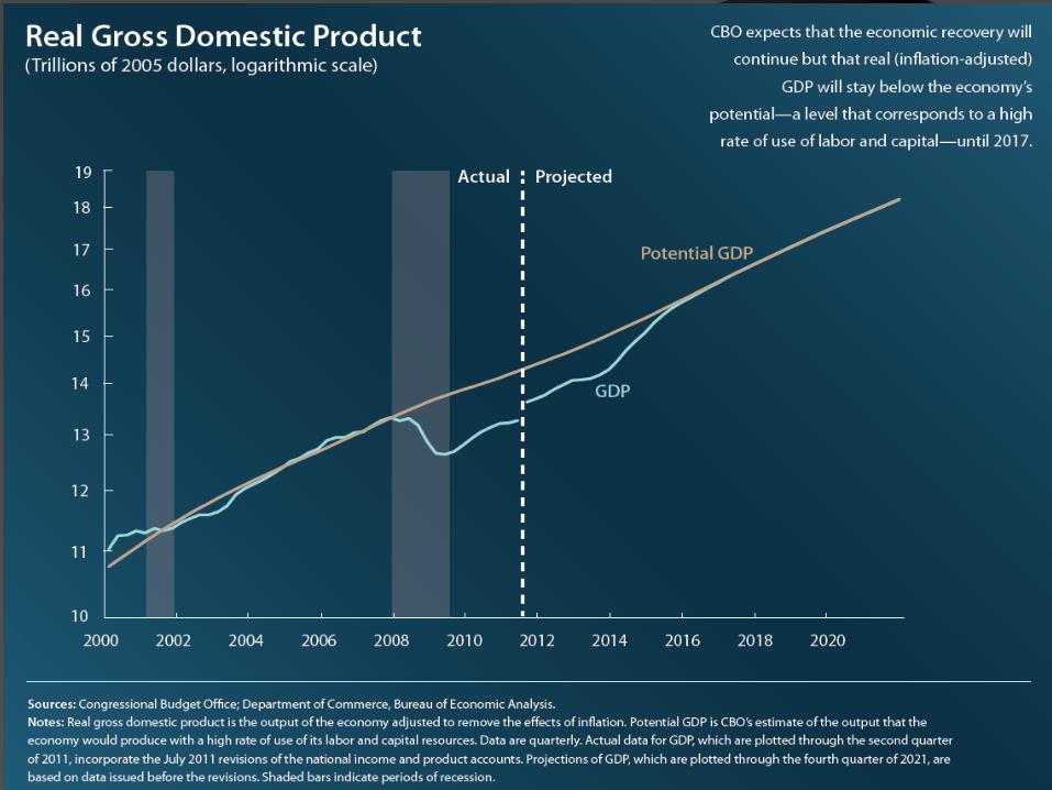
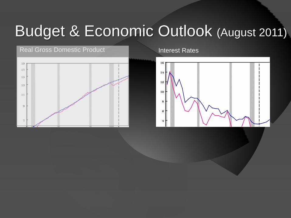
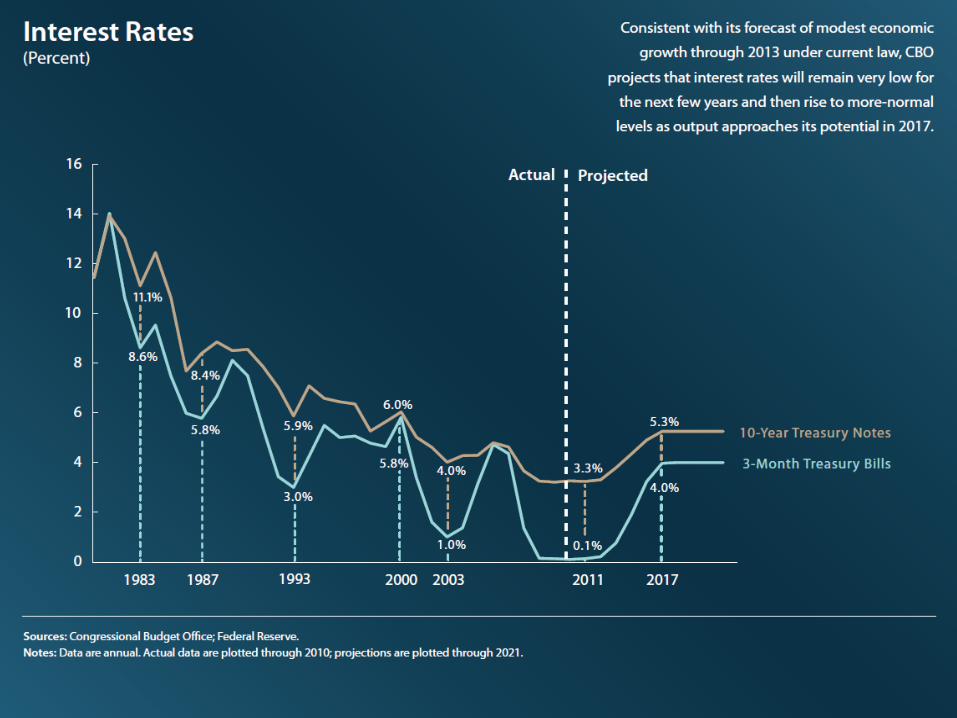
Budget & Economic Outlook (August 2011)
19
17
15
13
11
9
7
16
14
12
10
8
6
4
Real Gross Domestic Product Interest Rates

Budget & Economic Outlook (August 2011)
19
17
15
13
11
9
7
16
14
12
10
8
6
4
Real Gross Domestic Product Interest Rates
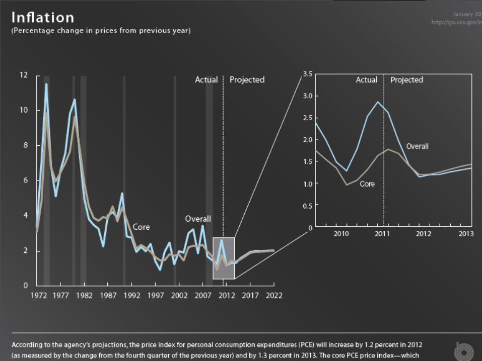

• Budget & Economic Outlook August 2011 and January 2012
• Static Infographics Social Security Federal Budget TARP SNAP Deforestation
CBO Showcase

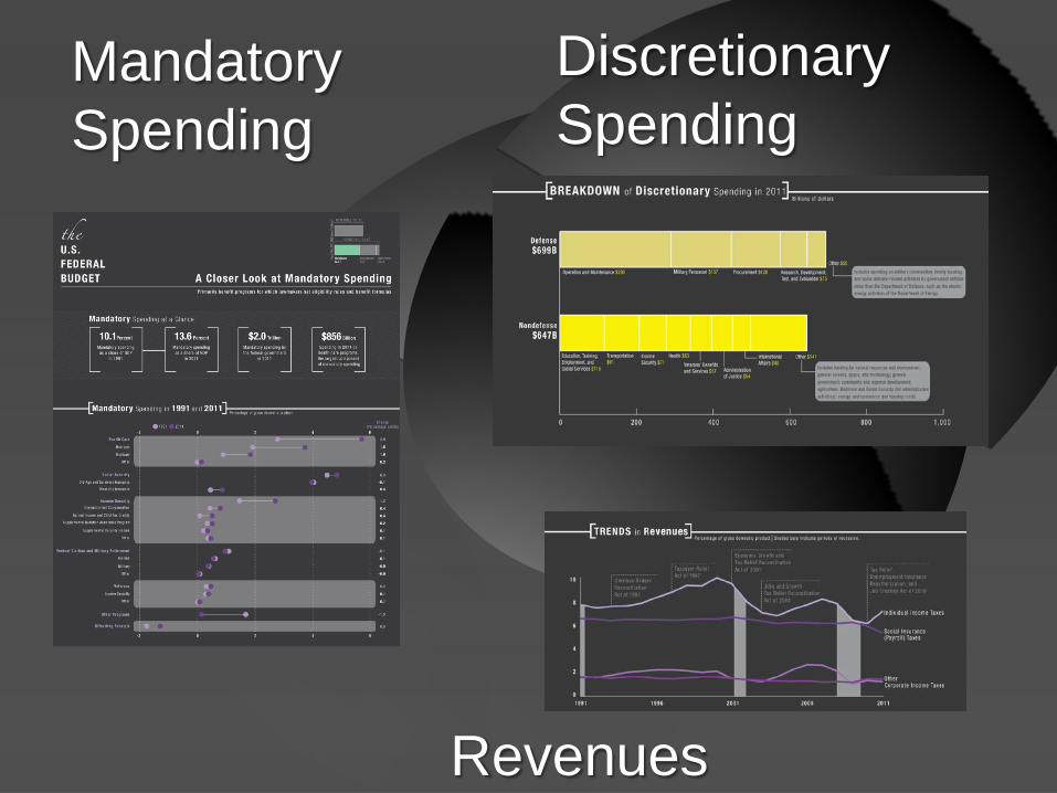
Mandatory Spending
Discretionary Spending
Revenues


To wrap up • We are in the business or presenting information
to policymakers and the public
• It does not take a lot of skill or expensive software to make your standard graphs look much better
• Infographics offer a complementary way to present information to our constituents
They are not meant to replace thorough, in-depth research, but can give the user an alternative perspective and interface and perhaps an introduction into a topic
Related Documents


