Visualising Variables – Validly! Damien Jolley School of Health & Social Development Deakin University, Victoria Originally presented at: ASCEPT Workshop: “Extracting the real significance from biological data” AHMRC, Thursday 28 November 2002 AHMRC Posters Department of Human Physiology & Anatomy School of Human Biosciences La Trobe University 23 April 2004

Visualising Variables – Validly! Damien Jolley School of Health & Social Development Deakin University, Victoria Originally presented at: ASCEPT Workshop:
Dec 22, 2015
Welcome message from author
This document is posted to help you gain knowledge. Please leave a comment to let me know what you think about it! Share it to your friends and learn new things together.
Transcript

Visualising Variables – Validly!
Damien JolleySchool of Health & Social
DevelopmentDeakin University, Victoria
Originally presented at:
ASCEPT Workshop:“Extracting the real significance from biological data”
AHMRC, Thursday 28 November 2002
AHMRC Posters
Department of Human Physiology & AnatomySchool of Human Biosciences La Trobe University23 April 2004
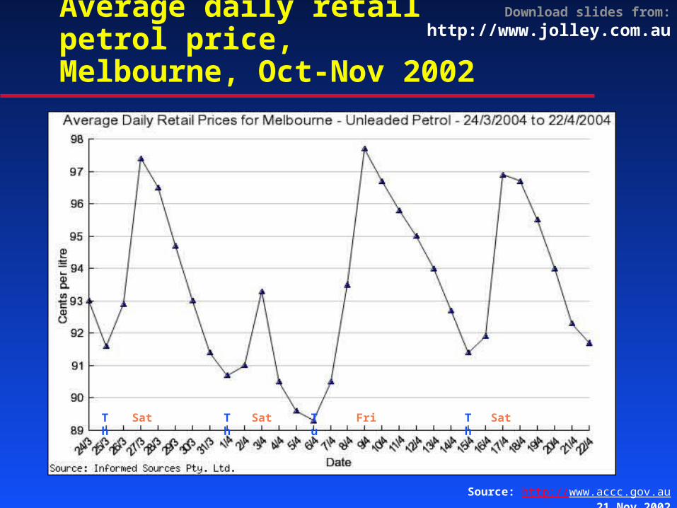
Download slides from: http://www.jolley.com.auAverage daily retail petrol price,Melbourne, Oct-Nov 2002
Th Th TuSat Sat Fri SatTh
Source: http://www.accc.gov.au, 21 Nov 2002

Download slides from: http://www.jolley.com.au
Sydney Adelaide
Brisbane
Melbourne
Otherweeks
Average daily retail petrol price,selected cities, 4 week to 21 Apr
Source: http://www.accc.gov.au, 23 Apr 2004
Vertical lines indicate Sundays
Download slides from: http://www.jolley.com.au
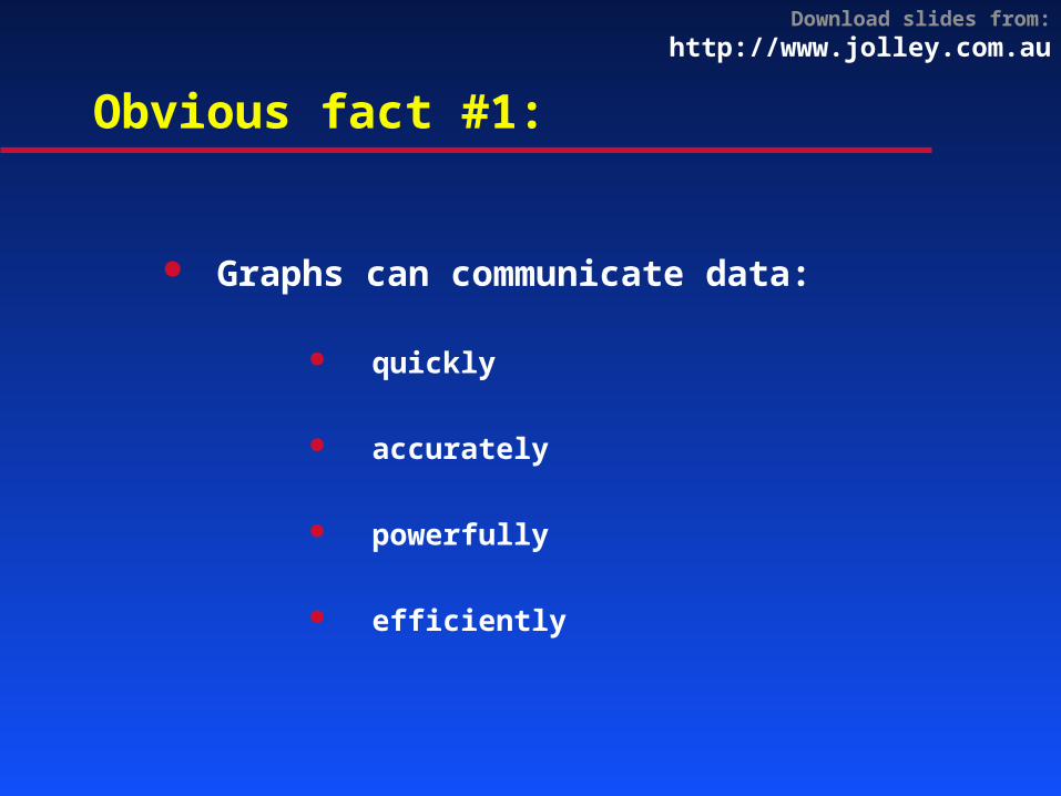
Obvious fact #1:
Graphs can communicate data:
quickly
accurately
powerfully
efficiently

Download slides from: http://www.jolley.com.au“Only 50% of American 17-year-olds can identify information in a graph”*
Source: Wainer H. Understanding graphs and tables. Educational
Researcher 1992; 21:14-23
* US National Assessment of
Educational Progress,June 1990
Download slides from: http://www.jolley.com.au
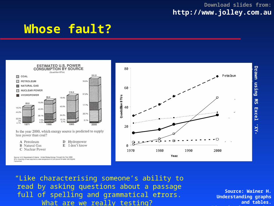
Whose fault?
Source: Wainer H. Understanding graphs and tables. Educational
Researcher 1992; 21:14-23
0
20
40
60
80
1970 1980 1990 2000
Year
Qu
ad
rilli
on
BT
Us
Petroleum
Nuclear power
Natural gas
Coal
Hydropower
“Like characterising someone’s ability to read by asking questions about a passage full of spelling
and grammatical errors. What are we really testing?”
Draw
n using MS Excel ‘XY-chart’
Download slides from: http://www.jolley.com.au
Obvious fact #2:
Bad graphs can hinder communication

Download slides from: http://www.jolley.com.au
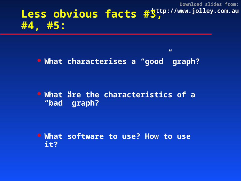
Less obvious facts #3, #4, #5:
What characterises a “good” graph?
What are the characteristics of a “bad” graph?
What software to use? How to use it?
Download slides from: http://www.jolley.com.au
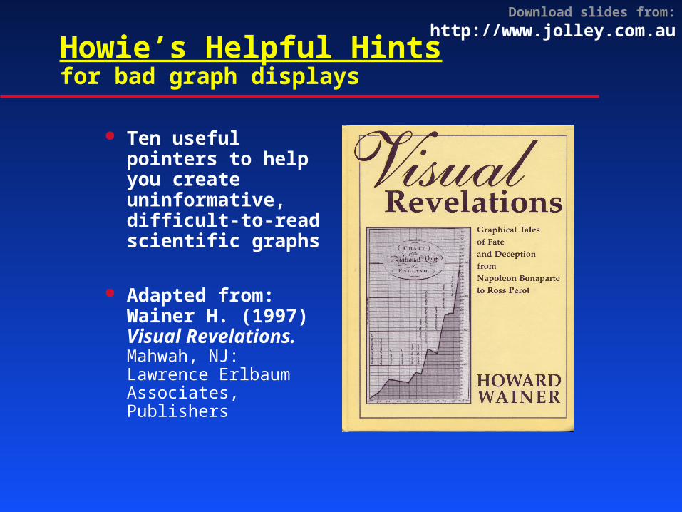
Howie’s Helpful Hintsfor bad graph displays
Ten useful pointers to help you create uninformative, difficult-to-read scientific graphs
Adapted from:Wainer H. (1997) Visual Revelations. Mahwah, NJ: Lawrence Erlbaum Associates, Publishers

Download slides from: http://www.jolley.com.au
Steps for better graphs
1. Identify direction of effect In almost all cases, the cause or predictor
variable should be horizontal (X) Effect or outcome variable is best vertical (Y)
2. Identify the levels of measurement Nominal, ordinal or quantitative are different!
3. Think of visual perception guides Columns or dots? Lines or scatterplot?
4. Minimise guides and non-data Grid lines, tick marks, legends are non-data
Download slides from: http://www.jolley.com.au
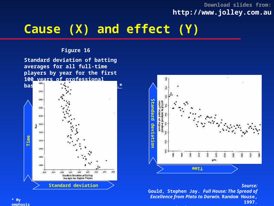
Cause (X) and effect (Y)
Figure 16
Standard deviation of batting averages for all full-time players by year for the first 100 years of professional baseball. Note the regular decline.*
Standard deviation
Tim
e
Source:Gould, Stephen Jay. Full House: The Spread of Excellence from
Plato to Darwin. Random House, 1997.cited: http://www.math.yorku.ca/SCS/Gallery/, 24 Nov 2002* My emphasis
Standard deviation
Time
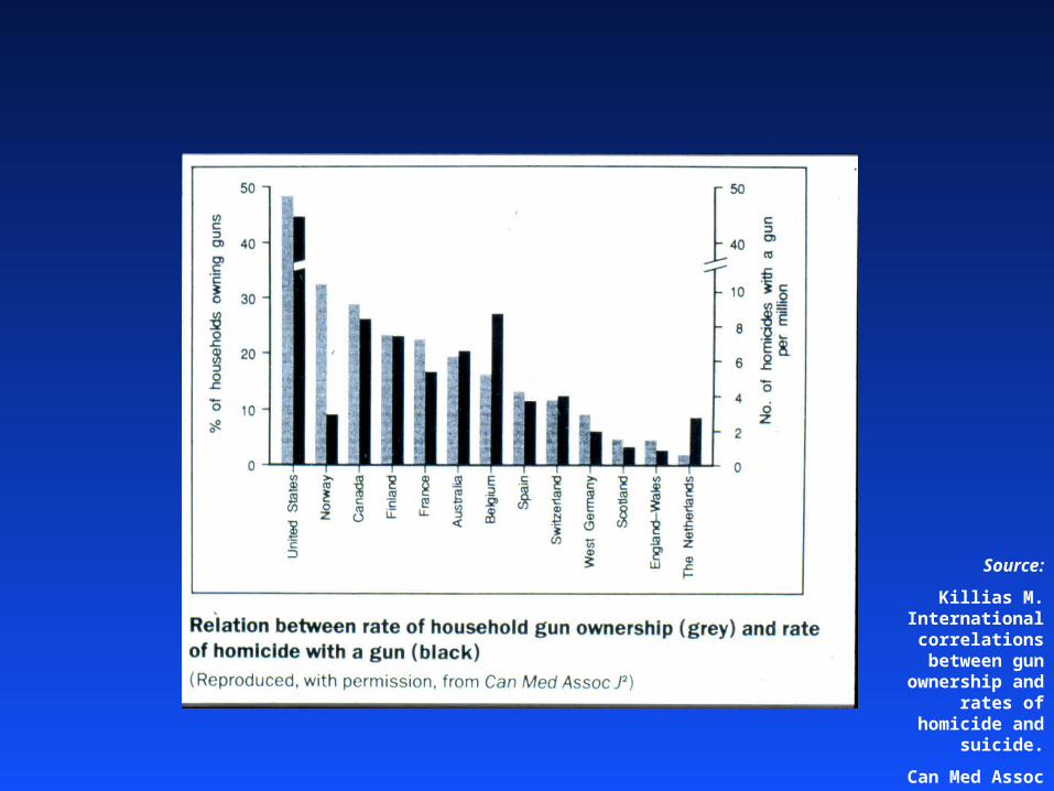
Source:
Killias M. International correlations
between gun ownership and rates
of homicide and suicide.
Can Med Assoc J 1993; 148: 1721-5

% of households owning guns
Rat
e o
f h
om
icid
e w
ith
a g
un
(p
er m
illio
n p
er y
ear)
10 20 30 40
1
5
10
50 USA
Norway
Canada
France
FinlandBelgium
Australia
SpainSwitzerland
Netherlands
West Germany
Scotland
England & Wales
Drawn using S-plus
Download slides from: http://www.jolley.com.au
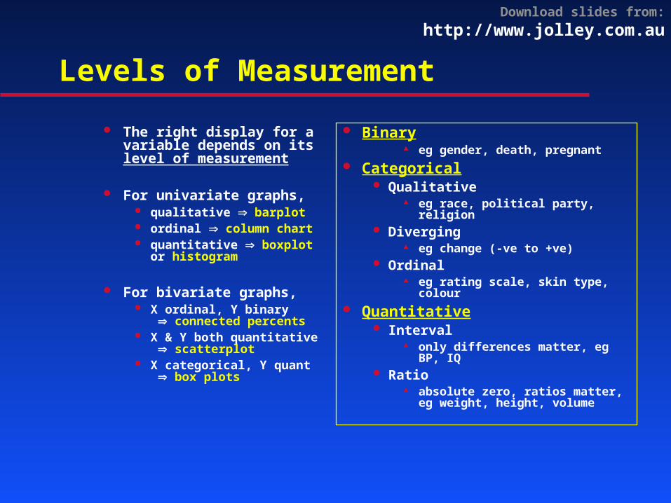
Levels of Measurement
The right display for a variable depends on its level of measurement
For univariate graphs, qualitative barplot ordinal column chart quantitative boxplot
or histogram
For bivariate graphs, X ordinal, Y binary
connected percents X & Y both quantitative
scatterplot X categorical, Y quant
box plots
Binary eg gender, death, pregnant
Categorical Qualitative
eg race, political party, religion Diverging
eg change (-ve to +ve) Ordinal
eg rating scale, skin type, colour Quantitative
Interval only differences matter, eg BP, IQ
Ratio absolute zero, ratios matter,
eg weight, height, volume
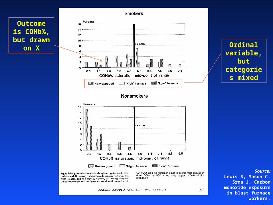
Source:Lewis S, Mason C, Srna J.
Carbon monoxide exposure in blast furnace workers.
Aust J Public Health. 1992 Sep;16(3):262-8.
Ordinal variable, but categories
mixed
Outcome is COHb%, but drawn on X
Download slides from: http://www.jolley.com.au
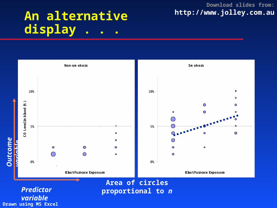
An alternative display . . .
Smokers
0%
5%
10%
Blast Furnace Exposure
None Low High
Non-smokers
0%
5%
10%
Blast Furnace Exposure
CO
Lev
el in
blo
od
(%
)
None Low High
Area of circles proportional to nPredictor variable
Ou
tcom
e va
riab
le
Drawn using MS Excel ‘bubble plot’
Download slides from: http://www.jolley.com.au
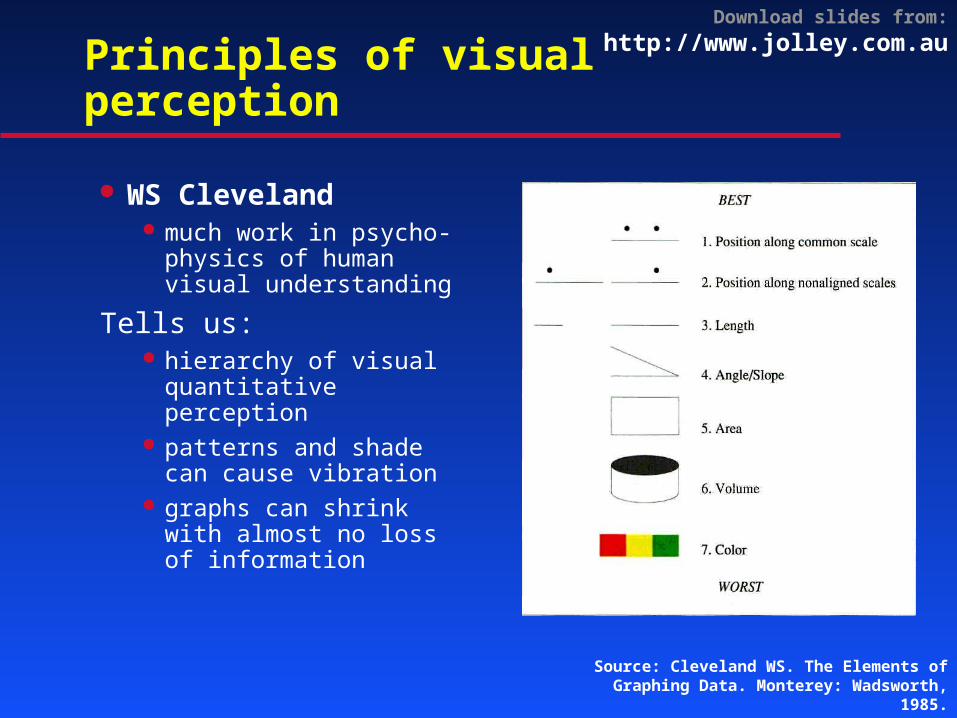
Principles of visual perception
WS Cleveland much work in psycho-
physics of human visual understanding
Tells us: hierarchy of visual
quantitative perception
patterns and shade can cause vibration
graphs can shrink with almost no loss of information
Source: Cleveland WS. The Elements of Graphing Data. Monterey: Wadsworth, 1985.
Download slides from: http://www.jolley.com.au
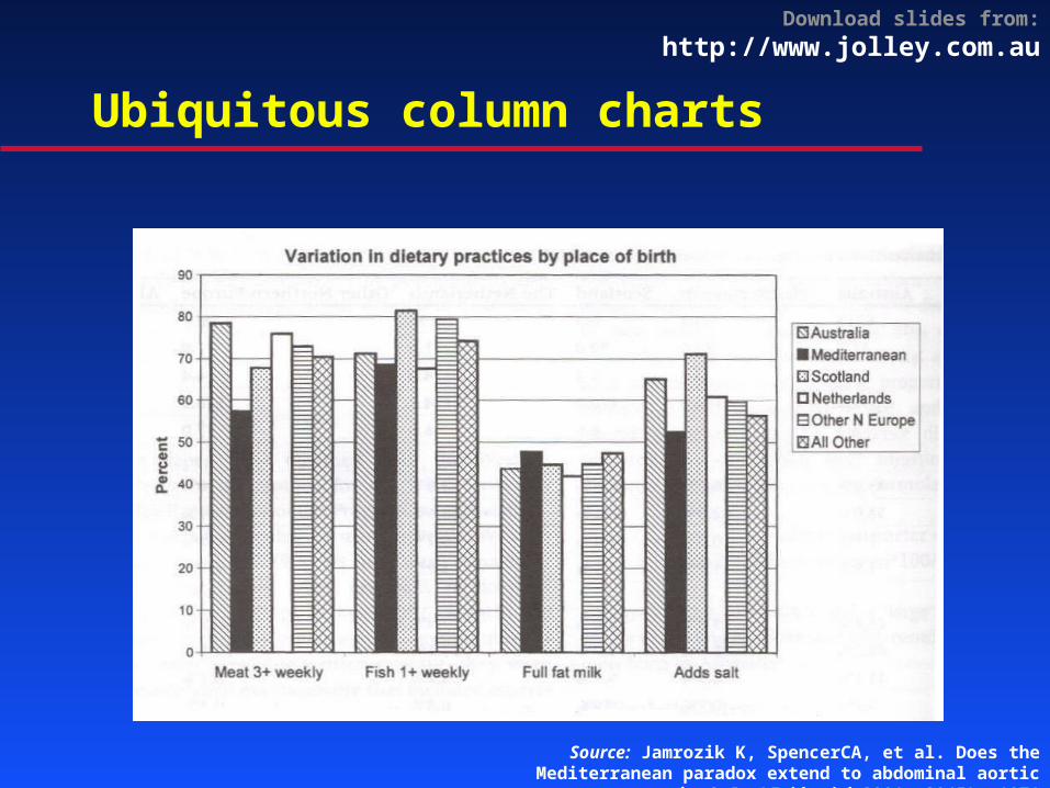
Ubiquitous column charts
Source: Jamrozik K, SpencerCA, et al. Does the Mediterranean paradox extend to abdominal aortic aneurism? Int J Epidemiol 2001; 30(5): 1071
Download slides from: http://www.jolley.com.au
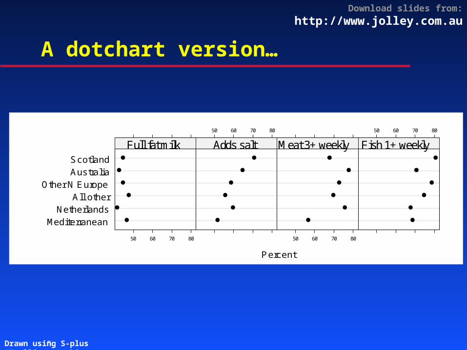
A dotchart version…
MediterraneanNetherlands
All otherOther N Europe
AustraliaScotland
Full fat milk
50 60 70 80
Adds salt
50 60 70 80
Meat 3+ weekly
50 60 70 80
Fish 1+ weekly
50 60 70 80
Percent
Drawn using S-plus “Trellis” graphics

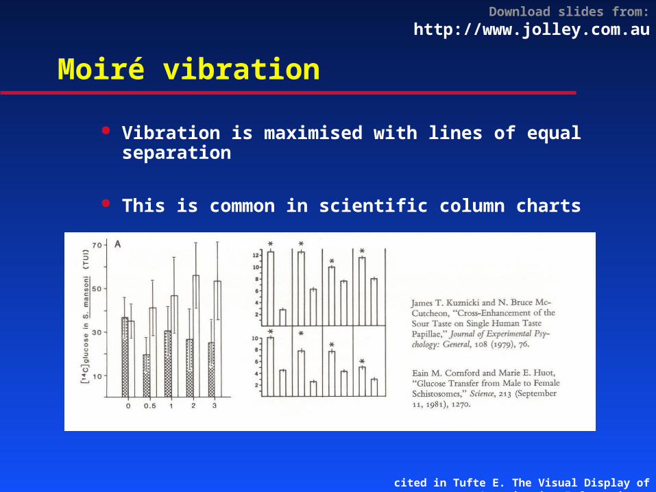
Moiré vibration
is easy with
a computer !!!
Download slides from: http://www.jolley.com.au
Moiré vibration
Vibration is maximised with lines of equal separation
This is common in scientific column charts
cited in Tufte E. The Visual Display of Quantitative Information.
Download slides from: http://www.jolley.com.au
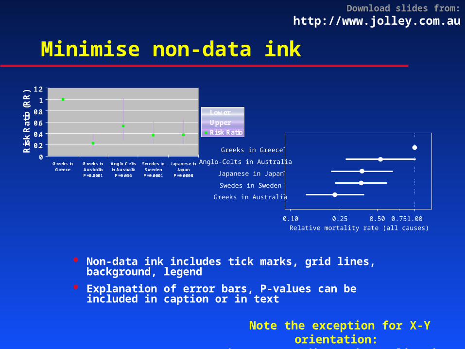
Minimise non-data ink
Non-data ink includes tick marks, grid lines, background, legend
Explanation of error bars, P-values can be included in caption or in text
Greeks in Australia
Swedes in Sweden
Japanese in Japan
Anglo-Celts in Australia
Greeks in Greece
0.10 0.25 0.50 0.75 1.00Relative mortality rate (all causes)
Note the exception for X-Y orientation: because predictor is qualitative (unordered)
Download slides from: http://www.jolley.com.au
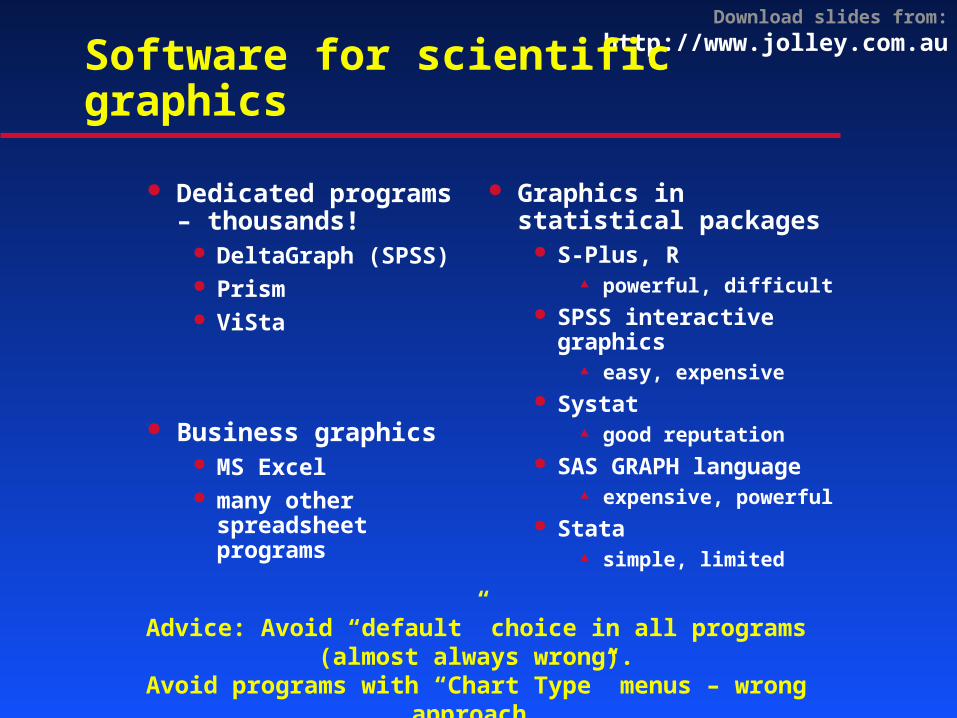
Software for scientific graphics
Dedicated programs – thousands!
DeltaGraph (SPSS)
Prism ViSta
Business graphics MS Excel many other
spreadsheet programs
Graphics in statistical packages
S-Plus, R powerful, difficult
SPSS interactive graphics
easy, expensive Systat
good reputation SAS GRAPH language
expensive, powerful Stata
simple, limited
Advice: Avoid “default” choice in all programs (almost always wrong).Avoid programs with “Chart Type” menus – wrong approach.
Download slides from: http://www.jolley.com.au
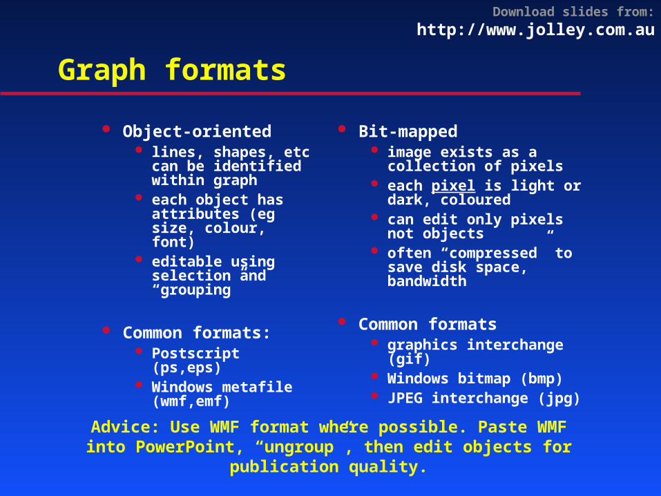
Graph formats
Object-oriented lines, shapes, etc
can be identified within graph
each object has attributes (eg size, colour, font)
editable using selection and “grouping”
Common formats: Postscript (ps,eps) Windows metafile
(wmf,emf)
Bit-mapped image exists as a
collection of pixels each pixel is light or
dark, coloured can edit only pixels not
objects often “compressed” to
save disk space, bandwidth
Common formats graphics interchange
(gif) Windows bitmap (bmp) JPEG interchange (jpg)
Advice: Use WMF format where possible. Paste WMF into PowerPoint, “ungroup”, then edit objects for publication quality.
Download slides from: http://www.jolley.com.au
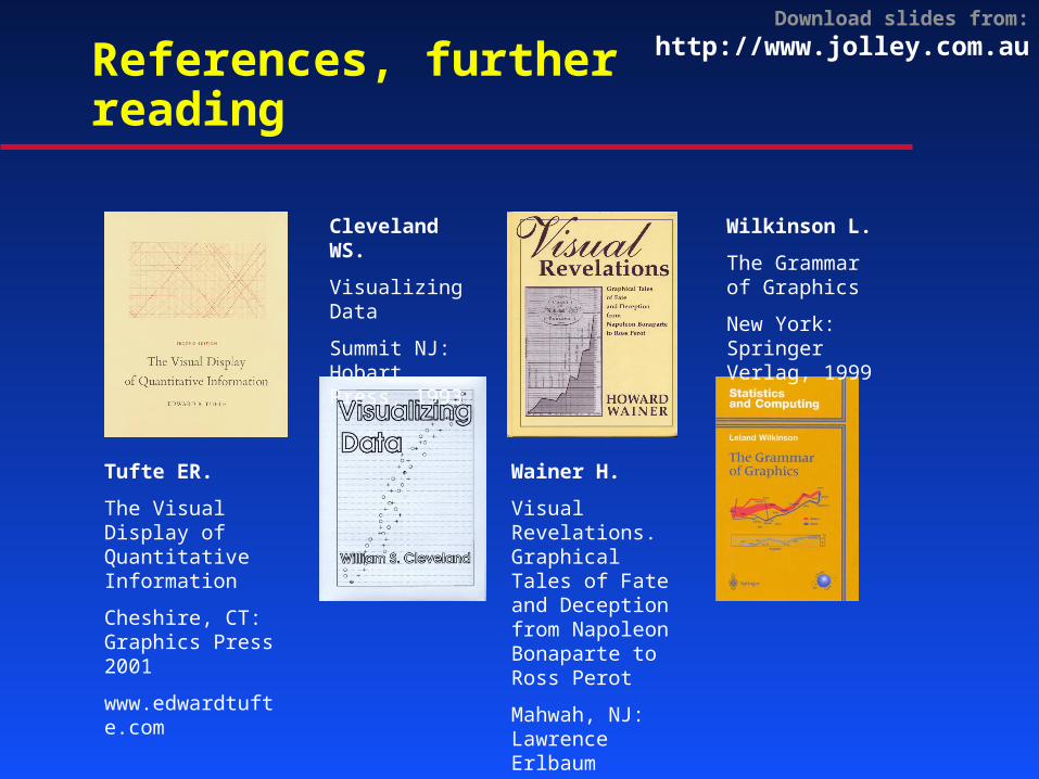
References, further reading
Tufte ER.
The Visual Display of Quantitative Information
Cheshire, CT: Graphics Press 2001
www.edwardtufte.com
Cleveland WS.
Visualizing Data
Summit NJ: Hobart Press, 1993
Wainer H.
Visual Revelations. Graphical Tales of Fate and Deception from Napoleon Bonaparte to Ross Perot
Mahwah, NJ: Lawrence Erlbaum Associates, Publishers. 1997
www.erlbaum.com
Wilkinson L.
The Grammar of Graphics
New York: Springer Verlag, 1999
Download slides from: http://www.jolley.com.au
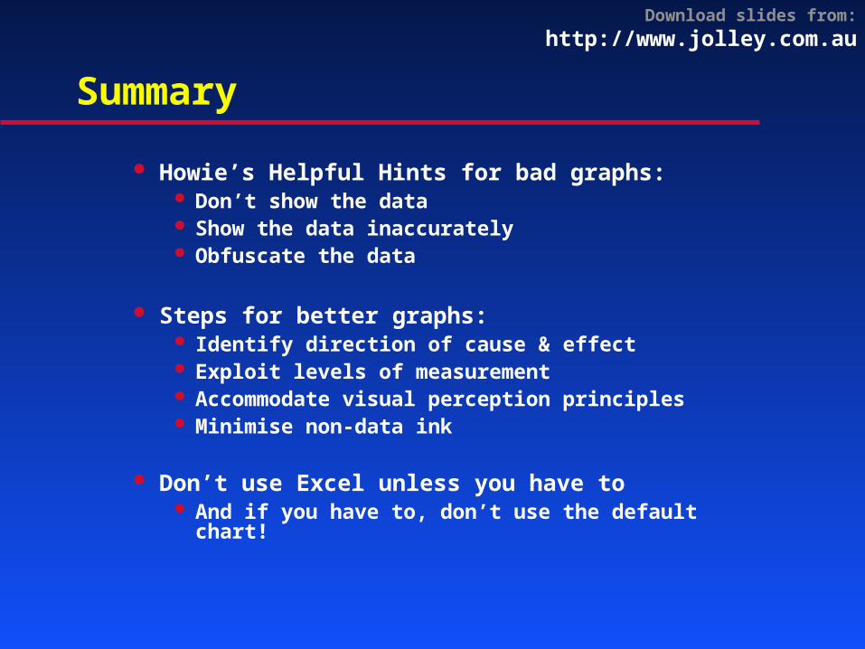
Summary
Howie’s Helpful Hints for bad graphs: Don’t show the data Show the data inaccurately Obfuscate the data
Steps for better graphs: Identify direction of cause & effect Exploit levels of measurement Accommodate visual perception principles Minimise non-data ink
Don’t use Excel unless you have to And if you have to, don’t use the default
chart!
Related Documents


