AND NOW SOME C.R.A.P.

Visual rhetoricbjan 29th
Jul 17, 2015
Welcome message from author
This document is posted to help you gain knowledge. Please leave a comment to let me know what you think about it! Share it to your friends and learn new things together.
Transcript
AND NOW SOME C.R.A.P.
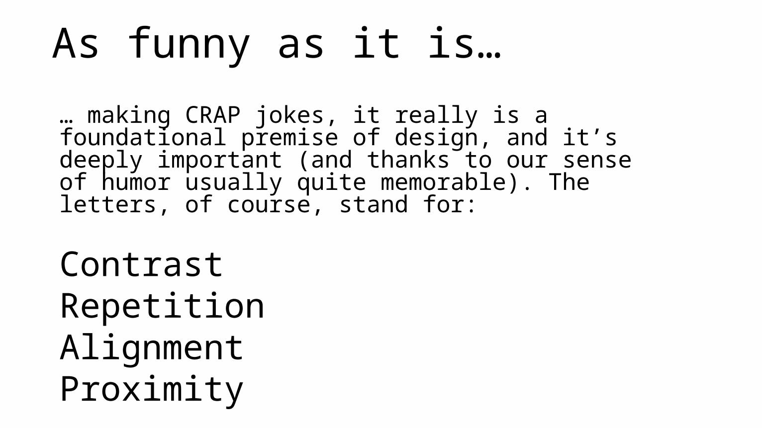
As funny as it is…
… making CRAP jokes, it really is a foundational premise of design, and it’s deeply important (and thanks to our sense of humor usually quite memorable). The letters, of course, stand for:
ContrastRepetitionAlignmentProximity

You read about it
So I’m going to give these to you in my words, along with a few quick examples, so you can get a good sense of how it works.
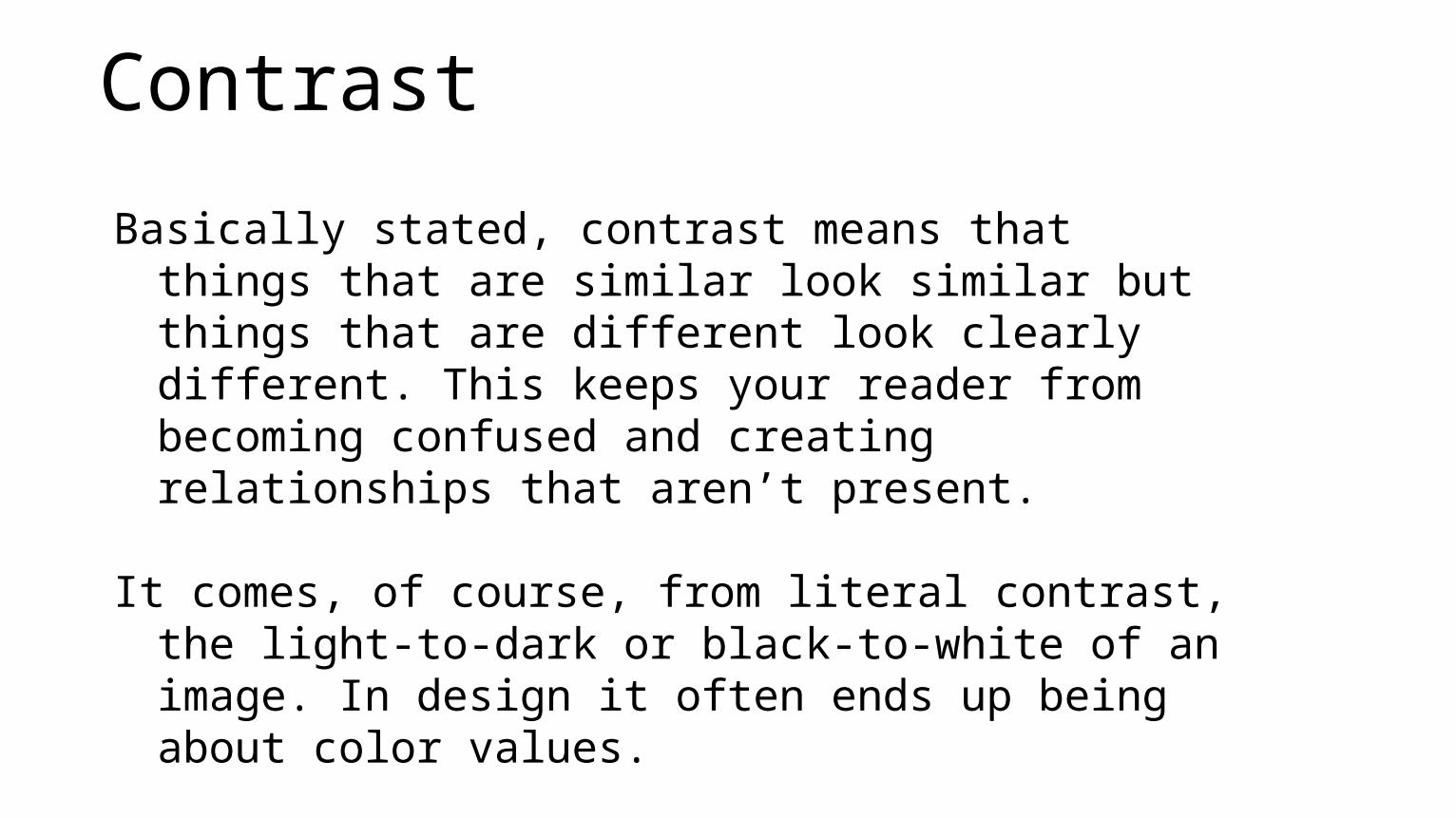
Contrast
Basically stated, contrast means that things that are similar look similar but things that are different look clearly different. This keeps your reader from becoming confused and creating relationships that aren’t present.
It comes, of course, from literal contrast, the light-to-dark or black-to-white of an image. In design it often ends up being about color values.
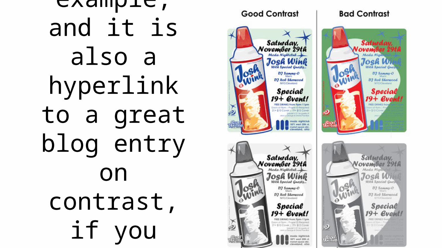
This image is a great example,
and it is also a hyperlink to a great blog entry
on contrast, if you want
to learn more.
Repetition
Maybe the easiest of these four concepts to define, repetition is, just as you’d guess, repeating something– a color, a logo, a typeface, a type style.
It unifies and organizes.
Alignment
Alignment is about positioning on a page. Nothing should be put on haphazardly. There should be a reason and a measurement that guides where things are placed in relation to each other.
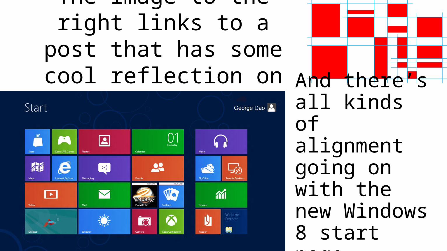
The image to the right links to a post that has some cool
reflection on alignment. And there’s all kinds of alignment going on with the new Windows 8 start page.
Proximity
Proximity is very similar in theory to alignment, but it’s more about grouping and use of white space.
Basically: similar things are grouped together, different things require space.

NEXT!
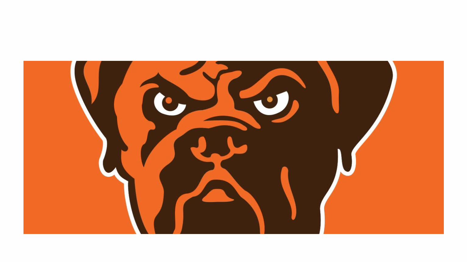
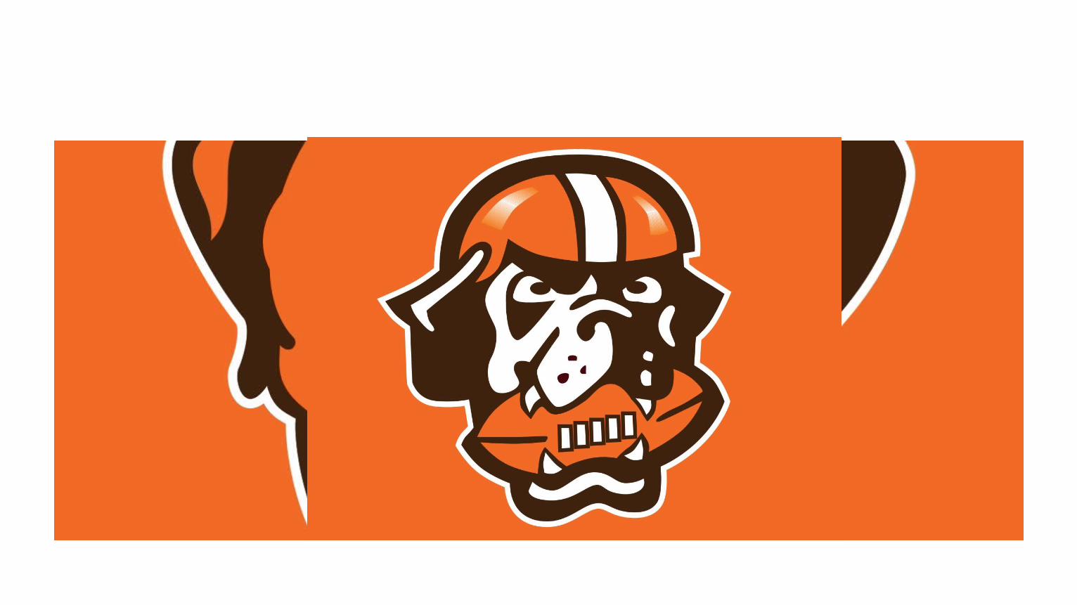
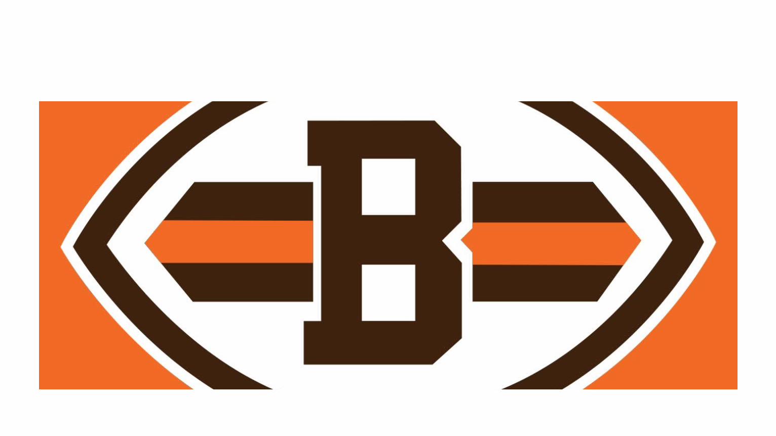
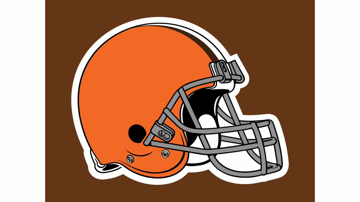
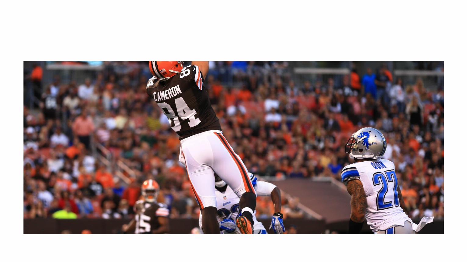
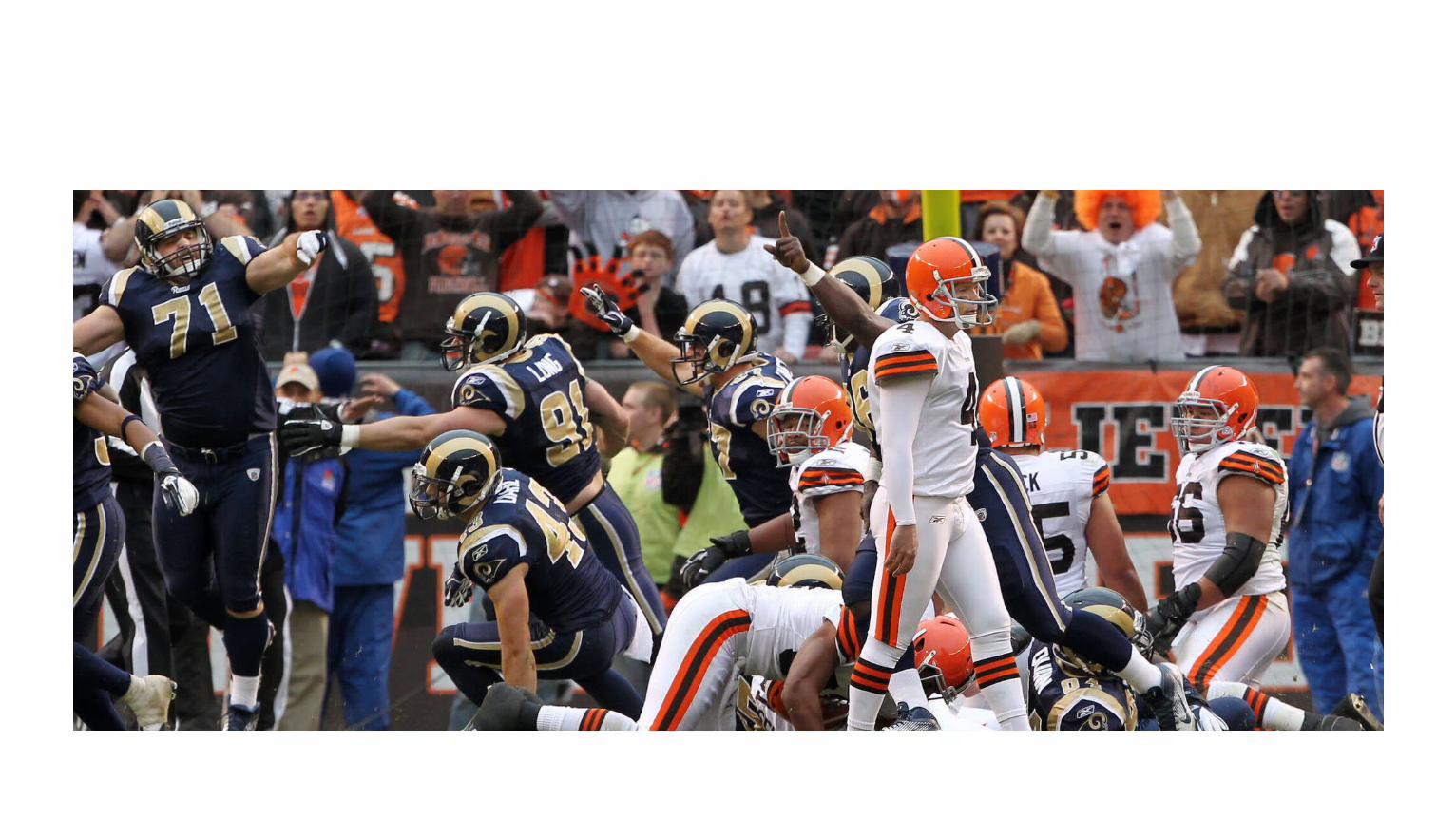
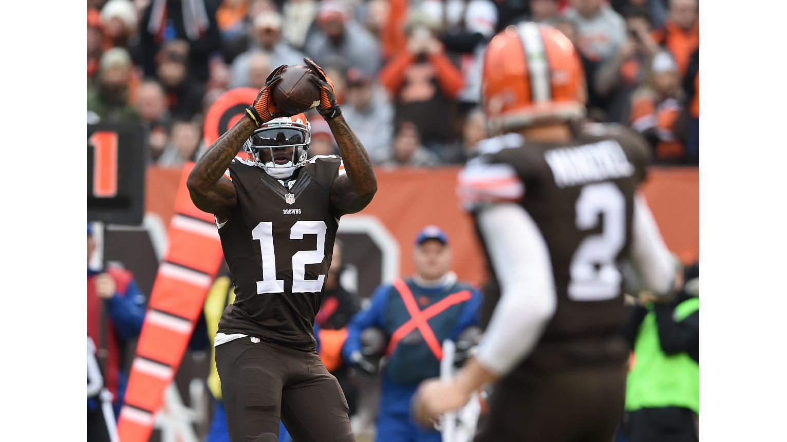
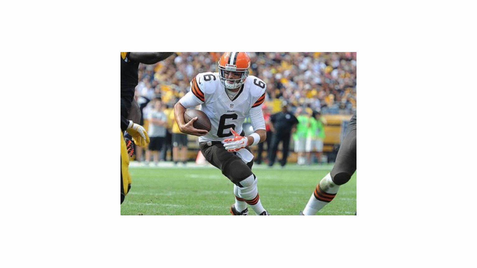
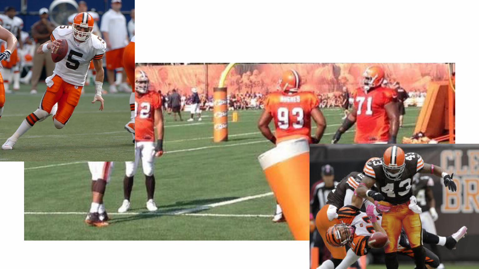
Project: new Cleveland Browns logo and
uniforms
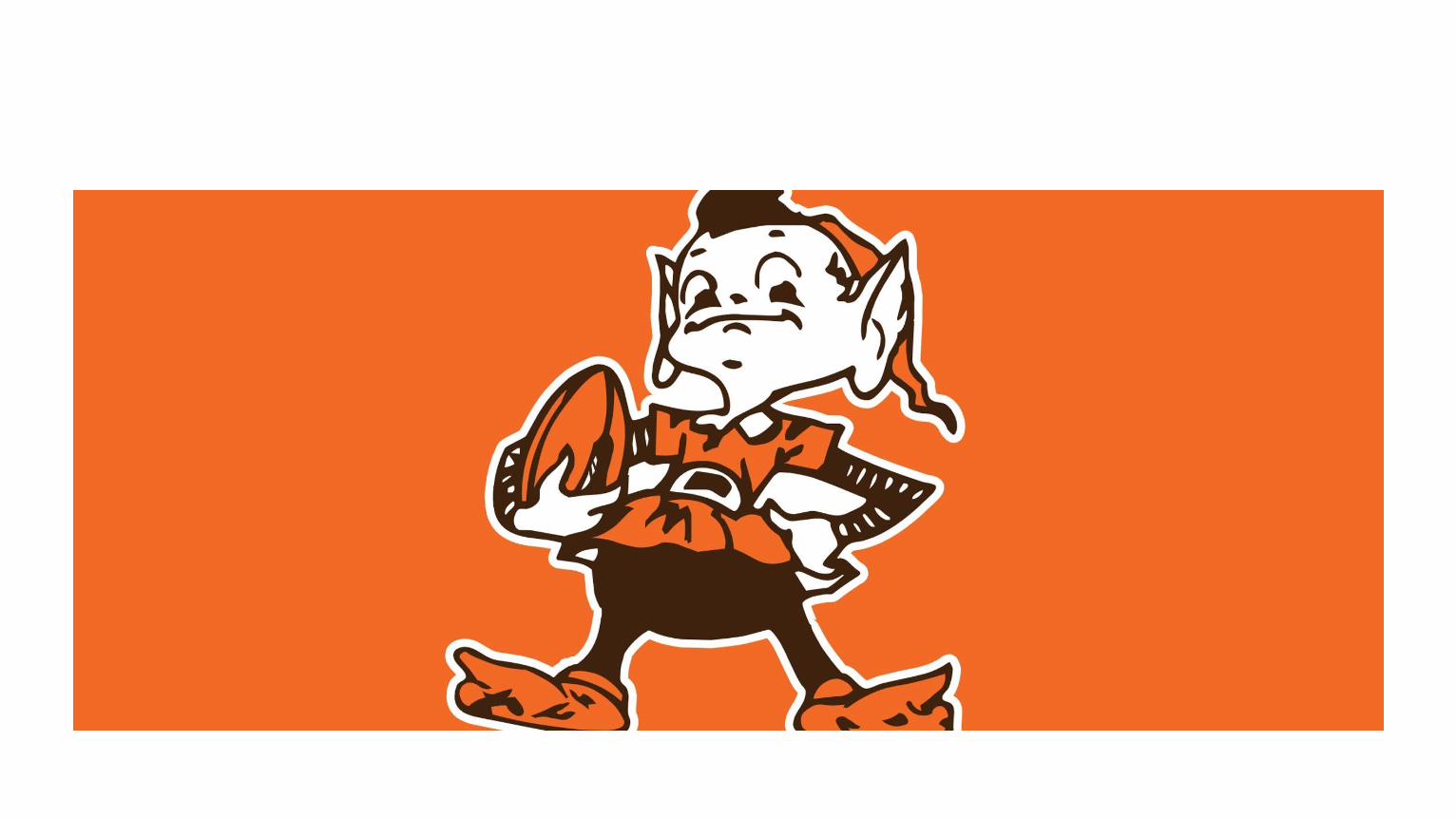

Let’s go here
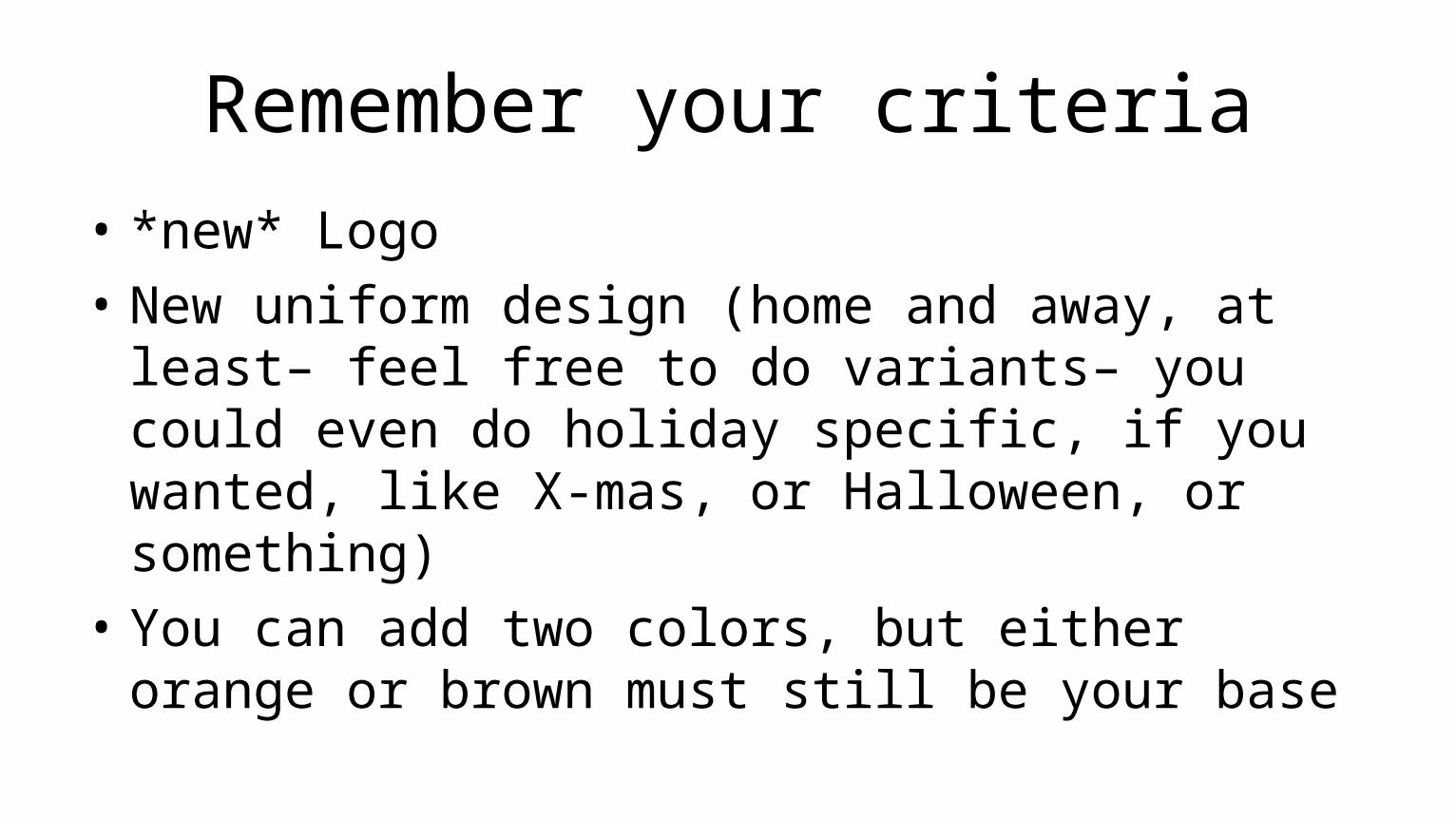
Remember your criteria• *new* Logo• New uniform design (home and away, at least– feel
free to do variants– you could even do holiday specific, if you wanted, like X-mas, or Halloween, or something)
• You can add two colors, but either orange or brown must still be your base

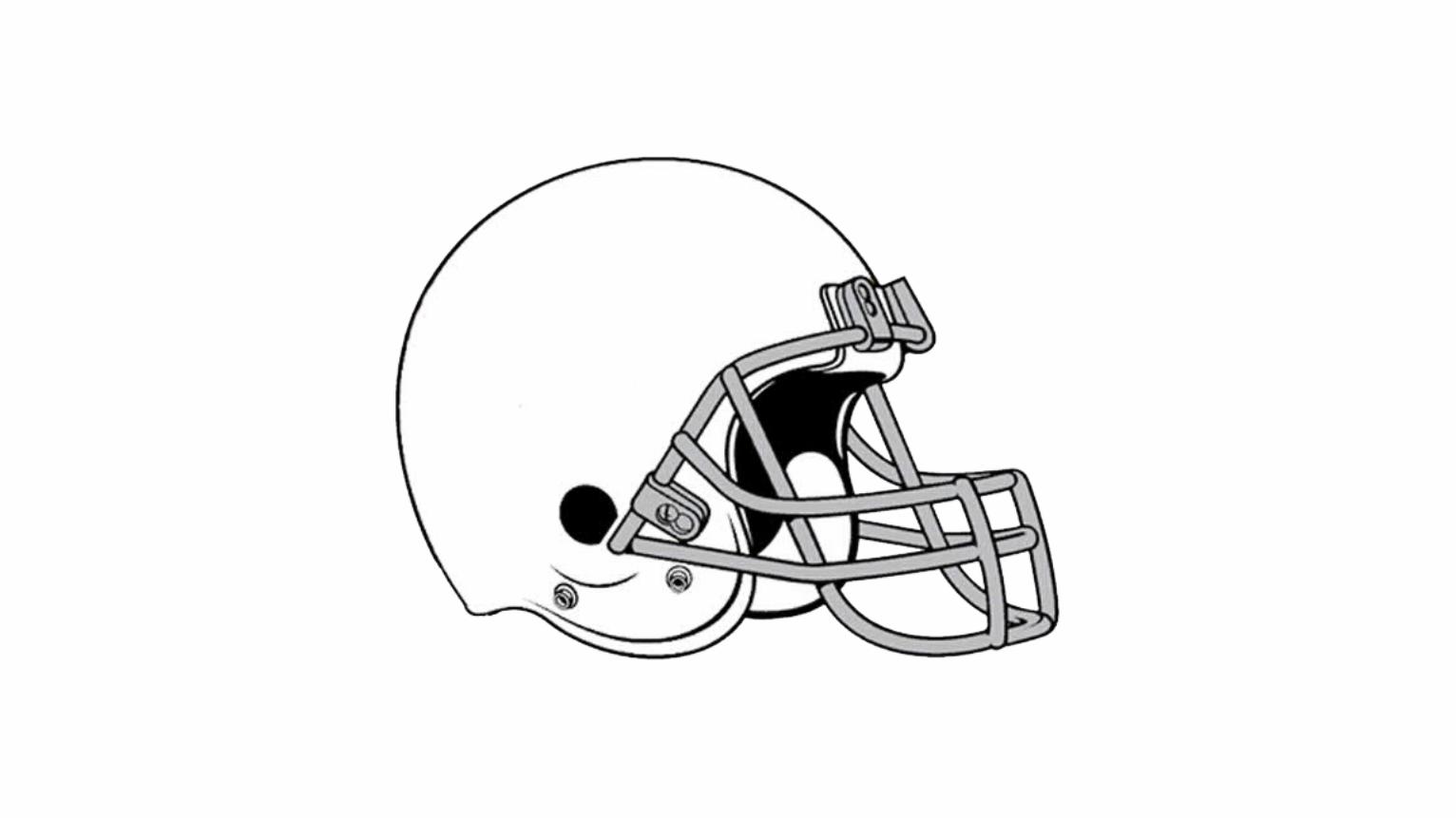
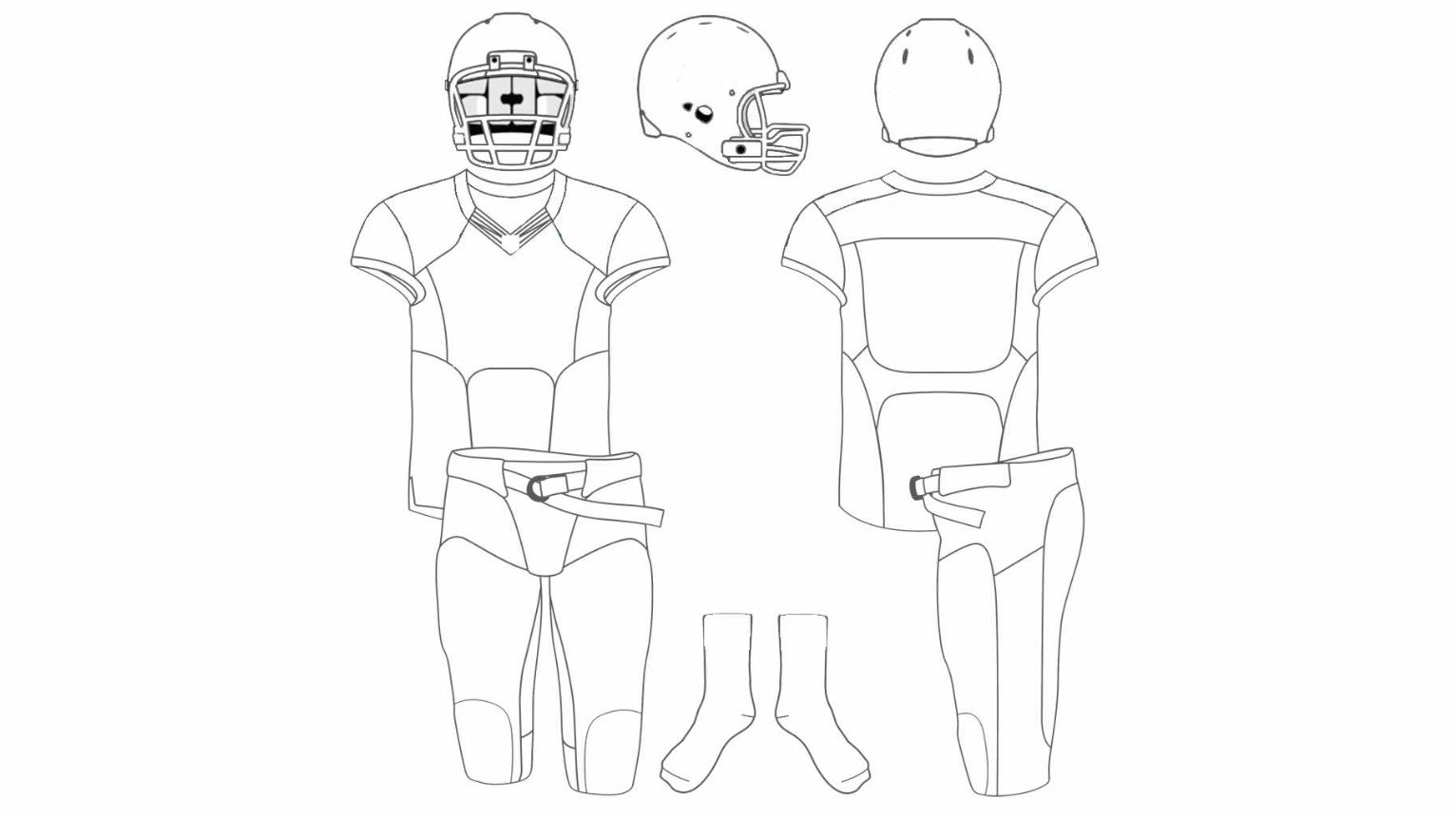
When we’re all done, you’ll give me• Black and white logo• Color logo• Image of helmet with logo (or helmets, if one of your
uniforms calls for a different helm)• Two (or more) uniform sheets with colors and any designs
applied. • A 500 word writer’s memo• A 250 word “pitch” letter for the Browns ownership
NEXT!
Poster.FIX IT!
(partner up– 2 to 3 or less)
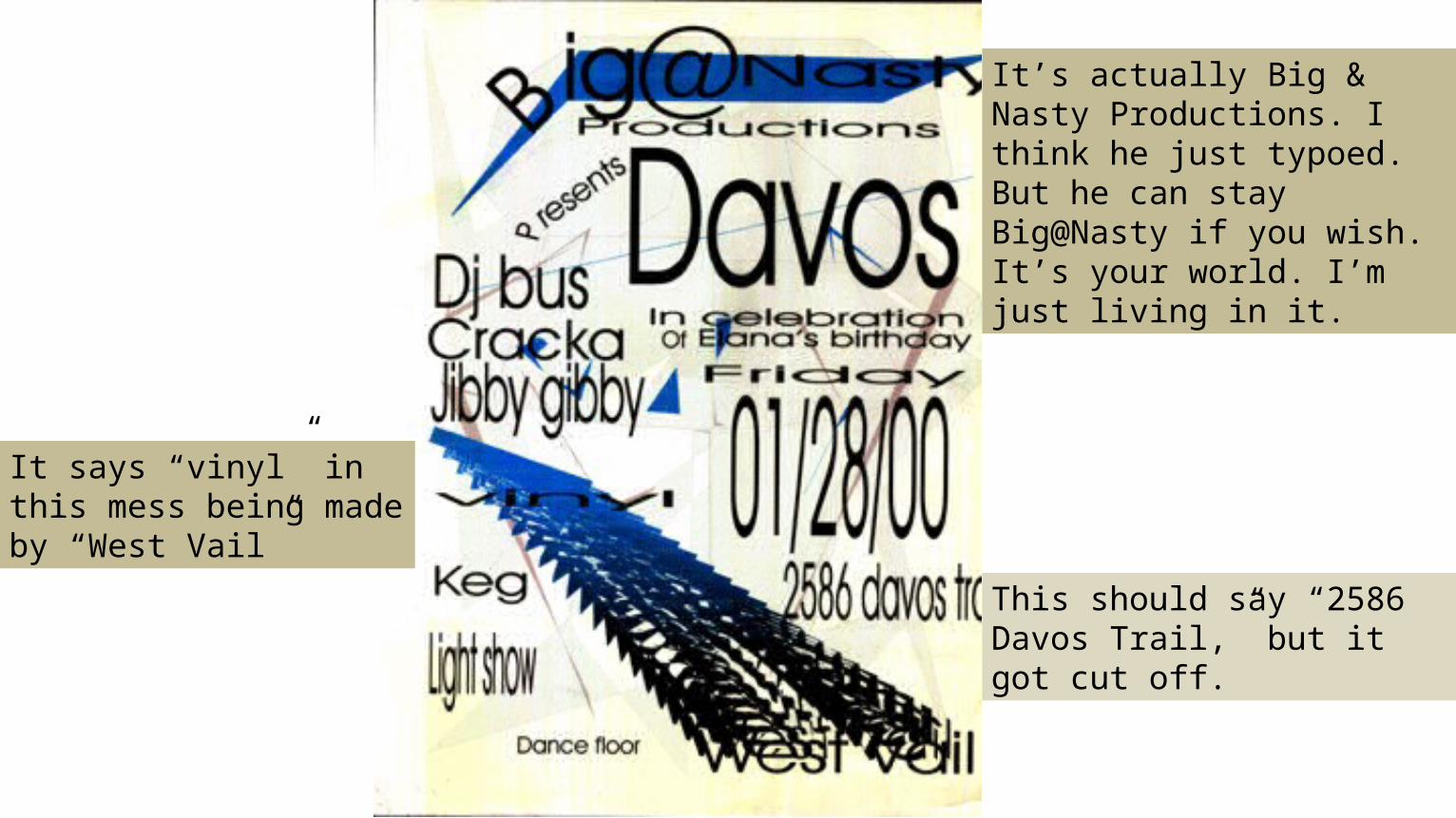
This should say “2586 Davos Trail,” but it got cut off.
It says “vinyl” in this mess being made by “West Vail”
It’s actually Big & Nasty Productions. I think he just typoed. But he can stay Big@Nasty if you wish. It’s your world. I’m just living in it.
For TuesdayREADINGS (for Tues and Thurs activities)•Wysocki “The Multiple Media of Texts” & “With Eyes That Think and Compose and Think,” •Barthes “Rhetoric of the Image” •Benjamin “The Work of Art in the Era of Mechanical Reproduction” •and Kress “Reading Images”
MAKE SURE TO READ BENJAMIN BEFORE TUESDAY’S CLASS!
Related Documents