visual identity manual

Welcome message from author
This document is posted to help you gain knowledge. Please leave a comment to let me know what you think about it! Share it to your friends and learn new things together.
Transcript

visual identity manual

If you are uncertain about how to apply any aspect of the visual identity please contact:
Terry BarridgeiMedia and Design Manager
Office of Public AffairsUniversity of Western SydneyLocked Bag 1797 Penrith NSW 2751Building AF Room AF.1.11, Werrington North Campus P: 9678 7517 F: 9678 7095M: 0416 157 184E: [email protected]
introductionWhy our guidelines are important Every time we come into contact with the wider community we have an opportunity to build the UWS reputation. The extent to which people understand and respond to us is dependent on the clarity and coherence of their experience with UWS, including its visual identity.
The UWS image relies heavily on these guidelines being followed. Key elements such as the identity, typeface, colour and style must be applied exactly as defined in these guidelines. The Office of Public Affairs is responsible for management of the visual identity of UWS.

contents01 logo
02 colours
03 typefaces
04 stationery
05 literature
06 digital advertising
07 promotional items
08 ceremonial items
09 Power Point

1.1 symbol & logotype
1.2 clear zone
1.3 primary colour palette
1.4 colour alternatives
1.5 co-branding logo
1.6 minimum size
1.7 positioning
1.8 use on images
1.9 do nots
1.10 unusual logo usage
1.11 Other internal and external facing logos
01 logo
University of Western Sydney - Visual identity manual

The University needs a consistent and strategic approach to brand management. Positioning UWS as a strong brand helps the University to differentiate itself from other providers and gives UWS a long-term competitive advantage. The brand is integral to the University’s long-terms success.
Clear and effective Brand and Visual Identity management policy and procedures are required to:
a. protect the image and reputation of the University (the UWS Brand)
b. ensure the protection of the visual identity of the University
c. provide frameworks for brand and visual identity enhancement and development
d. ensure a consistent approach in the application of Brand values and visual identity
e. help UWS staff and suppliers maintain a consistent, high-quality visual brand identity in target markets and the wider community
f. guide the development of promotional and other material in both a textual and visual context
The Brand and Visual Identity Management Policy and Procedures apply to all forms of promotion and to any material using the University Logo or nameplate (or official material).
The UWS logo is the sole visual identity representation of the University. No other logos, identifiers or variations thereof are permitted
This document sets out the University’s policy on our Brand and Visual Identity. Our logo is the first step in maintaining this.

1.1 logo symbol & logotype
Symbol
Logotype
The type and the symbol are symbiotic and must remain in the same relationship at all times. Neither symbol nor type can be separated from one another or altered in any way.
Please refer to incorrect useage on page 1.9.
The symbol must never be altered or redrawn in any way and the type should always appear in Helvetica Neue and no other typeface can substitute.
Guidelines for unusual usage appear on page 1.10 of this section.

1.2 logo clear zone
U
U
U
U
UU
The symbol and logotype are in a fixed relationship. The symbol always appears to the right hand corner of the logotype.
So that the UWS identity is clear and legible in print, it should have as much clear space around it as possible.
The minimum clear zone around the mark defines the area into which no other element must intrude.
The distance marked U represents the cap height of the character U. This proportionate distance is the minimum clear space allowed around the logo.

1.3 colour primary colour palette
PANTONE coated
Pantone 2945 C
Process Black
PROCESS coated
C100% M67% Y0% K8%
C0% M0% Y0% K100%
PROCESS uncoated
Pantone 300 U
C0% M0% Y0% K100%
UWS Blue
UWS Black
Maintaining the integrity of the UWS colours is paramount in a communicating consistent tone and positioning of the University and all it’s communications.
True colour reproduction can be attained by matching as closely as possible to the specified coated PMS colours.
The colours printed within these guidelines may not match the Pantone® standards exactly. For all colour reference, use the Pantone® Matching System standards. In addition, the colour breakdowns supplied may alter according to the final process or application. Wherever possible, the final reproduced colour should match as closely as possible to the specified coated Pantone® colour.
The swatches shown here are a guide only. Do not use these for exact colour matching.

1.4 logo colour alternatives
Version 1 Version 2 Version 3
The UWS logo has been designed to work equally well in both positive and negative form. There are five colour alternatives.
Version 1 of the logo is the preferred form. This prints in two special colours UWS Blue and UWS Black.
Although the logo works best in two colour, certain scenarios will arise where only a one colour version is appropriate.
Version 2 uses only one special colour which can be either UWS Blue or UWS Black. The black logo is only suggested where black is the only colour being used and no other colours are available to make the UWS Blue.
Version 3 The logo can be used reversed out of any of the colours in the suggested palettes except where legibility is compromised.
The logo must never appear in any other colour other than specified here.

1.5 logo Co-Branding Logo
When using the University logo in conjunction with other corporate logos, particularly when the logo needs to be small, the following rules apply.
Placing the logo as reversed on a blue or black background inside a lozenge containing either colour. Or when the actual background is dark then placing the logo in a white background lozenge.
The lozenge must maintain the rounded corner theme on all 4 corners.
The Co-Branding logo in the lozenge has been developed to ensure the UWS mark maintains impact in a multi-branded environment, sure as posters, displays etc.

1.6 logo minimum size
35mm 30mm
30mm
In the interest of legibility the logo should never be reproduced smaller than indicated.
The minimum width for logo without strapline is 30mm. The minimum width for logo with strapline is 35mm.
When using the logo this size it is important to make sure the text remains legible.
There is no maximum size. However, it is important to remember that the logo needs space around it.
The size of the logo should be appropriate to the area in which it is printed and not take up all the available space.

1.7 logo positioning
The UWS logo must be applied cleanly and consistently. In the vast majority of cases it should appear in the top right hand corner of a given area, at an equal distance from the top and right hand side.
(Actual measurements are supplied within the relevant sections of these guidelines.)
When this is not possible due to copy or specific print restrictions, eg. envelopes, and the position is not specified within these guidelines, please consult the Office of Public Affairs for guidance.

1.8 logo use on images
It is appropriate to use the logo over an image but only where the contrast is significant enough to create maximum legibility.
In the first example the contrast is ideal for the placement of the reversed logo.
Although the image is black and white a colour image with enough contrast is perfectly acceptable.
In the second example the logo gets lost amongst the many white areas in the image and is a perfect example of where the contrast is not nearly adequate to hold a reversed logo.
Where possible it is advisable to only use the reversed white version of the logo when placing over an image.
It is also preferable to keep the position of the logo in the upper or lower right hand corners of the image.
If using logo over an image, please send to iMedia for approval.
10
Logo use on an image
It is appropriate to use the logo over an image but only where the contrast is significant enough to create maximum legibility.
In the first example the contrast is ideal for the placement of the reversed logo.
Although the image is black and white a colour image with enough contrast is perfectly acceptable.
In the second example the logo gets lost amongst the many white areas in the image and is a perfect example of where the contrast is not nearly adequate to hold a reversed logo.
Where possible it is advisable to only use the reversed white version of the logo when placing over an image.
It is also preferable to keep the position of the logo in the upper or lower right hand corners of the image.
Welcome to the College of Business & Law Research Newsletter from the Office of the Associate Dean Research.
College of Business & Law Research newsVolume 1, 2011
Student NewsNew HDR enrolmentsThe College of Business and Law would like to welcome the following new HDR candidates to UWS.
Student Name School and Supervisory Panel
Jishan Hossain School of Economics and Finance - Supervisory panelTim Turpin and Partha Gangopadhyay
Rejani Rajan School of Management - Supervisory panelAnneke Fitzgerald and Terry Sloan
Warren Day School of Marketing - supervisory panel of Suzan Burton and David Low
San Kumaradeven School of Economics and Finance - Supervisory panel of Girija Mallik and Maria Varua
Victor Libdy School of Management - Supervisory panel of Lesley Kuhn and George Lafferty
Sheela Sree Kumar School of Management - Supervisory Panel of Bobby Banerjee and Fernanda Duarte
Nandita Das School of Management - Supervisory Panel of Bobby Banerjee and Fernanda Duarte
Mohammed Atwa Bawa School of Law - Supervisory Panel of Razeen Sappideen, Carolyn Sappideen and Scott Mann
Khaled Fayadh School of Law - supervisory panel of Carolyn Sappideen and Scott Mann
Noor Lazar School of Management - Supervisory panel Anne Abraham and Noor Lazar
Yasmin Hunter School of Law - Supervisory panel of Carolyn Sappideen and Sue Armstrong
Abdulla Alotaibi School of Economics and Finance - Supervisory panel of Satya Paul and Anil Mishra
Sabreena Amin School of Marketing - Supervisory panel of Syed Rahman and David Low
Michelle Cull School of Accounting - Supervisory panel of Gabriel Donleavy and Colleen Puttee
Rina Datt School of Accounting - Supervisory panel of Gabriel Donleavy and Kym Butcher
Anna Evangelista School of Economics and Finance - Supervisory panel of Ron Ratti and Dr Maria Varua
Nuan Lin School of Law - Supervisory panel of Carolyn Sappideen, Razeen Sappideen and Scott Mann
Sonia Molina School of Marketing - Supervisory panel of Hugh Pattinson and David Low
CO
B26
09 0
7/04
/201
1

1.9 logo do nots
Do not alter or distort the logo in any way.
Do not use the logo any smaller than the specified minimum size.
Do not redraw the logo.
Do not separate the symbol and logotype, or use the birds in any way. (other than specified within
these guidelines).
Do not alter the relationship between the symbol and
the logotype.
Do not add any other elements or invade the clear zone.
Do not use the logo on colours other than UWS specified ones.
Do not re-assign colours.Do not alter the logo using a gradient.
To maintain the consistency of our identity it is essential that the identity is never altered in any way. Here are a few examples of what not to do.
Artwork of the logo is available from the Office of Public Affairs.
11
Incorrect logo usage
To maintain the integrity of the UWS branding the logo identity is never to be altered in any way.Here are some examples of what not to do.
Distort
Colour logo on coloured background Transpose colours
Outline Redraw
Moving text and symbol Gradient
Adding element
11
Incorrect logo usage
To maintain the integrity of the UWS branding the logo identity is never to be altered in any way.Here are some examples of what not to do.
Distort
Colour logo on coloured background Transpose colours
Outline Redraw
Moving text and symbol Gradient
Adding element

1.10 logo unusual logo usage
In some cases internal use of the logo may call for unusual reproduction of the logo.
For example invitations may call for a blind embossed logo. Or a promotional item may use the abbreviated form of the logo.
Such usage must be approved by the brand guardian at the Office of Public Affairs.
12
Unusual logo usage
In some cases internal use of the logo may call for unusual reproduction of the logo.
For example invitations may call for a blind embossed logo. Or a promotional item may use the abbreviated form of the logo.
Such usage must be approved by the brand guardian at the Office of Public Affairs.

1.11 logo Other internal and external facing logos
The University needs a consistent and strategic approach to brand management. Positioning UWS as a strong brand helps the University to differentiate itself from other providers and gives UWS a long-term competitive advantage. The brand is integral to the University’s long-terms success.
Therefore the UWS logo is the sole visual identity representation of the University. No other logos, identifiers or variations thereof are permitted.
In a case where a department feels it is required, written approval must be obtained from the Executive Director of the Office of Public Affairs.
Before seeking this approval please read policyurl.edu.au
Please consider if creating a logo is the best course of action and whether or not what you are trying to achieve could be done another way working within the guidelines.

2.1 Primary colour palette
2.2 Secondary colour palette
02 colours
University of Western Sydney - Visual identity manual

2.1 colour primary colour palette
PANTONE coated
Pantone 2945 C
Process Black
PROCESS coated
C100% M67% Y0% K8%
C0% M0% Y0% K100%
PROCESS uncoated
Pantone 300 U
C0% M0% Y0% K100%
UWS Blue
UWS Black
Maintaining the integrity of the UWS colours is paramount in a communicating consistent tone and positioning of the University and all it’s communications.
True colour reproduction can be attained by matching as closely as possible to the specified coated PMS colours.
The colours printed within these guidelines may not match the Pantone® standards exactly. For all colour reference, use the Pantone® Matching System standards. In addition, the colour breakdowns supplied may alter according to the final process or application. Wherever possible, the final reproduced colour should match as closely as possible to the specified coated Pantone® colour.
The swatches shown here are a guide only. Do not use these for exact colour matching.

2.2 colour secondary colour palette
Pantone 2945 Cor
CMYK=100,67,0,8RGB=37,88,157#: 25589d
Pantone 1788 Cor
CMYK=0,100,92,0RGB=240,34,51#: f02233
Pantone 376 Cor
CMYK=60,0,100,0RGB=140,190,79#: 8cbe4f
Pantone 1375 Cor
CMYK=0,46,90,0RGB=255,154,0#: ff9a00
Pantone 3262 Cor
CMYK=80,0,33,0RGB=0,186,185#: 00bab9
Pantone 266 Cor
CMYK=79,81,0,5RGB=79,68,137#: 4f4489
Pantone 877 Cor
CMYK=0,0,0,40RGB=142,145,148#: 8e9194
UWS Blue UWS Red UWS Green UWS Orange UWS Teal UWS Purple UWS Silver
CMYK=60,0,20,20RGB=86,166,175#: 56a6af
CMYK=5,85,70,25RGB=181,56,55#: b53837
CMYK=40,0,75,25RGB=142,167,79#: 8ea74f
CMYK=0,1,47,30RGB=175,170,109#: afaa6d
CMYK=27,3,0,13RGB=161,196,208#: a1c4d0
CMYK=60,60,0,25RGB=99,89,141#: 63598d
CMYK=32,26,26,50RGB=103,104,105#: 676869
UWS Neutral Teal
UWS Neutral Red
UWS Neutral Green
UWS Neutral Beige
UWS Neutral Blue
UWS Neutral Purple
CMYK=0,20,50,50RGB=152,120,87#: 987857
CMYK=0,0,0,100RGB=0,0,0#: 000000
UWS Neutral Tan
UWS Black
UWS Neutral Grey
Bold / Solid group
Neutral group
A palette of secondary colours has been developed to enhance the primary colours and work on corporate literature. These colours can be used creatively to generate appropriate moods and dynamic backgrounds. Colour accuracy is very important. Specifications for all reproduction methods must be matched as closely as possible to the PMS colours to ensure true colour reproduction.
NoteIt should be noted that PMS 877 is a metallic colour and should not be reproduced in CMYK. It should only be used in limited applications such as prestigious documents.
The colours printed within these guidelines may not match the Pantone® standards exactly. For all colour reference, use the Pantone® Matching System standards. In addition, the colour breakdowns supplied may alter according to the final process or application. Wherever possible, the final reproduced colour should match as closely as possible to the specified coated Pantone® colour.
The swatches shown here are a guide only.Do not use these for exact colour matching.

3.1 Helvetica Neue – Primary typeface
3.2 Glypha – Heading font
3.3 Berthold Akzidenz Grotesk – Heading font
3.4 Arial – Digital font
03 typefaces
University of Western Sydney - Visual identity manual

xyz3.1 typefaces helvetica neue
Helvetica Neue 45 Light
abcdefighijklmnopqrstuvwxyzABCDEFGHIJKLMNOPQRSTUVWXYZ0123456789()@&?!
Helvetica Neue 55 Roman
abcdefighijklmnopqrstuvwxyzABCDEFGHIJKLMNOPQRSTUVWXYZ0123456789()@&?!
Helvetica Neue 75 Bold
abcdefighijklmnopqrstuvwxyzABCDEFGHIJKLMNOPQRSTUVWXYZ0123456789()@&?!
Arial
abcdefighijklmnopqrstuvwxyzABCDEFGHIJKLMNOPQRSTUVWXYZ0123456789()@&?!
Primary typeface
Substitute typeface(when Helvetica Neue is not available and for typing guides on a PC and Mac)
Helvetica Neue is our primary typeface. It is a clear, simple and open expression of who we are and what we say.
In order to present all UWS communications consistently only the specified typefaces should be used.
The standard body text of all UWS documents should be Helvetica Neue 45 Light. Other weights can be used for emphasis in the text and for legibility.
Other variations of the family eg. condensed should not be used.
Although Helvetica Neue is the preferred typeface, it may not be available on all PCs and Macs. In these instances Arial can be used as an alternative. eg. typing letters, fax and memos.

3.2 typefaces glypha - heading font
xyzGlypha – 75 Black
abcdefighijklmnopqrstuvwxyzABCDEFGHIJKLMNOPQRSTUVWXYZ0123456789()@&?!
Glypha – 35 Thin
abcdefighijklmnopqrstuvwxyzABCDEFGHIJKLMNOPQRSTUVWXYZ0123456789()@&?!
Glypha – 55 Roman
abcdefighijklmnopqrstuvwxyzABCDEFGHIJKLMNOPQRSTUVWXYZ0123456789()@&?!
heading typeface
Glypha is a bold heading typeface that communicates proudly on behalf of the University. It declares the University’s presence on posters, print advertising and in brochures.
The preferred weight is 75 Black for major headings. Thinner weights can be used but do not carry the same physical presence.
The standard body text of all UWS documents should be Helvetica Neue 45 Light.

3.3 typefaces Berthold Akzidenz Grotesk - heading font
xyzBerthold Akzidenz Grotesk – Light Condensed
abcdefighijklmnopqrstuvwxyzABCDEFGHIJKLMNOPQRSTUVWXYZ0123456789()@&?!Berthold Akzidenz Grotesk – Extra Bold Condensed
abcdefighijklmnopqrstuvwxyzABCDEFGHIJKLMNOPQRSTUVWXYZ0123456789()@&?!Berthold Akzidenz Grotesk – Condensed
abcdefighijklmnopqrstuvwxyzABCDEFGHIJKLMNOPQRSTUVWXYZ0123456789()@&?!
heading typeface
Berthold Aksidenz Grotesk is a minimalist heading typeface that reflects the University’s brand pillars: smart, welcoming, challenging and progressive. The refinement of this typeface is emphasised when used in the condensed form.
The preferred weight is Light Condensed for headings. Other weights can be used, but must always be from the condensed forms.
The standard body text of all UWS documents should be Helvetica Neue 45 Light.

3.4 typefaces arial - digital font
xyzArial
abcdefighijklmnopqrstuvwxyzABCDEFGHIJKLMNOPQRSTUVWXYZ0123456789()@&?!
digital typeface Arial is widely available and is the preferred substitute for Helvetica Neue in the digital space. Where Helvetica Neue is not available – particularly in web applications –Arial is an acceptable alternative.

4.1 letterhead typing guide
4.2 executive letterhead
4.3 alternative letterhead
4.4 compliment slip typing guide
4.5 executive compliment slip
4.6 alternative compliment slip
4.7 business card
4.8 alternative business card
4.9 C4 envelope
4.10 DL and DLX envelopes
4.11 fax template
4.12 memo template
4.13 alternative memo template
4.14 course shells
4.15 email signature
04 stationery
University of Western Sydney - Visual identity manual

We express UWS values every time we communicate. Stationery plays a vital role in creating a positive image.

55
4.1 stationery letterhead typing guide
25
1
2
3
5
65
All measurements in millimetres, Scale 50% of actual sizeActual size A4 (210x297mm)
40
162
Locked Bag 1797 Penrith NSW 2751 Australiawww.uws.edu.au
College/School/Division/Office
Mr Robertson 06 January 2003Level 2 53 Berry StreetNorth SydneyNSW 2060
Dear Mr Robertson
Interdum volgus rectum videt, est ubi peccat. Si veteres ita miratur laudaue poetas, ut nihil anteferat,nihil illis comparet, errat. Si quaedam nimis antique, si peraque dure dicere credit eos, ignave multa fatetur, et sapit et mecum facit et Iova iudicat aequo. Ier quae verbum emicuit si forte decorum, et si versus paulo concinnior unus et alter, iniuste totum duci venditque pa.
Non equidem insector delendave carmina Livi esse reor, memini quae plagosum mihi parvo Orbilium dictare sed videt, emendata videri pulchraque et exactis minimum distanti miro. Ier quae verbum emicuit si forte decorum, et si versus paulo concinnior unus et alter, iniuste totum duci venditque pa. Interdum volgus rectum videt, est ubi peccat. Si veteres ita miratur laudaue poetas, ut nihil anteferat, nihil illis comparet, errat. Si quaedam nimis antique, si peraque dure dicere credit eos, ignave multa fatetur, et sapit et mecum facit et Iova iudicat aequo.
Interdum volgus rectum videt, est ubi peccat. Si veteres ita miratur laudaue poetas, ut nihil anteferat, nihil illis comparet, errat. Si quaedam nimis antique, si peraque dure dicere credit eos, ignave multafatetur, et sapit et mecum facit et Iova iudicat aequo. Ier quae verbum emicuit si forte decorum, et siversus paulo concinnior unus et alter, iniuste totum duci venditque pa.
Yours faithfully
Stephen JonesOperations Manager
4
10
15
Symbol and logotypeThe symbol and logotype (without strapline) prints 100% UWS Blue and UWS Black. The width is 55mm as shown and is positioned 15mm from the top and 10mm from the right hand edge of the page.
Typing guide specificationsHelvetica Neue is recommended for use as typewritten text. If this is unavailable, Arial (a standard Windows font) may be used. All text prints 100% Black.
1. Postal addressArial or Helvetica Neue 45 Light U/lc, 7/8.5pt ranged from the top of the logotype as shown and 25mm from the left edge of the letterhead. A double space is used instead of a comma to separate address lines.
2. Department detailsArial or Helvetica Neue 55 Roman U/lc, 9/10.5pt. Positioned one line space below the postal address.
3. Recipient addressArial or Helvetica Neue 45 Light U/lc, 11/13.5pt positioned 65mm from the top and typed against a 25mm margin.
4. DateArial or Helvetica Neue 45 Light U/lc, 11/13.5pt. Positioned on the same line as the addressee the date must align with the left edge of the symbol and logotype.
5. Letter contentArial or Helvetica Neue 45 Light U/lc, 11/13.5pt, positioned 105mm from the top to ensure it falls below the foldmark. Text should be ranged left to a maximum line length of 162mm.
Between each paragraph leave one line space. Italics may be used if needed, capital letters and bold type should be used sparingly and only where essential. Underlining must not be used.

4.2 stationery executive letterhead
55 10
15
25
2
3
Office of the Vice-ChancellorProfessor Janice Reid am
PO Box 1000 St Marys NSW 1790 AustraliaT +61 2 9678 7801 F +61 2 9678 7809E [email protected] www.uws.edu.au
1
All measurements in millimetres, Scale 50% of actual sizeActual size A4 (210x297mm)
1. Symbol and logotypeThe symbol and logotype (without strapline) prints 100% UWS Blue and UWS Black.
The width is 55mm as shown and is positioned 15mm from the top and 10mm from the right hand edge of the page.
2. Office, title and nameHelvetica Neue 55 Roman U/lc, 9/10.5pt, prints 100% UWS Blue. Ranged from the top of the logotype as shown and 25mm from the left edge of the letterhead. There is a 0.5mm space after the name before the address.
3. AddressHelvetica Neue 55 Roman and Helvetica Neue 45 Light U/lc, 9/10.5pt, prints 100% UWS Black. A double space is used instead of a comma to separateaddress lines.
Typing guide specificationsThe specifications for the recipient address, date and letter content should follow points 3 and 4 on the letterhead typing guide (section 2.2).
Helvetica Neue is recommended for use as typewritten text. If this is unavailable, Arial (a standard Windows font) may be used. All text must appear in Black.

4.3 stationery alternative letterhead
5025
1
2
4
64
All measurements in millimetres, Scale 50% of actual sizeActual size A4 (210x297mm)
18
162
Locked Bag 1797 Penrith NSW 2751 Australiawww.uws.edu.au
Mr Robertson 06 January 2003Level 2 53 Berry StreetNorth SydneyNSW 2060
Dear Mr Robertson
Interdum volgus rectum videt, est ubi peccat. Si veteres ita miratur laudaue poetas, ut nihil anteferat,nihil illis comparet, errat. Si quaedam nimis antique, si peraque dure dicere credit eos, ignave multa fatetur, et sapit et mecum facit et Iova iudicat aequo. Ier quae verbum emicuit si forte decorum, et si versus paulo concinnior unus et alter, iniuste totum duci venditque pa.
Non equidem insector delendave carmina Livi esse reor, memini quae plagosum mihi parvo Orbilium dictare sed videt, emendata videri pulchraque et exactis minimum distanti miro. Ier quae verbum emicuit si forte decorum, et si versus paulo concinnior unus et alter, iniuste totum duci venditque pa. Interdum volgus rectum videt, est ubi peccat. Si veteres ita miratur laudaue poetas, ut nihil anteferat, nihil illis comparet, errat. Si quaedam nimis antique, si peraque dure dicere credit eos, ignave multa fatetur, et sapit et mecum facit et Iova iudicat aequo.
Interdum volgus rectum videt, est ubi peccat. Si veteres ita miratur laudaue poetas, ut nihil anteferat, nihil illis comparet, errat. Si quaedam nimis antique, si peraque dure dicere credit eos, ignave multafatetur, et sapit et mecum facit et Iova iudicat aequo. Ier quae verbum emicuit si forte decorum, et siversus paulo concinnior unus et alter, iniuste totum duci venditque pa.
Yours faithfully
Stephen JonesOperations Manager
3
13
15
Symbol and logotypeThe symbol and logotype (with strapline) is reversed out of 100% UWS Blue. The width is 50mm as shown and is positioned 15mm from the top and 13mm from the right hand edge of the page.
Typing guide specificationsHelvetica Neue is recommended for use as typewritten text. If this is unavailable, Arial (a standard Windows font) may be used. All text prints 100% Black.
1. Postal addressArial or Helvetica Neue 45 Light U/lc, 7/8.5pt ranged from the top of the logotype as shown and 25mm from the left edge of the letterhead. A double space is used instead of a comma to separate address lines.
2. Recipient addressArial or Helvetica Neue 45 Light U/lc, 11/13.5pt positioned 65mm from the top and typed against a 25mm margin.
3. DateArial or Helvetica Neue 45 Light U/lc, 11/13.5pt. Positioned on the same line as the addressee the date must align with the left edge of the symbol and logotype.
4. Letter contentArial or Helvetica Neue 45 Light U/lc, 11/13.5pt, positioned 105mm from the top to ensure it falls below the foldmark. Text should be ranged left to a maximum line length of 162mm.
Between each paragraph leave one line space. Italics may be used if needed, capital letters and bold type should be used sparingly and only where essential. Underlining must not be used.

55
4.4 stationery compliment slip typing guide
20
1
2
Locked Bag 1797 Penrith NSW 2751 Australiawww.uws.edu.au
College/School/Division/Office
7
7
All measurements in millimetres, Scale 75% of actual sizeActual size DL (210x99mm)
Symbol and logotypeThe symbol and logotype (with strapline) prints 100% UWS Blue and UWS Black.
The width is 55mm as shown and is positioned 7mm from the top and right hand edge of the compliment slip.
Typing guide specificationsHelvetica Neue is recommended for use as typewritten text. If this is unavailable, Arial (a standard Windows font) may be used. All text prints 100% Black.
1. Postal addressArial or Helvetica Neue 45 Light U/lc, 7/8.5pt ranged from the top of the logotype as shown and 20mm from the left edge of the compliment slip. A double space is used instead of a comma to separate address lines.
2. Department details Arial or Helvetica Neue 55 Roman U/lc, 9/10.5pt, positioned one line space below the postal address.

Professor Janice Reid AMVice -Chancellor
Office of the Vice-ChancellorProfessor Janice Reid am
Locked Bag 1797 Penrith NSW 2751 AustraliaT +61 2 9678 7801 F +61 2 9678 7809E [email protected] www.uws.edu.au
4.5 stationery executive compliment slip
55 7
7
20
7
1
2
3
4
5
With compliments
All measurements in millimetres, Scale 75% of actual sizeActual size DL (210x99mm)
1. Symbol and logotypeThe symbol and logotype (with strapline) prints 100% UWS Blue and UWS Black.
The width is 55mm as shown and is positioned 7mm from the top and right hand edge of the compliment slip.
2. Office, title and nameHelvetica Neue 55 Roman U/lc, 9/10.5pt and prints 100% UWS Blue. Ranged from the top of the logotype as shown and 20mm from the left hand edge of the compliment slip. There is a 0.5mm space after the name before the address.
3. AddressHelvetica Neue 55 Roman and Helvetica Neue 45 Light U/lc, 7/8.5pt, prints 100% UWS Black. A double space is used insteadof a comma to separateaddress lines.
4. With complimentsHelvetica Neue 45 Light U/lc, 9pt, prints 100% UWS Blue. There is a 7mm space between the top of the ‘With compliments’ and the top of the name.
5. Name and positionHelvetica Neue 45 Light U/lc, 8pt, prints 100% UWS Blue. Honorific is Helvetica Neue 45 Light U/c, 7pt, prints 100% UWS Blue.

WITH COMPLIMENTS
39
4.6 stationery alternative compliment slip
5
5
All measurements in millimetres, Scale 75% of actual sizeActual size DL (210x99mm)
Symbol and logotypeThe symbol and logotype (with strapline) is reversed out of 100% UWS Blue.
The width is 39mm as shown and is positioned 5mm from the top and right hand edge of the compliment slip.
Typing guide specificationsHelvetica Neue is recommended for use as typewritten text. If this is unavailable, Arial (a standard Windows font) may be used. All text prints 100% Black.

4.7 stationery business card
Office of Public Affairs Locked Bag 1797 Penrith NSW 2751 AustraliaTel +61 2 9852 5801 Fax +61 2 9852 5830 Mob 0418 297 460Email [email protected] www.uws.edu.au
Dr John Citizen Director
40 4
4
4
4
4.5Office of Public Affairs Locked Bag 1797 Penrith NSW 2751 AustraliaTel +61 2 9852 5801 Fax +61 2 9852 5830 Mob 0418 297 460 Email [email protected] www.uws.edu.au
Dr John Citizen fami,cpm,fsse,fsa,jp
Director
1
2
3
4.5
All measurements in millimetresActual size (90x55mm)
Example one: 3 line card with initials
Example two: 2 lines
1. Symbol and logotypeThe symbol and logotype (with strapline) prints 100% UWS Blue and UWS Black.
The width is 40mm as shown and is positioned 4mm from the top and right hand edge of the card.
2. Name and job titleHelvetica Neue 55 Roman U/lc, 8/9.5pt ranged left against a 4mm margin to a maximum length of 40mm from the edge of the card. Prints 100% UWS Blue. Qualifications appear in Helvetica Neue 55 Roman small caps, 8/8pt and prints 100% UWS Blue as shown in example one. The initials may be placed after the name on the top line only if they do not exceed the maximum line length.
3. DepartmentHelvetica Neue 55 Roman U/lc, 7/10pt and prints 100% UWS Blue. There is a 0.5mm space after before the address.
4. Contact addressHelvetica Neue 55 Roman and 45 Light U/lc, 7/8.5pt and prints 100% UWS Black. Ranged 4mm from the left and bottom edge of the card. A double space is used instead of a comma between address lines.
If you have additional requirements for personalising your business cards, such as
a. the inclusion of another logo please contact the Office of Marketing and Communication
b. printing on the reverse of the card in another language please contact Print Services.

4.8 stationery alternative business card
All measurements in millimetresActual size (90x55mm)
Locked Bag 1797Penrith NSW2751 Australia
T: +61 2 9671 7502 M: 0428 282 594F: +61 2 9678 7607 E: [email protected]
1. Symbol and logotypeThe symbol and logotype (with strapline) prints 100% UWS Blue and UWS Black.
The width is 36mm as shown and is positioned 3.5mm from the top and right hand edge of the card.
2. NameHelvetica Neue 65 Medium U/lc, 8.5/10.5pt ranged left against a 5mm margin to a maximum length of 40mm from the edge of the card. Prints 100% UWS Blue.
3. Job title and Department
Helvetica Neue 45 Light U/lc, 8.5/10.5pt ranged left against a 5mm margin to a maximum length of 40mm from the edge of the card. Prints 100% UWS Black. The initials may be placed after the name on the top line only if they do not exceed the maximum line length.
4. Contact phone and email
Helvetica Neue 45 Light U/lc, 7.8/9.5pt ranged left against a 5mm margin. Prints 100% UWS Black.
5. AddressHelvetica Neue 45 Light U/lc, 8.5/10.5pt ranged left against a 5mm margin to a maximum length of 40mm from the edge of the card. Back of card Prints 100% UWS Blue with text reversed out.
36
3.5
3.5
5 25
5
5
5
4.7
4.7
1
2
3
4
5
Mr John Citizen
Executive Director Engagement and Partnerships

4.9 stationery C4 envelope
14 55
10
5
2
3
POSTAGE
PAID
AUSTRALIA1
If undelivered please return to:University of Western Sydney Locked Bag 1797Penrith NSW 2751 Australia
All measurements in millimetres, Scale 50% of actual sizeActual size C4 (324x229mm)
1. Symbol and logotypeThe symbol and logotype (without strapline) prints 100% UWS Blue and UWS Black.
The width is 55mm as shown and is positioned 14mm from the left edge and 10mm down from the top edge of the envelope.
2. Return addressThe University name prints 100% UWS Blue in Helvetica Neue 55 Roman U/lc 7/8.5pt. The rest of the address prints 100% UWS Black, Helvetica Neue 45 Light U/lc in the same size.
Positioned ranged left, 5mm away from the right hand side of the logo. The baseline of the last line of the address aligning with the baseline of the logotype as shown.
3. KeylineUsed as a guide to write a department or office name here. The keyline prints 100% UWS Black with a line thickness of 0.3pt and a length of 112mm. Position 55mm down from the top edge of the envelope.

POSTAGE
PAID
AUSTRALIA
4.10 stationery DL and DLX envelopes
DLX
DL
12 45
8
5
2
POSTAGE
PAID
AUSTRALIAIf undelivered please return to:University of Western Sydney Locked Bag 1797Penrith NSW 2751 Australia
1
All measurements in millimetres, Scale 65% of actual sizeActual size DL (220x110mm) and DXL (235x120)
Both the symbol and logotype and return address are the same on both DL and DLX envelopes.
1. Symbol and logotypeThe symbol and logotype (without strapline) prints 100% UWS Blue and UWS Black.
The width is 45mm as shown and is positioned 12mm from the left edge and 8mm down from the top edge of the envelope.
2. Return addressThe University name prints 100% UWS Blue in Helvetica Neue 55 Roman U/lc 7/8.5pt. The rest of the address prints 100% UWS Black, Helvetica Neue 45 Light U/lc in the same size.
Positioned ranged left, 5mm away from the right hand side of the logo. The baseline of the last line of the address aligning with the baseline of the logotype as shown.

Attention Richard Curtis From Joe Blogger
Company LKS Date 23/01/03
Facsimile 9959 5639 Telephone 9959 4800
Subject New facsimile sheet Pages inc. 1
facsimile
Message here Set in Arial, 10/12.5pt in Black.
4.11 stationery fax template
1
2
3
4
5
6
55 10
10
25
75
40
5
Locked Bag 1797 Penrith NSW 2751 Australiawww.uws.edu.au
College/School/Division/Office
All measurements in millimetres, Scale 50% of actual sizeActual size A4 (210x297mm)
A fax template is available at:www.uws.edu.au/staff/visualidentity
1. Symbol and logotypeThe symbol and logotype (with strapline) prints 100% Black.
The width is 55mm as shown and is positioned 10mm from the top and right hand edge of the page.
Type specificationsArial is used for all text within the file as this is a standard Windows font available to all Windows users. All text prints 100% Black.
2. Postal address and department detailsArial 10/11.5pt ranged from the top of the logotype as shown and 25mm from the left edge of the letterhead. A double space is used instead of a comma to separate address lines.
3. Form titleArial 20pt, positioned 3mm above the top rule.
4. Address fieldsArial 8/27pt
5. Typing fieldsArial 10/12.5pt
6. Rules0.4pt positioned 75mm and 115mm from the top of the page.
4.12 stationery memo template
1
2
3
4
5
6
55 10
10
25
75
40
5
Locked Bag 1797 Penrith NSW 2751 Australiawww.uws.edu.au
College/School/Division/Office
To Richard Curtis
Date 23/01/03
From Joe Blogger
Subject New memorandum sheet
memorandum
Message here Set in Arial, 11/13.5pt in Black.
All measurements in millimetres, Scale 50% of actual sizeActual size A4 (210x297mm)
A memo template for use on internal correspondence is available at:www.uws.edu.au/staff/visualidentity
1. Symbol and logotypeThe symbol and logotype (with strapline) prints 100% Black.
The width is 55mm as shown and is positioned 10mm from the top and right hand edge of the page.
Type specificationsArial is used for all text within the file as this is a standard Windows font available to all Windows users. All text prints 100% Black.
2. Postal address and department detailsArial 10/11.5pt ranged from the top of the logotype as shown and 25mm from the left edge of the letterhead.A double space is used instead of a comma to separate address lines.
3. Form titleArial 20pt, positioned 3mm above the top rule.
4. Address fieldsArial 8/27pt
5. Typing fieldsArial 11/13.5pt
6. Rules0.4pt positioned 75mm and 115mm from the top of the page.

5025
46
34
162
7
7
4.13 stationery alternative memo template
2
3
4
5
To Richard Curtis
Date 23/01/03
From Joe Blogger
Subject New memorandum sheet
memorandum
MEMOrAnDuM
Message here Set in Arial, 11/13.5pt in Black.
All measurements in millimetres, Scale 50% of actual sizeActual size A4 (210x297mm)
A memo template for use on internal correspondence is available at:www.uws.edu.au/staff/visualidentity
1. Symbol and logotypeThe symbol and logotype (with strapline) prints 100% Black.
The width is 50mm as shown and is positioned 7mm from the top and right hand edge of the page.
Type specificationsArial is used for all text within the file as this is a standard Windows font available to all Windows users. All text prints 100% Black.
2. Form titleArial 20pt, positioned 3mm above the top rule.
3. Address fieldsArial 8/27pt
4. Typing fieldsArial 11/13.5pt
5. Rules0.4pt positioned 90mm and 115mm from the top of the page.

5025
46
7
7
4.14 stationery course shells
All measurements in millimetres, Scale 50% of actual sizeActual size A4 (210x297mm)
There are 2 variations of shells for use in Course preparation.
The examples shown here are in the UWS Blue however the mastheads can be coloured appropriately from the palettes provided if blue is not desired.
The squared off version is not die cut while the rounded cornered one can be used if the print run is not large and it is being printed internally.

4.15 stationery email signatures
John Citizen | Administrative OfficerOffice of Engagement and PartnershipsDivision of International and DevelopmentUniversity of Western Sydney | Locked Bag 1797 Penrith 2751 P: 1234 5678 | M: 1234 567 890 | F: 1234 5678 | E: [email protected]
John Citizen | Administrative OfficerOffice of Engagement and Partnerships | Division of International and DevelopmentP: 1234 5678 | M: 1234 567 890 | F: 1234 5678 | E: [email protected]
John Citizen | Administrative OfficerOffice of Engagement and Partnerships | Division of International and DevelopmentUniversity of Western Sydney | Locked Bag 1797 Penrith 2751 P: 1234 5678 | M: 1234 567 890 | F: 1234 5678 | E: [email protected]
Address-only Footer
Plain Text Footer
Promotional Footer

5.1 photography style
5.2 photography style–do nots
5.3 A4 front and back cover
5.4 A4 cover options
5.5 A4 Introduction layout
5.6 A4 Inner layouts
5.7 A5 front and back cover
5.8 A5 cover options
5.9 A5 introduction and inner layouts
5.10 DL front and back cover
5.11 DL cover options
5.12 DL Introduction layout
5.13 DL Inner layouts
5.14 two colour and copy heavy leaflets
5.15 colour banding
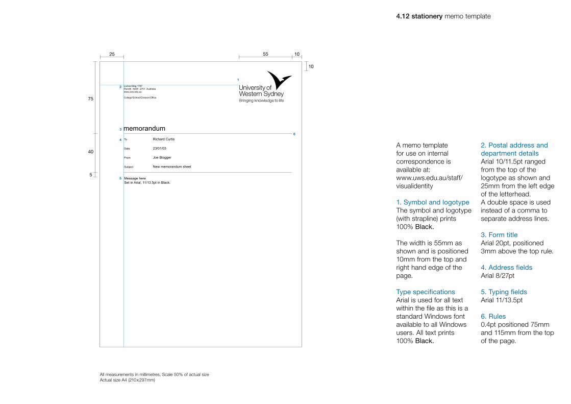
5.16 avoiding mistakes
05 literature
University of Western Sydney - Visual identity manual

however, the following specifications are a guide as to what the designer has to incorporate.
All promotional materials in any medium must be produced by the Office of Public Affairs.
In order to create a structured and consistent style to all the University of Western Sydney literature a template has been designed for A4,A5 and DL sized leaflets, brochures and booklets.
The contents of a publication is determined by the designer,
Literature provides a strong vehicle in which we can communicate a fresh and dynamic style, whilst simply and clearly communicating UWS.

5.1 literature photography style
SymbolicPositive/Forward thinkingAspirational
Throughout UWS literature photography plays a key part in setting the overall tone for the University.
There are three main themes for the photography style which are shown here.
All photography should be carefully selected. Photographs should be inspiring and dynamic conveying a consistent style and message.
All photography should be in either: colour, black and white, duotone or monotone. The image should also be sympathetic with the colour used in that particular brochure (for example UWS Blue and UWS Teal).
Aspirational and positive photography Should never be staged or appear unnatural in appearance. There should be nothing contrived or posed about the images.People should appear ‘real’ and not stiff, whilst retaining a sense of honesty and vibrancy in individuals.
Imagery should include interesting subject matter or people, pictured in a different way or from an unusual angle.
Symbolic photographyUsed to support a key message or theme throughout the brochure. It is important that this photography captures a message with clarity and simplicity in a contemporary way.
Consideration should also be given to the crop of an image, as this can change its character. More complex images can be cropped for simplicity whilst slightly unusual crops can create impact and dynamism.

x
x
x
x
x
x
x
x
x
5.2 literature photography style–do nots
Photography is a critical part of the UWS visual communication. Throughout literature the photographic style must be strictly adhered to. Here are some examples of what not to do.
SymbolicPositive/Forward thinkingAspirational
Avoid photographs which are contrived or posed, where the subject shows no real emotion or dynamism.
Images should not appear washed out in colour or clash with the colour chosen for a particular brochure style.
Aspirational and positive photographyStaged photography looks very forced and unnatural and doesn’t convey an honest message.
Very straightforward, dull and obvious photography conveys no excitement or dynamism about the subject matter.
Symbolic imageryImages should not appear cluttered in both subject matter and focus, as this can confuse key messages.
Care should be taken when cropping so the images appear clear and concise and there are no awkward shapes or uncomfortable compositions.

5.3 literature A4 front and back cover
Undergraduate Courses
University of Western SydneyLocked Bag 1797Penrith NSW 2751 Australiawww.uws.edu.au
63 7
7
7
7
XX
XX
XX
XX
XX
XX
X
10 7
1
2
3
4
5
87
70
An A4 template is available as a guide when designing A4 literature.
All measurements in millimetres, Scale 35% of actual sizeActual size A4 (210x297mm)
GridThe grid is shown in red. Each square is 70mm x 70mm and is determined by the width of an A4 split into three separate measures.
1. Symbol and logotypeThe symbol and logotype (with strapline) prints 100% UWS Blue and UWS Black.The width of the logo is determined by the grid and is 63mm. It is positioned 7mm from the top and right hand edge of the page.
2. ImageThe image always fits within the grid. The top left hand corner is curved and this curve is determined by creating a sphere with the diameter of one grid square (70mm).
3. TitleHelvetica Neue 45 Light U/lc, 12/14pt, prints 100% UWS Black. Ranged left against the measure of one grid square. If a sub-title is needed the main title appears in Helvetica Neue 55 Roman and the
sub-title in Helvetica Neue 45 Light. The text always moves up and the 7mm gap remains a constant.
4. AddressHelvetica Neue 55 Roman and 45 Light U/lc, 7/8.5pt as shown prints 100% UWS Blue and UWS Black. Ranged left against a 10mm margin.
5. CodeSet vertically in Arial 5.5pt in White.
NoteFor any one publication only two main colours should be used throughout i.e. for areas of block colour, titles, sub-titles and graphs.UWS Blue plus one additional colour from the secondary colour palette.
For example: UWS Blue and UWS Red or UWS Blue and UWS Green.
No tints of colours are to be used with the exception of graphs.

5.4 literature A4 cover options
Undergraduate CoursesSubtitle
Undergraduate Courses
equipping the minds of today with the solutions of tomorrow
Undergraduate Courses
equipping the minds of today with the solutions of tomorrow
Undergraduate Courses
equipping the minds of today with the solutions of tomorrow
70
70
BA
All measurements in millimetres, Scale 30% of actual sizeActual size A4 (210x297mm)
To allow for versatility within the identity there are a number of other options for front cover designs. Each must still follow the grid template as these examples show.
A. Photographic The square grid can be used to show a number of images in different configurations.
B. TypographicText is in Helvetica Neue 45 Light U/lc, 40/45pt, White out of a solid background colour. Ranged left to a margin of 18mm and 99mm down from the top of the page.
NoteFor any one publication only two main colours should be used throughout i.e. for areas of block colour, titles, sub-titles and graphs.
UWS Blue plus one additional colour from the secondary colour palette.
For example: UWS Blue and UWS Red or UWS Blue and UWS Green.
No tints of colours are to be used with the exception of graphs.

5.5 literature A4 introduction layout
Interdum volgus rectum videt, est ubi peccat. Si veteres ita miratur laudatque poetas, ut nihil anteferat, nihil illis comparet, errat. Si quaedam nimis antique, si peraque dure dicere credit eos, ignave multa fatetur, et sapit et mecum facit et Iova iudicat aequo.
Non equidem insector delendave carmina Livi esse reor, memini quae plagosum mihi parvo Orbilium dictare; sed emendata.
Rvideri pulchraque et exactis minimum distantia miror. Inter quae verbum emicuit si forte deco-rum, et si versus paulo concinnior unus et alter, iniuste totum ducit venditque poema.Interdum volgus rectum videt, est ubi peccat. Si veteres ita miratur laudatque poetas, ut nihil anteferat, nihil illis comparet, errat. Si quaedam nimis antique, si peraque dure dicere credit eos, ignave multa fatetur, et sapit et mecum facit et Iova iudicat aequo.
Non equidem insector delendave carmina Livi esse reor, memini quae plagosum mihi parvo Orbilium dictare; sed emendata videri pul-chraque et exactis minimum distantia miror. Inter quae verbum emicuit si forte decorum, et si ver-sus paulo concinnior unus et alter, iniuste totum ducit venditque poema.Interdum volgus rectum videt, est ubi peccat. Si veteres ita miratur
laudatque poetas, ut nihil anteferat, nihil illis comparet, errat. Si quaedam nimis antique, si peraque dure dicere credit eos, ignave multa fatetur, et sapit et mecum facit et Iova iudicat aequo. peraque dure dicere credit eos, ignave multa fatetur, et sapit et mecum facit et Iova iudicat aequo.
Laudatque poetas, ut nihil anteferat, nihil illis comparet, errat. Si quaedam nimis antique, si peraque dure dicere credit eos, ignave multa fatetur, et sapit et mecum facit et Iova iudicat aequo. peraque dure dicere credit eos, ignave multa fatetur, et sapit et mecum facit et Iova iudicat aequo.laudatque poetas, ut nihil antefer-at, nihil illis comparet, errat. Si quaedam nimis antique, si peraque dure dicere credit eos, ignave multa fatetur, et sapit et mecum facit et Iova iudicat aequo. peraque dure dicere credit eos, ignave multa fatetur, et sapit et mecum facit et Iova iudicat aequo.
An Australian success story
There are many words to describe Australia. Outgoing, friendly egalitarian, inclusive, confident in its future. It is a country with strong belief in its unique place in the world and the opportunities it can offer both the individual and society at large.
1
87
10
10
6
2
3
4
All measurements in millimetres, Scale 35% of actual sizeActual size A4 (210x297mm)
The grid for the internal pages within all A4 literature is based on a three column grid, with 10mm margins around each page and a 6mm gutter width.
All content ranges off a 87mm invisible line that is determined by the grid on the front cover.
1. Introductory statementThis statement or quote should reflect the content of the leaflet.
Helvetica Neue 45 Light U/lc, 27/31pt, White out of a solid background colour of 100% UWS Blue. Ranged left across two columns, 87mm down from the top edge.
2. TitleHelvetica Neue 45 Light U/lc, 15/17pt, prints in either 100% UWS Blue or 100% of the chosen secondary colour for that particular publication. Ranged left against a 10mm margin, 10mm from the top of the page.
3. ImageIf a photograph is required it should sit within the grid as shown.
4. Body textHelvetica Neue 45 Light U/lc, 9/11pt prints 100% UWS Black, ranged left 87mm down from the top edge of the page.
NoteFor any one publication only two main colours should be used throughout i.e. for areas of block colour, titles, sub-titles and graphs.
UWS Blue plus one additional colour from the secondary colour palette.
For example: UWS Blue and UWS Red or UWS Blue and UWS Green.
No tints of colours are to be used with the exception of graphs.

5.6 literature A4 inner layouts
AccommodationInterdum volgus rectum videt, est ubi peccat. Si veteres ita miratur laudatque poetas, ut nihil anteferat, nihil illis comparet, errat. Si quaedam nimis antique, si peraque dure dicere credit eos, ignave multa fatetur, et sapit et mecum facit et Iova iudicat aequo.
Sporting facilitiesNon equidem insector delendave carmina Livi esse reor, memini quae plagosum mihi parvo Orbilium dictare; sed emendata. Rvideri pulchraque et exactis minimum distantia miror. Inter quae verbum emicuit si forte decorum, et si versus paulo con.
Transport Rvideri pulchraque et exactis minimum distantia miror. Inter quae verbum emicuit si forte decorum, et si versus paulo concinnior unus et alter, iniuste totum ducit venditque poema. Interdum volgus rectum videt, est ubi peccat. Si veteres ita miratur laudatque poetas, ut nihil anteferat, nihil illis comparet errat. Si quaedam nimis antique, si peraque dure dicere credit eos.
Lorem gnave multa fatetur, et sapit et mecum facit et Iova iudicat aequo. Non equidem insector delendave carmina Livi esse reor, memini quae plagosum mihi parvo Orbilium dic-tare; sed emendata videri pulchraque et exactis minimum distantia miror. Inter quaeverbum emicuit si forte decorum, et si versus paulo concinnior unus et alter, iniuste totum ducit venditque poema.Interdum volgus rectum videt, est ubi peccat. Si veteres ita miratur.
laudatque poetas, ut nihil anteferat, nihil illis comparet, errat. Si quaedam nimis antique, si peraque dure dicere credit eos, ignave multa fatetur, et sapit et mecum facit et Iova iudicat aequo. peraque dure dicere credit eos, ignave multa fatetur, et sapit et mecum facit et Iova iudicat aequo.
Teaching and learning facilities•Nonequidem• Insectordelendavecarmina•Liviessereormeminiquaeplagosum mihi parvo• Insectordelendavecarmina
Blacktown campus
87
“ There is also a purpose in doing what we do here that is different from most other institutions in Australia.”
Dr Kate Stevens Senior Lecturer in PsychologyDeputy Director, MARCS
Profiles in excellence
Lorem gnave multa fatetur, et sapit et mecum facit et Iova iudicat aequo. Non equidem insector delendave carmina Livi esse reor, memini quae plagosum mihi parvo Orbilium dic-tare; sed emendata videri pulchraque et exactis minimum distantia miror. Inter quaeverbum emicuit si forte decorum, et si versus paulo concinnior unus et alter, iniuste totum ducit venditque poema.Interdum volgus rectum videt, est ubi peccat. Si veteres ita miratur.
Saudatque poetas, ut nihil anteferat, nihil illis comparet, errat. Si quaedam nimis antique, si peraque dure dicere credit eos, ignave multa fatetur, et sapit et mecum facit et Iova iudicat aequo. peraque dure dicere credit eos, ignave multa fatetur, et sapit et mecum facit et Iova iudicat aequo.
Lorem gnave multa fatetur, et sapit et mecum facit et Iova iudicat aequo. Non equidem insector delendave carmina Livi esse reor, memini quae plagosum mihi parvo Orbilium dic-tare; sed emendata videri pulchraque et exactis minimum distantia miror. Inter quaeverbum emicuit si forte decorum, et si versus. Paulo concinnior unus et alter, iniuste totum ducit venditque poema. Interdum volgus rectum.
Dr Catherine (Kate) StevensLaudatque poetas, ut nihil anteferat, nihil illis
comparet, errat. Si quaedam nimis antique, si peraque dure dicere credit eos, ignave multa fatetur, et sapit et mecum facit et Iova iudicat aequo. peraque dure dicere credit eos, ignave multa fatetur, et sapit et mecum facit et Iova iudicat aequo. laudatque poetas, ut nihil anteferat, nihil illis comparet, errat. Si quaedam nimis antique, si peraque dure dicere credit eos, ignave multa fatetur, et sapit et mecum facit et Iova iudicat aequo. peraque dure dicere credit eos, ignave multa fatetur, et sapit et mecum facit et Iova iudicat aequo. laudatque poetas, ut nihil anteferat, nihil illis comparet, errat. Si quae-dam nimis antique, si peraque dure dicere credit eos, ignave multa fatetur, et sapit et mecum facit et Iova iudicat aequo.
Peraque dure dicere credit eos, ignave multa fatetur, et sapit et mecum facit et Iova iudicat aequo. Lorem Ipsum dolor sit amit feraque dure dicere credit eos, ignave multa fatetur, et sapit et mecum facit et Iova iudicat aequo. Lorem Ipsum dolor sit amit ignave multa fatetur, et sapit et mecum facit et Iova iudicat aequo Llaudatque poetas, ut nihil anteferat, nihil illis comparet, errat. Si quaedam nimis antique, ignave multa fatetur, et sapit et mecum facit et Iova iudicat aequo. laudatque poetas, ut nihil anteferat, nihil illis comparet, errat. Si quaedam nimis antique, ignave multa fatetur, et sapit et mecum facit et Iova iudicat aequo. laudatque poetas, ut nihil anteferat, nihil illis comparet, errat. Si quaedam nimis antique, ignave multa fatetur, et sapit et mecum facit et Iova iudicat aequo. laudatque poetas, ut nihil anteferat, nihil illis comparet, errat. Si quaedam nimis antique.
Saudatque poetas, ut nihil anteferat, nihil illis comparet, errat. Si quaedam nimis antique, si peraque dure dicere credit eos, ignave multa fatetur, et sapit et mecum facit et Iova iudicat aequo. peraque dure dicere credit eos, ignave multa fatetur, et sapit et mecum facit et Iova iudicat aequo.
Lorem gnave multa fatetur, et sapit et mecum facit et Iova iudicat aequo. Non equidem insector delendave carmina Livi esse reor, memini quae plagosum mihi parvo Orbilium dic-tare; sed emendata videri pulchraque et exactis minimum distantia miror. Inter quaeverbum emicuit si forte decorum, et si versus paulo concinnior unus et alter, iniuste totum ducit venditque poema.Interdum volgus rectum videt, est ubi peccat. Si veteres ita miratur.
Saudatque poetas, ut nihil anteferat, nihil illis comparet, errat. Si quaedam nimis antique, si peraque dure dicere credit eos, ignave multa fatetur, et sapit et mecum facit et Iova iudicat aequo. peraque dure dicere credit eos, ignave multa fatetur, et sapit et mecum facit et Iova iudicat aequo.
Associate Professor Alan Bensoussan
Associate Professor Alan BensoussanHead of the Chinese Medical programSchool of Exercise and Health Sciences andDirector of the Centre for Complementary Medicine Research.
87
1
1
2
4
4
5
6
6
7
2
3
All measurements in millimetres, Scale 25% of actual sizeActual size A4 (210x297mm)
The grid for the internal pages within all A4 literature is based on a three column grid, with 10mm margins around each page and a 6mm gutter width.
All content ranges off a 87mm invisible line that is determined by the grid on the front cover.
1. ImagesIf photographs are required, full-bleed or otherwise, they should sit within the grid as shown. If an image sits on the left hand side of the page the curved corner template may be used.
2. Curved corner templateThe shape and size of the curve is determined in section 3.3 (A4 front and back cover). It may be used for full-bleed images or coloured blocks containing statements or
quotes only on the left hand side of the page. The use of the curve may not be absolutely necessary on every double page layout and must not be defined by a keyline.
3. Quotes/statementsAppear reversed White out of a solid background colour, ranged left in Helvetica Neue 45 Light 22/25pt.
4. TitlesHelvetica Neue 45 Light U/lc, 15/17pt, prints in either 100% UWS Blue or 100% of the chosen secondary colour for that particular publication. Ranged left against a 10mm margin, 10mm from the top of the page.
5. Sub-titlesHelvetica Neue 75 Bold U/lc, 9/11pt in the same colour as the title.
6. Body textHelvetica Neue 45 Light U/lc, 9/11pt, prints 100% UWS Black, ranged left 87mm down from the top edge of the page.
7. Small captionsAppear under photographs in Helvetica Neue 55 Roman 8/9.5pt, ranged left in the same colour chosen for titles and subtitles.
NoteFor any one publication only two main colours should be used throughout.
UWS Blue plus one additional colour from the secondary colour palette.
No tints of colours are to be used with the exception of graphs.

5.7 literature A5 front and back cover
XX
XX
XX
XX
XX
XX
X
Our Profile
University of Western SydneyLocked Bag 1797 Penrith NSW 2751 Australiawww.uws.edu.au
44.5 5
5
61.5
5
5
8 5
1
2
3
4
5
49.5
An A5 template is available as a guide when designing A5 literature.
All measurements in millimetres, Scale 50% of actual sizeActual size A5 (148.5x210mm)
GridThe grid is shown in red. Each square is 49.5mm x 49.5mm and is determined by the width of an A5 split into 3 separate measures.
1. Symbol and logotypeThe symbol and logotype (with strapline) prints 100% UWS Blue and UWS Black.The width of the logo is determined by the grid and is 44.5mm. It is positioned 5mm from the top and right hand edge of the page.
2. ImageWill always fit within the grid. The top left hand corner is curved and this curve is determined by creating a sphere with the diameter of one grid square (49.5mm).
3. TitleHelvetica Neue 45 Light U/lc, 10/12pt, prints 100% UWS Black.Ranged left against the measure of one grid square. If a sub-title is needed the main title appears in Helvetica Neue 55 Roman and the sub-title in Helvetica Neue
45 Light. The text always moves up and the 5mm gap remains a constant.
4. AddressHelvetica Neue 55 Roman and 45 Light U/lc, 7/8.5pt as shown prints 100% UWS Blue and UWS Black. Ranged left against a 8mm margin.
5. CodeSet vertically in Arial 5.5pt in White.
NoteFor any one publication only two main colours should be used throughout i.e. for areas of block colour, titles, sub-titles and graphs.
UWS Blue plus one additional colour from the secondary colour palette.For example: UWS Blue and UWS Red or UWS Blue and UWS Green.
No tints of colours are to be used with the exception of graphs.

Our ProfileSubheading here
equipping the minds of today with the solutions of tomorrow
Our ProfileSubheading here
equipping the minds of today with the solutions of tomorrow
5.8 literature A5 cover options
49.5
49.5
BA
Our ProfileSubtitle
equipping the minds of today with the solutions of tomorrow
Our Profile
All measurements in millimetres, Scale 40% of actual sizeActual size A5 (148.5x210mm)
To allow for versatility within the identity, as with A4, there are a number of other options for front cover designs. Each must still follow the grid template as these examples show.
A. Photographic The square grid can be used to show a number of images in different configurations.
B. TypographicText is in Helvetica Neue 45 Light U/lc, 28/32pt, White out of a solid background colour. Ranged left to a margin of 11mm and 70mm down from the top of the page.
NoteFor any one publication only two main colours should be used through-out i.e.for areas of block colour, titles, sub-titles and graphs.
UWS Blue plus one additional colour from the secondary colour palette.
For example: UWS Blue and UWS Red or UWS Blue and UWS Green.
No tints of colours are to be used with the exception of graphs.

Interdum volgus rectum videt, est ubi peccat. Si veteres ita miratur laudatque poetas, ut nihil ante ferat, nihil illis comparet, errat. Si quaedam nim is antique, si peraque dure dicere credit eos, ignave multa fatetur, et sapit et mecum facit et Iova iudicat aequo.
Our place in the worldNon equidem insector delendave carmina Livi esse reor, memini quae plagosum mihi parvo Orbilium dictare; sed emendata videri pulchraque et exactis minimum distantia miror. Inter quae verbum emicuit si forte decorum, et si versus paulo con cinnior unus et alter, iniuste totum ducit venditque poema.Interdum volgus rectum videt, est ubipeccat. Si veteres ita miratur.
Laudatque poetas, ut nihil anteferat, nihil illis comparet, errat. Si quaedam nimis antique, si peraque dure dicere credit eos, ignave multa fatetur, et sapit et mecum facit et Iova iudicat aequo. peraque dure dicere credit eos, ignave multa fatetur, et sapit et mecum facit et Iova iudicat aequo.
The University of Western Sydney serves a population of nearly 1.7 million people and is one of the country’s largest universities. It’s six located campuses provide a supportive experience for all students.
5.9 literature A5 introduction and inner layouts
Interdum volgus rectum videt, est ubi peccat. Si veteres ita miratur laudatque poetas, ut nihil anteferat, nihil illis comparet, errat. Si quaedam nimis antique, si peraque dure dicere credit eos, ignave multa fatetur, et sapit et mecum facit et Iova iudicat aequo.
Bankstown campusJoyce Wylie library
Blacktown campusBlacktown library
Campbelltown campusCampbelltown campus library
Hawkesbury campusHawkesbury campus library
Parramatta campusParramatta campus library
Penrith campusWard libraryL.J Allen library
Lorem gnave multa fatetur, et sapit et mecum facit et Iova iudicat aequo. Non equidem insector delendave carmina Livi esse reor, memini quae plagosum mihi parvo Orbilium dictare; sed emendata videri pulchraque et exactis minimum distantia miror.
Inter quae verbum emicuit si forte decorum, et si versus paulo concinnior unus et alter, iniuste totum ducit venditque poema.Interdum volgus rectum videt, est ubi peccat. Si veteres ita miratur
laudatque poetas, ut nihil anteferat, nihil illis comparet, errat. Si quaedam nimis antique, si peraque dure dicere credit eos, ignave multa fatetur, et sapit et mecum facit et Iova iudicat aequo. peraque dure dicere credit eos
Ignave multa fatetur, et sapit et mecum facit et I ova iudicat aequo.
Campuses Facilities
The ChancelleryFrogmore House
“ There is also a purpose in doing what we do here that is different from most other institutions in Australia.”
61.5
8
8
5
1
61.5
2
2
5
6
3
7
7
8
4
5
All measurements in millimetres, Scale 35% of actual sizeActual size A5 (148.5x210mm)
The grid for the internal pages within all A5 literature is based on a two column grid, with 8mm margins around each page and a 5mm gutter width.
All content ranges off a 61.5mm invisible line that is determined by the grid on the front cover.
1. Introductory statementThis statement or quote should reflect the content of the leaflet.
Helvetica Neue 45 Light U/lc, 22/25pt, White out of a solid background colour of 100% UWS Blue. Ranged left across 1.5 columns, 61.5mm down from the top edge of the page.
2. ImagesIf photographs are required, full-bleed or otherwise, they should sit within the grid as shown. If an image sits on the left hand side of the page, the curved corner template may be used.
3. Curved corner templateThe shape and size of the curve is determined in section 3.7 (A5 front and back cover). It may be used for full-bleed images or coloured blocks containing statements or quotes only on the left hand side of the page. The use of the curve may not be absolutely necessary on every double page layout and must not be defined by a keyline.
4. Quotes/statementsAppear reversed White out of a solid background colour, ranged left in Helvetica Neue 45 Light 17/19pt.
5. TitlesHelvetica Neue 45 Light U/lc, 12/14pt, prints in either 100% UWS Blue or 100% of the chosen secondary colour for that particular publication. Ranged left against a 8mm margin, 8mm from the top of the page.
6. Sub-titlesHelvetica Neue 75 Bold U/lc, 9/11pt in the same colour as the title.
7. Body textHelvetica Neue 45 Light U/lc, 9/11pt, prints 100% UWS Black, ranged left 61.5mm down from the top edge of the page.
8. Small captionsAppear under photographs in Helvetica Neue 55 Roman 8/9.5pt, ranged left in the same colour chosen for titles and subtitles.
NoteFor any one publication only two main colours should be used throughout.
UWS Blue plus one additional colour from the secondary colour palette

5.10 literature DL front and back cover
Our Profile
University of Western SydneyLocked Bag 1797Penrith NSW 2751 Australiawww.uws.edu.au
XX
XX
XX
XX
XX
XX
X
61.5
44.5 5
5
5
5
7 5
1
3
2
4
5
49.5
All measurements in millimetres, Scale 65% of actual sizeActual size DL (99x210mm)
An DL template is available as a guide when designing DL literature.
GridThe grid is shown in red and white. Each square is 49.5mm x 49.5mm and is determined by the width of a DL split into three separate measures.
1. Symbol and logotypeThe symbol and logotype (with strapline) prints 100% UWS Blue and UWS Black.
The width of the logo is determined by the grid and is 44.5mm. It is positioned 5mm from the top and right hand edge of the page.
2. ImageWill always fit within the grid. The top left hand corner is curved and this curve is determined by creating a sphere with the diameter of one grid square (49.5mm).
3. TitleHelvetica Neue 45 Light U/lc, 10/12pt, prints 100% UWS Black. Ranged left against the measure of one grid square. If a sub-title is needed the main title appears in Helvetica Neue 55 Roman and the sub-title in Helvetica Neue
45 Light. The text always moves up and the 5mm gap remains a constant.
4. AddressHelvetica Neue 55 Roman and 45 Light U/lc, 7/8.5pt as shown, prints 100% UWS Blue and UWS Black. Ranged left against a 7mm margin.
5. CodeSet vertically in Helvetica Neue 45 Light or Arial, 5.5pt in White.
NoteFor any one publication only two main colours should be used throughout i.e. for areas of block colour, titles, sub-titles and graphs.
UWS Blue plus one additional colour from the secondary colour palette.
For example: UWS Blue and UWS Red or UWS Blue and UWS Green.
No tints of colours are to be used with the exception of graphs.

MArCS AUDITORY LABORATORIES
Our ProfileSubheading here
equipping the minds of today with the solutions of tomorrow
Our ProfileSubheading here
equipping the minds of today with the solutions of tomorrow
5.11 literature DL cover options
BA
Our ProfileSubtitle
equipping the minds of today with the solutions of tomorrow
All measurements in millimetres, Scale 50% of actual sizeActual size DL (99x210mm)
To allow for versitility within the identity there are a number of other options for front cover designs. Each must still follow the grid template as these examples show.
A. Photographic The square grid can be used to show a number of images in different configurations.
B. TypographicText is in Helvetica Neue 45 Light U/lc, 24/26pt, White out of a solid background colour. Ranged left to a margin of 10mm and 70mm down from the top of the page.
NoteFor any one publication only two main colours should be used throughout i.e. or areas of block colour, titles, sub-titles and graphs.
UWS Blue plus one additional colour from the secondary colour palette.
For example: UWS Blue and UWS Red or UWS Blue and UWS Green.
No tints of colours are to be used with the exception of graphs.

5.12 literature DL introduction layout
61.5
7
7
5
Interdum volgus rectum videt, est ubi peccat. Si veteres ita miratur laudatque poetas, ut nihil anteferat, nihil illis comparet, errat. Si quae-dam nimis antique, si peraque dure dicere credit eos, ignave multa fatetur, et sapit et mecum facit et Iova iudicat aequo.
Our place in the worldNon equidem insector delendave carmina Livi esse reor, memini quae plagosum mihi parvo Orbilium dictare; sed emendata videri pul-chraque et exactis minimum distantia miror. Inter quae verbum emi-cuit si forte decorum, et si versus paulo con cinnior unus et alter, iniuste totum ducit venditque poema.Interdum volgus rectum videt, est ubi peccat. Si veteres ita miratur
Laudatque poetas, ut nihil anteferat, nihil illis comparet, errat. Si quaedam nimis antique, si peraque dure dicere credit eos, ignave multa fatetur, et sapit et mecum facit et Iova iudicat aequo.peraque dure dicere credit eos, ignave multa fatetur, et sapit et mecum facit et Iova iudicat aequo.
1 The University of Western Sydney serves a population of nearly 1.7 million people and is one of the country’s largest universities. Its six located campuses provide a supportive experience for allstudents.
Title2
3
4
The grid for the internal pages within all DL literature is based on a two column grid, with 7mm margins around each page and a 5mm gutter width.
All content ranges off a 61.5mm invisible line that is determined by the grid on the front cover.
1. Introductory statementThis statement or quote should reflect the content of the leaflet.
Helvetica Neue 45 Light U/lc, 17/19pt, White out of a solid background colour of 100% UWS Blue. Ranged left across 1.5 columns, 61.5mm down from the top edge.
2. TitleHelvetica Neue 45 Light U/lc, 12/14pt, prints in either 100% UWS Blue or 100% of the chosen secondary colour for that particular publication. Ranged left against a 7mm margin, 7mm from the top of the page.
3. Sub-titlesHelvetica Neue 75 Bold U/lc, 8/10pt in the same colour as the title.
4. Body textHelvetica Neue 45 Light U/lc, 8/10pt, prints 100% UWS Black. Ranged left 61.5mm down from the top edge of the page.
NoteFor any one publication only two main colours should be used through-out i.e. for areas of block colour, titles,sub-titles and graphs).
UWS Blue plus one additional colour from the secondary colour palette.
For example: UWS Blue and UWS Red or UWS Blue and UWS Green.
No tints of colours are to be used with the exception of graphs.
All measurements in millimetres, Scale 65% of actual sizeActual size DL (99x210mm)

5.13 literature DL inner layouts
61.5
Title
Sub-titleLorem gnave multa fatetur, et sapit et mecum facit et Iova iudicat aequo. Non equidem insector delendave carmina fivi esse reor, memini quae plago sum mihi parvo Orbilium dic-tare; sed emendata videri pul-chraque et exactis minimum distantia miror.
Inter quae verbum emicuit si forte decorum, et si versus paulo concinnior unus et alter, iniuste totum ducit venditque poema.Interdum volgus rectum videt, est ubi peccat. Si veteres ita miratur.
Laudatque poetas, ut nihil anteferat, nihil illis comparet, errat. Si quaedam nimis antique, si peraque dure dicere credit eos, ignave multa fatetur, et sapit et mecum facit et Iova iudicat aequo peraque dure dicere
Title
Caption to photgraph
credit eos.Ignave multa fatetur, et sapit et mecum facit et I ova iudicat aequo.
Non equidem insector delendave carmina Livi esse reor, memini quae plagosum mihi parvo Orbilium dictare; sed emendata videri pulchraque et exactis minimum distantia miror. Inter quae verbum emi cuit si forte decorum, et si versus paulo con cinnior unus et alter, iniuste totum ducit venditque poe ma.Inter dumvolgus rectum videt, est ubi peccat. Si veteres ita miratur.
Laudatque poetas, ut nihil anteferat, nihil illis comparet, errat. Si quaedam nimis antique, si peraque dure dicere credit eos, ignave multa fatetur, et sapit et mecum facit et Iova iudicat aequo.peraque dure dicere credit eos, ignave
“ There is also a purpose in doing what we do here that is different from most other institutions in Australia.”
Sub-titleLorem gnave multa fatetur, et sapit et mecum facit et Iova iudi-cat aequo. Non equidem insec-tor delendave carmina fivi esse reor, memini quae plago sum mihi parvo Orbilium dictare; sed emendata videri pulchraque et exactis minimum distantia miror.
Inter quae verbum emicuit si forte decorum, et si versus paulo concinnior unus et alter, iniuste totum ducit venditque poema.Interdum volgus rectum videt, est ubi peccat. Si veteres ita miratur
laudatque poetas, ut nihil antef-erat, nihil illis comparet, errat. Si quaedam nimis antique, si peraque dure dicere credit eos, ignave multa fatetur, et sapit et mecum facit et Iova iudicat aequo. peraque dure dicere credit eos
Sub-titleIgnave multa fatetur, et sapit et mecum facit et I ova iudicat aequo.
Non equidem insector delendave carmina Livi esse reor, memini quae plagosum mihi parvo Orbilium dictare; sed emendata videri pulchraque et exactis minimum distantia miror. Inter quae verbum emi cuit si forte decorum, et si versus paulo con cinnior unus et alter, iniuste totum ducit venditque poe ma.Inter dumvolgus rectum videt, est ubi peccat. Si veteres ita miratur.
Laudatque poetas, ut nihilanteferat, nihil illis comparet, errat. Si quaedam nimis antique, si peraque dure dicere credit eos, ignave multa fatetur, et sapit et mecum facit et Iova iudicat aequo.peraque dure dicere credit eos, ignave multa fatetur, et sapit et mecum facit et Iova iudicat aequo.
Sub-titleLaudatque poetas, ut nihilanteferat, nihil illis comparet, errat. Si quaedam nimis antique, si peraque dure dicere credit eos, ignave multa fatetur, et sapit et mecum facit et Iova iudicat aequo peraque dure dicere credit eos, ignave multa fatetur, et sapit et mecum facit et Iova iudicat aequo.
Teaching and Learning Facilities• Non equidem • Insector delendave carmina • Livi esse reor memini quae plago summihi parvo• Insector delendave carmina
61.5
1
1
2
4 4
5
5
6
6
7
2
3
The grid for the internal pages within all DL literatureis based on a two column grid, with 7mm margins around each page and a 5mm gutter width.
All content ranges off a 61.5mm invisible line that is determined by the grid on the front cover.
All measurements in millimetres, Scale 40% of actual sizeActual size DL (99x210mm)
1. ImagesIf photographs are required, full-bleed or otherwise, they should sit within the grid as shown. If an image sits on the left hand side of the page, the curved corner template may be used.
2. Curved corner templateThe shape and size of the curve is determined in section 3.10 (DL front and back cover). It may be used for full-bleed images or coloured blocks containing statements or quotes only on the left hand side of the page. The use of the curve may not be absolutely necessary on every double page layout and must not be defined by a keyline.
3. Quotes/statementsAppear reversed White out of a solid background colour, ranged left in Helvetica Neue 45 Light 14/16pt.
4. TitlesHelvetica Neue 45 Light U/lc, 12/14pt, prints in either 100% UWS Blue or 100% of the chosen secondary colour for that
particular publication. Ranged left against a 7mm margin, 7mm from the top of the page.
5. Sub-titlesHelvetica Neue 75 Bold U/lc, 8/10pt in the same colour as the title.
6. Body textHelvetica Neue 45 Light U/lc, 8/10pt, prints 100% UWS Black, ranged left 61.5mm down from the top edge of the page.
7. Small captionsAppear under photographs in Helvetica Neue 55 Roman 7/8.5pt, ranged left in the same colour chosen for titles and subtitles.
NoteFor any one publication only two main colours should be used throughout.
UWS Blue plus one additional colour from the secondary colour palette.
No tints of colours are to be used with the exception of graphs.

5.14 literature two colour and copy heavy leaflets
2011Arts and Humanities
University of Western SydneyLocked Bag 1797Penrith NSW 2751 Australiawww.uws.edu.au
CO
DE
XX
XX
XX
XX
XX
XX
X
The University of Western Sydney serves a population of nearly 1.7 million people and is one of the country’s largest universities. Its six located campuses provide a supportive experience for all students.
IntroductionInterdum volgus rectum videt, est ubi peccat. Si veteres ita miratur laudatque poetas, ut nihil anteferat, nihil illis comparet, errat. Si quaedam nimis antique, si peraque dure dicere credit eos, ignave multa fatetur, et sapit et mecum facit et Iova iudicat aequo.
Non equidem insector delendave carmina Livi esse reor, memini quae plagosum mihi parvo Orbilium dictare; sed emendata videri pulchraque et exactis minimum distantia miror. Inter quae verbum emicuit si forte decorum, et si versus paulo con cinnior unus et alter, iniuste totum ducit venditque poema.Interdum volgus rectum videt, est ubipeccat. Si veteres ita miratur.
Laudatque poetas, ut nihil anteferat, nihil illis comparet, errat. Si quaedam nimis antique, si peraque dure dicere credit eos, ignave multa fatetur, et sapit et mecum facit et Iova iudicat aequo. peraque dure dicere credit eos, ignave multa fatetur, et sapit et mecum facit et Iova iudicat aequo.
Bachelor of Social Science
Career OpportunitiesLorem gnave multa fatetur, et sapit et mecum facit et Iova iudicat aequo. Non equidem insector delendave carmina Livi esse reor, memini quae plagosum mihi parvo Orbilium dictare; sed emendata videri pulchraque et exactis minimum distantia miror.
Inter quae verbum emicuit si forte decorum, et si versus paulo concinnior unus et alter, iniuste totum ducit venditque poema.Interdum volgus rectum videt, est ubi peccat. Si veteres ita miratur laudatque poetas, ut nihil anteferat, nihil illis comparet, errat. Si quaedam nimis antique, si peraque dure dicere credit eos, ignave multa fatetur, et sapit et mecum facit et Iova iudicat aequo. peraque dure dicere credit eo. Ignave multa fatetur, et sapit et mecum facit et I ova iudicat aequoInterdum volgus rectum videt, est ubi peccat. Si veteres ita miraturlaudatque poetas, ut nihil anteferat, nihil illis com-paret, errat. Si quaedam nimis antique, si peraque dure dicere credit eos, ignave multa fatetur, et sapit et mecum facit et Iova iudicat aequo.
Assumed KnowledgeLorem gnave multa fatetur, et sapit et mecum facit et Iova iudicat aequo.
2002 UAINon equidem insector delendave carmina Livi esse reor memini
Key Programsplagosum mihi parvo Orbilium dictare; sed emendata videri pulchraque et exactis minimum distantia miror. Inter quae verbum emicuit si forte decorum, et si versus paulo concinnior unus et alter, iniuste totum ducit venditquepoema.Interdum volgus rectum videt, est ubi peccat si veteres ita.
Practical Experiencelaudatque poetas, ut nihil anteferat, nihil illis comparet, errat. Si quaedam nimis antique, si peraque dure dicere credit eos, ignave multa fatetur, et sapit et mecum facit et Iova iudicat aequo. peraque dure dicere credit eos.
3 years full time
About this CourseLorem gnave multa fatetur, et sapit et mecum facit et Iova iudicat aequo. Non equidem insector delendave carmina Livi esse reor, memini quae plagosum mihi parvo Orbilium dictare; sed emendata videri pulchraque et exactis minimum distantia miror. Inter quae verbum emicuit si forte decorum, et si versus paulo concinnior unus et alter, iniuste totum ducit venditque poema. Interdum volgus rectum videt, est ubi peccat. Si veteres ita miratur laudatque poetas, ut nihilanteferat, nihil illis.
Aboriginal Studies (Blacktown, Penrith) Comparet, errat. Si quaedam nimis antique, si peraque dure dicere credit eos, ignave multa fatetur, et sapit et mecum facit et Iova iudicat aequo. peraque dure dicere credit eo. Ignave multa fatetur, et sapit et mecum facit et I ova iudicat aequoInterdum volgus rectum videt, est ubi peccat. Si veteres ita miratur laudatque poetas, ut nihil anteferat, nihil illis comparet, errat. Si quaedam nimis antique, si peraque dure dicere credit eos, ignave multa fatetur, et sapit et mecum facit et Iova iudicat aequo.
Community Development (Penrith, Parramatta) Lorem gnave multa fatetur, et sapit et mecum facit et Iova iudicat aequo. Non equidem insector delendave carmina Livi esse reor, memini quae plagosum mihi parvo Orbilium dictare; sed emendata videri pulchraque et exactis minimum distantia miror. Inter quae verbum emicuit si forte decorum, et si versus paulo concinnior unus et alter, iniuste totum ducit venditquepoema.Interdum volgus rectum videt, est ubi peccat. Si veteres ita miratur laudatque poetas, ut nihil anteferat, nihil illis.
Criminology (Bamkstown, Hawkesbury)Tomparet, errat. Si quaedam nimis antique, si peraque dure dicere credit eos, ignave multa fatetur, et sapit et mecum facit et Iova iudicat aequo. peraque dure dicere credit eo. Ignave multa fatetur, et sapit et mecum facit et I ova iudicat aequoInterdum volgus rectum videt, est ubi peccat. Si veteres ita miratur laudatque poetas, ut nihil anteferat, nihil illis comparet, errat. Si quaedam nimis antique, si peraque dure dicere credit eos, ignave multa fatetur, et sapit et mecum facit et Iova iudicat aequo. fatetur, et sapit et
A mecum facit et I ova iudicat aequoInterdumvolgus rectum videt, est ubi peccat. Si veteres ita miratur laudatque poetas, ut nihil anteferat, nihil illis comparet, errat. Si quaedam nimis antique, siperaque dure dicere credit eos, ignave multa fatetur, et sapit et mecum facit et Iova iudicat ae.
part-time equivalent
706875 HECS Bankstown • •
706900 HECS Hawkesbury • •
706925 HECS Parramatta/Penrith • •
There may be instances where only two colours may be used for a publication, especially in very copy heavy documents. This does not have to sacrifice the design.
The grid and column guides remain exactly the same as the guides set up for other publications of that size, as does typesize, style, margins and positioning.
1. Symbol and logotypeThe symbol and logotype (with strapline) prints in its single colour version 100% UWS Black.
2. ColourUse only two main colours throughout.
uWS Black plus one additional colour from the secondary colour palette.
2. ImagesWhere photographs are required, full-bleed or otherwise, they should sit within the grid. If an image sits on the left hand side of the page the curved corner template may be used as shown.
All photographs must appear in Black and White, no duotones are permissible.
All measurements in millimetres, Scale 27% of actual sizeActual size A5 (148.5x210mm)

5.15 literature coloured banding
Heading Heading Heading
HeadingHeading
To allow for versatility within the visual identity, as a secondary option, it is permissible in limited publications to use a colour from the secondary colour palette as a band across the top.
When a secondary colour is used instead of White it must only be used with a full bleed photograph as shown.It must not be used with typographical or multi-image designs.
Special consideration must be given to the choice of image, it must be sympathetic to the colour used to create a balanced appearance.
This design option is strictly monitored by the Office of Marketing and Communication, and must only be used with permission from Publications.
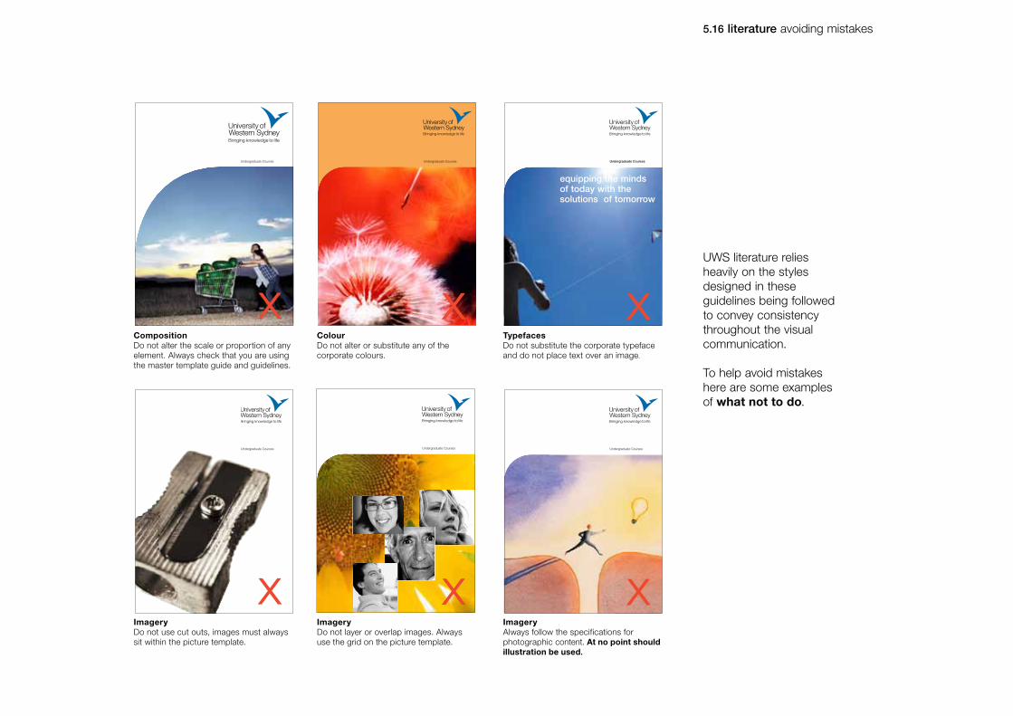
5.16 literature avoiding mistakes
Undergraduate Courses Undergraduate Courses
Undergraduate Courses
CompositionDo not alter the scale or proportion of any element. Always check that you are using the master template guide and guidelines.
ColourDo not alter or substitute any of the corporate colours.
ImageryDo not use cut outs, images must always sit within the picture template.
ImageryDo not layer or overlap images. Always use the grid on the picture template.
undergraduate Courses
Undergraduate Courses
TypefacesDo not substitute the corporate typeface and do not place text over an image.
ImageryAlways follow the specifications for photographic content. At no point should illustration be used.
Undergraduate Courses
x x x
x x x
UWS literature relies heavily on the styles designed in these guidelines being followed to convey consistency throughout the visual communication.
To help avoid mistakes here are some examples of what not to do.
equipping the minds of today with the solutions of tomorrow

6.1 web banners
06 digital advertising
University of Western Sydney - Visual identity manual

6.1 digital advertising web banners
1
2 3
4
Standard digital ad sizes include:
1. Leaderboard 728 x 90
2. Wide Skyscraper 160 x 600
3. Skyscraper 120 x 600
4. Medium Rectangle 300 x 250
The logo strapline should be ommitted when legibility is at risk.
The minimum logo size in this milieu is 100px wide by 54px high.

7.1 banners
7.2 merchandising
07 promotional items
University of Western Sydney - Visual identity manual
7.1 promotional items banners
Horizontal banners
Vertical banners (1x5) Horizontal banners (1x3)
Posters
Shown here are some promotional items such as banners and posters.
All show the symbol and logotype in a clear, consistent way.
The curve can easily but effectively help reinforce the visual identity.
All use the corporate colours to create a clean, dynamic and versatile look.
NoteA flock of birds pattern has been designed to enhance the visual identity and is used only in limited applications. Permission must be obtained by the Office of Public Affairs for use of the flock of birds foranything not specified within these guidelines.

UWS UWS
UWS
24mm 10mm
Small use logo
Maximum size Minimum size
7.2 promotional items merchandising
For certain merchandising applications such as pens, space restrictions will apply and the logo will need to be used smaller than it’s recommended minimum size.
In these limited applications a small use version of the logo has been created to be legible at very small sizes.
This logo must never appear larger than 24mm wide or smaller than 10mm wide. It must also never appear with the strapline.
Master artwork for this logo is available.
Note: Use of this version of the logo can only be approved by the Executive Director, Engagement and Partnerships.

8.1 certificate (version one)
8.2 certificate (version two)
8.3 testamur
08 ceremonialitems
University of Western Sydney - Visual identity manual

University of Western Sydney
University of Western Sydney
In the name of the Board of Trustees of the University of Western Sydneyand by the Authority of the same be it known that
having fulfilled all the requirements has this day been admitted to the
with all the privileges attached to the same and the Board of Trusteeshas authorised the Seal of the University to become hereunto affixed
Chancellor
Vice-Chancellor
Academic Registrar
University of Western Sydney
Professor Janice ReidVice-Chancellor
Professor Janice ReidVice-Chancellor
This is to certify that
Namehas sucessfully completed an internship
approved by the Australian Art Association in
Subjectfrom 1st August 2001 to 31st July 2002
This is to certify that
Namehas sucessfully completed an internship
approved by the Australian Art Association in
Subjectfrom 1st August 2001 to 31st July 2002
75 12
137
All measurements in millimetres Scale 45% of actual sizeActual size A4 (210x297mm)
1
2
33
8.1 ceremonial items certificate (version one)
The certificate is pre-printed and can be obtained only from the Office of Marketing and Communication.
For security reasons no attempts are to be made to re-create this certificate.
Typing guide specificationsHelvetica Neue is recommended for use as typewritten text. If this is unavailable, Arial (a standard Windows font) may be used. All text prints 100% Black. All type aligns with the left hand side of the identity, ranged left 137mm down from the top of the page to a measure of 75mm width.
1. Text Arial or Helvetica Neue 45 Light U/lc, 9.5/14pt.
2. Name and qualified subject Arial or Helvetica Neue 45 Light U/lc, 26.5pt.
There may be instances where the name may be longer than the space provided. Where this occurs the point size of the name may be reduced in size until it sits comfortably within the measure.
3. Signatory name and titleArial or Helvetica Neue 55 Roman and Helvetica Neue 45 Light U/lc, 9/11pt. Ranged left, aligned with the left hand side of the identity 3mm down from the keyline.

University of Western Sydney
University of Western Sydney
In the name of the Board of Trustees of the University of Western Sydneyand by the Authority of the same be it known that
having fulfilled all the requirements has this day been admitted to the
with all the privileges attached to the same and the Board of Trusteeshas authorised the Seal of the University to become hereunto affixed
Chancellor
Vice-Chancellor
Academic Registrar
University of Western Sydney
Professor Janice ReidVice-Chancellor
Professor Janice ReidVice-Chancellor
This is to certify that
Namehas sucessfully completed an internship
approved by the Australian Art Association in
Subjectfrom 1st August 2001 to 31st July 2002
This is to certify that
Namehas sucessfully completed an internship
approved by the Australian Art Association in
Subjectfrom 1st August 2001 to 31st July 2002
75 12
137
1
2
33
All measurements in millimetres Scale 45% of actual sizeActual size A4 (210x297mm)
8.2 ceremonial items certificate (version two)
The certificate is pre-printed and can be obtained only from the Office of Marketing and Communication.
For security reasons no attempts are to be made to re-create this certificate.
Typing guide specificationsHelvetica Neue is recommended for use as typewritten text. If this is unavailable, Arial (a standard Windows font) may be used. All text prints 100% Black. All type aligns with the left hand side of the identity, ranged left 137mm down from the top of the page to a measure of 75mm width.
1. Text Arial or Helvetica Neue 45 Light U/lc, 9.5/14pt.
2. Name and qualified subject Arial or Helvetica Neue 45 Light U/lc, 26.5pt.
There may be instances where the name may be longer than the space provided. Where this occurs the point size of the name may be reduced in size until it sits comfortably within the measure.
3. Signatory name and titleArial or Helvetica Neue 55 Roman and Helvetica Neue 45 Light U/lc, 9/11pt. Ranged left, aligned with the left hand side of the identity 3mm down from the keyline.

All measurements in millimetres Scale 45% of actual sizeActual size A4 (210x297mm)
8.3 ceremonial items testamur
The testamur is pre-printed and can be obtained only from the University. They are individually signed, numbered and sealed, and have general additional security embedded into each document.
For security reasons no attempts are to be made to re-create this testamur.
* THE
COM
MO
NS
EA
LO
FTHEUNIVERSITY
OF
WE
ST
ER
NSY
DNEY *
In the name of the Board of Trustees of the University of Western Sydney and by the Authority of the same be it known that
John Doe Smith
having fulfilled all the requirements has this day been admitted to the
Bachelor of Science
with all the privileges attached to the same and the Board of Trustees has authorised the Seal of the University to become hereunto affixed
Chancellor
Vice-Chancellor
Registrar
1 April, 2010
OPA2401-testamur.indd 2 10/12/10 11:23 AM

9.1 generic slides 1
9.2 generic slides 2
9.3 generic slides 3
09 powerpoint
University of Western Sydney - Visual identity manual

9.1 powerpoint generic slides 1
There are three different powerpoint designstandard styles available for use. The first one shown here is simple and can easily be used with text and pictures.

9.2 powerpoint generic slides 2
There are three different powerpoint designstandard styles available for use. The second one shown here is slightly more complex, it has up-to-date images of UWS students and buildings.

9.3 powerpoint generic slides 3
There are three different powerpoint designstandard styles available for use. The third one shown here is based on last years prospectus creative.
Updated annually to reflect collateral in market.

If you are uncertain about how to apply any aspect of the visual identity please contact:
Terry BarridgeiMedia and Design Manager Office of Public AffairsUniversity of Western SydneyLocked Bag 1797 Penrith NSW 2751Building AF Room AF.1.11, Werrington North Campus P: 9678 7517 F: 9678 7095M: 0416 157 184E: [email protected]
Related Documents