UX Assignment Chris Spalton

Welcome message from author
This document is posted to help you gain knowledge. Please leave a comment to let me know what you think about it! Share it to your friends and learn new things together.
Transcript

UX Assignment
Chris Spalton

Brief
Design, using whatever tools and processes you feel
comfortable with, a new user interface for a lift/elevator.
Here are some things to consider:
• it's for an office building with 300 floors
• there are a mix of users both those who work in the
building and those visiting
• there are 3 lifts in the building

Initial Thoughts / Assumptions Building this size would host multiple companies
so split it into 30 companies of approx 10 floors
each.
Reception for each company is on the lowest
floor of each ‘block’.
There are some communal areas such as Café,
Gym etc.
3 lifts : A B C
Lift software is smart enough to know quickest/
most efficient lifts / routes to ensure quickest
rides to each selected destination.
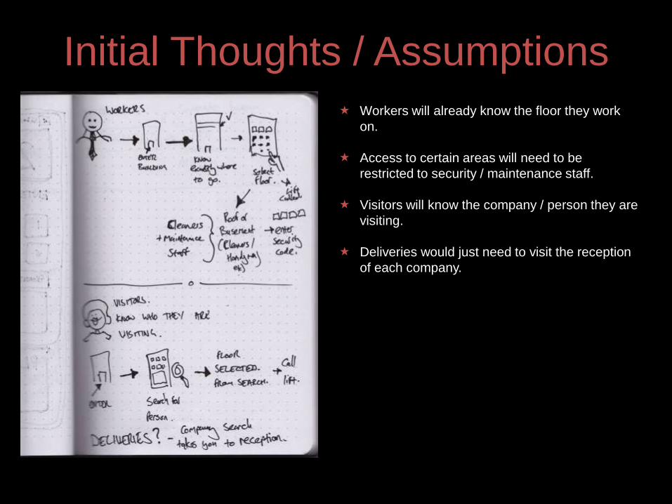
Initial Thoughts / Assumptions
Workers will already know the floor they work
on.
Access to certain areas will need to be
restricted to security / maintenance staff.
Visitors will know the company / person they are
visiting.
Deliveries would just need to visit the reception
of each company.

First Ideas
Traditional Physical Buttons COULD work, but
only for people who knew exactly what floor to
go to .
Due to complexity / size of building, touch
screen interface with search capability would
allow visitors to search for person/company they
were visiting.
Therefore (with the assumption that software is
smart enough) decided a touchscreen interface
OUTSIDE of lifts is the preferred option.

Initial Main Menu idea
Buttons to select either floor, find person, or find
facilities.
Traditionally laid out key pad, using same
principles as mobile phones to enter digits /
letters.
People are familiar with the layout so would be
natural to most.
However, lots of keys, and to find someone, it
would take a lot of buttons presses.

Chosen Main Menu
Main Menu screen is very simple, just 4 options
to go direct to floor, search for a person to visit,
search for a company to visit, select/Facility to
visit.
Very quick and simple to select initial option.
Added in ‘signpost’ so users know where they
currently are.
Due to size of building, lift might be far away, so
as soon as user interacts with the main menu,
the nearest lift starts to head to user current
floor, doesn’t wait for destination to be
confirmed first.

Option 1 – Select Floor.
Simple initial layout of
buttons. ‘Enter lift A’
message is displayed
once user confirms entry.
Added a Ground floor
button as that will be a
commonly used
destination.
Made confirm buton more
prominent. ‘Please use
Lift A’ message has time
until lift arrival. Made a
note that restricted areas
may need code to
progress.

Option 2 – Find Person.
Type in search using
keys in similar ways to a
mobile phone. Search for
company, then individual.
Too many clicks/button
presses.
Companies displayed alphabetically,
scrolls by holding down arrow. Once
company is selected, populates ‘person
list’ and person is chosen in the same
way. Floor is displayed for info, scrolls at
the same time as person field.

Option 3 – Find Company
Same concept / Principle as ‘Find Person’
option.
Companies are listed alphabetically along with
the floor number for reception.
Scroll with arrows, select and confirm.

Option 4 – Find Facilities
Same concept / Principle as Main Menu.
Big simple buttons that take you direct to the
facility you need.

WireFrames – Main Menu
Added in physical button in Braille for any blind
visitors. This would activate voice recognition IVR,
similar to a call/centre phone menu.

Option 1 – Select FloorInitial State Post Selection
Added in Breadcrumbs at the top
so user knows where they are. Total Clicks to choose destination =
5.

Option 1 – Select Restricted
FloorInitial State Post Selection
Once restricted area is selected,
user is prompted to enter
clearance code.
If Clearance Code is accepted then
lift continues, otherwise warning
message is displayed.

Option 2 – Find PersonInitial State Post Selection
User Scrolls with arrows to select
company.Once company is selected, person
list populates and works in the
same way.

Option 3 – Find CompanyInitial State Post Selection
User Scrolls with arrows to select
company.Once company is selected, lift sets
destination as tat companies
reception.

Option 4 – Visit FacilitiesInitial State Post Selection
Facilities are just big simple
buttonsChoose facility, hit confirm and
destination is set.

Inside Lift Control Panel
Display screen showing
Destination ‘Queue’ and
approximate timings.
If lift is called whilst in motion,
software will slot it into the queue in
the most efficient Slot.
3 physical buttons for hold doors
open, close doors, and call for
help. Set these as physical buttons
in case software fails and
touchscreen is unusable as a
result.

Inside Lift Control Panel Wireframe
Initial State Post Selection
Current floor is shown as lift moves
up and down. Each destination is
highlighted as lift arrives.
Here, a user has called the lift from
floor 64, so that has been slotted in
efficiently and timings to each
destination amended as a result.

End.
Related Documents