MIRUM AGENCY 2014 Session 3: USABILITY FIRST by Joan Lumanauw | May, 2015

Welcome message from author
This document is posted to help you gain knowledge. Please leave a comment to let me know what you think about it! Share it to your friends and learn new things together.
Transcript

MIRUM AGENCY 2014
Session 3:
USABILITY FIRSTby Joan Lumanauw | May, 2015

=Usability User Experience

BRAND EXPERIENCE
Desirability
Utility
Usability
Love the brand
It looks beautiful
Easy to use
Product is useful
USER EXPERIENCE

BRAND EXPERIENCE
Desirability
Utility
Usability
Love the brand
It looks beautiful
Easy to use
Product
USER EXPERIENCE

is about task-based interactions.
It is the measure of a user’s ability to use a product intuitively and easily.
It is also about increasing efficiency and removing any obstacle or pain point the users might encounter while using the product.
Usability

Intuitive Design Learnability Efficiency of use Memorability Error Frequency
A nearly effortless understanding of the architecture and navigation of the site
How fast a user who has never seen the user interface before can accomplish basic tasks
How fast an experienced user can accomplish tasks
After visiting the site, if a user can remember enough to use it effectively in future visits
How often users make errors while using the system, how serious the errors are, and how users recover from the errors
How to Measure Usability
http://www.nngroup.com/articles/usability-101-introduction-to-usability/

Just how do we achieve those 5 things?

THE USABILITY CHECKLISTWell, we can start by using

1. Recognition over recall
2. Match between system and real life
3. Standard & best practices
4. Error Prevention
5. Error Recognition
6. Visibility of System Status
7. Users should know where they are
THE USABILITY CHECKLIST

Place items on the page when and where users need them as they move through the system. Don’t force people to remember things.
RECOGNITION OVER RECALL
1. Recognition over recall
2. Match between system
and real life
3. Standard & best practices
4. Error Prevention
5. Error Recognition
6. Visibility of System Status
7. Users should know where
they are

1. Recognition over recall
2. Match between system
and real life
3. Standard & best practices
4. Error Prevention
5. Error Recognition
6. Visibility of System Status
7. Users should know where
they are
RECOGNITION OVER RECALL
Place items on the page when and where users need them as they move through the system. Don’t force people to remember things.
Email unsubscribe button on registration page

1. Recognition over recall
2. Match between system
and real life
3. Standard & best practices
4. Error Prevention
5. Error Recognition
6. Visibility of System Status
7. Users should know where
they are
MATCH BETWEEN SYSTEM AND REAL LIFE
Speak the user’s language. Use familiar terms, phrases and concepts, rather than system or business oriented words.

1. Recognition over recall
2. Match between system
and real life
3. Standard & best practices
4. Error Prevention
5. Error Recognition
6. Visibility of System Status
7. Users should know where
they are
STANDARD & BEST PRACTICES
People have used hundreds of interfaces before they arrived at yours. They’ll be expecting certain patterns of how things should be named and how they work.

1. Recognition over recall
2. Match between system
and real life
3. Standard & best practices
4. Error Prevention
5. Error Recognition
6. Visibility of System Status
7. Users should know where
they are
ERROR PREVENTION
Help users not make errors in the first place. Provide guidance and helpful design.

1. Recognition over recall
2. Match between system
and real life
3. Standard & best practices
4. Error Prevention
5. Error Recognition
6. Visibility of System Status
7. Users should know where
they are
ERROR RECOGNITION
Help users recognise, diagnose, and recover from errors. Error messages should be expressed in plain language, precisely indicate the problem, and constructively suggest a solution.

1. Recognition over recall
2. Match between system
and real life
3. Standard & best practices
4. Error Prevention
5. Error Recognition
6. Visibility of System Status
7. Users should know where
they are
VISIBILITY OF SYSTEM STATUS
The system should always keep users informed about what is going on, through appropriate feedback within a reasonable time.

1. Recognition over recall
2. Match between system
and real life
3. Standard & best practices
4. Error Prevention
5. Error Recognition
6. Visibility of System Status
7. Users should know where
they are
YOU ARE HERE
Interfaces should answer the question: where am I, and where am I not. Process interfaces should show the number of steps, progress, and the expected duration.
1. Recognition over recall
2. Match between system
and real life
3. Standard & best practices
4. Error Prevention
5. Error Recognition
6. Visibility of System Status
7. Users should know where
they are
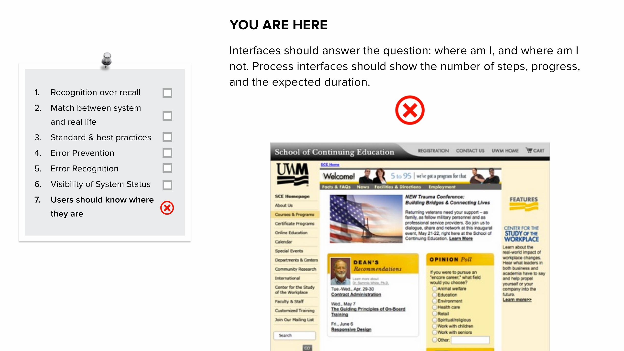
YOU ARE HERE
Interfaces should answer the question: where am I, and where am I not. Process interfaces should show the number of steps, progress, and the expected duration.

ANY QUESTIONS?
Related Documents


![[Webinar] with UX Pioneer Jeff Sauro: Measuring UX & Usability](https://static.cupdf.com/doc/110x72/554ba54fb4c905b3618b4e4c/webinar-with-ux-pioneer-jeff-sauro-measuring-ux-usability.jpg)