IJREAS Volume 2, Issue 6 (June 2012) ISSN: 2249-3905 International Journal of Research in Engineering & Applied Sciences 51 http://www.euroasiapub.org USER INTERFACE DESIGN WITH VISUALIZATION TECHNIQUES Surya Bahadur* B. Krishna Sagar* Mahesh Kumar Kondreddy* ABSTRACT Proper arrangement of the elements on the user screen have Andhra Pradesh helped the designers to make the screen look good and. Several techniques for visualization emphasize the arrangement and ordering of the screen elements based on particular criteria for best appearance of the screen. This paper investigates few significant visualization techniques in various web user interfaces and showcases the results for better understanding and their presence. Keywords: Visualization, Equilibrium, Symmetry, Sequence, Unity, Simplicity, Density, Regularity, Economy. *Assistant Professor, Department of Computer Science & Engineering, Madanapalle Institute of Technology & Science Andhra Pradesh.

Welcome message from author
This document is posted to help you gain knowledge. Please leave a comment to let me know what you think about it! Share it to your friends and learn new things together.
Transcript
IJREAS Volume 2, Issue 6 (June 2012) ISSN: 2249-3905
International Journal of Research in Engineering & Applied Sciences 51 http://www.euroasiapub.org
USER INTERFACE DESIGN WITH VISUALIZATION TECHNIQUES Surya Bahadur*
B. Krishna Sagar*
Mahesh Kumar Kondreddy*
ABSTRACT
Proper arrangement of the elements on the user screen have Andhra Pradesh helped the
designers to make the screen look good and. Several techniques for visualization emphasize
the arrangement and ordering of the screen elements based on particular criteria for best
appearance of the screen. This paper investigates few significant visualization techniques in
various web user interfaces and showcases the results for better understanding and their
presence.
Keywords: Visualization, Equilibrium, Symmetry, Sequence, Unity, Simplicity, Density,
Regularity, Economy.
*Assistant Professor, Department of Computer Science & Engineering, Madanapalle Institute
of Technology & Science Andhra Pradesh.
IJREAS Volume 2, Issue 6 (June 2012) ISSN: 2249-3905
International Journal of Research in Engineering & Applied Sciences 52 http://www.euroasiapub.org
1. INTRODUCTION Interface users expect a clear distinction about various elements/controls displayed depending
upon their purpose. User Interface designers need to put in effort so as to make user interface
easy to use by reducing visual work & memory use of the users. User Interface designer must
also consider or prepare a basic layout for arranging these screen elements depending upon
the elements functionality, importance, and other User Interface design properties for a better
screen design. Jean Vanderdonckt [1] emphasizes on visual techniques grouped into five
categories as a commonly accepted visual principle to guide in the arrangement of the layout
frame components.
The five groups are
a) Physical Techniques: Balance, Symmetric, Regularity, Alignment, Proportion and
Horizontality.
b) Composition Techniques: Simplicity, Economy, Neutrality, Singularity, Positivity and
Transparency.
c) Association and Dissociation Techniques: Unity, Repartition, Grouping and Sparing.
d) Ordering Techniques: Consistency, Predictability, Sequentiality and Continuity.
e) Photographic Techniques: Sharpness, Roundness, Stability, Representation,
Subtlety,Leveling Realism and Flatness.
In a research by Ngo et.al.[2], have proposed a well-defined mathematical model for the
fourteen esthetic characteristics like Balance, Equilibrium, Symmetry, Sequence, Cohesion,
Unity, Simplicity, Density, Regularity, Economy, Homogeneity, e.t.c. The result has
suggested the importance of these characteristics for designers of the interfaces. In addition to
these research studies there have been numerous other studies [5, 6, 7, 8, 9, 10] which
emphasize on various principles for user interface design to be more attractive and
aesthetically pleasing.
The current study being reported in this paper has been carried out by my friend circle
consisting of 12 members. The investigative form of study has been carried out over five
categories of websites, namely, a) Social network website interfaces b) Job site interfaces c)
Shopping website interfaces d) Stock trading website interfaces e) E-mail interfaces.
We have selected over 150 different popular websites that come under these 5 different
categories. The duration of the study was around 3 months. The investigative form of study
by us brought interesting and broad details about various user interface properties,
characteristics,principles. We present all these in detail in the following sections of this paper.
IJREAS Volume 2, Issue 6 (June 2012) ISSN: 2249-3905
International Journal of Research in Engineering & Applied Sciences 53 http://www.euroasiapub.org
In section 2, the presence of ordering of screen data and content for the investigated web user
interfaces is highlighted. In section 3, the results of screen navigation and flow are
showcased. Section 4 presents the 7 visual techniques under visually pleasing composition.
Section 5 deals with pleasing proportions and finally section 6 concludes the paper. The
figures representing the corresponding property or principle are taken from Galitz [3].
2. SCREEN DATA AND CONTENT The Screen elements must be arranged in a logically, meaningfully and sensibly so as to
enable the user retain the information on the screen in his/ her short term memory with ease.
One of the ways of achieving this is by arranging screen elements in a prioritized form
according the user’s needs and expectations. Well organized screens help users to find the
information they need quickly.
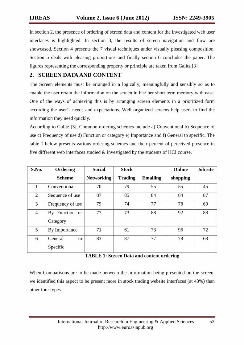
According to Galitz [3], Common ordering schemes include a) Conventional b) Sequence of
use c) Frequency of use d) Function or category e) Importance and f) General to specific. The
table 1 below presents various ordering schemes and their percent of perceived presence in
five different web interfaces studied & investigated by the students of HCI course.
S.No. Ordering
Scheme
Social
Networking
Stock
Trading
Emailing
Online
shopping
Job site
1 Conventional 70 79 55 55 45
2 Sequence of use 87 85 84 84 87
3 Frequency of use 79 74 77 78 60
4 By Function or
Category
77 73 88 92 88
5 By Importance 71 61 73 96 72
6 General to
Specific
83 87 77 78 68
TABLE 1: Screen Data and content ordering
When Comparisons are to be made between the information being presented on the screen;
we identified this aspect to be present more in stock trading website interfaces (at 43%) than
other four types.
IJREAS Volume 2, Issue 6 (June 2012) ISSN: 2249-3905
International Journal of Research in Engineering & Applied Sciences 54 http://www.euroasiapub.org
3. SCREEN NAVIGATION AND FLOW Every user expects the navigation and flow within the screen to be obvious and easy to
accomplish. Galitz [3] says Navigation can be made obvious by grouping and aligning screen
controls, judiciously using line orders to guide the eye. The table 2 below lists out various
techniques that can be used to enhance Screen Navigation and flow experience. Also the table
2 shows the perceived presence of these techniques among the investigated five different web
user interfaces.
S. No Techniques/Arrangement/Orientatio
n
Social
Networki
ng
Stock
Trading
Emaili
ng
Online
shoppi
ng
Job
site
1 Most important & Most frequently used
elements or controls placed at the
topleft
79 52 85 81 76
2 Grouping of elements observable onthe
screen.
88 91 85 100 84
3 Line borders for groups. 83 78 77 81 80
4 Identifiable difference among elements
that a critical, important,
secondary,peripheral.
48 57 50 78 68
5 Command buttons placed at the bottom
within a group.
55 55 73 56 52
6 Eye movement from dark areas to light
areas of the Screen.
71 82 81 85 80
7 Eye movement from big objects to little
Objects
83 74 73 81 84
8 Eye movement from unusual shapes to
common shapes.
54 64 46 52 52
9 Eye movement from highly saturated
colors to unsaturated colors.
75 65 77 74 83
TABLE 2: Screen Navigation and Flow
IJREAS Volume 2, Issue 6 (June 2012) ISSN: 2249-3905
International Journal of Research in Engineering & Applied Sciences 55 http://www.euroasiapub.org
The Screen elements arrangement should reduce the overall number of eye and manual
control movements needed to work with a screen. Top-to-bottom presentation of information
stood best among other form of presentations in the research [3].
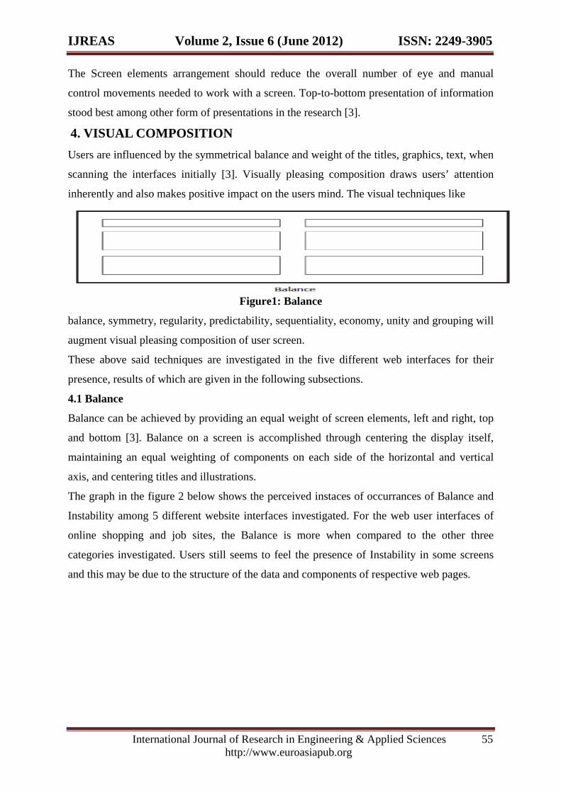
4. VISUAL COMPOSITION Users are influenced by the symmetrical balance and weight of the titles, graphics, text, when
scanning the interfaces initially [3]. Visually pleasing composition draws users’ attention
inherently and also makes positive impact on the users mind. The visual techniques like
Figure1: Balance
balance, symmetry, regularity, predictability, sequentiality, economy, unity and grouping will
augment visual pleasing composition of user screen.
These above said techniques are investigated in the five different web interfaces for their
presence, results of which are given in the following subsections.
4.1 Balance
Balance can be achieved by providing an equal weight of screen elements, left and right, top
and bottom [3]. Balance on a screen is accomplished through centering the display itself,
maintaining an equal weighting of components on each side of the horizontal and vertical
axis, and centering titles and illustrations.
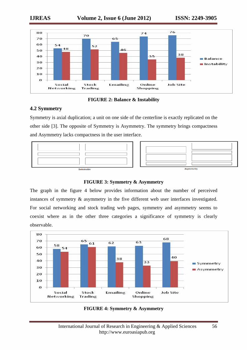
The graph in the figure 2 below shows the perceived instaces of occurrances of Balance and
Instability among 5 different website interfaces investigated. For the web user interfaces of
online shopping and job sites, the Balance is more when compared to the other three
categories investigated. Users still seems to feel the presence of Instability in some screens
and this may be due to the structure of the data and components of respective web pages.
IJREAS Volume 2, Issue 6 (June 2012) ISSN: 2249-3905
International Journal of Research in Engineering & Applied Sciences 56 http://www.euroasiapub.org
FIGURE 2: Balance & Instability
4.2 Symmetry Symmetry is axial duplication; a unit on one side of the centerline is exactly replicated on the
other side [3]. The opposite of Symmetry is Asymmetry. The symmetry brings compactness
and Asymmetry lacks compactness in the user interface.
FIGURE 3: Symmetry & Asymmetry
The graph in the figure 4 below provides information about the number of perceived
instances of symmetry & asymmetry in the five different web user interfaces investigated.
For social networking and stock trading web pages, symmetry and asymmetry seems to
coexist where as in the other three categories a significance of symmetry is clearly
observable.
FIGURE 4: Symmetry & Asymmetry
IJREAS Volume 2, Issue 6 (June 2012) ISSN: 2249-3905
International Journal of Research in Engineering & Applied Sciences 57 http://www.euroasiapub.org
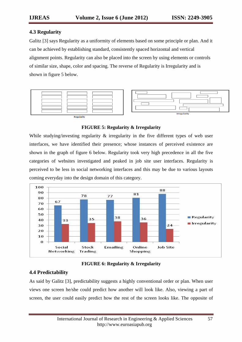
4.3 Regularity Galitz [3] says Regularity as a uniformity of elements based on some principle or plan. And it
can be achieved by establishing standard, consistently spaced horizontal and vertical
alignment points. Regularity can also be placed into the screen by using elements or controls
of similar size, shape, color and spacing. The reverse of Regularity is Irregularity and is
shown in figure 5 below.
FIGURE 5: Regularity & Irregularity
While studying/investing regularity & irregularity in the five different types of web user
interfaces, we have identified their presence; whose instances of perceived existence are
shown in the graph of figure 6 below. Regularity took very high precedence in all the five
categories of websites investigated and peaked in job site user interfaces. Regularity is
perceived to be less in social networking interfaces and this may be due to various layouts
coming everyday into the design domain of this category.
FIGURE 6: Regularity & Irregularity
4.4 Predictability As said by Galitz [3], predictability suggests a highly conventional order or plan. When user
views one screen he/she could predict how another will look like. Also, viewing a part of
screen, the user could easily predict how the rest of the screen looks like. The opposite of
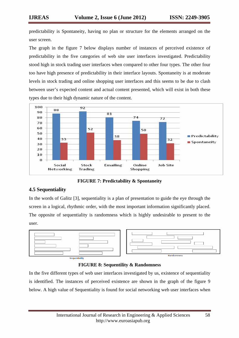
IJREAS Volume 2, Issue 6 (June 2012) ISSN: 2249-3905
International Journal of Research in Engineering & Applied Sciences 58 http://www.euroasiapub.org
predictability is Spontaneity, having no plan or structure for the elements arranged on the
user screen.
The graph in the figure 7 below displays number of instances of perceived existence of
predictability in the five categories of web site user interfaces investigated. Predictability
stood high in stock trading user interfaces when compared to other four types. The other four
too have high presence of predictability in their interface layouts. Spontaneity is at moderate
levels in stock trading and online shopping user interfaces and this seems to be due to clash
between user’s expected content and actual content presented, which will exist in both these
types due to their high dynamic nature of the content.
FIGURE 7: Predictability & Spontaneity
4.5 Sequentiality In the words of Galitz [3], sequentiality is a plan of presentation to guide the eye through the
screen in a logical, rhythmic order, with the most important information significantly placed.
The opposite of sequentiality is randomness which is highly undesirable to present to the
user.
FIGURE 8: Sequentility & Randomness
In the five different types of web user interfaces investigated by us, existence of sequentiality
is identified. The instances of perceived existence are shown in the graph of the figure 9
below. A high value of Sequentiality is found for social networking web user interfaces when
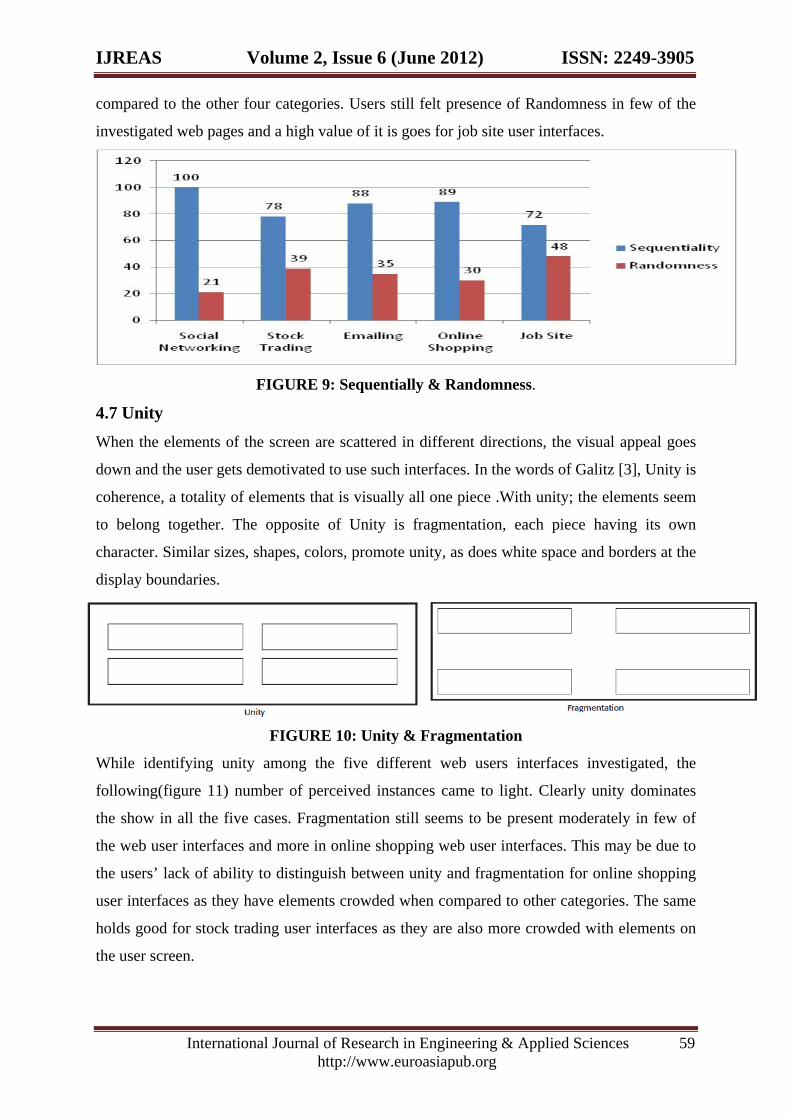
IJREAS Volume 2, Issue 6 (June 2012) ISSN: 2249-3905
International Journal of Research in Engineering & Applied Sciences 59 http://www.euroasiapub.org
compared to the other four categories. Users still felt presence of Randomness in few of the
investigated web pages and a high value of it is goes for job site user interfaces.
FIGURE 9: Sequentially & Randomness.
4.7 Unity When the elements of the screen are scattered in different directions, the visual appeal goes
down and the user gets demotivated to use such interfaces. In the words of Galitz [3], Unity is
coherence, a totality of elements that is visually all one piece .With unity; the elements seem
to belong together. The opposite of Unity is fragmentation, each piece having its own
character. Similar sizes, shapes, colors, promote unity, as does white space and borders at the
display boundaries.
FIGURE 10: Unity & Fragmentation
While identifying unity among the five different web users interfaces investigated, the
following(figure 11) number of perceived instances came to light. Clearly unity dominates
the show in all the five cases. Fragmentation still seems to be present moderately in few of
the web user interfaces and more in online shopping web user interfaces. This may be due to
the users’ lack of ability to distinguish between unity and fragmentation for online shopping
user interfaces as they have elements crowded when compared to other categories. The same
holds good for stock trading user interfaces as they are also more crowded with elements on
the user screen.
IJREAS Volume 2, Issue 6 (June 2012) ISSN: 2249-3905
International Journal of Research in Engineering & Applied Sciences 60 http://www.euroasiapub.org
FIGURE 11: Unity & Fragmentation
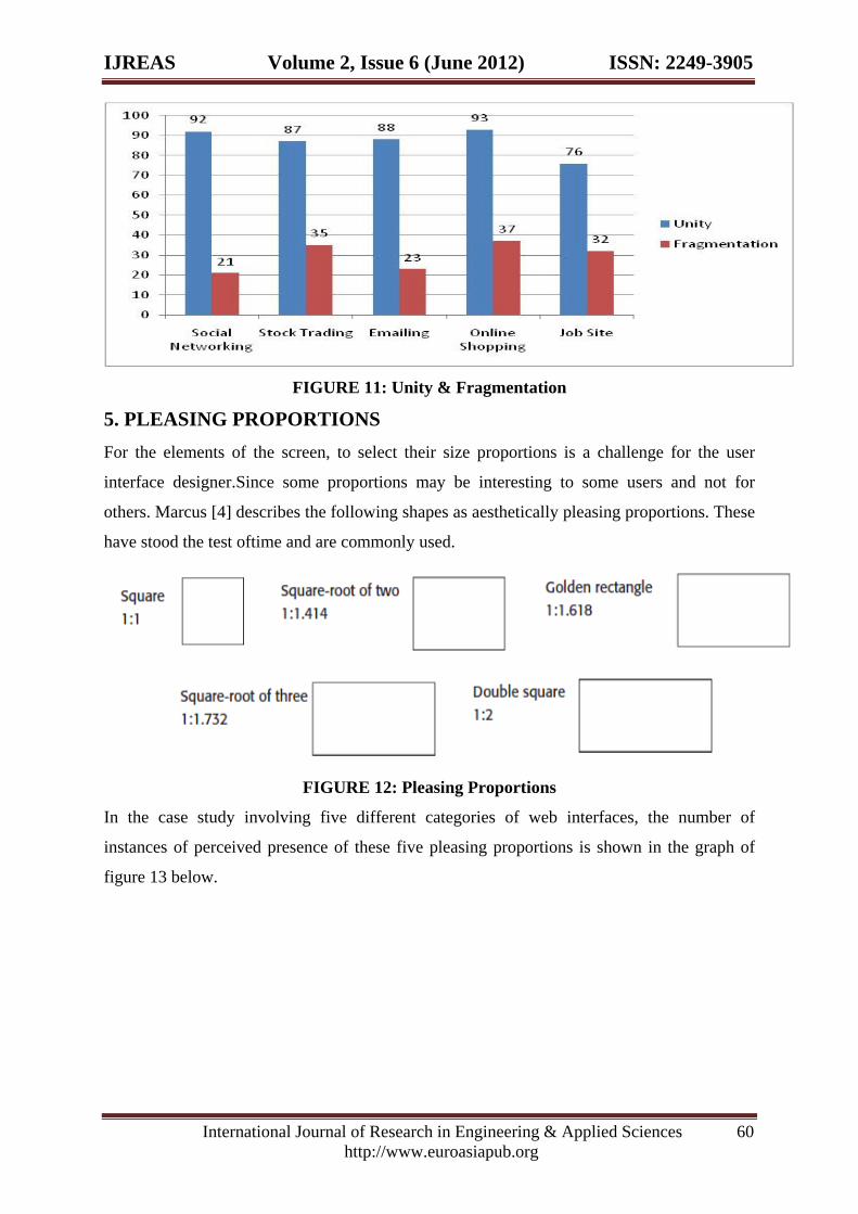
5. PLEASING PROPORTIONS For the elements of the screen, to select their size proportions is a challenge for the user
interface designer.Since some proportions may be interesting to some users and not for
others. Marcus [4] describes the following shapes as aesthetically pleasing proportions. These
have stood the test oftime and are commonly used.
FIGURE 12: Pleasing Proportions
In the case study involving five different categories of web interfaces, the number of
instances of perceived presence of these five pleasing proportions is shown in the graph of
figure 13 below.
IJREAS Volume 2, Issue 6 (June 2012) ISSN: 2249-3905
International Journal of Research in Engineering & Applied Sciences 61 http://www.euroasiapub.org
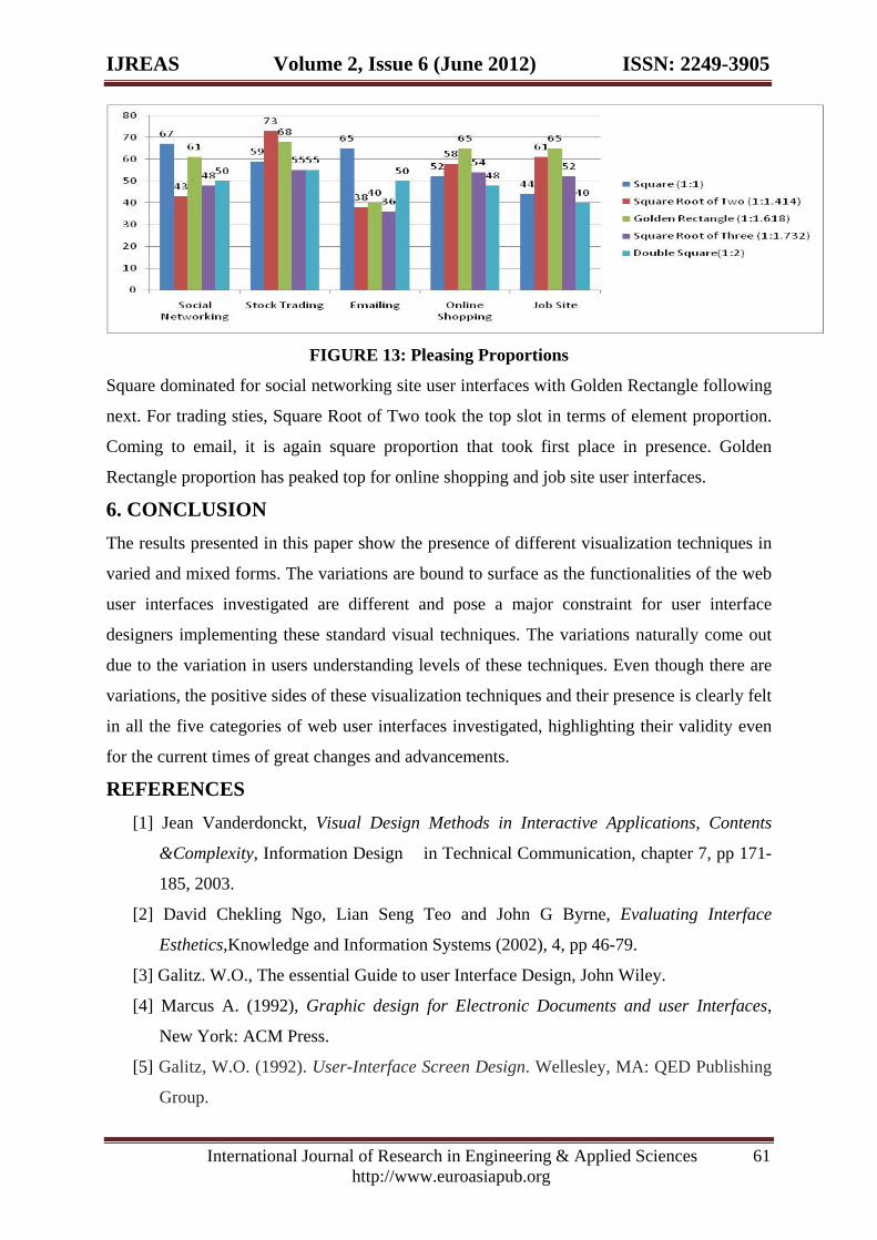
FIGURE 13: Pleasing Proportions
Square dominated for social networking site user interfaces with Golden Rectangle following
next. For trading sties, Square Root of Two took the top slot in terms of element proportion.
Coming to email, it is again square proportion that took first place in presence. Golden
Rectangle proportion has peaked top for online shopping and job site user interfaces.
6. CONCLUSION The results presented in this paper show the presence of different visualization techniques in
varied and mixed forms. The variations are bound to surface as the functionalities of the web
user interfaces investigated are different and pose a major constraint for user interface
designers implementing these standard visual techniques. The variations naturally come out
due to the variation in users understanding levels of these techniques. Even though there are
variations, the positive sides of these visualization techniques and their presence is clearly felt
in all the five categories of web user interfaces investigated, highlighting their validity even
for the current times of great changes and advancements.
REFERENCES [1] Jean Vanderdonckt, Visual Design Methods in Interactive Applications, Contents
&Complexity, Information Design in Technical Communication, chapter 7, pp 171-
185, 2003.
[2] David Chekling Ngo, Lian Seng Teo and John G Byrne, Evaluating Interface
Esthetics,Knowledge and Information Systems (2002), 4, pp 46-79.
[3] Galitz. W.O., The essential Guide to user Interface Design, John Wiley.
[4] Marcus A. (1992), Graphic design for Electronic Documents and user Interfaces,
New York: ACM Press.
[5] Galitz, W.O. (1992). User-Interface Screen Design. Wellesley, MA: QED Publishing
Group.
IJREAS Volume 2, Issue 6 (June 2012) ISSN: 2249-3905
International Journal of Research in Engineering & Applied Sciences 62 http://www.euroasiapub.org
[6] International Business Machines Corporation (IBM). (1991). Systems Application
Architecture Common User Access Advanced Interface Design Reference (SC34-
4289).
[7] International Business Machines (IBM). (2001). “Cost Justifying Ease of Use.”
http://www-3.ibm.com/ibm/easy/eou_ext.nsf/Publish/23.
[8] Mayhew, D.J. (1992). Principles and Guidelines in Software User Interface Design.
Englewood Clifs, NJ.Prentice Hall
[9] Microsoft Corporation. (1992). The Windows Interface: An Application Design Guide,
Redmond, WA: Microsoft Press.
[10] Microsoft Corporation. (1995). The Windows Interface Guidelines for Software
Design. Redmond, WA: Microsoft Press.
Related Documents