Usability of SE/SDI Websites Observations

Usability of SE/SDI Websites Observations. Good News Most people Like Most things On Most of our Websites.
Dec 31, 2015
Welcome message from author
This document is posted to help you gain knowledge. Please leave a comment to let me know what you think about it! Share it to your friends and learn new things together.
Transcript
Usability of SE/SDI Websites
Observations

Good News
Most people
Like Most things
On Most of our Websites
Why
• Good clean design
• Recognised brand
• Logos that reassure them (SE, SDI, Gov, UKTI, etc…)
• Knowledgeable and expert content
• Not too exciting (trustworthy and credible)

What is it?
What is it?
What is it?
What is it?
What is it?
What is it?


GDS Principles
1. Start with needs2. Do less3. Design with data4. Do the hard work to make it simple5. Iterate. Then iterate again6. Build for inclusion7. Understand context8. Build digital services, not websites9. Be consistent, not uniform10. Make things open: it makes things better
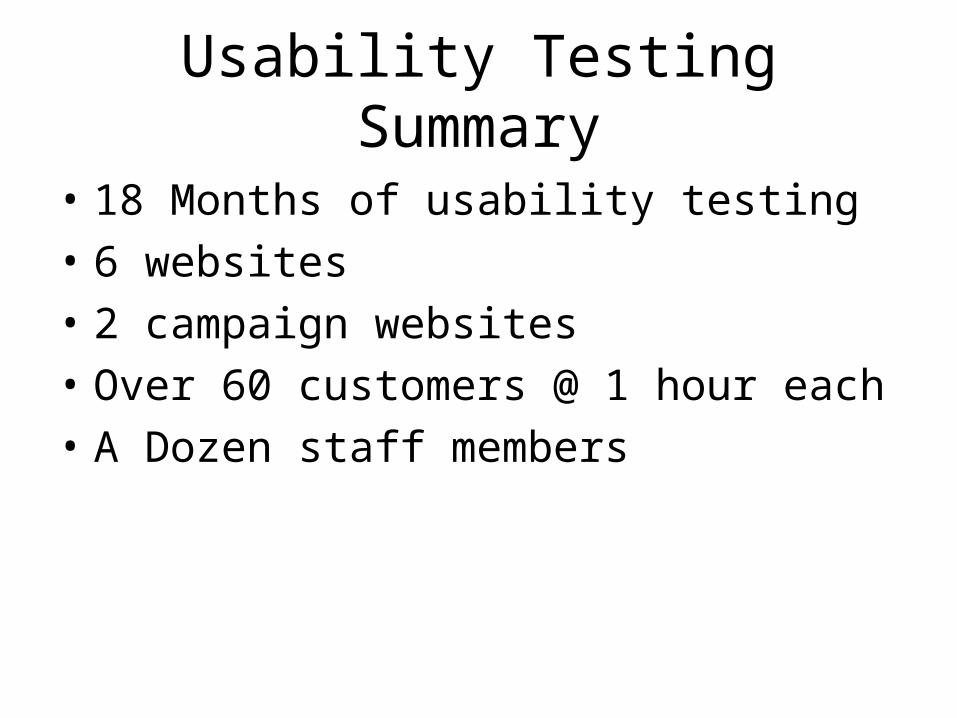
Usability Testing Summary
• 18 Months of usability testing
• 6 websites
• 2 campaign websites
• Over 60 customers @ 1 hour each
• A Dozen staff members
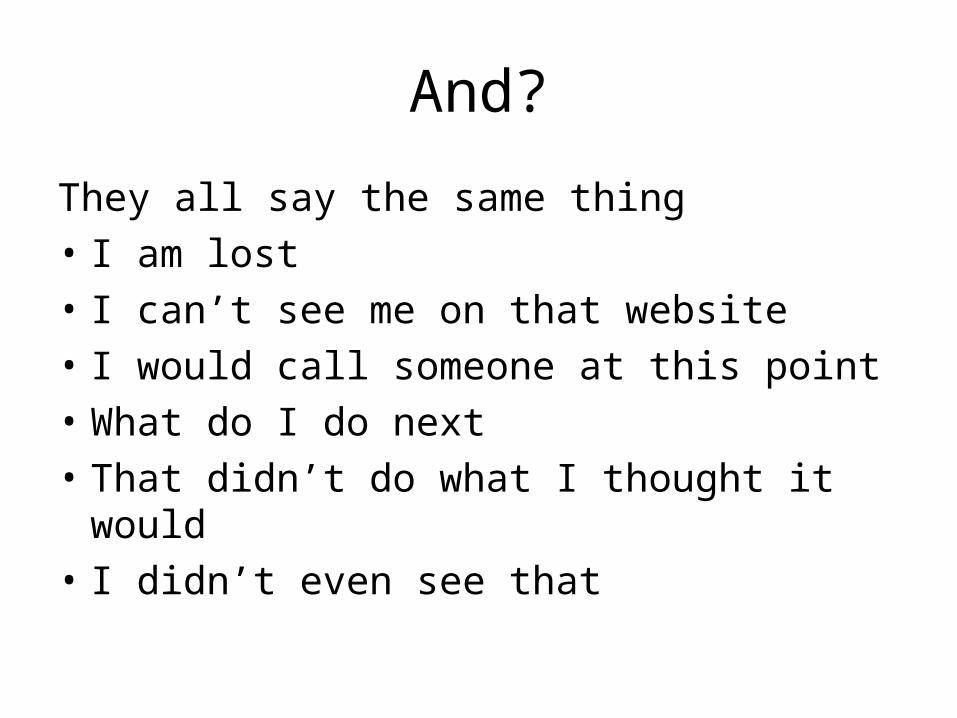
And?
They all say the same thing
• I am lost
• I can’t see me on that website
• I would call someone at this point
• What do I do next
• That didn’t do what I thought it would
• I didn’t even see that
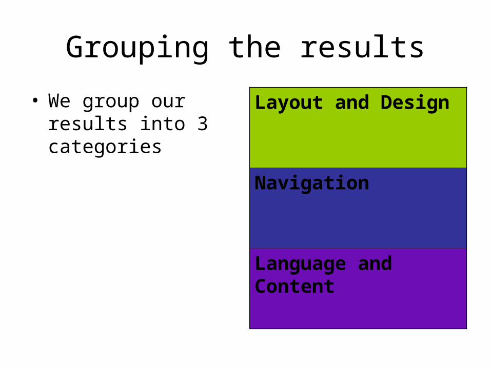
Grouping the results
• We group our results into 3 categories
Layout and Design
Navigation
Language and Content
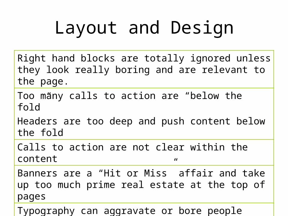
Layout and Design
Right hand blocks are totally ignored unless they look really boring and are relevant to the page.
Too many calls to action are “below the fold”
Headers are too deep and push content below the fold
Calls to action are not clear within the content
Banners are a “Hit or Miss” affair and take up too much prime real estate at the top of pages
Typography can aggravate or bore people
People expect website to look and behave like every other website they use
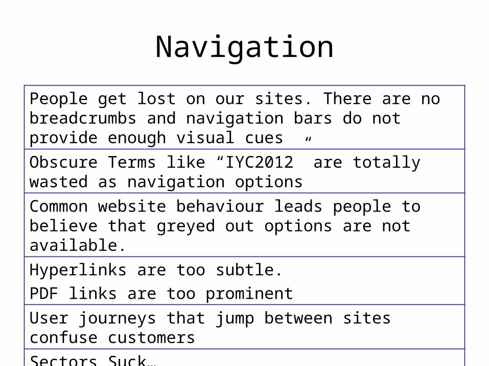
Navigation
People get lost on our sites. There are no breadcrumbs and navigation bars do not provide enough visual cues
Obscure Terms like “IYC2012” are totally wasted as navigation options
Common website behaviour leads people to believe that greyed out options are not available.
Hyperlinks are too subtle.
PDF links are too prominent
User journeys that jump between sites confuse customers
Sectors Suck…

Language and Content
Customers want to see their language and not ours
Content needs to make sense no matter what context it is in. Customers may have hit this page directly from search
PDF’s do not work as website replacements. They are normally well received but almost always break the user journey. They also tend to contain the wrong call’s to action for online consumption.
Calls to action need to be more prominent in blocks of content or at the bottom of pages
People spell things wrong. Keep it simple
Headings are critical. They vary between Active and Questioning. Customers often commented “What do you want me to do”

Related Documents