Usability for E-commerce: how to increase your online sales Practical Usability Guidelines for E-commerce. Part I.

Usability for e commerce - part I
Jul 16, 2015
Welcome message from author
This document is posted to help you gain knowledge. Please leave a comment to let me know what you think about it! Share it to your friends and learn new things together.
Transcript

Usability for E-commerce: how to increase your online
sales
Practical Usability Guidelines for E-commerce. Part I.

About Magecom
2008Year Founded
500+web sites
200+ecommerce projects
100+Magento projects
Magecom creates high quality e-commerce solutions on Magento platform
30+experts
www.magecom.net

Why do you need Usability?

What you should do?
• Define your audience
• Test the old design
• Test your competitor designs
• Inspect the design regarding the
established usability guidelines
• Test it again!

Key principles of website usability
• Accessibility
• Identity
• Navigation
• Content

NO!
Accessibility: page load speed
YES!

Accessibility: website color & contrast
YES! NO!
Sky-blue, pink – traditional customers
Navy-blue, Teal – budget shoppers
Black, Red-Orange, Royal-Blue – impulse shoppers
Accessibility: font size & spacing

Accessibility: flash & ads-on
• Flash Intro
• Banners
• Pop-ups

Accessibility: images & ALT tags
ALT Tags = Image content
Search engine crawlers cannot interpret graphic
content
High quality image
Low quality image
ALT tag example"new Wilson bright yellow tennis ball for beginners
without logo"

Accessibility: custom not-found page
• an apology for delivering
a wrong page
• a search box for your
website
• telling the potential
customer that they are on
the right domain
• navigation options
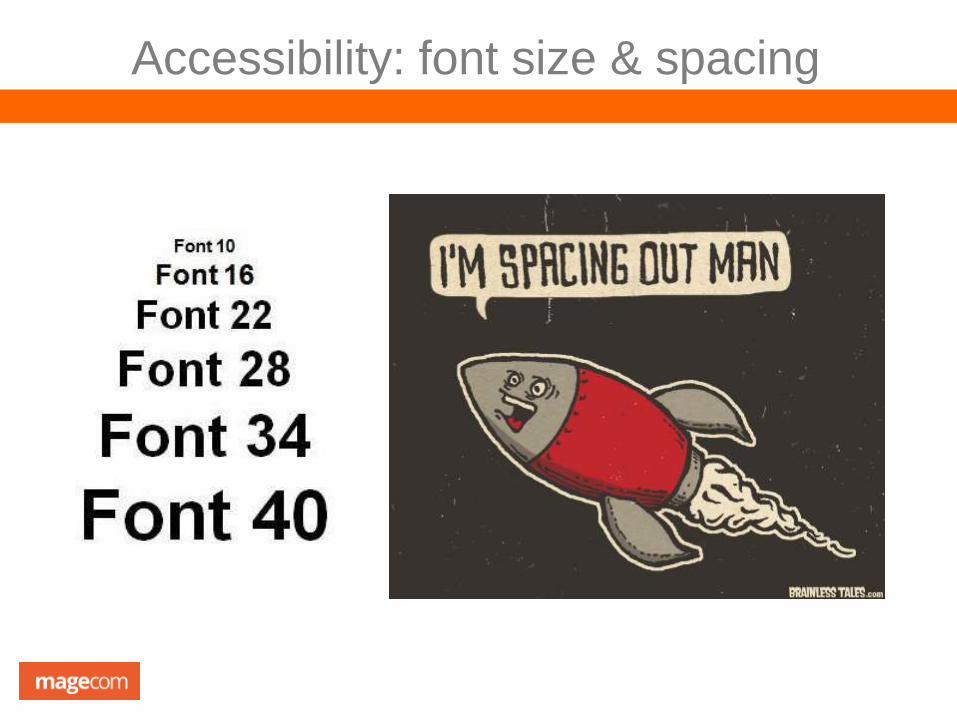
Identity: company logo
Company Logo is prominently placed
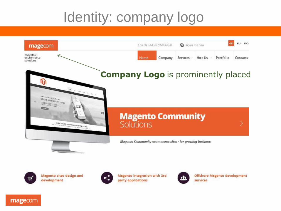
Identity: companies tagline

Identity: home page is digestible in 5 sec
This is how people read websites

21.3.1121.3.11
Identity: clear path to contact information
Address
Corporate video
Detailed information
Phone number
Gain trust from
your customers

21.3.1121.3.11
Navigation: menu is easily identifiable
• Make your navigation universal
• Consistency of navigation on all pages
• Use text for navigation
• Include breadcrumbs
• Avoid flash navigation
• Site maps

21.3.1121.3.11
Navigation: clear labels
About us
Contact us
Privacy Policy
Terms and Conditions
Shipping
Help
Category 1
Category 2
Category N
Category 1
Category 2
Category N
Do not confuse
your shopper!

21.3.1121.3.11
Navigation: number of buttons & links
Simple rules:
Do not overload buttons with text
Make the most important button
bigger than other buttons around
Label buttons with what they do,
for instant: cancel, next, order,
close, reset etc.
Put buttons where users can find
them
21.3.1121.3.11
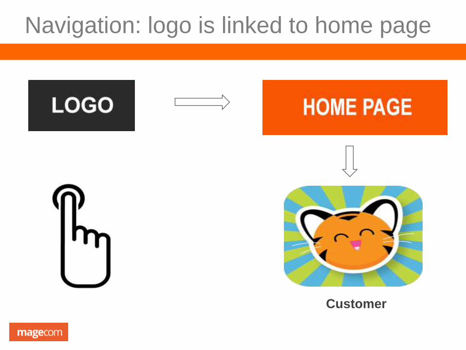
Navigation: logo is linked to home page
Customer
21.3.1121.3.11
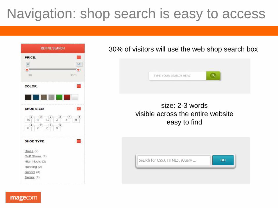
Navigation: shop search is easy to access
30% of visitors will use the web shop search box
size: 2-3 words
visible across the entire website
easy to find

21.3.1121.3.11
Content: headings are descriptive & clear

21.3.1121.3.11
Content: key content is above the fold
Average screen
resolution is 1024x768
66% of attention on a
normal web page is
spent above the fold
Web users don’t mind clicking links
With infinitely long
pages, people may
feel paralyzed by
the sheer volume
of content or the
number of choices
and not click
anything

21.3.1121.3.11
Content: emphasis is used wisely
Highlight the text on pages
sparsely: max 10% of your
content
The less you highlight, the more
attention your highlights will
receive

Content: banner ads & pop-ups
50% of internet users will close a pop-up ad before it loads
60% of users say that pop-ups led to mistrust
Ads give your web shop a poor first impressions
5 types of internal ads that cause user
experience issues:
• ads placed above product list
• ads placed within product list
• text ads below product list
• overlay dialog windows (“lightboxes”)
on page load
• ads placed in the prime content location

21.3.11
Content: URLs are user-friendly
NO!
http://www.mysite.com/item?23476
http://www.mysite.com/The-black-
jeans
http://www.mysite.com/black+jeans
YES!
http://www.mysite.com/black-jeans
21.3.11
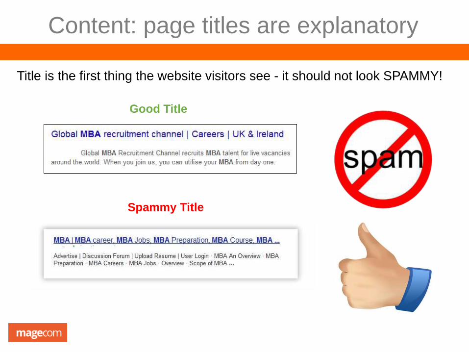
Content: page titles are explanatory
Title is the first thing the website visitors see - it should not look SPAMMY!
Spammy Title
Good Title
21.3.11
In Our Next Webinar:
1. Checkout process: how to optimize your checkout process to avoid shopping
cart abandonment
2. Navigation: help shoppers achieve their goals fast and easy
3. Marketing tips: loyalty programs and bonuses.
THANK YOU FOR BEING WITH US!
To inspect your website usability and SEO
issues please contact us: [email protected]
Related Documents