26 MOODY’S ANALYTICS / Regional Financial Review / May 2010 Higher living costs discourage people from migrating to a given area while si- multaneously encouraging residents to leave. Empirical evidence suggests there is a negative correlation between population growth, of which migration flows are the key determinant, and living costs (see Chart 1). Los Angeles and New York have experienced persistent net domestic migration outflows even during expanding business cycles. On the other hand, southern areas with low living costs have benefited from substantial migration inflows. Along with labor force productivity growth, population growth de- termines an area’s economic potential. Thus, an area’s cost structure is critically impor- tant to its long-term performance. This article presents the most recent update of the Moody’s Analytics metro area cost of living index, which considers the costs of energy, retail goods, housing, insur- ance and transportation. The article also ex- amines alternate measures of living costs. Methodology The Moody’s Analytics cost of living index is a nationally indexed composite av- erage of five key cost of living components. The weight of each component of the index varies depending on the metropolitan area, and in various metro areas, some compo- nents make up a larger portion of the total cost of living. For example, housing costs constitute 42% of the overall cost of liv- ing in Victoria TX as compared with 65% in San Jose CA. Energy costs constitute 3% of the overall cost of living in San Francisco as compared with 15% in Laredo TX. Annual expenditures are calculated for each of the five index components in every metro area and subsequently indexed to their respective national benchmark. These ratios are applied to the various compo- nents of U.S. living costs. The results are summed and indexed to the annual national expenditure average. The cost of living index does not incorporate a moving average, a technique used to reduce volatility. By using unadjusted and unbiased data, the cost of living index accurately depicts living costs in any given metro area at a specific point in time. National expenditure patterns are derived from the Bureau of Labor Statistics’ annual consumer expenditure survey. One of the largest inputs into living costs is retail expenditure. This category includes expenditures on a wide variety of goods such as food, apparel, entertainment and household furnishings. The cost index for this expenditure category is equal to na- tional expenditures on these items adjusted for the difference between retail wages and salaries per employee in the metro area and in the nation. If wages and salaries per em- ployee are higher and rising more quickly in a metro area than in the rest of the nation, producers must pass through price increases to compensate for elevated unit labor costs. Retail expenditures constitute between 20% and 34% of a metro area’s living costs, de- pending on the area. Notwithstanding the recent severe down- turn in house prices, housing expenditures are the single greatest component of household expenditure and are represented as such in the cost of living index. On average, the cost of housing accounts for 52% of total living costs as estimated in the Moody’s Analyt- ics cost of living index. Because of its large weight, the cost of housing is the cause of most of the annual variation in the cost of living index. Housing costs are also the most volatile component of the cost of living index, varying widely depending on region. Housing costs are estimated by consid- ering both mortgage payments and rent outlays. Monthly mortgage payments are estimated for each metro area using house price data from the National Association of Realtors. This house price metric is preferred because, unlike other price measures, it re- flects actual prices paid. A five-year average of the house price data is used to counteract price biases that might arise from the mix of homes sold in any one year. The base value is extended using price growth in the Federal Housing Finance Authority’s repeat-sales house price index, which, unlike the NAR data, is not subject to a mix bias. Annual homeowner expenditures are also calculated by assuming a 30-year mortgage with an 80% loan-to-value ratio. ANALYSIS R egional living costs are closely related to quality of life, migration patterns, and, by extension, long-term economic potential. For example, both Ames IA and Wichita Falls TX have per capita incomes that are be- low the U.S. average. After adjusting for living costs, however, both metro areas have above-average living standards, at least as measured by relative cost. By contrast, the Santa Rosa and San Diego metro areas in Califor- nia have above-average per capita income, yet relative living costs remain high. U.S. Metro Area Cost of Living Index Update BY CHRIS LAFAKIS & STEVEN G. COCHRANE

Welcome message from author
This document is posted to help you gain knowledge. Please leave a comment to let me know what you think about it! Share it to your friends and learn new things together.
Transcript

26 MOODY’S ANALYTICS / Regional Financial Review / May 2010
Higher living costs discourage people from migrating to a given area while si-multaneously encouraging residents to leave. Empirical evidence suggests there is a negative correlation between population growth, of which migration flows are the key determinant, and living costs (see Chart 1). Los Angeles and New York have experienced persistent net domestic migration outflows even during expanding business cycles. On the other hand, southern areas with low living costs have benefited from substantial migration inflows. Along with labor force productivity growth, population growth de-termines an area’s economic potential. Thus, an area’s cost structure is critically impor-tant to its long-term performance.
This article presents the most recent update of the Moody’s Analytics metro area cost of living index, which considers the costs of energy, retail goods, housing, insur-ance and transportation. The article also ex-amines alternate measures of living costs.
Methodology The Moody’s Analytics cost of living
index is a nationally indexed composite av-erage of five key cost of living components. The weight of each component of the index varies depending on the metropolitan area, and in various metro areas, some compo-nents make up a larger portion of the total cost of living. For example, housing costs constitute 42% of the overall cost of liv-
ing in Victoria TX as compared with 65% in San Jose CA. Energy costs constitute 3% of the overall cost of living in San Francisco as compared with 15% in Laredo TX.
Annual expenditures are calculated for each of the five index components in every metro area and subsequently indexed to their respective national benchmark. These ratios are applied to the various compo-nents of U.S. living costs. The results are summed and indexed to the annual national expenditure average. The cost of living index does not incorporate a moving average, a technique used to reduce volatility. By using unadjusted and unbiased data, the cost of living index accurately depicts living costs in any given metro area at a specific point in time. National expenditure patterns are derived from the Bureau of Labor Statistics’ annual consumer expenditure survey.
One of the largest inputs into living costs is retail expenditure. This category includes expenditures on a wide variety of goods such as food, apparel, entertainment and household furnishings. The cost index for this expenditure category is equal to na-tional expenditures on these items adjusted for the difference between retail wages and salaries per employee in the metro area and in the nation. If wages and salaries per em-ployee are higher and rising more quickly in a metro area than in the rest of the nation, producers must pass through price increases to compensate for elevated unit labor costs.
Retail expenditures constitute between 20% and 34% of a metro area’s living costs, de-pending on the area.
Notwithstanding the recent severe down-turn in house prices, housing expenditures are the single greatest component of household expenditure and are represented as such in the cost of living index. On average, the cost of housing accounts for 52% of total living costs as estimated in the Moody’s Analyt-ics cost of living index. Because of its large weight, the cost of housing is the cause of most of the annual variation in the cost of living index. Housing costs are also the most volatile component of the cost of living index, varying widely depending on region.
Housing costs are estimated by consid-ering both mortgage payments and rent outlays. Monthly mortgage payments are estimated for each metro area using house price data from the National Association of Realtors. This house price metric is preferred because, unlike other price measures, it re-flects actual prices paid. A five-year average of the house price data is used to counteract price biases that might arise from the mix of homes sold in any one year. The base value is extended using price growth in the Federal Housing Finance Authority’s repeat-sales house price index, which, unlike the NAR data, is not subject to a mix bias. Annual homeowner expenditures are also calculated by assuming a 30-year mortgage with an 80% loan-to-value ratio.
ANALYSIS
Regional living costs are closely related to quality of life, migration patterns, and, by extension, long-term economic potential. For example, both Ames IA and Wichita Falls TX have per capita incomes that are be-low the U.S. average. After adjusting for living costs, however, both metro areas have above-average living
standards, at least as measured by relative cost. By contrast, the Santa Rosa and San Diego metro areas in Califor-nia have above-average per capita income, yet relative living costs remain high.
U.S. Metro Area Cost of Living Index UpdateBY CHRIS LAFAKIS & STEVEN G. COCHRANE

MOODY’S ANALYTICS / Regional Financial Review / May 2010 27
ANALYSIS �� U.S. Metro Area Cost of Living Index
Rental expenditures are estimated by ex-tending monthly rental payments reported in the decennial census with the growth in the FHFA home price indices. Over sufficiently long periods of time, there exists a strong correlation between rental rates and house prices, which underpins the rental expen-diture estimation methodology. The rental price for New York incorporates data from the Census Bureau’s New York City housing and vacancy survey as well; since the decennial census value covers only a small portion of the market, it does not meaningfully repre-sent the rental market in New York.
Moody’s Analytics estimates of metro area homeownership rates are then used to reconcile the costs of owning and renting. The composite average is compared with the national average.
The third component of the cost of living index is household utility expenditure. Util-ity expenditures cover outlays on electricity and heating fuels. Expenditures are calcu-lated by multiplying demand for a particular energy fuel by the price of that fuel. Data from the Department of Energy’s Energy Information Administration is used to calcu-late the specific demand for each fuel type in a metro area. This approach is taken because calculating utility costs based on a fixed amount of electricity and other fuels would bias the cost of living index for this compo-nent, since demand for heating and cooling varies considerably by region, as do the type of fuels used.
For natural gas and heating oil, the ap-propriate state-level prices were used at the metro area level, as the primary variation in these prices is due to state-level taxes. For electricity, however, the price per kilowatt-hour for each metro area was obtained from the EIA, which publishes prices for specific energy providers. Metro areas are mapped every year to their primary energy provider to determine the cost of electricity in each area. Price data from the primary cooperative or publicly owned utility are used for those few areas not served by a privately owned utility. Household utility expenditures account for approximately 8% of the cost of living index.
Automobile insurance expenditures are a small portion of living costs, accounting for
just 6% of the cost of living index. The ex-penditure data come from the National As-sociation of Insurance Commissioners, which estimates a policy-adjusted average expendi-ture for each state. The state average is used for all metro areas within a state, as no finer regional breakdown of the data is available.
Public transportation expenditures are generally not an appreciable portion of overall living expenses in most regions, ac-counting for only 1% of total consumer ex-penditures nationally. In those areas where it is important, public transportation is a substitute for private transportation. Thus, no separate estimate of public transporta-tion expenditures is included in the cost of living index. The relative cost of private transportation is used as a proxy for all commuting-related costs.
Transportation expenditures are the smallest and most consistent component of the cost of living index across metro ar-eas. This component uses gasoline outlays to determine the variable-cost portion of consumer transportation spending. Vehicle prices are not used because they vary little across regions. To accurately estimate gasoline consumption at the metro level, commuting distance, traffic congestion, and retail gasoline prices must be considered. Metro area transportation costs are esti-mated by multiplying local retail gasoline prices, which are obtained from the Oil Price Information Service, by an estimate of the necessary number of gallons purchased per household for work and normal travel. The number of gallons purchased is determined by dividing the estimated number of miles driven by the estimated vehicle efficiency in each census division. This census division es-timate of gallons per household is adjusted to the metro area level by incorporating actual metro area and census division com-muting times obtained from the decennial census. The use of actual commuting times allows Moody’s Analytics to more accurately reflect the varied traffic conditions faced by residents within each metro area.
ResultsConsistent with prior years’ results, areas
with the highest housing costs are also the
areas with the most expensive living costs (see Table 1). These areas include the North-east Corridor, southern Florida and coastal California (see Chart 2). For the third con-secutive year, San Jose has the nation’s high-est cost of living, with costs 50% greater than the national average. This, however, is an improvement from 64% greater in 2007 and is back in line with its relative costs of the earlier years of this past decade. All five metropolitan areas and divisions with the highest living costs are in California.
Housing costs, which were the primary catalyst for rises in the cost of living index for many metro areas through much of the past decade, have now become the primary reason for relative costs to falter in 2008, narrowing some of the historical differences (see Chart 3). The national house price correction began in early 2006 and was in full swing by 2008, particularly in Arizona, California, Florida, Nevada, and parts of the Northeast (see Chart 4). Housing costs in 2008 accounted for 51.8% of total living costs as estimated by the Moody’s Analytics cost of living index, compared with a peak of 53.0% in 2006. Housing costs have ac-counted for an average of 52.1% of total liv-ing costs since 2000.
California still has the highest-cost metropolitan areas, with San Jose and San Francisco ranking first and second. Similarly, two New York metro divisions—Bridgeport CT and Nassau-Suffolk NY—still rank among the top 10.
But some changes are appearing in the rankings. First, California metro areas are now less dominant among the top 10 high-cost areas. Whereas nine of the top 10 were in California in 2005—Bridgeport was the only exception—only five of the top 10 were California metro areas in 2008, largely reflecting rapidly falling house prices at that time. Honolulu HI, Naples FL and Newark NJ now are among the high-est ranking. Naples ultimately faced house price declines of similar magnitude to the California metro areas, but its price decline was slower to appear.
Aside from California metro areas, the top quintile among the 384 metro areas and divisions in the U.S. is dominated by

28 MOODY’S ANALYTICS / Regional Financial Review / May 2010
FROM MOODY’S ECONOMY.COM 1 FROM MOODY’S ECONOMY.COM 1
-1
0
1
2
3
4
5
85 95 105 115 125 135 145 155
Chart 1: Costs, Growth Negatively Correlated Based on top 50 metro areas
Sources: Moody’s Analytics, Census Bureau
Average annual population growth, % 1998-2008
Cost of living, 2008, U.S.=100
FROM MOODY’S ECONOMY.COM 4 FROM MOODY’S ECONOMY.COM 4
Chart 4: …Occurred in Housing Bust Areas Change in housing costs, %, 2007-2008
Source: Moody’s Analytics
Greater than 5% decline 0% to 5% decline
0% to 7% increase
Greater than 7% increase
U.S. metro average=2.6% increase
FROM MOODY’S ECONOMY.COM 2 FROM MOODY’S ECONOMY.COM 2
Chart 2: Living Costs Are Highest on the Coasts Living cost by metro area
Source: Moody’s Analytics
Low, below 90
Average, 90 to 100
High, 100 to 110
Very high, above 115 U.S. metro average=95
FROM MOODY’S ECONOMY.COM 3 FROM MOODY’S ECONOMY.COM 3
Chart 3: The Largest Declines in Living Costs… Change in relative living costs, 2007-2008
Source: Moody’s Analytics
Decrease Modest increase, 0 to 1.8 Large increase, above 1.8
Average=-0.7
areas in Connecticut, Florida, Massachu-setts, New Jersey, the New York City area, and the coastal metro areas of Washington State. Within this quintile, costs have fallen over the past 10 years in the California and Massachusetts metro areas. Massachusetts house prices were among the first to falter at middecade, followed closely by many of the southern California metro areas. In all others that make up this top 20%, relative living costs rose over this period, no more so than in Honolulu and Naples. Rising costs through 2008 in Florida are also exemplified by a shift into the top quintile of Jacksonville and Orlando since 2002. Among others, Dallas, Fort Worth, Austin and Salt Lake City can be found in the top 20%. Salt Lake City is a newcomer to this top ranking because of its rise in house prices and because it was among the last of the major metro areas to suffer a downturn in prices.
The lowest quintile of metro areas re-mains dominated by the Midwest, mostly concentrated in Illinois (excluding Chicago), Indiana, Michigan, Ohio and Wisconsin. These are joined by areas of western Penn-sylvania and upstate New York. Other small areas in the mid-South and Southeast are among these lowest-cost areas. Danville IL is holding firm to its bottom ranking among all metro areas with costs 22% below aver-age. Significantly, every metro area in the lowest quintile saw its relative costs con-tinue to fall from 2002 to 2008. Thus, their comparative cost advantage continued to improve. Many of these areas, particularly in the industrial Midwest, have suffered from the deindustrialization of their economies, and their ever-falling relative costs offer them some potential for revitalization as the U.S. economy strives to become more cost competitive within the global economy.
The distribution of the cost of living across metro areas has changed since the early years of this past decade with a slightly more even distribution around the U.S. index today (see Table 2). In 2008, 101 of the 384 metro areas had a COLI greater than 100, or above the U.S. norm. In 2005 this figure was 96; in 2002 it was 82. As during the years following the 2001 recession, two factors led to this change. First, through the expan-sion that ended in late 2007, many midsize metro areas experienced rapid growth, particularly if they were peripheral to large metro areas. Much of this growth was fu-eled by homebuilding and the rapid rise in housing values. Also, businesses followed the population movement outward from the metro area centers, often to be closer to their workforces.
But within this trend, the average and median of the COLIs across all the metro
ANALYSIS �� U.S. Metro Area Cost of Living Index

MOODY’S ANALYTICS / Regional Financial Review / May 2010 29
ANALYSIS �� U.S. Metro Area Cost of Living Index
TABLE 1
2008 Cost of Living IndexIndex: U.S. = 100
2002 2005 2008 2002-2008
Index Rank Index Rank Index Rank Change in living costNew England
Bangor ME 87.7 315 88.6 247 90.1 231 2.4Barnstable Town MA 115.8 21 118.2 27 117.9 23 2.1Boston MA 120.8 14 118.4 26 118.2 22 -2.6Bridgeport CT 133.2 5 131.2 8 136.7 5 3.5Burlington VT 97.4 109 97.9 106 101 91 3.6Cambridge MA 122.0 11 119 25 119.3 20 -2.7Hartford CT 105.2 46 105.6 58 109.7 37 4.5Lewiston ME 89.3 274 90.1 203 91.8 197 2.5Manchester NH 105.8 41 107.4 48 107.5 46 1.7New Haven CT 107.0 36 107.3 49 112.6 32 5.6Norwich CT 102.7 60 104.6 62 107.7 44 5.0Peabody MA 113.0 25 112.1 38 111.6 35 -1.4Pittsfield MA 95.6 129 95.3 135 99.2 109 3.6Portland ME 98.9 93 100.3 94 101.5 86 2.6Providence RI 101.2 71 103.4 70 103.7 68 2.5Rockingham County NH 105.2 45 105.9 54 105.1 61 -0.1Springfield MA 95.2 137 96.7 118 99 113 3.8Worcester MA 105.3 44 105.8 55 103.5 70 -1.8
Middle AtlanticAlbany NY 93.8 160 93.4 153 97.3 127 3.5Allentown PA 97.4 107 99.1 100 101.8 83 4.4Altoona PA 85.4 362 84.2 347 84 348 -1.4Atlantic City NJ 105.7 42 108.8 42 111.7 34 6.0Binghamton NY 85.9 356 83.3 358 85 325 -0.8Buffalo NY 87.5 322 83.7 352 84.9 327 -2.6Camden NJ 100.4 78 103.8 66 107.8 43 7.4Edison NJ 115.7 22 119.5 24 124 13 8.3Elmira NY 84.8 371 81.9 372 81.5 374 -3.3Erie PA 86.5 346 83.5 355 83.4 357 -3.1Glens Falls NY 89.9 255 89.6 216 92.2 192 2.3Harrisburg PA 90.3 243 89.4 220 91.3 207 1.0Ithaca NY 90.0 253 89.1 230 91.1 209 1.1Johnstown PA 83.4 379 82 369 82 371 -1.3Kingston NY 98.3 99 101.2 81 104 67 5.7Lancaster PA 91.8 202 91.8 175 93.8 173 2.0Lebanon PA 88.9 285 87.5 269 89.8 237 1.0Nassau NY 124.4 10 127.7 14 130.1 9 5.7New York NY 118.5 17 121.7 20 126.8 12 8.3Newark NJ 121.9 12 122.6 18 127.8 10 5.9Ocean City NJ 101.3 70 107.6 46 109.7 37 8.4Philadelphia PA 101.4 67 102.3 76 106.2 57 4.8Pittsburgh PA 91.1 229 88.5 251 90.6 222 -0.5Poughkeepsie NY 100.4 80 103.9 64 104.9 62 4.6Reading PA 91.3 221 92.3 165 95.2 152 3.9Rochester NY 89.0 281 85.2 318 86 309 -3.0Scranton PA 86.4 350 85.4 305 87.5 278 1.1State College PA 89.2 279 87.4 271 89.9 235 0.7Syracuse NY 88.3 295 85.4 305 87.3 281 -1.0Trenton NJ 104.7 50 106.9 50 113.3 29 8.6
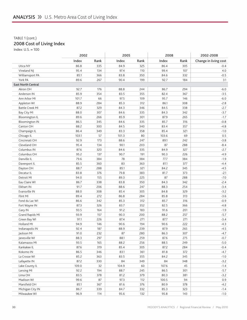
30 MOODY’S ANALYTICS / Regional Financial Review / May 2010
Utica NY 86.8 335 84.9 325 86.4 305 -0.4Vineland NJ 95.4 134 97.4 110 99.4 107 4.0Williamsport PA 85.1 366 83.8 350 84.6 332 -0.5York PA 89.6 267 90.4 199 92.7 184 3.1
East North CentralAkron OH 92.7 176 88.8 244 86.7 294 -6.0Anderson IN 85.9 354 83.5 355 82.4 367 -3.5Ann Arbor MI 101.7 66 97.5 109 95.7 146 -6.0Appleton WI 88.9 284 85.3 312 86.1 308 -2.8Battle Creek MI 87.2 329 84.3 346 84.5 338 -2.7Bay City MI 88.0 307 84.6 335 84.3 342 -3.7Bloomington IL 89.6 266 85.9 301 87.9 265 -1.7Bloomington IN 86.5 345 84.6 335 85.7 316 -0.8Canton OH 88.2 300 84.5 340 83.4 357 -4.8Champaign IL 86.4 349 83.3 358 85.4 321 -1.0Chicago IL 103.1 57 101.3 80 103.6 69 0.5Cincinnati OH 92.9 173 88.6 247 89.1 242 -3.8Cleveland OH 95.4 134 90.1 203 87 288 -8.4Columbus IN 87.6 320 84.6 335 84.9 327 -2.7Columbus OH 95.2 137 90.7 191 90.3 226 -4.9Danville IL 79.6 384 78 384 77.7 384 -1.9Davenport IL 85.5 360 83 363 81.1 377 -4.4Dayton OH 88.7 288 85.1 321 84.2 345 -4.5Decatur IL 83.8 376 79.8 383 81.7 373 -2.1Detroit MI 94.0 155 89.3 225 87 288 -7.0Eau Claire WI 86.7 338 83.8 350 84.3 342 -2.4Elkhart IN 91.7 206 88.6 247 88.3 254 -3.4Evansville IN 88.0 308 85.4 305 84.8 329 -3.2Flint MI 89.4 272 86.8 284 85.8 313 -3.6Fond du Lac WI 86.6 342 85.3 312 85.7 316 -0.9Fort Wayne IN 87.3 326 83.7 352 82.5 366 -4.8Gary IN 93.5 164 91.2 183 91.6 201 -1.9Grand Rapids MI 93.9 157 90.3 200 88.2 257 -5.7Green Bay WI 91.1 226 87.4 271 87.7 271 -3.4Holland MI 94.9 146 90.6 194 90.6 222 -4.3Indianapolis IN 92.4 187 88.9 239 87.9 265 -4.5Jackson MI 91.0 232 87 280 86.3 307 -4.7Janesville WI 88.3 297 88.1 259 87.6 275 -0.7Kalamazoo MI 93.5 165 88.2 256 88.5 249 -5.0Kankakee IL 87.6 319 85.4 305 87.2 284 -0.4Kokomo IN 86.5 346 83.1 361 81.8 372 -4.7La Crosse WI 85.2 363 83.5 355 84.2 345 -1.0Lafayette IN 87.2 330 84 349 84 348 -3.2Lake County IL 109.0 32 104.9 60 107.6 45 -1.4Lansing MI 92.2 194 88.7 245 86.5 301 -5.7Lima OH 83.5 378 81.2 379 80.3 381 -3.2Madison WI 99.6 87 97.3 112 100.5 94 0.9Mansfield OH 85.1 367 81.6 376 80.9 378 -4.2Michigan City IN 86.7 339 84.7 332 85.3 323 -1.4Milwaukee WI 96.9 114 95.6 132 95.8 143 -1.0
ANALYSIS �� U.S. Metro Area Cost of Living Index
TABLE 1 (cont.)
2008 Cost of Living IndexIndex: U.S. = 100
2002 2005 2008 2002-2008
Index Rank Index Rank Index Rank Change in living cost
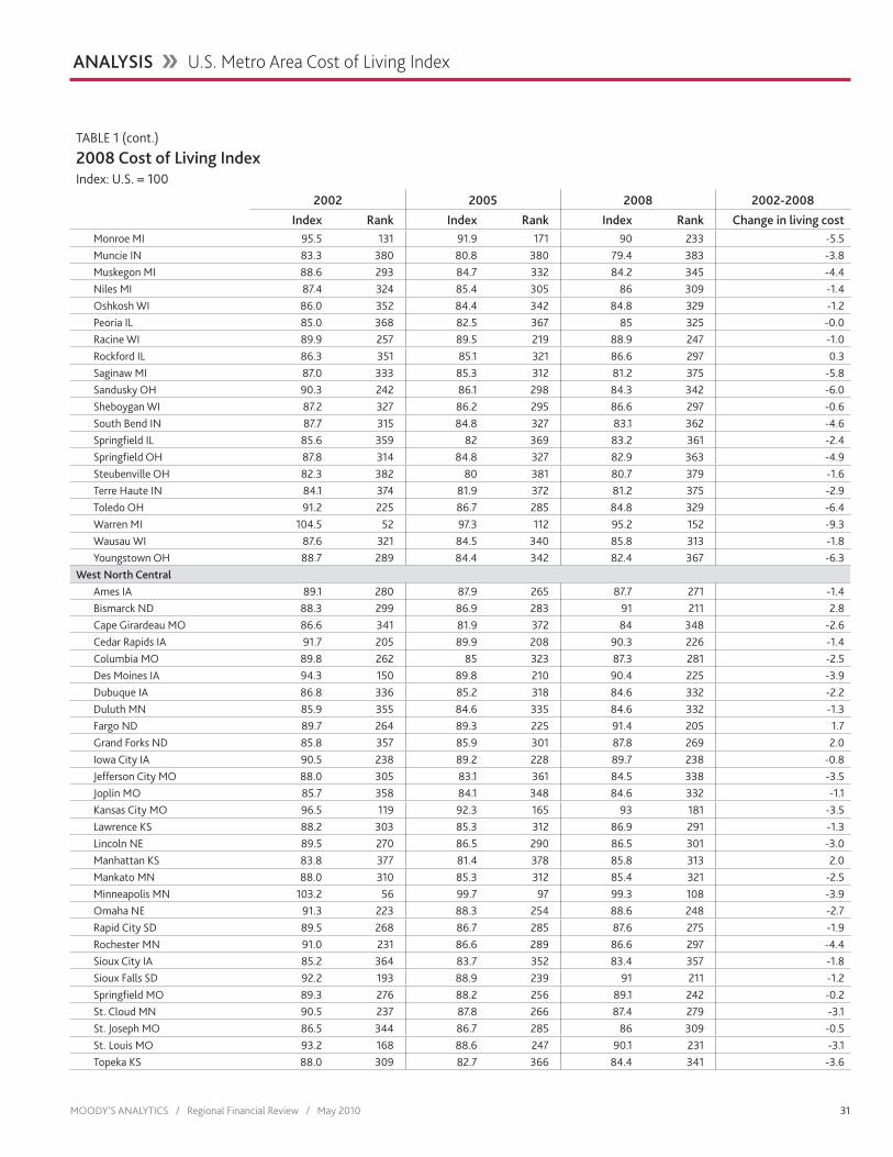
MOODY’S ANALYTICS / Regional Financial Review / May 2010 31
Monroe MI 95.5 131 91.9 171 90 233 -5.5Muncie IN 83.3 380 80.8 380 79.4 383 -3.8Muskegon MI 88.6 293 84.7 332 84.2 345 -4.4Niles MI 87.4 324 85.4 305 86 309 -1.4Oshkosh WI 86.0 352 84.4 342 84.8 329 -1.2Peoria IL 85.0 368 82.5 367 85 325 -0.0Racine WI 89.9 257 89.5 219 88.9 247 -1.0Rockford IL 86.3 351 85.1 321 86.6 297 0.3Saginaw MI 87.0 333 85.3 312 81.2 375 -5.8Sandusky OH 90.3 242 86.1 298 84.3 342 -6.0Sheboygan WI 87.2 327 86.2 295 86.6 297 -0.6South Bend IN 87.7 315 84.8 327 83.1 362 -4.6Springfield IL 85.6 359 82 369 83.2 361 -2.4Springfield OH 87.8 314 84.8 327 82.9 363 -4.9Steubenville OH 82.3 382 80 381 80.7 379 -1.6Terre Haute IN 84.1 374 81.9 372 81.2 375 -2.9Toledo OH 91.2 225 86.7 285 84.8 329 -6.4Warren MI 104.5 52 97.3 112 95.2 152 -9.3Wausau WI 87.6 321 84.5 340 85.8 313 -1.8Youngstown OH 88.7 289 84.4 342 82.4 367 -6.3
West North CentralAmes IA 89.1 280 87.9 265 87.7 271 -1.4Bismarck ND 88.3 299 86.9 283 91 211 2.8Cape Girardeau MO 86.6 341 81.9 372 84 348 -2.6Cedar Rapids IA 91.7 205 89.9 208 90.3 226 -1.4Columbia MO 89.8 262 85 323 87.3 281 -2.5Des Moines IA 94.3 150 89.8 210 90.4 225 -3.9Dubuque IA 86.8 336 85.2 318 84.6 332 -2.2Duluth MN 85.9 355 84.6 335 84.6 332 -1.3Fargo ND 89.7 264 89.3 225 91.4 205 1.7Grand Forks ND 85.8 357 85.9 301 87.8 269 2.0Iowa City IA 90.5 238 89.2 228 89.7 238 -0.8Jefferson City MO 88.0 305 83.1 361 84.5 338 -3.5Joplin MO 85.7 358 84.1 348 84.6 332 -1.1Kansas City MO 96.5 119 92.3 165 93 181 -3.5Lawrence KS 88.2 303 85.3 312 86.9 291 -1.3Lincoln NE 89.5 270 86.5 290 86.5 301 -3.0Manhattan KS 83.8 377 81.4 378 85.8 313 2.0Mankato MN 88.0 310 85.3 312 85.4 321 -2.5Minneapolis MN 103.2 56 99.7 97 99.3 108 -3.9Omaha NE 91.3 223 88.3 254 88.6 248 -2.7Rapid City SD 89.5 268 86.7 285 87.6 275 -1.9Rochester MN 91.0 231 86.6 289 86.6 297 -4.4Sioux City IA 85.2 364 83.7 352 83.4 357 -1.8Sioux Falls SD 92.2 193 88.9 239 91 211 -1.2Springfield MO 89.3 276 88.2 256 89.1 242 -0.2St. Cloud MN 90.5 237 87.8 266 87.4 279 -3.1St. Joseph MO 86.5 344 86.7 285 86 309 -0.5St. Louis MO 93.2 168 88.6 247 90.1 231 -3.1Topeka KS 88.0 309 82.7 366 84.4 341 -3.6
ANALYSIS �� U.S. Metro Area Cost of Living Index
TABLE 1 (cont.)
2008 Cost of Living IndexIndex: U.S. = 100
2002 2005 2008 2002-2008
Index Rank Index Rank Index Rank Change in living cost

32 MOODY’S ANALYTICS / Regional Financial Review / May 2010
Waterloo IA 84.9 370 84.4 342 84.6 332 -0.3Wichita KS 88.1 304 84.7 332 86.5 301 -1.6
South AtlanticAlbany GA 87.7 317 86.2 295 86.5 301 -1.2Anderson SC 91.4 218 89.4 220 89.1 242 -2.3Asheville NC 95.6 128 93.6 151 95.5 148 -0.1Athens GA 93.0 170 90.6 194 91.4 205 -1.6Atlanta GA 101.3 69 99.2 99 99.2 109 -2.1Augusta GA 91.5 212 89 234 90.3 226 -1.2Baltimore MD 99.6 85 105 59 113 30 13.4Bethesda MD 117.9 19 124.9 16 122.9 15 5.0Blacksburg VA 87.0 331 85.2 318 87.1 286 0.1Brunswick GA 91.8 202 91.3 180 94 170 2.2Burlington NC 92.6 178 88 261 85.7 316 -6.9Cape Coral FL 100.7 76 110.3 41 101.7 85 1.0Charleston SC 99.6 86 100.3 94 104.5 64 4.9Charleston WV 89.9 254 86 299 88.5 249 -1.4Charlotte NC 98.8 95 96.4 124 98.7 114 -0.0Charlottesville VA 99.3 89 101.1 82 102.7 76 3.4Columbia SC 96.1 122 94.8 140 97 130 0.9Columbus GA 89.5 268 88 261 88.2 257 -1.3Crestview FL 96.0 123 102.5 75 101.3 88 5.3Cumberland MD 82.1 383 81.5 377 82.6 365 0.5Dalton GA 92.4 188 90.5 196 89.7 238 -2.7Danville VA 86.9 334 85 323 83.8 354 -3.1Deltona FL 93.4 166 100.9 84 99.8 105 6.4Dover DE 95.0 144 97.1 116 103.5 70 8.5Durham NC 96.5 120 93.3 156 95.4 149 -1.1Fayetteville NC 91.5 215 88.5 251 88.4 252 -3.1Florence SC 94.2 151 91.1 185 90.5 224 -3.7Fort Lauderdale FL 109.3 31 120 23 116.4 27 7.1Gainesville FL 95.0 144 97.3 112 100.3 95 5.3Gainesville GA 98.6 96 96.2 125 96.8 131 -1.8Goldsboro NC 87.8 312 84.8 327 84 348 -3.8Greensboro NC 96.6 116 93.8 148 93 181 -3.6Greenville NC 89.9 259 87.5 269 86.7 294 -3.2Greenville SC 94.7 148 93 158 94.3 166 -0.4Hagerstown MD 91.2 224 96.1 127 95 157 3.8Harrisonburg VA 92.5 183 92.6 161 93.9 172 1.4Hickory NC 91.9 200 88.5 251 86.9 291 -5.0Hinesville GA 86.4 348 86.5 290 88 263 1.6Huntington WV 84.3 373 82 369 83.4 357 -0.9Jacksonville FL 97.2 110 101 83 103.2 74 6.0Jacksonville NC 88.8 287 87.8 266 88.1 262 -0.7Lakeland FL 91.6 209 96.6 121 97.2 128 5.6Lynchburg VA 87.6 318 86 299 88.2 257 0.6Macon GA 89.9 257 87.6 268 87.7 271 -2.2Miami FL 105.0 47 115.9 31 116.6 26 11.6Morgantown WV 89.4 271 86.7 285 86.6 297 -2.8Myrtle Beach SC 98.1 102 96.5 122 98.6 115 0.5
TABLE 1 (cont.)
2008 Cost of Living IndexIndex: U.S. = 100
2002 2005 2008 2002-2008
Index Rank Index Rank Index Rank Change in living cost
ANALYSIS �� U.S. Metro Area Cost of Living Index

MOODY’S ANALYTICS / Regional Financial Review / May 2010 33
Naples FL 115.2 24 129.7 11 131.2 8 16.0North Port FL 106.0 40 117.2 28 108.4 40 2.4Ocala FL 91.7 207 96 128 96.2 138 4.5Orlando FL 99.9 83 106.7 51 106.6 53 6.7Palm Bay FL 94.1 154 102.7 73 97.8 122 3.7Palm Coast FL 98.0 103 104.3 63 100.2 98 2.2Panama City FL 92.9 175 99.7 97 99.9 103 7.0Parkersburg WV 86.0 353 81.8 375 80.7 379 -5.3Pensacola FL 92.3 190 95.9 129 96.8 131 4.5Port St. Lucie FL 97.5 106 108.7 44 100.7 93 3.2Punta Gorda FL 95.2 139 103.5 69 96.1 140 0.9Raleigh NC 100.4 78 97.3 112 101.2 90 0.8Richmond VA 95.6 130 96.5 122 99.8 105 4.2Roanoke VA 92.0 198 90.7 191 90.8 218 -1.2Rocky Mount NC 87.2 327 84.8 327 84.5 338 -2.7Rome GA 90.4 240 88.1 259 87.8 269 -2.5Salisbury MD 90.8 235 91.4 179 95.1 156 4.3Savannah GA 94.1 153 95.4 134 95.6 147 1.5Sebastian FL 96.7 115 103.4 70 98.3 117 1.6Spartanburg SC 92.9 173 89.9 208 90.2 229 -2.7Sumter SC 89.7 263 87.2 276 87.2 284 -2.5Tallahassee FL 95.4 133 95.8 130 98 120 2.6Tampa FL 100.8 75 103.4 70 102.6 77 1.8Valdosta GA 88.3 296 87.2 276 87.6 275 -0.7Virginia Beach VA 93.2 169 96.7 118 100.3 95 7.1Warner Robins GA 91.3 222 89 234 89 245 -2.3Washington DC 112.4 27 121.8 19 119.5 18 7.1West Palm Beach FL 107.5 35 121.3 22 117.1 25 9.6Wheeling WV 83.0 381 79.9 382 79.6 382 -3.4Wilmington DE 102.9 59 103.7 68 108 41 5.1Wilmington NC 97.1 112 96.7 118 98.6 115 1.5Winchester VA 93.5 163 98.2 105 95.2 152 1.7Winston NC 96.0 125 93.2 157 91.6 201 -4.4
East South CentralAnniston AL 89.3 273 86.2 295 88.2 257 -1.1Auburn AL 92.6 179 89.7 213 91.8 197 -0.8Birmingham AL 97.9 104 95.7 131 97.8 122 -0.1Bowling Green KY 87.0 332 84.9 325 85.6 319 -1.4Chattanooga TN 97.0 113 93.9 146 95 157 -2.0Clarksville TN 89.2 277 87.4 271 87.3 281 -1.9Cleveland TN 91.3 220 88.3 254 87.9 265 -3.4Decatur AL 88.9 283 86.3 294 87.1 286 -1.8Dothan AL 87.9 311 87 280 88.5 249 0.6Elizabethtown KY 89.7 265 87.4 271 86.7 294 -3.0Florence AL 90.0 251 86.5 290 88 263 -2.0Gadsden AL 88.6 292 87 280 88.3 254 -0.3Gulfport MS 92.4 184 93.4 153 97.2 128 4.8Hattiesburg MS 91.6 209 89.1 230 91 211 -0.6Huntsville AL 92.1 197 88.9 239 91.1 209 -1.0Jackson MS 93.6 162 93.9 146 93.7 174 0.1
TABLE 1 (cont.)
2008 Cost of Living IndexIndex: U.S. = 100
2002 2005 2008 2002-2008
Index Rank Index Rank Index Rank Change in living cost
ANALYSIS �� U.S. Metro Area Cost of Living Index

34 MOODY’S ANALYTICS / Regional Financial Review / May 2010
Jackson TN 89.9 255 89.4 220 86 309 -3.9Johnson City TN 90.4 239 87.3 275 87.7 271 -2.7Kingsport TN 88.6 291 85.4 305 85.6 319 -3.0Knoxville TN 93.8 159 91.9 171 94 170 0.2Lexington KY 91.1 230 89.8 210 90.9 217 -0.1Louisville KY 92.2 192 89.4 220 90 233 -2.2Memphis TN 96.1 121 92.4 164 91.8 197 -4.3Mobile AL 91.6 208 91.3 180 94.7 160 3.1Montgomery AL 92.2 191 91.6 176 94.3 166 2.1Morristown TN 90.1 249 88 261 87.9 265 -2.1Nashville TN 99.2 90 96.2 125 100.3 95 1.1Owensboro KY 85.0 369 82.9 364 82.8 364 -2.2Pascagoula MS 90.3 243 89.8 210 92.7 184 2.4Tuscaloosa AL 91.3 219 89.4 220 91 211 -0.3
West South CentralAbilene TX 88.2 300 88.2 256 88.4 252 0.2Alexandria LA 90.2 246 90.7 191 92.3 191 2.1Amarillo TX 89.9 260 89 234 90.2 229 0.4Austin TX 103.5 55 100.9 84 105.4 60 2.0Baton Rouge LA 94.0 156 95.1 136 100.2 98 6.2Beaumont TX 89.9 260 89.6 216 93.6 176 3.8Brownsville TX 84.0 375 85.3 312 83.9 352 -0.1College Station TX 91.5 213 89.7 213 91.5 203 -0.0Corpus Christi TX 92.1 196 96.9 117 101.8 83 9.7Dallas TX 104.9 48 103.9 64 103.5 70 -1.4El Paso TX 95.0 143 93.4 153 96.1 140 1.1Fayetteville AR 88.2 300 88 261 87.4 279 -0.8Fort Smith AR 85.4 361 84.8 327 83.8 354 -1.6Fort Worth TX 99.7 84 98.3 103 99.1 112 -0.6Hot Springs AR 90.0 252 87.2 276 88.2 257 -1.8Houma LA 91.4 217 92.2 169 96.3 135 4.9Houston TX 101.4 68 100.2 96 103.3 73 1.9Jonesboro AR 86.6 343 83.3 358 82.1 370 -4.5Killeen TX 93.2 167 92.5 162 92.2 192 -1.0Lafayette LA 94.2 152 94.8 140 98.1 119 3.9Lake Charles LA 90.2 247 89.7 213 92.5 189 2.3Laredo TX 88.7 290 91.3 180 93.4 178 4.8Lawton OK 85.2 365 84.6 335 85.3 323 0.1Little Rock AR 91.8 204 90 205 92.8 183 1.0Longview TX 89.2 277 91.5 177 91 211 1.8Lubbock TX 92.3 189 91.5 177 90.8 218 -1.5McAllen TX 87.4 324 90 205 91.9 196 4.5Midland TX 91.1 227 90.8 188 96.3 135 5.2Monroe LA 91.9 201 92.3 165 93.2 179 1.3New Orleans LA 96.6 117 97.6 108 102.5 79 5.9Odessa TX 89.0 282 89 234 92.7 184 3.7Oklahoma City OK 91.1 227 89.3 225 90.7 221 -0.4Pine Bluff AR 84.6 372 82.2 368 82.2 369 -2.4San Angelo TX 90.0 250 90.8 188 91 211 1.0San Antonio TX 95.9 126 94.2 143 96.8 131 0.9
TABLE 1 (cont.)
2008 Cost of Living IndexIndex: U.S. = 100
2002 2005 2008 2002-2008
Index Rank Index Rank Index Rank Change in living cost
ANALYSIS �� U.S. Metro Area Cost of Living Index

MOODY’S ANALYTICS / Regional Financial Review / May 2010 35
Sherman TX 92.4 184 90.9 186 90.8 218 -1.6Shreveport LA 91.0 233 91.2 183 94.5 164 3.5Texarkana TX 88.4 294 85.8 303 84.6 332 -3.8Tulsa OK 91.6 209 90 205 92.6 187 1.0Tyler TX 97.7 105 95.1 136 94.6 162 -3.1Victoria TX 91.5 213 94.9 138 97.7 125 6.2Waco TX 90.8 234 90.2 201 89.9 235 -0.9Wichita Falls TX 88.8 286 88.7 245 88.3 254 -0.5
MountainAlbuquerque NM 93.8 161 91.9 171 95.9 142 2.1Billings MT 90.7 236 89.6 216 92.1 194 1.4Boise City ID 95.2 141 93.6 151 96.2 138 1.0Boulder CO 115.4 23 107.6 46 110.6 36 -4.8Carson City NV 104.7 51 111 40 107.1 49 2.4Casper WY 87.4 323 89.2 228 93.7 174 6.3Cheyenne WY 92.6 180 90.8 188 91.3 207 -1.3Coeur d’Alene ID 93.9 158 94.9 138 95.8 143 1.9Colorado Springs CO 100.3 81 95.5 133 95.8 143 -4.5Denver CO 107.7 34 100.7 88 99.9 103 -7.8Farmington NM 90.1 248 88.9 239 95.4 149 5.3Flagstaff AZ 98.4 98 100.6 92 104.9 62 6.5Fort Collins CO 100.0 82 94 145 92.4 190 -7.6Grand Junction CO 92.5 181 90.2 201 94.3 166 1.8Great Falls MT 86.7 337 85.5 304 86.4 305 -0.3Greeley CO 99.5 88 92.5 162 89.6 240 -9.9Idaho Falls ID 88.3 297 86.4 293 86.8 293 -1.5Lake Havasu AZ 94.8 147 98.5 102 96.3 135 1.5Las Cruces NM 88.0 306 87.2 276 89.2 241 1.2Las Vegas NV 104.1 53 112.2 37 106.6 53 2.5Lewiston ID 92.4 186 90.5 196 92 195 -0.4Logan UT 87.8 313 84.4 342 87 288 -0.8Missoula MT 95.1 142 93.8 148 97.8 122 2.7Ogden UT 92.5 182 89.1 230 93.2 179 0.7Phoenix AZ 102.3 63 106.5 52 104.3 65 2.0Pocatello ID 86.7 340 82.8 365 83.9 352 -2.8Prescott AZ 99.2 91 100.5 93 101 91 1.8Provo UT 93.0 171 89.1 230 94.2 169 1.2Pueblo CO 90.2 245 85.4 305 83.8 354 -6.4Reno NV 106.2 38 114.4 34 109.2 39 3.0Salt Lake City UT 96.0 123 94.2 143 103.2 74 7.2Santa Fe NM 106.7 37 104.9 60 107.1 49 0.4St. George UT 91.5 216 93.7 150 95.3 151 3.8Tucson AZ 99.1 92 100.7 88 100 102 1.0Yuma AZ 92.1 195 92.3 165 92.6 187 0.5
PacificAnchorage AK 104.8 49 103.8 66 106.6 53 1.8Bakersfield CA 98.3 99 105.8 55 100.2 98 1.9Bellingham WA 98.4 97 100.9 84 106 58 7.6Bend OR 98.1 101 99 101 102.4 81 4.3Bremerton WA 101.2 72 100.8 87 106 58 4.8
TABLE 1 (cont.)
2008 Cost of Living IndexIndex: U.S. = 100
2002 2005 2008 2002-2008
Index Rank Index Rank Index Rank Change in living cost
ANALYSIS �� U.S. Metro Area Cost of Living Index

36 MOODY’S ANALYTICS / Regional Financial Review / May 2010
Chico CA 106.0 39 112.8 36 107.2 48 1.2Corvallis OR 95.4 132 93 158 98 120 2.6El Centro CA 89.3 274 91.9 171 89 245 -0.3Eugene OR 94.6 149 94.4 142 98.3 117 3.7Fairbanks AK 98.8 94 98.3 103 102.6 77 3.8Fresno CA 100.6 77 108.5 45 102.3 82 1.7Hanford CA 95.7 127 97.4 110 94.6 162 -1.1Honolulu HI 115.9 20 127.9 13 141.5 3 25.6Kennewick WA 95.2 139 90.9 186 91.5 203 -3.7Longview WA 92.9 172 89 234 91.7 200 -1.2Los Angeles CA 111.4 29 121.5 21 119.4 19 8.0Madera CA 103.1 58 106.2 53 101.3 88 -1.8Medford OR 97.4 108 101.4 79 100.1 101 2.7Merced CA 101.8 64 108.8 42 94.7 160 -7.1Modesto CA 101.8 65 105.8 55 95 157 -6.8Mount Vernon WA 102.6 61 101.5 78 106.8 51 4.2Napa CA 118.7 16 124.4 17 117.5 24 -1.2Oakland CA 135.6 4 137.7 6 135.9 6 0.3Olympia WA 100.9 74 97.9 106 102.5 79 1.6Oxnard CA 119.2 15 128 12 120.4 17 1.2Portland OR 102.6 62 100.7 88 107.4 47 4.9Redding CA 105.4 43 113.4 35 107.9 42 2.5Riverside CA 104.0 54 114.9 33 106.8 51 2.8Sacramento CA 108.2 33 115.7 32 104.2 66 -4.0Salem OR 95.3 136 92.7 160 97.6 126 2.3Salinas CA 125.5 8 135.1 7 115.4 28 -10.1San Diego CA 125.1 9 131.1 10 120.5 16 -4.6San Francisco CA 145.6 1 145.1 1 147.7 2 2.1San Jose CA 145.2 2 144 2 149.6 1 4.4San Luis Obispo CA 112.9 26 117.1 29 112.8 31 -0.1Santa Ana CA 131.5 6 142.5 3 137.6 4 6.1Santa Barbara CA 121.7 13 131.2 8 119.2 21 -2.5Santa Cruz CA 141.1 3 142 4 132.2 7 -8.9Santa Rosa CA 130.9 7 138.7 5 126.9 11 -4.0Seattle WA 111.7 28 111.3 39 123.2 14 11.5Spokane WA 92.7 177 92.1 170 96.7 134 4.0Stockton CA 110.4 30 116.6 30 101.4 87 -9.0Tacoma WA 101.2 73 100.7 88 106.4 56 5.3Vallejo CA 118.0 18 126.8 15 112.3 33 -5.7Visalia CA 97.2 111 102.7 73 99.2 109 2.0Wenatchee WA 92.0 199 88.9 239 95.2 152 3.2Yakima WA 90.4 240 90.5 196 93.6 176 3.3Yuba City CA 96.6 118 101.9 77 94.4 165 -2.2
ANALYSIS �� U.S. Metro Area Cost of Living Index
TABLE 1 (cont.)
2008 Cost of Living IndexIndex: U.S. = 100
2002 2005 2008 2002-2008
Index Rank Index Rank Index Rank Change in living cost

MOODY’S ANALYTICS / Regional Financial Review / May 2010 37
ANALYSIS �� U.S. Metro Area Cost of Living Index
areas remained, oddly, virtually the same (see Table 2). Between 2002 and 2008 the average COLI fell in the highest and lowest quintiles and rose in the three intermedi-ary quintiles, shifting the overall distribu-tion downward slightly at the tails and narrowing the difference slightly between the top quintile and the next two. The path toward this shift, however, was not lin-ear, as can be seen from the intermediate shifts for the 2002-2005 and 2005-2008 periods. Thus it is difficult to say whether the 2002-2008 shifts are indicative of a longer-term trend, but if so, it would in-dicate that cost differences between the highest quintile and the next are narrow-ing, minimizing somewhat the differences in comparative advantage, at least as it refers to costs.
ImplicationsThe relative cost of living across the
regions continues to change over time. Recently the change continues a trend that began in 2007 in which living costs began to recede in metro areas with formerly hot housing markets as house prices began to decline. Many of these areas are in the South and the West, where accelerating economic and population growth has steadily driven up costs over time. There is some indication now that this is reversing slightly.
Historically the Northeast has had the most stable cost structure. The region has an abundance of well-paying jobs, along with high population density and slow growth, which support the region’s high, but stable, cost of living. The cost of living has gradually fallen in the Midwest, where the ongoing restructuring among many manufacturing industries weighs on economic and popula-tion growth.
Low living costs can be a critical growth driver for some metro areas. In particular, small metro areas often develop as lower-cost bedroom communities for major metro areas, even though the smaller area may have few internal economic drivers. By contrast, occasionally individuals choose to remain in a certain area even though the
cost of living is high. An expensive metro area can still attract a positive flow of do-mestic migration if its costs are competitive within the region. The recent general move-ment downward of costs in the highest-cost metro areas indicates some improvement in their comparative advantage, which should help to support their economies as econom-ic recovery continues in the coming year as well as further into the future.
Other cost measuresAlternative cost measures exist for re-
gional economies such as the consumer price index and the ACCRA (formerly known as the American Chamber of Commerce Researchers Association) living cost index, yet each differs greatly in both methodology and focus from the Moody’s Analytics cost of living index.
The purpose of the CPI is to track price changes over time and is thus not designed to measure comparative living costs across regional economies. The composition of the goods and services consumed by households and their relative prices vary substantially across regions. In addition, the CPI measure is available only for a handful of economies at the metro area level of detail.
The goal of the ACCRA index is more similar to that of the Moody’s Analytics index in that it attempts to capture relative
price levels across regional economies at a point in time. However, there are a number of differences between the two measures.
The Moody’s Analytics cost of living in-dex is published annually and is based on a variety of data sources primarily published by federal agencies. Sources include the Census Bureau, the Department of Energy, the Energy Information Administration, FHFA, the Bureau of Economic Analysis, and the National Association of Realtors. In con-trast, the ACCRA index is released on a quar-terly basis and is based on comparative price surveys culled from a network of chambers of commerce, economic development orga-nizations, and similar entities.
The ACCRA index represents price dif-ferences across regional economies for a common basket of goods and services. This provides a consistent basis for cost com-parison—with regard to the same basket of goods and services—across cities and metro areas. The limitation of this approach, how-ever, is that it fails to account for differences in spending patterns across regions and product substitution. The Moody’s Analyt-ics index does not have this limitation, as it measures relative prices for the goods and services actually consumed regionally. Such methodological differences make it difficult to compare the cost of living measure from ACCRA with our measure.
TABLE 2
Average Metro Area Cost of Living Index by QuintileIndex: U.S.=100
1st 2nd 3rd 4th 5thDifference between
1st and 5th quintiles
2008 113.9 98.6 92.4 87.9 83.7 30.2
2005 115.0 97.3 90.8 87.5 83.7 31.3
2002 114.3 97.2 91.2 87.7 84.0 30.3
Change Between 2008 and 2005 -1.1 1.2 1.6 0.4 0.1
Change Between 2005 and 2002 0.7 0.1 -0.4 -0.2 -0.3
Change Between 2008 and 2002 -0.4 1.4 1.2 0.2 -0.3
Source: Moody’s Analytics

84 MOODY’S ANALYTICS / Regional Financial Review / May 2010
© 2010, Moody’s Analytics, Inc. and/or its licensors and affiliates (together, “Moody’s”). All rights reserved. ALL INFORMATION CONTAINED HEREIN IS PROTECTED BY COPYRIGHT LAW AND NONE OF SUCH INFORMATION MAY BE COPIED OR OTHERWISE REPRODUCED, REPACKAGED, FURTHER TRANSMITTED, TRANSFERRED, DISSEMINATED, REDISTRIBUTED OR RESOLD, OR STORED FOR SUBSEQUENT USE FOR ANY PURPOSE, IN WHOLE OR IN PART, IN ANY FORM OR MANNER OR BY ANY MEANS WHATSOEVER, BY ANY PERSON WITHOUT MOODY’S PRIOR WRITTEN CONSENT. All information contained herein is obtained by Moody’s from sources believed by it to be accurate and reliable. Because of the possibility of human and mechanical error as well as other factors, however, all information contained herein is provided “AS IS” without warranty of any kind. Under no circumstances shall Moody’s have any liability to any person or entity for (a) any loss or damage in whole or in part caused by, resulting from, or relating to, any error (negligent or otherwise) or other circumstance or contingency within or outside the control of Moody’s or any of its directors, officers, employees or agents in connection with the procurement, collection, compilation, analysis, interpretation, communication, publication or delivery of any such information, or (b) any direct, indirect, special, consequential, compensatory or incidental damages whatsoever (including without limitation, lost profits), even if Moody’s is advised in advance of the possibility of such damages, resulting from the use of or inability to use, any such information. The financial reporting, analysis, projections, observations, and other information contained herein are, and must be construed solely as, statements of opinion and not statements of fact or recommendations to purchase, sell, or hold any securities. NO WARRANTY, EXPRESS OR IMPLIED, AS TO THE ACCURACY, TIMELINESS, COMPLETENESS, MERCHANTABILITY OR FITNESS FOR ANY PARTICULAR PURPOSE OF ANY SUCH OPINION OR INFORMATION IS GIVEN OR MADE BY MOODY’S IN ANY FORM OR MANNER WHATSOEVER. Each opinion must be weighed solely as one factor in any investment decision made by or on behalf of any user of the information contained herein, and each such user must accordingly make its own study and evaluation prior to investing.
About Moody’s Economy.comMoody’s Economy.com, a division of Moody's Analytics Inc., is a leading independent provider of economic research, analysis and data. As a well-recognized source of pro-prietary information on national and regional economies, industries, financial markets, and credit risk, we support strategic planning, product and sales forecasting, risk and sensitivity management, and investment research. Our clients include multinational corporations, governments at all levels, central banks, retailers, mutual funds, financial institutions, utilities, residential and commercial real estate firms, insurance companies, and professional investors.
With one of the largest assembled financial, economic and demographic databases, Moody's Economy.com helps companies assess what trends in consumer credit and behavior, mortgage markets, population, income, and property prices will mean for their business. Our web and print periodicals and special publications cover every U.S. state and metropolitan area; countries throughout Europe, Asia and the Americas; and the world's major cities, plus the U.S. housing market and 58 other industries. We also provide up-to-the-minute reporting and analysis on the world's major economies on our real-time Dismal Scientist web site from our offices in the U.S., the United Kingdom, and Australia. Our staff of more than 50 economists, a third of whom hold PhD's, offers wide expertise in regional economics, public finance, credit risk and sensitivity analysis, pricing, and macro and financial forecasting.
Moody's Economy.com became part of the Moody’s Corporation in 2005. Moody's Economy.com is headquartered in West Chester PA, a suburb of Philadelphia, with offices in London and Sydney. More information is available at www.economy.com.
Related Documents