By Rosie Little UNIT 9: URBAN SPACES

Urban spaces
Mar 08, 2016
urban spaces powerpoint
Welcome message from author
This document is posted to help you gain knowledge. Please leave a comment to let me know what you think about it! Share it to your friends and learn new things together.
Transcript

By Rosie Little UNIT 9: URBAN SPACES


Urban is the opposite of rural, inner city hustle and bustle, tall buildings, small buildings. The correct definition being: of, pertaining to, or designating a city or town. living in a city. characteristic of or accustomed to cities; citified: He is
an urban type.
URBAN
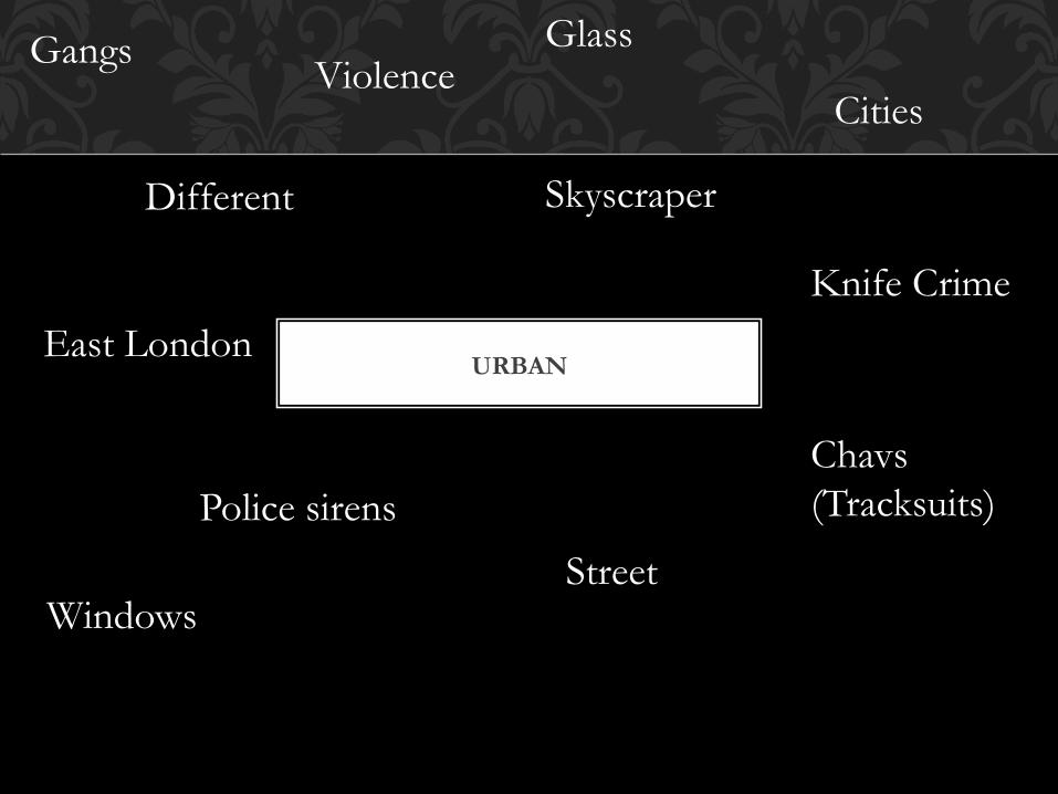
URBAN
Skyscraper
Cities
Different
Glass Gangs
East London
Knife Crime
Police sirens Chavs (Tracksuits)
Street Windows
Violence
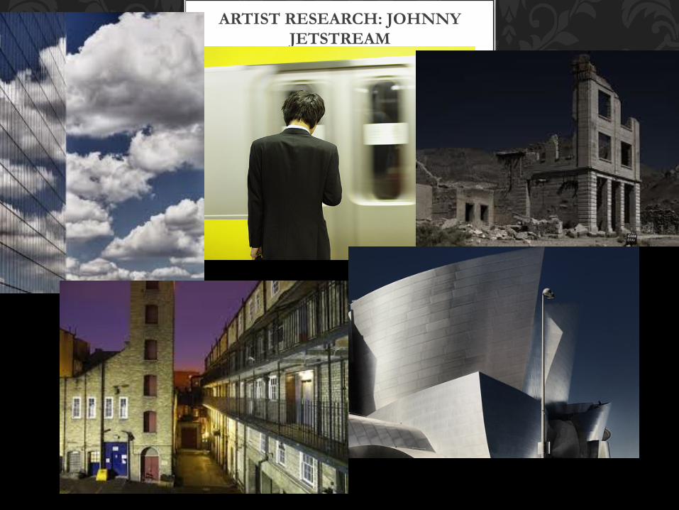
ARTIST RESEARCH: JOHNNY JETSTREAM
I really like Johnny's work as I believe it portrays urban streets in new fun kind of way. For example the picture of the sky reflecting in the building, I
believe the use of colours within that picture are bright and vibrant and make the sky really stand out.
JOHNNY JETSTREAM
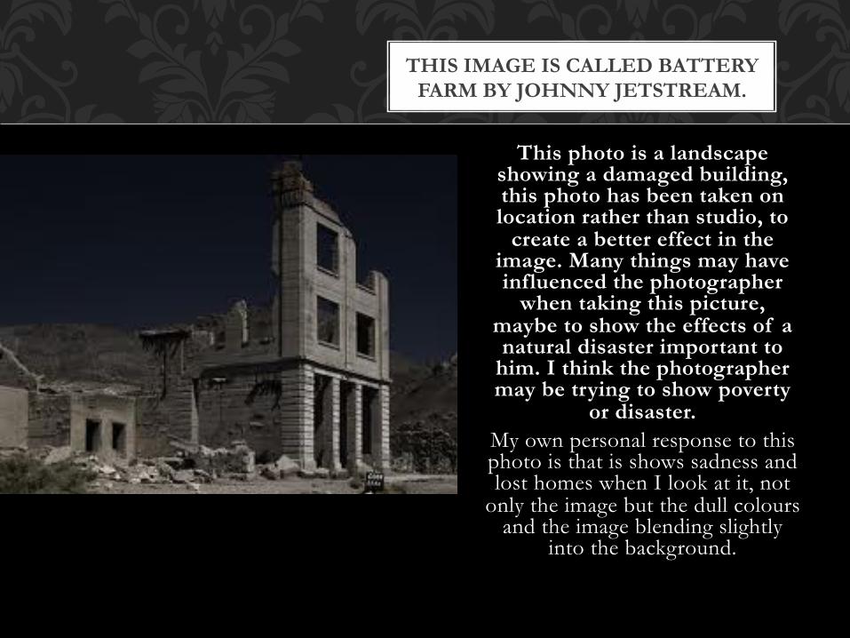
This photo is a landscape
showing a damaged building, this photo has been taken on location rather than studio, to
create a better effect in the image. Many things may have influenced the photographer
when taking this picture, maybe to show the effects of a natural disaster important to
him. I think the photographer may be trying to show poverty
or disaster. My own personal response to this photo is that is shows sadness and lost homes when I look at it, not
only the image but the dull colours and the image blending slightly
into the background.
THIS IMAGE IS CALLED BATTERY FARM BY JOHNNY JETSTREAM.

MY PHOTOS


I chose this photograph as one of my top eight as I believe its one of my best ones, in the way it portrays urban buildings. I believe the grey mirror like
buildings against the clear blue sky really makes the building stand out. Also the lighting in this image is bright which creates an overall better photo.
Date Time: 2012:01:19 22:55:37
Make: Canon
Model: Canon EOS 20D
Resolution Unit: inches


I like this photo as I believe it is a good angle for taking a photograph as it creates a good outcome image that isnt taken in a usual boring angle. And
therefore creates a better end photograph. I think yet again with this photograph is the blue sky against a glass building as it creates a better
outcome.
EVALUATION

MY CHOSEN PHOTO

When taking this photograph I wanted an outcome, showing an exaggerated height for a building taken from a fairly unusual angle. I was mainly inspired by the artist Joey Robinson
as some of his work uses glass buildings next to a bright blue sky reflecting in the glass of the building, I believe my building photo is very similar to this portraying the same type of mood.
I think the composition of this photograph is strong although the building is aligned to the left and therefore unbalanced I believe this doesn't’t create bad composition just adds to the effect of the photograph, as the building leads your eye upwards to the top of the building.
However if I was to reshoot my photo I would capture more negative space in the top part of the photograph. I took this photograph from a low view point in order to make the building
look tall and powerful. I think my photograph is in focus as it isn't out of focus. My exposure rate was F10 and my ISO was 800 and exposure time was 1/499.
In order to improve my photo I would like to edit it in a few different ways for example creating a mirrored image in order to create different moods and effects with one photo. My photo isn't correctly exposed as the exposure levels are not equal as the shadows out way the mid-tones. However I would not change this as I believe it creates a stronger more dramatic
photo. This building is fairly pleasing to the eye as the lines on the building show us different features of modern buildings.
The only thing I edited about my photograph was the negative space, I cropped my photo so there wasn't’t any un needed background as it was making the photo look overly unbalanced.
In conclusion I am very pleased with the outcome for this particular photograph as it successfully shows urban culture.
EVALUATION

PROJECTION
We also tried projection in order to get an image we had taken onto tower blocks for instance, with the end result being a better way of seeing a photograph, with a completely different outcome.

KALEIDOSCOPE
This was the experiment I tried when turning an ordinary photo in to something different. I like this image as I believe it is a new way of portraying a photograph, and creating an entirely different image from and older photograph.

PATTERN
Lines
Shapes
Texture Stripes/Dots
Materials
Buildings
Brick
Glass
Plastic

I think both of the photographs fall in to the category of pattern as they both contain strong line. Also I like the frame work and exposure on both.
Although the exposure/brightness is far to dark on image two I like it that way as it portrays a certain loneliness and desertion being dark and dreary.
EVALUATION (PATTERN)

Sun reflections in water
Puddles
Street signs ( in puddles)
In buildings
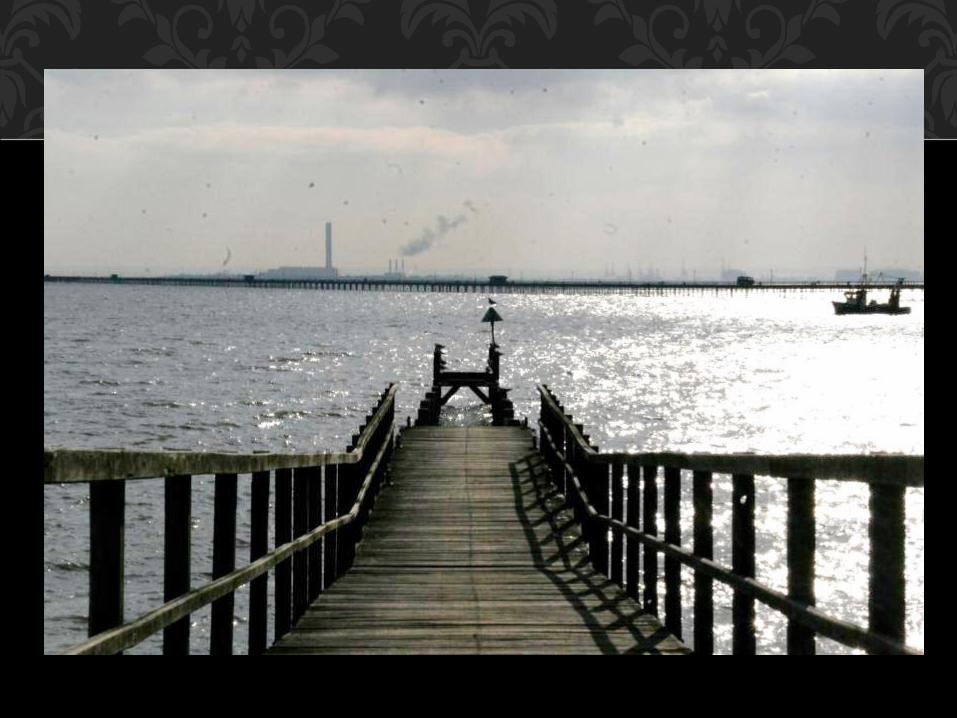
REFLECTION

This photo falls into the reflection category in my opinion as it shows the sun reflecting into the water, I like the way the fencing has almost become a silloheutte as the light source is focused onto the fence.


I chose both of these photos for reflection, as I think the sun reflecting into the sea allows it to fall into this category. I like these two photos as I think the framing is good on both. However I think on the second photo more of the
sea could have been shown.
EVALUATION
Related Documents


