59 Unit 4 Working with SPSS Graphs and Output for Windows Outline Lesson 16A: Creating an SPSS Graph • Creating a Simple Graph • Different SPSS Graphs Lesson 16B: Creating an SPSS Chart • Creating a Simple Chart • Different SPSS Charts Lesson 17A: Enhancing SPSS Graphs • Modifying a Chart • Setting Chart Preferences • A Few More Things • Using a Chart Template and Creating an APA-Style Graph Lesson 17B: Enhancing SPSS Charts • Modifying a Chart Lesson 18A: Using the Viewer and Pivot Tables • Saving Viewer Output • To Selectively Show and Hide Results • Printing the Contents of the Viewer Window • Printing a Selection from the Viewer Window • Deleting Output • Moving Output • An Introduction to Pivot Tables • Changing Table Appearance Lesson 18B: Using the Viewer • Saving Viewer Output • To Selectively Show and Hide Results • Printing the Contents of the Viewer Window • Deleting Output • Moving Output A picture surely is worth a thousand words, and nowhere is this more true than with numbers. You could look at a set of data all day long and not really see what the nature of the relationship is between variables until a graph or a table is created. In this unit, we will go through the steps of creating a graph and modifying one, plus some tips on us- ing the Output Viewer window. Note that there are many different tools available to create graphs in SPSS, and we will only be concentrating on the tools contained in the Legacy Dialogs option on the Graphs menu. Lesson 16A deals with creating graphs and output for the Windows version (23) of SPSS. Lesson 16B covers creating graphs and output for the Macintosh version of SPSS (23). Learning Objectives Lesson 16A: Explain how to create and save line, bar, scatter/dot, and pie graph Lesson 16B: Explain how to create, save, and print different types of chart Lesson 17A: Understand how to enhance SPSS graphs by modifying them and setting chart preferences Lesson 17B: Understand how to enhance SPSS charts by modifying their parameters Lesson 18A: Identify the use of output viewer and pivot tables Lesson 18B: Explain how to use viewer output by manipulating the data SAMPLE

Welcome message from author
This document is posted to help you gain knowledge. Please leave a comment to let me know what you think about it! Share it to your friends and learn new things together.
Transcript
59
Unit 4
Working with SPSS Graphs and Output for Windows
Outline
Lesson 16A: Creating an SPSS Graph• Creating a Simple Graph• Different SPSS Graphs
Lesson 16B: Creating an SPSS Chart• Creating a Simple Chart• Different SPSS Charts
Lesson 17A: Enhancing SPSS Graphs• Modifying a Chart• Setting Chart Preferences• A Few More Things• Using a Chart Template and Creating an
APA-Style Graph
Lesson 17B: Enhancing SPSS Charts• Modifying a Chart
Lesson 18A: Using the Viewer and Pivot Tables• Saving Viewer Output• To Selectively Show and Hide Results• Printing the Contents of the Viewer Window• Printing a Selection from the Viewer Window• Deleting Output• Moving Output• An Introduction to Pivot Tables• Changing Table Appearance
Lesson 18B: Using the Viewer• Saving Viewer Output• To Selectively Show and Hide Results• Printing the Contents of the Viewer Window• Deleting Output• Moving Output
A picture surely is worth a thousand words, and nowhere is this more true than with numbers. You could look at a set of data all day long and not really see what the nature of the relationship is between variables until a graph or a table is created. In this unit, we will go through the steps of creating a graph and modifying one, plus some tips on us-ing the Output Viewer window. Note that there are many
different tools available to create graphs in SPSS, and we will only be concentrating on the tools contained in the Legacy Dialogs option on the Graphs menu.
Lesson 16A deals with creating graphs and output for the Windows version (23) of SPSS. Lesson 16B covers creating graphs and output for the Macintosh version of SPSS (23).
Learning Objectives
Lesson 16A: Explain how to create and save line, bar, scatter/dot, and pie graph
Lesson 16B: Explain how to create, save, and print different types of chart
Lesson 17A: Understand how to enhance SPSS graphs by modifying them and setting chart preferences
Lesson 17B: Understand how to enhance SPSS charts by modifying their parameters
Lesson 18A: Identify the use of output viewer and pivot tables
Lesson 18B: Explain how to use viewer output by manipulating the data
M04_GREE9889_08_SE_C04.indd 59 31/05/16 3:35 pm
SAMPLE
60 Unit 4
Lesson 16A: Creating an SPSS GraphLesson 16A Explain how to create and save line, bar,
scatter/dot, and pie graph.
SPSS offers you just the features to create graphs that bring the results of your analyses to life. In this lesson, we will go through the steps to create several different types of graphs and provide examples of different graphs. In Lesson 17A, we’ll show you how to modify a graph by add-ing a graph title; adding labels to axes; modifying scales; and working with patterns, fonts, and more. Throughout this unit of Using SPSS, we’ll use the words graph and chart interchangeably.
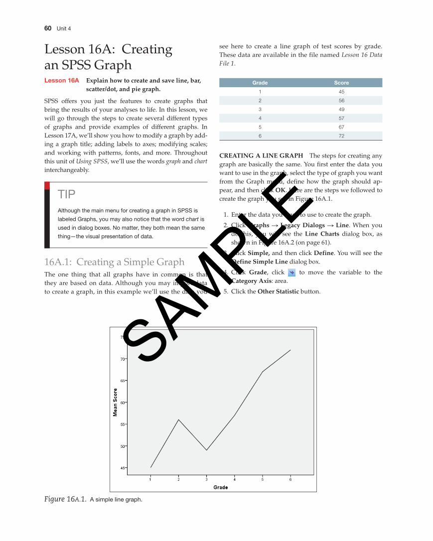
see here to create a line graph of test scores by grade. These data are available in the file named Lesson 16 Data File 1.
Grade Score
1 45
2 56
3 49
4 57
5 67
6 72
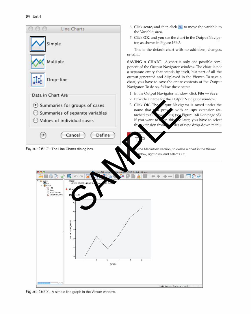
CrEAting A LinE grAph The steps for creating any graph are basically the same. You first enter the data you want to use in the graph, select the type of graph you want from the Graph menu, define how the graph should ap-pear, and then click OK. Here are the steps we followed to create the graph you see in Figure 16A.1.
1. Enter the data you want to use to create the graph.
2. Click graphs S Legacy Dialogs S Line. When you do this, you will see the Line Charts dialog box, as shown in Figure 16A.2 (on page 61).
3. Click Simple, and then click Define. You will see the Define Simple Line dialog box.
4. Click grade, click to move the variable to the Category Axis: area.
5. Click the Other Statistic button.
TipAlthough the main menu for creating a graph in SpSS is
labeled Graphs, you may also notice that the word chart is
used in dialog boxes. No matter, they both mean the same
thing—the visual presentation of data.
16A.1: Creating a Simple GraphThe one thing that all graphs have in common is that they are based on data. Although you may import data to create a graph, in this example we’ll use the data you
Figure 16A.1. A simple line graph.
M04_GREE9889_08_SE_C04.indd 60 31/05/16 3:35 pm
SAMPLE
Working with SpSS Graphs and Output for Windows 61
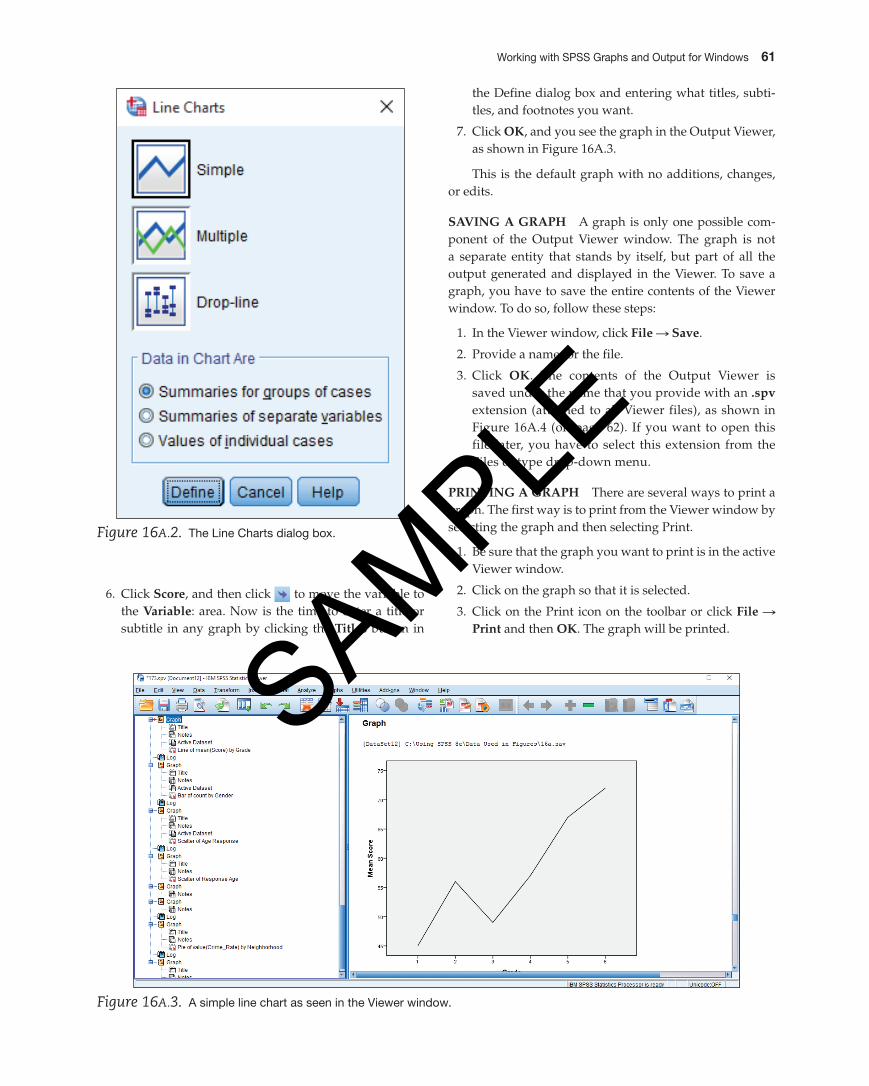
the Define dialog box and entering what titles, subti-tles, and footnotes you want.
7. Click OK, and you see the graph in the Output Viewer, as shown in Figure 16A.3.
This is the default graph with no additions, changes, or edits.
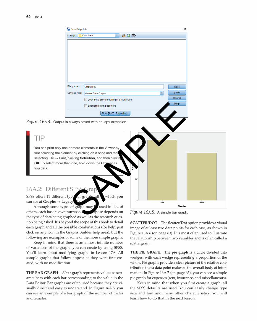
SAving A grAph A graph is only one possible com-ponent of the Output Viewer window. The graph is not a separate entity that stands by itself, but part of all the output generated and displayed in the Viewer. To save a graph, you have to save the entire contents of the Viewer window. To do so, follow these steps:
1. In the Viewer window, click File S Save.
2. Provide a name for the file.
3. Click OK. The contents of the Output Viewer is saved under the name that you provide with an .spv extension (attached to all Viewer files), as shown in Figure 16A.4 (on page 62). If you want to open this file later, you have to select this extension from the Files of type drop-down menu.
printing A grAph There are several ways to print a graph. The first way is to print from the Viewer window by selecting the graph and then selecting Print.
1. Be sure that the graph you want to print is in the active Viewer window.
2. Click on the graph so that it is selected.
3. Click on the Print icon on the toolbar or click File S print and then OK. The graph will be printed.
Figure 16A.2. The Line Charts dialog box.
Figure 16A.3. A simple line chart as seen in the Viewer window.
6. Click Score, and then click to move the variable to the variable: area. Now is the time to enter a title or subtitle in any graph by clicking the titles button in
M04_GREE9889_08_SE_C04.indd 61 31/05/16 3:35 pm
SAMPLE
62 Unit 4
16A.2: Different SPSS GraphsSPSS offers 11 different types of graphs all of which you can see at graphs S Legacy Dialogs.
Although some types of graph may be used in lieu of others, each has its own purpose. The purpose depends on the type of data being graphed as well as the research ques-tion being asked. It’s beyond the scope of this book to detail each graph and all the possible combinations (for help, just click on any icon in the Graphs Builder help area), but the following are examples of some of the more simple graphs.
Keep in mind that there is an almost infinite number of variations of the graphs you can create by using SPSS. You’ll learn about modifying graphs in Lesson 17A. All sample graphs that follow appear as they were first cre-ated, with no modification.
thE BAr grAph A bar graph represents values as sep-arate bars with each bar corresponding to the value in the Data Editor. Bar graphs are often used because they are vi-sually direct and easy to understand. In Figure 16A.5, you can see an example of a bar graph of the number of males and females.
Figure 16A.4. Output is always saved with an .spv extension.
TipYou can print only one or more elements in the Viewer by
first selecting the element by clicking on it once and then
selecting File S print, clicking Selection, and then clicking
OK. To select more than one, hold down the Ctrl key as
you click.
Figure 16A.5. A simple bar graph.
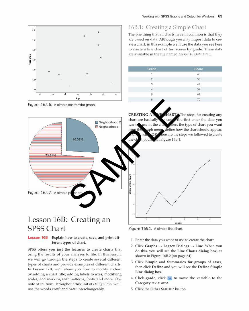
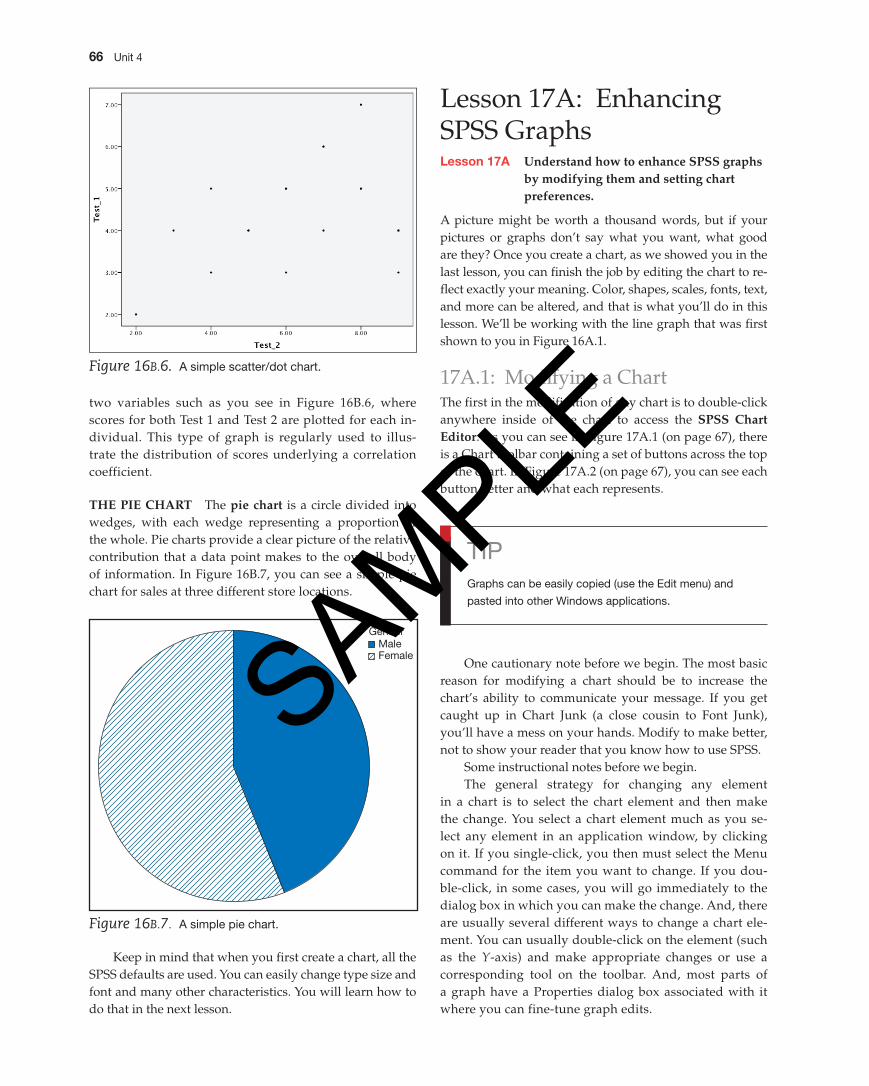
SCAttEr/DOt The Scatter/Dot option provides a visual image of at least two data points for each case, as shown in Figure 16A.6 (on page 63). It is most often used to illustrate the relationship between two variables and is often called a scattergram.
thE piE grAph The pie graph is a circle divided into wedges, with each wedge representing a proportion of the whole. Pie graphs provide a clear picture of the relative con-tribution that a data point makes to the overall body of infor-mation. In Figure 16A.7 (on page 63), you can see a simple pie graph for expenses (rent, insurance, and miscellaneous).
Keep in mind that when you first create a graph, all the SPSS defaults are used. You can easily change type size and font and many other characteristics. You will learn how to do that in the next lesson.
M04_GREE9889_08_SE_C04.indd 62 31/05/16 3:35 pm
SAMPLE
Working with SpSS Graphs and Output for Windows 63
Figure 16A.6. A simple scatter/dot graph.
73.91%
26.09%
Neighborhood 2Neighborhood 1
Figure 16A.7. A simple pie chart.
16B.1: Creating a Simple ChartThe one thing that all charts have in common is that they are based on data. Although you may import data to cre-ate a chart, in this example we’ll use the data you see here to create a line chart of test scores by grade. These data are available in the file named Lesson 16 Data File 1.
Lesson 16B: Creating an SPSS ChartLesson 16B Explain how to create, save, and print dif-
ferent types of chart.
SPSS offers you just the features to create charts that bring the results of your analyses to life. In this lesson, we will go through the steps to create several different types of charts and provide examples of different charts. In Lesson 17B, we’ll show you how to modify a chart by adding a chart title; adding labels to axes; modifying scales; and working with patterns, fonts, and more. One note of caution: Throughout this unit of Using SPSS, we’ll use the words graph and chart interchangeably.
Grade Score
1 45
2 56
3 49
4 57
5 67
6 72
CrEAting A LinE ChArt The steps for creating any chart are basically the same. You first enter the data you want to use in the chart, select the type of chart you want from the Graph menu, define how the chart should appear, and then click OK. Here are the steps we followed to create the chart you see in Figure 16B.1.
Figure 16B.1. A simple line chart.
1. Enter the data you want to use to create the chart.
2. Click graphs S Legacy Dialogs S Line. When you do this, you will see the Line Charts dialog box, as shown in Figure 16B.2 (on page 64).
3. Click Simple and Summaries for groups of cases, then click Define and you will see the Define Simple Line dialog box.
4. Click grade, click to move the variable to the Category Axis: area.
5. Click the Other Statistic button.
M04_GREE9889_08_SE_C04.indd 63 31/05/16 3:35 pm
SAMPLE
64 Unit 4
Figure 16B.2. The Line Charts dialog box.
Tipin the Macintosh version, to delete a chart in the Viewer
window, right-click and select Cut.
6. Click score, and then click to move the variable to the Variable: area.
7. Click OK, and you see the chart in the Output Naviga-tor, as shown in Figure 16B.3.
This is the default chart with no additions, changes, or edits.
SAving A ChArt A chart is only one possible com-ponent of the Output Navigator window. The chart is not a separate entity that stands by itself, but part of all the output generated and displayed in the Viewer. To save a chart, you have to save the entire contents of the Output Navigator. To do so, follow these steps:
1. In the Output Navigator window, click File S Save.
2. Provide a name for the Output Navigator window.
3. Click OK. The Output Navigator is saved under the name that you provide with an .spv extension (at-tached to all Viewer files) (see Figure 16B.4 on page 65). If you want to open this file later, you have to select this extension from the Files of type drop-down menu.
Figure 16B.3. A simple line graph in the Viewer window.
M04_GREE9889_08_SE_C04.indd 64 31/05/16 3:35 pm
SAMPLE
Working with SpSS Graphs and Output for Windows 65
printing A ChArt There are several ways to print a chart. The first way is to print from the Output Navigator by selecting the chart and then selecting Print.
1. Be sure that the chart you want to print is in the active Viewer window.
2. Click on the chart so that it is selected.
3. Click on the Print icon on the toolbar or click File S print and then OK. The chart will be printed.
16B.2: Different SPSS ChartsSPSS for the Macintosh offers many different types of charts. Although some types of chart may be used in lieu of others, each has its own purpose. The purpose depends on the type of data being charted as well as the research question being asked. It’s beyond the scope of this book to detail each chart and all the possible combinations, but the following are examples of some of the simple charts. Keep in mind that there is an almost infinite number of variations of the charts you can create with SPSS. You’ll learn about modifying charts in Lesson 17B. All sample charts that follow appear as they were first created, with no modifications.
thE BAr ChArt A bar chart represents values as sep-arate bars with each bar corresponding to the value in the
Data Editor. Bar charts are often used because they are easy to understand and require little attention to detail. In Figure 16B.5, you can see an example of a bar chart of the number of survey participants above and below the age of 50.
thE SCAttEr/DOt grAph A scatter/dot chart is used to visually represent the relationship between
Figure 16B.4. Output is saved in the Viewer window with an .spv extension.
Figure 16B.5. A simple bar chart.
M04_GREE9889_08_SE_C04.indd 65 31/05/16 3:35 pm
SAMPLE
66 Unit 4
Figure 16B.6. A simple scatter/dot chart.
two variables such as you see in Figure 16B.6, where scores for both Test 1 and Test 2 are plotted for each in-dividual. This type of graph is regularly used to illus-trate the distribution of scores underlying a correlation coefficient.
thE piE ChArt The pie chart is a circle divided into wedges, with each wedge representing a proportion of the whole. Pie charts provide a clear picture of the relative contribution that a data point makes to the overall body of information. In Figure 16B.7, you can see a simple pie chart for sales at three different store locations.
GenderMaleFemale
Figure 16B.7. A simple pie chart.
Lesson 17A: Enhancing SPSS GraphsLesson 17A Understand how to enhance SpSS graphs
by modifying them and setting chart preferences.
A picture might be worth a thousand words, but if your pictures or graphs don’t say what you want, what good are they? Once you create a chart, as we showed you in the last lesson, you can finish the job by editing the chart to re-flect exactly your meaning. Color, shapes, scales, fonts, text, and more can be altered, and that is what you’ll do in this lesson. We’ll be working with the line graph that was first shown to you in Figure 16A.1.
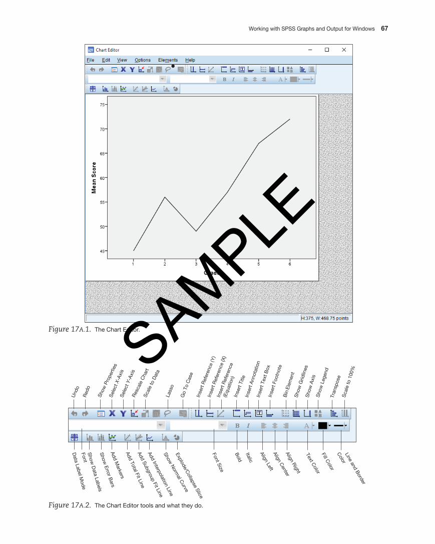
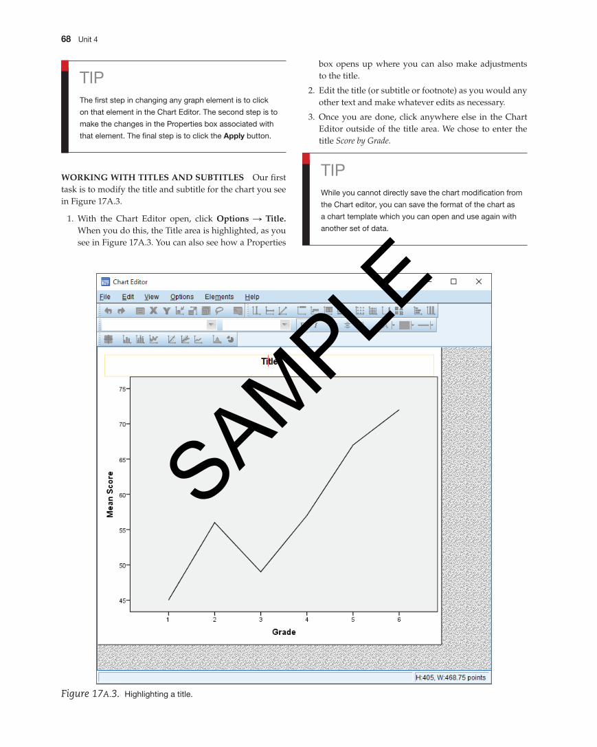
17A.1: Modifying a ChartThe first in the modification of any chart is to double-click anywhere inside of the chart to access the SpSS Chart Editor. As you can see in Figure 17A.1 (on page 67), there is a Chart toolbar containing a set of buttons across the top of the chart. In Figure 17A.2 (on page 67), you can see each button better and what each represents.
TipGraphs can be easily copied (use the Edit menu) and
pasted into other Windows applications.
One cautionary note before we begin. The most basic reason for modifying a chart should be to increase the chart’s ability to communicate your message. If you get caught up in Chart Junk (a close cousin to Font Junk), you’ll have a mess on your hands. Modify to make better, not to show your reader that you know how to use SPSS.
Some instructional notes before we begin.The general strategy for changing any element
in a chart is to select the chart element and then make the change. You select a chart element much as you se-lect any element in an application window, by clicking on it. If you single-click, you then must select the Menu command for the item you want to change. If you dou-ble-click, in some cases, you will go immediately to the dialog box in which you can make the change. And, there are usually several different ways to change a chart ele-ment. You can usually double-click on the element (such as the Y-axis) and make appropriate changes or use a corresponding tool on the toolbar. And, most parts of a graph have a Properties dialog box associated with it where you can fine-tune graph edits.
Keep in mind that when you first create a chart, all the SPSS defaults are used. You can easily change type size and font and many other characteristics. You will learn how to do that in the next lesson.
M04_GREE9889_08_SE_C04.indd 66 31/05/16 3:35 pm
SAMPLE
Working with SpSS Graphs and Output for Windows 67
Figure 17A.1. The Chart Editor.
Go
To C
ase
Lass
o
Red
o
Und
o
Sele
ct X
-Axi
sSe
lect
Y-A
xis
Show
Pro
perti
es
Scal
e to
Dat
a
Res
cale
Cha
rt
Inse
rt R
efer
ence
(X)
Inse
rt R
efer
ence
(Y)
Inse
rt Ti
tle
Inse
rt R
efer
ence
(Eq
uatio
n)
Inse
rt A
nnot
atio
nIn
sert
Tex
t Box
In
sert
Foo
tnot
eB
in E
lem
ent
Sho
w G
ridlin
es
Sho
w L
egen
dTr
ansp
ose
Sho
w A
xis
Sca
le to
100
%
Show N
ormal C
urve
Show
Error Bars
Add Total Fit LineAdd Interpolation Line
Add Markers
Add Subgroup Fit Line
Explode/Collapse Slice
Bold
Font Size
Italic
Data Label M
ode FontS
how D
ata Labels
Align LeftAlign C
enterAlign Right
Text Color
Fill Color
Line and Border
Color
Figure 17A.2. The Chart Editor tools and what they do.
M04_GREE9889_08_SE_C04.indd 67 31/05/16 3:35 pm
SAMPLE
68 Unit 4
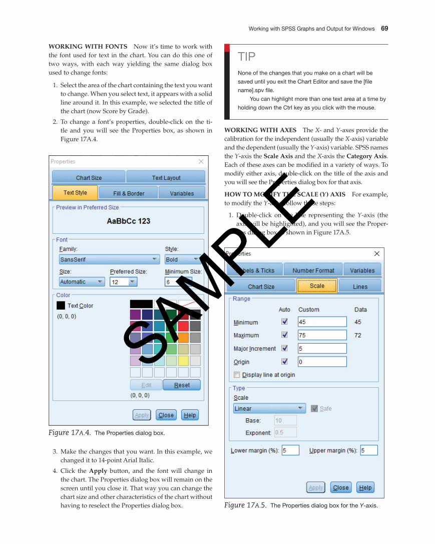
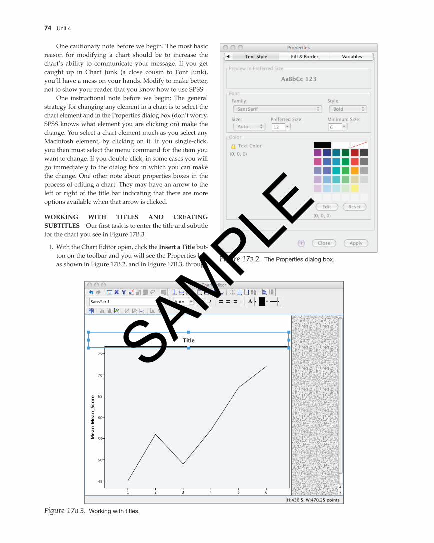
WOrKing With titLES AnD SUBtitLES Our first task is to modify the title and subtitle for the chart you see in Figure 17A.3.
1. With the Chart Editor open, click Options S title. When you do this, the Title area is highlighted, as you see in Figure 17A.3. You can also see how a Properties
box opens up where you can also make adjustments to the title.
2. Edit the title (or subtitle or footnote) as you would any other text and make whatever edits as necessary.
3. Once you are done, click anywhere else in the Chart Editor outside of the title area. We chose to enter the title Score by Grade.
TipThe first step in changing any graph element is to click
on that element in the Chart Editor. The second step is to
make the changes in the properties box associated with
that element. The final step is to click the Apply button.
Figure 17A.3. Highlighting a title.
TipWhile you cannot directly save the chart modification from
the Chart editor, you can save the format of the chart as
a chart template which you can open and use again with
another set of data.
M04_GREE9889_08_SE_C04.indd 68 31/05/16 3:35 pm
SAMPLE
Working with SpSS Graphs and Output for Windows 69
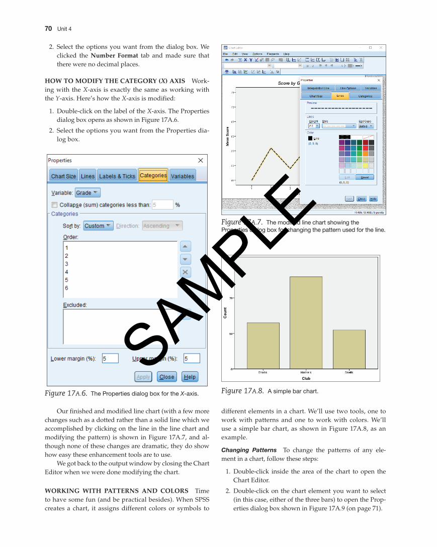
WOrKing With FOntS Now it’s time to work with the font used for text in the chart. You can do this one of two ways, with each way yielding the same dialog box used to change fonts:
1. Select the area of the chart containing the text you want to change. When you select text, it appears with a solid line around it. In this example, we selected the title of the chart (now Score by Grade).
2. To change a font’s properties, double-click on the ti-tle and you will see the Properties box, as shown in Figure 17A.4.
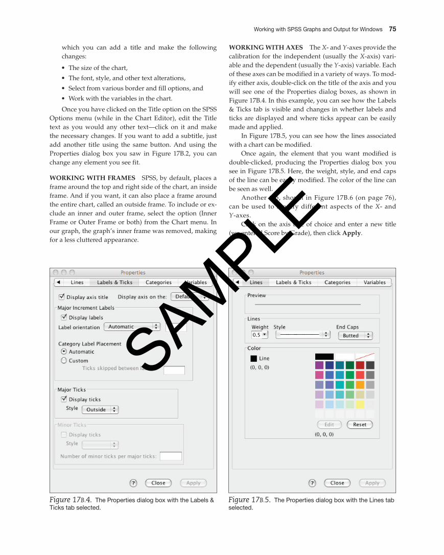
WOrKing With AxES The X- and Y-axes provide the calibration for the independent (usually the X-axis) variable and the dependent (usually the Y-axis) variable. SPSS names the Y-axis the Scale Axis and the X-axis the Category Axis. Each of these axes can be modified in a variety of ways. To modify either axis, double-click on the title of the axis and you will see the Properties dialog box for that axis.
hOW tO MODiFy thE SCALE (Y ) AxiS For example, to modify the Y-axis, follow these steps:
1. Double-click on the line representing the Y-axis (the axis will be highlighted), and you will see the Proper-ties dialog box as shown in Figure 17A.5.
Figure 17A.4. The properties dialog box.
3. Make the changes that you want. In this example, we changed it to 14-point Arial Italic.
4. Click the Apply button, and the font will change in the chart. The Properties dialog box will remain on the screen until you close it. That way you can change the chart size and other characteristics of the chart without having to reselect the Properties dialog box.
TipNone of the changes that you make on a chart will be
saved until you exit the Chart Editor and save the [file
name].spv file.
You can highlight more than one text area at a time by
holding down the Ctrl key as you click with the mouse.
Figure 17A.5. The properties dialog box for the Y-axis.
M04_GREE9889_08_SE_C04.indd 69 31/05/16 3:35 pm
SAMPLE
70 Unit 4
different elements in a chart. We’ll use two tools, one to work with patterns and one to work with colors. We’ll use a simple bar chart, as shown in Figure 17A.8, as an example.
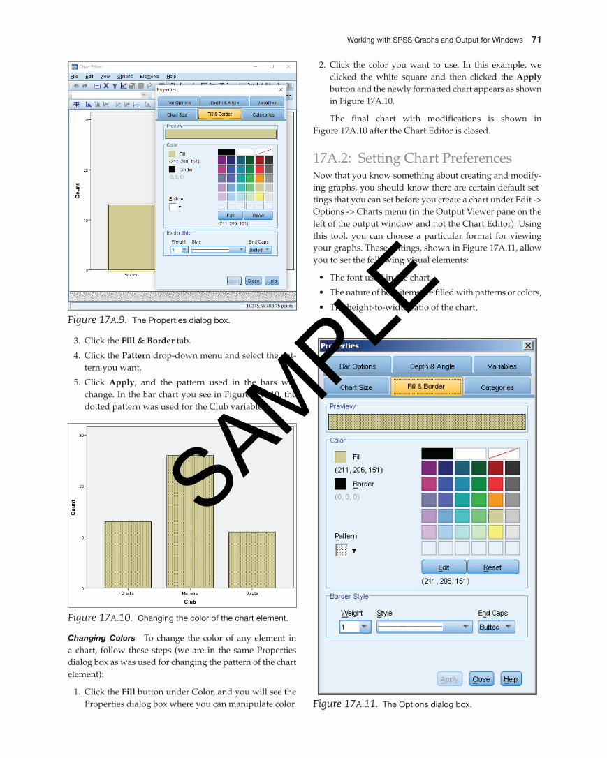
Changing Patterns To change the patterns of any ele-ment in a chart, follow these steps:
1. Double-click inside the area of the chart to open the Chart Editor.
2. Double-click on the chart element you want to select (in this case, either of the three bars) to open the Prop-erties dialog box shown in Figure 17A.9 (on page 71).
Figure 17A.7. The modified line chart showing the properties dialog box for changing the pattern used for the line.
2. Select the options you want from the dialog box. We clicked the number Format tab and made sure that there were no decimal places.
hOW tO MODiFy thE CAtEgOry (X) AxiS Work-ing with the X-axis is exactly the same as working with the Y-axis. Here’s how the X-axis is modified:
1. Double-click on the label of the X-axis. The Properties dialog box opens as shown in Figure 17A.6.
2. Select the options you want from the Properties dia-log box.
Our finished and modified line chart (with a few more changes such as a dotted rather than a solid line which we accomplished by clicking on the line in the line chart and modifying the pattern) is shown in Figure 17A.7, and al-though none of these changes are dramatic, they do show how easy these enhancement tools are to use.
We got back to the output window by closing the Chart Editor when we were done modifying the chart.
WOrKing With pAttErnS AnD COLOrS Time to have some fun (and be practical besides). When SPSS creates a chart, it assigns different colors or symbols to
Figure 17A.8. A simple bar chart.Figure 17A.6. The properties dialog box for the X-axis.
M04_GREE9889_08_SE_C04.indd 70 31/05/16 3:35 pm
SAMPLE
Working with SpSS Graphs and Output for Windows 71
Figure 17A.10. Changing the color of the chart element.
Figure 17A.9. The properties dialog box.
3. Click the Fill & Border tab.
4. Click the pattern drop-down menu and select the pat-tern you want.
5. Click Apply, and the pattern used in the bars will change. In the bar chart you see in Figure 17A.10, the dotted pattern was used for the Club variables.
Changing Colors To change the color of any element in a chart, follow these steps (we are in the same Properties dialog box as was used for changing the pattern of the chart element):
1. Click the Fill button under Color, and you will see the Properties dialog box where you can manipulate color.
2. Click the color you want to use. In this example, we clicked the white square and then clicked the Apply button and the newly formatted chart appears as shown in Figure 17A.10.
The final chart with modifications is shown in Figure 17A.10 after the Chart Editor is closed.
17A.2: Setting Chart PreferencesNow that you know something about creating and modify-ing graphs, you should know there are certain default set-tings that you can set before you create a chart under Edit -> Options -> Charts menu (in the Output Viewer pane on the left of the output window and not the Chart Editor). Using this tool, you can choose a particular format for viewing your graphs. These settings, shown in Figure 17A.11, allow you to set the following visual elements:
• The font used in the chart,
• The nature of how items are filled with patterns or colors,
• The height-to-width ratio of the chart,
Figure 17A.11. The Options dialog box.
M04_GREE9889_08_SE_C04.indd 71 31/05/16 3:35 pm
SAMPLE
72 Unit 4
Club
Co
unt
Sharks0
10
20
30
Mariners Smelts
Figure 17A.12. Making additional edits in the bar chart.
• The presence of a frame (inside or outside), and
• The presence of grid lines.
For example, if you want the initial chart to use Times New Roman as a font, specify it in the SPSS Options dia-log box you access through the Edit menu in the Chart Editor.
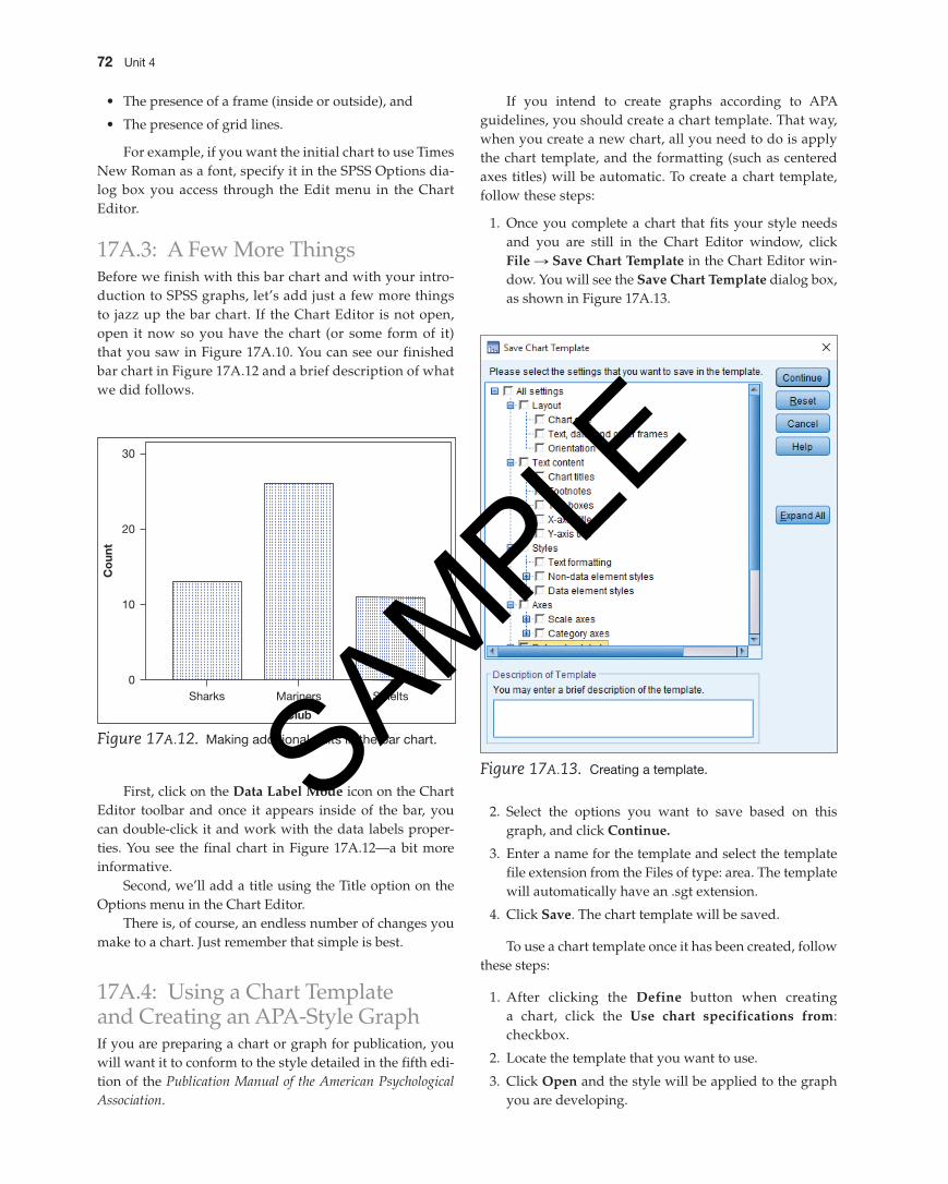
17A.3: A Few More ThingsBefore we finish with this bar chart and with your intro-duction to SPSS graphs, let’s add just a few more things to jazz up the bar chart. If the Chart Editor is not open, open it now so you have the chart (or some form of it) that you saw in Figure 17A.10. You can see our finished bar chart in Figure 17A.12 and a brief description of what we did follows.
Figure 17A.13. Creating a template.
First, click on the Data Label Mode icon on the Chart Editor toolbar and once it appears inside of the bar, you can double-click it and work with the data labels proper-ties. You see the final chart in Figure 17A.12—a bit more informative.
Second, we’ll add a title using the Title option on the Options menu in the Chart Editor.
There is, of course, an endless number of changes you make to a chart. Just remember that simple is best.
17A.4: Using a Chart Template and Creating an APA-Style GraphIf you are preparing a chart or graph for publication, you will want it to conform to the style detailed in the fifth edi-tion of the Publication Manual of the American Psychological Association.
If you intend to create graphs according to APA guidelines, you should create a chart template. That way, when you create a new chart, all you need to do is apply the chart template, and the formatting (such as centered axes titles) will be automatic. To create a chart template, follow these steps:
1. Once you complete a chart that fits your style needs and you are still in the Chart Editor window, click File S Save Chart template in the Chart Editor win-dow. You will see the Save Chart template dialog box, as shown in Figure 17A.13.
2. Select the options you want to save based on this graph, and click Continue.
3. Enter a name for the template and select the template file extension from the Files of type: area. The template will automatically have an .sgt extension.
4. Click Save. The chart template will be saved.
To use a chart template once it has been created, follow these steps:
1. After clicking the Define button when creating a chart, click the Use chart specifications from: checkbox.
2. Locate the template that you want to use.
3. Click Open and the style will be applied to the graph you are developing.
M04_GREE9889_08_SE_C04.indd 72 31/05/16 3:35 pm
SAMPLE
Working with SpSS Graphs and Output for Windows 73
Exercises: Lesson 17A 1. Create a simple bar chart, save the file, and send it
to a colleague and have that colleague send you the one that he or she created.
2. Perform the following edits on the bar chart.
a. Change the color of all bars.
b. Add a title to the chart and edit the titles of the X- and Y-axes.
c. Add a footnote.d. Save the chart design as a chart template.
Lesson 17B: Enhancing SPSS ChartsLesson 17B Understand how to enhance SpSS charts
by modifying their parameters.
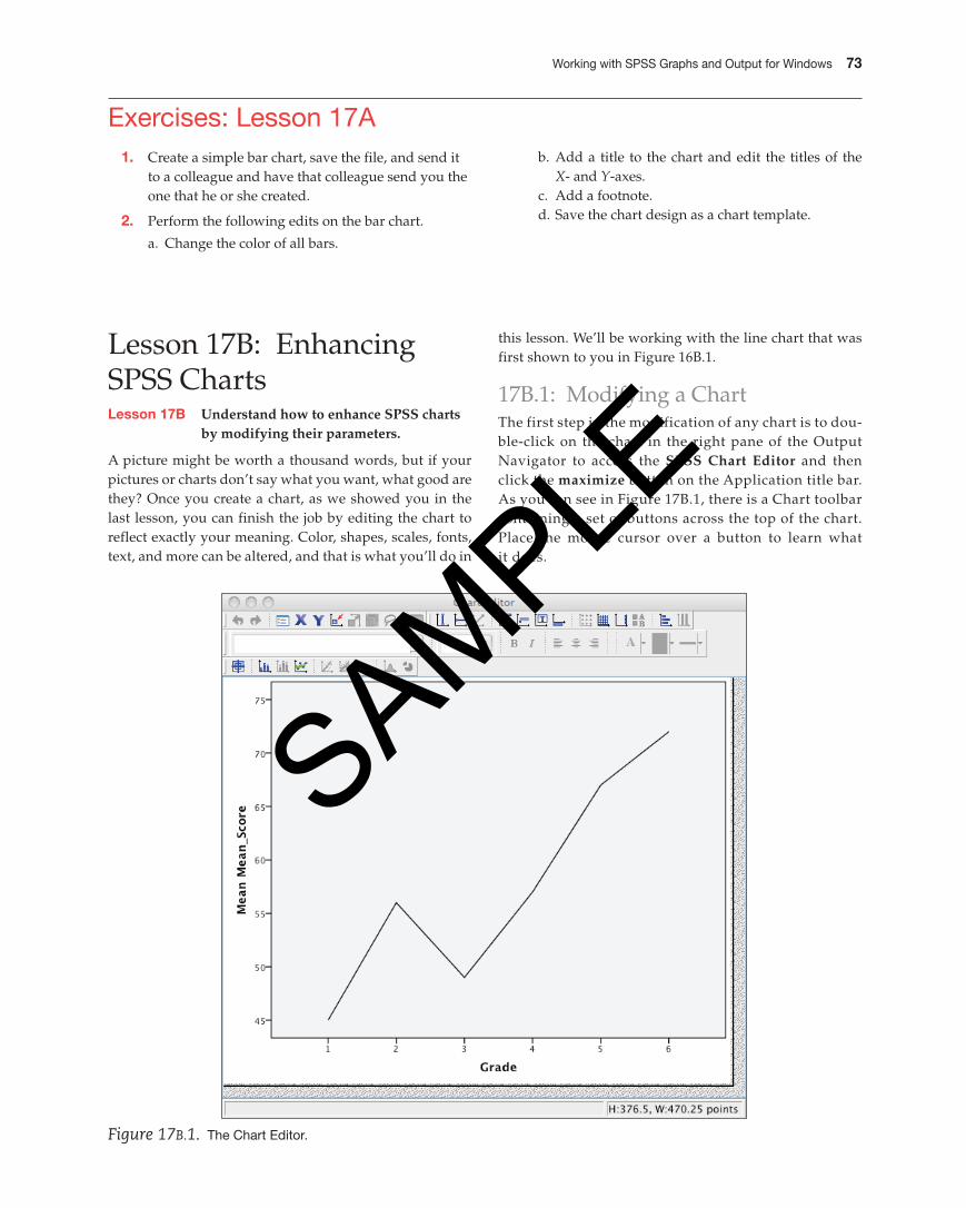
A picture might be worth a thousand words, but if your pictures or charts don’t say what you want, what good are they? Once you create a chart, as we showed you in the last lesson, you can finish the job by editing the chart to reflect exactly your meaning. Color, shapes, scales, fonts, text, and more can be altered, and that is what you’ll do in
this lesson. We’ll be working with the line chart that was first shown to you in Figure 16B.1.
17B.1: Modifying a ChartThe first step in the modification of any chart is to dou-ble-click on the chart in the right pane of the Output Navigator to access the SpSS Chart Editor and then click the maximize button on the Application title bar. As you can see in Figure 17B.1, there is a Chart toolbar containing a set of buttons across the top of the chart. Place the mouse cursor over a button to learn what it does.
Figure 17B.1. The Chart Editor.
M04_GREE9889_08_SE_C04.indd 73 31/05/16 3:35 pm
SAMPLE
74 Unit 4
One cautionary note before we begin. The most basic reason for modifying a chart should be to increase the chart’s ability to communicate your message. If you get caught up in Chart Junk (a close cousin to Font Junk), you’ll have a mess on your hands. Modify to make better, not to show your reader that you know how to use SPSS.
One instructional note before we begin: The general strategy for changing any element in a chart is to select the chart element and in the Properties dialog box (don’t worry, SPSS knows what element you are clicking on) make the change. You select a chart element much as you select any Macintosh element, by clicking on it. If you single-click, you then must select the menu command for the item you want to change. If you double-click, in some cases you will go immediately to the dialog box in which you can make the change. One other note about properties boxes in the process of editing a chart: They may have an arrow to the left or right of the title bar indicating that there are more options available when that arrow is clicked.
WOrKing With titLES AnD CrEAting SUBtitLES Our first task is to enter the title and subtitle for the chart you see in Figure 17B.3.
1. With the Chart Editor open, click the insert a title but-ton on the toolbar and you will see the Properties box as shown in Figure 17B.2, and in Figure 17B.3, through
Figure 17B.2. The properties dialog box.
Figure 17B.3. Working with titles.
M04_GREE9889_08_SE_C04.indd 74 31/05/16 3:35 pm
SAMPLE
Working with SpSS Graphs and Output for Windows 75
which you can add a title and make the following changes:
• The size of the chart,
• The font, style, and other text alterations,
• Select from various border and fill options, and
• Work with the variables in the chart.
Once you have clicked on the Title option on the SPSS Options menu (while in the Chart Editor), edit the Title text as you would any other text—click on it and make the necessary changes. If you want to add a subtitle, just add another title using the same button. And using the Properties dialog box you saw in Figure 17B.2, you can change any element you see fit.
WOrKing With FrAMES SPSS, by default, places a frame around the top and right side of the chart, an inside frame. And if you want, it can also place a frame around the entire chart, called an outside frame. To include or ex-clude an inner and outer frame, select the option (Inner Frame or Outer Frame or both) from the Chart menu. In our graph, the graph’s inner frame was removed, making for a less cluttered appearance.
Figure 17B.4. The properties dialog box with the Labels & Ticks tab selected.
Figure 17B.5. The properties dialog box with the Lines tab selected.
WOrKing With AxES The X- and Y-axes provide the calibration for the independent (usually the X-axis) vari-able and the dependent (usually the Y-axis) variable. Each of these axes can be modified in a variety of ways. To mod-ify either axis, double-click on the title of the axis and you will see one of the Properties dialog boxes, as shown in Figure 17B.4. In this example, you can see how the Labels & Ticks tab is visible and changes in whether labels and ticks are displayed and where ticks appear can be easily made and applied.
In Figure 17B.5, you can see how the lines associated with a chart can be modified.
Once again, the element that you want modified is double-clicked, producing the Properties dialog box you see in Figure 17B.5. Here, the weight, style, and end caps of the line can be easily modified. The color of the line can be seen as well.
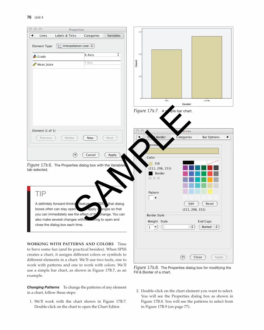
Another tab, shown in Figure 17B.6 (on page 76), can be used to modify different aspects of the X- and Y-axes.
Click on the axis title of choice and enter a new title (we entered Score by Grade), then click Apply.
M04_GREE9889_08_SE_C04.indd 75 31/05/16 3:35 pm
SAMPLE
76 Unit 4
Figure 17B.6. The properties dialog box with the Variables tab selected.
Figure 17B.7. A simple bar chart.
Figure 17B.8. The properties dialog box for modifying the Fill & Border of a chart.
WOrKing With pAttErnS AnD COLOrS Time to have some fun (and be practical besides). When SPSS creates a chart, it assigns different colors or symbols to different elements in a chart. We’ll use two tools, one to work with patterns and one to work with colors. We’ll use a simple bar chart, as shown in Figure 17B.7, as an example.
Changing Patterns To change the patterns of any element in a chart, follow these steps:
1. We’ll work with the chart shown in Figure 17B.7. Double-click on the chart to open the Chart Editor.
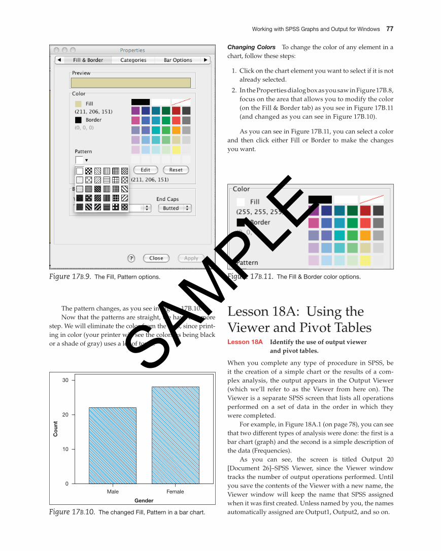
2. Double-click on the chart element you want to select. You will see the Properties dialog box as shown in Figure 17B.8. You will see the patterns to select from in Figure 17B.9 (on page 77).
TipA definitely forward-thinking feature of SpSS is that dialog
boxes often can stay open as you apply changes so that
you can immediately see the effect of the change. You can
also make several changes without having to open and
close the dialog box each time.
M04_GREE9889_08_SE_C04.indd 76 31/05/16 3:35 pm
SAMPLE
Working with SpSS Graphs and Output for Windows 77
Figure 17B.9. The Fill, pattern options.
Male Female
Gender
Co
unt
0
10
20
30
Figure 17B.10. The changed Fill, pattern in a bar chart.
Changing Colors To change the color of any element in a chart, follow these steps:
1. Click on the chart element you want to select if it is not already selected.
2. In the Properties dialog box as you saw in Figure 17B.8, focus on the area that allows you to modify the color (on the Fill & Border tab) as you see in Figure 17B.11 (and changed as you can see in Figure 17B.10).
As you can see in Figure 17B.11, you can select a color and then click either Fill or Border to make the changes you want.
Figure 17B.11. The Fill & Border color options.
The pattern changes, as you see in Figure 17B.10.Now that the patterns are straight, we have one more
step. We will eliminate the color from the bars, since print-ing in color (your printer will see the colors as being black or a shade of gray) uses a lot of toner.
Lesson 18A: Using the Viewer and Pivot TablesLesson 18A identify the use of output viewer
and pivot tables.
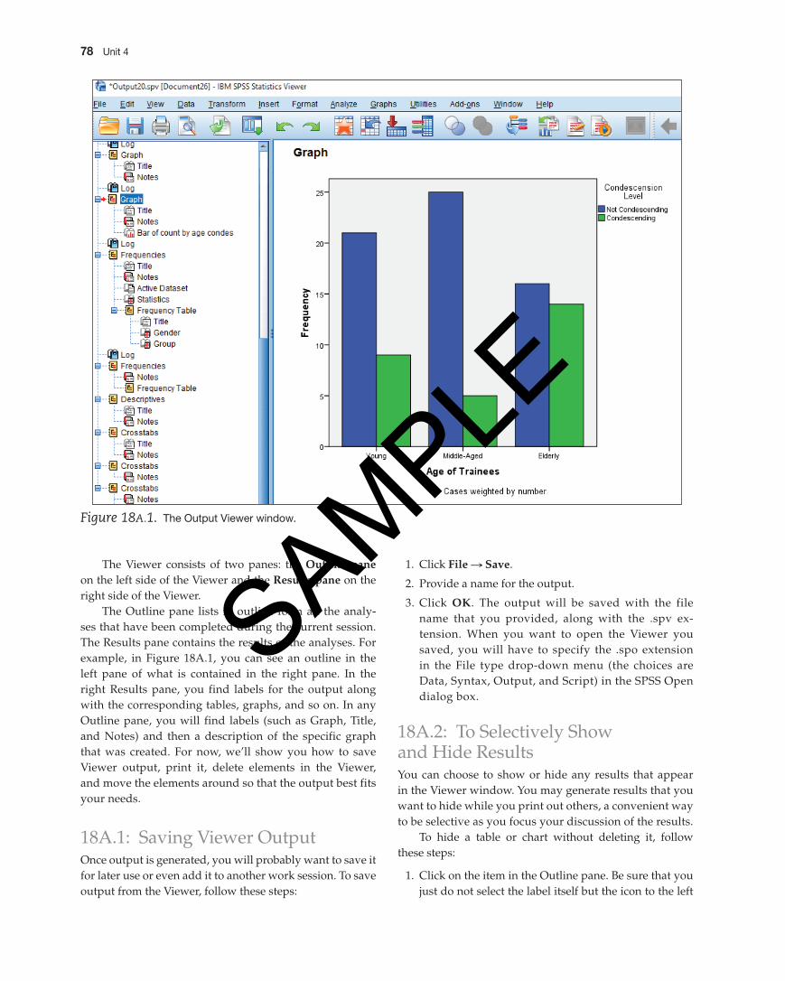
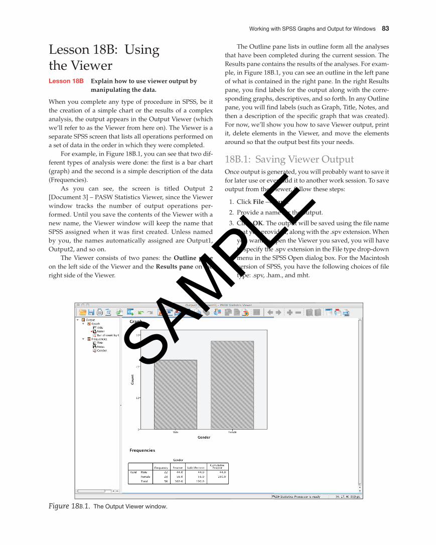
When you complete any type of procedure in SPSS, be it the creation of a simple chart or the results of a com-plex analysis, the output appears in the Output Viewer (which we’ll refer to as the Viewer from here on). The Viewer is a separate SPSS screen that lists all operations performed on a set of data in the order in which they were completed.
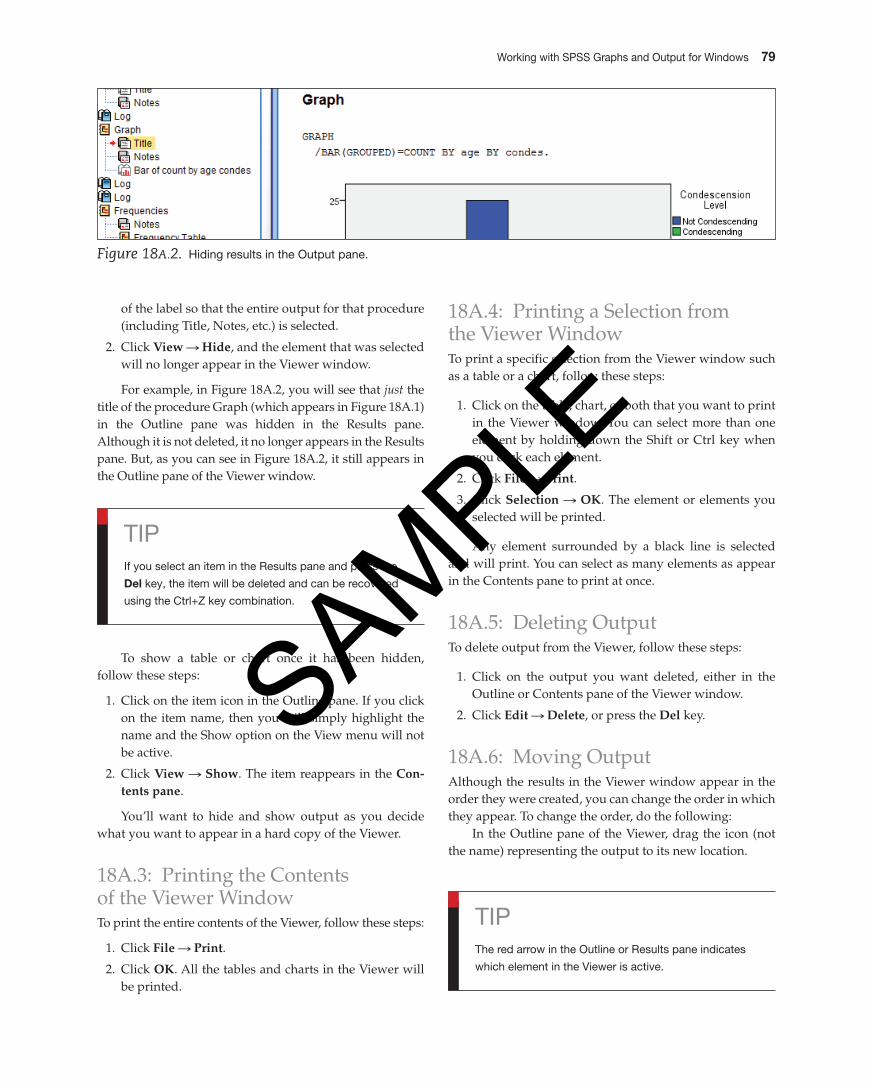
For example, in Figure 18A.1 (on page 78), you can see that two different types of analysis were done: the first is a bar chart (graph) and the second is a simple description of the data (Frequencies).
As you can see, the screen is titled Output 20 [Document 26]–SPSS Viewer, since the Viewer window tracks the number of output operations performed. Until you save the contents of the Viewer with a new name, the Viewer window will keep the name that SPSS assigned when it was first created. Unless named by you, the names automatically assigned are Output1, Output2, and so on.
M04_GREE9889_08_SE_C04.indd 77 31/05/16 3:35 pm
SAMPLE
78 Unit 4
Figure 18A.1. The Output Viewer window.
The Viewer consists of two panes: the Outline pane on the left side of the Viewer and the results pane on the right side of the Viewer.
The Outline pane lists in outline form all the analy-ses that have been completed during the current session. The Results pane contains the results of the analyses. For example, in Figure 18A.1, you can see an outline in the left pane of what is contained in the right pane. In the right Results pane, you find labels for the output along with the corresponding tables, graphs, and so on. In any Outline pane, you will find labels (such as Graph, Title, and Notes) and then a description of the specific graph that was created. For now, we’ll show you how to save Viewer output, print it, delete elements in the Viewer, and move the elements around so that the output best fits your needs.
18A.1: Saving Viewer OutputOnce output is generated, you will probably want to save it for later use or even add it to another work session. To save output from the Viewer, follow these steps:
1. Click File S Save.
2. Provide a name for the output.
3. Click OK. The output will be saved with the file name that you provided, along with the .spv ex-tension. When you want to open the Viewer you saved, you will have to specify the .spo extension in the File type drop-down menu (the choices are Data, Syntax, Output, and Script) in the SPSS Open dialog box.
18A.2: To Selectively Show and Hide ResultsYou can choose to show or hide any results that appear in the Viewer window. You may generate results that you want to hide while you print out others, a convenient way to be selective as you focus your discussion of the results.
To hide a table or chart without deleting it, follow these steps:
1. Click on the item in the Outline pane. Be sure that you just do not select the label itself but the icon to the left
M04_GREE9889_08_SE_C04.indd 78 31/05/16 3:35 pm
SAMPLE
Working with SpSS Graphs and Output for Windows 79
of the label so that the entire output for that procedure (including Title, Notes, etc.) is selected.
2. Click view S hide, and the element that was selected will no longer appear in the Viewer window.
For example, in Figure 18A.2, you will see that just the title of the procedure Graph (which appears in Figure 18A.1) in the Outline pane was hidden in the Results pane. Although it is not deleted, it no longer appears in the Results pane. But, as you can see in Figure 18A.2, it still appears in the Outline pane of the Viewer window.
18A.4: Printing a Selection from the Viewer WindowTo print a specific selection from the Viewer window such as a table or a chart, follow these steps:
1. Click on the table, chart, or both that you want to print in the Viewer window. You can select more than one element by holding down the Shift or Ctrl key when you click each element.
2. Click File S print.
3. Click Selection S OK. The element or elements you selected will be printed.
Any element surrounded by a black line is selected and will print. You can select as many elements as appear in the Contents pane to print at once.
18A.5: Deleting OutputTo delete output from the Viewer, follow these steps:
1. Click on the output you want deleted, either in the Outline or Contents pane of the Viewer window.
2. Click Edit S Delete, or press the Del key.
18A.6: Moving OutputAlthough the results in the Viewer window appear in the order they were created, you can change the order in which they appear. To change the order, do the following:
In the Outline pane of the Viewer, drag the icon (not the name) representing the output to its new location.
Tipif you select an item in the Results pane and press the
Del key, the item will be deleted and can be recovered
using the Ctrl+Z key combination.
TipThe red arrow in the Outline or Results pane indicates
which element in the Viewer is active.
To show a table or chart once it has been hidden, follow these steps:
1. Click on the item icon in the Outline pane. If you click on the item name, then you will simply highlight the name and the Show option on the View menu will not be active.
2. Click view S Show. The item reappears in the Con-tents pane.
You’ll want to hide and show output as you decide what you want to appear in a hard copy of the Viewer.
18A.3: Printing the Contents of the Viewer WindowTo print the entire contents of the Viewer, follow these steps:
1. Click File S print.
2. Click OK. All the tables and charts in the Viewer will be printed.
Figure 18A.2. Hiding results in the Output pane.
M04_GREE9889_08_SE_C04.indd 79 31/05/16 3:35 pm
SAMPLE
80 Unit 4
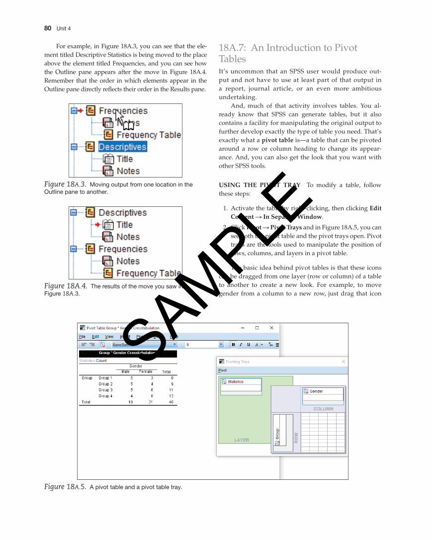
18A.7: An Introduction to Pivot TablesIt’s uncommon that an SPSS user would produce out-put and not have to use at least part of that output in a report, journal article, or an even more ambitious undertaking.
And, much of that activity involves tables. You al-ready know that SPSS can generate tables, but it also contains a facility for manipulating the original output to further develop exactly the type of table you need. That’s exactly what a pivot table is—a table that can be pivoted around a row or column heading to change its appear-ance. And, you can also get the look that you want with other SPSS tools.
USing thE pivOt trAy To modify a table, follow these steps:
1. Activate the table by right-clicking, then clicking Edit Content S in Separate Window.
2. Click pivot S pivot trays and in Figure 18A.5, you can see both the pivot table and the pivot trays open. Pivot trays are the tools used to manipulate the position of rows, columns, and layers in a pivot table.
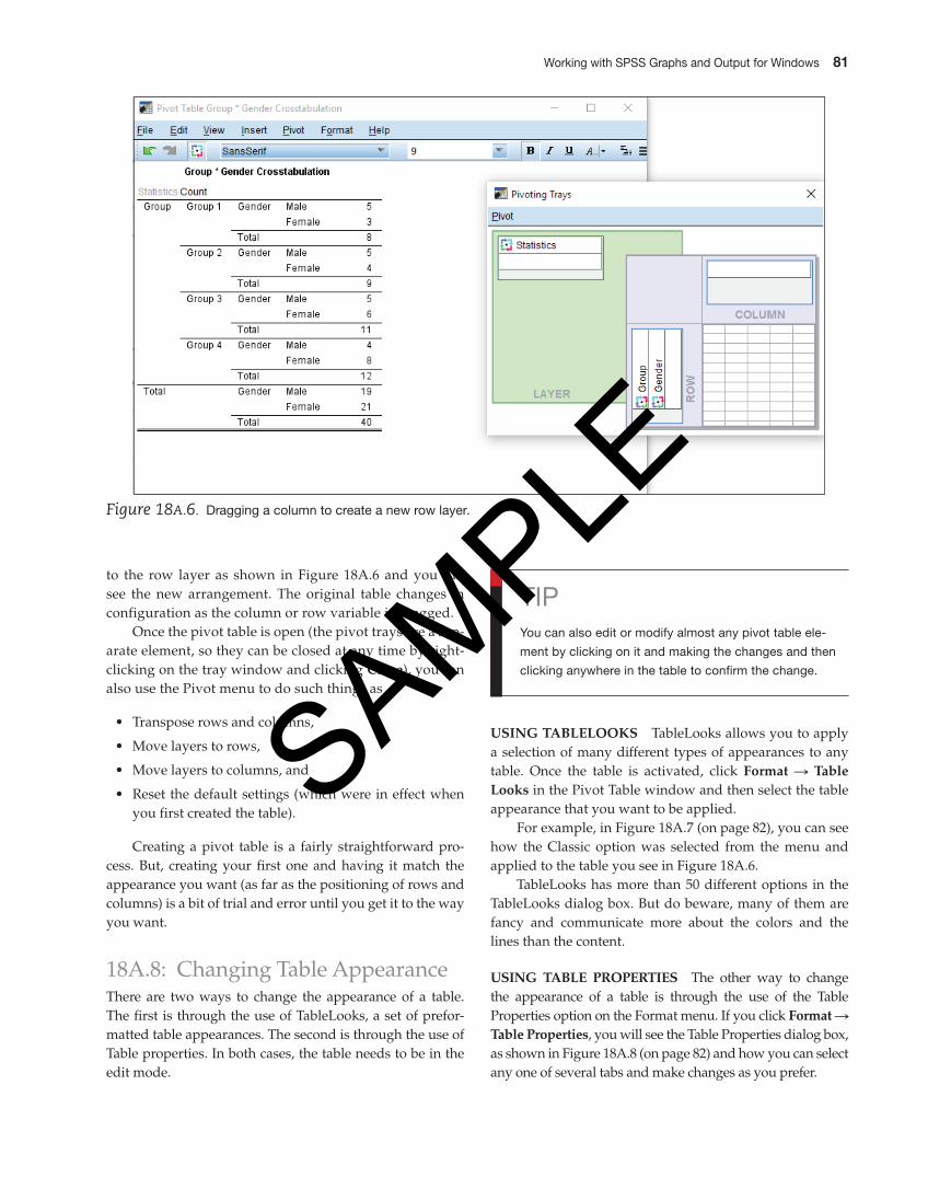
The basic idea behind pivot tables is that these icons can be dragged from one layer (row or column) of a table to another to create a new look. For example, to move gender from a column to a new row, just drag that icon
Figure 18A.4. The results of the move you saw in Figure 18A.3.
Figure 18A.3. Moving output from one location in the Outline pane to another.
Figure 18A.5. A pivot table and a pivot table tray.
For example, in Figure 18A.3, you can see that the ele-ment titled Descriptive Statistics is being moved to the place above the element titled Frequencies, and you can see how the Outline pane appears after the move in Figure 18A.4. Remember that the order in which elements appear in the Outline pane directly reflects their order in the Results pane.
M04_GREE9889_08_SE_C04.indd 80 31/05/16 3:35 pm
SAMPLE
Working with SpSS Graphs and Output for Windows 81
to the row layer as shown in Figure 18A.6 and you can see the new arrangement. The original table changes in configuration as the column or row variable is dragged.
Once the pivot table is open (the pivot trays are a sep-arate element, so they can be closed at any time by right-clicking on the tray window and clicking Close), you can also use the Pivot menu to do such things as
• Transpose rows and columns,
• Move layers to rows,
• Move layers to columns, and
• Reset the default settings (which were in effect when you first created the table).
Creating a pivot table is a fairly straightforward pro-cess. But, creating your first one and having it match the appearance you want (as far as the positioning of rows and columns) is a bit of trial and error until you get it to the way you want.
18A.8: Changing Table AppearanceThere are two ways to change the appearance of a table. The first is through the use of TableLooks, a set of prefor-matted table appearances. The second is through the use of Table properties. In both cases, the table needs to be in the edit mode.
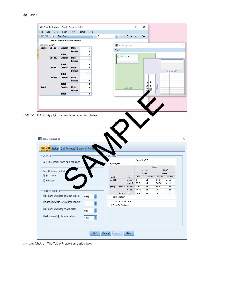
USing tABLELOOKS TableLooks allows you to apply a selection of many different types of appearances to any table. Once the table is activated, click Format S table Looks in the Pivot Table window and then select the table appearance that you want to be applied.
For example, in Figure 18A.7 (on page 82), you can see how the Classic option was selected from the menu and applied to the table you see in Figure 18A.6.
TableLooks has more than 50 different options in the TableLooks dialog box. But do beware, many of them are fancy and communicate more about the colors and the lines than the content.
USing tABLE prOpErtiES The other way to change the appearance of a table is through the use of the Table Properties option on the Format menu. If you click Format S table properties, you will see the Table Properties dialog box, as shown in Figure 18A.8 (on page 82) and how you can select any one of several tabs and make changes as you prefer.
Figure 18A.6. Dragging a column to create a new row layer.
TipYou can also edit or modify almost any pivot table ele-
ment by clicking on it and making the changes and then
clicking anywhere in the table to confirm the change.
M04_GREE9889_08_SE_C04.indd 81 31/05/16 3:35 pm
SAMPLE
82 Unit 4
Figure 18A.7. Applying a new look to a pivot table.
Figure 18A.8. The Table properties dialog box.
M04_GREE9889_08_SE_C04.indd 82 31/05/16 3:35 pm
SAMPLE
Working with SpSS Graphs and Output for Windows 83
Lesson 18B: Using the ViewerLesson 18B Explain how to use viewer output by
manipulating the data.
When you complete any type of procedure in SPSS, be it the creation of a simple chart or the results of a complex analysis, the output appears in the Output Viewer (which we’ll refer to as the Viewer from here on). The Viewer is a separate SPSS screen that lists all operations performed on a set of data in the order in which they were completed.
For example, in Figure 18B.1, you can see that two dif-ferent types of analysis were done: the first is a bar chart (graph) and the second is a simple description of the data (Frequencies).
As you can see, the screen is titled Output 2 [Document 3] – PASW Statistics Viewer, since the Viewer window tracks the number of output operations per-formed. Until you save the contents of the Viewer with a new name, the Viewer window will keep the name that SPSS assigned when it was first created. Unless named by you, the names automatically assigned are Output1, Output2, and so on.
The Viewer consists of two panes: the Outline pane on the left side of the Viewer and the results pane on the right side of the Viewer.
The Outline pane lists in outline form all the analyses that have been completed during the current session. The Results pane contains the results of the analyses. For exam-ple, in Figure 18B.1, you can see an outline in the left pane of what is contained in the right pane. In the right Results pane, you find labels for the output along with the corre-sponding graphs, descriptives, and so forth. In any Outline pane, you will find labels (such as Graph, Title, Notes, and then a description of the specific graph that was created). For now, we’ll show you how to save Viewer output, print it, delete elements in the Viewer, and move the elements around so that the output best fits your needs.
18B.1: Saving Viewer OutputOnce output is generated, you will probably want to save it for later use or even add it to another work session. To save output from the Viewer, follow these steps:
1. Click File S Save.
2. Provide a name for the output.
3. Click OK. The output will be saved using the file name that you provided, along with the .spv extension. When you want to open the Viewer you saved, you will have to specify the .spv extension in the File type drop-down menu in the SPSS Open dialog box. For the Macintosh version of SPSS, you have the following choices of file type: .spv, .ham., and mht.
Figure 18B.1. The Output Viewer window.
M04_GREE9889_08_SE_C04.indd 83 31/05/16 3:35 pm
SAMPLE
84 Unit 4
Figure 18B.2. Selecting and hiding results in the SpSS Viewer.
18B.2: To Selectively Show and Hide ResultsYou can choose to show or hide any results that appear in the Viewer window. You may generate results that you want to hide while you print out others, a conve-nient way to be selective as you focus your discussion of the results.
To show a table or chart once it has been hidden, follow these steps:
1. Click on the item icon in the Outline pane. If you click on the item name, then you will simply highlight the name and the Show option on the View menu will not be active.
2. Click view S Show. The item reappears in the Contents pane.
You’ll want to hide and show output as you decide what you want to appear in a hard copy of the Viewer.
18B.3: Printing the Contents of the Viewer WindowTo print the entire contents of the Viewer, follow these steps:
1. Click File S print.
2. Click OK. All the tables and charts in the Viewer will be printed.
printing A SELECtiOn FrOM thE viEWEr WinDOW To print a specific selection from the Viewer window, such as a table or a chart, follow these steps:
1. Click on the table, chart, or both that you want to print in the Viewer window. You can select more than one
TipThe red arrow in the Outline or Results pane indicates
which element in the Viewer is active.
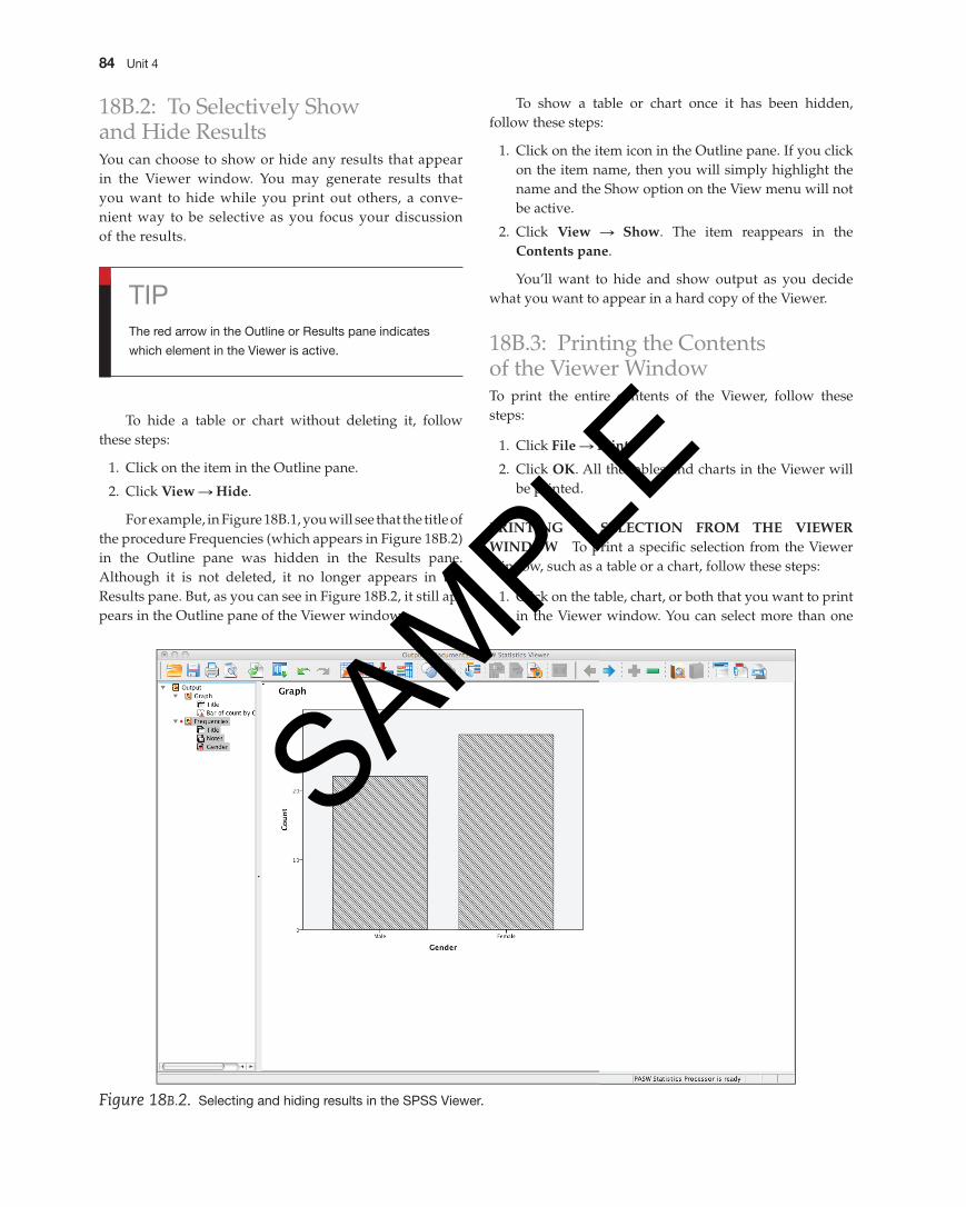
To hide a table or chart without deleting it, follow these steps:
1. Click on the item in the Outline pane.
2. Click view S hide.
For example, in Figure 18B.1, you will see that the title of the procedure Frequencies (which appears in Figure 18B.2) in the Outline pane was hidden in the Results pane. Although it is not deleted, it no longer appears in the Results pane. But, as you can see in Figure 18B.2, it still ap-pears in the Outline pane of the Viewer window.
M04_GREE9889_08_SE_C04.indd 84 31/05/16 3:35 pm
SAMPLE
Working with SpSS Graphs and Output for Windows 85
element by holding down the Shift or Ctrl key when you click each element.
2. Click File S print.
3. Click Selection S OK. The element or elements you selected will be printed.
Any element surrounded by a black line is selected and will print. You can select as many elements as appear in the Contents pane to print at once.
18B.4: Deleting OutputTo delete output from the Viewer, follow these steps:
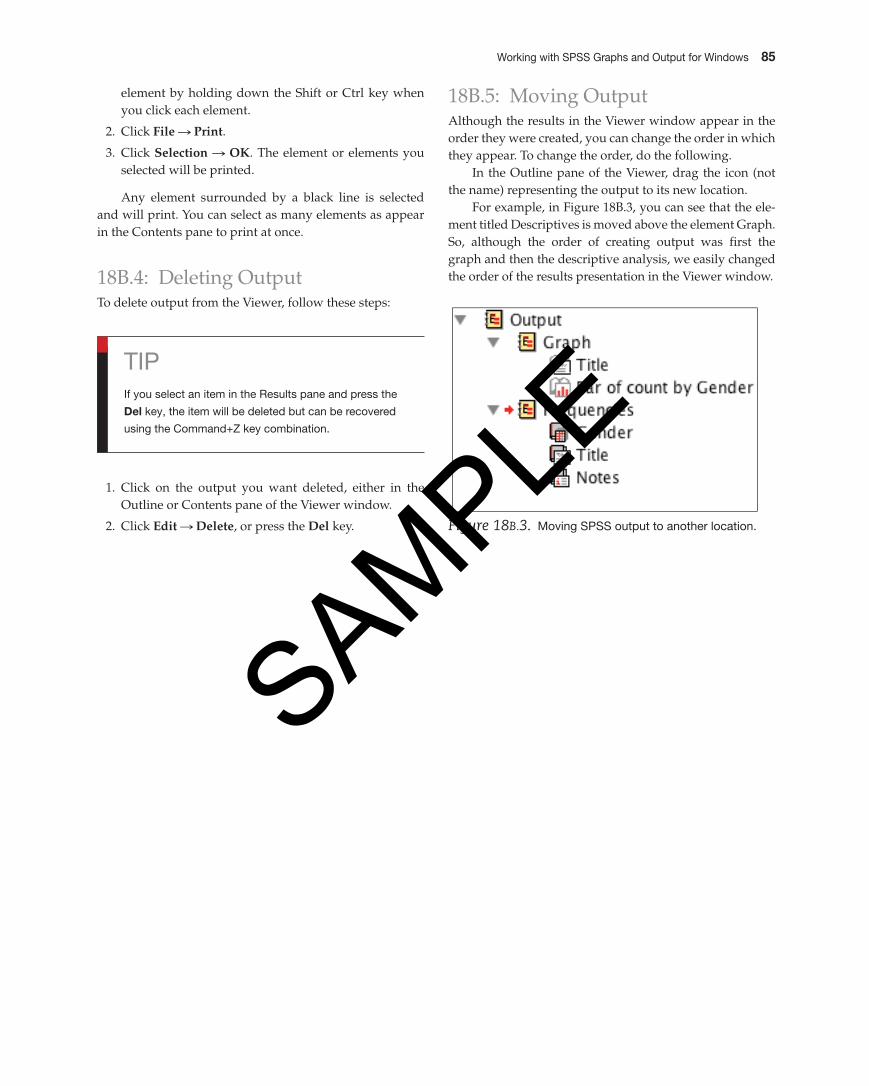
18B.5: Moving OutputAlthough the results in the Viewer window appear in the order they were created, you can change the order in which they appear. To change the order, do the following.
In the Outline pane of the Viewer, drag the icon (not the name) representing the output to its new location.
For example, in Figure 18B.3, you can see that the ele-ment titled Descriptives is moved above the element Graph. So, although the order of creating output was first the graph and then the descriptive analysis, we easily changed the order of the results presentation in the Viewer window.
Tipif you select an item in the Results pane and press the
Del key, the item will be deleted but can be recovered
using the Command+Z key combination.
1. Click on the output you want deleted, either in the Outline or Contents pane of the Viewer window.
2. Click Edit S Delete, or press the Del key. Figure 18B.3. Moving SpSS output to another location.
M04_GREE9889_08_SE_C04.indd 85 31/05/16 3:35 pm
SAMPLE
Related Documents


![GRAPHS USING SPSS 15[1]](https://static.cupdf.com/doc/110x72/568bd80a1a28ab2034a1e88b/graphs-using-spss-151.jpg)