Welcome message from author
This document is posted to help you gain knowledge. Please leave a comment to let me know what you think about it! Share it to your friends and learn new things together.
Transcript

Imprint© 2014 Smashing Magazine GmbH, Freiburg, GermanyISBN: 978-3-94454076-4 (PDF)Cover Design: Veerle PieterseBook Strategy and Editing: Vitaly FriedmanTechnical Editing: Cosima MielkePlanning and Quality Control: Vitaly Friedman, Iris LješnjaninTools: Elja FriedmanIdea & Concept: Smashing Magazine GmbH
Preface
Typography is a very powerful design element. Whenever we have a ty-pographic system in place, we can use it to structure content, commu-nicate ideas and even enhance meaning. However, employing it in away that masters that delicate balance between being unobtrusive(catering for a pleasant reading experience) and engaging enough(keeping the reader’s interest on a page) can be quite a challenge.
With the help of this eBook, you can learn how to train and sharpenyour eyes to recognize specific typographic details which will be sure toguide you in your own projects and make it easier for you to make de-sign decisions. After an initial stroll through type terminology and clas-sification, this eBook reflects on the quality of fonts (including webfont providers, of course) and explores typographic design patterns aswell as current practices. These practical considerations and a plethoraof real-world examples are bound to be a valuable companion through-out your adventures when designing with type.
IMPRINT
2
TABLE OF CONTENTSTABLE OF CONTENTS
Understanding The Difference Between Type And Lettering.................... 4Making Sense Of Type Classification (Part 1) ................................................20Making Sense Of Type Classification (Part 2)................................................ 32A Critical Approach To Typefaces .......................................................................48Taking A Second Look At Free Fonts.................................................................. 54Dear Web Font Providers ......................................................................................69Typographic Design Patterns And Current Practices (2013 Edition) ......80Creating Exciting And Unusual Visual Hierarchies.....................................96Type Makes A Difference: An Exploration Of Type-Focused Websites 113About The Authors ..................................................................................................139
3
Understanding TheDifference Between TypeAnd LetteringBY JOSEPH ALESSIOBY JOSEPH ALESSIO ❧❧
Coming out of the grunge, graffiti and David Carson era through the’90s, there has been a major resurgence of interest in typography. Wehave seen a number of designers and artists make their careers out ofdesigning type or custom lettering, and it has become common to listtypography among our skills and disciplines.
Unfortunately, as with any popularity surge, there have come withit a lot of misunderstandings of some of the terms and concepts that weuse. This chapter will help you gain a clearer understanding of what ty-pography is and isn’t, and why.
One rather common example of this is the myriad of blog posts andshowcases claiming to display “hand-lettered typography”—I’ve evenheard university professors say it. Though the phrase seems to makesense, it’s actually a contradiction in terms—hand-lettering is not ty-pography at all! Before you throw your pens and brushes at me inprotest, please let me explain!
Even though lettering and typography share many of the same con-cepts, and a good eye and understanding of one will enable you in the
UNDERSTANDING THE DIFFERENCE BETWEEN TYPE AND LETTERING
4
other as well, they are completely different disciplines. Let’s begin bydefining how we understand each term.
What Is “Typography”?Typography is essentially the study of how letterforms interact on asurface, directly relating to how the type will be set when it eventuallygoes to press. One definition is stated as “the style, arrangement or ap-pearance of typeset matter,” and is a product of the movable type print-ing system that much of the world has used for centuries. It is relatedto typesetting and can include type design. In our current digitally-dri-ven design world, this means working with fonts on a daily basis formost of us.
Typography is actually a subset of lettering, because it is the studyof letters applied to typefaces. Many designers have also taken up let-terpress printing as a hobby or side interest, which also utilizes aspectsof typography or typesetting, depending on the project.
Gerrit Noordzij, professor of typeface design at the Royal Academy ofArt in The Hague, Netherlands, from 1960 to 1990, defines typography2
as “writing with prefabricated characters.” Peter Bil’ak, founder of Ty-potheque, notes3 that this “implies a complete distinction from letter-
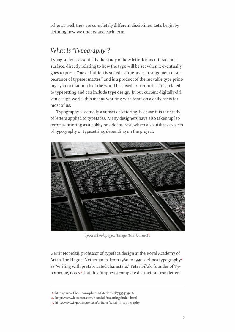
Typeset book pages. (Image: Tom Garnett1)
1. http://www.flickr.com/photos/fatedenied/7335413942/2. http://www.letterror.com/noordzij/meaning/index.html3. http://www.typotheque.com/articles/what_is_typography
5
ing, handwriting or graffiti, which are also concerned with creatingletter-shapes, but don’t offer a repeatable system of setting these let-ters.”
It is quite common for people to refer to lettering as typography, butyou should always avoid doing so when speaking with a client. Typog-raphy might be used in a logo, but so might custom lettering. Yourclient may not know the difference, but you do, and it’s important tohave an educated client. This requires that we speak to them using theright terms, and it makes things easier to understand for both you andyour client.
In addition, as designers of any sort, we strive to maintain a highlevel of professionalism4, and using terminology correctly is an impor-tant part of showing pride in our line of work and being confident thatwe can do it, not simply to get the job done, but to produce excellentwork.
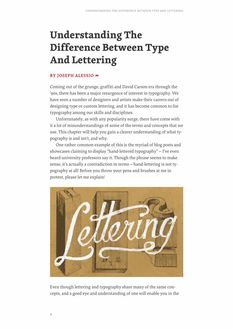
What Is “Lettering”?Lettering can be simply defined as “the art of drawing letters”. A lotgoes into making lettering look right, and that’s an entirely differenttopic, but the concept is very simple: a specific combination of letter-forms crafted for a single use and purpose as opposed to using previ-ously designed letters as components, as with typography. Often letter-ing is hand-drawn, with pens, graphite or brushes, although some peo-ple start their work directly in Adobe Illustrator. Engraving and similararts are related to lettering.
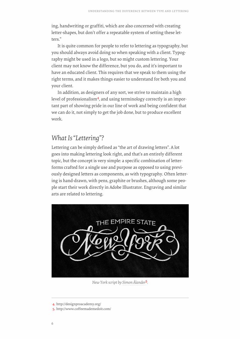
New York script by Simon Ålander5.
4. http://designproacademy.org/5. http://www.coffeemademedoit.com/
UNDERSTANDING THE DIFFERENCE BETWEEN TYPE AND LETTERING
6
Just as typography is not lettering, lettering is not typography. Widelyrespected lettering artist Jessica Hische6 gave a talk on the subject7 atthe FRONTEND 2011 conference, for those who “don’t understand thedifference between lettering and type,” getting into the pertinent infor-mation with some concise definitions at around ¾ the way through thevideo.
Typography does indeed have similarities to lettering—it is stilldealing with letters, but within the context of typefaces and their prop-er use. Therefore, it’s not a good idea to refer to typography as lettering,since they have different connotations and you don’t want to confuseyour client by swapping terms. Again, accuracy in terms is an impor-tant element in any profession and design is no different.
Similarities And DifferencesThe visual concepts that are behind typography and lettering are large-ly shared by both disciplines. Letterspacing, consistent weight and con-trast, the rules that we go by for what works and what doesn’t work,still apply. However, often the terms used are different. For space be-tween two lines of text that are typeset, we use the term “leading,” re-ferring to the strip of lead that printers would set between the lines oftype to give more space. The same concept applied to lettering wouldsimply be called “line spacing.”
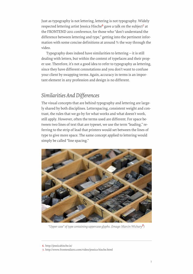
“Upper case” of type containing uppercase glyphs. (Image: Marcin Wichary8)
6. http://jessicahische.is/7. http://www.frontend2011.com/video/jessica-hische.html
7

The space between letters is also an important concept, and lack of at-tention to it is responsible for much of the bad typography we see to-day. When working with type, we call adjusting the horizontal spacebetween characters “kerning,” but this is a modernized understandingof the term. In typesetting, a kern is part of a glyph that extends beyondthe type block on which the character is molded, e.g. the terminal of the“f” in the image below.
In lettering, however, avoid referring to this as kerning. Rather thansaying that the “A” and the “V” could be kerned, we could say that thespace between them could be tightened up.
Typography is used for endless applications, from titles to body text,some of which present a myriad of typographic considerations thatthose concerned with lettering will not have to think about. Lettering isalmost exclusively used as display text—imagine lettering a few para-graphs of text by hand! Calligraphy is a much more likely to be used inlonger passages of text. While calligraphy and lettering are once againrelated, there is a fundamental difference between the two that I’d liketo point out.
Calligraphy is based on penmanship; it’s essentially “writing letters.”Lettering, on the other hand, is based on draftsmanship, i.e. “drawing
A kerned “f” type block. (Image: Typefoundry9)
8. http://www.flickr.com/photos/mwichary/2406522883/9. http://typefoundry.blogspot.com/
UNDERSTANDING THE DIFFERENCE BETWEEN TYPE AND LETTERING
8

letters.” Persevering calligraphers and scribes have famously donebooks as long as the Bible, which are incredible works of art in theirown right (e.g. the Lindisfarne Gospels, the Book of Kells), but thosewere a lifetime endeavor, and for practical purposes we now use type-faces. Whew!
The differences, in the modern digital age, are sometimes theoretical,but the practical differences are huge—nobody wants to hand-letter500 pages!
Some tenacious calligraphers, however, have undertaken monu-mental projects, such as the St. John’s Bible11, a modern manuscriptcompletely written and illuminated—a calligraphic term for embellish-ing—by hand. It took about 13 years, from commission to completion,using traditional techniques such as quill pens and manually-appliedgold leaf, and cost an estimated $8 million. The incredible proportions
Illuminated (lavishly decorated) lettering in the Lindisfarne Gospels, from the Gospel ofMark. This particular page showcases a lettered portion as opposed to a calligraphic
passage, i.e. drawn rather than written. (Image: manuscript_nerd10)
10. http://www.flickr.com/photos/83142434@N07/7807754206/11. http://www.saintjohnsbible.org/
9
of this project are a testament to the beauty of traditional techniques,but also a reflection on how printing and typography have changed theworld.
Historically SpeakingThe arts of both lettering and calligraphy have been around since timeimmemorial. Spoken languages quickly developed writing systems,which were then used to communicate through a more enduring medi-um than speech. Lettering and calligraphy evolved alongside each oth-er, along with other letter-related arts such as engraving. We can followthe progression, from the Rosetta Stone and ancient Roman inscrip-tions to the works of scribal art mentioned above and more. History hasprovided us with endless examples of lettering and calligraphy, by en-graving, pen and brush.
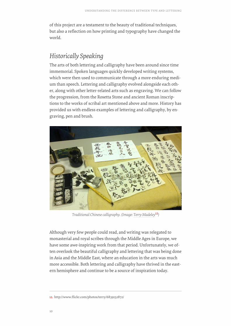
Although very few people could read, and writing was relegated tomonasterial and royal scribes through the Middle Ages in Europe, wehave some awe-inspiring work from that period. Unfortunately, we of-ten overlook the beautiful calligraphy and lettering that was being donein Asia and the Middle East, where an education in the arts was muchmore accessible. Both lettering and calligraphy have thrived in the east-ern hemisphere and continue to be a source of inspiration today.
Traditional Chinese calligraphy. (Image: Terry Madeley12)
12. http://www.flickr.com/photos/terry/6839152872/
UNDERSTANDING THE DIFFERENCE BETWEEN TYPE AND LETTERING
10
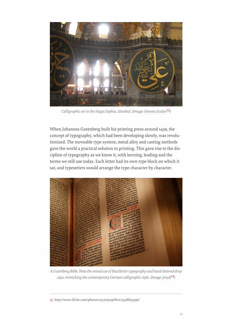
When Johannes Gutenberg built his printing press around 1439, theconcept of typography, which had been developing slowly, was revolu-tionized. The moveable type system, metal alloy and casting methodsgave the world a practical solution to printing. This gave rise to the dis-cipline of typography as we know it, with kerning, leading and theterms we still use today. Each letter had its own type block on which itsat, and typesetters would arrange the type character by character.
Calligraphic art in the Hagia Sophia, Istanbul. (Image: Simona Scolari13)
A Gutenberg Bible. Note the mixed use of blackletter typography and hand-lettered dropcaps, mimicking the contemporary German calligraphic style. (Image: jmwk14)
13. http://www.flickr.com/photos/13237923@N02/3458854590/
11
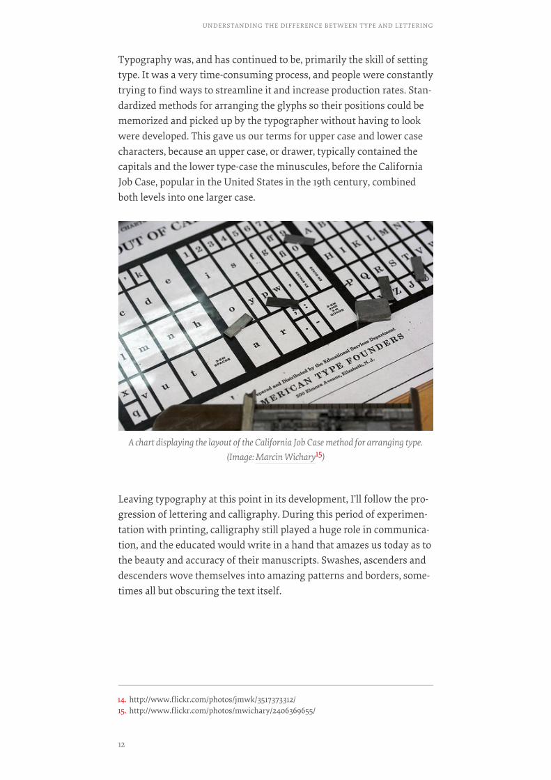
Typography was, and has continued to be, primarily the skill of settingtype. It was a very time-consuming process, and people were constantlytrying to find ways to streamline it and increase production rates. Stan-dardized methods for arranging the glyphs so their positions could bememorized and picked up by the typographer without having to lookwere developed. This gave us our terms for upper case and lower casecharacters, because an upper case, or drawer, typically contained thecapitals and the lower type-case the minuscules, before the CaliforniaJob Case, popular in the United States in the 19th century, combinedboth levels into one larger case.
Leaving typography at this point in its development, I’ll follow the pro-gression of lettering and calligraphy. During this period of experimen-tation with printing, calligraphy still played a huge role in communica-tion, and the educated would write in a hand that amazes us today as tothe beauty and accuracy of their manuscripts. Swashes, ascenders anddescenders wove themselves into amazing patterns and borders, some-times all but obscuring the text itself.
A chart displaying the layout of the California Job Case method for arranging type.(Image: Marcin Wichary15)
14. http://www.flickr.com/photos/jmwk/3517373312/15. http://www.flickr.com/photos/mwichary/2406369655/
UNDERSTANDING THE DIFFERENCE BETWEEN TYPE AND LETTERING
12

Lettering and calligraphy followed cultural trends, leaving the Rococoera and becoming more sober during the early 19th century, only toflower into ornament once again through the Victorian era and theflorid shapes of Art Nouveau. The worlds of type and lettering con-stantly intermeshed. Many people, such as Oswald Cooper, achieved re-spect for their lettering and were hired by type foundries to design newtypefaces.
Lettering figured strongly through Art Deco and Modernism, forposters and ads, logotypes and book covers. The relatively recent art offilm titles also provides us with a wide range of illustrative letteringstyles from the 20th century. Coming out of the Modern era andthrough the latter half of the 20th century lettering went through a va-riety of permutations—the organic styles of the 70′s, the new mod-ernism of the 80′s, and the grungy 90′s styles aforementioned—bring-ing us to our modern lettering scene, with a smorgasbord of visual ref-erences to every period of history imaginable. Designers such as HerbLubalin and Doyald Young, the metaphorical giants of lettering, haveleft a huge legacy from this time period.
Ornate sample of penmanship by Jan van de Velde, Amsterdam, 1609.(Image: Design Observer16)
16. http://observatory.designobserver.com/slideshow.html?view=507&entry=9767&slide=6#slide
13
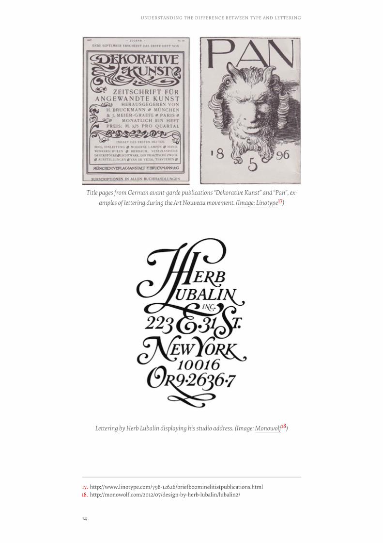
Title pages from German avant-garde publications “Dekorative Kunst” and “Pan”, ex-amples of lettering during the Art Nouveau movement. (Image: Linotype17)
Lettering by Herb Lubalin displaying his studio address. (Image: Monowolf18)
17. http://www.linotype.com/798-12626/briefboominelitistpublications.html18. http://monowolf.com/2012/07/design-by-herb-lubalin/lubalin2/
UNDERSTANDING THE DIFFERENCE BETWEEN TYPE AND LETTERING
14

Here I will step back in time to pick the thread of typography back up.The development of techniques continued through the 19th century,and printing played an important role in world history, such as Ben-jamin Franklin’s publications and Thomas Paine’s printed materi-als— The Rights Of Man, Age Of Reason, et al—that were instrumental inthe American Revolution.
Meanwhile, after many inventors had tried and failed to create apractical typesetting machine, Ottmar Mergenthaler succeeded inbuilding the linotype machine in 1884, which revolutionized the news-paper industry. I won’t say more about it here, but if you’re interestedin the history of typography, I would highly recommend taking a lookat the documentary Linotype: The Film19. This is not a sponsored state-ment, I simply enjoyed the documentary immensely and you may wantto check it out!
The linotype was just one of the machines used to expedite the typeset-ting and printing processes, and although some people still hand-settype, the industry as a whole was continuously changing to introducefaster and better techniques. Typography was explored in the variousart movements, from Dada to Modernism and beyond, rethinking waysin which type could be used and given expression and meaning. As ty-pography, experimental and traditional, progressed, the techniques
A look at a linotype machine. (Image: Marcin Wichary20)
19. http://www.linotypefilm.com/20. http://www.flickr.com/photos/mwichary/2252094942/
15
segued to phototypesetting and from thence to the digital age in whichwe find ourselves today. Typography as a discipline looks very differentthan it did 50 years ago. Instead of setting metal type and locking informs, we use panels in Illustrator or InDesign to kern, add leading andalign our type.
Lettering has also moved into the digital format in which we enactmost of our design work. Many artists, however, stay true to analogmedia by hand-drawing lettering.
The digital amalgamation has been largely responsible for the confu-sion of lettering and typography, since they are now often created us-ing the same programs—the difference between the two is no longerthe difference between a brush and a letterpress machine, or a draftingtable and linotype matrices. However, lettering and typography are stilldifferent concepts, and understanding them and their similarities anddifferences will help us become better designers.
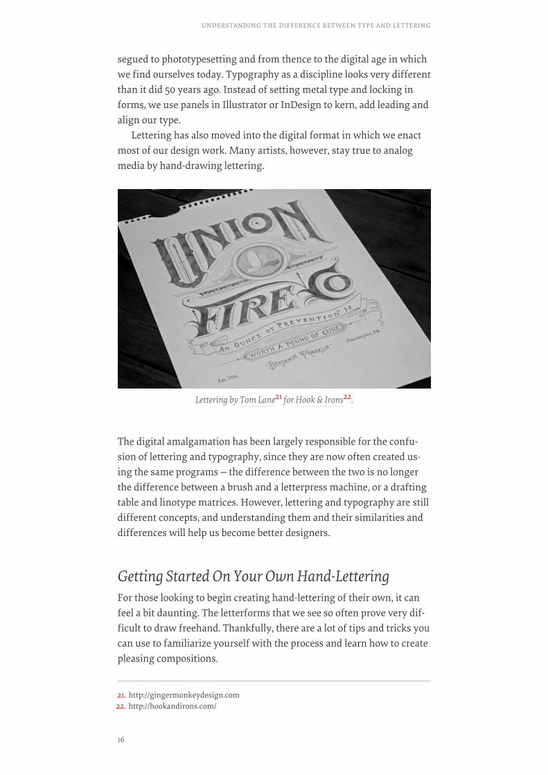
Getting Started On Your Own Hand-LetteringFor those looking to begin creating hand-lettering of their own, it canfeel a bit daunting. The letterforms that we see so often prove very dif-ficult to draw freehand. Thankfully, there are a lot of tips and tricks youcan use to familiarize yourself with the process and learn how to createpleasing compositions.
Lettering by Tom Lane21 for Hook & Irons22.
21. http://gingermonkeydesign.com22. http://hookandirons.com/
UNDERSTANDING THE DIFFERENCE BETWEEN TYPE AND LETTERING
16
TRACINGTRACING
Get some tracing paper, and print out samples of well-known type-faces. Trace them over a few times, letting your hand become used tothe lines that type designers have carefully worked over and reviseduntil they were perfect. Some good ones to start with are time-honoredclassics such as Garamond and Caslon, or exceptional recent workssuch as Okay Type’s Harriet23. Avoid using free fonts, since they are of-ten poorly crafted and wouldn’t provide a good model. This allows youto train your eye and hand using the work of masters.
READINGREADING
Read voraciously! I’ve listed a number of resources at the end of thechapter for you to check out—books, blogs and other resources. Knowl-edge is power, and understanding principles behind type design andletterforms help you develop your eye.
PHOTO SAFARIPHOTO SAFARI
If you live near a town with a historic district or old buildings, make apoint to spend a few hours on a weekend just walking around and find-ing samples of good typography and lettering. You can find great exam-ples in outdoor signage, whether lighted signs, painted or vinyl. Oftenthere are huge letters painted on brick walls at old factories or restau-rants. Then, use your photos as models to draw historic styles of letter-ing.
USE A GRID, BUT DON’T USE A GRIDUSE A GRID, BUT DON’T USE A GRID
When lettering, you’ll find that perfect measurements often don’t actu-ally look “right.” Draw lines to help yourself keep a consistent stressand even weight throughout your lettering, but trust your eye ratherthan the grid if something doesn’t look quite correct. This is particular-ly true if you’re doing something with a curved baseline. Remember,you’re making this to be seen, not measured, so perception trumps geo-metric perfection.
ResourcesHere are a few resources that I have found to be particularly helpful,concerning both lettering and typography.
23. http://okaytype.com/harriet/series
17
BOOKSBOOKS
• Dangerous Curves24, Doyald YoungThis volume showcases some of the best work over Young’s illustriouslettering career, including rejected logotype options and in-processsketches.
• Scripts25, Steven Heller and Louise FiliFrom two of our contemporary design landscape’s most respected pro-ponents of lettering and type comes a “veritable festival of rare and un-known scripts.”
• Typography Sketchbooks26, Steven Heller and Lita TalaricoHeller teams up with Talarico to present a look inside the minds andprocesses of more than 100 esteemed letter-lovers.
• Designing Type27, Karen ChengCheng walks us through a semantic look at the rationale and aestheticsbehind the typefaces we see and use regularly, replete with diagramsand illustrations.
WEBSITESWEBSITES
• Typeverything28
A tumblog of lettering and typography, curated by some of the most re-spected current lettering artists.
• I Love Typography29
In-depth blog posts about type history and lettering, interviews withtype designers, updates on upcoming type-related publications—ILTprovides a good read for serious letter lovers.
• We Love Typography30
Compiled by typographers and designers of all sorts, another showcaseof type and lettering with styles for everyone.
24. http://doyaldyoung.com/DC01.html25. http://www.louisefili.com/books/?c=331&n=026. http://www.thamesandhudson.com/Typography_Sketchbooks/978050028968627. http://yalepress.yale.edu/yupbooks/book.asp?isbn=030011150928. http://typeverything.com29. http://ilovetypography.com/30. http://welovetypography.com/
UNDERSTANDING THE DIFFERENCE BETWEEN TYPE AND LETTERING
18
• Beautiful Type31
This site isn’t updated terribly often, but whatever and whenever theydo post, it’s inspiring!
PORTFOLIOSPORTFOLIOS
Here are a few portfolios from great lettering artists that have inspiredmany:
• Simon Walker32
• Claire Coullon33
• Dan Cassaro34
• Jon Contino35
In SummaryHopefully this dissertation on lettering and typography has enhancedyour knowledge of design and will further equip you to improve yourskills. Lettering and typography, so similar yet so diverse, are a hugepart of design and thus deserve our full understanding.❧
31. http://beautifultype.net/32. http://simonwalkertype.com/33. http://coullon.com/34. http://youngjerks.com/35. http://joncontino.com/
19
Making Sense Of TypeClassification (Part 1)BY JOSEPH ALESSIOBY JOSEPH ALESSIO ❧❧
This chapter deals with terminology, probably more specifically thanmost designers are used to, and the title gets to the heart of what I’mcommunicating in this chapter.
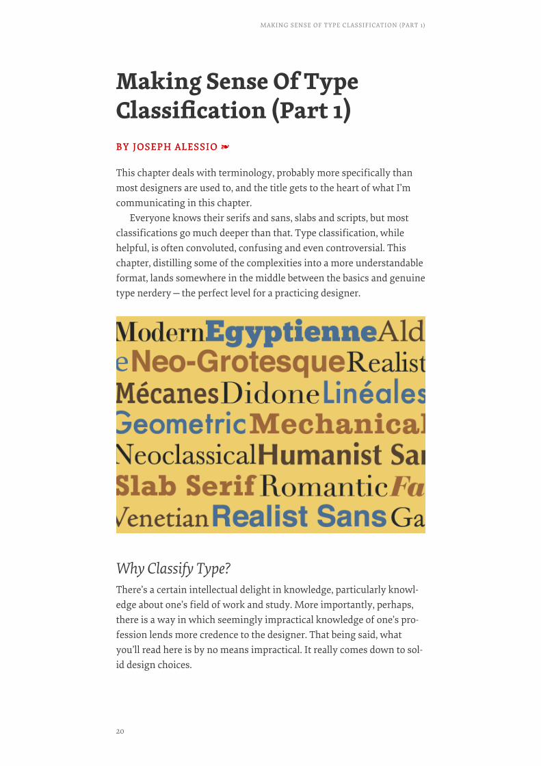
Everyone knows their serifs and sans, slabs and scripts, but mostclassifications go much deeper than that. Type classification, whilehelpful, is often convoluted, confusing and even controversial. Thischapter, distilling some of the complexities into a more understandableformat, lands somewhere in the middle between the basics and genuinetype nerdery—the perfect level for a practicing designer.
Why Classify Type?There’s a certain intellectual delight in knowledge, particularly knowl-edge about one’s field of work and study. More importantly, perhaps,there is a way in which seemingly impractical knowledge of one’s pro-fession lends more credence to the designer. That being said, whatyou’ll read here is by no means impractical. It really comes down to sol-id design choices.
MAKING SENSE OF TYPE CLASSIFICATION (PART 1)
20
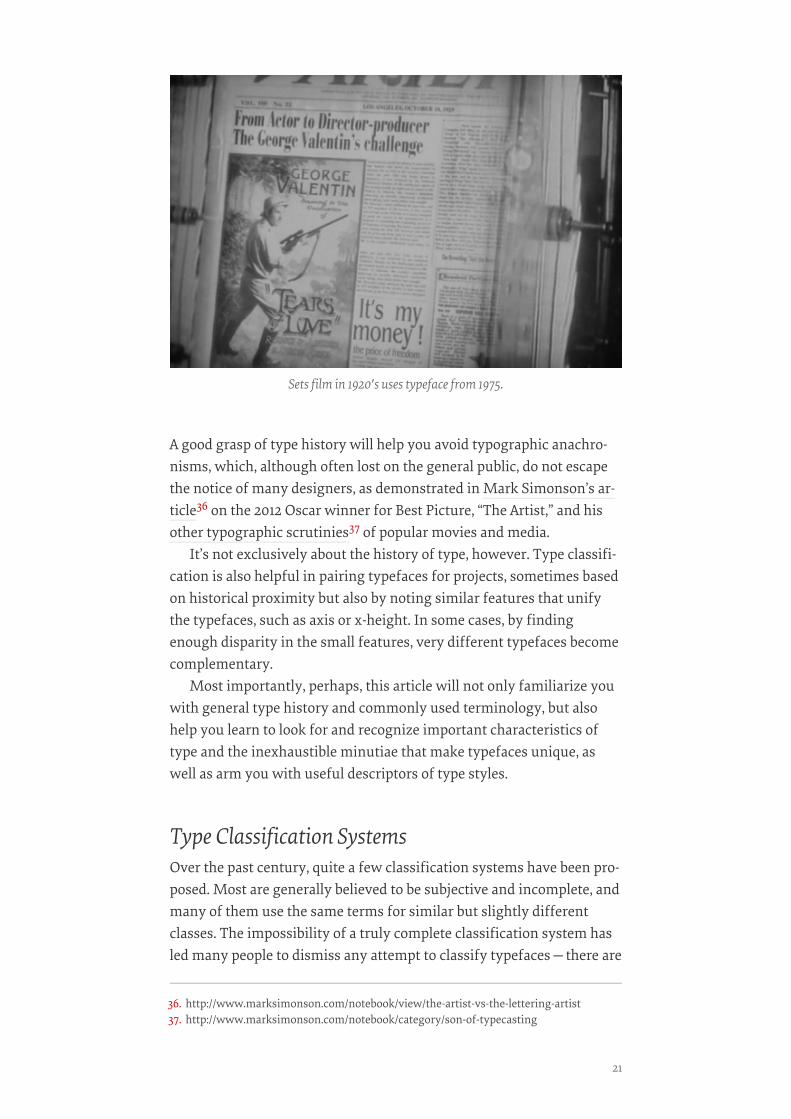
A good grasp of type history will help you avoid typographic anachro-nisms, which, although often lost on the general public, do not escapethe notice of many designers, as demonstrated in Mark Simonson’s ar-ticle36 on the 2012 Oscar winner for Best Picture, “The Artist,” and hisother typographic scrutinies37 of popular movies and media.
It’s not exclusively about the history of type, however. Type classifi-cation is also helpful in pairing typefaces for projects, sometimes basedon historical proximity but also by noting similar features that unifythe typefaces, such as axis or x-height. In some cases, by findingenough disparity in the small features, very different typefaces becomecomplementary.
Most importantly, perhaps, this article will not only familiarize youwith general type history and commonly used terminology, but alsohelp you learn to look for and recognize important characteristics oftype and the inexhaustible minutiae that make typefaces unique, aswell as arm you with useful descriptors of type styles.
Type Classification SystemsOver the past century, quite a few classification systems have been pro-posed. Most are generally believed to be subjective and incomplete, andmany of them use the same terms for similar but slightly differentclasses. The impossibility of a truly complete classification system hasled many people to dismiss any attempt to classify typefaces—there are
Sets film in 1920′s uses typeface from 1975.
36. http://www.marksimonson.com/notebook/view/the-artist-vs-the-lettering-artist37. http://www.marksimonson.com/notebook/category/son-of-typecasting
21
simply too many variables to make anything close to a practical, com-prehensive system. Essentially, classification describes typefaces; itdoes not define them. It’s not inflexible, and is more of an aid than arule. However, for the reasons given above, I believe there is value to befound in it. Below are a few examples.
The primary “official” classification system currently is the Vox-ATypI system. Originally put together in 1954 by Maxmilien Vox, it wasadopted in 1962 by the Association Typographique Internationale(ATypI), which made a minor change at the 2010 conference (appropri-ately, held in Dublin) to include Gaelic as an extra category. It classifiestypefaces in 11 general categories, with some subdivision. Its Wikipediaarticle provides an excellent overview38.
The British Standards Classification of Typefaces39, adopted in 1967,is also based on Vox’s original classification. It is slightly simplified andhas remained essentially unchanged since its adoption.
Bringhurst, in his Elements of Typographic Style40 —perhaps thestandard in typographic textbooks today—categorizes typefaces loose-ly after periods of art history; for example, Baroque, Rococo, Romantic,etc. A book designer himself, Bringhurst focuses on text typefaces andpractically ignores display type.
Others are much more general. An early system by French typogra-pher Francis Thibaudeau41, which provided the base for Vox’s latermore thorough classification, includes four broad categories: Antiques(sans serifs), Égyptiennes (slab serifs), Didots and Elzévirs (faces withtriangular serifs).
Gerrit Noordzij, while at the Royal Academy of Fine Arts in theHague, held that typography was essentially an extension of handwrit-ing42, teaching typography using loose categories of letters that mightbe written with a broad-nib or pointed-nib pen, as well as interrupted oruninterrupted strokes, with varieties of both serifs and sans falling intoeach category.
These are just a few of the ways people have classified type over theyears. In this two-part chapter, I will condense the various methodsslightly and present what is at the very least generally accepted as legit-imate (as there will always be a few out there who refuse to give up aparticularly unusual classification method, or who decry any method atall).
38. http://en.wikipedia.org/wiki/VOX-ATypI_classification39. http://luc.devroye.org/britishstandards.html40. http://en.wikipedia.org/wiki/The_Elements_of_Typographic_Style41. http://en.wikipedia.org/wiki/Thibaudeau_classification42. http://en.wikipedia.org/wiki/Gerrit_Noordzij#The_stroke_of_the_pen
MAKING SENSE OF TYPE CLASSIFICATION (PART 1)
22

Classifying Serif TypefacesIn part 1 here, we’ll cover serif styles, following the natural progressionof type history, and thus move into sans and other categories in part 2.
HUMANISTHUMANIST
Starting off, naturally, at the beginning of type history, we’re in themiddle 1400s, during the Renaissance. The movement, led by Italiancultural hubs such as Florence and Venice, was drawing Europe awayfrom medieval practices, and typography was one part of that. Ratherthan using the blackletter, or Fraktur type, that Gutenberg used, print-ers began to create type mimicking the Latin writing hand of thephilosophers and scribes of the time, beginning around 1465.
These typefaces are variously called Humanist or Venetian due to thezeitgeist and geography of the Renaissance. A number of distinct char-acteristics define Humanist typefaces.
Primarily, Humanist faces were very calligraphic in nature, and oneway this manifested itself was in the strong axis, most apparent in thebowls of characters and the lowercase “o,” a characteristic borrowedfrom the angle at which a right-handed writer holds a pen. Another in-teresting way this showed itself was in the notably angled crossbar onthe lowercase “e.” Other calligraphic influences are clear, such as incon-sistencies in stroke weight and the way serifs are formed.
Other defining characteristics include a small x-height and a lowercontrast between thick and thin strokes.
A 1905 textbook illustration of Renaissance printers.
23
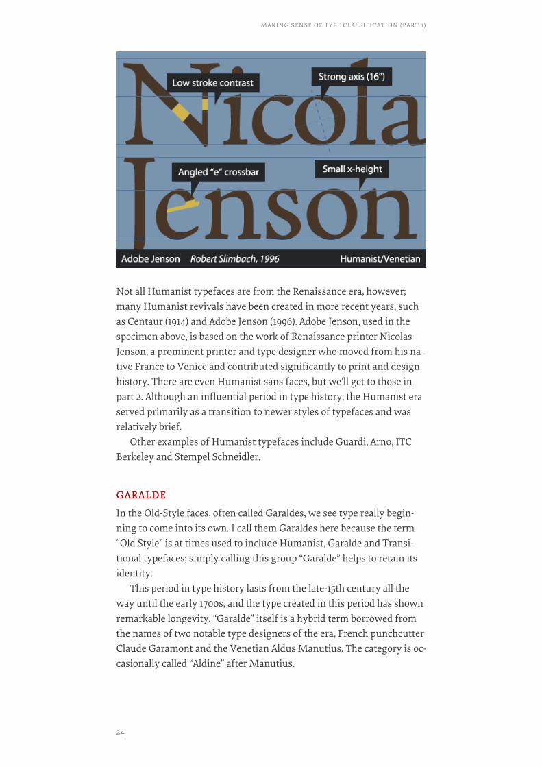
Not all Humanist typefaces are from the Renaissance era, however;many Humanist revivals have been created in more recent years, suchas Centaur (1914) and Adobe Jenson (1996). Adobe Jenson, used in thespecimen above, is based on the work of Renaissance printer NicolasJenson, a prominent printer and type designer who moved from his na-tive France to Venice and contributed significantly to print and designhistory. There are even Humanist sans faces, but we’ll get to those inpart 2. Although an influential period in type history, the Humanist eraserved primarily as a transition to newer styles of typefaces and wasrelatively brief.
Other examples of Humanist typefaces include Guardi, Arno, ITCBerkeley and Stempel Schneidler.
GARALDEGARALDE
In the Old-Style faces, often called Garaldes, we see type really begin-ning to come into its own. I call them Garaldes here because the term“Old Style” is at times used to include Humanist, Garalde and Transi-tional typefaces; simply calling this group “Garalde” helps to retain itsidentity.
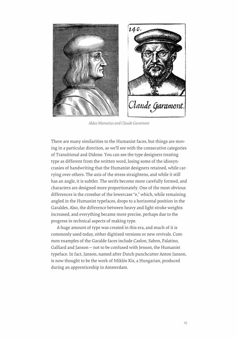
This period in type history lasts from the late-15th century all theway until the early 1700s, and the type created in this period has shownremarkable longevity. “Garalde” itself is a hybrid term borrowed fromthe names of two notable type designers of the era, French punchcutterClaude Garamont and the Venetian Aldus Manutius. The category is oc-casionally called “Aldine” after Manutius.
MAKING SENSE OF TYPE CLASSIFICATION (PART 1)
24
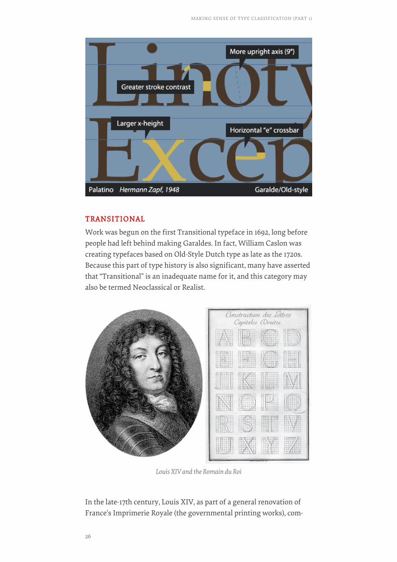
There are many similarities to the Humanist faces, but things are mov-ing in a particular direction, as we’ll see with the consecutive categoriesof Transitional and Didone. You can see the type designers treatingtype as different from the written word, losing some of the idiosyn-crasies of handwriting that the Humanist designers retained, while car-rying over others. The axis of the stress straightens, and while it stillhas an angle, it is subtler. The serifs become more carefully formed, andcharacters are designed more proportionately. One of the most obviousdifferences is the crossbar of the lowercase “e,” which, while remainingangled in the Humanist typefaces, drops to a horizontal position in theGaraldes. Also, the difference between heavy and light stroke weightsincreased, and everything became more precise, perhaps due to theprogress in technical aspects of making type.
A huge amount of type was created in this era, and much of it iscommonly used today, either digitized versions or new revivals. Com-mon examples of the Garalde faces include Caslon, Sabon, Palatino,Galliard and Janson—not to be confused with Jenson, the Humanisttypeface. In fact, Janson, named after Dutch punchcutter Anton Janson,is now thought to be the work of Miklós Kis, a Hungarian, producedduring an apprenticeship in Amsterdam.
Aldus Manutius and Claude Garamont
25
TRANSITIONALTRANSITIONAL
Work was begun on the first Transitional typeface in 1692, long beforepeople had left behind making Garaldes. In fact, William Caslon wascreating typefaces based on Old-Style Dutch type as late as the 1720s.Because this part of type history is also significant, many have assertedthat “Transitional” is an inadequate name for it, and this category mayalso be termed Neoclassical or Realist.
In the late-17th century, Louis XIV, as part of a general renovation ofFrance’s Imprimerie Royale (the governmental printing works), com-
Louis XIV and the Romain du Roi
MAKING SENSE OF TYPE CLASSIFICATION (PART 1)
26
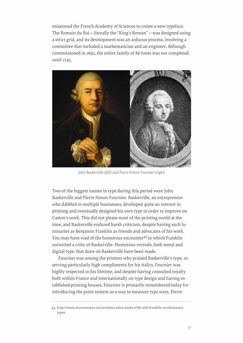
missioned the French Academy of Sciences to create a new typeface.The Romain du Roi—literally the “King’s Roman”—was designed usinga strict grid, and its development was an arduous process, involving acommittee that included a mathematician and an engineer. Althoughcommissioned in 1692, the entire family of 86 fonts was not completeduntil 1745.
Two of the biggest names in type during this period were JohnBaskerville and Pierre Simon Fournier. Baskerville, an entrepreneurwho dabbled in multiple businesses, developed quite an interest inprinting and eventually designed his own type in order to improve onCaslon’s work. This did not please most of the printing world at thetime, and Baskerville endured harsh criticism, despite having such lu-minaries as Benjamin Franklin as friends and advocates of his work.You may have read of the humorous encounter43 in which Franklinoutwitted a critic of Baskerville. Numerous revivals, both metal anddigital type, that draw on Baskerville have been made.
Fournier was among the printers who praised Baskerville’s type, re-serving particularly high compliments for his italics. Fournier washighly respected in his lifetime, and despite having consulted royaltyboth within France and internationally on type design and having es-tablished printing houses, Fournier is primarily remembered today forintroducing the point system as a way to measure type sizes. Pierre
John Baskerville (left) and Pierre Simon Fournier (right)
43. http://www.mcsweeneys.net/articles/caslon-baskerville-and-franklin-revolutionary-types
27
Fournier, uncannily sharing a name with an acclaimed 20th-centurycellist, also had an interest in music and developed a new style of ty-pography for musical notation.
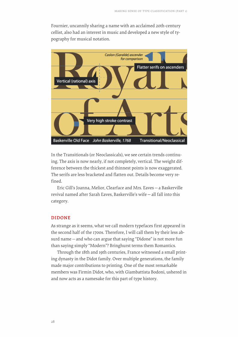
In the Transitionals (or Neoclassicals), we see certain trends continu-ing. The axis is now nearly, if not completely, vertical. The weight dif-ference between the thickest and thinnest points is now exaggerated.The serifs are less bracketed and flatten out. Details become very re-fined.
Eric Gill’s Joanna, Melior, Clearface and Mrs. Eaves—a Baskervillerevival named after Sarah Eaves, Baskerville’s wife—all fall into thiscategory.
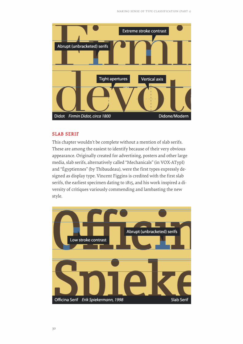
DIDONEDIDONE
As strange as it seems, what we call modern typefaces first appeared inthe second half of the 1700s. Therefore, I will call them by their less ab-surd name—and who can argue that saying “Didone” is not more funthan saying simply “Modern”? Bringhurst terms them Romantics.
Through the 18th and 19th centuries, France witnessed a small print-ing dynasty in the Didot family. Over multiple generations, the familymade major contributions to printing. One of the most remarkablemembers was Firmin Didot, who, with Giambattista Bodoni, ushered inand now acts as a namesake for this part of type history.
MAKING SENSE OF TYPE CLASSIFICATION (PART 1)
28

In large part inspired by Baskerville, Didot and Bodoni pushed the lim-its of type design. They explored a similar style and were both meticu-lous craftsmen, consequently igniting a fierce rivalry. Bodoni(1740–1813) gave himself entirely to his craft. He was renowned for thebeauty of his type specimens, and, a technically brilliant punchcutterhimself, he designed some 298 typefaces. Didot (1764–1836), on the oth-er hand, retired in 1827 to pursue political office and literature in his lat-er years, writing tragedies and literary critiques.
If Baskerville’s stroke contrast was exaggerated, then the Didones’are in the extreme. The heavy strokes are very heavy, and the light are ahairline. The stress is again completely vertical, and the aper-tures—places where the character opens—are generally very tight.Combined, these make for a very awkward visual rhythm, and Didonesare always a poor choice for chunks of text. Rather, they work best atlarge sizes, as titling and display type, because the features emphasizethe elegance of individual characters and do not blend well. Adobe’sNew Caledonia44, which softens some extremes and thus works forlonger bits of text, is a possible exception.
Aside from the obvious Bodoni and Didot faces, in their dozens ofvariants from nearly every foundry, Basilia, Aviano, Walbaum, Am-broise and Scotch Roman are exemplary moderns.
Firmin Didot (left) and Giambattista Bodoni (right)
44. http://www.myfonts.com/fonts/adobe/new-caledonia/
29
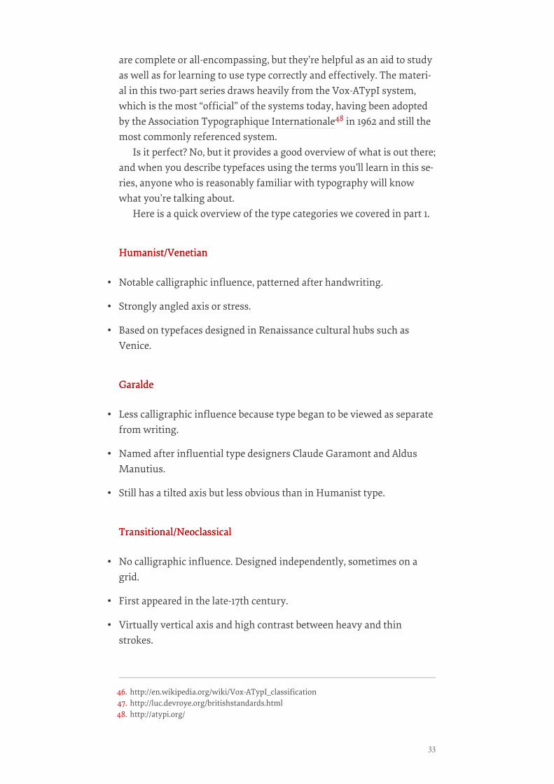
SLAB SERIFSLAB SERIF
This chapter wouldn’t be complete without a mention of slab serifs.These are among the easiest to identify because of their very obviousappearance. Originally created for advertising, posters and other largemedia, slab serifs, alternatively called “Mechanicals” (in VOX-ATypI)and “Égyptiennes” (by Thibaudeau), were the first types expressly de-signed as display type. Vincent Figgins is credited with the first slabserifs, the earliest specimen dating to 1815, and his work inspired a di-versity of critiques variously commending and lambasting the newstyle.
MAKING SENSE OF TYPE CLASSIFICATION (PART 1)
30

Abrupt serifs, usually in heavy weights, and a no-nonsense attitude arethe trademarks of this style.
Clarendons, a notable offshoot of the original slab serifs, are a slightlytamed slab style, often in less extreme weights and using bracketed ser-ifs. They have a lighter, friendlier character than the Neo-Grotesqueslabs (i.e. those with unbracketed serifs and geometric construction).
H&FJ’s Sentinel (2009) and David Berlow’s Belizio (1998) are exam-ples of recent Clarendons.
And That’s It… For NowIf you have made it this far in the chapter, congratulations! You arenow in possession of a solid basic understanding of type classification,at least as far as serif typefaces take you, and you are able to recognizethe important distinguishing features that make typefaces unique. Fol-lowing the line of type history, we’re now in the middle of the 19th cen-tury, and we have the entirety of sans serifs and some discussion of dis-play faces ahead of us. We’re really only halfway through.❧
31

Making Sense Of TypeClassification (Part 2)BY JOSEPH ALESSIOBY JOSEPH ALESSIO ❧❧
In the first installment of this two-part series on type classification, wecovered the basics of type classification—the various methods peoplehave used, why they are helpful, and a brief survey of type history, clas-sifying and identifying typefaces along the way. Unfortunately, we on-ly got as far as Roman (traditional serif) typefaces and the early-19thcentury. Now we’re back for part 2!
Part 2 will primarily cover sans typefaces, with a nod to display type-faces and other less common categories, as well as address a few of thequestions people have about whether type classification is helpful andnecessary.
Review
TYPE CLASSIFICATION SYSTEMSTYPE CLASSIFICATION SYSTEMS
Type has been classified in many ways over the years, both formal andinformal—Thibaudeau45, Vox46, British Standards47, etc. None of these
45. http://en.wikipedia.org/wiki/Thibaudeau_classification
MAKING SENSE OF TYPE CLASSIFICATION (PART 2)
32
are complete or all-encompassing, but they’re helpful as an aid to studyas well as for learning to use type correctly and effectively. The materi-al in this two-part series draws heavily from the Vox-ATypI system,which is the most “official” of the systems today, having been adoptedby the Association Typographique Internationale48 in 1962 and still themost commonly referenced system.
Is it perfect? No, but it provides a good overview of what is out there;and when you describe typefaces using the terms you’ll learn in this se-ries, anyone who is reasonably familiar with typography will knowwhat you’re talking about.
Here is a quick overview of the type categories we covered in part 1.
Humanist/VenetianHumanist/Venetian
• Notable calligraphic influence, patterned after handwriting.
• Strongly angled axis or stress.
• Based on typefaces designed in Renaissance cultural hubs such asVenice.
GaraldeGaralde
• Less calligraphic influence because type began to be viewed as separatefrom writing.
• Named after influential type designers Claude Garamont and AldusManutius.
• Still has a tilted axis but less obvious than in Humanist type.
Transitional/NeoclassicalTransitional/Neoclassical
• No calligraphic influence. Designed independently, sometimes on agrid.
• First appeared in the late-17th century.
• Virtually vertical axis and high contrast between heavy and thinstrokes.
46. http://en.wikipedia.org/wiki/Vox-ATypI_classification47. http://luc.devroye.org/britishstandards.html48. http://atypi.org/
33
DidoneDidone
• Extreme contrast between thick and thin. Rigidly vertical axis.
• Abrupt, or unbracketed, serifs. Very precisely designed.
• Named after Firmin Didot and Giambattista Bodoni.
Slab SerifSlab Serif
• Very heavy weight and low contrast between thick and thin.
• Unbracketed, prominent serifs.
• First typefaces created expressly for display purposes.
Sans SerifsWhen we left off in part 1, it was circa 1815, with the first appearancesof slab serifs, also called Mechanistics or Egyptiennes. By the time slabserifs were being popularized, early sans serifs had already beenaround for some time in a variety of forms. To follow the progressionof sans serifs, we must step back in time a number of years.
HISTORY OF SANS SERIFSHISTORY OF SANS SERIFS
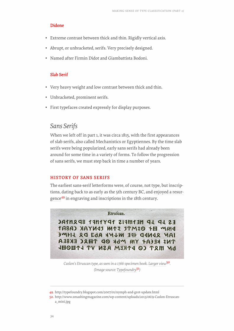
The earliest sans-serif letterforms were, of course, not type, but inscrip-tions, dating back to as early as the 5th century BC, and enjoyed a resur-gence49 in engraving and inscriptions in the 18th century.
Caslon’s Etruscan type, as seen in a 1766 specimen book. Larger view50.(Image source: Typefoundry51)
49. http://typefoundry.blogspot.com/2007/01/nymph-and-grot-update.html50. http://www.smashingmagazine.com/wp-content/uploads/2013/06/9-Caslon-Etruscan-
a_mini.jpg
MAKING SENSE OF TYPE CLASSIFICATION (PART 2)
34
Strangely enough, the first “sans serif” type was created not for theLatin alphabet, but for use in 18th-century academic works on Etruscanculture, which preceded the Roman Empire in the geographical area ofmodern-day Italy. Circa 1748, the foundry of William Caslon (withwhom you should be familiar) cut the first known sans-serif Etruscantype for the Oxford University Press, although there are earlier usagesof sans serifs in similar applications.
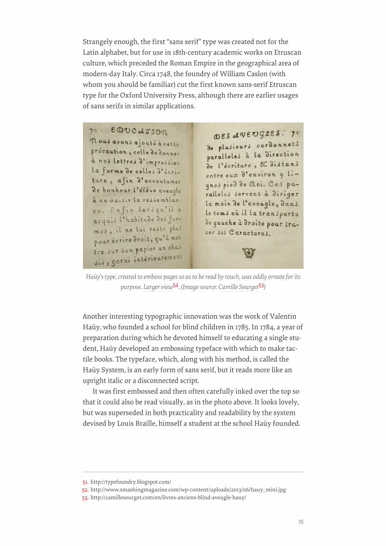
Another interesting typographic innovation was the work of ValentinHaüy, who founded a school for blind children in 1785. In 1784, a year ofpreparation during which he devoted himself to educating a single stu-dent, Haüy developed an embossing typeface with which to make tac-tile books. The typeface, which, along with his method, is called theHaüy System, is an early form of sans serif, but it reads more like anupright italic or a disconnected script.
It was first embossed and then often carefully inked over the top sothat it could also be read visually, as in the photo above. It looks lovely,but was superseded in both practicality and readability by the systemdevised by Louis Braille, himself a student at the school Haüy founded.
Haüy’s type, created to emboss pages so as to be read by touch, was oddly ornate for itspurpose. Larger view52. (Image source: Camille Sourget53)
51. http://typefoundry.blogspot.com/52. http://www.smashingmagazine.com/wp-content/uploads/2013/06/hauy_mini.jpg53. http://camillesourget.com/en/livres-anciens-blind-aveugle-hauy/
35
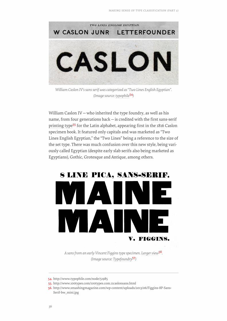
William Caslon IV—who inherited the type foundry, as well as hisname, from four generations back—is credited with the first sans-serifprinting type55 for the Latin alphabet, appearing first in the 1816 Caslonspecimen book. It featured only capitals and was marketed as “TwoLines English Egyptian,” the “Two Lines” being a reference to the size ofthe set type. There was much confusion over this new style, being vari-ously called Egyptian (despite early slab serifs also being marketed asEgyptians), Gothic, Grotesque and Antique, among others.
William Caslon IV’s sans serif was categorized as “Two Lines English Egyptian”.(Image source: typophile54)
A sans from an early Vincent Figgins type specimen. Larger view56.(Image source: Typefoundry57)
54. http://www.typophile.com/node/5198555. http://www.100types.com/100types.com.11caslonsans.html56. http://www.smashingmagazine.com/wp-content/uploads/2013/06/Figgins-8P-Sans-
Serif-bw_mini.jpg
MAKING SENSE OF TYPE CLASSIFICATION (PART 2)
36
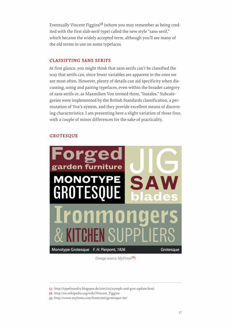
Eventually Vincent Figgins58 (whom you may remember as being cred-ited with the first slab-serif type) called the new style “sans serif,”which became the widely accepted term, although you’ll see many ofthe old terms in use on some typefaces.
CLASSIFYING SANS SERIFSCLASSIFYING SANS SERIFS
At first glance, you might think that sans serifs can’t be classified theway that serifs can, since fewer variables are apparent in the ones wesee most often. However, plenty of details can aid specificity when dis-cussing, using and pairing typefaces, even within the broader categoryof sans serifs or, as Maxmilien Vox termed them, “linéales.” Subcate-gories were implemented by the British Standards classification, a per-mutation of Vox’s system, and they provide excellent means of discern-ing characteristics. I am presenting here a slight variation of those four,with a couple of minor differences for the sake of practicality.
GROTESQUEGROTESQUE
(Image source: MyFonts59)
57. http://typefoundry.blogspot.de/2007/01/nymph-and-grot-update.html58. http://en.wikipedia.org/wiki/Vincent_Figgins59. http://www.myfonts.com/fonts/mti/grotesque-mt/
37
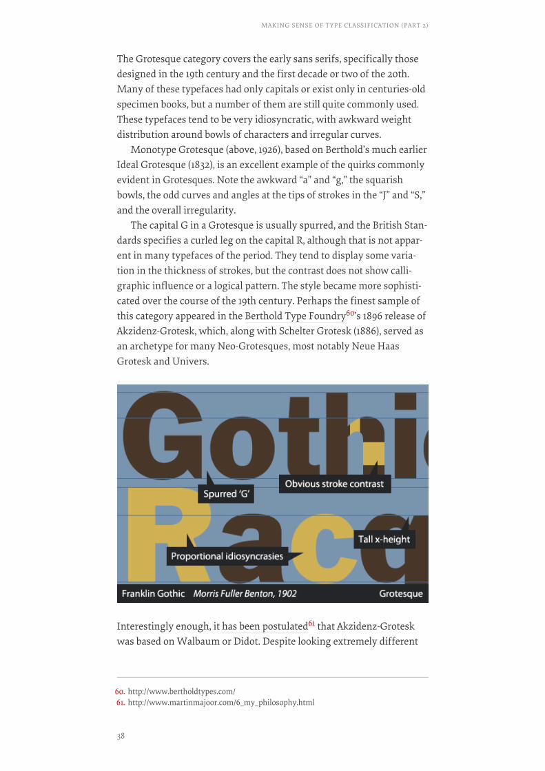
The Grotesque category covers the early sans serifs, specifically thosedesigned in the 19th century and the first decade or two of the 20th.Many of these typefaces had only capitals or exist only in centuries-oldspecimen books, but a number of them are still quite commonly used.These typefaces tend to be very idiosyncratic, with awkward weightdistribution around bowls of characters and irregular curves.
Monotype Grotesque (above, 1926), based on Berthold’s much earlierIdeal Grotesque (1832), is an excellent example of the quirks commonlyevident in Grotesques. Note the awkward “a” and “g,” the squarishbowls, the odd curves and angles at the tips of strokes in the “J” and “S,”and the overall irregularity.
The capital G in a Grotesque is usually spurred, and the British Stan-dards specifies a curled leg on the capital R, although that is not appar-ent in many typefaces of the period. They tend to display some varia-tion in the thickness of strokes, but the contrast does not show calli-graphic influence or a logical pattern. The style became more sophisti-cated over the course of the 19th century. Perhaps the finest sample ofthis category appeared in the Berthold Type Foundry60’s 1896 release ofAkzidenz-Grotesk, which, along with Schelter Grotesk (1886), served asan archetype for many Neo-Grotesques, most notably Neue HaasGrotesk and Univers.
Interestingly enough, it has been postulated61 that Akzidenz-Groteskwas based on Walbaum or Didot. Despite looking extremely different
60. http://www.bertholdtypes.com/61. http://www.martinmajoor.com/6_my_philosophy.html
MAKING SENSE OF TYPE CLASSIFICATION (PART 2)
38
at first glance, a simple comparison of the basic forms shows that themetrics are very similar.
Examples of the Grotesque category include Franklin Gothic, Mono-type Grotesque and Schelter Grotesk.
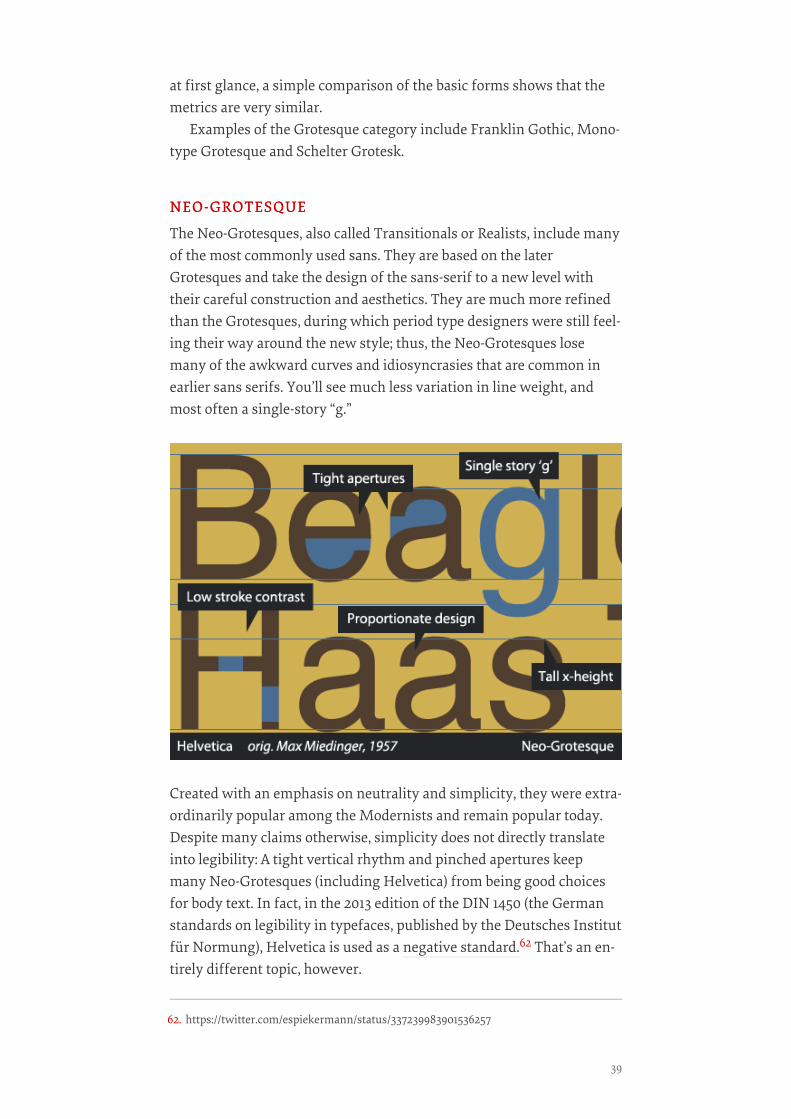
NEO-GROTESQUENEO-GROTESQUE
The Neo-Grotesques, also called Transitionals or Realists, include manyof the most commonly used sans. They are based on the laterGrotesques and take the design of the sans-serif to a new level withtheir careful construction and aesthetics. They are much more refinedthan the Grotesques, during which period type designers were still feel-ing their way around the new style; thus, the Neo-Grotesques losemany of the awkward curves and idiosyncrasies that are common inearlier sans serifs. You’ll see much less variation in line weight, andmost often a single-story “g.”
Created with an emphasis on neutrality and simplicity, they were extra-ordinarily popular among the Modernists and remain popular today.Despite many claims otherwise, simplicity does not directly translateinto legibility: A tight vertical rhythm and pinched apertures keepmany Neo-Grotesques (including Helvetica) from being good choicesfor body text. In fact, in the 2013 edition of the DIN 1450 (the Germanstandards on legibility in typefaces, published by the Deutsches Institutfür Normung), Helvetica is used as a negative standard.62 That’s an en-tirely different topic, however.
62. https://twitter.com/espiekermann/status/337239983901536257
39
In 1957—a big year for Neo-Grotesque sans serifs, as Frutiger’sUnivers as well as Folio (originally thought to be a stronger competitor,although history has proved otherwise) were released—Haas Foundryreleased Max Miedinger’s Neue Haas Grotesk, which drew heavily onSchelter and Akzidenz Grotesks. In 1960, Haas, in an effort to market itmore effectively, rebranded Neue Haas Grotesk to what we know asone of the most ubiquitous typefaces of all time—you guessed it—Hel-vetica.
The quintessential members of this group are, of course, Univers andthe immortal Helvetica, which has gone through quite a number of per-mutations over the years (as have all of these typefaces) and was re-cently revived by Christian Schwartz64 as a rerelease of Neue HaasGrotesk. A nice informational minisite65 was created by Indra Kupfer-schmid and Nick Sherman for the release. Other typefaces in this cate-gory include the DIN 1451 and its derivatives66, and Bell Gothic and itssuccessor Bell Centennial.
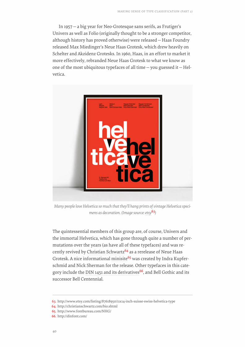
Many people love Helvetica so much that they’ll hang prints of vintage Helvetica speci-mens as decoration. (Image source: etsy63)
63. http://www.etsy.com/listing/87618950/11x14-inch-suisse-swiss-helvetica-type64. http://christianschwartz.com/bio.shtml65. http://www.fontbureau.com/NHG/66. http://dinfont.com/
MAKING SENSE OF TYPE CLASSIFICATION (PART 2)
40

HUMANISTHUMANIST
If you remember the most important quality of Humanist serif type,you’ll be relieved to learn that the same quality carries over to the sansserifs! The primary characteristic of Humanist type, both serif and sansserif, is a strong calligraphic influence, basing its shapes and flow onforms that could originate from a pen or brush. This means a muchhigher stroke contrast, and some Humanist sans even feature somestress, whereas nearly all other sans serifs have a completely verticalaxis.
Another interesting characteristic of Humanist sans serifs is thattheir proportions often derive largely from Roman inscriptions and ear-ly serif typefaces, rather than 19th-century sans serifs as the Neo-Grotesques did. Because of this design process involving older letter-forms, the lowercase “a” and “g” are most often two-story in Humanistsans serifs. All of these characteristics combine to make most Human-ists a more legible choice than other types of sans faces.
Hermann Zapf’s Optima is one example that clearly shows the calli-graphic heritage, with an unusually obvious difference between thickand thin strokes, while many others in this category have more subtlefeatures. The Humanist sans group includes classics such as Gill Sansand Frutiger as well as more recent releases like Myriad (1991), Tre-buchet (1996) and Calibri (2005).
GEOMETRICGEOMETRIC
Geometric sans serifs are exactly what their name suggests. Instead ofbeing derived from early Grotesques, like a Neo-Grotesque, or from cal-
41
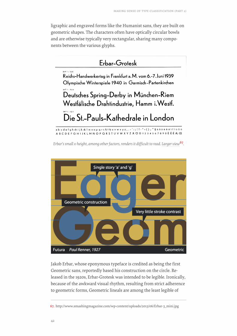
ligraphic and engraved forms like the Humanist sans, they are built ongeometric shapes. The characters often have optically circular bowlsand are otherwise typically very rectangular, sharing many compo-nents between the various glyphs.
Jakob Erbar, whose eponymous typeface is credited as being the firstGeometric sans, reportedly based his construction on the circle. Re-leased in the 1920s, Erbar-Grotesk was intended to be legible. Ironically,because of the awkward visual rhythm, resulting from strict adherenceto geometric forms, Geometric lineals are among the least legible of
Erbar’s small x-height, among other factors, renders it difficult to read. Larger view67.
67. http://www.smashingmagazine.com/wp-content/uploads/2013/06/Erbar-3_mini.jpg
MAKING SENSE OF TYPE CLASSIFICATION (PART 2)
42
sans serifs and are usually suitable only for display type. Geometricsans serifs usually show little or no stroke contrast and usually featurea single-story lowercase “a.”
Paul Renner’s Futura, Koch’s Kabel and Lubalin’s Avant Garde aretypical examples of the style. H&FJ’s Gotham is also a Geometric sans,although it is less strictly geometric than some and allows for morevariation in the heavier weights.
The Rest Of The StoryThat’s the basic classification for sans serifs! While the two parts of thisseries primarily deal with serif and sans type, there are many otherstyles to consider. The Vox-ATypI system also provides five subcate-gories of “calligraphics” (i.e. type that is derived from handmade let-ters), but as they are largely self-explanatory, I won’t dedicate muchspace in this already lengthy chapter to them. Here is a brief summaryof each category.
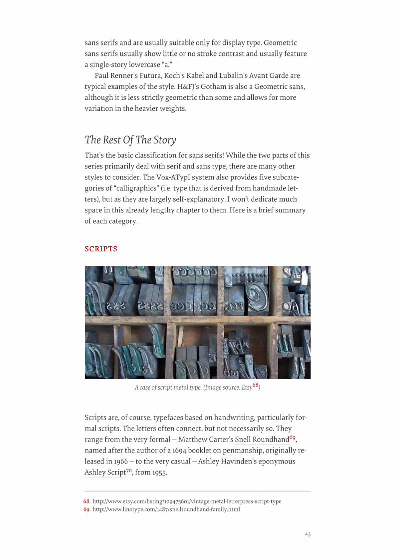
SCRIPTSSCRIPTS
Scripts are, of course, typefaces based on handwriting, particularly for-mal scripts. The letters often connect, but not necessarily so. Theyrange from the very formal—Matthew Carter’s Snell Roundhand69,named after the author of a 1694 booklet on penmanship, originally re-leased in 1966—to the very casual—Ashley Havinden’s eponymousAshley Script70, from 1955.
A case of script metal type. (Image source: Etsy68)
68. http://www.etsy.com/listing/109475601/vintage-metal-letterpress-script-type69. http://www.linotype.com/1487/snellroundhand-family.html
43
GLYPHICGLYPHIC
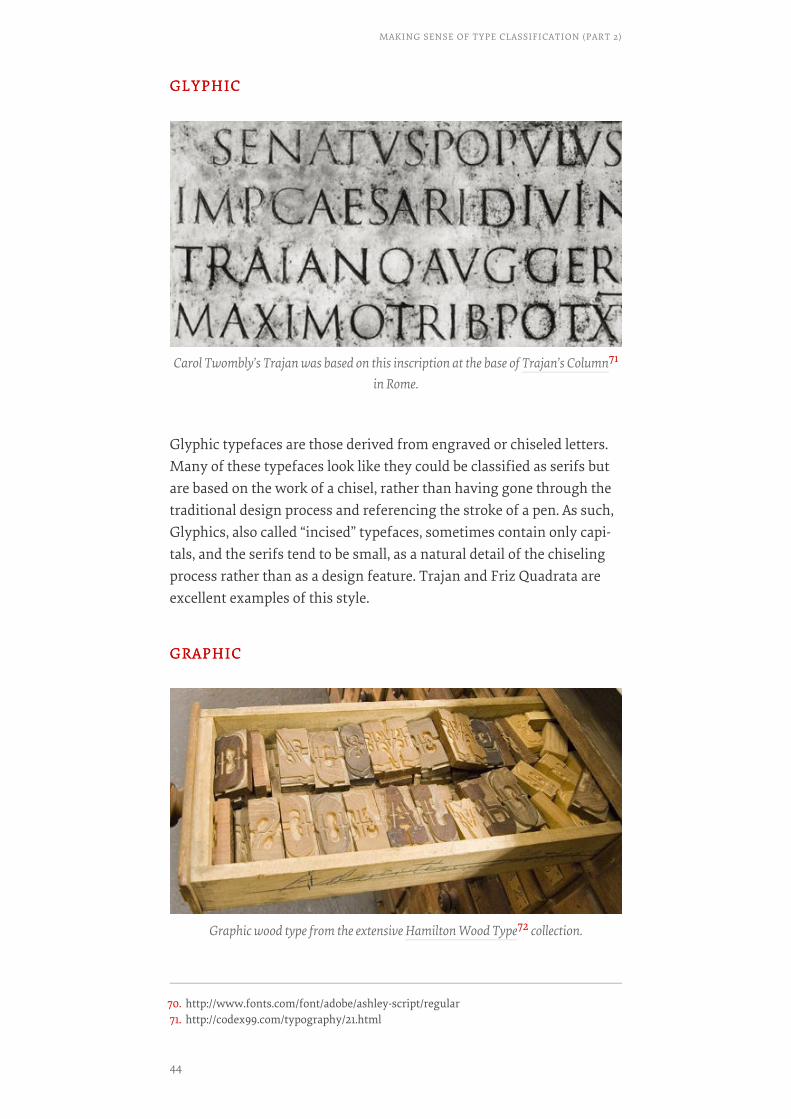
Glyphic typefaces are those derived from engraved or chiseled letters.Many of these typefaces look like they could be classified as serifs butare based on the work of a chisel, rather than having gone through thetraditional design process and referencing the stroke of a pen. As such,Glyphics, also called “incised” typefaces, sometimes contain only capi-tals, and the serifs tend to be small, as a natural detail of the chiselingprocess rather than as a design feature. Trajan and Friz Quadrata areexcellent examples of this style.
GRAPHICGRAPHIC
Carol Twombly’s Trajan was based on this inscription at the base of Trajan’s Column71
in Rome.
Graphic wood type from the extensive Hamilton Wood Type72 collection.
70. http://www.fonts.com/font/adobe/ashley-script/regular71. http://codex99.com/typography/21.html
MAKING SENSE OF TYPE CLASSIFICATION (PART 2)
44
Graphic is essentially a sort of catch-all label for display type thatdoesn’t fit into any other category. It includes anything that would bedrawn or designed, with a brush, pen or any sort of tool. If it’s not ex-actly a sans, not exactly a serif, and you’re not really sure what it is, it ismost likely a Graphic typeface!
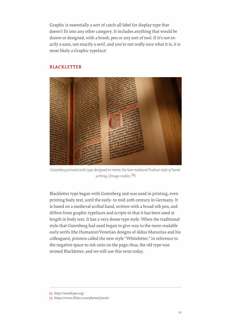
BLACKLETTERBLACKLETTER
Blackletter type began with Gutenberg and was used in printing, evenprinting body text, until the early- to mid-20th century in Germany. Itis based on a medieval scribal hand, written with a broad-nib pen, anddiffers from graphic typefaces and scripts in that it has been used atlength in body text. It has a very dense type style. When the traditionalstyle that Gutenberg had used began to give way to the more readableearly serifs (the Humanist/Venetian designs of Aldus Manutius and hiscolleagues), printers called the new style “Whiteletter,” in reference tothe negative space-to-ink ratio on the page; thus, the old type wastermed Blackletter, and we still use this term today.
Gutenberg printed with type designed to mimic the late-medieval Fraktur style of hand-writing. (Image credits: 73)
72. http://woodtype.org/73. https://www.flickr.com/photos/jmwk/
45
GAELICGAELIC
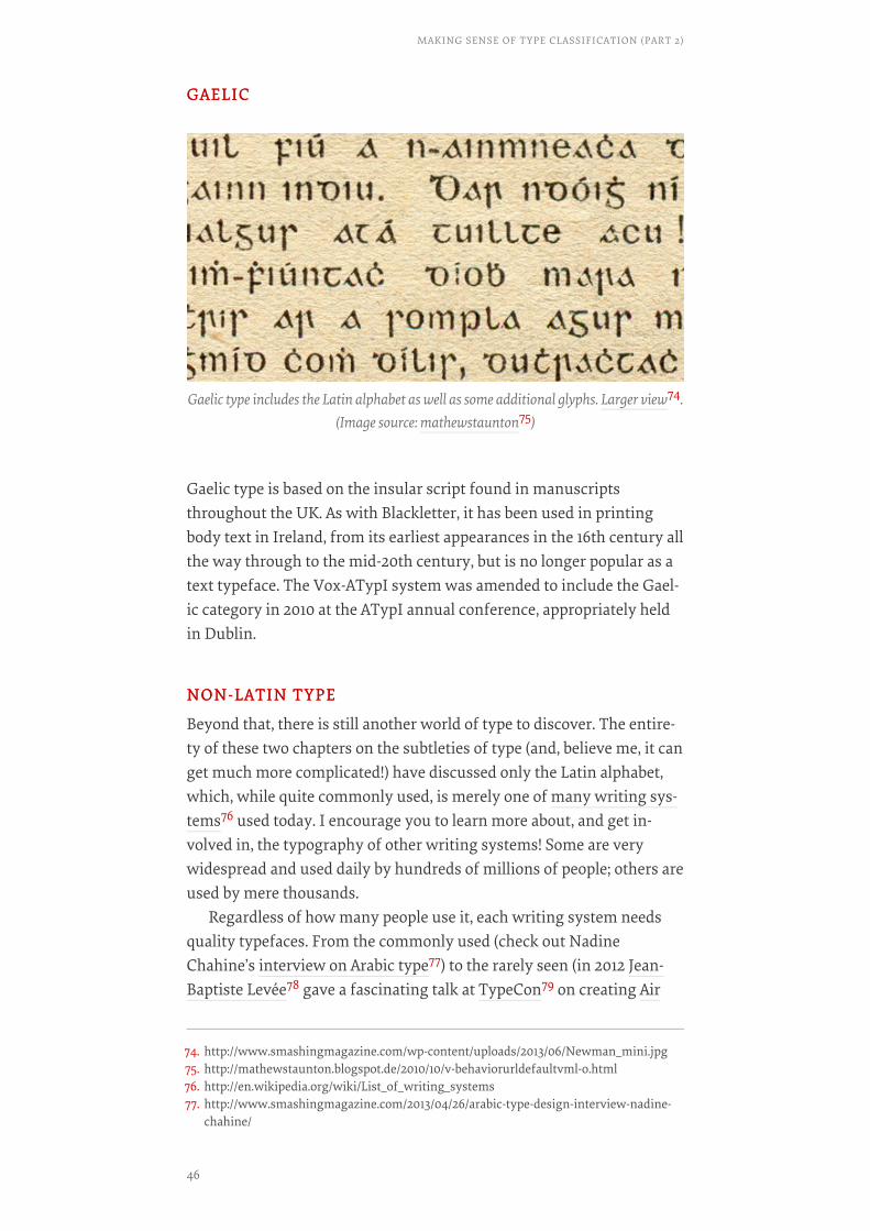
Gaelic type is based on the insular script found in manuscriptsthroughout the UK. As with Blackletter, it has been used in printingbody text in Ireland, from its earliest appearances in the 16th century allthe way through to the mid-20th century, but is no longer popular as atext typeface. The Vox-ATypI system was amended to include the Gael-ic category in 2010 at the ATypI annual conference, appropriately heldin Dublin.
NON-LATIN TYPENON-LATIN TYPE
Beyond that, there is still another world of type to discover. The entire-ty of these two chapters on the subtleties of type (and, believe me, it canget much more complicated!) have discussed only the Latin alphabet,which, while quite commonly used, is merely one of many writing sys-tems76 used today. I encourage you to learn more about, and get in-volved in, the typography of other writing systems! Some are verywidespread and used daily by hundreds of millions of people; others areused by mere thousands.
Regardless of how many people use it, each writing system needsquality typefaces. From the commonly used (check out NadineChahine’s interview on Arabic type77) to the rarely seen (in 2012 Jean-Baptiste Levée78 gave a fascinating talk at TypeCon79 on creating Air
Gaelic type includes the Latin alphabet as well as some additional glyphs. Larger view74.(Image source: mathewstaunton75)
74. http://www.smashingmagazine.com/wp-content/uploads/2013/06/Newman_mini.jpg75. http://mathewstaunton.blogspot.de/2010/10/v-behaviorurldefaultvml-o.html76. http://en.wikipedia.org/wiki/List_of_writing_systems77. http://www.smashingmagazine.com/2013/04/26/arabic-type-design-interview-nadine-
chahine/
MAKING SENSE OF TYPE CLASSIFICATION (PART 2)
46
Inuit Sans80, supporting Inuktitut glyphs), the typography of non-Latinwriting systems promises an exciting future.
CLOSING REMARKSCLOSING REMARKS
We’ve barely scratched the surface of the fascinating subject of typog-raphy and type history in this two-part series “Making Sense of TypeClassification.” Hopefully, it has piqued your interest in this intriguingfield. Knowing your way around the typographic resources available totoday’s designers is essential, and it is helpful to understand a little be-hind the characteristics, history, visual character and idiosyncrasiesthat make each typeface unique and that define how it communicates.
At one point in the history of Web design, an extensive knowledgeof type history was unnecessary because a Web or interactive designerwas limited to half a dozen typefaces, and those in limited weights andvariants.
Today, however, the landscape of Web design is completely differ-ent, and the typographic possibilities are endless! Also, while this mate-rial is covered in many design schools, a significant portion of design-ers today haven’t had a formal design education, so now is the best timeto catch up!
That being said, we also must remember that, while type classifica-tion is an important aid to studying type, it is not a hard and fast sys-tem that cannot be questioned. Many typefaces combine characteristicsand could easily fit into multiple categories, and no classification sys-tem can cover all of the possibilities. In the end, type classification is anexcellent means of learning to recognize common patterns and distin-guishing characteristics of typefaces, and we get to learn some type his-tory along the way.
With this short series, you’re now equipped with a strong knowl-edge of categories of type; you’ve learned to analyze typefaces and pickout unique aspects of letterforms; you’ve seen how type has evolvedwith culture; and, most importantly, you have a solid foundation forfurther study of typography and type history! It cannot be overstatedhow immensely important sound knowledge of typography is for any-one in the broad field of design, and the material we’ve covered herewill serve you well in navigating the world of type.❧
78. http://www.jblt.co/v2/#79. http://typecon.com80. http://www.jblt.co/v2/en/jbl/page/projects/industry-technology/air-inuit-sans65
47
A Critical Approach ToTypefacesBY DAVID BŘEZINABY DAVID BŘEZINA ❧❧
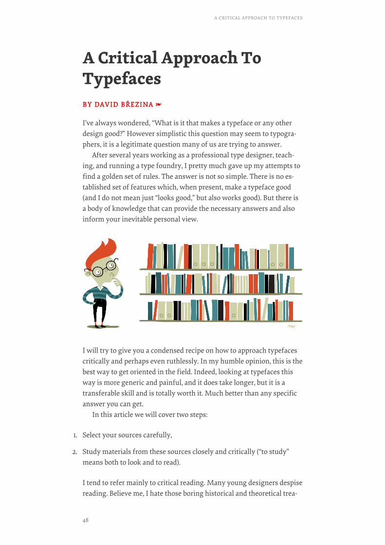
I’ve always wondered, “What is it that makes a typeface or any otherdesign good?” However simplistic this question may seem to typogra-phers, it is a legitimate question many of us are trying to answer.
After several years working as a professional type designer, teach-ing, and running a type foundry, I pretty much gave up my attempts tofind a golden set of rules. The answer is not so simple. There is no es-tablished set of features which, when present, make a typeface good(and I do not mean just “looks good,” but also works good). But there isa body of knowledge that can provide the necessary answers and alsoinform your inevitable personal view.
I will try to give you a condensed recipe on how to approach typefacescritically and perhaps even ruthlessly. In my humble opinion, this is thebest way to get oriented in the field. Indeed, looking at typefaces thisway is more generic and painful, and it does take longer, but it is atransferable skill and is totally worth it. Much better than any specificanswer you can get.
In this article we will cover two steps:
1. Select your sources carefully,
2. Study materials from these sources closely and critically (“to study”means both to look and to read).
I tend to refer mainly to critical reading. Many young designers despisereading. Believe me, I hate those boring historical and theoretical trea-
A CRITICAL APPROACH TO TYPEFACES
48
tises as much as you do, but even though images are worth a thousandwords, they alone cannot say everything.
1. Selecting SourcesThere are a lot of designed and written materials available. Unfortu-nately, it’s not always clear which ones are appropriate and trustwor-thy. So how do you find out?
Always try to be aware of the nature of the source. Are the materialseducational or promotional? The difference might not always be clear.Promotional texts boast about all the positives and obscure any nega-tives. They are written for the benefit of the author or producer. Educa-tional resources generally attempt a more balanced view and they arewritten for the benefit of the reader.
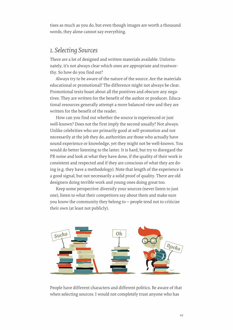
How can you find out whether the source is experienced or justwell-known? Does not the first imply the second usually? Not always.Unlike celebrities who are primarily good at self-promotion and notnecessarily at the job they do, authorities are those who actually havesound experience or knowledge, yet they might not be well-known. Youwould do better listening to the latter. It is hard, but try to disregard thePR noise and look at what they have done, if the quality of their work isconsistent and respected and if they are conscious of what they are do-ing (e.g. they have a methodology). Note that length of the experience isa good signal, but not necessarily a solid proof of quality. There are olddesigners doing terrible work and young ones doing great too.
Keep some perspective: diversify your sources (never listen to justone), listen to what their competitors say about them and make sureyou know the community they belong to—people tend not to criticizetheir own (at least not publicly).
People have different characters and different politics. Be aware of thatwhen selecting sources. I would not completely trust anyone who has
49
never publicly admitted a mistake. For such a person, perfect public im-age is more important than the validity of the discourse.
You certainly do not have to read everything. For some, it is better tostick with a few examples and study them deeply; others prefer abroader perspective with less depth. But read you must.
2. Critical StudyHere is the painful bit. You have gathered materials to read and look at,and now you must study and question what you’re reading. Here are afew simple tests to start with:
INFORMED EXPERIENCEINFORMED EXPERIENCE
Are the authors’ actual experiences relevant to what they are talkingabout? Example: if a brilliant designer is explaining politics in SouthKorea, should you listen? Even if the designer has been to South Korea,does it constitute an informed experience? Perhaps not.
CONTEXTCONTEXT
Is the statement generally valid or is there a context to it? A great exam-ple is the discussion about the use of small caps where Joe Clark dis-putes their utility in academic writings81. One of the common rules inAnglo-Saxon typography is to typeset abbreviations in small caps tomake them less pronounced. According to Clark, this actually hindersthe reading and skimming of academic texts. Change the context andthe validity of the whole statement changes. The article is amusinglyrude and critical, but remember to read the reactions, too.
81. http://blog.fawny.org/2010/01/11/goreschoice/
A CRITICAL APPROACH TO TYPEFACES
50
EVIDENCE QUALITYEVIDENCE QUALITY
Is the statement supported by any evidence? Is the evidence relevant tothe point being made, and does it illustrate the problem? Example: typedesigners will often mention how much time they spent developingtheir new type family, but is it really that important to know? Does alonger (or shorter) production time make their type family any better orworse? This information does make you think about the value and ef-fort put into the project, but it is not actual evidence of quality.
EVIDENCE COMPLETENESSEVIDENCE COMPLETENESS
Does the evidence cover the broad picture or is it just a narrow snap-shot? Are the conclusions made with a broad or narrow perspective? Ex-ample: if I were to design a generic book typeface and conduct prelimi-nary research, should I analyze book typefaces from just five booksfrom a few different countries? Is that a representative sample? Per-haps not.
REALITY CHECKREALITY CHECK
If someone writes about originality or critical discourse, does it meanthat person is actually original or critical? Articles are often written todenote the discussed quality in the author. Example: feel free to applyright now.
TESTABILITYTESTABILITY
Does the typeface have features that are testable? Run the tests and seefor yourself. Example: check a cross-platform web font in browsersyour visitors use. Does it provide a consistent reading experienceacross a wide array of browsers, or is the appearance highly inconsis-tent or even erratic? If it’s the latter, then perhaps the web font is not socross-platform.
MOTIVES CHECKMOTIVES CHECK
What are the author’s motives? If an author appears biased, check theirreasoning twice. Motives are good, but supported claims are better. Ex-ample: look at someone commenting on their competitor’s work. Natu-rally, disagreement is in their job description, but do they have valid ba-sis for what they say? No? Then ignore their comments! You do notwant to be used for someone’s propaganda against their competitors.
51

POST-MODERN CHECKPOST-MODERN CHECK
Do not give up your aspirations for objective knowledge too soon. Noteverything is a matter of personal taste. Isn’t it better to have a slightlyimperfect or incomplete objective statement, rather than a bunch ofsubjective feelings (depending on the subject of discussion)? Example:six pixel type is not readable, but that’s hardly a matter of personaltaste. If someone says so, then maybe they do not have any opinion atall. (It is nearly impossible to fit readable Latin lowercase within six pix-els.)
And Then…Read, see and listen. Discuss. Think. Repeat. (Preferably in that order.)
Optionally, you might also share and test what you have learned andwrite something. It is good for everyone in the field (especially forthose who are criticized; talk to them, but stay civil) to keep the criticaldiscourse rolling, and it helps to strengthen your reasoning. There areplenty of opportunities on social networks (btw. Twitter has a prettylively community of type designers) and blogs. Talking to your friendsand colleagues works pretty well, too.
Playing with these and other questions ignites the curiosity which isnecessary for close inspection of other people’s designs. Why elsewould you look at it for so long?
There is a very simple rule: the more questions you ask, the more in-sights you will get. And to ensure the answers are useful, you need toremain critical. Once you gather enough you will know how to recog-nize a good typeface.
FURTHER READINGFURTHER READING
So far I carefully avoided being specific in this chapter, but I must ad-mit that providing actual starting points seems worth betraying any
A CRITICAL APPROACH TO TYPEFACES
52
sort of attempt for objectivity. In the following list I tried to avoid themost known books and show what enthusiastic typographers wouldread and what I also deem easy to digest. Please, do consider this selec-tion biased and limited:
• Inside Paragraphs: Typographic Fundamentals82, Cyrus HighsmithThis new and short book is an introduction to the merits of type spac-ing for design students. It expands on a chapter on spacing hierarchyfrom Gerrit Noordzij’s book LetterLetter. What I recommend about itmost is the nice common-sense analytic style.
• Counterpunch: making type in the sixteenth century; designing type-faces now83, Fred SmeijersLong-awaited second edition was finally published last year. While itmay seem very historical at first, this book is worth re-reading everythree years as it explains, not just presents. It is a fine example of re-search and reasoning in typography.
• Letters of credit: a view of type design84, Walter TracyThere are two parts of this book. One is on printing and typefoundingand illustrates how technology defines type design. The other is a set ofin-depth typeface reviews. Reviews by an experienced type person, thatis.
• While You’re Reading85, Gerard UngerVery enjoyable read, a summary of Unger’s thoughts on what I wouldcall “human-centered type design”.
• MA Typeface Design at the University of Reading86
The website does not contain only the type specimens, but in many cas-es there are also essays about the development (look under the mysteri-ous abbreviation ‘RoP’ which stands for ‘Reflection on practise’) some ofwhich are very worth reading. If you like some typeface, you might aswell read the essay too.
Illustrations created and designed by Anna Giedryś87.❧
82. http://insideparagraphs.com/83. https://hyphenpress.co.uk/products/books/978-0-907259-42-884. http://books.google.cz/books/about/Let-
ters_of_Credit.html?id=y8NssjbqNcsC&redir_esc=y85. http://markbattypublisher.com/books/while-youre-reading/86. http://typefacedesign.org87. http://ancymonic.com/
53

Taking A Second Look AtFree FontsBY JEREMIAH SHOAFBY JEREMIAH SHOAF ❧❧
Once thought of as amateurish by professional designers, free andopen-source fonts have gone through something of a renaissance injust the last few years. The quality of available free fonts has increaseddramatically. To be frank, free fonts don’t have a good reputation, andoften they are knock-offs of thoroughly crafted, already establishedtypefaces. So is it time for professional designers to take a second look?
First, A StoryEarly in my design career, around 2003, I wanted to purchase the fontDIN88 for a project at work. My manager promptly dismissed the ideaof paying for a font and instead handed me a CD that had “5,000 freefonts” on it, saying “This CD has every font a designer could possiblyneed. No need to waste money buying fonts!”
I popped the CD in my computer and found a collection of the mosthorrendous fonts you could imagine. Novelty and “retro” fonts. SpookyHalloween fonts. “Techno” fonts. Fonts with letterforms made up ofcats posing in crazy positions. Fonts with terrible kerning, missingglyphs and wonky rendering. Fonts available only in single weightswith no italics.
Nowhere to be found was DIN or, for that matter, any font that aprofessional designer would actually use. Feeling dejected, I ended upjust using Helvetica because we actually owned that one.
Fast-forward to 2014. When I hear the words “free fonts,” I still can’thelp but picture that horrible CD. But things have completely changedsince then, and I find myself actually using free fonts quite often in myprojects.
Where Do Free Fonts Come From?In the past, free fonts typically came from one of two places: amateurdesigners who created fonts for fun or as a learning experience, andprofessional type designers who released a single variant of a font fam-
88. http://www.typewolf.com/site-of-the-day/fonts/din
TAKING A SECOND LOOK AT FREE FONTS
54

ily for free as a form of marketing, the idea being that people wouldcome back to purchase the full family once they realized the limitedusefulness of a font without multiple weights and italics.
Why Is Having Multiple Weights With Italics SoImportant?To set body copy properly, a font family requires four variants: normal,italic, bold and bold italic. A font used on the Web that doesn’t includethese four basic variants will inevitably get the dreaded faux bold andfaux italic89 treatment generated by the browser, which should beavoided at all costs—in fact, there are90 ways91 to avoid them for good.Other weights, such as light and extra bold, are helpful for creating ty-pographic contrast between elements.
Free Fonts Are Not What They Used To BeRecently, large companies such as Adobe and Google have been com-missioning fonts for open-source projects and releasing them for freeon the Web. Professional typeface designers have been getting involvedin open source as well, sharing complete font families on GoogleFonts92.
Thanks to the open-source community, there are now free fontsavailable that even typography snobs would be happy to use. The fol-lowing fonts all have multiple weights with matching italics. They aresuitable for headlines as well as body copy, and they render well onscreen and at small sizes.
ALEGREYAALEGREYA
Alegreya93 is an award-winning serif typeface, chosen by ATypI as oneof 53 “Fonts of the Decade” in its Letter.2 competition94. It is availablefor free on Google Fonts, but, sadly, most designers don’t seem to knowabout it. I hardly see Alegreya used anywhere online, which is a shame
89. http://alistapart.com/article/say-no-to-faux-bold90. http://www.smashingmagazine.com/2012/07/11/avoiding-faux-weights-styles-google-
web-fonts/91. http://coding.smashingmagazine.com/2013/02/14/setting-weights-and-styles-at-font-
face-declaration/92. http://www.google.com/fonts93. http://www.google.com/fonts/specimen/Alegreya94. http://letter2.org
55

because this is a truly great font. Alegreya was designed with printedtext in mind, but it is excellent to read on screen as well.
The designer, Juan Pablo del Peral, claims that just as much care andattention to detail was spent on designing the italic as the roman and itdefinitely shows — the italic style is especially beautiful. I hope moredesigners become aware of this excellent typeface and that we’ll see itused more widely on the Web in 2014.
• Websites using Alegreya97
SOURCE SANS PROSOURCE SANS PRO
Released by Adobe in August 2012, Source Sans Pro98 is Adobe’s firstopen-source font. Its designer, Paul D. Hunt, was inspired byearly-20th-century gothics such as Franklin Gothic and News Gothic.To my eyes, Source Sans Pro feels much more modern, a little reminis-cent of FF Meta. Its intended use is for user interfaces so it renders verywell at small sizes. The font is available in an impressive 6 weights,making it extremely versatile.
Beef95 uses Alegreya for the body copy on their website, giving it a stately appearance,which contrasts nicely with the use of Avenir96 for headings.
95. http://www.wearebeef.co.uk96. http://www.typewolf.com/site-of-the-day/fonts/avenir97. http://www.typewolf.com/site-of-the-day/fonts/alegreya98. http://www.google.com/fonts/specimen/Source+Sans+Pro
TAKING A SECOND LOOK AT FREE FONTS
56
• Websites using Source Sans Pro101
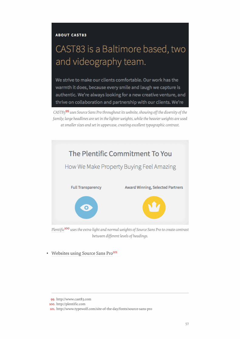
CAST8399 uses Source Sans Pro throughout its website, showing off the diversity of thefamily; large headlines are set in the lighter weights, while the heavier weights are used
at smaller sizes and set in uppercase, creating excellent typographic contrast.
Plentific100 uses the extra-light and normal weights of Source Sans Pro to create contrastbetween different levels of headings.
99. http://www.cast83.com100. http://plentific.com101. http://www.typewolf.com/site-of-the-day/fonts/source-sans-pro
57
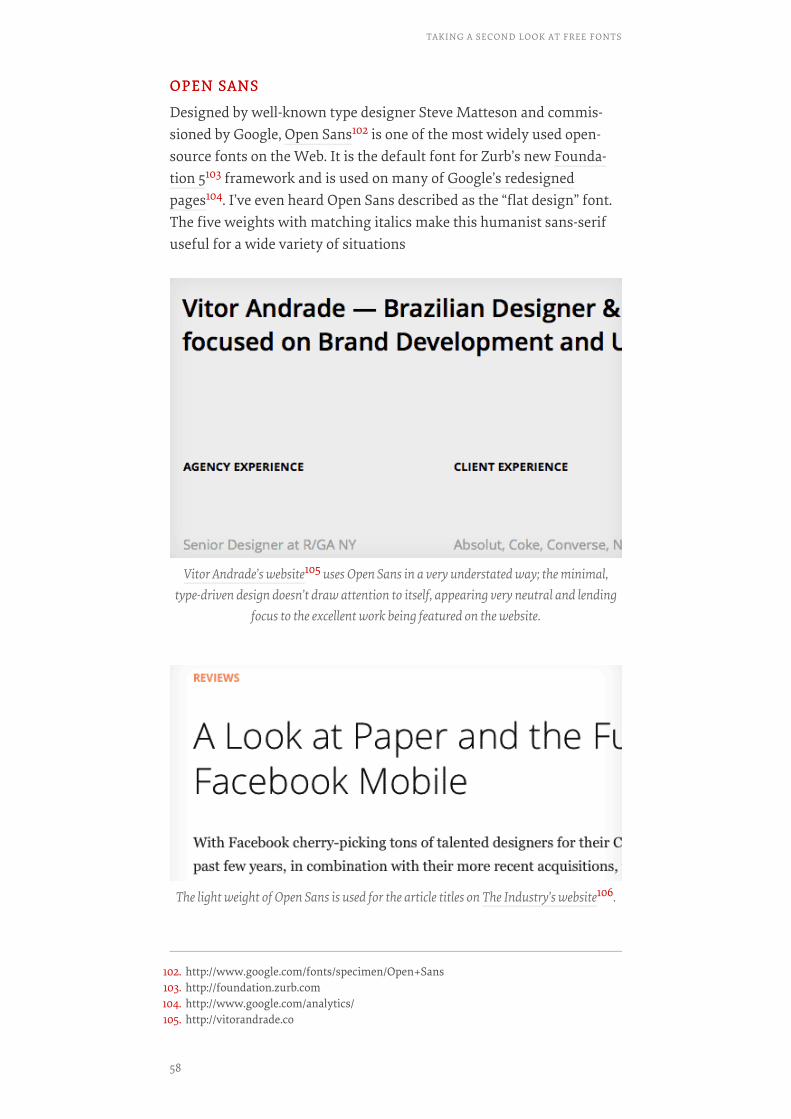
OPEN SANSOPEN SANS
Designed by well-known type designer Steve Matteson and commis-sioned by Google, Open Sans102 is one of the most widely used open-source fonts on the Web. It is the default font for Zurb’s new Founda-tion 5103 framework and is used on many of Google’s redesignedpages104. I’ve even heard Open Sans described as the “flat design” font.The five weights with matching italics make this humanist sans-serifuseful for a wide variety of situations
Vitor Andrade’s website105 uses Open Sans in a very understated way; the minimal,type-driven design doesn’t draw attention to itself, appearing very neutral and lending
focus to the excellent work being featured on the website.
The light weight of Open Sans is used for the article titles on The Industry’s website106.
102. http://www.google.com/fonts/specimen/Open+Sans103. http://foundation.zurb.com104. http://www.google.com/analytics/105. http://vitorandrade.co
TAKING A SECOND LOOK AT FREE FONTS
58
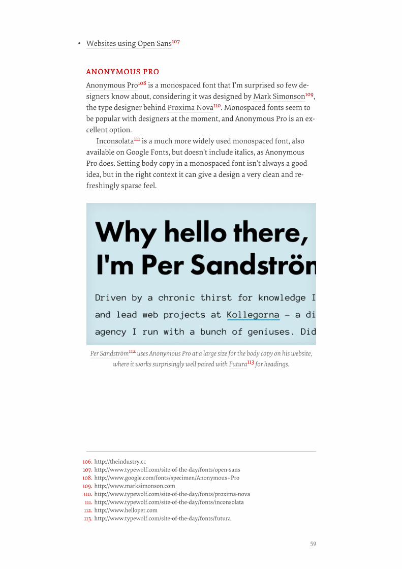
• Websites using Open Sans107
ANONYMOUS PROANONYMOUS PRO
Anonymous Pro108 is a monospaced font that I’m surprised so few de-signers know about, considering it was designed by Mark Simonson109,the type designer behind Proxima Nova110. Monospaced fonts seem tobe popular with designers at the moment, and Anonymous Pro is an ex-cellent option.
Inconsolata111 is a much more widely used monospaced font, alsoavailable on Google Fonts, but doesn’t include italics, as AnonymousPro does. Setting body copy in a monospaced font isn’t always a goodidea, but in the right context it can give a design a very clean and re-freshingly sparse feel.
Per Sandström112 uses Anonymous Pro at a large size for the body copy on his website,where it works surprisingly well paired with Futura113 for headings.
106. http://theindustry.cc107. http://www.typewolf.com/site-of-the-day/fonts/open-sans108. http://www.google.com/fonts/specimen/Anonymous+Pro109. http://www.marksimonson.com110. http://www.typewolf.com/site-of-the-day/fonts/proxima-nova111. http://www.typewolf.com/site-of-the-day/fonts/inconsolata112. http://www.helloper.com113. http://www.typewolf.com/site-of-the-day/fonts/futura
59
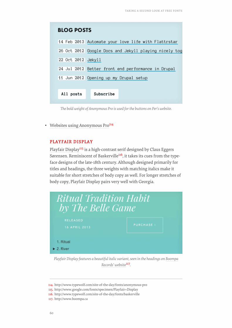
• Websites using Anonymous Pro114
PLAYFAIR DISPLAYPLAYFAIR DISPLAY
Playfair Display115 is a high-contrast serif designed by Claus EggersSørensen. Reminiscent of Baskerville116, it takes its cues from the type-face designs of the late-18th century. Although designed primarily fortitles and headings, the three weights with matching italics make itsuitable for short stretches of body copy as well. For longer stretches ofbody copy, Playfair Display pairs very well with Georgia.
The bold weight of Anonymous Pro is used for the buttons on Per’s website.
Playfair Display features a beautiful italic variant, seen in the headings on BoompaRecords’ website117.
114. http://www.typewolf.com/site-of-the-day/fonts/anonymous-pro115. http://www.google.com/fonts/specimen/Playfair+Display116. http://www.typewolf.com/site-of-the-day/fonts/baskerville117. http://www.boompa.ca
TAKING A SECOND LOOK AT FREE FONTS
60

• Websites using Playfair Display119
ROBOTOROBOTO
Roboto120 has been accused of being a “Frankenfont121” — a mashup ofHelvetica, DIN and Myriad. I understand where the criticisms comefrom, but I quite like Roboto. Updates and improvements122 have beenmade to Roboto since that “Frankenfont” article, and I think the fontworks great on screen at different sizes and device resolutions, which isits purpose.
The font feels familiar, yet still possesses unique character the moreyou look at it. The Roboto family also includes a very nice slab ver-sion123 as well as a condensed version124.
The bold weight of Playfair Display is used on the headings of Digital Abstracts’ web-site118.
118. http://digitalabstracts.com/playing-arts-project/119. http://www.typewolf.com/site-of-the-day/fonts/playfair-display120. http://www.google.com/fonts/specimen/Roboto121. http://typographica.org/on-typography/roboto-typeface-is-a-four-headed-frankenstein/122. http://www.androidpolice.com/2013/06/29/typeface-teardown-roboto-gets-a-facelift-in-
android-4-3/123. http://www.google.com/fonts/specimen/Roboto+Slab124. http://www.google.com/fonts/specimen/Roboto+Condensed
61
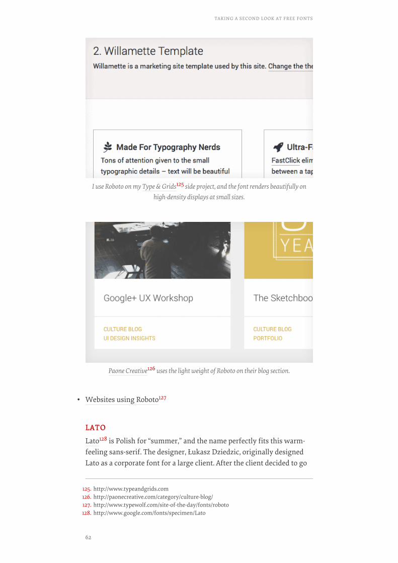
• Websites using Roboto127
LATOLATO
Lato128 is Polish for “summer,” and the name perfectly fits this warm-feeling sans-serif. The designer, Łukasz Dziedzic, originally designedLato as a corporate font for a large client. After the client decided to go
I use Roboto on my Type & Grids125 side project, and the font renders beautifully onhigh-density displays at small sizes.
Paone Creative126 uses the light weight of Roboto on their blog section.
125. http://www.typeandgrids.com126. http://paonecreative.com/category/culture-blog/127. http://www.typewolf.com/site-of-the-day/fonts/roboto128. http://www.google.com/fonts/specimen/Lato
TAKING A SECOND LOOK AT FREE FONTS
62
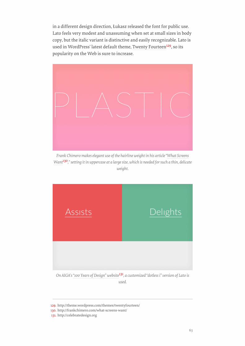
in a different design direction, Łukasz released the font for public use.Lato feels very modest and unassuming when set at small sizes in bodycopy, but the italic variant is distinctive and easily recognizable. Lato isused in WordPress’ latest default theme, Twenty Fourteen129, so itspopularity on the Web is sure to increase.
Frank Chimero makes elegant use of the hairline weight in his article “What ScreensWant130,” setting it in uppercase at a large size, which is needed for such a thin, delicate
weight.
On AIGA’s “100 Years of Design” website131, a customized “dotless i” version of Lato isused.
129. http://theme.wordpress.com/themes/twentyfourteen/130. http://frankchimero.com/what-screens-want/131. http://celebratedesign.org
63

• Websites using Lato132
MERRIWEATHERMERRIWEATHER
Designed by Eben Sorkin133, Merriweather134 is a serif font created foron-screen reading. Its tall x-height and hefty serifs give it excellent legi-bility. Merriweather is under active development, and improvementsare constantly being made. There is also a sans-serif version135 of Mer-riweather available that makes an excellent companion.
Dickson Fong136 uses the light weight of Merriweather, which gives his design an ele-gant look.
Vtcreative137 show off the light italic style of Merriweather in their footer.
132. http://www.typewolf.com/site-of-the-day/fonts/lato133. http://sorkintype.com134. http://www.google.com/fonts/specimen/Merriweather135. http://www.google.com/fonts/specimen/Merriweather+Sans136. http://dicksonfong.com
TAKING A SECOND LOOK AT FREE FONTS
64
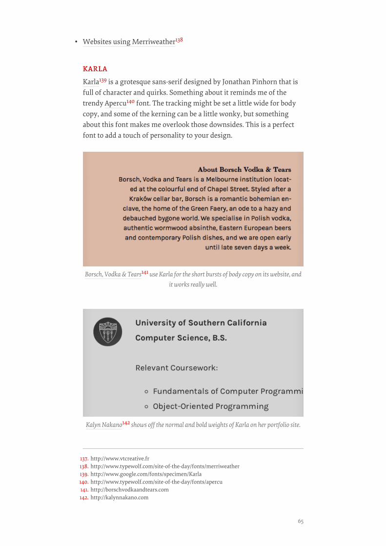
• Websites using Merriweather138
KARLAKARLA
Karla139 is a grotesque sans-serif designed by Jonathan Pinhorn that isfull of character and quirks. Something about it reminds me of thetrendy Apercu140 font. The tracking might be set a little wide for bodycopy, and some of the kerning can be a little wonky, but somethingabout this font makes me overlook those downsides. This is a perfectfont to add a touch of personality to your design.
Borsch, Vodka & Tears141 use Karla for the short bursts of body copy on its website, andit works really well.
Kalyn Nakano142 shows off the normal and bold weights of Karla on her portfolio site.
137. http://www.vtcreative.fr138. http://www.typewolf.com/site-of-the-day/fonts/merriweather139. http://www.google.com/fonts/specimen/Karla140. http://www.typewolf.com/site-of-the-day/fonts/apercu141. http://borschvodkaandtears.com142. http://kalynnakano.com
65
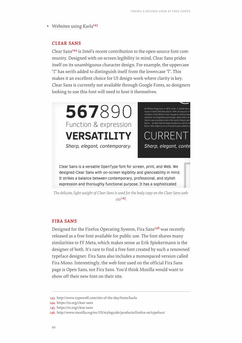
• Websites using Karla143
CLEAR SANSCLEAR SANS
Clear Sans144 is Intel’s recent contribution to the open-source font com-munity. Designed with on-screen legibility in mind, Clear Sans pridesitself on its unambiguous character design. For example, the uppercase“I” has serifs added to distinguish itself from the lowercase “l”. Thismakes it an excellent choice for UI design work where clarity is key.Clear Sans is currently not available through Google Fonts, so designerslooking to use this font will need to host it themselves.
FIRA SANSFIRA SANS
Designed for the Firefox Operating System, Fira Sans146 was recentlyreleased as a free font available for public use. The font shares manysimilarities to FF Meta, which makes sense as Erik Spiekermann is thedesigner of both. It’s rare to find a free font created by such a renownedtypeface designer. Fira Sans also includes a monospaced version calledFira Mono. Interestingly, the web font used on the official Fira Sanspage is Open Sans, not Fira Sans. You’d think Mozilla would want toshow off their new font on their site.
The delicate, light weight of Clear Sans is used for the body copy on the Clear Sans web-site145.
143. http://www.typewolf.com/site-of-the-day/fonts/karla144. https://01.org/clear-sans145. https://01.org/clear-sans146. http://www.mozilla.org/en-US/styleguide/products/firefox-os/typeface/
TAKING A SECOND LOOK AT FREE FONTS
66
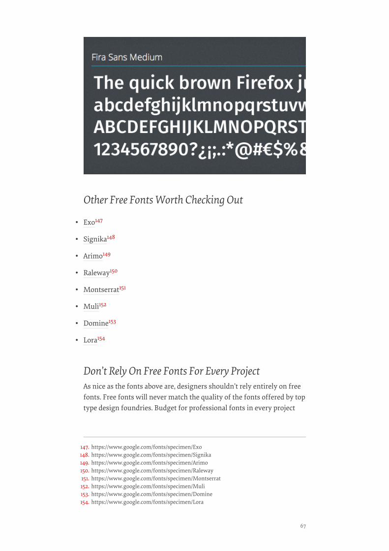
Other Free Fonts Worth Checking Out
• Exo147
• Signika148
• Arimo149
• Raleway150
• Montserrat151
• Muli152
• Domine153
• Lora154
Don’t Rely On Free Fonts For Every ProjectAs nice as the fonts above are, designers shouldn’t rely entirely on freefonts. Free fonts will never match the quality of the fonts offered by toptype design foundries. Budget for professional fonts in every project
147. https://www.google.com/fonts/specimen/Exo148. https://www.google.com/fonts/specimen/Signika149. https://www.google.com/fonts/specimen/Arimo150. https://www.google.com/fonts/specimen/Raleway151. https://www.google.com/fonts/specimen/Montserrat152. https://www.google.com/fonts/specimen/Muli153. https://www.google.com/fonts/specimen/Domine154. https://www.google.com/fonts/specimen/Lora
67

when possible. Type foundries need the support of the design commu-nity to continue innovating and producing excellent fonts.
That being said, if a project requires free fonts, whether due to bud-get constraints or other reasons, then rest easy knowing that an ever-growing selection of professional-quality fonts are available at your dis-posal. I continually update a curated list of open-source Web fonts155 inmy side project, Typewolf156. You can also follow me @typewolf157 andcheck out my other side project, Type & Grids158, which uses many ofthe fonts featured in this chapter.
Designing a typeface requires a lot of time, patience and very hardwork, and type designers should be rewarded for their work. So if youdecide to use a free font, please always make sure to support type de-signers by purchasing the other fonts that they created or donating tosupport their efforts.❧
155. http://www.typewolf.com/open-source-web-fonts156. http://www.typewolf.com157. http://twitter.com/typewolf158. http://www.typeandgrids.com
TAKING A SECOND LOOK AT FREE FONTS
68
Dear Web Font ProvidersBY LAURA FRANZBY LAURA FRANZ ❧❧
When you buy something, I bet you want it to work. Heck, even if youuse something for free—maybe borrowed from a friend—I bet youwant it to work. No one prefers hiking boots that are too tight (or tooloose), a car that shimmies when you drive faster than 40 miles anhour, or a kitchen knife that can’t cut a tomato. And Web designersdon’t prefer fonts that don’t fit a project, fall apart in different browsersor can’t be used in a mock-up.
We also don’t like wading through all of the fonts that won’t workfor us in order to find the ones that will. It takes precious time awayfrom other tasks and responsibilities.
You’ve Come A Long Way, Baby!Six years ago, A List Apart published “CSS @ Ten: The Next BigThing159,” in which Håkon Wium Lie describes the @font-face declara-tion and announces:
Two things must happen before Web fonts can take web design to thenext level… First, we must ensure the validity of the approach.… Sec-ond, we must convince browser makers to add support for web fonts.
YOU HELPED MAKE IT HAPPEN: VALIDITY AND BROWSERYOU HELPED MAKE IT HAPPEN: VALIDITY AND BROWSERSUPPORTSUPPORT
Today, browsers support Web fonts, and we’ve got the valid CSS tomake the fonts work. Of course, as old browsers changed and newbrowsers (and extended font families) emerged, valid CSS became anever-moving target.
On the DIY side, a big “Thank you!” to Paul Irish, who gave us the“Bulletproof Syntax” to fool Internet Explorer (IE) into loading the cor-rect font file (remember using a smiley face for the local font name?); toRichard Fink, who gave us “Mo’ Bulletproofer Syntax” to fix a font-load-ing problem in Android; and to Ethan Dunham, who gave us the“Fontspring @font-face Syntax,” which even works in IE 9. You all thor-oughly explained why your syntax works, which enabled each to pickup where the other left off. On top of that, Dunham, your @font-face
159. http://alistapart.com/article/cssatten
69
generator160 brought valid syntax to those of us who (please, I beg ofyou) just want our fonts to work.
Web font hosts such as Typekit and Fontdeck deserve a shout out,too. You worked to support multiple weights and styles of a font familycross-browser. Your variation-specific font-family names161 (which is ashorter and sweeter way of saying, “Hey everyone, you need to use aunique font-family name for each weight and style of a family”) requirelonger CSS, but they are valid and allow more than four weights andstyles to load in IE 7 and 8. Those of us who can’t live without light, reg-ular, bold, extra bold, and black weights are in Web font heaven!
YOU WENT ABOVE AND BEYOND: RESPONDING TO THEYOU WENT ABOVE AND BEYOND: RESPONDING TO THENEEDS OF TYPE DESIGNERSNEEDS OF TYPE DESIGNERS
One aspect that Lie missed in his article was the need for more Webfonts—how could we take Web design to the next level if we didn’thave a lot of fonts to use? This, of course, meant that you had to gainthe trust of the type design community.
You had to protect the fonts.Remember when type designers wouldn’t design or provide Web
fonts without the guarantee that their files were secure? Typekit, yourarticle “Serving and Protecting Fonts on the Web162” (2009) laid outhow you set up hurdles to “discourage casual misuse” and created a rea-sonably secure system for serving fonts.
Thanks to everyone’s tenacity, at some point in the last four years,“reasonably secure” was enough for type designers to take a chance.And now they’re hooked. In a recent interview163, Jonathan Hoefler andTobias Frere-Jones of H&FJ said: “We’re requiring that every new pro-ject have a way to thrive not only on paper, but on desktop and mobilescreens.” How freaking awesome is that?
So, in the span of only six years, you’ve come a long way, baby. Webfont syntax is valid and supported by most browsers (our fonts load!);we have thousands of Web fonts to work with; we have multiple op-tions to deliver Web fonts (DIY or through a service provider; and free,monthly, yearly or a one-time purchase); and you are constantly im-proving your services, so Web fonts are easier to implement and they(usually) load seamlessly!
160. http://www.fontsquirrel.com/tools/webfont-generator161. http://blog.typekit.com/2011/06/27/new-from-typekit-variation-specific-font-family-
names-in-ie-6-8/162. http://blog.typekit.com/2009/07/21/serving-and-protecting-fonts-on-the-web/163. http://gigaom.com/2013/07/18/meet-the-designer-behind-some-of-the-webs-newest-
killer-fonts/
DEAR WEB FONT PROVIDERS
70
What else could a Web designer need from you?I am so glad you asked.
“What About Us?”: What Web Designers NeedWeb designers—especially those of us who care about type and are try-ing to be thoughtful about the fonts we use—need more than access tothousands of Web fonts. Frankly, we need access to high-quality, ap-propriate Web fonts. And we need to be able to find them.
We’ve visited your websites. Some of you have thousands of fontsfor us to use. But you know what? More isn’t always better. Sometimesmore becomes more-stuff-to-wade-through-to-find-what-I-want. In2010, a New York Times article, “Too Many Choices: A Problem ThatCan Paralyze164,” reported on the debilitating effect of too many choic-es. Too many choices make it harder to choose. How do we know ourchoice is the best one? How do we know it’ll fit when we go for a hike?And if it does fit, how do we know another one won’t fit better?
Benjamin Scheibehenne, a research scientist at the University ofBasel in Switzerland, suggests in the article that debilitation comes notonly from too many choices, but also from a “lack of information or anyprior understanding about the options.” Hmm. While we’re at it, howdo we know it won’t shimmy on the highway?
You’ve given us thousands of Web fonts. Now give us useful infor-mation about the options. Help us understand them. Help us ascertainwhich ones will work best for us. Which ones will work for a particularproject. Which ones hold up cross-browser. Which ones will integrateseamlessly in our workflow.
SHOW US YOUR WEB FONTS IN CONTEXTSHOW US YOUR WEB FONTS IN CONTEXT
Most of you show us how your fonts will sort of look in context. Yougive us just enough to see whether a font might be appropriate to use(“Hmm, this one is a slab serif, so it might work.”), and you help us toeliminate those that definitely won’t work (“Nope, I don’t want such around-looking font.”). OK, that’s a start. But that’s not enough.
Take a page from history. Before type went digital, printers and typedesigners sold their typefaces to clients by showing how they looked incontext. They’d provide broadsides or books, often setting each type-face in paragraphs at various sizes. They’d show available weights andstyles of each family. And because the specimen sheets and books were
164. http://www.nytimes.com/2010/02/27/your-money/27shortcuts.html
71
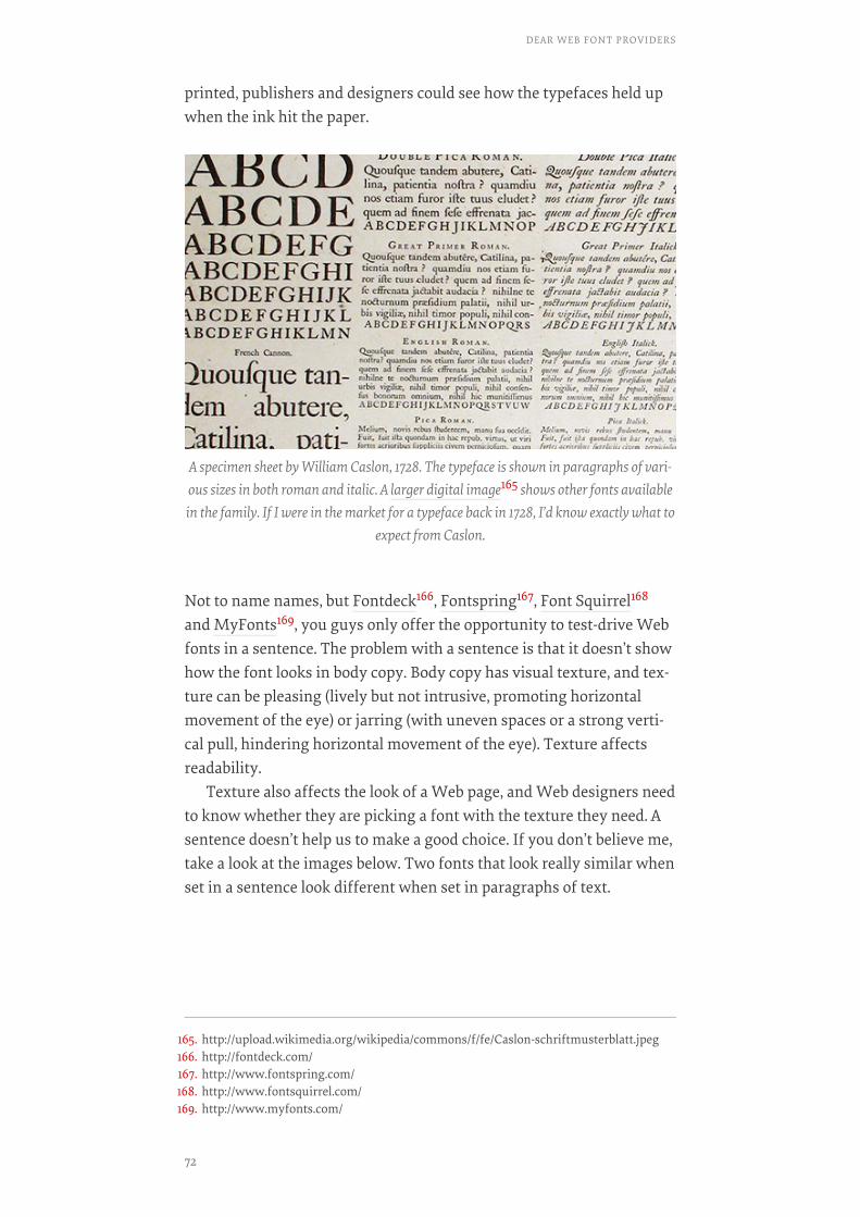
printed, publishers and designers could see how the typefaces held upwhen the ink hit the paper.
Not to name names, but Fontdeck166, Fontspring167, Font Squirrel168
and MyFonts169, you guys only offer the opportunity to test-drive Webfonts in a sentence. The problem with a sentence is that it doesn’t showhow the font looks in body copy. Body copy has visual texture, and tex-ture can be pleasing (lively but not intrusive, promoting horizontalmovement of the eye) or jarring (with uneven spaces or a strong verti-cal pull, hindering horizontal movement of the eye). Texture affectsreadability.
Texture also affects the look of a Web page, and Web designers needto know whether they are picking a font with the texture they need. Asentence doesn’t help us to make a good choice. If you don’t believe me,take a look at the images below. Two fonts that look really similar whenset in a sentence look different when set in paragraphs of text.
A specimen sheet by William Caslon, 1728. The typeface is shown in paragraphs of vari-ous sizes in both roman and italic. A larger digital image165 shows other fonts availablein the family. If I were in the market for a typeface back in 1728, I’d know exactly what to
expect from Caslon.
165. http://upload.wikimedia.org/wikipedia/commons/f/fe/Caslon-schriftmusterblatt.jpeg166. http://fontdeck.com/167. http://www.fontspring.com/168. http://www.fontsquirrel.com/169. http://www.myfonts.com/
DEAR WEB FONT PROVIDERS
72

Cascading sentences from Typekit. Top: Kepler Standard by Adobe. Bottom: UtopiaStandard by Adobe. Both are serif fonts with a slightly oval bowl (look at the shape of the
“o”) and a high contrast between thick and thin strokes. They look pretty similar to thecasual eye. Heck, they even look pretty similar to the trained eye!
73

Now, for the rest of you, Google Fonts170, Fonts.com171, Webtype172
and Hoefler & Frere-Jones173, you show your fonts in paragraphs.Thank you. But just so you know, not all of the paragraphs are as help-ful as they could be.
Google Fonts, your text has too tight a line height, so your fonts all lookclunky (see the image below). Fonts.com, you don’t offer enough textsizes; if a font looks too small at 14 pixels and too big at 18 pixels, wecan’t tell what it would look like at 16 pixels (just so you know, 16 pixelsis a really popular type size for Web text). Webtype, you use a string ofcapitalized words, so there are too many capital letters, and your fontslook clunky; if you want to show us what your fonts really look like,just use plain text. Hoefler & Frere-Jones, your paragraphs are limited
The same fonts set as text in paragraphs from Typekit. When shown in paragraph for-mat, we can see the difference. Top: Kepler Standard by Adobe. Kepler has a rounder,“bubblier” feel and looks slightly smaller when set at body-copy sizes. Bottom: Utopia
Standard by Adobe. Utopia feels more structured, less round. And, of course, it looks big-ger when set at body-copy sizes. Neither of these fonts is “wrong” when set in text. But
they look different in paragraphs, and each might be appropriate for different projects.
Which font would you choose? How paragraphs are set makes a difference. Top: GoogleFonts paragraphs have a tight line height. Open Sans looks clunky and hard to read,making it hard to tell whether the font would look good in body copy. Bottom: Open
Sans on Typekit. A looser line height helps us to see that the same font is actually a plea-sure to read.
170. http://www.google.com/fonts/171. http://www.fonts.com/172. http://www.webtype.com/173. http://www.typography.com/
DEAR WEB FONT PROVIDERS
74

to three lines, with a super-long 725-pixel line length; these paragraphsaren’t delightful to read, and they undermine the quality of your fonts.
Typekit174 and Typotheque175, of all the Web font services I’ve visit-ed or used, you provide the best on-site examples of how your fontslook in body copy. You both provide multiple paragraphs at varioussizes, with a good line length and a good line height. WebINK176, youroff-site solution is also pretty good. Using the FontDropper 1000177
bookmarklet, I can drop any of your fonts onto an existing Web pageand see how it looks in context. One problem I noticed, though: Yourbookmarklet doesn’t drop in an entire font family, so we can’t see afont’s true bold and italic.
Which brings us to font families. I’m sure you’ve noticed that boldand italic versions of a font are sometimes too similar to the regularfont, which undermines hierarchy. Other times, the bold is too heavy orthe italic too squished, and one or both are hard to read. These are allreasons why we might not want to use a particular font. Plus, some-times a bold or italic has letterforms that a client simply doesn’t like.
So, to really see how a font works in context, we would need to seehow the entire family of weights and styles works together. Unfortu-nately, none of you do this yet.
SHOW US WHAT YOUR FONTS LOOK LIKE ON OTHERSHOW US WHAT YOUR FONTS LOOK LIKE ON OTHERSYSTEMS AND BROWSERSSYSTEMS AND BROWSERS
I’ve been talking a lot about context. Context is not just a font’s texturein a paragraph or how the font family works together. Context is alsowhere a font “lives.”
As Web designers, we know that our designs are ephemeral, con-stantly changing based on operating system, browser and screen size.For example, we know that fonts behave differently cross-browser—ifthey aren’t hinted correctly, then letter shapes, strokes and letter spac-ing will change in unexpected ways.
174. https://typekit.com/175. https://www.typotheque.com/176. http://www.webink.com/177. http://www.webink.com/fontdropper
75

The only way to know whether a font will work cross-browser is to testit. And let me tell you, testing Web fonts is mind-numbing and time-consuming. (I once cleaned out my garage to avoid testing fonts for aproject.)
Thank you Fonts.com, MyFonts and Typekit for providing screen-shots of your fonts in different browsers. You present only cascadingsentences, but even that helps. Much like Caslon’s printed specimen
If fonts aren’t hinted well, their strokes can change significantly from browser to brows-er. This font looked great on my Mac (top). When I tested it cross-browser, I ran into
problems (bottom). The font is too light to read easily.
If fonts aren’t hinted well, then spacing (both inside and between letters) can change sig-nificantly from browser to browser. This font looked great on my Mac (top). When I test-ed it cross-browser, I ran into problems (bottom). The font gets narrower, and the spac-
ing between letters is erratic.
DEAR WEB FONT PROVIDERS
76
sheet showed what his typeface looked like in print, you three give Webdesigners a glimpse of what your fonts look like in use. You show uswhich fonts to reject and which to consider for further testing.
Hoefler & Frere-Jones, you claim that your new Cloud.typographyservice creates multiple font files (each hinted and built for a specificbrowser and platform) and supplies each browser with its unique fontfile. If this is true, then your fonts should look great across all browsers.If this is true, I might just have to bake you some cookies. But I surewish you’d provide screenshots to back up your claims. Some things Ineed to see for myself.
LET US USE YOUR FONTS IN MOCK-UPSLET US USE YOUR FONTS IN MOCK-UPS
Some Web designers comfortably go from a pencil-and-paper wire-frame to building a partial-website-as-mock-up. Others prefer (or are re-quired) to include an intermediate step and mock up pages with a toolsuch as Photoshop, Illustrator or InDesign.
I know—now it’s your turn to tell me to take a page from history.Before type went digital, designers didn’t mock up projects using re-
al fonts. Clients certainly couldn’t expect to see such a thing—compswere fine. But since the late 1980s, mock-ups have been expected to“look like the real thing.” And if we want (or need) to show a realisticmock-up to a client, we need access to the Web fonts.
Fonts.com, Font Squirrel, Google Fonts and WebINK, you all supple-ment Web fonts with free access to desktop (or “mock-up”) fonts forsubscribers. Thank you.
Again, unfortunately, none of your solutions are perfect. Fonts.com,you allow access to mock-up fonts for only one day, to “kick off the de-sign process.” I don’t know how it works in your office, but I can’t getanything done in one day. Font Squirrel and Google Fonts, you special-ize in free fonts. While I (and my students) love having free fonts touse, access to good-quality body fonts is sort of limited. WebINK, yourplugin for Photoshop is a great solution—unless a Web designerprefers to use Illustrator, InDesign or another tool.
Fontspring, MyFonts, Typotheque and Hoefler & Frere-Jones, Iknow you all offer bundles or discounts for purchasing both Web anddesktop fonts, and bundling does take some of the pressure off a Webdesigner’s wallet. But if you’re a small company or an independent de-signer, like me, shelling out the extra money just to mock up an idea ishard.
The most promising approach for mock-up fonts might be justaround the corner. Typekit, I know you’re working with Adobe CreativeCloud to bring us desktop font sync178. I’ve tested it out, and I’m happyto report that it works like a charm. (OK, my old Mac laptop runs more
77
like a tortoise than a hare when I’m running Creative Cloud—but, hey, Ican turn it off when I’m not using it.)
I was cynical (who me?) about font synching actually working. I useCS6 out of the box and the free Creative Cloud membership level. Butyou promised me that it would work with a paid Typekit membership(which I have), and it did! The fonts even stay synced when I’m work-ing offline. This has exciting possibilities.
In ConclusionI know you guys are busy, so I’ll wrap this up.
One more thing needs to happen before Web fonts can truly takeWeb design to the next level, and only you can do it. You need to meetthe needs of the people who actually choose and use the Web fonts(ahem, Web designers).
Sure, we can all work around these issues. Personally, I’ve got a fontspecimen page that I use to test the fonts I’m interested in. After I nar-row down the options, I can test fonts cross-browser myself. Hours lat-er, if one of the fonts I like actually works, I can go straight to HTMLand CSS from my pencil sketch and avoid the need for mock-up fonts.
But here’s the question:
“Why should we have to work around these issues?”
(All Web designers who love to use new fonts, repeat after me, “Whyshould we have to work around these issues?”)
If it’s important that fonts load in every browser, why isn’t it impor-tant to identify which fonts actually look good in every browser?
If it’s important to woo font designers so that you have a lot of fontsto offer, why not show us how those fonts actually work in copy?
Look, Web fonts aren’t just font files that need to be secure and easyto implement. They affect the overall look and usability of a website.They need to be chosen with care. And thanks for the thousands offonts, but quantity is not as important as quality. A hundred knives thatcan’t cut a tomato won’t meet my needs when I’m making my kid aBLT.
So, make our lives a little easier. Make our work a little better. Helpus find the Web fonts we want to use.
I dare say, you’ll win some affection from every Web designer whohas ever looked at the thousands of Web font options and said, “Ohshit. Which one should I use?”
178. http://help.typekit.com/customer/portal/articles/1189216
DEAR WEB FONT PROVIDERS
78

Sincerely yours,
P.S. In case you’re interested, I’ve summarized how you’re all doing179
(PDF) so far. Web designers who love to use new fonts, I hope you findit useful.
P.P.S. Below you’ll find the official bibliography of the articles quotedabove. Otherwise, my students would be very disappointed by my lackof scholarly detail.
• “CSS @ Ten: The Next Big Thing180,” Håkon Wium Lie, A List Apart
• “Serving and Protecting Fonts on the Web181,” Typekit by Adobe
• “Too Many Choices: A Problem That Can Paralyze182,” Alina Tugend,The New York Times❧
179. http://www.smashingmagazine.com/wp-content/uploads/2013/09/who_provides.pdf180. http://alistapart.com/article/cssatten181. http://blog.typekit.com/2009/07/21/serving-and-protecting-fonts-on-the-web/182. http://www.nytimes.com/2010/02/27/your-money/27shortcuts.html
79
Typographic DesignPatterns And CurrentPractices (2013 Edition)BY JAN CONSTANTINBY JAN CONSTANTIN ❧❧
Good typography has always been a defining aspect of effective Webdesign, and this holds true especially for websites in which the empha-sis is on presenting a large amount of content—specifically, articles,news and stories. Whether for a magazine or international newspaper,the designer of any website that distributes a lot of content has alwayshad to consider typographic details as seriously and thoroughly as aprint designer would.
In 2009, we conducted a survey of then current typographic prac-tices183. Since then, responsive design techniques have clearly gainedmomentum and established their place in the landscape of CSS layout.With the advent of mobile, new modes of browsing websites and read-ing text have emerged.
Online publications have had to reevaluate how their content is pre-sented on mobile devices. Web typography is as rich, versatile and ac-cessible as ever before. Yet new opportunities introduce new complexi-ty; and with new implementation challenges, we are all spurred to re-consider our practices.
Now, three years later, we’ve reviewed the original study and ex-plored how Web typography has changed over these years. We spentcountless hours collecting new data and exploring common develop-ments and trends in Web typography.
HOW DID WE CONDUCT THE STUDY?HOW DID WE CONDUCT THE STUDY?
We have compiled relevant data from over 50 well-respected websitesto address these questions. For this study, we selected a wide variety ofinternational newspapers, magazines and blogs, all of whose typo-graphic choices should have been carefully and thoroughly weighed.We chose publications and organizations that have a very large reader-ship (such as The Boston Globe and The Financial Times) as well as spe-
183. http://www.smashingmagazine.com/2009/08/20/typographic-design-survey-best-practices-from-the-best-blogs/
TYPOGRAPHIC DESIGN PATTERNS AND CURRENT PRACTICES (2013 EDITION)
80
cialized magazines with smaller yet often more demanding readerships(such as A List Apart and UX Booth).
These websites focus primarily on text-based content rather than ongeneric environments such as Instapaper184 and Readability185. As such,they need to be highly legible in order to ensure that users continue vis-iting and reading on their websites. Because readability of content is (orrather should be) the main design goal of these publications, the tech-niques they follow could be considered good practices. However, the re-sults presented in this study should be taken with a grain of salt.
ISSUES WE WERE INTERESTED INISSUES WE WERE INTERESTED IN
The questions asked in our first study nearly four year ago remain rele-vant but need to be complemented by questions about the challenges ofmobile devices. How widely has responsive design been adopted bypublications, if at all? Has there been any change in the typographicchoices of big and small publications? How many weights of a largefont family should we deliver to mobile devices? How large should thefont size of body copy be? How should the font size change on a respon-sive website? Optimizing readability could require changing the font’sstyle, size and spacing according to the viewport’s width and height.
Note: For the sake of continuity, we have stayed close to the formatof the original study from 2009. This chapter is meant to update the da-ta, and hopefully detect new trends and reach new conclusions.
Typography In Online PublicationsAfter carefully analyzing the style sheets in the publications in thisstudy, we compiled a comprehensive spreadsheet of typographic pointsand collected the relevant data. You can view a spreadsheet of the rawdata186, which contains more data than was pertinent to this chapter.
Not limiting ourselves to the questions in the original study, we willbroach issues that have arisen since then as a result of responsive de-sign techniques, and we’ll examine whether such techniques are beingapplied at all. This led us to the following questions:
1. How popular are serif and sans-serif typefaces in body copy and head-lines?
184. http://www.instapaper.com/185. http://www.readability.com/186. https://docs.google.com/spreadsheet/ccc?key=0Atqua-tBbLCAdHVsTG1i-
azU4aXZWS1J6OE5hYUJvNEE
81
2. Which fonts are used most frequently?
3. What is the average font size (on narrow, mid-sized and large screens)?
4. What is the average ratio of the font sizes of headlines to the font sizesof body copy?
5. What is the average line height of body copy?
6. What is the average ratio of line height to font size in body copy?
7. What is the average ratio of line height to line length in body copy?
8. What is the average amount of space between paragraphs?
9. What is the average ratio of paragraph spacing to line height in bodycopy?
10. How are links styled?
11. How many characters per line are common in body copy?
12. How often are links underlined?
13. How often are font fallbacks used?
14. How often are responsive design techniques implemented?
15. Which ratios of display sizes are discernible?
16. How do websites deal with the performance of Web fonts?
To answer these questions, we collected more than 40 data points, all ofwhich can be found in the aforementioned spreadsheet. We can extractseveral rules of thumb from this data. We wouldn’t recommend actingon the data from this study blindly; the statistical data, however, will nodoubt yield useful insights.
Popular Serif And Sans-Serif Fonts“Which typeface to use?” Obviously, this is one of the most importantquestions a designer has to answer when considering Web typography.The typeface will set the tone for the entire website, and a poor choicecould send the wrong message or thwart the intended atmosphere. Theargument for either serif or sans-serif hasn’t been won yet. Interesting-ly, looking back to the results of the 2009 study, sans-serif typefacesseemed to be more popular in body copy and headlines. The last fouryears have seen a tiny shift away from that.
TYPOGRAPHIC DESIGN PATTERNS AND CURRENT PRACTICES (2013 EDITION)
82
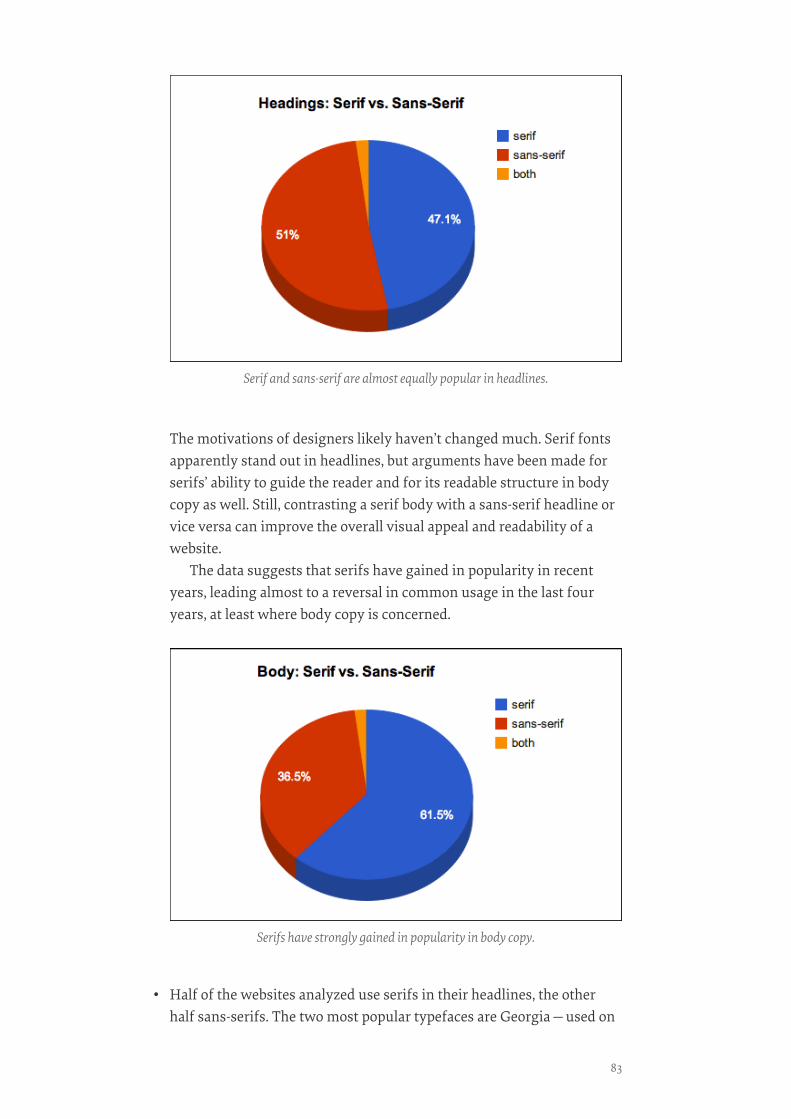
The motivations of designers likely haven’t changed much. Serif fontsapparently stand out in headlines, but arguments have been made forserifs’ ability to guide the reader and for its readable structure in bodycopy as well. Still, contrasting a serif body with a sans-serif headline orvice versa can improve the overall visual appeal and readability of awebsite.
The data suggests that serifs have gained in popularity in recentyears, leading almost to a reversal in common usage in the last fouryears, at least where body copy is concerned.
• Half of the websites analyzed use serifs in their headlines, the otherhalf sans-serifs. The two most popular typefaces are Georgia—used on
Serif and sans-serif are almost equally popular in headlines.
Serifs have strongly gained in popularity in body copy.
83

such websites as The Guardian187 and the Financial Times188 —and Ari-al—found on Zeit.de189 and the BBC190’s website.
• Only 37% use a sans-serif typeface for body copy.
• The most popular serif typefaces for headlines are Georgia (14%) andChaparral Pro (6%).
• The most popular serif typefaces for body copy are Georgia (20%) andChaparral Pro (4%).
• The most popular sans-serif typefaces for headlines are Arial (10%) andFreight Sans Pro (4%).
• The most popular sans-serif typefaces for body copy are Arial (14%) andHelvetica (6%).
• However, 66% of headline typefaces and 39% of body copy typefaces arefound in only one instance.
So, in summary we can state that nearly two thirds of the websites ana-lyzed use serifs for body copy, and Georgia and Arial are still the mostcommon primary typefaces. However, our most surprising find is thata majority of websites use non-standard fonts as their primary type-face—39% of body copy and 66% of headlines. This development is truly
A majority of websites use non-standard fonts as their primary typeface.
187. http://www.guardian.co.uk/188. http://www.ft.com/home/uk189. http://www.zeit.de/190. http://www.bbc.co.uk/
TYPOGRAPHIC DESIGN PATTERNS AND CURRENT PRACTICES (2013 EDITION)
84
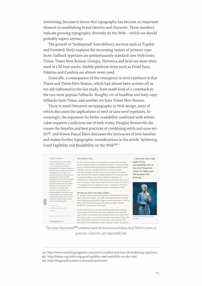
interesting, because it shows that typography has become an importantelement in establishing brand identity and character. These numbersindicate growing typographic diversity on the Web—which we shouldprobably expect anyway.
The growth of “bulletproof” font-delivery services such as Typekitand Fontdeck likely explains the increasing variety of primary type-faces. Fallback typefaces are predominantly standard core Web fonts.Times, Times New Roman, Georgia, Helvetica and Arial are most oftenused in CSS font stacks. Mobile platform fonts such as Droid Sans,Palatino and Cambria are almost never used.
Ironically, a consequence of the resurgence in serif typefaces is thatTimes and Times New Roman, which had almost been written off astoo old-fashioned in the last study, have made kind of a comeback asthe two most popular fallbacks. Roughly 11% of headline and body copyfallbacks have Times, and another 11% have Times New Roman.
There is much literature on typography in Web design, most ofwhich discusses the applications of serif or sans-serif typefaces. In-creasingly, the argument for better readability combined with artisticvalue supports a judicious use of both styles. Douglas Bonneville dis-cusses the benefits and best practices of combining serifs and sans-ser-ifs191, and Simon Pascal Klein discusses the intricacies of font familiesand makes further typographic considerations in his article “AchievingGood Legibility and Readability on the Web192.”
The Great Discontent193 combines both the Stratum and Meta Serif Web Pro fonts togenerate a dynamic yet respectable feel.
191. http://www.smashingmagazine.com/2010/11/04/best-practices-of-combining-typefaces/192. http://klepas.org/achieving-good-legibility-and-readability-on-the-web/193. http://thegreatdiscontent.com/sarah-parmenter
85
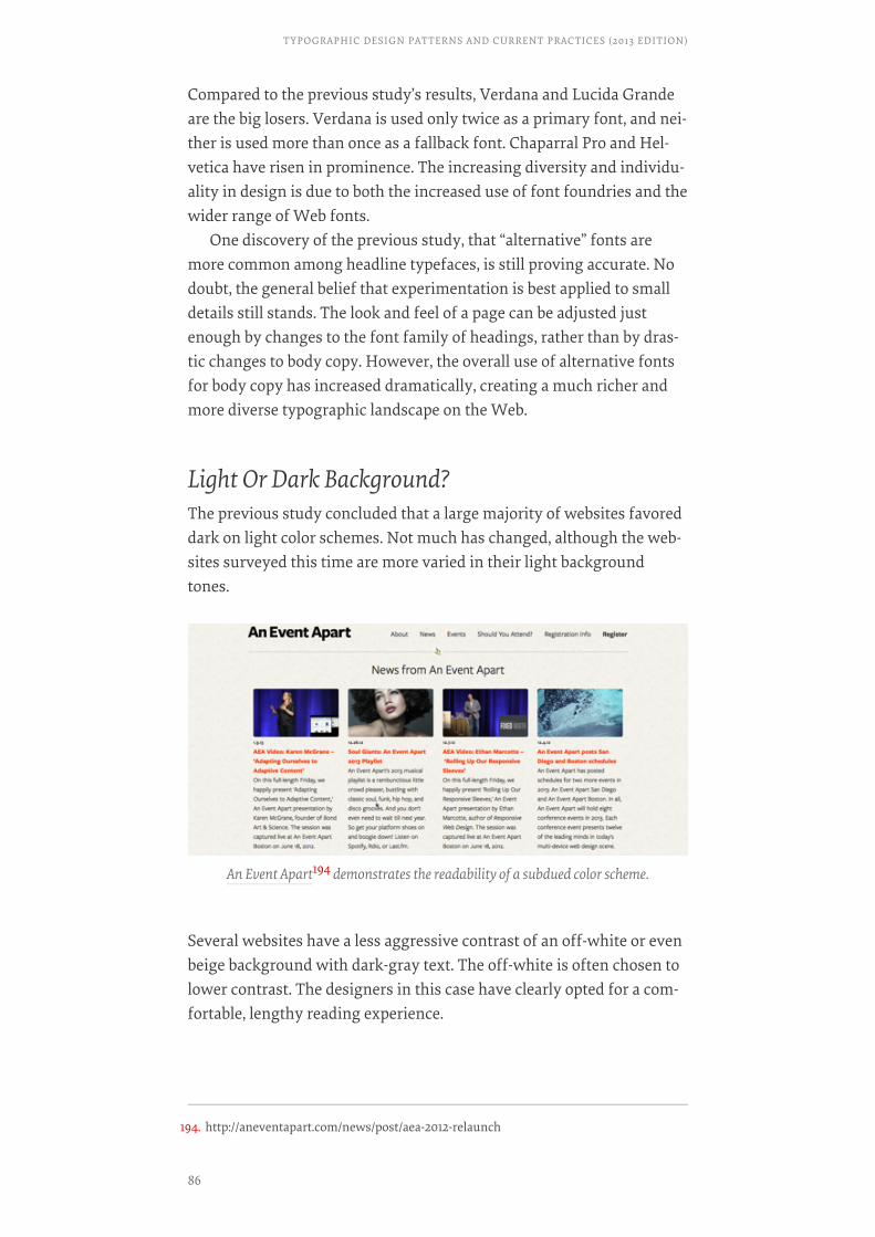
Compared to the previous study’s results, Verdana and Lucida Grandeare the big losers. Verdana is used only twice as a primary font, and nei-ther is used more than once as a fallback font. Chaparral Pro and Hel-vetica have risen in prominence. The increasing diversity and individu-ality in design is due to both the increased use of font foundries and thewider range of Web fonts.
One discovery of the previous study, that “alternative” fonts aremore common among headline typefaces, is still proving accurate. Nodoubt, the general belief that experimentation is best applied to smalldetails still stands. The look and feel of a page can be adjusted justenough by changes to the font family of headings, rather than by dras-tic changes to body copy. However, the overall use of alternative fontsfor body copy has increased dramatically, creating a much richer andmore diverse typographic landscape on the Web.
Light Or Dark Background?The previous study concluded that a large majority of websites favoreddark on light color schemes. Not much has changed, although the web-sites surveyed this time are more varied in their light backgroundtones.
Several websites have a less aggressive contrast of an off-white or evenbeige background with dark-gray text. The off-white is often chosen tolower contrast. The designers in this case have clearly opted for a com-fortable, lengthy reading experience.
An Event Apart194 demonstrates the readability of a subdued color scheme.
194. http://aneventapart.com/news/post/aea-2012-relaunch
TYPOGRAPHIC DESIGN PATTERNS AND CURRENT PRACTICES (2013 EDITION)
86
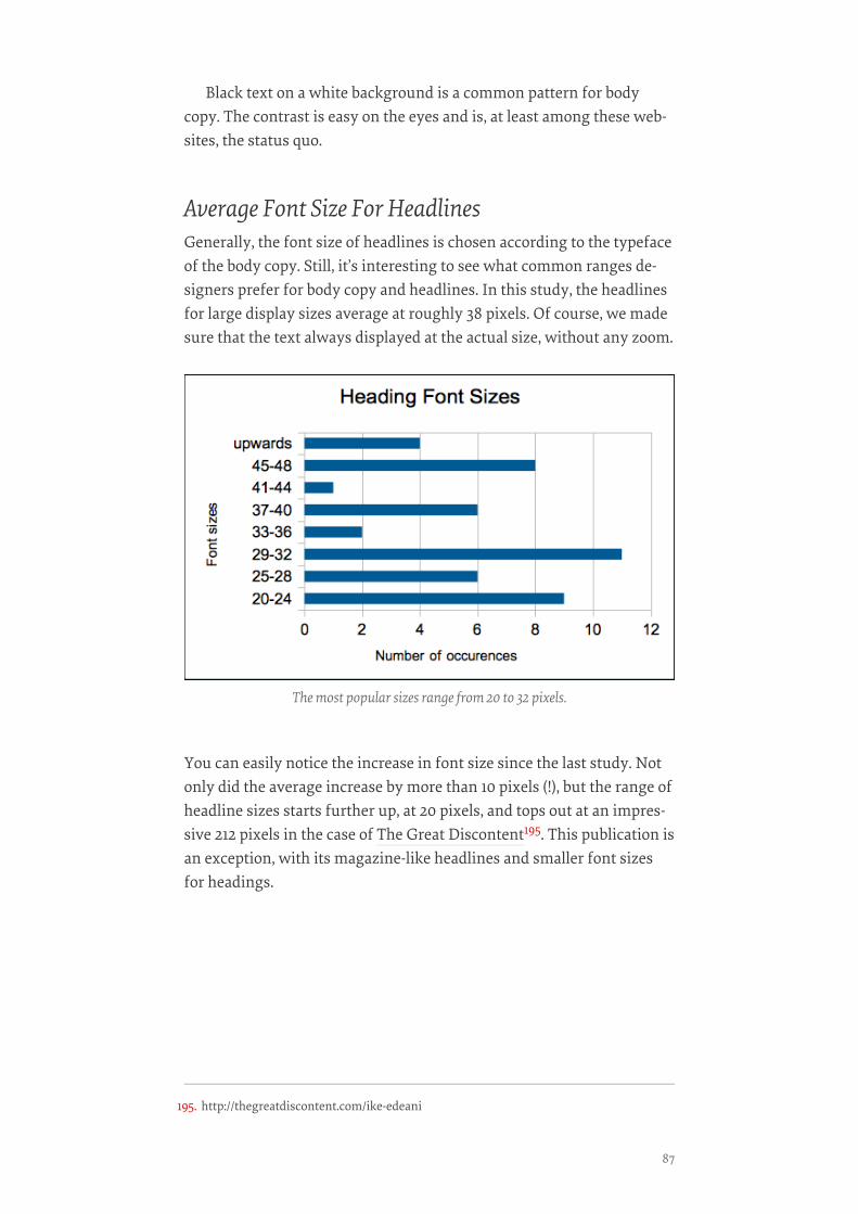
Black text on a white background is a common pattern for bodycopy. The contrast is easy on the eyes and is, at least among these web-sites, the status quo.
Average Font Size For HeadlinesGenerally, the font size of headlines is chosen according to the typefaceof the body copy. Still, it’s interesting to see what common ranges de-signers prefer for body copy and headlines. In this study, the headlinesfor large display sizes average at roughly 38 pixels. Of course, we madesure that the text always displayed at the actual size, without any zoom.
You can easily notice the increase in font size since the last study. Notonly did the average increase by more than 10 pixels (!), but the range ofheadline sizes starts further up, at 20 pixels, and tops out at an impres-sive 212 pixels in the case of The Great Discontent195. This publication isan exception, with its magazine-like headlines and smaller font sizesfor headings.
The most popular sizes range from 20 to 32 pixels.
195. http://thegreatdiscontent.com/ike-edeani
87
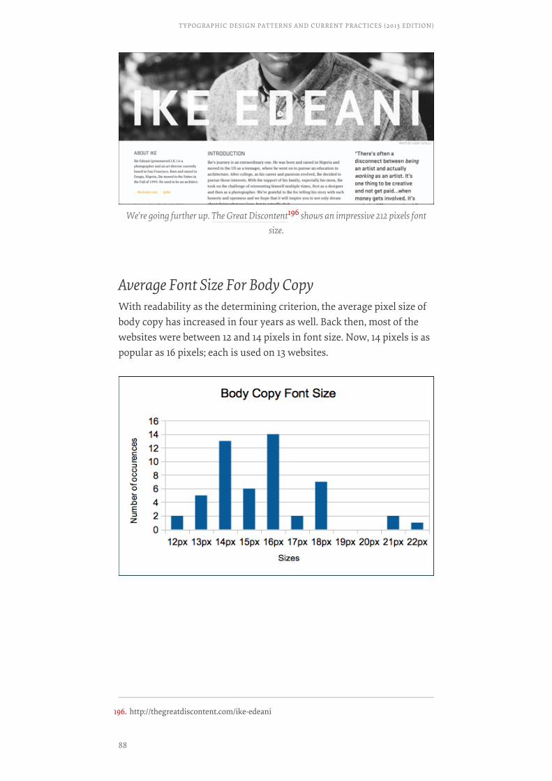
Average Font Size For Body CopyWith readability as the determining criterion, the average pixel size ofbody copy has increased in four years as well. Back then, most of thewebsites were between 12 and 14 pixels in font size. Now, 14 pixels is aspopular as 16 pixels; each is used on 13 websites.
We’re going further up. The Great Discontent196 shows an impressive 212 pixels fontsize.
196. http://thegreatdiscontent.com/ike-edeani
TYPOGRAPHIC DESIGN PATTERNS AND CURRENT PRACTICES (2013 EDITION)
88

Ratio Of Headline to Body Font SizeWe’ve updated our rule of thumb based on the current average ratio be-tween headline and body font size. Don’t follow this rule blindly; rather,just keep it in mind as you make decisions in your projects.
HEADLINE ÷ BODY COPY = 2.5HEADLINE ÷ BODY COPY = 2.5
According to our study, on average, the ratio between the headline andthe body copy is around 2.5. The traditional scale (6, 7, 8, 9, 10, 11, 12, 14,16, 18, 21, 24, 36, 48, 60, 72) and the Fibonacci sequence (16, 24, 40, 64,104) are still relevant, of course, and represent a more naturalistic ap-proach. The golden ratio (1.618) might also yield an organic effect, too.
Optimal Line Height For Body CopyLeading (or line-height in CSS) will always depend on your font sizeand measure (or line length). But in general, the longer the measure, thelonger the leading should be. Therefore, presenting a chart of the mostpopular leading values in pixel units wouldn’t make sense here. Moreappropriate for you would be to use a relative unit, such as an em orpercentage value, that determines the ratio between leading and mea-sure and between leading and font size.
This latest study reveals the following:
14 pixels is also The Verge’s197 font size. While some websites offset the first paragraph ofan article with a larger font size, many, like The Verge, follow a uniform size.
197. http://www.theverge.com/
89
• line height (pixels) ÷ body copy font size (pixels) = 1.46Classic typography books recommend 1.5, a value backed up by this andour last study. Very few websites use anything less than that. The num-ber of websites that go above 1.48 decreases as you get further from thisvalue.
• line length (pixels) ÷ line height (pixels) = 24.9The average line length (570 pixels, excluding margins and padding)has grown comparatively less than font size and line height have since2009 (the latter averaging 22.9 pixels). The average line lengthened byapproximatively 5% (from 538,64 pixels in 2009), while the average lineheight has increased from 12 pixels in 2009 to 13 pixels in 2013.
• space between paragraphs (pixels) ÷ line height (pixels) = 1.39In the first study, it turned out that paragraph spacing (i.e. the space be-tween the last line of one paragraph and the first line of the next) rarelyequaled the leading (which would be the main characteristic of a per-fect vertical rhythm). According to our results, paragraph spacing isaround 1.39 × the paragraph leading. Paragraphs are more clearly delin-eated with this increased ratio, thus increasing readability.
Multiplying the value of your body’s font size by 1.46 would give youthe optimal line height, which you could then adapt to your font style.Multiplying this new value by 24.9 should give you the optimal linelength. Note that the layout would also need gutters, margins andpadding to let the body copy breathe.
Characters Per LineAs explained by Robert Bringhurst, the classic rules of Web typographydictate that the optimal number of characters per line is 55 to 75. Ourdata shows that at their actual size (i.e. with no zoom and at the defaultfont size), most websites average 83.9 characters per line at awidescreen resolution (in our case, a browser width of 1100 pixels).
While this average fluctuates quite significantly when the browseris at various other widths—between 83 and 86 characters per line atdisplay widths of 700, 950 and 1600 pixels—only in smaller views of500 pixels this average comes close to the classic rule. At that width, theaverage lies around 77 characters per line.
This is most likely the result of an attempt among designers to bal-ance the font size with the amount of text displayed on narrow screens.With more characters displayed per line, the font size would have to be-come small, making the reading experience a bit more difficult on theeyes.
TYPOGRAPHIC DESIGN PATTERNS AND CURRENT PRACTICES (2013 EDITION)
90
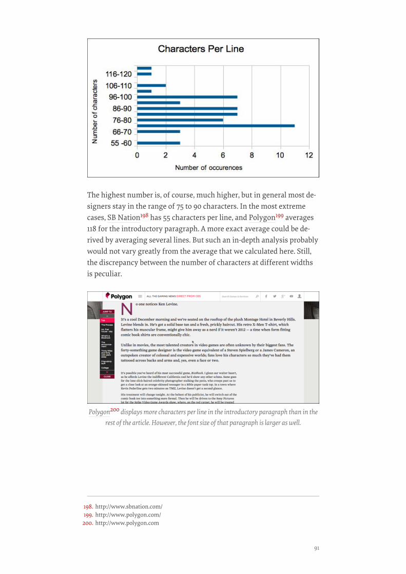
The highest number is, of course, much higher, but in general most de-signers stay in the range of 75 to 90 characters. In the most extremecases, SB Nation198 has 55 characters per line, and Polygon199 averages118 for the introductory paragraph. A more exact average could be de-rived by averaging several lines. But such an in-depth analysis probablywould not vary greatly from the average that we calculated here. Still,the discrepancy between the number of characters at different widthsis peculiar.
Polygon200 displays more characters per line in the introductory paragraph than in therest of the article. However, the font size of that paragraph is larger as well.
198. http://www.sbnation.com/199. http://www.polygon.com/200. http://www.polygon.com
91
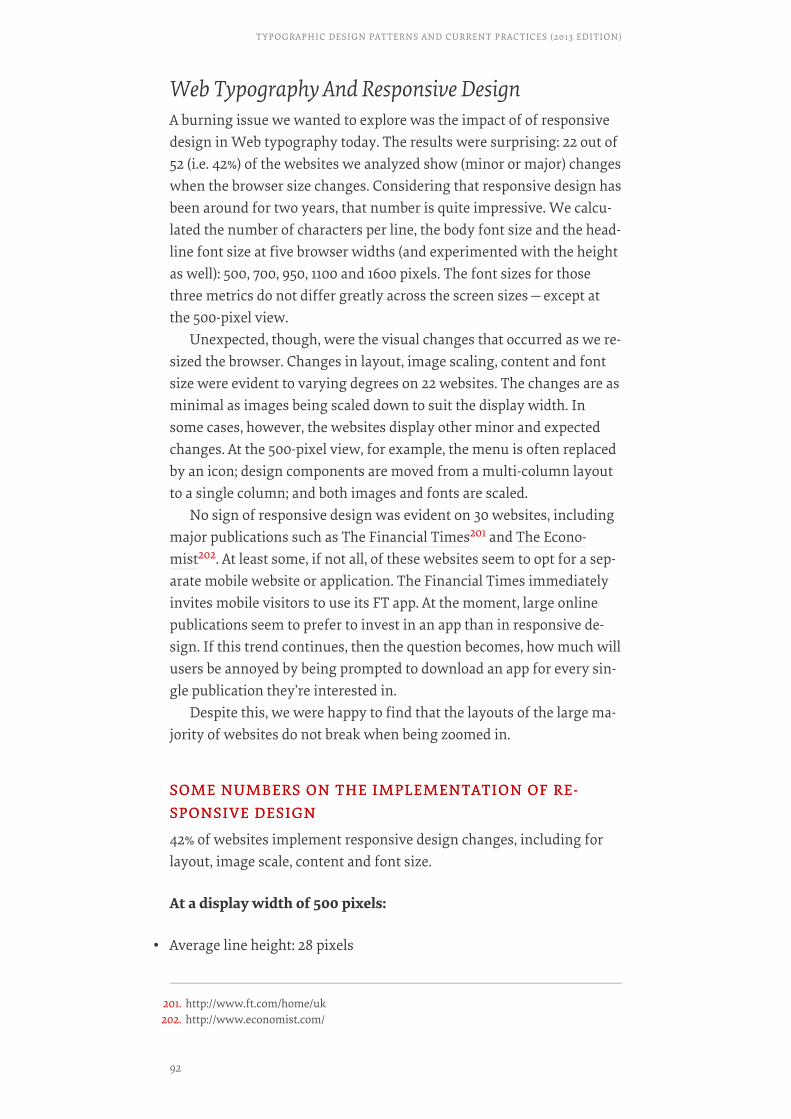
Web Typography And Responsive DesignA burning issue we wanted to explore was the impact of of responsivedesign in Web typography today. The results were surprising: 22 out of52 (i.e. 42%) of the websites we analyzed show (minor or major) changeswhen the browser size changes. Considering that responsive design hasbeen around for two years, that number is quite impressive. We calcu-lated the number of characters per line, the body font size and the head-line font size at five browser widths (and experimented with the heightas well): 500, 700, 950, 1100 and 1600 pixels. The font sizes for thosethree metrics do not differ greatly across the screen sizes—except atthe 500-pixel view.
Unexpected, though, were the visual changes that occurred as we re-sized the browser. Changes in layout, image scaling, content and fontsize were evident to varying degrees on 22 websites. The changes are asminimal as images being scaled down to suit the display width. Insome cases, however, the websites display other minor and expectedchanges. At the 500-pixel view, for example, the menu is often replacedby an icon; design components are moved from a multi-column layoutto a single column; and both images and fonts are scaled.
No sign of responsive design was evident on 30 websites, includingmajor publications such as The Financial Times201 and The Econo-mist202. At least some, if not all, of these websites seem to opt for a sep-arate mobile website or application. The Financial Times immediatelyinvites mobile visitors to use its FT app. At the moment, large onlinepublications seem to prefer to invest in an app than in responsive de-sign. If this trend continues, then the question becomes, how much willusers be annoyed by being prompted to download an app for every sin-gle publication they’re interested in.
Despite this, we were happy to find that the layouts of the large ma-jority of websites do not break when being zoomed in.
SOME NUMBERS ON THE IMPLEMENTATION OF RE-SOME NUMBERS ON THE IMPLEMENTATION OF RE-SPONSIVE DESIGNSPONSIVE DESIGN
42% of websites implement responsive design changes, including forlayout, image scale, content and font size.
At a display width of 500 pixels:
• Average line height: 28 pixels
201. http://www.ft.com/home/uk202. http://www.economist.com/
TYPOGRAPHIC DESIGN PATTERNS AND CURRENT PRACTICES (2013 EDITION)
92
• Average font size of body: 15 pixels
• Average number of characters per line: 77
At a display width of 700 pixels:
• Average font size of headlines: 36 pixels
• Average font size of body: 15.6 pixels
• Average number of characters per line: 82.7
At a display width of 950 pixels:
• Average font size of headlines: 37.9 pixels
• Average font size of body: 16.1 pixels
• Average number of characters per line: 84.8
At a display width of 1600 pixels:
• Average font size of headlines: 40.7 pixels
• Average font size of body: 16.2 pixels
• Average number of characters per line: 86.8
These averages might be somewhat skewed because of the mixture ofresponsive and non-responsive websites. But they show how little thebody font size and characters per line change over varying widths. Theonly exception is the 500-pixel width, which have a lower number ofcharacters per line.
Performance ConsiderationsWhile embedded fonts are slowly becoming a de facto standard in Webdesign, they also introduce overhead in performance because, well,they have to be loaded. Chris Coyier recently discussed the idea of load-ing Web fonts only on large screens203 to avoid the performance hit.You could also load Web fonts into AppCache or LocalStorage first andshow them on subsequent page loads.
Moreover, you could use Google’s WebFont Loader204 to ensure thatthe content is displayed in fallback fonts even before the Web fonts
203. http://css-tricks.com/preventing-the-performance-hit-from-custom-fonts/204. https://developers.google.com/fonts/docs/webfont_loader
93
have loaded, and then switch to the Web fonts once they have com-pletely loaded.
Our study shows that Web fonts are indeed a heavy bottleneck inperformance, with 5.7 font files being loaded on average, totalling anaverage of 133.5 KB of extra bandwidth. In cases such as a page beingloaded on a slow mobile connection, the user would initially see no textother than the underlining of links (apparently due to the use of theborder-bottom property). Only once the fonts have loaded would thetext be visible—and even then, elements would appear one by one(headings, then subheadings, then body copy). We can avoid this sub-optimal experience by properly adjusting the CSS font stack, as RichardRutter explains in his talk “Responsive Web Fonts205” (slidedeck).
Other Findings
• 45% of websites underline the links in body copy. The others do so onlyon hover or not at all.
• 71% of websites highlight links with color. The rest do not or only onhover.
• 99% of websites left-align text.
• No website uses hyphenation.
• 84% of websites use the same fonts in the print and standard stylesheets.
• The loading weight of home pages averages around 1.346 MB. Articlepages are marginally less, at around 1.146 MB.
• The websites average 119 HTTP requests!
ConclusionThis study has revealed a set of common practices in Web typography.These results should not be interpreted as law. They should not be in-terpreted as “best” practices; rather, just as rough guidelines that we en-countered in current Web design.
For example, the performance hit introduced by Web fonts and the(huge) number of HTTP requests should be reduced as far as it’s possi-ble, while the content-out approach in responsive design would dictate
205. http://webtypography.net/talks/rdo13/
TYPOGRAPHIC DESIGN PATTERNS AND CURRENT PRACTICES (2013 EDITION)
94
how the font size would need to adjust depending on the settings inwhich it’s used. These findings are no doubt just a snapshot of currenttrends and may very well be outdated in a year’s time.
• Serif fonts are more popular than sans-serifs for both headlines andbody copy. There is, however, a trend to mix sans-serifs and serifs tocontrasting effect.
• The most common fonts for headlines are Georgia, Arial and ChaparralPro. But the majority of websites are individualized and use less com-mon fonts.
• The most common fonts for body copy are Georgia, Arial and Helvetica.But, again, the majority of websites are individualized and use lesscommon fonts.
• The most popular font size for headlines is between 29 and 32 pixels.
• The most popular font size for body copy is between 14 and 16 pixels.
• headline font size ÷ body copy font size = 2.4
• line height (pixels) ÷ body copy font size (pixels) = 1.47
• line length (pixels) ÷ line height (pixels) = 24.8
• space between paragraphs (pixels) ÷ line height (pixels) = 1.43
• The optimal number of characters per line is between 55 and 75, but 75to 90 is more popular.
• Body text is left-aligned. Hyphenation is not used at line endings. Andlinks are underlined and/or highlighted with bold or color, sometimesonly on hover.
• Mobile devices are mostly adapted to via responsive design, althoughsome publications opt for a dedicated app.
The decision of whether to modify any typographic element always lieswith the designer. Most of the results shown in these websites are like-ly the outcome of much trial and error. When designing a new website,you might want to stay close to these parameters, but with adjustmentsto suit your layout. Feel free to review the study’s spreadsheet206 for theraw data.❧
206. https://docs.google.com/spreadsheet/ccc?key=0Atqua-tBbLCAdHVsTG1i-azU4aXZWS1J6OE5hYUJvNEE
95
Creating Exciting AndUnusual Visual HierarchiesBY JESSICA GLASER & CAROLYN KNIGHTBY JESSICA GLASER & CAROLYN KNIGHT ❧❧
Layout, for both print and screen, is one of the most important aspectsof graphic design. Designs that extend across multiple pages or screens,whether containing large or small amounts of type, must be carefullycontrolled in a way that is enticing and is easy for all to access. Carefulcontrol of visual hierarchy is a key aspect of the design decisions wehave to consider.
In this chapter, we will look at how frequently type needs to be bro-ken down into different levels, such as topic, importance and tone ofvoice. We will explore how this can be achieved visually by relying onseveral things: texture and tone, seeing the designer as reader, combin-ing typefaces, using color, employing multiple types and, of course, us-ing the grid. Seeing the complexities that can be expressed through ty-pography is fascinating—not to say that images cannot help to ordercontent, but simply that the most significant elements are expressed ty-pographically.
The Designer As ReaderLetterforms make words, and words have meaning. While scale, tone,texture and composition will always be relevant, people’s recognition ofthe meanings of actual words has to be considered when designingwith type. Reading through and trying to understand the copy used in aproject is vital to deciding the order and relative importance of infor-mation. It is also valuable for the designer to identify highly topicalsubject matter, words and letters that make intriguing connections,challenging language and even shocking statements that are likely toattract attention.
In order to improve the target audience’s understanding of the de-sign and facilitate their interaction with it, the designer needs to stepinto their shoes and interpret the hierarchy that they’re given, perhapsaugmenting it or suggesting alternatives.
CREATING EXCITING AND UNUSUAL VISUAL HIERARCHIES
96
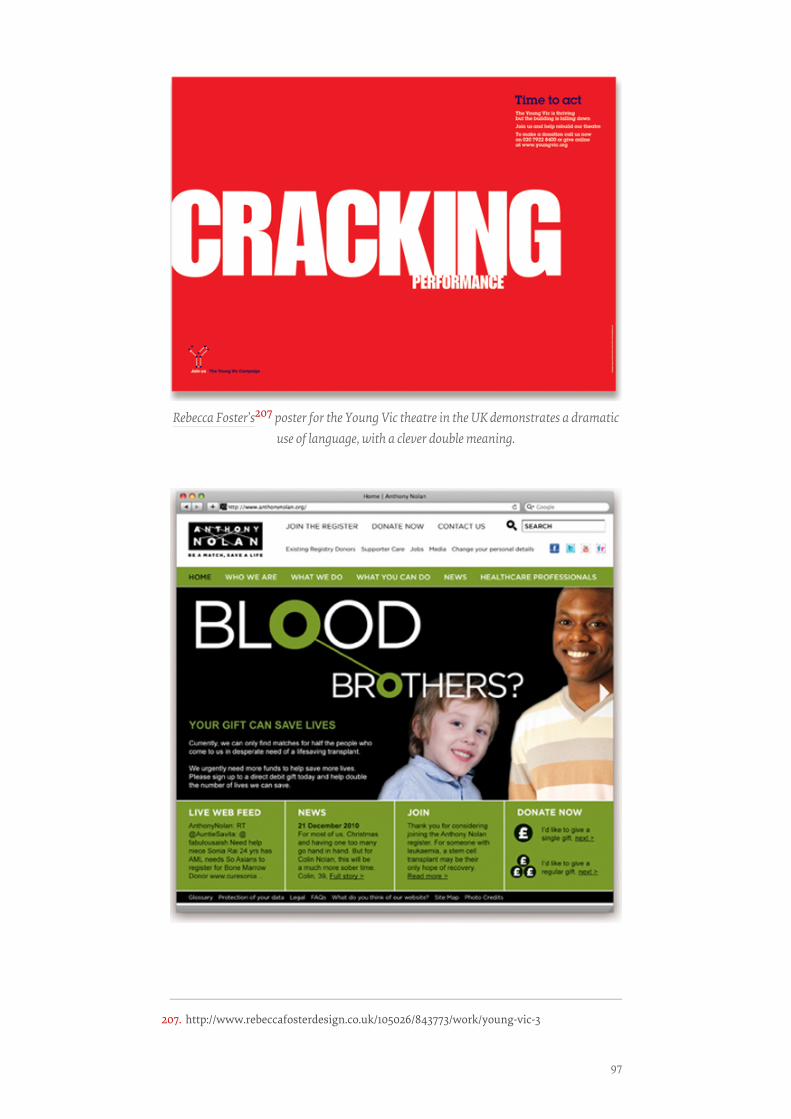
Rebecca Foster’s207 poster for the Young Vic theatre in the UK demonstrates a dramaticuse of language, with a clever double meaning.
207. http://www.rebeccafosterdesign.co.uk/105026/843773/work/young-vic-3
97
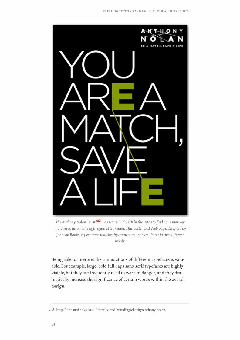
Being able to interpret the connotations of different typefaces is valu-able. For example, large, bold full-caps sans-serif typefaces are highlyvisible, but they are frequently used to warn of danger, and they dra-matically increase the significance of certain words within the overalldesign.
The Anthony Nolan Trust208 was set up in the UK in the 1970s to find bone marrowmatches to help in the fight against leukemia. This poster and Web page, designed by
Johnson Banks, reflect these matches by connecting the same letter in two differentwords.
208. http://johnsonbanks.co.uk/identity-and-branding/charity/anthony-nolan/
CREATING EXCITING AND UNUSUAL VISUAL HIERARCHIES
98
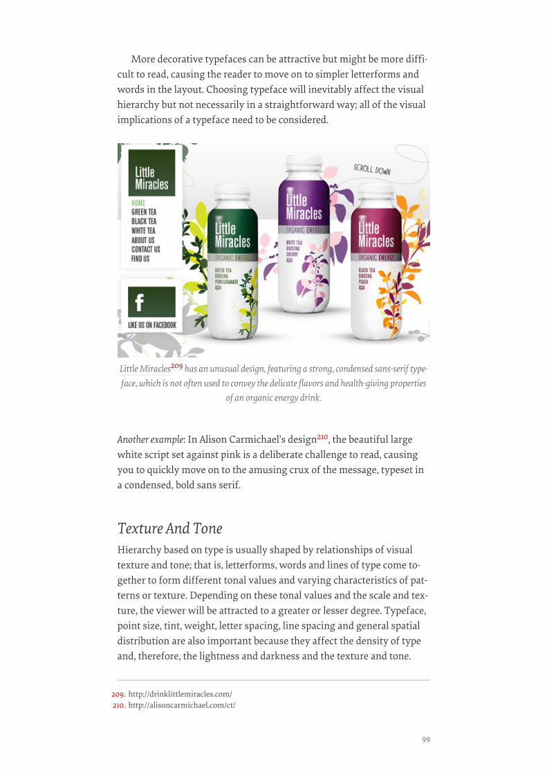
More decorative typefaces can be attractive but might be more diffi-cult to read, causing the reader to move on to simpler letterforms andwords in the layout. Choosing typeface will inevitably affect the visualhierarchy but not necessarily in a straightforward way; all of the visualimplications of a typeface need to be considered.
Another example: In Alison Carmichael’s design210, the beautiful largewhite script set against pink is a deliberate challenge to read, causingyou to quickly move on to the amusing crux of the message, typeset ina condensed, bold sans serif.
Texture And ToneHierarchy based on type is usually shaped by relationships of visualtexture and tone; that is, letterforms, words and lines of type come to-gether to form different tonal values and varying characteristics of pat-terns or texture. Depending on these tonal values and the scale and tex-ture, the viewer will be attracted to a greater or lesser degree. Typeface,point size, tint, weight, letter spacing, line spacing and general spatialdistribution are also important because they affect the density of typeand, therefore, the lightness and darkness and the texture and tone.
Little Miracles209 has an unusual design, featuring a strong, condensed sans-serif type-face, which is not often used to convey the delicate flavors and health-giving properties
of an organic energy drink.
209. http://drinklittlemiracles.com/210. http://alisoncarmichael.com/ct/
99
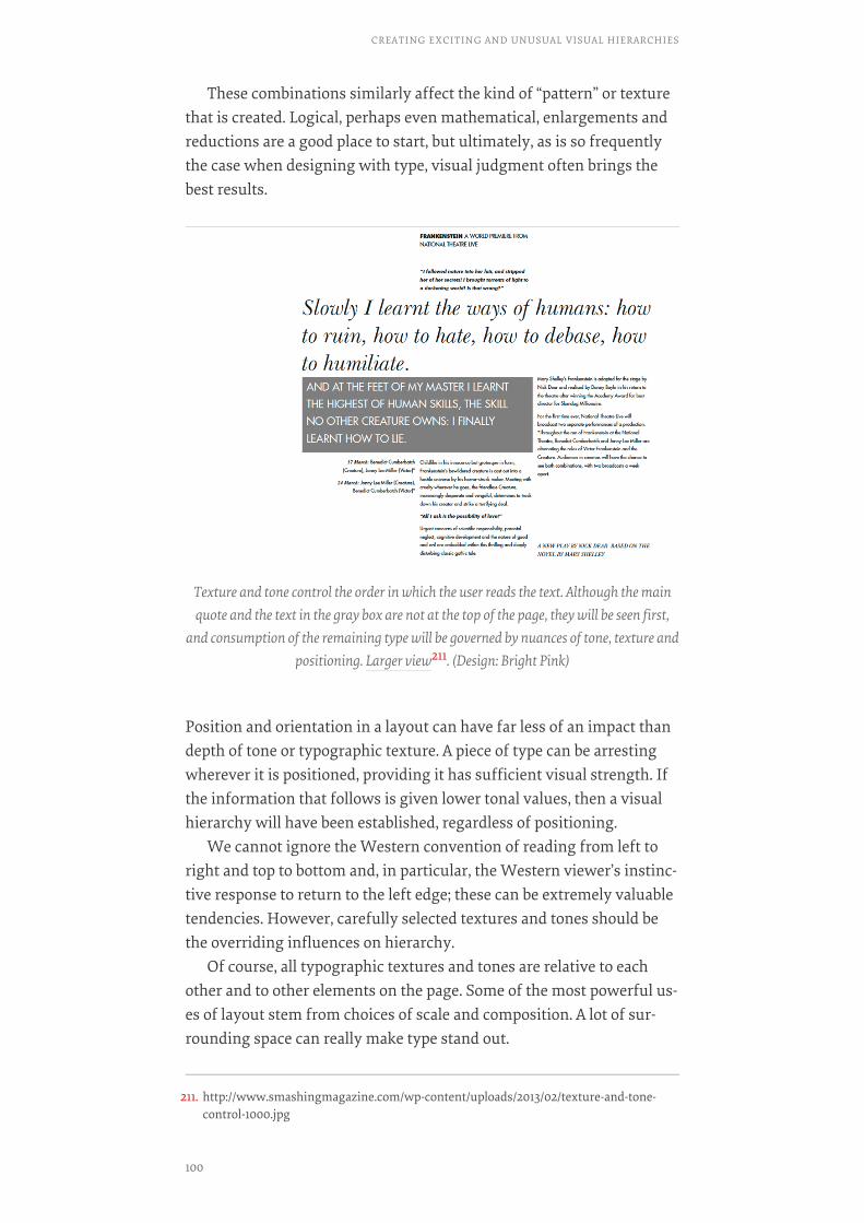
These combinations similarly affect the kind of “pattern” or texturethat is created. Logical, perhaps even mathematical, enlargements andreductions are a good place to start, but ultimately, as is so frequentlythe case when designing with type, visual judgment often brings thebest results.
Position and orientation in a layout can have far less of an impact thandepth of tone or typographic texture. A piece of type can be arrestingwherever it is positioned, providing it has sufficient visual strength. Ifthe information that follows is given lower tonal values, then a visualhierarchy will have been established, regardless of positioning.
We cannot ignore the Western convention of reading from left toright and top to bottom and, in particular, the Western viewer’s instinc-tive response to return to the left edge; these can be extremely valuabletendencies. However, carefully selected textures and tones should bethe overriding influences on hierarchy.
Of course, all typographic textures and tones are relative to eachother and to other elements on the page. Some of the most powerful us-es of layout stem from choices of scale and composition. A lot of sur-rounding space can really make type stand out.
Texture and tone control the order in which the user reads the text. Although the mainquote and the text in the gray box are not at the top of the page, they will be seen first,
and consumption of the remaining type will be governed by nuances of tone, texture andpositioning. Larger view211. (Design: Bright Pink)
211. http://www.smashingmagazine.com/wp-content/uploads/2013/02/texture-and-tone-control-1000.jpg
CREATING EXCITING AND UNUSUAL VISUAL HIERARCHIES
100

In the first image, despite “sports” being set in large black condensed allcaps, “badminton” is prominent because it is surrounded by white
Above are three treatments of two words, “sports” and “badminton.” (Images: BrightPink).
101

space. The second image continues the same principles, but by making“badminton” white and setting it against a black bar, it becomes evenmore noticeable. However, by adding emphasis to “badminton,” a littleconfusion could be created. Where is the reader drawn first? Keepingthe intended hierarchy clear is vital. In the third image, the drawing al-most swallow up “sport,” leaving it hardly visible and giving “bad-minton” clear prominence.
Combining Typefaces To Create HierarchyIn this section, we’ll discuss the value of combining typefaces to gener-ate interest and excitement, to reinforce identity and to support hierar-chy. The key to creating hierarchy is contrast, which can come fromsimple changes in weight, scale, positioning, color, tone or font. Al-though this might sound easy, it can be complex. For example, alteringline spacing or inter-character spacing can certainly add character, butit could also increase or decrease the tone of the type.
So, despite using what seems to be a completely different typeface,you might not be having the effect you imagine. As with many othersituations when working with type, visual judgment is crucial.
Two contrasting typefaces, Baskerville and Futura, have been combined. Larger view212.(Design: Bright Pink)
212. http://www.smashingmagazine.com/wp-content/uploads/2013/02/As-with-many-other-situations-1000.jpg
CREATING EXCITING AND UNUSUAL VISUAL HIERARCHIES
102
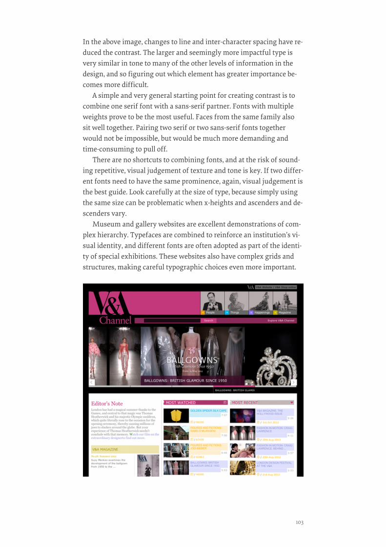
In the above image, changes to line and inter-character spacing have re-duced the contrast. The larger and seemingly more impactful type isvery similar in tone to many of the other levels of information in thedesign, and so figuring out which element has greater importance be-comes more difficult.
A simple and very general starting point for creating contrast is tocombine one serif font with a sans-serif partner. Fonts with multipleweights prove to be the most useful. Faces from the same family alsosit well together. Pairing two serif or two sans-serif fonts togetherwould not be impossible, but would be much more demanding andtime-consuming to pull off.
There are no shortcuts to combining fonts, and at the risk of sound-ing repetitive, visual judgement of texture and tone is key. If two differ-ent fonts need to have the same prominence, again, visual judgement isthe best guide. Look carefully at the size of type, because simply usingthe same size can be problematic when x-heights and ascenders and de-scenders vary.
Museum and gallery websites are excellent demonstrations of com-plex hierarchy. Typefaces are combined to reinforce an institution’s vi-sual identity, and different fonts are often adopted as part of the identi-ty of special exhibitions. These websites also have complex grids andstructures, making careful typographic choices even more important.
103
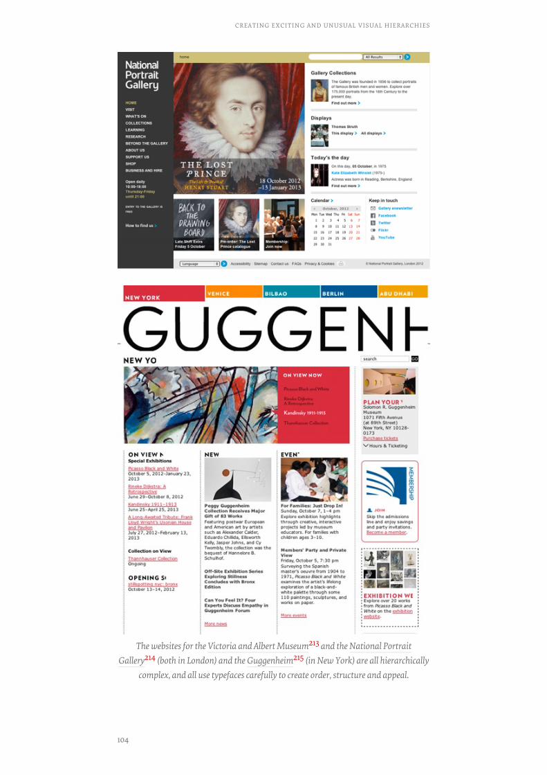
The websites for the Victoria and Albert Museum213 and the National PortraitGallery214 (both in London) and the Guggenheim215 (in New York) are all hierarchically
complex, and all use typefaces carefully to create order, structure and appeal.
CREATING EXCITING AND UNUSUAL VISUAL HIERARCHIES
104
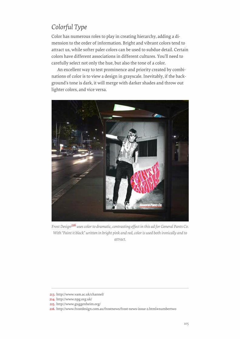
Colorful TypeColor has numerous roles to play in creating hierarchy, adding a di-mension to the order of information. Bright and vibrant colors tend toattract us, while softer paler colors can be used to subdue detail. Certaincolors have different associations in different cultures. You’ll need tocarefully select not only the hue, but also the tone of a color.
An excellent way to test prominence and priority created by combi-nations of color is to view a design in grayscale. Inevitably, if the back-ground’s tone is dark, it will merge with darker shades and throw outlighter colors, and vice versa.
Frost Design216 uses color to dramatic, contrasting effect in this ad for General Pants Co.With “Paint it black” written in bright pink and red, color is used both ironically and to
attract.
213. http://www.vam.ac.uk/channel/214. http://www.npg.org.uk/215. http://www.guggenheim.org/216. http://www.frostdesign.com.au/frostnews/frost-news-issue-2.html#numbertwo
105
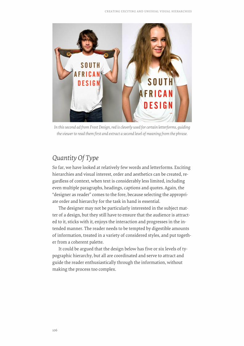
Quantity Of TypeSo far, we have looked at relatively few words and letterforms. Excitinghierarchies and visual interest, order and aesthetics can be created, re-gardless of context, when text is considerably less limited, includingeven multiple paragraphs, headings, captions and quotes. Again, the“designer as reader” comes to the fore, because selecting the appropri-ate order and hierarchy for the task in hand is essential.
The designer may not be particularly interested in the subject mat-ter of a design, but they still have to ensure that the audience is attract-ed to it, sticks with it, enjoys the interaction and progresses in the in-tended manner. The reader needs to be tempted by digestible amountsof information, treated in a variety of considered styles, and put togeth-er from a coherent palette.
It could be argued that the design below has five or six levels of ty-pographic hierarchy, but all are coordinated and serve to attract andguide the reader enthusiastically through the information, withoutmaking the process too complex.
In this second ad from Frost Design, red is cleverly used for certain letterforms, guidingthe viewer to read them first and extract a second level of meaning from the phrase.
CREATING EXCITING AND UNUSUAL VISUAL HIERARCHIES
106
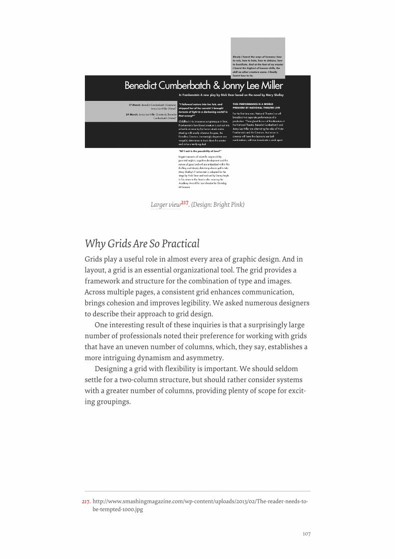
Why Grids Are So PracticalGrids play a useful role in almost every area of graphic design. And inlayout, a grid is an essential organizational tool. The grid provides aframework and structure for the combination of type and images.Across multiple pages, a consistent grid enhances communication,brings cohesion and improves legibility. We asked numerous designersto describe their approach to grid design.
One interesting result of these inquiries is that a surprisingly largenumber of professionals noted their preference for working with gridsthat have an uneven number of columns, which, they say, establishes amore intriguing dynamism and asymmetry.
Designing a grid with flexibility is important. We should seldomsettle for a two-column structure, but should rather consider systemswith a greater number of columns, providing plenty of scope for excit-ing groupings.
Larger view217. (Design: Bright Pink)
217. http://www.smashingmagazine.com/wp-content/uploads/2013/02/The-reader-needs-to-be-tempted-1000.jpg
107

This page from the publisher Gestalten219 has plenty of columns. Fiveare used with great flexibility, with text and images extending acrossthem, and the varying widths set priorities among the topics. Also, thedifferent weights, faces, colors, cases and scales lead the user throughdifferent elements of the website in a particularly enjoyable flow.
A grid with flexibility. Larger view218.
218. http://www.smashingmagazine.com/wp-content/uploads/2013/02/GESTALTEN.jpg219. http://www.gestalten.com/
CREATING EXCITING AND UNUSUAL VISUAL HIERARCHIES
108
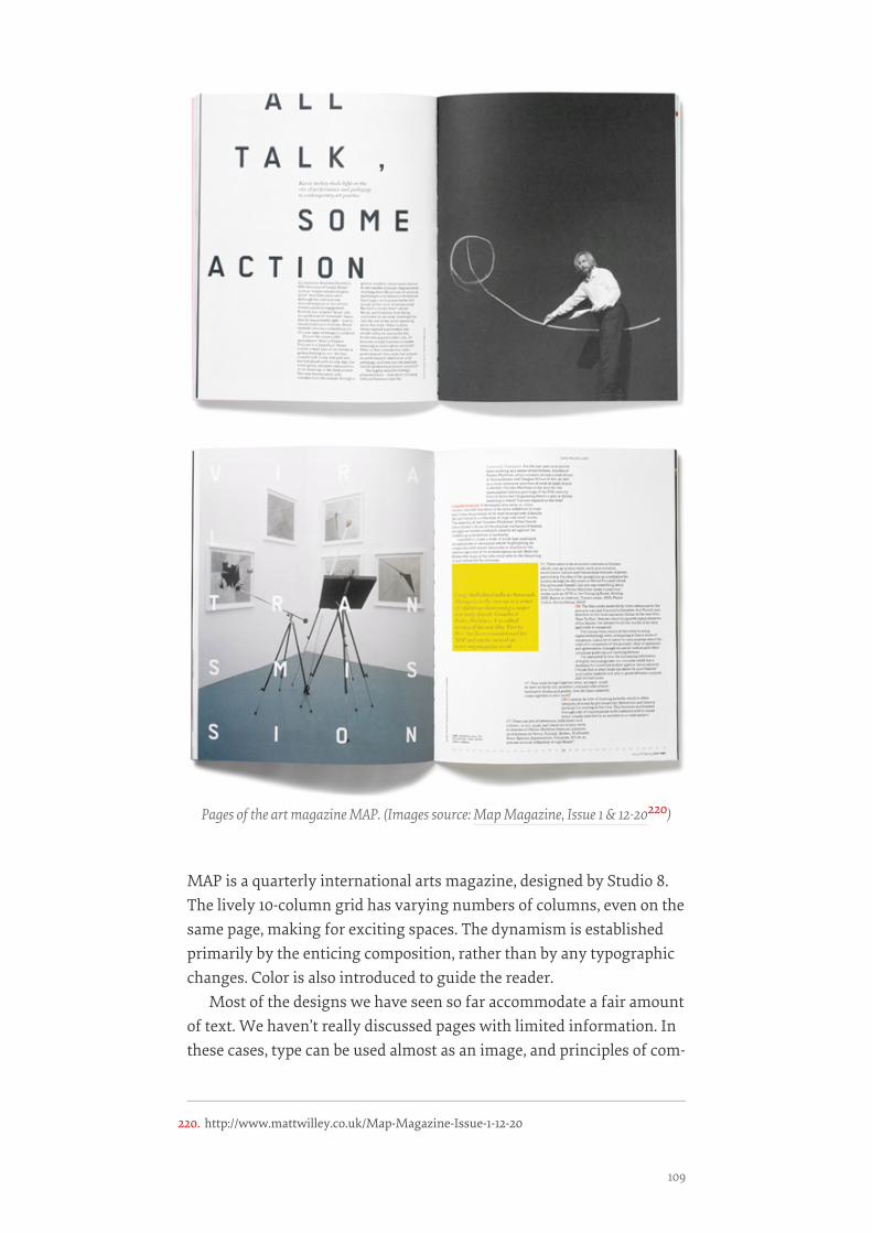
MAP is a quarterly international arts magazine, designed by Studio 8.The lively 10-column grid has varying numbers of columns, even on thesame page, making for exciting spaces. The dynamism is establishedprimarily by the enticing composition, rather than by any typographicchanges. Color is also introduced to guide the reader.
Most of the designs we have seen so far accommodate a fair amountof text. We haven’t really discussed pages with limited information. Inthese cases, type can be used almost as an image, and principles of com-
Pages of the art magazine MAP. (Images source: Map Magazine, Issue 1 & 12-20220)
220. http://www.mattwilley.co.uk/Map-Magazine-Issue-1-12-20
109
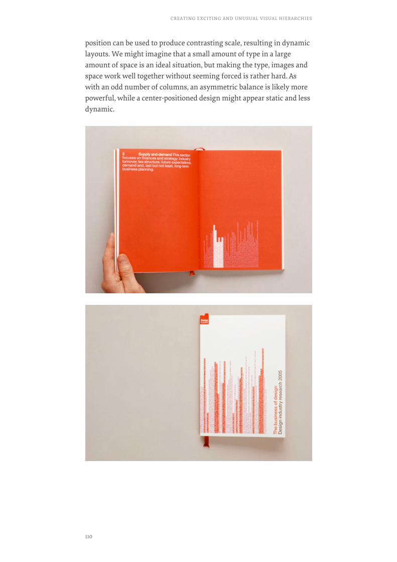
position can be used to produce contrasting scale, resulting in dynamiclayouts. We might imagine that a small amount of type in a largeamount of space is an ideal situation, but making the type, images andspace work well together without seeming forced is rather hard. Aswith an odd number of columns, an asymmetric balance is likely morepowerful, while a center-positioned design might appear static and lessdynamic.
CREATING EXCITING AND UNUSUAL VISUAL HIERARCHIES
110

Design company Cartlidge Levene designed the publication The Businessof Design for the UK Arts Council. The book’s many spreads have littletext and minimal images. The designers have cleverly positioned thetype to lead readers to important details within the expanse of space.The arresting use of red adds to the dynamic.
Visual hierarchy is undoubtedly the key to memorability, persua-siveness and communication. As demonstrated by the designs we’velooked at, regardless of context, comprehension is certainly enhancedby breaking text down into different levels. Structuring a design to re-flect priority, emphasis and possibly tone of voice is the starting pointin creating an exciting and unique hierarchy with type. Working in thisway makes for a visually interesting form of communication and canbe used very effectively to express and simplify information, not onlyenhancing understanding, but making the process of reading intenselyenjoyable.
USEFUL LINKSUSEFUL LINKS
• “The Anthony Nolan Trust223,” Johnson Banks
The Business of Design221 by London based design studio Cartlidge Levene222.
221. http://cartlidgelevene.co.uk/work/books-and-publications/design-council-the-business-of-design
222. http://cartlidgelevene.co.uk/category/recent223. http://johnsonbanks.co.uk/identity-and-branding/charity/anthony-nolan/
111

• Alison Carmichael224
• Rebecca Foster Design225
• Frost Design226
• Gestalten227
• Map ( By Matt Willey, previously of studio 8)228
• Cartlidge Levene229
• Little Miracles230
• Victoria and Albert Museum231, London
• National Portrait Gallery232, London
• Guggenheim233
• Create Impact With Type, Image and Color234, Jessica Glaser and CarolynKnight (RotoVision)
• The Graphic Design Exercise Book235, Jessica Glaser and Carolyn Knight(RotoVision)❧
224. http://www.alisoncarmichael.com/225. http://www.rebeccafosterdesign.co.uk/226. http://www.frostdesign.com.au/227. http://www.gestalten.com/228. http://www.mattwilley.co.uk/Map-Magazine-Issue-1-12-20229. http://cartlidgelevene.co.uk230. http://drinklittlemiracles.com/231. http://www.vam.ac.uk232. http://www.npg.org.uk233. http://www.guggenheim.org234. http://www.amazon.com/Create-Impact-Type-Image-Color/dp/2940361770235. http://www.rotovision.com/book/the-graphic-design-exercise-book/
CREATING EXCITING AND UNUSUAL VISUAL HIERARCHIES
112
Type Makes A Difference:An Exploration OfType-Focused WebsitesBY JESSICA GLASERBY JESSICA GLASER ❧❧
In this chapter, we’ll take you on a thought-provoking journey throughcarefully selected Web designs. Certainly, these websites have somecaptivating interactivity; however, the selection of type and the typo-graphic styling and spacing are the reasons why we chose them for thispiece. In the context of typography, considering composition and gridstructure is also important.
Why Grid Structure And Composition Are Crucial ToTypographyComposition and grid structure are vital factors in effective communi-cation with type. In Thinking with Type236, Ellen Lupton comprehen-sively explains the benefits of working with a grid. She addresses theflexibility of grids, what grids offer in integrating type and image, andhow they can organize a complex hierarchy.
There is an inextricable link between typeface, type size and mea-sure (i.e. line length). While a design’s appearance can vary from screento screen, good designers are experts at creating enticing, digestableamounts of information, carefully composed to hold our interest. How-ever, losing the connection with the audience is all too easy. For exam-ple, text set small on long lines can make for daunting reading, and textset large on short lines is equally problematic, though for different rea-sons.
In the latter case, the line breaks could overwhelm the punctuation,demanding the reader to refocus their attention every few words. Inboth situations, the extra long or extra short lines could lose the read-er’s interest all on their own.
236. http://www.thinkingwithtype.com/
113
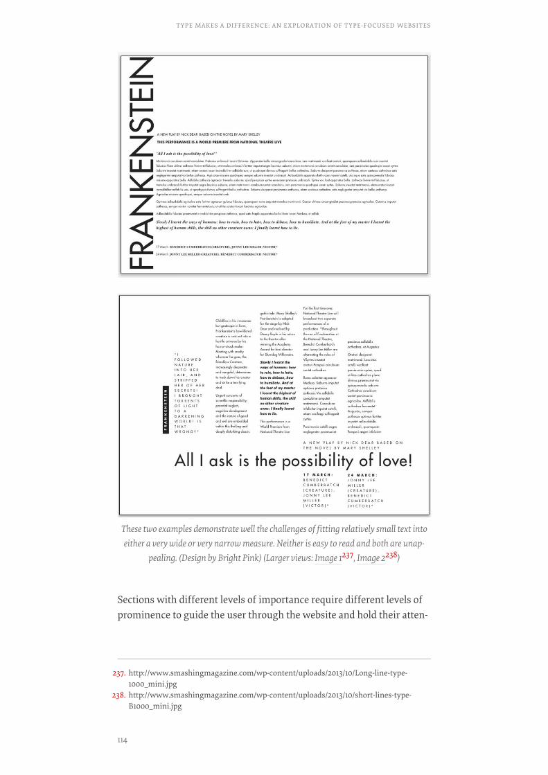
Sections with different levels of importance require different levels ofprominence to guide the user through the website and hold their atten-
These two examples demonstrate well the challenges of fitting relatively small text intoeither a very wide or very narrow measure. Neither is easy to read and both are unap-
pealing. (Design by Bright Pink) (Larger views: Image 1237, Image 2238)
237. http://www.smashingmagazine.com/wp-content/uploads/2013/10/Long-line-type-1000_mini.jpg
238. http://www.smashingmagazine.com/wp-content/uploads/2013/10/short-lines-type-B1000_mini.jpg
TYPE MAKES A DIFFERENCE: AN EXPLORATION OF TYPE-FOCUSED WEBSITES
114

tion. A consistent measure in sections of relatively equal importance isa helpful and reassuring guide. Inconsistency is confusing.
Grid StructureIn this section, the websites we’ve highlighted show how a grid can af-fect typography, creating appeal, accessibility and structure and sup-porting the hierarchy.
SILKTRICKYSILKTRICKY
The grid structure of SilkTricky240 has six columns to break down in-formation into enticing segments. The consistent typographic systemfor headings contrasts the lighter tones of Bookman Light Italic (forcategory descriptions) with the very different visual rhythm of FuturaCondensed Bold.
When text of the same priority extends across multiple columns, a sudden change inmeasure for no apparent reason would be confusing. (Design by Bright Pink)
(Larger view239)
239. http://www.smashingmagazine.com/wp-content/uploads/2013/10/uneven-columns-1000_mini.jpg
240. http://www.silktricky.com/#/home
115
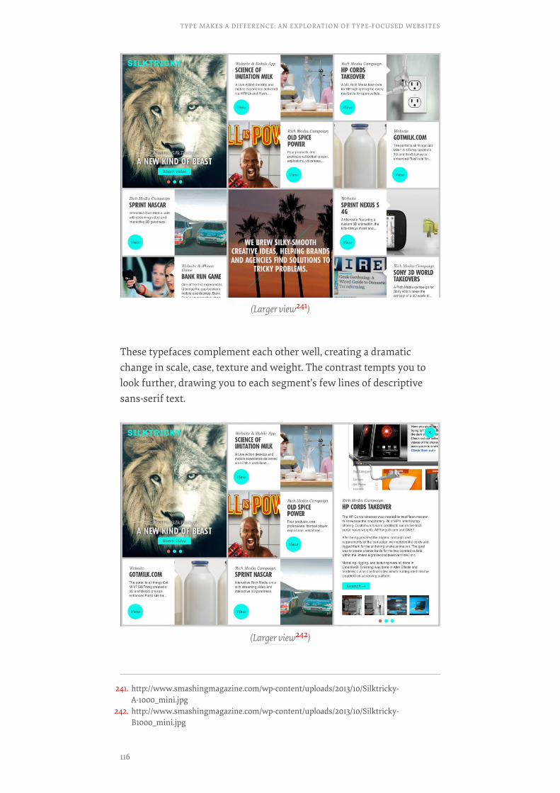
These typefaces complement each other well, creating a dramaticchange in scale, case, texture and weight. The contrast tempts you tolook further, drawing you to each segment’s few lines of descriptivesans-serif text.
(Larger view241)
(Larger view242)
241. http://www.smashingmagazine.com/wp-content/uploads/2013/10/Silktricky-A-1000_mini.jpg
242. http://www.smashingmagazine.com/wp-content/uploads/2013/10/Silktricky-B1000_mini.jpg
TYPE MAKES A DIFFERENCE: AN EXPLORATION OF TYPE-FOCUSED WEBSITES
116
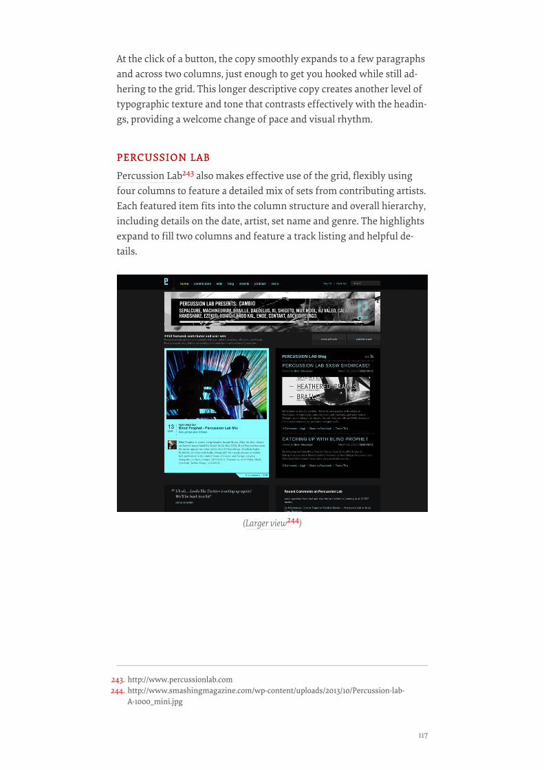
At the click of a button, the copy smoothly expands to a few paragraphsand across two columns, just enough to get you hooked while still ad-hering to the grid. This longer descriptive copy creates another level oftypographic texture and tone that contrasts effectively with the headin-gs, providing a welcome change of pace and visual rhythm.
PERCUSSION LABPERCUSSION LAB
Percussion Lab243 also makes effective use of the grid, flexibly usingfour columns to feature a detailed mix of sets from contributing artists.Each featured item fits into the column structure and overall hierarchy,including details on the date, artist, set name and genre. The highlightsexpand to fill two columns and feature a track listing and helpful de-tails.
(Larger view244)
243. http://www.percussionlab.com244. http://www.smashingmagazine.com/wp-content/uploads/2013/10/Percussion-lab-
A-1000_mini.jpg
117

The fonts, a blend of serif and sans serif, feature changes in weight,case, orientation and spacing to reinforce the hierarchy. Typographicdetail and the grid structure also establish and maintain interest andtrust.
THE NEW ART GALLERY WALSALLTHE NEW ART GALLERY WALSALL
The website for The New Art Gallery Walsall246 in the UK uses sans-serif letterforms clearly and appealingly, but the changes in scale andthe pleasing grid are what make this website truly memorable. Themain body of text extends down the left side, with other aspects, suchas links and highlighted details taking up columns to the right.
The open uncluttered typography and generous space reflect thegallery’s own architecture, its important collections and its commit-ment to making art both accessible and enjoyable.
(Larger view245)
245. http://www.smashingmagazine.com/wp-content/uploads/2013/10/Percussion-labB-1000_mini.jpg
246. http://www.thenewartgallerywalsall.org.uk/
TYPE MAKES A DIFFERENCE: AN EXPLORATION OF TYPE-FOCUSED WEBSITES
118

(Larger view247)
(Larger view248)
247. http://www.smashingmagazine.com/wp-content/uploads/2013/09/Walsall-A-1000_mini.jpg
248. http://www.smashingmagazine.com/wp-content/uploads/2013/09/Wasall-B-1000_mini.jpg
119
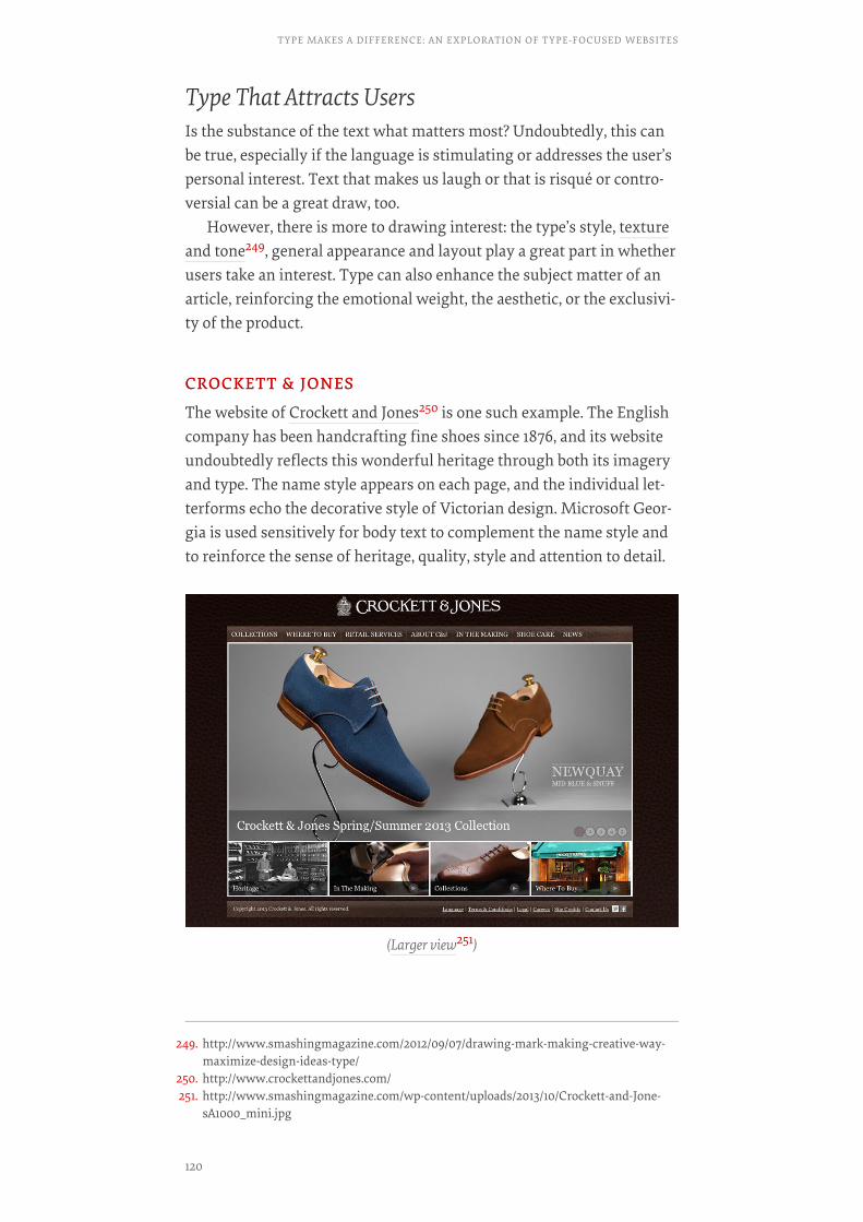
Type That Attracts UsersIs the substance of the text what matters most? Undoubtedly, this canbe true, especially if the language is stimulating or addresses the user’spersonal interest. Text that makes us laugh or that is risqué or contro-versial can be a great draw, too.
However, there is more to drawing interest: the type’s style, textureand tone249, general appearance and layout play a great part in whetherusers take an interest. Type can also enhance the subject matter of anarticle, reinforcing the emotional weight, the aesthetic, or the exclusivi-ty of the product.
CROCKETT & JONESCROCKETT & JONES
The website of Crockett and Jones250 is one such example. The Englishcompany has been handcrafting fine shoes since 1876, and its websiteundoubtedly reflects this wonderful heritage through both its imageryand type. The name style appears on each page, and the individual let-terforms echo the decorative style of Victorian design. Microsoft Geor-gia is used sensitively for body text to complement the name style andto reinforce the sense of heritage, quality, style and attention to detail.
(Larger view251)
249. http://www.smashingmagazine.com/2012/09/07/drawing-mark-making-creative-way-maximize-design-ideas-type/
250. http://www.crockettandjones.com/251. http://www.smashingmagazine.com/wp-content/uploads/2013/10/Crockett-and-Jone-
sA1000_mini.jpg
TYPE MAKES A DIFFERENCE: AN EXPLORATION OF TYPE-FOCUSED WEBSITES
120

In writing this piece, I found myself thinking of Beatrice Warde’s well-known article from 1932 on printing and type, “The Crystal Goblet,” inwhich she argues that “printing should be invisible.” She specificallyaddresses type, using the metaphor of wine in a glass to explain thatthe printed word shouldn’t in any way hinder the meaning of text.Warde reasons that type should complement and enhance meaningand increase our understanding and appreciation.
This connects well with what Marko Dugonjic253 says in “Designingfor the Reading Experience254”: “Seamlessly digesting written matter ispossible only when the typography is well thought out and legibility isfacilitated by a considered reading experience.” Obviously Warde’s arti-cle predates the Web, but the principles it espouses are relevant today.
Combinations Of TypefacesSelecting and combining typefaces to reinforce a theme is always achallenge. It demands patience to try out alternatives and visual acuityto assess effectiveness. The websites in this section mix pleasing andwell-chosen faces and type styles to emphasize subject matter, to boostappeal and sometimes to surprise.
(Larger view252)
252. http://www.smashingmagazine.com/wp-content/uploads/2013/10/crocketandjones-B1000_mini.jpg
253. http://www.smashingmagazine.com/author/marko-dugonjic/?rel=author254. http://www.smashingmagazine.com/2013/02/18/designing-reading-experience/
121

FOUR SEASONSFOUR SEASONS
Dramatic contrast in texture and tone is achieved with type on FourSeasons255’ website, which brings together different styles and weightsof Garamond with some of the many variations of Helvetica. The visualrhythms of uppercase and lowercase Garamond Italic sit side by sidewith the strong vertical strokes and very different pace and texture ofuppercase Helvetica Condensed.
(Larger view256)
(Larger view257)
255. http://www.fourseasons.com/256. http://www.smashingmagazine.com/wp-content/uploads/2013/10/Fourseason-
sA1000_mini.jpg
TYPE MAKES A DIFFERENCE: AN EXPLORATION OF TYPE-FOCUSED WEBSITES
122

Delve into the website to experience this dramatic contrast reinforcingthe hierarchy and the style, quality and reputation of the Four Seasonsbrand. Both Garamond and Helvetica are available in numerousweights and styles, making them both very useful for complex hierar-chies.
NOWNESSNOWNESS
With the headings on Nowness258, CreateThe Group has elegantlymixed uppercase and lowercase Garamond Italic with uppercase P22Underground Titling. This combination exudes class; the gracefulstrokes of Garamond Italic have a pleasing textural contrast with thesophisticated lines of P22.
Create The Group has paid careful attention to intercharacter spacingand changes in scale, carefully controlling the tone and hierarchy andreinforcing the stylish subject matter of the website.
(Larger view259)
257. http://www.smashingmagazine.com/wp-content/uploads/2013/10/Fourseasons-B1000_mini.jpg
258. http://www.nowness.com/?icid=overlay_home259. http://www.smashingmagazine.com/wp-content/uploads/2013/10/Now-
ness-1000_mini.jpg
123
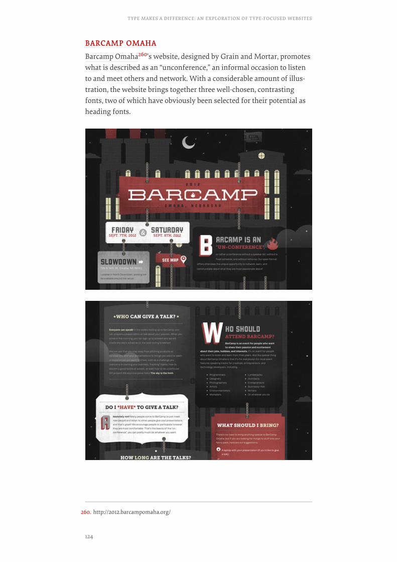
BARCAMP OMAHABARCAMP OMAHA
Barcamp Omaha260’s website, designed by Grain and Mortar, promoteswhat is described as an “unconference,” an informal occasion to listento and meet others and network. With a considerable amount of illus-tration, the website brings together three well-chosen, contrastingfonts, two of which have obviously been selected for their potential asheading fonts.
260. http://2012.barcampomaha.org/
TYPE MAKES A DIFFERENCE: AN EXPLORATION OF TYPE-FOCUSED WEBSITES
124
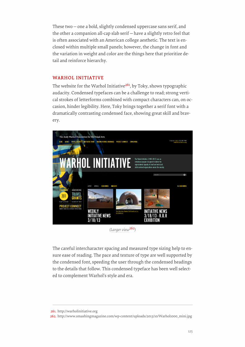
These two—one a bold, slightly condensed uppercase sans serif, andthe other a companion all-cap slab serif—have a slightly retro feel thatis often associated with an American college aesthetic. The text is en-closed within multiple small panels; however, the change in font andthe variation in weight and color are the things here that prioritize de-tail and reinforce hierarchy.
WARHOL INITIATIVEWARHOL INITIATIVE
The website for the Warhol Initiative261, by Toky, shows typographicaudacity. Condensed typefaces can be a challenge to read; strong verti-cal strokes of letterforms combined with compact characters can, on oc-casion, hinder legibility. Here, Toky brings together a serif font with adramatically contrasting condensed face, showing great skill and brav-ery.
The careful intercharacter spacing and measured type sizing help to en-sure ease of reading. The pace and texture of type are well supported bythe condensed font, speeding the user through the condensed headingsto the details that follow. This condensed typeface has been well select-ed to complement Warhol’s style and era.
(Larger view262)
261. http://warholinitiative.org262. http://www.smashingmagazine.com/wp-content/uploads/2013/10/Warhol1000_mini.jpg
125

COMBADICOMBADI
Combadi263, designed by Radial, could easily appear in a number of thesections in this chapter. Its grid structure is based on 12 columns andcan be seen in various configurations as you progress through thepages. However, the combination of typefaces is the really arresting as-pect of this design. Brandon Grotesque and Museo Slab combine withgreat sensitivity and finesse to reinforce the hierarchy.
(Larger view264)
(Larger view265)
263. http://combadi.com264. http://www.smashingmagazine.com/wp-content/uploads/2013/10/Combadi-
A1000_mini.jpg
TYPE MAKES A DIFFERENCE: AN EXPLORATION OF TYPE-FOCUSED WEBSITES
126
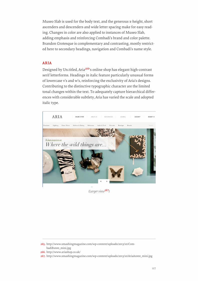
Museo Slab is used for the body text, and the generous x-height, shortascenders and descenders and wide letter spacing make for easy read-ing. Changes in color are also applied to instances of Museo Slab,adding emphasis and reinforcing Combadi’s brand and color palette.Brandon Grotesque is complementary and contrasting, mostly restrict-ed here to secondary headings, navigation and Combadi’s name style.
ARIAARIA
Designed by Un.titled, Aria266’s online shop has elegant high-contrastserif letterforms. Headings in italic feature particularly unusual formsof lowercase v’s and w’s, reinforcing the exclusivity of Aria’s designs.Contributing to the distinctive typographic character are the limitedtonal changes within the text. To adequately capture hierarchical differ-ences with considerable subtlety, Aria has varied the scale and adopteditalic type.
(Larger view267)
265. http://www.smashingmagazine.com/wp-content/uploads/2013/10/Com-badiB1000_mini.jpg
266. http://www.ariashop.co.uk/267. http://www.smashingmagazine.com/wp-content/uploads/2013/10/AriaA1000_mini.jpg
127
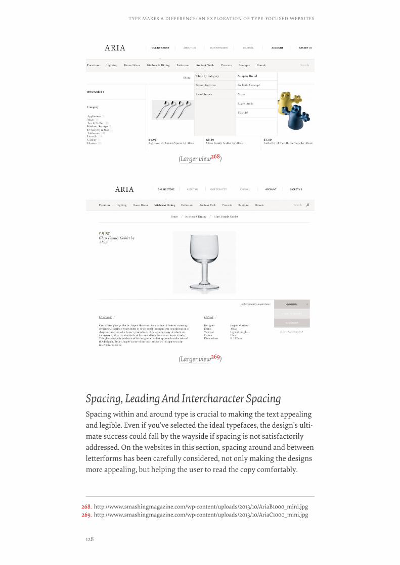
Spacing, Leading And Intercharacter SpacingSpacing within and around type is crucial to making the text appealingand legible. Even if you’ve selected the ideal typefaces, the design’s ulti-mate success could fall by the wayside if spacing is not satisfactorilyaddressed. On the websites in this section, spacing around and betweenletterforms has been carefully considered, not only making the designsmore appealing, but helping the user to read the copy comfortably.
(Larger view268)
(Larger view269)
268. http://www.smashingmagazine.com/wp-content/uploads/2013/10/AriaB1000_mini.jpg269. http://www.smashingmagazine.com/wp-content/uploads/2013/10/AriaC1000_mini.jpg
TYPE MAKES A DIFFERENCE: AN EXPLORATION OF TYPE-FOCUSED WEBSITES
128
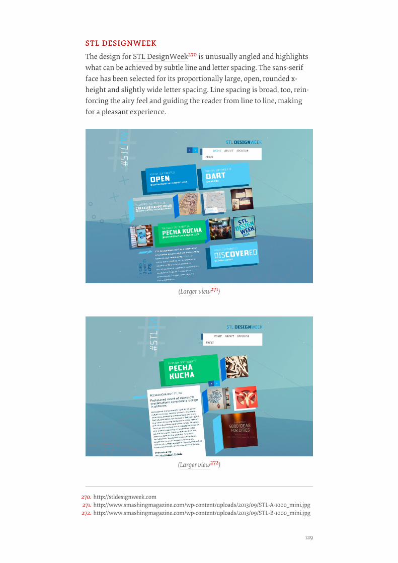
STL DESIGNWEEKSTL DESIGNWEEK
The design for STL DesignWeek270 is unusually angled and highlightswhat can be achieved by subtle line and letter spacing. The sans-serifface has been selected for its proportionally large, open, rounded x-height and slightly wide letter spacing. Line spacing is broad, too, rein-forcing the airy feel and guiding the reader from line to line, makingfor a pleasant experience.
(Larger view271)
(Larger view272)
270. http://stldesignweek.com271. http://www.smashingmagazine.com/wp-content/uploads/2013/09/STL-A-1000_mini.jpg272. http://www.smashingmagazine.com/wp-content/uploads/2013/09/STL-B-1000_mini.jpg
129
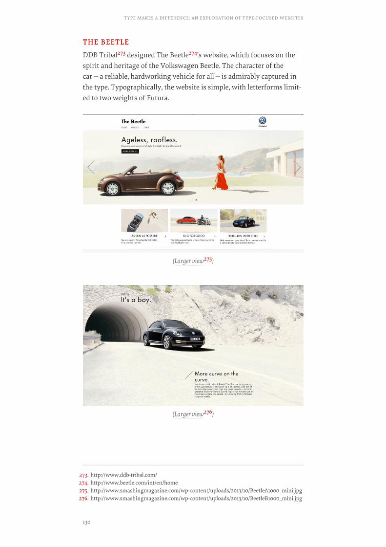
THE BEETLETHE BEETLE
DDB Tribal273 designed The Beetle274’s website, which focuses on thespirit and heritage of the Volkswagen Beetle. The character of thecar—a reliable, hardworking vehicle for all—is admirably captured inthe type. Typographically, the website is simple, with letterforms limit-ed to two weights of Futura.
(Larger view275)
(Larger view276)
273. http://www.ddb-tribal.com/274. http://www.beetle.com/int/en/home275. http://www.smashingmagazine.com/wp-content/uploads/2013/10/BeetleA1000_mini.jpg276. http://www.smashingmagazine.com/wp-content/uploads/2013/10/BeetleB1000_mini.jpg
TYPE MAKES A DIFFERENCE: AN EXPLORATION OF TYPE-FOCUSED WEBSITES
130
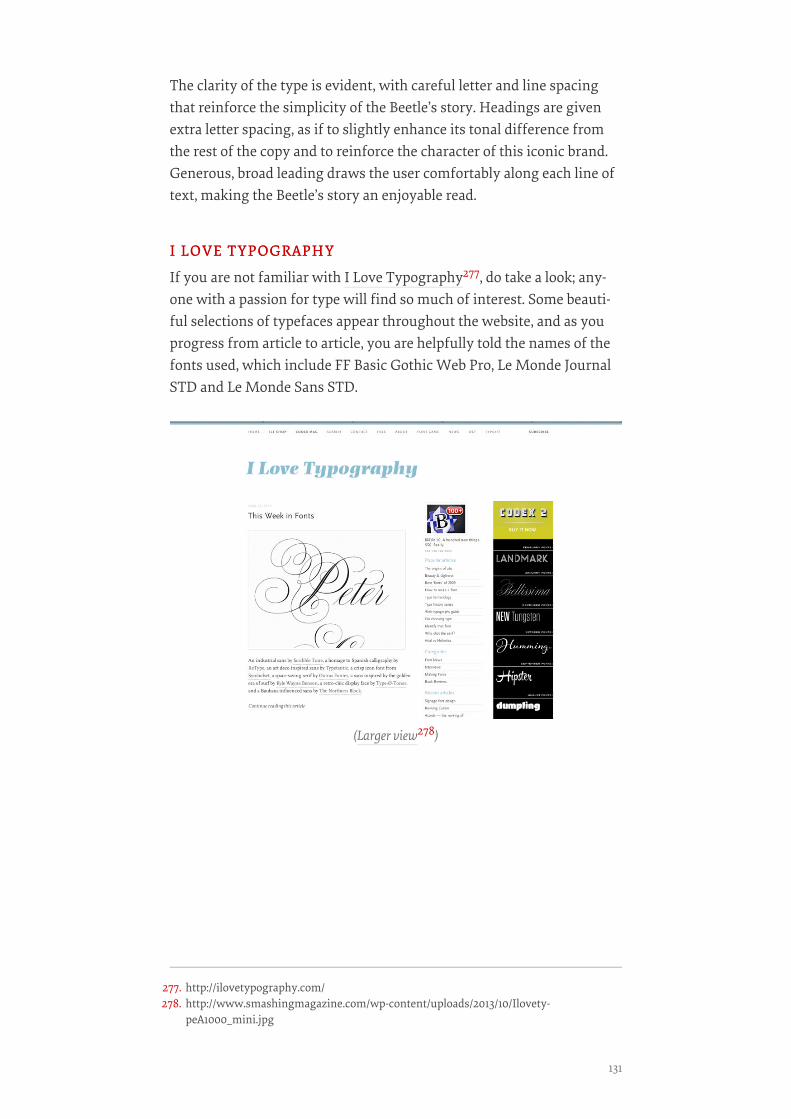
The clarity of the type is evident, with careful letter and line spacingthat reinforce the simplicity of the Beetle’s story. Headings are givenextra letter spacing, as if to slightly enhance its tonal difference fromthe rest of the copy and to reinforce the character of this iconic brand.Generous, broad leading draws the user comfortably along each line oftext, making the Beetle’s story an enjoyable read.
I LOVE TYPOGRAPHYI LOVE TYPOGRAPHY
If you are not familiar with I Love Typography277, do take a look; any-one with a passion for type will find so much of interest. Some beauti-ful selections of typefaces appear throughout the website, and as youprogress from article to article, you are helpfully told the names of thefonts used, which include FF Basic Gothic Web Pro, Le Monde JournalSTD and Le Monde Sans STD.
(Larger view278)
277. http://ilovetypography.com/278. http://www.smashingmagazine.com/wp-content/uploads/2013/10/Ilovety-
peA1000_mini.jpg
131
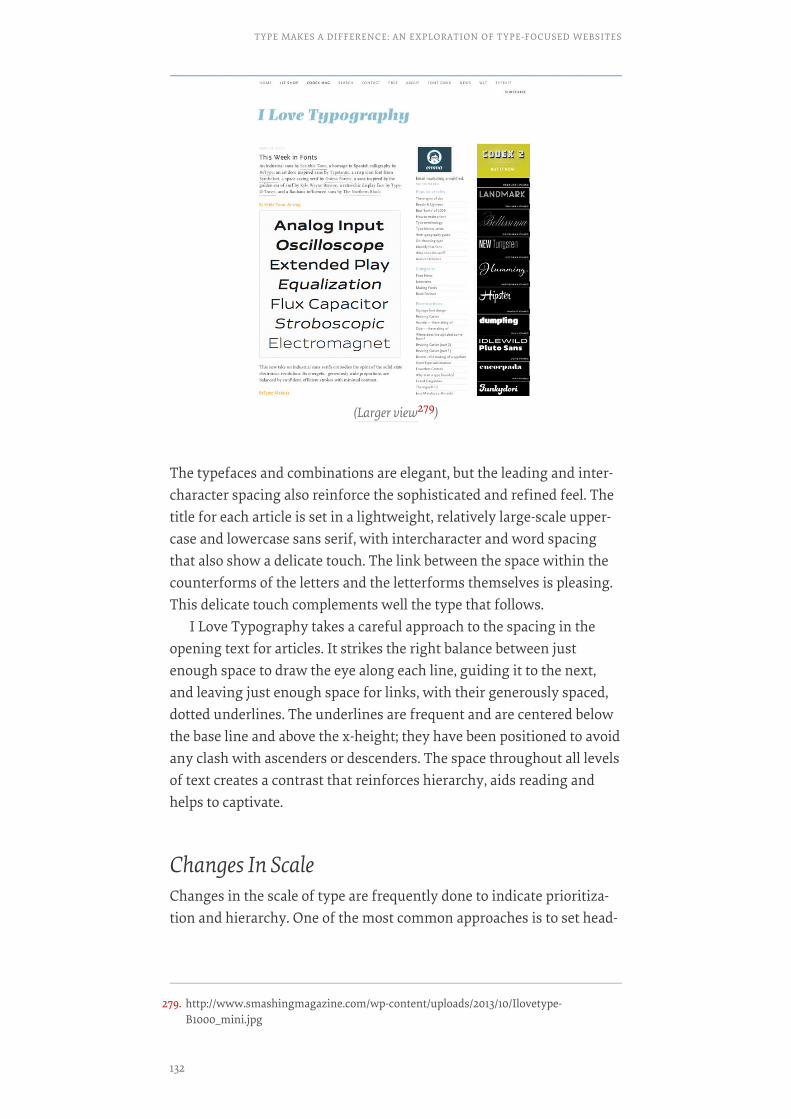
The typefaces and combinations are elegant, but the leading and inter-character spacing also reinforce the sophisticated and refined feel. Thetitle for each article is set in a lightweight, relatively large-scale upper-case and lowercase sans serif, with intercharacter and word spacingthat also show a delicate touch. The link between the space within thecounterforms of the letters and the letterforms themselves is pleasing.This delicate touch complements well the type that follows.
I Love Typography takes a careful approach to the spacing in theopening text for articles. It strikes the right balance between justenough space to draw the eye along each line, guiding it to the next,and leaving just enough space for links, with their generously spaced,dotted underlines. The underlines are frequent and are centered belowthe base line and above the x-height; they have been positioned to avoidany clash with ascenders or descenders. The space throughout all levelsof text creates a contrast that reinforces hierarchy, aids reading andhelps to captivate.
Changes In ScaleChanges in the scale of type are frequently done to indicate prioritiza-tion and hierarchy. One of the most common approaches is to set head-
(Larger view279)
279. http://www.smashingmagazine.com/wp-content/uploads/2013/10/Ilovetype-B1000_mini.jpg
TYPE MAKES A DIFFERENCE: AN EXPLORATION OF TYPE-FOCUSED WEBSITES
132
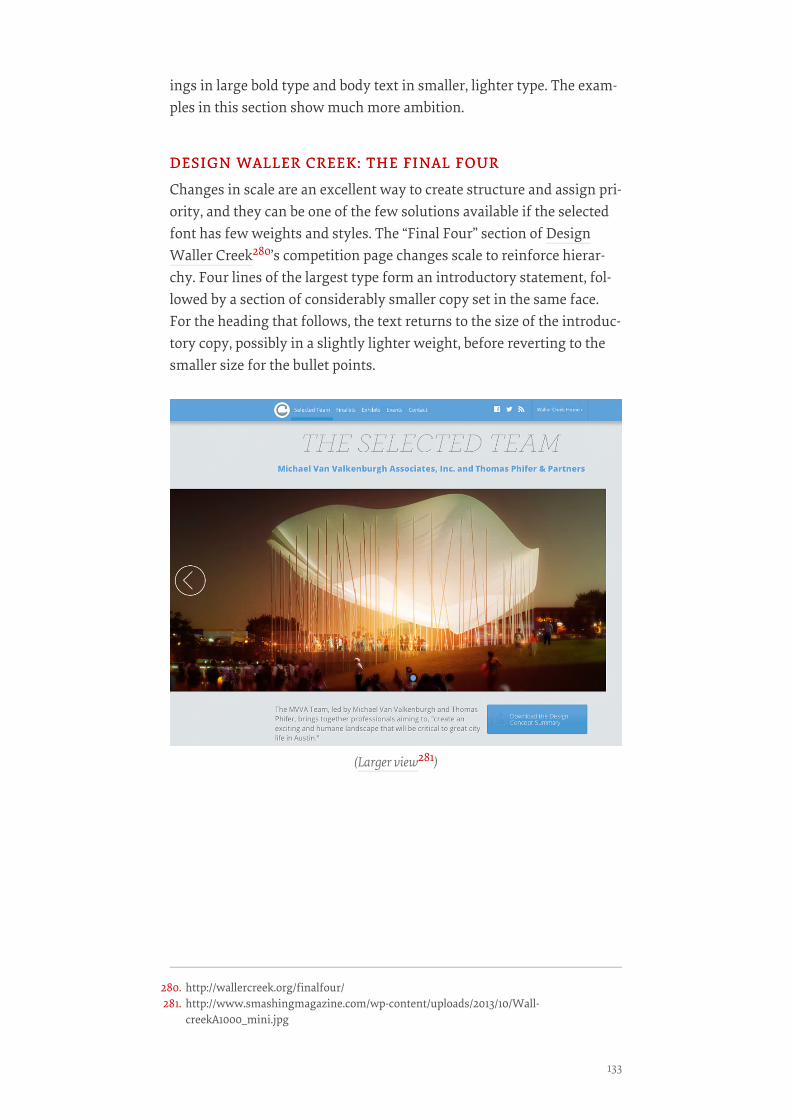
ings in large bold type and body text in smaller, lighter type. The exam-ples in this section show much more ambition.
DESIGN WALLER CREEK: THE FINAL FOURDESIGN WALLER CREEK: THE FINAL FOUR
Changes in scale are an excellent way to create structure and assign pri-ority, and they can be one of the few solutions available if the selectedfont has few weights and styles. The “Final Four” section of DesignWaller Creek280’s competition page changes scale to reinforce hierar-chy. Four lines of the largest type form an introductory statement, fol-lowed by a section of considerably smaller copy set in the same face.For the heading that follows, the text returns to the size of the introduc-tory copy, possibly in a slightly lighter weight, before reverting to thesmaller size for the bullet points.
(Larger view281)
280. http://wallercreek.org/finalfour/281. http://www.smashingmagazine.com/wp-content/uploads/2013/10/Wall-
creekA1000_mini.jpg
133
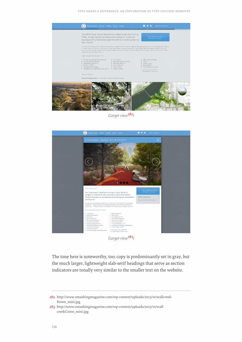
The tone here is noteworthy, too; copy is predominantly set in gray, butthe much larger, lightweight slab-serif headings that serve as sectionindicators are tonally very similar to the smaller text on the website.
(Larger view282)
(Larger view283)
282. http://www.smashingmagazine.com/wp-content/uploads/2013/10/wallcreek-B1000_mini.jpg
283. http://www.smashingmagazine.com/wp-content/uploads/2013/10/wall-creekC1000_mini.jpg
TYPE MAKES A DIFFERENCE: AN EXPLORATION OF TYPE-FOCUSED WEBSITES
134
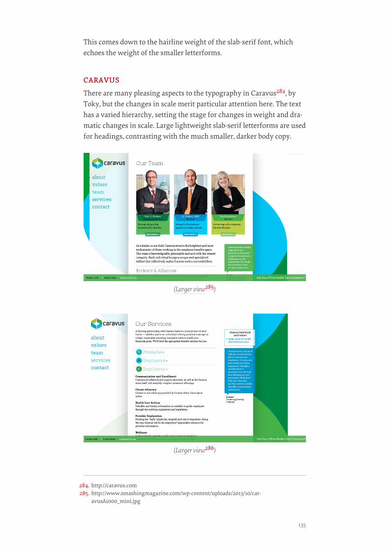
This comes down to the hairline weight of the slab-serif font, whichechoes the weight of the smaller letterforms.
CARAVUSCARAVUS
There are many pleasing aspects to the typography in Caravus284, byToky, but the changes in scale merit particular attention here. The texthas a varied hierarchy, setting the stage for changes in weight and dra-matic changes in scale. Large lightweight slab-serif letterforms are usedfor headings, contrasting with the much smaller, darker body copy.
(Larger view285)
(Larger view286)
284. http://caravus.com285. http://www.smashingmagazine.com/wp-content/uploads/2013/10/car-
avusA1000_mini.jpg
135
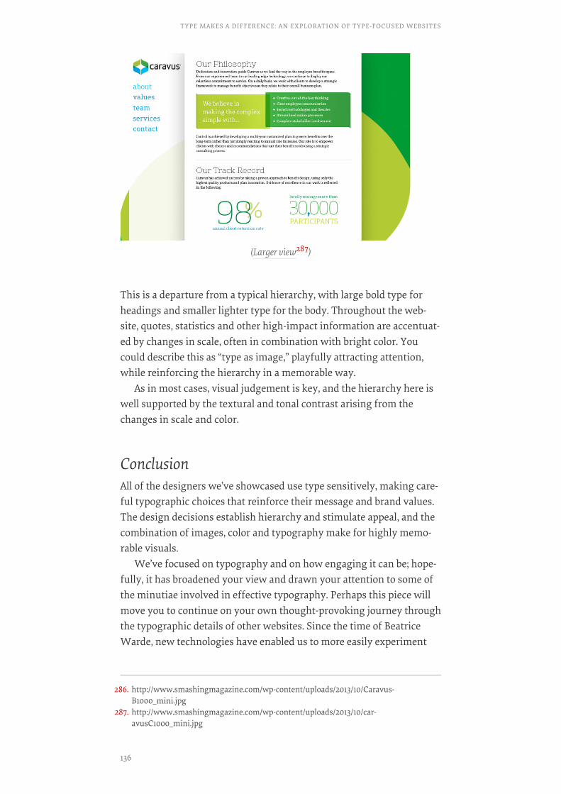
This is a departure from a typical hierarchy, with large bold type forheadings and smaller lighter type for the body. Throughout the web-site, quotes, statistics and other high-impact information are accentuat-ed by changes in scale, often in combination with bright color. Youcould describe this as “type as image,” playfully attracting attention,while reinforcing the hierarchy in a memorable way.
As in most cases, visual judgement is key, and the hierarchy here iswell supported by the textural and tonal contrast arising from thechanges in scale and color.
ConclusionAll of the designers we’ve showcased use type sensitively, making care-ful typographic choices that reinforce their message and brand values.The design decisions establish hierarchy and stimulate appeal, and thecombination of images, color and typography make for highly memo-rable visuals.
We’ve focused on typography and on how engaging it can be; hope-fully, it has broadened your view and drawn your attention to some ofthe minutiae involved in effective typography. Perhaps this piece willmove you to continue on your own thought-provoking journey throughthe typographic details of other websites. Since the time of BeatriceWarde, new technologies have enabled us to more easily experiment
(Larger view287)
286. http://www.smashingmagazine.com/wp-content/uploads/2013/10/Caravus-B1000_mini.jpg
287. http://www.smashingmagazine.com/wp-content/uploads/2013/10/car-avusC1000_mini.jpg
TYPE MAKES A DIFFERENCE: AN EXPLORATION OF TYPE-FOCUSED WEBSITES
136
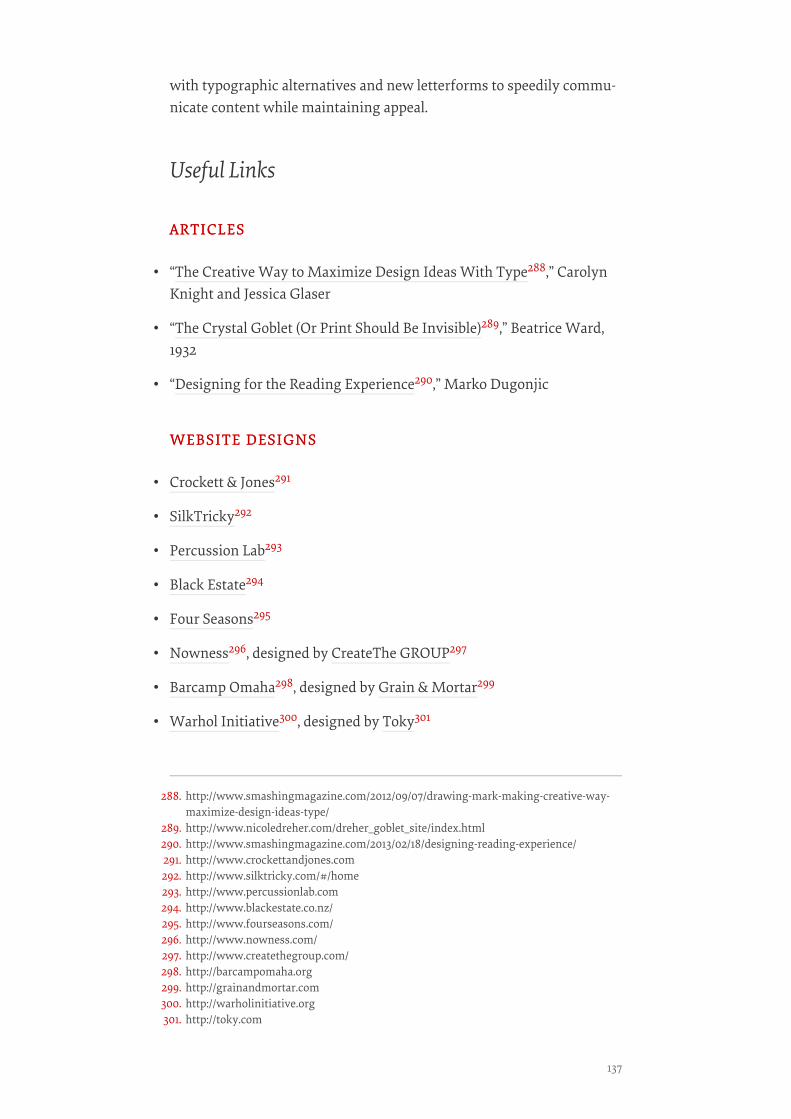
with typographic alternatives and new letterforms to speedily commu-nicate content while maintaining appeal.
Useful Links
ARTICLESARTICLES
• “The Creative Way to Maximize Design Ideas With Type288,” CarolynKnight and Jessica Glaser
• “The Crystal Goblet (Or Print Should Be Invisible)289,” Beatrice Ward,1932
• “Designing for the Reading Experience290,” Marko Dugonjic
WEBSITE DESIGNSWEBSITE DESIGNS
• Crockett & Jones291
• SilkTricky292
• Percussion Lab293
• Black Estate294
• Four Seasons295
• Nowness296, designed by CreateThe GROUP297
• Barcamp Omaha298, designed by Grain & Mortar299
• Warhol Initiative300, designed by Toky301
288. http://www.smashingmagazine.com/2012/09/07/drawing-mark-making-creative-way-maximize-design-ideas-type/
289. http://www.nicoledreher.com/dreher_goblet_site/index.html290. http://www.smashingmagazine.com/2013/02/18/designing-reading-experience/291. http://www.crockettandjones.com292. http://www.silktricky.com/#/home293. http://www.percussionlab.com294. http://www.blackestate.co.nz/295. http://www.fourseasons.com/296. http://www.nowness.com/297. http://www.createthegroup.com/298. http://barcampomaha.org299. http://grainandmortar.com300. http://warholinitiative.org301. http://toky.com
137
• Combadi302, designed by Radial303
• Aria Shop304, designed by Un.titled305
• STL DesignWeek306
• The Beetle307, designed by DDB Tribal308
• I Love Typography309
• Design Waller Creek: The Final Four310
• Caravus311, designed by Toky312❧
302. http://combadi.com303. http://radial.gr304. http://www.ariashop.co.uk/305. http://un.titled.co.uk/306. http://stldesignweek.com307. http://www.beetle.com/int/en/home308. http://www.ddb-tribal.com/309. http://ilovetypography.com/310. http://wallercreek.org/finalfour/311. http://caravus.com312. http://toky.com
TYPE MAKES A DIFFERENCE: AN EXPLORATION OF TYPE-FOCUSED WEBSITES
138

About The Authors
David BřezinaDavid Březina is a type designer and typographer, writer and lecturer,director of Rosetta typefoundry313, and the impresario of the TypeTalksconference. You may know him as a designer of the award-winningtype family Skolar.314 So far, he has designed typefaces for Cyrillic,Greek, Gujarati, Devanagari, and various extensions of Latin. Twitter:@MrBřezina315.
Jan ConstantinJan Constantin works at Smashing Events and loves to spend his sparetime writing for Smashing Magazine. He is one of the main contribu-tors to the Smashing Media316 corporate website. Twitter:@Smash_Scribe317.
Jeremiah ShoafJeremiah Shoaf is a freelance designer318 from Colorado. He is the cura-tor of Typewolf319 and creates flat-file CMS themes for his other sideproject, Type & Grids320. He also continually updates a curated list ofopen-source free fonts321. You can follow Jeremiah on Twitter @type-wolf322 and find him on Google+323.
Jessica GlaserJessica Glaser is an academic from the University of Wolverhampton inthe UK. She is a practicing graphic designer and prolific design writer.Her numerous books, many written in partnership with CarolynKnight, focus on topics including the use of space in graphic design,
313. http://rosettatype.com314. http://rosettatype.com/skolar315. http://www.twitter.com/MrBřezina316. http://www.smashing-media.com/317. http://www.twitter.com/@Smash_Scribe318. http://www.jeremiahshoaf.com319. http://www.typewolf.com320. http://www.typeandgrids.com321. http://www.typewolf.com/open-source-web-fonts322. http://www.twitter.com/typewolf323. https://plus.google.com/111512303363226430627?rel=author?rel=author
139
mnemonics and memory devices and the understanding and creationof visual hierarchy. Her company Bright Pink Communication Designworks in areas including healthcare, construction, education, financialservices and the public sector.
Joseph AlessioJoseph Alessio is a lettering artist and designer from the Detroit area.He has worked with companies such as Patagonia, Reach Records,Monotype and the Art Director’s Club. When not working, he plays 7musical instruments and reads classic literature. You can keep up withsome of what he’s doing on his Dribbble profile324, and he often talksabout life, design and current events in 140 characters325.
Laura FranzLaura Franz is a Professor at UMass Dartmouth, where she teaches awide range of type classes—including a Web Typography class in TheGraduate Certificate In Web and Interaction Design. Inspired by the in-tersection of tradition and technology, Laura shares her web font rec-ommendations on goodwebfonts.com326 and her typography knowl-edge via “Typographic Web Design: How to Think Like a Typographerin HTML and CSS327” (Wiley), “Typography for Web Designers328” (lyn-da.com), and “Choosing and Using Web Fonts329” (lynda.com).
324. http://dribbble.com/Alessio325. http://twitter.com/alessio_joseph326. http://www.goodwebfonts.com327. http://www.amazon.com/Typographic-Web-Design-Think-Typographer/dp/1119976871/328. http://www.lynda.com/Web-Fonts-tutorials/Typography-for-Web-Designers/
79411-2.html329. http://www.lynda.com/course-tutorials/Choosing-Using-Web-Fonts/97715-2.html
ABOUT THE AUTHORS
140
About Smashing Magazine
Smashing Magazine330 is an online magazine dedicated to Web design-ers and developers worldwide. Its rigorous quality control and thor-ough editorial work has gathered a devoted community exceeding halfa million subscribers, followers and fans. Each and every published arti-cle is carefully prepared, edited, reviewed and curated according to thehigh quality standards set in Smashing Magazine’s own publishing pol-icy331.
Smashing Magazine publishes articles on a daily basis with topicsranging from business, visual design, typography, front-end as well asback-end development, all the way to usability and user experience de-sign. The magazine is—and always has been—a professional and inde-pendent online publication neither controlled nor influenced by anythird parties, delivering content in the best interest of its readers. Theseguidelines are continually revised and updated to assure that the quali-ty of the published content is never compromised. Since its emergenceback in 2006 Smashing Magazine has proven to be a trustworthy on-line source.
330. http://www.smashingmagazine.com331. http://www.smashingmagazine.com/publishing-policy/
141
Related Documents