Types of Charts

Types of Charts. 4.02 Understand charts and graphs used in business.Slide 2 What you need to know: This objective will explain six common charts used.
Dec 22, 2015
Welcome message from author
This document is posted to help you gain knowledge. Please leave a comment to let me know what you think about it! Share it to your friends and learn new things together.
Transcript
Types of Charts

4.02 Understand charts and graphs used in business. Slide 2
What you need to know:
• This objective will explain six common charts used in business. The object of the game in this objective is to understand how each chart is used to communicate information.
• For example, if you are trying to compare the sales of Honda Civics to the sales of Nisson Altimas, what chart will best explain the data?

4.02 Understand charts and graphs used in business. Slide 3
How do you know which chart to use?
• In this PowerPoint, each chart will be defined and described with an example of the data it is most appropriately suited to represent
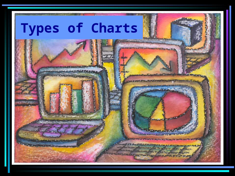
4.02 Understand charts and graphs used in business. Slide 4
Column Chart
• The first chart we will study is a Column Chart
• It is used to make comparisons about groups of data

4.02 Understand charts and graphs used in business. Slide 5
Column Chart
Spirit Participation
0
20
40
60
80
100
January February March April
Month
Att
enda
nce
Rat
e
Seniors
Juniors
Sophomores
This chart compares Senior, Junior, and Sophomore attendance rates at assemblies over a period of four months.
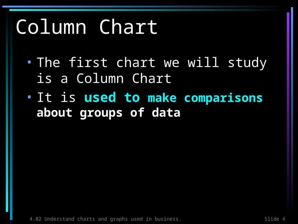
4.02 Understand charts and graphs used in business. Slide 6
Compare
• View the next four slides to compare how the Spirit Participation data is represented in different charts and then decide which chart makes the most sense of the information
• Remember, you are comparing attendance rates of students over a period of four months
4.02 Understand charts and graphs used in business. Slide 7
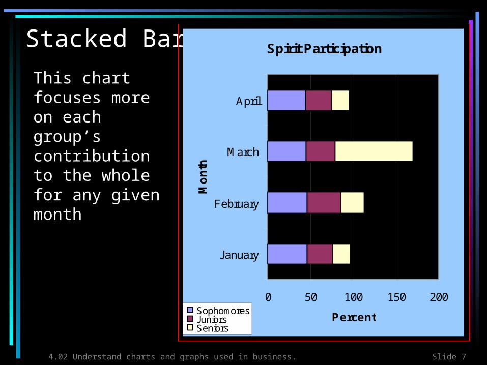
Stacked Bar Spirit Participation
0 50 100 150 200
January
February
March
April
Mo
nth
PercentSophomoresJuniorsSeniors
This chart focuses more on each group’s contribution to the whole for any given month

4.02 Understand charts and graphs used in business. Slide 8
LineSpirit Participation
0
10
20
30
40
50
60
70
80
90
100
January February March April
Month
Per
cen
t
SophomoresJuniorsSeniorsThis chart
would be okay if we were analyzing trends in attendance rates, but it does not provide a good side-by-side comparison

4.02 Understand charts and graphs used in business. Slide 9
XY ScatterSpirit Participation
0
10
20
30
40
50
60
70
80
90
100
0 1 2 3 4 5
Month
Per
cen
t Juniors
Seniors
Sophomores
This chart is trying to determine if there is a correlation between the month and the attendance rate

4.02 Understand charts and graphs used in business. Slide 10
PieSophomores
25%
26%25%
24%January
February
March
April
Finally, this chart is useless for representing the data because it only allows for one data series.
4.02 Understand charts and graphs used in business. Slide 11
What did you think?
• Which chart best represented the data?
• Why?
4.02 Understand charts and graphs used in business. Slide 12
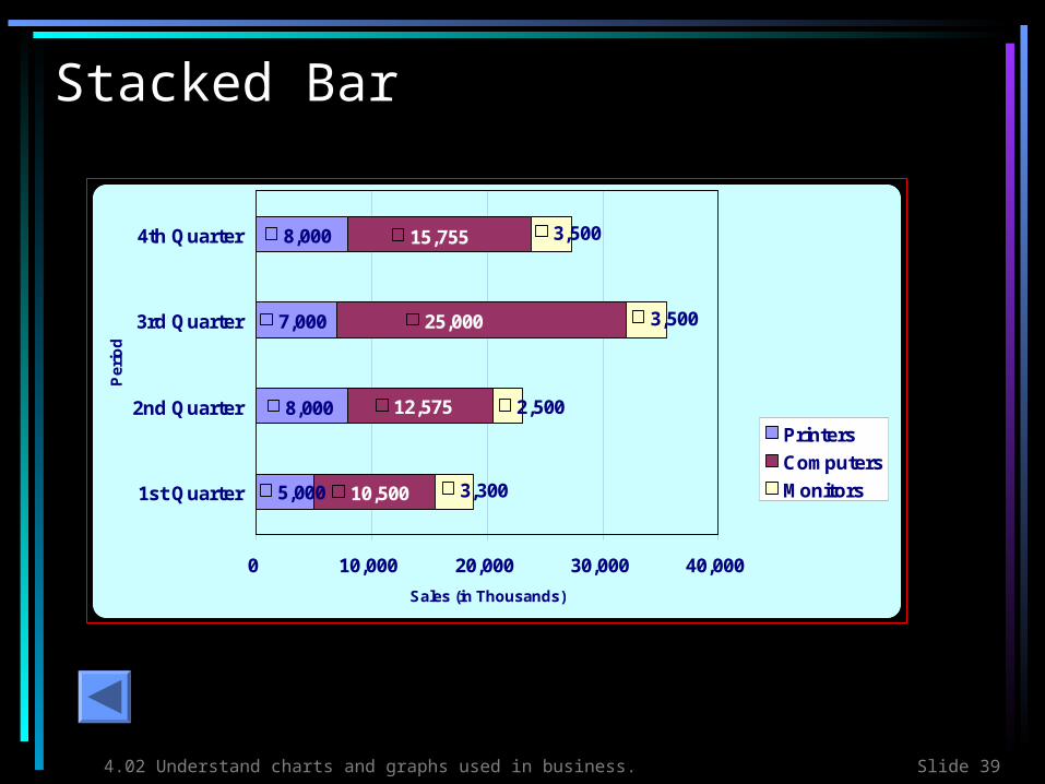
Stacked Bar Chart
• The next common business chart we will view is a Stacked Bar Chart
• It is used to represent the contribution of individual items to a whole
• Each bar is divided into two or more parts
• The length of the stacked bar represents a total

4.02 Understand charts and graphs used in business. Slide 13
Stacked Bar
This example shows the contributions of three components: Computers, Printers, and Monitors to total sales during each quarter (three-month period)
8,000
7,000
8,000
5,000
15,755
25,000
12,575
10,500
2,500
3,500
3,500
3,300
0 10,000 20,000 30,000 40,000
1st Quarter
2nd Quarter
3rd Quarter
4th Quarter
Pe
rio
d
Sales (in Thousands)
Printers
Computers
Monitors
ABC ComputersQuarterly
Report Sales
Analysis

4.02 Understand charts and graphs used in business. Slide 14
Compare
4.02 Understand charts and graphs used in business. Slide 15
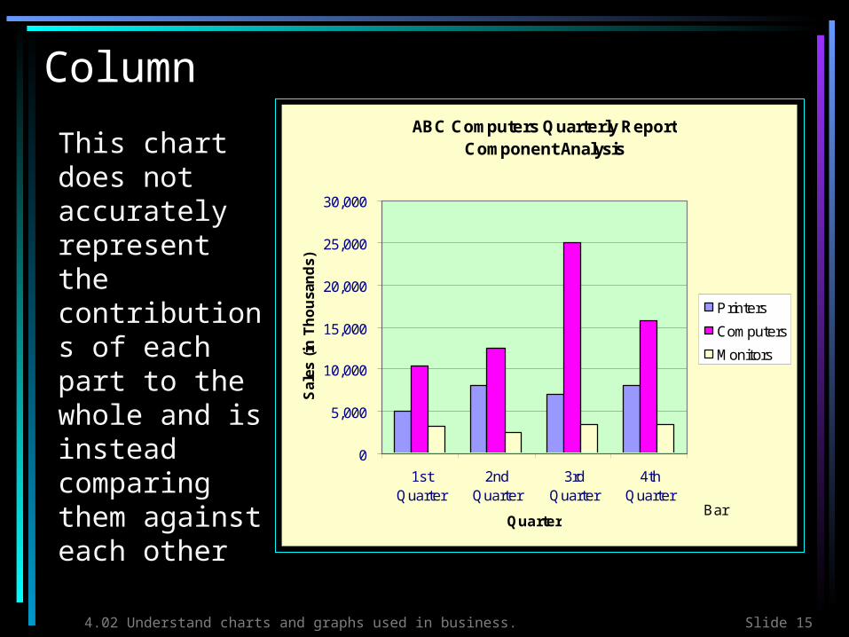
ColumnABC Computers Quarterly Report
Component Analysis
0
5,000
10,000
15,000
20,000
25,000
30,000
1stQuarter
2ndQuarter
3rdQuarter
4thQuarter
Quarter
Sal
es (
in T
ho
usa
nd
s)Printers
Computers
Monitors
Bar
This chart does not accurately represent the contributions of each part to the whole and is instead comparing them against each other

4.02 Understand charts and graphs used in business. Slide 16
Line ABC Company Quarterly Report Component Analysis
0
5,000
10,000
15,000
20,000
25,000
30,000
1stQuarter
2ndQuarter
3rdQuarter
4thQuarter
Quarter
Sal
es (
in T
ho
usa
nd
s)
Printers
Computers
Monitors
Line
What about this chart? Can you clearly identify each component’s contribution to the whole?

4.02 Understand charts and graphs used in business. Slide 17
XY ScatterABC Computers Quarterly Report
0
5,000
10,000
15,000
20,000
25,000
30,000
0 1 2 3 4 5
Quarter
Sal
es (
in T
ho
usa
nd
s)Printers
Computers
Monitors
XY Scatter
Why does this chart not work?
4.02 Understand charts and graphs used in business. Slide 18
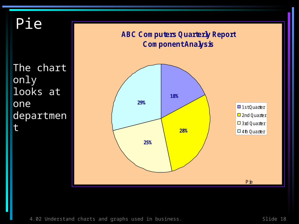
PieABC Computers Quarterly Report
Component Analysis
18%
28%
25%
29%1st Quarter
2nd Quarter
3rd Quarter
4th Quarter
Pie
The chart only looks at one department

4.02 Understand charts and graphs used in business. Slide 19
What did you think?
• Which chart best represented the data?
• Why?

4.02 Understand charts and graphs used in business. Slide 20
Line Chart
• The next common business chart we will view is a Line Chart
• It is used to indicate trends in data

4.02 Understand charts and graphs used in business. Slide 21
Line Chart
Which department showed the most growth? Which department showed a steady increase in sales? Which department showed a decline in sales?
Sales Trends by Department
0
10,000
20,000
30,000
40,000
50,000
60,000
1st Quarter 2ndQuarter
3rd Quarter 4th Quarter
Period
Sa
les
(in
Th
ou
sa
nd
s)
Music
Shoes
Clothing

4.02 Understand charts and graphs used in business. Slide 22
Compare

4.02 Understand charts and graphs used in business. Slide 23
ColumnSales Trends by Department
1,000
11,000
21,000
31,000
41,000
51,000
61,000
1st Q
uarte
r
2nd Q
uarte
r
3rd Q
uarte
r
4th
Quarte
r
Quarter
Sal
es (
in T
ho
usa
nd
s)
Music
Shoes
Clothing
Bar
•To analyze the trends in this chart, the reader must read each data series separately and then make comparisons and generalizations
•In the line chart, trends were clearly and quickly analyzed just by looking at the lines
4.02 Understand charts and graphs used in business. Slide 24
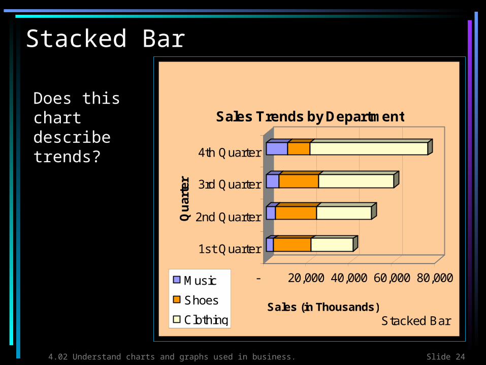
Stacked Bar
- 20,000 40,000 60,000 80,000
Sales (in Thousands)
1st Quarter
2nd Quarter
3rd Quarter
4th Quarter
Qu
arte
r
Sales Trends by Department
Music
Shoes
Clothing Stacked Bar
Does this chart describe trends?

4.02 Understand charts and graphs used in business. Slide 25
Pie
Music
15%
19%
25%
41%1st Quarter
2nd Quarter
3rd Quarter
4th Quarter
Pie
The pie chart fails to present all of the data

4.02 Understand charts and graphs used in business. Slide 26
What did you think?
• Which chart best represented the data?
• Why?
4.02 Understand charts and graphs used in business. Slide 27
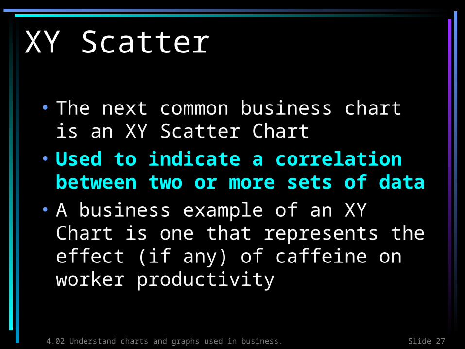
XY Scatter
• The next common business chart is an XY Scatter Chart
• Used to indicate a correlation between two or more sets of data
• A business example of an XY Chart is one that represents the effect (if any) of caffeine on worker productivity
4.02 Understand charts and graphs used in business. Slide 28
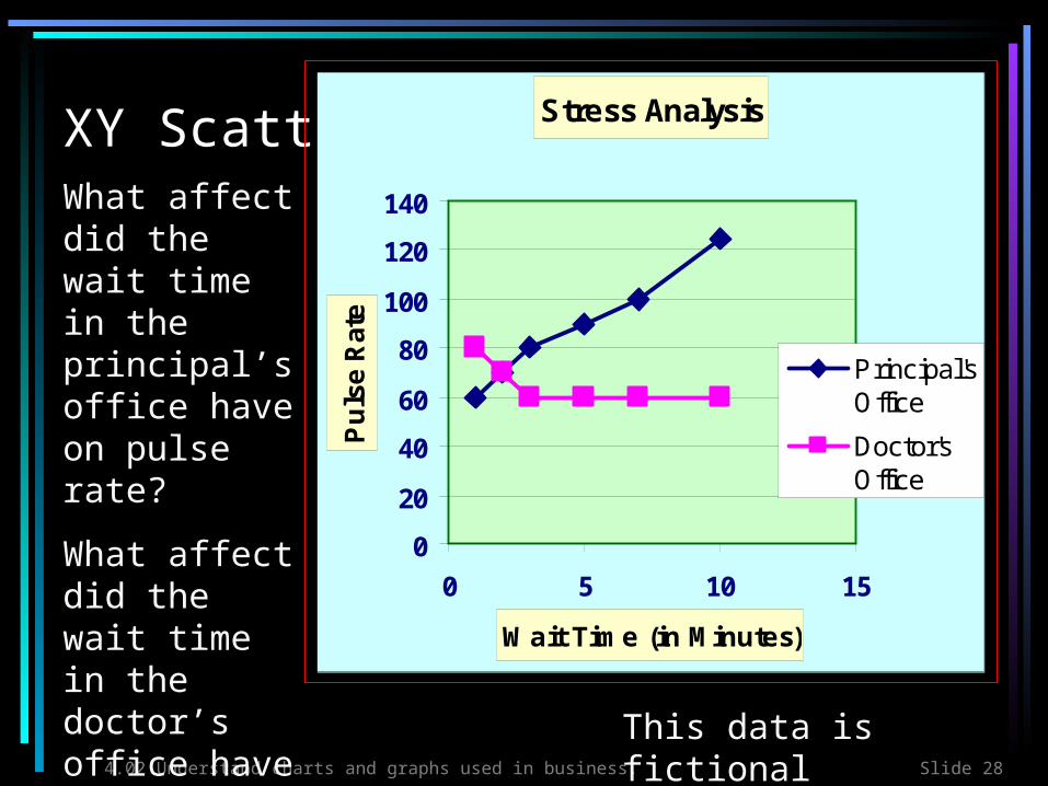
XY ScatterWhat affect did the wait time in the principal’s office have on pulse rate?
What affect did the wait time in the doctor’s office have on pulse rate?
Stress Analysis
0
20
40
60
80
100
120
140
0 5 10 15
Wait Time (in Minutes)
Pu
lse
Rat
ePrincipal'sOffice
Doctor'sOffice
This data is fictional

4.02 Understand charts and graphs used in business. Slide 29
Compare
4.02 Understand charts and graphs used in business. Slide 30
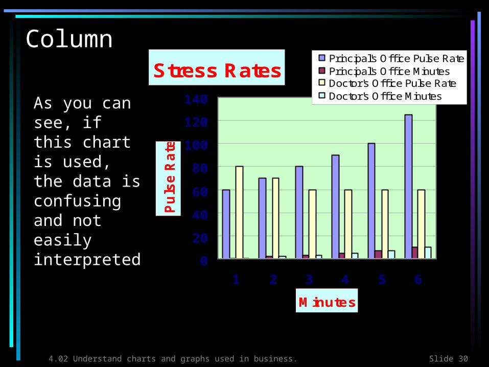
ColumnStress Rates
0
20
40
60
80
100
120
140
1 2 3 4 5 6
Minutes
Pu
lse
Ra
te
Principal's Off ice Pulse RatePrincipal's Off ice MinutesDoctor's Off ice Pulse RateDoctor's Off ice Minutes
Bar
As you can see, if this chart is used, the data is confusing and not easily interpreted

4.02 Understand charts and graphs used in business. Slide 31
Stacked Bar
Stress Rates
0 50 100 150 200 250
1
2
3
4
5
6
Min
ute
s
Pulse Rate
Principal's Off ice Pulse RatePrincipal's Off ice MinutesDoctor's Off ice Pulse RateDoctor's Off ice Minutes
Stacked Bar
This chart is also hard to interpret

4.02 Understand charts and graphs used in business. Slide 32
PiePrincipal's Office Pulse Rate
60
70
80
90
100
1251
2
3
4
5
6
Pie
The pie chart, once again, is clearly not the preferred chart for representing and communicating the data!

4.02 Understand charts and graphs used in business. Slide 33
What did you think?
• Which chart best represented the data?
• Why?
4.02 Understand charts and graphs used in business. Slide 34
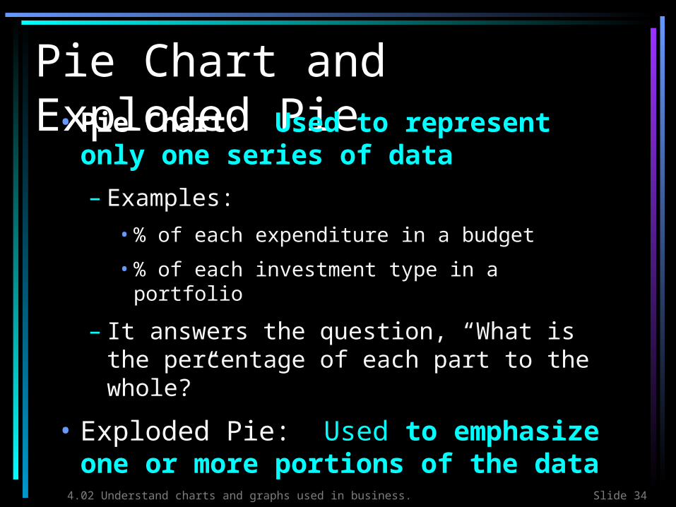
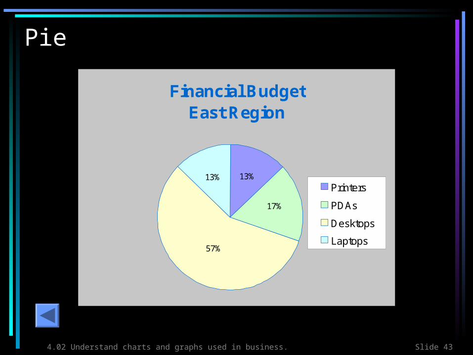
Pie Chart and Exploded Pie• Pie Chart: Used to represent
only one series of data
– Examples:
• % of each expenditure in a budget
• % of each investment type in a portfolio
– It answers the question, “What is the percentage of each part to the whole?”
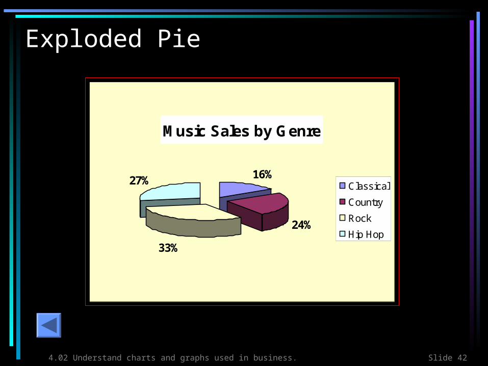
• Exploded Pie: Used to emphasize one or more portions of the data
4.02 Understand charts and graphs used in business. Slide 35
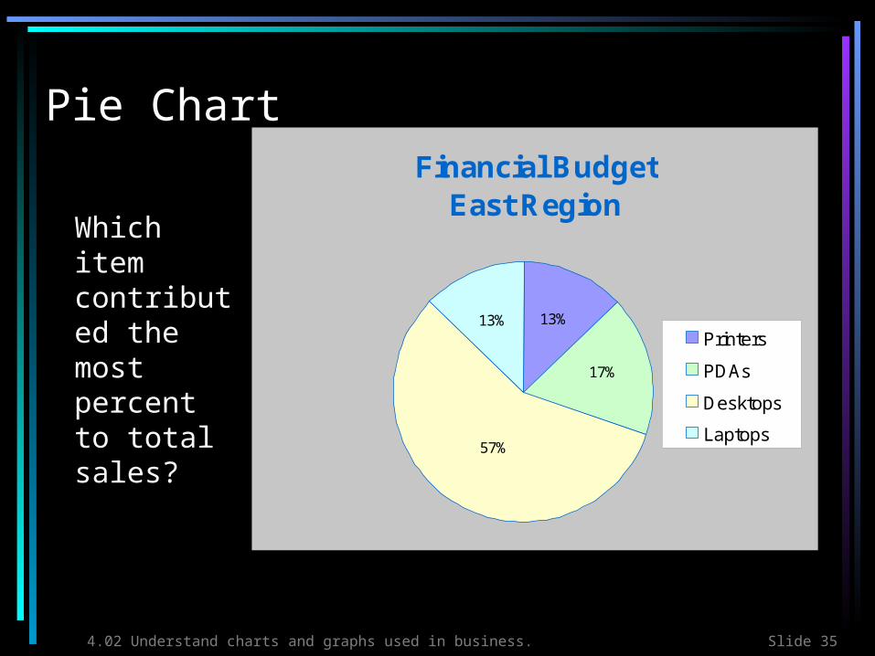
Pie Chart
Which item contributed the most percent to total sales?
Financial Budget East Region
57%
17%
13%13%Printers
PDAs
Desktops
Laptops

4.02 Understand charts and graphs used in business. Slide 36
Exploded Pie Chart
Music Sales by Genre
16%
24%
33%
27% Classical
Country
Rock
Hip Hop
4.02 Understand charts and graphs used in business. Slide 37
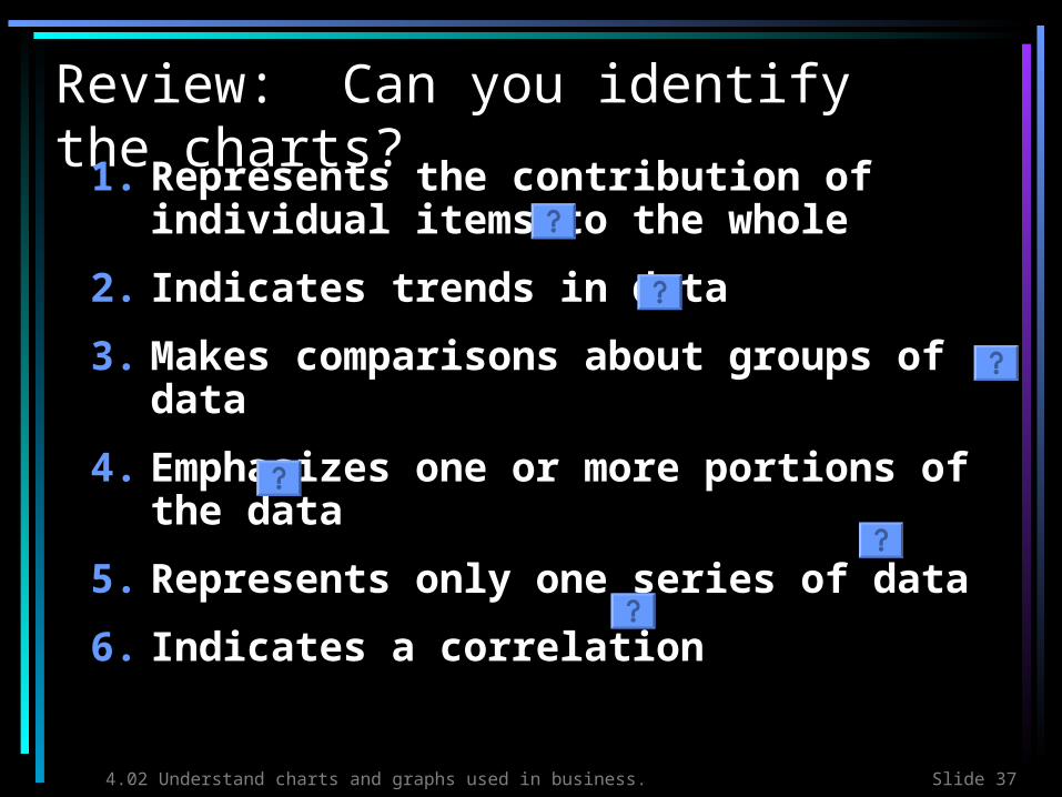
Review: Can you identify the charts?
1. Represents the contribution of individual items to the whole
2. Indicates trends in data
3. Makes comparisons about groups of data
4. Emphasizes one or more portions of the data
5. Represents only one series of data
6. Indicates a correlation
4.02 Understand charts and graphs used in business. Slide 38
That’s all folks . . .
• Let’s get busy and chart some data!
4.02 Understand charts and graphs used in business. Slide 39
Stacked Bar
8,000
7,000
8,000
5,000
15,755
25,000
12,575
10,500
2,500
3,500
3,500
3,300
0 10,000 20,000 30,000 40,000
1st Quarter
2nd Quarter
3rd Quarter
4th Quarter
Pe
rio
d
Sales (in Thousands)
Printers
Computers
Monitors
ABC ComputersQuarterly
Report Sales
Analysis

4.02 Understand charts and graphs used in business. Slide 40
XY Scatter
Stress Analysis
0
20
40
60
80
100
120
140
0 5 10 15
Wait Time (in Minutes)
Pu
lse
Rat
e
Principal'sOffice
Doctor'sOffice

4.02 Understand charts and graphs used in business. Slide 41
Column Chart
Spirit Participation
0
20
40
60
80
100
January February March April
Month
Att
end
ance
Rat
e
Seniors
Juniors
Sophomores
4.02 Understand charts and graphs used in business. Slide 42
Exploded Pie
Music Sales by Genre
16%
24%
33%
27% Classical
Country
Rock
Hip Hop
4.02 Understand charts and graphs used in business. Slide 43
Pie
Financial Budget East Region
57%
17%
13%13%Printers
PDAs
Desktops
Laptops
4.02 Understand charts and graphs used in business. Slide 44
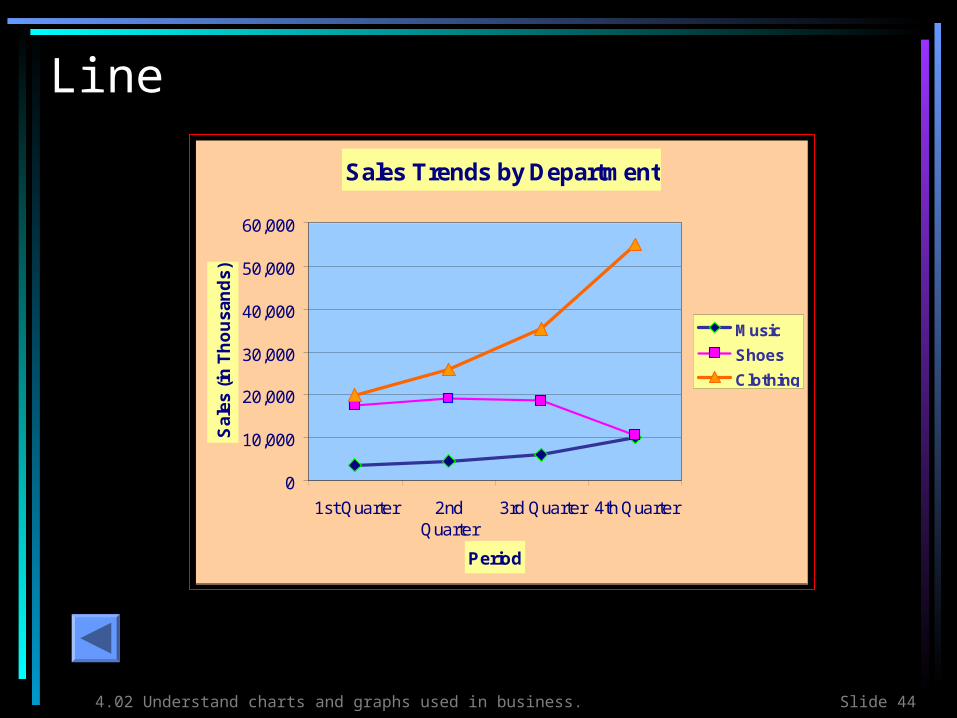
Line
Sales Trends by Department
0
10,000
20,000
30,000
40,000
50,000
60,000
1st Quarter 2ndQuarter
3rd Quarter 4th Quarter
Period
Sa
les
(in
Th
ou
sa
nd
s)
Music
Shoes
Clothing
Related Documents