63 Color Culture and Science Journal Vol. 11 (2) DOI: 10.23738/CCSJ.110207 Two theories for a model: the “querelle” between Klee and Ostwald Anna Marotta 1 1 Department of Architecture and Design, Polytechnic of Turin, [email protected] Corresponding author: Anna Marotta ([email protected]) ABSTRACT Framed in the time of history, the comparative theories of colour expressed not only give us a sort of "distillate" of chromatic culture, but also constitute a precious instrument of investigation, useful in the syncretic comparison of thoughts and positions, sometimes very different from each other, as in the case of the "querelle" between Paul Klee and Wilhelm Ostwald, a question proposed here again. This type of comparison, addressed in the 2017 conference on circular models, is developed here on biconical models, starting with those of Wilhelm Ostwald and Paul Klee, assuming and confirming the classification and analytical structuring of the models through the parameters adopted in Polychrome (Marotta 1999). It should be remembered that Klee publicly took a stand against Ostwald's theory and his model, but in fact assumed the essential geometry of the model of the chemist himself. The present investigation therefore aims to better clarify (in the face of formal analogies) the differences in objectives and scientific and artistic content. The work confirms that the position taken by Klee and his followers was partly prejudicial, linked to his artistic training and related experiences in the field, to which his intellectual milieu was no stranger. The position of the chemist is symmetrical, linked to the rigor of his scientific profile (although completed by the practice of painting). The substantial rapprochement of their respective convictions confirms the open-mindedness and maturity to which the two protagonists have arrived. In addition to describing cultural matrices, parameters and essential characteristics of the models examined, of particular interest is the scope of the applications already put in place of the models, or possible future developments, also connected to new methodologies (such as virtual and digital) in the color project, up to the experiments in concrete and material production. The most innovative digital virtual modes will allow to verify the analogies and differences (of forms and contents) of the respective models. KEYWORDS Comparative theories of colour, Colour models, Paul Klee, Wilhelm Ostwald, History of colour, Polysensory RECEIVED 24 June 2019; REVISED 09 July 2019; ACCEPTED 12 September 2019

Welcome message from author
This document is posted to help you gain knowledge. Please leave a comment to let me know what you think about it! Share it to your friends and learn new things together.
Transcript
63 Color Culture and Science Journal Vol. 11 (2) DOI: 10.23738/CCSJ.110207
Two theories for a model: the “querelle” between Klee and Ostwald Anna Marotta1 1Department of Architecture and Design, Polytechnic of Turin, [email protected]
Corresponding author: Anna Marotta ([email protected])
ABSTRACT
Framed in the time of history, the comparative theories of colour expressed not only give us a sort of "distillate" of chromatic culture, but also constitute a precious instrument of investigation, useful in the syncretic comparison of thoughts and positions, sometimes very different from each other, as in the case of the "querelle" between Paul Klee and Wilhelm Ostwald, a question proposed here again. This type of comparison, addressed in the 2017 conference on circular models, is developed here on biconical models, starting with those of Wilhelm Ostwald and Paul Klee, assuming and confirming the classification and analytical structuring of the models through the parameters adopted in Polychrome (Marotta 1999). It should be remembered that Klee publicly took a stand against Ostwald's theory and his model, but in fact assumed the essential geometry of the model of the chemist himself. The present investigation therefore aims to better clarify (in the face of formal analogies) the differences in objectives and scientific and artistic content. The work confirms that the position taken by Klee and his followers was partly prejudicial, linked to his artistic training and related experiences in the field, to which his intellectual milieu was no stranger. The position of the chemist is symmetrical, linked to the rigor of his scientific profile (although completed by the practice of painting). The substantial rapprochement of their respective convictions confirms the open-mindedness and maturity to which the two protagonists have arrived. In addition to describing cultural matrices, parameters and essential characteristics of the models examined, of particular interest is the scope of the applications already put in place of the models, or possible future developments, also connected to new methodologies (such as virtual and digital) in the color project, up to the experiments in concrete and material production. The most innovative digital virtual modes will allow to verify the analogies and differences (of forms and contents) of the respective models.
KEYWORDS Comparative theories of colour, Colour models, Paul Klee, Wilhelm Ostwald, History of colour, Polysensory
RECEIVED 24 June 2019; REVISED 09 July 2019; ACCEPTED 12 September 2019
Two theories for a model: the “querelle” between Klee and Ostwald
64 Color Culture and Science Journal Vol. 11 (2) DOI: 10.23738/CCSJ.110207
1. Introduction The synoptic picture of the models, which over time invert and represent the relative theories of colour, crystallizes (through images) a syncretic process in which the same theories have been produced and transformed.
The comparison - also formal - of thought through chromatic models (Marotta 1999) confirms its usefulness, even in the speculations sustained and represented by digital. In confirmation of this, a significant case could be constituted by the comparison - still under development - between the theories of Paul Klee and Wilelm Ostwald and their respective visualizations (both with a double cone configuration), between analogies and differences. The present contribution should therefore be considered as an investigative phase, preliminary to more precise applications and investigations through advanced technologies, now underway.
From a consolidated and "static" situation, contemporary reality leads us to new experimentations to decline virtual and digital modes, also in the chromatic field. This type of comparison, (dealt with in the XIII Conference of Colour on circular models (Marotta 2017)), will be developed on biconical models, starting from Ostwald's and Klee's, assuming and confirming the classification and analytical structuring of the models through the parameters adopted in Polychrome (Marotta 1999). The most innovative virtual and digital modes will allow to verify the analogies and differences (of forms and contents) of the respective models. It should be remembered that Klee publicly took a stand against Ostwald's theory and his model, but in fact assumed the essential geometry of the model of the chemist himself. The present study therefore aims to better clarify (in the face of formal similarities) the differences in scientific and artistic objectives and contents.
In fact, in the Bauhaus of the early 1920s, the apparent rejection of the material aspects of colour may have originated not only from the mystical tendencies of the School, but from more concrete factors (Geelhaar 1972). At the root of the "querelle" between Klee and Ostwald, it should be remembered that Itten's master, Hoelzel, was a declared opponent of the chemist's theory of colours. Of the latter, we recall that in 1909 he was awarded the Nobel Prize for his research in physical chemistry, a discipline he invented himself. An amateur painter, accustomed from childhood to preparing pigments, Ostwald developed a deep interest in colour in all its aspects. A tenacious (and amateur) painter, he spread his theories in the firm belief that there were absolute colour principles for art, to which he himself adhered: not following them led to the creation of works that were not "correct". He was in open disagreement, therefore, with freer artists and less strictly bound to his theories, consistent also with the socialist
convictions of the time. Some critics, such as Max Doerner, mocked the chemist: "To painters it seemed quite amusing that Professor Ostwald, analyzing Titian, announced that the blue of a cloak was two tones too high or too deep! It was simply Titian's typical blue.
2. Confirmations and denials of a heated and broadened debate Klee's theoretical and speculative activity is also rich in acute annotations (still relevant today), many in the psychological field (Cherchi 1978), when he states: "even space is a temporal notion [...]. In the work of art there are paths prepared for the eye of the spectator, who is about to explore, as an animal grazing in a meadow (in music as we know, channels guide the ear, while the theater combines the two possibilities). [...]. The musical work has the advantage of being perceived exactly in the order of succession in which it was conceived (Klee 1920). Even today, the instrumentally recorded path of the pupils who "palpitate" in the analysis of eye trekking is the most current scientific response to what Klee observed during his lessons at the Bauhaus: "music evokes spaces but does not possess them. While it is possible to construct visual itineraries in front of a painted canvas and the eye can in turn return to the starting point, hurry towards the boundaries of the surface and stop at will in any of the chosen areas, the ear is instead dragged forward by the music and its only resource to order the impressions, is to appeal to memory" (Klee 1956).
It is hardly necessary to stress how the relationship between sound and colour (in Klee as in Kandinsky) is never only synaesthetic, that is to say limitedly aimed at evoking or representing sensory experiences, also covering rhetorical purposes up to symbolic functions (Marotta 1999).
The strong matrix, common to the two artists, must be recognized in the conception of the wide and articulated circularity and interpenetration of all the arts, all understood with a single objective: the promotion of spiritual values in a world to be reconstructed, especially after the Great War of 1914-18. The Canon of the Chromatic Totality, a model developed by Klee, can assume in this sense a significant value of cosmic totality. It is then demonstrated how wide and elevated are the connections between terms such as "voice, canon, chord", also borrowed from the musical vocabulary: "Each colour starts from its own nothing, that is from the top of the near colour, first slowly and then more and more growing until it touches its own top; it then slowly decreases, towards its own nothing, that is towards the top of the other adjacent colour. But there's still something: on the record the
Two theories for a model: the “querelle” between Klee and Ostwald
65 Color Culture and Science Journal Vol. 11 (2) DOI: 10.23738/CCSJ.110207
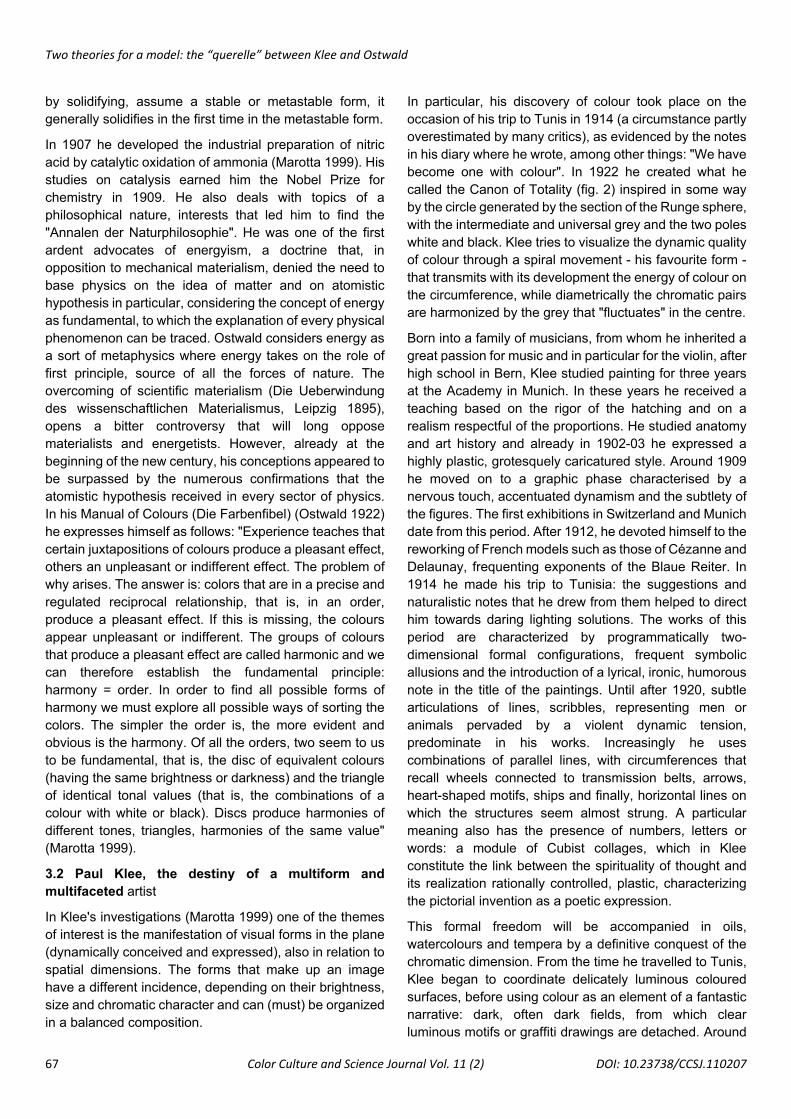
colours don't sound with one voice, as it might seem from the chain, but in a sort of three-voice chord. This representation is designed to show us the three-voice movement and to follow the process. As a canon, the voices attack each other one after the other; in each of the three main points a voice culminates, another voice begins to play slowly and another one is lost. This new figure could be called the canon of totality" (figs. 1 and 2) (Klee 1956). Visually comparing Ostwald's double-cone colour model with Klee's Canone della Totalità Cromatica (illustrated, among other things, in a lecture at the Bauhaus on 19 December 1922), it is impossible not to grasp the formal derivation of the Kleean figure from the Ostwaldan figure. Both models have a double-cone structure: at the ends of the vertical axis there are respectively white and black, while on the central section, at the intersection of the two cones, there is the chromatic circle. In Ostwald's model, the pure colours, arranged around the circumference of the circle, can be six, twelve, twenty-four or more, with the respective complementary colours (always diametrically opposed) located in circular sectors of equal size; while in Klee's Canon of Totality only three basic colours are indicated, arranged around the centre of the double cone, with a much sharper spiral pattern, a figure considered by the Author as an emblem of perfect geometric and dynamic synthesis. The above considerations confirm the derivation from Ostwald of Klee's Canon of Total Chromaticity, which functionally adapts the model of the German chemist - although he does not share the rigid and static approach - to the expression of dynamic colour, according to his own convictions.
From the comparison, and also taking into account the chronology, one can legitimately assume that Klee derived from Ostwald the setting for his Canon of the Chromatic Totality, considering it adequate, functional to the expression of the movement of the colour he studied ("red in red, in other words the scale of red diluted to deep red, in all its extension or partially") although he does not share the precise "science" of Ostwald, Klee does not accept his ideas on the harmonic accord of colours (Ostwald 1922).
However, the Bernese does not miss an opportunity to underline the diversity of his approach: in the lesson dedicated to order in the field of colours, held at the Bauhaus on 28 November 1922, the Swiss Master recalls that: "there are, as is well known, many theories of colors. For example, we have Goethe's theory, which was created to refute Newtonian statements". It is the most exhaustive treatment of his time on the physiological, physical and chemical aspect of colors. The author continues, "A chapter is also devoted to the sensitive-ethical effect of colours. More ancient traces of a theory of the colours of painting can be found in Leonardo, Dürer and others. Now
other colour theories have also been formulated; today two are being discussed: Hoelzel and Ostwald; but we are not a colour industry or a chemical dyeing plant, we must be free and have all the possibilities at our disposal". The importance - attributed by the artist from Bern to the psychological component and instead neglected by the "men of science" (here it is not by chance that Klee insists on repeating the reference to Ostwald) - is certainly a decisive argument of Klee's dissent: "those who study colours from a scientific point of view are generally concerned with providing logical-mathematical evidence. And so, the psychological aspect is neglected; as Ostwald does, for example (Birren 1969). The psychology of the painter requires the division of the circle into three and in six 1/6 is a number more akin to the circle than 1/8)". (Klee 1956). Klee's criticism of the limits of a purely technical-chemical orientation that "quietly neglects all transparent mixtures (veils)", and that shows a "complete ignorance of the relativity of chromatic values", thus becomes evident and takes shape. On the basis of this, the assumption of "harmonizing" by means of a tonality of equal value is considered reductive, since it would mean "renouncing all psychic richness" - thus visualized in the tone variations - limiting the artist's own freedom.
It would mean, in essence, not rendering the "gradations, from the smallest movement to the rich flowering of chromatic polyphony" (Klee 1956). To confirm Klee's position against that of Ostwald, it should be remembered that, by illustrating his theory of colour, the Swiss painter reiterates that he instead drew on theories of artists, which he explicitly recalls: "I want to try to tell you something useful about colour. I don't just base myself on my research, but I take ideas from others, men of science and not, with a light heart, to give them back to you. To name a few, I remember Goethe, Philipp Otto Runge, Delacroix, Kandinsky". On the contrary, the reference to some "men of science" is more general, but it is not by chance that Wilhelm Ostwald is mentioned among them. Regarding his theory, Klee writes, in a letter to Hans Hildebrandt: "What most artists have in common, the aversion of color as a science, became understandable to me when, a short time ago, I read Ostwald's theory of colors. But I wanted to take some time to see if I could get something good out of it. Instead, I only managed to extract a few curiosities. First of all, the pedestrian claim that acoustic science has stimulated music production. So, the reference to Helmholtz-Ostwald parallelism in their negative relationship to the arts would be quite correct. But that's not what they allude to. Scientists often find something childish in the arts. But in this case the positions are reversed. Puerili are also other things, for example the conception of a Potsdam square in which cars circulate honking their horn with a chord of do sharp. That could be
Two theories for a model: the “querelle” between Klee and Ostwald
66 Color Culture and Science Journal Vol. 11 (2) DOI: 10.23738/CCSJ.110207
funny, apart from the harmful practice whereby this uniform chord, this sound image without dissonances would be musical. His ideas on the harmonic chord of colours are also devoid of dissonances: the result is sounds comparable to the jodler and the Gstanzerl. Because it is an old story that beauty combined with beauty gives an insipid result. Very strange also the idea that the temperate chord in music is the work of science. I can only see it as a practical help. An analogous help is the scale of the chemical industry of the colors. Of course, we've been using it for a long time, but we don't need a colour theory at all. All the infinite mixtures never produce Schweinfurt green, a saturated red and a cobalt violet. In our country a dark yellow is never mixed with black because otherwise it gives the green. In addition, the chemistry of colours quietly overlooks all transparent mixtures (glazes). Not to mention the complete ignorance of the relativity of the chromatic values. To believe that the possibility of harmonizing by means of a shade of equal value must become a general rule is to renounce all psychic richness. Thank you very much!" (Klee 1956). In the Bauhaus years (but also in the decades that followed), like Klee and Kandinsky, Johannes Itten also rejected Ostwald's double cone approach: "When he establishes the equation 'Harmony = Order' - he contests - and gives the circle of colour of equal shade and the triangle of colour of similar value (saturation) as an example of order, he neglects the psychological laws of simultaneity and posthumous effect", demonstrating how convinced he was of the need for an interpretation of colour in a strongly psychological key, in this case gestalt (Marotta 1999).
More generally, the attention - even if indispensable - to the theoretical contributions matured at Bauhaus and privileged here, must not overlook more experimental findings and outcomes of the chromatic theories themselves. Alongside the already mentioned applications of Klee and Albers (Albers 1962) (in the field of glass painting) or of Kandinsky (for fresco techniques), numerous experiences have developed from the same theories, inside and outside the laboratories of the School. Here we can remember the examples in the Atelier of decoration for interior architecture, directed by Hinnerk Scheper, or the architectures - in the manifestations of the neoplastic movement - decomposed according to chromatic planes, by Theo Van Doesburg and Gerrit Thomas Rietveld, by Pieter Oud and Ludwig Mies Van Der Rohe. Or, architectural projects inspired by the same principles, by Herbert Bayer, Alfred Arndt, Farkas Molnàr. The same applies to the textile workshops (with the contribution and work of artists such as Anni Albers and Günta Stoltz), graphics (with figures such as Herbert Bayer) and children's games: the toys developed at the Bauhaus, not being a perfect imitation of objects from the
adult world, were to stimulate the child's imagination, allowing him to set in motion the infinite possibilities of composition and free reproduction of objects. Ludwig Hirschfeld-Mack, with his colorful spinning top, particularly enhances the educational aspect. Wingler notes in particular: "On the rotating spinning top, cardboard discs with printed segments in different colours or eccentric coloured circles could be thrown onto the pole. The rotation movement gave rise to an optical mixture of colours. This demonstrated, among other things, Goethe's, Schopenhauer's and Bezold's theories of colour” (Wingler 1962, Zevi 1974).
3. Klee and Ostwald. Comparison of chromatic theories We can once again confirm that - at the Bauhaus - Itten's thought (Itten 1962) contrary to Ostwald's theories was shared with similar intensity by Klee: although as a young man, in 1904, he was one of the few artists to express enthusiasm for Wilhelm Malerbriefe's manual (Letters to a Painter), calling it "an excellent scientific treatment of all technical subjects", later his opinions changed radically, as we have already mentioned, in the aforementioned letter to Hildebrandt (Klee 1956, Cherchi 1978).
3.1 Wilhelm Ostwald. The fate of a chemist, Nobel laureate and artist
As we have already mentioned, the theoretical principles that Ostwald (Marotta 1999) enunciates, carrying out chemical experiments and expressing important considerations on colors, have been strongly opposed by artists such as Itten and Klee. The Double Cone, his model of color, created - it seems between 1915 and 1919 - has a vertical axis, on which is the scale of grays (from white to black) and the central section (equator) on the plane of intersection of the two cones, on which is placed the chromatic circle. This visualization stems from his conviction that the colours included in the circle of pure colours, when mixed with white or black, differ little from each other.
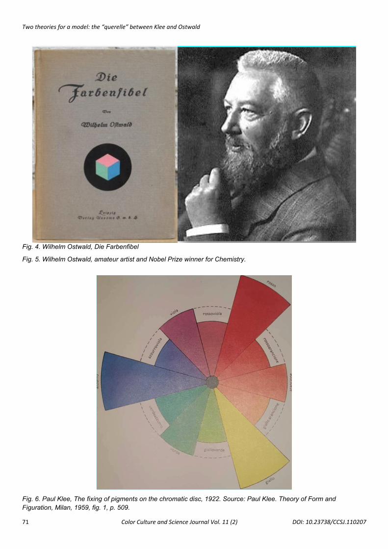
After graduating from Dorpat University, he taught at the Riga Polytechnic in 1881, at the University of Leipzig in 1887 and then in 1898 became director of the Institute of Electrochemistry in the same city. He is best known for his work on electrolytes and catalysis. in 1888 he applied the law of mass action to the ionization of electrolytes, discovering the law of dilution that bears his name and that will give a decisive impulse to the progress of this field of research; the first law allows to calculate the constant dissociation of an acid or a weak base through the measurement of the conductivity of their solutions; the second states that when a liquid in the cooling phase can,
Two theories for a model: the “querelle” between Klee and Ostwald
67 Color Culture and Science Journal Vol. 11 (2) DOI: 10.23738/CCSJ.110207
by solidifying, assume a stable or metastable form, it generally solidifies in the first time in the metastable form.
In 1907 he developed the industrial preparation of nitric acid by catalytic oxidation of ammonia (Marotta 1999). His studies on catalysis earned him the Nobel Prize for chemistry in 1909. He also deals with topics of a philosophical nature, interests that led him to find the "Annalen der Naturphilosophie". He was one of the first ardent advocates of energyism, a doctrine that, in opposition to mechanical materialism, denied the need to base physics on the idea of matter and on atomistic hypothesis in particular, considering the concept of energy as fundamental, to which the explanation of every physical phenomenon can be traced. Ostwald considers energy as a sort of metaphysics where energy takes on the role of first principle, source of all the forces of nature. The overcoming of scientific materialism (Die Ueberwindung des wissenschaftlichen Materialismus, Leipzig 1895), opens a bitter controversy that will long oppose materialists and energetists. However, already at the beginning of the new century, his conceptions appeared to be surpassed by the numerous confirmations that the atomistic hypothesis received in every sector of physics. In his Manual of Colours (Die Farbenfibel) (Ostwald 1922) he expresses himself as follows: "Experience teaches that certain juxtapositions of colours produce a pleasant effect, others an unpleasant or indifferent effect. The problem of why arises. The answer is: colors that are in a precise and regulated reciprocal relationship, that is, in an order, produce a pleasant effect. If this is missing, the colours appear unpleasant or indifferent. The groups of colours that produce a pleasant effect are called harmonic and we can therefore establish the fundamental principle: harmony = order. In order to find all possible forms of harmony we must explore all possible ways of sorting the colors. The simpler the order is, the more evident and obvious is the harmony. Of all the orders, two seem to us to be fundamental, that is, the disc of equivalent colours (having the same brightness or darkness) and the triangle of identical tonal values (that is, the combinations of a colour with white or black). Discs produce harmonies of different tones, triangles, harmonies of the same value" (Marotta 1999).
3.2 Paul Klee, the destiny of a multiform and multifaceted artist
In Klee's investigations (Marotta 1999) one of the themes of interest is the manifestation of visual forms in the plane (dynamically conceived and expressed), also in relation to spatial dimensions. The forms that make up an image have a different incidence, depending on their brightness, size and chromatic character and can (must) be organized in a balanced composition.
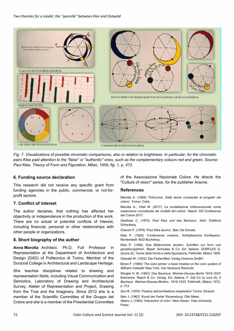
In particular, his discovery of colour took place on the occasion of his trip to Tunis in 1914 (a circumstance partly overestimated by many critics), as evidenced by the notes in his diary where he wrote, among other things: "We have become one with colour". In 1922 he created what he called the Canon of Totality (fig. 2) inspired in some way by the circle generated by the section of the Runge sphere, with the intermediate and universal grey and the two poles white and black. Klee tries to visualize the dynamic quality of colour through a spiral movement - his favourite form - that transmits with its development the energy of colour on the circumference, while diametrically the chromatic pairs are harmonized by the grey that "fluctuates" in the centre.
Born into a family of musicians, from whom he inherited a great passion for music and in particular for the violin, after high school in Bern, Klee studied painting for three years at the Academy in Munich. In these years he received a teaching based on the rigor of the hatching and on a realism respectful of the proportions. He studied anatomy and art history and already in 1902-03 he expressed a highly plastic, grotesquely caricatured style. Around 1909 he moved on to a graphic phase characterised by a nervous touch, accentuated dynamism and the subtlety of the figures. The first exhibitions in Switzerland and Munich date from this period. After 1912, he devoted himself to the reworking of French models such as those of Cézanne and Delaunay, frequenting exponents of the Blaue Reiter. In 1914 he made his trip to Tunisia: the suggestions and naturalistic notes that he drew from them helped to direct him towards daring lighting solutions. The works of this period are characterized by programmatically two-dimensional formal configurations, frequent symbolic allusions and the introduction of a lyrical, ironic, humorous note in the title of the paintings. Until after 1920, subtle articulations of lines, scribbles, representing men or animals pervaded by a violent dynamic tension, predominate in his works. Increasingly he uses combinations of parallel lines, with circumferences that recall wheels connected to transmission belts, arrows, heart-shaped motifs, ships and finally, horizontal lines on which the structures seem almost strung. A particular meaning also has the presence of numbers, letters or words: a module of Cubist collages, which in Klee constitute the link between the spirituality of thought and its realization rationally controlled, plastic, characterizing the pictorial invention as a poetic expression.
This formal freedom will be accompanied in oils, watercolours and tempera by a definitive conquest of the chromatic dimension. From the time he travelled to Tunis, Klee began to coordinate delicately luminous coloured surfaces, before using colour as an element of a fantastic narrative: dark, often dark fields, from which clear luminous motifs or graffiti drawings are detached. Around
Two theories for a model: the “querelle” between Klee and Ostwald
68 Color Culture and Science Journal Vol. 11 (2) DOI: 10.23738/CCSJ.110207
the twenties, Klee experimented with a very different and articulated use of colour, applied in relation to the greater or lesser weight of the contours, with their dynamics and expressive force: a choice certainly linked to the didactic activity carried out at the Bauhaus. This new conception of colour is accompanied by the writing of theoretical writings, through which Klee intends to communicate his vision of art. In 1924, during a lecture at the Kunstverein in Jena, he explained that the different functions in the different realms of nature lead to vital irregularities, reiterating (in accordance with the principles of Gestalt) that the artist must deal with the dimensions of mass (line), weight (tonality) and quality (color), not verisimilitude and must aim not at an external model, but at the original theme, the principle of creation, where the key to everything lies. On the other hand, in a note Klee argued that the figure is a living being, it is nature, because his theory of figuration (Gestaldtung) deals with the ways that lead to form. Saying: "theory of formation" is unusual, therefore, compared to form, figure (Gestalt) expresses something more alive. The figure is a form based on vital functions and these functions are of a spiritual nature, their basis is the need for expression. To pass from a form to a figure - he maintains - creative force is necessary, which therefore cannot be defined: there is matter and reason". In addition to this, the choice of means is important: over the material means (wood, metals, glass) it is preferable to use the ideal means (line, chiaroscuro, color): writing and image (Klee 1956). Writing and figuration are basically all one to abstract and synthesize reality and not to represent it. For this reason, figuration is linked to movement: the point moves, and a line derives from it as the first dimension; the line obtained, by moving, forms the two-dimensional plane. The collision of the planes results in a three-dimensional solid body. Klee, who is a musician, tries to set painting in analogy with harmonic systems, elaborating the elements of his themes like a specialist in the field, with notes, motifs, themes and modulations and despite supporting the need for a clear separation between the arts, evident are, especially in initial experiences, many points of contact with music. The very name of "Canon of Totality", attributed to his chromatic model, proves the close and complex relationship that the artist grasps between color and music, in a broader and more synaesthetic conception of "circularity and complementarity" of the various forms of art. Thus, we find works with a clear polyphonic or monophonic character, continuous melodies, based on uninterrupted lines, ascending and descending rhythms, tonal and atonal relations, etc. Numerous trips and exhibitions, including in the United States, preceded his appointment as professor at the State Academy of Düsseldorf in 1931. During this period, his production saw the succession of various stylistic tendencies: compositions with parallel lines that
thickened to the point of overlapping, references to compositional principles of a musical nature, with the use of gradations, planes on which colour stains were regularly distributed, large luminous fields crossed by parallel or converging lines. These abstract figures are sometimes superimposed on figurative fragments or human figures. From 1937 his style took on dark, dramatic tones, his poetic message was veined with suffering and pessimism; on a background (monochrome or polychrome) dense black brushstrokes appear and black are also the features that surround the colored areas. Klee is deeply anxious about the events in Nazi Germany, which also hurt him on a personal level. Klee's work, with its inimitable variety of expressions, occupies a central position in the artistic panorama of the twentieth century. It represents the affirmation of the creative freedom of an abstract language, in many respects similar to that of music and poetry. Klee's painting, sometimes reserved, soft, imbued with humour, often painful, visualizes the different spiritual and artistic tensions that characterize the existential dimension of the twentieth century.
4. Developments, insights, denials As is well known, contradicting his previous obstinacy, from 1925 Kandinskij changed his mind, supporting Ostwald's theories, while Gropius and the designers, who until then had been more attentive and sensitive to technological aspects, also considered them benevolently.
Wilhelm's chromatic theory - in an unusual way compared to the custom of the contemporary Authors - placed green among the primary ones, together with red, yellow and blue. The colour wheel shown in his Sillabario dei colori (1916) assigns no less than nine of the twenty-four subdivisions to green; he did not discuss the concept of green as a "secondary" mixture of blue and yellow, but rather considered - and in a "mediated" position with respect to exclusively material and technical parameters - green as perceptively autonomous: a recognition of Goethe's psychological dimension of tributary colour. In turn, in fact, the chemist had derived his theories from the Viennese Gestalt psychologist Ewald Hering (Marotta 1999), who hypothesized three sets of "antagonistic colors", in great similarity with the Goethean oppositional categories.
However, among the salient aspects of Ostwald's chromatic thought, the role assigned to the grey component in colour emerges - with the proposal of the concept of "brilliance" - for the range of greys in coloured space. In his chromatic sphere, Otto Runge had tried to extend the Goethian Circle of Colours, lying on a plane, through a perpendicular axis, with the development (in the
Two theories for a model: the “querelle” between Klee and Ostwald
69 Color Culture and Science Journal Vol. 11 (2) DOI: 10.23738/CCSJ.110207
space conceived in three dimensions) of tones, from the black pole to the white pole in the opposite pole, without considering the need to represent variations for the grey placed at the centre of the sphere.
The scientist was struck when, at Harvard in 1905, he had the opportunity to confront Albert Munsell, who had a three-dimensional idea of the chromatic system. The chemist wanted to translate this mental model into a series of easily recognizable principles that could guide the artists, allowing them to obtain a harmonic chromatic composition.
Thus, he developed a perceptual scale of gray tones that varied gradually and uniformly. These gradations were derived from a mathematical equation between the progressive percentages of black and white; Ostwald then applied the resulting range of greys to each of the shades of his twenty-four-part colour wheel, convinced that chromatic harmony arose from the application of colours whose values - with relative grey components - were compensated for. This was the central idea exposed in the Sillabario dei colori, which Klee irrevocably rejected. On the contrary, the artist recommends that painters "cut" the colors with white to harmonically balance the colors. The Nobel Prize winner, in a convinced and persistent way, continued the battle to defend his ideas. Thanks to his scientific expertise, he applied his theory effectively to the material aspects of the pigments from which he obtained the colours, and his role as consultant to the German paint industry enabled him to apply it to commercial products. In 1914 he organised an exhibition of industrial paints and dyes on behalf of the Deutsche Werkbund, the German association for art and design. In 1919 he opened a series of technical conferences on colour in Stuttgart, the tradition of which continues to this day.
If we wanted to give an example of the differences, in particular, between the concepts that differ most from Ostwald's convictions, in Paul Klee's thought there is the "dynamic" thought of the "peripheral chromatic movement" (Klee 1956): an infinite movement that takes place along the circumference and in contrast to the pendular movement that takes place along the diameter. Here the colors continuously pass into each other, there are no interruptions and every beginning is also the end. Each color starts from its nothingness, that is from the culmination of the near color, first slowly and then more and more growing until it touches its own culmination; it then begins to slowly decrease, toward its nothingness, that is toward the culmination of the other adjacent color. "If we consider, for example, the color red, we will not be wrong by fixing its width to two thirds of the circumference. There is a red that gives in yellow (the so-called warm red) and a red that gives nerazzurro (the so-called cold red).
But both of them represent, compared to pure red, a weakening. It must therefore be noted that red increases from one side or the other and this increase from two sides naturally leads to a climax, to a climax where red reaches its maximum height. Three points can then be established on the circumference: the red peak, the hot end of the red and the cold end of the red. These three points divide the circumference into a red line that measures two thirds, and a line without red that measures one third and is opposite to the red peak. In the same way the amplitude of yellow and blue can be determined" (Klee 1956).
Since the early decades of the twentieth century, Ostwald had strongly advocated his theories, obtaining greater consensus and support among the European artists of the time, both as a concrete basis for their work and as an object of criticism.
Among other things, he took on a charismatic role among the Dutch painters of De Stijl, such as Theo Van Doesburg, Jacobus Johannes, Oud and Piet Mondrian, although the latter, who was very attentive to the question of primary colours, struggled to understand what Ostwald's theory required in order to use colour correctly: should green be included or not?
5. Conclusions In addition to describing cultural matrices, parameters and essential characteristics of the models examined, of particular interest is the scope of the applications already put in place of the models, or possible future developments, also connected to new methodologies (such as virtual and digital) in the color project, up to the experiments in concrete and material production.
Following a methodological approach already developed and tested, the work will in the future tend towards a three-dimensional graphic interpretation and representation that - from a cultural and philological point of view - can be a tool for analysis and interrogation of sources. Specifically, quantitative elaborations should start from other assumptions to produce results of some interest. In this regard, it is useful to remember that it is always essential to make an explicit and reasoned declaration of the methodological approaches and parameters used, considered the most appropriate for the purposes of scientific investigations.
The visualization, also dynamic, of the single models, including the constituent parameters, constitutes a privileged laboratory for specialized scientific investigations, in which the dynamization will be able to render more effective the temporal sequences between the various models, also of different authors, in order to
Two theories for a model: the “querelle” between Klee and Ostwald
70 Color Culture and Science Journal Vol. 11 (2) DOI: 10.23738/CCSJ.110207
highlight and confirm their developments through the parameters, as well as to better narrate the modifications in time, for example of similar models, between analogies and differences. This is especially true if we consider
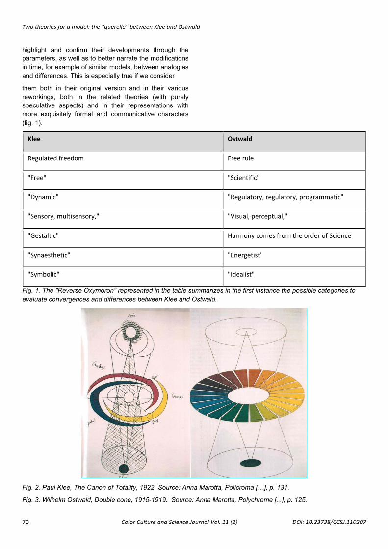
them both in their original version and in their various reworkings, both in the related theories (with purely speculative aspects) and in their representations with more exquisitely formal and communicative characters (fig. 1).
Klee Ostwald
Regulated freedom Free rule
"Free" "Scientific"
"Dynamic" "Regulatory, regulatory, programmatic"
"Sensory, multisensory," "Visual, perceptual,"
"Gestaltic" Harmony comes from the order of Science
"Synaesthetic" "Energetist"
"Symbolic" "Idealist"
Fig. 1. The "Reverse Oxymoron" represented in the table summarizes in the first instance the possible categories to evaluate convergences and differences between Klee and Ostwald.
Fig. 2. Paul Klee, The Canon of Totality, 1922. Source: Anna Marotta, Policroma […], p. 131.
Fig. 3. Wilhelm Ostwald, Double cone, 1915-1919. Source: Anna Marotta, Polychrome [...], p. 125.
Two theories for a model: the “querelle” between Klee and Ostwald
71 Color Culture and Science Journal Vol. 11 (2) DOI: 10.23738/CCSJ.110207
Fig. 4. Wilhelm Ostwald, Die Farbenfibel
Fig. 5. Wilhelm Ostwald, amateur artist and Nobel Prize winner for Chemistry.
Fig. 6. Paul Klee, The fixing of pigments on the chromatic disc, 1922. Source: Paul Klee. Theory of Form and Figuration, Milan, 1959, fig. 1, p. 509.
Two theories for a model: the “querelle” between Klee and Ostwald
72 Color Culture and Science Journal Vol. 11 (2) DOI: 10.23738/CCSJ.110207
Fig. 7. Visualizations of possible chromatic comparisons, also in relation to brightness. In particular, for the chromatic pairs Klee paid attention to the "false" or "authentic" ones, such as the complementary colours red and green. Source: Paul Klee. Theory of Form and Figuration, Milan, 1959, fig. 1, p. 472.
6. Funding source declaration This research did not receive any specific grant from funding agencies in the public, commercial, or not-for-profit sectors.
7. Conflict of interest The author declares, that nothing has affected her objectivity or independence in the production of this work. There are no actual or potential conflicts of interest, including financial, personal or other relationships with other people or organizations.
8. Short biography of the author Anna Marotta Architect, Ph.D, Full Professor in Representation at the Department of Architecture and Design (DAD) of Politecnico di Torino. Member of the Doctoral College in Architectural and Landscape Heritage.
She teaches disciplines related to drawing and representation fields, including Visual Communication and Semiotics, Laboratory of Drawing and Architectural Survey, Atelier of Representation and Project, Drawing from the True and the Imaginary. Since 2012 she is a member of the Scientific Committee of the Gruppo del Colore and she is a member of the Presidential Committee
of the Associazione Nazionale Colore. He directs the "Culture of vision" series, for the publisher Aracne.
References Marotta A. (1999) ‘Policroma, Dalle teorie comparate al progetto del colore’, Torino: Celid. Marotta A., Vitali M. (2017) ‘La modellazione tridimensionale come espansione concettuale dei modelli del colore‘, Napoli: XIII Conferenza del Colore 2017. Geelhaar C. (1972) ‘Paul Klee und das Bauhaus‘, Köln: DuMond Schauberg. Cherchi P. (1978) ‘Paul Klee teorico‘, Bari: De Donato
Klee P. (1920) ‘Confessione creativa‘, Schöpferische Konfession, Norderstedt: BoD Buchshop. Klee P. (1956) ‘Das Bildenrische deuken. Schriften zur form und gestaltungslehre‘, Basel: Schwabe & Co. Ed. italiana: DORFLES G. (acura di), Teorie della forma e della figurazione, Feltrinelli, Milano 1959. Ostwald W. (1922) ‘Die Farbenfibel, Verlag Unesma GmBH
Birren F. (1969) ‘The color primer: a basic treatise on the color system of Wilhelm Ostwald‘ New York: Van Nostrand Reinhold. Wingler H. M. (1962) ‘Das Bauhaus. Weimar-Dessau-Berlin 1919-1933‘ Bramsche: Rasch & Co. Verlag. Ed. italiana: F. Dal Co (a cura di), Il Bauhaus. Weimar-Dessau-Berlino. 1919-1933, Feltrinelli, Milano 1972, p. 312. Zevi B. (1974) ‘Poetica dell’architettura neoplastica’ Torino: Einaudi. Itten J. (1962) ‘Kunst der Farbe‘ Ravensburg: Otto Maier. Albers J. (1962) ‘Interaction of color‘, New Haven: Yale University Press.
Related Documents


![KLEE: EffectiveTesting of Systems Programs CristianCadarcristic/talks/klee-stanford-2009.pdf · KLEE – Hundred distinct benchmarks • SAGE, Pex[MSR Redmond] • Vigilante [MSR](https://static.cupdf.com/doc/110x72/5f9f70f59ff9751d89514a30/klee-effectivetesting-of-systems-programs-cristiancadar-cristictalksklee-stanford-2009pdf.jpg)