Transit Signal Priority on the California1 Bus Line INFO 247 Information Visualization Final Project Sai Dulla, Paul Sohn, and Jongkai Yang Introduction The San Francisco Municipal Transportation Authority (SFMTA) has recently installed Transit Signal Priority (TSP) on several MUNI bus lines. TSP is a system that detects the presence of buses approaching traffic signals, and modifies the signal cycle to extend the green light phase, making it more likely that the bus will “catch the light.” We embarked on this project in consultation with transportation engineers at the SFMTA, who shared data for one particular bus route: the California1 bus. Data was shared with a project for CEE 259: Public Transportation Systems. Project Goals This project is broadly intended to help our SFMTA contacts explore data in order to answer the key question: Did transit signal priority reduce travel times on the California1 bus? More specifically, as stated in the project proposal, our goal was to create a web interface that allows users to explore the travel time dataset and discover answers to questions he/she is interested in. Some of the important tasks that users should be able to accomplish with the tool include: ● Visualize travel time improvement over time (i.e. before / after TSP implementation) at different levels of data, including: ○ Different stops / intersections ○ Various times of day ○ Different intersection typologies (near vs. far side stop, what kind of signalization) ● Visualize “dwell time,” or how long buses stay at different stops ● Visualize stops and the bus route spatially, along with what is nearby ● Filter and otherwise explore data on their own ● Use other datasets (e.g. census data) to provide context for SFMTAprovided data (this was our “stretch” goal for this project)

Welcome message from author
This document is posted to help you gain knowledge. Please leave a comment to let me know what you think about it! Share it to your friends and learn new things together.
Transcript
Transit Signal Priority on the California1 Bus Line INFO 247 Information Visualization Final Project Sai Dulla, Paul Sohn, and Jongkai Yang
Introduction The San Francisco Municipal Transportation Authority (SFMTA) has recently installed Transit Signal Priority (TSP) on several MUNI bus lines. TSP is a system that detects the presence of buses approaching traffic signals, and modifies the signal cycle to extend the green light phase, making it more likely that the bus will “catch the light.” We embarked on this project in consultation with transportation engineers at the SFMTA, who shared data for one particular bus route: the California1 bus. Data was shared with a project for CEE 259: Public Transportation Systems.
Project Goals This project is broadly intended to help our SFMTA contacts explore data in order to answer the key question: Did transit signal priority reduce travel times on the California1 bus? More specifically, as stated in the project proposal, our goal was to create a web interface that allows users to explore the travel time dataset and discover answers to questions he/she is interested in. Some of the important tasks that users should be able to accomplish with the tool include:
Visualize travel time improvement over time (i.e. before / after TSP implementation) at different levels of data, including:
Different stops / intersections Various times of day Different intersection typologies (near vs. far side stop, what kind of signalization)
Visualize “dwell time,” or how long buses stay at different stops Visualize stops and the bus route spatially, along with what is nearby Filter and otherwise explore data on their own Use other datasets (e.g. census data) to provide context for SFMTAprovided data (this
was our “stretch” goal for this project)
Related Work Here we discuss a few readings that provided important theoretical underpinnings of this project, as well as several visualizations and other work that helped us envision and execute our project. Stephen Few, “Visual Communication: Core Design Principles for Displaying Quantitative Information”
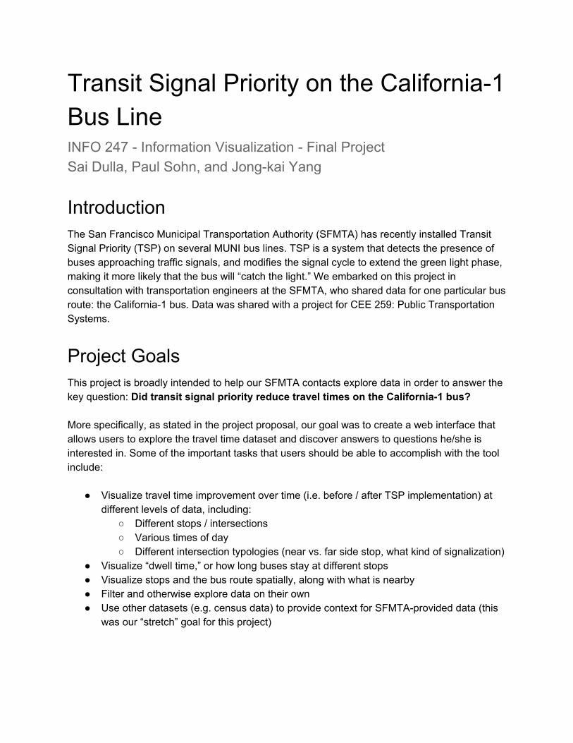
This reading presents some of the very basic, fundamental practices that are essential to effective visualization. Using lines to represent change over time and using distinct colors to represent different categories are two principles discussed in this paper.
Stephen Few, “Exploratory Vistas: Ways to Become Acquainted with a Data Set for the First Time”
Our project was based off of an exploratory data analysis project, and this reading discusses how to approach exploring a new dataset. Among other ideas, this reading emphasizes the importance of seeing distributions via histograms, which is an element we ended up including in our final project.

Stephen Few, “Now You See It: Simple Visualization Techniques for Quantitative Analysis,” Chapter 4: Analytical Interaction and Navigation
This chapter discusses various techniques for interactivity in visualization. We borrowed several of the principles in this chapter, including filtering via buttons and sliders.
Berkow, ElGeneidy, Bertini and Crout (2008), “Beyond Generating Transit Performance Measures: Visualizations and Statistical Analysis Using Historical Data”
This paper discusses some performance measures for public transit, and includes elements we considered for our own work, such as this plot of ridership by day of week:
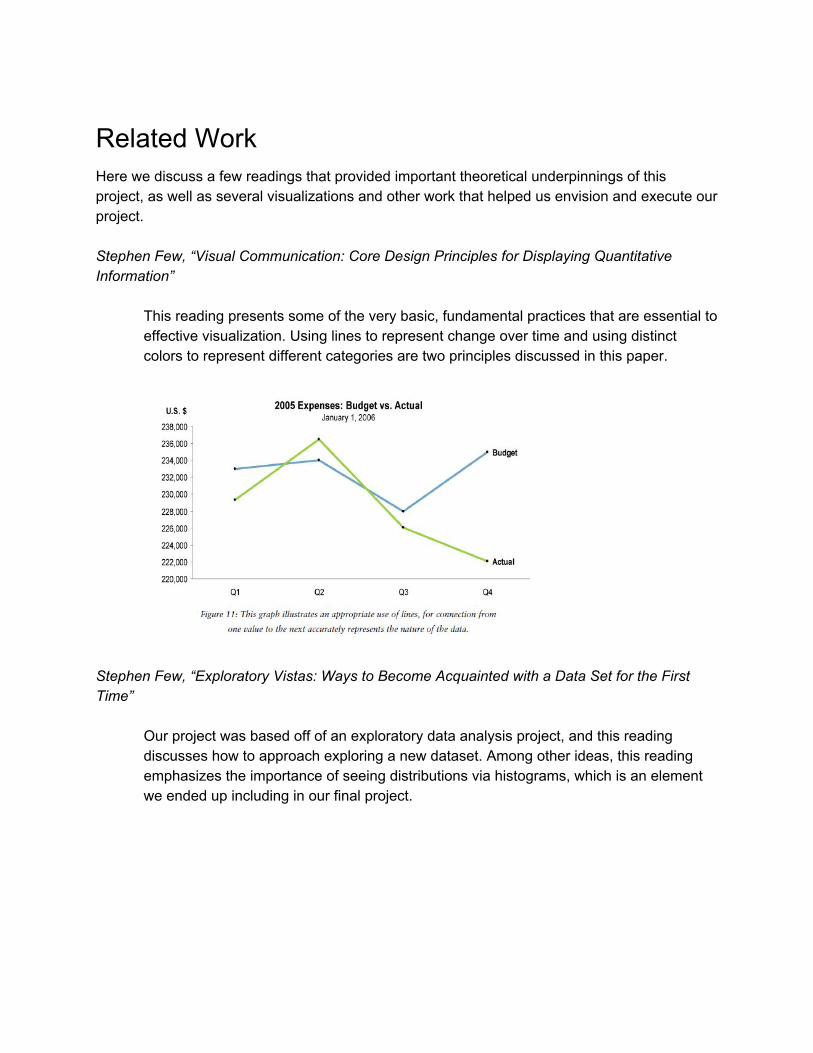
Lewis Lehe, Bus Bunching Visualization, http://setosa.io/bus/
This visualization from a transportation engineering PhD student did not directly relate to our project idea but provided some inspiration for good design and clever interactivity.
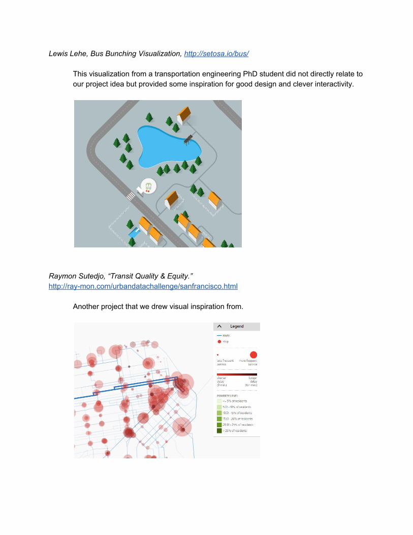
Raymon Sutedjo, “Transit Quality & Equity.” http://raymon.com/urbandatachallenge/sanfrancisco.html
Another project that we drew visual inspiration from.
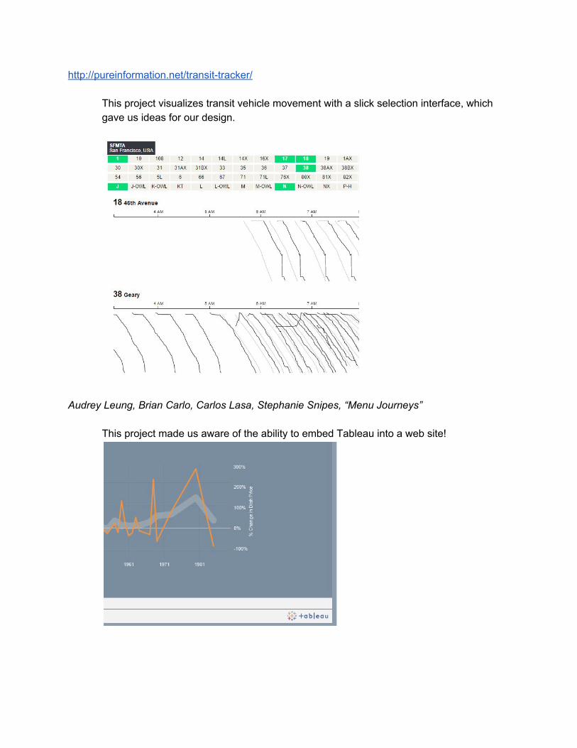
http://pureinformation.net/transittracker/
This project visualizes transit vehicle movement with a slick selection interface, which gave us ideas for our design.
Audrey Leung, Brian Carlo, Carlos Lasa, Stephanie Snipes, “Menu Journeys”
This project made us aware of the ability to embed Tableau into a web site!
Leaflet.js http://leafletjs.com/
Finally, we used the Leaflet.js interface to embed the map of the California1 bus in our website.
Visualization Our visualization is hosted at http://jongkai.me/SFMTA_TSP/. The final product is a singlepage web application that displays two primary visualizations that help users answer the key question of whether travel times have improved after implementing TSP.
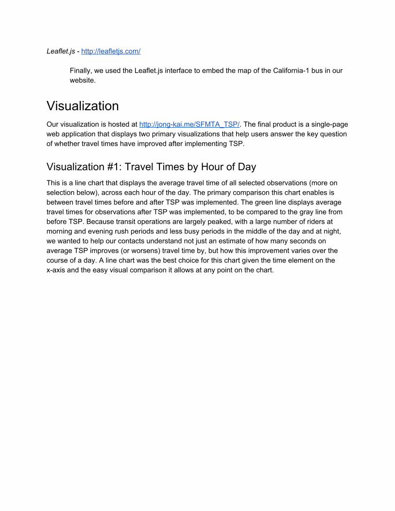
Visualization #1: Travel Times by Hour of Day This is a line chart that displays the average travel time of all selected observations (more on selection below), across each hour of the day. The primary comparison this chart enables is between travel times before and after TSP was implemented. The green line displays average travel times for observations after TSP was implemented, to be compared to the gray line from before TSP. Because transit operations are largely peaked, with a large number of riders at morning and evening rush periods and less busy periods in the middle of the day and at night, we wanted to help our contacts understand not just an estimate of how many seconds on average TSP improves (or worsens) travel time by, but how this improvement varies over the course of a day. A line chart was the best choice for this chart given the time element on the xaxis and the easy visual comparison it allows at any point on the chart.
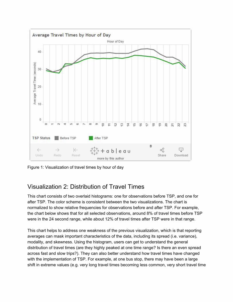
Figure 1: Visualization of travel times by hour of day
Visualization 2: Distribution of Travel Times This chart consists of two overlaid histograms: one for observations before TSP, and one for after TSP. The color scheme is consistent between the two visualizations. The chart is normalized to show relative frequencies for observations before and after TSP. For example, the chart below shows that for all selected observations, around 8% of travel times before TSP were in the 24 second range, while about 12% of travel times after TSP were in that range. This chart helps to address one weakness of the previous visualization, which is that reporting averages can mask important characteristics of the data, including its spread (i.e. variance), modality, and skewness. Using the histogram, users can get to understand the general distribution of travel times (are they highly peaked at one time range? Is there an even spread across fast and slow trips?). They can also better understand how travel times have changed with the implementation of TSP. For example, at one bus stop, there may have been a large shift in extreme values (e.g. very long travel times becoming less common, very short travel time
becoming more common), and at another bus stop, there may have been more of a shift in values in the middle of the distribution.
Figure 2: Visualization of the distribution of travel times
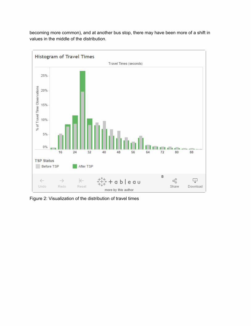
Selection Mechanism: Map of Bus Stops The interactivity in our visualization app comes into play with the ability to filter the visualized data. The first feature that allows for subsetting the data, as well as providing a spatial display of that subset, is the interactive map. The map is at the top of the page for several reasons. It provides a helpful bird’s eye view of the route that we are analyzing, gives an easy way to understand which data are selected at any given time, and is an eyecatching element.
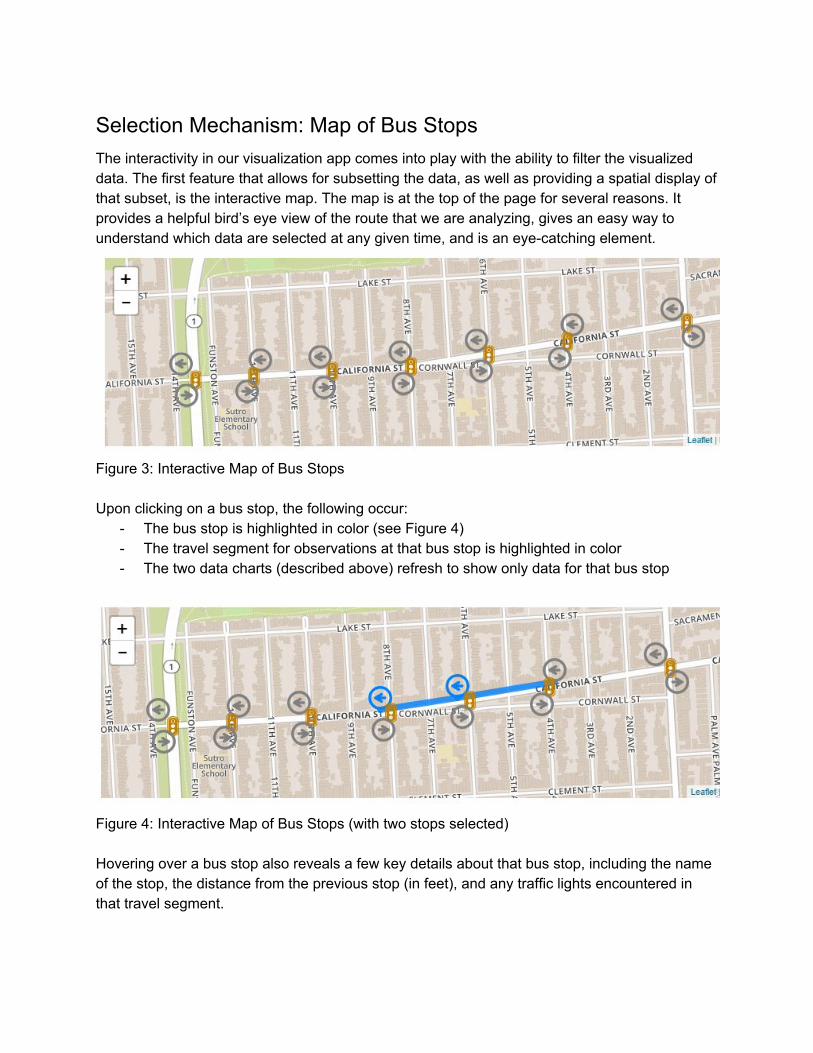
Figure 3: Interactive Map of Bus Stops Upon clicking on a bus stop, the following occur:
The bus stop is highlighted in color (see Figure 4) The travel segment for observations at that bus stop is highlighted in color The two data charts (described above) refresh to show only data for that bus stop
Figure 4: Interactive Map of Bus Stops (with two stops selected) Hovering over a bus stop also reveals a few key details about that bus stop, including the name of the stop, the distance from the previous stop (in feet), and any traffic lights encountered in that travel segment.

Figure 5: Hovering over a bus stop
Selection Mechanism: Checkboxes In addition to the clickable bus stops on the map, we provide several sets of checkboxes for users to be able to select bus stops by name and other characteristics, and allow subsetting by days of the week and times of the day.
Figure 6: Selection checkboxes
Time Selectors We allow users to select the day of the week they want to view observations from. This is important because transit operations not only vary over the course of a day, but over the course of a week as well. The difference between weekend and weekday performance of buses is a crucial distinction, as bus operators often provide different frequencies and types of service on weekdays. We also include a slider to subset the hours of day that are included in the charts as well. While this does not change the functionality of visualization #1, which already displays travel times over the course of a day, it does change the data for visualization #2, the histogram of travel times. This is a helpful tool in viewing how the distribution of travel times might change between the peak period and nonpeak periods.
Individual Stop Selectors In addition to allowing users to select bus stops by clicking on them on the map, we also provide checkboxes for users to select stops by name. We also provide the ability to select all of the inbound or outbound stops at once.
Bus Stop Type Selectors Farthest to the right, we also provide checkboxes for four different types of travel segments. There are two different types of bus stops. Far side bus stops are placed after the intersection they serve, so at these stops, buses travel through the intersection (which often has a light) before stopping to pick up passengers. Near side bus stops are placed before the intersection, so buses pick up passengers and then proceed through the intersection. The checkboxes we provide here reflect all four possible combinations of types (far side to far side, far side to near side, near side to near side, and near side to far side). It is clear that the number of traffic lights a bus crosses in a given travel segment would have an effect on average travel times for that segment. For the final project in CEE 259, we discovered that TSP has a greater impact on travel times at certain types of travel segments than others. For example, we would not expect a major effect on fartonear travel segments, which don’t have a traffic light for buses to cross. On the other hand, we may expect larger effects for neartofar segments, which have two lights (although we don’t actually find this pattern in the data). The checkbox selector for this characteristic allows users to quickly subset the visualized data for travel segments of a certain type.
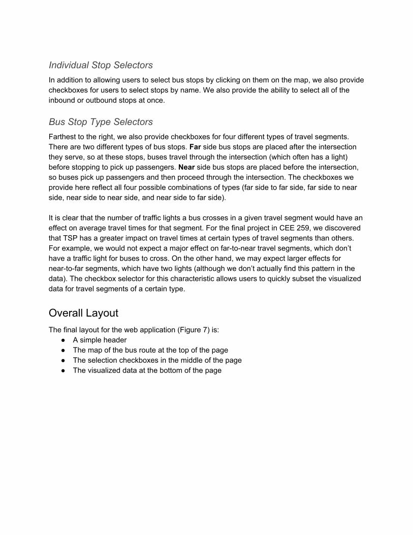
Overall Layout The final layout for the web application (Figure 7) is:
A simple header The map of the bus route at the top of the page The selection checkboxes in the middle of the page The visualized data at the bottom of the page
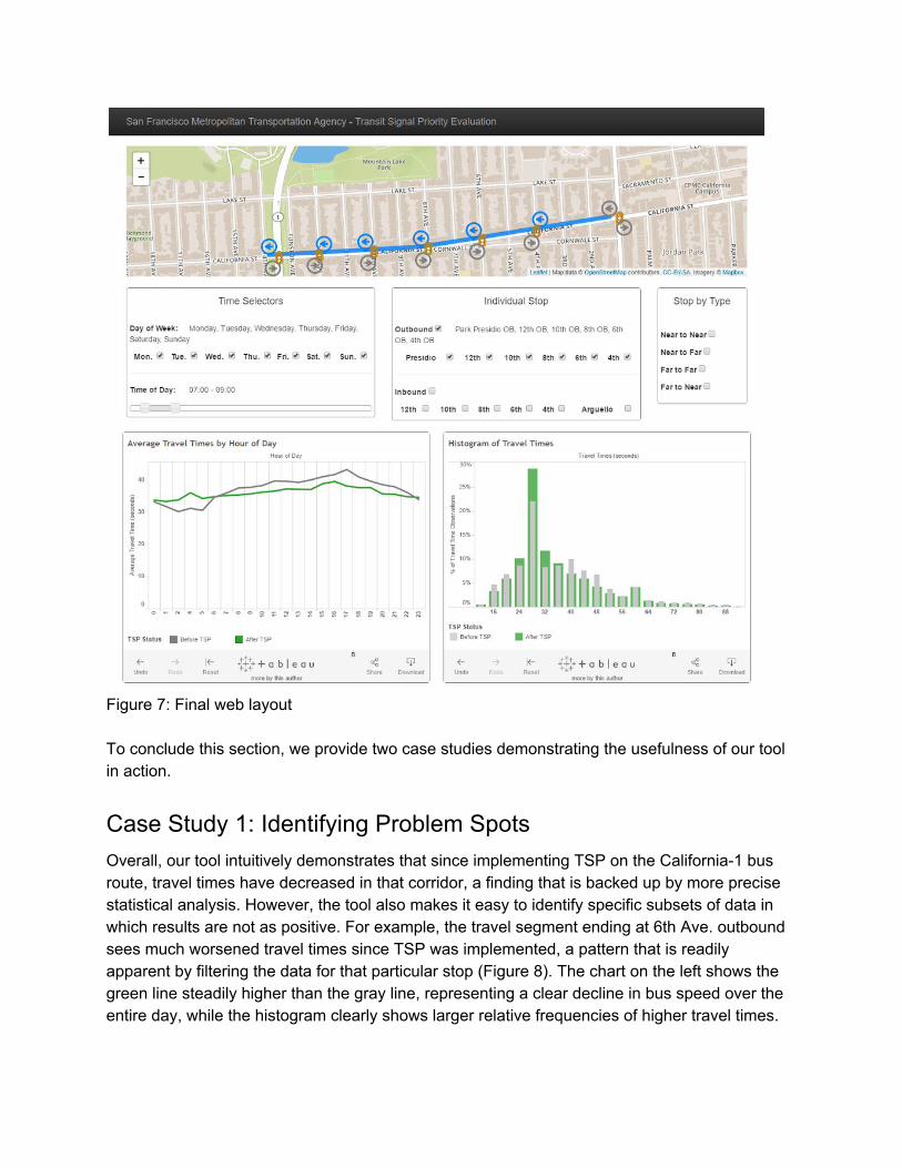
Figure 7: Final web layout To conclude this section, we provide two case studies demonstrating the usefulness of our tool in action.
Case Study 1: Identifying Problem Spots Overall, our tool intuitively demonstrates that since implementing TSP on the California1 bus route, travel times have decreased in that corridor, a finding that is backed up by more precise statistical analysis. However, the tool also makes it easy to identify specific subsets of data in which results are not as positive. For example, the travel segment ending at 6th Ave. outbound sees much worsened travel times since TSP was implemented, a pattern that is readily apparent by filtering the data for that particular stop (Figure 8). The chart on the left shows the green line steadily higher than the gray line, representing a clear decline in bus speed over the entire day, while the histogram clearly shows larger relative frequencies of higher travel times.
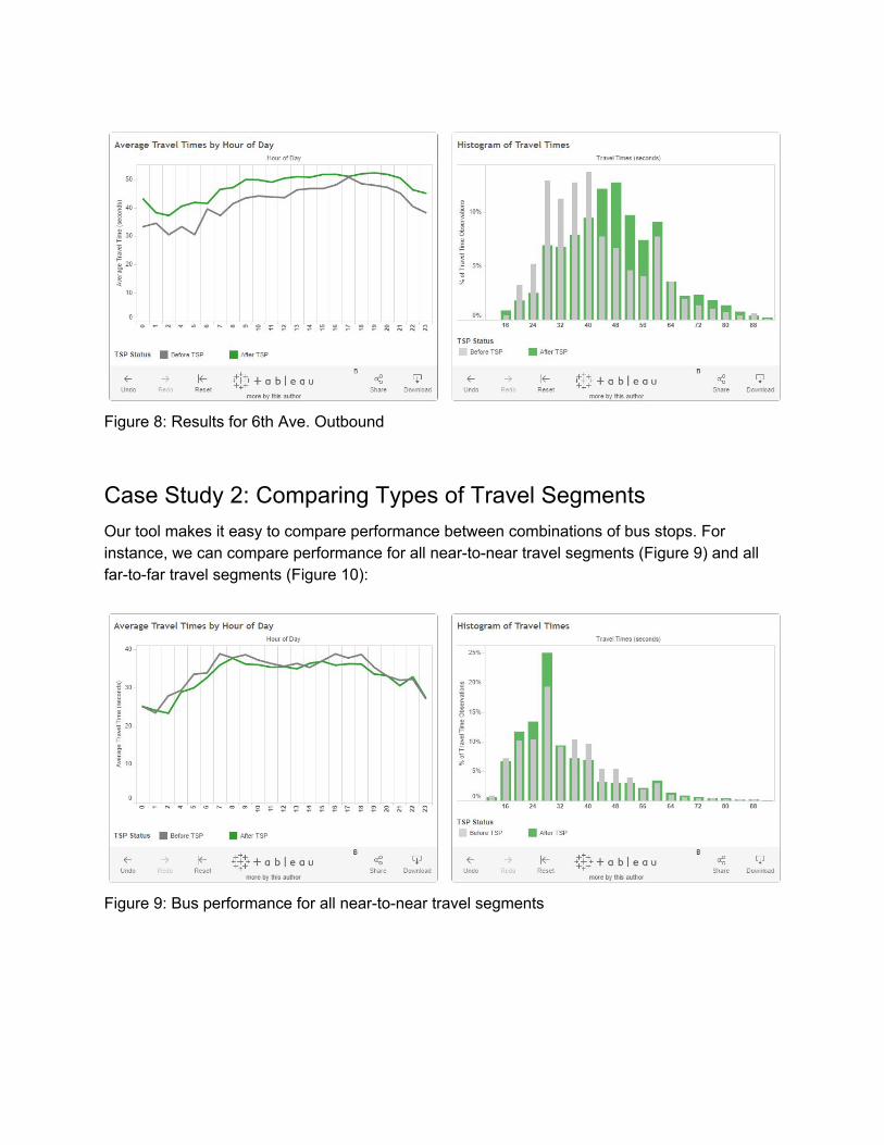
Figure 8: Results for 6th Ave. Outbound
Case Study 2: Comparing Types of Travel Segments Our tool makes it easy to compare performance between combinations of bus stops. For instance, we can compare performance for all neartonear travel segments (Figure 9) and all fartofar travel segments (Figure 10):
Figure 9: Bus performance for all neartonear travel segments
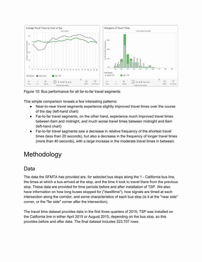
Figure 10: Bus performance for all fartofar travel segments This simple comparison reveals a few interesting patterns:
Neartonear travel segments experience slightly improved travel times over the course of the day (lefthand chart)
Fartofar travel segments, on the other hand, experience much improved travel times between 6am and midnight, and much worse travel times between midnight and 6am (lefthand chart)
Fartofar travel segments saw a decrease in relative frequency of the shortest travel times (less than 20 seconds), but also a decrease in the frequency of longer travel times (more than 40 seconds), with a large increase in the moderate travel times in between.
Methodology
Data The data the SFMTA has provided are, for selected bus stops along the 1 California bus line, the times at which a bus arrived at the stop, and the time it took to travel there from the previous stop. These data are provided for time periods before and after installation of TSP. We also have information on how long buses stopped for ("dwelltime"), how signals are timed at each intersection along the corridor, and some characteristics of each bus stop (is it at the "near side" corner, or the "far side" corner after the intersection). The travel time dataset provides data in the first three quarters of 2015; TSP was installed on the California line in either April 2015 or August 2015, depending on the bus stop, so this provides before and after data. The final dataset includes 223,707 rows.
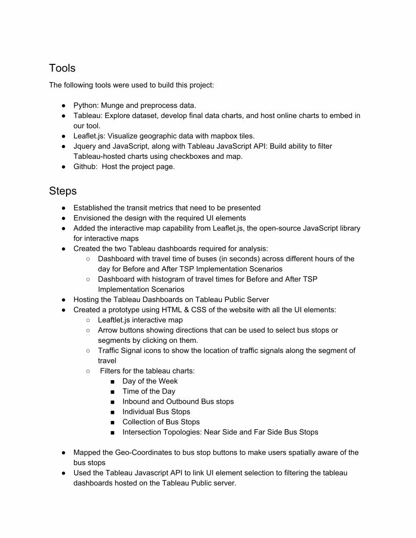
Tools The following tools were used to build this project:
Python: Munge and preprocess data. Tableau: Explore dataset, develop final data charts, and host online charts to embed in
our tool. Leaflet.js: Visualize geographic data with mapbox tiles. Jquery and JavaScript, along with Tableau JavaScript API: Build ability to filter
Tableauhosted charts using checkboxes and map. Github: Host the project page.
Steps Established the transit metrics that need to be presented Envisioned the design with the required UI elements Added the interactive map capability from Leaflet.js, the opensource JavaScript library
for interactive maps Created the two Tableau dashboards required for analysis:
Dashboard with travel time of buses (in seconds) across different hours of the day for Before and After TSP Implementation Scenarios
Dashboard with histogram of travel times for Before and After TSP Implementation Scenarios
Hosting the Tableau Dashboards on Tableau Public Server Created a prototype using HTML & CSS of the website with all the UI elements:
Leaftlet.js interactive map Arrow buttons showing directions that can be used to select bus stops or
segments by clicking on them. Traffic Signal icons to show the location of traffic signals along the segment of
travel Filters for the tableau charts:
Day of the Week Time of the Day Inbound and Outbound Bus stops Individual Bus Stops Collection of Bus Stops Intersection Topologies: Near Side and Far Side Bus Stops
Mapped the GeoCoordinates to bus stop buttons to make users spatially aware of the
bus stops Used the Tableau Javascript API to link UI element selection to filtering the tableau
dashboards hosted on the Tableau Public server.
Validation of results by manual verification of analysis variables such as Travel Times across hours and between different stops and sections of the routes.
Results
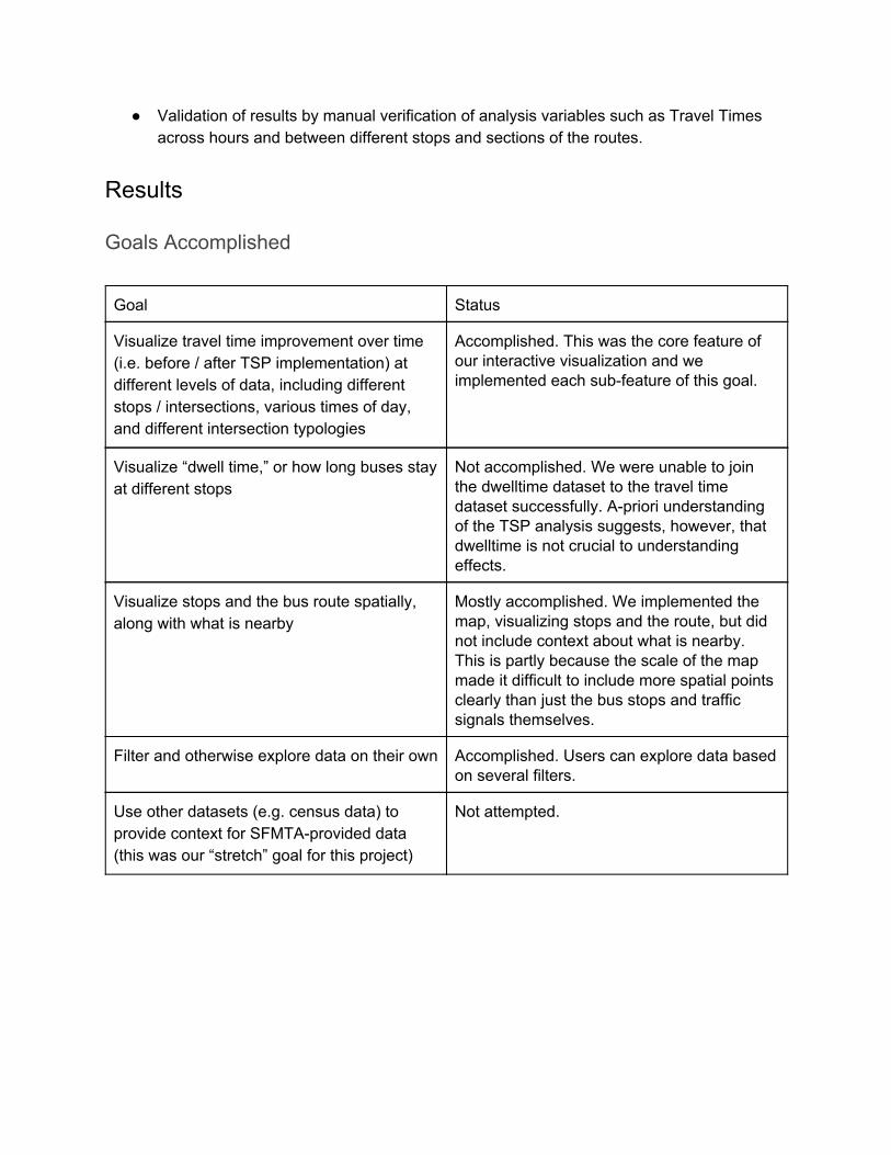
Goals Accomplished
Goal Status
Visualize travel time improvement over time (i.e. before / after TSP implementation) at different levels of data, including different stops / intersections, various times of day, and different intersection typologies
Accomplished. This was the core feature of our interactive visualization and we implemented each subfeature of this goal.
Visualize “dwell time,” or how long buses stay at different stops
Not accomplished. We were unable to join the dwelltime dataset to the travel time dataset successfully. Apriori understanding of the TSP analysis suggests, however, that dwelltime is not crucial to understanding effects.
Visualize stops and the bus route spatially, along with what is nearby
Mostly accomplished. We implemented the map, visualizing stops and the route, but did not include context about what is nearby. This is partly because the scale of the map made it difficult to include more spatial points clearly than just the bus stops and traffic signals themselves.
Filter and otherwise explore data on their own Accomplished. Users can explore data based on several filters.
Use other datasets (e.g. census data) to provide context for SFMTAprovided data (this was our “stretch” goal for this project)
Not attempted.

Client Feedback We were not able to schedule a full qualitative evaluation with our contact at SFMTA, but he gave the following feedback over email:
“This is really great stuff. I really like the way this dashboard works being able to modify those graphs and tweak them with the sliders is really key. We’ve found that interpreting the shape of the graph over time has been really helpful in having us identify events that appear in the data. I’d love to know if it is easy to scale this tool and apply it to our entire transit dataset.”
Feedback from Showcase Below are some of the suggestions we received from the final project showcase:
The second chart (histogram) is less intuitive than the line chart, in terms of interpreting the data and understanding what the axes are.
In both charts, it would be helpful to label the xaxes directly (we were unable to figure out a workaround for this in Tableau).
Traffic lights should be labeled in the map (we have implemented this). Some text introduction and directions for each feature are important even if the tool is
only meant to be used by professionals. The information in the popupbox when hovering over bus stops is not clear or intuitive.
Evaluation from Transit Engineering Student We also asked for informal feedback from a transit engineering student, Drew Levitt, who was involved in the project. Since this tool is intended to be used by transit professionals, a transportation student who is not yet familiar with the details of the project is a good test case. His feedback is laid out by section below:
OVERALL This is a pretty cool tool! Many ways to slice and dice the data, and reasonably clear reporting out below. It might be helpful to have some explanatory text. In particular, the fact you can click stops in the map to toggle them isn't immediately obvious. The sophistication of the selection options available here is great and as it continues to rise, I start to want an "Undo" option to revert the most recent change I've made to the selections, because things like Stop by Type can overwrite individual stops, etc. MAP The tooltip could be more helpful (big things: units for distance; minor things: clarify that this is distance *from last stop*, etc.) TIME SELECTORS Consider implementing check boxes for Weekday and Weekend, might save some users a few clicks as they want to examine just one type of service
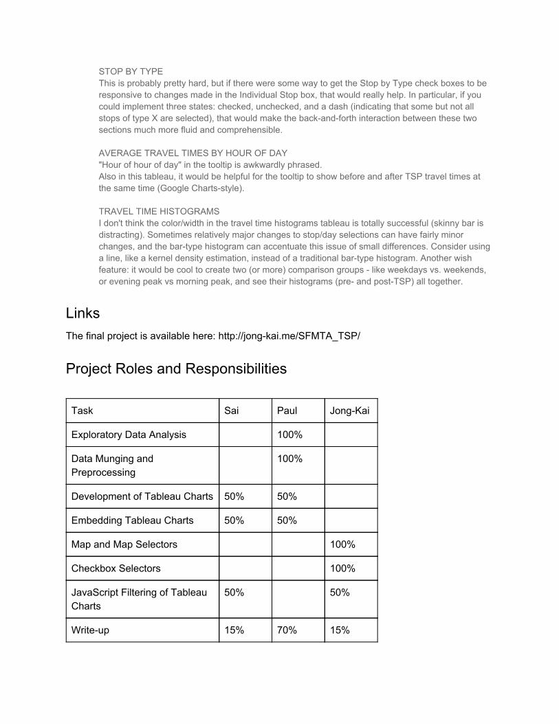
STOP BY TYPE This is probably pretty hard, but if there were some way to get the Stop by Type check boxes to be responsive to changes made in the Individual Stop box, that would really help. In particular, if you could implement three states: checked, unchecked, and a dash (indicating that some but not all stops of type X are selected), that would make the backandforth interaction between these two sections much more fluid and comprehensible. AVERAGE TRAVEL TIMES BY HOUR OF DAY "Hour of hour of day" in the tooltip is awkwardly phrased. Also in this tableau, it would be helpful for the tooltip to show before and after TSP travel times at the same time (Google Chartsstyle). TRAVEL TIME HISTOGRAMS I don't think the color/width in the travel time histograms tableau is totally successful (skinny bar is distracting). Sometimes relatively major changes to stop/day selections can have fairly minor changes, and the bartype histogram can accentuate this issue of small differences. Consider using a line, like a kernel density estimation, instead of a traditional bartype histogram. Another wish feature: it would be cool to create two (or more) comparison groups like weekdays vs. weekends, or evening peak vs morning peak, and see their histograms (pre and postTSP) all together.
Links The final project is available here: http://jongkai.me/SFMTA_TSP/
Project Roles and Responsibilities
Task Sai Paul JongKai
Exploratory Data Analysis 100%
Data Munging and Preprocessing
100%
Development of Tableau Charts 50% 50%
Embedding Tableau Charts 50% 50%
Map and Map Selectors 100%
Checkbox Selectors 100%
JavaScript Filtering of Tableau Charts
50% 50%
Writeup 15% 70% 15%
Related Documents