THE GREAT GATSBY Title Sequence.

Title sequence Analysis
Aug 06, 2015
Welcome message from author
This document is posted to help you gain knowledge. Please leave a comment to let me know what you think about it! Share it to your friends and learn new things together.
Transcript

THE GREAT GATSBY Title Sequence.

The first shot of the title sequence is the production company name in the style of writing is . This style is symbolic of the film The
Great Gatsby after being created in 1933 for this exact film by K.H. Schaefer. This font creates a classy yet dated type of feel for the
audience, which demonstrates the type of film they are watching. The gold steel colour of the bars leak through onto the page creating a
background for the silver title. As this happens the title of the production company name grows larger to enhance the the importance of who
produced the film (as it is a large production company).
1
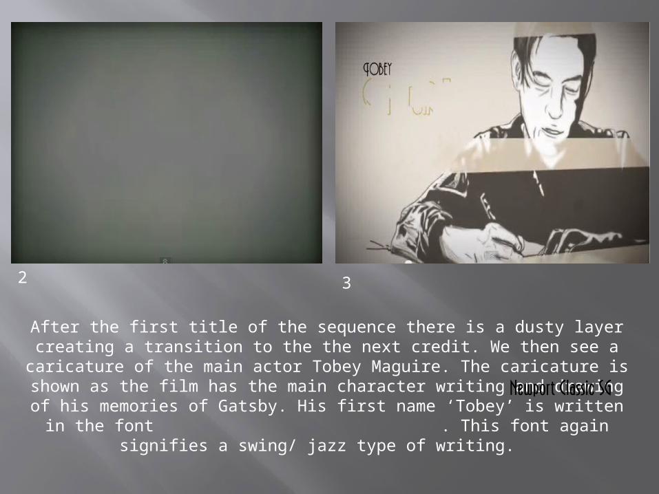
After the first title of the sequence there is a dusty layer creating a transition to the the next credit. We then see a caricature of the main actor Tobey Maguire. The caricature is shown as the film has the main
character writing and drawing of his memories of Gatsby. His first name ‘Tobey’ is written in the font . This font again signifies a
swing/ jazz type of writing.
2 3
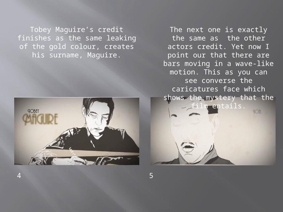
Tobey Maguire’s credit finishes as the same leaking of the gold colour, creates his surname,
Maguire.
4 5
The next one is exactly the same as the other actors
credit. Yet now I point our that there are bars moving in a
wave-like motion. This as you can see converse the
caricatures face which shows the mystery that the film
entails.

The nextpart isto Carey Mulligan, is exactly the same as the last two yet the her face has a bit more colour then the
other two as her lips are the colour of red. If you hadn’t seen the film you would relate the colour red to sexual,
sassy, love, blood. There could many interpretations to the reason for the red lips which is yet the whole mystery of
the film.
6
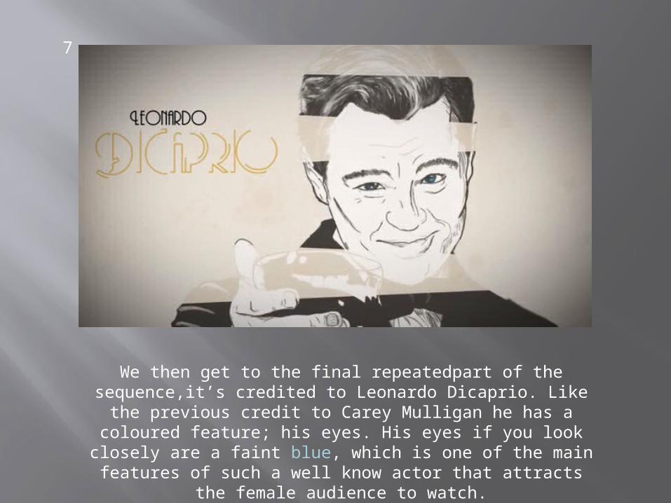
We then get to the final repeatedpart of the sequence,it’s credited to Leonardo Dicaprio. Like the previous credit to
Carey Mulligan he has a coloured feature; his eyes. His eyes if you look closely are a faint blue, which is one of the main features of such a well know actor that attracts the female
audience to watch.
7
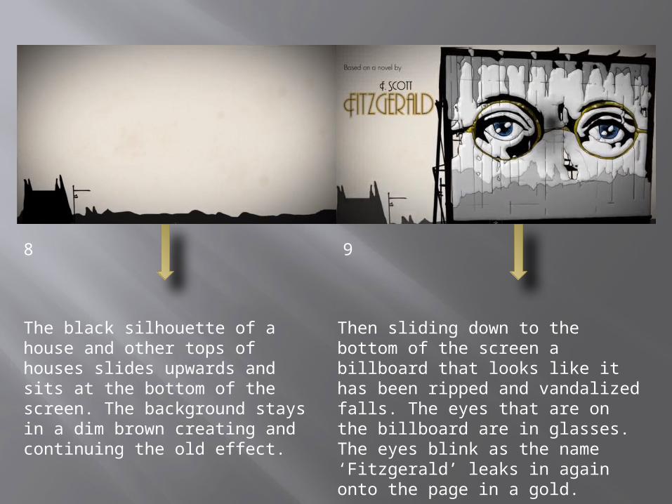
The black silhouette of a house and other tops of houses slides upwards and sits at the bottom of the screen. The background stays in a dim brown creating and continuing the old effect.
Then sliding down to the bottom of the screen a billboard that looks like it has been ripped and vandalized falls. The eyes that are on the billboard are in glasses. The eyes blink as the name ‘Fitzgerald’ leaks in again onto the page in a gold.
8 9

The billboard then starts a burning effect and burns a hole through the whole billboard. This then is the transition to the next part of the
sequence.
10

The transition then fades into a foggy green colour with a faded picture behind it. The foggy green then slowly fades as the picture becomes more apparent. The picture is black and white yet again showing the classical age of the film. The picture is one of the scenes within the film so it foreshadows what is to come.The there is a slight green light coming from a little building in the background of the picture. One of the buildings had a light moving in the way of a lighthouse. Then the surname leaks onto the page in gold.
11
13
12

The final part of the sequence is the title its self. The title is the in the font of Atlas. The effect on the title is a chrome colour making it a bold and strong also expensive look. This tells the audience that the film is about the old era in time yet the rich is mainly the focus.
Related Documents


