8 Elements & Prinicples Website Analysis Ad By Timmie O’Dell

timmies book
Mar 15, 2016
book,timmie
Welcome message from author
This document is posted to help you gain knowledge. Please leave a comment to let me know what you think about it! Share it to your friends and learn new things together.
Transcript

8 Elements & Prinicples
Website Analysis
Ad
ByTimmie
O’Dell


Line
Shape
Texture Balance
Contrast
Unity
Value
Color
Table Of Content


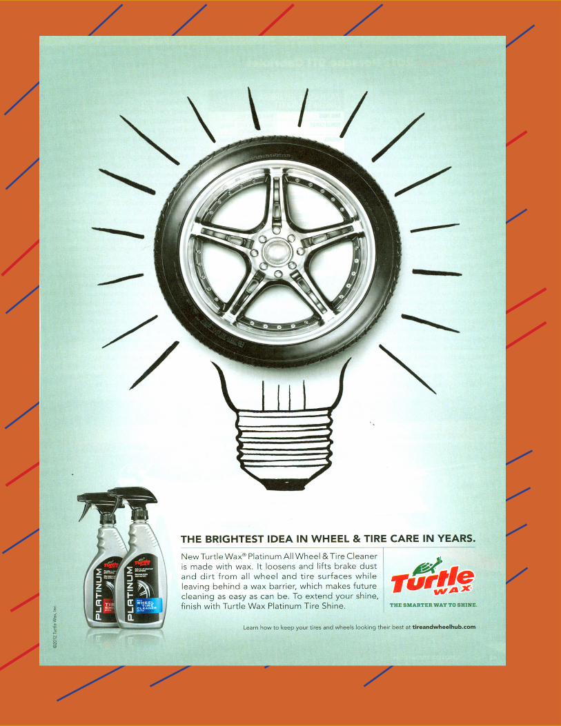
What is the product or service being advertised? The product being advertised is Norton virus software.
LINE is being used in the design in the following way (s):
X Create a mood
X Organize other elements on the page
Create texture through illustration
Please thoroughly explain your answer to the question above and analyze/describe how this advertisement or web-site uses LINE.
This advertisement creates a secure and safe feeling for the buyers who are going to buy this virus software. Norton antivirus software offers more than just one way to protect your computer and data when other software company’s may only offer one way to protect you. The way this advertisement organizes the other elements on the page is by showing a picture file name as the eye grabber on the page with a single ruled line that separates the advertisement from the text. The background is the dark yellow color just like the file that the software comes in, so the designer of the design incorporated the package color into the advertisement to make it stand out more when you are flipping through a magazine. The text used in this Norton advertisement is just the name of the pictured document that is being protect-ed by Norton software.
Please describe the effectiveness of the use of LINE in this design. I think that line was used very well in this design. The focal point of this advertisement is the long line of text that is
used to show how much Norton software can and will protect your computer from viruses.
Who is the primary audience of the advertisement or website?
Line
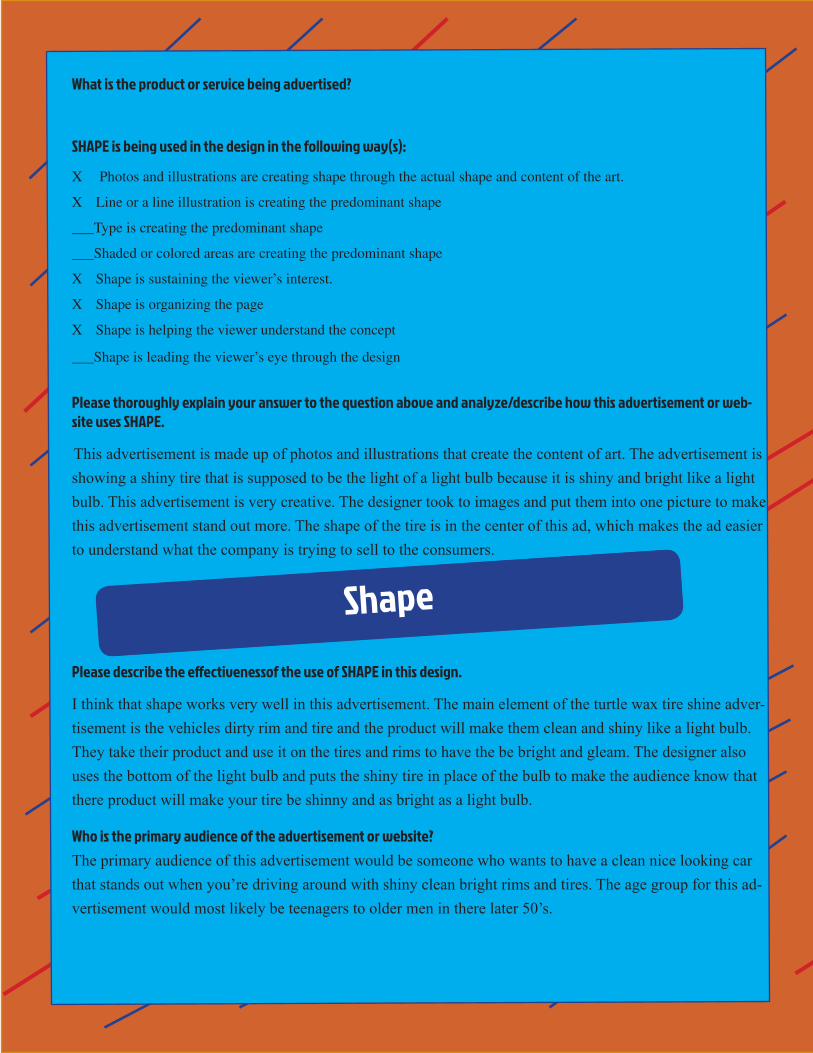
What is the product or service being advertised?
SHAPE is being used in the design in the following way(s):
X Photos and illustrations are creating shape through the actual shape and content of the art.
X Line or a line illustration is creating the predominant shape
___Type is creating the predominant shape
___Shaded or colored areas are creating the predominant shape
X Shape is sustaining the viewer’s interest.
X Shape is organizing the page
X Shape is helping the viewer understand the concept
___Shape is leading the viewer’s eye through the design
Please thoroughly explain your answer to the question above and analyze/describe how this advertisement or web-site uses SHAPE.
This advertisement is made up of photos and illustrations that create the content of art. The advertisement is showing a shiny tire that is supposed to be the light of a light bulb because it is shiny and bright like a light bulb. This advertisement is very creative. The designer took to images and put them into one picture to make this advertisement stand out more. The shape of the tire is in the center of this ad, which makes the ad easier to understand what the company is trying to sell to the consumers.
Please describe the effectivenessof the use of SHAPE in this design.
I think that shape works very well in this advertisement. The main element of the turtle wax tire shine adver-tisement is the vehicles dirty rim and tire and the product will make them clean and shiny like a light bulb. They take their product and use it on the tires and rims to have the be bright and gleam. The designer also uses the bottom of the light bulb and puts the shiny tire in place of the bulb to make the audience know that there product will make your tire be shinny and as bright as a light bulb.
Who is the primary audience of the advertisement or website?
The primary audience of this advertisement would be someone who wants to have a clean nice looking car that stands out when you’re driving around with shiny clean bright rims and tires. The age group for this ad-vertisement would most likely be teenagers to older men in there later 50’s.
Shape

What is the product or service being advertised?
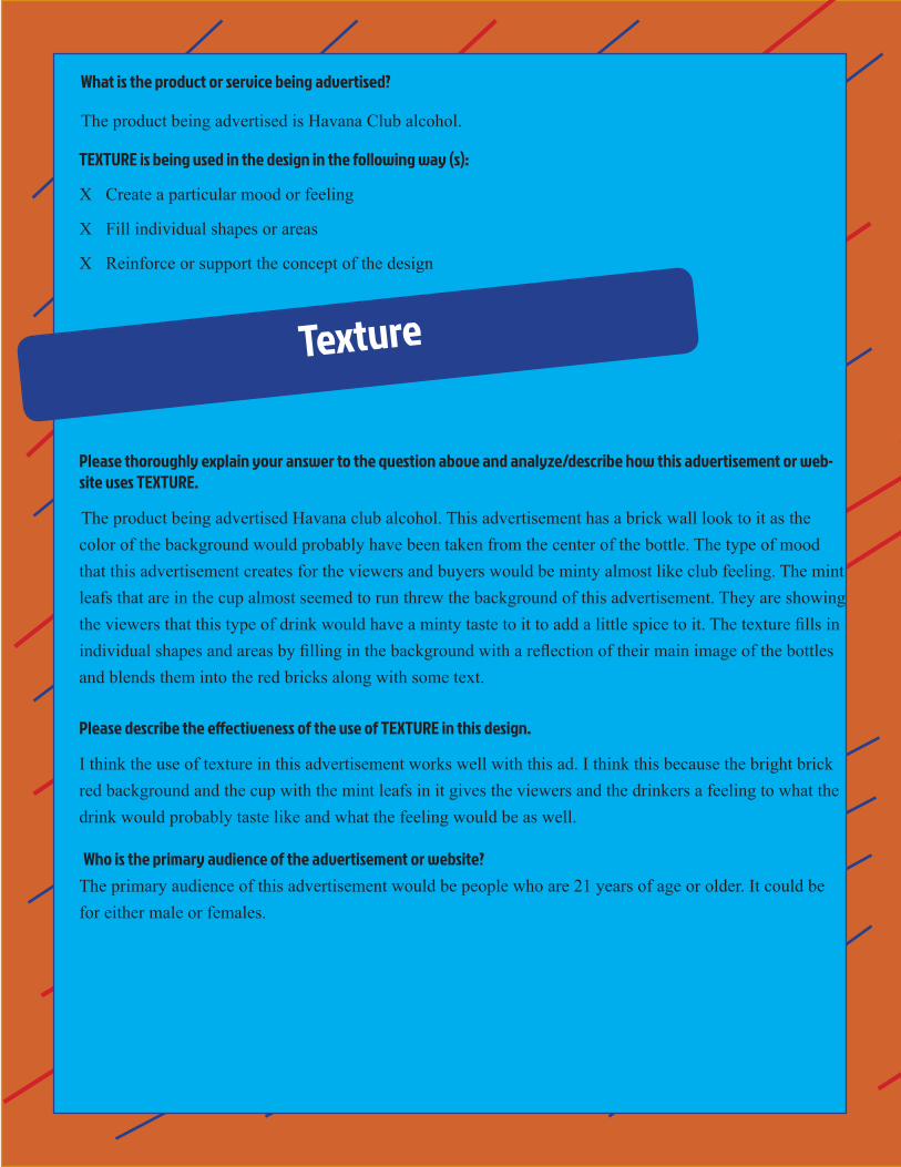
The product being advertised is Havana Club alcohol.
TEXTURE is being used in the design in the following way (s):
X Create a particular mood or feeling
X Fill individual shapes or areas
X Reinforce or support the concept of the design
Please thoroughly explain your answer to the question above and analyze/describe how this advertisement or web-site uses TEXTURE.
The product being advertised Havana club alcohol. This advertisement has a brick wall look to it as the color of the background would probably have been taken from the center of the bottle. The type of mood that this advertisement creates for the viewers and buyers would be minty almost like club feeling. The mint leafs that are in the cup almost seemed to run threw the background of this advertisement. They are showing the viewers that this type of drink would have a minty taste to it to add a little spice to it. The texture fills in individual shapes and areas by filling in the background with a reflection of their main image of the bottles and blends them into the red bricks along with some text.
Please describe the effectiveness of the use of TEXTURE in this design.
I think the use of texture in this advertisement works well with this ad. I think this because the bright brick red background and the cup with the mint leafs in it gives the viewers and the drinkers a feeling to what the drink would probably taste like and what the feeling would be as well.
Who is the primary audience of the advertisement or website? The primary audience of this advertisement would be people who are 21 years of age or older. It could be
for either male or females.
Texture

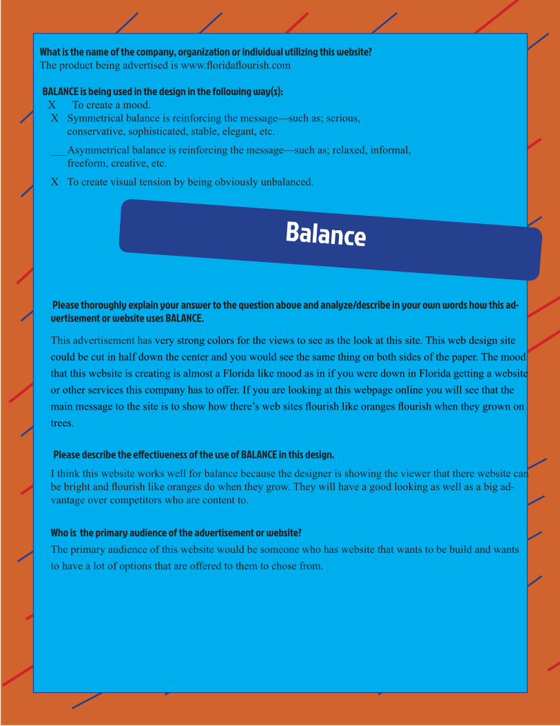
What is the name of the company, organization or individual utilizing this website? The product being advertised is www.floridaflourish.com
BALANCE is being used in the design in the following way(s): X To create a mood.
X Symmetrical balance is reinforcing the message—such as; serious, conservative, sophisticated, stable, elegant, etc.
___Asymmetrical balance is reinforcing the message—such as; relaxed, informal, freeform, creative, etc.
X To create visual tension by being obviously unbalanced.
Please thoroughly explain your answer to the question above and analyze/describe in your own words how this ad-vertisement or website uses BALANCE.
This advertisement has very strong colors for the views to see as the look at this site. This web design site could be cut in half down the center and you would see the same thing on both sides of the paper. The mood that this website is creating is almost a Florida like mood as in if you were down in Florida getting a website or other services this company has to offer. If you are looking at this webpage online you will see that the main message to the site is to show how there’s web sites flourish like oranges flourish when they grown on trees.
Please describe the effectiveness of the use of BALANCE in this design. I think this website works well for balance because the designer is showing the viewer that there website can be bright and flourish like oranges do when they grow. They will have a good looking as well as a big ad-vantage over competitors who are content to.
Who is the primary audience of the advertisement or website? The primary audience of this website would be someone who has website that wants to be build and wants
to have a lot of options that are offered to them to chose from.
Balance


Contrast
What is the product or service being advertised? The product being advertised is Old spice products.
CONTRAST is being used in the design in the following way(s):
X Strengthen an idea; support the message. __ to create a contradiction (BIG written in very small type).
__ contrasting colors
__ Contrasting values
X Contrasting shapes
__ Contrasting texture
__ Contrasting typography
Please thoroughly explain your answer to the question above and analyze/describe in your own words how this ad-vertisement or website uses CONTRAST.
This old spice ad is creating contrast in a lot of different ways. The basic message that the ad is trying to give to the viewers and buyers is if you use any old spice product that you will become more of a man and smell better than you already do. The ad strengthens the idea by having a man spilt into someone that on the left side is the guy who is kind of a nerd and has not used the old spice product and will not smell as good as the guy on the right and will not get any girls. The guy on the right is a rock star punk look who is able to get girls and go out and have a fun time instead of being a nerdy guy. This ad if you were to fold it in half you would have the same image of the person but one side of the ad would be the guy before he used the old spice product and the other side of the ad would be the rocker cool side that has used the product.
Please describe the effectiveness of the use of CONTRAST in this design. The effectiveness of the use of contrast in this advertisement is showing the viewers that if you wear their
product you will be able to attract women and smell better than you do. Also you will not be that nerdy person and be a rock star.
Who is the primary audience of the advertisement or website? The primary audience of this old spice advertisement would be aimed towards guys. The ad is showing if
you use the product than you will attract girls with the amazing smell of the product. The age group of this product would mainly be young guys but could be used for any age group.

Unity
What is the product or service being advertised?
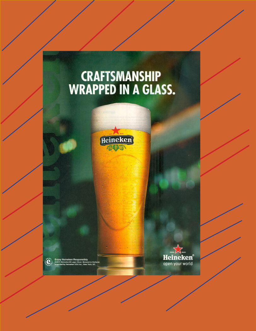
The product that is being advertised is Heineken beer.
UNITY is being used in the design to:
___Provide consistency
___Unify the design with consistent elements (grouped/repeating elements)
_X__Lead the viewer’s eye through the design
Please thoroughly explain your answer to the question above and analyze/describe how this advertisement or web-site uses UNITY.
The product being shown in this advertisement is Heineken beer. The product is being shown as a close up photograph of the glass of beer and the background blurred out. The way this ad is being unified is the take the color of the Heineken bottle which green, they use the color for the name of the beer and blend it into the the background and put the focal point and make the viewer eyes lead directly to the glass of beer. The designer’s intent was to show how much work went into making the product by put “ Craftsmanship wrapped in a glass” which mean to me that all the hard work and time put into making this product is shown when you pour it into a glass and when you drink it as well. If you were to take this advertisement and put a grid on it you would see the same thing as if you took the page and folded it in half.
Please describe the effectiveness of the use of UNITY in this design.
I feel that unity was used ok in this advertisement. The chose of color was a very good choice to use be-cause it represents the color of the bottle and shows that it is and import type if beer.
Who is the primary audience of the advertisement or website? The primary audience of this advertisement would be some the age of 21 or older and a person who likes
imported beer that has a stronger taste than regular beer does.

What is the name of the company, organization or individual utilizing this website?
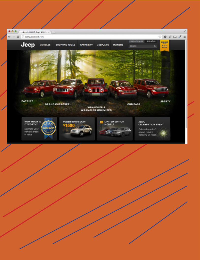
www.jeep.com/en/
VALUE is being used in the design in the following way(s)
_X__Creates a mood or feeling
___Creates contrast
_X__Creates movement and direction
Please thoroughly explain your answer to the question above and analyze/describe in your own words how this ad-vertisement or website uses VALUE.
This jeep website has the homepage of there company site designed very well. The first thing you think of when you see any jeep vehicle would be off-roading. This website has all of there current vehicles side by side lined up in a dark but bright woods environment. They also make all there vehicles a dark red color so when the viewers or buyers are looking at this webpage they might see how jeep is trying to make there machines stand out on the road and in this ad. The type of feeling that you would get from looking at this website would be an outdoor nature feeling. They use a black border around the homepage that surrounds the bright woods and sunlight hitting their vehicles.
The mood that this website puts people in is that by setting the jeeps in a off-road environment would make them seem as they are the toughest most durable cars out on the roads today. The vehicles are placed side-by-side making the jeep wrangler in the middle of the line up which is by far the toughest car of the cars. Your eyes could move either left to right or right to left in this website.
Please describe theeffectiveness of the use of VALUE in this design. I believe that this website works very well for value. The message that jeep Car Company has always tired
to give the viewers and buyers is that jeeps are made for any type of environment and are made to last long and are the best bargain for a good vehicle.
Who is the primary audience of the advertisement or website?
The primary audience of this website would be either a male or female who is looking for a rough, tough durable vehicle that is meant to handle any type of weather. If you want a vehicle that is able to go there the snow, rain, water, any type of weather than your best bet would be to buy a jeep vehicle.
Value

Color
What is the name of the company, organization or individual utilizing this website? www.marylandsecurity.net
COLOR is being used in the design in the following way(s):
_X__Creates a mood or feeling
_X__Creates visual tension and movement
_X__Provides unity and balance
_X__Provides structure and forms a grid in a design
___Provides a sense of order
___Creates harmony
Please thoroughly explain your answer to the question above and analyze/describe in your own words how this ad-vertisement or website uses COLOR.
The website that I am using for color is Maryland security site. The websites main use of color for their site is blue. The color blue gives people the secure safe feeling. The company is a security company that offers mobile camera systems for your job or businesses. They offer fixed camera systems for your com-munity. The main message of using the color blue would have a safely living feeling. This company is trying to show the buyers that they are the most secure and trustworthy security for any business or com-munity. The type of movement that Maryland security systems would give someone would be a safe and fast moving feeling. The one blue box in the background of the website that runs threw the moving boxes gives the viewers something else to look at besides the dark blue background and the sky white that is in the company’s name at the top of the page.
Please describe the effectiveness of the use of COLOR in this design. I think the effectiveness if the use of color works very well in this design layout. The color that they chose for the background as well as there boxes shows the viewers a since of security and safeness in there com-pany. The picked the color of there company logo rather than picking a lighter blue like sky blue which when talking about security police use the same type of blue as this company uses.
Who is the primary audience of the advertisement or website?
The primary audience for this website would be someone who either owns a business or lives in a commu-nity and wants to have the number one source for protection system available.
Related Documents