BROWN UNIVERSITY Department of Computer Science Master's Thesis CS-93-M8 "Bringing Graphic Design Expertise to Computer Generated Presentations" by Ralph Marshall ..

Welcome message from author
This document is posted to help you gain knowledge. Please leave a comment to let me know what you think about it! Share it to your friends and learn new things together.
Transcript

BROWN UNIVERSITY Department of Computer Science
Master's Thesis CS-93-M8
"Bringing Graphic Design Expertise
to Computer Generated Presentations"
by
Ralph Marshall
..

Bringing Graphic Design Expertise
to Computer Generated Presentations
by
Ralph Marshall
B.S. Northeastern University, 1988
Thesis
Submitted in partial fulfillment of the requirements for the
Degree of Master of Science in the Department of
Computer Science at Brown University
May 1993

This Thesis by Ralph Marshall
is accepted in its present form by the
Department of Computer Science
as satisfying the thesis requirement for the degree of
Master of Science
Date :tlt~/r~ ;;;;>
Steven P. Reiss
Approved by the Graduate Council
Date
ii
Authorization to lend and reproduce Thesis
As the sole author of this thesis, I authorize Brown University to lend it to other institutions or individuals for the purpose of scholarly research.
I further authorize Brown University to reproduce this thesis by photocopying or other means, in total or in part, at the request of other institutions or individuals for the purpose of scholarly research.
ate

1. Introduction
One of the goals of automating graphic design is to allow people to produce effective and accurate visualizations of their data sets. Computer-generated designs are most useful when they represent an improvement over a person's current approach. This means that such designs must not only present the data accurately but must also do so in an esthetically pleasing and easily comprehensible fashion. Working toward that end, this paper describes a new approach to generating business graphics (bar charts, line graphs, etc.) and provides conclusions about the method based on an implementation.
Data graphics work by mapping values to a collection of abstract marks, numbers and text. Several centuries of work has produced a theory of data graphics which defines the particular types of mappings that people find natural and easy to decode. I believe that we should take advantage of this accumulated knowledge, and that we can do so by creating a set of templates which embodies this expertise.
Each template describes a family of related graphics, such as scatter plots and bar charts. The templates consist of three components:
• Layout and drafting information such as font choice and line styles.
• A list of variations in the family and rules for mapping data into instances of these variations.
• A set of effectiveness guidelines known as a critic.
Storing the opinions of experts on decisions such as layout, line styles, and font choices relieves the software of the need to make these decisions anew for each data set. Since the number of templates is relatively small, it is practical to devote significant effort to getting these details right for each one. These carefully crafted templates also function as an important body of design expertise, allowing for organization-wide consistency and a source of knowledge for casual users.
Candidate presentations are produced by generating only those style variations which make sense given the particular data set. The associated critic uses a set of template-specific rules developed by humans to produce a numeric rating for each chart. The charts can then be presented to the user in a sorted order for his or her final selection. The ordering serves as an aid to users who do not have the graphic design training and/or time to make all of the decisions necessary to create a finished image.
In order to make this a practical graphing system we must provide as much flexibility to the user as possible. However, most existing automated design systems require complete control over the design rather than being able to cooperate with a user. Since Playfair's generation system consists of making decisions about .the alternatives possible for a given

template, it is straightforward to allow the user to make some of these decisions and have the computer make the remaining ones.
Another important feature of the library-based approach is that it simplifies the task of customizing the system to produce results which meet the user's specification. Without having to tinker with the underlying reasoning system, you can add a new template to the system which will allow it to create the required images. This modular approach means that none of the existing designs will be affected by the addition, and that the new style does not have to have anything in common with existing templates.
These conclusions about the merits of using templates are based on a prototype system named Playfair. Currently it is able to generate graphics from five different templates: bar charts, scatter plots,line charts, and text tables. A detailed critic has been developed for bar charts and more rudimentary ones exist for the remaining styles. The system has been tested on approximately 100 sample data sets.
The system is named after an English political economist who introduced many of the basic forms of graphics still in use today. The following description of his work is taken from The Visual Display of Quantitative Information by Edward Tufte:
... William Playfair (1759-1823) developed or improved upon nearly all the fundamental graphical designs, seeking to replace conventional tables of numbers with the systematic visual representations of his "linear arithmetic." .., The first known time-series using economic data was published in Playfair's remarkable book The Commercial and Political Atlas (London, 1786).
2. Statement of the Problem
People use graphics such as the one shown in Figure 1 for two main reasons: to help them discover something about the facts presented or to enable them to persuade others of their conclusions. In order to serve these functions, the graphs must be well suited to the information being presented, and they must be clearly drawn, uncluttered, and easy to comprehend. Unfortunately, designing good graphics requires specialized training.and practice which many people do not have. Without the necessary skills, many people spend long hours laboring over graphs which are often of marginal value. The goal of my research has been to capture the skills and expertise which contribute to effective graphic designs so that this knowledge can be made available to people through the software they use.
Ralph Marshall Master's Thesis 2
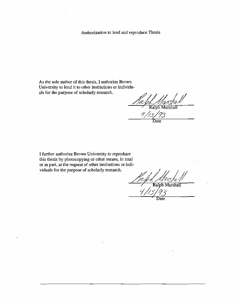
FIGURE 1. An example of good graphic design (created by Playfair)
Perfonnance of Dow Jones Index
Company
Bocq _ .. Ilxpras
AUT \.IoiIcd Tocbnologjca
w~ AIIIolI-SIao>al
J.P.MOIJIft c.c:..c.uScarlR_
_ SIccl
~ion CalbicIe Ilxxm
GcDmI_ Akoo
IMelllllimllP_ Wlllto;..ey
Olcvron GcoenlMlllDr5
McDmald'. T.....
_olGIIIIbIo Minnc&ota Mming
DaPmt PIlilipMolris
Kodak Mud:
Goodyear e-pilW
mM r-W_ I -...JIIII-"-.-'"
Change in Stock Price during December 1992
Soart:e:WIII,g.JClUJMI
How to tell the Good from the Bad and the Ugly
Figure 1 is a good graph from a number of perspectives:
• It has several stories to tell
• The data points have been sorted and arranged in a useful fashion
• A bar chart is well suited to the information
• It is visually attractive without being complicated
A good chart starts with an interesting set of facts, since the best design can not mask the fact that the information is basically dull. This chart provides several views of a widely tracked stock market index, so it is almost certain to be interesting to an appropriate audience. Looking at the chart, we quickly see that IBM had an abysmal month (it was widely rumored that the dividend would be cut by 50% or more) and that Boeing was noticably better than the rest (they had just . announced a large order from China). However, this chart also shows that slightly more stocks were up than down over the month, and it provides a rough indication of the amount of change for individual stocks. As a small bonus, the 30 stocks which constitute the Dow Jones Industrial Index are listed by name.
-=JI
.
Ralph Marshall Master's Thesis 3

One of the reasons we can draw the conclusions just mentioned is that the companies have been sorted in order of descending performance. Another plausible ordering would have been to arrange the companies in alphabetic order, facilitating look-up of a specific company. Either of these arrangements is obviously better than an unordered presentation of the values.
The choice to present this data in a bar chart is a good one since the numbers for each company represent values which can be compared as ratios. One of the secondary decisions is how to orient the bars; nonnally vertical bars are preferred for amounts of money, but since we have a relatively large number of bars (which must be individually labelled) running them horizontally provides more space for the company names.
While there can be no fixed standard for esthetics, this is a reasonably attractive display. Most people will be able to look at this chart and concentrate on the data without being distracted by extraneous details. An attractive font has been uniformly used for all text labels, with less important items, such as the attribution, presented in a smaller size which does not compete for attention. The chart elements are uncluttered, such as the individual bars which are solid rather than the unnecessary outlined rectangles often seen in bar charts.
There is a minor problem with this chart: The value for General Motors is presented as a nearly invisible bar. As readers, we have to decide if this means that the information for GM is not available or that the stock was unchanged for the month (the correct interpretation in this case). If a large number of stocks had shown no movement in December a bar chart would have been less helpful since this uncertainty would have been that much greater.
In order to judge whether we are making any progress with an automated designer, it is necessary to have a concise description of what we are aiming for. It is my opinion that the guidelines in [Ehrenberg77] concerning the design of good tables extend to graphic design as a whole. He provides two criteria for assessing the effectiveness of a data presentation:
The Strong Criterion for a Good Table:
The patterns and exceptions should be obvious at a glance.
The Weak Criterion for a Good Table:
The patterns and exceptions should be obvious at a glance once one has been told what they are.
The goal of Playfair is to produce images which meet at least the weak criterion, with the hope that they fulfill the stronger version in at least some cases.
Ralph Marshall Master's Thesis 4
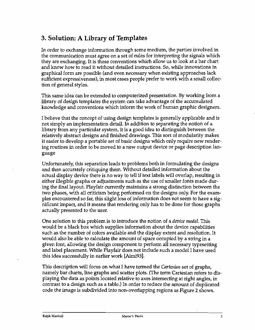
3. Solution: A Library of Templates
In order to exchange information through some medium, the parties involved in the communication must agree on a set of rules for interpreting the signals which they are exchanging. It is these conventions which allow us to look at a bar chart and know how to read it without detailed instructions. So, while innovations in graphical form are possible (and even necessary when existing approaches lack sufficient expressiveness), in most cases people prefer to work with a small collection of general styles.
This same idea can be extended to computerized presentation. By working from a library of design templates the system can take advantage of the accumulated· knowledge and conventions which inform the work of human graphic designers.
I believe that the concept of using design templates is generally applicable and is not simply an implementation detail. In addition to separating the notion of a library from any particular system, it is a good idea to distinguish between the relatively abstract designs and finished drawings. This sort of modularity makes it easier to develop a portable set of basic designs which only require new rendering routines in order to be moved to a new output device or page description language
Unfortunately, this separation leads to problems both in formulating the designs and then accurately critiquing them. Without detailed information about the actual display device there is no way to tell if text labels will overlap, resulting in either illegible graphs or adjustments such as the use of smaller fonts made during the final layout. Playfair currently maintains a strong distinction between the two phases, with all criticism being performed on the designs only. For the examples encountered so far, this slight loss of information does not seem to have a significant impact, and it means that rendering only has to be done for those graphs actually presented to the user.
One solution to this problem is to introduce the notion of a device model. This would be a black box which supplies information about the device capabilities such as the number of colors available and the display extent and resolution. It would also be able to calculate the amount of space occupied by a string in a given font, allowing the design component to perform all necessary typesetting and label placement. While Playfair does not include such a model I have used this idea successfully in earlier work [Aimi93].
This description will focus on what I have termed the Cartesian set of graphs, namely bar charts, line graphs and scatter plots. (The term Cartesian refers to displaying the data as points located relative to axes intersecting at right angles, in contrast to a design such as a table.) In order to reduce the amount of duplicated code the image is subdivided into non-overlapping regions as Figure 2 shows.
Ralph Marshall Master's Thesis 5

FIGURE 2. Layout components of a Cartesian template
Title
Vertical Data Region LegendAxis
Horizontal Axis
By providing objects corresponding to numeric and non-numeric axes plus assorted styles of data regions the various Cartesian images can be defined in te~ms of a small set of components. These pieces of the image have a size and location defined as percentages of the total image size, requiring the user to specify only the extent of the final result.
While the current version of Playfair stores these values in a table which is fixed at compile-time, there is no reason why they could not be accessible to users of the system. Since the whole idea of a design library is to capture the considered opinions of graphic designers, a production system should provide interactive controls over these values to allow designers to refine the templates by viewing actual graphs.
Note that this approach of fitting the image to a prespecified size has various trade-offs. It tends to work well when the final result must fit on a single sheet of paper or in a fixed space allocated within some larger document or other layout. However, it offers no facility for the system to automatically resize the space to more comfortably handle the given data set. Furthermore, it may be overly restrictive in a windowed computer display where there is no natural size for the graph (other than the total size of the screen). However, since the user could always adjust the size until a suitable one has been found, this method seems more useful than allowing the graph to assume whatever dimensions seem most appropriate to the system.
Returning to the previous issue of critiquing the image rather than just the design, it is likely that knowing the minimum space needed for each design could be a useful factor to consider when ranking the designs. Tufte devotes 'an entire chapter in [Tufte83] to the notion of data density and argues that a design with more data points per square inch will usually be better than another view of the same data which is sparser. While this idea is not used by Playfair, it could be a useful metric for selecting among alternatives in a system which does adjust the display size for each design alternative.
Ralph Marshall Master's Thesis 6

In addition to setting the positions and relative proportions of the graph elements, the template designer has to specify text fonts, label locations, and line drawing styles. These decisions are potentially quite valuable, as one of the hallmarks of amateurish graphics is a hodgepodge of fonts and faces used more because they were available than for any reason of improved communication. Also, by providing these values in a format akin to a style sheet the system makes it far easier for users to conform to the conventions of a specific publication or organization.
The critics exist to provide a numeric rating for each design and hopefully a justification for the rating. Playfair works by starting with a perfect score of 1000 points and assessing penalty points based on perceived problems with the design. It may be possible to derive the ratings additively but it seems more natural to treat the problem as a search for flaws in an otherwise successful design.
The critic consists of a set of rules which evaluate specific aspects of the design~
For example, one means for choosing between a graph of some sort and a table is to consider the size of the data set. This notion leads to rules in the graph critics which penalize for small sets and a corresponding rule in the table critic which penalizes for a large set.
Playfair implements these rules as pieces of code which examine the design objects and base their evaluation on calculations which are fairly involved in some cases. In order to facilitate their creation and refinement by design experts who are not programmers, a declarative system for specifying rules would obviously be required.
These rules are weighted and their penalties combined to form the final rating. This approach makes it easy to adjust the weights independently of the rule itself, aiding in the process of formulating the critic in the first place. It also provides a simple way for a user to turn off any rule by setting its weight to O. However, it also places an upper limit on the influence which can be exerted by anyone rule. As an extreme example, consider a data set consisting of but a single relational row. The previously mentioned rules which favor tables over graphs ideally ought to rule out a graph entirely in favor of a simple table, but since their penalty is capped the graphs might still receive reasonably high scores if there are no other problems with their designs.
This situation leads to the more general question of whether it is practical to compute a total order over all designs or only a partial order of instances relative to others from the same template. The current version of Playfair, with its weighted rules and somewhat embryonic critics for some templates, is only really successful in establishing a partial order, leaving the question of which template to prefer for the user. Hopefully a more detailed investigation of the problem will produce a rating mechanism capable of total orders.
One of the ways Playfair does have of selecting one template over another is that some of the rules are really measuring the suitability of the data set to the tem-
Ralph Marshall Master's Thesis 7
plate as a whole and not just a particular version of it. In addition to the previously noted preference for tables for small data sets, such rules include:
• Ruling out bar charts with many 0 values
• Ruling out line graphs for discrete fields.
• Any design representing quantitative components by non-positional encodings.
Since it is impossible for a computer system to consider all of the factors which will make a graphic suitable for a given situation, I consider it unreasonable to expect that the system's best rated choice will always meet with the users' approval. Rather, the goal is to have Playfair rank the designs with sufficient accuracy that one of best few designs is selected by the user as an effective presentation.
Generating all valid permutations of a template
Most of the criteria used by Playfair to select and rate designs are based on the types of the data fields to be presented and measures of the particular data points. For example, a bar chart must have at least one, typically non-numeric, field which is represented by the various bars, and another numeric value which can be presented as the length of individual bars. If a data set does not meet these minimal criteria, Playfair will rule out the possibility of presenting it using a bar chart.
In addition to minimal criteria, a rich collection of guidelines are used for rating the design based on the data types involved. For example, in addition to the two fields represented by the distinct bars and their length, it is possible to show a third field by filling the bars with colors, patterns, or shades of grey. The choice which is most appropriate is based on the data type of this third field. For example, color is inherently unordered1 and a chart which uses it to present orderedor numeric data will receive a lower ranking as a result.
Presenting the completed graphics to the user
After they have been critiqued the designs can be presented to the user for final selection. Currently this is done by rendering each of the designs in Postscript and using an on-screen display tool to preview them. A more advanced approach would be to generate thumbnail sketches of the final designs, allowing the user to base the first cut on those and then producing fully rendered versions only for the selected designs.
1. Charts are frequently drawn using some imposed ordering of color, such as the order of colors in the visible spectrum. However, such orderings are not natural and people are forced to explicitly decode the mapping each time they read such a chart.
Ralph Marshall Master's Thesis 8

4. Extended example
In order to make the foregoing description of templates more concrete, this section contains a detailed example of Playfair in action. While this is not intended as a users' manual for the system, I believe I have provided sufficient detail to allow others to build a comparable system.
Figure 3 shows a scatter plot presented in [Tufte83]. The values from this chart will be used for the example, allowing comparison between the original (apparently hand-drawn) graph and the one shown in Figure 4 which was produced by Playfair.
FIGURE 3. Original scatt~ plot depicting relationship between cigarette smoking and lung cancer
CRUDE MALE DEATH RATE FOR LUNG CANCER IN 1950 AND PER CAPITA CONSUMPTION OF
CIGARETTES IN 1930 IN VARIOUS COUNTRIES.
SOD
GREAT 8~ITAIN • coo
FlNLL/" V ~
300
SWITZERLAND /=0.73 t 0.30
.".HOLLAND ~
200 •U.S.A.DEHMARK~~ AUSTRALIA•" ~ CANADA
~ .SWEDEN 100
V.·NORWAY
ICELAND
o 250 500 750 1000 1250 1500
CIGARETTE CONSUMPTION
Ralph Marshall Master's Thesis 9
FIGURE 4. Playfair's scatter plot of cigarette smoking data Q\Ide M.r.1e Daalh Rate '" l.Mc CanotI ~ 19!O and: per ctplll Cuvump.ion or Cis.ueaes in 1930 in V.,ioul CcNrtrieI
Deaths per million SOO
400
3SO
300
2SO
200
150
100
ear_B,itaift
.......... .c...w.
50+--"--~--~--~---.----.-------, 200 400 600 100 1.000 1.200 1,400
Cigarette consumption
Prall Irtpl m p. 41 d Tht V1m&I DIIpII'j d «)wI_liM Infomw.lOIl
The following list shows the high level operations carried out during this transformation. Each of the steps is described in remainder of this section.
1. Analysis of the data relation
2. Generating all possible variations for each of the templates
3. Using template critics to evaluate each design
4. Presenting the ordered list of designs to the user
2. Taken from p.47 of The Visual Display of Quantitative Information by Edward Tufte. Original graph is from Report of the Advisory Committee to the Surgeon General, Smoking and Health (Washington, D.C., 1964), p.176.
Ralph Marshall Master's Thesis 10
Supplying the data
Playfair currently accepts input in the form of a single relational table with typed fields, as shown in Table 1.3
TABLE 1. Relational table for example
Deaths Field per Name: Country Cigarettes Million
Field Type: Text Label Count Count
Iceland 240 55
Norway 250 90
Sweden 300 115
Denmark 350 160
Australia 400 170
Holland 410 240
Canada 500 150
Switzerland 550 250
Finland 1150 350
Great Britain 1200 460 United 1300 190 States
The table may consist of any number of tuples but they must all represent the same relation. The tuples themselves can contain up to 5 fields, with this restriction due mostly to the fact that there are few general solutions to presenting highdimension data sets.
The data types used by Playfair are represented in a single inheritance hierarchy. This taxonomy is divided into a "core" section which Playfair uses explicitly when making decisions, and a lower level of more specific types (such as the Text type used in the example). Since the system bases all decisions on properties of the core types the type system can be extended to handle additional data sets as needed without requiring any modification to the underlying processing. Figure 5 shows the current set of data types. The word "nominal" is taken from the English translation of Bertin's work and denotes unordered data. Bertin distinguished components as Nominal, Ordered, and Quantitative; the refinements of Amount vs. Coordinate and the special case of Time were developed by others in subsequent work [RothMattis90].
3. The actual file format used by the system is shown in the appendix.
Ralph Marshall Master's Thesis 11
FIGURE 5. Data type hierarchy Domain-Specific TypesCore Types
Playfair has no sophisticated mechanism for generating printable representations of the data points. Labels must be entered as they are to appear in the result, and numeric values are printed in a fashion which is determined by the particular numeric type.
Analysis of the Data Relation
The first task is to extract a set of attributes which characterize this data set. The relation for the example contains 3 components and 11 tuples. The fields can be categorized as follows:
Country
• Data Type: Text
• Unique Values: 11
Cigarettes
• Data Type: Count
• Unique Values: 11
• Range: 240-1300
• Ratio: 5.42:1
• Zero Values: 0
Deaths per million
• Data Type: Count
• Unique Values: 11
Ralph Marshall Master's Thesis 12

• Range: 55-460
• Ratio: 8.38:1
• Zero values: 0
This set of attributes is intended to provide sufficient information for all of the templates as they generate and evaluate designs. As the library of templates grows this analysis would probably need to extract additional attributes from the relation.
Using the library to generate designs
In order to keep this discussion to a reasonable length I am only going to detail the designs generated by the scatter plot template. The other templates are described in the next section and the same mechanism is used to create designs based upon them.
As shown on page 18, the scatter plot template requires a minimum of three components, which are mapped onto the distinct marks and their positions relative to the two axes. Furthermore, the marks may be left unidentified or else distinguished by either a label, color, or shading. The template thus produces the designs shown in Figure 6 for this data set.
FIGURE 6. Decision Tree for the Scatter Plot Template
This shows a maximum of eight possible graphs, but some of the designs exceed limitation on color and value coding. Playfair limits designs to 8 colors and 10 shades of grey in an effort to ensure that the user will be able to differentiate them. So, for this particular data set (with 11 distinct mark labels) the designs shown in italics will be ruled out.
Ralph Marshall Master's Thesis 13

The remaining 4 designs are then collected together with the ones resulting from other templates and prepared for criticism.
Using critics to evaluate the designs
While the scatter plot critic is not very fully developed, it provides sufficient guidance to rate the design shown in Figure 4 as one of the best.
One rule looks at how the marks are labelled and compares that with the number of marks in all. Unlabeled graphs receive a high penalty for a very small number of marks, and no penalty if the graphs contain a large number of marks. Labelled graphs are penalized using the opposite measures (Le. Labelled graphs incur little penalty for small sets). This criteria makes the assumption that it is more difficult to provide legible labels in a very crowded graph. Based on this rule and the fairly small data set, both labelled graphs will receive a smaller penalty than the unlabeled versions.
The rule which penalizes for use of size to encode a component does not apply to any of these designs.
All of the designs have the same mark distribution since the same two components are shown positionally in all cases. Consequently, all designs will receive the same (small) penalty since the marks are not concentrated in anyone section of the image.
As with the mark distribution rule, all designs depict the same number of data points and thus receive the same penalty. A data set of this size can be shown as either a graph or a table with about equal success.
Based on this crude evaluation of the design, the designs will be split into two pairs: both labelled graphs will have the same score and will be rated above both unlabeled graphs (which are likewise tied.) Looking at the two labelled graphs a human will tend to prefer the one shown in Figure 4 since the causal variable (number of cigarettes smoked) is traditionally shown on the horizontal axis. Playfair does not have access to this information about the data set and thus has no means for preferring one design over the other.
We can also briefly consider the ratings which will be given to the best designs from other templates:
Line Chart: These designs will use the countries as points along one axis and show the two numeric components by varying position of a pair of lines. All of these designs will score poorly because the countries do not form any sort of continuous variable and thus are inappropriate for a line chart.
Bar Chart: Since Playfair is currently limited to producing simple bar charts, the designs will show the countries as bars, with one numeric field as the bar length
Ralph Marshall Master's Thesis 14
and the other through variation in value. Showing a numeric field by gray level is a poor choice and thus these designs will score poorly, although above the line chart in most cases.
Table: This data set makes a fine table, and in the absence of information about the purpose of the display we have no way to select between tables and scatter plots. This is an example of the fact noted earlier that the evaluations tend to form a partial order within a single template; the user will have to decide between the best rated table and the best rated scatter plot.
5. Details of the various templates, with examples
This section provides a complete description of each of the templates used by Playfair. I have not yet investigated how knowing something about the purpose of the display can be used to influence the decisions of the critics. However, even in the absence of a stated purpose it is possible to select some designs as more helpful than others, a view supported by comments such as this one:
A common doubt about trying to improve the layout of a table is whether the presentation should not depend on the particular use to be made of the data. But an "improved" version... is easier for virtually any purpose... The data could perhaps be displayed in a way even more suited to some specific purpose, but that would merely mean taking the procedures of this paper yet further. ([Ehrenberg77], p. 279)
More sophisticated critics should consider the purpose of the graphic when weighing its suitability. Bertin has identified three broad purposes, which he calls "levels of reading," namely:
1. Overall trends and correlations
2. Trends within a single field
3. Data recording - ability to look up a single value preferred over trends
Some of the guidelines should generate different penalty assessments depending on which of these three choices is desired by the user. While this is a fairly crude level of distinction, it would allow more accurate ranking of the choices.
Bar Charts
Bar charts are the most fully developed templates in the current implementation of Playfair. The chart can display the following components (with the type restrictions shown in parentheses):
• Individual bars (Nominal)
• Bar lengths (Amount)
Ralph Marshall Master's Thesis 15

• Bar gray level (Amount, Ordered) [Optional]
• Bar Color (Nominal) [Optional]
In addition the chart provides alternatives in the following areas:
• Bar orientation (horizontal or vertical)
• Field used to sort the bars (any component)
• Whether to label all bars or only a selected subset of them. This decision is based on the number of labels which must be accommodated, and if too many are needed only every nth bar will be labeled.
Figure 7 shows another example of this template.
FIGURE 7. An example bar chart produced by Playfair
Principal Moons in the Solar System
Diameter 4,000
3,500
3,000
2,500
2,000
1,500
1,000
500
Moon
The bar chart critic examines designs using the following criteria:
Choice of sort field
Bar charts are better for showing trends (or the lack of a trend) than for reading individual values with any precision. Consequently it is generally a good idea to
Ralph Marshall Master's Thesis 16

sort the bars by one of the components in the data set, allowing the user to make the visual determination of which sort order is most informative.
• Sorting by color or grey level. Sorting the bars by a visual attribute tends not to be helpful. This rule is justified by the fact that if all of the bars of a given color have similar lengths which are different from the lengths of the remaining bars this fact will be demonstrated just as well by sorting on the bar lengths while allowing for outliers to be seen.
• Not sorting at all. One exception to this occurs when the user has sorted the data sets in advance, but there is no real way for Playfair to know this.
• Sorting by unordered bar labels. Labels from an inherently unordered set will be sorted alphabetically, which only facilitates finding the bar corresponding to a given label and not detecting trends (unless the trend is related to the bar names themselves).
• Re-sorting bars which represent an ordered set. This rule is the inverse of the previous one: if the set depicted by the various bars has a natural ordering it is confusing to sort them by another criterion such as length.
Orientation
One of the conventions for drawing bar charts is that amounts (such as money) should be shown by vertical bars while lengths (such as a duration) should be shown horizontally. Consequently, designs which deviate from this convention are penalized:
• Horizontal amounts: full penalty.
• Vertical lengths: 1/2 penalty.
Omitted labels
As described above, the axis corresponding to the individual bars normally has labels for each bar. Playfair does not include a sophisticated system for fitting the labels to the available space, but rather uses some simple rules to increase the likelihood that the labels will fit. A vertical axis can contain no more than 50 labels, while a horizontal axis is limited to 25. If the number of bars exceeds these limits some of the labels are culled to meet the limit.
• Unordered bars with missing labels: full penalty.
• Ordered bars with missing labels: 1/2 penalty, under the assumption that the viewer will be able to infer the missing labels for some types of data.
Number of bars.
Very few bars make for an uninteresting bar chart, because there is little opportunity to perceive a trend. A table will typically do a better job of showing the exact values in a smaller space. Having a very large number of bars presents the prob-
Ralph Marshall Master·s Thesis 17

lem that it is difficult or impossible to label individual bars, and it can also be difficult to distinguish the color or shading of a very thin bar.
• <6 bars: 20 points for each bar fewer than 6.
• >20 bars: 1 point for each bar more than 20 to a maximum of 100 points.
Coverage
Bar charts do not have any means for distinguishing between a zero-length bar and a missing bar which indicates an unknown or inapplicable value.
• <20% of bars: 20 points each
• >20% of bars: full penalty
Extreme value range
Since the ratio is a real value the penalty is defined as a curve, shown in Figure 8. The general rationale is that a moderate range of values is desirable, with a toosmall range depicting all of the bars at the same length and a too large range resulting in invisible bars for the smaller values.
FIGURE 8. The extreme value range curve used to evaluate bar charts Extreme Value Ratio Penalty for Bar Charts
Penalty 100
80
60
40
20
- Pclll1ty
Ratio
Ralph Marshall Master's Thesis 18
Scatter Plots
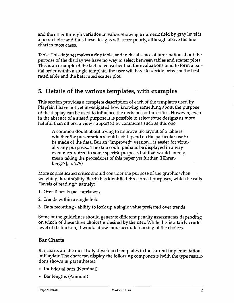
This template can display components of the following form:
• Individual marks (Non-numeric, no duplicates)
Labels may be provided as an option.
• X and Y position (Any)
• Shape (Nominal) [Optional]
• Size (AmOW1t) [Optional]
Shape and Size are mutually exclusive for a single graph.
• Color (Nominal) [Optional]
• Value (All but nominal) [Optional]
Color and Value are mutually exclusive for a single graph.
While this template permits a large number of components to be displayed, for the graph to be meaningful the relation must be keyed by the field shown by individual marks. While Playfair currently does not require information about the key fields of a relation, it does check that the mark field contains no duplicate entries, as that would certainly indicate that a scatter plot is inappropriate. Figure 9 shows an example of this template, using data taken from the 1990 census. This design clearly shows the preponderance of women in the oldest age groups. Note however that the original data has been grouped into apparently random intervals, making comparison of absolute values meaningless between age categories.
Ralph Marshall Master's Thesis 19

FIGURE 9. An example scatter plot produced by Playfair
Females 2SO,OOO
200,000
ISO,OOO
100,000
SO,OOO
Count of Persons by Sex, and Age (Whites, Massachusetts)
."
• @
85+ 80-84 75-79 70-74 6S-6J 62~
© 60-61 55-59 SO-54 45-49
® 40-44 @ • 35-39
30-340 15-29 22-24 21©
® • 20
18 19
160° ~, 17
15
S 14 12-13 10-11 7-9
~ 6 5 3-4 1-2 0-1
so,ooo 100,000 150,000 200,000 150,000
Males
The critic for scatter plots is quite primitive and examines the following criteria:
Number of points
As with other cartesian designs, a small data set provides little opportunity to perceive a trend. A table will typically do a better job of sh9wing the exact values in a smaller space. It is also quite difficult to label many points.
• <10 marks: 10 points for each bar fewer than 10.
• >100 bars: 1 point for each bar more than 100 to a maximum of 100 points.
Individual mark labels
As described in the detailed example, scatter plots should include mark labels if the number of marks is small and should avoid using text to label the marks if there are very many of them.
Ralph Marshall Master's Thesis 20

Mark distribution
In order to be most effective the scatter plot should contain marks spread over a reasonable fraction of the data region - having most of them concentrated in one location with a few outliers provides little information to the viewer.
Using Size to encode acomponent
• If the data set is large the variation in size makes it likely that smaller marks will be completely obscured by larger ones. It is also more likely that the image as a whole will be cluttered and thus difficult to interpret.
• If size is used in conjunction with another retinal component it will be difficult to discern the retinal variation in the smallest marks. The graph will also give a distorted impression of the number of marks sharing a given retinal value, as the larger marks will leave a disproportionate impression on the viewer.
Line Charts
This template can display components of the following form:
• Abscissa indices (Any type)
• 1-4 lines (Numeric)
If more than one line is displayed a corresponding legend is provided to indicate which field is shown by each line. Figure 10 shows an example of this template.
Ralph Marshall Master's Thesis 21
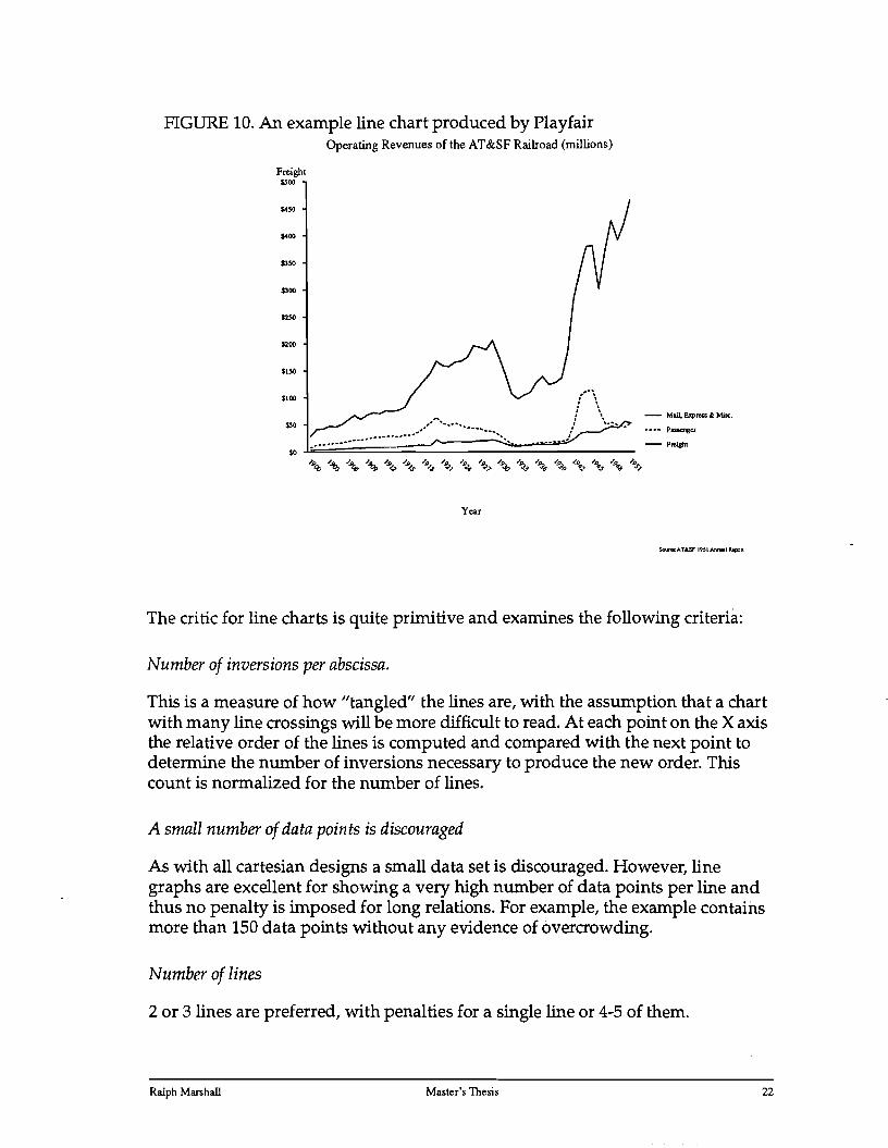
FIGURE 10. An example line chart produced by Playfair Operating Revenues of the AT&SF Railroad (millions)
Freight
The critic for line charts is quite primitive and examines the following criteria:
Number of inversions per abscissa.
This is a measure of how "tangled" the lines are, with the assumption that a chart with many line crossings will be more difficult to read. At each point on the X axis the relative order of the lines is computed and compared with the next point to determine the number of inversions necessary to produce the new order. This count is normalized for the number of lines.
A small number of data points is discouraged
As with all cartesian designs a small data set is discouraged. However, line graphs are excellent for showing a very high number of data points per line and thus no penalty is imposed for long relations. For example, the example contains more than 150 data points without any evidence of overcrowding.
Number of lines
2 or 3 lines are preferred, with penalties for a single line or 4-5 of them.
$500
$4SO
$400
SJSO
SJOO
$200
$ISO
$100
$50
so
- Mail. E>p.... .l M;sc.
.. ..... Passenger.
-F~l
Year
Ralph Marshall Master's Thesis 22
Average spread of the points
A graph with all of the lines following the same path is difficult to read since it is difficult to distinguish the lines. This rule computes the fraction of the vertical space occupied by each set of points and imposes larger penalties as the value approaches zero.
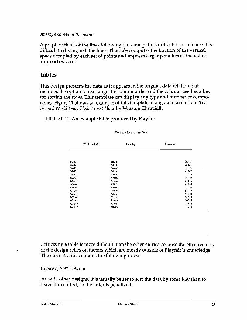
Tables
This design presents the data as it appears in the original data relation, but includes the option to rearrange the column order and the column used as a key for sorting the rows. This template can display any type and number of components. Figure 11 shows an example of this template, using data taken from The Second World War: Their Finest Hour by Winston Churchill.
FIGURE 11. An example table produced by Playfair
Weekly Losses At Sea
WeekEnded CoWllry Gross tons
6(2/40 6(2/40 6(2/40
fI9/40
fI9/40
fI9/40
6{16/4O 6{16/4O 6{16/4O 6{23/4O 6{23/4O 6{23/4O 6(30/40 6(30/40 6(30/40
BrilaiD Allied Neutral Britain Allied Neutral Britain Allied Neutral Britain Allied Neutral Britain Allied Neutral
79,415 25,137 4,375
49,762
22,253 14,750
60,006 40,216 23,170
91,373 81,742 39,159
30,'>17 13,626 19,332
Criticizing a table is more difficult than the other entries because the effectiveness of the design relies on factors which are mostly outside of Playfair's knowledge. The current critic contains the following rules:
Choice of Sort Column
As with other designs, it is usually better to sort the data by some key than to leave it unsorted, so the latter is penalized.
Ralph Marshall Masler's Thesis 23

The design will also be better if the sort column is either the first or last column in the table, because this makes it easier for the user to deduce how the rows have been arranged. Sorting by interior columns is thus penalized.
Column Ordering
While it is difficult to find a general rule for choosing the best column order, certain cases lead to reasonable guidelines:
• If the table contains exactly one non-numeric field it is assumed to be the key and thus should appear in the first column; other arrangements are penalized.
• Fields with duplicated values are almost certainly not the key4 and thus should not appear in the first column if any fields contain no duplicates.
Total Size of Table
Large data sets are typically easier to understand when presented graphically, so larger tables receive higher penalties. This rule is the complement to the rules for graphical displays which discourage very small data sets.
6. Related work
My work on graphic design has of course been influenced by that of others, both in traditional graphic design and in the emerging area of computer-generated presentations. Starting with the seminal research of Jock Mackinlay (see [Mackinlay86]), a number of groups have explored the problem of automating the production of business graphics based on a first principles method. In general their systems work by starting with low-level encodings of the data values based on their types and aggregating the mappings into a finished image. (See [RothHefley93] for a comprehensive overview of this work.) This approach permits a wide range of data sets to be visualized but does so at the cost of having no high-level categories of presentations.
One of the drawbacks with such systems is that the esthetic quality of the resulting graphics tends to compare poorly with professionally generated ones. While this may in part be due to the fact that the systems areresearch prototypes, the ability to work from templates that have been refined by humans makes it much easier to achieve visually effective displays. I feel that the graphics included in this paper demonstrate that a template-based system can in fact produce first rate graphics without extensive user intervention.
Some of the ideas behind Playfair grew out of my earlier work on Aimi [BurgerMarshall93], a system designed as an intelligent interface tool. Aimi allows peo
4. One exception occurs when two or more columns combine to form the key,.
Ralph Marshall Master's Thesis 24

pIe to conduct an extended "conversation" with the system and generates various graphs and menus in response to user questions when appropriate. Using graphs in such an environment introduces new problems not encountered when generating single, static displays as Playfair does. One difference is that the graphs are no longer isolated but are related elements in the flow of communication and as a result should be as consistent as possible in their design. Knowing just how long to continue using the same design even though subsequent responses are better suited to a new one is a difficult (and open) question.
Evaluating the fitness of interactive designs introduces new considerations about ease of manipulation for the user. In general, a design which provides many ways for the user to select or modify the data through the display is preferred, requiring the addition of a new set of rules to the critics.
The notion of using templates for choosing the most appropriate form of display was first advanced in [Gnanamgari81], but that work was limited to matching a given data set to a general presentation style (e.g. ''The data set should be shown as a bar chart"). My notion of templates introduces the use of detailed designs that have been crafted by a human and that can be evaluated by the system based on rules tailored to that design. This combination allows the system to produce high-quality finished images within an expandable range of styles.
Joe Marks has developed a system called ANDD [Marks91] which lays out nodeedge graphs. While the process of laying out the elements is wholly unrelated to the design approach used by Playfair, he uses the same notion of producing a numeric rating of each design based on a set of effectiveness and esthetic guidelines. (ANDD uses the method of genetic algorithms to evolve the final design, and these ratings are used directly to determine which designs are carried over to the next generation.) Unlike Playfair's weights, ANDD organizes the rules into levels, with lower levels used to break ties from the higher levels. The organization is something like:
1. Minimal suitability (e.g. Are any nodes overlapping?)
2. Ease of comprehension (e.g. How many edge crossings occur?)
3. High level goals (e.g. Do related nodes form distinct perceptual gestalts?)
This sort of rating scheme allows the highest level rules to effectively eliminate a design which fails a fundamental test even if it scores well at the lower levels.
Cleveland and McGill have written a number of interesting papers about graphic design, including [ClevelandMcGill87] which presents a precise formula for evaluating the aspect ratio of a line chart. While it is not clear how well their method
Ralph Marshall Master's Thesis 25

works5, it represents a good example of research into quantitative measures suitable for the critics.
Traditional graphic design
While graphic design is not an exact science, there are several books which provide a good background in the theory of data presentations. The earliest such works are by William Playfair himself; they provide excellent examples of graphs drawn in styles not typically seen today. I was able to obtain copies of [Playfair86] and [PlayfairOl] through my library. They provide extensive economic and social data about what was known at the time as the "civilized world" and as such are good examples of the fact that interesting data is a prerequisite to interesting graphs.
As noted earlier, the idea of representing design families in terms of the data components which they can display is drawn directly from [Bertin83]. It provides an excellent foundation in the theory of data graphics. It also includes a very interesting collection of graph styles not commonly seen, some of which are very effective in an appropriate setting. It is exactly this sort of specialized knowledge that a library can encode for the benefit of users who are only familiar with the more common fonna ts.
Edward Tufte has authored two delightful and justly acclaimed books about graphic communication ([Tufte83],[Tufte90]). He also introduces a number of novel graphic displays and rules for generating effective designs. While these esthetic guidelines do not appeal to everybody, since following them conduces to the production of rather austere graphics, they have much to recommend them and have been used as the basis for the templates which I have created so far.
7. Conclusions and future research
The goal of this work has been to show that first rate graphics can be produced by an automated system and I believe that this system is a promising start towards realizing that ambition. This system differs considerably from other automated design efforts with which I am familiar, both in its applicability and the type of design which it purports to do. Consequently I see these not as competing technologies but separate approaches which can hopefully be cross-bred to produce more capable systems in the future.
As with any good research project, this effort has raised a number of new questions which should be investigated by future work. The system currently has a small library of templates, and while there is no obvious reason why the library
5. The discussion printed with the paper includes a number of counter-examples and suggestions from the audience for improved measures. The authors agree that further exploration is needed before their measure can be applied to a broad range of graphics.
Ralph Marshall Master·s Thesis 26
cannot be extended to cover a wider range of styles it is likely that unforeseen problems will arise as the range is expanded.
Perhaps the most significant limitation of this work is that it only deals with data which can be represented as a single relation, a requirement which is obviously not met by a wide range of real world problems. I believe it would be very valuable to focus on this question in the near future as failing to overcome it would drastically limit the value of this approach.
The critics currently provided with the library seem to do an adequate job of discriminating between alternatives within a single design but it is less clear that the rankings for different templates can be merged to obtain a reasonable list. In order to make this possible for a larger library some absolute guidelines need to be established which describe what attributes a graph must possess to score above a certain value.
The existing critics have been evaluated by a small number of people looking at a relatively small number of graphs and stating whether or not they agree with the rankings; most of this work has been based on my own opinions. This has been a fairly ad hoc approach to refining the critics, especially since different observers often held diametrically opposed views about the correct ordering. A more carefully organized set of tests should be conducted to collect feedback about how well Playfair's ratings matched the user's assessment and how the two can be brought closer together. As a related effort it may prove fruitful to explore machine learning techniques which could be used to incorporate this feedback directly into the evaluations. .
8. Bibliography
[Bertin83] Bertin, J. 1983. Semiology of Graphics. Madison, WI: The University of Wisconsin Press. Translated by William J. Berg.
[BurgerMarshall93] Burger, J. and Marshall, R. 1993. The Application of Natural Language Models to Intelligent Multimedia. In Maybury, M. ed., Intelligent Multimedia Interfaces. New York: ACM Press.
[ClevelandMcGill87] Cleveland, W. and McGill, R. 1987. Graphical Perception: The Visual Decoding of Quantitative Information on Graphical Displays of Data (with Discussion). The Journal of the Royal Statistical Society, 150(3), Series A, 192229.
[Ehrenberg77] Ehrenberg, A. S. C. 1977. Rudiments of Numeracy (with Discussion). The Journal of the Royal Statistical Society, 140(3), Series A, 277-297.
[Gnanamgari81] Gnanamgari, S. 1981. Information Presentation Through Default Displays. Ph.D. thesis, University of Pennsylvania.
Ralph Marshall Master's Thesis 27

[Mahon77] Mahon, B. H. 1977. Statistics and Decisions: the Importance of Communication and the Power of Graphical Presentation (with Discussion). The Journal of the Royal Statistical Society, 140(3), Series A., 298-306.
[PlayfairOI] Playfair, W. 1801. The Statistical Breviary: shewing, on a principle entirely new, the resources of every state and kingdom in Europe. London.
[Playfair86] Playfair, W. 1786. The Commercial and Political Atlas. London.
[Mackinlay86] Mackinlay, J. D. 1986. Automating the Design of Graphical Presentations of Relational Information. ACM Transactions on Graphics, 5(2), 110-141.
[Marks91] Marks, J. 1991. A Formal Specification Scheme for Network Diagrams that Facilitates Automated Design. Journal ofVisual Languages and Computing. 4(2), 395-414.
[RothHefley93] Roth, S. and Hefley, W. 1993. Intelligent Multimedia Presentation Systems: Research and Principles. In Maybury, M. ed., Intelligent Multimedia Interfaces. New York: ACM Press.
[RothMattis90] Roth, S. F. and Mattis, J. 1990. Data Characterization for Intelligent Graphics Presentation. Proceedings of the CHI '90 Conference, New York: ACM Press.
[Silverstone91] Silverstone, S. 1991. Saying it with Images: An Interview with Edward Tufte. Aldus Magazine, May-June, 27-29, 56.
[Tufte90] Tufte, E. R. 1990. Envisioning Information. Cheshire, CT: Graphics Press.
[Tufte83] Tufte, E. R. 1983. The Visual Display of Quantitative Information. Cheshire, CT: Graphics Press.
Ralph Marshall Master's Thesis 28

9. Appendix: Data for examples
Before we can hope to automate the design of data graphics we need to find some objective means of comparing the results of different systems (as well as needing to monitor the progress of any given system over time.) One of the salient features of modern scientific inquiry is the requirement that other scientist be able to duplicate our results, thereby confirming that the experiment is not biased in some fashion. Other areas of computer research such as the machine learning community maintain public repositories of data sets (and even implementations of published algorithms) to facilitate this duplication of results and subsequent building upon earlier theories.
I believe that a similar arrangement would help to move graphic design towards a more scientific footing and hopefully improve the quality and scope of our work. As a humble start towards a more interactive community I have included the data sets used as examples in this paper. They all represent real data and have been chosen because they most clearly illustrate the various templates.
Table 2 shows the data file used to produce Figure 1 from this paper6. The file conssts of a header followed by the data values themselves. The first line (%Playfair1) is a marker to indicate that this file is in the Playfair format. It can be followed by declarations for the title and a footnote interspersed in any order with the field declarations, which must appear in the same order as the columns of the data file. The field declarations consist of the reserved marker %Field: followed by the field name and data type. The end of the header is signalled by the %Relation mar,ker and is followed by rows of the relation until the %End marker is seen.
TABLE 2. Data file for the Dow Jones Industrials Average chart %Playfair-1
%Title:Perfonnance of Dow Jones Index
%Field:Company Text
%Field:Change in Stock Price during December 1992 Percentage
%Footnote:Source: Wall St. Journal
%Relation
Boeing .1423
American Express .0874
AT&T .0822
United Technologies .0724
Westinghouse .0594
Allied-Signal .0591
J.P. Morgan .0584
6. The actual file uses semicolons to delimit the fields, which are shown here as columns for ease of reading.
Ralph Marshall Master's Thesis 29

TABLE 2. Data file for the Dow Jones Industrials Average chart
Coca-Cola
Sears Roebuck
Bethlehem Steel
Union Carbide
Exxon
General Electric
Alcoa
International Paper
Walt Disney
Chevron
General Motors
McDonald/s
Texaco
Procter & Gamble
Minnesota Mining
Du Pont
Philip Morris
Kodak
Merck
Goodyear
Caterpillar
Woolworth
IBM
%End
TABLE 3. Data File for the Cigarette Consumption chart
%Playfair-1
%Title:Crude Male Death Rate for Lung Cancer in 1950 and per capita Consumption of Cigarettes in 1930 in Various Countries
%Footnote:From graph on p. 47 of The Visual Display of Quantitative Information
%Field:Country
%Field:Cigarette consumption
%Field:Deaths per million
%Relation
Iceland
Norway
Sweden
Canada
Text
Count
Count
240 55
250 90
300 115
500 140
Ralph Marshall Master's Thesis 30

TABLE 3. Data File for the Cigarette Consumption chart
Australia 400 180
Denmark 350 160
United States 1300 190
Holland 410 235
Switzerland 500 255
Finland 1150 350
Great Britain 1200 460
%End
TABLE 4. Data File for the Moons of the Solar System chart
%Playfair-l
%Footnote:Source: ''The Atlas of the Solar System" by Bill Yenne
%TItle:Principal Moons in the Solar System
%Field:Moon Text
%Field:Diameter Mile
%Field:Planet Text
%Relation
Moon 2159 Earth
Deimos 8 Mars
Phobos 11 Mars
10 2257 Jupiter
Europa 1942 Jupiter
Ganymede 3278 Jupiter
Callisto 2995 Jupiter
Mimas 242 Saturn
Enceladus 310 Saturn
Tethys 652 Saturn
Dione 695 Saturn
Rhea 950 Saturn
Titan 3200 Saturn
Hyperion 184 Saturn
Iapetus 905 Saturn
Phoebe 136 Saturn
Miranda 217 Uranus
Ariel 720 Uranus
Umbriel 739 Uranus
Titania 998 Uranus
Oberon 961 Uranus
Ralph Marshall Master's Thesis 31

TABLE 4. Data File for the Moons of the Solar System chart
Triton 3728 Neptune
Charon 600 Pluto %End
TABLE 5. Data File for the Population Distribution chart
%Playfair-l
%TItle:Count of Persons by Sex, and Age (Whites, Massachusetts)
%Field:Age Range
%Field:Males
%Field:Females
%Relation
0-1 1-2 3-4
5
6
7-9
10-11
12-13 14
15
16
17
18
19
20
21
22-24
25-29
30-34
35-39
40-44
45-49
50-54
55-59
60-61
62-64
65-69
Text
Count
Count
31912
75890
71039
34754
33116
97412
63548
60185
29643
30523
31152
33112
37937
45184
45836
44817 131702
244842
240071
215586
193592
151667
117300
113593
45932
69457
106005
30493 72435
66743 32793
31640
92018
60112
56888
27691
29062
29559
31539
38699
46740
46701
45417
133596
246418
244331 220757
202638
158087 125591
123832
51651
80602
134785
Ralph Marshall Master's Thesis 32

TABLE 5. Data File for the Population Distribution chart
~n
75-79
80-84
85+
%End
~~O
57495
32705
21602
117271
97691
71092
68263
TABLE 6. Data File for the AT&SF Revenue chart
%Playfair-l
%Title:Operating Revenues of the AT&SF Railroad (millions)
%Footnote:Source:AT&SF 1951 Annual Report
%Field:Year
%Field:Freight
%Field:Passenger
%Field:Mail, Express & Misc.
%Relation
1900
1901
1902
1903
1904
1905
1906
1907
1908
1909
1910
1911
1912
1913
1914
1915
1916
1917
1918
1919
1920
1921
1922
Time
Dollar
Dollar
Dollar
28.5
41.7
42.3
47.5
46.05
50.46
59.3
67.54
60.57
68.14
72.45
71.01
76.43
75.09
77.37
82.3
102.73
116.90
131.20
144.74
168,47
160.22
158.02
7.8
12.85
13.5
14.82
15.93
16.79
19.52
22.08
21.57
24.05
26.63
27.25
28.56
29.25
27.62
31.21
30.47
35.83
43.34
52.98
63.47
52.59
48.64
3.12
3.82
4.15
4.51
4.99
5.10
6.19
7.21
6.89
7.79
8.65
8.55
9.04
9.23
9.30
10.01
11.08
12.78
13.10
11.77
22.30
16.11
18.45
Ralph Marshall Master's Thesis 33

TABLE 6. Data File for the AT&SF Revenue chart
1923 166.33
1924 168.10
1925 174.86
1926 196.32
1927 193.21
1928 189.00
1929 20555
1930 175.96
1931 143.62
1932 107.4
1933 97.42
1934 104.72
1935 109.68
1936 128.4
1937 138.98
1938 124.13
1939 127.53
1940 136.53
1941 185.12
1942 284.22
1943 333.83
1944 379.156
1945 380.29
1946 301.19
1947 370.48
1948 427.13
1949 391.24
1950 422.15
1951 466.22
%End
TABLE 7. Data File for the Shipping Losses table
%Playfair-l
%Title: Weekly Losses At Sea
%Field:Week Ended MonthDayYear
%Field:Country Text
%Field:Gross tons Pound
%Relation
6/2/40 Britain 79415
52.91
48.15
44.11
44.02
42.69
38.37
37.92
31.18
22.55
14.52
12.20
11.97
13.44
15.62
17.52
16.89
18.27
18.49
22.78
52.98
103.80
112.43
112.83
75.21
50.23
53.24
47.92
44.81
52.57
19.43
19.15
18.45
19.45
20.49
20.69
22.21
19.28
15.00
11.21
10.19
11.40
12.55
13.23
14.15
13.28
14.23
14.97
17.13
23.93
33.47
36.49
35.57
35.19
41.97
46.35
43.58
55.7
51.77
Ralph Marshall Master's Thesis 34

TABLE 7. Data File for the Shipping Losses table
6/2/40 Allied 25137
6/2/40 Neutral 4375
6/9/40 Britain 49762
6/9/40 Allied 22253
6/9/40 Neutral 14750
6/16/40 Britain 60006
6/16/40 Allied 40216
6/16/40 Neutral 23170
6/23/40 Britain 91373
6/23/40 Allied 81742
6/23/40 Neutral 39159
6/30/40 Britain 30377
6/30/40 Allied 13626
6/30/40 Neutral 19332
%End
Ralph Marshall Master's Thesis 35
Related Documents