The Use of Real Data in Fine Arts for Insight and Discovery: Case Studies in Text Analysis Fanny Chevalier † and Sara Diamond ‡ OCAD (Ontario College of Art & Design) University ABSTRACT Fine art is commonly defined as an art form developed primarily for aesthetics and conceptual practices. Thereby, it differs from Data Visualization in the sense that its focus is not the design of practical applications to address a specific problem. However, increasingly visual artists and designers have been interested in using real data in their artwork. Not only do they use the data as a primary material to create aesthetic pieces, but they also present the data to facilitate discovery. This specific form of art thus acts as Data Visualization, offering a new point of view on the data. This paper explores a series of case studies and interviews that indicate the influence Data Visualization has had in the artistic community in the specific contexts of text analysis, the ways the artists shifted their practices and the larger impacts in terms of exhibition and take up. KEYWORDS: Text analysis, fine arts. 1 INTRODUCTION One of the most important and transformative applications of information visualization by visual artists has been to further their interpretation, analysis and display of text. It is here that we see significant impacts on their practice and in the engagement of others with artists’ production. Not only have artists and the art world gained new insights from these applications, but expressions of value to other fields, new understandings of text- based network dynamics and new tools have emerged. The field of Digital Humanities, which undertakes the analysis of literary, philosophy and historical texts (amongst others), has gained from visual artists’ forays into text visualization. In the twentieth century, visual artists in the West began to treat language and text as materials, continuing the nineteenth-century artists’ fascination with literature. By the 1970s, conceptual art emphasized the idea over the form. Artists believed that language — whether consciously expressed or unconsciously — presents constructed or disrupted meaning and identity. In Post-Partum Document [5] artist and psychoanalytic theorist Kelly displayed her son’s used diapers annotated with textual references. Artists were drawn to structural analysis of language, applying knowledge from visual structuralism to text. The Art and Language movement of the 1970s and 1980s used text as texture within paintings. In the 1980s, artists applied structural semiotic tools to visual images. They used text and image to critique advertising, Holtzer’s billboards and LED displays (1985) being one of the most known responses. More recently artists have expressed interest in a new set of structures with linguistic and communicative implications — the underlying networks that carry textual expression on the Internet and mobile Internet. While expressions that join art and language together can be powerful, it has only been with the advent of data visualization that artists have the tools to engage holistically with text. Artists have then bound the visual and the underlying structures of text data together in ways that provoke new understandings and result in visually powerful images. Visual artists with a strong interest in literature, linguistics and communications processes now turn to Information Visualization as a digital and strongly visual trajectory to linguistic intervention, semiotics and conceptualism. This paper presents a series of art pieces created in this specific context of text analysis that we gleaned from observations and publications. To better understand the motivation and the impact of artists’ work, we have interviewed two of them (Roscover, Section 2.3 and Diamond, Section 2.6). We report in the corresponding sections excerpts from the discussions. 2 CASE STUDIES Artists have been interested in various forms of text analysis. From traditional literature to emotional expression in chat rooms, many works have been proposed to provide users with new ways of visualizing text. This section describes some of the most important pieces that have been proposed by visual artists and designers. 2.1 Writing Without Words 1 Posavec who has an historic interest in literature, poetics and visual expression proposes various graphic approaches to analyze the structure and themes of Jack Kerouac’s On the Road in her project Writing Without Words [6]. She manually parses text in an expressive and poetic manner to create works such as Literary Organism. a tree structure is used to show how Part One of the novel is split into chapters, chapters into paragraphs, and so on. The outcome is a cellular, plant-like structure (Figure 1). Figure 1. Literary Organism shows the structure of the book by parts, chapters, paragraphs, sentences and words [6]. 1 The quotes in this section are from the “Made by many” interview: http://madebymany.co.uk/interview-stefanie-posavec- beautifier-of-literature-003377 LEAVE 0.5 INCH SPACE AT BOTTOM OF LEFT COLUMN ON FIRST PAGE FOR COPYRIGHT BLOCK † [email protected], ‡ [email protected]

Welcome message from author
This document is posted to help you gain knowledge. Please leave a comment to let me know what you think about it! Share it to your friends and learn new things together.
Transcript
The Use of Real Data in Fine Arts for Insight and Discovery:
Case Studies in Text Analysis
Fanny Chevalier† and Sara Diamond‡
OCAD (Ontario College of Art & Design) University
ABSTRACT Fine art is commonly defined as an art form developed primarily
for aesthetics and conceptual practices. Thereby, it differs from Data Visualization in the sense that its focus is not the design of practical applications to address a specific problem. However, increasingly visual artists and designers have been interested in using real data in their artwork. Not only do they use the data as a primary material to create aesthetic pieces, but they also present the data to facilitate discovery. This specific form of art thus acts as Data Visualization, offering a new point of view on the data. This paper explores a series of case studies and interviews that indicate the influence Data Visualization has had in the artistic community in the specific contexts of text analysis, the ways the artists shifted their practices and the larger impacts in terms of exhibition and take up.
KEYWORDS: Text analysis, fine arts.
1 INTRODUCTION One of the most important and transformative applications of
information visualization by visual artists has been to further their interpretation, analysis and display of text. It is here that we see significant impacts on their practice and in the engagement of others with artists’ production. Not only have artists and the art world gained new insights from these applications, but expressions of value to other fields, new understandings of text-based network dynamics and new tools have emerged. The field of Digital Humanities, which undertakes the analysis of literary, philosophy and historical texts (amongst others), has gained from visual artists’ forays into text visualization.
In the twentieth century, visual artists in the West began to treat language and text as materials, continuing the nineteenth-century artists’ fascination with literature. By the 1970s, conceptual art emphasized the idea over the form. Artists believed that language — whether consciously expressed or unconsciously — presents constructed or disrupted meaning and identity. In Post-Partum Document [5] artist and psychoanalytic theorist Kelly displayed her son’s used diapers annotated with textual references. Artists were drawn to structural analysis of language, applying knowledge from visual structuralism to text. The Art and Language movement of the 1970s and 1980s used text as texture within paintings. In the 1980s, artists applied structural semiotic tools to visual images. They used text and image to critique advertising, Holtzer’s billboards and LED displays (1985) being one of the most known responses. More recently artists have expressed interest in a new set of structures with linguistic and communicative implications — the underlying networks that carry
textual expression on the Internet and mobile Internet. While expressions that join art and language together can be
powerful, it has only been with the advent of data visualization that artists have the tools to engage holistically with text. Artists have then bound the visual and the underlying structures of text data together in ways that provoke new understandings and result in visually powerful images. Visual artists with a strong interest in literature, linguistics and communications processes now turn to Information Visualization as a digital and strongly visual trajectory to linguistic intervention, semiotics and conceptualism.
This paper presents a series of art pieces created in this specific context of text analysis that we gleaned from observations and publications. To better understand the motivation and the impact of artists’ work, we have interviewed two of them (Roscover, Section 2.3 and Diamond, Section 2.6). We report in the corresponding sections excerpts from the discussions.
2 CASE STUDIES Artists have been interested in various forms of text analysis.
From traditional literature to emotional expression in chat rooms, many works have been proposed to provide users with new ways of visualizing text. This section describes some of the most important pieces that have been proposed by visual artists and designers.
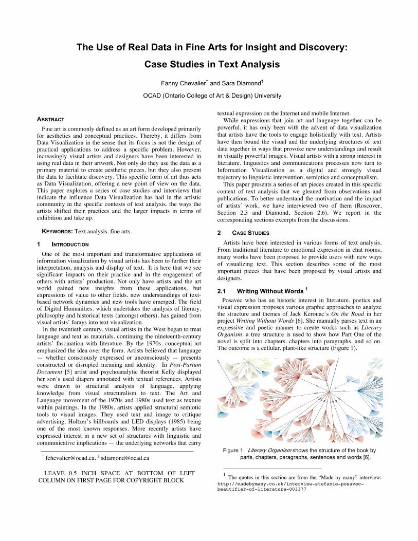
2.1 Writing Without Words 1 Posavec who has an historic interest in literature, poetics and
visual expression proposes various graphic approaches to analyze the structure and themes of Jack Kerouac’s On the Road in her project Writing Without Words [6]. She manually parses text in an expressive and poetic manner to create works such as Literary Organism. a tree structure is used to show how Part One of the novel is split into chapters, chapters into paragraphs, and so on. The outcome is a cellular, plant-like structure (Figure 1).
Figure 1. Literary Organism shows the structure of the book by
parts, chapters, paragraphs, sentences and words [6].
1 The quotes in this section are from the “Made by many” interview:
http://madebymany.co.uk/interview-stefanie-posavec-beautifier-of-literature-003377
LEAVE 0.5 INCH SPACE AT BOTTOM OF LEFT COLUMN ON FIRST PAGE FOR COPYRIGHT BLOCK

Posavec also proposed Sentence Drawings and Sentence Length that show the variation of the number of words per sentence, and Rhythm Texture, a method of visualizing rhythm and punctuation within writing. In these pieces she tries to express and compare the grammatical structure of eloquent sentences. She compares great works of literature seeking appropriate metaphors from the Data Visualization in order to explore “the similarities and differences in the writing styles of various authors,” as she argues the sentences structure is correlated to the writing style of the writer. Shorter sentences mean the writer has a choppy, terse writing style, and longer sentences imply that the writer has a free-flowing writing style that undulates across the page in a leisurely manner.
Posavec’s works are a perfect example of aesthetic artwork for insights and discovery of “complex patterns” formed by the structure of novel, sentence construction and themes. Not only does she use the real data as the primary material to generate artwork, but also she “wanted to find a way of communicating the complexities found in literature.” One interesting aspect that differentiates her work from traditional Data Visualization is that both the extraction of the visualized data and the generation of the graphics have been done manually: the data had to be carefully manipulated by the artist and the resulting artwork could not be generated by automatic, impersonal algorithms. As she says, she “liked the idea of visualizing the structure of a novel as a living, breathing thing full of energy and vitality.”
Her creations have been exhibited extensively in and are used as sources for digital humanities research. Commonly referenced as one of the “great visualizers,” her maps continue to be praised as being not only gorgeous in terms of graphic design, but also exhibiting scientific rigor and precision in their formulation.
2.2 TextArc 2 Paley created TextArc [3] to allow text to be processed; Key
words are quantified and brought to the foreground (Figure 2). TextArc has been designed as a means of condensing and expressing the essence, order, and preoccupations within large bodies of text. Depsite the fact that his tool automatically extracts and displays the data, Paley expresses the same carefulness with the writers’ texts as Posavec: TextArc “is still intended to respect the original text; functioning as a concordance, index, and structural guide.” Like Posavec’s view, the generated graphics should “allow the text to reveal itself in many ways”.
Figure 2. TextArc of the book Alice In Wonderland, focus on the
Rabbit character.
2 The quotes in this section were gathered from publications and
material available on TextArc website: http://www.textarc.org/
In the same way “a botanist learns visual strategies for distinguishing the type and health of a plant,” Payley argues that “people looking at TextArc have begun to develop visual strategies that help extract structural features in texts.”
Paley exhibits a very scientific and rational reasoning while describing the three primary goals of his work: “to create visual filters which let different subjects express their differences; to make the work readable enough that the viewer can gain specific insights; and to reveal complexity in a way that's matched to human perceptual abilities.” Again, the art form’s primary focus is not aesthetics, even though it plays an important role in the design since Payley claims his “visual representations are inspired by the calm but richly layered information in natural scenes.” The result is rather a practical application providing a new way to view a text that allows for the support of previous observations or hypotheses, or to serve as a visual seed, evoking new insights into a text’s meaning.
TextArc has been applied to literature, bodies of conference data, calendars and other corpus and Paley’s projects have been exhibited in various places such as the New York Public Library on large-scale plasma panel touch screens, extended to support conversations and group interaction.
2.3 Word Cloud Portraits 3 The success and the popularity of tag clouds —which can be
found these as printed word clouds on everyday objects such as T-shirts and mugs— have raised the interest of artists since their first use on the Internet in the photo sharing website Flickr [9]. One noticeable improvement on the initial 2002 Flickr word clouds concerns the layout. Instead of presenting the words in a rough, line-based layout, Wordle [4] offers the possibility of modifying the aesthetics of the word clouds. The layout relies on a powerful two-dimensional space-filling algorithm in the same vein as 1966 Lou Dorfsman Gastrotypographicalassemblage 4.
Some artists have explored the idea of combining language and shape to convey the same meaning. One can now commonly see word clouds in the shape of entities, emotional or concept representatives (e.g. an animal, heart, country, etc) to reinforce the main topic of the word cloud. One major piece is Roscover’s Burdened (Figure 3) that was published in TIME magazine to accompany a cover story on President Obama [7].
The artist uses a list of keywords that define Obama’s presidency and the climate of the country since he has been in Office. The words, displayed on top of a real photograph, are used to “define the piece in both pattern and paint.” They have been manually positioned so that they would “flow visually” from beginning to end across the different parts of the picture. Note the rational strategy Roscover went through, as he emphasized that in this process of manually laying out the words, the “hierarchy is paramount; without it, the eye is overloaded with text.”
Similarly to the previous examples, the deliberate custom-fitting of the words, much like puzzle pieces, “invariably reveals patterns that [he] thinks the brain is quick to pick up on.” But still, we find in the artist’s description, this common trend of letting the data talk by itself. The design is not meant to drive the user in one direction or the other. Even though the chosen positioning probably affects the user’s perception, “most [of the revealed patterns] are completely unintentional and the result of subconscious design decisions.”
3 The quotes in this section are excerpts from the interview we had with
Roscover (discussion through a series of emails). 4 http://www.aiga.org/content.cfm/rebuilding-a-legacy-
the-gastrotypographicalassemblage

Figure 3. Burdened depicts President Obama’s thoughts.
Roscover’s inspiration for his first portrait of Steve Jobs5 (a few years before he created Burdened) came from a text art portrait he saw in a student art gallery that merely had the name of the subject repeated several thousand times. He thought this was “dull and unimaginative,” so instead of using the name over and over, he decided to use text from Apple's late nineties ad campaign that, to him, embodies the spirit of Apple and Jobs himself. It is interesting to note that, in this case, the data was not at the origin of the art, but serves as value added to an artistic technique —the use of text as a filling texture— that would turn the resulting visual piece into actual Data Visualization. As a direct impact of social media, the 19-year old student was commissioned to create Obama’s portrait by one of the most read magazines all over the world and featured on the front page. The portraits have been widely spread over the Internet for their ingenuity. Despite the fact that many agree on the artistic value of the piece, Burdened has raised passionate political discussions on chat rooms and forums.
2.4 Emotional Expression on the Internet Artists have expressed interest in the relationship between the immediacy of text-based communication on the Internet, duration of communication, and emotional expression. Temporal structures define how text-based relationships emerge in the Internet, with synchronous and asynchronous experiences providing very different feelings and intimacies, and even forms of consciousness. These pile on top of each other in layers, allowing social relationships and expressions to feel like a thick texture of condensed time. We Feel Fine6 builds emotional portraits of specific online populations over time or through snap shots by extracting expressions of feelings from Weblogs. The project provides six movements (like a symphony), driven by statistical analysis and data aggregation, and then can’t be reshaped by users’ paths through the data. Feelings accumulate in mounds on the screen, quivering when the mouse-cursor passes over. Then the site is poignant and amusing. It also provides artists with a means to understand the affective dynamics of a large-scale phenomenon like Internet blogs.
5 http://gorosco.com/#438803/Steven-Paul-Jobs 6 http://www.wefeelfine.org
Figure 4. Listening Post is a piece that listens to a number of
online chat forums, displays and reads these in real-time.
The Listening Post 7 by Rubin and Hansen is an eloquent and monumental sculptural installation that samples real-time chat and creates a sonic and visual environment for viewers and listeners to feel the loneliness and eagerness of chat participants who are looking for love (Figure 4). Sounds and images flash across multiple screens. The examples given here show that linguistic and statistical analysis combined and placed in the hands of artists are a powerful tool. Rubin and Hansen have gone on to do many significant public art commissions that bring together data extraction from online text sources, visualization and sonification. While the intention was language analysis, it could be argued that the results of these forays contribute to the advancement of Computational Linguistics by bringing together advances in data measurement, artificial intelligence and, in the case of We Feel Fine, linguistics.
2.5 Socio-political Aspect on the Internet 8 Other artists are interested in contributing to the socio-political analysis of text-based communication on the Internet. Drawing from architecture and art, and engaging knowledge from Computational Linguistics, Sack formulated Conversation Map [8], a tool that indicates the “potential of democratic discussion forums” by visualizing how debates on political subjects in the Internet, forums or chat can cross national boundaries. Sack has since created an array of thematic discussion tools and social media games including artworks such as Agnostics: a Language Game and Translation Map 9 Sack argues for a move beyond interface design and artificial intelligence grounded in computational linguistics and computational phenomenology, which assume a mechanics of common sense. He highlights “aesthetics for the Internet need to focus on producing the means for visualizing and understanding how social and semantic relationships intertwine and communities and common sense emerge.” He focuses on developing social aesthetic appropriate to emergent social media that incorporates the ways that groups represent themselves as they change over time. To him, a workable approach to aesthetics for Internet design must “take into account the fact that common sense is being produced and changed through the conversation itself.”
7 http://www.earstudio.com/projects/listeningpost.html 8 Sack’s interviews can be found at http://people.ucsc.edu/~wsack/writings.html 9 http://people.ucsc.edu/~wsack/projects.html
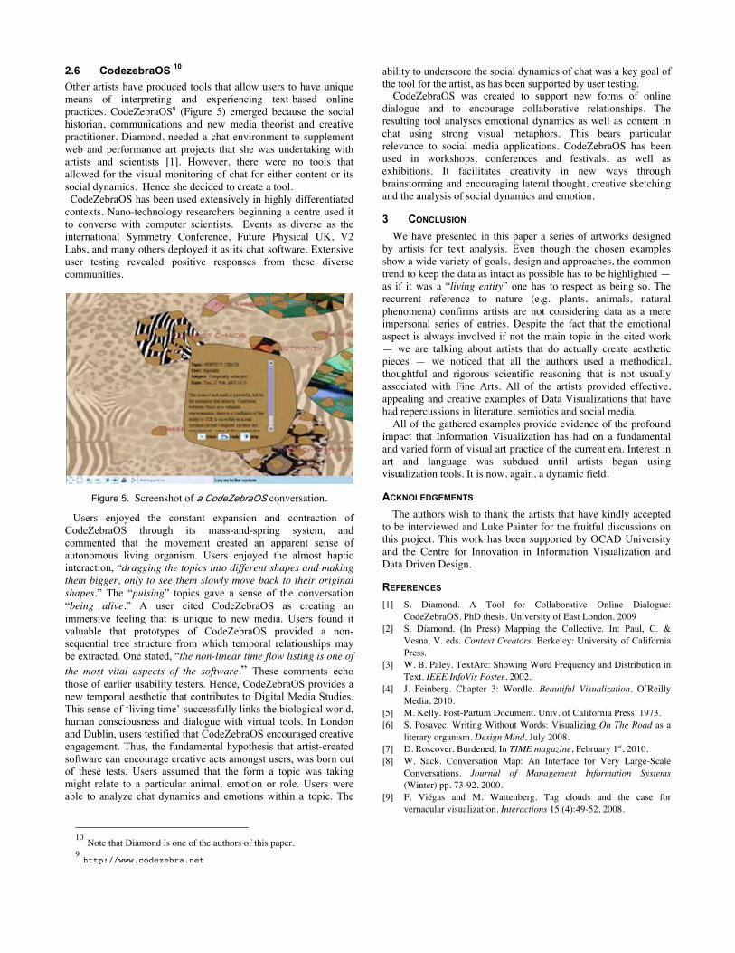
2.6 CodezebraOS 10 Other artists have produced tools that allow users to have unique means of interpreting and experiencing text-based online practices. CodeZebraOS9 (Figure 5) emerged because the social historian, communications and new media theorist and creative practitioner, Diamond, needed a chat environment to supplement web and performance art projects that she was undertaking with artists and scientists [1]. However, there were no tools that allowed for the visual monitoring of chat for either content or its social dynamics. Hence she decided to create a tool. CodeZebraOS has been used extensively in highly differentiated contexts. Nano-technology researchers beginning a centre used it to converse with computer scientists. Events as diverse as the international Symmetry Conference, Future Physical UK, V2 Labs, and many others deployed it as its chat software. Extensive user testing revealed positive responses from these diverse communities.
Figure 5. Screenshot of a CodeZebraOS conversation.
Users enjoyed the constant expansion and contraction of CodeZebraOS through its mass-and-spring system, and commented that the movement created an apparent sense of autonomous living organism. Users enjoyed the almost haptic interaction, “dragging the topics into different shapes and making them bigger, only to see them slowly move back to their original shapes.” The “pulsing” topics gave a sense of the conversation “being alive.” A user cited CodeZebraOS as creating an immersive feeling that is unique to new media. Users found it valuable that prototypes of CodeZebraOS provided a non-sequential tree structure from which temporal relationships may be extracted. One stated, “the non-linear time flow listing is one of the most vital aspects of the software.” These comments echo those of earlier usability testers. Hence, CodeZebraOS provides a new temporal aesthetic that contributes to Digital Media Studies. This sense of ‘living time’ successfully links the biological world, human consciousness and dialogue with virtual tools. In London and Dublin, users testified that CodeZebraOS encouraged creative engagement. Thus, the fundamental hypothesis that artist-created software can encourage creative acts amongst users, was born out of these tests. Users assumed that the form a topic was taking might relate to a particular animal, emotion or role. Users were able to analyze chat dynamics and emotions within a topic. The
10 Note that Diamond is one of the authors of this paper. 9 http://www.codezebra.net
ability to underscore the social dynamics of chat was a key goal of the tool for the artist, as has been supported by user testing. CodeZebraOS was created to support new forms of online dialogue and to encourage collaborative relationships. The resulting tool analyses emotional dynamics as well as content in chat using strong visual metaphors. This bears particular relevance to social media applications. CodeZebraOS has been used in workshops, conferences and festivals, as well as exhibitions. It facilitates creativity in new ways through brainstorming and encouraging lateral thought, creative sketching and the analysis of social dynamics and emotion.
3 CONCLUSION We have presented in this paper a series of artworks designed
by artists for text analysis. Even though the chosen examples show a wide variety of goals, design and approaches, the common trend to keep the data as intact as possible has to be highlighted — as if it was a “living entity” one has to respect as being so. The recurrent reference to nature (e.g. plants, animals, natural phenomena) confirms artists are not considering data as a mere impersonal series of entries. Despite the fact that the emotional aspect is always involved if not the main topic in the cited work — we are talking about artists that do actually create aesthetic pieces — we noticed that all the authors used a methodical, thoughtful and rigorous scientific reasoning that is not usually associated with Fine Arts. All of the artists provided effective, appealing and creative examples of Data Visualizations that have had repercussions in literature, semiotics and social media.
All of the gathered examples provide evidence of the profound impact that Information Visualization has had on a fundamental and varied form of visual art practice of the current era. Interest in art and language was subdued until artists began using visualization tools. It is now, again, a dynamic field.
ACKNOLEDGEMENTS The authors wish to thank the artists that have kindly accepted
to be interviewed and Luke Painter for the fruitful discussions on this project. This work has been supported by OCAD University and the Centre for Innovation in Information Visualization and Data Driven Design.
REFERENCES [1] S. Diamond. A Tool for Collaborative Online Dialogue:
CodeZebraOS. PhD thesis. University of East London. 2009 [2] S. Diamond. (In Press) Mapping the Collective. In: Paul, C. &
Vesna, V. eds. Context Creators. Berkeley: University of California Press.
[3] W. B. Paley. TextArc: Showing Word Frequency and Distribution in Text. IEEE InfoVis Poster, 2002.
[4] J. Feinberg. Chapter 3: Wordle. Beautiful Visualization, O’Reilly Media, 2010.
[5] M. Kelly. Post-Partum Document. Univ. of California Press. 1973. [6] S. Posavec. Writing Without Words: Visualizing On The Road as a
literary organism. Design Mind, July 2008. [7] D. Roscover. Burdened. In TIME magazine, February 1st, 2010. [8] W. Sack. Conversation Map: An Interface for Very Large-Scale
Conversations. Journal of Management Information Systems (Winter) pp. 73-92, 2000.
[9] F. Viégas and M. Wattenberg. Tag clouds and the case for vernacular visualization. Interactions 15 (4):49-52, 2008.
Related Documents