1 The tools of Webcomics: The “infinite canvas” and other innovations Håvard Knutsen Nøding A 60 pt. Master’s Thesis for English Literature, American and British Studies Presented to the Department of Literature, Area Studies and European Languages At the University of Oslo Spring term 2020 Thesis supervisor: Rebecca Scherr

Welcome message from author
This document is posted to help you gain knowledge. Please leave a comment to let me know what you think about it! Share it to your friends and learn new things together.
Transcript

1
The tools of Webcomics:
The “infinite canvas” and other innovations
Håvard Knutsen Nøding
A 60 pt. Master’s Thesis for English Literature, American and
British Studies
Presented to the Department of Literature, Area Studies and
European Languages
At the University of Oslo
Spring term 2020
Thesis supervisor: Rebecca Scherr

2
3
The tools of Webcomics:
The “infinite canvas” and other innovations
Håvard Knutsen Nøding

4
Copyright Håvard Knutsen Nøding
2020
The tools of Webcomics: The “infinite canvas” and other innovations
Håvard Knutsen Nøding
https://www.duo.uio.no/
Print: Reprosentralen, University of Oslo

5
Abstract
The main focus of this thesis is to introduce and offer insight into the new and innovative
ways webcomics build on and diverge from their print counterparts, as well as how these new
tools can make telling new kinds of stories and making new kinds of comics possible. I have
divided the thesis into three chapters, each with a focus on one aspect of the comics medium
which webcomics bring innovations to through a new, medium-specific tool. The first chapter
looks at time and motion, and how webcomics change the readers perception of the passage of
time in the comic through the use of tools like the “infinite canvas”, as well as others, such as
animation. The second chapter discusses composition, and how the fundamental design of the
page and the structure of the storytelling is altered through the use of tools like the “infinite
canvas”. Finally, the third chapter analyzes how webcomics can sometimes move away from,
or outright break the conventional relationship between text and image. In concluding, I will
summarize the innovations and highlight the fact that webcomics fundamentally change how
comics function in their medium.

6
7
Table of contents
Introduction……………………………………………………………………………… 8
1. Chapter 1: Time and Motion…………………………………………………… 25
1. The “infinite canvas” …………………………………………………… 25
2. XKCD …………………………………………………………………......29
i. “Time” …………………………………………………………… 29
ii. “Click and Drag” ………………………………………………... 37
iii. “Garden” ………………………………………………………… 41
3. The Order of the Stick …………………………………………………... 43
4. Saturday Morning Breakfast Cereal …………………………………... 46
5. Unsounded ……………………………………………………………...... 47
6. Chapter conclusion ……………………………………………………… 54
2. Chapter 2: Composition ………………………………………………………... 56
1. The Order of the Stick …………………………………………………... 59
2. UnDivine ………………………………………………………………… 68
3. Saturday Morning Breakfast Cereal/XKCD …………………………. 74
4. Goblins …………………………………………………………………... 78
5. Chapter conclusion……………………………………………………… 80
3. Chapter 3: Text-Image relationship …………………………………………... 84
1. XKCD …………………………………………………………………... 85
i. “Click and Drag” ……………………………………………… 85
ii. “Hoverboard” …………………………………………………. 87
iii. “Pixels” ………………………………………………………… 89
2. Unsounded ……………………………………………………………... 91
3. Girls With Slingshots …………………………………………………. 96
4. Daughter of the Lilies …………………………………………………. 97
5. Chapter conclusion……………………………………………………... 99
Conclusion……………………………………………………………………………… 100
Bibliography……………………………………………………………………………. 102

8
Introduction
Webcomics operate in a fundamentally different manner than print comics. In spite of
this, after Scott McCloud published “Reinventing Comics” in 2000, not much scholarly work
has been done on the fundamental technical differences between print comics and webcomics.
In this thesis I will attempt to explore these differences. They consist of a series of tools,
many unique to the medium of the internet and therefore webcomics. These new tools enable
a change in the basic building blocks of comics.
While the study of print comics have started to become more accepted by the
mainstream, with a great many works being written about comics like Art Spiegelman’s
“Maus” or “The Sandman” by Neil Gaiman, Sam Keith and Mike Dringenberg (and others) as
well as countless other comics, not much attention has been paid to webcomics. While some
books and papers have been written about the subject, not nearly enough attention has been
paid to this potentially groundbreaking new medium.
Webcomics will often look quite a lot like print comics but have one or two things
about them which are different from anything print could do. These are things like animation
and interactivity, or a very different page layout. This allows the webcomic to change, expand
on or enhance the impressions and emotions conveyed by the comic as well as introduce new
facets which in print would be impossible. For example, animation introduces changes to the
comic in real time, meaning a fundamental disconnection from the way time works in print
comics. Interactivity does the same thing, while also connecting the comic to the reader in
ways print comics never could. While the reader of a print comic may be what McCloud calls
a “silent accomplice” (Understanding Comics, p 68), an interactive comic makes the reader
involved in the action of a comic in a much more literal sense than if they were to merely read
it.
Webcomics can change the perception of time in comics, they can dramatically change
the structure and design of the comic, with all the changes that entails, and they can splinter
the very basic building blocks of the comic itself and turn into something remarkably
different.Webcomics are, in almost every sense, less restrained than print comics. This has the
potential to lead to a great deal of interesting and experimental works of art, and as such are
worthy of study. The different tools and restrictions of the internet lead to different stories

9
being possible, stories which would be impossible in print comics. I will be exploring some of
these in the thesis, as well as comics which stick more closely to the traditions of the print
comic.
The general view of webcomics has traditionally been fairly negative, as perhaps best
portrayed by games critic Ben “Yahtzee” Croshaw in his video about the subject
(www.youtube.com/watch?v=5t4xS2PqFFA). This view has not been entirely unwarranted, as
like with everything else on the internet there is little in the way of quality control. Not
everything is of poor quality, though. Some of it is even brilliant. The vast amounts of less
than stellar creations have, however, led to webcomics having a bad reputation. However, like
with many things on the internet, there is genuine talent also, and many excellent comics have
been created. These comics deserve to be examined just as much as print comics and in this
thesis I will attempt to do just that.
The History of Webcomics
I believe a brief introduction to the history of webcomics will be useful in order to
place the different comics I will be analyzing in the proper context, as well as show how the
comics developed and/or settled over time. The comics I will be writing about are taken from
a few different periods, but all started after 2000. I have chosen comics from within this
period because they are either more technically innovative or firmly embedded in a style than
the older webcomics were. In this way I can explore both the new and the old, as well as how
they can sometimes blend together in what tools they use and how.
Before I start on the history, however, I believe it is necessary to acknowledge one
thing about the literature on the subject. Very little has been written about the history of
webcomics. Every source I could find cited one book; “The History of Webcomics” by T.
Campbell. Every trail I followed eventually led back to this book. Since the book came out in
2006 it is fairly outdated. The only source I found which added more recent information was
an article written by Shaennon Garrity (with some assistance from Campbell) for “The
Comics Journal”, but even that only goes until 2011. Therefore, there is little in the way of
other viewpoints to consult about the subject and I will have to accept what these people have
written. Also, everything I comment on after 2011 is solely based on my own observations.

10
The history of webcomics can be divided into a few different eras. In her article from
The Comics Journal (www.tcj.com), Webcomics creator Shaennon Garrity divides it into five
distinct phases. These are; “the stone age” (1985-1992), “the bronze age” (1993-1995), “the
singularity” (1996-2000), “the age of shit getting real” (2001-2006), “and the age of this
whole app thing” (2007-“present” (2011)). I will be using these phases to explain how
webcomics first appeared and how they evolved. There is some disagreement between
Campbell and Garrity on where the different phases begin and end, but I will be following
Garrity’s outline, as it is the most recent and detailed.
“The stone age” (1985-1992)
In the days before the internet was available to everyone, it was mostly used by
college students (mostly in the USA, presumably). Webcomics, according to Shaenon Garrity,
appeared very early; “The earliest webcomics predate the World Wide Web and are almost as
old as public online file transfer.” (Shaenon Garrity, www.tcj.com). The history of webcomics
predates the Web and is as old as the internet itself. The first “webcomics” appeared in the
1980s and were drawn in early internet
message boards by using the letters and
symbols on the keyboard. At this point the
internet was more or less only available to
universities, and more specifically the
techs working there. The humor reflects
this. The first actual “comic” on the
internet was constructed of these
characters by “a type artist codenamed
Eerie” and was called “Inspector
Dangerfuck” (The History of Webcomics,
n.pag.).
At this time, possibly the first real
online comic was created by Eric Monster
Millikin. It was a Wizard of Oz parody Figure 1 - "Where The Buffalo Roam" by Hans Bjordahl

11
called “Witches in Stiches”. This was
distributed through CompuServe, the
first commercial online service in the
USA. The second comic was created by
Hans Bjordahl at Boulder University
and was called “Where The Buffalo
Roam”, and was mostly “sharp
observations about his college life”.
This comic was posted on the internet
for the first time on April 15, 1992 (The
History of Webcomics, n.pag.). This was the first regularly updated comic strip on the internet.
It billed itself as; “The Internet’s First Comic Strip”. In 1993 the comic “Doctor Fun” by
David Farley became the first comic on the internet to be hosted on its own dedicated website.
In these days, almost no one had access to the internet, and those who did usually had to sign
up to mailing lists and have webcomics emailed to them (Shaenon Garrity, www.tcj.com).
“Doctor Fun” also became the first regular webcomic.
The introduction of the first easy-to-use web-browser (named Mosaic) made it much
easier to publish images online. This was also when the internet was starting to take off, and
“web use grew by 341,634% in the course of 1993”. With the introduction of a usable
browser, thousands of creators started uploading to the internet (The History of Webcomics,
n.pag.). Most of the comics from this time until 1996 died.
As mentioned above, there is some disagreement on when the “stone age” died. In
1997 webcomics were starting to link to each other’s pages, sharing audiences and
influencing each other artistically. This was also the time when the idea of the “web comic”
started to gain traction. This was also considered an end of the “Stone Age” of webcomics
(The History of Webcomics, n.pag.).
“The bronze age” (1993-1995)
With the arrival of the Web, cartoonists began to post comics online more and more
frequently. Some of the giants of the webcomics sphere started at this time, some of which are
Figure 2 - "Doctor Fun" by David Farley

12
still around, like
“Penny Arcade” by
Jerry Holkins and
Mike Krahulik and
“PvP” by Scott Kurtz
in 1998, both of which
made their creators
rich. “Penny Arcade”
in particular spawned
the Penny Arcade Expo (PAX) which is one of the world’s largest gaming-related
conventions to this day. A slew of other comics started to populate the Web, most of them in
the format of black and white newspaper strips. Few of them reached the status of “Penny
Arcade” or “PvP”, though. The comics also started to split into a few different genres at this
point, most of them gaming or computer related, or other geek-adjacent interests.
Another comic, “Netboy” (also published in 1993) was noticed by publications such as
Wired and People magazine. Netboy was possibly the first webcomic to crash because its
servers were overloaded with visitors (6 per second). Some webcomics were already starting
to experiment with their form. The creator of Netboy was also the first to publish comics of
shapes and sizes which would be impossible in print. This is what McCloud would later call
the “infinite canvas”. The most notable of the early experimental webcomics was 1995s
Argon Zark! by Charlie Parker. This was a highly experimental and technically adept comic,
which introduced several innovative tools which I will explore in this paper, such as
animation and visual experimentation. It also utilized full color, one of the major advantages
of the medium. Several other experimental comics launched at this time, and people were
starting to realize the potential of the Web for creating comics. A comic named “Jax & Co”
was the first to introduce a “page turning interface” which allowed the reader to read one page
of a story at a time. This would be very useful for longer form comics which would follow,
like “Argon Zark”
by Charley Parker.
Argon Zark would
use the resources
of the internet to
their limits, using
Figure 3 - "Penny Arcade" by Jerry Holkins and Mike Krahulik
Figure 4- "PvP" by Scott Kurtz

13
“several programming
languages, animated GIFs, the
palette of computer monitors
and a hyperlink-based “page
turning” interface” (The History
of Webcomics, n.pag.).
By 1995 the Web was
starting to draw in professional
cartoonists who were already
either in print or were
determined to be. There were
several draws for them, for example archival storytelling, which would allow the reader easy
access to the entire comic, every strip which had been created, which made possible much
more complicated and involved stories. This led to creators who were already established in
print comics creating comics for the web as well. At the time, one of the more famous creators
of this kind was Scott Adams, the creator of “Dilbert”, who managed to build a sizeable
online following. Other cartoonists such as newspaper cartoonist Bill Holbrook would create
their own daily Web-strip alongside their newspaper strips. Some of this content could be
interacted with by the readership, starting to blur the line between cartoonist and audience.
(The History of Webcomics, n.pag.).
The print comic corporations more or less ignored webcomics, with a few exceptions. Most of
their contributions were either minimal or died fairly quickly (The History of Webcomics,
n.pag.).
“The singularity” (1996-2000)
In the mid-to-late 90s access to the internet was becoming more and more common,
and as such the audience for webcomics grew larger and larger. Different kinds of comics
were starting to appear, such as slice of life comics and more surreal works. People were also
beginning to make money from their creations. “Newspaper-style strips continued to
dominate, but now the winning genre was the ongoing serial adventure strip, usually done
Figure 5- "Argon Zark!" by Charlie Parker

14
with a heavy dollop of geeky
comedy” (Shaenon Garrity,
www.tcj.com), examples
including Pete Abrams’s “Sluggy
Freelance” and Jonathan
Rosenberg’s “Goats”.
New art styles also started
emerging at this time, most
notably manga-influenced art
such as in comics like
“Megatokyo” by Fred Gallagher
and Rodney Caston, sprite art, as in comics like “8-Bit Theatre” by Brian Clevinger and clip-
art comics like Ryan North’s “Daily Dinosaur Comics”. The introduction of the last two in
particular proved to the webcomics community that you did not have to be able to draw in
order to create webcomics, and “The barn doors flew open.” (Shaenon Garrity, www.tcj.com).
At this time McCloud also published
“Reinventing Comics”, which went a long
way towards giving webcomics more
legitimacy, and inspiring webcomics-
creators to embrace the things which
separated webcomics from print comics,
such as the “infinite canvas”, which was a
term McCloud coined in an MIT speech in
1996 and in his first online comic (The
History of Webcomics, n.pag.), and all the
other new tools creators had to experiment
with; “From here on out, comics and
computers were increasingly inseparable.”
(Shaenon Garrity, www.tcj.com). McCloud
had apparently been paying attention to
where the Web was going and knew that
something special was about to happen
when Mosiac was created. McCloud “spent
Figure 6- "Sluggy Freelance" by Pete Abrams
Figure 7- Scott McCloud - "Reinventing Comics"

15
the next six or seven years telling everyone else” about the potential of webcomics. People
like Charley Parker were “fascinated and grateful”. His peers in traditional comics were
“nonplussed” (The History of Webcomics, n.pag.). Not all webcomics creators would agree
with McCloud and follow where he predicted webcomics would go. “The new generation
rejected what McCloud had decided to accept in 2001. At times he may have been too
visionary.” (The History of Webcomics, n.pag. Original emphasis).
McCloud also drew a certain amount of fire from webcomic creators because of his
statements about the brilliance of micropayments (which were not yet feasible) and judging
webcomics which did not make full use of the freedom of the medium as not being “good
webcomics” (The History of Webcomics, n.pag.). His dismissal of any kind of online comic
which could be reproduced in print excluded many of the most popular webcomics of the
time, and made McCloud seem “willfully ignorant”, especially considering how inclusive his
definition of comics had been in “Understanding Comics” (The History of Webcomics,
n.pag.). His stance on this mellowed after a while, and he spent more time paying attention to
what kinds of comics actually appeared on the internet. This more mellow approach and
McCloud’s “personal magnetism” “took the edge off all but his harshest critics” (The History
of Webcomics, n.pag.). “McCloud remained web comics’ foremost “pure researcher,”
inspiring others” (The History of Webcomics, n.pag.). Others would innovate and also focus
on actually making webcomics for a living, while McCloud could live off of his other
ventures. Along with McCloud a few other webcomic creators would get started and become
somewhat famous online. Some even enough to make a living from drawing them.
One of the first webcartoonists to make a living off making comics was Pete Abrams
with his comic “Sluggy Freelance”, which began on August 25, 1997. He accomplished this
through extraordinarily prolific output, shameless self-promotion (which he had a real knack
for), getting his audience to help promote him (in part by creating a lot of in-jokes), and
expansive amounts of merchandizing. Around this time webcomics also began to run
advertisements on their sites.
Strips like PvP by Scott Kurtz became big in the 2000s and would eventually do things
like releasing the comic in print. Penny Arcade would also become big in this period,
eventually reaching (at the time of this book) 3.7 million “unique visitors”, becoming the
“most popular webcomic in history”. At this point the “gamer comic” was by far the most
popular and threatened to strangle the life from many other types of webcomic. This did not
last forever though, and they began to decline due to oversaturation. PVP and Penny Arcade

16
would stand strong, though. Penny Arcade is still a mammoth today, as evidenced by their
enormous reader-numbers and the popularity of the “Penny Arcade Expo” or PAX, which has
been running since August 2004, which is an enormous nerd-focused gaming convention. The
enormous success of these comics proved that there was such a thing as a webcomics field,
and that it was in fact possible to be a professional webcartoonist. “Their audience numbers
rivaled and eventually surpassed those of print comic books” (The History of Webcomics,
n.pag.). That being said, most webcartoonists had real trouble making any kind of money off
of their work. Several collectives were started, but most struggled to stay up, not to mention
pay their contributors.
All throughout this period, from the start of the webcomic to about 2000, most of the
comics created were focused on nerd humor. This was referred to as “nerdcore” by some.
Generally, webcomics would display an “edgier” and “more dangerous” brand of humor than
what would be allowed in print. The creators had no editor, and were answerable only to
themselves and their readership, after all. For the most part, this would hold true for
webcomics, with child-friendly comic being in the minority.
“The Age of Shit Getting Real” (2001-2006)
With the flood of new webcomics appearing on the Web, inspired to be experimental
by both McCloud and the lack of artistic standards or regulation, many new exiting projects
started appearing online. In 2002, Cat Garza started “Cuentos de la Frontera”, a collection of
Hispanic folk tales and urban legends adapted to explore McCloud’s idea of the online
“infinite canvas.” The Web also saw the appearance the graphic novels formatted specifically
for the web with the publication of “Nowhere Girl” by Justine Shaw in 2001. The success of
this comic sparked a wave of online graphic novels. Long-form comics were also starting to
become more and more popular.
Autobiographical comics were starting to appear as well, such as James Kochalka’s
“American Elf”, and comics were becoming more controversial with frank depictions of sex
and sexuality in comics like Erika Moen’s “DAR: A Super Girly Top Secret Comic Diary”
from 2003.
17
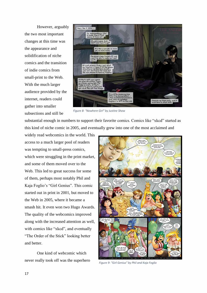
However, arguably
the two most important
changes at this time was
the appearance and
solidification of niche
comics and the transition
of indie comics from
small-print to the Web.
With the much larger
audience provided by the
internet, readers could
gather into smaller
subsections and still be
substantial enough in numbers to support their favorite comics. Comics like “xkcd” started as
this kind of niche comic in 2005, and eventually grew into one of the most acclaimed and
widely read webcomics in the world. This
access to a much larger pool of readers
was tempting to small-press comics,
which were struggling in the print market,
and some of them moved over to the
Web. This led to great success for some
of them, perhaps most notably Phil and
Kaja Foglio’s “Girl Genius”. This comic
started out in print in 2001, but moved to
the Web in 2005, where it became a
smash hit. It even won two Hugo Awards.
The quality of the webcomics improved
along with the increased attention as well,
with comics like “xkcd”, and eventually
“The Order of the Stick” looking better
and better.
One kind of webcomic which
never really took off was the superhero
Figure 8- "Nowhere Girl" by Justine Shaw
Figure 9- "Girl Genius" by Phil and Kaja Foglio
18
comic, probably because that was more or less all the traditional American comic publishers
like DC and Marvel would release. Superhero comics also may have had trouble due to the
limitations of the web, or of the expected upload schedule. They work less well in brief
installments. There was perhaps also a split in what the different audiences were looking for;
“Superhero comics of the early 00’s ran on nostalgia and familiar faces, and webcomics of the
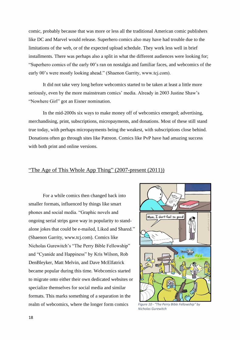
early 00’s were mostly looking ahead.” (Shaenon Garrity, www.tcj.com).
It did not take very long before webcomics started to be taken at least a little more
seriously, even by the more mainstream comics’ media. Already in 2003 Justine Shaw’s
“Nowhere Girl” got an Eisner nomination.
In the mid-2000s six ways to make money off of webcomics emerged; advertising,
merchandising, print, subscriptions, micropayments, and donations. Most of these still stand
true today, with perhaps micropayments being the weakest, with subscriptions close behind.
Donations often go through sites like Patreon. Comics like PvP have had amazing success
with both print and online versions.
“The Age of This Whole App Thing” (2007-present (2011))
For a while comics then changed back into
smaller formats, influenced by things like smart
phones and social media. “Graphic novels and
ongoing serial strips gave way in popularity to stand-
alone jokes that could be e-mailed, Liked and Shared.”
(Shaenon Garrity, www.tcj.com). Comics like
Nicholas Gurewitch’s “The Perry Bible Fellowship”
and “Cyanide and Happiness” by Kris Wilson, Rob
DenBleyker, Matt Melvin, and Dave McElfatrick
became popular during this time. Webcomics started
to migrate onto either their own dedicated websites or
specialize themselves for social media and similar
formats. This marks something of a separation in the
realm of webcomics, where the longer form comics Figure 10 - "The Perry Bible Fellowship" by Nicholas Gurewitch

19
created their own dedicated websites, and the social media comics started mutating into
memes. This separation continues in part to this day.
After 2011
In the years since the shift
towards shorter meme-like webcomics,
the “market” has shifted back towards
long-form comics somewhat. At least in
the sense that there seems to be more of
them than of the shorter comics on
websites which cater to webcomic-
readers. Sites like Hiveworks and
Webtoons will gather webcomics of at
least passable quality (perhaps
Hiveworks more so than Webtoons) and
present readers with a vetted selection
of comics. These sites will typically
focus more on the long-form comics
than on the meme-comics, probably
because they (the long-form comics) are much more financially stable and provide a more
long-term benefit to the website. Another reason why long-form webcomics and meme-
comics are not found in the same place is probably because they are treated as separate things.
Meme-comics are viewed as memes and webcomics as comics, with some middle ground in
comics like “SMBC” and “Cyanide and Happiness”.
Print comic corporations have taken note of the respectable numbers of people who
read webcomics and have tried haphazardly to break into the market, mostly by making their
comics available online and through comic-reader-apps, which many of the publishers now
have.
Figure 11- "Cyanide and Happiness" by Kris Wilson, Rob DenBleyker, Matt Melvin and Dave McElfatrick

20
In conclusion, webcomics started out as very short and simple comics, mostly gag-a-
day comics with little to no connection or story between them. They also had very little in the
way of innovative usage of the tools they had at their disposal. Some of these tools had not
even been invented yet. Over time the comics became more and more complex, with longer
stories, technical innovations and experimentation as people started to realize the possibilities
of this new medium. In this thesis I will explore some comics which have been around since
the beginning of the 2000s and which therefore benefited from the new tools which had been
developed by their predecessors, while the medium was also still fresh enough to innovate in
on their own. I will also explore some newer comics which entered the market as it had
already become well established and saturated enough that the creators had to deliver on
certain expectations of quality as well as longevity in order to survive. With this selection of
the fairly old and the fairly new, all with different approaches to how they create their comics
I believe that I will have provided a representative sampling of what webcomics have to offer,
and with this backbone of historical context, have given the reader enough information to
place the comics in the landscape of webcomics, especially since all the comics I have chosen
are still being produced (arguably with the exception of “Girls With Slingshots”).
I have chosen not to write extensively about the kinds of webcomics which behave
more like memes, as I do not feel comfortable with trying to draw a line between where the
webcomics end and the memes begin. Some short form comics like “SMBC” are fit for
sharing on social media, and often is, such as on sites like 9gag. This is the closest I will come
to discussing the creation of memes in this paper.
Theory
In this paper I will be relying quite heavily on the works of Scott McCloud and Will Eisner.
There are two reasons for this. Firstly, they provide a solid foundation of basic observations
on the construction of comics. Many of their points are fundamental enough that they can be
either transferred to a discussion on webcomics without losing their relevance, or they provide
an excellent point of contrast to point to when webcomics have changed something
fundamental in how they function in comparison with print comics. Since much of this thesis
21
is about analyzing the differences between the basic building blocks of print comics and
webcomics, these very fundamental observations are the most important to keep in mind.
Secondly, there is very little literature about the technical aspects of webcomics. McCloud’s
book “Reinventing Comics” is arguably still the most influential work on the subject even
though it was published in 2000. The combination of these two factors have led to a
somewhat restricted pool of sources to cite from. Some other works have been written on
webcomics, and I have attempted to use them wherever they are relevant.
Selection of webcomics
The comics I write about are separated into a few different categories. They mostly fit
into three; fantasy adventure, slice of life, and real-life nerd-associated humor. Like I
mentioned above, I have chosen these comics because I think they are representative of the
kind of webcomics which are the most common at the moment, and because they are
representations of many different kinds of webcomics, with differing degrees of
experimentation and complexity.
The fantasy adventure comics I discuss are; “The Order of the Stick” by Rich Burlew,
“Daughter of the Lilies” by Meg Syverud, “Unsounded” by Ashley Cope and “Goblins” by
Tarol (Ellipsis?) Hunt.
The slice of life comics I discuss are; “Girls With Slingshots” by Danielle Corsetto
and “Undivine” by Ayme Sotuyo (arguably, is also fantasy)
The real-life nerd-associated humor comics I discuss are; “Saturday Morning
Breakfast Cereal” by Zach Wienersmith and “xkcd” by Randall Munroe.
OOTS: “The Order of the Stick” is a fantasy adventure comic following the titular
order through their adventures. The story is set in a world heavily inspired by the popular
role-playing game Dungeons & Dragons. The comic is mostly comedic in tone, but explores
dramatic themes as well, especially as the comic has continued to develop.
XKCD: This is “a webcomic of romance, sarcasm, math and language” (xkcd.com/),
which also explores other subjects as well, while remaining fairly close to this definition. A
comic of quite dense nerd-humor, this webcomic has become one of the most popular

22
webcomics in the world. Every comic which is uploaded to the website is independent of
every other comic.
Daughter of the Lilies: According to the creator, this comic is “largely about the
importance of self-worth, the different forms love can take, how it can redeem and empower
us, as well as issues relating to anxiety. (There are also unicorns, manticores, ghouls, goblins,
cannibalistic elves, dragons, gods, fairies, ghosts, werewolves, demons, angels and so on)”
(www.daughterofthelilies.com/about). A fantasy webcomic set in what is possibly a post-
apocalyptic future following the main character “Thistle” and the band of mercenaries she
works for.
Unsounded: This comic is a fantasy adventure comic which “falls into the Epic
Fantasy Adventure genre, with occasional forays into the horrific, the profane and the goofy.”
(www.casualvillain.com/Unsounded/about.html). It follows a young thief girl on a mission along
with her faithful magic-wielding zombie.
UnDivine: This comic straddles the line between slice of life and fantasy comic.
According to the creator the comic “is a dark fantasy comic that deals with revenge, morality,
friendship and monsters.” (www.undivinecomic.com/about). It follows the daily life of a high-
school senior who sells his soul to a demon so she will help him deal with his problems.
SMBC: “Saturday Morning Breakfast Cereal” is a comic which uploads every day and
is about anything and everything, from math to philosophy to absurdist humor to complicated
dick-jokes. It follows the same format as “xkcd” in that every comic is independent of every
other comic which is uploaded.
Girls With Slingshots: This slice of life comic follows the mid-20s main character
Hazel and her group of friends through their daily lives. The comic is mainly drama-focused
with a great deal of humor mixed in.
Goblins: This is a fantasy adventure comic which “looks at a fantasy game realm from
the point of view of the low lever monsters, namely the goblins.”
(www.goblinscomic.com/what-is-goblins). Much like The Order of the Stick this comic is heavily
inspired by the role-playing game Dungeons & Dragons. It follows a group of goblins as they
are driven from their homes by the “heroes” of this world.

23
While there are many other types of webcomics, they often fall into the same
categories as these. As such I have chosen, as mentioned, a selection of webcomics which are
representative of the climate as a whole, with the three main blocks being humor, slice of life
and fantasy adventure, which all have an endless variety of subdivisions which all blend into
each other and create new genres all their own. In this way, they function a great deal like
regular comics.
Chapters
The chapters of this thesis are arranged in the order of “time and motion”, then
“composition”, then “text-image relationship”. The reason for this is that these three subjects
are the most fundamental aspects of comics, and webcomics change all of them. In the chapter
on time and motion I will be introducing most of the new tools used by webcomics, since all
of them have a very noticeable impact on the experience of time and motion in a comic. These
tools will then be explored further by analyzing how they affect the other fundamental aspects
of webcomics. This will be done in the chapters on the composition and on the text-image
relationship.
In the chapter on time and motion I will more specifically explore how webcomics
change the perception of time in comics by introducing the new tools of the medium to the
already established art of comics creation. One of the more important new features I will
explore is the idea of the “infinite canvas”. I will also touch on things like animation,
interactivity and other new tools. The comics I use in this chapter will be; xkcd, The Order of
the Stick, Saturday Morning Breakfast Cereal and Unsounded.
In the chapter on composition I will explore how the introduction of new methods for
creating and designing comics changes the composition of comics. The tools I introduced in
the chapter on time and motion will be relevant here as well, especially the “infinite canvas”,
as it has a clear and direct impact on the design of the page. I will also touch on the extensive
use of color in webcomics. The comics I use in this chapter will be; The Order of the Stick,
UnDivine, xkcd, Saturday Morning Breakfast Cereal and Goblins.
In the chapter on the text-image relationship in webcomics I will analyze how
webcomics splinter the traditional print idea of this relationship and becomes something much

24
harder to define. The introduction of several new layers of content made possible by the new
medium has caused a major upset in this relationship. The comics I will use in this chapter
will be; xkcd, Unsounded, Girls With Slingshots and Unsounded.
By going through the chapters in this order I will be gradually increasing the
complexity and the abstraction of the changes caused the new medium. The changes to the
experience of time and motion are the easiest too see and the effects are the easiest to define,
while the effects of changing the composition are more complex and abstract, and the changes
to the relationship between text and image are even more so.

25
Time and Motion.
Time and motion on the Web/Computer
There is a lot of overlap between traditional comics and webcomics when it comes to
time and motion, but they are not the same. Webcomics can do most or all the same things as
traditional print comics, but also everything offered by the platform they are on, that being the
computer, and more specifically the Web. Digital comics differs in their portrayal of time and
motion through the usage of several different tools unique to the medium. There are three
main innovations brought to webcomics by this medium; the “infinite canvas”, motion and
interactivity.1
The “infinite canvas”
The “infinite canvas” is the first and perhaps most famous of these tools. There are
three important aspects to it to explore; how it affects the common webcomics page, how it
can be used to create more uncommon pages, and what effect the “infinite” nature of it has on
the sense of time and perhaps timelessness in a webcomic.
One of the basic differences between traditional comics and webcomics is the "page"
they are read from. Traditional comics are printed on pages which are taller than they are
wide, while webcomics are displayed on a screen which is significantly wider than it is tall.
Not all webcomics take this into account, but many do. This is in part a problem of
composition, how to make the comic look good and read well on a wide screen, but it also has
1 Sound can also be used. Sound in comics is generally written out as a word or something
approximating the real-life sound, and in most webcomics this is how sound works as well. This is “traditional”
sound. Webcomics have the option however, of introducing real sound into the comic. Real sound in webcomics
is rarely used, however, even though it has several potential applications. The creator can insert sound clips of
the speech bubbles being read, sounds being played out, diegetic or non-diegetic music. Using sound in this way
has the effect of very clearly showing how much time is passing inside a panel, even more so than the traditional
speech bubble. It also takes control away from the reader, leaving them unable to dictate the pace of the action.
There are some ways around this, though, like programming the sound to only play at certain times and after
certain triggers, like moving the mouse cursor over the image, or scrolling and moving the image into view.

26
a significant impact on the aspects of time and motion in the comic. For example,
webcomics which are constructed in a way where you can see a whole "page" at a time
tend to read sideways rather than top-down, like a traditional newspaper-comic. There
are some webcomics which present a full comics page which is visible in its entirety
without having to scroll, but they are in the minority. This is not very different from the
ways it is done in print, but where webcomics differ significantly is when the entire
"page" is not visible at the same time. These pages are usually too big to fit on a
computer screen and still be legible, so the image goes past the borders on the
computer, usually further down. This means that you must move the image in order to
read the rest of the comic, and this can have several interesting effects on the aspects of
time and motion. First, you get an effect like that of turning the page when you scroll
down. New images and information are revealed to the reader. This is very significant
in terms of composition, in part because it dictates that the webcomic can hide twists
and surprises at the bottom of a page rather than at the top of the next one. This also
means that there can be a similar treatment of skips in time and place, and of motion.
While a traditional comic might want to wait until the next page to reveal something
new or make some major transition, the webcomic can do it at the bottom of the current
page because, again, scrolling down serves a similar (but not identical) function to
turning the page in a print comic.
Eisner has written about the effects of turning the page. The page functions as a
sort of “meta panel” (Comics and Sequential Art, p 65), encapsulating everything
depicted on it, including all the other panels. The page, however, is not as malleable as
the panels themselves, and can therefore be referred to as a “hard frame” (p 65),
perhaps more so in print than in webcomics, but the idea still stands. “The page as well
as the panel must therefore be addressed as a unit of containment although it, too, is
merely a part of the whole comprised by the story itself. This is no less true of comics
presented digitally – the sequential artist must take into consideration the use of meta-
panels of page, browser, and screen.” (65). Turning the page in a print comic is in a
way like looking from one panel to the next, or from one meta-panel to the next. The
question of time and motion is connected somewhat to the problem of the page. As
mentioned above, this is more a question of the composition and pacing of the comic,
but it relates to where you insert certain kinds of time skips and motions, and where the
creator makes some sort of major change, often in scenery or location, or making some
Figure 12 - McCloud's famous "infinite canvas" from his website scottmccloud.com

27
important reveal. “Keep in mind that when the reader turns the page a pause occurs. This
permits a change of time, a shift of scene, an opportunity to control the reader’s focus.” (p
65). As mentioned above, this is somewhat different in webcomics, where the page serves a
function somewhere between meta-panel and several “pages” at once.
The “infinite canvas” can be used to create much more uncommon comics pages as
well. The webcomic is much freer regarding “page” structure than the traditional comic; “The
comic can be composed of discreet panels in sequence, multiple series of panels running in
parallel, one image with no clearly defined borders but with images fading and overlapping,
or any number of other styles and methods." (Webcomics, p 112). McCloud created the term
“infinite canvas”, which was a result of his writing about the effect of scrolling (Reinventing
Comics, p 223). This resulted in what he named an "infinite canvas", where the page can
essentially be as large as the creator wants it to be. In theory this freedom of space could
extend in all (two dimensional) directions, letting you navigate the page freely, only seeing
certain parts of it at a time. On a computer the page could also be zoomed into, revealing new
images as the reader gets closer. This exploration of an image far too large to see the entirety
of has a few interesting effects. When you move through the webcomics page you are also
moving "deeper" into the comic (Reinventing Comics, p 227), and since you may not know
how far down it goes you may experience several things as a result. The reader may feel
compelled to keep reading, because you cannot stop until you have finished the page (even
though you have little idea of how long it is, unlike in print). It can also give the impression of
"falling" deeper and deeper into the comic. The more specific effects the use of the larger
“infinite canvas” can have depends largely on how it is used and in what context. I will
explore a few different ways it can be used later in the chapter, looking at a few specific
examples.
The term “infinite canvas” has come to mean something more than this to some;
Sometimes the term is used to describe any type of webcomic that utilizes the
particular "formal" possibilities of the Web. […] Infinite canvas has come to represent – for
some webcomics creators – the special formal possibilities offered by creating and reading
comics digitally. For some creators, this is an important reason for making webcomics; for
other creators, the idea of the infinite canvas moves too far away from what is appealing about
comics. (Webcomics, p 112).

28
While it is somewhat ambiguous which of the two options McCloud was talking about
in his “Reinventing Comics”, strictly the size of the screen or the possibilities of creation on
computers and the web in general, I have chosen to go with what I think is the more likely and
popularly accepted option. Therefore, whenever I refer to the “infinite canvas” it is the size of
the comics page which I am referring to.
The question of time and timelessness introduced by calling this the “infinite canvas”
is an interesting one. The “canvas” can of course never be literally infinite, as that would
require infinite computing power. McCloud makes this observation himself in “Reinventing
Comics” (p 224). It could be functionally infinite, though, in the sense that no human reader
would ever be able to reach the end, either because they run out of patience or lifespan.
Creating a comic of such size is of course outside of human capabilities, but it could in theory
be done. A comic of functionally infinite size on a canvas which can (almost) always fit more
is a comic which is also functionally infinite in time. McCloud makes the observation in
“Understanding Comics” that in comics, “time and space are one and the same.” (p 100).
Moving through space is moving through time. If there is no end to the space, then there
would be no end to the time either. Here the distinction between functionally infinite and
literally infinite becomes relevant. You could say that a lot of things are functionally infinite
in relation to something else. The life of the universe is “functionally” infinite in relation to
the lifespan of a single human, for example. This is different from being literally infinite, as
the lifespan of a human is still a measurable percentage of the lifespan of the universe, while
it would not be in comparison to a literally infinite amount of time. With infinite time, all
measurable amounts of time become practically no time at all. With infinite time, everything
is timeless. The reason this is relevant is that while the “infinite canvas” of the internet and
the computer can in many ways be made functionally infinite, the name “the infinite canvas”
implies a literal infinity, and the implication of the name is in many ways just as interesting as
the actuality. The implication, then, of a comic of infinite size is a comic of complete
timelessness. As the reader moves through the comic time would arguably pass, but in
relation to what? Any amount of time which passes between and inside panels would have to
be compared to the time which passes throughout the entirety of the comic because time is in
many ways purely experiential. This is a problem for philosophers and theoretical physicists
and is beyond the scope of this thesis, but interesting nonetheless. When any measurable
amount of time is to be compared to infinity, it is, as mentioned, no time at all.

29
I will explore how the tools mentioned above, perhaps especially the “infinite canvas”
effect a number of webcomics in different ways, and how through them the webcomics can
achieve results which would be impossible in print.
Analysis
I have chosen four different webcomics to analyze and will explore how they use their
medium to do something new regarding time and motion in comics, and how they change the
nature of the stories they tell, as well as enhance the message or emotional impact through the
usage of these tools. All the chapters will be structured in this way. The comics I will be
looking at in this chapter are; “xkcd” by Randall Munroe, “The Order of the Stick” by Rich
Burlew, “Saturday Morning Breakfast Cereal” by Zack Wienersmith, and “Unsounded” by
Ashley Cope. All of them apart from “Unsounded” utilize the “infinite canvas” in some way.
XKCD
I will be looking at how three different comics from this webcomic, specifically; “Time”,
“Click and Drag”, and “Garden”, experiment with the portrayal and experience of time and
motion. The webcomic is created by Randall Munroe and it consists of comics which are all
independent of each other, but with some recurring characters. “Time”, “Click and Drag” and
“Garden” are all examples of these comics.
Time
The comic "Time" (xkcd.com/1190/) is arguably an animation. A very slow animation.
It is 3102 frames long, going by at about 1 frame per hour, meaning that it took four months
for the entire animation to play, from midnight March 25 to July 26, 2013 (Explain xkcd –
Time). After the animation was finished, it started to loop through the last five frames, which
it still does to this day. If clicked it also leads to a webpage where you can scroll through the
entire story at your leisure.

30
The comic does three interesting things with time
and motion. The first is how slowly it plays. The second
is the wildly inconsistent amounts of time which passes
from panel to panel (or frame to frame) and the third is
the variety of motion in the comic. I also think the comic
is somewhere between a comic and an animation, and I
will explore this below.
While the animation itself would take four months to play out, the story told in that
animation is spread out over three days and two nights. In the first day the two main
characters build a sandcastle and trek a good way up a mountain. Then a night passes
(quickly, in terms of frames used). The second day they find people on top of the mountain,
talk to them, go back down to warn their people of a coming flood and float for a while on a
raft they build. Then the second night passes in literally one frame. They then reach land, go
ashore and walk off.
When the story is presented one frame at a time,
and one frame an hour, the story seems to take a lot
longer than it does "inside" the comic. As mentioned
before, the comic takes place over a period of three
days and two nights, while it would have taken four
months in real time to experience. I would argue that
experiencing the comic in this way, especially since it
really takes its time and "smells the flowers" as it were,
meaning that for the most part the characters are in no particular hurry, makes the reader (or
viewer) feel that everything is a much grander, and for the most part very relaxed, undertaking
than it would otherwise feel like. This feeling of relaxed grandeur would also help justify the
fact that the characters have never been as far up the
mountain as one day’s walk would take them in their
whole lives (presumably, judging by their
conversations). This would be more of a hard sell if it
played at a faster pace, especially since they seemed to
be able to just walk off on a whim. A similar feeling of
the comic being a large undertaking, or a quest, is given
Figure 13 - "Time" frame nr. 1
Figure 15 - "Time" frame nr. 100
Figure 14 - "Time" frame nr. 1500
31
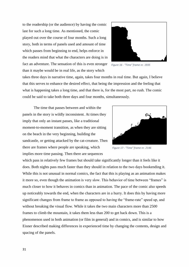
to the readership (or the audience) by having the comic
last for such a long time. As mentioned, the comic
played out over the course of four months. Such a long
story, both in terms of panels used and amount of time
which passes from beginning to end, helps enforce in
the readers mind that what the characters are doing is in
fact an adventure. The sensation of this is even stronger
than it maybe would be in real life, as the story which
takes three days in narrative time, again, takes four months in real time. But again, I believe
that this serves to enhance the desired effect, that being the impression and the feeling that
what is happening takes a long time, and that there is, for the most part, no rush. The comic
could be said to take both three days and four months, simultaneously.
The time that passes between and within the
panels in the story is wildly inconsistent. At times they
imply that only an instant passes, like a traditional
moment-to-moment transition, as when they are sitting
on the beach in the very beginning, building the
sandcastle, or getting attacked by the cat-creature. Then
there are frames where people are speaking, which
implies more time passing. Then there are sequences
which pass in relatively few frames but should take significantly longer than it feels like it
does. Both nights pass much faster than they should in relation to the two days bookending it.
While this is not unusual in normal comics, the fact that this is playing as an animation makes
it more so, even though the animation is very slow. This behavior of time between “frames” is
much closer to how it behaves in comics than in animation. The pace of the comic also speeds
up noticeably towards the end, when the characters are in a hurry. It does this by having more
significant changes from frame to frame as opposed to having the “frame-rate” speed up, and
without breaking the visual flow. While it takes the two main characters more than 2500
frames to climb the mountain, it takes them less than 200 to get back down. This is a
phenomenon used in both animation (or film in general) and in comics, and is similar to how
Eisner described making differences in experienced time by changing the contents, design and
spacing of the panels.
Figure 16 - "Time" frame nr. 1935
Figure 17 - "Time" frame nr. 2146

32
The most common device used in comics to
convey the passage of time is, as McCloud says, the
panel, which acts as a sort of punctuation in the flow of
the page. According to Will Eisner; "Once established
and set in sequence the block or panel becomes the
criterion by which to judge the illusion of time."
(Comics and Sequential Art, p 26). Eisner focuses
heavily on the usefulness of the panel in conveying the
passing of time between panels and the balloon in doing the same within a single panel.
"These two devices – panel and balloon – when enclosing natural phenomena, are critical to
supporting the recognition of time" (p 30). Eisner investigates several ways the composition
and shape of the panels can be used to imply different amounts of time passing. The number
and size of the panels is important. For example, you can compress time by using a greater
number of panels to show certain actions. You could show a person walking up a set of stairs
but do it several different ways. If in one panel you
show them at the bottom and in the other you show
them at the top, you imply that nothing of significance
happened during that time, and there is no tension.
However, if you use several smaller panels placed more
tightly together you build more tension and imply that
something important is happening. By making the
panels smaller and placing them closer together you can make the sequence faster and more
intense. The shape of the panel is also important. The example Eisner uses is that of a
telephone ringing during a tense scene. Several panels leading up to this have been tight and
small, building tension, but when the telephone rings it takes up an entire third of the page.
This gives the impression of the telephone ringing for a long time, and it also gives the event
significant weight. The sequence also imparts a certain rhythm and flow to the page. "In
comics, timing and rhythm, as created by action and framing, are interlocked." (p 30).
McCloud is not unaware of this. He describes how the feeling of time can be manipulated by
changing the shape and size of the panels. If a panel is larger, or at least longer, it tends to feel
like it takes up more time. His example is that of inserting a longer, silent panel into a
conversation to indicate a long pause in that conversation. "As unlikely as it sounds, the panel
shape can actually make a difference in our perception of time. Even though this long panel
Figure 19 - "Time" frame nr. 2202
Figure 18 - "Time" frame nr. 2228

33
has the same basic "meaning" as its shorter versions, still it has the feeling of greater length!"
(Understanding Comics, p 101).
By spending more panels on the characters
going up the mountain than on them coming down, we
feel that the journey down takes much less time, and in
this case, it also feels like they are hurrying, because the
narrative says that they are. This sensation is helped by
the amount of time which passes between panels on the
way down the mountain in contrast to the way up. The
story takes things so slowly on the way up in fact, that almost an entire third of the panels
pass before the characters even start their journey (frame 970 of 3100). By spending so much
time with the characters beforehand, the readers develop a relationship to them, and the
magnificent sandcastle they build gives the reader the idea that the rising of the sea-level
could in fact be a threat, even though it seems to happen very slowly. At the very least it
would be a threat to the sandcastle. As well as establishing the feeling of there being no rush,
a feeling echoed by the behavior of the characters, the long section in the beginning also
serves to introduce the main threat of the comic, namely the rising sea level. As the frames
slowly pass, the sea on the right side of the image slowly gets higher and higher,
imperceptibly slowly if you are not watching it happen at many times the speed of the original
presentation. The slow encroachment of the ocean both gives the impression that there might
not be anything to worry about (it is moving so slowly, after all) and at the same time planting
the seed in the back of the reader’s mind that this could probably become a problem if it does
not stop, which later in the comic turns out to be the case. This seed is also planted in the
minds of the characters, which is why they take the threat
of the rising ocean seriously immediately upon learning
what a major threat it is. This relaxed atmosphere of the
beginning is then contrasted with the more frantic ending
described above. The change in pace also reflects the
feelings and behavior of the characters. On the way back
down the mountain there is no longer any time to stop
and “smell the flowers”, and so it goes much faster. It still takes a while to get back down, at
least in real time, as the frames are still going by at a rate of one every hour, but it is much
quicker than the journey up the mountain.
Figure 21 - "Time" frame nr. 2465
Figure 20 - "Time" frame nr. 2576
34
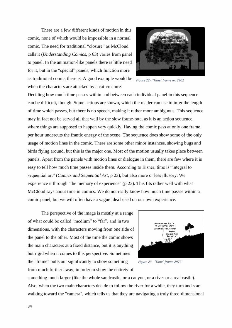
There are a few different kinds of motion in this
comic, none of which would be impossible in a normal
comic. The need for traditional “closure” as McCloud
calls it (Understanding Comics, p 63) varies from panel
to panel. In the animation-like panels there is little need
for it, but in the “special” panels, which function more
as traditional comic, there is. A good example would be
when the characters are attacked by a cat-creature.
Deciding how much time passes within and between each individual panel in this sequence
can be difficult, though. Some actions are shown, which the reader can use to infer the length
of time which passes, but there is no speech, making it rather more ambiguous. This sequence
may in fact not be served all that well by the slow frame-rate, as it is an action sequence,
where things are supposed to happen very quickly. Having the comic pass at only one frame
per hour undercuts the frantic energy of the scene. The sequence does show some of the only
usage of motion lines in the comic. There are some other minor instances, showing bugs and
birds flying around, but this is the major one. Most of the motion usually takes place between
panels. Apart from the panels with motion lines or dialogue in them, there are few where it is
easy to tell how much time passes inside them. According to Eisner, time is “integral to
sequential art” (Comics and Sequential Art, p 23), but also more or less illusory. We
experience it through "the memory of experience" (p 23). This fits rather well with what
McCloud says about time in comics. We do not really know how much time passes within a
comic panel, but we will often have a vague idea based on our own experience.
The perspective of the image is mostly at a range
of what could be called "medium” to “far”, and in two
dimensions, with the characters moving from one side of
the panel to the other. Most of the time the comic shows
the main characters at a fixed distance, but it is anything
but rigid when it comes to this perspective. Sometimes
the "frame" pulls out significantly to show something
from much further away, in order to show the entirety of
something much larger (like the whole sandcastle, or a canyon, or a river or a real castle).
Also, when the two main characters decide to follow the river for a while, they turn and start
walking toward the "camera", which tells us that they are navigating a truly three-dimensional
Figure 22 - "Time" frame nr. 2902
Figure 23 - "Time" frame 2977

35
space, of which we only have a two-dimensional view.
The reason the variety of motion in this comic is
interesting is that it is a blend of animation-like motion
and motion which belongs in comics. Seeing characters
move directly towards the “camera” in comics is fairly
rare, much rarer than in film. At times the frames go by
with little enough motion from panel to panel to function
perfectly as an animation, for example when they are building the sandcastle in the beginning,
while at other times it “slows down” considerably, to the point where it would no longer
function as an animation, but it will function as a comic, like when they are attacked by the
cat creature. During these instances the comic changes from animation to comic, and then it
changes back again. This back and forth between the lengths of time presented in and between
each panel through speech and motion is a large part of what makes this comic interesting
from a time and motion standpoint. This effect is brought sharply into focus on the webpage
“Time at your own pace” which can be reached by clicking on the comic panel on the main
website. It lets you view the whole comic, all 3102 panels “at your own pace”. To the left of
the selection of panels, there is a play button, and an interface where the reader can adjust
how quickly the frames should pass (the frame rate) and, importantly, how long it should
pause on the “special” frames. The “special” frames are the ones with dialogue or notable
actions in them, like the ones where the characters are being attacked by the cat creature. The
fact that the “play” function on this webpage makes the distinction between the normal panels
and the “special” panels by how quickly they should be played, enforces the idea that the
comic functions both as an animation and a comic at the same time, as well as mostly
animation at some times or mostly comic at others.
Therefore, I would argue that "Time" functions
somewhere between an animation and a comic, because
there are sections which lend themselves much more
easily to a higher "frame rate" than others. Some
sections would function fine as an animation, and others
would be unintelligible as anything other than a comic.
I think the comic straddles this in a very interesting way
by having the “frame rate” be so slow. It should be
noted, however, that several of the sections which lend themselves well to a higher “frame
Figure 24 - "Time" frame nr. 3046
Figure 25 - "Time" frame nr. 3091

36
rate” do not work badly as a comic and may in fact work
better as one, or at least as an animation which plays very
slowly. The reason for this is that those sections are often
the ones which are supposed to take a long time, because
they would take a long time in real life. By dedicating
more frames with less motion in “the gutter”
(Understanding Comics, p 66) between them to these
sections, the comic underlines just how long the adventure the main characters are on is
taking. This is, again, served doubly by having the upload rate be so slow. I will return to the
importance of this “in-between”-ness between two mediums and its relevance to webcomics
as a whole at the end of the chapter.
Animation in webcomics is not that unusual. It is the other major tool of time and
motion in webcomics, second only to the “infinite canvas”. Animation in webcomics can take
a few different forms, which have evolved to deal with the problem of the reader not always
looking where the creator wants them to look. They rarely take the form of a “normal”
animation of the kind you see in film, where the entire thing plays once and then is done.
When the creator does not know when the reader will see the animation, they must find a way
to play it in a manner where the reader is more likely to see it, regardless of how fast they
read. There are looping animations, which play over and over, functioning like a GIF
(whether that is the actual file format varies). Then there are animations which play very
slowly, like this comic, where it becomes something different entirely, something between an
animation and a comic. A third option is to create an “animation” where the reader must click
through each frame themselves. There are many other options for inserting animation into a
webcomic, restricted only by what can be done with a webpage. For example, the creator with
sufficient coding skill could make a panel which plays an animation when the mouse is over it
or insert a panel the reader has to click on to make it play. There is no shortage of options.
This comic utilizes the merging of comic and animation to great effect, creating
something which would be difficult and impractical, or even impossible in another medium.
The next comic “Click and Drag” will use another tool to achieve similarly unique effects, but
it will do it using the “infinite canvas”.
Figure 26 - "Time" frame nr. 3102
37
Click and Drag
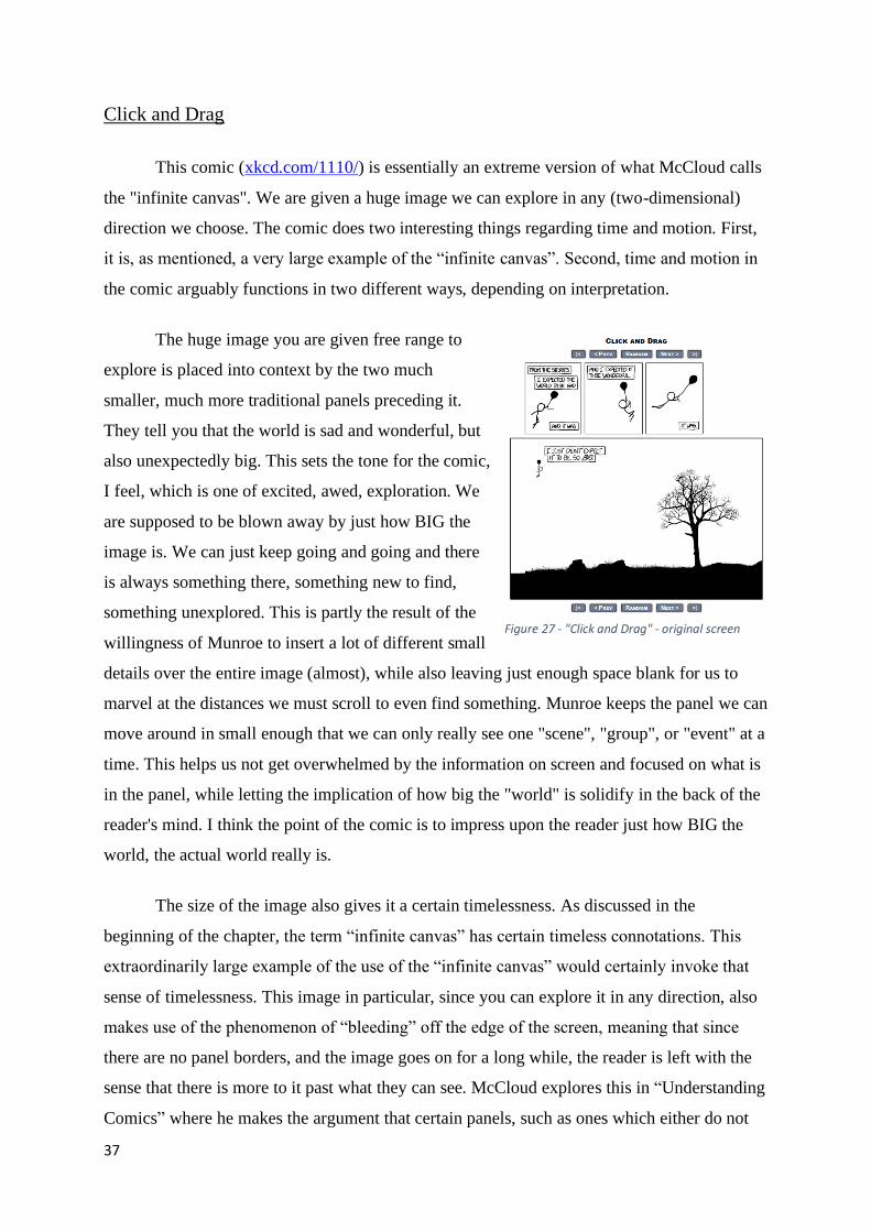
This comic (xkcd.com/1110/) is essentially an extreme version of what McCloud calls
the "infinite canvas". We are given a huge image we can explore in any (two-dimensional)
direction we choose. The comic does two interesting things regarding time and motion. First,
it is, as mentioned, a very large example of the “infinite canvas”. Second, time and motion in
the comic arguably functions in two different ways, depending on interpretation.
The huge image you are given free range to
explore is placed into context by the two much
smaller, much more traditional panels preceding it.
They tell you that the world is sad and wonderful, but
also unexpectedly big. This sets the tone for the comic,
I feel, which is one of excited, awed, exploration. We
are supposed to be blown away by just how BIG the
image is. We can just keep going and going and there
is always something there, something new to find,
something unexplored. This is partly the result of the
willingness of Munroe to insert a lot of different small
details over the entire image (almost), while also leaving just enough space blank for us to
marvel at the distances we must scroll to even find something. Munroe keeps the panel we can
move around in small enough that we can only really see one "scene", "group", or "event" at a
time. This helps us not get overwhelmed by the information on screen and focused on what is
in the panel, while letting the implication of how big the "world" is solidify in the back of the
reader's mind. I think the point of the comic is to impress upon the reader just how BIG the
world, the actual world really is.
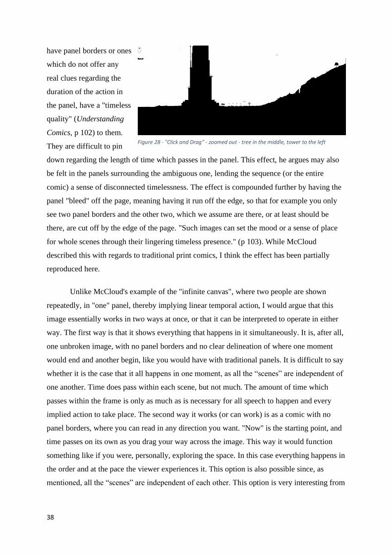
The size of the image also gives it a certain timelessness. As discussed in the
beginning of the chapter, the term “infinite canvas” has certain timeless connotations. This
extraordinarily large example of the use of the “infinite canvas” would certainly invoke that
sense of timelessness. This image in particular, since you can explore it in any direction, also
makes use of the phenomenon of “bleeding” off the edge of the screen, meaning that since
there are no panel borders, and the image goes on for a long while, the reader is left with the
sense that there is more to it past what they can see. McCloud explores this in “Understanding
Comics” where he makes the argument that certain panels, such as ones which either do not
Figure 27 - "Click and Drag" - original screen
38
have panel borders or ones
which do not offer any
real clues regarding the
duration of the action in
the panel, have a "timeless
quality" (Understanding
Comics, p 102) to them.
They are difficult to pin
down regarding the length of time which passes in the panel. This effect, he argues may also
be felt in the panels surrounding the ambiguous one, lending the sequence (or the entire
comic) a sense of disconnected timelessness. The effect is compounded further by having the
panel "bleed" off the page, meaning having it run off the edge, so that for example you only
see two panel borders and the other two, which we assume are there, or at least should be
there, are cut off by the edge of the page. "Such images can set the mood or a sense of place
for whole scenes through their lingering timeless presence." (p 103). While McCloud
described this with regards to traditional print comics, I think the effect has been partially
reproduced here.
Unlike McCloud's example of the "infinite canvas", where two people are shown
repeatedly, in "one" panel, thereby implying linear temporal action, I would argue that this
image essentially works in two ways at once, or that it can be interpreted to operate in either
way. The first way is that it shows everything that happens in it simultaneously. It is, after all,
one unbroken image, with no panel borders and no clear delineation of where one moment
would end and another begin, like you would have with traditional panels. It is difficult to say
whether it is the case that it all happens in one moment, as all the “scenes” are independent of
one another. Time does pass within each scene, but not much. The amount of time which
passes within the frame is only as much as is necessary for all speech to happen and every
implied action to take place. The second way it works (or can work) is as a comic with no
panel borders, where you can read in any direction you want. "Now" is the starting point, and
time passes on its own as you drag your way across the image. This way it would function
something like if you were, personally, exploring the space. In this case everything happens in
the order and at the pace the viewer experiences it. This option is also possible since, as
mentioned, all the “scenes” are independent of each other. This option is very interesting from
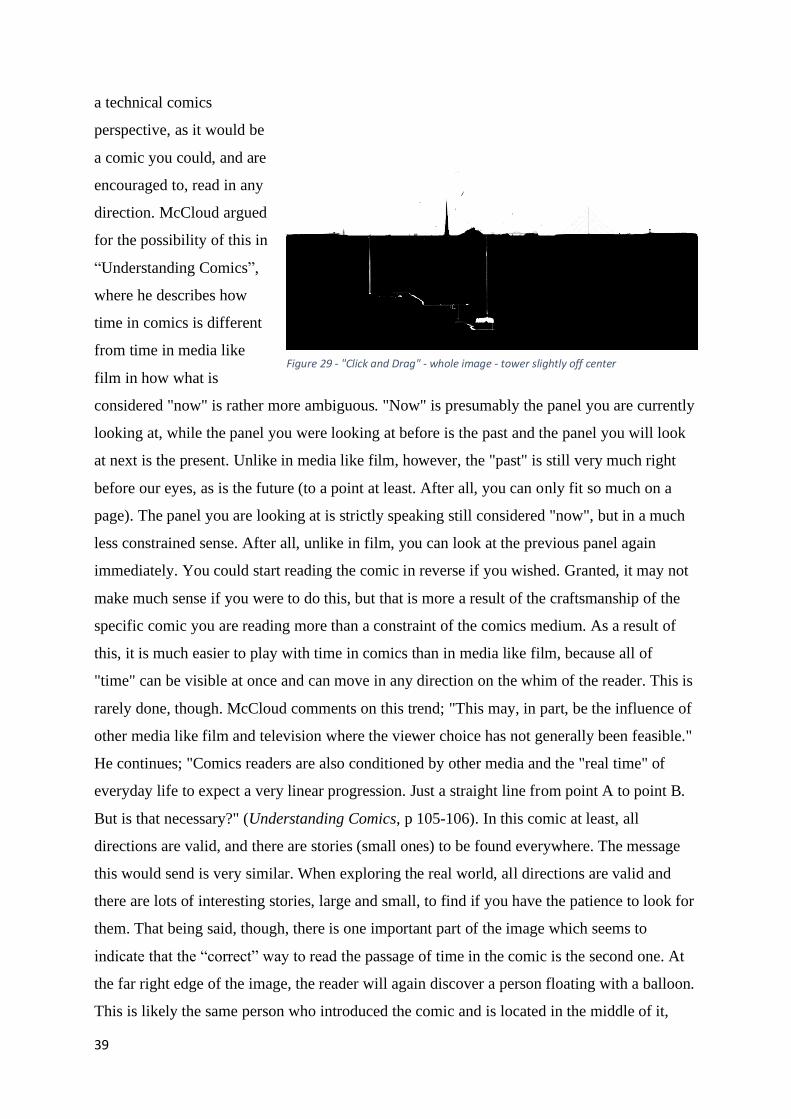
Figure 28 - "Click and Drag" - zoomed out - tree in the middle, tower to the left
39
a technical comics
perspective, as it would be
a comic you could, and are
encouraged to, read in any
direction. McCloud argued
for the possibility of this in
“Understanding Comics”,
where he describes how
time in comics is different
from time in media like
film in how what is
considered "now" is rather more ambiguous. "Now" is presumably the panel you are currently
looking at, while the panel you were looking at before is the past and the panel you will look
at next is the present. Unlike in media like film, however, the "past" is still very much right
before our eyes, as is the future (to a point at least. After all, you can only fit so much on a
page). The panel you are looking at is strictly speaking still considered "now", but in a much
less constrained sense. After all, unlike in film, you can look at the previous panel again
immediately. You could start reading the comic in reverse if you wished. Granted, it may not
make much sense if you were to do this, but that is more a result of the craftsmanship of the
specific comic you are reading more than a constraint of the comics medium. As a result of
this, it is much easier to play with time in comics than in media like film, because all of
"time" can be visible at once and can move in any direction on the whim of the reader. This is
rarely done, though. McCloud comments on this trend; "This may, in part, be the influence of
other media like film and television where the viewer choice has not generally been feasible."
He continues; "Comics readers are also conditioned by other media and the "real time" of
everyday life to expect a very linear progression. Just a straight line from point A to point B.
But is that necessary?" (Understanding Comics, p 105-106). In this comic at least, all
directions are valid, and there are stories (small ones) to be found everywhere. The message
this would send is very similar. When exploring the real world, all directions are valid and
there are lots of interesting stories, large and small, to find if you have the patience to look for
them. That being said, though, there is one important part of the image which seems to
indicate that the “correct” way to read the passage of time in the comic is the second one. At
the far right edge of the image, the reader will again discover a person floating with a balloon.
This is likely the same person who introduced the comic and is located in the middle of it,
Figure 29 - "Click and Drag" - whole image - tower slightly off center

40
where you start exploring. He looks the same and has the same kind of balloon. They also
speak the line; “I wonder where I’ll float next”. This seems to indicate that they are indeed the
same person. It would then be strange for them to exist in two places at once simultaneously.
The line also implies that this is supposed to be regarded as the “end” of the comic, which
would then mean that the right edge is the ending and while the reader is free to explore the
image in any direction they see fit, the left-to-right reading convention is still at least partially
in effect. However, there is a potential argument against this. At least one other balloon of the
same type is floating around apart from the two carrying people, this one without anyone
hanging from it. Since more of these balloons exist in the image, it could be that these are two
different people. This could be supported by the fact that there are a few other instances of
people in similar situations. For example, there are two much larger balloons with baskets
hanging from them flying around independently of each other, both of which have people in
them, as well as several boats.
I think both interpretations fit well with the message of the comic, which is that the
world is massive, and there is always more to discover and experience. More people to meet,
more stories to find. According to the website “explainxkcd.com” (a site run by fans);
The fact that we only see a small part of the landscape at once refers to the idea that
we cannot in real life comprehend the whole world altogether, but only what is around us
and/or in the range of our understanding at the time. The click-and-drag process, in which it is
impossible to go as fast as we would want to, also draws a parallel with the fact that
exploration is always done gradually, step by step, and trying something (i.e. here dragging in
a certain direction) always has a cost. This click-and-drag exploration reproduces the thrill of
discovering new horizons, getting lost sometimes, finding unexpected things, seeing beauty,
humor, desolation or happiness here and there… (explainxkcd.com)
The two ways of interpreting the way time works in the comic, the ambiguity of it, is
something which is hard or impossible to find on print comics. The option of creating a comic
which allows the reader multiple ways of experiencing time is something which I think is
unique to webcomics. The next comic, “Garden”, will again use the tools of the medium to
create an experience impossible in print.

41
Garden
This comic (xkcd.com/1663/) is interactive, and as such may seem more like a game
than a comic at all. There also seems to be little “point” to it, other than to let the garden
grow, tend to it, and see what kinds of things will show up in it. Whether it is a comic, a
game, an animation, or an “experience” is very much up for debate. The comic does two
interesting things with time and motion. The first is that the comic is interactive and requires
input from the reader for anything to happen at all, and the second is how much time it takes
to grow a proper garden.
There are many ways of making a
webcomic interactive. They can be roughly sorted
into two categories; interactable elements in the
comic itself, and interactable elements around the
comic. This comic only has interactable elements
in the comic itself. I will explore the other kind of
interactable comic later in the chapter.
Comics with interactions as part of the
comic itself are usually creations where the reader
has some sort of input in what happens inside the comics panels. For example, the reader
could be asked to click different sections of the panel, which would reveal different parts of a
story, or enter in information which would change the comic in some way. This kind of comic
gets quite close to becoming a browser game. The lines can get blurred. Like with introducing
animation, the comic becomes something not quite a comic and not quite a game/animation.
This in-between-ness will, again, be explored at the end of the chapter. This is essentially
what the comic “Garden” is.
The comic lets you create several different lamps. You can then control what color the
light coming from the lamps will be and direct the light from the lamps at different parts of
the garden. What shows up in the garden depends on the color of the light you choose, and in
what combinations. A lot of different things can show up in the garden, including plants,
animals, various characters from the normal comic, objects like obelisks and birdbaths, a great
number of various kinds of animal, and an assortment of other kinds of objects. The “reader”
can also prune the plants by selecting and deleting parts of them. By experimenting with the
Figure 30 - "Garden" - start screen

42
different combinations of light, users of the site
have created an incredible variety of gardens.
There are some legitimate questions of whether
this is a game more than a comic, or at least a
different kind of digital experience. I would
argue that it is not entirely a game and not
entirely a comic, like how “Time” is not entirely
a comic and not entirely an animation. While the
reader starts the “experience” and can influence
what happens, there is not a failure state, which
is important. In most, if not all, games there is an implied failure state. You cannot fail with
this comic. I would therefore argue that it is closer to an “experience” than to a game. I would
also argue that it is not entirely a comic, as there is little active participation in the events
apart from managing what is more likely or less likely to appear in the image. There is
arguably a story being told, but not much of one. The point seems to be, as the mouse-over
text tells us, to relax. Relax and see what happens. The mouse-over text could also be
suggesting the reader should not always think so hard. Many of the comics of “xkcd” are very
intellectual, and this could be an attempt to create something complex without wanting to
overburden the reader with analytical thinking. The meaning behind the text could be that
there is no deeper meaning to the comic at all.
Growing a garden takes a long time. How long depends on how full you want it to get.
The only way to grow the garden is to turn on the various lights and then sit and wait. The
only way for the “comic” to “progress” is for real time, not comic time, to pass. The reader
has no impact on how quickly things happen, like in the “Time” comic. The amount of time
needed to grow a garden is significant enough that Munroe gives the option of saving your
garden, which you can then come back to whenever you want if you want to keep tending to
it. There are also more options for different colors than there are available lamps, so if a
reader wants to see everything the “comic” has to offer, they need to play it several times.
The combination of the reader being unable to affect the pace of the comic, the pace
being so slow, and the comic having to be viewed in an active window, so the reader
essentially must sit and watch it, makes the experience of time in this comic glacial. Sitting
and watching plants grow and objects appear in “real time” makes for exceptionally slow
Figure 31 - Garden of username; "Halrandir" - from "explainxkcd.com"

43
viewing. When the animation of the winds starts and things start swaying in the breeze, things
start to move faster and slower at the same time, in the sense that things may be moving more,
but it is harder to see the progress of the garden.
The elements of time and motion is essential to this comic, just as much as in any
other. The reader sets events in motion, and after that they must wait. This is a different kind
of time than in regular comics, as the reader has no say over how quickly things move, and
things move in “objective” real time, not in the more ambiguous “comics” time. The things
which appear (mostly the plants) all sway in the breeze, and some plants grow gradually,
while others simply appear, so there is an element of animation to the comic as well.
The Order of the Stick
“The Order of the Stick” (popularly shortened to OOTS) is a fantasy adventure story
and for the most part a traditional comic, rarely experimenting by using the tools of the web,
with some notable exceptions. The comic essentially has two different kinds of pages. The
standard page, and the longer “infinite canvas” page. Since the usage of the different kinds of
pages are heavily based in their usefulness to the narrative, I will discuss what happens at a
few points in that narrative, and how the usage of the “infinite canvas” serves it.
The standard page in OOTS is like the
traditional comics page except for one major
difference, which is that the bottom of the page
is usually hidden when the reader first views it.
As discussed earlier, this functions essentially as
a small “infinite canvas” or the turn of a page.
The effects of turning the page as explained by
Eisner has been explored above, as well as the
effects of the “infinite canvas”. The way this
comic uses the “infinite canvas” is different from
the way it is used in “xkcd”. In “Click and Drag”
the canvas stretched in every direction, while
this comic uses a more traditional version, where Figure 32 - "OOTS" standard page – p 1180
44
the reader can only move downward, with jokes or “cliffhangers” for the next page located at
the bottom, out of the view of the reader at first. The comic is very story focused, with a
strong central narrative which everything is built around, and most of the published pages are
composed as traditional comics pages, with a good deal of freedom when it comes to panel
size and layout, but nothing that would look out of place in a print comic. When the comic is
published on the web, the published "chunks" of comic are even sometimes broken into
several pages at a time, while still all being published together, in order to keep the comic
print-friendly (which is useful, as the comic is printed in books, chapter by chapter), with the
final “page” in the larger “chunk” of pages being the one to most reliably use the “infinite
canvas”, or turning the page, effect. This changes sometimes, however, when something
narratively important happens. At those times the comic becomes more experimental and uses
especially the “infinite canvas” much more liberally.
For example, when the main character of the comic, Roy, falls to his death in the
middle of a battle, protecting a city from the main villain (not really having achieved anything
against him), the reader is treated to almost an exact copy of McCloud’s "infinite canvas"
falling strip (OOTS, p 443). Unlike in McCloud's strip, however, where the heroes manage to
stop themselves just in time, Roy slams unceremoniously into the ground, mid-sentence,
dying immediately. This is an extremely significant story moment for several reasons. Firstly,
he is the main character. The story being told is his. He is the one "in charge" of stopping the
main villain. Secondly, he is the leader of the Order of the Stick, and it has been repeatedly
established that the rest of the Order are useless without his direction. Thirdly, it means that in
order to bring him back from the dead (which is very much possible in the comic) the Order
must be able to retrieve his body, but since he fell to his death behind enemy lines, they
essentially MUST win the battle in order to do so. When the Order in fact fails to protect the
city and must flee, they are split into two groups, and are unable to meet back up again, with
one group having escaped the now conquered city and the other being trapped in that city
because they tried to retrieve Roy's body. This gets even worse for the group because the
person who can bring Roy back from the dead is in the group which escaped, so now they
cannot bring him back, even though they have his body. So now the main character is dead
(for a long while at least), the Order are separated, they are without the only person who could
keep them cohesive and effective, and the main villain just won an extremely important battle.
Roy falling to his death marks a turning point in the comic. Before this, the group had always
managed to muddle through to success somehow. There had been close calls, but they had

45
always succeeded. The good guys had always won. But this is the first time where
they not only failed, they did so spectacularly, at a time when they absolutely had to
win. The only reason the main villain did not complete his evil scheme then and
there was dumb luck, and no thanks to the Order. This kind of shift is more
effective if it is presented as a twist. We expect Roy to survive his fall. He is the
hero, the main character, and we have seen him survive things like it before. To
keep the results of his falling a surprise, Burlew uses the tool of the "infinite
canvas" to keep us in suspense the entire time. He even keeps Roy talking until the
very end, in order to ensure we are taken unawares. The point is that when the story
is about to make a major turn or something very important is about to happen, and it
would be made better by utilizing the tools available to the webcomics creator, that
is when Burlew uses them. Otherwise he keeps things fairly traditional. Burlew uses
the infinite canvas on at least one other occasion, when he wants the reader to be
shocked in a different way. While the tool being used is the same, the effect is very
different. In the other instance, the reader is shown a gravesite, the size of which
recontextualizes everything they and the reader have been told so far (OOTS, p
1139). The “infinite canvas” is used to show more and more graves, to the point
where they all blend together. What remains the same is that the moment it is being
used for is a major shift in the story. In many ways everything changes, both times
it is used.
This relates heavily to time and motion, time in the first example and motion
in the second. In the case of Roy falling to his death, we experience him falling at
roughly the same pace as he does, since he is speaking most of the way down, and
we wonder how long he has before he hits the ground. Since he is falling from a
great height, he has time for quite a monologue before he hits the ground. As we are
scrolling downward, we also experience the downward motion of his fall, in a way.
And since the bottom of the page stops at the same time as the web-page does, we
experience the sudden stop much like Roy does. While the first instance is used to
portray time and motion, the second instance is mostly used to portray space
through motion. The image of the graves keeps going and going, much longer than
the reader would be expecting, as Burlew rarely uses pages of such length, and the
graves are packed thicker and thicker, until they become an indistinguishable mass. Figure 33 - "OOTS" - Roy falling – p443

46
Saturday Morning Breakfast Cereal
Saturday Morning Breakfast Cereal, or SMBC for short, is also fairly traditional when
it comes to time and motion in its design. It does, however, make much more liberal use of the
"infinite canvas" than “OOTS” and “xkcd” does. Since the comic is a page-a-day work, and
the comics are all separate from each other, this is more a case of making use of the greater
flexibility of the medium to tell a greater variety of stories, or in this case, jokes. The comic
can be divided into two categories, the first being comics which all fit on the screen, and the
comics which use the “infinite canvas” to tell much longer jokes. All the comics also have one
additional optional joke, which can be found if the reader knows how to look for them. These
are the “votey’s”, or the “red button jokes”.
Since the usage of time and motion in the
“standard” comics is very traditional, I do not think
it necessary to explore them here. They are usually
single panel in the vein of “The Far Side” by Gary
Larson, or there are few enough panels that they all
fit on the screen.
Since the "infinite canvas" strips of
“SMBC” are divided into panels, they do not get
the same effect as the ones in “OOTS”. It is more
akin to reading deeper into a story than moving
physically downward. In that way it works more
like an invisible page count, or something more
like a very long tapestry. McCloud has argued for this being comics’ original shape, before
being confined to the pages of print (Reinventing Comics, p 201). In this way the comic can
essentially be as long as it wants to, without having to worry about the restrictions of print,
which according to McCloud is the more natural and comfortable form for comics. The comic
does on occasion use the "infinite canvas" in ways which are even more specific to the
medium, like making jokes where the reader must zoom out the image on their screen in order
to see a hidden dick joke in the background. When reading the comic normally, the shape is
too close and too large to fully take in what it is, which is reflected in the conversation going
Figure 34 - "SMBC" - standard comic
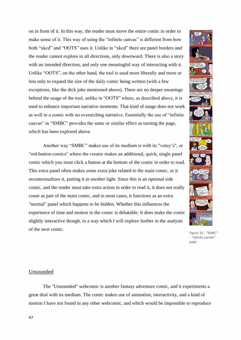
47
on in front of it. In this way, the reader must move the entire comic in order to
make sense of it. This way of using the “infinite canvas” is different from how
both “xkcd” and “OOTS” uses it. Unlike in “xkcd” there are panel borders and
the reader cannot explore in all directions, only downward. There is also a story
with an intended direction, and only one meaningful way of interacting with it.
Unlike “OOTS”, on the other hand, the tool is used more liberally and more or
less only to expand the size of the daily comic being written (with a few
exceptions, like the dick joke mentioned above). There are no deeper meanings
behind the usage of the tool, unlike in “OOTS” where, as described above, it is
used to enhance important narrative moments. That kind of usage does not work
as well in a comic with no overarching narrative. Essentially the use of “infinite
canvas” in “SMBC” provides the same or similar effect as turning the page,
which has been explored above.
Another way “SMBC” makes use of its medium is with its "votey’s", or
"red-button-comics" where the creator makes an additional, quick, single panel
comic which you must click a button at the bottom of the comic in order to read.
This extra panel often makes some extra joke related to the main comic, or it
recontextualizes it, putting it in another light. Since this is an optional side
comic, and the reader must take extra action in order to read it, it does not really
count as part of the main comic, and in most cases, it functions as an extra
"normal" panel which happens to be hidden. Whether this influences the
experience of time and motion in the comic is debatable. It does make the comic
slightly interactive though, in a way which I will explore further in the analysis
of the next comic.
Unsounded
The "Unsounded" webcomic is another fantasy adventure comic, and it experiments a
great deal with its medium. The comic makes use of animation, interactivity, and a kind of
motion I have not found in any other webcomic, and which would be impossible to reproduce
Figure 35 - "SMBC" - "infinite canvas" page

48
in print. While the main comics page is only subjected to animation and arguably
interactivity, the rest of the website surrounding the page experiments with all three tools.
The standard page in “Unsounded” is as
close to the traditional print page as it can get.
The whole page fits on the screen, with no
scrolling necessary. The comic makes no use of
the “infinite canvas” mechanic whatsoever. The
most common experimentation the comic does
to change the feeling of time and motion is
changing the background around the comics
page, effectively turning the whole webpage into
a meta-panel as explored above. When the
narrative moves from one place to another the
background of the webpage often changes
alongside the comics page, in effect becoming
an extended background of the comics page. In
this way the mise en page expands to include the
background of the webpage, as well as the other
parts of the website in other sections. Traditional
comics can also achieve an effect like this by changing the borders around the pages, so it is
hardly revolutionary, but this is a more extreme version.
The second most common way the comic experiments with its medium is through
animation. On page 39 of chapter 14 for example, the entire main comics page turns 90
degrees and becomes much smaller, essentially just two panels. While staying on the same
page, the reader can click through a sequence which is essentially a musical number with
several pieces of animation as two of the characters are singing. The pieces of animation are
not extensive, no more than what seems like a simple GIF overlaid on the page, and the effect
they have on the story is not obvious, but still potent, in a way. The point of the singing and
the music is to distract the other characters present and lull them into a false sense of security.
It works, not just on them, but on the reader as well. The animation and the change in image-
size helps in this regard. I believe that likening the sequence to an animated musical number
(as in a Disney film) makes a lot of sense here. It feels like a fun little aside. It is supposed to,
Figure 36 - "Unsounded" - standard page - webpage not pictured

49
for not just the reader, but also the audience in
the comic. Therefore, when things get ugly
and violent in the course of the musical
number, it takes the reader (and the
characters) by surprise. The change in size,
and the page turning on its side helps the
reader distance the sequence from the rest of
the comic, again, making the reader think of it
as a fun aside.
Other ways animation is used include
having sections of the comics page move in order to reveal other, new sections, having a
person disappear from one section of the page and appear in another, and having speech
bubbles appear and disappear as the reader looks at the page. These animations and the ones
discussed above are all small loops over which the reader has no control. The second way the
comic uses animation is not like this. In fact, it may be something different to animation
entirely. The second method is by uploading several versions of the same page and having the
reader click through them one “frame” at a time. In this way the “animation” only plays once,
and the reader has total control over how when and how quickly it happens. Both kinds of
animation are mostly used when something special is happening in the narrative, similar to
how the “infinite canvas” is used in “OOTS”, but much more liberally.
The ways this comic uses animation is different from how “xkcd” uses it, at least in
the comic “Time”. In “Time” the animation functioned more like an animated film. The
reader (or viewer) could only see one panel at a time and had no power over whether things
would happen, or how quickly. The “xkcd” animation played itself out entirely independently
of whether anyone was watching it or not. The animation in “Unsounded”, however is not like
this. As mentioned, the animations are inserted into more traditional comics pages for the
most part and serve the function of portraying things which would be possible to portray
without animation, but uses the animation to enhance the experience, or to help convey or
establish a particular feeling. The two different ways the comic is animated show this. The
faster looping animation, which plays without input from the reader, conveys surprise and
speed, or a magical unfolding of a scene, or they bring the scene or sequence to life in some
way. They portray things which are supposed to feel exciting and surprising. Meanwhile, the
Figure 37 - "Unsounded" p 39 chapter 14 - Page turns on its side, guitar playing animated

50
slower one-click-at-a-time animations portray moments which are supposed to have more
weight to them, both from the point of view of the characters as well as the reader. If a scene
is haunting or nightmarish to a character, then the slower animation is often used to enhance
that feeling. The slower animation is used when it is desirable for a moment to really sink in,
instead of being a flashy surprise.
Then there are the less obvious ways to portray time and motion in webcomics.
“Unsounded” does this in part by becoming interactive. This, however, is a different kind of
interactivity from “xkcd” and “Garden”. This is interactivity surrounding the comic itself,
without ever touching the main comics page. Comics with interactable elements around the
comic does this mainly through clickable links. This tool was discovered very early on and
was used extensively by one of the earlier webcomics, “Traced”. These links will then lead
the reader to different places which are relevant to the comic and the story of the current page.
This gives the webcomic; “the ability to make immediate connections to stories or
information.” (Webcomics, p 103). These links will then lead to other parts of the webpage (or
other webpages entirely) which will continue the story, add optional elements to it, or
recontextualize it in some way. The printed equivalent might be something like a comic with
optional fold-out sections. This can have interesting effects on the experience of time and
motion in the comic, depending on the chosen function. For example, it could serve as an
optional “meanwhile” effect, where the comic shows something happening somewhere else
which is separated from the main comic by being on a different webpage. In this comic the
pages the links lead to can serve as extensions of the world of the comic while not strictly
being a part of the story most of the time. The interactable elements around the comic need
not be clickable links, though. They can also be smaller interactable elements around the
webpage which the reader can click on (or interact with in some other way) to reveal
something new, like in “SMBC”, mentioned above.
The kind of motion I have not found elsewhere is heavily related to interactivity. In
one sequence, starting on page 96 of chapter 14, the comic does something I would argue
relates to time and motion, but is different enough that it could fit in other categories as well.
The setup in the story for what happens is relevant to how it effects the comic mechanically,
so I will briefly explain what is happening. The setup is that a powerful curse is about to be
unleashed on one of the characters. The nature of the curse is that everyone of a certain group

51
will hate this person with an all-consuming
passion. It will literally be the only thing they are
able to think about and feel, until he or they are
dead. In a very real sense, the entire world will
revolve around this person, for the ones affected.
This is reflected mechanically in the comic and in
the structure of the entire webpage. What I mean
by this is that several things happen before the
curse reaches the "actual page" of the comic.
First, the text of the "tab", at the top of the
webpage, which presents the comic, changes. Up
until this point it has presented the name of the
comic, the name of the current chapter, and the
page number you are currently on. When it
reaches page number 96, though, it changes. It
now reads; "What does his blood taste like?". Over the arrow you click to move to the next
page, as well as over the link to the index, appears alt-text (or mouse-over text), which assures
the reader that it is all right to hate this person. These changes continue for the next few
pages, presenting new text for each page, and the alt-text spreads to most of the click-able
links on the page, as well as over the main comics page. On page 98 the links which would
take the reader to other parts of the website, or to a dedicated wiki for the comic are crossed
out with red lines. If clicked on from this page onward, they will take the reader somewhere
else, specifically to pages which are either a corruption of the previous page, or a new page
dedicated to building hatred for the character which is about to be cursed. The "corrupted"
links lead for example to the wiki, to a page dedicated to telling the reader to hate the
character, and to "kill him before he kills you!". On page 99 the "tab" text changes to
"ETALARCHE" in all capital letters, which is the name of the curse. At this point the alt text
is all either this or the name of the character, all in capital letters. On page 100 we see the
curse take effect within the main comics page. The people around the character start to visibly
react. Along with this, the background of the webpage starts to flicker back and forth between
what was previously there and two red flesh-like columns covered with eyes and with his
name carved into them. On page 101 this new background takes over completely, and at this
point the curse is in full effect. I would argue that this very much falls under "Time and
Motion". It just does so in a way which is impossible to replicate in print, in a way which is
Figure 38 - "Unsounded" - corrupted link leads here
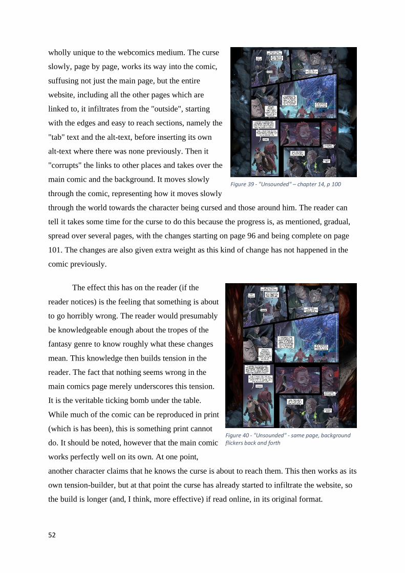
52
wholly unique to the webcomics medium. The curse
slowly, page by page, works its way into the comic,
suffusing not just the main page, but the entire
website, including all the other pages which are
linked to, it infiltrates from the "outside", starting
with the edges and easy to reach sections, namely the
"tab" text and the alt-text, before inserting its own
alt-text where there was none previously. Then it
"corrupts" the links to other places and takes over the
main comic and the background. It moves slowly
through the comic, representing how it moves slowly
through the world towards the character being cursed and those around him. The reader can
tell it takes some time for the curse to do this because the progress is, as mentioned, gradual,
spread over several pages, with the changes starting on page 96 and being complete on page
101. The changes are also given extra weight as this kind of change has not happened in the
comic previously.
The effect this has on the reader (if the
reader notices) is the feeling that something is about
to go horribly wrong. The reader would presumably
be knowledgeable enough about the tropes of the
fantasy genre to know roughly what these changes
mean. This knowledge then builds tension in the
reader. The fact that nothing seems wrong in the
main comics page merely underscores this tension.
It is the veritable ticking bomb under the table.
While much of the comic can be reproduced in print
(which is has been), this is something print cannot
do. It should be noted, however that the main comic
works perfectly well on its own. At one point,
another character claims that he knows the curse is about to reach them. This then works as its
own tension-builder, but at that point the curse has already started to infiltrate the website, so
the build is longer (and, I think, more effective) if read online, in its original format.
Figure 39 - "Unsounded" – chapter 14, p 100
Figure 40 - "Unsounded" - same page, background flickers back and forth

53
The comic could be said to be somewhat interactive in these sections where the reader
has access to optional material which they must perform additional actions to view. The
comic never reaches the levels of interactivity which would turn it into something closer to a
game, like “Garden”, but there are additional optional materials, parts of the comic the reader
can miss, unless they notice and perform the necessary actions to view them. While “Garden”
is built entirely around the idea of interactivity, “Unsounded” uses it to enhance a main
narrative. “XKCD” does not have an overarching narrative and so can devote one of its
comics, all of which are independent of each other, to explore the idea of an interactive comic.
Conclusion
Time and motion in webcomics are influenced by the extra tools they have at hand.
Through things like the “infinite canvas” and animation, as well as interactivity, they can
offer new experiences to the reader, experiences which would be impossible in print. The
“infinite canvas” has the potential to remove the boundaries of the traditional comics page,
letting the creator tell stories which could be read in any direction, like “Click and Drag”. It
could even help remove the expectation of the comics page entirely, letting stories of new
interesting formats be created, like one long uninterrupted image, similar to the old historical
tapestries. The “infinite canvas” also makes it easier to surprise the reader by hiding the real
size of the page they are reading, letting twists like the ones in “OOTS” happen, where the
entire comic can unexpectedly shift in another direction. The custom of letting the reader only
view one page at a time will also hide how much of the story is left, giving even more chances
for surprises.
By introducing animation into comics, the creators also introduce real time. The reader
no longer has control over how quickly they want things to occur in the comic, the creator of
the comic has taken that control. How much is taken varies greatly, from the quick animations
of “Unsounded” to the long, slow one-frame-an-hour animation of “Time”. This kind of slow
animation can stretch or slow down time by taking control of the pace, forcing the reader to
slow down as well. This is prevalent in both “Time” and “Garden” comics. By slowing the
comic down like this, it becomes easier to promote certain moods or emotions, which would
be impossible to promote if the reader would merely speed through. By forcing the reader to
stop, and in the case of these two comics, slow down and relax, they can give the reader an

54
experience they would never be able to receive from print. This reveals the potential for
slower, more contemplative comics (faster and more action-packed comics would also be
possible, but harder to create, or at least to keep from becoming pure animation). It is
important, though, not to lose the comics part of this amalgamation. “Time” works as well as
it does because it gets the benefits of both comics and animation. It does this by having its
very slow frame rate, but that might be necessary with the format it has. “Unsounded” avoids
this problem for the most part by only replacing parts of any page with an animation.
In fact, the in-between-ness of webcomics and other mediums might be its greatest
strength. The ability to introduce aspects from other mediums like animation and interactivity
broadens the possibilities for what kinds of stories can be told. Webcomics (at least some of
them) are an amalgamation of several different mediums, with the comic being the main
contributor. The creator does take some amount of control out of the hands of the reader, most
notably, as mentioned, the power to decide how quickly things will happen, but most
webcomics which introduce this kind of animation and interactivity provide some way of
ensuring the reader does not miss out on what the animation was supposed to show, such as
having it play slowly, or having it loop.

55
Composition
Composition is an important aspect of comics. It includes and influences art style and
general design, how the comic is structured on the level of individual pages and as whole
issues. Composition decides whether a comic is pleasant to read or to look at, or whether the
comic makes any sense at all. Poor composition can kill a comic for the readers, whether they
are able to explain why or not. After a short explanation of the importance of composition in
comics and some of the differences between composition in webcomics relative to print, I will
explore how a few different webcomics experiment with how they are composed, focusing in
particular on the “infinite canvas” and how it changes the structure of the page, not just
visually but also narratively. I will also go into how certain webcomics will use the tools
provided by the medium to let the reader experience the comic in entirely new ways, and how
this in turn impacts the composition of the comic.
The composition of a page deals with the design of the page, what it looks like, how it
functions. A page must be not only pleasing to the eye, it also must make sense and be easy to
read (unless the difficulty is the point). The images should be presented in a manner so the
reader can easily follow the course of events, their eyes should be able to track the order of
the panels without confusion or ambiguity (again, unless that is the point). This also applies to
things like speech bubbles. If the composition (as in placement) of the bubbles are off, it
becomes significantly harder to figure out who is saying what, and in what order. This will
also cause confusion. For example, a speech bubble should, in general, be located near the
speaker, and a small tail should extrude from the bubble, pointing to them. If the bubbles are
poorly placed, who says what can become ambiguous, even with the help of the tails,
especially if they end up crossing each other. Poor placement of bubbles can also ruin the
overall composition of the image, making it unpleasant to look at, as well as confusing. In this
manner, the composition of the speech bubbles is an important part of the composition of the
image. After all, the bubble will cover part of the image, and so must be considered when
designing both the image and the text. This is in part why comics favor short bursts of text
spread over more panels rather than one long text in a single speech bubble.
The composition of the panels has a great deal of impact on how the comics page is
experienced. If the panels are neatly divided and properly placed, it provides and easy and
relaxing reading experience. The reader needs to spend as little energy as possible to follow
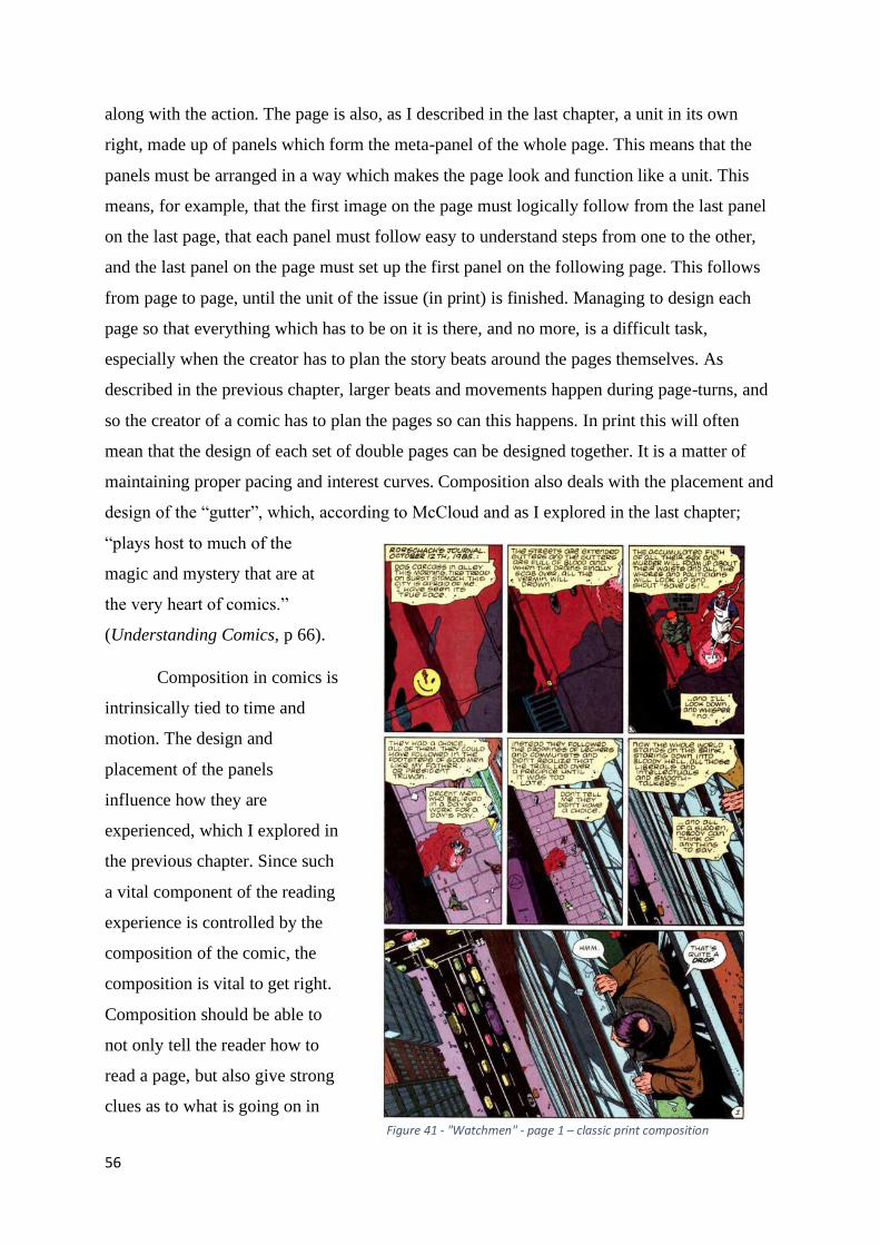
56
along with the action. The page is also, as I described in the last chapter, a unit in its own
right, made up of panels which form the meta-panel of the whole page. This means that the
panels must be arranged in a way which makes the page look and function like a unit. This
means, for example, that the first image on the page must logically follow from the last panel
on the last page, that each panel must follow easy to understand steps from one to the other,
and the last panel on the page must set up the first panel on the following page. This follows
from page to page, until the unit of the issue (in print) is finished. Managing to design each
page so that everything which has to be on it is there, and no more, is a difficult task,
especially when the creator has to plan the story beats around the pages themselves. As
described in the previous chapter, larger beats and movements happen during page-turns, and
so the creator of a comic has to plan the pages so can this happens. In print this will often
mean that the design of each set of double pages can be designed together. It is a matter of
maintaining proper pacing and interest curves. Composition also deals with the placement and
design of the “gutter”, which, according to McCloud and as I explored in the last chapter;
“plays host to much of the
magic and mystery that are at
the very heart of comics.”
(Understanding Comics, p 66).
Composition in comics is
intrinsically tied to time and
motion. The design and
placement of the panels
influence how they are
experienced, which I explored in
the previous chapter. Since such
a vital component of the reading
experience is controlled by the
composition of the comic, the
composition is vital to get right.
Composition should be able to
not only tell the reader how to
read a page, but also give strong
clues as to what is going on in
Figure 41 - "Watchmen" - page 1 – classic print composition

57
any given page, as well as give clues as to where in the story the reader is. For example, the
end of a story (issue or chapter, the end of a larger unit) is designed differently from the
beginning. The beginning of a story in comics functions much like it would in film, with an
introducing establishing shot to set the scene without drowning the reader with too much
information too quickly. The environment is established before the particulars of characters or
story. The ending of a story will often then do something similar, with a (usually) larger final
panel which will either solidify the ending of the story or establish the hook for the next part.
This panel is also similar in function to how film (usually) end. These similarities are useful to
keep in mind, as both comics and film are visual mediums, and so follow many of the same
rules. This final panel would then be the final shot of a film or episode, which, again, will
solidify the ending or establish the hook for the next one.
In terms of composition, webcomics are different from print comics. One major way
they are different is in how the pages are designed. In webcomics, the single page has to carry
more weight on its own, since they are usually presented one page at a time, with sometimes
significant periods of time between each page. Therefore, each webcomics page must to a
greater extent function as an independent unit. You can see this in print comics as well, of
course, with each page being a meta-panel which must function independently as well as
alongside all the other pages, but I would argue that the pages must be more so in webcomics.
There is perhaps more of a focus in webcomics on the single page and less on the larger
section of a chapter (or issue) of a print comic. This might be because webcomics are
generally not presented as chapters, but as one page at a time, for the entire run of the comic.
At least this is the case (usually) when they are put up online for the first time. The creator
could cut them into chapters later, but from page to page, the transition is not as noticeable as
the transition from issue to issue would be in print. Webcomics like “Goblins”, which I will
explore below, function like this, where there is no particularly noticeable difference between
the pages during transitions between chapters compared to between normal pages. There are,
of course, many similarities between composition in print comics and in webcomics. Most
webcomics follow the lead of print with regards to page shape and (generally) size, with some
notable exceptions, which I will explore below. The relationship between the panels on the
page function in the same way, where they have to follow logically from panel to panel, and,
as I will also explore below, from page to page. Since webcomics tend to, as mentioned,
publish one page at a time, this has a noticeable impact on the composition of many comics,
while others function equally well in either medium. Some comics, however, completely

58
break from the traditions of print, and, unlike many of the other comics I will discuss, would
not function in the print medium at all, largely because of experimental use of the tools
provided by the internet. Most of the comics I will examine in this chapter will be of the
variety which would, and do, function in print, with some examination of the ones which do
not. Many of the innovations utilized in these comics are possible through a specific tool, the
“infinite canvas”, which I explained and explored in the previous chapter on time and motion.
In this chapter I will examine how different webcomics change their composition and
design through and because of tools unique to the internet, most importantly the “infinite
canvas”, while also exploring the freedoms and restrictions unique to webcomics.
The Order of the Stick
In “The Order of the Stick” the use of the “infinite canvas” is integral to the design of
the comic. As I described in the chapter on time and motion, the comic uses this tool to some
extent in every page but saves the
more expansive use for important
story beats. In the chapter on time
and motion I described what the
effects of the use of the “infinite
canvas” can have on the reading
experience, and so in this chapter I
will focus more heavily on the
practical effects and changes it
brings to the normal pages of the
comic. The comic is originally
published as a webcomic, but after
the end of every chapter Burlew
compiles that chapter into a book
which is then published in print.
The comic structures itself
around the idea of the two different Figure 42 - "OOTS" - single print page on one internet page

59
pages; the book page and the internet page. The internet page is what gets posted to the
website with every upload and contains at least one book page. Usually it is divided into
several individual book pages. The reason Burlew does this is simply to achieve good flow
and utilize the “infinite canvas” without making it harder for himself to translate the comic
into print. The book pages are then, as mentioned, shorter sections of the webcomic. While
the book pages are not divided arbitrarily and without thought to page flow and pacing, they
are less individually strong, or at least less structured than the internet page. They function
more like a print page, which makes sense, since
that is essentially what they are. This can then
get turned on its head and used against the
reader when there is an important story beat
which makes particular use of the “infinite
canvas”, like the ones I described in the chapter
on time and motion. In particular the moment
where the character Durkon sees all the graves
of previous worlds. Unlike the page where Roy
falls to his death, which changes the width of
the page as well as the length, this page retains
the same ratio until the last book page. On the
page where Roy falls, the reader immediately
knows that something is different about his page
without even having to scroll down, since, as
mentioned, the width of the page has changed.
But on the page where the graves are revealed
this is not the case. The ratio remains the same,
and so the reader is caught unawares by the
momentous importance of what will happen.
The impact is even greater since the moment is
initially treated as something which is sad but
known, and fairly unimportant, something
already solidly established earlier on in the
comic. This is done by having the grave be
shown at the top of the internet page. While the
panel dedicated to it is large, taking up almost Figure 43 - Two print pages in one internet page

60
half the book page, there is nothing all that impactful
about it. The gravestone is large but simple. At the end
of the book page, however, another grave is pointed out
to us, which causes confusion in the reader and the
characters. Up until now we have only been informed of
one world having been destroyed. The following book
page then reveals more and more graves, and as the
reader scrolls down, expecting the page to end, like
almost all the pages before this one has, the page keeps
going for far longer than it usually does, showing more
and more graves, and the final panel of the page is huge,
with nothing but an amorphous, grey mass of
gravestones. This change in panel design is an
important one. The panel is, according to McCloud and
Eisner “comics most important icon!” (Understanding
Comics, p 98). The page is made up of panels and the
comic is made up of pages, and everything that happens
in a comic (at least a traditional comic) happens in some
kind of panel (even if it is the page as a meta-panel as
described by Eisner). The design and shape of the panel
is important; “Panel shapes vary considerably though,
and while differences of shape don’t affect the specific
meanings of those panels vis-à-vis time, they can affect
the reading experience.” (Understanding Comics, p 99).
Eisner makes the argument in his book that the shape of
the panel can in fact influence what the panel means
(Comics and Sequential Art, p 44). The surprising size
of the final panel means something different than the
preceding ones, in that its design is deliberately
intended to evoke a different emotion than the others. In
this case the emotion would be a mixture of awe, horror
and stunned surprise, which is only enhanced by the
subversion of expectation, since the much larger panel
breaks with the established pattern.
Figure 44 - "OOTS"- Second major use of "infinite canvas"

61
This amalgamation of the design for the medium of print and the medium of the
internet is an interesting example of straddling the line between the mediums. It makes use of
the freedom of the internet and the predictable structure of print comics. The composition of
comics is, after all, heavily related to what “page” they are on. The printed page of a
traditional comic book is much more restrictive than what can be done on the internet, while
the potential of the internet comics is similar to what McCloud describes as the “original”
comics, or at least historical relics and artworks which he sees as comics. These works were
much freer than a printed comics page, in that they were not restricted to a predetermined and
quite small canvas. The examples McCloud uses are; “…decorating the walls of a painted
tomb – spiraling in bas-relief up a stone column – parading across a 230-foot tapestry – or
zigzagging across an accordion-folded painted deerskin…” (Reinventing Comics, p 201). All
these things are impossible to do in print, but they are much more possible on the internet,
where size and shape is no issue (or at least less of one. The forms and shapes are still
converted from 3D to 2D, so you cannot view them in quite the same ways). For “OOTS” to
make use of both toolsets in the ways that it does is quite novel.
In webcomics, “pages” are usually portrayed as what is on the screen, or the specific
webpage the reader is on. This does not work in quite the same way as looking at a real
printed page, as it is harder to fit a lot of information onto the digital one without it becoming
unintelligible, as a result of the lower resolution. “To compensate for the low resolution and
screen shape, each page has roughly the same amount of visual information as a half page of
printed comics” (Reinventing Comics, p 214). This observation has remained fairly accurate,
with most webcomics opting for a more zoomed in look of a page, which the reader then has
to scroll down to see the rest of, with some exceptions, like “Unsounded”. The separation of
pages and images also influences the design of the whole comic, according to McCloud.
“Hypertext relies on the principle that nothing exists in space. Everything is either here, not
here, or connected to here – while in the temporal map of comics, every element of the work
has a spatial relationship to every other element at all times.” (Reinventing Comics, p 215).
McCloud does point out that this is not necessarily a problem. If it works, it works.
Printing changed the design of comics through restricting them to the page they would
be printed on. There was no longer infinite three-dimensional space to create in, but a
restrictive (as in small), flat piece of paper. This changed how comics were read, as they now
had to follow the traditions of reading print, which in the west was left to right and down. A
whole work could not fit on a single unbroken surface anymore, if it was too large.

62
Webcomics can break the mold of print, according to McCloud, if the creator can
“…recognize that the monitor which so often acts as a page – may also act as a window.”
(Reinventing Comics, p 222). This is mostly in reference to the idea of the “infinite canvas”
and how the image “behind” the screen can be much larger than the screen itself. It need not
restrict itself to the smaller frame like in print. The comic would then work more like a large
image in the real world, where the reader can still only read a part of it at a time but can move
in any direction and find the image continuing unbroken. In the real world the reader would
presumably be able to step back and get a view of the whole image without being able to read
what is on it. This could then be replicated in webcomics by having the reader be able to
zoom in and out, getting closer and further away from the image. In this way webcomics are
closer to the older creations and can therefore be much freer in their design. “In a digital
environment there’s no reason a 500-panel story can’t be told vertically” (which is close to
what “Saturday Morning Breakfast Cereal” sometimes does) “- or horizontally like a great
graphic skyline. We could indulge our left-to-right and up-to-down habits from beginning to
end in a giant descending staircase – or pack it all into a slowly revolving cube.” (Reinventing
Comics, p 223). While “OOTS” may not be the most experimental webcomic regarding the
possibilities of the internet, it straddles the line between the traditions of print and the freedom
offered by the tools of the internet to create a comic which draws and benefits from both
worlds. That being said, restricting itself to only exploring the “infinite canvas” in one
direction does not make full use of the freedom of the internet either. It means the design of
the comic is very much restricted in the kinds of movements it can portray, with prominence
given to vertical movement over horizontal movement, as argued by Eisner; “[Horizontal
stripe] bends the telling to a horizontal format. Vertical action effects are inhibited. [Vertical
comic] restricts the teller to a vertical field. It affects graphic storytelling by narrowing the
flow of imagery.” (Graphic Storytelling and Visual Narrative, p 8). “OOTS”, then, is both
served well by its more restrictive design choices, being able to surprise the readers with the
occasional longer page as well as having the option of printing physical copies of the comic,
while also limiting its access to the enormous freedom of design the tools of the internet
offers.
As mentioned above, “OOTS” using larger examples of the “infinite canvas” turns the
usual pattern on its head. The pages normally follow the pattern of a few book pages (or
sometimes one) of a standardized size, with the whole internet page functioning as a “meta
page”, with its own little arc. Each book page can also have its own little arc, akin to, or more

63
so than, the construction of print pages. The pages in “OOTS”, and many other webcomics
(especially those featuring a lot of jokes) have the following structure; introduce the scene and
what is happening, the middle, where most of the action happens (both literally in the case of
fight scenes and figuratively in the case of dialogue scenes), and the end, where there is
usually some kind of joke. The joke is seldom all that important to the main narrative but
serves to give a feeling of closure to the scene. A significant event, which serves as a
cliffhanger for the next page, or a twist, will often serve the same purpose, of giving closure
to the page. Like in print comics, the latter two options, the significant event and the twist,
serve to prepare, and build excitement for, the next page. These serve essentially the same
purpose, as it is common to hint at the next page at the end of the previous one, especially if
there is a page turn. I would argue again, though, that these tend to be weightier in
webcomics, in part because the page has to carry more weight on its own (because the wait
for the next page is longer), and because the comic usually operates without chapter breaks, so
it needs to spread its heavier transitions more evenly throughout the narrative. I will show this
structure with an example.
Page 1189, the last page of its chapter, has three book pages. The internet page starts
with two longtime allies of the main characters, who are currently spying on the main villain,
being informed that the main characters are on their way there. They are then ambushed by
unknown assailants, which do not appear to work for the villain, they get knocked
unconscious and carried off as the assailants talk about being resigned to being wiped from
existence. The internet page has its own arc with a beginning, middle, and conclusion. The
conclusion is also more dramatic than the usual page as it is also the conclusion of the
chapter. The reader does not know this is the last page until they have scrolled all the way
down to the bottom, though, making it a surprise. This would be harder to accomplish in print,
since the reader would be able to tell how many pages were left, unless the comic was printed
in a much larger compendium, which would mitigate the problem slightly, but not entirely.
Each book page then has its own little mini arc within the major arc of the internet page
(which is within the larger arc of the sequence, within the chapter, within the story). The first
page starts with the two characters being informed of the approach of the main characters.
The middle of the page is them then discussing this briefly while spying on the main villain
before being attacked by invisible assailants. The end of the page is then them on guard,
looking for the attackers. The next page then starts with the two groups initiating
conversation, with a spike in tension when one of the characters falls unconscious from

64
poison after the initial strike. The last remaining character
then speaks with the assailants for a while, with a new
spike in tension when we are informed that without an
antidote, the poisoned character will die shortly. The page
then ends with the second character surrendering to save
the life of the first. The third and last page then starts with
the second character also being poisoned and falling
unconscious, the middle is the both of them being carried
off, and the conclusion is the assailants talking about how
they expect to be wiped from existence.
Each page, and each level of page, has its own
little three act structure, which is enabled and reinforced
by the unique composition of the webcomics page. As
mentioned above, each page of a webcomic must stand on
its own in a way that print comics do not and introducing
a sequence of smaller arcs like this helps to keep the
reading experience interesting. Each page (both internet
and book) has a beginning, which refers back to the
previous page, helping to retain a sense of continuity, a
middle, with its own drama, and a conclusion, which
establishes a new status quo while hinting at the page to
come.
Most of the pages are like this, and in “OOTS” at
least it is very visible. Not all webcomics do this,
presumably, and the ones that do are not always so easy to
spot and define, but it is a storytelling tool which is very
useful in a medium where a long time can pass between
the release of new pages, and in the case of “OOTS”, it is
enabled and reinforced by the tools specific to the
medium, mostly the “infinite canvas”.
Earlier in the chapter I mentioned that internet
comics, unlike print comics, probably give less attention
to how the pages of the chapter (or just the comic) play off
Figure 45 - "OOTS" page 1189 - three print pages on one internet page and the end of the chapter

65
each other. This is usually a result of the reader only being able to see one page at a time, and
so the creator is not as incentivized to take the interaction between pages into account. While
print books have to take the difference between the double-spread and the page turn into
account, webcomics do not, although, it could be argued that the difference between the book
page and the internet page of “OOTS” function in a way similar to the double-spread and the
page turn. I would argue, however, that this is then mitigated by the reader only being able to
see less than one book-page at a time because of the “infinite canvas”.
There is a great disparity between how webcomics handle chapter transitions. In the case of
“OOTS”, there is heavy emphasis on giving each chapter a definitive starting point and end
point. This is not the case with all webcomics, as I will explore further below. At the end of
every chapter in “OOTS”, there is an establishing shot of the new location. This panel is, as
establishing shot panels tend to be, larger and drawn at a greater distance from the characters
than the usual panels. This helps to set the stage for the story, establish theme and mood, and
provide something like a narrative palate-cleanser to prepare the reader for a new chapter. At
the end of every chapter is an announcement (in the online version) that the last page of the
chapter is the last page. Along with this the final panel of a chapter tends to end either with a
grand reveal of some sort, like a much more impactful version of a regular page, or a large
“fade-out” panel, which helps to provide some sense of closure to what has just occurred.
Often the comic does both. The comic does its best to keep each chapter distinct from the
others in order to keep the chain of events clear in the minds of the readership. Since the story
is long and fairly convoluted, things could get confusing very quickly if this was not done.
Another comic which does not have clear
transitions between chapters is, as mentioned
above, “Goblins”, which I will explore later in the
chapter. In this desire to keep every chapter
memorable and distinct, Burlew uses tools which
would function perfectly in print as well, such as
designing each chapter to have its own easily
recognizable color palette. The first chapter is a
little all over the place, since it was written before
Burlew had much of a plan. The second chapter is
dominated by blues, as it mostly takes place in a
place called “Azure City”. The third chapter is blue Figure 46 - "OOTS" - Chapter 2 book cover

66
and orange, as “Azure City” is attacked by orange-
skinned monsters. The fourth chapter is dark blues,
blacks and pinks, as well as white, as the city has
been conquered by the villains, and Roy is dead
and wandering around in the afterlife. The fifth
chapter is orange, brown and red, as the characters
are questing in a huge desert, and the sixth chapter
is gray, blue and white, as it takes place in the
mountains. Color helps distinguish the chapters
from each other, and sets the tone, but this also
applies to print, and is therefore less of a focus in
this paper. This significant change in design
between chapters is made easy through Burlew’s
simple but memorable and impactful art style.
Eisner describes the phenomenon in comics of
simplicity being, in many cases, more useful than
complexity; “In comics, images are generally
impressionistic. Usually, they are rendered with
economy in order to facilitate their usefulness as a
language. Because experience precedes analysis,
the intellectual digestive process is accelerated by
the imagery provided by comics.” (Graphic
Storytelling and Visual Narrative, p 9). “OOTS” is
served very well by this phenomenon. The art style
of a comic can convey different kinds of emotion.
Things like shapes, colors and lines are all
influential in this regard. Different symbols come
to mean different things when we have lived with them for a while. Even backgrounds can be
used to convey the emotions of characters, which McCloud understands very well; “Even
when there is little or no distortion of the characters in a given scene, a distorted or
expressionistic background will usually affect our “reading” of characters inner states.”
(Understanding Comics, p 132). This is sometimes seen in webcomics, for example when the
backgrounds change in “Usounded”, reflecting the emotions of the characters on the page,
like sequence described in the previous chapter, of the characters in the comic being affected
Figure 47 - "OOTS" - Chapter 3 book cover
Figure 48 - "OOTS" - Chapter 4 book cover

67
by a curse. The characters are overtaken by this sinister new emotion, and the background
flickers back and forth between the normal one and the one implying an unnatural hatred and
rage, before settling on the latter one. This change, and the visible flickering and movement
back and forth before settling on the sinister new background, causes a reaction in the reader,
making the experience more unsettling than if the background had simply changed from one
to the other immediately. This effect is understood and described by McCloud; “Certain
patterns can produce an almost physiological effect in the viewer.” (Understanding Comics, p
132). The images do not necessarily have to be moving for this effect to manifest, though.
Eisner points out that a similar effect can be achieved with a tilted image of a train car
(Comics and Sequential Art, p 63). “Unsounded” also achieves this effect with the image of a
tornado moving the letters of the background in “Unsounded”. While the goal may be to
impart these feelings to the reader, the hope is then that the readers will transfer them to the
characters, which, according to McCloud, they often will; “But for some reason, readers will
ascribe those feelings, not to themselves, but to the characters they identify with.”
(Understanding Comics, p 132). The point of the sequence in “Unsounded” may be, though,
to portray a more subjective feeling than the train car and the tornado. While Burlew does not
experiment a great deal with this in “OOTS”, he uses changes in color and general design to
manipulate the perceived emotional states
of the characters, and, since the comic has
a very meta sense of humor, the characters
will sometimes point this out to each other.
An example of this happening is the scenes
where the Order are all hypnotized in the
desert. The whole color scheme changes to
reflect the emotional states of the
characters as they fall deeper into the
hypnosis and their emotions are changed
against their will. Since the color schemes
are so different between this sequence and
the normal plot the change back to normal
becomes quite jarring, which underlines
how strong the identity of the color design
of each chapter is, and how subtle the
Figure 49 - "OOTS" - Characters being hypnotized

68
change into the other color scheme was, which reflects the subtlety of the hypnosis magic
affecting the characters.
Though Burlew tries to design his chapters in pleasing ways that make narrative sense,
he also makes use of the “infinite canvas” to keep the exact end of a chapter hidden from the
viewer until the very last page. The announcement at the end of the chapter is presented as
part of the page, and since it is at the very bottom of the image the reader will not see it until
they read that far down. This surprise can be achieved much more easily in webcomics than in
print comics, first because the reader has no way of knowing how far away then end is unless
the creator tells them (there is, after all, no physical copy in the readers’ hands), and because
the creator can hide the announcement out of the immediate view of the reader. The
composition of the internet page ensures that the reader will likely not see the announcement
until they are at the end of the page, as it is all the way at the bottom, or as far down as it can
be without being separate from the main page.
These points obviously only apply to comics with an overarching plot, or at least
comics where the pages relate to each other. In many other webcomics, like “xkcd” and
“SMBC”, the individual pages are independent of each other. Since the pages can behave
independently like this, their structure is much freer. Many of them follow the structure of
beginning, middle, and end, especially the joke ones since jokes work off the same (or a
similar) structure, but many of them are freer and more experimental. An example of this
would be “Click and Drag” from “xkcd”.
UnDivine
“UnDivine” is a modern, urban fantasy webcomic about a high school boy who sells
his soul to a demon. The demon then starts following him around in human form. It is created
by Ayme Sotuyo, who migrated from print comics (most notably “Lumberjanes”) to create
webcomics instead. The comic is published as a webcomic first, and then in print later,
similarly to “OOTS”.
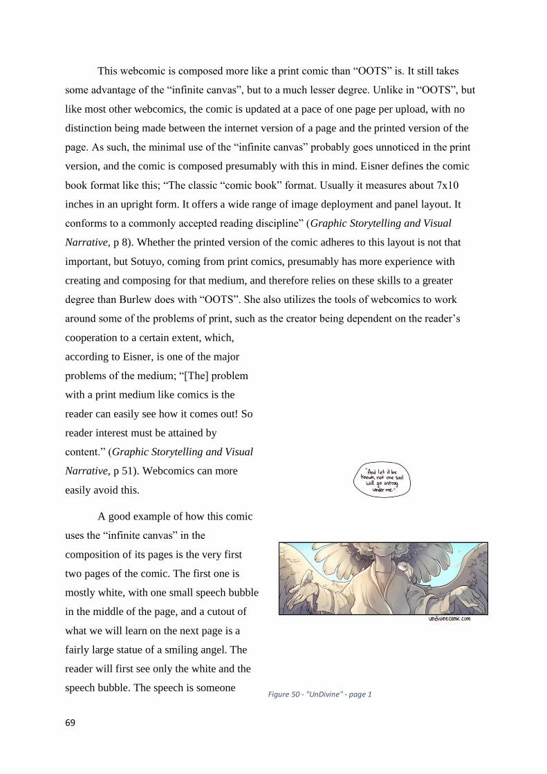
69
This webcomic is composed more like a print comic than “OOTS” is. It still takes
some advantage of the “infinite canvas”, but to a much lesser degree. Unlike in “OOTS”, but
like most other webcomics, the comic is updated at a pace of one page per upload, with no
distinction being made between the internet version of a page and the printed version of the
page. As such, the minimal use of the “infinite canvas” probably goes unnoticed in the print
version, and the comic is composed presumably with this in mind. Eisner defines the comic
book format like this; “The classic “comic book” format. Usually it measures about 7x10
inches in an upright form. It offers a wide range of image deployment and panel layout. It
conforms to a commonly accepted reading discipline” (Graphic Storytelling and Visual
Narrative, p 8). Whether the printed version of the comic adheres to this layout is not that
important, but Sotuyo, coming from print comics, presumably has more experience with
creating and composing for that medium, and therefore relies on these skills to a greater
degree than Burlew does with “OOTS”. She also utilizes the tools of webcomics to work
around some of the problems of print, such as the creator being dependent on the reader’s
cooperation to a certain extent, which,
according to Eisner, is one of the major
problems of the medium; “[The] problem
with a print medium like comics is the
reader can easily see how it comes out! So
reader interest must be attained by
content.” (Graphic Storytelling and Visual
Narrative, p 51). Webcomics can more
easily avoid this.
A good example of how this comic
uses the “infinite canvas” in the
composition of its pages is the very first
two pages of the comic. The first one is
mostly white, with one small speech bubble
in the middle of the page, and a cutout of
what we will learn on the next page is a
fairly large statue of a smiling angel. The
reader will first see only the white and the
speech bubble. The speech is someone Figure 50 - "UnDivine" - page 1

70
quoting a religious text. This, combined
with the pure white background,
immediately sets the tone of the comic.
Where the comic takes place is
presumably a very religious place, or at
least the comic will deal with religion
quite a bit. It will later turn out that the
comic is set in a heavily theistic (or even
theocratic) society on a fictional
Caribbean island, so it helps establish this
fact immediately. As the reader then
scrolls down, they will see this cutout of a
statue, showing only the lower half of the
face and the outstretched arms. There are a
few pigeons on it. This image is outwardly
friendly, but also menacing, almost
threatening when taken together with the
religious monologue going on. The image
establishes unease. It does this by only
showing this cutout of the full statue and,
very importantly, leaving out the eyes. The reader only sees a smiling mouth and outstretched
arms. The next image then seemingly undercuts this by having the reader immediately see the
religious monologue continue, speaking now about love, and the full statue is revealed,
showing the smiling, apparently benevolent angel, in bright daylight, in a park, in front of
several grand, church-like buildings, which will turn out to be a school. The reader will then
scroll down to see the name of the deity on the plinth; “La Davinidad”, as well as what
appears to be a student sitting at its base. These two pages do an excellent job of setting the
tone of the comic and informing the reader of several important plot points right away, and it
uses the “infinite canvas” to both deliver this information in a deliberate sequence, as well as
keeping the reader from being overwhelmed by it at any time. This is crucial in regard to
retaining control of the reader. Eisner writes; “In comics, reader control is attained in two
stages – attention and retention. Attention is accomplished by provocative and attractive
imagery. Retention is achieved by the logical and intelligible arrangement of the images.”
(Graphic Storytelling and Visual Narrative, p 51). The sequence goes; establish religious
Figure 51 - "UnDivine" - page 2
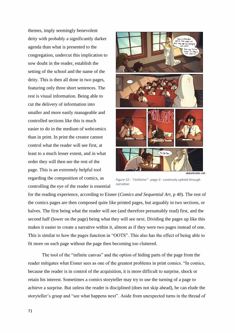
71
themes, imply seemingly benevolent
deity with probably a significantly darker
agenda than what is presented to the
congregation, undercut this implication to
sow doubt in the reader, establish the
setting of the school and the name of the
deity. This is then all done in two pages,
featuring only three short sentences. The
rest is visual information. Being able to
cut the delivery of information into
smaller and more easily manageable and
controlled sections like this is much
easier to do in the medium of webcomics
than in print. In print the creator cannot
control what the reader will see first, at
least to a much lesser extent, and in what
order they will then see the rest of the
page. This is an extremely helpful tool
regarding the composition of comics, as
controlling the eye of the reader is essential
for the reading experience, according to Eisner (Comics and Sequential Art, p 40). The rest of
the comics pages are then composed quite like printed pages, but arguably in two sections, or
halves. The first being what the reader will see (and therefore presumably read) first, and the
second half (lower on the page) being what they will see next. Dividing the pages up like this
makes it easier to create a narrative within it, almost as if they were two pages instead of one.
This is similar to how the pages function in “OOTS”. This also has the effect of being able to
fit more on each page without the page then becoming too cluttered.
The tool of the “infinite canvas” and the option of hiding parts of the page from the
reader mitigates what Eisner sees as one of the greatest problems in print comics. “In comics,
because the reader is in control of the acquisition, it is more difficult to surprise, shock or
retain his interest. Sometimes a comics storyteller may try to use the turning of a page to
achieve a surprise. But unless the reader is disciplined (does not skip ahead), he can elude the
storyteller’s grasp and “see what happens next”. Aside from unexpected turns in the thread of
Figure 52 - "UnDivine" - page 3 - continuity upheld through narration

72
a story, surprising the reader on a visual level
remains a major problem.” (Graphic
Storytelling and Visual Narrative, p 52). This
is, as mentioned above, much less of a
problem in webcomics, as the creator of the
webcomic has much greater control over what
the reader is able to see at any given time,
because the amount of new information
available to the reader at any given time is so
small, as the comic is published one page at a
time (for the most part). While the reader can
circumvent this if there is a sizable archive of
comics ahead of where they currently are in
the story, it is much more difficult to find a
specific place further ahead without being
able to skim (or at least look at) the pages in
between, and doing so quickly is harder in
webcomics than in print. It takes more effort
of the part of the reader, and sufficient effort
will often kill the urge to skip ahead. Some of
the problem remains, though, and the solutions
found in print still apply to an extent. “In
comics, the solution is to surprise the
character [original emphasis] with whom the
reader is involved.” (Graphic Storytelling and
Visual Narrative, p 52). Webcomics do not
need to rely as much on this as print does,
however.
Unlike “OOTS”, “UnDivine” has
experimented with splash pages to introduce a
new chapter. It only happened once, though,
so perhaps Sotuyo decided they were
unnecessary. Otherwise, the chapters end with
Figure 53 - "UnDivine" - Splash page for chapter 2
Figure 54 - "UnDivine" - End of chapter 2

73
a finalizing page which is composed differently than the ordinary pages. For example, the end
of chapter 2 has a page composed like a mirrored version of the first page of the comic, where
there is a panel at the top of the page, then a large white space, and then a small panel which
recontextualizes the first panel and sets up the coming conflicts of the next chapter. The large
white space between the panels is used similarly to how it was used in the introduction of the
comic, where the first panel sets the mood, and the second undercuts it. In the case of the
introduction, though, the mood was set by narration, and not a true panel. The final page of
the second chapter implies a happy ending. The main character has avoided a severe
punishment he assumed was unavoidable, and things are generally looking up for him. Then
the next, smaller panel at the bottom of the page shows blood leaking out of the corner of his
mouth. This indicates the start of his more noticeable transformation after selling his soul. The
white space helps sell the turnabout in fortune represented on the page. The reader can only
see the first optimistic panel at first and has to scroll down in order to see the next one, which
undercuts the optimism of the first.
The next chapter then starts with just an establishing shot of the new location, unlike
the previous chapter, which had a whole splash page and an introductory title. The two
chapters are separated by a sequence of reader questions, which Sotuyo then answers, but this
is more to fill time while Sotuyo takes a brief
break and to provide a mental separation
between the chapters, like what a front page
or splash page would provide. Starting the
new chapter with an establishing shot instead
of a splash page is more usual in the realm of
webcomics in contrast to print. This is
probably in part because there is no physical
copy, and so it needs no introduction, at least
not in the same way as a print comic book
would. This is the same way as “OOTS”
introduces its new chapters.
The establishing shot of the next
chapter, in this case chapter 3, functions like
an amalgamation of the traditions of print and
of the established norm of the comic. It has a Figure 55 - "UnDivine" - Chapter 3 page 1

74
large panel on top, featuring an image introducing the new location with some narration to
introduce the current events and conflicts. This panel is all the reader sees before scrolling
down. When doing so the reader then sees what functions like a secondary establishing shot,
showing the characters of the comic at a distance, establishing who is there and what is going
on. In print comics, the establishing shot would usually be much smaller in order to fit more
panels on the page (since space is a premium in print), or it would take a whole page in order
to be properly impressive. The webcomic takes what in print might be either half a page if the
establishing shot was smaller, or one and a half pages, if the establishing shot was larger. This
works much better in webcomics than it would in print, because of the tool of hiding parts of
the page beneath the edge of the screen. A way of seeing how much better it works as a
webcomic is by comparing how the page looks on the website with how it looks as a whole
image. When the reader sees the page on the website, they see only the large establishing shot,
which lets that panel take prominence on the page. This gives the reader the experience of
seeing a full-page establishing shot. They can then scroll down to see the secondary panel,
which introduces the characters, like a sub-establishing shot. This works well online, where
the reader can see only one full panel at a time, which separates them in the reader’s mind, but
it works less well when the reader can see the whole image. In that case, as you can see by the
image provided, the page looks out of balance. You would rarely see pages like this in print
comics, with one large panel at the top and one smaller (but still large) panel immediately
beneath it, especially with no gutter (apart from the thin black line) separating them. When
viewed like this, the page almost looks bad. This makes sense, though, as the page is not
meant to be viewed like this. It is meant to be seen one section at a time. While the page will
later be printed, it is common for pages designed like this to be cut into separate pieces, which
is what “OOTS” does with its larger “infinite canvas” pages. By using pages designed like
this as well as pages which work equally well in both formats, this webcomic straddles the
line between the two options in a way which is strengthened by the medium. “OOTS” does
the same, with its normal pages being divided into printable sections, as explored above, and
the occasional larger page, which will then be cut into sections for print.
SMBC/XKCD

75
“SMBC” (Saturday Morning
Breakfast Cereal) by creator Zack
Wienersmith does not do a lot different
regarding composition than the previous two
examples. The difference is mostly three-
fold. Firstly, the comic has no rigid base
structure it must follow, seeing as it is a
sequence of daily comics, all of which are
independent of the others. Secondly, it
includes the extra red-button comic (or
votey) at the end of the main comic. Thirdly,
the comic very occasionally makes use of
the technical aspects of the medium, having
the reader manipulate the image on their
screen to reveal a joke. The freedom afforded the comic by the first point is much greater than
anything you would find in a daily print publication, such as newspaper-comics. “SMBS” has
the freedom of the internet to experiment with and does so by having no firm guidelines for
what its comics look like. In this way it is quite similar to the comic “xkcd”. Therefore, the
comic features everything from single panel comics reminiscent of “The Far Side” by Gary
Larson, to long stories making heavy use of the “infinite canvas”, to a surprising amount of
graph jokes. The most innovative use
related specifically to the internet in
probably the extensive use of the “infinite
canvas”. Wienersmith uses it a great deal,
but only to create longer comics, usually
only in the form of a long, vertical
sequence of panels, essentially creating
one long comics page, subdivided into
what is visible on the screen at any time.
This approach is less systematic than what
can be seen in “OOTS” and to a lesser
extent “UnDivine”, as there is little in the
way of structured use.
Figure 57 - "SMBC" - Common format
Figure 56 - "SMBC" - Votey for the above image
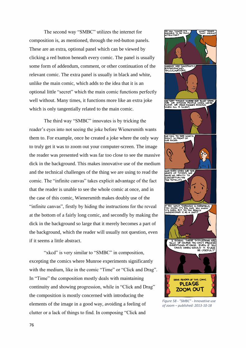
76
The second way “SMBC” utilizes the internet for
composition is, as mentioned, through the red-button panels.
These are an extra, optional panel which can be viewed by
clicking a red button beneath every comic. The panel is usually
some form of addendum, comment, or other continuation of the
relevant comic. The extra panel is usually in black and white,
unlike the main comic, which adds to the idea that it is an
optional little “secret” which the main comic functions perfectly
well without. Many times, it functions more like an extra joke
which is only tangentially related to the main comic.
The third way “SMBC” innovates is by tricking the
reader’s eyes into not seeing the joke before Wienersmith wants
them to. For example, once he created a joke where the only way
to truly get it was to zoom out your computer-screen. The image
the reader was presented with was far too close to see the massive
dick in the background. This makes innovative use of the medium
and the technical challenges of the thing we are using to read the
comic. The “infinite canvas” takes explicit advantage of the fact
that the reader is unable to see the whole comic at once, and in
the case of this comic, Wienersmith makes doubly use of the
“infinite canvas”, firstly by hiding the instructions for the reveal
at the bottom of a fairly long comic, and secondly by making the
dick in the background so large that it merely becomes a part of
the background, which the reader will usually not question, even
if it seems a little abstract.
“xkcd” is very similar to “SMBC” in composition,
excepting the comics where Munroe experiments significantly
with the medium, like in the comic “Time” or “Click and Drag”.
In “Time” the composition mostly deals with maintaining
continuity and showing progression, while in “Click and Drag”
the composition is mostly concerned with introducing the
elements of the image in a good way, avoiding a feeling of
clutter or a lack of things to find. In composing “Click and
Figure 58 - "SMBC" - Innovative use of zoom – published: 2013-10-18

77
Drag” an important
decision to make
would be how large
to make the
“window” the reader
would move around.
The characters and
objects had to be
visible and the
writing readable while remaining consistent with the design of the normal comic, but not so
large that the things in the image become impossible to recognize because the reader is too
close. The comic is zoomed out slightly further than the normal “xkcd” comic, presumably in
order to impart the feeling that the comic is not about any particular scene the reader may
come across, but about all of them, as well as the other aspects mentioned. In this comic in
particular, composition also has an impact on time and motion. In a medium where space and
time are more or less the same, as explored in the previous chapter, composition is closely
linked to time and motion. How the creator composes a page directs how the reader
experiences the time and motion of that page. By playing with the composition, the creator
can play with the experience of time. McCloud comments on this; “In comics, composition
follows a very different set of rules than in most graphic arts. By introducing time into the
equation, comics artists are arranging the page in ways not always conducive to traditional
picture making. Here, the composition of the
picture is joined by the composition of the
change, the composition of the drama – and
the composition of memory.”
(Understanding Comics, p 115). An example
of this is the direction the comic is supposed
to be read. How the panels are arranged are a
matter of composition, but it directly
influences the experience of time. I explored
this in my time and motion chapter and so
will not do so here.
Figure 59 - "xkcd" - Common format
Figure 60 - "xkcd" - "Click and Drag"

78
The design and composition of a webcomic is also affected by the idea of interactivity.
An example would be the comic “Garden”. The internet can be a deeply interactive “place”,
and the comics made there can reflect that. McCloud was one of the earlier comic theorists to
take notice of its capabilities; “Whether by choosing a path, revealing a hidden window or
zooming in on a detail, there are countless ways to interact with sequential art in a digital
environment.” (Reinventing Comics, p 229). Where the creator chooses to place parts of the
comic and what they choose to place there can be just as important to the webcomic as how
the panels are arranged on the page of a traditional print comic. The design can be arguably
even more meaningful because the kind of action which must be taken to reach this content
can have meaning in itself. What the reader does, how they do it, what the context of the
action is and what surrounds the choice are all elements which can play a part in creating a
new reading experience unlike anything found in print. An example of this could be in the
comic “Unsounded” where the “next” arrow is replaced by the outstretched hand of one of the
characters. The reader must “take the characters hand” in a sense for the story to continue.
McCloud thinks that this interactivity is essential in webcomics; “Most importantly, the mere
act of “reading” – moving through – digital comics should be a deeply interactive process.
Comics is a still life; mute, unmoving and passive in and of itself – but the act of reading
comics – even through the technology you hold in your hands – is anything but. Comics in a
digital environment will remain a still life – but a still life we explore dynamically.”
(Reinventing Comics, p 229). Another example of how the reading of a comic, and how you
read that comic, can have meaning in itself is in “Click and Drag”, where the action of
clicking and dragging the view across the huge image over and over again in order to find
everything there is to see represents the cost of real exploration, both in effort and in time, as
explored in the chapter on time and motion.
Unlike comics like “OOTS”, “Undivine”, and to a certain extent “SMBC”, there are
comics from “xkcd” which could never be put into print. Examples of this are the ones I have
explored already, comics like “Click and Drag” or “Garden”. These comics would not work in
any other medium, at least not without expending ridiculous effort, which is a sign of them
making great use of the tools unique to that medium.
Goblins
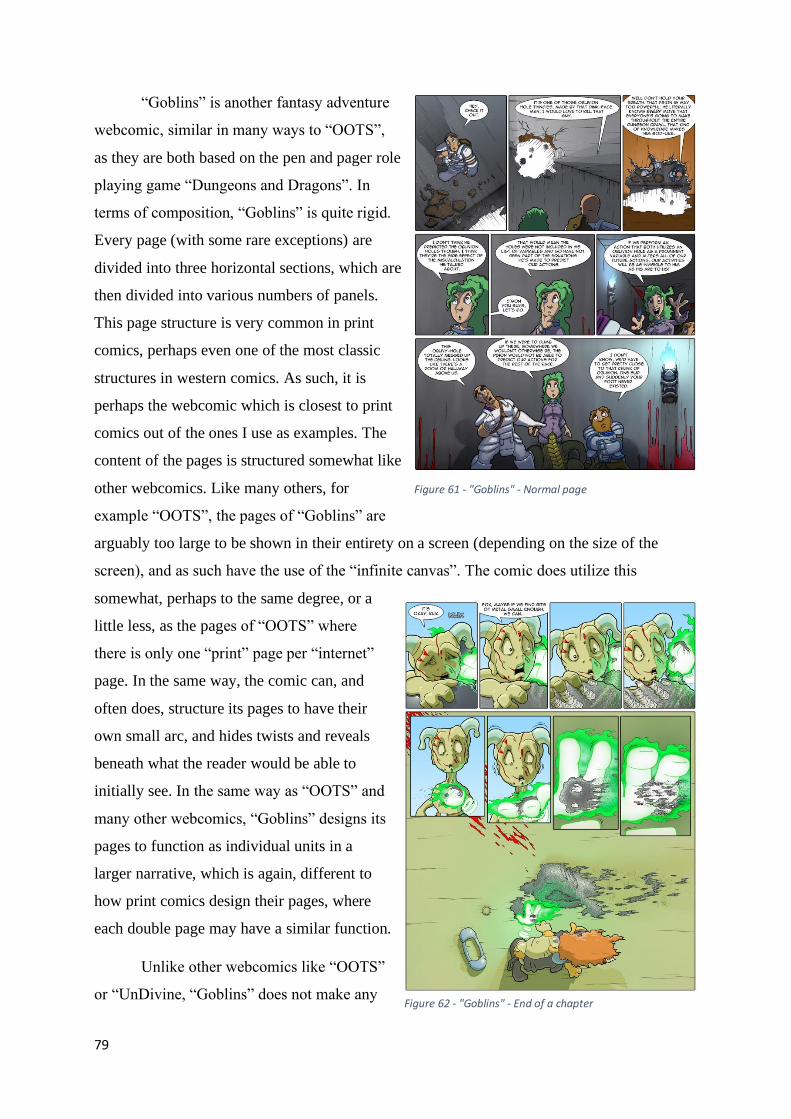
79
“Goblins” is another fantasy adventure
webcomic, similar in many ways to “OOTS”,
as they are both based on the pen and pager role
playing game “Dungeons and Dragons”. In
terms of composition, “Goblins” is quite rigid.
Every page (with some rare exceptions) are
divided into three horizontal sections, which are
then divided into various numbers of panels.
This page structure is very common in print
comics, perhaps even one of the most classic
structures in western comics. As such, it is
perhaps the webcomic which is closest to print
comics out of the ones I use as examples. The
content of the pages is structured somewhat like
other webcomics. Like many others, for
example “OOTS”, the pages of “Goblins” are
arguably too large to be shown in their entirety on a screen (depending on the size of the
screen), and as such have the use of the “infinite canvas”. The comic does utilize this
somewhat, perhaps to the same degree, or a
little less, as the pages of “OOTS” where
there is only one “print” page per “internet”
page. In the same way, the comic can, and
often does, structure its pages to have their
own small arc, and hides twists and reveals
beneath what the reader would be able to
initially see. In the same way as “OOTS” and
many other webcomics, “Goblins” designs its
pages to function as individual units in a
larger narrative, which is again, different to
how print comics design their pages, where
each double page may have a similar function.
Unlike other webcomics like “OOTS”
or “UnDivine, “Goblins” does not make any
Figure 61 - "Goblins" - Normal page
Figure 62 - "Goblins" - End of a chapter

80
significant distinction between where one chapter ends, and another begins. While comics like
“OOTS” has an end panel (similar to an establishing panel, but at the end of a chapter), an
end-of-chapter announcement and an establishing panel at the start of the next chapter, and
“UnDivine” has its fade-out pages and establishing panels, “Goblins” makes do with, at most,
small ending and establishing panels at the end of and beginning of chapters. The reason for
this is, presumably, to create a sense of continuity, of the comic being one long, uninterrupted
story. While “OOTS” deliberately tries to separate its story into easily recognizable sections
to create clear emotional and narrative breaks, “Goblins” avoids this, eschewing more
established methods of structuring the story, and instead letting the arcs separate themselves
where it feels natural. While this makes for an occasionally confusing and meandering
storyline, it also feels closer to real life, in a sense. Real life is not neatly divided into separate
stories, and like real life, the comic sprawls outward, and the characters have to make the best
of things. This is not to say that there is no plot, or that events happen without reason of
context, they just bleed into each other so naturally that it can be difficult to pinpoint where
one section of a story ends and another begins sometimes. This kind of structure would be
much harder to implement in print comics, where, by their very nature, they have to be
divided into neat blocks (like issues), while webcomics usually upload one page at a time, in
perpetuity, and “Goblins” has done so for 15 years.
Conclusion
The major difference between the composition of webcomics and print comics is what
the creator decides the reader should see at any one time. While this is similar to how the
design of pages function in print, it is different in the manner that the reader can see more by
simply scrolling down the webpage. This tool is introduced in large part due to the freedom
offered webcomics regarding the size of the comic page the creator wants to upload. This
freedom and how it is used changes the design of the page in sometimes significant ways, as
well as creates a difference between what is uploaded to the internet and what may be printed
in physical copies later. This can be seen in webcomics like “OOTS” and “UnDivine”, as
described above.
The difference between the size of the uploaded image and the screen the reader views
the comic on influences this somewhat, as the effect of hiding plot at the bottom of the page
arguably becomes stronger the less of the screen the reader can see, and perhaps more
81
importantly weaker if the screen is large enough to see what is intended to remain unseen.
While the image scales to the screen to a certain extent, the amount of the image which is
visible to the reader is not as firmly in the grasp of the creator of webcomics, unlike in print.
The creator of print comics have no way of controlling which pages the reader sees first,
which is an amount of control afforded to the webcomics creator, but the webcomics creator
can only have so much say over how much of any one image the reader can see at any one
time. This is usually more control than the creator of print comics has, though, as they always
have to work within the constraints of a standardized page. Both sides have freedoms and
constraints which are similar and different to their counterparts in the other medium.
There are other issues of composition brought about by the “infinite canvas” than this.
For example in the comic “Click and Drag” Munroe has to design his comic around the idea
and the image he then creates, to where the reader can and will see the things Munroe wants
them to see while also being able to explore the image on their own without necessarily being
guided anywhere. The guide in the image is usually the ground, or any other line which leads
in a direction the reader has yet to explore, like one of the many holes in the ground, or one of
the towers scattered around the image. There are also many things the reader would be unable
to find by merely following these lines, like the airplanes in the sky, or the glowing jellyfish
under the ground. The most important design aspect of the comic in this case is the distance
between events and the “camera” and the size of the “window” the reader is looking through.
These kinds of compositional tricks and challenges are not found in print comics, and
are probably unique to webcomics, as they are a unique amalgamation of the medium of print
comics and the new and groundbreaking tools of the internet. Eisner is aware of the flexibility
offered by the tools of the internet, but he believes that creators of webcomics have stuck to
print comic rhythms; “Webcomics (a term for comics displayed on the internet) provide the
storyteller with more flexibility in the control of the reader, but so far comics storytellers have
largely retained print rhythms when working digitally.” (Graphic Storytelling and Visual
Narrative, p 70). I both agree and disagree with this last part, as described elsewhere. The
structure, rhythm and role of the page has changed in webcomics. While Eisner does say “so
far” in the book, which was published in 2008, leaving the field open for further change, I
believe that change was already happening. The webcomics “OOTS” had already been going
for five years at this point and had started to experiment with the design and rhythms of its
pages, working its way closer to its current incarnation. How that comic experiments with the
rhythm of its pages, I have already explored above. The comic “xkcd”, one of the most

82
experimental comics I have ever seen, was started in 2005,
and while it would not become as innovative for a while
yet, it was already pushing boundaries. The existence of
these webcomics at the time of Eisner’s writing, and the
innovative ways they explore the possibilities of their
medium to, among other things, change the rhythm of their
work, I would argue prove Eisner wrong in this regard.
While I would agree that most webcomics in many ways
have stuck with the traditions of print, including a similar
rhythm (and I acknowledge that Eisner also specified that
he meant “largely”), I believe that the webcomics at the
time of his writing were more innovative and experimental
than he may have given them credit for.
In addition to the alternatives presented in this
chapter, webcomics can also be presented in other ways. If
a comic is presented as one long horizontal stripe which the
reader then has to scroll through would function more like a
tapestry, but not quite. The difference between the comic
and a tapestry would be that there is a harder border for
how much of it you can see at a time. In this case the screen
becomes more like a window as McCloud pointed out
(Reinventing Comics, p 222), and the reader can only view
a fragment of the comic at a time. You could argue that the
segment the reader is currently looking at could function as
a page, but that the pages also bleed heavily into each other,
and that there is rarely (depending on the specific design of
the comic) a hard border between events. There would
presumably still be some way of distinguishing one event
from the next, which would make it a comic instead of one
large image. This could for example be panel lines
disguised as pieces of the image (like a tree or similar), or just the reappearance of
recognizable characters (like what maybe happens at the very right side of “Click and Drag”).
In this case the comic might look like one long continuous image apart from the fact that the
Figure 63 - "OOTS" - Innovative use of "infinite canvas" in 2007 – p 406
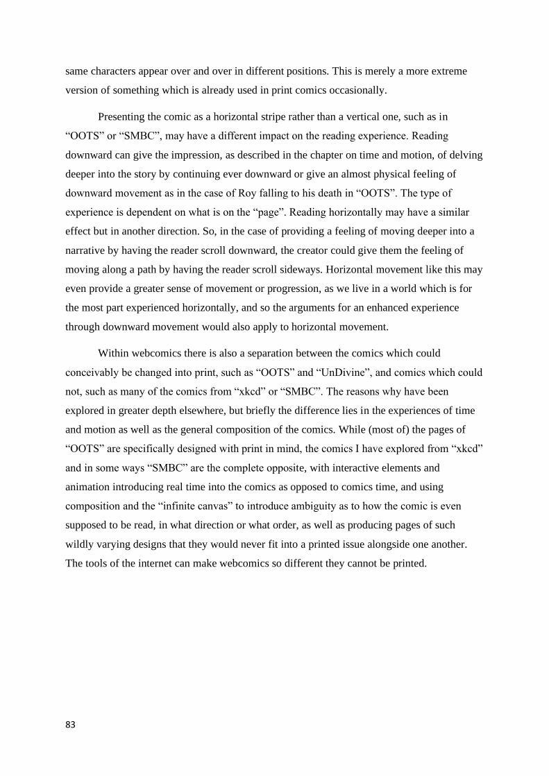
83
same characters appear over and over in different positions. This is merely a more extreme
version of something which is already used in print comics occasionally.
Presenting the comic as a horizontal stripe rather than a vertical one, such as in
“OOTS” or “SMBC”, may have a different impact on the reading experience. Reading
downward can give the impression, as described in the chapter on time and motion, of delving
deeper into the story by continuing ever downward or give an almost physical feeling of
downward movement as in the case of Roy falling to his death in “OOTS”. The type of
experience is dependent on what is on the “page”. Reading horizontally may have a similar
effect but in another direction. So, in the case of providing a feeling of moving deeper into a
narrative by having the reader scroll downward, the creator could give them the feeling of
moving along a path by having the reader scroll sideways. Horizontal movement like this may
even provide a greater sense of movement or progression, as we live in a world which is for
the most part experienced horizontally, and so the arguments for an enhanced experience
through downward movement would also apply to horizontal movement.
Within webcomics there is also a separation between the comics which could
conceivably be changed into print, such as “OOTS” and “UnDivine”, and comics which could
not, such as many of the comics from “xkcd” or “SMBC”. The reasons why have been
explored in greater depth elsewhere, but briefly the difference lies in the experiences of time
and motion as well as the general composition of the comics. While (most of) the pages of
“OOTS” are specifically designed with print in mind, the comics I have explored from “xkcd”
and in some ways “SMBC” are the complete opposite, with interactive elements and
animation introducing real time into the comics as opposed to comics time, and using
composition and the “infinite canvas” to introduce ambiguity as to how the comic is even
supposed to be read, in what direction or what order, as well as producing pages of such
wildly varying designs that they would never fit into a printed issue alongside one another.
The tools of the internet can make webcomics so different they cannot be printed.

84
Text-image relationship
The relationship between text and image is often a complicated one. It is the backbone
of comics, what everything revolves around. It is what makes the medium. They must almost
always work together in order to create something different than either could on their own. In
this chapter I will give a brief introduction to the relationship between text and image in
comics in general and then explore how webcomics build on and change this.
The combination of the mediums of text and image has generally been looked down
on, as McCloud points out; “Traditional thinking has long held that truly great works of art
and literature are only possible when the two are kept at arm’s length.” (Understanding
Comics, p 140). This has not been helped by the comic book industries willingness to accept
this as true; “Words and pictures are as popular as ever, but this widespread feeling that the
combination is somehow base and simplistic has become a self-fulfilling prophecy.” (p 141).
This view has changed somewhat since, and the combination of words and images can be
used to create new and interesting works of art. Comics blend the use of words and images in
a way that other mediums do not. Because of this, neither the pictures or the words will
always work by themselves, or at least not as intended. Depending on the individual comic,
the words and images depend on each other for meaning, and are intertwined to such an extent
that it would be difficult to extract much meaning from them separately. It would be like
watching a movie without the sound.
McCloud and Eisner both spend a lot of time emphasizing the fact that in comics
words and images have to work together. The creator(s) cannot simply focus on learning the
two skills separately and assume that because they have mastered them individually it will
work well in the comics medium. The words and the images have to play well off each other
and fit well together. “In comics at its best, words and pictures are like partners in a dance and
each one takes turns leading. When both partners try to lead, the competition can subvert the
overall goals – though a little playful competition can sometimes produce enjoyable results.”
(Understanding Comics, p 156). Words and images can carry more weight in different ways,
and by doing so can free up the other to do other creative things. “When pictures carry the
weight of clarity in a scene, they free words to explore a wider area.” (Understanding Comics,
p 157). “On the other hand, if the words lock in the “meaning” of a sequence, then the
pictures can really take off.” (Understanding Comics, p 159). Eisner adds that; “Writing is
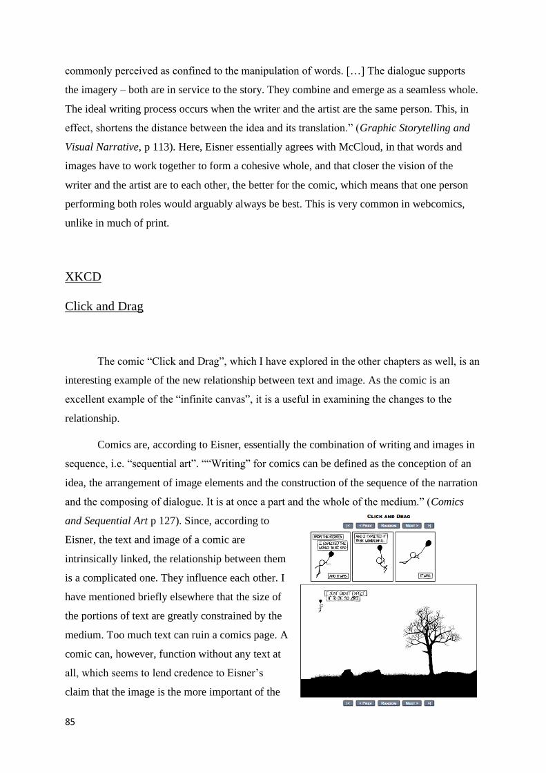
85
commonly perceived as confined to the manipulation of words. […] The dialogue supports
the imagery – both are in service to the story. They combine and emerge as a seamless whole.
The ideal writing process occurs when the writer and the artist are the same person. This, in
effect, shortens the distance between the idea and its translation.” (Graphic Storytelling and
Visual Narrative, p 113). Here, Eisner essentially agrees with McCloud, in that words and
images have to work together to form a cohesive whole, and that closer the vision of the
writer and the artist are to each other, the better for the comic, which means that one person
performing both roles would arguably always be best. This is very common in webcomics,
unlike in much of print.
XKCD
Click and Drag
The comic “Click and Drag”, which I have explored in the other chapters as well, is an
interesting example of the new relationship between text and image. As the comic is an
excellent example of the “infinite canvas”, it is a useful in examining the changes to the
relationship.
Comics are, according to Eisner, essentially the combination of writing and images in
sequence, i.e. “sequential art”. ““Writing” for comics can be defined as the conception of an
idea, the arrangement of image elements and the construction of the sequence of the narration
and the composing of dialogue. It is at once a part and the whole of the medium.” (Comics
and Sequential Art p 127). Since, according to
Eisner, the text and image of a comic are
intrinsically linked, the relationship between them
is a complicated one. They influence each other. I
have mentioned briefly elsewhere that the size of
the portions of text are greatly constrained by the
medium. Too much text can ruin a comics page. A
comic can, however, function without any text at
all, which seems to lend credence to Eisner’s
claim that the image is the more important of the

86
two. “In sequential art the two functions are irrevocably interwoven. Sequential art is the act
of weaving a fabric. […] When the two are mixed, the words become welded to the image and
no longer serve to describe but rather to provide sound, dialogue and connective passages.”
(Comics and Sequential Art p 127). The relationship between text and image in print comics
seem similar to their relationship in webcomics, or at least the function the text serves
alongside the image. In a way, though, the functions of the text have been expanded in many
of the same ways that the functions of the image have been. The images have become larger
and more layered and so has the text, in the sense that it has followed the images off the
screen and into the “infinite canvas”. For example, the text in “Click and Drag” is affixed to
the image and must be explored by the reader in the same way as that image. As Eisner said,
they are still welded together. The text has also become more technically layered, for example
through the use of alt-text or animation.
Since the reader is only able to view the comic one small section of the “Click and
Drag” comic at a time, they are unable to see all the text as well. In this case the relationship
between the text and the image remains fairly intact in a sense but is instead one layer
removed from the reader. The comic makes use of McCloud’s idea that the computer monitor
is less a frame than a window, which I have explored earlier. In a sense the comic functions as
a very large piece of paper which the reader can only view through a small hole, which they
can then move around as they please. As explored in the other chapters, this means that the
comic can be read in any direction and in any order without sacrificing any of what makes it
special. This means that everything which happens in the comic is independent of everything
else, including the text. Since none of the text is essential for understanding the comic, as well
as any particular scene, it loses its some of its function as a conveyor of essential meaning.
Even though there are comics which can function without words, most comics would become
meaningless without them. In comics where the art is meaningless without the text, and the
text is explained in part by the art, the two halves are considered interdependent. In the
creation of comics, the text often comes first, and directs the art. In this way the text would
have primacy and not the art. So, in the planning stage the text is the most important, and on
the page the art is the most important. Since the writing is so important to the planning of the
comic, Eisner argues that the best way to make comics is to have the writer and the artist be
the same person; “…one must then immediately acknowledge that in a perfect (or pure)
configuration the writer and the artist should be embodied in the same person. The writing (or
the writer) must be in control to the very end. I wrote about the importance of planning out the
87
story in the chapter on composition. The artist can also be considered to be “writing” when
they compose the structure of the images, such as leaving a panel with no words to create a
pause in the conversation or action. Eisner writes; “In practice, the creator, given or having
conceived the idea, sets about to develop it with words and imagery into a unified whole. It is
here that the graphic elements ascend to dominance. For the end product is, after all, to be
read as a total visual. It is this “mix” that is, in the final analysis, the ultimate test of the
success and quality of the sequential art effort.” (Comics and Sequential Art p 132). Eisner
here reiterates that comics (or sequential art) is, at the base level, a cooperative effort, as
“mix” of text and images. The text remains a part of the image in this comic, unlike in some
others which I will explore, and its role remains in line with the role of the image. They both
convey essential meaning, and together they make up the comic, but since this comic
functions differently from print comics, in the sense that the reader does not have to see more
than a fraction of the whole comic in order to get the intended experience, the image and the
text become less essential in their specific instances while remaining generally essential for
the comic. What I mean by that is that no particular section of the comic is absolutely required
for the rest of the comic to function, but the combination of text and image is still what makes
up the whole comic and is essential for the comic to function. This is different from how
things work in print comics, where, as I mentioned in the chapter on composition, space is at a
premium, and the creators of the comics cannot waste space on unimportant things. This
move away from the importance of specific parts of text or image and toward a generalization
of importance is much easier to accomplish in webcomics, especially through the use of the
“infinite canvas”. This generalization could be accomplished in other ways, such as through a
network of links or hidden panels, like the votey’s in “SMBC”, which, as explored elsewhere,
are not an essential part of the reading experience. There are other examples of comics from
“xkcd” which explores this phenomenon, such as the comic “Hoverboard”.
Hoverboard
The comic “Hoverboard” is in many ways similar to “Click and Drag”. They are both
explorations of the “infinite canvas”, they both show the reader a section of a much larger
image which the reader is then free to move around, and the contents of the image are in many
ways independent of each other. “Hoverboard” differs from “Click and Drag”, though, in that

88
this comic is a collecting game. The reader is
given the “task” (entirely optional) of
traversing the image looking for golden coins,
which can then be returned to the starting
location in exchange for points. This gives the
comic an added layer of interactivity which
“Click and Drag” not have. What this means
regarding the relationship between the image
and the text of the comic is debatable. At the
base level the comic functions very similarly
to “Click and Drag”, but with the two added
factors of an extra portion of text giving
instructions and congratulations to the
reader/player regarding their performance in playing the “game”, and an added incentive to
explore the whole image in order to look for gold coins.
The comic is somewhat more interconnected than “Click and Drag” since in several
“scenes” in the comic the characters are acknowledging or reacting to something which
occurs “off screen”, giving the reader/player hints as to where they can move in order to find
additional content. In this case the interactivity has affected the design of the comic, as the
scenes are less independent of each other. Since this independence was what led to a more
general importance of words and images, instead of the very specific importance in print
comics, this brings the comic at least somewhat closer to print comics, since there are sections
of the comic which does not function as intended without the other parts of the image. For
example, there is a man climbing the “Washington Monument” who reacts to the spaceships
above him. The reader cannot see this spaceship unless they make the effort to reach it. This
connects the scene of the two people climbing the monument to the spaceships, while also
providing the reader/player with direction on where they can go next. This interconnectedness
would also remove some of the ambiguity of time and motion which featured heavily in the
chapter on time and motion in the section discussing “Click and Drag”.
Figure 64 - "Hoverboard" - Start screen

89
Above, I
mentioned that Eisner
wrote that the artist and
the writer should
preferably be the same
person. I would add that
this would be best as long as the creator actually can write and draw well enough. Especially
write, because I find it much easier to forgive sub-par art than bad writing. This seems to fit in
with the general mood of internet comics, where the readership is much more willing to
forgive bad art as long as they like the writing. You can see this in the success of “xkcd” and
“Smbc”. While the art in neither comic is really that bad (especially in “xkcd” at times), that
is not what the readership shows up for. In those comics the writing is the important thing.
This is emphasized by the existence of the alt-text and the votey. In the case of the alt-text the
focus is entirely on the words, but as they relate to the comic, and in the case of the votey the
words take center stage and the art is usually extremely simplistic, if present at all. Many of
the votey’s are only words, making them essentially a secondary alt-text.
Pixels
In this comic the reader is given the instruction to scroll the mouse wheel in order to
zoom in on the image. As the reader does this,
every pixel is transformed into its own image.
The original image is not really made up of a lot
of different smaller images, but the smaller
images are morphed in as the reader scrolls
closer. This is a clear example of one of the
possibilities McCloud explored in Reinventing
Comics, where the reader “falls” deeper into the
comic as they scroll further and further into it,
which I have explored elsewhere, mostly in the
chapter on time and motion.
Figure 65 - "Hoverboard" - Full Image
Figure 66 - "Pixels" - Start screen

90
The relationship between text and image in this
comic is an interesting one. Every pixel in the image is a
part of the image one layer up, as well as its own separate
panel, with its own image and text. This means that every
panel in the comic is both text and image simultaneously,
and since the reader can presumably keep scrolling
forever (or close to it), this blended relationship will also
keep going forever. Eisner writes about the text and the
image being two halves of the whole, and together they
make up the comic. The text is a part of the image, in most
ways literally. In the case of this comic, this
relationship is even more literal, since every pixel
of every panel is its own panel.
While some webcomics have text and
image layered upward, like the alt-text and the
votey’s from “SMBC”, this comic layers them
downward. The reader must dive deeper into the
image in order to find new panels. While all the
panels which are revealed seem to be independent
of each other, and a lot of them are repetitions,
new panels with new images and text are revealed
all the time. There is no easy way to know how far down the reader can scroll before no new
panels are revealed, and so the comic could conceivably go on forever. In fact, it is possible
that there is no bottom layer, which is hinted at by the alt-text, which says; “It’s turtles all the
way down”. This is a reference to an old idiom of “turtles all the way down” which refers to
infinite recursion. Therefore, there may not really be an end to the comic. It may be an infinite
construction made from a finite number of parts. It should, therefore, be possible to see all the
different panels as long as the reader was willing to scroll for long enough, without ever
reaching the “end” of the comic.
There may be some connection between panels, even though they generally appear
independently. Some of them seem to fit together into small narratives, which the reader is
mostly left to piece together themselves. In this way the comic becomes partly a puzzle-game,
Figure 67 - "Pixels" - Zoomed in on the top turtle
Figure 68 - "Pixels" - Zoomed further in on the turtle
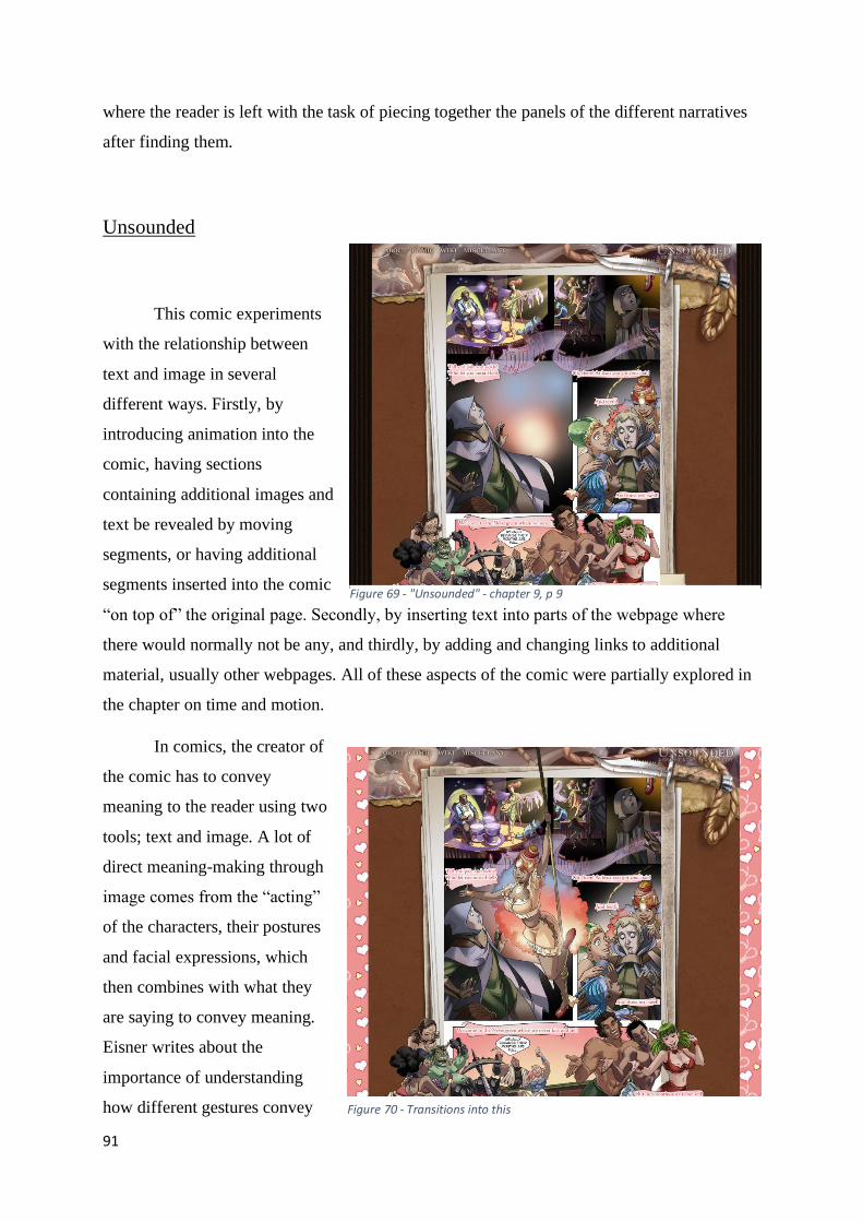
91
where the reader is left with the task of piecing together the panels of the different narratives
after finding them.
Unsounded
This comic experiments
with the relationship between
text and image in several
different ways. Firstly, by
introducing animation into the
comic, having sections
containing additional images and
text be revealed by moving
segments, or having additional
segments inserted into the comic
“on top of” the original page. Secondly, by inserting text into parts of the webpage where
there would normally not be any, and thirdly, by adding and changing links to additional
material, usually other webpages. All of these aspects of the comic were partially explored in
the chapter on time and motion.
In comics, the creator of
the comic has to convey
meaning to the reader using two
tools; text and image. A lot of
direct meaning-making through
image comes from the “acting”
of the characters, their postures
and facial expressions, which
then combines with what they
are saying to convey meaning.
Eisner writes about the
importance of understanding
how different gestures convey
Figure 69 - "Unsounded" - chapter 9, p 9
Figure 70 - Transitions into this

92
different meanings. “In comic book art,
the artist must draw upon personal
observations and an inventory of
gestures, common and comprehensible
to the reader. In effect, the artist must
work from a “dictionary” of human
gestures.” (Comics and Sequential Art p
104). Eisner also argues that; “In
comics, body posture and gesture
occupy a position of primacy over text.
The manner in which these images are
employed modifies and defines the
intended meaning of the words. They
can, by their relevance to the reader’s
own experience, invoke a nuance of
emotion and give auditory inflection to
the voice of the speaker.” (Comics and
Sequential Art p 106). What this essentially means, is that the face and body of the speaker in
a comic will change the meaning of the words which are spoken, i.e. the writing. If, for
example, someone smiles smugly while apologizing, the reader will know that the character is
not being genuine. Body language informs the text. And, like Eisner writes, how someone
says something is, in many ways,
more important than what they are
saying. The face is, of course, the
most important part of the body in
this regard, as that is where humans
read most emotions. Eisner writes;
“The surface of the face is, as
someone once put it, “a window to
the mind”. It is familiar terrain to
most humans. Its role in
communication is to register
emotion.” (Comics and Sequential
Art p 114). The rest of the body is
Figure 72 - "Unsounded" - chapter 12, p 54
Figure 71 - Transitions into this
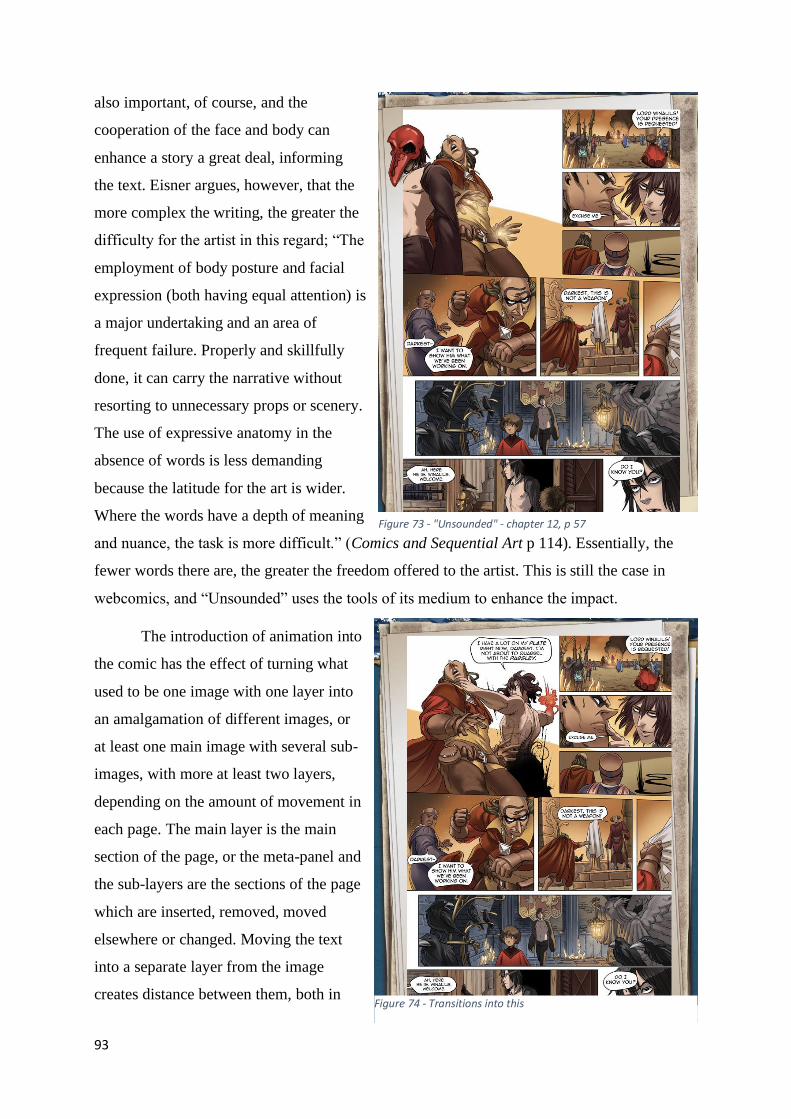
93
also important, of course, and the
cooperation of the face and body can
enhance a story a great deal, informing
the text. Eisner argues, however, that the
more complex the writing, the greater the
difficulty for the artist in this regard; “The
employment of body posture and facial
expression (both having equal attention) is
a major undertaking and an area of
frequent failure. Properly and skillfully
done, it can carry the narrative without
resorting to unnecessary props or scenery.
The use of expressive anatomy in the
absence of words is less demanding
because the latitude for the art is wider.
Where the words have a depth of meaning
and nuance, the task is more difficult.” (Comics and Sequential Art p 114). Essentially, the
fewer words there are, the greater the freedom offered to the artist. This is still the case in
webcomics, and “Unsounded” uses the tools of its medium to enhance the impact.
The introduction of animation into
the comic has the effect of turning what
used to be one image with one layer into
an amalgamation of different images, or
at least one main image with several sub-
images, with more at least two layers,
depending on the amount of movement in
each page. The main layer is the main
section of the page, or the meta-panel and
the sub-layers are the sections of the page
which are inserted, removed, moved
elsewhere or changed. Moving the text
into a separate layer from the image
creates distance between them, both in
Figure 73 - "Unsounded" - chapter 12, p 57
Figure 74 - Transitions into this

94
technical terms as well as in the minds of the reader. While the page is a static image there is a
certain sense of it being a whole, finished work. This is lost to a certain extent when the page
has elements which appear and disappear, or in the minds of the readers move into and off of
the page. It is no longer a permanent, unchanging, immutable work, but a cooperative effort
between layers to produce a different result. When only the text is moved in and out of the
page, this separation becomes even more clear, as the text is no longer and intrinsic part of the
image, at least in the minds of the reader. When it can be removed, it is no longer essential,
and text and image tend to occupy different sections in the readers mind. Animating the text
appearing and disappearing makes this separation much clearer in the minds of the reader, as
well as creating a separation in technical terms that was not there before.
The comic inserts text into parts of the webpage where there would normally be none,
especially in print. This includes alt-text (which many webcomic have, but not all), but also
other kinds of text, such as text in the background of the webpage, outside of the main comics
page. The comic has also experimented with inserting text into the webpage tab at the top of
the browser, which is very unusual. Like with the alt-text found in comics like “xkcd” or
“SMBC”, it is non-essential. The comic would function perfectly fine without it, but it does
add extra depth. I explored the emotional effect of adding alt-text into the comic in ways
which are abnormal in the chapter on time and motion. Like with other kinds of alt-text, this is
separated from the main comic, isolated into a layer of its own. It serves a different purpose in
this comic than in comics like “xkcd” or “SMBC” in that it is not intended to provide an
additional joke or different perspective on the comic, but to directly enhance the main
narrative. It is intended to serve as a tool for building tension, similarly to how the
backgrounds can be used (or borders around the page in print comics) to induce or enhance a
certain emotion or general mood. The comic will also insert text into this background, which
serves in many ways the same purpose as the alt-text and the text in the web-page tab.
The comic also makes clever use of links to enhance its main narrative. The pages
linked to are not essential parts of that narrative, and many reader may never even notice it is
there, but changing the destination of the clickable links around the main comics page
according to the events of the narrative has a similar effect as the alt-text and the
backgrounds, in that it serves to build a mood. Unlike with alt-text, though, it can do so in
many other ways than with just text. It can also use images, or a combination of the two,
which it does to great effect. This text and the images are related to the comic and each other
in arguably more tangential ways than the text and images of the main comic, as the reader

95
actively has to look for and find them, and they are, again, not essential parts of the narrative.
The introduction of additional webpages with direct connections to the text and images of the
main comic create one more layer, even further removed from the main page, separating the
“essence” of the comic even further. Whether this serves as fracturing the comic into an
unnecessarily complex web of connections, many of which are not essential but serve to build
and enhance the message of the comic, bloating the comic and reducing the amount of
discipline needed to create great art or giving the creator some much needed freedom to
experiment with the relationships between the different aspects of their works it up for debate.
Either way, the relationship between text and image has become much more layered and
complex in webcomics as opposed to print, where text and image were in most important
ways one and the same.
Digital comics could, in a way, disconnect text from the images. Or at least distance
them somewhat. In print comics the text is usually literally part of the image, inextricably
connected to it. In digital comics, it may not always be so simple. There is often text on the
screen, which is similar, or even exactly like, the text in print, a part of the image. But there
are many other kinds of text which connect to the rest of the comic in different ways, while
not being part of the image. This disconnection from the image gives the text a certain degree
of freedom, and lets the reader explore the text in ways which is not possible in print.
McCloud explores this idea, mostly regarding comics as a whole, but I believe that the text of
webcomics are a subsection of that and so his arguments about webcomics as a whole still
hold true for the text specifically. McCloud writes; “Just as documents filled with ideas and
images are linked throughout the Web, inviting us to explore them in any order – so too can
individual panels be linked in an interactive matrix of narrative choices. Any comic on the
Web is in hypertext’s backyard, it makes sense to adjust comics to fit its new environment.
Hypertext is, after all, a powerful and progressive force in information design – an idea that
strives to match the agility of human thought – in ways the technology of print never could.”
(Reinventing Comics, p 214-215). The point I am making here is that there can be a matrix of
different text surrounding the webcomic. This text can be an essential part of the reading
experience or just additional tidbits for the ones who know where to look (the latter one is the
most common). It can be a part of the story, helping to build or establish something, like in
Unsounded, or completely separate from it. This text can function like a bubble diagram, with
text sprouting off of the main comic in many different directions at the same time. This is
enhanced by the inclusion of links, which while something different from text, the links can

96
lead to additional content. In some ways it is no more distanced from the comic than alt-text
or the votey from SMBC, since an action is still needed to access it. Links are mostly different
because they take the reader away from the main comic and can lead to much more than just
more text.
In some ways the location of the text could have an impact on the feeling of movement
though the comic. In this way the text would become almost part of the image again, whether
it was hidden from the reader until discovered or not, since it would then directly relate to it,
or at least to something distinctly visual, instead of something mostly abstract, which is the
nature of writing.
Girls with Slingshots
“Girls with
Slingshots” is a
slice-of-life comic
portraying the main
character Hazel and
her group of
friends. It is one of a few webcomics which is published in a very traditional strip format
while also utilizing alt-text. Similar to comics like “xkcd” or “SMBC” it is mainly used to
make additional jokes or observations on the current strip. Other than this the text centered
around the strip itself behaves exactly like print, with the text and the images combined into
the same layer, as described above. The comic does one new thing though, which some other
webcomics do, which is introduce a section below the comic for the creator to post additional
content. This section functions in many ways like the alt-text, where the creator will insert
some additional joke or observation, but it is also used for general information, some
comment about the process of creating that particular page, the process of making the comic,
and interaction with the readership. While this type of text may often seem too far removed
from the comic to be relevant to the topic, it very often is not. This section serves in many
Figure 75 - "Girls with Slingshots" - p 1315

97
ways as a combination of alt-text, a votey (from “SMBC”) and an announcement board. As
such it is about as connected to the main comic as
either of these other tools.
“There is a major structural difference
between newspaper storytelling strips and comic
books. In comic books, stories come to a definitive
conclusion, a tradition that began when the early
comic books advertised that each story was
complete. A book is free-standing, whereas
newspapers are connected to the pattern of daily
life.” (Graphic Storytelling and Visual Narrative, p
132). This is in some ways like how webcomics
work and is especially true for comics like “Girls
with Slingshots”, which is designed much like a
newspaper strip, but with a stronger narrative. They
can keep going at a steady pace for years and years before ending, and the “distance” between
pages is no greater than what the reader can
still follow. The length of time between the
newspaper strips and the publication of a new
webcomics page can be drastically different,
though.
Daughter of the Lilies
This is another medieval fantasy
webcomic (but not based on Dungeons and
Dragons, at least not openly), portraying the
lives and adventures of a small band of
mercenaries. It is one of a few webcomics of
this kind, where each page is constructed like
a fairly normal comics page (like “Goblins”
or “UnDivine”), which also makes regular use
Figure 76 - Section under p 1315 (re-uploaded version)
Figure 77 - "Daughter of the Lilies" – chapter 2, p 6

98
of alt-text and the section below the comic for
additional content. Few other webcomics of this
kind do this. “Unsounded” does sometimes utilize
alt-text, as I have explored elsewhere, but only for
narrative purposes. The comic “Daughter of the
Lilies” uses its alt-text similarly to how “SMBC”
or “Girls with Slingshots” uses theirs, for making
jokes about or observations on the current page.
The comic also uses its extra section to make
similar comments, as well as posting small extra
comics, making announcements regarding the
comic or anything else the creator wants to write
about. It uses these tools exactly like “Girls with
Slingshots” does, while being a completely
different comic, proving that these are general
tools, not constrained to any particular genre of
comic, and both of these comics prove that these
tools still function when applied to narrative-
driven comics as well as comedic individual comics like “SMBC”.
The writing in comics is often “simpler” than in prose; “For example, writing for film
of comics is economical, eschews literary style, and does not need descriptive passages that
evoke images by analogous prose.” (Graphic Storytelling and Visual Narrative, p 114). I
think that the writing is “simpler” in another way as well. In comics it is important to limit the
amount of words, much more so than in prose, in large part because of the restraint of limited
space, both on the page and in the comic (in print at least). If a character says too much it
becomes boring much easier in comics than in prose. In a book, if a character wants to go on a
long monologue, they can, if it is written well. But in a comic, this is harder to achieve. The
creator cannot overload a single page with too much writing (though there can be a lot, as
shown in “OOTS”) because it will make the page boring and imbalanced, and they cannot just
create as many panels as they want because of the constraints of space. In print this constraint
is in the number of pages and the size of those pages, while in webcomics the constraint is
mainly in the size of the page and the patience of the reader. The creator of a webcomic can
create a huge page to fit the whole monologue into (as is sometimes done in “OOTS”), but
Figure 78 - Section under chapter 2, p 6

99
this is hard to do in a webcomic which has locked itself into a format. The webcomics creator
cannot dedicate many pages to a monologue either, because it becomes difficult to maintain a
sense of cohesion from page to page since the wait can be so long, and to maintain interest in
the reader. It is difficult to stay interested in a conversation which starts and stops every few
days, and it becomes easy to forget what has been said previously, unless the reader goes back
to read the previous parts of the comic just to refresh, which can become tiresome after a
while. This simplicity of language and conversation is easy to see in “Daughter of the Lilies”.
Unlike in webcomics like “OOTS” which sometimes has conversations lasting for many
pages, each page dense with text, this comic never has conversations that long or intricate. In
this way in follows print more closely than comics like “OOTS”.
Conclusion
The major difference in the relationship between text and image in webcomics in contrast to
in print is the introduction of several new potential layers. These layers can be occupied by
text, image or both. In comics like xkcd’s “pixels” we can see that text and image are the
same thing, but not in the same manner as they are in print. Instead they are both melded
together, each made up of the other and stacked on top on each other in a bottomless well of
text-image hybridization. In many other webcomics we can see the introduction of tools like
the alt-text and others like it, many of them serving similar functions while occupying slightly
different spheres in the webpage. And finally, we can see, in comics like “Unsounded”, that
text and image can be pulled further apart, not entirely removed from one another, but
reaching a greater separation than they ever could in print. This is achieved through
animation, inserting and removing parts of the image as the reader is viewing the page. The
result is that what in print is a much more clear and solid relationship (while still being
complex) becomes, in webcomics, a cloud of scattered content attached to the core of the
comic, the main page. The relationship has become much more amorphous and difficult to
define, with almost anything related to the comic being connected to it in some way or
another, and with the comic itself melting into an at times almost unrecognizable mass of text
and image.

100
Final thoughts
As this thesis has attempted to show, webcomics have innovated several tools. These
tools have then been used to create something entirely new, separate from print comics. In the
chapter on time and motion I showed how webcomics can introduce ambiguity in temporality
as well as which direction the reader is supposed to go in comics like “Click and Drag”, how
they can transform into something similar but not identical to animation in comics like
“Time” or video games in comics like “Garden”. Some tools have been embraced more
widely than others, such as the “infinite canvas”, which in comics like “The Order of the
Stick” can serve to give the reader an impression of physical movement, or narrative
movement in the case of comics like “Saturday Morning Breakfast Cereal”. Other comics,
like “Unsounded” will embrace a different facet of the new technical possibilities afforded the
creator of webcomics by having movement take place outside of the main comics page,
thereby making the entire website and everything on it, as well as all the links leading
elsewhere, part of the narrative.
In the chapter on composition I have shown how tools such as the “infinite canvas”
have an impact on other things in addition to the experience of time and motion by showing
how webcomics can embrace the idea of a page without practical two-dimensional limits.
Most webcomics go half-way, such as “The Order of the Stick” and how it divides its pages
into two different kinds while following the same underlying structure regardless of the length
of the posted content. Comics like “UnDivine” will keep its basic print-like pages but
transforming it into something closer to one-and-a-half page simply by obscuring the bottom
half from the readers view. Comics like “Saturday Morning Breakfast Cereal” will experiment
with composition by hiding optional panels for the reader to find on their own, or designing
pages with jokes where the reader has to zoom out, which is a joke that can only make sense
in the medium of the computer and the internet. “Click and Drag” from “xkcd” will stretch the
possibilities of composition by having a page too large for everything to relate to everything
else, making everything splinter into many different disconnected scenes. Other webcomics
will make use of the fact that on the internet there is no need to separate sections of a story
into chapters, and so comics like “Goblins” will make its entire story something closer to an
unbroken narrative with little in the way of clear delineation between where sections start and
stop.

101
In the chapter on text-image relationship I explored how webcomics shatter the
traditional print idea of how this relationship is supposed to work, with text becoming images
becoming text again into infinity in comics like “Pixels” by “xkcd”. In other comics text
becomes disconnected from the main comics page through the use of alt-text, images become
detached from the main page through the use of the “votey” in “Saturday Morning Breakfast
Cereal”. In comics like “Unsounded” text, image and main page shatter into many different
layers, with animation moving text into and out of the main page, alt-text is found everywhere
on the website, and plot-relevant information is hidden away behind links to other websites
which change without even necessarily attracting the attention of the reader. Other comics
still, like “Girls With Slingshots” and “Daughter of the Lilies” will break down the barriers
even further by introducing direct communication between the creator and the readership
through comment-sections and creator-commentary which can blur the line between alt-text
and aside directed at the reader.
Webcomics are an entirely different creature than print comics. This can be seen in the
many possibilities for webcomics to change the fundamental building blocks which print
comics rest on into something different for themselves to use. The combination of tools
provided by computers and those provided by and invented for the internet, sometimes
specifically for webcomics, has the power to lead webcomics in entirely their own direction,
separate from their print counterparts. While not many webcomics have embraced the more
experimental nature of the medium (the most experimental ones in this paper being “xkcd”
and “Unsounded”), the options are there, and a not insignificant number of comics are starting
to take advantage of them. As I have shown in this thesis, webcomics operate in a
fundamentally different manner than print comics. In fact, they do so regardless of how close
they try to stick to their print counterparts, though some webcomics deviate further than
others. By their very nature webcomics are electronic while print comics are not. Just this
difference and all the implications arising from it, many of which I have explored in this
thesis, serve to irreversibly separate the webcomic from the print comic.

102
Bibliography
Abrams, Pete. Sluggy Freelance. sluggy.com. (1997-), n.pag. Web. 11. May. 2020.
[sluggy.com/]
Batinic, Josip. “Enhanced Webcomics: An Exploration of the Hybrid Form of Comics on the
Digital Medium.” Image & Narrative Vol 17, nr. 5 (2016) pp. 81-90.
Bjordahl, Hans. Where the Buffalo Roam. Shadowculture.com. (1987-1995), n.pag. Web. 11.
May. 2020. [www.shadowculture.com/wtbr/]
Burlew, Rich. The Order of the Stick. giantitp.com. Giant in the Playground. (2003-), n.pag.
Web. 11. May. 2020. [www.giantitp.com/]
Campbell, T. The History of Webcomics. Antarctic Press. 2006. Print
Cope, Ashley. “About.” Unsounded. Casualvillain.com. Web. 11. May. 2020.
[www.casualvillain.com/Unsounded/about.html]
---. Unsounded. casualvillain.com. (2010-), n.pag. Web. 11. May. 2020.
[www.casualvillain.com/]
Corsetto, Danielle. “About.” Girls With Slingshots. Girlswithslingshots.com. Web. 11. May.
2020. [www.girlswithslingshots.com/about]
---. Girls With Slingshots. Girlswithslingshots.com. (2004-2015), n.pag. Web. 11. May. 2020.
[www.girlswithslingshots.com/]
Croshaw, Ben. “Zero Punctuation: Webcomics.” The Escapist. Youtube.com. 21. Jul. 2011.
Web, film. 11 May 2020. [www.youtube.com/watch?v=5t4xS2PqFFA]

103
Eisner, Will. Comics and Sequential Art: Principles and Practises From the Legendary
Cartoonist. W.W. Norton & Company. New York. London. 2008. Print
---. Graphic Storytelling and Visual Narrative: Principles and Practices from the Legendary
Cartoonist. W.W. Norton & Company. New York. London. 2008. Print
Ellis, Warren. “The Shape of the New Webcomics.” warrenellis.com. 30. May 2012. Web. 11.
May 2020. [www.warrenellis.com/the-shape-of-the-new-webcomics/]
Farley, David. Doctor Fun. Web.archive.org. (1993-2006), n.pag. Web. 11. May. 2020.
[web.archive.org/web/20171102183222/http://www.ibiblio.org:80/Dave/drfun.html]
Foglio, Phil & Kaja Foglio. Girl Genius. girlgeniusonline.com. (2001-), n.pag. Web. 11. May.
2020. [www.girlgeniusonline.com/]
Garrity, Shaenon. “The History of Webcomics.” The Comics Journal (2011): n.pag. Web. 11
May 2020. [www.tcj.com/the-history-of-webcomics/]
Gurewitch, Nicholas. The Perry Bible Fellowship. pbfcomics.com. (2001-), -), n.pag. Web.
11. May. 2020. [pbfcomics.com/]
Halsband, Megan, Stephanie Grimm. “Panel Problems: Issues and Opportunities for
Webcomics Archives.” Art Documentation: Journal of the Art Libraries Society of North
America 37 no.2 (Fall 2018): 119-140.
Holkins, Jerry & Mike Krahulik. Penny Arcade. penny-arcade.com (1998-), n.pag. Web. 11.
May. 2020. [www.penny-arcade.com/]
Hunt, Tarol. “What-is-goblins.” Goblins. Goblinscomic.com. Web. 11. May. 2020.
[www.goblinscomic.com/what-is-goblins]

104
---. Goblins. goblinscomic.com. (2005-), n.pag. Web. 11. May. 2020.
[www.goblinscomic.com/]
Kogel, Dennis. Rethinking Webcomics: Webcomics as a Screen Based Medium. MA Thesis.
U of Jyväskylä, 2013. JYX Digital Repository. Web. 11. May 2020.
Kukkonen, Karin. Studying Comics and Graphic Novels. WilyBlackwell. West Sussex. 2013.
Kurtz, Scott. PvP. pvponline.com. (1998-), n.pag. Web. 11. May. 2020. [pvponline.com/]
McCloud, Scott. Reinventing Comics: The Evolution of an Art Form. HarperCollins. New
York, 2000. Print
---. Understanding Comics: The Invisible Art. HarperCollins. New York, 1993. Print
Martin, Côme. “With, Against or Beyond Print? Digital Comics in Search of a Specific
Status.” The Comics Grid: Journal of comics scholarship (sep. 2017) n.pag. Web. 13. May
2020
Misemer, Leah. “A Historical Approach to Webcomics: Digital Authorship in the Early
2000s.” The Comics Grid: Journal of comics scholarship (jun. 2019) n.pag. Web. 13. May
2020
Moore, Alan & Dave Gibbons. Watchmen. New York. DC Comics. 2014.
Munroe, Randall. “About.” XKCD. xkcd.com. Web. 11. May. 2020. [xkcd.com/about/]
---. XKCD. xkcd.com. (2005-), n.pag. Web. 11. May. 2020. [xkcd.com/]

105
Parker, Charlie. Argon Zark! zark.com. (1995-2008), n.pag. Web. 11. May. 2020.
[www.zark.com/]
Shaw, Justine. Nowhere Girl. nowheregirl.com. (2001-2010), n.pag. Web. 11. May. 2020.
[www.nowheregirl.com/]
Sotuyo, Ayme. “About.” [Un]Divine. Undivine.com. Web. 11. May. 2020.
[www.undivinecomic.com/about]
---. UnDivine. Undivinecomic.com. (2016-), n.pag. Web. 11. May. 2020.
[www.undivinecomic.com/]
Syverud, Meg. “About.” Daughter of the Lilies. Daughterofthelilies.com. Web. 11. May.
2020. [www.daughterofthelilies.com/about]
---. Daughter of the Lilies. daughterofthelilies.com. (2013-), n.pag. Web. 11. May. 2020.
[www.daughterofthelilies.com/]
Walters, Maria. “What’s up with Webcomics? Visual and Technological Advances in
Comics.” Interface: The Journal of Education, Community and Values Vol. 9 (2009): n.pag.
Web. 11. May. 2020
Wienersmith, Zach. Saturday Morning Breakfast Cereal. smbc-comics.com. (2002-), n.pag.
Web. 11. May. 2020. [www.smbc-comics.com/]
“alt attribute”. Wikipedia: The Free Encyclopedia. Wikimedia Foundation. 11. May 2020
[en.wikipedia.org/wiki/Alt_attribute]
Wilson, Kris., et al. Cyanide and Happiness. explosm.net. (2005-), -), n.pag. Web. 11. May.
2020. [explosm.net/]

106
Withrow, Steven & John Barber. Webcomics: Tools and Techniques for digital cartooning.
The Ilex Press Limited. East Sussex. 2005. Print.
Related Documents