"The Old Seven." "The First Seven." "The Basic Seven." Quality pros have many names for these seven basic tools of quality, f irst emphasized by Kaoru Ishikawa, a professor of engineering at Tokyo University and the father of ³quality circles.´ 1. Cause-and-effect diagram (also called Ishikawa or fishbone chart): Identifies many po ssible causes for an effect or problem and sorts ideas into useful categories. 2. Check sheet: A structured, prepared form for collecting and analyzing data; a generic tool that can be adapted for a wide variety o f purposes. 3. Control charts: Graphs used to study how a process changes over time. 4. Histogram: The most commonly used graph for showing frequency distributions, or how often each different value in a set of data occurs. 5. Pareto chart: Shows on a bar graph which factors are more significant. 6. Scatter diagram: Graphs pairs of numerical data, one variable on each axis, to look for a relationship. 7. Stratification: A technique that separates data gathered from a variety of sources so that patterns can be seen (some lists replace "stratification" with "flowchart" or "run chart"). Quality Control Charts: General Purpose General Approach Establishing Control Limits Common Types of Charts Short Run Control Charts y Short Run Charts for Variables y Short Run Charts for Attributes Unequal Sample Sizes Control Charts for Variables vs. Charts for Attributes Control Charts for Individual Observations Out-of-Control Process: Runs Tests Operating Characteristic (OC) Curves Process Capability Indices Other Specialized Control Charts General Purpose: In all production processes, we need to monitor the extent to which our products meet specifications. In the most general terms, there are two "enemies" of product quality: (1) deviations from target specifications, and (2) excessive variability around target specifications. During the earlier stages of developing the production process, designed experiments are often used to optimize these two quality characteristics. The methods provided in Quality Control are on-line or in-process quality control procedures to monitor an on-going production process. General Approach: The general approach to on-line quality control is straightforward: We simply extract samples of a certain size from the ongoing production process. We then produce line charts of the variability in those samples, and consider their closeness to target specifications. If a trend emerges in those lines, or if samples fall outside pre- specified limits, then we declare the process to be out of control and take action to find the cause of the problem. These types of charts are sometimes also referred to as Shewhart control charts. Interpreting the chart. The most standard display actually contains two charts (and two histograms ); one is called an X -bar chart , the other is called an R chart .

Welcome message from author
This document is posted to help you gain knowledge. Please leave a comment to let me know what you think about it! Share it to your friends and learn new things together.
Transcript

8/7/2019 The Old Seven
http://slidepdf.com/reader/full/the-old-seven 1/19
"The Old Seven."
"The First Seven."
"The Basic Seven."
Quality pros have many names for these seven basic tools of quality, first emphasized by Kaoru Ishikawa, a
professor of engineering at Tokyo University and the father of ³quality circles.´
1. Cause-and-effect diagram (also called Ishikawa or fishbone chart): Identifies many possible causesfor an effect or problem and sorts ideas into useful categories.
2. Check sheet: A structured, prepared form for collecting and analyzing data; a generic tool that canbe adapted for a wide variety of purposes.
3. Control charts: Graphs used to study how a process changes over time.4. Histogram: The most commonly used graph for showing frequency distributions, or how often each
different value in a set of data occurs.5. Pareto chart: Shows on a bar graph which factors are more significant.6. Scatter diagram: Graphs pairs of numerical data, one variable on each axis, to look for a
relationship.7. Stratification: A technique that separates data gathered from a variety of sources so that patterns
can be seen (some lists replace "stratification" with "flowchart" or "run chart").
Quality Control Charts:
General Purpose
General Approach
Establishing Control Limits
Common Types of Charts
Short Run Control Charts
y Short Run Charts for Variables
y Short Run Charts for Attributes
Unequal Sample Sizes
Control Charts for Variables vs. Charts for Attributes
Control Charts for Individual Observations
Out-of-Control Process: Runs Tests
Operating Characteristic (OC) Curves
Process Capability Indices
Other Specialized Control Charts
General Purpose:In all production processes, we need to monitor the extent to which our products meet specifications. In the most
general terms, there are two "enemies" of product quality: (1) deviations from target specifications, and (2) excessive
variability around target specifications. During the earlier stages of developing the production process, designed
experiments are often used to optimize these two quality characteristics. The methods provided in Quality Control are
on-line or in-process quality control procedures to monitor an on-going production process.
General Approach: The general approach to on-line quality control is straightforward: We simply extract samples of
a certain size from the ongoing production process. We then produce line charts of the variability in those samples,
and consider their closeness to target specifications. If a trend emerges in those lines, or if samples fall outside pre-
specified limits, then we declare the process to be out of control and take action to find the cause of the problem.
These types of charts are sometimes also referred to as Shewhart control charts.
Interpreting the chart. The most standard display actually contains two charts (and two histograms); one is called
an X -bar chart , the other is called an R chart .

8/7/2019 The Old Seven
http://slidepdf.com/reader/full/the-old-seven 2/19
In both line charts, the horizontal axis represents the different samples; the vertical axis for the X-bar chart represents
the means for the characteristic of interest; the vertical axis for the R chart represents the ranges. For example,
suppose we wanted to control the diameter of piston rings that we are producing. The center line in the X-bar chart
would represent the desired standard size (e.g., diameter in millimeters) of the rings, while the center line in the R
chart would represent the acceptable (within-specification) range of the rings within samples; thus, this latter chart is
a chart of the variability of the process (the larger the variability, the larger the range). In addition to the center line, a
typical chart includes two additional horizontal lines to represent the upper and lower control limits (U CL, LCL,
respectively); we will return to those lines shortly. Typically, the individual points in the chart, representing the
samples, are connected by a line. If this line moves outside the upper or lower control limits or exhibits systematic
patterns across consecutive samples, then a quality problem may potentially exist.
Elementary Concepts discusses the concept of the sampling distribution, and the characteristics of the normal distribution. The method for constructing the upper and lower control limits is a straightforward
application of the principles described there.
Establishing Control Limits:Even though you could arbitrarily determine when to declare a process out of control (that is, outside the UCL-LCL
range), it is common practice to apply statistical principles to do so.Example. Suppose we want to control the mean
of a variable, such as the size of piston rings. Under the assumption that the mean (and variance) of the process
does not change, the successive sample means will be distributed normally around the actual mean. Moreover,
without going into details regarding the derivation of this formula, we also know (because of the central limit theorem,
and thus approximate normal distribution of the means) that the distribution of sample means will have a standard
deviation of Sigma (the standard deviation of individual data points or measurements) over the square root of n (the
sample size). It follows that approximately 95% of the sample means will fall within the limits ± 1.96 *Sigma/Square Root(n). In practice, it is common to replace the 1.96 with 3 (so that the interval will include
approximately 99% of the sample means), and to define the upper and lower control limits as plus and minus 3 sigma
limits, respectively.
General case. The general principle for establishing control limits just described applies to all control charts. After
deciding on the characteristic we want to control, for example, the standard deviation, we estimate the expected
variability of the respective characteristic in samples of the size we are about to take. Those estimates are then used
to establish the control limits on the chart.

8/7/2019 The Old Seven
http://slidepdf.com/reader/full/the-old-seven 3/19
Common Types of Charts:The types of charts are often classified according to the type of quality characteristic that they are supposed to
monitor: there are quality control charts for v ariables and control charts for attributes. Specifically, the following charts
are commonly constructed for controlling variables:
X-bar chart. In this chart the sample means are plotted in order to control the mean value of a variable (e.g.,
size of piston rings, strength of materials, etc.). R chart. In this chart, the sample ranges are plotted in order to control the variability of a variable. S chart. In this chart, the sample standard dev iations are plotted in order to control the variability of a
variable. S**2 chart. In this chart, the sample v ariances are plotted in order to control the variability of a variable.
For controlling quality characteristics that represent attributes of the product, the following charts are commonly
constructed:
C chart. In this chart (see example below), we plot the number of defecti v es (per batch, per day, per machine, per 100 feet of pipe, etc.). This chart assumes that defects of the quality attribute are rare, and the
control limits in this chart are computed based on the Poisson distribution (distribution of rare events).
U chart. In this chart we plot the rate of defecti v es, that is, the number of defectives divided by the number of units inspected (the n; e.g., feet of pipe, number of batches). Unlike the C chart, this chart does notrequire a constant number of units, and it can be used, for example, when the batches (samples) are of different sizes.
Np chart. In this chart, we plot the number of defectives (per batch, per day, per machine) as in the C chart.However, the control limits in this chart are not based on the distribution of rare events, but rather on thebinomial distribution. Therefore, this chart should be used if the occurrence of defectives is not rare (e.g.,they occur in more than 5% of the units inspected). For example, we may use this chart to control thenumber of units produced with minor flaws.
P chart. In this chart, we plot the percent of defectives (per batch, per day, per machine, etc.) as in the Uchart. However, the control limits in this chart are not based on the distribution of rare events but rather onthe binomial distribution (of proportions). Therefore, this chart is most applicable to situations where theoccurrence of defectives is not rare (e.g., we expect the percent of defectives to be more than 5% of thetotal number of units produced.
All of these charts can be adapted for short production runs (short run charts), and for multiple process
streams
Short Run Control Charts: The short run control chart, or control chart for short production runs, plots
observations of variables or attributes for multiple parts on the same chart. Short run control charts were

8/7/2019 The Old Seven
http://slidepdf.com/reader/full/the-old-seven 4/19
developed to address the requirement that several dozen measurements of a process must be collectedbefore control limits are calculated. Meeting this requirement is often difficult for operations that produce alimited number of a particular part during a production run.
For example, a paper mill may produce only three or four (huge) rolls of a particular kind of paper (i.e., part ) and then
shift production to another kind of paper. But if variables, such as paper thickness, or attributes, such as blemishes,
are monitored for several dozen rolls of paper of, say, a dozen different kinds, control limits for thickness and
blemishes could be calculated for the transformed (within the short production run) variable values of interest.
Specifically, these transformations will rescale the variable values of interest such that they are of compatible
magnitudes across the different short production runs (or parts). The control limits computed for those transformed
values could then be applied in monitoring thickness, and blemishes, regardless of the types of paper (parts) being
produced. Statistical process control procedures could be used to determine if the production process is in control, to
monitor continuing production, and to establish procedures for continuous quality improvement..
Short Run Charts for Variables: Nominal chart, target chart. There are several different types of short run charts. The most basic are the nominal
short run chart, and the target short run chart. In these charts, the measurements for each part are transformed by
subtracting a part-specific constant. These constants can either be the nominal values for the respective parts
(nominal short run chart), or they can be target values computed from the (historical) means for each part ( Target X -
bar and R chart ). For example, the diameters of piston bores for different engine blocks produced in a factory canonly be meaningfully compared (for determining the consistency of bore sizes) if the mean differences between bore
diameters for different sized engines are first removed. The nominal or target short run chart makes such
comparisons possible. Note that for the nominal or target chart it is assumed that the variability across parts is
identical, so that control limits based on a common estimate of the process sigma are applicable.
Standardized short run chart. If the variability of the process for different parts cannot be assumed to be identical,
then a further transformation is necessary before the sample means for different parts can be plotted in the same
chart. Specifically, in the standardized short run chart the plot points are further transformed by dividing the deviations
of sample means from part means (or nominal or target values for parts) by part-specific constants that are
proportional to the variability for the respective parts. For example, for the short run X-bar and R chart, the plot points
(that are shown in the X-bar chart) are computed by first subtracting from each sample mean a part specific constant
(e.g., the respective part mean, or nominal value for the respective part), and then dividing the difference by another
constant, for example, by the average range for the respective chart. These transformations will result in comparable
scales for the sample means for different parts.
Short Run Charts for Attributes: For attribute control charts (C, U, Np, or P charts), the estimate of the variability of the process (proportion, rate,
etc.) is a function of the process average (average proportion, rate, etc.; for example, the standard deviation of a
proportion p is equal to the square root of( p*(1- p)/n). Hence, only standardized short run charts are available for
attributes. For example, in the short run P chart, the plot points are computed by first subtracting from the respective
sample p values the average part p's, and then dividing by the standard deviation of the average p's
Control Charts for Variables vs. Charts for Attributes:
Sometimes, the quality control engineer has a choice between variable control charts and attribute control charts.
Advantages of attribute control charts. Attribute control charts have the advantage of allowing for quick summaries
of various aspects of the quality of a product, that is, the engineer may simply classify products as acceptable or
unacceptable, based on various quality criteria. Thus, attribute charts sometimes bypass the need for expensive,
precise devices and time-consuming measurement procedures. Also, this type of chart tends to be more easily
understood by managers unfamiliar with quality control procedures; therefore, it may provide more persuasive (to
management) evidence of quality problems.

8/7/2019 The Old Seven
http://slidepdf.com/reader/full/the-old-seven 5/19
Advantages of variable control charts. Variable control charts are more sensitive than attribute control charts (see
Montgomery, 1985, p. 203). Therefore, variable control charts may alert us to quality problems before any actual
"unacceptables" (as detected by the attribute chart) will occur. Montgomery (1985) calls the variable control charts
leading indicators of trouble that will sound an alarm before the number of rejects (scrap) increases in the production
process.
Control Chart for Individual Observations: Variable control charts can by constructed for individual observations taken from the production line, rather than
samples of observations. This is sometimes necessary when testing samples of multiple observations would be too
expensive, inconvenient, or impossible. For example, the number of customer complaints or product returns may only
be available on a monthly basis; yet, you want to chart those numbers to detect quality problems. Another common
application of these charts occurs in cases when automated testing devices inspect every single unit that is produced.
In that case, you are often primarily interested in detecting small shifts in the product quality (for example, gradual
deterioration of quality due to machine wear). The C U S UM , MA, and EWMA charts of cumulative sums and weighted
averages discussed below may be most applicable in those situations.
1.Basic charts for variable data in which each point represents the most recent data, including
X-Bar and R charts, X-Bar and S charts, X-Bar and S-squared charts,Medi an and Range charts,
and Individual s chart s based on X and MR(2).
2. Basi c chart s f or attr ibute d ata, including P, NP, U, and C charts. 3. T ime-weighted chart s in
which the points plotted are calculated from both current and historical data, including MA,
EWMA, and CuSum charts.
4. M ulti v ariate charts, designed for situations where multiple correlated measurementsare collected.
5. ARI MA control charts for autocorrelated data in which the samples collected from one
time period to the next are not independent.
6. Toolwear charts for monitoring data that is expected to follow a trend line, not remainconstant at a fixed level.
7. Acceptance control charts for high Cpk processes, where the control limits are placedat a fixed distance from the specification limits rather than the centerline of the chart.
8. CuScore charts, which are designed to detect specific types of patterns when theyoccur.
All control charts can be used for Phase I studies, in which the data determine thelocation of the control limits, and Phase II studies, in which the data are comparedagainst a pre-established standard. A special procedure is also provided to help designa control chart with acceptable power.
Basic Variables Charts: The classical type of control chart, originally developed backin the 1930's, is constructed by collecting data periodically and plotting it versus time. If more than one data value is collected at the same time, statistics such as the mean,

8/7/2019 The Old Seven
http://slidepdf.com/reader/full/the-old-seven 6/19
range, median, or standard deviation are plotted. Control limits are added to the plot tosignal unusually large deviations from the centerline, and run rules are employed todetect other unusual patterns.
Basic Attributes Charts:
For attribute data, such as arise from PASS/FAIL testing, the charts used most oftenplot either rates or proportions. When the sample sizes vary, the control limits dependon the size of the samples.
Time-Weighted Charts:
When data is collected one sample at a time and plotted on an individuals chart, thecontrol limits are usually quite wide, causing the chart to have poor power in detectingout-of-control situations. This can be remedied by plotting a weighted average or

8/7/2019 The Old Seven
http://slidepdf.com/reader/full/the-old-seven 7/19
cumulative sum of the data, not just the most recent observation. The average runlength of such charts is usually much less than that of a simple X chart.
Multivariate Control Charts: When more than one variable are collected, separatecontrol charts are frequently plotted for each variable. If the variables are correlated, thiscan lead to missed out-of-control signals. For such situations, STATGRAPHICSprovides several types of multivariate control charts: T-Squared charts, Generalized Variance charts, and M ulti v ariate EWMA charts. In the case of two variables, the pointsmay be plotted on a control ellipse.
ARIMA Control Charts
With today's automated data collection systems, samples are frequently collected atclosely spaced increments of time. Any sort of process dynamics introduces correlationinto successive measurements, which causes havoc with standard control charts thatassume independence between successive samples. In such cases, a control chart that

8/7/2019 The Old Seven
http://slidepdf.com/reader/full/the-old-seven 8/19
captures the dynamics of the process must be used to properly detect unusual eventswhen they occur.The proper chart for such situations is often an ARI MA control chart, which is based upon a parametric time series model for process dynamics. Such chartseither plot the residual shocks to the system at each time period, or they display varyingcontrol limits based upon predicted values one period ahead in time.
Toolwear Charts: Control charts can also be used to monitor processes in which themean measurement is expected to change over time. This commonly occurs whenmonitoring the wear on a tool, but also arises in other situations. The control charts for such cases have a centerline and control limits that follow the expected trend.
Acceptance Control Charts: For processes with a high Cpk, requiring themeasurements to remain within 3 sigma of the centerline may be unnecessarilyrestrictive. In such cases, the process may be allowed to drift, as long as it does notcome too close to the specification limits. A useful type of control chart for this case is

8/7/2019 The Old Seven
http://slidepdf.com/reader/full/the-old-seven 9/19
the Acceptance Control Chart , which positions the control limits based on thespecification limits rather than the process mean.
Cuscore Charts: When monitoring a real-world process, the types of out-of-controlsituations that are likely to occur may be known ahead of time. For example, a pumpthat begins to fail may introduce an oscillation into the measurements at a specificfrequency. In such cases, specialized CuScore Charts may be constructed to watch for that specific type of failure.
STATGRAPHICS will construct CuScore charts to detect: spikes, ramps, bumps of
known duration, step changes, exponential increases, sine waves with known frequencyand phase, or any custom type of pattern that the user wishes to specify.
8/7/2019 The Old Seven
http://slidepdf.com/reader/full/the-old-seven 10/19
Control Chart Design: For a control chart to be effective, it must be able to distinguishbetween situations in which the process is operating as expected and those in which ithas deviated seriously from its target values. STATGRAPHICS Centurion provides aprocedure for designing control charts that will detect deviations of a specifiedmagnitude within an acceptable time. In a typical application, the user specifies a target
mean and the desired average run length before a deviation of that magnitude isdetected:
The procedure then determines the number of samples and smoothing parameter thatwill achieve the desired performance.
³Capability´ Measures� Where a process is stable and normal, what it will do can be described by two numbers,/u andsigma()
� Where in addition, there are engineering specifications, L and U , (i.e. I want L<x<U in order tohave product functionality) there is sometimes pressure to invent further onenumber summaries
m and s

8/7/2019 The Old Seven
http://slidepdf.com/reader/full/the-old-seven 11/19
Process Capability Indices:
Description
Discuss the various process capability indices that are commonly used as baseline
measurements in the MEASURE phase and in the CONTROL phase.
The concept of process capability is relevant for only processes that are instatistical control.
There are two types of data being analyzed:
CONTINUOUS DATA:
y PPM y DPMO(Draft Plans of Management) y Z-short term y Z-long term
VARIABLE DATA: y Cp(process capability ratio) y Cpk y Pp(process index) y Ppk(measure
probability) y Cpm(capability index)
Capability estimates are strongest (but not always required) when:
y Process is in stable and in statistical control - use SPC charts to verify
(note: Description: SPC Charts are used to analyze process performance by plotting data
points, control limits, and a centerline. A process should be in control to assess the process
capability.
Objective: Monitor process performance and maintain control with adjustments only when
necessary and with caution not to over adjust. These are used as predictive tools. Regular
monitoring of a process can save unnecessary inspection, adjustments, and prevent troubleby being proactive.)
y Data is normally distributed (however data does not have to be normally distributed to
use control charts)
y If not normal, the data is transformable
y Satisfies the Central Limit Theorem and normality assumptions apply
The capability indices of Ppk and Cpk use the mean and standard deviation to estimateprobability. A target value from historical performance or the customer can be used to
estimate the Cpm.
Cp and Pp are measurements that do not account for the mean being centered around thetolerance midpoint. The higher these values means the narrower the spread (more precise)of the process. That spread being centered around the midpoint is part of the Cpk and Ppkcalculations.
The midpoint = (USL-LSL) / 2

8/7/2019 The Old Seven
http://slidepdf.com/reader/full/the-old-seven 12/19
The addition of "k" quantifies the amount of which a distribution is centered. A perfectlycentered process where the mean is the same as the midpoint will have a "k" value of 1.
Cp and Cpk are coined as "within subgroup", "short term", or "potentialcapability" measurements of process capability because they use a smoothingestimate for sigma. These indices should measure only inherent variation, that is common
cause variation within the subgroup.
Plotting subgroup to subgroup data as individuals (I-MR) will likely show an out of controlchart and process that is likely in control just showing lot-lot variation, shift-shift variationor day to day variation which is expected. Therefore the SEQUENCE of gathering andmeasuring is mandatory to have a correct calculation of Cp and Cpk. The subgroups shouldbe the same size and an the highest value is most likely obtained for Cp when the samplesare collected with one operator on one shift on one machine with one set of tools, etc.
Most common estimate for Cp and Cpk uses an average of the subgroup ranges, R-bar, in aprocess with only inherent variation (no special causes) formula that lowers the width of thedata distribution (sigma) from the X-bar & R chart. This optimization of sigma reduces its
spread and value further increasing the value Cp and Cpk over Pp and Ppk.
Pp and Ppk use an estimate for sigma that takes into account all or total process variationincluding special causes (should they exist) and this estimate of sigma is the samplestandard deviation, s, applies to most all situations. This estimation accounts for "withinsubgroup" and "between subgroup" variation.
Cp, since it is a short term index and not dependent on centering and uses an optimalsmoothed and reduced estimate for sigma, represents the process entitlement. Processentitlement the best a process can be expected to perform in terms of minimal variationunder existing conditions.
Cpk value can never exceed Cp. A perfectly centered distribution on the midpoint will have aCpk = Cp. Any movement either way from the midpoint will have a "k" value of <1.0 andCpk < Cp.
In Cp and Pp, consider the numerator (USL-LSL) as a constant. As the estimate for standarddeviation (sigma) of a distribution reduces and approaches zero the value of Cp and Pp willincrease towards infinity.
Cp and Pp are meaningless if only unilateral tolerances are provided, in other words if onlythe USL or LSL are provided. Both tolerances (bilateral) must be provided to calulate ameaningful Cp and Pp. A boundary can be used (such as 0 lower limit) but the meaning of Cp to Cpk will differ from the meaning using bilateral tolerances.
The overall process performance indices, Pp and Ppk, most often uses the samplestandard deviation, s, formula as an estimate for sigma. There are other methods availablefor estimating the overall (total) process sigma.
The Cpk and Ppk will require two calculations, selecting the mininum is the value use asbaseline and to compare to customer acceptability level. These can be calculated usingunilateral or bilateral tolerances. Shown in the table below is the formula for bilateraltolerances where a LSL and USL are provided. If only one specification is provided

8/7/2019 The Old Seven
http://slidepdf.com/reader/full/the-old-seven 13/19
(unilateral) then the value used for Cpk and Ppk is provided by the calculation that involvesthe specfication limit provided.
Pp and Ppk are rarely used compared to Cp and Cpk. They should only be used as relativecomparisons to their counterparts. Capability indices, Cp and Cpk, should be compared toone another to assess the differences over a period of time. The goal is to have a high Cp,
and get the process centered so the Cpk increases and approaches Cp. The same applies forPp and Ppk.
Cpk and Ppk account for centering of the process among the midpoint of the specifications.However, this performance indice may not be optimal if the customer wants another pointas the target other than the midpoint. The calculation of Cpm accounts for the addition of atarget value.
Capability Analysis for VARIABLE Data:
STEP 1: Decide on the characteristic being assessed or measured. Such as length, time,radius, ohms, hertz, thickness, hardness, tensile strength, distance.
STEP 2: Validate the specification limits and possibly a target value provided bycustomer(s).
STEP 3: Collect and record the data in order at even intervals in the Data Collection Plan. If you are taking multiple readings in a group then you have subgroups and you need to getthe same amount of readings at each group. If you have a destructive test such as tensiletesting, then you will get one reading per part and subgroup size is one.(You will have toindicate the subgroup size when analyzing the data using statistical software. Ensure this iscorrectly done and entered into the software dialog box.)
STEP 4: Assess process stability using a control chart such as I-MR, X-bar & R, or other
proper control chart. There may be a specific customer required charting method.
STEP 5:If the process is stable, assess the "Normality" of the data. Assuming 95% level of confidence, the P-value should be greater than 0.05. Data must be normal, able to beassumed normal, or transformed in order to proceed.
STEP 6: Calculate the basic statistics such as the mean, standard deviation, and variance.Calculate the capability indicices (Cp, Cpk, Pp, Ppk, Cpm) as applicable.
STEP 7: Verify to the customer requirement for capability where the process is acceptable.
NOTE: This is a SAMPLE analysis. These results are used to make inferences about the
POPULATION.

8/7/2019 The Old Seven
http://slidepdf.com/reader/full/the-old-seven 14/19
Explaining the Indices
Defining Standard Deviation In many automotive standards the data is plotted using 125 samples in subgroup sizes of 5
on an X-bar & R chart. The R-bar value used in estimation for sigma for Cp and Cpk is the
average of each subgroup's range.
The estimation for sigma, s, in Pp and Ppk, is commonly the same formula as the samplestandard deviation calculation. It is free from dependency on sequence of sample gathering
and is not a function of the subgroup spreads. If the parts being analyzed are being pulledout of carton or pallet randomly and the order of production or subgrouping is unknownthen the ONLY estimate is to use the (or one of) "long term" estimate or the "short term"estimate.
It takes into account the total spread of all data points for true performance. However, if theorder isn't maintained and measurement plotted vs. time, control charts can't be employedto assess stability and control of the process. Always try to avoid to assessing capability of measurements where process control isn't first understood.

8/7/2019 The Old Seven
http://slidepdf.com/reader/full/the-old-seven 15/19
There are many other types of sigma estimates and often statistical software programsallow these choices. There is also much confusion among terminology and the true meaningof the capability indices. The underlying assumptions of control are debatable. As mentionedbefore, a control chart of may appear out of control as some of the special cause points maybe actual common cause due to inherent operator-operator or shift-shift variability.Therefore (whenever possible) when assessing process capability, Cp and Cpk, of a
manufacturing process (the best it can perform) use only one shift with one operator withsame lot of material with same tools on the same machine, etc. Correct sequence gatheringand plotting is required for Cp and Cpk. Since Pp and Ppk measure total observationcapability the sequence is not as important.
More importantly, select the calculation for estimating the standard deviation and thecapability indices that the team and the customer agree on. Use the same calculations andindices throughout the project.
NOTES:Processes that are in control should have a process capability that is near theprocess performance. The more significant the gaps between capability and performancethe higher the likelihood of special cause data.
It is possible to have data that falls outside the specification limits (LSL,USL) and still have acapable process. It depends on the performance of the other data, and the customeracceptability levels and any specific rules that may apply from the customer, standard, law,or company.
This is all a part of gathering the Voice of the Customer (VOC), and validating thespecifications when using them. Due to the dynamics of customer needs and expectations itis important to continually validate the limits and acceptability levels throughout the project.There could be a long period of time between the SIPOC and the development of the ControlPlan and assessing final capability and any changes are better captured sooner than later.
MORE GRAPHS shown below to help explain indice relationships.
PROCESS IMPROVEMENT USING PROCESS ANALYSIS.
8/7/2019 The Old Seven
http://slidepdf.com/reader/full/the-old-seven 16/19
Flow Charts:Understanding and communicating how a process works
Flow charts are easy-to-understand diagrams showing how steps in a process fit together. This makes them usefultools for communicating how processes work, and for clearly documenting how a particular job is done. Furthermore,the act of mapping a process out in flow chart format helps you clarify your understanding of the process, and helpsyou think about where the process can be improved.
A flow chart can therefore be used to: y Define and analyze processes.
y Build a step-by-step picture of the process for analysis, discussion, or communication.
y Define, standardize or find areas for improvement in a process
Also, by conveying the information or processes in a step-by-step flow, you can then concentrate moreintently on each individual step, without feeling overwhelmed by the bigger picture.
How toUse the Tool:
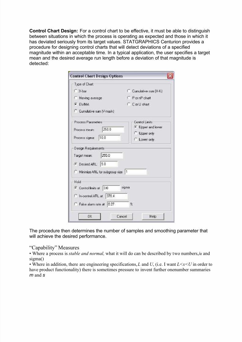
Most flow charts are made up of three main types of symbol:
y Elongated circles, which signify the start or end of a process.
y Rectangles, which show instructions or actions.
y Diamonds, which show decisions that must be made
Within each symbol, write down what the symbol represents. This could be the start or finish of the process, theaction to be taken, or the decision to be made.
Symbols are connected one to the other by arrows, showing the flow of the process.
Tip: There are many other flowchart symbols that can also be used. However, remember that an important use of flowcharts is in communication: If you use obscure symbols that only part of your audience understands, there's a goodchance that your communication will fail. As ever, keep things simple!
To draw the flow chart, brainstorm process tasks, and list them in the order they occur. Ask questions such as "Whatreally happens next in the process?" and "Does a decision need to be made before the next step?" or "Whatapprovals are required before moving on to the next task?"Start the flow chart by drawing the elongated circle shape,and labeling it "Start".Then move to the first action or question, and draw a rectangle or diamond appropriately. Writethe action or question down, and draw an arrow from the start symbol to this shape.
Work through your whole process, showing actions and decisions appropriately in the order they occur, and linkingthese together using arrows to show the flow of the process. Where a decision needs to be made, draw arrows

8/7/2019 The Old Seven
http://slidepdf.com/reader/full/the-old-seven 17/19
leaving the decision diamond for each possible outcome, and label them with the outcome. And remember to showthe end of the process using an elongated circle labeled "Finish".
Finally, challenge your flow chart. Work from step to step asking yourself if you have correctly represented thesequence of actions and decisions involved in the process. And then (if you're looking to improve the process) look atthe steps identified and think about whether work is duplicated, whether other steps should be involved, and whether the right people are doing the right jobs.
Tip: Flow charts can quickly become so complicated that you can't show them on one piece of paper. This is where youcan use "connectors" (shown as numbered circles) where the flow moves off one page, and where it moves ontoanother. By using the same number for the off-page connector and the on-page connector, you show that the flow ismoving from one page to the next.
Example:
The example below shows part of a simple flow chart which helps receptionists route incoming phone calls to thecorrect department in a company:
KeyPoints:
Flow charts are simple diagrams that map out a process so that it can easily be communicated to other people.Todraw a flowchart, brainstorm the tasks and decisions made during a process, and write them down in order. Thenmap these out in flow chart format using appropriate symbols for the start and end of a process, for actions to betaken and for decisions to be made.

8/7/2019 The Old Seven
http://slidepdf.com/reader/full/the-old-seven 18/19
Finally, challenge your flow chart to make sure that it's an accurate representation of the process, and that that itrepresents the most efficient way of doing the job.
Process Improvement Made Easy: The 8d Problem Solving Process
Explained:
What is the 8d Problem Solving Process? Anything that involves ³eight disciplines´ must be
complicated and difficult to learn, right? Here to help you, is the 8d problem solving process
explained in everyday language. The 8d problem solving is about teams working together to
resolve problems, using a structured 8 step process to help focus on facts not opinion.
Discipline 1 ± Build The Team: Assemble a small team of people with the right mix of
skills, experience and authority to resolve the problem and implement solutions. Ensure
these people have the time and inclination to work towards the common goal. Get your
people ³on board´ by using team building tools such as ice-breakers and team activities.
Discipline 2 ± Describe the Problem: How can you fix it if you don¶t know what¶s broken?The more clearly you describe the problem, the more likely you are to resolve it. Be specific
and quantify the problem where possible. Clarify what, when, where and how much e.g.
what is the impact to customers? Consider using checklists from professional 8d problem
solving suppliers to stimulate and open up your thinking.
Discipline 3 ± Implement a Temporary Fix:What ³sticking plaster´ can you use untilyou figure out what¶s really causing the problem? Implement a temporary fix and monitorand measure the impact to ensure it¶s not making things worse. Remember to keep going,as a sticking plaster will never cure a broken leg!
Discipline 4 ± Eliminate Root Cause: There will be many suspects causing the problem,
but usually only one culprit. The key is figuring out which one. This is where it can get a bitnumerically challenging, as statistical tools are often used to get a deep understanding of what is going on in a process.
Discipline 5 ± Verify Corrective Action: You know what¶s causing the problem ± how areyou going to fix it? Test to make sure that your planned fixes have no undesirable sideeffects. If so, are there complementary fixes that eliminate side effects? If your solution justisn¶t feasible, you can still change your mind before you move to the next ³go live´ stage.
Discipline 6 ± Implement Permanent Fix: Go for it! Implement your permanent andcomplementary fixes and monitor to make sure it¶s working. Usually you will get it right, butif not, go back a few steps and try again ± the culprit is there to be caught!
Discipline 7 ± Stop It Happening Again: If you¶ve gone to all this trouble, you don¶twant the problem to sneak up on you again! Prevent recurrence of the problem by updating
everything related to the process e.g. specifications, training manuals, or ³mistake proofing´ the process.
Discipline 8 ± Celebrate Success: Teamwork got you this far, so put on your collectiveparty shoes and celebrate your success. Going public with success spreads knowledge andlearning across your organisation, and let¶s face it, we all like a little recognition now andagain.
The 8d problem solving process is used by big businesses such as National Semiconductor,Shell and Toyota. The key is focusing on facts and not opinion, being disciplined enough to

8/7/2019 The Old Seven
http://slidepdf.com/reader/full/the-old-seven 19/19
follow the process and remembering that a good team are worth more than the sum of theindividuals. Do that, and you¶ll save time, money and lift your employees.
Related Documents