The History of the Cluster Heat Map Leland Wilkinson and Michael Friendly October 25, 2008 Abstract The cluster heat map is an ingenious display that simultaneously reveals row and column hierarchical cluster structure in a data matrix. It consists of a rectangular tiling with each tile shaded on a color scale to represent the value of the corresponding element of the data matrix. The rows (columns) of the tiling are ordered such that similar rows (columns) are near each other. On the vertical and horizontal margins of the tiling there are hierarchical cluster trees. This cluster heat map is a synthesis of several different graphic displays developed by statisticians over more than a century. We locate the earliest sources of this display in late 19th century publications. And we trace a diverse 20th century statistical literature that provided a foundation for this most widely used of all bioinformatics displays. 1 Introduction The cluster heat map is a rectangular tiling of a data matrix with cluster trees appended to its margins. Within a relatively compact display area, it facilitates inspection of row, column, and joint cluster structure. Moderately large data matrices (several thousand rows/columns) can be displayed effectively on a high- resolution color monitor and even larger matrices can be handled in print or in megapixel displays. The cluster heat map is well-known in the natural sciences and one of the most widely used graphs in the biological sciences. As Weinstein (2008) mentions: For visualization, by far the most popular graphical representation has been the clustered heat map, which compacts large amounts of information into a small space to bring out coherent patterns in the data. ... Since their debut over 10 years ago, clustered heat maps have appeared in well over 4000 biological or biomedical publications. Weinstein describes the heat map as follows: 1

Welcome message from author
This document is posted to help you gain knowledge. Please leave a comment to let me know what you think about it! Share it to your friends and learn new things together.
Transcript

The History of the Cluster Heat Map
Leland Wilkinson and Michael Friendly
October 25, 2008
Abstract
The cluster heat map is an ingenious display that simultaneously reveals row and column hierarchical
cluster structure in a data matrix. It consists of a rectangular tiling with each tile shaded on a color
scale to represent the value of the corresponding element of the data matrix. The rows (columns) of the
tiling are ordered such that similar rows (columns) are near each other. On the vertical and horizontal
margins of the tiling there are hierarchical cluster trees. This cluster heat map is a synthesis of several
different graphic displays developed by statisticians over more than a century. We locate the earliest
sources of this display in late 19th century publications. And we trace a diverse 20th century statistical
literature that provided a foundation for this most widely used of all bioinformatics displays.
1 Introduction
The cluster heat map is a rectangular tiling of a data matrix with cluster trees appended to its margins.
Within a relatively compact display area, it facilitates inspection of row, column, and joint cluster structure.
Moderately large data matrices (several thousand rows/columns) can be displayed effectively on a high-
resolution color monitor and even larger matrices can be handled in print or in megapixel displays.
The cluster heat map is well-known in the natural sciences and one of the most widely used graphs in
the biological sciences. As Weinstein (2008) mentions:
For visualization, by far the most popular graphical representation has been the clustered heat
map, which compacts large amounts of information into a small space to bring out coherent
patterns in the data. ... Since their debut over 10 years ago, clustered heat maps have appeared
in well over 4000 biological or biomedical publications.
Weinstein describes the heat map as follows:
1
default
Text Box
In press, The American Statistician

In the case of gene expression data, the color assigned to a point in the heat map grid indicates
how much of a particular RNA or protein is expressed in a given sample. The gene expression
level is generally indicated by red for high expression and either green or blue for low expression.
Coherent patterns (patches) of color are generated by hierarchical clustering on both horizontal
and vertical axes to bring like together with like. Cluster relationships are indicated by tree-like
structures adjacent to the heat map, and the patches of color may indicate functional relationships
among genes and samples.
Figure 1 shows a typical heat map as described by Weinstein. The most popular bioinformatics software
for producing this graphic is documented in Eisen et al. (1998). The Eisen paper, which describes a cluster
heat map program, was the third most cited article in PNAS as of July 1, 2008 (PNAS 2008).
The “debut” Weinstein refers to is possibly a debut in the biology literature, but it certainly is not a debut
in the statistical literature. The components of this display have a long history in statistical graphics. The
biological references give little indication of the background for the underlying ideas required to construct
a heat map. In this article, we trace the lineage of the heat map and show what elements were ultimately
integrated in the display that biologists finally adopted.
2 The Past
To elucidate the history of this display, we will present each of the components that underly the design of
the cluster heat map. Some are quite old, some relatively recent.
2.1 Shading Matrices
The heart of the heat map is a color-shaded matrix display. Shaded matrix displays are well over a century
old. Figure 2 shows an example from Loua (1873). This graphic summarizes various social statistics across
the arrondissements of Paris. Like the other graphics in the book, it was hand drawn and colored.
Shading a table or matrix is a longstanding device for highlighting entries, rows, or columns. Accountants,
graphics designers, computer engineers, and others have used this method for years. The most common recent
application involves the use of color to shade rows, columns, or cells of a spreadsheet.
2
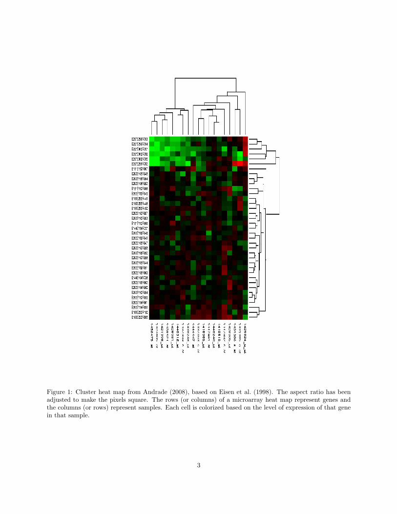
Figure 1: Cluster heat map from Andrade (2008), based on Eisen et al. (1998). The aspect ratio has beenadjusted to make the pixels square. The rows (or columns) of a microarray heat map represent genes andthe columns (or rows) represent samples. Each cell is colorized based on the level of expression of that genein that sample.
3

Figure 2: Shaded matrix display from Loua (1873). This was designed as a summary of 40 separate maps ofParis, showing the characteristics (national origin, professions, age, social classes, etc.) of 20 districts, usinga color scale that ranged from white (low) through yellow and blue to red (high). A monochrome versioncan be found at http://www.math.yorku.ca/SCS/Gallery/images/loua1873-scalogram.jpg.
2.2 Permuting Matrices
The cluster heat map does more than shade. It permutes the rows and columns of a matrix to reveal
structure. Matrix permutation has a long history as well. Like the idea of shading, sorting a matrix or table
to reveal structure is over a century old. Figure 3 shows a sorted matrix of educational data from Brinton
(1914). Figure 4 shows an example from Bertin (1967). Jacques Bertin devoted a chapter to illustrating the
usefulness of what he called the reorderable matrix. His examples were sorted by hand.
2.2.1 Seriation
It was an anthropologist who developed one of the first models for ordering a data matrix. Petrie (1899)
sought to rearrange the rows and columns of a rectangular matrix of measurements on anthropological
artifacts so that the largest values would be near the main diagonal. His immediate goal was to use attributes
(columns) to serialize artifacts (rows) in order to recover a temporal ordering on the artifacts. His goal had
implications well beyond his subject matter. Petrie had identified the Toeplitz structure implicit in the
ordering of a data matrix based on time (or some other dimension). His article generated a large literature
over more than a century on a topic variously called seriation or matrix reordering (Robinson 1951; Kendall
1963; McCormick et al. 1972; Hubert 1974, 1976; Lenstra 1974; Friendly 2002; Friendly and Kwan 2003;
Climer and Zhang 2006).
Ten years after Petrie’s paper, Jan Czekanowski developed a seriation method and used a shaded dia-
4

Figure 3: Sorted shaded display from Brinton (1914). The data are ranks of US states on each of 10educational features assessed in 1910. The matrix has been sorted by the row-marginal ranks.
Figure 4: Permuted matrix display from Bertin (1967). This figure was devised to illustrate the possibilityof sorting a matrix to reveal block-diagonal structure.
5

Figure 5: Sorted shaded display from Czekanowski (1909), reproduced in Hage and Harary (1995)
gram to represent block-diagonal data structures. Figure 5 shows a sorted matrix of educational data from
Czekanowski (1909). Czekanowski’s display, except for the lack of coloring and appended cluster trees, is
similar to the output of contemporary computer matrix reordering programs (Liiv 2008).
2.2.2 The Guttman Scalogram
Fifty years after Petrie, Louis Guttman introduced a matrix permutation to reveal a different one-dimensional
structure. The Guttman Scalogram (Guttman 1950) was a direct method for fitting a deterministic model (a
total order that Guttman called a Simplex) to a binary matrix. In Guttman’s method, a rectangular binary
matrix was permuted by hand (using paper or a tabulating machine) to approximate a unidimensional scale:
below the quasi-diagonal were to be as many 1’s as possible and above the quasi-diagonal, as many 0’s as
possible. A matrix with this structure was said to be scalable, implying an ordering of the rows and columns.
The Scalogram found wide application in the following decades, particularly in the social sciences. Fig-
ure 6 shows an example from Rondinelli (1980). Computer programs eventually automated this scaling (Nie
et al. 1970; Wilkinson 1979). Others eventually developed interactive visual analytics programs to allow
users to explore their own permutations (Siirtola and Makinen 2005). And statisticians developed stochastic
generalizations of Guttman’s model that allowed this permutation to be applied more widely (Goodman
1975; Andrich 1978).
2.2.3 Hierarchical Clustering
Not long after Guttman’s Scalogram became popular, cluster analysts took an interest in representing clusters
by shading association (similarity/dissimilarity) matrices. Sneath (1957) was perhaps the earliest advocate
for this graphic.
6

Figure 6: Scalogram display from Rondinelli (1980), based on Guttman (1950). This manually-sorted scalo-gram summarizes facilities statistics (high school, rural bank, auto repair shop, drugstore...) for settlementsin the Bicol River Basin, Phillipines.
Ling (1973) introduced a computer program, called SHADE, for implementing Sneath’s idea. Ling’s
program used overstrikes on a character printer to represent different degrees of shading. Gower and Digby
(1981) implemented Ling’s display on a dot matrix printer. Figure 7 shows an example from their chapter.
2.2.4 Two-way Clustering
Shortly after Ling’s paper, Hartigan (1974) introduced a block clustering program with direct display of a
rectangular data matrix. The theory behind this program was discussed in Hartigan (1975). Motivated by
Hartigan’s work, Wilkinson (1984) implemented a two-way hierarchical clustering routine on a rectangular
data matrix, using Ling’s shading method for the display.
2.2.5 Seriating a Binary Tree
For a binary tree with n leaves, there are 2n−1 possible linear orderings of the leaves in a planar layout
of the tree. Hierarchical clustering algorithms do not determine a particular layout. Therefore, we need
an additional algorithm to seriate the rows/columns of a clustered matrix. Gruvaeus and Wainer (1972)
developed a greedy algorithm that Wilkinson used in the SYSTAT display. Gale et al. (1984) devised
an alternative algorithm for this purpose. More recent papers discuss this problem in detail and specify
optimization algorithms with objective functions designed for the task (Wishart 1997; Bar-joseph et al.
7

Figure 7: Permuted cluster display from Gower and Digby (1981), following Ling (1973). This display wasdesigned to represent a symmetric similarity/dissimilarity matrix.
2003; Morris et al. 2003). A desirable aspect of these algorithms is that they yield a total order when it
exists (e.g., when the association matrix has Toeplitz form).
2.3 Appending Trees
There remains the issue of appending cluster trees to the rectangular data matrix. We have seen examples
that append a clustering tree to an association matrix. Gower and Digby (1981) took the next step and
appended cluster trees to both row and column association matrices. Figure 8 shows their template. Their
layout is in some ways superior to the modern microarray heat map, because it simultaneously displays the
row and column similarities/dissimilarities on which the clustering is based. Chen (2002) and others adopted
this design.
It is a short step from this design to the layout chosen by the biologists. The first published heat map
in this form appeared in Wilkinson (1994). Figure 9 shows a color version of that figure from the SYSTAT
manual. By the time Eisen et al. (1998) appeared, there were tens of thousands of copies of SYSTAT
circulating in the scientific community.
3 The Future
Weinstein (2008) finds constructing cluster heat maps a “surprisingly subtle process.” His description of
8

Figure 8: Permuted cluster display framework from Gower and Digby (1981). This is a template for arow/column clustering of a rectangular data matrix. By treating the data as a lower-corner matrix of asquare super-matrix, the display reveals both row and column structure.
these subtleties would not surprise a statistician. Those familiar with the cluster literature know that there
are issues regarding the choice of a distance measure (Euclidean, weighted Euclidean, City Block, etc.) and
the choice of linkage method (single, complete, average, centroid, Ward, etc.). Kettenring (2006) discusses
these issues in practice. In addition, Weinstein mentions the problem of ordering the leaves of the clustering
tree, suggesting that “some objective (but, to a degree, arbitrary) rule must be invoked to decide which way
each branch will, in fact, swing.” As we have mentioned, this is not an arbitrary objective; it is a well-defined
seriation problem.
Modern statistical packages implement the heat map display as part of a clustering package (e.g., JMP
and SYSTAT) or they make it easy to plot a heat map using any seriation algorithm (e.g., R and Stata).
By doing so, all the options available for clustering or other analytics are renderable in a heat map. This
flexible architecture underscores the fact that a heat map is a visual reflection of a statistical model. It is
not an arbitrary ordering of row and column cluster trees.
In general, a matrix heat map can be considered to be a display whose rows and columns have been
permuted through an algorithm. Many of the recent references cited in this article mention an explicit
objective function for evaluating the resulting permutation. A popular seriation loss function is the sum of
distances between adjacent rows and columns. We can minimize this function directly on a given dataset or
use it to evaluate the goodness of a particular heuristic seriation.
Alternatively, we can sample values from known bivariate distributions, randomize rows and columns
in the sampled data matrix, and compare the solutions from different seriation algorithms. Wilkinson
9

Figure 9: Cluster heat map from Wilkinson (1994). The data are social statistics (urbanization, literacy, lifeexpectancy for females, GDP, health expenditures, educational expenditures, military expenditures, deathrate, infant mortality, birth rate, and ratio of birth to death rate) from a UN survey of world countries. Thevariables were standardized before the hierarchical clustering was performed.
.
10

(2005) generated rectangular matrices whose row and column covariances were determined by five different
covariance structures: Toeplitz, Band, Circular, Equicovariance, and Block diagonal. He then randomly
permuted rows and columns before applying several different seriation algorithms, including clustering,
MDS, and SVD. Overall, SVD recovered the original ordering better than any other method used on all five
types of matrices.
These findings suggest that a simple SVD may be the best general seriation method and that cluster
methods should be restricted to those datasets where a cluster model is appropriate. If SVD is chosen, then
one should consider recent robust methods for this decomposition (Liu et al. 2003). For microarray data, it
is still an open question whether hierarchical-clustering-based seriation is more useful than other approaches,
despite the popularity of this method.
4 Conclusion
The cluster heat map did not originate ex nihilo. It came out of a relatively long history of matrix displays,
before and after the computer era. As with many graphical methods, the cluster heat map involved a creative
synthesis of different graphical representations devised by a number of statisticians.
11

References
Andrade, M. (2008), “Heatmap,” http://en.wikipedia.org/.
Andrich, D. (1978), “A rating formulation for ordered response categories,” Psychometrika, 43, 357–74.
Bar-joseph, Z., Demaine, E. D., Gifford, D. K., Hamel, A. M., Jaakkola, T. S., and Srebro, N. (2003), “K-ary
clustering with optimal leaf ordering for gene expression data,” Bioinformatics, 19, 506–520.
Bertin, J. (1967), Semiologie Graphique, Paris: Editions GauthierVillars.
Brinton, W. C. (1914), Graphic Methods for Presenting Facts, New York: The Engineering Magazine Com-
pany.
Chen, C. H. (2002), “Generalized Association Plots: Information Visualization via Iteratively Generated
Correlation Matrices,” Statistica Sinica, 12, 7–29.
Climer, S. and Zhang, W. (2006), “Rearrangement Clustering: Pitfalls, Remedies, and Applications,” Journal
of Machine Learning Research, 7, 919–943.
Czekanowski, J. (1909), “Zur differentialdiagnose der Neandertalgruppe,” Korrespondenzblatt der Deutschen
Gesellschaft fur Anthropologie, Ethnologie und Urgeschichte, 40, 44–47.
Eisen, M., Spellman, P., Brown, P., and Botstein, D. (1998), “Cluster analysis and display of genome-wide
expression patterns,” Proceedings of the National Academy of Sciences, 95, 14863–14868.
Friendly, M. (2002), “Corrgrams: Exploratory Displays for Correlation Matrices,” The American Statistician,
56, 316–324.
Friendly, M. and Kwan, E. (2003), “Effect ordering for data displays,” Computational Statistics & Data
Analysis, 43, 509–539.
Gale, N., Halperin, W., and Costanzo, C. (1984), “Unclassed matrix shading and optimal ordering in hier-
archical cluster analysis,” Journal of Classification, 1, 75–92.
Goodman, L. (1975), “A new model for scaling response patterns: An application of the quasi-independence
concept,” Journal of the American Statistical Association, 70, 755–768.
Gower, J. and Digby, P. (1981), “Expressing complex relationships in two dimensions,” in Interpreting
Multivariate Data, ed. Barnett, V., Chichester, UK: John Wiley & Sons, pp. 83–118.
12
Gruvaeus, G. and Wainer, H. (1972), “Two additions to hierarchical cluster analysis,” British Journal of
Mathematical and Statistical Psychology, 25, 200–206.
Guttman, L. (1950), “The basis for scalogram analysis,” in Measurement and Prediction. The American
Soldier, ed. et al., S. S., New York: John Wiley & Sons, vol. IV.
Hage, P. and Harary, F. (1995), “Close-Proximity Analysis: Another Variation on the Minimum-Spanning-
Tree Problem,” Current Anthropology, 36, 677–683.
Hartigan, J. (1974), “BMDP3M: Block Clustering,” in BMDP Biomedical Computer Programs, ed. Dixon,
W., Berkeley, CA: University of California Press.
— (1975), Clustering Algorithms, New York: John Wiley & Sons.
Hubert, L. (1974), “Some applications of graph theory and related non-metric techniques to problems of
approximate seriation: The case for symmetric proximity measures,” The British Journal of Mathematical
and Statistical Psychology, 27, 133–153.
— (1976), “Seriation using asymmetric proximity measures,” The British Journal of Mathematical and
Statistical Psychology, 29, 32–52.
Kendall, D. (1963), “A statistical approach to Flinders Petries sequence dating,” Bulletin of the International
Statistical Institute, 40, 657–680.
Kettenring, J. (2006), “The Practice of Cluster Analysis,” Journal of Classification, 23, 3–30.
Lenstra, J. (1974), “Clustering a data array and the Traveling Salesman Problem,” Operations Research, 22,
413–414.
Liiv, I. (2008), “Pattern discovery using seriation and matrix reordering: A unified view,” Ph.D. thesis,
Tallinn University of Technology, Department of Informatics, Talininn, Estonia.
Ling, R. (1973), “A computer generated aid for cluster analysis,” Communications of the ACM, 16, 355–361.
Liu, L., Hawkins, D., Ghosh, S., and Young, S. (2003), “Robust singular value decomposition analysis of
microarray data,” Proceedings of the National Academy of Sciences, 100, 13167–13172.
Loua, T. (1873), Atlas statistique de la population de Paris, Paris: J. Dejey.
13

McCormick, W. T., Schweitzer, P. J., and White, T. W. (1972), “Problem decomposition and data reorga-
nization by a clustering technique,” Operations Research, 20, 993–1009.
Morris, S. A., Asnake, B., and Yen, G. G. (2003), “Dendrogram seriation using simulated annealing,”
Information Visualization, 2, 95–104.
Nie, N. H., Bent, D. H., and Hull, C. H. (1970), SPSS: Statistical Package for the Social Sciences, New York,
NY: McGraw-Hill Book Company.
Petrie, W. (1899), “Sequences in Prehistoric Remains,” The Journal of the Anthropological Institute of Great
Britain and Ireland, 29, 295–301.
PNAS (2008), “Most-Cited Articles as of July 1, 2008 – updated monthly,” http://www.pnas.org/reports/
most-cited.
Robinson, W. (1951), “A method for chronologically ordering archaeological deposits,” American Antiquity,
16, 293–301.
Rondinelli, D. A. (1980), Spatial analysis for regional development, Tokyo, Japan: The United Nations
University.
Siirtola, H. and Makinen, E. (2005), “Constructing and reconstructing the reorderable matrix,” Information
Visualization, 4, 32–48.
Sneath, P. (1957), “The application of computers to taxonomy,” Journal of General Microbiology, 17, 201–
226.
Weinstein, J. (2008), “A Postgenomic Visual Icon,” Science, 319, 1772–1773.
Weinstein, J., Myers, T., OConnor, P., Friend, S., Fornace Jr., A., Kohn, K., Fojo, T., Bates, S., Rubinstein,
L., Anderson, N., Buolamwini, J., van Osdol, W., Monks, A., Scudiero, D., Sausville, E., Zaharevitz, D.,
Bunow, B., Viswanadhan, V., Johnson, G., Wittes, R., and Paull, K. (1997), “An Information-Intensive
Approach to the Molecular Pharmacology of Cancer,” Science, 275, 343–349.
Wilkinson, L. (1979), “Permuting a matrix to a simple pattern,” in Proceedings of the Statistical Computing
Section of the American Statistical Association, Washington, DC: The American Statistical Association,
pp. 409–412.
— (1984), SYSTAT, Version 2, Evanston, IL: SYSTAT Inc.
14
— (1994), SYSTAT for DOS: Advanced Applications, Version 6, Evanston, IL: SYSTAT Inc.
— (2005), The Grammar of Graphics, New York: Springer-Verlag, 2nd ed.
Wishart, D. (1997), “ClustanGraphics: Interactive Graphics for Cluster Analysis,” Computing Science and
Statistics, 29, 48–51.
15
Related Documents