The Good, the Bad, and the Ugly The CAS Guide to Stellar PowerPoint Presentations

The Good, the Bad, and the Ugly The CAS Guide to Stellar PowerPoint Presentations.
Dec 15, 2015
Welcome message from author
This document is posted to help you gain knowledge. Please leave a comment to let me know what you think about it! Share it to your friends and learn new things together.
Transcript
The Good, the Bad,and the Ugly
The CAS Guide to Stellar PowerPoint Presentations
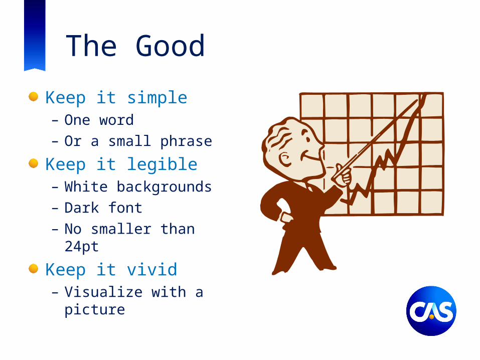
The Good
Keep it simple– One word– Or a small phrase
Keep it legible– White backgrounds– Dark font– No smaller than 24pt
Keep it vivid– Visualize with a picture
The BadComplex – you don’t want to overly bombard your audience with too much information on the slide.
– This is far more difficult to read that small bullet points would be. Don’t depend on people to be able to take in all this text.
– Use bullets and make sure that you practice your presentation beforehand. You don’t want to be reading from the slides. Keeping it short will discourage you from reading than in engaging your audience.
Cluttered – trying to fit too much information on just one slide will make it hard for people to be able to absorb all this information.
– You don’t need to try to fit too much onto one slide. Make sure that your font is always greater than 24pt. That should naturally show you how much legible space you have on a presentation.
– You can try to divide the information up into different slides, which will help your audience visualize the information better with better organization.
Text heavy – your audience will appreciate using images – such as charts or maps to convey some of the information that you are trying to give them
– Instead of writing out long sentences about the information that you pulled from a chart, show the chart instead.

The UglyThis is everything that you could possibly do wrong with a presentation slide.You absolutely do not want to do thisPlease don’t do this:
– Have a dark textured background– Have font that’s light and hard to read.– Not checking the punctuation at the end of your bullets to make sure that they are
consistent– Put text on top of a picture, no one can actually read that;
Also don’t put too much inofrmaiton on a slideDon’t forget to run spell check (look above)You need to try to organize your information instead of this non high-level bulleted mess.Don’t put pronouns into your bullets, it’s not necessary;Please be mindful of the fact that some people are also color-blind so red and green together are a terrible combination.I’m sure no one actually does this to this extent

Good Screen Shot
Use speaker notes– Print and rehearse– Guide during presentation

AND GOOD LUCK!

Casualty Actuarial Society4350 North Fairfax Drive, Suite 250
Arlington, Virginia 22203
www.casact.org
Related Documents