No. 01 THE CORIAN ® 50 NEW AESTHETICS INTERVIEWS ASHLEY HICKS SPOTLIGHT REPORT PORTFOLIO Cuadrante de San Francisco No.14, Int 1 Col. Cuadranta de San Francisco Alcaldía: Coyoacán C.P. 04320, CDMX Tels: (55) 5554 5858 / (55) 55443737 DONDE COMPRAR

Welcome message from author
This document is posted to help you gain knowledge. Please leave a comment to let me know what you think about it! Share it to your friends and learn new things together.
Transcript
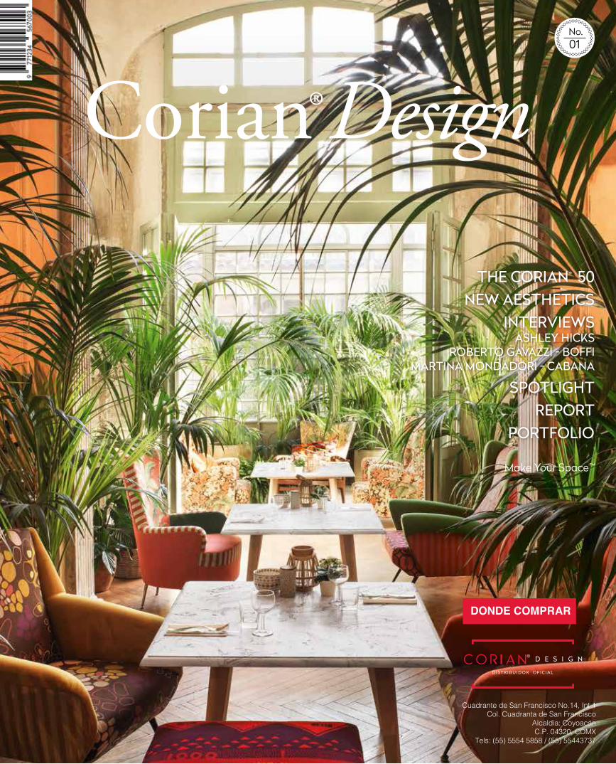
No. 01
THE CORIAN® 50 NEW AESTHETICS
INTERVIEWSASHLEY HICKS
SPOTLIGHT REPORT
PORTFOLIO
Cuadrante de San Francisco No.14, Int 1Col. Cuadranta de San Francisco
Alcaldía: CoyoacánC.P. 04320, CDMX
Tels: (55) 5554 5858 / (55) 55443737
DONDE COMPRAR
Since its inception, Corian® has provided the world of design and architecture the perfect medium in which to innovate. Renowned for its adaptability, its variety of patterns and
color schemes, its sensorial qualities, durability and cleanliness, this breakthrough invention has ably met the challenges of modern living.
Today, Corian® is a major source of inspiration for leading architects and designers. Around the world, it is used by premium kitchen, bath and furniture brands, time and again meeting the requirements of even the most demanding clients. Corian® has come far from its initial success as an exceptional solution for interiors, building itself into a brand that has developed its functional, aesthetic and creative capabilities to the fullest.
This year marks an important anniversary – 50 years ago Corian® first entered into commercial use. In addition, we will witness the unveiling of a new branding and communications strategy that promotes the qualities of Corian® in a campaign telling the product’s story in all its varied facets.
To celebrate this new direction, we are launching a new publication, Corian® Design, which will be distributed worldwide in print and available online. It features a new Corian® logo and expressive statement – Make Your Space™ – that reflects our new branding strategy. They will be progressively adopted across the world in Corian® marketing tools and communications campaigns.
In this inaugural issue, we look at what
lies ahead for Corian®, from its ever-expanding
collection of colors – moving now in the direction of warmth, emotion and modernity to meet specific market and societal trends – to technological developments aimed at improving its performance and adapting it to the evolving needs of modern society.
We celebrate our heritage by showcasing a selection of works that creative minds have realized with this technically versatile material. We explore the aesthetic qualities this remarkable product has to offer and the increasing number of ways it can be put to good use to enhance spaces both public and private. We gain insight into the world of design and industry through interviews with prominent personalities who today operate at the forefront of their field.
Fifty years on, Corian® continues to inspire, surprise and delight through a myriad of extraordinary projects encompassing interiors, buildings and furnishings. The ability to constantly learn, improve and adapt is an essential element of life and Corian®
embodies this spirit of continual evolution, which keeps it at the cutting edge of the design industry. It pushes the envelope thanks to its unique properties and reliability, the creative talent that maximizes its full potential, the skills and the passion of our customers, and the dedication of the entire Corian® team.
Today marks much more than a historic milestone reached by Corian®. It marks the next step in the journey, one to a universe of possibilities based on collaboration and innovation. Get ready for a new Corian® experience.
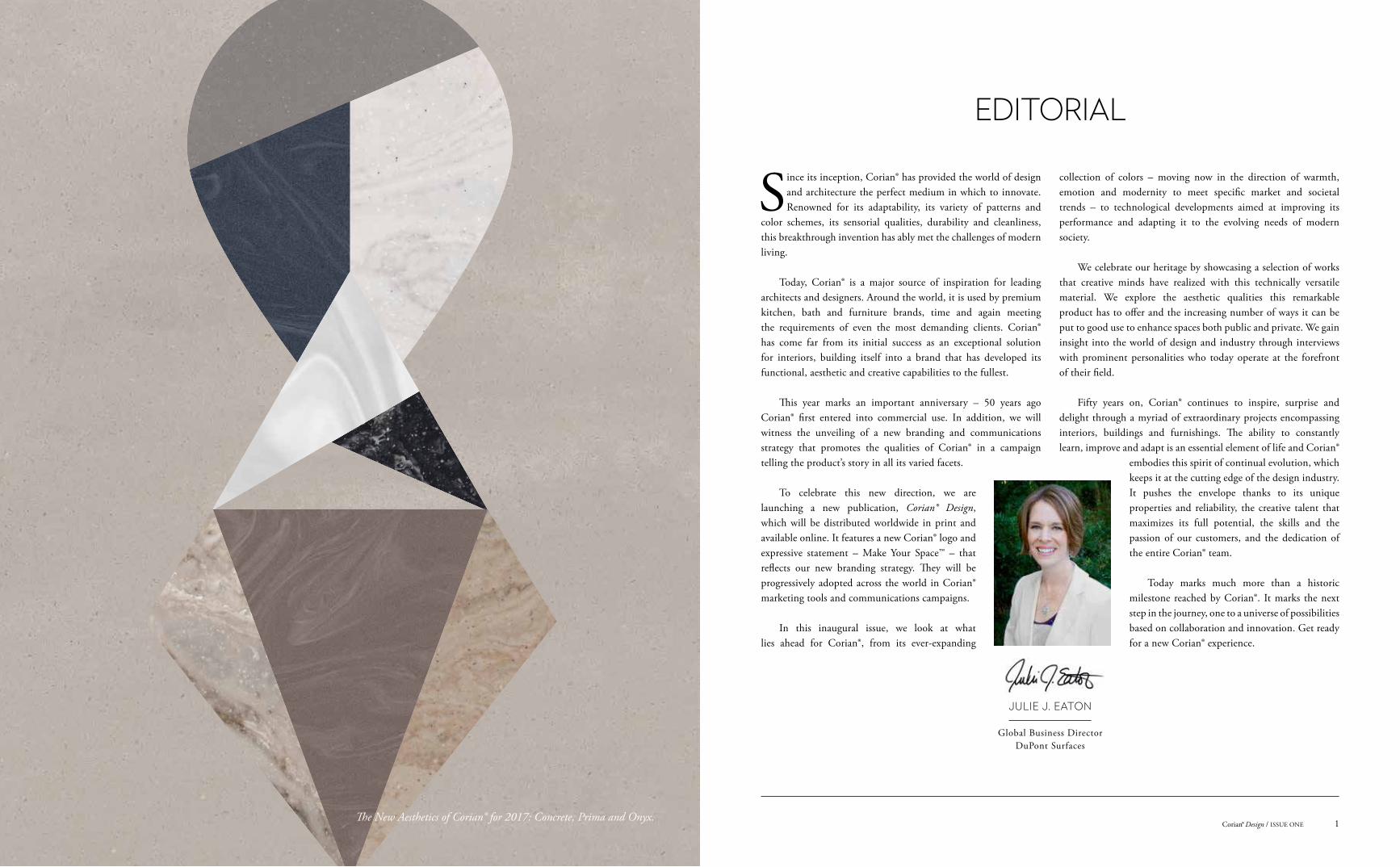
EDITORIAL
JULIE J. EATON
Global Business DirectorDuPont Surfaces
1Corian® Design / ISSUE ONEThe New Aesthetics of Corian® for 2017: Concrete, Prima and Onyx.
64 Educating for Tomorrow
Rio de Janeiro’s Museu do Amanhã explores the future of our planet. Its exhibits rely on a forward-looking material: Corian®.
36 The Boffi Code
Founded in 1934 with a focus on kitchens, Italy’s Boffi is today a global design brand. A conversation with Boffi CEO Roberto Gavazzi.
4 Experience the New Aesthetics of Corian®
Life, culture and style evolve. Now experience the evolution of Corian®, as innovative new colors and designs take a bold step forward.
20 The Corian® 50
Fifty years after its debut, Corian® continues to inspire. We’ve assembled 50 head-turning projects featuring Corian®.
One-on-One
6 Concrete
10 Onyx
12 Prima
58 Take it to the Max
Interiors magazine Cabana has become an overnight sensation in the design world. An interview with Cabana editor-in-chief Martina Mondadori Sartogo.
84 The Mix-and-Match Maestro
Celebrated British interior designer and architect Ashley Hicks talks home decoration with Corian® Design.
Portfolio
40 Residential Style
The rich colors and versatility of Corian® offer an endless array of design possibilities limited only by one’s imagination.
50 Interiors Reimagined
From delicate curves to dramatic contours, the extraordinary shapes permitted by Corian® make it the ideal material to create imaginative commercial spaces.
Spotlight
70 Getting into Gear
A California car shopping business gets a new headquarters that cleverly incorporates Corian®.
76 Clinically Sound
A cutting-edge Serbian clinic goes for an ultramodern design thanks to Corian®.
80 White Out Wonder
Poland’s new OVO Wroclaw complex stands out on the block with a stunning facade in Corian®.
88 Full Steam Ahead
Japan is a leader in rail transport. Kengo Kuma & Associates upgrade its rolling stock with Corian®.
Report
92 Infinite Possibilities
For proof of the transformative power of Corian®, one need look no further than the Meinert family.
Innovation
96 Into the Deep
The Corian® brand is naturally associated with innovation and aesthetics. It has recently given further proof of this with the introduction of DeepColor™ Technology.
Global Digest
98 A Roundup of Corian® Projects from Across the World
104 Corian® - Global Contacts
THIS ISSUE
3Corian® Design / ISSUE ONECorian® Design / ISSUE ONE2
CONTENTSCONTENTS
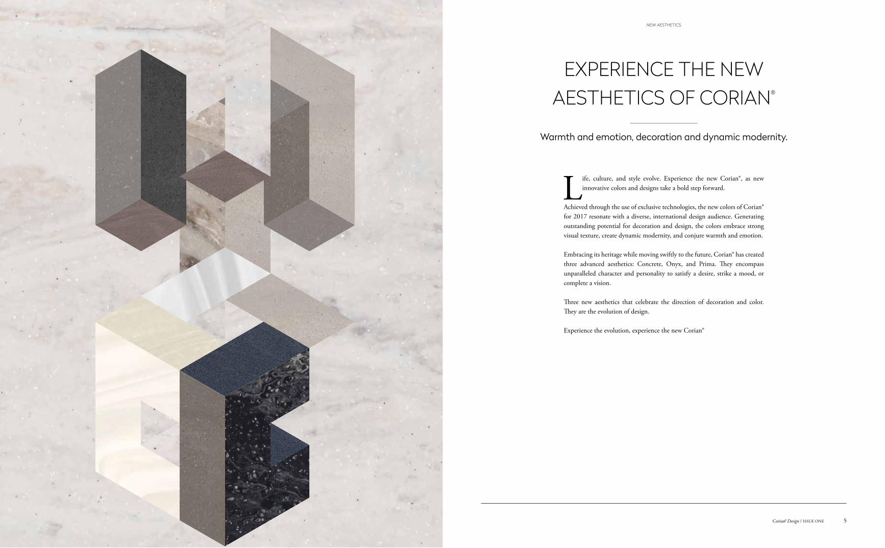
Warmth and emotion, decoration and dynamic modernity.
Life, culture, and style evolve. Experience the new Corian®, as new innovative colors and designs take a bold step forward.
Achieved through the use of exclusive technologies, the new colors of Corian® for 2017 resonate with a diverse, international design audience. Generating outstanding potential for decoration and design, the colors embrace strong visual texture, create dynamic modernity, and conjure warmth and emotion.
Embracing its heritage while moving swiftly to the future, Corian® has created three advanced aesthetics: Concrete, Onyx, and Prima. They encompass unparalleled character and personality to satisfy a desire, strike a mood, or complete a vision.
Three new aesthetics that celebrate the direction of decoration and color. They are the evolution of design.
Experience the evolution, experience the new Corian®
EXPERIENCE THE NEW AESTHETICS OF CORIAN®
5Corian® Design / ISSUE ONE
NEW AESTHETICS
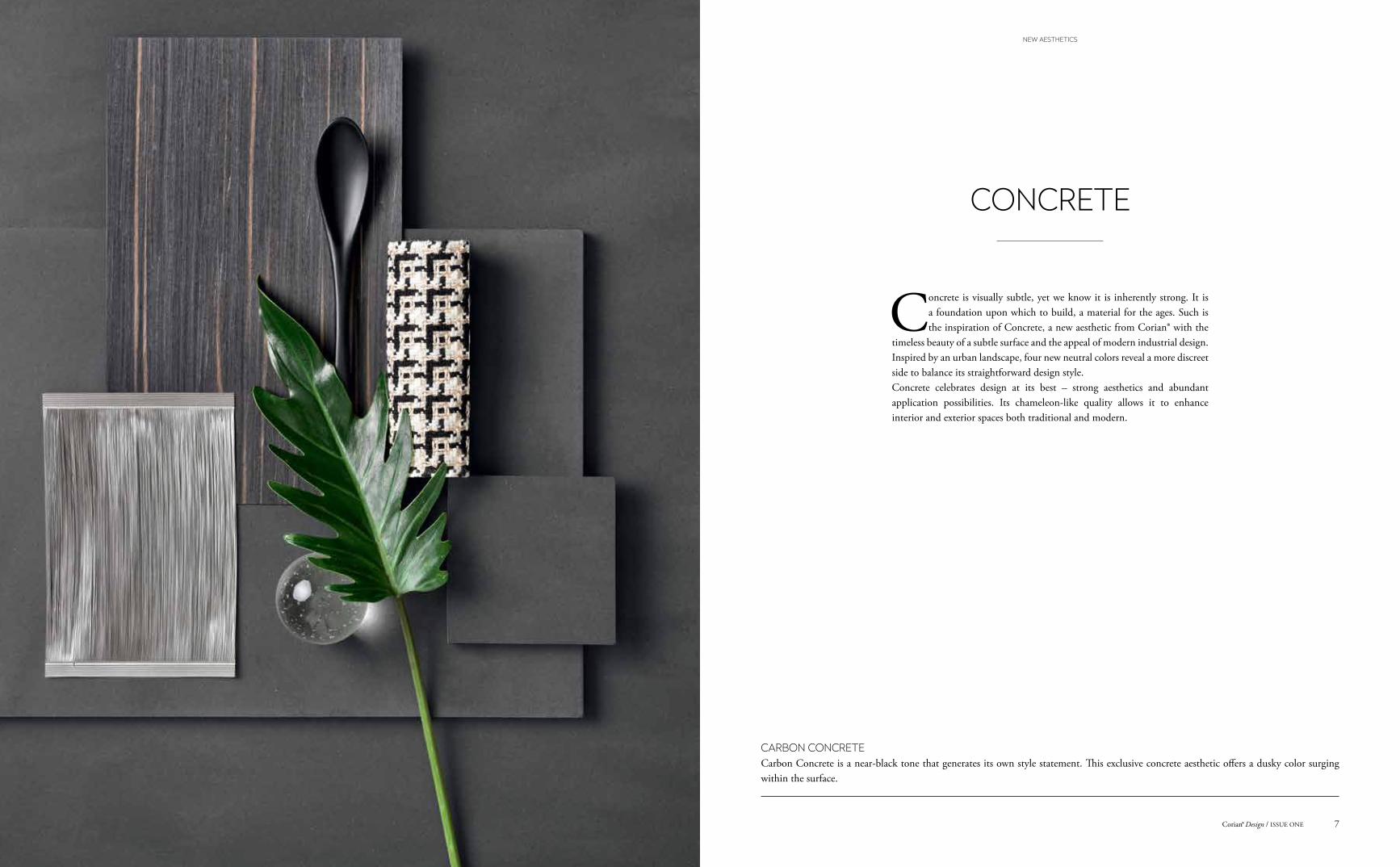
Concrete is visually subtle, yet we know it is inherently strong. It is a foundation upon which to build, a material for the ages. Such is the inspiration of Concrete, a new aesthetic from Corian® with the
timeless beauty of a subtle surface and the appeal of modern industrial design. Inspired by an urban landscape, four new neutral colors reveal a more discreet side to balance its straightforward design style.Concrete celebrates design at its best – strong aesthetics and abundant application possibilities. Its chameleon-like quality allows it to enhance interior and exterior spaces both traditional and modern.
CONCRETE
CARBON CONCRETECarbon Concrete is a near-black tone that generates its own style statement. This exclusive concrete aesthetic offers a dusky color surging within the surface.
7Corian® Design / ISSUE ONE
NEW AESTHETICS
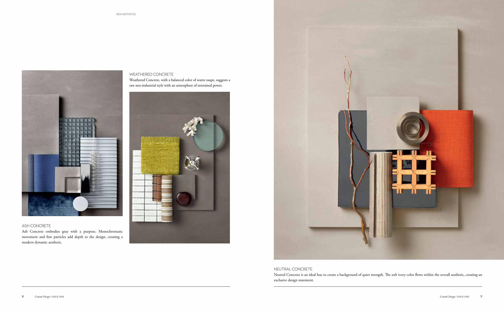
WEATHERED CONCRETE Weathered Concrete, with a balanced color of warm taupe, suggests a raw neo-industrial style with an atmosphere of restrained power.
ASH CONCRETEAsh Concrete embodies gray with a purpose. Monochromatic movement and fine particles add depth to the design, creating a modern dynamic aesthetic.
NEUTRAL CONCRETENeutral Concrete is an ideal hue to create a background of quiet strength. The soft ivory color flows within the overall aesthetic, creating an exclusive design statement.
9Corian® Design / ISSUE ONECorian® Design / ISSUE ONE8
NEW AESTHETICS
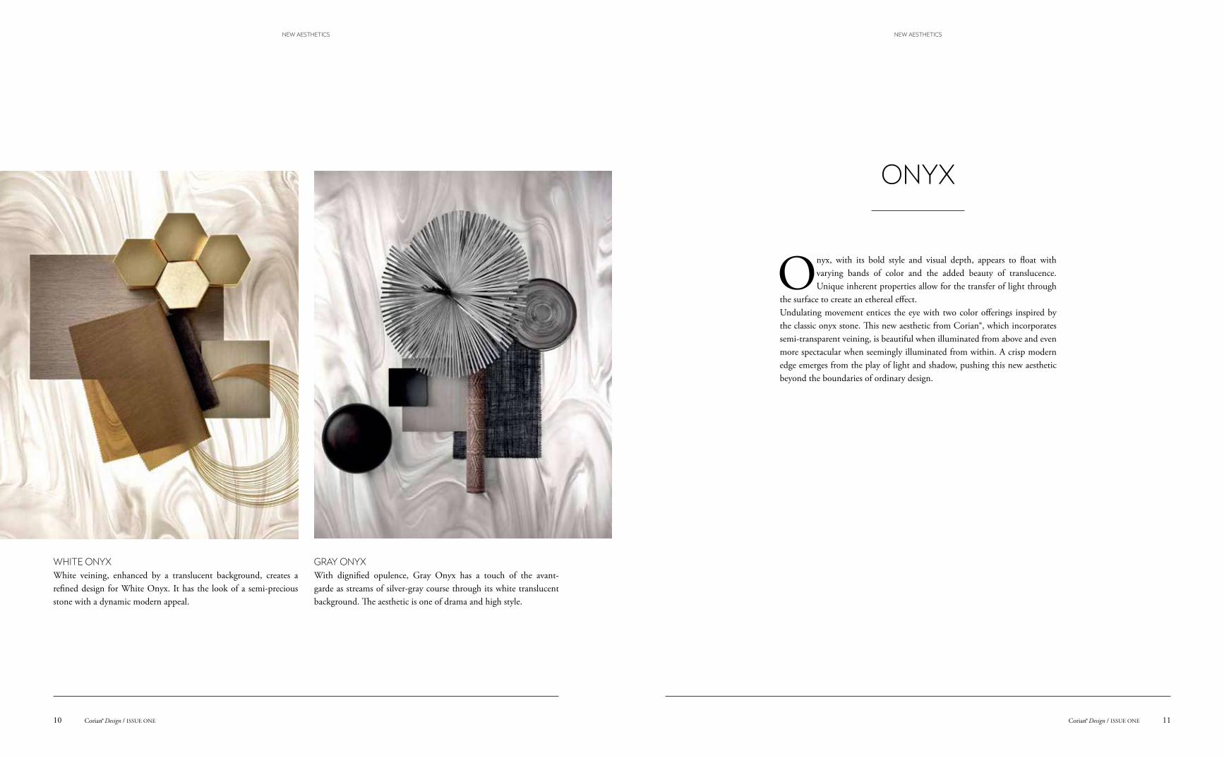
Onyx, with its bold style and visual depth, appears to float with varying bands of color and the added beauty of translucence. Unique inherent properties allow for the transfer of light through
the surface to create an ethereal effect.Undulating movement entices the eye with two color offerings inspired by the classic onyx stone. This new aesthetic from Corian®, which incorporates semi-transparent veining, is beautiful when illuminated from above and even more spectacular when seemingly illuminated from within. A crisp modern edge emerges from the play of light and shadow, pushing this new aesthetic beyond the boundaries of ordinary design.
ONYX
WHITE ONYXWhite veining, enhanced by a translucent background, creates a refined design for White Onyx. It has the look of a semi-precious stone with a dynamic modern appeal.
GRAY ONYXWith dignified opulence, Gray Onyx has a touch of the avant-garde as streams of silver-gray course through its white translucent background. The aesthetic is one of drama and high style.
11Corian® Design / ISSUE ONECorian® Design / ISSUE ONE10
NEW AESTHETICSNEW AESTHETICS
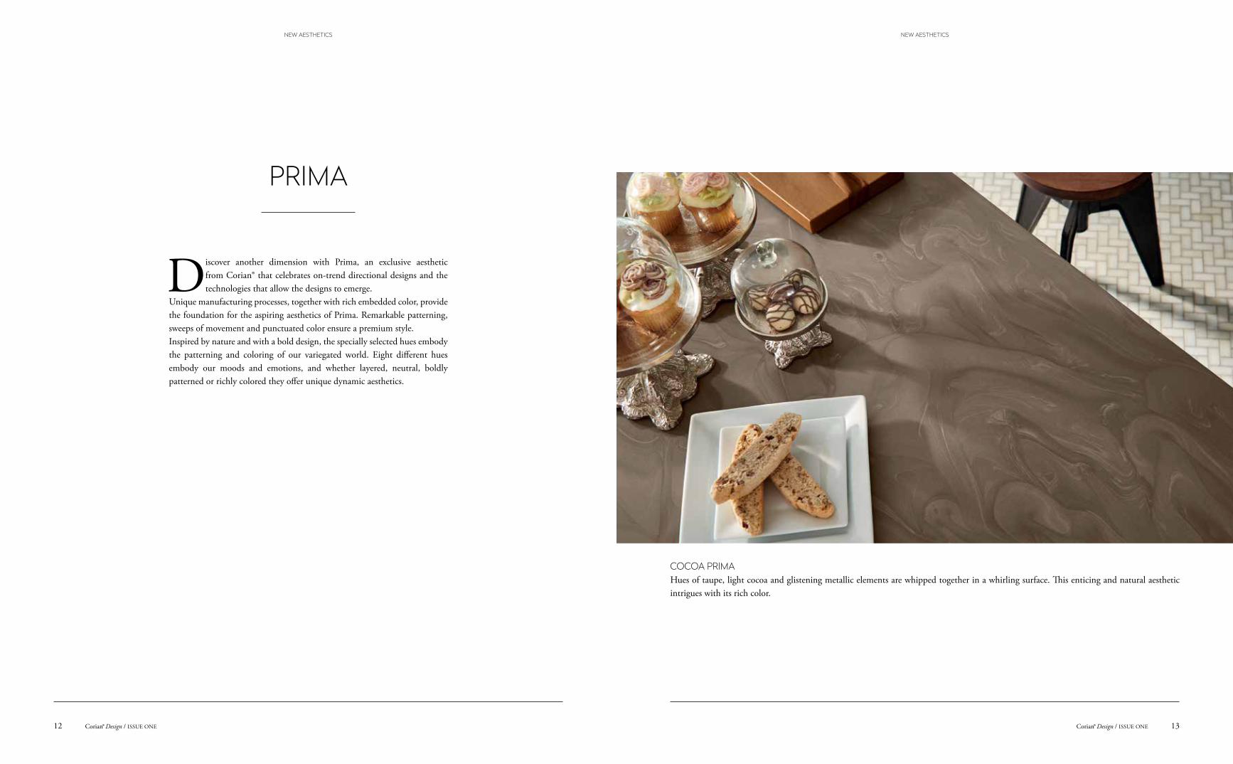
Discover another dimension with Prima, an exclusive aesthetic from Corian® that celebrates on-trend directional designs and the technologies that allow the designs to emerge.
Unique manufacturing processes, together with rich embedded color, provide the foundation for the aspiring aesthetics of Prima. Remarkable patterning, sweeps of movement and punctuated color ensure a premium style. Inspired by nature and with a bold design, the specially selected hues embody the patterning and coloring of our variegated world. Eight different hues embody our moods and emotions, and whether layered, neutral, boldly patterned or richly colored they offer unique dynamic aesthetics.
PRIMA
COCOA PRIMA Hues of taupe, light cocoa and glistening metallic elements are whipped together in a whirling surface. This enticing and natural aesthetic intrigues with its rich color.
13Corian® Design / ISSUE ONECorian® Design / ISSUE ONE12
NEW AESTHETICS NEW AESTHETICS
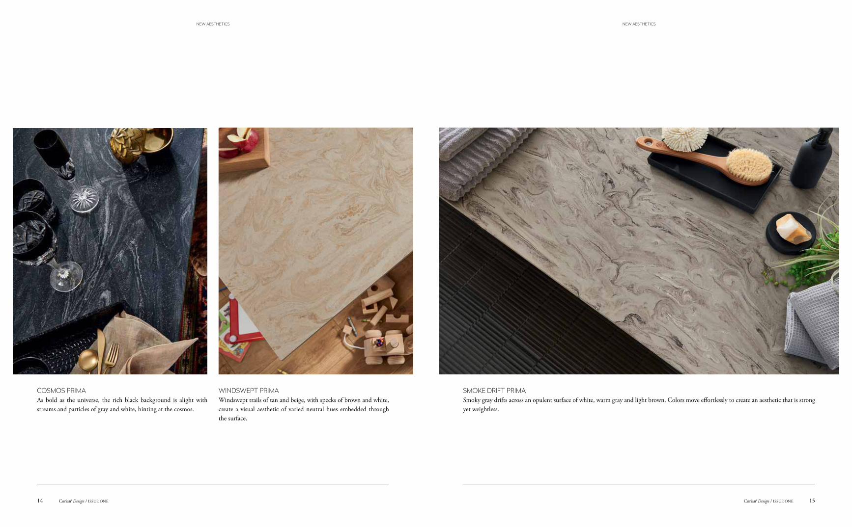
COSMOS PRIMAAs bold as the universe, the rich black background is alight with streams and particles of gray and white, hinting at the cosmos.
WINDSWEPT PRIMA Windswept trails of tan and beige, with specks of brown and white, create a visual aesthetic of varied neutral hues embedded through the surface.
SMOKE DRIFT PRIMASmoky gray drifts across an opulent surface of white, warm gray and light brown. Colors move effortlessly to create an aesthetic that is strong yet weightless.
15Corian® Design / ISSUE ONECorian® Design / ISSUE ONE14
NEW AESTHETICS NEW AESTHETICS
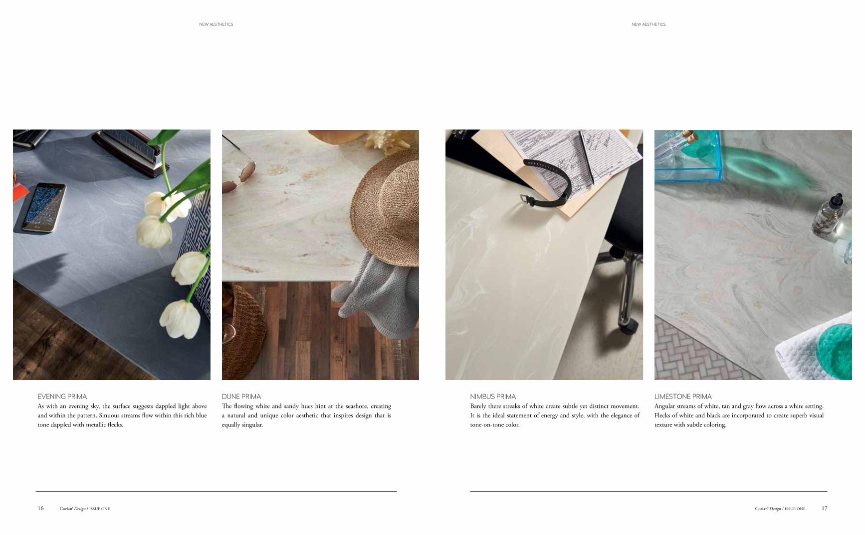
DUNE PRIMA The flowing white and sandy hues hint at the seashore, creating a natural and unique color aesthetic that inspires design that is equally singular.
LIMESTONE PRIMAAngular streams of white, tan and gray flow across a white setting. Flecks of white and black are incorporated to create superb visual texture with subtle coloring.
NIMBUS PRIMABarely there streaks of white create subtle yet distinct movement. It is the ideal statement of energy and style, with the elegance of tone-on-tone color.
EVENING PRIMA As with an evening sky, the surface suggests dappled light above and within the pattern. Sinuous streams flow within this rich blue tone dappled with metallic flecks.
17Corian® Design / ISSUE ONECorian® Design / ISSUE ONE16
NEW AESTHETICS NEW AESTHETICS
Marc Chagall
Cor
ian®
Sm
oke
Drif
t Prim
a
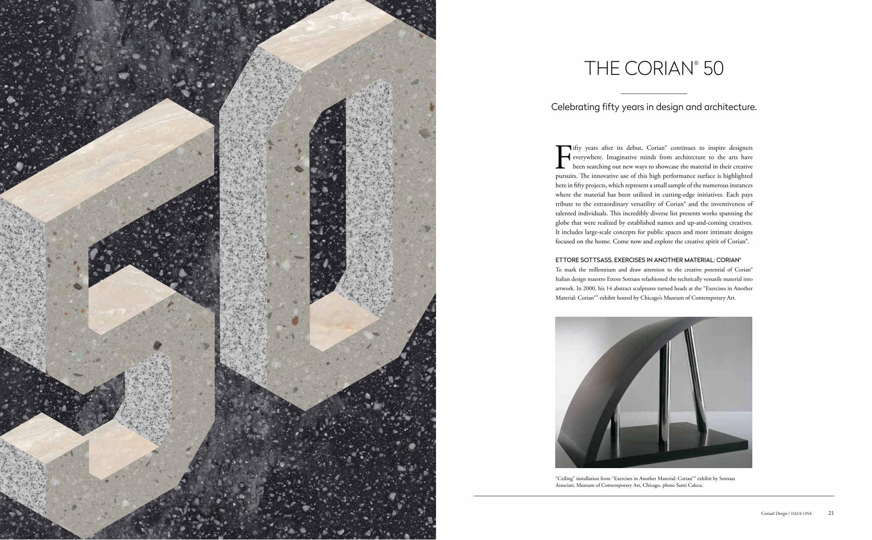
ETTORE SOTTSASS, EXERCISES IN ANOTHER MATERIAL: CORIAN®
To mark the millennium and draw attention to the creative potential of Corian® Italian design maestro Ettore Sottsass refashioned the technically versatile material into artwork. In 2000, his 14 abstract sculptures turned heads at the “Exercises in Another Material: Corian®” exhibit hosted by Chicago’s Museum of Contemporary Art.
Fifty years after its debut, Corian® continues to inspire designers everywhere. Imaginative minds from architecture to the arts have been searching out new ways to showcase the material in their creative
pursuits. The innovative use of this high performance surface is highlighted here in fifty projects, which represent a small sample of the numerous instances where the material has been utilized in cutting-edge initiatives. Each pays tribute to the extraordinary versatility of Corian® and the inventiveness of talented individuals. This incredibly diverse list presents works spanning the globe that were realized by established names and up-and-coming creatives. It includes large-scale concepts for public spaces and more intimate designs focused on the home. Come now and explore the creative spirit of Corian®.
THE CORIAN® 50
“Ceiling” installation from “Exercises in Another Material: Corian®” exhibit by Sottsass Associati, Museum of Contemporary Art, Chicago, photo Santi Caleca.
Celebrating fifty years in design and architecture.
21Corian® Design / ISSUE ONE
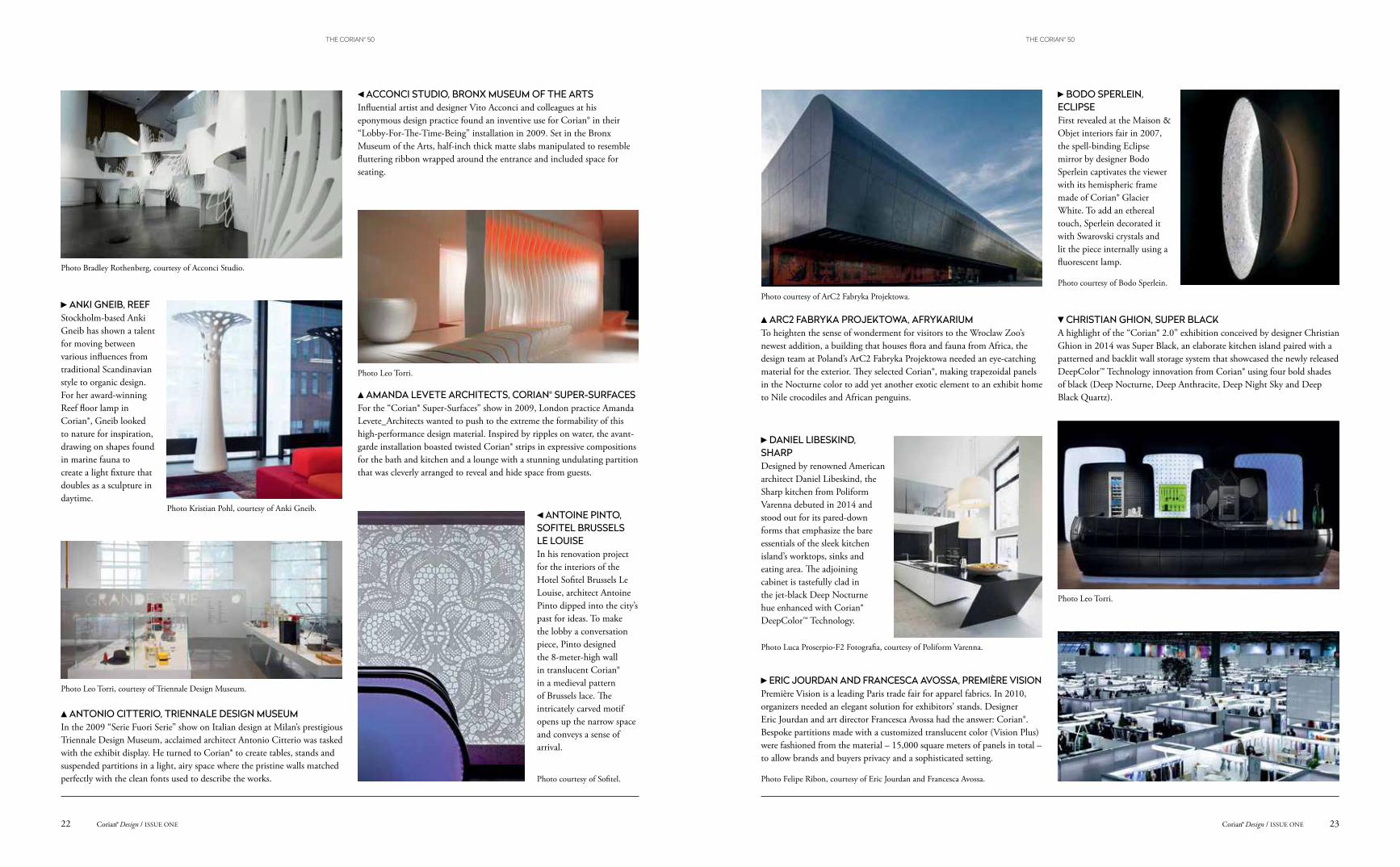
ACCONCI STUDIO, BRONX MUSEUM OF THE ARTSInfluential artist and designer Vito Acconci and colleagues at his eponymous design practice found an inventive use for Corian® in their “Lobby-For-The-Time-Being” installation in 2009. Set in the Bronx Museum of the Arts, half-inch thick matte slabs manipulated to resemble fluttering ribbon wrapped around the entrance and included space for seating.
AMANDA LEVETE ARCHITECTS, CORIAN® SUPER-SURFACESFor the “Corian® Super-Surfaces” show in 2009, London practice Amanda Levete_Architects wanted to push to the extreme the formability of this high-performance design material. Inspired by ripples on water, the avant-garde installation boasted twisted Corian® strips in expressive compositions for the bath and kitchen and a lounge with a stunning undulating partition that was cleverly arranged to reveal and hide space from guests.
ANTONIO CITTERIO, TRIENNALE DESIGN MUSEUM In the 2009 “Serie Fuori Serie” show on Italian design at Milan’s prestigious Triennale Design Museum, acclaimed architect Antonio Citterio was tasked with the exhibit display. He turned to Corian® to create tables, stands and suspended partitions in a light, airy space where the pristine walls matched perfectly with the clean fonts used to describe the works.
ANKI GNEIB, REEFStockholm-based Anki Gneib has shown a talent for moving between various influences from traditional Scandinavian style to organic design. For her award-winning Reef floor lamp in Corian®, Gneib looked to nature for inspiration, drawing on shapes found in marine fauna to create a light fixture that doubles as a sculpture in daytime.
ANTOINE PINTO, SOFITEL BRUSSELS LE LOUISEIn his renovation project for the interiors of the Hotel Sofitel Brussels Le Louise, architect Antoine Pinto dipped into the city’s past for ideas. To make the lobby a conversation piece, Pinto designed the 8-meter-high wall in translucent Corian® in a medieval pattern of Brussels lace. The intricately carved motif opens up the narrow space and conveys a sense of arrival.
DANIEL LIBESKIND, SHARP Designed by renowned American architect Daniel Libeskind, the Sharp kitchen from Poliform Varenna debuted in 2014 and stood out for its pared-down forms that emphasize the bare essentials of the sleek kitchen island’s worktops, sinks and eating area. The adjoining cabinet is tastefully clad in the jet-black Deep Nocturne hue enhanced with Corian® DeepColor™ Technology.
CHRISTIAN GHION, SUPER BLACK A highlight of the “Corian® 2.0” exhibition conceived by designer Christian Ghion in 2014 was Super Black, an elaborate kitchen island paired with a patterned and backlit wall storage system that showcased the newly released DeepColor™ Technology innovation from Corian® using four bold shades of black (Deep Nocturne, Deep Anthracite, Deep Night Sky and Deep Black Quartz).
ARC2 FABRYKA PROJEKTOWA, AFRYKARIUMTo heighten the sense of wonderment for visitors to the Wroclaw Zoo’s newest addition, a building that houses flora and fauna from Africa, the design team at Poland’s ArC2 Fabryka Projektowa needed an eye-catching material for the exterior. They selected Corian®, making trapezoidal panels in the Nocturne color to add yet another exotic element to an exhibit home to Nile crocodiles and African penguins.
BODO SPERLEIN, ECLIPSEFirst revealed at the Maison & Objet interiors fair in 2007, the spell-binding Eclipse mirror by designer Bodo Sperlein captivates the viewer with its hemispheric frame made of Corian® Glacier White. To add an ethereal touch, Sperlein decorated it with Swarovski crystals and lit the piece internally using a fluorescent lamp.
ERIC JOURDAN AND FRANCESCA AVOSSA, PREMIÈRE VISIONPremière Vision is a leading Paris trade fair for apparel fabrics. In 2010, organizers needed an elegant solution for exhibitors’ stands. Designer Eric Jourdan and art director Francesca Avossa had the answer: Corian®. Bespoke partitions made with a customized translucent color (Vision Plus) were fashioned from the material – 15,000 square meters of panels in total – to allow brands and buyers privacy and a sophisticated setting.
Photo Bradley Rothenberg, courtesy of Acconci Studio.
Photo Leo Torri.
Photo courtesy of ArC2 Fabryka Projektowa.Photo courtesy of Bodo Sperlein.
Photo Leo Torri.
Photo courtesy of Sofitel.
Photo Leo Torri, courtesy of Triennale Design Museum.
Photo Kristian Pohl, courtesy of Anki Gneib.
Photo Luca Proserpio-F2 Fotografia, courtesy of Poliform Varenna.
Photo Felipe Ribon, courtesy of Eric Jourdan and Francesca Avossa.
23Corian® Design / ISSUE ONECorian® Design / ISSUE ONE22
THE CORIAN® 50THE CORIAN® 50
JAN HENDRIX, AFRICA HOUSECompleted in the 1920s, London’s Africa House greets visitors with an ornate Portland stone facade. During a 2013 refurbishment, Mexico-based Dutch artist Jan Hendrix was invited to help give its interior a modern makeover. Hendrix installed a set of 20 plates in cut-out Corian® in the form of algae that appear to clamber up the wall of the atrium.
INGO MAURER, TROTZDEMLegendary German lighting designer Ingo Maurer is often referred to as a choreographer of light and shadows. His unique body of work includes the Trotzdem collection, a trio of illuminated tables he exhibited at Milan Design Week in 2005 at Spazio Krizia. Made of Corian® Glacier White, tables featured integrated lighting systems, including one with a set of seven protruding flashlights and reflectors.
GUILHERME TORRES, LINHA LOOSThe 2015 edition of the Casa Cor interiors and architecture fair in São Paulo provided the platform for architect Guilherme Torres to show off the possibilites of Corian®. Torres referenced the work of influential architect Adolf Loos in his collection, the highlight of which was a sleek table with a checkerboard top in pristine Glacier White and Deep Nocturne.
JAMES IRVINE, VITAMIN BAR In 2003, British designer James Irvine’s minimalist but colorful “Vitamin Bar” installation appeared at the “De-Lighted by Corian®” event. The circular bar and stools in Corian® Cameo White and a custom gray-beige tone had lighting that changed color in unison to give off a futuristic vibe.
Photo Corian® Brasil.
Photo courtesy of Jan Hendrix.
Photo Tom Vack, courtesy of Ingo Maurer.
Photo Miro Zagnoli.
GWENAEL NICOLAS, SPIRALTokyo-based French designer Gwenael Nicolas is accustomed to redefining the boundaries of design. In 2003, his multidisciplinary studio Curiosity presented its breathtaking Spiral fountain in Corian® to demonstrate the potential of the sturdy manmade material, shaping it into a seemingly weightless object that appears to float in midair.
Photo Daichi Ano, courtesy of Curiosity.
“Formable” in Corian® Aqua, “Malleable” in Corian® Arrowroot, “Stylish” in Corian® Aurora,“Versatile” in Corian® Bronzite, “Reliable” in Corian® Fawn.
Corian® Design / ISSUE ONE24
THE CORIAN® 50
KARIM RASHID, SMART-OLOGIC CORIAN® LIVINGIn 2010, industrial design iconoclast Karim Rashid dreamed up a futuristic residential composition for the “Smart-ologic Corian® Living” exhibit staged in Milan. A wide selection of Corian® tones were turned into a fascinating sensorial experience by way of intricately patterned backlit walls and fluid forms utilized to craft furnishings from benches to bed frames.
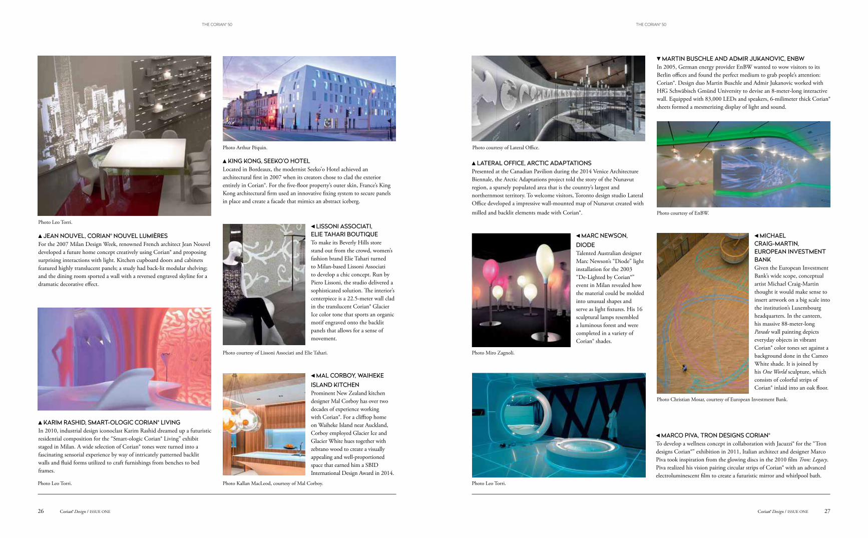
KING KONG, SEEKO’O HOTEL Located in Bordeaux, the modernist Seeko’o Hotel achieved an architectural first in 2007 when its creators chose to clad the exterior entirely in Corian®. For the five-floor property’s outer skin, France’s King Kong architectural firm used an innovative fixing system to secure panels in place and create a facade that mimics an abstract iceberg.
LATERAL OFFICE, ARCTIC ADAPTATIONSPresented at the Canadian Pavilion during the 2014 Venice Architecture Biennale, the Arctic Adaptations project told the story of the Nunavut region, a sparsely populated area that is the country’s largest and northernmost territory. To welcome visitors, Toronto design studio Lateral Office developed a impressive wall-mounted map of Nunavut created with milled and backlit elements made with Corian®.
LISSONI ASSOCIATI, ELIE TAHARI BOUTIQUETo make its Beverly Hills store stand out from the crowd, women’s fashion brand Elie Tahari turned to Milan-based Lissoni Associati to develop a chic concept. Run by Piero Lissoni, the studio delivered a sophisticated solution. The interior’s centerpiece is a 22.5-meter wall clad in the translucent Corian® Glacier Ice color tone that sports an organic motif engraved onto the backlit panels that allows for a sense of movement.
MAL CORBOY, WAIHEKE ISLAND KITCHENProminent New Zealand kitchen designer Mal Corboy has over two decades of experience working with Corian®. For a clifftop home on Waiheke Island near Auckland, Corboy employed Glacier Ice and Glacier White hues together with zebrano wood to create a visually appealing and well-proportioned space that earned him a SBID International Design Award in 2014.
Photo Leo Torri.
Photo courtesy of Lissoni Associati and Elie Tahari.
Photo Arthur Péquin. Photo courtesy of Lateral Office.
Photo Kallan MacLeod, courtesy of Mal Corboy.
MARC NEWSON, DIODE Talented Australian designer Marc Newson’s “Diode” light installation for the 2003 “De-Lighted by Corian®” event in Milan revealed how the material could be molded into unusual shapes and serve as light fixtures. His 16 sculptural lamps resembled a luminous forest and were completed in a variety of Corian® shades.
MARCO PIVA, TRON DESIGNS CORIAN®
To develop a wellness concept in collaboration with Jacuzzi® for the “Tron designs Corian®” exhibition in 2011, Italian architect and designer Marco Piva took inspiration from the glowing discs in the 2010 film Tron: Legacy. Piva realized his vision pairing circular strips of Corian® with an advanced electroluminescent film to create a futuristic mirror and whirlpool bath.
MARTIN BUSCHLE AND ADMIR JUKANOVIC, ENBW In 2005, German energy provider EnBW wanted to wow visitors to its Berlin offices and found the perfect medium to grab people’s attention: Corian®. Design duo Martin Buschle and Admir Jukanovic worked with HfG Schwäbisch Gmünd University to devise an 8-meter-long interactive wall. Equipped with 83,000 LEDs and speakers, 6-milimeter thick Corian® sheets formed a mesmerizing display of light and sound.
MICHAEL CRAIG-MARTIN, EUROPEAN INVESTMENT BANKGiven the European Investment Bank’s wide scope, conceptual artist Michael Craig-Martin thought it would make sense to insert artwork on a big scale into the institution’s Luxembourg headquarters. In the canteen, his massive 88-meter-long Parade wall painting depicts everyday objects in vibrant Corian® color tones set against a background done in the Cameo White shade. It is joined by his One World sculpture, which consists of colorful strips of Corian® inlaid into an oak floor.
Photo Miro Zagnoli.
Photo Leo Torri.
Photo courtesy of EnBW.
Photo Christian Mosar, courtesy of European Investment Bank.
JEAN NOUVEL, CORIAN® NOUVEL LUMIÈRES For the 2007 Milan Design Week, renowned French architect Jean Nouvel developed a future home concept creatively using Corian® and proposing surprising interactions with light. Kitchen cupboard doors and cabinets featured highly translucent panels; a study had back-lit modular shelving; and the dining room sported a wall with a reversed engraved skyline for a dramatic decorative effect.
Photo Leo Torri.
27Corian® Design / ISSUE ONECorian® Design / ISSUE ONE26
THE CORIAN® 50THE CORIAN® 50
MORITZ WALDEMEYER, BY ROYAL APPOINTMENTEager to create a chair fit for a king, designer Moritz Waldemeyer chose Corian® to achieve his goal. Unveiled at London gallery Libby Sellers in 2007, he fashioned a trio of seats in the material and shaped them to resemble a medieval throne. Each had sensors to scan a sitter’s clothing for colors and project them in a halo-like aura using LED lighting.
NAOTO FUKASAWA, SHELF XIn 2005, star designer Naoto Fukasawa once again surprised with a simple yet striking form. Realized entirely in Corian® Glacier White, his Shelf X bookcase for leading design brand B&B Italia is defined by ultraclean geometric lines that give the storage unit a sense of presence.
NURU KARIM, MATHEMATICAL SURFACESThe Art Every initiative looks to reach a wider audience by exhibiting artwork outside the museum. In Mumbai, Nuru Karim, founder of the NU.DE architecture practice, took on a project to allow the city’s underprivileged residents a chance to get up close to art, designing a large screen-like sculpture out of Corian® with perforations that represents complex mathematical geometry.
NEFA ARCHITECTS, LEO BURNETTFor the Moscow offices of advertising agency Leo Burnett, Russian practice Nefa Architects looked for a powerful visual message to communicate the brand’s identity. Drawing inspiration from the eyewear once worn by founder Leo Burnett, the firm enlarged it into an oversized sculpture and forged it out of Corian® Deep Nocturne, turning the office into a modern art gallery.
Photo courtesy of Moritz Waldemeyer.
Photo courtesy of B&B Italia.
Photo Alexey Knyazaev, courtesy of Nefa Architects.
Photo Nuru Karim.
MINISTRY OF DESIGN, METAMORPHOSISFor the 2010 Milan Design Week, high-end furniture brand Saporiti Italia called on five creative teams to envision inventive seating concepts. Colin Seah and his Singapore-based Ministry of Design studio delivered a well-thought-out piece with their Metamorphosis bench, a 4-meter-long abstract sculpture in Corian® that also functions as a bench.
Photo courtesy of Saporiti Italia.
“Global” in Corian® Citrus Orange, “Local” in Corian® Blueberry Ice, “Innovative” in Corian® Costa,“Contemporary” in Corian® Imperial Yellow, “Timeless” in Corian® Hazelnut.
Corian® Design / ISSUE ONE28
THE CORIAN® 50
ORA ITO, RENDEZ-VOUS TOYOTAWhen automaker Toyota wanted to reimagine the car showroom for a location on the Champs Elysées in Paris, it called on designer Ora Ito. The French creative opted for Corian® and light-emitting diodes to build a fanciful fluid interior, using nearly 400 square meters of the solid surface to form everything from handrails and consoles to signage and pillars.
PATRICIA URQUIOLA, FERGANA The creative process of prolific Spanish designer Patricia Urquiola focuses on overlapping and the unexpected connections of images and forms. In 2010, her Fergana collection for Italian furnishings brand Moroso included tables with Corian® tops done in delicately carved patterns juxtaposed with a base in solid ash that cleverly combines tradition with technology.
PINEARQ, HEALTH SCIENCE CAMPUS Spanish architectural practice Pinearq has built up an extensive portfolio of healthcare projects. For the University of Barcelona’s Health Science Campus in Bellvitge, the firm felt Corian® would make a perfect fit for the building’s facade. The latticework design protects the building from the intense Mediterranean sun in summer while its white color provides more light in winter.
PHILIP NASH, THE GAVIN JONES GARDEN OF CORIAN®
At the 2008 edition of the Chelsea Flower Show, the world’s preeminent event on gardening, Corian® took center stage. Landscape designer Philip Nash utilized the man-made material for a contemporary installation that stylishly integrated flora and the innovative surface. The highlight was Nash’s walkway in Glacier White that resembled a coiled fern elegantly unfolding its fronds.
POL QUADENS, LES OISEAUXFor the outdoor Samsara Sculpture Park in southeastern France, Belgian artist and designer Pol Quadens sought to make a dramatic statement that would catch the eye of passersby. Entitled Les Oiseaux, he envisioned a pair of tall, streamlined objects, which resemble birds at rest, in Corian® that pivot according to the seasons and light and which make graceful additions to the surrounding landscape.
Photo Luc Boegly.
Photo Trevor Grant.
Photo courtesy of Moroso.
Photo Juny Brullet.
Photo courtesy of Pol Quadens/Ovo Editions.
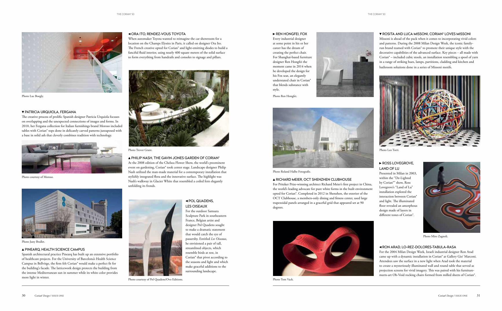
REN HONGFEI, FOXEvery industrial designer at some point in his or her career has the dream of creating the perfect chair. For Shanghai-based furniture designer Ren Hongfei the moment came in 2014 when he developed the design for his Fox seat, an elegantly understated chair in Corian® that blends substance with style.
RICHARD MEIER, OCT SHENZHEN CLUBHOUSE For Pritzker Prize-winning architect Richard Meier’s first project in China, the world’s leading advocate for pure white forms in the built environment opted for Corian®. Completed in 2012 in Shenzhen, the exterior of the OCT Clubhouse, a members-only dining and fitness center, used large trapezoidal panels arranged in a graceful grid that appeared set at 90 degrees.
RON ARAD, LO-REZ-DOLORES-TABULA-RASAFor the 2004 Milan Design Week, Israeli industrial designer Ron Arad came up with a dynamic installation in Corian® at Gallery Gio’ Marconi. Attendees saw the surface in a new light when Arad took the material to create a mysteriously illuminated wall and round table that served as projection screens for vivid imagery. This was paired with his furniture-meets-art Oh-Void rocking chairs formed from milled sheets of Corian®.
ROSITA AND LUCA MISSONI, CORIAN® LOVES MISSONI Missoni is ahead of the pack when it comes to incorporating vivid colors and patterns. During the 2008 Milan Design Week, the iconic family-run brand teamed with Corian® to promote their unique style with the decorative capabilities of the advanced surface. Key pieces – all made with Corian® – included cubic stools, an installation resembling a spool of yarn in a range of striking hues, lamps, partitions, cladding and kitchen and bathroom solutions done in a series of Missoni motifs.
ROSS LOVEGROVE,LAND OF LU Presented in Milan in 2003, within the “De-Lighted by Corian®” show, Ross Lovegrove’s “Land of Lu” installation explored the interaction between Corian® and light. The illuminated floor revealed an amorphous design made of layers in different tones of Corian®.
Photo Ren Hongfei.
Photo Roland Halbe Fotografie.
Photo Tom Vack.
Photo Miro Zagnoli.
Photo Leo Torri.
31Corian® Design / ISSUE ONECorian® Design / ISSUE ONE30
THE CORIAN® 50THE CORIAN® 50
SETSU AND SHINOBU ITO, OPS Composed of black and white layers of Corian®, the appearance of the OPS sofa-cum-bench draws on the background of its creators. Milan-based designers Setsu and Shinobu Ito explore the Japanese concept of rebirth in their creation, making an elaborate seat of irregular and soft curves in colors that continuously overlap.
SIMONE LEAMON AND EDMUND CARTER, DAYORAMACalled upon to refurbish elevators in a downtown Melbourne office complex in 2009, Simone LeAmon and Edmund Carter looked to recapture the magic of lift cars designed during the Art Deco period. The pair lined the elevator interior with an unusual white lattice in Corian® mixed with timber veneer paneling, custom handrails and LED lighting.
THOMAS SANDELL, MIAMIRespected home interiors brand B&B Italia has long been known as an innovator when it comes to selecting materials for its furniture products. So it was no surprise when it gave the go-ahead for furniture designer Thomas Sandell’s Miami line, lightweight aluminum structures with sculpted tabletops in Corian® that sport an elegant central recess.
TOMÁŠ MEDEK, POLLEN IVThe work of Czech sculptor Tomáš Medek often involves the use of intricate grids. In his Pollen series, the artist has delved into the microscopic world of pollen. For his Pollen IV sculpture, he chose to work with Corian® to create an otherworldly sphere that incorporates an elegant lattice-like structure.
SOMA ARCHITECTS, KOUKJIAN BOUTIQUESet in Beirut’s Central District, the Koukjian jewelry boutique has gained attention for its remarkable interiors that ably show off the brand’s bejeweled creations. Conceived by New York-based SOMA Architects, the elongated space recalls a modernist jewel box thanks to the use of Corian®, which appears in the display shelves and dramatically lines the wall in uneven strips.
Photo Leo Torri.
Photo Nicole England, courtesy of Simone LeAmon and Edmund Carter.
Photo Filip-Slapal, courtesy of Tomáš Medek.Photo courtesy of SOMA Architects.
Photo courtesy of B&B Italia.
“Modern” in Corian® Juniper, “Futuristic” in Corian® Hot, “Functional” in Corian® Evening Prima,“Durable” in Corian® Diamond Blue, “Colorful” in Corian® Grape Green.
Corian® Design / ISSUE ONE32
THE CORIAN® 50
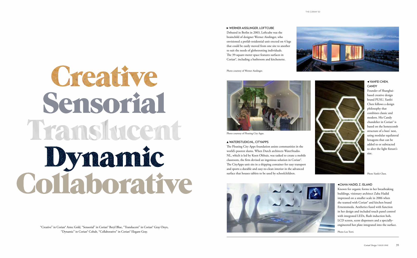
YANFEI CHEN, CANDYFounder of Shanghai-based creative design brand PUSU, Yanfei Chen follows a design philosophy that combines classic and modern. His Candy chandelier in Corian® is based on the honeycomb structure of a bees’ nest, using modular equilateral hexagons that can be added to or subtracted to alter the light fixture’s size.
ZAHA HADID, Z. ISLAND Known for organic forms in her breathtaking buildings, visionary architect Zaha Hadid impressed on a smaller scale in 2006 when she teamed with Corian® and kitchen brand Ernestomeda. Aesthetics fused with function in her design and included touch panel control with integrated LEDs, flush induction hob, LCD screen, scent dispensers and a specially-engineered hot plate integrated into the surface.
WATERSTUDIO.NL, CITYAPPSThe Floating City Apps foundation assists communities in the world’s poorest slums. When Dutch architects WaterStudio.NL, which is led by Koen Olthuis, was tasked to create a mobile classroom, the firm devised an ingenious solution in Corian®. The CityApps unit sits in a shipping container for easy transport and sports a durable and easy-to-clean interior in the advanced surface that houses tablets to be used by schoolchildren.
WERNER AISSLINGER, LOFTCUBEDebuted in Berlin in 2003, Loftcube was the brainchild of designer Werner Aisslinger, who envisioned a prefab residential unit erected on 4 legs that could be easily moved from one site to another to suit the needs of globetrotting individuals. The 39-square-meter space features surfaces in Corian®, including a bathroom and kitchenette.
Photo courtesy of Werner Aisslinger.
Photo courtesy of Floating City Apps.
Photo Yanfei Chen.
Photo Leo Torri.
“Creative” in Corian® Aztec Gold, “Sensorial” in Corian® Beryl Blue, “Translucent” in Corian® Gray Onyx,“Dynamic” in Corian® Cobalt, “Collaborative” in Corian® Elegant Gray.
35Corian® Design / ISSUE ONE
THE CORIAN® 50
How a successful kitchen company became a global brand.
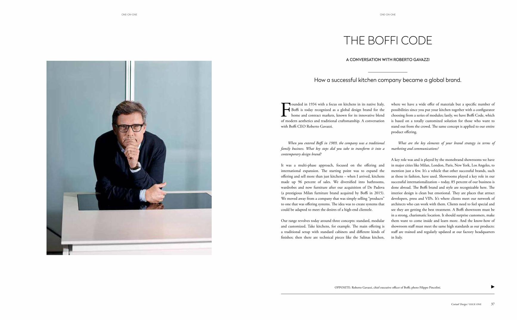
THE BOFFI CODEA CONVERSATION WITH ROBERTO GAVAZZI
Founded in 1934 with a focus on kitchens in its native Italy, Boffi is today recognized as a global design brand for the home and contract markets, known for its innovative blend
of modern aesthetics and traditional craftsmanship. A conversation with Boffi CEO Roberto Gavazzi.
When you entered Boffi in 1989, the company was a traditional family business. What key steps did you take to transform it into a contemporary design brand?
It was a multi-phase approach, focused on the offering and international expansion. The starting point was to expand the offering and sell more than just kitchens – when I arrived, kitchens made up 96 percent of sales. We diversified into bathrooms, wardrobes and now furniture after our acquisition of De Padova (a prestigious Milan furniture brand acquired by Boffi in 2015). We moved away from a company that was simply selling “products” to one that was offering systems. The idea was to create systems that could be adapted to meet the desires of a high-end clientele.
Our range revolves today around three concepts: standard, modular and customized. Take kitchens, for example. The main offering is a traditional setup with standard cabinets and different kinds of finishes; then there are technical pieces like the Salinas kitchen,
where we have a wide offer of materials but a specific number of possibilities since you put your kitchen together with a configurator choosing from a series of modules; lastly, we have Boffi Code, which is based on a totally customized solution for those who want to stand out from the crowd. The same concept is applied to our entire product offering.
What are the key elements of your brand strategy in terms of marketing and communications?
A key role was and is played by the monobrand showrooms we have in major cities like Milan, London, Paris, New York, Los Angeles, to mention just a few. It’s a vehicle that other successful brands, such as those in fashion, have used. Showrooms played a key role in our successful internationalization – today, 85 percent of our business is done abroad. The Boffi brand and style are recognizable here. The interior design is clean but emotional. They are places that attract developers, press and VIPs. It’s where clients meet our network of architects who can work with them. Clients need to feel special and see they are getting the best treatment. A Boffi showroom must be in a strong, charismatic location. It should surprise customers, make them want to come inside and learn more. And the know-how of showroom staff must meet the same high standards as our products: staff are trained and regularly updated at our factory headquarters in Italy.
OPPOSITE: Roberto Gavazzi, chief executive officer of Boffi; photo Filippo Pincolini.
37Corian® Design / ISSUE ONE
ONE-ON-ONEONE-ON-ONE
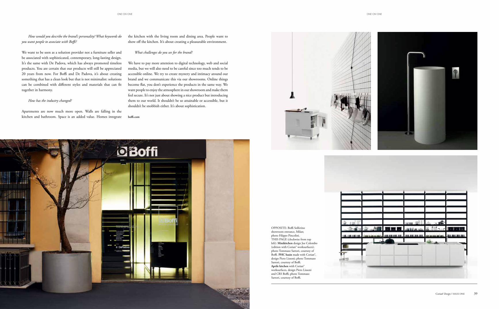
OPPOSITE: Boffi Solferino showroom entrance, Milan; photo Filippo Pincolini. THIS PAGE (clockwise from top left): Minikitchen design Joe Colombo (edition with Corian® worksurfaces); photo Tommaso Sartori, courtesy of Boffi. PHC basin made with Corian®, design Piero Lissoni; photo Tommaso Sartori, courtesy of Boffi. Aprile kitchen with Corian® worksurfaces, design Piero Lissoni and CRS Boffi; photo Tommaso Sartori, courtesy of Boffi.
How would you describe the brand’s personality? What keywords do you want people to associate with Boffi?
We want to be seen as a solution provider not a furniture seller and be associated with sophisticated, contemporary, long-lasting design. It’s the same with De Padova, which has always promoted timeless products. You are certain that our products will still be appreciated 20 years from now. For Boffi and De Padova, it’s about creating something that has a clean look but that is not minimalist: solutions can be combined with different styles and materials that can fit together in harmony.
How has the industry changed?
Apartments are now much more open. Walls are falling in the kitchen and bathroom. Space is an added value. Homes integrate
the kitchen with the living room and dining area. People want to show off the kitchen. It’s about creating a pleasurable environment.
What challenges do you see for the brand?
We have to pay more attention to digital technology, web and social media, but we will also need to be careful since too much tends to be accessible online. We try to create mystery and intimacy around our brand and we communicate this via our showrooms. Online things become flat, you don’t experience the products in the same way. We want people to enjoy the atmosphere in our showroom and make them feel secure. It’s not just about showing a nice product but introducing them to our world. It shouldn’t be so attainable or accessible, but it shouldn’t be snobbish either. It’s about sophistication.
boffi.com
39Corian® Design / ISSUE ONE
ONE-ON-ONEONE-ON-ONE
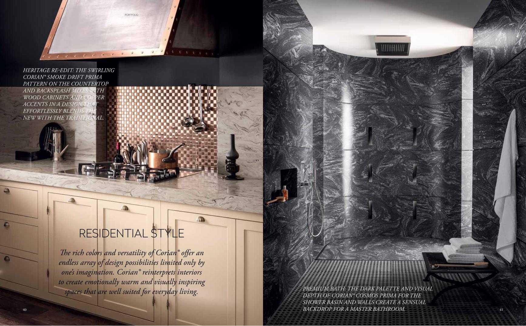
PREMIUM BATH: THE DARK PALETTE AND VISUAL DEPTH OF CORIAN® COSMOS PRIMA FOR THE SHOWER BASIN AND WALLS CREATE A SENSUAL BACKDROP FOR A MASTER BATHROOM.
HERITAGE RE-EDIT: THE SWIRLING CORIAN® SMOKE DRIFT PRIMA PATTERN ON THE COUNTERTOP AND BACKSPLASH MIXES WITH WOOD CABINETS AND COPPER ACCENTS IN A DESIGN THAT EFFORTLESSLY BLENDS THE NEW WITH THE TRADITIONAL.
The rich colors and versatility of Corian® offer an endless array of design possibilities limited only by one’s imagination. Corian® reinterprets interiors
to create emotionally warm and visually inspiring spaces that are well suited for everyday living.
RESIDENTIAL STYLE
4140
PORTFOLIO
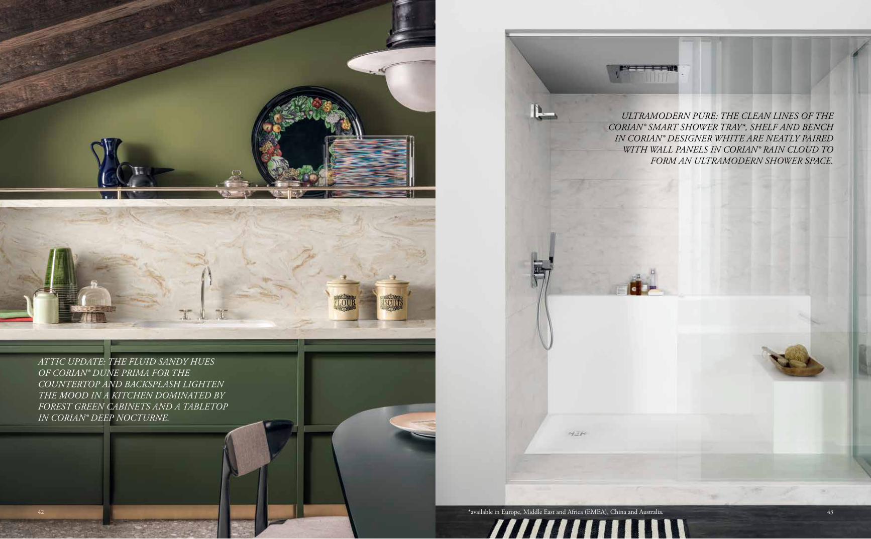
ULTRAMODERN PURE: THE CLEAN LINES OF THE CORIAN® SMART SHOWER TRAY*, SHELF AND BENCH
IN CORIAN® DESIGNER WHITE ARE NEATLY PAIRED WITH WALL PANELS IN CORIAN® RAIN CLOUD TO
FORM AN ULTRAMODERN SHOWER SPACE.
ATTIC UPDATE: THE FLUID SANDY HUES OF CORIAN® DUNE PRIMA FOR THE COUNTERTOP AND BACKSPLASH LIGHTEN THE MOOD IN A KITCHEN DOMINATED BY FOREST GREEN CABINETS AND A TABLETOP IN CORIAN® DEEP NOCTURNE.
*available in Europe, Middle East and Africa (EMEA), China and Australia. 4342
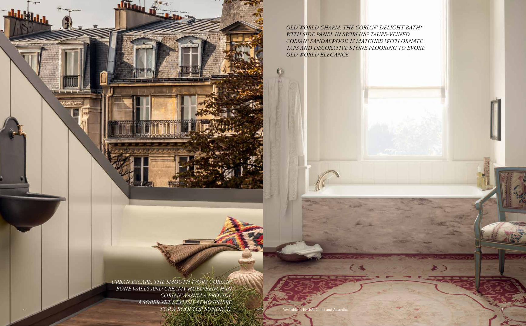
OLD WORLD CHARM: THE CORIAN® DELIGHT BATH* WITH SIDE PANEL IN SWIRLING TAUPE-VEINED CORIAN® SANDALWOOD IS MATCHED WITH ORNATE TAPS AND DECORATIVE STONE FLOORING TO EVOKE OLD WORLD ELEGANCE.
URBAN ESCAPE: THE SMOOTH IVORY CORIAN® BONE WALLS AND CREAMY HUED BENCH IN
CORIAN® VANILLA PROVIDE A SOBER YET STYLISH ATMOSPHERE
FOR A ROOFTOP SUNDECK. *available in EMEA, China and Australia. 4544
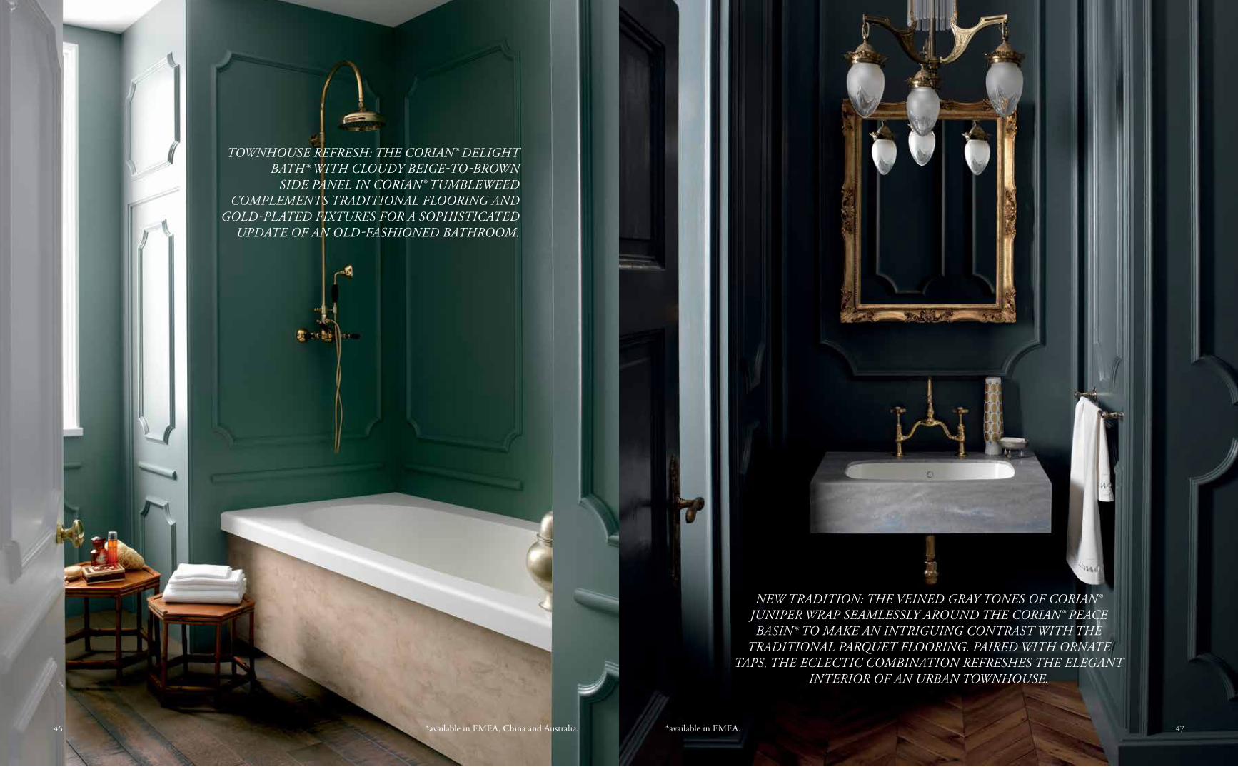
NEW TRADITION: THE VEINED GRAY TONES OF CORIAN® JUNIPER WRAP SEAMLESSLY AROUND THE CORIAN® PEACE BASIN* TO MAKE AN INTRIGUING CONTRAST WITH THE
TRADITIONAL PARQUET FLOORING. PAIRED WITH ORNATE TAPS, THE ECLECTIC COMBINATION REFRESHES THE ELEGANT
INTERIOR OF AN URBAN TOWNHOUSE.
TOWNHOUSE REFRESH: THE CORIAN® DELIGHT BATH* WITH CLOUDY BEIGE-TO-BROWN
SIDE PANEL IN CORIAN® TUMBLEWEED COMPLEMENTS TRADITIONAL FLOORING AND
GOLD-PLATED FIXTURES FOR A SOPHISTICATED UPDATE OF AN OLD-FASHIONED BATHROOM.
*available in EMEA.*available in EMEA, China and Australia. 4746
Cor
ian®
Coc
oa P
rima
Pablo Picasso
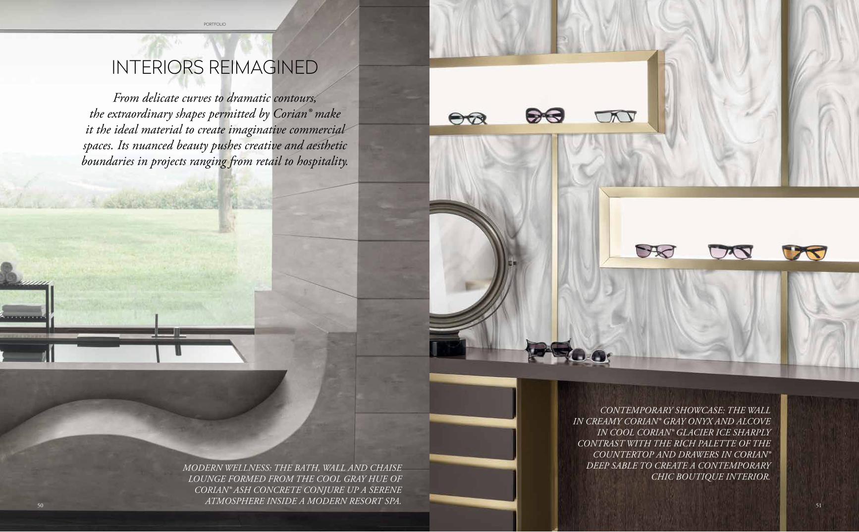
CONTEMPORARY SHOWCASE: THE WALL IN CREAMY CORIAN® GRAY ONYX AND ALCOVE
IN COOL CORIAN® GLACIER ICE SHARPLY CONTRAST WITH THE RICH PALETTE OF THE
COUNTERTOP AND DRAWERS IN CORIAN® DEEP SABLE TO CREATE A CONTEMPORARY
CHIC BOUTIQUE INTERIOR.MODERN WELLNESS: THE BATH, WALL AND CHAISE
LOUNGE FORMED FROM THE COOL GRAY HUE OF CORIAN® ASH CONCRETE CONJURE UP A SERENE
ATMOSPHERE INSIDE A MODERN RESORT SPA.
INTERIORS REIMAGINEDFrom delicate curves to dramatic contours,
the extraordinary shapes permitted by Corian® make it the ideal material to create imaginative commercial spaces. Its nuanced beauty pushes creative and aesthetic boundaries in projects ranging from retail to hospitality.
5150
PORTFOLIO
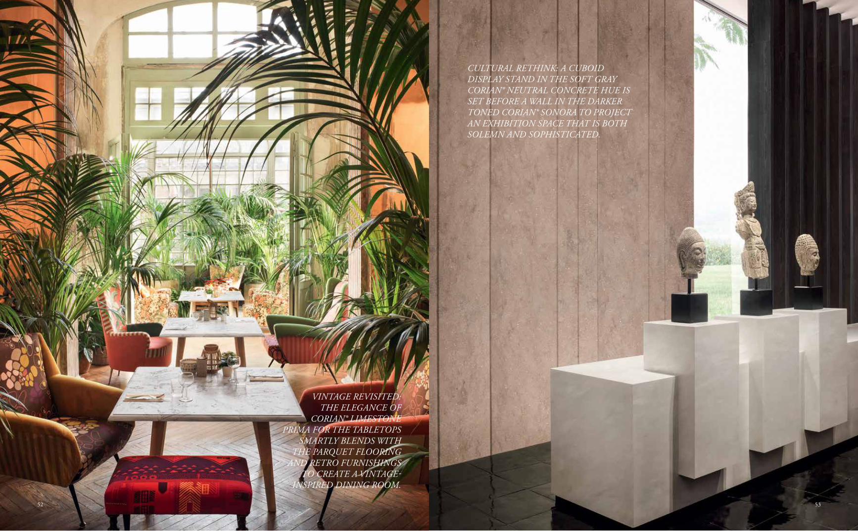
CULTURAL RETHINK: A CUBOID DISPLAY STAND IN THE SOFT GRAY CORIAN® NEUTRAL CONCRETE HUE IS SET BEFORE A WALL IN THE DARKER TONED CORIAN® SONORA TO PROJECT AN EXHIBITION SPACE THAT IS BOTH SOLEMN AND SOPHISTICATED.
VINTAGE REVISITED: THE ELEGANCE OF
CORIAN® LIMESTONE PRIMA FOR THE TABLETOPS
SMARTLY BLENDS WITH THE PARQUET FLOORING
AND RETRO FURNISHINGS TO CREATE A VINTAGE-
INSPIRED DINING ROOM.
5352
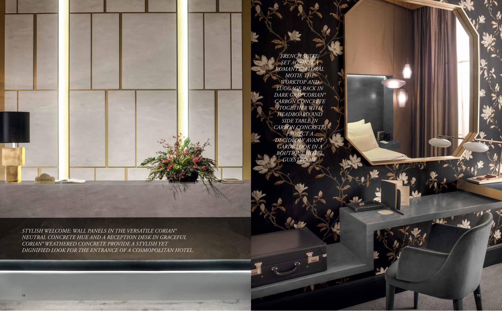
FRENCH SUITE:SET AGAINST A
ROMANTIC FLORAL MOTIF, THE
WORKTOP AND LUGGAGE RACK IN
DARK GRAY CORIAN® CARBON CONCRETE (TOGETHER WITH HEADBOARD AND
SIDE TABLE IN CARBON CONCRETE)
PROJECT A DECIDEDLY AVANT-GARDE LOOK IN A BOUTIQUE HOTEL
GUESTROOM.
STYLISH WELCOME: WALL PANELS IN THE VERSATILE CORIAN® NEUTRAL CONCRETE HUE AND A RECEPTION DESK IN GRACEFUL CORIAN® WEATHERED CONCRETE PROVIDE A STYLISH YET DIGNIFIED LOOK FOR THE ENTRANCE OF A COSMOPOLITAN HOTEL.
5554
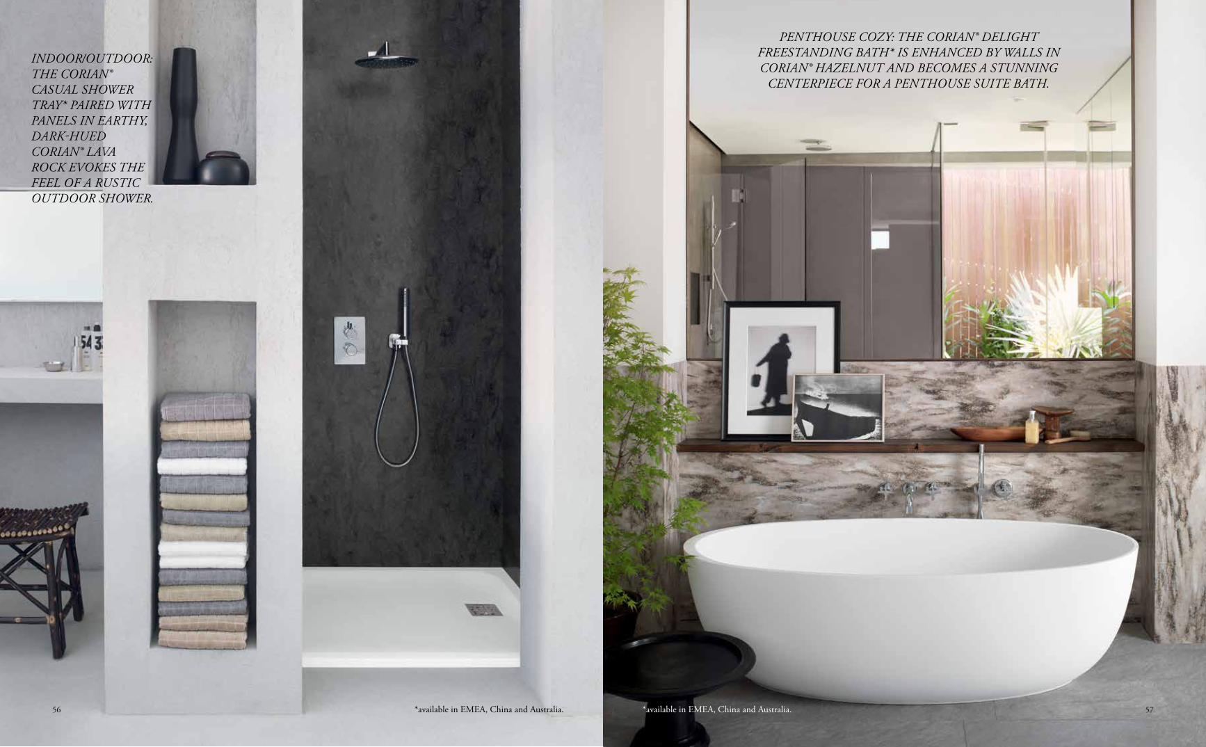
PENTHOUSE COZY: THE CORIAN® DELIGHT FREESTANDING BATH* IS ENHANCED BY WALLS IN CORIAN® HAZELNUT AND BECOMES A STUNNING
CENTERPIECE FOR A PENTHOUSE SUITE BATH.
INDOOR/OUTDOOR: THE CORIAN® CASUAL SHOWER TRAY* PAIRED WITH PANELS IN EARTHY, DARK-HUED CORIAN® LAVA ROCK EVOKES THE FEEL OF A RUSTIC OUTDOOR SHOWER.
*available in EMEA, China and Australia. *available in EMEA, China and Australia. 5756
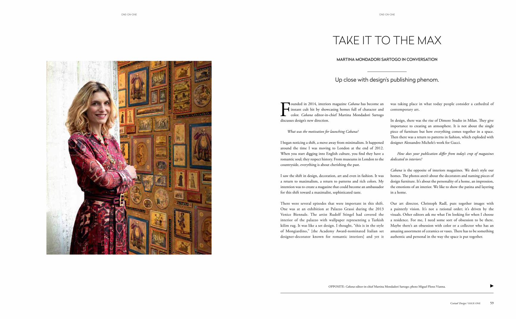
Up close with design’s publishing phenom.
TAKE IT TO THE MAXMARTINA MONDADORI SARTOGO IN CONVERSATION
Founded in 2014, interiors magazine Cabana has become an instant cult hit by showcasing homes full of character and color. Cabana editor-in-chief Martina Mondadori Sartogo
discusses design’s new direction.
What was the motivation for launching Cabana?
I began noticing a shift, a move away from minimalism. It happened around the time I was moving to London at the end of 2012. When you start digging into English culture, you find they have a romantic soul; they respect history. From museums in London to the countryside, everything is about cherishing the past.
I saw the shift in design, decoration, art and even in fashion. It was a return to maximalism, a return to patterns and rich colors. My intention was to create a magazine that could become an ambassador for this shift toward a maximalist, sophisticated taste.
There were several episodes that were important in this shift. One was at an exhibition at Palazzo Grassi during the 2013 Venice Biennale. The artist Rudolf Stingel had covered the interior of the palazzo with wallpaper representing a Turkish kilim rug. It was like a set design. I thought, “this is in the style of Mongiardino,” [the Academy Award-nominated Italian set designer-decorator known for romantic interiors] and yet it
was taking place in what today people consider a cathedral of contemporary art.
In design, there was the rise of Dimore Studio in Milan. They give importance to creating an atmosphere. It is not about the single piece of furniture but how everything comes together in a space. Then there was a return to patterns in fashion, which exploded with designer Alessandro Michele’s work for Gucci.
How does your publication differ from today’s crop of magazines dedicated to interiors?
Cabana is the opposite of interiors magazines. We don’t style our homes. The photos aren’t about the decorators and naming pieces of design furniture. It’s about the personality of a home, an impression, the emotions of an interior. We like to show the patina and layering in a home.
Our art director, Christoph Radl, puts together images with a painterly vision. It’s not a rational order; it’s driven by the visuals. Other editors ask me what I’m looking for when I choose a residence. For me, I need some sort of obsession to be there. Maybe there’s an obsession with color or a collector who has an amazing assortment of ceramics or vases. There has to be something authentic and personal in the way the space is put together.
OPPOSITE: Cabana editor-in-chief Martina Mondadori Sartogo; photo Miguel Flores Vianna.
59Corian® Design / ISSUE ONE
ONE-ON-ONEONE-ON-ONE

The work of Renzo Mongiardino had a profound influence on you. How would you describe his aesthetic?
For him, creating a room was like a painter working with colors and light. Every single interior he made was unique. He would never just put a fabric on a wall or sofa, he would stencil or paint a floral motif or use gold leaf to make something one-of-a-kind. His interiors are very Cabana. He was an alchemist, whereas contemporary designers are scientists. For him, it was about the final magic touch, how you pull things together. Nowadays, there’s a precise formula with a lot of design being done on the computer.
You launched the magazine in print at a time when traditional media is struggling. Why?
I think it’s a matter of considering print as a way of creating an object more than disseminating a message. Today, we are bombarded with images on the screen – we get our news from the web – yet ultimately we are physical beings. We want to touch, to see. So we’ve created a tactile object that people can collect. Each issue we partner
with a brand – for example, Pierre Frey, Etro and Gucci – to make covers with fabric patterns where each is cut in a way that every single cover is unique and becomes a collector’s item.
You studied the classics and art history at school. Are you drawn more to interiors with history?
The past is reassuring. It’s been studied. It’s the same as fashion designers who look to vintage and style icons of the past. I’ve always been a romantic soul and had a fascination with the past, whether I’m walking through the National Gallery in London and looking at the old masters or watching Downton Abbey. There is also a bit of nostalgia to it as well.
You’ve described Cabana as a lifestyle brand. Explain.
Cabana is like a big family. We’ve created a community that is attracted to our aesthetic. In 2017, we will launch an online shop to offer vintage finds and our own Cabana collection of tableware, glassware from Murano and other items. Every piece will be crafted by hand and have a strong visual curation on our side.
THIS PAGE: Cabana has become an instant collector’s item thanks to its distinctive covers and stunning photography of lavish interiors. For each issue, the magazine partners with a leading fabric purveyor (Pierre Fray and Etro to name just two) and patterns are cut in such a way that every single cover is unique. Photos courtesy of Cabana.
THIS PAGE: Limited edition box set of Cabana; one of the chairs created by Gucci designer Alessandro Michele for Cabana that features the fashion house’s own fabric. Photos Filippo Pincolini, courtesy of Cabana.
61Corian® Design / ISSUE ONECorian® Design / ISSUE ONE60
ONE-ON-ONEONE-ON-ONE
Cor
ian®
Nim
bus P
rima
Ilya Ehremburg
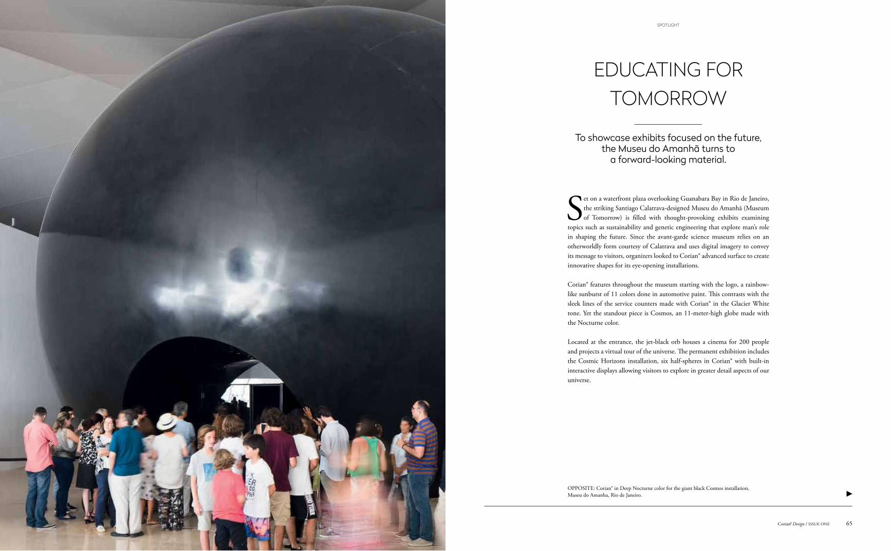
OPPOSITE: Corian® in Deep Nocturne color for the giant black Cosmos installation, Museu do Amanha, Rio de Janeiro.
To showcase exhibits focused on the future, the Museu do Amanhã turns to
a forward-looking material.
Set on a waterfront plaza overlooking Guanabara Bay in Rio de Janeiro, the striking Santiago Calatrava-designed Museu do Amanhã (Museum of Tomorrow) is filled with thought-provoking exhibits examining
topics such as sustainability and genetic engineering that explore man’s role in shaping the future. Since the avant-garde science museum relies on an otherworldly form courtesy of Calatrava and uses digital imagery to convey its message to visitors, organizers looked to Corian® advanced surface to create innovative shapes for its eye-opening installations.
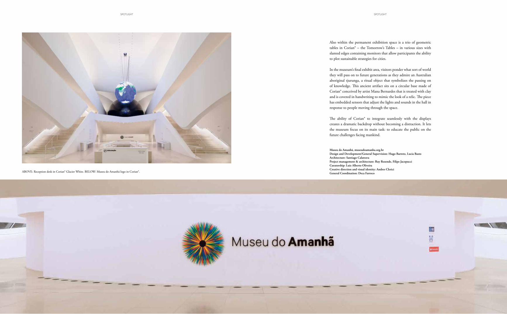
Corian® features throughout the museum starting with the logo, a rainbow-like sunburst of 11 colors done in automotive paint. This contrasts with the sleek lines of the service counters made with Corian® in the Glacier White tone. Yet the standout piece is Cosmos, an 11-meter-high globe made with the Nocturne color.
Located at the entrance, the jet-black orb houses a cinema for 200 people and projects a virtual tour of the universe. The permanent exhibition includes the Cosmic Horizons installation, six half-spheres in Corian® with built-in interactive displays allowing visitors to explore in greater detail aspects of our universe.
EDUCATING FOR TOMORROW
65Corian® Design / ISSUE ONE
SPOTLIGHT
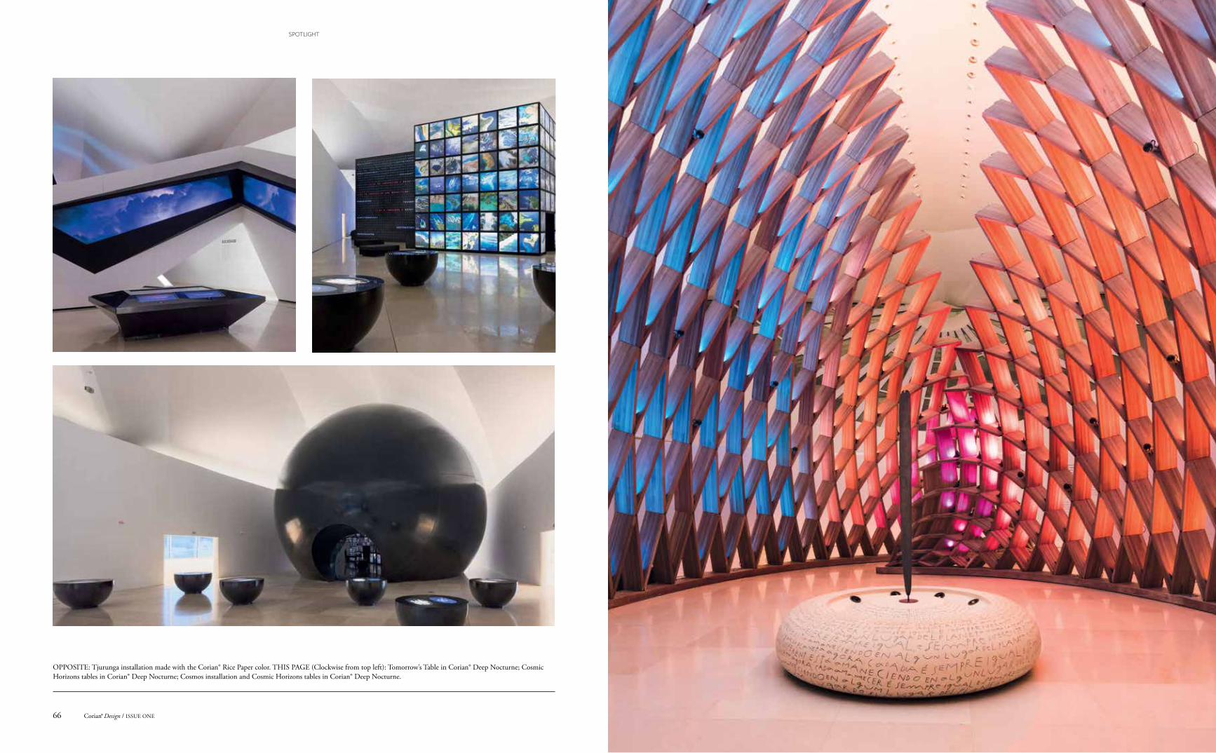
OPPOSITE: Tjurunga installation made with the Corian® Rice Paper color. THIS PAGE (Clockwise from top left): Tomorrow’s Table in Corian® Deep Nocturne; Cosmic Horizons tables in Corian® Deep Nocturne; Cosmos installation and Cosmic Horizons tables in Corian® Deep Nocturne.
Corian® Design / ISSUE ONE66
SPOTLIGHT
Also within the permanent exhibition space is a trio of geometric tables in Corian® – the Tomorrow’s Tables – in various sizes with slanted edges containing monitors that allow participants the ability to plot sustainable strategies for cities.
In the museum’s final exhibit area, visitors ponder what sort of world they will pass on to future generations as they admire an Australian aboriginal tjurunga, a ritual object that symbolizes the passing on of knowledge. This ancient artifact sits on a circular base made of Corian® conceived by artist Mana Bernardes that is treated with clay and is covered in handwriting to mimic the look of a relic. The piece has embedded sensors that adjust the lights and sounds in the hall in response to people moving through the space.
The ability of Corian® to integrate seamlessly with the displays creates a dramatic backdrop without becoming a distraction. It lets the museum focus on its main task: to educate the public on the future challenges facing mankind.
Museu do Amanhã, museudoamanha.org.brDesign and Development/General Supervision: Hugo Barreto, Lucia BastoArchitecture: Santiago CalatravaProject management & architecture: Ruy Rezende, Filipe JacopucciCuratorship: Luiz Alberto OliveiraCreative direction and visual identity: Andres ClericiGeneral Coordination: Deca FarrocoABOVE: Reception desk in Corian® Glacier White. BELOW: Museu do Amanhã logo in Corian®.
SPOTLIGHTSPOTLIGHT
OPPOSITE: View from lobby looking upstairs at Edmunds.com headquarters.
For online business Edmunds.com, a popular resource for North American shoppers interested in buying a car, the move into their new Santa Monica headquarters in the summer of 2016 coincided with the
company’s fiftieth anniversary. To mark this important milestone, Las Vegas-based M+M Creative Studio created an inspiring office interior for Edmunds staff that celebrates all things automotive.
An important ingredient that repeatedly surfaces in the architects’ design is Corian®, which was utilized throughout the sprawling 13,000-square-meter complex. “We wanted the visual cues in the office to be polished to give the impression of a newly waxed car and, with the proper surface finishing, Corian® works perfectly, providing the glossy look we were looking for,” says Chris Mitchell, CEO of M+M Creative Studio.
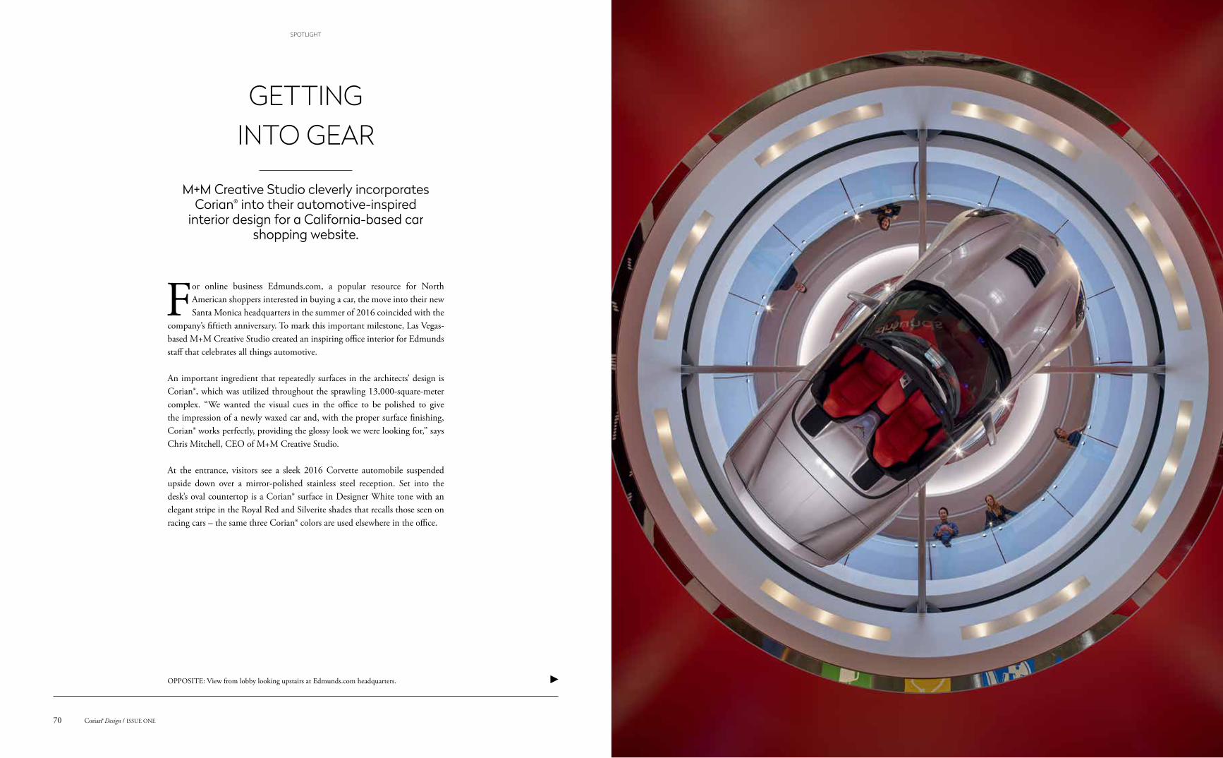
At the entrance, visitors see a sleek 2016 Corvette automobile suspended upside down over a mirror-polished stainless steel reception. Set into the desk’s oval countertop is a Corian® surface in Designer White tone with an elegant stripe in the Royal Red and Silverite shades that recalls those seen on racing cars – the same three Corian® colors are used elsewhere in the office.
GETTING INTO GEAR
M+M Creative Studio cleverly incorporates Corian® into their automotive-inspired
interior design for a California-based car shopping website.
Corian® Design / ISSUE ONE70
SPOTLIGHT
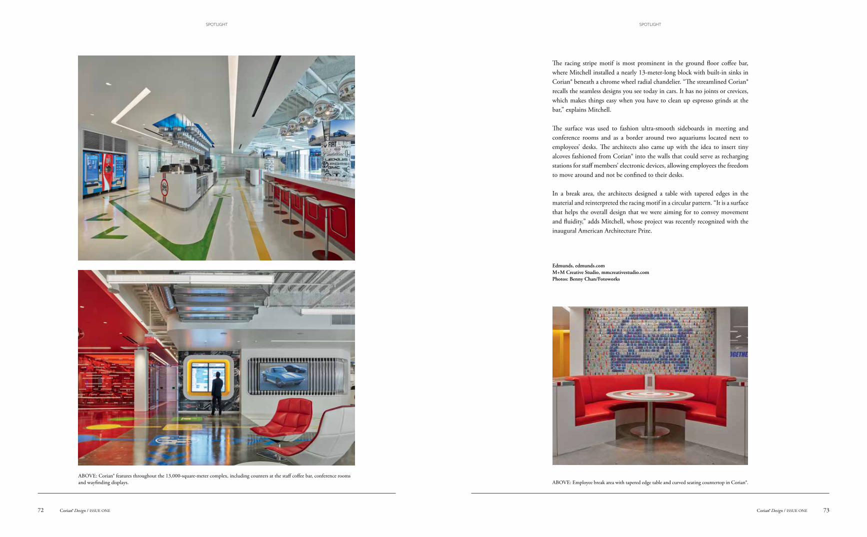
The racing stripe motif is most prominent in the ground floor coffee bar, where Mitchell installed a nearly 13-meter-long block with built-in sinks in Corian® beneath a chrome wheel radial chandelier. “The streamlined Corian® recalls the seamless designs you see today in cars. It has no joints or crevices, which makes things easy when you have to clean up espresso grinds at the bar,” explains Mitchell.
The surface was used to fashion ultra-smooth sideboards in meeting and conference rooms and as a border around two aquariums located next to employees’ desks. The architects also came up with the idea to insert tiny alcoves fashioned from Corian® into the walls that could serve as recharging stations for staff members’ electronic devices, allowing employees the freedom to move around and not be confined to their desks.
In a break area, the architects designed a table with tapered edges in the material and reinterpreted the racing motif in a circular pattern. “It is a surface that helps the overall design that we were aiming for to convey movement and fluidity,” adds Mitchell, whose project was recently recognized with the inaugural American Architecture Prize.
Edmunds, edmunds.comM+M Creative Studio, mmcreativestudio.comPhotos: Benny Chan/Fotoworks
ABOVE: Employee break area with tapered edge table and curved seating countertop in Corian®.ABOVE: Corian® features throughout the 13,000-square-meter complex, including counters at the staff coffee bar, conference rooms and wayfinding displays.
73Corian® Design / ISSUE ONECorian® Design / ISSUE ONE72
SPOTLIGHTSPOTLIGHT
Cor
ian®
Cos
mos
Prim
a
Paul Rand
OPPOSITE: Clinic features backlit wall cladding panels in translucent Corian® Glacier Ice and door cladding in Corian® Glacier White.
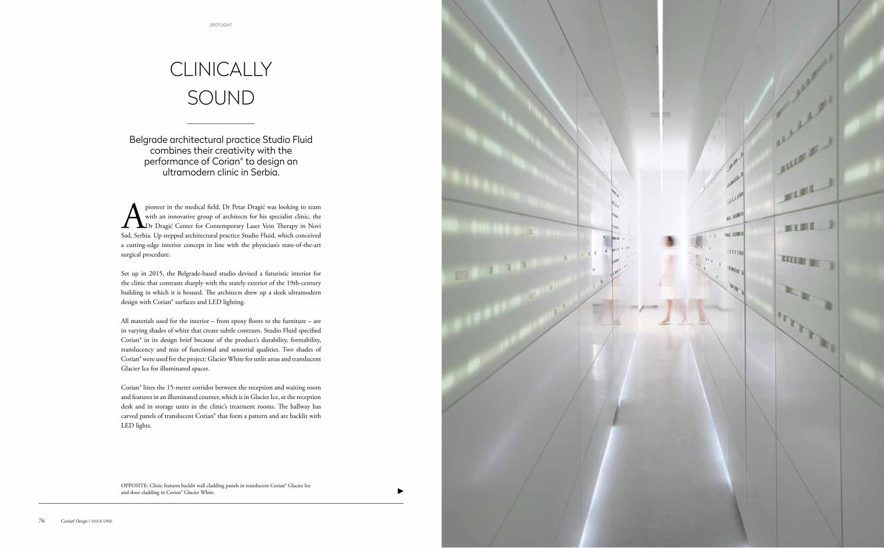
Belgrade architectural practice Studio Fluid combines their creativity with the
performance of Corian® to design an ultramodern clinic in Serbia.
A pioneer in the medical field, Dr Petar Dragić was looking to team with an innovative group of architects for his specialist clinic, the Dr Dragić Center for Contemporary Laser Vein Therapy in Novi
Sad, Serbia. Up stepped architectural practice Studio Fluid, which conceived a cutting-edge interior concept in line with the physician’s state-of-the-art surgical procedure.
Set up in 2015, the Belgrade-based studio devised a futuristic interior for the clinic that contrasts sharply with the stately exterior of the 19th-century building in which it is housed. The architects drew up a sleek ultramodern design with Corian® surfaces and LED lighting.
All materials used for the interior – from epoxy floors to the furniture – are in varying shades of white that create subtle contrasts. Studio Fluid specified Corian® in its design brief because of the product’s durability, formability, translucency and mix of functional and sensorial qualities. Two shades of Corian® were used for the project: Glacier White for unlit areas and translucent Glacier Ice for illuminated spaces.
Corian® lines the 15-meter corridor between the reception and waiting room and features in an illuminated counter, which is in Glacier Ice, at the reception desk and in storage units in the clinic’s treatment rooms. The hallway has carved panels of translucent Corian® that form a pattern and are backlit with LED lights.
CLINICALLY SOUND
Corian® Design / ISSUE ONE76
SPOTLIGHT
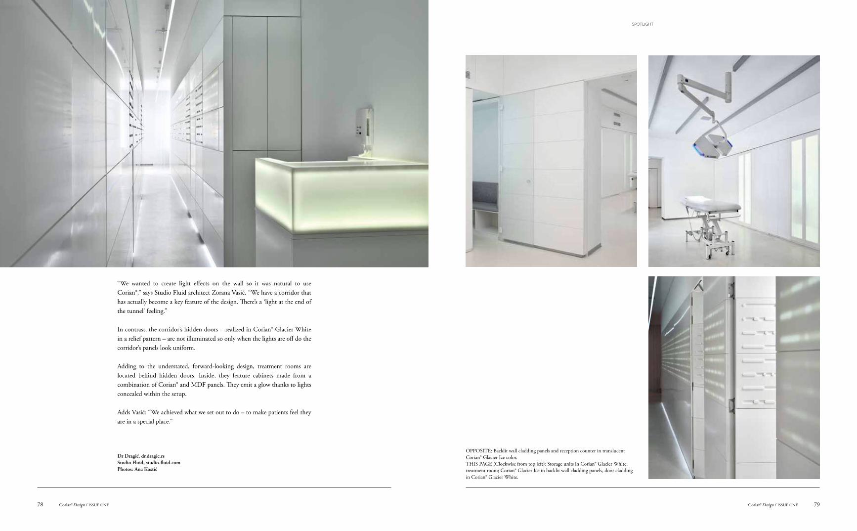
OPPOSITE: Backlit wall cladding panels and reception counter in translucent Corian® Glacier Ice color.THIS PAGE (Clockwise from top left): Storage units in Corian® Glacier White; treatment room; Corian® Glacier Ice in backlit wall cladding panels, door cladding in Corian® Glacier White.
“We wanted to create light effects on the wall so it was natural to use Corian®,” says Studio Fluid architect Zorana Vasić. “We have a corridor that has actually become a key feature of the design. There’s a ‘light at the end of the tunnel’ feeling.”
In contrast, the corridor’s hidden doors – realized in Corian® Glacier White in a relief pattern – are not illuminated so only when the lights are off do the corridor’s panels look uniform.
Adding to the understated, forward-looking design, treatment rooms are located behind hidden doors. Inside, they feature cabinets made from a combination of Corian® and MDF panels. They emit a glow thanks to lights concealed within the setup.
Adds Vasić: “We achieved what we set out to do – to make patients feel they are in a special place.”
Dr Dragić, dr.dragic.rs Studio Fluid, studio-fluid.comPhotos: Ana Kostić
79Corian® Design / ISSUE ONECorian® Design / ISSUE ONE78
SPOTLIGHT
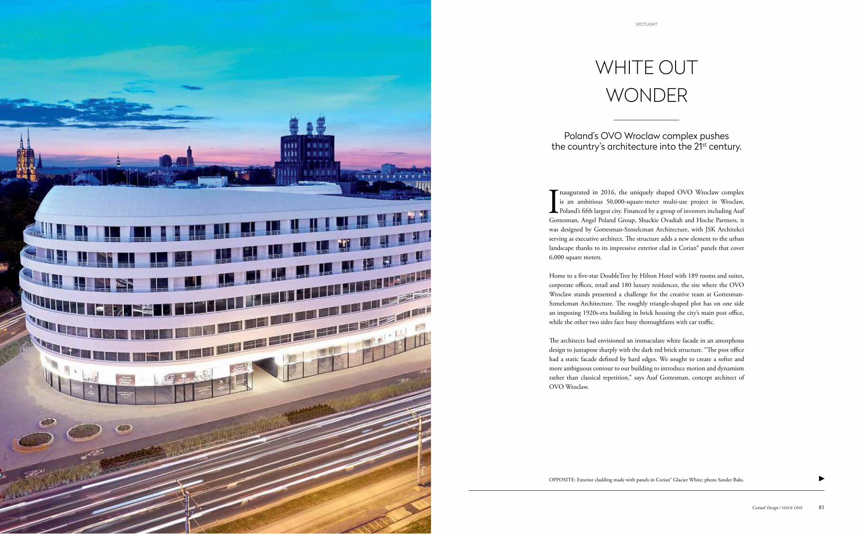
OPPOSITE: Exterior cladding made with panels in Corian® Glacier White; photo Sander Baks.
Poland’s OVO Wroclaw complex pushes the country’s architecture into the 21st century.
Inaugurated in 2016, the uniquely shaped OVO Wroclaw complex is an ambitious 50,000-square-meter multi-use project in Wroclaw, Poland’s fifth largest city. Financed by a group of investors including Asaf
Gottesman, Angel Poland Group, Shuckie Ovadiah and Hoche Partners, it was designed by Gottesman-Szmelcman Architecture, with JSK Architekci serving as executive architect. The structure adds a new element to the urban landscape thanks to its impressive exterior clad in Corian® panels that cover 6,000 square meters.
Home to a five-star DoubleTree by Hilton Hotel with 189 rooms and suites, corporate offices, retail and 180 luxury residences, the site where the OVO Wroclaw stands presented a challenge for the creative team at Gottesman-Szmelcman Architecture. The roughly triangle-shaped plot has on one side an imposing 1920s-era building in brick housing the city’s main post office, while the other two sides face busy thoroughfares with car traffic.
The architects had envisioned an immaculate white facade in an amorphous design to juxtapose sharply with the dark red brick structure. “The post office had a static facade defined by hard edges. We sought to create a softer and more ambiguous contour to our building to introduce motion and dynamism rather than classical repetition,” says Asaf Gottesman, concept architect of OVO Wroclaw.
WHITE OUT WONDER
81Corian® Design / ISSUE ONE
SPOTLIGHT
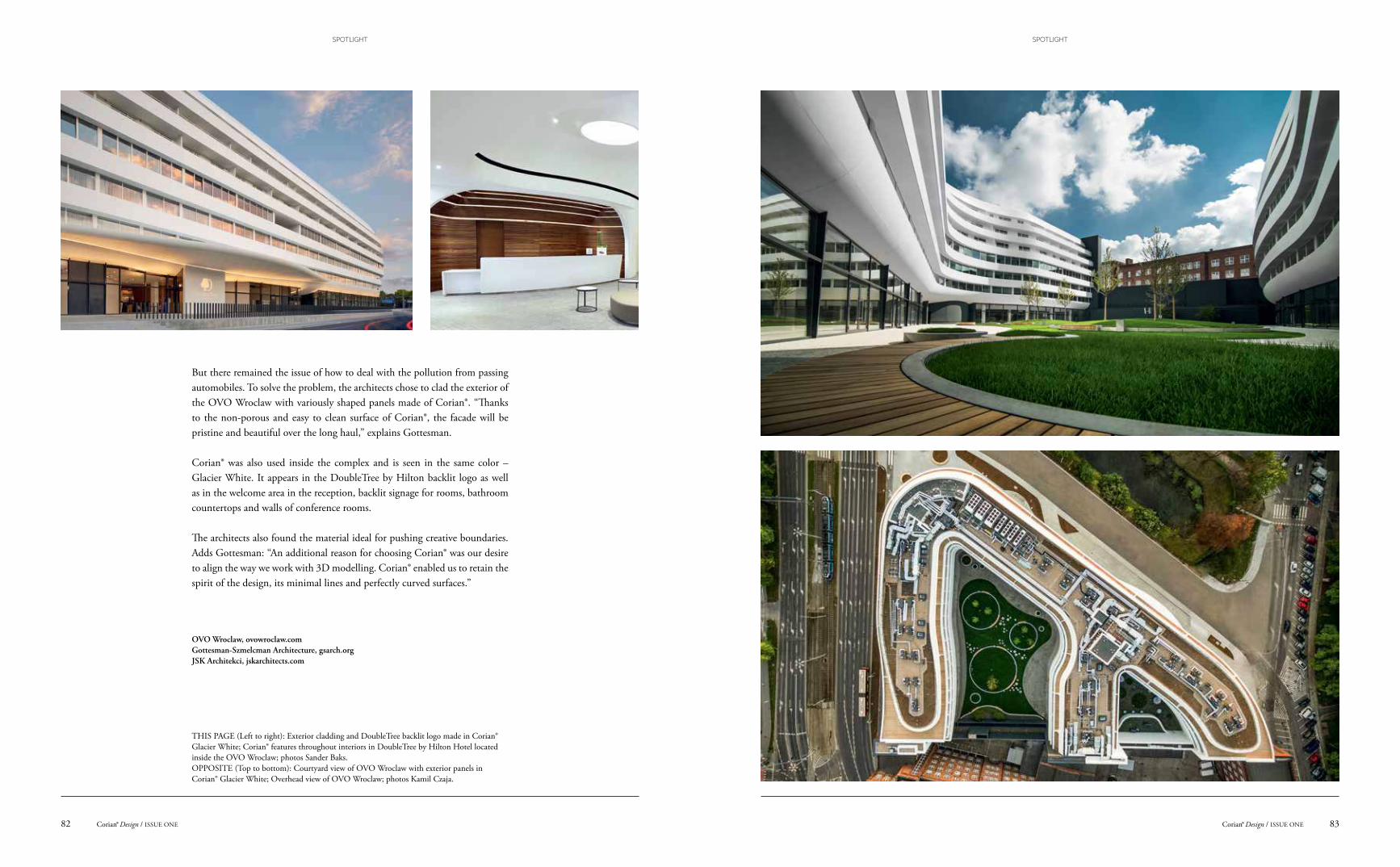
But there remained the issue of how to deal with the pollution from passing automobiles. To solve the problem, the architects chose to clad the exterior of the OVO Wroclaw with variously shaped panels made of Corian®. “Thanks to the non-porous and easy to clean surface of Corian®, the facade will be pristine and beautiful over the long haul,” explains Gottesman.
Corian® was also used inside the complex and is seen in the same color – Glacier White. It appears in the DoubleTree by Hilton backlit logo as well as in the welcome area in the reception, backlit signage for rooms, bathroom countertops and walls of conference rooms.
The architects also found the material ideal for pushing creative boundaries. Adds Gottesman: “An additional reason for choosing Corian® was our desire to align the way we work with 3D modelling. Corian® enabled us to retain the spirit of the design, its minimal lines and perfectly curved surfaces.”
OVO Wroclaw, ovowroclaw.comGottesman-Szmelcman Architecture, gsarch.orgJSK Architekci, jskarchitects.com
THIS PAGE (Left to right): Exterior cladding and DoubleTree backlit logo made in Corian® Glacier White; Corian® features throughout interiors in DoubleTree by Hilton Hotel located inside the OVO Wroclaw; photos Sander Baks.OPPOSITE (Top to bottom): Courtyard view of OVO Wroclaw with exterior panels in Corian® Glacier White; Overhead view of OVO Wroclaw; photos Kamil Czaja.
83Corian® Design / ISSUE ONECorian® Design / ISSUE ONE82
SPOTLIGHTSPOTLIGHT
THE MIX-AND-MATCH MAESTROA TALK ON INTERIORS WITH ASHLEY HICKS
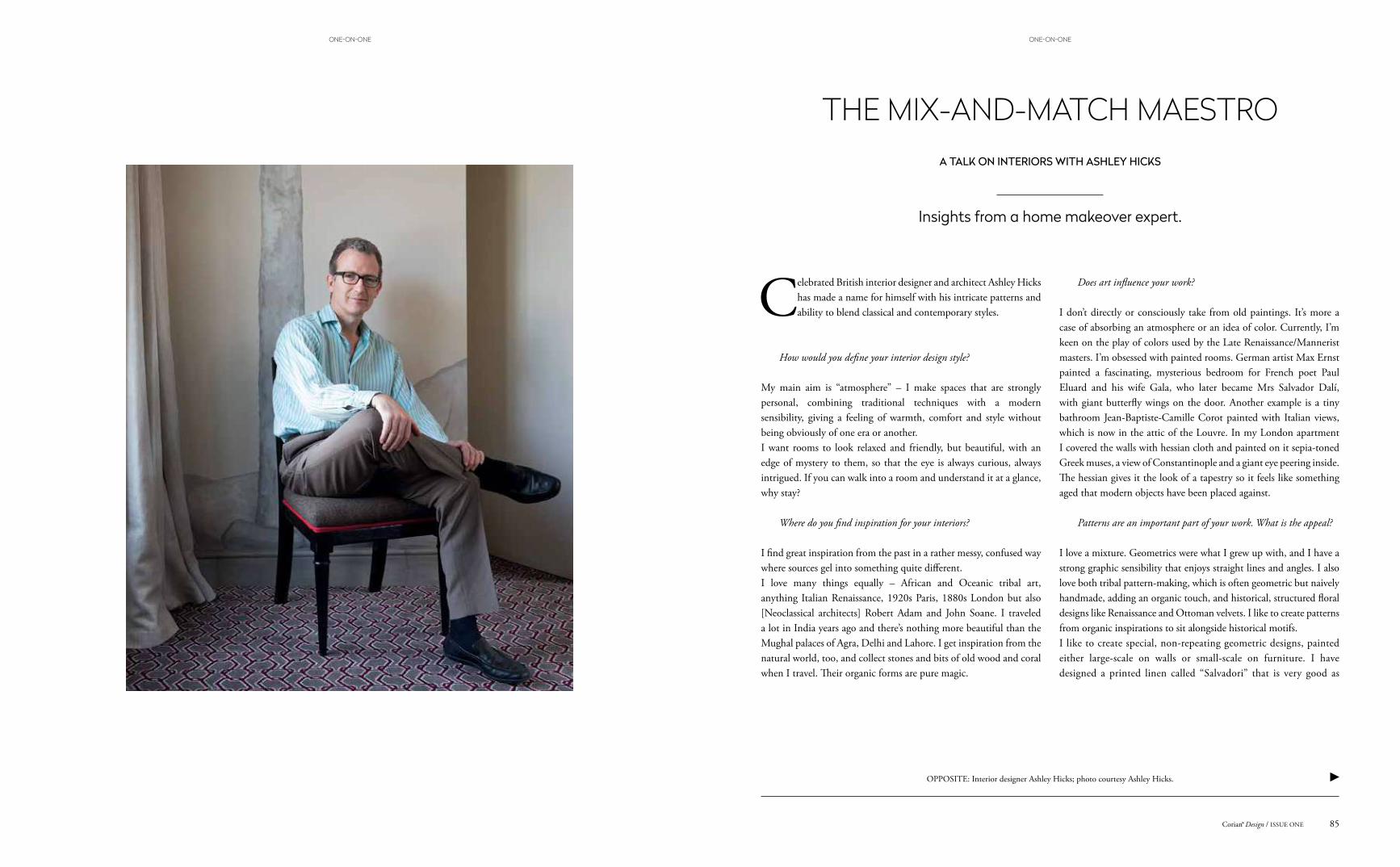
Celebrated British interior designer and architect Ashley Hicks has made a name for himself with his intricate patterns and ability to blend classical and contemporary styles.
How would you define your interior design style?
My main aim is “atmosphere” – I make spaces that are strongly personal, combining traditional techniques with a modern sensibility, giving a feeling of warmth, comfort and style without being obviously of one era or another. I want rooms to look relaxed and friendly, but beautiful, with an edge of mystery to them, so that the eye is always curious, always intrigued. If you can walk into a room and understand it at a glance, why stay?
Where do you find inspiration for your interiors?
I find great inspiration from the past in a rather messy, confused way where sources gel into something quite different. I love many things equally – African and Oceanic tribal art, anything Italian Renaissance, 1920s Paris, 1880s London but also [Neoclassical architects] Robert Adam and John Soane. I traveled a lot in India years ago and there’s nothing more beautiful than the Mughal palaces of Agra, Delhi and Lahore. I get inspiration from the natural world, too, and collect stones and bits of old wood and coral when I travel. Their organic forms are pure magic.
Does art influence your work?
I don’t directly or consciously take from old paintings. It’s more a case of absorbing an atmosphere or an idea of color. Currently, I’m keen on the play of colors used by the Late Renaissance/Mannerist masters. I’m obsessed with painted rooms. German artist Max Ernst painted a fascinating, mysterious bedroom for French poet Paul Eluard and his wife Gala, who later became Mrs Salvador Dalí, with giant butterfly wings on the door. Another example is a tiny bathroom Jean-Baptiste-Camille Corot painted with Italian views, which is now in the attic of the Louvre. In my London apartment I covered the walls with hessian cloth and painted on it sepia-toned Greek muses, a view of Constantinople and a giant eye peering inside. The hessian gives it the look of a tapestry so it feels like something aged that modern objects have been placed against.
Patterns are an important part of your work. What is the appeal?
I love a mixture. Geometrics were what I grew up with, and I have a strong graphic sensibility that enjoys straight lines and angles. I also love both tribal pattern-making, which is often geometric but naively handmade, adding an organic touch, and historical, structured floral designs like Renaissance and Ottoman velvets. I like to create patterns from organic inspirations to sit alongside historical motifs.I like to create special, non-repeating geometric designs, painted either large-scale on walls or small-scale on furniture. I have designed a printed linen called “Salvadori” that is very good as
Insights from a home makeover expert.
OPPOSITE: Interior designer Ashley Hicks; photo courtesy Ashley Hicks.
85Corian® Design / ISSUE ONE
ONE-ON-ONEONE-ON-ONE
upholstery – a grand Renaissance velvet design that I redrew as if it was an old woodcut print, which gives it a modern edge.
How do you go about designing a space?
I always sketch by hand. I also love to make things myself like door handles that I shape in clay to have cast in bronze and furniture pieces that I carve from wood or epoxy foam and then gild or paint myself. There’s something so direct and rewarding about making things with your hands. It gives a very personal signature to a room.
How would you define your furniture collection of tables and chairs?
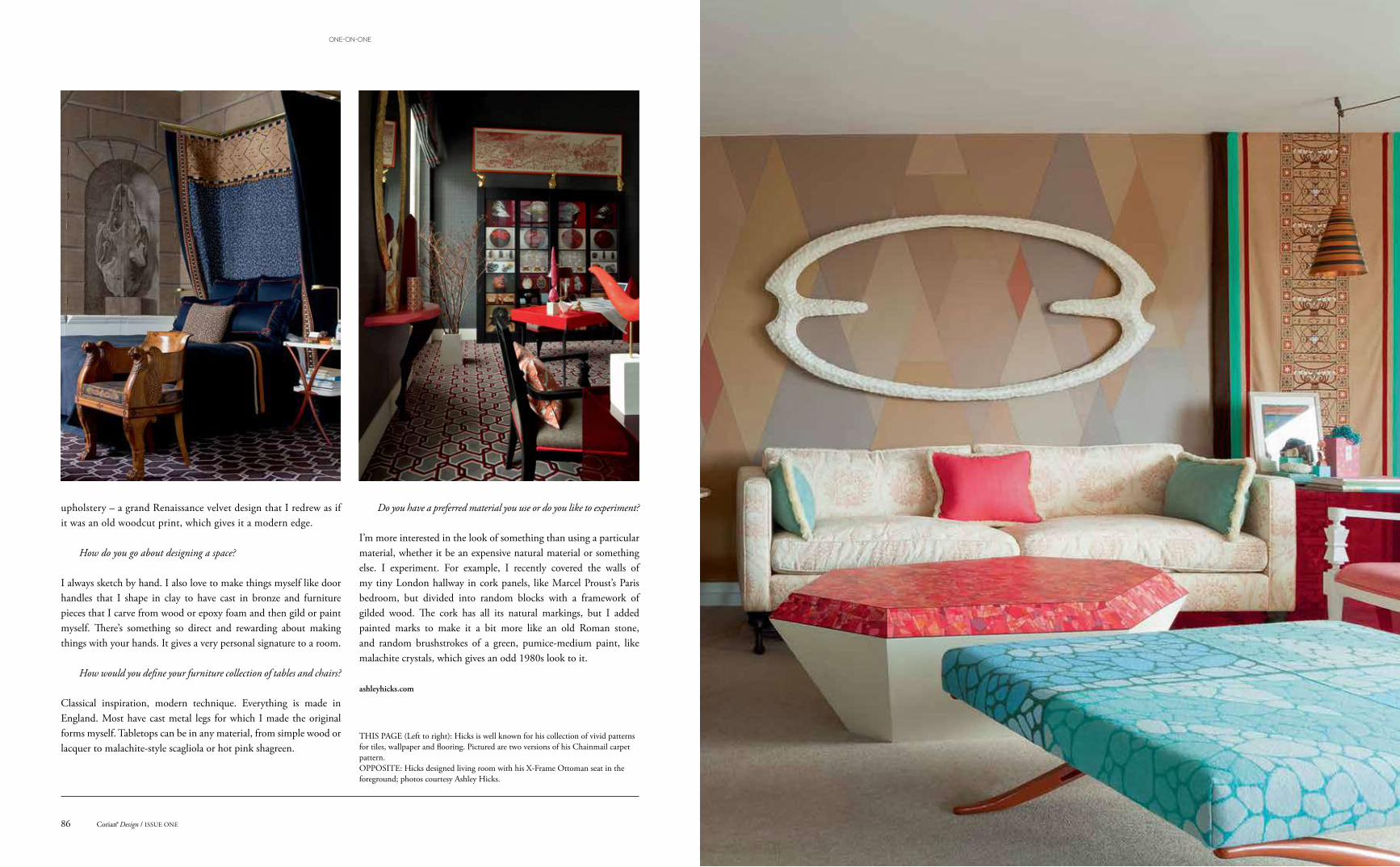
Classical inspiration, modern technique. Everything is made in England. Most have cast metal legs for which I made the original forms myself. Tabletops can be in any material, from simple wood or lacquer to malachite-style scagliola or hot pink shagreen.
Do you have a preferred material you use or do you like to experiment?
I’m more interested in the look of something than using a particular material, whether it be an expensive natural material or something else. I experiment. For example, I recently covered the walls of my tiny London hallway in cork panels, like Marcel Proust’s Paris bedroom, but divided into random blocks with a framework of gilded wood. The cork has all its natural markings, but I added painted marks to make it a bit more like an old Roman stone, and random brushstrokes of a green, pumice-medium paint, like malachite crystals, which gives an odd 1980s look to it.
ashleyhicks.com
THIS PAGE (Left to right): Hicks is well known for his collection of vivid patterns for tiles, wallpaper and flooring. Pictured are two versions of his Chainmail carpet pattern.OPPOSITE: Hicks designed living room with his X-Frame Ottoman seat in the foreground; photos courtesy Ashley Hicks.
Corian® Design / ISSUE ONE86
ONE-ON-ONE

OPPOSITE: Seibu Railway restaurant car with countertops in Corian® Suede designed by Kengo Kuma & Associates; photos Yoshihito Imaeda.
Trains are traditionally one of the most demanding environments for designers and materials due to the challenging conditions found on board: space limitations, safety concerns and maintenance issues.
Japan has been a leader in rail travel ever since the first high-speed Shinkansen rolling stock was introduced. Last year, the latest improvement to its train service came in the shape of a restaurant car concept by internationally acclaimed Japanese architecture firm Kengo Kuma & Associates, which looked to Corian® for a key component in its design.
Commissioned by private train operator Seibu Railway, the Japanese architectural firm, which has won numerous awards for its thoughtful designs, came up with the smart-looking dining car design for use on the company’s network that runs primarily between Tokyo and the Saitama Prefecture, a busy route which is packed with commuters on weekdays and travelers on weekends.
Kengo Kuma’s practice skillfully combines the cutting-edge material, which has already been used aboard Japanese train carriages in vanities, with wood for an interior that is infused with warmth. Countertops are in the deep brown Corian® Suede color tone and are tastefully paired with wood side panels and carpeting.
The project’s centerpiece is the 10-meter-long L-shaped open kitchen counter, a highly trafficked area during journeys where patrons mingle and eat and where the functional and sensorial benefits of Corian® – cleanliness, durability and pleasant tactility – are put to good use thanks to the well-thought-out design.
Seibu Railway, seibu-group.co.jpKengo Kuma & Associates, kkaa.co.jp
FULL STEAM AHEAD
89Corian® Design / ISSUE ONE
SPOTLIGHT
Cor
ian®
Lim
esto
ne P
rima
Joseph Addison
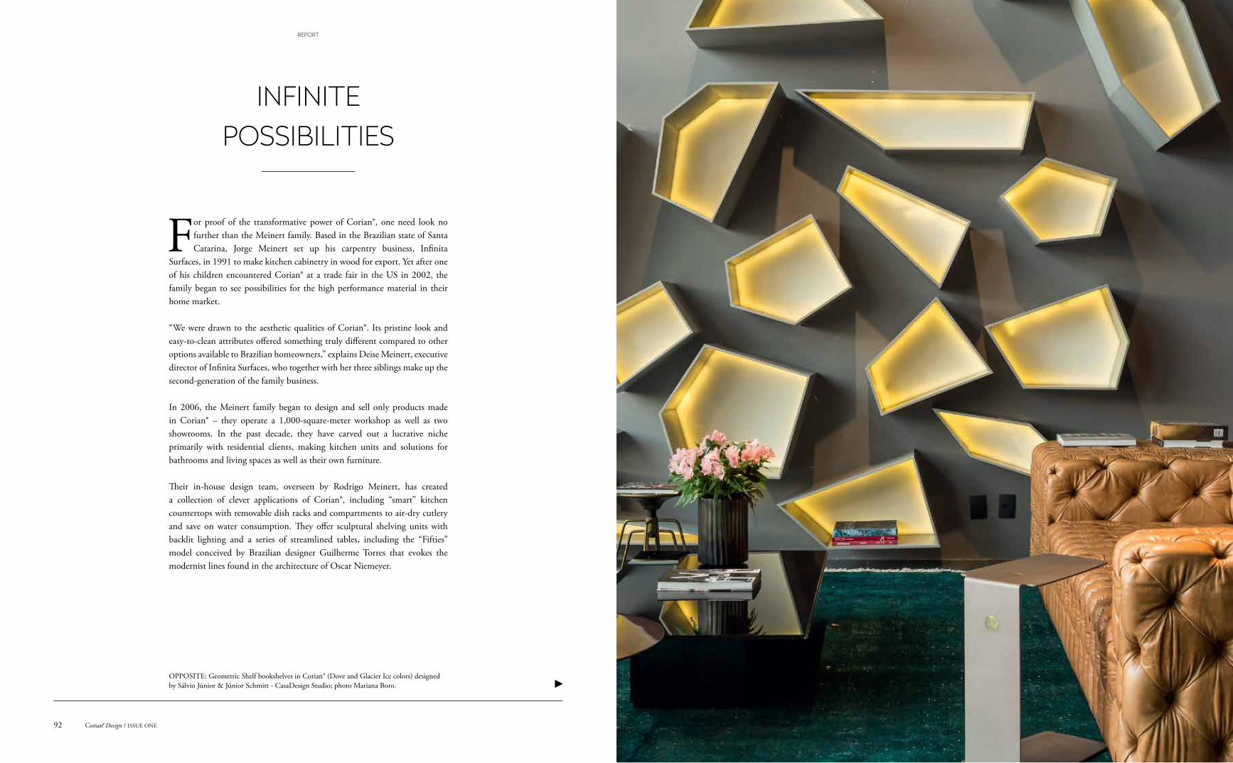
OPPOSITE: Geometric Shelf bookshelves in Corian® (Dove and Glacier Ice colors) designed by Sálvio Júnior & Júnior Schmitt - CasaDesign Studio; photo Mariana Boro.
For proof of the transformative power of Corian®, one need look no further than the Meinert family. Based in the Brazilian state of Santa Catarina, Jorge Meinert set up his carpentry business, Infinita
Surfaces, in 1991 to make kitchen cabinetry in wood for export. Yet after one of his children encountered Corian® at a trade fair in the US in 2002, the family began to see possibilities for the high performance material in their home market.
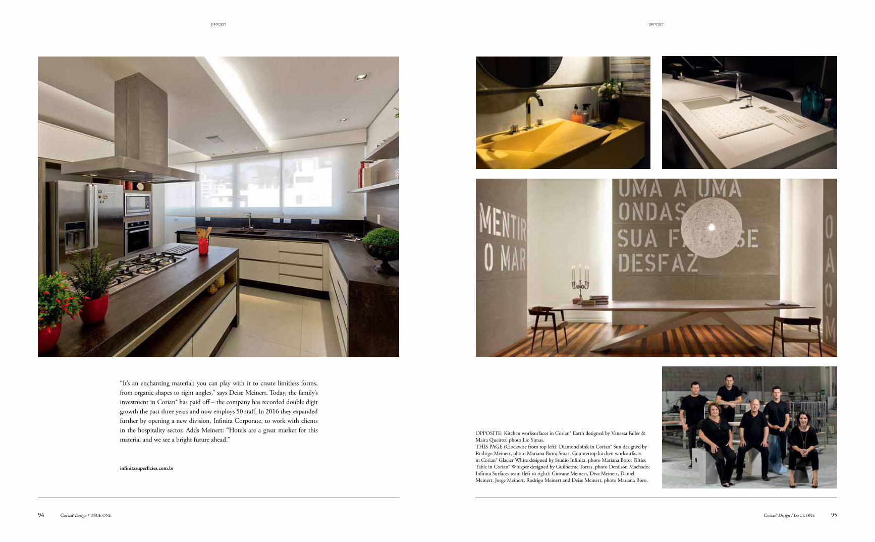
“We were drawn to the aesthetic qualities of Corian®. Its pristine look and easy-to-clean attributes offered something truly different compared to other options available to Brazilian homeowners,” explains Deise Meinert, executive director of Infinita Surfaces, who together with her three siblings make up the second-generation of the family business.
In 2006, the Meinert family began to design and sell only products made in Corian® – they operate a 1,000-square-meter workshop as well as two showrooms. In the past decade, they have carved out a lucrative niche primarily with residential clients, making kitchen units and solutions for bathrooms and living spaces as well as their own furniture.
Their in-house design team, overseen by Rodrigo Meinert, has created a collection of clever applications of Corian®, including “smart” kitchen countertops with removable dish racks and compartments to air-dry cutlery and save on water consumption. They offer sculptural shelving units with backlit lighting and a series of streamlined tables, including the “Fifties” model conceived by Brazilian designer Guilherme Torres that evokes the modernist lines found in the architecture of Oscar Niemeyer.
INFINITE POSSIBILITIES
Corian® Design / ISSUE ONE92
REPORT
OPPOSITE: Kitchen worksurfaces in Corian® Earth designed by Vanessa Faller & Maira Queiroz; photo Lio Simas.THIS PAGE (Clockwise from top left): Diamond sink in Corian® Sun designed by Rodrigo Meinert, photo Mariana Boro; Smart Countertop kitchen worksurfaces in Corian® Glacier White designed by Studio Infinita, photo Mariana Boro; Fifties Table in Corian® Whisper designed by Guilherme Torres, photo Denilson Machado; Infinita Surfaces team (left to right): Giovane Meinert, Diva Meinert, Daniel Meinert, Jorge Meinert, Rodrigo Meinert and Deise Meinert, photo Mariana Boro.
“It’s an enchanting material: you can play with it to create limitless forms, from organic shapes to right angles,” says Deise Meinert. Today, the family’s investment in Corian® has paid off – the company has recorded double digit growth the past three years and now employs 50 staff. In 2016 they expanded further by opening a new division, Infinita Corporate, to work with clients in the hospitality sector. Adds Meinert: “Hotels are a great market for this material and we see a bright future ahead.”
infinitasuperficies.com.br
95Corian® Design / ISSUE ONECorian® Design / ISSUE ONE94
REPORTREPORT
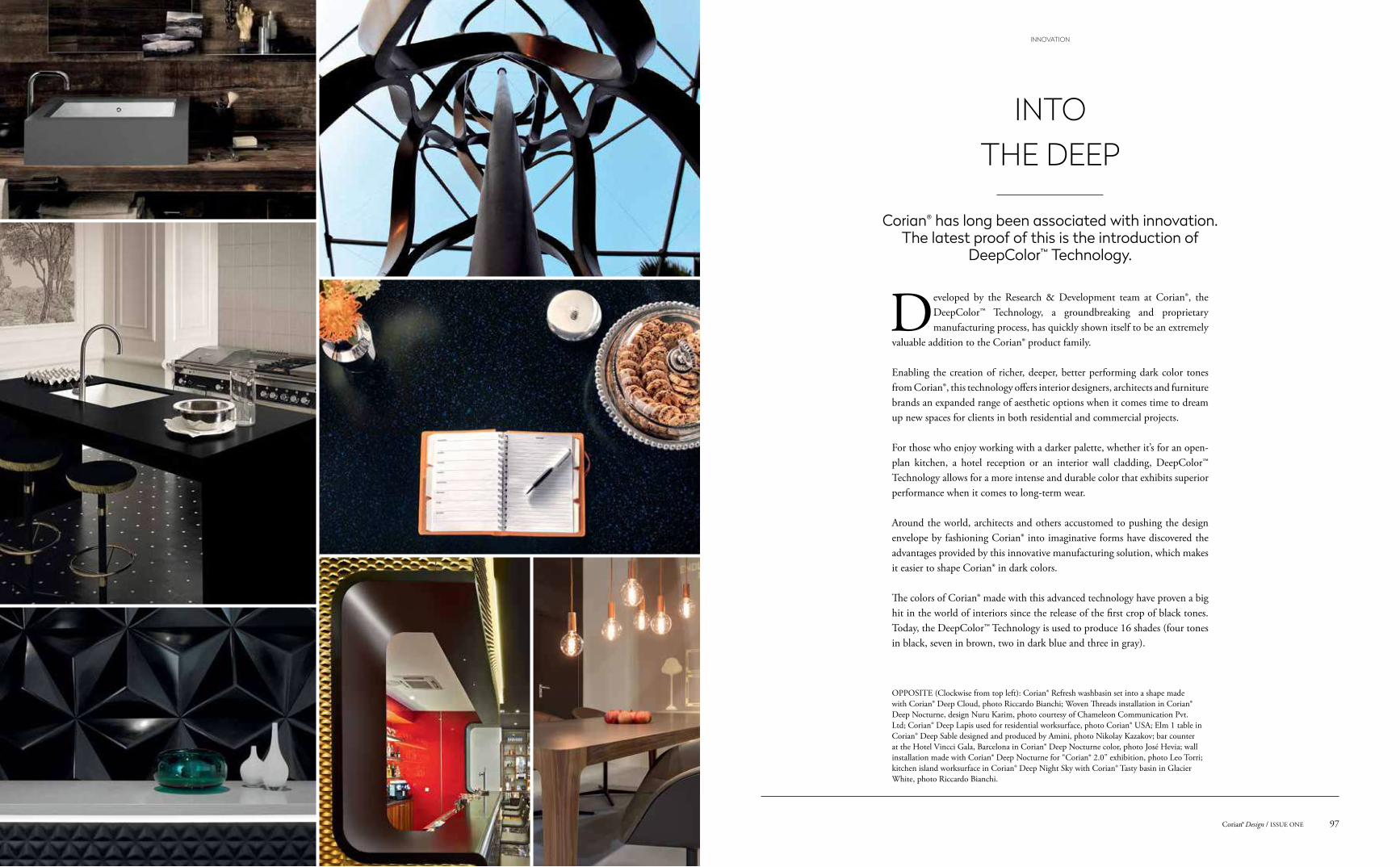
OPPOSITE (Clockwise from top left): Corian® Refresh washbasin set into a shape made with Corian® Deep Cloud, photo Riccardo Bianchi; Woven Threads installation in Corian® Deep Nocturne, design Nuru Karim, photo courtesy of Chameleon Communication Pvt. Ltd; Corian® Deep Lapis used for residential worksurface, photo Corian® USA; Elm 1 table in Corian® Deep Sable designed and produced by Amini, photo Nikolay Kazakov; bar counter at the Hotel Vincci Gala, Barcelona in Corian® Deep Nocturne color, photo José Hevia; wall installation made with Corian® Deep Nocturne for “Corian® 2.0” exhibition, photo Leo Torri; kitchen island worksurface in Corian® Deep Night Sky with Corian® Tasty basin in Glacier White, photo Riccardo Bianchi.
Developed by the Research & Development team at Corian®, the DeepColor™ Technology, a groundbreaking and proprietary manufacturing process, has quickly shown itself to be an extremely
valuable addition to the Corian® product family.
Enabling the creation of richer, deeper, better performing dark color tones from Corian®, this technology offers interior designers, architects and furniture brands an expanded range of aesthetic options when it comes time to dream up new spaces for clients in both residential and commercial projects.
For those who enjoy working with a darker palette, whether it’s for an open-plan kitchen, a hotel reception or an interior wall cladding, DeepColor™ Technology allows for a more intense and durable color that exhibits superior performance when it comes to long-term wear.
Around the world, architects and others accustomed to pushing the design envelope by fashioning Corian® into imaginative forms have discovered the advantages provided by this innovative manufacturing solution, which makes it easier to shape Corian® in dark colors.
The colors of Corian® made with this advanced technology have proven a big hit in the world of interiors since the release of the first crop of black tones. Today, the DeepColor™ Technology is used to produce 16 shades (four tones in black, seven in brown, two in dark blue and three in gray).
INTO THE DEEP
Corian® has long been associated with innovation. The latest proof of this is the introduction of
DeepColor™ Technology.
97Corian® Design / ISSUE ONE
INNOVATION
GLOBAL DIGEST
Corian® projects from across the world
Photo courtesy of Lincolnshire County Council.
Photos courtesy of Eventscape Inc.
Photos Mitch Tobias Photography, courtesy of Montalba Architects.
Photo Jake Fitzjones.
Photo courtesy of ArtCor.
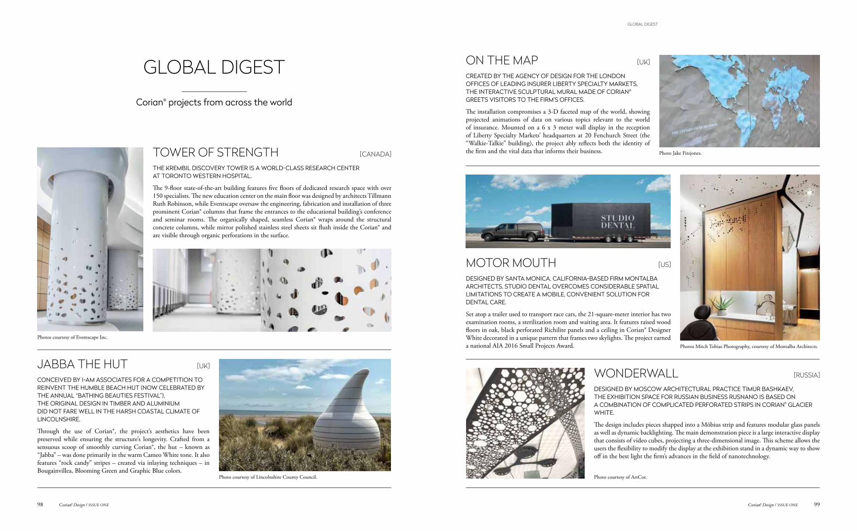
TOWER OF STRENGTH [CANADA]
THE KREMBIL DISCOVERY TOWER IS A WORLD-CLASS RESEARCH CENTER AT TORONTO WESTERN HOSPITAL.
The 9-floor state-of-the-art building features five floors of dedicated research space with over 150 specialists. The new education center on the main floor was designed by architects Tillmann Ruth Robinson, while Eventscape oversaw the engineering, fabrication and installation of three prominent Corian® columns that frame the entrances to the educational building’s conference and seminar rooms. The organically shaped, seamless Corian® wraps around the structural concrete columns, while mirror polished stainless steel sheets sit flush inside the Corian® and are visible through organic perforations in the surface.
JABBA THE HUT [UK]
CONCEIVED BY I-AM ASSOCIATES FOR A COMPETITION TO REINVENT THE HUMBLE BEACH HUT (NOW CELEBRATED BY THE ANNUAL “BATHING BEAUTIES FESTIVAL”), THE ORIGINAL DESIGN IN TIMBER AND ALUMINIUM DID NOT FARE WELL IN THE HARSH COASTAL CLIMATE OF LINCOLNSHIRE.
Through the use of Corian®, the project’s aesthetics have been preserved while ensuring the structure’s longevity. Crafted from a sensuous scoop of smoothly curving Corian®, the hut – known as “Jabba” – was done primarily in the warm Cameo White tone. It also features “rock candy” stripes – created via inlaying techniques – in Bougainvillea, Blooming Green and Graphic Blue colors.
ON THE MAP [UK]
CREATED BY THE AGENCY OF DESIGN FOR THE LONDON OFFICES OF LEADING INSURER LIBERTY SPECIALTY MARKETS, THE INTERACTIVE SCULPTURAL MURAL MADE OF CORIAN® GREETS VISITORS TO THE FIRM’S OFFICES.
The installation compromises a 3-D faceted map of the world, showing projected animations of data on various topics relevant to the world of insurance. Mounted on a 6 x 3 meter wall display in the reception of Liberty Specialty Markets’ headquarters at 20 Fenchurch Street (the “Walkie-Talkie” building), the project ably reflects both the identity of the firm and the vital data that informs their business.
MOTOR MOUTH [US]
DESIGNED BY SANTA MONICA, CALIFORNIA-BASED FIRM MONTALBA ARCHITECTS, STUDIO DENTAL OVERCOMES CONSIDERABLE SPATIAL LIMITATIONS TO CREATE A MOBILE, CONVENIENT SOLUTION FOR DENTAL CARE.
Set atop a trailer used to transport race cars, the 21-square-meter interior has two examination rooms, a sterilization room and waiting area. It features raised wood floors in oak, black perforated Richilite panels and a ceiling in Corian® Designer White decorated in a unique pattern that frames two skylights. The project earned a national AIA 2016 Small Projects Award.
WONDERWALL [RUSSIA]
DESIGNED BY MOSCOW ARCHITECTURAL PRACTICE TIMUR BASHKAEV, THE EXHIBITION SPACE FOR RUSSIAN BUSINESS RUSNANO IS BASED ON A COMBINATION OF COMPLICATED PERFORATED STRIPS IN CORIAN® GLACIER WHITE.
The design includes pieces shapped into a Möbius strip and features modular glass panels as well as dynamic backlighting. The main demonstration piece is a large interactive display that consists of video cubes, projecting a three-dimensional image. This scheme allows the users the flexibility to modify the display at the exhibition stand in a dynamic way to show off in the best light the firm’s advances in the field of nanotechnology.
99Corian® Design / ISSUE ONECorian® Design / ISSUE ONE98
GLOBAL DIGEST
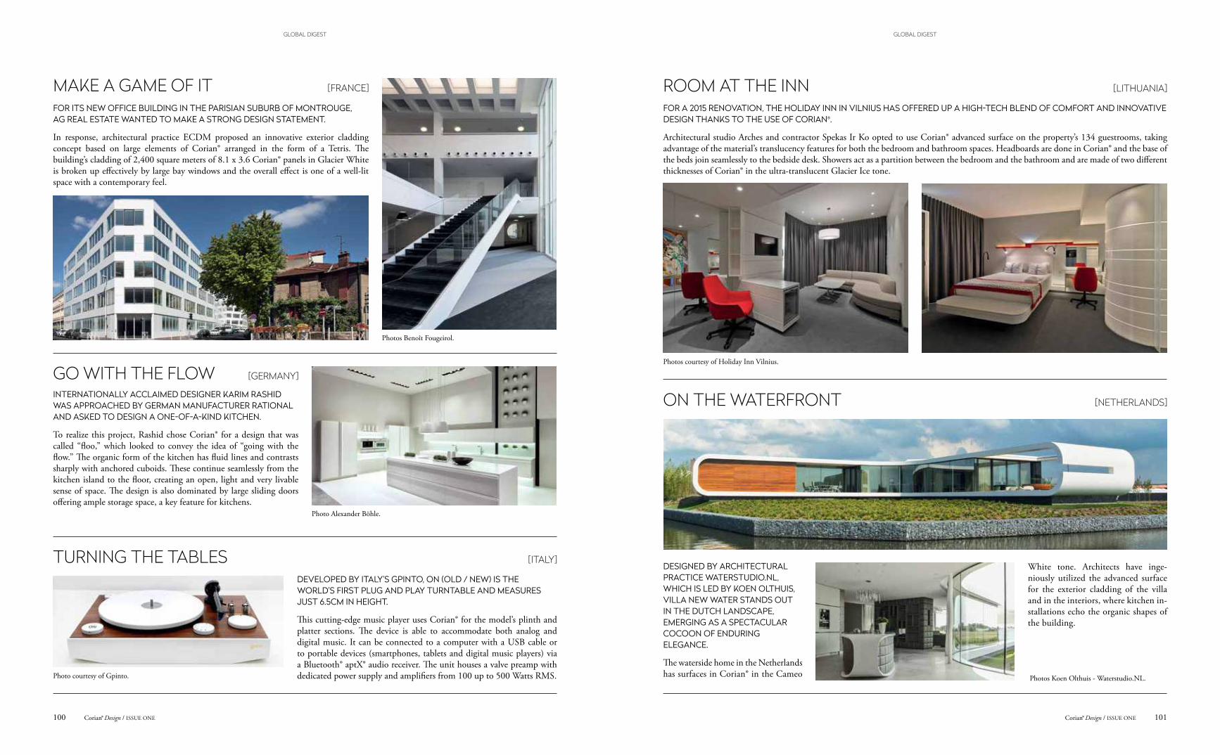
Photos courtesy of Holiday Inn Vilnius.
Photos Koen Olthuis - Waterstudio.NL.
Photos Benoît Fougeirol.
Photo Alexander Böhle.
Photo courtesy of Gpinto.
MAKE A GAME OF IT [FRANCE]
FOR ITS NEW OFFICE BUILDING IN THE PARISIAN SUBURB OF MONTROUGE, AG REAL ESTATE WANTED TO MAKE A STRONG DESIGN STATEMENT.
In response, architectural practice ECDM proposed an innovative exterior cladding concept based on large elements of Corian® arranged in the form of a Tetris. The building’s cladding of 2,400 square meters of 8.1 x 3.6 Corian® panels in Glacier White is broken up effectively by large bay windows and the overall effect is one of a well-lit space with a contemporary feel.
GO WITH THE FLOW [GERMANY]
INTERNATIONALLY ACCLAIMED DESIGNER KARIM RASHID WAS APPROACHED BY GERMAN MANUFACTURER RATIONAL AND ASKED TO DESIGN A ONE-OF-A-KIND KITCHEN.
To realize this project, Rashid chose Corian® for a design that was called “floo,” which looked to convey the idea of “going with the flow.” The organic form of the kitchen has fluid lines and contrasts sharply with anchored cuboids. These continue seamlessly from the kitchen island to the floor, creating an open, light and very livable sense of space. The design is also dominated by large sliding doors offering ample storage space, a key feature for kitchens.
TURNING THE TABLES [ITALY]
DEVELOPED BY ITALY’S GPINTO, ON (OLD / NEW) IS THE WORLD’S FIRST PLUG AND PLAY TURNTABLE AND MEASURES JUST 6.5CM IN HEIGHT.
This cutting-edge music player uses Corian® for the model’s plinth and platter sections. The device is able to accommodate both analog and digital music. It can be connected to a computer with a USB cable or to portable devices (smartphones, tablets and digital music players) via a Bluetooth® aptX® audio receiver. The unit houses a valve preamp with dedicated power supply and amplifiers from 100 up to 500 Watts RMS.
ROOM AT THE INN [LITHUANIA]
FOR A 2015 RENOVATION, THE HOLIDAY INN IN VILNIUS HAS OFFERED UP A HIGH-TECH BLEND OF COMFORT AND INNOVATIVE DESIGN THANKS TO THE USE OF CORIAN®.
Architectural studio Arches and contractor Spekas Ir Ko opted to use Corian® advanced surface on the property’s 134 guestrooms, taking advantage of the material’s translucency features for both the bedroom and bathroom spaces. Headboards are done in Corian® and the base of the beds join seamlessly to the bedside desk. Showers act as a partition between the bedroom and the bathroom and are made of two different thicknesses of Corian® in the ultra-translucent Glacier Ice tone.
ON THE WATERFRONT [NETHERLANDS]
DESIGNED BY ARCHITECTURAL PRACTICE WATERSTUDIO.NL, WHICH IS LED BY KOEN OLTHUIS, VILLA NEW WATER STANDS OUT IN THE DUTCH LANDSCAPE, EMERGING AS A SPECTACULAR COCOON OF ENDURING ELEGANCE.
The waterside home in the Netherlands has surfaces in Corian® in the Cameo
White tone. Architects have inge-niously utilized the advanced surface for the exterior cladding of the villa and in the interiors, where kitchen in-stallations echo the organic shapes of the building.
101Corian® Design / ISSUE ONECorian® Design / ISSUE ONE100
GLOBAL DIGESTGLOBAL DIGEST
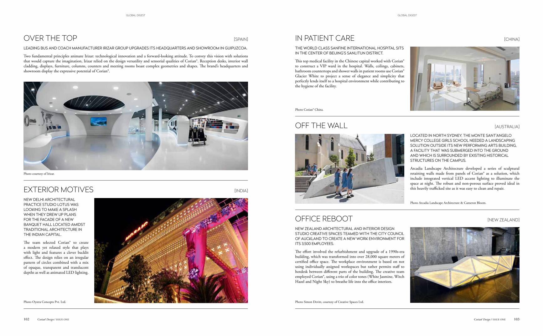
Photo Corian® China.
Photo Arcadia Landscape Architecture & Cameron Bloom.
Photo Simon Devitt, courtesy of Creative Spaces Ltd.
Photo courtesy of Irizar.
Photo Oystra Concepts Pvt. Ltd.
OVER THE TOP [SPAIN]
LEADING BUS AND COACH MANUFACTURER IRIZAR GROUP UPGRADES ITS HEADQUARTERS AND SHOWROOM IN GUIPUZCOA.
Two fundamental principles animate Irizar: technological innovation and a forward-looking attitude. To convey this vision with solutions that would capture the imagination, Irizar relied on the design versatility and sensorial qualities of Corian®. Reception desks, interior wall cladding, displays, furniture, columns, counters and meeting rooms boast complex geometries and shapes. The brand’s headquarters and showroom display the expressive potential of Corian®.
EXTERIOR MOTIVES [INDIA]
NEW DELHI ARCHITECTURAL PRACTICE STUDIO LOTUS WAS LOOKING TO MAKE A SPLASH WHEN THEY DREW UP PLANS FOR THE FACADE OF A NEW BANQUET HALL LOCATED AMIDST TRADITIONAL ARCHITECTURE IN THE INDIAN CAPITAL.
The team selected Corian® to create a modern yet relaxed style that plays with light and features a clever backlit effect. The design relies on an irregular pattern of circles combined with a mix of opaque, transparent and translucent depths as well as animated LED lighting.
IN PATIENT CARE [CHINA]
THE WORLD CLASS SANFINE INTERNATIONAL HOSPITAL SITS IN THE CENTER OF BEIJING’S SANLITUN DISTRICT.
This top medical facility in the Chinese capital worked with Corian® to construct a VIP ward in the hospital. Walls, ceilings, cabinets, bathroom countertops and shower walls in patient rooms use Corian® Glacier White to project a sense of elegance and simplicity that perfectly lends itself to a hospital environment while contributing to the hygiene of the facility.
OFF THE WALL [AUSTRALIA]
LOCATED IN NORTH SYDNEY, THE MONTE SANT’ANGELO MERCY COLLEGE GIRLS SCHOOL NEEDED A LANDSCAPING SOLUTION OUTSIDE ITS NEW PERFORMING ARTS BUILDING, A FACILITY THAT WAS SUBMERGED INTO THE GROUND AND WHICH IS SURROUNDED BY EXISTING HISTORICAL STRUCTURES ON THE CAMPUS.
Arcadia Landscape Architecture developed a series of sculptural retaining walls made from panels of Corian® as a solution, which include integrated vertical LED accent lighting to illuminate the space at night. The robust and non-porous surface proved ideal in this heavily trafficked site as it was easy to clean and repair.
OFFICE REBOOT [NEW ZEALAND]
NEW ZEALAND ARCHITECTURAL AND INTERIOR DESIGN STUDIO CREATIVE SPACES TEAMED WITH THE CITY COUNCIL OF AUCKLAND TO CREATE A NEW WORK ENVIRONMENT FOR ITS 3,500 EMPLOYEES.
The effort involved the refurbishment and upgrade of a 1990s-era building, which was transformed into over 28,000 square meters of certified office space. The workplace environment is based on not using individually assigned workspaces but rather permits staff to hotdesk between different parts of the building. The creative team employed Corian®, using a trio of color tones (White Jasmine, Witch Hazel and Night Sky) to breathe life into the office interiors.
103Corian® Design / ISSUE ONECorian® Design / ISSUE ONE102
GLOBAL DIGESTGLOBAL DIGEST
Cuadrante de San Francisco No.14, Int 1Col. Cuadranta de San FranciscoAlcaldía: CoyoacánC.P. 04320, CDMXTels: (55) 5554 5858 / (55) 55443737
DONDE COMPRAR
Related Documents