THE BIG-R BOOK FROM DATA SCIENCE TO LEARNING MACHINES AND BIG DATA — PART — Dr. Philippe J.S. De Brouwer last compiled: September , Version .. (c) Philippe J.S. De Brouwer – distribution allowed by John Wiley & Sons, Inc.

Welcome message from author
This document is posted to help you gain knowledge. Please leave a comment to let me know what you think about it! Share it to your friends and learn new things together.
Transcript

THE BIG-R BOOKFROM DATA SCIENCE TO LEARNING MACHINES AND BIG DATA
— PART 05—
Dr. Philippe J.S. De Brouwerlast compiled: September 1, 2021Version 0.1.1
(c) 2021 Philippe J.S. De Brouwer – distribution allowed by John Wiley & Sons, Inc.

THE BIG R-BOOK:From Data Science to Big Data and Learning
Machines
�— PART 05: Modelling —�
(c) 2021 by Philippe J.S. De Brouwer – distribution allowed by John Wiley & Sons, Inc.
These slides are to be used in with the book – for best experience, teachers will read the book before using the slides and students have access to thebook and the code.
© Dr. Philippe J.S. De Brouwer 2/296

The Big R-Book by Philippe J.S. De Brouwer
part 05: Modelling↓
chapter 21:
Regression Models
© Dr. Philippe J.S. De Brouwer 3/296

The Big R-Book by Philippe J.S. De Brouwer
part 05: Modelling
↓
chapter 21: Regression Models
↓
section 1:
Linear Regression
© Dr. Philippe J.S. De Brouwer 4/296

Linear Regression
With a linear regression we try to estimate an unknown variable, y, (also “dependent variable”) based on a knownvariable, x, (also “independent variable”) and some constants (a and b). Its form is
y = ax + b
© Dr. Philippe J.S. De Brouwer 5/296
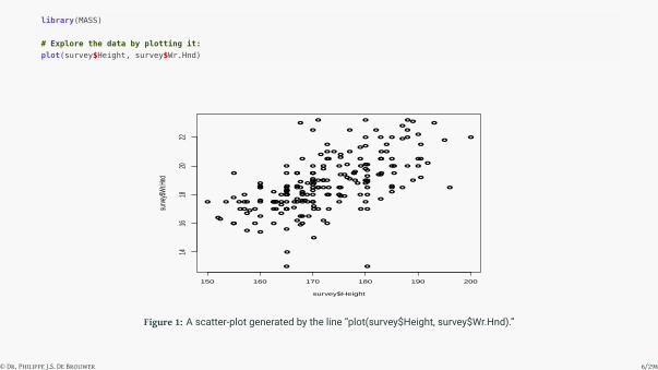
library(MASS)
# Explore the data by plotting it:
plot(survey$Height, survey$Wr.Hnd)
●
●
●
●
●
●
●
●
●
●
●
●
●
●
●
●
●
●
●
●
●
●●
●
●
●
●
●
●
●
●
●
●
●
●
●
●
●
●
●●
●
●
●
●
●
●
●
●
●
●
●
●
●
●
●
● ●
●
●
●
●
●
●
●
●
●
●
●
●
●
● ●
●
●
● ●
●
●
●
● ●
●
●
●
●●
●
●
●
●
●
●
●
●
●
● ●
●
●
●
●
●
●
●
●
●
●
●
●
●
●
●
●
●
●
●
●
●
●
●
●
●
●
●
●
●
●●
●
●
●
●
●
●
●
●
●
●
●
●
●
●
●
●
●
●●
●
●
●
●
●
●
●
●
●
●
●
●
●
●
●
●
●
●
●
●
●
●
●
●
●
●
●
●
●
●
●
●
●● ● ●
●
●
●
●
●
●
●
●
●●
●
●●
●
●
● ●●
●●
●
●
●
●
150 160 170 180 190 200
1416
1820
22
survey$Height
surve
y$W
r.Hnd
Figure 1: A scatter-plot generated by the line “plot(survey$Height, survey$Wr.Hnd).”
© Dr. Philippe J.S. De Brouwer 6/296

# Create the model:
lm1 <- lm (formula = Wr.Hnd ~ Height, data = survey)
summary(lm1)
##
## Call:
## lm(formula = Wr.Hnd ~ Height, data = survey)
##
## Residuals:
## Min 1Q Median 3Q Max
## -6.6698 -0.7914 -0.0051 0.9147 4.8020
##
## Coefficients:
## Estimate Std. Error t value Pr(>|t|)
## (Intercept) -1.23013 1.85412 -0.663 0.508
## Height 0.11589 0.01074 10.792 <2e-16 ***## ---
## Signif. codes: 0 '***' 0.001 '**' 0.01 '*' 0.05 '.' 0.1 ' ' 1
##
## Residual standard error: 1.525 on 206 degrees of freedom
## (29 observations deleted due to missingness)
## Multiple R-squared: 0.3612,Adjusted R-squared: 0.3581
## F-statistic: 116.5 on 1 and 206 DF, p-value: < 2.2e-16
© Dr. Philippe J.S. De Brouwer 7/296

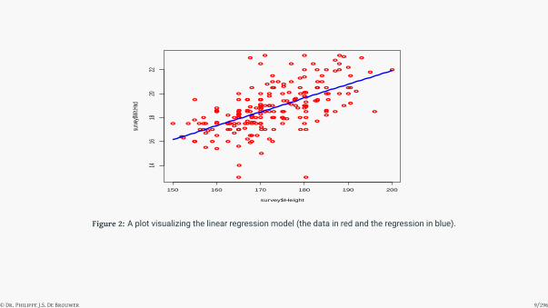
# Create predictions:
h <- data.frame(Height = 150:200)
Wr.lm <- predict(lm1, h)
# Show the results:
plot(survey$Height, survey$Wr.Hnd,col="red")
lines(t(h),Wr.lm,col="blue",lwd = 3)
© Dr. Philippe J.S. De Brouwer 8/296
●
●
●
●
●
●
●
●
●
●
●
●
●
●
●
●
●
●
●
●
●
●●
●
●
●
●
●
●
●
●
●
●
●
●
●
●
●
●
●●
●
●
●
●
●
●
●
●
●
●
●
●
●
●
●
● ●
●
●
●
●
●
●
●
●
●
●
●
●
●
● ●
●
●
● ●
●
●
●
● ●
●
●
●
●●
●
●
●
●
●
●
●
●
●
● ●
●
●
●
●
●
●
●
●
●
●
●
●
●
●
●
●
●
●
●
●
●
●
●
●
●
●
●
●
●
●●
●
●
●
●
●
●
●
●
●
●
●
●
●
●
●
●
●
●●
●
●
●
●
●
●
●
●
●
●
●
●
●
●
●
●
●
●
●
●
●
●
●
●
●
●
●
●
●
●
●
●
●● ● ●
●
●
●
●
●
●
●
●
●●
●
●●
●
●
● ●●
●●
●
●
●
●
150 160 170 180 190 200
1416
1820
22
survey$Height
surve
y$W
r.Hnd
Figure 2: A plot visualizing the linear regression model (the data in red and the regression in blue).
© Dr. Philippe J.S. De Brouwer 9/296

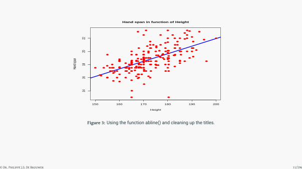
# Or use the function abline()
plot(survey$Height, survey$Wr.Hnd,col = "red",
main = "Hand span in function of Height",
abline(lm(survey$Wr.Hnd ~ survey$Height ),
col='blue',lwd = 3),
cex = 1.3,pch = 16,
xlab = "Height",ylab ="Hand span")
© Dr. Philippe J.S. De Brouwer 10/296
●
●
●
●
●●
●
●
●
●
●
●
●
●
●
●
●
●
●
●
●
●●
●
●
●
●
●
●
●
●
●
●●
●
●
●
●
●
●●
●
●
●
●
●
●
●
●
●
●
●
●
●
●
●
● ●
●
●
●
●
●
●
●
●●
●
●
●
●
● ●●
●
● ●
●
●
●
● ●
●
●
●
●●
●
●
●
●
●
●
●
●
●
●●
●
●
●
●
●
●
●
●
●
●
●
●
●
●
●
●
●
●
●
●
●
●●
●
●
●
●
●
●
●●
●
●
●
●
●
●
●
●
●
●
●
●
●
●
●
●
●
●●
●
●
●
●
●
●
●●
●
●
●
●
●
●
●
●
●
●
●
●
●●
●●
●
●
●
●
●
●
●
●
●● ● ●
●
●
●
●
●
●
●
●
●●
●
●●
●
●
● ●●
●●
●
●
●
●
150 160 170 180 190 200
1416
1820
22
Hand span in function of Height
Height
Hand
span
Figure 3: Using the function abline() and cleaning up the titles.
© Dr. Philippe J.S. De Brouwer 11/296

Question #1 – Build a linear model
Consider the data set mtcars from the library MASS. Make a linear regression of the fuel consumptionin function of the parameter that according to you has the most explanatory power. Study the residuals.What is your conclusion?
© Dr. Philippe J.S. De Brouwer 12/296

The Big R-Book by Philippe J.S. De Brouwer
part 05: Modelling
↓
chapter 21: Regression Models
↓
section 2:
Multiple Linear Regression
© Dr. Philippe J.S. De Brouwer 13/296

Multiple Linear Regression
Multiple regression is a relationship between more than two known variables (independent variables) to predictone variable (dependent variable). The generic form of the model is:
y = b + a1x1 + a2x2 + · · ·+ anxn
In R, the lm() function will handle this too. All we need to do is update the parameter formula:
# We use mtcars from the library MASS
model <- lm(mpg ~ disp + hp + wt, data = mtcars)
print(model)
##
## Call:
## lm(formula = mpg ~ disp + hp + wt, data = mtcars)
##
## Coefficients:
## (Intercept) disp hp wt
## 37.105505 -0.000937 -0.031157 -3.800891
© Dr. Philippe J.S. De Brouwer 14/296

Note also that all coefficients and intercept can be accessed via the function coef():
# Accessing the coefficients
intercept <- coef(model)[1]
a_disp <- coef(model)[2]
a_hp <- coef(model)[3]
a_wt <- coef(model)[4]
paste('MPG =', intercept, '+', a_disp, 'x disp +',
a_hp,'x hp +', a_wt, 'x wt')
## [1] "MPG = 37.1055052690318 + -0.000937009081489667 x disp + -0.0311565508299456 x hp + -3.80089058263761 x wt"
© Dr. Philippe J.S. De Brouwer 15/296

# This allows us to manually predict the fuel consumption
# e.g. for the Mazda Rx4
2.23 + a_disp * 160 + a_hp * 110 + a_wt * 2.62
## disp
## -11.30548
© Dr. Philippe J.S. De Brouwer 16/296

Exercise: multiple linear regression
Question #2 – Build a multiple linear regression
Consider the data set mtcars from the library MASS. Make a linear regression that predicts the fuel con-sumption of a car. Make sure to include only significant variables and remember that the significance ofa variable depends on the other variables in the model.
© Dr. Philippe J.S. De Brouwer 17/296

Poisson Regression
Definition 1 (Poisson Regression)
The general form of the Poisson Regression is
log(y) = b + a1x1 + a2x2 + bnxn
with:• y: the predicted variable (aka response variable, independent variable, or unknown variable)• a and b are the numeric coefficients.• x is the known variabl, aka the predictor variable, or independent variable.
© Dr. Philippe J.S. De Brouwer 18/296

the Poisson Regression in R
The Poisson Regression can be handled by the function glm() in R, its general form is as follows.
Function use for glm()
glm(formula, data, family)
where:• formula is the symbolic representation the relationship between the variables,• data is the dataset giving the values of these variables,• family is R object to specify the details of the model and for the Poisson Regression is value is
“Poisson”.
© Dr. Philippe J.S. De Brouwer 19/296

Example i
Consider a simple example, where we want to check if we can estimate the number of cylinders of a car based onits horse power and weight, using the dataset mtcars
© Dr. Philippe J.S. De Brouwer 20/296

Example ii
m <- glm(cyl ~ hp + wt, data = mtcars, family = "poisson")
summary(m)
##
## Call:
## glm(formula = cyl ~ hp + wt, family = "poisson", data = mtcars)
##
## Deviance Residuals:
## Min 1Q Median 3Q Max
## -0.59240 -0.31647 -0.00394 0.29820 0.68731
##
## Coefficients:
## Estimate Std. Error z value Pr(>|z|)
## (Intercept) 1.064836 0.257317 4.138 3.5e-05 ***## hp 0.002220 0.001264 1.756 0.079 .
## wt 0.124722 0.090127 1.384 0.166
## ---
## Signif. codes: 0 '***' 0.001 '**' 0.01 '*' 0.05 '.' 0.1 ' ' 1
##
## (Dispersion parameter for poisson family taken to be 1)
##
## Null deviance: 16.5743 on 31 degrees of freedom
## Residual deviance: 4.1923 on 29 degrees of freedom
## AIC: 126.85
##
## Number of Fisher Scoring iterations: 4
© Dr. Philippe J.S. De Brouwer 21/296

Example iii
Weight does not seem to be relevant, so we drop it and try again (only using horse power):
m <- glm(cyl ~ hp, data = mtcars, family = "poisson")
summary(m)
##
## Call:
## glm(formula = cyl ~ hp, family = "poisson", data = mtcars)
##
## Deviance Residuals:
## Min 1Q Median 3Q Max
## -0.97955 -0.30748 -0.03387 0.28155 0.73433
##
## Coefficients:
## Estimate Std. Error z value Pr(>|z|)
## (Intercept) 1.3225669 0.1739422 7.603 2.88e-14 ***## hp 0.0032367 0.0009761 3.316 0.000913 ***## ---
## Signif. codes: 0 '***' 0.001 '**' 0.01 '*' 0.05 '.' 0.1 ' ' 1
##
## (Dispersion parameter for poisson family taken to be 1)
##
## Null deviance: 16.5743 on 31 degrees of freedom
## Residual deviance: 6.0878 on 30 degrees of freedom
## AIC: 126.75
##
## Number of Fisher Scoring iterations: 4
© Dr. Philippe J.S. De Brouwer 22/296

Example iv
© Dr. Philippe J.S. De Brouwer 23/296

Syntax of Non-Linear Regression
Function use for nls()
nls(formula, data, start) with
1 formula a non-linear model formula including variables and parameters,
2 data the data-frame used to optimize the model,
3 start a named list or named numeric vector of starting estimates.
© Dr. Philippe J.S. De Brouwer 24/296

Example for nls() i
# Consider observations for dt = d0 + v0 t + 1/2 a t^2
t <- c(1,2,3,4,5,1.5,2.5,3.5,4.5,1)
dt <- c(8.1,24.9,52,89.2,136.1,15.0,37.0,60.0,111.0,8)
# Plot these values.
plot(t, dt, xlab = "time", ylab = "distance")
# Take the assumed values and fit into the model.
model <- nls(dt ~ d0 + v0 * t + 1/2 * a * t^2,
start = list(d0 = 1,v0 = 3,a = 10))
# Plot the model curve
simulation.data <- data.frame(t = seq(min(t),max(t),len = 100))
lines(simulation.data$t,predict(model,
newdata = simulation.data), col = "red", lwd = 3)
© Dr. Philippe J.S. De Brouwer 25/296

Example for nls() ii
●
●
●
●
●
●
●
●
●
●
1 2 3 4 5
2040
6080
100
120
140
time
distan
ce
Figure 4: The results of the non-linear regression with nls(). This plot indicates that there is one outlier and you might want torerun the model without this observation.
© Dr. Philippe J.S. De Brouwer 26/296

Example for nls() iii
The model seems to fit quite well the data. As usual, we can extract more information from the model object viathe functions summary() and/or print().
© Dr. Philippe J.S. De Brouwer 27/296

Example for nls() iv
# Learn about the model:
summary(model) # the summary
##
## Formula: dt ~ d0 + v0 * t + 1/2 * a * t^2
##
## Parameters:
## Estimate Std. Error t value Pr(>|t|)
## d0 4.981 4.660 1.069 0.321
## v0 -1.925 3.732 -0.516 0.622
## a 11.245 1.269 8.861 4.72e-05 ***## ---
## Signif. codes: 0 '***' 0.001 '**' 0.01 '*' 0.05 '.' 0.1 ' ' 1
##
## Residual standard error: 3.056 on 7 degrees of freedom
##
## Number of iterations to convergence: 1
## Achieved convergence tolerance: 1.822e-07
print(sum(residuals(model)^2))# squared sum of residuals
## [1] 65.39269
print(confint(model)) # confidence intervals
## 2.5% 97.5%
## d0 -6.038315 15.999559
## v0 -10.749091 6.899734
## a 8.244167 14.245927
© Dr. Philippe J.S. De Brouwer 28/296

The Big R-Book by Philippe J.S. De Brouwer
part 05: Modelling
↓
chapter 21: Regression Models
↓
section 3:
Performance of Regression Models
© Dr. Philippe J.S. De Brouwer 29/296

Mean Square Error (MSE)
Definition 2 (Mean Square Error (MSE))
The means square error is the average residual variance. The following is a predictor:
MSE(y, y) =1N
N∑k=1
(yk − y)2
© Dr. Philippe J.S. De Brouwer 30/296

R-squared for a model
Definition 3 (R-squared)
R-squared is the the proportion of the variance in the dependent variable that is predictable from the independentvariable(s). We can calculate R-squared as:
R2 = 1−∑N
k=1 (yk − y)2∑Nk=1 (yk − y)2
with yk the estimate for observation yk based on our model, and yk the mean of all observations yk.
© Dr. Philippe J.S. De Brouwer 31/296

Example
m <- lm(data = mtcars, formula = mpg ~ wt)
summary(m)
##
## Call:
## lm(formula = mpg ~ wt, data = mtcars)
##
## Residuals:
## Min 1Q Median 3Q Max
## -4.5432 -2.3647 -0.1252 1.4096 6.8727
##
## Coefficients:
## Estimate Std. Error t value Pr(>|t|)
## (Intercept) 37.2851 1.8776 19.858 < 2e-16 ***## wt -5.3445 0.5591 -9.559 1.29e-10 ***## ---
## Signif. codes: 0 '***' 0.001 '**' 0.01 '*' 0.05 '.' 0.1 ' ' 1
##
## Residual standard error: 3.046 on 30 degrees of freedom
## Multiple R-squared: 0.7528,Adjusted R-squared: 0.7446
## F-statistic: 91.38 on 1 and 30 DF, p-value: 1.294e-10
summary(m)$r.squared
## [1] 0.7528328
© Dr. Philippe J.S. De Brouwer 32/296

Exercise: model performance for linear regression
Question #3 – Find a better model
Use the dataset mtcars (from the library MASS), and try to find themodel that best explains the consump-tion (mpg).
© Dr. Philippe J.S. De Brouwer 33/296

Mean Average Deviation (MAD)
Definition 4 (Mean average deviation (MAD))
MAD(y, y) :=1N
N∑k=1
|yk − y|
© Dr. Philippe J.S. De Brouwer 34/296

The Big R-Book by Philippe J.S. De Brouwer
part 05: Modelling↓
chapter 22:
Classification Models
© Dr. Philippe J.S. De Brouwer 35/296

The Big R-Book by Philippe J.S. De Brouwer
part 05: Modelling
↓
chapter 22: Classification Models
↓
section 1:
Logistic Regression
© Dr. Philippe J.S. De Brouwer 36/296

Generalized form of the Logistic Regression
Definition 5 (– Generalised logistic regression)
A logistic regression, is a regression of the log-odds:
ln
{P[Y = 1|X]
P[Y = 0|X]
}= α+
N∑n=1
fn(Xn)
with X = (X1,X2, . . . ,XN) the set of prognostic factors.
© Dr. Philippe J.S. De Brouwer 37/296
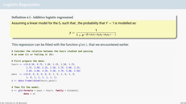
Logistic Regression
Definition 6 (– Additive logistic regression)
Assuming a linear model for the fn such that , the probability that Y = 1 is modelled as:
y =1
1 + e−(b+a1x1+a2x2+a3x3+··· )
This regression can be fitted with the function glm(), that we encountered earlier.
# Consider the relation between the hours studied and passing
# an exam (1) or failing it (0):
# First prepare the data:
hours <- c(0,0.50, 0.75, 1.00, 1.25, 1.50, 1.75,
1.75, 2.00, 2.25, 2.50, 2.75, 3.00, 3.25,
3.50, 4.00, 4.25, 4.50, 4.75, 5.00, 5.50)
pass <- c(0,0, 0, 0, 0, 0, 0, 1, 0, 1, 0, 1, 0,
1, 0, 1, 1, 1, 1, 1, 1)
d <- data.frame(cbind(hours,pass))
# Then fit the model:
m <- glm(formula = pass ~ hours, family = binomial,
data = d)
© Dr. Philippe J.S. De Brouwer 38/296

# Visualize the results:
plot(hours, pass, col = "red", pch = 23, bg = "grey",
xlab = 'Hours studied',
ylab = 'Passed exam (1) or not (0)')
pred <- 1 / (1+ exp(-(coef(m)[1] + hours * coef(m)[2])))
lines(hours, pred, col = "blue", lwd = 4)
0 1 2 3 4 5
0.00.2
0.40.6
0.81.0
Hours studied
Pass
ed ex
am (1
) or n
ot (0)
Figure 5: The grey diamonds with red border are the data-points (not passed is 0 and passed is 1) and the blue line represents thelogistic regression model (or the probability to succeed the exam in function of the hours studied.
© Dr. Philippe J.S. De Brouwer 39/296

The Big R-Book by Philippe J.S. De Brouwer
part 05: Modelling
↓
chapter 22: Classification Models
↓
section 2:
Performance of Binary Classification Models
© Dr. Philippe J.S. De Brouwer 40/296

The Example for this Section i
In the following sections we will use the dataset from the package titanic. This is data of the passengers onthe RMS Titanic, that sunk in 1929 in the Northern Atlantic Ocean after a collision with an iceberg.The data can be unlocked as follows:
# if necessary: install.packages('titanic')
library(titanic)
# This provides a.o. two datasets titanic_train and titanic_test.
# We will work further with the training-dataset.
t <- titanic_train
colnames(t)
## [1] "PassengerId" "Survived" "Pclass" "Name"
## [5] "Sex" "Age" "SibSp" "Parch"
## [9] "Ticket" "Fare" "Cabin" "Embarked"
© Dr. Philippe J.S. De Brouwer 41/296

Fitting a Logistic Regression on the Titanic data
# fit provide a simple model
m <- glm(data = t,
formula = Survived ~ Pclass + Sex + Pclass * Sex + Age + SibSp,
family = binomial)
summary(m)
##
## Call:
## glm(formula = Survived ~ Pclass + Sex + Pclass * Sex + Age +
## SibSp, family = binomial, data = t)
##
## Deviance Residuals:
## Min 1Q Median 3Q Max
## -3.3507 -0.6574 -0.4438 0.4532 2.3450
##
## Coefficients:
## Estimate Std. Error z value Pr(>|z|)
## (Intercept) 8.487528 0.996601 8.516 < 2e-16 ***## Pclass -2.429192 0.330221 -7.356 1.89e-13 ***## Sexmale -6.162294 0.929696 -6.628 3.40e-11 ***## Age -0.046830 0.008603 -5.443 5.24e-08 ***## SibSp -0.354855 0.120373 -2.948 0.0032 **## Pclass:Sexmale 1.462084 0.349338 4.185 2.85e-05 ***## ---
## Signif. codes: 0 '***' 0.001 '**' 0.01 '*' 0.05 '.' 0.1 ' ' 1
##
## (Dispersion parameter for binomial family taken to be 1)
##
## Null deviance: 964.52 on 713 degrees of freedom
## Residual deviance: 614.22 on 708 degrees of freedom
## (177 observations deleted due to missingness)
## AIC: 626.22
##
## Number of Fisher Scoring iterations: 6
© Dr. Philippe J.S. De Brouwer 42/296

Useful Concepts for the Confusion Matrix
The following are useful measures for how good a classification model fits its data:
• Accuracy: The proportion of predictions that were correctly identified.• Precision (or positive predictive value): The proportion of positive cases that correct.• Negative predictive value: The proportion of negative cases that were correctly identified.• Sensitivity or Recall: The proportion of actual positive cases which are correctly identified.• Specificity: The proportion of actual negative cases which are correctly identified.
© Dr. Philippe J.S. De Brouwer 43/296
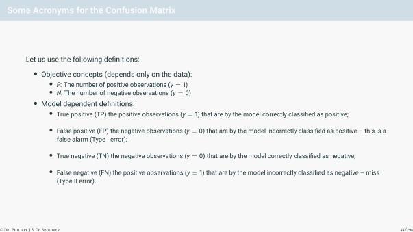
Some Acronyms for the Confusion Matrix
Let us use the following definitions:
• Objective concepts (depends only on the data):• P: The number of positive observations (y = 1)• N: The number of negative observations (y = 0)
• Model dependent definitions:• True positive (TP) the positive observations (y = 1) that are by the model correctly classified as positive;
• False positive (FP) the negative observations (y = 0) that are by the model incorrectly classified as positive – this is afalse alarm (Type I error);
• True negative (TN) the negative observations (y = 0) that are by the model correctly classified as negative;
• False negative (FN) the positive observations (y = 1) that are by the model incorrectly classified as negative – miss(Type II error).
© Dr. Philippe J.S. De Brouwer 44/296
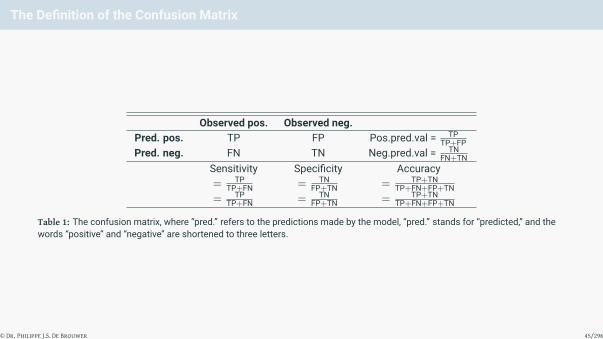
The Definition of the Confusion Matrix
Observed pos. Observed neg.Pred. pos. TP FP Pos.pred.val = TP
TP+FPPred. neg. FN TN Neg.pred.val = TN
FN+TNSensitivity Specificity Accuracy= TP
TP+FN = TNFP+TN = TP+TN
TP+FN+FP+TN= TP
TP+FN = TNFP+TN = TP+TN
TP+FN+FP+TN
Table 1: The confusion matrix, where “pred.” refers to the predictions made by the model, “pred.” stands for “predicted,” and thewords “positive” and “negative” are shortened to three letters.
© Dr. Philippe J.S. De Brouwer 45/296

The Confusion Matrix in R
# We build further on the model m.
# Predict scores between 0 and 1 (odds):
t2 <- t[complete.cases(t),]
predicScore <- predict(object=m,type="response", newdat = t2)
# Introduce a cut-off level above which we assume survival:
predic <- ifelse(predicScore > 0.7, 1, 0)
# The confusion matrix is one line, the headings 2:
confusion_matrix <- table(predic, t2$Survived)
rownames(confusion_matrix) <- c("predicted_death",
"predicted_survival")
colnames(confusion_matrix) <- c("observed_death",
"observed_survival")
# Display the result:
print(confusion_matrix)
##
## predic observed_death observed_survival
## predicted_death 414 134
## predicted_survival 10 156
© Dr. Philippe J.S. De Brouwer 46/296
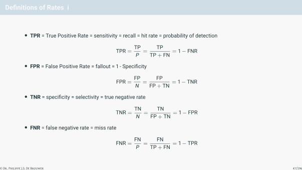
Definitions of Rates i
• TPR = True Positive Rate = sensitivity = recall = hit rate = probability of detection
TPR =TPP
=TP
TP + FN= 1− FNR
• FPR = False Positive Rate = fallout = 1 - Specificity
FPR =FPN
=FP
FP + TN= 1− TNR
• TNR = specificity = selectivity = true negative rate
TNR =TNN
=TN
FP + TN= 1− FPR
• FNR = false negative rate = miss rate
FNR =FNP
=FN
TP + FN= 1− TPR
© Dr. Philippe J.S. De Brouwer 47/296

Definitions of Rates ii
• Precision = positive predictive value = PPV
PPV =TP
TP + FP
• Negative predictive value = NPV
NPV =TN
TN + FN• ACC = accuracy
ACC =TP + TNN + P
=TP + TN
TP + TN + FP + FN• F1 score = harmonic mean of precision and sensitivity
F1 =PPV× TPRPPV + TPR
=2 TP
2 TP + FP + FN
© Dr. Philippe J.S. De Brouwer 48/296

Definitions for the ROC Curve
The ROC curve is formed by plotting the true positive rate (TPR) against the false positive rate (FPR) at variouscut-off levels.1 Formally, the ROC curve is the interpolated curve made of points whose coordinates are functionsof the threshold: threshold = θ ∈ R, here θ ∈ [0, 1]
ROCx(θ) = FPR(θ) =FP(θ)
FP(θ) + TN(θ)=
FP(θ)
#N
ROCy(θ) = TPR(θ) =TP(θ)
FN(θ) + TP(θ)=
FP(θ)
#P= 1−
FN(θ)
#P= 1− FNR(θ)
© Dr. Philippe J.S. De Brouwer 49/296
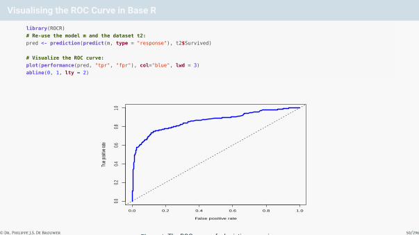
Visualising the ROC Curve in Base R
library(ROCR)
# Re-use the model m and the dataset t2:
pred <- prediction(predict(m, type = "response"), t2$Survived)
# Visualize the ROC curve:
plot(performance(pred, "tpr", "fpr"), col="blue", lwd = 3)
abline(0, 1, lty = 2)
False positive rate
True p
ositiv
e rate
0.0 0.2 0.4 0.6 0.8 1.0
0.00.2
0.40.6
0.81.0
Figure 6: The ROC curve of a logistic regression.© Dr. Philippe J.S. De Brouwer 50/296

Note: The Performance Object is an S4 Object
This object will know how it can be plotted (or rather “the function plot will dispactch th the relvant method”). Ifnecessary, then it can be converted to an a data frame as follows:
S4_perf <- performance(pred, "tpr", "fpr")
df <- data.frame(
x = [email protected],
y = [email protected],
)
colnames(df) <- c([email protected], [email protected], [email protected])
head(df)
## False positive rate True positive rate Cutoff
## 1 0.000000000 0.000000000 Inf
## 2 0.002358491 0.000000000 0.9963516
## 3 0.002358491 0.003448276 0.9953019
## 4 0.002358491 0.013793103 0.9950778
## 5 0.002358491 0.017241379 0.9945971
## 6 0.002358491 0.024137931 0.9943395
© Dr. Philippe J.S. De Brouwer 51/296

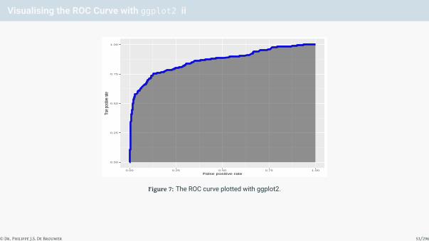
Visualising the ROC Curve with ggplot2 i
In a final report, it might be desirable to use the power of ggplot2 consistently. In the following code we illustratehow this a ROC curve can be obtained in ggplot2.2 The plot is in Figure 7 on slide 53.
library(ggplot2)
p <- ggplot(data=df,
aes(x = `False positive rate`, y = `True positive rate`)) +
geom_line(lwd=2, col='blue') +
# The next lines add the shading:
aes(x = `False positive rate`, ymin = 0,
ymax = `True positive rate`) +
geom_ribbon(, alpha=.5)
p
© Dr. Philippe J.S. De Brouwer 52/296
Visualising the ROC Curve with ggplot2 ii
0.00
0.25
0.50
0.75
1.00
0.00 0.25 0.50 0.75 1.00False positive rate
True p
ositiv
e rate
Figure 7: The ROC curve plotted with ggplot2.
© Dr. Philippe J.S. De Brouwer 53/296
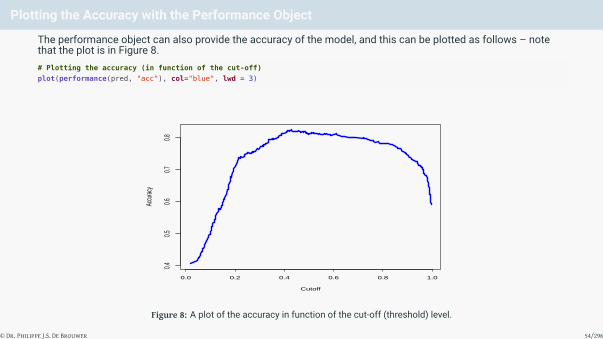
Plotting the Accuracy with the Performance Object
The performance object can also provide the accuracy of the model, and this can be plotted as follows – notethat the plot is in Figure 8.# Plotting the accuracy (in function of the cut-off)
plot(performance(pred, "acc"), col="blue", lwd = 3)
Cutoff
Accu
racy
0.0 0.2 0.4 0.6 0.8 1.0
0.40.5
0.60.7
0.8
Figure 8: A plot of the accuracy in function of the cut-off (threshold) level.
© Dr. Philippe J.S. De Brouwer 54/296

AUC in R i
# Assuming that we have the predictions in the prediction object:
plot(performance(pred, "tpr", "fpr"), col = "blue", lwd = 4)
abline(0, 1, lty = 2, lwd = 3)
x <- c(0.3, 0.1, 0.8)
y <- c(0.5, 0.9, 0.3)
text(x, y, labels = LETTERS[1:3], font = 2, cex = 3)
© Dr. Philippe J.S. De Brouwer 55/296

AUC in R ii
False positive rate
True p
ositiv
e rate
0.0 0.2 0.4 0.6 0.8 1.0
0.00.2
0.40.6
0.81.0
A
B
C
Figure 9: The area under the curve (AUC) is the area A plus the area C. In next section we characterise the Gini coeffient, whichequals area A divided by area C.
© Dr. Philippe J.S. De Brouwer 56/296

AUC in R iii
# Note: instead you can also call the function text() three times:
# text(x = 0.3, y = 0.5, labels = "A", font = 2, cex = 3)
# text(x = 0.1, y = 0.9, labels = "B", font = 2, cex = 3)
# text(x = 0.8, y = 0.3, labels = "C", font = 2, cex = 3)
© Dr. Philippe J.S. De Brouwer 57/296

The AUC in R
In R, the AUC in R is provided by the performance() function of ROCR and stored in the performance object. It isan S4 object, and hence we can extract the information as follows.
AUC <- attr(performance(pred, "auc"), "y.values")[[1]]
AUC
## [1] 0.8615241
© Dr. Philippe J.S. De Brouwer 58/296

The Gini Coefficient in R
In R, extracting the Gini coefficient from the performance object is trivial, given the AUC that we calculatedbefore. In fact, we can use the AUC to obtain the Gini:
paste("the Gini is:",round(2 * AUC - 1, 2))
## [1] "the Gini is: 0.72"
© Dr. Philippe J.S. De Brouwer 59/296

The Definition of KS
The Kolmogorov-Smirnov (KS) test is another measure that aims to summarize the power of a model in oneparameter. In general, the KS is the largest distance between two cumulative distribution functions:
KS = sup |F1(x)− F2(x)|
© Dr. Philippe J.S. De Brouwer 60/296
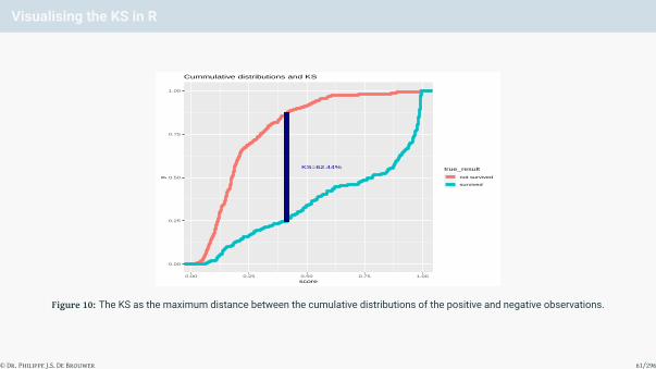
Visualising the KS in R
KS=62.44%
0.00
0.25
0.50
0.75
1.00
0.00 0.25 0.50 0.75 1.00score
ytrue_result
not survived
survived
Cummulative distributions and KS
Figure 10: The KS as the maximum distance between the cumulative distributions of the positive and negative observations.
© Dr. Philippe J.S. De Brouwer 61/296

Calculating the KS in R
The package stats from base R provides the functions ks.test() to calculate the KS.
pred <- prediction(predict(m,type="response"), t2$Survived)
ks.test(attr(pred,"predictions")[[1]],
t2$Survived,
alternative = 'greater')
##
## Two-sample Kolmogorov-Smirnov test
##
## data: attr(pred, "predictions")[[1]] and t2$Survived
## D^+ = 0.40616, p-value < 2.2e-16
## alternative hypothesis: the CDF of x lies above that of y
As you can see in the aforementioned code, this does not work in some cases. Fortunately, it is easy to constructan alternative:
perf <- performance(pred, "tpr", "fpr")
ks <- max(attr(perf,'y.values')[[1]] - attr(perf,'x.values')[[1]])
ks
## [1] 0.6243656
# Note: the following line yields the same outcome
ks <- max([email protected][[1]] - [email protected][[1]])
ks
## [1] 0.6243656
© Dr. Philippe J.S. De Brouwer 62/296

Naive Function to find the Optimal Cutoff i
# get_best_cutoff
# Finds a cutof for the score so that sensitivity and specificity
# are optimal.
# Arguments
# fpr -- numeric vector -- false positive rate
# tpr -- numeric vector -- true positive rate
# cutoff -- numeric vector -- the associated cutoff values
# Returns:
# the cutoff value (numeric)
get_best_cutoff <- function(fpr, tpr, cutoff){
cst <- (fpr - 0)^2 + (tpr - 1)^2
idx = which(cst == min(cst))
c(sensitivity = tpr[[idx]],
specificity = 1 - fpr[[idx]],
cutoff = cutoff[[idx]])
}
# opt_cut_off
# Wrapper for get_best_cutoff. Finds a cutof for the score so that
# sensitivity and specificity are optimal.
# Arguments:
# perf -- performance object (ROCR package)
# pred -- prediction object (ROCR package)
# Returns:
# The optimal cutoff value (numeric)
opt_cut_off = function(perf, pred){
mapply(FUN=get_best_cutoff,
pred@cutoffs)
}
© Dr. Philippe J.S. De Brouwer 63/296

Naive Function to find the Optimal Cutoff ii
We can now test the function as follows:
opt_cut_off(perf, pred)
## [,1]
## sensitivity 0.7517241
## specificity 0.8726415
## cutoff 0.4161801
© Dr. Philippe J.S. De Brouwer 64/296

The Optimal Cutoff in case of Dissimilar Costs for FPs and FNs i
# We introduce cost.fp to be understood as a the cost of a
# false positive, expressed as a multiple of the cost of a
# false negative.
# get_best_cutoff
# Finds a cutof for the score so that sensitivity and specificity
# are optimal.
# Arguments
# fpr -- numeric vector -- false positive rate
# tpr -- numeric vector -- true positive rate
# cutoff -- numeric vector -- the associated cutoff values
# cost.fp -- numeric -- cost of false positive divided
# by the cost of a false negative
# (default = 1)
# Returns:
# the cutoff value (numeric)
get_best_cutoff <- function(fpr, tpr, cutoff, cost.fp = 1){
cst <- (cost.fp * fpr - 0)^2 + (tpr - 1)^2
idx = which(cst == min(cst))
c(sensitivity = tpr[[idx]],
specificity = 1 - fpr[[idx]],
cutoff = cutoff[[idx]])
}
© Dr. Philippe J.S. De Brouwer 65/296
The Optimal Cutoff in case of Dissimilar Costs for FPs and FNs ii
# opt_cut_off
# Wrapper for get_best_cutoff. Finds a cutof for the score so that
# sensitivity and specificity are optimal.
# Arguments:
# perf -- performance object (ROCR package)
# pred -- prediction object (ROCR package)
# cost.fp -- numeric -- cost of false positive divided by the
# cost of a false negative (default = 1)
# Returns:
# The optimal cutoff value (numeric)
opt_cut_off = function(perf, pred, cost.fp = 1){
mapply(FUN=get_best_cutoff,
pred@cutoffs,
cost.fp)
}
© Dr. Philippe J.S. De Brouwer 66/296

The Optimal Cutoff in case of Dissimilar Costs for FPs and FNs iii
When false positives are more (or less) expensive than false negatives, then we can use our funtion as follows:
# Test the function:
opt_cut_off(perf, pred, cost.fp = 5)
## [,1]
## sensitivity 0.5793103
## specificity 0.9716981
## cutoff 0.6108004
© Dr. Philippe J.S. De Brouwer 67/296

Using ROCR with Dissimilar Costs for FPs and FNs
# e.g. cost.fp = 1 x cost.fn
perf_cst1 <- performance(pred, "cost", cost.fp = 1)
str(perf_cst1) # the cost is in the y-values
## Formal class 'performance' [package "ROCR"] with 6 slots
## ..@ x.name : chr "Cutoff"
## ..@ y.name : chr "Explicit cost"
## ..@ alpha.name : chr "none"
## ..@ x.values :List of 1
## .. ..$ : Named num [1:410] Inf 0.996 0.995 0.995 0.995 ...
## .. .. ..- attr(*, "names")= chr [1:410] "" "298" "690" "854" ...
## ..@ y.values :List of 1
## .. ..$ : num [1:410] 0.406 0.408 0.406 0.402 0.401 ...
## ..@ alpha.values: list()
# the optimal cut-off is then the same as in previous code sample
pred@cutoffs[[1]][which.min([email protected][[1]])]
## 738
## 0.4302302
# e.g. cost.fp = 5 x cost.fn
perf_cst2 <- performance(pred, "cost", cost.fp = 5)
# the optimal cut-off is now:
pred@cutoffs[[1]][which.min([email protected][[1]])]
## 306
## 0.7231593
© Dr. Philippe J.S. De Brouwer 68/296

Plotting Cost Information i
par(mfrow=c(2,1))
plot(perf_cst1, lwd=2, col='navy', main='(a) cost(FP) = cost(FN)')
plot(perf_cst2, lwd=2, col='navy', main='(b) cost(FP) = 5 x cost(FN)')
© Dr. Philippe J.S. De Brouwer 69/296
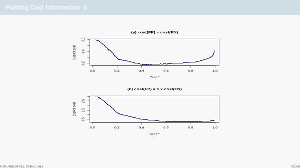
Plotting Cost Information ii
(a) cost(FP) = cost(FN)
CutoffEx
plicit
cost
0.0 0.2 0.4 0.6 0.8 1.0
0.2
0.4
0.6
(b) cost(FP) = 5 x cost(FN)
Cutoff
Expli
cit co
st
0.0 0.2 0.4 0.6 0.8 1.0
0.5
1.5
2.5
© Dr. Philippe J.S. De Brouwer 70/296

Plotting Cost Information iii
Figure 11: The cost functions compared different cost structures. In plot (a), we plotted the cost function when the cost of a falsepositive is equal to the cost of a false negative. In plot (b), a false positive costs five times more than a false negative (valid for aloan in a bank).
par(mfrow=c(1,1))
© Dr. Philippe J.S. De Brouwer 71/296

The Big R-Book by Philippe J.S. De Brouwer
part 05: Modelling↓
chapter 23:
Learning Machines
© Dr. Philippe J.S. De Brouwer 72/296

Forms of Learning
• Supervised learning: The algorithm will learn from provided results (e.g. we have data of good and bad creditcustomers)• Unsupervised learning: The algorithm groups observations according to a given criteria (e.g. the algorithm
classifies customers according to profitability without being told what good or bad is).• Reinforced learning: The algorithm learns from outcomes: rather than being told what is good or bad, the
system will get something like a cost-function (e.g. the result of a treatment, the result of a chess game, orthe relative return of a portfolio of investments in a competitive stock market). Another way of definingreinforced learning is that in this case, the environment rather than the teacher provides the right outcomes.
© Dr. Philippe J.S. De Brouwer 73/296

The Big R-Book by Philippe J.S. De Brouwer
part 05: Modelling
↓
chapter 23: Learning Machines
↓
section 1:
Decision Tree
© Dr. Philippe J.S. De Brouwer 74/296

The linear additive decision tree
y = f(x) =N∑
n=1
αnI {x ∈ Rn}
with x = (x1, . . . , xm) and I{b} the identity function so that I{b} :={ 1 if b
0 if !b
© Dr. Philippe J.S. De Brouwer 75/296

Visual representation of the decision tree
x1 < 0.33
x2 > 0.5
α1 α2
x1 < 0.66
α3 x2 < 1
α4 α5 (0, 0) (1, 0)
(1, 1)(0, 1)
x1
x2
R1
R2
R3
R4
R5
Figure 12: An example of the decision tree on fake data represented in two ways: on the left the decision tree and on the right theregions Ri that can be identified in the (x1, x2)-plane.
© Dr. Philippe J.S. De Brouwer 76/296

Growing a tree
1 goodness of fit: SS:∑
(yi − f(xi))2
2 estimate in each region Ri: yi = avg(yi|xi ∈ Ri)
3 best split: minj,s
[miny1
∑xi∈R1(j,s (yi − y1)2 + miny1
∑xi∈R2(j,s) (yi − y2)2
]4 For any pair (j, s) we can solve the minimizations with average as estimator:
{y1 = avg[yi|xi ∈ R1(j, s)]
y2 = avg[yi|xi ∈ R2(j, s)]
© Dr. Philippe J.S. De Brouwer 77/296

Tree Pruning i
The idea is to minimize the “cost of complexity function” for a given pruning parameter α. The cost function isdefined as
Cα(T) :=
|ET |∑n=1
SEn(T) + α|T| (1)
This is the sum of squares in each end-note plus α times the size of the tree. |T| is the number of terminal nodesin the sub-tree T (T is a subtree to T0 if T has only nodes of T0), |ET | is the number of end-nodes in the tree T andSEn(T) is the sum of squares in the end-node n for the tree T. The square errors in node n (or in region Rn) alsoequals:
SEn(T) = Nn MSEn(T)
= Nn1Nn
Nn∑xi∈Rn
(yi − yn)2
=
Nn∑xi∈Rn
(yi − yn)2
© Dr. Philippe J.S. De Brouwer 78/296

Tree Pruning ii
with yn the average of all yi in the region n as explained previously.
© Dr. Philippe J.S. De Brouwer 79/296

Classification Trees
In case the values yi do not come from a numerical function but are rather a nominal or ordinal scale,3 it is nolonger possible to use MSE as a measure of fitness for the model. In that case, we can use the average numberof matches with class c:
pn,c :=1Nc
∑xi∈Rn
I{yi = c} (2)
The class c that has the highest proportion pn,c , is defined as argmaxc(pm,k). This is the value that we will assignin that node. The node impurity then can be calculated by one of the following:
Gini index =∑c 6=c
pn,cpn,c (3)
=C∑
c=1
pn,c(1− pn,c) (4)
Cross-entropy or deviance = −C∑
c=1
pn,c log2(pn,c) (5)
Misclassification error =1Nn
∑xi∈Rn
I{yi = c} (6)
= 1− pn,c (7)
with C the total number of classes.
© Dr. Philippe J.S. De Brouwer 80/296

Binary classification
While largely covered by the explanation above, it is worth to take a few minutes and study the particular casewhere the output variable is binary: true or false, good or bad, 0 or 1. This is not only a very important case, but italso allows us to make the parallel with information theory.
Binary classifications are important cases in everyday practice: good or bad credit risk, sick or not, death or alive,etc.
The mechanism to fit the tree works exactly the same. From all attributes, choose that one that classifies theresults the best. Split the dataset according to the value that bests separates the goods from the bads.
We need a way to tell what is a good split. This can be done by selecting the attribute that has the mostinformation value. The information – measured in bits – of outcomes xi with probabilities Pi is
I(P1, . . . ,PN) = −N∑i=1
Pi log2(Pi)
Which in the case of two possible outcomes (G the number of “good” observations and B the number of “bad”observations) reduces to
I(
GG + B
,B
G + B
)= −
GG + B
log2
(G
G + B
)−
BG + B
log2
(B
G + B
)
© Dr. Philippe J.S. De Brouwer 81/296

Broadening the Scope
1 Loss matrix2 Missing values3 Linear combination splits4 Link with ANOVA: An alternative way to understand the ideal stopping point is using the ANOVA approach.
The impurity in a node can be thought of as the MSE in that node.
MSE =n∑
i=1
(yi − y)2
with yi the value of the ith observation and y the average of all observations.This node impurity can also be thought of as in ANOVA analyses.
SSbetweenB−1
SSwithinn−B
∼ Fn−B,B−1
with {SSbetween = nb
∑Bb=1 (yb − y)2
SSwithin =∑B
b=1∑nb
i=1 (ybi − y)2
with B the number of branches, nb the number of observations in branch b, ybi the value of observation bi.Now, optimal stopping can be determined by using measures of fit and relevance as in a linear regressionmodel. For example, one can rely on R2 , MAD, etc.
5 Other tree building procedures
© Dr. Philippe J.S. De Brouwer 82/296

Issues
1 Over-fitting: this is one of the most important issues with decision trees. It should never be used withoutappropriate validation methods such as cross validation or random forest approach before an effort toprune the tree.
2 Categorical predictor values
3 Instability
4 Difficulties to capture additive relationships
5 Stepwise predictions
© Dr. Philippe J.S. De Brouwer 83/296

Growing trees with rpart
Function use for rpart()
rpart(formula, data, weights, subset, na.action = na.rpart,
method=c('class','anova'), model = FALSE,
x = FALSE, y = TRUE, parms, control, cost, ...)
with the most important parameters:• data: the data-frame containing the columns to be used in formula.• formula: am R-formula of the form y ~ x1 + x1 + ... – note that the plus signs do not really
symbolise the addition here, but only indicate which columns to choose.• weights: optional case weights.• subset: optional expression that indicates which section of the data should be used.• na.action: optional information on what to do with missing values. The default is na.rpart,
which means that all rows with y missing will be deleted, but any xi can be missing.• method: optional method such as “anova,” “poisson,” “class” (for classification tree), or “exp”. If it is
missing, a reasonably guess will be made, based on the nature of y.
As usual, more information is in the documentation of the function and the package.
© Dr. Philippe J.S. De Brouwer 84/296

Example of a Classification Tree with rpart i
## example of a regression tree with rpart on the dataset of the Titanic
##
library(rpart)
titanic <- read.csv("../../data/titanic3.csv")
frm <- survived ~ pclass + sex + sibsp + parch + embarked + age
t0 <- rpart(frm, data=titanic, na.action = na.rpart,
method="class",
parms = list(prior = c(0.6,0.4)),
#weights=c(...), # each observation (row) can be weighted
control = rpart.control(
minsplit = 50, # minimum nbr. of observations required for split
minbucket = 20, # minimum nbr. of observations in a terminal node
cp = 0.001,# complexity parameter set to a small value
# this will grow a large (over-fit) tree
maxcompete = 4, # nbr. of competitor splits retained in output
maxsurrogate = 5, # nbr. of surrogate splits retained in output
usesurrogate = 2, # how to use surrogates in the splitting process
xval = 7, # nbr. of cross validations
surrogatestyle = 0, # controls the selection of a best surrogate
maxdepth = 6) # maximum depth of any node of the final tree
)
© Dr. Philippe J.S. De Brouwer 85/296

Example of a Classification Tree with rpart ii
# Show details about the tree t0:
printcp(t0)
##
## Classification tree:
## rpart(formula = frm, data = titanic, na.action = na.rpart, method = "class",
## parms = list(prior = c(0.6, 0.4)), control = rpart.control(minsplit = 50,
## minbucket = 20, cp = 0.001, maxcompete = 4, maxsurrogate = 5,
## usesurrogate = 2, xval = 7, surrogatestyle = 0, maxdepth = 6))
##
## Variables actually used in tree construction:
## [1] age embarked pclass sex sibsp
##
## Root node error: 523.6/1309 = 0.4
##
## n= 1309
##
## CP nsplit rel error xerror xstd
## 1 0.4425241 0 1.00000 1.00000 0.035158
## 2 0.0213115 1 0.55748 0.55748 0.029038
## 3 0.0092089 3 0.51485 0.52998 0.028819
## 4 0.0073337 4 0.50564 0.53462 0.028806
## 5 0.0010000 6 0.49098 0.54952 0.028945
# Plot the error in function of the complexity parameter
plotcp(t0)
© Dr. Philippe J.S. De Brouwer 86/296
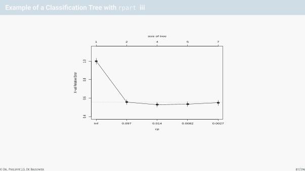
Example of a Classification Tree with rpart iii
●
●
● ●●
cp
X−va
l Rela
tive E
rror
0.40.6
0.81.0
Inf 0.097 0.014 0.0082 0.0027
1 2 4 5 7
size of tree
© Dr. Philippe J.S. De Brouwer 87/296

Example of a Classification Tree with rpart iv
# print(t0) # to avoid too long output we commented this out
# summary(t0)
# Plot the original decisions tree
plot(t0)
text(t0)
© Dr. Philippe J.S. De Brouwer 88/296

Example of a Classification Tree with rpart v
|sex=b
age>=9.5 pclass>=2.5
embarked=d
sibsp>=1.5
age>=27.5
0 1
00 1
1
1
# Prune the tree:
t1 <- prune(t0, cp=0.01)
plot(t1); text(t1)
© Dr. Philippe J.S. De Brouwer 89/296

Example of a Classification Tree with rpart vi
|sex=b
pclass>=2.5
embarked=d0
0 1
1
© Dr. Philippe J.S. De Brouwer 90/296

Visualizing the tree with rpart.plot i
# plot the tree with rpart.plot
library(rpart.plot)
prp(t0, type = 5, extra = 8, box.palette = "auto",
yesno = 1, yes.text="survived",no.text="dead"
)
© Dr. Philippe J.S. De Brouwer 91/296

Visualizing the tree with rpart.plot ii
mal
>= 9.5 >= 3
S
>= 2
>= 28
fml
< 9.5 < 3
C,Q
< 2
< 28
sex
age
00.82
10.55
pclass
embarked
sibsp
00.87
age
00.67
10.56
10.65
10.94
Figure 13: The decision tree represented by the function prp() from the package rpart.plot. This plot not only looks moreelegant, but it is also more informative and less simplified. For example the top node “sex” has now two clear options in whichdescriptions we can recognize the words male and female, and the words are on the branches, so there is no confustion possiblewhich is left and which right.
© Dr. Philippe J.S. De Brouwer 92/296

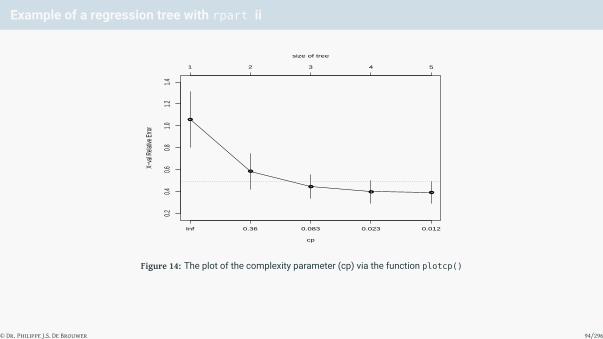
Example of a regression tree with rpart i
# Example of a regression tree with rpart on the dataset mtcars
# The libraries should be loaded by now:
library(rpart); library(MASS); library (rpart.plot)
# Fit the tree:
t <- rpart(mpg ~ cyl + disp + hp + drat + wt + qsec + am + gear,
data=mtcars, na.action = na.rpart,
method = "anova",
control = rpart.control(
minsplit = 10, # minimum nbr. of observations required for split
minbucket = 20/3,# minimum nbr. of observations in a terminal node
# the default = minsplit/3
cp = 0.01,# complexity parameter set to a very small value
# his will grow a large (over-fit) tree
maxcompete = 4, # nbr. of competitor splits retained in output
maxsurrogate = 5, # nbr. of surrogate splits retained in output
usesurrogate = 2, # how to use surrogates in the splitting process
xval = 7, # nbr. of cross validations
surrogatestyle = 0, # controls the selection of a best surrogate
maxdepth = 30 # maximum depth of any node of the final tree
)
)
# Investigate the complexity parameter dependence:
printcp(t)
##
## Regression tree:
## rpart(formula = mpg ~ cyl + disp + hp + drat + wt + qsec + am +
## gear, data = mtcars, na.action = na.rpart, method = "anova",
## control = rpart.control(minsplit = 10, minbucket = 20/3,
## cp = 0.01, maxcompete = 4, maxsurrogate = 5, usesurrogate = 2,
## xval = 7, surrogatestyle = 0, maxdepth = 30))
##
## Variables actually used in tree construction:
## [1] cyl disp hp wt
##
## Root node error: 1126/32 = 35.189
##
## n= 32
##
## CP nsplit rel error xerror xstd
## 1 0.652661 0 1.00000 1.05743 0.25398
## 2 0.194702 1 0.34734 0.58519 0.16379
## 3 0.035330 2 0.15264 0.44396 0.10823
## 4 0.014713 3 0.11731 0.39652 0.10419
## 5 0.010000 4 0.10259 0.39066 0.10461
plotcp(t)
© Dr. Philippe J.S. De Brouwer 93/296
Example of a regression tree with rpart ii
●
●
●
● ●
cp
X−va
l Rela
tive E
rror
0.20.4
0.60.8
1.01.2
1.4
Inf 0.36 0.083 0.023 0.012
1 2 3 4 5
size of tree
Figure 14: The plot of the complexity parameter (cp) via the function plotcp()
© Dr. Philippe J.S. De Brouwer 94/296

Example of a regression tree with rpart iii
# Print the tree:
print(t)
## n= 32
##
## node), split, n, deviance, yval
## * denotes terminal node
##
## 1) root 32 1126.04700 20.09062
## 2) wt>=2.26 26 346.56650 17.78846
## 4) cyl>=7 14 85.20000 15.10000
## 8) hp>=192.5 7 28.82857 13.41429 *## 9) hp< 192.5 7 16.58857 16.78571 *## 5) cyl< 7 12 42.12250 20.92500
## 10) disp>=153.35 6 12.67500 19.75000 *## 11) disp< 153.35 6 12.88000 22.10000 *## 3) wt< 2.26 6 44.55333 30.06667 *
summary(t)
## Call:
## rpart(formula = mpg ~ cyl + disp + hp + drat + wt + qsec + am +
## gear, data = mtcars, na.action = na.rpart, method = "anova",
## control = rpart.control(minsplit = 10, minbucket = 20/3,
## cp = 0.01, maxcompete = 4, maxsurrogate = 5, usesurrogate = 2,
## xval = 7, surrogatestyle = 0, maxdepth = 30))
## n= 32
##
## CP nsplit rel error xerror xstd
## 1 0.65266121 0 1.0000000 1.0574288 0.2539755
## 2 0.19470235 1 0.3473388 0.5851938 0.1637947
## 3 0.03532965 2 0.1526364 0.4439621 0.1082286
## 4 0.01471297 3 0.1173068 0.3965209 0.1041916
## 5 0.01000000 4 0.1025938 0.3906556 0.1046149
##
## Variable importance
## wt disp hp drat cyl qsec
## 25 24 20 15 10 5
##
## Node number 1: 32 observations, complexity param=0.6526612
## mean=20.09062, MSE=35.18897
## left son=2 (26 obs) right son=3 (6 obs)
## Primary splits:
## wt < 2.26 to the right, improve=0.6526612, (0 missing)
## cyl < 5 to the right, improve=0.6431252, (0 missing)
## disp < 163.8 to the right, improve=0.6130502, (0 missing)
## hp < 118 to the right, improve=0.6010712, (0 missing)
## drat < 3.75 to the left, improve=0.4186711, (0 missing)
## Surrogate splits:
## disp < 101.55 to the right, agree=0.969, adj=0.833, (0 split)
## hp < 92 to the right, agree=0.938, adj=0.667, (0 split)
## drat < 4 to the left, agree=0.906, adj=0.500, (0 split)
## cyl < 5 to the right, agree=0.844, adj=0.167, (0 split)
##
## Node number 2: 26 observations, complexity param=0.1947024
## mean=17.78846, MSE=13.32948
## left son=4 (14 obs) right son=5 (12 obs)
## Primary splits:
## cyl < 7 to the right, improve=0.6326174, (0 missing)
## disp < 266.9 to the right, improve=0.6326174, (0 missing)
## hp < 136.5 to the right, improve=0.5803554, (0 missing)
## wt < 3.325 to the right, improve=0.5393370, (0 missing)
## qsec < 18.15 to the left, improve=0.4210605, (0 missing)
## Surrogate splits:
## disp < 266.9 to the right, agree=1.000, adj=1.000, (0 split)
## hp < 136.5 to the right, agree=0.962, adj=0.917, (0 split)
## wt < 3.49 to the right, agree=0.885, adj=0.750, (0 split)
## qsec < 18.15 to the left, agree=0.885, adj=0.750, (0 split)
## drat < 3.58 to the left, agree=0.846, adj=0.667, (0 split)
##
## Node number 3: 6 observations
## mean=30.06667, MSE=7.425556
##
## Node number 4: 14 observations, complexity param=0.03532965
## mean=15.1, MSE=6.085714
## left son=8 (7 obs) right son=9 (7 obs)
## Primary splits:
## hp < 192.5 to the right, improve=0.46693490, (0 missing)
## wt < 3.81 to the right, improve=0.13159230, (0 missing)
## qsec < 17.35 to the right, improve=0.13159230, (0 missing)
## drat < 3.075 to the left, improve=0.09982394, (0 missing)
## disp < 334 to the right, improve=0.05477308, (0 missing)
## Surrogate splits:
## drat < 3.18 to the right, agree=0.857, adj=0.714, (0 split)
## disp < 334 to the right, agree=0.786, adj=0.571, (0 split)
## qsec < 16.355 to the left, agree=0.786, adj=0.571, (0 split)
## wt < 4.66 to the right, agree=0.714, adj=0.429, (0 split)
## am < 0.5 to the right, agree=0.643, adj=0.286, (0 split)
##
## Node number 5: 12 observations, complexity param=0.01471297
## mean=20.925, MSE=3.510208
## left son=10 (6 obs) right son=11 (6 obs)
## Primary splits:
## disp < 153.35 to the right, improve=0.393317100, (0 missing)
## hp < 109.5 to the right, improve=0.235048600, (0 missing)
## drat < 3.875 to the right, improve=0.043701900, (0 missing)
## wt < 3.0125 to the right, improve=0.027083700, (0 missing)
## qsec < 18.755 to the left, improve=0.001602469, (0 missing)
## Surrogate splits:
## cyl < 5 to the right, agree=0.917, adj=0.833, (0 split)
## hp < 101 to the right, agree=0.833, adj=0.667, (0 split)
## wt < 3.2025 to the right, agree=0.833, adj=0.667, (0 split)
## drat < 3.35 to the left, agree=0.667, adj=0.333, (0 split)
## qsec < 18.45 to the left, agree=0.667, adj=0.333, (0 split)
##
## Node number 8: 7 observations
## mean=13.41429, MSE=4.118367
##
## Node number 9: 7 observations
## mean=16.78571, MSE=2.369796
##
## Node number 10: 6 observations
## mean=19.75, MSE=2.1125
##
## Node number 11: 6 observations
## mean=22.1, MSE=2.146667
# plot(t) ; text(t) # This would produce the standard plot from rpart.
# Instead we use:
prp(t, type = 5, extra = 1, box.palette = "Blues", digits = 4,
shadow.col = 'darkgray', branch = 0.5)
>= 2.26
>= 7
>= 193 >= 153.4
< 2.26
< 7
< 193 < 153.4
>= 2.26
>= 7
>= 193 >= 153.4
< 2.26
< 7
< 193 < 153.4
wt
cyl
hp
13.41n=7
16.79n=7
disp
19.75n=6
22.1n=6
30.07n=6
Figure 15: The same tree as in Figure ?? but now pruned with a complexity parameter ρ of 0.1. The regression tree is – in thisexample – too simple.
# Prune the tree:
t1 <- prune(t, cp = 0.05)
# Finally, plot the pruned tree:
prp(t1, type = 5, extra = 1, box.palette = "Reds", digits = 4,
shadow.col = 'darkgray', branch = 0.5)
>= 2.26
>= 7
< 2.26
< 7
>= 2.26
>= 7
< 2.26
< 7
wt
cyl
15.1n=14
20.92n=12
30.07n=6
© Dr. Philippe J.S. De Brouwer 95/296

The Big R-Book by Philippe J.S. De Brouwer
part 05: Modelling
↓
chapter 23: Learning Machines
↓
section 2:
Random Forest
© Dr. Philippe J.S. De Brouwer 96/296

Random Forest
To fit a random forest in R, we can rely on the package randomforest:
library(randomForest)
© Dr. Philippe J.S. De Brouwer 97/296

head(mtcars)
## mpg cyl disp hp drat wt qsec vs am gear carb
## Mazda RX4 21.0 6 160 110 3.90 2.620 16.46 0 1 4 4
## Mazda RX4 Wag 21.0 6 160 110 3.90 2.875 17.02 0 1 4 4
## Datsun 710 22.8 4 108 93 3.85 2.320 18.61 1 1 4 1
## Hornet 4 Drive 21.4 6 258 110 3.08 3.215 19.44 1 0 3 1
## Hornet Sportabout 18.7 8 360 175 3.15 3.440 17.02 0 0 3 2
## Valiant 18.1 6 225 105 2.76 3.460 20.22 1 0 3 1
mtcars$l <- NULL # remove our variable
frm <- mpg ~ cyl + disp + hp + drat + wt + qsec + am + gear
set.seed(1879)
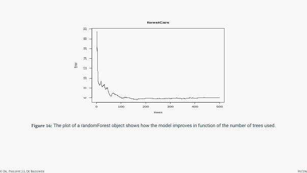
# Fit the random forest:
forestCars = randomForest(frm, data = mtcars)
# Show an overview:
print(forestCars)
##
## Call:
## randomForest(formula = frm, data = mtcars)
## Type of random forest: regression
## Number of trees: 500
## No. of variables tried at each split: 2
##
## Mean of squared residuals: 6.001878
## % Var explained: 82.94
# Plot the random forest overview:
plot(forestCars)
© Dr. Philippe J.S. De Brouwer 98/296
0 100 200 300 400 500
68
1012
1416
1820
forestCars
trees
Error
Figure 16: The plot of a randomForest object shows how the model improves in function of the number of trees used.
© Dr. Philippe J.S. De Brouwer 99/296

# Show the summary of fit:
summary(forestCars)
## Length Class Mode
## call 3 -none- call
## type 1 -none- character
## predicted 32 -none- numeric
## mse 500 -none- numeric
## rsq 500 -none- numeric
## oob.times 32 -none- numeric
## importance 8 -none- numeric
## importanceSD 0 -none- NULL
## localImportance 0 -none- NULL
## proximity 0 -none- NULL
## ntree 1 -none- numeric
## mtry 1 -none- numeric
## forest 11 -none- list
## coefs 0 -none- NULL
## y 32 -none- numeric
## test 0 -none- NULL
## inbag 0 -none- NULL
## terms 3 terms call
# visualization of the RF:
getTree(forestCars, 1, labelVar=TRUE)
## left daughter right daughter split var split point status
## 1 2 3 disp 192.500 -3
## 2 4 5 cyl 5.000 -3
## 3 6 7 cyl 7.000 -3
## 4 8 9 gear 3.500 -3
## 5 0 0 <NA> 0.000 -1
## 6 0 0 <NA> 0.000 -1
## 7 10 11 qsec 17.690 -3
## 8 0 0 <NA> 0.000 -1
## 9 12 13 drat 4.000 -3
## 10 14 15 drat 3.440 -3
## 11 0 0 <NA> 0.000 -1
## 12 16 17 am 0.500 -3
## 13 18 19 qsec 19.185 -3
## 14 20 21 drat 3.075 -3
## 15 0 0 <NA> 0.000 -1
## 16 0 0 <NA> 0.000 -1
## 17 0 0 <NA> 0.000 -1
## 18 0 0 <NA> 0.000 -1
## 19 0 0 <NA> 0.000 -1
## 20 0 0 <NA> 0.000 -1
## 21 0 0 <NA> 0.000 -1
## prediction
## 1 20.75625
## 2 24.02222
## 3 16.55714
## 4 24.97857
## 5 20.67500
## 6 19.75000
## 7 16.02500
## 8 21.50000
## 9 25.24615
## 10 16.53636
## 11 10.40000
## 12 23.33333
## 13 26.88571
## 14 17.67143
## 15 14.55000
## 16 23.44000
## 17 22.80000
## 18 24.68000
## 19 32.40000
## 20 15.80000
## 21 19.07500
# Show the purity of the nodes:
imp <- importance(forestCars)
imp
## IncNodePurity
## cyl 163.83222
## disp 243.89957
## hp 186.24274
## drat 96.08086
## wt 236.59343
## qsec 57.99794
## am 31.84926
## gear 32.31675
# This impurity overview can also be plotted:
plot( imp, lty=2, pch=16)
lines(imp)
●
●
●
●
●
●
● ●
1 2 3 4 5 6 7 8
5010
015
020
025
0
Index
imp
Figure 17: The importance of each variable in the random-forest model.
# Below we print the partial dependence on each variable.
# We group the plots per 3, to save some space.
impvar = rownames(imp)[order(imp[, 1], decreasing=TRUE)]
op = par(mfrow=c(1, 3))
for (i in seq_along(impvar)) {
partialPlot(forestCars, mtcars, impvar[i], xlab=impvar[i],
main=paste("Partial Dependence on", impvar[i]))
}
100 200 300 400
1920
2122
Partial Dependence on disp
disp
2 3 4 5
1920
2122
Partial Dependence on wt
wt
50 100 200 300
18.5
19.0
19.5
20.0
20.5
21.0
21.5
Partial Dependence on hp
hp
Figure 18: Partial dependence on the variables (1 of 3).
4 5 6 7 8
19.5
20.0
20.5
21.0
21.5
Partial Dependence on cyl
cyl
3.0 3.5 4.0 4.5 5.0
19.4
19.6
19.8
20.0
20.2
20.4
20.6
Partial Dependence on drat
drat
16 18 20 22
19.8
19.9
20.0
20.1
20.2
20.3
20.4
20.5
Partial Dependence on qsec
qsec
Figure 19: Partial dependence on the variables (2 of 3).
3.0 3.5 4.0 4.5 5.0
19.9
20.0
20.1
20.2
20.3
Partial Dependence on gear
gear
0.0 0.2 0.4 0.6 0.8 1.0
19.9
20.0
20.1
20.2
Partial Dependence on am
am
Figure 20: Partial dependence on the variables (3 of 3).
© Dr. Philippe J.S. De Brouwer 100/296

The Big R-Book by Philippe J.S. De Brouwer
part 05: Modelling
↓
chapter 23: Learning Machines
↓
section 3:
Artificial Neural Networks (ANNs)
© Dr. Philippe J.S. De Brouwer 101/296

Artificial Neural Networks (ANNs)
−0.21
106
carb
0.667
93
gear
0.79751
drat
−0.15836
cyl
0.01308disp
−0.02059
hp
2.45742
am
0.86427
qsec
−3.7419
wt
mpg
11.94978
1
Figure 21: A logistic regression is actually a neural network with one neuron. Each variable contributes to a sigmoid function inone node, and if that one node gets loadings over a critical threshold, then we predict 1, otherwise 0. The intercept is the “1” in acircle. The numbers on the arrows are the loadings for each variable.
© Dr. Philippe J.S. De Brouwer 102/296

Neural Networks in R
#install.packages("neuralnet") # Do only once.
# Load the library neuralnet:
library(neuralnet)
# Fit the aNN with 2 hidden layers that have resp. 3 and 2 neurons:
# (neuralnet does not accept a formula wit a dot as in 'y ~ .' )
nn1 <- neuralnet(mpg ~ wt + qsec + am + hp + disp + cyl + drat +
gear + carb,
data = mtcars, hidden = c(3,2),
linear.output = TRUE)
© Dr. Philippe J.S. De Brouwer 103/296
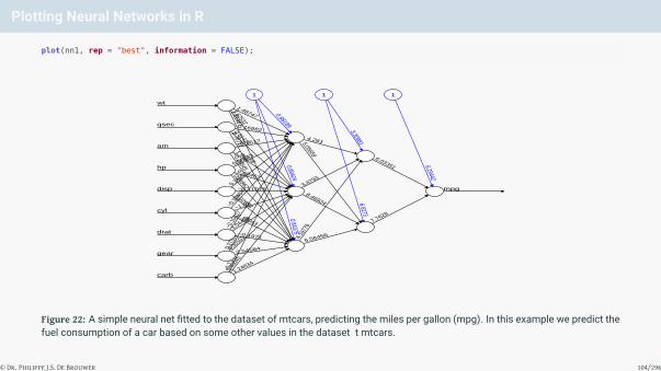
Plotting Neural Networks in R
plot(nn1, rep = "best", information = FALSE);
1.24634
0.400
45
−0.71
31
carb
2.545840.331
01
0.275
31
gear
−0.1971
1.04498
−0.10
317drat
2.12043
−1.01−0.30
484
cyl
0.02658
−0.110750.1406
disp
0.24962
0.68467
0.56843
hp
−0.26545
1.96158
−0.7517am
0.76711
0.61414
0.16982qsec
1.614871.62532
1.48747
wt
6.564564.197
78
8.46924
3.4793
5.05659
4.261
7.7628
6.03351
mpg
0.843750.89424
0.88189
1
6.8273
3.30981
1
6.29442
1
Figure 22: A simple neural net fitted to the dataset of mtcars, predicting the miles per gallon (mpg). In this example we predict thefuel consumption of a car based on some other values in the dataset t mtcars.
© Dr. Philippe J.S. De Brouwer 104/296

Using a different dataset
# Get the data about crimes in Boston:
library(MASS)
d <- Boston
© Dr. Philippe J.S. De Brouwer 105/296

Step 1: Missing Data
# Inspect if there is missing data:
apply(d, 2, function(x) sum(is.na(x)))
## crim zn indus chas nox rm age dis
## 0 0 0 0 0 0 0 0
## rad tax ptratio black lstat medv
## 0 0 0 0 0 0
# There are no missing values.
© Dr. Philippe J.S. De Brouwer 106/296

Step 2: Split the Data in Test and Training Set
set.seed(1877) # set the seed for the random generator
idx.train <- sample(1:nrow(d), round(0.75 * nrow(d)))
d.train <- d[idx.train,]
d.test <- d[-idx.train,]
© Dr. Philippe J.S. De Brouwer 107/296

Step 3: Fit a Challenger Model
# Fit the linear model, no default for family, so use 'gaussian':
lm.fit <- glm(medv ~ ., data = d.train)
summary(lm.fit)
##
## Call:
## glm(formula = medv ~ ., data = d.train)
##
## Deviance Residuals:
## Min 1Q Median 3Q Max
## -14.2361 -2.7610 -0.5274 1.7500 24.3261
##
## Coefficients:
## Estimate Std. Error t value Pr(>|t|)
## (Intercept) 43.951765 6.183072 7.108 6.19e-12 ***## crim -0.115996 0.044113 -2.630 0.00891 **## zn 0.049986 0.015809 3.162 0.00170 **## indus -0.017726 0.073447 -0.241 0.80942
## chas 2.022221 1.054440 1.918 0.05591 .
## nox -19.073462 4.377995 -4.357 1.72e-05 ***## rm 3.259283 0.496699 6.562 1.82e-10 ***## age 0.010649 0.015858 0.671 0.50234
## dis -1.688850 0.240451 -7.024 1.06e-11 ***## rad 0.335786 0.080535 4.169 3.82e-05 ***## tax -0.012459 0.004593 -2.713 0.00699 **## ptratio -1.056385 0.151795 -6.959 1.59e-11 ***## black 0.008201 0.003229 2.539 0.01151 *## lstat -0.573025 0.060766 -9.430 < 2e-16 ***## ---
## Signif. codes: 0 '***' 0.001 '**' 0.01 '*' 0.05 '.' 0.1 ' ' 1
##
## (Dispersion parameter for gaussian family taken to be 23.1)
##
## Null deviance: 32734.8 on 379 degrees of freedom
## Residual deviance: 8454.6 on 366 degrees of freedom
## AIC: 2287.3
##
## Number of Fisher Scoring iterations: 2
# Make predictions:
pr.lm <- predict(lm.fit,d.test)
# Calculate the MSE:
MSE.lm <- sum((pr.lm - d.test$medv)^2)/nrow(d.test)
© Dr. Philippe J.S. De Brouwer 108/296

Step 4: Rescale the Data and Split into Training and Testing Set
# Store the maxima and minima:
d.maxs <- apply(d, 2, max)
d.mins <- apply(d, 2, min)
# Rescale the data:
d.sc <- as.data.frame(scale(d, center = d.mins,
scale = d.maxs - d.mins))
# Split the data in training and testing set:
d.train.sc <- d.sc[idx.train,]
d.test.sc <- d.sc[-idx.train,]
© Dr. Philippe J.S. De Brouwer 109/296

Step 5: Train the ANN on the Training Set
Finally, we are ready to train the ANN. This is straightforward:
library(neuralnet)
# Since the shorthand notation y~. does not work in the
# neuralnet() function we have to replicate it:
nm <- names(d.train.sc)
frm <- as.formula(paste("medv ~", paste(nm[!nm %in% "medv"], collapse = " + ")))
nn2 <- neuralnet(frm, data = d.train.sc, hidden = c(7,5,5),
linear.output = T)
© Dr. Philippe J.S. De Brouwer 110/296

plot(nn2, rep = "best", information = FALSE,
show.weights = FALSE)
medv
1 1 1 1
Figure 23: A visualisation of the ANN. Note that we left out the weights, because there would be too many. With 13 variables, andthree layers of respectively 7, 5, and 5 neurons, we have 13× 7 + 7× 5 + 5× 5 + 5 + 7 + 5 + 5 + 1 = 174 parameters.
© Dr. Philippe J.S. De Brouwer 111/296

Step 6: Test the Model on the Test Data
# Our independent variable 'medv' is the 14th column, so:
pr.nn2 <- compute(nn2,d.test.sc[,1:13])
# Rescale back to original span:
pr.nn2 <- pr.nn2$net.result*(max(d$medv)-min(d$medv))+min(d$medv)
test.r <- (d.test.sc$medv)*(max(d$medv)-min(d$medv))+min(d$medv)
# Calculate the MSE:
MSE.nn2 <- sum((test.r - pr.nn2)^2)/nrow(d.test.sc)
print(paste(MSE.lm,MSE.nn2))
## [1] "21.7744962283853 10.641222207598"
© Dr. Philippe J.S. De Brouwer 112/296
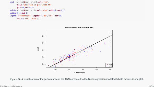
plot (d.test$medv,pr.nn2,col='red',
main='Observed vs predicted NN',
pch=18,cex=0.7)
points(d.test$medv,pr.lm,col='blue',pch=18,cex=0.7)
abline(0,1,lwd=2)
legend('bottomright',legend=c('NN','LM'),pch=18,
col=c('red','blue'))
10 20 30 40 50
1020
3040
50
Observed vs predicted NN
d.test$medv
pr.nn
2
NNLM
Figure 24: A visualisation of the performance of the ANN compared to the linear regression model with both models in one plot.
© Dr. Philippe J.S. De Brouwer 113/296

Cross Validation
To execute the k-fold cross validation for the linear model, we use the function cv.glm() from the package boot.Below is the code for the 10 fold cross validation MSE for the linear model:
library(boot)
set.seed(1875)
lm.fit <- glm(medv ~ ., data = d)
# The estimate of prediction error is now here:
cv.glm(d, lm.fit, K = 10)$delta[1]
## [1] 23.78659
© Dr. Philippe J.S. De Brouwer 114/296

Cross Validation of the ANN
# Reminders:
d <- Boston
nm <- names(d)
frm <- as.formula(paste("medv ~", paste(nm[!nm %in% "medv"],
collapse = " + ")))
# Store the maxima and minima:
d.maxs <- apply(d, 2, max)
d.mins <- apply(d, 2, min)
# Rescale the data:
d.sc <- as.data.frame(scale(d, center = d.mins,
scale = d.maxs - d.mins))
# Set parameters:
set.seed(1873)
cv.error <- NULL # Initiate to append later
k <- 10 # The number of repetitions
# This code might be slow, so you can add a progress bar as follows:
#library(plyr)
#pbar <- create_progress_bar('text')
#pbar$init(k)
# In k-fold cross validation, we must take care to select each
# observation just once in the testing set. This is made easy
# with modelr:
library(modelr)
kFoldXval <- crossv_kfold(data = d.sc, k = 10, id = '.id')
# Do the k-fold cross validation:
for(i in 1:k){
# <see digression below>
train.cv <- kFoldXval$train[i]
test.cv <- kFoldXval$test[i]
test.cv.df <- as.data.frame(test.cv)
# Rebuild the formula (names are changed each run):
nmKfold <- paste0('X', i, '.', nm)
medvKfld <- paste0('X', i, '.medv')
frmKfold <- as.formula(paste(medvKfld, "~",
paste(nmKfold[!nmKfold %in% medvKfld],
collapse = " + ")
)
)
# Fit the NN:
nn2 <- neuralnet(frmKfold, data = train.cv,
hidden = c(7, 5, 5),
linear.output=TRUE
)
# The explaining variables are in the first 13 rows, so:
pr.nn2 <- compute(nn2, test.cv.df[,1:13])
pr.nn2 <- pr.nn2$net.result * (max(d$medv) - min(d$medv)) +
min(d$medv)
test.cv.df.r <- test.cv.df[[medvKfld]] *(max(d$medv) - min(d$medv)) + min(d$medv)
cv.error[i] <- sum((test.cv.df.r - pr.nn2)^2)/nrow(test.cv.df)
#pbar$step() #uncomment to see the progress bar
}
© Dr. Philippe J.S. De Brouwer 115/296

The Big R-Book by Philippe J.S. De Brouwer
part 05: Modelling
↓
chapter 23: Learning Machines
↓
section 4:
Support Vector Machine
© Dr. Philippe J.S. De Brouwer 116/296

Support Vector Machines (SVM): The Concept
The idea behind support vector machines (SVM) is to find a hyperplane that best separates the data in the knownclasses. The idea is to find a hyperplane that maximises the distance between the groups.
The problem is in essence a linear set of equations to be solved, and it will fit a hyperplane, which would be astraight line for two dimensional data.
Obviously, if the separation is not linear, this method will not work well. The solution to this issue is known as the“kernel trick.” We add a variable that is a suitable combination of he two variables (for example if one groupappears to be centred in the 2D plane, then we could us z = x2 + y2 as third variable). Then we solve the SVMmethod as before (but with three variables instead of two), and find a hyperplane (flat surface) in a 3D spacespan by (x, y, z). This will allow for a much better separation of the data in many cases.
© Dr. Philippe J.S. De Brouwer 117/296

SVM in R: the Function svm() i
Function use for svm()
svm(formula, data, subset, na.action = na.omit, scale = TRUE,
type = NULL, kernel = 'radial', degree = 3,
gamma = if (is.vector(x)) 1 else 1 / ncol(x), coef0 = 0,
cost = 1, nu = 0.5, class.weights = NULL, cachesize = 40,
tolerance = 0.001, epsilon = 0.1, shrinking = TRUE,
cross = 0, probability = FALSE, fitted = TRUE, ...)
Most parameters work very similar to other models such as lm, glm, etc. For example data and formula
do not need much explanation anymore. The variable type, however, is an interesting one and it is quitespecific for the SVM model:
1 C-classification: The default type of the dependent variable is a factor object;2 nu-classification: Alternative classification – the parameter ν is used to determine the number
of support vectors that should be kept in the solution (relative to the size of the dataset), thismethod will use the parameter ε for the optimization, but it is automatically set;
3 one-classification: Allows to detect outliers and can be used when only one class is available(say only cars with four cylinders and it allows to detect “unusual cars with four cylinders”);
4 eps-regression: The default regression type, ε regression allows to set the parameter ε, theamount of error the model can have so that anything larger than ε is penalized in proportion to C,the regularization parameter;
5 nu-regression: The regression model that allows to tune the number of support vectors.© Dr. Philippe J.S. De Brouwer 118/296

SVM in R: the Function svm() ii
Another important parameter is kernel. This parameter allows us to select which kernel should be used.The following options are possible:
1 Linear: t(u)*v
2 Polynomial: (gamma*t(u)*v + coef0)^degree
3 Radial basis: exp(-gamma*|u-v|^2)
4 Sigmoid: tanh(gamma*u'*v + coef0)
When used, the parameters gamma, coef0, and degree can be provided to the function if one wants toover-ride the defaults.
Note – Optimisation types
Excluding the one-classification, there are two types of optimization: ν and ε and there aretwo types of target variables and hence we have regression and classification. In the svm()
function both C and eps are used to refer to the same mechanism.
© Dr. Philippe J.S. De Brouwer 119/296

An Example of Regression SVM in R with e1071
Here is a simple example, based on the dataset mtcars:
library(e1071)
svmCars1 <- svm(cyl ~ ., data = mtcars)
summary(svmCars1)
##
## Call:
## svm(formula = cyl ~ ., data = mtcars)
##
##
## Parameters:
## SVM-Type: eps-regression
## SVM-Kernel: radial
## cost: 1
## gamma: 0.1
## epsilon: 0.1
##
##
## Number of Support Vectors: 17
© Dr. Philippe J.S. De Brouwer 120/296

An Example of Classification SVM in R with e1071
Below we illustrate how classification SVM model can be fitted:
# split mtcars in two subsets (not necessary but easier later):
x <- subset(mtcars, select = -cyl)
y <- mtcars$cyl
# fit the model again as a classification model:
svmCars2 <- svm(cyl ~ ., data = mtcars, type = 'C-classification')
# create predictions
pred <- predict(svmCars2, x)
# show the confusion matrix:
table(pred, y)
## y
## pred 4 6 8
## 4 11 0 0
## 6 0 7 0
## 8 0 0 14
© Dr. Philippe J.S. De Brouwer 121/296

Optimising the SVM
svmTune <- tune(svm, train.x=x, train.y=y, kernel = "radial",
ranges = list(cost = 10^(-1:2), gamma = c(.5, 1, 2)))
print(svmTune)
##
## Parameter tuning of 'svm':
##
## - sampling method: 10-fold cross validation
##
## - best parameters:
## cost gamma
## 10 0.5
##
## - best performance: 0.906572
After you have found the optimal parameters, you can run the model again and specify the desired parametersand compare the performance (e.g. with the confusion matrix).
© Dr. Philippe J.S. De Brouwer 122/296

The Big R-Book by Philippe J.S. De Brouwer
part 05: Modelling
↓
chapter 23: Learning Machines
↓
section 5:
Unsupervised Learning and Clustering
© Dr. Philippe J.S. De Brouwer 123/296

Clustering Methods
Clustering methods identify sets of similar objects – referred to as “clusters” – in a multivariate data set. Themost common types of clustering include
1 partitioning methods,
2 hierarchical clustering,
3 fuzzy clustering,
4 density-based clustering, and
5 model-based clustering.
© Dr. Philippe J.S. De Brouwer 124/296

k-Means Clustering
Given a set of observations x = (x1, x2, . . . , xn) (where each observations xi is a n-dimensional vector), k-meansclustering aims to minimize the variance for k (where k ≤ n) sets – or clusters, Ci henceforth – between themean of the set and the members of that group C = {C1,C2, . . . ,Ck}. So the goal of k-means clusteringbecomes to find
argminC
k∑i=1
∑x inCi
||x− µi||
The standard algorithm start from randomly taking k different observations as initial centre for the k clusters.Each observation is then assigned to the cluster whose centre is the “closest.” The distance is usually expressedas the Euclidian distance between that observation and the centroid of the cluster.
Then we calculate again the centre of each cluster4 and the process is repeated: each observation is nowallocated to the cluster that has the centroid closest to the observation. This step is then repeated till there are nochanges in the cluster allocations in consecutive steps.
© Dr. Philippe J.S. De Brouwer 125/296

k-Means in R i
In this section, we will use the dataset mtcars that is – by now – well known. The dataset is usually loaded whenR starts, and if that is not the case you can find it in the package datasets.
First, we have a look at the data mtcars and choose weight and fuel consumption as variables of interest for ouranalysis. Along the way, we introduce you to the package ggrepel that is handy to pull labels away from eachother. We use this because we want to plot the name of the car next to each dot in order to get someunderstanding of what is going on.
Most of those things can be obtained with ggplot2 alone.5 The output is in Figure 25 on slide 127.
library(ggplot2)
library(ggrepel) # provides geom_label_repel()
ggplot(mtcars, aes(wt, mpg, color = factor(cyl))) +
geom_point(size = 5) +
geom_label_repel(aes(label = rownames(mtcars)),
box.padding = 0.2,
point.padding = 0.25,
segment.color = 'grey60')
© Dr. Philippe J.S. De Brouwer 126/296
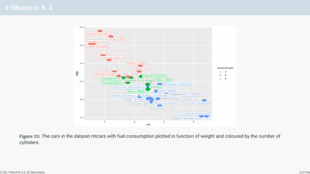
k-Means in R ii
● ●
●
●
●●
●
●
●
●
●
●●
●
● ●
●
●
●
●
●
●●
●
●
●
●
●
●
●
●
●Mazda RX4
Mazda RX4 Wag
Datsun 710
Hornet 4 Drive
Hornet Sportabout Valiant
Duster 360
Merc 240D
Merc 230
Merc 280
Merc 280C
Merc 450SE
Merc 450SL
Merc 450SLC
Cadillac Fleetwood
Lincoln Continental
Chrysler Imperial
Fiat 128Honda Civic
Toyota Corolla
Toyota Corona
Dodge Challenger
AMC Javelin
Camaro Z28
Pontiac Firebird
Fiat X1−9
Porsche 914−2
Lotus Europa
Ford Pantera L
Ferrari Dino
Maserati Bora
Volvo 142E
10
15
20
25
30
35
2 3 4 5wt
mpg
factor(cyl)
●a●a●a
4
6
8
Figure 25: The cars in the dataset mtcars with fuel consumption plotted in function of weight and coloured by the number ofcylinders.
© Dr. Philippe J.S. De Brouwer 127/296

k-Means in R iii
Note – Elegant labels
Compare Figure 25 on slide 127 with the result that we could get from adding to our plot text via thefunction geom_text():
ggplot(mtcars, aes(wt, mpg, color = factor(cyl))) +
geom_point(size = 5) +
geom_text(aes(label = rownames(mtcars)),
hjust = -0.2, vjust = -0.2)
© Dr. Philippe J.S. De Brouwer 128/296
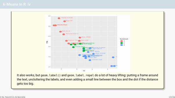
k-Means in R iv
● ●
●
●
●●
●
●
●
●
●
●●
●
● ●
●
●
●
●
●
●●
●
●
●
●
●
●
●
●
●Mazda RX4Mazda RX4 Wag
Datsun 710
Hornet 4 Drive
Hornet SportaboutValiant
Duster 360
Merc 240D
Merc 230
Merc 280
Merc 280C
Merc 450SE
Merc 450SL
Merc 450SLC
Cadillac FleetwoodLincoln Continental
Chrysler Imperial
Fiat 128
Honda Civic
Toyota Corolla
Toyota Corona
Dodge ChallengerAMC Javelin
Camaro Z28
Pontiac Firebird
Fiat X1−9
Porsche 914−2
Lotus Europa
Ford Pantera L
Ferrari Dino
Maserati Bora
Volvo 142E
10
15
20
25
30
35
2 3 4 5wt
mpg
factor(cyl)
●a●a●a
4
6
8
It also works, but geom_label() and geom_label_repel do a lot of heavy lifting: putting a frame aroundthe text, uncluttering the labels, and even adding a small line between the box and the dot if the distancegets too big.
© Dr. Philippe J.S. De Brouwer 129/296

k-Means in R v
Plotting the cars in the (wt, mpg) plane we notice a certain – almost linear – relation and colouring the dotsaccording to the number of cylinders we might be able to imagine some possible groups.
© Dr. Philippe J.S. De Brouwer 130/296

PCA before clustering i
© Dr. Philippe J.S. De Brouwer 131/296

PCA before clustering ii
# Normalize the whole mtcars dataset:
d <- data.frame(matrix(NA, nrow = nrow(mtcars), ncol = 1))
d <- d[,-1] # d is an empty data frame with 32 rows
for (k in 1:ncol(mtcars)) {
rng <- range(mtcars[, k], na.rm = TRUE)
d[, k] <- (mtcars[, k] - rng[1]) / rng[2]
}
colnames(d) <- colnames(mtcars)
rownames(d) <- rownames(mtcars)
# The PCA analysis:
pca1 <- prcomp(d)
summary(pca1)
## Importance of components:
## PC1 PC2 PC3 PC4 PC5 PC6
## Standard deviation 0.6960 0.4871 0.20255 0.13916 0.09207 0.07719
## Proportion of Variance 0.5993 0.2935 0.05076 0.02396 0.01049 0.00737
## Cumulative Proportion 0.5993 0.8929 0.94365 0.96761 0.97810 0.98547
## PC7 PC8 PC9 PC10 PC11
## Standard deviation 0.06203 0.05801 0.05112 0.03642 0.02432
## Proportion of Variance 0.00476 0.00416 0.00323 0.00164 0.00073
## Cumulative Proportion 0.99023 0.99439 0.99763 0.99927 1.00000
# Note also:
class(pca1)
## [1] "prcomp"
We see that the first two components explain about 90% of the variance. This means that for most applicationsonly two principal components will be sufficient. This is great because the 2D visualizations will be sufficientlyclear. The function plot on the PCA object (prcomp-object in R), will visualize the relative importance of thedifferent principal components (PCs) – in Figure ?? on slide ??. The function biplot() projects all data in theplane (PC1,PC2) and hence should show maximum variance – in Figure ?? on slide ??:# Plot for the prcomp object shows the variance explained by each PC
plot(pca1, type = 'l')
●
●
●
●● ● ● ● ● ●
pca1
Varia
nces
0.00.1
0.20.3
0.40.5
1 2 3 4 5 6 7 8 9 10
Figure 26: The plot() function applied on a prcomp object visualises the relative importance of the different principal components.
# biplot shows a projection in the 2D plane (PC1, PC2)
biplot(pca1)
−0.3 −0.2 −0.1 0.0 0.1 0.2 0.3
−0.3
−0.2
−0.1
0.00.1
0.20.3
PC1
PC2
Mazda RX4Mazda RX4 Wag
Datsun 710
Hornet 4 Drive
Hornet Sportabout
Valiant
Duster 360
Merc 240DMerc 230
Merc 280Merc 280C
Merc 450SEMerc 450SLMerc 450SLCCadillac FleetwoodLincoln ContinentalChrysler Imperial
Fiat 128Honda Civic
Toyota Corolla
Toyota Corona
Dodge ChallengerAMC Javelin
Camaro Z28
Pontiac Firebird
Fiat X1−9
Porsche 914−2
Lotus Europa
Ford Pantera LFerrari Dino
Maserati Bora
Volvo 142E
−2 −1 0 1 2 3
−2−1
01
23
mpgcyl
disp
hpdrat
wtqsec
vs
am
gear carb
Figure 27: The custom function biplot() project all data in the plane that is span by the two major PCs.
© Dr. Philippe J.S. De Brouwer 132/296

Fuzzy Clustering: the Idea
One such algorithm is called “fuzzy clustering” – also referred to as soft clustering or “soft k-means.” It works asfollows:
1 Decide on the number of clusters, k.
2 Each observation has a coefficient wij (the degree of xi being in a cluster j) for each cluster — in the first stepassign those coefficients randomly.
3 Calculate the centroid of each cluster as
cj =
∑i wij(xi)mxi∑i wij(xi)m
where m is the parameter that controls how fuzzy the cluster will be. Higher m values will result in a morefuzzy cluster. This parameter is also referred to as the “hyper-parameter”
4 For each observation calculate again the weights with the updated centroids.
wij =1∑k
l
(||xi−ci||xi−cl
) 2m−1
5 Repeat from step 3, until the algorithm has coefficients that do not change more than a given small value ε,the sensitivity threshold
© Dr. Philippe J.S. De Brouwer 133/296

Fuzzy Clustering in R i
library(tidyverse) # provides if_else
library(ggplot2) # 2D plotting
library(ggfortify)
library(cluster) # provides fanny (the fuzzy clustering)
library(ggrepel) # provides geom_label_repel (de-clutter labels)
carCluster <- fanny(d, 4)
my_colors <- if_else(carCluster$cluster == 1, "coral",
if_else(carCluster$cluster == 2, "darkolivegreen3",
if_else(carCluster$cluster == 3, "cyan3",
"darkorchid1")))
# Autoplot with visualization of 4 clusters
autoplot(carCluster, label=FALSE, frame=TRUE, frame.type='norm',
shape=16,
loadings=TRUE, loadings.colour = 'blue',
loadings.label = TRUE, loadings.label.size = 5,
loadings.label.vjust = 1.2, loadings.label.hjust = 1.3) +
geom_point(size = 5, alpha = 0.7, colour = my_colors) +
geom_label_repel(aes(label = rownames(mtcars)),
box.padding = 0.2,
point.padding = 0.25,
segment.color = 'grey40') +
theme_classic()
© Dr. Philippe J.S. De Brouwer 134/296
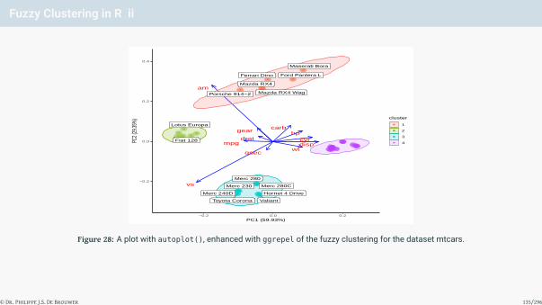
Fuzzy Clustering in R ii
●●
●
●
●
●
●
●●
●●
●●● ●●●
●
●
●
●
●●
●
●
●
●
●
●●
●
●
mpgcyldisp
hpdrat
wtqsec
vs
am
gearcarb
Mazda RX4
Mazda RX4 Wag
Hornet 4 Drive
Valiant
Merc 240D
Merc 230
Merc 280
Merc 280C
Fiat 128
Toyota Corona
Porsche 914−2
Lotus Europa
Ford Pantera LFerrari Dino
Maserati Bora
−0.2
0.0
0.2
0.4
−0.2 0.0 0.2PC1 (59.93%)
PC2 (
29.35
%)
cluster
●
●
●
●
1
2
3
4
Figure 28: A plot with autoplot(), enhanced with ggrepel of the fuzzy clustering for the dataset mtcars.
© Dr. Philippe J.S. De Brouwer 135/296

Hierarchical Clustering: the Idea
Hierarchical clustering is a particularly useful approach that provides a lot of insight and does not require todefine a number of clusters to be provided by the user. Ultimately, we get a tree-based representation of allobservations in our dataset, which is also known as the dendrogram. This means that we can use thedendrogram itself to make an educated guess on where to separate the dendrogram and hence how much and atwhat level we make clusters.
© Dr. Philippe J.S. De Brouwer 136/296

Hierarchical Clustering in R i
The R code to compute and visualize hierarchical clustering is below, and the plot resulting from it is in Figure 29on slide 138:
# Compute hierarchical clustering
library(tidyverse)
cars_hc <- mtcars %>%
scale %>% # scale the data
dist(method = "euclidean") %>% # dissimilarity matrix
hclust(method = "ward.D2") # hierachical clustering
plot(cars_hc)
© Dr. Philippe J.S. De Brouwer 137/296
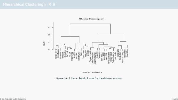
Hierarchical Clustering in R ii
Porsc
he 91
4−2
Lotus
Euro
paDa
tsun 7
10Vo
lvo 14
2EHo
nda C
ivic
Fiat X
1−9
Fiat 1
28To
yota
Corol
laMe
rc 28
0Me
rc 28
0CHo
rnet 4
Driv
eVa
liant
Toyo
ta Co
rona
Merc
240D
Merc
230
Chrys
ler Im
peria
lCa
dillac
Flee
twoo
dLin
coln
Conti
nenta
lDu
ster 3
60Ca
maro
Z28
Merc
450S
LCMe
rc 45
0SE
Merc
450S
LHo
rnet S
porta
bout
Ponti
ac Fi
rebird
Dodg
e Cha
lleng
erAM
C Ja
velin
Ferra
ri Dino
Mazd
a RX4
Mazd
a RX4
Wag
Ford
Pante
ra L
Mase
rati B
ora05
1015
Cluster Dendrogram
hclust (*, "ward.D2").
Heigh
t
Figure 29: A hierarchical cluster for the dataset mtcars.
© Dr. Philippe J.S. De Brouwer 138/296

The Big R-Book by Philippe J.S. De Brouwer
part 05: Modelling↓
chapter 24:
Towards a Tidy Modelling Cycle with modelr
© Dr. Philippe J.S. De Brouwer 139/296

Loading the Packages and Show the Example
The package model provides a layer around R’s base functions that allows not only to work with models using thepipe %>% command, but also provides some functions that are more intuitive to work with. modelr is not part ofthe core-tidyverse, so, we need to load it separately.
library(tidyverse)
library(modelr)
d <- mtcars
lm1 <- lm(mpg ~ wt + cyl, data = d)
© Dr. Philippe J.S. De Brouwer 140/296

The Big R-Book by Philippe J.S. De Brouwer
part 05: Modelling
↓
chapter 24: Towards a Tidy Modelling Cycle with modelr
↓
section 1:
Adding predictions
© Dr. Philippe J.S. De Brouwer 141/296
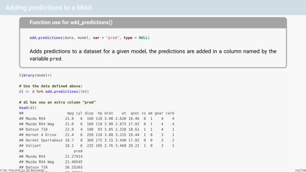
Adding predictions to a Mdel
Function use for add_predictions()
add_predictions(data, model, var = "pred", type = NULL)
Adds predictions to a dataset for a given model, the predictions are added in a column named by thevariable pred.
library(modelr)
# Use the data defined above:
d1 <- d %>% add_predictions(lm1)
# d1 has now an extra column "pred"
head(d1)
## mpg cyl disp hp drat wt qsec vs am gear carb
## Mazda RX4 21.0 6 160 110 3.90 2.620 16.46 0 1 4 4
## Mazda RX4 Wag 21.0 6 160 110 3.90 2.875 17.02 0 1 4 4
## Datsun 710 22.8 4 108 93 3.85 2.320 18.61 1 1 4 1
## Hornet 4 Drive 21.4 6 258 110 3.08 3.215 19.44 1 0 3 1
## Hornet Sportabout 18.7 8 360 175 3.15 3.440 17.02 0 0 3 2
## Valiant 18.1 6 225 105 2.76 3.460 20.22 1 0 3 1
## pred
## Mazda RX4 22.27914
## Mazda RX4 Wag 21.46545
## Datsun 710 26.25203
## Hornet 4 Drive 20.38052
## Hornet Sportabout 16.64696
## Valiant 19.59873
© Dr. Philippe J.S. De Brouwer 142/296

The Big R-Book by Philippe J.S. De Brouwer
part 05: Modelling
↓
chapter 24: Towards a Tidy Modelling Cycle with modelr
↓
section 2:
Adding Residuals
© Dr. Philippe J.S. De Brouwer 143/296
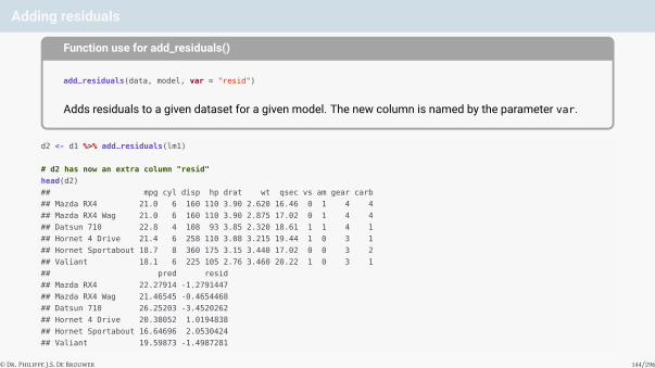
Adding residuals
Function use for add_residuals()
add_residuals(data, model, var = "resid")
Adds residuals to a given dataset for a given model. The new column is named by the parameter var.
d2 <- d1 %>% add_residuals(lm1)
# d2 has now an extra column "resid"
head(d2)
## mpg cyl disp hp drat wt qsec vs am gear carb
## Mazda RX4 21.0 6 160 110 3.90 2.620 16.46 0 1 4 4
## Mazda RX4 Wag 21.0 6 160 110 3.90 2.875 17.02 0 1 4 4
## Datsun 710 22.8 4 108 93 3.85 2.320 18.61 1 1 4 1
## Hornet 4 Drive 21.4 6 258 110 3.08 3.215 19.44 1 0 3 1
## Hornet Sportabout 18.7 8 360 175 3.15 3.440 17.02 0 0 3 2
## Valiant 18.1 6 225 105 2.76 3.460 20.22 1 0 3 1
## pred resid
## Mazda RX4 22.27914 -1.2791447
## Mazda RX4 Wag 21.46545 -0.4654468
## Datsun 710 26.25203 -3.4520262
## Hornet 4 Drive 20.38052 1.0194838
## Hornet Sportabout 16.64696 2.0530424
## Valiant 19.59873 -1.4987281
© Dr. Philippe J.S. De Brouwer 144/296

The Big R-Book by Philippe J.S. De Brouwer
part 05: Modelling
↓
chapter 24: Towards a Tidy Modelling Cycle with modelr
↓
section 3:
Bootstrapping Data
© Dr. Philippe J.S. De Brouwer 145/296

Bootstrapping data i
Function use for bootstrap()
bootstrap(data, n, id = ".id")
Generates n bootstrap replicates (dataset build from random draws –with replacement – of observationsfrom the source data) of the dataset data.
The following code illustrates how bootstrapping can be used to generate a set of estimates for relevantcoefficients for a linear model, and then tidies up the results for further use.
© Dr. Philippe J.S. De Brouwer 146/296

Bootstrapping data ii
set.seed(1872) # make sure that results can be replicated
library(modelr) # provides bootstrap
library(purrr) # provides map, map_df, etc.
library(ggplot2) # provides ggplot
d <- mtcars
boot <- bootstrap(d, 10)
# Now, we can leverage tidyverse functions such as map to create
# multiple models on the 10 datasets
models <- map(boot$strap, ~ lm(mpg ~ wt + cyl, data = .))
# The function tidy of broom (also tidyverse) allows to create a
# dataset based on the list of models. Broom is not loaded, because
# it also provides a function bootstrap().
tidied <- map_df(models, broom::tidy, .id = "id")
Now that we have a tidy tibble of results, we can for example visualise the results in order to study how stable themodel is. The histogram of the estimates of coefficients is shown in Figure 30 on slide 149 with the followingcode.
© Dr. Philippe J.S. De Brouwer 147/296

Bootstrapping data iii
# Visualize the results with ggplot2:
p <- ggplot(tidied, aes(estimate)) +
geom_histogram(bins = 5, col = 'red', fill='khaki3',
alpha = 0.5) +
ylab('Count') +
xlab('Estimate of the coefficient in the plot-title') +
facet_grid(. ~ term, scales = "free")
p
© Dr. Philippe J.S. De Brouwer 148/296
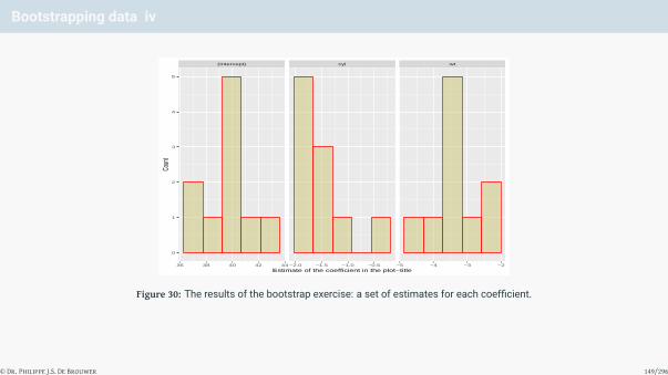
Bootstrapping data iv
(Intercept) cyl wt
36 38 40 42 44 −2.0 −1.5 −1.0 −0.5 −5 −4 −3 −2
0
1
2
3
4
5
Estimate of the coefficient in the plot−title
Coun
t
Figure 30: The results of the bootstrap exercise: a set of estimates for each coefficient.
© Dr. Philippe J.S. De Brouwer 149/296

The Big R-Book by Philippe J.S. De Brouwer
part 05: Modelling
↓
chapter 24: Towards a Tidy Modelling Cycle with modelr
↓
section 4:
Other Functions of modelr
© Dr. Philippe J.S. De Brouwer 150/296

The Big R-Book by Philippe J.S. De Brouwer
part 05: Modelling↓
chapter 25:
Model Validation
© Dr. Philippe J.S. De Brouwer 151/296

The Big R-Book by Philippe J.S. De Brouwer
part 05: Modelling
↓
chapter 25: Model Validation
↓
section 1:
Model Quality Measures
© Dr. Philippe J.S. De Brouwer 152/296

Model Quality Measures with modelr
# load modelr:
library(modelr)
# Fit a model:
lm1 <- lm(mpg ~ wt + qsec + am, data = mtcars)
# MSE (mean square error):
mse(lm1, mtcars)
## [1] 5.290185
# RMSE (root mean square error):
rmse(lm1, mtcars)
## [1] 2.30004
# MAD (mean absolute error):
mae(lm1, mtcars)
## [1] 1.931954
# Quantiles of absolute error:
qae(lm1, mtcars)
## 5% 25% 50% 75% 95%
## 0.3794271 0.9657082 1.4923568 2.8170045 4.3435305
# R-square (variance of predictions divided by the variance of the
# response variable):
rsquare(lm1, mtcars)
## [1] 0.8496636© Dr. Philippe J.S. De Brouwer 153/296

Cross Validations with modelr
set.seed(1871)
# Split the data:
rs <- mtcars %>%
resample_partition(c(train = 0.6, test = 0.4))
# Train the model on the training set:
lm2 <- lm(mpg ~ wt + qsec + am, data = rs$train)
# Compare the RMSE on the training set with the testing set:
rmse(lm2, rs$train); rmse(lm2, rs$test)
## [1] 2.354864
## [1] 2.559619
# Note that this can alos be done with the pipe operator:
lm2 %>% rmse(rs$train)
## [1] 2.354864
lm2 %>% rmse(rs$test)
## [1] 2.559619
© Dr. Philippe J.S. De Brouwer 154/296

The Big R-Book by Philippe J.S. De Brouwer
part 05: Modelling
↓
chapter 25: Model Validation
↓
section 2:
Predictions and Residuals
© Dr. Philippe J.S. De Brouwer 155/296

Add Predictions and Residuals with modelr
# Fit the model:
lm1 <- lm(mpg ~ wt + qsec + am, data = mtcars)
# Add the predictions and residuals:
df <- mtcars %>%
add_predictions(lm1) %>%
add_residuals(lm1)
# The predictions are now available in $pred:
head(df$pred)
## [1] 22.47046 22.15825 26.28107 20.85744 17.00959 20.85409
# The residuals are now available in $resid:
head(df$resid)
## [1] -1.4704610 -1.1582487 -3.4810670 0.5425557 1.6904131 -2.7540920
# It is now easy to do something with those predictions and
# residuals, e.g. the following 3 lines all do the same:
sum((df$pred - df$mpg)^2) / nrow(mtcars)
## [1] 5.290185
sum((df$resid)^2) / nrow(mtcars)
## [1] 5.290185
mse(lm1, mtcars) # Check if this yields the same
## [1] 5.290185
© Dr. Philippe J.S. De Brouwer 156/296

The Big R-Book by Philippe J.S. De Brouwer
part 05: Modelling
↓
chapter 25: Model Validation
↓
section 3:
Bootstrapping
© Dr. Philippe J.S. De Brouwer 157/296

Bootstrapping in base R
The function “sample()” takes a sample from data
Function use for sample()
sample(x, size, replace = FALSE, prob = NULL) with• x: either a vector of one or more elements from which to choose, or a positive integer.• size: the number of items to select from x• replace: set to TRUE if sampling is to be done with replacement• prob: a vector of probability weights for obtaining the elements of the vector being sampled
© Dr. Philippe J.S. De Brouwer 158/296

Example: Sampling the SP500 data i
# Create the sample:
SP500_sample <- sample(SP500,size=100)
# Change plotting to 4 plots in one output:
par(mfrow=c(2,2))
# The histogram of the complete dataset:
hist(SP500,main="(a) Histogram of all data",fr=FALSE,
breaks=c(-9:5),ylim=c(0,0.4))
# The histogram of the sample:
hist(SP500_sample,main="(b) Histogram of the sample",
fr=FALSE,breaks=c(-9:5),ylim=c(0,0.4))
# The boxplot of the complete dataset:
boxplot(SP500,main="(c) Boxplot of all data",ylim=c(-9,5))
# The boxplot of the complete sample:
boxplot(SP500_sample,main="(c) Boxplot of the sample",
ylim=c(-9,5))
© Dr. Philippe J.S. De Brouwer 159/296

Example: Sampling the SP500 data ii
(a) Histogram of all data
SP500De
nsity
−8 −6 −4 −2 0 2 4
0.00.1
0.20.3
0.4
(b) Histogram of the sample
SP500_sample
Dens
ity
−8 −6 −4 −2 0 2 4
0.00.1
0.20.3
0.4
●●
●
●
●
●●
●
●
●
●
●
●●
●
●●●
●●
●
●
●●
●●●●
●
●
●●●●●
●●
●
●●
●
●
●●
●
●
●
●
●
●
●
●
●●●●
●●
●
●
●
●
●
●
●
●
●
●●
●
●
●
●
●
●
●●
●
●
●●
●
●
●●
●
●●
●
●
●
●●
●
●●
●●●
●
●
●
●
●
●●
●
●●
●●
●●
●
●
●
●
●●●
●●
●
●●
●
●
●
●
●
●●
●
●
●
●
●●●
●
●
●
●
●
−8−4
02
4(c) Boxplot of all data
●
●
●
●●
●
−8−4
02
4
(c) Boxplot of the sample
Figure 31: Bootstrapping the returns of the S&P500 index.
© Dr. Philippe J.S. De Brouwer 160/296

Example: Sampling the SP500 data iii
# Reset the plot parameters:
par(mfrow=c(1,1))
In base R, the sample is a dataset itself and it can be addressed as any other dataset:
mean(SP500)
## [1] 0.04575267
mean(SP500_sample)
## [1] 0.07596865
sd(SP500)
## [1] 0.9477464
sd(SP500_sample)
## [1] 0.9967802
© Dr. Philippe J.S. De Brouwer 161/296

Bootstrapping with modelr
The function bootstrap() works as follows:
# Bootstrap generates a number of re-ordered datasets
boot <- bootstrap(mtcars, 3)
# The datasets are now in boot$strap[[n]]
# with n between 1 and 3
# e.g. the 3rd set is addressed as follows:
class(boot$strap[[3]])
## [1] "resample"
nrow(boot$strap[[3]])
## [1] 32
mean(as.data.frame(boot$strap[[3]])$mpg)
## [1] 18.94687
# It is also possible to coerce the selections into a data-frame:
df <- as.data.frame(boot$strap[[3]])
class(df)
## [1] "data.frame"
© Dr. Philippe J.S. De Brouwer 162/296

Bootstrapping with modelr: an Example i
set.seed(1871)
library(purrr) # to use the function map()
boot <- bootstrap(mtcars, 150)
lmodels <- map(boot$strap, ~ lm(mpg ~ wt + hp + am:vs, data = .))
# The function tidy of broom turns a model object in a tibble:
df_mods <- map_df(lmodels, broom::tidy, .id = "id")
# Create the plots of histograms of estimates for the coefficients:
par(mfrow=c(2,2))
hist(subset(df_mods, term == "wt")$estimate, col="khaki3",
main = '(a) wt', xlab = 'estimate for wt')
hist(subset(df_mods, term == "hp")$estimate, col="khaki3",
main = '(b) hp', xlab = 'estimate for hp')
hist(subset(df_mods, term == "am:vs")$estimate, col="khaki3",
main = '(c) am:vs', xlab = 'estimate for am:vs')
hist(subset(df_mods, term == "(Intercept)")$estimate, col="khaki3",
main = '(d) intercept', xlab = 'estimate for the intercept')
© Dr. Philippe J.S. De Brouwer 163/296
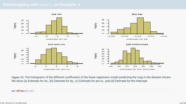
Bootstrapping with modelr: an Example ii
(a) wt
estimate for wt
Frequen
cy
−5 −4 −3 −2 −1
010
2030
40
(b) hp
estimate for hp
Frequen
cy
−0.05 −0.04 −0.03 −0.02 −0.01
010
2030
40
(c) am:vs
estimate for am:vs
Frequen
cy
0 2 4 6 8
05
1020
30
(d) intercept
estimate for the intercept
Frequen
cy
28 30 32 34 36 38 40
05
1015
2025
30
Figure 32: The histograms of the different coefficients of the linear regression model predicting the mpg in the dataset mtcars.We show (a) Estimate for wt., (b) Estimate for hp., (c) Estimate for am:vs., and (d) Estimate for the intercept.
par(mfrow=c(1,1))
© Dr. Philippe J.S. De Brouwer 164/296

The Big R-Book by Philippe J.S. De Brouwer
part 05: Modelling
↓
chapter 25: Model Validation
↓
section 4:
Cross-Validation
© Dr. Philippe J.S. De Brouwer 165/296

Elementary Cross Validation in Base R
d <- mtcars # get data
set.seed(1871) # set the seed for the random generator
idx.train <- sample(1:nrow(d),round(0.75*nrow(d)))
d.train <- d[idx.train,] # positive matches for training set
d.test <- d[-idx.train,] # the opposite to the testing set
© Dr. Philippe J.S. De Brouwer 166/296
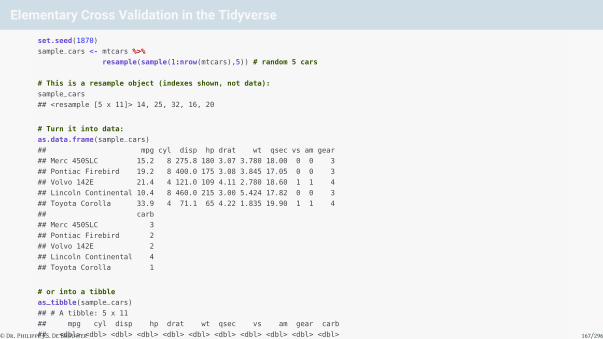
Elementary Cross Validation in the Tidyverse
set.seed(1870)
sample_cars <- mtcars %>%
resample(sample(1:nrow(mtcars),5)) # random 5 cars
# This is a resample object (indexes shown, not data):
sample_cars
## <resample [5 x 11]> 14, 25, 32, 16, 20
# Turn it into data:
as.data.frame(sample_cars)
## mpg cyl disp hp drat wt qsec vs am gear
## Merc 450SLC 15.2 8 275.8 180 3.07 3.780 18.00 0 0 3
## Pontiac Firebird 19.2 8 400.0 175 3.08 3.845 17.05 0 0 3
## Volvo 142E 21.4 4 121.0 109 4.11 2.780 18.60 1 1 4
## Lincoln Continental 10.4 8 460.0 215 3.00 5.424 17.82 0 0 3
## Toyota Corolla 33.9 4 71.1 65 4.22 1.835 19.90 1 1 4
## carb
## Merc 450SLC 3
## Pontiac Firebird 2
## Volvo 142E 2
## Lincoln Continental 4
## Toyota Corolla 1
# or into a tibble
as_tibble(sample_cars)
## # A tibble: 5 x 11
## mpg cyl disp hp drat wt qsec vs am gear carb
## <dbl> <dbl> <dbl> <dbl> <dbl> <dbl> <dbl> <dbl> <dbl> <dbl> <dbl>
## 1 15.2 8 276. 180 3.07 3.78 18 0 0 3 3
## 2 19.2 8 400 175 3.08 3.84 17.0 0 0 3 2
## 3 21.4 4 121 109 4.11 2.78 18.6 1 1 4 2
## 4 10.4 8 460 215 3 5.42 17.8 0 0 3 4
## 5 33.9 4 71.1 65 4.22 1.84 19.9 1 1 4 1
# or use the indices to get to the data:
mtcars[as.integer(sample_cars),]
## mpg cyl disp hp drat wt qsec vs am gear
## Merc 450SLC 15.2 8 275.8 180 3.07 3.780 18.00 0 0 3
## Pontiac Firebird 19.2 8 400.0 175 3.08 3.845 17.05 0 0 3
## Volvo 142E 21.4 4 121.0 109 4.11 2.780 18.60 1 1 4
## Lincoln Continental 10.4 8 460.0 215 3.00 5.424 17.82 0 0 3
## Toyota Corolla 33.9 4 71.1 65 4.22 1.835 19.90 1 1 4
## carb
## Merc 450SLC 3
## Pontiac Firebird 2
## Volvo 142E 2
## Lincoln Continental 4
## Toyota Corolla 1
© Dr. Philippe J.S. De Brouwer 167/296

Elementary Cross Validation in the Tidyverse
library(modelr)
rs <- mtcars %>%
resample_partition(c(train = 0.6, test = 0.4))
# address the datasets with: as.data.frame(rs$train)
# as.data.frame(rs$test)
# Check execution:
lapply(rs, nrow)
## $train
## [1] 19
##
## $test
## [1] 13
© Dr. Philippe J.S. De Brouwer 168/296

Elementary Cross Validation in the Tidyverse:an Example i
Now, that we have a training and test dataset, we have all the tools necessary. The standard workflow nowbecomes simply the following:
# 0. Store training and test dataset for further use (optional):
d_train <- as.data.frame(rs$train)
d_test <- as.data.frame(rs$test)
# 1. Fit the model on the training dataset:
lm1 <- lm(mpg ~ wt + hp + am:vs, data = rs$train)
# 2. Calculate the desired performance measure (e.g.
# root mean square error (rmse)):
rmse_trn <- lm1 %>% rmse(rs$train)
rmse_tst <- lm1 %>% rmse(rs$test)
print(rmse_trn)
## [1] 2.014614
print(rmse_tst)
## [1] 2.990294
We were using a performance measure that was readily available via the function rmse(), but if we want tocalculate another risk measure, we might need the residuals and/or predictions first. Below, we calculate thesame risk measure without using the function rmse(). Note that step one is the same as in the aforementionedcode.
© Dr. Philippe J.S. De Brouwer 169/296

Elementary Cross Validation in the Tidyverse:an Example ii
# 2. Add predictions and residuals:
x_trn <- add_predictions(d_train, model = lm1) %>%
add_residuals(model = lm1)
x_tst <- add_predictions(d_test, model = lm1) %>%
add_residuals(model = lm1)
# 3. Calculate the desired risk metrics (via the residuals):
RMSE_trn <- sqrt(sum(x_trn$resid^2) / nrow(d_train))
RMSE_tst <- sqrt(sum(x_tst$resid^2) / nrow(d_test))
print(RMSE_trn)
## [1] 2.014614
print(RMSE_tst)
## [1] 2.990294
© Dr. Philippe J.S. De Brouwer 170/296

Monte Carlo Cross Validation in the tidyverse: the Tools
# Monte Carlo cross validation
cv_mc <- crossv_mc(data = mtcars, # the dataset to split
n = 50, # n random partitions train and test
test = 0.25, # validation set is 25%
id = ".id") # unique identifier for each model
# Example of use:
# Access the 2nd test dataset:
d <- data.frame(cv_mc$test[2])
# Access mpg in that data frame:
data.frame(cv_mc$test[2])$mpg
## [1] 16.4 10.4 30.4 19.2 27.3 26.0 15.8 19.7 15.0
# More cryptic notations are possible to obtain the same:
mtcars[cv_mc[[2]][[2]][2]$idx,1]
## [1] 16.4 10.4 30.4 19.2 27.3 26.0 15.8 19.7 15.0
© Dr. Philippe J.S. De Brouwer 171/296

Monte Carlo Cross Validation in the tidyverse: An Example i
set.seed(1868)
library(modelr) # sample functions
library(purrr) # to use the function map()
cv_mc <- crossv_mc(mtcars, n = 50, test = 0.40)
mods <- map(cv_mc$train, ~ lm(mpg ~ wt + hp + am:vs, data = .))
RMSE <- map2_dbl(mods, cv_mc$test, rmse)
hist(RMSE, col="khaki3")
© Dr. Philippe J.S. De Brouwer 172/296

Monte Carlo Cross Validation in the tidyverse: An Example ii
Histogram of RMSE
RMSE
Freq
uenc
y
1.5 2.0 2.5 3.0 3.5 4.0 4.5
05
1015
20
Figure 33: The histogram of the RMSE for a Monte Carlo cross validation on the dataset mtcars.
© Dr. Philippe J.S. De Brouwer 173/296

k-fold Cross Validation in the tidyverse: the Tools
The function crossv_kfold of modelr will prepare the selections as for each run as follows.
library(modelr)
# k-fold cross validation
cv_k <- crossv_kfold(data = mtcars,
k = 5, # number of folds
id = ".id") # unique identifier for each
Each observation of the 32 will now appear once in one test dataset:
cv_k$test
## $`1`
## <resample [7 x 11]> 1, 6, 14, 15, 23, 26, 32
##
## $`2`
## <resample [7 x 11]> 3, 10, 12, 17, 18, 22, 28
##
## $`3`
## <resample [6 x 11]> 2, 4, 9, 19, 20, 25
##
## $`4`
## <resample [6 x 11]> 5, 8, 13, 24, 27, 29
##
## $`5`
## <resample [6 x 11]> 7, 11, 16, 21, 30, 31
© Dr. Philippe J.S. De Brouwer 174/296

k-fold Cross Validation in the tidyverse: an Example i
set.seed(1868)
library(modelr)
library(magrittr) # to access the %T>% pipe
crossv <- mtcars %>%
crossv_kfold(k = 5)
RMSE <- crossv %$%
map(train, ~ lm(mpg ~ wt + hp + am:vs, data = .)) %>%
map2_dbl(crossv$test, rmse) %T>%
hist(col = "khaki3", main ="Histogram of RMSE",
xlab = "RMSE")
© Dr. Philippe J.S. De Brouwer 175/296

k-fold Cross Validation in the tidyverse: an Example ii
Histogram of RMSE
RMSE
Freq
uenc
y
1.0 1.5 2.0 2.5 3.0 3.5 4.0
0.00.2
0.40.6
0.81.0
Figure 34: Histogram of the RMSE based on a 5-fold cross validation. The histogram indeed shows that there were 5observations. Note the significant spread of RMSE: the largest one is about four times the smallest.
© Dr. Philippe J.S. De Brouwer 176/296

The Big R-Book by Philippe J.S. De Brouwer
part 05: Modelling
↓
chapter 25: Model Validation
↓
section 5:
Validation in a Broader Perspective
© Dr. Philippe J.S. De Brouwer 177/296
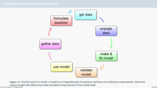
Validation in a Broader Perspective
formulatequestion
get data
wrangledata
make &fit model
validatemodel
use model
gather data
Figure 35: The life cycle of a model: a model is an integrated part of business and focus of continuous improvement. Note howusing a model will collect more data and lead to improvement of the model itself.
© Dr. Philippe J.S. De Brouwer 178/296

The Big R-Book by Philippe J.S. De Brouwer
part 05: Modelling↓
chapter 26:
Labs
© Dr. Philippe J.S. De Brouwer 179/296

The Big R-Book by Philippe J.S. De Brouwer
part 05: Modelling
↓
chapter 26: Labs
↓
section 1:
Financial Analysis with quantmod
© Dr. Philippe J.S. De Brouwer 180/296

quantmod
# Install quantmod:
if(!any(grepl("quantmod", installed.packages()))){
install.packages("quantmod")}
# Load the library:
library(quantmod)
Now, we are ready to use quantmod. For example, we can start downloading some data with the functiongetSymbols():
# Download historic data of the Google share price:
getSymbols("GOOG", src = "yahoo") # get Google's history
## [1] "GOOG"
getSymbols(c("GS", "GOOG"), src = "yahoo") # to load more than one
## [1] "GS" "GOOG"
© Dr. Philippe J.S. De Brouwer 181/296

What type of data does quantmod provide?
The function stockSymbols() can provide a list of symbols that are quoted on Amex, Nasdaq, and NSYE.
stockList <- stockSymbols() # get all symbols
nrow(stockList) # number of symbols
## [1] 11083
colnames(stockList) # information in this list
## [1] "Symbol" "Name" "LastSale"
## [4] "MarketCap" "IPOyear" "Sector"
## [7] "Industry" "Exchange" "Test.Issue"
## [10] "Round.Lot.Size" "ETF" "Market.Category"
## [13] "Financial.Status" "Next.Shares" "ACT.Symbol"
## [16] "CQS.Symbol" "NASDAQ.Symbol"
© Dr. Philippe J.S. De Brouwer 182/296

plotting in QuantMod i
getSymbols("HSBC",src="yahoo") #get HSBC's data from Yahoo
## [1] "HSBC"
# 1. The bar chart:
barChart(HSBC)
© Dr. Philippe J.S. De Brouwer 183/296
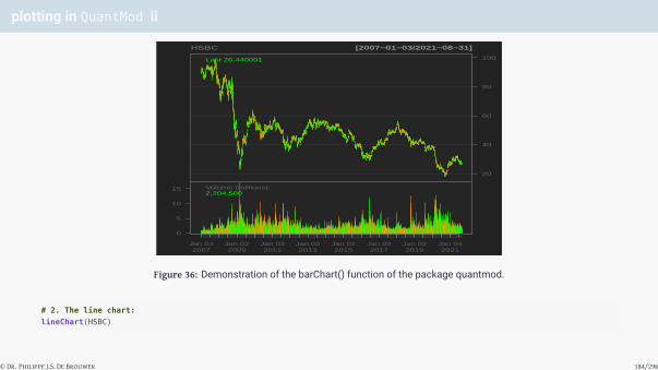
plotting in QuantMod ii
20
40
60
80
100
HSBC [2007−01−03/2021−08−31]
Last 26.440001
Volume (millions):2,204,500
0
5
10
15
Jan 032007
Jan 022009
Jan 032011
Jan 022013
Jan 022015
Jan 032017
Jan 022019
Jan 042021
Figure 36: Demonstration of the barChart() function of the package quantmod.
# 2. The line chart:
lineChart(HSBC)
© Dr. Philippe J.S. De Brouwer 184/296
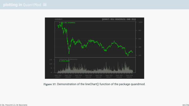
plotting in QuantMod iii
20
40
60
80
100
HSBC [2007−01−03/2021−08−31]
Last 26.440001
Volume (millions):2,204,500
0
5
10
15
Jan 032007
Jan 022009
Jan 032011
Jan 022013
Jan 022015
Jan 032017
Jan 022019
Jan 042021
Figure 37: Demonstration of the lineChart() function of the package quandmod.
© Dr. Philippe J.S. De Brouwer 185/296

plotting in QuantMod iv
# Note: the lineChart is also the default that yields the same as plot(HSBC)
# 3. The candle chart:
candleChart(HSBC, subset='last 1 years',theme="white",
multi.col=TRUE)
© Dr. Philippe J.S. De Brouwer 186/296
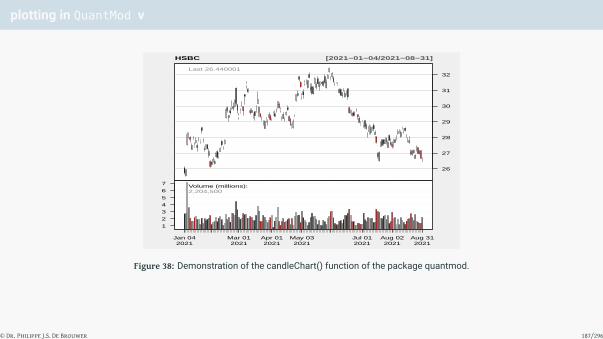
plotting in QuantMod v
26
27
28
29
30
31
32
HSBC [2021−01−04/2021−08−31]
Last 26.440001
Volume (millions):2,204,500
1
2
3
4
5
6
7
Jan 042021
Mar 012021
Apr 012021
May 032021
Jul 012021
Aug 022021
Aug 312021
Figure 38: Demonstration of the candleChart() function of the package quantmod.
© Dr. Philippe J.S. De Brouwer 187/296

quantmod data structure
myxtsdata["2008-01-01/2010-12-31"] # between 2 date-stamps
# All data before or after a certain time-stamp:
xtsdata["/2007"] # from start of data until end of 2007
xtsdata["2009/"] # from 2009 until the end of the data
# Select the data between different hours:
xtsdata["T07:15/T09:45"]
© Dr. Philippe J.S. De Brouwer 188/296

Subsetting by Time and Date
HSBC['2017'] #returns HSBC's OHLC data for 2017
HSBC['2017-08'] #returns HSBC's OHLC data for August 2017
HSBC['2017-06::2018-01-15'] # from June 2017 to Jan 15 2018
HSBC['::'] # returns all data
HSBC['2017::'] # returns all data in HSBC, from 2017 onward
my.selection <- c('2017-01','2017-03','2017-11')
HSBC[my.selection]
© Dr. Philippe J.S. De Brouwer 189/296

Aggregating to a different time scale
periodicity(HSBC)
unclass(periodicity(HSBC))
to.weekly(HSBC)
to.monthly(HSBC)
periodicity(to.monthly(HSBC))
ndays(HSBC); nweeks(HSBC); nyears(HSBC)
© Dr. Philippe J.S. De Brouwer 190/296

Apply by Period
endpoints(HSBC,on="years")
## [1] 0 251 504 756 1008 1260 1510 1762 2014 2266 2518 2769 3020
## [14] 3272 3525 3692
# Find the maximum closing price each year:
apply.yearly(HSBC,FUN=function(x) {max(Cl(x)) } )
## [,1]
## 2007-12-31 99.52
## 2008-12-31 87.67
## 2009-12-31 63.95
## 2010-12-31 59.32
## 2011-12-30 58.99
## 2012-12-31 53.07
## 2013-12-31 58.61
## 2014-12-31 55.96
## 2015-12-31 50.17
## 2016-12-30 42.96
## 2017-12-29 51.66
## 2018-12-31 55.62
## 2019-12-31 44.70
## 2020-12-31 39.37
## 2021-08-31 32.38
# The same thing - only more general:
subHSBC <- HSBC['2012::']
period.apply(subHSBC,endpoints(subHSBC,on='years'), FUN=function(x) {max(Cl(x))} )
## [,1]
## 2012-12-31 53.07
## 2013-12-31 58.61
## 2014-12-31 55.96
## 2015-12-31 50.17
## 2016-12-30 42.96
## 2017-12-29 51.66
## 2018-12-31 55.62
## 2019-12-31 44.70
## 2020-12-31 39.37
## 2021-08-31 32.38
# The following line does the same but is faster:
as.numeric(period.max(Cl(subHSBC),endpoints(subHSBC, on='years')))
## [1] 53.07 58.61 55.96 50.17 42.96 51.66 55.62 44.70 39.37 32.38
© Dr. Philippe J.S. De Brouwer 191/296

quantmod functions i
seriesHi(HSBC)
## HSBC.Open HSBC.High HSBC.Low HSBC.Close HSBC.Volume
## 2007-10-31 98.92 99.52 98.05 99.52 1457900
## HSBC.Adjusted
## 2007-10-31 49.39895
has.Cl(HSBC)
## [1] TRUE
tail(Cl(HSBC))
## HSBC.Close
## 2021-08-24 26.88
## 2021-08-25 27.39
## 2021-08-26 26.97
## 2021-08-27 27.15
## 2021-08-30 26.68
## 2021-08-31 26.44
There are even functions that will calculate differences, for example:
• OpCl(): daily percent change open to close• OpOp(): daily open to open change
© Dr. Philippe J.S. De Brouwer 192/296

quantmod functions ii
• HiCl(): the percent change from high to close
These functions rely on the following that are also available to use:
• Lag(): gets the previous value in the series
• Next(): gets the next value in the series
• Delt(): returns the change (delta) from two prices
Lag(Cl(HSBC))
Lag(Cl(HSBC), c(1, 5, 10)) # One, five and ten period lags
Next(OpCl(HSBC))
# Open to close one, two and three-day lags:
Delt(Op(HSBC),Cl(HSBC),k=1:3)
© Dr. Philippe J.S. De Brouwer 193/296

Period Returns i
dailyReturn(HSBC)
weeklyReturn(HSBC)
monthlyReturn(HSBC)
quarterlyReturn(HSBC)
yearlyReturn(HSBC)
allReturns(HSBC) # all previous returns
© Dr. Philippe J.S. De Brouwer 194/296

Financial Models in quantmod
Consider the following naive model:
# First, we create a quantmod object.
# At this point, we do not need to load data.
setSymbolLookup(SPY = 'yahoo', VXN = list(name = '^VIX', src = 'yahoo'))
qmModel <- specifyModel(Next(OpCl(SPY)) ~ OpCl(SPY) + Cl(VIX))
head(modelData(qmModel))
## Next.OpCl.SPY OpCl.SPY Cl.VIX
## 2014-12-04 0.0006254149 0.0005782548 28447.7
## 2014-12-05 -0.0043851339 0.0006254149 26056.5
## 2014-12-08 0.0102755104 -0.0043851339 23582.8
## 2014-12-09 -0.0133553492 0.0102755104 21274.0
## 2014-12-10 0.0015204875 -0.0133553492 19295.0
## 2014-12-11 -0.0086360048 0.0015204875 17728.3
© Dr. Philippe J.S. De Brouwer 195/296

A Simple Model with quantmod i
First, we import the data and plot the linechart for the symbol in Figure 39 on slide 197:
getSymbols('HSBC',src='yahoo') #google doesn't carry the adjusted price
## [1] "HSBC"
lineChart(HSBC)
© Dr. Philippe J.S. De Brouwer 196/296

A Simple Model with quantmod ii
20
40
60
80
100
HSBC [2007−01−03/2021−08−31]
Last 26.440001
Volume (millions):2,204,500
0
5
10
15
Jan 032007
Jan 022009
Jan 032011
Jan 022013
Jan 022015
Jan 032017
Jan 022019
Jan 042021
Figure 39: The evolution of the HSBC share for the last ten years.
© Dr. Philippe J.S. De Brouwer 197/296

A Simple Model with quantmod iii
The line-chart shows that the behaviour of the stock is very different in the period after the crisis. Therefore, wedecide to consider only data after 2010.
HSBC.tmp <- HSBC["2010/"] #see: subsetting for xts objects
The next step is to divide our data in a training dataset and a test-dataset.
# use 70% of the data to train the model:
n <- floor(nrow(HSBC.tmp) * 0.7)
HSBC.train <- HSBC.tmp[1:n] # training data
HSBC.test <- HSBC[(n+1):nrow(HSBC.tmp)] # test-data
# head(HSBC.train)
Till now we used the functionality of quantmod to pull in data, but the function specifyModel() allows us toprepare automatically the data for modelling: it will align the next opening price with the explaining variables.Further, modelData() allows to make sure the data is up-to-date.
# Making sure that whenever we re-run this the latest data is pulled in:
m.qm.tr <- specifyModel(Next(Op(HSBC.train)) ~ Ad(HSBC.train)
+ Hi(HSBC.train) - Lo(HSBC.train) + Vo(HSBC.train))
D <- modelData(m.qm.tr)
© Dr. Philippe J.S. De Brouwer 198/296

A Simple Model with quantmod iv
We decide to create an additional variable that is the difference between the high and low prices of the previousday.
# Add the additional column:
D$diff.HSBC <- D$Hi.HSBC.train - D$Lo.HSBC.train
# Note that the last value is NA:
tail(D, n = 3L)
## Next.Op.HSBC.train Ad.HSBC.train Hi.HSBC.train
## 2018-02-28 49.93 42.10609 50.39
## 2018-03-01 49.14 42.08063 50.00
## 2018-03-02 NA 41.97883 49.52
## Lo.HSBC.train Vo.HSBC.train diff.HSBC
## 2018-02-28 49.60 1902700 0.790001
## 2018-03-01 49.27 2673600 0.730000
## 2018-03-02 48.93 2283700 0.590000
# Since the last value is NA, let us remove it:
D <- D[-nrow(D),]
The column names of the data inherit the full name of the dataset. This is not practical since the names will bedifferent in the training set and in the test-set. So we rename them before making the model.
colnames(D) <- c("Next.Op","Ad","Hi","Lo","Vo","Diff")
© Dr. Philippe J.S. De Brouwer 199/296

A Simple Model with quantmod v
Now, we can create the model.
m1 <- lm(D$Next.Op ~ D$Ad + D$Diff + D$Vo)
summary(m1)
##
## Call:
## lm(formula = D$Next.Op ~ D$Ad + D$Diff + D$Vo)
##
## Residuals:
## Min 1Q Median 3Q Max
## -23.5149 -4.4501 0.5144 3.5156 13.5259
##
## Coefficients:
## Estimate Std. Error t value Pr(>|t|)
## (Intercept) 1.541e+01 8.845e-01 17.43 <2e-16 ***## D$Ad 9.391e-01 2.410e-02 38.98 <2e-16 ***## D$Diff 8.538e+00 4.102e-01 20.82 <2e-16 ***## D$Vo -1.183e-06 1.045e-07 -11.32 <2e-16 ***## ---
## Signif. codes: 0 '***' 0.001 '**' 0.01 '*' 0.05 '.' 0.1 ' ' 1
##
## Residual standard error: 4.721 on 2050 degrees of freedom
## Multiple R-squared: 0.5246,Adjusted R-squared: 0.5239
## F-statistic: 754 on 3 and 2050 DF, p-value: < 2.2e-16
© Dr. Philippe J.S. De Brouwer 200/296

The volume of trading in the stock does not seem to play a significant role, so we leave it out.
m2 <- lm(D$Next.Op ~ D$Ad + D$Diff)
summary(m2)
##
## Call:
## lm(formula = D$Next.Op ~ D$Ad + D$Diff)
##
## Residuals:
## Min 1Q Median 3Q Max
## -23.6521 -4.9734 0.9299 3.8559 11.0599
##
## Coefficients:
## Estimate Std. Error t value Pr(>|t|)
## (Intercept) 10.95237 0.81603 13.42 <2e-16 ***## D$Ad 1.03550 0.02323 44.57 <2e-16 ***## D$Diff 6.46346 0.37820 17.09 <2e-16 ***## ---
## Signif. codes: 0 '***' 0.001 '**' 0.01 '*' 0.05 '.' 0.1 ' ' 1
##
## Residual standard error: 4.865 on 2051 degrees of freedom
## Multiple R-squared: 0.4948,Adjusted R-squared: 0.4944
## F-statistic: 1005 on 2 and 2051 DF, p-value: < 2.2e-16
© Dr. Philippe J.S. De Brouwer 201/296
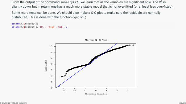
From the output of the command summary(m2) we learn that all the variables are significant now. The R2 isslightly down, but in return, one has a much more stable model that is not over-fitted (or at least less over-fitted).
Some more tests can be done. We should also make a Q-Q plot to make sure the residuals are normallydistributed. This is done with the function qqnorm().
qqnorm(m2$residuals)
qqline(m2$residuals, col = 'blue', lwd = 2)
●
●●
●●
●●●
●
●
●●
●
●
●
●●
●●
●
●
●
●
●
●●
●
●
●
●●● ●
●●
●
●
●
●
●●
●
●●● ●●●
●
●
●
●●
●
●
●
●
● ●
●●●
●
●●
●
●
●
●
●
●
●
●
●
●
●
●
●
●
●●
●●
●●
●
●
●●
●●
●●
●
●
●
●
●
●●
●
●
●●
●●
●
●
●
●
●
●
●●
●
●
●●
●
●●●
●●
●
●
●●
●●●●
●
●
●
●
●
●●
●
●
●●
●
●
●●
●●
●
●
●
●●
●
●
●●
●
●
●●●●
●
●●
●
●●
●●
●
●●
●●
●
●●
●
●●
●●
●
●
●
●●●
●
●
●●
●●
●
●
●●●
●
●
●
●
●●
●
●
●●
●
●
●
●●
●
●
●
●
●
●
●●●●
●
●
●
●
●
●
●
●
●
●●
●
●●
●●●
●●●
●
●●
●
●
●
●
●
●●
●
●
●●●
●
●
●●●
●●
●
●
●
●●
●
●
●
●●●
●
●●●
●
●
●
●
●
●
●●
●
●●
●
●
●●
●●
●
●
●
●●
●
●
●
●●
●
●●
●●
●
●●
●
●●●●●
●
●
●●●
●
●
● ●●
●●
●
●
●
●
●
●
●
●●●●
●●
●●●
●
●●●●●
●●●●
●
●
●●
●●
●●
●●
●
●
●●●
●●●●
●
●
●●
●
●
●
●
●
●
●●
●
●
●
●●
●
●●
●●
●
●
●●
●
●
●
●●●
●
●
●
●●●
●
●●●
●
●
●
●
●
●
●
●●
●
●●
●
●●
●
●
●
●
●
●
●●
●●●
●
●
●
●●
●
●●●●
●●
●
●●
●●
●
●●●
●
●
●●
●●
●
●
●●
●
●
●●
●
●
●
●●
●
●
●
●●●
●
●
●
●●
●●
●
●●
●●●
●
●
●●
●●●
●
●
●
●
●
●
●●
●
●
●
●
●●
●
●
●●
●
●
●●●
●
●●●●
●●
●
●
●
●
●●
●
●●
●
●●●
●
●
●●
●
●●
●
●●●●
●
●
●
●
●
●
●
●
●●
●●
●
●
●
●
●
●
●
●
●
●
●
●
●●
●
●●
●
●●●
●
●
●
●
●●●
●
●
●
●
●●
●●
●
●●
●
●●●
●●
●●
●●●●●
●●
●●
●
●
●
●
●
●
●
●
●
●
●●
●
●
●●●
●●
●●●
●●●
●
●●●
●
●
●
●●
●●
●
●●
●
●
●
●
●●
●●
●
●
●
●
●●
●●
●
●
●
●
●●●●●
●●
●●
●
●
●
●
●●
●●
●
●●
●
●
●
●
●
●
●●●
●●●
●
●
●●●●
●
●●
●●
●●●●
●●
●
●
●●
●
●
●●
●●
●●●●
●●●
●
●
●●●
●●
●●
●●●
●
●
●
●●
●
●
●
●
●●
●
●●
●
●
●●
●
●
●●
●
●●
●
●
●●
●
●
●
●●
●
●●●
●●
●
●
●
●●
●●
●
●●
●
●●
●
●●
●
●●
●
●●
●
●●
●●●●●●●
●●
●
●
●
●
●
●●
●
●●●●
●
●
●
●●
●●
●
●
●
●
●
●
●●
●
●●
●●
●●
●
●
●●
●●
●
●
●
●●●●
●●●
●
●●●
●●
●●
●
●
●
●●
●
●
●●●
●●
●
●●●
●●●●
●
●●●
●
●
●●
●●●●●
●●
●●●
●
●●
●
●
●●
●
●
●●
●
●●
●●●
●
●
●
●●●
●●
●
●●
●●
●●
●●
●●
●
●
●●
●●
●●●
●
●
●●
●●
●●
●●●●●●
●
●●●
●●
●
●●
●●
●
●
●●
●●●
●●●
●
●
●●
●●
●●●
●
●
●
●
●
●●
●
●
●●
●
●
●●
●●
●●
●
●●
●
●
●
●●●
●
●●●●
●
●●
●
●
●
●
●●
●●
●●
●
●
●●●●
●●
●●
●●●
●●
●●●●
●●●
●●
●●●
●
●
●●●
●●●
●
●●●●
●●
●●●●
●●●
●●
●●●
●●
●●●●
●
●●
●●●●●●
●●
●●●
●
●
●
●
●
●●
●
●●
●
●
●●
●●
●●
●●
●●
●●
●●●●
●
●●●
●●
●
●●●●
●●
●
●●
●●
●
●●
●
●
●
●●●●●●
●
●●●●
●●
●
●●●●●
●●
●●●
●●●●
●●
●●
●●
●●
●●
●
●●
●●
●●
●
●●●●
●
●●●
●●●
●
●
●●●●●
●
●
●●●●●●
●
●●
●
●
●
●●●●●
●
●
●●
●●●
●
●●●
●
●
●
●
●●●●
●
●
●
●
●
●●●●●●
●
●
●
●
●●
●●
●●
●●
●●
●●
●●●●
●●
●
●●
●●●●●●●●●●
●
●
●
●
●
●●
●
●●
●●●●
●
●●●
●●●
●●
●●
●
●
●
●
●
●
●●
●●●●●●
●●●
●●
●
●●
●●●
●
●●●
●●●
●●●●
●●
●
●●●
●●●●
●
●
●●
●
●●
●
●●
●
●●●
●●
●●●●
●
●
●
●
●●
●●
●●●●
●●
●●●●●
●
●●●●●
●●
●
●
●●●
●
●●●●
●
●●●●
●
●
●
●●
●
●
●
●
●
●
●●●
●
●●●●●●
●●
●
●●
●●
●
●
●
●
●
●
●●
●
●
●
●
●●
●
●
●●
●●●
●
●
●●●
●
●
●●
●●●
●●●
●●
●●
●
●●●
●
●●●●●●●
● ●●●●●
●
●●●
●●
●●●
●●
● ●
●
●
●●
●●
●●●
●●
●●
●
●
●
●●
●
●
●●
●●●
●
●
●
●
●●
●
●●
●
●
●
●
●●
●
●
●
●
●
●●
●
●●●●
●●
●
●● ●
●
●●
●●
●
●●
●
●
●
●
●●●
●
●●●●●●●
●●●●
●
●
●
●
●●
●●● ●
●
●
●
●●
●
●
●●
●●
●●
●
●
●
●
●
●●
●
●●
●
●
●
●
●
●
●
●
●●●●●●●
●
●●
●
●
●●
●
●●
●
●●
●●
●
●
●●●●●●
●
●
●
●
●●
●
●
●●●●
●●●
●
●
●●
●
●
●●●
●
●
●●
●●●
●
●
●●●
●●
●●
●●●●
●
●
●●
●
●●
●
●
●●
●●●
●
●●●
●
●●●
●●
●●●
●
●
●
●●●
●
●●●
●
●
●
●●
●●●●
●●●
●●●●●
● ●●●●
●
●●●●●●
●●
●
● ●●
●●●●
●
●
●●●●
●●
●
●●●●●●
●●
●●
●●
●
●
●
● ● ●
●●●●
●●
●●●●
●●
●●
●
●●●
●●●
●●
●
●
●●●
●
●●
●●●
●●
●●●
●●
●
●
●
●
●
●●
●●●
●
●●
●
●
●●
●●
●
●●
●
●●
●●
●●
●●
●
●●
●
●
●
●●
●●
●
●●●●●
●●
●●
●
● ●●
●
●
●
●
●●
●
●
●●
●
●
●● ●● ●
●
●
●●
●●●
●●●
●
●
●●
●
●
●
●
●●
●
●
●●●
●●●
●●●●
●
●
●
●
●
●
●
●
●
●
●
●
●
●
●●●
●●
−3 −2 −1 0 1 2 3
−25
−20
−15
−10
−50
510
Normal Q−Q Plot
Theoretical Quantiles
Samp
le Qu
antile
s
© Dr. Philippe J.S. De Brouwer 202/296

Figure 40: The Q-Q plot of our naive model to forecast the next opening price of the HSBC stock. The results seems to bereasonable.
Figure 40 on slide 203 shows that the model does capture well the tail-behaviour of the forecasted variable.However, the predicting power is not great.
© Dr. Philippe J.S. De Brouwer 203/296

Testing the model robustness i
To check the robustness of our model we should now check how well it fits the test-data. The idea is that sincethe model was built only on the training data, that we can assess its robustness by checking how well it does onthe test-data.First, we prepare the test data in the same way as the training data:
m.qm.tst <- specifyModel(Next(Op(HSBC.test)) ~ Ad(HSBC.test)
+ Hi(HSBC.test) - Lo(HSBC.test) + Vo(HSBC.test))
D.tst <- modelData(m.qm.tst)
D.tst$diff.HSBC.test <- D.tst$Hi.HSBC.test-D.tst$Lo.HSBC.test
#tail(D.tst) # the last value is NA
D.tst <- D[-nrow(D.tst),] # remove the last value that is NA
colnames(D.tst) <- c("Next.Op","Ad","Hi","Lo","Vo","Diff")
We could of course use the function predict() to find the predictions of the model, but here we illustrate howcoefficients can be extracted from the model object and used to obtain these predictions. For the ease ofreference we will name the coefficients.
a <- coef(m2)['(Intercept)']
bAd <- coef(m2)['D$Ad']
bD <- coef(m2)['D$Diff']
est <- a + bAd * D.tst$Ad + bD * D.tst$Diff
© Dr. Philippe J.S. De Brouwer 204/296

Testing the model robustness ii
Now, we can calculate all possible measures of model power.
# -- Mean squared prediction error (MSPE):
#sqrt(mean(((predict(m2,newdata = D.tst) - D.tst$Next.Op)^2)))
sqrt(mean(((est - D.tst$Next.Op)^2)))
## [1] 4.862097
# -- Mean absolute errors (MAE):
mean((abs(est - D.tst$Next.Op)))
## [1] 4.174993
# -- Mean absolute percentage error (MAPE):
mean((abs(est - D.tst$Next.Op))/D.tst$Next.Op)
## [1] 0.09218155
# -- Squared sum of residuals:
print(sum(residuals(m2)^2))
## [1] 48544.39
# -- Confidence intervals for the model:
print(confint(m2))
## 2.5 % 97.5 %
## (Intercept) 9.3520325 12.552698
## D$Ad 0.9899451 1.081063
## D$Diff 5.7217706 7.205149
© Dr. Philippe J.S. De Brouwer 205/296

Testing the model robustness iii
These values give us an estimate on what error can be expected by using this simple model.
# Compare the coefficients in a refit:
m3 <- lm(D.tst$Next.Op ~ D.tst$Ad + D.tst$Diff)
summary(m3)
##
## Call:
## lm(formula = D.tst$Next.Op ~ D.tst$Ad + D.tst$Diff)
##
## Residuals:
## Min 1Q Median 3Q Max
## -23.6336 -4.9728 0.9232 3.8609 11.0621
##
## Coefficients:
## Estimate Std. Error t value Pr(>|t|)
## (Intercept) 10.95993 0.81620 13.43 <2e-16 ***## D.tst$Ad 1.03528 0.02324 44.55 <2e-16 ***## D.tst$Diff 6.45949 0.37829 17.08 <2e-16 ***## ---
## Signif. codes: 0 '***' 0.001 '**' 0.01 '*' 0.05 '.' 0.1 ' ' 1
##
## Residual standard error: 4.866 on 2050 degrees of freedom
## Multiple R-squared: 0.4947,Adjusted R-squared: 0.4942
## F-statistic: 1004 on 2 and 2050 DF, p-value: < 2.2e-16
© Dr. Philippe J.S. De Brouwer 206/296

Testing the model robustness iv
One will notice that the estimates for the coefficients are close to the values found in model m2. Since the lastmodel, m3, includes the most recent data it is probably best to use that one and even update it regularly with newdata.
Finally, one could compare the models fitted on the training data and on the test-data and consider if on whattime horizon the model should be calibrated before use. One can consider the whole dataset, the last five years,the training dataset, etc. The choice will depend on the reality of the environment rather than on naivemathematics. Although one machine-learning approach would consist of using all possible data-horizons andfinding the optimal one.
© Dr. Philippe J.S. De Brouwer 207/296

The Big R-Book by Philippe J.S. De Brouwer
part 05: Modelling↓
chapter 27:
Multi Criteria Decision Analysis (MCDA)
© Dr. Philippe J.S. De Brouwer 208/296

The Big R-Book by Philippe J.S. De Brouwer
part 05: Modelling
↓
chapter 27: Multi Criteria Decision Analysis (MCDA)
↓
section 1:
What and Why
© Dr. Philippe J.S. De Brouwer 209/296

Decision Levels in Companies
1 Super-strategic: Mission statement (typically the founders, supervisory board and/or owners have decidedthis) — this should not be up to discussion, so nothing to decide here (but note that the company mostprobably started by a biased vision and a bold move on what was actually a multi-criteria problem).
2 Managerial Control / strategic: Typical the executive management (executive committee) — almost allproblems will be ideally fit for MCDA analysis.
3 Operational Control / tactical: Typical middle management — some multi criteria problems, but mostprobably other methods are more fit.6
© Dr. Philippe J.S. De Brouwer 210/296

The Big R-Book by Philippe J.S. De Brouwer
part 05: Modelling
↓
chapter 27: Multi Criteria Decision Analysis (MCDA)
↓
section 2:
General Work-flow
© Dr. Philippe J.S. De Brouwer 211/296

Step 1: Explore the Big Picture
Make sure that the problem is well understood, that all ideas are on the table, that the environment is taken intoaccount, and that we view the issue at hand through different angles and from different points of view. Use forexample exploratory techniques such as:
• SWOT analysis,• 7Ps of Marketing,• Business Model Canvas,• NPV, IRR, cost benefit analysis, etc.,• time-to-break-even, time to profit, largest cumulated negative, etc.,• two-parameter criteria (e.g. income/cost) referred,• make sure that the problem is within one level of decision (strategic / managerial / operational) — see p. 210.
© Dr. Philippe J.S. De Brouwer 212/296

Step 2: Identify the Problem at Hand
Make sure that the question is well formulated and is that it is the right questions to ask at this moment in thesecircumstances.
• Brainstorming techniques or focus groups to• get all alternatives• get all criteria• understand interdependencies• etc..
• Make sure you have a clear picture on what the problem is, what the criteria and what the possiblealternatives are• Note: This step is best within one level of decision (strategic/managerial/operational).
© Dr. Philippe J.S. De Brouwer 213/296

Step 3: Get Data, Construct and Normalise the Decision Matrix
This step makes the problem quantifiable. At the end of this step, we will have numbers for all criteria for allalternative solutions.
If we miss data, we can sometimes mitigate this by adding a best estimate for that variable, and then using “risk”as an extra parameter.
The work-flow can be summarised as follows:
1 Define how to measure all solutions for all criteria, i.e. make sure we have an ordinal scale for all criteria.
2 Collect all data so that you can calculate all criteria for all solutions.
3 Put these number is a “decision matrix”.
4 Make sure that the decision matrix is as small as possible: can some criteria be combined into one? Forexample, it might be useful to fit criteria such as the presence of tram, bus, parking, etc. into one“commuting convenience” criterion.
Normalizing a decision matrix is making sure that
1 All criteria need to be maximized.
2 The lowest alternative for each criterion has a value 0 and the highest equals 1.
© Dr. Philippe J.S. De Brouwer 214/296

Step 4: Leave Out Unacceptable and Inefficient Alternatives
1 Leave out all alternative that do not satisfy the minimal criteria – eventually rethink the minimal criteria.
2 Drop the non-optimal solutions (the “dominated ones”).
3 Consider dropping the alternatives that score lowest on some key-criteria.
© Dr. Philippe J.S. De Brouwer 215/296

Step 5: Use a Multi Criteria Decision Method to Get a Ranking
If the problem cannot be reduced to a mono criterion problem then we will necessarily have to make sometrade-off when selecting a solution. A – very subjective – top-list of multi criteria decision methods (MCDMs) isthe following.
1 Weighted sum method.
2 ELECTRE (especially I and II).
3 PROMethEE (I and II).
4 PCA analysis (aka “Gaia” in this context).
© Dr. Philippe J.S. De Brouwer 216/296

Step 6: Recommend a Solution
In practice, we never make a model or analysis just out of interest, there is always a goal when we do something.Doing something with our work is the reason why we do it in the first place. The data scientist needs to help themanagement to make good decisions. Therefore it is necessary to write good reports, make presentations,discuss the results and make sure that the decision maker has understood your assumptions and has a fair ideaof what the model does.
This step could also be called “do something with the results.”
Keep the following into account:
• Connect back to the company, its purpose and strategic goals (steps 1 and 2)• Provide the rationale• Provide confidence to decision makers• Conclude• Make an initial plan (assuming an Agile approach, and suggest how to omplement the proposed solution).
© Dr. Philippe J.S. De Brouwer 217/296

MCDA Definitions Used i
Definition 7 (MCDA wording)
• A possible solution for the key-question ai is called a alternative.• The set of all alternatives isA (in what follows we assume all alternatives to be discrete, andA is finite (and
hence countable – we assume A possible alternatives that are worth to consider) — as opposed tocontinuous.a
• A criterion is a measure for success, it is considered to be a function onA that is indicative of how good analternative is for on aspect. We consider – without loss of generality – K possible criteria.• The decision matrix M = (mik), is an A× K matrix for which we choose
• the alternatives to be headings of the rows (so M has A rows) and• the criteria to be headings of the columns (so M has K columns).
• The normalized decision matrix is M = (mik), so that ∀k ∈ {1 . . .K} : ∃i : mik = 0 and∀k ∈ {1 . . .K} : ∃i : mik = 1• An alternative that cannot be rejected (is not dominated nor preferred under another alternative) is a
solution.aSo, we consider in this chapter problems of choice and not problems of design.
© Dr. Philippe J.S. De Brouwer 218/296

The Big R-Book by Philippe J.S. De Brouwer
part 05: Modelling
↓
chapter 27: Multi Criteria Decision Analysis (MCDA)
↓
section 3:
Identify the Issue at Hand: Steps 1 and 2
© Dr. Philippe J.S. De Brouwer 219/296

The Example: R-Bank
R-bank is UK based and till now it has 10 000 people working in five large service centres in Asia and SouthAmerica. These centres are in Bangalore, Delhi, Manilla, and Hyderabad and São Paulo. These cities also happento be top destinations for Shared Service Centres (SSC) and Business Process Outsourcing (BPO) – as presentedby the Tholons index (see http://www.tholons.com).7
The bank wants to create a central analytics function to supports its modelling and in one go it will start buildingone central data warehouse with data scientists to make sense of it for commercial and internal reasons (e.g.risk management).
© Dr. Philippe J.S. De Brouwer 220/296

The Alternatives
For possible destinations we retain the top ten of Tholons:
1 Bangalore,
2 Delhi,
3 Manilla,
4 Hyderabad,
5 São Paulo,
6 Dublin,
7 Kraków,
8 Chennai, and
9 Buenos Aires.
© Dr. Philippe J.S. De Brouwer 221/296

Definition of Criteria
1 Talent: Availability of talent and skills (good universities and enough students)
2 Stability: Political stability and fiscal stability
3 Cost: The of running the centre
4 Cost inflation: Salary inflation
5 Travel: Cost and convenience of travelling to the centre (important since we expect lots of interactionbetween the headquarters and the SSC Risk and Analytics)
6 Time-zone Time-zone overlap (as alternative to travel)
7 Infrastructure: Office space, roads, etc.
8 Life quality: Personal risk and quality of life (museums, restaurants, public transport, etc.)
9 An international airport in close proximity.
© Dr. Philippe J.S. De Brouwer 222/296

The Big R-Book by Philippe J.S. De Brouwer
part 05: Modelling
↓
chapter 27: Multi Criteria Decision Analysis (MCDA)
↓
section 4:
Step 3: the Decision Matrix
© Dr. Philippe J.S. De Brouwer 223/296

Quantify all Criteria for All Alternatives
1 Talent: Use Tholons’ “talent, skill and quality” 2017 index – see http://www.tholons.com
2 Stability: the 2017 political stability index of the World Bank – seehttp://info.worldbank.org/governance/WGI
3 Cost: Use Tholons’ “cost” 2017 index – see http://www.tholons.com
4 Cost inflation “Annualized average growth rate in per capita real survey mean consumption or income, totalpopulation (%)” from https://data.worldbank.org
5 Travel: Cost and convenience of travelling to the centre (important since we expect lots of interactionbetween the headquarters and the SSC Risk and Analytics) – our assessment of airline ticket price betweenR-bank’s headquarters, the travel time, etc.
6 Time-zone: Whether there is a big time-zone differnce – this is roughly one point if in the same time-zone asR-bank’s headquarters, zero if more than 6 hours difference.
7 Infrastructure: Use Tholons’ “infrastructure” 2017 index – see http://www.tholons.com
8 Life quality: Use Tholons’ “risk and quality of life” 2017 index – see http://www.tholons.com
9 International airport in close proximity: Not withheld as a criterion, because all cities in the Tholons top-10have international airports.
© Dr. Philippe J.S. De Brouwer 224/296
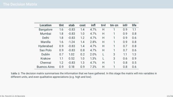
The Decision Matrix
Location tlnt stab cost infl trvl tm-zn infr lifeBangalore 1.6 -0.83 1.4 4.7% H 1 0.9 1.1Mumbai 1.8 -0.83 1.0 4.7% H 1 0.9 0.8Delhi 1.8 -0.83 1.2 4.7% H 1 0.9 0.6
Manilla 1.6 -1.24 1.4 2.8% H 1 0.9 0.8Hyderabad 0.9 -0.83 1.4 4.7% H 1 0.7 0.8Sao Polo 0.9 -0.83 0.8 4.7% H 1 0.7 0.6Dublin 0.7 1.02 0.2 2.0% L 3 1.1 1.3Krakow 1.1 0.52 1.0 1.3% L 3 0.6 0.9Chennai 1.2 -0.83 1.3 4.7% H 1 0.8 0.5
Buenos Aires 0.9 0.18 0.9 7.3% H 1 0.8 0.6
Table 2: The decision matrix summarises the information that we have gathered. In this stage the matrix will mix variables indifferent units, and even qualitative appreciations (e.g. high and low).
© Dr. Philippe J.S. De Brouwer 225/296

Creating This Decision Matrix in R
M0 <- matrix(c(
1.6 , -0.83 , 1.4 , 4.7 , 1 , 0.9 , 1.1 ,
1.8 , -0.83 , 1.0 , 4.7 , 1 , 0.9 , 0.8 ,
1.8 , -0.83 , 1.2 , 4.7 , 1 , 0.9 , 0.6 ,
1.6 , -1.24 , 1.4 , 2.8 , 1 , 0.9 , 0.8 ,
0.9 , -0.83 , 1.4 , 4.7 , 1 , 0.7 , 0.8 ,
0.9 , -0.83 , 0.8 , 4.7 , 1 , 0.7 , 0.6 ,
0.7 , 1.02 , 0.2 , 2.0 , 3 , 1.1 , 1.3 ,
1.1 , 0.52 , 1.0 , 1.3 , 3 , 0.6 , 0.9 ,
1.2 , -0.83 , 1.3 , 4.7 , 1 , 0.8 , 0.5 ,
0.9, 0.18 , 0.9 , 7.3 , 1 , 0.8 , 0.6 ),
byrow = TRUE, ncol = 7)
colnames(M0) <- c("tlnt","stab","cost","infl","trvl","infr","life")
# We use the IATA code of a nearby airport as abbreviation,
# so, instead of:
# rownames(M0) <- c("Bangalore", "Mumbai", "Delhi", "Manilla", "Hyderabad",
# "Sao Polo", "Dublin", "Krakow", "Chennai", "Buenos Aires")
# ... we use this:
rownames(M0) <- c("BLR", "BOM", "DEL", "MNL", "HYD", "GRU",
"DUB", "KRK", "MAA", "EZE")
M0 # inspect the matrix
## tlnt stab cost infl trvl infr life
## BLR 1.6 -0.83 1.4 4.7 1 0.9 1.1
## BOM 1.8 -0.83 1.0 4.7 1 0.9 0.8
## DEL 1.8 -0.83 1.2 4.7 1 0.9 0.6
## MNL 1.6 -1.24 1.4 2.8 1 0.9 0.8
## HYD 0.9 -0.83 1.4 4.7 1 0.7 0.8
## GRU 0.9 -0.83 0.8 4.7 1 0.7 0.6
## DUB 0.7 1.02 0.2 2.0 3 1.1 1.3
## KRK 1.1 0.52 1.0 1.3 3 0.6 0.9
## MAA 1.2 -0.83 1.3 4.7 1 0.8 0.5
## EZE 0.9 0.18 0.9 7.3 1 0.8 0.6
© Dr. Philippe J.S. De Brouwer 226/296

Normalising the Decision Matrix in R i
© Dr. Philippe J.S. De Brouwer 227/296

Normalising the Decision Matrix in R ii
# Political stability is a number between -2.5 and 2.5
# So, we make it all positive by adding 2.5:
M0[,2] <- M0[,2] + 2.5
# Lower wage inflation is better, so invert the data:
M0[,4] <- 1 / M0[,4]
# Then we define a function:
# mcda_rescale_dm
# Rescales a decision matrix M
# Arguments:
# M -- decision matrix
# criteria in columns and higher numbers are better.
# Returns
# M -- normalised decision matrix
mcda_rescale_dm <- function (M) {
colMaxs <- function(M) apply(M, 2, max, na.rm = TRUE)
colMins <- function(M) apply(M, 2, min, na.rm = TRUE)
M <- sweep(M, 2, colMins(M), FUN="-")
M <- sweep(M, 2, colMaxs(M) - colMins(M), FUN="/")
M
}
# Use this function:
M <- mcda_rescale_dm(M0)
# Show the new decision matrix:
knitr::kable(round(M, 2))
tlnt stab cost infl trvl infr lifeBLR 0.82 0.18 1.00 0.12 0 0.6 0.75BOM 1.00 0.18 0.67 0.12 0 0.6 0.38DEL 1.00 0.18 0.83 0.12 0 0.6 0.12MNL 0.82 0.00 1.00 0.35 0 0.6 0.38HYD 0.18 0.18 1.00 0.12 0 0.2 0.38GRU 0.18 0.18 0.50 0.12 0 0.2 0.12DUB 0.00 1.00 0.00 0.57 1 1.0 1.00KRK 0.36 0.78 0.67 1.00 1 0.0 0.50MAA 0.45 0.18 0.92 0.12 0 0.4 0.00EZE 0.18 0.63 0.58 0.00 0 0.4 0.12
© Dr. Philippe J.S. De Brouwer 228/296

The Big R-Book by Philippe J.S. De Brouwer
part 05: Modelling
↓
chapter 27: Multi Criteria Decision Analysis (MCDA)
↓
section 5:
Step 4: Delete Inefficient and Unfit Alternatives
© Dr. Philippe J.S. De Brouwer 229/296

Function to Create a Dominance Matrix i
© Dr. Philippe J.S. De Brouwer 230/296

Function to Create a Dominance Matrix ii
# mcda_get_dominated
# Finds the alternatives that are dominated by others
# Arguments:
# M -- normalized decision matrix with alternatives in rows,
# criteria in columns and higher numbers are better.
# Returns
# Dom -- prefM -- a preference matrix with 1 in position ij
# if alternative i is dominated by alternative j.
mcda_get_dominated <- function(M) {
Dom <- matrix(data=0, nrow=nrow(M), ncol=nrow(M))
dominatedOnes <- c()
for (i in 1:nrow(M)) {
for (j in 1:nrow(M)) {
isDom <- TRUE
for (k in 1:ncol(M)) {
isDom <- isDom && (M[i,k] >= M[j,k])
}
if(isDom && (i != j)) {
Dom[j,i] <- 1
dominatedOnes <- c(dominatedOnes,j)
}
}
}
colnames(Dom) <- rownames(Dom) <- rownames(M)
Dom
}
© Dr. Philippe J.S. De Brouwer 231/296

Get the Dominating Alternatives with that Function i
# mcda_get_dominants
# Finds the alternatives that dominate others
# Arguments:
# M -- normalized decision matrix with alternatives in rows,
# criteria in columns and higher numbers are better.
# Returns
# Dom -- prefM -- a preference matrix with 1 in position ij
# if alternative i dominates alternative j.
mcda_get_dominants <- function (M) {
M <- t(mcda_get_dominated(M))
class(M) <- "prefM"
M
}
© Dr. Philippe J.S. De Brouwer 232/296

Apply the Function to Get the Dominated Alternatives i
Dom <- mcda_get_dominants(M)
print(Dom)
## BLR BOM DEL MNL HYD GRU DUB KRK MAA EZE
## BLR 0 0 0 0 1 1 0 0 1 0
## BOM 0 0 0 0 0 1 0 0 0 0
## DEL 0 0 0 0 0 1 0 0 0 0
## MNL 0 0 0 0 0 0 0 0 0 0
## HYD 0 0 0 0 0 1 0 0 0 0
## GRU 0 0 0 0 0 0 0 0 0 0
## DUB 0 0 0 0 0 0 0 0 0 0
## KRK 0 0 0 0 0 0 0 0 0 0
## MAA 0 0 0 0 0 0 0 0 0 0
## EZE 0 0 0 0 0 0 0 0 0 0
## attr(,"class")
## [1] "prefM"
We see that
• Hyderabad (HYD) is dominated by Bangalore: it has a worse talent pool and lower quality of life, while itscores the same for all other criteria.• São Paulo is dominated by Bangalore, Mumbai, Delhi, and Hyderabad.• Chennai is dominated by Bangalore.
© Dr. Philippe J.S. De Brouwer 233/296

Deleting the Dominated Alternatives i
# mcda_del_dominated
# Removes the dominated alternatives from a decision matrix
# Arguments:
# M -- normalized decision matrix with alternatives in rows,
# criteria in columns and higher numbers are better.
# Returns
# A decision matrix without the dominated alternatives
mcda_del_dominated <- function(M) {
Dom <- mcda_get_dominated(M)
M[rowSums(Dom) == 0,]
}
This function allows us to reduce the decision matrix M to M1 that only contains alternatives that are notdominated.
M1 <- mcda_del_dominated(M)
knitr::kable(round(M1,2))
tlnt stab cost infl trvl infr lifeBLR 0.82 0.18 1.00 0.12 0 0.6 0.75BOM 1.00 0.18 0.67 0.12 0 0.6 0.38DEL 1.00 0.18 0.83 0.12 0 0.6 0.12MNL 0.82 0.00 1.00 0.35 0 0.6 0.38DUB 0.00 1.00 0.00 0.57 1 1.0 1.00KRK 0.36 0.78 0.67 1.00 1 0.0 0.50EZE 0.18 0.63 0.58 0.00 0 0.4 0.12
© Dr. Philippe J.S. De Brouwer 234/296

The Big R-Book by Philippe J.S. De Brouwer
part 05: Modelling
↓
chapter 27: Multi Criteria Decision Analysis (MCDA)
↓
section 6:
Plotting Preference Relationships
© Dr. Philippe J.S. De Brouwer 235/296

Creating an S3 Method to Plot prefM Objects
# First, we load diagram:
require(diagram)
# plot.prefM
# Specific function to handle objects of class prefM for the
# generic function plot()
# Arguments:
# PM -- prefM -- preference matrix
# ... -- additional arguments passed to plotmat()
# of the package diagram.
plot.prefM <- function(PM, ...)
{
X <- t(PM) # We want arrows to mean '... is better than ...'
# plotmat uses the opposite convention, because it expects flows.
plotmat(X,
box.size = 0.1,
cex.txt = 0,
lwd = 5 * X, # lwd proportional to preference
self.lwd = 3,
lcol = 'blue',
self.shiftx = c(0.06, -0.06, -0.06, 0.06),
box.lcol = 'blue',
box.col = 'khaki3',
box.lwd = 2,
relsize = 0.9,
box.prop = 0.5,
endhead = FALSE,
main = "",
...)
}
© Dr. Philippe J.S. De Brouwer 236/296

Testing the Function on the Dominance Matrix i
# We pass the argument 'curve = 0' to the function plotmat, since otherwise
# the arrow from BLR to MAA would be hidden after the box of EZE.
plot(Dom, curve = 0)
© Dr. Philippe J.S. De Brouwer 237/296
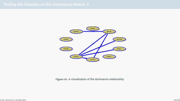
Testing the Function on the Dominance Matrix ii
BLR
BOM
DEL
MNL
HYD
GRU
DUB
KRK
MAA
EZE
Figure 41: A visualization of the dominance relationship.
© Dr. Philippe J.S. De Brouwer 238/296

The Big R-Book by Philippe J.S. De Brouwer
part 05: Modelling
↓
chapter 27: Multi Criteria Decision Analysis (MCDA)
↓
section 7:
Step 5: MCDA Methods
© Dr. Philippe J.S. De Brouwer 239/296

Non-Compensatory Methods vs. Compensatory Methods
• Non-compensatory methods• for example, “dominance” is one of those methods• they do not allow weaknesses on one attribute to be compensated by strong aspects of other attributes, but . . .• typically they do not lead to a unique solution• typically they even are insufficient to find a small enough set of the best solutions
• Compensatory methods• They allow full or partial compensation of weaknesses• the rest of this course . . .
© Dr. Philippe J.S. De Brouwer 240/296

The MaxMin Method
1 find the weakest attribute for all solutions
2 select the solution that has the highest weak attribute (0 in a normalized decision matrix)
This method makes sense if
• the attribute values are expressed in the same units, and• when the “a chain is as weak as the weakest link reasoning” makes sense.
© Dr. Philippe J.S. De Brouwer 241/296

The MaxMax Method
1 Find the strongest attribute for all solutions.
2 Select the solution that has the strongest strong attribute.
This method makes sense if
• the attribute values are expressed in the same units, and• when one knows that the best of the best in one attribute is most important.
© Dr. Philippe J.S. De Brouwer 242/296

The Weighted Sum Metod
The MCDA is replaced by finding the maximum for:
maxx∈A{N(a)}
with N(.) the function <n 7→ <n so that
N(ai) =K∑
k=1
wk mik or
N(a) = M.w
where M is the decision matrix where each element is transformed according to a certain function.
© Dr. Philippe J.S. De Brouwer 243/296

The WSM Method in R
In R this can be obtained as follows.
# mcda_wsm
# Calculated the Weigthed Sum MCDA for a decision matrix M and weights w.
# Arguments:
# M -- normalized decision matrix with alternatives in rows,
# criteria in columns and higher numbers are better.
# w -- numeric vector of weights for the criteria
# Returns
# a vector with a score for each alternative
mcda_wsm <- function(M, w) {
X <- M %*% w
colnames(X) <- 'pref'
X
}
© Dr. Philippe J.S. De Brouwer 244/296

The WSM Applied to our Example
Taking into account that the SSC will not be very large, that we cannot expect employees just to be ready (so wewill do a lot of training ourselves and work with universities to fine-tune curricula, etc.), we need a long time to setup such centre of expertise and hence need stability, etc. we came up with the following weights.
# The critia: "tlnt" "stab" "cost" "infl" "trvl" "infr" "life"
w <- c( 0.125, 0.2, 0.2, 0.2, 0.175, 0.05, 0.05)
w <- w / sum(w) # the sum was 1 already, but just to be sure.
# Now we can execute our function mcda_wsm():
mcda_wsm(M1, w)
## pref
## BLR 0.4282418
## BOM 0.3628739
## DEL 0.3819215
## MNL 0.4162013
## DUB 0.5898333
## KRK 0.7309687
## EZE 0.2850577
© Dr. Philippe J.S. De Brouwer 245/296

Rewrite the function mcda_wsm() to Return a Score Matrix Object
The complete ranking can be represented with plotmat but it might make more sense to use ggplot2. To do soneatly, we take a step back and re-write the function mcda_wsm() and make it return a “matrix of scores”(“scoreM” for short).
# mcda_wsm_score
# Returns the scores for each of the alternative for each of
# the criteria weighted by their weights.
# Arguments:
# M -- normalized decision matrix with alternatives in rows,
# criteria in columns and higher numbers are better.
# w -- numeric vector of weights for the criteria
# Returns
# a score-matrix of class scoreM
mcda_wsm_score <- function(M, w) {
X <- sweep(M1, MARGIN = 2, w, `*`)
class(X) <- 'scoreM'
X
}
© Dr. Philippe J.S. De Brouwer 246/296

Print the Results of the WSM Method with plot.scoreM() i
Now we are ready to define a specialised plotting function for objects of the class “scoreM:”
# plot.scoreM
# Specific function for an object of class scoreM for the
# generic function plot().
# Arguments:
# M -- scoreM -- score matrix
# Returns:
# plot
plot.scoreM <- function (M) {
# 1. order the rows according to rowSums
M <- M[order(rowSums(M), decreasing = T),]
# 2. use a bar-plot on the transposed matrix
barplot(t(M),
legend = colnames(M),
xlab = 'Score',
col = rainbow(ncol(M))
)
}
© Dr. Philippe J.S. De Brouwer 247/296

Plotting the Preferences for the WSM
# Whith the normalised decision matrix M1 and the weights w, we calculate the score matrix:
sM <- mcda_wsm_score(M1, w)
# Then we plot the result:
plot(sM)
KRK DUB BLR MNL DEL BOM EZE
lifeinfrtrvlinflcoststabtlnt
Score
0.00.1
0.20.3
0.40.5
0.60.7
Figure 42: The scores of different cities according to the WSM.© Dr. Philippe J.S. De Brouwer 248/296

Weighted Product Method—WPM
Let wj be the weight of the criterion j, and mij the score (performance) of alternative i on criterion j then solutionscan be ranked according to their total score as follows
P(ai) = Πnj=1(mij)
wj
© Dr. Philippe J.S. De Brouwer 249/296

With Preference
Let wj be the weights of the criteria, and mij the score (performance) of alternative i on criterion j then a solutionai is preferred over a solution an if the preference P(ai, aj) > 1, with
P(ai, aj) := Πnk=1
(mikmjk
)wk
This form of the WPM is often called dimensionless analysis because its mathematical structure eliminates anyunits of measure. Note however, that it requires a ratio scale.
© Dr. Philippe J.S. De Brouwer 250/296

ELECTRE: the idea i
If the decision matrix M has elements mik , then we prefer the alternative ai over the alternative aj for criterion k ifmik > mjk. In other words, we prefer alternative i over alternative j for criterion k if its score is higher for thatcriterion. The amount of preference can be captured by a function Π().
In ELECTRE the preference function is supposed to be a step-function.
Definition 8 (Preference of one solution over another)
The preference of a solution ai over a solution aj is
π+(ai, aj) :=K∑
k=1
πk(mik −mjk) wk
We can also define an anti-prefrence as a measure that estimates the amount of negative preference that comesinto one solution as compared to another.
© Dr. Philippe J.S. De Brouwer 251/296

ELECTRE: the idea ii
Definition 9 (Anti-preference of one solution over another)
The anti-preference of a solution ai over a solution aj is
π−(ai, aj) :=K∑
k=1
πk(mjk −mik) wk
We note that:
π+(ai, aj) =K∑
k=1
πk(mik −mjk) wk
= −K∑
k=1
πk(mjk −mik) wk
= −π+(aj, ai)
= −π−(ai, aj)
= π−(aj, ai)
© Dr. Philippe J.S. De Brouwer 252/296

ELECTRE: the idea iii
Even with a preference function π() that is a strictly increasing function of the difference in score, it might be thatsome solutions have the same score for some criteria and hence are incomparable for these criteria. So, itmakes sense to define a degree of “indifference.”
Definition 10 (The Weighted Degree of Indifference )
The Weighted Degree of Indifference of a solution a and b is
π0(a, b) =k∑
j=a
wj − π+(ai, aj)− π−(ai, aj)
= 1− π+(ai, aj)− π−(ai, aj)
The last line assumes that the sum of weights is one.
© Dr. Philippe J.S. De Brouwer 253/296

ELECTRE I: the Index C1 i
There are two particularly useful possibilities for this index of comparability. We will call them C1 and C2.
Definition 11 (Index of comparability of Type 1)
C1(a, b) =Π+(a, b) + Π0(a, b)
Π+(a, b) + Π0(a, b) + Π−(a, b)
Note that C1(a, b) = 1⇔ aDb. This, however, should not be the case in our example as we already left out alldominated solutions.
Definition 12 (Index of comparability of Type 2)
C2(a, b) =Π+(a, b)
Π−(a, b)
Note that C2(a, b) =∞⇔ aDb.
Further, to this index of comparability it makes sense to define a threshold Λ below which we consider thealternatives as “too similar to be discriminated.”
For each criterion individually we define:• for the comparability index a cut-off level and consider the alternatives as equally interesting if Ci < Λi:
• Λ1 ∈]0, 1[ if one uses C1• Λ2 ∈]0,∞[ if one uses C2
© Dr. Philippe J.S. De Brouwer 254/296

ELECTRE I: the Index C1 ii• for each criterion a maximal discrepancy in the “wrong” direction if a preference would be stated:
rk, k ∈ {1 . . .K}. This will avoid that a solution a is preferred over b while it is too much worse than b for atleast one criterion.
With all those definitions we can define the preference structure as follows:
• for C1 :Π+(a, b) > Π−(a, b)
C1(a, b) ≥ Λ1∀j : dj(a, b) ≤ rj
⇒ a � b
• for C2 :Π+(a, b) > Π−(a, b)
C2(a, b) ≥ Λ2∀j : dj(a, b) ≤ rj
⇒ a � b
In a last step one can present the results graphically and present the kernel (the best solutions) to the decisionmakers. The kernel consists of all alternatives that are “efficient” (there is no other alternative that is preferredover the latter).
Definition 13 (Kernel of an MCDA problem)
The kernel of a MCDA problem is the set
K = {a ∈ A | @b ∈ A : b � a}
© Dr. Philippe J.S. De Brouwer 255/296

ELECTRE I in R i
Below is one way to program the ELECTRE I algorithm in R. One of the major choices that we made was create afunction with a side effect. This is not the best solution if we want others to use our code (e.g. if we would like towrap the functions in a package). The alternative would be to create a list of matrices, that then could be returnedby the function.
Since we are only calling the following function within another function this is not toxic, and suits our purposewell.
© Dr. Philippe J.S. De Brouwer 256/296

ELECTRE I in R ii
# mcda_electre Type 2
# Push the preference matrixes PI.plus, PI.min and
# PI.indif in the environment that calls this function.
# Arguments:
# M -- normalized decision matrix with alternatives in rows,
# criteria in columns and higher numbers are better.
# w -- numeric vector of weights for the criteria
# Returns nothing but leaves as side effect:
# PI.plus -- the matrix of preference
# PI.min -- the matrix of non-preference
# PI.indif -- the indifference matrix
mcda_electre <- function(M, w) {
# initializations
PI.plus <<- matrix(data=0, nrow=nrow(M), ncol=nrow(M))
PI.min <<- matrix(data=0, nrow=nrow(M), ncol=nrow(M))
PI.indif <<- matrix(data=0, nrow=nrow(M), ncol=nrow(M))
# calculate the preference matrix
for (i in 1:nrow(M)){
for (j in 1:nrow(M)) {
for (k in 1:ncol(M)) {
if (M[i,k] > M[j,k]) {
PI.plus[i,j] <<- PI.plus[i,j] + w[k]
}
if (M[j,k] > M[i,k]) {
PI.min[i,j] <<- PI.min[i,j] + w[k]
}
if (M[j,k] == M[i,k]) {
PI.indif[j,i] <<- PI.indif[j,i] + w[k]
}
}
}
}
}
This function can now be called in an encapsulating function which calcualtes the ELECTRE preference matrix.# mcda_electre1
# Calculates the preference matrix for the ELECTRE method
# Arguments:
# M -- decision matrix (colnames are criteria, rownames are alternatives)
# w -- vector of weights
# Lambda -- the cutoff for the levels of preference
# r -- the vector of maximum inverse preferences allowed
# index -- one of ['C1', 'C2']
# Returns:
# object of class prefM (preference matrix)
mcda_electre1 <- function(M, w, Lambda, r, index='C1') {
# get PI.plus, PI.min and PI.indif
mcda_electre(M,w)
# initializations
CM <- matrix(data=0, nrow=nrow(M), ncol=nrow(M))
PM <- matrix(data=0, nrow=nrow(M), ncol=nrow(M))
colnames(PM) <- rownames(PM) <- rownames(M)
# calcualte the preference matrix
if (index == 'C1') {
# for similarity index C1
for (i in 1:nrow(M)){
for (j in 1:nrow(M)) {
CM[i,j] <- (PI.plus[i,j] + PI.indif[i,j]) / (PI.plus[i,j] +
PI.indif[i,j] + PI.min[i,j])
if((CM[i,j] > Lambda) && ((M[j,] - M[i,]) <= r) &&
(PI.plus[i,j] > PI.min[i,j])) PM[i,j] = 1
}
}
} else {
# for similarity index C2
for (i in 1:nrow(M)){
for (j in 1:nrow(M)) {
if (PI.min[i,j] != 0)
{CM[i,j] <- (PI.plus[i,j]) / (PI.min[i,j])}
else
{CM[i,j] = 1000 * PI.plus[i,j]} # to avoid dividing by 0
if((CM[i,j] > Lambda) && ((M[j,] - M[i,]) <= r) &&
(PI.plus[i,j] > PI.min[i,j])) {PM[i,j] = 1}
}
}
}
for (i in 1:nrow(PM)) PM[i,i] = 0
class(PM) <- 'prefM'
PM
}
© Dr. Philippe J.S. De Brouwer 257/296

ELECTRE I in R: Our SSC Example i
The function mcda_electre1() is now ready for use. We need to provide the decision matrix, weights and thecut-off value and a vector for maximum inverse preferences. The code below does this, prints the preferencerelations a matrix and finally plots them with our custom method plot.prefM() in Figure 43 on slide 259.
# the critia: "tlnt" "stab" "cost" "infl" "trvl" "infr" "life"
w <- c( 0.125, 0.2, 0.2, 0.2, 0.175, 0.05, 0.05)
w <- w / sum(w) # the sum was 1 already, but just to be sure.
r <- c(0.3, 0.5, 0.5, 0.5, 1, 0.9, 0.5)
eM <- mcda_electre1(M1, w, Lambda=0.6, r=r)
print(eM)
## BLR BOM DEL MNL DUB KRK EZE
## BLR 0 1 1 1 0 0 1
## BOM 0 0 0 0 0 0 1
## DEL 0 1 0 0 0 0 1
## MNL 0 1 1 0 0 0 1
## DUB 0 0 0 0 0 0 1
## KRK 0 0 0 0 1 0 1
## EZE 0 0 0 0 0 0 0
## attr(,"class")
## [1] "prefM"
plot(eM)
© Dr. Philippe J.S. De Brouwer 258/296

ELECTRE I in R: Our SSC Example ii
BLR
BOM
DELMNL
DUB
KRK
EZE
Figure 43: The preference structure as found by the ELECTRE I method given all parameters in the code.
© Dr. Philippe J.S. De Brouwer 259/296

ELECTRE I: A Simpliefied Plot
KRK // DUB
))BLR // MNL // DEL // BOM // EZE
Figure 44: Another representation of Figure 43. It is clear that Krakow and Bangalore are quite different places. Therefore they arenot ranked between each other and choosing between them means making compromises.
© Dr. Philippe J.S. De Brouwer 260/296

ELECTRE II: the Idea
Hence, the idea of ELECTRE II was born to force a complete ranking by
• gradually lower the cut-off level Λ1 and• increasing the cut-off level for opposite differences in some criteria rj.
© Dr. Philippe J.S. De Brouwer 261/296

ELECTRE II in R: our SSC Example i
In our example r needs to be equal to the unit vector and Λ can be zero in order to obtain a full ranking. The codebelow uses these values and plots the preference relations in Figure 45 on slide 263.
# The critia: "tlnt" "stab" "cost" "infl" "trvl" "infr" "life"
w <- c( 0.125, 0.2, 0.2, 0.2, 0.175, 0.05, 0.05)
w <- w / sum(w) # the sum was 1 already, but just to be sure.
r <- c(1, 1, 1, 1, 1, 1, 1)
eM <- mcda_electre1(M1, w, Lambda = 0.0, r = r)
print(eM)
## BLR BOM DEL MNL DUB KRK EZE
## BLR 0 1 1 1 0 0 1
## BOM 0 0 0 0 0 0 1
## DEL 0 1 0 0 0 0 1
## MNL 0 1 1 0 0 0 1
## DUB 1 1 1 1 0 0 1
## KRK 1 1 1 1 1 0 1
## EZE 0 0 0 0 0 0 0
## attr(,"class")
## [1] "prefM"
plot(eM)
© Dr. Philippe J.S. De Brouwer 262/296

ELECTRE II in R: our SSC Example ii
BLR
BOM
DELMNL
DUB
KRK
EZE
Figure 45: The preference structure as found by the ELECTRE II method given all parameters in the code.
© Dr. Philippe J.S. De Brouwer 263/296

ELECTRE II: A Simplified Graph for Our Example i
KRK // DUB // BLR // MNL // DEL // BOM // EZE
Figure 46: The results for ELECTRE I with comparability index C2.
© Dr. Philippe J.S. De Brouwer 264/296

ELECTRE: Advantages and Disadvantages
Advantages
• No need to add different variables in different units• All that is needed is a conversion to “preference” and add this preference• Richer information than the Weighted Sum Method• The level of compensation can be controlled
Disadvantages
• There is still an “abstract” concept “preference,” which has little meaning and no pure interpretation• To make matters worse, there are also the cut-off levels• So to some extend it is still so that concepts that are expressed in different units are compared in a naive
way.
© Dr. Philippe J.S. De Brouwer 265/296

The Idea of PROMethEE
• Enrich the preference structure of the ELECTRE method.• In the ELECTRE Method one prefers essentially a solution a over b for criterion k if and only if fk(a) > fk(b).• This 0-or-1-relation (black or white) can be replaced by a more gradual solution with different shades of grey.• This preference function will be called πk(a, b) and it can be different for each criterion.
The idea is that the preference for alternative ai and aj can be expressed in function of the weighted sum ofdifferences of their scores mik in the decision matrix.
π(ai, aj) =K∑
k=1
Pk(mik −mjk)wk (8)
=K∑
k=1
Pk(dk(ai, aj)
)wk (9)
In which we used the following “distance definition”:
Definition 14 (Distance dk(a, b))
dk(a, b) = fk(a)− fk(b)
© Dr. Philippe J.S. De Brouwer 266/296

Preference Functions
Examples:
• step-function with one step (similar to ELECTRE preferences)• step-function with more than one step• step-wise linear function• π(d) = max(0,min(g× d, d0)) (linear, gearing g)• sigmoid equation: π(d) = 1
1−(
1d0−1)e−dt
• π(d) = tanh(d)
• π(d) = erf(√
(π)
2 d)
• π(d) = d√1+x2
• Gaussian: π(d) =
0 for d < 0
1− exp
(− (d−d0)2
2s2
)for d ≥ 0
• . . .
© Dr. Philippe J.S. De Brouwer 267/296

PROMethEE I: the Idea
The preference function allows us to define a flow of how much each alternative is preferred, Φ+i , as well as a
measure of how much other alternatives are preferred over this one: Φ−i . The process is as follows.
1 Define preference functions π : A×A 7→ [0, 1]
2 They should only depend on the difference between the scores of each alternative as summarized in thedecision matrix mik :
πk(ai, aj) = πj(mik −mjk
)= πj
(dk(ai, aj)
)3 Define a preference index: Π(ai, aj) =
∑Kk=1 wkπk(ai, aj)
4 Then sum all those flows for each solution – alternative – to obtain1 a positive flow: Φ+(ai) = 1
K−1∑
aj∈AΠ(ai, aj) = 1
K−1∑K
k=1∑A
j=1 πk(ai, aj)
2 a negative flow: Φ−(ai) = 1K−1
∑aj∈A
Π(aj, ai) = 1K−1
∑Kk=1∑A
j=1 πk(aj, ai)
3 a net flow: Φ(ai) = Φ+(ai)− Φ−(ai)
where the wk are the weights of the preference for each criteria so that∑K
k=1 wk = 1 and∀k ∈ {1 . . .K} : wk > 0
© Dr. Philippe J.S. De Brouwer 268/296

The Preference Relations
Based on these flows, we can define the preference relations for PROMethEE I as follows:
•
a � b⇔{
Φ+(a) ≥ Φ+(b) ∧ Φ−(a) < Φ−(b) orΦ+(a) > Φ+(b) ∧ Φ−(a) ≤ Φ−(b)
• indifferent⇔ Φ+(a) = Φ+(b) ∧ Φ−(a) = Φ−(b)
• in all other cases: no preference relation
© Dr. Philippe J.S. De Brouwer 269/296

PROMethEE I in R i
We will first define a base function that calculates the flows Φ and pushes the results a in the environment wherethe function is called (similar to the approach for the ELECTRE method).# mcda_promethee
# delivers the preference flow matrices for the Promethee method
# Arguments:
# M -- decision matrix
# w -- weights
# piFUNs -- a list of preference functions,
# if not provided min(1,max(0,d)) is assumed.
# Returns (as side effect)
# phi_plus <<- rowSums(PI.plus)
# phi_min <<- rowSums(PI.min)
# phi_ <<- phi_plus - phi_min
#
mcda_promethee <- function(M, w, piFUNs='x')
{
if (piFUNs == 'x') {
# create a factory function:
makeFUN <- function(x) {x; function(x) max(0,x) }
P <- list()
for (k in 1:ncol(M)) P[[k]] <- makeFUN(k)
} # in all other cases we assume a vector of functions
# initializations
PI.plus <<- matrix(data=0, nrow=nrow(M), ncol=nrow(M))
PI.min <<- matrix(data=0, nrow=nrow(M), ncol=nrow(M))
# calculate the preference matrix
for (i in 1:nrow(M)){
for (j in 1:nrow(M)) {
for (k in 1:ncol(M)) {
if (M[i,k] > M[j,k]) {
PI.plus[i,j] = PI.plus[i,j] + w[k] * P[[k]](M[i,k] - M[j,k])
}
if (M[j,k] > M[i,k]) {
PI.min[i,j] = PI.min[i,j] + w[k] * P[[k]](M[j,k] - M[i,k])
}
}
}
}
# note the <<- which pushes the results to the upwards environment
phi_plus <<- rowSums(PI.plus)
phi_min <<- rowSums(PI.min)
phi_ <<- phi_plus - phi_min
}
© Dr. Philippe J.S. De Brouwer 270/296

PROMethEE I for the SSC Example i
Now, we can define a function mcda_promethee1() that calls the function mcda_promethee() to define thepreference flows.
© Dr. Philippe J.S. De Brouwer 271/296

PROMethEE I for the SSC Example ii
# mcda_promethee1
# Calculates the preference matrix for the Promethee1 method
# Arguments:
# M -- decision matrix
# w -- weights
# piFUNs -- a list of preference functions,
# if not provided min(1,max(0,d)) is assumed.
# Returns:
# prefM object -- the preference matrix
#
mcda_promethee1 <- function(M, w, piFUNs='x') {
# mcda_promethee adds phi_min, phi_plus & phi_ to this environment:
mcda_promethee(M, w, piFUNs='x')
# Now, calculate the preference relations:
pref <- matrix(data=0, nrow=nrow(M), ncol=nrow(M))
for (i in 1:nrow(M)){
for (j in 1:nrow(M)) {
if (phi_plus[i] == phi_plus[j] && phi_min[i]==phi_min[j]) {
pref[i,j] <- 0
}
else if ((phi_plus[i] > phi_plus[j] &&
phi_min[i] < phi_min[j] ) ||
(phi_plus[i] >= phi_plus[j] &&
phi_min[i] < phi_min[j] )) {
pref[i,j] <- 1
}
else {
pref[i,j] = NA
}
}
}
rownames(pref) <- colnames(pref) <- rownames(M)
class(pref) <- 'prefM'
pref
}
All that is left, now is to execute the function that we have created in previous code segment.# We reuse the decision matrix M1 and weights w as defined above.
m <- mcda_promethee1(M1, w)
The object m is now the preference matrix of class prefM, and we can plot it as usual – result in Figure 47 onslide 272# We reuse the decision matrix M1 and weights w as defined above.
m <- mcda_promethee1(M1, w)
plot(m)
BLR
BOM
DELMNL
DUB
KRK
EZE
Figure 47: The hierarchy between alternatives as found by PROMethEE I.
Again, it is possible to simplify the scheme of Figure 47 on slide 272 by leaving out the spurious arrows: that is inFigure 48 on slide 272.
KRK //
))
DUB
""MNL // EZE
BLR // DEL // BOM
<<
Figure 48: The preference relations resulting from PROMethEE I. For example, this shows that the least suitable city would beBuenos Aires (EZE). It also shows that both Krakow (KRK) and Bangalore (BLR) would be good options, but PROMethEE I isunable to tell us which of both is best, they cannot be ranked based on this method.
© Dr. Philippe J.S. De Brouwer 272/296

An Example with Cusotmised Preference Functions i
The function that we have created can also take a list of preference functions via its piFUNs argument. Below, weillustrate how this can work and we plot the results in Figure 49 on slide 274.
# Make shortcuts for some of the functions that we will use:
gauss_val <- function(d) 1 - exp(-(d - 0.1)^2 / (2 * 0.5^2))
x <- function(d) max(0,d)
minmax <- function(d) min(1, max(0,2*(d-0.5)))
step <- function(d) ifelse(d > 0.5, 1,0)
# Create a list of 7 functions (one per criterion):
f <- list()
f[[1]] <- gauss_val
f[[2]] <- x
f[[3]] <- x
f[[4]] <- gauss_val
f[[5]] <- step
f[[6]] <- x
f[[7]] <- minmax
# Use the functions in mcda_promethee1:
m <- mcda_promethee1(M1, w, f)
# Plot the results:
plot(m)
© Dr. Philippe J.S. De Brouwer 273/296

An Example with Cusotmised Preference Functions ii
BLR
BOM
DELMNL
DUB
KRK
EZE
Figure 49: The result for PROMethEE I with different preference functions provided.
Interestingly, the functions that we have provided, do change the preference structure as found by PROMethEE I,even the main conclusions differ. The main changes are that KRK became comparable to BLR and MNL to DEL.
Note that besides the plot that we obtain automatically via our functon plot.prefM(), it is also possible tocreate a plot that uses the transitivity to make the image lighter and easier to read. This is presented in Figure 50on slide 275.© Dr. Philippe J.S. De Brouwer 274/296

An Example with Cusotmised Preference Functions iii
DUB
++KRK
;;
##
// MNL // DEL // BOM // EZE
BLR
<<
Figure 50: The results for PROMethEE I method with the custom preference functions. In this case there is one clear winner thatis preferred over all other options: Krakoów.
© Dr. Philippe J.S. De Brouwer 275/296

Advantages and Disadvantages of PROMethEE I
Advantages:• It is easier and makes more sense to define a
preference function than the parameters Λj and r inELECTRE.• It seems to be stable for addition and deletion of
alternatives (the ELECTRE and WPM have beenproven inconsistent here).• No comparison of variables in different units.• The preference is based on rich information.
Disadvantages:• Does not readily give too much insight in why a
solution is preferred.• Needs more explanation about how it works than
the WSM.• Some decision makers might not have heard about
it.• There are a lot of arbitrary choices to be made, and
those choices can influence the result.
© Dr. Philippe J.S. De Brouwer 276/296

PROMethEE II: the Idea
We can condense this information further for each alternative:
Φ(a) =∑x∈A
k∑j=1
πj(fj(a), fj(x))
=∑x∈A
π(a, x)
This results in a preference relation that will almost in all cases show a difference (in a small number of casesthere is indifference, but all are comparable – there is no “no preference”)
• a � b⇔ Φ(a) > Φ(b)
• indifferent if Φ(a) = Φ(b)
• in all other cases: no preference relation
© Dr. Philippe J.S. De Brouwer 277/296

Advantages and Disadvantages of PROMethEE II
Advantages• Almost sure to get a full ranking.• The preference structure is rich and preference
quantifiable.• The preferences are transitive:
a � b ∧ b � c⇒ a � c.• No conflicting rankings possible, logically
consistent for the decision makers.
Disadvantages• More condensed information (loss of information,
more compensation).• Might be more challenging to understand for some
people.• A lot of arbitrary functions and parameters relating
to preference.
© Dr. Philippe J.S. De Brouwer 278/296

Gaia, the Idea: Using PCA in MCDA i
In the context of MCDA, this projection in the (PC1,PC2) plane is also referred to as method for “geometricalanalysis for interactive aid” (Gaia). It is, however, nothing more than one part of a principal component analysis(PCA).
© Dr. Philippe J.S. De Brouwer 279/296

Gaia (and PCA) in R i
Principal component analysis is part of the functionalities of the package stats and hence is available by default.We have already demonstrated how to use PCA in R in Section ?? “??” on page ??, here we only repeat the basics.In the following code, we calculate the principle components (PCs), plot the variance explained per principlecomponent in Figure ?? on slide ?? and the biplot (projection in the in (PC1,PC2) plane) in Figure ?? on slide ??.
pca1 <- prcomp(M1)
summary(pca1)
## Importance of components:
## PC1 PC2 PC3 PC4 PC5 PC6
## Standard deviation 0.8196 0.4116 0.3492 0.18995 0.1103 0.04992
## Proportion of Variance 0.6626 0.1671 0.1203 0.03559 0.0120 0.00246
## Cumulative Proportion 0.6626 0.8297 0.9499 0.98555 0.9975 1.00000
## PC7
## Standard deviation 4.682e-18
## Proportion of Variance 0.000e+00
## Cumulative Proportion 1.000e+00
# plot for the prcomp object shows the variance explained by each PC
plot(pca1, type = 'l')
© Dr. Philippe J.S. De Brouwer 280/296

Gaia (and PCA) in R ii
●
●
●
●
●● ●
pca1
Varia
nces
0.00.1
0.20.3
0.40.5
0.6
1 2 3 4 5 6 7
Figure 51: The variance explained by each principal component.
# biplot shows a projection in the 2D plane (PC1, PC2)
biplot(pca1)
© Dr. Philippe J.S. De Brouwer 281/296
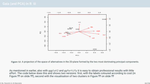
Gaia (and PCA) in R iii
−0.6 −0.4 −0.2 0.0 0.2 0.4 0.6
−0.6
−0.4
−0.2
0.00.2
0.40.6
PC1
PC2
BLRBOM
DELMNL
DUB
KRK
EZE
−1.5 −1.0 −0.5 0.0 0.5 1.0
−1.5
−1.0
−0.5
0.00.5
1.0
tlnt
stab
cost
infl
trvl
infr
life
Figure 52: A projection of the space of alternatives in the 2D-plane formed by the two most dominating principal components.
As mentioned in earlier, also with ggplot2 and ggfortify it is easy to obtain professional results with littleeffort. The code below does this and shows two versions: first, with the labels coloured according to cost (inFigure ?? on slide ??), second with the visualisation of two clusters in Figure ?? on slide ??
© Dr. Philippe J.S. De Brouwer 282/296
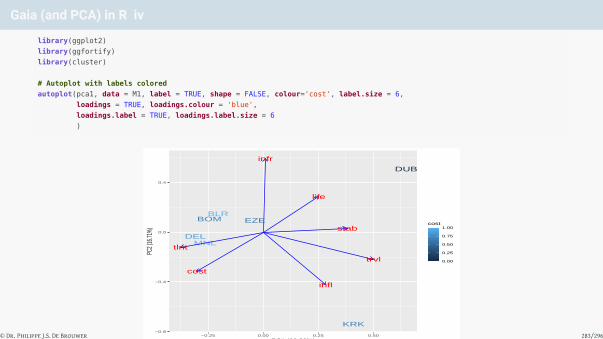
Gaia (and PCA) in R iv
library(ggplot2)
library(ggfortify)
library(cluster)
# Autoplot with labels colored
autoplot(pca1, data = M1, label = TRUE, shape = FALSE, colour='cost', label.size = 6,
loadings = TRUE, loadings.colour = 'blue',
loadings.label = TRUE, loadings.label.size = 6
)
BLRBOM
DELMNL
DUB
KRK
EZE
tlnt
stab
cost
infl
trvl
infr
life
−0.8
−0.4
0.0
0.4
−0.25 0.00 0.25 0.50PC1 (66.26%)
PC2 (
16.71
%)
0.00
0.25
0.50
0.75
1.00cost
Figure 53: A standard plot with autoplot() with labels coloured
© Dr. Philippe J.S. De Brouwer 283/296
Gaia (and PCA) in R v
# Autoplot with visualization of 2 clusters
autoplot(fanny(M1,2), label=TRUE, frame=TRUE, shape = FALSE, label.size = 6,
loadings = TRUE, loadings.colour = 'blue',
loadings.label = TRUE, loadings.label.size = 6)
BLRBOM
DELMNL
DUB
KRK
EZE
tlnt
stab
cost
infl
trvl
infr
life
−0.8
−0.4
0.0
0.4
−0.25 0.00 0.25 0.50PC1 (66.26%)
PC2 (
16.71
%) cluster
aa
1
2
Figure 54: Autoplot with visualization of two clusters
© Dr. Philippe J.S. De Brouwer 284/296

Gaia (and PCA) in R viThese visualization show already a lot of information, but we can still add the “decision vector” (the vector ofweights projected in the (PC1,PC2) plane). This shows us where the main decision weight its located, and itshows us the direction of an ideal soluton in the projection. This can be done by adding an arrow to the plot withthe function annotate().# Use the weights as defined above:
w
## [1] 0.125 0.200 0.200 0.200 0.175 0.050 0.050
# Calculate coordinates
dv1 <- sum( w * pca1$rotation[,1]) # decision vector PC1 component
dv2 <- sum( w * pca1$rotation[,2]) # decision vector PC2 component
p <- autoplot(pam(M1,2), frame=TRUE, frame.type='norm', label=TRUE,
shape=FALSE,
label.colour='blue',label.face='bold', label.size=6,
loadings=TRUE, loadings.colour = 'dodgerblue4',
loadings.label = TRUE, loadings.label.size = 6,
loadings.label.colour='dodgerblue4',
loadings.label.vjust = 1.2, loadings.label.hjust = 1.3
)
p <- p + scale_y_continuous(breaks =
round(seq(from = -1, to = +1, by = 0.2), 2))
p <- p + scale_x_continuous(breaks =
round(seq(from = -1, to = +1, by = 0.2), 2))
p <- p + geom_segment(aes(x=0, y=0, xend=dv1, yend=dv2), size = 2,
arrow = arrow(length = unit(0.5, "cm")))
p <- p + ggplot2::annotate("text", x = dv1+0.2, y = dv2-0.01,
label = "decision vector",
colour = "black", fontface = 2)
p
© Dr. Philippe J.S. De Brouwer 285/296

Gaia (and PCA) in R vii
BLRBOM
DELMNL
DUB
KRK
EZE
tlnt
stab
cost
infl
trvl
infr
life
decision vector
−0.8
−0.6
−0.4
−0.2
0.0
0.2
0.4
0.6
−0.6 −0.4 −0.2 0.0 0.2 0.4 0.6PC1 (66.26%)
PC2 (
16.71
%) cluster
1
2
Figure 55: Clustering with elliptoid borders, labels of alternative, projections of the criteria and a “decision vector” (black arrow) –the projection of the weights – constitute a “Gaia-plot.”
On plot of Figure 55 on slide 286 is an orthogonal projection in the (PC1,PC2) plane – the plane of the two mostimportant principal components – we find the following information:
1 The name of the alternatives appears centred around the place where they are mapped. The projectioncoincides with the alternatives being spread out as much as possible.© Dr. Philippe J.S. De Brouwer 286/296

Gaia (and PCA) in R viii2 Two clusters are obtained by the function pam(): the first cluster has a red ellipsoid around it and the
second one generates the error message “Too few points to calculate an ellipse” since there are only twoobservations in the cluster (KRK and DUB).
3 Each criterion is projected in the same plane. This shows that for example DUB offers great life quality, KRKoptimal location and low wage inflation, whereas the group around DEL and MNL have low costs and a bigtalent pool, etc.
4 A “decision vector,” which is the projection of the vector formed by using the weights as coefficients in thebase of criteria. This shows the direction of an ideal solution.
When we experiment with the number of clusters and try three clusters, then we see that KRK breaks apart fromDUB. Thus we learn that – while both in Europe – Krakow and Dublin are very different places.
This plot shows us how the alternatives are different and what the selection of weights implies. In our examplewe notice the following.
• The cities in Asia are clustered together. These cities offer a deep talent pool with hundreds of thousands ofalready specialized people and are – still – cheap locations: these locations are ideal for large operationswhere cost is multiplied.• Dublin offers best life quality and a stable environment. The fact that it has great infrastructure is not so
clear in this plot and also note that we left out factors such as “digital enabled” for which again Dublinscores great. Ireland has also as stable low-tax regime. However, we notice that it is opposite to thedimensions “tlnt” and “cost”: it is a location with high costs and a really small talent pool. This means that itwould be the ideal location for a head-quarter rather than a shared service centre.© Dr. Philippe J.S. De Brouwer 287/296

Gaia (and PCA) in R ix
• Krakow is – just as Dublin – a class apart. Poland has a stable political environment thanks to the EuropeanUnion, is close to R-bank’s headquarters and further offers reasonable costs and best-in-class wageinflation. However, we note that it sits (almost) opposite to the dimension infrastructure. Krakow is indeedthe ideal location for a medium sized operation, where specialization is more important than a talent pool ofmillions of people. It is also the ideal place for long-term plans (it has low wage inflation and a stablepolitical situation), but still has to invest in its infrastructure. A reality check learns us that this is happening,and hence it would be a safe solution to recommend.
© Dr. Philippe J.S. De Brouwer 288/296

Outranking Methods i
The idea of outranking methods is to prefer a solution that does better on more criteria. We can think of thefollowing mechanisms:
• Direct Ranking: A solution a is preferred over b if a does better on more criteria than b
• Inverse Ranking: A solution a is preferred over b if there are more alternatives that do better than b than thereare alternatives that do better than a
• Median/Average Ranking: Use the median/average of both previous
• Weighted Ranking: Use one of the previous in combination with weights wj
© Dr. Philippe J.S. De Brouwer 289/296

Outranking in R
### Outrank
# M is the decision matrix (formulated for a maximum problem)
# w the weights to be used for each rank
outrank <- function (M, w)
{
order <- matrix(data=0, nrow=nrow(M), ncol=nrow(M))
order.inv <- matrix(data=0, nrow=nrow(M), ncol=nrow(M))
order.pref <- matrix(data=0, nrow=nrow(M), ncol=nrow(M))
for (i in 1:nrow(M)){
for (j in 1:nrow(M)) {
for (k in 1:ncol(M)) {
if (M[i,k] > M[j,k]) { order[i,j] = order[i,j] + w[k] }
if (M[j,k] > M[i,k]) { order.inv[i,j] = order.inv[i,j] + w[k] }
}
}
}
for (i in 1:nrow(M)){
for (j in 1:nrow(M)) {
if (order[i,j] > order[j,i]){
order.pref[i,j] = 1
order.pref[j,i] = 0
}
else if (order[i,j] < order[j,i]) {
order.pref[i,j] = 0
order.pref[j,i] = 1
}
else {
order.pref[i,j] = 0
order.pref[j,i] = 0
}
}
}
class(order.pref) <- 'prefM'
order.pref
}
© Dr. Philippe J.S. De Brouwer 290/296

Goal Programming: The Idea i
Replace max{f1(x), f2(x), . . . , fn(x)} by
min{y1 + y2 + . . .+ yj + . . .+ yk |x ∈ A
}
with
f1(x) +y1 = M1f2(x) +y2 = M2. . . = . . .
fj(x) +yj = Mj. . . = . . .
fk(x) +yk = Mk
© Dr. Philippe J.S. De Brouwer 291/296

Goal Programming: The Idea ii
• Of course, the yi have to be additive, so have to be expressed in the same units.
• This forces us to convert them first to the same unit: e.g. introduce factors rj that eliminate the dimensions,and then minimize
∑kj=1 rj yj
• This can be solved by a numerical method.
It should be clear that the rj play the same role as the fj(x) in the Weighted Sum Method. This means that themain argument against the Weighted Sum Method (adding things that are expressed in different units) remainsvalid here.8
The target unit that is used will typically be “a unit-less number between zero and one” or “points” (marks) . . . as itindeed looses all possible interpretation. To challenge the management, it is worth to try in the first place topresent “Euro” or “Dollar” as common unit. This forces a strict reference frame.
© Dr. Philippe J.S. De Brouwer 292/296

The Target Interpretation of Goal Programming
• define a target point, M (e.g. the best score on all criteria)• define a “distance” to the target point: ||F− x||, with F = (f1(x), f2(x), . . . , fk(x))′ (defined as in the Weighted
Sum Method, so reducing all variables to the same units).For the distance measure be inspired by:• the Manhattan Norm: L1(x, y) =
∑kj=1 |xj − yj|
• the Euler Norm: L2(x, y) =(∑k
j=1(xj − yj)2) 1
2
• the general p-Norm: Lp(x, y) =(∑k
j=1(xj − yj)p) 1
p
• the Rawls Norm: L∞(x, y) = maxj=1...k |xj − yj|
The problem was introduced in Page 291 as the Manhattan norm, but we can of course use other norms too.
© Dr. Philippe J.S. De Brouwer 293/296

Advantages and Disadvantages of Goal Programming
Advantages• Reasonably intuitive.• Better adapted to problems of “design” (whereA is
infinite).
Disadvantages• One has to add variables in different units, or at
least reduce all different variables to unit-lessvariables via an arbitrary preference function.• The choice of the weights is arbitrary.• Even more difficult to gain insight.
© Dr. Philippe J.S. De Brouwer 294/296

The Big R-Book by Philippe J.S. De Brouwer
part 05: Modelling
↓
chapter 27: Multi Criteria Decision Analysis (MCDA)
↓
section 8:
Summary MCDA
© Dr. Philippe J.S. De Brouwer 295/296

Do not forget
Golden Rule
MCDA is not a science, it is an art!
The Decision-making paradox
• MCDA-methods used for solving multi-dimensional problems (for which different units of measurement areused to describe the alternatives), are not always accurate in single-dimensional problems• When one alternative is replaced by a worse one, the ranking of the others can change• This is proven for both ELECTRE and WPM. However, WSM and PROMethEE (most probably) are not
subjected to this paradox.
© Dr. Philippe J.S. De Brouwer 296/296
Related Documents