Welcome message from author
This document is posted to help you gain knowledge. Please leave a comment to let me know what you think about it! Share it to your friends and learn new things together.
Transcript


www.clarklabs.org [email protected]
Source Code © 1987-2020 J. Ronald Eastman
Production © 1987-2020 Clark University

INTRODUCTION 1
INTRODUCTION
The exercises of the Tutorial are arranged in a manner that provides a structured approach to the understanding of the fundamentals of spatial analysis and modeling that the TerrSet system provides. The TerrSet Geospatial Monitoring and Modeling System is comprised of a constellation of eight interdependent and integrated toolsets. These exercises explore all eight toolsets that cover a wide range of topics in the areas of GIS analysis, image processing, spatial modeling and earth science. The exercises are organized as follows:
Using the TerrSet System
Exercises in this section introduce the fundamental terminology and operations of the TerrSet system, including setting user preferences, display and map composition, and working with databases in Database Workshop. It is strongly recommended that users complete these exercises to fully take advantage of TerrSet’s capabilities.
IDRISI GIS Analysis
The exercises in this section explore the powerful IDRISI GIS Analysis toolset found in the TerrSet system. The first set of exercises in this section provides an introduction to the most fundamental raster GIS analytical tools: database query, distance and context operators, map algebra, the use of cartographic models, multi-criteria and multi-objective decision making, and TerrSet’s Macro Modeler, a graphic modeling environment to organize analyses. The last set of exercises in this section illustrates a range of the possibilities for advanced analysis using IDRISI GIS Analysis toolset. These include regression modeling, predictive modeling using Markov Chain analysis, database uncertainty and decision risk, geostatistics and soil loss modeling with RUSLE.
IDRISI Image Processing
The exercises in this section explore the IDRISI Image Processing toolset found in the TerrSet system. The first set of exercises steps the user through the fundamental processes of satellite image classification, using both supervised and unsupervised techniques. In the latter exercises, the techniques explored in the previous set of exercises are expanded to include issues of classification uncertainty and mixed-pixel classification. The IDRISI Image Processing toolset provides advanced image processing techniques that are explored in the latter set of exercises in this section.
Land Change Modeler
This set of exercises explores TerrSet’s Land Change Modeler, an integrated vertical application for analyzing past land cover change, modeling the potential for change, predicting the course of change into the future, and evaluating planning interventions for maintaining ecological sustainability. There is a facility also for modeling REDD scenarios (Reducing Emissions from Deforestation and Forest Degradation).

INTRODUCTION 2
GeOSIRIS
This exercise explores TerrSet’s GeOSIRIS modeler, an integrated vertical application for national-level REDD planning that estimates the impacts of alternative policies for REDD+ projects on deforestation, emission reductions, and revenue generation.
Habitat and Biodiversity Modeler
This set of exercises explores TerrSet’s Habitat and Biodiversity Modeler, an integrated vertical application for assessing the implications of change on habitats, species modeling, and biodiversity analysis. Tools include interfaces to MAXENT and MARXAN.
Ecosystem Services Modeler
This set of exercises explores TerrSet’s Ecosystem Services Modeler, an integrated vertical application containing 15 ecosystem service models that are closely based on the InVEST toolkit developed by the Natural Capital Project.
Climate Change Adaptation Modeler
This set of exercise explores TerrSet’s Climate Change Adaptation Modeler, an integrated vertical application for addressing the growing challenges of adapting to rapidly changing climate.
Earth Trends Modeler
This set of exercises explores Earth Trends Modeler, another vertical application within TerrSet for the analysis of image time series. The Earth Trends Modeler includes a coordinated suite of data mining tools for the extraction of trends and underlying determinants of variability.
We recommend you complete the exercises in the order in which they are presented within each section, though this is not strictly necessary. Knowledge of concepts presented in earlier exercises, however, is assumed in subsequent exercises. All users who are not familiar with the TerrSet system should complete the first set of exercises entitled Using the TerrSet System. After this, a user new to GIS and Image Processing might wish to complete the Introductory GIS and Image Processing exercise sections, then come back to the Advanced exercises at a later time. Users familiar with the system should be able to proceed directly to the particular exercises of interest. In only a few cases are results from one exercise used in a later exercise.
As you are working on these exercises, you will want to access the Program Modules section in the on-line Help System any time you encounter a new module. When action is required at the computer, the section in the exercise is designated by a letter. Throughout most exercises, numbered questions will also appear. These questions provide opportunity for reflection and self-assessment on the concepts just presented or operations just performed.
When working through an exercise, examine every result (even intermediate ones) by displaying it. If the result is not as expected, stop and rethink what you have done. Geographical analysis can be likened to a cascade of operations, each one depending upon the previous one. As a result, there are endless blind alleys, much like in an adventure game. In addition, errors accumulate rapidly. Your best insurance against this is to think carefully about the result you expect and examine every product to see if it matches expectations.
The TerrSet Tutorial data can be downloaded from the Clark Labs website: www.clarklabs.org. Once downloaded and unzipped, data for the Tutorial are in a set of folders, one for each Tutorial section as outlined above.

TUTORIAL 1 USING THE TERRSET SYSTEM 3
▅ TUTORIAL 1 - USING THE TERRSET SYSTEM
USING THE TERRSET SYSTEM EXERCISES
The TerrSet System Environment
Display: Layers and Group Files
Display : Layer Interaction Effects
Display : Surfaces -- Fly Through and Illumination
Display: Navigating Map Query
Map Composition
Palettes, Symbols, and Creating Text Layers
Data Structures and Scaling
Database Workshop: Working with Vector Layers
Database Workshop: Analysis and SQL
Database Workshop : Creating Text Layers / Layer Visibility
Data for the exercises in this section are in the \TerrSet Tutorial\Using TerrSet folder. The TerrSet Tutorial data can be downloaded from the Clark Labs website: www.clarklabs.org.

EXERCISE 1-1 THE TERRSET SYSTEM ENVIRONMENT 4
▅ EXERCISE 1-1 THE TERRSET SYSTEM ENVIRONMENT
Getting Started
A To start the TerrSet system, double-click on the TerrSet application icon in the TerrSet Program Folder. This will load the TerrSet system.
Once the system has loaded, notice that the screen has four distinct components. At the top, we have the main menu. Underneath we find the tool bar of icons that can be used to control the display and access commonly used facilities. Below this is the main workspace, followed by the status bar.
Depending upon your Windows setup, you may also have a Windows task bar at the very bottom of the screen. If the screen resolution of your computer is somewhat low (e.g., 1024 x 768), you may wish to change your task bar settings to autohide.1 This will give you extra space for display—always an essential commodity with a GIS.
B Now move your mouse over the tool bar icons. Notice that a short text label pops up below each icon to tell you its function. This is called a hint. Several other features of the TerrSet interface also incorporate hints.
TerrSet Explorer
C Click on the TerrSet Explorer icon, the left-most tool bar icon. This option will launch the TerrSet Explorer utility.
TerrSet Explorer is a general purpose utility to manage and explore TerrSet files and projects. Use TerrSet Explorer to set your project environment, manage your group files, review metadata, display files, and simply organize your data with such tools as copy, delete, rename, and move commands. You can use TerrSet Explorer to view the structure of TerrSet file formats and to drag and drop files into TerrSet dialog boxes. TerrSet Explorer is permanently docked to the left edge of the TerrSet desktop. It cannot be moved but
1 This can be done from the START menu of Windows. Choose START, then SETTINGS, then Task bar. Click "always on top" off and "autohide" on. When you
do this, you simply need to move your cursor to the bottom of the screen in order to make the task bar visible.

EXERCISE 1-1 THE TERRSET SYSTEM ENVIRONMENT 5
it can be minimized and horizontally resized whenever more workspace is required. We will explore the various uses of TerrSet Explorer in the exercises that follow.
Projects
D With TerrSet Explorer open, select the Projects tab at the top of TerrSet Explorer. This option allows you to set the project environment of your file folders. Make sure that the Editor pane is open at the bottom of the Projects’ tab. If you right-click anywhere in the Projects form you will have the option to show the Editor. The Editor pane will show the working and resource folders for each project. During the installation a “Default” project is created. Make sure that you have selected this project by clicking on it. The result will have the radio button highlighted for that project.
A project is an organization of data files, both the input files you will use and the output files you will create. The most fundamental element is the Working Folder. The Working Folder is the location where you will typically find most of your input data and will write most of the results of your analyses.2 The first time TerrSet is launched, the Working Folder by default is named:
\TerrSet Tutorial Data\Using TerrSet
E If it is not set this way already, change the Working Folder to be the Using TerrSet folder.3 To change the Working Folder, click in the Working Folder input box and either type in the location or select the browse button to the right to locate the Using TerrSet folder.
In addition to the Working Folder, you can also have any number of Resource Folders. A Resource Folder is any folder from which you can read data, but to which you typically will not write data.
For this exercise, define one Resource Folder:
\TerrSet Tutorial\Introductory GIS
If this is not correctly set, use the New Folder icon at the bottom of the Editor pane to specify the correct Resource Folder. Note that to remove folders, you must highlight them in the list first and then click the Remove Folder icon at the bottom of Editor.
F The project should now show \TerrSet Tutorial\Using TerrSet as the Working Folder and \TerrSet Tutorial\Introductory GIS as the Resource Folder. Your settings are automatically saved in a file named DEFAULT.ENV (the .env extension stands for Project Environment File). As new projects are created, you can always use Projects in TerrSet Explorer to re-load these settings.
2 You can always specify a different input or output path by typing that full path in the filename box directly or by using the Browse button and selecting
another folder.
3 During installation, the default location will be to the Public folder designated by Windows. This will usually be in a shared documents folder in Users or Documents and Settings. Adjust these instructions accordingly.

EXERCISE 1-1 THE TERRSET SYSTEM ENVIRONMENT 6
The TerrSet system maintains your Project settings from one project to the next. Thus, they will change only if they are intentionally altered. Consequently, there is no need to explicitly save your Project settings unless you expect to use several projects and wish to have a quick way of alternating between them.
G Now click the Files tab in TerrSet Explorer. You are now ready to start exploring the TerrSet system. We will discuss TerrSet Explorer more in depth later, but from the Files tab you will see a list of all files in your working and resource folders.
The data for the exercises are installed in several folders. The introduction to each section of the Tutorial indicates which particular folder you will need to access. Whenever you begin a new Tutorial section, change your project accordingly.
A Special Note to Educators
In normal use, the Working Folder is used for both input and output data. However, if multiple students will be using the same data in a laboratory setting, you may prefer to set the Project as follows:
Working Folder: A temporary folder to hold all student output data.
Resource Folder(s): The folder(s) in which the original tutorial input data are stored.
Note that all the files that comprise raster (.rgf), vector (.vlx), or signature (.sgf) groups must be in the same folder. When an exercise requires students to add new files from the Working Folder to groups stored in a Resource Folder, they should first copy all the files to group from the Resource Folder to the Working Folder.
Dialog Boxes and Pick Lists Each of the menu entries, and many of the tool bar icons, access specific TerrSet modules. A module is an independent program element that performs a specific operation. Clicking a menu entry thus results in launching a dialog box (or window) in which you can specify the inputs to that operation and the various options that you wish to use.
H There are three ways to launch TerrSet module dialog boxes. The most commonly used modules have toolbar icons. Click the Display icon to launch the DISPLAY Launcher dialog. Close the dialog by clicking the X in the upper right corner of the dialog window. Now go to the Display menu and click on the DISPLAY Launcher menu entry. Close the dialog again. Finally, you can access an alphabetical list of all the TerrSet modules with the Shortcut utility, located at the top of the TerrSet window. Shortcut will stay open until you choose the Turn Shortcut Off command under the File Menu. Click the dropdown list arrow on Shortcut and scroll down until you find DISPLAY Launcher, then click on it and click the Open Dialog button (green arrow to the right of Shortcuts), or simply hit Enter. Note that you may also type the module name directly into the Shortcut box. In the Tutorial Exercises, you will typically be instructed to find module names in their menu location to reinforce your knowledge of the way in which a module is being used. The dialog box will be the same, however, no matter how it has been opened.
I Notice first the three buttons at the bottom of the DISPLAY Launcher dialog. The OK button is used after all options have been set and you are ready to have the module do its work. By default TerrSet dialogs are persistent -- i.e., the dialog does

EXERCISE 1-1 THE TERRSET SYSTEM ENVIRONMENT 7
not disappear when you click OK. It does the work, but stays on the screen with all of its settings in case you want to do a similar analysis. If you would prefer that dialogs immediately close after clicking OK, you can go to the User Preferences option under the File menu and disable persistent dialogs. (Note: having said this, DISPLAY Launcher is never persistent.)
If persistent dialogs are enabled, the button to the right of the OK button will be labeled as Close. Clicking on this both closes the dialog and cancels any parameters you may have set. If persistent forms are disabled, this button will be labeled Cancel. However, the action is the same -- Cancel always aborts the operation and closes the dialog.
J The Help button can be used to access the context-sensitive Help System. You probably noticed that the main menu also has a Help button. This can be used to access the TerrSet Help System at its most general level. However, accessing the Help button on a dialog will bring you immediately to the specific Help section for that module. Try it now. Then close the Help window by clicking the X button in its upper-right corner.
The Help System does not duplicate information in the manuals. Rather, it is a supplement, acting as the primary technical reference for specific program modules. In addition to providing directions for the operation of a module and explaining its options, the Help System also provides many helpful tips and notes on the implementation of these procedures in the TerrSet system.
Dialogs are primarily made up of standard Windows elements such as input boxes (the white boxes) in which text can be entered, radio buttons (such as the file type radio button group), check boxes (such as those to indicate whether or not the map layer should be displayed with a legend), buttons, and so on. However, TerrSet has incorporated some special dialog elements to facilitate your use of the system.
K In DISPLAY Launcher, make sure the File Type indicates that you wish to display a raster layer. Then click the small button with the ellipses, just to the right of the left input box. This will launch the pick list. TerrSet uses this specially-designed selection tool throughout the system.
The pick list displays the names of map layers and other data elements, organized by folders. Notice that it lists your Working Folder first, followed by each Resource Folder. The pick list always opens with the Working Folder expanded and the Resource Folders collapsed. To expand a collapsed folder, click on the plus sign next to the folder name. To collapse a folder, click on the minus sign next to the folder name. A listed folder without a plus/minus symbol is an indication that the folder contains no files of the type required for that particular input box. Note that you can also access other folders using the Browse button.
L Collapse and expand the two folders. Since the pick list was invoked from an input box requiring the name of a raster layer, the files listed are all the raster layers in each folder. Now expand the Working Folder. Find the raster layer named SIERRADEM and click on it. Then click on the OK button of the pick list. Notice how its name is now entered into the input box on DISPLAY Launcher and the pick list disappears.4
Note that double-clicking on a layer in the pick list will achieve the same result as above. Also note that double-clicking on an input box is an alternate way of launching the pick list.
M Now that we have selected the layer to be displayed, we need to choose an appropriate palette (a sequence of colors used in rendering the raster image). In most cases, you will use one of the standard palettes represented by radio buttons. However, you will learn later that it is possible to create a virtually infinite number of palettes. In this instance, the TerrSet Default Quantitative palette is selected by default and is the palette we wish to use.
4 Note that when input filenames are chosen from the Pick List or typed without a full path, TerrSet first looks for the file in the Working Folder, then in each
Resource Folder until the file is found. Thus, if files with the same name exist in both the Working and Resource Folders, the file in the Working Folder will be selected.

EXERCISE 1-1 THE TERRSET SYSTEM ENVIRONMENT 8
N Notice that the autoscale option has been automatically set to Equal Intervals by the display system. This will be explained in greater detail in a later exercise. However, for now it is sufficient to know that autoscaling is a procedure by which the system determines the correspondence between numeric values in your image (SIERRADEM) and the color symbols in your palette.
O The legend and title check boxes are self-explanatory. For this illustration, be sure that these check boxes are also selected and then click OK. The image will then appear on the screen. This image is a Digital Elevation Model (DEM) of an area in Spain.
The Status and Tool Bars The Status Bar at the bottom of the screen is primarily used to provide information about a map window.
P Move the mouse over the map window you just launched. Notice how the status bar continuously updates the column and row position as well as the X and Y coordinate position of the mouse. Also notice what happens when the mouse is moved off of the map window.
All map layers will display the X and Y positions of the mouse—coordinates representing the ground position in a specific geographic reference system (such as the Universal Transverse Mercator system in this case). However, only raster layers indicate a column and row reference (as will be discussed further below).
Also note the Representative Fraction (RF) on the left of the status bar. The RF expresses the current map scale (as seen on the screen) as a fraction reduction of the true earth. For example, an RF = 1/5000 indicates that the map display shows the earth 5000 times smaller than it actually is.
Q Like the position fields, the RF field is updated continuously. To get a sense of this, click the icon marked Full Extent Maximized (pause the cursor over the icons to see their names). Notice how the RF changes. Then click the Full Extent Normal icon. These functions are also activated by the End and Home keys. Press the End key and then the Home key.
R You can set a specific RF by right-clicking in image. Select Set specific RF from the menu. A dialog will allow you to set a specific RF. Clicking OK will display the image at this specified scale.
As indicated earlier, many of the tool bar icons launch module dialogs, just like the menu system. However, some of them are specifically designed to access interactive features of the display system, such as the two you just explored. Two other interactive icons are the Measure tools, both length and zone.
S Click on the Measure Length icon located near the center of the top icons and represented by a ruler. Then, move the cursor into the SIERRADEM image and left-click to begin measuring a length. As you move the cursor in any direction, an accompanying dialog will record the length and azimuth along the length of the line. If you continue to left-click, you can add additional segments that will add length to the original segment. A right-click of the mouse will end measuring.
Click on the Measure Zone icon located to the right of the Measure Length icon. Then click anywhere in the image and move the mouse. As you drag the mouse, a circle will be drawn with a dialog showing the radius and area of the circle. A right-click will end this process.

EXERCISE 1-1 THE TERRSET SYSTEM ENVIRONMENT 9
Menu Organization As distributed, the main menu has nine sections: File, IDRISI GIS Analysis, IDRISI Image Processing, Land Change Modeler, Habitat and Biodiversity Modeler, GeOSIRIS, Ecosystem Services Modeler, Earth Trends Modeler, Climate Change Adaptation Modeler. Collectively, they provide access to over 300 analytical modules, as well as a host of specialized utilities and vertical applications. The File, IDRISI GIS Analysis, IDRISI Image Processing items will open to your typical pull-down menu to expose more items. The remaining menu items will launch vertical applications that are theme oriented. Each is explored later. For now we will explore the first three menu items that contain the majority of the analytical functionality in TerrSet.
As the name suggests, the File menu contains a series of utilities for the import, export and organization of data files. However, as is traditional with Windows software, the File menu is also where you set user preferences.
T Open the User Preferences dialog from the File menu. We will discuss many of these options later. For now, click on the Display Settings tab and then the Revert to Defaults button to ensure that your settings are set properly for this exercise. Click OK.
The Reformat submenu under the File menu contains a series of modules for the purpose of converting data from one format to another. It is here, for example, that one finds routines for converting between raster and vector formats, changing the projection and grid reference system of map layers, generalizing spatial data and extracting subsets.
The IDRISI GIS Analysis and the IDRISI Image Processing menus contain the majority of modules. The GIS Analysis menu is two to four levels deep, with its primary organization at level two. The first four menu entries at this second level represent the core of GIS analysis: Database Query, Mathematical Operators, Distance Operators and Context Operators. The others represent major analytical areas: Statistics, Decision Support, Change and Time Series Analysis, and Surface Analysis. The IDRISI Image Processing menu includes ten submenus.
The Model Deployment Tools menu includes tools and facilities for constructing models as well as information for calling TerrSet capabilities from user-written programs.
U Go to the Surface Analysis submenu under the IDRISI GIS Analysis main menu and explore the four submenus there. Note that most of the menu entries that open module dialog boxes (i.e., the end members of the menu trees) are indicated with capital letters but some are not. Those designated with capital letters can be used as procedures with the IDRISI Macro Language (IML). Now click on the CONTOUR menu entry in the Feature Extraction submenu to launch the CONTOUR module.
V From the CONTOUR dialog, specify SIERRADEM as the input raster image. (Recall that the pick list may be launched with the Pick List button, or by double-clicking on the input box.)
Enter the name CONTOURS as the output vector file. For output files, you cannot invoke the pick list to choose the filename because we are creating a new file. (For output filename boxes, the pick list button allows you to direct the output to a folder other than the Working Folder. You also can see a list of filenames already present in the Working Folder.)
Change the input boxes to specify a minimum contour value of 400 and a maximum of 2000, with a contour interval of 100. You can leave the default values for the other two options. Enter a descriptive title to be recorded in the documentation of the output file. In this case, the title "100 m Contours from SIERRADEM" would be appropriate. Click OK. Note that the status bar shows the progress of this module as it creates the contours in two passes—an initial pass to create the basic contours and a second pass to generalize them. When the CONTOUR module has finished, TerrSet will automatically display the result.

EXERCISE 1-1 THE TERRSET SYSTEM ENVIRONMENT 10
The automatic display of analytical results is an optional feature of the System Settings of the User Preferences dialog (under the File menu). The procedures for changing the Display Settings will be covered in the next exercise.
W Move your cursor over the CONTOURS map window. Note that it does not display a column and row value in the status bar. This is because CONTOURS is a vector layer.
Composer and Navigation
X To appreciate the difference between raster and vector layers better, close the CONTOURS map window by clicking on the X button on its upper-right corner. Then, with the SIERRADEM display active, click the Add Layer option of the Composer dialog and specify CONTOURS as the vector layer and Outline Black as the symbol file. Click OK to add this layer to your composition.
Composer is one of the most important tools you will use in the construction of map compositions. It allows you to add and remove layers, change their hierarchical position and symbolization, and ultimately save and print map compositions. Composer will be explored in far greater depth in the next exercise. By default, Composer will always be displayed on the right-side of the desktop when any map window is open.
Y Along with Composer, the navigation tools on the tool bar (which are also available on the keyboard and mouse) are essential for manipulating the map window. The tool bar has several icons for navigating around a map layer. There are icons for panning, zooming and changing the size or extent of the map window. These functions are duplicated by keyboard and mouse operations. The zoom in and zoom out icons not only zoom, but also center the image depending on where you place your cursor. The PgUp and PgDn keys on the keyboard are similar but without the recentering. The Full Extent Normal and Full Extent Maximized icons are duplicated by the Home and End keys. With the keyboard you can also pan using the arrow keys and with a properly supported mouse, you can zoom in and out using the mouse wheel.
Now pan to an area of interest and zoom in until the cell structure of the raster image (SIERRADEM) becomes evident. As you can see, the raster image is made up of a fine cellular structure of data elements (that only become evident under considerable magnification). These cells are often referred to as pixels. Note, however, that at the same scale at which the raster structure becomes evident, the vector contours still appear as thin lines.
In this instance, it would seem that the vector layer has a higher resolution, but looks can be deceiving. After all, the vector layer was derived from the raster layer. In part, the continuity of the connected points that make up the vector lines gives this impression of higher resolution. The generalization stage also served to add many additional interpolated points to produce the smooth appearance of the contours. The chapter Introduction to GIS in the TerrSet Manual discusses raster and vector GIS data structures.
Alternative Graphic Displays The construction of map compositions through the use of DISPLAY Launcher and Composer will represent one of the most important tools you will use in GIS. These will be explored in much further depth in the following exercise. However, TerrSet provides a variety of other means for viewing geographic data. To finish off this exercise, we will explore the ORTHO module which provides one of two facilities within TerrSet for creating three-dimensional displays.

EXERCISE 1-1 THE TERRSET SYSTEM ENVIRONMENT 11
Z Click on the DISPLAY Launcher icon and specify the raster layer named SIERRA234. Note that the palette options are disabled in this instance because the image represents a 24-bit full color image5 (in this case, a satellite image created from bands 2, 3 and 4 of a Landsat scene). Click OK.
AA Now choose the ORTHO option from the DISPLAY submenu under the File menu. Specify SIERRADEM as the surface image and SIERRA234 as the drape image. Since this is a 24-bit image, you will not need to specify a palette. Keep the default settings for all other parameters except for the output resolution. Choose one level below your display system's resolution.6 For example, if your system displays images at 1024 x 768, choose 800 x 600. Then click OK. When the map window appears, press the End key to maximize the display.
The three-dimensional (i.e., orthographic) perspective offered through ORTHO can produce extremely dramatic displays and is a powerful tool for visual analysis. Later we will explore another module that not only produces three dimensional displays, but also allows you to fly through the model!
The rest of the exercises in this section of the Tutorial focus primarily on the elements of the Display System.
Housekeeping As you are probably now beginning to appreciate, it takes little time before your workspace is filled with many windows. Go to the Window List menu. Here you will find a list of all open dialogs and map windows. Clicking on any of these will cause that window to come to the top. In addition, note that you can close groups of open windows from this menu. Choose Close All Windows to clean off the screen for the next exercise.
5 A 24-bit image is a special form of raster image that contains the data for three independent color channels which are assigned to the red, green and blue
primaries of the display system. Each of these three channels is represented by 256 levels, leading to over 16 million displayable colors. However, the ability of your system to resolve this image will depend upon your graphics system. This can easily be determined by minimizing TerrSet and clicking the right mouse button on the Windows desktop. Then choose the Settings tab of the Display Properties dialog. If your system is set for 24-bit true color, you are seeing this image at its fullest color resolution. However, it is as likely as not that you are seeing this image at some lower resolution. High color settings (15 or 16 bit) look almost indistinguishable from 24-bit displays, but use far less memory (thus typically allowing a higher spatial resolution). However, 256 color settings provide quite poor approximations. Depending upon your system, you will probably have a choice of settings in which you trade off color resolution for spatial resolution. Ideally, you should choose a 24-bit true color or 16-bit high color option and the largest spatial resolution available. A minimum of 800 x 600 spatial resolution is recommended, but 1024 x 768 or better is more desirable.
6 If you find that the resulting display has gaps that you find undesirable, choose a lower resolution. In most instances, you will want to choose the highest resolution that produces a continuous display. The size of the images used with ORTHO (number of columns and rows) influences the result, so in one case, the best result may be obtained with one resolution, while with another dataset, a different resolution is required.

EXERCISE 1-2 DISPLAY: LAYERS AND GROUP FILES 12
▅ EXERCISE 1-2 DISPLAY: LAYERS AND GROUP FILES
The digital representation of spatial data requires a series of constituent elements, the most important of which is the map layer. A layer is a basic geographic theme, consisting of a set of similar features. Examples of layers include a roads layer, a rivers layer, a land use layer, a census tract layer, and so on. Features are the constituents of map layers, and are the most fundamental geographic entities—the equivalent of molecules, which are in turn compounds of more basic atomic features such as nodes, vertices and lines.
At a higher level, layers can be understood to be the basic building blocks of maps. Thus a map might be composed of a state boundaries layer, a forest lands layer, a streams layer, a contours layer and a roads layer, along with a variety of ancillary map components such as legends, titles, a scale bar, north arrow, and the like.
With traditional geographic representations, the map is the only entity that we can interact with. However, in GIS, any of these levels are available to us. We can focus the display on specific features, isolated layers, or we can view any of a series of multi-layer custom-designed maps. It is the layer, however, that is unquestionably the most important of these. Layers are not only the basic building blocks of maps, but they are also the basic elements of geographic analysis. They are the variables of geographic models. Thus our exploration of GIS logically starts with map layers, and the display system that allows us to explore them with the most important analytical tool at our disposal—the visual system.
Displaying Map Layers Since the earliest days of automated cartography and GIS, map layers have been digitally encoded according to two fundamentally different logics—raster and vector. The fact that both formats are still very much in use attests to the fact that each has special strengths. Indeed, most GIS software systems, including TerrSet, have moved towards the integration of the two. Thus, as you work with the system, you will work with both forms of representation.
A Make sure your main Working Folder is set to Using TerrSet. Then click on the DISPLAY Launcher icon on the tool bar. Note that separate options are included for raster and vector layers, as well as a map composition option (which we will explore in a later exercise). Despite the fact that their representational structures are very different, your means of displaying and interacting with them is identical.
Display the vector layer named SIERRAFOREST. Select the user-defined symbol option, invoke the pick list for the symbol files and choose the symbol file Forest. Turn the title and legend options off. Click OK.
This is a vector layer of forest stands for the Sierra de Gredos area of Spain. We examined a DEM and color composite image of this area in the previous exercise. Vector layers are composed of points, which are linked to form lines and areal

EXERCISE 1-2 DISPLAY: LAYERS AND GROUP FILES 13
boundaries of polygons.1 Use the zoom (PgUp and PgDn) and pan keys (the arrows) to focus in on some of these forest polygons. If you zoom in far enough, the vector structure should become quickly apparent.
B Press the Home key to restore the original display and then the End key to maximize the display of the layer. Click on a forest polygon. The polygon becomes highlighted and its ID is shown near the cursor. Click on several other forest
polygons. Also click on some of the white areas between these polygons. Now select the Identify icon on the toolbar. Continue to click on polygons. Note the information presented in the Identify box that to the right of the map.
What should be evident here is that vector representations are feature-oriented—they describe features—entities with distinct boundaries—and there is nothing between these features (the void!). Contrast this with raster layers.
C Click on the Add Layer button on Composer. This dialog is a modified version of DISPLAY Launcher with options to add either an additional raster or vector layer to the current composition. Any number of layers can be added in this way. In this instance, select the raster layer option and choose SIERRANDVI from the pick list options. Then choose the NDVI palette and click OK.
This is a vegetation biomass image, created from satellite imagery using a simple mathematical model.2 With this palette, greener areas have greater biomass. Areas with progressively less biomass range from yellow to brown to red. This is primarily a sparse dry forest area.
D Notice how this raster layer has completely covered over the vector layer. This is because it is on top and it contains no empty space. To confirm that both layers are actually there, click on the check mark beside the SIERRANDVI layer in the Composer dialog. This will temporarily turn its visibility off, allowing you to see the layer below it.
Make the raster layer visible again by clicking to the left of the filename. Raster layers are composed of a very fine matrix of cells commonly called pixels,3 stored as a matrix of numeric values, but represented as a dense grid of varying colored rectangles.4 Zoom in with the PgDn key until this raster structure becomes apparent.
Raster layers do not describe features in space, but rather the fabric of space itself. Each cell describes the condition or character of space at that location, and every cell is described. Since the Identify tool is still on, first click on the SIERRANDVI filename on Composer (to select it for inquiry) then click onto a variety of cells with the cursor. Notice how each and every cell contains a value. Consequently, when a raster layer is in a composition, we generally cannot see through to any layers below it. Conversely, this is generally not the case with vector. However, the next exercise will explore ways in which we can blend the information in layers and make background areas transparent.
E Change the position of the layers so that the vector layer is on top. To do this, click the name of the vector layer (SIERRAFOREST) in Composer so that it becomes highlighted. Then press and hold the left mouse button down over the highlighted bar and drag it until the pointer is over the SIERRANDVI filename and it becomes highlighted, then release the mouse button. This will change its position.
1 Areal features, such as provinces, are commonly called polygons because the points which define their boundaries are always joined by straight lines, thus
producing a multi-sided figure. If the points are close enough, a linear or polygonal feature will appear to have a smooth boundary. However, this is only a visual appearance.
2 NDVI and many other vegetation indices are discussed in detail in the chapter Vegetation Indices in the TerrSet Manual as well as Tutorial Exercise 5-7.
3 The word pixel is a contraction of the words picture and element. Technically a pixel is a graphic element, while the data value which underlies it is a grid cell value. However, in common parlance, it is not unusual to use the word pixel to refer to both.
4 Unlike most raster systems, TerrSet does not assume that all pixels are square. By comparing the number of columns and rows against the coordinate range in X and Y respectively, it determines their shape automatically, and will display them either as squares or rectangles accordingly.

EXERCISE 1-2 DISPLAY: LAYERS AND GROUP FILES 14
With the vector layer on top, notice how you can see through to the layer below it wherever there is empty space. However, the polygons themselves obscure everything behind them. This can be alleviated by using a different form of symbolization.
F Select the SIERRAFOREST layer in Composer. Then click on the Layer Properties button. Layer Properties, as the name suggests, displays some important details about the selected (highlighted) layer, including the palette or symbol file in use.
You have two options to change the symbol file used to display the SIERRAFOREST layer. One would be to click on the pick list button and select a symbol file, as we did the first time. However, in this case, we are going to use the Advanced Palette/Symbol Selection tool. Click that particular button--it is just below the symbol file input box.
The Advanced Palette/Symbol Selection tool provides quick access to over 1300 palette and symbol files. The first decision you need to make is whether the data express quantitative variations (such as with the NDVI data), qualitative differences (such as land cover categories that differ in kind rather than quantity) or simple set membership depicted with a uniform symbolization. In our case, the latter applies, therefore click on the None (uniform) option. Then select the cross-stripe symbol type (“x stripe”) and a blue color logic. Notice that there are four blue color options. Any of these four can be selected by clicking on the button that illustrates the color sequence. Try clicking on these buttons and note what happens in the input box -- the symbol filename changes! Thus all you are doing with this interface is selecting symbol files that you could also choose from a pick list. Ultimately, click on the darkest blue option (the first button on the right) and then click on OK. This returns you to Layer Properties. You can also click OK here.
Unlike the solid polygon fill of the Forest symbol file, the new symbol file you selected uses a cross-hatch pattern with a clear background. As a result, we can now see the full layer below. In the next exercise you will learn about other ways of blending or making layers transparent.
From the steps above, we can clearly see that vector and raster layers are different. However, their true relative strengths are not yet apparent. Over the course of many more exercises, we will learn that raster layers provide the necessary ingredients to a large number of analytical operations—the ability to describe continuous data (such as the continuously varying biomass levels in the SIERRANDVI image), a simple and predictable structure and surface topology that allows us to model movements across space, and an architecture that is inherently compatible with that of computer memory. For vector layers, the real strength of their structure lies in the ability to store and manipulate data for collections of layers that apply to the features described.
Group Files In this section, we will begin an exploration of group files. In TerrSet, a group file is a collection of files that are specifically associated with each other. Group files are associated with raster layers and to signature files. A group file, depending on the type, will have a specific extension but is always a text file that lists files associated with a group. There are two types of raster group layers: raster and time series files with .rgf and .ts extensions respectively. Signature group files are of two types, multispectral signature and hyperspectral signature group files with .sgf and .hgf extensions respectively. All group files are created using TerrSet Explorer.
Raster Layer Groups

EXERCISE 1-2 DISPLAY: LAYERS AND GROUP FILES 15
A raster layer group is exactly that—a collection of raster layers that are grouped together. We will use TerrSet Explorer to create this group file with a .rgf extension.
G Open TerrSet Explorer from the File menu. By default TerrSet Explorer opens to the Files tab displaying all the filtered files in the Working and Resource folders. Like the pick list, you can display files in any of the folders by scrolling and clicking the appropriate folder name. Make sure you are in the Using TerrSet folder. To create a raster group file we will select the necessary files and then right-click to create this file.
Select each of the following files in turn. You may multi-select files by holding down the shift key to select several files listed together or by holding down the control key to select several files individually.
SIERRA1 SIERRA2 SIERRA3 SIERRA4 SIERRA5 SIERRA7 SIERRA234 SIERRA345 SIERRADEM SIERRANDVI
If you make any mistakes, simply click the file to highlight or remove the highlight. If it is highlighted, it is selected. Then, right-click in the Files pane and choose the Create\Raster group option from the menu. By default the name given to this new group file is RASTER GROUP.RGF. The files contained in the raster group will also be displayed in TerrSet Explorer. Change the name of the raster group file to SIERRA by right-clicking on the RASTER GROUP.RGF filename and select Rename.
By default, the Metadata pane should be visible in TerrSet Explorer. If it is not, right click in the Files pane and select Metadata. Then when you select the SIERRA group file, Metadata will show the files contained in this group and their order. In most cases order is not important, but if it is as in the case of Time Series analysis, you can always change the order in Metadata.
Raster group files provide a range of powerful capabilities, including the ability to provide tabular summaries about the characteristics of any location.
H Bring up DISPLAY Launcher and select the raster layer option. Then click on the pick list button. Notice that your SIERRA group appears with a plus sign, as well as the individual layers from which it was formed. Click on the plus sign to list the members of the group and then select the SIERRA345 image. You should now see the text "sierra.sierra345" in the input box. Since this is a 24-bit composite, you can now click OK without specifying a palette (this will be explained further in a later exercise). This is a color composite of Landsat bands 3, 4 and 5 of the Sierra de Gredos area. Leave it on the screen for the next section.
With raster groups, the individual layers exist independent of the group. Thus, to display any one of these layers we can specify it either with its direct name (e.g., SIERRA345) or with its group name attached (e.g., SIERRA.SIERRA345). What is the benefit, then, of using a group?

EXERCISE 1-2 DISPLAY: LAYERS AND GROUP FILES 16
I We will need to work through several exercises to fully answer this question. However, to get a sense, invoke the Identify tool from the toolbar. Then move the mouse and use the left mouse button to click on various pixels around the image and look at the Identify grid box to the right of the map.
Identify Mode allows you to inspect the value of any specific pixel for any map layer or across map layers. See the section on Display: Navigating Map Query.
Displaying Map Layers with TerrSet Explorer Until this point we have used DISPLAY Launcher to display layers, either individually or as part of a group. Alternatively, you can display raster and vector files from TerrSet Explorer, simply by double-clicking on the filename from the Files tab.
J To display SIERRADEM from TerrSet Explorer, double-click on the filename. The map layer will appear on the TerrSet Desktop. You can also display a member of a group file by double-clicking on the raster group file to expose the grouped files, then again double-click on the file to display. The resulting file will be displayed with the dot logic in the filename, for example, SIERRA.SIERRADEM.
When displaying layers from TerrSet Explorer you will have no control over its initial display characteristics, unlike DISPLAY Launcher. However, once a layer is displayed you can alter its display from Layer Properties in Composer. As we will see in the next section, TerrSet Explorer can also be used to Add Layers to map compositions, just as in Composer.

EXERCISE 1-3 DISPLAY: LAYER INTERACTION EFFECTS 17
▅ EXERCISE 1-3 DISPLAY: LAYER INTERACTION EFFECTS
As we have seen, map compositions are formed from stacking a series of layers in the same map window using Composer. By default, the backgrounds of vector layers are transparent while those of raster layers are opaque. Thus, adding a raster layer to the top of a composition will, by default, obscure the layers below. However, TerrSet provides a number of multi-layer interaction effects which can modify this action to create some exciting display possibilities.
Blends
A If your workspace contains any existing windows, clean it off by using the Close All Windows option from the Window List menu. Then use DISPLAY Launcher to view the image named SIERRADEM using the Default Quantitative palette. The colours in this image are directly related to the height of the land. However, it does not convey well the nature of the relief. Therefore we will blend in some hillshading to give a sense of the topography.
B First, go to the Surface Analysis section of the GIS Analysis menu and then the Topographic Variables submenu to select HILLSHADE. This option accesses the SURFACE module to create hillshading from your digital elevation model. Specify SIERRADEM as the elevation model and SIERRAHS as the output. Leave the sun azimuth and elevation values at their default values and simply click OK.
The effect here is clearly dramatic! To create this by hand would have taken the skills of a talented topographer and many weeks of painstaking artistic rendition using a tool such as an air brush. However, through illumination modeling in GIS, it takes only moments to create this dramatic rendition.
C Our next step is to blend this with our digital elevation model. Remove the hillshaded image from the screen by clicking the X in its upper-right corner. Then click onto the banner of the map window containing SIERRADEM and click Add Layer in Composer. When the Add Layer dialog appears, click on Raster as the layer type and indicate SIERRAHS as the image to be displayed. For the palette, select Greyscale.
Notice how the hillshaded image obscures the layer below it. We will move the SIERRADEM layer so it is on top of the hillshading layer by dragging it1 with the mouse so it is at the bottom position in Composer’s layer list. At this point, the DEM should be obscuring the hillshading.
1 To drag it, place the mouse over the layer name and press and hold the left mouse button down while you move the mouse to the new position where you
want the layer to be. Then release the left mouse button and the move will be implemented.

EXERCISE 1-3 DISPLAY: LAYER INTERACTION EFFECTS 18
Now be sure SIERRADEM is highlighted in Composer (click on its name if it isn’t) and then click the Blend button on Composer.
The Blend button blends the color information of the selected layer 50/50 with that of the assemblage of visible elements below it in the map composition. The Layer Properties button contains a visibility dialog that allows other proportions to be used (such as 60/40, for example). However, a 50% blend is typically just right. Note that the blend can be removed by clicking the Blend button a second time while that layer is highlighted in Composer. This application is probably the most common use of blend -- to include topographic hillshading. However, any raster layer can be blended.2
Vector layers cannot be blended directly. However, they can be affected by blends in raster layers visually above them in the composition. To appreciate this, click the Add Layer button on Composer and specify the vector layer named CONTOURS that you created in the first exercise. Then click on the Advanced Palette/Symbol Selection tab. Set the Data Relationship to None (uniform), the Symbol Type to Solid, and the Color Logic to Blue. Then click on the last choice to select LineSldUniformBlue4 and click OK. As you can see, the contours somewhat dominate the display. Therefore drag the CONTOURS layer to the position between SIERRAHS and SIERRADEM. Notice how the contours appear in a much more subtle color that varies between contours. The reason for this is that the color from SIERRADEM has now blended with that of the contours as well.
Before we go on to consider transparency, let’s make the color of SIERRADEM coordinate with the contours. First be sure that the SIERRADEM layer is highlighted in Composer by clicking onto its name. Then click the Layer Properties button. In the Display Min/Max Contrast Settings input boxes type 400 for the Display Min and 2000 for the Display Max. Then change the Number of Classes to 16 and click the Apply button, followed by OK. Note the change in the legend as well as the relationship between the color classes and the contours. Keep this composition on the screen for use in the next section.
Transparency
D Let’s now define the lakes and reservoirs. Although we don’t have direct data for this, we do have the near-infrared band from a Landsat image of the region. Near-infrared wavelengths are absorbed very heavily by water. Thus open water bodies tend to be quite distinctive on near-infrared images. Click onto the DISPLAY Launcher icon and display the layer named SIERRA4. This is the Landsat Band 4 image. Use Identify to examine pixel values in the lakes. Note that they appear to have reflectance values less than 30. Therefore it would appear that we can use this threshold to define open water areas.
E Click on the RECLASS icon on the toolbar. Set the type of file to be reclassified to Image and the classification type to User-Defined. Set the input file to SIERRA4 and the output file to LAKES. Set the reclass parameters to assign:
a 1 to values from 0 to just less than 30, and
a 0 to values from 30 to just less than 999.
Then click on OK. The result should be the lakes and reservoirs we want. However, since we want to add it to our composition, remove the automatically displayed result.
2 Vector layers cannot be the agents of a blend. However, they can be affected by blends in raster layers above them, as will be demonstrated in this exercise.

EXERCISE 1-3 DISPLAY: LAYER INTERACTION EFFECTS 19
F Now use the Add Layer button on Composer to add the raster layer LAKES. Again use the Advanced Palette/Symbol Selection tab and set the Data Relationship to None (uniform), the Color Logic to Blue and then click the third choice to select UniformBlue3.
G Clearly there is a problem here -- the LAKES layer obscures everything below it. However, this is easily remedied. Be sure the LAKES layer is highlighted in Composer and then click the right-most of the small buttons above Add Layer.
This is the Transparency button. It makes all pixels assigned to color 0 in the prevailing palette transparent (regardless of what that color is). Note that a layer can be made both transparent and blended -- try it! As with the blend effect, clicking the Transparent button a second time while a transparent layer is highlighted will cause the transparency effect to be removed.
Composites In the first exercise, you examined a 24-bit color composite layer, SIERRA234. Layers such as this are created with a special module named COMPOSITE. However, COMPOSITE images can also be created on the fly through the use of Composer. We will explore both options here.
H First remove any existing images or dialogs. Then use DISPLAY Launcher to display SIERRA4 using the Greyscale palette. Then press the “r” key on the keyboard. This is a shortcut that launches the Add Layer dialog from Composer, set to add a raster layer (note that you can also use the shortcut “v” to bring up Add Layer set to add a vector layer). Specify SIERRA5 as the layer and again use the Greyscale palette. Then use the “r” shortcut again to add SIERRA7 using the Greyscale palette. At this point, you should have a map composition containing three images, each obscuring the other.
Notice that the small buttons above Add Layer in Composer include three with red, green and blue colors. Be sure that SIERRA7 is highlighted in Composer and then click on the Red button. Then highlight SIERRA5 in Composer (i.e., click onto its name) and then click the Green button. Finally, highlight SIERRA4 in Composer and click the Blue button.
Any set of three adjacent layers can be formed into a color composite in this way. Note that it was not important that they had a Greyscale palette to start with—any initial palette is fine. In addition, the layers assigned to red, green and blue can be in any order. Finally, note that as with all of the other buttons in this row on Composer, clicking it a second time while that layer is highlighted causes the effect to be removed.
Creating composites on the fly is very convenient, but not necessarily very efficient. If you are going to be working with a particular composite often, it is much easier to merge the three layers into a single 24-bit color composite layer. 24-bit composite layers have a special data type, known as RGB24 in TerrSet. These are TerrSet’s equivalent of the same kind of color composite found in BMP, TIFF and JPG files.
Open the COMPOSITE module, either from the Display menu or from its toolbar icon. Here we can create 24-bit composite images. Specify SIERRA4, SIERRA5 and SIERRA7 as the blue, green and red bands, respectively. Call the output SIERRA457. We will use the default settings to create a 24-bit composite with original values and stretched saturation points with a default saturation of 1%. Click OK.
The issue of scaling and saturation will be covered in more detail in a later exercise. However, to get a quick sense of it, create another composite but use a temporary name for the output and use the simple linear option. To create a temporary output name, simply double-click in the output name box. This will automatically generate a name beginning with the prefix “tmp” such as TMP000.

EXERCISE 1-3 DISPLAY: LAYER INTERACTION EFFECTS 20
Notice how the result is much darker. This is caused by the presence of very bright, isolated features. Most of the image is occupied by features that are not quite so bright. Using simple linear scaling, the available range of display brightnesses on each band is linearly applied to cover the entire range, including the very bright areas. Since these isolated bright areas are typically very small (in many cases, they can’t even be seen), we are sacrificing contrast in the main brightness region in order to display them. A common form of contrast enhancement, then, is to set the highest display brightness to a lower scene brightness. This has the effect of saturating the brightest areas (i.e., assigning a range of scene brightnesses to the same display brightness), with the positive impact that the available display brightnesses are now much more advantageously spread over the main group of scene brightnesses. Note, however, that the data values are not altered by this procedure (since you used the second option for the output type –to create the 24 bit composite using original values with stretched saturation points). This procedure only affects the visual display. The nature of this will be explained further in a later exercise. In addition, note that when you used the interactive on the fly composite procedure, it automatically calculated the 1% saturation points and stored these as the Display Min and Max values for each layer3.
Anaglyphs Anaglyphs are three-dimensional representations derived from superimposing a pair of separate views of the same scene in different colors, such as the complementary colors, red and cyan. When viewed with 3-D glasses consisting of a red lens for one eye and a cyan lens for the other, a three-dimensional view can be seen. To work properly, the two views (known as stereo images) must possess a left/right orientation, with an alignment parallel to the eye4.
I Use the Close All Windows option of the Window List menu to clear the screen. Then use DISPLAY Launcher to view the file named IKONOS1 using the Greyscale palette. Then use Add Layer in Composer (or press the “r” key) to add the image named IKONOS2, again with the Greyscale palette.
Click the checkmark next to the IKONOS2 image in Composer on and off repeatedly. These two images are portions of two IKONOS satellite images (www.spaceimaging.com) of the same area (San Diego, United States, Balboa Park area), but they are taken from different positions -- hence the differences evident as you compare the two images.
More specifically, they are taken at two positions along the satellite track from north to south (approximately) of the IKONOS satellite system. Thus the tops of these images face west. They are also epipolar. Epipolar images are exactly aligned with the path of viewing. When they are viewed such that the left eye only sees the left image (along track) and the right eye only sees the right image, a three-dimensional view is perceived.
Many different techniques have been devised to present each eye with the appropriate image of a stereo pair. One of the simplest is the anaglyph. With this technique each image is portrayed in a special color. Using special eyeglasses with filters of the same color logic on each eye, a three-dimensional image can be perceived.
J The TerrSet system can accommodate all anaglyphic color schemes using the layer interaction effects provided by Composer. However, the red/cyan scheme typically provides the highest contrast. First be sure that the IKONOS2 image is highlighted in Composer and is checked to be visible. If it is not, click on its name in Composer. Then click on the Cyan button of the group above Add Layer (Cyan is the light blue color, also known as aquamarine). Then highlight the IKONOS1 image and click on the Red button above Add Layer. Then view the result with the 3-D glasses, such that the red lens is over the left eye and the cyan lens is over the right eye. You should now see a three-dimensional image. Then try reversing
3 More specifically, the on the fly compositing feature in Composer looks to see whether the Display Min and Max are equal to the actual Min and Max. If they
are, it then calculates the 1% saturation points and alters the Display Min and Max values. However, if they are different, it assumes that you have already made decisions about scaling and therefore uses the stored values directly.
4 If they have not already been prepared to have this orientation, it is necessary to use either the TRANSPOSE or RESAMPLE modules to reorient the images.

EXERCISE 1-3 DISPLAY: LAYER INTERACTION EFFECTS 21
the eye glasses so that the red lens is over the right eye. Notice how the three dimensional image becomes inverted. In general, if you get the color sequence reversed, you should always be able to figure this out by looking at what happens with familiar objects.
This is only a small portion of an IKONOS stereo scene. Zoom in and roam around the image. The resolution is 1 meter -- truly extraordinary! Note that other sensor systems are also capable of producing stereo images, including SPOT, QUICKBIRD and ASTER. However, you may need to reorient the images to make them viewable as an anaglyph, either using TRANSPOSE or RESAMPLE. TRANSPOSE is the simplest, allowing you to quickly rotate each image by 90 degrees. This will typically make them useable as an anaglyphic pair. However, it does not guarantee that they will be truly epipolar. With truly epipolar images, a single straight line joins up the two image centers and the position of the other image’s center in each. In many cases, this can only be achieved with RESAMPLE.

EXERCISE 1-4 DISPLAY: SURFACES—FLY THROUGH AND ILLUMINATION 22
▅ EXERCISE 1-4 DISPLAY: SURFACES—FLY THROUGH
AND ILLUMINATION
In the first exercise, we had a brief look at the use of ORTHO to produce a three-dimensional display, and in the previous exercise, we saw how blends can be used to create dramatic maps of topography by combining hillshading with hypsometric tints. In this exercise, we will explore the ability to interactively fly through a three-dimensional model. In addition, we will look at the use of the ILLUMINATE module for preparing drape images for fly through.
Fly Through
A If your workspace contains any existing windows, clean it off by using the Close All Windows option from the Window List menu. Then click on the 3DFly Through icon on the toolbar (the one that looks like an airplane with a head-on view). Alternatively, you can select Fly Through from the DISPLAY menu.
B Look very carefully at the graphics on the Fly Through dialog. A fly through is created by specifying a digital elevation model (DEM) and (typically) an image to drape upon it. Then you control your flight with a few simple controls.
Movement is controlled with the arrow keys. You will want to control these with one hand. Since you will less often be moving backwards, try using your index and two middle fingers to control the forward and left and right keys. Note that you can press more than one key simultaneously. Thus pressing the left and forward keys together will cause you to move in a left curve, while holding these two keys and increasing your altitude will cause you to rise in a spiral.
You can control your altitude using the shift and control keys. Typically you will want to use your other hand for this on the opposite side of the keyboard. Thus using your left and right hands together, you have complete flight control. Again, remember that you can use these keys simultaneously! Also note that you are always flying horizontally, so that if you remove your fingers from the altitude controls, you will be flying level with the ground.
Finally you can move your view up and down with the Page Up and Page Down keys. Initially your view will be slightly down from level. Using these keys, you can move between the extremes of level and straight down.
Specify SIERRADEM as the surface image and SIERRA345 as the drape image. Then use the default system resource use (medium) and set the initial velocity to slow (this is important, because this is not a big image). You can leave the other settings at their default values. Then click OK, but read the following before flying!

EXERCISE 1-4 DISPLAY: SURFACES—FLY THROUGH AND ILLUMINATION 23
Here is a strategy for your first flight. You may wish to maximize the Fly Through display window, but note that it will take a few moments. Start by moving forward only. Then try using the left and right arrows in combination with the forward arrow. When you get close to the model, try using the altitude keys in combination with the horizontal movement keys. Then experiment ... you’ll get the hang of it very soon.
Here are some other points about Fly Through that you should note:
• A right mouse click in the display area will provide several additional display options including the ability to change the background color and view of the sky.
• Fly Through occurs in a separate window from TerrSet. If you click on the main TerrSet window, the Fly Through display might slip behind TerrSet. However, you can always click on its icon in the Windows taskbar to bring it back to the front.
• Fly Through requires very substantial computing resources. It is constructed using OpenGL -- a special applications programming interface designed for constructing interactive 3-D applications. Many newer graphics cards have special settings for optimizing the performance of OpenGL. However, experiment with care and pay special attention to limitations regarding display resolution. In general, the key to working with large images (with or without special support for OpenGL) is having adequate RAM -- 256 megabytes should generally be regarded as a minimum. 512 megabytes to 1 gigabyte are really required for smooth movement around very large images. Experiment using the three options for resource use (see the next bullet) and varying image sizes. Also note that you should close all unnecessary applications and map windows to maximize the amount of RAM available. See the Fly Through Help for more suggestions if problems occur.
• Fly Through actually constructs a triangulated irregular network (TIN) for the interactive display -- i.e., the surface is constructed from a series of connected triangular facets. Changing the resolution option affects both the resolution of the drape image and the underlying TIN. However, in general, a smaller image with higher resource use will lead to the best display. Again, experiment. If the triangular facets become disturbingly obvious, either move to a smaller image size or zoom out to a higher altitude. Note that poor resolution may lead to some unusual interactions between the three-dimensional model and the draped image (such as streams flowing uphill).
• If surfaces were displayed true to scale in their vertical axis, they would typically appear to have very little relief. As a result, the system automatically estimates a default exaggeration. In general this will work well. However, specific locations may need adjustment. To do this, close any open Fly Through window and redisplay after adjusting the exaggeration factor. A value of 50% will yield half the exaggeration while 200% will double it. 0% will clearly lead to a flat surface.
Just for Fun... If your system is clearly capable of handling the high demands of Fly Through and OpenGL, try another Fly Through scene (much larger) -- the images are called SFDEM and SF234 -- a digital elevation model for the San Francisco area along with a Landsat TM composite of bands 2, 3 and 4. The topography is dramatic and the scene is large enough to allow a substantial flight.
You can also record flights and play them back, or save them as .wav files. Right-click on the 3-D display window to bring up the recording options.
C Using Fly Through, use the images SFDEM and SF234 to open the 3-D display window. Maximize the display window. When the 3-D display window appears, right-click and select the Load option and load the file SF.CSV. Right-click again and select Play (F9). This will replay a recorded flight path we developed. You can use the speed keys F10 and F9 to pause and

EXERCISE 1-4 DISPLAY: SURFACES—FLY THROUGH AND ILLUMINATION 24
play the loaded path. You can also create your own and save it to an AVI file to be played back in Media Viewer or embed it into a PowerPoint presentation!
Illuminate The most dramatic Fly Through scenes are those that contain illumination effects. The shading associated with sunlight shining on a surface is an important input to three-dimensional vision. Satellite imagery naturally contains illumination shading. However, this is not the case with other layers. Fortunately, the ILLUMINATE module can be used to add illumination effects to any raster layer.
D To appreciate the scope of the issue, first close all windows (including Fly Through) and then use Fly Through to explore the DEM named SIERRADEM without a drape image. Use all of the default settings. Although this image does not contain any illumination effects, it does present a reasonable impression of topography because the hypsometric tints (elevation-based colors) are directly related to the topography.
E Close the Fly Through display window and then use Fly Through to explore SIERRADEM using SIERRAFIRERISK as the drape image. Use the user-defined palette named Sierrafirerisk and the defaults for all other settings. As you will note, the sense of topographic relief exists but is not great. The problem here is that the colors have no necessary relationship to the terrain and there is no shading related to illumination. This is where ILLUMINATE can help.
F Go to the DISPLAY menu and launch ILLUMINATE. Use the default option to illuminate an image by creating hillshading for a DEM. Specify SIERRAFIRERISK as the 256 color image to be illuminated1 and specify Sierrafirerisk as the palette to be used. Then specify SIERRADEM as the digital elevation model and SIERRAILLUMINATED as the name of the output image. The blend and sun orientation parameters can be left as they are.2 You will note that the result is the same as you might have produced using the Blend option of Composer. The difference, however, is that you have created a single image that can be draped onto a DEM either with Fly Through or with ORTHO.
G Finally, run Fly Through using SIERRADEM and SIERRAILLUMINATED. As you can see, the result is clearly superior!
1 The implication is that any image that is not in byte binary format will need to be converted to that form through the use of modules such as STRETCH (for
quantitative data), RECLASS (for qualitative data), or CONVERT (for integer images that have data values between 0-255 and thus simply need to be converted to a byte format.
2 ILLUMINATE performs an automatic contrast stretch that will negate much of the impact of varying the sun elevation angle. However, the sun azimuth will be very noticeable. If you wish to have more control over the hillshading component, create it separately using the HILLSHADE module and then use the second option of ILUMINATE.

EXERCISE 1-5 DISPLAY: NAVIGATING MAP QUERY 25
▅ EXERCISE 1-5 DISPLAY: NAVIGATING MAP QUERY
As should now be evident, one of the remarkable features of a GIS is that maps can be actively queried. They are not simply static representations of singular themes, but collections of data that can be viewed in myriad ways. In this exercise, we will consolidate and extend some of the interactive map query techniques already discussed.
The Identify Tool
A First, close any open map windows. Then use Display Launcher and display the raster layer SIERRA234. Since this is a 24-bit image, no palette is needed.
A 24-bit image is so named because it defines all possible colors (within reason) by means of the mixture of red, green and blue (RGB) additive primaries needed to create any color. Each of these primaries is encoded using 8 bits of computer memory (thus 24 bits over all three primaries) meaning that it encodes up to 256 levels from dark to bright for each primary.1 This yields a total of 16,777,216 combinations of color—a range typically called true color.2 24-bit images specify exactly how each pixel should be displayed, and are commonly used in Remote Sensing applications. However, most GIS applications use "single band" images (i.e., raster images that only contain a single type of information), thus requiring a palette to specify how the grid values should be interpreted as colors.
B Keeping SIERRA234 on the screen, use DISPLAY Launcher to display SIERRA4 and SIERRANDVI. Use the Grey Scale palette for the first of these and the NDVI palette for the second.
C Each of these two images is a "single band" image, thus requiring the specification of a palette. Each palette contains up to 256 consecutive colors. Click on the Identify tool from the tool bar and then click various pixels in all three images.
1 In the binary number system, 00000000 (8 bits) equals 0 in the decimal system, while 11111111 (8 bits) equals 255 in the decimal system (a total of 256
values).
2 The degree to which this image will show its true colors will also depend upon your graphics system and its setting. You may wish to review your settings by looking at your display system properties (accessible through Control Panel). With the system set to 256 colors, the rendition may seem somewhat poor. Obviously, setting the system to 24-bit (true color) will give the best performance. Many systems offer 16-bit color as well, which is almost indistinguishable from 24-bit.

EXERCISE 1-5 DISPLAY: NAVIGATING MAP QUERY 26
Without clicking on the Identify tool, clicking in any image will show the pixel value at the cursor location. Clicking on the Identify tool from the icon bar will open the Identify box to the right the image showing the pixel value and the x and y location. As you click in the SIERRA234 image, notice that the 24-bit image actually stores three numeric values for each pixel—the levels of the red, green and blue primaries (each on a scale from 0-255), as they should be mixed to produce the color viewed.
The SIERRA4 image is a Landsat satellite Band 4 image and shows the degree to which the landscape has reflected near-infrared wavelength energy from the sun. It is identical in concept to a black and white photograph, even though it was taken with a scanner system rather than a camera. This single band image is also quantized to 256 levels, ranging from 0 (depicted as black with the Grey Scale palette) to 255 (shown as white with the Grey Scale palette). Note that this band is also one of the three components of SIERRA234. In SIERRA234, the Band 4 component is associated with the red primary.3
In the SIERRA4 image, there is a direct correspondence between pixel values and colors. For example, in the Grey Scale palette, middle grey occupies the 128th position (half way between black at 0 and white at 255), and will be assigned to any pixels that have a value of 128. However, notice that the SIERRANDVI image does not have this correspondence. Here the values range from -0.30 to 0.72. In cases such as this, TerrSet uses a system of autoscaling to assign cell values to palette colors. We will explore the issue of autoscaling more thoroughly in Exercise 1-8. For now, simply recognize that, by default, the system evenly divides the actual number range (-0.30 to 0.72) into 256 classes and assigns each a color from the palette. For example, all cells with values between -0.300 and -0.296 are assigned color 0, those between -0.296 and -0.292 are assigned color 1, and so on.
Now let’s see how we can view all the pixel values across many images at any location. To do this, again we will use the Identify tool.
D From TerrSet Explorer, highlight the six SIERRA raw bands, SIERRA1, SIERRA2, SIERRA3, SIERRA4, SIERRA5, and SIERRA7. Once they are highlighted, right-click in TerrSet Explorer and select Add Layer. This will display all 6 bands into one map window.
E Now, with the Identify tool selected, click anywhere in the map composition to view the pixel value across all the bands. The values will be shown in the Identify box.
F The graphing option of the Identify tool also works by autoscaling. Click on the View as Graph checkbox at the bottom of the Identify box to change the display to graph mode and then click around in the map composition containing the 6 images. By default, the bars for each image are scaled in length between the minimum and maximum for that image. Thus a half-length bar would signify that the selected pixel has a value half-way between the minimum and maximum for that image. This is called independent scaling. However, notice that there is also a button to toggle this to relative scaling. In this case, all the bars are scaled to a uniform minimum and maximum for the entire group. Try this. You will be required to specify the minimum and maximum to be used. You can accept the default offered.
3 It has become common to specify the primaries from long to short wavelength (RGB) while satellite image bands are commonly specified from short to long
wavelengths (e.g., SIERRA234 which is composed from the green, red and near-infrared wavelengths, and assigned the blue, green and red primaries respectively).

EXERCISE 1-5 DISPLAY: NAVIGATING MAP QUERY 27
Group Linked Zoom Group files are used for the simultaneous navigation of multiple map windows that are members of a raster group file..
G Close all map windows. Then use DISPLAY Launcher and select from the SIERRA group the raster layer SIERRA234. It is important here that this be selected from the group (i.e., that its name is specified as SIERRA.SIERRA234 in the input box). Again, since this is a 24-bit image, no palette is needed. Alternatively, you can display this file from TerrSet Explorer by selecting the file from within the SIERRA group file. To verify that it is displayed correctly with the “dot-logic”, the banner of the map window should read SIERRA.SIERRA234.
H Now display SIERRA2, SIERRA3 and SIERRA4 using the “dot-logic”, that is, display the images by selecting them from within the SIERRA group file.
I Close the Identify box. Notice that this does not turn off the simpler Identify Mode. Now move the three images on your screen so that you can see as much as possible of all three. Then click on the SIERRA.SIERRA234 layer to give it focus. Using the pan and zoom keys, move around this image.
Normally, pan and zoom operations only affect the map window that has focus. However, since each of these map windows belongs to a common group, their pan and zoom operations can also be linked.

EXERCISE 1-5 DISPLAY: NAVIGATING MAP QUERY 28
J Select the Group Link icon on the tool bar. Now pan and zoom around any of the images and watch the effect! We can also see this with the Zoom Window operation. Zoom Window is a procedure whereby you can delineate a specific region you wish to zoom into. To explore this, click on the Zoom Window icon and then move the mouse over one of your images. Notice the shape of the cursor. We will zoom into an area that just encloses the large lake to the north. Move the mouse to the upper-left corner of the rectangular area you will zoom into. Then hold down the left mouse button and keep it down while you drag the rectangle until it encloses the lake region. When you let go of the mouse, this region will be zoomed into. Notice the effect on the other group members! Finally, click on the Full Extent Normal icon on the tool bar (or press the Home key). Note that this linked zoom feature can be turned off at any time by simply clicking onto the Group Link icon again.
Placemarks As you zoom into various parts of a map, you may wish to save a particular view in order to return to it at a later time. This can be achieved through the use of placemarks. A placemark is the spatial equivalent of a bookmark.
K Use DISPLAY Launcher to bring up any layer you wish. Then use the zoom and pan keys to zoom into a specific view. Save that view by clicking on the Placemarks icon (next to the Group Link icon).
The Placemarks tab of the Map Properties dialog is displayed. We will explore this dialog in much greater depth in the next exercise. For now, click on the Add Current View as a New Placemark button to save your view. Then type in any name you wish into the input box that opens on the right, and click the Enter and OK buttons.
Now zoom to another view, add it as a second placemark, and then exit from the Placemarks dialog. Press the Home key to restore the original map window. At this point, your view corresponds with neither placemark. To return to one of your

EXERCISE 1-5 DISPLAY: NAVIGATING MAP QUERY 29
placemarks, click the placemark icon and then select the name of the desired placemark from the placemarks window. Then click the Go to Selected Placemark button.
TerrSet allows you to maintain up to 10 placemarks per map composition, where a composition consists of a single map window with one or more layers. In the next exercise, we will explore map compositions in depth. However, for now it is simply necessary to recognize that placemarks will be lost if a map window is removed from the screen without saving the composition, and that placemarks apply to the composition and not to the individual map layer per se.

EXERCISE 1-6 MAP COMPOSITION 30
▅ EXERCISE 1-6 MAP COMPOSITION
By now you have gained some familiarity with Composer—the utility that is present whenever a map window is on the screen. However, as you will see in this illustration, it is but one piece of a very powerful system for map composition.
Map Components A map composition consists of one or more map layers along with any number of ancillary map components, such as titles, a scale bar and so on. Here we review each of these constituent elements.
Map Window
The map window is the window within which all map components are contained. A new map window is created each time you use DISPLAY Launcher. The map window can be thought of as the piece of paper upon which you create your composition. Although DISPLAY Launcher sets the size of the map window automatically, you can change its size either by pressing the End or Home keys. You can also move the mouse over one of its borders, hold the left mouse button down, and then drag the border in or out.
Layer Frame
The layer frame is a rectangular region in which map layers are displayed. When you use DISPLAY Launcher, and choose not to display a title or legend, the layer frame and the map window are exactly the same size. When you also choose to display a legend, however, the map window is opened up to accommodate the legend to the right of the layer frame. In this case the map window is larger than the layer frame. This is not merely a semantic distinction. As you will see in the practical sequence below, there is truly a layer frame object that contains the map layers and that can be resized and moved. Each map composition contains one layer frame.
Legends
Legends can be constructed for raster layers and point, line and polygon vector layers. Like all map components, they are sizable and positionable. The system allows you to display legends for up to five layers simultaneously. The text content of legends is derived either from the legend information carried in the documentation file of the layer involved, or is constructed automatically by the system.

EXERCISE 1-6 MAP COMPOSITION 31
Scale Bar
The system allows a scale bar to be displayed for which you can control its length, text, number of divisions and color.
North Arrow
The standard north arrow supplied allows not only text and color changes, but can also be varied in its declination (its angle from grid north). Declination angles are always specified as azimuths (as an angle from 0-360°, clockwise from north).
Titles
In addition to text layers (which annotate layer features), you also have the ability to add up to three free-floating titles. These are referred to as the title, sub-title and caption. However, they are all map objects of identical character and can thus be used for any purpose whatsoever.
Text Frame
In addition to titles, you can also incorporate a text frame. A text frame is a sizable and placeable rectangular box that contains text. It is commonly used for blocks of descriptive text or credits. There is no limit on the amount of text, although it is rare that more than a paragraph or two would be used (for reasons related to map composition space).
Graphic Insets
TerrSet also allows you to incorporate up to two graphic insets into your map. A graphic inset can be either a Windows Metafile (.wmf), an Enhanced Windows Metafile (.emf) or a Windows Bitmap (.bmp) file. It is both sizable and placeable. Note that the Windows Metafile (.wmf) format has now been superseded by the Enhanced Windows Metafile (.emf), which is preferred.
Map Grid
A map grid can also be incorporated into your composition quite easily. Parameters include the position of the origin and the increment (i.e., interval) in X and Y and the ability to display grids or tics. The grid is automatically labeled and can be varied in its position and color and text font.
Backgrounds
All map components have backgrounds. By default, all are white. However, each can be varied individually or as a group. The layer frame and map window backgrounds deserve special mention.
When one or more raster layers is present in the composition, the background of the layer frame will never be visible. However, when only vector layers are involved, the layer frame background will be evident wherever no feature is present. For example, if you were creating a map of an island with vector layers, you might wish to color the layer frame background blue to convey the sense of its surrounding ocean.

EXERCISE 1-6 MAP COMPOSITION 32
Changing the map window background is like changing the color of paper upon which you draw the map. However, when you do this, you may wish to force all other map components to have the same color of background. As you will see below, there is a simple way to force all map components to adopt the color of the map window background.
Building the Composition As soon as you launch a map window, you begin the process of creating a map composition. TerrSet will automatically keep track of the positions and states of all components. However, they will be lost unless you specifically save the composition before closing the map window.
A Use DISPLAY Launcher to launch a map window with the raster layer named WESTLUSE. Choose the user-defined palette WESTLUSE. Also, be sure the legend and title options are both checked. Then click OK.
DISPLAY Launcher provides a quick composition facility for a single layer, with automatic placement of both the title and the legend (if chosen). To add further layers or map components, however, we will need to use other tools. Let's first add some further layers to the composition. All additional layers are added with Composer.
B Click on the Add Layer button of Composer.1 Then add the vector layer named WESTROAD using the symbol file also named WESTROAD. Then click on Add Layer again and add the vector text layer named WESTBOROTXT. It also has a special symbol file, named WESTBOROTXT.
The text here is probably very hard to read. Therefore, press the End key (or click the Full Extent Maximized button on the tool bar) to enlarge your composition. Depending upon your display resolution, this may or may not have helped much. However, this is a limitation of your display system only. When it is printed, the text will have significantly better quality (because printers characteristically have higher display resolutions than monitors).
C An additional feature of text layers is that they maintain their relative size. Use the PgUp and PgDn keys to zoom into the map. Notice how the text gets physically bigger, but retains its relative size. As you will see later, there is a way in which you can specifically set the relationship between map scale and text size.
Modifying the Composition
D Press the Home key and then the End key to return to the previous state of the composition. Then click the Map Properties button on Composer. This tabbed page dialog contains the means of controlling all non-layer components of the composition.
By default, the Map Properties dialog opens to the Legends tab. In this case, we need to add a legend for the roads layer. Notice how the first legend object is set to the WESTLUSE layer. This was set when you chose to display a legend when first launching the layer. We therefore will need to use one of the other legend objects. Click the down arrow of the layer name input box for Legend 2 for a list of all the layers in the composition. Select the WESTROAD layer. Notice how the visible property is automatically selected. Now click the Select Font button and set the text to be 8-point, the font to be
1 There are two short-cut keys for Add Layer, “r” for raster and “v” for vector. With a map layer in focus, hit the “r” or “v” key to bring up the Add Layer dialog
box.

EXERCISE 1-6 MAP COMPOSITION 33
Arial, the style to be regular, and the color to be black. Then click the Select Font button for the WESTLUSE legend and make sure it has the same settings. Then click OK.
E When DISPLAY Launcher initiates the display, it is in complete control of where all elements belong. However, after it is displayed, we can alter the location and the size of any component. Move the mouse over the roads legend and double-click onto it. This will produce a set of sizing/move bars along the edge of the component. Once they appear, the component can be either resized and/or moved. In this case, we simply want to move it. Place the mouse over the legend and hold the left button down to drag to a new location. Then to fix it in place (and thereby stop the drag/size operation), click on any other map component (or the banner of the map window). Do this now. You will know you have been successful if the sizing bars disappear.
Note that in Composer, Auto-Arrange is on by default whereby map elements such as titles, legends, scale bar, insets, etc. are automatically arranged. When the Home and End key are pressed, the map compostion will return to its default display state. Turning off the Auto-Arrange option allows the manual positioning of map elements.
F Now move the mouse over the title and click the right mouse button. Right clicking over any map composition element will launch the Map Properties dialog with the appropriate tab for the map component involved.2 Notice how the Title component has been set to visible. Again, this was set when the land use layer was launched. When the title option was selected in DISPLAY Launcher, it adopted the text of the title entry in the documentation file for that layer.3 However, we are going to change this. Change the title to read "Westborough, Massachusetts." Then click on the Select Font button and change the font to Times New Roman, bold italic style, maroon color and 22-point size.
Next, click into the Caption Text input box and type "Landuse / Landcover." Set the font to be bold 8-point Arial, in maroon. Then click OK.
G Turn off Auto-Arrange in Composer. Now bring up Map Properties again and select the Graphic Insets tab. Use the Browse button to find the WESTBORO.BMP bitmap. Select this file and then set the Stretchable property on and the Show Border option off. Then click OK. You will immediately note that you will need to both position and size this component. Double-click onto the inset and move it so that its bottom-right corner is in the bottom-right corner of the map window, allowing a small margin equal to that between the layer frame and the map window. Then grab the upper-left grab bar and drag it diagonally up and to the left so that the inset occupies the full width of the legend area (again leaving a small margin equal to that placed on the right side). Also be sure that the shape is roughly square. Then click any other component (of the map window banner) to set the inset in place.
H Now bring up Map Properties again and select the Scale Bar tab. Set the Units text to Meters, the number of divisions to 4 and the length to 2000. Also click the Select Font button and set it to 8-point regular black Arial and click OK. Then double-click onto the scale bar and move it to a position between the inset and the roads legend. Click onto the map window banner to set it in place.
I Now select the Background tab from Map Properties. Click into the Map Window Background Color box to bring up the color selection dialog. Select the upper-left-most color box and click the Define Custom Colors button. This will yield an expanded dialog in which colors can be set graphically, or by means of their RGB or HLS color specifications. Set the Red, Green and Blue coordinates to 255, 221 and 157 respectively. Then click on the Add to Custom Colors button, followed by the OK button. Now that you are back at the Background tab, check the box labeled Assign Map Window Background Color to All Map Components. Then click OK.
2 In the case of right clicking over the layer frame, the default legend tab is activated.
3 If the title entry in the documentation file is blank, no title will appear even though space has been left for it.

EXERCISE 1-6 MAP COMPOSITION 34
J This time select the Map Grid tab from Map Properties. Set the origin X and Y coordinates to 0 and the increment in both X and Y to be 200. Click the Current View option under the Map Grid Bounds. Choose the text option to Number inside. Set the color (by clicking onto its box) to be the bright cyan (aquamarine) color in column 5, row 2 of the color selection options. Set the Decimal Places to 0 and the Grid Line Width to 1. Then set the font to regular 8-point Arial with an Aqua color (to match the grid). Then click OK to see the result.
K Finally, bring up Map Properties and go to the GeoReferencing tab. We will not change anything here, but simply examine its contents. This tab is used to set specific boundaries to the composition and the current view. Note that the units are specified in the actual map reference units, which may represent a multiple of ground units. In this case, each map reference unit represents 20 meters. Note also the entries to change the relationship of Reference System coordinates to Text Points. At the moment, it has been set to 1. This means that each text point is the equivalent of 1 map unit, which in turn represents 20 meters. Thus, for example, a text label of 8-points would span an equivalent of 160 meters on the ground. Changing this value to 2 would mean that 8-point text would then span 320 meters. Try this if you would like. You will need to click on OK to have the change take place. However, be sure to change it back to 1 before finishing.
L Next, let's go to the North Arrow tab. Select one of the north arrows with your cursor. This will automatically select the visible option. Besides the default north arrows, you have the option of creating your own and importing these and a BMP or EMF. You have additional options for setting background color and declination. Like all other components, the North Arrow is also placeable and sizable. Place it below the legends.
M To finish, click on OK to exit Map Properties.
Saving and Printing the Composition This completes our composition of the map. Naturally, it would be nice to save and/or print the composition. For this, we need to return to Composer.
N Click the Save button on Composer. Note the variety of options you have. However, only the first truly saves your composition in a form that will allow you to recreate and further edit or extend your map composition. Click it now, and save it to a Map Composition named WESTBORO. This will create a map composition file named "WESTBORO.MAP" in your Working Folder. However, note that it only contains the instructions on how to create the map and not the actual data layers. It assumes that when it recreates the map, it will be able to find the layers you reference in either the Working Folder or one of the Resource Folders of the current Project Environment. Thus if you wish to copy the composition to another location, you should remember to copy both the ".map" file and all layer, palette and symbol files required. (The TerrSet Explorer may be used to copy files.)
O Once you have saved your composition, remove it from the screen. Then call DISPLAY Launcher and select the Map Composition File option and search for your composition named WESTBORO. Then simply click OK to view the result. Once your composition has finished displaying, you are exactly where you left off.
P Now select the Print button from Composer. Select your printer and review its properties. If the Properties box for your printer has a Graphics tab, select it and look at the settings. Be sure it has been set to the finest graphics option available. Also, if you have the choice of rasterizing all graphic objects (as opposed to using vector graphics directly), do so. This is important since printers that have this option typically do not have enough memory to draw complex map objects in vector directly. With this choice, the rasterization will happen in the computer and not the printer (a better solution).

EXERCISE 1-6 MAP COMPOSITION 35
After you have reviewed the graphics options, set the paper orientation to landscape and then print your map.
Final Important Notes About Printing and Composition
The results you get with printing will depend upon a variety of factors:
• You should always work with True Type fonts if you intend to print your map. Non-True Type fonts cannot be rotated properly (or at all) by Windows (even on screen). In addition, some printers will substitute different fonts for non-True Type fonts without asking for your permission. True Type fonts are always specially marked by Windows in the font selection dialog.
• Some printers provide options to render True Type fonts as graphics or to download them as "soft fonts." Experiment with both options, but most printers with this option require the "soft fonts" option in order to print text backgrounds correctly.
• Probably the best value for money in printers for GIS and Image Processing lies with color ink jet printers. However, the quality of paper makes a huge difference. Photo quality papers will yield stunning results, while draft quality papers may be blurred with poor color fidelity.
Save the WESTBORO map composition for use in Exercise 1-8.

EXERCISE 1-7 PALETTES, SYMBOLS AND CREATING TEXT LAYERS 36
▅ EXERCISE 1-7 PALETTES, SYMBOLS AND CREATING
TEXT LAYERS
Throughout the preceding exercises, we have been using palettes and symbol files to graphically render map layers. Through the Advanced Palette/Symbol Selection options of DISPLAY Launcher and Layer Properties in Composer, TerrSet provides over 1300 pre-defined palettes and symbol files. However, there are times when you will need to make a special palette for a specific map layer. In this exercise, we explore how to create these files. In addition, we explore the creation of text layers (a major form of annotation) through digitizing.
Creating Palettes for Raster Layers Both symbol files and palettes are created with Symbol Workshop. However, given the frequency with which we will need to create palettes, a special icon is available on the tool bar to access the palette option of Symbol Workshop.
A Find the icon for Symbol Workshop and click it. We will create a new palette to render topographic surfaces. Notice the large matrix of boxes on the right. These represent the 256 colors that are possible in a color palette.1 Currently, they are all set to the same color. We will change this in a moment. Now move your mouse over these boxes and notice that as the mouse is over each box, a hint is displayed indicating which of the 256 palette entries that box represents.
From the File menu, select New. Specify a palette as the type of symbol and the name ETDEM as the filename and click OK.
B Click into the box for palette entry 0. You will now be presented with the standard Windows color dialog. The color we want for this entry is black, which is the sample color in the lower-left corner of the basic colors section of the dialog box. Select it and then click OK.
C Now click into the box for palette entry number 17. Define a custom color by setting the values for Red, Green and Blue (RGB) to 136 222 64 and click OK. Then set the From blend option to 0 and the To blend option to 17 and click the Blend button.
1 This limit of 256 colors per palette is set by Windows.

EXERCISE 1-7 PALETTES, SYMBOLS AND CREATING TEXT LAYERS 37
D Now locate palette entry 51 and set its RGB values to 255 232 123. Set the blend limits from 17 to 51 and click the Blend button.
E Set palette entry 119 to an RGB of 255 188 76. Then blend from 51 to 119.
F Set palette entry 238 to an RGB of 180 255 255. Then blend from 119 to 238.
G Finally, set palette entry 255 to white. This is the sample color in the lower right corner of the basic colors section (or you can set it with an RGB of 255 255 255). Then blend from 238 to 255. This completes the palette. We can save it now by selecting the Save option from Symbol Workshop's File menu. Exit from Symbol Workshop.
H Now use DISPLAY Launcher to view the image named ETDEM. You will notice that DISPLAY Launcher automatically detects that a palette exists with the same name as the image to be displayed, and therefore assumes that you want to use it. However, if you had used a different name, you would simply need to select the Other/User-defined option and choose the palette you just created from the pick list.2
Creating Symbol Files for Vector Layers The map you just displayed is of elevation in Ethiopia. We will now add a vector line layer of the province boundaries to the elevation display.
I Use the Add Layer button on Composer and add the file named ETPROV with the Outline Black symbol file. As you can see, these lines (thin solid black) are somewhat too dark for the delicate palette we've created. Therefore, let's create a new symbol file using grey lines.
J Open Symbol Workshop either from the Display menu or by clicking on its icon. Under Symbol Workshop's File menu, select New. When the New Symbol File dialog appears, click on Line and specify the name Grey.
K Now select line symbol 0 and set its width to 1 and its style to solid. Then click on the color box to access the Windows color dialog to set its color to RGB 128 128 128. Click OK to exit the color selection dialog and again to exit the line symbol dialog.
L Now click on the Copy button. By default, this function is set to copy the symbol characteristics from symbol 0 to all other symbols. Therefore, all 256 symbols should now appear the same as symbol 0. Choose Save from the Symbol Workshop File menu and close Symbol Workshop.
M We will now apply the symbol file we just created to the province boundaries vector layer in the map display. Click on the entry for ETPROV in the Composer list (to select it), then click the Layer Properties button. Change the symbol file to Grey. Then click on the OK button of the Layer Properties dialog. The more subtle medium grey province boundaries go well with the colors of the elevation palette.
2 Note that user-created palettes are always stored in the active Working Folder. However, you can save them elsewhere using the Save As option. If you
create a symbol file that you plan to use for multiple projects, save it to the Symbols folder under the main TerrSet program folder.

EXERCISE 1-7 PALETTES, SYMBOLS AND CREATING TEXT LAYERS 38
Digitizing Text Layers Our next step will be to create a set of labels for the provinces of Ethiopia. This will be done by creating a symbol file for the text symbols, and a text layer with the label features.
N Open Symbol Workshop and from the File menu, select New. In the New Symbol File dialog, specify Text and input the name PROVTEXT. Select text symbol 0 and set its characteristics to 12 point bold italic Times New Roman in maroon. Click OK to return to the main Symbol Workshop dialog, and use the Copy button to copy this symbol to all other categories. Then Save the file (from the File menu) and exit Symbol Workshop.
We now have a symbol file to use in labeling the provinces. To create the text layer with the province names, we will use the TerrSet on-screen digitizing utility. Before beginning, however, examine the provinces as delineated in your composition. Notice that if you start at the northernmost province and move clockwise around the boundary, you can count 11 provinces, with two additional provinces in the middle—a northern one and a southern one. This is the order we will digitize in: number 1 for the northernmost province, number 2 for that which borders it in the clockwise direction, and so on, finishing with number 13 as the more southerly of the two inner provinces.
O First, press the End key to make your composition as large as possible. Then click the digitize icon on the tool bar (the one with the cross in a circle). If the highlighted layer in Composer is the ETPROV layer, you will then be asked if you wish to add features to this existing layer, or create a new layer. Indicate that you wish to create a new layer. If, on the other hand, the highlighted layer in Composer was the ETDEM layer, it would automatically assume that you wished to create a new layer since ETDEM is raster, and the on-screen digitizing feature always creates vector layers.
P Specify PROVTEXT as the name of the layer to be created and click on Text as the layer type. For the symbol file, specify the PROVTEXT symbol file you just created. Specify 1 as the index of the first feature, make sure the Automatic Index feature is selected, and click OK. Now move to the middle of the northernmost province and click the left mouse button. Enter TIGRAY as the text for the label. Most other elements can be left at their default values. However, select the Specify Rotation Angle option, and leave it at its default value of 90°.3 Also, the relative caption position should be set to Center. Then click OK.
Q Repeat this action for each of the remaining provinces. Their names and their feature ID's (the symbol type will remain at 1 for all cases) are listed below. Remember to digitize them in clockwise order. For the two center provinces, digitize the northern one first.
2 Welo 3 Harerge 4 Bale 5 Sidamo 6 Gamo Gofa 7 Kefa 8 Ilubabor 9 Welega 10 Gojam 11 Gonder
3 Text rotation angles are specified as azimuths (i.e., clockwise from north). Thus, 90° yields standard horizontal text while 270° produces text that is upside-
down.

EXERCISE 1-7 PALETTES, SYMBOLS AND CREATING TEXT LAYERS 39
12 Shewa 13 Arsi
Don't worry if you make any mistakes, since they can be corrected at a later time. When you have finished, click the right mouse button to signal that you have finished digitizing. Then click the Save Digitized Data icon on the tool bar (a red arrow pointing downward, 2 icons to the right of the Digitize icon) to save your text layer.
R When we initially created this text layer, we made all text labels horizontal. Let's delete the label for Shewa and put it on an angle with the same orientation as the province. Make sure the text layer, PROVTEXT is highlighted in Composer. Click on the Delete Feature icon on the tool bar (a red X to the right of the Digitize icon). Then move the mouse over the Shewa label and click the left mouse button to select it. Press the Delete key on the keyboard. TerrSet will prompt you with a message to confirm that you do wish to delete the feature. Click Yes. Click on the Delete Feature icon again to release this mode. Now click the Digitize icon and indicate that you wish to add a feature to the existing layer. Specify that the index of the first feature to be added should be 12. Then move the cursor to the center of the Shewa province and click the left mouse button. As before, type in the name Shewa, but this time, indicate that you wish to use Interactive Rotation Specification Mode. Then click OK and move the cursor to the right. Notice the rotation angle line. This is used simply to facilitate specification of the rotation angle. The length of the line has no significance—only the angle is meaningful. Now rotate the line to the northeast to an angle that is similar to the angle of the province itself. Finally click the left mouse button to place the text.
If you made any mistakes in constructing the text layer, you can correct them in the same manner. Otherwise, click the right mouse button to finish digitizing and then save your revised layer by clicking on the Save Digitized Data icon on the tool bar.4
S To complete your composition, place the legend for the elevation layer in the upper-left corner of the layer frame. Since the background color is black, you will want to use Map Properties to change the text color of the legend to be white and its background to be black.
T Add any other map components you wish and then save the composition under the name ETHIOPIA.
U Save the ETHIOPIA map composition for use in Exercise 1-8.
Photo Layers A photo layer is a special example of a text layer. It was developed specifically for use with ground truthing. This final section of the exercise will demonstrate using Photo Layers as part of a ground truth exercise in Venezuela. Photo Layers are created as text layers during the on-screen digitizing process, either through digitizing a new text layer or when laying down waypoints during GPS interaction. In both cases, entering the correct syntax for the text caption will create a Photo Layer.
V Using DISPLAY Launcher, display the layer LANDSAT345_JUNE2001. Then, use Add Layer on Composer to add the vector text layer CORRIDOR.
4 If you forget to save your digitizing, TerrSet will ask if you wish to save your data when you exit.

EXERCISE 1-7 PALETTES, SYMBOLS AND CREATING TEXT LAYERS 40
Four text labels will appear corresponding to ground truth locations. The ground truth exercise was undertaken with the goal of creating a land use map from the Landsat imagery shown in the raster layer. During the exercise a GPS was connected to laptop. As waypoints were recorded, photos also were taken of the land cover which could be used to facilitate the classification process.
When the text layer is displayed, text labels associated with photos will be underlined. In our case, the text labels shown are different times during the day, but on different days.
W Using Identify, click on the text location. The photos associated only with that label will be displayed. Only one photo layer label can be displayed at a time. Click on the other text labels and the previous photos will be removed as other layers are displayed.
Each photo shown corresponds exactly to the view azimuth at the location where the photo was taken. When you move the mouse over the banner of a photo, its title will be displayed. In our case, each photo has a title corresponding to the name of the photo, and also its azimuth. Arrows will correspond to the azimuth.
You will want to review the Help on Photo Layers for complete detail on creating these text layers. Once created, you can use them to recall your ground truth experience.

EXERCISE 1-8 DATA STRUCTURES AND SCALING 41
▅ EXERCISE 1-8 DATA STRUCTURES AND SCALING
A Use DISPLAY Launcher to view both the WESTBORO and ETHIOPIA map compositions created in Exercises 1-6 and 1-7.1 Notice the difference between the legends for the WESTLUSE layer of the WESTBORO composition and the ETDEM legend of the ETHIOPIA composition. To appreciate the reasons for this difference, choose TerrSet Explorer from the File menu or click on its icon (the first icon).
TerrSet Explorer is a general purpose utility to manage and explore TerrSet files and projects. You can use TerrSet Explorer to set your project environment, manage your group files, review metadata, display files, and simply organize your data with such tools as copy, delete, rename, and move commands. You can use TerrSet Explorer to view the structure of TerrSet file formats and to drag and drop files into TerrSet dialog boxes. TerrSet Explorer is permanently docked to the left of the TerrSet desktop. It cannot be moved but it can be minimized and horizontally resized.
With the Files tab selected in TerrSet Explorer, you will notice a filters tab where you can select the files that only files selected with the filter will show in the files list. Notice that there is a Filters tab where one can select the files to be shown in the Files tab. Alternatively, you can alter the filter at the bottom of the Files pane. When you first open TerrSet Explorer, it automatically lists the files in your Working Folder. However, like the pick-list, you can select to show files in any of your Resource Folders as well.
B From the Files tab, select the folder that contains the WESTLUSE and ETDEM raster images. Find the file WESTLUSE and right-click on its filename.
By right-clicking on any file or files you will be presented with a host of utilities including copying, deleting and renaming files, along with a second set of utilities for showing its structure and/or for viewing file contents of a binary file. We will use these latter operations in this exercise.
C Right-click again in the Files pane and make sure that the Metadata option is selected and showing on the bottom half of the Files tab. Now, notice as you select any file, the metadata for that file is shown. Again, highlight the WESTLUSE layer. Notice that the name is listed as "WESTLUSE.RST." This is the actual data file for this raster image, which has an ".rst" file extension.
1 If you did not complete the earlier exercises, display the raster image WESTLUSE with the palette WESTLUSE and a legend. Also display ETDEM with the
ETDEM palette (or the Default Quantitative palette) and a legend. Then continue with this exercise.

EXERCISE 1-8 DATA STRUCTURES AND SCALING 42
Now change the filter to show all files. Go to the input box below the Files pane and select the pull-down menu. Select the All Files (*.*) option. Now locate again WESTLUSE.RST. Notice, however, that also shown is a second file with an ".rdc" extension. The ".rdc" file is its accompanying metadata file. The term metadata means "data about data," i.e., documentation (which explains the "rdc" extension—it stands for "raster documentation"). The data shown in the Metadata pane come from the “.rdc” files. Vector files also have a documentation file, “.vdc.”
Change the filter back again to the default listing. You can do this from the pull-down menu.
D Now with WESTLUSE highlighted, right-click and choose the Show Structure option. This shows the actual data values behind the upper left-most portion (8 columns and 16 rows) of the raster image. Each of these numbers represents a land use type, and is symbolized by the corresponding palette entry. For example, cells with a number 3 indicate forested land and are symbolized with the third color in the WESTLUSE palette. Use the arrow keys to move around the image. Then close the Show Structure dialog.
E Make sure that the WESTLUSE raster layer is still highlighted in TerrSet Explorer, and view its metadata which will show us the contents of the "WESTLUSE.RDC" file. This file contains the fundamental information that allows the file to be displayed as a raster image and to be registered with other map data.
The file type is specified as binary, meaning that numeric values are stored in standard IEEE base 2 format. The Show Structure utility in TerrSet Explorer allows us to view these values in the familiar base 10 numeric system. However, they are not directly accessible through other means such as a word processor. TerrSet also provides the ability to convert raster images to an ASCII2 format, although this format is only used to facilitate import and export.
The data type is byte. This is a special sub-type of integer. Integer numbers have no fractional parts, increasing only by whole number steps. The byte data type includes only the positive integers between 0 and 255. In contrast, files designated as having an integer data type can contain any whole numbers from -32768 to + 32767. The reason that they both exist is that byte files only require one byte per cell whereas integer files require 2. Thus, if only a limited integer range is required (as in this case), use of the byte data type can halve the amount of computer storage space required. Raster files can also be stored as real numbers, as will be discussed below.
The columns and rows indicate the basic raster structure. Note that you cannot change this structure by simply changing these values. Entries in a documentation file simply describe what exists. Changing the structure of a file requires the use of special procedures (which are extensively provided within TerrSet). For example, to change the data type of a file from byte to integer, you would use the module CONVERT.
There are seven fields related to the reference system to indicate where the image exists in space. The Georeferencing chapter in the TerrSet Manual gives extensive details on these entries. However, for now, simply recognize that the reference system is typically the name of a special reference system parameter file (called a REF file in TerrSet) that is stored in the GEOREF sub-folder of the TerrSet program directory. Reference units can be meters, feet, kilometers, miles, degrees or radians (abbreviated m, ft, km, mi, deg, rad). The unit distance multiplier is used to accommodate units of other types (e.g., minutes). Thus, if the units are one of the six recognized unit types, the unit distance will always be 1.0. With other types, the value will be other than 1. For example, units can be expressed in yards if one sets the units to feet and the unit distance to 3.
The positional error indicates how close the actual location of a feature is to its mapped position. This is often unknown and may be left blank or may read unknown. The resolution field indicates the size of each pixel (in X) in reference units. It may also be left blank or may read unknown. Both the positional error and resolution fields are informational only (i.e., are not used analytically). 2 ASCII is the American Standard Code for Information Interchange. It was one of the earliest coding standards for the digital representation of alphabetic
characters, numerals and symbols. Each ASCII character takes one byte (8 bits) of memory. Recently, a new system has been introduced to cope with non-US alphabet systems such as Greek, Chinese and Arabic. This is called UNICODE and requires 2 bytes per character. TerrSet accepts UNICODE for its text layers since the software is used worldwide. However, the ASCII format is still very much in use as a means of storing single byte codes (such as Roman numerals), and is a subset of UNICODE.

EXERCISE 1-8 DATA STRUCTURES AND SCALING 43
The minimum and maximum value fields express the lowest and highest values that occur in any cell, while the display minimum and display maximum express the limits that are used for scaling (see below). Commonly, the display minimum and display maximum values are the same as the minimum and maximum values.
The value units field indicates the unit of measure used for the attributes, while the value error field indicates either an RMS value for quantitative data or a proportional error value for qualitative data. The value error field can also contain the name of an error map. Both fields may be left blank or read unknown. They are used analytically by only a few modules.
A data flag is any special value. Some TerrSet modules recognize the data flags background or missing data as indicating non-data.
F Using WESTLUSE we see there are 13 legend categories. Either double-click in Categories input box or select the ellipse button to the right of the Categories input box to show the legend categories. This Categories dialog box contains interpretations for each of the land use categories. Clearly it was this information that was used to construct the legend for this layer. You can now close Categories dialog.
G Now highlight the ETDEM raster layer in File Tab of TerrSet Explorer and right-click to Show Structure. What you will initially see are the zeros which represent the background area. However, you may use the arrow keys to move farther to the right and down until you reach cells within Ethiopia. Notice how some of the cells contain fractional parts. Then exit from Show Structure and view this file’s Metadata.
Notice that the data type of this image is real. Real numbers are numbers that may contain fractional parts. In TerrSet, raster images with real numbers are stored as single precision floating point numbers in standard IEEE format, requiring 4 bytes of storage for each number. They can contain cells with data values from -1 x 1037 to +1 x 1037 with up to 7 significant figures. In computer systems, such numbers may be expressed in general format (such as you saw in the Show Structure display) or in scientific format. In the latter case, for example, the number 1624000 would be expressed as 1.624e+006 (i.e., 1.624 x 10⁶).
Notice also that the minimum and maximum values range from 0 to 4267.
Now notice the number of legend categories. There is no legend stored for this image. This is logical. In these metadata files, legend entries are simply keys to the interpretation of specific data values, and typically only apply to qualitative data. In this case, any value represents an elevation.
H Remove everything from the screen except your ETHIOPIA composition. Then use DISPLAY Launcher to display ETDEM, and for variety, use the TerrSet Default Quantitative palette and select 16 as the number of classes. Be sure that the legend option is selected and then click OK. Also, for variety, click the Transparency button on Composer (the one on the far right in Composer).
Notice that this is yet another form of legend.
What should be evident from this is that the manner in which TerrSet renders cell values as well as the nature of the legend depends on a combination of the data type and the number of classes.
When the data type is either byte or integer, and the layer contains only positive values from 0-255 (the range of permissible values for symbol codes), TerrSet will automatically interpret cell values as symbol codes. Thus, a cell value of 3 will be interpreted as palette color 3. In addition, if the metadata contains legend captions, it will display those captions.
If the data type is integer and contains values less than 0 or greater than 255, or if the data type is real, TerrSet will automatically assign cells to symbols using a feature known as autoscaling and it will automatically construct a legend.
Autoscaling divides the data range into as many categories as are included in the Autoscale Min to Autoscale Max range specified in the palette (commonly 0-255, yielding 256 categories). It then assigns cell values to palette colors using this

EXERCISE 1-8 DATA STRUCTURES AND SCALING 44
relationship. Thus, for example, an image with values from 1000 to 3000 would assign the value 2000 to palette entry 128.
The nature of the scaling and the legend created under autoscaling depends upon the number of classes chosen. In the User Preferences dialog under the File menu, there is an entry for the maximum number of displayable legend categories. By default, it is set at 16. Thus when the number of classes is 16 or less, TerrSet will display them as separate classes and construct a legend showing the range of values assigned to each class.
When there are more than 16 classes, the result depends on the data type. When the data contain real numbers or integers with values less than 0 or greater than 255, it will create a continuous legend with pointers to representative values (such as you see in the ETHIOPIA composition). For cases of positive integer values less than 256, it will use a third form of legend. To appreciate this, use DISPLAY Launcher to examine the SIERRA4 layer using the Greyscale palette. Be sure the legend option is on but that the autoscaling option is set to Off (Direct).
In this case, the image is not autoscaled (cell values all fall within a 0-255 range). However, the range of values for which legend captions are required exceeds the maximum set in User Preferences,3 so TerrSet provides a scrollable legend. To understand this effect further, click on the Layer Properties button in Composer. Then, alternately set the autoscaling option to Equal Intervals and None (Direct). Notice how the legend changes.
I You will also notice that when the autoscaling is set to Equal Intervals, the contrast of the image is improved. The Display Min and Display Max sliders also become active when autoscaling is active. Set the autoscaling to Equal Intervals and then try sliding these with the mouse. They can also be moved with the keyboard arrow keys (hold down the shift key with the arrows for smaller increments).
Slide the Display Min slider to the far left. Then press the right arrow twice to move the Display Min to 26 (or close to it). Then move the Display Max slider to the far right, followed by three clicks of the left arrow to move the Display Max to 137. Notice the start and end legend categories on the display.
When the Display Min is increased from the actual minimum, all cell values lower than the Display Min are assigned the lowest palette entry (black in this case). Similarly, all cell values higher than the Display Max are assigned the highest palette entry (white in this case). This is a phenomenon called saturation. This can be very effective in improving the visual appearance of autoscaled images, particularly those with very skewed distributions.
J Use DISPLAY Launcher to display SIERRA2 with the Greyscale palette and without autoscaling. Clearly this image has very poor contrast. Create a histogram display of this image using HISTO from the Display menu (or its toolbar icon). Specify SIERRA2 as the image name and click OK, accepting all defaults.
Notice that the distribution is very skewed (the maximum extends to 96 despite the fact that very few pixels have values greater than 60). Given that the palette ranges from 0-255, the dark appearance of the image is not surprising. Virtually all values are less than 60 and are therefore displayed with the darkest quarter of palette colors.
If the Layer Properties dialog is not visible, be sure that SIERRA2 has focus and click Layer Properties again. Now set autoscaling to use Equal Intervals and click Apply. This provides a big improvement in contrast since the majority of cell values now cover half the color range (which is spread between the minimum of 23 and the maximum of 96). Now slide the Display Max slider to a value around 60. Notice the dramatic improvement! Click the Save button. This saves the new Display Min and Display Max values to the metadata file for that layer. Now whenever you display this image with equal intervals autoscaling, these enhanced settings will be used.
3 The number of displayable legend categories can be increased to a maximum of 48.

EXERCISE 1-8 DATA STRUCTURES AND SCALING 45
K You will have noticed that there are two other options for autoscaling -- Quantiles and Standard Scores. Use DISPLAY Launcher to display SIERRA2 using the Greyscale palette and no autoscaling (i.e., Direct). Notice again how little contrast there is. Now go to Layer Properties and select the Quantiles option. Notice how the contrast sliders are now greyed out. Despite this, choose 16 classes and click Apply. As you can see, the Quantiles scheme does not need any contrast enhancement! It is designed to create the maximum degree of contrast possible by rank ordering pixel values and assigning equal numbers to each class.
Now use Layer Properties to select the Standard Scores autoscaling option using 6 classes. Click Apply. This scheme creates class boundaries based on standard scores. The first class includes all pixels more than 2 standard deviations below the mean. The next shows all cases between 1 and 2 standard deviations below the mean. The next shows cases from 1 standard deviation below the mean to the mean itself. Similarly, the next class shows cases from the mean to one standard deviation above the mean, and so on. As with the other end, the last class shows all cases of 2 or more standard deviations. For an appropriate palette, go to the Advanced Palette / Symbol Selection dialog. Choose a Quantitative data relationship and a Bipolar (Low-High-Low) color logic. Select the third scheme from the top of the four offered, and then set the inflection point to be 37.12 (the mean). Then click on OK. Bipolar palettes seem to be composed of two different color groups -- in this case, the green and orange group, signifying values below and above the mean.
L Remove all images and dialogs from the screen and then display the color composite named SIERRA345. Then click on Layer Properties on Composer. Notice that three sets of sliders are provided—one for each primary color. Also notice that the Display Min and Max values for each are set to values other than the actual minimum and maximum for each band. This was caused by the saturation option in COMPOSITE. They have each been moved in so that 1% of the data values is saturated at each end of the scale for each primary.
Experiment with moving the sliders. You probably won't be able to improve on what COMPOSITE calculated. Note also that you can revert to the original image characteristics by clicking either the Revert or Close buttons.
Scaling is a powerful visual tool. In this exercise, we have explored it only in the context of raster layers and palettes. However, the same logic applies to vector layers. Note that when we use the interactive scaling tools, we do not alter the actual data values of the layers. Only their appearance when displayed is changed. When we use these layers analytically the original values will be used (which is what we want).
We have reviewed the important display techniques in TerrSet. With Composer and DISPLAY LAUNCHER you have limitless possibilities for visualizing your data. Note, however, that you can also use TerrSet Explorer to quickly display raster and vector layers. But unlike with DISPLAY LAUNCHER, you will not have control over its initial display, but you can always use Composer to alter its display characteristics. Displaying files with TerrSet Explorer is meant as a quick look. Also, you can specify some initial parameters for the TerrSet Explorer display in User Preferences under the File menu.
To finish this exercise, we will use TerrSet Explorer a bit further to examine the structure of vector layers.
M Open TerrSet Explorer and make sure the filter used is displaying vector files (.vct). Then choose the WESTROAD layer and right-click on Show Structure. As you can see, the output from this module is quite different for vector layers. Indeed, it will even differ between vector layer types.
The WESTROAD file contains a vector line layer. However, what you see here is not the actual way it is stored. Like all TerrSet data files, the true manner of storage is binary. To get a sense of this, close the Show Structure dialog and then right-click on WESTROAD to Show Binary. Clearly this is unintelligible. The Show Structure procedure for vector layers provides an interpreted format known as "Vector Export Format".4 That said, the logical correspondence between what is
4 A vector export format file has a ".vxp" extension and is editable. The CONVERT module can import and export these files. In addition, the content of Show

EXERCISE 1-8 DATA STRUCTURES AND SCALING 46
seen in Show Structure and what is contained in the binary file is very close. The binary version does not contain the interpretation strings on the left, and it encodes numbers in a standard IEEE binary format.
N Remove any displays related to Show Structure or Show Binary. Then view the Metadata button for WESTROADS. As you can see, there is a great deal of similarity between the metadata file structures for raster and vector. The primary difference is related to the data type field, which in this case reads ID type. Vector files always store coordinates as double precision real numbers. However, the ID field can be either integer5 or real. When it contains a real number, it is assumed that it is a free-standing vector layer, not associated with a database. However, when it is an integer, the value may represent an ID that is linked to a data table, or it may be a free-standing layer. In the first case, the vector feature IDs would match a link field in a database that contains attributes relating to the features. In the second case, the vector feature IDs would be embedded integer attributes such as elevations or land use codes.
O You may wish to explore some other vector files with the Show Structure option to see the differences in their structure. All are self-evident in their organization, with the exception of polygon files. To appreciate this, find the AWRAJAS2 vector layer in the Files list. Then right-click on Show Structure. The item that may be difficult to interpret is the Number of Parts. Most polygons will have only one part (the polygon itself). However, polygons that contain holes will have more than one part. For example, a polygon with two holes will list three parts—the main polygon, followed by the two holes.
Structure can be saved as a VXP file (simply click on the Save to File button). Furthermore, you can edit within the Show Structure dialog. If you edit a VXP file, be sure to re-import it under a new name using CONVERT. This way your original file will be left intact. The Help System has more details on this process.
5 The integer type is not further broken down into a byte subtype as it is with raster. In fact, the integer format used for vector files is technically a long integer, with a range within +/- 2,000,000.

EXERCISE 1-9 DATABASE WORKSHOP: WORKING WITH VECTOR LAYERS 47
▅ EXERCISE 1-9 DATABASE WORKSHOP: WORKING
WITH VECTOR LAYERS
A spatial frame is simply a layer that describes only the geographic character of features and not their attributes. In raster, as with vector, this spatial frame is bound by the minimum and maximum X and Y coordinates, but with raster its attributes are tied to the actual pixel values. And as we worked with in earlier exercises, a raster group file is essentially a simple collection of raster layers. The case of vector layers is very different in concept. A single vector layer acts as a spatial frame but its attributes can be associated with a data table of statistics for the features depicted. By associating a data table with attribute data for each feature, a layer can be formed from each such data field. Although simple vector layers can exist, the power of associating unique vector features to a collection of attributes in a table is the hallmark of vector GIS.
In TerrSet we accomplish this association between a vector spatial frame and a collection of attributes with our Database Workshop facility. Our native database format for storing attribute data is in Microsoft Access (.accdb) format. In these remaining exercises we will explore the use of vector collections and Database Workshop.
A Remove all map windows from the screen by choosing Close All Windows from the Window List menu.
B Bring up DISPLAY Launcher and choose to display a vector layer. Then click on the Pick List button and find the entries named MASSTOWNS. The first one listed is a spatial frame, while the second (with the + sign beside it) is a layer collection based on that spatial frame. Select the layer named MASSTOWNS (the one without the plus sign). Click the legend option off and then go to the Advanced Palette/Symbol Selection tab. A spatial frame defines features but does not carry any attribute (thematic) data. Instead, each feature is identified by an ID number. Since these numbers do not have a quantitative relationship, click on the data relationship button for Qualitative. Then select the Variety (black outline) color logic option and click OK. The state of Massachusetts in the USA is divided into 351 towns. If you click on the polygons with Identify, you will be able to see the ID numbers.
Now run DISPLAY Launcher again to display a vector layer and locate the vector collection named MASSTOWNS1 (look for the + sign beside it). Click on either the + sign or the MASSTOWNS filename, and notice that a whole set of layer names are then listed below it. Select the layer named POP2000. Ensure that the title and legend are checked on. Then select the Advanced Palette/Symbol Selection tab. The data in this layer express the population in the year 2000. Since these data clearly represent quantitative variations, select the Data Relationship to be Quantitative. Then set the color logic Unipolar (ramp from white). We will use the default symbol file named PolyUnipolarWred. Then click OK.
1 There is no requirement that the spatial frame and the collection based upon it have the same name. However, this is often helpful in visually associating
the two.

EXERCISE 1-9 DATABASE WORKSHOP: WORKING WITH VECTOR LAYERS 48
Unipolar color schemes are those that appear to progress in a single sequence from less to more. You can easily see this in the legend, but the map looks terrible! The problem here is that the population of Boston is so high compared to all other towns in the state, the other towns must appear at the other end of the color scale in order to preserve the linear scaling between the colors and the data values. To remedy this, click on Layer Properties and change the autoscaling option to be Quantiles. Then click OK.
As you can see, the quantiles autoscaling option is ideally suited to the display of highly skewed distributions such as this. It does it by rank ordering the towns according to their data values and then assigning them in equal groups to each of a set of classes. Notice how it automatically decided on 16 classes. However, you are not restricted to this. You can choose any number of classes up to 16.
MASSTOWNS is a vector layer collection. In reality, the data file with the + sign beside it is a vector link file (also called a VLX file since it has a “.vlx” extension, or simply a “link” file). A vector link file establishes a relationship between a vector spatial frame and a database table that contains the information for a set (collection) of attributes associated with the features in the spatial frame.
C To get an understanding of this, we will open TerrSet's relational database manager, Database Workshop. Make sure the population for 2000 (MASSTOWNS.POP2000) map window has focus (click on its banner if you are unsure—it will be highlighted when it has focus). Then click on the Database Workshop icon on the tool bar (an icon with a grid-like pattern on the right side of the toolbar). Ordinarily, Database Workshop will ask for the name of the database and table to display. However, since the map window with focus is already associated with a database, it displays that one automatically. Click on the map window to give it focus and then press the Home key to make it the original size. Then resize and move Database Workshop so that it fits below the map window and shows all columns (it will only show a few rows).
Notice also the relationship between the title in your map window and the content of Database Workshop. The first part specifies the database that it is associated with (MASSACHUSETTS.ACCDB); the second part indicates the table (Census 2000) and the third part specifies the column. The column names of the table match the layer names included in the MASSTOWNS layer collection in the Pick List in DISPLAY Launcher (including POP2000). In database terminology, each column is known as a field. The rows are known as records, each of which represents a different feature (in this case, different towns in the state). Activate Identify mode and click on several of the polygons in the map. Notice how the active record in Database Workshop (as indicated by position of the highlighted cell) is immediately changed to that of the polygon clicked. Likewise, click on any record in the database and its corresponding polygon will be highlighted in the map.
D When a spatial frame is linked to a data table, each field becomes a different layer. Notice that Database Workshop has an icon that is identical to that used for DISPLAY Launcher. If you hover over the icon with your mouse, the hint text will read Display Current Field as Map Layer. As the icon would suggest, this can be used as a shortcut to display any of the numeric

EXERCISE 1-9 DATABASE WORKSHOP: WORKING WITH VECTOR LAYERS 49
data fields. To use it, we need to choose the layer to display by simply clicking the mouse into any cell within the column of the field of interest. In this case, move over to the POPCH80_90 (population change from 1980 to 1990) field and click into any cell in that column. Then click the Display Current Field as Map Layer icon on Database Workshop. As this is meant as a quick display utility, the layer is displayed with default settings. However, they can easily be changed using the Layer Properties dialog.
There are four ways in which you can specify a vector layer for display that is part of a collection. The first is to select it from the Pick List as we did to start. The second is to display it from Database Workshop. Thirdly, we can use DISPLAY Launcher and simply type in the name using dot logic. Finally, we can display a part of a collection from TerrSet Explorer, very much the same way as we did in DISPLAY Launcher, by opening up the “.vlx” file and displaying one of the numeric fields. Notice the names of the two layers currently displayed from the MASSTOWNS collection (as visible both in Composer and on the Map Window banners). Each starts with a prefix equal to the collection name, followed by a dot ("."), followed by the name of the data field from which it is derived. This same naming convention can be used to specify any layer that belongs to a collection. You may now close the map windows and Database Workshop.
E How is a vector layer collection established? It is done with the facility in Database Workshop with the “Establish Display Link” option. This can be launched from an icon in Database Workshop or from the Query menu. If it is not already open, open the MASSTOWNS.VLX database file in Database Workshop. Make sure that the Census 2000 table is selected, then open the Establish Display Link dialog.
Notice that a vector link file contains three components—the name of the vector spatial frame, the database file, and the link field.
The spatial frame is any vector file which defines a set of features using a set of unique integer identifiers. In this case, the spatial definition of the towns in the state of Massachusetts, MASSTOWNS.
The database file can be any Microsoft Access format file. In cases where a dBASE (.dbf) file is available, Database Workshop can be used to convert it to Access format. This vector collection uses a database file called MASSACHUSETTS.ACCDB.
The link field is the field within the database table that contains the identifiers that link (i.e., match) with the identifiers used for features in the spatial frame. This is the most important element of the vector link file, since it serves to establish the link between records in the database and features in the vector frame file. The Town_ID field is the link field for this vector collection. It contains the identifiers that match the feature identifiers of the polygon features of MASSTOWNS.
Note that database files can contain multiple tables and can be relational. The VLX file also stores from which table the VLX was created. In this case, the CENSUS2000 table is used.
Our intention here is simply to examine the structure of an existing VLX file.
Once a link has been established, we can do more than simply display fields in a database. We can also export fields and directly create stand-alone vector or raster layers.
F Similar to displaying any field, place the cursor in the field you wish to export (in this case choose the POPCH90_00), then select from the File/Export/Field/to Vector File menu option. The Export Vector File dialog allows you to specify a filename for the new vector file and the field to export. Notice also that it creates a suggested name for the output file by concatenating the table name with the field name. If the field name is correct, click OK to create the new vector file. Otherwise, choose the correct field and click OK. The new vector file reference parameters will be taken from the vector file listed in the link file.
Notice that the toolbar in Database Workshop has an icon for rapid selection of the option to create a vector file (fifth from the left). Similarly there is one for exporting a raster layer (fourth from the left). Again, place the cursor in the field you

EXERCISE 1-9 DATABASE WORKSHOP: WORKING WITH VECTOR LAYERS 50
want to export (in this case, choose the AREA field) and then click the Create IDRISI Raster Image icon. You will be asked to specify a name for the new layer. You can choose the suggested name and click OK. This will then yield a new display regarding reference parameters.
Recall that a vector link file defines the relationship between a vector file as a spatial layer frame and a database as the vector collection of data. Because we are exporting to a raster image, we will need to define the output parameters for a different type of spatial layer frame. After defining the output filename, you will then be prompted for the output reference parameters. By default, the coordinate reference system and bounding rectangle will be taken from the linked vector file. What we need to define is the number of columns and rows the image will span. In addition, we may need to make adjustments necessary to match the bounding rectangle to the resolution of cells. However, as it turns out, we already have a raster image with the exact parameters we need, called TOWNS. Therefore, click on the Copy from Existing File option and specify TOWNS. You will then notice that it specifies 2971 columns and 1829 rows (i.e., 100 meter resolution). Now click OK and the image will be autodisplayed.
G Finally, with the link established, we can also import data to existing databases. From DISPLAY Launcher, display the raster image STATEENVREGIONS, using the palette of the same name.
The state has been divided into ten ‘state of environment’ regions. This designation is used primarily for state buildout monitoring and analysis. We will now create a new field in the CENSUS2000 table and update that table to reflect each town’s environmental region code. Using the raster image, we will import this data to a new field.
With the CENSUS2000 table selected, choose Add Field from the Edit menu. Call the field ENVREGION with a data type of integer. You will notice that it adds this new field to the far right of the table. Then from the File menu in Database Workshop, go to Import/Field/from Raster Image. From the Import Raster dialog, enter TOWNS as the feature definition image and STATEENVREGIONS as the image to be processed. Select Max2 as the Summary type and Update existing field for Output. For the link field name, enter TOWN_ID and for the update field name, enter ENVREGION. Finally, click OK to have the data be imported.
The result is added to the new field in the database. The new values contain the state environmental regions. Thus, each town in the table now has assigned its region value in this new field.
We have just learned that collections of vector layers can be created by linking a vector spatial frame to a data table of attributes. In the next exercise we will explore how this can facilitate certain types of analysis.
2 All of the pixels within each region have the same value, so it would seem that most of these options would yield the same result. However, to hedge against
the possibility that some pixels near the edge may partially intersect the background and be assumed to have a value of 0, the choice of Max is safest.

EXERCISE 1-10 DATABASE WORKSHOP: ANALYSIS AND SQL 51
▅ EXERCISE 1-10 DATABASE WORKSHOP: ANALYSIS
AND SQL
As we saw in the previous exercise, a vector collection is created through an association of a database of attributes and a vector spatial frame. As a consequence, standard database management procedures can be used to query and manipulate the database, thereby offering counterparts to the database query and mathematical operators of raster GIS.
One of the most common means of accessing database tables is through a special language known as Structured Query Language (SQL). TerrSet facilitates your use of SQL through two primary facilities: Filter and Calculate.
Filter
A Make sure your main Working Folder is set to Using TerrSet. Then clear your screen and use DISPLAY Launcher to display the POPCH90_00 vector layer from the MASSTOWNS vector collection. Use the Default Quantitative palette. Then open Database Workshop, either from the GIS Analysis/Database Query menu or from its icon. Move the table to the bottom right of the screen so that both the table and the map are in view, but with as little overlap as possible.
B Now click the Filter Table icon (the one that looks like a pair of dark sunglasses) on the Database Workshop toolbar. This is the SQL Filter dialog. The left side contains the beginnings of an SQL Select statement while the right side contains a utility to facilitate constructing an SQL expression.
Although you can directly type an SQL expression into the boxes on the left, we recommend that you use the utility on the right since it ensures that your syntax will be correct.1
We will filter this data table to find all towns that had a negative population change from two consecutive censuses, 1980 to 1990 and from 1990 to 2000.
1 SQL is somewhat particular about spacing—a single space must exist between all expression components. In addition, field names that contain spaces or
unusual characters must be enclosed in square brackets. Use of the SQL expression utility on the right will place the spaces correctly and will enclose all field names in brackets.

EXERCISE 1-10 DATABASE WORKSHOP: ANALYSIS AND SQL 52
The asterisk after the Select keyword indicates that the output table should contain all fields. You will commonly leave this as is. However, if you wanted the result to contain only a subset of fields, they could be listed here, separated by commas.2
The From clause is already understood to be the current table.
The Where clause is the heart of the filter operation, and may contain any valid relational statement that ultimately evaluates to true or false when applied to any record.
The Order By clause is optional and can be left blank. However, if a field is selected here, the results will be ordered according to this field.
C Either type directly, or use the SQL expression tabs to create the following expression in the WHERE clause box: [popch80_90] < 0 and [popch90_00] < 0
Then click OK.
When the expression completes successfully, all features which meet the condition are shown in the Map Window in red, while those that do not are shown in dark blue. Note also that the table only contains those records that meet the condition (i.e., the red colored polygons). As a result, if you click on a dark blue polygon using Identify mode, the record will not be found.
D Finally, to remove the filter, click the Remove Filter icon (the light glasses).
Calculate
E Leaving the database on the screen, remove all maps derived from this collection. We need to add a new data field for the next operation and this can only be done if the data table has exclusive access to the table (this is a standard security requirement with databases). Since each map derived from a collection is actively attached to its database, these need to be closed in order to modify the structure of the table.
F Go to the Database Workshop Edit menu and choose the Add Field option. Call the new field POPCH80_00 and set its data type to Real. Click OK and then scroll to the right of the database to verify that the field was created.
G Now click on the Calculate Field Values icon (+=) in the Database Workshop toolbar. In the Set clause input box, select POP80_00 from the dropdown list of database fields. Then enter the following expression into the Equals clause (use the SQL expression tabs or type directly):
(([pop2000] - [pop1980]) / [pop2000]) * 100
Then click OK and indicate, when asked, that you do wish to modify the database. Scroll to the POPCH80_00 field to see the result.
2 Note that if the data table is actively linked to one or more maps and you only use a subset of output fields, one of these should be the ID field. Otherwise, an
error will be reported.

EXERCISE 1-10 DATABASE WORKSHOP: ANALYSIS AND SQL 53
H Save the database and then make sure that the table cursor (i.e., the selected cell) is in any cell within the POPCH80_00 field. Then click the Display icon on the Database Workshop toolbar to view a map of the result. Note the interesting spatial distribution.
Advanced SQL The Advanced SQL menu item under the Query menu in Database Workshop can be used to query across relational databases. We will use the database MASSACHUSETTS that has three tables: town census data for the year 2000, town hospitals, and town schools. Each table has an associated vector file. The tables HOSPITALS and SCHOOLS have vector files of the same names. The table CENSUS2000 uses a vector file named MASSTOWNS.
I Clear your screen and open a new database, MASSACHUSETTS. When it is open, notice the tabs at the bottom of the dialog. You can view the tables, CENSUS2000, HOSPITALS, and SCHOOLS, by selecting their tabs.
J With the CENSUS2000 table in view, select the Establish Display Link icon from the Database Workshop toolbar. Select the vector link file MASSTOWNS, the vector file MASSTOWNS, and the link field name TOWN_ID. Click OK. Once the display link has been established, place the cursor in the POPCH90_00 field, then select the Display Current Field as Map Layer icon to display the POPCH90_00 field as a vector layer. Examine the display to visualize those towns that have either significant increase or decrease in population from the 1990 to the 2000 census.
We will now create a new table using information contained in two tables in the database to show only those towns that have hospitals.
K From the Query menu, select Advanced SQL. Type in the following expression and click OK.
Select * into [townhosp] from [census2000] , [hospitals] where [census2000].[town] = [hospitals].[town]
When this expression is run, you will notice a new table has been created in your database named TOWNHOSP. It contains the same information found in the table CENSUS2000, but only for those towns that have hospitals.
Challenge Create a Boolean map of those towns in Massachusetts where there has been positive population growth.
The database query operations we performed in this exercise were carried out using the attributes in a database. This was possible because we were working with a single geography, the towns of Massachusetts, for which we had multiple attributes. We displayed the results of the database operations by linking the database to a vector file of the towns IDs. As we move on to Part 2 of the Tutorial, we will learn to use the raster GIS tools provided by TerrSet to perform database query and other analyses on layers that describe different geographies.

EXERCISE 1-11 DATABASE WORKSHOP: CREATING TEXT LAYERS/LAYER VISIBILITY 54
▅ EXERCISE 1-11 DATABASE WORKSHOP: CREATING
TEXT LAYERS / LAYER VISIBILITY
In an earlier exercise, we saw how we can create a new text layer by direct digitizing. In this exercise, we will explore how to create text layers from the information in database files. In addition, we’ll look at how we can affect the visibility of map layers according to the map scale.
Exporting Text Layers
A Make sure your main Working Folder is set to Using TerrSet. Then clear your screen and use DISPLAY Launcher to display the TOWN_ID field from the MASSTOWNS vector collection. Use the Advanced Palette/Symbol Selection tab to set the data relationship to None (Uniform). Then select the lightest yellow color (the fourth one) from the Color Logic options.
B Next, click on the Database Workshop icon to open the database associated with this collection. What we want to do is create a vector layer from the TOWNS field. This is very easy! Click into the TOWNS column to select that field. Then click on the Create IDRISI Vector File icon on the Database Workshop menu. All settings should be correct to immediately export the layer -- a single symbol code of 1 will be assigned to each label. Click OK.
Notice that it not only created the layer but also added it to your composition. Also notice that it doesn’t look that great -- it’s a little congested! However, there is another issue to be resolved. Zoom in on the map. Notice how the features get bigger but the text stays the same size. We have not seen this before. In previous exercises, the text layers automatically adjusted to scale changes.
C Both problems are related to a metadata setting. Click on TerrSet Explorer icon on the main TerrSet toolbar. Select to view vector files and the Metadata pane, then click on the text layer you created (CENSUS2000_TOWN). In the Metadata pane notice the metadata item titled “Units per Point.” Only text layers have this property. It specifies the relationship between the ground units of the reference system and the measurement unit for text -- points (there are 72 points in an inch = 28.34 points per centimeter). Currently it reads unknown because the export procedure from Database Workshop did not know how it should be displayed.
Change the unknown to be 100. This implies that one text point equals 100 meters, given the reference system in use by this layer. Then save the modified metadata file.

EXERCISE 1-11 DATABASE WORKSHOP: CREATING TEXT LAYERS/LAYER VISIBILITY 55
D Now go to Composer and remove CENSUS2000_TOWN. Then use Add Layer to add it again using the Default Quantitative symbol file1. At the layer level, this is equivalent to rebooting the operating system! Changes to any georeferencing parameter (which are generally very rare) require this kind of reloading.
E Initially, the text may seem to be very small. However, zoom into the map. Notice how the size of the text increases in direct proportion to the change in scale.
Layer Visibility
F Press the Home key to return the display to the original window size. Although we have adjusted the relationship of text size to scale, it is clear that at the default map window size it is too small to properly be read. This can be controlled by setting the layer visibility parameters.
G Make sure that CENSUS2000_TOWN is highlighted in Composer and then open Layer Properties. Click on the Visibility tab. The Visibility tab can be used as an alternative to set the various layer interaction effects previously explored. There are also other options. One is the order in which TerrSet draws vector features. This can be particularly important with point and line layers to establish which symbols lie on top of others when they overlap. However, our concern is with the Scale/Visibility options.
H The Scale/Visibility options control whether a layer is visible or not. By default, layers are always visible. More specifically, they are visible at scales from 1:0 (infinitely large) to 1:10,000,000,000 (very, very small). Change the “to” scale denominator from 10,000,000,000 to 500,000 (without the comma). Then click OK.
Press the Home key to be sure that you’re viewing the map at its base resolution. Depending upon the resolution of your screen, the text should now not be visible. If it is, zoom out until it is invisible and look at the RF indicator in the lower-left of TerrSet. Then zoom in. As you cross the 500,000 scale denominator threshold, you should see it become visible.
The layer visibility option allows for enormous flexibility in the development of compositions for map exploration. You can easily set varying layers to become visible or invisible as you zoom in or out of varying detail.
1 The use of the Quant symbol file may seem illogical here. However, since the layer was originally displayed with this symbol file, and since all text labels
share the same ID (1), it makes sense to do this.

TUTORIAL 2 IDRISI GIS ANALYSIS 56
▅ TUTORIAL 2 - IDRISI GIS ANALYSIS
INTRODUCTORY GIS EXERCISES
Cartographic Modeling
Database Query
Distance and Context Operators
Exploring the Power of Macro Modeler
Cost Distances and Least Cost Pathways
Map Algebra
Multi-Criteria Evaluation—Criteria Development and the Boolean Approach
Multi-Criteria Evaluation—Non-Boolean Standardization and Weighted Linear Combination
Multi-Criteria Evaluation—Ordered Weighted Averaging
Multi-Criteria Evaluation—Site Selection Using Boolean and Continuous Results
Multi-Criteria Evaluation—-Multiple Objectives
Multi-Criteria Evaluation—Conflict Resolution of Competing Objectives
Data for the first six exercises in this section are in the \TerrSet Tutorial\Introductory GIS folder. Data for the six Multi-Criteria Evaluation exercises may be found in the folder \TerrSet Tutorial\MCE. The TerrSet Tutorial data can be downloaded from the Clark Labs website: www.clarklabs.org.

TUTORIAL 2 IDRISI GIS ANALYSIS 57
ADVANCED GIS EXERCISES
Spatial Decision Modeler (SDM)
Weight-of-Evidence Modeling with Belief
Database Uncertainty and Decision Risk
Multiple Regression and GIS
Dichotomous Variables and Logistic Regression
Geostatistics
Soil Loss Modeling with RUSLE
Reference Systems with PROJECT
Data for the exercises in this section are in the \TerrSet Tutorial\Advanced GIS folder. TerrSet Tutorial data can be downloaded from the Clark Labs website: www.clarklabs.org.

EXERCISE 2-1 CARTOGRAPHIC MODELING 58
▅ EXERCISE 2-1 CARTOGRAPHIC MODELING
A cartographic model is a graphic representation of the data and analytical procedures used in a study. Its purpose is to help the analyst organize and structure the necessary procedures as well as identify all the data needed for the study. It also serves as a source of documentation and reference for the analysis.
We will be using cartographic models extensively in the Introductory GIS portion of the Tutorial. Some models will be provided for you, and others you will construct on your own. We encourage you to develop a habit of using cartographic models in your own work.
In developing a cartographic model, we find it most useful to begin with the final product and proceed backwards in a step by step manner toward the existing data. This process guards against the tendency to let the available data shape the final product. The procedure begins with the definition of the final product. What values will the product have? What will those values represent? We then ask what data are necessary to produce the final product, and we then define each of these data inputs and how they might be obtained or derived. The following example illustrates the process:
Suppose we wish to produce a final product that shows those areas with slopes greater than 20 degrees. What data are necessary to produce such an image? To produce an image of slopes greater than 20 degrees, we will first need an image of all slopes. Is an image of all slopes present in our database? If not, we take one step further back and ask more questions: What data are necessary to produce a map of all slopes? An elevation image can be used to create a slope map. Does an elevation image exist in our database? If not, what data are necessary to derive it? The process continues until we arrive at existing data.
The existing data may already be in digital form, or may be in the form of paper maps or tables that will need to be digitized. If the necessary data are not available, you may need to develop a way to use other data layers or combinations of data layers as substitutes.
Once you have the cartographic model worked out, you may then proceed to run the modules and develop the output data layers. The Macro Modeler may be used to construct and run models. However, when you construct a model in the Macro Modeler, you must know which modules you will use to produce output data layers. In effect, it requires that you build the model from the existing data to the final product. Hence, in these exercises, we will be constructing conceptual cartographic models as diagrams. Then we will be building models in the Macro Modeler once we know the sequence of steps we must follow. Building the models in the Macro Modeler is worthwhile because it allows you to correct mistakes or change parameters and then re-run the entire model without running each individual module again by hand.
The cartographic model diagrams in the Tutorial will adhere, to the extent possible, to the conventions of the Macro Modeler in terms of symbology. We will construct the cartographic models with the final output on the right side of the model, and the data and command elements will be shown in similar colors to those of the Macro Modeler. However, to facilitate the use of the Tutorial exercises when printed from a black and white printer, each different data file type will be represented by a different shape in the Tutorial. (The Macro Modeler uses rectangles for all input data and differentiates file types on the basis of color.) Data files in the

EXERCISE 2-1 CARTOGRAPHIC MODELING 59
Tutorial are respresented as shown in Figure 1. Image files are represented by rectangles, vector files by triangles, values files by ovals, and tabular data by a page with the corner turned down. Filenames are written inside the symbol.
Figure 1
Modules are shown as parallellograms, with module names in bold letters, as in the Macro Modeler. Modules link input and output data files with arrows. When an operation requires the input of two files, the arrows from those two files are joined, with a single arrow pointing to the module symbol (Figure 3).
Figure 2 shows the cartographic model constructed to execute the example described above. Starting with a raster elevation model called ELEVATION, the module SLOPE is used to produce the raster output image called SLOPES. This images of all slope values is used with the module RECLASS to create the final image, HIGH SLOPES, showing those areas with slope values greater than 20
degrees.
Figure 2
Figure 3 shows a model in which two raster images, area and population, are used with the module OVERLAY (the division option) to produce a raster image of population density.
Figure 3
For more information on the Macro Modeler, see the chapter TerrSet Modeling Tools in the TerrSet Manual. You will become quite familiar with cartographic models and using the Macro Modeler to construct and run your models as you work through the Introductory GIS Tutorial exercises.
filename filename filename
Raster Imag e Files Vector Files Attribute Values Files Tabular Data
elevation slopes high slopesslope reclass
population
area
overlay pop_density

EXERCISE 2-2 DATABASE QUERY 60
▅ EXERCISE 2-2 DATABASE QUERY
In this exercise, we will explore the most fundamental operation in GIS, database query. With database query, we are asking one of two possible questions. The first is a query by location, "What is at this location?" The second is a query by attribute, "Where are all locations that have this attribute?" As we move the cursor across an image, its column and row position as well as its X and Y coordinates are displayed in the status bar at the bottom of the screen. When we click on the Identify icon and then on different locations in the image, the value of the cell, known as the z value, is displayed next to the cursor and in the Identify box to the right of the map window. As we do this, we are querying by location. In later exercises, we will look at more elaborate means of undertaking query by location (using the modules EXTRACT and CROSSTAB), as well as the ability to interactively query a group of images at the same time. In this exercise, we will primarily perform database query by attribute.
To query by attribute, we specify a condition and then ask the GIS to delineate all regions that meet that condition. If the condition involves only a single attribute, we can use the modules RECLASS or ASSIGN to complete the query. If we have a condition that involves multiple attributes, we must use OVERLAY. The following exercise will illustrate these procedures. If you have not already done so, read the section on Database Query in the chapter Introduction to GIS in the TerrSet Manual prior to beginning the exercise.
A First, we will set up the Working Folder that will be used in this exercise. Select TerrSet Explorer from the File menu. From the Projects tab set the Working Folder to the Introductory GIS folder and save the project to the default project environment.1
B Use DISPLAY Launcher to display a raster layer named DRELIEF. Use the Default Quantitative palette and choose to display both a title and legend. Autoscaling, equal intervals with 256 classes will automatically be invoked, since DRELIEF has a real data type. Click OK. Use Identify mode to examine the values at several locations.
This is a relief or topographic image, sometimes called a digital elevation model, for an area in Mauritania along the Senegal River. The area to the south of the river (inside the horseshoe-shaped bend) is in Senegal and has not been digitized. As a result it has been given an arbitrary height of ten meters. Our analysis will focus on the Mauritanian side of the river.
This area is subject to flooding each year during the rainy season. Since the area is normally very dry, local farmers practice what is known as "recessional agriculture" by planting in the flooded areas after the waters recede. The main crop that is grown in this fashion is the cereal crop sorghum.
A project has been proposed to place a dam along the north bank at the northernmost part of this bend in the river. The intention is to let the flood waters enter this area as usual, but then raise a dam to hold the waters in place for a longer period of time. This would
1 If you are in a laboratory situation, you may wish to create a new folder for your own work and choose it as your Working Folder. Select the folder
containing the data as a Resource Folder. This will facilitate writing your results to your own folder, while still accessing the original data from the Resource Folder.

EXERCISE 2-2 DATABASE QUERY 61
allow more water to soak into the soil, increasing sorghum yields. According to river gauge records, the normal flood stage for this area is nine meters.
In addition to water availability, soil type is an important consideration in recessional sorghum agriculture because some soils retain moisture better than others and some are more fertile than others. In this area, only the clay soils are highly suitable for this type of agriculture.
C Display a raster layer named DSOILS. Note that the Default Qualitative palette is automatically selected as the default for this image. TerrSet uses a set of decision rules to guess if an image is qualitative or quantitative and sets the default palette accordingly. In this case it has chosen well. Check that both the Title and Legend options are selected and click OK. This is the soils map for the study area.
In determining whether to proceed with the dam project, the decision makers need to know what the likely impact of the project will be. They want to know how many hectares of land are suitable for recessional agriculture. If most of the flooded regions turn out to be on unsuitable soil types, then increase in sorghum yield will be minimal, and perhaps another location should be identified. However, if much of the flooded region contains clay soils, the project could have a major impact on sorghum production.
Our task, a rather simple one, is to provide this information. We will map out and determine the area (in hectares) of all regions that are suitable for recessional sorghum agriculture. This is a classic database query involving a compound condition. We need to find all areas that are:
located in the normal flood zone AND on clay soils.
To construct a cartographic model for this problem, we will begin by specifying the desired final result we want at the right side of the model. Ultimately, we want a single number representing the area, in hectares, that is suitable for recessional sorghum agriculture. In order to get that number, however, we must first generate an image that differentiates the suitable locations from all others, then calculate the area that is considered suitable. We will call this image BESTSORG.
Following the conventions described in the previous exercise, our cartographic model at this point looks like Figure 1. We don’t yet know which module we will use to do the area calculation, so for now, we will leave the module symbol blank.
Figure 1
The problem description states that there are two conditions that make an area suitable for recessional sorghum agriculture: that the area be flooded, and that it be on clay soils. Each of these conditions must be represented by an image. We'll call these images FLOOD and BESTSOIL. BESTSORG, then, is the result of combining these two images with some operation that retains
b e s ts o r g h as u ita b le

EXERCISE 2-2 DATABASE QUERY 62
only those areas that meet both conditions. If we add these elements to the cartographic model, we get Figure 2.
Figure 2
Because BESTSORG is the result of a multiple attribute query, it defines those locations that meet more than one condition. FLOOD and BESTSOIL are the results of single attribute queries because they define those locations that meet only one condition. The most common way to approach such problems is to produce Boolean2 images in the single attribute queries. The multiple attribute query can then be accomplished using Boolean Algebra.
Boolean images (also known as binary or logical images) contain only values of 0 or 1. In a Boolean image, a value of 0 indicates a pixel that does not meet the desired condition while a value of 1 indicates a pixel that does. By using the values 0 and 1, logical operations may be performed between multiple images quite easily. For example, in this exercise we will perform a logical AND operation such that the image BESTSORG will contain the value 1 only for those pixels that meet both the flood AND soil type conditions specified. The image FLOOD must contain pixels with the value 1 only in those locations that will be flooded and the value 0 everywhere else. The image BESTSOIL must contain pixels with the value 1 only for those areas that are on clay soils and the value 0 everywhere else. Given these two images, the logical AND condition may be calculated with a simple multiplication of the two images. When two images are used as variables in a multiplication operation, a pixel in the first image (e.g., FLOOD) is multiplied by the pixel in the same location in the second image (e.g., BESTSOIL). The product of this operation (e.g., BESTSORG) has pixels with the value 1 only in the locations that have 1's in both the input images, as shown in Figure 3 below.
FLOOD BESTSOIL BESTSORG
0 X 0 = 0
0 X 1 = 0
1 X 0 = 0
1 X 1 = 1
Figure 3
This logic could clearly be extended to any number of conditions, provided each condition is represented by a Boolean image.
2 Although the word binary is commonly used to describe an image of this nature (only 1's and 0's) we will use the term Boolean to avoid confusion with the
use of the term binary to refer to a form of data file storage. The name Boolean is derived from the name of George Boole (1815-1864), who was one of the founding fathers of mathematical logic. In addition, the name is appropriate because the operations we will perform on these images are known as Boolean Algebra.
bestsorg hasuitable
bestsoil
flood

EXERCISE 2-2 DATABASE QUERY 63
The Boolean image FLOOD will show areas that would be inundated by a normal 9 meter flood event (i.e., those areas with elevations less than 9 meters). Therefore, to produce FLOOD, we will need the elevation model DRELIEF that we displayed earlier. To create FLOOD from DRELIEF, we will change all elevations less than 9 meters to the value 1, and all elevations equal to or greater than 9 meters to the value 0.
Similarly, to create the Boolean image BESTSOIL, we will start with an image of all soil types (DSOILS) and then we will isolate only the clay soils. To do this, we will change the values of the image DSOILS such that only the clay soils have the value 1 and everything else has the value 0. Adding these steps to the cartographic model produces Figure 4.
Figure 4
We have now arrived at a place in the cartographic model where we have all the data required. The remaining task is to determine exactly which TerrSet modules should be used to perform the desired operations (currently indicated with blank module symbols in Figure 4). We will add the module names as we work through the problem with TerrSet. When we have completed the entire exercise, we will then explore how Macro Modeler and Image Calculator might be used to do pieces of the same analysis.
First we will create the image FLOOD by isolating all areas in the image DRELIEF with elevations less than 9 meters. To do this we will use the RECLASS module.
D Now let's examine the characteristics of the file DRELIEF. (You may need to move the DSOILS display to the side to make DRELIEF visible.) Click on the DRELIEF display to give it focus. Once the DRELIEF window has focus, click on the Layer Properties button on Composer. Select the Properties tab.
1 What are the minimum and maximum elevation values in the image?
E Before we perform any analysis, let’s review the settings in User Preferences. Open User Preferences under the File menu. On the System Settings tab, enable the option to automatically display the output of analytical modules if it is not already enabled. Click on the Display Settings tab and choose the QUAL palette for qualitative display and the QUANT palette for quantitative display. Also select the automatically show title and automatically show legend options. Click OK to save these settings.
We are now ready to create our first Boolean image, FLOOD.
F Choose RECLASS from the IDRISI GIS Analysis/Database Query menu. We will reclassify an image file with the user-defined reclass option. Specify DRELIEF as the input file and enter FLOOD as the output file. Then enter the following values in the first row of the reclassification parameters area of the dialog box:
Assign a new value of: 1 To values from: 0 To just less than: 9
bestsorghasuitable
bestsoil
flood
dsoils
drelief

EXERCISE 2-2 DATABASE QUERY 64
Continue by clicking into the second row of the reclass parameters table and enter the following:
Assign a new value of: 0 To values from: 9 To just less than: >
Click on the Save as .rcl file button and give the name FLOOD. An .rcl file is a simple ASCII file that lists the reclassification limits and new values. We don’t need the file right now but we will use it with the Macro Modeler at the end of the exercise. Press OK and to create an integer output.
Note that we entered ">" as the highest value to be assigned the new value 0. The “>” symbol refers to the largest possible value in the image. Likewise, the “<” can be used to refer to the smallest actual value in an image.
G When RECLASS has finished, look at the new image named FLOOD (which will automatically display if you followed the instructions above). This is a Boolean image, as previously described, where the value 1 represents areas meeting the specified condition and the value 0 represents areas that do not meet the condition.
H Now let's create a Boolean image (BESTSOIL) of all areas with clay soils. The image file DSOILS is the soils map for this region. If you have closed the DSOILS display, redisplay it.
2 What is the numeric value of the clay soil class? (Use the Identify tool from the tool bar.)
We could use RECLASS here to isolate this class into a Boolean image. If we did (although we won't), our sequence in specifying the reclassification would be as follows:
Assign a new value of: 0 To values from: 0 To just less than: 2
Assign a new value of: 1 To values from: 2 To just less than: 2
Assign a new value of: 0 To values from: 3 To just less than: >
Notice how the range of values that are not of interest to us have to be explicitly set to 0 while the range of interest (soil type 2) is set to 1. In RECLASS, any values that are not covered by a specified range will retain their original values in the output image.3 Notice also that when a single value rather than a range is being reclassified, the original value may be entered twice, as both the "from" and "to" values.
RECLASS is the most general means of reclassifying or assigning new values to the data values in an image. In some cases, RECLASS is rather cumbersome and we can use a much faster procedure, called ASSIGN, to accomplish the same result. ASSIGN assigns new
3 The output of RECLASS is always integer, however, so real values will be rounded to the nearest integer in the output image. This does not affect our
analysis here since we are reclassifying to the integer values 0 and 1 anyway.

EXERCISE 2-2 DATABASE QUERY 65
values to a set of integer data values. With ASSIGN, we can choose to assign a new value to each original value or we may choose to assign only two values, 0 and 1, to form a Boolean image.
Unlike RECLASS, the input image for ASSIGN must be either integer or byte—it will not accept original values that are real. Also unlike RECLASS, ASSIGN automatically assigns a value of zero to all data values not specifically mentioned in the reassignment. This can be particularly useful when we wish to create a Boolean image. Finally, ASSIGN differs from RECLASS in that only individual integer values may be specified, not ranges of values.
To work with ASSIGN, we first need to create an attribute values file that lists the new assignments for the existing data values. The simplest form of an attribute values file in TerrSet is an ASCII text file with two columns of data (separated by one or more spaces).4 The left column lists existing image "features" (using feature identifier numbers in integer format). The right column lists the values to be assigned to those features.
In our case, the features are the soil types to which we will assign new values. We will assign the new value 1 to the original value 2 (clay soils) and will assign the new value 0 to all other original values. To create the values file for use with ASSIGN we use a module named Edit.
I Use Edit from the IDRISI GIS Analysis/Database Query menu to create a values file named CLAYSOIL. (Edit also has its own icon) We want all areas in the image DSOILS with the value 2 to be assigned the new value 1 and all other areas to be assigned a 0. Our values file might look like this:
1 0 2 1 3 0 4 0 5 0
As previously mentioned, however, any feature that is not mentioned in the values file is automatically assigned a new value of zero. Thus our values file only really needs to have a single line as follows:
2 1
Type this into the Edit screen, with a single space between the two numbers. From the File menu on the Edit dialog box (not the main menu) choose Save As and save the file as an attribute values file with the name CLAYSOIL. (When you choose attribute values file from the list of file types, the proper filename extension, .avl, is automatically added to the filename you specify.) Click Save and when prompted, choose integer as the data type.
We have now defined the value assignments to be made. The next step is to assign these to the raster image.
J Open the module ASSIGN from the GIS Analysis/Database Query menu. Since the soils map defines the features to which we will assign new values, enter DSOILS as the feature definition image. Enter CLAYSOIL as the attribute values file. Then for the output image file, specify BESTSOIL. Finally, enter a title for the output image and press OK.
K When ASSIGN has finished, BESTSOIL will automatically display. The data values now represent clay soils with the value 1 and all other areas with the value 0.
We now have Boolean images representing the two criteria for our suitability analysis, one created with RECLASS and the other with ASSIGN.
4 More complex, multi-field attribute values files are accessible through Database Workshop.

EXERCISE 2-2 DATABASE QUERY 66
While ASSIGN and RECLASS may often be used for the same purposes, they are not exactly equivalent, and usually one will require fewer steps than the other for a particular procedure. As you become familiar with the operation of each, the choice between the two modules in each particular situation will become more obvious.
At this point we have performed single attribute queries to produce two Boolean images (FLOOD and BESTSOIL) that meet the individual conditions we specified. Now we need to perform a multiple attribute query to find the locations that fulfill both conditions and are therefore suitable for recessional sorghum agriculture.
As described earlier in this exercise, a multiplication operation between two Boolean images may be used to produce the logical AND result. In TerrSet, this is accomplished with the module OVERLAY. OVERLAY produces new images as a result of some mathematical operation between two existing images. Most of these are simple arithmetic operations. For example, we can use OVERLAY to subtract one image from another to examine their difference.
As illustrated above in Figure 3, if we use OVERLAY to multiply FLOOD and BESTSOIL, the only case where we will get the value 1 in the output image BESTSORG is when the corresponding pixels in both input maps contain the value 1.
OVERLAY can be used to perform a variety of Boolean operations. For example, the cover option in OVERLAY produces a logical OR result. The output image from a cover operation has the value 1 where either or both of the input images have the value 1.
3 Construct a table similar to that shown in Figure 3 to illustrate the OR operation and then suggest an OVERLAY operation other than cover that could be used to produce the same result.
L Run OVERLAY from the GIS Analysis/Database Query menu to multiply FLOOD and BESTSOIL to create a new image named BESTSORG. Click Output Documentation to give the image a new title, and specify "Boolean" for the value units. Examine the result. (Change the palette to QUAL if it is difficult to see.) BESTSORG shows all locations that are within the normal flood zone AND have clay soils.
M Our next step is to calculate the area, in hectares, of these suitable regions in BESTSORG. This can be accomplished with the module AREA. Run AREA from the GIS Analysis/Database Query menu, enter BESTSORG as the input image, select the tabular output format, and calculate the area in hectares.
4 How many hectares within the flood zone are on clay soils? What is the meaning of the other reported area figure?
Adding the module names to the cartographic model of Figure 4 produces the completed cartographic model for the above analysis, shown in Figure 5.
The result we produced involved performing single attribute queries for each of the conditions specified in the suitability definition. We then used the products of those single attribute queries to perform a multiple attribute query that identified all the locations that met both conditions. While quite simple analytically, this type of analysis is one of the most commonly performed with GIS. The ability of GIS to perform database query based not only on attributes but also on the location of those attributes distinguishes it from all other types of database management software.

EXERCISE 2-2 DATABASE QUERY 67
Figure 5
The area figure we just calculated is the total number of hectares for all regions that meet our conditions. However, there are several distinct regions that are physically separate from each other. What if we wanted to calculate the number of hectares of each of these potential sorghum plots separately?
When you look at a raster image display, you are able to interpret contiguous pixels having the same identifier as a single larger feature, such as a soil polygon. For example, in the image BESTSORG, you can distinguish three separate suitable plots. However, in raster systems such as TerrSet, the only defined "feature" is the individual pixel. Therefore since each separate region in BESTSORG has the same attribute (1), TerrSet interprets them to be the same feature. This makes it impossible to calculate a separate area figure for each plot. The only way to calculate the areas of these spatially distinct regions is to first assign each region a unique identifier. This can be achieved with the GROUP module.
GROUP is designed to find and label spatially contiguous groups of like-value pixels. It assigns new values to groups of contiguous pixels beginning in the upper-left corner of the image and proceeding left to right, top to bottom, with the first group being assigned value zero. The value of a pixel is compared to that of its contiguous neighbors. If it has the same value, it is assigned the same group identifier. If it has a different value, it is assigned a new group identifier. Because it uses information about neighboring pixels in determining the new value for a pixel, GROUP is classified as a Context Operator. More context operators will be introduced in later exercises in this group.
Spatial contiguity may be defined in two ways. In the first case, pixels are considered part of a group if they join along one or more pixel edge (left, right, top or bottom). In the second case, pixels are considered part of a group if they join along edges or at corners. The latter case is indicated in TerrSet as including diagonals. The option you use depends upon your application.
The figure below illustrates the result of running GROUP on a simple Boolean image. Note the difference caused by including diagonals. The example without diagonal links produces eight new groups (identifiers 0-7), while the same original image with diagonal links produces only three distinct groups.
Figure 6
bestsorghasuitable
bestsoil
flood
dsoils
drelief reclass
assign
overlay area
claysoil
edit
1 1 0 1
1 0 0
0
00
0 0
1
1
1 1
0 0 1 2
0 1 1
1
16
3 1
2
4
5 7
0 0 1 2
0 1 1
1
11
1 1
2
0
0 0
original image no diagonals including diagonals
Fi 6

EXERCISE 2-2 DATABASE QUERY 68
N Run GROUP from the IDRISI GIS Analysis/Context Operators menu on BESTSORG to produce an output image called PLOTS. Include diagonals and uncheck the “Ignore background” option. Click OK. When GROUP has finished, examine PLOTS. Use Identify mode to examine the data values for the individual regions. Notice how each contiguous group of like-value pixels now has a unique identifier. (Some of the groups in this image are small. It may be helpful to use the category "flash" feature to see these. To do so, place the cursor on the legend color box of the category of interest. Press and hold down the left mouse button. The display will change to show the selected category in red and everything else in black. Release the mouse button to return the display to its normal state.)
5 How many groups were produced?
Three of these groups are our potential sorghum plots, but the others are groups of background pixels. Before we calculate the number of hectares in each suitable plot, we must determine which group identifiers represent the suitable sorghum plots so we can find the correct identifiers and area figures in the area table. Alternatively, we can mask out the background groups by assigning them all the same identifier of 0, and leaving just the groups of interest with their unique non-zero identifiers. The area table will then be much easier to read. We will follow the latter method.
In this case, we want to create an image in which the suitable sorghum plots retain their unique group identifiers and all the background groups have the value 0. There are several ways to achieve this. We could use Edit and ASSIGN or we could use RECLASS. The easiest method is to use an OVERLAY operation.
6 Which OVERLAY option can you use to yield the desired image? Using which images?
O Perform the above operation to produce the image PLOTS2 and examine the result. Change the palette to QUAL. As in PLOTS, the suitable plots are distinguished from the background, each with its own identifier.
P Now we are ready to run AREA (found in the GIS Analysis/Database Query menu). Use PLOTS2 as the input image and ask for tabular output in hectares.
7 What is the area in hectares of each of the potential sorghum plots?
The figure below shows the additional step we added to our original cartographic model. Note that the image file BESTSORG was used with GROUP to create the output image PLOTS, then these two images were used in an OVERLAY operation to mask out those groups that were unsuitable. The model could also be drawn with duplicate graphics for the BESTSORG image.

EXERCISE 2-2 DATABASE QUERY 69
Figure 7
Finally, we may wish to know more about the individual plots than just their areas. We know all of these areas are on clay soils and have elevations lower than 9 meters, but we may be interested in knowing the minimum, maximum or average elevation of each plot. The lower the elevation, the longer the area should be inundated. This type of question is one of database query by location. In contrast with the pixel-by-pixel query performed at the beginning of this exercise, the locations here are defined as areas, the three suitable plots.
The module EXTRACT is used to extract summary statistics for image features (as identified by the values in the feature definition image).
Q Choose EXTRACT from the IDRISI GIS Analysis/Database Query menu. Enter PLOTS2 as the feature definition image and DRELIEF as the image to be processed. Choose to calculate all listed summary types. The results will automatically be written to a tabular output.
8 What is the average elevation of each of the potential sorghum plots?
In this exercise, we have looked at the most basic of GIS operations, database query. We have learned that we can query the database in two ways, query by location and query by attribute. We performed query by location with the Identify mode in the display at the beginning of the exercise and by using EXTRACT at the end of the exercise. In the rest of this exercise we have concentrated on query by attribute. The tools we used for this were RECLASS, ASSIGN and OVERLAY. RECLASS and ASSIGN are similar and can be used to isolate categories of interest located on any one map. OVERLAY allows us to combine queries from pairs of images and thereby produce compound queries.
One particularly important concept we learned in this process was the expression of simple queries as Boolean images (images containing only ones and zeros). Expressing the results of single attribute queries as Boolean images allowed us to use Boolean or logical operations with the arithmetic operations of OVERLAY to perform multiple attribute queries. For example, we learned that the OVERLAY multiply operation produces a logical AND when Boolean images are used, while the OVERLAY cover operation produces a logical OR.
We also saw how a Boolean image may be used in an OVERLAY operation to retain certain values and mask out the remaining values by assigning them the value zero. In such cases, the Boolean image may be referred to as a Boolean mask or simply as a mask image.
Using Macro Modeler with this Exercise
hasuitableper plot
plots2
plots
bestsorg
group
area

EXERCISE 2-2 DATABASE QUERY 70
The Macro Modeler is a graphic environment that allows you to construct and run a model. It cannot be used entirely as a substitute for the conceptual cartographic models we drew in this exercise because it requires that you know which modules you will use. However, once you have worked out a conceptual cartographic model, you may then build it in Macro Modeler. Although you may construct the entire model and run it, it may be best while you are learning to run the model after adding each step. You can then examine the output and verify that you are using the correct sequence of steps. Now we will use Macro Modeler to replicate the first part of this exercise, up to finding the first area figure.
R Choose Macro Modeler either from the Modeling menu or from its toolbar icon (third from the right). The modeling environment then opens.
S We will proceed to build the model working from left to right from Figure 5 above. Begin by clicking on the Raster Layer icon (seventh from the left) in the Macro Modeler toolbar and choosing the file DRELIEF. Before getting too far, go to the File menu on the Macro Modeler and choose Save As. Give the model the name Exer2-2.
T Now click the Module icon in the Macro Modeler toolbar and choose RECLASS from the module list. Note that whenever a module is placed, its output file is automatically placed and is given a temporary filename. Right click on the output file symbol and edit the name to be FLOOD2 (so as not to overwrite the file FLOOD which we created earlier). Right click on the RECLASS symbol and examine the module parameters box. While most modules will have module parameters exactly as in the main dialog boxes, some modules have some differences between the way the main dialog works and the way the module works in the Macro Modeler. RECLASS is such a module. On the main dialog, you entered the reclassification sequence of values to be used. In the Macro Modeler, these values must be entered in the form of a RECLASS (.rcl) file.
Figure 8
In the module parameters dialog boxes, the label for each parameter is shown in the left column and the choice for that parameter is shown in the right column. When more than one choice is available for a parameter, you can see the list of choices by clicking on the right column, as shown in Figure 8. Click on the file type with the left mouse button to see a list of possible choices for this parameter. Choose Raster Layer. Click on Classification Type and choose File Mode. Then click

EXERCISE 2-2 DATABASE QUERY 71
on .rcl filename and choose FLOOD (we saved this earlier from the RECLASS dialog box. These .rcl files may also be created with Edit or by clicking the New button on the .rcl file Pick List.) Finally, choose Byte/Integer as the output data type and click OK. Essentially, we have filled out all the information needed in the RECLASS dialog box and have stored it in the model. Now connect the input file, DRELIEF, to RECLASS by clicking the connect icon on the toolbar. This turns the cursor into a pointing finger. Click DRELIEF and hold down the left mouse button while dragging the cursor to the RECLASS symbol. When you release the button, you will see the link formed and hear a snapping sound (if your computer has sound capabilities).
U This is the first step of the model. We can run it to check the output. Save the model by choosing Save from the Macro Modeler File menu or by clicking the Save icon (third from the left). Then run the model by choosing Run from the menu bar or with the Run icon (fourth from the right). You will be prompted with a message that the output layer, FLOOD2, will be overwritten if it exists. Click Yes to continue. The image FLOOD2, which should be identical to the image FLOOD created earlier, will automatically display.
V Continue building the model until it looks like that in Figure 8. Save and run the model after adding each step to check your intermediate results. Each time you place a module, right-click on it and fill out the parameters exactly as you did when working with the main dialogs. Note that the module Edit cannot be used in the Macro Modeler, but you have already created the values file CLAYSOIL and may use it with ASSIGN. Also note that the AREA module does not provide tabular output in the Macro Modeler. Stop with the production of BESTSORG and run AREA from its main dialog rather than from the Macro Modeler.
One of the most useful aspects of the Macro Modeler is that once a model is saved, it can be altered and run instantly. It also keeps an exact record of the operations used and is therefore very helpful in discovering mistakes in an analysis. We will continue to use the Macro Modeler as we explore the core set of GIS modules in this section of the Tutorial. For more information on the Macro Modeler see the chapter TerrSet Modeling Tools in the TerrSet Manual, as well as the on-line Help System entry for Macro Modeler.

EXERCISE 2-2 DATABASE QUERY 72
Using Image Calculator with this Exercise It is extremely important to understand the logic of reclassification and overlay as they form the core of many analyses that use GIS. The best way to gain this understanding is by performing each operation then examining the result to verify that it is as expected. However, TerrSet does offer a shortcut that allows users to perform several individual operations at once from one dialog box—Image Calculator. The Image Calculator allows users to enter full mathematical or logical expressions using either constants or images as variables. It offers many of the functions of RECLASS and OVERLAY, as well as other modules, in one dialog box.
W To see how the creation of BESTSORG in this exercise could be done with Image Calculator, open it from the IDRISI GIS Analysis/Database Query menu or choose its icon. Choose the Logical Expression operation type since we are finding the logical AND of two criteria. Type in the output image name BESTCALC. (We will give our result here a different name so that we can compare it to BESTSORG.) Now enter the expression by clicking on the components such that the expression is exactly as shown below. Note that you may type in filenames or press the insert image button to choose a filename from the Pick List. If you do the latter, brackets will automatically enclose the filenames.
BESTCALC = ([DRELIEF]<= 9)AND([DSOILS]=2)
Press Process Expression and when the calculation is finished, compare the result to that obtained in Step l above which we called BESTSORG.
Note that we could not finish our analysis solely with Image Calculator because it does not include the GROUP, AREA or EXTRACT functions. Also note that in developing our model, it is much easier to identify errors in the process if we perform each individual step with the relevant module and examine each result. While Image Calculator may save time, it does not supply us with the intermediate images to check our logical progress along the way. Because of this, we will often choose to use individual modules or the Macro Modeler rather than Image Calculator in the remainder of the Tutorial.
At this point you may delete all of the files you created in this exercise. The Delete utility is found in the TerrSet Explorer under the File menu. Do not delete the original data files DSOILS and DRELIEF.

EXERCISE 2-3 DISTANCE AND CONTEXT OPERATORS 73
▅ EXERCISE 2-3 DISTANCE AND CONTEXT OPERATORS
In this exercise,1 we will introduce two other groups of analytical operations, distance and context operators. Distance operators calculate distances from some feature or set of features. In a raster environment, they produce a resultant image where every pixel is assigned a value representing its distance from the nearest feature. There are many different concepts of distance that may be modeled. Euclidean, or straight-line, distance is what we are most familiar with, and it is the type of distance analysis we will use in this exercise. In TerrSet, Euclidean distances are calculated with the module DISTANCE. A related module, BUFFER, creates buffer zones around features using the Euclidean distance concept. In Exercise 2-5 another type of distance, known as cost distance, will be explored.
Context operators determine the new value of a pixel based on the values of the surrounding pixels. The GROUP module, which was used in Exercise 2-2 to identify contiguous groups of pixels, is a context operator since the group identifier assigned to any pixel depends upon the values of the surrounding pixels. In this exercise, we will become familiar with another context operator, SURFACE, which may be used to calculate slopes from an elevation image. The slope value assigned to each pixel depends upon the elevation of that pixel and its four nearest neighbors.
We will use these distance and context operators and the tools we explored in earlier exercises to undertake one of the most common of GIS analysis tasks, suitability mapping, a type of multi-criteria evaluation. A suitability map shows the degree of suitability for a particular purpose at any location. It is most often produced from multiple images, since most suitability problems incorporate multiple criteria. In this exercise, Boolean images will be combined using the OVERLAY module to yield a final map that shows the sites that meet all the specified criteria. This type of Boolean multi-criteria evaluation is often referred to as constraint mapping, since each criterion is defined by a Boolean image indicating areas that are either suitable for use (value 1) or constrained from use (value 0). The map made in Exercise 2-2 of sites suitable for sorghum agriculture is a simple example of constraint mapping. In later exercises, we will explore tools for non-Boolean approaches to multi-criteria suitability analysis.
Our problem in this exercise is to find all areas suitable for the location of a light manufacturing plant in a small region in central Massachusetts near Clark University. The manufacturing company is primarily concerned that the site be on fairly level ground (with slopes less than 2.5 degrees) with at least 10 hectares in area. The local town officials are concerned that the town's reservoirs be protected and have thus specified that no facility can be within 250 meters of any reservoir. Additionally, we need to consider that not all land is available for development. In fact, in this area, only forested land is available. To summarize, sites suitable for development must be:
i) on land with slopes less than 2.5 degrees;
ii) outside a 250-meter buffer around reservoirs;
1 At this point in the exercises, you should be able to display images and operate modules such as RECLASS and OVERLAY without step by step instructions. If
you are unsure of how to fill in a dialog box, use the defaults. It is always a good idea to enter descriptive titles for output files.

EXERCISE 2-3 DISTANCE AND CONTEXT OPERATORS 74
iii) on land currently designated as forest; and
iv) 10 hectares or greater in size.
Two images for this area are provided, a relief map named RELIEF, and a land use map, named LANDUSE. The study area is quite small to help speed your progress through this exercise.
A To become familiar with the study area, run ORTHO from the Display menu with RELIEF as the surface image and LANDUSE as the drape image. Accept the default output filename ORTHOTMP and all the view defaults. Indicate that you wish to use a user-defined palette called LANDUSE and a legend, and choose the output resolution that is one step smaller than your Windows display (e.g., if you are displaying at 1024 x 768, choose the 800 x 600 output).
As you can see, the study area is dominated by deciduous forest, and is characterized by rather hilly topography.
We will go about solving the suitability problem in four steps, one for each suitability criterion.
The Slope Criterion The first criterion listed is that suitable sites must be on land with slopes less than 2.5 degrees. Our goal in this first step then is to produce a Boolean image for areas meeting this criterion. We will call the image SLOPEBOOL.
To organize our analysis for this step, we first ask what the final image will represent. SLOPEBOOL should be a Boolean image in which all pixels with slopes less than 2.5 degrees have the value 1 and all other pixels have the value 0. To create this image, we will need to have an image of all slope values. As an image of all slopes does not exist in the database, it must be calculated. As indicated in the introduction to this exercise, the module SURFACE calculates a slope image from an elevation image. The elevation image we have is RELIEF. Once the image of slopes is in our database, we can use a reclassification to isolate only those slopes that meet our criterion. (This is very similar to isolating elevations that will be flooded from all other elevations in Exercise 2-2.)
1 Before reading ahead, fill in the cartographic model below to depict the steps described above.
B Display RELIEF with the TerrSet Default Quantitative palette.2 Explore the values with the Identify tool.
On a topographic map, the more contour lines you cross in a given distance (i.e., the more closely spaced they are), the steeper the slope. Similarly, with a raster display of a continuous digital elevation model, the more palette colors you encounter across a given distance, the more rapidly the elevation is changing, and therefore the higher the slope gradient.
2 For this exercise, make sure that your Display Preferences (under User Preferences in the File menu) are set to the default values by pressing the Revert to
Defaults button.
relief slopebool
module? module?
slopes

EXERCISE 2-3 DISTANCE AND CONTEXT OPERATORS 75
Creating a slope map by hand is very tedious. Essentially, it requires that the spacing of contours be evaluated over the whole map. As is often the case, tasks that are tedious for humans to do are simple for computers (the opposite also tends to be true—tasks that seem intuitive and simple to us are usually difficult for computers). In the case of raster digital elevation models (such as the RELIEF image), the slope at any cell may be determined by comparing its height to that of each of its neighbors. In TerrSet, this is done with the module SURFACE. Similarly, SURFACE may be used to determine the direction that a slope is facing (known as the aspect) and the manner in which sunlight would illuminate the surface at that point given a particular sun position (known as analytical hillshading).
C Launch Macro Modeler from its toolbar icon or from the Modeling menu. Place the raster file RELIEF and the module SURFACE. Link RELIEF to SURFACE. Right-click on the output image and give it the filename SLOPES. Then right-click on the SURFACE module symbol to access the module parameters. The dialog shows RELIEF as the input file and SLOPES as the output file. The default surface operation, slope, is correct, but we need to change the slope measurement to be degrees. The conversion factor is necessary when the reference units and value units are not the same. In the case of RELIEF, both are in meters, so the conversion factor may be left blank. Choose Save As from the Macro Modeler File menu and give the new model the name Exer2-3. Run the model (click yes to all when prompted about overwriting files) and examine the resulting image.
The image named SLOPES can now be reclassified to produce a Boolean image that meets our first criterion—areas with slopes less than 2.5 degrees.
D Add the module RECLASS to the model. Connect SLOPES to it, then right-click on the output image and change the image name to be SLOPEBOOL. Right-click on the RECLASS module symbol to set the module parameters. All the default settings are correct in this case, but as we saw in the last exercise, when run from the Macro Modeler, RECLASS requires a text file (.rcl) to specify the reclassification values. In the previous exercise, we saved the .rcl file after filling out the main RECLASS dialog. You may create .rcl files like this if you prefer. However, you may find it quicker to create the file using a facility in Macro Modeler.
Right-click on the input box for .rcl file on the RECLASS module parameters dialog. This brings up a list of all the .rcl files that are in the project. At the bottom of the Pick List window are two buttons, New and Edit. Click New.
This opens an editing window into which you can type the .rcl file. Information about the format of the file is given at the top of the dialog. We want to assign the new value 1 to slopes from 0 to just less than 2.5 degrees and the value 0 to all those greater than or equal to 2.5 degrees. In the syntax of the .rcl file (which matches the order and wording of the main RECLASS dialog), enter the following values with a space between each:
1 0 2.5 0 2.5 999
Note that the last value given could be any value greater than the maximum slope value in the image. Click Save As and give the filename SLOPEBOOL. Click OK and notice that the file you just created is now listed as the .rcl file to use in the RECLASS module parameters dialog. Close the module parameters dialog.
E Save the model then run it (click yes to all when prompted about overwriting files) and examine the result.
The Reservoir Buffer Criterion The second criterion for locating the light manufacturing plant is that suitable areas must be outside 250-meter buffer zones around reservoirs. A buffer zone is an area that falls within a certain distance of a particular feature or set of features. Our second step is to create a Boolean image that represents this condition. The image will contain the value 1 for all pixels that are further than 250 meters from a reservoir and the value 0 for all pixels that are within 250 meters of a reservoir.

EXERCISE 2-3 DISTANCE AND CONTEXT OPERATORS 76
In planning the analysis for this step, we know that we will need to calculate distance from reservoirs and to isolate a set of those distances. Before constructing the cartographic model, however, we will need to know more details about the modules from which we may choose. Specifically, we need to know the type of input they require and the type of output they produce.
TerrSet includes several distance operators, all located under the IDRISI GIS Analysis/Distance Operators menu. Two could be used to produce the image we need, DISTANCE or BUFFER. Both require as input an image in which the target features from which distances should be calculated have non-zero values and every other pixel has the value 0.
2 How could you create a Boolean image of reservoirs? From which image would you derive this? (There are two different modules you could use.)
F Display the image named LANDUSE using the user-defined palette LANDUSE. Determine the integer land-use code for reservoirs.
Either RECLASS or Edit/ASSIGN could be used to create a Boolean image of reservoirs. Both require a text file be created outside the Macro Modeler. We will use Edit/ASSIGN to create the Boolean image called RESERVOIRS.
G Open Edit from the Data Entry menu or from its toolbar icon. Type in: 2 1 (the value of reservoirs in LANDUSE, a space and a 1). Choose Save As from Edit’s File menu, choose the Attribute Values File file type, give the name RESERVOIRS, and save as an Integer data type. Close Edit.
H In the Macro Modeler, place the attribute values file RESERVOIRS and move it to the left side of the model, under the slope criteria branch of the model. Place the raster image LANDUSE under the attribute values file and the module ASSIGN to the right of the two data files. Right click on the output file of ASSIGN and change the name to be RESERVOIRS. Before linking the input files, right click on the ASSIGN module symbol. As we saw in the previous exercise, ASSIGN uses two input files, a raster feature definition image and an attribute values file. The input files must be linked to the module in the order they are listed in the module parameters dialog. Close the module parameters dialog and link the input raster feature definition image LANDUSE to ASSIGN then link the attribute values file RESERVOIRS to ASSIGN. This portion of the model should appear similar to the cartographic model below (although the values file symbol in the Macro Modeler is rectangular rather than oval). Note that the placement of the raster and values file symbols for the ASSIGN operation could be reversed—it is the order in which the links are made and not the positions of the input files that determine which file is used as which input. Save and run the model. Note that the slope branch of the model runs again as well and both terminal layers are displayed.
The image RESERVOIRS defines the features from which distances should be measured in creating the buffer zone. This image will be the input file for whichever distance operation we use.
landuse
reservoirs
reservoirsassign

EXERCISE 2-3 DISTANCE AND CONTEXT OPERATORS 77
The output images from DISTANCE and BUFFER are quite different. DISTANCE calculates a new image in which each cell value is the shortest distance from that cell to the nearest feature. The result is a distance surface (a spatially continuous representation of distance). BUFFER, on the other hand, produces a categorical, rather than continuous, image. The user sets the values to be assigned to three output classes: target features, areas within the buffer zone and areas outside the buffer zone.
We would normally use BUFFER, since our desired output is categorical and this approach requires fewer steps. However, to become more familiar with distance operators, we will take the time to complete this step using both approaches. First we will run DISTANCE and RECLASS from their main dialogs, then we will add the BUFFER step to our model in Macro Modeler.
I Run DISTANCE from the IDRISI GIS Analysis/Distance Operators menu. Give RESERVOIRS as the feature image and RESDISTANCE as the output filename. Examine this image. Note that it is a smooth and continuous surface in which each pixel has the value of its distance to the nearest reservoir.
J Now use RECLASS to create a Boolean buffer image in which pixels with distances less than 250 meters from reservoirs have the value 0 and pixels with distances greater than or equal to 250 meters have the value 1. Call the resulting image DISTANCEBOOL.
3 What values did you enter into the RECLASS dialog box to accomplish this?
4 Examine the result to confirm that it meets your expectations. It may be useful to display the LANDUSE image as well. Does DISTANCEBOOL represent (with 1's) those areas outside a 250m buffer zone around reservoirs?
The image DISTANCEBOOL satisfies the buffer zone criterion for our suitability model. Before continuing on to the next criterion, we will see how the module BUFFER can also be used to create such an image.
K In Macro Modeler, add the module BUFFER to the right of the image RESERVOIRS and connect the image and module. Right click to set the module parameters for BUFFER. Assign the value 0 for the target area, 0 for the buffer zone and 1 for the areas outside the buffer zone. Enter 250 as the buffer width. Right click on the output image and change the image name to be BUFFERBOOL. The second branch of your model will now be similar to the cartographic model shown below.
Figure 3
DISTANCEBOOL and BUFFERBOOL should be identical, and either approach could be used to complete this exercise. BUFFER is preferred over DISTANCE when a categorical buffer zone image is the desired result. However, in other cases, a continuous distance image is required. The MCE exercises later on in the Tutorial make extensive use of distance surface images.
landuse
reservoirs
reservoirsassign
buf ferboolbuffer

EXERCISE 2-3 DISTANCE AND CONTEXT OPERATORS 78
The Land Use Criterion At this point, we have two of the four individual components required to produce our final suitability map. We will now turn to the third, that only forested land is available for development.
5 Describe the contents of the final image for this criterion. You are already familiar with two methods for producing such an image. Draw the cartographic model showing the steps and call the final image FORESTBOOL.
L You first must determine the numeric codes for the two forest categories (do not consider orchards or forested wetlands) in the LANDUSE image. This can be done in a variety of ways. One easy method is to click on the LANDUSE file symbol in the model, then click on the Describe icon (first icon on right) on the Macro Modeler toolbar. This opens the documentation file for the highlighted layer. Scroll down to see the legend categories and descriptions. Then follow the cartographic model you drew above to add the required steps to the model to create a Boolean map of forest lands (FORESTBOOL). Save and run the model. Note that you may use the LANDUSE layer that is already placed in the model to link into this forest branch of the model. However, if you wish you may alternatively add another LANDUSE raster layer symbol for this branch. (If you become stuck, the last page of this exercise shows the full model.)

EXERCISE 2-3 DISTANCE AND CONTEXT OPERATORS 79
Combining the Three Boolean Criteria The fourth and last condition to account for in our analysis is that suitable sites must have an area of 10 hectares or more. At this point, however, we do not have any "sites" for which to calculate area. We have three separate Boolean images, one for each of the previous conditions. Before we can begin to address the area criterion, we must combine these three Boolean images into one final Boolean image that shows those areas where all three conditions are met.
In this case, we want to model the Boolean AND condition. Only those areas that meet all three criteria are considered suitable. As we learned in Exercise 2-2, Boolean algebra is accomplished with OVERLAY.
M Add the OVERLAY operations necessary to create this composite Boolean image showing areas that meet all three conditions. To do this, you will need to combine two images to create a temporary image, and then combine the third with that temporary image to produce the final result.3 Call this final result COMBINED. Save and run the model.
6 Which operation in OVERLAY did you use to produce COMBINED? Draw the cartographic model that illustrates the steps taken to produce COMBINED from the three Boolean criteria images.
N Examine COMBINED. There are several contiguous areas in the image that are potential sites for our purposes. The last step is to determine which of these meet the ten hectare minimum area condition.
The Minimum Plot Size Criterion As with the sorghum plots in the previous exercise, what appear to our eyes to be separate and distinct plots are all just pixels with the same value (1) to a GIS. As we did in that earlier exercise, before calculating area we need to differentiate the individual plots using a context operation called GROUP.
O Add the module GROUP to the model. Link COMBINED as the input file and change the output file to be GROUPS. Choose to include diagonals in the GROUP module parameters dialog. Save and run the model.
7 Look at the GROUPS image. How can you differentiate between groups that had the value 1 in COMBINED (and are therefore suitable) and groups that had the value 0 in COMBINED (and are therefore unsuitable)?
P We will account for unsuitable groups in a moment. First add the AREA module to the model. Link GROUPS as the input file and change the output image to be GROUPAREA. In the AREA module parameters dialog, choose to calculate area in hectares and produce a raster image output.
3 Note that all three images could be combined in one operation with Image Calculator. The logical expression to use would be:
[COMBINED]=[SLOPEBOOL]AND[BUFFERBOOL]AND[FORESTBOOL]

EXERCISE 2-3 DISTANCE AND CONTEXT OPERATORS 80
In the output image, the pixels of each group are assigned the area of that entire group. Use the Identify tool to confirm this. It may be helpful to display the GROUPS image beside the GROUPAREA image. Since the largest group has a value much larger than those of the other groups and autoscaling is in effect, the GROUPAREA display may appear to show fewer groups than expected. The Identify tool will reveal that each group was assigned its unique area. To remedy the display, make sure GROUPAREA has focus (selected), then choose Layer Properties on Composer. Set the Display Max to 17. To do so, either drag the slider to the left or type 17 into the Display Maximum input box and press Apply. The value 17 was chosen because it is just greater than the area of the largest suitable group.
Altering the maximum display value does not change the values of the pixels. It merely tells the display system to saturate, or set the autoscale endpoint, at a value that is different from the actual data endpoints. This allows more palette colors to be distributed among the other values in the image, thus making visual interpretation easier.
We now want to isolate those groups that are greater than 10 hectares (whether suitable or not).
8 What module is required to do this? Why isn't Edit/ASSIGN an option in this case?
Q Add a RECLASS step to the model. Use either the Macro Modeler facility or the main RECLASS dialog box to create the .rcl file needed by the RECLASS module parameters dialog box. Link RECLASS with GROUPAREA to create an output image called BIGAREAS.
R Finally, to produce a final image, we will need to mask out the unsuitable groups that are larger than 10 hectares from the BIGAREAS image. To do so, add an OVERLAY command to the model to multiply BIGAREAS and COMBINED. Call the final output image SUITABLE. Again, you may wish to link the COMBINED layer that is already in the model, or you may place another COMBINED symbol in the model.
This exercise explored two important classes of GIS functions, distance operators and context operators. In particular, we saw how the modules BUFFER and DISTANCE (combined with RECLASS) can be used to create buffer zones around a set of features. We also saw that DISTANCE creates continuous distance surfaces. We used the context operators SURFACE to calculate slopes and GROUP to identify contiguous areas.
We saw as well how Boolean algebra performed with the OVERLAY module may be extended to three (or more) images through the use of intermediary images.
Do not delete your Exer2-3 model, nor the original images LANDUSE and RELIEF. You will need all of these for the next exercise where we will explore further the utility of the Macro Modeler.

EXERCISE 2-3 DISTANCE AND CONTEXT OPERATORS 81

EXERCISE 2-4 EXPLORING THE POWER OF MACRO MODELER 82
▅ EXERCISE 2-4 EXPLORING THE POWER OF MACRO
MODELER
Up to this point, we have used cartographic modeling mostly as an organizational tool. However, the Macro Modeler is more than a layout tool for analytical sequences, as we will explore in this exercise.
Using the Modeler to Explore “What If” Scenarios One of the most common activities in planning is the exploration of “what if” scenarios. Suppose the planners who set the four criteria for the suitability study in Exercise 2-3 are concerned that perhaps their slope criterion of 2.5 degrees might be too restrictive, and would like to examine the consequences of considering slopes up to 4 degrees as suitable for development. If we hadn’t built a model, this would be tedious to re-calculate. With the model, we can change criteria and examine the new results almost instantaneously.
A If you have closed it, open Macro Modeler, then open the model file Exer2-31. Run the macro as it is to produce the image SUITABLE.
B First we will see how the results change when we relax the slope criterion such that slopes less than 4 degrees are considered suitable. Under the Macro Modeler File menu, choose Save As and give the model the new name Exer2-4a. Examine the model and locate the step in which the slope threshold is specified. It is the RECLASS module operation that links SLOPES and SLOPEBOOL. Right-click on the RECLASS command symbol.
1 How is the slope threshold specified in the RECLASS parameters dialog box? Review the previous exercise if you are uncertain. Then change the slope threshold from 2.5 to 4.
1 If you don’t have the Macro Modeler file from the previous exercise, it is installed in the Introductory GIS data directory in a zip file called Exer2-3.zip. Use
your Windows Explorer tools to unzip the file and extract the contents to the same directory.

EXERCISE 2-4 EXPLORING THE POWER OF MACRO MODELER 83
C Now change the name of the final output to SUITABLE2-4a (remember that this can be done using a right-click on the output layer symbol). Then save your model and run it.
2 Describe the differences between SUITABLE and SUITABLE2-4a.
SubModels One of the most powerful features of Macro Modeler is the ability to save models as submodels. A submodel is a model that is encapsulated such that it acts like a new analytical module.
To save your suitability mapping procedure as a submodel, select the Save Model as a SubModel option from the File menu of Macro Modeler. You will then be presented with a SubModel Properties form. This allows you to enter captions for your submodel parameters. In this case, the submodel parameters will be the input and output files necessary to run the model. You should use titles that are descriptive of the nature of the inputs required since the model will now become a generic modeling function. Here are some suggestions. Alter the captions as you wish and then click OK to save the submodel2.
Layer or File Caption
Relief Relief Image
Land use Landuse Image
Reservoirs Reservoir Classes
Forestbool Forest Classes
Suitable Output Suitability Image
D To use your submodel, you will need to add an additional Resource Folder to your project (but leave the Working Folder set as it is). Using TerrSet Explorer, add the Resource Folder \TerrSet Tutorial\Advanced GIS folder as it contains some layers that we will need. Then in Macro Modeler click the New icon (the farthest left on the Macro Modeler toolbar) to start a new workspace. Add the following two layers from the Advanced GIS folder to your workspace: DEM LANDUSE91
2 Note that when the SubModel Parameters form comes up, the layers may not be in the order you wish. To set a specific order, cancel out of the SubModel
Parameters dialog and then click on each of the inputs, and then the outputs, in the order in which you would like them to appear. Then go back to the Save Model as a SubModel option in the File menu.

EXERCISE 2-4 EXPLORING THE POWER OF MACRO MODELER 84
And add the following two attribute values files from your Introductory GIS folder: WESTRES WESTFOR
E Click on the LANDUSE91 symbol to select it and click the Display icon on the Macro Modeler toolbar. This is a map of land use and land cover for the town of Westborough (also spelled Westboro), Massachusetts, 1991. You may also view the DEM layer in a similar fashion. This is a digital elevation model for the same area. The WESTRES values file simply contains a single line of data specifying that class 5 (lakes) will be assigned the value 1 to indicate that they are the reservoirs (almost all of the lakes here are in fact reservoirs). The WESTFOR values file also contains a single line specifying that class 7 will be assigned 1 to indicate forest.
F Now click on the SubModel icon (eighth from the right). You will notice your submodel listed in the Working Folder. Select it and place it in your workspace. Then do a right-click onto it. Do you notice your captions? Now use the Connect tool to connect each of your input files to your submodel and give any name you wish to your output file. Then run the model.
3 How many suitable areas did you find?
Submodels are very powerful because they allow you to extend the analytical capabilities of your system. Once encapsulated in this manner, they become generic tools that you can use in many other contexts. They also allow you to encapsulate processes that should be run independently from other elements in your model.
DynaLinks and Dynamic Modeling A DynaLink is a “dynamic link”—a link that introduces a feedback loop, thereby introducing change over time for dynamic modeling.
G To introduce DynaLinks, click on the Open model icon (second from the left) and select the model named RESIDENTIAL GROWTH. As the name suggests, this model predicts areas of growth in residential land within existing forest land. The study area is again Westborough, Massachusetts. First, run the model. The image that is displayed at the end shows the original areas of residential as class 2 and new areas of growth as class 1. The logic by which it works is as follows (click on each layer mentioned to select it and use the Display tool to view it as you go along):
• the image named RESIDENTIAL91 shows the original areas of residential land in 1991.
• the image named LDRESSUIT maps the inherent suitability of land for residential uses. It is based on factors such as proximity to roads, slope and so on.
• a filtering process is used to downweight the suitability of land for residential as one moves away from existing areas of residential. The procedure uses a filter that is applied to the Boolean image of existing residential areas. The filter yields a result (PROXIMITY) that has zeros in areas well away from existing residential areas and ones well within existing residential areas. However, in the vicinity of the edge of existing residential areas, the filter causes a gradual transition from one to zero. This result is used as a multiplier to progressively downweight the suitability of areas as one moves away from existing residential areas (DOWNWEIGHT).
• the RANDOM module is used to introduce a slight possibility of forest land converting to residential in any area (RANDOM SEED).

EXERCISE 2-4 EXPLORING THE POWER OF MACRO MODELER 85
• all growth is constrained within existing forest areas (FOREST91).
• after suitabilities are downweighted, combined and constrained (FINAL SUITABILITY), cells are rank ordered in terms of their suitability (RANKED SUITABILITY), while excluding consideration of areas of existing residential land. This rank ordered image is then reclassified to extract the best 500 cells. These become the new areas of growth (BEST AREAS). These are combined with existing areas of residential land to determine the new state of residential land (NEW RESID). The final layer then illustrates both new and original areas (GROWTH).
H We will now introduce a DynaLink to make this a dynamic process. Click on the DynaLink icon (the one that looks like a lightning bolt). It works just like the Connect tool. Move it over the image named NEW RESID, hold the left button down and drag the end of the DynaLink to the RESIDENTIAL91 image at the beginning of the model. Then release the mouse button. Now run the model. The system will ask how many iterations you wish—indicate 7 and check the option to display intermediate images.
I Now run the process again but do not display intermediates. Note in particular how the names for RESIDENTIAL91, NEW RESID and GROWTH change. On the first iteration, RESIDENTIAL91 is one of the input maps, and is used towards the production of NEW RESID_1 and GROWTH_1. Then before the second iteration starts, NEW RESID_1 is substituted for RESIDENTIAL91 and becomes an input towards the creation of NEW RESID_2 and GROWTH_2. This production of multiple outputs for NEW RESID occurs because it is the origin of a DynaLink, while the production of multiple outputs for GROWTH occurs because it is a terminal layer (i.e., the last layer in the model sequence). If a model contains more than one terminal layer, then each will yield multiple outputs. Finally, notice at the end that the original names reappear. For terminal layers, there is an additional implication – a copy of the final output (GROWTH_7, in this case) is then made using the original name specified (GROWTH).
As you can see, DynaLinks are very powerful. By allowing the substitution of outputs to become new inputs, dynamic models can readily be created, thereby greatly extending the potential of GIS for environmental modeling.
Batch Processing Using DynaGroups A batch process is one in which we process a group of data files all at one time. Many systems, including TerrSet, provide macro scripting languages to facilitate batch processing. However, Macro Modeler provides an even easier way to undertake batch processes.
J Use DISPLAY Launcher to examine the image named MAD82JAN. This is an image of Normalized Difference Vegetation Index (NDVI) data for January 1982 produced from the AVHRR system aboard one of the NOAA series weather satellites. The original image was global in extent (with 8 km resolution). Here we see only the island of Madagascar. NDVI is calculated from the reflectance of solar energy in the red and infrared wavelength regions according to the simple formula:
NDVI = (IR – R) / (IR + R)
This index has values that can range from –1 to +1. However, real numbers (i.e., those with fractional parts) require more memory in digital systems than integer values. Thus it is common to rescale the index into a byte (0-255) range. With NDVI, vegetation areas typically have values that range from 0.1 to 0.6 depending upon the amount of biomass present. In this case, the data have been scaled such that 0 represents an NDVI of –0.05 and 255 represents an NDVI of 0.67.
You will note that MAD82JAN is only one of 18 images in your folder, showing January NDVI for all years from 1981 through 1999 (18 years). In this section we will use Macro Modeler to convert this whole set of images back to their original (unscaled) NDVI values. The backwards conversion is as follows:

EXERCISE 2-4 EXPLORING THE POWER OF MACRO MODELER 86
NDVI = (Dn * 0.0028) – 0.05 where Dn is the scaled digital number
K First, let’s create the model using MAD82JAN. Open Macro Modeler to start a new workspace (or click the New icon). Then click on the Raster Layer icon and select MAD82JAN. Then click on the Module icon and select SCALAR. Right click on SCALAR and change the operation to multiply and the value to 0.0028. Then connect MAD82JAN to SCALAR. Click on the Module icon and select SCALAR again. Change the operation for this second SCALAR to subtract and enter a value of 0.05. Then connect the output from the first SCALAR operation to the second SCALAR. Now test the module by clicking on the Run icon. If it worked, you should have values in the output that range from –0.05 to 0.56.
L To perform this same operation on all files, we now need to create a raster group file. Open TerrSet Explorer then scroll the File pane in the Introductory GIS folder until you see MAD82JAN and click it to highlight it. Now hold down the shift key and press the down arrow until the whole group (MAD82JAN through MAD99JAN) has been highlighted. Then right-click and select Create / Raster Group from the menu. A new raster group file is created called RASTER GROUP.RGF. Click on this file and either right-click or hit F2 to rename this group file to MADNDVI.
M In Macro Modeler, click onto the MAD82JAN symbol to highlight it, and click the Delete icon (sixth icon from left) to remove it. Next, locate the DynaGroup icon (it’s the one with a group file symbol along with a lightning bolt). Click it and select Raster Group File. Then select your MADNDVI group file and connect it as the input to the first SCALAR operation (use the standard Connect tool for this). Finally, go to the final output file of your model (it will have some form of temporary name at the moment) and change it to have the following name:
NEW+<madndvi>
This is a special naming convention. The specification of <madndvi> in the name indicates that Macro Modeler should form the output names from the names in the input DynaGroup named MADNDVI. In this case, we are saying that we want the new names to be the same as the old names, but with a prefix of NEW added on.
N Now run the model to see how it works. You will be informed that there will be 18 iterations (you cannot change this—it is determined by the number of members in the group file). While it runs, note how the output filenames are formed. At the end, it will also produce a raster group file using the prefix specified (NEW). Remember to save your model before you move on.

EXERCISE 2-4 EXPLORING THE POWER OF MACRO MODELER 87
Modeling Iterative Processes using DynaGroups with DynaLinks Another important role for DynaGroups and DynaLinks is in the execution of iterative processes. In this last section, we will explore how they can be used together in a very powerful fashion.
O Open the model named MEAN. This has been specifically developed to work with your data. Note that it incorporates both a DynaGroup and a DynaLink. To calculate the average (mean) of your images of Madagascar, we need to sum up the values in the 18 NDVI images and then divide by 18. The combined DynaGroup and DynaLink accomplishes the summation, while the last SCALAR operation does the division.
P Display the image named BLANK_NDVI. As you can see, it only contains zeros. In the first iteration, the model takes the first image in the DynaGroup (MAD82JAN) and adds it to BLANK_NDVI (using OVERLAY) and places the result in SUM_1. The DynaLink then substitutes SUM_1 for BLANK_NDVI and thus adds the second image in the group (MAD83JAN) to SUM_1. At the end of the sequence, a final image named SUM is created, containing the sum of the 18 images. This is then divided by 18 by the SCALAR operation to get the final result. Run the model and watch it work. Note also that the output of the DynaGroup did not use any of the special naming conventions. In such cases the system reverts back to its normal naming convention for multiple outputs (numeric suffixes).
Q As a final example, open the model named STANDEV. This calculates the standard deviation of images (across the series). It has already been structured for the specific files in this exercise. Run it and see if you can figure out how it works—the basic principles are the same as for the previous example.
Optional: Automating Analyses with Macros In the first part of this exercise, we explored “what if” scenarios using Macro Modeler. This section of the exercise will explore the use of IDRISI Macro Language to construct macros. Unlike using the graphical interface with Macro Modeler, macros are strictly-script based and provide slightly different capabilities. However, all module functionality found in Macro Modeler is based on TerrSet Macros. This exercise will cover the exact same “what if” scenario covered above with Macro Modeler, but using macros. The assumption is that the same planners who set the four criteria for the suitability study in Exercise 2-3 later decide that slopes up to 4 degrees rather than 2.5 degrees should be considered suitable for development.
We can automate our analysis through the use of macros. A macro is sometimes referred to as a meta-program since it is, in effect, a program that executes a set of programs. In TerrSet, a macro is an ASCII file that lists each module to be used and all the parameters required for its execution. The entire set of modules may be executed by simply entering the macro filename in the Run Macro dialog box called from the File menu. If we had a macro built for our suitability analysis, we could easily use Edit to change any module parameters (e.g., 2.5 to 4.0 for the slopes reclassification step) and then we could run the entire process again.
For each TerrSet module that can be used in a macro file, there is a specific format known as the macro command format. The syntax of these commands may be found in the description of the modules in the on-line Help System. The format always begins with the module name, followed by an X to indicate that parameters should be taken from the file rather than from the dialog box. Next, all the parameters needed for the execution of the module are given in a specific order and format, separated by asterisks (*). These parameters supply all the information you would enter into the dialog boxes if you were using the modules interactively.

EXERCISE 2-4 EXPLORING THE POWER OF MACRO MODELER 88
Input and output filenames in macros may optionally include filename extensions and/or paths. If no extension is given, the logical extension for that operation is added automatically. For example, when an image is required, entering LANDUSE or LANDUSE.RST in the macro will produce the same result. As with the interactive use of TerrSet, full paths may be given for input and output filenames. If no path is given, the program first looks in the Working Folder, then in each Resource Folder until it finds the specified input file. For output, if no path is specified, the file is written to the Working Folder.
Macro files must have the extension .IML (for IDRISI Macro Language). If created in the TerrSet Edit module, the proper extension will automatically be added if you choose to save as a macro file.
Note that some modules do not have a macro command version. These are typically modules that do not produce a resulting file (e.g., TerrSet Explorer) or modules that require interaction from the user (e.g., Edit). In the menu, any module written in all upper-case letters may be used in a macro. For more detailed information, see the section on Command Line Macros in the chapter TerrSet Modeling Tools in the TerrSet Manual.
In this exercise, we will write a macro for the analysis that was done interactively in Exercise 2-3. All the modules we used in that exercise are available for use in macros except Edit. Since Edit is not available for the macro, we can either produce the values files necessary for use with ASSIGN prior to executing the macro, or we can replace the Edit/ASSIGN steps with RECLASS steps. We will do the latter.
R Let’s first look at the steps needed to create the image SLOPEBOOL from the elevation model RELIEF as shown in Exercise 2-3. The first module we used was SURFACE. Go to the TerrSet on-line Help System, click on the Index tab, and search for SURFACE. Display the topic, then choose the Macro Command item. The information is shown as follows:
SURFACE Macro Command
Running this module in macro mode requires the following parameters:
1: x (to indicate that macro mode is being used)
2: operation number (1=Slope / 2=Aspect / 3=Both / 4=Hillshading)
3: input filename (the image containing values to use in the calculation)
4: output filename (the new image to be created)
5: second filename (if both slope and aspect calculated, # if not used)
6: slope measurement (“d”=degrees / “p”=percent)
7: conversion factor (optional -- converts val. units to ref. units)
e.g., “surface x 3*relief*slope*aspect*p”
For Analytical Hillshading (operation 4 in #2), parameters 5 and 6 require:
5: sun azimuth (sun azimuth [in degrees clockwise from north])
6: sun elevation (sun elevation [in degrees up from horizon])
To execute the first step of our analysis, creating a slope image from the elevation model, we would use the following macro command:
surface x 1*relief*slopes*#*d

EXERCISE 2-4 EXPLORING THE POWER OF MACRO MODELER 89
S The next module we used was RECLASS to create a Boolean image of slopes less than 2.5 degrees from our slope image. Again, access the on-line Help System for the Macro Command format for RECLASS. Given our variables, the next line in the macro file should be:
reclass x i*slopes*slopebl*2*1*0*2.5*0*2.5*999*-9999
T Run Edit from the Data Entry submenu under the File menu. From the File menu in Edit, choose to open a file. Select the macro file type and open the file EXERCISE2-3. The macro has already been created for you. Each line executes an TerrSet module using the same parameters we used in Exercise 2-3. As the last line indicates, the final image will be called SUITABLE2, rather than SUITABLE (created in Exercise 2-3), so we may compare the two. Note that the lines beginning with the letters REM are considered by the program to be remarks and will not be executed. These remarks are used to document the macro.
U Take some time to compare the Macro Command format information in the on-line Help System with some of the lines in the macro. Note that you may size the on-line Help window smaller so you may have both it and the Edit window visible at the same time. You may also choose to have the Help System stay on top from the Help System Options menu.
V When you are finished examining the macro, choose to Exit. Do not save any changes you may have inadvertently made.
W Choose Run Macro from the Model Deployment Tools submenu under the IDRISI GIS Analysis menu, then enter EXERCISE2-3 as the macro filename, and leave the macro parameters input box blank. As the macro is running, you will see a report on the screen showing which step is currently being processed. When the macro has finished, SUITABLE2 will automatically display with the Qual palette. Then display SUITABLE (created in Exercise 2-3) in a separate window with the same palette and position it to see both images simultaneously.
X Open the macro file with the TerrSet Edit module again and change it so that slopes less than 4 degrees are considered suitable. The altered command line should be:
reclass x i*slopes*slopebl*2*1*0*4*0*4*999*-9999
You should also change the remark above the RECLASS command to indicate that you are creating a Boolean image of slopes less than 4 degrees. In Edit, choose to Save then Exit. Run the macro and compare the results (SUITABLE2) to SUITABLE.
Y Use the Edit module to open and change the macro once again so that it does not use diagonals in the GROUP process. Also change the final image name to be SUITABLE3. (Retain the 4 degree slope threshold.) Save the macro and run it.
4 Describe the differences between SUITABLE, SUITABLE2 and SUITABLE3 and explain what caused these differences.
Command macros may also be written with variable “placeholders” as command line parameters. For example, suppose we wish to run several iterations of the macro, each with a different slope threshold. We can set up the macro with a variable placeholder for the threshold parameter. The desired threshold can then be entered into the Run Macro dialog in the Macro Parameters input box. This will be easier than editing and saving a new macro file for each iteration. We will change the macro to take both the slope threshold and the output filename from the Macro Parameters input box.

EXERCISE 2-4 EXPLORING THE POWER OF MACRO MODELER 90
Z Open the macro EXERCISE2-3 in Edit. In the reclassification step for the slope criterion, replace the slope threshold value 4 with the variable placeholder %1 in both places in which it occurs. The new command line should appear as follows:
reclass x i*slopes*slopebl*2*1*0*%1*0*%1*999*-9999
Also replace the output filename, SUITABLE3, with a second variable placeholder, %2, both in the last reclassification step and in the last display step as follows
reclass x i*sitearea*%2*2*0*0*10*1*10*99999*-9999
display x n*%2*qual256*y
Save the macro file and Exit the editor.
AA Choose Run Macro. Enter the macro filename and in the Macro Parameters input box, enter the slope threshold of interest and the desired output filename, separated by a space. For example, if you wished to evaluate a thresold of 5 degrees and call the output SUITABLE5, you would enter the following in the Macro Parameters box:
5 suitable5
Press Run Macro
BB You may now quickly evaluate the results of using several different slope thresholds. Each time you run the macro, enter a slope threshold value and an output filename.
Command macros are clearly a very powerful tool in GIS analysis. Once they are created, they allow for the very rapid evaluation of variations on the same analysis. In addition, exactly the same analysis may be quickly performed for another study area simply by changing the original input filenames. As an added advantage, macro files may be saved or printed along with the corresponding cartographic model. This would provide a detailed record for checking possible sources of error in an analysis or for replicating the study.
Note:
TerrSet records all the commands you execute in a text file located in the Working Folder. This file is called a LOG file. The commands are recorded in a similar format to the macro command format that we used in this exercise. All the error messages that are generated are also recorded. Each time you open TerrSet, a new LOG file is created and the previous files are renamed. The log files of your five most recent TerrSet projects are saved under the filenames IDRISI32.LOG, IDRISI32.LO2, ... IDRISI32.LO5 with IDRISI32.LOG being the most recent.
The LOG file may be edited and then saved as a macro file using Edit. Open the LOG file in Edit, edit the file to have a macro file format, then choose the Save As option. Choose Macro file (*.iml) as the file type and enter a filename.
Note also that the command line used to generate each output image, whether interactively or by a macro, is recorded in that image’s Lineage field in its documentation file. This may be viewed with the Metadata utility in TerrSet Explorer and may be copied and pasted into a macro file using the CTRL+C keyboard sequence to copy highlighted text in Metadata and the CTRL+V keyboard sequence to paste it into the macro file in Edit.
In addition to macros, Image Calculator offers some degree of automation. While the macro file offers more flexibility, any analyis that is limited to the modules OVERLAY, SCALAR, TRANSFORM and RECLASS may be carried out with Image Calculator. Expressions in Image Calculator may be saved to a file and called up again for later use.

EXERCISE 2-5 COST DISTANCE AND LEAST-COST PATHWAYS 91
▅ EXERCISE 2-5 COST DISTANCE AND LEAST-COST
PATHWAYS
In the previous exercise, we introduced one of the TerrSet distance operators called DISTANCE. DISTANCE produces a continuous surface of Euclidean distance values from a set of features. In this exercise, we will use a variant on the DISTANCE module called COST. While DISTANCE produces values measured in units such as meters or kilometers, COST calculates distance in terms of some measure of cost, and the resulting values are known as cost distances. Similar to DISTANCE, COST requires a feature image as the input from which cost distances are calculated. However, unlike DISTANCE, COST also requires a friction surface that indicates the relative cost of moving through each cell. The resulting continuous image is known as a cost distance surface.
The values of the friction surface are expressed in terms of the particular measure of cost being calculated. These values often have an actual monetary meaning equal to the cost of movement across the landscape. However, friction values may also be expressed in other terms. They may be expressed as travel time, where they represent the time it would take to cross areas with certain attributes. They might also represent energy equivalents, where they would be proportional to total fuel or calories expended while traveling from a pixel to the nearest feature.
These friction values are always calculated relative to some fixed base amount which is given a value of 1. For example, if our only friction was snow depth, we could assign areas with no snow a value of 1 (i.e., the base cost) and areas with snow cover values greater than 1. If we know that it costs twice as much to traverse areas with snow six to ten inches deep than it does to cross bare ground, we would assign cells with snow depths in that range a friction value of 2. Frictions are specified as real numbers to allow fractional values, and they can have values between 0 and 1.0 x 1037. Frictions are rarely specified with values less than 1 (the base cost) because a friction value less than 1 actually represents an acceleration or force that acts to aid movement.
No matter what scheme is used to represent frictions, the resulting cost distance image will incorporate both the actual distance traveled and the frictional effects encountered along the way. In addition, because friction values will always be used to calculate cost distances, cost distance will always be relative to the base friction value or cost. For example, if a cell is determined to have a cost distance of 5.25, this indicates that it costs five and a quarter times as much as the base cost to get to this cell from the nearest feature from which cost was calculated. Or, phrased differently, it costs the same amount to get to that cell as it would to cross five and a quarter cells having the base friction. The module SCALAR may be used to transform relative cost distance values into actual monetary, time, or other units.
The discussion above focuses on isotropic frictions, one of two basic types of frictional effects. Isotropic frictions are independent of the direction of movement through them. For example, a road surface will have a particular friction no matter which direction travel occurs. The road surface has characteristics (paved, muddy, etc.) that make movement easier (low friction value) or more difficult (high friction value). We will work with this type of friction surface in this exercise. The TerrSet module COST accounts for isotropic frictional effects.

EXERCISE 2-5 COST DISTANCE AND LEAST-COST PATHWAYS 92
Those frictions that vary in strength depending on the direction of movement are known as anisotropic frictions. An example is a prevailing wind where movement directly into the wind would cause the cost of movement to be great, while traveling in the same direction as the wind would aid movement, perhaps even causing an acceleration. In order to effectively model such anisotropic frictional effects, a dual friction surface is required—one image containing information on the magnitude of the friction, and another containing information on the direction of frictional effect. The module VARCOST is used to model this type of cost surface. For more information, see the chapter on Anisotropic Cost Analysis in the TerrSet Manual
In this exercise, we will be working only with isotropic frictions, and therefore will be using the COST module. COST offers two separate algorithms for the calculation of cost surfaces. The first, COSTPUSH, is faster and works very well when friction surfaces are not complex or network-like. The second, COSTGROW, can work with very complex friction surfaces, including absolute barriers to movement.1
An interesting and useful companion to the cost modules is PATHWAY. Once a cost surface has been created using any of the cost modules, PATHWAY can be used to determine the least-cost route between any designated cell or group of cells and the nearest feature from which cost distances were calculated.
We will use both the COST and PATHWAY modules in this exercise.
Our problem concerns a new manufacturing plant. This plant requires a considerable amount of electrical energy and needs a transformer substation and a feeder line to the nearest high voltage power line. Naturally, plant executives want the construction of this line to be as inexpensive as possible. Our problem is to determine the least-cost route for building the new feeder line from the new plant to the existing power line.
A Display the image named WORCWEST with the user-defined palette WORCWEST.2 (Note that DISPLAY Launcher automatically looks for a palette or symbol file with the same name as the selected layer. (If found, this is entered as the default.) This is a land use map for the western suburbs of Worcester, Massachusetts, USA, that was created through an unsupervised classification of Landsat TM satellite imagery.3 Use Composer to add the vector layer NEWPLANT, with the user defined symbol file NEWPLANT. The location of the new manufacturing plant will be shown with a large white circle just to the northwest of the center of the image. Then add the vector file POWERLINE to the composition, using the user defined symbol file POWERLINE. The existing power line is located in the lower left portion of the image and is represented with a red line. These are the two features we want to connect with the least-cost pathway.
B Open Macro Modeler. We will construct a model for this exercise as we proceed4.
Cost distance analysis requires two layers of information, a layer containing the features from which to calculate cost distances and a friction surface. Both must be in raster format.
First we will create the friction surface that defines the costs associated with moving through different land cover types in this area. For the purposes of this exercise, we will assume that it costs some base amount to build the feeder line through open land such as
1 For further information on these algorithms, see: Eastman, J.R., 1989. Pushbroom Algorithms for Calculating Distances in Raster Grids. Proceedings,
AUTOCARTO 9, 288-297.
2 For this exercise, make sure that your display settings (under File/User Preferences) are set to the default values by pressing the Revert to Defaults button.
3 This is an image processing technique explored in the Introductory Image Processing Exercises section of the TerrSet Tutorial.
4 The module RASTERVECTOR combines six previously released raster/vector conversion modules: POINTRAS, LINERAS, POLYRAS, POINTVEC, LINEVEC, and POLYVEC. This exercise continues to use the command lines for these previous modules in Macro Modeler.

EXERCISE 2-5 COST DISTANCE AND LEAST-COST PATHWAYS 93
agricultural fields. Given this base cost, Table 1 shows the relative costs of having the feeder line constructed through each of the land uses in the suburbs of Worcester.
Land Use Friction Explanation
Agriculture 1 the base cost
Deciduous Forest
4 the trees must first be felled, then removed and sold
Coniferous Forest
5 this wood is not as valuable as deciduous hardwood, and does not allow as great a cost recovery
Urban 1000 a very high cost—virtually a barrier
Pavement 1 the base cost
Suburban 1000 a very high cost—virtually a barrier
Water 1000 a very high cost—virtually a barrier. Residents do not want power lines affecting the visual character of the lakes and reservoirs
Barren/Gravel 1 the base cost
Table 1
You will notice that some of these frictions are very high. They act essentially as barriers. However, we do not wish to totally prohibit paths that cross these land uses, only to avoid them at high cost. Therefore, we will simply set the frictions at values that are extremely high.
C Place the raster layer WORCWEST on the Macro Modeler. Save the model as Exer2-5.
D Access the documentation file for WORCWEST by clicking first on the WORCWEST image symbol to highlight it, then clicking on the Describe icon on the Macro Modeler toolbar. (You can also access similar information from Metadata utility in TerrSet Explorer). Determine the identifiers for each of the land use categories in WORCWEST. Match these to the land use categories given in Table 1, then use Edit to create a values file called FRICTION. This values file will be used to assign the friction values to the land use categories of WORCWEST. The first column of the values file should contain the original land use categories while the second column contains the corresponding friction values. Save the values file and specify real as the data type (because COST requires the input friction image to have real data type).
E Place the values file you just created, FRICTION, into the model then place the module ASSIGN. Right-click on ASSIGN to see the required order of the input files—the feature definition image should be linked first, then the attribute values file. Close module properties and link WORCWEST and then FRICTION to ASSIGN. Right-click on the output image and rename it FRICTION. Save and run the model.

EXERCISE 2-5 COST DISTANCE AND LEAST-COST PATHWAYS 94
This completes the creation of our friction surface. The other required input to COST is the feature from which cost distances should be calculated. COST requires this feature to be in the form of an image, not a vector file. Therefore, we need to create a raster version of the vector file NEWPLANT.
F When creating a raster version of a vector layer in TerrSet, it is first necessary to create a blank raster image that has the desired spatial characteristics such as min/max X and Y values and numbers of rows and columns. This blank image is then “updated” with the information of the vector file. The module INITIAL is used to create the blank raster image. Add the module INITIAL to the model and right click on it. Note that there are two options for how the parameters of the output image will be defined. The default, copy from an existing file, requires we link an input raster image that already has the desired spatial characteristics of the file we wish to create (the attribute values stored in the image are ignored). We wish to create an image that matches the characteristics of WORCWEST. Also note that INITIAL requires an initial value and data type. Leave the default initial value of 0 and change the data type to byte. Close Module Parameters and link the raster layer WORCWEST, which is already in the model, to INITIAL. You may wish to re-arrange some model elements at this point to make the model more readable. You can also add a second copy of WORCWEST to your model rather than linking the existing one if you prefer to do so. Right-click on the output image of INITIAL and rename the file BLANK. Save and run the model. We have created the blank raster image now, but must still update it with the vector information.
Add the vector file NEWPLANT to the model, then add the module POINTRAS to the model and right-click on it. POINTRAS requires two inputs—first the vector point file, then the raster image to be updated. The default operation type, to record the ID of the point, is correct. Close module parameters. Link the vector layer NEWPLANT then the raster layer BLANK to the POINTRAS module. Right-click on the output image of POINTRAS and rename this to be NEWPLANT. (Recall that vector and raster files have different filename extensions, so this will not overwrite the existing vector file.) Save and run the model.
G NEWPLANT will then automatically display. If you have difficulty seeing the single pixel that represents the plant location, you may wish to use the interactive Zoom Window tool to enlarge the portion of the image that contains the plant. You may also add the vector layer NEWPLANT, window into that location, then make the vector layer invisible by clicking in its check box in Composer. You should see a single raster pixel with the value one representing the new manufacturing plant.
The operation you have just completed is known as vector-to-raster conversion, or rasterization. We now have both of the images needed to run the COST module, a friction surface (FRICTION) and a feature definition image (NEWPLANT). Your model should be similar to the figure below, though the arrangement of elements may be different.
H Add the COST module to the model and right-click on it. Note that the feature image should be linked first, then the friction image. Choose the COSTGROW algorithm (because our friction surface is rather complex). The default values for the last two parameters are correct. Link the input files to COST, then right-click on the output file and rename it COSTDISTANCE.
worcwest
newplant
friction
Figure 1
blank
friction
initial
assign
pointras newplant

EXERCISE 2-5 COST DISTANCE AND LEAST-COST PATHWAYS 95
The calculation of the cost distance surface may take a while if your computer does not have a very fast CPU. Therefore you may wish to take a break here and let the model run.
I When the model has finished running, use the Identify tool to investigate some of the data values in COSTDISTANCE. Verify that the lowest values in the image occur near the plant location and that values accumulate with distance from the plant. Note that crossing only a few pixels with very high frictions, such as the water bodies, quickly leads to extremely high cost distance values.
In order to calculate the least cost pathway from the manufacturing plant to the existing power line, we will need to supply the module PATHWAY with the cost distance surface just created and a raster representation of the existing power line.
J Place the module LINERAS in the model and right-click on it. Like POINTRAS, it requires the vector file and an input raster image to be updated. Close module parameters then place the vector file POWERLINE and link it to LINERAS. Rather than run INITIAL again, we can simply link the output of the existing INITIAL process, the image BLANK, into LINERAS as well. Right-click on the output image and rename it POWERLINE. Save the model, but don’t run it yet. Since the COST calculation takes some time, we will build the remainder of the model, then run it again.
We are now ready to calculate the least-cost pathway linking the existing power line and the new plant. The module PATHWAY works by choosing the least-cost alternative each time it moves from one pixel to the next. Since the cost surface was calculated using the manufacturing plant as the feature image, the lower costs occur nearer the plant. PATHWAY, therefore, will begin with cells along the power line (POWERLINE) and then continue choosing the least cost alternative until it connects with the lowest point on the cost distance surface, the manufacturing plant. (This is analogous to water running down a slope, always flowing into the next cell with the lowest elevation.)
K Add the module PATHWAY to the model and right click on it. Make sure that multiple pathways is not selected. Note that it requires the cost surface image be linked first, then the target image. Link COSTDISTANCE, then POWERLINE to PATHWAY. Right-click on the output image and rename it NEWLINE. Save and run the model.
NEWLINE is the path that the new feeder power line should follow in order to incur the least cost, according to the friction values given. A full cartographic model is shown in the figure below.
Figure 2
friction
pointras newplant
cost costdistance
lineras powerline
powerline
blank
worcwest
newplant
friction
initial
assign
newlinepathway

EXERCISE 2-5 COST DISTANCE AND LEAST-COST PATHWAYS 96
For a final display, it would be nice to be able to display NEWPLANT, POWERLINE and NEWLINE all as vector layers on top of WORCWEST. However, the output of PATHWAY is a raster image. We will convert the raster NEWLINE into a vector layer using the module LINEVEC. To save time in creating the final product, we will do this outside the Modeler.
L Select RASTERVECTOR from the Reformat menu. Select Raster to vector then Raster to line. The input image is NEWLINE and the output vector file may be called NEWLINE as well.
M Create a map composition with WORCWEST, NEWPLANT, POWERLINE and NEWLINE.
1 The place where the new feeder line meets the existing power line is clearly the position for the new transformer substation. How do you think PATHWAY determined that the feeder line should join here rather than somewhere else along the power line? (Read carefully the module description for PATHWAY in the on-line Help System.)
2 What would be the result if PATHWAY were used on a Euclidean distance surface created using the module DISTANCE, with the feature image NEWPLANT, and POWERLINE as the target feature?
In this exercise, we were introduced to cost distances as a way of modeling movement through space where various frictional elements act to make movement more or less difficult. This is useful in modeling such variables as travel times and monetary costs of movement. We also saw how the module PATHWAY may be used with a cost distance surface to find the least-cost path connecting the features from which cost distances were calculated to other target features.
In addition, we learned how to convert vector data to raster for use with the analytical modules of TerrSet. Normally we would use the module RASTERVECTOR, but in Macro Modeler this was accomplished with POINTRAS for point vector data and LINERAS for line vector data. A third module, POLYRAS, is used for rasterization of vector polygon data. These modules require an existing image that will then be updated with the vector information. INITIAL may be used to create a blank image to update. We also converted the raster output image of the new power line to vector format for display purposes using the module LINEVEC. The modules POINTVEC and POLYVEC perform the same raster to vector transformation for point and polygon vector files.
It is not necessary to save any of the images created in this exercise.

EXERCISE 2-6 MAP ALGEBRA 97
▅ EXERCISE 2-6 MAP ALGEBRA
In Exercises 2-2 and 2-4, we used the OVERLAY module to perform Boolean (or logical) operations. However, this module can also be used as a general arithmetic operator between images. This then leads to another important set of operations in GIS called Map Algebra.
Map Algebra refers to the use of images as variables in normal arithmetic operations. With a GIS, we can undertake full algebraic operations on sets of images. In the case of TerrSet, mathematical operations are available through three modules: OVERLAY, TRANSFORM, and SCALAR (and by extension through the Image Calculator, which includes the functionality of these three modules). While OVERLAY performs mathematical operations between two images, SCALAR and TRANSFORM both act on a single image. SCALAR is used to mathematically change every pixel in an image by a constant. For example, with SCALAR we can change a relief map from meters to feet by multiplying every pixel in the image by 3.28084. TRANSFORM is used to apply a uniform mathematical transformation to every pixel in an image. For example, TRANSFORM may be used to calculate the reciprocal (one divided by the pixel value) of an image, or to apply logarithmic or trigonometric transformations.
These three modules give us mathematical modeling capability. In this exercise, we will work primarily with SCALAR, OVERLAY, and Image Calculator. We will also use a module called REGRESS, which evaluates relationships between images or tabular data to produce regression equations. The mathematical operators will then be used to evaluate the derived equations. Those who are unfamiliar with regression modeling are encouraged to further investigate this important tool by consulting a statistics text. We will also use the CROSSTAB module, which produces a new image based on all the unique combinations of values from two images.
In this exercise, we will create an agro-climatic zone map for the Nakuru District in Kenya. The Nakuru District lies in the Great Rift Valley of East Africa and contains several lakes that are home to immense flocks of pink flamingos.
A Display the image NRELIEF with the Default Quantitative palette.1
This is a digital elevation model for the area. The Rift Valley appears in the dark black and blue colors, and is flanked by higher elevations shown in shades of green.
An agro-climatic zone map is a basic means of assessing the climatic suitability of geographical areas for various agricultural alternatives. Our final image will be one in which every pixel is assigned to its proper agro-climatic zone according to the stated criteria.
1 For this exercise, make sure your User Preferences are set to the default values by opening File/User Preferences and pressing the Revert to Defaults
button. Click OK to save the settings.

EXERCISE 2-6 MAP ALGEBRA 98
The approach illustrated here is a very simple one adapted from the 1:1,000,000 Agro-Climatic Zone Map of Kenya (1980, Kenya Soil Survey, Ministry of Agriculture). It recognizes that the major aspects of climate that affect plant growth are moisture availability and temperature. Moisture availability is an index of the balance between precipitation and evaporation, and is calculated using the following equation:
moisture availability = mean annual rainfall / potential evaporation2
While important agricultural factors such as length and intensity of the rainy and dry seasons and annual variation are not accounted for in this model, this simpler approach does provide a basic tool for national planning purposes.
The agro-climatic zones are defined as specific combinations of moisture availability zones and temperature zones. The value ranges for these zones are shown in the table below.
Moisture Availability Zone Moisture Availability Range Temperature Zone Temperature Range (°C)
7 <0.15 9 <10
6 0.15 - 0.25 8 10 - 12
5 0.25 - 0.40 7 12 - 14
4 0.40 - 0.50 6 14 - 16
3 0.50 - 0.65 5 16 - 18
2 0.65 - 0.80 4 18 - 20
1 >0.80 3 20 - 22
Table 1 2 22 - 24
1 24 - 30
2 The term potential evaporation indicates the amount of evaporation that would occur if moisture were unlimited. Actual evaporation may be less than this,
since there may be dry periods in which there is simply no moisture available to evaporate.

EXERCISE 2-6 MAP ALGEBRA 99
For Nakuru District, the area shown in the image NRELIEF, three data sets are available to help us produce the agro-climatic zone map:
i) a mean annual rainfall image named NRAIN;
ii) a digital elevation model named NRELIEF;
iii) tabular temperature and altitude data for nine weather stations.
In addition to these data, we have a published equation relating potential evaporation to elevation in Kenya.
Let's see how these pieces fit into a conceptual cartographic model illustrating how we will produce the agro-climatic zones map. We know the final product we want is a map of agro-climatic zones for this district, and we know that these zones are based on the temperature and moisture availability zones defined in Table 1. We will therefore need to have images representing the temperature zones (which we'll call TEMPERZONES) and moisture availability zones (MOISTZONES). Then we will need to combine them such that each unique combination of TEMPERZONES and MOISTZONES has a unique value in the result, AGROZONES. The module CROSSTAB is used to produce an output image in which each unique combination of input values has a unique output value.
To produce the temperature and moisture availability zone images, we will need to have continuous images of temperature and moisture availability. We will call these TEMPERATURE and MOISTAVAIL. These images will be reclassified according to the ranges given in Table 1 to produce the zone images. The beginning of the cartographic model is constructed in the figure below.
Unfortunately, neither the temperature image nor the moisture availability image are in the list of available data—we will need to derive them from other data.
The only temperature information we have for this area is from the nine weather stations. We also have information about the elevation of each weather station. In much of East Africa, including Kenya, temperature and elevation are closely correlated. We can evaluate the relationship between these two variables for our nine data points, and if it is strong, we can then use that relationship to derive the temperature image (TEMPERATURE) from the available elevation image.3
The elements needed to produce TEMPERATURE have been added to this portion of the cartographic model in the figure below. Since we do not yet know the exact nature of the relationship that will be derived between elevation and temperature, we cannot fill in the steps for that portion of the model. For now, we will indicate that there may be more than one step involved by leaving the module as unknown (????).
3 A later tutorial exercise on Geostatistics presents another method for developing a full raster surface from point data.
agzones
reclass moistzones
temperzones
crosstab
reclass
moistavail
temperature
Figure 1

EXERCISE 2-6 MAP ALGEBRA 100
Now let's think about the moisture availability side of the problem. In the introduction to the problem, moisture availability was defined as the ratio of rainfall and potential evaporation. We will need an image of each of these, then, to produce MOISTAVAIL. As stated at the beginning of this exercise, OVERLAY may be used to perform mathematical operations, such as the ratio needed in this instance, between two images.
We already have a rainfall image (NRAIN) in the available data set, but we don't have an image of potential evaporation (EVAPO). We do have, however, a published relationship between elevation and potential evaporation. Since we already have the elevation model, NRELIEF, we can derive a potential evaporation image using the published relationship. As before, we won't know the exact steps required to produce EVAPO until we examine the equation. For now, we will indicate that there may be more than one operation required by showing an unknown module symbol in that portion of the cartographic model in the figure below.
Now that we have our analysis organized in a conceptual cartographic model, we are ready to begin performing the operations with the GIS. Our first step will be to derive the relationship between elevation and temperature using the weather station data, which are presented in the table below.
temperature????
nrelief
weather stationelevation andtemperature data
Figure 2
Derived Relationship
moistavailoverlaynrelief
Published
???? evapo
nrain
Relationship
Figure 3

EXERCISE 2-6 MAP ALGEBRA 101
Station Number Elevation (ft) Mean Annual Temp. (°C)
1 7086.00 15.70
2 7342.00 14.90
3 8202.00 13.70
4 9199.00 12.40
5 6024.00 18.20
6 6001.00 16.80
7 6352.00 16.30
8 7001.00 16.30
9 6168.00 17.20
Table 2
We can see the nature of the relationship from an initial look at the numbers—the higher the elevation of the station, the lower the mean annual temperature. However, we need an equation that describes this relationship more precisely. A statistical procedure called regression analysis will provide this. In TerrSet, regression analysis is performed by the module REGRESS.
REGRESS analyzes the relationship either between two images or two attribute values files. In our case, we have tabular data and from it we can create two attribute values files using Edit. The first values file will list the stations and their elevations, while the second will list the stations and their mean annual temperatures.
B Use Edit from the Data Entry menu, first to create the values file ELEVATION, then again to create the values file TEMPERATURE. Remember that each file must have two columns separated by one or more spaces. The left column must contain the station numbers (1-9) while the right column contains the attribute data. When you save each values file, choose Real as the Data Type.
C When you have finished creating the values files, run REGRESS from the GIS Analysis/Statistics menu. (Because the output of REGRESS is an equation and statistics rather than a data layer, it cannot be implemented in the Macro Modeler.) Indicate that it is a regression between values files. You must specify the names of the files containing the independent and dependent variables. The independent variable will be plotted on the X axis and the dependent variable on the Y axis. The linear equation derived from the regression will give us Y as a function of X. In other words, for any known value of X, the equation can be used to calculate a value for Y. We later want to use this equation to develop a full image of temperature

EXERCISE 2-6 MAP ALGEBRA 102
values from our elevation image. Therefore we want to give ELEVATION as the independent variable and TEMPERATURE as the dependent variable. Press OK.
REGRESS will plot a graph of the relationship and its equation. The graph provides us with a variety of information. First, it shows the sample data as a set of point symbols. By reading the X and Y values for each point, we can see the combination of elevation and temperature at each station. The regression trend line shows the "best fit" of a linear relationship to the data at these sample locations. The closer the points are to the trend line, the stronger the relationship. The correlation coefficient ("r") next to the equation tells us the same numerically. If the line is sloping downwards from left to right, "r" will have a negative value indicating a "negative" or "inverse" relationship. This is the case with our data since as elevation increases, temperature decreases. The correlation coefficient can vary from -1.0 (strong negative relationship) to 0 (no relationship) to +1.0 (strong positive relationship). In this case, the correlation coefficient is -0.9652, indicating a very strong inverse relationship between elevation and temperature for these nine locations.
The equation itself is a mathematical expression of the line. In this example, you should have arrived (with rounding) at the following equation:
Y = 26.985 - 0.0016 X
The equation is that of a line, Y = a + bX, where a is the Y axis intercept and b is the slope. X is the independent variable and Y is the dependent variable.
In effect, this equation is saying that you can predict the temperature at any location within this region if you take the elevation in feet, multiply it by -0.0016, and add 26.985 to the result. This then is our "model":
TEMPERATURE = 26.985-0.0016 * [NRELIEF]
D You may now close the REGRESS display. This model can be evaluated with either SCALAR (in or outside the Macro Modeler) or Image Calculator. In this case, we will use Image Calculator to create TEMPERATURE.4 Open Image Calculator from the IDRISI GIS Analysis/Mathematical Operators menu. We will create a Mathematical Expression. Type in TEMPERATURE as the output image name. Tab or click into the Expression to process input box and type in the equation as shown above. When you are ready to enter the filename NRELIEF, you can click the Insert Image button and choose the file from the Pick List. Entering filenames in this manner ensures that square brackets are placed around the filename. When the entire equation has been entered, press Save Expression and give the name TEMPER. (We are saving the expression in case we need to return to this step. If we do, we can simply click Open Expression and run the equation without having to enter it again.) Then click Process Expression.
The resulting image should look very similar to the relief map, except that the values are reversed—high temperatures are found in the Rift Valley, while low temperatures are found in the higher elevations.
E To verify this, drag the TEMPERATURE window such that you can see both it and NRELIEF.
Now that we have a temperature map, we need to create the second map required for agro-climatic zoning—a moisture availability map. As stated above, moisture availability can be approximated by dividing the average annual rainfall by the average annual potential evaporation.
4 If you were evaluating this portion of the model in Macro Modeler, you would need to use SCALAR twice, first to multiply NRELIEF by -0.0016 to produce an
output file, then again with that result to add 26.985.

EXERCISE 2-6 MAP ALGEBRA 103
We have the rainfall image NRAIN already, but we need to create the evaporation image. The relationship between elevation and potential evaporation has been derived and published by Woodhead (1968, Studies of Potential Evaporation in Kenya, EAAFRO, Nairobi) as follows:
Eo(mm) = 2422 - 0.109 * elevation(feet)
We can therefore use the relief image to derive the average annual potential evaporation (Eo).
F As with the earlier equation, we could evaluate this equation using SCALAR or Image Calculator. Again use Image Calculator to create a mathematical expression. Enter EVAPO as the output filename, then enter the following as the expression to process. (Remember that you can press the Insert Image button to bring up a Pick List of files rather than typing in the filename directly.)
2422 - (0.109*[NRELIEF])
Press Save Expression and give the filename MOIST. Then press Process Expression.
G We now have both of the pieces required to produce a moisture availability map. We will build a model in the Macro Modeler for the rest of the exercise. Open Macro Modeler and place the images NRAIN and EVAPO and the module OVERLAY. Connect the two images to the module, connecting NRAIN first. Right-click on the OVERLAY module and select the Ratio (zero option) operation. Close module parameters then right-click on the output image and call it MOISTAVAIL. Save the model as Exer2-6 then run it.
The resulting image has values that are unitless, since we divided rainfall in mm by potential evaporation which is also in mm. When the result is displayed, examine some of the values using the Identify tool. The values in MOISTAVAIL indicate the balance between rainfall and evaporation. For example, if a cell has a value of 1.0 in the result, this would indicate that there is an exact balance between rainfall and evaporation.
1 What would a value greater than 1 indicate? What would a value less than 1 indicate? This would indicate that NRAIN had a higher value than EVAPO -- a positive moisture balance
At this point, we have all the information we need to create our agro-climatic zone (ACZONES) map. The government of Kenya uses the specific classes of temperature and moisture availability that were listed in Table 1 to form zones of varying agricultural suitability. Our next step is therefore to divide our temperature and moisture availability surfaces into these specific classes. We will then find the various combinations that exist for Nakuru District.
H Place the RECLASS module in the model and connect the input image MOISTAVAIL. Right click on the output image and rename it MOISTZONES. Right click the RECLASS symbol. As we saw in earlier exercises, RECLASS requires a text .rcl file that defines the reclassification thresholds. The easiest way to construct this file is to use the main RECLASS dialog. Close Module Parameters.
Open RECLASS from IDRISI GIS Analysis/Database Query. There is no need to enter filenames. Just enter the values as shown for moisture zones in Table 1, then press Save as .RCL file. Give the filename MOISTZONES. Then right click to open the RECLASS module parameters in the model and enter MOISTZONES as the .rcl file. Save and run the model.
I Change the MOISTZONES display to use the Default Quantitative palette and equal interval autoscaling.

EXERCISE 2-6 MAP ALGEBRA 104
2 How many moisture availability zones are in the image? Why is this different from the number of zones given in the table? (If you are having trouble answering this, you may wish to examine the documentation file of MOISTAVAIL.)
The information we have concerning these zones is published for use in all regions of Kenya. However, our study area is only a small part of Kenya. It is therefore not surprising that some of the zones are not represented in our result.
J Next we will follow a similar procedure to create the temperature zone map. Before doing so, however, first check the minimum and maximum values in TEMPERATURE to avoid any wasted reclassification steps. Highlight the TEMPERATURE raster layer in the model, then click the Describe icon on the Macro Modeler toolbar. Use Check for the minimum and maximum data values in TEMPERATURE. Then use the main RECLASS dialog again to create an .rcl file called TEMPERZONES with the ranges given in Table 1.
Place another RECLASS model element and rename the output file TEMPERZONES. Link TEMPERATURE as the input file and right-click to open the module parameters. Enter the .rcl file, TEMPERZONES, that you just created.
Now that we have images of temperature zones and moisture availability zones, we can combine these to create agro-climatic zones. Each resulting agro-climatic zone should be the result of a unique combination of temperature zone and moisture zone.
3 Previously we used OVERLAY to combine two images. Given the criteria for the final image, why can't we use OVERLAY for this final step?
K The operation that assigns a new identifier to every distinct combination of input classes is known as cross-classification. In TerrSet, this is provided with the module CROSSTAB. Place the module CROSSTAB into the model. Link TEMPERZONES first and MOISTZONES second. Right-click on the output image and rename it AGROZONES. Then right-click on CROSSTAB to open the module parameters. (Note that the CROSSTAB module when run from the main dialog offers several addition output options that are not available when used in the Macro Modeler.)
The cross-classification image shows all of the combinations of moisture availability and temperature zones in the study area. Notice that the legend for AGROZONES explicitly shows these combinations in the same order as the input image names appear in the title.

EXERCISE 2-6 MAP ALGEBRA 105
Figure 4
Figure 4 shows one way the model could be constructed in Macro Modeler. (Your model should have the same data and command elements, but may be arranged differently.
In this exercise, we used Image Calculator and OVERLAY to perform a variety of basic mathematical operations. We used images as variables in evaluating equations, thereby deriving new images. This sort of mathematical modeling (also termed map algebra), in conjunction with database query, form the heart of GIS. We were also introduced to the module CROSSTAB, which creates a new image based on the combination of classes in two input images.
Optional Problem The agro-climatic zones we have just delineated have been studied by geographers to determine the optimal agricultural activity for each combination. For example, it has been determined that areas suitable for the growing of pyrethrum, a plant cultivated for use in insect repellents, are those defined by combinations of temperature zones 6-8 and moisture availability zones 1-3.
L Create a map showing the regions suitable for the growth of pyrethrum.
4 There are several ways to create a map of areas suitable for pyrethrum. Describe how you made your map.
We will not use any of the images created in this exercise for later exercises, so you may delete them all if you like, except for the original data files NRAIN and NRELIEF.
This completes the GIS tools exercises of the Introductory GIS section of the Tutorial. Database query, distance operators, context operators, and the mathematical operators of map algebra provide the tools you will use again and again in your analyses.
We have made heavy use of the Macro Modeler in these exercises. However, you may find as you are learning the system that the organization of the main menu will help you understand the relationships and common uses for the modules that are listed alphabetically in the Modeler. Therefore, we encourage you to explore the module groupings in the menu as well. In addition, some modules cannot be used in the Modeler (e.g., REGRESS) and others (e.g., CROSSTAB) have additional capabilities when run from the menu.
The remaining exercises in this section concentrate on the role of GIS in decision support, particularly regarding suitability mapping.

EXERCISE 2-7 MCE: CRITERIA DEVELOPMENT AND THE BOOLEAN APPROACH 106
▅ EXERCISE 2-7 MCE: CRITERIA DEVELOPMENT AND
THE BOOLEAN APPROACH
The next five exercises will explore the use of GIS as a decision support system. Although techniques will be discussed that can enhance many types of decision making processes, the emphasis will be placed on the use of GIS for suitability mapping and resource allocation decisions. These decisions are greatly assisted by GIS tools because they often involve a variety of criteria that can be represented as layers of geographic data. Multi-criteria evaluation (MCE) is a common method for assessing and aggregating many criteria. However, its full potential is only recently being realized.
An important first step in understanding MCE is to develop a common language in which to present and approach such methods. If the reader has not already done so, the chapter on Decision Support: Decision Strategy Analysis in the TerrSet Manual should be reviewed. The language presented there will be used in these exercises.
In this next set of exercises we will explore a variety of MCE techniques. In this exercise, criteria will be developed and standardized, and a simple Boolean aggregation method will be used to arrive at a solution. The following two exercises explore more flexible and sophisticated aggregation methods. Exercise 2-8 illustrates the use of the Weighted Linear Combination (WLC), while Exercise 2-9 introduces the Ordered Weighted Averaging (OWA) aggregation technique. Exercise 2-10 addresses issues of site selection, particularly regarding spatial contiguity and minimum site area requirements. The final exercise in this set, Exercise 2-11, expands the problem to include more than one objective and uses multi-objective allocation procedures to produce a final solution.
Often, some of the data layers developed in an exercise will be used in subsequent exercises. At the end of each exercise, you will be told which layers must be kept. However, if possible, you may wish to keep all the data layers you develop for this set of exercises to facilitate further independent exploration of the techniques presented.
To demonstrate the different ways criteria can be developed, as well as the variety of MCE procedures available, the first four exercises of this series will concentrate on a single hypothetical suitability problem. The objective is to find the most suitable areas for residential development in the town of Westborough, Massachusetts, USA. The town is located very near two large metropolitan areas and is a prime location for residential (semi-rural) development.
A Change your Working Folder to the TerrSet Tutorial\MCE folder using TerrSet Explorer.
B Display the image MCELANDUSE using the user-defined MCELANDUSE palette. Choose to display the legend and title map components. Use Add Layer to add the streams layer MCESTREAMS with the user-defined BLUE symbol file and the roads layer MCEROADS with the default Outline Black symbol file.

EXERCISE 2-7 MCE: CRITERIA DEVELOPMENT AND THE BOOLEAN APPROACH 107
As you can see, the town of Westborough and its immediate vicinity are quite diverse. The use of GIS will make the identification of suitable lands more manageable.
Because of the prime location, developers have been heavily courting the town administrators in an effort to have areas that best suit their needs allocated for residential development. However, environmental groups also have some influence on where new development will or will not occur. The environmentally-mixed landscape of Westborough includes many areas that should be preserved as open space and for wildlife. Finally, the town of Westborough has some specific regulations already in place that will limit land for development. All these considerations must be incorporated into the decision making process.
This problem fits well into an MCE scenario. The goal is to explore potential suitable areas for residential development for the town of Westborough: areas that best meet the needs of all groups involved. The town administrators are collaborating with both developers and environmentalists and together they have identified several criteria that will assist in the decision making process. This is the first step in the MCE process, identifying and developing criteria.
Original Data and Criteria Development In order to determine which lands to consider for development, the town administration has identified three sets of criteria: town regulations that limit where development can occur, financial considerations important to developers, and wildlife considerations important to environmentalists. In this problem, all criteria will be expressed as raster images.
Criteria are of two types, constraints and factors. Constraints are those Boolean criteria that constrain (i.e., limit) our analysis to particular geographic regions. No matter which method is eventually used to aggregate criteria, constraints are always Boolean images. In this case, the constraints differentiate areas that we can consider suitable for residential development from those that cannot be considered suitable under any conditions.
In contrast, factors are criteria that define some degree of suitability for all geographic regions. They define areas or alternatives in terms of a continuous measure of suitability. Individual factor scores may either enhance (with high scores) or detract from (with low scores) the overall suitability of an alternative. (The degree to which this happens depends upon the aggregation method used.) Factors can be standardized in a number of ways depending upon the individual criteria and the form of aggregation eventually used.
In our example, we have two constraints and six factors that will be developed. We will now turn our attention to the development of these criteria.
Note: Many of the tools needed to develop the initial criteria layers of this exercise were presented in earlier exercises. To move more quickly to the new concepts of these exercises, the initial criteria layers are provided. The data used to derive these initial images in this section are included in the compressed supplemental file called MCESUPPLEMENTAL.ZIP. If desired, you can uncompress and use these files to practice the initial stages of criteria development.
Constraints
The town's building regulations are constraints that limit the areas available for development. Let's assume new development cannot occur within 50 meters of open water bodies, streams, and wetlands.
C Display the image MCEWATER with the Default Qualitative palette.

EXERCISE 2-7 MCE: CRITERIA DEVELOPMENT AND THE BOOLEAN APPROACH 108
To create this image, information about open water bodies, streams, and wetlands was brought into the database. The open water data was extracted from the land use map, MCELANDUSE. The streams data came from a USGS DLG file that was imported then rasterized. The wetlands data used here were developed from classification of a SPOT satellite image. These three layers were combined to produce the resultant map of all water bodies, MCEWATER.1
D Display the image WATERCON with the Default Qualitative palette.
This is a Boolean image of the 50 m buffer zone of protected areas around the features in MCEWATER. Areas that should not be considered are given the value 0 while those that should be considered are given the value 1. When the constraints are multiplied with the suitability map, areas that are constrained are masked out (i.e., set to 0), while those that are not constrained retain their suitability scores.
In addition to the legal constraint developed above, new residential development will be constrained by current land use; new development cannot occur on already developed land.
E Look at MCELANDUSE again. (You can quickly bring any image to focus by choosing it from the Window List menu.) Clearly some of these categories will be unavailable for residential development. Areas that are already developed, water bodies, and large transportation corridors cannot be considered suitable to any degree.
F Display LANDCON, a Boolean image produced from MCELANDUSE such that areas that are suitable have a value of 1 and areas that are unsuitable for residential development have a value of 0.2
Now we will turn our attention to the continuous factor maps. Of the following six factors, the first four are relevant to building costs while the latter two concern wildlife habitat preservation.
Factors
Having determined the constraining criteria, the more challenging process for the administrators was to identify the criteria that would determine the relative suitability of the remaining areas. These criteria do not absolutely constrain development, but are factors that enhance or detract from the relative suitability of an area for residential development.
For developers, these criteria are factors that determine the cost of building new houses and the attractiveness of those houses to purchasers. The feasibility of new residential development is determined by factors such as current land use type, distance from
1 The wetlands data is in the image MCEWETLAND in MCESUPPLEMENTAL.ZIP. The streams data is the vector file MCESTREAMS we used earlier in this
exercise.
2 MCELANDUSE categories 1-4 are considered suitable and categories 5-13 are constrained.

EXERCISE 2-7 MCE: CRITERIA DEVELOPMENT AND THE BOOLEAN APPROACH 109
roads, slopes, and distance from the town center. The cost of new development will be lowest on land that is inexpensive to clear for housing, near to roads, and on low slopes. In addition, building costs might be offset by higher house values closer to the town center, an area attractive to new home buyers.
The first factor, that relating the current land use to the cost of clearing land, is essentially already developed in the MCELANDUSE image. All that remains is to transform the land use category values into suitability scores. This will be addressed in the next section.
The second factor, distance from roads, is represented with the image ROADDIST. This is an image of simple linear distance from all roads in the study area. This image was derived by rasterizing and using the module DISTANCE with the vector file of roads for Westborough.
The image TOWNDIST, the third factor, is a cost distance surface that can be used to calculate travel time from the town center. It was derived from two vector files, the roads vector file and a vector file outlining the town center.
The final factor related to developers' financial concerns is slope. The image SLOPES was derived from an elevation model of Westborough.3
G Examine the images ROADDIST, TOWNDIST, and SLOPES using the Default Qualitative palette. Display MCELANDUSE with the Default Qualitative palette.
1 What are the values units for each of these continuous factors? Are they comparable?
2 Can categorical data (such as land use) be thought of in terms of continuous suitability? How?
While the factors above are important to developers, there are other factors to be considered, namely those important to environmentalists.
Environmentalists are concerned about groundwater contamination from septic systems and other residential non-point source pollution. Although we do not have data for groundwater, we can use open water, wetlands, and streams as surrogates (i.e., the image MCEWATER). Distance from these features has been calculated and can be found in the image WATERDIST. Note that a buffer zone of 50 meters around the same features was considered an absolute constraint above. This does not preclude also using distance from these features as a factor in an attempt by environmentalists to locate new development even further from such sensitive areas (i.e., development MUST be at least 50 meters from water, but the further the better).
The last factor to be considered is distance from already-developed areas. Environmentalists would like to see new residential development near currently-developed land. This would maximize open land in the town and retain areas that are good for wildlife distant from any development. Distance from developed areas, DEVELOPDIST, was created from the original land use image.
H Examine the images WATERDIST and DEVELOPDIST using the Default Qualitative palette.
3 MCEROAD, a vector file of roads; MCECENTER, a vector file showing the town center; and MCEELEV, an image of elevation, can all be found in the
compressed file MCESUPPLEMENTAL. The cost-distance calculation used the cost grow option and a friction surface where roads had a value of 1 and off-road areas had a value of 3.

EXERCISE 2-7 MCE: CRITERIA DEVELOPMENT AND THE BOOLEAN APPROACH 110
3 What are the values units for each of these continuous factors? Are they comparable with each other?
We now have the eight images that represent criteria to be standardized and aggregated using a variety of MCE approaches. The Boolean approach is presented in this exercise while the following two exercises address other approaches. Regardless of the approach used, the objective is to create a final image of suitability for residential development.
The Boolean Approach The first method that will be used to solve this MCE problem is the familiar Boolean approach. All criteria (constraints and factors) will be standardized to Boolean values (0 and 1) and the method of aggregation will be Boolean intersection (multiplication of criteria). This is the most common GIS method of multiple criteria evaluation and it has been used extensively in previous exercises (e.g., 2-2 and 2-3). While this technique is common, we shall see that Boolean standardization and aggregation severely limit analysis and constrain resultant land allocation choices. Subsequent exercises will explore other approaches.
Boolean Standardization of Factors
While it is clearly appropriate that constraints be expressed in Boolean terms, it is not always clear how continuous data (e.g., slopes) can be effectively reduced to Boolean values. However, the logic of Boolean aggregation demands all criteria (constraints and factors) be standardized to the same Boolean scale of 0 or 1. All of the continuous factors developed above must be reduced to Boolean constraints as in previous exercises. For each factor, a "crisp" or "hard" decision as to what defines suitable areas for development must be made. The following are the decision rules for each factor.
Land Use Factor
Of the four land use types available for development, forested and open undeveloped lands are the least expensive and will be considered equally suitable by developers, while all other land will be considered completely unsuitable. Note that this factor, expressed as a Boolean constraint, will make redundant the land use constraint developed earlier. In later exercises, this will not be the case.
I Display a Boolean image called LANDBOOL. It was created from the land use map MCELANDUSE using the RECLASS module. In the LANDBOOL image, suitable areas have a value of 1 and unsuitable areas have a value of 0.
Distance from Roads Factor
To keep costs of development down, areas closer to roads are considered more suitable than those that are distant. However, for a Boolean analysis we need to reclassify our continuous image of distance from roads to a Boolean expression of distances that are suitable and distances that are not suitable. We will reclassify our image of distance from roads such that areas less than 400 meters from any road are suitable and those equal to or beyond 400 meters are not suitable.
J Display a Boolean image called ROADBOOL. It was created using RECLASS with the continuous distance image, ROADDIST. In this image, areas within 400 meters of a road have a value of 1 and those beyond 400 meters have a value of 0.

EXERCISE 2-7 MCE: CRITERIA DEVELOPMENT AND THE BOOLEAN APPROACH 111
Distance to Town Center Factor
Homes built close to the town center will yield higher revenue for developers. Distance from the town center is a function of travel time on area roads (or potential access roads) which was calculated using a cost distance function. Since developers are most interested in those areas that are within 10 minutes driving time of the town center, we have approximated that this is equivalent to 400 grid cell equivalents (GCEs) in the cost distance image. We reclassified the cost distance surface such that any location is suitable if it is less than 10 minutes or 400 GCEs of the town center. Those 400 GCEs or beyond are not suitable.
K Display a Boolean image called TOWNBOOL. It was created from the cost distance image TOWNDIST. In the new image, a value of 1 is given to areas within 10 minutes of the town center.
Slope Factor
Because relatively low slopes make housing and road construction less expensive, we reclassified our slope image so that those areas with a slope less than 15% are considered suitable and those equal to or greater than 15% are considered unsuitable.
L Display a Boolean image called SLOPEBOOL. It was created from the slope image SLOPES.
Distance from Water Factor
Because local groundwater is at risk from septic system pollution and runoff, environmentalists have pointed out that areas further from water bodies and wetlands are more suitable than those that are nearby. Although these areas are already protected by a 50 meter buffer, environmentalists would like to see this extended another 50 meters. In this case, suitable areas will have to be at least 100 meters from any water body or wetland.
M Display a Boolean image called WATERBOOL. It was created from the distance image called WATERDIST. In the Boolean image, suitable areas have a value of 1.
Distance from Developed Land Factor
Finally, areas less than 300 meters from developed land are considered best for new development by environmentalists interested in preserving open space.
N Display a Boolean image called DEVELOPBOOL. It was created from DEVELOPDIST by assigning a value of 1 to areas less than 300 meters from developed land.
Boolean Aggregation of Factors and Constraints
Now that all of our factors have been transformed into Boolean images (i.e., reduced to constraints), we are ready to aggregate them. In the most typical Boolean aggregation procedure, all eight images are multiplied together to produce a single image of suitability. This procedure is equivalent to a logical AND operation and can be accomplished in several ways in TerrSet, (e.g., using the Spatial Decision Modeler, the MCE module, a series of OVERLAY multiply operations, or Image Calculator with a logical expression multiplying all the images).

EXERCISE 2-7 MCE: CRITERIA DEVELOPMENT AND THE BOOLEAN APPROACH 112
In assessing the results of an MCE analysis, it is very helpful to compare the resultant image to the original criteria images. This is most easily accomplished by displaying all the images in a group into the same map window, then using the Identify tool from the toolbar.
O Open the DISPLAY Launcher dialog box and invoke the Pick List. You should see the filename MCEBOOLGROUP in the list with a small plus sign next to it. This is an image group file that has already been created using TerrSet Explorer. Click on the plus sign to see a list of the files that are in the group. Choose MCEBOOL and press OK. Note that the filename shown in the DISPLAY Launcher input box is MCEBOOLGROUP.MCEBOOL. Choose the Default Qualitative palette and click OK to display MCEBOOL.4
P Add all the images in the same group file to the same map window. Then use the Identify tool from the its toolbar and explore at any pixel locational the values across the MCEBOOLGROUP.
4 What must be true of all criterion images for MCEBOOL to have a value 1? Is there any indication in MCEBOOL of how many criteria were met in any other case?
5 For those areas with the value 1, is there any indication which were better than others in terms of distance from roads, etc.? If more suitable land has been identified than is required, how would one now choose between the alternatives of suitable areas for development?
Assessing the Boolean Approach
Tradeoff and Risk
It should have been clear that a value of 1 in the final suitability image is only possible where all eight criteria also have a value of 1, and a value of 0 is the result if even one criterion has a value of 0. In this case, suitability in one criteria cannot compensate for a lack of suitability in any other. In other words, they do not trade off. In addition, because the Boolean multi-criteria analysis is a logical AND (minimum) operation, in terms of risk, it is very conservative. Only by exactly meeting all criteria is a location considered suitable. The result is the best location possible for residential development and no less suitable locations are identified.
These properties of no tradeoff and risk aversion may be appropriate for many projects. However, in our case, we can imagine that our criteria should compensate for each other. We are not just interested in extreme risk aversion. For example, a location far from the town center (not suitable when considering this one criteria) might be an excellent location in all other respects. Even though it may not be the most suitable location, we may want to consider it suitable to some degree.
4 The interactive tools for group files (Group Link and the Identify tool) are only available when the image(s) have been displayed as members of the group,
with the full dot logic name. If you display MCEBOOL without its group reference, it will not be recognized as a group member.

EXERCISE 2-7 MCE: CRITERIA DEVELOPMENT AND THE BOOLEAN APPROACH 113
On the other end of the risk continuum is the Boolean OR (maximum) aggregation method. Whereas the Boolean AND require all criteria to be met for an area to be called suitable, the Boolean OR requires that at least one criteria be met. This is clearly quite risky because for any suitable area, all but one criteria could be unacceptable.
Q Display the BOOLOR image using the Default Qualitative palette. It was created using the logical OR operation in Image Calculator. You can see that almost the entire image is mapped as suitable when the Boolean OR aggregation is used.
6 Describe BOOLOR. Can you think of a way to use the Boolean factors to create a suitability image that lies somewhere between the extremes of AND and OR in terms of risk?
The exercises that follow will use other standardization and aggregation procedures that will allow us to alter the level of both tradeoff and risk. The results will be images of continuous suitability rather than strict Boolean images of absolute suitability or non-suitability.
Criterion Importance
Another limitation of the simple Boolean approach we used here is that all factors have equal importance in the final suitability map. This is not likely to be the case. Some criteria may be very important to determining the overall suitability for an area while others may be of only marginal importance. This limitation can be overcome by weighting the factors and aggregating them with a weighted linear average or WLC. The weights assigned govern the degree to which a factor can compensate for another factor. While this could be done with the Boolean images we produced, we will leave the exploration of the WLC method for the next exercise.
Spatial Contiguity and Site Size
The Boolean multi-criteria result shows all locations that are suitable given the criteria developed above. However, it should be clear that suitable areas are not always contiguous and are often scattered in a fragmented pattern. For problems such as residential development site selection, suitable but small sites are not appropriate. This problem of contiguity can be addressed by adding a post-aggregation constraint such as "suitable areas must also be at least 20 hectares size." This constraint would be applied after all suitable locations (of any size) are found.
Do not delete any images used or created in this exercise. They will be used in the following exercises.

EXERCISE 2-8 MCE: NON-BOOLEAN STANDARDIZATION AND WEIGHTED LINEAR COMBINATION 114
▅ EXERCISE 2-8 MCE: NON-BOOLEAN
STANDARDIZATION AND WEIGHTED
LINEAR COMBINATION
The following exercise builds upon concepts discussed in the Decision Support: Decision Strategy Analysis chapter of the TerrSet Manual as well as the previous exercise of the Tutorial. This exercise introduces a second method of standardization in which factors are not reduced to simple Boolean constraints. Instead, they are standardized to a continuous scale of suitability from 0 (the least suitable) to 255 (the most suitable). Rescaling our factors to a standard continuous scale allows us to compare and combine them, as in the Boolean case. However, we will avoid the hard Boolean decision of defining any particular location as absolutely suitable or not for a given criteria. In this exercise we will use a soft or “fuzzy” concept to give all locations a value representing its degree of suitability. Our constraints, however, will retain their “hard” Boolean character.
We will also use a different aggregation method, the Weighted Linear Combination (WLC). This aggregation procedure not only allows us to retain the variability from our continuous factors, it also gives us the ability to have our factors trade off with each other. A low suitability score in one factor for any given location can be compensated for by a high suitability score in another factor. How factors tradeoff with each other will be determined by a set of Factor Weights that indicate the relative importance of each factor. In addition, this aggregation procedure moves the analysis well away from the extreme risk aversion of the Boolean AND operation. As we will see, WLC is an averaging technique that places our analysis exactly halfway between the AND (minimum) and OR (maximum) operations, i.e., neither extreme risk aversion nor extreme risk taking.
In this and subsequent exercises we will use the decision support modules FUZZY, MCE, WEIGHT and MOLA. We encourage you to become familiar with the main interfaces of these modules. Each is used to build a full decision support model. In this exercise we will build a model to identify sites for residential development.
The first step in developing a decision support model is to identify and develop the criteria, both constraints and factors. We have already developed the two constraint maps for you, water and land use.
A Display the two constraint maps, WATERCON and LANDCON.
The water constraint map excludes areas within 50 meters of water sources and the land use constraint will limit residential development to appropriate land use.

EXERCISE 2-8 MCE: NON-BOOLEAN STANDARDIZATION AND WEIGHTED LINEAR COMBINATION 115
The next step is to create the six factor maps that will decide areas of suitability for residential development. The six images used in the previous exercise to create the Boolean factor images will be standardized to continuous factors using the module FUZZY.
Standardization of Factors to a Continuous Scale The standardization procedure for WLC is somewhat more involved than in the Boolean case. Factors are not just reclassified into 0’s and 1’s, but are rescaled to a particular common range (0.0-1.0) according to some function. The original constraints in our example, water bodies and wetlands (WATERCON) and certain land use categories (LANDCON), will remain as Boolean images (i.e., constraining criteria) that will simply act as masks in the last step of the WLC.
Let us reconsider our original factors, standardization guidelines, and decision rules. These decision rules were previously in the form of hard decisions. Our factors were reduced to Boolean constraints using crisp set membership functions, 0’s and 1’s. Now our factors will be considered in terms of fuzzy decision rules where suitable and unsuitable areas are continuous measures between 0.0 and 1.0. The resulting continuous factors to be produced below will be developed using fuzzy set membership functions.1
Land Use Factor
In our Boolean MCE, we reclassified our land use types available for development into suitable (Forest and Open Undeveloped) and unsuitable (all other land use categories) (LANDBOOL). However, according to developers, there are four land use types that are suitable to some degree (Forested Land, Open Undeveloped Land, Pasture, and Cropland), each with a different level of suitability for residential development. Knowing the relative suitability of each category, we can rescale them into the range 0.0-1.0. While most factors can be automatically rescaled using some mathematical function, rescaling categorical data such as land use simply requires giving a rating to each category based on some knowledge. In this case, the suitability rating is specified by developers.
B Creating a quantitative factor from a qualitative input image can be done using Edit/ASSIGN or RECLASS in order to give each land use category a suitability value. Display the image called LANDFUZZ. It is a standardized factor map derived from the image MCELANDUSE. On the continuous (i.e., fuzzy) 0.0-1.0 scale we gave a suitability rating of 1.0 to Forested Land, 0.75 to Open Undeveloped land, 0.50 to areas under Pasture, 0.3 to Cropland, and gave all other categories a value of 0.0.
We now need to create the remaining standardized factor maps using the FUZZY module. Standardization is necessary to transform the disparate measurement units of the factor images into comparable suitability values. The selection of parameters for this standardization relies upon the user’s knowledge of how suitability changes for each factor. When using FUZZY, it is important to know the minimum and maximum data values for the input image. A fuzzy membership function shape and type must be specified and control point values are entered based on the input image minimum and maximum data values. Below is a description of the standardization criteria used with each factor image.
Distance to Town Center Factor
The simplest rescaling function for continuous data takes an original range of data and performs a simple linear stretch. For example, measures of relative distance from the town center, an important determinant of profit for developers, will be rescaled to a range of 1 See the Decision Support chapter in the TerrSet Manual for a detailed discussion of fuzzy set membership functions.

EXERCISE 2-8 MCE: NON-BOOLEAN STANDARDIZATION AND WEIGHTED LINEAR COMBINATION 116
suitability where the greatest cost distance has the lowest suitability score (0) and the least cost distance has the highest suitability score (1). A simple linear distance decay function is appropriate for this criterion, i.e., as cost distance from the town center increases, its suitability decreases.
C Display the image TOWNDIST.
The TOWNDIST image was created using the COST module. This module transforms a cost distance surface using roads as the source image and a friction image of road types to derive a relative travel time image to the town center. The assumption is that areas that are more accessible to the amenities of the town center will be more suitable for residential development.
D Open the module FUZZY. Set the membership function type to linear. Enter TOWNDIST as the input file and enter TOWNFUZZ as the output name. Set the output format to real and choose the monotonically decreasing linear function. Enter the control points for c of 0 and 582 for control point d. These values are the minimum (0) and maximum (582) distance values found in our cost distance image. Click OK to run.

EXERCISE 2-8 MCE: NON-BOOLEAN STANDARDIZATION AND WEIGHTED LINEAR COMBINATION 117
Distance to Open Water Factor
Other factors, such as our distance from water bodies, do not have a constant decrease or increase in suitability based solely on distance. We know, for example, that town regulations require residential development to be at least 50 meters from open water and wetlands, and environmentalists prefer to see residential development even further from these water bodies. However, a distance of 800 meters might be just as good as a distance of 1000 meters. Suitability may not linearly increase with distance.
In our case study, suitability is very low within 100 meters of water. Beyond 100 meters, all parties agree that suitability increases with distance. However, environmentalists point out that the benefits of distance level off to maximum suitability at approximately 800 meters. Beyond 800 meters, suitability is again equal. This function cannot be described by the simple linear function used in the preceding factor. It is best described by an increasing sigmoidal curve. We will use a monotonically increasing sigmoidal function to rescale the values in the distance-from-water image WATERDIST.
E Display the image WATERDIST and examine the values.
F Use FUZZY again. Select sigmoidal as the membership function type. Enter WATERDIST as the input file and enter WATERFUZZ as the output file name. Select real as the output data format and monotonically increasing as the membership function shape. To accommodate the two thresholds of 100 and 800 meters in our function, the control points are no longer the minimum and maximum of our input values. Rather, they are equivalent to the points of inflection on the Sigmoidal curve. In the case of an increasing function, the first control point (a) is the value at which suitability begins to rise sharply above zero and the second control point (b) is the value at which suitability begins to level off and approaches a maximum of 1.0. Therefore, for this factor, input a value of 100 for control point a and a value of 800 for control point b. See the Help for FUZZY for a complete description of the fuzzy curves and control points. Click OK to run.
Distance to Roads Factor
Similar to our distance from water factor, distance from roads is a continuous factor to be rescaled to 0.0-1.0. In the previous exercise, developers identified only areas within 400 meters of roads as suitable. However, given the ability to determine a range of suitability, they have identified areas within 50 meters of roads as the most suitable and areas beyond 50 meters as having a continuously decreasing suitability that approaches, but never reaches 0. This function is adequately described by a decreasing J-shaped curve.
G Display the image ROADDIST and examine the values.
H Use FUZZY again. Select J-shaped as the membership function type. Enter ROADDIST as the input file and enter ROADFUZZ as the output file name. Select real as the output data format. To rescale our distance from roads factor to this J-shaped curve, we chose a monotonically decreasing function. As with the other functions, the first control point is the value at which the suitability begins to decline from maximum suitability. However, because the J-shaped function never reaches

EXERCISE 2-8 MCE: NON-BOOLEAN STANDARDIZATION AND WEIGHTED LINEAR COMBINATION 118
0, the second control point is set at the value at which suitability is halfway between not suitable and perfectly suitable. Specify 50 for the value of the first control point c and 400 for the value of the second control point d. Click OK to run.
Slopes Factor
We know from our discussion in the previous exercise that slopes below 15% are the most cost effective for development. However, the lowest slopes are the best and any slope above 15% is equally unsuitable. We again use a monotonically decreasing sigmoidal function to rescale our data to the 0.0-1.0 range.
I Display the image SLOPES and examine the values.
J Using FUZZY, select sigmoidal as the membership function type. Enter SLOPES as the input file and enter SLOPEFUZZ as the output file name. Select real as the output data format. To rescale our slopes factor to this sigmoidal curve, we chose a monotonically decreasing function. As with the other functions, the first control point is the value at which the suitability begins to decline from maximum suitability. The second control point is the value at which suitability begins to level off and approaches 0.0. Specify 0.0 for the value of the first control point c and 15 for the value of the second control point d. Click OK to run.
Distance from Developed Land Factor

EXERCISE 2-8 MCE: NON-BOOLEAN STANDARDIZATION AND WEIGHTED LINEAR COMBINATION 119
Finally, our last factor, distance from developed land, is also rescaled using a linear distance decay function. Areas closer to currently developed land are more suitable than areas farther from developed land, i.e., suitability decreases with distance.
K Display the image DEVELOPDIST and examine the values.
L Open the module FUZZY. Set the membership function type to linear. Enter DEVELOPDIST as the input file and enter DEVELOPFUZZ as the output name. Set the output format to real and chose the monotonically decreasing linear function. Enter the control points for c of 0 and for 1325 for control point d. These values are the minimum and maximum distance values found in our distance image. Click OK to run
All factors have now been standardized to the same continuous scale of suitability (0.0-1.0). Standardization makes comparable factors representing different criteria measured in different ways. This will also allow us to combine or aggregate all the factor images.
Weighting Factors for Aggregation One of the advantages of the WLC method is the ability to give different relative weights to each of our factors in the aggregation process. Factor weights, sometimes called tradeoff weights, are assigned to each factor. They indicate a factor’s importance relative to all other factors and they control how factors will tradeoff or compensate for each other. In the case of WLC, where factors fully tradeoff, factors with high suitability in a given location can compensate for other factors with low suitability in the same location. The degree to which one factor can compensate for another is determined by its factor or tradeoff weight.
In TerrSet, the module WEIGHT utilizes a pairwise comparison technique to help you develop a set of factor weights that will sum to 1.0. Factors are compared two at a time in terms of their importance relative to the stated objective (e.g., locating residential development). After all possible combinations of two factors are compared, the module calculates a set of weights and, importantly, a consistency ratio. The ratio indicates any inconsistencies that may have been made during the pairwise comparison process. The module allows for repeated adjustments to the pairwise comparisons and reports the new weights and consistency ratio for each iteration.
M Open the module WEIGHT. Choose to use a previous pairwise comparison file (.pcf) and select the file RESIDENTIAL. Also specify that you wish to produce an output decision support file and type in the same name, RESIDENTIAL. Then press the Next button.
The second WEIGHT dialog box displays a pairwise comparison matrix that contains the information stored in the .pcf file RESIDENTIAL that was created for you. This matrix indicates the relative importance of any one factor relative to all others. It is the hypothetical result of lengthy discussions amongst town planners and their constituents. To interpret the matrix, ask the question, “Relative to the column factor, how important is the row factor?” Answers are located on the 9-point scale shown at the top of the WEIGHT dialog. For example, relative to being near the town (TOWNFUZZ), being near to roads (ROADFUZZ) is very strongly more important (a matrix value of 7) and compared to being on low slopes (SLOPEFUZZ), being near developed areas (DEVELOPFUZZ) is strongly less important. Take a few moments to assess the relative importance assigned to each factor.2 Press the OK button and choose to overwrite the file if prompted.
2 It is with much difficulty that factors relevant to environmentalists have been measured against factors relevant to developers' costs. For example, how can
an environmental concern for open space be compared to and eventually tradeoff with costs of development due to slope? We will address this issue directly in the next exercise.

EXERCISE 2-8 MCE: NON-BOOLEAN STANDARDIZATION AND WEIGHTED LINEAR COMBINATION 120
The weights derived from the pairwise comparison matrix are displayed in the Module Results box. These weights are also written to the decision support file RESIDENTIAL. The higher the weight, the more important the factor in determining suitability for the objective.
1 What are the weights for each factor? Do these weights favor the concerns of developers or environmentalists?
We will choose to use the pairwise comparison matrix as it was developed. (You can return to WEIGHT later to explore the effect of altering any of the pairwise comparisons.)
The WEIGHT module is designed to simplify the development of weights by allowing the decision makers to concentrate on the relative importance of only two factors at a time. This focuses discussion and provides an organizational framework for working through the complex relationships of multiple criteria. The weights derived through the module WEIGHT will always sum to 1. It is also possible to develop weights using any method and use these with MCE-WLC, so long as they sum to 1.
2 Give an example from everyday life when you consciously weighted several criteria to come to a decision (e.g., selecting a particular item in a market, choosing which route to take to a destination). Was it difficult to consider all the criteria at once?
Aggregating Weighted Factors and Constraints using WLC One of the most common procedures for aggregating data is by Weighted Linear Combination (WLC). With WLC, each standardized factor is multiplied by its corresponding weight, these are summed, and then the sum is divided by the number of factors. Once this
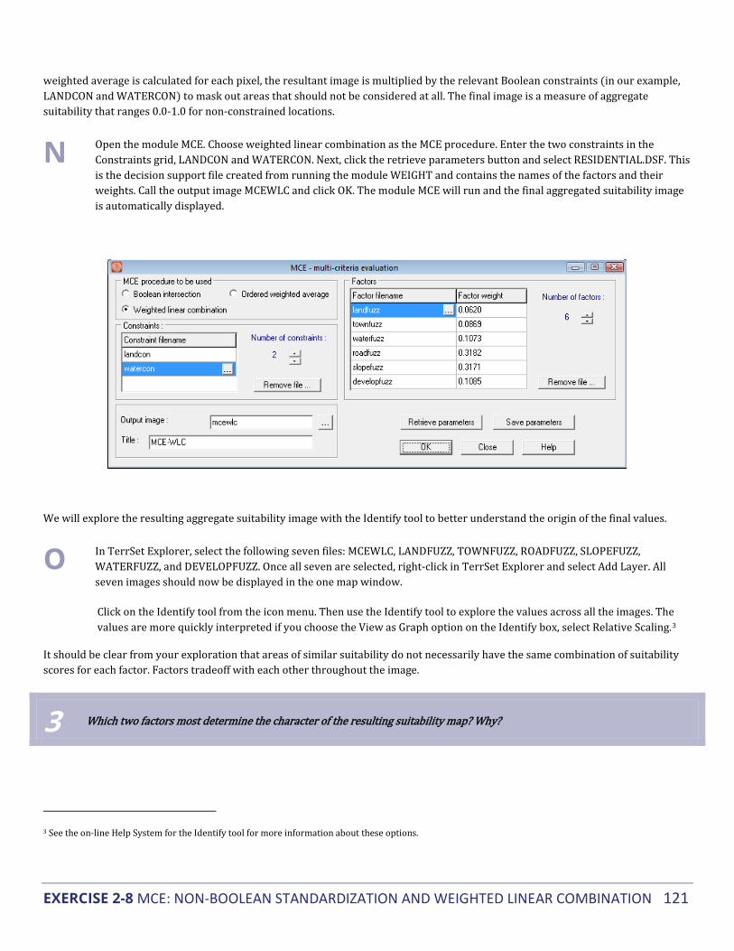
EXERCISE 2-8 MCE: NON-BOOLEAN STANDARDIZATION AND WEIGHTED LINEAR COMBINATION 121
weighted average is calculated for each pixel, the resultant image is multiplied by the relevant Boolean constraints (in our example, LANDCON and WATERCON) to mask out areas that should not be considered at all. The final image is a measure of aggregate suitability that ranges 0.0-1.0 for non-constrained locations.
N Open the module MCE. Choose weighted linear combination as the MCE procedure. Enter the two constraints in the Constraints grid, LANDCON and WATERCON. Next, click the retrieve parameters button and select RESIDENTIAL.DSF. This is the decision support file created from running the module WEIGHT and contains the names of the factors and their weights. Call the output image MCEWLC and click OK. The module MCE will run and the final aggregated suitability image is automatically displayed.
We will explore the resulting aggregate suitability image with the Identify tool to better understand the origin of the final values.
O In TerrSet Explorer, select the following seven files: MCEWLC, LANDFUZZ, TOWNFUZZ, ROADFUZZ, SLOPEFUZZ, WATERFUZZ, and DEVELOPFUZZ. Once all seven are selected, right-click in TerrSet Explorer and select Add Layer. All seven images should now be displayed in the one map window.
Click on the Identify tool from the icon menu. Then use the Identify tool to explore the values across all the images. The values are more quickly interpreted if you choose the View as Graph option on the Identify box, select Relative Scaling.3
It should be clear from your exploration that areas of similar suitability do not necessarily have the same combination of suitability scores for each factor. Factors tradeoff with each other throughout the image.
3 Which two factors most determine the character of the resulting suitability map? Why?
3 See the on-line Help System for the Identify tool for more information about these options.

EXERCISE 2-8 MCE: NON-BOOLEAN STANDARDIZATION AND WEIGHTED LINEAR COMBINATION 122
The MCEWLC result is a continuous image that contains a wealth of information concerning overall suitability for every location. However, using this result for site selection is not always obvious. We will continue to explore site selection methods relevant to continuous suitability images in the next exercise.
Assessing the WLC Approach The WLC procedure allows full tradeoff among all factors. However, the amount any single factor can compensate for another is determined by its factor weight. In our example, a high suitability score in SLOPEFUZZ can easily compensate for a low suitability score in LANDFUZZ for the same location. In the resultant image that location will have a high suitability score. In the reverse scenario, a high suitability score in LANDFUZZ can only weakly compensate for a low score in SLOPEFUZZ. It can tradeoff, but the degree to which it will impact the final result is severely limited by the low factor weight of LANDFUZZ.
In terms of relative risk, we saw earlier how a Boolean MCE that uses the AND operation is essentially a very conservative or risk averse operation, and that the OR operation is extremely risk taking. These are the extremes on a continuum of risk. WLC lies exactly in the middle of this continuum. WLC, then, is characterized by full tradeoff and average risk as illustrated in the figure below.
The weighted linear combination aggregation method offers much more flexibility than the Boolean approaches of the previous exercise. It allows for criteria to be standardized in a continuous fashion, retaining important information about degrees of suitability. It also allows the criteria to be differentially weighted and to trade off with each other. In the next exercise, we will explore another aggregation technique, Ordered Weighted Averaging (OWA), which will allow us to control the amount of risk and tradeoff we wish to include in the result.

EXERCISE 2-9 MCE: ORDERED WEIGHTED AVERAGING 123
▅ EXERCISE 2-9 MCE: ORDERED WEIGHTED AVERAGING
In this exercise, we will explore Ordered Weighted Averaging (OWA) as a method for MCE. This technique, like WLC, is best used with factors that have been standardized to a continuous scale of suitability and weighted according to their relative importance. Constraints will remain as Boolean masks. Therefore, this exercise will simply use the constraints, standardized continuous factors, and weights developed in the previous exercises. However, in the case of OWA, a second set of weights, Order Weights, will also be applied to the factors. This will allow us to control the overall level of tradeoff between factors, as well as the level of risk in our suitability determination.
Our first method of aggregation, Boolean, demanded that we reduce our factors to simple constraints that represent "hard" decisions about suitability. The final map of suitability for residential development was the product of the logical AND (minimum) operation, i.e., it was a risk-averse solution that left no possibility for criteria to tradeoff with each other. If a location was not suitable for any criterion, then it could not be suitable on the final map. (We also explored the Boolean OR (maximum) operation, which was too risk-taking to be of much use.)
WLC, however, allowed us to use the full potential of our factors as continuous surfaces of suitability. Recall that after identifying the factors, they were standardized using fuzzy functions, and then weighted and combined using an averaging technique. The factor weights used expressed the relative importance of each criterion for the overall objective, and they determined how factors were able to trade off with each other. The final map of continuous suitability for residential development (MCEWLC) was the result of an operation that can be said to be exactly halfway between the AND and OR operations. It was neither extremely risk-averse nor extremely risk-taking. In addition, all factors were allowed to fully tradeoff. Any factor could compensate for any other according to its factor weight.
Thus the MCE procedures we used in the previous two exercises lie along a continuum from AND to OR. The Boolean method gives us access to the extremes while the WLC places the operation exactly in the middle. At both extremes of the continuum, tradeoff is not possible, but in the middle there is the potential for full tradeoff. The aggregation method we will use in this exercise, OWA, will give us control over the position of the MCE along both the risk and tradeoff axes (refer to the figure in the previous exercise). That is, it will let us control the level of risk we wish to assume in our MCE, and the degree to which factor weights (tradeoff weights) will influence the final suitability map. OWA offers a wealth of possible solutions for our residential development problem.
Control over risk and tradeoff is made possible through a set of order weights for the different rank-order positions of factors at every location (pixel). The order weights will first modify the degree to which factor weights will have influence in the aggregation procedure, thus they will govern the overall level of tradeoff. After factor weights are applied to the original factors (to some degree dependent upon the overall level of tradeoff used), the results are ranked from low to high suitability for each location. The factor with the lowest suitability score is then given the first Order Weight, the factor with the next lowest suitability score is given the second Order Weight, and so on. This has the effect of weighting factors based on their rank from minimum to maximum value for each location. The relative skew toward either minimum or maximum of the order weights controls the level of risk in the evaluation. Additionally, the degree to which the order weights are evenly distributed across all positions controls the level of overall tradeoff, i.e., the degree to which factor weights have influence.

EXERCISE 2-9 MCE: ORDERED WEIGHTED AVERAGING 124
The user should review the section on Decision Support in the TerrSet Manual for more information on OWA.
Average Risk and Full Tradeoff In our example, we need to specify six order weights because we have six factors that will be rank-ordered for each location after the modified factor weights are applied. If we want to produce a result identical to our WLC example where our level of risk is exactly between AND and OR and our level of tradeoff is full (i.e., factor weights are employed fully), then we would specify the following order weights:
Average Level of Risk - Full Tradeoff
Order Weights: 0.16 0.16 0.16 0.16 0.16 0.16
Rank: 1st 2nd 3rd 4th 5th 6th
In the above example, weight is distributed or dispersed evenly among all factors regardless of their rank-order position from minimum to maximum for any given location. They are skewed toward neither the minimum (AND operation) nor the maximum (OR operation). As in the WLC procedure, our result will be exactly in the middle in terms of risk. In addition, because all rank order positions are given the same weight, no rank-order position will have a greater influence over another in the final result.1 There will be full tradeoff between factors, allowing the factor weights to be fully employed. To see the result of such a weighting scheme, and to explore a range of other possible solutions for our residential development problem, we will again use the module MCE.
A Open the module MCE. Choose Ordered Weighted Average as the MCE procedure. Enter the two constraints in the Constraints grid, LANDCON and WATERCON. Next, click the retrieve parameters button and select RESIDENTIAL.DSF. This is the decision support file created from running the module WEIGHT and contains the names of the factors and their weights. Call the output image MCEAVG.
B Next, specify the order weights. Specify .16 for each order weight by entering this into the order weight grid. These order weights will produce a solution with full tradeoff and average risk. Click OK to run.
C When MCE has finished processing, the resulting image, MCEAVG, will be displayed. Also display the WLC result, MCEWLC, and arrange the images such that both are visible. These images are identical. As previously discussed, the WLC technique is simply a subset of the OWA technique. Do not close MCE.
1 It is important to remember that the rank-order for a set of factors for a given location may not be the same for another location. Order weights are not
applied to an entire factor image, but on a pixel by pixel basis according to the pixel values' rank orders.

EXERCISE 2-9 MCE: ORDERED WEIGHTED AVERAGING 125
The results from any OWA operation will be a continuous image of overall suitability, although each may use different levels of tradeoff and risk. These results, like that from WLC, present a problem for site selection as in our example. Where are the best sites for residential development? Will these sites be large enough for a housing development? The next exercise will address site selection methods. In the remainder of this exercise, we will explore the result of altering the order weights in the MCE-OWA procedure.
Low Risk and No Tradeoff If we want to produce a low risk result for our residential development problem, one close to AND (minimum) on the risk continuum, then we would give greater order weight to the lower rank-orders (the minimum suitability values). In fact, if we give full weight to the first rank-order (the minimum suitability score across all factors for each pixel), our result will closely resemble the AND operation we used in our Boolean MCE. In addition, such a weighting would result in no tradeoff. The factor weights we developed earlier would influence the ranking process, but the suitability score assigned would not be weighted. The order weights we would use for this AND operation would be the following:
Low Level of Risk - No Tradeoff
Order Weights: 1 0 0 0 0 0
Rank: 1st 2nd 3rd 4th 5th 6th
In this AND operation example, all weight is given to the first ranked position, the factor with the minimum suitability score for a given location. Clearly this set of order weights is skewed toward AND; the factor with the minimum value gets full weighting. In addition, because no rank-order position other than the minimum is given any weight, there can be no tradeoff between factors. The minimum factor alone determines the final outcome.

EXERCISE 2-9 MCE: ORDERED WEIGHTED AVERAGING 126
D Specify a new set of order weights in the order weights grid. Enter 1 for Weight 1 and 0 for all the remaining order weights. Change the output image name to MCEMIN. Click OK to run.
E Use the Identify tool to explore the values in the output image. You can display all the factors in the same map window and explore further the values across all the factors for any minimum risk score.
1 What factor appears to have most determined the final result for each location in MCEMIN? What influence did factor weights have in the operation? Why?
2 For comparison, display your Boolean result, MCEBOOL (with the qualitative palette), alongside MCEMIN. Clearly these images have areas in common. Why are there areas of suitability that do not correspond to the Boolean result?
An important difference between the OWA minimum result and the earlier Boolean result is evident in areas that are highly suitable in both images. Unlike in the Boolean result, in the MCEOWA result, areas chosen as suitable retain information about varying degrees of suitability.
F Now, let’s create an image called MCEMAX that represents the maximum operation using the same set of factors and constraints. In MCE, rename the output image to MCEMAX. Then specify a new set of order weights for the maximum operation. For the first order weight, specify 0. Specify 0 for all the other weights except for Weight 6. For this one, specify 1. Click OK to run. When it is done running, use the Identify tool to explore the values in the image.

EXERCISE 2-9 MCE: ORDERED WEIGHTED AVERAGING 127
3 What order weights yield the maximum operation? What level of tradeoff is there in your maximum operation? What level of risk?
4 Why do the non-constrained areas in MCEMAX have such high suitability scores?
The minimum and maximum results are located at the extreme ends of our risk continuum while they share the same position in terms of tradeoff (none). This is illustrated in the figure above.

EXERCISE 2-9 MCE: ORDERED WEIGHTED AVERAGING 128
Varying Levels of Risk and Tradeoff Clearly the OWA technique can produce results that are very similar to the AND, OR, and WLC results. In a way these are all subsets of OWA. However, because we can alter the order weights in terms of their skew and dispersion, we can produce an almost infinite range of possible solutions to our residential development problem, i.e., solutions that fall anywhere along the continuum from AND to OR and that have varying levels of tradeoff.
For example, in our residential development problem, town planners may be interested in a conservative or low-risk solution for identifying suitable areas for development. However, they also know that their estimates for how different factors should trade off with each other are also important and should be considered. The AND operation will not let them consider any tradeoff, and the WLC operation, where they would have full tradeoff, is too liberal in terms of risk. They will then want to develop a set of order weights that would give them some amount of tradeoff but would maintain a level of low risk in the solution.
There are several sets of order weights that could be used to achieve this. For low risk, the weight should be skewed to the minimum end. For some tradeoff, weights should be distributed through all ranks. The following set of order weights was used to create the image MCEMIDAND.
Low Level of Risk - Some Tradeoff
Order Weights: 0.5 0.3 0.125 0.05 0.025 0.0
Rank: 1st 2nd 3rd 4th 5th 6th
Notice that these order weights specify an operation midway between the extreme of AND and the average risk position of WLC. In addition, these order weights set the level of tradeoff to be midway between the no tradeoff situation of the AND operation and the full tradeoff situation of WLC.
G Display the image MCEMIDAND from the group file called MCEMIDAND. (The remaining MCE output images have already been created for you.
H Display the image MCEMIDOR from the group file called MCEMIDOR. The following set of order weights was used to create MCEMIDOR.
High Level of Risk - Some Tradeoff
Order Weights: 0.0 0.025 0.05 0.125 0.3 0.5
Rank: 1st 2nd 3rd 4th 5th 6th
5 How do the results from MCEMIDOR differ from MCEMIDAND in terms of tradeoff and risk? Would the MCEMIDOR result meet the needs of the town planners?

EXERCISE 2-9 MCE: ORDERED WEIGHTED AVERAGING 129
6 In a graph similar to the risk-tradeoff graph above, indicate the rough location for both MCEMIDAND and MCEMIDOR.
I Close all open display windows and display all five results from the OWA procedure in order from AND to OR (i.e., MCEMIN, MCEMIDAND, MCEAVG, MCEMIDOR, MCEMAX), into the same map window. Then use the Identify tool to explore the values in these images. It may be easier to use the graphic display in the Identify box. To do so, click on the View as Graph button at the bottom of the box.
While it is clear that suitability generally increases from AND to OR for any given location, the character of the increase between any two operations is different for each location. The extremes of AND and OR are clearly dictated by the minimum and maximum factor values, however, the results from the middle three tradeoff operations are determined by an averaging of factors that depends upon the combination of factor values, factor weights, and order weights. In general, in locations where the heavily weighted factors (slopes and roads) have similar suitability scores, the three results with tradeoff will be strikingly similar. In locations where these factors do not have similar suitability scores, the three results with tradeoff will be more influenced by the difference in suitability (toward the minimum, the average, or the maximum).
In the OWA examples explored so far, we have varied our level of risk and tradeoff together. That is, as we moved along the continuum from AND to OR, tradeoff increased from no tradeoff to full tradeoff at WLC and then decreased to no tradeoff again at OR. Our analysis, graphed in terms of tradeoff and risk, moved along the outside edges of a triangle, as shown in the figure below.
However, had we chosen to vary risk independent of tradeoff we could have positioned our analysis anywhere within the triangle, the Decision Strategy Space.
Suppose that the no tradeoff position is desirable, but the no tradeoff positions we have seen, the AND (minimum) and OR (maximum), are not appropriate in terms of risk. A solution with average risk and no tradeoff would have the following order weights.
Average Level of Risk - No Tradeoff
Order Weights: 0.0 0.0 0.5 0.5 0.0 0.0

EXERCISE 2-9 MCE: ORDERED WEIGHTED AVERAGING 130
Rank: 1st 2nd 3rd 4th 5th 6th
(Note that with an even number of factors, setting order weights to absolutely no tradeoff is impossible at the average risk position.)
7 Where would such an analysis be located in the decision strategy space?
J Display the image called MCEARNT (for average risk, no tradeoff). Compare MCEARNT with MCEAVG. (If desired, you can add MCEARNT to the MCEOWA group file by opening the group file in TerrSet Explorer, adding MCEARNT, then saving the file.)
MCEAVG and MCEARNT are clearly quite different from each other even though they have identical levels of risk. With no tradeoff, the average risk solution, MCEARNT, is near the median value instead of the weighted average as in MCEAVG (and MCEWLC). As you can see, MCEARNT breaks significantly from the smooth trend from AND to OR that we explored earlier. Clearly, varying tradeoff independently from risk increases the number of possible outcomes as well as the potential to modify analyses to fit individual situations.
Grouping Factors According to Tradeoff Our analysis so far has assumed that all factors must trade off according to the same level prescribed by one set of order weights. However, as discussed earlier in this example, our factors are of two distinct types: factors relevant to development cost and factors relevant to environmental concerns. These two sets do not necessarily have the same level of tradeoff. Factors relevant to the cost of development clearly can fully trade off. Where financial cost is the common concern, savings in development cost in one factor can compensate for a high cost in another. Factors relevant to environmentalists, on the other hand, do not easily trade off. Keeping wildlife habitat distant from new development does not compensate for water runoff and contamination concerns.
To cope with this discrepancy, we will treat our factors as two distinct sets with different levels of tradeoff specified by two sets of ordered weights. This will yield two intermediate suitability maps. One is the result of combining all financial factors, and the other is the result of combining both environmental factors. We will then combine these intermediate results using a third MCE operation.
For the first set of factors, those relevant to cost, we will use the WLC procedure to combine them since we want a result that yields full tradeoff and average risk. There are four cost factors to consider: current land use, distance from town center, distance from roads, and slope. The WLC procedure allows factor weights to fully influence the result, and the cost factors have already been weighted along with the environmental factors such that all six original factor weights summed to 1. However, we will have to create new weights for the four cost factors such that they sum to 1 without the environmental factors. For this example, rather than re-weighting our four cost factors, we will simply rescale the weights previously calculated such that they sum to 1. The original constraints (LANDCON and WATERCON) were also applied
Original Weights Rescaled Weights
LANDFUZZ 0.0620 0.0791

EXERCISE 2-9 MCE: ORDERED WEIGHTED AVERAGING 131
TOWNFUZZ 0.0869 0.1108
ROADFUZZ 0.3182 0.4057
SLOPEFUZZ 0.3171 0.4044
.
K Display the COSTFACTORS image.
For the second set of factors, those relevant to environmental concerns, we will use an OWA procedure that will yield a low risk result with no trade off (i.e. the order weights will be 1 for the 1st rank and 0 for the 2nd). There are two factors to consider: distance from water bodies and wetlands and distance from already developed areas. Again, we will rescale the original factor weights such that they sum to 1 and apply the original constraints.
Original Weights Rescaled Weights
WATERFUZZ 0.1073 0.4972
DEVELOPFUZZ 0.1085 0.5028
L Display the image ENVFACTORS.
Clearly these images are very different from each other. However, note how similar COSTFACTORS is to MCEWLC.
8 What does the similarity of MCEWLC and COSTFACTORS tell us about our previous average risk analysis? Which factors most influence the results in COSTFACTORS and ENVFACTORS?
The final step in this procedure is to combine our two intermediate results using a third MCE operation. In this aggregation, COSTFACTORS and ENVFACTORS are treated as factors in a separate aggregation procedure. There is no clear rule as to how to combine these two results. We will assume that our town planners are unwilling to give more weight to either the developers' or the environmentalists' factors; the factor weights will be equal. In addition, they will not allow the two new consolidated factors to trade off with each other, nor do they want anything but the lowest level of risk when combining the two intermediate results.
9 What set of factor and order weights will give us this result?

EXERCISE 2-9 MCE: ORDERED WEIGHTED AVERAGING 132
M Display an image called MCEFINAL.
10 How does MCEFINAL differ from previous results? How did the grouping of factors in this case affect outcomes?
Save the image MCEFINAL for use in the following exercise. OWA offers an extraordinarily flexible tool for MCE. Like traditional WLC techniques, it allows us to combine factors with variable factor weights. However, it also allows control over the degree of tradeoff between factors as well as the level of risk one wants to assume. Finally, in cases where sets of factors clearly do not have the same level of tradeoff, OWA allows us to temporarily treat them as separate suitability analyses, and then to recombine them. OWA, as a GIS technique for non-Boolean suitability analysis and decision making is potentially revolutionary.

EXERCISE 2-10 MCE: SITE SELECTION USING BOOLEAN AND CONTINUOUS RESULTS 133
▅ EXERCISE 2-10 MCE: SITE SELECTION USING BOOLEAN
AND CONTINUOUS RESULTS
This exercise uses the results from the previous three exercises to address the problem of site selection. While a variety of standardization and aggregation techniques are important to explore for any multi-criteria problem, they result in images that show the suitability of locations in the entire study area. However, multi-criteria problems, as in the previous exercises, often concern eventual site selection for some development, land allocation, or land use change. There are many techniques for site selection using images of suitability. This exercise explores some of those techniques in the context of finding the most suitable sites for residential development.
Site Selection using the Boolean Result Using the result of the Boolean analysis to select sites for residential development is rather straightforward because all areas have been divided into suitable or unsuitable so there are no degrees of suitability to consider. Consequently, there are no "second best" areas for residential development, nor are there judgments to be made about the best location within areas judged to be suitable. However, there remains the problem of size and spatial contiguity of suitable areas.
The areas chosen as suitable are fragmented throughout the study area and most are probably too small for a residential development project. Many are only a few hundred square meters in size. We can address this problem by adding a post- aggregation constraint: areas suitable for development must be 20 hectares or larger.
A Display MCEBOOL, the result from the previous exercise. Using a combination of the modules GROUP, AREA, RECLASS, and OVERLAY in a sequence identical to that used in the latter part of the exercise on distance and context operators, contiguous areas greater than or equal to 20 hectares were found. The result is the image BOOLSIZE20. Display this image.
This approach results in several potential sites from which to choose. However, due to their Boolean nature, their relative suitability cannot be judged and it would be difficult to make a final choice between one or another site. A non-Boolean approach will give us more information to compare potential sites with each other.

EXERCISE 2-10 MCE: SITE SELECTION USING BOOLEAN AND CONTINUOUS RESULTS 134
Site Selection using Continuous Suitability Images The WLC and OWA approaches result in continuous suitability images that make selecting specific sites for residential development, or any other allocation, problematic. In the Boolean approach, site suitability was clearly defined (though rather arbitrarily) and the only problem for site selection was one of contiguity. This was addressed by adding the post-aggregation constraint that suitable sites must be at least 20 hectares in size. With a continuous result, there is first the problem of deciding what locations should be chosen from the set of all locations, each of which has some degree of suitability. Only after this is established can the problem of contiguity be addressed as in the Boolean result.
There are several methods for site selection using a continuous image of suitability. Here we will explore two basic approaches. In the first approach, some level of suitability is specified as a threshold for considering a location finally suitable or not. For example, all locations with a suitability score of at least .75 will be selected as appropriate for some allocation while those with a score below .75 will not be selected. This hard decision results in a Boolean map indicating all possible sites.
In the second approach, it is not the degree of suitability but the total quantity of land for selection (or allocation to a new use) that determines a threshold. In this case, all locations (i.e., pixels) are ranked by their degree of suitability. After ranking, pixels are selected/allocated based on their suitability until the quantity of land needed is achieved. For example, 1000 hectares of land might need to be selected/allocated for residential development. Using this approach, all locations are ranked and then the most suitable 1000 hectares are selected. The result is again a Boolean map indicating selected sites.
Both types of thresholds (by suitability score or by total area) can be thought of as additional post-aggregation constraints. They constrain the final result to particular locations. However, it should be noted that they do not address the problem of contiguity and site size. It is only after thresholding (when a Boolean image is produced) that results can be assessed in terms of contiguity and size using methods similar to those described above.
In addition to these essentially Boolean solutions to site selection using a continuous suitability image, non-Boolean solutions to site selection are perhaps possible using anisotropic surface calculations. However, these methods are not well developed at this time and will not be addressed in this exercise.
Suitability Thresholds
A threshold of suitability for the final site selection may be arbitrary or it may be grounded in the suitability scores determined for each of the factors. For example, during the standardization of factors, a score of .75 or above might have been thought to be, on average, acceptable while below .75 was questionable in terms of suitability. If this was the logic used in standardization, then it should also be applicable to the final suitability map. Let's assume this was the case and use a score of .75 as our suitability threshold for site selection. This is a post-aggregation constraint. We will use the result from the previous exercise, MCEWLC, but you could follow these procedures using any of the continuous suitability results from the previous exercises.
B Run RECLASS from the IDRISI GIS Analysis/Database Query menu and specify MCEWLC as the input image and SUIT75 as the output image. Then enter the following values into the reclassification parameters area of the dialog box. Save the image in integer format.
Assign a new value of To all values from To just less than 0 0 .75 1 .75 >

EXERCISE 2-10 MCE: SITE SELECTION USING BOOLEAN AND CONTINUOUS RESULTS 135
The result is a Boolean image of all possible sites for residential development. However, it is a highly fragmented image with just a few contiguous areas that are substantial. Let's assume that another post-aggregation constraint must be applied here as well, that a suitable site be 20 hectares or greater.
C Use GROUP (with diagonals) and AREA to determine if there are any areas 20 hectares or larger in size. (Remember to remove the unsuitable groups.) Call the resulting image SUIT75SIZE20 (for suitability threshold .75, site size 20 hectares).
1 What is the size of the largest potential site for residential development?
D Clearly, given the post-aggregation constraints of both a suitability threshold of .75 and a site size of 20 hectares or greater, there are no suitable sites for residential development. Assuming town planners want to continue with site selection, there are a number of ways to change the WLC result. Town planners might use different factors or combinations of factors, they might alter the original methods/functions used for standardization of factors, they might weight factors differently, or they might simply relax either or both of the post-aggregation constraints (the suitability threshold or the minimum area for an acceptable site).
In general, non-Boolean MCE is an iterative process and you are encouraged to explore all of the options listed above to change the WLC result.
Using Macros for Iterative Analysis In the site selection problem of this exercise, we need to run the same set of operations that we performed above over and over, each time changing one parameter, to iteratively arrive at an acceptable final solution. You saw in several of the earlier exercises of this section of the Tutorial how Macro Modeler can be used to achieve easy automation of such analyses. In this exercise, you will be exposed to TerrSet’s non-graphic macro scripting language.
The macro we will use has been provided and is called SITESELECT.
E Use Edit, from the Data Entry menu, to examine a macro file (.iml) named SITESELECT. Don't make any changes to the file yet.
The macro scripting language uses a particular syntax for each module to specify the parameters for that module. For more information on these types of macros, see the section on TerrSet Modeling Tools in the TerrSet Manual. The particular command line syntax for each module is specified in each module description in the on-line Help System.
The macro uses a variety of TerrSet modules to produce two maps of suitable sites.1 One map shows each site with a unique identifier and the other shows sites using the original continuous suitability scores. The former is automatically named SITEID by the macro. It is used as the feature definition file to extract statistics for the sites. The other map is named by the user each time the macro is run (see below). The macro also reports statistics about each site selected. These include the average suitability score, range of scores, standard deviation of scores, and area in hectares for each site.
1 Any lines that begin with "rem" are remarks. These are for documentation purposes and are ignored by the macro processor.

EXERCISE 2-10 MCE: SITE SELECTION USING BOOLEAN AND CONTINUOUS RESULTS 136
Note that some of the command lines contain symbols such as %1. These are placeholders for user-defined inputs to the macro. The user types the proper values for these into the macro parameters input box on the Run Macro dialog box. The first parameter entered is substituted into the macro wherever the symbol %1 is placed, the second is substituted for the %2 symbol, and so on. Using a macro in this way allows you to easily and quickly change certain parameters without editing and resaving the macro file. The SITESELECT macro has four placeholders, %1 through %4. These represent the following parameters:
%1 the name of the continuous suitability map to be analyzed
%2 a suitability threshold to use
%3 the minimum site size (in hectares)
%4 the name of the output image with the suitable sites masked and each site containing its continuous values from the original suitability map
Now that we understand the macro, we will use it to iteratively find a solution to our site selection problem. (Note that in Macro Modeler, you would change these parameters by linking different input files, renaming output files and editing the .rcl files used by RECLASS)
F Close Edit. If prompted to save any changes, click No.
Earlier, a suitability level of .75 and a site size of 20 hectares resulted in no selected sites from MCEWLC. Therefore, we will reduce the site size threshold to 2 hectares to see if any sites result.
G Choose the Run Macro command from the IDRISI GIS Analysis\Model Deployment Tools menu. Enter SITESELECT as the macro file to run. In the Macro Parameters input box, type in the following four macro parameters as shown, with a space between each:
MCEWLC .75 2 SUIT75SIZE2
These parameters ask the macro to analyze the image MCEWLC, isolate all locations with a suitability score of 200 or greater, from those locations find all contiguous areas that are at least 2 hectares in size, and output an image called SUIT200SIZE2 (for suitability of 200 or greater and sites of 2 hectares or greater). Click Run Macro and wait while the macro runs several TerrSet modules to yield the result.
The macro will output two images and two tables.
It will first display the sites selected using unique identifiers (the image will be called SITEID).
It will then display a table that results from running EXTRACT using the image SITEID as the feature definition image and the original suitability image, MCEWLC, as the image to be processed. Information about each site, important to choosing amongst them, is displayed in tabular format.
The macro will then display a second table listing the identifier of each site along with its area in hectares.
Finally, it will display the sites selected using the original suitability scores. This final image will be called SUIT75SIZE2.
The images output from the SITESELECT macro show all locations that are suitable using the post-aggregation constraints of a particular suitability threshold and minimum site size. The macro can be run repeatedly with different thresholds.

EXERCISE 2-10 MCE: SITE SELECTION USING BOOLEAN AND CONTINUOUS RESULTS 137
2 How many sites are selected now that the minimum area constraint has been lowered to 2 hectares? How might you select one site over another?
H Visually compare SUIT75SIZE2 to the final result from the Boolean analysis (BOOLSIZE20).
3 What might account for the sites selected in the WLC approach that were not selected in the Boolean approach?
Rather than reducing the minimum area for site selection, planners might choose to change the suitability threshold level. They might lower it in search of the most suitable 2 hectare sites.
I Run the SITESELECT macro a second time using the following parameters that lower the suitability threshold to .65:
MCEWLC .65 2 SUIT65SIZE2
These parameters ask the macro to again analyze the image MCEWLC, isolate all locations with a suitability score of .65 or greater, find sites of 2 hectares or greater, and output the image SUIT65SIZE2 (i.e., suitability .65 and hectares 2).
4 How many sites are selected? How would you explain the differences between SUIT75SIZE2 and SUIT65SIZE2?
J Finally, lower the suitability threshold to .5, retain the 2 hectare site size, and run the macro again. Call the resulting image SUIT5SIZE2.
The difference in the size and quantity of sites selected from a suitability level of .65 to .5 is striking. In the case where the threshold is set at .5, the number of sites may be too great to reasonably select amongst them. Also, note that as the size of sites grow, appreciable differences within those large sites in terms of suitability can be seen. (This can be verified by checking the standard deviations of the sites.)
K To help explain why there is such a change in the number and size of sites, run HISTO from the IDRISI GIS Analysis/Statistics menu with MCEWLC as the input image and a display minimum of .0001.
5 What helps to explain the increase in the number and size of selected sites between suitability levels .65 and .5?
Selecting a variety of suitability thresholds, different minimum site sizes, and exploring the results is relatively easy with the SITESELECT macro. However, justifying the choices of threshold and site size is dependent solely on the human element of GIS. It can only be done by participants in the decision making process. There is no automated way to decide the level of suitability nor the minimum site size needed to select final sites.

EXERCISE 2-10 MCE: SITE SELECTION USING BOOLEAN AND CONTINUOUS RESULTS 138
Specifying a Total Area Threshold The second basic approach to selecting locations from the continuous suitability map (e.g., MCEWLC) is by ranking all locations (pixels) in terms of suitability and then selecting a fixed quantity of top-ranked locations (e.g., equivalent to 1000 hectares). The result would be a Boolean map where an exact amount of land is selected or allocated for new use. The selected land can then be analyzed in terms of contiguity as in the previous examples.
We will easily accomplish this with module TOPRANK.
L Open the module TOPRANK. Enter the input image name MCEWLC. Choose the number of cells option, and enter 25000. 25000 cells is equivalent to 1000 ha. Enter an output name, BEST1000, and click OK to run.
M Run TOPRANK again, but change the number of cells to 50000. This will identify the best 2000 hectares. Change the output image name to BEST2000 and click OK.
6 What problem might be associated with selecting sites for residential development from the most suitable 2000 hectares in MCEWLC?
The results of this total area threshold approach can be used to allocate specific amounts of land for some new development. However, it cannot guarantee the contiguity of the locations specified since the selection is on a pixel by pixel basis from the entire study area. These Boolean results must be submitted to the same grouping and reclassification steps described in the previous section to address issues of contiguity and site size.
Using a total area threshold works well for selecting the best locations for phenomena that can be distributed throughout the study area or for datasets that result in high levels of autocorrelation (i.e., suitability scores tend to be similar for neighboring pixels). A much easier way of identifying more contiguous areas is to use the Spatial Decision Modeler or the MOLA module which has an automated contiguity threshold feature build in. We will explore these techniques in the next exercises.
Our exploration of MCE techniques has thus far concentrated on a single objective. The next exercise introduces tools that may be used when multiple objectives must be accommodated.

EXERCISE 2-11 MCE: MULTIPLE OBJECTIVES 139
▅ EXERCISE 2-11 MCE: MULTIPLE OBJECTIVES
In the previous four exercises, we have explored multi-criteria evaluation in terms of a single objective—suitability for residential development. However, it is often the case that we need to make site selection or land allocation decisions that satisfy multiple objectives, each expressed in its own suitability map. These objectives may be complementary in terms of land use (e.g., open space preservation and market farming) or they may be conflicting (e.g., open space preservation and retail space development).
Complementary objective problems are easily addressed with MCE analyses. We simply treat each objective's suitability map as a factor in an additional MCE aggregation step. The case of conflicting or competing objectives, however, requires some mechanism for choosing between objectives when a location is found highly suitable for more than one. The Multi-Objective Land Allocation (MOLA) module in TerrSet employs a decision heuristic for this purpose. It is designed to allocate locations based upon total area thresholds as in the last part of the previous exercise. However, the module simultaneously resolves areas where multiple objectives conflict. It does so in a way to provide a best overall solution for all objectives. For details about the operation of MOLA, review the section on Decision Support found in the TerrSet Manual.
To illustrate the multi-objective problem, we will use MOLA to allocate land (up to specified area thresholds) for two competing objectives, residential development and industrial development in Westborough. As noted above, total area thresholding can be thought of as a post-aggregation constraint. In this example, there is one constraint for each objective. Town planners want to identify the best 1600 hectares for residential development as well as the best 600 hectares for industrial expansion. We will use the final suitability map, MCEFINAL, from the previous exercise, for the residential development suitability map. For the industrial objective we have already created an industrial suitability map for you called INDUSTRIAL.
We will begin by creating maps for each objective.
A Open the module MOLA. Select the single objective allocation procedure. For the suitability image enter MCEFINAL. Select to force contiguous allocations, set the number of clusters at 1. Select to force compact allocations with the minimum span of allocations set to 3. Select to use areal requirements and enter 40000. This is in cell units and is equivalent to 1600 ha. Give an output image name as BEST1600RESID. Hit OK to run.
B We will again run MOLA with the single objective allocation procedure. For the suitability image enter INDUSTRIAL. Do not select to force contiguous allocations or to force compact allocations. Select to use areal requirements and enter 15000. This is in cell units and is equivalent to 600 ha. Give an output image name as BEST600INDUST. Hit OK to run.
Before we continue with the MOLA process, we will first determine where conflicts in allocation would occur if we treated each of these objectives separately.
C Open the module CROSSTAB. Enter BEST1600RESID as the first image, BEST600INDUST as the second image, and choose to create a crossclassification image called CONFLICT.

EXERCISE 2-11 MCE: MULTIPLE OBJECTIVES 140
The categories of CONFLICT include areas allocated to neither objective (1), areas allocated to residential objective, but not the industrial objective (2), and areas allocated to both the residential and industrial objectives (3). It is this latter class that is in conflict. (There are no areas that were selected among the best 600 hectares for industrial development that were not also selected among the best 1600 hectares for residential development.)
The image CONFLICT illustrates the nature of the multi-objective problem with conflicting and competing objectives. Since treating each objective separately produces conflicts, neither objective has been allocated its full target area. We could prioritize one solution over the other. For example, we could use the BEST1600RESID image as a constraint in choosing areas for industry. In doing so, we would assign all the areas of conflict to residential development, then choose more (and less suitable) areas for industry to make up the difference. Such a solution is often not desirable. A compromise solution that achieves a solution that is best for the overall situation and doesn't grossly favor any objective may be more appropriate.
The MOLA procedure is designed to resolve such allocation conflicts in a way that provides a compromise solution—a best overall solution for all objectives.
D Open the module MOLA. Select multi-objective as the allocation type and select use area requirements for the allocation. To the right of the grid, increase the number of objectives to 2. Enter the two suitability maps, MCEFINAL and INDUSTRIAL. Enter the allocation captions of Residential and Industrial for the correct suitability map. Enter .5 as the objective weight for both. Enter an areal requirement of 40000 for residential and 15000 for industrial. These are equivalent to 1600 ha and 600 ha respectively. Select to force contiguous allocation and compactness. Leave the minimum span of 3. Enter an output name as MOLAFINAL. Click OK.
The MOLA procedure will run iteratively and when finished will display a log of its iterations and the final image.
1 How many iterations did MOLA take to achieve a solution?
E The MOLA log indicates the number of cells assigned to each objective. However, since we specified the area requirements in hectares, we will check the result by running the module AREA. Choose AREA from the IDRISI GIS Analysis / Database Query menu. Give MOLAFINAL as the input image, choose tabular output, and units in hectares.
2 How close is the actual solution to the requested area values?
The solution presented in MOLAFINAL is only one of any number of possible solutions for this allocation problem. You may wish to repeat the process using other suitability maps created earlier for residential development or new industrial suitability maps you create yourself using your own factors, weights, and aggregation processes. You may also wish to identify other objectives and develop suitability maps for these.

EXERCISE 2-12 MCE: CONFLICT RESOLUTION OF COMPETING OBJECTIVES 141
▅ EXERCISE 2-12 MCE: CONFLICT RESOLUTION OF
COMPETING OBJECTIVES
The Kathmandu Valley Case Study
In the previous exercises on decision support, we explored the tools available in TerrSet for land suitability mapping and land allocation. This exercise will further explore these concepts using a new case study and dataset. This exercise assumes the user has familiarity of the concepts and language introduced in the Decision Support chapter of the TerrSet Manual.

EXERCISE 2-12 MCE: CONFLICT RESOLUTION OF COMPETING OBJECTIVES 142
In this exercise, we will consider the case of the expansion of the carpet industry in Nepal and its urbanizing effects on areas traditionally devoted to valley agriculture. After the flight of the Tibetans into Nepal in 1949, efforts were undertaken, largely by the Swiss, to promote traditional carpet-producing technologies as a means of generating local income and export revenues. Today the industry employs over 300,000 workers in approximately 5000 registered factories. Most of these are sited within the Kathmandu Valley. The carpets produced are sold locally as well as in bulk to European suppliers.
In recent years, considerable concern has been expressed about the expansion of the carpet industry. While it is recognized that the production of carpets represents a major economic resource, the Kathmandu Valley is an area that has traditionally been of major importance as an agricultural region. The Kathmandu Valley is a major rice growing region during the monsoon months, with significant winter crops of wheat and mustard (for the production of cooking oil). The region also provides a significant amount of the vegetables for the Kathmandu urban area. In addition, there is concern that urbanization will force the loss of a very traditional lifestyle in the cultural heritage of Nepal.
In an attempt to limit the degree of urban expansion within the Kathmandu area, the Planning Commission of Nepal has stopped granting permission for the development of new carpet factories within the ring road of Nepal, promoting instead the area outside the Kathmandu Valley for such developments. However, there still remains significant growth within the valley.
A Display the image KVLANDU with the KVLANDU palette. The Kathmandu urban area is clearly evident in this image as the large purplish area to the west. The smaller urban region of Bakhtipur can be seen to the east. Agricultural areas show up either as light green (fallow or recently planted) or greenish (young crops). The deep green areas are forested.
The focus of this exercise is the development of a planning map for the Kathmandu Valley, setting aside 1500 hectares outside the Kathmandu ring road in which further development by the carpet industry will be permitted and 6000 hectares in which agriculture will be specially protected. The land set aside for specific protection of agriculture needs to be the best land for cultivation within the valley, while those zoned for further development of the carpet industry should be well-suited for that activity. Remaining areas, after the land is set aside, will be allowed to develop in whatever manner arises.
The development of a planning zone map is a multi-objective/multi-criteria decision problem. In this case, we have two objectives: the need to protect land that is best for agriculture and the need to find other land that is best suited for the carpet industry. Since land can only be allocated to one of these uses at any one time, the objectives are viewed as conflicting -- i.e., they may potentially compete for the same land. Furthermore, each of these objectives require a number of criteria. For example, suitability for agriculture can be seen to relate to such factors as soil quality, slope, distance to water, and so on. In this exercise, a solution to the multi-objective/multi-criteria problem is presented as it was developed with a group of Nepalese government officials as part of an advanced seminar in GIS.1 While the scenario was developed purely for the purpose of demonstrating decision support techniques and the result does not represent an actual policy decision, it is one that incorporates substantial field work and well-established perspectives.
Each of the two objectives is dealt with as a separate multi-criteria evaluation problem and two separate suitability maps are created. They are then compared to arrive at a single solution that balances the needs of the two competing objectives.
The data available for the development of this solution are as follows:
i. Land use map derived from Landsat imagery named KVLANDU
ii. Digital elevation model (DEM) named KVDEM
iii. 50 meter contour vector file named DEMCONTOURS
iv. Vector file of roads named KVROADS
1 The seminar was hosted by UNITAR at the International Center for Integrated Mountain Development (ICIMOD) in Nepal, September 28-October 2, 1992.

EXERCISE 2-12 MCE: CONFLICT RESOLUTION OF COMPETING OBJECTIVES 143
v. Vector file of the ring road area named KVRING
vi. Vector file of rivers named KVRIVERS
vii. Land capability map named KVLANDC
The Landsat TM imagery dates from October 12, 1988. The DEM is derived from the USGS Seamless Data Distribution System at http://seamless.usgs.gov/. All other maps were digitized by the United Nations Environment Program Global Resources Information Database (UNEP/GRID). The roads data are quite generalized and were digitized from a 1:125,000 scale map. The river data are somewhat less generalized and also derived from a 1:125,000 map. The land capability map KVLANDC was digitized from a 1:50,000 scale map with the following legend categories:
IIBh2st Class II soils (slopes 1-5 degrees / deep and well drained). Warm temperate (B = 15-20 degrees) humid (h) climate. Moderately suitable for irrigation (2).
IIIBh Class III soils (slopes 5-30 degrees / 50-100cm deep and well drained). Warm temperate and humid climate.
IIICp Class III soils and cool temperate (C = 10-15 degrees) perhumid climate.
IVBh Class IV soils (slope >30 degrees and thus too steep to be cultivated) and a warm temperate humid climate.
IBh1 Class I soils (slopes <1 degree and deep) / warm temperate humid climate / suitable for irrigation for diversified crops.
IBh1R Class I soils / warm temperate humid climate / suitable for irrigation for wetland rice.
The Multi-Criteria Evaluation for the Carpet Industry

EXERCISE 2-12 MCE: CONFLICT RESOLUTION OF COMPETING OBJECTIVES 144
Through discussions, the group of Nepalese officials evaluating this problem decided that the major factors affecting the suitability of land for the carpet industry were as follows:
Proximity to Water
Substantial amounts of water are used in the carpet washing process. In addition, water is also needed in the dying of wool. As a result, close proximity to water is often an important consideration.
Proximity to Roads
The wool used in Nepalese carpets is largely imported from Tibet and New Zealand (see figure below). Access to transportation is thus an important consideration. In addition, the end product is large and heavy, and is often shipped in large lots (see figure above).
Proximity to Power
Electricity is needed for general lighting and for powering the dying equipment. Although not as critical an element as water, proximity to power is a consideration in the siting of a carpet factory.

EXERCISE 2-12 MCE: CONFLICT RESOLUTION OF COMPETING OBJECTIVES 145
Proximity to Market
Kathmandu plays an important role in the commercial sale of carpets. With Nepal's growing tourist trade, a sizable market exists within the city itself. Perhaps more importantly, however, commercial transactions often take place within the city and most exports are shipped from the Kathmandu airport.
Slope Gradient
Slope gradient is a relatively minor factor. However, as with most industries, lands of shallow gradient are preferred since they are cheaper to construct and permit larger floor areas. In addition, shallow gradients are less susceptible to soil loss during construction.
In addition to these factors, the decision group also identified several significant constraints to be considered in the zoning of lands for the carpet industry:
Slope Constraint
The group thought that any lands with slope gradients in excess of 100% (45 degrees) should be excluded from consideration.
Ring Road Constraint
Current government policy denies permission for the development of new factories within the ring road that circles Kathmandu.
Land Use Constraint
The problem, as it is presented, is about the future disposition of agricultural land. As a result, only these areas are open for consideration in the allocation of lands to meet the two objectives presented.
The process of developing a suitability map for the carpet industry falls into three stages. First, maps for each of the factors and constraints need to be developed. Second, a set of weights needs to be developed that can dictate the relative influence of each of the factors in the production of the suitability map. Finally, the constraints and factors, along with their associated weights, need to be combined in order to produce the suitability map.

EXERCISE 2-12 MCE: CONFLICT RESOLUTION OF COMPETING OBJECTIVES 146
Creating the Criterion Maps Criteria can be of two types: factors and constraints. Factors are continuous in character and serve to enhance or diminish the suitability of the land for a particular application depending upon the magnitude of the variable in question. Constraints, on the other hand, are Boolean in character. They serve to exclude certain areas from consideration. The development of the carpet industry suitability map involves both kinds of criteria.
Creating the Constraint Maps
For the constraints, all that is required is the development of a Boolean image -- an image containing only zeros and ones -- zeros where development is excluded and ones where it is permitted. In this case, three constraints are involved: slope, the ring road and land use.
B Display KVDEM with the default Quantitative palette. To get a better perspective of the relief, use "Add Layer" from Composer to display the vector file DEMCONTOURS. Choose the White Outline symbol file. These are 50 meter contours created from the DEM.
C Next run SURFACE on the elevation model KVDEM to create a slope map named KVSLOPES. Specify to calculate the output in slope gradients as percent. Display the result with the Quantitative palette.
D Now create the slope constraint map by running RECLASS on the image KVSLOPES to create a new image named SLOPECON. Use the default user-defined classification option to assign a new value of 1 to all values ranging from 0 to just less than 100 and 0 to those from 100 to 999. Then examine SLOPECON with the Qualitative palette. Notice that very few areas exceed the threshold of 100% gradient.
E Now that the slope constraint map has been created, we need to create the ring road constraint map. We will use the vector ring road area data for this.
After displaying the vector file KVRING, run the module RASTERVECTOR and select to rasterize a vector polygon file. Select KVRING as the input file and give it the output name, TMPCON, for the raster file to create. When you hit OK, the module INITIAL will be called because the corresponding raster file does not yet exist. Using INITIAL, specify the image to copy parameters from as KVDEM and the output data type as byte. Then hit OK.
What we need is the inverse of this map so as to exclude the area inside the ring road. As in the step above, run RECLASS on TMPCON to assign a new value of 1 to all values ranging from 0 to 1 and 0 to those from 1 to 2. Name the output RINGCON.
F The final constraint map is one related to land use. Only agriculture is open for consideration in the allocation of lands for either objective. Display KVLANDU with the legend and the KVLANDU user-defined palette. Of the twelve land use categories, the Katus, Forest/Shadow, Chilaune and Salla/Bamboo categories are all forest types; two categories are urban and the remaining six categories are agricultural types.
Perhaps the easiest way to create the constraint map here is to use the combination of Edit and ASSIGN to assign new values to the land use categories. Use Edit to create an integer attribute values filename TMPLAND as follows:
1 1

EXERCISE 2-12 MCE: CONFLICT RESOLUTION OF COMPETING OBJECTIVES 147
5 1
6 1
7 1
9 1
10 1
Then run ASSIGN and use KVLANDU as the feature definition image, TMPLAND as the attribute values file, and LANDCON as the output file. Note that ASSIGN will assign a zero to any category not mentioned in the values file. Thus, the forest and urban categories will receive a zero by default. When ASSIGN has finished, display LANDCON with the Qualitative palette.
This completes our development of the constraint maps for the carpet suitability mapping project.
Creating the Factor Maps
The development of factor maps usually involves two and at times, three, distinct steps. In the first step, the basic factor map will be developed. In the second step, the values in the map will be standardized to a specific range. In the third step, if necessary, values will be inverted to assure that high values on the map correspond to areas more suitable to the objective under consideration. In this case study, all maps will be standardized to 0.0-1.0.
G The first factor is that of proximity to water. As we did earlier with the roads, we will first need to create a raster version of the river data. First display the vector file named KVRIVERS. Notice how this is quite a large file covering the entire Bagmati Zone (one of the main provinces of Nepal). The roads data also cover this region. As we did before, we will run RASTERVECTOR, but this time we will rasterize a line file. Input KVRIVERS as the vector line file and enter KVRIVERS as the image file to be updated. When you hit OK, the module INITIAL will be called since the raster file named in the output does not yet exist. Specify the image to copy parameters from as KVDEM then hit OK. Display the result and note that only the portion of the vector file matching the extent of the initial file was rasterized.
Now run DISTANCE to calculate the distance of every cell from the nearest river. Specify KVRIVERS as the input feature image and TMPDIST as the output image. View the result.
1 What are the minimum and maximum distances of data cells to the nearest river? How did you determine this?
Now run the module FUZZY to standardize the distance values. Use TMPDIST as the input image and WATERFAC as the output. Specify linear as the membership function type, the output data format as real, and the membership function shape as monotonically decreasing (we want to give more importance to being near a water source than away). Specify the control points for c and d as 0 and 2250, respectively. Hit OK and display the result.
This is the final factor map. Display it with the Quantitative palette and confirm that the higher values are those nearest the rivers (you can use "Add Layer" to overlay the vector rivers to check).The distance image has thus been converted to a standard range of values (to be known as criterion scores) based on the minimum and maximum values in the image. Values are thus standardized to a range determined by the extreme values that exist within the study area. Most of the factors will be standardized in this fashion.

EXERCISE 2-12 MCE: CONFLICT RESOLUTION OF COMPETING OBJECTIVES 148
H Now create the proximity to roads factor map. Since the raster version of the roads data has already been created, the procedure will be quick. Run DISTANCE on KVROADS to create a distance image named TMPDIST (yes, this is the same name we used in the previous step -- since the distance image was only a temporary image in the process of creating the proximity image, it may be overwritten). Then run FUZZY on TMPDIST to create ROADFAC. Specify linear as the membership function type, the output data format as real, and the membership function shape as monotonically decreasing. Specify the control points for c and d as 0 and 2660, respectively. Hit OK and display the result. Confirm that it has criterion scores that are high (e.g., 1) indicating high suitability near the roads and low (e.g., 0) indicting low suitability at the most distant extremes.
I Now create the proximity to power factor map. We do not have any data on electrical power. However, it is reasonable to assume that power lines tend to be associated with paved (Bitumen) roads. Thus use RECLASS on KVROADS to create TMPPOWER. With the user-defined classification option, assign a value of 0 to all values ranging from 2 to 999. Then display the image to confirm that you have a Boolean map that includes only the class 1 (Bitumen) roads from KVROADS. Use the same procedures as in the above two steps to create a scaled proximity factor map based on TMPPOWER. Call the result POWERFAC.
J To create the proximity to market map, we will first need to specify the location of the market. There are several possible candidates: the center of Kathmandu, the airport, the center of Patan, etc. For purposes of illustration, the junction of the roads at column 163 and row 201 will be used. First use INITIAL to create a byte binary image with an initial value of 0 based on the spatial parameters of KVLANDU. Call this new image KVMARK. Then use UPDATE to change the cell at row 201 / column 163 to have a value of 1. Indicate 201 for the first and last row and 163 for the first and last column. Display this image with the Qualitative palette to confirm that this was successfully done.
K In this case, we will use the concept of cost distance in determining the distance to market. Cost distance is similar in concept to normal Euclidean distance except that we incorporate the concept of friction to movement. For instance, the paved roads are easiest to travel along, while areas off roads are the most difficult to traverse. We thus need to create a friction map that indicates these impediments to travel. To do so, first create an attribute values file that indicates the frictions associated with each of the surface types we can travel along (based on the road categorizations in KVROADS). Use Edit to create this real number attribute values file named FRICTION with the following values:
0 10.0
1 1.0
2 1.5
4 6.0
5 8.0
Save and exit when done.
This indicates that paved roads (category 1) have a base friction of 1.0. Gravel and earth roads (category 2) require 1.5 times as much cost (in terms of time, speed, money etc.). Main trails (category 4) cost 6 times as much to traverse as paved roads while local trails (category 5) cost 8 times as much. Areas off road (category 0) cost 10 times as much to traverse as paved roads. Category 3 (unclassified) has not been included here because there are no roads of this category in our study area.
Now use ASSIGN to assign these frictional attribute values to the KVROADS image. Call the output image FRICTION. Display it with the Quantitative palette to examine the result. Then run the module COST. Choose the cost grow algorithm

EXERCISE 2-12 MCE: CONFLICT RESOLUTION OF COMPETING OBJECTIVES 149
and specify KVMARK as the feature image and FRICTION as the friction surface image. Use all other defaults. Call the output image COST. When COST finishes, examine the result.
Now use FUZZY to create a standardized factor map called MARKFAC. Display it with the Quantitative palette to examine the result and confirm that the high values (near 1.0) are those closest to the center of Kathmandu and that the low values (near 0) are those farthest away.
L The final factor map needed in this stage is the slope factor map. The slope gradients have already been calculated (KVSLOPES). However, our procedure for developing the standardized criterion scores will be slightly different. Instead of using the minimum and maximum values as the control points, use FUZZY with the linear option and base it on values of 0 and 100 (the minimum and a logically determined maximum slope) for control points c and d respectively. Call the output factor map SLOPEFAC. Use DISPLAY Launcher with the Quantitative palette to examine the result and confirm that the high factor scores occur on the low slopes (which should dominate the map).
Weighting the Criteria Now that the criteria maps have been created, we need to develop a set of weights to establish their relative importance to the objective under consideration. In the procedure that will be used here, the weights will need to be real numbers that sum to 1.0. The factor maps will then be multiplied by their weights and subsequently added together. Since the weights sum to 1.0 and the factor maps all have a standardized range of 0-1.0, the final weighted linear combination will also have a range of 0-1.0. At the end of this process, the final suitability map will be multiplied by each of the constraints in turn to zero out all excluded areas.
In some cases, it may be feasible to estimate the weights to be used in a multi-criteria evaluation directly. However, many people find this to be somewhat difficult. In addition, when a group of people all have a vested interest in the outcome, it becomes necessary to incorporate the opinions of all participants. For these cases, the procedure of pairwise comparisons associated with the Analytical Hierarchy Process (AHP) is appropriate. In TerrSet, the WEIGHT procedure undertakes this process.
WEIGHT requires that the decision makers make a judgment about the relative importance of pairwise combinations of the factors involved. In making these judgments, a 9-point rating scale is used, as follows:
1/9 1/7 1/5 1/3 1 3 5 7 9
extremely very strongly strongly moderately equally moderately strongly very strongly extremely less important more important
The scale is continuous, and thus allows ratings of 2.4, 5.43 and so on. In addition, in comparing rows to columns in the matrix below, if a particular factor is seen to be less important rather than more important than the other, the inverse of the rating is used. Thus, for example, if a factor is seen to be strongly less important than the other, it would be given a rating of 1/5. Fractional ratings are permitted with reciprocal ratings as well. For example, it is permissible to have ratings of 1/2.7 or 1/7.1 and so on.
To provide a systematic procedure for comparison, a pairwise comparison matrix is created by setting out one row and one column for each factor in the problem. The group involved in the decision then provides a rating for each of the cells in this matrix. Since the matrix is symmetrical, however, ratings can be provided for one half of the matrix and then inferred for the other half. For example, in the case of the carpet industry problem being considered here, the following ratings were provided.

EXERCISE 2-12 MCE: CONFLICT RESOLUTION OF COMPETING OBJECTIVES 150
waterfac powerfac roadfac markfac slopefac
Waterfac 1
Powerfac 1/5 1
roadfac 1/3 7 1
markfac 1/5 5 1/5 1
slopefac 1/8 1/3 1/7 1/7 1
The diagonal of the matrix is automatically filled with ones. Ratings are then provided for all cells in the lower triangular half of the matrix. In this case, where a group was involved, the GIS analyst solicited a rating for each cell from a different person. After providing an initial rating, the individual was asked to explain why he/she rated it that way. The rating and its rationale were then discussed by the group at large, in some cases leading to suggestions for modified ratings. The final rating was then chosen either by consensus or compromise.
To illustrate this process, consider the first few ratings. The first ratings solicited were those involved with the first column. An individual was selected by the analyst and asked the question, "Relative to proximity to water, how would you rate the importance of being near power?" The person responded that proximity to power was strongly less important than proximity to water, and it thus received a rating of 1/5. Relative to being near water, other individuals rated the relative importance of being near roads, near the market and on shallow slopes as moderately less important (1/3), strongly less important (1/5) and very strongly less important (1/8) respectively. The next ratings were then based on the second column. In this case, relative to being near to power, proximity to roads was rated as being very strongly more important (7), proximity to market was seen as strongly more important (5), and slope was seen as being moderately less important (1/3). This procedure then continued until all of the cells in the lower triangular half of the matrix were filled.
This pairwise rating procedure has several advantages. First, the ratings are independent of any specific measurement scale. Second, the procedure, by its very nature, encourages discussion, leading to a consensus on the weightings to be used. In addition, criteria that were omitted from initial deliberations are quickly uncovered through the discussions that accompany this procedure. Experience has shown, however, that while it is not difficult to come up with a set of ratings by this means, individuals, or groups are not always consistent in their ratings. Thus the technique of developing weights from these ratings also needs to be sensitive to these problems of inconsistency and error.
To develop a set of weights from these ratings, we will use the WEIGHT module in TerrSet. The WEIGHT module has been specially developed to take a set of pairwise comparisons such as those above, and determine a best fit set of weights that sum to 1.0. The basis for determining the weights is through the technique developed by Saaty (1980), as discussed further in the Help for the module.
M Run the module WEIGHT and specify to create a new pairwise comparison file. Name the output CARPET and indicate the number of files to be 5. Then insert the names of the factors, in this order: WATERFAC, POWERFAC, ROADFAC, MARKFAC, SLOPEFAC. Hit next and you will be presented with an input matrix similar to the one above, with no ratings. Referring to the matrix above, fill out the appropriate ratings and call the output file CARPET. Hit OK.
You will then be presented with the best fit weights and an indication of the consistency of the judgments. The Consistency Ratio measures the likelihood that the pairwise ratings were developed at random. If the Consistency Ratio is less than 0.10, then the ratings have acceptable consistency and the weights are directly usable. However, if the Consistency Ratio exceeds 0.10, significant consistency problems potentially exist (see Saaty, 1980). This is the case with the ratings we entered.

EXERCISE 2-12 MCE: CONFLICT RESOLUTION OF COMPETING OBJECTIVES 151
2 What are the weights associated with the factors on this run? What was the Consistency Ratio?
N Since the Consistency Ratio exceeds 0.10, we should consider revising our ratings. A second display will be presented in which inconsistencies can be identified. This next display shows the lower triangular half of the pairwise comparison matrix along with a consistency index for each. The consistency index measures the discrepancy between the pairwise rating given and the rating that would be required to be perfectly consistent with the best fit set of weights.
The procedure for resolving inconsistencies is quite simple. First, find the consistency index with the largest absolute value (without regard for whether it is negative or positive). In this case, the value of -3.39 associated with the rating of the proximity to power factor (POWERFAC) relative to the proximity to water factor (WATERFAC) is the largest. The value -3.39 indicates that to be perfectly consistent with the best fit weights, this rating would need to be changed by 3.39 positions to the left on the rating scale (the negative sign indicates that it should be moved to the left -- i.e., a lower rating).
At this point, the individual or group that provided the original ratings should reconsider this problematic rating. One solution would be to change the rating in the manner indicated by the consistency index. In this case, it would suggest that the rating should be changed from 1/5 (the original rating) to 1/8.39. However, this solution should be used with care.
In this particular situation, the Nepalese group debated this new possibility and felt that the 1/8.39 was indeed a better rating. (This was the first rating that the group had estimated and in the process of developing the weights, their understanding of the problem evolved as did their perception of the relationships between the factors.) However, they were uncomfortable with the provision of fractional ratings -- they did not think they could identify relative weights with any greater precision than that offered by whole number steps. As a result, they gave a new rating of 1/8 for this comparison.
Return to the WEIGHT matrix and modify the pairwise rating such that the first column, second row of the lower triangular half of the pairwise comparison matrix reads 1/8 instead of 1/5. Then run WEIGHT again.
3 What are the weights associated with the factors in this second run? What is the Consistency Ratio?
4 Clearly, we still haven't achieved an acceptable level of consistency. What comparison has the greatest inconsistency with the best fit weights now?
5 Again, the Nepalese group who worked with these data preferred to work with whole numbers. As a result, after reconsideration of the relative weight of the market factor to the road factor, they decided on a new weight of 1/2. What would have been their rating if they had used exactly the change that the consistency index indicated?
Again, edit the pairwise matrix to change the value in column 3 and row 4 of the CARPET pairwise comparison file from 1/5 to 1/2. Then run WEIGHT again. This time an acceptable consistency is reached.
6 What are the final weights associated with the factors? Notice how they sum to 1.0. What were the two most important factors in the siting of carpet industry facilities in the judgment of these Nepalese officials?

EXERCISE 2-12 MCE: CONFLICT RESOLUTION OF COMPETING OBJECTIVES 152
O Now that we have a set of weights to apply to the factors, we can undertake the final multi-criteria evaluation of the variables considered important in siting carpet industry facilities. To do this, run the module MCE. The MCE module will ask for the number of constraints and factors to be used in the model. Indicate 3 constraints and enter the following names:
SLOPECON
RINGCON
LANDCON
For the names of the factors and their weights, either enter the name of the pairwise comparison file saved from running WEIGHT, i.e., CARPET, or enter the following:
WATERFAC 0.5077
POWERFAC 0.0518
ROADFAC 0.2468
MARKFAC 0.1618
SLOPEFAC 0.0318
Name the output CARPSUIT and run MCE. The MCE module will then complete the weighted linear combination. Display the result. This map shows suitability for the carpet industry. Use "Add Layer" to overlay KVRIVERS and KVROADS. Note the importance of these factors in determining suitability.
7 MCE uses a procedure that multiplies each of the factors by its associated weight, adds the results, and then multiplies this sum by each of the constraints in turn. The procedure has been optimized for speed. However, it would also have been possible to undertake this procedure using standard mathematical operators found in any GIS. Describe the TerrSet modules that could have been used to undertake this same procedure in a step-by-step process.
The Multi-Criteria Evaluation for Agriculture In the above section, we developed a map indicating the suitability of land for the carpet industry. In this section, we will undertake the same process for agriculture. If you recall, the purpose is to determine the suitability of land for agriculture in order to zone the best lands for protection of its agricultural status. The Nepalese group that worked on this problem felt that the same three constraints would apply in the multi-criteria evaluation of agricultural suitability. However, they identified only the water, slope, and market factors as being of relevance to this problem. In addition, they felt that an additional factor needed to be added -- soil capability. Our first step will therefore be to create this new standardized factor map. Then we will follow a similar procedure to that above to create the agricultural suitability map.
P Display the map KVLANDC with the Qualitative palette and a legend. This land capability map combines information about soils, temperature, moisture, and irrigation potential. Based on the information in the legend (see the beginning of this exercise for detailed descriptions of the categories), the group of Nepalese officials who worked with these data felt that the most capable soil was IBh1R, followed in sequence by by IBh1, IIBh2st, IIIBh, IVCp, and IVBh.

EXERCISE 2-12 MCE: CONFLICT RESOLUTION OF COMPETING OBJECTIVES 153
To reclassify the land capability map into an ordinal map of physical suitability for agriculture, use Edit to create an integer attribute values file named TMPVAL. Then enter the following values to indicate how classes in the land capability map should be reassigned to indicate ordinal land capability:
1 4
2 3
3 2
4 1
5 5
6 6
Next, run ASSIGN and use KVLANDC as the feature definition image to create the output image TMPSOIL using TMPVAL as the attribute values file of reassignments.
Then run STRETCH with a simple linear stretch. Specify TMPSOIL as the input image and SOILFAC as the output image name. For the output image parameters, select real as the output data type and specify the minimum and maximum value as 0.0 and 1. 0, respectively.2 Display the result with the Qualitative palette.
Q This now gives us the following constraints and factors to be brought together in the multi-criteria evaluation of land suitability for agriculture:
Constraints SLOPECON
RINGCON LANDCON Factors WATERFAC SLOPEFAC SOILFAC MARKFAC
Here is the lower triangular half of the pairwise comparison matrix for the factors as judged by the Nepalese decision team:
waterfac slopefac soilfac markfac
waterfac 1
2 There is some question about the advisability of using ordinal data sets in the development of factor maps. Factor maps are assumed to contain interval or
ratio data. The standardization procedure ensures that the end points of the new map have the same meaning as for any other factor -- they indicate areas that have the minimum and maximum values within the study area on the variable in question. However, there is no guarantee that the intermediate values will be correctly positioned on this scale. Although in this particular case it was felt that classes represented fairly even changes in land capability, input data of less than interval scaling should, in general, be avoided.

EXERCISE 2-12 MCE: CONFLICT RESOLUTION OF COMPETING OBJECTIVES 154
slopefac 1/7 1
soilfac 1 5 1
markfac 1/6 1/3 1/6 1
Now use the WEIGHT and MCE procedures as outlined in the carpet facilities suitability section to create an agricultural suitability map. Call the pairwise comparison file AGRI and the final agricultural suitability map AGSUIT.
8 What were the final weights you determined for the factors in this agricultural suitability map? What was the Consistency Ratio? How many iterations were required to achieve a solution?
Be sure to examine the final map with DISPLAY Launcher.
Solving the Single-Objective Problems The original planning problem was to develop a zoning map that would set aside 6000 hectares of specially protected agricultural land and 1500 hectares of land for further expansion of the carpet industry. Let's first consider how to approach these as single objective problems. In the next part, we will look at how to resolve the conflicts between the objectives, a multi-objective problem, and arrive at a final solution.3
If we consider either of these objectives on their own, we are clearly quite close to a final solution. For example, in the case of the carpet industry objective, we already know the comparative suitability of the land for this use. We only need to figure out which are the best 1500 hectares! To do this, we need to rank order the data cells in terms of their suitability and select as many of the most highly ranked cells to total 1500 hectares. We will do this with the TOPRANK module.
R Run the module TOPRANK and specify the input file CARPSUIT. Specify 16666 as the number of cells. Call the output image to be produced CARPRANK. Click OK to run.
In the case here, we wish to isolate the best 1500 hectares of land. In this data set, each cell is 30 meters by 30 meters. This amounts to 900 square meters, or 0.09 hectares per cell (since a hectare contains 10,000 square meters). As a result, 1500 hectares is the equivalent of 16,666 cells.
S Display the result. You may wish to use "Add Layer" and the advanced palette selection to overlay the KVRIVERS file with a BLUE symbol file and the KVROADS file with a GREEN symbol file.
T Now use the same procedure as that just described to create AGRANK from AGSUIT that isolates the best 66,666 cells (which is the equivalent of 6000 hectares).
3 Note particularly, however, that this process of looking at the problem from a single-objective perspective is not normally undertaken in the solution of
multi-objective problems. It is only presented here because it is easier to understand the multi-objective procedure once we have examined the problem from a single-objective perspective.

EXERCISE 2-12 MCE: CONFLICT RESOLUTION OF COMPETING OBJECTIVES 155
U Use the module CROSSTAB to produce a cross-classification image of CARPRANK against AGRANK. Call this cross-classification image CONFLICT. Then display the result, with a legend, to examine the CONFLICT image.
9 Which class shows areas that are best suited for the carpet industry and not for agriculture? Which class shows areas that are best suited for agriculture and not for the carpet industry? Which class shows areas of conflict (i.e., were selected as best for both agriculture and the carpet industry)?
The conflict image thus illustrates the nature of the multi-objective problem with competing objectives. The ultimate solution still needs to meet the area targets set (1500 hectares of land for the carpet industry and 6000 hectares of land for agriculture). However, since land can only be allocated to one or the other use, conflicts will need to be resolved.
A Solution for Conflicting Objectives The solution to the multi-objective problem presented here requires a procedure that is specific to the case of competing objectives. As we have already seen, there is more than one way in which this may be solved. However, the solution to be discussed next is perhaps the most common -- a case where we have no basis for prioritizing land allocation, and we therefore must resolve conflicting claims for territory on a location-specific basis.
MOLA (an acronym for Multi-Objective Land Allocation) solves this problem with a procedure that simply requires suitability maps for each of the objectives being considered. MOLA then undertakes the iterative process of:
a. ranking the suitability maps using the module TOPRANK to identify the best areas according to the areal requirement.
b. resolving conflicts using a minimum distance to ideal point rule based on weighted objectives;
c. checking how far short of the area targets each objective is, and then
d. rerunning the procedure until a solution is reached.
V Now to complete the multi-objective decision process, run the module named MOLA. Select the multi-objective allocation type. Specify to use area requirement and use the spin buttons to 2 as the number of objectives. Then, enter the two suitability maps, AGSUIT and CARPSUIT. Specify an allocation caption for each, Agriculture and Carpet Industry, respectively. Enter 0.5 as the objective weight for each. Next, specify the areal requirements of 66666 for agriculture and 16666 for the carpet industry. Specify the output name as FINAL. Click OK to run.
10 Display FINAL and use "Add Layer" to overlay the roads (KVROADS) with the GREEN user-defined symbol file and the rivers (KVRIVERS) with the WHITE user-defined symbol file. What evidence can you cite for the procedure appearing to work?

EXERCISE 2-12 MCE: CONFLICT RESOLUTION OF COMPETING OBJECTIVES 156
Feel free to experiment with the many options such as contiguity and compactness. Compare the results of each.
Conclusions The procedure illustrated in this exercise provides both immediate intuitive appeal and a strong mathematical basis. Moreover, this choice heuristic procedure highlights the participatory methodology employed throughout this workbook. The logic is easily understood as the procedure offers an excellent vehicle for discussion of the identified criteria and objectives and their relative strengths and weaknesses.
It isolates the decisions between competing objectives to those cases where the effects of an incorrect decision would be least damaging -- areas that are highly suitable for all objectives.

EXERCISE 2-13 SPATIAL DECISION MODLER (SDM) 157
▅ EXERCISE 2-13 SPATIAL DECISION MODELER (SDM)
In this exercise we will explore the Spatial Decision Modeler (SDM) modeling environment. Spatial Decision Modeler is a graphical decision support tool that provides a graphical interface for developing decision models that can resolve complex resource allocation decisions. For this exercise we will develop a planning map for the metro west area of Massachusetts with the goal of allocating 3600 ha for additional protection and 3600 ha for residential development. Fundamentally, the development of a planning map is a multi-objective/multi-criteria decision problem. In this case, we would like to allocate land for two objectives. Each of these objectives requires a number of criteria. For example, to calculate the suitability for the protected area objective may require such factors as proximity to primary roads, proximity to urban areas, proximity to residential areas, etc.
The Spatial Decision Modeler uses the language and the logic developed around the TerrSet decision support tools, including the development of factors and constraints with tools such as FUZZY and RECLASS, the combination of factors to produce suitability maps with the MCE tool (multi-criterion evaluation), and the combination of multiple objectives with the MOLA tool (multi-objective land allocation). The SDM graphical interface is modeled after Macro Modeler. It will be useful to review the help and tutorial on Macro Modeler and decision support before modeling with SDM.
We have identified many data layers to address the competing objectives of protection and residential development.
The variables which influence the suitability for protected areas include:
1) Distance from Primary Roads
2) Distance from Secondary Roads
3) Distance from Tertiary Roads
4) Proximity to Protected Areas
5) Distance from Urban Areas
6) Distance from Residential Areas
The variables which influence the suitability for residential areas include:
1) Cost distance from Urban Area
2) Distance from Primary Roads
3) Distance from Secondary Roads
4) Percent open water in view

EXERCISE 2-13 SPATIAL DECISION MODLER (SDM) 158
5) Slopes
Notice that some variables can apply to both objectives. There is as well a Boolean constraint map, CONSTRAINT, with will constrain the result from existing urban areas, residential areas and water bodies.
Protected Area Objective
Our first step is to build the protected area model by adding all the variable files and the constraint file to the SDM workspace.
A From the SDM menu or the toolbar, click Decision Variables and then Add variable. From the pick list, add the first variable, distance from primary roads, DIST_PRIMARY. Do this for the remaining 5 variables, DIST_SECONDARY, DIST_TERTIARY, DIST_URBAN, DIST_RESID, and PROX_PROTECTED.
B Next, add the constraint from the Decision Variable menu by selecting Add constraint. Add the file CONSTRAINT.
Now that we have all the protected area input variables on the workspace, our next step is to convert these variables to factor maps using the FUZZY decision operator. The use of the FUZZY operator not only converts each variable to be on the same scale, but also allows the user to define what is suitable for a given variable. For example, we have a distance from primary roads variable. Should 10 km from a road be given the same preference during the aggregation process as 500 meters from the same road? The FUZZY operator allows us to define these variable preferences, or in the language of the FUZZY operator, its membership function. We will use the FUZZY module to convert the value in each variable map to a specific range with a specific membership so that they can be combined to create a suitability map using the MCE procedure.
C Insert a FUZZY operation into the modeling area, either from the Decision Operations menu or its associated icon on the toolbar. Since each variable has to be converted through a fuzzy operation, the number of FUZZY operators inserted has to equal to the number of variables. Not including the constraint variable, insert six FUZZY operators onto the workspace and place each next to a variable. Then link each variable with a FUZZY operator using the Connect link icon on the toolbar. The output of FUZZY operators will be factors, shown with default output filenames in the blue rectangle.
D Finally, for each FUZZY output, change the output filename. Right-click on each output filename and replace the initial characters with the characters “fprot”, denoting the fuzzy result for protected land variables. The new names should be: FPROT_PRIMARY, FPROT_SECONDARY, FPROT_TERTIARY, FPROT_URBAN, FPROT_RESID, and FPROT_PROTECTED.
E Next we need to enter the fuzzy parameters for each variable in order to transform them into factors. Right-click on each FUZZY operator and set each according to the table below.

EXERCISE 2-13 SPATIAL DECISION MODLER (SDM) 159
Variable name Function shape Function type Control points
FPROT_PRIMARY Monotonically Increasing Sigmoidal a: 500; b:5000
FPROT_SECONDARY Monotonically Increasing Sigmoidal a: 100; b:2000
FPROT_TERTIARY Monotonically Increasing Sigmoidal a: 0; b:1000
FPROT_PROTECTED Monotonically Decreasing Sigmoidal c: 0; d:1000
FPROT_URBAN Monotonically Increasing Sigmoidal a: 500; b:5000
FPROT_RESID Monotonically Increasing Sigmoidal a: 0; b:1000
After defining the fuzzy parameters for each protected area variable, the next step is the MCE aggregation that will combine all the factors to create a protected area suitability map, our first objective. We will link each factor to one MCE operator to accomplish this task.
F Add an MCE operation from the Decision Operations menu. Then, using the Connect option, link each factor to the MCE operation. Also link the constraint file, CONSTRAINT, to the MCE operation.
G Right-click on the MCE output filename and rename the output to OBJ_PROT.
H Since MCE is a weighted linear combination, we next need to set the weights that will be applied to each factor during the MCE aggregation operation. Right-click the MCE operator and set the aggregation operation as medium decision risk / no tradeoff. Then, for each factor set the weight listed below.
Factor name Weights DIST_PRIMARY 0.4085 DIST_SECONDARY 0.1158 DIST_TERTIARY 0.0610 PROX_PROTECTED 0.0243 DIST_URBAN 0.2550 DIST_RESID 0.1355
I Save the model, use the name TUTOR_SDM. If you want, you can run the model at this point to check if all the parameters are set correctly. Click the Run menu item or the Run icon on the toolbar.

EXERCISE 2-13 SPATIAL DECISION MODLER (SDM) 160
Residential Objective
We have now completed the first half of the analysis, deriving the protected area objective. Since our problem is a multi-objetive problem with competing objectives, the next phase is to add the residential land allocation portion of the model to our SDM workspace.
J From the SDM menu or the toolbar, click Decision Variables and then Add variable. From the pick list, add the first variable, cost distance from urban areas, COSTDIST_URBAN. Add the remaining 4 variables: DIST_PRIMARY, DIST_SECONDARY, OPEN_WATER_VIEW, and SLOPE.
K Next, add the constraint from the Decision Variable menu by selecting Add constraint. Add the file CONSTRAINT. This step is optional; you could use the existing constraint file already on the workspace.
As we did previously, we need to develop factor maps (suitability maps) based on each variable using the FUZZY module.
L Insert a FUZZY operation next to each of the five residential variables. Then link each variable with a FUZZY operator using the Connect link icon on the toolbar. The output of FUZZY operators will be factors, shown as a blue rectangle.
M Next, change the output name for each fuzzy output. Replace the initial characters and precede each with “fres”, denoting fuzzy for the residential land evaluation. The new names should be: FRES_PRIMARY, FRES_SECONDARY, FRES_URBAN, FRES_OPEN_WATER, and FRES_SLOPE.
N Then, enter the fuzzy parameters for each variable in order to transform them into factors. Right-click each FUZZY operator and set each according to the table below.
Variable name Function shape Function type Control points
DIST_PRIMARY Monotonically Increasing Sigmoidal a: 0; b:1000
DIST_SECONDARY Monotonically Increasing Sigmoidal a: 0; b:500
COSTDIST_URBAN Symmetric Sigmoidal a: 2; b:5; c:10; d:20
OPEN_WATER_VIEW Monotonically Increasing Linear a:0; b:0.08
SLOPE Monotonically Decreasing Sigmoidal c:0; d:25
We can now link all the outputs from FUZZY to a new MCE operation that will calculate the residential objective.
O Add an MCE operation into the workspace. Link each of the five residential factors to this new MCE operation. And also link the constraint file, CONSTRAINT, to the MCE operation.
P Rename the MCE operator output file for residential land allocation to be OBJ_RES.
Q Next, set the weights for each factor to be applied during the MCE operation. Right-click the MCE operator for residential land allocation and set the aggregation operation as medium decision risk / no tradeoff. Then, for each factor set the weight as listed below.

EXERCISE 2-13 SPATIAL DECISION MODLER (SDM) 161
Factor name Weights FRES_URBAN 0.0811 FRES_PRIMARY 0.2900 FRES_SECONDARY 0.1628 FRES_SLOPE 0.4340 FRES_OPEN_WATER 0.0321
Multi-objective Land Allocation - Competing Objectives
Now that we have defined our two objectives as defined by the two suitability images created by MCE, protected areas and residential lands, we will use the MOLA operation to allocate land for these two competing objectives.
R Add the MOLA operation into the SDM workspace from the Decision Operations menu. Then link the two result images from the MCE operations to the MOLA operator. Also, link the constraint file, CONSTRAINT, to the MOLA operator. Although the constraint map was taken into account during the MCE operations, it can be included in the MOLA step to speed up the allocation calculation.
S Right-click the MOLA operator to set its parameters. Select to use area requirement. The grid should show two records, our two objectives. Leave the objective weight for each at 1 (equal weight). Then set the area requirement for both objectives at 40000. (40,000 is in the number of cells, which given the 30 meter resolution of the data, is equivalent to 3600 ha.) Deselect both of the force options for contiguity and compactness for now.
T Right-click on the output filename for MOLA, enter MOLA as the new filename.
U Save the model and click Run from the menu.
V When the model finishes MOLA image will be autodisplayed. Also display the two MCE output images, OBJ_PROT and OBJ_RES.
1 Viewing the two MCE results, for each, which factors seem to dominate in the determination of the suitabilities?
2 Viewing the MOLA output, notice how the allocation of pixels are scattered throughout the study area. What do you suppose accounts for the residential allocation to be less contiguous than the protected area allocation?
Suppose one would like to use the allocation for residential area to start a housing construction project. A final allocation that has one or several contiguous areas would be more ideal. We will now take into account contiguity.
W Right-click on the MOLA operator and select the force contiguous allocation option. Close the parameter dialog by clicking OK, then rename the MOLA output to MOLA_CONTIG. Run the model again.

EXERCISE 2-13 SPATIAL DECISION MODLER (SDM) 162
This time the results are two contiguous regions, one for residential and for protected area.
Now suppose we want to find the best three parcels for residential development. We can do this as a single objective problem by running MOLA with just one objective.
X Disconnect the link between "OBJ_PROT" and MOLA operator. You can do this by selecting the link. Once it is highlighted you can select delete. This leaves only the residential objective.
Y Now right-click the MOLA operator so set parameters. Notice how the parameters dialog is very different now that we have only one objective. Select to force contiguous allocations and set the number of clusters to 3. Next, select areal requirement and enter a value of 40000. Then close the parameters dialog.
Z Rename the MOLA output to MOLA_CLUSTER. Run the model again.
Multi-objective Land Allocation - Complementary Objectives
The case above is an example where you have two objectives that conflict with each other, which means one pixel can only be allocated to meet one single objective. What if you have two complementary objectives? For example one may want to allocate land for protected areas, but also want to maximize the total water maintained by those parcels. One pixel can serve both objectives at the same time. The following example demonstrates such a case.

EXERCISE 2-13 SPATIAL DECISION MODLER (SDM) 163
AA Using the same model in the previous example, we will delete everything related to the residential land allocation, including all the FUZZY, MCE and MOLA operators and their inputs and outputs. What remains are the FUZZY operators for creating factors related to protected land allocation and the MCE operator for creating the corresponding suitability map.
BB Add another variable, WATER_YIELD and connect this new variable to a new FUZZY operator. Change the output name to FWATER_YIELD. Right-click the FUZZY operator and set the water yield parameters below:
Variable name Function shape Function type Control points
WATER_YIELD Monotonically Increasing Sigmoidal a: 0; b:1000
CC Add an MCE operator and link both FWATER_YIELD and OBJ_PROT to it. Change the output name to COMB_SUIT.
DD Right-click on the new MCE operation and set the aggregation option to medium decision risk / full tradeoff. Give OBJ_PROT a higher weight (0.7) than FWATER_YIELD (0.3). MCE operators will create a composite suitability image for both objectives.
EE Add a MOLA operation into the workspace and connect COMB_SUIT to it. Right-click the MOLA operator and select to force contiguous allocations and set the number of clusters to 4. Set the areal requirement 40000.
FF Link the constraint file to the MOLA operator. Right-click the MOLA output filename and rename it to MOLA_COMP.
GG Run the model.

EXERCISE 2-13 SPATIAL DECISION MODLER (SDM) 164

EXERCISE 2-14 WEIGHT-OF-EVIDENCE MODELING WITH BELIEF 165
▅ EXERCISE 2-14 WEIGHT-OF-EVIDENCE MODELING
WITH BELIEF
This exercise will expand upon the series of MCE/MOLA Decision Support exercises of the previous section by examining another method for the aggregation of data known as Dempster-Shafer Weight-of-Evidence modeling. The Belief module, used in this exercise, has a wide variety of applications, as it can aggregate many different sources of information to predict the probability that any phenomenon might occur. Because the tool provides the user with a method for reviewing the relative strength of the information gathered to establish belief values, it is useful for applying anecdotal information to an analysis since one can acknowledge ignorance in the final outcome produced. With this flexibility, it becomes possible to establish and evaluate the relative risk of decisions made based on the total information that is available. The user should review the Dempster-Shafer section of the Decision Support: Decision Strategy Analysis chapter in the TerrSet Manual for more background information.
As an introduction to the module, this exercise will demonstrate how to evaluate sample evidence for which the application of expert knowledge is important, and then derive probability surfaces in order to demonstrate that knowledge. This exercise also will demonstrate how to combine evidence to predict the belief in a phenomenon occurring across an entire raster surface.
The user will evaluate existing evidence using expert knowledge to transform the evidence into probabilities to support certain hypotheses which, represented as probability surfaces, are then aggregated in the Belief module. The objective is to evaluate the probability that an archaeological site may be found in each pixel location in a surface representing the Piñon Canyon in the American Southwest.1 Given knowledge about existing archaeological sites and given expert knowledge about the culture, each line of evidence is transformed into a layer representing the likelihood that a site exists. The aggregated evidence produces results that are used to predict the presence of archaeological sites, evaluate the impact of each line of evidence to the total body of knowledge, and identify areas for further research.
The research question guides us to define the frame of discernment—it includes two basic elements: [site] and [nonsite]. The hierarchical combination of all possible hypotheses therefore includes [site], [nonsite], and [site, nonsite]. We are most interested in the results produced for the hypothesis [site]. The existing evidence we use, however, may support any of the possible hypotheses. The final results produced for the hypothesis [site] are dependent on how all evidence is related together in the process of aggregation. Even though the evidence may support other hypotheses, it indirectly affects the total belief in [site].
1 Kenneth Kvamme of the Department of Anthropology, University of Arkansas, Fayetteville, Arkansas, USA, donated the sample data. We have formed a
hypothetical example from his data set.

EXERCISE 2-14 WEIGHT-OF-EVIDENCE MODELING WITH BELIEF 166
We have gathered indirect evidence that is related to the likelihood that an archaeological site exists. They are: known sites, frequency of artifacts (shards counted), permanent water, and slopes. The evidence is derived from different sources independent of each other. Each line of evidence is associated with the hypotheses only indirectly, therefore ignorance is an important factor to acknowledge in the analysis. We must be explicit about what we know and what we do not know.
The data files for this exercise consist of:
SITES: vector file containing known archaeological sites WATER: image file of permanent waters SHARD_SITE: probability image in support of the hypothesis [site], derived from frequency of shard counts SLOPE_NONSITE: probability image in support of the hypothesis [nonsite], derived from slopes.
First we need to derive, for each line of evidence, probability images for the hypotheses that the evidence supports. Deciding which hypothesis to support, given the evidence, is not always very clear. Often the distinction between which hypothesis the evidence supports is very subtle. For each line of evidence we develop, we must decide where our knowledge lies about the relationship between the evidence and the hypotheses. This in part determines which hypothesis the evidence supports, as well as how we develop probability values for each hypothesis supported. For example, in the case of slopes, we are less certain about which slopes attract settlement than with which slopes are unlivable. Gentle slopes may seem to support the hypothesis that there will be a site. However, since gentle slopes are only a necessary but not a sufficient condition for a site to exist, they only constitute a plausibility instead of a belief for [site]. Therefore, they support the hypothesis [site, nonsite]. Steep slopes, on the other hand, indicate a high likelihood that a location is NOT a site, thus, such slopes support the hypothesis [nonsite].
In many cases, the evidence we have only supports the plausibility or negation of the primary hypothesis of concern. This means that evidence supports the hypotheses [site, nonsite] or [nonsite] rather than [site]. Our knowledge about a hypothesis is greatest when the support for the hypothesis by the evidence is indistinguishable from the support for other hypotheses. Likewise, if the evidence only supports the complement of the hypothesis, the contrary is true. This is because it is often the case that the clearest and strongest evidence we have only supports the negation of the hypothesis of concern. Even with our total body of knowledge in hand, we may only produce evidence images that state an overall lack of evidence to support the hypothesis of concern. This does not, however, mean that the information is not useful. Indeed, it means just the opposite. By producing these evidence images, we seek to refine the hypothesis of where a spatial phenomenon is likely to occur by applying evidence that reduces the likelihood the phenomenon will NOT exist. By aggregating different sources of probability information, we can narrow down the range of probabilities for the hypothesis of concern, thus making it possible either to make a prediction for the hypothesis or to narrow the number of selected locations for further information gathering.
Creating Probability Images from the Evidence "Permanent Water" Permanent water data represents indirect information from which to assess the probability of whether or not a site exists. We use this evidence as an example to demonstrate a reasoning process for deciding which hypotheses the evidence supports and then deriving the corresponding probability images. We first need to look at the evidence and see how it is related to the hypotheses.
A First we will set up the Working Folder for this exercise. Using TerrSet Explorer choose the folder \TerrSet Tutorial\Advanced GIS as your Working Folder.
B Then display a raster image called WATER using the Default Qualitative palette. This represents the permanent water bodies in the area. On Composer, choose to add a vector layer called SITES using the outline white symbol file. These are the existing known archaeological sites in the area.

EXERCISE 2-14 WEIGHT-OF-EVIDENCE MODELING WITH BELIEF 167
The association of most sites with permanent water suggests that these rivers are a determining factor for the presence of the sites. We can see that most (if not all) of the sites are close to permanent water. Our knowledge about this culture indicates that water is a necessary condition of living, but it is not sufficient by itself, since other factors such as slopes also affect settlement. Therefore, closeness to water indicates the plausibility for a site. Locations farther away from water, on the other hand, clearly support the hypothesis [nonsite], for without water or the means to access it, people cannot survive. Distance to permanent water is important in understanding the relationship of this evidence to our hypothesis of concern, [site]. To look at the relationship between distance to water and known site locations, we must perform the following steps.
C Run the module DISTANCE from the GIS Analysis menu on the image WATER and call the result WATERDIST. Inspect the result then close the image.
D Run the module RASTERVECTOR from the Reformat menu with the point to raster option. Enter SITES as the input vector file and SITES as the image to be updated. For the operation type, choose to change cells to record the identifiers of each point. Press OK. Since the image file SITES does not exist, you will next be asked to create the image with INITIAL. Choose yes. Enter WATER as the image from which to copy the parameters, select byte as the output data type and set the initial value to 0. When the resulting file autodisplays, open Layer Properties and change the palette to be Qual.
Now we have a raster image SITES that contains known sites and a raster image WATERDIST that contains distance from water values.
To initially develop the relationship between the sites and their distance from water, the module HISTO will be used. Since it is only the pixels that contain sites that we want to analyze, we will use a mask image with HISTO.
E Run the module HISTO and indicate that an image file will be used. The input file is WATERDIST. Click on the checkbox to use a mask and enter SITES as the mask filename. Choose graphic output and enter the value 100 for the class width.
The graphic histogram shows the frequency of different distance values among the existing archaeological sites. Such a sample describes a relationship between the distance values and the likelihood that a site may occur. Notice that when distance is greater than 800 m, there are relatively few known sites. We can use this information to derive probabilities for the hypothesis [nonsite].
F Run the module FUZZY. Use WATERDIST as the input file, then choose the Sigmoidal function with a monotonically increasing curve. Enter 800 and 2000 as control points a and b, respectively. Choose real data output and call the result WATERTMP. Use the Identify tool to explore the range of values in your result.
WATERTMP contains the probabilities for the hypothesis [nonsite]. The image shows that when distance to permanent water is 800 m, the probability for [nonsite] starts to rise following a sigmoidal shaped curve, until at 2000 m when the probability reaches 1. However, there is a problem with this probability assessment. When probability reaches 1 for the hypothesis [nonsite], it does not leave any room for ignorance for other types of water bodies (such as ground water and non-permanent water). To incorporate this uncertainty, we will scale down the probability.
G Run the module SCALAR, and multiply WATERTMP by 0.8 to produce a result called WATER_NONSITE. (Note that you could also use Image Calculator for this.)
In the image WATER_NONSITE, the probability range is between 0 - 0.8 in support of the hypothesis [nonsite]. It is still a sigmoidal function, but the maximum fuzzy membership is reduced from 1 to 0.8. The remaining evidence (1-WATER_NONSITE) produces the probabilities that support the hypothesis [site, nonsite]. This is known as ignorance, and it is calculated automatically by the Belief module.
Creating Probability Images from the Other Lines of Evidence

EXERCISE 2-14 WEIGHT-OF-EVIDENCE MODELING WITH BELIEF 168
Similarly, probability images can be created from the other three lines of evidence.
For known sites, we have a reason to speculate that the closer a location is to the known sites, the more likely it is that we may find sites. This is based on the assumption that living conditions are spatially correlated, and that people tend to live within the vicinity of each other in order to better protect the community. As distance from known sites increases, however, the likelihood for the hypothesis [site] quickly drops off. To define the probability using the FUZZY module, the J-shaped function best describes this curve.
H Run DISTANCE on the image SITES and call the result SITEDIST. Then run FUZZY on SITEDIST with the J-shaped function. Choose a monotonically decreasing curve, and use 0 and 350 (meters) as control points c and d, respectively. Call the result SITE_SITE. These are the supporting probabilities for the hypothesis [site] given the evidence "known sites."
For locations that are far from the known sites, we do not have information to support the hypothesis [site], yet this could simply reflect that research has not extended into those areas. Therefore, it does not support the hypothesis [nonsite]. It indicates ignorance (probability for the hypothesis [site, nonsite]), which is calculated internally by the module Belief.
For the evidence representing shard counts, we use a similar reasoning as that for the evidence of known sites, and we derive the image SHARD_SITE in support of the hypothesis [site]. The image represents the likelihood a site will occur at each location given the frequency of discovered shards. Likewise for the slope evidence, we derive a probability image SLOPE_NONSITE which supports the hypothesis [nonsite]. This line of evidence represents the likelihood that a site will not occur given the steepness of slopes. We have already created these two images for you.
I Display the images SHARD_SITE and SLOPE_NONSITE.
Aggregating Different Lines of Evidence Now that all probability images exist for each line of evidence, we turn to the Belief module for their aggregation.
J Run the Belief module. Replace the Knowledge base title with: "Archaeological Sites." In the class list, we want to enter the basic elements in the frame of discernment: site, and nonsite. In the class list box, enter the word SITE and then press the Add button. Next enter the word NONSITE and press the Add button again. As soon as you enter both elements, a list of hierarchical hypotheses will be created automatically in the hypotheses list. In this example, we have three hypotheses: [site], [nonsite], and [site, nonsite].
Now we need to enter information for each line of evidence.
K Press the add new line of evidence button. Enter the caption "Distance from water," and enter the image name WATER_NONSITE. Choose [nonsite] as the supported hypothesis. Then press Add entry. Notice that the filename and its supported hypothesis will be displayed in the image/hypothesis box. If you were to have more images (probability for another hypothesis supported other than ignorance) from this line of evidence, you would enter it here along with its supported hypothesis. But in our case, since this is the only image we need to enter, press OK to complete the entry. Notice that the caption shows up in the Current state of knowledge box.
Do the same for the other three lines of evidence:
Caption Image Name Supported Hypothesis
Slopes SLOPE_NONSITE [nonsite]
Known sites SITE_SITE [site]

EXERCISE 2-14 WEIGHT-OF-EVIDENCE MODELING WITH BELIEF 169
Shard frequency SHARD_SITE [site]
You may choose to modify the information associated with any line of evidence by pressing Modify/View selected evidence.
L All of the above information entered into the Belief dialog can be saved into a knowledge base file with an “.ikb” extension. After you finish entering all the information, select File/Save Current Knowledge Base and save the knowledge base as ARCHAEOLOGY.
M From the Belief module, select Analysis/Build Knowledge Base. The program combines all of the evidence and creates the resulting BPAs (basic probability assignments) for all of the hypotheses. Once completed, choose Extract summary from the Analysis menu. Choose to extract the belief, plausibility, and belief interval files for the hypothesis SITE, and call them BELIEF_SITE, PLAUS_SITE, and INTER_SITE, respectively. Click OK.
N Display each of the images just created using the Default Quantitative palette. Visually explore the patterns in these results. Add the vector layer for the existing sites (SITES) to assist the visual interpretation.
O To further facilitate this exploration, we will use the Identify tool. To do this, we will need to display the required files in the same map window. One way to do this is to select the three files in TerrSet Explorer, BELIEF_SITE, PLAUS_SITE, and INTER_SITE by highlighting all three. Then right-click and select Add Layer. This should add all three images to the same map window.
Now, click on the Identify tool from the toolbar and begin querying the within the map window. Each query will report the cell values for all three images in the Identify box located to the right of your map window. Pay attention to areas that have a high probability in the image BELIEF_SITE and try to explain the relationship between belief, plausibility and the belief interval.
3 What is that relationship? What areas should be chosen for further research?
P To explore the relationship between the results and the evidence layers, create another raster group file called EVIDENCE that contains the files:
WATER_NONSITE SLOPE_NONSITE SITE_SITE SHARD_SITE BELIEF_SITE PLAUS_SITE INTER_SITE
Q Close SITE.BELIEF_SITE then display EVIDENCE.BELIEF_SITE from DISPLAY Launcher by first finding the raster group file, then searching inside to find the correct image. Use the Identify tool to explore the relationship between the three results images and the four images representing your evidence.
What you should notice immediately is that the BELIEF_SITE image contains the aggregated probability for [site] from known sites and shard counts, and represents the minimum committed probability for this hypothesis [site]. Belief is higher around the points where there is supporting evidence. The PLAUS_SITE image, on the other hand, shows wider areas along the permanent water bodies

EXERCISE 2-14 WEIGHT-OF-EVIDENCE MODELING WITH BELIEF 170
that have high probability. This image represents the highest possible probability for [site] if all the probability associated with this hypothesis proves to support the hypothesis. The INTER_SITE image shows the probability of potentials—the higher the probability, the more valuable further information will be in a location. This image also implies the value of gathering more information and thus has potential for identifying areas for further research.
It is obvious from the results of this data set that our ignorance was greatest where we had no sample information. Deciding where it would be best to allocate resources for new archaeological digs would depend on the relative risks that we would want to take. We might decide to continue to select areas near the river where the likelihood is highest of finding a site. On the other hand, if we believe that sites might occur throughout the region, but for reasons not represented in our analysis, we might decide that we need to understand more about the sites that are farthest from the river and expand our knowledge base before accepting our predictions. It is possible to examine one line of evidence at a time to review the effects of each line of evidence on final beliefs and the level of ignorance. To do so simply requires adding one line of evidence at a time and rebuilding the database before extracting the new summary images. In this way, Belief becomes a tool for exploring the individual strengths and weaknesses of each piece of evidence in combination with the other lines of evidence.
R From the Belief module, open the file ARCHAEOLOGY and run Analysis/Extract Summary. Answer yes when asked whether to rebuild the file. When Belief has finished rebuilding, select the hypothesis [nonsite] and choose to extract belief (BELIEF_NONSITE), plausibility (PLAUS_NONSITE), and belief interval (INTER_NONSITE) images. Click OK.
S Create another raster group file called EVIDENCE2. Enter the same four evidence files but change the corresponding results files from Belief to those just extracted. Display these three images by choosing them from within the EVIDENCE2 group in the Pick List. Once again use the Identify tool to explore the relationships between the three results images and between the results and the evidence.
Conclusion The simultaneous characterization of what we know and what we do not know allows us to understand the relative risks we take in the decisions we make about resources. An additional advantage of characterizing variables as beliefs is the opportunity to incorporate many different types of information, including expert knowledge, anecdotally related experience, probabilities, and classified satellite data, among other types of data.

EXERCISE 2-15 DATABASE UNCERTAINTY AND DECISION RISK 171
▅ EXERCISE 2-15 DATABASE UNCERTAINTY AND
DECISION RISK
The previous exercise using the module Belief dealt primarily with uncertainty in the decision. In this exercise we will focus briefly on uncertainty in the data and in the decision rule specifically. Uncertainty in any one data layer will propagate through an analysis and combine with other sources of error, including the uncertain relation of the data layer to the final decision set. This exercise concerns the propagation of measurement error through a decision rule. In particular, we look at the case of simulating sea level rise and establishing decisions about modeled impacts. The primary question of concern is how to give full recognition to the decision risk generated by two uncertainties—uncertainty in the data and uncertainty in the decision rule itself, in this case the estimate of the sea level applied.
Anticipated rises in a sea level associated with global warming have led some nations to estimate impacts and develop strategies for adapting to land cover and population changes. For illustration, we use data from the vicinity of the Cua-Lo estuary near Vinh in north-central Vietnam.1 Data for this tutorial can be found in the Advanced GIS tutorial folder.
A Run the module ORTHO using the elevation model VINHDEM. Specify the drape image VINH345 using the Color Composite palette. Call the output image ORTHO1. Choose a resolution appropriate for your screen and accept the rest of the defaults. Alternatively, you can use the module Fly Through with the same inputs.
The satellite composite image was created from Landsat Thematic Mapper bands 3, 4, and 5 to emphasize relative change in biomass and moisture levels. The large lowland areas are dominated by paddy rice agriculture which is a net export crop of considerable economic value.
Since elevations, in most maps, are measured relative to mean sea level, a typical approach to simulate flooding or a new sea level is to subtract an estimated water level rise from all heights in a digital elevation model. Areas then having a difference value of 0 or less are considered to be inundated. This is problematic, however, because it disregards the uncertainty in both measurements of the elevation model and of sea level projections.
1 The case study described here is from part of the material prepared for the Spatial Information Systems for Climate Change Analysis, Vietnamese National
Workshop, Hanoi, Vietnam, 18-22 September, 1995. A further description of how the model was developed to project changes in land use as a result of environmental change is in "Spatial Information Systems and Assessment of the Impacts of Sea Level Rise," J. Ronald Eastman and Stephen Gold, United Nations Institute for Training and Research, Palais de Nations, CH-1211 Geneva 10, Switzerland.

EXERCISE 2-15 DATABASE UNCERTAINTY AND DECISION RISK 172
Incorporating Uncertainty in the Database Our task is to evaluate both measurement error and projection error and their combined errors in terms of the decision risk.
Sea level estimates vary. At current rates of sea level rise, the projected estimate of change by the year 2100 is 0.21 meters. Estimates are higher, however, for conditions of accelerated global warming related to greenhouse gas emissions. They range from 0.32 to 0.64 meters.2 A mean level estimate, therefore, would be 0.48 meters with a standard deviation of 0.08 meters.
The standard deviation of 0.08 m can be directly applied as an uncertainty estimate for projected sea level rise. The value is an expression of the variability of estimated values from their true value (the standard deviation of the errors). In quantitative data, this error often is expressed as root-mean-square error (RMS). If RMS is not provided with a data layer, then it is necessary to calculate it. This is the case with the elevation model we have.
B Use the Default Quantitative palette to display the image VINHDEM.
To create this elevation model, first contours were digitized from 1:25,000 topographic map sheets. The sheets had a 1 meter contour interval up to 15 meters with the interval afterwards increasing to 5 meters. The INTERCON procedure was used to interpolate a full surface at 30 meter resolution from the rasterized contour lines. The resolution was chosen in order to co-register it with land use data derived from the satellite imagery.
Because of the importance of heights under 1 meter for estimating inundation, additional elevation data were required. Detailed spot heights were evaluated relative to four significant categories of rice agriculture found in the land use map. Strong associations between these categories and spot heights made it possible to model heights under one meter based on land use. Likewise, the same process was applied to depth and turbidity levels associated with reflections in the river and adjacent marshes.
Maps produced by major topographic agencies since the mid-1800's usually have 90% of all locations on a map falling within half of the stated contour interval. Assuming that error in elevation is random,3 it is possible to work out the RMS error using the following logic:4
i. For a normal distribution, 90% of all measurements would be expected to fall within 1.645 standard deviations of the mean (value obtained from statistical tables).
ii. Since the RMS error is equivalent to a standard deviation for the case where the mean is the true value, then a half contour interval spans 1.645 RMS errors.
i.e., 1.645 RMS = C/2 where: C = contour interval
Solving for RMS, then:
RMS = C/3.29
i.e., RMS = 0.30 C 2 Asian Development Bank, 1994. Climate Change in Asia: Vietnam Country Report, ADB, Manila.
3 Further research is necessary to determine the significance of systematic bias from interpolated heights as a function of distance from the contours. For the exercise, only error for the original hypsometric calculations is determined.
4 Also, the RMS calculation is demonstrated in GIS and Decision Making, Explorations in Geographic Information Systems Technology, United Nations Institute for Training and Research, Vol. IV.

EXERCISE 2-15 DATABASE UNCERTAINTY AND DECISION RISK 173
Therefore, the RMS error can be estimated by taking 30% of the contour interval. In the case of the lower elevations of VINHDEM, the RMS becomes 0.30 meters. Although a more detailed estimation would be possible for heights less than 1 meter, to err on the conservative side, we will apply an RMS of 0.30 meters across all elevations.
Simulating the New Sea Level Before simulating the inundation due to sea level rise with uncertainty incorporated, we begin with the more typical approach. We must subtract an estimated water level rise from all heights in a digital elevation model.
C Use SCALAR or Image Calculator to subtract a value of 0.48 meters from VINHDEM and call the resulting image LEVEL1. Use the Identify tool to examine the z-values in the lower areas.
Areas having a difference value of 0 or less are considered to be inundated by our initial estimates. Because this image was derived from both the elevation model and the projected sea level rise, it thus possesses uncertainty from both. In the case of subtraction, standard propagation procedures produce a new uncertainty level as:
�(0.30)2 + (0.08)2 = 0.31
As described in the Uncertainty Management section of the Decision Support: Uncertainty Management chapter in the TerrSet Manual, this information can be supplied to the documentation and then subsequently used by the PCLASS module to calculate the probability that land will be below sea level, given the stated heights of the elevation model and the combined level of uncertainty.
D Close all files, if you have not already done so. Open the Metadata pane in TerrSet Explorer and choose the image file LEVEL1. Enter 0.31 as the value error and then choose to save the file.
E Run the module PCLASS. Enter LEVEL1 as the input image and PROBL1 as the output image. Calculate the probability that heights are below a threshold of 0, and use Identify tool to examine the values in the resulting image.
Using the default Quantitative palette (QUANT), areas appearing purple have an estimated probability of being inundated of 0, while those that are green approach a probability of 1. There is a range of colors in between where the probability values are less certain. A data value of 0.45, for example, indicates a probability that the data cell has a 45% chance it may be flooded, or conversely, a 55% chance of remaining above water.
A probability map expresses the likelihood of each pixel being flooded if one were to state that it would not. This is a direct expression of decision risk. It is now possible to establish a risk limit—a threshold above which the risk of inundation is too high to ignore.
F Run RECLASS on PROBL1. Call the output image RISK10. Assign a new value of 1 to values of 0 to 0.10 (expected land areas), and a value of 0 to values of 0.10 to 1 (expected inundation zone).
G Use OVERLAY to multiply VINH345 with RISK10 to produce the image called LEVEL2.
H Run ORTHO on VINHDEM using LEVEL2 as the drape image, and call the output image ORTHO2. Use the Composite palette, and select the appropriate resolution for your graphic system. After the result displays, also display the image ORTHO1 to make comparisons between the two.

EXERCISE 2-15 DATABASE UNCERTAINTY AND DECISION RISK 174
In traditional GIS analysis, we do not account for uncertainty in the database. As a result, hard decisions are made with very little concept of the risk involved in such decisions. This exercise demonstrates how simple it can be to work with measurement error and its propagation in the decision rule. The task of the decision maker is to evaluate a soft probability map and set an acceptable level of risk with which the decision maker is comfortable. By knowing the quality of the data, the decision maker can view the decision risk occurring across an entire surface, and make judgments and choices about that risk. Finally, any further analysis or simulation modeling of impacts with such data increases the precision of those decisions as well.

EXERCISE 2-16 MULTIPLE REGRESSION AND GIS 175
▅ EXERCISE 2-16 MULTIPLE REGRESSION AND GIS
In Exercise 2-6, we explored the concept of linear bivariate regression to predict temperature from elevation. In that analysis, only two variables were involved. In this exercise and the next, we explore multiple linear and logistic regression, which are two important techniques for analyzing relationships among multiple variables. In both cases, there are several explanatory (or independent) variables which help to predict the variable of concern, the dependent variable.
In multiple regression, a linear relationship is assumed between the dependent variable and the independent variables. For example, in the case of three independent variables, the multiple linear regression equation can be written as:
Y=a+b1*x1+b2*x2+b3*x3
where Y is the dependent variable; x1, x2, and x3 are the independent variables; a is the intercept; and b1, b2, and b3 are the coefficients of the independent variables x1, x2, and x3, respectively. The intercept represents the value of Y when the values of the independent variables are zero, and the parameter coefficients indicate the change in Y for a one-unit increase in the corresponding independent variable.
The independent variables can be continuous (e.g., interval, ratio, or ordinal) or discrete (e.g., dummy variables). However, the dependent variable should be continuous and unbounded. Some assumptions underlie the use of multiple linear regression, such as:
a. The observations are drawn independently from the population, and the dependent variable is normally distributed;
b. The number of observations should be greater than the number of independent variables; and
c. No exact or near linear relationship exists among independent variables.
Logistic regression is a special case of multiple regression in which the dependent variable is discrete, such as land cover types (e.g., forest, pasture, urban, etc.). If the dependent variable is dichotomous, Y takes on only two values: 1 and 0. In predicting forest change, for example, Y=1 represents the event that the forest has changed, and Y=0 represents the event that the forest has remained unchanged.
In the case of three independent variables, the logistic regression equation can be expressed as follows:
logit(p)=ln(p/(1-p))=a+b1*x1+b2*x2+b3*x3
where p is the dependent variable expressing the probability that Y=1. The other components have the same meaning as in the multiple linear regression equation above. The relationship between the dependent variable and independent variables follows a logistic curve. The logit transformation of the equation effectively linearizes the model so that the dependent variable of the regression is continuous in the range of 0-1.

EXERCISE 2-16 MULTIPLE REGRESSION AND GIS 176
In the following section, we will look at the multiple regression technique. There are many instances where a single variable may be a composite of the effects of a variety of variables. In the example here, we will examine price signals across Ethiopian agricultural markets as a function of distance to central markets, average rainfall and oxen ownership in order to illustrate the use of multiple regression. The price signal surface was computed using approximately 100 months of time series price data across 50 markets in Ethiopia. One of the results derived from the analysis was price transmission values from the central market to the local markets. The values for the local market ranged from 0 to 100%. A local market with a value of 65% meant that if there was a $100 price increase in the central market, then the price in the local market would increase by $65.00. Well-integrated markets (values close to 100) are usually an indicator of efficient economies. Thus, it would be of considerable policy interest to understand the variables that affect market integration.
A Display the image file MKT-INTEGRATION with the MKT-INTEGRATION palette. This is an image of interpolated price transmission values from 36 markets.1 Add the vector layers EROADS (with the EROADS symbol file) and MKT-CENTERS (with the MKT-CENTERS symbol file). EROADS is a map of the major roads, tracks, and trails in Ethiopia. MKT-CENTERS represent the markets used in the analysis of price data. Use the Identify tool to explore the values across Ethiopia, especially around the major highways (thick lines).
The interpolation has been carried out for better visual interpretation. Note that most of the high integration values are along the major highways (thick lines) linking Addis Ababa with Asmara and Djibouti. It seems apparent that the road network has an important role to play in market integration.
By understanding the exact contribution of the distance to roads factor (based on the road network), we can form conclusions about the costs and benefits of building new roads and their effect on improving the levels of market integration. We will also include two other variables to better explain the overall nature of market integration. A wealth variable (oxen ownership2), and a rainfall variable3 are included in the regression.
B Display the image PCT-OXEN with a title and legend using the Default Quantitative palette. Use ADD LAYER to overlay the vector file AWRAJAS using the Outline Black symbol file. Explore the percentage of oxen ownership across the administrative polygons using the Identify tool.4
This raster image was derived from polygons representing each of the administrative districts (Awrajas). We can not run a multiple regression using this image because the number of sample data values is not representative of unique sample points, but rather, is representative of each Awraja's size. Thus, an Awraja twice the size of a neighboring Awraja would enter twice the number of observations into the regression. In addition, the market integration and rainfall surfaces have been interpolated from point surfaces. We will extract point data based on markets for each of the four variables (price transmission, cost-distance, oxen ownership, and average rainfall). Once we have comparable data, we can then run a multiple regression using these variables.
C Display the image EROADS-COST with a title and legend using the Default Quantitative palette. This is a cost-distance surface indicating the relative cost to travel from any pixel to that pixel's nearest market. Add the vector file MKT-CENTERS (with the MKT-CENTERS symbol file). A raster version of these points (the image MARKETS) was used with EXTRACT to extract values from each of the four images containing variables we wish to use in the multiple regression,
1 Only 36 of the 50 markets analyzed had significant statistical validity to be used in this stage.
2 Households that are relatively wealthy are usually more involved in market activities.
3 Rainfall was used as an 'incentive to trade' variable. Areas with higher rainfall will have relatively less incentive to trade than low rainfall/consistent deficit areas.
4 You can see the wide disparities in oxen ownership across the administrative districts. Also, parts of Harerghe and all of Tigray did not have any data on oxen ownership.

EXERCISE 2-16 MULTIPLE REGRESSION AND GIS 177
MKT-INTEGRATION, EROADS-COST, ERAINFALL, and PCT-OXEN.5 These four values files are called Y1PRICE, X1DIST, X2RAIN, and X3OXEN respectively. Y1PRICE is the dependent variable while the others are the independent variables.
1 If we had to extract Awraja-level information (third level administrative boundary polygons) for the same four layers, how would we go about doing it?
D Open MULTIREG (GIS Analysis/Statistics). Choose the values file option and select Y1PRICE as the dependent variable and X1DIST, X2RAIN, and X3OXEN as the independent variables. Call the output prediction file PREDICTION and the residual file RESIDUAL.
2 What can you say about the power of this regression in explaining price transmission values across Ethiopia? What proportion of the variation in price transmission (dependent variable) is left unexplained (refer to the paragraph on R and R squared below)?
Multiple Regression Results Regression Equation:
Y1PRICE = 87.0431 - 0.0992*X1DIST - 0.0253*X2RAIN + 0.2424*X3OXEN
Regression Statistics:
R = 0.630161 R square = 0.397102
Adjusted R = 0.600469 Adjusted R square = 0.360563
F ( 3, 32) = 7.02566
ANOVA Regression Table
Source Degrees of freedom
sum of squares mean square
Regression 3.00 7744.41 2581.47
Residual 32.00 11757.90 367.43
5 You may create these values files yourself with the data provided. Note that the values files will have a record for the non-market areas as well as the
market points. This value will be 0 in the left column of the values file. Delete this line from the values files before running the regression.

EXERCISE 2-16 MULTIPLE REGRESSION AND GIS 178
Total 35.00 19502.31
Individual Regression Coefficient
Coefficient t_test (32)
Intercept 87.04 6.01
x1dist -0.10 -2.54
x2rain -0.03 -3.04
x3oxen 0.24 1.41
Notes on the Results
Regression Equation: The regression equation outputs the regression coefficients for each of the independent variables and the intercept. The intercept can be thought of as the value for the dependent variable when each of the independent variables takes on a value of zero. The coefficients indicate the effects of each of the independent variables on the dependent variable. For example, if the cost-distance value for an area to its central market decreases by 100 units because of the construction of a new road, then the market integration percentage increases by 9.92% (i.e., -100 multiplied -0.0992 = 9.92%).
R, Adjusted R, R square, Adjusted R square: R represents the multiple correlation coefficient between the independent variables and the dependent variable. R squared represents the extent of variability in the dependent variable explained by all of the independent variables. In our case, about 40% of the variance in the price transmission is explained by our independent variables. The adjusted R and R squared are the R and R squared after adjusting for the effects of the number of variables.6
F Value: The F value indicates the overall significance of the regression (i.e., whether or not the independent variables, taken jointly, contribute significantly to the prediction of the dependent variable). A significant F value in our case, F(3, 32) with 99% confidence interval, is 4.46. The F value in this regression (7.02) is greater than the F value given in the table and hence, the overall regression is significant. If our F value was less, then we would need to rethink our selection of the independent variables.
ANOVA Table (Analysis Of Variance): A simple two variable regression can be thought of as fitting a best-fit line through the two variables plotted on an XY graph. The difference between the predicted value for a point and the actual value for that point (on the line of best fit) is the residual for that point or the unexplained variation. This is squared to take care of both negative and positive deviations. The sum of the squared residuals subtracted from the total sum of squares gives us the explained part of the regression (or what is called the regression sum of squares). You could also calculate the regression sum of squares and then subtract it from the total to get the residual sum of squares. The explained part divided by the total sum of squares yields the R-squared. Multiple regression just extends the same idea to a multi-variable scenario (a line of best fit through a multidimensional space).
6 Refer to any text on introductory statistics for a detailed explanation of R-square, F-test and t-test.

EXERCISE 2-16 MULTIPLE REGRESSION AND GIS 179
Individual Regression Coefficient: As mentioned in the regression equation paragraph above, the coefficients express the individual contribution of each independent variable to the dependent variable. The significance of the coefficient is expressed in the form of a t-statistic. The t-statistic verifies the significance of the variables' departure from zero (i.e., no effect). In our case, the t-statistic has to exceed the following critical values7 in order for the independent variable to be significant:
at a 99% confidence level with 32 degrees of freedom = 2.45
at a 85% confidence level with 32 degrees of freedom = 1.055
The distance coefficient has a t-statistic of 2.54, the rainfall t-statistic is 3.04 and the oxen ownership t-statistic is 1.41 indicating that the distance and rainfall variables are highly significant (99%) while the oxen ownership is relatively less significant (85%). The t-statistic and the F statistic combined are the most common tests used in estimating the relative success of the model and for adding and deleting independent variables from a regression model.
The output also produced two values files called PREDICTION and RESIDUAL. These are the regression model predicted price transmission values and residual values. We will assign the residuals back to the market point file and briefly analyze them.
E Display the vector file AWRAJAS with the Outline Black symbol file. Add the vector file RESIDUAL using the same symbol file. Highlight RESIDUAL in Composer then use the Identify tool to explore the residual values for the market centers.
Analysis of the residuals can direct us to problems with the model in specific areas. High positive residuals indicate that the model is under-predicting the price transmission values for these areas. Conversely, a high negative value indicates that the actual price transmission value is less than the predicted value. By geographically linking these values to specific provinces or market areas, we can begin to formulate more specific questions that could lead to a better understanding of price transmission performance throughout Ethiopia.
7 F statistic and t-statistic look-up tables are available in the back of most elementary statistics texts.

EXERCISE 2-17 DICHOTOMOUS VARIABLES AND LOGISTIC REGRESSION 180
▅ EXERCISE 2-17 DICHOTOMOUS VARIABLES AND
LOGISTIC REGRESSION
In this exercise, we will illustrate the use of logistic regression. As discussed in the previous exercise, logistic regression is applicable when the dependent variable is discrete and its relationship with the independent variables follows a logistic curve. For solving a logistic regression in TerrSet, refer to the procedures documented in the on-line Help System under the module LOGISTICREG.
This exercise explores the use of logistic regression to analyze and predict forest change. The town of Westborough in Massachusetts, USA has experienced land cover changes over the last few decades and forest change is of particular concern in the area. We have obtained Westborough land use data from 1971, 1985, and 1991, as well as stream and road data, to analyze this change. The following data layers are provided for this exercise:
LANDUSE71 1971 land cover image
LANDUSE85 1985 land cover image
LANDUSE91 1991 land cover image
ROADS Roads vector and raster files
STREAMS Streams vector and raster files
Our goal is to use these data to analyze forest change as well as predict future trends. Our inquiry into forest change processes in the area has revealed that the following variables affect forest change: proximity to existing urban areas, proximity to roads, distance to the edge of existing forests, and distance to streams. Past experience has shown that the closer a location is to urban areas and to roads, the more likely it will be deforested. Experience has also shown that deforestation tends to start from the edge of existing forests, and thus, a location closer to the edge of a forest is likely to have a higher probability of deforestation. The fourth variable, distance to streams, does not seem to have a clear significance for forest change—we include it in the regression analysis to determine the significance of the variable.
First, we will perform the logistic regression for forest change between 1971 and 1985. In this case, we need to use 1971 as the baseline year to create four distance images (the independent variables), and one dichotomous forest image (the dependent variable).

EXERCISE 2-17 DICHOTOMOUS VARIABLES AND LOGISTIC REGRESSION 181
Creating the Dependent Variable
We will need to create an image that shows forest changing to other land use types. (You may use a similar approach to analyze other types of changes, including non-forest areas that change into forest.)
A Display the LANDUSE71 and LANDUSE85 images with the LANDUSE palette, legend and title. Using the Identify tool, verify that the value for forest in both images is 7. We want to create a new image that represents those areas that were forest in 1971, but were not forest in 1985. In other words, we want to select those pixels that have the value 7 in the image LANDUSE71 and any value other than 7 (i.e., not forest) in 1985. You could create this image in a number of ways, but IMAGE CALCULATOR provides the quickest method.
Open IMAGE CALCULATOR and select the Logical Expression option, since we are using the logical AND to find the desired areas. Enter the output filename FORESTCHG7185, then enter the following expression.
[landuse71]=7 and [landuse85]not(=7)
Click Process Expression. In the resulting image, the value 1 represents those areas that changed from forest in 1971 to some other cover type in 1985.
1 Compare the LANDUSE71 and FORESTCHG7185 images. What is the likely relationship between forest change and the distance of a location to urban areas and roads? (Note: you may want to add the vector layer WESTROADS to help you answer the question.)
Creating Images for the Independent Variables First we will create an image showing the distance to the edge of forest areas:
B Run PATTERN (from the GIS Analysis/Context Operators menu) on FOREST71 and choose CVN (center versus neighbors) and a 3x3 window size. Call the result FORESTPAT71. Make sure the result is displayed with the qualitative palette then use the Identify tool to explore the result. The values in the resulting image show the number of pixels that have different values from the center pixel of the 3x3 moving window in the FOREST71 image. You can see that only the forest boundary areas have values other than 0.
C OVERLAY (with the multiply option) the following two images: FORESTPAT71 and FOREST71, and call the result FORESTEDG71. Once the result is automatically displayed with the qualitative palette, notice that now only the thin edges (instead of thick boundary areas) of forest areas are shown.
D Run DISTANCE using FORESTEDG71 as the feature image and call the output image FORESTDIST71 for distance to the edges of existing forests.
Next, we will create an image showing distance to urban areas.
E Run RECLASS or Edit/ASSIGN with the image LANDUSE71 to create the Boolean image URBAN71, in which the value 1 represents High and Low Density Residential and Industrial / Commercial areas and all other areas have the value 0. Run

EXERCISE 2-17 DICHOTOMOUS VARIABLES AND LOGISTIC REGRESSION 182
DISTANCE using URBAN71 as the feature image and call the result URBANDIST71. This image represents distance to urban areas.
Lastly, we will create images showing distances from both streams and roads.
F Run DISTANCE on ROADS and STREAMS and call the results ROADDIST and STREAMDIST respectively.
Now we have all four images for the independent variables, as well as the dichotomous image for the dependent variable and we are ready to perform the logistic regression. Note that we can use the regression result to make new predictions in a time series if we have independent variables for the new time periods. Among the four variables, two have changed conditions during 1985-1991: distance to the edge of forests and distance to urban areas.
G Use the same steps you used above in creating FORESTDIST71 to create an image of distance to forest edge in 1985. Call the new image FORESTDIST85. (Use LANDUSE85 to define the forests.)
H Follow the same steps used in creating URBANDIST71 to create URBANDIST85 (distance to urban areas in 1985). (Use LANDUSE85 to define the urban areas.)
For the two other independent variables, distance to roads and distance to streams, we do not have information about changes in roads and streams between time periods. Thus, we will assume they have remained unchanged and therefore use the same distance images ROADDIST and STREAMDIST for the new prediction.
I Run LOGISTICREG from the GIS Analysis/Statistics menu and choose regression among images. Use FORESTCHG7185 as the dependent variable and the following four images as the independent variables: FORESTDIST71, URBANDIST71, ROADDIST, and STREAMDIST. Call the output prediction file FORESTPRE85 and the output residual file FORESTRES85. (Note that we are predicting forest changes for the year 1985.) Choose to use FOREST71 as a mask because only 1971 forest areas are valid data points.
Select Produce new predictions. Produce 1 new prediction with the following four independent variables: FORESTDIST85, URBANDIST85, ROADDIST, and STREAMDIST, and call the new output prediction file FORESTPRE91.
After the module finishes running we should have the predicted probability of forest changing to other land use types for both 1985 and 1991. Examine the Results Table.
The summary equation and summary statistics apply to the transformed linear regression. Because a maximum likelihood squares approach is used to estimate the parameters, using R2,or in our case the Pseudo R2, as a measure of goodness of fit for the logistic regression is questionable; in general, however, a higher Pseudo R2 indicates a better prediction than a lower one. Since all our independent variables are distance images, the parameter coefficients (positive or negative) in the equation are relative indicators of a positive or negative relationship between the probability and the independent variables. However, in most cases the independent variables will be on different scales and using the coefficients to assess the relationship may not be possible.
When images are regressed, we need to remember that spatial autocorrelation exists between neighboring pixels. In some instances we may even be dealing with interpolated data in which case spatial autocorrelation is inherent. Therefore, the valid sample size is unknown. This is why we use "Psuedo " R.

EXERCISE 2-18 GEOSTATISTICS 183
▅ EXERCISE 2-18 GEOSTATISTICS
This exercise introduces the Gstat interfaces, a program for geostatistical modeling, prediction, and simulation.1 The intent of the exercise is to show you how to manipulate the three TerrSet modules: Spatial Dependence Modeler, Model Fitting, and Kriging and Simulation. The exercise is not intended to be an introduction to the field of Geostatistics, nor an overview of Gstat. It is expected that the reader is familiar with the material and the concepts of exploratory data analysis, variogram modeling, and geostatistical prediction. A list of suggested textbooks and reading materials, and an overview of variogram modeling and the management of imperfect data distributions, is available in the on-line Help System. For a description of the range of methods that TerrSet and Gstat support, please see the chapter Geostatistics in the TerrSet Manual, the Help System for these modules, and the information displayed when the About buttons are clicked for these modules.
With geostatistics, the GIS analyst gains a wide range of tools to detect and describe expressions of spatial dependency in a study area through sample data sets. (Very simply, spatial dependency refers to the extent to which neighboring points have similar attributes.) These tools contribute to an exploratory analysis of data by helping describe the nature of spatial dependency in the study area. These descriptions may then be used to build predictive models for full surfaces.
Any geostatistical project begins, prior to sampling, with obtaining as much knowledge as possible about the distribution characteristics of the phenomenon under study. In cases where one does not have direct control over the production of sample data, the project begins by gathering ancillary information about the study area, the sampling methods, and the sampling scheme. Next, if a geostatistical analysis is to be fruitful, it is necessary to examine the spatial arrangement of data samples visually and produce summary statistics that reveal characteristics of the sample data distribution. Detecting and interpreting special features, characteristics, or abnormalities of the data set are the first steps of exploratory data analysis, the success of which will influence subsequent interpretations of geostatistical measures of variability and continuity. In addition to displaying a map of the sample locations with different palettes, one can analyze histograms of the attributes and obtain a statistical summary of the data using the module HISTO. With moving window statistics, one can define neighborhoods for samples and plot local means against local standard deviations using combinations of the modules FILTER, SCATTER and TREND. With these results in hand, better interpretations of spatial structure are likely as one begins geostatistical analysis.
This exercise demonstrates the primary tools of geostatistical analysis. Different data sets are chosen in the exercise to illustrate key points about the tools. Though we will follow a series of steps here, geostatistical analysis has no particular sequence of steps to which a user need adhere. The clear theoretical presentations of textbooks unfortunately mask the true difficulty of practicing geostatistics. Even when the best conditions of stationarity exist in a real world data set, the real world is far from ideal. As a
1 The TerrSet System provides a graphical user interface to Gstat, a program for geostatistical modeling, prediction and simulation written by Edzer J.
Pebesma (Department of Physical Geography, Utrecht University). Gstat is freely available under GNU General Public License from http://www.geog.uu.nl/gstat/. The modifications we made to the Gstat code are available from our website http://www.clarklabs.org/. A description of Gstat is available in an article: Edzer J. Pebesma and Cees G. Wesseling, 1998. Gstat: a program for geostatistical modeling, prediction and simulation, Computers & Geosciences Vol. 24, No. 1, pp. 17-31. General theory and application of Gstat capabilities are in Chapters 5 and 6 in Principles of Geographical Information Systems, Peter A. Burrough and Rachael A. McDonell, Oxford University Press, 1998.

EXERCISE 2-18 GEOSTATISTICS 184
consequence, learning how to use spatial statistics takes much practice and experience. For those with little practical experience in geostatistics, we suggest completing one section of the exercise at a time and returning to textbooks and the on-line Help System for review. No less important is an active exploration of the data sets and methods beyond those outlined in the exercise in order to practice the concepts. There are no “correct” answers in geostatistics, only the opportunity to gain more knowledge about the data and the measured surface, and to improve one's models.
The first part of the exercise is an exploration of the Spatial Dependence Modeler, which provides tools for measuring spatial variability (or its complement, continuity) in sample data. In the second section of the exercise, we will use the module Model Fitting to build models of spatial variability with the assistance of mathematical fitting techniques. Finally, in the last section of the exercise, we will use the third module, Kriging and Simulation, to test models for the prediction and simulation of full surfaces.
Part 1: Spatial Dependence Modeler
Rainfall Data
Using the Spatial Dependence Modeler we will look at an average July rainfall data set from 1961 to 1990 taken from 262 rainfall stations throughout the Sahelian region in West Africa.2 The goal of this investigation will be to develop a rainfall surface map based on the sample data. The resultant surface map could then be used, for example, as an input to an agricultural assessment model for the study region.
A Open the Spatial Dependence Modeler from the GIS Analysis/Surface Analysis/Geostatistics menu. Enter RAIN as the input vector variable file. The Display Type should be set to Surface. Accept the rest of the defaults, then press the graph button. Once the variogram surface graph has been produced, place the cursor in the center of the graph and move towards the right following the dark blue colors.
The variogram surface is a representation of statistical space based on the variogram cloud. The variogram cloud is the mapped outcome of a process that matches each sample data point with each and every other sample data point and produces a variogram value for each resulting pair. It then displays the results by locating variogram values according to their separation vector, i.e., separation distance and separation direction. Superimposing a raster grid over the cloud and averaging cloud values per cell creates a raster variogram surface. In this example, the geostatistical estimator method used was the default method – the semivariogram calculated by the moments estimator. Lag distance zero is located at the center of the grid, from which lag distances increase outwardly in all directions. Each pixel thus represents an approximate average of the pairs’ semivariances for the set of pair separation distances and directions represented by the pixel. When using the Standard palette, dark blue colors represent low variogram values, or low variability, while the green colors represent high variability. Notice at the bottom of the surface graph the direction and the number of lags which are measured from the center of the surface graph. Degrees are read clockwise starting from the north.
Moving the cursor over the surface graph shows a lag value which represents a geographic distance, i.e., the separation distance between paired samples that are selected for calculation. Although distance is calculated based on the spatial coordinates of the input data set, distances are grouped into intervals and assigned a sequential number for the lag. When those distances are regularly defined, the distance across each pixel, or the lag width, is the same. When distance intervals are irregularly defined, each pixel may represent a different distance interval or lag width.
2 UCL - FAO AGROMET Project: AGROMET, Food and Agricultural Organization, Rome, and the Unite de Biometrie, Universite Catholique de Louvain,
Louvain-La-Neuve.

EXERCISE 2-18 GEOSTATISTICS 185
B Go to the Lags parameter on the Spatial Dependence Modeler dialog. With the Regular lag type entered in the lags box, click on its Options button (the small button to the right) to access the regular intervals lag specification dialog. Notice that the number of lags is set to a default of 10. The lag width is calculated automatically. The reference units for RAIN are in kilometers, as is the lag width. Click on manual mode. Change the number of lags to 20, but leave the lag width at its default value. Click OK. Next change the Cutoff % to have a value of 100. Then press the Graph button.
Cutoff specifies the maximum pair separation distance as a percentage of the length of the diagonal of the bounding rectangle of the data points. (Note that it is based on data locations and not the minimum and maximum x and y coordinates of the documentation file.) By specifying 100, Gstat will calculate semivariances for all data pairs, overriding the specified number of lags and lag width.3 This surface graph now shows all possible pairs in the data set in all directions separated by the default lag width of 40.718 km, for 20 lags and for a maximum separation distance of about 814 km. The semivariogram graph is inversely symmetric on the right and left sides. A low variability pattern is prominent in the east-west direction.
We will now explore this variability pattern further by constructing directional variograms. We will be changing parameters repeatedly in the hope of uncovering the spatial dependency pattern in the rainfall data set.
C Change the Lags parameter again from its option button. Change the number of lags back to 10, leave the lag width at 40.718 and change Cutoff % back to the default of 33.33. Now change the Display Type parameter from surface to directional and change Residuals to Raw. Finally, click on the omnidirectional override in the lower-right section of the dialog box. Press the Graph button.
The resulting directional graph is the omnidirectional semivariogram. Each point summarizes the variability calculated for data pairs separated by distances falling within the specified distance interval for the lag, regardless of the direction which separates them. The omnidirectional curve summarizes the surface graph on the left by plotting for each lag the average variability of all data pairs in that lag. As you can see, there is a smooth transition from low variability within lags that include points that are near each other to high variability within lags that include points with higher separation distances. This rainfall data is exhibiting one of the most fundamental axioms of geography: that data close together in space tend to be more similar than those that are further apart.
D From the Spatial Dependence Modeler dialog, click the Stats On option. Notice there are two tabbed pages of summary information, Series Statistics and Lag Statistics, that describe the currently focused directional graph. This information is important for uncovering details concerning the representativeness of individual lags. We will return to this issue in a moment. For now, take note of the number of pairs associated with each lag as indicated in Lag Statistics.
E Next, click on the h-scatterplot button, select lag 1 and press Graph Lag.
The h-scatterplot is another technique used for uncovering information on a data set’s variability and is used to graph the attribute values of all possible combinations of pairs of data within a particular lag according to the pair selection parameters set by the user. By default, Gstat bases its calculations on data attributes transformed to ordinary least squares residuals. We chose the Raw data option above in order to plot the actual rainfall attributes in the h-scatterplot rather than the residuals. The x-axis represents the from (tail) sample attribute and the y-axis the to (head) sample attribute. In this case, the h-scatterplot shows for the first lag all the data pairs and their attributes within 40.718 km of each other. Recalling the summary Lag Statistics for this graph, we know that 395 pairs are plotted in the first lag. This is an unusually high number of pairs for a single lag. Normally, sample data sets are much smaller, so they also produce fewer sample data pairs. It is also the case that omnidirectional variograms are based on more pairs than the directional ones.
3 See the on-line Help System for Spatial Dependence Modeler for more information on how cutoff and lag specification interact and impact the variogram
surface display.

EXERCISE 2-18 GEOSTATISTICS 186
F To get a sense of how densely data pairs are plotted, you can zoom in to the graph by using the zoom button. Each point represents a data pair from the rainfall data set that has been selected for this lag. To return to the original graph, press the zoom 100% button.
The shape of the cloud of plotted points reveals how similar (i.e., continuous) data values are over a particular distance interval. Thus, if the plotted data values at a certain distance and direction were perfectly correlated, the points would plot on a 45-degree line. Likewise, the more dispersed the cloud, the less continuous the sample data would be when grouped according to the set parameters. Try selecting higher lags to plot. Usually with a higher lag, the pairs become more dispersed and unlike each other in their attributes. Since we are using the omnidirectional semivariogram, the number of pairs is not limited by direction, and as a consequence, the dispersal is less apparent. Given the large quantity of pairs produced from the rainfall data set, the degree of dispersal is less noticeable when examining subsequent lags.
Note, however, that it is possible to see pairs that are outliers relative to the others. Outliers can be a cause for concern. The first step in analyzing an outlier is to identify the actual pair constituting the point.
G To see the data points constituting an individual pair, use the left mouse button to click on a data point on the graph. If a query box does not appear, you have not clicked on a point successfully. Try again.
The box that appears for the data point contains the reference system coordinates of the data. This information can be used to examine the points within the context of the data distribution simply by going back to the original display of RAIN and locating them. When there are few data pairs in a lag, an outlier pair can have a significant impact on the variability summary for the lag. Outliers can occur for several reasons, but often they are due to the grouping of pairs resulting from the lag parameters set, rather than from a single invalid data sample distorting the distribution. One is cautioned to not remove a data sample from the set, as it may successfully contribute to other lags when paired with samples at other distances. A number of decisions can be made about outliers. See Managing Imperfect Distributions in the on-line Help System for the Spatial Dependence Modeler for more information about methods for handling outliers. In the case of the RAIN data set, the high number of data pairs per lag make it unlikely that outlier pairs have strong influence on the overall calculation of variability for each lag.
Typically, uncovering spatial continuity is a tedious process that entails significant manipulation of the sample data and the lag and distance parameters. With the Spatial Dependence Modeler, it is possible to interactively change lag widths, the number of lags, directions, and directional tolerances, use data transformations, and select among a large collection of modeling methods for the statistical estimator. The goal is to decide on a pattern of spatial variability for the original surface, i.e., the area measured by the sample data, not to produce good looking variograms and perfect h-scatterplots. To carry out this goal successfully with limited information requires multiple views of the variability/continuity in the data set. This will significantly increase your understanding and knowledge of the data set and the surface the set measures.
Given the large number of sample data and the smooth nature of rainfall variability, our task is somewhat easier. We still need to view multiple perspectives though. We will now refine our analysis using directional graphs produced for different directions, and then we will assess the results.
H From the Spatial Dependence Modeler dialog, close the h-scatterplot graph. With Stats Off, view the surface graph. From the surface model, we can see that the direction of maximum continuity is around 95º. With the Display Type on directional, change the Cutoff % back to 100, then select the Lags option button, change the number of lags to 40 and decrease the lag width to 20. Click OK. Then uncheck the omnidirectional override option and enter a Directional angle of 95º, either by typing it in or selecting it with your cursor. Lower the Angular tolerance to 5º (discussed in the next section). Then press Graph. When it is finished graphing, you can press Redraw to leave only the last graphed series.
I Next, click Stats On and choose the Lag Statistics tab. Notice that the first lag, a 20 km interval, only has one data pair at a separation distance of 11.26 km. The first several lags are probably less reliable than the later lags. In general, we try to achieve at least 30 pairs per lag to produce a representative average for each lag. Change the lag parameter again using the

EXERCISE 2-18 GEOSTATISTICS 187
Lags option button and enter 20 for the number of lags and increase the lag width to 40. The Cutoff % should be set to 100. Press OK, then Graph. When it is finished graphing, note the differences between the two series and then click Redraw.
J Next, with only the 95º direction showing on the graph, change the directional angle to 5º, and press Graph again. Do not redraw. Then select the omnidirectional override option and press Graph. Only the 95º, 5º, and omnidirectional series should be displayed in the graph.
The challenge of the directional variogram is determining what one can learn about the sample data and what it measures. Then one must judge the reliability of the interpreted information from a number of perspectives. From a statistical perspective, we generally assume that one data pair in a lag is insufficient. However, we may have ancillary information that validates that the single data pair is a reasonable approximation for close separation distances. Given the broad scale of the sample data, we know that a certain level of generalization about the surface from the sample data is inevitable. We had you plot another semivariogram using a wider lag width, in part, to be more consistent across the lower lags.
You should notice from the three directional series, 5º, 95º, and omnidirectional, that the 95º series has the lowest continuous variability at increasing separation distances. In the orthogonal direction at 5º, variability increases much more rapidly using the same lag spacing. The omnidirectional series is similar to an average in all directions and therefore it falls between the two series in this case. The comparison of the directional graph to the surface graph is logical. The 5º and 95º series reveal the extent of difference with direction, i.e., anisotropy and trending. The directions of minimum (5º) and maximum (95º) spatial continuity implied by the variograms are quite distinct. The degree of spatial dependency across distance is greater in the west-east direction. From our knowledge of the area, we can confirm that the prevailing winds in this part of Africa in July indeed do carry the rains from south to north, dropping less and less rain as they go northward. In this case, we would expect those rainfall measurements from stations that are close to each other to be similar. Furthermore, we also would expect measurements separated in a west to east direction, especially at an approximate 95º direction, to be somewhat similar at even far distances as the rains move off the coast towards the Sahel.
Before continuing, we will accept these descriptions of the variability as sufficient for suggesting the overall character of spatial continuity for rainfall in this area. Once we decide that we have enough information, we can save it and utilize it for designing models in the Model Fitting module. We want to save not only our information about maximum continuity, but also separately save information about minimum continuity as well. In the next section, we will discuss why such axes are relevant. We have decided that the 95º direction is the axis of maximum spatial continuity and 5º is the axis of minimum continuity. We will save each direction plus the omnidirectional graph, to variogram files that specifically represent sample (experimental) variograms. Each variogram file saves the information that was used to create the sample semivariogram, as well as the variability value (V(x)) for each lag, the number of data pairs, and the average separation distance.
K From the Series options of the Spatial Dependence Modeler dialog, select the 95º series, then press the Save button. Save the variogram file with the name RAIN-MAJOR-95 and press OK. Next select the variogram for 5º in the Series option box (clicking Redraw is unnecessary) and save it as RAIN-MINOR-5, and repeat for the omnidirectional variogram by saving it as RAIN-OMNI.
Most environmental data exhibit some spatial continuity that can be described relative to distance and direction. Often, uncovering this pattern is not as straightforward as with the rainfall example, even with its associated errors. One will need to spend a great deal of time modeling different directions with many different distances and lags, confirming results with knowledge about the data distribution, and trying different estimators or data transformations. It is good practice to view the data set with different statistical estimators as well. The robust estimator of the semivariogram is useful when the number of data pairs in lags representing close separation distances are few. A covariogram should always be checked to verify the stability of any semivariogram. An inconsistent result suggests a prior error in one’s judgment when the sample semivariogram was accepted as a good representation of the spatial variability. We suggest you try these with RAIN for practice. For a model fitting demonstration, we have enough information and knowledge about our data set to believe that the 95º direction gives us sufficient ability to derive the spatial continuity pattern from our rainfall data set. Before we move on to the next step, however, we will use a data set with a different character to continue demonstrating how to interpret results in Spatial Dependence Modeler.

EXERCISE 2-18 GEOSTATISTICS 188
Elevation Data
Our next demonstration of Spatial Dependence Modeler uses a data set representing 227 sample data points of elevation on the coast of Massachusetts, USA.4 This data set is used to further highlight an exploration of a clear description of anisotropy using Spatial Dependence Modeler display tools.
As we saw with the rainfall data set in the previous exercise and will see with the elevation data set, the continuity of spatial dependence varies in different directions. Both data sets exhibit anisotropy in their patterns of spatial continuity. In the case of RAIN, recall from the surface variogram the darker areas of minimum variability and its elongated shape. The shape of anisotropy when visible in the surface variogram can be inferred ideally as an elliptical pattern. Beyond its edges, spatial variability is too great to have measurably significant correlation between locations. This distance at which this edge is defined is the range. When directional variograms (which are like profiles or slices of the surface variogram) have V(x) values that transition between spatially dependent and non-dependent areas, they are displaying an estimate of the range, i.e., an edge of the ellipse for a particular set of directions. When a directional variogram represents a single direction, the range is like a single point on the ellipse. The hypothetically smooth delineation of an ellipse is the delineation of the ranges for all of the infinitely possible number of directional variograms. See the on-line Help System for the Spatial Dependence Modeler for more information on this topic.
We will closely examine anisotropy through the use of the surface variogram on the elevation data set.
L From the GIS Analysis/Surface Analysis/Geostatistics menu, choose the Spatial Dependence Modeler. Select ELEVATION as the vector file variable. Change the Lags parameter by pressing the Lags option button. Select the Manual option then enter 75 for the number of lags and 36 for the lag width. Press OK. Change the Cutoff % to 100, then press Graph.
The elevation surface represented by the measured samples of ELEVATION is clearly much more complex in terms of its spatial continuity than we had previously seen with our rainfall data set. However, we will continue with the analysis of the ELEVATION data set in anticipation that an appropriate model can be developed. We will begin by focusing on close separation distances.
M Change the Lags parameters again by selecting the Lags option button. Enter 16 for the number of lags and 45 for the lag distance. Change the Cutoff % back to 33.33 and press Graph.
You should notice an elongated elliptical pattern at the center and in the direction of about 45º, around which spatial dependence tends to uniformly decrease. This uniformity suggests that the sills, or the levels of maximum variability, are roughly the same in all directions. You will also notice, however, that within different directions, the separation distances of the points of inflection at which this uniformity is reached, i.e., the ranges, are different. The elliptical pattern suggests that the range varies with direction. This suggests that geometric anisotropy is present in the spatial structure of the study area.
The concept of an ellipse is an important one to maintain when using the geostatistical tools of TerrSet. An ellipse can be described by its major and minor axes and a directional angle, and with these components, a simple mathematical formula can derive the range value, or distance value from the center of the ellipse to the edge of the ellipse, along any other directional angle. We can delineate a model of anisotropy by estimating the directional angle along which the major axis of the ellipse is oriented and the range values for the major and minor axes. For our purposes, the semivariogram’s range of the direction of maximum continuity is the major axis of the ellipse, and its range for the direction of minimum continuity is the minor axis. Moving the cursor around the ellipse within the surface variogram, you will see that the major axis appears to occur at about 42º, which means the perpendicular minor direction would be about 132º. We will now graph these two directions.
4 Ratick, S. J. and W. Du, 1991. Uncertainty Analysis for Sea Level Rise and Coastal Flood Damage Evaluation. Worcester, MA, Institute for Water Resources,
Water Resources Support Center, United States Army Corps of Engineers. Ratick, S. J., A. Solow, J. Eastman, W. Jin, H. Jiang, 1994. A Method for Incorporating Topographic Uncertainty in the Management of Flood Effects Associated with Changing Storm Climate. Phase I Report to the U.S. Department of Commerce, Economics of Global Change Program, National Oceanographic and Atmospheric Administration.

EXERCISE 2-18 GEOSTATISTICS 189
N Using the lag parameters above, (the number of lags at 16, a lag width of 45, and the Cutoff % set to 33.33) change the Display Type to directional. For the first graph, specify a Directional angle of 42º, change the Angular tolerance to 5º, then press Graph. When the model is graphed, change the Directional angle to 132º and press Graph again.
It would appear that both directions appear to transition to constant variability (i.e., non-dependence) at nearly the same level, at a V(x) roughly equal to 25. The ranges, though, are different. However, given the current angular tolerance and lag width, the irregularity of the semivariograms makes it difficult to estimate where the ranges of anisotropy occur. We will change the angular tolerance again, using a set of parameters chosen after investigating many different tolerances.
O Change the Angular Tolerance to 17º and the Directional Angle to 42º. Press Graph. Press Redraw when the graph finishes displaying. Now change the Angular tolerance to 22.5º and the Directional angle to 132º then press Graph.
Note that the new semivariograms appear “better behaved.” It is more apparent when each directional series reaches its point of transition, but they reach this level at different ranges. We varied the angular tolerance to demonstrate its importance. An angular tolerance is the range of angles for grouping data pairs on either side of the specified direction. So 22.5º on either side of 132º, for example, constitutes an angular range from 109.5º to 154.5º, or a total of 45º. By graphing, one should notice that widening the tolerance angle stabilizes the semivariogram in the sense that it makes transitions in the variability readings smoother. Also, note that the wider tolerance angle slightly shifts the range, in the case of the minor direction possibly increasing it, and in the major direction, decreasing it. Widening the tolerance angle does, in some sense, average the ranges of the anisotropic ellipse by including data pairs from the wider extent. The danger is that it lowers the estimate of the range for the maximum continuity direction.
Another option to stabilize the variogram would have been to increase the lag width parameter while maintaining the lower tolerance angle. If this produced a stable result, then it could lead to a better estimate of the range for the major axis. One is cautioned about using high tolerance angles when examining anisotropy in specific directions. One risks over-generalizing by incorporating more pairs using wide tolerance angles. Especially when anisotropy is extreme, as it appears to be here, incorporating the anisotropic effects of data pairs from angles on either end of the angular range for the direction of maximum continuity will create a semivariogram for which the true anisotropy, as speculated from the range, is underestimated. Likewise, in the minor direction, this can mean overestimation of the anisotropic range.
Here, we end our discussion on interpreting anisotropy with the display tools in Spatial Dependence Modeler. For the purpose of the Model Fitting exercise, we will save these two descriptions of variability for ELEVATION.
P You should have only the last 42º and 132º angles showing in the graph. Note the color of each angle. Select the series option for the 42º direction, press Save and give the filename ELEVATION-MAJOR. Next, select the last 132º direction series graphed by clicking on the Series option, press Save and give the filename ELEVATION-MINOR.
We have only touched on the options available in the Spatial Dependence Modeler. Feel free to experiment with other options, especially with the RAIN and ELEVATION datasets. We have not made definitive judgements about the data sets and about what they represent. We encourage you to practice developing your own judgements about the data sets and what they might show. The sample semivariograms created here are not only descriptive, but will be used in the next section to develop models for prediction purposes.
Part 2: Model Fitting In this section we will explore the Model Fitting interface options. The purpose of model fitting is to fit visually and mathematically a smooth continuous model that describes the pattern of spatial variability of the measured surface. The experimental semivariograms suggest the model's form. We will use those semivariograms produced in the Spatial Dependence Modeler module to show how to design models and make judgments about them.

EXERCISE 2-18 GEOSTATISTICS 190
First, we visually design mathematical curves to create a proposed model variogram. If we are satisfied that the sample semivariogram represents the variability well, then we can use automatic methods that will refine the fit. The advantage of using automatic fitting is that the final mathematical curve proposed by the algorithm is, in and of itself, another source for exploratory data analysis. Mathematical fitting can inversely weight sample semivariogram lags by the number of pairs that were averaged when the semivariance was calculated. This then gives the shorter lag distances more importance in determining the outcome. This and other nonvisual cues increase the chances of designing a good model. However, designing a curve is best done as both a visual and an automatic process. Neither on its own is sufficient, especially if the representativeness of the sample semivariograms used are inconsistent in their behavior across different lags.
To facilitate the exploration of the Model Fitting module, the elevation data will be used for our initial demonstration. First we will look at how to design an isotropic model, then we will show how to create an anisotropic model that represents geometric anisotropy. We will return to our rainfall data set in the last section of this exercise to facilitate the discussion on zonal anisotropy. Each data set exhibits some unique properties that make their respective discussions more relevant.

EXERCISE 2-18 GEOSTATISTICS 191
Designing an Isotropic Model
If the degree of spatial dependence decreases equally at the same rates for all sample pair separation directions, the model one designs is isotropic. We have already seen that this is not the case with either the rainfall or elevation data sets. However, to better understand the tools available in the Model Fitting module, we will first fit an isotropic model to the elevation data. To do an isotropic analysis, we will create and save two omnidirectional variogram models using the Spatial Dependence Modeler. We will quickly create these directional variogram (.var) files to bring into Model Fitting. The .var files are not transportable since they store the directory information from which they were created and must reside in their original data directory. We will not elaborate on the parameters chosen for this first step and assume that you have completed the previous exercise. If you are continuing from the previous exercise, you should close Spatial Dependence Modeler dialog, then re-open it to reset all the defaults.
Q From the Surface Analysis/Geostatistics menu, choose the Spatial Dependence Modeler. Enter ELEVATION as the input vector Variable file and press Graph. Next, change the Display Type parameter to the directional option. Then change the lag parameters by selecting the Lags option button. Enter 10 for the number of lags and 95 for the lag width, and press OK. Select the omnidirectional override option and then click on the Graph button. Select to Save and save this model with the name ELEVATION-OMNI95W. Next, again change the lag parameter from the Lags option button, this time change the lag width to 40, and then graph. Save this model variogram with the name ELEVATION-OMNI40W.
We will use these models as our description of variability for this section of the exercise as they exhibit nicely transitioning models, i.e., they appear to possess characteristics of a less complex variability pattern.
We will now begin our model fitting exploration.
R From the Surface Analysis/Geostatistics menu, choose Model Fitting. Enter ELEVATION-OMNI95W as the Sample Variogram model to fit, then press Enter. This is an omnidirectional series describing the spatial variability in a data set of sample points measuring elevation.
With model fitting, we will interpret the continuity structures suggested by the semivariograms we produced with the Spatial Dependence Modeler as well as any additional information we have obtained. The parameters for the structure(s) will describe the mathematical curves that constitute a model variogram. These parameters include the sill, range, and anisotropy ratio for each structure. When there is no anisotropy, the anisotropy ratio is represented mathematically as a value of 1. The sill in Model Fitting is an estimated semivariance that marks where a mathematical plateau begins. The plateau represents the semivariance at which an increase in separation distance between pairs no longer has a corresponding increase in the variability between them. Theoretically, the plateau infinitely continues showing no evidence of spatial dependence between samples at this and subsequent distances. It is the semivariance where the range is reached.
In the previous exercise we presented the range as the edge of an hypothetical ellipse. Under conditions of isotropy, we assume that the ellipse is perfectly round. We also presented the range as a theoretical edge. In practice, however, we typically define the range as that separation distance that corresponds to the semivariance at about 95% of the sill. The imprecision of real world data results in fuzzy transitions from spatial dependence to no dependence.
S Visually examine the data series ELEVATION-OMNI95W for the values at which it appears to reach a range and a sill. What appears to be the sill and range for this data?
The sill roughly appears at a semivariance of 27 and the range roughly at about 475 feet. For the sake of demonstration, we will assume that the sample semivariogram is directly indicative of the actual surface continuity and we will visually fit a function to the semivariogram. Initially, we will design a mathematical curve with these estimated range and sill parameters while leaving the first structure, the Nugget structure, at zero (more on Nugget below).

EXERCISE 2-18 GEOSTATISTICS 192
T For the first non-nugget structure (structure 2), use the default Spherical model and enter a Range of 475 and a Sill of 27 in the set of corresponding boxes. Once finished, you should notice that the mathematical model displays on two charts.
The bottom chart shows the design of each independent structure while the top shows structures combined into one equation. Because only one structure is actively in use, the charts are the same.
Notice that the mathematical curve does not fit well through the first several lags of the series. In designing a model to fit to the sample data, the general shape of the curve is defined by the mathematical model(s) that are used. In the Model Fitting interface, the first structure of the model listed is the Nugget structure. The Nugget structure does not affect the shape of a curve, only its y-intercept. It has been listed separately from other structures because many environmental data sets experience a rise in the y-intercept for the curve (see the on-line Help System for the Model Fitting module for more information). Graphically it appears as a sill with zero as its range. Depending on the distance interval used, and the number of pairs captured in the first interval, high variability at very close separation distances can occur. We model this condition with a Nugget structure which is the jump from the origin of the y-axis to where the plot of points appears likely to meet the y-axis.
U Do the elevation data exhibit a nugget effect? If so, what might it be? Try adjusting the Nugget Sill, and then try readjusting the range and sill parameters for the spherical structure. Decimal values can be typed in the boxes to increase precision.
Using our data series, we seem to have a nugget at V(x) = 6 which visually changes our range and sill parameters to approximately 575 and 21 respectively. How we model the closest separation distances is significant to ordinary kriging. They correspond to the distances commonly used to define a local neighborhood. As this model is most often expected to apply to these lowest separation distances, we must fit well. We need to be careful in our assessment of the Nugget, especially since we must estimate it.
The lowest separation distances often have fewer sample pairs constituting the average semivariance, which challenges the reliability or “behavior” of the variogram at these distances. Let us look at the statistical support provided for each lag of the semivariogram.
V Turn on the Stats option by right-clicking the mouse when the cursor is in the upper graph and a pop-up menu will appear. Select Stats On.
This information is carried from the Spatial Dependence Modeler. It appears that all of the lags have strong statistical support. Be advised though that this does not confirm the validity of the sample semivariogram. The Nugget we estimated, though, probably matches the sample semivariogram well.
You might notice that it is difficult to fit the first 5 lags continuously with a curve. A continuous curve is fit to the data points to fill in for information that is lacking from samples alone, and to estimate an actual pattern for the study area. In this case, one has to understand how to interpret the changes in the 3rd and 4th lags as their variability drops and seems inconsistent with the more continuous pattern of the 1st, 2nd, and 5th lags. Why is this so? Are there anomalies in the distribution of data pairs entering the calculation at these distance intervals? Are the number of data samples insufficient relative to others? Or is the spatial continuity pattern more complex? Hopefully, at the stage of exploring variogram models, one already has asked these questions, and came to the conclusion that this model is both the “best behaved” and/or the most indicative of the spatial dependency pattern of the study area. Whenever one is challenged by the fitting process, one should use it as an opportunity for greater enlightenment about the data set.
When a sample semivariogram is inconsistent across distance, one can simultaneously display additional semivariograms to help judge the design of a model.
W Select Stats Off by performing the same sequence as above. Then enter in a second sample variogram. Under Optional files enter the filename ELEVATION-OMNI40W, then press the Enter key.
ELEVATION-OMNI40W represents lags intervals at 40 feet whereas the other file, ELEVATION-OMNI95W, represents them at 95 feet. Notice that the points from the second variogram follow the same curve. Viewing two curves that differ only in their lag widths is

EXERCISE 2-18 GEOSTATISTICS 193
useful for assessing the continuity structure that they both imply, especially when discontinuities in each can be compensated by the other . The second and third sample semivariograms can be used for viewing only. In this case, their series do not enter any fit calculations, but are useful in defining more than one structure.
As patterns of spatial dependency among samples become more complex, more than one structure may be necessary to describe the evidence provided by one sample semivariogram.5 We will take this approach with ELEVATION-OMNI95W. We will model two mathematical curves to approximate the shape of continuity implied by the semivariogram. All structures eventually are combined into one equation from which spatial continuity information is derived for kriging and simulation using one variable. The use of more than one structure combined in this way is an example of nested structures.
X Set all of the ranges and sills for all structures to zero, including the Nugget Sill. Select the Gaussian model for the first non-nugget structure, and the Spherical model for the second non-nugget structure. For the Gaussian structure, structure 2, enter a range of 330 and a sill of 30. For the spherical structure, structure 3, enter a range of 125 and a sill of 24.
A box pops up in the middle of the Model Fitting dialog that reports the actual sills of the nested (combined) structure equation represented in the top chart. The sills you entered correspond to the sills of the independent structures displayed in the bottom chart. Note that 100 and 450 appear to be the points of inflection on the combined mathematical curve. The combined equation produces neither a Gaussian nor a spherical shape, but a more complex shape. We will use the third structure to visually fit the information reported in the first two lags, and we will use the second structure to visually fit to the higher lags.
Y Next, increase the Nugget Sill to a value of 1. Try changing all of the parameters to visually create a “best fit” model variogram to the sample semivariogram. After adjusting the parameters, press Fit Model to automatically fit a curve. You will probably get an error message that there is a singular model or no convergence.
If you received the message, “Singular Model in Fit,” during some iteration of fitting and determining the sum of the squares of the errors in the fit, the fitting matrix did not pass a test for numerical stability in a matrix used by the algorithm. Sometimes adjusting the parameters slightly and refitting will help overcome this problem. The problem may be more serious if the structures you have used are not sufficiently different from one another. If you received the message, “No Convergence in Fit,” then the automatic fitting algorithm did not succeed in matching the model variogram to the sample variogram. The on-line Help System discusses ways to interpret why this has happened, and how to get around the problem.
Z Set the third structure range and sill to 0. Set the Gaussian structure to spherical, and adjust the range to 575, sill to 21, and Nugget to 6. Then press Fit Model.
One is cautioned to not "over fit" the model variogram curve to the sample semivariogram. Too many structures may in fact increase the error in describing spatial continuity. Error components of sample data also can have spatial autocorrelation. The omnidirectional model was chosen for this exercise, not for its representativeness of the spatial dependency in the study area, but instead as a demonstration of the Model Fitting tools. In fact, compared to results using many data sets, ELEVATION-OMNI95W represents a relatively smooth transitional curve for a sample semivariogram. We chose it because it “looks good.” In reality, the study area represented by ELEVATION may not be homogeneous enough to properly model its characteristics smoothly. It may need to be stratified into separate areas. At the very least, we know from the Spatial Dependence Modeler that it shows signs of geometric anisotropy which renders the omnidirectional series we applied here invalid for actual model development.
We have assumed that these models are isotropic by leaving the anisotropy ratio set to one. In this section, we were able to demonstrate how to use many tools in Model Fitting. Data sets generally are not smoothly transitional nor are they isotropic, so with
5 When evidence of a secondary structure of spatial dependence can be gathered independently from more than one semivariogram, then each of the
semivariograms can be modeled and fit independently. See the on-line Help System for the Model Fitting module to see how to append the information into one equation for kriging and simulation.

EXERCISE 2-18 GEOSTATISTICS 194
the ELEVATION and RAIN data sets, we next will illustrate how to model the real world condition of anisotropy, both geometric and zonal, using Model Fitting.
Modeling Geometric Anisotropy
In this section, we will continue our exploration of Model Fitting by addressing geometric anisotropy. We also will have an opportunity to address changing the number of lags during automatic fitting and using different structure types.
Geometric anisotropy occurs when the range of spatial variability changes with direction, but the sills remain the same. For the ELEVATION data set, we can model spatial continuity in two directions, the major (maximum continuity) and minor (minimum continuity), using the sample variogram files saved in the Spatial Dependence Modeler exercise. In practice, we must first build a model based on the major direction only, treating it as if it represented an isotropic model. Unlike the last part's demonstration, this is a real world example, and as such, will be used to demonstrate additional features of the fitting process for any real world model.
AA From the GIS Analysis/Surface Analysis/Geostatistics menu, choose Model Fitting. Select ELEVATION-MAJOR as the sample variogram to fit, and press Enter. Using a spherical model, visually fit the sample variogram by adjusting the range and the sill parameters for this first non-nugget structure, i.e., the second structure. Try to visually fit the curve to the first 10 lags, or points, of the graph.
There are lags that extend beyond the lag distance at which the sill is met. We do not want to have these lags influence the definition of the curve. How do we decide on how many lags to fit? We invariably estimate the size of a local neighborhood for interpolation before deciding on the importance and relevance of each lag to the creation of a final model. The distribution of data samples, the judged reliability of the variograms, and ancillary data help us choose the size of this neighborhood. As discussed in the previous section, we want to emphasize the lower lags, yet those at farther separation distances may be judged to be relevant for interpolation as well. We do not want to automatically exclude these and thereby sacrifice the accuracy of a fit. In practice, we try fitting to different numbers of lags and assessing the sensibility of each model variogram’s distribution before deciding on the number of lags to ultimately use. Fitting a curve, therefore, is a constant balancing act of several factors: the desired scale of the variability to use for predicting the surface, the reliability of each lag to that scale, the expected size of the local neighborhood given the sample data and its distribution, and the logistics of finessing an automatic fit.
We already limited our visual fit to the first 10 lags. Now we will limit the automatic model fitting process by specifying the number of lags to fit.6
BB Change the number of lags to fit by checking the box in the center. Specify a value of 10. (The default is to fit to all lags.) Now try automatic fitting, by pressing Fit Model. If there was no convergence in the fit of your model to the sample semivariogram, try entering the following values into your first non-nugget structure: 625 for range, and 24 for sill, and no Nugget Sill. Press Fit Model again.
Semivariances are always positive because of a square term in the semivariogram formula. Mathematical curve fitting does not take this into account. The weighted least squares (WLS) fitting algorithm used (see the Help System) generically fits a curve to a set of points given their x, y position and the number of data pairs that entered the original estimation of V(x) at each lag. It tries to minimize the weighted sum of squares of differences between the sample and model semivariogram values. The algorithm produces a result that properly fits the first two lags together with the y-intercept when using a Spherical model. The Spherical model is relatively linear for the first several lags which raises the possibility of an intercept in the negative y-axis (try the above parameters if this did not happen to you). Clearly, a negative Nugget is unacceptable for building a model. We can try another model which has a different shape near the y-axis.
6 After completing this section, for practice, we suggest that you try changing the number of lags to fit several times in order to see how results can change.

EXERCISE 2-18 GEOSTATISTICS 195
CC Change the Spherical structure to a Gaussian structure, adjust parameters, and press Fit Model again. If there is no convergence, try entering the following values: 264 for the Range, 21 for the Sill, and 1.5 for the Nugget Sill. Then change the Fit Method to WLS2 and press Fit Model again.
The WLS2 version of weighted least squares fitting not only weights the points by the number of data pairs represented by each point, but also uses the semivariances to normalize the weights. It visually makes sense that the Gaussian model has a small nugget effect. In practice though, a Gaussian model always is accompanied by a small nugget to avoid mathematical artifacts later during interpolation. Let us accept this fit. We will examine the results it produces during interpolation in the last exercise. For now, we will move on to demonstrate modeling the anisotropy.
DD Next, enter another sample variogram in the second input box in the Optional files section. Choose ELEVATION-MINOR, and press Enter.
To model geometric anisotropy, we will use the second sample variogram purely for visual interpretation of the differing ranges. The anisotropy ratio represents the ratio of the range of the minimum direction of continuity to the range of the maximum direction of continuity.
EE Under the Anisotropy Ratios column, lower the anisotropy ratio for the first non-nugget structure, using the scroll bars. Watch the upper chart as you lower the ratio. An additional curve should appear. Set the anisotropy ratio to 0.40. Then, before going on, let us save our current mathematical equation. Press the Save Model button and save the model variogram parameters to a model command file (.prd) called ELEVATION-PRED. Using this fit, we have now saved the mathematical curve with its associated geometric anisotropy information to a parameter file that can be used later for kriging or conditional simulation.
The sample semivariogram representing the minor direction of continuity is used to visually fit the anisotropy. We do not use the automatic fitting algorithm to evaluate the fit with the anisotropy ratio. We can indirectly calculate a ratio by hand after fitting the major and minor directions independently of each other. In order to choose a ratio with the assistance of automatic fitting, read the on-line Help System for the sequence of steps.
For now, we will accept the visual fit of the anisotropy. The minor direction is more difficult to fit automatically as it is a relatively “noisy” semivariogram. The goal of modeling spatial continuity is to delineate a pattern that describes the major spatial characteristics of the actual elevation surface which was measured. We do this not by creating the best fit to an unstable set of values, but by using ancillary knowledge. We know from looking at the sample data set that elevation changes more quickly in the 132º direction than in the 42º direction, but we have fewer samples to measure the variability of the minor direction over short separation distances. Continuity in this case is not smoothly transitional enough to succeed with automatic fitting using the available algorithms.
Modeling Zonal Anisotropy
Zonal anisotropy, an extreme form of geometric anisotropy, occurs when there is a noticeable difference in the degree of variability across distance in the direction of maximum variability relative to the direction of minimum variability as witnessed in our rainfall data set. It is detectable when there is a marked change in sill values with direction. As we will see, a zonal structure contributes to the model only in the direction of maximum variability. To model the zonal effect, we specify an ellipse in the direction of maximum variability (not continuity) that is so stretched, i.e., its range is so great, that the perpendicular axis visually disappears. The resulting ellipse is like a line that if draped across the surface variogram, falls in the direction of maximum variability. In the case of the rainfall data set, this line is in the south to north direction - the direction of the prevailing winds.
In this exercise, we will build a model containing zonal anisotropy by fitting three structures together. The first structure is the zonal structure which will be given a very low anisotropy ratio. This low anisotropy ratio indicates that spatial dependence drops off

EXERCISE 2-18 GEOSTATISTICS 196
immediately for data pairs in any other direction than the one of maximum variability. We will then fit two isotropic structures to the direction of maximum continuity.
The rainfall data set exhibits strong zonal anisotropy and is used for this demonstration.
FF From the GIS Analysis/Surface Modeling/Geostatistics menu, select Model Fitting. Enter RAIN-MAJOR-95 as the sample variogram to fit, and press Enter.
Examine the shape of the semivariogram. It is asymptotic, that is, it continues to increase rather than reach a sill within the bounds of the study area. Also notice how the rate of increase changes across distance. In particular, it seems to level off around 300 km. And then at around 450 km, the curve increases again sharply. One explanation for this change across distances is that we are seeing two general patterns of variability existing at different scales. The first, representing relatively close separation distances or local variability, actually reaches a sill at around V(x)=225. The second is the asymptotic component, perhaps representing continental scale factors affecting rainfall patterns. In this part of the exercise, we will try to model both components together with the zonal component. With geometric anisotropy, we began by designing the model for the major direction. For zonal anisotropy, we start by modeling the zonal structure.
GG For the first non-nugget structure to fit, use the Spherical model, enter 20000 for the range, set the sill to a value of 1, and set the anisotropy ratio to 0.00001.
The values we suggested simulate extreme geometric anisotropy, i.e., zonal anisotropy. The range must be some arbitrarily large value relative to the maximum distance of the x-axis. Together, the range, an extremely low sill, and an anisotropy ratio of .00001, define an almost infinite ellipse.
HH Next, for the second non-nugget structure, change the model to an Exponential structure and visually fit a curve to the first 4-10 lags such that the sill is reached between the 5th and 6th lag V(x) values. Keep your eye on the top chart. In the presence of zonal anisotropy, you must use the top graph to visually fit the model rather than the bottom chart. Adjust the Nugget Sill accordingly.
Using the Exponential model, you should have entered values close to a range of 60 and a sill of 500. When the first non-nugget structure is your anisotropy structure, then you will want to visually fit to the top graph because of the impact a zonal structure makes on the display of structures. Notice that the Actual Sills are half what is specified when the two structures are added together to create the model displayed in the top chart.
II Next, fit a Power curve to the third non-nugget structure (the fourth structure). Note that the maximum range for a Power curve is 2. The range value for this structure does not correspond to distance but to a component defining a Power curve. A range value below 1 results in a convex curve, and a range value above 1 results in a concave shape. Visually fit a curve to the latter half. You will notice immediately that the sills will now be divided by three. This requires adjustments in the previous structure to compensate for the zonal effect on display. Keep your eye on the combined curve generated in the top chart. Most likely, you will have to increase the Nugget sill and the sill of the Exponential structure to compensate for the combinatory effect. You may have to enter a sill value by hand if the scroll bar does not increase the sill high enough. Readjust any parameters of the two curves until you are satisfied with the visual fit.
For the Power model, you should have entered values close to a range of 2 and a sill of 750. The sill of the Exponential structure above 500 also should have been increased and a Nugget should have been added. Automatic fitting does not work well in the presence of zonal anisotropy. After finishing this exercise, if you wish to try automatic fitting with the other two structures, first remove the zonal component, and readjust the sills.
JJ Before we save the model, we need to update the angle boxes on the Model Fitting dialog so that they correspond to the non-Nugget structures. Enter 5 for Angle 1, the direction of maximum variability, and leave angles 2 and 3 at 95º for the

EXERCISE 2-18 GEOSTATISTICS 197
direction of maximum continuity. Then press the Save Model button to save all of the parameters to a prediction file (.prd) called RAIN-PRED.
The model variogram is used to develop kriged or simulated surfaces. We will experiment with ordinary kriging of a rainfall surface in the next exercise. For now, we have demonstrated the development of model variograms in TerrSet. For each of our rainfall and elevation data sets, we have produced one possible predictive model for spatial continuity. For neither data set do we claim that these are definitive models. Indeed, they were chosen primarily for the various illustrations of the tools. We will examine the fit of the model in the next section using cross validation and ordinary kriging. Afterwards, it is likely that the user will want to return to both the Spatial Dependence Modeler and Model Fitting modules to re-examine our assumptions in more depth, develop new and improved models, and develop new surfaces.
Part 3: Ordinary Kriging In the Part 1 of this exercise, we developed a model variogram for rainfall. In Part 3 we will use the parameters entered for the variogram model to create an interpolated surface using the ordinary kriging option. Ordinary kriging is known to be a Best Linear Unbiased Estimator (B.L.U.E.), because it minimizes the variance error between the model and the estimate. The end result of kriging will be to produce two images, a surface of kriged estimates and a surface of estimated variances. The latter image is used to identify problems with the fit of the model to the sample data (not to the actual surface) by revealing the relative differences in the model fit across a study area.
Kriging estimates a new attribute for each location (pixel) on the basis of a local neighborhood. A quick method for evaluating the fit of a model variogram is through cross-validation. With cross-validation, the algorithm interactively removes one sample and interpolates, i.e., kriges, a new value for the sample data location based on the input model and other input parameters. It continues this procedure for each data sample (262 for the rainfall data set) until all sample data locations have an estimated value. The end result is a new image with interpolated points only at the original data points, and another image containing variances. A table comparing the original data values to the new data values with their related statistics is also created.
KK From the GIS Analysis/Surface Analysis/Geostatistics menu, choose Kriging and Simulation. Leave the default estimation option at ordinary kriging and select the cross validation option under Kriging Options. Enter RAIN-PRED as the model source, and then click on the edit option under Model Specifications. Use the cursor to trace through the mathematical model, and note the format of the equation saved by Model Fitting. Next, enter RAIN as the input sample vector data file. Then select the maximum number of sample points to be 30 under the local neighborhood selection options. A mask file is needed that specifies the rows, columns, and reference system of the area to be predicted. Enter RAINMASK, which is provided in the dataset, as the mask image. Enter RAIN-XL-PRED for the output Prediction File. Click on the box that reads Prediction File and select Variance File. Finally, enter RAIN-XL-VAR for the output Variance File. Press OK when done and examine the module results when cross validation finishes.
The module results show the correspondence between the original and the predicted values. In our case, the correspondence is fairly consistent with a correlation of approximately .93. The strongest inconsistency in the fit of the model is present in the maximum rainfall level which reports a higher z-score. The standard deviation of the predicted values is also lower than that of the original distribution.
LL Next, examine the two output images, RAIN-XL-PRED and RAIN-XL-VAR with the Standard palette. You can either display the RAIN vector file separately or add the vector layer RAIN to each image using Composer. Alternatively, you can display them within the same map window to facilitate using the Identify tool. In any case, you should examine the input rainfall data against the output cross-validation results. Using RAIN-XL-VAR, notice the difference in variance between areas with dispersed points and areas with denser point distributions. Zoom into the right middle section of the variance image. Adjust the Contrast/Brightness if necessary in Layer Properties to enhance the display.

EXERCISE 2-18 GEOSTATISTICS 198
The sample data and the predicted values are fairly similar at first glance. From the variance image, we can see that the predicted values deviate the most from the model variogram where data samples are more dispersed. We also can see that samples nearest to each other had less deviation from the model variogram than the dispersed data points.
It is likely in any kriging project that you will try different models and local neighborhood options, run a cross-validation test for each modification, and evaluate each resulting model fit before deciding on the parameters of the final surface. The edit option for the model variogram allows you to test different models on the fly. The .prd is not altered by these edits. One is also likely to alter the local neighborhood using a combination of the options listed in that section. We chose 30 maximum samples to limit the neighborhood. Thus, for any given location, no more than 30 of the closest rainfall station measures (closest in the sense of distance transformed by anisotropy), and their covariances, will be calculated to estimate each location. We suggest trying different local neighborhoods such as fewer samples, radius, or a radius with a quadrant search of a few samples per quadrant. Both the level of generalization needed for the application and the amount of information deemed necessary given the distribution of samples affect this choice, and consequently, the outcome of kriging predictions. With a combination of cross-validation, changing the local neighborhood options, and the editing of the parameter file, we can try to improve on the prediction process.
We will now krige an entire surface and examine the original data relative to the overall interpolation.
MM At the Kriging and Simulation dialog, uncheck the cross-validation option. Enter new output filenames, RAIN-PRED for the Prediction File and RAIN-VAR for the Variance File. Then press OK.
NN When kriging is finished, both RAIN-PRED and RAIN-VAR will be displayed with the Standard palette. Observe the spatial continuity of data values in the 95º direction. Note that the variance image shows the lowest variances values close to the input data and higher values as we move away from these points.
Interpreting a variance image is not straightforward. It never confirms the correctness of the chosen model, but only provides evidence of problems. One problem noticeable here is where the rainfall stations are sparse in the north. A large area is dependent on the fit of the model to one close rainfall station and many distant rainfall stations. There are at least four possible explanations: 1) that the model is fit poorly to the greatest separation distances, 2) the model is fit poorly to close separation distances, 3) there are simply not enough close measuring stations and 4) any combination of 1-3. It may be that the model fits relatively consistently to all distances as long as there are enough stations to balance out potential inaccuracies in the rainfall measures themselves. We can use as further evidence the variances of the northeast corner which has no stations. The variances increase rapidly with distance away from the stations. This suggests that the model fits better to the closely-separated sample data. A different variance image based on a different model could show greater uniformity in the variances across all areas. However, such a result would not confirm accuracy. One is cautioned that even though such a result may reflect a uniformly good fit, the model itself may be consistently inaccurate.
We use cross validation and the full prediction and variance surfaces to identify and to evaluate inconsistencies, ultimately to decide whether to modify or to reject the model, not to evaluate prediction accuracy. The methods raise questions that suggest further investigation. For example, did the zonal modeling heuristic we used to manage nonstationarity cause distortions? The zonal model appears to predict consistently, but it may be contributing to consistently high variances. What are reasons for heterogeneous regions of variance? This may be difficult to answer. Besides the reasons mentioned previously, perhaps we used too large a neighborhood. Perhaps, a single curve rather than the two we chose would be preferable, especially if we decided to focus only on improving model fit at the local scale (and not to the broader scale variability). Such judgements ultimately lie with the needs of the application.
Next, let us look at an image of the original input data samples superimposed upon the kriged surface.
OO Run OVERLAY. Enter RAIN-SAMPLES (a rasterized version of our rainfall data set) as the first image and RAIN-PRED as the second image. Call the output file COVER. Choose the First covers second except where zero option and run the module. Notice if any of the original sample pixels have attributes that stand out significantly from their surroundings.

EXERCISE 2-18 GEOSTATISTICS 199
Looking at RAIN-PRED, we can see that using the two isotropic structures modeled in the previous exercise has helped us capture both local scale variability and the broader sweeps of gradual change in the West-East direction across the Sahel.
This exercise has suggested a number of ways to use geostatistical tools available in TerrSet in an investigative manner. We suggest using this data set for further practice and exploration. In addition to the models we define, the definition of the local neighborhood also has a strong effect on outcomes regardless of how good our models may be.
A final note about other estimation methods:
We have only touched upon a few of the kriging and simulation tools available through the TerrSet interface. For example, cokriging is another useful geostatistical tool that uses an additional sample data set to assist in the prediction process. Cokriging assumes that the second data set is highly correlated with the primary data set to be interpolated. Cokriging is useful, for example, when the cost of sampling is very high and other (cheaper or available) sample data can be used instead. An additional sample data set of NDVI values for the Sahelian region has been included with the exercise data which can be used to explore cokriging.
Indicator and Conditional Simulation are increasingly used geostatistical techniques for the prediction of surfaces. We suggest using the ELEVATION data set and the saved model variograms created in the Model Fitting exercise to explore these options.

EXERCISE 2-19 SOIL LOSS MODELING WITH RUSLE 200
▅EXERCISE 2-19 SOIL LOSS MODELING WITH RUSLE
This exercise1 introduces RUSLE (Revised Universal Soil Loss Equation), a model that is widely used to estimate average annual nonchannelized soil loss.
The Revised Universal Soil Loss Equation (RUSLE) permits the estimation of long-term soil loss in a wide range of environmental settings. RUSLE is the primary means for estimating soil loss on farm fields and rangelands in the United States. It also has been successfully applied to other areas of the world when it has been calibrated for local areas. In addition, it has been used to estimate soil loss within the framework of a river basin.
Much literature has been written on RUSLE and its predecessor USLE. No attempt is made here to explain all of the assumptions, applications, and limitations of RUSLE itself. This exercise is intended solely as an introduction on how to utilize the RUSLE module within the TerrSet software. We recommend that you read the basic handbook2 on RUSLE before utilizing this module.
The RUSLE equation is defined:
A = R* K *LS* C* P
where
A= average annual soil loss (t/acre or t/hectare)
R = Rainfall - runoff erosivity factor
K = Soil erodability factor
L = Slope length factor
S = Slope (steepness) factor
C = Cover management factor (land cover) and
P = Support practice factor (conservation)
1 This exercise was contributed by Dr. Laurence Lewis, Clark University, Graduate School of Geography. Dr. Lewis was instrumental in the development of the
RUSLE module.
2 The basic handbook explaining RUSLE is: Renard, K.G., G.R. Foster, G.A. Weesies, D.K. McCool, and D.C. Yoder, 1997, Predicting Soil Erosion by Water: A Guide to Conservation Planning With the Revised Universal Soil Loss Equation (RUSLE), Agricultural Handbook, 703. U.S. Government Printing Office, Washington, D.C. 404 pp.

EXERCISE 2-19 SOIL LOSS MODELING WITH RUSLE 201
The RUSLE module not only allows the user to estimate average annual soil loss for existing conditions, it permits one to simulate how land use change (C factor), climate change (R factor), and/or changes in conservation/management practices (P factor), will affect soil loss. With the RUSLE module, it is possible to estimate soil loss for individual farm fields, river basins, or other appropriate areal units. In addition, the RUSLE module output allows the user to determine the spatial pattern of soil loss. This permits the user to identify the critical areas within fields or catchments that are contributing major amounts of soil loss.
This exercise will demonstrate the basic aspects of RUSLE and how the manipulation of the variables in RUSLE affect the magnitude of soil loss. Since our example is based on data gathered in the United States, our example will use field data in SI units (e.g., acres) though metric units may also be used with this module. We will estimate the average annual soil loss for seven farm fields and the individual patches within each field. We will also identify critical zones of major soil loss by analyzing the spatial patterns of those individual patches.
The data used in this example is derived from a dairy farm in Rutland, Massachusetts (about 10 miles (16 km) north of Worcester in Central Massachusetts).
A Display the raster file RUSLEDEM with the Quantitative palette.
This file is a representation of the topographic aspects of the area and will be used to determine slope steepness and aspect.
B Using Composer, add the raster layer FIELDS to the DEM with the Qualitative palette. From Composer, highlight FIELDS and then select both the transparency and blend icons.
We can now visualize the topographic setting of the seven fields.
C Now display the other 4 input raster files required as data inputs: KFACTOR, RFACTOR, CFACTOR, and PFACTOR. Use the Quantitative palette.
Note that the R values (rainfall erosivity) in the RFACTOR image are identical for all fields. This will normally be the case for most studies concerned with a small area. Likewise the K values (soil erodability) are identical for all of the farm fields with the same soil type. The C values represent corn (maize) (0.27) and hay (0.005).
Now we are ready to enter parameters into the RUSLE module.
D Open the RUSLE module. Check the Use field image box since we are estimating soil loss for more than one field. (If you were running RUSLE on only one field or a catchment, you would not check this box) Then input the appropriate six files identified in steps a, b, and c.
E For the control specifications, input the following values for the first run of RUSLE: Slope Threshold = 3, Maximum slope length = 200 (feet), select round to shorter, set the aspect threshold to 3, the smallest patch size to 43,560 (ft2), the default background to 0, and check the box to average soil factor within patches.
For the output file specifications, type RUN1 for both the patch and fields prefixes. Then press the Save parameters button and enter a name for this data set (e.g., RUSLE RUN 1). Press OK.
When RUSLE has finished running, it will display two result text boxes. Since we selected to use a field image, one text box shows the total soil loss by field while the second text box shows the total soil loss by the individual patches within each field. The maximum slope length parameter determines the number of patches. Patches will be split if they exceed this slope length as shown by those patches with asterisks beside their ID numbers. The split will only occur within those areas where the K, R, C, and P values are the same.

EXERCISE 2-19 SOIL LOSS MODELING WITH RUSLE 202
F Display the resulting images for both the patches and fields. There should be a total of five. You may also want to display the C, K, P, and R factor images as well.
We will now look more closely at the results to determine the potential for soil loss in these farm fields.
1 What is the maximum and minimum soil loss (tons/acre/year) that occurs on the seven fields? What two fields have the lowest soil loss?
2 Look at the C, K, P, and R values for the seven fields. Which of these four factors contains the most explanatory value for the low average soil loss for these two fields?
3 Which field has the highest average soil loss per acre? Which factor (L, S, C, K, P, R) is the likely major contributing factor for this field’s average soil loss?
4 Now look at the patch soil loss figure. Which patch had the highest soil loss? In what field is this patch located? By looking at the patches, you can detect the major portions of each field that contribute to the majority of the soil loss. These are the areas that need to be focused on in curtailing soil loss.
Note that the fields with the lowest soil loss were those with a crop cover of hay (C value = 0.005). This shows the important impact of crop cover in affecting soil loss.
The next step illustrates how ground cover affects soil loss.
G Use the modules Edit and ASSIGN to assign new C values to our field image. (If you are not familiar with these modules, please review the Help System for each.) In Edit, create an attribute values file, CVALUES_REVISED, with the IDs 1-7 in the left-hand column and new C values, as listed below, in the right-hand column. Then run ASSIGN using the newly created attribute file and FIELDS as the feature definition image. Call the output image CFACTOR_REVISED.
New C Values
Field 1 (silage corn) 0.30
Field 2 (potatoes) 0.31
Field 3 (silage corn no till) 0.11
Field 4 (permanent hay) 0.005
Field 5 (small grains) 0.13
Field 6 (legume hay) 0.01
Field 7 (mixed vegetables) 0.50
Note that the lower the C value the more the groundcover minimizes soil loss.

EXERCISE 2-19 SOIL LOSS MODELING WITH RUSLE 203
H Run RUSLE again, but replace the C factor image with CFACTOR_REVISED. Use RUN2 as the new prefixes for the output images.
5 For Field 7, compare the unit soil loss and total soil loss difference between the two runs. What are the values?
The increase in soil loss shows how critical crop cover is in affecting soil loss. Indeed, changing the crop from corn to mixed vegetables approximately doubled the soil loss. Compare Fields 2 and 6 as well. Field 2 was originally in hay and was changed to potatoes. In Run 1, the unit soil loss was 0.1 and the total soil loss was 0.2. With the change in crop cover, the unit and total soil loss changed to 7.0 and 16.5 respectively.
For Field 6, the original crop cover was corn and it changed to mixed legumes and hay. In Run 1, the unit soil loss was 4.5 and the total soil loss was 10.3. With the change in crop cover, the unit and total soil loss changed to 0.2 and 0.4 respectively.
As can be seen, crop cover is a very important factor affecting soil loss and land use changes have affected soil erosion rates worldwide.
Now let us look at how climatic changes could affect soil loss in our example. Global warming, for instance, might increase precipitation in the area. We can model this increase by altering our rainfall factor map.
I Use the modules Edit and ASSIGN to assign a new R value to the RFACTOR image. In Edit, create an attribute values file, NEWRAIN, with the ID 115 in the left-hand column and the new R value of 125 in the right-hand column. Then run ASSIGN using the newly created attribute values file and RFACTOR as the feature definition image. Call the output image RFACTOR_REVISED.
J Now run RUSLE using the original RUN 1 inputs, but replace the R factor image with the one created above.
6 By how much (absolute and percentage) did soil loss increase due to the increase in the R value from 115 to 125?
Humans have the ability to alter many of the factors incorporated into the RUSLE equation. For example, the L factor can be altered by changing the dimensions of a field; the C factor is altered through changing the land use; the P factor can be altered by how a crop is grown (e.g., with or without mulch). By changing other values of the factors in this case study, it is possible to estimate what affect it will have on soil loss before actually changing the factor. Likewise, through inspection of the patches, it is possible to see the greatest contributors to soil loss. You may want to explore further using the SEDIMENTATION module within TerrSet to model not only soil loss but deposition by patch.

EXERCISE 2-20 REFERENCE SYSTEMS WITH PROJECT 204
▅ EXERCISE 2-20 REFERENCE SYSTEMS WITH PROJECT
In this exercise we will explore the PROJECT module, a fundamental reformatting tool. The PROJECT module is given its name because the most dramatic capability it incorporates is the ability to change the underlying projection of a given image or vector layer. However, it is more strictly a module that transforms between different reference systems. A reference system consists of:
• a datum which defines the shape of the earth (as defined by a smooth reference ellipsoid), and the specific fit of that ellipsoid to the actual, rather bumpy surface we call the earth (as defined, most commonly, by a set of three constants known as the Molodensky constants).
• a projection, consisting of its name and all necessary parameters to fit that projection to the datum.
• a grid system, consisting of a true origin and a false origin from which the numbering begins, and specific measurement units.
PROJECT is capable of transforming raster and vector layers whenever any of these many parameters are changed. In this exercise we will use the PROJECT module to change the datum of vector layers to match that of a DEM.
A Open TerrSet and set your working folder to the Advanced GIS tutorial folder. Run PROJECT from the File\Reformat menu. Choose to project a vector file, then enter STREAMS27 as the input filename. The reference system for STREAMS27 is US27TM16. Give STREAM83 as the output file, and US83TM16 as the reference file for the output result.
B Once STREAM83 autodisplays, add the STREAMS27 file to the same map window.
The difference caused by changing datums from NAD27 to NAD83 in this region is quite large, particularly in the north-south direction.
C Use the Identify tool to estimate the difference in X and Y of the position of the same feature in both files.
1 What is the difference in position (in meters) in X and in Y between the two layers?

EXERCISE 2-20 REFERENCE SYSTEMS WITH PROJECT 205
D Now project the other vector files, ROADS27 and WATERBODY27, from US27TM16 to US83TM16. Display DEM83 with the palette BLACKEARTH (with autoscaling on), and overlay all the newly projected vector files.
In the United States, the Universal Transverse Mercator (UTM) reference system is used for topographic mapping. However, it has error characteristics that do not meet local government planning needs. In this context, error should not exceed 1:10,000 (1 part in 10,000). However, with its 6 degree wide zone, the UTM system has error at its center that can be as much as 1:2500, thus it is not used for local government and engineering purposes. In the United States, a State Plane Coordinate System (SPCS) has been set up whereby each state has a unique system, based on either the Transverse Mercator (not to be confused with the UTM) or the Lambert Conformal Conic projections. In most states, several zones are required in order to keep error below the 1:10,000 limit.
The Black Earth dataset we have been working with falls into the Wisconsin State Plane 1983 South Zone (according to a recent topographic sheet). Separate REF files have been provided for all SPC zones, both using the NAD27 and NAD83 datums, as detailed in Appendix 3: Supplied Reference System Parameter Files in the TerrSet Manual. The one that applies to our area is SPC83WI3. Let's then convert our data files to the State Plane system.
E Run PROJECT and indicate that you wish to transform the input file named DEM83 (which uses the US83TM16 reference system) to produce a new output file named SPCDEM using the SPC83WI3 reference system. Notice that there are some additional parameters in this dialog box compared to the last time you ran PROJECT, because this time we are projecting a raster image. One refers to the background value and the other to the type of resampling to use. These are identical to the questions we encountered in the resample tutorial, and for good reason. The projection process using a raster image is essentially identical to the process used by RESAMPLE—only the formulas used for geometric transformation are different.
You may use the default background value of zero. The resampling type should ordinarily be set to Nearest Neighbor for qualitative data and Bilinear for quantitative data.1 Select Bilinear. To continue, select Output Reference Info.
1 Actually, there is not a strong difference between the two options when the data is quantitative and the resolution is not changing dramatically. The bilinear
option produces a smoother surface, but alters the values from their original levels. Nearest neighbor does not alter any values, but produces a less

EXERCISE 2-20 REFERENCE SYSTEMS WITH PROJECT 206
PROJECT will then ask for the number of columns and rows and the minimum and maximum X and Y coordinates for the area to be projected. You may use the defaults here since we want the same area, at the same inherent resolution.
When PROJECT has finished, display the result with autoscaling and the BLACKEARTH palette.
F To confirm that our transformation has worked, run PROJECT again and project the vector file named STREAM83 to the SPC83WI3 reference system (you can call this result SPCSTRM). Then add this result as a layer on top of SPCDEM. (You can, if you wish, transform the other vector layers as well).
Here then we see our layers in the State Plane system. This time, although we did not change the datum, we did change both the projection (from Transverse Mercator to Lambert Conformal Conic) and the grid system (since they have different true and false origins).
TerrSet comes with over 400 prepared reference system files. However, there is almost an infinite range of possibilities, and it may very well happen that one is not available for the system with which you need to work. In this case, the easiest approach is to copy an existing file that has a similar projection, and then use the TerrSet utility Edit to modify that copy with the correct parameters. The details on these parameters can be found in the chapter on Georeferencing in the TerrSet Manual.
Before leaving this exercise, it is worth noting here the difference between PROJECT and RESAMPLE. They are similar in some respects, but very different in others. RESAMPLE is intended as a means of transforming an unknown (and possibly irregular) reference system to a known one. PROJECT, on the other hand, transforms from one known system to another known system. In addition, PROJECT uses definitive formulas for its transformations while RESAMPLE uses a best-fit equation based on a control point set.
continuous result.

EXERCISE 2-21 KNN REGRESSION: ESTIMATING FOREST STOCKS 207
▅ EXERCISE 2-21 KNN REGRESSION: ESTIMATING
FOREST STOCKS
In this exercise we will investigate the use of the KNN Regression method for estimating areas based on samples and remotely sensed imagery. The k-NN technique is often used by foresters to map forests and their characteristics. In this exercise, we will use sample data of forest growing stock volumes in the Apennine Mountains east of Florence, Italy. Using the KNN Regression tool, we will model the sample stock volume with Landsat imagery to estimate the extent of forest stocks in the region. The University of Florence established 40 field sampling units in the Apennine region. We will use their database of forest stock samples to estimate stocks throughout the region.
A First, make sure your Working Folder is set to the Advanced GIS tutorial folder.
B In TerrSet Explorer, select the three remotely sensed bands, APENNINE3, APENNINE4, and APENNINE5. With these 3 bands selected, right-click and select the menu option Display as Color Composite. Then, add the vector layer SURVEYUNITS to the color composite.
The survey units layer shows the 40 sample sites of forest volumes in the region.
C Open Database Workshop and open the database SURVEYUNITS.
Note the volume field in the database which is the forest growing stock volumes for the 40 sample areas. We will use these stock volumes as the response variable to estimate stock volumes across the region using the module KNNREGRESS.
D Open the module KNNREGRESS. Select vector as the sample file type and enter the filename SURVEY_UNITS. Then select to enter the database file type .accdb and enter the filename SURVEY_UNITS. The field name selected should be VOLUME.
E Enter a mask image: FOREST_MASK. Enter the independent variables by inserting the layer group APENNINE_BANDS. This will load the 6 Landsat bands into the independent variables grid. Choose MIN as the extraction type.
F Click the show statistics button to view the summary of the attributes by ID across all independent variables.
When the output statistics results display, note that the first column contains the IDs of the field survey units and the subsequent columns showing the statistics (minimum values) extracted from each independent variable for each survey unit.

EXERCISE 2-21 KNN REGRESSION: ESTIMATING FOREST STOCKS 208
G Select Euclidean as the distance option and select Test for optimum K as the process type. Set the maximum number of nearest neighbours (maximum K) to 20, i.e., the K threshold parameter. Click OK.
You can test KNN Regression in order to find the optimal configuration in terms of multidimensional distance and the number of nearest neighbours (K). The optimization is based on the Leave-One-Out (LOO) cross-validation technique. The KNN optimization provides two outputs for the selected multidimensional distance: 1) a graph showing both the correlation and RMSE for each K value; and 2) a table of the actual correlation and RMSE values for each K as shown in the graph. We can now begin to model and create estimation layer forest stocks across the region.
H Select the process type: Run analysis with specified K. Choose Euclidean distance and a K threshold of 4. Specify the output image name as VOLUME_EUC. Click OK to run.
I Repeat step F through H to test the KNN regression using both Mahalanobis and Fuzzy Mahalanobis distance measures.
1 Compare the graph and table outputs from each distance option. Which graph provides the most optimal configuration of KNN?

TUTORIAL 3 IDRISI IMAGE PROCESSING 209
▅ TUTORIAL 3 - IDRISI IMAGE PROCESSING
INTRODUCTORY IMAGE PROCESSING EXERCISES Image Georegistration Using RESAMPLE
Image Exploration
Image Restoration and Transformation
Image Restoration: Landsat 8
Principal Components Analysis
Supervised Classification
Unsupervised Classification
Change Analysis--Pairwise and Multiple Image Comparison
Data for the exercises in this section are in the \TerrSet Tutorial\Introductory IP folder. The TerrSet Tutorial data can be downloaded from the Clark Labs website: www.clarklabs.org.
ADVANCED IMAGE PROCESSING EXERCISES Bayes' Theorem and Maximum Likelihood Classification
Segmentation Classification
Soft Classifiers I: BAYCLASS
Hardeners
Soft Classifiers II: Dempster-Shafer Theory and BELCLASS
Dempster-Shafer and Classification Uncertainty
Vegetation Analysis in Arid Environments

TUTORIAL 3 IDRISI IMAGE PROCESSING 210
Data for the exercises in this section are in the \TerrSet Tutorial\Advanced IP folder. The TerrSet Tutorial data can be downloaded from the Clark Labs website: www.clarklabs.org.

EXERCISE 3-1 IMAGE GEOREGISTRATION USING RESAMPLE 211
▅ EXERCISE 3-1 IMAGE GEOREGISTRATION USING
RESAMPLE
Resampling is a procedure for spatially georeferencing an image to its known position on the ground. Often, this procedure is used to register an image to a universally recognized coordinate reference system such as Lat/Long or Universal Transverse Mercator (UTM). If the image is already georeferenced but needs to be transformed into another reference system (e.g., from Lat/Long to UTM), it is advised that you follow the method outlined in Exercise 6-3 on Changing Reference Systems with PROJECT. Resampling should only be performed when an image is not georeferenced, or when it is not possible to project it. For more information, refer to the chapter on Georeferencing in the TerrSet Manual.
Even though satellite imagery and other data may often be bought already georeferenced, there are two reasons why you should consider purchasing non-georeferenced data and doing it yourself. First, you can monitor and reduce the positional error that is inevitably introduced during any resampling process. A pre-georeferenced image has positional error that is not always documented, and that may be larger than what you can achieve by doing it yourself.
Second, you can choose the reference system into which the image will be transformed. Resampling is a rubber-sheet transformation that stretches and warps an image to fit a particular reference system. This process introduces spatial distortion. Some reference systems, and their associated projections, will introduce more spatial distortion than others for your area. By choosing to do the resampling yourself, you can choose the reference system that introduces the least amount of spatial distortion. You can also reference the data to match the reference system of other data you are using.
The resampling procedure may be summarized in three steps as follows:
1. The user identifies the X,Y coordinates of pairs of points that represent the same place within both the input and output coordinate systems (Figure 1). These are often referred to as control points or ground control points (GCPs) The coordinates of the output system may be taken from a map, from another already georeferenced image, from a vector file, or through surveying either with traditional instruments or with Global Positioning Systems (GPS).
2. TerrSet derives an equation that describes the relationship between the two coordinate systems.
3. Using this equation, TerrSet converts the input file to the output reference system through what is termed a rubber-sheet transformation.
In this exercise, we will georeference a raw Landsat Thematic Mapper (TM) image (input reference system) to a previously resampled Landsat image in a UTM coordinate system (output reference system). TM imagery has a pixel resolution of 30 meters and

EXERCISE 3-1 IMAGE GEOREGISTRATION USING RESAMPLE 212
this will be maintained through the analysis. The input image, called PAXTON, is within the Paxton quadrangle, just west of Howe Hill in central Massachusetts. We will use a Band 4 TM image from a previous exercise to derive the UTM control points. This image, called P012R31_5T870916_NN4, is found in the Introductory Image Processing tutorials.
A Open TerrSet Explorer and the Projects tab. Create a new project with the working folder set the Introductory IP tutorial folder. These folders should be found within the TerrSet Tutorial folder.
B Display the image PAXTON with the Autoscale, Equal Intervals option and the Greyscale palette. This is the infrared band.
Move the cursor across the image and notice that the column positions match the X coordinates (as reported at the bottom of the screen). From Layer Properties on Composer, choose the Properties tab. Note the values for the minimum and maximum X and Y and the number of rows and columns. This reference system was entered into the image's documentation file when it was imported to TerrSet. The reason this particular 'arbitrary' reference system is used will be explained at the end of this exercise when we consider the positional error introduced during the resampling.
1 When you move the cursor across the image, the row positions and Y coordinates don't match. Why?
C Display the image P012R31_5T870916_NN4 with the Autoscale, Equal Intervals option and the Greyscale palette. This is also an infrared band.
Move the cursor across the image and notice X and Y coordinates (as reported at the bottom of the screen). From Layer Properties on Composer, choose the Properties tab. Note the reference system and the values for the minimum and maximum X and Y coordinates.
The first step in the resampling procedure is to find points that can be easily identified within both the input image and some already georeferenced map or data layer, i.e., P012R31_5T870916_NN4. The X,Y coordinates of these points in the georeferenced map or data layer will be the "output" coordinate pairs, while the coordinates from the currently arbitrarily referenced image (PAXTON) will be the "input" coordinate pairs. Places that make good control points include road and river intersections, dams, airport runways, prominent buildings, mountain ridges, or any other obvious physical feature.
The input image P012R31_5T870916_NN4 is an entire TM band. Since only a small portion in the upper-left corner corresponds to the town of Paxton, we will window out the portion we need. This will make displaying and finding good control points easier.
D Run the module WINDOW. Enter as the input filename P012R31_5T870916_NN4 from the Introductory Image Processing folder. Give an output image name of BAND4UTM. Select Geographical positions as the method to specify the window. For the coordinates specify:
Minimum X coordinate = 252000
Maximum X coordinate = 264000
Minimum Y coordinate = 4681000
Maximum Y coordinate = 4697000
When WINDOW has completed, display BAND4UTM alongside PAXTON using the Greyscale palette with Autoscale Equal Intervals. We will use BAND4UTM to determine all the output control points for the rest of this exercise.
Before continuing, close all images and forms on the TerrSet desktop (Ctl-Shift-W).

EXERCISE 3-1 IMAGE GEOREGISTRATION USING RESAMPLE 213
We are now ready to begin the resample process.
E Run the module RESAMPLE. The input file type specifies the type of file to be resampled and can be a raster or a vector file, or a group of files entered as an RGF. Leave the input file type as raster and specify the input image as PAXTON and the output image as PAXTONUTM. We will fill in the output reference parameters later.
The input and output reference files to be specified next refers to the set of images to be used to create the GCPs. For the input reference image select PAXTON and for the output reference image select BAND4TUM. With each selection, the image will be displayed in a separate window. Although in this case, the files specified for the input and reference images are the same as those specified for the input and output images, the reference images can be any set of images with corresponding reference systems used in the creation of ground control points.
Before continuing we need to specify the background value, mapping function and the resampling type.
F Enter 0 as the background value.
A background value is necessary because, after fitting the image to a projection, the actual shape of the data may be angled. In this case, some value needs to be put in as a background value to fill out the grid. The value 0 is a common choice. This is illustrated in Figure 2.
The best mapping function to use depends on the amount of warping required to transform the input image into the output registered image. You should choose the lowest-order function that produces an acceptable result. A minimum number of control points are required for each of the mapping functions (three for linear, six for quadratic, and 10 for cubic).
G Choose the linear mapping function.
The process of resampling is like laying the output image in its correct orientation on top of the input image. Values are then estimated for each output cell by looking at the corresponding cells underneath it in the input image. One of two basic logics can be used for the estimation. In the first, the nearest input cell (based on cell center position) is chosen to determine the value of the output cell. This is called a nearest neighbor rule. In the second, a distance weighted average of the four nearest input cells is assigned to the output cell. This technique is called bilinear interpolation. Nearest neighbor resampling should be used when the data values cannot be changed, for example, with categorical data or qualitative data such as soils types. The bilinear routine is appropriate for quantitative data such as remotely sensed imagery.
H Since the data we are resampling is quantitative in character, choose the bilinear resampling type.

EXERCISE 3-1 IMAGE GEOREGISTRATION USING RESAMPLE 214
We are now ready to digitize control points. It is critical to obtain a good distribution of control points. The points should be spread evenly throughout the image because the equation that describes the overall spatial fit between the two reference systems will be developed from these points. If the control points are clustered in one area of the image, the equation will only describe the spatial fit of that small area, and the rest of the image may not be accurately positioned during the transformation to the new reference system. A rule of thumb is to try to find points around the edge of the image area. If you are ultimately going to use only a portion of an image, you may want to concentrate all the points in that area and then window out that area during the resampling process.
I To illustrate how control points are found, zoom into the PAXTON image around the coordinates X 93 and Y 359. This is a long narrow reservoir in the upper-left portion of the image. Look for a pixel that defines the road intersection going across the reservoir. This intersection corresponds to the intersection found at X,Y position 253712, 4693988 in BAND4UTM. Zoom into BAND4UTM at the corresponding location. Notice how difficult it is to determine a precise location for the intersection in PAXTON because of cell resolution. This is what makes resampling a time-consuming and exacting task.
We will select a total of 18 well distributed control points throughout the two images. As we develop these points, you can refer to Figure 3 at the end of this exercise for the approximate location of all the control points. Before you begin to locate and digitize control points, you may want to make adjustments to the contrast of each image.
J Zoom back out of both images to the default extent. You can use the Home key when the image is in focus. With PAXTON in focus, select Layer Properties from composer. Try adjusting the display maximum down to around 120 and notice that many features, particularly roads, are more visible. Make a similar adjustment to BAND4UTM. Keep this in mind, that as you try to discern features in both images, it will be helpful to make adjustments to either of the contrast settings.
K Let’s digitize our first control point. From the RESAMPLE dialog box, notice the Digitize GCP input and output buttons. The input button refers to the input reference image PAXTON, and the output button refers to the output reference image BAND4UTM. Click the input button. Notice that a control point is placed in the center of the PAXTON image. We will now place this point at the location mentioned in Step (i) above, i.e., on the road as it crosses the reservoir at approximately X 93 and Y 359. You may want to move the point to the general location and then zoom into the image to place it more precisely. Notice that as you move the point, the input X and Y values on the RESAMPLE grid change. In addition, you will notice that as you move the cursor through either the input or output reference images, the area around the cursor will be magnified and displayed on the right side of the RESAMPLE form.
Once you have placed the GCP on the PAXTON image, click the Output Digitize GCP button. This will place the first GCP in the BAND4UTM image. Move the first output GCP to the same location on the road as above, in the BAND4UTM image. It should be placed approximately at X,Y position 253702, 4693981.
We now will place the next three points. We will place one point at a time.
L Zoom back out on both images. We will place GCP 2 at a location below GCP 1 approximately at X, Y position 112.8, 158.3 in PAXTON. Digitize another input GCP, move it to this location. This is at the exit of the reservoir. Select another output GCP and place it at approximately 252989, 4688317 in the X and Y position in BAND4UTM.
M Next, we will place GCP 3 on the input and output reference images. We will place this GCP on the center of an island in a reservoir at approximately 213.5 X and 29.5 Y in the input image PAXTON. Locate this reservoir on both images and zoom into the area. Digitize GCP 3 on both the input and output image and place it at the center of the brightest cell on the island.

EXERCISE 3-1 IMAGE GEOREGISTRATION USING RESAMPLE 215
2 What was the X,Y coordinate pairs GCP 3 for both the input and reference image?
Next we will place the 4th GCP. As this and subsequent points are digitized you will notice several features, the calculation of the RMS and residual values and the automatic placement of the corresponding coordinate pair. Each of these features are described below. First we will digitize the point.
N On both the input and output image, zoom into the airport in the lower-right corner of each image. We will place GCP 4 at the intersection of two airstrips at approximately 492.5 X and 65.5 Y on the input image. Place the input coordinate pair at this location. Notice that once you place the 4th GCP, the 4th output GCP will be interpolated and automatically placed on the output reference image. Initially, as you add more GCPs, the corresponding interpolated point will be more accurately placed. Move the output GCP to the correct location at approximately 262981 X and 4683370 Y.
The interpolation is dependent on the mapping function selected. In our case we are using a linear mapping function, so after the third point, all subsequent points will be interpolated based on the linear polynomial equation, or best fit. As you digitize the remaining points, the corresponding coordinate pair will be automatically placed, but some adjustment will need to be made manually.
Also notice that the total root mean square (RMS) and residuals for each control point are now calculated. The residuals express how far the individual control points deviate from the best fit equation. Again, the best fit equation describes the relationship between the input image's arbitrary reference system and the output reference system into which it will be resampled. This relationship is calculated from the control points. A point with a high residual may suggest that the point's coordinates were ill chosen, in either the input system, the output system, or both.
The total RMS describes the typical positional error of all the control points in relation to the equation. It describes the probability that a mapped position will vary from the true location. According to US national map accuracy standards, the RMS for images should be less than 1/2 the resolution of the input image. Recall that TM imagery has a resolution of 30 meters. So in our case, one would expect that the RMS should be less than 15 meters. The RMS is expressed, however, in input units. Here, we need to understand the 'arbitrary' reference system for PAXTON.
O Open TerrSet Explorer and select the raster file PAXTON, then view its metadata. Notice the properties for this image, in particular the number of rows and columns and the minimum and maximum X and Y coordinates.
PAXTON's X,Y coordinate system matches the number of rows and columns in the image. This means that one unit in the reference system is equal to the width of one pixel. In other words, by moving one unit in the X direction, you move one pixel. Therefore, 0.5 units in the reference system is equal to 1/2 the pixel width. The goal, therefore, is to reduce the total RMS error to less than 0.5.
During the resample process and the placement of GCPs, one should constantly be aware of the overall RMS and the residual values. Notice that some points have higher residuals relative to others. This is not unexpected nor uncommon. As we saw earlier, choosing control points is not easy. Fortunately, we can choose not to include the bad points and calculate a new equation. Before omitting points, however, recall a critical issue mentioned earlier: maintaining a good distribution of points. While those points with a very high residual value tend to be poor, this is not always the case. A few bad points in another part of the image may be "pulling" the equation and making one good point appear bad. You might choose to remove the most questionable points first. Alternatively, re-examine the X,Y coordinate positions of your coordinate pairs and reposition them if necessary.
P Let’s digitize the remaining 14 GCPs. Refer to their physical locations in Figure 3 and their precise locations in Table 1. You can place them by either typing in the coordinates or digitizing each GCP. If you wish to type each GCP, digitize the point first, then edit the X and Y coordinate.

EXERCISE 3-1 IMAGE GEOREGISTRATION USING RESAMPLE 216
Remaining GCPs
Point Input X Input Y Output X Output Y
5 417.0 141.5 261354 4685938
6 285.0 200.3 258062 4688399
7 429.0 396.0 263283 4692957
8 216.8 408.2 257460 4694610
9 384.7 501.6 262678 4696160
10 354.4 22.7 258876 4683022
11 186.8 445.8 256850 4695840
12 407.2 309.8 262141 4690689
13 232.9 331.3 257403 4692371
14 152.4 20.6 253231 4684224
15 427.3 458.7 263638 4694714
16 467.8 215 263220 4687664
17 191.6 191.5 255403 4688725
18 297.3 145 258048 4686790
As you enter in the GCPs, you should be aware of the total RMS and the residuals for each point. High residual values, for example, over 1.0, are a clue that the coordinate pairs need to be adjusted, or alternate locations found altogether. Remember, our goal is to achieve an RMS below the input resolution of 0.5.
Q After completing the placement of all the GCPs, save all the coordinates to a GCP file called PAXTON. Use the Save GCP as button to save the file. This file can be called up later to add more points or to make adjustments during the development of your GCPs.
Once you are satisfied with entering and adjusting of the GCPs, the final stage is to specify the output reference parameters. These are the parameters that the resampled image will acquire after the resample process.

EXERCISE 3-1 IMAGE GEOREGISTRATION USING RESAMPLE 217
R Click on the Output Reference Parameters button. We first need to determine the number of columns and rows for the output image. These depend upon the extent of the output image, however, so we will first fill in the minimum and maximum X and Y coordinates.
Enter the following minimum and maximum X and Y's:
Minimum X coordinate = 253000
Maximum X coordinate = 263500
Minimum Y coordinate = 4682000
Maximum Y coordinate = 4695000
This is the bounding rectangle of the output file that will be created. Any bounding rectangle may be requested, and it is quite common to window out a study area that is smaller than the original image during this process. Note that if the bounding rectangle extends beyond the limits of the original image, those pixels will be assigned the background value.
We can now calculate the number of columns and rows for the output image. The number of columns for the output file is calculated from the following equation:
# Columns = (MaxX-MinX)/Resolution
PAXTON is a Landsat Thematic Mapper image which has a resolution of 30 meters. This is the cell resolution that we will want to retain for the output image. The equation is therefore:
# Columns = (263500-253000)/30 = 350
3 What is the equation for determining the number of rows, and what is the correct number of rows (round the result)?
S Enter 350 columns and the correct number of rows.
T Next select the reference system parameter file UTM-19N from the Georef sub-folder of your TerrSet program folder. Retain the default meters for reference units and enter 1 as the unit distance. Press OK on both dialog boxes.
UTM-19N is the name of the reference system parameter file that corresponds to the Universal Transverse Mercator projection in Zone 19 (covering Massachusetts). A full discussion of reference system parameter files is found in the chapter on Georeferencing in the TerrSet Manual.
U After entering all the required output reference parameters, select OK and again, select OK to run RESAMPLE. The computer is now performing the last step of the resampling process. The entire image is being transformed into an output reference system according to the equation calculated from the GCPs.
4 What is the RMS? The overall RMS should be just below the US map accuracy standard.

EXERCISE 3-1 IMAGE GEOREGISTRATION USING RESAMPLE 218
V When the resampling is complete, give focus to the output image, PAXTONUTM, then use Layer Properties from Composer to enable Autoscaling, Equal Intervals and change the palette to Greyscale, if necessary.
W Display the original image, PAXTON, as well and notice that a clockwise twisting has occurred during the resampling. This spatial transformation is most evident when looking at the long lakes and the airport runways at the right side of the image.
Georegistering images is an exacting process. Any spatial inaccuracies in the registered images will carry through in all other analyses derived from the registered data. As with many of the processes we have explored in this Tutorial, the best approach is often an iterative one, with many rounds of assessment and adjustment.

EXERCISE 3-1 IMAGE GEOREGISTRATION USING RESAMPLE 219

EXERCISE 3-2 IMAGE EXPLORATION 220
▅ EXERCISE 3-2 IMAGE EXPLORATION
With this exercise, we begin an extensive exploration of remotely sensed imagery and image processing techniques. Because remotely sensed imagery is a common source of data for GIS analysts, and has a raster structure, many raster geographic information systems provide some image processing capabilities. If you have not already read the chapter Remote Sensing chapter in the TerrSet Manual, do so now before continuing with this set of exercises.
We will explore different ways to increase the contrast of remotely sensed images to aid visual interpretation, a process known as image enhancement. We introduced this concept in the display exercises at the beginning of the Tutorial, but we will review and extend the discussion here because of its importance in image processing and interpretation. We will also learn about the nature of satellite imagery and the information it carries.
We will use remotely sensed data for the region just west of Worcester, Massachusetts called Howe Hill. Four bands of Landsat Thematic Mapper (TM) imagery that were acquired by the satellite on September 10, 1987, constitute the data set for this small area. They are called HOW87TM1, HOW87TM2, HOW87TM3 and HOW87TM4, and correspond to the blue visible, green visible, red visible and near infrared wavelength bands, respectively.
We begin our investigation of image enhancement by questioning why we need to increase visual contrast in the imagery. In working with satellite imagery, we will almost always want to use a grey-scale palette for display. This palette choice for auto-display, as well as other aspects of the display, may be customized in User Preferences.
A Choose User Preferences from the File menu. On the System Settings tab, enable the option to automatically display the output of analytical modules. Then on the Display Settings tab, set the default quantitative palette to be Greyscale. Choose to automatically show the title, but not the legend.
B Display the image HOW87TM4 with the Greyscale palette with no autoscaling. Notice that the whole image has a medium grey color and therefore has very low contrast. The Greyscale palette ranges from black (color 0) to white (color 255), yet there don't appear to be any white or light grey pixels in the display. To see why this is the case, click Layer Properties on Composer. Note that the minimum value in HOW87TM4 is 0 and the maximum value is 190. This explains why the image appears so dark. The brighter colors of the palette (colors 191-255) are not being used.
C To further explore how the range of data values in the image affects the display, run HISTO from the Display menu. Enter HOW87TM4 as the input image, choose to produce a graphic output, use a class width of one, and the default minimum and maximum values. When finished, move the histogram to the side in order to view both the image and the histogram at the same time.
The horizontal axis of the histogram may be interpreted as if it were the Greyscale palette. A reflectance value of zero is displayed as black in the image, a reflectance value of 255 is displayed as white, and all values in between are displayed in varying shades of grey. The vertical axis shows how many pixels in the image have that value and are therefore displayed in that color. Notice also the

EXERCISE 3-2 IMAGE EXPLORATION 221
bimodal structure of the histogram. We will address what causes two peaks in the near infrared band later in the exercise, when we learn about the information that satellite imagery carries.
As verified by the histogram, none of the pixels in the image have the value of 255. Corresponding to the histogram, there are no bright white pixels in the image. Notice also that most of the pixels have a value around 90. This value falls in the medium grey range in the Greyscale palette, which is why the image HOW87TM4 appears predominantly medium grey.
1 If the image HOW87TM4 had a single pixel with reflectance value 0 and one other with the value 255 (all the other data values remaining as they are) would the contrast of the image display be improved? Why or why not?
Contrast Stretches To increase the contrast in the image, we will need to stretch the display so that all the colors of the palette, ranging from black to white, are used. There are several ways to accomplish this in TerrSet, and the most appropriate method will always depend on the characteristics of the image and the type of visual analysis being performed.
There are two outcomes of stretch operations in TerrSet: changes only to the display (the underlying data values remain unchanged) and the creation of new image files with altered data values. The former are available through options in the display system, while the latter are offered through the module STRETCH. There are also two types of contrast stretches available in TerrSet: linear stretches, with or without saturation, and histogram equalization. All of these options will be explored in this section of the exercise.
Simple Linear Stretches
The simplest type of stretch is a linear stretch using the minimum and maximum data values as the stretch endpoints. The term stretch is quite descriptive of the effect. If the histogram you displayed earlier were printed on a rubber sheet, you could hold the histogram at the minimum and maximum data values and stretch the histogram to have a wider X axis. With a simple linear stretch, the endpoints of the data distribution are pulled to the endpoints of the palette and all values in between are re-scaled accordingly.
The easiest way to accomplish a simple linear stretch for display purposes is by autoscaling the image. When autoscaling is used, the minimum value in the image is displayed with the lowest color in the palette and the maximum is displayed with the highest color in the palette.1 All of the values in between are distributed through the remaining palette colors.
D With the HOW87TM4 display in focus, choose Layer Properties on Composer. For the Autoscaling options, click between Equal Intervals (on) and None (off) a few times, closely examining the overall change in contrast as well as the effects in the darkest and lightest areas of the image. Notice that the contrast increases with Equal Intervals on.
1 Autoscaling actually uses the Display Min and Display Max values from the image documentation file and matches those to the autoscaling minimum and
maximum values in the palette file. We will return to this later. For now, assume that the minimum and maximum data values are equal to the minimum and maximum display values for the image and the autoscaling minimum and maximum values are 0 and 255 in the palette file.

EXERCISE 3-2 IMAGE EXPLORATION 222
2 Draw a rough sketch of the histogram for HOW87TM4 with autoscaling. Label the X axis with palette indices 0-255 rather than data values. On that axis, note where the minimum and maximum data values lie and also mark where the palette colors black, white, and medium grey lie.
Note that autoscaling does not change the data values stored in the file; it only changes the range of colors that are displayed. Although autoscaling often improves contrast, this is not always the case.
E Display HOW87TM1 with the Greyscale palette. Again, open Layer Properties from Composer and click autoscaling on and off. Notice how little contrast there is in either case. Then, also in Composer, move to the Properties tab and click the Histogram button on the Layer Properties dialog box. (The module HISTO is called and uses the data values from the file, and is therefore not affected by any display contrast enhancements, such as autoscaling, that are in effect in the display.)
3 What are the min and max values in the image? What do you notice about the shape of the histogram? How does this explain why autoscaling does not improve the contrast very much?
Autoscaling alters the display of an image. If it is desirable to create a new image with the stretched data values, then the module STRETCH is used. To achieve a simple linear stretch with STRETCH, choose the linear option and accept the default to use the minimum and maximum data values as the endpoints for stretching. The stretched image, when displayed, will be identical to the autoscaled display. (You may try this with one of the images if you wish.)
Linear Stretches with Saturation
We can achieve better contrast by applying a linear stretch with saturation to the image. When we use saturation with a stretch, we set new minimum and maximum display values that are within the original data value range (i.e., the minimum display value is greater than the minimum data value and the maximum display value is less than the maximum display value). When we do this, all the values that lie above the new display maximum are assigned to the same last palette color (e.g., white) and all those below the new display minimum are assigned to the same first palette color (e.g., black). We therefore lose the ability to visually differentiate between those "end" values. However, since most remotely sensed images have distributions with narrow tails on one or both ends, this loss of information is only for a small number of pixels. Most pixels may then stretch across more palette colors, yielding higher visual contrast and enhancing our ability to perform visual analysis with the image.
The data values that are assigned the lowest and highest palette colors are called the saturation points. There are two ways to produce a linear stretch with saturation in TerrSet. You may set the saturation points interactively through Composer/Layer Properties, or you may use the STRETCH module. The former affects the display only, while the latter produces a new image that contains the stretched values. We will experiment with both methods.
F Bring the HOW87TM1 display window into focus (or re-display it if it is closed). Choose Layer Properties in Composer. The Contrast Settings area of the dialog box is active only when autoscaling is turned on, so turn it on. The default setting corresponds to a simple linear stretch, with the minimum and maximum data values as the endpoints (11 and 255). Since the histogram showed a very long thin tail at the upper end of the distribution, it is likely that lowering the Display Max value will have the greatest effect on contrast. Slide the Display Max down by clicking to the left of the marker. Each time you click, note the change in the display and the new saturation point value shown in the box to the right of the slider.
G Click the Revert button to go back to the original autoscaled settings. Now move the Display Min marker up incrementally.

EXERCISE 3-2 IMAGE EXPLORATION 223
4 Why does contrast actually become worse as you increase the amount of saturation on the lower end of the distribution? (Hint: recall the image histogram.)
Saturation points for display are stored in the image documentation file's Display Min and Display Max fields. By default, these are equal to the minimum and maximum data values. These may be changed by choosing Save Changes and OK in the Layer Properties dialog. They may also be changed through the Metadata utility in TerrSet Explorer. Altering these display values does not affect the underlying data values, and therefore will not affect any analysis performed on the image. However, the new Display Min and Max values will be used by Display when autoscaling is in effect.
Now we will turn to the linear stretch with saturation options offered through the module STRETCH. A linear stretch with saturation endpoints may be created with the linear stretch option, setting the lower and upper bounds for the stretch to be the desired saturation points. This works in the same way as setting saturation points in Layer Properties. The difference is that with STRETCH, a new image with altered values is produced.
STRETCH also offers the option to saturate a user-specified percentage (e.g., 5%) of the pixels at each end (tail) of the distribution. To do so, choose the linear with saturation option and give the percentage to be saturated.
H Run STRETCH with HOW87TM4 to create a new file called TM4SAT5. Choose the linear with saturation option and give 5 as the percentage to be saturated on each end. Do the same with HOW87TM1, calling the output image TM1SAT5. Compare the stretched images to the originals.
The amount of saturation required to produce an image with "good" contrast varies and may require some trial and error adjustment. Generally, 2.5-5% works well.
Histogram Equalization
The histogram equalization stretch is only available through the STRETCH module and not through the display system. It attempts to assign the same number of pixels to each data level in the output image, with the restriction that pixels originally in the same category may not be divided into more than one category in the output image. Ideally, this type of stretch would produce a flat histogram and an image with very high contrast.
I Try the histogram equalization option of STRETCH with HOW87TM4. Call the output stretched image TM4HE. Compare the result with the original, then display a histogram of TM4HE.
The histogram is not exactly flat because of the restriction that pixels with the same original data value cannot be assigned to different stretch values. Note, though, that the higher the frequency for a stretched value, the more distant the next stretched value is.
J Use HISTO again with TM4HE, but this time give a class width of 20. In this display, the equalization (i.e., flattening) of the histogram is more apparent.
According to Information Theory, the histogram equalization image should carry more information than any other image we have produced since it contains the greatest variation for any given number of classes. We will see later in this exercise, however, that information is not the same as meaning.

EXERCISE 3-2 IMAGE EXPLORATION 224
Exploring Reflectance Values We will now move on to explore what these remotely sensed images "mean." To facilitate this exploration, we will first create a raster group file of the original images and one of the enhanced images created earlier. This will allow us to link the zoom and window actions as well as use the Identify tool across all the images belonging to the group.
K Close any display windows that may be open.
L Create a raster group file in TerrSet Explorer.2 From the Files pane, select the files HOW87TM1, HOW87TM2, HOW87TM3, HOW87TM4 and TM4SAT5. Then right-click and select Create Raster Group file. By default, a file named RASTER GROUP.RST is created. Select this file, right-click and rename it to HOW87TM.
M Open DISPLAY Launcher and activate the Pick List. Note that the group file, HOW87TM now appears in the list of raster files in the Working Folder and that there is a plus sign next to it. This indicates that it is a group file. Clicking on the plus sign expands the Pick List to show all the members of the group. If you wish to use any of the group display features, group members must be displayed from within the group file and with their full "dot-logic" names. The easiest way to do this is to invoke the Pick List, expand the group file, then choose the file from the list of group file members. Choose TM4SAT5 from the list. Note that the name in the DISPLAY Launcher file input box reads HOW87TM.TM4SAT5. This is the full "dot logic" name that identifies the image and its group. Choose the Grey Scale palette and display the image. (Alternatively, you can display members of a group with the dot-logic from TerrSet Explorer.
N Also display the four original images, HOW87TM1 through HOW87TM4, in the same manner with the Grey Scale palette. Do not apply autoscaling or change the contrast for any of these images. We want to be able to visually compare the actual data values in these original bands. Arrange the images next to each other on the screen so that you can see all five at once. If you need to make them smaller so they can all be seen, follow this procedure:
Position the cursor over the lower right edge of each map window until the cursor becomes a double arrow, then drag the map window to the desired size. If necessary, you can always return to the original display size by pressing the End key.
Because the contrast is low in all of the original images, we will use the stretched image, TM4SAT5, to locate specific areas to query. However, it is the data values of the original files in which we are interested.
There are three land-cover types that are easily discernible in the image: urban, forest and water. We want to now explore how these different cover types reflect each of the electromagnetic wavelengths recorded in the four original bands of imagery.
O Draw three graphs as in Figure 1 and label them water, forest and urban.
2 Note that all the files of a group must be stored in the same folder. If you are working in a laboratory situation, with input data in a Resource Folder and
your output data in the Working Folder, you will need to copy the input files HOW87TM1-HOW87TM4 into your Working Folder, where TM4SAT5 is stored, before continuing with the exercise.

EXERCISE 3-2 IMAGE EXPLORATION 225
In order to examine reflectance values in all four images we will use the Identify tool feature that allows simultaneous query of all the images within the same map window.
P This time, from TerrSet Explorer, select all five images, H0W87TM1, H0W87TM2, H0W87TM3, H0W87TM4, and TM4SAT5. When all five images are selected, right-click and select Add Layer. Then click the Identify icon on the toolbar. (Note that by default Identify mode is activated.) A small Identify box opens to the right of the map window. Find three to four representative pixels in each cover type and click on the pixels to check their values. The reflectance values of the queried pixel in all five images in the map window appear in the table. Determine the reflectance value for water, forest and urban pixels in each of the four original bands. Fill in the graphs you drew in step o) for each of the cover types by plotting the pixel values.
5 What is the basic nature of the graph for each cover type? (In other words, for each cover type, which bands tend to have high values and which bands tend to have low values?)
You have just drawn what are termed spectral response patterns for the three cover types. With these graphs, you can see that different cover types reflect different amounts of energy in the various wavelengths. In the next exercises, we will classify satellite imagery into land cover categories since land cover types have unique spectral response patterns. This is the key to developing land cover maps from remotely sensed imagery.
We will now return to two outstanding issues that were mentioned earlier but not yet resolved. First, let's reconsider the shape of the histogram of HOW87TM4. Recall its bimodal structure.
6 Now that you have seen how different image bands (or electromagnetic wavelengths) interact with different land cover types, what do you think is the land cover type that is causing that small peak of pixels with low values in the near infrared band?
"Information" versus "Meaning" Now, let us return briefly to our stretched images and reconsider how stretching images may increase contrast and therefore "information," but not actually add any "meaning."

EXERCISE 3-2 IMAGE EXPLORATION 226
Q Use STRETCH with HOW87TM1, choosing a histogram equalization and 256 levels. Call the output TM1HE. Then also display TM1SAT5.
Note how different these images are. The histogram equalized version of Band 1 certainly has a lot of variation, but we lose the sense that most of the cover in this image (forest) absorbs energy in this band heavily (because of moisture within the leaf as well as plant pigments). It is best to avoid the histogram equalization technique whenever you are trying to get a sense of the reflectance/absorption characteristics of the land covers. In fact, in most instances, a linear with saturation stretch is best. Remember also that stretched images are for display only. Because the underlying data values have been altered, they are not reliable for analysis. Use only raw data for analysis unless you have a clear reason for using stretched data.
Creating Color Composites In the final section of this exercise, we will explore the creation of color composite images as a type of image enhancement. Up to this point in the exercise, we have been displaying single bands of satellite imagery. Color composite images allow us to view the reflectance information from three separate bands in a single image.
In TerrSet, the 24-bit color composite image is used for display and visual analysis. It contains millions of colors and the contrast of each of the three bands can be manipulated interactively and independently in Composer on the display system.
We will now create a 24-bit natural color composite image using the three visible bands of the same imagery for Howe Hill as we examined above.3
R Run COMPOSITE from the Display menu. Specify HOW87TM1 as the blue image band, HOW87TM2 as the green image band and HOW87TM3 as the red image band. Give COMPOSITE123 as the output filename. Choose a linear with saturation points stretch. Choose to create a 24-bit composite with the original values. Do not omit zeros and saturate 1%.
The resulting composite image retains the original data values but display saturation points are set such that 1% on each end of the distribution of each band is saturated. These can be further manipulated from the Layer Properties dialog box. However, for now, leave these as they are.
S Use the Identify tool to examine some of the values in the composite image. Note that the values of the red, green, and blue bands are all displayed. Try to interpret the values as spectral response patterns across the three visible bands.
7 Look back at the spectral response patterns you drew above for water, forest and urban cover types. Given the bands we have used in the composite image, describe why each of these cover types has its particular color in the composite image.
Compositing is a very useful form of image enhancement, as it allows us to see simultaneously the information from three separate bands of imagery. Any combination of bands may be used, and the choice of bands often depends upon the application. In this example we have created a natural color composite in which blue reflectance information is displayed with blue light in the computer display, green information with green light and red information with red light. Our interpretation of the spectral response patterns underlying the particular colors we see in the composite is therefore quite intuitive—what appears as green in the display is reflecting relatively high on the green band in reality. However, it is very common to make color composite images from other bands
3 See Exercise 3-1 on Composites for creating 24-bit RGB composites on the fly from Composer.

EXERCISE 3-2 IMAGE EXPLORATION 227
as well, some of which may not be visible to the human eye. In these cases, it is essential to keep in mind which band of information has been assigned to which color in the composite image. With practice, the interpretation of composite images becomes much easier.4
T Create a new composite image using the same procedure as before, except give HOW87TM2 as the blue band, HOW87TM3 as the green band, HOW87TM4 as the red band and FALSECOLOR as the output image name.
This type of composite image is termed a false color composite, since what we are seeing in blue, green and red light is information that is not from the blue, green and red visible bands, respectively.
8 Why does vegetation appear in bright red colors in this image?
Satellite imagery is an important input to many analyses. It can provide timely as well as historical information that may be impossible to obtain in any other way. Because the inherent structure of satellite imagery is the same as that of raster GIS layers, the combination of the two is quite common. The remainder of the exercises in this section illustrate the use of satellite imagery for land cover classification.
4 For practice in interpreting colors as mixes of red, green and blue light, open Symbol Workshop from the toolbar. Choose one palette color index and vary
the amount of red, green, and blue, observing the resulting colors. Experienced image analysts can estimate the relative reflectance values of the three input images just by looking at the colors in the composite image.

EXERCISE 3-3 IMAGE RESTORATION AND TRANSFORMATION 228
▅ EXERCISE 3-3 IMAGE RESTORATION AND
TRANSFORMATION
In this exercise, we will explore the use of several techniques for image restoration. Restoration techniques are preprocessing techniques for the removal of noise or flaws in imagery due to either sensor detection errors or natural noise from atmospheric effects. TerrSet provides a range of techniques to address these issues. The modules DESTRIPE, PCA, and ATMOSC will be used here to explore radiometric correction and noise removal in imagery. With DESTRIPE and PCA we will explore the removal of noise due primarily to sensor errors. These errors are common since satellites transfer and receive vast amounts of digital data from many miles above the earth. We will also explore the removal of noise caused by the scattering of solar radiation, which can result in haze. Given the components of the atmosphere, reflectances can be affected by the interaction between incoming and outgoing electromagnetic radiation, which alters the true ground-leaving radiance. The module ATMOSC attempts to account for these effects by removing or dampening the resulting haze.
Removing Sensor Error using DESTRIPE In the first part of this exercise, we will attempt to address image noise due to sensor error, often occurring in the form of striping or banding. This is very typical with older imagery, but can occur with any sensor platform. Striping or banding is systematic noise in an image that results from variation in the response of the individual detectors used for a particular band. This usually happens when a detector goes out of adjustment and produces readings that are consistently much higher or lower than the other detectors for the same band.
The procedure that corrects systematically bad scan lines in an image is called destriping. It involves the calculation of the mean (or median) and standard deviation for the entire image and then for each detector separately. It works on both horizontal and vertical scan lines. Examples of a horizontal scan line detector include MSS and TM, while SPOT is an example of a vertical scan line detector.
A With the image NJOLO2 displayed, use the Add Layer option in Composer to add the other two raster bands, NJOLO1 and NJOLO3, to the same map composition. Then in Composer, highlight NJOLO1 and select the blue icon on Composer to assign it the blue component. Then use the cursor to highlight NJOLO2 and select the green icon to assign it the green component. Finally, select NJOLO3 and select the red icon to assign it the red component. Once the red band is selected and assigned the red component, you will see the false color display in the map window.

EXERCISE 3-3 IMAGE RESTORATION AND TRANSFORMATION 229
The false color composite highlights the severity of the detector error. Given that the striping is perfectly vertical, we can easily reduce this error using the module DESTRIPE. This module works on perfectly horizontal or vertical noise by calculating a mean and standard deviation for the entire image and then for each detector separately. Then the output from each detector is scaled to match the mean and standard deviation of the entire image. Details of the calculation are given when the module has finished running.
B Open the module DESTRIPE. Enter NJOLO2 as the input image. Call the output image NJOLO2D. Set the number of detectors equal to the number of columns (509) and select Vertical orientation for the striping. Then hit OK to run the module.
C With the result, replace NJOLO2 in Step b above with NJOLO2D and display the new false color composite.
The new composite should show a remarkably less noisy image. Since only band 2 was noisy, all the bands are now ready for analysis. In the next section, we will look at removing noise due to a combination of factors.
Removing Sensor Error and Haze Removal with PCA In this section of the exercise, we will explore using Principal Components Analysis (PCA) for removing noise in imagery that has already been geocorrected.
D Using DISPLAY Launcher, display the Map Composition VIETNAM. By default, only band 1, VIET1, is displayed. In Composer, however, you will notice that all the bands are present in the Map Composition. You can display each band, moving from band 2 to band 7, by selecting the check box just to the left of the filename. Select each of the bands to view each band’s level of noise.

EXERCISE 3-3 IMAGE RESTORATION AND TRANSFORMATION 230
As each band is displayed, you will see a reduction in the level of noise, although all bands are affected to some degree. The other striking feature is that, although the noise is striped as in the previous section, it is neither horizontal nor vertical. If satellite data are acquired from a distributor already fully georeferenced, then radiometric correction via DESTRIPE is no longer possible. This Landsat TM image from the coast of Vietnam was already geocorrected when it was received. In this case, Principal Components Analysis can be used on the group of input bands.
Running PCA transforms a group of bands into statistically separate components. The last few components usually represent less than 1 percent of the total information available and tend to hold information relevant to noise, and in our case, striping. If these components are removed completely and the rest of the components are reassembled, the improvement can be dramatic. The striping effect may even disappear.
E Open the module PCA. Specify Forward T-Mode as the analysis type and the covariance matrix unstandardized option. Insert the layer group file VIETNAM. Specify 7 for the number of components to be extracted. Give an output prefix of PCA and select the option to output the complete text. Then click OK.
When PCA finishes, it will produce a set of images with the prefix PCA and output a table of statistics from the transformation.
F Display each of the seven component images, either within a single window or independently.
Once the images are displayed, notice how each subsequent image contains more and more noise. Also, according to the table of statistics produced from PCA, notice that Component 1 explains 93% of the total variability across all the bands (read from the %var. line under each component)
1 What is the total percent variance explained by the last four bands? By the last three bands?
The Results table from the PCA module shows the statistics from the transformation, including the variance/covariance matrix, the correlation matrix, and the component eigenvectors and loadings. Analyzing the components section of the table, the rows are ordered according to the band number and the column eigenvectors, reading from left to right, represent the set of transformation coefficients required to linearly transform the bands to produce the components. Similarly, each row represents the coefficients of the reverse transformation from the components back to the original bands. Multiplying each component image by its corresponding eigenvector element for a particular band and summing the weighted components together reproduces the original band of information. If the noise components are simply dropped from the equation, it is possible to compute the new bands, free of these effects. This can be achieved manually using Image Calculator in TerrSet. But an easier method is just to use the inverse PCA option in the PCA module.
G In PCA, select to perform an inverse t-mode PCA. Specify PCA_T-MODE_COMPS as the RGF component filename and PCA_T-MODE as the eigen filename. Then enter 1-2 for list of components to be used, NEWBAND as the prefix for the output files, and 1-7 for the output bands to be created. Then click OK.
Once the operation is completed, display and compare the original band 1, VIET1, to the transformed PCA NEWBAND1. Notice the significant improvement in the display. Doing the reverse transformation with only the first two components significantly reduced the noise. These two components also contain 97.3% of the overall variance in the original band. We can add more components to capture more of the original variability, but we will need to weigh this against increasing noise.

EXERCISE 3-3 IMAGE RESTORATION AND TRANSFORMATION 231
H Run PCA again. This time only use the eigenvector for component 1 to create a new band 1. Call the new output NEWBAND1_.
2 If you were to use Image Calculator to calculate the new band, what equation would you use to create NEWBAND1_1 above? What was the total variance explained in the result to the original image?
You can experiment with entering any number of components and their respective eigenvectors. You would not want to do a reverse transformation on all of the bands. If you recall, only bands 1, 2, 3, and 6 seem to contain radiometric noise. The other bands should be left as is for further analysis. Also, once you have the reverse bands the way you would like, they will need to be stretched to a byte level from 0 to 255 for further use with the other original bands. You can use the modules STRETCH or FUZZY.
Atmospheric Correction to Remove Haze with ATMOSC In the previous sections of this exercise, we demonstrated the removal of systematic noise due to bad scan data. The modules DESTRIPE and PCA substantially reduced banding and striping noise due to sensor errors. In this section, we will explore the removal of radiometric errors due to haze and demonstrate atmospheric correction using the module ATMOSC.
The images we will use to demonstrate atmospheric correction are taken from a Landsat 5 TM image of Southeastern New England, USA, including Boston, Worcester and Cape Cod, Massachusetts, and Providence, Rhode Island. The date of the image is September 16, 1987. The goal is to reduce or remove any atmospheric influence by eliminating haze or other interferences. First, we will remove haze using the Cos(t) model, and then we will verify our results using “pure” spectral libraries.
ATMOSC calls for a number of inputs, particularly for the full model, which requires the calculation of Optical Thickness. Usually, most of the data input required for the module can be found or calculated from the accompanying metadata. You can also consult with basic Image Processing texts for some of the required parameters.
ATMOSC also needs the meteorological conditions for that day. For the vicinity of Boston, Worcester, and Providence, we contacted the local weather bureau for Worcester, Massachusetts and were provided with the following weather information for that day:
Sept 16, 1987 Worcester Regional Airport (KORH)
10:00 DST Temperature 67 F Dew Point 51 F Visibility 30 mi Station Pressure 28.95
11:00 DST Temperature 70 F Dew Point 53 F Visibility 30 mi Station Pressure 28.92 SLP 30.01
I Display the image P012R31_5T870916_NN3, using the Greyscale palette and autoscaling (Equal Intervals). The last character in the band filenames is the band number. You are now displaying band 3. You will notice banding especially in the ocean areas east of the center of the image. This is Boston Harbor.
J We will next create a false color composite. With band 3 in focus, add two more raster layers to this image. Either hit the ‘R’ key or click Add Layer in Composer. Add bands P012R31_5T870916_NN2 and P012R31_5T870916_NN4 to the layer P012R31_5T870916_NN3.

EXERCISE 3-3 IMAGE RESTORATION AND TRANSFORMATION 232
Once all three layers are present within the same map window, you can use the features in Composer to assign each band to represent blue, green and red in a combined window display.
K With the map layer containing all three bands in focus, move the cursor over to Composer. Select band 2 and then select the blue icon on Composer to assign it the blue component. Then use the cursor to highlight band 3 and select the green icon. Likewise, select band 4 and select the red icon to assign it the red component. Once the red band is selected and assigned the red component, you will see the false color display in the map window. See above figure.
Once the composite image is displayed, the distortion caused by haze is evident. The composite image, especially when the visible bands are used, best illustrates the distortions caused by energy scattering in the atmosphere as well as noise due to sensor problems. Look particularly at water bodies in the interior of the image, as well as along the coast. Explore the image, looking at the ocean, lakes, urban areas and vegetation areas.
To correct for these errors, the user must collect the required metadata for the imagery used. The data used in this exercise was originally downloaded from the University of Maryland with its accompanying metadata. Let’s examine this file.
L Open the file METADATA.TXT using Edit and examine the data. We will use the time and date information, the sun elevation, the satellite name, and for each band, the wavelength, gain and bias. You may find that printing this four-page file will be useful over the course of this exercise.
At this point, we have everything needed to run the ATMOSC’s cos(t) model.
M Open the module ATMOSC and select the cos(t) model. Enter the input image as P012R31_5T870916_NN4. By entering the input image first, the module will read the minimum and maximum values from it’s documentation file and enter in default Dn min and Dn max. These can be edited later.
N Next, we need to enter the year, month, date and GMT (Greenwich Mean Time). If not already open, open the metadata file: METADATA.TXT. Locate the line that begins: “Start_Date_Time.” This line will list the year, month, day, and time (1987, 09, 16, 14:53:59.660, respectively). However, the ATMOSC module requires that the time be in decimals. Round the minutes, seconds and milliseconds to the nearest minute (54) and divide by 60 to get the minutes to a single decimal place, i.e., 14.90.
O Next, we need to determine the wavelength of the band center. We will again use the metadata file. Each band has its own section in the metadata file. Locate the section for band 4. The second line for band 4 should read: “File_Description=Band 4.” Below this line we find the wavelength information in the line: “Wavelengths.” The values here, 0.76 and 0.90, are the minimum and maximum wavelengths in microns for this band. Average these values to find the wavelength of the band center (.83) and enter it into ATMOSC.
The next input is the DN haze value, which refers to the Digital Number or value that must be subtracted to account for visible haze. This can be determined by isolating extremely low reflectance values in the images such as deep lakes or fresh burn scars.
P To assess the DN haze value, once again display the false color composite that you created in Step (j), and find a large deep lake. These are areas that should have very low reflectance at all wavelengths. The Wachusett Reservoir, just north of Worcester in the upper-left quadrant (column 2840, row 1375) of the image is a good location for this. Zoom into this area, and using the Identify tool, find the lowest red (band 4) value in the lake. Make sure you have band 4 selected in Composer. Enter this value (it should be about 6 for this band) into ATMOSC for the DN haze. Remember that the image is bordered by background values that are 0.

EXERCISE 3-3 IMAGE RESTORATION AND TRANSFORMATION 233
For the next set of inputs, we need to calibrate the radiance. This is done using the gain and bias values in the band 4 section of the metadata file. Please note that the metadata uses the term “bias” while ATMOSC uses the term “offset.” This exercise will use the ATMOSC terminology.
Q Select the offset/gain radiance calibration option. Then, reading from the metadata file for the fourth band from the gains and biases line, the gain and offset given are 8.14549 and -1.51, respectively. The module requires that these inputs be in mWcm-2sr-1um-1. To test the units, multiply the gain by the highest possible image value (255 for byte images) and add the offset. If the result is between 10 and 30, then the units are correct. If the result is too large by a factor of 10, then the units are Wm-2sr-1um-1 and the decimal for both offset and gain must be shifted one place to the left. Enter an offset of -.0151 and a gain of .0814549. For more details, see the Notes section of the ATMOSC Help file.
R The next input is the satellite viewing angle, which is 0 for all Landsat Satellites. This is the default setting in ATMOSC. For other satellite platforms, the user must check to determine the viewing angle for the scene, although it is usually zero.
S Finally, the sun elevation must be entered. Near the beginning of the metadata file, look for the line Solar_Elevation. Enter the sun elevation, 45.18. Give the output image name BAND4COST and click on OK.
T Repeat this process for bands 2 and 3.
3 What were the values used to correct bands 2 and 3?
Next we need to create a composite of the corrected images.
U Repeat the steps in (j) and (k) above using the transformed, atmospherically corrected images to create a false color composite. Compare this composite with the one made from the pre-transformed bands. Explore the differences, particularly in the shallow coastal regions, urban areas, and Wachusett Reservoir.
You will notice that much of the haze has been removed. This haze is most likely a result of attenuation due to particles, both moisture and solid materials, in the atmosphere. If you look closely, however, you will notice that other noise is present that is not due to atmospheric effects, but due to possible errors with the sensors on board the satellite. The image could be corrected further through PCA.
Evaluation of ATMOSC Researchers at the USGS Spectroscopy Lab have measured the spectral reflectance of hundreds of materials in a laboratory setting. The result is a compilation of a spectral library for each material measured. For each material, a “pure” signature of spectral reflectance is produced. It is pure because, done in a lab setting, the measurement of the spectral response is void of any atmospheric effects and other attenuation effects. The library can be used as a reference for material identification in remotely sensed imagery, particularly hyperspectral imagery. After running ATMOSC, the values in the output images are reflectances, the same scale of values found in the spectral library. Although used to calibrate remote sensors, they can also be used to validate our results. One of the materials measured by the USGS is that of “lawn grass.” As a pure spectral signature, lawn grass elicits the following spectral response pattern across six bands of TM:

EXERCISE 3-3 IMAGE RESTORATION AND TRANSFORMATION 234
Band Spectral Reflectance
1 4.043227E-02
2 7.830066E-02
3 4.706150E-02
4 6.998996E-01
5 3.204015E-01
7 1.464245E-01
Table 1: Spectral reflectance values for lawn grass as reported from the USGS spectral library for TM. (More detail on spectral libraries can be found at http://speclab.cr.usgs.gov/spectral.lib04/spectral-lib04.html.)
We have digitized a test area for the TM images used in this exercise from a golf course. This will approximate a large contiguous “lawn grass” area needed to validate the atmospheric correction on each of the bands. The golf course is at approximately column 2405 and row 1818. A raster file with the name LAWN GRASS exists that can be used to overlay on the images to verify its location.
Using the image LAWN GRASS, we will extract out the average values from the three bands created from ATMOSC.
V Run the module EXTRACT. Specify the feature definition image as LAWN GRASS and the image to be processed as BAND2COST. Select average as the summary type and tabular output type. Run EXTRACT again on BAND3COST and BAND4COST.
4 What were the reflectance values extracted for each of the three corrected bands? The raster file LAWN GRASS is a Boolean image with values of 1 for the areas of interest (lawn grass) and zero for the background.
The results should indicate very similar reflectance values for our three corrected bands, TM bands 2, 3, and 4.

EXERCISE 3-4 IMAGE RESTORATION: LANDSAT 8 235
▅ EXERCISE 3-4 IMAGE RESTORATION: LANDSAT 8
This tutorial demonstrates the Landsat module used for the import and restoration of any of the Landsat satellite archives, including MSS, TM, ETM+ and Landsat 8 OLI and TIRS. The Landsat module will not only import raw DN, but also undertake atmospheric correction on the multispectral data to produce reflectance or radiance imagery, as well as calibrate the thermal bands to temperature data.
The LANDSAT module utilizes the MTL metadata text files distributed with each Landsat scene in the USGS archive. This revised archive provides data in GeoTIFF format with an accompanying MTL metadata text file. One site that provides the simplest method for searching and downloading these data is the USGS Earth Explorer portal, at http://earthexplorer.usgs.gov. The USGS Glovis site is another portal that provides the Landsat data in the required format.
The Landsat satellite archive is one of the most recognizable remote sensing platforms with imagery spanning four decades providing the longest time series of imagery data available to earth scientists. In this tutorial, we will import an example of Landsat 8 OLI/TIRS imagery from coastal British Columbia, Canada, and perform some preprocessing steps to improve the quality and contrast of the imagery. If you already have Landsat 8 imagery in the required format, you can certainly use this in place of the British Columbia data.
A The first step is to download the required scene. Open your browser to the USGS Earth Explorer portal at earthexplorer.usgs.gov. You will need to register and login before you can download data. If you have not already done so, please register and then log in to the Earth Explorer site before continuing.
B Once you have logged in to Earth Explorer, search for the scene with path and row of 50/24 and an acquisition date of August 3, 2014. On the Earth Explorer site, select the data set to use, the Landsat archive L8 OLI/TIRS. Having selected the dataset, you can then search using the scene ID above.
C Once you have located this scene, locate the option to view the scene in Earth Explorer.
The interactive map in Earth Explorer shows a pre-generated composite for this Landsat scene. We can see that this image is mostly cloud free, except for some fog in the lower portion of the image. Much of the mountainous areas of this image are covered by glaciers, while the lower elevation areas are covered by temperate rainforest. Landsat 8 imagery can be used effectively to map both surface types. In Earth Explorer, your interactive window may look like the image below.

EXERCISE 3-4 IMAGE RESTORATION: LANDSAT 8 236
D Once you have successfully located the scene, proceed to download. You will be presented with several download options, select to the Level 1 GeoTIFF data product. Save it to your computer and store it in a folder you will set as your working folder in TerrSet.
E Once downloaded you must unzip the archive file so that you have an individual GeoTIFF file for each band and the accompanying MTL text file in the same folder.
F After the data is unzipped and ready for import, open TerrSet and set your working folder to the folder containing your unzipped Landsat 8 scene.
G Open the Landsat module from the Import menu. Then load the Landsat metadata file: LC08_L1TP_050024_20140803_20170420_01_T1_MTL. Then click OK.
Opening this MTL will automatically enter all band information for this scene. Landsat 8 imagery contains 4 visible, 5 NIR/SWIR, and 2 thermal bands, along with a quality check band. The top of the form also displays basic data about the scene, including the sensor, image date, and path and row.

EXERCISE 3-4 IMAGE RESTORATION: LANDSAT 8 237
To investigate the imagery, we will first import 3 bands to create a false color composite.
H Under the include column, click on all bands so that only 4, 5, and 6 are set to “yes”. In the output image name dialog, add the suffix “_raw” to these 3 bands (e.g., LC08_L1TP_050024_20140803_20170420_01_T1_B4_RAW). Leave all other defaults and click OK.
Once the module completes running, the first image will autodisplay. Landsat 8 data improves upon previous versions by having a 16-bit radiometric resolution with raw DN values ranging from 0 and 66,535. Next, we will create a quick composite to better view the data.
I With the raw band 4 image displayed, use the add layer button on Composer to add bands 5 and 6 to the map composition. Again, from Composer, use the composite red, green, and blue icons for the three bands in Composer. In Composer, select band 4 and then click the blue icon. Select band 5 and click the green icon. Then select band 6 and click the red icon. You may have to extend the size of Composer to adequately view the band names.

EXERCISE 3-4 IMAGE RESTORATION: LANDSAT 8 238
The result will look very similar to the quick browse image in Earth Explorer. This is a false color composite using the red, NIR and SWIR bands. Forest appears as green, and ice and snow as blue, though brighter than reality.
Next, we will import the imagery and convert to reflectances.
J In the LANDSAT module, select the “Convert to reflectance” option under Multispectral bands and leave the reflectance correction to none. Change the suffixes for bands 4, 5, and 6 to “_reflecNone”. Click OK.
Once the module runs, investigate the outputs. Note that while the output appears visually similar, the values have changed, now roughly between 0 and 1. Unlike raw DN, reflectance values are a physical property of the surface, where values near 0 represent surfaces that are very absorptive at a particular wavelength and those near 1 very reflective. Note that the highest values in Band 4 (red visible) are the snow and ice surfaces, while everything else is mostly absorptive.
Next we will correct imagery for atmospheric haze. Atmospheric correction is typically performed by the ATMOSC module in TerrSet. For Landsat versions prior to Landsat 8, the Landsat module will make a call to the ATMOSC module. For Landsat 8, the Landsat module will use the metadata contained in the MTL text file. See the tutorial on atmospheric correction using ATMOSC for more detail on this restoration technique.
K In the Landsat module, select the Dark-object subtraction radio button under Reflectance correction. Change the suffixes for bands 4, 5, and 6 to “_darkObj”. Click OK.
The Dark-object subtraction algorithm uses the input radiances and sun angles, as specified in the MTL text file, along with the lowest non-zero DN in an image to remove atmospheric haze. While this image is mostly devoid of haze, contrast will be improved.

EXERCISE 3-4 IMAGE RESTORATION: LANDSAT 8 239
L Open the reflectance with no correction output for band 4 with the grayscale and compare it with the output using Dark-object subtraction. Choose the “stretch current view” option from Composer for each image output.
Note that while the images look similar, the range of values is greater for the atmospherically corrected image, indicating better contrast. Even when haze is minimal in an image, atmospheric correction is suggested to improve contrast and standardize reflectance.
Next, we will investigate the thermal imagery captured by Landsat 8.
M In the LANDSAT module, select not to include Bands 4,5 and 6 from the include column, but set bands 10 and 11 to “yes”. The Thermal band options will now become available. Leave the default, Raw DN, and change the file name suffixes for bands 10 and 11 to “_raw”. Click OK. When the module finishes running, click the instant stretch button in Composer to improve the contrast.
Note that this image looks the opposite than the visual imagery we imported above, with the lowest values (lowest emission) from cold surfaces (ice and snow) and highest from warmer surfaces (areas in the rain shadow). As with the other raw imagery, values are in the native 16-bit format. However, they have no real physical meaning. To remedy this, we can import the thermal imagery and convert to at-satellite brightness temperature.
N From the LANDSAT module, select the “Convert to at-satellite brightness temperature” option under the thermal bands options. Change the output suffixes to “_atSat”. Click OK. On the autodisplayed image, the “stretch current view button” from Composer and then from Layer Properties specify a new palette RADAR.
Raw DN values have now been converted to at-satellite brightness temperatures, in degrees Kelvin. To get a better idea of what these values mean, we will zoom in to a subsection of the image.
O Using the zoom window option, select a box around the right-hand side of the image, about 1/3 from the bottom. Maximize your map window. Use the identify tool to select and investigate pixel values.

EXERCISE 3-4 IMAGE RESTORATION: LANDSAT 8 240
Identifying the darkest pixels in the upper-left hand corner will return values near 273 Kelvin, or approximately 0 Celsius, a value we would expect given that this is the surface of an icefield in midsummer. Identifying the greenish pixels near the bottom of the image returns values between 281 and 282, or 7 or 8 Celsius. The difference in water temperature between the Klinaklini River (draining from the north from the Ha-Iltzuk Icefield in the upper left) and the ocean water in Knight Inlet is apparent. Note also the high values on some south facing slopes, reflecting the relative warmth of the exposed rock of the mountainsides in the area. Converting to at-satellite brightness temperatures accurately reflects expected temperatures of the surfaces in this image.

EXERCISE 3-5 PRINCIPAL COMPONENTS ANALYSIS FOR MULTI-SPECTRAL IMAGERY 241
▅ EXERCISE 3-5 PRINCIPAL COMPONENTS ANALYSIS
FOR MULTI-SPECTRAL IMAGERY
In the previous exercise, we explored the use of principal components analysis for the removal of noise in multi-spectral imagery. Although PCA is commonly used for this purpose, in this exercise, we will explore its additional wide use as a method for data compaction. In satellite imagery, it is not uncommon to find that a strong degree of correlation exists between the multispectral bands. Such correlation indicates that if reflectances are high at a particular location on one band, they are also likely to be high on the other band. In the extreme case, if two bands were perfectly correlated, they would essentially describe the same information. It is not unusual to find that an image with 7 bands, such as Landsat Thematic Mapper, contains far fewer than 7 bands of true information.
The question then arises as to whether just a few of the bands provide an adequate characterization of earth surface reflectances. To answer this, let's explore the information-carrying characteristics of the Landsat imagery we used in the previous exercise through Principal Components Analysis.
Principal Components Analysis (PCA) is related to Factor Analysis and can be used to transform a set of image bands such that the new bands (called components) are uncorrelated with one another and are ordered in terms of the amount of image variation they can explain. The components are thus a statistical abstraction of the variability inherent in the original band set.
Since each of the components produced by this transformation is uncorrelated with the other, each carries new information. Also, because they are ordered in terms of the amount of information they carry, the first few components will tend to carry most of the real information in the original band set while the later components will describe only minor variations. One application of Principal Components Analysis then is data compaction—by retaining only the first few components, one can keep most of the information while discarding a large proportion of the data.
With high processor speeds and disk capacity, data compaction is less of an issue now than it was in the past. Most classifiers will allow the input of many bands, and it is common to use all bands in a classification, whether they are highly correlated or not. However, reducing the number of bands may increase efficiency since noise may possibly be eliminated and the classifiers have less information to discriminate. In this exercise, through PCA, we will learn about the information-carrying characteristics of our Landsat data.1
A Display H87TM4 (the near infrared band) with the Greyscale palette and Equal Interval autoscaling. Use the Instant Stretch tool (found on Composer) as well. Now display each of the remaining bands in the same way.
1 For more detail on the PCA methodology, please review the Help for the PCA module..

EXERCISE 3-5 PRINCIPAL COMPONENTS ANALYSIS FOR MULTI-SPECTRAL IMAGERY 242
1 Do any other bands look like band 4 (H87TM4)? Which one(s)?
B Now run PCA (Principal Components Analysis) from the Image Processing/Transformation menu. Choose Forward t-mode and the covariance matrix unstandardized option. Indicate that seven bands will be used. Click into the Image Band Name list, click the Pick List button, and choose H87TM1. Do the same for each of the seven bands. Indicate that seven components should be extracted. Alternatively, you can use the Insert layer group option and select the H87 raster group file. Enter H87 as the new prefix for the output files and the complete text output option.
PCA will then proceed to calculate the transformation equations and write out the new component files with names that range from H87_T-MODE_CMP1 through H87_T-MODE_CMP7.
The results will appear on the screen as summary tables when the PCA module has finished working. You may print this if you wish.
2 Look at the correlation matrix. Is there much correlation between bands? Which band correlates most with band 1? Do any bands correlate with band 4? How does this compare to your answer for question 1?
C Now scroll down the screen to look at the component summary table where the eigenvalues and eigenvectors for each component (listed as columns) are displayed. The eigenvalues express the amount of variance explained by each component and the eigenvectors are the transformation equations. Notice that this has been summarized as a percent variance explained (% var.) measure at the top of each column.
3 How much variance is explained by components 1, 2 and 3 separately? How much is explained by components 1 and 2 together (add the amount explained by each)? How much is explained by components 1, 2 and 3 together?
D Now scroll down the screen and look at the table of loadings. The loadings refer to the degree of correlation between these new components (the columns) and the original bands (the rows).
4 Which band has the highest correlation with component 1? Is it a high correlation?
5 Which band has the highest correlation with component 2?
If you did not print the tables, do not close this window since you will need to refer to this information later. Merely minimize it to make room for the display of other images.
E Now display the following four images, all with Equal Interval autoscaling and the Greyscale palette: H87_T-MODE_CMP1(component 1), H87_T-MODE_TM2 (band 2), H87_T-MODE_CMP3 (component 3), H87_T-MODE_TM4 (band 4).

EXERCISE 3-5 PRINCIPAL COMPONENTS ANALYSIS FOR MULTI-SPECTRAL IMAGERY 243
Try arranging all these images on the screen at the same time so all are visible. Remember, you can reduce the size of the layer frame by double-clicking in the image, dragging one of the sizing handles, clicking outside the image, then clicking the Fit Map Window to Layer Frame toolbar icon.
6 How similar does component 1 look to the infrared image? How similar does component 2 look to the red image?
F Now look at component 7 (H87_T-MODE_CMP7) with the autoscale option.
7 How well does this correlate with the original seven bands (use the loadings chart to determine this)? Judging by what you see, what do you think is contained in component 7? How much information will be lost if you discard this component?
The relationships we see in this example will not be the same in every landscape. However, this is not an uncommon experience. If you had to choose only one band to work with, it is often the case that the near infrared band (TM band 4) carries the greatest amount of information. After this, it is commonly the red visible band that carries the next greatest degree of information. After this it will vary. However, the green visible (TM band 2) and middle infrared (TM band 5) bands are two good candidates for a third band to consider.
Going back to our original question, it is clear that three bands can carry an enormous amount of information. In addition, we can also see that the bands that are used in the traditional false color composite (green, red and infrared) are also very well chosen—they clearly carry the bulk of the information in the full data set. Thus, for the purpose of unsupervised classification, which we will explore in the next exercise, it makes sense that we could use just three bands of imagery to carry out the image classification.
You may delete the seven component images (H87_T-MODE_CMP1-7).

EXERCISE 3-6 SUPERVISED CLASSIFICATION 244
▅ EXERCISE 3-6 SUPERVISED CLASSIFICATION
In the first exercise of this section, we drew the spectral response patterns for three kinds of land covers: urban, forest and water. We saw that the spectral response patterns of each of these cover types were unique. Land covers, then, may be identified and differentiated from each other by their unique spectral response patterns. This is the logic behind image classification. Many kinds of maps, including land cover, soils, and bathymetric maps, may be developed from the classification of remotely sensed imagery.
There are two methods of image classification: supervised and unsupervised. With supervised classification, the user develops the spectral signatures of known categories, such as urban and forest, and then the software assigns each pixel in the image to the cover type to which its signature is most similar. With unsupervised classification, the software groups pixels into categories of like signatures, and then the user identifies what cover types those categories represent.
The steps for supervised classification may be summarized as follows:
1. Locate representative examples of each cover type that can be identified in the image (called training sites).
2. Digitize polygons around each training site, assigning a unique identifier to each cover type.
3. Analyze the pixels within the training sites and create spectral signatures for each of the cover types.
4. Classify the entire image by considering each pixel, one by one, comparing its signature with each of the known signatures. So-called hard classifications result from assigning each pixel to the cover type that has the most similar signature. Soft classifications, on the other hand, evaluate the degree of membership of the pixel in all classes under consideration, including unknown and unspecified classes. Decisions about how similar signatures are to each other are made through statistical analyses. There are several different statistical techniques that may be used. These are often called classifiers.
This exercise illustrates the hard-supervised classification techniques available in TerrSet. Soft classifiers are explored in the Advanced Image Processing Exercises of the Tutorial. A more detailed discussion of both types of classification may be found in the chapter Classification of Remotely Sensed Imagery in the TerrSet Manual.
Training Site Development We will begin by creating the training sites. The area we will classify is a small windowed area around Howe Hill, immediately northwest of the airport, that we saw in the HOW87TM1-4 images in the previous exercise. Figure 1 shows the results of a field visit to this area. The training sites created in this exercise will be based on the knowledge of land cover types identified during this visit.

EXERCISE 3-6 SUPERVISED CLASSIFICATION 245
Each known land cover type will be assigned a unique integer identifier, and one or more training sites will be identified for each.
A Write down a list of all the land cover types identified in Figure 1, along with a unique identifier that will signify each cover type. While the training sites can be digitized in any order, they may not skip any number in the series, so if you have ten different land-cover classes, for example, your identifiers must be 1 to 10.
The suggested order (to create a logical legend category order) is:
1-Shallow water 2-Deep water
Urban (Streets) Agriculture
Conifers
DeepWater
Deciduous
Conifers
Urban(Abandoned
Airport)
Conifers
Deep WaterDeciduous
ShallowWater
Figure 1

EXERCISE 3-6 SUPERVISED CLASSIFICATION 246
3-Agriculture 4-Urban 5-Deciduous Forest 6-Coniferous Forest
B Display the image called H87TM4 using the Greyscale palette, with autoscaling set to Equal Intervals. Use the on-screen digitizing feature of TerrSet to digitize polygons around your training sites. On-screen digitizing in TerrSet is made available through the following three toolbar icons:
Digitize Delete Feature Save Digitized Data
C Use the navigation buttons at the bottom of Composer (or the Page Down and left and right arrow keys on the keyboard) to focus in closely around the deep water lake at the left side of the image. Then select the Digitize icon from the toolbar.
Enter TRAININGSITES as the name of the layer to be created. Use the Default Qualitative palette and choose to create polygons. Enter the feature identifier you chose for deep water (e.g., 2). Press OK.
The vector polygon layer TRAININGSITES is automatically added to the composition and is listed on Composer. Your cursor will now appear as the digitize icon when in the image. Move the cursor to a starting point for the boundary of your training site and press the left mouse button. Then move the cursor to the next point along the boundary and press the left mouse button again (you will see the boundary line start to form). The training site polygon should enclose a homogeneous area of the cover type, so avoid including the shoreline in this deep water polygon. Continue digitizing until just before you have finished the boundary, and then press the right mouse button. This will finish the digitizing for that training site and ensure that the boundary closes perfectly. The finished polygon is displayed with the symbol that matches its identifier.
You can save your digitized work at any time by pressing the Save Digitized Data icon on the toolbar. Answer yes when asked if you wish to save changes.
If you make a mistake and wish to delete a polygon, select the Delete Feature icon (next to Digitize). Select the polygon you wish to delete, then press the delete key on the keyboard. Answer yes when asked whether to delete the feature. You may delete features either before or after they have been saved.
Use the navigation tools to zoom back out, then focus in on your next training site area, referring to Figure 1. Select the Digitize icon again. Indicate that you wish to add features to the currently active vector layer. Enter an identifier for the new site. Keep the same identifier if you want to digitize another polygon around the same cover type. Otherwise, enter a new identifier.
Any number of training sites, or polygons with the same ID, may be created for each cover type. In total, however, there should be an adequate sample of pixels for each cover type for statistical characterization. A general rule of thumb is that the number of pixels in each training set (i.e., all the training sites for a single land cover class) should not be less than ten times the number of bands. Thus, in this exercise, where we will use seven bands in classification, we should aim to have no less than 70 pixels per training set.
D Continue until you have training sites digitized for each different land cover. Then save the file using the Save Digitized Data icon from the toolbar.

EXERCISE 3-6 SUPERVISED CLASSIFICATION 247
Signature Development After you have a training site vector file you are ready for the third step in the process, which is to create the signature files. Signature files contain statistical information about the reflectance values of the pixels within the training sites for each class.
E Run MAKESIG from the Image Processing/Signature Development menu. Choose Vector as the training site file type and enter TRAININGSITES as the file defining the training sites. Click the Enter Signature Filenames button. A separate signature file will be created for each identifier in the training site vector file. Enter a signature filename for each identifier shown (e.g., if your shallow water training sites were assigned ID 1, then you might enter SHALLOW WATER as the signature filename for ID 1). When you have entered all the filenames, press OK.
Indicate that seven bands of imagery will be processed by pressing the up arrow on the spin button until the number 7 is shown. This will cause seven input name boxes to appear in the grid. Click the Pick List button in the first box and choose H87TM1 (the blue band). Click OK, then click the mouse into the second input box. The pick button will now appear on that box. Select it and choose H87TM2 (the green band). Enter the names of the other bands in the same way: H87TM3 (red band), H87TM4 (near infrared band), H87TM5 (middle infrared band), H87TM6 (thermal infrared band) and H87TM7 (middle infrared band). Click OK.
F When MAKESIG has finished, open the TerrSet Explorer from the File menu. Select the filter to display the signature file type (sig) and check that a signature exists for each of the six land cover types. If you forgot any, repeat the process described above to create a new training site vector file (for the forgotten cover type only) and run MAKESIG again.
To facilitate the use of several subsequent modules with this set of signatures, we may wish to create a signature group file. Using group files (instead of specifying each signature individually) quickens the process of filling in the input information into module dialog boxes. Similar to a raster image group file, a signature group file is an ASCII file that may be created or modified with TerrSet Explorer. MAKESIG automatically creates a signature group file that contains all our signature filenames. This file has the same name as the training site file, TRAININGSITES.
G Open TerrSet Explorer from the File menu. From the Filters, pane select to also display signature and signature group files. Then from the Files tab choose TRAININGSITES. In the Metadata pane, verify that all the signatures are listed in the group file.
To compare these signatures, we can graph them, just as we did by hand in the previous exercise.
H Run SIGCOMP from the Image Processing/Signature Development menu. Choose to use a signature group file and choose TRAININGSITES. Display their means.
1 Of the seven bands of imagery, which bands differentiate vegetative covers the best?
I Close the SIGCOMP graph, then run SIGCOMP again. This time choose to view only 2 signatures and enter the urban and the conifer signature files. Indicate that you want to view their minimum, maximum, and mean values. Notice that the reflectance values of these signatures overlap to varying degrees across the bands. This is a source of spectral confusion between cover types.

EXERCISE 3-6 SUPERVISED CLASSIFICATION 248
2 Which of the two signatures has the most variation in reflectance values (widest range of values) in all of the bands? Why?
Another way to evaluate signatures is by overlaying them on a two-band scatterplot or scattergram. The scattergram plots the positions of all pixels on two bands, where reflectance of one band forms the X axis and reflectance of the other band forms the Y axis. The frequency of pixels at each X,Y position is signified by a quantitative palette color. Signature characteristics can be overlayed on the scattergram to give the analyst a sense of how well they are distinguishing between the cover types in the two bands that are plotted.
To create such a display in TerrSet, use the module SCATTER. It uses two image bands as X and Y axes to graph relative pixel positions according to their values in these two bands. In addition, it creates a vector file of the rectangular boundary around the signature mean in each band that is equal to two standard deviations from this mean. Typically, one would create and examine several scattergrams using different pairs of bands. Here we will create one scattergram using the red and near infrared bands.
J Run SCATTER from the Image Processing/Signature Development menu. Indicate H87TM3 (the red band) as the Y axis and H87TM4 (the near infrared band) as the X axis. Give the output the name SCATTER and retain the default logarithm count. Choose to create a signature plot file and enter the name of the signature group file TRAININGSITES. Press OK.
K Move the cursor around in the scatterplot. Note that the X and Y coordinates shown in the status bar are the X and Y coordinates in the scatterplot. The X and Y axes for the plot are always set to the range 0-255. Since the range of values in H87TM3 is 12-66 and that for H87TM4 is 5-136, all the pixels are plotting in the lower-left quadrant of the scatterplot. Zoom in on the lower-left corner to see the plot and signature boundaries better. You may also wish to click on the Maximize Display of Layer Frame icon on the toolbar (or press the End key) to enlarge the display.
The values in the SCATTER image represent densities (log of frequency) of pixels, i.e., the higher palette colors indicate many pixels with the same combination of reflectance values on the two bands and the lower palette colors indicate few pixels with the same reflectance combination. Overlapping signature boxes show areas where different signatures have similar values. SCATTER is useful for evaluating the quality of one's signatures. Some signatures overlap because of the inadequate nature of the definition of land cover classes. Overlap can also indicate mistakes in the definition of the training sites. Finally, overlap is also likely to occur because certain objects truly share common reflectance patterns in some bands (e.g., hardwoods and forested wetlands).
It is not uncommon to go through several iterations of training site adjustment, signature development, and signature evaluation before achieving satisfactory signatures. For this exercise, we will assume our signatures are adequate and will continue on with the classification.
Classification Now that we have satisfactory signature files for all of our land cover classes, we are ready for the last step in the classification process—to classify the images based on these signature files. Each pixel in the study area has a value in each of the seven bands of imagery (H87TM1-7). As mentioned above, these are respectively: blue, green, red, near-infrared, middle infrared, thermal infrared and another middle infrared bands. These values form a unique signature which can be compared to each of the signature files we just created. The pixel is then assigned to the cover type that has the most similar signature. There are several different statistical techniques that can be used to evaluate how similar signatures are to each other. These statistical techniques are called classifiers. We will create classified images with three of the hard classifiers that are available in TerrSet. Exercises illustrating the use of soft classifiers and hardeners may be found in the Advanced Image Processing section of the Tutorial.

EXERCISE 3-6 SUPERVISED CLASSIFICATION 249
L We will be producing a variety of classified images. To make the automatic display of these images more informative, open User Preferences from the File menu and on the Display Settings tab check on the option to automatically show the legend (in addition to the title).
The first classifier we will use is a minimum distance to means classifier. This classifier calculates the distance of a pixel's reflectance values to the spectral mean of each signature file, and then assigns the pixel to the category with the closest mean. There are two choices on how to calculate distance with this classifier. The first calculates the Euclidean, or raw, distance from the pixel's reflectance values to each category's spectral mean. This concept is illustrated in two dimensions (as if the spectral signature were made from only two bands) in Figure 2.1 In this heuristic diagram, the signature reflectance values are indicated with lower case letters, the pixels that are being compared to the signatures are indicated with numbers, and the spectral means are indicated with dots. Pixel 1 is closest to the corn (c's) signature's mean, and is therefore assigned to the corn category. The drawback for this classifier is illustrated by pixel 2, which is closest to the mean for sand (s's) even though it appears to fall within the range of reflectances more likely to be urban (u's). In other words, the raw minimum distance to mean does not take into account the spread of reflectance values about the mean.
M All of the classifiers we will explore in this exercise may be found in the Image Processing/Hard Classifiers menu. Run MINDIST (the minimum distance to means classifier) and indicate that you will use the raw distances and an infinite maximum search distance. Click on the Insert Signature Group button and choose the TRAININGSITES signature group file. The signature names will appear in the corresponding input boxes in the order specified in the group file. Call the output file MINDISTRAW. Click OK to start the classification. Examine the resulting land cover image. (Change the palette to Qual if necessary.)
We will try the minimum distance to means classifier again, but this time with the second kind of distance calculation—normalized distances. In this case, the classifier will evaluate the standard deviations of reflectance values about the mean—creating contours of standard deviations. It then assigns a given pixel to the closest category in terms of standard deviations. We can see in Figure 3 that pixel 2 would be correctly assigned to the urban category because it is two standard deviations from the urban mean, while it is at least three standard deviations from the mean for sand.
N To illustrate this method, run MINDIST again. Fill out the dialog box in the same way as before, except choose the normalized option, and call the result MINDISTNORMAL.
3 Compare the two results. How would you describe the effect of standardizing the distances with the minimum distance to means classifier?
1 Figures 2-5 are adapted from Lillesand and Kiefer, 1979. Remote Sensing and Image Interpretation. First edition. New York, Chichester, Brisbane and
Toronto: John Wiley & Sons.

EXERCISE 3-6 SUPERVISED CLASSIFICATION 250
The next classifier we will use is the maximum likelihood classifier. Here, the distribution of reflectance values in a training site is described by a probability density function, developed on the basis of Bayesian statistics (Figure 4). This classifier evaluates the probability that a given pixel will belong to a category and classifies the pixel to the category with the highest probability of membership.
O Run MAXLIKE. Choose to use equal prior probabilities for each signature. Click the Insert Signature Group button, then choose the signature group file TRAININGSITES. The input grid will then automatically fill. Leave the minimum likelihood at 0.0 and call the output image MAXLIKE, then click OK. Maximum likelihood is the slowest of the techniques, but if the training sites are good, it tends to be the most accurate.
Finally, we will look at the parallelepiped classifier. This classifier creates 'boxes' (i.e., parallelepipeds) using minimum and maximum reflectance values or standard deviation units (z-scores) within the training sites. If a given pixel falls within a signature's 'box,' it is assigned to that category. This is the simplest and fastest of classifiers and the option using Min/Max values was used as a quick-look classifier years ago when computer speed was quite slow. It is prone, however, to incorrect classifications. Due to the correlation of information in the spectral bands, pixels tend to cluster into cigar- or zeppelin-shaped clouds. As illustrated in Figure 5, the 'boxes' become too encompassing and capture pixels that probably should be assigned to other categories. In this case, pixel 1 will be classified as deciduous (d's) while it should probably be classified as corn. Also, the 'boxes' often overlap. Pixels with values that fall at this overlap are assigned to the last signature, according to the order in which they were entered.
Run PIPED and choose the Min/Max option. Click the Insert Signature Group button and choose TRAININGSITES. Call the output image PIPEDMINMAX. Then click OK. Note the zero-value pixels in the output image. These pixels did not fit within the Min/Max range of any training set and were thus assigned a category of zero.
The parallelepiped classifier, when used with minimum and maximum values, is extremely sensitive to outlying values in the signatures. To mediate this, a second option is offered for this classifier that uses z-scores rather than raw values to construct the parallelepipeds.
P Run PIPED exactly as before, only this time choose the z-score option, and retain the default 1.96 units. This will construct boxes that include 95% of the signature pixels. Call this new image PIPEDZ.
4 How much did using standard deviations instead of minimum and maximum values affect the parallelepiped classification?
The final supervised classification module we will explore in this exercise is FISHER. This classifier is based on linear discriminant analysis.

EXERCISE 3-6 SUPERVISED CLASSIFICATION 251
Q Run FISHER. Insert the signature group file TRAININGSITES. Call the output image FISHER and give a title. Press OK.
R Compare each of the classifications you created: MINDISTRAW, MINDISTNORMAL, MAXLIKE, PIPEDMINMAX and PIPEDZ. To do this, display all of them with the Default Qualitative palette. You may need to make the window frames smaller to fit all of them on the screen.
5 Which classification is best?
As a final note, consider the following. If your training sites are very good, the Maximum Likelihood or FISHER classifiers should produce the best results. However, when training sites are not well defined, the Minimum Distance classifier with the standardized distances option often performs much better. The Parallelepiped classifier with the standard deviation option also performs rather well and is the fastest of the considered classifiers.
Keep MINDISTNORMAL and MAXLIKE for use in Exercise 3-7. You may delete the other images created in this exercise.

EXERCISE 3-7 UNSUPERVISED CLASSIFICATION 252
▅ EXERCISE 3-7 UNSUPERVISED CLASSIFICATION
Unsupervised classification is another technique for image classification. In the unsupervised approach, the dominant spectral response patterns that occur within an image are extracted, and the desired information classes are identified by means of ground truthing. In TerrSet, unsupervised classification is provided by way of two modules named CLUSTER and ISOCLUST. This exercise focuses on CLUSTER.
CLUSTER uses a histogram peak selection technique. This is equivalent to searching for the peaks in a one-dimensional histogram, where a peak is defined as a value with a greater frequency than its neighbors on either side. Once the peaks have been identified, all possible values are assigned to the nearest peak. Thus, the divisions between classes tend to fall at the midpoints between peaks. Because this technique has specific criteria for what constitutes a peak, you do not need to make a prior estimate (as some techniques require) of the number of clusters an image contains—it will determine this for you.
CLUSTER evaluates a multi-dimensional histogram based on the number of input bands. We will use all seven bands used in the previous exercise of TM for the Howe Hill area to illustrate this technique.
A To facilitate data entry, we will create a raster group file for all of these bands. Open TerrSet Explorer and from the File pane select six of the seven H87TM bands. Do not include band six, H87TM6. With the six bands highlighted, right-click and select Create Raster Group. By default, a file named RASTER GROUP.RST is created. Select this file, right-click and rename it to HOWEHILL.
B Now run CLUSTER from the Image Processing/Hard Classifiers menu. Choose to insert the layer group, HOWEHILL. This will insert all six bands into the input filename grid. Call the output image BROAD. Then choose the broad generalization level and elect to drop the least significant clusters with 10%. Leave the option Grey levels at its default of 6. The result, BROAD, will be displayed with the Qualitative color palette.
C To facilitate visual analysis of this image, you may wish to use the category "flash" option. Place the cursor over a legend color box and press and hold down the left mouse button. This will cause that category to be displayed in red, while every other category is displayed in black. When you release the mouse button, the display will return to normal.
You can also display three of the H87TM bands behind the broad classification as a composite. With the broad classification image in focus, add the three raster layers to the composition: H87TM2, H87TM3, H7TM4. Then select each band and assign an RGB component, using the icons in Composer. Select H87TM2 and assign it the Blue component. Select H87TM3 and assign it the Green component. And select H87TM4 and assign it the Red component. Once the Red component is assigned, the false color composite will obscure the broad classification. Move the file BROAD to the top of the list (below the other images in the list). Then, by clicking on and off the file BROAD, you can investigate your assumptions of the classes.
The result from CLUSTER is an image of the very broad spectral classes in the study area.

EXERCISE 3-7 UNSUPERVISED CLASSIFICATION 253
1 How many broad clusters were produced? Given your knowledge of the area from the supervised classification exercise, what land cover do you think is represented by each of the clusters?
The broad and fine generalization levels use different decision rules when evaluating the frequency histogram for peaks. In broad clustering, a peak must contain a frequency higher than all of its non-diagonal neighbors. Fine classification allows a peak to have one non-diagonal neighbor with a higher frequency. This accommodates true peaks which are otherwise missed because nearby peaks of greater magnitude obscure the usual dip between the peaks. This concept is illustrated in one-dimensional space in Figure 1. Broad clusters are divided only at the valleys. Fine clusters are divided at both the valleys and the shoulders of the histogram.
D Use CLUSTER again, with the same six H87TM images to create an image called FINE. This time, use the fine generalization level, and again, elect to drop the 10% least significant clusters. As you can see, the fine generalization produces many more clusters. Scroll down the legend or increase the size of the legend box to see how many clusters there are.
2 How many clusters are produced? Which cluster is most easily identified? Why do you think this is the case?
E Image histograms allow us to see the difference in the distribution of pixels among classes, depending on the generalization level. Run HISTO from the Display menu to create a histogram of FINE, keep the rest of the defaults. In the output of the CLUSTER module, Cluster 1 is always the one with the highest frequency of pixels. It corresponds to the largest land cover type detected during classification. The second cluster has a smaller number of pixels and so on.
Note that many of the higher numbered clusters have relatively few pixels. One approach that is often employed is to look for a natural break in the histogram of fine clusters to estimate the number of significant cover types in the study area. Once determined, you can run the CLUSTER module again, this time specifying the number of clusters to identify. All remaining pixels are assigned to the cluster to which they are most similar. (Note that this would not be a good approach if you were specifically looking for a land cover type that covers little area.)
F Look at the histogram of FINE. Note that the study area is dominated by two clusters. Several small breaks in the histogram might be chosen as the cutoff point. One might choose to set the number of clusters to 6, 10 or 15 based on those breaks in the histogram. For ease of interpretation in the absence of ground truth information, we will choose to keep the first 6 clusters as our significant land cover types.

EXERCISE 3-7 UNSUPERVISED CLASSIFICATION 254
G Run CLUSTER with our six bands again. This time give FINE10 as the output filename, choose the fine generalization level and choose to set the maximum number of clusters to 10. Keep the remaining defaults.
The problem we now face is how to interpret these clusters. If you know a region, the broad clusters are often easy to interpret. The fine clusters, however, can take a considerable amount of care in interpreting. Usually existing maps, aerial photographs and ground visits are required to adequately identify these finer clusters. In addition, we will often find that we need to merge certain clusters to produce our final map. For example, we might find that one cluster represents pine forest on shaded slopes while another is the pine forest on bright slopes. These are two distinct spectral classes. In the final map, we want both of these to be part of a single pine forest information class. To group and reassign clusters like this, we can use ASSIGN.
H Try to interpret the 10 clusters of FINE10. To do so, compare FINE10 with the supervised classification outputs you created in the previous exercise (MINDISTNORMAL and MAXLIKE). You may also find it useful to look at the original bands or composite images (create 24-bit composites for a better visual effect) to determine what cover type is represented by a cluster. When you have determined to which category each cluster should be assigned, use Edit to enter this information into an attribute values file called LANDCOVER. The cluster numbers should be listed in the first column and the numeric land cover categories in the second column of the values file. Accept the default integer data type when asked.
3 What were your class assignments?
I Use ASSIGN to create the new land cover image. The feature definition file is FINE10, the values file is LANDCOVER and call the output image LANDCOVER. Display it with the Qualitative palette. Use the Metadata utility in TerrSet Explorer to add meaningful legend captions to LANDCOVER and save. Then redisplay LANDCOVER to cause the new legend information to appear in the display.
The unsupervised cluster classification is a very quick way to gain knowledge of the study area. Classification is most often an iterative process where each step yields new information that the analyst can use to improve the classification. Oftentimes, supervised and unsupervised classifications are used together in hybrid approaches. For example, in FINE10, cluster number 3 is quite difficult to interpret, yet it is the third most prevalent spectral class in the study area. This might alert us to a land cover category (e.g. wetlands) that was left out of the original set of cover classes we developed signatures for in the supervised classification. We could then go back and create a training site and signature for that class and re-classify the image using the supervised classifiers. The clusters of an unsupervised analysis might also be used as training sites for signature development in a subsequent supervised classification. The important thing to note is that classification is hardly ever a single-step process.
Finally, no classification is complete without an accuracy assessment. Accuracy assessment provides the means to assess the confidence with which one might use the classified land cover map. It can also provide information to help improve the classified map. The Classification of Remotely Sensed Imagery chapter in the TerrSet Manual describes this important process.
In this set of exercises, we have concentrated on the hard classifiers. The soft classifiers, which delay the assignment of each pixel to a class, are described in the Advanced Image Processing set of exercises in this Tutorial.

EXERCISE 3-8 CHANGE ANALYSIS – PAIRWISE AND MULTIPLE IMAGE COMPARISON 255
▅ EXERCISE 3-8 CHANGE ANALYSIS - PAIRWISE AND
MULTIPLE IMAGE COMPARISON
This exercise will explore some of the ways in which environmental change can be analyzed through image comparison. Explanations of the techniques that are used can be found in the Change Analysis chapter of the TerrSet Manual and also in Lillesand et. al. 2004.1 The techniques in this exercise relate to quantitative pairwise and multiple image data only and include simple differencing, thresholding, image regression, image ratioing, and change vector analysis. Subsequent exercises deal with qualitative image comparison using Land Change Modeler and the analysis of long time series of quantitative images using Earth Trends Modeler. Bear in mind that while tools are available to analyze change, there are no standard procedures for applying those tools. As a result, this exercise should be regarded as an exploration, not as a definitive approach or set of steps.
Simple Differencing The first technique explores differences in the quantitative distribution of vegetation over the continent of Africa for the same month over two different years. The first image is a normalized difference vegetation index (NDVI) image derived from NOAA (United States National Oceanic and Atmospheric Administration) AVHRR (Advanced Very High Resolution Radiometer) satellite imagery for the month of December 1987 (called AFDEC87). The second is a corresponding image for December 1988 (called AFDEC88). Has any significant change in vegetation occurred between the two years? If so, what areas are affected?
NDVI is a quantitative measure that correlates highly with the quantity of living vegetative matter in any region. The index is derived quite simply using the red and near infrared wavelength bands of AVHRR (or any other source) data. In green vegetation, the presence of chlorophyll causes strong absorption of red wavelengths while leaf structure will tend to cause high reflectance of near infrared wavelengths. As a result, areas with a dense and vigorous vegetative canopy will tend to show a strong contrast in the reflectances in these two regions. The index is calculated as follows:
NDVI = (Infrared - Red) / (Infrared + Red)
This operation is available directly in the OVERLAY and VEGINDEX modules of TerrSet and can be duplicated on most systems using the simple math operators provided. In our case, however, these images were processed directly by NOAA and rescaled to a byte integer range (i.e., the images measure NDVI directly with a range of values between 0-255).
1 Lilles and, T. M., R.W. Kiefer, and J.W. Chipman. 2004. Remote Sensing and Image Interpretation. John Wiley & Sons.

EXERCISE 3-8 CHANGE ANALYSIS – PAIRWISE AND MULTIPLE IMAGE COMPARISON 256
A First, open TerrSet and from TerrSet Explorer, verify that the Introductory IP folder is listed as either the main Working Folder or a Resource Folder.
B Next, display the AFDEC87 and AFDEC88 images with DISPLAY Launcher using the NDVI palette and the Equal Intervals autoscale option.
In these images, low NDVI values are shown in brown colors while high NDVI values are shown in dark green.
1 What are the main differences you can identify through visual comparison?
We will now create a simple difference image to compare the two dates by subtracting the 1987 image from the 1988 image. There are several ways to accomplish this in TerrSet. We will use the Image Calculator. This facility allows us to use entire images as arguments in mathematical equations. Operations are performed between corresponding pixels of the input images to produce an output image. (Image Calculator makes calls to other modules such as OVERLAY, SCALAR and TRANSFORM. You will see these in the status bar as Image Calculator evaluates expressions.)
C Open Image Calculator. Enter the output filename DIFF88-87 in the first input box. Place your cursor in the Expression to process input box and click the Insert Image button. Select the first image, AFDEC88, from the Pick List. Click on the subtraction button, then use Insert Image again and select AFDEC87 (see figure below). Then click the Process Expression button. When the calculation is completed, the output image will automatically display. If necessary, change the display palette to NDVI from within Composer.
AFDEC88 - AFDEC87 = DIFF88-87
While the image is displayed, press the Add Layer button on the Composer dialog and enter the vector filename COUNTRY using the Outline white symbol file to overlay the country boundaries.
The legend provides information about the correspondence between image colors and data values. We can also query the data values at particular points using the Identify tool. To do so, make sure that the DIF88-87 image is selected in Composer, then click anywhere in the image. The value at the cursor location is displayed. Feel free to use this tool in any input or output images we work with.
2 The positive value areas on this image are those in which we have a stronger NDVI in 1988 than in 1987 while the negative value areas are those in which the NDVI is lower. For the sake of discussion, we will call these areas positive and negative change. What areas have strong positive change? What areas have strong negative change?
D You may find it helpful in the visual analysis to isolate the positive and negative change areas. To do this, make sure DIFF88-87 is in focus (by clicking anywhere in the image), then click Layer Properties on Composer. The contrast settings allow you to interactively control the saturation points of the display. To highlight the negative change areas in the image, set the display maximum endpoint to 0. This causes all pixels that have the value 0 or higher to be displayed in the highest

EXERCISE 3-8 CHANGE ANALYSIS – PAIRWISE AND MULTIPLE IMAGE COMPARISON 257
palette color -- green in this case. After examining the image, choose the Revert button, then set the display minimum to 0. This causes all the pixels with values less than or equal to 0 to be displayed with the lowest palette color -- black in this case. The actual data values have not been altered at all. Feel free at any point in these exercises to use the saturation values settings to further explore any image. Alternatively, you can use a bipolar palette to achieve the same display. With DIFF88-87 in focus, select Layer Properties from Composer, then the Advanced Palette selection. Choose the bipolar color logic low-high-low with the inflection point value at 0. Select the third palette choice that resembles the NDVI palette, dark green to red. Then hit OK.
What we have created here is a simple difference image. However, whenever we work with a difference image, there is the problem of distinguishing true change from random variation. This is usually done through a process called thresholding and is explored in the next part of the exercise.
Thresholding With thresholding, we try to establish upper and lower limits to normal variation beyond which we consider true change to have occurred. To establish the threshold limits to normal variation, a histogram is usually required.
E To display a histogram of the difference image, choose the HISTO module under the Display menu. Enter DIFF88-87 as the input image, a class width of 1, new min and max values of -120 and 120 and the graphic histogram output type option.
3 What are the mean and standard deviation values?
If you are unfamiliar with the concept of a standard deviation, it would probably be wise to consult an introductory statistics text. Briefly, the standard deviation is a measure of the degree of variation in a data set that can be used whenever the histogram follows a normal distribution. A normal distribution has a bell-shaped curve with a single central peak and symmetrical tails that fall off in a convex fashion to either side.
If the data truly are normal, then the standard deviation (often abbreviated with the Greek letter sigma -- σ) measures the characteristic dispersion of values away from the mean and can be used to evaluate the probability that certain differences from the mean would be expected. For example, approximately 95% of all values would be expected to fall within plus or minus 2 σ from the mean while almost 99% would be expected to fall within plus or minus 3 σ. Data values that are more than 3 σ from the mean are very unusual (see figure).

EXERCISE 3-8 CHANGE ANALYSIS – PAIRWISE AND MULTIPLE IMAGE COMPARISON 258
The mean and standard deviation can thus be used to isolate unusual changes. However, in our case, the distribution is only somewhat normal in character. Despite this, we will go ahead with this procedure.
To create our thresholds, we will take the mean and subtract three times the standard deviation to get the lower threshold. We will then add three times the standard deviation to the mean to get the upper threshold. This should isolate the most unusual values that we can call significant change.
Lower Threshold = Mean - 3 σ = -44.5650
Upper Threshold = Mean + 3 σ = 41.3256
F To create the thresholded image, we will use the module RECLASS. The resulting image will have three classes -- class 1 covering all values less than -44.5650 (Mean - 3 σ), class 0 covering all values from -44.5650 to 41.3256, and class 2 covering all values greater than 41.3256 (Mean + 3 σ).
Open RECLASS and enter DIFF88-87 as the input file and CHG88-87 as the output file (Figure 3). Then assign a new value of 1 to all values ranging from -75 to those just less than -44.5650. Assign a new value of 0 to all values ranging from -44.5650 to those just less than 41.3256. Finally, assign a new value of 2 to all values ranging from 41.3256 to those just less than 112. When finished, press OK to execute the reclassification.
Criteria
1 = <-3 σ
DIFF8887 RECLASS 0 = -3 σ to +3 σ = CHG88-87
2 = >+3 σ
G The image will automatically display with a qualitative palette in which value 0 (no significant change in our image) is represented with the color black. If you find it difficult to distinguish the change areas on this black background, you may find it useful to make a special palette to use with images like this. Choose Symbol Workshop under the Display menu or from its toolbar icon. Choose File/New and select the Palette option. Enter the new filename CHANGE and press OK. Adjust the color mixes of Red, Green, and Blue for palette colors 0, 1 and 2 such that they will be meaningful to you when used to display change images. (You might consider, for example, light grey for no change (0), bright red for negative change (1) and bright green for positive change (2)). Under File, choose the Save option and then exit Symbol Workshop.
To apply the new palette to the image, click Layer Properties on Composer. Choose the palette file CHANGE, then press OK on Layer Properties. Do not autoscale the display since you want values in the image to correspond directly to the color numbers in the CHANGE palette.
4 Where are the areas of “negative” and “positive” change on this image? (You may want to use Composer to add the layer COUNTRY.) Does your list of significant change areas differ from your list for question 1? If so, describe this difference.

EXERCISE 3-8 CHANGE ANALYSIS – PAIRWISE AND MULTIPLE IMAGE COMPARISON 259
You probably noticed that the mean value of the difference image is not 0. This suggests that there is an overall change between the two dates. One possibility is that on average, December 1988 was simply not as wet (NDVI correlates very highly with rainfall) as December 1987. The other possibility is that the sensor on the satellite was not working identically during the two time periods. In fact, it is not only differences in the mean that we need to be concerned about, but also differences in variability.
Differences in the mean and variation may be the result of such effects as sensor drift, atmospheric conditions or differences in illumination, in which case they will lead to non-comparability of data values. The next step in this exercise will review a technique to try to compensate for these conditions.
Image Regression To correct for changes in the mean and variation, a technique known as image regression can be used. Regression is used to determine the relationship between variables. If you are unfamiliar with the technique, you should probably consult an introductory statistics text. In TerrSet, a module named REGRESS provides a simple linear regression facility for determining the relationship between the data either in two image or two values files. In this case, we will look at the relationship between two images.
With image regression, we assume that the image at time two is a function of that at time one (i.e., that it is the way it is largely because of the way it was in the past). The time-one image is thus the independent variable and the time-two image is the dependent variable. REGRESS calculates the linear relationship between the two images and plots a graph of individual pixel values using the two dates as the X and Y axes. The regression equation can then be used with Image Calculator to create a predicted image for time two based on the data for time one. This predicted image is really the time-one image but adjusted for overall differences in the mean and for differences in variation about the mean. Thus, we could equally refer to the predicted time-two image as an adjusted time-one image.
Once an adjusted time-one image has been created, it is then subtracted from the actual time-two image to yield a difference image that can then be thresholded in the normal way. Let's try this with our data.
H We first have to choose between computing the regression between the full images or on samples taken from them. If we use the full images, AFDEC87 would be entered as the independent variable and AFDEC88 as the dependent variable. However, with any geographic or finely spaced data, one should consider the presence of spatial autocorrelation because it produces a false indication of the degrees of freedom in the data (a measure of the effective number of independent sample points). For our purposes, we will use the regression only to estimate the regression coefficients that will be used to adjust for atmospheric and instrument calibration effects. Sample spacing will not bias these estimates -- only our consideration of their significance. One should explore more fully this concept of spatial autocorrelation before utilizing this technique on actual data.
I Now run the module REGRESS. Indicate that you will be computing a regression between images and specify AFDEC87 as the independent variable and AFDEC88 as the dependent variable. We will not use the mask image option. Click OK to run.
In the REGRESS display, the frequency of pixels is indicated in the scatterplot and the best-fit line is shown. The equation of that line is also provided and should read as follows: Y = -11.822667 + 1.222612 X with a correlation coefficient (r) of 0.945929 and a t statistic of 1337.11.

EXERCISE 3-8 CHANGE ANALYSIS – PAIRWISE AND MULTIPLE IMAGE COMPARISON 260
The equation states that the value in December 1988 is equal to -11.822667 plus 1.222612 times the value in December 1987. The correlation coefficient (r) of 0.95 is squared to produce the coefficient of determination. This indicates that just over 89% of the variability in December 1988 can be explained by the variability in 1987! The slope of the equation is 1.222612. You will notice that REGRESS also provides a t statistic to test whether this slope is significantly different from 1. In our case, the value of t is very high, suggesting (along with the value of the slope itself) that this can probably be considered a significant difference. However, it should be noted that a definitive statistical test does require that we have confidence in the stated degrees of freedom, and that an analysis of spatial autocorrelation would be required for a strongly defensible judgment. In our case, however, it would seem that there is a significant change in the variability (as evidenced by the slope) from one date to the next. Let's use this equation then to adjust the 1987 data.
J First, close all the open windows and displays. Then use Image Calculator to evaluate the following mathematical expression. Remember to use the Insert Image button to add existing images to the Expression to process input box.
ADJUST87 = ([AFDEC87] * 1.222612) - 11.822667
K You may wish to change the palette for the display of ADJUST87. To do so, select Layer Properties from Composer and enter NDVI for the palette file. Click OK.
L Now that you have the adjusted 1987 image (or the predicted 1988, depending on how you wish to consider it), let's use it to create a new difference image. Use Image Calculator to create an image called DIFFADJ that is the difference of AFDEC88 and ADJUST87 (see figure).
AFDEC88 – ADJUST87 = DIFFADJ
M Now utilize the HISTO module and display a histogram of DIFFADJ. Since this is a real number image, change the minimum and maximum to new values of -97 and 114 and choose a graphic output with a class width of 1.0.
5 How does this distribution differ from that of DIFF88-87?

EXERCISE 3-8 CHANGE ANALYSIS – PAIRWISE AND MULTIPLE IMAGE COMPARISON 261
6 What are the mean and standard deviation values for this image? How does this compare to the previous difference image?
N Now use the same thresholding procedure as before (using RECLASS) to create an image called CHGADJ (see figure) that illustrates areas of significant change based on three standard deviations away from the mean.
Criteria
1 = <-3σ
DIFFADJ RECLASS 0 = -3σ to 3σ
= CHGADJ
2 = >3σ
O At this point, we would like to compare this image with the previous change image you created. Change the palette for the display of CHGADJ to be the CHANGE palette you created earlier (or use the default qualitative palette). Then display CHG88-87, also with the CHANGE palette. Place the images side-by-side so you can compare them. You may wish to add the vector COUNTRY layer and also use the Identify tool to explore the image values.
7 How does CHGADJ compare with CHG88-87? What are the major differences?
Image regression is a very effective technique for circumventing what are known as "offset and gain" effects between images. These effects are due to differences in the satellite sensor between the two dates. Offset refers to a shift in the mean while gain refers to a slope that is significantly different from 1, causing values that should be identical to be different.
However, both differencing and regression differencing techniques consider differences of a given quantity to be equivalent no matter where they occur on the measurement scale. Sometimes this is not desired. The next technique, image ratioing, provides for a relative scaling of differences.
We will use the images CHG88-87 and CHGADJ again later when examining qualitative data comparison techniques, so do not delete them.
Image Ratioing In some instances, a researcher may wish to give more emphasis to differences at the low end of the scale, not unlike emphasizing the difference between a pin dropping in a quiet room as compared to one dropping beside a running jet engine. Imagine, for example, that a researcher is more concerned about change in arid areas than in those areas with a strong vegetative cover. In such instances a relative scaling of differences is required and may be achieved by image ratioing. Image ratioing can be accomplished in TerrSet using Image Calculator.

EXERCISE 3-8 CHANGE ANALYSIS – PAIRWISE AND MULTIPLE IMAGE COMPARISON 262
In the result, areas where the data value is identical on both images receive a value of 1.0. Those where the value is higher at time two will have a value greater than 1.0. For instance, an area with a value two and a half times as large at time two as in time one would receive a value of 2.5. Those at time two with a lower value will receive values less than 1.0, thus, for example, areas with values half as large at time two as at time one would receive a value of 0.5. The resulting image often looks quite different from one produced by image differencing, with change areas at the low end of the original measurement scale given substantially greater emphasis.
There are, however, a number of problems with the image ratioing technique. First, the presence of zeros in the images being compared presents a variety of problems. When the denominator is zero, the value cannot normally be evaluated because division by zero is undefined. One solution to division by zero is to add a small increment to each image. Be aware, however, that this does affect the scaling of the ratio. Another solution is simply to mask out from the final result all the cells that contained zeros in the denominator image. This is an option only if the system being used allows division by zero to be performed.
TerrSet provides some mechanisms for allowing a division-by-zero operation to be completed. Zero divided by zero is evaluated as 1.0, or no change. A positive number divided by zero is evaluated as positive infinity, which is represented by a very large number (1 times 10 to the power of 18). Similarly, a negative number divided by zero is evaluated as negative infinity. Since TerrSet will allow division by zero to occur, the kind of postprocessing discussed above can be done.
The second problem with image ratioing is that the resulting data scale is not linear. For example, while 1.0 indicates no change and 2.0 indicates twice as much in time two, 0.5 represents twice as much at time one -- a distance only half that when the sequence is reversed! To correct this problem, Image Calculator can again be used to convert the ratio scale to a log ratio scale. The result will then be linear and symmetrical about zero. For example, ratios of 0.5, 1 and 2 will produce log ratios of -0.69, 0 and +0.69.
To explore image ratioing, we will use a different data set because we want to illustrate one of the pairwise comparison techniques using data at a larger scale. We have NDVI images from 1977 and 1979 derived from the Landsat MSS satellite sensor for an area of Mauritania along the Senegal River.
The part of Mauritania in which we're interested is the Rosso area. This is located in the southwestern corner of Mauritania. Much of Mauritania's land area is marked by plateau and desert. This Saharan zone gradually merges south into the Sahel. Further south, along the Senegal River, there is a narrow zone of agriculture. This area is flooded seasonally and produces crops of millet, maize and sorghum. Rainfall in this region of Mauritania in 1977 was 123.3 mm and in 1979 was 325.9 mm. (The 47 year average is 264.4 mm.)
The first two images we will work with are the NDVI images named MAUR77 and MAUR79. A normalized ratio was used, with the infrared and red bands from Landsat MSS (Multispectral Scanner) satellite imagery. (Your exercise data includes the original four bands of MSS imagery for both dates.)
P Display each of the NDVI images with the NDVI palette. Click on each image in turn, select Layer Properties in Composer and note the ranges of values.
The range of values includes negative numbers, and this is worth noting. Negative NDVI values may show up in areas in which there is little or no vegetation. Non-vegetated areas do not display the specific spectral response of vegetation (absorption in the red band and reflectance in the infrared band) and their NDVI ratios decrease in magnitude. (Note that whenever the red reflectance value is higher than the infrared reflectance value, the NDVI will be negative.) Areas of snow, sand, bare soil and dead vegetation are examples of such areas. Given that the Mauritania image covers areas with shifting dunes, the appearance of negative values is not unusual.
Q To proceed with image ratioing, we will use this information about NDVI values to assume that pixels in our image with negative or zero values have very little or no vegetation as measured by the satellite sensor. Therefore, we will assign all non-positive numbers a value of .01. This will alleviate the problems of division by zero as well as that of the interpretation of negative values. We believe that .01 represents such a low NDVI value (bare soil has been shown to have an NDVI value of .25), that it will have little effect on our attempt to identify areas of significant "negative" and "positive"

EXERCISE 3-8 CHANGE ANALYSIS – PAIRWISE AND MULTIPLE IMAGE COMPARISON 263
change between the two dates. Essentially, .01 still represents the absence of vegetation. We will then ratio the images after the zero and non-positive values have been changed.
R Remembering that we want the lowest value in our image to be .01, we first want to reclassify MAUR77 (using RECLASS) so that all values just less than .01 are changed to .01. All other values will remain the same. Call this image MAUR77P (see figure).
We now have an image that consists entirely of positive NDVI values with a minimum value of .01.
MAUR77 (Reclass .01=>.01) = MAUR77P
S Repeat the above step for MAUR79 and call the result MAUR79P.
T Now we can begin the steps for the image ratioing technique. Open the OVERLAY module and select the ratio option (First/Second) to divide MAUR79P by MAUR77P. Call the result IMGRATIO. Make sure that the Change analysis option is selected for handling division by zero then click OK. As discussed above, the direct result of the ratioing operation is not linear nor is it symmetrical about zero. To correct this, open the module TRANSFORM, and select the natural logarithm (ln(x)) transformation to transform IMGRATIO into a new image called LOGRATIO (see figure).
MAUR79P (OVERLAY /) MAUR77P = IMGRATIO
IMGRATIO (TRANSFORM natural logarithm) = LOGRATIO
8 Using Layer Properties, look at the characteristics of LOGRATIO. What are the minimum and maximum values? Why do we have negative values? What do those negative values indicate about the change in vegetation between 1977 and 1979?
U Now display a histogram to examine the characteristics of LOGRATIO. Change the minimum for the display to -3.0 and the maximum to 4.5, and use a class width of 0.05
9 Why does the histogram have a spike at 0? Does the histogram look reasonably symmetrical? From your examination of the histogram, within what range do most non-zero values occur? What are the mean and standard deviation?
V Now reclassify LOGRATIO to create an image as before with class 1 for values less than 3 standard deviations below the mean, class 0 for those values between -3 and 3 standard deviations, and class 2 for those with values greater than 3 standard deviations above the mean. Call this new image CHGRATIO (see figure). Through Layer Properties, change the palette to CHANGE.
Criteria

EXERCISE 3-8 CHANGE ANALYSIS – PAIRWISE AND MULTIPLE IMAGE COMPARISON 264
1 = <-3σ
LOGRATIO RECLASS 0 = -3σ to +3σ
= CHGRATIO
2 = >+3σ
W It would appear that very little significant change occurred between 1977 and 1979. Use RECLASS again to create another image using thresholds based on 2 standard deviations away from the mean. Call this image CHGRAT2 (see figure). Examine this result with the CHANGE palette.
Criteria
1 = <-2σ
LOGRATIO RECLASS 0 = -2σ to +2σ
= CHGRAT2
2 = >+2σ
10 Describe the differences you see between the two thresholded images.
When we use thresholds with 3 standard deviations, we can say that 99.73% of the values in the image are due to normal variation and 0.135% in each "tail" represents significant change (the pixels we see). When we use thresholds with 2 standard deviations, we can say that 95.45% of the values in the image are due to normal variation while 2.275% in each "tail" represents significant change.
How do we decide what is a significant change in vegetation from one year to the next? From a statistical point of view, this is difficult to answer with certainty. We would need to investigate other records from those years and perhaps ground-truth the area.
This completes our exploration of pairwise comparison techniques for quantitative data. Try to summarize the differences between them, then think of how they might be used in your own work.

EXERCISE 3-8 CHANGE ANALYSIS – PAIRWISE AND MULTIPLE IMAGE COMPARISON 265
Change Vector Analysis Change Vector Analysis can be applied to either pairs of multi-band data or whole time series of single band data. Thus, it is a technique that bridges both pairwise and multiple comparisons. In this exercise, we will use the red and infrared bands from images of different dates to examine two components of change detection that are important in change vector analysis -- the magnitude of change and the direction of change.
This exercise uses two SPOT multi-spectral (XS) images for the Gharb Plain area of Morocco. The Gharb Plain is located in the northwestern corner of Morocco and is crossed by the Sebou River. It is a coastal lowland with deep alluvial deposits and is suitable for intensive agriculture. During the winter of 1985-86, Morocco received good winter rains after seven years of drought.
We have imagery for two dates in 1986 -- May 10 and June 13. Three bands of imagery are provided for each date, band 1 (green), 2 (red), and 3 (infrared).
X Display the MAY3 and the JUNE3 (infrared) images using equal interval autoscaling and the greyscale color palette.
In the May image, many crops have not reached maturity and show up as dark grey. In contrast, the crops that have reached maturity show up as light grey (the leaf structure causes high reflectance of infrared energy). In the image JUNE3 (infrared), you will notice some distinctive changes. Many of the crops that were close to maturity are now mature, while many of the fields that had previously shown up as mature have now been harvested.
Spatial Registration
Before proceeding with change vector analysis with the Gharb Plain data, we need to introduce the important process of spatial registration for the purpose of change analysis. Whenever you are comparing two or more images that were collected at different times or from different sources, spatial registration is a crucial step in the process. Typically, we look at changes over time by examining the differences in the values of corresponding cells in multiple images. This process only makes sense, however, if the corresponding pixels of each image actually describe the same location on the ground. In earlier exercises, the step of registering the images was already done for us. The two image sets for this exercise have not yet been registered. Since they were taken on separate dates and thus differ slightly in position and orientation, our first task in this exercise will be to register these images using a process known as rubber sheet resampling. This technique is covered more thoroughly in the Image Georegistration exercise in the Image Processing section of the Tutorial. If you are not familiar with the technique, you may wish to complete it before proceeding.
To aid in the process of registration, we will create a new image for each date combining information from all three spectral bands. These images, called color composites, will allow us to more easily complete the registration task.
Y Use the module COMPOSITE with MAY1, MAY2 and MAY3, assigned to the blue, green and red bands respectively to create a color composite called MAYCOMP. Choose the linear with saturation endpoints stretch type and the 24-bit composite with original values and stretched saturation points output type.
Do not omit zeros and enter 3 as the percent to saturate. Do the same with your June images (JUNE1, etc.) to create JUNECOMP.
This procedure produces what is known as a false color composite. When displayed, the green band is assigned to the blue component in the resulting image, the red band to the green component, and the infrared to the red component. The result is therefore not what we would see with our eyes.

EXERCISE 3-8 CHANGE ANALYSIS – PAIRWISE AND MULTIPLE IMAGE COMPARISON 266
Z Arrange the two composite images so they are side by side. Note the differences between the two images, especially in the pink and red areas.
AA At the beginning of this exercise, you looked at the infrared bands for these two dates. You were given some hints about which colors indicated immature, mature and harvested crops. Take a moment to review that information, then compare the single infrared bands to the color composite images.
11 In the color composite images, what colors seem to represent immature crops, mature crops, and harvested areas?
We will now proceed with the registration. We will leave the June image as it is and will register the May image to it. In order to do this, we need to precisely (within a single cell if possible) identify several locations on both images for which we can record the geographic coordinates. Road intersections and other such easily visible features are often used. These locations are called control points and will be used to create a mapping function with which the entire May image will be resampled. The accurate collection of control point information often requires a fair amount of precision and time (and patience!). The remainder of our change analysis depends upon a good registration between the two images, so the extra time spent doing this step well is certainly worth the effort.
The spatial registration procedure is somewhat lengthy, but it is a procedure that you will undoubtedly need to undertake if you do change analysis with your own data. Because of this, we recommend that you take time to complete this section. However, if you do not wish to complete this part of the exercise, first read through the following steps, then use the Rename option in TerrSet File Explorer to rename the correspondence (.cor) file GHARBTMP, which was included in your data set, to the new filename of GHARB. Then rejoin the exercise later below when the GCPs are created.
This correspondence file contains the following data:
81168.557481 9497.598907 1351.812384 9567.990134
239.208719 2362.946385 368.662817 2441.580867
8775.445072 2259.587386 8932.436718 2245.876513
9871.579797 7290.177530 10049.083791 7268.100631
4662.593278 5804.216520 4821.436200 5833.687406
5415.710057 9476.473832 5606.497044 9500.786715
5104.974257 663.387245 5231.711292 688.884075
1352.233630 4291.895646 1503.302825 4365.379702
The first line contains a single whole number indicating the number of control points in the file. Each succeeding line contains two sets of X and Y coordinates for each control point, the first set from the original referencing system, and the second set from the new referencing system. Complete details for this format can be found in the TerrSet Help System.
BB Run the module RESAMPLE. The input file type specifies the type of file to be resampled and can be a raster or a vector file, or a group of files entered as an RGF. Leave the input file type as raster and specify the input image as MAY2 and the output image as MAY2RES. We will fill in the output reference parameters later.

EXERCISE 3-8 CHANGE ANALYSIS – PAIRWISE AND MULTIPLE IMAGE COMPARISON 267
The input and output reference files to be specified next refers to the set of images to be used to create the GCPs. For the input reference image, enter MAYCOMP and for the output reference image, enter JUNECOMP. The images will display in separate windows.
Before continuing, we need to specify the background value, mapping function and the resampling type.
CC Enter 0 as the background value.
A background value is necessary because after fitting the image to a projection, the actual shape of the data may be angled. In this case, some value needs to be put in as a background value to fill out the grid. The value 0 is a common choice.
The best mapping function to use depends on the amount of warping required to transform the input image into the output registered image. You should choose the lowest-order function that produces an acceptable result. A minimum number of control points are required for each of the mapping functions (three for linear, six for quadratic, and 10 for cubic). Choose the linear mapping function.
The process of resampling is like laying the output image in its correct orientation on top of the input image. Values are then estimated for each output cell by looking at the corresponding cells underneath it in the input image. One of two basic logics can be used for the estimation. In the first, the nearest input cell (based on cell center position) is chosen to determine the value of the output cell. This is called a nearest neighbor rule. In the second, a distance weighted average of the four nearest input cells is assigned to the output cell. This technique is called bilinear interpolation. Nearest neighbor resampling should be used when the data values cannot be changed, for example, with categorical data or qualitative data such as soil types. The bilinear routine is appropriate for quantitative data such as remotely sensed imagery. Since the data we are resampling is quantitative in character, choose the bilinear resampling type.
We are now ready to digitize control points. It is critical to obtain a good distribution of control points. The points should be spread evenly throughout the image because the equation that describes the overall spatial fit between the two reference systems will be developed from these points. If the control points are clustered in one area of the image, the equation will only describe the spatial fit of that small area, and the rest of the image may not be accurately positioned during the transformation to the new reference system. A rule of thumb is to try to find points around the edge of the image area. If you are ultimately going to use only a portion of an image, you may want to concentrate all the points in that area and then window out that area during the resampling process.
As you identify control points, note the total RMS and the individual RMS for each point. The RMS provides an indication of how well the coordinates listed in the correspondence file fit the mapping function and polynomial equation that were specified in the RESAMPLE dialog. You should strive to have an RMS less than half the size of a cell in the output image. In this case, an overall RMS less than 10 meters is acceptable.
You may wish to omit control points with high residuals in order to lower the overall RMS error. RESAMPLE will recalculate the function based upon the remaining control points. You should try to keep as many points as possible and still attain the acceptable RMS. Also, ensure that the remaining points are well distributed in the image.
DD Once you are satisfied with the control points, click on the Output Reference Parameters button. Enter the following reference system parameters to match the June images. Alternatively, you can select to copy the parameters from any of the June images.
Number of Columns = 512
Number of Rows = 512
Min. X Coordinate = 0

EXERCISE 3-8 CHANGE ANALYSIS – PAIRWISE AND MULTIPLE IMAGE COMPARISON 268
Max. X Coordinate = 10240
Min. Y Coordinate = 0
Max. Y Coordinate = 10240
Reference System = plane
Reference Units = m
Unit Distance = 1
After you enter the above information, you are now ready to run RESAMPLE on MAY2. When RESAMPLE finishes, it will automatically display the resampled image. Note the black areas on the left side and bottom of the image. This will be explained below.
EE Use RESAMPLE in the same way for the May infrared image (MAY3) using the exact same parameters to create MAY3RES. You can simply change the input image name and run RESAMPLE again.
In order to fit the May images to the June images, a rubber sheet transformation was applied to the May images. In this case, the May images had to be rotated slightly in a clockwise direction and shifted slightly to the right to achieve registration with the June images. This can be confirmed by examining the original and resampled May images. Note the zero-value areas at the left and bottom of the resampled images. When the images were rotated to match the June orientation, some pixels had no corresponding data in the input image and were therefore filled with the background value of 0, that was specified in the RESAMPLE dialog. This is illustrated in the figure below.
We now have areas in the May images that are filled with non-data values. We don’t want to identify change between these background areas in the May images and the corresponding data values in the June images. There are two ways we might approach this problem. At this point, we could window out the common area from both the May and June image sets. This makes subsequent processing easier, but also requires that we exclude some pixels for which we do have data values in both May and June (because a raster image must be rectangular). The other approach is to continue with the data as they are, but mask out the background areas whenever necessary. This has the advantage of keeping all relevant data values and only discarding the irregularly-shaped mask area. We will take the first approach.
FF Window into one of the resampled May images and determine the corner row/column numbers for the largest rectangular area that can be extracted such that it contains no background values.

EXERCISE 3-8 CHANGE ANALYSIS – PAIRWISE AND MULTIPLE IMAGE COMPARISON 269
GG Open WINDOW from the Reformat menu. Indicate that 4 files will be windowed. Then click in each grid line and enter MAY2RES, MAY3RES, JUNE2 and JUNE3. Enter the output prefix WIN and choose the option to add the prefix to the filename. Select to specify window coordinates based on row/column positions and enter the following:
Upper Left Column: 9
Upper Left Row: 0
Lower Right Column: 511
Lower Right Row: 507
Though it is time consuming and often tedious work, spatial registration is an extremely important step in change analyses of all types. Now that this has been accomplished, we are ready to proceed with the change vector analysis.
Change Vector Extraction
We are now ready to explore the change vector techniques that 1) measure the magnitude of change and 2) the direction of that change. We will relate the latter to the type of change that occurred, i.e., growth or harvesting. Because some agricultural fields have experienced growth while others have undergone harvest between these two dates, this data set provides a good illustration of different types of change that occurred in one location.
To measure the magnitude of change between the two dates, we must use an approach that accommodates the multi-band imagery we have available. Taking the red and infrared bands for each date, we can imagine that each pixel has a "location" in each of the two bands (see figure above). The difference between the pixels can then be expressed as the Euclidean distance between them in space. The formula is:
𝐷𝐷 = �(𝐼𝐼𝐼𝐼𝐼𝐼𝐼𝐼𝐼𝐼𝐼𝐼𝐼𝐼𝐷𝐷2 − 𝐼𝐼𝐼𝐼𝐼𝐼𝐼𝐼𝐼𝐼𝐼𝐼𝐼𝐼𝐷𝐷1)2 + (𝐼𝐼𝐼𝐼𝐷𝐷2 − 𝐼𝐼𝐼𝐼𝐷𝐷1)2
With our images, the distance formula becomes:
𝐷𝐷 = �(𝑊𝑊𝐼𝐼𝐼𝐼𝑊𝑊𝑊𝑊𝐼𝐼𝐼𝐼 3 −𝑊𝑊𝐼𝐼𝐼𝐼𝑊𝑊𝐼𝐼𝑊𝑊 3𝐼𝐼𝐼𝐼𝐷𝐷)2 + (𝑊𝑊𝐼𝐼𝐼𝐼𝑊𝑊𝑊𝑊𝐼𝐼𝐼𝐼 2 −𝑊𝑊𝐼𝐼𝐼𝐼𝑊𝑊𝐼𝐼𝑊𝑊 2𝐼𝐼𝐼𝐼𝑅𝑅)2
This distance formula could easily be evaluated using Image Calculator. However, the module DECOMP can be used to calculate both the distance and the direction images, so we will use it.

EXERCISE 3-8 CHANGE ANALYSIS – PAIRWISE AND MULTIPLE IMAGE COMPARISON 270
HH First calculate the simple difference images that will be the X and Y component images submitted to DECOMP. Call the Band 3 difference image DIF3 and the Band 2 difference image DIF2. (see figure)
WINJUNE3 (OVERLAY -) WINMAY3RES= DIF3
WINJUNE2 (OVERLAY -) WINMAY2RES = DIF2
II Before running DECOMP, we must first convert the DIF images to real data format. Run CONVERT from the Reformat Menu. Give DIF3 as the input file, DIF3 as the output file, and choose to create a Real Binary file. Click OK when asked whether to overwrite the file. Do the same with DIF2.
JJ Open the module DECOMP and choose the option to compose X and Y component images into a force pair. Enter DIF3 as the input X component image and DIF2 as the input Y component image. Enter DISTANCE as the output magnitude filename and DIRECT as the output direction filename (see figure). When DECOMP finishes, display DISTANCE with the quantitative palette.
DIF3 (DECOMP) DIF2 = DISTANCE and DIRECT
12 Where are the areas where the magnitude of change is relatively high? Where are the areas of change where the magnitude of change is relatively low?
Now we can focus on examining the direction or type of change that has occurred: where crops have been harvested and where crops have reached maturity. For each cell, DECOMP has calculated the direction from the location of the May pixel to the location of the corresponding June pixel. These values are measured as azimuths in degrees clockwise from the positive Y-axis. This is most easily visualized by thinking of plotting each May pixel in a grid system where the X-axis represents the infrared band and the Y-axis represents the red band. The location of the May pixel is the origin. Then the June location is plotted. The angle formed between the positive Y-axis and a line connecting the May and June locations is the change angle recorded by DECOMP (see figure).
KK Display DIRECT with the quantitative palette.

EXERCISE 3-8 CHANGE ANALYSIS – PAIRWISE AND MULTIPLE IMAGE COMPARISON 271
13 What ranges of angles are most common in the image? (Note: you may want to run HISTO twice, once with the graphic option and once with the numeric option. You may find it useful to set the min-max values for the histogram to 0 and 360 and the class width to 1.)
14 What percent of the change angles are found in each 90-degree quadrant (upper right, lower right, lower left, upper left)? (Hint: use RECLASS to divide the direction image into 90-degree quadrants then use HISTO with the numeric option with the reclassified image.)
Interpreting the Results
Now we are ready to explore the ways this final image can be interpreted. Angles in the lower right quadrant would seem to indicate areas that have experienced growth between the two dates (Figure 16). This would generally indicate that values in the infrared increased and values in the red decreased between May and June. The increase in infrared may be due to a fuller canopy cover, while the decrease in red indicates that more red light is being absorbed for photosynthesis.
We intended to identify areas of harvest as well as growth in this study area. We would expect harvested areas to have a marked increase in red reflectance, since the cut vegetation would no longer be absorbing red light for photosynthesis. We would also expect an increase in infrared reflectance since more of the underlying soil would be exposed. Therefore, we would expect harvested areas to have change angles in the upper right quadrant.

EXERCISE 3-8 CHANGE ANALYSIS – PAIRWISE AND MULTIPLE IMAGE COMPARISON 272
The majority of change angles, however, fall in the lower left quadrant, where there was a decrease in infrared as well as a decrease in red reflectance. The interpretation of this change direction is difficult. The effect of soil moisture on reflectance values for vegetation and soil has not been addressed in the analysis so far yet may provide an explanation for the absence of change angles in the upper right quadrant and the prevalence of those in the lower left.
Since the reflectance properties of soil are different from those of vegetation, when the vegetation canopy is not very full, the reflectance recorded by the sensor is mixed. Dry soil has high reflectance in both the red and infrared, while wet soil absorbs both the red and infrared wavelengths, resulting in low reflectance values. Harvested areas would allow more of the soil signature to reflect, so it is possible that the lower left quadrant areas really are harvested, but high soil moisture is depressing both the red and infrared reflectance. Ground truth data would be necessary to verify this hypothesis, however.
We logically would expect that there are areas where no significant change occurred between the two dates. The question becomes once again one of thresholding.
15 In this case, if we wanted to establish threshold values in order to differentiate significant from non-significant change, would we work with the distance image, the direction image, or both? Does a change angle of zero indicate no change?
LL Display a histogram of DISTANCE, giving new min and max values of 0 and 100 and specifying a class width of 1.
Recall that in earlier exercises, we used the mean plus or minus three standard deviations to define our upper and lower threshold values. We assumed that values falling outside those thresholds represented significant change. In this case, however, that approach does not make sense, since the lower part of the distribution is the smallest magnitude of change. For this exercise, it is only the upper tail of the distribution that represents the largest, and perhaps the most significant, changes.
MM Choose a threshold value beyond which you believe significant change has occurred. (Note that you would normally have ground truth information available to guide you in setting the threshold value.) Make an image of change/no change areas using this threshold value with RECLASS and the DISTANCE image. Give the change areas the value 1, and no change areas the value 0. Use this resulting image to find which change angles are most represented by the larger change distances. Use OVERLAY to multiply the change/no change image by your DIRECT image.
16 Do the largest change distances correspond to a narrow range of change directions, or are they fairly equally distributed among all the change directions present?
As you can see, there are a number of factors that may affect our interpretation and conclusions with respect to the change vector analysis technique. The development of this exercise has been a part of continuing research in vegetative change detection. The importance of ground truth information in change analysis must be stressed. By knowing with certainty the amount and type of change that has occurred in a few places, we are better able to interpret the changes we see in the images we create for the entire study area.

EXERCISE 3-9 BAYES’ THEOREM AND MAXIMUM LIKELIHOOD CLASSIFICATION 273
▅ EXERCISE 3-9 BAYES’ THEOREM AND MAXIMUM
LIKELIHOOD CLASSIFICATION
The next six exercises expand the discussion of classification techniques presented in the Introductory Image Processing exercises. These exercises will focus on information that can be gleaned from an iterative classification process that provides a number of layers of information through the use of soft classifiers. The analyst then reduces that information to a single classified image. If you have not already done so, read the Classification of Remotely Sensed Imagery section in the TerrSet Manual before continuing with these exercises. The data for these next set of exercises can be found in the Advanced IP tutorial folder.
We will be working with the same dataset for all six exercises, and results from one exercise may be used for comparison with results from another. Therefore, if possible, keep all the resulting images from each exercise until the entire set has been completed.
The Maximum Likelihood procedure is unquestionably the most commonly used procedure for classification in remote sensing. The foundation for this approach is Bayes' Theorem which expresses the relationship between evidence, prior knowledge, and the likelihood that a specific hypothesis is true. Unfortunately, surprisingly little use is made of the ability to incorporate prior knowledge into the procedure. Most commonly, analysts make no assumptions about the relative likelihood of finding the land cover classes of interest before considering the evidence, and thus assume that each class is equally likely. In cases of strong evidence, this will usually do little harm. However, it is in the context of weak evidence that prior knowledge can make a very important contribution. TerrSet is unusual in that it offers an especially rich set of options for the inclusion of prior knowledge into the classification process. In particular, it offers the special ability to incorporate prior knowledge in the form of probability images, such that the prior probability of any class is allowed to vary from one location to the next. As demonstrated in this exercise, this offers a significant improvement in the classification procedure.
A Display the three images named SPWEST1, SPWEST2 and SPWEST3, each in its own display window using the Greyscale palette. These are the green, red and near infrared bands from the SPOT-HRV multispectral (XS) sensor for the area of Westborough, Massachusetts. Form a false color composite of these bands using the COMPOSITE module (from the Display menu). Enter the bands in the order listed above as the blue, green and red input bands. Call the resulting image SPWESTFC. Choose a linear stretch with saturation points and create a 24-bit composite that retains the original values. Give 1% as the amount to saturate on each end. Then display the result.
Westborough is a small rural town that has undergone substantial development in recent years because of its strategic location in one of the major high-tech development regions in the United States. It is also an area with significant wetland coverage—a land cover of particular environmental concern.
B From Composer, add the vector layer named SPTRAIN using the Qualitative symbol file. Select Map Properties and add a legend for this layer by choosing the Legend tab. Make the first legend visible and choose SPTRAIN as the layer. You may

EXERCISE 3-9 BAYES’ THEOREM AND MAXIMUM LIKELIHOOD CLASSIFICATION 274
need to enlarge the map window (by dragging its edge) to view the entire legend. This layer contains a set of training sites for the following land cover types:
1 Older Residential OLDRES 2 Newer Residential NEWRES 3 Industrial / Commercial IND-COM 4 Roads ROADS 5 Water WATER 6 Agriculture / Pasture AG-PAS 7 Deciduous Forest DECIDUOUS 8 Wetland WETLAND 9 Golf Courses / Grass GOLF-GRASS 10 Coniferous Forest CONIFER 11 Shallow Water SHALLOW
The last column in this list is a set of signature names that will be used in this and the following exercises of this set.
C Use MAKESIG (Image Processing/Signature Development) to create a set of signatures for the training sites in the SPTRAIN vector file. Indicate that the 3 SPOT bands named SPWEST1, SPWEST2 and SPWEST3 should be used. Choose the Enter Signature Filenames button and give the signature names in the order listed above.
D MAKESIG automatically creates a signature group file with the same name as the training site file. Signature group files facilitate use of the classifier dialog boxes. Using TerrSet Explorer, select the signature filter to display files with a “.sgf” extension. Then in the Files pane verify that the signatures are listed in the signature group file. Then save the file with the new name called SPOTSIGS. Right-click on the signature group file to rename.
E Run MAXLIKE (Image Processing/Hard Classifiers). In this first classification, we will assume that we have no prior information on the relative frequency with which different classes will appear. Therefore, choose the option for equal prior probabilities. Then press the Insert Signature Group button and choose SPOTSIGS. This will fill in the names of all 11 signatures. Leave as 0.0 the minimum likelihood for classification, give SPMAXLIKE-EQUAL as the output filename. Press the OK button to run.
F When the classification is completed, display the resulting map using a palette named SPMAXLIKE. Opt to also display the legend and title. Then compare the result to the false color composite named SPWESTFC.
1 Which classes do you feel the classifier performed best on? Which ones appear to be the worst?
The State of Massachusetts conducts regular land use inventories using aerial photography. The date of the SPOT image used here is 1992. Prior to this, land use assessments had been undertaken in 1978 and 1985. Based on these inventories for the town of Westborough, CROSSTAB was used to determine the relative frequency with which each land cover class changed to each of the other classes during the 1978-85 period. These relative frequencies are known as transition probabilities and are the underlying basis for a Markov Chain prediction of future transitions. If we assume that the underlying driving forces and trajectories of change from 1978 to 1985 have remained stable through 1992, it is possible to estimate the probability with which each land cover class in 1985 might change to any other class in 1992. These transition probabilities were then applied to the 1985 land cover classes as a base, to yield a set of probability maps expressing our prior belief that each of the land cover classes will occur in 1992. These images have the following names:

EXERCISE 3-9 BAYES’ THEOREM AND MAXIMUM LIKELIHOOD CLASSIFICATION 275
PRIOR-OLDRES PRIOR-NEWRES PRIOR-IND-COM PRIOR-ROADS PRIOR-WATER PRIOR-AG-PAS PRIOR-DECIDUOUS PRIOR-WETLAND PRIOR-GOLF-GRASS PRIOR-CONIFEROUS PRIOR-SHALLOW
G Display a selection of these prior probability maps using the Default Quantitative palette. Notice that these spatial definitions of prior probability only extend to the Westborough town boundary. Outside the town boundary, the prior probability has been expressed as a non-spatial transition probability, much as one would traditionally specify in the use of the Bayesian Maximum Likelihood Procedure. For example, in the PRIOR-NEWRES image, the area outside the town boundary has a prior probability of 0.18, which simply represents the likelihood that any area might be expected to be a newer residential one in 1992.1 However, the spatially-specific prior probabilities range anywhere up to 0.70, depending on the existing land cover in 1985.
H Now run MAXLIKE again. Repeat the same steps as were undertaken previously, but this time indicate that you wish to specify a prior probability image for each signature. Insert the group file SPOTSIGS. Click into the Probability Definition column of the grid for the first signature. A Pick List button will appear. Click it, then choose the corresponding prior probability image. For example, the first signature listed should be OLDRES. The probability definition for that line should be PRIOR-OLDRES. Click into each line in turn and select the prior probability image for that signature. Call the resulting image SPMAXLIKE-PRIOR. Then click OK to run.
I Display SPMAXLIKE-PRIOR with the SPMAXLIKE palette and indicate that you wish to have a legend. Then add the vector layer WESTBOUND with the Outline Black symbol file. This layer shows the boundary of the town.
2 Describe those classes in which the most obvious differences have occurred as a result of including the prior probabilities.
J Use the CROSSTAB module to create a crossclassification image of the differences between SPMAXLIKE-EQUAL and SPMAXLIKE-PRIOR. Call the crossclassification map EQUAL-PRIOR. Then display EQUAL-PRIOR using the Qualitative palette, a title and legend. (You may find it useful to create a palette in which the colors for those classes that are the same between the two images are all white or black.2 The legend highlight may also be helpful. To highlight a particular category, hold down the left mouse button on a legend color box.) Add the WESTBOUND vector layer onto your map to facilitate examination of the effect of the prior probability scheme.
1 This figure is simply the area of the image divided by the area of the newer residential class in 1992.
2 To do so, first open the documentation file for EQUAL-PRIOR with TerrSet Explorer and view its metadata. View it’s legend categories. Write down the category numbers of those representing no change (e.g., 1|1, 2|2). There will be 11 of these. Now, open Symbol Workshop. Open the palette file Qual from the TerrSet program folder's Symbols folder. Choose File/Save As and save it to your Working Folder with a new name, e.g., Equal-Prior. Click on the color boxes for each of the 11 no-change categories, each time changing that color to be white or black. If there are other palette colors that are white or black that are not on your list, change their colors to something else. Save the file and use Layer Properties to apply it to the image.

EXERCISE 3-9 BAYES’ THEOREM AND MAXIMUM LIKELIHOOD CLASSIFICATION 276
3 Do you notice any other significant differences that were not obvious in question 2 above?
4 How would you describe the pattern of differences in areas outside the town boundary versus those differences inside?

EXERCISE 3-10 SEGMENTATION CLASSIFICATION 277
▅ EXERCISE 3-10 SEGMENTATION CLASSIFICATION
This tutorial introduces the concept of image segmentation for classification. It builds on the previous exercise using the data for Westborough, Massachusetts. Set the data path of your Working Folder to Advanced IP in your TerrSet Tutorial data folder.
Classification from segments is a three-step process. The first step is the segmentation of the imagery to the correct level of generalization. The second step is the development of training sites from the segmentation result. The third and final step is the classification, based on the the training sites developed in step two as well as a previously classified image.
Segmentation is a process by which pixels are grouped that have homogeneous spectral similarity. The module SEGMENTATION is used to create an image comprised of segments that have spectral similarity. Across space and over all input bands, a moving window assesses this similarity and segments are defined according to a stated similarity threshold. The smaller the threshold, the more homogeneous the segments. A larger threshold will result in a more heterogeneous and generalized segmentation result. These segments are then assigned to specific land cover types as we develop training site data and refine the classification process.
A Display the composite image SPWESTFC from the previous exercise.
This is the false color composite image derived from green, red, and near-infrared SPOT imagery, SPWEST1, SPWEST2, and SPWEST3, respectively. It is from these three bands we will segment and find spectral similarity.
B Open the module SEGMENTATION. Insert the three band files SPWEST1, SPWEST2, and SPWEST3. Specify “0,30,50” in the Similarity tolerance input box (without quotation marks). Enter the output prefix SPSEG, leave the other defaults and click OK.
When the SEGMENTATION module has finished, it will have created three vector files SPSEG_0, SPSEG_30, and SPSEG_50. We will add these three files, one at a time, to the composite image.
C Display the composite SPWESTFC. Next, in Composer, select Add Layer. (You alternately can hit the V key with the map window selected.) Add the first vector file SPSEG_50 using the “outline white” palette. Add the other two vector files SPSEG_30 and SPSEG_0 (in that order) with the same palette. Once all three segment files have been added, you can click their display on and off from Composer to view the different levels.
Notice that SPSEG_50 contains fewer segments than the other two files, i.e., it is more generalized. The similarity tolerance controls the level of homogeneity within the segments. Zero is the smallest number that can be used and represents the base watershed, i.e., the most homogeneous segments. Numbers greater than zero will result in a more generalized segmentation. We will use SPSEG_30 for the classification process.

EXERCISE 3-10 SEGMENTATION CLASSIFICATION 278
D Close all your map windows and launch the module SEGTRAIN. Select the option to Create a new segment training file. Enter SPSEG_30 as the segmentation file for sampling and SPWESTFC as the composite background image file. Enter SEGTRAIN as the output segment training filename. Once the files have been entered into the SEGTRAIN dialog, the display icon on the center-right of the dialog will become enabled. Click on this icon to display both the segmentation file and composite image in one map window.
Each segmentation file created contains in its documentation file (.rdc) the names of the bands from which it was created. In SEGTRAIN, we will interactively select segments that pertain to our classes of interest. When we are finished selecting training classes and run the module, SEGTRAIN will isolate selected segments as the training classes and then feed these segments to the module MAKESIG. MAKESIG will create the signatures from the bands from which the segments were derived using the class names defined in SEGTRAIN. Let’s begin the class selection process.
We are going to select training sites for the following seven classes and select segments that are as homogeneous as possible:
a. deciduous
b. coniferous
c. grass or pasture
d. wetland
e. water
f. residential
g. urban or built
E Make sure that the SPSEG_30 vector file is the highlighted file in Composer. To select segments for training, click the Pick new sample button on the SEGTRAIN dialog. Then move the cursor to a water body in the map window at approximately column 230 and row 65. Click once on the segment containing the water body. Notice that it will display the segment ID. Now double-click the segment to select it.
F You will notice that the segment ID populates the segment training samples grid in the SEGTRAIN dialog. Enter a class ID of 5 for this newly selected segment and a class name of Water. Click on the color icon for this selection and choose a basic blue from the color ramp. When we have finished creating all of our training samples, a symbol file with the output filename will be generated with the colors selected.
G Next, let’s select a segment for deciduous forest. Click the Pick new sample button on the SEGTRAIN dialog and select a segment in the map window at approximately column 500 and row 180. Double-click to select and enter a Class ID of 1 and a class name of Deciduous.
H We will now select one segment each for the remaining classes. Use the following table as a guide and give the classes appropriate colors.
Column Row Class ID Class Name 420 505 2 Coniferous 380 100 3 Grass or Pasture 335 275 4 Wetland 125 175 6 Residential

EXERCISE 3-10 SEGMENTATION CLASSIFICATION 279
407 91 7 Urban or Built
I Select a few more segments per class. Refer to the ones already digitized to find similar segments per class. See the table below for additional predefined segments.
Column Row Class ID Class Name 105 135 2 Coniferous 115 215 7 Urban or Built 410 75 3 Grass or Pasture 395 110 7 Urban or Built 360 94 7 Urban or Built 355 235 4 Wetland 390 410 1 Deciduous 335 510 1 Deciduous 230 390 6 Residential 110 350 4 Wetland 120 110 6 Residential 360 25 2 Coniferous 185 55 3 Grass or Pasture 480 450 5 Water 470 357 7 Urban or Built 255 140 5 Water
J Once you have selected your segments, click the Create button on the SEGTRAIN dialog.
Now that the training sites are defined, we can begin the classification stage. The module SEGCLASS is used to classify segments based on an existing reference image. The reference image is a classification image obtained either through a supervised or unsupervised method. In our case, we will input the training segments we just created to run a maximum likelihood classifier and use that result as our reference image for the segmentation-based classification.
K Open the module MAXLIKE, the maximum likelihood classifier. Leave the default to use equal probabilities for each signature. Click the Insert signature group button and select SEGTRAIN. This is the signature group file created when you ran the SEGTRAIN module. Call the output image MAX and click OK.
The result is a classification map for our seven classes, based on the training sites developed earlier. We will now refine this result with the module SEGCLASS running the majority rule classifier.
L Open the module SEGCLASS. Enter the input segmentation file SPSEG_30 and MAX as the pixel classification reference image. Call the output SEGCLASSMAX and click OK.
M Place the two images SEGCLASSMAX and MAX side by side and compare the results.
Notice that the segmentation classification result shows a more generalized map-like result. It may or may not be any more accurate than the maximum likelihood result however. Only through ground truthing validation can we make this assessment. You may want

EXERCISE 3-10 SEGMENTATION CLASSIFICATION 280
to review your steps and experiment with different segmentation levels for the classification. You also may add additional bands such as a texture band during the training process.

EXERCISE 3-11 SOFT CLASSIFIERS I: BAYCLASS 281
▅ EXERCISE 3-11 SOFT CLASSIFIERS I: BAYCLASS
In this exercise, we introduce the concept of a soft classifier. A soft classifier is one that evaluates the degree to which each pixel belongs to each of a set of land cover classes. Thus, instead of making a definitive (i.e., hard) decision about the class membership of each pixel, a soft classifier outputs a separate real-number image for each class that expresses set membership on a 0-1 scale. TerrSet offers a group of soft classifiers, of which the BAYCLASS module is the most approachable.
We will again be using the Westborough SPOT data and the signatures developed in the previous exercise.
A Run the module BAYCLASS from the Image Processing/Soft Classifiers menu. You will notice that the interface for this module is almost identical to that of MAXLIKE. Select equal prior probabilities. Indicate that you wish to use the signature group file named SPOTSIGS. Enter the prefix BAY for the output images. Click OK.
The output from BAYCLASS is in the form of a series of posterior probability maps (BAYOLDRES, BAYNEWRES, BAYIND-COM, etc.). The values in each represent the evaluated probability that each pixel belongs to that class. BAYCLASS automatically creates two additional outputs, a raster group file and a classification uncertainty image. The raster group file's name is the same as the prefix you specified for the output files (i.e., “BAY.RGF” in this case). We will use it to facilitate identifying pixel values across the entire set of output images. The classification uncertainty image, discussed below, is named BAYCLU.
Because BAYCLASS produces multiple output images, only the classification uncertainty image automatically displays.
B Display BAYCLU and give it focus. Then from TerrSet Explorer, use the Add Layer command to add BAYDECIDUOUS and BAYCONIFER to the BAYCLU map window. Then click on the Identify tool icon from the toolbar. Click in the map window and explore the images (the values of all the images are shown in the Identify box).
1 Compare the BAYDECIDUOUS and BAYCONIFER images. How would you characterize the ability of the classifier to ascertain whether a pixel belongs to the deciduous class versus the conifer class?
C Notice the distinct forest stand near the top of the BAYDECIDUOUS image that includes the cell at column 324 and row 59. Use the Zoom Window icon option to window in on this stand. Notice that there is a comparatively greater amount of uncertainty about many of these pixels compared to other deciduous stands. Use the Identify tool to query several of these pixels. Activate the Graph option in the Identify box to facilitate your examination.

EXERCISE 3-11 SOFT CLASSIFIERS I: BAYCLASS 282
2 Many of the pixels in this stand have a degree of membership in the deciduous class that is less than 1 (i.e., there is some uncertainty that the pixel belongs to the deciduous class). For what other class(es) has the classifier indicated some probability of membership for these pixels?
3 What are the posterior probabilities of all non-zero classes at the cell located at column 326 and row 43. How do you interpret these data (consider all of these classes in your answer)?
4 Since this is a 20 meter resolution image, each pixel represents 0.04 hectares. For the cell at column 326 and row 43, how many hectares of deciduous species do you think might exist in this pixel?
5 Examine the cells at column 325, row 43 and column 326, row 43 in the BAYCLU image. What are the uncertainty values at these locations? What accounts for the difference between them?
6 Examine the cell at column 333, row 37. Notice that the probabilities are fairly evenly spread between three classes. How many classes were they spread between at column 325, row 43? What has been the effect on the uncertainty value? Why?
7 Looking at the BAYCLU uncertainty image as a whole, what classes have the least uncertainty associated with them? Given that the deciduous category is such a heterogeneous group of species, why do you think the classifier was able to be so conclusive about this category? (Don't worry too much about your answer here—this is simply a chance to speculate on the reason why. The reason will be covered in more depth in the next exercise).
D Use EXTRACT (from the IDRISI GIS Analysis/Database Query menu) to extract the average uncertainty associated with each of the land cover classes in SPMAXLIKE-EQUAL (the Maximum Likelihood classified result created in the first exercise of this section). Since this image was also created using equal prior probabilities and the non-fuzzy signatures, it corresponds exactly to the images produced by BAYCLASS. Specify SPMAXLIKE-EQUAL as the feature definition image and BAYCLU as the image to be analyzed. Then ask for the average summary type and tabular output.
8 What classes have the highest average uncertainties? Can you give a reason why this might be so?
9 Examine the cells in the vicinity of column 408, row 287 on the BAY-CONIFER image. These cells show similar probabilities of belonging to the wetland and conifer classes. How might you interpret this area? Would you have been able to uncover this if you had used the MAXLIKE module (compare to the output of SPMAXLIKE-EQUAL)?

EXERCISE 3-12 HARDENERS 283
▅ EXERCISE 3-12 HARDENERS
In the previous exercise, we produced a series of images expressing the posterior probability of belonging to a set of land cover classes in the Westborough region. This is a characteristic of all of the soft classifiers. They all defer the issue of making an actual decision about the land cover class of a pixel. Rather, they simply output the state of one's knowledge about those pixels. We can force a decision, however, by using a hardener—a module that implements a simple decision logic. The result of using a hardener is a qualitative land cover image in which each pixel is assigned a single class.
A Run the HARDEN module. You will find it in the IDRISI Image Processing/Soft Classifiers menu. Select to harden using posterior probabilities from BAYCLASS. This is the appropriate hardener for use with the output from BAYCLASS.1 Press the Insert Layer Group button and choose the group file named BAY (created in the previous exercise). (Do not include BAYCLU). The number of files indicator should be 11.
Indicate that 4 output levels should be produced. Note that 0 has been entered as the minimum probability value for each class (by default).2 Specify that you wish to have a group file named BAYMAX and also specify BAYMAX at the output file name.
B Display each of the images BAYMAX1, BAYMAX2, BAYMAX3 and BAYMAX4 from beneath the BAYMAX group file. Use the Spmaxlike palette in each case, and specify that a legend should be used. BAYMAX1 indicates the result of assigning the class with the maximum probability from the BAYCLASS results. Thus it will be essentially the same result as that produced from MAXLIKE (SPMAXLIKE-EQUAL, in this case).3 BAYMAX2 indicates the class of the second highest probability while BAYMAX3 and BAYMAX4 indicate the third and fourth highest probabilities respectively.
1 Examine the large stand of deciduous forest in the vicinity of column 583, row 307. Compare the results in BAYMAX1 and BAYMAX2. How do you interpret those areas where the second highest probability has come out as conifer, wetland or golf/grass? Examine the probabilities associated with these classes (from the previous exercise) in developing your answer.
1 All of the hardener options actually make calls to MDCHOICE to undertake the analysis. The reason there are separate options for HARDEN is that they have
been tailored to the specific needs of these forms of output.
2 Pixels will be given a value of 0 if they are less than or equal to the value specified for the minimum probability.
3 The result is in fact identical except for the manner in which they may have treated the minimum probability issue. Since HARDEN will assign the value 0 to any pixel with a probability of belonging to all classes equal to 0, while MAXLIKE will assign an arbitrary choice, the default options may yield a few small differences related to areas that clearly don't have representation in the classification.

EXERCISE 3-12 HARDENERS 284
2 Notice the striping that is apparent in the third and fourth level images (BAYMAX3 and BAYMAX4). Why do you think this exists? Note also the distinct change that occurs in the vicinity of column 73. This is also related to the same problem as the striping.

EXERCISE 3-13 SOFT CLASSIFIERS II: DEMPSTER-SHAFER THEORY AND BELCLASS 285
▅ EXERCISE 3-13 SOFT CLASSIFIERS II: DEMPSTER-
SHAFER THEORY AND BELCLASS
BELCLASS is the third classifier in the soft classification group and an important counterpart to BAYCLASS. While BAYCLASS is based on Bayesian probability theory, BELCLASS is based on the variant of Bayesian probability theory known as Dempster-Shafer theory. If you have not already done so, read the section on BELCLASS in the chapter Classification of Remotely Sensed Imagery in the TerrSet Manual. You may also wish to read the section on Dempster-Shafer in the Decision Support: Uncertainty Management chapter.
A Run the module named BELCLASS (Image Processing/Soft Classifiers). You will notice that the interface for this module is quite similar to that of BAYCLASS. Indicate that you wish to use equal prior probabilities. Then choose the Insert Signature Group button and select the signature group file named SPOTSIGS that you created in the previous exercise. Choose the Belief output option and enter the prefix BEL for the output images. (A raster group file named BEL will also automatically be created.) Click OK.
B The output from BELCLASS is in the form of a series of Dempster-Shafer belief images (BELOLDRES, BELNEWRES, BELIND-CM, etc.) and a classification uncertainty image (BELCLU). The latter is autodisplayed. Display the classification uncertainty image created with BAYCLASS, from the previous exercise, with the Default Quantitative palette and arrange the two so you can see them both.
1 Describe the difference between BELCLU and the BAYCLU image created in the previous exercise. Given what you have read in the chapter Classification of Remotely Sensed Imagery, what do you think can account for the fundamental difference between these images?
C Close the classification uncertainty images and use Add Layer from TerrSet Explorer to add some of the belief images to the map window. Use the Identify tool to examine the values across the images. The values in each represent the evaluated belief (a form of probability) that each pixel belongs to that class.
D If not already added, add the image BELDECIDUOUS to the map window along with BAYDECIDUOUS, (created with BAYCLASS in a previous exercise). Look at the large stand of deciduous forest that surrounds the cell at column 215, row 457 and query using the Identify tool.

EXERCISE 3-13 SOFT CLASSIFIERS II: DEMPSTER-SHAFER THEORY AND BELCLASS 286
2 Use the Identify tool with BELDECIDUOUS to examine the beliefs associated with the cells in this stand. What are typical beliefs for the deciduous class? What are the typical posterior probabilities found in BAYDECIDUOUS for this same area?
3 Notice that the beliefs or probabilities associated with other classes are typically zero or near zero in both cases. How then does BAYCLASS produce such large probabilities and BELCLASS produce much lower beliefs (remember that they both share the same underlying mathematical basis)?
4 What do you think might cause the variation in belief in this stand on the BELCLASS image (Hint: consider the issue of the representativeness of training sites)?
E Run the module HARDEN to harden these results. Select to calculate beliefs from BELCLASS. Then choose to insert the layer group BEL. Remove the uncertainty image BELCLU from the set of images to be processed if it is present. Name the output image BELMAX. Note that you are not asked how many levels to produce. This is because each pixel has a non-zero belief in only one class. Belief in all other classes is 0. When the result is displayed, change the palette to be SPMAXLIKE. Then also display the first level image produced the previous exercise with HARDEN, called BAYMAX1 with that same palette.
5 How similar are these images? (You may wish to use CROSSTAB with the two images to help you answer this question.)
6 What are the belief and posterior probability values at column 229, row 481? Clearly BAYCLASS (and thus MAXLIKE) has concluded overwhelmingly that this is an example of deciduous forest. However, given the belief you have determined, is this reasonable? Is there perhaps another reason other than that given in the answer to question 4 that might account for the strong difference between these two classifiers? (Hint: BELCLASS implicitly incorporates the concept of an OTHER class in its calculations—i.e., something other than the classes given in the training sites.)
F Run BELCLASS again and now specify only two signatures: DECIDUOUS and IND-COM. Use the prefix BEL2 for the output. Then run BAYCLASS and do the same thing using the prefix BAY2.
7 Compare BEL2DECID with BAY2DECID and BEL2IND-COM with BAY2IND-COM. Given everything you have learned so far about the difference between these modules, how do you account for the differences/similarities between these two classifiers in handling this problem? In formulating your answer, compare your results with BAYDECID, BELDECID, BAYIND-COM and BELIND-COM.

EXERCISE 3-14 DEMPTER-SHAFER AND CLASSIFICATION UNCERTAINTY 287
▅ EXERCISE 3-14 DEMPSTER-SHAFER AND
CLASSIFICATION UNCERTAINTY
In the previous exercise, we saw that BELCLASS provides information on the degree of support for each of a set of land cover classes independent of the support which is (or is not) provided for the other classes. Dempster-Shafer actually provides a very rich description of uncertainty in the classification process, as will be illustrated in this exercise.
A Run BELCLASS with equal prior probabilities. Choose to insert the signature group file named SPOTSIGS that you created in the previous exercise. However, this time indicate that you wish to output plausibilities rather than beliefs. Enter the prefix PLAUS for the output images.
B The output from BELCLASS with this option is in the form of a series of Dempster-Shafer plausibility images (PLAUSOLDRES, PLAUSNEWRES, PLAUSINDCOM, etc.). The values in each represent the evaluated plausibility, a form of probability that expresses the highest potential probability that each pixel belongs to that class. Examine these plausibility images with the Default Quantitative palette. Also examine the PLAUSCLU classification uncertainty image (note that the PLAUSCLU image is the same as the BELCLU image).
While belief indicates the degree of hard support for a hypothesis, plausibility expresses the degree to which that hypothesis cannot be disbelieved—i.e., it expresses the degree to which there is a lack of evidence against the hypothesis.
1 Examine PLAUSDECIDUOUS and compare it to BELDECIDUOUS. Overall, how would you describe the plausibility of deciduous compared to the belief in deciduous? What is the nature of that plausibility in areas in which BELDECIDUOUS is high? Compare PLAUSDECIDUOUS also to BAYDECIDUOUS from the previous exercise. How does PLAUSDECIDUOUS compare to BAYDECIDUOUS in areas where BAYDECIDUOUS is high?
C Use OVERLAY to subtract BELDECIDUOUS from PLAUSDECIDUOUS (i.e., PLAUSDECIDUOUS - BELDECIDUOUS). Call the result BELINTDECID. Examine this result using the Default Quantitative palette. This image displays what is called a belief interval. A belief interval is the difference between the plausibility and the belief for a particular class, and expresses a measure of uncertainty about the state of knowledge about that class.

EXERCISE 3-14 DEMPTER-SHAFER AND CLASSIFICATION UNCERTAINTY 288
2 Create similar belief interval images for conifers and wetland. Call the results BELINTCONIF and BELINTWETLAND. How similar are these images to BELINTDECID?
D Display the image named PLAUSCLU using the Default Quantitative palette. This is the same image that BELCLASS created while calculating beliefs, called BELCLU. It is included as an output for use in cases where beliefs have not been output.
3 How similar is PLAUSCLU to the individual uncertainty images BELINTDECID, BELINTCONIF and BELINTWETLAND?
The BELCLU and PLAUSCLU images created by BELCLASS actually express a very specific form of uncertainty known in Dempster-Shafer theory as ignorance. Ignorance is different from a belief interval in that a belief interval is category-specific while ignorance applies to the whole state of knowledge. Ignorance expresses the degree to which the state of knowledge is such that it is unable to distinguish between the classes. In BELCLASS, we have modified Dempster-Shafer theory to implicitly include an additional class which we call OTHER, in recognition of the possibility that a pixel belongs to a class for which we have not given a training site. Thus, ignorance expresses the degree to which we are unable to tell to what class the pixel belongs, including the possibility that it is not one of the classes we are examining.
In the TerrSet implementation of BELCLASS, we also recognize a further aspect of uncertainty that we call ambiguity. Given that belief expresses the extent of evidence that specifically supports a particular class, ambiguity expresses the degree to which support is ambiguous because it also supports other classes.
Ambiguity can be calculated as the difference between the belief interval for a specific class and overall ignorance.
E Create an ambiguity image for deciduous by running OVERLAY and subtracting BELCLU (or PLAUSCLU) from BELINTDECID. Call the result AMBDECID. Notice the degree of ambiguity in the forest stand in the vicinity of the cell at column 324 and row 59. In the previous exercise on BAYCLASS, we identified this as an area with a significant mixture of coniferous and deciduous species. The presence of ambiguity gives direct support for the presence of mixtures involving the class being examined.
F Create a similar ambiguity image for conifers and call it AMBCONIF.
4 How extensive is ambiguity involving either conifers or deciduous?
5 Considering that the total uncertainty of a class (e.g., BELINTDECID) is composed of both ignorance (BELCLU) and ambiguity (AMBDECID), what is the larger component of uncertainty, ignorance or ambiguity?
As a final note, it is worth considering the issue of sub-pixel classification. The concept of sub-pixel classification is based on the assumption that all uncertainty in the classification of a pixel arises because of the presence of indistinguishable mixtures. However, as has been evident from this exploration based on Dempster-Shafer theory, ambiguity is not always a major component of uncertainty. Clearly, ignorance can be a major element. With the range of uncertainty exploration tools provided in TerrSet, however, it is possible to distinguish between these concepts and focus quite specifically on that aspect which is of greatest concern.

EXERCISE 3-15 VEGETATION ANALYSIS IN ARID ENVIRONMENTS 289
▅ EXERCISE 3-15 VEGETATION ANALYSIS IN ARID
ENVIRONMENTS
In this exercise, we will explore the use of different vegetation index calculation models available in the VEGINDEX, TASSCAP and PCA modules to analyze vegetation cover. Before continuing, you may find it useful to read or review the Vegetation Indices chapter in the TerrSet Manual. That chapter provides an extensive overview of many vegetation indices, only some of which will be used in this exercise.
Introduction to Vegetation Indices Vegetation cover was an early focus of research in natural resources management using space-born satellite images, especially with the release of the Earth Resources Technology Satellites known as Landsat in 1972. Landsat, SPOT and NOAA data offer time series images that are widely used to monitor and assess the status of vegetation at the global, regional, national and local levels. Vegetation indices use various combinations of multi-spectral satellite data to produce a single image representing the amount of vegetation present, or vegetative vigor. Low index values usually indicate less healthy vegetation while high values indicate more healthy vegetation.1 Different indices have been developed to better model the actual amount of vegetation on the ground. The index that is most appropriate for use in a particular environment can best be determined through calibration with sample measurements of biomass. In the absence of biomass measurements, these index images can be useful indicators of the relative amount of vegetation present.
Vegetation has a characteristic spectral response pattern2 in which visible blue and red energy is absorbed strongly, visible green light is reflected weakly (hence giving vegetation its green color) and near infrared energy is very strongly reflected. Because of this characteristic spectral response pattern, many of the vegetation index models use only the red and near-infrared imagery bands.
Introduction to the Data and the Study Area 1 Of the 19 vegetation indices produced in the VEGINDEX module, only the RVI and NDVI produce images with high values indicating little vegetation and low
values indicating more vegetation. If you are using a vegetation index model not provided in VEGINDEX, you must determine whether the index values are proportional or inversely proportional to the amount of vegetation present before you can properly interpret the image.
2 See the Introduction to Remote Sensing and Image Processing chapter in the TerrSet Manual for a discussion of spectral response patterns.

EXERCISE 3-15 VEGETATION ANALYSIS IN ARID ENVIRONMENTS 290
In this exercise, we will assess vegetation cover and its changes in an area of southern Mauritania.
The area covered by the images in this exercise is near the Senegal/Mauritania border and contains part of the Senegal River flood plain as well as the lower section of the Gorgol River flood plain (partially visible at the upper-left corner of the image). This is a tributary of the Senegal River. These sections of the two rivers are covered by riverine vegetation dominated by the Acacia nilotica species, the preferred species for fuelwood and charcoal. Other woody species such as Borassius flabelifer and Iphaene thebaica are used as building material. Rainfed and flood recessional agriculture and grazing are also practiced in this region.
Once a relatively humid area, persistent rainfall deficits since the late 1960s have left the study area, as well as more and more of the Sahel, semi-arid. Much vegetation has shifted from savanna to steppe. Relics of the savanna vegetation are only found along river valleys on clay, clay sand and sandy clay soils, since these retain moisture better than other soils in the area. Increasing pressure from populations trying to adapt to the continuous drought conditions has been the main cause of vegetation cover degradation in this environment.
Quantifying the low density vegetation cover that characterizes arid and semi-arid lands is especially challenging because vegetation cover is not complete - most pixels contain an average reflectance of vegetation and bare soil. Some of the vegetation index models we will use have been developed specifically to help account for the effects of background soil reflectance.
The data we will use are Landsat Multi-spectral Scanner (MSS) images. These images were taken on October 10, 1980 and October 12, 1990 by Landsat 4. There are eight images provided in the dataset, four from each year: MAUR80-BAND1, MAUR80-BAND2, MAUR80-BAND3 and MAUR80-BAND4 for 1980; MAUR90-BAND1, MAUR90-BAND2, MAUR90-BAND3 and MAUR90-BAND4 for 1990. These correspond to MSS bands visible green, visible red, near-infrared and a slightly longer-wavelength near-infrared, respectively. Since the two scenes were taken at two different dates, they must be registered to one another if we are to do analysis between them. This task has already been performed using a methodology similar to that described in the exercise on Resample. We will begin the exercise by producing and comparing several vegetation indices for the 1990 scene, then we will analyze changes between the two scenes.
Creating Vegetation Index Images There are three major families of vegetation indices that we will explore: Slope-Based, Distance-Based and Orthogonal Transformation vegetation indices.
The Slope-Based VI's
The slope-based VI's use the ratio of the reflectance of one band to that of another, usually the red and the near-infrared. The term slope-based is used because in comparing resulting VI values, we are essentially comparing the slopes of lines passing through the origin and the pixels as plotted on a graph with the reflectance of one band as the X-axis and the reflectance of the other as the Y-axis.
A Before beginning our exploration of vegetation indices, select User Preferences from the File menu and set the "Automatically display the output of analytical modules" feature on. We will always display the VI images with a user-defined palette named NDVI. Go to the Display tab of the User Preferences dialog box and enter NDVI as the Quantitative Palette. Also, choose to show titles, but do not show legends (this will maximize display space). Click OK to save the settings and exit User Preferences.
B Use the module VEGINDEX (IDRISI Image Processing/Transformation menu) twice to produce images for two of the slope-based models: Ratio and NDVI. Use MAUR90-BAND2 as the red band and MAUR90-BAND3 as the near infrared band. Call

EXERCISE 3-15 VEGETATION ANALYSIS IN ARID ENVIRONMENTS 291
the resulting images 90RATIO and 90NDVI. Examine each of the output images. Consult the on-line Help System for details about the equation used for each index.
1 What similarities and differences do you notice between the two output images? (In answering this question, it may be useful to look at the pair of images with other quantitative palettes as well, such as Greyscale or Quant.) What is the purpose of normalizing the Ratio to create NDVI? (You may wish to consult the TerrSet Manual section on Vegetation Indices for help in answering this question.)
The slope-based VI's are simple linear combinations that use only the reflectance information from the red and infrared bands. In contrast, the second family of Vegetation Indices that we will explore, the distance-based VI's, uses information about the reflectance characteristics of the background soil in addition to the red and infrared bands.
The Distance-Based VI's
The reflectance values recorded by the sensor for each pixel constitute an average reflectance of all the cover types in the instantaneous field of view (i.e., the pixel). When vegetation cover is not complete, which is particularly the case in arid and semi-arid regions, the average reflectance values are greatly influenced by the background soil type. The distance-based VI's address this problem of separating information about vegetation from information about soils in remotely sensed data.
The distance-based indices are based on the concept of a soil line and distances from that soil line. A soil line is a linear equation that describes the relationship between reflectance values in the red and infrared bands for bare soil pixels. This line is produced by running a simple linear regression between the red and infrared bands on a sample of bare soil pixels. Once that relationship is known, all unknown pixels in an image that have that same relationship in red and infrared reflectance values are assumed to be bare soils. Unknown pixels that fall far from the soil line because they have higher reflectance values in the infrared band are assumed to be vegetation (based on the characteristic spectral response pattern for vegetation where the infrared band reflectance values are relatively higher than those of the red band). Those that fall far from the soil line because their red reflectances are high are often assumed to be water (based on the characteristic spectral response pattern for water where the red band reflectance values are relatively higher than those of the infrared band).
Inputs to the calculation of the distance-based VI's are the red band, the infrared band, the slope of the soil line and intercept of the soil line. (In addition, some of these VI's also require a scaling factor.)
The first step in calculating the soil line is to identify a sample of bare soil pixels in the image. We will use the 90NDVI image created earlier to develop a mask image for bare soil. (If better knowledge of the area were available, we could on-screen digitize known bare soil areas.)
2 If you assume that any pixel having a higher infrared than red reflectance is vegetation and everything else is bare soil, what threshold value could you use with the 90NDVI image to separate vegetation from bare soils? (Hint: Use the NDVI equation with some example values to help you answer this question.)
Run RECLASS with 90NDVI to create the image SOILMASK. Assign the new value 1 to bare soil areas and the new value 0 to vegetated areas.
Once the bare soil areas have been identified, the values for those areas in the infrared and red bands are submitted to linear regression to calculate the soil line. The soil line calculation is not the same, however, for all the distance-based VI's. Some are based

EXERCISE 3-15 VEGETATION ANALYSIS IN ARID ENVIRONMENTS 292
on a regression where the red band is evaluated as the independent variable, and some are based on a regression where the infrared band is evaluated as the independent variable. Since we will be creating both types of distance-based VI's, you will need to run the regression twice to determine two soil lines.
C Run REGRESS (from the IDRISI GIS Analysis/Statistics menu) twice, between the MAUR90-BAND2 and MAUR90-BAND3 images, using SOILMASK as the mask image. Write down the slope (b) and intercept (a) values for the case in which the red band is treated as the independent variable and for the case in which the infrared band is the independent variable.3
3 What are the slope and intercept when the red band is the independent variable? When the infrared is the independent variable? What is the coefficient of determination (r2)?
The coefficient of determination is quite high, indicating that the relationship between red and infrared reflectance for these bare soil pixels is described well by a linear equation.
D Run VEGINDEX three times to produce the distance-based VI's PVI, PVI3, and WDVI. For each VI, refer to the Help System section Determining Slope and Intercept Values under VEGINDEX to determine which soil line parameters to use for each particular VI. Also refer to the Vegetation Indices chapter in the TerrSet Manual for details about the equation used for each index.
4 What are the major differences you see in the displays of the three distance-based vegetation index images produced?
5 Is there a noticeable difference between these three images (on average) and the two slope-based images (on average) produced earlier? In other words, would you be able to separate the five output images into two families based solely on the resulting images?
The Orthogonal Transformation VI's
The final group of vegetation indices we will explore are the Orthogonal Transformation VI's. With these VI's, four or more bands of imagery are transformed into a set of new images, one of which describes vegetation. We will explore the use of the Tasseled Cap and Principal Components transformations for producing vegetation images.
The Tasseled Cap transformation uses a set of four MSS multi-spectral images to produce four new images.4 The Green Stuff or Green Vegetation Index (GVI) image represents vegetation. Other images produced represent Soil Brightness Index (SBI), Yellow Vegetation Index (YVI) and Non-Such Index (NSI). The name of the transformation describes the shape of a plot of pixels in GVI-SBI space for an image having vegetation in many stages of development. The Tasseled Cap was developed to represent the most important information from a multi-band agricultural scene in only two images - GVI and SBI.
3 The equation written at the top of the REGRESS display is in the form y=b+ax, where y=independent variable, b=intercept, a=slope, and x=dependent
variable.
4 The transformation can also be used with six TM images. In this case, three output images are produced, representing greenness, brightness and moistness.

EXERCISE 3-15 VEGETATION ANALYSIS IN ARID ENVIRONMENTS 293
E Run TASSCAP from the IDRISI Image Processing/Transformation menu. Indicate that you will be using MSS data and enter the four bands for the 1990 scene. Give 90 as the prefix for the output files. This will produce four images called 90GREEN, 90BRIGHT, 90YELLOW and 90NOSUCH. Display the four images. (Auto-display is disabled for modules that produce more than one output image.)
6 Why do you think the areas indicated as having high amounts of vegetation in the green vegetation image show low values in the soil brightness image?
The Tasseled Cap transformation uses global constants (i.e., the values don't change from scene to scene) to weight the bands being transformed. Because of this, it may not be appropriate to use in all environments. Principal components analysis, on the other hand, is a scene-specific transformation of a set of multi-spectral images into a new set of component images. The component images are uncorrelated and are ordered according to the amount of variation they explain from the original band set. The first of these component images typically describes albedo, or brightness, (which includes the background soil) and the second typically describes variation in vegetative cover.
F Run PCA from the IDRISI Image Processing/Transformation menu. Choose Forward T-mode as the analysis type and the covariance matrix unstandardized option. Enter 4 as the number of input bands and enter the four 1990 MSS images as input bands. Enter 4 as the number of components to be extracted. Give 90 as the output file prefix. When the processing is finished, display the resulting four images, 90CMP1 through 90CMP4.
The tabular information produced by PCA indicates that the first component describes nearly 93% of the variance in the original set of four bands. All the input bands have high and positive loadings for component one. We might then interpret this component as describing the overall image "brightness." The second component has positive loadings for both infrared bands and negative loadings for the visible green and red bands. It can be interpreted as an image describing vegetation, independent of the overall scene brightness. Components three and four describe little of the original variance and appear to represent atmospheric and other noise in the images.
The equation used for the GVI image of the Tasseled Cap transformation5 also weights the infrared bands positively and the visible bands negatively, though the weighting values are somewhat different. It is therefore not surprising to see great similarity between the second component image and the GVI image produced earlier.
Comparing Vegetation Indices It is possible to visually compare all of the vegetation index images we have produced. Some obviously have better contrast than others. Some seem to show more variation within the low-value areas. However, without ground-truth information about the status of vegetation in the area in 1990, we cannot determine which indices are most useful. What we will do is analyze the set of images as a whole to see what different characteristics are illustrated by the various indices.
To do this, we will submit all of the VI images we have created in this exercise to a principal components analysis (excluding 90NOSUCH and 90YELLOW).
5 GVI = [(-0.386MSS4)+(-0.562MSS5)+(0.600MSS6)+(0.491MSS7)] In the naming of the image files for this exercise, MAUR90-BAND1 corresponds to MSS4
in the equation, MAUR90-BAND2 to MSS5 and so forth.

EXERCISE 3-15 VEGETATION ANALYSIS IN ARID ENVIRONMENTS 294
G Run the PCA module. Choose forward t-mode as the analysis type and the correlation matrix standardized option. Indicate 7 as the number of files and enter the names of the seven VI images. Choose to extract 4 components. Give VI as the output image prefix. The output images will be called VI_T-MODE_CMP1, VI_T-MODE_CMP2, VI_T-MODE_CMP3 and VI_T-MODE_CMP4. Display these images.
The component images describe the most important "patterns" present in the 7 input vegetation index images. The first component image shows the pattern which is most common to all the input images. The second component image shows the next most important pattern remaining after the first has been removed, and so forth. The statistics produced by PCA include information about the percent variance explained by each component and the weightings (loadings) of each input image on each component.
7 Compare VI_T-MODE_CMP1 with the input VI images. Which resemble it most? Are the loadings of those input images high compared to the others for that component?
Research6 has indicated that in a similar study comparing 25 VI images, the first component described a general vegetation index, including elements of greenness and soil background. The second component represented those VI's that corrected for soil background, and the third described soil moisture.
Change Analysis using Vegetation Index Images
We will now undertake an analysis between the two dates of imagery. We will be concerned with identifying areas that have undergone significant change between 1980 and 1990.
H Display MAUR80-BAND3, the near infrared band of the 1980 image, using the Greyscale palette and autoscaling with Equal Intervals.
Unfortunately, the data we have for 1980 has significant horizontal "striping" effects due to sensor miscalibration. It is, however, the best available data for that time and study area, so we will use it.7
I Choose any one of the vegetation indices you used with the 1990 scene and produce a corresponding image for the 1980 data. If you choose a distance-based VI, you will need to find new soil line parameters for the 1980 data since soil moisture conditions may be quite different between the two dates and areas of bare soil may have changed.
The most elementary of change analysis techniques is visual comparison.
J Look at the VI image pairs for the two dates and try to determine areas where changes in vegetation are evident. The striping that is apparent in the 1980 scene is an artifact of the sensor system. Use HISTO with the two vegetation images and note the average value for the entire image.
6 Thiam, Amadou, 1997. Geographic Information and Remote Sensing Systems Methods for Assessing and Monitoring Land Degradation in the Sahel Region:
The Case of Southern Mauritania. PhD Dissertation, Clark University, Worcester, Massachusetts.
7 You may wish to try to mitigate the striping by using Fourier analysis with these 1980 images. Use the forward transform, filter out the horizontal elements, then use the backward transformation. See the chapter Fourier Analysis in the TerrSet Manual for more information.

EXERCISE 3-15 VEGETATION ANALYSIS IN ARID ENVIRONMENTS 295
8 Does it appear that there is generally more or less vegetation in 1990 than in 1980?
The closest rain-gauge station to this area is the town of Mbout, located outside the image to the East. The station recorded approximately 200 mm of rain in 1980 and 240 mm of rain in 1990. Since rainfall and vegetation cover are highly correlated, we can expect to see generally higher vegetation index values in the area for 1990 than for 1980.
There are many quantitative methods we can use to analyze change between images. Here we will explore only one, simple differencing. For a more complete treatment of change analysis techniques, see the Time Series/Change Analysis chapter in the TerrSet Manual. You may use the data from this exercise to explore on your own many of the techniques presented in that chapter.
With simple differencing, we merely subtract one image from the other, then analyze the result. The critical issue then becomes one of setting an appropriate threshold for the difference image beyond which we consider real change, as opposed to ephemeral variation, to have occurred. Ground truth information would normally be used to identify these thresholds.
K Use OVERLAY to subtract your 1990 image from your 1980 image. Call the resulting image 1980-1990. Use HISTO with 1980-1990 and change the class width to be small in relation to the range of values in 1980-1990. (The class width will differ depending on the particular VI you chose to use. Make sure there are at least 100 "bins" or divisions in the histogram.) Note the distribution of values, as well as the mean and standard deviation.
In the absence of ground truth information to guide our selection of a suitable change/no-change threshold, we will use the standard deviation. We will consider that only those pixels lying beyond two standard deviations from the mean in either the positive or negative direction constitute real change and those lying within two standard deviations represent normal variation. In a normal distribution, 90% of the values fall within two standard deviations. By setting this as our threshold, therefore, we are identifying the outlying 10% of pixels as our significant change areas.
L Use RECLASS with 1980-1990 and the mean and standard deviation values you found above to create a new image, CHANGE, in which areas showing a significantly negative change in vegetation from 1980 to 1990 have the value 1, areas with normal variation have the value 2 and areas with significantly positive change from 1980 to 1990 have the value 3.
9 What is the distribution of positive and negative change areas in the study area? (Try to disregard change that is due to the sensor miscalibration in the 1980 imagery.)
10 Optional: Repeat steps a through o for several other vegetation indices and compare the results. How much does the choice of vegetation index influence the final assessment of change?

TUTORIAL 4 LAND CHANGE MODELER (LCM) 296
▅ TUTORIAL 4 - LAND CHANGE MODELER (LCM)
LAND CHANGE MODELER EXERCISES
Projects and Change Analysis
Transition Potential Modeling
Change Prediction
Validation
Modeling a REDD Project
Dynamic Road Development
Data for the exercises in this section are in the \TerrSet Tutorial\LCM folder. The TerrSet Tutorial data can be downloaded from the Clark Labs website: www.clarklabs.org.

EXERCISE 4-1 LCM: PROJECTS AND CHANGE ANALYSIS 297
▅ EXERCISE 4-1 LCM: PROJECTS AND CHANGE
ANALYSIS
This next set of tutorial exercises will explore the basic functionality of the Land Change Modeler. By no means do these exercises cover the depth of all that is available. Several case studies are used to best illustrate the section under consideration and the breadth of what LCM has to offer.
In this exercise, we will explore the Change Analysis tab within LCM. Here you will find a set of tools for the rapid assessment of change, allowing one to generate one-click evaluations of gains and losses, net change, persistence and specific transitions both in map and graphical form. Specifically in this exercise, we will look at the process of establishing a LCM project and performing a basic change analysis. For this we will use the first of several study areas – Central Massachusetts, USA … the home of TerrSet. Data for this exercise can be found in the CMA folder under the TerrSet Tutorial\LCM folder.
A Now display the file named LANDCOVER85CMA using a qualitative palette of the same name. This is the region between the outskirts of Boston (Route 128/I95 is at the eastern edge) and the core of Central Massachusetts. The resolution of the data is 60 meters. Then display the file named LANDCOVER99CMA. Although it may not be very evident at this stage, there was enormous change during this period, as we will see with LCM.
B Open LCM from the menu by clicking on Land Change Modeler.
C If TerrSet Explorer is open, minimize it against the left-hand edge to make as much room as possible for LCM.
D In the LCM Project Parameters panel, click on the “create new session” button and enter the text “CMA” (for “Central Massachusetts”). For the earlier land cover image, enter LANDCOVER85CMA. For the later land cover image, enter LANDCOVER99CMA. For the basis roads layer, enter ROADSCMA, and for the elevation layer, enter ELEVATIONCMA. You will have noticed that the default palette has filled in automatically. This is an optional element and any palette file can be used. Finally, click on the Continue button.
E You are now presented with a graph of gains and losses by category. Notice that the biggest gain is in the residential (>2 acres) category. Notice that the default unit is cells. Change that to be hectares. The minimum size of the residential category (>2 acres) is approximately 1 hectare (actually 0.81 hectares).
F Now click on the Contributors to Net Change button and select the residential (>2 acres) category. As you can see, it is mostly gaining from forest, and to a lesser extent agriculture (cropland and pasture).

EXERCISE 4-1 LCM: PROJECTS AND CHANGE ANALYSIS 298
1 Notice that some land is lost to smaller residential. What is this process called?
G Now return to the gains and losses graph. Notice that most classes are primarily either gaining or losing land but that the open land category is doing both. Select open land in the Contributors to Net Change drop-down list.
2 What information in this graph would allow you to conclude that the major character of open land is secondary forest regrowth?
H Now click on the Gains and Losses button again and change the units to “% change.” Notice that this confirms that the open land category is very dynamic (as is the Barren Land category).
I Change the units back to hectares and select deciduous forest from the Contributors to Net Change drop-down list. As you can see, open land is the chief contributor.
J To complement these graphs, go to the Change Maps panel and click on the Create Map button. Notice that you didn’t need to specify an output name – it created a temporary filename for you. There are a number of cases in LCM where you may want to produce outputs in quick succession without necessarily keeping any of them (because you’re exploring). These will all indicate that the output name is optional. However, if you want to keep an output, give it a name!
The map you just created shows a bewildering pattern of change! Since we know that the biggest contributor to change is residential (>2 acres), we will now use the tools in LCM to see if we can begin to understand it better.
K In the Change Maps panel, click on the Map the Transition option. In the first drop-down list (from), choose the All item. Then in the corresponding “to” box, choose the residential (>2 acres) category. Click Create Map. This shows all the areas that changed to the residential (>2 acres) category by the origin category.
L Although we can begin to see a pattern here, we will use the spatial trend tool to see more detail. Expand the Spatial Trend of Change panel by clicking on its arrow button. Then select All in the Map Spatial Trend from the drop-down list and then residential (>2 acres) in the “to” drop-down list. Leave the order of polynomial at the default of 3 and click the Map Trend button.
As you can see, this analysis takes considerably longer than the simple change analyses. However, it provides a very effective means of generalizing the trend. From this it is evident that the change to large residential properties is primarily concentrated to the north-east and south-east of the image.
M Back in the Change Analysis panel, create a graph of the Contributors to Net Change experienced by cropland. Notice that in addition to losing land to development categories, it also loses to open land (i.e., secondary forest). Create a third-order trend of cropland to open land.

EXERCISE 4-1 LCM: PROJECTS AND CHANGE ANALYSIS 299
3 Comparing the trend map of change to large residential to the trend map for Cropland, what can you conclude about the main driving forces of change in this area of Massachusetts?

EXERCISE 4-2 LCM: TRANSITION POTENTIAL MODELING 300
▅ EXERCISE 4-2 LCM: TRANSITION POTENTIAL
MODELING
In this exercise, we will explore the Transition Potentials tab. This tab allows one to group transitions into a set of sub-models and to explore the potential power of explanatory variables. Variables can be added to the model either as static or dynamic components. Static variables express aspects of basic suitability for the transition under consideration, and are unchanging over time. Dynamic variables are time-dependent drivers such as proximity to existing development or infrastructure and are recalculated over time during the course of a prediction.
Once model variables have been selected, each transition is modeled using either logistic regression or our extensively enhanced multi-layer perceptron (MLP) neural network. The result in either case is a transition potential map for each transition – an expression of time-specific potential for change.
For this exercise, we will use a data set from a rapidly changing area in the Bolivian lowlands known as Chiquitania. The data for this analysis were developed by and are used here with the permission of Conservation International’s Center for Applied Biodiversity Science at the Museo Noel Kempff Mercado in Bolivia.
A Before we begin, we need to change our default Working Folder to the CT folder. Using TerrSet Explorer, click on the Projects tab, move the cursor to an empty area of the Explorer view and click the right mouse button. Select the New Project option. Then, browse for the folder named TerrSet Tutorial\LCM\CT. This will create an TerrSet project named CT (short for “Chiquitania”).
B Display the file named LANDCOVER86CT.
Chiquitania is about 200 km to the north/northwest of Santa Cruz de la Sierra – Bolivia’s boom town of petrochemicals and agrobusiness in the Amazon basin. This is a region of rolling hills at the ecotone between the Amazonian forest and deciduous dryland tropical forest. It is not well suited to mechanized agriculture, but has economic value for both cattle and timber production. In addition, there is some subsistence agriculture. Note that the classification does not distinguish between settlements and agriculture. This map was intended for ecosystem monitoring and so both are designated as anthropogenic disturbance. This also includes secondary forest – once disturbed, land remains in that class. The vast majority of disturbed areas are used for pasture – either for dairy (primarily in the south east) and beef production.

EXERCISE 4-2 LCM: TRANSITION POTENTIAL MODELING 301
C For a sense of how the area is changing, now display the file named LANDCOVER94CT. In this tutorial exercise, we are going to model this change and predict what the landscape might look like in the future if the nature of development stays the same (this is important wording!).
D Go to the Window List menu entry and close all map windows. Then minimize TerrSet Explorer1. Launch LCM and create a new LCM session called Chiquitania. Enter LANDCOVER86CT as the Earlier land cover map, LANDCOVER94CT as the later land cover map, ROADS94CT as the basis2 roads layer and ELEVATIONCT as the elevation model. Notice that it automatically fills in the palette. This is because the land cover maps each have palettes of the same name as the image files. Now click on the Continue button.
In contrast to the change in the first LCM tutorial, this one is very straightforward! This is largely because of the definition of the disturbed class. It simply consumes the natural landscape!
E Click on the Create Map button on the Change Maps panel. As you can see, the amount of change that has taken place between 1986 and 1994 is extensive and involved seven separate types of transition. However, some of these are quite small. For example, change the units to hectares and then move the cursor over the miniscule bar in the gains and losses graph for cusi palm (a palm important for its oil and thatch). Notice how the graph tells you the exact quantity. This amount of loss is as much likely to be map error as anything else – at a total of 27 pixels out of almost a million in the entire image, it is not worth modeling. Therefore, click on the Ignore Transitions Less Than checkbox in the Change Maps panel and enter a value of 500 hectares in the Edit box beside it. Then click on the Create Map button again.
Notice how this has reduced the transitions to just 4 – the main transitions that are taking place in the area. In order to predict change, we will need (at any moment in time) to be able to create a map of the potential of land to go through each of these transitions. These maps will be called transition potential maps.
F To model transitions, click on the second tab in LCM – the Transition Potentials tab, then expand the Transition Sub-Models: Status panel by clicking on its button.
Important Note:
Notice that there is a grid that lists 4 transitions. This was caused by the area filter you applied on the Change Analysis tab to ignore minor transitions. It has given each transition a default name (which you may change at any time). In order to predict change, you will need to empirically model each of these four transitions. You have two tools to do this: logistic regression and a multi-layer perceptron (MLP) neural network3. If you use the former, then each of these transitions must be modeled separately. However, if you use MLP, you have the opportunity of modeling several or even all transitions at once. This is only reasonable if you think the driving forces for these transitions are the same and that a common group of explanatory variables can adequately model all of the transitions that are collected together into a sub-model. If you wish to group several transitions into a sub-model, all that is required is that you give them a common name, as you will see in the sequence that follows. Your final model can range from one that consists of a single sub-model describing all transitions to a separate sub-model for each transition.
For our purposes, it is reasonable to conclude that all four of the transitions have the same origin. Thus we will collect all four into a single sub-model.
1 This is not necessary, particularly if you have a wide-screen or dual monitor display. However, if you don’t, you will want the extra space.
2 The term “basis” here refers to the fact that it will be used as the basis for building new roads. In this sense, the later land cover map will become the basis layer for building new land cover changes.
3 We tested 12 techniques, including all of the procedures found in other land cover change models at the time of publication. Of these, only these two procedures surfaced as viable techniques, and our experience has been that the MLP is the most robust – hence it is the default.

EXERCISE 4-2 LCM: TRANSITION POTENTIAL MODELING 302
G We will use the Transition Sub-Models: Status tab to group all four transitions. Notice the left-most column in the grid signifying the transitions to be included (denoted by a yes in the column). We will group the four ‘yes’ transitions into a new group named disturbance. Click into the Sub-Model Name entry of the grid for each of the four transitions we are grouping together and enter the sub-model name “disturbance.” Notice that the drop-down list labeled Sub-Model to be Evaluated is automatically changed to “disturbance.” This determines what is being modeled in the panels on other parts of this tab.
H Now comes the issue of which variables can explain the change that occurred from 1986 to 1994. Display the image named DIST_FROM_DISTURBANCE86CT.
It is logical to assume that between 1986 and 1994, new disturbance tended to be near to areas of existing disturbance (for reasons of access). This map was created by extracting the disturbed areas from the earlier land cover image, filtering it with a 3x3 mode filter to remove extraneous pixels and then running the DISTANCE module on the result.
I To see the nature of its relationship to change, go back to the Change Analysis tab and create a map of the transition from All to Anthropogenic Disturbance from 1986 to 1994. Call the output map CHANGEALL. Then, using CHANGEALL, use the module RECLASS to create a Boolean map of change called CHANGE8694. Assign a 1 to all the old values from 1 to 999. Then use the module HISTO (click on the HISTO icon next to the GPS icon) and enter DIST_FROM_DISTURBANCE86CT as the input file and CHANGE8694 as a mask. Change the maximum value to display to be 10000 (meters). Then click OK.
As you can see, there is a very sharp decline in the frequency of change as we move away from existing areas, to the point where it drops to virtually nothing after four kilometers. This is a non-linear relationship. If we were to model using logistic regression, we would need to linearize it by applying a log transformation (using the Variable Transformation Utility panel on the Transition Potentials tab). However, we will be using MLP which is quite capable of modeling non-linear relationships. Therefore, we will leave the variable as it is.
J Notice the model grid in the Transition Sub-Model Structure panel also allows you to enter variables directly. Click the Number of Files up-down button and increase this number to 6. Then enter directly into the grid the following variables: DIST_FROM_DISTURBANCE86CT, DIST_FROM_STREAMSCT, DIST_FROM_ROADS94CT, DIST_FROM_URBANCT, ELEVATIONCT and SLOPESCT. Click on the individual Pick List button to add the files.
Notice that all of these variables are continuous quantitative variables. Both logistic regression and the MLP require this. What if we wanted to include a qualitative variable such as land cover? There are two ways we can do this. One would be to create a separate Boolean layer of each land cover class and add them to the model. In regression analysis, these are known as “dummy” variables. However, the downside is that this potentially increases the number of variables in the model substantially, which can impact model performance (a phenomenon known as the Hughes phenomenon). We will therefore use a different approach.
K Open the Variable Transformation Utility panel and select the Evidence Likelihood option. Enter CHANGE8694 in the Transition or Land Cover Layer input box and the earlier land cover map, LANDCOVER86CT as the input variable name. Call the output EVLIKELIHOOD_LC. Be sure the checkbox correctly indicates this is a categorical variable. Then click OK. Notice that you now have a quantitative variable that you created from one that was categorical. It was created by determining the relative frequency with which different land cover categories occurred within the areas that transitioned from 1986 to 1994. The numbers thus express the likelihood of finding the land cover at the pixel in question if this were an area that would transition. Add it also to your model. You should now have a total of 7 variables in your model as shown in the Transition Sub-Model Structure panel: DIST_FROM_DISTURBANCE86CT, DIST_FROM_STREAMSCT, DIST_FROM_ROADS94CT, DIST_FROM_URBANCT, SLOPESCT, ELEVATIONCT, and EVLIKELIHOOD_LC.
L Now click the Run Sub-Model button and watch what happens. It may indicate that it needs to adjust the sample size. This is normal and just fine – it relates to the random selection process. Remember, just wait until it finishes its default 10000

EXERCISE 4-2 LCM: TRANSITION POTENTIAL MODELING 303
iterations. You should achieve an accuracy rate somewhere in the vicinity of 80%. If it finishes and it achieves less than 75%, click on the Run Sub-Model button again.
Important Note:
Before running the model, it is useful to explain briefly the MLP procedure since it is a dynamic process. The first thing that will happen when you click the Run Sub-Model button is that it will create a random sample of cells that experienced each of four transitions we are modeling and an additional set of random samples for each of the cases of pixels that could have, but did not go through the transition. Thus the neural network will be fed with examples of eight classes, four transition classes and four persistent classes (representing cases where each of the “from” classes remains the same). We are only interested in the first four of these, but the neural network will be able to train best if it has all 8. We have designed a special automatic training mode that allows you to simply watch the training process and wait for it to finish. Although you can stop the training process at any point, make adjustments to the parameters, and then start it again, do not do so here – just watch what it does. The on-line Help System can give you more details about how the MLP works, but the key thing to understand at this point is that it is using the examples you gave it to train on and is developing a multivariate function that can predict the potential for transition based on the values at any location for the 7 explanatory variables. It does this by taking half the samples it was given to train on and it reserves the other half to test how well it is doing. The MLP constructs a network of neurons between the seven input values from the explanatory variables and the eight output classes (the transition and persistence classes), and a web of connections between the neurons that are applied as a set of (initially random) weights. These weights structure the multivariate function. With each pixel it looks at from the training data, it gauges its error and adjusts the weights. As it gets better at doing this, you will notice that the accuracy (determined from the validation data) increases and the precision improves (i.e., the RMS error declines). When the MLP completes its training, it is up to you to decide whether it has done well enough and whether it should re-train either with the same parameters, but a different random sample, or with new parameters.
M After the MLP procedure has finished its learning process, it will create an HTML file with a report about the nature of the model it has created. The first section gives you general information such as the names of the variables and the parameters that were used in training the network. Note that it also lists the name of the training site file it automatically created. If you display this, you will see the exact samples that were used to create the model. Remember that for each class, half are used for training and half for testing.
At the end of part 2 in this first section, it lists both the accuracy and the skill with which the model was able to predict whether the validation pixels would change, and if so, to what class. The skill measure is simply the measured accuracy minus the accuracy expected by change. In part 3 of the first section, it provides a breakdown of the skill acording to the transitions being modeled and the persistences involved. Note that negative skills are possible but would not ordinarily be expected to be much different from 0. Note also that the distribution of skill will depend on the nature of the variables being used. Some variables may be more effective in establishing where change won’t happen (persistence) than where it will (transition). In this case, note that the skill associated with the various transition and persistence classes is fairly evenly distributed. This is good. If you encounter other situations where the distribution of skill is very uneven, you may wish to consider inclusion of other variables to try to even out the skill.
The second section provides the connection weights for all connections between the inputs and the hidden layer neurons as well as the connections between the hidden layer neurons and the output neurons. This is provided for pedagogic value. However, you can and probably should ignore this information. With a hidden layer, there are many combinations of connection weights that will yield roughly the same prediction skill. Thus if you run MLP several times in a row, you will notice that these values can change substantially. Don’t focus on this. The more important information is in the tables and graphs that follow.
Go to Section 3 of the HTML output that shows the sensitivity of the model to holding selected inputs constant. Having fully trained the model using all variables, these tables and associated graphs show what happens when you use the trained model after the inputs from selected variables to be constant at their mean value. The effect of this is that it removes variability associated with that variable. The first table/graph shows what happens when you force a single variable to be constant and gives results for all combinations. From this it would appear that holding variables 1 (distance from disturbance), 3 (proximity to roads) and 7

EXERCISE 4-2 LCM: TRANSITION POTENTIAL MODELING 304
(evidence likelihood of land cover) constant have the biggest effect on the skill of the model. Therefore it suggests that they are important. Holding the others constant does not appear to affect the model very much, suggesting that they have little effect on the result.
The second table/graph shows what happens when you hold all variables constant EXCEPT one. Here we again see that variable 7 is important. However, curiously, all of the other variables don’t seem to exhibit much skill. In addition, we see that the full model skill is around 0.80 but the sum of the skills for the individual variables is less than 0.50. What can account for this discrepancy?
The answer is interaction effects – the phenomenon where having a pair of variables together leads to skill beyond what either of the contributors adds on its own. Variables 1 and 3 don’t have much skill on their own, but when they are in combination with variable 7, the skill is more than all of their individual skills combined. The ability to detect and model interaction effects is an extremely powerful feature.
The last table/graph shows a backwards elimination stepwise analysis. It starts by holding constant the single variable that has the least effect on the model. It then adds another variable such that it is the pair of variables (that includes the variable selected in the previous step) that has the least effect on the model while held constant. Next it considers holding constant three variables that include the previous two, and so on until only one variable is left. Many users will find this table and associated graph to be the most useful. It can be very helpful in deciding upon the most parsimonious model (the model that explains the most while using the least number of variables). Using a parsimonious model is generally advised since cutting back on the number of variables reduced the possibility of overfitting.
1 Which model do you feel would be the most parsimonious in this case? Explain your logic.
N If you wish, drop the variables that you feel gives you a more parsimonious model. Then run the sub-model again.
O When the training has finished, you can then click on the Create transition potential button. It will then create and display the four transition potential maps. These express, for each location, the potential it has for each of the modeled transitions.

EXERCISE 4-3 LCM: CHANGE PREDICTION 305
▅ EXERCISE 4-3 LCM: CHANGE PREDICTION
In this exercise, we will use the transition potentials we modeled in the previous exercise to create several types of predictions. The Change Prediction tab in LCM provides the controls for a dynamic land cover change prediction process. After specifying an end date, the quantity of change in each transition can be modeled. We will use the Markov Chain analysis to model these transitions.
Two basic models of change are provided: a hard prediction model and a soft prediction model. The hard prediction model is based on a competitive land allocation model similar to a multi-objective decision process. The soft prediction yields a map of vulnerability to change for the selected set of transitions. In general, the results of the soft prediction is preferred for habitat and biodiversity assessment. The hard prediction yields only a single realization while the soft prediction is a comprehensive assessment of change potential.
In the next exercise, we will validate the results of our prediction.
A If you closed LCM after the last exercise, launch it again and reload your LCM project (e.g., Chiquitania). You will notice that everything is filled in exactly as you left it. Now move to the Change Prediction tab and open the Change Demand Modeling panel. This is where you specify the end year of your prediction and consequently determine the amount of change that is going to happen. The default procedure for doing this is a Markov Chain. If you wish, you can choose to edit the transition probabilities or you can enter the transition probabilities as a data file from some external program. We will use the default option here and let LCM work out the quantities automatically. Therefore, simply enter 2000 as the prediction date (i.e., a 6-year prediction). We will do this because we have an actual image for 2000 which we can use to validate how well the prediction process works.
B Next, open the Change Allocation panel. By default, it is set to create the prediction in one step. Notice also that by default, an option is checked for a soft prediction. Click this off for the moment and click the Run Model button. Notice that the prediction process takes 4 passes – one for each of the 4 transitions. The result is what is called a hard prediction – a prediction of a specific scenario for the future date (in this case, 2000).
C When the hard prediction run has finished, click on the soft prediction option. You will notice that it now enables a grid that shows each of the included transitions. In this case, we will elect to include all of the transitions (the default option). Then run the prediction model again.
The result will be both a hard prediction and an additional map of vulnerability to the set of transitions selected. Since we are modeling four transitions to disturbance, the result is a map of vulnerability to anthropogenic disturbance.
The distinction between hard and soft prediction is very important. At any point in time, there are typically more areas that have the potential to change than will actually change. Thus a commitment to a single prediction is a commitment to or “best guess” at just one of many highly plausible scenarios. If you compare the result to what actually occurred, the chances of getting it right are thus quite

EXERCISE 4-3 LCM: CHANGE PREDICTION 306
slim. A soft prediction, however, maps out all the areas that are thought to be plausible candidates for change. If the concern is with the risks to habitat and biodiversity, this may be the better output format1.
In both of the above cases, we modeled the change in one step. This is fine if all the variables in the model are static (i.e., they do not change over time). This is clearly true of the elevation, slope, distance from streams and likelihood of land cover variables. However, there is one variable in our model that is clearly dynamic rather than static – distance from disturbance. As new areas of disturbance emerge, the distance from disturbance changes. LCM incorporates the concept of dynamic variables in several ways.
D Go back to the Transition Potentials tab. Find the entry for the variable named DIST_FROM_DISTURBANCE86CT in the Transition Sub-Model Structure panel. Notice that it is listed as being static by default. Click into the Role cell for this variable and change it to dynamic using the drop-down list box. Then click into the basis layer type column for this variable and select land cover. You will then be presented with a list of the land cover classes. Select anthropogenic disturbance in this case and click the Insert button to make it the dynamic land cover class. Then click OK.
E Now go back to the Change Prediction tab. Since we have identified a variable as being dynamic, now set the number of dynamic variable recalculation stages to be 3. Check the Display Intermediate stage Images checkbox option on2 and the Create AVI Video option. Finally, change the output name to be LANDCOV_PREDICT_2000_D3. Be sure that soft prediction is turned on. Then click the Run Model button again. Notice that now there is a lot more work being performed. There are several differences with this analysis:
− At each stage, distance from disturbance is being recalculated.
− Also at each stage, the explanatory variables (including this revised one) are re-submitted to MLP. Multi-Layer Perceptron then applies the originally calculated connection weights to the revised explanatory variables to calculate new transition potentials.
− The prediction at each stage calculates change in proportion to the number of stages.
− A video (in AVI format) is created of the images at each stage. This video can be viewed with Media Viewer in TerrSet or with any player that supports the AVI format.
F You saw the intermediate results as they were created. Now open Media Viewer (from the Display menu), maximize it and select the AVI video named LANDCOV_PREDICT_2000_D3. Notice that you are seeing 4 frames in this video. This is because it starts from the land cover map which is the basis for the prediction – the 1994 map. Then open the AVI video entitled LANDCOV_PREDICT_2000_D3_SOFT and review the results.
G When you are finished reviewing the prediction results, close MediaViewer. Display the final predicted image LANDCOV_PREDICT_2000_D3, then use Composer to add LANDCOV_PREDICT_2000 as an additional layer on top of it (and use one of the land cover palettes). In Composer, click the checkmark beside this top-most layer on and off. This will highlight the difference. In general, it is best to grow long predictions in stages in order for dynamic variables to be adjusted. You can have any number of variables that are designated as dynamic.
H Now we will add new infrastructures and a constraint. Go to the Planning tab and open the Planned Infrastructure Changes panel. Click the spin button for the number of changes and indicate that there will be three new infrastructural
1 Soft prediction is based on aggregating the transition potentials for each of the included transitions. By default, a logical OR is used for aggregation. Very
simply, this recognizes that the vulnerability to transition is higher if several transitions have interest in the same pixel.
2 Use this option with care. It uses a substantial amount of Windows resources to display images. With a prediction that has many stages, it is possible to completely exhaust available memory.

EXERCISE 4-3 LCM: CHANGE PREDICTION 307
development stages. In the first row of the grid, enter the file named NEW_ROADS_96CT and set the effective date to be 1996. For the second row, enter NEW_ROADS_98CT and 1998 respectively, while in the last row, enter NEW_ROADS_00CT and 20003.
I Before we enter our constraint, display the image RESERVESCT.
This is a constraints map that delineates indigenous forest reserves (the black areas) in which transition potentials need to be lowered to reduce the possibility of development. A constraints and incentives image acts as a multiplier. A multiplier of 1.0 has no effect. Multipliers greater than 1.0 act as incentives (they increase the transition potential) while multipliers less than 1.0 act as disincentives. A multiplier of 0.0 acts as an absolute constraint. RESERVESCT is an image where indigenous forest reserves have been set a very low multiplier value (0.01). These are areas that were designated for indigenous forest use in the 1990’s by the Bolivian National Institute for Agrarian Reform (INRA). Traditional subsistence agriculture does lead to some forest conversion, but the rate is very low4 – hence the low multiplier. Thus it is not a hard constraint but rather a very strong disincentive. All other areas have been assigned 1.05.
J To apply this multiplier, open the Constraints and Incentives panel. In the Incentives / Constraints map column of the grid, enter the image RESERVESCT for each of our four transitions.
K Next we will need to set our roads layer as dynamic also. Go back to the Transition Potentials tab and change the DIST_FROM_ROADS94CT layer to be dynamic6. Then click on the basis layer type entry and choose roads. You will then be presented with a dialog that shows the three road categories. Select primary, secondary and tertiary, click the Insert button and then click OK. This information will have more meaning when we run dynamic road building. However, we are activating this layer as dynamic now because the addition of new infrastructure needs to know which explanatory variable needs to be updated with the new roads when they reach their implementation date and which road classes should be included in the calculation of distance from roads.
L Now return to the Change Prediction tab and the Change Allocation panel. Under optional components, click on the apply infrastructure changes and zoning – contraints/incentives options. Then set the number of dynamic variable recalculation stages to six (i.e., each year will be modeled separately). If you have plenty of RAM and your screen is fairly clean of displayed images, turn on the Display intermediate stage images checkbox – you will find it interesting to see the effects of the new infrastructure as it is added over time. Otherwise leave it off, because you can watch it in the AVI movie afterwards. Finally, set the output to be LANDCOV_PREDICT_2000_DCI6 (disturbance/constraints/infrastructure in 6 iterations) and then run the model. This output is required for the next exercise. Depending upon the speed of your computer, this will take between 5 and 10 minutes to complete. Notice the effect of the new roads and the forest reserves disincentive in your hard and soft results. After it finishes, also view the AVI movies for both the hard and soft outputs.
3 In normal use, these roads would be planned infrastructural developments. However in this case, the files indicate actual road developments so that we can
validate how well the prediction process works (next exercise).
4 Killeen, T.J., Villegas, Z., Soria, L., Guerra, A., Calderon, V., Siles, T.T., and Correa, L., (forthcoming) Land-Use Change in Chiquitania (Santa Cruz, Bolivia):Indigenous lands, private property; the failure of governance on the agricultural frontier.
5 Depending upon the context, you may find the need to designate different constraint/incentive images for different transitions. For any transitions for which no constraints or incentives apply, simply specify “none” (without the quotes).
6 Notice that when modeling land cover as a dynamic driver, we started with a basis layer that was for the earlier year (1986) whereas when we are modeling roads, we use a basis layer for the later year (1994). This logic continues in the prediction process. Thus, the new roads for 2000 are used when the prediction for 2000 is formed.

EXERCISE 4-3 LCM: CHANGE PREDICTION 308
1 Try a long prediction (e.g., 30 or more years) and look at the impact of the number of dynamic stages on the end result (e.g., try it in 1 stage, then 2 stages, then 4 stages, etc.). Is there a point where it doesn’t make any difference?

EXERCISE 4-4 LCM: VALIDATION 309
▅ EXERCISE 4-4 LCM: VALIDATION
In the previous exercise, we created a prediction in both a hard (scenario) and soft (vulnerability) sense for the year 2000 based on information about the land cover in 1986 and 1994, and information about road developments and development constraints. How good was it? Given that the prediction was to 2000, we know the result! In this exercise, we will find out and explore the answer to determine its implications for predictive land cover change analysis.
To continue with this exercise, you should have completed the previous exercise and have your default Working Folder set to the LCM\CT folder.
A Open LCM and load the project used in the previous exercises, e.g., CT. The earlier land cover image should be LANDCOVER86CT and the later land cover image should be LANDCOVER94CT. The final hard result from the previous exercise was named LANDCOV_PREDICT_2000_DCI6. Display it and then display the image named LANDCOVER00CT. This is the actual land cover in 2000.
Clearly there is quite a difference. What is immediately apparent is that the quantity of change was far larger than what the history from 1986 to 1994 would have suggested. In fact, there was a major change as a result of the land reform process enacted in the mid-1990s. In order to keep title to land, it was necessary to show that it was being used, which in turn led to a spike in deforestation in the late 1990s1. This provides a first hard lesson about land cover change prediction – past history is not always a good indicator of the future.
To examine more carefully how we did with the specific task of predicting change to anthropogenic disturbance, we will use the Validation panel in LCM. Validation uses a three-way crosstabulation between the later land cover map, the prediction map and the map of reality.
B Go to the Validation panel in LCM under the Change Prediction tab. The initial land cover map is that stated as the later land cover image in the LCM Project Parameters panel: LANDCOVER94CT. Specify second image, the current prediction map, as LANDCOV_PREDICT_2000_DCI6 and the third image as LANDCOVER00CT, the map of reality. Call the output VALIDATE_DCI6 and hit the Validate button.
The cases where we predicted correctly are called hits and are green. For example, looking at the legend locate the class 1|8|8 - Hits. Locations under this category were woodland savanna in 1994, they transitioned to anthropogenic disturbance in 2000, and we predicted the same transition. The cases where we predicted change but in reality did not change are called false alarms. Misses correspond to areas predicted to persist unchanged but experienced a transition. Correct rejections are those cases we did not predict (black background areas) and dominate the map. 1 Killeen, T.J., Villegas, Z., Soria, L., Guerra, A., Calderon, V., Siles, T.T., and Correa, L., (forthcoming) Land-Use Change in Chiquitania (Santa Cruz, Bolivia):
Indigenous lands, private property; the failure of governance on the agricultural frontier.

EXERCISE 4-4 LCM: VALIDATION 310
Notice that misses are predominantly large deforested areas away from the roads. These are the big changes by private owners rushing to establish claims to forested areas. The earlier history we had could not have predicted this. If we ignore these, then we notice that hits, false alarms and misses tend to happen in generally the same locations. This would suggest that we are able to get the general locations of change fairly well, but we have room for improvement on the specifics. If you look at the number of false alarms relative to the number of hits2, you can see that our success rate is only about 25%.
Clearly, we have room for improvement, but remember that this is a scenario – a hard prediction chosen from many equally plausible scenarios. Whenever there are more eligible locations for change than the actual amount of change, it is going to make it very hard to attain an accurate hard prediction. This is where the soft prediction comes into play.
C Display LANDCOV_PREDICT_2000_DCI6_SOFT – the soft prediction that was created from your last run. Then add the Boolean image of all changes (ACTUAL_CHANGE9400CT) as a layer on top of it and choose the third uniform blue palette (UniformBlue). Make the background of the layer transparent using the Transparent Layer icon on Composer. Notice that most of the areas that truly changed (with the exception of some of the large fields that resulted from the land tenure policy change) were considered to be vulnerable.
D To evaluate this, go to the GIS Analysis menu, Change/Time Series submenu and select the module named ROC. This module calculates the ROC statistic (also known as the Area Under the Receiver Operating Characteristic Curve - or AUC). This measure is used to determine how well a continuous surface predicts the locations given the distribution of a Boolean variable. In this case, you should specify LANDCOV_PREDICT_2000_DCI6_SOFT as the input image and ACTUAL_CHANGE9400CT as the reference image. Set the number of thresholds to be 100 and leave all other parameters at their default values. Then click OK. Your answer may be a little different because of the stochastic component of the MLP used in the model. However, you should have a value near to 0.80 – quite a strong value!
1 Given that there was a major policy change that had a huge impact on land cover change, what can you conclude about the relative benefits of soft prediction? What are the potential drawbacks?
2 We are ignoring misses because we know we had the quantity wrong. By comparing hits to false alarms, we can evaluate the quality of the areas that our
model indicated would change.

EXERCISE 4-5 LCM: MODELING A REDD PROJECT 311
▅ EXERCISE 4-5 LCM: MODELING A REDD PROJECT
This exercise will explore the use of Land Change Modeler (LCM) for modeling REDD, Reducing Emissions from Deforestation and Forest Degradation, a climate change mitigation strategy for the protection and maintenance of forests. Tropical forests play a major role in sequestering carbon, and the conservation of these forests offers tremendous potential for reducing greenhouse gas emissions. The intention of a REDD project is to establish such protected areas to reduce deforestation. In this exercise, we will use the REDD facility in LCM to calculate the estimated greenhouse gas (GHG) emission reductions that would result from the implementation of a REDD project. We will use data from an actual case study for the Mantadia region of Madagascar.1
Before a REDD project can begin, one must estimate the potential impact of the project over its lifetime. Historical trends in the land cover change in the area of the proposed REDD project must be examined, and two future scenarios of deforestation must be created: one in which the proposed project land is preserved, and the other in which the past land change trends continue unimpeded. The difference in carbon stocks between these two scenarios, called additionality, is used as the measure of the carbon offset resulting from the implementation of the proposed REDD project. The REDD project tab within the Land Change Modeler is used for making these calculations.2
The REDD project location for this exercise is the Ankeniheny – Mantadia Biodiversity Conservation Corridor and Restoration Project in Madagascar. The primary rainforest is rapidly disappearing, and it is home to a high number of endemic species. The forest fragments that remain are highly vulnerable to deforestation from slash and burn agriculture (called tavy farming) and fuel wood collection. These are by far the main drivers of deforestation in this region of Madagascar.
Tavy farming is used to grow coffee, banana, clove, ginger, litchi, rice, maize, and other vegetables in small quantities as well as small-scale livestock farming (including chickens). Much of the population surrounding the project area is made up of subsistence farmers. Tavy farming is practiced in this region primarily because of the low monetary input that it requires, the constraints that the topography presents, and because of an unclear land tenure system. With increasing population pressure, tavy farming is not a sustainable practice as it leaves the land degraded after a short period of time. The other significant destructive pressure on the forest comes from the extraction of charcoal from the wood in the project area. The Malagasy population is highly dependent on charcoal for cooking and other household energy needs.
Before you begin with this exercise, please review the LCM change analysis and prediction exercises. Although we will focus on the functionality of the REDD tab, this exercise assumes the user has a working knowledge of developing an accurate model of historic land cover change for the use of predicting future scenarios.
1 Data for this exercise were supplied by Conservation International who carried out the original REDD study in Madagascar. The data used for this study
were originally at 30 meters, but for this exercise they were aggregated to 150 meters.
2 The REDD tab in Land Change Modeler incorporates the World Bank’s BioCarbon Fund model, BioCF. Details on this methodology can be found in the TerrSet Help system and at: https://www.biocarbonfund.org/.

EXERCISE 4-5 LCM: MODELING A REDD PROJECT 312
Part I: Land Change Analysis In this first section, we will conduct a land change analysis to uncover the changing landscape dynamics in the Mantadia region.
A Set your default working folder to TerrSet Tutorial/LCM/REDD
B Display the three land cover maps named LC1990MANTADIA, LC2000MANTADIA, and LC2005MANTADIA with the palette MANTADIA_LANDUSE. These land cover images are from the years 1990, 2000, and 2005 and each contain 4 land cover classes: forest, non-forest, water, and clouds.
We will use LCM to determine the rate of forest loss between 1990 and 2005. That rate will then be used to extrapolate change into the future in the absence of a REDD project intervention. This is referred to as the “business as usual” scenario and will become the baseline calculation required for the establishment of the REDD project.
The first step is to create a validation model that will test a set of driver variables that describe the change from forest to non-forest in our reference area. We have land cover images from three points in time: 1990, 2000, and 2005. We will model the forest loss that occurred between 1990 and 2000, make a prediction to 2005, and then validate our predicted 2005 image against the actual 2005 image. By doing so, we can test and identify the various driver variables to better match our prediction image to the image of reality. Once the appropriate drivers are identified and the model validated, we will use this set of driver variables to model the change between 1990 and 2005, and then predict forest loss between 2005 and 2035. This assumes that the historical rate of change continues without REDD project intervention. The baseline greenhouse gas emissions will be calculated in this prediction.
C Open LCM, either from the menu or the shortcut. In the LCM Session Parameters panel, select Create new session and enter VALIDATION_MANTADIA. For the earlier and later land cover images, enter LC1990MANTADIA and LC2000MANTADIA respectively. Make sure that the dates for each are set correctly, i.e., 1990 and 2000. Press Continue.
After clicking the Continue button, the Change Analysis panel will open automatically. Here we will analyze the change between 1990 and 2000 in terms of gains and losses for each of our land cover types.
D In the Change Analysis panel, select to analyze gains and losses by category and select hectares as the units.
From the gains and losses graph, there was a major loss of forest transitioning to non-forest, more than 60,000 hectares in that ten-year period. This forest loss is primarily due to agricultural expansion in the region.
E Open the Change Maps panel and select the Map changes option. Then select Ignore transitions less than option and specify 1000 hectares. Click the Create Map button.
The displayed map shows all the pixels that transitioned from forest to non-forest between 1990 and 2000 in the reference area. These pixels will be used to train our model, the next step in the exercise. Before we continue, notice the large patch areas of no change on the map. Notice how the loss of some areas of forest take on distinct boundaries. These patch areas of no change are current protected areas and/or national parks. Clearly, these are areas under threat from agricultural expansion.
F Now click on the Transition Potentials tab and open the first panel, Transitions Sub-Models: Status. You should see only one sub-model, forest to non-forest for the transition modeling.

EXERCISE 4-5 LCM: MODELING A REDD PROJECT 313
G Next, open the panel Transition Sub-Model Structure. Click the Insert layer group button and choose the raster group file DRIVER_VARIABLES. Ten driver variables will be loaded into the grid.
Each driver variable on its own is a statement of basic suitability for the transition under consideration, in our case, forest to non-forest. Collectively, these are the variables that have been identified as contributors to the change in land cover from forest to non-forest between 1990 and 2000. Combined, they will be used to develop a more complex model of suitability for the transition from forest to non-forest.
The 10 variables used in the model include:
DIST_FOREST_EDGE_1990: Distance from the 1990 forest edge.
EV_PROTECT: Evidence likelihood of deforestation in existing protected forest areas vs. unprotected forest areas.
EV_COMMUNE: Evidence likelihood of deforestation within each commune (level 3 administrative boundary).
EV_DISTRICT: Evidence likelihood of deforestation within each district (level 2 administrative boundary).
DIST_ROAD_MINOR: Distance from secondary roads.
DIST_RIVER: Distance from rivers.
DIST_TN_MED: Distance from medium size towns.
DIST_TN_SML: Distance from small towns.
ELEVATION: SRTM elevation data.
SLOPE: Slope data derived from the SRTM elevation data.
H Open the Run Transition Sub-Model panel and choose SimWeight as the model type. Change the sample size to 250. Keep the remaining defaults and click Calculate Weights. When it is finished running, the results will display in the graph. After the graph displays, click on the Run Sub-Model button to create the transition potential map.
The output is a map that represents each pixel’s suitability to transition from forest to non-forest as modeled by SimWeight using the collection of driver variables. This transition potential map will be used to predict our future scenarios.
1 Of the ten driver variables, which three variables will not be used in the SimWeight model, assuming the default settings?
I The first step in the change prediction process is change demand modeling. Open the Change Prediction tab in LCM and the first panel, Change Demand Modeling. Select the Markov Chain option and enter 2005 as the prediction date. Click the View / edit matrix button to display the transition probability for all classes. We are only interested in transitions from forest to non-forest. Change the first cell in the matrix (row 1, column 1) to .9877 and the second cell (row 1, column 2) to .0123. This is the actual rate of land cover change between 2000 and 2005. Click save.
Change demand modeling is where we specify the rate of change that will be used in the prediction. By default, LCM uses the Markov Chain to calculate how much land will transition from one class to another based on the historical rate of land cover change from the “earlier” and “later” images, in our case, between 1990 and 2000. However, since this is a validation model and we have an actual land cover image for the year 2005, we will use the actual rate of change between 2000 and 2005 in our prediction. This is because, for the validation, we are only concerned with assessing whether we have selected the appropriate driver variables to accurately

EXERCISE 4-5 LCM: MODELING A REDD PROJECT 314
predict the location of deforestation (allocation error) and are less concerned with the amount of deforestation predicted (quantity error).
J Open the Change Allocation panel. You should see that the Prediction Date is set to 2005. Keep the rest of the default settings and specify the output name as VALIDATION_PREDICTION_2005. Click on the Run Model button.
When the model has finished running, it will display both a hard and soft prediction map. The hard prediction map is one scenario of land cover in 2005, while the soft output tells a much more important and detailed story. It depicts areas vulnerable to change based on the driver variables and how they were used in the model. We will not ignore the soft prediction map but will use the hard prediction to validate the model, given that we have the actual land cover map for 2005.
K Open the Validation panel and select the Evaluate Current Prediction option. The initial land cover map is set by default as LC2000MANTADIA, and the predicted land cover map is set as VALIDATION_PREDICTION_2005. Enter the validation land cover map as LC2005MANTADIA and specify the output name as VALIDATION_2005. Click Validate.
The output map is a 3-way crosstabulation between the initial land cover map, our predicted 2005 image, and the 2005 image of reality. The yellow pixels are False Alarms. These are areas where we predicted a change from forest to non-forest, but there was no change. The red pixels are Misses. These are areas where we did not predict change, but the pixels changed from forest to non-forest. The green pixels are Hits. These are pixels that we predicted would change to non-forest, and they did in fact change.
Part II: Creating a Prediction Model
In this part of the exercise, we will use the model developed in the previous exercise in order to do the actual REDD modeling and develop the future land cover maps of deforestation. We will use the model and the driver variables, but instead of predicting from 2000, we will predict out 30 years from 2005 to 2035, creating stage maps every 5 years. We will utilize the land cover maps for 1990 and 2005 for our prediction
L Since we will be utilizing different dates, close LCM, reopen and create a new project called MANTADIA_REDD. For the earlier land cover image, enter LC1990MANTADIA with a date of 1990. For the later land cover image, specify LC2005MANTADIA with a date of 2005. Check the REDD Project option. Notice the project start and end dates are populated with the ones specified earlier. Make sure the reporting interval is set to 5. Use a special palette and select MANTADIA_LANDUSE palette. Press Continue.
A REDD project is typically modeled with a 30-year projection and assessment stages every 5 years. Specifying a reporting interval of 5, in this case, indicates that for our 30-year prediction between 2005 and 2035, we will produce 6 prediction maps When we begin the carbon accounting part of this exercise, the carbon reporting will be done using these interval results.
M In the Change Analysis panel, change the units to hectares and look at the gains and losses by category. Clearly the major exchange was from forest to non-forest, nearly 80,000 hectares.
N In the Change Maps panel, select to Ignore transitions less than 1000 hectares. Then click the Create Map button. The resulting map shows only those pixels that transitioned from forest to non-forest between 1990 and 2005.
It is this transition, forest to non-forest, that we will model for our REDD project. We will use the same set of driver variables identified in Part I of this exercise.

EXERCISE 4-5 LCM: MODELING A REDD PROJECT 315
O Open the Transition Potentials tab within the Land Change Modeler. Open the Transition Sub-Models: Status panel. There should be one transition, forest to non-forest, set to “yes”. Leave the default sub-model name.
P Next, open the Transition Sub-Model Structure panel. Choose to insert the layer group DRIVER_VARIABLES. These are the same 10 variables used in the previous exercise.
We will choose one variable to be dynamic, distance from the forest edge in 1990. In doing so, we are saying that proximity to existing deforestation is a good indicator of future deforestation. As deforestation occurs between 2005 and 2035, the distance from forest edge will change as well. Given that we are projecting scenarios every 5 years, LCM will automatically recalculate this distance for every recalculation stage.
Q Once the variables are loaded into the grid, highlight the DIST_FOREST_EDGE_1990 variable. Change its role from static to dynamic by clicking in the Role cell next to its name. Then, click in the Basis layer type cell and choose Land Cover. The Dynamic Variable Class dialog will open. Select the non-forest land cover class and click Insert to make it dynamic, and then press OK. The Operation should default to Distance.
R Next, go to the Run Transition Sub-Model panel and choose SimWeight as the model type to run. Change the sample size to 250. Keep the remaining defaults and click the Calculate Weights button. When this initial calculation is complete, click on the Run Sub-Model button to create the transition potential map.
The relevance weight chart is an indication of each variable’s importance at discriminating change. For each variable, it compares the standard deviation of the variable inside areas that have changed (forest to non-forest) to the standard deviation across the entire map. For a variable to be important it would have a smaller standard deviation in the change area than for the entire study area. The graph can be used as a guide to inform the utility of variables as well as to indicate that more variables may need to be identified to include in the model.3
The resulting transition potential image is essentially a suitability map—the suitability that each pixel will undergo the transition from forest to non-forest. This output will be used in the next step to estimate where deforestation is likely to occur every five years between 2005 and 2035.
2 Which three driver variables have the highest relevance weights and which three have the lowest?
3 What were the values for Hit Rate, False Alarm Rate, and Peirce Skill Score after running SimWeight? How was the Peirce Skill Score calculated?
S Open the Change Prediction tab in LCM. In the Change Demand Modeling panel, notice that the prediction date is set to 2035. This is set automatically when we created the LCM project, indicating we were modeling a REDD project. This end date was retrieved from our input in the LCM Project Parameters panel.
T Open the Change Allocation panel. Notice also that the prediction date is set to 2035, and that the number of recalculation stages is set to 6. Indicate that you want to create an AVI video and display the intermediate stage images and keep the rest of the default settings. Specify the output prefix as PREDICTION_2035. Click Run Model. With recalculation stages, this may
3 See the following reference for more detail on the SimWeight procedure: Sangermano, F., J.R. Eastman, and H. Zhu. Similarity Weighted Instance-based
Learning for the Generation of Transition Potentials in Land Use Change Modeling. Transactions in GIS, 14(5) 569-580.

EXERCISE 4-5 LCM: MODELING A REDD PROJECT 316
take several minutes to run, and at the end of each stage, the hard and soft prediction maps will be displayed, along with the final prediction map to 2035.
The output is a series of predicted land cover maps for the proposed Mantadia REDD project’s reference areas. Prediction maps are produced for the years 2010 (PREDICTION_2035_stage_1), 2015 (PREDICTION_2035_stage_2), 2020 (PREDICTION_2035_stage_3), 2025 (PREDICTION_2035_stage_4), 2030 (PREDICTION_2035_stage_5), and 2035 (PREDICTION_2035). These maps are found in your Working Folder.
4 Compare each prediction stage map and the final prediction map. What is the number of forest pixels for each map? What is the number of forest pixels for the 2005 land cover map?
U View the AVI videos that were created by opening the Media Viewer module from the TerrSet File Display menu. Within the viewer, select File > Open AVI video and choose to open PREDICTION_2035. Press the play button to view the hard prediction video. The video consists of each of the prediction maps (6 total) being played one after the other, and the video then loops back to the first image.
5 Can you identify any patterns through viewing the prediction images in this way that you were not easily detecting by looking at each image individually?
Part III: Calculating Greenhouse Gas Emissions The REDD tab in LCM utilizes a methodology for estimating and monitoring net anthropogenic greenhouse gas (GHG) emission reductions as a result of implementing a REDD project. The approach is based on the World Bank’s BioCarbon Fund (BioCF) Methodology for Estimating Reductions of GHG Emissions for Mosaic Deforestation.
The BioCF methodology requires several geographical inputs. The first is the project area— the geographic extent of the proposed REDD project. The second geographic input is the leakage area— the area around the project area that may experience impacts as a result of the creation of the protected forest area (REDD project area), such as the relocation of deforestation. The third is the reference area—the entire area of study, both the project area plus the leakage area.
Greenhouse gas emission reductions are calculated by taking the estimated carbon loss (in our case through deforestation and forest degradation) without a REDD project intervention and subtracting the estimated carbon that would be saved through a REDD project intervention, along with the estimated carbon loss through leakage. This difference is called additionality and is the net GHG emissions that are reduced as a result of the REDD project.

EXERCISE 4-5 LCM: MODELING A REDD PROJECT 317
The first task is to create what is called the baseline, which is the estimation of carbon loss in the absence of a REDD project given that historical rates of deforestation will continue. Then we calculate the With Project scenario, which is the estimated amount of carbon saved by the creation of a protected area, minus the amount of forest carbon loss projected due to leakage.
We will begin by looking at the project and leakage areas.
V In TerrSet, display the land cover map LC1990MANTADIA. In TerrSet Explorer, locate the two vector files, LEAKAGE_AREA and PROJECT_AREA and add them to the display. Right-click on each in TerrSet Explorer and add each using the Add layer option. Click each on and off in Composer to better examine their locations.
We are now ready to calculate the carbon emissions impact of our proposed REDD project. In the last section of this exercise, we created all of the necessary projected land cover scenario maps for each reporting period.
W Make sure LCM is open and load the project: MANTADIA_REDD. Then click on the REDD Project tab within LCM. Open the REDD Session File panel and create a new session named MANTADIA. Click Continue.
Reference Area
Leakage Area
Project Area

EXERCISE 4-5 LCM: MODELING A REDD PROJECT 318
X Open the REDD Project Specifications panel. Select raster as the file type and enter PROJECT_AREA and LEAKAGE_AREA in the appropriate project and leakage input boxes. The Project start date should already be set to 2005, the end date should be listed as 2035, and the reporting interval should indicate 5 years. These reflect the values that were input when you set up your LCM session in the LCM Session Parameters panel.
Y Next, open the Calculate CO2 Emissions panel.
The Calculate CO2 Emissions panel has two tables. The first table, Carbon pools, lists six carbon pools and requires specific information about each carbon pool used to calculate the project’s carbon stock exchange and greenhouse gas (GHG) emissions. We will only include the first two carbon pools, above and below ground. The second table, Carbon density (tC ha-1), automatically lists the land cover classes modeled (in our case, forest and non-forest) and the carbon pools included in the first table.
Z In the Carbon pools table, specify that the above-ground and below-ground pools are to be included, and that the remaining 4 pools are to be excluded. In the second column, set the above-ground input type to Constant, and below-ground input type to Cairns. The Cairns’ equation calculates below-ground carbon density based on the above-ground carbon density values.
AA In the Carbon density table, in the column labeled AB (above-ground), enter a carbon density value of 125 for forest, and 10.09 for non-forest. The BB (below-ground) values will automatically be calculated using the Cairns’ equation. Click the Continue to run before moving to the next step.
The next panel, Calculate Non-CO2 Emissions, is used to calculate non-CO2 emissions when deforestation is due to fire. In this area of the world, this method of clearing is often used. Open the Calculate Non-CO2 Emissions panel. There are two tables in this panel. In the first panel, Sources of GHG emissions, specify that the gases CO2 (carbon dioxide), CH4 (methane), and N2O (nitrous oxide) from biomass burning should all be included in the calculation (note that CO2 is always included if this panel is utilized as it is calculated in the previous panel).
BB In the second table, enter the average proportion of the forest that is burned when cleared (F burnt), the average proportion of above-ground (Burned AB), dead-wood (Burned DW), and litter burned (Burned L), then the average combustion efficiency of above ground (CE AB), dead wood (CE DW) and litter (CE L) biomass. These are required to calculate non-CO2 emissions from fire. Enter the following for each and click the Continue button to run and move on to the final step.
Classes F burnt Burned AB Burned DW Burned L CE AB CE DW CE L
Forest 100 35 35 70 95 95 95
Non Forest
100 35 35 70 95 95 95
The final step is to enter information about the anticipated effectiveness of the REDD project over the life of the project. In the last panel on the REDD Project tab, Calculate Net GHG Emissions, you need to enter the projected leakage rate and the projected success rate for each stage of the REDD project. Entering the project’s estimated leakage and success rates will determine the project’s overall effectiveness, which will then be used to make the final adjustments to net emissions.
CC Open the Calculate Net GHG Emissions panel and enter the following leakage and success rate values from the table below. Then click on the Calculate Net GHG Emissions button.

EXERCISE 4-5 LCM: MODELING A REDD PROJECT 319
Reporting Interval Success Rate (%) Leakage Rate (%)
Stage 1 66 20
Stage 2 80 20
Stage 3 90 10
Stage 4 90 10
Stage 5 90 10
Stage 6 90 10
DD A Microsoft Excel workbook will be produced, and Excel will open automatically. The workbook will contain eight tables, labeled according to the BioCF reporting convention:
Tables for CO2 emissions:
Table 1: List of carbon pools included or excluded in the proposed REDD project activity.
Table 4: List of land cover classes with their respective average carbon density per hectare (tCO2e ha-1) in different carbon pools.
Table 6: Baseline deforestation activity data per land cover class in project area, leakage area and reference area.
Table 10: Baseline carbon stock changes per land cover class in project area, leakage area and reference area.
Tables for non-CO2 emissions:
Table 2: List of sources and GHG in the proposed REDD project activity.
Table 12: List of LULC classes with their respective average emission per hectare (tC ha-1) in different sources.
Table 13: Baseline non-CO2 emission per LULC class in project area, leakage area and reference area.
Tables for net GHG emissions:
Table 17: For each stage, the output represents the increase in GHG emissions due to leakage from the project area. This will reduce the overall effectiveness of the project by decreasing the baseline carbon stocks. This is calculated for both CO2 and non-CO2 emissions.
Table 19: For each stage, the output represents the ex-ante net anthropogenic GHG emission reductions (C-REDD), accounting for reductions in the carbon baseline (C-Baseline) due to leakage (C-Leakage) and the project's actual success rate (C-Actual). The final calculation is:
C-REDD = (C-Baseline) – (C-Actual) – (C-Leakage)
EE Look at the complete Excel workbook that has been created. The final sheet in the workbook, Table 19, contains the information that we have been most curious about—the amount of carbon that this REDD project will protect given a departure from the business as usual deforestation scenario. At the bottom right of this table, find the cumulative CO2 and

EXERCISE 4-5 LCM: MODELING A REDD PROJECT 320
non-CO2 values that the proposed REDD project would save. Add these two cumulative values to find the estimated total amount of carbon saved by the project.
6 What is the total amount of tCO2e that the Mantadia REDD project is expected to protect?
This concludes our REDD exercise. We encourage you to explore different scenarios that could include different reporting intervals or different values of carbon for each carbon pool.

EXERCISE 4-6 LCM: DYNAMIC ROAD DEVELOPMENT 321
▅ EXERCISE 4-6 LCM: DYNAMIC ROAD DEVELOPMENT
In the third exercise for LCM, we created a prediction for 2000 in which we were able to add new infrastructure as we went along. If we do not have any information on future roads, and if we plan on projecting long into the future, we run into a problem. Proximity to roads is typically a very strong factor in land cover change. If we project into the future without the roads growing along with development, our model is increasingly forced to make decisions without a critical component. In this release of LCM, we have included a tool for dynamic road development that attempts to predict where they will grow. This is the focus of this exercise.
In the Change Prediction exercise, we made our roads layer dynamic and we selected secondary and tertiary for development. LCM uses the following logic: primary roads can grow secondary roads and can extend themselves; secondary roads can grow tertiary roads and can also extend themselves; tertiary roads can only extend themselves. Thus, we have chosen to extend existing secondary roads and grow new tertiary roads.
A If you have completed the earlier exercise on Change Prediction, set your default Working Folder to the LCM\CT tutorial folder. Then open LCM and select the LCM project used to complete that exercise (e.g., Chiquitania).
Then, in the Change Prediction tab, open the Dynamic Road Development panel. We will use the default choices for road endpoint and route generation and also accept the default that all transitions play a role in deciding locations of high transition potential. The critical parameters we now need to set are the spacing and length parameters. Spacing refers to the frequency with which a road type occurs along a road of a higher grade. The length refers to how much they will grow at each stage. Notice that primary roads do not appear in this grid – they can only extend themselves and do so at the same rate as the secondary roads. For secondary roads, specify a length of 5 km and a spacing of 16 km. For tertiary, 3 km for the growth length and specify 8 km for spacing. Then set the skip factor to be 2. This means that it will grow roads only at every other stage. Notice that the output name has automatically been specified as ROADS_PREDICT_2000.
B Next, open the Change Allocation panel and check on the Dynamic Road Development option under optional components. For this run, click off apply infrastructure changes. Again choose 6 dynamic stages, create AVI and calculate soft prediction. Leave the display intermediate stage images option off to save time (dynamic road building does take time). Change the output name to LANDCOV_PREDICT_2006_DR6 and then run the model.
C When the prediction finishes, launch Media Viewer and look at each of the three AVI videos it produced – the hard and soft predictions and the dynamic road development as well.
1 Try different spacing and growth length parameters for the road building. What appears to look most reasonable? How sensitive is the result to these parameters?

TUTORIAL 5 GEOSIRIS 322
▅ TUTORIAL 5 - GEOSIRIS
GEOSIRIS EXERCISE
Modeling the Impact of a REDD Policy
Data for the exercises in this section are in the \TerrSet Tutorial\GEOSIRIS. The TerrSet Tutorial data can be downloaded from the Clark Labs website: www.clarklabs.org.

EXERCISE 5 GEOSIRIS: MODELING THE IMPACT OF A REDD PROJECT 323
▅ EXERCISE 5 GEOSIRIS: MODELING THE IMPACT OF
A REDD POLICY
In an effort to quantify the impacts of REDD+ policies, the OSIRIS (Open Source Impacts of REDD+ Incentives Spreadsheet) suite of tools was developed by Conservation International. The GeOSIRIS modeler in TerrSet has adapted these tools as a geospatial implementation of OSIRIS allowing for the spatial representation of deforestation and carbon emissions. This exercise will use the GeOSIRIS modeler to calculate how a potential REDD+ policy in Indonesia could affect deforestation, carbon emissions, agricultural revenue, and carbon payments.
Carbon emissions related to deforestation and forest degradation represent almost 20% of global emissions, greater than the global transportation sector and second only to the energy industry.1 For several reasons, Indonesia is a very important country in regard to deforestation and forest degradation. Sixty percent of Indonesia's land area is forested, and it has the 3rd largest area of tropical rainforest in the world.2 Greenhouse emissions in this sector are high, representing 1.46 gigatons of carbon dioxide emitted annually.3 Indonesia also has substantial tropical peatlands4, which have been recognized as an important source for carbon dioxide emissions.5
The GeOSIRIS modeler differs from the REDD modeler found in Land Change Modeler (LCM). The REDD modeler in LCM predicts how deforestation and carbon emissions would change if a specific reference area were protected from deforestation. The GeOSIRIS modeler takes a different approach. A modeled GeOSIRIS policy uses a carbon payment system to incentivize emission reductions. The policy can be administered at different jurisdictional levels, such as the province or district. In this exercise we will create a GeOSIRIS policy for Indonesia and determine how deforestation and carbon emissions would change.
Setting up your session
In this section you will create your GeOSIRIS session and set several model parameters.
1 UN-REDD Programme. http://www.un-redd.org/aboutredd/tabid/102614/default.aspx
2 UN-REDD Programme, Indonesia http://www.un-redd.org/CountryActions/Indonesia/tabid/987/language/en-US/Default.aspx
3 Busch, Jonah, et al. "Structuring economic incentives to reduce emissions from deforestation within Indonesia." Proceedings of the National Academy of Sciences 109.4 (2012): 1062-1067.
4 Page, Susan E., et al. "The amount of carbon released from peat and forest fires in Indonesia during 1997." Nature 420.6911 (2002): 61-65.
5 van der Werf, Guido R., et al. "Global fire emissions and the contribution of deforestation, savanna, forest, agricultural, and peat fires (1997-2009)."Atmospheric Chemistry and Physics 10.23 (2010): 11707-11735.

EXERCISE 5 GEOSIRIS: MODELING THE IMPACT OF A REDD PROJECT 324
A Set your working folder to TerrSet Tutorial/GeOSIRIS. Then display the image named INDONESIA. You can see that the reference area for this REDD+ policy is all of Indonesia.
We will use the GeOSIRIS model to predict how deforestation, carbon emissions, agricultural revenue, and carbon payments would change if a REDD+ framework were implemented nationwide. The GeOSIRIS model does this by first calculating the relationship between deforestation and agricultural revenue, as well as other independent variables, using a regression model. This relationship will be used to calculate the final predicted amounts of deforestation and carbon emissions.
We first need to create your GeOSIRIS session.
B Open the GeOSIRIS modeler. Select the option to create a new session, enter INDONESIA for the session name.
C Next, in the Advanced Management section, select to automatically overlay a vector on the results, and input the vector file INDONESIA. Select white as the line color. Then click Save
Entering Input Parameters and Image Files
In the next four panels, you will enter input parameters and images for the GeOSIRIS model.
D If you haven't already done so, close the Session Parameters panel and open the External Factors Panel.
The first two input parameters are the global carbon price and the country national reference level. The global carbon price is the price paid to or by the policy’s nation for emission reductions or increases, in dollars per ton of CO2 equivalent. Thus, if the carbon price is $10 per ton CO2 equivalent and the participating nation achieved emission reductions totaling 1 billion tons CO2 equivalent, then the nation would receive $10 billion in carbon payments. In this session, we will be calculating emission increases and decreases on the district level, where districts can receive payments for emission reductions, or pay carbon penalties for emission increases.
E Enter 10 as the global carbon price, i.e., $10.00.

EXERCISE 5 GEOSIRIS: MODELING THE IMPACT OF A REDD PROJECT 325
1 What effect would you expect a higher carbon price to have on deforestation and carbon emissions? Would you expect them to increase or decrease? Why?
The next parameter is the country national reference level which determines the level of carbon emissions against which carbon reductions or increases are measured as a proportion of Business-as-usual (BAU) emissions. The term "Business-as-usual" means how emissions would be expected to continue if no REDD+ policy was in place. In our case, we would like the country national reference level to be equal to business-as-usual emissions, so we will enter a value of 1. In other cases, depending on the REDD+ agreement, the national reference level may be different than BAU emissions.
F Enter 1 for the country national reference level and close the External Factors panel.
The next panel is called the Decision on National REDD+ Rules and Incentives. This panel's inputs determine how carbon revenue and carbon penalties are divided between the national government and a lower administrative level. For this session, we will be using districts as our main administrative level, because the district chief (bupati) determines land-use decisions for forested land in Indonesia. Distributing carbon revenue and penalties between the national government and local actors can also result in reduced total carbon emissions for a REDD+ program.3
G Enter 0.2 for benefit sharing and 1 for cost sharing. You will see the within-country carbon price for carbon reductions appear as $8, and for carbon penalties appear as $0.
This means that districts achieving net carbon reductions must share 20 percent of their carbon revenue with the national government. Districts which have net carbon increases will have 100 percent of their carbon penalty paid by the national government.
The next panel is the Model Parameters panel. These parameters are economic and describe how the domestic price of agriculture will be affected by the REDD+ policy implementation. The first input, price elasticity, defines how sensitive the domestic production price of agriculture is to the deforestation rate. The global REDD+ mechanism can also affect the domestic price of agriculture, as

EXERCISE 5 GEOSIRIS: MODELING THE IMPACT OF A REDD PROJECT 326
global agricultural land decreases. The second input, the exogenous increase in agricultural price, represents this proportional change in the domestic agricultural price due to these effects.
H Enter 0.6 for the price elasticity, and 0.3 for the exogenous increase in agricultural price.
Next, we will enter the input images that map the existing forested area, carbon pools (above/below ground, soil, and peat), as well as, the recent deforestation rate in Indonesia.
I Close the Model Parameters panel and open the Input Image Files panel. Select the Fractional option, and enter the images AREA, FOREST_B_REDD, AB_BB_CARBON, SOIL_CARBON in their appropriate input boxes. Then, enter 0.1 as the soil-carbon proportion (representing 10 percent). Next, check the Peat check box and enter PEAT as the peat depth image. Then, enter 1474.2 as the emission value for peat soil. Finally, enter DEFORESTATION as the deforested area map.
The fractional option is selected because the pixel values in the images for total land area, forest area, and deforestation are a fractional proportion of the total pixel. We will later use this level of detail to our advantage when calculating regression coefficients.

EXERCISE 5 GEOSIRIS: MODELING THE IMPACT OF A REDD PROJECT 327
2 Look at the image of peat soil. On which two islands are the largest concentrations of peat soil?
Finally, we will enter images for the administrative levels where changes in carbon emissions are accounted. We will use two levels, province and district.
J In the Administrative Levels table, set the number of levels to 2 using the spin button. For the first (top) level, enter the PROVINCE for the input image, “Province” as the description, 100 as the % of the Business-as-usual (BAU) emission rate, 25 as the % of emission rate, and select “applied” for the accounting scale from the pull-down menu. For the second level, enter the DISTRICT image, “District” as the description, 100 for BAU, 25 for % of emission rate, and select “Applied” for the accounting scale from the pull-down menu.
Make sure the province image is the top image level listed, as this affects how the summary statistics will be calculated. The % of BAU input determines what percent of business-as-usual emissions (i.e., emissions without REDD+) are used as the baseline for calculating changes in carbon emissions. The % of Emission Rate column is used to calculate the reference level floor for each province, as a proportion of the national emission rate.
Running a Regression
We will next calculate the regression coefficients that relate deforestation to agricultural revenue, and other variables. This step is one of the most important in the GeOSIRIS model, since it will be used as the basis for the final predictions of deforestation, carbon emissions, and agricultural revenue. Since our data is fractional, we will use a Poisson regression.
K Open the Effective Opportunity Cost panel and select the Run Poisson Regression option.
The Poisson regression will use the deforestation image as its dependent variable. For the independent variables, we need to include one variable related to potential agricultural revenue, and any additional variables we think could affect deforestation, such as slope, elevation etc.
L Select the Insert Layer Group button and select IND_VARIABLES. This will load 10 variables entered in the Independent Variables grid. Set the first variable, AG_NPV_REVENUE as the Agricultural Variable by selecting Yes from the right column pull-down menu.

EXERCISE 5 GEOSIRIS: MODELING THE IMPACT OF A REDD PROJECT 328
There are two additional parameters to enter. The parameter “Proportion of potential agricultural revenue retained after production costs” refers to how much of agricultural revenue is expected to be retained after production costs. The “regression sampling proportion” parameter defines what percent of eligible pixels are used in calculating the regression equation. Selecting a smaller number for the sampling proportion will result in a faster regression, but the results may be less accurate.
M Enter 1 for the Proportion of Agricultural Revenue Retained and enter 10% for the Regression Sampling Proportion.
The last step before running the regression is to setup a regression stratification. This allows us to run separate regressions for different levels of forest cover. This stratification is useful because we may expect different variables to affect deforestation for different levels of forest cover.
N Under Forest Cover Classes option, select Multiple Forest Cover Classes option, then select User-Defined Classification. Set the Number of Classes to 4. In the Maximum Cover column of the table, enter 28, 70, 95, and 100.
The maximum cover values correspond to forested areas of 250, 625, 850, and 900 hectares per pixel. The final step is to run the stratified regression, and calculate the coefficients for the agricultural revenue variable.
O Click the Run button. When the process is finished, the coefficients will be displayed in the grid.
3 What are the regression coefficients of the agricultural revenue variable for each stratum?

EXERCISE 5 GEOSIRIS: MODELING THE IMPACT OF A REDD PROJECT 329
P Save your session in the Session Parameters panel, and then close the Session Parameters and Effective Opportunity Cost panels.
Calculating Emissions
The final step of the GeOSIRIS Modeler is to model deforestation and carbon emissions, using the regression coefficients calculated previously. The model first calculates the final proportional change in the domestic agricultural price, which is affected by the change in agricultural area due to the REDD+ policy. The amount of change is calculated using an iterative process. You can specify the model precision to determine how close two successive values of the proportional change must be for the model to end.
Q Open the Output Parameters panel. Make sure INDONESIA is listed as the GeOSIRIS output name. Select 0.001 for the model precision, and 20 for the maximum number of iterations. Then click Run. Be sure to save the model after it completes running.
The model will calculate the final proportional change in agricultural price, and the final images of deforestation and carbon emissions.
R Open the image INDONESIA_CHANGE IN EMISSIONS DUE TO REDD. Using the Layer Properties option of the Composer, set the Autoscaling Option to Standard Scores.
4 Where are the largest reductions in carbon emissions located? Where, if any, are gains in carbon emissions located?
In addition, an Excel spreadsheet will open named INDONESIA, which lists deforestation, carbon emissions, agricultural revenue, and carbon payments on a national, province, and per-district level. The last section of this tutorial describes the results contained in this spreadsheet.
Interpreting Results
S If not opened already, open the INDONESIA spreadsheet to see the final results of the model.

EXERCISE 5 GEOSIRIS: MODELING THE IMPACT OF A REDD PROJECT 330
The Excel spreadsheet is divided into two main sections. The left-hand side lists the inputs for the model, and the right-hand side lists the results of the model, first on the national level, then for any subnational jurisdictions. In this model, our subnational jurisdictions are the province and the district.
T Look at the Inputs section of the spreadsheet and note that the entries match those entered in the GeOSIRIS modeler. Find the Proportional Change in Agricultural Price entry (at the bottom of this section), and note that the entry in gray matches the equilibrium proportional change calculated by the GeOSIRIS modeler.
U Now look at the Outputs section of the spreadsheet. The top section lists information at the national level. It is important to note that the results shown for the national level are based on the jurisdiction first listed in the Administrative Levels table (this is why it was important to have the Provincial jurisdiction listed first in this table).
Deforestation results are listed first in light green, followed by carbon emission results in light blue, revenue results in gold, and an environmental integrity score in dark green, which is the ratio of actual emission reductions to credited emission reductions. The environmental integrity score is 1.00 in our case, since the reference level for emissions was equal to the actual historical, or business-as-usual emission rate. This score can vary if the reference level is different from the historical emission rate.
5 What was the percent change in deforestation due to REDD+? What was the percent change in carbon emissions? How much revenue did the central government receive due to carbon payments (Net central government surplus/deficit from carbon payments)?
V Below the national-level results are results for the different sub-national jurisdictions, in our case the district and province levels, followed by information at the site, or pixel, level. Here you can see how deforestation and carbon emissions vary for each district and province. You can also see how many districts and provinces choose to opt-in to the REDD+ program. This opt-in decision is based on a trade-off between carbon revenue and agricultural revenue (less carbon penalties).
6 What was the participation rate for districts in the REDD+ program? If the REDD+ program were administered at the province level, how many provinces would choose to participate?
This concludes our exercise using the GeOSIRIS modeler. We encourage you to explore different scenarios, such as including different variables in the regression model or selecting different administrative levels for the carbon payment accounting.

TUTORIAL 6 HABITAT BIODIVERSITY MODELER (HBM) 331
▅ TUTORIAL 6 - HABITAT BIODIVERSITY MODELER (HBM)
HABITAT AND BIODIVERSITY MODELER EXERCISES
Habitat Assessment, Change and Gap Analysis and Corridor Planning
Species Range Polygon Refinement and Habitat Suitability
Maxent
Biodiversity Analysis
Reserve Selection with Marxan
Data for the first exercise will use the data in the \TerrSet Tutorial\LCM\CMA folder. The remainder of the exercises in this section is in the \TerrSet Tutorial\HBM folder. TerrSet Tutorial data can be downloaded from the Clark Labs website: www.clarklabs.org.

EXERCISE 6-1 HBM: HABITAT ASSESSMENT, GAP ANALYSIS AND CORRIDOR PLANNING 332
▅ EXERCISE 6-1 HBM: HABITAT ASSESSMENT, GAP
ANALYSIS AND CORRIDOR PLANNING
In this exercise, we will explore the features HBM offers to gauge the implications of change, the Habitat Assessment and the Habitat Change / Gap Analysis panels. These tools would typically be used to analyze the implications of change for a single species, such as an umbrella or charismatic species. We will explore also the corridor planning tool for biodiversity conservation.
Habitat Assessment
Given information on land cover, habitat suitability and parameters related to the home ranges and dispersal characteristics of the species, it designates land as belonging to five different categories:
Primary Habitat. This is habitat that meets all the necessary life needs in terms of home range size, access to summer and winter forage, etc. Issues other than minimum area and required buffer size are specified by a minimum suitability on a habitat suitability map.
Secondary Habitat. This includes areas which have the designated habitat cover types, but which are missing one or more requirements (such as area or minimum suitability level) to serve as primary habitat. Secondary habitat areas provide areas of forage and safe haven for dispersing animals as they move to new areas of primary habitat.
Primary Potential Corridor. Areas of primary potential corridor are non-habitat areas that are reasonably safe to traverse, such as at night.
Secondary Potential Corridor. These are areas that are known to be traversed by the species in question, but which constitute much riskier cover types.
Unsuitable. These are areas that are not suited for habitat or corridors.
The spatial inputs to the Habitat Assessment tool include one of your land cover layers and optionally a habitat suitability map. In this case, we will consider habitat for the bobcat (Lynx rufus) in Massachusetts1.
1 The parameters used in this illustration were determined from a wide variety of radio collar studies and bobcat field reports. Although we could not find
data specific to the Central Massachusetts area, we adopted parameters from studies in central Pennsylvania. Although we believe the parameters are generally reasonable, differences in prey density can change the home range size substantially. In addition, some gap crossing parameters could not be

EXERCISE 6-1 HBM: HABITAT ASSESSMENT, GAP ANALYSIS AND CORRIDOR PLANNING 333
A As we did in the first exercise, use TerrSet Explorer to set your Working Folder to the CMA (Central Massachusetts) folder under the LCM TerrSet Tutorial folder. Open HBM and go to the Species tab and open the Habitat Assessment panel. Input the land cover map LANDCOVER85CMA
B Next, using DISPLAY Launcher display the image named HABITATSUITABILITY85CMA and examine the values. This suitability map was created using the multi-criteria evaluation option of the Habitat Suitability / Species Distribution panel.
C The habitat suitability map was created in several steps as indicated in the extended footnote below2.
D The next step is to set the cover types that comprise the bobcat habitat and the gap crossing distances within their home ranges and outside their home ranges. In the land cover grid set to include as potential habitat deciduous, mixed and conifer forest areas to be Yes and leave all others as No. Then enter the following values for the gap distances:
definitively established. This illustration is intended only to serve as a vehicle for discussing the nature of the parameters and the character of the mapped results. No scientific conclusions should be derived or reported from this illustration.
2 For primary and secondary habitat, the MCE option was used to create an initial result from 0-1. These were then rescaled into a range from 0.75 to 1 for primary habitat and 0.5 to 0.75 for secondary habitat. Additional modifications were then added as follows:
Primary Habitat: Factors in developing the primary habitat suitability component included proximity to conifer areas (winter foraging sites), proximity to summer foraging areas (principally the boundaries between forest and forested/shrub wetland, secondary forest, pasture and open land sites), proximity to suitable den sites (areas with steep slopes) and the presence of forest. All proximity factors were fuzzified using control points of 0 and 3800 meters (the maximum distance a bobcat will typically travel in a day). Aggregation of factors was achieved using a minimum function followed by applying a forest constraint. Within habitat, conifers were assigned 1.0, mixed forest was assigned 0.85 and deciduous forest was assigned 0.75.
Secondary Habitat: Factors in developing the secondary habitat were identical to the above except for access to suitable den sites. Forest categories were handled in the same manner as above. In addition, other urban areas were assigned 0.65 and large residential (> 2 acres) areas were assigned 0.55. The aggregation method was also the same.
Primary Potential Corridor: For primary potential corridor, a very simple logic was used. Open land was assigned a suitability of 0.48 and pasture was assigned 0.32.
Secondary Potential Corridor: For secondary potential corridor, other urban was assigned 0.20, cropland was assigned 0.18 and large residential (> 2 acres) was assigned 0.10.

EXERCISE 6-1 HBM: HABITAT ASSESSMENT, GAP ANALYSIS AND CORRIDOR PLANNING 334
Category Gap distance within range Gap distance outside of range
Industrial / Commercial 0 0 Residential (<2 acres + multi-family) 0 100 Residential (>2 acres) 0 500 Transportation 0 50 Other Urban 32 2000 Barren / Waste Disposal / Mining 0 65 Cropland 32 100 Pasture 65 3800 Open Land 65 3800 Deciduous Forest na na Mixed Forest na na Conifer Forest na na Wetland 32 100 Water 32 32
E Now we need to specify the area and buffer requirements for each category. For primary habitat, enter a minimum core area of 42.2 km2 and a buffer distance of 120 m. Set the minimum habitat suitability of 0.75. For secondary habitat, the corresponding values should be 1.55 km2, 120 m and 0.5. For primary potential corridor, set the minimum edge buffer to be 120 m and the minimum habitat suitability to be 0.25 while for secondary potential corridors, set them to be 60 m and 0.0 respectively. Check to Consider the Habitat Suitability option and specify HABITATSUITABILITY85CMA as the suitability map. Notice that it specifies a default output name of HABITAT_STATUS_LANDCOVER85CMA. Change it to HABITAT_STATUS_1985. Now click on the Create Analysis button.
F When the analysis has finished, change the land cover map to LANDCOVER99CMA and change the habitat suitability map to be HABITATSUITABILITY99CMA. Change the output layer name to HABITAT_STATUS_1999. Then run this new analysis. When the analysis has finished, display both habitat maps and visually compare the change that has taken place between the two dates.
Habitat Change / Gap Analysis
In this section of the exercise we will explore the habitat change and gap analysis panel to assess the impacts of landscape change on the bobcat. This panel allows you to assess the habitat gains and losses from two points in time using the habitat status maps produced above or to analyze the protection gaps for a particular species based on a protection areas map and a map of the species habitat status.
G Open the Habitat Change / Gap Analysis panel. Change the units to hectares and specify HABITAT_STATUS_1985 as the first habitat status map and HABITAT_STATUS_1999 as the second. Then click on the Run Analysis button.
1 Examine the graph of changes in habitat. What does the graph suggest about habitat for the bobcat in Central Massachusetts?

EXERCISE 6-1 HBM: HABITAT ASSESSMENT, GAP ANALYSIS AND CORRIDOR PLANNING 335
H Now click on the Protection Gaps radio button and specify HABITAT_STATUS_1999 as the habitat status map and PROTECTEDCMA as the protection map. Specify GAPS as the gap map filename and then click on the Run Analysis button.
2 What do you conclude about the degree of protection of bobcat habitat in Central Massachusetts?
Corridor Planning
In this section of the exercise we will explore the corridor planning panel within the Planning tab to identify possible corridors for our bobcat. These corridors intend to link the bobcat’s primary habitats and can be used for conservation planning. As landscapes become increasingly fragmented, corridor planning is a possible solution to linking up disconnected habitats.
I Display the habitat status map for 1999: HABITAT_STATUS_1999.
You will notice that there are 5 main primary habitat patches (Figure 1). The two smaller patches, 3 and 5, could benefit from dispersal corridors between them and also to the larger patches. We will begin by finding a corridor that would link these two smaller patches. The Corridor Planning panel in HBM requires a minimum of three inputs: two terminal region maps and a habitat suitability map. The habitat suitability map for 1999 is already available. We need to create the two terminal region maps, one each for patches 3 and 5. Each terminal region map must be Boolean. The first step is to isolate our primary habitat.
J Run the module RECLASS. Specify HABITAT_STATUS_1999 as the input file. Name the output file HS99_REC. Assign a new value of 1 to all values from 4 to just less than 5 and assign a new value of 0 to all values from 1 to just less than 4. Click OK.
Next, we need to group this result to find these five patches.
K Run the module GROUP. Specify HS99_REC and the input image and specify HS99_GR as the output image. Select to include diagonals and the initial group as 1. Ignore background values of 0. Click OK.
You should now have five groups. The first corridor we will create is from patch 3 to patch 5, our two smaller patches. We need two terminal region maps, each Boolean for our two patches to analyze. We can use either the module RECLASS or ASSIGN for creating the Boolean maps. Let’s try RECLASS again. We will need to run this twice.
L Run the module RECLASS. Specify HS99_GR as the input file. Name the output file PATCH3. Assign a new value of 1 to all values from 3 to just less than 4. Then assign a new value of 0 to all values from 1 to just less than 3, and again assign a new value of 0 to all values from 4 to just less than 6. Click OK.
Next, let’s change the RECLASS parameters to create a Boolean map of group 5. Call the output PATCH5.
3 What RECLASS parameters did you specify to create the Boolean map PATCH5. Create separate Boolean maps for each of the remaining three patches.
We are now ready to run corridor analysis on our two patch images, 3 and 5.

EXERCISE 6-1 HBM: HABITAT ASSESSMENT, GAP ANALYSIS AND CORRIDOR PLANNING 336
M In Habitat Biodiversity Modeler, from the Planning tab, open the Corridor Planning panel. Specify terminal region 1 map as PATCH3 and the terminal region 2 map as PATCH5. Specify the input habitat suitability map as HABITATSUITABILITY99CMA. Use a corridor width of 2 km with 1 branch. Specify the output map as CORRIDOR3_5. Run create corridor map.
The result is a potential corridor linking our two smaller patches. You can experiment with creating other corridors with different widths and branches.
4 Create potential corridors linking all five patches.
Patch 1
Patch 2
Patch 3
Patch 4
Patch 5
Secondary Potential CorridorUnsuitable
Primary HabitatSecondary HabitatPrimary Potential Corridor
Figure 1

EXERCISE 6-2 HBM: SPECIES RANGE POLYGON REFINEMENT AND HABITAT SUITABILITY 337
▅ EXERCISE 6-2 HBM: SPECIES RANGE POLYGON
REFINEMENT AND HABITAT
SUITABILITY
This exercise will explore species range polygon refinement for increasing the accuracy of habitat suitability and species distribution modeling. The tools needed are found in the Species tab in HBM and the Species Range Polygon Refinement and Habitat Suitability/Distribution panels.
Species distribution models require information of presence or presence-absence data that are typically collected either through expensive and time-consuming fieldwork or from museum collections or herbariums. Because of the global deficiency of this type of data, especially for rare species, it is important to take advantage of species range polygon maps--species’ ranges developed and drawn by experts on map bases--for use as input for species distribution models.
The Species Range Polygon Refinement panel allows for the refinement of such range polygon maps of species distributions. This information is exceptionally valuable, but subject to error as a result of imprecision in the base maps, projection and geodetic datum errors, and limited geographical extent of expertise (i.e., the expert delineates only in the areas where she or he has expertise).
The underlying principle of the refinement process is to uncover the common environmental logic of the areas delineated by the range polygon. It does this by creating clusters of environmental conditions according to a set of environmental variables that the user believes can characterize the niche of the species. It then compares these clusters with the range polygon to determine the proportional inclusion of clusters within the range polygon. Clusters that fall wholly or largely within the polygon are assumed to describe essential components of that niche. Those that fall mostly or wholly outside are assumed to be unlikely components. The polygon is thus refined by removing areas that fall below a designated confidence.
To explore this technique, we will use the range polygon for the Vicugna vicugna (vicuña). The vicuña belongs to the camel family and is distributed along the Andes of southern Peru, western Bolivia, northwestern Argentina, and northern Chile. In the second part of this exercise, we will model the distribution of the vicuña.
A First we need to set our default Working Folder to Vicugna under the TerrSet Tutorial folder. Open TerrSet Explorer, click on the Projects tab, move the cursor to an empty area of the Explorer view and right-click the mouse button. Select the New Project option. Then browse for the folder named TerrSet Tutorial\HBM\Vicugna. This will create a new TerrSet project named Vicugna.

EXERCISE 6-2 HBM: SPECIES RANGE POLYGON REFINEMENT AND HABITAT SUITABILITY 338
B Once your default Working Folder is set, open the vector file named VICUGNA. This polygon was created by NatureServe1 and modified by Conservation International - Andes CBC to include only the distribution inside countries of their interest. Now, from Composer, add the vector layer SA_COUNTRIES and specify the black outline symbol file. As you zoom out, you will see more clearly where the range polygon falls within South America.
1 What country’s northern border does this ‘expert’ derived range polygon seem to abruptly end at?
To refine the vicuña species range polygon, we will use the following environmental variables:
NDVI – mean
NDVI – seasonal variability
Elevation
Temperature - mean
Temperature - seasonal variability
Precipitation - annual variability
C Open HBM and go directly to the Species tab. Then click on the Species Range Polygon Refinement panel. Select vector as the range map file type to create a new environmental cluster map. This last option will create a cluster image based on the input environmental variables. This cluster result will then be used by the program to refine the polygons.
D Next, select confidence as the output option. This option results in a continuous surface that is proportional to the percent of the area of the cluster falling inside the range polygon with values ranging between 0.0 and 1.0. Clusters falling wholly inside the range polygon will have a confidence of 1 while those wholly outside will have a confidence of zero. It is an empirical likelihood statement of confidence that indicates how confident we are that the area belongs to the species range polygon.
E We now need to insert the environmental variables. Click on the Insert Layer Group button and add the raster group file ENV_VARS. Notice that our six variables are now loaded in the grid.
F Finally, specify the input range polygon map VICUGNA, name the output cluster map CLUSTER, and specify to use the background mask MASK_WATER. Name the output confidence map as CONFIDENCE_VICUGNA. When all the parameters are set, click the Run button.
G When the process is finished, it should display the new confidence map. Add the vector country boundaries using the white outline symbol file and examine the result.
1 © 2005 NatureServe, 1101 Wilson Boulevard, 15th Floor, Arlington Virginia 22209, U.S.A. All Rights Reserved.

EXERCISE 6-2 HBM: SPECIES RANGE POLYGON REFINEMENT AND HABITAT SUITABILITY 339
2 What are the differences, spatially and in their attributes, between the refined range map and the original range map?
Habitat Suitability / Species Distribution
Now that we have created a confidence map for the vicuña, we are now ready to create a habitat suitability map.
H Open the Habitat Suitability / Species Distribution panel on the Species tab.
Land Change Modeler can either theoretically or empirically model habitat suitability for a species. Theoretical models allow the user to input expert knowledge about a species in the form of a set of rules. The modeling approach option available here would be multi-criteria evaluation. When presence or presence-absence data are available, empirical modeling techniques are available that empirically determine the set of rules about a species and its distribution.
TerrSet provides two empirical models that use presence only data to model species distribution: Mahalanobis typicalities and the weighted Mahalanobis. The difference between them is that the weighted Mahalanobis uses our confidence image produced earlier to weight the environmental variables. To calculate our new species distribution map, we will use this weighted Mahalanobis approach and the confidence map created in the previous exercise.
I Select the presence option for the type of training data to use. Then select weighted Mahalanobis as the modeling approach and vector as the training site file type. Enter VICUGNA as the input training data file and CONFIDENCE_VICUGNA as the confidence image. Enter ENV_VARS as the layer group to load the environmental variables. Name the output NEW_VICUGNA and click the Run button.
Here we are using the same variables that we used to refine the polygon. However, it is possible to use different variables. For example, if the interest is to predict the distribution of the species under conditions of global warming, you could include a map of future climate derived from models of climate change. You will want to explore more with these scenarios on your own.
J When the process is finished, display the file named NEW_VICUGNA. Add the vector layer SA_COUNTRIES with a white outline symbol file.
3 How does this result now compare to the original polygon?

EXERCISE 6-3 HBM: MAXENT 340
▅ EXERCISE 6-3 HBM: MAXENT
Species distribution modeling is based upon the relationship between the observations of the species and the environmental conditions. Various algorithms are available, the use of which is dependent on the type of species data (training data) being utilized. Such data is categorized as presence, presence/absence, or abundance (one also may model based on no training data and in this case, the model is mainly theoretical). Presence data includes samples of locations where species are known to inhabit, presence/absence data includes samples of locations they are known to inhabit and not inhabit, and abundance data includes the numbers of species found at each location.
Such modeling is most commonly done with species occurrences in the form of point observation data, obtained either from field work or museum collections. The Global Biodiversity Information Facility (www.gbif.org) is an excellent resource for free downloadable global species observations compiled mainly from museum collections.
Since presence–only data is the most readily available type of species data, presence-only species distribution models are extensively used. TerrSet’s Habitat and Biodiversity Modeler includes an interface to the widely-used Maxent presence-only species distribution model.1
In this exercise, we will model again the distribution of the vicuña utilizing the HBM interface to the Maxent software,2 along with a vector map of observation data and the same set of environmental variables used in the previous exercise. The tools can be found in the Species tab of HBM, within the Habitat Suitability/Species Distribution Modeling panel.
A Set your Working Folder to Vicugna folder in the TerrSet Tutorial\HBM folder. Also, make sure that the Maxent software is installed on your computer. See the footnote below or the Help system for installation details.
B For the training data character, select the Presence option, and the Maxent modeling approach. Specify Vector as the training site file type and enter VICUGNA_PT as the input training data file. Enter ENV_VARS as the layer group to load the environmental variables and indicate VICUGNA_MAX as the output species name.
1 Steven J. Phillips, Robert P. Anderson, Robert E. Schapire. 2006. Maximum entropy modeling of species geographic distributions. Ecological Modelling, 190:
231-259.
2 Maxent must be downloaded and installed, along with the associated literature, from http://biodiversityinformatics.amnh.org/open_source/maxent/ before you can utilize the HBM interface to Maxent in TerrSet. The software consists of two files: maxent.jar and maxent.bat. The maxent.jar file can be used on any computer running Java Version 1.4 or later. In order to run Maxent from TerrSet, you must download both files and save them to the TerrSet Mods folder (default location: C:\Program Files (x86)\TerrSet\mods). A tutorial on the stand-alone version of Maxent can be downloaded from the same website above. This tutorial provides more information on, for example, the different output formats and interpretation of results found in HTML file output. See the Help for more details on installing the required Maxent files.

EXERCISE 6-3 HBM: MAXENT 341
C Within the Maxent parameters section of the dialog, do not select to use projection layers. Select the auto features option to be used by Maxent to create the habitat suitability. Depending on the feature types selected, the model can represent increasingly complex patterns. The auto features option uses these default features, based on the number of training samples:
Minimum of 80 training samples: all feature types
Between 15 and 79 training samples: the linear, quadratic and hinge features
Between 10 and 14 training samples: the linear and quadratic features
Less than 10 samples: the linear feature
D If you have enough memory available, you can increase Maxent memory usage – the default is 512 mb of RAM.
E Utilize the default option of Logistic for the output, leave checked the option to create the response curves and include a jackknife test for variable importance.
The logistic output generates an image with values ranging from zero to one, that represents an estimate of the probability of presence of the species.
When “jackknife of variable importance” is selected, Maxent generates several models. First, each variable is used in isolation to model the distribution of species. Then each variable is excluded and a model is created with the remaining variables. Finally a model with all variables is created. The jackknife test result allows the user to evaluate the contribution of each variable to the model. For example, a variable with high gain when run by itself indicates that it strongly contributes to the model. If the gain decreases when the variable is excluded, it suggests that the variable has information not present in other variables. The concept of gain in Maxent is equivalent to a measure of goodness of fit.
F Uncheck the Run Maxent silently option. This will allow the Maxent interface to display during runtime.
G Click the Run button.
When Run Maxent silently is not checked, the Maxent interface will open and the modeling will begin. Maxent produces a very useful HTML file with information on the accuracy of the output model, response curves and the variable contribution to the model, which is also displayed inside TerrSet. This file also summarizes the control parameters included in the model and provides the command line in the case that the user wants to replicate the analysis in the stand-alone version of Maxent.
Maxent outputs will be saved into a subfolder called vicugna_max found inside your project’s Working Folder. This folder will be automatically added as a Resource Folder to your TerrSet project.
1 How does this image compare to the one produced through the Weighted Mahalanobis Typicalities method?

EXERCISE 6-4 HBM: BIODIVERSITY ANALYSIS 342
▅ EXERCISE 6-4 HBM: BIODIVERSITY ANALYSIS
In this exercise, we will explore the calculation of biodiversity measures that are commonly used for decision making in conservation and planning. These measures include alpha diversity, gamma diversity, beta diversity, Sorensen’s dissimilarity index, and the range restriction index.
Alpha diversity is the simplest measure of diversity, often referred to as species richness. It refers to the diversity at a single location (e.g., pixel location or ecosystem) and is usually expressed as the total number of species.
Gamma diversity measures the regional richness by calculating the overall diversity across a larger region or across ecosystems.
Beta diversity measures the change in species diversity between locations (e.g., ecosystems).1 Sometimes beta diversity is referred to as species turnover as you move from one region to another.
𝐼𝐼𝐴𝐴𝐴𝐴ℎ𝑎𝑎 𝑑𝑑𝑑𝑑𝑑𝑑𝑑𝑑𝑑𝑑𝑑𝑑𝑑𝑑𝑑𝑑𝑑𝑑 (𝛼𝛼) 𝐺𝐺𝑎𝑎𝐺𝐺𝐺𝐺𝑎𝑎 𝑑𝑑𝑑𝑑𝑑𝑑𝑑𝑑𝑑𝑑𝑑𝑑𝑑𝑑𝑑𝑑𝑑𝑑 (𝛾𝛾) 𝐵𝐵𝑑𝑑𝑑𝑑𝑎𝑎 𝑑𝑑𝑑𝑑𝑑𝑑𝑑𝑑𝑑𝑑𝑑𝑑𝑑𝑑𝑑𝑑𝑑𝑑 (𝛽𝛽)
Sorensen’s dissimilarity index is a measure of species compositional dissimilarity. It measures the turnover of species composition across regions. In contrast to Sorensen’s index, Sorensen’s dissimilarity is measured as 1 minus Sorensen’s index, where Sorensen’s index is computed as the number of species that are common between the pixel and the region to which it belongs divided by the average alpha within the region.
The range restriction index (RRi) measures how restricted a species’ range is compared to the entire region.2 The measure ranges from 0 to 1, where 0 indicates all species at that location (pixel location) are unrestricted from anywhere in the entire study location while a value of 1 indicates that all the species at that location (e.g., pixel location) are completely restricted. This measure would be comparable to a level of endemism.
To explore these measures of biodiversity, we will use data for the North Andean Conservation Corridor (Norandean) which is part of the Tropical Andes Biodiversity Hotspot. It is one of the most diverse regions on earth in jeopardy from urban sprawl, mining, timber extraction, cattle ranching, and agricultural expansion. The Norandean corridor has an area of approximately 84,878 km2 that covers parts of Colombia and Venezuela. It is also the last refuge for many species of mammals and birds.
1 Beta diversity calculates the Whittaker beta diversity measure: 𝛽𝛽𝛽𝛽 = 𝛾𝛾
𝛼𝛼��
2 𝐼𝐼𝐼𝐼𝑑𝑑 =∑ �1−
𝐴𝐴𝐴𝐴𝐴𝐴𝐴𝐴𝐴𝐴𝑝𝑝𝑖𝑖𝐴𝐴𝐴𝐴𝐴𝐴𝐴𝐴 𝑅𝑅𝐴𝐴𝑅𝑅𝑖𝑖𝑅𝑅𝑅𝑅�
2𝑅𝑅𝑖𝑖=1
𝛼𝛼

EXERCISE 6-4 HBM: BIODIVERSITY ANALYSIS 343
For our exercise, we will focus on species of one particular class--amphibians. We will use species distribution polygon data generated by NatureServe under the Global Amphibians Assessment program (http://www.globalamphibians.org) and compiled by Conservation International – Andes Center for Biodiversity Conservation.
A We will first need to set our default Working Folder to the Norandean folder under the TerrSet Tutorial\HBM folder. Open TerrSet Explorer, click on the Projects tab, move the cursor to an empty area of the Explorer view and right-click the mouse button. Select the New Project option. Then browse for the folder named TerrSet Tutorial\HBM\Norandean. This will create a new TerrSet project named Norandean.
B Display the file named NORTHANDEAN_HILLSHADE with a Greyscale palette. This is an analytical hillshade image created with the module SURFACE from elevation data. Now, from Composer, add the vector layer SA_COUNTRIES, found in the Vicugna folder, and specify the Outline Black symbol file. As you zoom out, you will see more clearly where the range polygons fall within South America.
C Now add another vector layer named NORTHANDEAN_CORRIDOR. This is the area of the North-Andean corridor that we will focus on.
D Open the Biodiversity tab of HBM and select the Biodiversity Analysis panel. Select vector composite polygon as the species range data then leave as selected all analysis types. Uncheck option to delete generated layers. Although this will increase the amount of disk used, it will speed the process for the second part of this exercise. For the regional definition type, select focal zone and enter a focal zone diameter of 50 km. This is the extent of the regional area for which gamma diversity and Sorensen’s Dissimilarity index will be calculated.
E Now we are ready to enter the filenames. Input NORANDEAN_AMPH as the composite polygon species file. This vector composite file has 556 polygons corresponding to 556 species of amphibians. You can open the ACCDB file of the same name with Database Workshop to see the corresponding names of the species, taxonomy and status.
F Input NORTHANDEAN_HILLSHADE as the reference layer for rasterization. Select to apply a land mask and input NORANDEAN_WATER_MASK. This will avoid calculations in the ocean area. Then, in order, specify the following output filenames for the remainder of the inputs: ALPHA_FOCAL50, BETA_FOCAL50, GAMMA_FOCAL50, DISSIMILARITY_FOCAL50, and RANGE_RESTRICTION_FOCAL50.
G When you are finished entering all the parameters, run the process by clicking OK.
H When the process has finished, display each of the diversity meaures and add the vector layer NORTHANDEAN_PROTECTED to each. These polygons represent the protected areas in the region. You can find the name for each protected area by opening the file of the same name in Database Workshop.
1 Using the results, how is the region being protected in terms of local richness, regional richness, richness change, species turnover, and protection of endemics?
We will now continue with the biodiversity analysis, but instead of using a focal zone, we will calculate biodiversity measures for regions. In doing so, we will only be creating new beta and gamma diversity outputs. Alpha, Sorensen’s dissimilarity, and range restriction can be recalculated but they do not take into account ecoregions, they only use the focal zone for their calculation. The exception is RRi, which always uses the entirety of the study area for its calculation.

EXERCISE 6-4 HBM: BIODIVERSITY ANALYSIS 344
I Display the vector file WWF_ECOREGION. This is a vector file of the eco-regions for Latin America and the Caribbean created by World Wildlife Fund. We will only use a small portion of this file, the northern region of South America, for those regions that fall within our Norandean corridor.
J Before we run the biodiversity analysis again with our ecoregions file, we will need to change some of the parameters. Select raster group as input for the species range data. This group file was created previously when we ran the first part of this exercise. Select vector region polygons as the input for the regional definition. For analysis type, select beta and gamma.
K Finally, we will enter in the necessary input files. Enter WWF_ECOREGION as the input region polygon file. Next enter NORANDEAN_AMPH as the raster group file and NORTHANDEAN_HILLSHADE as the reference layer for rasterization. Choose to apply the mask NORANDEAN_WATER_MASK. Input the file ALPHA_FOCAL50 created earlier for the alpha diversity file and specify the two output files for beta and gamma as BETA_ECORREG and GAMMA_ECORREG. Then click OK to run the process.
2 When it has finished, compare the results of beta and gamma from the previous run. How do they compare? What does gamma tell us about the biodiversity of each eco-region? Which eco-region is more diverse? Which one is the least diverse?

EXERCISE 6-5 HBM: BIODIVERSITY ASSESSMENT 345
▅ EXERCISE 6-5 HBM: BIODIVERSITY ASSESSMENT:
IDENTIFYING THE RICHNESS OF
MEXICO’S ENDEMIC THREATENED
REPTILES
In this tutorial we will explore the use of the IUCN species data to assess biodiversity of endemic species in Mexico. Mexico has the second highest diversity of reptile species as well as being second for the number of threatened herp species.1 Threatened species are those with vulnerable, endangered or critically endangered IUCN status. In this tutorial, we will evaluate which locations in Mexico have the largest number of endemic threatened reptile species.
For this study we will use IUCN species range polygons as well as information on their red list status. We will work through several tools, including Database Workshop, Habitat and Biodiversity Modeler, and the IUCN filtering import routine.
First we need to start by obtaining the IUCN data that we will use in this tutorial from the IUCN website.
A Set your working folder to the HBM IUCN folder under your TerrSet Tutorial folder.
B Using a browser, open the IUCN site at https://www.iucnredlist.org/resources/spatial-data-download.. Locate the main dataset for reptiles and download it to your IUCN tutorial folder. Locate the taxonomy table for reptiles and download that as well to the IUCN tutorial folder. Unzip the reptiles file into your IUCN working folder.
We will now convert the downloaded reptile data in Shapefile format to the IDRISI vector format.
1 Flores-Villela, O. and I. Canseco-Márquez. 2004. Nuevas Especies y Cambios Taxonomicos para la herpetofauna de Mexico. Biological Conservation 134,
593-600.
Urbina-Cardona, J.N. and O. Flores-Villela. 2010. Ecological-Niche Modeling and Prioritization of Conservation-Area Network for Mexican Herpetofauna. Conservation Biology 24(4), 1031-1041.
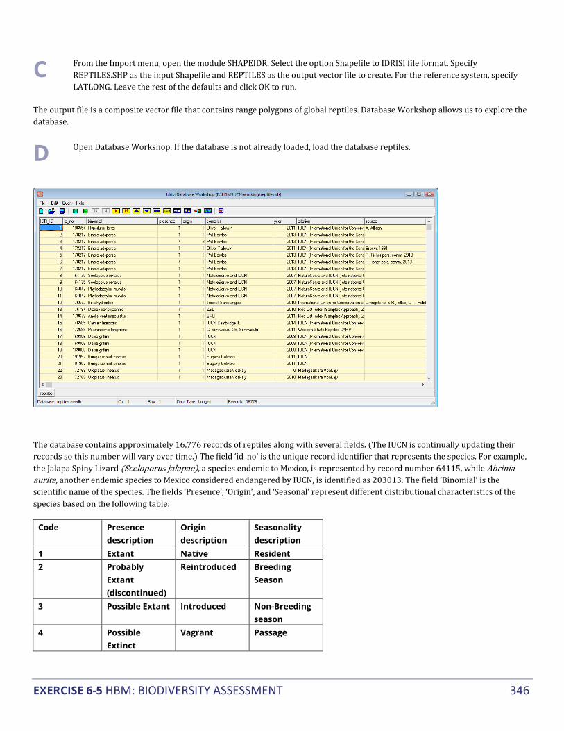
EXERCISE 6-5 HBM: BIODIVERSITY ASSESSMENT 346
C From the Import menu, open the module SHAPEIDR. Select the option Shapefile to IDRISI file format. Specify REPTILES.SHP as the input Shapefile and REPTILES as the output vector file to create. For the reference system, specify LATLONG. Leave the rest of the defaults and click OK to run.
The output file is a composite vector file that contains range polygons of global reptiles. Database Workshop allows us to explore the database.
D Open Database Workshop. If the database is not already loaded, load the database reptiles.
The database contains approximately 16,776 records of reptiles along with several fields. (The IUCN is continually updating their records so this number will vary over time.) The field ‘id_no’ is the unique record identifier that represents the species. For example, the Jalapa Spiny Lizard (Sceloporus jalapae), a species endemic to Mexico, is represented by record number 64115, while Abrinia aurita, another endemic species to Mexico considered endangered by IUCN, is identified as 203013. The field ‘Binomial’ is the scientific name of the species. The fields ‘Presence’, ‘Origin’, and ‘Seasonal’ represent different distributional characteristics of the species based on the following table:
Code Presence description
Origin description
Seasonality description
1 Extant Native Resident 2 Probably
Extant (discontinued)
Reintroduced Breeding Season
3 Possible Extant Introduced Non-Breeding season
4 Possible Extinct
Vagrant Passage

EXERCISE 6-5 HBM: BIODIVERSITY ASSESSMENT 347
5 Extinct (post 1500)
Origin Uncertain
Seasonal occurrence uncertain
6 Presence uncertain
- -
Notice the field ‘category’. This field contains the Red List Status which we will use in the later part of this exercise. For more information on the fields contained in the database, see the metadata document found on the IUCN website.
Using the database you can pre-filter the dataset to include only certain distributional characteristics. In this case we will include only native (Origin = Native), resident (Seasonal = Resident), current species (Presence = Extant).
E Within Database Workshop, go to ‘Query’ and select ‘Filter Table’. Filtering allows the use of SQL commands to filter out only the required records. In the “Where” section of the Filter Table form, enter the command: [presence] = 1 and [origin] = 1 and [seasonal] = 1.
Once the selection is performed, we need to export this selection as a new vector file.
F From Database Workshop, establish the vector link to the vector file REPTILES and the link field IDR_ID. Then, go to the file menu, then Export –> Field and select “to vector file”. Specify the output vector file name as REPTILES_IDR_ID and select the field name IDR_ID as the field to export. Numeric values should be selected as the export file type, then click OK.
A new vector file will be created containing only those polygons that satisfy all three conditions specified in the database filter.

EXERCISE 6-5 HBM: BIODIVERSITY ASSESSMENT 348
Next, we will extract only those reptile ranges endemic to Mexico that are endangered, critically endangered or vulnerable. The Filter IUCN Species Ranges panel in the Habitat and Biodiversity (HBM) will allow us to do this selection.
G Open Habitat and Biodiversity Modeler. Select the Biodiversity tab and then open Filter IUCN Species Ranges panel. Specify REPTILES as the IUCN range polygon file. After selecting the range polygon file, the other file input parameters should be filled out automatically. The IUCN database should be REPTILES, the database table is REPTILES, the polygon ID field is IDR_ID, the species ID field is ID_NO, and the Red List status field is CATEGORY.
H Next, select to output only polygons with IUCN status of Vulnerable, Endangered, and Critically Endangered, by checking only the corresponding boxes.
I Select the spatial filter option to be bounding polygon and enter MEXICO as bounding polygon vector file.
J Finally, select the range is endemic option to include only species whose ranges fall within the bounding polygon. Name the output prefix as MX_ENDEMIC_THREATENED. Click Run.
Running the IUCN tool will create two vector outputs. The first is a vector file of the IUCN Red List status for each species. The second file is a vector file of the unique polygon species IDs corresponding to the IUCN Red List database. The latter output will be used in the biodiversity analysis panel to calculate the species richness of threatened reptiles endemic to Mexico.
K Still in the Habitat and Biodiversity Modeler, open the Biodiversity Analysis panel. This panel allows you to calculate different biodiversity metrics, including alpha diversity, calculated as the number of species per pixel (also called species richness).

EXERCISE 6-5 HBM: BIODIVERSITY ASSESSMENT 349
L Select vector composite polygon as the species range data option and alpha diversity as the analysis type option. Specify the input composite polygon file as MX_ENDEMIC_THREATENED_IUCN_STATUS. Specify MEXICO_MASK as both the reference layer for rasterization and region mask. Call the output MX_ENDEMIC_THREATENED_RICHNESS.
M Display the alpha diversity image. Add the vector boundary file to the image, MEXICO with the UniWhite palette.
1 Which areas in Mexico have high concentration of threatened endemic reptile species?

EXERCISE 6-6 HBM: RESERVE SELECTION WITH MARXAN 350
▅ EXERCISE 6-6 HBM: RESERVE SELECTION WITH
MARXAN
Marxan is a planning software for reserve selection originally developed by Ian Ball and Hugh Possingham (2000) at the University of Queensland. Marxan reserve selection is based on a minimum set problem, where the objective is to achieve a particular species target at the lowest cost. Marxan generates new reserve networks and permits the evaluation of current reserve networks.
TerrSet’s Habitat and Biodiversity Modeler application includes a front-end utility that calls the Marxan program. Note that only a subset of Marxan functionality is implemented in this version of HBM. In order to run this exercise, you will first need to install the Marxan program. Marxan is freely available from the University of Queensland and can be downloaded at: http://marxan.org/software.html. Note, this version of the Marxan interface only supports version 2.43. Download the appropriate version from the University of Queensland site. More information about the TerrSet Marxan front-end utility can be found in the Help System. The Marxan manual (available at the same site as above) can also be freely downloaded for additional details.
In this exercise, we will explore the use of Marxan to evaluate Bolivia’s current protected area network and select a new protected area network to fulfill a specific species area target.
A Before starting the exercise, we need to set our default Working Folder to MARXAN under the TerrSet Tutorial Data\HBM folder. Open TerrSet Explorer, click on the Projects tab, move the cursor to an empty area of the Explorer view and right-click the mouse button. Select the New Project option. Then, browse for the folder location containing the TerrSet tutorial data and select the Marxan subfolder. This will create a TerrSet project named MARXAN.
In order to run Marxan, the following input images are necessary.
Planning units map: This is the base map that will be used for the land allocation to define the protected areas. The planning units map should contain unique identifiers for each location that corresponds to a different planning unit. During a MARXAN run, each planning unit will be evaluated on whether it should be included in the reserve network. This map can be considered the minimum mapping unit for the protected area allocation.
Planning units can be specified in different ways. For example, it is possible to consider each pixel in the image a different planning unit. However, in reality, management of protected areas does not occur at a square pixel level. In this exercise, we will use the administrative units of river basins, ecoregions, and land use to identify the different planning units.
B Display the map BOLIVIA_LU. This map shows land use in Bolivia in 2004. Disturbed areas are either urban or agriculture and will have a particular ID in the planning units map.

EXERCISE 6-6 HBM: RESERVE SELECTION WITH MARXAN 351
C Display the map BOLIVIA_ROADS. This map shows the roads in Bolivia. Since the resolution of the image is 5 km, it represents a buffer of 5 km along all roads.
D Display the map BOLIVIA_PA. This map shows the location of national parks in Bolivia and was extracted from the IUCN database of protected areas (https://www.protectedplanet.net/). Each protected area will be given a unique ID in the planning unit since they are managed differently.
E Display the map BOLIVIA_PROV. This is an administrative units map of the provinces of Bolivia.
F Display the maps BOLIVIA_BASIN and BOLIVIA_ECO. These are maps of the country river basins and the ecoregions for Bolivia, respectively.
Given that reserve management can be constrained by administrative boundaries, the planning units map of the provinces was used. We then subdivided the provinces based on basins and ecoregions. Finally, we added the information on land use, roads and protected areas.
G Display the planning units map BOLIVIA _PU to view the unique planning units.
Species distribution maps:
The species distribution maps are Boolean images with values of 1 in locations where the species is present and 0 where the species is absent. For this study, we utilized rasterized range polygon maps from the NatureServe database (www.natureserve.org)
Planning unit tenure (or planning unit status): The planning unit tenure map specifies which locations are available for selection in a final reserve system. Values of zero or one are given for locations that can be allocated to a reserve network. If a location has a value of 1, it will be included in the initial reserve system (but may not be part of the final result). If a location has a value of 0, it may be chosen in the initial reserve system, depending on the value indicated for the “starting proportion” parameter. A value of 2 is given for a fixed reserve system (such as the current reserve network), and a value of 3 is given for locations that are excluded from selection, such as particular land use types (urban areas, agriculture, roads, etc.).
The planning unit tenure map used in this analysis is derived from the land use map of Bolivia, the map of protected areas and the road map.
The map PU_TENURE has values of 0 for all available lands, values of 2 for the currently protected areas network, and a value of 3 for all roads and disturbed (agriculture/urban) land cover classes. This map will be used in the second part of this exercise.
The map PU_TENURE_PAASSESS is a modified tenure map created for evaluating the success of the current reserve network. In this case, current protected areas are assigned a value of 2 and all other locations are assigned a value of 3. This map will be used in the first part of this exercise.
Land cost layer: This layer specifies the cost of including the planning unit in the reserve system (for example, the cost of purchasing the land). This map is optional and if it is not included, the cost will be proportional to the planning unit size. For this exercise, we will not include this map.
Along with the input images, Marxan requires the following parameters.
Target: The target indicates how much of the species range needs to be protected and is specified in the number of cells.
Species penalty factor (SPF): This is a value given to a particular species or group of species to indicate its importance for inclusion in the reserve network. The higher the value, the more likely that species’ target is met. There is no fixed rule on how to determine this

EXERCISE 6-6 HBM: RESERVE SELECTION WITH MARXAN 352
value. The Marxan Tutorial recommends that you run Marxan with the specification of a uniform value for all species first, then evaluate the results. If with that particular SPF, all targets are not met, increase the SPF by a factor of two until all targets have been met. When that point is reached, lower the SPF slightly to see if all targets are still met. Once the base SPF is set up in this way, relative values can be applied to each species based on their ecological significance, vulnerability, rarity, etc.
Boundary length file: If reserve compactness is important and you want to consider this for reserve selection, select the checkbox.
Determining whether the current reserve network is protecting Bolivia’s endemic diversity One of the uses of Marxan is to determine whether existing protected areas are fulfilling conservation objectives.
For the purpose of this tutorial, we will specify a species conservation target to protect at least 50% of the range of distribution of Bolivia’s endemic species.
Marxan: Input and Output
H Open Habitat and Biodiversity Modeler and go to the Planning tab. From the Planning tab, open the Marxan: Input and Output panel. Specify BOLIVIA_PU as the planning unit layer. For the species distribution layers, specify the raster group file BOLIVIA_ENDEMICS.RGF. This contains the distribution of 73 species of mammals, birds and amphibians endemic to Bolivia. You will notice that the name column of the species grid will populate. Leave the default Type of 1 as we will first select a uniform SPF and target for all of them. In TerrSet, this can be accomplished automatically. All species that will have the same target and SPF should have the same type number. Then, in the Target % input box (percentage of the species range that needs to be protected to meet the conservation target), specify 50 and in the Penalty Factor input box, specify 10. Then click the AutoFill Spec. Type button. The SPF and Target (in number of cells) will populate the species grid automatically for all species. These values will not be important to assess current protected areas but will be important when selecting new reserve areas.
I Next, indicate that you wish to use a Planning unit tenure layer and enter PU_TENURE_PAASSESS as the name. For this exercise, we will not be utilizing a land cost layer or boundary length file. Specify an output prefix of ASSESS_CURRENT_PA. Click the Continue button and the Marxan: Parameters panel will open.
Marxan: Parameters
J In the Marxan: Parameters panel, specify 1 in the Repeat runs input box. We are using a low number because we are not allocating new areas; we are just evaluating the current protection network. For the “Species missing if proportion of target lower than” input box, specify 0.95. This means that with a conservation target of 50%, the target will be considered met if the reserve protects 47.5% of the range or more (0.95 x 50=47.5). For the Run Mode, select the “Use only a heuristic option” and specify Greedy as the Heuristic type. Since we are only assessing current protected areas, we are choosing the

EXERCISE 6-6 HBM: RESERVE SELECTION WITH MARXAN 353
fastest method. We will not utilize the Cost threshold nor will we specify a random seed. Set the Starting proportion to zero.
K Click the Run Marxan button.
Results
For the evaluation of current reserves, the generated maps are not significant since we are not allocating new areas. We are interested only in the text outputs.
L When Marxan finishes running, it will display two images and a log file. Close the two images.
The log file provides information on the total area of final reserves, existing reserves and newly added reserves as well as information on the species that are not protected under this reserve network. For each conservation feature (species) not protected, the log file provides the feature name, the target (amount of the range that we sought to protect), amount held in the network of protected areas, occurrences held (the number of reserves the species is present), and if the target was met (yes or no). The other options of occurrence target, separation target and separation achieved are not applicable in this implementation of Marxan and have values of zero. At the end of the log file is the number of species that have not met the target with the current protected areas network.
This information is also included in the file called ASSESS_CURRENT_PA_MVBEST.TXT, saved in the Working Folder. This file is comma-delimited and can be viewed in TerrSet with the Edit module.
From the Target met column in the output text file, we can extract the following information (with the help of a calculator or spreadsheet program):
From the 73 endemic species in Bolivia (16 mammals, 21 birds and 36 amphibians), the protection target of 50% of range is fulfilled (target met) for only 18 species. Two mammals, 1 bird and 15 amphibians meet the target, representing 12.5% of the endemic mammals, 4.76% of the endemic birds and 41.67% of the endemic amphibians.
Select new protected areas to meet target In this section, we will run Marxan to identify new protected areas that meet specified targets.
Marxan: Input and Output
M We will use the same planning units layer BOLIVIA_PU, as well as the same group file of species distribution layers BOLIVIA_ENDEMICS.RGF. In the Target % input box, specify 50 and in the Penalty Factor input box, specify 10. Then click the AutoFill Spec. Type button. Indicate that you wish to use a Planning unit tenure layer and specify the file PU_TENURE. We will not utilize a land cost layer. Indicate that you wish to use a Boundary length file in order to generate more compact reserves. Specify the output prefix as NEW_PA. Click Continue and the Marxan: Parameters panel will open.

EXERCISE 6-6 HBM: RESERVE SELECTION WITH MARXAN 354
Marxan: Parameters
N In the Marxan: Parameters panel, specify 1000 in the Repeat runs input box and set the Boundary Length Modifier (BLM) to 2. The boundary length modifier determines how much emphasis should be placed on maximizing reserve compactness. It can utilize any positive value greater than zero; the larger the value, the more compact the reserve network. Since the BLM value depends on the study area, the user can try different values to achieve the desired compactness. For the “Species missing if proportion of target lower than” input box, specify 0.95. For the Run Mode, use the method “Apply annealing followed by the iterative improvement” algorithm. The default settings for the Annealing controls and Iterative improvement type also will be used.
O Select to use the Cost threshold by selecting the threshold enabled option. This will generate reserves with costs less than the threshold value, or area (when no cost layer is used). Set 1600 as the Threshold (1600 pixels ~ 8000 km2). The penalty factor (cost threshold penalty) applies a penalty to the objective function if the cost (or area) of the selected reserve is greater than the threshold. The penalty factor A determines the size of the penalty. The higher the value, the larger the penalty for exceeding the threshold. A lower value for penalty factor A allows the threshold to move slightly above. Penalty factor B determines how gradually the penalty is applied. The higher the value for penalty factor B, the longer it will take for the penalty to be applied (e.g., applied to later iterations). Set Penalty Factor A to 9 and Penalty Factor B to 2. Set the Starting proportion to zero and do not specify a random seed.
P Click the Run Marxan button
Results
When Marxan finishes, it displays two images and a log file. For each run, Marxan generates a reserve network solution. The SUMMEDSOLUTION map provides for each planning unit the selection frequency across all runs. The larger the value, the more likely those reserves are required in the reserve system to meet the conservation targets. The best solution map shows the solution for the run with the best objective value. Although it is called best solution, the Marxan User Manual states that this should only be seen as a very good solution, not as the best possible reserve system.
The log file here provides information on the total area of final reserves, existing reserves and newly added reserves as well as information on the species that are not protected under this reserve network. With this generated reserve network, the target of 50% protection was not met for 7 species.
This information is also in the file called NEW_PA_MVBEST.TXT, saved under the Working Folder.
From the Target met column of the output text file, we can extract the following information:
From the 73 endemic species in Bolivia (16 mammals, 21 birds and 36 amphibians), the new conservation system would allow the protection of 50% of ranges (target met) for 65 species. Twelve mammals, 19 birds and 34 amphibians met the target, representing 75% of the endemic mammals, 90.5% of the endemic birds and 94.4% of the endemic amphibians.
References
Ball, I. R. and H. P. Possingham, (2000) MARXAN (V1.8.2): Marine Reserve Design Using Spatially Explicit Annealing, a Manual.

TUTORIAL 7 ECOSYSTEM SERVICES MODELER (ESM) 355
▅ TUTORIAL 7 - ECOSYSTEM SERVICES MODELER (ESM)
ECOSYSTEM SERVICES MODELER EXERCISES
Water Yield
Hydro Power
Water Purification
Sediment
Carbon Storage and Sequestration
Timber Harvest
Habitat Quality and Rarity
Crop Pollination
Habitat Risk Assessment
Offshore Wind Energy
Aesthetic Quality
Overlapping Use
Coastal Vulnerability
Marine Aquaculture
Wave Energy
Data for the exercises in this section are in the \TerrSet Tutorial\ESM folder. The TerrSet Tutorial data can be downloaded from the Clark Labs website: www.clarklabs.org.

EXERCISE 7-1 ESM: WATER YIELD 356
▅ EXERCISE 7-1 ESM: WATER YIELD
The water yield model within ESM measures the average annual runoff or water yield from watersheds in a study region. Water yield images are required for two other ESM models, Hydropower and the Water Purification.
In this tutorial we will be assessing the water availability within the state of Massachusetts in 2100. An important component of evaluating water yield is land cover. For this exercise, we offer an optional exercise to develop a future land use map for Massachusetts using Land Change Modeler. However, this is a time consuming exercise, therefore we have provided this future land use map for you in the Water Yield tutorial folder. This same land use map will be used in the hydropower and water purification models. If you wish to develop the future land use map, you should complete the optional exercise at the end of this tutorial and return to the steps below.
A Set your working folder to the Water Yield folder within the TerrSet Tutorial ESM folder. Then open ESM and the Water Yield tab.
First we need to enter all the necessary information regarding the extent of our study area.
B Enter MASS_WATERSHEDS as the Watershed image, MASS_SUBWATERSHEDS as the Sub-watershed image and BIOPHYSICAL_MODEL as the .csv table.
Next we need to enter information for the water yield calculation. The water yield calculation can be used to assess the amount of water produced per watershed, per sub-watershed and per pixel. One of the primary inputs is a land use map whose categories correspond to parameters in the database. We will use a land use map of Massachusetts for the year 2100.
C Enter the land cover prediction for 2100, or the one you created through the optional exercise at the end of this tutorial in the data folder. The file we have provided is called MA_LANDCOV_PREDICT_2100. Enter MA_PRECIP_2100. The precipitation map was created using the Climate Change Adaptation Modeler within TerrSet. Enter MASS_REFERENCE_ET as the reference evapotranspiration image, MASS_SOIL_DEPTH as the soil depth image, and MASS_PAWC as the potential available water fraction image.
D Keep the seasonality factor at 7. Type MASS_WATER_YIELD as the output image name. Click Run.
1 What would be an advantage/disadvantage to predicting water yield on a watershed, sub-watershed and pixel scale?

EXERCISE 7-1 ESM: WATER YIELD 357
2 From the outputs produced, what does the sub-watershed image show that the watershed image does not show?
3 How would you explain the sub-watershed image based on the pixel water yield image?
OPTIONAL: Creating the Future Land Use Map with Land Change Modeler
The Land Change Modeler within TerrSet will be used to create a prediction of the land use in Massachusetts in 2100, based on the land cover changes that occurred between 1996 and 2006. Land cover is needed for the Hydropower Model to be able to assess where water yield and water demand will be occurring. This land use map is already supplied in the tutorial folder for those who would like to avoid this step.
Change Analysis
E To complete this part of the exercise, you will need to create a new resource folder that is set to the land use folder under the TerrSet Tutorial ESM Water Yield folder. Then, open LCM. When LCM opens create a new session called “Massachusetts_2100”. Use the pick list to enter Mass_Landcover_1996 as the earlier image and Mass_Landcover_2006 as the later image. The dates next to entries should automatically fill in as 1996 and 2006 respectively. Click Continue.
After you click Continue, the Change Analysis tab opens to reveal the gains and losses between 1996 and 2006. The first thing you’ll notice in this panel is the huge loss of Deciduous Forest. This will be a driving force within our model. In this case, we are only going to focus on large transitions – that is, we will ignore land cover transitions that total less than 12000 cells in all.
F In the Change Maps panel, check the box to ignore transitions and enter 12000 cells as the threshold.
G Select the radio button to Map the transition from Deciduous Forest to Low Intensity Developed. Give the output name DECID_TO_LOWDEVEL, and then click Create Map. We will use this output image to transform a variable in the next step.
4 Where does the map show the most transitions from deciduous forest to low intensity development? What part of Massachusetts are these transitions concentrated?
Transition Potentials
Now that we have gone through analyzing and mapping changes we will calculate transition potentials based on the specified transitions between the two 1996 and 2006 land cover maps. All of the transitions have the potential to be included, but many of these transitions are very small and the model would not be very good at predicting these transitions; this is why we chose to ignore all transitions less than 12000 cells.

EXERCISE 7-1 ESM: WATER YIELD 358
H Open the Transitions Potentials tab. Since we checked the box to ignore small transitions there should only be five Transition Sub-Models in the Transition Sub-Model matrix: Deciduous Forest to Medium Intensity Developed, Deciduous Forest to Low Intensity Developed, Deciduous Forest to Open Space Developed, Deciduous Forest to Grassland/Herbaceous, and Deciduous Forest to Scrub/Shrub.
Even though we have already limited the number of transitions to be modeled, we are going to exclude Deciduous Forest to Grassland/Herbaceous and Deciduous Forest to Scrub/Shrub.
I To do this click on the “Yes” next to each of these transitions and a “No” should appear.
J Under Sub-Model Name, rename each of the transitions as DECID_LOSS so that they are all modeled together in our prediction.
Now that we have specified the transitions that will be used we can establish constraints to these transitions. In this case, constraints are permanently protected land areas within Massachusetts (parks, conservatories, corridors, national forests…) which will not change regardless of their similarity to other parcels of land that did change.
K Switch to the Planning tab and open the Constraints and Incentives tab. The three transitions we are interested in should be entered into the table here. Under Constraints/Incentives Map use the pick list to enter PROTECTED for all three transitions.
We will next use Evidence Likelihood to transform a map of Massachusetts towns into an explanatory variable. We will account for zoning and municipal decision practices that influences changes in the Massachusetts landscape, but would otherwise be unexplained in the model.
L Open the Variable Transformation Utility panel under the Transition Potentials tab and make sure Evidence Likelihood is selected. Enter DECID_TO_LOWDEVEL as the transition or land cover layer name; this is the transition map you created in the Change Analysis panel. Use the pick list to enter MASSTOWNS as the input variable name and type MASS_TOWNS_EL as the output file. Select the check box Categorical since our input variable is already categorical and does not have to be binned. Click OK.
M Now, open the Transition Sub-Model Structure panel. This is where we will enter all of the driver variables that could contribute to the loss of deciduous forests that we’ve seen so far in our analysis. Click “Insert Layer Group” and select the RGF MASS_VARIABLES. This contains the following variables:
i. MASS_DEM: 30m resolution Digital Elevation Model
ii. DIST_BOSTON: Euclidean distance from Boston
iii. MASS_DIST_DEVEL_96: Euclidean distance from developed land cover types in 1996
iv. MASS_DIST_TO_ROADS: Euclidean distance from major roads
v. MASS_SLOPE: slope, derived from MASS_DEM
vi. DIST_OPEN_SPACES: Euclidean distance from protected open spaces, derived from OPEN_SPACE
vii. DIST_PONDS: Euclidean distance from ponds

EXERCISE 7-1 ESM: WATER YIELD 359
viii. DIST_STREAMS: Euclidean distance from streams
N Increase the Number of files to 9 and click on the empty space created below the other variables. Use the pick list to navigate to the file MASS_TOWNS_EL in your Working Folder which was just created in the Variable Transformation Utility panel.
When entering variables into the Transition Sub-Model Structure panel you are given the option to enter that variable as static or dynamic. Static refers to variables that unchanging over time whereas dynamic variables are recalculated over time during the course of a prediction. In this case, the majority of our variables are static but we must change one variable to be dynamic.
O Under Role, switch MASS_DIST_DEVEL_96 to be dynamic. The Basis layer type of MASS_DIST_DEVEL_96 is land cover and when specified insert Medium intensity Developed as the Dynamic land cover class. Leave operation as distance.
P In the Run Transition Sub-Model panel, select MLP Network, change the start learning rate to 0.001 and the end learning rate to 0.0001, keep all other defaults and click Run Sub-Model.
Q The accuracy rate should be roughly 50%; if you get a percentage much lower than this value you are going to want to run the sub-model again. When you reach an appropriate accuracy rate and the sub-model finishes running, click Create Transition Potential.
A text file appears before this stage. Browse through this file for information about the contribution of each of the variables entered. For more information about the specifics of this file refer to the LCM Help. When the transition potentials finish running you will have three images, one for each of the three transitions entered.
Change Prediction
The last step within the Land Change Modeler is to use the information generated from the 1996 and 2006 land cover maps to create a prediction for land cover in 2100.
R Switch to the Change Prediction tab and open the Change Demand Modeling panel. Select Markov Chain and enter 2100 as the Prediction Date.
S Open the Change Allocation panel and make sure all three sub-models are included in this panel’s table. Select Zoning – Constrains/Incentives and make sure Create soft prediction is selected. You do not need to create an AVI video unless you are interested. Enter 4 recalculation stages, specify MA_LANDCOV_PREDICT_2100 as the Output Prefix and click Run Model. When this has finished, you have a land cover prediction for Massachusetts in 2100!
5 Compare the land cover prediction for 2100 to the 2006 land cover map. What changes do you notice?
6 How would you interpret the soft prediction map? What areas are most likely to experience changes? How do these areas compare with their distance from Boston and why do you think that is?

EXERCISE 7-2 ESM: HYDROPOWER 360
▅ EXERCISE 7-2 ESM: HYDROPOWER
The Hydropower Model in ESM is used to estimate water contribution from different parts of the landscape and how fluctuation on this contribution, e.g., due to land cover change, can impact potential hydropower production. In this exercise we will produce a water scarcity map by watershed which is total water yield minus water consumption by land cover. An economic valuation will be performed as well based on consumptive demand, energy prices and the cost of hydropower facility maintenance.
For this tutorial, we will model the potential for hydropower production in Western Massachusetts. We have identified 5 potential dams within 5 watersheds in the study area. These dams are at least 30 feet high and could be converted to hydropower facilities. We will use the Hydropower model to assess the potential for each of these watersheds to produce hydropower, both from a physical and economic perspective.
Before completing this exercise, you will have to have completed the Water Yield exercise in order to produce the water yield image needed as one of the inputs for hydropower. Using projected land use and precipitation data for 2100 we will assess the potential use of hydropower energy in Massachusetts.
A Make sure your working folder is set to the Water Yield tutorial folder found within the ESM tutorial folder.
B Open ESM and switch to the Hydropower tab. In the first panel enter MASS_WATERSHEDS as the Watershed image, MASS_SUBWATERSHEDS as the Sub-watershed image.
In the Net Water Supply panel, the user enters parameters to calculate the water scarcity. This is the difference between Water Yield, calculated in the Water Yield exercise, and water consumptive use, calculated here. It estimates water demand based on land use type and estimates how much water is used within each. Therefore, the amount of water available at each hydropower dam, or in each watershed, is the difference between water yield and water demand in the watershed.
C Open the Net Water Supply panel and select MASS_WATER_YIELD_PIXEL as the water yield image, the pixel level water yield image produced during the water yield tutorial.
D Enter MA_LANDCOV_PREDICT_2100 as the land use image. Use the pick list to specify WATER_DEMAND as the Water demand table. Enter MASS_WATER_SCARCITY as the output net water supply prefix. Click Run.
1 Using the pixel level water scarcity output image, what portion of Massachusetts appears to have the most water scarcity?

EXERCISE 7-2 ESM: HYDROPOWER 361
The Valuation panel, the last step of this model, will calculate the economic value of water bodies given that they provide energy service, which would otherwise be costly.
E Open the Valuation panel and use the drop-down menu to select HYDROPOWER_VALUATION as the Hydropower valuation table. Then select HYDROPOWER_CALIBRATION as the Hydropower calibration table. Specify MASS_HYDROPOWER_VALUATION as the Output Valuation image prefix. Click Run.
2 There is an area within Massachusetts that has the highest potential for hydropower. Go to Google Maps and look up what this area represents. What is it?

EXERCISE 7-3 ESM: WATER PURIFICATION 362
▅ EXERCISE 7-3 ESM: WATER PURIFICATION
The Water Purification model estimates the contribution that vegetation and soil has on the purification of water through the removal of nutrient pollutants present in runoff. Runoff can be detrimental for various reasons, one being the monetary cost of returning this soil to its initial location. Various forms of vegetation are able to prevent run-off by taking up water and using their roots to support soil systems. This tutorial walks the user through a case study within the state of Oregon, USA; an area known to contain several water systems and various national parks. The model works by first estimating the amount of nutrients retained by each vegetated state. It then analyses the value of this vegetation based on the avoided cost of water treatment.
A Create a new project and set your working folder to the Water Purification tutorial folder within the ESM tutorial folder.
B Open ESM and switch to the Water Purification tab.
C In the Model Input panel, enter WATERSHED as the watershed image, SUBWATERSHED as the sub-watershed image.
The nutrient retention panel is used to generate an estimate of the total nitrogen and phosphorous retained in the environment based on water yield and physical attributes of the location's environment.
D Load WATER_YIELD as the water yield image, LANDCOVER as the land cover image, and DEM as the DEM image.
E Select BIOPHYSICAL_TABLE.CSV and WATER_PURIFICATION_THRESHOLD.CSV as the biophysical table and the water threshold table, respectively.
The Biophysical Models table contains several variables. The last column of this table is very important for this exercise because it contains values for nitrogen loading. The Water Purification Threshold table contains information related to nitrogen and phosphorous thresholds.
F Keep 1000 as the default for the flow accumulation threshold.
G Enter N_RETENTION as the Nitrogen retention image and N_EXPORT as the Nitrogen export image, P_RETENTION as the Phosphorous retention image, and P_EXPORT as the Phosphorous export image. Click Run.
1 Which of the two elements has a higher level of export?

EXERCISE 7-3 ESM: WATER PURIFICATION 363
2 Do the sub-watersheds match in terms of their ability to retain phosphorous and nitrogen?
3 What does this say about the importance of supporting natural vegetation, especially around moving water systems?
Valuation
The last step of this model is the assessment of the value of natural environments, given that they provide retention services which otherwise would be costly.
H We will use the sub-watershed outputs from above so enter N_RETENTION_SWS_N as the nitrogen retention image and P_RETENTION_SWS_P as the phosphorous retention image. Enter the WATER_PURIFICATION_VALUATION.CSV file as the water purification valuation table.
The Water Purification valuation table contains information related to the costs of implementing procedures or machinery that will compensate for the loss of services that were originally provided by the natural environment. These values tend to be more subjective than those for the Biophysical or Threshold tables, but this is also where the user is able to place values on the services provided by the eco-system.
I Specify N_VALUATION and P_VALUATION as the output file names. Click Run.
4 Which of the sub-watersheds will be most costly to support, based on its low nitrogen and phosphorous retention and in turn its low valuation for these elements?

EXERCISE 7-4 ESM: SEDIMENT RETENTION 364
▅ EXERCISE 7-4 ESM: SEDIMENT RETENTION
In this exercise, we will use the Sediment Retention model to assess the dredging costs associated with removing accumulated sediment from waterways in the state of Oregon, USA. The Sediment Retention model estimates a watershed’s ability to retain sediment based on several environmental factors. For this exercise, two relationships are important: 1) that erosion coincides with areas subjected to high rainfall, and 2) that erosion increases as the sand content of the soil increases.
A Create a new project in TerrSet Explorer with your working folder set to the Sediment Retention folder within the ESM Tutorial folder. Then open ESM and select the Sediment Retention tab.
We first need to specify several input images that define the area of interest.
B Specify WATERSHED as the watershed image and SUBWATERSHED as the sub-watershed image.
C Display the watershed and sub-watershed images.
1 How many subwatersheds does each watershed contain?
Next, we will specify the data files that will estimate the likelihood and the level and direction of sedimentation.
D Open the Soil Loss panel and input the appropriate files. Specify LANDCOVER as the land cover image, DEM as the DEM image, EROSIVITY as the rainfall erosivity image, and ERODIBILITY as the soil erodibility image.
Next, we will input the data tables for calculating sediment loss. The tables contain biophysical information for specific land cover and the allowable sediment threshold values for watersheds and reservoirs.
E Specify the SEDIMENT_THRESHOLD.CSV table for the sediment threshold table input and the BIOPHYSICAL_TABLE.CSV table from the biophysical table input.
F Keep the flow accumulation threshold and slope threshold at their default 1000 and 75, respectively.

EXERCISE 7-4 ESM: SEDIMENT RETENTION 365
G Specify the output names, SEDIMENT_EXPORT for the sediment export image, R_WQ as the water quality retention image, and R_DREDGE as the dredging retention image. Click Run.
The water quality output will show the benefits of sediment retention solely related to water quality. The dredging output will show the level of sediment retained to avoid dredging in a watershed.
2 Why do you think it could be important to have the water quality and dredging sedimentation benefits separate? Who do you think would be interested in this information and what do you think they would use this information for?
3 Looking at the image you titled SEDIMENT_EXPORT, click on the stretch button within TerrSet Composer to better view this image. Where does sediment export occur? What land cover type do you think sediment export is associated with? You will notice that the retention images for water quality and dredging look exactly the same, but if you use cursor inquiry mode and click on the various subwatersheds within each image you will notice that they contain different values.
4 Now, open the images TOTAL_RETENTION_DR and TOTAL_RETENTION_WQ and stretch the files like you did for the EXPORT image. How can you explain that both images show larger values as they branch out?
Finally, we will look at the economic value placed on the services provided by watersheds in their retention of sediment.
H Open the Valuation panel. Specify R_WQ as the water quality retention image and R_DREDGE as the dredging retention image. Then specify SEDIMENT_VALUATION.CSV as the sediment valuation table. This table will allow us to calculate the avoided cost of dredging and filtering.
I Finally, specify the two output file names, WQ_VAL as the water quality valuation image and DREDGE_VAL as the dredging valuation image. Click Run.
5 What do you notice about how retention values, from the previous panel’s outputs, associate with economic values? Why do you think that is?
6 What are some of the highest values within Oregon’s subwatersheds? What is the lowest value within Oregon’s subwatersheds? What does this say about the areas that should be preserved and the areas that should be aided and modified?

EXERCISE 7-5 ESM: CARBON STORAGE AND SEQUESTRATION 366
▅ EXERCISE 7-5 ESM: CARBON STORAGE AND
SEQUESTRATION
In this tutorial, we will explore the Carbon Storage and Sequestration panel to estimate the net amount of carbon stored, the total biomass removed from deforesting and harvesting, and the economic value of the carbon sequestered in the remaining carbon pools in a large parcel of land comprised of National Forests and National Parks in Oregon.
A First, create a new project in TerrSet Explorer and set your default working folder to the Carbon Storage tutorial folder under the TerrSet tutorial ESM tutorial folder. Then open the Ecosystem Services Modeler and the tab for Carbon Storage and Sequestration.
This model allows the user to estimate the amount and value of carbon sequestration in a vegetated landscape over time. The results of this panel complement the outputs from the REDD model in LCM.
B Display the image CURRENT_LANDCOVER_2000.
1 Is there more forested land or more non-forested land in this parcel?
C Enter CURRENT_LANDCOVER_2000 as the current land cover image. Then enter 2000 as the year of the current image.
D Use Edit to display the table CARBON_POOLS_SAMP.CSV.
This file contains information about the carbon storage capacity of four carbon pools: aboveground biomass, belowground biomass, soil carbon, and dead carbon. The first four columns are C_above, C_below, C_soil, C_dead, which contain the amount of carbon stored in each of these pools in Megagrams (Mg) ha-1. The fifth column is titled LULC and contains the unique integer identifier corresponding to the land cover type. The final column, LULC_Name, contains the category name of each land cover type. For future studies, use this table as a template. You can always open this table with EDIT.
E Now that you are familiar with the table select it as the input file on the panel for Carbon Pools table.

EXERCISE 7-5 ESM: CARBON STORAGE AND SEQUESTRATION 367
2 How many LULC categories are in the CARBON_POOLS_SAMP.CSV table?
F Display the future land cover image FUTURE_LANDCOVER_2030. This land cover image is a projection of what land cover will be in 2030.
3 How does the future land cover image compare to the current land cover image?
G Select the future land cover option and enter FUTURE_LANDCOVER_2030 as the future land cover image. Enter 2030 for the Year.
H Select the harvest rate option and enter CURRENT_HARVEST_RATES as the current parameters group file (.rgf) and enter FUTURE_HARVEST_RATES as the future parameters group file (.rgf).
I Now, check the box next to Compute economic valuation. Enter 15.01 as the price of carbon per metric ton. This is the value per metric ton in 2011 according to the EU’s Emissions Trading Scheme. Then, enter 0 as the annual rate of change in the price of carbon. Market value is very difficult to predict, as is exemplified in the 12% drop in the carbon market between 2011 and 2012, followed by a steady rise in 2013. Lastly, keep the market discount rate at 7%.
J Finally, enter “OR_CARBON” as the output file prefix and hit Run. Model outputs are in Mg of carbon per pixel and the value of carbon sequestered is in dollars.
4 List the 5 Total Value Outputs that are given. What do these values indicate?
5 How do the images of Currently Stored Carbon and Future Stored Carbon compare and contrast?

EXERCISE 7-6 ESM: TIMBER HARVEST 368
▅ EXERCISE 7-6 ESM: TIMBER HARVEST
The Timber Harvest model evaluates the potential value of timber harvesting from multiple forest parcels in a study area. This tutorial will look at a portion of land within Oregon, comprised of large swaths of national parks and national forests.
First we need to set our project to use the Timber Harvest data under the TerrSet Tutorial folder.
A Open TerrSet Explorer and create a new Project with a working folder set to the Timber Harvest folder under the ESM tutorial folder.
B Then display the vector image PLANTATION. This is the input file of managed parcels, each containing unique IDs.
C Open the Ecosystem Services Modeler and click on the Timber Harvest tab. For the first input, managed parcels vector file, enter PLANTATION. For the plantation production file enter PLANT_TABLE.CSV.
D Use Excel or Edit in TerrSet to view the contents of PLANT_TABLE.CSV.
1 Which of the parcels (give parcel ID) have the lowest costs for maintenance and harvesting? Which have the highest costs?
This table contains information concerning the market price of timber harvested per unit harvest (Price), the annual maintenance cost of each timber parcel (Maint_cost), the mass of wood (Mg) harvested per ha per harvest (Harv_mass), the frequency of harvest periods in years (Freq_harv), the cost of harvest (Harv_cost), the time period of analysis in years (T), an indicator specifying whether harvest occurs immediately upon the start of the time period (Immed_harv), and an expansion factor that translates mass into volume for harvested wood (BCEF). For future studies, use this table as a template. See the Help and the Manual for complete details on the parameters and the calculations.
E Keep market discount rate set at its default value of 7. This is a typical percent rate for environmental projects.
F Enter an output file prefix of TIMBER_HARVEST and click Run.

EXERCISE 7-6 ESM: TIMBER HARVEST 369
2 What are the ranges of biomass and volume available for harvest?
3 What does it mean that there are some negative values in the net present value output image? How do the negative parcels compare to your answers for question 2? What does this mean?
4 From the net present value image, which land parcel would you be most interested in using for harvesting? How does this parcel compare to your answers for question 2?

EXERCISE 7-7 ESM: HABITAT QUALITY AND RARITY 370
▅ EXERCISE 7-7 ESM: HABITAT QUALITY AND RARITY
In this tutorial, we will explore the Habitat Quality and Rarity panel to assess the impacts that anthropogenic threats have on the quality and rarity of habitats. In this case study we will develop generalized habitat quality and rarity outputs that can be used to estimate the sensitivity of habitat to changes in the landscape. In this generalized model it is assumed that through land degradation and threats to the land that we can make a statement on habitat quality and rarity. For our purpose’s habitat quality is assessed by land cover change proximity and habitat rarity is assessed by looking at the reduction of rare land cover from a historical baseline. Four factors are used to assess habitat quality and risk: the relative impact of identified threats on land cover (e.g., the increase in crop land, roads, etc.), the sensitivity of each habitat to each threat, the distance between habitats and threats, and whether the land is protected.
The information provided by this model is useful when trying to assess the impact of habitat change on an individual species or a group of species. In this study, we will use this generalized model to evaluate the habitat of the Bobcat (Lynx rufus) in Worcester County, Massachusetts, from 2009-2100. We have a baseline map for this area from 1976 that we can use to assess the changes over the last 30-plus years. A map of projected land cover in 2100 will be used to determine future impacts. Using the Bobcat as a case study, we will look at how human changes to the land can impact species habitats, which in turn give us insights into the extirpation of such species from areas like Central Massachusetts.
A First set your working folder to the Habitat Quality tutorial folder under the TerrSet Tutorial\ESM folder. Then, open ESM and the tab for Habitat Quality and Rarity.
B Display the land cover map LANDCOVER_CURRENT_2009. Use this map as the current land cover image in ESM. For now do not enter future or base land cover images. We will return to these later in the exercise.
1 We will consider only forest land cover types as habitat for the Bobcat. Are these habitats abundant?
C Next display each of the files in the raster group file THREATS. Explore the extent of each of these threats. Select the THREATS raster group file to insert all the threat images into the threat images grid by clicking on the insert raster group button.
2 Which of these threats have the greatest extent? Which do you think is the greatest threat to the Bobcat habitat?
D From the threat parameters section of the panel, select the THREATS.CSV file from the drop-down menu.

EXERCISE 7-7 ESM: HABITAT QUALITY AND RARITY 371
E Then, select the SENSITIVITY.CSV file from the sensitivity table drop-down menu.
The Sensitivity table contains several fields indicating the sensitivity of different habitat types to threats. The habitat column lists all land cover present in the Land cover maps, LULC is the ID of those land covers, HABITAT is a Boolean column that indicates if the land cover is part of the species habitat (value of 1) or not (value of 0). Other columns represent the relative sensitivity of habitat to different threats, where higher values represent a higher sensitivity and lower values lower sensitivity.
For this example, only forested land cover types (Deciduous Forest, Coniferous Forest and Mixed Forest) are considered habitat for the Bobcat, and we assume that the sensitivity to each threat is the same for all three land cover types. For all habitat types, Agriculture was given the lowest relative sensitivity, as in many cases Bobcats can use these areas for their source of food (mice). The benefit of agricultural areas is, however, opposed by its effect on habitat fragmentation, as fenced agricultural patches prevent movement and therefore increases isolation of populations. Sensitivity of habitat to light roads and light density residential was considered lower than for secondary roads, primary roads and urban areas. Bobcats are able to crossroads with light traffic; however, they tend to avoid high traffic roads. Bobcats are known to move and live close to low density residential areas where they can find pray, but they tend to avoid urban areas.
The threat table contains columns indicating the type of threat, the relative impact of the threat, the maximum effective distance from the threat and a Boolean field called DECAY, with values of zero representing an exponential impact decay and a value of 1 a linear impact decay.
F Next, select to use an accessibility image and enter ACCESSIBILITY.
The accessibility image designates the protection status of land between 0-1. A value of 0 represents full protection, while values greater than 0 have less protection and more accessibility.
G Leave the output scaling factor at its default value of 0.5 and call the output prefix CURRENT_HABITAT. Now hit the Run button.
3 What are the two maps that are generated in the output? What does each one tell us?
4 Which habitat has the greatest degree of degradation? What degradation value is given for that habitat? Which habitat has the greatest quality? What quality value is given for that habitat?
Now we will rerun the model to include the future and base land cover images and future threat images.
H Back at the top of the panel, select to use both the future and base land cover options. Then enter LANDCOVER_FUTURE_2100 as the future land cover image and LANDCOVER_BASE_1976 as the base land cover image.
I Leave the scaling factor at .50 but change the output prefix to CURRENT_FUTURE_HABITAT and click the run button.

EXERCISE 7-7 ESM: HABITAT QUALITY AND RARITY 372
5 What additional map is generated when a base land cover image is included in the model? Which habitat is the rarest? Which habitat is the most abundant?

EXERCISE 7-8 ESM: CROP POLLINATION 373
▅ EXERCISE 7-8 ESM: CROP POLLINATION
In this tutorial, we will explore the Crop Pollination panel to quantify the abundance of and services provided by wild pollinators to agricultural sites on Martha’s Vineyard. Be sure to read the entire section in the manual on Crop Pollination before proceeding with this tutorial.
A First you need to set your default working folder to the Crop Pollination tutorial folder under the TerrSet tutorial ESM folder. Then, open ESM and select the Crop Pollination Panel.
B Display MV_LANDCOVER_2006.rst and take note of the different land cover classes. Then enter it as the current land cover image in the Crop Pollination panel.
1 Which of the land cover types would you expect to find pollinators in?
C Enter the csv file POLLINATOR_SPECIES as the pollinator species/guild table.
The pollinator species/guilds table allows the user to provide specific information about the pollinator species included in your study. In the table, which you can view in any text editor and found in your tutorial folder, a Boolean indicator is used to provide information on whether a pollinator is a ground or cavity nester. If a species is a generalist, both categories will have a 1. The subsequent categories refer to the amount of activity a pollinator displays during different seasons and is a value that ranges from 0 to 1. The final category “Alpha” is the maximum foraging distance a pollinator is willing to go (in meters) to collect food. This has already been done for you but in other studies this information would be collected from primary literature. For future studies, use this table as a template.
D Enter the csv file LANDCOVER_ATTRIBUTES as the Land cover attributes table.
The land cover attributes table allows the user to provide information on suitability of the land cover types to provide opportunities for nesting and food (floral abundance) to the pollinators. In the table, each land cover type is placed into one of the following categories under the LULC_Group column; Built, Agricultural, Water, Recreational, and Forest. In this table the column headings pertaining to the seasons refer to the floral abundance, per land category, per season, on a scale from 0 to 1. This value accounts for both floral coverage and duration of availability in the season. For example, if a forest contains 80% floral coverage for 75% of the spring season, the value here would be (0.8 * 0.75 = 0.6). For future studies, use this table as a template.

EXERCISE 7-8 ESM: CROP POLLINATION 374
E Enter MV_CP as the output file prefix.
F Display the raster image, MV_LANDCOV_PREDICT_2100.
More information about how this land cover prediction image was created is available within the Hydropower tutorial.
G We will include a future prediction, so check this box and enter MV_LANDCOV_PREDICT_2100 as the future land cover image. Type 2006 as the current year and 2100 as the future year.
We will include a calculation for pollinator service value, allowing the user to estimate the relative value of wild pollinators for an agricultural area. This does not calculate actual dollar values, but rather provides a relative value where you can identify areas that gain the most benefits from wild pollination.
H Check the box next to calculate pollinator service value and keep the half-saturation constant at its default value, 0.125.
This default value is good for most situations, and represents the abundance of pollinators required to reach half the pollinator-dependent yield.
I In the proportion of total crop yield attributed only to wild pollination field, enter 0.5.
This means that approximately 50% of all crop yields are attributed to wild pollinators. The outputs from this model can highlight regions where pollination is needed, or where there are pockets of land without high pollinator abundance. This can provide useful information on where to site new apiaries.
We will not be using a mask because we are interested in modeling all categories, so you can leave this box unchecked. This mask option would be important if you were interested in looking at an agricultural assessment, in which case you would only be interested in Cultivated Crops and Pasture/Hay land cover categories.
J Be sure to close any of the open csv files, then click Run.
Twelve outputs are produced, half are future predictions and the other half are for the current year. Images ending in _FUT refer to the predicted year ending in _CUR are for the current year.
2 Navigate to the images for current Total nesting map for all species/guilds. What do these images show about where pollinators are located in Martha’s Vineyard? How would you predict crop prosperity to coincide with this distribution?
3 Now navigate to the images for future Total nesting map for all species/guilds? What difference in distribution do you notice? What might have resulted in this distributional change (you might check out the 2100 land cover prediction image)? How would you predict agriculture would change in Martha’s Vineyard due to this shift?

EXERCISE 7-8 ESM: CROP POLLINATION 375
4 Navigate to the images for current and future relative value of pollination services. Look at the range of values in the legends, how do they compare? What differences do you notice between these images?

EXERCISE 7-9 ESM: HABITAT RISK ASSESSMENT 376
▅ EXERCISE 7-9 ESM: HABITAT RISK ASSESSMENT
In this tutorial we will explore the Habitat Risk Assessment panel to assess the impacts of anthropogenic stressors on the ecosystems of the west coast of Vancouver Island. This panel allows you to aggregate the different types of stressors to give a total risk factor for each habitat. Before completing this tutorial you should read the Habitat Risk Assessment section in the TerrSet manual.
A Set your default working folder to the Habitat Risk Assessment tutorial folder under the TerrSet Tutorial ESM folder. Then open ESM and click on the Habitat Risk Assessment tab.
B Display and explore the individual files of the raster group file HABITATS. Now, do this for the raster group file STRESSORS.
1 Which one of these habitats appears to be most abundant on the island? Which stressor is the most common on the island and which do you think causes the most stress to the habitats?
C In the Input panel, specify HABITATS for Habitat Raster Group File and STRESSORS for Stressor Raster Group File.
The Habitat Stressor Rating Table which is in Excel spreadsheet format is an integral player in this model. This table rates the effect each stressor has on each habitat based on the user’s best knowledge.
D Using Microsoft Excel, open the file, HABITAT_STRESSOR_RATING_TABLE.XLS, found within the Habitat Risk Assessment Tutorial Data Folder.1
On worksheet (1) you can see that column B is the list of stressor names and column A is the specific integer given to each stressor (this name and number identifying scheme should match your file names e.g., FerryRoutes_1, Fishing_2, etc.). In each category
1 This Excel file is specifically formatted to run with the Habitat Risk Assessment model. You can use this file to model other scenarios, but the basic structure
must be maintained. A backup of this file can be found in the Resfiles folder under the TerrSet installation folder.

EXERCISE 7-9 ESM: HABITAT RISK ASSESSMENT 377
(Intensity and Management) you choose an option from the drop down menu and select a radio button describing the quality of the data.
E In the Management column, FinFish row, click the arrow on the right of the drop down menu and select "not effective, poorly managed". Now click the radio button for unrated.
F Now, switch to Worksheet 3, found at the bottom of the Excel page.
At first glance this worksheet appears quite intimidating but it is rather easy to complete. Again you need to list your habitat (column B) with its specific assigned integer (column A) and list your stressor (column D) with its specific assigned integer (column C). Worksheet (2) is where the effects of the stressor on the habitat are rated. For each category (Change In Area, Change In Structure, Natural Disturbance Frequency, and Overlap Time) an option from the drop down menu must be selected and a radio button selected for the quality of the data being used.
G Now open Worksheet 2 of the Habitat Stressor Rating Table by clicking on the tab labeled 2.
Notice how the habitat name is still assigned to its specific integer ID. In this table specific information about the habitat is completed. The categories (Natural Mortality Rate, Recruitment Pattern, Connectivity, and Age At Maturity or Recovery Time) must be completed by selecting an option from the drop down menu and clicking a radio button which best describes the quality of the data.
H Under the habitat "eel grass" and category "Natural Mortality Rate" click on the drop down menu to switch to "high mortality" and click the "unrated" radio button.
I Now, enter the Habitat Stressor Rating Table into the appropriate space on the modeler.
J Enter “RISK_ASSESSMENT” for the output image. Click Run.
2 What are the names of the 3 outputs that are generated? What information does each map give us?
3 Which habitat has a recovery potential of 0? Hint: to answer this question, right click within Composer to add each habitat individually as raster layers and observe which of the habitats overlap within only 0 values.
4 What area of the coast has the greatest risk to its habitats, i.e. north, south…? Hint: to help answer this question, right click within Composer and add DEMHILL as a raster layer to the Risk to all habitat image. Then, click the Blend Layer icon within Composer. This image helps to visualize the coastline.

EXERCISE 7-10 ESM: OFFSHORE WIND ENERGY 378
▅ EXERCISE 7-10 ESM: OFFSHORE WIND ENERGY
The Wind Energy Model evaluates the potential for establishing a wind farm using wind speed and air density. The model provides the option to place an economic value of potential sites. Wind farms have value, not only in their ability to produce “green” energy and thus avoiding the typical carbon emissions of most energy sources, but also due to their monetary value based on the price paid for this wind energy. This exercise steps through the process of locating possible offshore wind farms off the New England coast.
A Create a new project in TerrSet Explorer that sets your working folder to the tutorial folder Offshore Wind Energy under the ESM tutorial folder. Then open ESM and click on the Offshore Wind Energy tab.
Let’s begin by displaying some of the images that will be used in this exercise.
B Display the files LAND and MASK.
Looking at LAND, notice the coastal land area of New England, USA. This image will be used to calculate the distance to all offshore areas. The MASK image is our study area off the coast that may have potential for wind energy development.
We will now enter the data needed for the energy calculation, i.e., the amount of wind power an offshore location holds and its potential, and additionally the amount of energy, as a result of this power, that could be produced in one year.
C Under the Energy Calculation panel, for the wind data point images, enter SHAPE_FACTOR as the shape factor image, and SCALE_FACTOR as the scale factor image.
These images are a grid of points within the study area and are used for interpolating the scale and shape wind parameters used in the calculation. These two parameters are associated with the nature of winds; larger shape factor values are associated with more consistent wind speeds, in comparison wind speeds vary significantly more when shape factor values are lower. See the Help for further details.
Next, we will enter the files needed for the energy calculation.
D Enter LAND for the land image, DEM for the DEM image, MASK for the mask image, and GLOBAL_WIND_ENERGY_PARAMETERS.CSV as the wind energy parameters table file.
This CSV file contains information regarding air density, various costs and coefficients. We will keep all of the default settings as they are in this table, but if you are interested in providing your own information for these values, modifying this table gives you that option.

EXERCISE 7-10 ESM: OFFSHORE WIND ENERGY 379
E Specify WIND_ as the output prefix.
F Specify 3_6_TURBINE.CSV as the turbine parameters table file.
This table contains information for various turbine characteristics specific for 3.6MW wind turbines. The user can also choose the file 5_0_TURBINE.CSV which is specific for 5.0 MW turbines.
G Set the number of turbines to 130. Keep the default values for the depth and distance offshore parameters. Then click Run.
1 What do the wind power density (WIND_PD) and the harvested energy (WIND_HAREN) images show about the potential for wind turbines in this area? From these images, what would you say would be the preferred location for a wind farm? From these images, what values would you expect for power density and harvested energy as you move further from the coast?
Valuation
The valuation panel allows for the assessment of the monetary and environmental components of a wind farm design. There are three outputs associated with this section, a wind farm value image, an annual offset of carbon emissions image, and a levelized cost of energy image.
H Open the Valuation panel.
The user is given two options for identifying grid connections, either a land point and grid point image or a wind point image. In this case we will use the land point and grid point option.
I Select the land point and grid point images option, then enter LAND_POINT as the land point image, and GRID_POINT as the grid point image.
If you are running the valuation step immediately after running the energy calculation step, most of the other inputs will be populated. The harvest energy image is an output from the energy calculation, the rest of the inputs are those from the previous step.
J We will keep the numerical inputs at their default values. Enter an output prefix of WIND_VAL and click Run.
2 What is the largest amount of carbon emissions avoided if a wind farm is centered at the highest rated pixel?
3 What is the value (NPV, or net present value) of the farm that is centered on that same pixel?

EXERCISE 7-10 ESM: OFFSHORE WIND ENERGY 380
4 What is the lowest price a wind farm developer can obtain for his wind energy in order to break even (LCOE, or Levelized Cost of Energy)? Why is it that this map doesn’t appear to follow the same patterns as the other outputs? What does this draw attention to?

EXERCISE 7-11 ESM: AESTHETIC QUALITY 381
▅ EXERCISE 7-11 ESM: AESTHETIC QUALITY
In this exercise, we will explore the Aesthetic Quality model in ESM. This model estimates the visual impact as a result of new developments. The model relies on elevation data in combination with location and height of planned developments to assess the impacts to particular user-specified vantage points. For this tutorial we will assess the potential impact of a proposed wind turbine field in the area around Martha’s Vineyard, an island off the Northeast Coast of the United States.
The model produces three outputs. The first is the visual impact image where areas within the region of Martha’s Vineyard will be classified based on their visibility to the wind turbines. The model also generates population statistics, estimating the number of people who will be affected and unaffected by the establishment of these structures, based on their visibility. The third output looks at specific areas of interest (e.g. parks, conservation areas, residential zones) and calculates the percentage of these areas that are in view of the wind turbine field.
A In TerrSet Explorer, create a new project. Set the working folder to the Aesthetic Quality folder within the ESM Tutorial folder. Then open ESM and select the Aesthetic Quality tab.
We will first calculate a visual impact image.
B The feature location and height image is the raster image depicting the object of interest for the impact analysis. In this case, it is an image of heights, in meters, of the wind turbines for a proposed Cape Wind project. In our case, the entire proposed site is set to 75 meters. Enter CAPEWIND as the Feature image.
C Enter MV_MASK as the Study area mask image.
D Enter MV_DEM as the DEM image.
For this example, we will not include a land cover height image. This is the height of objects on the ground that can be added to the DEM – for example tree height, buildings, or other features that influence the analysis. However, this information is often difficult to estimate without Radar or LiDAR data, for example. We assume here that the DEM will suffice for height estimates.
E Select to account for air quality. Leave the default minimum visibility at 0.02 which refers to the minimum perceptible visual contrast. Visual contrast is a measure of an object’s visibility with respect to its background or surroundings. If the visual contrast drops below a certain number, the object is considered invisible. Typical values for the threshold range from 0.02-0.05.

EXERCISE 7-11 ESM: AESTHETIC QUALITY 382
F Specify a visual range of 30. This will give you the maximum impact for the wind energy project in terms of their visibility from the island with the best possible weather conditions. Set the maximum search distance to 30000. This value is in meters, the value units of the elevation image.
G Specify VISUAL_IMPACT as the output visual impact image name and click Run.
Next, we will assess the population and areas that will be impacted by this proposed project. In this case, we will estimate the number of people that will be affected by the wind turbine project based on population density. Also, we will estimate specific areas within Martha’s Vineyard that could be impacted by their view of these turbines. The specific areas we will look at include historical, recreation and conservation lands.
H Open up the Implications panel. Enter VISUAL_IMPACT as the visual impact image created above. By default, this should already be inserted.
I Check to use a population image and enter MV_POP_DENSITY.
Tourism is an important part of the economy in Martha’s Vineyard and the visual effect of proposed wind projects may impact (positively or negatively) this tourism industry. For that reason we are looking at specific areas within Martha’s Vineyard that are known to be popular tourist locations and likely to be visually impacted by the establishment of wind turbines.
J Check to summarize by regions and increase the number of region maps to 3. Enter the three region maps in the grid: MV_HISTORICAL, MV_RECREATION, and MV_CONSERVATION. The units for each of these files should be changed to hectares. Click Run.
1 What is the total population affected? Total unaffected?
2 For each region, which area (ID) is the most impacted?

EXERCISE 7-12 ESM: OVERLAPPING USE 383
▅ EXERCISE 7-12 ESM: OVERLAPPING USE
In this tutorial, we will explore the Overlapping Use model to analyze natural areas that are important for recreational activities on Martha’s Vineyard. The model evaluates areas that are important depending on their multi-use potential. We will explore the two options on the Overlapping Use model; Gridded Planning Units and Management Zone.
A Open TerrSet Explorer and create a new Project with a working folder set to the Overlapping Use folder under the ESM tutorial folder.
B Select gridded planning units as the analysis level to model. Using this option will analyze each pixel location for its potential for recreational activities.
C Enter the file OVERLAPPING_USE.CSV as the overlapping use table. This table contains the inter-activity weights for each activity describing the importance of each activity relative to one another. Additionally, the table contains a buffer distance (in meters) to indicate the area around each activity that should be analyzed. For example, beaches are important recreational areas, but the water and land surrounding the beach are also important (for swimming, parking, etc.). Therefore, we use a buffer area of 100m to indicate that beaches and their surroundings are important. The inter-activity weight for Beaches is 4, which is the highest score, because beaches are important sources of revenue on Martha’s Vineyard.
Ten activity layers are provided with this tutorial representing important recreational activities on Martha’s Vineyard. In most cases, the intra-activity rankings for each layer are based on touring maps and tourists reviews with increasing popularity from lower number to higher number. The ten recreational activities included for this tutorial are: beaches, ferry routes, golf courses, kayaking areas, touring sites (or attractions), scenic views, core natural habitats, critical natural landscapes, fishing and transportation.
D Enter the 10 activity layers into the grid, either individually or click the Insert group file button and select MV_ACTIVITIES.RGF.
E Select to use the important human use areas option and select LIGHTHOUSES as the points indicating locations of human use. Using this option identifies hubs of human use where the importance score decays as we move further away from the hub.
F Keep the Distance Decay Rate at 0.025. Using the function exp(-B*d), this decay rate is a relatively linear decrease in importance over distance.
G Enter an output file prefix of MV_GRIDDED_RECREATION and click Run.

EXERCISE 7-12 ESM: OVERLAPPING USE 384
1 Which part of the island appears to have the highest frequency of recreation? Which areas of the island are most important for recreation?
Now we are going to try the management zone option.
H Go back to the top of the panel and select management zone, then enter the analysis level image MANAGEMENT_ZONE_MV. This image includes 12 management zones for the island of Martha’s Vineyard. This way, each management zone may be analyzed individually as an aggregate of the recreational importance across all pixels within the particular zone.
I Leave the remaining inputs as above. Enter the output prefix MV_MANAGEMENT_RECREATION. Then click RUN.
2 Which management zones appear to have the highest and lowest frequency of recreation? Which management zones are the most and least important for recreation?

EXERCISE 7-13 ESM: COASTAL VULNERABILITY 385
▅ EXERCISE 7-13 ESM: COASTAL VULNERABILITY
In this exercise, we will explore the Coastal Vulnerability model in ESM. The model evaluates the exposure of coastal communities to storm-induced erosion and inundation. In this tutorial, we will continue exploring the island of Martha’s Vineyard, off the coast of southern Massachusetts.
This model can generate vulnerability measures for each coastline segment of Martha’s Vineyard based on wind exposure, wave exposure, relief (elevation), shoreline geomorphology, surge potential, sea level rise and natural habitats. Each of these input variables is ranked from 1-5 in order of increasing storm vulnerability; the ranking process is outlined in the Coastal Vulnerability section of the TerrSet Manual. These vulnerability rankings are compiled to generate a vulnerability index for each shoreline segment using the following equation:
VI=(RElevation RWind RWaves Rgeomorphology RHabitats RSurge RSeaLevel)1/NumVar
where R is the rank for each of the variables and numvar is the total variables in the calculation. This model also gives the user the option of using a population density map and a structure map to emphasize key coastal community locations that are vulnerable to storms.
A To begin this tutorial, create a new project and set your working folder to the Coastal Vulnerability tutorial folder under the ESM tutorial folder. Then, open ESM and click on the Coastal Vulnerability tab to open this model.
There are two sections within the Coastal Vulnerability model, the Fetch Calculator and the Vulnerability Index. The Fetch Calculator is explained in more detail in the TerrSet Manual, but in essence it is used to calculate fetch distance and coastal exposure. In the subsequent tab, the output from the Fetch model is used in conjunction with Wind-Wave point exposure data to produce measures of wind and wave exposure.
B Within the Fetch Calculator panel specify MV_LANDMASK as the Land area, MV_COASTLINE as the Coastline image and MV_AOI as the Study area. Enter MV_FETCH as the Output file name. Click Run.
Now that the Fetch has been estimated, the vulnerability index for coastal locations can be calculated.
C Once the fetch analysis is finished, open the Vulnerability Index panel. Keep 12500 as the default Fetch distance threshold.
D The Fetch output file should have automatically been filled with the file just created moments ago, MV_FETCH. Keep the average depth at the default 500.
E Now specify the remaining mandatory inputs – a map of relief and a map of population density – the former is named MV_ELEVATION and the latter is MV_POPULATION.

EXERCISE 7-13 ESM: COASTAL VULNERABILITY 386
The tutorial then gives a list of possible variables that can be included. None of these variables are mandatory to run the program, but they all enhance the model’s ability to better estimate vulnerability. All the variables will be used in this tutorial except for Surge potential. Surge potential is not included because this variable is based on a location’s placement and proximity to a continental shelf, and in this case study the entirety of Martha’s Vineyard is within the confines of the continental shelf off of Massachusetts, as is the entire area of interest for this study.
F Open the files MV_GEOMORPHOLOGY, MV_COASTALSTRUCTURES, MV_SEALEVELRISE, and the four habitat maps within the MV_HABITATS raster group file. Look at them simultaneously. You will need to zoom in to see these images properly.
1 Looking at the locations of the four habitats, which do you think will be most vulnerable to wind and wave storms? Why?
G Select all the optional input data except Surge Potential. Then load the following images: MV_GEOMORPHOLOGY for shoreline geomorphology, MV_COASTALSTRUCTURES for anthropogenic structures, MV_SEALEVELRISE for sea level rise, MV_HABITATS for the natural habitats raster group file and the .csv file MV_NATURALHABITATS as the natural habitat table. Specify MV_VI as the Output file prefix and click Run.
2 What areas of Martha’s Vineyard appear most vulnerable to wind and wave storms? Why do you think that is? How do your habitat vulnerability predictions in Question 1 compare to what the model predicts for these habitats?
3 How do human populations in Martha’s Vineyard (shown in the file MV_POPULATION) relate to this vulnerability map?

EXERCISE 7-14 ESM: MARINE AQUACULTURE 387
▅ EXERCISE 7-14 ESM: MARINE AQUACULTURE
The Marine Aquaculture model is used for estimating actual and potential yield of aquaculture facilities and the economic value of this yield. In this tutorial we will estimate the actual and potential yield in two parts. For the first part we will use existing netpen locations for Atlantic salmon off the coast of Vancouver, Canada to estimate the long-term benefits from their use. In the second part we will use sea surface temperature data to find suitable locations for netpens for Atlantic Salmon off the Northeast Coast of the United States.
Evaluating Existing Netpen Yield
A Within the TerrSet Explorer panel, set your working folder to the Marine Aquaculture tutorial folder under the ESM tutorial folder. Open ESM and select the Marine Aquaculture tab.
In the first panel of the Marine Aquaculture model we will specify our existing knowledge of aquaculture netpens for the Atlantic salmon which will include information on existing netpen locations and data on water temperature and farm operations.
B Select the option to estimate existing netpen yield.
C Under Vector input, enter NETPEN as the Netpen/farm location polygon. This vector file contains 22 polygons representing existing Atlantic salmon aquaculture sites off Vancouver.
D For the daily water temperature table select AQUA_TEMPDAILY.CSV and for the farm operations table select AQUA_OPERATION.CSV.
The daily water temperature table contains a full year of daily temperatures within each of the 22 netpens. This information is used to calculate growth rates, as fish growth depends on water temperature. The farm operations table contains information about how the fish farms, or netpens, are operated. The number and volume of total fish harvest depends on the parameters in this table. First, start weight, which is in kilogram weight of the fish at outplanting--when the fish is first released into the netpen. This is set at 0.06 kg in the table. The next parameter is the target weight in kilograms which is the weight the fish must reach to be harvested. This is set at 5.4 kg in the table. Next, the total number of fish in the netpen. This number varies from 300,000 to 1,000,000 depending on the netpen. The next parameter is the start day (Julian day) when the fish are outplanted. Finally, the last parameter is the number of fallow days which is the number of days between harvest seasons. These last two parameters define the number and length of growing seasons for the fish and vary by netpen.
E Open each of the .CSV files to view the parameters.

EXERCISE 7-14 ESM: MARINE AQUACULTURE 388
We now need to enter the growth and operation parameters specific to the fish. For Atlantic salmon, we use parameters that are based on previous research.
F You should leave the default values in the growth and operation section. For Atlantic salmon, the growth parameters a and b should be 0.038 and 0.6667, respectively. For the proportion of fish remaining after processing this should be set at .85. This is because processing entails the removal of bones, heads, scales, etc., which oftentimes reduces the total mass sold by 15%. The daily natural mortality rate should be set at 0.000137. This value is derived from the annual natural mortality rate for Atlantic salmon, which is approximately 0.05. Finally, we are using 3 years as the duration of this simulation.
G Enter an output file prefix of ATLANTIC_SALMON.
H We will be including an overlay vector layer so select the overlay vector layer on results option and enter VANCOUVER as the overlay vector layer.
Including the valuation option will produce an output text file of the total value (in thousands of dollars) for the duration of the model (in this case 3 years) for each of the 22 netpens. In this section, the user may enter market price parameters to estimate the economic benefits of Atlantic salmon. Although US dollars is the default, any currency unit could be used.
I Select the valuation option and keep the defaults of values of 2.25 for market price of processed fish, 0.3 for the proportion of market price that accounts for costs and 0.07 for the annual market discount rate. Click Run.
Two output files will autodisplay. One is the total number of harvest cycles each farm will complete over the course of the 3-year simulation. The other file is the total harvested weight for each farm, summed over the 3-year period. An output table will also appear on screen with sections for the farm operations (input), farm harvesting (output) and farm result totals (output).
1 Looking at the output table, which of the aquaculture farms is valued highest and what is its total value? Which farm do you think you would invest the majority of your energy and finances?
Evaluating Potential Netpen Sites with Sea Surface Temperature
We will now evaluate the Northeast Coast of the US for its potential for farming Atlantic Salmon. The base data for this analysis is monthly sea surface temperature climatology, which along with fish and netpen parameters, will be used to assess the suitability for Atlantic Salmon netpens.
J Select the evaluate potential netpen sites option. Then enter NE_SST_CLIMATOLOGY as the Monthly SST climatology. This is the long-term average (1981-2001) sea surface temperature for the New England coastal area derived from NOAA Pathfinder SST and downscaled to 1km.
K Select to use a mask and enter NE_WATER_MASK to mask out all land.

EXERCISE 7-14 ESM: MARINE AQUACULTURE 389
L Enter 25000000 as the number of fish per farm. In this case, each 1 km2 pixel in the landscape is treated as a potential netpen. This value was estimated assuming an average number of 500,000 fish in a 20,000 m2 farm.
M Enter the same parameters used for Atlantic Salmon in the Vancouver example (within the AQUA_OPERATION.CSV table): Outplanting weight of 0.06 and a Target weight of 5.4. Enter 60 as the Julian day of outplanting (the start date of March 1). Enter 90 as the length of the fallow period.
We will now enter the growth and operation parameters.
N For Atlantic Salmon, enter 0.038 as the fish growth parameter a and enter 0.6667 as parameter b.
O Next, enter 0.85 as the proportion of fish remaining after processing. Enter a daily natural mortality rate of 0.000137.
P Enter 4 years as the duration of the simulation. Then enter the output file prefix as NE_ATLANTIC_SALMON. Do not select to overlay a vector file on the result.
Q Select to use the valuation option. Enter 2.25 as the dollar value per kg of Atlantic Salmon. Keep the proportion of market price that accounts for cost at 0.3 and 0.07 as the annual market discount rate. Click Run.
2 Given the results for potential Atlantic Salmon yield, where along the coast would it be most profitable to locate a fish farm? What was the major factor in determining the potential suitability for fish farming?

EXERCISE 7-15 ESM: WAVE ENERGY 390
▅ EXERCISE 7-15 ESM: WAVE ENERGY
In this exercise, we will continue to investigate the Ecosystem Services Modeler by exploring the Wave Energy model. This model estimates the amount of wave energy produced in a marine environment based on wave data and wave energy conversion (WEC) efficiency and can be used to compare potential WEC facilities. We will highlight the uses of the Wave Energy Model by examining potential WEC facilities around the island of Martha’s Vineyard near the Muskeget Channel.
Residents of Martha’s Vineyard and surrounding islands are vulnerable to power shortages due to their location at the end of the power grid. This exercise is based on an actual project in which a group of scientific and private organizations are exploring the potential of the Muskeget Channel for tidal energy. Although tidal energy (driven by the force of gravity) differs from wave energy (derives from wind), it is interesting to estimate the potential for wave power in this area as a renewable alternative to traditional power sources.
In general terms, the intent of the model is to estimate the potential energy captured through ocean waves. Waves are caused by wind generated by uneven solar heating; therefore wave energy can be considered a concentrated form of solar energy. The wave power transmitted by irregular waves in deep water is a function of sea water density, gravitational acceleration, significant wave height (wave height of the tallest 1/3 of the waves), the wave energy period and the water depth.
A To begin, set your Working Folder to the Wave Energy folder in the ESM Tutorial folder. Then open ESM. When it is open, locate and open the Wave Energy tab.
B For the Wave Watch database, select North America.
By selecting North America, we will use the Wave Watch III dataset containing wave height, wave length, and water depth information that is necessary to calculate wave energy that has more specific parameters and a higher resolution than the global data.
C Enter GLOBAL_DEM as the elevation/bathymetry image; this is a seamless DEM dataset from ETOPO2. Enter OCEAN_MASK as the study area image.
The next step is to provide the information required to convert wave characteristics such as height, length, and velocity into wave power, then into the services gained from a wave energy conversion project. Services may be quantified in terms of the amount of total energy captured (in MWh per year), the total power generated (in kW/meter crest length), and the project’s net present value.
This information is supplied via individual machine (device) tables. For each machine you must have at least a performance table and a parameter table. In addition, to run the valuation step, an economic valuation table is required for each machine. We have supplied four machine examples: Aqua Buoy, OWC, Pelemis, and Wave Dragon.

EXERCISE 7-15 ESM: WAVE ENERGY 391
D Enter MACHINE_PELAMIS_PARAMETER.CSV as the machine parameter file and MACHINE_PELAMIS as the performance table.
The performance table is a look-up table with the absorption capabilities of the specific WEC machine for given sea state conditions. In this tutorial, we are estimating wave power generated by a Pelamis wave energy converter.
E Check the box for Valuation and enter LANDING_GRID and POWER_GRID as input images. Enter the number of units to be 1. Then enter MACHINE_PELAMIS_ECON.CSV as the machine economic file.
F Enter MV_WAVE as the output file prefix and click Run.
1 Where would you choose to site a Wave Energy Conversion facility within this seascape?
Display the wave energy output file MVWAVE_WE and add-layer LAND_MASK to it. In Composer, select LAND_MASK and, also in Composer, click on the Transparent layer icon. This layer is a land mask depicting Martha’s Vineyard, Nantucket, and the southern part of Cape Cod off the Northeast Coast of the US.
2 Why do you think there is an area with low wave energy to the east of Martha’s Vineyard, given the location of the land? What do land and islands seem to do to waves and the potential for wave energy?
TUTORIAL 8 CLIMATE CHANGE ADAPTATION MODELER (CCAM) 392
▅ TUTORIAL 8 - CLIMATE CHANGE ADAPTATION MODELER (CCAM)
CLIMATE CHANGE ADAPTATION MODELER EXERCISES
Model Global Warming and Sea Level Rise / Generate Climate Scenarios
Sea Level Rise Impact
Crop Climatic Suitability Modeling
Derive Bioclimatic Variables
NetCDF Import
Gaussian to LatLong Transformation
Downscale Scenario
Data for the exercises in this section are in the \TerrSet Tutorial\CCAM folder. The TerrSet Tutorial data can be downloaded from the Clark Labs website: www.clarklabs.org.

EXERCISE 8-1 CCAM: MODEL GLOBAL WARMING AND SEA LEVEL RISE 393
▅ EXERCISE 8-1 CCAM: MODEL GLOBAL WARMING
AND SEA LEVEL RISE
In this exercise, we will explore the capabilities of the coupled MAGICC and SCENGEN models.1 These models allow you to explore global patterns of climate change. The model works by first running MAGICC to produce an estimate of temperature change and sea level rise based on a user-defined emission scenario and various other variables. The output from MAGICC, which can be viewed either as a graph or a report, is used by SCENGEN to create several global images of precipitation and temperature for a specified scenario year. There are several options within each section of the model which allow for user flexibility; specifically related to emission scenarios and models involved. In this exercise we will be looking at the variability in models provided in SCENGEN and their diversity in predicting average yearly precipitation.
The data for MAGICC and SCENGEN are internal to the module, therefore no data for running the models is installed in the tutorial folder. However, you will find a folder under the TerrSet Tutorial CCAM that has a world vector file included that can be used for visualization. You should also set your working folder to this tutorial folder to facilitate the writing of the output files.
A Create a new project with MAGICC_SCENGEN folder found in the CCAM tutorial folder as your working folder. Then open the Climate Change Adaptation Modeler and open the first panel, MAGICC under the Generate Scenario panel.
The first step to using MAGICC is to specify model parameters.
B Enter A1T-MES as the emission scenario.
The A1T-MES scenario is defined as having a high energy demand, global cooperation and new technological alternatives that do not include fossil fuels but emphasize energy conservation.
C Keep all of the other parameters at their default values but switch the Model option to CSIRO. Notice, within output parameters, that MAGICC will make predictions up to the year 2100, using 1990 as a reference year. Click Run.
1 MAGICC and SCENGEN are stand-alone software developed and maintained by the National Center for Atmospheric Research (NCAR) and incorporated into
TerrSet with their acknowledgment. The software was installed to the C: drive during the TerrSet installation. More information can be found at: http://www.magicc.org/.

EXERCISE 8-1 CCAM: MODEL GLOBAL WARMING AND SEA LEVEL RISE 394
You should see a graph appear below with two lines and a range. You can switch between the temperature change predictions and sea level rise predictions. Each graph shows two lines, the user input and the best guess. The best guess line is calculated using all default values and the specified emission scenario, while the user input line is calculated from any changes made by the user to the model parameters. If the user does not make any changes to the default values then these lines will appear as one. Because we selected CSIRO as the model, the other inputs in model parameters, besides the emission scenario, are ignored because CSIRO has values for these inputs hard-wired into MAGICC.
1 What are the temperature change and sea level rise predictions for both CSIRO and default settings? Which shows greater increases? How does sea level rise relate to temperature change?
D We will be using MAGICC’s default settings so click the button, Revert to default setting, but change emission scenario back to A1T-MES and click Run. As explained above you should now have only one line.
2 How would you describe the increase in temperature relative to the rise in sea level, specifically the shape of these lines and what this means for the future?
E Now we will use MAGICC’s calculations to run SCENGEN. Open the SCENGEN panel. You should see A1T-MES as the scenario at the top, and because we are interested in variability in annual precipitation predictions, select Annual within Climate Scenario Generation and select Precipitation within the Variable box. Change the scenario year to 2064.
SCENGEN combines selected models by averaging their change predictions based on their normalized results. This ensures that each model will be included equally in calculations so that models with high climate sensitivity are not over-represented.
F We will include all but two of the models, FGOALS1G and GISS-ER.
G Select to overlay a vector layer and use the pick list button to enter the image WORLD_NATIONS. Choose to keep the spatial effects of aerosols included but switch from no correction to drift correction in order to remove drift as a variable. Click Run.
When SCENGEN is finished running four global precipitation maps will be created. The image that is autodisplayed, the ABSDEL image, is a map of the average of absolute changes in annual precipitation for the 30 year interval centered on 2064, averaged over the 18 selected models.
3 In the ABSDEL image, what global patterns do you see in precipitation change over this 30 year interval?
If you open the TerrSet Explorer panel you will notice that TerrSet automatically created a new resource folder containing the four image outputs, ABSDEL, ABS-MOD, ABS-OBS and AEROSOL. ABS-MOD is the new mean state using a model-mean baseline when including aerosols, ABS-OBS is the new mean state using an observed baseline when including aerosols, and AEROSOL is the scaled change field when only aerosols are included.

EXERCISE 8-1 CCAM: MODEL GLOBAL WARMING AND SEA LEVEL RISE 395
4 How do these outputs compare to each other? Do they follow the same pattern or do they show differences?
Now we will change from averaging multiple models to using a single model for creating a prediction map.
H Go back to the SCENGEN panel and choose to Select None and then choose just the model CCCMA-3.0. Keep all other parameters the same as before but add _ONE to the end of the output prefix. Click Run.
5 How do the ABSDEL maps compare when using 18 models and when using just a single model? Which is “noisier”? What does this say about using a multi-model or single-model approach?

EXERCISE 8-2 CCAM: SEA LEVEL RISE IMPACT 396
▅ EXERCISE 8-2 CCAM: SEA LEVEL RISE IMPACT
The Sea Level Rise Impact model within the Climate Change Adaptation Modeler is an effective tool for estimating the extent and the specific land areas likely to be affected by rising oceans. The model produces a probability image where areas certain to be underwater are given values of 1, and areas certain to remain unaffected are 0. Values between 0 and 1 represent the probability that any specific pixel is impacted by sea level rise. It is possible that you, the user, have information for each of the input parameters required in this model, if not, other models within CAM are helpful. This tutorial will walk users through acquiring this information.
This tutorial looks at predicting possible consequences of global sea level rise on the Bay River and its surrounding waterways around Pamlico, North Carolina. Much of this land is bisected by water systems and remains close to sea level, therefore likely to be at risk to sea level rise.
A Create a new project in TerrSet Explorer with your working folder set to the Sea Level Rise tutorial folder within the CCAM folder. Then open the Climate Change Adaptation Modeler and the Sea Level Rise Impact panel under the Impact Analysis tab.
B Display the DEM image, EAST_PAMLICO_DEM and view this image.
1 What areas do you predict are most likely to be impacted by sea level rise?
C On the Sea Level Rise Impact panel, enter EAST_PAMLICO_DEM as the digital elevation model.
The model next asks for projected sea level rise. For this, we will use MAGICC, also within the Climate Change Adaptation Modeler.
D Switch to the Generate Scenario tab within CCAM.
We will keep all of the information at its default, but glance over the values entered in this panel. Keep in mind that the information generated by MAGICC will be global, as opposed to local, estimates.
E Click Run.

EXERCISE 8-2 CCAM: SEA LEVEL RISE IMPACT 397
F Once MAGICC is finished running, a graph will appear; switch from temperature change to sea level rise. Place your cursor over the best guess line at the year 2100 and a best guess value should appear, representing the projected sea level rise value, measured in centimeters.
G Convert this centimeter value to meters, switch back to the Impact Analysis tab and enter this value as the projected sea level rise.
The model next asks for the uncertainty in the projection (RMSE). RMSE stands for root-mean-square error and it is similar to standard deviation, but as opposed to being compared against the mean it is compared against the truth. For this we will again use MAGICC.
H Again, switch back to the Generate Scenario tab. The graph you just created should still be open. This time, place your cursor within the range at the year 2100 and values will appear for the range. This range explains roughly 2 standard deviations, so divide the range by 2. Again, this graph is in centimeters, so convert your value to meters and enter it as the uncertainty in the projection (RMSE).
Uncertainty in the DEM (RMSE) is provided by the DEM provider. In this case, the DEM was provided by NOAA.1
I Enter 0.30 as the uncertainty in the DEM (RMSE).
J We will include a coastline, so click the box next to overlay original coastline and enter East_Pamlico_Coast.
K Enter NC_SLR as the output probability image.
L Check the box next to force existing ocean areas to have a probability of 1.
Choosing this option is important if you are concerned that the output probability image will mark existing oceans or waterways with probabilities less than 1.
M Click Run.
2 Are you surprised by the areas that are going to be impacted by sea surface rise? How does the output image compare to the predictions you made from looking at the DEM?
3 What part of this area is to be affected most by rising oceans? Open the coastal outline image (EPAM_ARCS); what does this image also show in that same area? Based on this information, why is it that this specific area is most affected?
1 For more information on this image and how they calculated this uncertainty value, see NOAA’s Integrated Models of Coastal Relief site:
http://www.ngdc.noaa.gov/mgg/coastal/crm.html

EXERCISE 8-2 CCAM: SEA LEVEL RISE IMPACT 398
4 What would you say to people who are living in this area or use this area for recreational purposes?

EXERCISE 8-3 CCAM: CROP CLIMATIC SUITABILITY MODELING 399
▅ EXERCISE 8-3 CCAM: CROP CLIMATIC SUITABILITY
MODELING
In this exercise, we will explore the Crop Climatic Suitability Modeling tool within the Climate Change Adaptation Modeler. This model estimates the global suitability distribution of specific crops based on monthly temperature and precipitation data, and the length of a crop’s growing season.
During this exercise we will be examining the wild ancestors of the peanut, the groundnut, Arachis hypogaea. Researchers believe that A. hypogaea originated in the area between northern Argentina and southern Bolivia (Stalker and Simpson, 1995)1. We will assess the suitability of these locations and determine whether or not they remain viable locations for these crops. We will also look at other suitable locations and how precipitation and temperature work together to limit the distribution of this species.
A Create a new project with your working folder set as the Crop Suitability tutorial sub folder within the CCAM folder. Then, add a resource folder to the Climatology tutorial folder, also under the CCAM tutorial folder.
B Then open the Climate Change Adaptation Modeler (CCAM) and click on Impact Analysis. Then open the Crop Climatic Suitability Modeling panel.
The first section of this model requires monthly climatology dataset inputs for precipitation and temperature.
C Use the pick list to enter the raster group file PRECIP for the precipitation input, TMIN for minimum temperature and TMEAN for mean temperature. Do not include a mask.
The climate data for this tutorial was developed by WorldClim (www.worldclim.org) and uses their 10-minute resolution version, based on climate conditions from ~1950-2000.
The next input section, crop parameters, allows you to specify the crop of interest. If you know information for your crop’s precipitation, temperature and growing season then you can choose to specify crop parameters directly. However, it is unlikely that you will have all of this information, in which case you can choose to retrieve parameters from a database and then modify individual values. The database for crop species was developed by the FAO (http://ecocrop.fao.org) and is located in the resfiles\CCAM folder under the TerrSet application folder.
1 Stalker, H. T., and C. E. Simpson. 1995. Germplasm resources in Arachis. P.14-53. H. E. Pattee and H. T. Stalker (ed.) Advances in peanut science. American
Peanut Research and Education Society, Inc., Stillwater, OK.

EXERCISE 8-3 CCAM: CROP CLIMATIC SUITABILITY MODELING 400
D We will be relying completely on the database, so if not already selected, choose to retrieve parameters from the database.
There are several methods to searching for a crop, but most commonly you enter in the name of the crop or portion in the search string input box which will then open a pull-down menu of crops. Alternatively, you can type in a common or scientific name.
E Type groundnut into the search string and click on the option that is listed first, Groundnut, Arachis hypogaea L.
Upon clicking on this option you will notice that groundnut gets filled in as the common name, Arachis hypogaea L. as the scientific name, and all of the entries for growing season, precipitation and temperature appear.
F We will first assess the distribution using precipitation and temperature contributions. Under the Module Parameters section, select precipitation and temperature. Then, select to use the minimum of the scores to calculate the final suitability scores.
G Enter GROUNDNUT_SUIT as the output image name and click Run. When the model is finished running, the suitability map will be automatically displayed. If you want, you can add the vector layer, WORLD_NATIONS to this map using the Outline White symbol file.
1 As previously mentioned, northern Argentina and southern Bolivia were considered the origin of this species. In general do they continue to remain suitable for this species’ existence?
2 What pattern do you notice in areas that are considered highly suitable? Are there any areas you’re surprised are included in this distribution?
We will now look at the contribution precipitation and temperature each play in this specific scenario.
H Return to the module parameters section and switch to precipitation only and change the output image input to GROUNDNUT_PRECIP_SUIT. Click Run.
I Once this finishes running switch to temperature only and change the output image input to GROUNDNUT_TEMP_SUIT, click Run.
3 Comparing the three maps generated what role does precipitation play in the final (GROUNDNUT_SUIT) suitability image? What role does temperature play? In other words, in what areas of the globe is temperature limiting, and in what areas is precipitation a limiting factor in the distribution of groundnuts?
Evaluating Future Crop Suitability

EXERCISE 8-3 CCAM: CROP CLIMATIC SUITABILITY MODELING 401
We will now evaluate the climatic suitability of this species for the year 2070. To do this, we will use climatic projections derived from Global Circulation Models (GCMs). Global Circulation Models simulate the response of global climate to changes in concentration of greenhouse gasses (GHG), such as carbon dioxide (CO2), methane (CH4), and nitrous oxide (NO). There exist many different GCMs that include different components of the earth systems (you can see an example of the variety of these models within the Generate Scenario Tab, Generate Climate Scenarios –SCENGEN panel of CCAM). Projections of climate also depend on the atmospheric greenhouse gas concentrations used in the GCMs. The IPCC 5th Assessment adopted four greenhouse gas concentration trajectories, called Representative Concentration Pathways (RCPs). These RCPs describe potential future climates that depend on the amount of GHG emitted.
For this case study we will use a GCM called HadGEM2-ES for the year 2070, created by the Met Office Hadley Centre, UK. We will be using the scenario developed for RCP8.5, which represents the most extreme increase in GHG concentration for the year 2070 (details of this scenario can be found in Rihi et al 20072). These data have been downscaled and processed by WorldClim (www.worldclim.org).
First we need to change the monthly climatology dataset inputs for precipitation and temperature to represent future conditions
J Use the pick list and change the precipitation input raster group file to PRECIP_2070, the minimum temperature to T_MIN_2070, and the mean temperature to T_MEAN_2070. Do not include a mask.
K We will assess the future distribution using precipitation and temperature contributions. Under the Module Parameters section, select precipitation and temperature. Then, select to use the minimum of the scores to calculate the final suitability scores.
L Enter GROUNDNUT_SUIT_2070 as the output image name and click Run.
4 Compare the future potential distribution GROUNDNUT_SUIT_2070 to the current distribution done in the previous exercise (GROUNDNUT_SUIT). Do you see any differences? Are there areas that will potentially decrease their suitability for Groundnuts? Are there areas expected to increase their suitability?
2 Riahi, K., Gruebler, A., and Nakicenovic N. 2007. Scenarios of long-term socio-economic and environmental development under climate stabilization.
Technological Forecasting and Social Change. 74(7) 887-935.

EXERCISE 8-4 CCAM: DERIVE BIOCLIMATIC VARIABLES 402
▅ EXERCISE 8-4 CCAM: DERIVE BIOCLIMATIC
VARIABLES
Habitat suitability mapping and species modeling rely on a variety of data to detect environmental variability. Deriving bioclimatic variables from extreme and average temperature and precipitation data allows ecologists to model more effectively. In this exercise we will generate 19 bioclimatic variables from precipitation and temperature data that can be used for such modeling. These derived data represent annual trends, seasonality, and extreme or limiting factors.
In this exercise we will use global 10-arcmin data made available from the WorldClim database (www.worldclim.org) to better understand patterns of seasonal and global climates. These data include monthly minimum, maximum, and average temperature and monthly total precipitation.
A Create a new project that has its working folder the Bioclimatic Variables tutorial folder under the CCAM tutorial folder. Then, add a resource folder to the Climatology tutorial folder, also under the CCAM tutorial folder.
B Then open the Climate Change Adaptation Modeler (CCAM) and the Impact Analysis tab. Then open the Bioclimatic Variables panel.
TerrSet provides the user two methods of running this model, either using minimum and maximum temperature data in conjunction with precipitation data, or using average temperature data along with precipitation data.
C We will run the model using average temperature data so select this choice within input options. Then input the raster group files. For average temperature enter TMEAN and enter PRECIP for the Precipitation input. Select to use a mask and enter MASK as the input. Enter MEAN as the Output prefix and click Run.
Only one of the bioclimatic variables will automatically appear, but the others were generated in your working folder. Notice that only 17 bioclimatic variables are created. Using the average temperature option, we are unable to create two of the variables, which require minimum and maximum temperature as inputs. The bioclimatic variables that are in the working folder include: (1) Annual Mean Temperature, (4) Temperature Seasonality, (5) Max Temperature of Warmest Month, (6) Max Temperature of Coldest Month, (7) Temperature Annual Range, (8) Mean Temperature of Wettest Quarter, (9) Mean Temperature of Driest Quarter, (10) Mean Temperature of Warmest Quarter, (11) Mean Temperature of Coldest Quarter, (12) Annual Precipitation, (13) Precipitation of Wettest Month, (14) Precipitation of Driest Month, (15) Precipitation Seasonality, (16) Precipitation of Wettest Quarter, (17) Precipitation of Driest Quarter, (18) Precipitation of Warmest Quarter, and (19) Precipitation of Coldest Quarter. Keep in mind that because you used average temperature rather than minimum and maximum the model will not generate the standard second (Mean Diurnal Range) and third (Isothermality) bioclimatic variables.

EXERCISE 8-4 CCAM: DERIVE BIOCLIMATIC VARIABLES 403
D You should open up each of the images generated to get a sense of their patterns.
1 When looking at Mean Temperature of the Wettest Quarter (bio8) and Mean Temperature of the Driest Quarter (bio9), what differences do you observe in global distributions of precipitation?
2 How does the pattern you observed in the images above compare to the pattern seen in images Mean Temperature of Warmest Quarter (bio10) and Mean Temperature of Coldest Quarter (bio11)?
3 Take a look at the images Precipitation of Wettest Quarter (bio16) and Precipitation of Driest Quarter (bio17). In comparing these images, what do they show about ranges of high and low levels of precipitation? What does it mean if a location has high precipitation during driest quarter but low relative precipitation during wettest quarter? What are some locations that show this pattern?
4 Which climatic variable surprises you the most? Why?
We will now run the analysis again, but this time we will use the minimum and maximum temperature data as inputs.
E Under the input options section, select to use the minimum temperature/maximum temperature/precipitation option. Then input the raster group files for the minimum and maximum temperature inputs. Select TMIN for the minimum temperature raster group file and TMAX for the maximum temperature input. PRECIP should be the precipitation input. Select to use a mask and enter MASK as the input. Enter MINMAX as the Output prefix and click Run.
5 If you look at some of the outputs from this recent run and compare them to the previous run, you may notice differences. For example, look at variable 19 for both outputs, precipitation of the coldest quarter. What would account for the differences between the two runs?

EXERCISE 8-5 CCAM: NETCDF IMPORT 404
▅ EXERCISE 8-5 CCAM: NETCDF IMPORT
In this exercise, we will explore the NetCDF model within the Climate Change Adaptation Modeler. This tool is necessary for importing NetCDF data files, especially time series data, into TerrSet. Although TerrSet provides MAGICC and SCENGEN to produce time series data, most data providers now archive their data in NetCDF format. The first part of this tutorial walks the user through retrieving online CMIP5 climate change scenario data in NetCDF format. The second part is the actual import of these data.
Creating an OpenID Account1
We will begin the tutorial by registering as a new user and accessing data through the Earth System Grid Federation (ESGF).
A Launch your internet browser and navigate to: https://pcmdi.llnl.gov/.
B Once at this site, you will need to register with OpenID before you can download data.
C Once you are logged, search for CMIP5 data.
D There are filters you can use to refine the search of CMIP5 data. Try to search for Experiment data sstClim (for sea surface climatology). With a Time Frequency monClim (for monthly climatology).
E Now that we have narrowed the results, select one of the datasets and download the product. The data should be in NetCDf format. You can experiment with searching and downloading other data as well.
Importing Data
The last step within this tutorial is to take the CMIP5 data you accessed through ESGF and import it into TerrSet.
F To complete this last step, create a new project in TerrSet Explorer so that the working folder is set to the NetCDF tutorial folder under the CCAM tutorial folder (Or set your working folder to wherever you saved NetCDF file in Step h.). Then open the Climate Change Adaptation Modeler (CCAM), click on the Preprocess tab and open the NetCDF Import panel.
1 If you are unable to complete the ESGF registration process, we have downloaded an alternative NetCDF file that can be used to complete the import
process of this exercise. This file can be found in the NetCDF tutorial folder, AIR.2M.MON.MEAN.NC. It is near-surface monthly mean air temperature downloaded from the NOAA NCEP-DOE site for the years 1979 to 2012.

EXERCISE 8-5 CCAM: NETCDF IMPORT 405
G Enter the downloaded file as the NC file input box. The user can change the variable to be extracted by using the drop-down arrow next to extract variable. Using this arrow switch to the proper climate variable.
H Now, refresh your working folder and view the imported data. If you imported the data we provided for you, see footnote, you should have 17 raster images that have been extracted into this folder. These images represent mole fraction of ozone in the air at 17 different standard pressure levels: 1000, 925, 850, 700, 600, 500, 400, 300, 250, 200, 150, 100, 70, 50, 30, 20 and 10, hPa.
1 Open the images. Do you notice any patterns?

EXERCISE 8-6 CCAM: GAUSSIAN TO LATLONG TRANSFORMATION 406
▅ EXERCISE 8-6 CCAM: GAUSSIAN TO LATLONG
TRANSFORMATION
In this exercise, we will explore the Gaussian to Latlong Transformation model within CCAM. This model is used to convert data formatted within a Gaussian grid coordinate system to a latitude and longitude coordinate system. Most climate modelers work with data in the Gaussian grid format (essentially a vector point format) which facilitates the high analytical demands of global climate modeling. In theory, this format is not a true raster format, even though the data is visualized as a raster in TerrSet when it is imported. What is important to the climate modelers is not the raster surface, but the point locations that they represent. The Gaussian to Latlong Transformation model takes this “point” file and converts it to a true raster file. See the Help for a more detailed discussion.
This tutorial uses Gaussian files imported from the NOAA NCEP-DOE Reanalysis 2 portal. Originally these data were stored and downloaded in NetCDF format. They were imported using the NetCDF import tool in CCAM.
A Navigate to the NOAA Reanalysis 2 portal: www.esrl.noaa.gov/psd/data/gridded/data.ncep.reanalysis2.gaussian.html.
You will notice that at the top of the page NOAA mentions that the data is in Gaussian grid format. This should tip you off that something is a little different about this dataset and it must be imported differently.
B Scroll through the list of data available for download. We are interested in monthly mean air temperature in 2012. You can follow the links to download theses data, but the TerrSet tutorial folder provides the files already downloaded.
C Open TerrSet and set your working folder to the Gaussian tutorial folder within the CCAM tutorial folder. The folder contains 408 global images of monthly mean near surface air temperature.
1 If we have monthly data, how many years does this represent?
D Open the Climate Change Adaptation Modeler and open the Preprocess tab, and then open the Gaussian to Latlong Transformation panel.

EXERCISE 8-6 CCAM: GAUSSIAN TO LATLONG TRANSFORMATION 407
E Specify that you are entering an RGF file and use the pick list to enter the file MONTHLY_AIR_TEMPERATURE.
F Enter 1979 as the start year and 2012 as the end year. Specify GAUSS as your output prefix and click Convert.
G Display the first image for both the Gaussian format and the output Latlong result. Especially near the poles, see if you notice differences at specific locations in the x and y coordinates.
2 What differences do you notice between the two images? Where, spatially, are these differences found? Where are similarities between the images found spatially? Does this trend continue in the other converted images?

EXERCISE 8-7 CCAM: DOWNSCALE SCENARIO 408
▅ EXERCISE 8-7 CCAM: DOWNSCALE SCENARIO
In this exercise, we will explore the capabilities of the Downscale Scenario model within the Climate Change Adaptation Modeler. This model allows the user to produce a higher resolution image from a low resolution image, based on user-defined or model-produced anomalies. Downscaling is a common technique for those working with climate prediction scenario data which is produced at coarse scales, typically from 1 to 4 degrees. However, beware that this is essentially an interpolation technique and the typical errors associated with interpolation apply.
In this tutorial we are interested in increasing the resolution of monthly precipitation images for Massachusetts for the year 2100; produced using MAGICC and SCENGEN, the climate scenario modeling tools, also found in the Climate Change Adaptation Modeler in TerrSet.
A Create a new TerrSet project in TerrSet Explorer. Set your working folder to the Downscale tutorial folder within the CCAM tutorial folder.
B Open the Climate Change Adaptation Modeler and navigate to the Downscale Scenario panel within the Preprocess tab.
The user is given the options for a single scenario or climatology. Selecting climatology means that the input contains more than one image representing the climatological scenario; these images are contained within raster group files.
C We will downscale monthly climatology images produced from SCENGEN, so select the climatology option.
The user is also given the option of including their own anomalies or having the model produce them. SCENGEN can be very useful for this purpose because they produce both types of outputs; the average of absolute changes (ABSDEL) output from SCENGEN accounts for the change in precipitation (anomaly) and the new mean state using an observed baseline (ABS_OBS) output accounts for the new mean climate condition. We will run Downscale using the former option, having the downscaling model use SCENGEN produced anomalies.
D Select the option: Images express anomalies.
E Enter 2100_RAIN_COARSE_ANOMALY as the baseline future scenario. This is a raster group file containing 12 global images, one for each month, of predicted precipitation anomalies for 2100.

EXERCISE 8-7 CCAM: DOWNSCALE SCENARIO 409
F Enter MA_FINE_BASELINE as the fine resolution baseline input. This is a raster group file containing 12 Massachusetts images, one for each month, of precipitation from 30-year normals covering 1981to 2010.1
It should be noted that because we are including our own anomalies, the year of the fine resolution baseline image must match the reference year used to create the anomaly images. The fine resolution baseline image reflects precipitation from 1981-2010. In comparison, SCENGEN uses reference data from 1980-1999 to produce its anomalies. In this case we are considering conditions to be relatively the same between these reference periods.
G Now, from TerrSet Explorer, view the Metadata of the images within each of these raster group files.
1 What is the resolution of the coarse resolution images? What is the resolution of the fine resolution images?
You will notice that the coarse resolution images are global whereas the fine resolution images are of Massachusetts. The nature of the fine resolution image is what dictates the fine resolution future output image.
H Click the box to apply a mask and use the pick list to enter MA_MASK. This will reduce the processing time for the model since we are only interested in Massachusetts.
I Enter DOWN as the output prefix and click Run.
J Once TerrSet is finished producing all 12 outputs use the stretch icon within Composer to stretch each image in order to enhance its visual quality.
2 TerrSet has now produced 2100 monthly precipitation predictions. What yearly pattern do you notice in precipitation across Massachusetts? Does this trend match the trend from 1981-2010?
3 What areas in Massachusetts are expected to have less rain? What areas are expected to have more rain?
You might be interested to know that the downscaling model was used to produce the 2100 Massachusetts precipitation prediction image that is used in ESM’s Water Yield Tutorial.
1 Data was downloaded from the PRISM Climate Group site: http://www.prism.oregonstate.edu.

TUTORIAL 9 EARTH TRENDS MODELER (ETM) 410
▅ TUTORIAL 9 - EARTH TRENDS MODELER (ETM)
EARTH TRENDS MODELER EXERCISES
The ETM Session Structure / Exploring Space-Time Dynamics
Trend Analysis and Temporal Profiling
Seasonal Trend Analysis
Decomposition using Principal Components
Linear Models
Linear Models II: Partial Regression
S-mode versus T-mode Analysis
Empirical Orthogonal Teleconnection Analysis
Extended PCA and EEOT
Multichannel Singular Spectrum Analysis and MEOT
Canonical Correlation
Spectral Analysis: Fourier PCA and Wavelets
Data for the exercises in this section are in the \TerrSet Tutorial\ETM folder. The TerrSet Tutorial data can be downloaded from the Clark Labs website: www.clarklabs.org.

EXERCISE 9-1 ETM: THE ETM PROJECT STRUCTURE/EXPLORING SPACE-TIME DYNAMICS 411
▅ EXERCISE 9-1 ETM: THE ETM SESSION STRUCTURE /
EXPLORING SPACE-TIME DYNAMICS
Starting an ETM Session Earth Trends Modeler (ETM) uses a session structure to keep track of the many data files that are involved in time series analysis. ETM sessions not only keep track of the data files, they also track the analyses that have been run on the files. Sessions streamline the process of working with and comparing time series analyses. ETM sessions depend upon the standard TerrSet project structure consisting of a Working Folder and one or more resource folders in order to quickly locate the various data files.
Because of the many files involved, we generally recommend that each time series be placed in a separate folder. You may find it convenient (and it is recommended) to place these folders as subfolders of your Working Folder. However, this is not obligatory. Whenever a new time series is introduced (by you), you will need to add the folder in which it resides to the resource folder structure of your TerrSet project. ETM does this automatically for time series it creates as a result of analyses undertaken.
A Let’s begin by creating a new TerrSet project. Open TerrSet Explorer and click on the Projects tab. Right click the mouse anywhere in the empty space of this tab and a context menu will display. Select the New Project option to launch the Browse dialog. Navigate to the ETM subfolder in the TerrSet Tutorial Data folder. Select it as your Working Folder. Your new project, by default, will have the same name as the folder.
B Now go to the Editor pane at the bottom of the Projects tab in TerrSet Explorer.1 Click on the New Folder icon (located at the bottom left). Then click into the Resource Folder input box that has just been created and click on the Pick List button to launch the Browse dialog. Navigate to and select the Ocean_Height subfolder. Create additional resource folders for each of the other subfolders in the ETM folder except the LST folder. Do not add this folder yet.
C You should have added six resource folders.
1 If the Projects tab in TerrSet Explorer is not divided into two panels, with the bottom one called Editor, right-click again in the empty space of the tab and
select Show Editor from the context menu.

EXERCISE 9-1 ETM: THE ETM PROJECT STRUCTURE/EXPLORING SPACE-TIME DYNAMICS 412
D Now launch ETM. Like LCM, ETM is a vertical application docked to the left edge. Minimize TerrSet Explorer if it is open to provide additional room.2
E ETM will open at the Explore tab and Session panel. Select the Create new session option and specify ESD (short for Earth System Dynamics) as your ETM session name (we strongly recommend short session names).
F Now click the Add button to launch the Pick List and navigate to the TOPPOS9799 series in the Ocean_Height folder. You will notice that it immediately opens a panel named Explore Space / Time Dynamics and displays a 3-D space-time data cube for this data set using the default quantitative palette. We will change the default palette. From the ETM Session panel, enter SST as the palette in the Optional Palette cell for the TOPPOS9799 series and then click the Reset button in the Explore Space panel to adopt this new palette. Notice also that in the Session panel, the radio button selection has changed from create new session to use existing session. This signifies that your new session has been successfully established.
This series portrays anomalies in ocean height (in meters) for every five day period from January 1997 to December 1999. There are thus a total of 3 * 73 = 219 images in the series. Ocean height is quite plastic, responding to factors such as pressure systems, and particularly, temperature. Warmer sea surface temperatures cause the water to expand which leads to higher heights. Colder waters lead to lower heights.
Exploring Space-Time Dynamics
G Close ETM’s Session panel to maximize vertical space (this will become important later).
H The space-time visual explorer provides three viewing options of your data. The default view is the Cube view. The Cube view shows you three slices through space and time that are marked with white lines. The top face shows you a slice in time. By default it goes to the middle of the series. The front face (facing the lower right in the default view) shows you a slice in space-time – in this case, variations at all longitudes over time at the equator. The side face also shows you a slice in space-time, but in this case, variations over all latitudes over time at the prime meridian are shown. Try grabbing and moving the cube with your mouse. Then try the Zoom in / out buttons (hover the mouse over each of the buttons to see tip text). Then click the Reset button to go back to the default view. Now select the first image in the series from the Time drop-down list. Notice that the white line moves to the top of the cube (the earliest slice in time). Then click the Animate button (blue arrow, bottom right) and watch the sequence (including the position of the white line showing the time slice).
1 The sequence you are watching covers the development of the largest El Niño in history (1997-98) followed by a very large La Niña (1998-99). The peak of the El Niño is in December 1997. El Niño is an anomalous warming in the Pacific along the equator. From watching the animation, does the warming appear to stay in place or does it move?
Now stop the animation and click the Display icon (map, bottom right). The full image for the time slice selected will display. Then select the radio button labeled Y and click the Play button again. Notice the relationship between the horizontal line on the top of the cube and the image being displayed on the front face. This kind of display is known by climatologists as a Hovmoller plot.
2 Generally we recommend a widescreen monitor using your highest resolution possible for working with ETM and LCM. You may also wish to work with
small fonts (the Windows default) in your display setup.

EXERCISE 9-1 ETM: THE ETM PROJECT STRUCTURE/EXPLORING SPACE-TIME DYNAMICS 413
2 This image represents all longitudes over time at the latitude defined by the horizontal line displayed on the top face. Stop the animation and click the Reset button again. What do you think the three vertical black bands represent on the front face? If you’re uncertain, look at the position of the horizontal line on the top of the cube.
3 There is strong evidence of diagonal patterns in the display sloping from top left to bottom right. What do you think these represent? (Hint: consider the two dimensions).
Note that the side face presents an equivalent Hovmoller plot for the X axis. Select the X axis and try animating it. Notice the relationship with the vertical line on the top face. Note that in addition to animation, you also can scroll through any dimension of the cube by selecting the appropriate dimension and using the arrow keys. Stop the animation if it is running and try this.
Now stop any animation that may be running, click the Reset button and change the view from Cube to Plane. This view is not as user-friendly as the cube view, but it does correctly show what you’re actually viewing on the faces of the cube. Note that there is a Visibility slider that appears to the lower right of the plane view that you can manipulate to change the visibility of the non-selected planes. Play with it to become familiar with this view.
I Finally, select the Sphere view. Try moving and animating it. Note that this view only allows you to animate through time, but it provides a very important perspective, particularly when viewing polar regions.3
Important Note: Animation is great but it does consume significant computer resources. You will want to stop the animation when you work with other aspects of ETM or TerrSet.
Creating a Time Series Starting with the IDRISI Taiga version (version 16), a time series consists of a pair of files – a file containing the actual time series of data and a documentation file that describes the temporal characteristics of the series. Documentation files have a “.tsf” extension and have a uniform format regardless of the nature of the time series.
Time series of raster images form time-space cubes. In these cases, a raster group file (.rgf) describes the image series and a .tsf file documents its characteristics. Later we will consider other forms of time series, but here we will consider the creation of a time series. In your current TerrSet project, there is a folder called SST containing a series of sea surface temperature images. Inside that folder, there is a raster group file named SST8210.RGF which identifies these files as a group. It was created by right-clicking within the Files tab of TerrSet Explorer and selecting Create from the context menu. Now we need to extend it to be a time series file.
3 The space-time visualization tool considers any time series to be a cube. It was primarily designed for working with global images. In cases where the series
represents a more limited area, the sphere view provides a fisheye view.

EXERCISE 9-1 ETM: THE ETM PROJECT STRUCTURE/EXPLORING SPACE-TIME DYNAMICS 414
J Open the Session panel on ETM’s Explore tab. Notice the Create/edit a time series (TSF) file button below the grid. Click on it and another dialog will launch. Select the Create from an RGF option and click the Pick List button to navigate to the SST8210.RGF file in the SST resource folder.
K You will now be able to document the time characteristics of the raster group file in the dialog. Here are the elements you should specify:
• The title and units are optional (but recommended). Indicate here that the title is “SST Optimally Interpolated Version 2” and the units are “Degrees Celsius.”
• Modify the appropriate spin buttons to indicate that the start of the series is 01/01/1982 and that the end is 12/31/2010. These dates are similar in purpose to the bounding rectangle of coordinates for the spatial reference system. They represent the limits of the time period for which the series is valid. Note that the start date starts at midnight and the last date ends at a second before midnight.
• The default option of Monthly as the Series type is correct here. Notice that the grid indicates the Legend caption that should be used for each month. If English is not your language, you can modify these captions. The Julian dates, however, should not normally be edited (unless you’re adding a series designated as Other). These represent the decimal day of year of the middle of each time period (month, in this case) for non-leap years. If your series starts with or includes a leap year, the software will adjust accordingly (it knows which years are leap years). This information is used by analytical procedures within ETM for which precise time is required, such as the Seasonal Trend Analysis (STA) procedure (located in the Analysis tab). Most series types are supported. An Other option is provided to allow for further possibilities.
• Now click the Save button. You will be asked if you wish to add the series automatically to the session. Click Yes. This will create a file named SST8210.TSF to accompany SST8210.RGF and the series will be added to your session. You can now close the Create TSF dialog.
L Now go back to the Session panel. Notice that the SST series was added to the grid. Enter the name SST as your preferred palette for this series. Also, in the Optional Mask field, enter the name SST_WATER. This file defines areas of water that have data and land areas for which there is no data. The significance of the mask will be explained in the next exercise.

EXERCISE 9-1 ETM: THE ETM PROJECT STRUCTURE/EXPLORING SPACE-TIME DYNAMICS 415
Creating a Space-Time Cube for your New Series The space-time cube view is produced from a special reduced-resolution data file4. You will need to create this reduced resolution version whenever a new series is added, but once it has been created, you will not need to create it again.
M Before creating the cube, we are going to apply a contrast stretch to the first image in the series since the procedure that is going to create the visualization cube applies the display min and display max of the first image in the series to all subsequent series. Generally you will want to use either the left or middle instant stretch options provided for this purpose at the bottom of the Composer utility. Use DISPLAY Launcher (or TerrSet Explorer) to display the first image in your series – the image named “SST_OIV2_1982_1”. If these data were anomalies (i.e., where 0 represents the norm and negative or positive values represent anomalies), we would want to use the middle stretch option. However, these data are direct temperature values. Thus, use the left button to optimally stretch this first image. In applying the contrast stretch, the image values themselves are not changed, only the display min and display max values in the metadata for this image.
N Now open the Explore Space / Time Dynamics panel. Select the newly added SST series in the Series dropdown list. Then click the Create / Recreate Visualization button. You will notice a progress report at the bottom of the screen and it will go through three passes. When it finishes, the cube will be displayed.
Note that in displaying the space-time cube, ETM uses the palette associated with the series in the session grid. If no palette is listed, it uses the default QUANT palette.
If you will not be continuing on to the next exercise at this time, close ETM. You will be prompted whether to save your session. Click Yes. Whenever you close ETM, you are always given the option to save your session.
4 In actuality, there are three files associated with the three dimensions of the visualization cube. However, it is simplest to imagine them as being a single
file.

EXERCISE 9-2 ETM: TREND ANALYSIS AND TEMPORAL PROFILING 416
▅ EXERCISE 9-2 ETM: TREND ANALYSIS AND TEMPORAL
PROFILING
Long-Term Trends and Anomaly Series One of the most fundamental analyses of a time series is the search for trends. ETM has a range of trend analysis tools, including a newly developed procedure for seasonal trends that will be explored in a later exercise. Here we will focus on long-term trends.
A Open the Explore tab and if it is not specified already, select the ESD session created in the prior exercise. Go to the Analysis tab and open the Series Trend Analysis panel. Select the SST series from the Input series drop-down box. Notice that this action causes an automatic output prefix to be specified. ETM will automatically add a suffix appropriate to the analysis type you are running. The default prefix provided is normally a good choice.
B Now indicate that you wish to use a mask file. Notice that it automatically adds the name of the mask file associated with this series. Although the mask is optional, it can speed up the analysis substantially. Since trends are calculated for each pixel separately, the mask tells it which pixels it should calculate (those with a 1 in the mask image) and which ones it can skip (those with a 0 in the mask image).
C Now choose the Linearity procedure and run the analysis. When it has finished, the result will be displayed. The presence of a linear trend is measured by the coefficient of determination from a linear regression analysis (i.e., an r2). A separate coefficient is calculated for each pixel. Note that when you run analyses, ETM keeps track of them and records them as icons on the first tab. To see this, close the display and open the Explore Trends panel from the Explore tab. Select Interannual Trends and choose SST as the series in the drop-down box. An icon will display with your linearity result. Clicking on it will display your analysis again. As you run more trend analyses, they will each be given an icon in this panel. This way you can easily recall already analyzed trends (as you will soon appreciate, you will often want to do this).
D Notice in your linearity result the strong linear trend at the mouth of the Amazon. The plume that stretches across the Atlantic is at the position of the Atlantic Equatorial Counter Current – an eastward flowing current sandwiched between the easterly flow (i.e., from the east) of ocean currents to the north and south. To investigate this further, zoom into the region near the strongest trend and create a profile over time. To do this, open the Explore Temporal Profiles panel, also in the Explore tab. Use the default option to draw a circular sample region. Then select your SST series and click the Draw sample region button. Position the mouse over column 131 / row 88, and click and hold down the left mouse button while

EXERCISE 9-2 ETM: TREND ANALYSIS AND TEMPORAL PROFILING 417
you pull outwards to form a circle that covers 5 pixels. Click the right button. This will create your profile in the panel (it will take longer the first time you access a series for profiling, but then will be quite quick after that).
E Now for comparison, press the Home key on your keyboard to zoom out to the full image. Create another profile in the center of the Atlantic about halfway between Florida and Portugal.
1 If you look at the trend lines carefully, both locations have a long-term trend. Why do you think the Amazon outlet trend was characterized as being more linear?
2 What do you think might be happening at the outlet of the Amazon? (As of the time of this writing, the answer is unknown – simply list one or more plausible explanations that you might want to research).
F In most examinations of long term trends, we will want to remove the well-known annual cycle of variability associated with the annual solar cycle. It is typically a major, but very predictable, cycle. This is known as deseasoning. ETM provides several choices for deseasoning. Open the Preprocess tab and the Deseason panel. Choose the default Anomalies procedure, select SST8210 as the input series and leave the default output prefix as SST8210 (the actual output prefix will be called SST8210_ANOM). Then click Run.
G With anomalies, ETM calculates the median value of each pixel for each time period (e.g., month). This is known in the meteorological/climatological communities as the climatology value1. The climatology value is then subtracted from each image. For example, each January image would have the long-term January median value subtracted from it, and so on.
H When the anomaly series is finished, open the ETM Session panel from the Explore tab. Note that the series has been automatically added to your session. You can therefore begin working with it immediately. Now go back to the Series Trend Analysis panel on the Analysis tab and select the SST8210_ANOM series. Indicate that you wish to use a mask file (notice that it associated the same one as that associated with the original data). Then run each of the available trend procedures in turn.
3 Note the difference between the linearity trend for SST8210 and that for SST8210_ANOM. Why do you think the trend at the outlet of the Orinoco River in South America is now stronger than that for the Amazon, which is now barely visible? What is the total increase in degrees Celsius in the Labrador Sea (to the west of southern Greenland) over the 29 years of the series?
4 How similar are the linear correlation and monotonic trend measures? Bearing in mind that the word monotonic simply means, in this context, the propensity to constantly increase or decrease (possibly in a non-linear fashion) and that the former is specifically testing for a linear association, what can you conclude about the nature of temperature increases in the Atlantic ocean in the northern hemisphere2?
1 We have chosen to calculate median values rather than averages because you may need to work with shorter series than the 30 year norm that is typically
used by Climatologists.
2 This is a tricky issue. Although the 29-year record of this series is a substantial amount of time, there are also known climate system oscillations that are much longer than this. For example, the northern hemisphere Atlantic is known to experience a long-term oscillation known as the Atlantic Multidecadal Oscillation (AMO).

EXERCISE 9-2 ETM: TREND ANALYSIS AND TEMPORAL PROFILING 418
5 How similar are the linear trend (OLS) and median trend (Theil-Sen) images? The latter is a robust trend slope estimator, meaning that it is resistant to the effects of outliers. However, the longer the series, the less likely it is that outliers will have a significant effect. If your series is long, such as this, and you do not expect the presence of unusual outliers, the linear trend (OLS) option is faster to calculate and will yield essentially the same result. Note that OLS refers to Ordinary Least Squares – the technique used in standard regression for calculating the trend.
6 The Mann-Kendall Significance procedure outputs an image measure in z-scores which allows you to gauge both the significance and direction of the trend simultaneously. Trends with high numbers imply stronger evidence. Critical values are +/- 1.96 for 5% probability of chance and +/- 2.58 for a 1% probability of chance. Note that this procedure is in reality measuring the significance of a monotonic trend. When this option finishes running, it only shows the z-score image result. However, if you open the Explore Trends panel and specify Interannual Trends and the SST_Anom series, you will notice that a “p” image has also been created. A p image is a measure of the probability that the observed trend happened by chance. Values near 0 imply strongly significant trends. What do you conclude about the statistical significance of the trends in the northern hemisphere Atlantic?

EXERCISE 9-3 ETM: SEASONAL TREND ANALYSIS 419
▅ EXERCISE 9-3 ETM: SEASONAL TREND ANALYSIS
Because of the tilt of the axis of the earth relative to our orbit around the sun, solar energy receipt has an annual cycle. In the extratropics, there will be a single peak in solar input while within the tropics, there will be a double maximum. It is logical therefore to expect that many aspects of the environment such as plant phenology, temperature and precipitation will have a seasonal cycle.
Long-term trends tell us that something is changing in the environment, but they don’t tell us when in the year that change is occurring. Conversely, areas that show no trend (such as in the average NDVI for an area) may in fact be undergoing a change in seasonality where the changes balance to yield the same average.
Seasonal Trend Analysis is a new analytical technique developed by Clark Labs1. In this exercise, we will use a 10 year archive of monthly MODIS Land Surface Temperature (LST) imagery from the Terra satellite (MOD11C3 version 5). Specifically, the data consist of 10 km resolution monthly images of LST for the Arctic (defined here as north of 50 degrees in order to include the Aleutian Islands) measured in degrees Kelvin, from January 2001 to December 20102. For ease of viewing, the data were also projected onto a Lambert Azimuthal Equal Area projection.
A To add this series to your ETM session, we are going to use a special feature that will make the process easier. Open ETM and load your ESD session (if it is not already open). From the Session panel, select the Add button to add a series. From the Pick List, click Browse and navigate to the series named ArcticLST0110, located in the folder named “LST” under the ETM tutorial folder. ETM will not only add the series to the session, it will automatically update your TerrSet project to include its folder as a Resource Folder. This is the fastest way of adding new series and integrating them into your ETM session.
B While the ETM Session panel is still open, specify the default palette as SST (it works well with any temperature data) and specify the mask as ArcticLST_Land. Then minimize the Session panel.
C To give some context for our examination of seasonal trends, first go to the Series Trend Analysis panel on the Analysis tab. Then select the ArcticLST0110 series and the Linear trend (OLS) option. Indicate that the mask should be used and then run the analysis. When it finishes, click on the symmetric instant stretch option of Composer so that positive and negative trends can be seen in balance.
1 See Eastman, J.R., Sangermano, F., Ghimire, B., Zhu, H., Chen, H., Neeti, N., Cao, Y., and Crema, S. (2009) Seasonal Trend Analysis of Image Time Series,
International Journal of Remote Sensing, 30, 10, 2721-2726.
2 The original data were at a 5 km resolution. In order to create a data set that would be rapid to process on most computers, the data were subsequently resampled to a 10 km resolution. A nearest-neighbor resampling was used, so the pixels are unchanged from their original values.

EXERCISE 9-3 ETM: SEASONAL TREND ANALYSIS 420
The linear trend image shows that over the 10-year period from 2001-2010, most of the Arctic was experiencing increasing temperatures. Obviously, this has been an issue of significant concern. But when has that increase been happening? Year round? Only in the summer? These are issues of importance not only in understanding when the increases have been happening, but also for understanding impacts on the ecology of the region. This is the purpose of seasonal trend analysis.
D Now go to the Analysis tab and open the STA (Seasonal Trend Analysis) panel. Select your ArcticLST0110 series and change the number of years for the first/last median images to 5 (an explanation will follow). Also indicate that the mask should be used (it speeds up the analysis). Accept all the other default settings. Then click Run. When it is complete, a couple of images will be displayed.
STA undertakes an enormous amount of work so you will find that it takes a fair amount of time to complete. Here is a brief synopsis of what is being calculated:
• First it analyzes each year in the series separately using Harmonic Regression. Harmonic Regression is similar in intent (but not in its methodology) to Fourier Analysis. It tries to explain each annual sequence within the series as a linear combination of sine waves. Depending on the options you choose, it characterizes each year using 2, 3 or 4 waves (called harmonics). Each harmonic is described by its frequency (how many cycles there are over the year), amplitude (strength) and phase (orientation with respect to time). Using 2 waves, for example, results in a best fit description using a wave with 1 cycle over the year (the annual cycle) and one with 2 cycles over the year (a semi-annual cycle). In the terminology of STA, it thus calculates Amplitude 1, Phase 1, Amplitude 2, Phase 2 and an intercept term known as Amplitude 0. For the default case of 2 harmonics, it describes each annual cycle by 5 numbers.
• We recommend using only 2 harmonics since higher harmonics are more likely to be affected by noise.
• In a second stage, STA now looks for trends in each of these 5 parameters. The trends are calculated using the Theil-Sen median slope method. These trend images are then used to construct two images: one based on the Amplitudes (encoding trends in Amplitude 0 in red, Amplitude 1 in green and Amplitude 2 in blue) and a second one based on the phases (encoding trends in Phase 1 in green and Phase 2 in blue). Since Amplitude 0 is equivalent to the mean value of the series, it is used to encode red in the Phases image as well.
The colors on the two map outputs from STA represent trends in seasonality. Only a neutral gray indicates an absence of a trend. While it is technically possible to create static legends for these maps, they would be virtually impossible to interpret (since the colors represent trends in the shape parameters of the seasonal curve). Therefore, we have developed a special interactive legend.
E Click on the Explore tab and open the Explore Trends panel (close others if you need space). Make sure that Seasonal Trends is selected and ArcticLST0110 is the series listed in the drop-down box. If the Phases and Amplitudes images are not currently displayed, click on the Display icon (map) next to the Series drop-down box to display them.
F Generally, the Amplitudes image carries the greatest amount of information. Therefore, we will explore this first (although in this case, the phase information is also highly informative). Adjacent areas that have similar colors can be assumed to be experiencing the same trends. Notice the large reddish area spanning the eastern North American Arctic. Zoom into the map so that you are focused on the area around southern Baffin Island. In the Explore Trends panel, click on the Draw sample region button and move the cursor approximately over column 177, row 528 of the image. Hold the left mouse button down and pull away to create a circular region approximately 777 pixels in size and then release the left button and click the right button. A graph of seasonal curves will be created (it is, in fact, the median response over the 777 pixels selected). The green represents the beginning of the series and the red represents the end of the series. The Y-axis represents temperature (in degrees Kelvin) and the X axis represents time over a year, from January to December. As we can see here, over the 10-year period examined, the warming that southern Baffin Island has experienced has been almost entirely in the winter.
Now, an explanation is needed about these curves.

EXERCISE 9-3 ETM: SEASONAL TREND ANALYSIS 421
• First, they are fitted curves, much like a regression trend line or a trend surface. They are not meant to try to provide a close fit to the actual curves for any specific year. Rather, their shape (and trend in shape) is derived from an analysis of the entire series – in this case, 10 years. Using this information, a “fitted” graph can be created for the start and end of the series. They are not intended as descriptions of 2001 and 2010 specifically, but rather (based on the full 10 years of data) the best fit modeled curves for 2001 and 2010. This intentionally generalized view is based on the greatest possible amount of information and is an abstraction that intentionally rejects short-term variability. This results from the fact that the harmonic regression ignored the semi-annual variability since only two harmonics were used.
• The trend operator used in the second stage of STA is a Theil-Sen median slope operator (see Eastman et al., op. cit.). This is a robust trend estimator that is resistant to the effects of outliers. In fact, it is unaffected by wild values until they exceed 29% of the length of the series (in samples). This series contains 120 images, so it is completely unaffected by wild and noisy values unless they persist for more than 34 months. The implication of this is that it also ignores the effects of short-term inter-annual climate teleconnections such as El Niño (typically a 12-month effect) and La Niña (typically a 12-24-month effect). The trends in seasonality portrayed by STA are thus long-term trends (for this specific series, from 3 to 10 years).
• The default fitted curves are necessarily smooth (since they are generated from the modeled trends). However, there are several ways to look more explicitly at the trends, which we will explore next.
G As a contrast to the winter warming in the Baffin Island region, let’s look at what is happening in southwest Alaska. Specifically, we will look at what is happening on Kodiak Island. To facilitate your location of Kodiak and to illustrate another means of specifying sample locations, first zoom into the Alaska region on the ArcticLST0110_STA_AMPLITUDES image and then use the Add Layer feature of Composer (the icon with the plus sign) to add the vector layer named KODIAK in the LST folder. Use the Outline White option for the symbol file and proceed to display the layer as an overlay on the Amplitudes image. Note that Kodiak is only one of a group of adjacent islands. Thus, it may appear that only part of the island is displayed. However, the vector outline defined the whole island as distinct from those of its neighbors.
When we looked at Baffin Island, we only looked at the fitted curves. To explore the more detailed display options, toggle on all of the Amplitude 0, Amplitude 1, Phase 1, Amplitude 2, Phase 2, Green up/down and Observed seasonal curves options (and leave the Fitted seasonal curves option on as well). For the moment, leave the Trend to graph drop-down as the Fitted curves option.
H To collect a sample for the whole island, select the Select a vector feature radio button and then click the Select sample feature button. The cursor will change to a point. Now select the Kodiak Island polygon by clicking it once. Notice that the polygon turns to a solid red color to indicate that it has been selected and displays a message to double click the polygon to display the curves. Double click it now to display the median curve for all pixels within the Kodiak Island polygon.
The fitted curves for Kodiak are quite different from those of Baffin Island.
1 Looking at the fitted seasonal curves for Kodiak Island, is spring coming earlier or later in 2010 than 2001? How much earlier or later (look at the Green up/down panel below the graph).
I Notice in the bottom right of the Explore Trends panel, there is a drop-down box titled Trend to graph which currently indicates Fitted Curves. Select Observed Curves from the drop-down list. Observed curves are the median values for each month over the first and last 5 years (which you selected in the STA panel before running the analysis). The observed curves are noisier and the time between them is shorter (only 5 years separate the curves rather than 10). However, they provide a helpful “reality check” on the fitted curves. The observed curves are very useful for long series but become

EXERCISE 9-3 ETM: SEASONAL TREND ANALYSIS 422
problematic for short series, where the fitted curves become important generalizations for understanding what is going on.
Now select Amplitude 0 from the Trend to graph drop-down. Amplitude 0 is somewhat of a misnomer – it is actually the mean annual value (temperature, in this case) and is thus more like an intercept. The trend line that is drawn is a Theil-Sen slope and is thus equivalent to that which dictates the strength of redness in the image. Clearly land surface temperature has been declining over the 10 years, but somewhat irregularly.
Now select Amplitude 1 from the drop-down list. Amplitude 1 represents the amplitude of the annual curve. The graph suggests that the annual amplitude has been decreasing, but only slightly.
Now select Phase 1 from the Trend to graph drop-down. Notice that the phase of the annual cycle is also decreasing. A decreasing phase angle is a shift to a later time of the year and vice versa. They are the inverse of each other.
Now select Amplitude 2 and then Phase 2. These are difficult to interpret. These both describe the semi-annual cycle. While only a few places on earth have true semi-annual cycles (such as some locations in the tropics), the semi-annual cycle is the primary shape parameter that affects the annual curve. For example, in high latitudes, short annual cycles can only be formed from a sinusoidal curve by merging it with a powerful semi-annual component. In this example, the negative trend in Amplitude 2 is indicative of a flattening of the curve. There is no trend here in Phase 2.
J Now look again at the Linear trend (OLS) image. Notice that the North Slope of Alaska (in the vicinity of column 343, row 245) shows an increase in temperature just like the Canadian Arctic. However, notice that on the Amplitudes image the color is very different from that in Arctic Canada (it is green like most of Alaska) but that it is different from the rest of Alaska on the Phases image (where it is red instead of green or blue). This implies that the North Slope is different both from Arctic Canada and also from other regions of Alaska.
2 Select the Define a circular sample option and examine a sample of about 1057 pixels in the vicinity of column 343 and row 245. Despite the fact that both the North Slope and Arctic Canada (such as Baffin Island) have increasing temperatures, how is the North Slope different from Arctic Canada?
3 How is it different from Kodiak Island (and other areas in southwest Alaska)?
While generally the Amplitude image will tend to show more information than the Phases image, it is always good to consult both since they show different information. In this example, the Phases image is unusually rich in information.
Seasonal Trend Analysis can be an exceptionally powerful tool. If you explore the trends in various parts of these images you will note that Greenland and many areas of Arctic Russia have similar patterns to Arctic Canada -- increases in temperature primarily in the winter. Meanwhile, western Alaska has a trend of colder winters. The fact that many of the trends evident during this short record are happening in winter suggests that the reasons why may have something to do (in part) with some of the more prevalent winter climate patterns known as teleconnections. We will return to this in a later exercise.

EXERCISE 9-4 ETM: DECOMPOSITION USING PRINCIPAL COMPONENTS 423
▅ EXERCISE 9-4 ETM: DECOMPOSITION USING
PRINCIPAL COMPONENTS
Earth observation imagery typically shows a great deal of variability over time. Thus it is common to want to decompose that variability into its underlying constituents. One of the most popular ways of doing this is through Principal Components Analysis (PCA) -- also known as Empirical Orthogonal Function (EOF) Analysis.
In the context of time series analysis, what the PCA is looking for is recurring patterns of variability. However, there are two ways we can do this. We can look for recurring spatial patterns, over time, or recurring temporal patterns, over space. The distinction is subtle but it can lead to important differences in the results. The former of these (recurring spatial patterns, over time) is known as T-mode because the variables are time slices, while the latter (recurring temporal patterns, over space) is known as S-mode because the variables are locations in space (pixels). In this exercise we will explore the nature of PCA using the default T-mode that is looking for recurrent spatial patterns.
A If you have not done so already, read the Principal Components section of the Earth Trends Modeler chapter in the TerrSet Manual. Then open the PCA panel on the Analysis tab. Select the SST8210 data set as the input series. The defaults are set for their typical use in time series analysis so you can immediately click the Run button. In the process of computing the results, it will create a detailed tabular statement with the analysis. However, we will not need this, so you may ignore it or remove it from the screen. When it has finished, ETM will automatically switch to the Explore PCA/EOT/Fourier PCA/CCA/Wavelet panel of the Explore tab. The first component will be displayed.
Note: A Clarification About Terminology. Please note that the use of T-mode (most commonly used in the Geography and Remote Sensing communities) or S-mode (more common in the Climate and Atmospheric Science communities) leads to results with important differences in terminology. The starting point for PCA/EOF is an inter-variable correlation matrix (or a variance/covariance matrix if it is unstandardized). In T-mode the variables are images (time slices). Thus, if you have 300 images over time, this is a 300 x 300 matrix of correlations. In contrast, in S-mode, the correlations are between pixels over space. Thus if you have an image series with 100 columns and 100 rows, the correlation matrix will be a 10,000 by 10,000 matrix. Both procedures produce a set of spatial and a set of temporal results. With T-mode, the spatial images are the components and the one-dimensional temporal series are known as loadings -- a measure of the correlation between each component and the original image series. S-mode is the dual of T-mode. Thus, in S-mode, the components are one-dimensional temporal series while the loadings are two dimensional images. Note also that some climatologists refer to each component as a mode.
B Look at the first loading graph. This shows time on the X axis and correlation on the Y axis. Notice that the values are all very high. What this tells us is that every image has this pattern present within it. Thus, this is essentially the pattern of the long term average sea surface temperature. Note that in interpreting the components, you should focus on the pattern over space and not the absolute values of the component scores (the values in the image). Because it is a standardized

EXERCISE 9-4 ETM: DECOMPOSITION USING PRINCIPAL COMPONENTS 424
analysis and successive components are based on residuals from previous components, it becomes increasingly hard to relate these values back to the original imagery. However, we can see in the title of the loading graph that this first component accounts for over 98% of the variability in sea surface temperature over space and time. All remaining variability is contained within the remaining 1.78%.
C Now in the Explore PCA panel, select Component 2 and click the Display (map) icon to its right. The component image will display. Notice that the loadings follow an annual cycle that is symmetric about the 0 correlation position. The loadings are positive during the northern hemisphere late summer/early autumn and negative in the early spring. Then notice that the component image also has positive and negative values. This is a case where it is best that the contrast stretch be symmetric about 0 so that it is unambiguous as to where there are negative values and where there are positive values. Therefore, make sure that the PCA layer is highlighted in Composer (it might not be if you have an automatic vector overlay), and click the middle STRETCH button at the bottom of Composer to create a symmetric stretch about zero.
Notice the hemispheric (north/south) differences in the component scores (the image values). Also notice in the Atlantic how the division between the hemispheres falls in the same position as the Atlantic Equatorial Counter Current noted earlier. Clearly this is the annual seasonal cycle. Notice also that while the component explains only a little over 1.5% of the total variance in SST8210 over space and time, this represents over 85% of the variance remaining after the effects of Component 1 are removed.
Looking at the loadings graph and the component image as a pair, the loadings say that geographically the pattern looks most like this during the boreal late summer/early autumn (August/September – i.e., when the loadings are high) and the opposite of this during the boreal early spring months (February/March, when the loadings are highly negative). The nearly perfect sinusoidal pattern of the loadings supports the interpretation of this as the annual cycle, but there is evidently a lag in its maximum impact.
D Now display the loading graph and component image for Component 3. Also use the STRETCH button on Composer to stretch the image symmetrically. This is also an annual cycle, but notice that it is aligned more with the early winter (December) and early summer (June) and that it is much smaller in its accounting of variance (only about 4% of the variance explained by Component 2).
1 Compare the areas that have the strongest seasonality in Components 2 and 3. Given the timing of loadings, what does this suggest about the relationship between components over space and time? We know that components are independent of each other. Are they independent of each other in time, space or over both?
E Now display and examine the loading graphs for Components 4, 5 and 6. Stretch each of the component images symmetrically using the middle STRETCH option in Composer. Component 4 is also clearly a seasonal cycle; however, it is semi-annual. Component 5 is clearly an interannual cycle (we will have more to say about this shortly), while Component 6 appears to be a mix between a seasonal cycle (again, semi-annual) and an interannual oscillation. This highlights an interesting issue regarding PCA/EOF. Although the components can represent true underlying sources of variability, they can also represent mixtures. We will explore this further in subsequent exercises.
F Often it is these interannual oscillations that are a key interest in image time series analysis. If this is the case, then it is usually advisable to run the PCA on deseasoned data. Therefore, let’s go back to the Analysis tab and run PCA again, but this time use the anomalies in SST you created in an earlier exercise. Use all the same parameters that you did the first time (i.e., the defaults).

EXERCISE 9-4 ETM: DECOMPOSITION USING PRINCIPAL COMPONENTS 425
G Now look at Component 1 from this new analysis and compare it to Component 5 from your previous one. Clearly they are the same thing (although the loading for Component 1 of the anomalies in SST is more coherent over time), but the patterns are inverted in the component images and the loading graphs. Since they are both inverted, they therefore represent the same thing. It’s like taking the negative of a negative number which yields a positive. This leads to an important issue. It is mathematically permissible to invert the loadings graph (by multiplying by -1) if you also invert the component image. The end result is identical mathematically, but in some cases may be easier to explain. Don’t hesitate to do this. For the graph, export the data to a spreadsheet (right-click on the empty space in the graph and choose the clipboard text option to paste into your spreadsheet, and then subsequently multiply by -1); for the component image, use the SCALAR module or Image Calculator to multiply by -1.
H If you have not yet stretched Component 1 from your anomalies analysis, do so now (with the symmetric option). This is the El Niño / La Niña phenomenon (also known as the El Niño / Southern Oscillation, abbreviated as ENSO). ENSO is an irregular oscillation typically in the 2.5-7 year range. El Niño events are associated with a weakening (or even a reversal) of the prevailing easterlies (trade winds) along the equator. Normally, the frictional effect of these easterlies on the sea surface causes a movement of warm surface waters to the Asian side of the Pacific. In fact, normally, the Asian side is actually higher (by about 40 cm) than the South American side. When the trade winds weaken, this warm pool of water flows back to the South American side under the force of gravity. After a period of about 6-12 months of warming, the trade winds resume and the pattern reverses. In fact, El Niño events are characteristically followed by an abnormal strengthening of the trades, producing the opposite effect known as a La Niña.
2 Looking at your loading graph, the big peaks and big valleys represent El Niño and La Niña events, respectively. Tabulate the periods when you think El Niño conditions existed, when the La Niña pattern was prevalent and when neither was present (some call this “La Nada”). What do you think is the typical length of a complete El Niño event? What about the typical length of a La Niña? How normal are La Nada conditions?
I ENSO is known as a climate teleconnection because it leads to correlated climate conditions over widely dispersed areas of the globe. A teleconnection can also be defined as a characteristic pattern of variability. There is great interest in the study of teleconnections because of their utility in seasonal forecasting. By monitoring SST in the central Pacific, we now have good warning about the development of ENSO conditions, which has facilitated seasonal forecasting around the world. To understand these implications better, make sure that the Component 1 graph for the SST anomalies PCA is showing in the Explore PCA panel, and then click on the small save icon just to the upper left of the graph (its hint will say Save component loading as an index series). Like temporal profiles, component loadings can be saved as a time series. Since the series is a one-dimensional non-image series, it is known as an Index Series. This component loading is an excellent index of the ENSO phenomenon which we will explore further in the next exercise.
J You can use the default name it suggests when you save the component loading. It’s a long name but it’s unambiguous.
K Now look at Components 2 through 5 (or more if you wish). These all look like candidates for climate teleconnections, but what if they are mixtures as we saw before with the raw SST series? We’ll explore this further in the next few exercises.

EXERCISE 9-5 ETM: LINEAR MODELS 426
▅ EXERCISE 9-5 ETM: LINEAR MODELS
The Linear Modeling tool in ETM is essentially a multiple regression tool specially developed for analyzing lag relationships between series over time1. We will use this to look at the relationship between the ENSO phenomenon and precipitation worldwide.
The series we will use to examine precipitation was developed by the Global Precipitation Climatology Project (GPCP). Specifically, we will use the GPCP Version 2 Combined Precipitation Data Set2. The image series is spatially coarse (2.5 degrees) but represents one of the best long-term observed series of precipitation. Each image expresses monthly precipitation as the mean daily precipitation rate (as mm per day) for a specific month. Thus, in a sense, the data are equalized for the effects of differing lengths of months. The data are derived from a variety of satellite instruments (e.g., SSM/I emission and scattering estimates, TOVS, AIRS, GPI, OPI) and rain gauge data. Although the series starts in 1979, we will work with a monthly series from 1982 to 2010 to maintain continuity with the other series in this Tutorial.
A To incorporate the series, open the ETM Session panel from the Explore tab and click the Add button to launch the Pick List. Click Browse to locate the folder labeled PRECIPITATION in the ETM subfolder of the TerrSet Tutorial data folder, and within that folder, select the series named GPCP8210. Then in the palette entry for the series, specify PRECIP (another pre-defined palette in TerrSet).
B For a general orientation to the GPCP data, open the PCA panel from the Analysis tab and run PCA in T-mode to create a standardized (the default) analysis of the precipitation (just as you did in the previous exercise). In general, PCA is an excellent way to understand the characteristic space-time pattern of a series and to understand its seasonal dynamics. Examine the first three components and use the middle stretch option (important) on Composer to stretch each symmetrically.
Component 1 shows the pattern of average precipitation. Don’t be concerned about the negative values – remember that these are standardized components. Negative areas are those that are typically below the global average. Notice the thin band of very high precipitation that circles the equator. This is the Inter-Tropical Convergence Zone (ITCZ). Because the equatorial region, on average, receives the most direct sunlight, the associated heating of the lower atmosphere causes air to rise and precipitate when it cools at higher altitudes. Clearly the effect is most pronounced and narrowly defined over the oceans. This rising air then flows towards the poles at higher altitudes and begins to descend in areas roughly 30 degrees poleward of the equator. This descending air warms as it
1 Note that serial correlation in residuals (the characteristic correlation between error terms in a series and those within the same series at other lags) is not
automatically handled. There are special tools on the Preprocess tab designed for removing lag 1 serial correlation by creating a difference series, for applying a trend-preserving pre-whitening that removes serial correlation in the residuals, and a procedure known as the Cochrane-Orcutt transformation for removing the effects of lag 1 serial correlation in the error term of a model for the purpose of testing the significance of the model. There are also tools for creating lagged series so that they can be entered as direct autoregressive terms in the model.
2 Adler, R.F., G.J. Huffman, A. Chang, R. Ferraro, P. Xie, J. Janowiak, B. Rudolf, U. Schneider, S. Curtis, D. Bolvin, A. Gruber, J. Susskind, P. Arkin, 2003: The Version 2 Global Precipitation Climatology Project (GPCP) Monthly Precipitation Analysis (1979 - Present). J. Hydrometeor., 4(6), 1147-1167.

EXERCISE 9-5 ETM: LINEAR MODELS 427
falls, causing evaporation of moisture and generally cloud-free conditions. This leads to the great deserts that circle the globe, roughly at these latitudes. Notice how the great deserts that border oceans (e.g., the Sahara, the Kalahari and Namib, the Atacama, the Mojave and the Australian deserts), extend broadly into the oceans to the west.
C The ITCZ is not fixed in position. Although it maintains a consistent position on the oceans, over land it migrates with the apparent position of the sun. Over South America and Africa, it migrates quite substantially. You can appreciate the timing by hovering your cursor over the peaks and valleys of the loadings graph3.
1 Which component represents the Southern Hemisphere summer pattern?
D As a second preparatory step to looking at the relationship between ENSO and precipitation, open the Deseason panel on the Preprocess tab and create an anomaly series for your precipitation. Select your GPCP8210 series, leave the other default settings and click Run.
E Now let’s use the Linear Modeling tool to analyze the relationship between ENSO and precipitation. Open the Linear Modeling panel on the Analysis tab. Select your anomalies in precipitation as the dependent series. Then for the independent series, select your saved Component 1 loading from the anomalies in SST (this series was created in the previous exercise and by default it was named “sst8210_anom_pca_center_std_T-modecomp_1”). The default analysis of R (correlation) is fine. Leave all the other defaults as well and click Run. When it finishes, it will display the image.
F You will notice that the most extreme impact of ENSO is in the equatorial Pacific with a major decrease in precipitation over Southeast Asia and a major increase of precipitation in the central and eastern Pacific. This makes sense as warm surface waters of the western Pacific move eastwards. However, land areas are also affected over many parts of the globe.
2 If you had to choose the top five land areas that are affected by ENSO, what would they be? For each, indicate the nature of the relationship (negative / positive). What does this mean for each during El Niño conditions? What about under La Niña conditions?
G By default, this relationship was evaluated at lag 0. In other words, the relationship was evaluated to see the extent to which SST anomalies in the Pacific are associated with simultaneous changes in precipitation. ETM’s linear modeling tool also allows you to evaluate relationships at different lags. Rerun the linear modeling analysis you did above, but change the lag to be 3 (i.e., positive 3) and change the default prefix by adding “lag+3_” to the front of the default prefix. Then do it again and change the lag to be -3 and change the default prefix by adding “lag-3_” to the front of the default prefix.
3 You will notice that for most areas, the peak impact is at lag 0 (late December for El Niño events). Lag -3 would be 3 months before the peak (late September) while Lag +3 would be later March. Notice how southern Chile and Patagonia start as wet
3 If you need to examine the graph in more detail, move your cursor to an empty area of the graph and right-click. Select the option to copy the data to the
clipboard as text. This text can then be pasted into a spreadsheet. Note that some graphs will have a final column that represents a trend that can be ignored.

EXERCISE 9-5 ETM: LINEAR MODELS 428
anomalies leading up to an El Niño and then finish as negative anomalies. When is the peak for East Africa? – early, middle or late? What about southern Africa (particularly Zimbabwe and southern Mozambique)? What about the southwest US?

EXERCISE 9-6 ETM: LINEAR MODELS II: PARTIAL REGRESSION 429
▅ EXERCISE 9-6 ETM: LINEAR MODELS II: PARTIAL
REGRESSION
The Linear Modeling tool in ETM provides a wide range of features. In this exercise, we are going to examine the patterns of several well-known climate teleconnections. To separate their effects without the influence of others, we will undertake a partial correlation analysis, a feature of the Linear Modeling tool.
A partial correlation is a measure of association between two variables when the effects of one or more related variables are removed. It thus allows us to look at the association in isolation, free of the influence of the other variables. We will use this technique to look at the spatial pattern of five well-known climate teleconnections:
• ENSO. There are many indices to the ENSO phenomenon. However, we will use the ONI (Oceanic Niño Index) defined as the 3-month running mean of ERSST.v3 SST anomalies (another SST data series) in the Niño 3.4 region (5°N-5°S, 120°-170°W1). The equatorial Pacific is broken into several monitoring zones, and the Niño 3.4 region is one that covers the adjacent halves of regions 3 and 4.
• AO – the Arctic Oscillation. The Arctic Oscillation (also known as the Northern Annular Mode [NAM] or regionally as the North Atlantic Oscillation [NAO]) is an atmospheric circulation pattern in which the atmospheric pressure over the polar regions varies in opposition with that over middle latitudes (about 45 degrees North) on time scales ranging from weeks to decades2.
• AAO – the Antarctic Oscillation. The Antarctic Oscillation (also known as the Southern Annual Mode [SAM]) is the dominant pattern of non-seasonal tropospheric circulation variations south of 20°S, and it is characterized by pressure anomalies of one sign centered in the Antarctic and anomalies of the opposite sign centered about 40-50°S3 .
• PDO – the Pacific Decadal Oscillation. The Pacific Decadal Oscillation is an interannual to interdecadal oscillatory pattern of sea surface temperatures most prominent in the north Pacific with alternating anomalies in sea surface temperature in the northwest and northeast Pacific4.
1 https://origin.cpc.ncep.noaa.gov/products/analysis_monitoring/ensostuff/ONI_v5.php
2 https://nsidc.org/cryosphere/glossary/term/arctic-oscillation
3 http://jisao.washington.edu/data/aao/
4 For more information, see Mantua, N.J., Hare, S.J., Zhang, Y., Wallace, J.M., and Francis, R.C., (1997) A Pacific interdecadal climate oscillation with impacts on salmon production, Bulletin of the American Meteorological Society, 78, 1069-1079.

EXERCISE 9-6 ETM: LINEAR MODELS II: PARTIAL REGRESSION 430
• AMO – the Atlantic Multidecadal Oscillation. The Atlantic Multidecadal Oscillation is defined as a series of long-duration changes in the sea surface temperature of the North Atlantic Ocean, with cool and warm phases that may last for 20-40 years at a time5.
As is evident from above, two of these are patterns of variability in atmospheric pressure (AO / AAO) and three (as measured) are patterns in sea surface temperature (ENSO, PDO, AMO). To investigate the patterns associated with these teleconnections, we will first look at their impacts on lower tropospheric temperatures. Then we will have a closer look at their manifestation in the SST data.
The series we will use to look at lower tropospheric temperatures was derived from the Remote Sensing Systems (RSS) Microwave Sounding Unit (MSU) data for the lower troposphere (TLT)6. The sensors are passive microwave sounding units that are processed to yield information on several layers of the atmosphere. In this case, we are looking at the data that are primarily related to the lowest 5 km of the troposphere.
A Add this series to your session by opening the Explore tab and the ETM Session panel. Click the Add button to launch the Pick List. Select Browse and locate the folder named TLT in the ETM subfolder of the TerrSet Tutorial data folder. From the TLT folder, select the series named TLT8210. For the palette entry, specify the SST palette since it works well for any temperature source, and for the mask, specify TLT8210_MASK
B Now you will need the indices for each of these teleconnections. Click the Add button again and browse for the series named ONI8210 in the folder TELECONNECTIONS in the ETM subfolder of the TerrSet Tutorial folder. Add each of the following as well to your session: AO8210, AAO8210, PDO8210 and AMO8210.
C Now go to the Explore Space/Time Dynamics panel in the Explore tab and select the ONI8210 series. Since this is an index series (i.e., a one-dimensional series), the panel displays a graph. Notice that there is a button on the top left side of the graph to add a second series. Click it and add the loading graph you saved from Component 1 (sst8210_anom_pca_center_std_t-modecomp_1). Despite the fact that these were developed from different data sets with a different logic, you can see that they match very well. You can use this same panel to explore the other four series over time.
D Again, we will need to deseason the data, so go to the Preprocess tab and Deseason panel to create an anomaly series for your TLT8210 series.
E Open the Linear Modeling panel on the Analysis tab. Select your TLT8210_ANOM series as the dependent series. Indicate that there will be five independent index series. Then enter your five teleconnection indices into the five grid rows. All should be run at the default lag of 0. Then select Partial R as the output and click Run.
F When it has finished, it will show one of the results (just to let you know it has completed). However, we will want to look at all of them. Therefore, remove all map windows from this display (the Window icon from the menu in TerrSet has a special option to do this) and open the Explore tab. Then minimize any unnecessary panels and open the Explore Series Relationships panel. From the dropdown box, select TLT8210_ANOM. You will notice an icon that relates to the linear model you just ran. As was the case for trend analysis, ETM keeps track of all your linear models. Click on the icon and the whole series of Partial R images will display.
5 http://www.aoml.noaa.gov/phod/amo_faq.php
6 http://www.remss.com/

EXERCISE 9-6 ETM: LINEAR MODELS II: PARTIAL REGRESSION 431
G Find the result related to the ONI (view the image titles). Notice the strong warming of the lower troposphere in the equatorial Pacific related to El Niño (where the inverse happens during a La Niña).
H Now find the result related to the AO. After El Niño, probably the best-known climate teleconnection is the AO, and from this it is clear why. During the positive phase (i.e., when the index is positive), the difference in pressure between the polar and mid-latitude regions is stronger, leading to a more northerly jet stream in winter that makes the eastern US and Europe warmer and drier.
I Conversely, negative AO conditions are associated with colder and snowier winters in these locations. Note that the AO and the NAO (the North Atlantic Oscillation) are thought to be essentially the same phenomenon. They are measured differently, and the NAO measure is more specifically representative of the north Atlantic region whereas the AO measure pertains to the whole Arctic.
J Now find the AAO. Like the AO, the AAO relates to variations in pressure over the south polar region relative to mid-latitudes. We are missing data for most of Antarctica, but the negative positive dipole is evident.
K Now let’s look at the PDO. The PDO is an ocean phenomenon, so its presence in the atmosphere is not so distinct (we’ll see this more clearly when we look at the SST anomalies). However, the oscillation described is primarily about the negative area that extends from south of the Aleutian Islands to Japan versus the positive region along the Pacific rim of North America. The PDO has been implicated in variations of breeding success of Pacific Salmon.
L Finally, let’s look at the AMO. To fully appreciate the relationship, stretch the result symmetrically about 0 with the STRETCH tool in Composer. What we see here is a general warming of the equatorial lower troposphere, although with its strongest effect in the Atlantic. When we look at the SST relationships, a much more specific pattern will be seen.
M Now run the same analysis you just completed with the SST8210_ANOM series. When you return to the Linear Modeling panel, you will probably only need to change the name of the dependent series since the five independent series should still be listed there. Again, select Partial R as the analysis and click Run.
N First have a look at the AO and AAO results. You will note the patterns of both teleconnections are evident in the SST anomalies, but it is not as strong as what we found in the lower troposphere temperature anomalies. The AO and AAO are rapidly oscillating phenomena so the observation of a weaker coupling is perhaps not surprising.
O Now have a look at the PDO. These are oceanic teleconnections, so the patterns are very evident. The PDO is very well-defined, with a horseshoe shaped area of positive temperatures around the North American Pacific rim. Note that the flow direction of the ocean current in this area is clockwise. Also note the ENSO-like area of warming in the equatorial Pacific. Even though we have removed the effect of ENSO in this Partial R analysis, this persists. This suggests that an additive effect between ENSO and PDO might exist (i.e., that one can enhance or detract from the other).
P Next, look at the partial correlation associated with the ONI. We saw this pattern before in the first component from the Principal Components Analysis of anomalies in SST. Indeed, if you display that component image and compare it to the partial correlation image (use the SST palette and the symmetric instant stretch option on Composer for each), you will notice that they are remarkably similar.
Q Finally, let’s look at the AMO. Note that the pattern does not extend around the globe as we saw in the atmosphere, but that it is concentrated in the Atlantic. To remind ourselves of the temporal pattern of the AMO, display the index series AMO8210 in the Explore Space / Time Dynamics panel in the Explore tab. Note that there is a strong linear trend over the

EXERCISE 9-6 ETM: LINEAR MODELS II: PARTIAL REGRESSION 432
period of the available data. This is a problem. The AMO is described as roughly 65-70 years in length. Thus, our series may be dominated by only one phase. It is commonly believed that the shift to the positive phase of the AMO started in the mid-90’s. The problem is that if we are only seeing part of the cycle, then anything with a linear trend is going to correlate with this index. There is some discussion within the scientific community that part of what we are seeing here might relate to global warming of the oceans.
1 The first PCA of SST8210_ANOM in an earlier exercise was an excellent match to the partial correlation of the ONI. However, the second component doesn’t seem to match any one of the teleconnections very well, but rather, relates to several. Which ones?
The fact that the second PCA component seems to represent a mixture of true physical patterns points to its largest failing. When more than one pattern of roughly equal weight is present, the PCA procedure has a tendency to produce components that are mixtures of these true physical sources of variability. We will return to this theme and possible solutions in the exercises to follow.
In the Seasonal Trends Analysis exercise, it was noticed in a preliminary trend analysis that most areas in the Arctic are experiencing a positive trend in land surface temperatures. However, from the STA analysis, it was noticed that most of these areas were experiencing this increase in the winter. However, we noted here that the Arctic Oscillation is also primarily a winter phenomenon.
2 Is it possible that the increasing trends in LST are related to the AO? To determine this you will need to create a shorter version of the AO index series. This can be done by going to the Generate/Edit Series panel of the Preprocess tab and using the Truncated Series option and removing the first 228 months of data from the beginning of the series (call the result AO0110). Then you can determine the relationship. What did you find?
Challenge Question
Graph out your AO0110 index series in the Explore Space/Time Dynamics panel of the Explore tab and then superimpose a linear trend onto the series. Notice that it has a slight negative trend, but a much greater variability on a month-to-month basis. You may have noticed that the Generate/Edit Series panel on the Preprocess tab also includes the ability to create a linear series.
3 How could you determine the degree to which the relationship between Arctic land surface temperatures and the AO is related to the high frequency variability of the AO and not a linear trend?

EXERCISE 9-7 ETM: S-MODE VERSUS T-MODE ANALYSIS 433
▅ EXERCISE 9-7 ETM: S-MODE VERSUS T-MODE
ANALYSIS
In an earlier exercise we introduced Principal Components Analysis (PCA). The technique falls within a broad family of analytical techniques known as spectral decomposition. The goal of spectral decomposition is to break down a complex signal into a set of independent building blocks. Like all of the spectral decomposition techniques, PCA is thus searching for recurrent patterns in the data. As mentioned in the introduction to PCA, the search for patterns in image time series can be carried out in two very different senses: one can search for recurrent patterns in space over time or recurrent patterns in time over space. The distinction is subtle but important.
The search for recurrent spatial patterns over time is known as T-mode analysis and is the form of pattern analysis that was used in the mode of PCA that was introduced in an earlier exercise. The T in T-mode stands for time, since each time slice (image) is considered to be a separate variable. Thus, in Exercise 9-6, where we were analyzing 348 consecutive monthly images, the starting point for the analysis was a 348 x 348 matrix of correlations between every image and every other image in the series (ETM creates the matrix automatically behind the scenes). Thus. the patterns it is looking for are ones that exist over the whole image. In the earlier PCA exercise, the images were global. Therefore, it was looking for recurrent global patterns. It found a strong one (the ENSO phenomenon), but then seemed to have trouble.
In this exercise we are going to look at an alternative mode of spectral decomposition known as S-mode. The S in S-mode stands for space. Here we are looking for recurrent patterns in time over space. The patterns it is looking for are thus not images, but one-dimensional time series (profiles over time). Since temporal profiles exist at every pixel location, the matrix of correlations that is analyzed in an S-mode PCA of the SST8210_ANOM series would be a 64,800 x 64,800 matrix (since there are 360 columns x 180 rows = 64,800 pixels in each image) which records the correlation between the temporal profile at every pixel and every other pixel. Again, ETM creates this matrix behind the scenes.
A If it is not already open, load your ESD session. Then go to the Analysis tab and open the PCA panel. Again, specify the SST8210_ANOM series. Leave all options at their defaults except specify S-mode this time and set the mask option on. Then run the analysis. In the process of computing the results, it will create a details tabular statement with the analysis. Again, we will not need this, so you may ignore it or remove it from the screen. Our focus will be on the graphed and imaged results that it will display when it is finished.
Notice that the numeric values of the image and graph associated with S-mode PCA have changed. Unlike T-mode, where the image was the component and the graph was the loading (and thus showed correlations from -1 to +1), with S-mode, the graph is the component and the image contains the loadings. This makes sense since S-mode is about patterns over time. The components are thus temporal profiles. The loading images show where those patterns were prevalent.

EXERCISE 9-7 ETM: S-MODE VERSUS T-MODE ANALYSIS 434
1 Not surprisingly the first S-mode component is again the El Niño/Southern Oscillation phenomenon. After the basic pattern of seasons, ENSO is the biggest recurrent pattern in the climate system. What about S-mode Component 2? Comparing the loading image for the partial correlations with the teleconnections from the previous exercise, which one is most similar to the loading image? What is the correlation between the component (in the graph) and the teleconnection you selected? (Use the second series display option in the graph for this).
In T-mode, we only found one component that matched a known teleconnection very well (ENSO). In this case we found two. Does this mean that S-mode does not suffer from the problem of mixed components? No, but it is somewhat less prone to the problem. With the T-mode analysis we analyzed global images. Therefore we were looking for global patterns. To find a pattern that affects the entire globe is tough. ENSO is clearly one that does, but many teleconnection patterns only affect a portion of the earth. S-mode, however, is not being asked to find global patterns across space, but rather, common temporal patterns. While this is a little restrictive, the problem still exists. It is for this reason that you will typically see the discussion of PCA results being restricted to only a very small number of components.
B Now go back to the PCA panel on the Analysis tab and select the TLT8210_ANOM series. This time use all the defaults again but indicate that you wish it to calculate both T-mode and S-mode. You can also indicate that it should use the mask in order to restrict the analysis to pixels that have actual data.
2 Look at T-mode Component 1. What is it (refer back to your teleconnection partial regression results)?
C Now look at S-mode Component 1. Any ideas what it might be related to? This is a tough one, so we’ll walk you through this step. In PCA and related spectral decomposition techniques there is an important relationship between the temporal representation of the component (the graph) and its spatial representation (the loading image, in this case). In this example, the graph is the component and the image is a map of correlations that shows the degree to which it is present at various locations. Note, however, that both the graph and the loading image have both positive and negative elements. Thus if you were to multiply every element in the graph by -1 and also multiply every pixel in the image by -1, the graph and the image would each look inverted, but the relationship between them would be the same (in the same sense that a double negative is a positive). Thus, learn to think flexibly when interpreting components. The identity of the component may be the inverse of the pattern you see.
In this case, the frequency of peaks and troughs is similar to what we’ve seen with ENSO. Use the secondary series display option to superimpose the ONI8210 index series onto the S-mode component loading. Notice how the two seem to be related, but the inverse. Notice that as soon as you overlaid the ONI index onto the component, an additional button appeared to the upper left of the graph. This is the inversion button. Click it!
Now it is quite clear that S-mode Component 1 is related to ENSO. However, it has a very different appearance to what we’ve seen before. We see a pattern of anomalies that affect the entire tropics. The anomaly pattern is negative (in the image), but each of the El Nino events (e.g., 1982/83 and 1997/98) shows a negative component value at those times. Thus the anomaly is actually a positive (warm) one (a negative negative) during an El Nino. During La Ninas, the anomaly is cold (a positive negative).
Notice that there also seems to be a lag between the peaks and troughs in the ONI index and the component scores (the graph of S-mode Component 1). The ONI index is in green. It would appear, then, that the ONI happens first and then the atmospheric pattern responds. Use the lag shift arrows to the top right of the graph to shift the ONI index left or right.

EXERCISE 9-7 ETM: S-MODE VERSUS T-MODE ANALYSIS 435
3 How many months of shift gives you the maximum absolute correlation between ONI8210 and the S-mode Component 1 (if several months have the same correlation, choose the one closest to lag 0 as a more conservative choice).
Notice that the component also has a pronounced trend that is not in the ONI index. This is reminiscent of the trend we saw in the AMO index. Now change the second series display to show the AMO8210 index.
4 Compared to the relationship between this component and the ONI, to what degree is it also related to the AMO?
Important Notes
When answering this last question, you may have been tempted to lag the AMO relative to the components. However, you will have noticed that the improvement is very small (about 0.03) compared to the improvement caused by lagging the ONI (0.20 -- almost 10 times as much). In a case such as this it is safer to conclude that the relationship is not lagged.
This suggests that the pattern in S-mode Component 1 is a mixture between 2 underlying causes -- ENSO and the AMO. Is this a failing, or reality? We talked earlier about the problem of mixed components where PCA produces a component that is a mixture of more than one underlying pattern. However, this is a bit different. Both ENSO and the AMO are primarily ocean phenomena. What if the atmosphere responds in a similar fashion to both teleconnections? What we are seeing here is an atmospheric bridge phenomenon where it would appear that the troposphere is responding to tropical ocean warming (in the Pacific in the case on ENSO and in the Atlantic in the case of the AMO) by propagating warming across the tropics, globally1. Thus it would appear that the PCA may have found a single atmospheric pattern that has two major causes. We should therefore be very careful before concluding that a pattern is mixed and therefore degenerate.
Finally, the question arises as to why the first component of the T-mode PCA is about the Arctic and the first component of S-mode is about the tropics. For a detailed answer, please see Machado-Machado et al. (2011)2 as this is a topic that is beyond the scope of this tutorial. However, the brief answer is that the orientation mode chosen (T or S) has strong implications for the effects of standardization and centering on PCA and related techniques. Centering refers to the removal of the mean in the calculation of either the correlation matrix (as in a Standardized PCA) or the variance-covariance matrix (as in an Unstandardized PCA). This is a normal feature of PCA (although ETM provides you with an option to not use centering). However, in S-mode the mean that is removed is the mean of each pixel over time while in T-mode it is the mean value of each image over space. Similarly, standardization refers to the analysis of the inter-variable correlation matrix rather than the variance-covariance matrix. In T-mode the effect is that each image has equal weight in the analysis whereas in S-mode, each pixel has equal weight. For example, in S-mode, the pixels in the tropics had just as much weight as those in the Arctic whereas in T-mode the Arctic pixels, with their much higher variability, dominated the analysis. This is an advanced topic and we strongly suggest that you consult Machado-Machado et al. (op cit.) for further information.
1 For more information on this phenomenon, see: Yulaeva E, Wallace JM (1994) The signature of ENSO in global temperature and precipitation fields derived
from Microwave Sounding Unit. American Meteorological Society, 7:1719–1736.
Lau N-C, Nath MJ (1996) The role of the “atmospheric bridge” in linking tropical pacific ENSO events to extratropical SSTanomalies. J Climate 9:2036–2057.
Klein SA, Soden BJ, Lau NC (1999) Remote sea surface temperature variation during ENSO: evidence for a tropical atmospheric bridge. J Climate 12:917–932.Sobel AH, Held IM, Bretherton CS (2002) The ENSO signal in tropical tropospheric temperature. J Climate 15:2702–2706.
2 Machado-Machado, E.A., Neeti, N., Eastman, J.R., Chen, H., (2011) Interactions between standardization, centering and space-time orientation in Principal Components Analysis of image time series. Earth Science Informatics, 4, 3, 117-124.

EXERCISE 9-8 ETM: EMPIRICAL ORTHOGONAL TELECONNECTION ANALYSIS 436
▅ EXERCISE 9-8 ETM: EMPIRICAL ORTHOGONAL
TELECONNECTION ANALYSIS
In the previous tutorials we saw evidence that components can sometimes represent mixtures of underlying factors. One approach that has been developed to handle this is post-analysis rotation of components. In general this is known as Rotated Principal Components Analysis (RPCA). However, there are several rotation techniques to choose from, and important decisions need to be made that can have strong implications for the result (e.g., first stage EOF Mode filtering). A recently introduced procedure called Empirical Orthogonal Teleconnection (EOT) analysis1 provides an ingenious solution to this problem in a manner that is simple to understand and which requires few decisions.
Note: Make sure to run this when you have time to spare. Depending upon your system, it may take as many as 2 or more hours to run. EOT is a brute force analysis procedure. However, the results are well worth the wait.
A Read the section on EOT in the ETM chapter of the TerrSet Manual to gain an understanding of the basics of how it operates. Then open the Analysis tab and the EOT panel. Choose the default options for the Standardized EOT processing option (a Standardized EOT privileges the quality of the relationship over the magnitude of the variance it describes – it is thus similar in impact to a Standardized PCA). Choose SST8210_ANOM as the series to analyze (EOT is typically run on anomalies). Specify SST_WATER as the mask image (to avoid trying to process cells on land). Choose 6 as the number of output EOT’s (there’s nothing special about this number – it only suits the purpose of this tutorial. Typically the number would be larger, such as 10 or 15).
B Now the only tough decision – the Sampling Rate. A sampling rate of 1 calculates results for every pixel. There is typically a fair amount of spatial autocorrelation in an environmental series such as SST. Thus, calculating every pixel is a waste of time – adjacent pixels are likely to yield the same result as the one initially evaluated. In addition, the presence of noise may make it desirable to aggregate the information from several adjacent cells. The sampling rate controls both of these issues. If you specify a sampling rate of 3, it will analyze an image with only a third as many columns and a third as many rows, where each new pixel represents the average of the original 3x3 neighborhood around it. Thus you want to choose a value that averages out spatial noise but does not average out inherent spatial variability. For this exercise, we are going to choose a value of 7 for expediency (i.e., 7 pixels which represent 7 degrees in this instance). Note that although it is not required that the rate be an odd number, we recommend it, as the final EOTs can be related to specific pixels in the original
1 Van den Dool, H. M., Saha, S., Johansson, A., (2000) Empirical orthogonal teleconnections. Journal of Climate, 13:1421-1435; Van den Dool, H., (2007)
Empirical Methods in Short-Term Climate Prediction. Oxford University Press, New York.

EXERCISE 9-8 ETM: EMPIRICAL ORTHOGONAL TELECONNECTION ANALYSIS 437
image. Also note that the final stage of the EOT procedure in ETM uses a Partial Correlation analysis, which is always run at full resolution.
C Accept the default output name and click Run. When it has finished, the Explore EOT panel will automatically open. The Explore EOT panel is the same as that for PCA. Therefore, display your six EOTs and examine their EOT graphs.
1 Do you find that the EOT analysis has located any of the ocean teleconnections you have previously seen? Which ones (i.e., what are their names and what EOT’s do they correspond with)? Do they appear to be mixed or pure?
You should note that the EOT graphs relate to specific points. If you wish to know where they are, a vector file with the same name as your analysis prefix can be found in the COMPONENTS subfolder of the folder with your series name (SST_ANOM, in this case). For the first EOT, the EOT graph is literally a profile of SST anomalies over time at that point. All other EOTs represent profiles over time in the residual pattern after the effects of all previous EOT’s have been removed. Thus EOT2 is a location that can explain the greatest amount of variability in other locations after the effects of ENSO have been removed. Note that EOT3 and EOT4 are a mystery at this point. They are independent of ENSO, but affect the same region. Are they related to the timing of ENSO events? For example, EOT3 corresponds quite well (both as an index over time and the locations primarily involved) to the index known as the TNI (Trans-Niño Index) which was developed as a means for monitoring the space/time progression of the ENSO phenomenon. EOT4 is in the area that we noticed was commonly affected by ENSO and the PDO. Is this an interaction pattern or is it something entirely independent? What is EOT52? There is much to explore here and we have only looked at a few of these patterns.
In closing this exercise, a caveat should be stated. This is a very new technique and much needs to be learned about the results it yields. In addition, most of the observational record about the earth system over the past 30 years is pieced together from multiple sources and filled in where gaps exist. There are also many elements that can contaminate an observational procedure. The EOT and Cross-EOT procedures provided here are powerful data mining procedures, but possess, in this context, substantial scope for error of interpretation.
Important Notes
As currently implemented, all EOT-related procedures in ETM work in S-mode.
Although EOT should be less prone to the phenomenon of “mixed” patterns, it is not immune to it. If the series is dominated by two somewhat similar patterns and a pixel exists with a temporal pattern intermediate between the two, it is possible that it may choose that intermediate pattern despite the fact that it does not centrally belong to either major pattern. That said, it does appear that EOT is much less prone to the problem of mixed patterns as we find with PCA.
2 EOT5 corresponds reasonably well with a well-known climate index. We leave it to the reader to explore this further.

EXERCISE 9-9 ETM: EXTENDED PCA AND EEOT 438
▅ EXERCISE 9-9 ETM: EXTENDED PCA AND EEOT
In the previous exercises, where we have used spectral decomposition techniques such as PCA and EOT, we have only been dealing with a single image time series. In this exercise, we are going to explore extended analyses whereby we search for patterns in multiple time series at the same time.
The concept of Extended PCA (EPCA, also known as Extended EOF -- EEOF) is quite simple. In both PCA and EOT we are looking for recurrent patterns. With EPCA and EEOT (Extended EOT) we simply extend this search across multiple series (i.e., we are looking for patterns that are recurrent over all series considered). Like EOT, EEOT only works in S-mode (at this time), but EPCA can be run in either S-mode or T-mode.
A If it is not already open, load your ESD session. Then go to the Analysis tab and open the PCA panel. Choose the EPCA option. Notice that when you do so, most of the interface stays the same, but now a grid replaces the series input drop-down. By default, the number of series is set at 2. That’s fine for this exercise but be aware that any number can be analyzed simultaneously (depending on how patient you’re willing to be). Choose SST8210_ANOM as the first series and TLT8210_ANOM as the second series. Also indicate their mask files (SST_WATER for the former and TLT8210_MASK for the latter). For the output prefix, specify SSTTLT and select S-mode for analysis. Then run the analysis.
When EPCA finishes, it will display the first component and switch back to the PCA panel of the Explore tab. Note that on this results panel, the analysis will be listed under the name of the series that was listed first in the grid when the analysis was run. Also note that when it displays results, each component now consists of a graph and as many images as there are series that were included in the analysis. The images will be displayed with titles that state the variable number in the order they were specified in the input grid. It was for this reason that the output prefix was specified in a manner that would facilitate remembering the order of the series.
1 Look at the results for S-mode Extended Component 1. What does it represent (an easy question)? What is the lag relationship between the component and the teleconnection it represents? Is this meaningfully different from a lag 0 (a more difficult question)?
2 Look at the results for S-mode Extended Component 2. Be sure to use the symmetric stretch option on both of the images. How do you interpret this component?

EXERCISE 9-9 ETM: EXTENDED PCA AND EEOT 439
Challenge Question
3 Can you interpret the atmospheric pattern for S-mode Component 2 based on what you’ve learned in earlier exercises? This is a challenging question. You may wish to read some of the references supplied in the previous exercise in order to answer it.
Important Notes
Extended EOT is the EOT equivalent of EPCA. Thus it has the potential benefit of being like a rotated PCA over multiple series. However, it suffers from the drawback that computational times are significant. You can apply this same exercise sequence to EEOT, but do so when your computer has adequate time to run. Roughly speaking, the amount of time required will be equal to the sum of the times needed to run an EOT on each series separately.
EPCA and EEOT are simply looking for commonly recurring patterns, just like PCA and EOT. While it is most likely that the patterns uncovered will be found in all or many of the series analyzed, this is not guaranteed. If a pattern is extremely prevalent in one series and not at all present in the other, it may still qualify as a prevalent pattern.
With EPCA and EEOT, the series need to match temporally (i.e., have exactly the same number of images over the same period of time). However, they do not need to match spatially.

EXERCISE 9-10 ETM: MULTICHANNEL SINGULAR SPECTRUM ANALYSIS AND MEOT 440
▅ EXERCISE 9-10 ETM: MULTICHANNEL SINGULAR
SPECTRUM ANALYSIS AND MEOT
Be sure that you have read the manual about MSSA and MEOT before running this exercise. In addition, the material covered in previous exercises on PCA and Extended PCA is important to the discussion here.
Multichannel Singular Spectrum Analysis (MSSA) is a special form of Extended PCA. With Extended PCA, multiple data series are analyzed simultaneously to search for recurrent patterns. The same is true of MSSA. In fact, in ETM, the MSSA procedure actually uses EPCA to do the main analytical work. However, what is different about MSSA is that, instead of working with multiple unrelated series, it works with multiple instances of the same series, but at different lags (time offsets). The purpose of MSSA is to look for patterns that evolve in space and time. The same is true of Multichannel Extended EOT (MEOT) and the general discussion here is applicable to MEOT as well. MEOT was developed by Clark Labs and has the character of a rotated MSSA (a novel concept at the time of this writing). However, because of the time required to run MEOT, the exercise here will focus on MSSA.
A We will explore MSSA by using the TLT8210 (monthly lower tropospheric temperatures from 1982 to 2010) series. Go to the PCA/EOF panel on the Analyze tab and select MSSA. You will note that the form is essentially identical to that of PCA, but that it adds a new parameter known as the embedding dimension. The embedding dimension is the number of lags that will be considered and acts as a kind of filter. MSSA is very good at describing cycles and the embedding dimension acts as a control over what cycles can be detected.
Select TLT8210 as the series to be analyzed and set the embedding dimension to be 13 (approximately a year). In general, it’s a bit easier to interpret the results when the embedding dimension is an odd number (it facilitates interpreting the graphs). Then select S-mode for analysis, indicate that you do wish to use the mask, and leave the other parameters at their default values. Then click Run.
B The first thing ETM does when it starts to run is to prepare, in this instance, 13 versions of the series. The first will start in January 1982 and will be known as lag 0. The second will start in February 1982 and will be lag 1. Meanwhile, the first will end in December 2009, the second will end in January 2010, and so on. The last series will be known as lag 12 and will start in January 1983 and will end in December 2010. Then it sends these 13 series to EPCA. Clearly there is a lot of work being done here.
C When it finishes, it will go to the Explore tab PCA panel and display the first MSSA in the form of a graph and 13 images. To make it easier to interpret the results, select each image in turn and click the symmetric instant stretch option in Composer. Then remove all of the images by going to the Window menu in TerrSet and clicking on the Close All Map Windows option. Then click on the Display icon next to the component selector to review these 13 images as a sequence. You may wish to remove and redisplay the images several times to get a sense of the spatial development.

EXERCISE 9-10 ETM: MULTICHANNEL SINGULAR SPECTRUM ANALYSIS AND MEOT 441
From the graph it is obvious that this component represents an annual cycle. By moving the cursor over the graph, the peaks are happening in August while the troughs are happening in February. If you are having difficulty seeing this, right-click on the graph in any empty area. It will give you the option of saving the graph to the clipboard. One of the options is to save it as text. If you do this, you can paste it into a spreadsheet such as Excel or a text editor such as TerrSet’s EDIT module1. This will give you additional detail.
The labeling of the graph is representative of the middle of the embedding dimension window, which in this case is lag 6. Since the peaks are in August, you can therefore think of lag 6 as a map of the typical August pattern. That would therefore imply that lags 0 and 12 both represent February.
1 Look at the lag 0, 3, 6 and 9 images. These represent February, May, August and November, respectively. Describe the different patterns associated with these 4 seasonal images.
D Before we finish with MSSA 1, click on the Save icon on the graph and save it as an index series named MSSA1.
E Now clear all of the map windows off your screen and display MSSA 2. You will notice that it too looks to be an annual signal. As you did before, use the symmetric contrast stretch option of Composer to stretch each of the 13 lags.
2 When are the peaks and troughs associated with MSSA 2? Use the option to display a second series in the graph to overlay your index series named MSSA1 onto this graph of MSSA 2 to determine the lag relationship between these two components. What is the maximum correlation you can find after sliding the MSSA1 graph over MSSA2? How many months are there between MSSA1 and MSSA2?
MSSA 1 and MSSA 2 exhibit a special relationship known as quadrature (or more accurately, quadrature phase). When two signals are in quadrature, they are exactly out of phase. That is the case here. This is a special feature of MSSA when it finds oscillating patterns. If the pattern is smaller than the embedding dimension, then it will produce a pair of components (usually adjacent and with very similar levels of explanatory value) that describe the full cycle. Two components are required for the same reason that it requires 2 dimensions (X and Y) to describe Cartesian space and a sine/cosine pair to describe Fourier harmonics. MSSA 1 and MSSA 2 are thus what are known as basis vectors -- they describe the full range of states of the seasonal oscillation. MSSA is thus an excellent tool for the search for regular oscillations. However, they do not need to assume a regular shape such as these and the technique can be effective even with very irregular oscillations, as we will now see.
F Now display MSSA 3 and stretch the 13 images symmetrically. There are several features to note about this component. First, the temporal pattern shows an overall trend of increasing temperatures. Second there are peaks associated with each of the major El Niño events, especially, 1997/1998, but less so for the La Niñas such as 1999/2000.
3 Add the ONI8210 index as a second series. What is the lag relationship between MSSA 3 and ENSO? Where have you seen this before? How would you describe this component?
1 In many cases there may be an extra column of data related to ETM’s ability to superimpose a trend. This can be ignored. The first column contains the
labels and the second column contains the data for the primary series.

EXERCISE 9-10 ETM: MULTICHANNEL SINGULAR SPECTRUM ANALYSIS AND MEOT 442
G Before leaving MSSA 3, remove the ONI index as a second graph and save the MSSA as an index series. Call it MSSA3. Then display MSSA 4 and stretch the 13 images symmetrically.
4 This graph shows a lot of high frequency variability, but notice, that it also shows interannual peaks associated with all the major La Niña years. The El Niño/La Niña phenomenon is described as a quasi-oscillation. Using your stored index series of MSSA 3, superimpose it upon MSSA 4 and use the lag sliders to determine whether the two are in quadrature. What is the maximum correlation you can establish between them? At what lag?
The quadrature is far from perfect, but it does look like this pair may represent the basis vectors for the ENSO phenomenon. If MSSA 3 represents the response to ENSO (evidently also affected by the AMO and possibly global warming), it seems plausible that MSSA 4 may be more a measure of the response to La Nina. Note the sharp La Nina response that is evident in the 13 lag images.

EXERCISE 9-11 ETM: CANONICAL CORRELATION 443
▅ EXERCISE 9-11 ETM: CANONICAL CORRELATION
Canonical Correlation is similar in intent to Extended PCA, but with two important differences. Both techniques are designed to look for coupled modes between different image series (i.e, patterns that are related between the two series). However, they differ in that, while Extended PCA can search for coupled modes between multiple series, Canonical Correlation only works with two series. In addition, while the components of Extended PCA are not guaranteed to be coupled, with Canonical Correlation they are (although this does not guarantee any significant relationship).
A Clear the screen of all map windows and go to the CCA panel on the Analysis tab. Since this is very familiar territory now, we will once more analyze the relationship between sea surface temperature and lower tropospheric temperature. Specify TLT8210_ANOM as the dependent (Y) series and SST8210_ANOM as the independent (X) series. Select S-mode (see the Important Notes section for important information about this). Indicate that you wish to use the masks for both series. All other options can be left at their default values, but for the output prefix, simplify it to be TLTSST. Then click the Run button. You have time to get a coffee here since it will take a few minutes to calculate.
In essence, Canonical Correlation is undertaking Principal Components Analyses on each of the two series in a special manner such that the components it produces are maximally correlated to each other (this is the coupled part). However, if we are to adopt the traditional terminology of CCA, we need to adopt some specific and sometimes new terminology.
The components that are produced for each series are known as variates. The correlations between the variates of one series to another are known as the canonical correlations. The correlations between a single variate and the original members of that series are known as its homogenous correlations. The homogenous correlations are equivalent to the loadings in a T-mode PCA. The correlations between a single variate and the original members of the other series are known as its heterogenous correlations.
B When the analysis finishes, ETM will display the graphing results from the Explore tab. By default, the Canonical Correlations between all the X and Y variates is initially displayed. Also, when finished, it will autodisplay four images, the homogenous and heterogenous correlations for both Y variate 1 and X variate 1. To proceed more methodically, close all map windows on the screen and choose the Canonical Correlation option in the Statistics drop-down list. Notice in the graph variates 1 and 2 have the highest correlations between series. You can move the cursor over any of the bars to know the specific value.
1 What is the canonical correlation between variate 1 for SST and variate 1 for TLT? What is the value of the canonical correlation between variate 2 for the two series?

EXERCISE 9-11 ETM: CANONICAL CORRELATION 444
C Select the X-variate radio button and then select the X-variate option from the Statistics drop-down list. This is the SST variate (component). Then click the Display icon next to the ID indicator. This will display the homogenous and heterogenous correlations for this SST variate. Stretch both of the images symmetrically.
2 Looking at the graph and the homogenous correlation image, what does this variate represent? Looking at the heterogenous correlation, how do you interpret this?
D Select the Y-variate radio button and then display the Y-variate option from the statistics window. This is the TLT variate. Then click the Display icon next to the ID indicator. This will display the homogenous and heterogenous correlations for this TLT variate. Stretch both of the images symmetrically.
3 How would you describe the relationship between the Y-variate images and the X-variate images?
E Now select the second variate from the ID selector.
4 Now that you know the logic of Canonical Correlation, how do you interpret variate 2 (refer back to the results of previous exercises to answer this)?
F Finally note that in the Statistics drop-down there is also a Variance Explained option. This indicates the total percent variance explained by a variate and the series that it is drawn from.
Important Notes
Note that with S-mode, the temporal characteristics of the two series need to match but the spatial characteristics can be completely different. Conversely with T-mode analysis, the spatial characteristics need to match between the two series, but their temporal characteristics can be different. The implication of this is that in S-mode, two separate masks are required (if masks are used) while in T-mode a single mask is required that applies to both images. This mask should indicate (with 1’s) all areas that contain valid data in both series whereas it should contain 0’s in pixels that are missing in either series.

EXERCISE 9-12 ETM: SPECTRAL ANALYSIS: FOURIER PCA AND WAVELETS 445
▅ EXERCISE 9-12 ETM: SPECTRAL ANALYSIS: FOURIER
PCA AND WAVELETS
The two procedures we will explore in this exercise are both intended to uncover oscillations in image series. The first is based on a well-known procedure that assumes the complex signal we see over time at any location results from the additive effect of a series of regular sinusoidal oscillations. The second is a less restrictive procedure that provides a useful first look at variations in the system over time and scale. Read the ETM chapter sections of the TerrSet Manual on both of these procedures before starting this exercise.
A To explore the nature of Fourier PCA (FPCA), we will use the raw SST8210 data series. Go to the Fourier PCA Spectral Analysis panel on the Analysis tab and select SST8210 as the series to be analyzed. You can use the same name for the output prefix. Indicate that you wish to use a mask and specify SST_WATER. Specify 2 as the number of output components (you can specify more if you wish, but it will add to the processing time and we will only look at 2 of them) and leave the cutoff frequency at its default value. Click Run (it will take about 3-5 minutes depending upon your system). During the course of the analysis, it will display a text summary of the percent variance explained by each component and the scores associated with each of the amplitudes. This is more detail than we need for this exercise, so it can be removed from the screen. When the analysis is finally complete, the first FPCA component will be displayed, and the Explore Fourier PCA panel from the Explore tab will open while displaying its periodogram.
B Note that it displays two images -- an eigenvector image and a component loading image, which will be discussed further below.
Fourier PCA involves three stages. In the first stage, a Fourier Analysis is undertaken to decompose the series into a spectrum of sine waves ranging from one that completes one full cycle over the full series (i.e., one cycle over 29 years, known as harmonic 1), to one that completes two cycles over 29 years (harmonic 2), to three cycles over 29 years (harmonic 3), and so on up to one that completes 174 cycles over the 29 years (a two month cycle). Each pixel is analyzed separately. The result is a set of 174 images that express the amplitude of each cycle (i.e., how prevalent it is) and another 174 that express the phase (essentially the start position of the sine wave).
In this analysis, we are searching for the presence of regular cycles. With one-dimensional series, this is normally done by means of a periodogram – a graph that shows cycle frequency along the X axis and amplitude (or a related measure) along the Y axis. Waves that are strongly present would thus be expected to have high amplitudes. But how do we create a periodogram for spatial data? The approach we have tried here is to take the amplitude images and feed them into an unstandardized S-mode PCA. The PCA is thus looking for combinations of waves that are commonly present in the imagery. These are the component images (a loading image and an eigenvector image) and the periodograms are their component scores (a one-dimensional graph). These can sometimes be a

EXERCISE 9-12 ETM: SPECTRAL ANALYSIS: FOURIER PCA AND WAVELETS 446
challenge to interpret, so we have also included a third step, in which we correlate each of the loading images with the original series to get a sense of when these patterns are present. These produce a form of pseudo-loading as a one-dimensional graph.
C Looking at the periodogram for Component 1, we see a very large peak at a frequency of 29. There are 29 years of data in the series, so 29 cycles over 29 years is clearly the annual cycle. Also notice that there is a small peak at 58 cycles and another even smaller one at 87. These are harmonics and imply a departure from a purely sinusoidal form. The fact that the harmonics of the fundamental waveform at 29 cycles are small implies that this is a very regular sinusoidal form.
D Use the left-most STRETCH option on Composer to enhance the display of this component on both the loading image and the eigenvector image. Normally in the use of PCA we only look at the loading image. However, in S-mode analysis there is also an eigenvector image that is produced. Often these will look very similar, since they are related. However, at times they can also differ in important ways. In this case, they look quite different.
The relationship between the loading and the eigenvector is similar to that between a correlation coefficient and a slope coefficient in regression. The former tells you the degree of relationship while the latter tells you about the magnitude. If you look at the loading image, most areas have a very high correlation. This implies that almost all areas of the ocean have a very well-defined annual sinusoidal curve. In some areas it may be gentle and in others very pronounced -- the loading image simply says it’s present, not to what degree. In contrast, the eigenvector image tells about how big the sinusoidal curve is.
E Now select Component 2 from the Component drop-down. In addition, click on the Display icon next to the drop-down list to display the loading and eigenvector images. Use the middle option of STRETCH on Composer to stretch the two images symmetrically. Notice that we have a large peak at 58 cycles. 58 cycles over 29 years indicates a semi-annual (6 month) cycle. However, several other peaks are evident, implying that this component is showing us a composite waveform made up of several frequencies. First, we notice an annual cycle (29 cycles) as well as the semi-annual one, and several harmonics of these implying a departure from regular sinusoidal forms.
F In addition, we see several peaks at frequencies lower than 29. These are inter-annual cycles.
G To see the inter-annual cycles in detail, change the drop-down selector to the upper-right of the graph to read Inter-annual instead of All frequencies. We can now clearly see that we have peaks at 6 and 8 cycles. Since there are 29 years of data, 6 cycles represent a period of 4.83 years and 8 cycles represents 3.6 years. What this is telling us then is that we have a pattern that has a cycle of approximately 4-5 years that also has annual and semi-annual components.
1 Knowing this, and looking at the eigenvector and loading images, what is your interpretation of this pattern?
H If you are finding this difficult to interpret, choose the Temporal loading option from the drop-down selector.
I This tells us when the pattern was present. The semi-annual cycle is clearly evident in the graph but notice the inter-annual pattern. There are very distinctive peaks in the vicinity of the Januaries of 1983, 1987, 1992, 1998, 2010 (as well as other less distinctive peaks). Clearly the central Pacific is involved (as well as other areas in the tropics). Does this help?
Fourier PCA is really intended for uncovering regular cycles in the series. It clearly did quite well with the annual and semi-annual cycles. However, most of the oscillations in this series are not very regular. Therefore, its utility here is limited. In addition, it should be noted that Fourier assumes that the cycle is present throughout the series. It really has no concept for a wave that persists only for a brief period of time. For example, if a good two-year cycle existed in the series, but only for perhaps the first 8 years, we would detect the presence of a two year cycle, but with diminished strength. In addition, we would have no idea when the cycle happened.

EXERCISE 9-12 ETM: SPECTRAL ANALYSIS: FOURIER PCA AND WAVELETS 447
This is where the concept of wavelets comes in. A wavelet is a small wave, or perhaps better stated, a briefly appearing wave. Wavelets can be of any form. For example, one could use a sine wave as a wavelet. In practice, there are a variety of wavelets that are used for special reasons, such as minimization of leakage. However, we have introduced into ETM a very simple form known as an Inverse Haar wavelet that leads to a very simple form of interpretation in the context of image time series. If you have not already read the section on wavelets in the ETM chapter of the TerrSet Manual, do so now.
J If it is not already open, go to the Explore PCA/EOT/FPCA/CCA/Wavelets panel on the Explore tab and select the Wavelet Scaleogram option. For the series, select TLT8210_ANOM (the anomalies in Lower Tropospheric Temperature [TLT] series). Then click on the Use Entire Map option. It will then calculate a wavelet scaleogram and display it.
On the X axis you have time and on the Y axis you have scale (in months). Given the logic of the Inverse Haar, positive and negative numbers mean gains or losses of temperature, respectively. For the palette associated with our series, blue colors in the scaleogram thus indicate cooling while red colors indicate warming.
Along the bottom row (a scale of 1 month) are displayed changes from one month to the next. The next row up (a scale of two) shows changes between the average of two adjacent months and the average of the following two months. The 2/2 filter is then slid one month later and it is calculated again. Thus this form of wavelet is known as a maximum overlap wavelet. In looking at pairs in this manner, we have only n-2 possible pairs. Thus the second row is smaller than the first. The third row (scale = 3) depicts the difference between sets of 3 adjacent months to the following 3 months, and so on. Ultimately, we arrive at the case where we are comparing the average temperature of the first 174 months with the average of the last 174 months. This is the top of the pyramid.
How do we interpret this diagram? Looking at the wavelet result, we see sequences of strong cooling (dark blue) and strong warming (dark red). Move the cursor over the darkest red part in 1997. This is clearly the warming phase of the El Niño of 1997/98. If you have placed your mouse over September 1997 with a scale of 11 months, it will indicate that the change between the 11 months before this and the 11 months after is 0.43 degrees Kelvin.
Now moving the mouse to the top of the reddest part, we see that the scale of the El Niño warming is a little over 2 years. The meaning of this is that the warming had an impact on global TLT that lasted about 2 years. The cooling associated with the La Niña that followed was more extensive. The strongest impact lasted about 2.5 years (you can tell this by moving your cursor to the top of the darker blue region). However, the total cooling effect took almost 5 years to erase (the top of the lighter blue area). Now you can see the meaning behind the concept of scale.
2 What was the scale of the cooling of the lower troposphere associated with the 1988/89 La Niña?
3 Around June of 1991, we see a rapid cooling. However, this was a time when we were heading into an El Niño. The cooling seems illogical. What else might cause atmospheric cooling? Do you know the event? What was its scale?
Related Documents