Florida State University Libraries Electronic Theses, Treatises and Dissertations The Graduate School 2009 Teaching Painting and Drawing at Florida State University: A Case Study Liu Nan Follow this and additional works at the FSU Digital Library. For more information, please contact [email protected]

Welcome message from author
This document is posted to help you gain knowledge. Please leave a comment to let me know what you think about it! Share it to your friends and learn new things together.
Transcript
Florida State University Libraries
Electronic Theses, Treatises and Dissertations The Graduate School
2009
Teaching Painting and Drawing at FloridaState University: A Case StudyLiu Nan
Follow this and additional works at the FSU Digital Library. For more information, please contact [email protected]

FLORIDA STATE UNIVERSITY
COLLEGE OF VISUAL ARTS, THEATRE, AND DANCE
TEACHING PAINTING AND DRAWING AT FLORIDA STATE UNIVERSITY: A CASE
STUDY
By
LIU NAN
A Dissertation submitted to the
Department of Art Education
in partial fulfillment of the
requirements for the degree of
Doctor of Philosophy
Degree Awarded:
Spring Semester, 2009
Copyright © 2009
Liu Nan
All Rights Reserved

The members of the Committee approve the dissertation of Liu Nan defended on November 17,
2008.
______________________________
Tom Anderson
Professor Directing Dissertation
______________________________
Jeff Milligan
Outside Committee Member
__________________________________
Pat Villeneuve
Committee Member
______________________________
David Gussak
Committee Member
Approved:
_____________________________________________
David Gussak, Chair, Department of Art Education
_____________________________________________
Sally McRorie, Dean, College of Visual Arts, Theatre, and Dance
The Office of Graduate Studies has verified and approved the above named committee members.
ii

This dissertation is dedicated to my parents Li Guang Zhi, and Liu Xiao Liang, my grandmother
Li Qing Shen, my aunt Liu Xiao Yan, my wife Deng Hai Qiong and my son Ethan Jiu Ming Liu.
And in memory of Liu Hui Ying and Ma Ping Gong, to whom I didn’t say proper goodbyes.
iii

ACKNOWLEDGMENTS
A great deal of support and encouragement has been contributed throughout the entire
process of this dissertation and I feel that my gratitude extends far beyond what this mere
acknowledgements page permits.
I would first like to thanks my advisor, Dr. Tom Anderson, who is always patient with
my writing and has given me many thoughtful suggestions. Additionally, I also want to express
my appreciation towards all of my committee members. Dr. Pat Villeneuve provided me with
guidance on using APA format and Dr. Roald Nassargard offered insightful, tough critique and
pushed me to become more critical in thinking and writing processes. Later on, when he was on
sabbatical, Dr. Jeff Milligan stepped in to take his place and I have gratitude to Dr. Milligan for
his support throughout this journey. I would also like to thank Dr. Marcia Rosal who gave me
suggestions in the early stages of literature review and taught me how to search for relevant
articles using the computer. In her absence during sabbatical, Dr. David Gussak has been
instrumental in aiding this dissertation process in her absence.
I would also like to thank my first advisor, Dr. Bonnie Black, who was with me when I
began my first American graduate program in art education in University of Arkansas at Little
Rock for both her professional mentor and life supporting. Dr. Michael Day, who first introduced
the rationale of American art education especially Discipline-Based Art Education to me when I
was in Beijing and Dr. Sally McRorie who allowed me to pursue a dual degree both in Fine Art
and Art Education during the past six years both academically and financially.
A more general round of sincere thanks go to all of the painting and drawing faculty
members, undergraduate students, and the chair in the art department at Florida State University.
I have no doubt that without their cooperation and assistance, this dissertation would not been
possible.
Finally, thanks all of my family members, my parents--Li Guang Zhi, and Liu Xiao Liang;
they always give me the support both financially and emotionally, my grandmother, Li Qing
Shen, who taught me be perseverance, my aunt Liu Xiao Yan, who supported me so that I can
come to this country realize my dream, my wife Haiqiong and my son Ethan, they are the
sunshine of my life.
iv

TABLE OF CONTENTS
List of Figures ix
Abstract xii
1. INTRODUCTION 1
State of the Problem 2
Research Question 2
Supporting Questions 2
Rationale 2
Scope of the Study 4
Limitation of the Study 6
Research Design 7
Definition of Terms 9
Summary 10
2. LITERATURE REVIEW 11
Painting and Drawing Instruction in Higher Education in the United States: Historical
Overview of Trends from 1776 until 2006 11
The Academic System 11
The Modernist Tradition and Bauhaus Influence on American Artists Training 17
Visual Arts Instruction in College and University Art Departments 22
Current Issues and Ideas in Teaching Painting and Drawing in Higher Education 26
Contextualism and Essentialism 27
Creativity and Skills and Concept Development as Issues in Teaching Painting
and Drawing 28
Using the Nude Model and Academic Tradition 30
Teaching Studio Art 31
v

Previous Research of Teaching Studio Art in American Higher Education 34
Summary 38
3. RESEARCH METHODOLOGY 40
Overview of the Study 41
Phenomenological Foundations of This Study 42
Pragmatism 44
Methodology: Qualitative Case Study 46
Educational Criticism and Qualitative Research 48
Research Strategies 49
Literature Review 49
Sample 50
Triangulation 52
Data Collection Devices 53
Data Gathering and Coding 54
Confidentiality 55
Reporting 56
Summary 56
4. A PILOT STUDY 57
Patterns 57
Trends 58
Themes 59
Findings from Interviews 60
Finding from the Pilot Study 61
Summary 62
5. THEMATIC PRESENTATION OF THE DATA 63
vi

Data from Department of Art Written Sources 64
Data from Interview of Art Department Chair 65
Data from Department of Art Faculty Participants 67
If You Can See, You Can Draw: Professional/Thematic Instructional Data for
Professor A 68
Listen to The Painting. The Painting Tells You What’s Going on:
Professional/Thematic Instructional Data for Professor B 91
Dare to Be Stupid. Egg on Your Face: Professional/Thematic Instructional Data
for Professor C 108
Failure Is Part of the Success: Professional/Thematic Instructional Data for
Professor D 126
Summary 151
6. ANALYSIS, INTERPRETATION AND CONCLUSIONS 153
Findings about Professor A 153
Findings about Professor B 155
Findings about Professor C 158
Findings about Professor D 159
Generalized Synthesis of Four Faculty Participants Responses and Observations 162
Supporting Question One 163
Supporting Question Two 164
Supporting Question Three 171
Supporting Question Four 173
Supporting Question Five 175
Answers to the Major Research Question 178
Conclusions 181
Connections and Implications for Teaching Practice and Further Research 183
APPENDIX A: Field Notes from the Pilot Study-Observation Two Professors’ Classes at
Florida State University: Professor A: Color Theory Course 186
vii

APPENDIX B: Interview with Professor A from the Pilot Study 198
APPENDIX C: Field Notes from the Pilot Study-Professor B: Figure Painting 200
APPENDIX D: Interview with Professor B from the Pilot Study 207
APPENDIX E: Interview Questions for Instructors 209
APPENDIX F: Informed Consent Form for Instructors 210
Informed Consent Form for Focus Group 211
Human Subjects Approval from Florida State University 212
APPENDIX G: Interview with Professor A 215
APPENDIX H: Interview with Professor B 225
APPENDIX I: Interview with Professor C 231
APPENDIX J: Interview with Professor D 239
APPENDIX K: Field Notes-Professor A’s Life Drawing 249
APPENDIX L: Field Notes-Professor B’s Painting I 269
APPNDIX M: Field Notes-Professor C’s Drawing II 282
APPENDIX N: Field Notes Professor D’s Painting II 295
APPENDIX O: Interview Chair of Art Department, Florida State University 310
APPENDIX P: Coded Themes 316
APPENDIX Q: Syllabus of Four Painting and Drawing Classes 319
REFERENCES 349
BIOGRAPHICAL SKETCH 355
viii

LIST OF FIGURES
Figure 1. Drawing Studio in “The Church” 78
Figure 2. Study of the Figure-a 84
Figure 3. Study of the Figure-b 84
Figure 4. Self Portrait-a 84
Figure 5. Self Portrait-b 84
Figure 6. Figure Ground Ambiguity-a 85
Figure 7. Figure Ground Ambiguity-b 85
Figure 8. Study of Skeleton and Self Portrait-a 85
Figure 9. Study of Skeleton and Self Portraits-b 85
Figure 10. Experiment Drawing with Skeleton-a 86
Figure 11. Experiment Drawing with Skeleton-b 86
Figure 12. Study of Skeleton-a 86
Figure 13. Study of Skeleton-b 86
Figure 14. Study of Figure-c 87
Figure 15. Study of Figure-d 87
Figure 16. Study of Figure-e 87
Figure 17. Study of Figure-f 87
Figure 18. Gesture Drawing-a 88
Figure 19. Gesture Drawing-b 88
Figure 20. Blind Contour Drawing-a 88
Figure 21. Blind Contour Drawing-b 88
Figure 22. Painting Studio in “The Church” 98
Figure 23. Demonstration of Self Portrait by Professor B 100
Figure 24. Self Portrait-c 102
Figure 25. Self Portrait-d 102
Figure 26. Self Portrait-e 102
Figure 27. Self Portrait-f 103
Figure 28. Landscape-a 103
Figure 29. Landscape-b 103
ix

Figure 30. Landscape-c 104
Figure 31. Landscape-d 104
Figure 32. Randomly Selected Images Painting-a 104
Figure 33. Randomly Selected Images Painting-b 104
Figure 34. Randomly Selected Images Painting-c 105
Figure 35. Randomly Selected Images Painting-d 105
Figure 36. Persona-a 120
Figure 37. Persona-b 120
Figure 38. Persona-c 120
Figure 39. Persona-d 120
Figure 40. Persona-e 121
Figure 41. Persona-f 121
Figure 42. Persona-g 121
Figure 43. Persona-h 121
Figure 44. Book of Drawing-a 122
Figure 45. Book of Drawing-b 122
Figure 46 Book of Drawing-c 122
Figure 47. Book of Drawing-d 122
Figure 48. Book of Drawing-e 122
Figure 49. Book of Drawing-f 122
Figure 50. Book of Drawing-g 123
Figure 51. Book of Drawing-h 123
Figure 52. Book of Drawing- I 123
Figure 53. Book of Drawing-j 123
Figure 54. Book of Drawing-k 123
Figure 55. Book of Drawing-l 123
Figure 56. Book of Drawing-m 124
Figure 57. Book of Drawing-n 124
Figure 58. Book of Drawing-o 124
Figure 59. Book of Drawing-p 124
Figure 60. Book of Drawing-q 124
x

Figure 61. Book of Drawing-r 124
Figure 62. Provocative Painting-a 145
Figure 63. Provocative Painting-b 145
Figure 64. Provocative Painting-c 145
Figure 65. Window Painting-a 145
Figure 66. Provocative Painting-d 146
Figure 67. Window Painting-b 146
Figure 68. Window Painting-c 146
Figure 69. Window Painting-d 146
Figure 70. Homage to Van Gogh-a 147
Figure 71. Homage to Van Gogh-b 147
Figure 72. Homage to Van Gogh-c 147
Figure 73. Homage to Van Gogh-d 147
Figure 74. Viewfinder Painting-a 148
Figure 75. Viewfinder Painting-b 148
Figure 76. Viewfinder Painting-c 148
Figure 77. Self Portrait-g 148
xi

ABSTRACT
The purpose of this case study is to examine the nature of the teaching in the painting and
drawing program at Florida State University. Aspects to be considered in this case study will
include the philosophy of the program as represented in its written materials, the program’s
stated and practical educational goals, and the program’s teaching strategies and envisioned
outcomes for undergraduate students as articulated and modeled by the permanent faculty. To
best achieve its goals, this study has drawn profiles of the teaching of painting and drawing
studio classes at one American university with particular emphasis on the context of the
rationales and methods of instruction practiced by the permanent faculty. To further
contextualize the findings and assumptions appropriate pertinent literature is integrated into the
discussion. In that context, this study aimed to add to the currently limited body of qualitative
research on teaching painting and drawing in higher education in Florida.
Using a method of in-depth interviews, document analysis, and participant observation,
within FSU’s painting and drawing program during one semester, individual instructors were
interviewed and four studio courses were observed. Each course’s objectives, subject matter,
structures, techniques/media taught, teacher’s teaching philosophy, instructional techniques,
motivation, issues and concerns, grading strategies, and students’ artwork were examined. In
addition, contextual material also consisted of official departmental documents and website
information to set a context for the examination. Data were analyzed and coded qualitatively, and
interpretations and an evaluation were presented thematically in narrative fashion. Furthermore, a
synthesis/interpretation helped readers to understand the character of the case. Finally
conclusions were drawn, and implications from those conclusions were discussed.
The literature suggests that in Western research, there is a professional distance existing
between practicing artists who teach in art departments and scholars who teach within art
education departments. There is a gap in the literature on teaching painting and drawing in higher
education, representing a need for this study and the findings of the study provide some key
ideas to help better understand the state of these subjects in higher education.
A general conclusion based on the cited interviews and observations of the professors
who took part in this study reveals several positive aspects of the drawing and painting program
at Florida State University, particularly in the sense that the ideologies that support the teaching
xii

xiii
methodologies and practices are in clear alignment with the stated goals of the department.
Despite some fluctuations in terms of the actual methods used to present, analyze, and critique
material produced by students, there is almost a sense of unanimous agreement that the goals
stated as core principles by the Department of Art are correct and acceptable. The following are
seen as the most salient aspects of the Department of Art with all of the material and resources
considered: 1) Foundational skills development: building a solid foundation for the beginning-
level students which refers to the fundamental skills and techniques in drawing and painting 2)
An emphasis on personal creativity versus rigorous adherence to particular artistic styles,
practices, or ideologies. 3) Directions of courses are more based on the students as opposed to a
rigid lesson plan on the part of the professor; thus further emphasizing creativity while at the
time leaving the course(s) open to further areas of exploration. 4) A stated goal of allowing
students to make mistakes in order to best teach them through example and 5) A diverse
integration of elements of art history and new technology (as opposed to textbooks) to teach
conceptual ideas. From the findings of this study, two weak areas need to be addressed for the
program which include a lack of full preparation on the part of the student body for the
foundational skills/techniques and a lack of updated and/or adequate studio space for faculty to
best practice.
From this case study, implications for researching teaching practice in higher education
in United States emerge. Several questions might be considered as research topics for future
study, including the perceived role that a foundation program plays in the teaching and learning
at a college art department studio, the role of studying old master’s materials and techniques in
teaching painting and drawing in a contemporary studio classroom, the methods and techniques
adopted by college instructors for cultivating students’ creativity in studio art learning, the
relationship between drawing and painting in contemporary college studio teaching.
Aside from this, a cross-cultural comparative study of teaching painting and drawing in
higher education between China and the U.S.A could be investigated to see what parallels and
differences emerge and if they are culturally based or rather influenced by disconnected artistic
traditions.

CHAPTER 1
INTRODUCTION
I have loved painting and drawing since I was nine years old and had the dream of
becoming an artist and painter. As my dream has become a reality through my studies in
China and then in the United States, I strive to close the circle, to bring the world of art,
especially painting and drawing, to my future students in China.
I was trained in an art school in a comprehensive university that was oriented
toward studying traditional Chinese painting. The teaching method that was emphasized
focused on painting and drawing styles from the past and on technical proficiency.
Students in this tradition study various methods of holding the brush to achieve a variety
of visual effects. From the single stroke, dots, and lines to the study of composition and
styles, students follow their teachers’ demonstrations, or copy and imitate the
masterpieces from the past or from the teachers’ own works.
In addition, from my experience, in most drawing and oil painting classes in the
art academies of China, the teaching methods have amalgamated the practices of the
nineteenth century French Academy and early twentieth century Soviet schools of
Socialist Realism, taught by generations of Chinese artist-teachers who studied in France
and the Soviet Union. In drawing classes in China, students start with drawing from
classic European plaster statuary, then move on to arranged still life, and finally to live
models. Oil painting classes focus on realist or naturalist styles using the subject of still
life and live models. I feel this teaching method fosters the development of skills, but
fails to encourage the cultivation of creativity because of its overwhelming focus on skill
and technical training. I always asked my teachers how to draw and paint, but I seldom
asked myself why I drew or painted in this way.
Trained within this Chinese cultural tradition, I came to the United States to study
art and art education methods. I wanted to study how artists were trained in the United
States, what teaching philosophy and methodologies were being used in universities to
cultivate artists, how the artist-teacher teaches techniques/skills and creativity, and to find
the meaning in the teaching of painting and drawing through my own eyes and my own
experience. Like an artist producing a landscape painting on site, as a researcher I am
1

eager to create a picture of the teaching realities found within the college and university
painting and drawing studios.
Statement of the Problem
The purpose of this study is to examine the nature of the teaching in the painting
and drawing program at Florida State University, including the philosophy of the
program as represented in its written materials, the program’s educational goals, and the
program’s teaching strategies and envisioned outcomes for undergraduate students as
articulated and modeled by the permanent faculty. The study draws profiles of the
teaching of painting and drawing studio classes at the university particularly in the
context of the rationales and methods of painting and drawing instruction engaged in by
the permanent faculty, and when it is appropriate, in the context of a review of salient
literature. In that context, this study aims to add to the currently limited body of
qualitative research on teaching painting and drawing in higher education in Florida.
Research Question
The research question is:
What is the character of the painting and drawing program at Florida State
University? In particular, what are the goals, strategies, and outcomes envisioned for
undergraduate student learning as articulated and modeled by the permanent faculty?
Supporting Questions
1. What is the philosophy of the department, and what are the goals of the
painting and drawing program in the visual arts department at Florida State
University (FSU) as represented by official documents and websites?
2. What are the pedagogical rationales and methodologies of the faculty as they
represent them through interviews, documents, and in practice?
3. What are the faculty’s issues and concerns as represented in interviews?
4. What are the faculty’s influences as they present them?
5. What is the extent of agreement or disagreement across the faculty regarding
the teaching of painting and drawing courses required of all undergraduate art
majors as presented in practice and through interviews?
Rationale
2

A search of the literature reveals that not much research has been conducted as to
how painting and drawing is taught to college level students either in China or in the
United States. Because the majority of faculty who have taught and continue to teach
studio art courses in college are made up of practicing artists, and because the faculty is
seldom staffed with researchers or pedagogues, not much research of the kind envisioned
here has been done. This research then helps scholarly and pedagogical audiences which
include art teachers and art students both in the United States and in China, to have a
general understanding of teaching painting and drawing as a cultural phenomenon. Along
with this general intention for the research is a more specific intention of understanding
the pedagogical methodologies of one particular American university. My practical
purpose is that I want to bring current ideas of teaching painting and drawing in the
United States back to China when I return to train future artists. I am interested in
teaching college art because, personally, as an art major student in China, I witnessed
many highly talented students who failed to make sufficient progress after four years of
college training in the art major. I could not help asking myself why. As a result, I
planned to do research on college art teaching, especially on teaching painting and
drawing, to see if I could facilitate student success. I hope this is an avenue for attaining
that success.
The literature suggests, that even in Western research, there is a professional
distance existing between practicing artists who teach in art departments and scholars
who teach within art education departments (Spicanovic, 2000). From reviewing the
readings (1960-2006) from the Art Journal published by The College Art Association,
the largest professional organization of college art teaching in the United States, I found
that there is a lack of research in the field of studio teaching at the university level. Most
papers published in the Art Journal are various kinds of non-data-based writings such as
lectures or essays about teaching painting and drawing by faculty members who have
taught at different universities and colleges. In one of the few extent studies, Spicanovic
(2000) addressed the current issues in teaching painting in a postmodern era which was
derived from both his own experience of teaching and review of previous related studies.
As a Ph.D. candidate in art education and a five-year art teacher in a college art
3

department, Spicanovic felt the practice of studio teaching was segregated from art
education. As he (2000) remarked:
There was little discussion among my teaching colleagues on the topic of a
pedagogical rationale for teaching art, and I wish to generate ideas and questions
that could be of assistance to other practitioners in the reflection upon and
development of their pedagogies. I hoped to encourage more research that deals
with the education of artists, and that draws upon qualitative, field-based
methodology. (p. 18)
On the art education side, there are, however, a few field-based research studies
conducted by Ph.D. and masters graduate students in art education (Sevigny, 1977;
Stokrocki, 1981; James, 1996; Spicanovic, 2000; Walker, 2004), but this literature is
scanty and incomplete. Nevertheless, the literature I have found addressing teaching
strategies in painting and drawing is drawn primarily from art education journals, such as
Studies in Art Education, Art Education, and Visual Art Research. Unfortunately most of
the scholarship in these sources focuses on research addressed to K-12 school teaching
and learning instead of studio art education at the college level. Spicanovic pointed out
the need for more field research on teaching studio art. He suggested qualitative research
methodology (as defined in chapter three of this study) for further research in the field. In
this study, I attempt to address that need. Therefore, there is a gap in the literature on
teaching painting and drawing in higher education, representing a need for this study.
Scope of the Study
This is a case study of the painting and drawing program in the art department at
Florida State University. My choice of FSU is a sample of convenience (Fraenkel &
Wallen, 2003), which fits my needs in that it shows one example of American higher
education instruction in art. While this case may not be seen as a sample representative
of all American universities, it does adequately reflect a comprehensive university
program. The purpose of qualitative research is to examine one thing in its depth, by
means of describing, analyzing, interpreting, and evaluating its character and what it
means and how it is valued by those involved (Anderson, 2000; Eisner, 1998). In this
sense, this focus on the FSU painting and drawing program fits my desire to understand
4

an American university art program, as a single representative-a case of an American art
program in a large comprehensive university.
The reason I chose all of the permanent painting and drawing faculty is threefold:
First, choosing the full set of permanent faculty of the department helped me to
understand as a whole the department’s philosophy and goals in relation to the character
of the painting and drawing program. Studying these faculty members as the designated
departmental representatives helped me gain a more in-depth understanding of the
phenomena of teaching painting and drawing in one American university program, in
order to understand the character of the whole through the parts.
Second, FSU is a national comprehensive graduate research university which fits
my research interest, in that I studied art in a comprehensive graduate research university
in China, and have some previous understanding of a university-level program. My own
learning experiences and the problems I encountered in learning as an art student in a
university art department became the impetus for this research.
Third, this is a sample of convenience. My time and access for fieldwork were
limited. I needed to pick a case that was accessible and willing to accommodate my
research. Since I studied my MFA in painting for two years at FSU, it was relatively easy
for me to access all of the painting and drawing faculty members for interviews and
observations. So the choice was made to study the program at FSU due both to its
appropriateness and it accessibility to me.
Using a method of interviews, document analysis, and participant observation,
(Anderson, 2000; Eisner, 1998) within FSU’s painting and drawing program during one
semester, individual instructors were interviewed and observed. Each course’s objectives,
subject matter, structures, techniques/media taught, teacher’s instructional techniques,
motivation, and students’ artwork were examined. In addition, contextual material also
consisted of official departmental documents and website information to set a context for
my examination. Data were analyzed and coded qualitatively, and interpretations and an
evaluation were presented thematically in narrative fashion (Eisner, 1998; Anderson,
2000; Goodall, 2000; Patton, 2002; Bogdan & Biklen, 2003).
Five objectives or operative procedures were adopted in the study to achieve its
successful completion. First, both the etic issues (Stake, 1995) of teaching painting and
5

drawing raised from the salient literature review and the emic issues that emerge from
initial interviews and field observations from a pilot study helped me pose substantive
research questions. Second, the field based examination of the program was conducted.
Third, through document analysis, both the philosophy of the art department and the
goals of the painting and drawing program were examined in conjunction with the
pedagogical rationales and methodologies employed by all permanent painting and
drawing faculty members. Fourth, a synthesis/interpretation helped readers to understand
the character of the case. Finally conclusions were drawn, and implications from those
conclusions were discussed.
From this case study, I will conduct a comparative study of teaching painting and
drawing in higher education between China and the United States. That will be my next
study.
Limitations of the Study
This research is only conducted in one university which only represents one case,
and it is not possible to generalize the results to other schools or situations. However,
generalization is not the purpose of this study. The purpose is to understand this case in
depth (Eisner, 1998; Stake, 1995), focusing on the character of the painting and drawing
program in terms of what the faculty teaches, how they teach, what they believe, and
what they value, as well as the problems they face in teaching painting and drawing. The
primary goal of this study is to give art teachers and art students both in the United States
and China a realistic picture of teaching painting and drawing for undergraduate students
in a national graduate research university in the United States, and hopefully to inspire
them to think about the possibilities of meaning of teaching painting and drawing in
higher education. In this sense, as Eisner (1998) suggested, naturalistic generalization is
possible. That is, one can ascertain from an intelligent analysis and interpretation of a
given situation what might be useful to his/her own situation. As Eisner (1998) stated:
What one learns about one school can raise one’s consciousness to features that
might be found in other schools; the study does not claim that other schools will
share identical or even similar features but rather that these are features one might
look for in other schools. (p. 103)
6

My role of researchers as being the primary instrument is another limitation of
this study, but my sensibility and perceptivity also is unique and bears my own signature,
and in that way is also an asset. As Eisner (1998) said:
Each person’s history, and hence world, is unlike anyone else’s. This means that
the way in which we see and respond to a situation, and how we interpret what we
see, will bear our own signature. This unique signature is not a liability but a way
of providing individual insight into a situation. (p. 34) Detachment and distance
are no virtues when one wants to improve complex social organizations or so
delicate a performance as teaching. It is important to know the scene. (p. 2)
I received my M.F.A in painting from the Art Department here at Florida State University
two years ago, and it could be another limitation for this study because my perceptions
about the program.
Research Design
I used qualitative case study techniques as my principle research methodology
(Anderson, 2000; Creswell, 2002; Eisner, 1998; Stake, 1995), which was grounded in
phenomenological premises (Bogdan & Biklen, 2003). Researchers in the
phenomenological mode attempt to understand the meaning of events and interactions of
ordinary people in particular situations (Bogdan & Biklen, 2003). What I want to
understand is what is the meaning of teaching painting and drawing for the painting and
drawing faculty at the art department at FSU? What are their instructional goals? What
are their teaching methods and how do they teach? What are the problems they face when
they teach, and how do they deal with these problems? How do these teachers interact
with their students in painting and drawing studio classrooms? What are the outcomes for
students taught by these faculty members? In essence I tried to understand and report
their essential understandings of what it means to teach painting and drawing at FSU.
As part of the participant observation process, in-depth interviews (Seidman,
1998) was a primary research tool of qualitative research that allowed me to discover the
participants’ reality of teaching in a college painting and drawing program. The purpose
of the in-depth interviews is to try to understand the experience of other people and the
meaning they make of that experience (Seidman, 1998). According to Seidman, the best
way to get at the events and meanings of people’s lives is to ask them. Through
7

interviewing the permanent drawing and painting faculty in the FSU Art Department, I
gained more information about individual instructors’ training backgrounds, life
experiences, instructional goals, and strategies of instruction and the meaning of their
teaching experiences. In addition, the interviews gave additional insight into what had
been observed by allowing for clarification of events and activities.
Field observation was another primary tool and helped to verify the information
acquired from interviews (Anderson, 2000; Patton, 2002; Bogdan & Biklen, 2003). “The
only way for us to really know what another person experiences is to experience the
phenomenon as directly as possible for ourselves,” (Patton, 2002, p. 106). What faculty
members say may or may not be manifested in what they do. I want to see if they walk
their talk. Through observing classes, writing field notes, and interpreting what I see, I
constructed patterns, trends, and themes to interpret the meaning behind the phenomena
(Bogdan & Biklen, 2003), in conjunction with the interviews, which were the primary
research instrument.
The prefigured foci for this examination came from the supporting questions
which were drawn from the review of the literature and the pilot study, but there were
emergent foci too, that rose from the research process (Eisner, 1998). These were
addressed thematically in the narrative report.
Practical strategies I used in this research include:
a. A literature review of previous salient studies through manual and
computer searches of college art journals, journals in art education, and
art textbooks,
b. Development of a purposeful convenience sampling strategy for
choosing a program to be studied,
c. A document analysis of the Art Department’s goals and the teaching
philosophy of individual faculty (Bogdan & Biklen, 2003),
d. Development of a pilot study of the research method in which I
observed in two classes at FSU (one color theory class and one figure
painting class),
e. Taping interviews of participants (Seidman, 1998),
f. Participant observation, (Anderson, 2000; Eisner, 1998),
8

g. Taking field notes (Emerson, Fretz & Shaw, 1995),
h. Taking digital photography of teaching environments and students’
artworks (Bogdan & Biklen, 2003),
i. Implementing educational criticism strategy (Eisner, 1998; Anderson,
2000) for coding and interpretation.
Definitions of Terms
For purposes of this study the following definition of terms are in effect.
Painting- “the representing of a subject on a surface by the application of paint or
colors; the practice of applying paint to a canvas, etc., for any artistic purpose” (Oxford
English Dictionary, 2005).
Western Tradition of Painting- the traditional painting methods, techniques and
styles derived from European painting styles.
Drawing- “A division of the fine arts in which artists make a descriptive graphic
mark of line, tone, texture, or value, by pulling or dragging a tool across a receptive
surface or background – usually a piece of fine-quality grained or toothed paper”
(Mendelowitz, Wakeham, Faber, 2003, p. 361).
Method- “A special form of procedure or characteristic set of procedures
employed (more or less systematically) in an intellectual discipline or field of study as a
mode of investigation and inquiry, or of teaching and exposition” (Oxford English
Dictionary, 2001).
Teaching Method of Painting and Drawing- The way an artist teacher teaches
students to paint or to draw.
Motives- “The reason or cause behind something. An impression or apprehension
that prompts a person to action”; (Oxford English Dictionary, 2002). “An emotion,
desire, physiological need, or similar impulse that acts as an incitement to action”
(American Heritage Dictionary, 2006).
Meaning- Something that is conveyed or signified; sense or significance.
(Dictionary.com) “Meaning is that which one seeks to know, through interpretation.
Meaning implies significance, importance, mood” (Stokrocki, 1981, p. xi).
Strategy- “A plan, method, or series of maneuvers or stratagems for obtaining a
specific goal or result” (Dictionary.com, 2006). “An elaborate and systematic plan of
9

action” (Wordnet, 2006). “A plan of action resulting from strategy or intended to
accomplish a specific goal” (American Heritage Dictionary, 2006).
Outcome- “A final product or end result; consequence; issue” (Dictionary.com,
2006). A phenomenon that follows and is caused by some previous phenomenon
(Wordnet, 2006).
Etic issues- “Etic issues are the researcher’s issues, sometime the issues of a
larger research community, colleagues and writers” (Stake, 1995, p. 20).
Emic issues- “Emic issues are the issues of the actors, the people who belong to
the case. These are issues from the inside” (Stake, 1995, p. 20).
Thick description- “Thick description is an effort aimed at interpretation, at
getting below the surface to that most enigmatic aspect of the human condition: the
construction of meaning” (Eisner, 1991, p. 15).
Summary
In this study, I examined the character of the painting and drawing program at
Florida State University. Using qualitative research methods that included interviewing
with teachers, document analysis, and careful field observation. The narrative format as
known “thick description” (Geertz, 1973; Eisner, 1991) was my primary method of
report. A synthesis of interpretation and evaluation based on coding my data qualitatively
and was developed based on the interviewing and field observation.
10

CHAPTER 2
LITERATURE REVIEW
Painting and Drawing Instruction in Higher Education in the United States:
Historical Overview of Trends from 1776 until 2006
In this section, I drew three salient historical lines or tendencies in painting and
drawing instruction in higher education in the United States. The first line of influence
was the so-called academy from the late eighteenth century to the late nineteenth century
which was primarily influenced by traditional European academies, and its instructional
programs which emphasized the study of the past (Efland, 1990). Under the academy
system, the imitation of the appearance of the real world or verisimilitude was the
standard for teaching and learning. This resulted in cultivating students’ skill and
technical proficiency in both theory and practice. Second was the influence of European
modernism and Bauhaus from the late nineteenth century to today which put more
emphasis on individuality and creativity and placed greater emphasis on newness or new
‘ism’ (Gombrich, 1972). Experimentation and innovation substituted for the Academy’s
focus on technical dexterity and became the central tenet for teaching and learning. Third
was the development of art schools in colleges and universities where they have become
the major force for post-secondary artist training since World War II (Efland, 1990).
The Academic System
Throughout the eighteenth century, for the most part American art students went
abroad to Europe to pursue their professional training (Efland, 1990). In Matthew Pratt’s
(1765) painting The American School, he showed the expatriate American artist
Benjamin West who lived from 1738 to 1820 in his London home studio, teaching a
small group of art students (Brown, 1967). As Byrd (1964) described: “Hopeful young
artists from this country came to his studio to work and study over a period of fifty
years.” (p. 130). In Pratt’s painting, students in West’s studio were surrounded by
classical casts and statues while drawing or painting from life models. West’s teaching
reflected the method of the Royal Academy of London which gravitated toward portrait
and historical painting. Moreover, West’s personal taste for antiquity of Greek and
Roman statuary shaped his teaching in a classically-influenced, rigid method. Many of
11

West’s students became the precursors of the earlier academy in this country and they
adopted both the rationales of European academic administration and the instructional
methods. Among West’s disciples were prominent figures like Charles Wilson Peale,
who was the founder of the American Academy of Art in Philadelphia in 1794, and a
board member of the Pennsylvania Academy of Fine Arts, as well as John Trumbull who
was the president of the New York Academy of Fine Arts in 1820. Another was Samuel
Morse, the president of the National Academy of Design in 1826 (Byrd, 1964;
MacDonald, 1970). Through the efforts of these men and others like them, the
opportunities of professional training for young artists were expanded in the United
States, and more art academies were founded in the principle cities.
Most of the early art academies were founded in metropolitan areas of the
northeastern United States (Naeve, 1978). For instance, in New York City there was
established the Columbian Academy (1792), the American Academy of the Fine Arts
(1802), the National Academy of Design (1826), the American Art Union (1850), the
Cooper Union (1857), the Art Students League (1870), and the New York School of Art
(1896) founded by William Merritt Chase (Gardner, 1967; Brown, 1967; Efland, 1990).
In Philadelphia, the Pennsylvania Academy of the Fine Arts (1807) remains the nation’s
oldest continuing art organization (Naeve, 1978; Lehmann, 1995; Efland, 1990; Elkins,
2001). Unlike Philadelphia and New York, Boston did not have an academy of art until
the last third of the nineteenth century (Davis, 1995).
Throughout the eighteenth century the French Academy was used as the prototype
for art schools throughout the continent (Efland, 1990), derived from the Middle-Age
model of apprenticeship training in master artists’ studios and Renaissance European
academy traditions. In the Middle Ages, when the artist was viewed primarily as a
craftsman, painting and drawing instruction throughout most of Europe was part of the
apprenticeship system organized by local and regional guilds (Goldstein, 1996). Under
this system, a young artist who was eager to study art was required to enter the workshop
of a master to learn his craft and to acquire complete technical skills. In this system, there
was not a fixed canon of instruction, and the training continued to be based entirely on
actual practice and focused on the particular tasks to be fulfilled by the master. The
12

individuality of the young artist was subordinate to the rigid guild rules, and the tradition-
bound thinking permitted only limited room for aesthetic innovations (Wick, 2000).
Starting from the fifteenth century in Italy, and about a century later in other
European countries, the art academies gradually broke free from the medieval guild
system practice and teaching in artists’ training (Wick, 2000). During the Renaissance in
Italy, Leonardo da Vinci (1452-1519) perfected the view of drawing and painting as a
subject of science. His new concept of art resulted in a change in art instruction. He
advocated the study of mathematics, geometry, and medical science, through which he
recorded the anatomy of the human body, and the principles of proportion of the human
body. Combining rational theories with the practice of art, he placed great emphasis on
drawing and painting from nature, copying from established masterpieces, and drawing
from ancient sculptural relieves, which gave material and structure to the academies.
The term "academy" was used here in a different sense from its original, Platonic
meaning. The academy was originally a school for philosophers founded by Plato in 385
B.C. and its goal was to transmit a comprehensive intellectual education to prepare the
youth for service to the state (Wick, 2000). The later academy, as I used the term here,
refers to a professional school focusing on cultivating personnel in special disciplines,
such as, art, music, or architecture. Such academies abandoned the goal of general
education of the Platonic academy and emphasized professional specialization.
Academies for the visual arts came into existence in Italy in the sixteenth century
and proliferated in the seventeenth century (Goldstein, 1996). In 1563, Cosimo de’
Medici founded the first art academy in Europe, the Accademia del Disegno (Brown &
McLean, 2004), also called the Florentine Academy of Design (Elkins, 2001). Students of
the Florentine Academy studied not only statues, mathematics including perspective,
proportion, and harmony, geometry, anatomy, but also learned to make intricate,
“learned” composition. The idea was to get away from the empirical, haphazard kind of
learning that artists had faced in workshops, and to substitute theory-based instruction
instead (Elkins, 2001). This was the fundamental pedagogical rationale of the
Renaissance art academy: seeking the balance between practice and theory (Elkins,
2001).
13

From Italy, the concept of the academy as an organized institution for the training
of artists spread to other countries, such as Holland, France and England (Goldstein,
1996). By 1729 there were over five hundred Academies in Italy alone (Elkins, 2001).
In 1648, the Royal Academy of Painting and Sculpture was founded in France
(Efland, 1990; Goldstein, 1996). It was the largest, most influential, and best-organized
of the seventeenth-century academies (Elkins, 2001). Life drawing was among the most
powerful courses. A formalized curriculum was provided. First, was drawing from two-
dimensional works following either the instructor’s own or engravings after the old
masters. Then came drawing from sculpture, usually plaster casts of antique statuary.
And finally there was drawing from life (Efland, 1990; Goldstein, 1996). The sequence of
this drawing curriculum was viewed as the heart and core of the academic instructional
method from the latter years of the seventeenth century to the latter years of the
nineteenth century (Efland, 1990). It was based on the premise that nature was filled with
imperfections so that one must select from and improve upon it in the way the ancients
did. The ancient sculptures or casts of them were offered as models or standards of
perfect form. After drawing from them, the student was expected in the life class to
discern so-called defects in the live model and to correct them (Goldstein, 1975).
Creativity and individuality was not valued in this stage of the French academy
instruction, and the students were required to conform to decorum, to be moderate in all
things (Elkins, 2001).
The academies maintained collections of life-size plaster casts of the famous
antique sculptures and casts of body parts, and students from all over Europe learned
from the same array of plaster figures, such as the Apollo Belvedere, the Discobolus
(discus thrower), the Laocoon, and so on (Elkins, 2001). Students drew from these casts,
and their shapes, forms, and contrasts were ingrained into their daily lives. The aim of
this instruction was to cultivate students’ taste of ancient ideal beauty; also it was a
preliminary study for life drawing. The drawings were required to have perfect
proportions, and had to be represented in the proportions in which they appeared, or in
slightly idealized versions of their natural proportion (Elkins, 2001). The likeness was the
standard for teaching and learning.
14

Students were required to prove their academic proficiency in life drawing before
being admitted to the painting studio. Today, we can still see an example of this process
in the drawing Admitted to Life, Admitted to Painting by American artist Abraham
Walkowiz done while he was studying painting in Paris at the Beaux-Arts in the 1890s
(Brown & McLean, 2004).
In the nineteenth century, more and more artists from the United States went to
Europe to study painting and drawing both in academies and private ateliers (Byrd,
1964). In France alone, based on the archives of Beaux-Arts, between 1807-1894, there
were about 100 American matriculants who were born before 1880 and active as painters
registered at Ecole the Beaux-Arts in Paris, and there were about 200 American pupils
registered in three major ateliers (Alexandre Cabanel, Jean-Leon Gerome, and Isadore
Pils’s ateliers) between 1863-1900 in Paris (Weinberg, 1981).
Among these students who pursued their art training in Europe during this period
were William Morris Hunt, John Singer Sargent, Thomas Ekins, William Merritt Chase,
Frank Duveneck, Childe Hassam, and Mary Casatt (Weinberg, 2003). Their European
training had been better, much broader, and sounder than the earlier tight and timid
scholasticism of Benjamin West’s London studio (Logan, 1955). After they finished their
study in Europe, they returned to the United States and taught at academies or gave
private art lessons, and they most often adopted the teaching method of the French,
British, Italian and German academies which they had attended. For example, William
Morris Hunt returned to America in 1855 after twelve years of study in Europe, where he
stayed in Rome, Düsseldorf, and Paris (Byrd, 1964) and studied with French-
Academicians and Salon Painters Thomas Couture and Jean-Francois Millet. When he
settled in Boston, he opened his own studio to teach painting and he introduced the
methods of the Barbizon school to his American students. He taught a large group of
female students, and he taught the value of expressive realism and a broad, direct
painterly style (Wygant, 1983).
Thomas Eakins was one of the most important Academic teachers in nineteenth-
century American higher education (Byrd, 1964). He studied painting and drawing from
Jean-Leon Gerome in Paris with an exact control and finished style (Wygant, 1983). He
also studied figure painting with Leon Bonnat, another master of French academic figure
15

painting (Weinberg, 2003). He traveled to Spain to study the masterpieces of Velasquez
and Ribera and returned to Philadelphia in 1870 to teach at the Pennsylvania Academy of
Fine Arts. He applied an uncompromising realism into his teaching at Pennsylvania
Academy of Fine Arts. His teaching emphasized human anatomy and figure drawing and
painting. He invited medical doctors to give lectures on anatomy, and stressed drawing
and painting nudes with a painstaking method. Most of the students in the Academy went
so far as to study dissected corpses.
William Merritt Chase studied at Royal Academy in Munich from 1872 to 1877
with Karl von Piloty (Weinberg, 2003). He was also influenced by Wilhelm Leibl who
was friendly with Courbet and admired the works of Manet. Under Leibl’s influence,
Chase developed a lively style featuring commonplace models, flashy brushwork, dark
palette, and dramatic chiaroscuro, traits inspired by contemporary French Realists and
certain old masters of Spanish and northern Baroque painting like Velazquez, Murillo,
Ribera, Zurbaran, Rubens, Hals, and Rembrandt (Weinberg, 2003). Chase was an
eclectic. He told his students: “Be in an absorbent frame of mind. Take the best from
everything. Originality is found in the greatest composite which you can bring
together.”(Weinberg, 2003, p. 280). Chase taught at the Art Students League in 1878. His
figure drawing class was directed in the Munich manner toward an understanding of mass
and light and shade, as well as line quality and muscle structure. Also, he introduced to
his students a style of freely and heavily loaded brush work in figure painting (Logan,
1955).
Early in second decade of the twentieth century, American painting and drawing
instruction faced a transition from the Western European academic tradition to the
modernist tradition. The origins of modernism have been variously located between the
late eighteenth century and the early twentieth (Harrison, 1997). But in America, a
significant change occurred around 1910, and especially following the Armory Show in
New York City in 1913 (Lehmann, 1995). This show, considered the watershed between
classic academic art and new contemporary styles, affected methods of art instruction as
well as altering museum collection patterns. The old practices of copying masterpieces
and drawing from plaster casts were gradually replaced by art instruction emphasizing
creativity and individuality (Lehmann, 1995).
16

As a member of the last generation of traditional academic students, Will Barnet
recalled in an interview conducted by Ed Colker in 1982 the beginning of the transition in
teaching method from so-called old-fashioned academic traditions to “vogue” modern
methods in art school when he was an art student: “When I left the Boston Museum
School in 1929-30, that was the end of the Academy. Up until 1929 you were taught all
the principles of the French Academy” (Colker, 1982, p. 27).
From 1930 to the 1960s, the transition occurred gradually spreading from one
location to another (Barnet, 1982). Most of the art schools changed their curriculum, and
drawing from plaster casts was removed from the foundation courses. Will Barnet (1982),
who had fifty years teaching experience at different art schools and universities which
included the Art Student League, the Pennsylvania Academy of Fine Arts, Cooper Union,
Penn State, Yale, and Cornell, recalled when he began to teach at the Pennsylvania
Academy of Fine Arts in the early 1960s: “When I came to the Academy I was surprised
at the school. It wasn’t academic. During the sixties schools were changing their
programs and throwing out plaster casts in elementary courses, getting rid of ‘old-
fashioned’ traditions” (Colker, 1982, p. 26).
As time passes, today, we only can find a few academies following the old-
fashioned academic teaching method. In most of the painting and drawing studios in
America and Europe today, it is rare to see professors who teach drawing class using
plaster casts, but in China, most of the drawing classes in both the academies and
university art departments still employ this European academic tradition. However, life
drawing and figure painting continue to be dominant in the curricula of most American
schools today. But likeness, correctness, and the realistic representation of nature are not
the only standards in teaching and learning in contemporary art schools. There are other
influences, rising from modernism, for example.
The Modernist Tradition and Bauhaus influence on American Artists Training
Since the advent of modernism between the late eighteenth century and early
twentieth century, there has been a break from the authority of classical tradition. Among
other things, modernism is a breakdown of the traditional decorum in Western culture
that previously connected the appearance of works of art to the appearance of the natural
world (Harrison, 1997). For modernists, the imitation of the appearance of the real world
17

was no longer the most important function for art, and newness became the prevailing
standard. Avant-garde artists resisted traditional academic painting and drawing methods
and they strove to break through the veil of appearances to a higher truth (Gombrich,
1972). As a result, they often abjured the traditional approaches of representation which
not only included the principles of chiaroscuro and linear perspective, but also the
traditional artist's subject matter pertaining to literary content and everyday life
(Greenberg, 1963). As Harrison (1997) proclaimed:
If modernism was unacademic in its origins and in its development, then, as it
generally was, … it was because the entire mode of existence within which
modernist critical intuitions were realized was incompatible with the world of
values that the Academics were there to represent. (p. 18)
In the modernist tradition, individual expression is highly valued (Anderson,
1999), and the academic tradition appeared as repressive and hindered the individual
striving toward spontaneous or individual forms of expression. The notion of selfhood, or
self-control became a key thrust in contemporary art education in the United States. Since
the advent of modernism, from Arthur Wesley Dow and Hans Hofmann to Josef Albers,
from the Bauhaus to Black Mountain College to today’s studio art education, the self
became the center of learning.
In the modernist tradition, the most important American artist-teacher of the early
twentieth century was Arthur Wesley Dow (Singerman, 2000). After studying the
academic theory of art for five years at the Academy Julian in France, Dow was
“thoroughly dissatisfied” (Efland, 1990). He discarded the traditional academic teaching
method and emphasized the construction of the work of art, especially principles of
design, line, notan (light and dark), color, opposition, transition, repetition, symmetry,
and subordination (Efland, 1990). The difference in Dow’s method from the academy
was his radical departure from realism. Instead of copying reality, he asked his students
to simplify and abstract reality. When Dow taught painting, he said: “painting is merely
the cutting up of space by line, and then adding color…” (Singerman, 2000, p. 109).
Smith (1996) evaluated Dow as the first important American teacher to propose a theory
suited to formalist practice …. “and formalism as a dominant theory was the most
influential theoretical underpinning for modernism” (Singerman, 2000, p. 37). Dow’s
18

teaching influenced the first generation of American modernists including Max Weber
and Georgia O’Keeffe.
If Dow was the first American teacher who proposed a theory for modernist
teaching in the United States, it was Hans Hofmann who first brought European
modernist teaching methods of painting to America in the early 1930s, and his teaching
influenced the next generation of artist training in America (Brown, 1967). Before
arriving in the United States, Hofmann taught in his painting studio in Munich for many
years and accumulated considerable first-hand experience in teaching modern painting.
After arriving in America, Hans Hofmann taught at the University of California in
Berkeley in the summers of 1930 and 1931. He then moved to New York City in the fall
of 1931 where he taught at the Art Students League for two years. After that he opened
his own school in Provincetown in 1935 where Robert Motherwell, Ad Reinhardt, and
other artists of the New York School would regularly spend their summers through the
1940s (Fineberg, 2000). Unlike Dow’s rationally oriented emphasis on principles of
design, Hofmann emphasized pictorial structure with emotional dimension, and put more
weight in his teaching on paint handling, intuitive expression through materials, and
visual tension. For instance, his theory of push-and-pull was a new way of creating visual
tensions within the pictorial plane. As Hofmann claimed:
Depth, in a pictorial, plastic sense, is not created by the arrangement of objects
one after another toward a vanishing point, in the sense of Renaissance
perspective, but on the contrary (and in absolute denial of this doctrine), by the
creation of forces in the sense of push and pull. (Fineberg, 2000, p. 54)
This theory emphasized the space of a picture which must be a coherent volume
equally penetrable in all its parts (Kahn, 1990). Hofmann also urged his students to find
significance within themselves and to express an inner world of intuition or the
“spirituality” of the work.
Phelan (1981) believed that the basic influence on studio art education in this
country in the last fifty years was derived primarily from a single source: the German
Institute called the Bauhaus. Contemporaries of Hofmann, a group of German Bauhaus
teachers, came to the United States in the late 1930s, and their firsthand experience of
European modern art also influenced the teaching methods used in many American art
19

schools (Singerman, 1999). For instance, Walter Gropius taught at Harvard in 1937,
Laszlo Moholy-Nagy taught at the New Bauhaus in Chicago in 1939, and Josef Albers
taught at Black Mountain College and Yale from the 1930s to the 1950s.
The Bauhaus system emphasized the craftsman model for cultivating artists. The
students explored variable materials as much as possible through personal experience.
Creativity and individuality were highly valued at the Bauhaus. The Bauhaus system
sought to combine the theoretical curriculum of an art academy with the practical
curriculum of an arts-and-crafts school in its attempt to unify all training in art and design
(Efland, 1990). It was a new kind of academicism, as Wick (2000) called it, an “art
school of modernism” (p. 56).
The teaching plan at the Bauhaus in Germany was divided into three programs:
the apprentices, the journeyman, and the junior masters (Wick, 2000). The preliminary
curriculum was divided into three stages. The initial stage, the foundation course, was a
six-week course which provided students with a common ground of experience. Students
experienced variable materials and liberated themselves in order to develop the sense of
touch and a subjective feeling for materials (Efland, 1990). The second stage, the
tentative workshop, was a six-week workshop in which students worked with one
material only. After this stage, successful students were admitted to the apprentice
workshop where they studied for a three-year period as an apprentice before they were
eligible to take the journeyman’s examination. This kind of curriculum was thought to be
more democratic than the academies’ and it offered more opportunities for students to
choose before they made a decision to focus on one medium.
Thus, at the Bauhaus, students became acquainted with common and unique
qualities of the materials, such as wood, paper, metal, glass, stone, textiles, plastics, and
rubber. The inherent qualities and characteristics of the materials were explored, such as
flexibility, brittleness, response to heat and cold, tools appropriate to each, forms which
could be created, combination of materials, as well as many other possible qualities for
analysis (Logan, 1955). Interaction and free exploitation of materials became the primary
method in student learning. At present, most art schools in colleges and universities in the
United States use some variation of this curriculum design, and students can try different
media before they choose certain media or foci in which they may specialize (Efland,
20

1990). The Bauhaus rationale of teaching and learning was initially manifested at Black
Mountain College (BMC) in the United States. During 1933 to 1956, this progressive
school in North Carolina played a vital role in the history of cultivating modern painters,
and it became, as Mary Emma Harris described, “a symbol of academic freedom and the
experimental spirit” (Wick, 2000). If the old academic tradition emphasized studying
examples from the past and following dogmatic theories, the teaching at BMC was quite
the opposite, and it stressed students’ self-experimentation with materials and creativity.
Josef Albers, Anni Albers, Lyonel Feininger, Fannie Hillsmith, Ilya Bolotowsky,
Robert Motherwell, Willem De Kooning, Franz Kline, and Jack Tworkov, among others
taught painting and drawing classes at BMC (Katz, 2002). And many students who
graduated from BMC became famous in their later career as modern painters, for
example, David Bailey, Kenneth Noland, Robert Rauschenberg, Susan Weil, and Cy
Twombly. As Vincent Katz (2002) remarked:
What was encouraged, what was engaged in at Black Mountain – both by students
and by artist/teacher – was experimentation. People felt free there to undertake
activities geared toward finding new ways of doing, rather than studying and
repeating the past. (p. 15)
Josef Albers, a former Bauhaus instructor who taught at BMC and Yale
University, influenced many students over twenty years of teaching, and they, in turn,
communicated his innovations to the next generation of pupils. His pedagogy of painting
and drawing emphasized improvisatory exercises in self-expression, and exercises in
body moving, and breathing. Through free experiment, students explored multiple
mediums in their art creation and chose their own media.
Albers taught drawing, design, and color painting classes during the beginning
period of the Black Mountain School. He adapted his teaching methods acquired at
Bauhaus into the BMC curriculum and he believed that the process of learning, or the
experiment in training, was more important than final product. According to Albers:
To experiment is at first more valuable than to produce; free play in the beginning
develops courage. Therefore, we do not begin with a theoretical introduction; we
start directly with the material…Our aim is not so much to work differently as to
21

work without copying or repeating others. We try to experiment, to train ourselves
in ‘constructive thinking.’ (Katz, 2002, p. 22)
Albers’s teaching method emphasized the students’ self-exploration of materials instead
of merely learning skills or techniques from the past. He emphasized a “pedagogy of
learning” rather than a “pedagogy of teaching” (Wick, 2000, p. 174). The teacher’s role
was that of a facilitator who gave heuristic suggestions based on students’ experiments.
For example, in one class, Albers encouraged his students to develop constructive
thinking by using the edges of a piece of blank paper in their creation as an experiment
with materials, (Rather than drawing on the blank surface of the paper). Furthermore, he
encouraged students to use paper as a building material through complicated folding or
through trying to tie it, pin it, sew it, or rivet it instead of laying it flat as a writing
material (Katz, 2002).
Albers left Black Mountain College in 1949 and taught at Yale’s art school where
he oriented the art department toward modern art in the 1950s. Unlike Dow and
Hofmann, Albers’s teaching was not based on any aesthetic principle, system, theory, or
dogma. Instead, he posed problems in perception which his students were required to
solve on the basis of their own individual experiences. The focus was on learning by trial
and error, not on the application of theories (Sandler, 1982).
Visual Arts Instruction in College and University Art Departments
Today, college and university art departments have become the major force in
studio art teaching, and more and more students choose universities as the contexts for
their art educations. In fact some university programs, such as Yale, are leading
programs in graduating prominent contemporary artists (Efland, 1990; Singerman, 1999).
In 1863, Augustus Russell Street donated $200,000 to Yale in support of a school
of fine arts (Efland, 1990). Yale is the oldest incorporated art school within a university
in the western world (Sandler, 1982). Street’s effort began to change the pattern of visual
arts instruction in the United States from an earlier art academy setting to a new direction,
the university and college setting.
Efland (1990) compared three early art programs established in universities in the
United States which provided models for other institutions to emulate. The art programs
at Harvard, Yale and Princeton represented three different approaches to instruction. Yale
22

emphasized studio studies which were identical to those of professional art schools.
Harvard combined practice art with art history. Princeton focused on art history and
archeology.
Charles Eliot Norton, in 1874, began to teach fine arts at Harvard (Logan, 1955).
Norton’s program of fine arts was a combination of art history and practice of art. He
taught art history to undergraduate students and believed that the study of art history
should be balanced with instruction in the practice of art as well. Norton was essentially
literary and historical in his views of the arts (Logan, 1955). Also at Harvard, Charles H.
Moore was hired as an instructor in freehand drawing and watercolor, and under his
direction studio courses began to take shape. Painting and drawing instruction at Harvard
functioned as the annexation of another large area of educational territory rather than an
independent academic discipline for cultivating practical artists.
While at Yale, John Ferguson Weir, the first director of Yale’s art school,
emphasized the practical aspect of art instruction, including the education of practical
artists (Efland, 1990). The first object of the school was to provide a school for the
technical training of those wishing to follow art professionally as painters, sculptors or
architects. The art history course did not have the impact that Norton’s lectures had at
Harvard.
The department of fine arts at Princeton was established in 1882. Marquand
guided the department as part of the humanities and leaned more toward art history and
archeology. As Duffus (1928) described:
The Princeton student does not learn to draw or paint unless he teaches himself to
do so, or unless he takes some of the professional courses in architecture. What he
learns is the drawing, painting, carving, and building that has been done by
others – the cultural hand-me-downs of the past. (p. 62)
Unlike Norton, who was able to appeal directly to undergraduates, Marquand’s teaching
was directed to graduate students (Efland, 1990). His students carried this type of
teaching and scholarship to other universities.
By the turn of the century, larger universities and small liberal arts colleges had
begun to establish small departments of one or two persons to offer courses in art
appreciation, with some possibility for the pursuit of studio studies (Efland, 1990). In
23

1900, a survey of the 422 colleges and universities in the United States showed that only
47 offered courses in art (Wygant, 1983). In the decade following the First World War,
there was a dramatic increase in the teaching of visual art in colleges and universities
(Efland, 1990). In 1925 half of the colleges and universities in the country were teaching
art. By 1941, the percentage was closer to two-thirds (Efland, 1990).
Since World War II, studio arts have found a place in the curricula of most
colleges and universities (Byrd, 1964). Art departments in colleges and universities have
become a major force of artist education. First, the incorporation of multidisciplined
curricula in comprehensive universities or colleges facilitated a broad environment for art
students. The idea is that students not only concentrate within art disciplines in terms of
art skills and art history, but also learn from other disciplines such as philosophy,
anthropology, literature, music, sociology, science, and so forth. Second, in the
meantime, the GI bill brought millions of veterans and returning servicemen and women
to colleges and universities, which resulted in an expansion of university art departments
as well. Third, many progressive public schools offered art instruction on a more
advanced level than in the past (Byrd, 1964). Teaching these courses were men and
women not only concentrated in the large cities like their predecessors, but scattered
throughout the entire country. Fourth, traditionally, the university acts as an arena where
science and research are the most important goals and functions. Under this tradition, the
art department of a university allows a freer teaching and learning atmosphere than an art
academy which acts as the “custodian of traditions” (Matter, 1963). University art
departments open up their doors to all kinds of arts: traditional, modern and postmodern.
Most universities invite visiting artists on campus, have artists-in-residence, or pay artists
to lecture or exhibit their works which might not be salable in the commercial galleries
(Singerman, 1999).
In this context, the meaning of the idea of painting was changing and continues to
change. Harold Rosenberg’s (1952) term action painting redefined the meaning of
painting which emphasized the experience of pure action, the creative act of self-
discovery. For abstract expressionists, the canvas became the arena in which to act.
Painting for them is an act instead of an object. Painting was a process rather than a
product. Clement Greenberg’s (1955) formalist view established the theoretical
24

foundation of color field painting, in which the post-painterly abstractionists painted their
huge canvas with large areas of solid pure color. Since then, Rauschenberg’s combined
painting (Fineberg, 2000) has developed along another avenue which added the three
dimensional sculptural elements onto the two-dimensional surface. From the 1970s to
1990s, pluralistic forms and manners were adopted by artists who created ‘painting,’ such
as collage, appropriation, color field, minimal, language, and Op.
From the 60s to 70s, universities became a place where postmodernism found a
fertile milieu in which to grow (Singerman, 1999). Postmodernism was derived from
opposition to modernism and the questioning of traditional beliefs. Poststructuralists
deconstruct all systems theories, including modernism (Anderson, 1999). Postmodernism
calls for interdisciplinary study and the emergence of eclectic and pluralistic art practices,
and postmodern artists turn to mixed media, video, computer, or other formats instead of
insisting on two-dimensional painting and drawing mediums (Spicanovic, 2000). One of
the effects of postmodernism has been an emergence of interdisciplinary and multi-media
art programs in university art departments. Saul Ostrow (2007), chair of visual arts at the
Cleveland Institute of Art, deemed that the cultural environments that inform students’
vision of the role of artists and art have significantly changed during the last 15 years.
Compared to Ostrow’s time of study in the 1970s as an MFA graduate student when
painters, photographers, sculptors, printmakers were nominally and often physically
segregated, today the boundaries between disciplines are being redefined, both
technically and conceptually.
The method of postmodernism is centered on critique (Anderson & Milbrandt,
2005). In the 1960s postmodernism began to influence teaching in art schools. Such
critical theory and language-based art still exists among young artists today. As Thomas
Lawson (2007) believed: “the primary skills needed for an artist today are analytic and
critical: how to understand images and texts, how to think through personal decision-
making” (p. 105).
In today’s university art department, traditional academism, modernism, and
postmodernism typically exist side-by-side. The technical proficiency of the traditional
academy, the individual creativity of modernism, and the critical method of
25

postmodernism are combined together in teaching and learning by the faculties. As Leslie
King-Hammond (2007) said:
All art students still need a foundation of conceptual, technical and critical
training that reflects both tradition and innovation. We should keep adding to our
curricula. Students need access to so much more information today because the
way artists work now is so open-ended, using so many new techniques and
technologies and mediums. (p. 102)
From my own experience as an MFA student in the art department at Florida State
University over the last two years, I witnessed this pedagogical synthesis in the way FSU
fosters its graduate students. However, in cultivating its undergraduate art major students,
I lack firsthand experience, and so I began to do in-depth research on this topic.
Current Issues and Ideas in Teaching Painting and Drawing in Higher Education
Commentary on art schools had occurred for a long time. In Mercedes Matter’s
article “What’s Wrong with U.S. Art Schools?” (1963), she presented this issue: “Today,
it is possible for a student to go through art schools and gain an acute perception of ‘what
is going on,’ a fairly intelligent grasp of the situation and yet… in old fashioned language,
he will never have learned to draw.” (p. 41). For Matter, a devaluing of artists’ traditional
skills was a problem in teaching and learning. This “deskilling” was defined by Benjamin
Buchloh (2004) as a term used by modernists who intentionally banished traditional
manual virtuosity and the competence of draftsmanship. For Buchloh, deskilling is a
concept of considerable importance in describing numerous artistic endeavors throughout
the twentieth century with relative precision (p. 531).
Singerman (1999) recalled that although he holds a Master of Fine Arts degree in
sculpture from the 1970’s, he did not at the time have the traditional skills of the sculptor;
he couldn’t carve or cast or weld or model in clay. He admitted that his inability was not
his program’s fault because at that time the craft practices of a particular métier were no
longer central to his training; he learned to think, not inside a material tradition, but rather
about it, along its frame. The problem was not how to sculpt or to paint, but what to do as
an artist, and how to work. The curricula in Singerman’s graduate school was perhaps the
one that Bruce Ferguson (2007) called a “need to know” (p. 104) curricula. This means
that rather than a body of knowledge to be handed down by gatekeepers, advanced
26

schools teach students material that is in relation to the individual students’ needs. Based
on the personal needs of the individual students, teachers provide specific knowledge and
skills to help students learn.
Issues like what to teach and how to teach always exist in teaching painting and
drawing in higher education. The subjects of traditional painting and drawing include the
subjects of still life, landscape, and figures. From other domains there are issues such as
contextualism versus essentialism, realism versus abstraction, representative versus
nonrepresentative, traditional high arts versus modern and postmodern arts, copying and
imitation versus innovation and creativity, techniques and skills versus idea and concepts,
using nude models or not, and so forth. I explored these issues in the following sections.
Contextualism and Essentialism
Contextualists advocate the communicative function of art in social and cultural
contexts (Anderson & Milbrandt, 2005). They believe that any artwork should be
examined under its larger social, cultural, and historical environment. Some of the most
influencial contextualists in art education are June King McFee, Laura Chapman and
Graham Chalmers. McFee (1977) believed that people are influenced in their choices in
art by their culture. Creative artists never escape their own culture. Contextualists or
instrumentalists believe painting should convey meaning to others. No painting ideally is
created with pure aesthetic purpose; rather it reflects its circumstances and does
something beyond being merely aesthetic in the world.
In teaching painting and drawing, contextualists attempt to express the meaning of
a painting or draw in its social, political, or cultural context (Anderson & Milbrandt,
2005). For instance, Robert Henry asked his students to observe and record their own
daily life around them in their painting; he encouraged his students to express
contemporary American life with a fresh American eye. He took a social point of view as
a contextualist in his teaching.
On the other hand essentialists believe painting and drawing is for its own sake
(Anderson & Milbrandt, 2005). Painting and drawing is for the sake of pure aesthetic
purpose, rendered through line, color, space, and composition. Painting and drawing is a
process of artists’ self-exploration in its forms, to express aesthetic meanings. Painting
and drawing is not for politics, history, culture, society, and community, but for its
27

intrinsic qualities. Essentialism or formalism is supported by such aestheticians as Clive
Bell (1906), and R.G. Collingwood (1938). Essentialism emphasized pure aesthetic forms
and compositional qualities rather than social and cultural meanings of artworks. Clive
Bell (1906) defined art as significant form. Creation of forms or combination of lines and
of colors to create significant form is the only motive for the painter to create a painting.
In teaching painting and drawing, essentialists ask how the line is arranged, what
is the color relationship, how do the elements and principles of design work together, and
so on (Anderson & Milbrandt, 2005). For example, Kandinsky and Klee taught their
students in the Bauhaus by applying pure abstract forms such as point, line, and
geometric shapes to explore the compositional problems. Albers did the same thing,
urging his students at Black Mountain College and Yale to use color theory in their
painting practice, by experimenting with color stripes, color squares, and abstract color
strokes in their composition.
Creativity and Skills and Concept Development as Issues in Teaching Painting and
Drawing
To teach students to create a painting or a drawing is to cultivate students to
express an idea or concept with a painting or drawing medium (McFee, 1977; Chapman,
1978; Walker, 1996; Dobbs, 1998; Anderson & Milbrandt, 2005). According to Dobbs
(1998), art making in the Western tradition is the imposition of form upon matter, rooted
in concepts of art such as ancient Greek philosophy. The artist begins with an idea and
expresses it in a medium through skill and mastery of technique. In this sense, skill
development and the techniques adopted in art making are for the purpose of expressing
ideas and concepts. On the one hand, some students have many ideas and concepts but
they lack skills to execute them. On the other hand, only having skills without an idea is
not enough in creating a painting or drawing (Anderson & Milbrandt, 2005). The
techniques of how to use a graphite pencil, a piece of charcoal, or a brush to mix colors to
achieve certain effects, are teachable and belong to the techniques and skills domain.
Only having the skills will produce a craftsman instead of an artist/painter (Chapman,
1978). The distinction between a craftsman and a painter is that a painter can realize his
ideas by applying the craftsman’s techniques and skills into creation, but a craftsman only
uses his skills to imitate previous works, and does not create original works.
28

When a teacher teaches certain types of skills to students he/she must teach the
concept behind it simultaneously (Anderson, 2005) for a complete artistic experience. An
example may be found in the glazing techniques of oil painting. The traditional
Renaissance painter Caravaggio adopted glazing techniques to create large transparent
shadows contrasting with high light areas in order to create the so-called light of divine
(Gombrich, 1972). On the contrary, Impressionists such as Monet abandoned glazing
techniques and adopted wet on wet techniques in order to express the instant fleeting
natural light effect. If Monet used the same techniques as Caravaggio, he would have had
to have waited for the under-paint to completely dry and the spontaneous effect of
impressionism would have been lost. Jackson Pollock adopted techniques of dripping and
splattering paint on a horizontally positioned canvas. This was the most convenient
technique for him to express his needs. As he stated: “new needs need new techniques….
The modern painter cannot express this age… in the old forms of the Renaissance or of
any other past culture.” (Gardner, 1996, p. 1098).
In art making, skills should be adopted and adapted for the purpose of creation.
Cultivating creativity means cultivating originality. Students need to understand the past
and then undertake an intentional break from that past in their artistic work. Teachers
need to encourage students to synthesize existing schemes, or break the established
patterns. McFee (1961) defined creative activity as follows: first, invent a new pattern,
form or idea; second, rearrange already established objects, patterns or ideas; and third,
integrate a new or borrowed factor into an already established organization. Eisner (1997)
defined four types of creativity: boundary pushing, inventing, boundary breaking, and
aesthetic organizing. Gardner (1989) noted that creativity was a massive dislocation or
radical reconceptualization, or a modest alteration of existing schemes or practices.
Anderson and Milbrandt (2005) described creativity thusly: “Creativity is a new or
unique way of seeing, understanding or doing something in relation to what already
exists, the way things have been seen or understood or done until now” (p. 66). Picasso
studied traditional representational art when he was a teenager at Academia del Natural in
Barcelona (Brown & McLean, 2004) in preparation for his own creative expression.
Willem de Kooning studied at Rotterdam Academy of Fine Arts where he achieved a
high level of skill at rendering photographic realism by the age of seventeen (Fineberg,
29

2000). Gerhard Richter had already mastered socialist realism before he left Dusseldorf
of East Germany when he was 29 years old (Fineberg, 2000). The early training of these
artists served as a foundation for the innovative and exploratory work seen in their later
careers.
Using the Nude Model and Academic Tradition
The purpose of using nude models for teaching painting and drawing varies by
different art schools and artist-teachers. The use of the nude as subject matter is prevalent
in the European and American Academic tradition.
The nude as a form of art was first used by the Greeks in the fifth century (Clark,
1956). In Greece, the nude represented idealized natural beauty. In the classical
sculptures, such as, Apollo and Venus of Melos, Greek artists found a balance of ideal and
real beauty. During the Renaissance, Leonardo da Vinci studied the human body for the
purpose of anatomy and proportion as a means of scientific research.
Cultivating a taste of ideal beauty through painting and drawing from nude
models was one of the earliest traditions of the European academies (Goldstein, 1996). In
1563, the first art academy in Europe, the Accademia del Disegno, offered the
opportunity to study drawing from live models (Brown & Mclean, 2004). In Johann
Zoffany’s 1772 drawing The Life Class at the Royal Academy, he illustrated the adoption
of male nude models as the subject at the Royal Academy’s painting class. Two male
nude models were arranged in different poses by a group of official academicians. In the
nineteenth-century French academy, life drawing was dictated by a taste for the graceful
and elegant (Goldstein, 1996).
Between 1876 and 1886, At Pennsylvania Academy of Fine Art, Tomas Eakins’s
painting class adopted nude models with a focus on anatomical study and most of his
students went so far as to study dissected corpses (Byrd, 1964). Eakins’ drawing Seated
Woman Wearing a Mask challenged the social taboo of using the female nude model in
painting classes. He resigned his teaching position because he insisted on using two
models, one male and one female in same class, for anatomical comparison which
challenged the authorities at Pennsylvania Academy of Fine Art (Byrd, 1964).
The Hofmann school, in 1938 used nude models to study positive and negative
space. Hofmann told his students to “draw not merely the model but the ‘space’” (Kahn,
30

1990, p. 190). When he taught his students to enjoy Vermeer, Velazquez, and Rembrandt,
Hofmann said, “The beauty is in the empty spaces” (Kahn, 1990, p. 190).
Teaching Studio Art
In the field of art education in the twentieth century, there are many scholars who
have presented unique rationales that also influenced studio art education enormously. In
1947, Viktor Lowenfeld published the first edition of Creative and Mental Growth. His
rationale of creative art education was based on a most basic human need, sound mental
and emotional growth. In the book he affirmed a direct connection between spontaneous
creativity and mental health. Based on his heuristic theory, in the 1950s art classes placed
more emphasis on students’ self-expression, personal idea, concept and instant mood
(Efland, 1990). The teacher designed the curriculum based on students’ interests rather
than on systematic instruction.
In the late 1950s, reacting to the successful launching of a space satellite by the
Soviet Union, American education experienced a pendulum swing toward academic
subjects (Efland, 1990). In 1959, during the Woods Hole conference, Jerome Bruner’s
(1960) structure-of-the-discipline theory in general education was the theoretical
foundation of the reform leading to discipline-based art education (DBAE) in art
education. Bruner (1960) believed that “the teaching and learning of structure, rather than
simply the mastery of facts and techniques, is at the center of the classic problem of
transfer” (p. 12). Any discipline must have its own intrinsic structures from which the
curriculum and instruction should be generated. Visual arts, like any other discipline,
should have its own intrinsic structures for teaching and learning, he believed.
In 1965 a seminar on discipline centered art education was held at Pennsylvania
State University. A pervasive theme of the Penn State Conference was that art possessed
a structure like that of any other academic discipline. In addition to studio art, art history,
art criticism, and aesthetic education were the rubrics often used to refer to this new
thinking about art education (Efland, 1990).
In the 1970s, Wachowiak and Clements (1970) presented the theory of qualitative
instruction in art education which required the teacher to go beyond initial stimulation in
art instruction. They believed that more time and more thought are needed for qualitative
instruction. Qualitative instruction not only entails consistent formative and ongoing
31

evaluation in the form of feedback from instructor to student, but also entails continual
reflection by students about their own work and the work of others (Anderson, 2005).
Contemporaries of Wachowiak and Clements, June King McFee (1977), and
Laura Chapman (1978) contributed to the developing contextual theory in art education,
which held that teaching art is to cultivate students to express meaning through their
creation, and communicate ideas to others about things that count in the world. Chapman
(1978) emphasized the difference between teaching art and creating art. She deemed that
students must experience the process of creating art, and the teacher must become
familiar with ways of thinking about art that extends beyond personal preferences and
experiences. In other words, in order to create painting, the teacher should teach the
student not only the single style that he or she liked, but many different styles of
paintings. From the inception of an idea, through the elaboration and refinement of that
initial idea, through to the execution in a medium, the student will create a piece of
artwork.
McFee (1977) believed that people are influenced in their choices of art by their
culture. There are two purposes for creating art. One is to express the person’s own
feelings, ideas, understandings, perceptions, and relationships. Another is to
communicate to others, to stress ideas, to clarify issues, to illustrate meanings and
relationships, to intensify other people’s perceptions of things, and to enhance the quality
of their experience. She concluded that there are five needs for students in order to create
art: first, ideas to express; second, symbols, visual images, and designs or compositions
that express these ideas; third, materials that are appropriate for the message; fourth,
skills to manipulate the media so their ideas can be brought out; and fifth, skills to
criticize what they have done so that they can continue to develop. Moreover, the teacher
should move beyond personal preference to a certain style and medium, and open up
more avenues for creating art.
Throughout the 1980s, discipline-based art education (DBAE) gradually earned
teachers’ approval which combined four art disciplines into teaching and learning
through art. In DBAE, students not only create art, but also study art history, art criticism,
and aesthetics. W. Dwaine Greer (1984) first used the term discipline-based art education
and he set forth the principles of DBAE. The DBAE art program was designed to teach
32

art by means of a formal, continuous curriculum in the same way as other academic
subjects. In DBAE, the four art disciplines are taught interactively to build an
increasingly developed understanding and enlightened appreciation for works of art.
Another influential view of teaching and learning in the twenty-first century is
comprehensive art education, advocated by Anderson and Milbrandt (2005). The
comprehensive model extends DBAE to include visual culture, creativity and new
technologies as foci. The continuing focus on studio instruction in this context builds on
the tradition of qualitative instruction in making art. Based on Wachowiak and
Clements’(1970) theory, Anderson & Milbrandt (2005) emphasized the component of
qualitative instruction in making art. Anderson & Milbrandt (2005) believed that making
art is to create meaning based on students’ life experiences, and they advocated what they
called art for life. Anderson & Milbrandt first asked why students make art, and what
kind of meaning do artists make in their art? They answered the questions from
essentialists’ (personal) and contextualists’ (social) points of view. They suggested: “ In
art for life, a good program will combine the intrinsic, essentialist, personal,
psychological aspects of making art and the aspects that are social, community based,
extrinsic, and instrumentalist” (Anderson & Milbrandt, 2005, p. 141).
Anderson & Milbrandt (2005) also emphasized facilitating skills, problem
solving, the connection between process and meaning, the growth of artistic intelligence,
and overcoming the fear of making art. From a visual meaning perspective, in the process
of making art, the teacher facilitates the connections between ideas and skills, as students
create their unique art works.
In the field of general education, stimulus-response theorists believe that learning
is a change in observable behavior, which occurs through stimuli and responses (Bigge &
Shermis, 1992). It includes trial and error; readiness, exercise and effect; stamping in; and
stimulus substitution. Stimuli are environmental agents that act upon an organism so as
either to cause it to respond or to increase the probability of a response of a certain kind.
Responses are physical reactions of an organism to either external or internal stimulation.
For example, stimulus-response theorists interpret learning in terms of changes in
strength of: stimulus-response connection, associations, habits, or behavioral tendencies
(Bigge & Shermis, 1992). In painting instruction the teacher would introduce the
33

information of the medium and demonstrate the basic techniques to students. These are
considered processes of stimuli. The teacher also arranges for students to practice the
techniques and overcome the inherent technical obstacles. By repetitive practice, students
become familiar with the media and techniques so that they can change their behavior
and apply the techniques to their art production. It is a stimuli-response procedure as the
teacher assigns different projects with increasingly advanced technical tasks. As the
students finish one task, they move onto a higher-level set of tasks and skills. Once a
series of tasks are finished, students may achieve a masterful level of technical
proficiency.
For cognitive interaction theory, learning is a process of gaining or changing
insights, outlooks, expectations, or predictable thought patterns. Cognitive interactionists
defined learning in terms of reorganization of perceptual or cognitive fields so as to gain
understandings (Bigge & Shermis, 1992). This reorganization comes about in the process
of testing out actions in the world as noted by stimulus-response advocates. Living
spaces, experiences, environments, and subjective insights are very important
components to cultivating students’ ideas. Each student has his or her own life space and
experiences: they grew up in different environments and cultures. Based on individuality,
the art teacher should encourage each student to develop his or her own ideas, concepts,
insights, and thinking patterns. In art creation, there is no single answer, but many
possible explanations. Both stimulus-response theory and cognitive interaction, then is
appropriate in teaching painting and drawing.
Previous Research of Teaching Studio Art in American Higher Education
A few original data-based research projects of teaching studio art in higher
education conducted by doctoral and master students of art education have provided a
range of models for this study. The review included case studies conducted by Sevigny
(1977), Janesick (1982), Petsch (1998); ethnographic research conducted by James
(1996), and Walker (2004); microethnographic research by Stokrocki (1981); and field-
based qualitative research by Spicanovic (2000).
A small number of historical studies of studio instruction based on works of
college artist-teachers, art educators and art historians also presented comprehensive
social, cultural, and pedagogical contexts to guide me in my literature review. Examples
34

include Logan (1955); Byrd (1964); Macdonald (1970); Wygant (1983); Efland (1990);
Smith (1996); Goldstein (1996); Singerman (1999); and Elkins (2001).
Sevigny (1977) conducted a case study investigation at a beginning level studio
classroom of one midwestern university. His study focused on the qualitative dimension
of student and teacher interaction. He adopted triangulated approach for case study
investigation which included a variety of descriptive operations, observation
perspectives, and analysis procedures. The purpose of his study was to seek for a greater
understanding of the learning dynamic that operates in a university studio classroom
setting. The research question was: “What are the characteristics of the appraisal events
and the instructional methods that accomplish the evaluation of student artistic
performance in the context of a university studio art classroom?”(Sevigny, 1977, p. 15).
An Ohio State University beginning life drawing class of the summer quarter of
1976 was selected for this study. A tenured assistant professor with nine years of studio
instruction experience was chosen as the instructor subject and the student subjects
included 19 students – both fine art and non art major students. Field notation was the
basic data-recording device of the participant observation that involved the keeping of a
daily log. The final analysis was based on 80 hours of field observation during a ten-week
period. This case study emphasized students’ learning perspective. The case study
method and triangulated approach are adopted in my study.
Janesick (1982) also adopted case study method to study two college level
architectural design classes for third-year college students taught by a professor during 16
months in a west-coast polytechnic institution. The professor was chosen through
randomly questioning students about who was the best teacher in the architecture
department. The research questions that guided the study were: “What elements are
involved in the enterprise of teaching architectural design at the university level by a
professional architect-turned-teacher? How does an individual implement a design
curriculum?” (Janesick, 1982, p. 22).
The research questions emerged from symbolic interactionism and rested upon a
phenomenology paradigm (Janesick, 1982). Symbolic interactionists view human
experience as an interpretive process. Phenomenology stresses understanding that focuses
on the meaning of human behavior within a given social context, including understanding
35

the thoughts as well as actions of a given person. In this context, the methodology of
participant observation is well suited to discovering how people interpret their social
reality. From participant observation classes, and in-depth interviewing of the instructor
to analysis data, Janesick attempted to generalize grounded theory for ethnographic
research. The analysis of data was divided into two categories: the (1) statements and the
(2) actions which derived from field notes and interview materials. The statements
included goal statements, attitude statements, statements about students, belief
statements, references to other architects, statements on teaching (rewards and
frustrations), and statements on professionalism. The actions included in-class activities,
field trips, on-campus activities outside of teaching, critique sessions, work sessions in
studio, contents of lectures, planning, and actions of a professional nature. These
categorizes will be adopted for my data analysis strategies. Janesick’s case study provides
for me a good example in a very detailed research design procedure.
Petsch (1998) conducted an ethnographic study which focused on case studies of
three painters. Their artmaking processes and their artworks were examined to gain
understanding about the creative and expressive experience. Implications for teaching
studio art were draw from the case studies. The research question was: “What creative
and expressive qualities are involved in painting, and how are they made manifest in the
painting process?” (Petsch, 1998, p. 2). The means of data collection were recording, note
taking, and photography. The results of this study help frame issues related to student-
centered approaches to teaching studio art where fostering creative and expressive growth
is of primary importance.
Stokrocki (1981) adopted microethnographic procedures and phenomenological
description to study a college pottery class to describe qualitatively a student learning
environment. As she defined, microethnography is the study of a smaller experience or a
slice of everyday reality, such as instruction. Stokrocki presented the major research
question: “What is the nature of an art learning environment?”(Stokrocki, 1981, p. 18)
She considered this pottery class and its meaningful action as a text. Through a
hermeneutical explanation and interpretation, she sought the meaning in an art learning
environment. I adopt the phenomenological theoretical position into my study.
36

James (1996), applied qualitative ethnographic methodological research into a
studio context conducted in a midwestern university sculpture studio class over an
academic quarter. The research focused on the perspectives of teaching and learning in
order to present a holistic overview of the real studio class teaching and learning
environment in higher education. The classroom interactions between teacher and
students, and student and peers, were observed, recorded, and interpreted. Students were
also interviewed in order to gain a better understanding of participants’ perspective.
The theoretical frameworks were based on system theory, symbolic
interactionism, and constructivism. In the analysis section, James (1996) divided the
course structure into three categories that included foundational, studio, and critique
phases. In each phase, more categories were added, such as demonstrating techniques,
showing examples of art, interacting with materials, interacting with instructors,
interacting with peers, and group critique.
In the conclusion, James (1996) suggested that continued qualitative research of
other studio environments will illuminate the diverse realities of studio learning and
teaching in various contexts, and further investigations of peer interactions, instructional
delivery, creative processes, and instructional phases will enable further understanding of
their connectedness and meaning within studio classroom systems. James’s suggestions
give me inspiration in seeking the meaning of studio instruction in my study.
Walker (2004), a graduate student at Concordia University, conducted an
ethnographic study of a painting class instructed by professor Susan Scott in one
academic year. This research is a recent ethnographical study of teaching painting at the
university level. The question investigated in this study was clearly stated: “What
organizational and personal qualities of a teacher, as exemplified by an active artist and
studio teacher at Concordia University, lead to the success of a studio art class at the
university level and contribute to the essence of good teaching?” (Walker, 2004, p. 1)
Walker (2004) used the method of participant observation and interview to
examine the organization of the course and the content and the pedagogical qualities.
Field notes and weekly journals were assembled and were descriptive and reflective
based on observations.
37

In Professor Scott’s course titled Methods and Materials of the Artist, students
developed a basic understanding of the traditional materials and techniques of painting,
and also developed an understanding related to contemporary art practice (Walker, 2004).
Professor Scott focused on the introduction and demonstration of historical materials and
techniques, such as watercolor, encaustic, egg tempera, fresco secco, egg oil emulsion,
and silverpoint. The information that emerged from this study enabled Walker to define
the essence of good teaching and to develop his philosophy of education.
Walker (2004) adopted the three phases that James used for the analysis course
structure: the foundation, studio, and critic phases. Three emergent foci from observation
helped Walker to define good teaching: first, the way the course is organized; second,
additional knowledge and information to help create new avenues of creative exploration;
and third, the instructor’s quality.
Finally, Walker (2004) concluded with the subject’s teaching philosophy. He
believed that “structure” and “freedom” were equally important components in his
teaching. The structure referred to the rules, basic craft and techniques. Through the
teacher’s demonstration and the students’ practice, students mastered the techniques. In
order to express the students’ ideas effectively, the teacher needs to help students
combine the techniques they learned with their ideas so that students can create their
work freely. As a former student of Professor Scott, Walker re-evaluated her own
learning experience in this course. All comments were positive, and this may have been
related to her student-teacher relationship with the subject, which is a profound limitation
of that study.
Summary
In this chapter, I conducted a salient literature review of historical painting and
drawing instruction in higher education in the United States that included descriptions of
some key artist-teachers and their influence on teaching. I reviewed three different trends
in studio instruction in higher education historically, which includes the early academic
tradition, the modernism and Bauhaus influence, and the art schools in universities and
colleges. In addition, I presented some issues and concepts in teaching painting and
drawing based on a literature review, including discussion of contexualism and
essentialism, creativity and skills, nudity and the academic tradition. I also compared
38

some teaching and learning theories in the field of art education and education related to
teaching studio art. Finally, I reviewed previous research of teaching painting conducted
by art historians, art critics, painting instructors and graduate students from which I
derived inspiration for this study.
39

CHAPTER 3
RESEARCH METHODOLOGY
This is a case study focused on in-depth examination of the nature of a painting
and drawing program at one American university. Through an examination of the
painting and drawing program at Florida State University, I attempted to answer the
major research question: What is the character of the painting and drawing program at
Florida State University? In particular, what are the goals, strategies, and outcomes
envisioned for undergraduate student learning as articulated and modeled by the
permanent faculty?
The supporting questions are:
1. What is the philosophy of the department, and what are the goals of the
painting and drawing program in the visual arts department at Florida State
University (FSU) as represented by official documents and websites?
2. What are the pedagogical rationales and methodologies of the faculty as they
represent them through interviews, documents, and in practice?
3. What are the faculty’s issues and concerns as represented in interviews?
4. What are the faculty’s influences as they present them?
5. What is the extent of agreement or disagreement across the faculty regarding
the teaching of painting and drawing courses required of all undergraduate art
majors as presented in practice and through interviews?
The research strategy engaged is qualitative field research. Qualitative studies are field-
focused. That is, researchers go out to schools, visit classrooms, and observe teachers
(Eisner, 1991) to gain firsthand information about that which they seek to understand.
Qualitative study is nonmanipulative and tends to study situations and objects intact.
Qualitative methodologies refer to research procedures which produce descriptive data,
particularly people’s own written or spoken words and observable behavior (Bogdan &
Taylor, 1975).
In the art education field, by the mid-1970s a pronounced shift from empirical to
qualitative research had occurred (Efland, 1990). Initially this approach was labeled
participant-observer research. Later the terms qualitative research or qualitative inquiry
40

began to be used (Efland, 1990). Eisner (1991) used the term qualitative inquiry.
According to Eisner (1991) the six features of qualitative inquiry are that it is: “Field-
focused; conducted so that the researcher is an instrument; interpretive in nature;
expressive in language; paying attention to particulars; and relying on coherence for
authenticity, insight as a primary tool, and instrumental utility to judge whether it makes
sense. My research focused on the qualities of teaching painting and drawing investigated
in studio classroom settings, arising from careful observation, thick description, synthetic
analysis (Anderson, 2000a), and interviews (Seidman, 1998) of faculty members
involved.
My research is informed by previous research by Sevigny (1977), Stokrocki
(1981), James (1996), Spicanovic (2000), Walker (2004) and others. The methodology of
my research is that of a qualitative case study. By going into the field and observing, like
a painter sitting on site to paint a landscape, I saw with my own eyes, felt and
experienced the qualities of teaching painting and drawing by all of the permanent faculty
members in the art department at FSU. As Eisner (1991) said: “Seeing, rather than mere
looking, requires an enlightened eye: this is as true and as important in understanding and
improving education as in creating a painting” (p. 1).
Overview of the Study
In order to gain a holistic sense of individual instructors’ teaching methods, and in
order to unveil the meaning of their teaching, immersion in their actual teaching
environment is necessary for the research. Participant observation and in-depth open
ended interviews (Bogdon & Taylor, 1975; Schuman, 1982; Seidman, 1998; Eisner,
1998; Patton, 2002; Bogdan & Biklen, 2003) are the primary methods of case study that
not only allowed me to discover the reality of teaching painting and drawing in a college
studio environment, but also allowed me to experience, live, the teaching methods and
environments of all these teachers. During one semester I interviewed and observed
painting and drawing classes taught by all of the permanent faculty members in the art
department at FSU.
In-depth, phenomenologically-based interviewing (Schuman, 1982; Seidman,
1998) was applied as the primarily approach for interviewing teachers. A formal three-
part interview was conducted for each teacher (Seidman, 1998). The first part of the
41
interview focused on the personal life domain which includes the life experience,
educational background, and training background. The second part of the interview
focused on what the teacher actually does: the teaching domain which includes teaching
experience, teaching philosophy, teaching methods, issues and concerns in teaching. The
third part focused on the meaning of their teaching experiences. Each interview was
conducted for as long as necessary, but not over an hour. Aside from these formal
interviews, occasional conversations between these faculty members and me were
applied as a secondary interview strategy for gathering information. These formal
interviews were recorded, and the impromptu interviews were too, when possible.
Prefigured foci rising from the supporting research questions and emergent foci
rising from the research experience (Eisner, 1991) helped me to draw a series of themes
for interpretation. The review of literature provided both the grounds for the supporting
research questions and salient themes and issues of teaching painting and drawing, and
these required major attention as far as what to look for when I got into the field. The
emergent foci emerged during the observation and helped me find some key points while
observing the classes.
From interviews and observations, through field notes and coding activity, I
arrived at an interpretation of the meaning behind the phenomena that helped me and
viewers to understand the culture of teaching in a college painting and drawing program.
Phenomenological Foundations of This Study
The theoretical underpinnings, concepts, and philosophical propositions that guide
researchers in their inquiries and research are ways through which researchers look at the
world. All research is guided by some theoretical orientation (Bogden & Biklen, 2003).
The primary theoretical framework for this study is drawn from phenomenology
(Husserl, 1913; Schulz; 1950; Patton, 2002; Fraenkel & Wallen, 2003; Bogdan & Biklen,
2003). Phenomenology is the study of an experience and its essence (Stokrocki, 1997) as
constructed in the experience of the participants. What is the essence of the experience of
teaching painting and drawing in the art department at Florida State University as defined
by the faculty? What is the character of this program and what are the qualities of
teaching in this program as experienced by the participants? My study intended to answer
these questions.
42

Phenomenological theory places emphasis upon the inquiry of meaning, structure
and essence of the lived experience of a particular phenomenon for a person or group of
people (Patton, 2002). The researcher hopes to gain some insight into the world of his or
her participants and to describe their perceptions and reactions (Fraenkel & Wallen,
2003). Through participant observation in the classroom and in-depth, open-ended
interviews with all of these teachers who teach painting and drawing in the art department
at FSU, I gained some insight of their perception of teaching and understand their
teaching from their own frame of reference. As Patton (2002) stated:
The Phenomenological approach is a focus on exploring how human beings make
sense of experience and transform experience into consciousness. This requires
methodologically, carefully, and thoroughly capturing and describing how people
experience some phenomenon – how they perceived it, describe it, feel about it,
judge it, remember it, make sense of it, and talk about it with others. (p. 104)
Phenomenological theory has been influenced by the philosophers Edmund
Husserl and Alfred Schutz (Bogdon & Biklen, 2003). Husserl envisaged phenomenology
as the descriptive, non-reductive science of whatever appears, in the manner of its
appearing, in the subjective and intersubjective life of consciousness (Moran, 2005).
Phenomenology accepts what is given purely as given, excluding all positing of non-
immanent reality (Moran, 2005, p. 3). Husserl presented the slogan “back to the things
themselves”, and he insisted on the “essence” or “genuine meaning” of the thing (Moran,
2005, p. 5). In other words, phenomenology wants to clarify concepts in terms of the
original intuitions in which they are experienced in a living way.
Conversely, Husserl (Gurwitsch, 1970) believed that the modern science
inaugurated by Galileo, in what he referred to as scientific reality, was an ideal
mathematical construction superseding, and substituted for, the life-world. For Husserl,
the life-world proved to be the most essential presupposition of a foundation of making
sense of the science of physics. The scientific universe he believed was constructed on
the basis of the multiple experience of the life-world.
Husserl (Wagner, 1970) believed that consciousness was the medium through
which the objective thing was manifested. Consciousness was the pre-existing
requirement to understand the life-world. According to Husserl, all direct experiences of
43

humans were experiences in and of their life-world. The life-world was the whole sphere
of everyday experiences, orientations, and actions through which individuals pursued
their interests and affairs by manipulating objects, dealing with people, conceiving plans,
and carrying them out.
Schutz (1944) developed Husserl’s conception of the ‘life-world’ and emphasized
it as the social and cultural world, which was the root of our store of experience: as
Schutz called it “stock of knowledge at hand” (p. 99). The stock comprises a set of
connected rules and maxims of behavior in typical situations, recipes for handling things
of certain types so as to attain typical results (Schutz, 1964). So the knowledge of the
world of nature and the knowledge of social and cultural worlds I am living in are the
major components of my stock of knowledge at hand. All interpretation of this world is
based upon a stock of previous experience of it, and this stock is socially derived and
being transmitted to the person by his or her parents, teachers, other persons in authority,
and also by all kinds of associates (Gurwitsch, 1970). In this sense, all of these teachers’
teaching in the study was influenced by their stock of knowledge at hand which was not
only derived from their previous life and teaching experiences, but also from social and
cultural influences.
Phenomenologists view human behavior – what people say and do – as a product
of how people interpret their world (Bogdon & Taylor, 1975). In a phenomenological
sense, then, I want to know: What are the teaching experiences of these teachers in the
painting and drawing program? What kind of sense do these experiences provide for the
teachers? How do they feel about their teaching and what do they have to say about their
teaching?
Pragmatism
Pragmatism is another supporting theoretical framework in my research (Peirce,
1878; James, 1898; Dewey, 1934; Eisner, 1991) in the sense that my research methods
and structure rise from pragmatic principles. It followed and complemented the
phenomenological premises of this study.
James’s (1898) contentions that consciousness is teleological in nature and his
principle of experience (p. 32) are the basic theoretical underpinnings in formulating my
research questions. The understanding of all instructional activity and its products must
44

include reference to the instructors’ pedagogical goal, their personal interests, and to the
department’s philosophy. The premise is that nothing is random without purpose. What
happens in the painting and drawing studio must reflect the department goal and
instructors’ rationale. For James (Suckiel, 2006), any concept or hypothesis which has no
experiential implications or effects is meaningless. Everything real must be able to be
experienced, and everything experienced must be real. James believed that the appeal to
experience was both necessary and sufficient for explaining phenomena we seek to
understand. In this sense, both instructors’ own experience of teaching and my own
experience of their teaching will be necessary and sufficient for explaining the teaching
phenomena I seek to understand.
Dewey’s (1934) propositions of doing and undergoing and having an experience
are also fundamental to my research. One of the key ideas of Dewey’s pragmatism is that
reality only reveals itself as a result of the activities – the doings – of the organism
(Biesta & Burbules, 2003). The interaction between the living human organism and its
environment constructs a process of transaction (Biesta & Burbules, 2003) which is the
core of experience from which we construct meaning. The term experience for Dewey is
a function of the organism-environment transaction. As Dewey (1934) stated: “Every
experience is the result of interaction between a live creature and some aspect of the
world in which he lives” (pp. 43-44). The relationship between doing (action) and
undergoing (reception/consequence) must be joined in perception and this relationship is
what gives us meaning. In Dewey’s view, meaning is embedded in an acquired
perception which lies between the individual and their encounter with the world. In my
research, this transactionalism manifested itself between all these painting and drawing
instructors and their authentic college studio teaching context, between their antecedent
education, their life world and their teaching philosophy and teaching methods; between
their teaching philosophy, and teaching methods and students’ artworks. What and how
they teach reflected their beliefs, which gave meaning to their teaching.
Elliot Eisner (1991) took Dewey’s pragmatism as his philosophical foundation in
educational qualitative inquiry. His premise is “To see is to experience qualities,” (p. 1).
Eisner’s (1991) Elightened Eye says:
45

Experience has its genesis in our transaction with the qualities of which our
environment consists. By qualities I mean those features of our environment that
can be experienced through any of our senses. Our capacity to experience
qualities is, from one perspective, well developed when we enter the world. (p.
17)
Here, Eisner emphasizes that experience lies in the transaction between ourselves and our
environment, which is derived from Dewey’s organism-environment transaction view.
Anderson (2003) likewise suggested that meaning lay not in the objective world nor in
the subjective self, but in the transaction between them. Through our sensibility and
perception, the features of our environment could be experienced especially when we
entered the real world in the research field, and the meaning could then be interpreted.
Eisner (1991) also stated: “What we experience is shaped both by our conceptual
framework and the tools we have available” (p. 28), which was similar to Schutz’s (1944)
stock of the knowledge at hand described in the previous segment. Eisner (1991) called
this “sensibility and schema” (p. 34). How we see, respond and interpret the world is
dependent upon our sensibility and schema, which bears our own signature. Sensibility
and schema gave import to observation which provides the means through which we
make sense of a complex qualitative situation. The historical antecedents of a context
provide a background against which particular episodes acquire meaning. Personal
history, antecedent knowledge and previous experience shape people’s experience and
act upon our consciousness.
Phenomenology and Pragmatism share some common ground. Both of them
frame the study of the live experience in similar ways. In this case, both of them
contribute to understanding the teaching experience of these painting and drawing
teachers, which results from the interaction between their instruction and the authentic
academic environment. Second, both of them seek the meaning of the phenomena
engaged, in this case the instruction of painting and drawing by the permanent faculty at
FSU.
Methodology: Qualitative Case Study
Case study research is a form of framing for qualitative research that, in turn,
endeavors to discover meaning, to investigate processes, and to gain insight into and in-
46

depth understanding of an individual, group, or situation (Lodico, & Spaulding, &
Voegtle, 2006). A qualitative case study is an intensive, holistic description and analysis
of a bounded phenomenon such as a program, an institution, an event, a person, a
process, or a social unit or group (Merriam, 1988). In order to discover the meaning of
teaching painting and drawing in the art department at FSU, and gain an in-depth
understanding of the teaching phenomena of all the permanent painting and drawing
faculty members, case study is the best approach.
Case study first appeared in the disciplines of anthropology and sociology
(Hamel, 1993). During World War I, Bronislaw Malinowski (1915), a Polish-born
Austrian anthropologist, took refuge in Melanesia for three years in the Trobriand
Islands, and he carefully observed the local village culture. First hand observations of
patterns of behavior, beliefs, and customs of local people were faithfully noted in the
field logs. The village offered a homogeneous social life, combined with a low
population density. The study immediately provided many practical benefits for case
studies because it was an enlargement of all of the culture’s traits and features (Hamel,
1993).
In sociology, the French sociologist Frederic Le Play (Hamel, 1993) is considered
the founder of the case study in France. From 1835-1836, Le Play conducted a systematic
study of the working-class populations of various European nations. For Le Play, society
cannot be studied as a single entity or unit. The focus must be on some key element. This
element served as a prime observation point, one that made up the society’s basic unit.
This unit revealed the characteristic features of the society, its social state. The family
was his observation point, or the case. An in-depth study of the family case would
provide an understanding of the society in its characteristic features.
In the United States, the case study was the approach of choice for early
sociological studies, and the University of Chicago became the leader of the case study
approach (Hamel, 1993). Since 1916, teachers in the Department of Sociology at the
University of Chicago, Professors William I. Thomas, Robert Park, George H. Mead, and
their students Ernest W. Burgess, Herbert Blumer, Robert Redfield, and Everett C.
Hughes, conducted case studies focusing on the social problems provoked by
urbanization and immigration. These case studies were influenced by Dewey’s pragmatist
47
philosophy. According to Dewey (1934), the interaction between the human being and
our life environment defined the meanings of our life. The actor’s view was valued in
these case studies in the University of Chicago School.
Another characteristic of the case study, (Lodoco, Spaulding, & Voegtle, 2006), is
that case studies can be differentiated from other forms of qualitative research because
these studies focus on a single unit or a bounded system. In order to determine whether
the case studied is a bounded system, the researcher might ask whether there is a limit to
the number of people involved who could be interviewed. If there is no end to the number
of people who could be interviewed or to observations that could be conducted, then the
phenomenon is not bounded enough to be a case (Lodoco, Spaulding, & Voegtle, 2006).
A case study might also be selected because it is intrinsically interesting in and of
itself, and one would study it to achieve as full an understanding of the phenomenon as
possible (Merriam, 1988). Stake (1995) defined three kinds of case studies. These were
the intrinsic case study, the instrumental case study, and the collective case study. This
study is an intrinsic case study because I have an intrinsic interest in the case, in terms of
a particular issue: painting and drawing in a major American university.
The interest of case study lies in examining process rather than outcomes, in
context rather than a specific variable, and in discovery rather than confirmation
(Merriam, 1988). There is no manipulation or treatment of subjects. The researcher takes
things as they are (McMillan & Schumacher, 1984). A case study design is used to gather
descriptive information about the present status, past experiences and environmental
forces that contribute to the individual social units (Sevigny, 1977). In qualitative
research, the researcher emphasizes episodes of nuance, the sequentiality of happenings
in context, and the wholeness of the individual (Stake, 1995).
Educational Criticism and Qualitative Research
The task of the critic is to transform the qualities of a painting, play, novel, poem,
classroom or school, or act of teaching and learning in a public form that illuminates,
interprets, and appraises the qualities that have been experienced (Eisner, 1991). The aim
of educational criticism, or educational connoisseurship (Eisner, 1991), is to appreciate
the qualities of some educational situation or events and their antecedent and contextual
condition. The aim of educational criticism is to help others see and understand (Eisner,
48

1991) a given educational situation. In the context of art education, the critic looks at
educational interactions, situations, and institutions as though looking at a work of art for
meaning and significance (Anderson, 2000A).
The aim of educational criticism is to discover significant human meanings,
especially through looking at what, how, and why people do what they do in a social
context (Anderson, 2000A). The researcher is trying to get a picture, recognize patterns,
and understand the significance of what’s going on in the situation he or she is observing.
In this research, it means trying to understand what is being taught, and how and why it is
being taught.
In order to examine the teaching methods and the meanings they have to the
participants in the FSU painting and drawing program, I adopted Eisner’s (1998) and
Anderson’s (2000A) educational criticism strategies for case study as a vital strategy in
my research. The former strategy included four dimensions: “description, interpretation,
evaluation, and thematics.” The latter strategy included three stages: “immersion and
response, description (which moved from surface to depth and from general to
analytically specific), and interpretation (which included and generally concluded with an
evaluation).” Both strategies helped me to interpret the meaning behind the phenomena.
A combination of these two strategies guided my research.
Research Strategies
Literature Review
Qualitative research on teaching painting and drawing at the university level is a
new field of study. A review of the literature suggests little research had been conducted
on teaching painting and drawing in the past. Through a computer search strategy, I
found about ninety papers related to the subject of teaching painting and drawing of
which there were only two articles directly related to my study. Five dissertations were
tangentially related.
I used the databases ERIC, WorldCat, JSTOR, Article First, Wilson/web, and
UMI ProQuest Digital Dissertation through key word searches including: “teaching
painting and drawing,” “teaching method of painting and drawing,” “studio teaching and
painting,” “teaching drawing and painting,” “ painting and painting teaching method,”
“teaching painting and drawing at university,” “artist-teacher,” “painting and drawing and
49

approach and study,” “teaching studio art,” “teaching art,” “art study and teaching,” and
“painting and drawing instruction.” In addition, I also reviewed the journals through both
computer and manual search strategies, including, Art Education (1980-2005), Studies in
Art Education (1980-2005), College Art Journal (1940-1960), Art Journal (1960-2000),
Visual Art Research (1980-2005), Art & Academe, and American Artist.
I found two key articles (James, 1996; Spacavonic, 2000) one master’s thesis
(Walker, 2004) and five doctoral dissertations (Sevigny, 1977; Stokrocki, 1981; Janesick,
1982; James, 1996; Petsch, 1998) which were directly related to my research. These
studies all used qualitative research methodologies. The five dissertations focused on
perspectives other than mine, such as the teacher-student interaction, student-learning
environment, and cultivating artists’ creativity.
The search also yielded sixteen articles tangentially related to my study. All of the
sixteen articles utilized the historical research and case study approaches. Through this
research I had gained an historical overview of teaching painting and drawing in
American higher education from eighteenth century to today. These articles pointed out
some vital trends and issues that had emerged within the discipline, for example, how in
different historical periods, the rationales and teaching methods of painting and drawing
reflected evolving concepts of how to teach painting and drawing.
The literature did suggest topics and concepts that were to be used in structuring
aspects and foci of my inquiry, and were addressed as supporting questions and topics in
the interviews and in analysis and interpretation of data.
Sample
I adopted convenience sampling strategy (Patton, 2002; Fraenkel & Wallen, 2003)
congruent with my focus. The sampling strategy contained within a case study which
focused on studying a painting and drawing program involving all of the permanent
faculty members who teach painting and drawing classes in this program. This case, the
painting and drawing program at the Florida State University, was chosen because it fit
my needs in that it showed one example of American higher education instruction in
studio art. My personal experience as an art major student studying in a comprehensive
university in China was an intrinsic interest for this study.
50

Since I had been studying for my MFA in painting here at FSU during the last two
years, all of the painting and drawing faculty members were conveniently available for
interviews and study. That was I understand the field of study to be examined (Eisner,
1991), so the field observations and interviews were of easy access for me. Also, this case
involved an independent academic unit. An in-depth study of this unit provided a
thorough understanding of the wholeness through observing and talking with the
individuals involved. The graduate teaching assistants and adjuncts who teach painting
and drawing classes currently in the art department were not selected as my subjects for
interviewing and observation because theirs were temporary teaching positions and were
constantly being changed: only the permanent faculty members were selected for this
study as duly appointed representatives of the art department.
Out of five permanent faculty members contacted for this research, four
(Professors A, B, C, D) agreed to participate. Of the participants, the four faculty
members include two female and two male professors. Two are recently hired, and the
other two are full professors with over 20 years of teaching experience.
Professor A (PA) went to the University of Alabama at Birmingham for her
undergraduate degree and received her MFA in painting from the University of Illinois at
Urbana Champion (UIUC). PA taught six years of painting and drawing. She taught
Drawing I, Drawing II, 2D Design and Figure Drawing over the course of three years at
UIUC. At the University of Alabama at Birmingham, she taught all level painting and
drawing courses, from Drawing I to Drawing IV, and graduate drawing, as well as
intermediate and advanced painting for three years. Currently, Professor A teaches one
2D Design and two Figure Drawing classes at Florida State University. This is her first
year teaching at FSU.
Professor B (PB) first went to Meramec Community College in St. Louis for two
years studying art. Then he went to another small college in St. Louis called Fontbonne
College and got his BFA, a bachelors degree for painting. After that he went to Indiana
University for two years to get my Master’s degree. Professor B had been painting for
thirty-three years, and he had taught painting and drawing for 23 years at FSU. Currently
PB taught all level painting courses.
51

Professor C (PC) completed his undergraduate education at the Memphis College
of Art in Memphis. Tennessee. He completed graduate school at the University of
Illinois and later completed postgraduate study at Harvard University, and then the
Massachusetts Institute of Technology in Boston. PC had been teaching for 35 years and
began his instructional career when he was in the undergraduate phase of art school.
When PC started out teaching at FSU fifteen years ago, he was teaching mostly
Experimental Design and Drawing I. Currently PC teaches Drawing II, and Figure
Drawing.
Professor D (PD) went to the Art Institute of Chicago for a BFA where there were
markedly more installations and a distinct emphasis on postmodern art. She then went to
the Florence of Academy of Art in Italy, which stressed classical realism in the style of
French Beaux-Arts. Professor D obtained her Master’s degree from the University of
Delaware, but she was studying mostly with the conservation department with focus on
the materials and techniques of the old masters. PD had studied painting for 25 years.
Professor D has seven years of formal teaching experience and started to teach at FSU in
September 2007. She teaches Materials and Technique, a workshop, and also teaches
graduate students. She likes to work with students in a one-on-one setting, talking about
what materials are best for them to execute their work and the process by which to
develop it. She also teaches Painting I, Painting II, Drawing II.
All of these four faculty members were trained in different background and were
influenced by different teachers and art movements. They had different teaching
experience. Two are recently hired assistant professors, and the other two are tenure-
tracked full professors. In chapter 5, I will present an in-depth analysis of these faculty
members’ educational/training background.
Triangulation
Triangulation is fundamental in qualitative research and it improves the quality of
the data that are collected and the accuracy of the researcher’s interpretations (Fraenkel &
Wallen, 2003). I used triangulation to include using different data collecting techniques.
Triangulation strengthens a study by combining methods (Patton, 2002). Triangulation
was first used in the social sciences to convey the idea that to establish a fact you need
more than one source of information (Bogdan & Biklen, 2003). Triangulation was used in
52

qualitative research for verification of the facts. It came to mean that many sources of
data were better in a study than a single source because multiple sources lead to a fuller
understanding of the phenomena you were studying (Bogdan & Biklen, 2003). The
triangulation process in this study included three methods: interviewing teachers,
observing classes, and examining documents including students’ works and analyzing
other records of teaching, such as syllabi, personal documents, and lecture notes (Patton,
2002; Fraenkel & Wallen, 2003). I used this triangulation process to authenticate the
research findings.
During interviews of the teachers, I asked questions addressing these domains: 1.
personal domain, such as their previous training background and life experience; 2.
teaching domain, such as, the teacher’s feelings, instructional goals, motivations,
attitudes, concerns, issues, and means about teaching painting, and teacher’s opinion
towards traditional and contemporary painting teaching method; and 3. meaning domain,
such as, the meaning of their teaching experiences.
Through observations, I focused on: the studio classroom setting; the teacher’s
method of instruction; the content, structure and goal of the class; the basic information,
content, and techniques delivery; and how the teacher helped students combine the
techniques they learned and their individual concepts into their art creation. Field
observation (Fraenkel & Wallen; 2003, Patton, 2002) was recorded in a journal, and
included description and interpretation. I transcribed and analyzed the data I collected
and summarized the main characteristics of the painting and drawing classes, especially
the teaching methods of these teachers.
Through examination of the documents, I examined students’ works to verify the
teachers’ teaching. I scrutinized whether the teachers’ instructional goals were
implemented effectively, and whether the students combined what they learned, such as
the techniques and concepts into their artworks. In addition, I examined the records of
teaching through personal documents which included all written materials that were self-
revealing of a person’s view of experience. For instance, syllabus, lecture notes, diaries,
published autobiographies, exhibition brochures, and so forth were analyzed.
Data Collection Devices
Data collection devices included the following:
53

The researcher as an instrument. The primary instrument in my study was myself.
Eisner’s (1991) said that the researcher was the primary instrument in qualitative
research. This maybe seen as both an asset and a limitation.
Observation. I observed one class for each permanent faculty member who
teaches painting and drawing at FSU’s Arts Department during one academic semester
(Emerson, Fretz, &Shaw, 1995; Anderson, 2000; Patton, 2002; Bogdan & Biklen, 2003)
Interview. I interviewed all of the permanent painting and drawing faculty
members at FSU’s Visual Arts Department (Eisner, 1991; Seidman, 1998; Anderson,
2000; Patton, 2002; Bogdan & Biklen, 2003).
Document analysis.Written documents, such as art department and college
bulletins, syllabi, course handouts, and student evaluations were examined (Eisner, 1991;
Bogdan & Biklen, 2003).
Audio recording. All of the interviews were audio recorded and transcribed into
written format (Eisner, 1991; Bogdan & Biklen, 2003).
Note taking. Field notes were taken for each class, (Eisner, 1991; Anderson, 2000;
Bogdan & Biklen, 2003). They were narrative, descriptive, analytic and interpretive in
nature. Note taking served to remind me of the key information that emerged in the event.
Digital Photography. All of the studio classroom settings were recorded by digital
camera. Some of the students’ artworks finished in the painting classes were recorded as
document samples (Eisner, 1991; Bogdan & Biklen, 2003).
Data Gathering and Coding
Data gathering. As Bogdan and Biklen (2003) stated: “The term data refers to the
rough materials researchers collect from the world they are studying” (p. 117). Data
includes materials such as interview transcripts and participant observation field notes,
photographs, official and personal documents, and newspaper articles (Bogdon & Tylor,
1975; Eisner 1998; Wolcott, 2001; Bogdan & Biklen, 2003). The data in my research
included a field notes journal, interview transcripts, department documents, personal
documents and photos.
The field notes journal included descriptive notes that were detailed objective
recordings of the classroom setting, the content of the teachers’ instruction, and the
conversations between teachers and students. Based on the descriptive field notes, I wrote
54

reflections (analytic comments) that were more objective and reflect critical interpretation
of what I perceived, and what I thought it mean.
Interview transcripts were transcribed from interviewing teachers. All of the
interviews were tape recorded, then transcribed into written transcripts.
Personal documents include art books, syllabi, diaries and lecture notes which
were used as data collection materials. These materials portrayed the subjects’ own life
experience with their own words. In addition official departmental literature reflecting the
program’s stance toward painting and drawing were examined.
Digital photographs of studio classroom settings and students’ art works were
taken. Photographs provided striking descriptive data, often used to understand the
subjective, and are frequently analyzed inductively (Bogdan & Biklen, 2003).
Coding. One set of codes came from reviewing the literature and are framed as
the supporting questions. And another set of codes came from a pilot study described
below. Furthermore, emergent codes arised from searching through data. Patterns, themes
and trends were found and written down using words and phrases to represent these
topics as codes (Bogdan & Biklen, 2003; Goodall, 2000; Eisner, 1998; Emerson, Fretz &
Shaw, 1995). Themes rised from patterns in the data, which were the result of emphases
by faculty or repetition in their arising. Emergent codes included terms such as, teaching
rationale, teaching method, teaching experience, techniques and skills, concepts and
ideas, artists, art style and art movement, color relation, proportion, and composition. In
reviewing the interview and field notes, abbreviations derived from the initial letters of
key words were employed for sorting and used in further post-fieldwork. For example,
teaching method was TM. It helped me to handle my field notes, interview transcripts,
and other descriptive materials for further interpretation.
Confidentiality
Confidentiality of all subjects was maintained. All of the participants remained
anonymous (Seidman, 1998). I used Professor A, B, C, D…. to name the subjects in the
research. All audio and visual recordings were kept in my private apartment and locked
in a drawer and destroyed once the study was completed.
Before the observation and interview, all of the participants were given informed
consent forms (see appendix F). Informed consent forms summarized the purpose of my
55

research. They knew who I was and whom to contact for information if they had
questions or concerns with the research process. I also informed the participants of the
right to participation. Their participation was voluntary and they might stop participation
at any time. All participant responses were kept confidential to the extent allowed by law.
All of the quotes from the professors’ lectures and interviews were reported in the
research, but identities of the lecturer/interviewee were protected.
Reporting
I gave each subject a report of my research, which included all of the interview
manuscripts and data analysis for a member check of accuracy. Eisner (1991) pointed out
that as a qualitative researcher, we should provide our subjects the opportunity to read
and comment on the study, and their feedback could help the researcher eliminate those
misunderstanding or unfair description had occurred. If there was disagreement as to an
event I negotiated a correction, but interpretation of events were my own. This report
served both as a member checking mechanism to ensure accuracy, and as a completed
document when the dissertation was finished. It was in a narrative style and reported my
findings exactly as the data revealed (Bogdan & Biklen, 2007). My task as a qualitative
researcher is to record the facts as they actually happened (Goodall, 2000) and tell the
truth as it exists (Anderson, 2000).
Summary
In this chapter I have presented the theoretical frameworks of phenomenology and
pragmatism as well as educational criticism, the qualitative research methodology, the
concept of case study, and how these apply to my research. I also outlined my research
strategies, data collection, and reporting strategy. In next chapter, I presented a pilot
study that I conducted as a preliminary study for further field research.
56

CHAPTER 4
A PILOT STUDY
In a pilot study I conducted, I observed two classes taught by two professors at the
FSU art department. (See appendix A, B, C, and D). One color theory class was taught by
Professor A. This class is a preliminary foundation course for Painting I. The other figure
painting class was taught by Professor B which requires that students have had Painting I
and Painting II. I also interviewed Professors A and B (see appendix A and B). I applied
ethnography as my research methodology.
I spent about twenty hours observing each of these classes. The color theory class
was on Monday and Wednesday afternoons, 3:30-6:00. I spent about seven hours
observing Professor A’s class on five Wednesdays, for about one and one-half hours per
observation. The figure painting class was on Tuesday and Thursday afternoons 3:30-
9:00. I observed this class four times at one and one-half hours per observation.
Furthermore, after my first observation, I conducted one 30 minute interview with
Professor A and another with professor B.
From my observations and interviews, I wrote field notes in my journal book.
From the descriptions I transcribed and analyzed the data I collected and summarized the
main characteristics of these classes at FSU as I saw them. Here are some patterns, trends
and themes that emerged from observations and interviews with Professors A and B:
Patterns
Professor A’s color theory class is not only theory-based, but also requires
technical knowledge. It connects color to art making, therefore color becomes
meaningful. In the first part of the class Professor A introduces color theory. Through
making collages, students resolve technical problems. In the second part of the class
students paint paintings with acrylics, and students support their own ideas by using the
color system.
At the beginning of each class, Professor A takes attendance and then begins his
lecture. First, he introduces basic color concepts, such as, additive and subtractive colors,
variable light levels (from high level light to low level light), simultaneous contrast, color
vibration and color transparency, primary colors, secondary colors, tertiary colors, and
57

color tint and shade. Second, he discusses scientific knowledge of the eye and sight, such
as the limitations of our eye, the light sources, and the difference of visual function
between human beings and animals. Third, through art books he introduces artists who
applied color theory into their art creation. Finally, he gives a homework assignment and
students begin to work on the assignment. From theory to practice, students applied the
color concept into art making.
Professor B’s figure painting class is a studio workshop which emphasizes
students’ practice through observing and painting nude models. The teacher critiques
students’ artwork personally based on the students’ particular problems. Professor B gave
verbal directions that are based on the individual’s situation. Based on the specific
problem of the student, the teacher takes examples from famous artists and gives the
student visual solutions. Each student develops his/her own style and makes progress.
There is no group lecture for the whole class, however, Professor B gives personal
suggestions while students paint. There is no copying from the masterpieces.
Trends
From observing Professor A’s class, several emergent foci (Eisner, 1998)
appeared. First, Professor A’s color theory class was influenced by the European Bauhaus
System. This focus confirms my previous literature review. For example, several authors
of the textbooks in Professor A’s class were the instructors of the Bauhaus School in
Germany, such as, Josef Albers (1963), and Johannes Itten (1963). In a demonstration,
Professor A adopted Albers’ method of juxtaposing color squares as a strategy of
showing color effects in collage, such as color vibration and simultaneous contrast.
Second, Professor A’s class was highly structured. This also was an emergent
focus. From theory to practice, students applied the color concept into art making.
Third, Professor A combined scientific research findings with color theory.
During class he was showed pictures, read newspapers and used variable light
instruments to illustrate vividly the concept of color to his students.
Professor B’s figure painting class was seemingly influenced by the traditional
European studio art class. This reflected my previous literature review of teaching
painting in American higher education. For instance, one reflection was the adoption of
the nude model in the traditional academy both in Europe and the United States. In the
58

French Academic art school and British Royal art school, the model was used as the main
subject. In American art education history, before 1920, there were many art schools that
still used similar methods, such as the Buffalo Fine Arts Academy and the Rhode Island
School of Design (Barnhill, Korzenik & Sloat, 1997), where the teacher set models for
students. Through painting using nude models, students learned about human anatomy,
proportion, color harmony, and composition. The model kept the same pose for several
classes. Students set their easels around the model from various points of view. The
realistic style was the main style adopted by the students. However, in Professor B’s
class, the model is used only as the visual information supporter. Students had their own
choice to create their own style. Some students used abstract styles, while some adopted
surrealism. Each student’s work had its own style, which was different from the
traditional European and American academic styles instruction under which all of the
students produced similar representative style painting.
Another emergent focus in Professor B’s class involved there being no group
lectures on anatomy. Professor B gave students some personal suggestion on anatomy
instead of group lectures. Only nude models were studied. There were no clothed
models.
Themes
In color theory class, I found four themes, these being: color concepts; scientific
research of light, eye and sight; artists; and art style or art movements.
Color Concepts
Professor A teaches additive and subtractive colors, variable light levels (from
high level light to low level light), simultaneous contrast, color vibration and color
transparency, primary colors, secondary colors, tertiary colors, color tint and shade.
Scientific Research of Light, Eye and Sight
After professor A introduced the basic color concept, professor A always
discussed new scientific findings of the eye and vision.
Artists
Professor A also introduced different artists who used different color theories in
their paintings, such as Wayne Thiebaud, Fredric Remington, David Casper, and John
Stobart, who painted under different light levels in the morning, at dawn, and at night.
59

Professor A used Cezanne’s, Van Gogh’s, and Monet’s paintings as examples to illustrate
how they combined simultaneous contrast. Professor A introduced the artists who took
the ideas of collage and applied it into their art creations such as, James Rosenquist,
Robert Hudson, and Gee’s Bend. Professor A used the paintings of Monet, Degas, and
Seurat as examples to show students how these artists applied color transparency.
Art Style or Art Movements
Professor A mentioned Abstract Expressionism, Pointillism, Impressionism,
Divisionism, and Photo-realism.
In Professor B’s figure painting class, I found four themes which were composition,
color relationship, proportions, and techniques.
Composition
Professor B always suggested that students deal with their compositional
problems.
Color Relationship
Light and dark, warm and cool, primary and secondary, and complementary
colors were mentioned.
Proportions
The relationship among each part of the body such as face, hands, arm, torso,
limbs, legs, and so on were presented.
Techniques
Professor B emphasized using special brushes, colors or tools to realize specific
effects.
Findings from Interviews
Teaching Experience
In the interview, I asked 10 questions of each professor. In questions 1-4, I
focused on the personal domain. I asked about each professor’s educational and training
background, and his teaching experience.
Professors A and B were both experienced professors. Professor A has taught art
class for 32 years. Professor B has taught art class for 18 years. Both of them hold the
60

terminal degree in studio art, the master of fine arts degree (M.F.A). Both are practicing
artists. When they are not teaching, they spend their spare time painting and drawing.
Teaching Rationale and Methodology
In questions 5-10, I focused on the teaching method domain. I asked Professor A
about the basic teaching methodology of his class, the main textbooks, and what he
believes to be the most important element in his class. Professor A believed that color
relationship is most important in his color theory class.
I asked the same questions of Professor B. Professor B emphasized cultivating
students’ personality and creativity. Thinking and looking are the most important things
he teaches his students. His teaching method is based on personal need and support of the
students’ unique solution. He also mentioned that there were traditional techniques such
as composition or color harmony that student should know. However, there was no
perfect solution to any problem, he said.
Findings from the Pilot Study
Professor A’s class was theory-based, and from theory to practice students applied
the concept they learned into art creation.
Professor A implemented color theory with both scientific and artistic methods.
Most recent scientific research on color was transmitted through his lectures or
demonstrations.
Professor A’s class was Bauhaus influenced and highly structured. He adapted
Bauhaus textbooks for his class. Following the established structure in his class, from
informing the basic concept of color theory, to showing examples which represented the
concept, students learned to apply the theory into practice.
Professor B gave students more freedom when they painted. In professor B’s
workshop, students chose their own styles to paint. Various styles were developed.
Professor B taught the subject matter in the fashion of a mentor. He critiqued each
student’s work based on his own experience, also compared it to some masterpieces
which might give some solutions for this student.
Based on the different levels of students, Professor B gave different suggestions.
For some beginning level students who had just started figure painting, professor B asked
them to work on smaller canvases or focus on portrait or a section of the body to begin
61

with. For the students who had more experience of figure painting, he suggested that they
work on large-scale canvases, and deal with certain problem, such as proportion, tone or
contrast.
In this pilot study, I learned aspects doing of qualitative field research. Qualitative
research is a time consuming, labor-intensive process. Up to this point, I had only
focused on teachers’ instruction for short periods of time. Also, this pilot study does not
go beyond basic findings, leaving off at the necessary deeper level of interpretation of
meaning, which must be incorporated into the final study. But further research will be
conducted.
Summary
This pilot study reflected some basic features of the teaching reality of two of the
professors in the Art Department and grounded me in how to conduct my further
research. The findings in this pilot study also serve to suggest points of interest and
patterns to be further examined in this dissertation. The next chapter is the thematic
presentation of the data from both the interviews faculty members and my field research
in narrative form.
62

CHAPTER 5
THEMATIC PRESENTATION OF THE DATA
The data presented in this chapter were collected through interviews, field
observation notes, department documents, personal documents and digital photos. First,
contact emails were sent to contact all permanent faculty members who teach painting
and drawing in the Department of Art at Florida State University. Out of five faculty
members contacted for this research, four (Professors A, B, C, D) agreed to participate.
Following this initial contact, the four faculty participants were interviewed about their
training and formal education background, teaching philosophy, teaching methods, and
issues and concerns they encountered in their teaching and material gathered from these
interviews were recorded and transcribed into written transcripts. (Appendix G-J). In
addition to the interviews, one class taught by each of these faculty members, 20 hours
for each class during one semester period, were observed and documented and altogether
80 hours of field observation was conducted with field notes being compiled after each
observation (Appendix K-N).
Of the participants, the four faculty members include two female and two male
professors. Two are recently hired, and the other two are full professors with over 20
years of teaching experience. The observations that form part of this research are based
on Professor A’s Life Drawing Class, Professor B’s Painting I Class, Professor C’s
Drawing II Class, and Professor D’s Painting II Class, thus forming a broad overview of
introductory and intermediate drawing and painting instruction at Florida State
University. Additionally, for the purposes of this research, relevant written documents
were gathered for analysis, including Art Department and college bulletins, course
syllabi, and course handouts for contextual analysis. These research materials were
complemented by digital photos of both the studio classroom environment and some of
the students’ artworks created in these classes. Finally, while observing the four
professors’ classes, an interview was conducted with the chair of the art department
(Appendix O) in order to gain a general overview of several foundational aspects of the
Department of Art.
63

The process of interviewing and observing the four painting and drawing
professors who participated in this study, a wealth of useful data was collected but for the
purposes of this study, this section contains only the most salient features of the
collection based on a series of themes that emerged. For a fuller overview, the reader is
encouraged to view the complete data set in Appendix G-O.
The data analysis for this study was reported in the following broad thematic
categories that include the following:
● Educational background and subsequent teaching experience.
● Teaching load handled and routine of a normal day.
● Aspects of educational philosophy more generally, including content, methods,
major influences, choices of textbooks and materials, teaching goals for each
class, as well as issues encountered in teaching environment (such as frustrations
and rewards, for example) and other matters of concern.
● More classroom-oriented specifics such as the general studio environment, the
structure of the class and major techniques and materials employed, underlying
concepts of the classes and matters of demonstration and presentation.
● Issues of feedback and evaluation, including the use and perceived usefulness
of group and individual critiques, grading systems, and the outcome of students.
For purposes of focus and clarity, the data in these categories are presented after
first offering the data related to the department’s philosophy and objectives from written
sources.
Data from Department of Art Written Sources
As stated on the website for the Florida State Department of Art, drawing and
painting at the FSU Art Department is described as follows:
Drawing is a fundamental skill that all artists use in varied forms, from
preliminary sketches for a painting, sculpture, installation, or animation to a small or
large-scale autonomous drawing. Drawing can be experimental and playful, but most
importantly it can allow the student to discover new and exciting possibilities of
expression in a relatively short period of time. Drawing is for everyone. Painting
embraces a critique-based curriculum that stresses a strong background in painting
fundamentals, materials, conceptual and analytical processes needed in order to build
64

technical proficiencies in painting. The goal of the faculty is to develop artists with
personal insights and independent visions that can then be fully realized through the
medium of paint. (n. p.)
From the website it is apparent that drawing at FSU is perceived as both a
fundamental skill required for students in order to enable them to explore greater
possibilities in other disciplines in art as well as an independent medium for the
purpose of experimentation in art creation. Painting emphasizes the students’
individuality through technical proficiencies in painting and it through the
development of skills in both of these unique but interrelated disciplines that
students are able to achieve a level of proficiency sustainable enough to allow for
more free, open, and ultimately more creative artistic exploration.
Data from Interview of Art Department Chair
In addition to the broader departmental overview offered on the
Department of Art website, other general and qualified information was gathered
during the interview phase with the Department Chair Joe Sanders. Professor Joe
Sanders is a new Chair of the Art Department since 2006, and from his
perspective, he provided some key information of the department.
The department has 25 faculty members, has the largest number of
graduates in the College of Visual Arts, Theatre and Dance, and is the largest
program in the college. According to the Department Chair (Sanders, personal
interview, May 29, 2008):
Last semester we had close to 680 students, I think that’s the peak of our
enrollment last fall for art and design. The art department has a more
multi-disciplinary art program. We have a more multi-disciplinary area
program. We offer courses that are very similar to other programs, but we
also encourage students to investigate cross-disciplines within the
department and some degrees outside the department.
According to the chair of the Department of Art at Florida State University, there
is a very distinct philosophy that underlies a great deal of the mission. The response to a
question about the philosophy yielded the answer from the Joe Sanders (personal
interview, May 29, 2008):
65

If you can think it, you can make it. That’s my own personal perception,
but the core philosophy of the department is crossing boundaries, is
interdisciplinary thinking, cross disciplinary thinking. Thinking outside of
the box. Coming up with innovative ways to express oneself. It would be
to continue asking questions, continue building on tradition, using
fundamental principles to build up for undergraduate students, so we
enhanced our foundation program a lot these past two years with a new
foundation program director that is giving our students technical and
conceptual skills they need to be successful in art and design. We are
trying to build a solid foundation of technical and conceptual information
and let them really explore a lot of ideas and a lot of different disciplines
immediately after that.
As the Chair described above, the structure of the undergraduate curriculum in the FSU
Department of Art has two stages. Undergraduate students in this department must finish
the foundation program during the first two years. This foundation includes seven
sequential courses (1.Success Strategies, 2. 2D Design, 3. Drawing I, 4. Figure Drawing,
5. Survey, 6. Studio Practice, 7. 3D Design). After completing the foundation, they can
then apply for the BA or BFA program and move into the second stage. In the second
stage, students become art majors and they can take any class in the art department, such
as painting, sculpture, printmaking, photography. They can also explore different
disciplines. BA applicants are going to be less specialized, and BFA are more specialized
and have more studio credit hours.
The painting and drawing program has five faculty members at the time of this
study, representing the largest number of faculty in any one discipline area in the
department. “The Painting and Drawing program is probably more focused on developing
studio artists than anything else,” the chair of the department remarked (personal
interview, Joe Sanders, May 29, 2008):
In other words, they really want to give the painting and drawing students the
skills they need to be successful in the gallery, the museum, and the exhibition
arena. So they want to give the students the tools for success as a practicing studio
66

artist, and then on the undergraduate level or the skills to succeed if they try to get
into a master’s program.
Therefore, as suggested by the curriculum and the Department Chair, the painting
and drawing program is studio-oriented and is focused on cultivating studio artists and
future graduate students. Regarding the painting and drawing program, the department
chair also commented:
I think the painting area is really developing well, there are some really solid
traditional roots and color field painting, and abstraction in some degree, and then
recently with new hires really strengthen our figurative painting. So I think
probably we are one of the better programs in the southeast in terms of painting
with the recognition of our faculty, and also with the strength in figure drawing
and landscape painting. The drawing area is a smaller area; it’s actually a part of
the painting area. (May 29, 2008)
From the interview with the chair, I obtained the basic information of the art
department, such as the philosophy of the department, the student and faculty numbers,
and the goals the painting and drawing program. The goals of the Department of Art are
congruent with the values of the School of Visual Art as noted on their website:
Put students at the forefront of all efforts and prepare them for successful
academic and professional careers; emphasize care and attention to the needs of
each student by maintaining manageable class sizes and providing individual
guidance; respect the full range of the arts and scholarship, from old to new and
from mainstream to highly innovative. (n. p.)
Cultivating student’s individuality in art creation and emphasize both traditional
and contemporary arts and scholarships are the goals of the Art Department and the
School of Visual Arts. Consequently, there is an alignment in philosophy between the
School of Visual Arts, and the specific focus of the Department of Art, thus proving a
thematic link in mission.
Data from Department of Art Faculty Participants
The following section offers the detailed answers from the faculty participants to
the thematic elements discussed previously.
67

If You Can See, You Can Draw: Professional/Thematic Instructional Data for
Professor A
Educational background. Professor A (PA) went to the University of Alabama at
Birmingham for her undergraduate degree and received her MFA in painting from the
University of Illinois at Urbana Champion (UIUC).
Teaching experience. Professor A taught six years of painting and drawing. She
taught Drawing I, Drawing II, 2D Design and Figure Drawing over the course of three
years at UIUC. At the University of Alabama at Birmingham, she taught all level painting
and drawing courses, from Drawing I to Drawing IV, and graduate drawing, as well as
intermediate and advanced painting for three years. Currently, Professor A teaches one
2D Design and two Figure Drawing classes at Florida State University. This is her first
year teaching at FSU and her Life Drawing class was the subject of one of the
observation locales used in this research.
The goals of the class. The goals of Professor A’s Life Drawing class are to
explore the anatomical, conceptual and expressive complexities of the human form (Life
Drawing Syllabus, Fall 2007). This demanding course focuses on the development of
rendering skills with particular emphasis on the human figure and helps students gain the
basic skill of drawing the human form through observation using a variety of media and
techniques. In the Syllabus-Course Objectives, PA wrote: Upon successful course
completion, students should be able to
• Convey movement and action through gesture drawing
• Use foreshortening and proportion to convincingly represent the figure in any
pose
• Demonstrate substantial knowledge of the human skeleton
• Create a compelling illusion of volume through a variety of shading techniques
• Convincingly incorporate the figure in an environment
• Propose and complete an ambitious project of their own design (Fall, 2007)
Teaching load and normal day routine. (Note: During the interview with this
professor and the other professors, I asked a series of open-ended questions. Each of
these questions is italicized in this chapter, followed by the response to the question and
for the sake of brevity, Professor A will be referred to as PA.)
68

“What is your current teaching load?”
“I teach 3 and 3. So I teach 3 in the fall and 3 in the spring. Right now I am
teaching one 2D design class, and two drawing classes, figure drawing, and in the spring,
I will teach the same.”
“What is a normal day like for you at work?
“I don’t really know, everyday sort of changes. But basically, I spend a lot of time
outside of class reading. I feel like as part of being a good instructor you should be really
familiar with what’s going on in the contemporary world. I spend a lot of time reading
articles, magazines, monographs about different artists, but also preparing handouts,
preparing lectures, looking back through previous notes, just to make sure that if I’ve
written notes about different assignments that I did in class once it work better. One thing
that I think is really important about teaching is making sure of the order in which you
introduce certain techniques and certain ideas. I think this can really have a huge affect
on the outcome of the class. So typically, I wake up and read email, I respond to email, I
spend some time reading about artists, looking at work, and I grade papers. I teach,
obviously, and I have a fair amount of meetings, I do some one-on-one individual
meetings with students, just look at their work, a lot of time just on graphic design, not
even drawing, just sort of giving them an idea about what I think their strengths are, and
so forth. We have faculty meetings, we go every Friday to the MFA warehouses and then
once a month we go to the BFA warehouses and talk to the BFA students.”
Teaching philosophy. “What is your teaching philosophy?”
“I think that it is important to the students to develop their own path to a certain
extent. I don’t try to have a class where everybody is the same. And I try to work with
each student’s strengths and each student’s ideas. I think it is important to allow their
ideas to have some presence in the work as soon as they start to express themselves. They
have conceptual wants. But I also think it is hugely important to provide a structure; I
think it is important to give hallmark, to give feedback. I think students want to know
why we make them do certain things. So I try to provide objectives. I try to say I want
you to do this because you are going to get this out of it. So they understand how things
relate to each other.
69

I’m very, very open. I would let my students tell me anything like, “You are the
worst teacher in the world.” Why is that? I will have a conversation with them on that
level, they can start a discussion anyway they want to. So I want them to be very open to
express themselves. I want to be open to receive that information. I feel like for students
to learn you have to urge a group of students to learn. You have to be able to express any
ideas you have or you are trying to convey.”
“What’s important to teach in drawing?”
“I think the most important thing to teach in drawing is how to see. And within
that I try to teach them a little bit of about why they see things the way they do. How
color works, why it’s important to get a full value range, what we can actually draw on a
paper. We see a lot more than we can actually draw so to teach them about that. I think it
is really important to teach mass and volume, so that the drawings have depth, value and
space. When I teach a typical drawing class, I don’t let them use lines at all. No line at
all. I asked them to make drawings that are absent of lines. If they want to make a line,
they only can put one value next to another to create an edge. So I make them do that for
two weeks before I let them use line at all. Because most of the students want to come
and draw contour line drawings, and that keeps your drawing so flat. So I think I
probably introduce that in figure drawing in next semester just because I still feel I
struggle with it so much within this class. So we start out with volume and mass, then
introduce line, so they understand how the two work together.”
“What do you have to say about the importance of teaching art skills, techniques and
creativity?”
“I think that it is critical to teach technique, and give them the tools. I think it’s a
mistake when teachers, especially in the beginning, teach a lot about ideas, and try to get
them to build the conceptual without the technical as base. Not that it’s wrong to teach
conceptual early, I think that’s great, but I really think that’s a mistake. A lot of
instructors make that mistake; you have to teach the basic building blocks, teach them the
rules, teach them how to use different materials. I think creativity is sort of inherent in the
task, whether it’s just using the technical instruments or making something. I think the act
of making is very creative all on its own. But I do definitely want to build idea-based
work and have the students become aware of what it is they are trying to say. I first teach
70

them the vocabulary, which is sort of technical material skills, and sort of help them
develop the discussion. What is there? Whether it is narrative or conceptual, help to build
that.”
Teaching methods. “Can you describe three of your most effective teaching
methods you use for your drawing class?”
“I don’t know if I narrow it down to precise methodologies, but I think that one
thing that I do very successfully is I try to repeat myself over and over in different ways. I
try to say the exact same thing in as many different ways as possible. It probably makes
me sound like an idiot because I just say things over and over. But I think that is really
important. I even say it three or four times and they still sometimes don’t hear. Several
students will not hear you. But I also try to really be loud. If that makes any sense, I try to
present myself as a very loud person. As someone who struggled on my own, so that they
understand they shouldn’t just be brilliant from the very beginning that it is a struggle and
you can really learn a lot from your failures. So I try to give self-deprecating illustrations
of personal experiences so that anybody who would be discouraged might feel
encouraged by that.
And I also try to be more accessible to them. I don’t like creating a division
between instructor and students. Obviously there is a division, but I don’t like them to
feel like they can’t approach me with just the most menial question. I’ll pretty much
entertain anything they want to ask. I made that open.
Finally I try to do student evaluations one-on-one in class. I try to present the
ideas and sort of give an overview review, then I go around and try to talk, to talk to each
individual student and check on their progress. It’s really difficult at FSU because the
classes are too large and the studios are too small. I feel like it’s too much to really do
that effectively. And the class period is too short at only two and half hours, I miss the
three hour studios, so I struggle with that a little bit, but I do try get one-on-one.”
“What do you think is the most important thing you teach your students?”
“To make mistakes,” (said without hesitation) “I honestly do. I mean you teach
them concept, you teach them to …actually to make mistakes and to learn from the
mistakes, not just to make them. But to really pursue understanding, not just brilliance.
So I think that through making mistakes and taking risks, they actually understand more.
71

They understand what failure is and how to turn it around. So I try not to let them make
mistakes and throw it away. I try to encourage them to work through it, and try to figure
out a way to incorporate it--sort of move beyond so it’s not just about perfection.”
“How do you motivate your students?”
“That’s a lot more difficult. It really depends on the situation. People who come to
figure drawing class usually come in two different groups. One group really enjoys
drawing the figure, and one group just has to take the class, and they have no desire to
learn, and they hate drawing the figure. Typically, I just try to explain how it will help
them grow whether or not they are going into graphic design, or photography. Beyond
that I just try to encourage them on the individual level, even the student who is making
barely mediocre to bad work. At some point, I try to encourage whatever strengths they
have. I try to point out the most interesting part of their drawing, what is successful about
it. I try to free up different media. So if they are really bad at one technique, they are
probably brilliant at the other. And when I know they do have a shift, they do succeed
with something. I say: ‘Wow, look how good you did. This is great.’ Just try to give them
some optimism, but I don’t think I try to encourage them overly; I try to tell them things
aren’t good when I don’t think they are. They ask me “is this a great drawing?” This is
not. I try to be honest with them. Because then when I do say something positive, I hope
they do respect it.”
Textbooks. “What are the textbooks you use for your drawing class? Why do you
choose them? If you don’t use a text, why not?”
“I don’t really use a text. There are several really good ones out there. My reason
for not using a textbook is purely sympathetic to the students. I feel like we ask them to
buy a lot of materials and it is really expensive. So I don’t require a textbook. I do,
however, always recommend textbooks on my syllabus. It depends on whether I am
teaching figure drawing or beginning drawing or whatever, but the one I particularly
promote is called the Experimental Drawing, which once again entreats you to have a
experience, try technique, and engage your creative side verses your analytical side. I
also encourage people to look at anatomy books, so they understand the structure of the
human form for figure drawing. Just sort of how the artists may look at the body as
72

opposed to viewing them purely for scientifically structure. But typically, I try to stay
away from books entirely and provide something slightly different.”
Influences. “What artists or movements have influenced your practices as an
artist or teacher?”
“There are several key artists that I really like. Ann Hamilton is one. First of all,
she makes incredibly beautiful works. What I really like about her is she is an installation
artist for the most part. But even though she is an installation artist, she is also a sculptor,
she also does printmaking, she does drawing, she has such an incredible grasp of her
conceptual ideas that she uses the materials necessary to express what she is doing, and I
really appreciate that about her work. In addition, I like her ideas, what she works with
conceptually, but I think she is really seeks out the most important materials, and often
she will start with materials. She will have an old warehouse, she will research the history
of the building, and try to figure out what it was used for, and that sort of dictates the
material. Then she lets the materials sort of speak to the art project. In a way, she sort of
works from reverse. A lot of time I sort of like how she has this push and pull, how she
lets the work inform her, and she informs the work simultaneously. I really like that about
her. I would say mainly I’m really interested in installation artists, but also people who
just sort of explore personal history.
When I first went into art, I was an electrical engineer and math major actually,
and I just took a class. I went to a school that was not great in art by any means, and I
remember talking with my painting faculty Mark Majesky. He was just really
encouraging, but in an indirect way. He just talks about what it was. He was also very
straightforward, he painted a non-glamorous picture of the artist which I appreciated. You
know it’s about work, generosity, sort of staying perseverance. But I really appreciate
that. Then I got to graduate school, I worked with Funs Facter. While my work was
completely different, the ideas were fairly distinct. He was a really good mentor. He
asked a lot of hard questions that really made you think about your work in a way. He
pushed me in ways I wouldn’t push myself, so I think that was important. One from my
undergrad, sort of pushing me going into art, and the other was a subtle push, that wasn’t
like he was a monumental figure, it’s a steady influence in my graduate program.
73

In my graduate program you came in as a graduate student. If you have a teaching
assistantship, you are given your own class. And the university was very good, and they
sort of gave you a list of guidelines that outline the objective in the classroom, but they
didn’t really tell you the content of your class. What you should teach? But over the
years, just having talked to me, I can’t really name anyone. But having talked to people
you know everybody just tends to give you a little bit advice, and you collect together,
you sort of build your own. But I think I have been very fortunate to have very good
mentors. I think you can learn from just about anybody you encountered. That’s the
beautiful thing. Everybody probably has something to give.”
Issues and concerns encountered in teaching. “What are the most pressing issues
and concerns you have encountered in teaching drawing?”
“Well, I think that in teaching drawing … depending on what level of drawing, it
is a little disconcerting if you get advance level drawing students who really are
struggling with basic concepts and basic techniques. I think that I struggle with making
sure they have a really strong foundation, if I am in the beginning stage of the teaching. I
teach Drawing I, this time I’m teaching figure drawing considered as an upper level
drawing course. But if I were teaching a beginning drawing course, I would really make
sure that they know their tools, they understand perspective, they understand composition
and form, value and light, and these were some things I really struggled with this past
term. I had a lot of students within the class that didn’t have these. I felt like I had a
certain level of expectation. I would say 95 percent of the class didn’t meet that level of
expectation. So I had to go back a lot further than I would normally in a figure drawing
class to try drilling the basics. You know … how do you look at a composition, how do
you choose a composition, how do you lay it out, how you develop a drawing. So I think
that is a concern I have right now in this program. It’s in fluctuation. We just had a new
foundation director who is changing the structure. They used to take Drawing I, Drawing
II, 2D-Design, 3D-Design, and that was it. Now figure drawing is actually a requirement
to foundations. So it’s actually required at FSU now, which we are working on changing.
So right now we are working towards having a 2D Design, 3D Design, and 4D Design
(with Time-Based and Digital), Drawing I, and then a success strategy seminar class, sort
of to teach them, like how to approach college. You know basically students sometimes
74

think it is everyone else’s responsibility to give them an education. So this class sort of
teaches them it is their responsibility to get an education, and really, what can they do to
promote that. So it is a seminar workshop. And then we are working on a bridge class,
after you take those. Right now you would normally take a figure drawing, but we want
them to be aware they can then go in a color theory class, a figure drawing course, a
drawing concepts course, or story board narrative drawing course. So there will be
options for that final foundation course.”
Frustrations and rewards. “What are the biggest frustrations you experience
related to teaching?”
“There are several. I really enjoy teaching, I think that I am really lucky with that.
I like doing it, I like going there. But once again, specific to this university, I feel that the
student body has a long ways to go. I was sort of taken back by how loose they were.
They seem not to be as serious as I would want them to be. A lot of talking, a lot of
disruptive energy in the class, so I guess my frustration is really being able to engage the
group. I think that’s my responsibility, to engage students, but I also think it’s their
responsibility to accept that. I think the class size is too big to effectively engage
students, and the studio space is too small to effectively, you know … we don’t have the
right tools. We don’t have the right space. We don’t have the right lighting system to set
up the model, to light them up properly. We have 19 to 20 students. It’s too many. 15
would be great. There is not enough space really to get them around there. They get close
too the figure to see it. So you know there are a lot of these sorts of situations because of
the studio, and because of the lack of lighting. Because of the numbers, the students
aren’t effectively engaged, so I think it’s a little frustrating.”
“What do you think will be your greatest rewards in teaching drawing?”
“You know, you see them every semester. You have students who really enjoy the
process, are really sort of developing. You can see the progress. Usually you aren’t going
to see each student from beginning to end, you just see a marked change. That’s really
rewarding But it’s especially rewarding when students enjoy it enough to where they
want to pursue it, and get excited and talk to you about what are the other artists I should
be looking at, and are there people you would recommend. They just get that energy and
that excitement. That’s a thing that’s really rewarding. But on top of that, you know I
75

always find my work grows every time I work with them. I research other artists, I
discover somebody new, and it is important for my own studio practice. Excitement!”
Grading. “What strategies do you use for evaluation or grading your student
work?”
“It’s difficult. I think I try to present the project so there is a clear objective, so
that I can just say, you know, did you or did you not meet the objective and then I rank
them based on information they should have gained through prerequisites of the class. I
rank them on the information that I know I have given them and I have talked with them
about. A lot of time, I rank them on their motivations. That’s sort of an arbitrary one. I
think a lot of times, you have a weak student who is not very skilled but they try new
things. They put a lot of time, energy, and dedication into it. Maybe it doesn’t come out
to be as good as somebody who has really strong talent, but didn’t really put much effort
in it at all. But as long as the person who is the weaker student tries really hard and is
making progress and making important discoveries, I definitely reward them for that. So
it is a little bit subjective. Motivation definitely plays in; dedication, experimentation, not
just unfruitful experimentation, but really investigating. I give them usually a two-part
grade. That’s A, A plus, A minus, B, B plus, B minus. Each assignment should have a
score, usually split into two parts. One is purely honest, technical--whether or not they
did a job creating the piece and then the second grade is sort of just on the effectiveness.
Is it just really beautiful? Is there conceptual strength to it that very clearly presents
itself? Did they just follow the rules or did they put a little more into it? For the final
grade I average everything. I do turn the A-minus into numerical grades for that average.
The way I do that, say A-plus is a range, it goes from 96 to 100 in the point range, or 97
to 100. And then if they have been really strong in class, really done a great job in class
participation, involved in critique and working hard, I’ll give them the benefit of a high
end number in that range. If they are sort of distraction in class, they’re fairly lazy, I will
give them the lower end of that. So, they end up B-plus. And it is a great student who
really makes the class a better class. I will give him consistently an 89 score for that B-
plus versus someone who is constantly leaving the classroom, or talking, or not paying
attention. I will grade them instead of an 89, I’ll give them the lower end, which maybe is
76

an 85 or 86 point value. So I like class participation coming that way. I allow 3 absences,
no matter what, and after that I start to lower their grade a letter.
Perceived meaning of teaching. “I just think that teaching is really something
that’s incredibly important. And it’s nice when an instructor is there because they want to
teach, as opposed to just the job that gives the paycheck. And it’s an opportunity to make
art, and protect the environment, which I think you do find. But I think it’s just, you
know, you learn from the students. You live in this space. I think that a good teacher is
probably someone who is learning as much as they are teaching.”
The studio environment. The Art Department owns different buildings on campus.
The life drawing classroom is located in the “Church” – an old church that is now used
for painting and drawing classes. The church is located just across the street from the
Department of Art, and it has two large studio classrooms. There are several offices of
faculty members of the painting division also located in this building. Most of the
painting and drawing classes for undergraduate students are held in here.
Inside the drawing studio (figure 1), about twenty metal easels and three wooden
easels are set around a round table. The table is in the center of the room and covered by
two pieces of felt. A wooden stick lays on top of the table. An old cushion has fallen to
the ground. The floor is covered with black charcoal dust and looks dirty. About 15 gray
drawing horses (benches) are set around the table between the easels. On the wall behind
me, there is a blackboard, with a white clipboard hanging next to it. In front of the
blackboard, there are five studio spot lights with stands, and a movable screen, on which
is hanging a large life size anatomy poster. Nearby, in the corner of the same wall, there
are a couple of white pedestals. Against the wall in front of me there are three metal
archive tables with horizontal file drawers attached to them. On the left wall there are 3
large white clipboards, each measuring 8x5 feet, which are usually used for hanging
students’ works during the critique. On the right wall, there is a rolled projector screen. A
U.S. flag is hanging from the ceiling. The roof is very high and the ceiling is triangular. A
white wicker sofa and some metal stools are scattered around. On the right side of the
entrance, there is a sink with a trash can under it. A fan is standing near the trash can.
77

Figure 1. Drawing Studio in “The Church”
Materials and technique. The media in PA’s class includes vine charcoal,
compressed charcoal, graphite, conte crayon, graphic pencil, oil pastel, color pencil, ink
and brush, stick with charcoal, gum eraser, kneaded eraser, pink or white plastic eraser.
The techniques includes cross-hatching, positive and negative space relationship, gesture,
value shift, uncontrolled stick drawing, blind contour drawing, eraser drawing with
subtractive method, mix media experimentation.
The content of professor A’s instruction. PA uses the nude model and skeleton as
the main subjects. She teaches 10-minute quick gesture drawings as a warm-up exercise
at the beginning of each class, allowing about one minute for each pose. She then gives
different assignments for the later section of the class, such as figure and ground
ambiguity, blind contour drawing, 30-40 minutes poses study, and skeleton study with
mixed media experimenting drawing. She also gives outside class assignments such as a
self-portrait study, 15-22 studies of mouths in different positions and expressions, as well
as assignments based on sketchbook studies.
One particular assignment of note is the mixed-media experimental drawing. This
assignment is to combine two pieces of 18x24- inch drawing paper together to draw a
skull and skeleton. Students can explore different techniques into their creation. They can
cut and paste the paper, they can sew two pieces of paper together, they can add
background or textures with stencils. In short, by apply creative concepts; students can
78

try almost any imaginable strategy to create the piece. The most importantly principle
underlying this study is that they are able to create and apply unique concepts using their
selected materials.
As demonstration of this more open-ended approach, for one class session,
Professor A brought some tree branch sticks and asked students to tape a piece of
charcoal on one end of them and, had them use these to stand up and draw. This practical
experiment visibly broke students’ sense of control and the lines appeared on the surface
of drawing achieved an unexpected effect.
Demonstration. In one class, PA demonstrates how to draw a skeleton with
different media. She sits on the floor using charcoal, graphite, conte crayon to draw the
same area, the knee cap, with different techniques, she used crosshatching, full tonal
arrangement, and positive and negative space as conceptual elements.
Presentation. PA did not make any presentations throughout the period of
observation cited in this research, but she constantly gave students personal advice or
arranged group critiques.
Group Critique. In one of the self-portrait sections, PA leads a group critique and
asked all of the students to hang their self portraits on the clipboard and began the
discussion by asking what the students learned from the assignment in question. A few
answered that the assignment was difficult, to which she responded, “Why is this hard?
You see yourself every day. You have an idea what you look like. That is very elegant.”
PA says, “A ‘shift’ is when you draw something, and it changes your perception.” She
continued her discussion on this aspect of difficulty by telling one of the students, “You
have expectation of natural detail, and a more hard, accurate representation.” She went on
to ask how many of the students could the classmates identify as who was being
presented in the self-portraits. While most of the answers varied between the students,
some of whom recognized six and some who recognized none, Professor A stated she
recognized ten of them before moving on with the next segment of her discussion.
For this part of the student discussion, Professor A addresses the students and
proposes new task: “Choose one of your favorites and talk about it. Then talk about your
own work. Why do you like it? Why not? Think about what you want to say about it,
something you want to talk about, you know exactly what you want to say.”
79

“I like Rheon’s.” says a girl. “His head is bigger as compared to the shoulders.”
“I like the one on the bottom.” says Rheon. “I have trouble with my self-portrait.
It’s hard to draw myself in the mirror. The image moves.”
“Your face needs to be rounder. You cut off your chin.” says PA.
“I’m looking down.” says Rheon.
PA turns to another girl and asks, “Talk about your ears.”
The girl had drawn her ears different sizes. “One of my ears is different when I
see it with my eye.” says the girl.
“This is the psychology of her drawing. In her mind, one of her ears is different.”
PA says.
“Christina, go next.” PA says,
“I like Alexia’s. I like the eyes. It has details.” Says Christina.
“You have a darker eye. They are very tempting. The eyes have radiating lines.”
To another student PA says, “BP, talk about yours.”
“It looks angry. I didn’t mean to draw myself angry. I drew without a mirror.”
says BP.
“Do you think it an accurate representation of you?” PA asks,
“No.” answers BP.
“If you redraw it this weekend, what else do you want to improve?” PA asks.
“I will draw the shoulder bigger, and add more shadow.”
“Make it large.” Says PA.
“What would you like to change in order to make it look more like you?” PA
asks.
“What do you think?” BP asks.
“Your upper lip. Your nose is wider than your chin.” Says PA.
“She doesn’t know what to do. I’m asking these questions to help her. There is
something missing.”
“Next. Let’s go down the row.”
“I think Tyler has done really well. I like the eyes, the nose. I can’t really say
something about it. It’s not really like you.” A girl says.
“I really drew it part in parts, not so much on the whole.” Says Tyler.
80

“I think you drew your mouth like your childhood icon.” Say the girl.
“I can’t stand it. I hope I don’t look like that.”
“You really have the personality in it. I recognize the nose. Soften up the cheek
bones.” Says PA.
“There are a couple of things. It’s believable, but something is not right.”
“I have different light.”
“Your drawing is a three-quarter point of view, one side of the face is bigger than the
other. Psychologically, they are symmetrical.” Says PA.“The shoulders have to support
the head. That’s a common problem. Ratio often is a little bit off.”
“Next.”
“I like the third one towards the right. It a little bit cartoonist like. I recognize
your eyes, nose.” A boy says.
“Feel your ear. Try to feel the relation to the neck. Here it is more linear, add
more value.” says PA.
“I like your forehead. Your eyes are too close together. You should have one eye
space between the two eyes. Widen the nostril, then correct your length of nose.”
“Just use the proportion, sometimes not always.” Says PA.
“That one does not look like him. It looks like him five years ago.” Says a boy.
“Your nose is not long enough. It needs to be down further. Many people make
the forehead too narrow.” Says PA.
“I’m kind of upset with it. It’s frustrating. It’s nothing like me.” Lee says.
“How are the shoulders? How is the proportion?”
“I like this shadow under the chin. The jaw is too high, down to the mouth. Your
nose is little too short. It needs to be longer. It happens a fair amount.”
“It’s about time today, please put your drawing on this table. Make sure your
name is on the back.”
Individual critique. For the midterm review, PA did a one-on-one critique
individually with each student. Piece by piece, she reviewed all of the assignments with
patience, helping students choose their best works and suggesting direction for their
further improvement. She tells the students that their portfolios will need to include the
student’s sketchbook and 10 selected drawings. Before she begins the review she has the
81

students put their blind contour on top, followed by their gesture, model, and skeleton
drawings respectively. The process of review is detailed below in the form of field notes
taken during this review process. PA starts to review her first student for his midterm
selection of works. The two sit in the hallway on an old sofa. The boy opens his portfolio
folder, which includes some studies he did so far and also opens one of his sketch books.
Several other framed pieces are set up against the wall.
“It’s well done. Blind contour…You lost control. Ink and stick. The long stick is
really taking the level of control.” PA reviews his blind contour drawing and the drawing
with ink, and the drawing with a tree branch and charcoal.
Then, PA reviews the sketchbook and criticizes several sketches.
“These are five minutes pieces. I just barely start working on it.” says the boy.
“You go to library where people are hanging out. I really like these marks. I like it
when you come back articulate it. I want to see more of that. Quick drawings, you have
more energy here. Consider those types of things. Eraser. I like it that you use it as a type
of drawing tool.” PA encourages the student to do more quick drawings and combine
eraser as a drawing tool.
“Have you done this type drawing before?” asks PA. “I don’t know what to do. All these
marks are linear. When you are drawing additively, you still draw linear marks.”
“It pushes me away from value. It doesn’t create value. Why don’t we create a
midway? In spite of the value you put here, it is still flat because this line. You’ve got to
commit to it. Try to work on compressed charcoal and get away from contour. What
would happen if you went back and used charcoal to combine them?” PA suggests the
student to eliminate the lines in his drawing and use more full range of value.
“I like those energetic marks. This one seems more stable. You need more full
range value. Push yourself towards that. It articulates the values.”
“This is the first day.” Says the student.
“This is really nice. People, when they slow down, they lose the energy. They
become static. These are really beautiful. I want you to have a sense of … I like it when
you bring smudges in to articulate the form.” Says PA.
The student produces another piece and hands it to her, “This is the eraser
drawing; what do you think about the techniques?”
82

“I like it that you are trying energetic marks on the drawing paper. Try to loosen
up a little bit. It may take three or four weeks. Make sure to have strong choices.” Says
PA.
“This one is earlier.”Says the student.
“You’ve got a sense of the structure underneath the skin.” Says PA.
As this review is being conducted, the rest of the group is working on their own
pieces individually while PA does one-on-one reviews of student’s midterm portfolios.
Then PA starts to review the second student’s works.
“True blind contour. How do you like blind contour?” PA asks the student
whether she like the blind contour line drawing.
“I’m messy. I enjoy it.” Answers the student.
“One thing I think I firmly believe: If you can see, you can draw. The rest of the
technique comes with patience. With your left brain.” Says PA.
“Just being in the class, now I look at things completely different.” says the
student.
“You do very well with gesture. Practice always helps.” Says PA.
“The more practice, the more I get it.” Says the student.
“It creates more geometry. It heavy handed. It is overworked. I would enlarge it.”
Following this, PA starts to critique the third student for his midterm review.
Students’ outcomes. Here are some drawings from PA’s class (Figure 2-21):
83

Figure 2. Study of the Figure-a Figure 3. Study of the Figure-b
Figure 4. Self Portrait-a Figure 5. Self Portrait-b
84

Figure 6. Figure Ground Ambiguity-a Figure 7. Figure Ground Ambiguity-b
Figure 8. Study of Skeleton and Self Portrait-a Figure 9. Study of Skeleton and Self Portraits-b
85

Figure 10. Experiment Drawing with Skeleton-a Figure 11. Experiment Drawing with Skeleton-b
Figure 12. Study of Skeleton-a Figure 13. Study of Skeleton-b
86
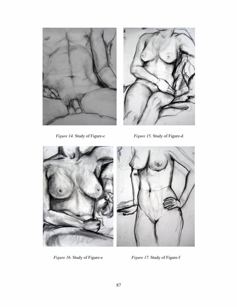
Figure 14. Study of Figure-c Figure 15. Study of Figure-d
Figure 16. Study of Figure-e Figure 17. Study of Figure-f
87

Figure 18. Gesture Drawing-a Figure 19. Gesture Drawing-b
Figure 20. Blind Contour Drawing-a Figure 21. Blind Contour Drawing-b
88

Figure 2, 3 are in depth study of body. Students spend 40 minutes or longer time
to study the anatomy and proportion. Figure 4, 5 are self portraits study. Students drew
their own face in front of a mirror to study the facial characters. And they also study the
scull with the self portrait (figure 8, 9) in order to understand the underneath structure of
the head. Figure 6, 7, are the study of figure/ground ambiguity. This assignment is
emphasis on the blurred old photography effect of background and figure relation by
using eraser as a drawing tool to erase across the edges of the shadows and contour lines.
Figure 10, 11 are experimental drawings with skeletons. In figure 10, the student
uses two different kind of paper. She draws a skull on a piece of white drawing paper,
then she tears it, then burns certain part of the edges. After that she glues it on another
piece of brownish craft paper, and continues to draw another skull which is crossing from
the white paper onto the brown paper. She then adds some darker tone around the skull to
create contract between the image and the background. She adds bones of a hand on the
lower part of the brown paper. For the background, she tears and burns some holes.
Finally, she starts to use white tempera paint to add some highlight on the skulls and
bones, then splashes some white spots with the white paint on the back ground.
In figure 11, the student uses two same sized white drawing paper and lays them
on the floor in a certain angle. Then she starts to draw the skeleton on top of them. After
that, she uses stencils to create the industrial like textures on the whole background. Last,
she uses black and yellow watercolors to create an opposite effect on the background.
Figure 12, 13 are study of skeletons with subtractive and additive methods. For
the subtractive method, students use 6B or darker graphite or black charcoal to lay out a
dark background first, then use gum eraser to erase the light area, and add the highlight.
Finally, students go back to articulate some tones and reinforce some contour lines to
define the shape. Figure 14-17 are the study of the body, which emphasized the skeletal
and muscular structures and 3-dimensional volume. Figure 18, 19, are the examples of
students’ gesture drawings. They are created very quickly (about 30 seconds to one
minute for each pose). Figure 20, 21 are blind contour drawings. Students are constantly
looking at the model while they use contour line to define the edges of the model. From
the beginning line to the finished line, students do not look at their drawing paper which
89
helps students to better understand the continuous structures and bigger shapes of the
human body as a whole.
Other questions. “Do you think it is important to be a practicing artist in order to
be a good art professor?”
“I do. I think you need to have a studio practice of your own. Do I think you need
to be the most brilliant artist? Definitely not. I think some of the strongest instructors,
strongest teachers probably don’t have the most successful, sometimes even the most
interesting art, but I do think they actively engage in the process of making.”
“What do you think about the relation between drawing and painting?”
“I think drawing is really crucial to all of them, but I think drawing is central for
painting. Even if you are working in pure abstraction, and non-objective work where you
don’t have to have a true likeness of anything. Just to understand how to build the
composition, knowing how forms relate to each other, and scale, proportion and energy.
All that you want from drawing. I think also just the process of the way you make marks
really, really very directly does affect the way you paint, the way you hold the brush, the
way you move paint on the canvas.”
“What do you think about drawing and painting in relation to other disciplines within
visual arts?”
“I think that painting is fairly separate. But I feel that drawing is just a strong
foundation for everyone. For everything, whether it is photography, whether it is graphic
design, sculptures. Painting helps those disciplines as well, but I think it’s less direct. But
I think drawing teaches you about layer, about putting information next to each other,
about process, all those things are hugely important in other disciplines. Plus it’s really a
quick way to illustrate ideas before you spend a lot of time making them. Make sure
those ideas fit in your conceptual frameworks.”
“Do you have discussions among your teaching colleagues about teaching drawing and
painting?”
“Oh, yeah, quite a lot. We have meetings. We do have meetings about it. Less
frequently about specifically teaching and how to teach. Sometimes we do meet with
adjuncts sort of to observe different classes. I haven’t done that here at this university, I
have at others. But very informally, meeting with other colleagues, just sort of talking. A
90

lot of times just about a specific type of student. You know what you do if you have a
student talking all the time. How do you approach this? What becomes of this? Probably
you have to deal with it, or ignore it. You know I definitely had people say how do you
illuminate them, how do you really teach them about this concept. What is prospect do
you use if someone is struggling with something? People are fairly open about asking,
and getting influence. So, definitely, definitely.”
“Do you collaborate with other painting and drawing teachers? How? Give examples?”
“Not formal collaboration here yet, but in the past I’ve taught collaborative
courses with the History, English, and Music departments where we’d collaborate
between all of them. So I taught class for two weeks. We would sort of take historical
references, literary references, musical references, and art references, and pull them
together, and sort of have this creative artistic class where students could choose to work.
And from that there would be a period where students would reach out, sort of choose to
work with one of the foreign instructors on a more extended project based on what their
persuasion was. Whether they like art, music, or…or just want to experiment with one or
the other. So, I’ve definitely done that. But I also taught collaborative classes within the
arts, which are really typically usually exciting. They are difficult to get through the
administrative process because of who gets credit for teaching. You know it’s a little bit
problematic, but I think in this period of cooperation the two instructors just have really
great ideas, they usually figure out a way to make it work. That can be very useful just
because you expand the knowledge base. The students get to see how two different
people approach a similar topic. It’s really important and exciting. I think it’s an
important thing.”
Listen to The Painting. The Painting Tells You What’s Going on:
Professional/Thematic Instructional Data for Professor B
Educational background. Professor B went to a community college for two years
studying art. It is called Meramec Community College in St. Louis. Then he went to
another small college in St. Louis called Fontbonne College and got his BFA, a bachelors
degree for painting. Then he went to Indiana University for two years to get my Master’s
degree.”
“Did you study painting/drawing? What courses did you take in painting/drawing?”
91

“Yes, mostly a lot of art classes. So many painting classes! I took a lot of
sculpture classes. I liked doing a lot of sculpture, but after some point I got to where I
didn’t enjoy the process of sculpture, making molds, and the extra labor intensive work. I
didn’t actually make any artwork. It’s the fabrication of structure to make the work. I got
kind of tired of that. So, most were painting classes. A lot of them were figure painting,
figure drawing. That’s about as specific that I got with any of them.”
“How long did you study painting/drawing?”
“I really start painting probably about 1974. Thirty-three years, I guess.”
Teaching experience. “What classes do you teach at FSU?”
“I teach painting class. Right now it is a Painting I class. The class I first taught
was a self-portrait class, so, the idea of what self-portrait might be about, maybe just
physical likeness. It is difficult for the students because they only know painting as a
pictorial reference to themselves. They don’t really grasp the notion of self-portrait
beyond a physical likeness. It’s been interesting.”
“How long have you taught painting/drawing class overall? And how long have you
taught painting/drawing at FSU?”
“I started teaching since 1985 here at FSU. It’s about 23 years.”
Teaching load and normal day routine. “What is your teaching load?”
“Right now it’s two undergraduate classes, then graduate students on top of that.”
“What’s a normal day like for you at work? (Describe your routine.)”
“The first class starts at 12:50, I paint in the morning usually, and then I get to
school about 12:00. Get stuff ready. Check the mail in the art office, and have a Painting I
class for two and half hours. Then another class in the same room, so it’s a pretty easy
transition. Sometimes we have faculty meetings.
Teaching philosophy. “What’s your teaching philosophy?”
“You know, it really is to try to find what the students are interested in in their own
mind, because I don’t need to teach anybody to be like me. There is no reason why
anybody should try to teach somebody to be like them. So you have to try to get into
students’ heads and figure out what they really want to learn, even if they don’t quite
know it. So you end up piecing together a lot of little clues, almost, and try to help them
92

to figure out where their own personal insights may be. Sometimes it’s hard work’ like a
detective story, adding parts of clues and figuring out the answer.”
“What do you think the most important thing is that you teach your students?”
“I don’t know. It’s an interesting thing. I don’t know if there is a single most
important thing. It’s hard to say. They never had to be very creative for the most part. So,
maybe just inside, how to take advantage of their own individuality, and how to think
differently, and how to trust the solution. A lot of time you trying convince them there is
no correct answer, but there are a lot of boring answers. You don’t want one of those, you
just want something new and different and individualistic. Maybe just how to be
confident and individualist.”
“What’s important to be taught in drawing and painting?”
“There are so many things. Some of it just may be the history of it, and why
people do it. Or it may be why, even more important, people do it today. And why
humans do this thing. Particularly with painting and drawing, there is a notion that there
is only the one of something. They are not like multiple produced or computer produced
things. There is only one of that piece of paper which that drawing is on, or one piece of
canvas. I think students don’t really understand or appreciate the uniqueness of what they
do sometimes.”
“What do you feel are the basic skills that students need to master? And how do you
incorporate them in your class?”
“Sometimes they have to realize that it’s a lot of work. They’re used to instant
gratification …the computers, anything … are short term interests and focus. With
drawing and painting, the skills have to be built up over years, of thinking, of observing
and learning. You have a lot of mechanical processes you have to learn. Particularly with
the painting, you know how to build a canvas, how to build the stretcher. There are a lot
of physical, mechanical skills, and that takes a long time for one individual to start to get
a handle on.”
“What do you have to say about the importance in teaching art skills, techniques
and creativity?”
“Skills are pretty easy to teach. Once they understand the mechanics, maybe how
to work with a saw or figure out how to get the canvas square, you know those things
93

maybe they just need to be exposed to, they can absorb that really quickly. Techniques
are really kind of individual choices, and again I am trying be responsive to what that
student seems to be really enjoying, whether it is really thick paint, really thin paint,
loosely interpreted subject matter, really tight realistic, … I try getting a sense for what
they are really interested in thereafter, and I work toward that direction. Creativity is
probably the hardest part. Because they haven’t been exposed to art that much, they don’t
really have to… Going through the education system nowadays, the students are bright.
The students learn how to memorize things really well. They are not really asked to
create anything or invent anything. So it is really difficult for them to come up with some
interesting ideas. They come up with an idea, usually it’s a fairly solid idea, but it’s not
very inventive. It’s hard for them to think past their initial idea where it could just
become something much more different than anybody else might come up with. That’s
probably a hard thing, just teaching somebody maybe a process to becoming creative.
Just take your first idea, and think you are genius. I try to see what I can do to make more
of a difference than if I thought personally that they are just lazy or they haven’t
exercised that part of the brain.”
The goals of the class. “What are your instructional goals for your painting I
class?”
“For Painting I class, a lot of it really is a first exposure to painting. So sometimes
it’s just to get them to comfortable with that, knowing that they can do it. You don’t have
to worry about the styling of it. And give them some insight into the history of painting,
so they can maybe appreciate it and enjoy looking at paintings.”
Teaching method. Regarding the most effective teaching methods, Professor B
said: “I do a lot of work particularly when they start on their drawings. You can explain
things to them, but you’re dealing with a visual language. So if you are trying verbalize
things, sometimes it’s a difficult way to get the point across. So I just draw on their
drawings, or show things: ‘Why don’t you do this? Do you see this?’ They tend to say,
‘Oh yes, I see that!’ Same thing with paintings a lot of the time. It’s so easy just to
demonstrate this idea of how to get this shape, how to get this form, how to get this color.
Sometimes I show videotapes to them just to get them exposed to other artists.
Particularly they are relatively unconventional artists. They have a preconceived notion
94

of what art is or what a drawing should look like, and they really haven’t been exposed to
other or more recent options for the visual arts, painting and drawing. In Tallahassee, you
can’t go to a museum. You can’t point out something on a painting and say, “Look at
how this artist did that.” So you end up using a lot of books, as good as you’ve got.
Certainly, you deal with the reproduction, the small scale. You lose the texture. That’s
really the only resource you have to work with here in Tallahassee.”
“How do you motivate your students?”
“Motivation is kind of a strange thing. Some people you can never motivate, so
you don’t spend a whole lot of your energy trying to motivate. Other ones tend to be self-
motivated, you just keep them focused and engaged. You have to get a sense for when
you feel the project is dragging too long, so you find a new project. Or you build on a
current project for the future. And you have to figure out sometimes what are the
students’ paces. They don’t work on the same pace. One class doesn’t work with the
same pace as the other class. I always end up being in a fairly loose structure. The
schedule is produced depending on what that particular class has done and how far they
get, when they are ready to move on. So we transfer to something completely different.”
Influences. “What artists or movements have influenced your practice as an artist
or teacher?”
“One of the things that I always try to do with the students is to break with the
more art historical understanding of the sequencing of art and artists. Try to convince
them or try to explain to them that they might not need to think of art chronologically,
and to think of other artists as sort of non-time referenced. So you look at somebody who
was painting in the 16 century perhaps, and try to have the same insight and same
perseverance as them, and you might have somebody who is working now. I’m not trying
to stick them in historical archives some place. You can certainly get stuff on books for
hours of just inventing and imagining anything going on now. Sometimes again they are
good for understanding information and memorizing things, but it’s hard for them to
shake that structure of education. Things have to be chronological. No they don’t, when
you talk about art! Good artists make specific time periods.”
“Are there any artist-teachers influence you on your career? Describe them and their
influence.”
95

“There are a couple of teachers I guess that had a certain influence me. When I
was in community college, the first painting teacher I had. He was an old guy, he was an
adjunct. He probably retired, he came to teach painting class. We had still life set up. I
didn’t really know anything about art. I didn’t really know anything about painting. So I
am taking this class. We were studying still life. He came over, he did this painting of a
little kerosene lantern. It was kind of magic to watch this thing. Just sort of happy. It
wasn’t like you sketch it out or diagram it. You just look at it and kind of painted it. Just
in a kind of magic way. I thought, “Oh, people do that.” It’s not like an engineer that has
a blueprint. You look at something, you just interpret it. It’s a sort of enlightened
moment.
The other one is a teacher I had at the last two years in undergraduate school. He
started talking about interests in other artist. He read other artists and trying figure out the
larger painting significance. How to look past, maybe, just the subject matter of the
painting and figure out why it’s a great painting, and maybe just why it’s a great story.
So, you know it’s about … I hate to say … ‘interpreting’ anything, but ‘appreciating’ I
guess.
When in graduate school, you know the teachers are a little different. I didn’t
learn anything specific maybe from them, but learned what to be like, or the expected
avenue if you are going to be a professional artist. So you see these people working, you
see these people exhibiting. There is another aspect to this whole art thing I never really
contemplated very much.”
Issues and concerns encountered in teaching. “What are the most pressing issues
and concerns you have encountered in teaching painting?”
“The students expect things to be done quickly, or they don’t realize the amount
of time and energy that is involved in doing that stuff with any certain degree of
competency. I don’t mean to say they are lazy, but they just don’t maybe grasp the
amount of the focus that it takes, you know. ‘Cause to think about it and just take to
somewhere … they think they have a vision in their head, and if it doesn’t become that
vision, they feel like they failed instead of listening to what the image was evolving into
and going with that. They tend to be a little frustrated.”
Frustrations and rewards. “What are the biggest frustrations in your teaching?”
96

“Most of my colleagues. The students for the most part are conscientious, they
may not work hard as they should. But never much in the way of difficult students. I
guess you have higher expectations of your colleagues maybe, in general, across the
board. Some of them just… they might be ineffective teachers, they might be disengaged,
they just don’t care. They might not be willing to pursue their own career very far. They
do their own research. I often wonder what a lot of them do when they are not teaching.
Obviously, they are not working on the career, not making art works. I guess they sit
around and watch television or something. I don’t know what they do.”
“What do you think will be your greatest rewards in teaching painting?”
“It’s an interesting question. There were, what probably comes down to maybe a
few dozen real good students that you have over the years, but you can at least say that
you maybe helped to get them to where they wanted to take that stuff. You feel good
about that. Have the goal or have the success. They actually care. You talk to them a little
bit. You make suggestions because a lot them just kind of become disappointed. The
point when you’re done with college, you don’t know in which direction you are going
right now. A lot of them just don’t know. They are in need of advice and suggestions.
You feel great about that.”
Grading. “What strategies do you use for evaluation or grading student work?”
“That just depends on where they started and to where they evolved. I don’t have
a set bar that everybody has to reach, because not everybody starts at the same level. How
much information they’re willing to absorb and do something with.”
Textbooks.“What are the textbooks you use for your painting class? Why you
chose them? If you don’t use a text, why not?”
“There is no text book in my class. I use the master painters’ books to show my
students. Most of the common painting books in the market are pretty dry. There are no
cookbooks for painting.”
Meaning of teaching. About the meaning of teaching, professor B said: “I always
enjoy the job. I always kind of enjoy this, You know, watch and help out all the students
at one level or another. Sometimes I think about someday when I’m retired. You kind of
wonder how much you miss it. You know probably I’ll miss some interaction and
problem solving with the students about their works. At some levels I guess.”
97

The studio environment. The painting studio is located in the “The Church” which
is actually an old church just across street from the Fine Arts building. Inside the studio
there are some wood and metal easels. Some metal stools and small cabinets are scattered
around the easels. Paint marks are seen on every surface, and there are these colorful
marks on the easels, stools, and the floor. You can smell the linseed oil in the air although
the fan has been turned on. The wall in front of me is about 40 feet long, and is used for
displaying students’ works during the group critique. On the wall behind me on the left
there is a sink and a trash can. Further left, there are three 7-foot metal cabinets in which
there are all kinds of objects for still life. On the wall, several pieces of student’ self-
portraits are hanging. On the wall behind me to the right, there are three middle size 4
foot metal cabinets which are used for carrying students’ art supplies. On top of the
cabinet are piles of students’ paintings, stacked in rows. Some paintings are landscape,
some are figure paintings, and some are still life. Against both the left and right walls
there are four big, wooden shelves which are used for storing students’ paintings. In the
left corner of the room, there is a big table on which a still life setting is set up. Some
glass bottles, plastic fruit, and pots are displayed, and a paper sign on the table reads
“Please do not move.”
Figure 22. Painting Studio in “The Church”
98

Don’t Worry about the Likeness at First
Demonstration. When I came to the studio classroom, Professor B had already set
up an easel, and a small table with a paint box. Inside the paint box, there is a set of
palette papers on which oil paint had been prepared. Two jars are placed beside the paint
box: one jar contains linseed oil as the medium, and another with mineral spirit for
cleaning brushes. A piece of white rag is sitting on the corner of the table. A spotlight
with orange light is clamped on the easel. Professor B will teach students how to paint a
self portrait. One male student is sitting as the model. He has blonde hair and wears a pair
of glasses. Professor B prepares by plugging in his extensions cords to power his lamp
and as he waits for the final group of students to arrive, shows the students present how to
place their mirrors for the self-portrait exercise.
PB prepares paint while talking to the whole class. Students move easels around.
“Come over here”. PB starts to paint the model. “The first part tests your creativity. Find
some photo surface. Start really dark. Stay away from blue and green. Set your palette on
your right side. Think about how you orient your canvases. Big things first, small things
later. Don’t think about likeness at first.” Professor B is leading by example and as he
works, he continues on with his discussion of qualifiers for the exercise in self-portrait
painting.“A couple of things you need to be aware of. Think about light from a ping pong
ball. Think about nice gradation, highlight, light area, shadow area, core of shadow,
reflected light, and cast shadow. Think about reflected light. Paint the nose like a ping-
pong ball. Always look for corners.”
99

Figure 23. Demo of Self Portrait by PB
“It’s an angled corner. Use your purple and orange. Add cool reflect color. Work
in some kind of dark. Redefine the jaw. Don’t think about the glasses. Drawing the frame
is easier than eye balls.”
“Try colors. Variation colors. Get a guess. Illuminating things can be possible.
More like sculpture. Catch conversions. Nose and ear warm. Translucent. Don’t paint
your face nice and paint the neck like that.” PB paints an elongated neck to contrast with
the proportioned face.
Students are standing behind PB and observing his demonstration. One student
asks, “Which red is that?”
“Cadmium red light hue.” Answers PB, “ Look up sternomastoid. Round up the
chest. Tighten up a little more. Don’t start it too light. You look for the corner.”
“Keeping it light, redefine the shapes. You got the idea already?”
“Every time you look, use your nose as reference to the chin. Don’t try to be a
camera. Allow yourself a couple of chances.”
“Do we make the background on top of it?” a student asks.
“Use yellow ocher. Find something you are interested in for your background.”
“I’ll show you books in my office when you work on your background.”
“Will our finished project be Picasso-like?” a student asks.
100

1:19 p.m., PB finishes the demonstration. The demonstration is about 20 minutes, and
then students begin to paint. PB brings several books for students and helps students set
up easels and mirrors.
The goals of the class. Professor B’s Painting I class is structured to give students
their first exposure to painting mediums. For the most part, a goal of this class is to
encourage students to learn to work with a full palette of color while dealing with the
problems of building a painting that conveys a realistic illusion of a 3-dimensional world
on a 2-dimensional surface. Other important aspects of this class are studying historical
examples of painting and developing the verbal skills needed to carry on informed
discussions about painting and art. As the class progresses, the emphasis shifts towards
promoting the personal style and individual creativity of students and how they approach
the mediums and techniques.
The content of the teacher’s instruction. Professor B gives students a variety of
assignments for his Painting I class. Typical assigned projects for this class include:
● Copies of the works of masters
● Self-portraits
● Landscape painting
● Paintings based on randomly-selected images using a mixed media approach.
Regardless of the assignment, the main medium is oil paint on canvas. Based on
each student’s specific problem areas, Professor B gives personal solutions. There are no
presentations in PA’s painting I class, although in one class session Professor B did show
a video of a contemporary artist at work.
Students’ outcomes. Here are some artworks created in PB’s Painting I class
(Figure 24-35):
101

Figure 24. Self Portrait-c Figure 25. Self Portrait-d
Figure 26. Self Portrait-e
102

Figure 27. Self Portrait-f
Figure 28. Landscape-a Figure 29. Landscape-b
103

Figure 30. Landscape -c Figure 31. Landscape-d
Figure 32.Randomly Selected Images Painting-aFigure 33.Randomly Selected Images Painting-b
104

Figure 34.Randomly Selected Images Painting-cFigure 35.Randomly Selected Images Painting-d
Figures 24-27 are self-portrait paintings created by several students in Professor
B’s Painting I class. In figure 24, Professor B asked the student to emphasize the cast
shadow under the cap and the chin to create the 3 dimensional effects. In figure 25, he
showed this student how to paint glasses. He asked the student to temper down the eye
and add some cast shadow, then suggested that the student create some reflection on the
lenses of the glasses. On the background, the student put some black lines on white lines
and it became too busy. To remedy this, Professor B suggested a change to some another
color to create balance and detract from the problem and also encouraged the student to
consider a different color on one side of the face. As a result of these suggestions, this
student covered the background with some blue and purple on one side, and yellow and
orange on the other side.
In figure 26, the student adopted Van Gogh’s Starry Night as the background.
Because the student used an orange spotlight as his light source, Professor B suggested
that he add some orange to the background so the portrait and the background were
connected with the same tone. In figure 27, another student put purple and red on each
canvas, and he juxtaposes two canvases as one piece. His face was separated by these two
canvases. Professor B encouraged him to use this format and also suggested that he think
105

about the opposite characteristic of this duality. One side uses cool colors; the other uses
warm colors. On the background, he painted a pool table on the upper left which was
borrowed from Van Gogh’s painting as well.
In the landscape assignment which is presented in figure 28, Professor B showed
a student how to paint a cloud; He suggested the student work with blue first, then add
white on top. He asked the student to consider the light and dark areas of the cloud, then
soften the edge. Furthermore, he asked the student to think about the flying giant rocks,
which have a side, top, and bottom.
In figure 29, PB suggested the student tone down the color in the distance and
then soften the hard edges of the distant background. In figure 30, the student found a
zoom in viewpoint for her composition. It is the corner of the old cafe which was an old
train container with the wheels at the bottom. In figure 31, PB suggested the student
separate the foreground mailbox, mid-ground gray wall, and background sky. He
suggested darkening the mailbox because dark things come forward, and to try some
other colors to separate the gray of the wall from the sky.
In the paintings based on randomly selected images in figure 32, the student in
this example glued some pages of a journal on the surface of the canvas as the first layer,
then glued shorter pieces of paper strips on top of it as the second layer. He then wiped
acrylic black all over the surface to get some nice texture. Next, he covered the center
area with a piece of blue color fiber, and used a palette knife to add Acrylic Gel Medium
to the fiber. Finally, he used black marker to draw some images he randomly selected
from an old journal which included: a pilot, an airplane, a bird, some clouds, and
skyscrapers from New York City as the top layer. In figure 33, the student used Japanese
Kanji characters, the Eiffel Tower in France, and the French words: “C’est ne pas une
femme” which means “There is no woman.” in English. He also added Chinese
characters representing the same meaning. In figure 34, another student covered the
background with black paint first, then he dripped the green and orange acrylic paint on
top of the black from the top and bottom directions. In figure 35, the girl combined a
nude figure with some images she found in her daily life.
Other questions addressed by professor B. “What do you think about the relation
of drawing and painting?”
106

“While in a way they are so well related, in a way they are well apart. I am trying
to, a lot of time, convince students painting really has a lot more in common with
sculpture in a way; the idea of adding things, layering things, building of surfaces.
Drawing tends to be kind of about a containment of information. In most of the cases, it’s
a line around something. There is not that physicality of building up a surface of a
column on a column. Probably the important thing I am trying get them to understand is
that painting really isn’t as close to drawing as they think. But all they share in common
is the 2-dimensional surface. It’s hard for them to understand that for a long time. They
want to draw things and fill them in. I tend to try to not let them do that, because that’s
again the first thing coming into their head, “Oh I can draw, so I fill in. Oh, I’m
painting.” In most cases, it’s a completely different world.
“What do you think about drawing and painting in relation to other disciplines in visual
arts?”
“It’s way superior. I don’t know. The singularity of art, at least drawing and
painting extend to the rest of them. Even sculpture, people have no problem. A lot of
sculptors in most cases, making multiple images make images off their original. Every
museum in the country got one of Roden’s Thinker at sometime. It’s another thing, it
seems, to do that, to accept that idea with paintings and drawings. I did a lot of sculpture
in school, I enjoyed it. It wasn’t as magical as painting. Painting is all about illusions. It’s
always flat, whether you dealing with the illusion of space or you accept that flatness. It’s
all flat. There’s a kind of magic to that. It’s a very limited possibility, but at the same
time, an endless possibility. In sculpture you always make something. It’s like making a
coffee table or making a chair. I mean there is a room. It’s a 3-dimensional thing, and has
weight and mass. There wasn’t any magic to that I guess so.”
“Do you have conversations with your colleagues?”
“Just the one I like. The ones I don’t like or don’t respect, I just tend not to talk
with them.”
“Do you have discussions among your teaching colleagues about teaching drawing and
Painting?”
“We share sometimes ideas or projects that succeed.”
“Do you collaborate with other painting and drawing teachers? How? Give examples.”
107

“No. I really don’t. Some faculty members do or enjoy doing that. I guess I don’t really
do or probably wouldn’t want to do it. I don’t know. I think I just like the sort of one-on-
one interaction with the students. We have a group critic or something like that, a lot of
time you try to be on a committee with people with whom you have a sort of shared
ideology or shared notion of approaches. Sometimes you don’t. Sometimes you get on
one, but the discussion ends up being between the two faculty members, and the students
just sit there, relatively disengaged.
Dare to Be Stupid. Egg on Your Face: Professional/Thematic Instructional Data for
Professor C
Educational background. Professor C completed his undergraduate education at
the Memphis College of Art in Memphis. Tennessee. He completed graduate school at
the University of Illinois and later completed postgraduate study at Harvard University,
and then the Massachusetts Institute of Technology in Boston.
Teaching experience. PC has been teaching for 35 years and began his
instructional career when he was in the undergraduate phase of art school. When PC
started out teaching at FSU fifteen years ago, he was teaching mostly Experimental
Design and Drawing I.
Teaching load and normal day routine. “What class do you teach at FSU? What’s
your teaching load?”
“This semester for instance, is Drawing II, and then Figure Drawing. Then I guess
you can count the graduate workshop, it’s on Friday. It’s not a studio class. It is more like
a seminar.”
“What’s a normal day like for you at work? (Describe your routine.)”
“One thing is preparing. I don’t have any morning classes. My first class at
1:00 … 10 minutes of 1:00 … 12:50, is the Figure Drawing. Then after that I have the
Drawing II. In the morning, usually late morning, I prepare for the classes. I like to bring
something in, especially for Drawing II, but then also for Drawing I, I have a library at
home, and I bring in examples of other artists. I don’t show too many slides, but what I
do is this. Because I have been teaching Drawing II for many years … this is the first
semester in a long time with the Figure Drawing … so, for Drawing II I have about five
or six years of students’ drawings, examples, digital images, etc. So I project these
108

examples for them so they get to see those examples. I have to try to make it clear that
these, of course, are not to be copied, but sometimes it’s hard because I have students
come up to me and just get frustrated and they just ask, “Professor, what do you want me
to do?” Usually the answer is not what I want you to do, but what you want you to do.
You must do it.”
Teaching philosophy. Regarding his teaching philosophy, Professor C said: “If it
is a fundamental class or a basic class, my philosophy for drawing I would be different
from Drawing II. Teaching art in general, like an umbrella, the whole bottle of glass, is
that I try to think of myself as a facilitator first, where I can facilitate the whole idea of
exploring, experimenting, taking chances, not always sitting comfortably in the middle of
the room, but rather on the edge. In other words, not on the middle of the table, but sitting
or standing out on the edge. And all too often I will say, ‘Fall off! Sometimes jump, take
risks!’ And I mean this when I tell the students … I mean seriously, “Dare to be stupid!”
So what I really mean is … don’t be afraid of take those risks. You are going to feel
sometimes that you get egg on your face. This is an American expression. “Egg on your
face.” You look like a fool. All of us are usually afraid to look like this. We don’t want to
be foolish. So, I mean, it’s not to say that my philosophy is to be foolish, it is to dare to
take the risk. But sometimes, especially with the young students, the undergraduate
students, maybe not so much as the graduate students, if I say “Dare to be stupid” I’ll get
up on the table. This is where we all mostly want to be … in a warm bath. You know …
a warm bath, taking a bath, very comfortable, in the middle. But what you want to try is
to be on the edge, try jumping off some time. But I think it is human nature to be in a
warm bath, very comfortable. Just, the last thing I’ll say … let’s say Drawing I compared
to Drawing II, or Drawing 3 or Experimental Drawing … Drawing I, I think is important
to have the fundamentals, line shape, volume, color, progressive … you step through
those elements, understanding perspective, two dimensional depth, three dimensional
depth. For Drawing II, it is more exploration. That’s one of the problems in a good
foundation class or course, basic design, or basic drawing, or basic sculpture … that you
have the fundamentals of understanding what it takes to make a good solid piece of
sculpture or a good fundamental drawing. “Let’s see representational drawing!” I mean,
you know from your training.”
109

“What do you think is the most important thing to teach your student?”
“Have confidence. To build the confidence. I would always say that everyone is
talented. The technical talent varies, but they all like to explore. Sometimes they are
afraid to explore. But they can’t come out of my class without the confidence to win, to
play, to explore, to take chances, to dare to be stupid. All of those are so important, just
being you. So many people are just stuck in routine, or in jobs. It’s a boring life,
sometimes. Being an artist, you are a creative person. I think everyone is creative.”
“What’s important to be taught in drawing?”
“Like what I was saying, in a basic classes it is, you know, what grammar is in
English. You have grammar in Chinese. You have a strong foundation. From that
foundation, is then to take the risk, to explore, to experiment. You know I had a very
strict, maybe not as strict as yours, but a very structured drawing and painting
background. You know how to draw. I went to a high school, art school. It’s a high
school which had a museum in Connecticut, near New York. It’s the oldest art high
school in the country. Norwich Free Academy. It’s a city, a small city in Connecticut. It
looks like a college campus, it has a museum, and it has an art school. Have you ever
drawn with silverpoint? That’s how I learned to draw the figure.”
“What do you feel are the basic skills that students need to master? And how do you
incorporate them in your class?”
“That’s pretty straightforward in drawing, something like a fundamental class, the
Drawing I. But it’s something I am struggling with in the advanced drawing classes, like
Drawing II or Experimental Drawing. I like to think that just by the content of the
assignment, they are going to learn certain skills, certain technical skills and concepts.
That’s important. I like to think that as they go along from Drawing I, Drawing II, or to
more advanced classes, or whatever class it is, it is a balancing act between the content,
the concept and the technique.”
“What do you have to say about the importance of teaching art skills and techniques, and
the role of creativity in this?”
“Sometimes they overlap. The technical versus the conceptual. I think it’s
important to have a good foundation, in case of drawing, a simple stepping from the first
part of the semester, line, shade … to gradually go through volume, then texture, and
110

color. So it’s progressive. The fundamentals, the grammars, the basics. With that then in
Drawing II like I’m teaching now, to encourage students to use that skill. But then take
chances with those skills. To really explore and sometimes I say, you know, “Look I want
you all … you are being too careful. Dare to be stupid!” Sometimes I use this table as an
example of the art world or the universe. Here we are in the middle of the table, right?
We never get to the edge. If we get to the edge, we only get this close. I want you to fall
off, and then get back up, taking chances.”
Influences. “Do you have some influences from other teachers in the past and
who stands out most in your memory?
“In all of my time … probably he has passed away. He was a painter at the
Memphis Academy; it’s now called the Memphis College of Art. It has an undergraduate
BFA and a graduate MFA program. His name is Ted Faiers and he did very, you could
almost say very flat, paintings but they are very socially and politically smart. He would
do paintings about issues of the day, but very seductively. Not abstract, not photographic,
not hyper real, almost two-dimensional kind of, not cartoon either, also flat at the same
time. He wasn’t a big talker like me. He taught by example in his work. And we would
talk about ideas and social and political issues, a little bit, not a lot. I think of all of the
years and all of the people I have known, he was the greatest influence.”
“In your career, who was the most influential teacher in showing you how to teach as a
mentor?”
“I never took any, like, Art Ed kind of thing. But I never took any of those courses,
or anything, or sat in. This is a difference with an MFA, the studio, all studio. Of course it
is a crap shoot, in another way. You can get some really lousy teachers. They are not
interested in teaching or do not have a training background. So what I know is, of course,
what I pick from colleagues, or from talking with other artists or other people that are
teaching. So over all these years, I’ve learned from all these other people. Someone had
passed away; Ed Love who was only here just before he died, five or six years or so. I got
to talk to him quite a bit. He genuinely cared about art students and loved to teach. I had
and still have great respect for Ed Love. Also I was around him with students as well. I
guess one thing I picked from Ed was that you can be pretty forceful, you can be very
forceful, but it comes from your heart. You can be ….You don’t say, “This is shit.” You
111

can say, “This is the problem with the drawing. This is what I think you can do to make
this a stronger drawing. Look this is really beautiful here.” You have these ways of
complimenting. Complimenting another works. Do you know what I mean? There are
some things you are doing that are good, but also there is a way going around almost like
the back door and saying, “Look! This really needs a lot of help. You’ve got to change
this.” Like, the student says, “I really want the table to look three dimensional, it looks
flat.” You just say, “Woo! You are in trouble. You’ve really got to get working on this.
There are some possibilities. Here’s how to make it look more three dimensional, more
spatial.”
“What artists or art movements have influenced your teaching?”
“In the early twentieth century, before and during World War I.… the Surrealists.
Then later in the fifties and sixties, the Situationists. Then after World War I, the Dadaist.
So what makes me curious about these movements is why somebody always related to
them … because those artists start to look at art with an experimental quality. Experience
outside of the studio, outside of the gallery, another world. Art work does not just have to
be in papers, on canvas or marble—that actually can be anything. I will give you an
example of a performance that I did with a student from the Academy of Vilnius where
they have a picnic on a landfill, on a garbage can, so outside, within this landfill with all
of this open garbage, there is a beautiful table cloth, beautiful food. These young people
sat around eating the food with acres, acres and acres of garbage. I should send you the
website. It’s a beautiful image. But you realize what they are doing and where they are
doing it. But the point I try to make is … Situationist. The Dadaists were actually after
World War I, one hell of a war. Millions of people died. People just came out and shot at
each other this close. “There is a war, let’s go man!” A lot of the artists were really
affected by that. Some people felt that this was insane, “How can I paint on canvas, or
draw on paper?” So they start in the streets walking, performing. Technically it’s not so
much. Mostly just ideas.”
Teaching methods. “How do you motivate your students?”
“It’s a good question. All these years I have been teaching, it’s still a challenge all
the time. Especially now, I feel that with all of the competition from media, the
computers, the iPods, all of the plug-ins, the cell phone, the digital this and that. For sure,
112

sometimes I think I’ve got to be an entertainer rather than an educator. I have to get up on
the table, and dance. You know tap dancing. I get their attention then I deliver the content
after I do the dance. I don’t know, I feel that’s unfortunate. But to keep them motivated,
part of it is, you hope, that the assignments, for instance, in figure drawing, which you
haven’t been sitting in on, but figure drawing … not only getting different models, but
also .... right now my class was doing composition drawings. They are doing drawings
from other models and incorporating them into a larger drawing. That’s all they have
been doing up to now, up to mid semester. It is always an ongoing endeavor or it’s very
challenging. I think of motivation and energy being very similar. I guess one of my
favorite words is “challenging.” How can I challenge the student? I think if they are
challenged with these assignments or projects that give them not just excitement, but a
little bit of self consciousness about that. Seems like we live in an entertainment culture.
You have to be entertained to be excited, to be involved. But I guess nothing is wrong
with that. To get them involved is also challenging them at same time. I am hoping by the
example that I have formed a big library of digital images of student work and other
examples.
So within Drawing II, for instance, one of the earlier assignments is that of the
fruits and vegetable based upon Giuseppe Arcimboldo. So, Giuseppe Arcimboldo was a
sixteenth-century northern Italian painter. Students bring in their own fruits and
vegetables and they draw a portrait. And they set up the lighting to make it look like …
you didn’t get to see … I had a display of those in the Fine Arts building. I should have
told you that, I just took them down. That one they really seem to get excited about,
because they are doing something concrete--a portrait. And then they’re also using fruits
and vegetables that they are familiar with. It’s right in front of them, right? It’s so
important that they have their own fruits and vegetables. The actual fruits and vegetables.
So I pick up an apple. I say, “You see this apple? I want you to look at the apple. But I
want you to think about an apple and I know you all can think about what an apple looks
like. You all know, probably you all think you know exactly what an apple looks like.
But I’m telling you this apple I have in my hand, is not like any other apple in the world.
And I want you to understand that when you are drawing it. This apple is as unique as
you, so when you drawing it I want to see that personality, the personality in the apple, in
113

the whole portrait. It’s a challenge. We can close our eyes, we know what an apple looks
like, what a pear look like, what a banana looks like. They are such common symbols.
But sometimes I see students. They have the still life in front of them, like the apple or
the pear, the banana. Here is the paper, their nose is stuck to the paper because they know
what the banana looks like. It’s amazing. You’ve probably seen people do that, even in
figure drawing. Sometimes I will go behind them, I’ll tap, and say, “Look at the model.”
They are like this. Stop drawing with your nose. They are so close. These are just bad
habits. I have a book that’s actually for children, in other words, the old illustration are
very large. I think that is pretty good for illustrations. That excites them. I think that
motivates them.
Also, the unexpected: I like to introduce, from time to time, something that is not
on the syllabus. For instance, when they come in, what I might do is, once they’ve settled
in … they are working on a drawing, let say, or they just look like they are settled in but
they are not very motivated. I’ll turn the lights off. All the lights off, dark! I ask them to
be perfectly still, not to do anything. First, I tell them to stop. Whatever you doing, stop.
I’m turning the lights off, of course they definitely stop. So one technique after I do that
is … I have the small vaulted cap candles. They each get a candle which is lighted. They
have the drawing boards too, so I have to set that up. And a piece of paper, or sometimes
I give them small sheets of 8x10. I wait at least 5 to 10 minutes when their eyes become
adjusted. I want them to be very quiet. I want them to be able to hear their breathing, and
to try to breathe very slowly, and also try to empty their mind. Try to think about either
just one thing--a color, or a line, or the absence of it. Just to try to get them to focus on
something, but out of the studio, here at FSU, Tallahassee, Florida. All of the other
problems, they got a date tonight, whatever is going on that makes their brain busy, right.
So they forget that. That, and also the challenge I give them to just breathe slowly. Don’t
to do anything. Don’t drift with your mind. Then I say I would like you to draw
something.
Sometimes they had music, sometimes the music is classical, very peaceful.
Maybe like Chopin, not very loud. But not all the time. So if I don’t have the music, then
I’ll say, “I want you to draw a line. I want you to draw these lines, but I don’t want you to
think about an object. I want you to be very peaceful, I want you to be very quiet.” So,
114

it’s a peaceful and quiet line. They can see the paper, with just a very low light. And I
know the blood pressure is low, their heart’s probably not going fast. Maybe there are a
couple of them just, pang, pang…, “What the hell’s going on here?” Right? So it could
start with that peaceful music. I might say something that is very coarse, or, “I want you
to make some line a little more erratic.” So anyway, this kind of …, so many possibilities.
I don’t know I’m talking about the other thing. I’ve got all of these long sticks
with charcoal on them. Or again I don’t want them to think about drawing a chair or
drawing something realistic. I want them to look at the line and what the line has to give.
I want them making lines spontaneously. For some it becomes natural to improvise that
way. For others, they are in a way … I guess you can say, natural. In our culture, people
like drawing to be on a paper, on a two-dimensional surface, something photographic.
That’s what they revere and respect. So clearly to draw photographically is automatically
prized in our culture. In many, not all. Some more than others, in some degree. I think it
is important to have a grasp of the techniques and craft, to know how to draw. But
anyway, the long sticks and charcoal just disrupts the routine. Other times, I just let them
have the candle and the paper, and just turn off the light. And I say, “Would you please
all stands up? I want you forget what you are doing. So we’ll do some breathing
exercises.” If you driving down the boring highway, and then suddenly there is a light, or
an arrow directing you to turn one way abruptly … maybe it generates something in your
mind, but you never thought of it before. For one thing, you’ve got to turn right. You’ve
got to get off this boring road, right? I kind of hope these little tasks that I assign join the
assignment.
You know within the drawing assignments I like to think that there are enough
interests in the context within the limitation. They have to use several threads – important
social, political, and aesthetic issues in the context. What’s important to them? They
might say the war in Iraq. Another might say no parking on campus. Another might say
global warming, or the election coming up. So they don’t have to pick out one of those
subjects. They can combine them. And then they have to incorporate the person’s name
in the drawing as well. It’s a type of contemporary art, I called it topical issues. Issues
like those that appear in National Geographic.”
Textbooks. “What art textbook do you use for your drawing classes?”
115

“I don’t use a drawing textbook. But I bring in different art books to show
students. Like today I brought one. It’s actually on street art, on graffiti art, or painting or
drawings in public spaces, or private spaces. The reason why … I haven’t found a book.
If I taught drawing I, it probably would be something traditional. For instance, for Figure
Drawing, which I teach this semester, I will use a book … but it is not demanded, I will
bring it in. And I’ll copy some from the original. I think I bought it at a local Barnes &
Noble. It’s a very simplified with the torso and the cube. And how to begin, begin with
gestures. But for the Drawing II class … I get a lot of books through the mail that the
publisher sends. I look through them. But for now I end up bringing in books on artists,
design, graffiti artists and sculpture, and painting. I leave them on table, and have them
come and look through the books.”
Issues and concerns encountered in teaching. “What are the most pressing issues
and concerns you have encountered in teaching drawing?”
“The space, the studio space. The institution. The art department is always
financially distracted. For instance, if we want to put in lighting, a floating light, the
ceiling is so tall, they’re not sure how to do it. So we don’t have these tripods. That
would be very important in figure drawing. I’m not sure we can do that. Issues involving
having a proper studio environment are very important.
The other issue is having a strong foundation. All of the students should have it if
they go onto interior design, sculpture, graphic design, video production, painting,
drawing … they should have the fundamentals. It is so important. If you have the
fundamentals, you can do anything. For Drawing I, to me, the skills are more important
than the ideas. Still side by side, sharing. The core is foundation. Then whatever you
want to do in your life, performance, video, sculpture, painting … you can do because
you’ve got this range of skills. There are other artists, instructors in other fields. For
instance, you decide if you want to make not a Statue of Liberty, but a very large
sculpture, made out of bronze, You’ve got to learn how to cast, right? Tomorrow you
want to do some very elaborate video production performance. You learn the Video
Editing software, all of the programs. So some people call these the foundations. I’m
talking about as a discipline only. You discover what it is you need. But in this institution,
116

especially in public university, you got so many students. Some are very, very talented.
They need to be fair to them.”
Frustrations and rewards. “What are the biggest frustrations in your teaching?”
“One is having a good, well-equipped studio. Maybe that’s just my age too, I wish
students could be more motivated. I’m always trying things, other than standing on the
table dancing, or strip-teasing. So I get frustrated because I think every student is talented.
But is every student motivated? Maybe…I’m trying to motive them. You see the talented
ones, and just go with that. Life will be beautiful.”
“What do you think will be your greatest rewards in teaching drawing?”
“When I see students, and just say, “My God! I’m not making them suffer for no
reason at all!” I said ‘not making them suffer.’ I give an assignment, it will have
limitations. Young people like total freedom, machine gun everything first. Then see if
you can learn something or get something out of it. So in Drawing II, I have limitations,
like with Persona, or whatever it is. What gets them excited is, when they made this
unbelievable drawing, an unbelievably challenging drawing, with all the limitations that
are given to them to kind of focus them. The small area … all the possibilities. They see
all the possibilities. They have seen the excitement on the drawing and in them, in the
student too.”
Grading. “What Strategies do you use for evaluation or grading student work?”
“In relation to Drawing II class, I grade according to the student's attention to the
drawing assignment's context. In other words, did the student understand the limitations
of the assignment and within those limitations produce a fantastic, knock your socks off
drawing. That results in a "fantastic grade." However, if the student for instance does
NOT pay attention to the limitations of the assignment, the grade suffers
accordingly. Critique participation is an integral part of the final assignment grade too.”
The goals of the observed class (Drawing II). Professor C’s goal in Drawing II is
to allow the more experienced student/artist to explore with various media in a creative
environment. Within the constraints of the materials and assigned projects, each student
is encouraged to produce works in the spirit of exploration. A major preoccupation for
everyone in this workshop should be to experiment/play. The students explore the many
117

possibilities of critical observation through a variety of black and white and color media
and the sketchbook is an important part of the class.
Content of the instruction. PC gives different assignments including still life
presentation of fruits and vegetables, portrait drawing, assignments based on basic
drawing and textures, persona drawing, book of drawing, and group murals. Each student
creates drawings based on a given theme or concept. From the preliminary sketches, to
concept development, to the final work, Professor C always gives students the creative
means to make their own decisions.
Materials and technique. Color pencil, graphic pencil, charcoal, ink and pen, color
pastel, gouache, watercolor, and other media (such as, maylor and, vellum) are explored
by students. There is no demonstration for Professor C’s Drawing II class because the
course content hinges so much on the flexibility afforded by personal exploration and
experimentation.
Concepts and ideas. Many of the core concepts and ideas expressed by Professor
C can best be demonstrated through an example taken from the field notes gathered
during observation of one of his Drawing II classes. In one class, Professor C asked
students to create a drawing based on the concept of persona. Before any students were
given the chance to begin work on the project, however, Professor C asked the students a
basic, but obviously difficult to answer question; “What is persona?”
“How you appear to other people.” says one student.
“It’s not a human quality.” says another.
“It’s when you make a room for yourself or create an identity.” answers yet
another.
“Spiderman.” says a boy.
“Hero.” Says another boy.
Professor C listens to these answers without individual comment and, seeming
comfortable with the answers he received, he tells his class, “You just introduce your
piece. What does it personify? Talk about the process you went through to get there.”
A female student begins the discussion about her piece. She had drawn a group of
female and male figures in the forest, and they seem to be emerging from the trees.
“What you are pulling out? What’s the Persona?” Professor C asks of her.
118

She answers that her piece represented “The natural world, the birth. Repetition of
that tree. Emotions. Well to me, the trees are like barriers. Like burdens. The man, the
girl, they are coming out of the trees. There is the contrast of nature. The trees are dead.
Humans are killing nature. If you kill nature, you kill yourself. Fiber-like, open trees with
figures, rebirth, the psychology of rebirth. Something death, something taking its place.
Younger people.” explains the student.
Without interruption from Professor C, the student continues with her own
analysis saying she didn’t have a specific image haven’t a specific image “Just man and
woman. They are naked. The tree is dead, but is very strong. You point to that direction.
We each bring our own experience to the visual images,” the girl continues.
“Yes, we’ll interpret the same piece with our different points of view.” Professor
C says and continues, “If I draw things on a piece of paper, you call it square. It is not
that specific. You can’t make a clear point or definition to the persona.”
Another student offers his own critique of the piece, suggesting, “It’s superman
rat, rabbit. I really want them angry. I know you have another meaning behind it. I see the
turtle like Indian, sharks like Americans, taking territories with force. The sea animals
have industrial weapons, but the turtles only have sharp arrows” The student says.
“Next.” Another piece emerges as the topic of discussion and the students take
turns offering their insights, for the most part uninterrupted and uninhibited by the
reflections of Professor C, who listens carefully and thoughtfully to each observation.
“Horrible pastel.”
“It’s hard for me to see. Quickly folks.”
“The bird enjoys the day,” says another student, “It’s good luck. One of my
teachers told me in the elementary school. He told me that is means good luck.”
“I thought that there were four panels. The bird’s good luck wears out, and he
starts targeting people to poop on them.”
Professor C adds a question into the discussion, “Is that a sheet of paper, or did
you cut it? I can’t see what is there.”
Another boy draws three portraits which represent himself at different ages. “It’s
about aging. Being born and being a daddy, the transition.” says the boy.
“Make it fuller. It’s a self-portrait?” asks Professor C.
119

“No. It’s just came from my head.” answers the boy.
An African- American student draws a portrait of her mom. Around her portrait,
there is a Chinese character.
“Your mother is a strong woman. She is really feminine too.” says Professor C.
“What’s the meaning of those symbols?” he asks.
“The word “Li” means strength, the power. This symbol represents female.”
“I was wondering why put a symbol on her shirt, the juxtaposition of a character.
Most American wouldn’t recognize that character.” Professor C comments.
Students’ outcomes. Here are some artworks created in PC’s Drawing II class (
Figure 36-61):
Figure 36.Perona-a Figure 37.Persona-b
Figure 38 Persona-c Figure 39. Persona-d
120

Figure 40. Persona-e Figure 41. Persona-f
Figure 42. Persona-g Figure 43. Persona-h
121

Figure 44. Book of Drawing-a Figure 45. Book of Drawing-b
Figure 46 Book of Drawing-c Figure 47. Book of Drawing-d
Figure 48. Book of Drawing-e Figure 49. Book of Drawing-f
122

Figure 50. Book of Drawing-g Figure 51. Book of Drawing-h
Figure 52. Book of Drawing-i Figure 53. Book of Drawing-j
Figure 54. Book of Drawing-k Figure 55. Book of Drawing-l
123

Figure 56. Book of Drawing-m Figure 57. Book of Drawing-n
Figure 58. Book of Drawing-o Figure 59. Book of Drawing-p
Figure 60. Book of Drawing-q Figure 61. Book of Drawing-r
In the Persona assignment, in figure 36, the girl tried to personify the natural
world and the rebirth. According to the student who created the piece, the trees were like
124

barriers, like burdens. The man and the girl were coming out of the trees. The trees were
dead. Humans were killing nature. When they kill nature, they kill themselves. Fiber-like,
open trees with figures represented rebirth, the psychology of rebirth. Something death,
something taking its place. In figure 37, the student drew a war scene between turtles and
sea animals. Invaders come from the sea. The turtles have arrows, and they are on the
shore. The sea animals have machine guns and industrial weapons, and they are on the
ships. The turtles are like Indians; the sharks like Americans, taking territories with force.
The sea animals have industrial weapons, but the turtles only have sharp arrows. In figure
39, a girl drew a serial of cartoon style pictures in which a clam acts as different
characters in daily life, the business guy, the cheer leader…
In the book of drawing assignment(figure 44), in figure 45, the girl drew trains,
boats and other types of transportation; in figure 46, and 47, a girl drew a robot and a
burger; in figure 48, and 49, a girl incorporated the drawings with an Atlas map to
represent the places she had been to; in figure 50, and 51, a boy drew an angle and a man,
adopting computer generated images into his drawing; in figure 52, and 53, a girl drew a
character lost in the woods; in figure 54, and 55, a girl drew a travel book; in figure 56,
and 57, the student drew a Halloween party; in figure 58,59, a student drew an abstract
color drawing titled color chasing.
Other questions for professor C. “What do you think about the relation of drawing
and painting?”
“Historically they’re related to each other. Usually drawing is like the step-child
of painting. Some painters think drawing is a way to get to their painting; they draw on
canvas too or as a preliminary study. All of that appeared, certainly, historically. In fact,
before the Impressionists, before they paint outdoors, artists would go draw landscapes
and go into the studio and paint the landscape indoors, from the drawing. I think drawing
could be something that simply stands on its own like painting or sculpture. Or it’s about
ideas. It is important to be able to doodle on paper, to do a lot of nonsense on paper, and
not get very serious of it. Drawing is a help for me because drawing helps me relax more.
It’s so instantaneous. There is high art like painting and sculpture. And everything else
below that is drawing, printmaking, photo, video. Painting is held very high in West, I
think in your culture too, right? For sure.”
125

“What do you think about drawing and painting in relation to other disciplines within
visual arts?”
“It can be interchangeable with other disciplines as well. It doesn’t have to be
‘This is painting, two-dimensional. Drawing is two-dimensional.’ You can take
inspiration from outside the studio. You can actually do your work, your performance,
your video outside the studio. It is important to you as an artist. It can be historically
inside the studio. That’s perfectly fine. But it’s so broad. It’s more interwoven together.”
“Do you have discussions with your teaching colleagues about teaching drawing and
painting?”
“Yes, but not enough. Faculty meetings, probably no. But two weeks ago, at
meeting of painting and drawing faculty, so there was a discussion, but not enough. I had
been to the foundation meeting, there are ideas. So that’s very important. For instance,
next semester, in January, we have a retreat, where we go a day or two day. Stay in a
hotel; I have been some of those, more discussions about philosophy, teaching.”
“Do you collaborate with other painting and drawing teachers? How? Give examples.”
“I have in the past, but not recently. More recently, what I’ve done is to invite
someone into class from either painting or drawing, or a photographer, to discuss their
work. So they would come in and show their drawings. Several years ago before Janis
Hartwell retired, we did a workshop together based on the environment, our earth
environment. And students were to do a project around readings. It could be drawing, it
could be sculpture, it could be almost any media. It is hard to do because of the way
bureaucracy is set up. But Janis and I would meet together with students.”
“Is there anything else you want to say?”
“Nothing other than … give students enough information and skills, so they can just be
excited about what they can be as an artist, and not get cynical and disappointed. Keeping
their confidence, believing in themselves. It’s hard. It’s a hard struggle. Basically giving
them tools.”
Failure Is Part of the Success: Professional/Thematic Instructional Data for
Professor D
Educational background. Professor D went to the Art Institute of Chicago for a
BFA where there were markedly more installations and a distinct emphasis on
126

postmodern art. She then went to the Florence of Academy of Art in Italy, which stressed
classical realism in the style of French Beaux-Arts. Professor D obtained her Master’s
degree from the University of Delaware, but she was studying mostly with the
conservation department with focus on the materials and techniques of the old masters.
“What courses did you take in painting/drawing?”
“In my undergraduate, I took a lot of figure drawing and figure painting, and
figure sculpture in clay, and also welding at the Art Institute of Chicago. At the Florence
school, we learned classically how to draw with charcoal from cast and figure studies.
One year in Italy, a whole year. Usually that program (the one in Italy was a certificate
program) would require like three to five years to complete. So I really just …I did what
would have been the equivalent of the first, and perhaps part of the second year. And then
graduate school. It was not nearly self-directed study because I had done many painting
reconstructions. But the courses that were offered for art conservation were working with
contemporary knowledge from spectralisis and X-rays of what old masters used. So it
was working from the reports from the conservators about what they had found about the
artwork. We did reconstructions of Vermeer, Manet, Canaletto, Cenualiy.”
“What was the focus/emphasis of your training in relation to painting and drawing?”
“The materials and techniques of old masters. Not just one focus, but kind of split
between the Primitive Northern Renaissance and what would have been Grizelled
painting with artists such as Vermeer. I was interested in icon painting, so I worked a lot
with egg tempera and gold leaf.”
“How long did you study painting/drawing?”
“I feel I studied painting for 25 years. But, on paper, eight years of higher
education.”
Teaching experience. Professor D has seven years of formal teaching experience
and started to teach at FSU in September 2007. She teaches Materials and Technique, a
workshop, and also teaches graduate students. She likes to work with students in a one-
on-one setting, talking about what materials are best for them to execute their work and
the process by which to develop it. She also teaches Painting I, Painting II, Drawing II,
and she will teach a critique course and color theory next semester.
Teaching load and normal day routine. “What’s your teaching load?”
127

“This semester three courses, last semester two courses, so 2 and 3 for the whole
year.”
“What’s a normal day like for you at work? (Describe your routine.)”
“On average, I have meetings in the morning or at lunch and I prepare for my
class in the classroom. Prepare the room for the students. For example, today we had a
demo where I brought in another professor who showed us how to do an encaustic
process. But generally I would do a demo, and do a lecture, and discuss each course of
the assignment with the students. I would focus individually on the students, redirect for
the entire class, and then talk about what happens in the next class. Break it down for
next class. What is nice is that in the Materials and Techniques class, I leave many other
things out so that I can show my painting II students the same thing the prior class was
learning. So that there is bleed-through. I like to have an open door policy, so I invite my
students from later on in the day. They always come earlier, or there is a special demo. I
try to have students from Painting II come to catch the techniques lecture. I try to get the
students involved and come in, and even with the figure drawing at night. I try to invite
other students from other classes. Other teachers know that if there are any students that
have problems and need more hours, they can come to my section.”
Teaching philosophy. “What’s your teaching philosophy?”
“I try to help the students facilitate their ability to have a concept and have the
materials and techniques they are using reinforce the concept so that their intent, their
subject, their content, and the materials all reinforce the integrity of the project. I like to
expose students to conceptual ideas so that their works are about ideas. But I am not
interested in students’ work looking like my work. I am happy to expose any element of
my work in it when it’s appropriate, I don’t mind using my own work as an example, but
I am not interested in having students paint like me. I’m most interesting in finding out
what motivates them, and help them access what their vision is.”
“What do you think is the most important thing you teach your students?”
“Not sure. How to not give up. One of the most of important things I tell them is
that failure is part of success because it is too easy to be defeated and walk away and
never do something again. Say no. By all means be patient.”
“What’s important to be taught in drawing?”
128

“In drawing, I believe that … to start representationally. And then
representationally show them elements of design and value. And how to see, and how to
break down reality into a structure so that it doesn’t matter what you are looking at, you
can represent it accurately.”
“What’s important to be taught in painting?”
“Painting with color is another element of design with the composition. So I try to
teach them how color resolves the composition. And that is mostly done at the abstract
level, even though you have to have the drawing, in my opinion, even if you are to
unlearn it and work only abstractly. So there is a process which is integral. Sometimes
you have to unlearn things in order to have progress. I like to have them in a very rigid
beginning and foundation, and then do some assignments that purposefully disrupt their
understanding of what they’ve learned, so they start to have an original voice.”
“What do you feel are the basic skills that students need to master? And how do you
incorporate them in your class?”
“At the painting I and drawing I level, I am much interested in that they are
connected with the materials, that they are fighting the materials, that they are learning to
analyze and strategize for having successful composition and observing the world. If they
don’t understand how to perceive it’s very challenging to get them to have the hand-eye
coordination, to get the results to connect.
And at the Painting II and Drawing II level, I am much more interested in what
they have to say with the media, and I expect that they have some exposure and/or
mastery of the media. By the time they get to Painting II, they are able to refine their
technique. They really begin to have ideas or concepts they’re expressing. They are
willing to experiment, experiment perhaps to the point where they fail. If they learn why
it doesn’t work, learn how those ideas can be expressed through painting or drawing.
Alternatively, they’ll learn that painting or drawing weren’t the best media, perhaps, for
all of the ideas.”
“What do you have to say about the importance of teaching art skills, techniques and
creativity?”
“I have a lot to say. I’m developing a lecture that speaks about the importance of
art, teaching art, but also about understanding that inheritance that we have, culturally.
129

Art is a privilege and if we trade perceived freedoms for our abilities to express ourselves
freely, it can jeopardize our ability to have art. So I’m very interested in students in
general understanding art history, so that they can understand that this is not an arbitrary
thing … you can or can not do art, it may or may not be art. But that it does something
very powerful, very influential. And that is a great privilege that could be taken away if
you don’t preserve it. In regards to the skill and being a technician, my feelings are also
very passionate. Which is … if you don’t maintain the knowledge base of how the
masters made paintings, you lose this knowledge and with the death of each master
painter, it was like a library burning down because very rarely they passed on their
process of their techniques. They would just go out, and it would be a mystery and then
we would go through a period of time when no one kept this knowledge alive. Sometimes
the workshops could help the situation. Hundreds of people were trained but it has to be
with intent to keep those traditions maintained. It’s just whether or not someone cares
enough to share and create other artist educators. For example, Gérôme taught hundreds,
if not thousands of people, and Gérôme studied with Ingre and David, so he was passing
on these techniques. These techniques then passed on to Ekins, Ekins studied with Ives
Gammell, Ives Gammell studied with Lack, Lack studied with Daniel Graves, and Daniel
Graves is who I studied in Italy. So it passed from master to master to masters, so that
there is some great inheritance in skill. It also becomes a form of taxidermy which cannot
be terribly original. You really recreate somebody else’s vision from two to three years
ago. So there is a tension, “push and pull” between maintaining what was in the past and
responding to what will be innovative in the future.
So lastly, how do I respond to creativity? Which is … Carl Rogers, the
psychologist, maintains that it is very important to study art, and important in every
pursuit, whether it be science or medicine or any type of entrepreneurial adventure,
because with art you have to be daring. You have to strategize. You have to problem
solve. You have to use the ability to think in less predictable ways in order to solve the
problem. And this creates innovation and honestly, it also creates a kind of willingness to
persevere. I think it will strengthen your spirit. And while as an educator, I may not
create artists, I think I do create better thinkers and they can resolve problems more
creatively as the result of the education. So I think that is a qualitative life-enhancing
130

degree, or pursuit of study, but I cannot be wrapped up in the potential success specific to
the artist.”
The goals of the class. “What are your instructional goals for your
painting/drawing classes?”
“For Painting II this semester, it’s to have a variety of assignments that are based
partially on observation and partially off of an abstract concept. That may have some
research attached, so it might be advantageous for them to look at other painters, go to
library, look at magazines, have political opinions. Or, if they are used to being an indoor
painter, go outside. There are a variety of ways to start a painting, not only technically,
but also conceptually. Are these formal issues that you are trying to resolve or conceptual
issues that you are trying to resolve? Come at a painting from as many different
directions as possible as a survey, but I want the students have their own voice.”
Teaching methods. “Describe three of your most effective teaching methods do
you use for your painting/drawing class?”
“One is horribly contemporary. Either I take them directly into a computer and I
show them the picture … ‘This is what I’m thinking of. Here is the artist, here is the
artist’s statement, the artist’s biography.’ … all of it. Or, unfortunately second to those …
books. There are so many things that I want to show that are not in any books. There is
no book on certain topics. So while I have much access on the internet, I would prefer to
be showing them books, but internet is free--books cost money.
Generally they trust me enough … I ask permission if I may work on their work. I
think that it helps them with authorship and authenticity, that I am much more interested
in them subverting their desire to have total authorship of their work, I don’t want
necessarily to compete or share. It’s merely that I can show them, and they trust me and
by showing them that I know what I’m doing, and I’m willing to pick up the materials.
I’m not just going to talk to them--I’ll show them. I’ll demonstrate on other work, but I
will work on their work and I will show them these are the steps that you must take in
order to achieve the effect. Demonstrations, but also … early, not later--but early. Just
that ability to work with them quite literally.
We have this large problem in our Florida State system … where we have access
of surplus materials. We have no equipment fee. That’s why we are working in an
131

environment that looks abysmal. It’s less than satisfactory. However, as a result of
Florida, I don’t know legislation perhaps, each student has money that is allocated out of
the tuition toward their supplies. So we have this money in excess because we almost
can’t compete with more supplies to pay for it. But I can because I’m a Materials and
Techniques teacher. So what I like is to promote the new open door policy, and invite
students or even graduate students, so that they can come in and work with the supplies.
This is something I can do only on a small scale this semester because I just got here. But
in the future this is what I want. I want them to have access. I want them to be able come
in at any time and be able to use encaustic, acrylic, or oil, as long as they are not to take
the tool home and work with it here. I would like them to have infinite exposure to
whatever materials they want to work with, and just provide them an environment in
which to experiment.”
“How do you motivate your students?”
“Exposure. I do give power point presentations that show them old masters and
contemporary artists. I like to encourage them to be an art person. I am less following
through on that this semester. I did take them over to see the students, the older students,
the MFA, the BFA students installing their exhibitions so they knew what they were
looking forward to. What the goal was--to have these major exhibitions. But I am
planning trips to Ringling in the fall, and one to New York City in the spring. Let
students have much exposure to actual art, because it’s very frustrating to realize that
some things are digital representations, and quite unlike the actual experience of art. I
think, trust motivates them a lot, because they realize very quickly that I am interested in
their goals…. So they know that I will be honest with them and tell them which things are
working or not working, and I am happy to work with them. I have already given them
encouragement and directions towards the idea to do the work. It seems to be a successful
practice, you need successful motivation. So I think I am able to provide them strategies
for that success.”
Textbooks. “What are the textbooks you use for your painting/drawing class?
Why do you choose them? If you don’t use a textbook, why not?”
“Specifically I would like to have Pixie Moore from Britain. An extremely small
book, a primer on painting, formally available in Britain. I am not certain if I can get
132

permission to reproduce it, or if I can just reproduce it. It’s only about thirty pages, and it
talks about pretty much everything you need to know about oil painting and it’s really
insightful, and I would like all of the students to have that because it’s short and concise.
What is a primer? Sometimes students don’t know what a primer is. What is sizing? You
know just these things. How do you put it on? Very simple, not too much information.
It’s just adequate, and short. I don’t have it because it’s not available, so I am trying to
resolve that. I showed them mine, and they thought it was great. I often read my books. I
have always found books that are available from the internet, but I have never required
the students to have the current edition. This is because I don’t know exactly how the
scam works. But if you are a teacher, and you always insist that they all have the same
edition or the current edition, it costs 4 or 5 times more than older edition. I don’t
understand what kind of evil is currently here, making students go get the latest book. I
do show them a book that would be beneficial to help them accomplish their work. I
think what is more important is having a library like the one that I am borrowing from,
from another professor. I can take a book from their office, and students have access to
the books, and have them available. I wish in our school we had a lounge where the
books would just be available, and to have those books close to the studios. It is great to
have a library, but it is better to have accessible books near the art space.”
Influences. “What artists or movements have influenced your practice as an artist
or teacher?”
“All of them. Julie Heffernan, so many things about timing … she was the first
Latina painter who was doing old master painting techniques. I did study with her, but
she personally didn’t teach me anything except that going to Yale makes you a jerk.
I’m so interested in materials and techniques. I learned from everyone, my ex-
husband (laughs), he is now a conservator. Some bizarre things happen when you get
married. [My ex-husband] was a great painter. We got married, he never painted again.
He was my painting coach. So kind of like Bouguereau marrying his best student, she
never painted again. You don’t know … she was painting Bouguereaus, probably. [He]
never painted me. I don’t know if that works. I think I accidentally cannibalized potential.
I study from dead artists because they are easy to learn from. After you’ve learned the
fundamental Holbein, Vermeer, and Mumbling, it teaches you a lot.
133

Daniel Graves with the Florence Academy of Art was an instructor who had so
much study with the masters as he was studying with three hundred years’ tradition and I
could teach your dog how to do this type of painting because I’m so dogmatic and rote.
You do step A, step B, step C … and it was complete abasement of any kind of personal
expression, zero. I had an exposure, but in terms of a really truly personal connection
with somebody who mentored me, I have somehow avoided it in general. I am very
rebellious, and I think that why I sought out an authority that wasn’t alive and that is why
I purposefully attach myself to those painters who had already deceased.
Brown was one who taught me how to do painting with instruction. And he said I
was superb of all in that class, because I was asking too many questions. Why I started
teaching was because I had so many awful teachers. Ha, ha, ha … I was teaching my high
school art class because my high school art teacher was awful. He was hired to coach
football, and he was so bad that they removed him from football immediately cause no
one wanted him coaching the football team. And they left him in painting to linger for
nine years. Every day I looked at him for 4 years because I refused not to take art. I was
sitting there and I was teaching all the other students how to draw and I’ll just do my own
work and he will give me my A. All my senior year I wrote a manifesto on why he should
be removed and how he wasn’t supporting art and education and I reinforced it with all
empirical evidence of the numbers of students that would enter his class as freshmen, and
how few exited as seniors, and how he couldn’t have worse … you know, these things
may have been listed on the books, but he didn’t offer them. And he didn’t offer them,
because the numbers weren’t there. But I showed, you know … I just showed his history
of neglect, and his inability to provide what we needed.
Hilton was one at the University of Delaware, a formidable teacher. He was very
structured, millions of times more structured than I am now. He has been teaching for 30
years. I would say, he was the most influential. He was also such an authority; he also
knew that nothing was wrong because no one can be that right. I think it is important to
say that you just don’t know something, or that you think this is how it is.”
“Are there any artist-teachers who had influence you on your career? Describe them and
their influence.”
134

“Yes, I learned a lot about what you don’t do. I am a part, and hope to continue to
be a part, of the think tank that I stirred. I’m still doing that … trying to get national
recognition of higher education for art, at the undergraduate and graduate levels, because
honestly, I think we’ve been in the dark ages. I think it had been medieval and entirely
unstructured.
So you can have the best and the worst, but there was no standard--and the
standard is coming, and it turns to the old master techniques, really, in the last ten years.
Under postmodernism they disregard the structure, while even maybe under the guise of
Bauhaus. Pretty much it was under the teacher. If you feel it, do it, you know, kinesthetic,
very loose, very free. I think that depends on a swing the other way. We will go through a
period of being much more dogmatic. The downfall of that will be we will have an
enormous amount of mediocrity, without the highs and lows. But it will be standardized.
And then it will fall apart again.
I am excited about that revolution. It can occur. It hasn’t in the entire higher
education system yet. The last time that education and art were together was in the 20s.
Then art and education split, and we need to bring them back together. This is starting at
FSU, it’s not national. We will make it national. Not because of me. Mary Stewart is
going to build a national institute. I am extremely impressed. She is doing it, so I don’t
have to. I support her, but I don’t want to do it.”
Issues and concerns encountered in teaching. “What are the most pressing issues
and concerns you have encountered in teaching drawing and painting?”
“That students take art for granted and don’t understand what they are inheriting,
what their mission and potential is, for what art can be – to expose people or change
people’s lives. I just want them to understand how powerful it is, how many different
ways art can be creative, and how it has evolved. So I am really interested in biography
and teaching the context in which art was created because so many things were done in
the same context.
Art may not be the same art it was when it was created, because of the mind of the
people if they don’t maintain comprehension--why it was and what it was. If you are a
contemporary Jewish woman who has an Asian art collection, and you see the entire
collection of religious paintings, you think it all is Christian crap. That is an uneducated
135

point of view. Helga donated the Asian art collection to Ringling thought that. It just
shows that when you just hear something, you don’t necessarily understand it. So the
more exposure I can give my students … so that they can say, ‘Yes, this all-black
painting by Ad Reinhardt is art.’ More than that … ‘This is why it was known as art in
that context.’ You might think that it has not been created anywhere. Of course not!
Because somebody has already done it.”
Frustrations and rewards. “What are the biggest frustration in your teaching?”
“Trying to create my professional work in addition to service--in addition to
creating my professional work. I’ve had wonderful students this semester and last
semester, yet I have had class with horrible students, and it’s partially because I was
inheriting the bad structure from before Mary got here. So we had beyond … beyond the
worst structure. It was just a shock to come here from another system, (and I think I have
had some students that were challenging in the past) and to end up in a way I would
consider to be typical, and not the students fault. And realize that their foundation is
totally lacking--it’s devastating, it’s underwhelming, and more than anything, it defied
my expectations of what they should been. If I thought they were all planning on working
with people who were severely mentally disabled, my expectations would have been
different, or if they were getting PhDs in art education and had never worked with art
materials, that what have been a different set of expectations. But my expectations for
them, being majors and at their age level--we didn’t meet. So I am hoping that will
forever be different.”
“What do you think will be your greatest rewards in teaching painting/drawing?”
“I am very much interested in long term personal interaction with my students and
knowing that I was able to make their lives more meaningful and more significant, no
matter what kind of interaction that is. It is just something I want for my own existence.
If we have someone who wants to know, who wants to do art, who wants to
communicate, connect, we will make them better. It’s through the power of observation
that we can maintain that. To be an instructor that only focuses on the student for one
semester and then it’s out of my hands, I don’t want be that person, uncertainly putting
people through the program. Now, this can’t be with every single student I’ve ever had.
However, this is what is meaningful; finding out how much you are changing the world.”
136

Grading. “What strategies do you use for evaluation or grading student work?”
“I am much more interested in having very clear expectations and outcomes with
the freedom to experiment, but they know they must fulfill certain requirements. And
then you need to be able to help them understand how they’ve been evaluated, then they
can self-evaluate how they achieved the assignment. I’m less interested in being a
dictator, and more interested in finding how far they were able to bring themselves. In the
end, it was very clear who was achieving the highest level and who was trying to add to
it, and who was marginally covering the assignment and who was not… I’m more freely,
personally experimenting with giving Fs.
Now I realize that during the first seven years I taught, I midwife the lower third
of the class. I was too interested in that, and now I’m not interested in that. I can
participate too openly, and they are working and have their goals. I mothered them, and I
might as well have done all the work, because I may have kept them in class. I kept them
working, but I’m now experimenting with letting that one-third go for the sake of
conserving my own energy. While, if they fail, maybe this semester they weren’t
supposed to be in this class because they couldn’t handle time constraints--and that’s
their problem. It’s more a real-life learning than a painting-learning, but they didn’t know
how to manage their time. I do have a student on the other hand … and this has nothing
to do with intelligence … I have a student that I suspect has a very low IQ or severe
disability. I’ll collect students who are willing to work hard from other teachers, but it
was an unsuccessful match, and she now comes to my class because I know how to direct
her. I guess I’m more interested in the student that’s not even mine who wants to work
than I am in students who I have to control and listen to, and make a excuses for, and get
in between love and their personal life, and why they don’t have the work done. Now I’m
just losing them.
Or there is another 5 percent--they work better at home. They work better work at
home where they actually paint. I am experimenting with making attendance optional. I
quit taking attendance for Painting II. It’s an experiment. I may never do this again, but I
think we are creating a society which is ambivalent. I think we are creating a society of
people who are unable to be adults. If you go to work where they are just taking
attendance, you just get fired if you don’t go to work. So why am I treating my students
137

like they are in the second grade? This is my philosophy presently. I may change by next
semester, but this is my first experience for this semester … so far I have the same
number of A, B, and C students and these students are happy. I checked with other
teachers to find out what their numbers are: We start with 16 students, but now we have
this many. So it doesn’t seem to be that similar … that just I had a better attendance in the
past, but I was exhausted. I don’t think it creates a quality environment. It is not ‘leave a
child behind’ it is ‘water the flowers, not the rocks.’ If I’m constantly teaching towards
becoming a nominator and try to bring everybody, it’s really rough, which I consider to
be embarrassing. I don’t have the energy I once did, something has to go. I guess my
feeling is that as an adult, you have to make a decision. How bad is it? My feeling is if
you miss a few classes, your works perhaps are already failing, but there is that exception
… one student who might have mental problems, or be depressed, or for whatever reason
cannot work in the room--they might still (I am still wondering for this exception) if they
still can get an A at the end with horrible attendance, if their work is better somehow. If
they don’t need me, then the teacher obviously … I don’t know.”
The structure of the Painting II class. Professor D gives assignments based on a
theme or a concept, such as provocative painting, window painting, homage to Van
Gogh, or view-finder paintings, for example. Before each assignment, she presents a
Power Point presentation and introduces historical and contemporary artists who applied
a similar concept in their paintings to provide the assignments with a richer set of
contexts.
Professor D values both the old masters and contemporary artists, but she has a
tendency to emphasize materials and techniques from the old masters. Also, she
constantly shows students current artists through the use of personally-selected internet
websites or art books. Professor D’s Painting II class covers a large amount of technical
and conceptual information.
Concepts and Ideas. When I came in the classroom, Professor D was leading a
discussion for the new assignment, which was based on a “provocative” theme. To begin
the project, Professor D offers the students a general definition of “provocative” in the
context of the assignment, telling them,
138

Provocative means serving or tending to provoke, excite, or stimulate. For example, "a
provocative remark" or "a provocative smile". Provocative also means a stimulating
discussion or exciting controversy. For example, "a provocative novel" or it could be an
exciting sexual desire.”
Following her definition of the term, she asks her students what the opposite of
provocative might mean, which elicits a number of answers from her students, most of
which related to the term “ordinary.” In agreement with the offered definitions, Professor
D continues, suggesting that the opposite of provocative is related to the term “banality”
which, as she puts it, “means boring, ordinary, conventional, or dull ordinariness,
unremarkable.”
She asks her student directly “How is your work provocative? Is it political?
Racial? Sexual? Poor Taste? Culturally inflammatory? How is your technique reinforcing
your concept? These questions, she urges, should be supported with the ideas a
techniques the students have gleaned from learning about other artists.
One student talks about her idea and suggests her desire to do a research piece on
abortion or the distinction of animals.
“The Abortion. Animal form, distinction or political issues, it could be great topic.
What’s your color sequential? Have a great idea, a great composition” Professor D
contributed.
“I have two ideas. New York attractive or unattractive. Baby being raped.”
Another girl says.
“Look works of Botanski, a photographer –world war II. Blow up, high
resolution. Life and death.” Professor D suggests.
“You could print the image on canvas.” PD suggests to another student.
“This is turning out interesting. People like seduced.”
“One of things is my daughter is 18 months old. She does weird things. She holds
beer bottles.” Another student says.
“I think those are great. I’m not there yet. That’s the point. Listen to everyone
else.” says Professor D.
“Look the work of Daumier (French 19th century artist) who did cartoon like
works. His work was so controversial, so profound.” PD says to another student.
139

“It’s against the religion. It’s the biggest political tension they faced.” another boy
plans to do research on religion issues.
“Is it merely religion?” asks PD.
“This is wonderful. Look Duchamp, 1917. He was famous for ideas.”
“The Sensation Show in London, Britain, Tate Gallery. We have more freedom
than ever. We had that show when it came to Brooklyn Museum in New York City.”
“He was so outrage. I’m so desperate.”
“Look John Curry. Pornographic painting.” PD suggests a student to look John
Curry’s painting.
“The Provocative painting due next week.”
In the next class, PD continues lead a group discussion on Provocative painting.
A girl presents her idea of provocative painting: “Today is technology dominant.
We can easily search online. The internet dating. Woman have sex with Robots. I’m
thinking of color.”
“In 1950s, there was an artist who drew a woman with vacuum, look at your art
history books.” Professor D suggests.
“You might think about women in home. Washing machine, vacuum. Don’t take
the idea of internet, take it further. Color was used in certain way. Postal blue, pastel
pink. In Africa, woman with rings stretch neck, Chinese woman stretch feet. It will be
hard to paint. Figure out sex box. Advertising, Porn sites. Less is more. Title will be “Sex
with Robot.” PD elaborates her ideas.
“Who like to be next?”
“Oral sex, children, toys. Puppet, Barbie doll.”
“Apple and baby’s head in the plastic bag. It’s going to be crippy.” A boy paint
still life with apples and bowls, and a plastic baby toy.
“Who’s next?”
“Girls and guys. I put guys upside down. I put my dad’s sunglass. Direct
suggestive.”
“It’s about what you want to see. Over-sexualized view of childhood.”
140

“What is appropriate for an age level? Childhood and sexulization. What’s
underneath?” Professor D encourages the student to think more critically about this
concept.
“She is standing there like a mirror, look. There is an African-American artist, she
paints their faces in black, their skin color in a white American perception. What black
should be? It is the context. You are walking a line.”
“Child, sexualities, mirror. Make a bridge, make the means. Something that can’t
be said with word. You can use painting as a media.”
“Animals. Fascinating features seems very fragile. They make into a form. The
psychology of animal. Sketch quality. Don’t say you can’t do anything else. In
contemporary society articulate in a way. Talk 7 days of your work, make a lot of
sketches, push more.”
“Nature sells itself for who? For what market? Confinement.”
“A BFA student put dead animals in the show.”
“Girls exposing. Water reconnecting. Suppose to be outside. Look at Marcel
Duchamp’s last piece. Readymade. In Philadelphia Museum of Art. Ivels’s work. In a
dark, black room. She was holding lantern, constantly moving, water, flesh. What is real?
What is not?”
PD shows her Tattoo to students. She did it 16 years ago.
“The thing I tell you write it down. If you didn’t reinforce it. You won’t
remember it.” PD asks students to write notes.
“George Tooker, look his works in the art magazine.”
“You go. Life size of the girl. Let her hold a condom. Put a dress on it. Paint over
it. Female sexuality. Make some sketches. Look Rauschenberg’s Bed and Jasper John’s
Laundry. Dada works. They both are process oriented.”
“You can’t cover acrylic on top of oil paint.”
“Animal shark hunting. Monster human. Kit was drunk. Art had gone too far.”
“Crusberden. Shot him in the arm. He damaged himself, masturbating himself during the
show. Now he is doing real virtual architecture work.”
“Joseph Beuys. German artist. He used animal felt, cheese. He was holding a dead
hare.”
141

“What are you thinking?”
“Look up a shirt, something. Woman shirt. Took photo. A hole in the bathroom.
You can create a space, we become a voyeur.”
“You are last. Multi interaction. Look at Barbara Kruger’s collage art. Consumer
society. When you have an idea, you have to hit it from the side instead hit it direct. Can
you be a mom on the phone? Here is mom, here is baby, here is mess. Fax the baby,
microwave the baby. You just not pay attention.”
“Statistically, woman are biological tight to the baby. Who has that
responsibility? You should do better. You might come up with something more
controversial.”
“Older children will be the younger kid’s keeper.”
Presentation. In another class, Professor D gives a presentation to students before
a new assignment, which is entitled, “Homage to Van Gogh” and she encourages her
students to go to the Van Gogh Museum website to see the collection of homage
paintings displayed there. Again, she begins with a definition of the important term, just
as she did with the word “provocative” in the previous assignment discussed here. She
tells her students that a homage is “respect” and that it “an expression of high regard, or a
tribute to something that shows respect or attests to the worth or influence of another.”
The class has a few moments to digest this definition and consider its relevance before
Professsor D begins her description of the assignment, which is for the students to create
an original composition based on the work of Van Gogh. What is most interesting,
however, is there are particular limitations for the students to observe in terms of
thematic elements fit for exploration. Instead of leaving the content of the compositions
solely to the discretion of her students, Professor D tells them they must use the subjects
of peasants, fields of cypress or olive trees, portraits (including self-portraits) and/or
landscapes. As a further qualifier to the study, she states that for technique, the students
must use a Post-Impressionist Staccato brush and work with pure color.
This was a rather complex assignment that involved critical planning on the part
of her students and to even further add a dash of extra necessary insight, she limited the
available themes for the project to those that had to do with “the psychology of intense
pure color, the dancing contours of form, the elevation of the working class, or the daily
142

routine of painting what one sees. Within these contextual, thematic, and material
limitations the students had to choose a palette of colors similar to those used by Van
Gogh, thus eliminating certain colors such as Chrome Yellow, for instance and using
alternates such as Cadmium, which was available then. The students were given one
week and were told additional to be prepared by then to have started their final
compositions at that time.
With the students having a better idea of what to pay attention to given the
context of the assignment, Professor D begins a Power Point presentation of Van Gogh,
first talking about typical colors in Van Gogh's palette which included yellow ocher,
chrome yellow, cadmium yellow, chrome orange, vermilion, Prussian blue, ultramarine,
lead white, zinc white, emerald green, red lake, red ocher, raw sienna, and black. (Both
chrome yellow and cadmium yellow are toxic, so some modern artists tend to use
versions that have hue at the end of the name, which indicates that it's made from
alternative pigments.) With these elements in mind, students not only were given a visual
guide to the types of colors that would be employed for this project, but with the
historical guide to the available and often-used colors, they had a more solid academic
understanding of the assignment as well.
Second, PD talks about Van Gogh’s biography:
“Van Gogh was born on March 30, 1853, in Groot-Zundert, Netherlands….”
Professor D continues at length with the details of Van Gogh’s life before offering
more personal insights, suggesting that “his painting increasingly showed a lack of
brushwork as he, in his haste to capture it, spread the color he saw in life thickly on to the
canvas with his palette knife - and even straight from the tube.”
Demonstration. In one class, Professor D demonstrates how to make a toned
ground.
“You can paint fat over thin, you can paint transparent to opaque. Spanish
painters used a lot of red, French love warm grey. Alizarin Crimson not dry well is
transparent. 2” brush is wide enough. 1” brushes do work. You can find them in ware
store. Wait for 4 days before it dry. Create a middle tone. Acrylic dry fast, oil dries
slowly. Egg tempera uses tiny brush.”
“Does somebody stitch or make their canvas?” a student asks.
143

“No. You buy raw canvas or primed canvas from art supply store. Either cotton
duck canvas, or Linen. Linen is very expensive. It is imported from Belgium or east
Europe. You stretch your canvas.”
Professor D finds an old canvas to use for a demonstration among the many used
ones sitting around from past students. She begins to use sand paper to grind lightly at
the canvas in order to get a smoother surface. Once this is complete, she adds green, grey,
white, Alizarin Crimson on the paper palette and with these laid out, she uses a 1” brush
to mix them together while pouring a little bit of mineral spirit until she achieves the
desired consistency. Finally, under the watchful eyes of her students, she applies the paint
on the canvas, talking her class through the process:
“Face to face or back to back. Warm sponge wet the back. Use a rag rub the
surface. Green grey, mineral spirit. White. 18x24.”
Materials and techniques. In another class, Professor D shows the paint she just
ordered from Italy. She notices the work of one her students, who is busy copying Van
Gogh’s Sunflowers. “Are you just doing reproductions?” Professor D asks.
“No. I have some ideas, but I just want to practice his technique,” he replies.
“You need some Prussian blue and Chrome yellow, Van Gogh sunflower’s
yellow.” Professor D then opens a box which she just ordered from the Italian art store
and opens one tube of Chrome yellow, squishing a small amount on a piece of paper
towel. “For Van Gogh’s technique, you might let the paint sit on the paper towel for a
couple of hours, the oil will be absorbed, then you might apply the paint on the canvas to
get the opaque effect.”
Professor D shows several students the paint she just ordered from Italy and
begins to describe their uses. “For certain techniques such as, Flemish school, Rembrandt
school, they use special color, and there are several factory still making this kind of paint
today which includes Maimeri Artistic oil paint in Italy, Old Holland, Blockx in Belgium,
Sennelier in France, Leerance & Bourgeois oil colour in France. Williamsburg and
Gamblin in the United States, and Michael Harding Artists oil Colours.”
Next, PD shows the students a book titled The Techniques of the Great Masters of
Art (Quantum Books), noting Rembrandt Van Rijn’s color palette on page 60: 1.) Lead
white mix with 25% chalk; 2.). Black; 3.) brown; 4.) Red ochre; 5.) Transparent browns
144

(Cologne earth and bistre); 6.)Vermilion and organic red lakes; 7.) Lead tin yellow; 8.)
Smalt; 9.) Greens by mixing lead-tin yellow with azurite or smalt.
Students’ outcomes. Here are selected students’ artworks from PD’s Painting II
class (Figure 62-77):
Figure 62. Provocative Painting-a Figure 63. Provocative Painting-b
Figure 64. Provocative Painting-c Figure 65. Window Painting-a
145

Figure 66. Provocative Painting-d Figure 67. Window Painting-b
Figure 68. Window Painting-c Figure 69. Window Painting-d
146

Figure 70. Homage to Van Gogh-a Figure 71. Homage to Van Gogh-b
Figure 72. Homage to Van Gogh-c Figure 73. Homage to Van Gogh-d
147

Figure 74. Viewfinder Painting-a Figure 75. Viewfinder Painting-b
Figure 76. Viewfinder Painting-c Figure 77. Self Portrait-g
The assignment on Provocative Painting, Professor D asked students to find some
stimulating or exciting issues as the idea or concept. In figure 62, one student took the
idea of technology dominant in today’s daily life and did research online and found a
148

woman having sex with robots. Professor D suggested she think about woman in the
home and the symbolic relationship between this artistic representation and this woman’s
everyday mechanical items like the washing machine, sewing machine, vacuum, and the
use colors in the piece and life simultaneously. In figure 63, the student adopted popular
culture cartoon images with sexual indication (the hot dog) which Professor D suggested
that the student go look at Roy Lichtenstein’s painting. In figure 64, a girl juxtaposes a
sexy, blonde-haired girl’s face with a church stained glass painting and to aid her with the
development of this idea, Professor D suggested that she look at Playboy in the early
1960s and 1970s for common imagery, suggesting that she might take the idea of
women’s identities and the woman’s body in an overtly sexy, intellectual way. Professor
D also suggested the student examine the works of Joselyn Hobbie, Lisa Yuskavage, and
Diane Arbus and to read their biographies. In figure 66, the student recorded his young
daughter trying to drink his beer in a restaurant.
In the window painting assignment, PD asked students to depict a different view
from a window and use different strategies for the articulation of space. In figure 68, the
student used semi-abstract geometrical shapes to define the space inside and outside the
window. She also used warm and cool colors to represent the interior space and outside
landscape. In figure 65, the student adopted the idea of church stained glass and she
changed the image of Mary with a popular culture image. In the figure 67, another
student took the idea of a traditional church triptych window format and added popular
cartoon images on it. In figure 69, the student using the concept of window through
window and painted two windows with the observers e looking outside the window and
seeing another figure behind another window.
In the assignment of Homage to Van Gogh, in figures 70-73, PD asked students to
adopt Van Gogh’s colors, techniques, subjects, and composition into their own creation.
In figure 70, a student painted a portrait of Van Gogh and added another smaller face on
the top left area of background with similar style of Van Gogh. On the lower left she
paints a hand with a forearm. The whole piece is in a chrome yellow hue. On each
figure’s face there is one eye which is unpainted and left with sky blue. In figure 71, the
student used the same kind of brushstrokes in her landscape. In figures 72 and 73, the
student made copies of sunflower and iris and Professor D suggested that he use Prussian
149

Blue and Chrome Yellow. For the opaque effect, she suggested the student let the paint
sit on the paper towel for a couple of hours and then the extra oil would be absorbed.
In the viewfinder painting assignment, students used a viewfinder to choose their
compositions. One student chose his bedroom (figure 74) and another chose a corner of
his apartment (figure 75). In figures 76 and 77, the student adopted Alex Kanevsky’s
method of painting. Alex painted the same model on the same canvas, and he used the
same canvas to continue to paint the next one when he finished the first one. So he
recorded the constantly changing status of the model. This student painted the beer
bottles during a twelve hour period while a party was going on his room and guests kept
adding empty bottles and the bottles were constantly moving and some were falling down
while others had been moved. The concept of still life became frustration. So this student
painted the bottles in a blurred manner to represent that feeling.
Other questions. “Do you think it is important to be a practicing artist in order to
be a good art professor?”
“You not only must be a practicing artist, but also you must practice art in a
classroom because you can’t even know what you need to say unless you are doing what
they are doing. And you can’t say too much. But I think somehow, in a room, especially
with figure drawing with observation, hand-eye coordination is one thing. Then, making
that communication, you have to process it. This is especially true with being a
professional artist. I don’t know how to do this. To have the expectation of being a
professional artist, a teacher must have experience. Otherwise, I’m teaching other
teachers to be art educators. How many of those do you meet? I don’t know.”
“What do you think about the relation of drawing and painting?”
“I think they are interconnected. They have a wonderful dialogue, but students
who paint and don’t draw lack structure. Students who draw and don’t paint haven’t been
given that authority to represent reality on a canvas surface. I think it’s wonderful to be
able to teach, I want to actually teach them both.”
“What do you think about drawing and painting in relation to other disciplines within
visual arts?”
“I think exposure is great, exposure to other media, so to have exposure to
ceramics is good. It could be photography, but at some point you also have to specialize,
150

becoming an expert. So early on there is exposure, then you must become an expert or
you become an expert in multimedia, which means you have everything, but are not an
expert.”
“Do you have discussions among your teaching colleagues about teaching drawing and
painting?”
“We have no time to discuss anything because we are so busy trying to hire
people and have exhibits, and critique, and grade work. Yes, I would suggest that at the
beginning of the year we have more discussion about what is to teach, how to teach. We
have a wonderful group of painting and drawing instructors. There is interaction,
conversation, and dialogue, and there is just a healthy environment between drawing and
painting. I can be social, and just walk in someone else’s class. I’m teaching Drawing II,
and it’s so nice to exchange assignments from the outside and to find out what their best
assignments are, and my best assignments. The more excited we are, the more excited the
students are. I’m bored, and they are bored. How awful! Yuck!”
“Do you collaborate with other painting and drawing teachers? How? Give examples.”
“This is my first year. I have not had enough time, but, for example there is a new
hire, so I am excited for when she gets here.”
“Is there anything else you want to say?”
“This is my first year here. In my career over the last two years, I have had this
new commercial component and that can be helpful because I have done so much
navigating. I can be that much more interesting because I can talk about all of the artists
I’ve met and exhibited with, and make the external living art world alive within
Tallahassee, which is just about nowhere. But I would say I think I might have been a
better teacher right out of graduate school than I am now today, because I can do better.
So I’m looking forward to being better.”
Summary
From the data presented above, I tried to paint a realistic picture and offer some
practical insights into the reality of teaching painting and drawing at Florida State
University. All of these four painting and drawing professors have their own teaching
philosophy, teaching methods and influences and although there are parallels between
some of these aspects, there are generally just as many differences. Their pedagogical
151

rationales, instructional goals and methodologies, issues and concerns, frustrations and
rewards were obtained through qualitative data collection methods and so to offer an
analysis of the scope of this subset of the art education curriculum, in next chapter, an
interpretation based on different themes will be proposed and based upon these outcomes,
a presentation of my findings will seek to organically answer the major and supplemental
questions underpinning this examination.
152

CHAPTER 6
ANALYSIS, INTERPRETATION AND CONCLUSIONS
In this chapter, a generalization and analysis of key findings that emerged from
the interviews and observations with the four faculty participants in the previous chapter
was offered. Following was a comparison of what the participants said and what they did
with what the department chair said and what was being done with the written, stated
objectives of the department. With these elements in mind, answers were provided to
both the main and supporting research questions that were derived from the data
collection process. Finally, the conclusions were presented and some implications of this
study and suggestions for the direction of further research and teaching practice were
drawn based on the synthesis of these aspects of this study.
Findings about Professor A
Professor A’s Figure Drawing class adopts the nude model and skeleton as the
major subjects, which constitutes a prefigured focus and is similar to the classical
traditions in academies both in Europe and the United States. The nude model and
skeleton were set up under the studio light and students were studying them with the
emphasis that they understand the anatomical structure and 3-dimentional volume of the
human figure.
Professor A’s several classes stressed experimentation with the new materials and
techniques, such as the use of a tree branch stick for drawing with charcoal, developing
uncontrolled effects, and employing of mixed media for drawing, such as in the example
of the use of various materials to create a piece of skeleton drawing. This is an emergent
focus which is similar to Bauhaus’ in terms of an emphasis on material experimentation.
This faculty member encourages students to develop new concepts with the mediums,
which exemplifies what Professor A said in the interview when she suggested that she
adopted Experimental Drawing as her textbook and encouraged students to have an
experience and to try new techniques.
Gesture drawing is adopted by Professor A as a method of warm-up study at the
beginning of each class. This is a popular method in drawing instruction and which is a
method that first appeared in Kimon Nicolaïdes’ book (1990), The Natural Way to Draw,
153

in the early twentieth century and is still pervasive among studio instruction of American
higher education today.
Students works created in this class included only part of the body. Most of the in-
depth studies of the body are only part of the torso instead of the studies comprised of the
whole body. Because the size of the drawing boards in the classroom are common
(18x24 inches), and students use 18x24 inches drawing pad, this make it difficult to draw
the full figure, which is part of the reason for this decision. Additionally, there are 19
students in the class and it is hard for them to use larger format paper or drawing boards
since it is already quite crowded in the studio. It should be noted that this issue emerges
in the interviews with Professor A and the large class sizes and lack of ample workspace
are of concern, especially for a class that requires more room than others might.
Professor A believes that one of the most important concepts to introduce and
encourage in students is how to see. In the interview she remarked upon this vital element
in her instructional philosophy, saying, “If you can see, you can draw.” Along these
lines, in order to teach students how to see she emphasizes concepts of mass and volume
so drawings have depth, value and space. To make this better understood, during the first
two weeks, she does not allow her students to use lines; students can only put one value
next to another to create an edge. After that she introduces line, and students understand
how the two work together. In the observation, it also emerged that Professor A stresses
the value and tonal arrangement in each class. This is a manifestation of the concepts of
emphasizing mass and volume.
Professor A thinks it is important to provide a structure and objectives in teaching
so that students understand why an instructor requires or emphasizes certain concepts and
assignments. For example, during the period of observation that forms the basis of this
study, at the beginning of each class, Professor A would always begin by presenting the
objectives of the new assignment and then went on to explain them to individual students
while the whole group was drawing, thus putting them in a more personalized and
immediate context that was not simple theory or concept, but something practical and of
importance to the assignments the students were currently working on.
Over the course of the observation, it appeared that Professor A tried to work with
each student’s strength and each student’s ideas and placed great emphasis on their status
154

as individuals, rather than as members of a collective class. To this end, she would offer
up different media, so if a student was not proficient at one technique, he or she might
have the opportunity to prove to be brilliant at the other. During the observation,
Professor A gave various assignments which were based on different medium and
techniques, and she gave positive feedback to individual students both at daily class and
the mid-term review, all in the context of their personal strengths and weaknesses rather
than based on a rigid grading criteria or artistic standard based on one media solely.
While still maintaining emphasis on individual talents and weaknesses, Professor
A had a tendency to urge whole group of students to learn, and often would reiterate the
key points or information over and over in different ways to help the students understand
the same material in different contexts as well as drive home the importance of certain
materials.
Professor A thinks it is critical to teach techniques, and gives the students the
drawing tools at the beginning stage of studying. PA thinks it is a mistake when a teacher,
especially in the beginning, teaches a lot about ideas, and then tries to get students to
build the conceptual without the technical knowledge as the foundation for the artistic
implementation of the ideas. To this end, Professor A would often demonstrate different
techniques herself on her students’ drawings to help them learn in this more hands-on
manner that integrated ideas and practical application simultaneously.
Another important component of Professor A’s teaching philosophy is that she
thinks the most important thing she teaches her students is to make mistakes and learn
from them. Through my observation, it appeared that Professor A did not evaluate
students’ work based merely on the finished work, but on students’ efforts, their
willingness to try new techniques, and their openness to making important discoveries.
Findings about Professor B
One unique feature that emerged in observing Professor B was his encouragement
of his students to develop their own style and to avoid painting in his style or along the
lines of other artists. In some ways like Professor A, Professor B is tries to be responsive
to what the individual student enjoys and is good at and based on each student’s level,
Professor B gives individual suggestions as opposed to group-wide comments devoid of
personalization.
155

As a teacher of painting, Professor B gives students more freedom, which is also
aligned with his encouraging of personal styles to emerge. In the self-portrait assignment,
for example, Professor B told his students at the beginning, “Don’t worry about the
likeness at first” which freed them from the constraints of symbolic perfection and
allowed the personal tone to emerge and individual styles to manifest. As a result of this
style of instruction, it became clear that students responded and began to open up and not
worry about likeness, thus giving them the opportunity to try to experiment with colors
and have more confidence at the beginning of painting stage. In line with this emphasis
on freedom and, perhaps to some degree, unorthodoxy.
Professor B paints or draws on another painting or directly on the students’ work
to show them the techniques or the concepts. Through personal demonstration, professor
B provides visual clues to students and shows by example rather than lecture.
These demonstration techniques to the whole group are a main characteristic of
Professor B’s teaching style. For example, during the self portrait assignment, Professor
B demonstrated how to paint a portrait before the assignment so that students understand
how to do it before they begin, although he encourages them to take their own direction
and not paint it the exact same way he does. Professor B also demonstrates how to stretch
a canvas and varnish a finished painting through example, even though he could easily
resort to web or printed materials as the main instructional guidelines for such tasks.
Through examining the randomly selected images painting, it becomes apparent
that PB cultivates students’ creativity and non-linear thinking and asks what students are
to do with these images remains open-ended. In introduction this activity, Professor B
tells his students, “Listen to the painting. Painting tells you what’s going on.” Instead of
having a preconceived notion of what the painting should looks like, PB encourages
students to work through the painting process. Based on the images they have, students
develop ideas or techniques that are based on the notion of individual style he encourages.
Professor B teaches the class in the fashion of a mentor. He critiques each
student’s work based on his own experience and also compares student work to some
masterpieces which might give some solutions or sources of further inquiry for this
student. Professor B usually brings some books about well-known painters to show
156

students how the artists depicted dealt with similar problems such as color relations,
matters of composition, or the development of ideas.
Professor B’s painting class utilizes a flexible structure; the schedule is produced
depending on the students’ paces, how far the particular class has progressed, how far the
students get in terms of the curriculum, and when they are ready to move on. He keeps
the students focused and engaged to finish one project, and then moves onto a new
assignment.
Professor B has been teaching painting and drawing 23 years and is an
experienced professor. He studied painting for four years as an undergraduate and for two
years in graduate school, where he completed numerous figure drawing and figure
painting classes. Professor B has been painting for 33 years and received a national award
for painting last year.
Professor B tries to find what the students are interested in painting in their own
minds to determine what they really want to learn. In order to figure out where their own
personal insights may be, he tries to teach the students how to be confident and an
individualist. This concept was implemented in his teaching throughout my observation
both through his use of encouragement verbally and through his other interactions on a
personal level with his students.
Professor B thinks it is important to teach the students to understand the history of
painting and why people have done it throughout history and continue to do so. In these
terms, he tries to appreciate the meaning of painting rather than just the practice alone.
With this emphasis on history and painting in a cultural and historical content, it was not
surprising to see Professor B showing books about master artists, contemporary and
classical, to individual students. With this more philosophical approach to painting,
Professor B tries to teach the students to understand the oneness of painting and the
uniqueness of what they do. In the interview that was conducted for this study, Professor
B said, particularly with painting and drawing, there is a notion that there is only the one
of something. They are not like multiple produced or computer produced things. There is
only the one of that piece of paper which that drawing is on, or one piece of canvas
(November 18, 2007).
157

Professor B feels that drawing and painting are skills that have to be built over
years of thinking, of observing and learning----and it takes a long period of time,
particularly with painting where there are a lot of physical and mechanical skills to learn.
PB tries to teach students to realize the amount of time and energy that is involved in
painting with certain degree of competency and stresses that painting is an unending
process of learning to be conducted over the course of one’s lifetime rather than over the
span of a single college course or two.
Professor B thinks the skills are easy to teach and they are based on individual
choices. Based on each student’s need, he then works toward the direction dictated by his
students, a sentiment he expressed in a segment of the interview (November 18, 2007) for
this study:
I’m trying be responsive to what that student seems to be really enjoying, whether
it is really thick paint, really thin paint, loosely interpreted subject matter, really
tight realistic, … I try getting a sense for what they are really interested in
thereafter, and I work toward that direction.
PB’s method is similar to Bruce Ferguson’s (2007)“need to know” curricula.
This means that rather than a body of knowledge to be handed down by gatekeepers,
advanced schools teach students material that is in relation to the individual students’
needs. Based on the personal needs of the individual students, teachers provide specific
knowledge and skills to help students learn.
Professor B thinks that creativity is the hardest part to teach and tries to teach
students a process to becoming creative because he thinks today’s educational system is
good at teaching students memorization of facts, but lacks the ability to show students
how to invent things. Based on the students’ solid ideas, PB helps them to make that idea
different and rendered as uniquely their own, despite any influences.
Findings about Professor C
Professor C encourages students to explore new ideas and possibilities with
variable mediums which are similar to Albers’ “pedagogy of learning” (Wick, 2000).
Professor C’s role is that of a facilitator who gave heuristic suggestions based on
students’ experiments and in this way, students were encouraged in a number of ways to
take risks. For example, for the book of drawings assignment, Professor C gave the
158

constraint format with unlimited possibilities. Students make a book of art with 15 pages
of drawings with their own themes or use of various particular mediums and techniques;
some students adopt cartoon style drawing, some adopt hatching techniques, some
combine computer generated images, and some adopt found-objects. Other students use
pen, some use pencil, some use watercolor or color crayon, and some combine
printmaking.
Professor C’s class hinges upon the value of critique, which is a typical
postmodern strategy of teaching and learning (Anderson & Milbrandt, 2005). Through
group and individual critiques, the students experience cultivation of their analytical and
critical thinking skills and through critique, students add or change their concepts based
on the professor’s or peers’ feedback.
Professor C has taught drawing to students at all levels. In teaching drawing,
Professor C thinks of himself as a facilitator and encourages students to explore,
experiment, and take chances. In the interview, he says: “Dare to be stupid. Egg on your
face.” This rationale was seen through my observation as he always tries to push students
take risks and jump out of their comfort zone. In short, Professor C’s objective is to
challenge his students and does so through creative and challenging assignments that are
exciting to his students.
Professor C believes that teaching drawing is a balancing act between the content,
the concept, and the techniques. He thinks that for Drawing I, it is important to have the
fundamentals, to step through the elements of art, such as line, shape, volume, color, two
dimensional and three-dimensional depth. For Drawing II, Professor C feels the objective
is more about the process of exploration.
The exercises of breathing, mind drifting, and improvising drawing in professor
C’s class are also similar to Albers’ improvisatory exercises in self-expression, exercises
in body moving, and breathing when Albers taught in Bauhaus and Black Mountain
College (Katz, 2002). I did not witness Professor C using this method during the period
of observation, but in the interview, he mentioned that he did incorporate this method.
Findings about Professor D
Professor D uses computers and the internet as teaching resources to show artists’
works to individual students. This is a another postmodern teaching strategy which is
159
different from traditional and modern teaching method (Spicanovic, 2000) and
throughout the observations, the other three painting and drawing professors in this
department did not seem to adopt a similar strategy.
Professor D gives students more information on traditional painting materials and
techniques, such as the Flemish School, Rembrandt School, and Van Gogh. In order to do
this, she orders special paints and mediums which are today made only by certain
factories in Europe and the United States. This also reinforces what she said in the
interview that art is a great privilege that could be taken away if we don’t preserve it, and
it has to be the intent to keep those traditions maintained. This teaching method is derived
from the traditional academy teaching method which Professor D learned in the Florence
Academy of Art.
Despite her different approach, it should be noted that Professor D adopted
traditional painting methods in conjunction with her teaching goal, which leans more
towards a student’s needs rather than standards based on a classical tradition. She seeks
to achieve a balance in her class of a “push and pull” between maintaining what was in
the past and responding to what will be innovative in the future in terms of artistic
innovation.
Power Point presentations are presented before each new assignment by Professor
D, such as window painting, homage to Van Gogh, and night scene painting, and so on.
When Professor D shows the power point slides, the assignment becomes clear because
students see how old masters and contemporary artists have developed ways to include
the similar idea or concepts in their works and thus can hopefully offer a synthesis that
her class is trying to project with the stated push and pull format between the old masters
and the new directions art is taking.
Professor D always leads group critiques for each assignment, which assists
students in concept development-another postmodern strategy of teaching and learning as
well (Lawson, 2007). Professor D exposes students to conceptual ideas so their works
reflect a conceptual foundation. Professor D is most interested in finding out what
motivates her students and how to help them access their vision.
Professor D studied art at the Art Institute of Chicago where there was an
emphasis on installation and postmodern art. She went to Florence of Academy of Art to
160

study classical realism, especially the style of French Beaux-Arts, which provides an
interesting contrast in educational background and application. Professor D is a new
professor at Florida State and has seven years of teaching experience.
Professor D tries to help the students facilitate their ability to develop a concept,
and then to have the materials and techniques they are using to reinforce the concept so
that their intent, their subject, their content, and the materials--all of the elements work
together reinforce the integrity of the project.
Professor D is most interested in finding out what motivates the students and to
help them access what their vision is. PD wants the students to have their own individual
voice, even though she believes that her students must have a very strong foundation.
This is reinforced by her requirements of students to do some assignments that
purposefully disrupt their understanding of what they have learned, so they start to have
an original voice and move beyond prior learning experiences. Despite this rigid nature of
foundational emphasis, she thinks the most important thing she teaches her students is not
to give up, as she said in the interview, “Failure is part of success.”
At the Painting I and Drawing I level, Professor D is very interested in how the
students are connected with the materials; are fighting the materials, that they are learning
to analyze and strategize for having successful composition and observing the world, and
to have the hand-eye coordination? At the Painting II and Drawing II level, Professor D is
more interested in what students have to say with the media and expects students to have
some exposure or mastery of the media, and to refine their technique. Students begin to
have ideas or concepts they are expressing, and are willing to experiment and even
experiment to the point where they fail.
Professor D is very passionate about the need for skill and mastery and is
especially dedicated to exploration of the old master’s techniques. As she mentioned in
the interview:
If you don’t maintain the knowledge base of how the masters made paintings, you
lose this knowledge. And with the death of each master painter, it was like a
library burning down because very rarely they passed on their process of their
techniques. They would just go out, and it would be a mystery and then we would
161

go through a period of time when no one kept this knowledge alive. (March 6,
2008)
Professor D deems that studying the old masters’ materials and techniques is
becoming a new trend in higher education system and thinks teaching painting and
drawing in American higher education experiences a swing between a dogmatic
standardized method and a more loose, and free unstructured method. As she stated in the
interview:
I think we’ve been in the dark ages. I think it had been medieval and entirely
unstructured. So you can have the best and the worst, but there was no standard.
And the standard is coming, and it turns to old master techniques, really, in the
last ten years. Under postmodernism they disregard the structure, while even
maybe under the guise of Bauhaus. Pretty much it was under the teacher. If you
feel it, do it. You know, kinesthetic, very loose, and very free. I think that depends
on a swing the other way. We will go through a period of being much more
dogmatic. The downfall of that will have an enormous amount of mediocrity,
without the highs and lows. But it will be standardized. And then it will fall apart
again. (March 6, 2008)
Professor D also thinks that there is a tension between maintaining what was in
the past and responding to what will be innovative in the future. Along these lines,
Professor D believes that with art one have to be daring, one have to be strategize, one
have to problem solve which creates innovation and willingness of persevere, saying: “As
an educator, I may not create artists; I think I do create better thinkers.”
Generalized Synthesis of Four Faculty Participants’ Responses and Observations
All of these four professors’ teaching styles and philosophies reflect certain
aspects of the goals of the painting and drawing program, the philosophy of the art
department, and the values of the School of Visual Arts. Professor A’s teaching
reinforces both the fundamental drawing techniques and new concepts of applying
variable mediums, which is same as the chairman’s rationale of using fundamental
principles to build for undergraduate students’ innovative ways to express themselves.
Professor B’s teaching style emphasizes student’s personal insights and independent
visions through the medium of paint, which reflects one of the values of the School of
162

Visual Arts. Professor C’s teaching particularly reflects one of the goals of drawing
program, which is the need to be experimental and playful, but most importantly
presented in a manner that allows the student to discover the exciting possibilities of
expression in a relatively short period of time. Professor D’s teaching style and
underlying philosophy especially reflects one of the values of the visual art school, in
which both old master’s materials and techniques and contemporary arts have been
studied. In short, all of the professors emphasize care and attention to the needs of each
student by providing individual guidance in one or more of the stated goals or values of
the Art Department. The painting classes embrace a critique-based curriculum that
stresses fundamentals, materials, conceptual and analytical process and the drawing
classes serve these same ends, albeit with a different medium and skill set. In the painting
classes, all the faculty members adopt group or individual critiques to develop students’
critical thinking. Professor B showed students how to stretch a canvas, how to varnish a
finished painting, Professor D showed students how to prepare a toned canvas, how to
painting with special old masters’ techniques. In drawing classes, Professor A and
Professor C arranged group and one-one-one critiques to get the concept cross,
meanwhile, they showed students how to achieve certain effect by manipulating variable
drawing mediums. The sum effect of this attention to detail and process has been that
students are made to feel that they are a part of the entire construction of their work rather
than “sponges” who take in instruction and provide examples of what they feel is
expected. This encourages creativity and involvement and emphasis one of the most
positive aspects of painting and drawing instruction at Florida State.
In the next section, the major and supporting research questions are answered.
The supporting research questions are addressed first.
Supporting Question One
What is the philosophy of the department and what are the goals of the painting
and drawing program in the visual arts department at Florida State University (FSU) as
represented by official documents and websites?
During the interview with the chair of the art department, when asked what the
general philosophy of the Art Department at Florida State was, he said:
163

If you can think it, you can make it. That’s my own personal perception,
but the core philosophy of the department is crossing boundaries, is
interdisciplinary thinking, cross disciplinary thinking. Thinking outside of
the box. Coming up with innovative ways to express oneself. It would be
to continue asking questions, continue building on tradition, using
fundamental principles to build up for undergraduate students, so we
enhanced our foundation program a lot these past two years with a new
foundation program director that is giving our students technical and
conceptual skills they need to be successful in art and design. We are
trying to build a solid foundation of technical and conceptual information
and let them really explore a lot of ideas and a lot of different disciplines
immediately after that. (May 29, 2008)
Therefore, according to the Chair of the Art Department, the goal of painting and
drawing program is focused on cultivating studio artists with both solid skills and a talent
for creative innovation. From the art department’s website, drawing and painting at FSU
art department is described as follows:
Drawing is a fundamental skill that all artists use in varied forms, from
preliminary sketches for a painting, sculpture, installation, or animation to a small
or large-scale autonomous drawing. Drawing can be experimental and playful, but
most importantly it can allow the student to discover new and exciting
possibilities of expression in a relatively short period of time. Drawing is for
everyone. Painting embraces a critique-based curriculum that stresses a strong
background in painting fundamentals, materials, conceptual and analytical
processes needed in order to build technical proficiencies in painting. The goal of
the faculty is to develop artists with personal insights and independent visions that
can then be fully realized through the medium of paint (n. p.)
The goal of drawing at FSU is a fundamental skill for all students to explore more
possibilities in other disciplines in art, meanwhile, as an independent medium for
exploration. The goal of painting is emphasis on students’ individuality through technical
proficiencies in painting mediums.
Supporting Question Two
164

What are the pedagogical rationales and methodologies of the faculty as they
represent them through interviews, documents, and in practice?
In order to most accurately represent the answer to this question, it is useful to go
through and highlight some of the most salient aspects of the methodologies, teaching
styles, and pedagogical principles each professor interviewed and observed. This will
allow for a greater sense of synthesis among the varied ideas about approaching to teach
and will permit for a more focused analysis based on the key points.
Professor A
Professor A expressed the belief in the need to provide a strong foundation of
technical and critical thinking before moving on to conceptual work, so that students have
the tools necessary for expression. However, once those tools are in place, Professor A
tries to provide critical support to students so that their ideas are developed to the fullest
extent. She considers it a mistake when an instructor, especially in the beginning, teaches
too extensively about ideas and abstract concepts, and instead, tries to encourage students
to build the conceptual aspect alongside the technical as basis. Professor A thinks it is the
most important thing to teach in drawing is how to see and adopts the motto, “if you can
see, you can draw.” To Professor A, it is critical to provide a structure, to give hallmark,
to teach the basic building blocks and rules, and to teach how to use different materials.
With all of these aspects, there can finally be a union between the two philosophies in
terms of framework and foundational requirements.
Along the lines of technical instruction of the foundations, Professor A contends
that the order in which she introduces concepts can have a significant impact on the
outcome of the class, thus she structures the class in the sense that she has a definite
ordering of conceptual principles and how (and when) she introduces them. Furthermore,
although there is some degree of structure in this sense, she considers it is important that
the students develop their own paths to a certain extent. To this end, she tries to work
with each student’s strengths and ideas and encourages her students to express
themselves freely. With this in mind, it is worth noting that Professor A herself is also
very open and communicative, thus she sets the tone and communication standard by
example and considers it.
165

Professor A wants to make sure that students have an understanding of historical
precedents, cultural contexts, and theoretical dialogue relating to their individual projects
and personal interests and encourages her students to read art theory and criticism, visit
museums and galleries, and look to their own personal history, investigate fields that are
not art specific, and tap every available resource in order to gain as much knowledge as
possible. She believes that this often broadens the scope and provides source material that
is honest and often charged.
As observed in Professor A’s class, the component of discussion, critiques
(individually and in a group context) are integral to the creative process, both during and
post production. Critiques are held to allow students to explore ideas, discuss techniques,
and gauge reactions to their work. As a part of the critique process, she encourages
students to ask questions about what they do not understand, challenge that with which
they do not agree, and most of all, be open to the ideas that they hear. Although the
nature of these critiques and discussions is often critical (for better or worse) there is no
admonishment for mistakes as Professor A adheres to the principle that making mistakes
is an essential element of the learning process.
Much of what has been generalized about Professor A is in alignment with
statements made in her syllabus when Professor A describes that her goal as an educator
is to provide students with the basic knowledge and skills necessary to assist them in
developing a defined personal aesthetic by the time of their graduation. She thinks that as
part of being a good instructor, the teacher should be really familiar with what’s going on
in the contemporary world and to keep abreast of current events and changes in society
and the art that is influenced by it, she spends a lot of time reading articles, magazines,
and monographs about different artists.
Professor B
Professor B’s primary objective is to teach students how to take advantage of their
own individuality, how to allow themselves to think differently, and how to, as he puts it,
“trust the solution.” Professor B tries to respond to what the students are really interested
in, to figure out what they really want to learn and work toward that direction. Professor
B also believes that the history of the painting is very important to teach and encourages
his students to think about the reasons for painting and to consider its persistence as a
166

form of expression across the centuries. In short, he thinks it is important to teach
students to understand the uniqueness of painting and drawing, and to grasp the lofty
notion that there is only the one of that piece of painting or drawing.
Professor B feels the students are used to instant gratification due to their society
and culture of computers, television--anything that serves them in terms of short term
interests and brief focus points. With drawing and painting, the skills have to be built up
over years, including thinking, observing, and learning and it is a source of frustration to
him that this is not aligned with the youth culture of his students. Unlike the other faculty
members interviewed for this study, Professor B seemed the most inclined to, rather
paradoxically, put great faith in the creativity of his students while at the same time
feeling as though they were not completely original and were not trying hard enough to
be creative or to move past that which they had learned in the past. Professor B was the
member with the most emphasis on offering students the opportunity to guide themselves
and have free expression.
Professor C
Rather than viewing himself as simply an instructor, Professor C imagines himself
more as a facilitator, or one who distributes their idea of exploring, experimenting, taking
chances, not always sitting comfortably, but being just on the edge, falling off, sometimes
jumping—all of which is embodied in his statement during an interview that students
should “dare to be stupid.” Although he places great emphasis on experimentation, for
Drawing I, Professor C expressed that it is of critical importance for students to have the
fundamental skills with concepts of line, shape, volume, color, and perspective and he,
like many of his colleagues, feels that students must step through those elements before
understanding can occur and true creativity happen. In Drawing II, he encourages
students to use those fundamental skills to explore, to experiment, and to take chances to
a greater degree. This echoes his belief that drawing is a balancing act between the
content, the concept and the technique.
Professor C thinks that teaching students to have confidence is the most important
thing in his drawing classes and allows for free exploration, an aspect that is aided by a
firm grasp on the vital foundational skills of drawing. In the drawing assignments,
Professor C likes to encourage the sense of free exploration and confident expression and
167

to this end, will occasionally disrupt the routine of the class and leads students to do
breathing exercises, mind drifting, and improvising drawing under various conditions,
such as candlelight or with a background sound of classical music. Like Professor B, he
has two main focuses, the first of which is an emphasis on the necessity for students to
have the basic skills and secondly, that to be free and open to new ideas, students must be
willing to learn from mistakes and build confidence.
Professor D
Professor D tries to help the students generate a concept and to have the materials
on hand and encourage techniques to reinforce the concept so that their intent, their
subject, their content, and the materials all reinforce the integrity of the project. In short,
Professor D’s approach to her students’ work is integrative and multifaceted, as well as
more heavily based on concept than simple execution or free-flow of ideas. She likes to
expose students to conceptual ideas so that their work is about ideas as much as a
demonstration of techniques. During the observation period, it was she stated on more
than one occasion that she did not want her students’ work looking or being anything like
her own—this was one of the most emphasized objections she made and she was quick to
repeat this if she thought one student was using her ideas or techniques, although she
does rely on her own work to provide numerous examples. In general, she is most
interested in finding out what motivates the students and then to help them access what
their vision is.
Professor D believes that it is important to start representationally in Drawing I
and then representationally show students elements of design and value. In her Painting I
and Drawing I level classes, Professor D is interested in letting the students connect with
the materials and to fight with the materials in a process of exploration and
experimentation where they are permitted, if not encouraged, to fail for the sake of the
learning process. Thus, they are learning to analyze and strategize for having successful
composition sand observe the world while accepting mistakes and moving along,
strengthened due to them. At the Painting II and Drawing II level, Professor D is more
interested in what the students have to say about the media and that they have the
opportunity to explore and endure mastery of the medium. By the time they get to
Painting II, they are able to refine their technique and are really beginning to have an idea
168

or concept to express or be willing to experiment. They may be willing to experiment
perhaps to the point where they fail and then they learn why it doesn’t work. They learn
how their ideas can be expressed through painting or drawing, and automatically they
will learn that painting or drawing weren’t the best media, or perhaps all of the ideas
were not the best.
Overview of Methodologies
The purpose of the following overview of core methodologies of each professor is
to look for existing parallels and to offer the reader a quick-glance perspective on some
of the most influential ideas grounding teaching methods and techniques. Following this
brief overview of their methods, a more coherent and universal picture will begin to
emerge and broad conclusive statements can be made and supported using the methods
behind this research.
Professor A’s Methodologies
● Professor A repeats herself over and over in different way. She also presents
herself loudly.
● Professor A also is accessible to the students; she attempts to close the gap
between the instructor and students.
● Professor A does student evaluations individually as one-on-one in class. This
exchange lets her know what areas are going well and which areas might need
improvement.
● Professor A tries to present the ideas to the whole class and then go around
talking to each individual student and check on his/her progress.
● Professor A asks the students to touch themselves in order to feel their body
structure and to feel the three dimensional volume.
● When students are working on shadow, Professor A asks the students to stand
up and see the drawing from a distance in order to articulate the shadow.
Professor B’s Methodologies
● Professor B draws or paints for students to demonstrate an idea, such as how to
get this shape, how to get this form, or how to get this color.
● Professor B sometimes shows videotapes to students to expose them to other
artists.
169
● Professor B shows art books to students as a reference when he wants to show
student some ideas or techniques.
● Professor B gives individual advice to each student based on each student’s
personal problems.
Professor C’s Methodologies
● Professor C shows a Power Point presentation of previous students’ works as
examples before each assignment.
● Professor C encourages students to explore and to experiment within a
constraint theme, but with unlimited possibilities.
● Professor C uses topical issues in the assignments, such as important social,
political, and aesthetic issues in the context.
● Personal critiques and group critiques are the main methods Professor C adopts
in his Drawing II class.
● Professor C leads students to museums and galleries to see the exhibitions.
Professor D’s Methodologies
● Professor D uses the computer and internet to show students certain art works,
artists, galleries and museums.
● Professor D shows art books to students and she also uses Power Point
presentations to show old masters and contemporary artists’ works.
● Professor D is willing to pick up the materials and demonstrate for students, and
she demonstrates Flemish School, Rembrandt, and Van Gogh’s technique.
● Individual or group critiques are major methods to stimulate students’ ideas.
● Professor D provides a new open door policy and invites students or even
graduate students to have infinite exposure to whatever materials they want to
work with, just to provide them an environment in which to experiment.
● Professor D plans field trips to Ringling Museum in Sarasota and museums in
New York City next year to see paintings in an archived context.
To summarize, these four professors’ teaching rationales and methodologies are
all trying to build a solid foundation of technical and conceptual information of technical
and conceptual information and let the students easily explore a lot of ideas. They are
congruent with the goals of the painting and drawing program and the philosophy of the
170

art department. Professor A‘s several assignments stressed the experimentation with new
mediums, such as using tree branch with charcoal to draw in order to achieve
uncontrolled effect. In another assignment, PA asked student to create a piece of skeleton
drawing by using mixed mediums to experiment with variable materials. PB
demonstrated how to paint a self-portrait, how to do it which gave students a directly
visual clue before they began to paint. PB encouraged his students to develop their own
style and to avoid painting in his style or along the lines of other artists. PC always
pushed his students to take risk, to try new ideas and new techniques. PC’s class hinged
upon the value of critiques for this the purpose of developing new concepts and ideas. PD
provided her students with both the old masters’ techniques and the contemporary artists’
websites, and her teaching emphasized “push and pull” which seeks to achieve a balance
between maintaining what was in the past and responding to what will be innovative in
the future. By simultaneously encourage free range of expression while emphasizing the
critical need for a firm grasp in the basics, all of the professors seek to offer an integrated
approach. However, as many of them note in their interviews, these goals are far too
often subverted by a lack of a quality base of foundational skills.
Supporting Question Three
What are the faculty’s issues and concerns as represented in interviews?
Professor A felt strongly that in teaching drawing, it is a little disconcerting that
advanced-level drawing students were struggling with basic concepts and techniques. She
constantly wrestles with making sure her students have a strong foundation if she is in the
beginning stage of the teaching. She teaches Drawing I and is also teaching Figure
Drawing, which is considered as an upper-level drawing course, but if she was teaching a
beginning drawing course, she would make sure that her students know their tools,
understand perspective, understand composition and form, and value and light and finds
that these issues are not being addressed in the students’ previous classes or experiences,
which changes her desires for the outcomes for her classes. In the past term, she had so
many students within the class that didn’t have the core skills necessary for her to adhere
to her curriculum. In the interview PA stated that she felt 95 percent of the class didn’t
meet her expectations regarding basic skills. Consequently, she had to go back further
than she would normally in a figure drawing class and drill students on the basics—the
171

core fundamentals, including how to look at a composition, how to choose a composition,
how to lay it out, and how to develop a drawing. For Professor A, this was a challenge
and major concern with the program.
Professor B feels frustration with his students in their expectations for instant
gratification. He laments that they do not realize the amount of time and energy that is
involved in painting with certain degree of competency, as expressed in his interview:
They just don’t grasp the amount of the focus that it takes. Because to think about
it and just take to somewhere … they think they have a vision in their head, and if
it doesn’t become that vision, they feel like they failed instead of listening to what
the image was evolving into and going with that. They tend to be a little
frustrated. (November 18, 2007)
Varying from student-based issues, Professor C took most issue with the physical
space, stating that the studio space is the most pressing issue been countered in teaching
drawing. He feels that the institution and the art department are always financially
distracted. For instance, Professor C wants to install an innovative and useful type of
lighting called floating lights, however, the ceiling is so tall, no one is sure how to do it,
and so the classes don’t have the necessary light source. This lack of lighting is a
complication in figure drawing.
For professor C, issues surrounding a proper studio environment are very
important. The other issue in drawing is the lack of a strong foundation from the students.
If students go onto interior design, sculpture, graphic design, video production, painting,
or drawing, then they should have had the fundamentals that are so important but these
are lacking and cannot always be addressed in the advanced classes.
Professor D thinks that students take art for granted and don’t understand what
they have inherited, what their mission and potential is, and how art can expose people to
new ideas or change people’s lives. He wants his students to understand how powerful art
is and how many different ways one can be creative. Professor D is interested in
biography and teaching the context in which art was created because so many things were
done in the same context but she also feels the previous structure of the program is failing
and the students have a weak foundation. They didn’t meet her expectations for their age
172

level, a sentiment that is echoed, sometimes directly, other times indirectly, by her
colleagues.
All of these issues and concerns represented in the interview were also mentioned
in the interview of department chair, Joe Sanders. The enhancement of the new
foundation program during the past two years is aimed at giving the students the technical
and conceptual skills they need while implementing a sequential curriculum to build
towards greater professional development. With budgets cut in the state of Florida,
historically, art programs were the first to be eliminated, however, the chair is optimistic
about the direction the department is going in and believes that art is the most important
thing to keep because visual arts builds in students the skills they need to become free,
open-minded thinkers, technical learners, visual learners, and creative problem solvers.
Art gives many, many different strengths and skills. Art also gives appreciation for
cultural history and heritage. Part of the role of the Art Department is not necessarily
always just to create professional artists, but to create people who are appreciators, who
have an experience in art, who support art, continue to support art in our community. It is
a much broader issue than just creating artists. With the issues and problems discussed by
the professors, however, it appears there is a gap between projections that are optimistic
and the current reality of a divide in student expectations and the possession of an
adequate studio environment.
Supporting Question Four
What are the faculty’s influences as they present them?
All of the professors were influenced by their teachers from their undergraduate
or graduate school careers, their friends, and/or contemporary art movements or artists.
Professor A was influenced by installationist Ann Hamilton by the way she works
with materials conceptually. In her undergraduate education, Professor A was influenced
by Mark Majesky, her painting teacher who pushed her to go into art; and in graduate
school her teacher, Funs Facter, who gave her a steady influence by asking her a lot of
hard questions.
Professor B was influenced by his first painting teacher in his community college
by his magic way of demonstrating how to paint a lantern. He was also influenced by his
teacher in the last two years in undergraduate school who taught him how to appreciate a
173

great painting. In his graduate school career, Professor B learned from his professors
what it takes to be a professional artist.
Professor C was influenced by his painting teacher TD Fairs at the Memphis
College of Art through talking and exchanging ideas about social and political issues. He
was also influenced by Ed Love who taught him “teaching is coming from your heart”.
Situationists and Dadaists also influenced his teaching in the sense of experimental
quality.
Professor D was influenced by Julie Heffernan, who was doing old master
painting techniques. PD learned from everyone including her ex-husband, a conservator.
PD was influenced by old masters, such as, Holbein, Vermeer, and Mumbling. Daniel
Grave from Florence Academy of Art, and Hilton from University of Delaware are two
teachers who influenced her.
All of these influences are reflected in their individual teaching styles and
foundational philosophies. For example, based on their experiences with mentors, both as
students (at the undergraduate and graduate level) as well as with professional artist past
and present, Professor A encourages her students to work with materials conceptually;
Professor B leads his students to listen to the painting since painting tells what’s going
on; Professor C cultivates his student to dare to be stupid, to experiment; Professor D
valued the study of old master’s materials and techniques. While each of the professors
discussed in this research brings a host of vastly different perspectives and influences to
his or her classroom, one salient point remains; all of these professors were greatly
influenced early on in their careers as students, many of them by faculty members. This is
of incredible importance because it demonstrates that, in line with Florida State
University’s mission to create practicing artists for both the world of studio and
educational art, university faculty have the possibility to help students create their
careers. Far from being seen as mere teachers or instructors, all of the professors
interviewed have backgrounds where they felt strongly connected to a teacher or mentor,
which means that in turn, they all realize the true value of having such a relationship with
their students. In other words, with each of these professor’s commitment to helping their
students find their own unique voice while also taking care to guide them without
emphasis on what is right or wrong per se, these professors are using their experiences
174

with positive influences in their own classroom. It would appear then, that the value of
these professors in having mentors at the undergraduate level might have an impact on
how they seek to connect, even on a personal level (as some of the professors cited here
say they do try to do) with their pupils and form a relationship that extends the mere
didactic.
Supporting Question Five
What is the extent of agreement or disagreement across the faculty regarding the
teaching of painting and drawing courses required of all undergraduate art majors as
presented in practice and through interviews?
All of the professors agreed that it is important to teach the foundational
techniques and skills first at beginning level of drawing and painting and then to move to
conceptual exploration or experimentation at the advanced level. In addition to this more
structured point of agreement, all of the professors encourage students to develop their
own individual styles and all of them combined traditional, modern and postmodern
teaching methods. Furthermore, far from being a traditional correctness-based approach,
all of the professors in his study actively encourage students to take risks, make mistakes
and learn from the mistakes, considering the process to be essential to learning and
working toward the ultimate goal of confidence-building and the student’s own unique
voice.
Regarding teaching skills, techniques, and creativity, Professor A thinks that it is
critical to teach techniques and give the students the tools and foundational ideas in the
beginning; to initially teach them the rules, and teach them how to use different materials,
thinking that creativity is inherent in the task, and the act of making is very creative all on
its own. Professor B thinks the skills are easy to teach, but that students just need to be
exposed to the skills and can then absorb the skill sets quickly. He also thinks techniques
are individual choices based on individual student’s needs and he attempts to help
students learn certain techniques based on these principles. Professor B feels creativity is
the hardest part to teach because today’s educational system is only good at training
students to memorize information instead of inventing new concepts.
Professor C thinks skills, techniques and creativity overlap. Professor C thinks it
is important to have a good foundation in Drawing I and in Drawing II and to encourage
175

students to take chances with those skills. Professor D is very passionate about old
masters’ materials and techniques and she believes that there is a tension between
maintaining what was in the past and responding to what will be innovative in the future.
She believes art does create better thinkers.
In terms of concepts and ideas, Professor A thinks it is very important to allow
students’ ideas to have some presence in the work as soon as they start to express
themselves. Professor B tries to cultivate students’ creative thinking and individual ideas.
Professor C thinks of himself as a facilitator and that he should facilitate the whole idea
of exploring, experimenting, and taking chances. Professor D likes to expose students to
conceptual ideas so their works are about ideas.
In terms of the relationship of drawing and painting, Professor A thinks drawing
is central to the ability to paint. Drawing helps a student understand how to build the
composition, know and how forms relate to each other, the scale, proportion and energy.
Even the way you make marks directly affects the way you paint, the way you hold the
brush, and the way you move on the canvas. Professor B thinks drawing and painting in a
way are so well related, in a way they are well apart. Professor B thinks painting has a lot
more in common with sculpture, such as the ideas of adding things, layering things,
building of surfaces. Professor C thinks historically drawing and painting are related to
each other, while some painters think drawing is a way to get to their painting or as a
preliminary study for their paintings. Professor C thinks drawing could be something that
simple stands on its own. Drawing helps him relax more, it is so instantaneous.
Professor D thinks drawing and painting are interconnected and they have a wonderful
dialogue. Drawing provides structure for painting.
In terms of her view about the relation of drawing and painting with other
disciplines in visual arts, Professor A feels that drawing is a strong foundation for
everyone and it is a quick way to illustrate ideas before you spend a lot of time making
them and that painting is fairly separate. Professor C thinks drawing and painting can be
interchangeable with other disciplines, and it’s so broad and is more interwoven together
today. Professor D suggests that exposure to other media is great, but at some point
students have to specialize; to become an expert.
176

The discussion about textbooks provided some points of difference among the
instructors. Professor A and Professor C do not require their student to buy a textbook but
do bring in books to show to their students as the situations warrant. Professor B feels
there are no “cookbooks” for painting and he doesn’t require his student to buy any
textbooks and also shows different art books to students. Professor D would like her
students have Pix Moore’s painting book because it is short and concise, and she would
like to have a library close to the studio for students accessing the books they need.
Aside from the textbook variances, there are also some differences, although
many more similarities in terms of the grading structures preferred by each participant.
Professor A has the most concrete grading criteria of any of professors and gives a two-
part grade: one part is purely technical and another is on the effectiveness, such as
participation involved in critique and working hard. The final grade is an average of the
two. Professor B’s grading of students’ works depends on where they started and to
where they evolved, how much information they are willing to absorb, and how they
synthesize the information they gathered throughout the course of the class. Professor C
grades according to the student's attention to the drawing assignment's context. In other
words, the students understand the limitations of the assignment and within those
limitations produce a fantastic drawing. That results in a "fantastic grade." However, if
the student for instance does not pay attention to the limitations of the assignment, the
grade suffers accordingly. Critique participation is an integral part of the final
assignment grade too. Professor D is interested in having clear expectations and
outcomes and students must fulfill certain requirements and feels that students can self-
evaluate how they achieved the assignment; as Professor D puts it, he tries to “water the
flowers, not the rocks.”
The interviews were one of the most revealing components of the research used
for this study as they offered clear, irrefutable verbal evidence as to what each of the
subjects considered to the most important and, for that matter, the most problematic.
What emerged in the course of these interviews was the fact that each of these professors
is quite like the other in terms of the foundational aspects of teaching art at the university
level and additionally, all of the professors believe that students at the levels they teach
are equally as capable of expressing amazing creativity and originality while at the same
177

time being beholden to traditional ideas and a lack of technical skill to truly express their
concepts. In fact, all of these professors were in agreement with the fact that there is a
lack of technical foundation in their students and throughout the course of the interviews,
there was a definite sense of frustration among the faculty that they were not able to fully
realize their teaching objectives due to these performance and standards-based shortfalls.
Another component of the interview portion that was revealing was the amount of
emphasis placed on traditional modes of teaching art though classical works by masters
(as opposed to relying more on the personal creativity of students to guide the direction
of the class). While all there was some degree of agreement in terms of the necessity for
students to understand art from a historical and broader conceptual level (in terms of its
status as one of the branches of the humanities extending as far back as recorded time)
only a couple of the professors truly emphasized this historical aspect to a great degree.
The other professors, while not at all disparaging about introducing formal historical
topics as the context of classroom discussion and projects, were more inclined to allow
the students to aid in directing the content of the class. This lessened emphasis on
traditionalism or formality leads to a lessened use of textbooks and a greater emphasis on
actual practice and even, for some of the professors, technology in the form of websites,
for example.
Answers to the Major Research Question
What is the character of the painting and drawing program at Florida State
University? In particular, what are the goals, strategies, and outcomes envisioned for
undergraduate student learning as articulated and modeled by the permanent faculty?
The painting and drawing program at Florida State University is the largest
discipline area in the art department with five faculty members. It as a primary focus on
developing studio artists or future graduate students. Drawing is considered an essential
skill for each student, and it functions both as the basic skill for any other medium in
visual arts such as preliminary sketch for painting, sculpture, installation, and as a
independent medium for experimentation. Painting starts with the fundamentals, the
materials and techniques; meanwhile, it stresses critique-based, conceptual, and analytical
learning process.
178

The painting and drawing classes at the art department of Florida State University
are based on individual assignments. Within each assignment, foundation information
was introduced about technical procedures, historical and contemporary references,
aesthetic concepts, and creative process for the students to create their own works in the
studio environment. Meanwhile, the whole class was engaged in group critiques to
discuss their own and others’ work and to receive the professor’s feedback. By viewing
examples of previous students or other artists, by watching the professors’ demonstration
techniques, by talking with professor and peer students, and through individual hands-on
practice, students learn how to create drawings and paintings. Traditional academism,
modernism, and postmodernism teaching methodologies coexist side-by-side in the art
department. The technical proficiency of the traditional academy, the individual
creativity of modernism, and the critical method of postmodernism (Anderson &
Milbrandt, 2005) are combined together in teaching and learning by the faculties.
The professors work from skills level to concept level. All of these four professors
agree that, for undergraduate students, having a solid foundation is very important at the
beginning level of drawing and painting study. After students mastered the basic tools
and techniques, the teacher might emphasize more ideas and concepts into teaching and
learning. This supports one of the goals of the philosophy of the art department-using
fundamental principles to build up for undergraduate students, giving students technical
and conceptual skills they need to be successful in art and design.
Group critique and individual critique are primary feedback strategies employed
for studio teaching and learning by the professor in the art department at FSU. Through
critiques, students can exchange ideas and receive feedback both from the instructor and
the peer group, and it helps them to rethink their own works. All of these four professors
apply this method in their teaching. This supports one of the core philosophies of the art
department the chairman mentioned: “If you can think of it, you can make it. Think
outside of the box and coming up with innovative ways to express oneself. Giving
Students the technical and conceptual skills they need to be successful in art and design.”
Another type of instructional feedback is demonstrating how to do something. It helps
students understand the procedure of art making. For examples, Professor A demonstrates
179

how to use hatching techniques to create 3D volume, Professor B demonstrates how to
paint a self-portrait, and Professor D demonstrates how to prepare a toned canvas.
The professors engage in theme-based instruction, which can stimulate students to
do research on a concept or an issue, and students can better understand their objectives
for different assignments. Furthermore, it allows students to be creative while still
adhering to the structure of the class and the desired objectives, especially if their class is
a bit more open-ended in terms of content.
Across the interviews and observations, it emerged that the professors’ teaching
styles and methods are based on the students’ lives and needs. Professors always
considered the students’ lives when they started to design the curriculum. All of these
four professors design their assignment based on students’ interests and choices. This
supports one of the values of the School of Visual Arts: emphasize care and attention to
the needs of each student by providing individual guidance (n. p.).
Experimentation is an effective means for cultivating creativity in art learning. All
of these four professors encourage their students to experiment with both the materials
and new concepts. With that said, study of old master’s materials and techniques is a new
trend since it was faded away from the curriculum during the past 80 years. In particular,
Professor D values the importance of studying old master’s materials and techniques.
These support one value of the School of Visual Arts: respect the full range of the arts
and scholarship, from old to new and from mainstream to highly innovative (n. p.).
Power Point presentations are an effective way to show student the examples
either from a previous class or other artists’ works. Professor C and D adopt this strategy
in their teaching. Other technological innovations have made their way into the
classrooms of these art instructions, most notably the internet and the host of resources it
can provide. Internet is the fastest media to acquire information and visual images in a
postmodern technology society. From Professor D’s teaching standpoint, this method is a
very convenient mean to show students the visual images. These support one of the
values of the School of Visual Arts: Put students at the forefront of all efforts and prepare
them for successful academic and professional careers (n. p.).
In sum, the most important aspect that was granted attention was the need for the
instruction of drawing and painting at Florida State University to be in synch with the
180

expectations of the instructors. In order for all of the subjects of this study to realize their
goals as educators, a greater emphasis on the development of technical skills is deemed
necessary. Far too many of the problems encountered by the faculty interviewed for this
study revolved around a lack of general skills to serve as a jumping-off point for greater
levels of creative exploration—thus making this one of the most fundamentally disruptive
issues these faculty members face. While all of them use slightly different methods to
encourage creativity (some with emphasis on free exploration, others with a slightly more
formal approach with specific assignments and a more exhaustive grading rubric) these
methods are complicated by a perceived lack of foundational skills in their students. The
suggestion can thus be made, based on this research,that Florida State’s program can be
characterized by emphasis on finding one’s creative self and artistic identity, but that
relies on the students’ prior grounding of certain essential skills in order to best succeed
and benefit from the program.
Conclusions
The painting and drawing program at Florida State University is in its transition
from a more loose and free structured program to a structured interdisciplinary
comprehensive program. The faculty members who teach painting and drawing courses
all graduated from top schools and received their terminal degrees, the Master of Fine
Arts Degree (MFA), with different training backgrounds. Their teaching philosophies and
methodologies were influenced both by their previous teachers and contemporary
movements and artists. They all attempt to implement their personal teaching rationales,
methodologies compatible with the departmental goals and college’s values.
The research findings suggest that there are four major issues in teaching drawing
and painting which are addressed both by the faculty members and the drawing and
painting program in art department at Florida State University. First, building a solid
foundation for the beginning level students which refers to the fundamental skills and
techniques in drawing and painting. Second is the development of individual student’s
concepts and ideas through critical thinking. Third is the encouragement of innovation
and creativity. Fourth is studying both traditional and contemporary arts.
In the process of teaching, all of the faculty members emphasize the solid
foundation for the student at the beginning level, and from the basic to advance level.
181

Through demonstration, power point presentation, the basic technical knowledge is
introduced by the professors; through hands-on practice, students master the skills and
techniques and achieve proficiency.
Individual student’s ideas and concepts are valued by the faculty members.
Students’ interest becomes the most important objective in teaching and learning.
Individual student’s progresses are stressed through individual and group critiques.
Individual style is cultivated by the professors.
Creativity and innovation are encouraged by the faculty members.
Experimentation with new materials and techniques are encouraged by all the faculty
members. Through group critiques and one-on-one individual critique, critical thinking is
placed as one of the most important components in teaching and learning.
Studying both old masters’ materials and techniques and contemporary artists are
valued by the faculty members. Through Power Point presentation and internet, showing
art books and magazines or video tapes, visiting to museums and galleries, both
traditional and contemporary artists’ works are presented to students.
A general conclusion based on the cited interviews and observations of the
professors who took part in this study reveals several positive aspects of the drawing and
painting program at Florida State University in the sense that the ideologies that support
the teaching methodologies and practices are in clear alignment with the stated goals of
the Art Department at FSU. Despite some fluctuations in terms of the actual methods
used to present, analyze, and critique material produced by students, there is almost a
sense of unanimous agreement that the goals stated as core principles by the Department
of Art are correct and acceptable. The following are seen as the most salient aspects of
the Department of Art with all of the material and resources considered: 1) Foundational
skills development. 2) An emphasis on personal creativity versus rigorous adherence to
particular artistic styles, practices, or ideologies. 3) Direction of courses are more based
on the students as opposed to a rigid lesson plan on the part of the professor; thus further
emphasizing creativity while at the time leaving the course(s) open to further areas of
exploration. 4) A stated goal of allowing students to mistakes in order to best teach them
through example and 5) A diverse integration of elements of art history and new
technology (as opposed to textbooks) to teach conceptual ideas.
182

What has emerged from this picture is a coherent and stable department view that
is in alignment with its purposes, albeit plagued by a couple of particularly persistent
problems. Despite the union between the ideal and practical teaching, there are a few
notable problems that should be addressed by current and future faculty as well as
departmental heads. Interestingly, these problems are not difficult to solve and frankly,
the responsibility and future accountability for the correction of these issues is
department-wise and might result in a shift in the statement of purpose or mission
declaration on the part of the Department of Art. These two weak areas include a lack of
full preparation on the part of the student body for the foundational skills/techniques and
a lack of updated and/or adequate studio space for faculty to best practice.
Connections and Implications for Teaching Practice and Further Research
These findings do reflect the major trends I generalized in chapter two of the
historical salient literature review that suggests that teaching painting and drawing in
American higher education experience a swing between structured dogmatic method and
a loose, freely unstructured method.
These findings also testify to the contention I presented in chapter two that in
today’s university art department, traditional academism, modernism, and postmodernism
typically exist side-by-side. The technical proficiency of the traditional academy, the
individual creativity of modernism, and the critical method of postmodernism are
combined together in teaching and learning by the faculties in art department at Florida
State University.
From this case study, implications for researching teaching practice in higher
education in United States emerge. I present select questions which might be considered
as research topics for future study:
1. What is the role that a foundation program plays in the teaching and learning at a
college art department studio?
2. What is the role of studying old master’s materials and techniques in teaching
painting and drawing in a contemporary studio classroom?
3. What are the methods and techniques adopted by college instructors for
cultivating students’ creativity in studio art learning?
183

4. What is the relationship between drawing and painting in contemporary college
studio teaching?
5. How do instructors adopt technology such as computers and the internet as a new
teaching resource in studio art instruction?
6. How do professors apply group critique and individual critique as primary
teaching strategies in studio teaching and learning to cultivate students’ critical
thinking?
7. How do college instructors adopt themes in instruction in studio art teaching?
8. How do the professors design their curriculum relate to students’ actual lives and
needs?
9. How does the funding and facility affect the studio art teaching?
This study is focused only on one case, the teaching phenomena of one academic
program in a national research university in the United State. For future study, some other
painting and drawing programs within other type of institutes in the United States could
be included. For example, a private university, (Yale University’s Art School, or
Stanford University), a professional art college, (Savanna College of Art, Massachusetts
College of Arts, Memphis College of Art), or a liberal arts college (such as Smith
College, Hendrix College) to offer a broader range of practices, philosophies, and sets of
core values.
I also plan to conduct similar research in China in the context of teaching drawing
and painting in the national research universities (Qing Hua University, Nan Kai
University, Ren Men University), or professional art colleges, (Central Fine Arts
Academy, or China Fine Arts Academy). Aside from this, a cross-cultural comparative
study of teaching painting and drawing in higher education between China and the U.S.A
could be investigated to see what parallels and differences emerge and if they are
culturally based or rather influenced by disconnected artistic traditions.
Future research also could describe various aspects of teaching and learning, such
as student learning, teacher and student interaction, and peer study would help in-depth
qualitative research in this area as well. In this study, interviewing and field notes were
used as the primary and secondary research tools. The use of student artworks as a
184

research tool in interpreting teacher’s instructional rationale can be a rewarding area for
further research.
Finally, as an art educator myself, I would implement some of the teaching
rationales and methodologies acquired from this study into my own teaching practice.
The methods these four faculty members used for cultivating student’s individuality and
creativity, the group and one-on-one critiques for cultivating students’ critical thinking,
and the new technologies, such as adopting computer and internet, as new resources for
teaching and learning, or theme-based assignments will provide new inspiration for my
own teaching. One of the most valuable insights this research has lent to my future
practice is a firmer understanding of some of the challenges that lay ahead, particularly
when I find that there is a lack of foundational skills or openness to exploring new ideas.
I have seen through both my firsthand observation and through the in-depth interviews
that these sources of frustration, while difficult to overcome, can be managed if an
instructor is aware of these issues and can plan a curriculum that is based on these
weaknesses. Nonetheless, it will be essential to stress in my own classes, as well as to
other instructors who emphasize basic skills, that we cannot expect students to reach their
creative potential if they are not given the appropriate tools in the beginning.
185

APPENDIX A
FIELD NOTES FROM THE PILOT STUDY
Observation Two Professors Teach Painting at FSU
Professor A: Color Theory Course
Observation 1
8/27/03 3:35-5:05
Location: ATL 01
I arrive in the art class at about 3:00 P.M. The class starts at 3:35. The studio
classroom was an old church before. Also because the ceiling is a triangle shape, the students call it “the church house.” Inside the front door, on both sides, there are two offices for two faculty members. Behind these offices is the studio. In the studio there are four wooded shelves which were located at the left side of the wall used for storing student’s artwork. On the right side wall there are four metal cabinets for the TA or instructors store art supplies. There are also three large metal cabinets filled with still lifes and various light bulbs. In the center of the studio, there are many easels chairs, small cabinets for setting art supplies, a couch.
Professor A is preparing for the class. He sets up several easels and put several portable lamps (one green, one yellow, one red, one blue, two transparent and a bold bulb) on three metal easels. Between each easel there is equal distance and the easels are laid out in front of a white wooden board on which a square piece of red paper was hanging.
There are 22 students in this class and an observer from France. One student arrives late.
Professor A begins his lecture: “We spent all our life observing colors. Before age 2, we began to recognize colors. The red board on the wall looks like red. It’s ‘red’ in your head. It may not the same red actually. It’s additive or subtractive color.”
“In landscape, artists add relative values and colors in it. Color multiplies each other.”
“How do you paint? We do use light a lot.” Professor A calls rolled and the students’ names. One student is absent. Then he
introduces the required textbooks and supplies. “An adjustable color wheel which you can order from Reaver Fine Art Supplies
store is also the main textbook.” “Josef Albers’ Interaction of color (the brief version, the real book cost $200) is
one of the recommended readings.” Professor A shows the book to the group and mentions, “The same color on different backgrounds looks different.”
On the cover paper of this book, there is a color picture which illustrates a basic color effect. The same yellow ocher was juxtaposed on two different backgrounds, a light blue and an orange background so that the same yellow ocher looks quite different. The former looks warmer and brighter, the latter looks darker in value.
“Another book is the elements of color written by Johannes Itten, the famous German Bauhaus color instructor who was Josef Albers’s teacher. He published an international series books on color theory. This book was printed well and very clean. Color defining each other, interacting each other.”
186

“Any problem and questions?” Professor A then turns off the light in the classroom and begins his lecture. He
turns on the full light bulb on the easel. “See the red square, it is a little pink. It’s 100 watt.” Then he turns off the full light bulb and turns on the bold bulb yellow. “Not much yellow?” Then he changes another bulb, “this one should be normal.” It’s a yellow day light bulb. “It hurts.”
“See color light hit the red square reflect back to our eyes. See things differently. Let’s play.”
“The red spectrum is long wave. Put red on red reinforces of the paper you get double. The light gets more powerful red.” Then he turn on the full spectrum bulb, “Artists do that a lot.”
“What will happen, shut down the red, turn on the green. Now we get the gallery light. It neutralizes. The red is not very much. The red paper absorbs the green. They are complementary colors. We like opposites. In terms of light it absorbs and reflects. ”
Then he turns on the blue bulb, “I got it from Home Deposit. It’s not the real blue one. It’s glowing is weak.” Then he turns on the yellow one, “It’s pretty good. Warm.”
“In full spectrum under the sun, color will be more complex when light is good. I suggest my students take their slides in the open shadow under the sunlight. Few of them were over tone.”
“What you should do for your home studio is get a good light source. You only spent 15-20 dollars for a light to work under it. It’s soft and nice.”
“Morning is more blue. Evening is yellow, orange, and red. The sunlight never looks the same. It refreshes your eyes.”
Then he shows a new brand white large standing lamp which he just got. “It’s $170. It’s cold, soft and nice. Light always looks blue.”
Students ask questions: “What’s about the north light in the studio? What’s about the south light?” Ray answers: “The north light warms up your studio. The south light cools down your studio light.”
Then he introduces the GE fricen light. “Not really rich, but it’s ok, still good quality.”
Then he turns on two white long tube lights, “It’s your typical garden light. It’s cold. It’s little harsh cold and that’s my opinion of it.”
He gives the assignment for next week. “Play with variable light in your own studio so that make your home light
situation better.” Additive color: “I’m adding yellow, blue, red and green.” Professor A begins to
turn on yellow, blue, red and green bulb and all of them are hit the same place on the white board. “Too green.” He adjusts the green light.
“Let’s go to a test. I use four colors. Try all the colors in the center and make white.” One the white board, now, there appears a white area in the center around which are the four colors.
Then Professor A asks one student to put her hands in front of the light and says: “Look at the shadow!” Now, the shadow appears blue, yellow, red, and green.
“Here is one of my favorite painter, Wayne Thiebaud’s. He is a pop artist. The New Yorker magzine’s cover shows one of his painting ‘Ice Cream Man’. Look at the
187

shadow he painted. Now you begin to understand how he did it.” Students pass around the magazine.
Then professor A begins to introduce the art materials to students. First, he shows the paint. He uses same four colors of paints: “the more you mix it, the grayer it is.” He shows students his color palette. Yellow, red, blue and green mix together, you get a brownish color instead of white. It’s called subtractive mixing.”
“I buy large tubes, such as, cadmium yellow light, cadmium red light, cobalt blue, and emerald green. You can buy Raw Sienna or mix your own brown from these four colors. I make my colors in jars, and I put a number on it. Such as this one, number 12. Why? Because it’s the same color of number a 12 color pencil.”
“It’s usually a little dark from the tube. When I paint the leaves, I don’t use green directly. Use blue and yellow to mix your green.”
“You need a color palette. Don’t buy the expensive one, just use a piece of wood board, and sand it smoothly. You also need a palette knife, rag, and water container. I like the big drink cup from McDonalds.”
“Brushes. Three of them, flat, round and fan brush. I like big brushes. They are still stiff. Look at the cheap one, how thin it is.”
On a table, he shows all of these painting materials. After class, many students continue to look the materials and ask questions. Comments (Interpretation): 1) Additive and subtractive colors. They are the main concepts introduced in the class. 2) Color wheel is as the main textbook. 3) Josef Albers’s book Interaction of Color. Josef Albers was a former German Bauhaus art schools’ student and teacher. After the dissolution of the Berlin Bauhaus in 1933, Albers was the first of its artists to emigrate to the United States. He taught art at Black Mountain College in North Carolina. In 1950, he became a professor at Yale University. He was an color expert in color theory field. 4) Johannes Itten’s book The Elements of Color. Johannes Itten, former Bauhaus’ instructor, who taught color theory class based on seven contrasting pairs: the contrasts of color-in-itself, of light and dark, of cold and warm, the contrast between complementaries, simultaneous contrast, and qualitative and quantitative contrast, and subjective color values. Itten was influenced by his teacher Holzel. Holzel was influenced by Goethe’s Farbenlehre. Itten developed a teaching method which released completely new creative potentialities in the student. 5) German Bauhaus was the most important art school in the Nineteenth century. The teaching method of Bauhaus was adopted by many American art schools. In 1913, the Armory show in New York was also the watershed of traditional and modern American art. 6) Home studio light source. In the West, the light source was studied as science since the Renaissance. The knowledge of light was the key thrust in Western art through art training. Many artists have their own studio light sources. 7) Wayne Thiebaud’s painting was mentioned by Professor Ray several times in class. 8) Demonstration color mixing. Teacher’s demonstration is very important for college students in studio art. Throughout the demonstration, the professor shows the whole process of color mixing.
188

Professor A: Observation 2
3:05-5:05 P.M. 09/3/03
Location: ATL 01
Light level
Professor A carries a couple of art books into the classroom quietly.
First, he takes students’ attendance. He calls each student’s name and the students raise their hands, then he writes down their names on a piece of paper. There are 17 students in the classroom.
Professor A begins his lecture: “I brought some books, Wayne Thiebaud works with light. I decide to use the book, rather than slide. Some artists work on low level light.” “Some news was reported. A man was blind for 40 years. They did some surgery on his eyes and he got his sight back. He could see a lot of things, face, body, etc. He had to learn to see again.” “In the science world, scientists discovered that eyes could be trained. If a part of the brain was damaged, and couldn’t recognize things, through training, you can learn to see again.” “Life magazine, they gave a subject a pair of glasses, asked him look upside down.” “Training your eye what to see. It’s not simple. It does not happen overnight.” “There is a really limit of our eye. When we look things, we focus the center image. Everything out of the center is blurred. Limits to our eye and focal point of our eye.” “When drawing out of focus, somebody would say there is no edge.” “You can do it in your mind. We see with our mind.” “Let me talk about light level. Your eyes are extremely sensitive to light and dark. In the morning, 6 clock, really dark. You need to find your socks in the closet. You can see different objects, but you couldn’t see colors. You pick out two socks and go to school. One is blue and one is green.” “Make sure have enough light. Standard light will work. Turn on the light one direction directly. You got more light, value, and variable shadows.” “High level light. Go outside, you couldn’t look at the sun. It damages your eyes. Too much.” “When you try to photography your art, you took it under the sun light. It’s hard to work under there. Light is real dirty. It bounces everywhere.” “We always seek normal light. Make sure is not too much, not too little. A lot of artists have light level.” Then, he showed students a book titled “Color, Light, Sight and Science”. “You see with your body not with your eye.” “You can walk out with your eye close, but you still can see the light.” “Little spots. Sensitive. Frog can’t see around. Horse can’t see ahead only on the sides.” “Reflection of the light. Simplified light.” One student was late. “Black is not complete. Nothing is for sure, but we just try our best.” Professor A begins to introduce several famous artists who worked with different light levels: “Wayne Thiebaud studied theatre lighting before he painted. Look at the spiky shadow.”
189

Professor A shows one of Wayne Thiebaud’s book and points to a still life of a bowl of cherries. “When I was a student in California, he was teaching at Sacramento, the capital city. He is one of my favorite. He painted still lifes, such as lipstick. He is popular in California.” Then professor A shows Wayne Thiebaud’s figure painting, and landscape painting, “ Some of his landscape paintings were painted in San Francisco. I’m a California painter.” “Up and down hills. Car chase. Road is so stiff. Interesting guy. See this painting, Pies and cakes. He used really thick paint. Make you hungry.” “There are very few artists work on low light levels night scene.” “Fredric Remington. I love this guy. Very interesting guy. Really western life scene. He lived from 1869-1909. Look at the color of night. In this book there are 70 paintings that are all of night scenes. The old stage coach. Low light blues and greens. Winter snows, whole book of color on night. He painted at night. A lot of his paintings were really sad.” “David Caspar was born in 1819. ‘Boston Harbor’ was painted in 1850. This painting was in an exhibition at the Metropolitan Museum in New York in 2001. Ships in low light. He was one of the Hudson school painters.” “Another Boston artist, John Stobart, who was born in 1800. He did research of old pictures. In 1825, He painted the Fennel Hall, we can see the water filled under the hall.” Professor A shows another book to his students, which is the American Maritime painting of John Stabart.” “Friedric was called moon watcher. He traveled to a lot of this space.” “Good work does take more time. Working with do not fight with.” “Color and vision come together.” After the lecture, professor A sets up two tables and students begin to work on their assignments. “First assignment. Draw a diagram of your home studio. Show me the light feature. Where is the window, where is your table, where do you work. You can do a perspective drawing and show me your studio situation.” “An 8” x 11” sheet will be fine. It’s really no big deal.” One student raises her hand and said: “I lived in a dormitory and I have no space to work.” “You could show me your table where you do your home work.” Professor A answered. “Second assignment. All color is relative. Color is a hue. Value is light and dark.” “Color effect can be changed by background.” Professor A shows a picture where one small size red square is juxtaposed to a white background. On another picture where one small size of a red square is juxtaposed on a black background. The former looks darker and the latter looks lighter in value. “Surround a color, primary color, green and red, orange and blue can be changed by background. Make this color change. Take a little square, put it on a different background. You choose your background. The value differs. They change the color, even balance the value. A little bit of value change. That’s your assignment.” “No fixed color. It varies with different situations. Use your color paper. Be logical about it.” Students begin to work on their assignments. Comments (Interpretation):
1) Professor A first takes attendance.
190

2) He introduces recent scientific research on eye and sight. 3) In this class Professor A teaches color theory which focuses on variable light
level, from high level light to low level light. 4) He introduced four artists: Wayne Thiebaud, Fredric Remington, David Casper,
and John Stobart, who painted under different light levels, morning, dawn, night, etc.
5) Finally, he assigns two homework assignments. The first assignment is to draw a diagram of the student’s own studio light feature. The second one emphasizes color relationship. Same color on different backgrounds looks quite different in value.
Professor A: Observation 3
3:35-5:05P.M. 9/10/03
Location: ATL 01
Color Vibration There are 15 students in the classroom. Four students are late.
Professor A begins his lecture: “I’ll grade the assignment. Don’t get behind in your assignment. Keep cell phones off.” “Monday we began to study collage. I introduced the collage, the history of collage. Picasso invented the collage. I also introduced photo collage. You suppose to do one collage. It’s due next Monday.” “Today I’ll talk about color vibration. I brought tons of books. Next week is simultaneous contrast. Some people have trouble with that.” “All kinds of commercial art use colors to get someone’s attention. We have an emotional response. They drive us to be excited; we’ll buy their stuff. They use bright colors, red, and yellow… Men have sense to blue and women to red. Come and go. Men have a hard time shopping in the mall. It’s nature and nurture theory. Women love shopping, grocery stores. It’s a pretty interesting thing.” “When you buy a car. You want to buy a red car. Sports cars attract man. It’s an aggressive color. Longer wave length attracts exciting color, short wave length attract soft color.” “The police know silver blends with the gray road. White is the most reflective color. Black is the most absorbing color. Some pigments fade more than the other colors. Blue is cooler. Fire engine is still red. Under normal light, red is very obvious color. Under night red is not red. Red makes the gray (a little gray in there) simultaneous contrast. My fellow student found a job in Detroit in a car company as a graphic designer. We always learn.” “Let me take attendance. I lost my sheet, now I just found it. Pick up on your assignment.” “Go back to the old days. 1900 they came up with the idea of a collage. During the pop Art movement, Robert Rausenberg, Jesper Johns, and Andy Walhor, etc. Andy Walhor picked upon advertising: his soup can is art. Jesper Johns’ white on white paintings. It’s impossible such pure white. All these guys they understand the color issues. Andy Worhol spent 8 hours put the video on when somebody was sleeping. Stenciled on. Abstract expression. Roy Lichstein was interested in old cartoons. Chuck Close’s 6 feet
191

tall photo-realism paintings used big dots. Popular images, brush strokes, make sculpture. Raushenberg 1955 goat, tire, pop art, color entered sculpure. Color and sculpture get together. Color can move ahead 2D.” “Here is another one. Artist, Ellsworth Kelly, he does a lot of collages. The newspaper, the black letter, all color are there.” Professor A shows the works from Red Groom by Ruckus Manhattan in which small color squares was arranged.” Then he shows students David EM’s works: “Very simple drawing. It shows sensibility. They are electronic computer paintings, and looks like collages. It’s a monogramtic collage. Only one color.” “I keep talking about the limitation of your vision. Now I talk about color vibration. When we look at two colors side by side, we don’t really differentiate from green and blue. It’s an optical mixing. Color confuses your eyes. We supposed there are 32 images. When the images flash in front of you, there are not images anymore. Impressionism used it, and it makes color bright, cleaner, and brilliant. Art in the San Francisco Bay Area are extremely vibrate and bright. They were very beautiful.” Then, Professor A shows several examples to the class. The first one, a small red square was set on a large area with green background. Second, the black letters on a white background from the Art News cover. Third, black and white mixed, the cover of Optical Art on which, the black stripes and white background were interacting.” “You can put vibration in your art work. Be careful, small units that you put into your work. It’s powerful.” “I’ll do it with great care.” “Choose two colors that opposite each other, white and black, red and green, blue and orange, yellow and violet.” Moritz Zwimpfer’s “color, light, sight, sense” Professor A helps students to choose their colors, adjust cards. Comments (Interpretation):
1) Professor A introduces new media, the collage. 2) From commercial art to pop art, he uses different examples to show students how
the artists deal with color issues. 3) Then he introduces a new concept, color vibration. 4) Notion and concepts: collage, photo collage, color vibration, simultaneous
contrast, and commercial art. 5) Artists were mentioned: Picasso, Robert Rausenberg, Jesper Johns, Andy Warhol, Roy Lichstein, Chuck Close, Ellsworth Kelly, Red Groom by Ruckus Manhattan, David EM.
6) Art styles: Pop art, Impressionism.
Professor A: Observation 4
3:45-4:50 P.M. 9/17/03
Location: ATL 01
Simultaneous Contrast
Professor A carries a portfolio into classroom. He sets up two large tables. He
brings color construction papers, black, gray, red, yellow, and blue.
192

He begins to talks about the assignment: “Someone asks me: Can I do it over?” “Yes, you can. Put something at the back and redo it.” “I’m not really concerned about this assignment.” “I brought some new books to help you. I talk about these books.” “What are the implications of the collage? A lot of artists just take off the idea of collage. James Rosenquist, abstract expressionist, had an exhibition at the F.S.U. Museum. He supports himself and finds a job as a muralist. He uses scaffold to paint his murals. He just takes small drawing to large mural. It’s so big, so huge. He just took the paint tube to paint. You are in front of it, you couldn’t see the whole. It’s life size, interesting thing. He uses billboard. Put them together. Long long way. 30 feet. He is just a commercial artist. He has painting in capital building in downtown.” “West coast painter, Robert Hudson, San Francisco, California painter who painted deers, so junky. “There are chairs on the floor, there are chairs on the wall, they are really stuff, they are collages. Start from Rembrandt’s portrait and work reactive to interactive. That’s pretty West Coasts, vibrant colors.” “Have you heard about Gee’s Bend?” “I have seen this show.” One student answers. “Most artists are educated. The uneducated artists do quilt. It’s folk art by using fiber, patterns. They put them together. They are so well done. This quilt is 72 inches and created in 1935. Isolating the red with white and black.” “From east coast to west coast, now we meet at South Alabama.” Professor A reads an article from a newspaper about Gee’s Bend show: “Gee’s bend quilters are gaining fame… University of Nebraska-Lincoln has the world’s largest quilt collection…” “Cézanne used aero perspective. His landscape painting use orange and green makes the foreground and the middle ground come forward. He used lighter cool color for the sky in the background. By outlining mountains, he created the illusion.” “Van Gogh, he took the background yellow. It’s way too light too bright. He makes the background battle with the figure, the negative shape. It’s a color war. That’s his feeling. Some of his paintings are arranged with complementary colors, the starry night, the background is blue. Traditional artists saw impressionist painting, they say: ‘this is not art.’ He was a smart guy, he know how to manipulate the color.” Professor A shows the Famous Sunflower and asks,“ This flower looks weird, they are lonely. Is it about flowers? What’s it about? It’s for loneliness.” “Look at Monet’s Water Lilies. Very nice. That’s not the way Van Gogh painted. Painting is not only about the technical part, also its about ideas and concepts.” “I really want to show some slides. It’s better than books. That’s why I brought in many books. I want go back over something. I’ll take attendance.” Then he takes students’ attendance. “Now I talk about your assignment. ‘Itten’ book-simultaneous effects. Look at opposite colors. Present in your vision. You have an orange background, just look at the three blue squares. There is no blue. They play a game. The left one looks gray blue, the middle one looks plain blue, and the right one looks orange gray blue.” “The third one you should choose is a little opposite color with background. Keep the value close. Successive contrast.”
193

“Opposite color contrast. Successive contrast. It’s a very subtle thing.” Then professor A shows an example. He chooses a small gray square of neutral No. 5 gray and sets the gray square on three different backgrounds. Then he explains the different color effects: “the first one is set up on a blue background. The gray looks orange, the second one is set up on red background, the gray looks green. The last gray was set on the yellow background, it looks violet.” “It’s only in your head, the longer you look at it, the stronger it is.” Then he shows another example. “Juxtapose three small squares of gray on white, gray, and black background. The first gray looks light, the second gray looks larger, the third gray looks darker, and the white push it in.” “In different situations, everything changes. As an artist we need to control it. You can work it intuitively. You can work it technically.” Comments (Interpretation):
1) Professor A introduces the artists who took the ideas of collage and applied it into their art creations such as, James Rosenquist, Robert Hudson, and Gee’s Bend.
2) Then he uses Cezanne, Van Gogh, and Monet’s paintings as examples to illustrate how they combined simultaneous contrast.
3) He talks about simultaneous contrast and gives students their assignments. 4) Artists mentioned: James Rosenquist, Robert Hudson, San Francisco, Gee’s Bend,
Cezanne, Van Gogh, Monet. 5) Art styles mentioned: abstract expressionism 6) Concept: simultaneous contrast
Professor A: Observation 5
3:45-4:50 P.M. 9/24/03
Location: ATL 01
Color Transparency
Professor A reviews the color wheel. “Primary colors: yellow, red, and blue.
Secondary colors: orange is red and yellow. Violet is blue and red. Green is yellow and blue. In and between those primary and secondary colors are tertiary colors: violet +red=violet red…” “On the back side of the color wheel is tint and shade. It’s a whole color system. It removes the barriers between color and us.” One student is late. “When I look at magazines the artists live in New York, colors are different there. We should glad we are here in Florida.” Then professor A takes attendance. He brings a lot of books. “Consider illusion of transparency. One color going over another color is color transparency. We can look through the colors. It’s real to people as real transparency.” Professor A shows a book titled Design’s Principles and Problems to students. He chooses two examples from it. One is purple triangle through orange square. Another one is same color but different shapes.” “They just put the mixing color of these two. It must be strong shape. Lots of integrity.
194

Geometric, squares, and triangles. So they will maintain transparency. One color going over another color. It’s a logical result. It can be total a fiction. 3”-4” size. Try to neutralize the background. Questions?” One student asks: “How many different colors are you overlapping?” “I like the first one, the orange over several colors. Good questions.” Ray answers, “you can put in your painting just as a technique. You get interested in depth and quality.” “People always really neglect it. I got an example for you. There are all kinds of ways that artists do transparency in their art. Pointillism, Impressionism.” He uses one of Monet’s painting titled Walk to Poppies field, “The poppy on the green ground. Shadow is perfect done.” “Degas went to Italy and visited his family. Look at the Line. His father was relaxed. His mother was strict, stiff, and straight. The two draughts, one is towards to her father, one is towards the mother.” “Do you know how old he was when he painted this? 22.” “This is my book from the Art Institute of Chicago. Seurat, dots, pointillism. 1859, Sunday afternoon on …Like holo around people. Dividionist illusion of life shadows. There is a butterfly just past there.” “Another book titled The Artist in His Studio written by Alexander Liberman. This is his postgraduate work.” He compares two paintings created by same artist, “Random House is famous for his bathroom painting. He likes paint his wife. His wife likes to bath there. It’s a fantasy bathroom. The next one, it is transformed from ordinary bathroom to imaginary color room.” “Alexander visited them in their studios.” “Do you know what is CMYK?” “It’s a way of printing with only four colors. M is Magenta, Y is yellow, C is Cian, a blue green, then put black and print. Why do they only use three color print?” “Cheap and easy.” “Another interested artist in New York is a contemporary painter, Chuck Close. He uses same kind of divisionism.” “He does finger print, self-portrait. He is sick. He works from photography. It’ called Photo-realism. The whole painting made by the little abstract paintings. Comments (Interpretation):
1) Professor A reviews the basic color concepts on the color wheel. Primary colors, secondary colors, tertiary colors, color tint and shade.
2) He takes attendance. 3) He introduces color transparency. 4) He uses Monet and Degas and Seurart’s paintings as examples to show students
hoe they applied color transparency. 5) He also uses Random House and Chuck Close’s paintings as examples. 6) Concepts and notion introduced: primary colors, secondary colors, tertiary colors, tint and shade, color transparency, and CMYK. 7) Art styles and movements mentioned: Pointillism, Impressionism, Divisionism,
and Photo-realism. 8) Artists: Monet, Degas, Seurart, Random House, and Chuck Close,
195

Coding: 1) CT: color theorists Josef Albers, Johannes Itten, Edith Feisner, Charles LeClair 2) CTC: color theory concept Additive color, subtractive color, low level light, high level light, collage, photo collage, color vibration, simultaneous contrast, monogramic collage, primary colors, secondary colors, tertiary colors, tint and shade, color transparency, CMYK, 3) AC: art school Bauhaus school, Hudson school painters, 4) AM: artists mentioned Wayne Thiebaud, Fredric Remington, David Caspar, John Stobart, Picasso, Robert Rausenberg, Jesper Johns, Andy Walhor, Roy Lichstein, Chuck Close, Ellsworth Kelly, Rucks Manhattan, Bavid EM, James Rosenquist, Robert Hudson, Gee’s Bend, Cezanne, Van Gogh, Monet, Dega, Seurar, Random House, 5) ASM: art styles and movements Pop Art, Commercial Art, Impressionism, Art in San Francisco Bay, Abstract Expressionist, Pointillism, Divisionism, Photo-realism, 6) CTB: color theory books
Color wheel, Interaction of color (Josef Albers), The elements of color (Johannes Itten), Color Studies (Edith Feisner), Color in contemporary painting (Charles LeClair), Color, light, sight and science, Design’s Principles and Problems, Artist in His Studio (Alexander Liberman)
7) ACT: assignments of color theory “Play with variable light in your own studio so that make your home light situation better.” “First assignment. Draw a diagram of your home studio. Show me the light feature. Where is the window, where is your table, where do you work. You can do a perspective drawing and show me your studio situation. 8” x 11” sheet be fine. It’s really no big deal.”
“Second assignment. All color is relative. Color is a hue. Value is light and dark.” “Color effect can be changed by background. Surround a color, primary color, green and red, orange and blue can be changed by background. Make this color change. Take a little square, put on the different background. You choose your background. The value is different. They change the color even balance the value. A little bit value change. That’s your assignment.”
8) SE: studio environment The studio was an old church before. Also because the ceiling is a triangle shape,
the students call it “the church house.” Inside the front door, on both sides, there are two offices for two faculty members. Behind these offices is the studio. In the studio there are four wooded shelves which were located at the left side of the wall used for storing student’s artwork. On the right side wall there are four metal cabinets for the TA or instructors store art supplies. There are also three large metal cabinets filled with still lifes and various light bulbs. In the center of the studio, there are many easels chairs, small cabinets for setting art supplies, a couch.
He set up several easels and put several portable lamps (one green, one yellow, one red, one blue, two transparent and a bold bulb) on three metal easels. Between each
196

easel there is equal distance and the easels are lay in front of a white wood board on which a square piece of red paper was hanging.
9) TM: teaching method The structure I invented for color theory class is not only theory-based, but also technical knowledge and skill-oriented. Connect color to art making, color becomes meaningful. In the first part of the class I introduce color theory. Through making collages, students resolve the technical problem. In the second part, it turns over. We paint paintings with acrylic, and students support their own ideas by using color system. We paint monochromatic painting, and they practice their own color system. From interview:
1) PD: personal domain Professor A have 32 years teaching experience at FSU and 41 years painting experience. 2) TD: teaching domain All colors are relative. I go over and over with different approaches to emphasize color relationship. First skill is able to see color better and manipulate color. Later student learn how to select color and mix color. How they are arranged. The context they put color makes color meaningful. Teaching art skills, techniques and creativity just cannot be separated. The one thing we can teach much better is technique. You can be better with training. You can see more values, colors. Before me, there were two professors who taught this class both were failure. They just taught theory. There was no practice. As a result, the class became smaller. I just start teach this class five years ago, and my class continue strong. Some students came from painting major, some came from graphic design major. Bauhaus system was international known contemporary art education system. It changed the structure of art and influences all over the world, such as Japan and United States. Color theory is much German. Johannes Itten was Swiss. He taught at Bauhaus. Most of the color theories were influenced by Europeans.
197

APPENDIX B
INTERVIEW WITH PROFESSOR A
FROM THE PILOT STUDY
9/24/03 2:40 PM-3:10 PM.
Location: Professor A’s office
1. How long have you taught painting (or color theory) class? How long have
you taught painting at FSU?
I have been here at FSU for 32 years. I got my first job here in 1970 after I graduated from the University of California at Berkeley. 2. What’s your training background? Where did you study painting?
I began to study art when I was young. I focused on drawing first, then I began to study painting. I spent six years for my B.F.A at the Cleveland Institute of Art from 1962-1968. At the beginning I painted with black and white and limited my colors, then I started with colors.
3. How long did you study painting?
I studied painting at the Cleveland Institute of Art for six years and at the University of California at Berkeley for two years. 4. What’s a normal day like? How many classes do you teach?
This semester I teach one color theory class on Monday and Wednesday afternoons from 3:35-6:05 P.M. Before, I taught Painting 1, which included still life painting, self-portrait painting, portrait painting, and landscape painting.
I also teach 12 graduate students. I am member of a lot of committees. I teach critique class for second year graduate students at M.F.A warehouse on Friday. I am the coordinator of the B.F.A. program and work for 40 students of the program. The B.F.A. warehouse is located at Railroad Square. I’m a busy guy!
5. What teaching method do you use for your teaching?
The structure I invented for color theory class is not only theory-based, but also requires technical knowledge and skill-orientation. When you connect color to art making, color becomes meaningful. In the first part of the class I introduce color theory. Through making collages, students resolve the technical problem. In the second part, it turns over. We paint paintings with acrylic, and students support their own ideas by using the color system. We paint monochromatic painting, and they practice their own color system.
6. What do you think is the most important thing you teach your students?
All colors are relative. I go over and over with different approaches to emphasize color relationships. 7. What’s the main textbook do you use for your color theory class? Why you
chose them?
Edith Feisner’s Color Studies is a popular book for color theory. Josef Albers, Interaction of Color; Johannes Itten’s The Elements of Colors; Charles LeClair’s Color in Contemporary Painting are good books as well. I still like the color wheel. It’s my main textbook.
198

8. What do you feel are the basic skills that students need to master? And how
do you incorporate them in your class?
The first skill is ability to see color better and manipulate color. Later students learn how to select color and mix color. How they are arranged. The context they put color in makes color meaningful. 9. Do you think it is important to be a practicing artist in order to be a good art
professor?
Yes. Good artists are humble and struggle. The same problem that your students faced. So you understand their problems. I paint on weekends and my studio is located in the B.F.A. warehouse. As an art professor, exhibition is equal to publishing in other disciplines. 10. What do you have to say about the importance in teaching art skills,
techniques and creativity?
They just cannot be separated. The one thing we can teach much better is technique. You can be better with training. You can see more values, colors. Before me, there were two professors who taught this class. Both were failures. They just taught theory. There was no practice. As a result, the class became smaller. I just started teaching this class five years ago, and my class continues to become strong. Some students came from painting majors, some came from graphic design majors. The Bauhaus system was an internationally known contemporary art education system. It changed the structure of art and influences all over the world, such as Japan and United States. Color theory is very much German. Johannes Itten was Swiss. He taught at Bauhaus. Most of the color theories were influenced by Europeans. Comments (Interpretation): 1). Question 1-4, I focus on the personal domains. I asked Professor A’s educational and training background, and his teaching experience. 2). Question 5-10, I focus on the teaching method domain. I asked professor A the basic teaching methodology of his class, the main textbooks, and the most important element in his class. 3). The structure Professor A invented for color theory class is not only theory-based, but also technical knowledge and skill-oriented. Connect color to art making, color becomes meaningful. 4). Professor A believes that color relationship is the most important thing to teach to his students in his color theory class.
5). Professor A’s color theory class was influenced by Europeans. Several authors of the textbooks in Professor A’s class were instructors in the famous Bauhaus Arts School in Germany. The Bauhaus system was an internationally recognized contemporary art education system. It changed the structure of art and its influence was felt all over the world, in places such as Japan and the United States. It emphasized the craftsman model for cultivating artists. The students explored variable materials as much as possible through personal experience instead of following the teacher’s instruction. Creativity was highly valued at Bauhaus.
199

APPENDIX C
FIELDNOTES FROM THE PILOT STUDY
Professor B: Figure Painting Workshop
Observation 1
3:30-4:30 P.M. 8/ 28/2003
Location: ATL 01 Professor B prepares the light and set the chair. Adjust the height of the light.
Turn on the second green light as reflect light. Students move the easels adjust the view. Prepare the paint. The studio was an old church before. Also because the ceiling is a triangle shape,
the students call it “the church house.” Inside the front door, on both sides, there are two offices for two faculty members. The left on is professor B’s office. Behind these offices is the classroom studio. In the studio there are four wooded shelves which were located at the left side of the wall used for storing student’s artwork. On the right side wall there are four metal cabinets for the TA or instructors store art supplies. There are also three large metal cabinets filled with still lifes and various light bulbs. In the center of the studio, there are many easels chairs, small cabinets for setting art supplies, a couch.
Outside, it begins to rain. Several students are wet. Noisy sound of moving easels. Several painting set around corners.
The model is late. All of the students are waiting for the only model. Students walk around.
“Make sure you have a good view.” Professor B mentioned, “Lyann will be here today, and she will come back Tuesday.”
“Think about where you will work on before you start.” Students adjust easels and choose a spot. Professor B adjusts the light and lowers the light (reflect). He talks with students
about composition. Students begin to paint. One student use yellow, and green paint on the
background. Another student use charcoal to begin the preliminary drawing. The studio is quiet. An older student who looks like Rodin begins drawing with black paint. Two
students use pink to start painting contour lines. One student uses a waste canvas and start to paint over it.
“Have any questions? I’ll be back in 15 minutes. I’ll go cross street to the art office.”
One student use white to paint over the red background. Another one uses a palette knife to paint. She mixes paint with palette knife.
3 students use small size canvas to paint a whole figure. Several of them use a larger size to paint. One student paints on a small black panel with orange.
One student is late. Among the 19 students, there are 3 left-handed students. The classroom is quiet. The Older man paints over the black color with orange.
200

One student uses red to draw the figure. One uses green for the drawing. 1 hour later, first break. In professor B’s office, on the bookshelf, there are skulls of animals, a bottle of
brushes, and many drawing and painting books. The drawing books include: 1. The New Drawing on the Right Side of the Brain by Edwards Tarcher Putnam 2. Drawing-a contemporary approach 4th edition 3. Drawing by Janet Allen 4. The Art of Drawing by Chaet 5. Drawing Dimentions by Cynthia Maris Dantzic 6. Figure Drawing-the structure, anatomy, and expressive design of human Form.
5th edition Goldstein 7. Drawing Lessons from the Great Masters (Hale) 8. Peterson First Guide to Anatomy The painting books include: 1. Vuillard Abrams. 2. James Mcneill Whistler (Maria Costantino) 3. The Unseen Van Gogn Muhlberger First Glance books 4. Van Gogn Face to Face The Detroit Institute of Arts 5. Mattisse R 6. Andrew Wyeth: the Helga pictures (John Wilmerding) 7. Christian Schad.and the Neue Sachlichkeit NEUE Galerie Museum for
German and Australian Art, New York. 8. Soutine Taschen 9. Raphael 10. The Shock of the New (Robert Hughes) 11. Oskar Kokoschka NEUE Early Portraits from Vienna and Berlin 1909-
1914 12. Gustav Klimt Susanna Partsch 13. Lucian Freud Willian Feaver (Tate) 14. The Fauves (The Reign of Color) 15. Edward Hopper Goodrich 16. Gauguins Nirvana (Zafran) 17. Degas’ Drawings Dover 18. Jennifer Bartlett 19. Bonnard Abrams 20. Bruegele Excalibur 21. Techniques of the Great Masters of Art (Quantum books)
Comments: 1) Art book on shelf drawing and painting books. 2) Textbooks 3) Basic knowledge of painting. Color, anatomy, composition, drawing.
Professor B: Observation 2
3:30-4:30 PM. 9/4/03
Location: ATL 01
201

Students have set up their easels and are ready to paint. The new model (female) has laid on the couch. The couch is covered by a black cloth, and the model is under an orange light (two lights from different directions.) 18 students here in 2 circles around the model, and more students are arriving. Some students use green color to paint the contour line, some use pink or purple. Professor B comes in and said: “Are you all doing alright?” Then, he helps one student adjust the easel and move the table closer to the model. “It’s a little crowded, maybe do a couple quick one.” Professor B critiques one students’ work. Professor B goes back into his office and brings back another new canvas. He gives it to this student, and the student start a new one. It’s too crowed in the studio, one student can’t see the model. Professor B suggests one student do some small researches on small sketches close to the model. She erased her first draft with rug on the canvas. Professor B critiques one graduate student’s sketch for composition. “Probably draw the table down a little bit.” Professor B adds several pieces of masking tape (about 5” long each) on the painting and changes it with different directions and angles. (There are variable compositions between the model and background.) Then professor B begins to give personal advice to each student while they are painting. “I think that chair blocks the spot.” “You still need some objects to function that break.” “Something helps to drag that space back.” “This color is weird.” Two students came in late. “Interesting color. Think about what color you use. How realistic do you want to be? Be aware what will be done, such as, a certain color to paint, the relationship of the colors, simple shapes. Start to think about it initially. There are a lot of different options.” The French student uses a lot of pink and yellow in her painting. She wears a pair of gloves when she is painting. One student sets the canvas too low. Professor B helps her adjust the easel: “The canvas will be set at same eye level.” “Think about an interesting option. You can attach two pieces of canvas together and paint on them as one piece.” “I like the darkness and the soft manipulation. You might paint this one thicker than the last painting.” “Keep trying, kind of orient yourself some reference points. Higher the figure, make the body more horizontal. Think what effect might cause that; think what you want to do, also think about background. Paint that cloth.” “I’ll see what I can do it”, student answers. “That’s nice. Nice start. Almost like a landscape. Keep interest involved. Keep that elbow down. Raise her hand more.” “Challenge yourself. Think about overlapping of the legs. This one goes behind, so thin a little bit. Sometimes it looks so complicated, the slight angle here going back a little. Also figure out the background.” “Purple and orange mix together, you get a nice middle dark tone.”
202

“Little small the leg, little big the head. Pretty stable, easy to think about.” Mark uses a bamboo stick to parallel with the leg’s angle: “Maybe there is something wrong to cause that.” Comments:
Professor B uses his personal experience to direct students. He critiques students’ paintings with color, proportion, composition and technique problems.
Professor B: Observation 3
3:30- 4:30 PM. 9/11/03
Location: ATL 01 The Model has not arrived yet. Students set up the easels and adjusts their spots.
(music on) There is one painting that looks good. Large size. He catches the feeling of the model. Students’ works are in progress, they added more details and colors. Model comes in with green velvet robe. She has long hair. She poses in the same manner as the last class. “Today is the last day you work on this painting. She will out of town this week. Figure out thing under certain circumstance, and seek them out.” “Shadow, shading…” There are two graduate students in the class. Professor B gives students personal advice while they are working on their paintings, “Make the hand resting on the floor. Paint the hand again, do not make it too differently with the body.” A student adjusts the light. The classroom is quiet. “Good job on the light and dark value.” “Accent of lines. Purples and yellows, vertical plane and invent a shadow on the floor. The continuation of the floor.” Professor B helps one student change her easel to another angle so that she can observe the model easier. “Might be some links between these two colors. Figure out where the feet go.” “Pick up the back edge of here. A piece of shape, or color, start to work on it, organize your painting.” “Think about intensity of those colors and contrast of colors.” “Look at whole painting. Organize the shape of the body. Feel the light across the body. Just think of the color. Something just gradually changes. Color change, the orange pink reflects by the light. “Think about warmer colors. Sometimes put down the painting, then go back later and work on it.” “Change a dry brush or watercolor brush.” He goes to his office and bring several brushes give them to this student. “Some time not quite right, just work on it.” “Use the background to trim off the body.” “The oldest student ‘Roden’ works on the body, he paint the background with blue, foreground dark blue, the body light yellow and pink. The graduate student works on a sketchbook with pencil.
203

Professor B brings a bamboo stick, shows one student how to use it to paint the details. “The face is good, the ear is good as well.” “Think about the variation. Use complementary colors. Use green and Venetian red. Pretty intense color. Sometimes weird color in shadow. Pink, orange, ocher works on middle tone.” “Please write your name, social security number on this paper. Studio open on Saturday 11:00-5:00, come in, and keep working on background or…”
Professor B: Observation 4
3:30-4:30 PM. 9/25/03
Location: ATL 01 Draw the same model. Set the new model (male) model. (Music on)
Adjust easels. Two graduate students. Model (John) lies on a table, left arm support the head. “Everything looks all right? Does John look like he is in the same spot as last time?” A piece of black cloth covers the table. Two lights were set up from different directions. One warm orange light and one cool yellow light. Classroom is quiet. One student comes late. One student paints on light blue background canvas, one paints on light green background, one paints on a black background. Students are working on the torso, limbs. “Put some darker colors, purple orange.” “Interesting color. Nice face you got there.” “Body and face. Make paint mark similar from the face and cloth.” “Be careful of drawing line, consistency, style, some variation instead of one color.” Broke up, distort organize signify space. In scale. Orange.” “Keep working try to find variety.” Coding: 1) CN: composition. Professor B critiques one graduate student’s sketch for composition. “Probably draw the table down a little bit.” Professor B adds several pieces of masking tape (about 5” long each) on the painting and changes it with different directions and angles. (There are variable compositions between the model and background.) “I think that chair blocks the spot.” “You still need some objects to function that break.” “Something helps to drag that space back.” “Think about an interesting option. You can attach two pieces of canvas together and paint on them as one piece.” “Keep trying, kind of orient yourself some reference points. Higher the figure, make the body more horizontal. Think what effect might cause that; think what you want to do, also think about background. Paint that cloth.” “That’s nice. Nice start. Almost like a landscape. Keep interest involved. Keep that elbow down. Raise her hand more.”
204

“Challenge yourself. Think about overlapping of the legs. This one goes behind, so thin a little bit. Sometimes it looks so complicated, the slight angle here going back a little. Also figure out the background.” Professor B uses a bamboo stick to parallel with the leg’s angle: “Maybe there is something wrong to cause that.” “Accent of lines. Purples and yellows, vertical plane and invent a shadow on the floor. The continuation of the floor.” “Figure out where the feet go.” “Pick up the back edge of here. A piece of shape, or color, start to work on it, organize your painting.” “Look at whole painting. Organize the shape of the body. Feel the light across the body.” “Use the background to trim off the body.” “Body and face. Make paint mark similar from the face and cloth.” “Be careful of drawing line, consistency, style, some variation instead of one color.” Broke up, distort organize signify space. In scale. Orange.” “Keep working try to find variety.” 2) CR: color relationship: “This color is weird.” “Interesting color. Think about what color you use. How realistic do you want to be? Be aware what will be done, such as, a certain color to paint, the relationship of the colors, simple shapes. Start to think about it initially. There are a lot of different options.” “I like the darkness and the soft manipulation. You might paint this one thicker than the last painting.” “Purple and orange mix together, you get a nice middle dark tone.” “Good job on the light and dark value.” “Might be some links between these two colors.” “Think about intensity of those colors and contrast of colors.” “Just think of the color. Something just gradually changes. Color change, the orange pink reflects by the light.” “Think about warmer colors. Sometimes put down the painting, then go back later and work on it.” “Think about the variation. Use complementary colors. Use green and Venetian red. Pretty intense color. Sometimes weird color in shadow. Pink, orange, ocher works on middle tone.” “Put some darker colors, purple orange.” “Interesting color. Nice face you got there.” 3) PN: proportion. “Think about overlapping of the legs. This one goes behind, so thin a little bit. Sometimes it looks so complicated, the slight angle here going back a little.” “Little small the leg, little big the head. Pretty stable, easy to think about.” “Make the hand resting on the floor. Paint the hand again, do not make it too differently with the body.” “In scale.” 4) TE: technique. “Change a dry brush or watercolor brush.” He goes to his office and bring several brushes give them to this student.
205

Professor B brings a bamboo stick, shows one student how to use it to paint the details. “The face is good, the ear is good as well.”
206

APPENDIX D
INTERVIEW WITH PROFESSOR B
FROM THE PILOT STUDY
4:10-4:40 P.M. 9/18/03
Location: Professor B’s Office
1. How long have you taught painting?
I have been teaching since 1985 here at FSU. 2. What’s your training background?
Teaching studio art, there is no training. If you are a good artist, you can teach. I went to a community college in St. Louis, Missouri for two years, then I continued my studies at a college in St. Louis. After that I went to Indiana University at Bloomington for graduate school. 3. How long did you study painting?
Back in community college in 1974, I began to study painting. 4. What’s a normal day like? (How many classes are taught?)
I teach figure painting classes on Tuesday and Thursday 3:30-9:30. Before this year I had taught life drawing, drawing classes, also I taught methods and concepts class, a design class. 5. What’s the teaching method you use?
It’s hard to say. Every student is different. So, I gave them verbal directions that are based on individual situations. Based on the same problem the student had, I’ll take examples from famous artists and give student visual solutions. 6. How do you combine anatomy, color theory or art history into your
teaching?
There is consistency and variety from one person to next. To a different person, I might use a different way. 7. What do you think is the most important thing you teach your student?
Thinking and looking. There is no preconcerned idea for what reality should look like. The model supports information to you. Paint itself suggests the meaning. Most students don’t know what the most important thing is in their painting. I teach them to think and to look at. 8. What’s the main textbook do you use for painting class?
There is no textbook. I use the master painters books to show my students. Most of the common painting books in the market are pretty bad. They are dry. There are no cookbooks for painting. 9. What do you feel are the basic skills that students need to master? And how
do you incorporate them in your class?
There are traditional techniques; such as composition or color harmony that a student should know. However, there is no perfect solution. There are nice paintings or interesting paintings. Sometimes I work with students with unexpected effects because I want them to find their interests and create special paintings. What they are doing is to try to find their personal, unusual painting style. 10. Do you think it is important to be a practicing artist in order to be a good art
professor?
207

I agree with it on some level. As both a practicing artist and a professor you can teach as much as you know and avoid whole classes that look exactly the same. 11. What do you have to say about the importance of teaching painting? (1)
Creativity (2) art skill and technique (3) critical thinking.
Creativity is most important. It accesses individual thought and sets your own goal. Skills hinder yourself. You use your skills to make repetitions, which is like a robot. Critical thinking is used in art education or art history. For artists, they just create and I call it creative thinking. Comments:
1). Professor B emphasizes cultivating student’s personality and creativity. Thinking and looking are the most important things he teaches his students. His teaching method is based on the students’ personal needs, and supports their unique solutions.
2). He also mentioned that there were traditional techniques such as composition or color harmony that student should know. However, there was no perfect solution.
3). His class still uses a model as the main subject of study. All of the subjects are nude models, female and male. This exemplifies the traditional western studio art training method, such as the teaching method of the 19th century French Academic of art, where the nude model was adopted by artists in the studio environment as the main research subject for painting and drawing. However, here the model was used only as visual information, and students use their own creativity to convey meaning in their paintings.
4) Verbal direction (teaching method) 5) Only a nude model was used in this class, there is no clothed model. 6) If you are a good artist, you can teach.
208

APPENDIX E
INTERVIEW QUESTIONS
Interview Questions for Instructors
1. What’s your training background/where did you go to art school? 2. Did you study painting/drawing? 3. What courses did you take in painting and drawing? 4. What was the focus/emphasis of your training in relation to painting and drawing? 5. How long did you study painting/drawing? 6. What classes do you teach at FSU? 7. How long have you taught painting/drawing class overall? 8. How long have you taught painting/drawing at FSU? 9. What’s your teaching load? 10. What’s a normal day like for you at work? (Describe your routine.) 11. What’s your teaching philosophy? 12. What’s important to be taught in drawing? 13. What’s important to be taught in painting? 14. What do you feel are the basic skills that students need to master? And how do
you incorporate them in your class? 15. What are your instructional goals for your painting/drawing classes? 16. How do you motivate your students? 17. What do you have to say about the importance in teaching art skills, techniques
and creativity? 18. Describe three of your most effective teaching methods do you use for your
painting/drawing class? 19. What do you think is the most important thing you teach your students? 20. What are the textbooks you use for your painting/drawing class? Why you chose
them? If you don’t use a text, why not? 21. What artists or movements have influenced your practice as an artist or teacher? 22. Are there any artist-teachers influence you on your career? Describe them and
their influence. 23. What are the most pressing issues and concerns you have encountered in teaching
drawing and painting? 24. What are the biggest frustrations in your teaching? 25. What do you think will be your greatest rewards in teaching painting/drawing? 26. What strategies do you use for evaluation or grading student work? 27. Do you think it is important to be a practicing artist in order to be a good art
professor? 28. What do you think about the relation of drawing and painting? 29. What do you think about drawing and painting in relation to other disciplines
within visual arts? 30. Do you have discussions among your teaching colleagues about teaching drawing
and painting? 31. Do you collaborate with other painting and drawing teachers? How? Give
examples. 32. Is there anything else you want to say?
209

APPENDIX F
HUMAN SUBJECTS APPROVAL FROM FLORIDA STATE
UNIVERSITY
Informed Consent Form for Instructors
I freely and voluntarily and without element of force or coercion, consent to participate in the research project entitled, “Teaching Painting and Drawing at Florida State University: A Case Study”.
This research project is being conducted by Liu Nan, a doctoral student at Florida State University, under the direction of Dr. Tom Anderson. I understand the purpose of his research is to better understand the process of and characteristics of teaching painting and drawing to college students in Florida State University. I understand that if I participate in this study, I will be asked questions about my teaching practices in a college painting/drawing studio environment and about the meanings this practice has for me.
I understand I will be asked to answer questions about my teaching experience, my teaching philosophy, and teaching methods.
I understand that my participation is totally voluntary and I may stop participation at any time. All my answers to the questions will be kept confidential to the extent allowed by law. Although quotes from my lectures and interviews may be reported in the research, my name, or any other identifying characteristics, will not appear on any of the results.
I understand that I may contact Liu Nan at 850-321-9422 or his directing professor, Dr. Tom Anderson, at 850-644-2331 for answers about this research or my rights. Questions may also be referred to the Human Subjects Committee at Florida State University. The committee may be contacted at: Human Subjects Committee, Mail Code 2742 or P O Box 3062742, Tallahassee, FL 32306-2742.
I have read and understand the consent form.
______________________________________ _______________________
Participant’s Signature Date
210

Informed Consent Form for Focus Group
I freely and voluntarily and without element of force or coercion, consent to participate in the research project entitled, “Teaching Painting and Drawing at Florida State University: A Case Study”.
This research project is being conducted by Liu Nan, a doctoral student at Florida State University. I understand the purpose of his research is to better understand the process of and characteristics of teaching painting and drawing to undergraduate students in Visual Arts Department, Florida State University. I understand that if I participate in this study, I will be asked questions about my learning experience in my college painting and drawing studio class and my impressions and feelings about the painting/drawing instructor’s instruction in this painting/drawing class.
I understand I will be asked to answer questions about the painting/drawing instructor’s teaching methods, the subject matters, and my feeling about this painting/drawing class. Also, my artworks created in this class will be photographed for research.
I understand that my participation is totally voluntary and I may stop participation at any time. All my answers to the questions will be kept confidential to the extent allowed by law. Although quotes from my interviews may be reported in the research, my name, or any other identifying characteristics, will not appear on any of the results.
I understand that I may contact Liu Nan at 850-321-9422 or his directing professor, Dr. Tom Anderson, at 850-644-2331 for answers about this research or my rights. Questions may also be referred to the Human Subjects Committee at Florida State University. The committee may be contacted at: 2010 Levy Ave Bldg B Suite 276 Tallahassee, FL 32310.
I have read and understand the consent form.
______________________________________ _______________________
Participant’s Signature Date
211

212

213

214

APPENDIX G
INTERVIEW WITH PROFESSOR A 11/10/07
1. What’s your training background/where did you go to art school?
I went to the University of Alabama, Birmingham for my undergraduate and I started in electrical engineering and math. And I switched to art, and got my degree probably in two years going straight through with all studio art and art history classes. I was completely immersed in art for the last two years of my training. And I applied for graduate school. I received my degree at the University of Illinois at Urbana-Champaign where I was in the painting program. And it was a very interdisciplinary approach, so that’s where I got my MFA. 2. Did you study painting and drawing?
Painting and drawing, yeah. 3. What course did you take in painting and drawing?
In graduate school, it’s very open, the structure of the program was very, very loose, so it was more independent study. You had painting studio, and for that we all owned individual space. They were 15 by 20 feet. They had private entrances, so you could go there 24 hours a day. What you did was you sign up to work with two faculty members each semester, and you stayed with the same two faculty members for all of the painting studio. This rotated each semester, and they will come to your studio for an hour each week and talk to you about what you are doing in your work. Basically … your progress, they just talked about idea. They would critique some of your work. They really would just do idea generation. And if you have trouble with something, a lot of the time it was like ... “Oh, I found a great artist. You should look at her. I went to this exhibit. You should go check this out. Make sure you see this person. It’s related to your work.” A lot of just idea exchange which I think is really useful.
And then the only other class I was required to take in graduate school was seminar. It wasn’t art history. It was the studio faculty that did it. So one of the studio faculty would have a seminar. It maybe was like … one was on selling, one was on collecting, and sort of this consumer culture. They were sort of different aspects of art making or different sorts of theories or ideas that tend to run through contemporary art. They gave you some articles to read. You look at contemporary artists. We watched movies. We talked. We sat around and talked. Usually we would have an artist project, and we made something. A lot of times, at the end of class, we would make a book as our final. You can write a paper or make a book. Pretty much everyone made a book. So it was very weak on writing and art history. But we did have an art critic who taught there because it was so close to Chicago. We had art critics come down to teach seminars. So there were writing seminars you could take. So that had a little more art history. But it was also very contemporary based - how you would write about your own works, how would you critique other gallery exhibitions. So it was very sort of “hands on.” 4. What was the focus/emphasis of your training in relation to painting and
drawing?
I’m not sure what exactly you mean. In my work personally I did a lot of installation, sort of soft sculptures, sewn fabric sculpture, a lot of dealing with architecture and space. I did it separately. That was part of my final product. I would
215

make these creations within a painting program because our program was varied. Even though it was a painting program, they didn’t care at all. You could take anything. You could do glass, ceramic or metal, and jewelry. I would take other things, I took other classes just to learn techniques and as sort of nice diversion. But pretty much was just reading and creating. 5. How long did you study painting/drawing?
A total of two years in undergraduate, and three years in graduate school. For undergraduate painting and drawing I actually took a very interdisciplinary study, we didn’t have a BFA program, so they didn’t really direct you. You just had to have a certain number of hours in studio courses. 6. What did you learn?
Specifically just those two. It was a pretty weak program to be honest. For drawing I remember taking just a couple of classes. It means they teach you still life, there were a couple of outdoor assignments, they talked about chiaroscuro, and lighting, and different things like that, a little bit. But it was a really small classroom. We drew on tables, so it was a wrong format. And they encouraged like tracing, and copying. And then in painting it was completely open. I loved those classes but not because they did a lot of teaching. It was completely open. You had a little section in the classroom. Just a table divided your space from others. You could just set and paint anything at all you want. We never painted still life. We had very few things like technical instructions about. I didn’t know how you mix when I was first took a painting class. I had no idea that you mixed anything with paint. You know.
So in painting, you could paint anything. I remember on the first day of the class, he just sort of introduced painting very openly. He didn’t care if you sew grass together and painted on grass, or painted on wood. You can paint on canvas, you can paint on anything you could find, just paint. And I remembered him saying that. He didn’t tell us how or what or weather oil or acrylic, or how to clean a brush, nothing. If you wanted to learn that, you would basically wait. So I remember I was asking a lot of questions like why was my paint like this? “You’ve got to mix it with something.” I remember like … “Huh? Do you want to tell me what?” I did a lot to learn painting by myself. I checked out books - sort of “how to.” Then I asked questions. I sort of visited other people who took other classes, or I learned from different means with all of that. But he was fun. 7. How long have you taught painting/drawing class overall?
Six years. This is the seventh year. I started in graduate school. I didn’t take a fellowship, I took a teaching assistantship. And I really wanted to do that because I knew I wanted to teach. So at UIUC you could teach your own class. You didn’t teach with another professor, you had your very own class. Yeah, they give you a class to teach. For some people it was a disaster. Some people were successful. They figured out pretty quickly. If you taught really badly, they would give you a fellowship and pulled you away. I taught drawing I, drawing II, and 2D design over the course of the three years. I did teach one figure drawing class while I was in graduate school. After that I took a year off, lived in Chicago, and did a lot of freelance work. Then I got a job teaching full time at the University of Alabama at Birmingham where I was teaching painting and drawing. There I taught from drawing I to drawing 4, and they have four level sections of drawing. And they also had an art education graduate program. So I taught graduate drawing for
216

them. Then I taught intermediate and advance painting as well. And I taught 2D design there. That was three years before I moved to California. And then now at FSU. 8. What’s your teaching load?
I teach 3 and 3. So I teach 3 in the fall and 3 in the spring. Right now I am teaching one 2D design class, and two drawing classes – figure drawing. And in the spring I will teach the same. 9. What’s a normal day like for you at work? (Describe your routine.)
I don’t really know, everyday sort of changes. But basically I spend a lot of time outside of class reading. I feel like … as part of being a good instructor you should be really familiar with what’s going on in the contemporary world. I spend a lot of time reading articles, magazines, monographs about different artists. But also preparing hand outs, preparing lectures, looking back through previous notes, just to make sure. Like if I’ve written notes about different assignments that I’ve done in class once, and it worked better. One thing that I think is really important about teaching is making sure about the order in which you introduce certain techniques and certain ideas. I think that can really have a huge affect on the outcome of the class. So I try to structure the class in that way. So typically I wake up, I read email, and I respond to email. I spend some time reading about artists, and looking at work. I grade papers. I teach, obviously. I have a fair amount of meetings. I do some one-on-one individual meetings with students, just looking at their works. A lot of time, even just graphic design, not even drawing. Just sort of giving them an idea about what I think their strengths are, and so forth. Faculty meetings, we go every Friday to the MFA warehouses, and then once a month we go to the BFA warehouses and talk to the BFA students. 10. What’s important to be taught in drawing?
A lot of things. I think the most important thing to teach in drawing is how to see. And within that I try to teach them a little bit about why they see things the way they do. How color works, why it is important get a full value range, what we can actually draw on a paper versus how many, you know, white. We see a lot more than we can actually draw. So to teach them about that. I think it is really important to teach mass and volume, so drawings have depth, and value and space. When I teach a typical drawing class, I don’t let them use lines at all. No lines at all. I ask them to make drawings that are absent of line. If they want to make a line, they only can put one value next to another to create an edge.
So I make them do that for two weeks before I let them use line at all to try to break. Because most of the students want to come and draw contour line drawings, and that keeps your drawing so flat. So and I think I’ll probably introduce that in figure drawing next semester just because I still feel I struggle with it so much within this class. So we start out with volume and mass, then introduce line, so they understand how the two work together. 11. What is your teaching philosophy?
I think that it is important that the students develop their own path to a certain extent. I don’t try to have a homogenous class where everybody is the same. And I try to work with each student’s strength and each student’s ideas. I think it is important to allow their ideas to have some presence in the work as soon as they start expressing. They have conceptual wants. But I also think it is hugely important to provide a structure. I think it is important to give hallmark, to give feedback. I think students want to know why we
217

make them do certain things. So I try to provide objectives. So I try to say I want you to do this because you are going to get this out of it. So they understand how things relate to each other. I’m very, very open. I would let my students tell me anything at all. Probably, like, “You are the worst teacher in the world.” “Why is that?” I will have a conversation with them on that level. They can start a discussion anyway they want to. So I want them to be very open to express themselves. I want to be open to receive that information. I feel like for students to learn you have to urge a group of students to learn. You have to be able to express any ideas you have or you’re already trying to convey. And like, three hundred possible ways. So I try to say things, even if they think they’ve heard it, or they’re tired of me saying things. I repeated myself over, and over and over. Because for some of the people, it helps them think. For others, they’re just sort of thrown out … stop and think … certain aspects of that. 12. How do you motivate your students?
That’s a lot more difficult. It really depends on the situation. A lot of people come to figure drawing class. They usually come in two different groups. One really enjoys drawing figures. They really like that. And one just has to take the class, and they have no desire to learn, and they hate creating a drawn figure. Typically I just try to explain how it will help them grow, whether or not they are going to graphic design, or photography. That’s the answer they hear all the time. Beyond that I just try to encourage them on the individual level, even the student making barely mediocre or bad work. At some point, I try to encourage whatever strengths there are. I try to point out the most interesting drawing, parts of their drawing, whatever’s successful about that. I try to free up different media. So if they are really bad at one technique, they’re probably brilliant at the other. And when I know what it is, they do have a shift. They do succeed with something. “Woo, look how good you did! This is great!” Just try to give them some optimism, but I don’t think I try to encourage them overly; like try to tell them things are good when I don’t think they are. They ask me is this a great drawing. This is not. I try to be honest with them. Because then when I do say something positive, I hope they do respect it. They understand that in a general way. 13. What do you have to say about the importance in teaching art skills, techniques
and creativity?
I think that it is critical to teach technique, and give them the tools. I think it’s a mistake when teacher, especially in the beginning, teaches a lot about ideas, and tries to get them to build the conceptual without the technical as a basis. Not that it’s wrong to teach concepts early, I think that’s great. But I really think that’s a mistake. A lot of instructors make that mistake. You’ve got to teach the basic building blocks, teach them the rules, teach them how to use different materials. I think creativity is sort of inherited in the task, even if it’s just using the technical instruments making something. I think the act of making is very creative all on its own. But I do definitely want to build idea-based work and have the students become aware of what it is they are trying to say. I first teach them the vocabulary, which is sort of technical material skills, and sort of help them develop the discussion. What is it there? Whether it is narrative or conceptual, I help them to build that. 14. Describe three of your most effective teaching methods which you use for your
drawing class?
218

I don’t know if I narrow down to precise methodologies, but I think that one thing that I do very successfully and is very helpful is … I try to repeat myself over and over in different ways. I try to say the exactly the same thing in as many different ways as possible so that students try to connect with different people and their different learning abilities. And that sort of probably makes me sound like an idiot because I just say things over and over. But I think that is really important. I am even saying three or four times, and they still sometimes don’t hear. Several students will not hear you. But I also try to really be loud. If that make any sense, I try to present myself as a very loud person. And someone who struggled on my own, so that they understand they shouldn’t just be brilliant from the very beginning, that it is a struggle and you can really learn a lot from your failures. So I try to give sort of self deprecating illustrations of personal experiences with what it is, so that anybody who would be discouraged, might sort of feel encouraged by that. And also be more accessible to them. I don’t like creating a division between instructor and students. Obviously there is a division, but I don’t like them to feel like they can’t approach me with just the most pending question. I’ll pretty much entertain anything they want to ask. I made that open. And three, I try to do student evaluations, even just individually, with students one-on-one in class. I try to present the ideas and sort of give an overview. Then I go around and try to talk, to talk each individual student and check on their progress. It’s really difficult at FSU because the classes are too large and the studios are too small. I feel like it’s too much to really do that effectively. And the class period is too short, and only 2 and half hours. I miss the three hour studios. So I struggle with that a little bit, but I do try get one-on-one. 15. What do you think is the most important thing you teach your students?
To make mistakes. I honestly do. I mean you teach them concept, you teach them to …actually, you know, to make mistakes and to learn from the mistakes, not just to make them. But to really pursue understanding, not just brilliance. So I think that through making mistakes and taking risks, they actually understand more. They understand what failure is and how to turn it around. So I try not let them make mistakes and throw it away. I try to encourage them to work through it, and try to figure out a way to incorporate it. Sort of move beyond. So it’s not just about perfection. 16. What are the textbooks you use for your drawing class? Why do you chose
them? If you don’t use a text, why not?
I don’t really use a text. There are several really good ones out there. My reason for not using a textbook is purely sympathetic. To the students I feel like we ask them to buy a lot of materials and it gets really expensive. So I don’t require a textbook. I do, however, always recommend a textbook on my syllabus and I think that there are several, depending on whether I am teaching figure drawing or beginning drawing or whatever. But the ones I particularly promote are the ones call the Experimental Drawing, which just sort of once again lets you have a experience, try technique, and engage your creative side versus your analytical side. And I do always encourage people to look at anatomy books, so they understand the structure of the human form for figure drawing. Just sort of how the artists may look at the body as opposed to purely from scientific structure. But typically I try to stay away from books entirely and provide something slightly different. 17. What artists or movements have influenced your practices as an artist or
teacher?
219

There are several key artists that I really like. Ann Hamilton is one. First of all, she makes incredible, beautiful works. What I really like about her is she is an installation artist for the most part. But even though she is an installation artist, she is also a sculptor, she also does printmaking, and she does drawing. She sort of has such an incredible grasp – her conceptual – that she uses the materials necessary to express what she is doing. And I really appreciate that about her work. In addition, I like her ideas, what she works with is conceptual, but I think she really seeks out the most important materials. And often she will start with materials, she will have an old warehouse, she will research the history of the building, and try to figure out what it is used for, and that sort of dictates the material. Then she lets the materials sort of speak to the art project. In a way she sort of works from reverse. A lot of time I sort of like how she has this push and pull, how she lets the work inform her. And she informs the work simultaneously. I really like that about her. I would say mainly I’m really interested in installation artists. But also people who just sort of explore personal history. When I was very young, when I first went into art, I was in electrical engineering and math actually, and I just took a class. I went to a school which was not great in art by any means, and I remember sort of talking with a painting faculty member, who is Mark Majesky. He was just really encouraging, but not in a non-direct way. He just talks about what it was. He was also very straightforward. He painted a non-glamourous picture of the artist which I appreciated. You know it’s about work, tenacity, sort of staying perseverance. But I really appreciate that. Then when I got to graduate school, I worked with Funs Facter. While my work was completely different, the ideas were fairly distinct. He is a really good mentor, he asked a lot of hard questions. Really makes you think about your work in a way. He pushed me in ways I wouldn’t push myself, so I think that was important. One from my undergrad, sort of pushed me into going into art. And the other was a subtle push, that’s not like he wasn’t a monumental figure. It was a steady influence in my graduate program. 18. Are there any artist-teachers who have influenced you in your career? Describe
them and their influence.
In my graduate program you came in as a graduate student. If you have a teaching assistantship, you are given your own class. And the university was very good, and they sort of gave you a list of guidelines for the objectives in the classroom. How you should conduct yourself kind of thing, but they didn’t really tell you the content of your class – what you should teach. But over the years, just having talked to me, I can’t really name anyone. But having talked to people you know everybody just tends to give you a little bit of advice, and you collect together, you sort of build your own. But I think I have been very fortunate to have had very good mentors. I think you can learn from just about anybody you encounter. That’s the beautiful thing. Everybody probably has something to give. 19. What are the most pressing issues and concerns you have encountered in
teaching drawing?
Well, I think that in teaching drawing … depending on what level of drawing, it is a little disconcerting if you get advance level drawing students who really are struggling with basic concepts and basic techniques. I think that I struggle with making sure they have a really strong foundation, if I am in the beginning stage of the teaching. I teach drawing I, this time I’m teaching figure drawing considered as an upper level drawing course. But if I were teaching a beginning drawing course, I would really make sure that
220

they know their tools, they understand perspective, they understand composition and form, value and light, and these were some things I really struggled with this past term. I had a lot of students within the class that didn’t have these. I felt like I had a certain level of expectation. I would say 95 percent of the class didn’t meet that level of expectation. So I had to go back a lot further than I would normally in a figure drawing class to try drilling the basics. You know … how do you look at a composition, how do you choose a composition, how do you lay it out, how you develop a drawing. So I think that concern I have right now in this program. It’s in fluctuation. We just had a new foundation director who is changing the structure. They used to take drawing 1, drawing 2, 2D design, 3D design, and that was it. Now figure drawing is actually a requirement to foundation. So it’s actually required at FSU now, which we are working on changing. So right now we are working towards having a 2D design, 3D design, and 4D design (with time based and digital), drawing 1, and then a success strategy seminar class, sort of to teach them, like how to approach collage. You know basically students sometimes think it is everyone else’s responsibility to give them an education. So this class sort of teaches them it is their responsibility to get an education, and really, what can they do to promote that. So it is a seminar workshop. And then we are working on a bridge class, after you take those. Right now you would normally take a figure drawing, but we want them to be aware they can then go in a color theory class, a figure drawing course, a drawing concepts course, or story board narrative drawing course. So there will be options for that final foundation course. 20. What are the biggest frustrations in your teaching?
There are several. I really enjoy teaching. So I think that I am really lucky with that. I like doing it, I like going there. But once again, specific to this university, I feel that the student body has a long way to go. I was sort of taken back by how loose they were. They seem not to be as serious as I would want them to be. A lot of talking, a lot of disruptive energy in the class, so I guess my frustration is really being able to engage the group. I think that’s my responsibility, to engage students. But I also think it’s their responsibility to accept that. I think the class size is too big to effectively engage students, and the studio space is too small to effectively, you know … we don’t have the right tools. We don’t have the right space. We don’t have the right lighting system to set up the model, to light them up properly. We have 19 to 20 students. It’s too many. 15 would be great. There is not enough space really to get them around there. They get close to the figure to see it. So you know there are a lot of these sort of situations because of the studio, and because of the lack of lighting. Because of the numbers, the students aren’t effectively engaged, so I think it’s a little frustrating. 21. What do you think will be your greatest rewards in teaching drawing?
You know, you see them every semester. You have students who really enjoy the process, are really sort of developing. You can see the progress. Usually you aren’t going to see each student from beginning to end, you just see a marked change. That’s really rewarding But it’s especially rewarding when students enjoy it enough to where they want to pursue it, and get excited and talk to you about what are the other artists I should be looking at, and are there people you would recommend. They just get that energy and that excitement.
221

That’s a thing that’s really rewarding. But on top of that, you know I always find my work grows every time I work with them. I research other artists, I discover somebody new, and it is important for my own studio practice. Excitement! 22. What strategies do you use for evaluation or grading your students’ work?
It’s difficult. I think I try to present the project so there is a clear objective, so that I can just say, you know, did you or did you not meet the objective. And then I rank them based on information they should have gained through prerequisites of the class. I rank them on the information that I know I have given them and I have talked with them about. A lot of time I rank them on their motivations. That’s sort of an arbitrary one. I think a lot of times, you have a weak student who is not very skilled. But they try new things. They put a lot of time, energy, and dedication into it. Maybe it doesn’t come out to be as good as somebody who has really strong talent, but didn’t really put much effort in it at all. But as long as the person who is the weaker student tries really hard and is making progress, and making important discoveries, I definitely reward them for that. So it is a little bit subjective. Motivation definitely plays in, dedication, experimentation, not just unfruitful experimentation, but really investigating. I give them usually a two-part grade. That’s A, A plus, A minus, B, B plus, B minus. Each assignment should have a score, usually split into two parts. One is purely honest, technical, whether or not they did a job creating the piece. And then the second grade is sort of just on the effectiveness. Is it just really beautiful? Is there conceptual strength to it that very clearly presents itself? Did they just follow the rules or did they put a little more into it? For the final grade I average everything. I do turn the A minus into numerical grades for that average. The way I do that, say A plus is a range, it goes from 96 to 100 in the point range, or 97 to 100. And then if they have been really strong in class, really done a great job in class participation, involved in critique and working hard, I’ll give them the benefit of a high end number in that range. If they are sort of distraction in class, they’re fairly lazy, I will give them the lower end of that. So, they end up B plus. And it is a great student who really makes the class a better class. I will give him consistently an 89 score for that B plus. While, versus someone who is constantly leaving the classroom, or talking, or not paying attention. I will grade them instead of an 89, I’ll give them the lower end, which maybe is an 85 or 86 point value. So I like class participation coming that way. I allow 3 absences, no matter what, and after that I start to lower their grade a letter. 23. Do you think it is important to be a practicing artist in order to be a good art
professor?
I do. I think you need to have a studio practice of your own. Do I think you need to be the most brilliant artist? Definitely not. I think some of the strongest instructors, strongest teachers probably don’t have the most successful, sometimes even the most interesting art, but I do think they actively engage in the process of making. 24. What do you think about the relationship between drawing and painting?
I think drawing is really crucial to all of them, but I think drawing is central for painting. Even if you are working in pure abstraction, and non-objective work where you don’t have to have a true likeness of anything. Just to understand how to build the composition, knowing how forms relate to each other, and scale, proportion and energy. All that you want from drawing. I think also just the process of the way you make marks
222

really, really very directly does affect the way you paint, the way you hold the brush, the way you move paint on the canvas. 25. What do you think about drawing and painting in relation to other disciplines
within visual arts?
I think that painting is fairly separate. But I feel that drawing is just a strong foundation for everyone. For everything whether it is photography, whether it is graphic design, sculptures. Painting helps those disciplines as well, but I think it’s less direct. But I think drawing teaches you about layer, about putting information next to each other, about process, all those things are hugely important in other disciplines. Plus it’s really a quick way to illustrate ideas before you spend a lot of time making them. Make sure those ideas fit in your conceptual frameworks. 26. Do you have discussions among your teaching colleagues about teaching drawing
and painting?
Oh, yeah, quite a lot. We have meetings. We do have meetings about it. Less frequently about specifically teaching and how to teach. Sometimes we do meet with adjuncts sort of to observe different classes. I haven’t done that here at this university, I have at others. But very informally, meeting with other colleagues, just sort of talking. A lot of times just about a specific type of student. You know what you do if you have a student talking all the time. How do you approach this? What becomes of this? Probably you have to deal with it, or ignore it. You know I definitely had people say how do you illuminate them, how do you really teach them about this concept. What is prospect do you use if someone is struggling with something? People are fairly open about asking, and getting influence. So, definitely, definitely. 27. Do you collaborate with other painting and drawing teachers? How? Give
examples?
Not formal collaboration here yet, but in the past I’ve taught collaborative courses with the History, English, and Music departments where we’d collaborate between all of them. So I taught class for two weeks. We would sort of take historical references, literary references, musical references, and art references, and pull them together, and sort of have this creative artistic class where students could choose to work. And from that there would be a period where students would reach out, sort of choose work with one of the foreign instructors on a more extended project based on what their persuasion was. Whether they like art, music, or…or just want to experiment with one or the other. So, I’ve definitely done that. But I also taught collaborative classes within the arts, which are really typically usually exciting. They are difficult to get through the administrative process because of who gets credit for teaching. You know it’s a little bit problematic, but I think in this period of cooperation the two instructors just have really great ideas, they usually figure out a way to make it work. That can be very useful just because you expand the knowledge base. The students get to see how two different people approach a similar topic. It’s really important and exciting. I think it’s an important thing. 28. Is there anything else you want to say?
I don’t know. I get to talk all the time. I just think that teaching is really something that’s incredibly important. And it’s nice when an instructor is there because they want to teach, as opposed to just the job that gives the paycheck. And it’s an opportunity to make art, and protect the environment, which I think you do find. But I
223

think it’s just, you know, you learn from the students. You live in this space. I think that a good teacher is probably someone who is learning as much as they are teaching.
224

APPENDIX H
INTERVIEW WITH PROFESSOR B 11/18/07 7:00pm
1. What’s your training background/where did you go to art school?
I went to a community college for two years. I was going to study botany. That was like, gardening plants. Then I got involved with the science, the Latin, the memorization, and terms. It started to lose some of its interest, a certain magic that I was interested in. I’ve always liked doing art, so I took a painting class. I really enjoyed it. So I got a two year degree at a community college studying art. It is called Mera Mec Community College in St. Louis. Then I went to another small college in St. Louis called Fontbonne College and got my, I guess, it was a BFA, a bachelor degree for painting. Then I went to Indiana University for two years to get my Master’s degree. 2. Did you study painting/drawing? 3. What courses did you take in
painting/drawing?
Yes, mostly a lot of art classes. So many painting classes! I took a lot of sculpture classes. I liked doing a lot of sculpture, but after some point I got to where I didn’t enjoy the process of sculpture, making molds, and the extra labor intensive work. I didn’t actually make any artwork. It’s the fabrication of structure to make the work. I got kind of tired of that.
So, most were painting classes. A lot of them were figure painting, figure drawing. That’s about as specific that I got with any of them. 4. What was the focus/emphasis of your training in relation to painting and
drawing?
Mostly figure painting, just in relation to terms of specific subject matter like that. 5. How long did you study painting/drawing?
I really start painting probably about 1974. 33 years, I guess. 6. What classes do you teach at FSU?
I teach painting class. Right now it is a Painting I class. The class I first taught was a self-portrait class, so, the idea of what self-portrait might be about, maybe just physical likeness. It is difficult for the students because they only know painting as a pictorial reference to themselves. They don’t really grasp the notion of self-portrait beyond a physical likeness. It’s been interesting. 7. How long have you taught painting/drawing class overall? 8. How long have you
taught painting/drawing at FSU?
I started teaching in 1985 here at FSU. It’s been about 23 years. 9. What’s your teaching load?
Right now it’s two undergraduate classes, then graduate students on top of that. 10. What’s a normal day like for you at work? (Describe your routine.)
The first class starts at 12:50, I paint in the morning usually, and then I get to school about 12:00. Get stuff ready. Check the mail in the art office, and have a Painting I class for two and half hours. Then another class in the same room, so it’s a pretty easy transition. Sometimes we have faculty meetings. 11. What’s your teaching philosophy?
You know, it really is to try to find what the students are interested in in their own mind, cause I don’t need to teach anybody to be like me. There is no reason why anybody
225

should try to teach somebody to be like them. So you have to try to get into students’ heads and figure out what they really want to learn, even if they don’t quite know it. So you end up piecing together a lot of little clues, almost, and try to help them to figure out where their own personal insights may be. Sometimes it’s hard work like a detective story, adding parts of clues and figuring out the answer. 12-13. What’s important to be taught in drawing and painting?
There are so many things. Some of it just may be the history of it, and why people do it. Or it may be why, even more important, people do it today. And why humans do this thing. Particularly with painting and drawing, there is a notion that there is only the one of something. There are not like multiple produced or computer produced things. There is only one of that piece of paper which that drawing is on, or one piece of canvas. I think students don’t really understand or appreciate the uniqueness of what they do sometimes. 14. What do you feel are the basic skills that students need to master? And how do
you incorporate them into your class?
Sometimes they have to realize that it’s a lot of work. They’re used to instant gratification …the computers, anything … are short term interests and focus. With drawing and painting, the skills have to be built up over years, of thinking, of observing and learning. You have a lot of mechanical processes you have to learn. Particularly with the painting, you know how to build a canvas, how to build the stretcher. There are a lot of physical, mechanical skills, and that takes a long time for one individual to start to get a handle on. 15. What are your instructional goals for your painting I class?
For painting I class, a lot of it really is a first exposure to painting. So sometimes it’s just get them to comfortable with that, knowing that they can do it. You don’t have to worry about the styling of it. And give them some insight into the history of painting, so they can maybe appreciate it and enjoy looking at paintings. 16. How do you motivate your students?
Motivation is kind of a strange thing. Some people you can never motivate, so you don’t spend a whole lot of your energy trying to motivate. Other ones tend to be self-motivated, you just keep them focused and engaged. You have to get a sense for when you feel the project is dragging too long, so you find a new project. Or you build on a current project for the future. And you have to figure out sometimes what are the students’ paces. They don’t work on the same pace. One class doesn’t work with the same pace as the other class. I always end up being in a fairly loose structure. The schedule is produced depending on what that particular class has done and how far they get, when they are ready to move on. So we transfer to something completely different. 17. What do you have to say about the importance in teaching art skills, techniques
and creativity?
Skills are pretty easy to teach. Once they understand the mechanics, maybe how to work with a saw or figure out how to get the canvas square, you know those things maybe they just need to be exposed to, they can absorb that really quickly. Techniques are really kind of individual choices, and again I am trying be responsive to what that student seems to be really enjoying, whether it is really thick paint, really thin paint, loosely interpreted subject matter, really tight realistic, … I try getting a sense for what they are really interested in thereafter, and I work toward that direction. Creativity is
226

probably the hardest part. Because they haven’t been exposed to art that much, they don’t really have to… Going through the education system nowadays, the students are bright. The students learn how to memorize things really well. They are not really asked to create anything or invent anything. So it is really difficult for them to come up with some interesting ideas. They come up with an idea, usually it’s a fairly solid idea, but it’s not very inventive. It’s hard for them to think past their initial idea where it could just become something much more different than anybody else might come up with. That’s probably a hard thing, just teaching somebody maybe a process to becoming creative. Just take your first idea, and think you are genius. I try to see what I can do to make more of a difference than if I thought personally that they are just lazy or they haven’t exercised that part of the brain. 18. Describe three of your most effective teaching methods which you use for your
painting class.
I do a lot of work particularly when they start on their drawings. You can explain thing to them, but you’re dealing with a visual language. So if you are trying verbalize things, sometimes it’s a difficult way to get the point across. So I just draw on their drawings, or show things: “Why don’t you do this? Do you see this?” They tend to say, “Oh yes, I see that!”
Same thing with paintings a lot of the time. It’s so easy just to demonstrate this idea of how to get this shape, how to get this form, how to get this color. Sometimes I show videotapes to them just to get them exposed to other artists. Particularly they are relatively unconventional artists. They have a preconceived notion of what art is or what a drawing should look like, and they really haven’t been exposed to other or more recent options for the visual arts, painting and drawing. In Tallahassee, you can’t go to a museum. You can’t point out something on a painting and say, “Look at how this artist did that.” So you end up using a lot of books, as good as you’ve got. Certainly you deal with the reproduction, the small scale. You lose the texture. That’s really the only resource you have to work with here in Tallahassee. 19. What do you think is the most important thing you teach your students?
I don’t know. It’s an interesting thing. I don’t know if there is a single most important thing. It’s hard to say. They never had to be very creative for the most part. So, maybe just inside, how to take advantage of their own individuality, and how to think differently, and how to trust the solution. A lot of time you trying convince them there is no correct answer, but there are a lot of boring answers. You don’t want one of those, you just want something new and different and individualistic. Maybe just how to be confident and individualist. 20. What artists or movements have influenced your practice as an artist or
teacher?
One of the things that I always try to do with the students is to break with the more art historical understanding of the sequencing of art and artists. Try to convince them or try to explain to them that they might not need to think of art chronologically, and to think of other artists as sort of non-time referenced. So you look at somebody who was painting in the 16 century perhaps, and try to have the same insight and same perseverance as them, and you might have somebody who is working now. I’m not trying to stick them in historical archives some place. You can certainly get stuff on books for hours of just inventing and imagining anything going on now. Sometimes again they are
227

good for understanding information and memorizing things, but it’s hard for them to shake that structure of education. Things have to be chronological. No they don’t, when you talk about art! Good artists make specific time periods. 21. Are there any artist-teachers who have influenced you in your career? Describe
them and their influence.
There are a couple of teachers I guess that had a certain influence me. When I was in community college, the first painting teacher I had. He was an old guy, he was an adjunct. He probably retired, he came to teach painting class. We had still life set up. I didn’t really know anything about art. I didn’t really know anything about painting. So I am taking this class. We were studying still life. He came over, he did this painting of a little kerosene lantern. It was kind of magic to watch this thing. Just sort of happy. It wasn’t like you sketch it out or diagram it. You just look at it and kind of painted it. Just in a kind of magic way. I thought, “Oh, people do that.” It’s not like an engineer that has a blueprint. You look at something, you just interpret it. It’s a sort of enlightened moment. The other one is a teacher I had at the last two years in undergraduate school. He started talking about interests in other artist. He read other artists and trying figure out the larger painting significance. How to look past, maybe, just the subject matter of the painting and figure out why it’s a great painting, and maybe just why it’s a great story. So, you know it’s about … I hate to say … “interpreting” anything, but “appreciating” I guess. When in graduate school, you know the teachers are a little different. I didn’t learn anything specific maybe from them, but learned what to be like, or the expected avenue if you are going to be a professional artist. So you see these people working, you see these people exhibiting. There is another aspect to this whole art thing I never really contemplated very much. 22. What are the most pressing issues and concerns you have encountered in
teaching painting?
The students expect things to be done quickly, or they don’t realize the amount of time and energy that is involved in doing that stuff with any certain degree of competency. I don’t mean to say they are lazy, but they just don’t maybe grasp the amount of the focus that it takes, you know. ‘Cause to think about it and just take to somewhere … they think they have a vision in their head, and if it doesn’t become that vision, they feel like they failed instead of listening to what the image was evolving into and going with that. They tend to be a little frustrated. 23. What are the biggest frustrations in your teaching?
Most of my colleagues. The students for the most part are conscientious, they may not work hard as they should. But never much in the way of difficult students. I guess you have higher expectations of your colleagues maybe, in general, across the board. Some of them just… they might be ineffective teachers, they might be disengaged, they just don’t care. They might not be willing to pursue their own career very far. They do their own research. I often wonder what a lot of them do when they are not teaching. Obviously, they are not working on the career, not making art works. I guess they sit around and watch television or something. I don’t know what they do. 24. Do you have conversations with your colleagues?
Just the one I like. The ones I don’t like or don’t respect, I just tend not to talk with them.
228

25. What do you think will be your greatest rewards in teaching painting?
It’s an interesting question. There were what probably comes down to maybe a few dozen real good students that you have over the years, but you can at least say that you maybe helped to get them to where they wanted to take that stuff. You feel good about that. Have the goal or have the success. They actually care. You talk to them a little bit. You make suggestions because a lot them just kind of become disappointed. The point when you’re done with college, you don’t know in which direction you are going right now. A lot of them just don’t know. They are in need of advice and suggestions. You feel great about that. 26. What strategies do you use for evaluation or grading student work?
That just depends on where they started and to where they evolved. I don’t have a set bar that everybody has to reach, because not everybody starts at the same level. How much information they’re willing to absorb and do something with. 27. What do you think about the relationship between drawing and painting?
While in a way they are so well related, in a way they are well apart. I am trying to, a lot of time, convince students painting really has a lot more in common with sculpture in a way. The idea of adding things, layering things, building of surfaces. Drawing tends to be kind of about a containment of information. In most of the cases, it’s a line around something. There is not that physicality of building up a surface of a column on a column. Probably the important thing I am trying get them to understand is that painting really isn’t as close to drawing as they think. But all they share in common is the 2 dimensional surface. It’s hard for them to understand that for a long time. They want to draw things, and fill them in. I tend to try to not let them do that, because that’s again the first thing coming into their head, “Oh I can draw, so I fill in. Oh, I’m painting.” In most cases, it’s a completely different world. 28. What do you think about drawing and painting in relation to other disciplines in
visual arts?
It’s way superior. I don’t know. The singularity of art, at least drawing and painting extend to the rest of them. Even sculpture, people have no problem. A lot of sculptors in most cases, making multiple images make images off their original. Every museum in the country got one of Roden’s Thinker at sometime. It’s another thing, it seems, to do that, to accept that idea with paintings and drawings. I did a lot of sculpture in school, I enjoyed it. It wasn’t as magical as painting. Painting is all about illusions. It’s always flat, whether you dealing with the illusion of space or you accept that flatness. It’s all flat. There’s a kind of magic to that. It’s a very limited possibility, but at the same time, an endless possibility. In sculpture you always make something. It’s like making a coffee table or making a chair. I mean there is a room. It’s a 3 dimensional thing, and has weight and mass. There wasn’t any magic to that I guess so. 29. Do you have discussions among your teaching colleagues about teaching drawing
and Painting?
We share sometimes ideas or projects that succeed. 30. Do you collaborate with other painting and drawing teachers? How? Give
examples.
No. I really don’t. Some faculty members do or enjoy doing that. I guess I don’t really do or probably wouldn’t want to do it. I don’t know. I think I just like the sort of
229

one-on-one interaction with the students. We have a group critic or something like that, a lot of time you try to be on a committee with people with whom you have a sort of shared ideology or shared notion of approaches. Sometimes you don’t. Sometimes you get on one, but the discussion ends up being between the two faculty members, and the students just sit there, relatively disengaged. 31. Is there anything else you want to say?
I always enjoy the job. I always kind of enjoy this, You know, watch and help out all the students at one level or another. Sometimes I think about someday when I’m retired. You kind of wonder how much you miss it. You know probably I’ll miss some interaction and problem solving with the students about their works. At some levels I guess. 32. And do you plan to retire in 10 years?
I guess maybe like 12 years. The university sets windows of opportunity for retirement. They make economically really work for you well. And they make those windows of departure I guess. I don’t know when that will be. A lot of administrative work you don’t really enjoy. For teaching you are always dealing with the problems that you are interested in.
230

APPENDIX I
INTERVIEW WITH PROFESSOR C 11/07/07
1. What’s your training background/where did you go to art school?
For undergraduate school I went to an art school in Memphis, the Memphis College of Art. And then for graduate school, at the University of Illinois. And later, a postgraduate at Harvard University, and then at MIT, Massachusetts Institute of Technology in Boston. 2. Did you study painting/drawing?
Yeah, while, painting and printmaking. Painting was my major in my undergraduate in art school. And, no, photography actually was my minor. Yes. Because in graduate school, I was also painting, but I had to have a strong minor, and that was printmaking. That’s in late 1970s. To me printmaking was so close to drawing anyway, especially etching, litho, and etching II. 3. What classes did you take in painting/drawing?
Even … do you mean … back to art school, like my undergraduate. There was a difference which comes up now for me with figure drawing, because I teach figure drawing this semester. I’m so upset that I teach it only just 4 hours a week. When I was in undergrad I had some time 9 hours a week. So, it was all about draw, draw, draw, and you went in and out, and you would draw some more. 4. What was the focus/emphasis of your training in relation to painting and drawing?
How long did you study painting and drawing?
So, undergraduate school was four years, graduate school was two years, then the rest of my life. 5. What classes do you teach at FSU?
This semester for instance, is the drawing II, and then figure drawing. Then I guess you can count the graduate workshop, it’s on Friday. It’s not a studio class. It is more like a seminar. But we visit studio, they do. These graduate students actually have three projects to work on through this semester. And they write one paper – one paper on an artist they choose. Then I also have readings. I give them readings. Throughout this semester, we discuss those readings. 6. How long have you taught painting/drawing class overall?
I even taught when I was in undergraduate art school. It’s more like 35 years. 7. How long have you taught painting/ drawing at FSU?
When I started out I was teaching mostly experimental design. But I did teach some drawing I, so that goes back fifteen years or so. 8. What’s your teaching load?
Two classes. Drawing II and figure drawing. 9. What’s a normal day like for you at work? (Describe your routine.)
One thing is preparing. I don’t have any morning classes. My first class at 1:00 … 10 minutes of 1:00 … 12:50, is the figure drawing. Then after that I have the drawing II. In the morning, usually late morning, I prepare for the classes. I like to bring something in, especially for drawing II, but then also for drawing I. I have a library at home, and I bring in examples of other artists. I don’t show too many slides, but what I do is this. Because I have been teaching drawing II for many years … this is the first semester a
231

long time with the figure drawing … so, for drawing II I have about five or six years of students’ drawings, examples, digital images, etc. So I project these examples for them. So they get to see those examples. I have to try to make it clear that these, of course, are not to be copied, but sometimes it’s hard. Because I have students come up to me and just get frustrated. And they just ask, “Professor, what do you want me to do?” Usually the answer is not what I want you to do, but what you want you to do. You must do it. 10. What’s your teaching philosophy?
That has to be … no, but I had to qualify it. If it is a fundamental class or a basic class, my philosophy for drawing would be different from drawing II. Teaching art in general, like an umbrella, the whole bottle of glass, is that I try to think of myself as a facilitator first, where I can facilitate the whole idea of exploring, experimenting, taking chances, not always sitting comfortably in the middle of the room, but rather on the edge. In other words, not on the middle of the table, but sitting or standing out on the edge. And all too often I will say, ‘Fall off! Sometimes jump, take risks!’ And I mean this when I tell the students … I mean seriously, “Dare to be stupid!” So what I really mean is … don’t be afraid of take those risks. You are going to feel sometimes that you get egg on your face. This is an American expression. “Egg on your face.” You look like a fool. All of us are usually afraid to look like this. We don’t want to be foolish. So, I mean it’s not to say that my philosophy is to be foolish, it is to dare to take the risk. But sometimes, especially with the young students, the undergraduate students, maybe not so much as the graduate students, if I say “Dare to be stupid” I’ll get up on the table. This is where we all mostly want to be … in a warm bath. You know … a warm bath, taking a bath, very comfortable, in the middle. But what you want to try is to be on the edge, try jumping off some time. But I think it is human nature to be in a warm bath, very comfortable.
Just, the last thing I’ll say … let’s say drawing I compared to drawing II, or drawing 3 or experimental drawing … Drawing I, I think is important to have the fundamentals, line shape, volume, color, progressive … you step through those elements, understanding perspective, two dimensional depth, three dimensional depth. For drawing II, it is more exploration. That’s one of the problems in a good foundation class or course, basic design, or basic drawing, or basic sculpture … that you have the fundamentals of understanding what it takes to make a good solid piece of sculpture or a good fundamental drawing. “Let’s see representational drawing!” I mean, you know from your training. 11. What’s important to be taught in drawing?
Like what I was saying. In a basic classes it is, you know, what grammar is in English. You have grammar in Chinese. You have a strong foundation. From that foundation, is then to take the risk, to explore, to experiment. You know I had a very strict, maybe not as strict as yours, but a very structured drawing and painting background. You know how to draw. I went to a high school, art school. It’s a high school which had a museum in Connecticut, near New York. It’s the oldest art high school in the country. Norwich Free Academy. It’s a city, a small city in Connecticut. It looks like a college campus, it has a museum, and it has an art school. Have you ever drawn with silverpoint? That’s how I learned to draw the figure. 12. Do you have some influence from other teachers? Who’s your favorite teacher?
In all of my time … probably he has passed away. He was a painter at the Memphis Academy, it’s now called the Memphis College of Art. It has an undergraduate
232

BFA and a graduate MFA program. His name is Ted Faiers and he did very, you could almost say very flat, paintings but they are very socially and politically smart. He would do paintings about issues of the day, but very seductively. Not abstract, not photographic, not hyper real, almost two-dimensional kind of, not cartoon either, also flat at the same time. He wasn’t a big talker like me. He taught by example in his work. And we would talk about ideas and social and political issues, a little bit, not a lot. I think of all of the years and all of the people I have known, he was the (greatest influence). I was in the undergraduate art school; I was young and impressionable, right? 13. In your career, who was the most influential teacher in showing you how to
teach as a mentor?
I never took any, like, Art Ed kind of thing. But I never took any of those courses, or anything, or sat in. This is a difference with an MFA, the studio, all studio. Of course it is a crab shoot, in another way. You can get some really lousy teachers. They are not interested in teaching, or do not have a training background. So what I know is of course what I pick from colleagues, or from talking with other artists or other people that are teaching. So over all these years, I’ve learned from all these other people.
Someone had passed away. Ed Love who was only here just before he died. Five or six years or so. I got to talk to him quite a bit. Also I was around him with students as well. I guess one thing I picked from Ed was that you can be pretty forceful, you can be very forceful, but it comes from your heart. You can be ….You don’t say, “This is shit.” You can say, “This is the problem with the drawing. This is what I think you can do to make this a stronger drawing. Look this is really beautiful here.” You have these ways of complementing. Complementing another works. Do you know what I mean? There are some things you are doing that are good, but also there is a way going around almost like the back door and saying, “Look! This really needs a lot of help. You’ve got to change this.” Like, the student says, “I really want the table to look three dimensional, it looks flat.” You just say, “Woo! You are in trouble. You’ve really got to get working on this. There are some possibilities. Here’s how to make it look more three dimensional, more spatial.” 14. What do you feel are the basic skills that students need to master? And how do
you incorporate them in your class?
That’s pretty straight forward in drawing, something like a fundamental class, the drawing I. But it’s something I am struggling with the advanced drawing classes, like drawing II or experimental drawing. I like to think that just by the content of the assignment, they are going to learn certain skills, certain technical skills and concepts. That’s important. I like to think that as they go along from drawing I, drawing II, or to more advanced classes, or whatever class it is, it is a balancing act between the content, the concept and the technique. 15. What do you have to say about the importance of teaching art skills, techniques,
and creativity?
Sometimes they overlap. The technical versus the conceptual. I think it’s important to have a good foundation, in case of drawing, a simple stepping from the first part of the semester, line, shade … to gradually go through volume, then texture, and color. So it’s progressive. The fundamentals, the grammars, the basics. With that, then in drawing II like I’m teaching now, to encourage students to use that skill. But then take chances with those skills. To really explore and sometimes I say, you know, “Look I want
233

you all … you are being too careful. Dare to be stupid!” Sometimes I use this table as an example of the art world or the universe. Here we are in the middle of the table, right? We never get to the edge. If we get to the edge, we only get this close. I want you to fall off, and then get back up, taking chances. 16. How do you motivate your students?
It’s a good question. All these years I have been teaching, it’s still a challenge all the time. Especially now, I feel that, with all of the competition from media, the computers, the iPods, all of the plug-ins, the cell phone, the digital this and that. For sure, sometimes I think I got to be an entertainer rather than an educator. I have to up on the table, and dance. You know tap dancing. I get their attention, then I deliver the content after I do the dance. I don’t know, I feel that’s unfortunate.
But to keep them motivated, part of it is, you hope, that the assignments, for instance, in figure drawing, which you haven’t been sitting in on, but figure drawing … not only getting different models, but also .. right now my class was doing composition drawings. They are doing drawings from other models and incorporating them into a larger drawing. That’s all they have been doing up to now, up to mid semester. It is always an ongoing endeavor or it’s very challenging. I think of motivation and energy being very similar. I guess one of my favorite words is “challenging.” How can I challenge the student? I think if they are challenged with these assignments or projects that give them not just excitement, but a little bit of self consciousness about that. Seems like we live in an entertainment culture. You have to be entertained to be excited, to be involved. But I guess nothing is wrong with that. To get them involved is also challenging them at same time.
I am hoping by the example that I have from a big library of digital images of student work and other examples … obviously the fruit and vegetables. So within drawing II, for instance, one of the earlier assignments is that of the fruits and vegetable based upon Giuseppe Arcimboldo. So, Giuseppe Arcimboldo was a sixteenth century northern Italian painter. Students bring in their own fruits and vegetables and they draw a portrait. And they set up the lighting to make it look like … you didn’t get to see … I had a display of those in the Fine Arts building. I should have told you that, I just took them down. That one they really seem to get excited about, because they are doing something concrete ---a portrait. And then they’re also using fruits and vegetables that they are familiar with. It’s right in front of them, right? It’s so important that they have their own fruits and vegetables. The actual fruits and vegetables. So I pick up an apple. I say, “You see this apple? I want you not to look at the apple. But I want you to think about an apple and I know you all can think about what an apple looks like. You all know, probably you all think you know exactly what an apple looks like. But I’m telling you this apple I have in my hand, is not like any other apple in the world. And I want you to understand that when you are drawing it. This is apple is as unique as you, so when you drawing it I want to see that personality, the personality in the apple, in the whole portrait.”
It’s a challenge. We can close our eyes, we know what an apple looks like, what a pear look like, what a banana looks like. They are such common symbols. But sometimes I see students. They have the still life in front of them, like the apple or the pear, the banana. Here is the paper, their nose is stuck to the paper because they know what the banana looks like. It’s amazing. You’ve probably seen people do that, even in figure drawing. Sometimes I will go behind him, I’ll tap the, and say, “Look at the model.”
234

They are like this. Stop drawing with your nose. They are so close. These are just bad habits.
I have a book that’s actually for children, in other words, the old illustration are very large. I think that is pretty good for illustrations. That excites them. I think that motivates them. Also the unexpected. I like to introduce from time to time to something that is not on the syllabus. For instance, when they come in, what I might do is, once they’ve settled in … they are working on a drawing, let say, or they just look like they are settled in but they are not very motivated. I’ll turn the lights off. All the lights off, dark! I ask them to be perfectly still, not to do anything. First, I tell them to stop. Whatever you doing, stop. I’m turning the lights off, of course they definitely stop. So one technique after I do that is … I have the small vaulted cap candles. They each get a candle which is lighted. They have the drawing boards too, so I have to set that up. And a piece of paper, or sometimes I give them small sheets of 8x10. I wait at least 5 to 10 minutes when their eyes become adjusted. I want them to be very quiet. I want them to be able to hear their breathing, and to try to breath very slowly, and also try to empty their mind. Try to think about either just one thing, a color, or a line, or the absence of it. Just to try to get them to focus on something, but out of the studio, here at FSU, Tallahassee, Florida. All of the other problems, they got a date tonight, whatever is going on that makes their brain busy, right. So they forget that. That, and also the challenge I give them to just breathe slowly. Don’t to do anything. Don’t drift with your mind. Then I say I would like you to draw something. Sometimes they had music, sometimes the music is classical, very peaceful. Maybe like Chopin, not very loud. But not all the time. So if I don’t have the music, then I’ll say, “I want you to draw a line. I want you to draw these lines, but I don’t want you to think about an object. I want you to be very peaceful, I want you to be very quiet.” So, it’s a peaceful and quiet line. They can see the paper, with just a very low light. And I know the blood pressure is low, their heart’s probably not going fast. Maybe there are a couple of them just, pang, pang…, “What the hell’s going on here?” Right?
So it could start with that peaceful music. I might say something that is very coarse, or, “I want you to make some line a little more erratic.” So anyway, this kind of …, so many possibilities. I don’t know I’m talking about the other thing. I’ve got all of these long sticks with charcoal on them. Or again I don’t want them to think about drawing a chair or drawing something realistic. I want them to look at the line and what the line has to give. I want them making lines spontaneously. For some it becomes natural to improvise that way. For others, they are in a way … I guess you can say, natural. In our culture, people like drawing to be on a paper, on a two-dimensional surface, something photographic. That’s what they revere and respect. So clearly to draw photographically is automatically prized in our culture. In many, not all. Some more than others, in some degree. I think it is important to have a grasp of the techniques and craft, to know how to draw. But anyway, the long sticks and charcoal just disrupts the routine. Other times, I just let them have the candle and the paper, and just turn off the light. And I say, “Would you please all stands up? I want you forget what you are doing. So we’ll do some breathing exercises.”
If you driving down the boring highway, and then suddenly there is a light, or an arrow directing you to turn one way abruptly … maybe it generates something in your mind, but you never thought of it before. For one thing, you’ve got to turn right. You’ve got to get off this boring road, right? I kind of hope these little tasks that I assign join
235

joint the assignment. You know within the drawing assignments I like to think that there are enough interests in the context within the limitation. They have to use several threads – important social, political, and aesthetic issues in the context. What’s important to them? They might say the war in Iraq. Another might say no parking on campus. Another might say global warming, or the election coming up. So they don’t have to pick out one of those subjects. They can combine them. And then they have to incorporate the person’s name in the drawing as well. It’s a type of contemporary art, I called it topical issues. Issues like those that appear in National Geographic. 17. What do you think is the most important thing to teach your students in your
drawing classes?
Have confidence. To build the confidence. I would always say that everyone is talented. The technical talent varies, but they all like to explore. Sometimes they are afraid to explore. But they can’t come out of my class without the confidence to win, to play, to explore, to take chances, to dare to be stupid. All of those are so important, just being you. So many people are just stuck in routine, or in jobs. It’s a boring life, sometimes. Being an artist, you are a creative person. I think everyone is creative. 18. What art textbook do you use for your drawing classes?
I don’t use a drawing textbook. But I bring in different art books to show students. Like today I brought one. It’s actually on street art, on graffiti art, or painting or drawings in public spaces, or private spaces. The reason why … I haven’t found a book. If I taught drawing I, it probably would be something traditional. For instance, for figure drawing which I teach this semester, I will use a book … but it is not demanded, I will bring it in. And I’ll copy some from the original. I think I bought it at a local Barnes & Noble. It’s a very simplified with the torso and the cube. And how to begin, begin with gestures. But for the drawing II class … I get a lot of works through the mail that the publisher sends. I look through them. But for now I end up bringing in books on artists, design, graffiti artists and sculpture, and painting. I leave them on table, and have them come and look through the books. 19. What artists or art movements have influenced your teaching?
In the early twentieth century, before and during World War I, … the Surrealists. Then later in the fifties and sixties, the Situationists. Then after World War I the Dadaist. So what makes me curious about these movements is why somebody always related to them … because those artists start to look at art with an experimental quality. Experience outside of the studio, outside of the gallery, another world.
I will give you an example of a performance that I did with a student from the Academy of Vilnius where they have a picnic on a landfill, on a garbage can, so outside. Within this landfill with all of this open garbage, there is a beautiful table cloth, beautiful food. These young people sat around eating the food with acres, acres and acres of garbage. I should send you the website. It’s a beautiful image. But you realize what they are doing and where they are doing it. But the point I try to make is … Situationist.
The Dadaist were actually after World War I, one hell of a war. Millions of people died. People just came out and shot at each other this close. “There is a war, let’s go man!” A lot of the artists were really affected by that. Some people felt that this is insane. “How can I paint on canvas, or draw on paper?” So they start in the streets walking, performing. Technically it’s not so much. Mostly just ideas.
236

20. What are the most pressing issues and concerns you have encountered in
teaching drawing?
The space, the studio space. The institution. The art department is always financially distracted. For instance, if we want to put in lighting, a floating light. The ceiling is so tall, they’re not sure how to do it. So we don’t have these tripods. That would be very important in figure drawing. I’m not sure we can do that. Issues involving having a proper studio environment is very important.
The other issue is having a strong foundation. All of the students should have it, if they go onto interior design, sculpture, graphic design, video production, painting, drawing … they should have the fundamentals. It is so important. If you have the fundamentals, you can do anything. For drawing I, to me the skills are more important than the ideas. Still side by side, sharing. The core is foundation. Then whatever you want to do in your life, performance, video, sculpture, painting … you can do because you’ve got this range of skills. There are other artists, instructors in other field. For instance, you decide if you want to make not a Statue of Liberty, but a very large sculpture, made out of bronze, You’ve got to learn how to cast, right? Tomorrow you want to do some very elaborate video production performance. You learn the Video Editing software, all of the programs. So some people call these the foundations. I’m talking about as a discipline only. You discover what it is you need. But in this institution, especially in public university, you got so many students. Some are very, very talented. They need to be fair to them. 21. What are the biggest frustrations in your teaching?
One is having a good, well-equipped studio. Maybe that’s just my age too, I wish students could be more motivated. I’m always trying things, other than standing on the table dancing, or strip teasing. So I get frustrated because I think every student is talented. But is every student motivated? Maybe? I’m trying to motive them. You see the talented ones, and just go with that. Life will be beautiful. 22. What do you think will be your greatest rewards in teaching drawing?
When I see students, and just say, “My God! I’m not making them suffer for no reason at all!” I said ‘not making them suffer.’ I give an assignment, it will have limitations. Young people like total freedom, machine gun everything first. Then see if you can learn something or get something out of it. So in drawing II, I have limitations, like with Persona, or whatever it is. What gets them excited is, when they made this unbelievable drawing, an unbelievably challenging drawing, with all the limitations that are given them to kind of focus them. The small area … all the possibilities. They see all the possibilities. They have seen the excitement on the drawing and in them, in the student too.
23. What strategies do you use for evaluation or grading student work?
Grading: In relation to let's say a drawing II class, I grade according to the
student's attention to the drawing assignment's context. In other words, did the student
understand the limitations of the assignment and within those limitations produce a
fantastic, knock your socks off drawing. That results in a "fantastic grade." However, if
the student for instance does NOT pay attention to the limitations of the assignment, the
grade suffers accordingly. Critique participation is an integral part of the final
assignment grade too.
237

24. What do you think about the relationship between drawing and painting?
Historically they related to each other. Usually drawing is like the step child of painting. Some painters think drawing is a way to get to their painting, they draw on canvas too. Or as a preliminary. All of that appeared, certainly, historically. In fact, before the Impressionists, before they paint outdoors, artists would go draw landscapes and go into the studio and paint the landscape indoors, from the drawing. I think drawing could be something that simply stands on its own like painting or sculpture. Or it’s about ideas. It is important to be able to doodle on paper, to do a lot of nonsense on paper, and not get very serious of it. Drawing is a help for me because drawing helps me relax more. It’s so instantaneous. There is high art like painting and sculpture. And everything else below that is drawing, printmaking, photo, video. Painting is held very high in West, I think in your culture too, right? For sure. 25. What do you think about drawing and painting in relation to other disciplines
within visual arts?
It can be interchangeable with other disciplines as well. It doesn’t have to be ‘This is painting, two-dimensional. Drawing is two-dimensional.’ You can take inspiration from outside the studio. You can actually do your work, your performance, your video outside the studio. It is important to you as an artist. It can be historically inside the studio. That’s perfectly fine. But it’s so broad. It’s more interwoven together. 26. Do you have discussions among your teaching colleagues about teaching drawing
and painting?
Yes, but not enough. At faculty meetings, probably not, at overall faculty meetings. But two weeks ago, at a meeting of painting and drawing faculty, so there was a discussion, but not enough. I had been to the foundation meeting, there are ideas. So that’s very important. For instance, next semester, in January, we have a retreat, where we go a day or two days, and stay in a hotel. I have been to some of those, where there are more discussions about philosophy, teaching. 27. Do you collaborate with other painting and drawing teachers? How? Give
examples.
I have in the past, but not recently. More recently, what I’ve done is to invite someone into class from either painting or drawing, or a photographer, to discuss their work. So they would come in and show their drawings. Several years ago before Janis Hartwell retired, we did a workshop together based on the environment, our earth environment. And students were to do a project around readings. It could be drawing, it could be sculpture, it could be almost any media. It is hard to do because of the way bureaucracy is set up. But Janis and I would meet together with students. 28. Is there anything else you want to say?
Nothing other than … give students enough information and skills, so they can just be excited about what they can be as an artist, and not get cynical and disappointed. Keeping their confidence, believing in themselves. It’s hard. It’s a hard struggle. Basically giving them tools.
238

APPENDIX J
INTERVIEW WITH PROFESSOR D 03/06/2008
1. What’s your training background/where did you go to art school?
For getting a BFA, I went to the Art Institute of Chicago where there was more installation and very postmodern art. And then I went to the Florence of Academy of Art which stressed classical realism, that was in the style of French Beaux-Arts. My masters degree is from the University of Delaware, but I was studying mostly with the conservation department on the materials and techniques of the old masters. 2. Did you study painting/drawing?
Exclusively. And art history. 3. What courses did you take in painting/drawing?
In my undergraduate, I took a lot of figure drawing and figure painting, and figure sculpture in clay, and also welding at the Art Institute of Chicago. At the Florence school, we learned classically how to draw with charcoal from cast and figure studies. One year in Italy, a whole year. Usually that program (the one in Italy was a certificate program) would require like three to five years to complete. So I really just …I did what would have been the equivalent of the first, and perhaps part of the second year. And then graduate school. It was not nearly self-directed study because I had done many painting reconstructions. But the courses that were offered for art conservation were working with contemporary knowledge from spectralisis and X-rays of what old masters used. So it was working from the reports from the conservators about what they had found about the artwork. We did reconstructions of Vermeer, Manet, Canaletto, Cenualiy. 4. What was the focus/emphasis of your training in relation to painting and
drawing?
The materials and techniques of old masters. Not just one focus, but kind of split between the Primitive Northern Renaissance and what would have been Billy Brezai/Grizelle reziled (unintelligible) painting with artists such as Vermeer. I was interested in icon painting, so I worked a lot with egg tempera and gold leaf. 5. How long did you study painting/drawing?
I feel I studied painting for 25 years. But, on paper, eight years of higher education. 6. What classes do you teach at FSU?
Materials and technique. It’s my own workshop, so I have graduate students. And I like to work with students one-on-one, talking about what materials would be best for them to execute their work, and what processes to develop it. And then painting I, painting II, drawing II. I will be teaching a critique course, as well as color. 7. How long have you taught painting/drawing classes overall?
Six years. 8. How long have you taught painting/drawing at FSU?
Since September, so really, it’s been seven months. 9. What’s your teaching load?
This semester three courses, last semester two courses, so 2 and 3 for the whole year. 10. What’s a normal day like for you at work? (Describe your routine.)
239

On average I have meetings in the morning or at lunch. And I prepare for my class in the classroom. Prepare the room for the students. And for example, today we had a demo where I brought in another professor who showed us how to do any encaustic process. But generally I would do a demo, and do a lecture, and discuss each course of the assignment with the students. I would focus individually on the students, redirect for the entire class, and then talk about what happens in the next class. Break it down for next class. What is nice is that in the materials and techniques class, I leave many other things out so that I can show my painting II students the same thing the prior class was learning. So that there is bleed through. I like to have an open door policy, so I invite my students from later on in the day. They always come earlier, or there is a special demo. I try to have students from painting II come to catch the techniques lecture. I try to get the students involved and come in, and even with the figure drawing at night. I try to invite other students from other classes. Other teachers know that if there are any students that have problems and need more hours, they can come to my section. 11. What’s your teaching philosophy?
I try to help the students facilitate their ability to have a concept, and have the materials and techniques they are using reinforce the concept, so that their intent, their subject, their content, and the materials all reinforce the integrity of the project. I like to expose students to conceptual ideas so that their works are about ideas. But I am not interested in students’ work looking like my work. I am happy to expose any element of my work in it, when it’s appropriate, I don’t mind using my own work as an example, but I am not interested in having students paint like me. I’m most interesting in finding out what motivates them, and help them access what their vision is. 12. What’s important to be taught in drawing?
drawing, I believe that … to start representationally. And then representationally show them elements of design and value. And how to see, and how to break down reality into a structure so that it doesn’t matter what you are looking at, you can represent it accurately. 13. What’s important to be taught in painting?
Painting with color, is another element of design with the composition. So I try to teach them how color resolves the composition. And that is mostly done at the abstract level, even though, you have to have the drawing, in my opinion, even if you are to unlearn it, and work only abstractly.
So there is a process which is integral. Sometimes you have to unlearn things in order to have progress. I like to have them in a very rigid beginning and foundation, and then do some assignments that purposefully disrupt their understanding of what they’ve learned, so they start to have an original voice. 14. What do you feel are the basic skills that students need to master? And how do
you incorporate them in your class?
At the painting I and drawing I level, I am much interested in that they are connected with the materials, that they are fighting the materials, that they are learning to analyze and strategize for having successful composition and observing the world. If they don’t understand how to perceive it’s very challenging to get them to have the hand-eye coordination, to get the results to connect. And at the painting II and drawing II level, I am much more interested in what they have to say with the media, and I expect that they have some exposure and/or mastery of the media. By the time they get to painting II, they
240

are able to refine their technique. They really begin to have ideas or concepts they’re expressing. They are willing to experiment, experiment perhaps to the point where they fail. If they learn why it doesn’t work, learn how those ideas can be expressed through painting or drawing. And alternatively, they’ll learn that painting or drawing weren’t the best media, perhaps, for all of the ideas. 15. What are your instructional goals for your painting/drawing classes?
My goals are to … for painting II this semester, it’s to have a variety of assignments that are based partially on observation and partially off of an abstract concept. That may have some research attached, so it might be advantageous for them to look at other painters, go to library, look at magazines, have political opinions. Or if they are used to being an indoor painter, go outside. There are a variety of ways to start a painting, not only technically, but also conceptually. Are these formal issues that you are trying to resolve or conceptual issues that you are trying to resolve? Come at a painting from as many different directions as possible as a survey. But I want the students have their own voice. 16. How do you motivate your students?
Exposure. I do give power point presentations that show them old masters and contemporary artists. I like to encourage them to be an art person. I am less following through on that this semester. I did take them over to see the students, the older students, the MFA, the BFA students installing their exhibitions. So they knew what they were looking forward to. What the goal was, to have these major exhibitions. But I am planning trips to Ringling in the fall, and one to New York City in the spring. Let students have much exposure to actual art, because it’s very frustrating to realize that some things are digital representations, and quite unlike the actual experience of art. I think, trust motivates them a lot, because they realize very quickly that I am interested in their goals. I’m interested in (unintelligible). So they know that I will be honest with them and tell them which things are working or not working, and I am happy to work with them. I have already given them encouragement and directions towards the idea to do the work. It seems to be a successful practice, you need successful motivation. So I think I am able to provide them strategies for that success. 17. What do you have to say about the importance of teaching art skills, techniques
and creativity?
I have a lot to say. I’m developing a lecture that speaks about the importance of art, teaching art, but also about understanding that inheritance that we have, culturally. Art is a privilege and if we trade perceived freedoms for our abilities to express ourselves freely, it can jeopardize our ability to have art. So I’m very interested in students in general understanding art history, so that they can understand that this is not an arbitrary thing … you can or cannot do art, it may or may not be art. But that it does something very powerful, very influential. And that is a great privilege that could be taken away if you don’t preserve it.
In regards to the skill, and being a technician, my feelings are also very passionate. Which is … if you don’t maintain the knowledge base of how the masters made paintings, you lose this knowledge. And with the death of each master painter, it was like a library burning down because very rarely they passed on their process of their techniques. They would just go out, and it would be a mystery. And then we would go through a period of time when no one kept this knowledge alive.
241

Sometimes the workshops could help the situation. Hundreds of people were trained. But it has to be with intent to keep those traditions maintained. It’s just whether or not someone cares enough to share and create other artist educators. For example, Gérôme taught hundreds if not thousands of people, and Gérôme studied with Ingre and David, so he was passing on these techniques. These techniques then passed on to Ekins, Ekins studied with Ives Gammell, Ives Gammell studied with Lack, Lack studied with Daniel Graves, and Daniel Graves is who I studied in Italy. So it like passed from master to master to masters, so that there is some great inheritance in skill.
It also becomes a form of taxidermy which cannot (laughs) be terribly original. You really recreate somebody else’s vision from two to three years ago. So there is a tension, “push and pull” between maintaining what was in the past and responding to what will be innovative in the future.
So lastly, how do I respond to creativity? Which is … Carl Rogers, the psychologist, maintains that it is very important to study art, and important in every pursuit, whether it is science or medicine or any type of entrepreneurial adventure, because with art you have to be daring. You have to be strategizing. You have to problem solving. You have to use the ability to think in less predictable ways in order to solve the problem. And this creates innovation, and honestly, it also creates a kind of willingness to persevere. I think it strengthen your spirit. And while, as an educator, I do not create artists, I think I do create better thinkers. And they can resolve problems more creatively as the result of the education.
So I think that is a qualitative life-enhancing degree, or pursuit of study, but I cannot be wrapped up in the potential success specific to the artist. 18. Describe three of your most effective teaching methods which you use for your
painting/drawing class?
One is horribly contemporary. Either I take them directly into a computer or I show them the picture … “This is what I’m thinking of. Here is the artist, here is the artist’s statement, the artist’s biography.” … all of it. Or, unfortunately second to those … books. There are so many things that I want to show that are not in any books. There is no book on certain topics. So while I have much access on internet, I would prefer to be showing them books. But internet is free, books cost money.
Generally they trust me enough … I ask permission if I may work on their work. I think that it helps them with authorship and authenticity, that I am much more interested in them subverting their desire to have total authorship of their work, I don’t want necessarily to compete or share. It’s merely that I can show them, and they trust me. And by showing them that I know what I’m doing, and I’m willing to pick up the materials. I’m not just going to talk to them, I’ll show them. I’ll demonstrate on other work, but I will work on their work, and I will show them these are the steps that you must take in order to achieve the effect. Demonstrations, but also … early, not later. But early. Just that ability to work with them quite literally.
Ah … one more, let’s see … that I think is very effective … We have this large problem in our Florida State system … where we have access of surplus materials. We have no equipment fee. That’s why we are working in an environment that looks abysmal. It’s less than satisfactory. However, as a result of Florida, I don’t know
242

legislation perhaps, each student has money that is allocated out of the tuition toward their supplies.
So we have this money in excess because we almost can’t compete with more supplies to pay for it.
But I can ‘cause I’m a materials and techniques teacher. So what I like is to promote the new open door policy, and invite students or even graduate students, so that they can come in and work with the supplies. This is something I can do only on a small scale this semester, because I just got here. But in the future this is what I want. I want them to have access. I want them to be able come in at any time, and be able to use encaustic, acrylic, or oil, as long as they are not to take the tool home and work with it here. I would like them to have infinite exposure to whatever materials they want to work with, and just provide them an environment in which to experiment. 19. What do you think is the most important thing you teach your students?
Not sure. How to not give up. (laughs) One of the most of important things I tell them is that failure is part of success because it is too easy to be defeated and walked away, and never do something again. Say no. By all means be patient. 20. What are the textbooks you use for your painting/drawing classes? Why did you
choose them? If you don’t use a textbook, why not?
Specifically I would like to have Pixie Moore from Britain. An extremely small book, a primer on painting, formally available in Britain. I am not certain if I can get permission to reproduce it, or if I can just reproduce it. It’s only about thirty pages, and it talks about pretty much everything you need to know about oil painting. And it’s really insightful. And I would like all of the students to have that because it’s short and concise. What is a primer? Sometimes students don’t know what a primer is. What is sizing? You know just these things. How do you put it on? Very simple, not too much information. It’s just adequate, and short. I don’t have it because it’s not available, so I am trying to resolve that. I showed them mine, and they thought it was great. I often read my books.
I have always found books that are available from the internet, but I have never required the students to have the current edition. This is because I don’t know exactly how the scam works. But if you are a teacher, and you always insist that they all have the same edition or the current edition, it costs 4 or 5 times more than older edition. I don’t understand what kind of evil is currently here, making students go get the latest book.
I do show them a book that would be beneficial to help them accomplish their work. I think what is more important is having a library like the one that I am borrowing from, from another professor. I can take a book from their office, and students have access to the books, and have them available. I wish in our school we had a lounge where the books would just be available, and to have those books close to the studios. It is great to have a library, but it is better to have accessible books near the art space. 21. What artists or movements have influenced your practice as an artist or
teacher?
All of them. Julie Heffernan, so many things about timing … she was the first Latino painter who was doing old master painting techniques. I did study with her, but she personally didn’t teach me anything except that going to Yale makes you a jerk.
I’m so interested in materials and techniques. I learned from everyone, my ex-husband (laughs), he is now a conservator. Some bizarre things happen when you get married. XXXX was a great painter. We got married, he never painted again. He was my
243

painting coach. So kind of like Bouguereau marrying his best student, she never painted again. You don’t know … she was painting Bouguereaus, probably. XXXX never painted me. I don’t know if that works. I think I accidentally cannibalized potential.
I study from dead artists because they are easy to learn from. After you’ve learned the fundamental Holbein, Vermeer, and Mumbling, it teaches you a lot. Daniel Graves with the French Academy of Art was an instructor who had so much study with the masters as he was studying with three hundred years’ tradition. And I could teach your dog how to do this type of painting because I’m so dogmatic and rote. And you do step A, step B, step C … and it was complete abasement of any kind of personal expression, zero. I had an exposure, but in terms of a really truly personal connection with somebody who mentored me, I have somehow avoided it in general. I am very rebellious, and I think that why I sought out an authority that wasn’t alive. And that is why I purposefully attach myself to those painters who had already deceased.
Brown was one who taught me how to do painting with instruction. And he said I was superb of all in that class, because I was asking too many questions. Why I started teaching was because I had so many awful teachers. Ha ha, ha … I was teaching my high school art class because my high school art teacher was awful. He was hired to coach football, and he was so bad that they removed him from football immediately cause no one wanted him coaching the football team. And they left him in painting to linger for nine years. Every day I looked at him for 4 years because I refused not to take art. I was sitting there and I was teaching all the other students how to draw. And I’ll just do my own work and he will give me my A. All my senior year I wrote a manifesto on why he should be removed and how he wasn’t supporting art and education.
And I reinforced it with all empirical evidence of the numbers of students that would enter his class as freshmen, and how few exited as seniors. And how he couldn’t have worse … you know, these things may have been listed on the books, but he didn’t offer them. And he didn’t offer them, because the numbers weren’t there. But I showed, you know … I just showed his history of neglect, and his inability to provide what we needed.
Hilton was one at the University of Delaware, a formidable teacher. He was very structured, millions of times more structured than I am now. He has been teaching for 30 years. I would say, he was the most influential. He was also such an authority. He also knew that nothing was wrong because no one can be that right. I think it is important to say that you just don’t know something, or that you think this is how it is. 22. Are there any artist-teachers who had influence on your career? Describe them
and their influence.
Yes, I learned a lot about what you don’t do. I am a part and hope to continue to be a part of the think tank that I stirred. I’m still doing that … trying to get national recognition of higher education for art, at the undergraduate and graduate levels, because honestly I think we’ve been in the dark ages. I think it had been medieval and entirely unstructured.
So you can have the best and the worst, but there was no standard. And the standard is coming, and it turns to the old master techniques, really, in the last ten years. Under postmodernism they disregard the structure, while even maybe under the guise of Bauhaus. Pretty much it was under the teacher. If you feel it, do it. You know, kinesthetic, very loose, very free. I think that depends on a swing the other way. We will
244

go through a period of being much more dogmatic. The downfall of that will be we will have an enormous amount of mediocrity, without the highs and lows. But it will be standardized. And then it will fall apart again.
I am excited about that revolution. It can occur. It hasn’t in the entire higher education system yet. The last time that education and art were together was in the 20s. Then art and education split, and we need to bring them back together. This is starting at FSU, it’s not national. We will make it national. Not because of me. Mary Stewart is going to build a national institute. I am extremely impressed. She is doing it, so I don’t have to. I support her, but I don’t want to do it. 23. What are the most pressing issues and concerns you have encountered in
teaching drawing and painting?
That students take art for granted and don’t understand what they are inheriting, what their mission and potential is, for what art can be – to expose people or change people’s lives. I just want them to understand how powerful it is, how many different ways art can be creative, and how it has evolved. So I am really interested in biography, and teaching the context in which art was created, because so many things were done in the same context.
Art may not be the same art it was when it was created, because of the mind of the people, if they don’t maintain comprehension, why it was and what it was. If you are a contemporary Jewish woman who has an Asian art collection, and you see the entire collection of religious paintings, you think it all is Christian crap, that is an uneducated point of view. Helga donated the Asian art collection to Ringling thought that. So it just shows that she was very uneducated. It just shows that when you just hear something, you don’t necessarily understand it.
So the more exposure I can give my students … so that they can say, “Yes, this all-black painting by Ad Reinhardt is art.” More than that … “This is why it was known as art in that context.” You might think that it has not been created anywhere. Of course not! Because somebody has already done it. 24. What are the biggest frustrations in your teaching?
Try to create my professional work in addition, to service. In addition to creating my professional work.
I’ve had wonderful students this semester and last semester. Yet, I have had class with horrible students, and it’s partially because I was inheriting the bad structure from before Mary got here.
So we had beyond … beyond the worst structure. It was just a shock to come here from another system, (and I think I have had some students that were challenging in the past) and to end up in a way I would consider to be typical, and not the students fault. And realize that their foundation is totally lacking. It’s devastating, it’s underwhelming. And more than anything, it defied my expectations of what they should been. If I thought they were all planning on working with people who were severely mentally disabled, my expectations would have been different. Or if they were getting PhDs in art education and had never worked with art materials, that what have been a different set of expectations. But my expectations for them, being majors and at their age level, we didn’t meet. So I am hoping that will forever be different. 25. What do you think will be your greatest rewards in teaching painting/drawing?
245

I am very much interested in long term personal interaction with my students and knowing that I was able to make their lives more meaningful and more significant, no matter what kind of interaction that is. It is just something I want for my own existence. If we have someone who wants to know, who wants to do art, who wants to communicate, connected, we will make them better. It’s through the power of observation that we can maintain that. To be an instructor that only focuses on the student for one semester and then it’s out of my hands, I don’t want be that person, uncertainly putting people through the program. Now this can’t be with every single student I’ve ever had. However, this is what is meaningful, finding out how much you are changing the world. 26. What strategies do you use for evaluation or grading student work?
I am much more interested in having very clear expectations and outcomes, with the freedom to experiment. But they know they must fulfill certain requirements. And then you need to be able to help them understand how they’ve been evaluated. Then they can self-evaluate how they achieved the assignment. I’m less interested in being a dictator, and more interested in finding how far they were able to bring themselves.
In the end, it was very clear who was achieving the highest level, and who was trying to add to it, and who was marginally covering the assignment, and who was not…
I’m more freely, personally experimenting with giving Fs. Now I realize that during the first seven years I taught, I midwifed the lower third of the class. I was too interested in that, and now I’m not interested in that. I can participate too openly, and they are working and have their goals. I mothered them, and I might as well have done all the work, because I may have kept them in class. I kept them working. But I’m now experimenting with letting that one-third go for the sake of conserving my own energy. While, if they fail, maybe this semester they weren’t supposed to be in this class because they couldn’t handle time constraints. And that’s their problem. It’s more a real life learning than a painting learning. But they didn’t know how to manage their time.
I do have a student on the other hand … and this has nothing to do with intelligence … I have a student that I suspect has very low IQ or severe disability. I’ll collect students who are willing to work hard, from other teachers, but it was an unsuccessful match, and she now comes to my class because I know how to direct her.
I guess I’m more interested in the student that’s not even mine who wants to work, than I am in students who I have to control, and listen to, and make a excuses for, and get in between love and their personal life, and why they don’t have the work done. Now I’m just losing them.
Or there is another 5%, they work better at home. They work better work at home where they actually paint. I am experimenting with making attendance optional. I quit taking attendance for painting II. It’s an experiment. I may never do this again. But I think we are creating a society which is ambivalent. I think we are creating a society of people who unable to be an adult. If you go to work where they are just taking attendance, you just get fired if you don’t go to work. So why am I treating my students like they are in the second grade. This is my philosophy presently. I may change by next semester. But this is my first experience for this semester … so far I have the same number of A, B, and C students. And these students are happy.
246

And I checked with other teachers to find out what their numbers are. We start with 16 students, but now we have this many. So it doesn’t seem to be that similar … that just I had a better attendance in the past. But I was exhausted. I don’t think it creates a quality environment. It is not “leave a child behind.” It is “water the flowers, not the rocks.”
If I’m constantly teaching towards becoming a nominator and try to bring everybody, it’s really rough, which I consider to be embarrassing. I don’t have the energy I once did. Something has to go. I guess my feeling is that as an adult, you have to make a decision. How bad is it? My feeling is if you miss a few classes, your works perhaps are already failing. But there is that exception … one student who might have mental problems, or be depressed, or for whatever reason cannot work in the room. They might still – I am still wondering for this exception – if they still can get an A at the end with horrible attendance, if their work is better somehow. If they don’t need me, then the teacher obviously … I don’t know. 27. Do you think it is important to be a practicing artist in order to be a good art
professor?
You not only must be a practicing artist, but also you must practice art in a classroom because you can’t even know what you need to say unless you are doing what they are doing. And you can’t say too much. But I think somehow, in a room, especially with figure drawing with observation, hand-eye coordination is one thing. Then making that communication, you have to process it. This is especially being a professional artist. I don’t know how to do this. To have expectation of being a professional artist, a teacher must have experience. Otherwise, I’m teaching other teachers to be art educators. How many of those do you meet? I don’t know (laughs). 28. What do you think about the relation of drawing and painting?
I think they are interconnected. They have a wonderful dialogue. But students who paint and don’t draw lack structure. Student who draw and don’t paint haven’t been given that authority to represent reality on a canvas surface. I think it’s wonderful to be able to teach, I want to actually teach them both. 29. What do you think about drawing and painting in relation to other disciplines
within visual arts?
I think exposure is great, exposure to other media. So to have exposure to ceramics is good. It could be photography … But at some point you also have to specialize, becoming an expert. So early on there is exposure, then you must become an expert. Or, you become an expert in multimedia, which means you have everything, but are not an expert. 30. Do you have discussions among your teaching colleagues about teaching drawing
and painting?
We have no time to discuss anything because we are so busy trying to hire people and have exhibits, and critique, and grade work. Yes, I would suggest that at the beginning of the year we have more discussion about what is to teach, how to teach. We have a wonderful group of painting and drawing instructors. There is interaction, conversation, and dialogue, and there is just a healthy environment between drawing and painting. I can be social, and just walk in someone else’s class. I’m teach drawing II, and it’s so nice to exchange assignments from the outside. And to find out what their best assignments are, and my best assignments. The more excited we are, the more excited the students are. I’m bored, and they are bored. How awful! Yuck!
247

31. Do you collaborate with other painting and drawing teachers? How? Give
examples.
This is my first year, I have not have enough time. But for example there is a new hire, so I am excited for when she gets here. 32. Is there anything else you want to say?
This is my first year here. In my career over the last two years, I have had this new commercial component. And that can be helpful because I have done so much navigating. I can be that much more interesting because I can talk about all of the artists I’ve met and exhibited with, and make the external living art world alive within Tallahassee which is just about nowhere. But I would say I think I might have been a better teacher right out of graduate school than I am now today, because I can do better. So I’m looking forward to being better.
248

APPENDIX K
FIELDNOTES OF FOUR PROFESSORS’ DRAWING AND
PAINTING CLASSES AT FSU
PROFESSOR A: LIFE DRAWING
Observation 1
10/04/07 3:45pm-6:15pm
Location: ATL 02
The life drawing classroom is located in the “Church” – an old church that is now
used for painting and drawing classes. The Art Department owns different buildings on campus. The church is located just across the street from the Art Department, and it has two large studio classrooms. Also located there are several offices of faculty members of the painting division. Most of the painting and drawing classes for undergraduate students are held in here. There are two entrances for the church, the front door and the back door. Upon entering through the front door, one sees two faculty offices, one on either side. Passing the offices, there is a painting studio of about 800 square feet. Behind the painting studio is the drawing studio. Upon entering through the back door, there is a hallway with a vending machine at the end. On the left and right walls there are several show cases which display various student works. The first room on my left is the drawing room. It’s about the same size as the painting studio.
Inside the drawing studio, about twenty metal easels and three wooden easels are set around a round table. The table is in the center of the room and covered by two pieces of felt. A wooden stick lays on top of the table. An old cushion has fallen to the ground. The floor is covered with black charcoal dust and looks dirty. About 15 gray drawing horses (benches) are set around the table between the easels. On the wall behind me, there is a blackboard, with a white clipboard hanging next to it. In front of the blackboard, there are five studio spot lights (with stands), and a movable screen, on which is hanging a large life size anatomy poster. Nearby, in the corner of the same wall, there are a couple of white pedestals. Against the wall in front of me there are three metal archive tables with horizontal file drawers attached to them. On the left wall there are 3 large white clipboards, each measuring 8x5 feet, which are usually used for hanging students’ works during the critique. On the right wall, there is a rolled projector screen. A U.S. flag is hanging from the ceiling. The roof is very high and the ceiling is triangular. A white wicker sofa and some metal stools are scattered around. On the right side of the entrance, there is a sink with a trash can under it. A fan is standing near the trash can.
Today there is a new model, a male model in his late fifties. When I arrive there, the model had already arrived, and was waiting for the instructor. Eight students are sitting on the drawing horses preparing supplies.
Professor A (PA) arrives at 3:45pm and she speaks to the whole group: “Today we will move forward. Spend 5 to 10 minutes walking around and setting up your composition. This composition will fit in your 18’x24’ rectangular picture frame. Look at the negative space with the same interest as you would your positive space. Psychologically engage your drawing. Break up the composition. Make contact with the
249

format. Keep proportions correct. Draw proportional shadows, and make corrections to your shapes. Maintain the relation between the shadows and shapes. Not like where you sitting, you have Mr. Skeleton here you can see, with your body. Hold your finger up to see angles and relate the picture frame to your paper.” PA set up a skeleton with the model so that students could compare both while drawing.
PA asks students to move closer to the model, and then she begins to move around the room helping individual students, talking to them about their drawings.
“Once you set up the initial composition, start with your darkest value. Set up all of the darkest values in your composition.”
“Work on a large scale. Watch your proportions.” One student gets some oil paint on his drawing board because he just comes from
an oil painting class. PA helps him to clean his board, and says, “I will get more.” PA gets more paper towel for him.
“That’s too vertical. Look at the angle. It comes in.” “Watch the proportions.” “The angle comes up.” “Make sure once you get the initial sketch, you should compare the arm, the belly,
the leg, the knee, and see how far away the relative part is to the whole”. “You got to come closer. Tell me where is it?” “You need to build the shape that can move up anytime.” “It is so zoomed in. The cast shadow is so important.” “Do you have an eraser? You should use it as a best tool in your box.
Different erasers have different functions. The kneaded eraser help you to lighten up the shadows. If you are going to cut or add a highlight or a light area, use the gum eraser. The white or the purple one.”
“Check the angle, see the angle. As you start to put your shoulders in, correct your angles.”
“Your eye will automatically figure out what happens here.” “What’s the distance? Is it an even distance or triangular? The angle of the
triangle here is not quite right. That doesn’t match.” “Note the negative space underneath his arm below his elbow.” “You simplified the shadow. You will see abberation. “Look very carefully at all of the edges.” “Thin here, on the shoulder. Watch the angle. You can’t just bring that jaw
down.” “Wider space, softer shadow. Form. How close they are to each other. The ear is
too close to the hair, I’d bring it down to here.” “Exactly.” “Try to draw the negative shape instead trying to draw the real ear.” “It is so subtle, so soft, the darkest value. Concentrate, get rid of the general icon
in your mind. Try to do this with the charcoal, let the paper show through the charcoal.” “I think this form disappears here.” “Really cool shadow!” “You can’t draw arm like that unless something is supporting it.” “Watch those contours. You are going to add shadow. One form appears in front
of the other. I am just looking.”
250

“Yes, this shape is much better.” “The back could probably come back to here.” “Slow down. Trust yourself in getting the basics.” “Is the leg close to the belly, or the belly close to the legs?” “Let your blood flow.” “Tell me where is the thigh, and the highlight, and the shadow?” “Start again. Erase that form”. “So slightly. You can’t draw the knee like that. Slightly bigger.” “If you fix that, this arm is too wide.” “That’s a help.” “Remember the creative side of the brain.” “What if you are in the middle of the two halves of the brain?” a student asks. “I
want you to shift to the right side of the brain.” “Look at the features. They are older. What happen to the knee cap? It comes
behind the arm.” PA helps a girl to fix the knee cap behind the arm. “How fast was that? Two seconds.”
“I want you to spend a couple of seconds looking and drawing.” PA puts in a music CD (the Beatles).
“A break.” “Save yourself some time. Tell me about the shape of the back around the arm.” “Watch the contour.” “Hang on, let’s finish.” “When you get to a point, you stop.” “Highlight and shadow. Little subtle things, but it is there. Does that make any
sense?” There are 15 students. “Think about volume. Stand up and touch your toes.” PA asks a girl stand up to
touch her toes to feel the 3 dimensional volume.” “Move your leg, stand up.” PA asks another girl to stand up and see her drawing
from a distance. “Let’s see. Is there anything? Some shadow is needed for more articulation.” PA starts to draw and helps her articulate some shadows, “You make this line so exact, so precise.”
“Can I borrow an eraser?” PA asks to the group. “Pick up the subtle transition, now you have something to do. Something you can bring back in after working on your shadows.”
“See the reflected light? Look closer. Charcoal is hard to erase. It doesn’t erase easily, just press it in. When your kneaded eraser gets dirty, just stretch it.” PA shows the students how to use kneaded eraser to add some reflected light in the shadow area, and how to add highlights. “Make your highlights pop out.”
The model asks: “Can I take a break?” “Just let me grab some tape. I feel ready for a break.” PA uses tape to mark the
positions of the model’s feet on the background as a reference for when the model resumes posing after the break.
“Guys, let’s have a 15 minutes break. Get your blood flowing. Take a look at your drawing. Stretch your body.”
“Value is your friend.”
251

During the break, PA has a conversation with some students. One student asked PA when will be the due date for the last assignment – the self
portrait. PA says: “Today.” “Can I turn it in next time because I did not know today is the due date.” “Have you checked Blackboard (the online class tool) for the due date? The due
date is on Blackboard”. “Make sure you turn it in. If you are late, your grade will be a lower grade.” “If you turn it in during the next class, the highest grade you can get is 90.” After the break, PA holds a group critique for last assignment – the self-portrait.
She sets up a spot light for the self-portraits. 15 self-portraits are hung on the board on the wall of the left side of the classroom.
“I want to spend time talking about these.” PA says. “Are we going to draw more after we talk about these?” a girl asks, “No.” “All right guys.” A boy just put his self-portrait on the wall. “What did you learn from this assignment?” PA asks, “Awful, hard.” Some students answered. “Why is hard? You see yourself every day. You have an idea what you look like.
That one is very elegant.” PA says. “A ‘shift’ is when you draw yourself, and it changes your perception.” says a girl. “You have some elements which are very true, you have some elements are
exaggerated.” “You have expectation of natural detail, and a more hard, accurate
representation.” “How many of you could recognize the person?” PA asks, “Let’s give a number.” “Nine.” says a boy. “Eight.” Says another boy. “Ten.” Says a girl. “Six.” Several students answer. “With ten of them I can recognize the person.” PA says. Then PA moves the discussion in another direction. “Fine. Choose one of your
favorites and talk about it. Then talks about your own work. Why do you like it? Why not? Think about what you want to say about it, something you want to talk about, you know exactly what you want to say.”
“I like Rheon’s.” says a girl. “His head is bigger as compared to the shoulders.” “I like the one on the bottom.” says Rheon. “I have trouble with my self-portrait.
It’s hard to draw myself in the mirror. The image moves.” “Your face needs to be rounder. You cut off your chin.” says PA. “I’m looking down.” says Rheon. PA turns to another girl and asks, “Talk about your ears.” The girl had drawn her ears different sizes. “One of my ears is different when I
see it with my eye.” says the girl.” “This is the psychology of her drawing. In her mind, one of her ears is different.”
PA says. “Cristina, go next.” PA says,
252

“I like Elixa’s. I like the eyes. It has details.” Says Cristina. “You have a darker eye. They are very tempting. The eyes have radiating lines.” To another student PA says, “BP, talk about yours.” “It looks angry. I didn’t mean to draw myself angry. I drew without a mirror.”
says BP. “Do you think it an accurate representation of you?” PA asks, “No.” answers BP “If let you redraw it this weekend? What else do you want to improve?” PA asks. “I will draw the shoulder bigger, and add more shadow.” “Make it large.” Says PA. “What would you like to change in order to make it look more like you?” PA
asks. “What do you think?” BP asks. “Your upper lip. Your nose is wider than your chin.” Says PA. “She doesn’t know what to do. I’m asking these questions to help her. There is
something missing.” “Next. Let’s go down the row.” “I think Tyler has done really well. I like the eyes, the nose. I can’t really say
something about it. It’s not really like you.” A girl says. “I really drew it part in parts, not so much on the whole.” Says Tyler. “I think you drew your mouth like your childhood icon.” Say the girl. “I can’t stand it. I hope I don’t look like that.” “You really have the personality in it. I recognize the nose. Soften up the cheek
bones.” Says PA. “There are a couple of things. It’s believable, but something is not right.” “I have different light.” “Your drawing is a three-quarter point of view, one side of the face is bigger than
the other. Psychologically, they are symmetrical.” “The shoulders have to support the head. That’s a common problem. Ratio often
is a little bit off.” “Next.” “I like the third one towards the right. It a little bit cartoonist like. I recognize
your eyes, nose.” A boy says. “Feel your ear. Try to feel the relation to the neck. Here it is more linear, add
more value.” says PA. “I like your forehead. Your eyes are too close together. You should have one eye
space between the two eyes. Widen the nostril, then correct your length of nose.” “Just use the proportion, sometimes not always.” “That one does not look like him. It looks like him five years ago.” “Your nose is not long enough. It needs to be down further. Many people make
the forehead too narrow.” “I’m kind of upset with it. It’s frustrating. It’s nothing like me.” The boy says. “How are the shoulders? How is the proportion?” “I like this shadow under the chin. The jaw is too high, down to the mouth. Your
nose is little too short. It needs to be longer. It happens a fair amount.”
253

“It’s about time today, please put your drawing on this table. Make sure your name is on the back.” Comments:
1. PA mentioned negative and positive space, format, angle, contour, form, scale, and proportion.
2. PA emphasized psychologically engaging in your drawing. 3. Relationship between parts of the body or face. 4. Once you get your initial composition, start with your darkest value. 5. Compare how far away the relative part is to the whole. 6. Different eraser, different function. 7. Looking and drawing. 8. See the problem from a distance. 9. Group critique of self-portrait. 10. Parts of the body mentioned: shoulder, arm, jaw, ear, belly, leg, thigh, knee, knee
cap, toes, nose, chin, cheek bones, forehead, nostril. 11. Concepts and new terms: Highlight, shadows, cast shadow, reflect light. 12. Grading strategy.
Professor A: Life Drawing
Observation 2
10/09/07 3:45pm-6:15pm
Location: ATL 02
“Today we will work on a skeleton with different media. I have some charcoal,
graphite, Conte crayon. We will apply mark making. Make a mark over another mark, scribble. Also use your eraser, use the kneaded eraser. If your plastic eraser becomes dirty, it will drag the graphite into next area. Draw your shadow additively, make your highlight subtractively.
“I have a gift for you.” PA brings two bags of Utrecht art supplies. “You get one pack of charcoals. The white charcoal, just the two sticks. Also you get one gray, one black and one valon. I do have paper, I also have a set of oil pastels, we will use it the rest of the semester. I bought everyone a 9B pencil, so you don’t tell me you have no darker value. I got you an eraser. When I call your name, come up and get one of each of those things.” PA calls the roll. “Kateline, Lee, Jason…”
“Today, I’m going to do a demo real quick. You might see what material I use and how I use. I want you draw the same thing. For instance, if you draw the knee cap area, then focus on that area with several different techniques. PA starts to drag the table on which the skeleton was standing. The skeleton falls down on the ground suddenly and breaks. She picks up the jaw and tries to fix it.
The students especially the girls start screaming when that happens. “I saw that on the Health Channel.” says a boy. “I’ll replace it.” PA says with confidence. “He’s done.” says another student. Then PA begins her demonstration.“I’m going to sit here.” PA grabs her
sketchbook and a graphite. She sits on the floor, and starts to draw.
254

“Today do not use white. Use your conte crayon, charcoal, and graphite to articulate the forms”.
“Should I do all of my studies on one sheet?” a student asks. “Fill the space first, then move on to next one.” Answers PA. “Zoom in very close. Pick a small area to focus on in one area. Repeat with
different areas. For example, the knee, the feet. Play with different techniques.” Students start to draw. The music is on.
“I want you to think about full value arrangement from light to shadow. Also think about the texture, the bone. Don’t over smooth the bone.” PA starts to critique students’ work individually while students work on their drawings.
One boy covers the whole paper with black tone, then he uses kneaded eraser to lighten it up with subtractive method. He had done one 8B graphite drawing, and one charcoal drawing.
“Use the eraser to play with the shadow. Cold press paper gives you a nice texture. Work on different techniques. Pay attention. You’ve done one. Articulate this form.”
“Graphite only, mark making.” “Charcoal, No blending, Graphite only mark making, no blending.” PA writes on
one boy’s drawing because he speaks Spanish and a little bit hesitant with English. “We see things in different ways. The more you press these marks, the more value
you get. The less you press these marks, the less value you get. Then use your eraser to go back here.”
“Not precisely. Use a loose style.” “Can I use a pen?” a boy asks, “When you get exhausted, you can use a pen.” PA answers. “Against the darker value background.” PA emphasizes the contrast between the
dark background and the light skeleton in the foreground. “Use eraser blending in the other area. Sometimes you just need a little
articulation.” “Do you have a favorite medium?” A student asks. “Conte is nice.” PA answers. “It’s tough, it’s hard to erase.” another student says. One student doesn’t like his drawing, and he scratches it with a cross line.” “That looks good.” PA helps him to erase the scratch marks. “See, it gets so
shining and gorgeous. I’m having fun.” PA adds a few changes to the drawing and encourages the student to continue and finish it.
“It’s so rigid. Come back in a loose way. It still has the visual marks.” PA shows a girl how to use the gum eraser to blend the values. PA uses eraser along the edge, then use the eraser over the edge.
“We all know you can do precise, accurate drawings. I want you to scribble. Have some fun, walk around and see some others.”
“Is that dark enough?” A boy makes whole background black. “I do not mean for you to make it that dark. You over idealize the shadow.” PA
criticized his background. Some of the materials that PA gave to the students are: 1. Woodless graphic pencil 9B, 6B.
255

2. Woodless Crayon 9B. 3. Oil pastel (a set) 4. Jumbo charcoal. 5. Graphite
Comments:
1. Students use subtractive method to draw which means using eraser as a drawing tool to erase the highlight, and to lighten area.
2. PA, using the students’ lab fee, bought some art supplies for each student which included charcoal, graphite, Conte crayon, oil pastel, and 9B pencil.
3. PA demonstrated different techniques of mark making with different mediums. 4. PA emphasized full value arrangement from light to dark. 5. PA helped one student who speaks little English. PA writes the assignment
requirement on his drawing paper. 6. PA showed students how to use different kinds of eraser to work on the shadows. 7. Articulation of the forms. 8. Scribble, use loose marks.
Professor A: Life Drawing
Observation 3
10/11/07 3:45pm-6:15pm
Location: ATL 02
“I bring the best iPod.” says a boy, “That’s bold.” says PA. “Today we will do some gesture warm up. Grab a piece of newsprint. 10 minutes
quick pose. It’s a warm up exercise. Do whatever you want.” “I did a surgery on the skeleton. I think he is going to be ok.” PA fixed the
skeleton during the weekend. “We are ready anytime you are.” PA speaks to the model. “There you go. Describe the character of the man, the gravity, volume, cross
contour. Make it large enough. You can cross the entire paper.” “Let’s try a new pose.” The model changes to a new pose. “Central line.” “You’re supposed to drawing. I don’t want to hear any talk. Remember doing the
form underneath the surface. You don’t want to draw a straight leg.” Some students are talking while drawing.
“New pose.” “Try an arm stretch.” PA asks the model to change a new pose with emphasis on
arm stretching. “What is working? Is his waist resting? I want to see relationship.” PA walks
around the group and give some advices to individual students. “New pose.” About one minute, PA asks the model to change to a new pose. “The most central line.” “New pose.” One minute later, model is asked to change to a new pose. “You can relate parts back to the overall form. Gesture is not the contour. Start
from the center of the form and create the volume of the space, not just the edge.” “New pose. Another one minute quick pose. ”
256

“Start from center, make your way out, then come back in.” PA repeats the key point of gesture drawing.
“You should have some value. Use the side of your charcoal. Get the sense of the value. Triangulate the leg and the feet.”
“New pose.” “Come into the center of the form instead of staying at the edge.” “Draw the most important lines first. What’s the tension of the body?” “New pose.” “Start from the center, work your way around, add some value, value is our
friend.” “New pose.” “Move your hands from your body. A standing pose.” PA talks to the model. “New pose.” “Bailing water from your boat.” PA asks the model to change a new quick pose. “Throw a Frisbee” “Chop is fine.” “I’ll ask the audience … Would you rather have two poses or just one long pose?” “One long pose.” Several students say. “Move closer. Think about how you separate the space. I want you make the
negative space as interesting as the positive space. I want it to be an interesting pose.” “You are going to break him today?” asks a boy. “I’m going to not break him.” PA says. “You are guys. It doesn’t hurt. It only helps.” “I’ll add some skeleton form into the picture. If the skeleton is in your view, add it
in. The drapery, build an entire composition. Physically move from your drawing. Always check relative proportion. Stand up to look at it. Probably some of you think I am completely insane, but I want you to continue to humor me.”
“Look at the negative space. Just make sure. The angle of the head is wrong. You have to reshape that face because it is not like that. What was going to happen is…” PA critiques one boy’s drawing.
“It is pretty good. You got a slight angle. You really need to generalize the most compelling characteristics, the highlights. As an artist, you need to articulate. Choose what it is. What form is darker or lighter. Make sure you relate certain shadows to certain volumes.”
“When you use cross-hatching, look the underneath forms. This is called surface variation. Don’t just draw a line across the surface. It will flatten the area out.”
“You want to bring that angle slightly up. That’s where you are going to start. So adjust that. Lower the drapery a lot here. Look at your relative proportion. One thing I will say … you don’t just end up at a certain format. When developing these things, you just figure it out.”
“If some of you finished really fast, please start a new drawing.” “It’s a little too high. Keep this in mind. You can do it.” “You will end up with too much negative space. I think it is pretty good. You
don’t have much space here. Just look at the negative space. That will help. This doesn’t make any sense either. So much less to draw.”
“Think about it. Laziness.”
257

“First of all. The line of the arm need to go out. Do you have eraser or not. Too much space.”
“Absurd. Can I say to the whole group what you just said? The word you used is absurd.” PA says.
“No.” the girl says. “You have perspective here. You are going to make sure to create that kind of
angle. Is that helping at all?” “Create more curves. Whatever comes out from the edge. Come back with your
eraser somewhat. It is subtle. I see seven deeper shadows there. Those are all sorts of things you need to do. Keep all of the texture behind.”
“I need to stretch my leg a little bit.” The model says. PA put several pieces of tape around the model as reference marks for the break. “Do you want a longer break?” PA asks, “OK.” Model answers. “Take advantage of this opportunity. Working and adding value.” PA suggests
students to add more value during the break. “Full range of tones: mid grey, dark grey, dark dark grey, full black.” “I love charcoal. You want a charcoal?” After a 15 minute break, the model comes back and starts to pose. “Do you have a
towel? My feet need a towel underneath.” The model asks. PA puts a towel underneath the model’s feet. “You were looking at him the whole class. Tell him correct the pose.” PA asks
students to correct the pose which should be the same as before. “They are very soft. That will articulate the form underneath the surface.” “If you have the shadow underneath here, you don’t need the tiny details.” “These hands are great. You might want to fade it back there. Instead use your
whole eraser. Use the small eraser.” “I can see it.” PA says. “I can’t see anything.” says the boy. “The dark value I want to see, it’s right there. I would encourage you to do this.
Not smudge it. Really tell me where the edge is. When you blend this value, don’t over blend it. You are going to have some underneath texture show through. One thing I want to see is … you can’t judge values until you have one thing pop out.” PA erases some highlights for the student.”
“The nice thing about it, the drapery comes from this way. It helps you to redefine the shape of the leg.”
“Don’t be scared of them. Just do it.” “I need some help with the leg.” A girl asks. “Watch the contour here. You have these differences in contours. Start coming
back in here.” “Don’t just look at the lines, start getting the shadows in.” 14 students are here. “All those shadows start to make sense of this big area. It is going to be a darker
line. Keep working it out. The mark making is describing a value shift.”
258

“I see just scribbling. All just relative values. I see tiger stripes. I see a lot of shadow here. Reflected light underneath here. Your drawing is little small. If I were you, I would use a bigger eraser, then you can erase a lot.”
“Subtle little things. I took out too much of the value. You can come back and add more. I’m going to erase it out. You are going to figure out where that shadow is. Once you get to this point, you ….”
“Technically you can take a break any time. There is about 35 minutes left for the class.” Comments:
1. PA introduces gesture drawing as warm up exercise. 2. A 10-minute gesture drawing, and change different quick poses about every1-2
minutes each pose. 3. Gesture is not the contour. Start from the center of the form and create the volume
of the space, not just the edge. 4. When you use cross-hatching, look the underneath the forms. This is called
surface variation. 5. Full range of tones: mid grey, dark grey, dark dark grey, full black.
Professor A: Life Drawing
Observation 4
10/25/07 3:45pm-6:15pm
Location: ATL 02
PA brings a box of clips. “Does anyone needs clips?” “What are we doing today?” asks a boy. PA brings a bunch of tree branch sticks and she gives every student one stick.
“What I want you to do is to take one graphite or a large piece of charcoal. To tape it to the end. You want your drawing medium sticking out like this.” PA tapes one piece of charcoal onto the stick and shows to the group. “You need a couple pieces of tape, tight, not waggling when you draw it.”
“So tape this. Go ahead stand up. Use the stick to draw. It breaks your sense of control. This makes it intentionally further away from your body. Some of you have more flexible sticks. Everybody, we are going to draw with the stick. Roughly 10 minutes.”
“Go ahead. Just fill it up. Keep in mind you want to draw from your shoulder. We only use one arm. Here you go.”
“Let’s focus. Try to build the mark. It’s fun. Look at the model. Focus. I’m serious. New pose. You can draw on the floor too.”
“Draw from your shoulder. That looks nice. She’s got a tonalship.” “New pose. Try to impose control. That’s really good. Nice.” “Whether or not you get accurate or representational drawings, some of them are
really nice gestures. Check them out.” “We are roughians.” says a boy. “Let’s start. Just right on top. Keep going. Make sure they are making sense. Let’s
have a whole day of fun. Let’s have change, and new fun.” “Fantastic.” “Let’s do a new pose. Three more of these.”
259

“Draw what you can see. If you can’t see him draw someone in your class, they don’t know.”
Music on. The iPod plays pop music which changes the atmosphere of the class. “Let’s do one more pose. Last pose.” “Professor, do we have more tape?” a boy asks. “If your composition is completely full, you can move to another page.”
“I like those, you’ve got plenty of room, now let’s walk around. Most of you have nice gestures. If you want, you can hang on to it. Two forty-minute long poses.”
“We are going to work to longer poses.” “Blacken the shadow. Back figure ambiguity. Across shadow instead along
shadow. Build your value by using eraser.” “Charcoal or graphite, either one.” PA brings a piece of cloth and drapes it over the chair. “This is hard to ignore.”
“Is that ok?” “You can try color. Your shadow may be cool, your bright area may be warm.”
PA draws a basic color wheel on the blackboard to show three pairs of complementary colors.
Then PA talks about the midterm review. “Now, for the midterm review. Your portfolio will include your sketch book and 10 drawings. Put your blind contour on top, then your gesture drawings, model and skeleton drawings.”
PA starts to review first student for his midterm review. They sit in the hallway on an old sofa. The boy opens his portfolio folder which includes some studies he did so far, he also opens one of his sketch books. Several other framed pieces are set up against the wall.
“It’s well done. Blind contour.” “You lost control. Ink and stick The long stick is really taking the level of
control.” PA reviews the sketchbook. “These are five minutes pieces. I just barely start working on it.” says the boy. “You go to library where people are hanging out. I really like these marks. I like it
when you come back articulate it. I want to see more of that. Quick drawings, you have more energy here. Consider those types of things. Eraser. I like it that you use it as a type of drawing tool.”
“Have you done this type drawing before?” “I don’t know what to do. All these marks are linear. When you are drawing
additively, you still draw linear marks.” “It pushes me away from value. It doesn’t create value. Why don’t we create a
midway? In spite of the value you put here, It is still flat because this line. You’ve got to commit to it. Try to work on compressed charcoal and get away from contour. What would happen if you went back and used charcoal to combine them.”
“I like those energetic marks. This one seems more stable. You need more full range value. Push yourself towards that. It articulates the values.
“This is the first day.” “This is really nice. People when they slow down, they lose the energy. They
become static. These are really beautiful. I want you to have a sense of … I like it when you bring smudges in to articulate the form.”
260

“This is the eraser drawing.” “What do you think about the techniques?” “I like it that you are trying energetic marks on the drawing paper. Try to loosen
up a little bit. It may take three or four weeks. Make sure to have strong choices. This one is earlier. You’ve got a sense of the structure underneath the skin.”
The rest of the group is working on their own works while PA does individual reviews of student’s midterm portfolios.
“True blind contour. How do you like blind contour?” “I’m messy. I enjoy it.” “You out of your element.” “One thing I think I firmly believe. If you can see, you can draw. The rest of the
technique comes with patience. With your left brain.” “Absorbing.” “Critique. “Just being in the class. Now I look at things completely different.” says the girl. “You do very well with gesture. Practice always helps.” “ The more practice, the more I get it.” “It creates more geometry. It heavy handed. It is over worked. I would enlarge it.”
“Where are they?” PA asks, after she critiques the second students, some of the students had left.
“They are on break.” A boy says. “I am taking the rolls.” Then PA starts to critique the third student for his midterm review. He is a cartoon
artist, and he brings four sketchbooks of cartoon images that he created. “Work outside your comfort zone.”
Comments:
1. PA uses tree branch sticks and tapes pieces of charcoal to them in order to extend the tool and intentionally loose the control.
2. PA reviews students’ midterm portfolios one on one. 3. One thing I think I firmly believe. If you can see, you can draw. 4. The iPod plays pop music which changes the atmosphere of the class. 5. After a 10-minute quick pose, they do two longer, forty minute poses. 6. You can try color. Your shadow may be cool, your bright area may be warm. PA
draws a basic color wheel on the blackboard to show three pairs of complementary colors.
7. Midterm review content. Your portfolio will include your sketch book and 10 drawings. Put your blind contour on top, then your gesture drawings, model and skeleton drawings.
8. Getting away from contour.
Professor A: Life Drawing
Observation 5
10/30/07 3:45-6:15pm Location: ATL 02
261

PA brings a brush, a bottle of house paint, and some stencils for students to add textures. There are also some thread and needles, one bottle of Indian ink, and some masking tapes.
This assignment is to combine two pieces of 18”x24” inch drawing paper together to draw a skull and skeleton. Students can explore and combine different techniques into their creation. They can cut and paste the paper, they can sew two pieces of paper together, they can add background or textures with stencils. They can try whatever strategies they wish to create this piece.
“It’s going to be due next class. Any questions about the paper?” “Cut the paper.” “You can thin the paint with water. Use different materials. Experimenting with
different formats.” Students work on their own pieces after PA talks about the assignment. One student sews two pieces of her drawing together. Another student tear his paper into different pieces, then tapes them together
again. A girl adds brown paper underneath her skull drawing. Then she glues them
together. She extends the second skull onto the brown paper, then she adds the hand bone and neck bone with black charcoal and white charcoal. She uses ink brush go over the lower right corner, then she tears several holes on it.
A boy burns part of the edge of his drawing. A boy juxtaposes two pieces of paper. He starts to draw a group of the thigh
bones. A girl uses a stencil with a candle, and then uses ink wash to add the background
texture. A boy uses tape to cover the background, then uses ink and brush go over it later.
After the ink is dried, he takes off the tape. The places which were covered with tape are showing as white stripes. While the ink is still wet, he uses water and paper towel to make textures. Finally, he uses his brush to splash ink on the lower part of the background.
“What color are you going to add?” PA asks, “Red”, the girl answers, “You had to think about it. Take a risk. The more risk you take, the more success
you might get.” “I’m very excited.” “You can leave it in grey scale.” “You’ve got some nice energy.” “You haven’t incorporated overlapping the paper edge.” “Loose. Is that fun? Dirty it up more.” “The type of the surface. This is my immediately impression with the piece.” “Could you add color to the ink?” “Play on a different kind of paper.” “Take some risk.” “It could be anything. Try three different techniques.” “It’s not red.” The girl adds yellow pastel into the background texture. “I kind of like him.” PA says, “Have you seen Chuck Close?”
262

“When you work on a larger scale, you can afford messy like this.” “Mark making and articulating.” “Good for you. I like those … bold, rich, dark black. Leave it alone, and come
back and work on it.” “You can glue, sew. Don’t ruin them.” “Should I just sew them as separate pieces now?” “I would sew them as one piece.” “Other than the thread, I don’t know what I want to do.” “You can do whatever you want to.” “I don’t encourage you overwork on the background.” “The finger print adds the quality of the mark. That may not be something you are
interested in.” “Bring one bone. Here is your tail.” “They are not my bones.” says the boy. “It takes longer than I thought.” says the boy. “Ideally it is from the larger bone to the smaller bone.” “The one thing I suggest is the way they are arranged. They are stacked.” “You have a lot of symmetry. Stacking. You can cut this paper out, attach it
somewhere else.” “15-22 mouths in different positions and expressions.” (this is a outside class
assignment.) “A lot of life. An organic, life thing grew here.” “You’ve got two class periods, no excuse.” A boy asks for a one-day of extension
for this assignment. “Think about the uncontrolled part. You let chance happen, you let things happen.
Then you add a whole bunch things to gain control over it. Here is your thing. This is my assignment only for you.”
“I think it is going well. Where is your thread? Come back here and tie the thread. What do you think about the space behind the skull? Slightly unstable. It’s a visual squeeze. Why not add more space behind you, more psychological space behind you.”
“How are you doing?” One girl paints white over the charcoal drawing. “How do you like your color?” “You get a forshortening coming out. You get a placement shift. You get
something coming forward, something coming out at you.” “For this type of thing, you will not get everything articulated.” “It’s not shadow. It’s really dirty. It feels false.” “What’s your overall feeling?” “I have no idea.” “You got a pretty shiny skeleton. Do something. Sketch, draw.” “Looks good. Maybe do a wash with Indian ink.” “You have a weird shift here.” “Because I draw from the floor up.”
Comments:
1. A new assignment with experiments in various materials. More like Bauhaus experimentation with materials.
263

2. The cultivation of creativity. Take a risk.
Professor A: Life Drawing Observation 6
11/6/07 3:45pm-6:15pm
Location: ATL 02
“Put them together. For the first 10-15 minutes put your works on the board”. PA asks students to put their last assignment on the wall, and then leads a group critique.
“What do you think about the project?” PA asks. “Awesome. I felt a little bit of freedom.” says a boy. “What do you think about the results?” “Amazing.” A boy says, “Nothing else?” “I love that one because…” PA suggests students to explain why they love this
assignment.” “I love the paper she used because of its brown color. It’s not photo realism. She
tears it up, yet holds it all together.” says a girl, “I also like Kelly’s. She uses different colors which brings out the image of the skeleton.”
“I like that she juxtaposes the industrial texture with the skeleton.” says a boy. “Any other thoughts?” “I like Frank’s. It’s fun. I like the red and yellow marks.” “Input? Thought?” “Each of you approaches it differently. I like it that some of you are taking risks
out of your comfort zones. You’re working on a larger scale. I also gave you a Halloween theme to draw. It’s tempting, and really fun.”
“I will continue throw out techniques at you.” “That’s fine. Take some chances. There are a lot of things to work on. I want you
to leave it on the wall.” “Laying colors. Take some risk. Start with a gesture.” “Lee, why you hang it that way?” PA adjusts light for the model. There is a new model, a female model for today. “Are you all ready?” “One minute.” “Let’s start. Do 10 gestures. Let your pencil move and describe the value. Spend
most of your time looking at the figure. Figure out the mass, the volume of the figure.” “A different pose.” “Tonal arrangement. What muscles are working? What’s the most important part?
What’s essential? Move into the center of the drawing.” “New drawing.” “Make sure you know what’s the most important part?” “You can’t just draw one leg.” “Before you develop the detail, you need to give a shot.” “New pose.” “New Pose. Five more.” There is about one and a half or two minutes for each
pose.
264

“New pose.” “There is a weird phenomenon. No one finish your gesture before time.” “I’m sorry. New pose. Remember show me what’s going on in the body.” “New pose. Two more left.” The model is standing on one leg, “you can break
this pose anytime you want.” “New pose.” Most students work on the same paper. “So, let’s do a 30 or 35 minute longer pose. You can work with contour, and
colors. “My suggestion is when you use color, think about warm and cool colors. Warm color comes forward and cool color recesses. You could use blind contour technique with pencil.
I want the entire page, not tons of negative space. I do want you to use the entire format.”
“Remember when you work on blind contour, observe real closely and capture detail. Moving your eye with same speed as with your pencil. Just blind contour.”
“If your pencil goes off the page, just pick up the pencil, and keep working on it. Truly blind. Slow down.”
“Too curvy. Don’t guess, spend time looking. I suggest you slow down, maybe do a couple close studies. Maybe do another one.”
“Change the drawing from horizontal to vertical.” One girl adds red charcoal on top of the black line. “I have the color here.” “If you want to work on colors, but you don’t have the colors here, you can use
them, just pick the color you need.” PA put some color pastel on a small table for some students who do not have the colors with them. PA turns on the iPod.
“We have about five minutes left.” “You can change the medium.” “All that is left brain work.” “All right. A break.” “There is brown craft paper on the stage.” “Let’s get back to work. All right guys.” “You are going to go back and add some cool color on this?” “Let’s simmer down.” There is a new pose, though some students had not finished the last one. 30 minutes. “Use your entire composition, positive and negative space.” “You’re missing a shadow here. Darker tone.” “Use warm and cool colors. Make sure you don’t make the hair stop there. The
angle is a little bit wrong. Just draw right on top. You are going to build up your shadow.”
“Do you have another kind of eraser?” “Use a really dirty one. It gives you a really old photography feeling. It adds
antique age feeling to it.” “Play with the colors together.” “Lay colors on top of each other. Don’t blend them.” “You have so much green in there. Put orange over blue. Put them on top each
other. Vibration.”
265

“Looks like you’re having some fun. Use blue. Green on red, then use red on top of green. Keep going like that. You can always go back and lay things in. Just keep working on that.” Comments:
1. PA critiques the last assignment. 2. At the beginning section of the class, PA asks the students to practice gesture
drawing for 10 minutes. Students use the same page and each pose will be 1.5 to 2 minutes long.
3. Then students do a 30-35 minute, longer pose, and they can use blind contour techniques with pencil and color drawing with color pastel.
4. Warm color comes forward and cool color recesses. 5. Lay colors on top of each other. Don’t blend them. Color Vibration.
Professor A: Life Drawing
Observation 7
11/8/07 3:45pm-6:15pm
Location: ATL 02
“I want you to try a different technique, work on figure ground ambiguity.” “Spend 5 minutes setting up the contour. Block in your shadow. Use plastic
eraser. Take several passes to get the final effect. Like antique old photography. You can work on high focus and low focus. Absolute control. Saturate the paper. Use the texture of the paper. Erase across. There will be one drawing today.”
“Start with gesture. Warm up.” PA brings a blue cloth to act as a background.” “I hope you guys are ready. 10 gestures warm ups. About a minute each.” “I’ll turn on some light.” “Draw faster than that.” “New pose. We don’t want to slow down. Loosen up. Get the blood flowing.
What’s the central element? What’s going on in the body?” “New pose.” “New pose.” “Don’t just fill in the blank. You can come back in. Just draw with the side of the
charcoal. That’s good.” “New pose.” “Three more.” “New pose.” “Two more.” PA turns off the light. “Next.” “That’s it.” “Use compressed charcoal. Choose a paper, and have a structure behind it. Use
something a little bit dirtier. Fill in the whole picture.” “Zoom in. Choose an area with good shadows and highlight.” “Use the pink pearl or plastic white.” “Guys, serious. Let’s draw. Good shadows.” “You will need to guess at your contour. You will not be completely accurate, you
have more shadows.”
266

“I would like you to try the technique. It’s up to you.” “Sweet.” “I see very clear highlight and shadow.” “I will have a field trip, and do some investigation.” says a boy, and he comes
closer to see the model. “Don’t erase it. Don’t overuse the eraser as an elimination tool.” “That’s way down here. You’ve got a variation in scale. You’ve got the wrist
coming down here. That’s a little bit too much.” “Look. Your angle is wrong. I think it’s the wrong shape. This is vine, use the
compressed. Vine is going to disappear.” “You got to watch the spacing between the parts.” “Try to draw the negative shape. There is so much going on behind there. You
don’t have to widen it. Add a half inch width. Just draw the front, just draw his hip, and butt. Make sure when you draw a line upwards, make sure you have the right angle. Seems I see a bar across your shadow. Erase your highlight. Erase as far as you can. You are going to do it again and again. You block your shadow, and you create the blur. The ambiguity between the figure and back ground. Go back again and again, over and over. Erase across the shadow edge, not inline with your shadow.
“What?” a girl starts over with a new page. “Pull the highlight again. Come back and work on the shadow again.” “Just drag it. Don’t press it.” “Hard. Just have fun.” “Diagonal. The shadow this way.” “Oh.” “Fussy, fussy.” “The dark area has the rich shadow.” “I would like you to put some variation into the background instead of just a flat
tone.” “I’m killing this one.” A boy says, “Now you know the technique.” “I’m hot and cold. Sometime I feel like I’m doing good, sometime I feel bad.” the
boy says. The model is almost asleep. “You can sleep by all means.” “Try it.” “Does this look right?” “I would encourage you to do some drapery underneath the leg. Just make it up.” “I start adding value now. 10-15 minutes break.” “Looking around the classroom, it looks pretty darn good.” “Don’t argue, just finish it.” “Guys break is over, I want you working.” Students come back to work on the
color drawings. Comments:
1. PA introduces a new technique to students … the figure/ground ambiguity. 2. At the beginning, PB asks the students to do a 10 minute gesture warm up
practice. 10 quick poses with 1 minute for each pose.
267

Professor A: Life Drawing
Observation 8
11/13/07 3:30-6:00pm
Location: ATL 02
“Today you can work on your old drawings and make them successful. If you do
not finish them, keep working on them. Your portfolio list is online on Blackboard. I posted it over the weekend.”
“Spend 30 minutes or more. Put a large piece and your sketch book in your portfolio. All your work will go into your final portfolio.”
“In your final portfolio, you have to write about why you choose these pieces, and the strengths of them. Type it out, do not hand-write it. I will grade 60 portfolios in one and a half days. It is most helpful for you type it out. Also there are some aspects I might have overlooked. That information will help me read your pieces. It’s a really positive thing. Brown paper or newsprint paper should be placed between each drawing. Try to convince me you really care.”
“Your works must be well presented. Your portfolio is not just a container for turning your works in. Take craft paper to make the portfolio, and staple it. Have things labeled. Put figure drawing information on the label, as well as whether this is the Tuesday and Thursday class. You will have no more or no less than 15 pieces. Talk about where you were at the beginning of the class. You must provide blind contour drawing, the gestures, the in depth figure studies, the study of skeletons, and so on.”
“Any questions?” “When will we turn it in?” asks a boy, “That will be the last week of the class. Thursday of finals week. December 4th.” “The sketch book is part of it.” “Any other questions?” Then PA starts to teach gesture drawing. She asks students to do several quick
one minute gesture drawings. “Don’t drawing outlines, draw the volume of the body.” Then, she switches to long pose, she adjusts the spot light.
“Always think about composition using the entire format.” PA gives some tree sticks and Indian ink to students, students dip sticks into the ink and draw with them.
The music is on. PB uses her own iPod. “Pull out the eye a little bit.” “It is easier to match the size of the head to the size of the body than match the
size of the body to the size of the head.” “You are going to put the light back on that face, aren’t you? It’s kind of dark.” “Take advantage of the model. Draw Jim while you’re here. You can do this at
home.” A boy draws something else, and PB asks him to draw the model. Students work with different mediums: stick with charcoal, stick with rope, color
crayon, graphic pencil, vine charcoal…. “How are you doing Jim, tired?” “No.”
Comments: 1. PA talks about the requirement of the final portfolio. 2. Gesture warm up practice.
268

APPENDIX L
PROFESSOR B: PAINTING I
Observation 1
10/2/07 12:50-3:20 pm
Location: ATL 01
The painting studio is located in the “Church”. It’s an old church just across street
from the Fine Art building. Inside the studio there are some wood and metal easels. Some metal stools and small cabinets are scattered around the easels. Paint marks are all over the place, on the easels, stools, floor, and so on. You can smell the linseed oil in the air although the fan has been turned on. The wall in front of me is about 40 feet long, and is used for displaying students’ works during the group critique. On the wall behind me on the left there is a sink and a trash can. Further left, there are three 7-foot metal cabinets in which there are all kinds of objects for still life. On the wall, several pieces of student’ self-portraits are hanging. On the wall behind me to the right, there are three middle size 4 foot metal cabinets which are used for carrying students’ art supplies. On top of them are piles of students’ paintings, stacked in rows. Some are landscape, some are figure paintings, and some are still life. Against both left and right walls there are four big, wooden shelves which are used for storing students’ paintings. In the left corner of the room, there is a big table on which a still life setting is set up. Some glass bottles, plastic fruit, and pots are displayed, and a paper sign on the table reads “Please do not move.”
When I came to the studio classroom, Professor B had already set up an easel, and a small table with a paint box. Inside the paint box, there is a set of palette paper on which oil paint had been prepared. Also two jars are beside the paint box, one with linseed oil as medium, another with mineral spirit for cleaning brushes. A piece of white rag is sitting on the corner of the table. A spotlight with orange light is clamped on the easel. Professor B will teach students how to paint a self portrait. One male student is sitting as the model. He has blonde hair and wears a pair of glasses.
“I got the mirror from Lowes and they are not expensive. Some extension cords there. We plug it in.” PB prepares the plugs and extension cords.
“Put the lamp near your easel. Try to put the mirror at the back of your chair,” says PB,“I will show you how to start the self portrait when everyone shows up.”
PB prepares paint while talking to the whole class. Students move easels around. “Come over here”. PB starts to paint the model. “The first part tests your creativity. Find some photo surface.”
“Start really dark. Stay away from blue and green. Set your palette on your right side.”
“Think about how you orient your canvases. Big things first, small things later. Don’t think about likeness at first.”
“A couple of things you need to be aware of. Think about light from a ping pong ball. Think about nice gradation, highlight, light area, shadow area, core of shadow, reflected light, and cast shadows.”
“Think about reflected light. Paint the nose like a ping-pong ball. Always look for corners.”
269

“It’s an angled corner. Use your purple and orange. Add cool reflect color. Work in some kind of dark. Redefine the jaw. Don’t think about the glasses. Drawing the frame is easier than eye balls.”
“Try colors. Variation colors. Get a guess. Illuminating things can be possible. More like sculpture. Catch conversions. Nose and ear warm. Translucent. Don’t paint your face nice and paint the neck like that.” PB paints an elongated neck to contrast with the proportioned face.
Students are standing behind PB and observing his demonstration. One student asks “Which red is that?”
“Cadmium red light hue. Look up sternomastoid. Round up the chest. Tighten up a little more. Don’t start it too light. You look for the corner.”
“Keeping it light, redefine the shapes. You got the idea already?” “Every time you look, use your nose as reference to the chin. Don’t try to be a
camera. Allow yourself a couple of chances.” “Do we make the background on top of it?” a student asks. “Use yellow ocher. Find something you are interested in for your background.”
“I’ll show you books in my office when you work on your background.” “Will our finished project be Picasso-like?” a student asks. 1:19 pm PB finishes the demonstration. Students begin to paint. PB brings several
books for students, and help students set up easels and mirrors. There are 11 students in the class.
“Should be interesting. I missed the critique on Thursday.” A girl was not here last class.
“ Just finish your master copy.” PB says. “I can’t figure out where to put the mirror. Behind me?” the girl asks. “Do you have a clamp any longer?” “Keep your hat on. It has a nice shadow.” PB talks to another girl. “Think about the arrangement of color. The shadow. The purple is always good.” “Do you have some white? A boy asks, and PB finds one tube of white for him. “It is too dark. Should be pink.” PB critiques his work. “Try not to draw your face. Try to build your face.” “It tends to get bigger and bigger.” “Reverse canvas, you can see it.” “I got a Van Gogh book. Van Gogh is kind of good for self portrait.” “The original is smaller than that. He used red and green to build the surface.” “Figure out what that weird shadow is. What that color is.” PB set up the book for the student as reference. “Think of the composition. Look at the mirror a couple of minutes.” “Some adjustment of that. Greenish light pink.” “Don’t think about reoccupying this later. Think about making your face out of
clay. Big thing first, small thing later.” “Cover up. It’s a darker color. It’s easy to paint over the ear.” “Look the cheek bones. Do the hair before the shape of the head. Keep everything
relative.” “Don’t try to draw yourself. Start to block in. A little bit at a time.” “Specially when you looking down, keep the mouse angled.”
270

“What will your landscape be? Photography is a good resource for painting backgroud.” A girl wants to add a landscape to her background, and she shows her picture to PB.
“You need to find some sort of mountain landscape. Think of the angle of the horizon line. Something like a broken building, cracked.”
“Think how big your canvas is.” “Some of them change over time. Don’t get too fussy.” “Maybe narrow the face down. Be careful of the blue. Clean your brush.”
PB brings two brushes for one student. “Find something in the painting that matches your face. Don’t worry about the
likeness. You did the Vermeer painting. Keep things simple. The side of the nose, the side of the face. See how that one relates to the others. Sometimes it comes from the brain. Let your eye paint the painting. Find an easiness. Don’t try to solve the complicatedness.”
“Raise the forehead a little bit.” “You might try holding your palette on your leg.” “That’s good. A brush stroke can do a lot in the right spot. That’s a good start.” “We’ll work on this today, Tuesday and Thursday. If you re really fast, you can
finish it today.” “Be careful of the blue. I don’t know what that color is. I use extra charcoal. You
just add more orange. How bright is it? Look at the eye level. Maybe raise the eyeball a little bit. Make some changes. Shadow or highlight.”
“It’s a good start. Listen to the painting. Painting tells you what’s going on.” “Let see 1600 Rubens. Let me find you a warmer red. Don’t worry about the
purple.” PA gets a palette for the girl. “Look at the mirror and figure out the face. Deal
with the color of the face. Go back with a smaller brush. Use the brush to just blend in what you have there now. Look at the structure.”
“There is no reason to save these white spots here.” PB suggests that a student cover the white spots.
“The face is too broad. Just keep looking a couple of seconds. Look at the mirror. That’s a generic face. That’s not your face. Whose face it is?”
“The variations.” “Work on the eyeball. Your brain knows it, but your eye feels it in a different
way. Gradation.” “Skin and hair. The hair becomes part of the skin, or hair covers parts of the
skin.” Again PB shows a student the Rubens book for the hair and skin relation. “Light is on your forehead. Look, the eyelid. It’s more fun to paint the lid curve.
See how the lid curves? Try to keep things warmer. The sense of the surface of the nose. Different plane. Over simplified and generalized.”
“Maybe my cheek is too far.” A girl says. “Dark comes forward. More light here. Try to get the big structure first. Sometime
you might not retouch it. Color on the top. bluer, grayer. Comments:
1. PB demonstrates how to paint a portrait before the students start. 2. Build things instead of draw things.
271

3. Don’t worry about the likeness at first. 4. PB uses a ping pong ball as an example to introduce the basic concepts of light source, highlight, light area, shadow area, core of shadow, and cast shadow. 5. PB uses Rubens as example to show how the artist uses warm tone on the face. 6. Talks about hair and skin relationship. 7. Start from dark to light. 8. PB uses Van Gogh as example to explain how artist use warm and cool color. 9. Big thing first, small thing later. 10. Keep everything relative. 11. Listen to the painting. Painting tells you what’s going on.
Professor B: Painting I
Observation 2
10/04/07 12:50-3:20pm Location: ATL 01
Students continue the self-portrait. “Start the background. Get something going on the background. Here are some
books.” PB brings some art books and puts them on the sofa. He then puts a clamp on one
of the student’s canvases to connect two pieces together. PB brings a lamp to help a girl add the light (the girl was not here last class).
“Put the mirror in a way you are not staring at it.” PB helps the girl adjust the light, than adds a white canvas for the reflection.
“Make sense of the face. Big, simple things first. Don’t draw it. Think about building the face.” PB turns on the music.
“Did we have the white light on last time, someone remember?” PB asks, “They were on.” Several students answer. “That one wouldn’t raise up.” A boy couldn’t raise the metal bar on his easel. “Maybe we can raise your tuition, so we can buy some new easels.” PB tries to
raise the bar. He uses a piece of wood underneath the bar as a level. “Deal with the larger things first. Maybe put the landscape in the background.
Work the darker area first.” “Do the hair first. Kind of brownish. Warmer colors, pink, orange, rather than
blue and green.” “Deal with the upper lip. It’s very important for the inside corner. Change to a
small brush. Try that one.” PB asks a student to change the eye structure and work with smaller brush.
“Think about where your middle dark tone is. The shadow is on your face.” A boy asks how to mix skin color. “Might be a good color for your shirt.” PB gives a Mao stick to a student. “Kind of close it. Adjust for a while.” “Work on the nose. Right now it is kind of straight forward. Maybe try a triangle
shape. Put in shadows and corners.” PB shows the triangle shape of the corner of mouth to one girl.
272

“Look at the tip of the nose. Don’t continue your drawing. Once you have that start, you have a reference. Get away with your general idea of the face. Use orange and purple. Careful with the blue. Don’t make yourself into a fried chicken. Make your shadow even darker and warmer. “
“Do you get an idea of background? Don’t try to draw these things.” “Professor, do you have a smaller brush. Mine is kind of dead.” A girl asks, “I’ll
see.” PB answers. “Here is the tiny one. Try that.” PB finds one small brush in his office and gives it
to the girl. “A little bit wider. Now it is squashed. Maybe don’t lose the dark side of the face.
Maybe use same color as that to start on that side. Get started with the nose.” “You got the things in the right spot.” One student turns his canvas upside down. “Add something interesting. A psychological aspect into it, otherwise, it is kind of
flat. Figure out which is which. Hair or neck.” “Tone the white down a little bit.” “Be careful with the details. Break that edge, a little softer.” “I don’t want to mess it up.” a girl says, “It is too early to mess it up. See the
whole mouth. Don’t segregate it from the area near to it.” PB says. “It’s hard for me to use this brush.” “It’s kind of a weird brush.” “Let me see. In some cases it is the brush.” “Try this on. It’s a little worn.” PB gives another brush to the student. “Wipe it out, paint over it.” “Darker first.” “At some point you can put the hair first.” “When you dealing with the mouth, pay attention to the corner plane. There is a
triangle on the corner.” “Think of the edge. So harsh, maybe softer. Whatever edge is dark is, handle that
first.” “Be careful with the black. Put in a little more light. Full violet, feel gray.” “Too narrow, here. Wider. Maybe at least try to sort out those corners.” PB takes attendance. “Think things consistently. Sustain.” “It’s a horrible place.” “A little thicker.” “Your brush is just wiping stuff as you’re putting things on.” “What yellow ocher do you have?” “The highlight is the last thing you put on.” “Watch the new skin.” “You almost have it, sometimes you can use a shadow to help out. Like with that
nose.” “Don’t worry about the eyeball, work on the eye lids.” “Break the neck line. Figure out where the top of the chin is.” “Horizontal thing. Stick on it.” “Take teachers’ advice. Not white. A little bit
yellow.”
273

“Find these breaks. Dark the eye a little bit. Make the eye irises a little lighter. Work on both eyes at the same time.”
“Three colors. Pink, red, and green. Avoid the same color on both sides.” “Put the hair in, instead of the profile. You do a need sense of that edge, but try to
blur it into the space. Use cool gray, cool blue. Not a razor edge. Not a severe thing.” “Be spontaneous at same time. That’s far away from the center.” “The glasses are good. Temper down the eye. Maybe cast some shadow.
Reflection on the lenses of the glasses. You’ve got to be brave.” “Take advantage of the opportunity. 99% of the time, it will be better.” “Some light on the nose. You work on the dark background. Now it seems to
come forward.” “I’ll find an example.” PB brings a book of Chuck Close to show a student. “Edge
softer, less contrast.” “Why keep piling on to your painting? Blend it since it is still wet.” PB suggests
one student continue to make changes on the canvas today rather than leave it until next time, “Tuesday it will be dry and hard to work on it. You can do better than that. Break that edge. Pay attention to the shadow.”
“The cheekbone comes up in here. Don’t make it seem unrelated to the other area.” Comments:
1. Use Chuck Close as example to show the soft edge. 2. Gives his own brushes to students when their brush does not work. 3. PB shows how to work on the nose, the eye, and the mouth, and the glasses.
Professor B: Painting I
Observation 3
10/09/07 12:50-3:20pm
Location: ATL 01
Students start to add background onto their self-portraits. “Don’t try to draw the
background. Soft gradation. Don’t just break the thing down. Build up the dark areas.” One student uses da Vinci’s “Mona Lisa” background as her background. She
begins to add green color to her canvas. Another student puts purple and red on each canvas. He juxtaposes two canvases
as one piece. His face was separated by these two canvases. One side uses cool colors, and the other uses warm colors. “I want to juxtapose them on the wall. I want separate them.” He starts to add a pool table on the left canvas as part of the background (which is borrowed from Van Gogh’s painting).
Another student covers his background with dark black. Then he applies red and orange to lighten up a distant mountain. He uses Odds Nerdrum’s painting as a background to create a kind of mysterious, lonely feeling.
“Tuesday We’ll do landscapes. Bring a new canvas. Does everyone know how to get to Railroad Square? You know Gaines Street? Cross the railroad tracks, the first right, turn right. We’ll meet in front of 621 Gallery. Get it done by Thursday; you don’t need to come here. Bring a chair.”
274

“This Thursday, during the second half of class, we will put up our self-portrait and talk about it.”
One student put some black lines on white lines. “It’s becoming pretty busy. Maybe it just can’t be black and white, maybe some other color. Maybe a different color on one side of the face than the other.” Then the student covered the background with some blue and purple.”
“Now some gray, maybe more pink. Pick up the corners, Just subtly. Just kind of soften things out a little bit.”
Another student uses a red spot light so that the highlight on the face is red, but on the background, he only uses ultramarine blue as the major tone.
“Cause and effect. Some red or orange maybe on the background.” He starts to add cool sky blue on the background.
“Rounds off the face. Skin, nose all of that kind of thing … brighter. You miss those two planes. Pick up some light at the corner.”
“I don’t know what to do with it. Nothing red and yellow. Don’t blame me.” says a boy.
“Look at the mirror. Just change colors. Start the correct shape. Bring the cheek up and back. Big shadow. You have to paint a area and come back to adjust it.” PB helps a girl to adjust her face. Cover some parts, lighten up the face. “Keep looking hard in the mirror. Stay away from blue. Use a smaller brush. Sort out the corner of the mouth.”
“All right, much better.” “A kind of darker color.” “Do you save it for grand children?” One student’s yellow ocher has dried on the
palette, and PA asks her to add more paint on palette. Before you get to the nose, it gets darker. The tip of the nose gets wider over here.
Maybe you have to trim it in a little bit. The chin. Cheek bone goes back. Maybe cheeks go higher.”
“Warmer tone. Let me get the book with the eyeballs. Try to get the iris lighter. Little brighter for the higher part, a little thicker.” PB shows a book of Rubens’ painting in which there are good pictures of eyes.
“The last thing you put in is the highlight. The life is in there.” “Too bright. Tone it down a little bit. Save the white for your highlight.” “Tone the white shirt down. Keep everything somber. Be careful, never scoop it
in. Right now the landscape is kind of squeezing the cheek bone. There are several lines which make the contour of the face.”
One student adds two balls on the background. “What kind of ball of that? Not quite normal.” PB says.
“That’s all right.” The student answers. “You have to be careful with the weird connotations. You might be convincing.
A lot of things are just references. Maybe suggest a horizontal reference.” “All right.” the student answers. “Keep working hard. You have to look at the mirror a couple of seconds. Be
cautious in using a color in several places.” “I can’t do it.” A girl says, “Yes you can.” PB says.
275

“You put some paint there. You wipe it out. You blend it. You go some place, figure out an easy place. Tend to paint one thing. Then move around and paint something else.”
“Just close in on it, because a lot of times your brain tells you what is needed.” “At this point you might do it brighter.”
Comments:
1. PB shows students how to paint the eyes, nose, mouth, chin and cheek bones. 2. PB shows Rubens’s paintings to students as examples for the eyes. 3. Background and foreground relation.
Professor B: Painting I
Observation 4
10/11/08 12:50-3:20pm. Location: ATL 01
“There is really nothing you can do about it.” “Tuesday we go to Railroad Square. We start some landscape. In front of the 621
Gallery. Again, if it rains or something, you can come back here and work on the self-portrait.”
“Tone down the yellow. Just avoid the line.” “More stuff on the sky. You are the only living creature on the planet. When I
come back, everything else has gone.” PB suggests that one student add more things on his background.
“Nothing like a movie. A movie is fake.” PB doesn’t like movies, but some students love movies.
“You don’t watch movies.” The girl says. “Does anybody know The Levitator in the 80s?” the girl tries to recall a movie,
but she does not remember the name of the movie. “Dark Crystal?” one boy guesses. “You are so excited back to the movie.” “Start out with continuity of grey. Cast the shadow. Find some other solution for
shirt color.” “Is Odds Nerdrum still around?” a boy asks as he looks through a book of Odds
Nerdrum’s painting, “His subjects are cool.” “People either hate him or love him.” PB says. “Make the hair darker. The green shirt is kind of nice. Contrast that with the
face.” “Think about the time of the day. The atmosphere.” “Add a little bit of red in there to tone it down.” PB says. “When I paint things they don’t look real.” a girl says. “Extra turquoise?” The girl paints the mountain too green, and PB suggests her to
add more turquoise. The mountain looks different. “What is a strategy? Super genies.” PB says, “Got to be brave”. “Keep working on the shirt. Try the shoulder, then come back. You don’t want to
create any confusion for anyone. Grey that down. Much duller.” “Maybe lay the palette flatter.”
276

“I try to paint the real way.” Says the girl. “Let me get a Chuck Close book.” PB went to his office. “Maybe there are flames in the city. Some smart student made a bomb. Do you
know the BFA Bomb event?” PB talks to the class. “Have you seen any Bruegel?” PB brings a Bruegel book for one student to
suggest him adding more stuff to the background. “Just think more stuff in the background. Get some crazy stuff in the background.”
PB gives another student the book 500 Self-portraits (published by Phaidon) as reference.
“Do you have a book that has hands in it?” a girl asks. “Which hand? Left or right.” PB asks.
One girl uses Van Gogh’s painting as her background. “Graduate to the narrow. The nose feels right. Separate this flat form. Just slightly
darker. It’s a kind of weird spot.” “Look at the rest of the painting. Just be brave. Just do not be afraid to do extra
work. Something comes from the foreground. A couple of miles. Part of the reason is we have no reference. What are you going to do with the background? Happy or sad? City or landscape?”
“Could be a simple plant. Diagonal lines can bring the space back.” “Mental energy.” The boy starts to add a target on the background. “When you go over the blue, you might use a lighter color. Solid black gray.”PB
suggests.“Stronger reference to the hair. Look at the mirror. The reality. Then improvise that. Good grade for being brave. Maybe your hands hold something.” Comments:
1. Use Bruegel as example. 2. Artist mentioned, Odds Nerdrum. 3. Conversation with students about movies, and BFA bomb event.
Professor B: Painting 1
Observation 5
10/16/07 12:50-3:20pm
Location Railroad Square Art Park
PB leads students to Railroad Square to paint landscapes. Students chose their own spot to paint, and PB walks around giving personal advices.
“Just work fast. We’ll come back and visit.” PB talks to first student, then PB walks towards next student.
“Suggest the curve around. Figure out the light and cast a shadow. Maybe tone it down back here. The dark becomes so dominant. Play with that grass. Now it’s a kind of fake green color, maybe not artificial green. Lighten up a little bit.” PB talks to next student.
“Try to add the stuff back there.” PB shows a girl some junk back the corner. PB drags an old toilet sink into the foreground.
“Finish up today. I think we have a critique on Tuesday. Take a certain time, but time changes. Narrow down a little bit.”
“We have six weeks left. You have to get some photos. Animal, cars.”
277

“When will be the Boston trip?” PB asks a girl who will go to Boston next weekend to watch football games. “Next week. I’m so excited. All the people going together like to go to museums.”says the girl with exciting.
“How’s the weather there. It was raining yesterday in Boston. I appreciate the modern art more and more, but I don’t enjoy it.” the girl says.
“Try some other color to separate the gray of the wall from the sky.” PB suggests her to separate the middle gound wall with the background sky, “Dark things come forward. Not darker, thin your mail box.”
“It does change. You pick the most interesting part.”PB comes back to the first student. “Try squinting your eyes, it will eliminate some information.”
“Find some photos. It could be animal, vegetable or minerals (anything that not alive). We will develop a thematic concept for a collage. Find some interesting photos. You can start to look for photos over the weekend. National Geograpic is fine. Seems interesting.” PB asks students to find some photo images for next assignment.
“You are getting there. What you might do is let the sign move up to here, and push that purple edge back.”
“You have a tiny brush, don’t you?” a girl asks, “Take a walk around, maybe borrow one.” PB suggests.
“Take a walk a little while.”PB talks to another girl. She is painting a store around the corner of the street.“The reference marks, the dress will be good for reference.” PB suggests her to add some reference mark to the store.
“Keep squinting your eye. Sometimes there are weird green things. Go ahead work on that.” PB talks to another boy.
“It’s harder to be outside.” the boy says. “Get a trash can or safety cone.” PA suggests a girl to find something to support
the canvas. “Take a rest a little while.” “A little bit of orange in the green. Don’t just put yellow in the green. Just try to
simplify part of it.” “Do not make it bright in the distance. Do not let the hard edge be in the
distance.” PB suggests a student how to paint the background. “Do you think I need to rework here a little bit?” a boy asks. “I would since it is still wet.” PB answers. “Do you think I should just remix things or add a little bit of white?” the boy asks. “Da Vinci said that what you paint is what is between you and the object.” “The border between abstraction and realism.” “The shape could be larger. Work on your car, add a little more reflection on the
hood. Watch your back wheel. It is more vertical, narrower.”PB talks to another boy. “You can tell from your painting. Maybe get the sky in.” “Play with that bright triangle.” “Looks better the blue sky. You don’t have a whole lot to do. Get a darker green,
put a little bit of white on top of it.” “Work with the blue. Put the white on top. Light and dark. Soft edge. Think about
the giant flying rocks … side, top, and bottom. Spatial reference, thinner cloud and bigger cloud.” PB shows the boy how to paint a cloud.
278

“Less contrast when things get further away. A lot of time you should paint the sky darker, especially the blue. Look at pre-Raphael paintings in England. They all paint the sky bright blue.” Comments: 1. Artists mentioned: pre-Raphael paintings in England. 2. PB teaches student how to paint clouds. 3. PB teaches student how to paint background. “Do not make it bright in the distance. Do not let the hard edge be in the distance. Less contrast when things get further away.” 4. Squint your eyes. 5. PB asks students to prepare some photo images for next assignment. 6. PB cites da Vinci’s art philosophy: “Da Vinci said that what you paint is what is between you and the object.”
Professor B: Painting I
Observation 6
10/18/07 12:50-3:20pm
Critique of Landscape
Location: ATL 01
9 students here. 12:58pm. “Would you guys like to have some Halloween Candy?” PB brings a bag of candy
to the group. “Save some.” “Let’s go ahead talk about next painting.” “Look through a magazine. Look for some images of animal, vegetable, and
minerals. Minerals could be cars, socks. You can find some interesting images in National Geographic. Don’t download images from the internet to your computer. Cars, samples of furniture. Can be anything, a cat, or patterns from wallpaper. Some general information.”
“Tie things together. Sometimes pose some questions without answering them.” Then PB shows a book of contemporary painting to the group. “You could use segregation or use different layers. Do not make a collage. It will not be a collage. David Sally is a contemporary painter, he choose random selections of images, or diagrams. Oil painting is hard to work with in mixed media. You could paint on fabric. Paint a pattern. Try to be inventive. Also think about primary and secondary. The hard thing is your brain trying to figure out the logical thing. Sometimes there is an accident, a thing beyond the traditional one panel, flat surface. You might combine two canvases together. One panel being painted one way, the other being painted another way. Don’t over think, just think about the evolution of the concept.”
Two girls are late. “Your guys came in late, I will go over this with you later.” “Now we’ll talk about the painting. Why do you choose that particular spot?
When you see paintings in the museum, it is a great painting. Why? What’s working in this painting? What’s not working?”
“There was a tree. I like it because of the shadow. The green line and the checkers are so bright.”
279

“You simplied the scene. When you paint, it is not just an adding process, not merely a check list of the objects.”
“I want to see more value, more light. A lot of time suggestion.” “Atomic bomb going off in the background.” A boy critiques the girls’ work. “Very straight forward, more contrast adds to it.”PB comments. “I’ll think about it.” Says the girl. “Let’s go to the top one. Why you pick that spot?” then, PB leads the discussion
to another piece. “It’s kind of cool instead of drawing a building. A lot of people don’t spend a lot
of time looking at that spot.” A girl paint the corner of the old café which was an old train container with the wheels at the bottom.
“Compositional. Circles and rectangles. A chain of order. Don’t know why?” “It’s always change. You did a nice job of the building. The cast shadow. Nice
composition.” “Next one. Listen to the painting, look at the painting….”
Comments:
1. Artist mentioned: David Sally. 2. New assignment. 3. Critique of landscape.
Professor B: Painting I
Observation 7
11/8/07 12:50-3:20pm
Location: ATL 01
Students work on a new assignment. They can choose images randomly from
some journals. One student uses Japanese Kanji characters, the Eiffel Tower in France, and the
French words: “C’est ne pas une femme” which means “There is no woman.” in English, he also put in Chinese characters representing the same meaning.
Another student covers the background with black paint, then he drips the green and orange acrylic paint on top of the black from top and bottom directions.
Another student paints a map of Africa. He is planning to add an elephant, a zebra, and a tribal dancer on top of it.
One student glues some pages of a journal on the surface of the canvas, then glues shorter pieces of paper strips on top of it. He then wipes acrylic black all over the surface to get some nice texture. After that he covers the center area with a piece of fiber, and uses a palette knife to add Acrylic Gel Medium to the fiber.
“I will give you each a random image, either on the front or back of the page. Just a piece of paper. PB gives one randomly found photo image which he collected form National Geographic to each student.
“A good pilot. Paint it upside down. There was a German artist who painted upside down. I couldn’t remember his name.” PB says.
“Your mind works that way.” A girl works on her ballet shoes. Another girl works on rocks in a stream.
280
“Work a little faster, you only have 4 weeks left.” PB says. Comments:
1. Students work on a new assignment. They can use any randomly found photo images in their paintings. Also they can glue, cut and paste some fibers to create texture on the painting surface.
2. PA gives a randomly found photo image that he collected from National Geographic to each student.
Professor B: Painting I
Observation 8
11/13/07 12:50-3:20pm
Location: ATL 01
“Think about layer. Hummingbird. The diagram. Think about layers. Maybe large
scale of certain images instead of side by side.” “Randomly lay things on top instead of side by side.” “Instead of describing a story, people use conventional concepts to define the
painting.” “That part is supposed to glow. I’d put glow medium there. I’ll put it in the dark
room and see whether it glows.” A boy talks about his painting to me. “Anyone think about varnish? It can bring the color back.” PB starts to show
students how to varnish a painting, and he brings in a bottle of Soluvar Gloss Varnish with a 4” wide flat goat brush.
“Just brush it on top. Pour it on top and brush it pretty quick. Don’t worry about air bubbles. Sometimes just tilt it and see if there is a spot uncovered.”
One student varnishes his painting after PB finishes his demo. “Anyone else want to varnish your painting? We got the brush, we just throw the
brush away when we’re done.” PB talks to the whole group to see if other students want to varnish their paintings as well.
“A lot of colors become duller when they dry. The varnish helps bring the color back.” PB explains.
“What’s your opinion about spry and brush varnish?” asks a student. “I like the consistency with the brush.” PB answers. “Be aware where light comes from. Stylization.” “Work with the tree. Add some orange to the green. It’s not a fake tree. Start to
build trees. Think about the mass instead of starting with the trunk, branches, then leaves.”
“Look at this book and see how the artists work with trees.” PB borrows a book to the student. The book is titled The Artist and American Landscape. Comments:
1. PB shows students how to varnish a painting. 2. PB shows one student how to work with the trees.
281

APPENDIX M
PROFESSOR C: DRAWING II
Observation 1
10/03/07 3:45pm-6:15pm
Location: ATL 02
Students hang up their works on the wall. “What you want to do is get your work in the best place. When they are too close,
their visual relationship is changed.” “This is so big. Some are so close.” “Find some time. Go over it again.” “You believe in variety.” “These 20 drawings without touching them, they become visually part of the
pieces next to them.” “Look at the negative space. There is every reason to be sensitive to that.’ “This assignment is about collecting texture, color, spatial arrangement, layering,
composing, collaging, and the balance between drawing and texture.” “This is a major challenge. You can use figures and text, you can weave them
together, integrate them together, and reinforce them.” “Some of you draw too much and lose the texture. Is there a focal point?” “I’m not putting any value on it. I’m just noting the visual phenomena – a general
assessment about visual things. We covered enough.” “What does it convey? Can it be a story?” PC asks. “It’s up to you. Why not go from left to right?” “I choose two colors, red and black.” says a boy. “Anything you want to change?” PC asks. “I want to add the word ‘Woman’.” says the boy. “Why yellow?” “I don’t know.” the boy says. “What’s the top? What’s your subject?” “I have no subject. I just draw curvy black lines.” answers the boy. “I like where you place the black. The syllabus mentioned theme and subject.
This is important, a theme or a subject. For example, male and female relationship.” PC says.
“Frankly.” “This is a good texture, it’s more subtle.” “The black tries to sit on top, and it helps push and pull. That is done very well.” “Thank you.” “Let’s go to the upright. Jessica.” PC starts with the next student. “I want to make it bigger.” Jessica says. “What do you feel about the focal point?” PC asks. “The circle draws your attention. It becomes a target.” “I like the softness, the layers, the transparence. The bluish color, and the circle
goes through the piece.” “Anyone else?”
282

“It might be interesting just to keep transparence throughout whole drawing.” “Also make it larger.” “Thanks. Next below.” PC asks the next student to talk about the work. “The world is not able to afford the cost of living.” The girl says. “Cheap foods. There are not much left yet.” “Anything you concerned with?. This is my own texture.” “One thing I want to say is that you rely too much on the figure. I like the
aggressiveness of the arm, but the hand and arm are too dominant. They are not so representative, just hide the arm.” PC critiques her work.
“Now you got more texture, more pronouncement of the texture. It tells a story, a social issue.”
“Thanks. Let’s go all the way up.” “My name is John.” a boy says. “My work is about the city and its colors.” “Is there any feedback?” “I see green and brown.” a girl says. “Anything you’d do differently?” “Radiation of lines.” “What about composition?” “Focal point runs off the page.” ”I see some smaller text in the back. Fairly abstract. You saw the city. This is very interesting.” “Value arrangement. The outline, the highlight.” “Below, all the way down.” “Something can come off. It is a larger texture. More darker. When you move
back, it grays. There are differences, but not great differences.” “This speaks in general words.” “It’s very effective for texture.” “I’d encourage you to work on it more.” “Low key contrast.” “What kind of paper?” PC asks. “Newsprint.” answers the student. “It’s not white, and it gives a tone.” “You’ve got so much going on there. Relate it to the background.” “Lastly, take your texture with you. Don’t throw them away.” “Next assignment. ‘Persona.’ ” PC gives a new assignment to the group. “I’m thinking about size. We have problem with the showcase. I did buy rolls. I
got rolls. We’ll size it up for you on Wednesday. 38”x50” Lenox paper. They don’t fit in this show case.”
“I’ll show examples on Wednesday. What do I mean by ‘persona’? Human character? Personality? Give some meaning – how you view yourself. You are going to create a new persona. Spiderman. Come up with a dozen ideas. Goggle it, check it in the dictionary. Do thumbnails. You are going to talk about persona. It’s also how we think about people. Use your own creation. Be prepared. Come in with that idea.” PC proposes some questions about persona, and asks them to do research on it.
“What’s the due date?” asks a student. “Next week.” PC answers.
283

Comments: 1. Group critique of texture drawing. 2. PC gives the next assignment – Persona.
Professor C: Drawing II
Observation 2
10/8/ 07 Monday 3:45-6:15pm
Location: ATL 02
“Make sure you are in a good position.” “Persona.” “There’s a high degree of visual punch. On one hand, it can be anything, object,
unanimated, depends on what you decide it. Using a serial form, you can make your case strongly. It provides a repetition for the eye. You can draw an animal. By repeating it, your piece becomes stronger.”
“Any questions?” PC shows an example of a ‘persona’ drawing from a previous class. This work is
in three parts, and a cat appears in each part. The cat appears as a repetition in each part, with a changing background. In one, the cat was in the forest surrounded by trees, in another, it was in the city, and in another, it had human eyes in it.
“I really want us to look at the one on the right. What persona comes out of this?” “Nature. 1. the cat looks at you, you are a predator. 2. the human looks at you, it’s
fearful. 3. but the last one, I couldn’t understand. Is it a wild cat?” One student says. PC continues to show a couple examples to students. “Does this convey something to you?” “What I want us to do is to figure out the size. It will be larger than 18x24. Maybe
we use this as a guide.” Then PC finds a piece of newsprint paper.
“Do you have a box cutter?” PC asks a student to help him cut a large roll of
paper.
“Work in your sketch book while you are waiting for your paper.” PC asks students work in their sketch books while waiting for their paper.
“I didn’t get all of the things we are doing today.” A student says. 8 students start to develop their ideas into serial thumbnails in their sketch books. Students show their sketch books to PC individually. “She is a girl, and she will transition to being a boy.” a student says. “Between now and Monday, you need to find some images. Monday you are
going to have the photos.” PC says, “It’s going to be the bird, the devil of the bird. It’s a bad day.” Another boy says. “Do some good bird research.” PC says to him. “Angry animals kill each other.” a boy says. “Are they coming from the water?” PC asks. “How do I depict us humans above animals?” a boy asks.
284

“Depends on how you draw it.” PC says. “Think about scale when you go to your final work. You can cut it up, don’t limit
yourself.” Another boy talks about his story. He wants to draw ‘Pinado’, which is a donkey-
like animal image, because his family was originally from Mexico. A girl plan to do a group of girls who wear social masks. “These girls have
Victorian dress, nice and pretty. They jump into the mud.” says the girl. “What does this personify?” PC asks. “Maybe the mud represents social
pressure.” PC suggests. “I try to be an outsider.” says the girl. “People always have a mask on them, they hide their true face. They always hide
behind cell phones, computers. So I want to draw smiling faces.” the girl explains. “You might draw larger faces, with smiles even larger. You can do a bunch of
these on a piece of paper, then cut them out, and move them around to see the composition.” PC suggests.
Several students continue to show their idea of persona to PC. “Drinking and driving. I want to do a triptych, kids, cars, and night time.” another boy says, “It could be a sequential thing. Man versus nature, trees, cityscape.” PC says. “In Germany, there is a site … it’s a car crash site. The cars are still there.”
“On Monday I want you have a solid idea, maybe fifty to sixty percent.” PC says to the whole class.
“American dream. Cigarette, drinks, tickets, and ramen noodles.” one girl says. “I want to draw people in the party situation, and their psychological aspects.
Everyone puts on a mask.” says a boy. Comments:
1. PC shows some examples of Persona drawings, which were done by students in his previous classes.
2. Then students begin to show ideas of their persona drawing, PC gives some advice to each of the students for their ideas.
Professor C: Drawing II
Observation 3
10/10/07 3:45pm-6:15pm
Location: ATL 02
“What is persona?” PC asks. “How you appear to other people.” says a boy. “It’s not a human quality.” says another boy. “It’s when you make a room for yourself or create an identity.” answers a girl. “Spiderman.” says a boy. “Hero.” says another boy. “Good.” says PC. “You just introduce your piece. What does it personify? Talk about the process
you went through to get there.” PC says.
285

A girl begins her talk. “Monday night, technically it didn’t work out so well. I combined water color and pencil.” She drew a group of female figures in the forest, and they seem to be emerging from the trees.
“What you are pulling out? What’s the Persona?”PC asks. “The natural world, the birth. Repetition of that tree. Emotions. Well to me, the
trees are like barriers. Like burdens. The man. The girl. They are coming out of the trees. There is the contrast of nature. The trees are dead. Humans are killing nature. If you kill nature, you kill yourself. Fiber-like, open trees with figures, rebirth, the psychology of rebirth. Something death, something taking its place. Younger people.” explains the girl.
“I haven’t a specific image. Just man and woman. They are naked. The tree is dead, but is very strong. You point to that direction. We each bring our own experience to the visual images.” the girl continues.
“Yes, we’ll interpret the same piece with our different points of view.” PC says. “If I draw things on a piece of paper, you call it square. It is not that specific. You
can’t make a clear point or definition to the persona. It’s a beautiful drawing. On Monday, you’ll show the Victoria girls. Thank you Joanna.”
“Second one. Nathan.” “It’s superman rat, rabbit. I really want them angry. I know you have another
meaning behind it. I see the turtle like Indian, sharks like Americans, taking territories with force. The sea animals have industrial weapons, but the turtles only have sharp arrows.”
“This is about war. Invaders come from the sea.” A boy draws a war scene between turtles and sea animals. The turtles have arrows, and they are on the shore. The sea animals have machine guns and industrial weapons, and they are on the ships.
“Next.” “Horrible pastel.” “It’s hard for me to see. Quickly folks.” “The bird enjoys the day.” “It’s good luck. One of my teachers told me in the elementary school. He told me
that is means good luck.” A boy says. “I thought that there were four panels. The bird’s good luck wears out, and he
starts targeting people to poop on them.” “Is that a sheet of paper, or did you cut it? I can’t see what is there.” A girl draws a lot of wine bottles showing through a car window, and a tomb
stone on the right side of the picture. “It’s about driving. There are wine bottles and tomb inscriptions.”
Another boy draws three portraits which represent himself at different ages. “It’s about aging. Being born and being a daddy, the transition.” says the boy.
“Make it fuller. It’s a self-portrait?” asks PC. “No. It’s just came from my head.” answers the boy. An African- American student draws a portrait of her mom. Around her portrait,
there are several Chinese characters. “Your mother is a strong woman. She is really feminine too.” says PC. “What’s the meaning of those symbols?” PC asks the meaning of the words which
appear on the lower part of the piece. “The word “Li” means strength, the power. This symbol represents female.”
286

“I was wondering why put a symbol on her shirt, the juxtaposition of a character. Most American wouldn’t recognize that character.” PC comments.
“I didn’t see it as a connection with a woman’s bathroom. There is a symbol representing a female.” In the drawing, the student used a symbol which is used on bathroom doors to represent women’s bathrooms.
“Any other female symbol you can Google?” PC suggests. “You had a photo. A little bit more. You can make all of the symbols around her.
Think about color selection.” PC says. “I use watercolor and ink on graphic paper. In the city, people going crazy. The
city as a place of happiness. In New York people never sleep.” A girl draws a night scene of New York cityscape.
“I think the sky is very effective. It gives a dream-like feeling.” PC comments. A boy draws a party scene, college boys and girls are dressed nicely talking to
each other at a party. “I call it blue party. Ideally I like to do three panels. I chose wood because I’ve had a sculpture project sitting in my room for years. I took them apart. I know as a group what it conveys, but I don’t know …”
“The girl gets away from the boy at the party. He is doing a modern dance. Socializing, bar life.”
“It’s a civilian camera. It’s hidden.” Another boy draws a civilian camera, and in the lens there are exaggerated figures.
Another boy draws a cell phone with radiating lines around it.“Pen and color pencil. It’s about communication. Cell phones. A tumor had to be removed where his cell phone sat in his pocket. If you talk for half an hour, all that radiation goes into your head.” he explains.
“So, change the side the phone is on.” Another girl says. “I tried to use a small amount of color.”
“That’s a very uncomfortable angle of perspective. These waves are very interesting.”
“I used ink.” “A bit scary. She looks like she’s wearing a mask.” “What’s the position of your hand. What’s her persona?” “Ambiguity. Strange empty soul. It’s a clown. Halloween time, evilish.” “Pep Lopez. Party. Shadow Liquor bottle.” A boy uses Mexican symbols. “Cast a more dramatic shadow. Figure out the light source.” PC suggests. “Thanks for saving us from flood. Super tampon. How the tampon relates to the
size of the building. Slant. For kids. Giant tampon with the personality. Flood vs absorbing.” A girl uses kids images in her drawing.
“Gang street fight. Simply straight back of cartoon style. Surprise. Pastel.” “Love relationship.” “Subtle color. Sura. When you see this close up, you cannot recognize a visual
image. There are red, blue colors.” “It’s clamp, the business guy, and the cheer leader.” A girl draws a serial of
cartoon style pictures in which several images act as different characters in daily life. “Joy. Childhood. Creepy. Color of the Cloth. The sugar.” A girl draw a boy sitting
on the floor and there is a bunch of candy and sugar around him. “Why not have more food. Candy bar. Food is getting a little lost.” PC suggests.
287

“I don’t want you to leave yet. I want you Monday to go to the museum. Your next assignment is a book of drawings … sketches, thumbnail sketches, narrative, serial, one after another. Choose your persona. Literature or abstract. It can be text. Monday I want to see defined ideas. Let’s see what you come up with. Four or five solid ideas. 15 pages. One month. Be a little bit wise with your time. Four or five ideas. Different narrative.” Comments:
1. Students present their ideas of Persona. 2. PC gives a new assignment – a book of drawings.
Professor C: Drawing II
Observation 4
10/29/07 3:45-6:15PM
Location: ATL 02
PC leads students to an exhibition in the Museum on campus. He asks students to choose one piece in the show and talk about it.
“How I would like to do this is from the front here to the back. Let me know which one you chose.”
“I choose this one because I like the techniques of this one. I like the transition from the water to the sky.” one boy says.
“A windy day. Moody. Isolation. Is there anything else add to the emotions of this piece?” PC asks.
“A hard line separates the foreground from the background. It’s very detailed. Mysterious. Anyone else in this room?” PC asks.
“Eight female images emerge from the trees. The hunter, and the birds.” “Humanity. A human attempt to replace the nature.” a boy says. “I like the chaos of it, and the wide range of materials. The duct tape gives the
unprofessional look. White is a good choice of background. Organism, paradises, very elegant. She uses negative and positive space very well, very organized. I don’t like abstract art, but this one I like. An organization of chaos.” a girl says.
“Coral-plant. They are living plants. Is there a focal point? The red is a bright light color. It’s so concentrated.” PC says.
“I like this. It kind of reminds me of Dali.” a boy says. “I have a question. What does it evoke to you?” PC asks. “A woman can do what a man can do.” answers the girl. “It’s a combat. There’s a female army in the front line. The color red, the green
jacket are complementary colors.” “There are two pieces. It over growth. It caught my attention. It’s crazy. The
realism of the depth.” “Anybody else?” “You can see the brush strokes. It shows some relation with the wall. When I first
came in, I thought it was painted on the wall.” “Look at the bottom. It probably sits on the plastic, then they roll it up and ship it.
It’s pretty flat. Once it peels up, they are portable. I had a show in Prague, it had to be removed.” says PC.
288

“I like the lines, printed off from the computer. Different values. Makes an interesting picture.”
“I just think all of these are interesting shapes. The composition is not in the center. It’s pretty abstract. I just wonder why he chooses white and black instead of color. It’s on mylar. It’s a bunch of textures. A lot of possibilities. It doesn’t tell a particular story to me in a visual way.” PC says.
“I like its simplicities. He just uses the dot, burn, to create the shape. What is it?” “It was done with a magnifying glass.” “I just appreciate the smaller details. He used gun powder create a burn effect on
the edge of the paper.” “Next.” “I like the different media. The goat. The guy was tortured. He is a secret ghost.
Some parts were cut off. Monocut. Linocut. It’s a giant piece of stencil.” “I like the color of the sky, light blue. There is a lot of going on.” “You are pointing out more. Maybe the one cultural thing … I have been to
Mexico a couple times. I like the style, real dark. A lot of space. It seems like it’s from another culture. These look like they’re Egyptian, the coffin, two different cultures. The darkest area of the eyes, masks, and costumes.” PC say.
“My favorite thing in art is space. The degree of shadows. The depth of shadow, which makes very interesting space.”
“I like the turquoise in the background. I like the delicacy of it. I like to use color to create the sense of space and depth.”
“It was done directly on the wall. I never think about things like this. Energy lines go everywhere. I don’t know where to start, and where to go.”
“Internal feelings. You are not going to get this sense outside literally. Trees, pyramids, telephone wires, the path. All the chaos of civilization. Turmoil. Reports that the US government is a battle horse. The eye, the telephone pole so twisted together.”
“This is it today.” Comments:
1. PC leads students to the museum on campus to see a new exhibition, and students choose one piece to critique.
Professor C: Drawing II
Observation 5
10/31/07 3:45pm-6:15pm
Location: ATL 02
“I found my junk drawer today. I am going to show you some examples. I will
show you 10 examples. PC begins to show students some examples of book making done by previous students.
“She brings in a ruler and a T-square. This is a series of drawings she drew on white paper, then she trimmed it and pasted on black paper.”
“I’ll show you different kinds of binding. Sometimes drawing, sometimes watercolor.”
289

“This art book would be narrative – an objective narrative for the subject. You could draw 15-20 drawings as a sequential story, then bind them together as a book. For example, a Book of Spiders, or the Journey to Boston.”
“Wednesday, you should have some interesting ideas. You might do some research for your paper either in Utrecht or Reavers. I want you go there and look at different kinds of paper rather than the white bond paper.”
“Although saw only one example of it, maintain that drawing quality.” “Hold your ideas up and Just talk about them. Don’t necessarily copy people’s
ideas. Ask them questions. What it mean to you? Begin to borrow and steal ideas. Try to get as loud as possible, as visual as possible.”
“My sketches are small. I have different ideas.” “Could it be colored?” a student asks. “Think about the extremes to fill in the space. Some are really larger shapes.” “Fire thing, tree, wood, some season.” “Comic books. Super tampon suicide.” “More isolated in the city. The girl, the more she works, the more she is
separated.” “Superman reacts to the society. Superman getting divorced.” “My favorite world. I will use pen and watercolor. I will diet with tea. Kind of
old. Kind of surrealistic. No figures. There are things like landscape, animals, monuments. Juxtapose them . Transparency.”
“Another ideal portrait of my cousins. Short biography, I find some other idea more interesting. No. 5 changes into No.1. The location.”
“15 colors represent song of the last 15 years. Music is so psychological. I used to have music lessons, where we brought different kinds of music.”
“Other ideas.” “My first idea is animals. I like anthropology and mythology.” “Some more ideas?” “Boston.” “Visual clue progress. City, rich and poor, river.” “Drinking and driving. Condoms….” “Love.” “A place to travel.” “Did I skip anybody? I’ll let you go. When you come in Monday, have your paper
ready.” Comments:
1. PC shows some examples of books of drawing. 2. PC leads students in a discussion of their initial ideas of the book of drawing.
Professor C: Drawing II
Observation 6
11/15/07 3:45pm-6:15pm
Location: ATL 02
PC puts some examples of art books out on the stand. “Does everybody know when it is due?” asks PC.
290

“No.” “It’s posted on Blackboard. Folks, listen up now. A couple of BFA students will
present their drawings this Friday in the BFA Warehouse, please join us.” “Let’s see what’s up here. Some of them are drawings, and some are prints of
drawings. It’s very carefully cut and glued. This was from way back when I taught digital art.”
“The commercial, they print it out.” “It’s about her family. Look how it is bound.” “Acetate. You can take a drawing and transfer it onto acetate. Here are a few
examples. She used Japanese binding as a means of binding. Yarn and thread. My wife is a weaver.”
“It’s drawn on a vellum. This was painted off-sight.” “5 hole stitches, 3 hole stitches, Chinese binding, vellum.” “Unfinished books which come in late are never finished in the binding. The
drawing is finished. Putting drawings together does not make a book. All of these other visual elements, such as the color and texture, should also be carefully considered. Think about the drawing first. With a very simple binding. Look at the handout, here are some pretty straight forward bindings.” PC gives students a handout of book binding.
“Let’s not do questions now. Please use the time on your drawings. I just took my pain pill. I’ll sit here.” PC’s back hurt so that he had to take a pain pill.
Students start their drawings. One girl wants to use different places she has been, such as a natural scene, the
cityscape, places with animals. Italy, Mexico, Los Angeles, New York, Seattle….” “On Wednesday we will have a little show of your books. You will talk about
your stories, and images?” One boy uses “Angel to Devil” as his subject. He will combine photos and
drawings. Another boy wants to draw a party scene in cartoon style representing social life. “I like Robert. I like Chinese fortune cookies, so I will use this image as the major
image, and I will collect a bunch of fortune cookies.” A girl told me her plan. “Wednesday we’ll have a little presentation of what we have done so far.”
Another student will use self-portrait as the subject. Another student chooses a book of fruits and will use color pastel. A girl plans to do a book about the transitioning of various types of transportation,
and she will include old trains, cars, and bikes. A girl will draw city monuments images, New York, Seattle, Miami. She will use
maps as backgrounds, use pencil drawing, add a little bit watercolor. “You have vellum paper, don’t you? It supposes to be mylar.” PC suggests. “I
want to use abstract color. It’s hard to describe. I will use color pastel.” a boy says. “Dead body from war.” A boy says.
Comments:
1. PC shows some real books of drawing from his previous digital art class. 2. PC also gives a handout which shows three different types of binding, 5 hole,
3 hole, and Chinese binding. 3. Students start work on their books individually.
291

Professor C: Drawing II
Observation 7
11/17/07 3:45-6:15pm
Location: ATL 02
“Folks what I want to do right now, I’ll let you come here to give your presentation. I want you all to be in this inner circle.” PC asks students to sit closer in a circle. “We just want a small circle now, please sit as close as possible. This will give you better visual feedback.”
Students work on their own books, and prepare for the presentation. “I learned over years, this is the most secret assignment. This is a process.
Smallness giving some kind of studio process. It is not acceptable that Monday you come in work, and then leave. I actually marked your progress. Some of you were highly motivated. This is brand new fabric. Sit on the bench. Come up with your materials. Some of you have changed your idea. Show us your new idea. I will start with Jessica.”
“I got a book, and tore out the pages. I want to illustrate the girl and the animals. She is actually dancing. This supposed to be a wolf. I use tracing paper, pencil, and go over it with gauche.”
“Matt.” “I am working on abstract color chasing. The book will be oriented this way, I
will put a piece of chipboard underneath the paper. A race of color, a ball of color chasing other colors.” Matt says.
“Give us an example.” PC says. “For example, a pink ball. The colors mingle, they melt. “I’ve changed my idea. I have one and a half pages done. It’s about a Halloween
party, and what happens on Halloween night. I got some a funny nose. The costume. These definitely will be covered.” Lee says.
“Are they black and white?” PC asks. “Yes.” “You can make things larger, more aggressive.” PC suggests. “Do you have an idea of the binding? Are you going to have it done?” PC asks. “Bryon.” “Three holes or four holes. Pile up signature. Depends on the thickness of the
paper. Cut them to half, then pile them up.” “Mine is a personal narrative. This is the first paper, I used paper from beer
bottles. It represents when I turned to 21. next one with oil, vegetable oil. I like it. It worked out as well as the first one. My main focus will be on different mediums.” The Mexican boy says.
“Jessica.- A travel book. I am going to try a whole bunch of colors, watercolor, oil pastel, pastel on vellum. Italy, Mexico….”
“Wednesday I’m here, but I don’t take attendance.” PC says because Wednesday is Thanksgiving.
“I will extend the due date, but you have to come in with your almost finished book in a week. I don’t want the book finished, but most it – seventy-five percent of the drawings – should be finished. You will end up with some brilliant books.”
292

Comments:
1. PC asks students to do a presentation on their ideas about their books of drawing.
2. Students work on their own books of drawing.
Professor C: Drawing II
Observation 8
11/22/07 3:45-6:15pm
Location: ATL 02
Most of the students had finished their drawings and bindings. PC asks them to
present their books to the whole class both drawings and binding. “I want you to think about one thing you would do differently, what problems you
encountered during the procedure? How satisfied did you feel? Think of one aspect in which you might do better next time.”
“The best way to present this … this is your participation … you can flip through your book, not necessary show every page. What is it about? Conceptually talk about the story. Technically how did you arrive at certain decisions? Think about how you will deliver your story. Some of the presentations will be more abstract, some are about color. So, next time we meet, I will take photos. What we will do is this. If you take your book with you during Thanksgiving, please bring them on Monday. It’s crucial.”
“It makes no difference overall for the most part. I’m very happy. If you take it with you, I know you are working on it.”
“Jessica.” “This is my cover. I illustrate a woman who nurses a baby, she dances…” “Is it a symbol?” “I made a stamp.” “I sew and glue the leaves to the book. I might bind it a different way.” “What do you think technically?” “Most people are attracted to that, but I like to be more emotionally engaged, like
a fairy tale.” “The design of the page is very beautiful. Low key color.” “Matt.” “I use color race, I use the color pastel, the actually color, the vibration of the
color. I tried to spray, but it’s darkening the pages.” “It takes a lot of time. I had an idea, I couldn’t execute it. It is labor intensive.” “You were working.” PC comments on the Mexican boy’s work. “Francesca.” “I love all of the places I traveled, the spirit of the city, the roads in Colorado,
different symbols of different places. I use gouache. I’m binding it with the three holes method.”
“The whole book should have the same style, which is its consistency. You might consider Mylar which looks like gouache. Also you might use tracing paper.” PC suggests to a girl.
“What about the binding?” “Nathan.”
293

“This is my book. I use wood and metal for binding. It took longer than I thought it would. I sketch first, then I photocopy my sketches and print them on Stonehenge paper. I use hatching techniques for my drawings, and add red color to represent the blood, the war. The ‘blood’ grows, and it spread out through the whole book.”
“The ‘blood’ is too red,” “A girl getting detached, which has a lot of meaning to me.” “Eddy.” “Angle help man, the guy dies.” “Alicia.” “Transportation, trains, boats. It’s timeless. I use watercolor and ink. “He is a lost character. He doesn’t know where to go.” “Super tampon come into my mind.” “Courtney, use an Atlas map.” “How to incorporate the drawings into map.” “Wednesday. I am going to show examples. I’ll be here alone projecting images.” “The last assignment will start one week from today. We will create a mural as a
group. I will divide the whole class into three groups. It’s more playful and social.” Comments: 1. Students make presentations about their books of drawing.
294

APPENDIX N
PROFESSOR D: PAINTING II
Observation 1
1/21/08 3:30-6:00pm
Location: ATL 01
When I came into the classroom, Professor D (PD) was leading a discussion for
the new assignment. This assignment is based on a “Provocative” theme. PD gives advice to each student after they present their own idea in front of the group.
“Provocative means serving or tending to provoke, excite, or stimulate. For example, "a provocative remark" or "a provocative smile.” Provocative also means a stimulating discussion or exciting controversy. For example, "a provocative novel" or it could be an exciting sexual desire.” PD explains.
“What is the opposite?” PD asks. “Ordinary.” A student answers. “Banality, which means boring ordinary, conventional or dull
ordinariness, unremarkable comment or feature, an ordinary remark or feature that lacks originality.” says PD.
“How is your work provocative? Is it political? Racial? Sexual? Poor Taste? Culturally inflammatory? How is your technique reinforcing your concept? Support your ideas and techniques with examples from other artists.” asks PD.
A girl talks about her idea and she wants to do a research on abortion or the distinction of animals.
“The Abortion. Animal form, distinction or political issues, it could be great topic. What’s your color sequential? Have a great idea, a great composition.” says PD.
“I have two ideas. New York attractive or unattractive. Baby being raped.” Another girl says.
“Look at works of Botanski, a photographer – World War II. Blow up, high resolution. Life and death.” PD suggests.
“You could print the image on canvas.” PD suggests to another student. “This is turning out interesting. People like being seduced.” “One of things is … my daughter is 18 months old. She does weird things. She
holds a beer bottle.” a boy says. “I think those are great. I’m not there yet. That’s the point. Listen to everyone
else.” says PD. “Look the work of Daumier (French 19th century artist) who did cartoon-like
works. His work was so controversial, so profound.” PD says to another student. “It’s against the religion. It’s the biggest political tension they faced.” another boy
plans to do research on religious issues. “Is it merely religion?” asks PD. “This is wonderful. Look at Duchamp, 1917. He was famous for ideas.” “The Sensation Show in London, Britain, Tate Gallery. We have more freedom
than ever. We had that show when it came to the Brooklyn Museum in New York City.” “He was so outrageous. I’m so desperate.”
295

“Look at John Curry. Pornographic painting.” PD suggests a student to look John Curry’s painting.
“The Provocative painting is due next week.” After the discussion, PD moves to a demonstration, and she shows students how
to make a toned ground. “You can paint fat over thin, you can paint transparent to opaque. Spanish
painters use a lot of red, the French love warm grey. Alizarin Crimson does not dry well, it is transparent. 2” brush is wide enough. 1” brushes do work. You can find them in a hardware store. Wait for 4 days before it dries. Create a middle tone. Acrylic dries fast, oil dries slow. For egg tempera, use a tiny brush.”
“Is somebody stitching their canvas?” a student asks. “No. You buy raw canvas or primed canvas from an art supply store. Either cotton
duck canvas or linen. Linen is very expensive. It is imported from Belgium or east Europe. You stretch your canvas.”
Then PD looks around for an old used canvas for the demo. “There are a bunch of old canvases abandoned by previous students, you are welcome to use them.” says PD.
PD finds one old canvas, then she uses sand paper to sand the canvas in order to get a more smoother surface. After that she adds green, grey, white, and Alizarin Crimson to the paper palette. Then she uses a 1” brush to mix them together while pouring a little bit of mineral spirits into it. Finally she applies the paint to the canvas. After about five minutes, PD had finished her demo.
“Face-to-face or back-to-back. With a warm sponge, wet the back. Use a rag to rub the surface. Green grey, mineral spirits. White. 18x24” Comments:
1. Provocative painting, group discussion. 2. Demonstration how to make a toned ground. 3. Painting techniques: fat over thin, or transparent to opaque. 4. Artist mentioned: John Curry, Daumier, Boltanski, Duchamp. 5. Museums mentioned: London, Britain, Tate Gallery; Brooklyn Museum, New
York.
Professor D: Painting II
Observation 2
1/28/08 3:30-6:00pm
Location: ATL 01
PD talks about a new assignment-Window painting. “For this project I would like you to complete 4 à la prima paintings and one
finished painting. Each study will depict a different view out of a window. Use different strategies for the articulation of space such as diminishing size, overlapping forms, vertical positioning, atmospheric perspective or advancing and receding colors. First create 4 à la prima paintings on heavy-duty watercolor paper that measures 10 x 10 inches. Finish each study quickly in one sitting. Paint with as few brush strokes as possible. Make notes about the following: What do you find to be compelling about each scene? What color relationships are central to each composition? What vantage point
296

creates the most dynamic spatial qualities? When these studies are finished, you will choose one of these to enlarge to at least 24 x 36 inches.”
“You can use watercolor paper, or heavy paper to create a window painting. Depending upon what your idea is, you can also bring in visual images to work from, whether they are representative or abstract. Why do I considering working with window painting? Because window paintings have …” Then PD makes a power point presentation of window paintings. She shows both historical and contemporary painters who included windows in their paintings.
“This one was painted by Edward Hopper. Light through the window. Is it inside out or outside in? Is it voyeurism, or are there no people involved? What are you looking at?”
“This piece is ‘Emergency’ created by Melanie Schiff. Outdoor, indoor, and romantic. This is from Modern Painters, the alcohol bottle, the sunset is landing directly on the top of alcohol bottle …”
After the presentation, PD continues to lead a group discussion on provocative painting.
“What is being representative?” “Pattern, Black holes, religion, black gesso. Multiple ideas.” “These things have been done.” “Who wants to go next?” A girl presents her idea of a provocative painting: “Today is technology
dominant. We can easily search online. There is internet dating. Women have sex with Robots. I’m thinking of color.”
“In the 1950s, there was an artist who drew a woman with a vacuum cleaner. Look at your art history books.” PD suggests.
“You might think about women in the home. Washing machines, vacuum. Don’t take the idea of the internet, take it further. Color was used in certain ways. Postal blue, pastel pink. In Africa, women wear rings and stretch their necks out. Chinese women bound their feet. It will be hard to paint. Figure out sex box. Advertising, Porn sites. Less is more. The title will be “Sex with Robot.” PD elaborates her ideas.
“Who would like to be next?” “Oral sex, children, toys. Puppet, Barbie doll.” “Apple and baby’s head in the plastic bag. It’s going to be creepy.” A boy paints
still life with apples and bowls, and a plastic baby toy. “Who’s next?” “Girls and guys. I put guys upside down. I put in my dad’s sunglasses. Directly
suggestive.” “It’s about what you want to see. Over-sexualization of childhood.” “What is appropriate for an age level? Childhood and sexualization. What’s
underneath?” PD encourages the girl to think more. “She is standing there like she is looking in a mirror. There is an African-
American artist. She paints their faces in black. Their skin color in a white American perception. What black should be? It is the context. You are walking a thin line.”
“Child, sexualities, mirror. Make a bridge, make the means. Something that can’t be said with words. You can use painting as a media.”
297

“Animals. Fascinating features seems very fragile. They combine into a form. The psychology of animals. Sketch quality. Don’t say you can’t do anything else. In contemporary society articulate it in a contemporary way. Take seven days for your work, make a lot of sketches, push more.”
“Nature sells itself for who? For what market? Confinement.” “A BFA student put dead animals in the show.” “Girls exposing. Water reconnecting. Supposed to be outside. Look at Marcel
Duchamp’s last piece. Readymade. In the Philadelphia Museum of Art. Ivels’s work. In a dark, black room. She was holding a lantern, constantly moving, water, flesh. What is real? What is not?”
PD shows her Tattoo to students. She got it 16 years ago. “What I tell you, write it down. If you don’t reinforce it, you won’t remember it.”
PD asks students to take notes. “George Tooker, look at his works in the art magazine.” “You go. Life size of the girl. Let her hold a condom. Put a dress on it. Paint over
it. Female sexuality. Make some sketches. Look at Rauschenberg’s Bed and Jasper John’s Laundry. Dada works. They both are process-oriented.”
“You can’t put acrylic on top of oil paint.” “Animal shark hunting. Monster human. A kid was drunk. Art had gone too far.”
“Crusberden. Shot him in the arm. He injured himself, masturbating during the show. Now he is doing real virtual architecture work.”
“Joseph Beuys, a German artist. He used animal felt, cheese. He was holding a dead hare.”
“What are you thinking?” “Look up a shirt, something. Woman shirt. Took photo. A hole in the bathroom.
You can create a space, we become a voyeur.” “You are last. Multi interaction. Look at Barbara Kruger’s college art. Consumer
society. When you have an idea, you have to hit it from the side instead of hitting it directly. Can you be a mom on the phone? Here is a mom, here is a baby, here is a mess. Fax the baby, microwave the baby. You’re just not paying attention.”
“Statistically, woman are biologically close to the baby. Who has that responsibility? You should do better. You might come up with something more controversial.”
“Older children will be the younger kid’s keeper.” Comments:
1. Continues presentations of ideas of provocative painting. 2. Artist mentioned: Marcel Duchamp, Ivels, Crusberden, Rauschenberg, Jasper
John, Joseph Beuys, Barbara Kruger, George Tooker. 3. Museum mentioned: Philadelphia Museum of Art. 4. Art movement mentioned: Dada.
Professor D: Painting II
Observation 3
1/30/08 3:30-6:00pm
Location: ATL 01
298

Students work on another piece. PD starts to demonstrate on one girl’s painting. The girl had the underneath tone finished last class. PD uses sand paper to sand the painting surface, then uses the rag to clean the sand dust. PD combines mineral spirits, Galkyd medium, with Alizarin and Prussian blue to glaze. PD uses a big brush (No.10) to cover certain area, tones down the background around the figure in the center, and adds some tone on the body. Then PD uses a rag to rub the tones on the figure. “Translucent brown because things get less atmosphere, I try to open up it a little bit.”
“Push things back with darker color. Highlight central things. Some things are more opaque.” “Poppy oil slows things down in drying.”
A boy works on a tree painting, his idea to use a photo of tree and work with different angles, like in Cezanne’s painting.
Some students work on the sketch of window painting. One girl shows her sketches and several photos to PD. She asked her sister to pose for her in front of the window. “Your sister looks from inside out. The idea of a frame within a frame. How the space informs the stage performing and supports the tension. In order to get that picture to work, she took 100 pictures.
When PD teaches this painting class, there is one student from her previous painting class still working on his egg tempera painting. On his table there are some basic materials of egg tempera: Sinopix (Brand) (Complete Starter Pigment Set), egg yolk, and water. He paints with a fine brush, only using black color for underneath tones, then warm colors on top of it, such as burnt umber, burnt sienna, green, viridian, and white.
PD Studied with Jon Redmond in Philadelphia. He graduated from Pennsylvania Academy of Fine Arts. PD also mentioned Steven Assael and the Forum Gallery. She also mentioned a figure painter, Nelson Shanks, who teaches figure painting.
PD shows two journals to students. One is New American Painting. Another is Juxtapose-Art & Culture Magazine.
“I have ideas, but I am stuck, and don’t know how to continue.” says a boy. “What you want to do?” PD asks. “No concept included. A painting of window. You can paint a window. Have
something observed, and have something sourced.” “How many of you have magazines?” “If it is a composition, a color, rip it out. I have binders of binders of images. I
have a whole archive. Rip things out.” PD suggests students collect image archives. “Have ideas on hand.” “I was constantly defeated by the images. I only have some bad photos.” “I’m not frustrated anymore. When you are in undergraduate or graduate school,
your lens is small. When you are teaching, your have to expend your lens.” “This is the photo that I mentioned the last time. It is called “Emergency” created
by Melanie Schiff. Outdoor, indoor, and romantic. This is from Modern Painters.” Comments:
1. Artists mentioned: Jon Redmond, Steven Assael, Nelson Shanks, Melanie Schiff. 2. Art Magazines mentioned: New American Painting, Juxtapose-Art & Culture
Magazine, Modern Painters. 3. Gallery mentioned: Forum Gallery
299

Professor D: Painting II
Observation 4
02/04/08 3:30-6:00pm
Location: ATL 01
PD gives a new assignment to students: Homage to Van Gogh. “Look at the website for the Van Gogh Museum in Arles to see other homage paintings. The website is http://www.fondationvangogh-arles.org/. What is an homage? Respect, an expression of high regard, or a tribute. Something that shows respect or attests to the worth or influence of another.”
“In this assignment, you will create an original composition based on Van Gogh. Your assignment may relate to his work in terms of one or more of the following: Subject: Peasants, fields of cypress or olive trees, portraits, self portrait, landscapes. Technique: Post Impressionists Staccato brush work of pure color. Themes: The psychology of intense pure color, the dancing contours of form, the elevation of the working class, or the daily routine of painting what you see, your environment. Palette: Work with your choice of subject, choosing to closely replicate the same colors Van Gogh used in his work. Chrome yellow is not available but Cadmium is the contemporary closest replacement. Present studies next week and be prepared to have started your final composition in class.”
Then PD starts a power point presentation of Van Gogh. PD first talks about typical colors in Van Gogh's palette which included
� yellow ocher � chrome yellow � cadmium yellow � chrome orange � vermilion � Prussian blue � ultramarine � lead white � zinc white � emerald green � red lake � red ocher � raw sienna � black � (Both chrome yellow and cadmium yellow are toxic, so some modern artists tend
to use versions that have hue at the end of the name, which indicates that it's made from alternative pigments.)
Second, PD talks about Van Gogh’s biography: “Van Gogh was born on March 30, 1853, in Groot-Zundert, Netherlands.Vincent was the son of a Dutch Protestant minister, and grew up believing that his calling, too, lay in serving his fellow man. Unfortunately, his nature was such that anything he attempted was doomed to failure. He wasn't inattentive to career
300

moves but, rather, threw himself into endeavors with such ferocity that he quickly exhausted his body, followed by his mind.” “By the time he was 27, van Gogh had been a theology student, a semi-trained
evangelist in the slums of London and the mines of Wasmes (in Belgium), a French tutor, an unsuccessful art salesman, and spurned by love.”
“During his time with the miners, van Gogh painted the rough, miserable lives of the peasants with which he lived. One of these works, The Potato Eaters (1885), is acknowledged as his early masterpiece. In 1886, Vincent moved to Paris, where his devoted brother, Theo, was an art dealer. He quickly launched himself into study of the Impressionists and Japanese prints and emerged, after two years, with a highly original palette.” “He relocated himself to Arles, in Provence, where he began a frenzy of painting (sometimes going through a canvas per day) that showed his love for the town, countryside and sunlight of the area. Better known works from his time in Arles include Bedroom at Arles (1888), The Night Café (1888) and Starry Night (1889). His painting increasingly showed a lack of brushwork as he, in his haste to capture it, spread the color he saw in life thickly on to the canvas with his palette knife - and even straight from the tube.” At last, PD shows an outline of Van Gogh’s life. � 1853 March 30: Birth of Vincent Willem van Gogh in the Netherlands, the eldest
son of Theodorus van Gogh, a pastor of the Dutch Reformed church. � 1857 Birth of Vincent's brother, Theo. � 1869 Begins working at the Hague gallery of the French art dealers Goupil & Cie. � 1872 First letters to Theo. Van Gogh will write about seven hundred of them until
his death. � 1873 Transferred to the London branch of Goupil. First visit to Paris. � 1875 Transferred to Paris. � 1876 Dismissed. Becomes a teacher and then an assistant preacher in England. � 1877 Moves to Amsterdam to study theology. � 1878 Gives up his studies. Moves to coal-mining region in Belgium to do
evangelical work. � 1880 Decides to become an artist. Studies at the Brussels Academy for nine
months. Theo begins helping him financially. � 1881 Moves to live with his parents in Etten in North Brabant. In late November
moves to The Hague to study with painter Anton Mauve. � 1882 Liaison with prostitute Sien Hoornik. First oil paintings. � 1883 Breaks off with Sien. Moves to the village of Nuenen, in North Brabant, to
live with his parents. � 1885 Death of his father. Enrolls for a few months at the academy in Antwerp � 1886 Moves to Paris, where he lives with his brother. Meets Toulouse-Lautrec
and Gauguin. � 1887 Organizes an exhibition of Japanese woodcuts at the Cafe du Tambourin.
Meets Seurat. � 1888 In February, moves to Arles in Provence. In October, Gauguin visits him.
During a mental breakdown (probably an epileptic seizure), Van Gogh cuts off his left earlobe. His paintings are included in the Salon des Indendants, Paris.
301

� 1889 Enters the asylum of Saint-R�y (Nan: There is a problem with this word on my computer) as a voluntary patient.
� 1890 In January, sells his first picture. First article devoted to his work (enthusiastic). In May, moves to Auvers-sur-Oise near Paris. July 27: Shoots himself in the chest; dies two days later.
� 1891 Death of Theo. 1892 First retrospective exhibition in the Netherlands.
1893 First publication of Vincent's letters. 1913 Margaret E. F. Irwin, How Many Miles to Babylon?, first novel inspired by Van Gogh's life. 1935 Van Gogh exhibition in the United States (Museum of Modern Art, New York). 1973 Opening of the Van Gogh Museum in Amsterdam.
Comments:
1. PD gives new assignment – Homage to Van Gogh to class. 2. PD makes a presentation of Van Gogh.
Professor D: Painting II
Observation 5
02/06/08 3:30-6:00pm
Location: ATL 01
“Anybody have question about Van Gogh?” PD asks. One girl shows an old magazine to PD in which there is a female image with a
bird design on her face, and she wants paint a bird lady. PD suggests that she do several sketches and add some feathers on her cloth.
A boy wants to paint a self portrait like Van Gogh did. PD suggests that he do a series of five self portraits “You can work on the same canvas, you can work on Zerox.
A girl wants to do two portraits facing each other. “Conceptually you can do it, use color yellow and green because it’s Van Gogh.” PD suggests that the students look at Kristen Ferrell’s works and maybe do a diagram of Van Gogh.”
Another girl loves painting shoes and she got inspiration from Van Gogh’s old shoes.
A boy is copying Van Gogh’s Sunflowers. “Are you just doing reproductions?” PD asks, “No. I have some ideas, but I just want to practice his technique.” says the boy.
“You need some Prussian blue and Chrome yellow, the yellow of Van Gogh’s sunflowers.” PD then opens a box which she just ordered from the Italian Art Store. PD opens one tube of Chrome yellow and squishes a small amount on a piece of paper towel. “For Van Gogh’s technique, you might let the paint sit on the paper towel for a couple of hours, the oil will be absorbed, then you might apply the paint on the canvas to get the opaque effect.”
PD shows several students the paint she just ordered from Italy. “For certain techniques such as those of the Flemish school and the Rembrandt school, they use special colors. And there are several factories still making this kind of paint today. These include Maimeri Artistic oil paint (Italy), Old Holland, Blockx (Belgium), Sennelier
302

(French), Leerance & Bourgeois oil colour (French). Williamsburg (USA), Gamblin (USA), and Michael Harding Artists oil colours.” PD says.
For the Flemish painting technique, PD ordered: Flemish Siccative Medium (Brillant –Gloss) Michael Harding (MH) Cremnitz White MH Oxide of Chromium MH Viridian MH Genuine Naples Yellow Light MH Genuine Naples Yellow Dark Williamsburg (Will) Lamp Black Will Earth Green Will Lemon Ochre Will Nickel Yellow Will Sap Green Will Vermillion (1 backordered) Old Holland (OH) Alizarin Crimson Lake EX OH Green Earth OH Parisian Prussian BL Ex OH Yellow Ochre LT OH Olive Green Dark OH Red Ochre Blockx Carmine Blockx Nickel Yellow Blockx Cobalt Blue Blockx Indigo Maimeri Art oils 60ml Chrome yellow deep Maimeri Chrome yellow Lemon Maimeri Chrome yellow Orange Gamblin Asphaltum 37ml Sennelier (Senn) Emerald Green
and Kolinsky Oil Brushes PD also shows students a book titled The Techniques of the Great Masters of Art
(Quantum Books). On page 60 is shown Rembrandt Van Rijn’s technique: 1.) lead white mix with 25% chalk; 2.) black; 3.) brown; 4.) red ochre; 5.) transparent browns (Cologne earth and bistre); 6.) Vermilion and organic red lakes; 7.) lead tin yellow; 8.) Smalt, 9.) Greens by mixing lead-tin yellow with azurite or smalt.
When one boy finishes his apple painting, PD talks about the signature, it’s part of the composition. Comments:
1. PD talks about Van Gogh’s colors. 2. PD shows the colors she ordered from an Italian Art store which includes the
palette of the Flemish school and the Rembrandt school. 3. PD shows students a book titled The Techniques of the Great Masters of Art (Quantum Books) 4. Art factories both in Europe and in America still make old oil paints which were used by special schools like the Flemish school and the Rembrandt school: Maimeri
303

Artistic oil paint (Italy), Old Holland, Blockx (Belgium), Sennelier (French), Leerance & Bourgeois oil colour (French). Williamsburg (USA), Gamblin (USA), and Michael Harding Artists oil colours.
Professor D: Painting II
Observation 6 02/ 20/08 3:30-6:00pm
Location: ATL 01
Group Critique. Students gather in front of the Church and sit on the steps. PD asks the first student to talk about her paintings. She has two paintings. The first one is a landscape at night, a starry night. She imitates Van Gogh’s starry night’s style. “When I went inside, it was not like outside.” says the girl.
“We had to diminish those windows. Let’s look at the one on the right. It more successful.” says PD.
“I want the window really bright, really saturated.” says the girl. “I used masking tape to create the edges.”
“The grass can be done a little bit more.” PD says, “The taping technique lends itself to architecture.”
Second student, a girl, shows her Van Gogh painting. She paints a Van Gogh style self-portrait on a silver gray background. She also shows 4 small landscape paintings. “I did nine sky paintings and finally I did four. Now I’m waiting for them dry.”
PD says: “Monday basically you pass or fail.” Some students had not finished their paintings, and PD set the deadline for evaluation.
“Jimmy, you are next.” Jimmy shows one self-portrait and the apple painting. “I really wanted something so randomly rendered, but still recognized.” says
Jimmy. PD says: “It’s fun not be a slave to narrative. Your palette is overwhelmingly
warm.” “I put in cooler colors, I got my new palette.” His apple painting palette is very
warm, yellow, orange, and red have been applied on the canvas. In the self-portrait, he applies more green and blue. Also he adopted Alex Kanevsky’s method of painting himself blurred.
The next student copied two of Van Gogh’s Sunflowers. Another student shows his window painting. It’s about football. A boy is holding
a football on the lower left corner of the painting. Behind him is a window. The painting feels unfinished. PD suggests that he use two photos in the composition. “I’d shrink it down. And think about the scale. It’s not done.”
There is a book on the table inside the studio. It’s titled Formulas for Painters by Robert Massey. PD asks students to look through the book anytime. She also opens another professor’s office and borrows books to students. Because PD just started to teach here the second semester, she only has a cabinet in the studio classroom instead of an office.
The group comes back into the studio to continue the critique because outside is a little bit chilly. During the weekend, PD had given a new assignment to the class through Blackboard. It’s a viewfinder painting. Students will Create 4 small (6 x 9 inch) à la
304

prima paintings of outdoor scenes using a viewfinder and one finished painting. They will create a small square viewfinder and go outdoors to create 4 paintings of the landscape using this viewfinder. Focus on texture, color and framing. When these studies are finished, they will choose one of these to enlarge to at least 30 x 40 inches.
One student painted a sketch for the viewfinder painting. “For the glass, you got to pick up reflecting. Keep painting, don’t stop before the end of this semester. Did you finish your provocative painting?”
“I took it home. I’ll bring it on Monday,” answers the boy. Another girl did a triptych, using the traditional church painting format. However,
she adopted contemporary American pop culture images as the images on each panel, such as Mickey Mouse.
An older student presents three paintings. One is a cosmic galaxy painting. She builds the painting like painted sculpture. “I use paper towel with an acrylic medium. I use a stick to scratch it out.”
“I love how it is structured. Let’s let it dry. It is so much better,” says PD, “If people don’t get what your painting is saying, you have to add words. You can block letter around it.”
Her second painting is a woman behind a window taking a picture. Her camera lens is against the window. It’s a view from outside of a coffee shop. A big window and a red brick wall occupy most of the canvas. “I took a photo. I still have the other coffee shop.” “That’s brand new. It’s ten million times better. It’s more mysterious. Do another in black. Make it black.” PD encourages her to do more work. Her third painting is a landscape, a winter morning snow scene. “Consider the foreground, middle and background. The receding perspective.” PD says.
Another girl presents her large panel and a window painting. She finds an old window and paints on it. “You paint in reverse, or on the front. You just keep painting backwards.” PD suggests.
“How can I get my brushstroke?” asks the girl. “You can paint on both sides.” PD answers. “Who’s next?” A girl juxtaposes a sexy, blonde-haired girl’s face with a church stain glass
painting. PD suggests that she look at Playboy in the early 60s and 70s. “There are so many things going on. There is a plastic quality. Take on woman identities, her body, overly sexy, intellectual way. Look at Joselyn Hobbie, Lisa Yuskavage, and Diane Arbus’s works. Read her biography. Let’s go after these faces. If we couldn’t get most coherent body of works, we can get most incoherent body of works. Add some flavor towards what I guide you.”
“Alex Kiz, female painter.” “You will paint sky first before you paint the tree.” PD suggests. “It takes me many hours to paint these trees.” says the girl. “If you paint too opaque, it wouldn’t have the luminosity. Be aluminous. I would
recommend to add color to the sky, keep going.” “OK.” “I don’t like all the black. The brushstroke is way better.” “That’s gorgeous.” “Do at least one oil sketch. You don’t know how the painting turns out.”
305

“What do you really want? What do you really want to be?” “I point you to a direction you wouldn’t normally go.” “I really work very detailed. Rather than get too fragmented for the viewfinder.”
The last girl painted two young boys: “I graduate this semester.” “Keep working on their face. It depends on how the edge is handled.”
“I’m excited with this, not the Van Gogh one. This is really understanding what he is doing. I could have helped you take this a lot of further if you had been here.” This girl has many absences.
Then PD comes to the other professor’s office and uses his computer to show several students some artists they might consider to look at on a website. PD shows an illustrator, Eric White, who works on internet. Then PD shows John Hendrix’s works.
PD shows a girl how to paint a flower. PD starts with a contour line, then adds rose color as first coat, then applies white on top. PD shows a website named Http://Artpapa.net/contest/vien/28/54/ Kuksi.com , and there are lessons which show students how to paint roses, flowers.
PD mentions Kyle Stevenson, and Michael Alan. Comments:
1. Artists mentioned: Alex Kanevsky, Joselyn Hobbie, Lisa Yuskavage, Diane Arbus, Eric White, John Hendrix, Kyle Stevenson, and Michael Alan.
2. Art book shown to students: Formulas for Painters by Robert Massey. 3. Website Http://Artpapa.net/contest/vien/28/54/ Kuksi.com.
Professor D: Painting II
Observation 7
2/25/08 3:30-6:00pm
Location: ATL 01
One girl sands her painting, “The texture looks great. I would have four paintings have the same format.” PD says.
“Crazy shadow. Do not copy someone else’s work. Copyright. The American
Gothic. Her sister sued. Find your own window, rather than take out his object. This is more Van Gogh.”
“You are a little behind. Just to let you know where you are. I really push hard. What do you really want in the class? If you want something specific, we can work on your need. How will you let me to push you?”
“It came out strong, but you lost it. You can work during spring break.” “That’s the Van Gogh you interpret in your own way. You have a good skill.” “The thing is I teach a copy class. Some of them are copying Rembrandt,
Vermeer. You know there are original works. What makes that painting so seductive?” “I was introducing every new assignment every 3 weeks.” “Jennifer. This is the viewfinder. He is in the playground. I’ll keep working on the
Van Gogh thing. If you get a poster, you can see more directly. You have to have a painting that is big enough to see.”
“Are you applying for the BFA?” “No. I’m graduating.” “I want to see more light on the face.”
306

“In general. We call that Kitsch. The Van Gogh is the least successful.” “I haven’t done portrait.” “I like the Pizza on the hand.” “Can you explain a little bit?” asks the girl. “The great thing about oil paint is that you have a longer time open in the air.” “I took picture on my phone. They are my nephews.” “Try to do them the rest of the semester.” “Check out Julie Heffernan, Nicola Vellano, and Alex Kanevsky, Timothy Cam,
David Stoupakis.” “Who works with kids?” “Greg. Is the thing in your studio?” “No. I work from a black and white photos. I forgot to bring it today. The cat. The
chair.” “Look at William Bailey’s works.” “You need good photographs.” “So. I give up on that.” “Who do you want to paint like? You are more on the animals. I’ll adopt a style
isolated.” “Find someone you like. Look at Laurie Hogin’s works.” “Watership down”—a book. Blueship—a kind of outsider gallery. Adlen Gallery. “I had to just modify my technique. I do like the painting you are working on, if
you would only have more compulsion toward my assignment.” “Do you want to be next?” “You have perfume and shoes. Van Gogh doing shoes.” A girl shows her provocative painting on which there is a hand holding a cell
phone and the middle finger is up.” “Do you like this painting?” “This is the first one I have ever done in oil. I didn’t really like my photos.” “We still have this week and next week. Don’t rely on spring break, if you only
do two.” “Anything is possible. No more excuses. You have to do it.” “This is underneath a tree (flower).” “That photo can make good pictures. Stick the photo in the projector. It will
project on the wall.” “I need a window painting.” “Do you have a digital print?” “I’m horrible with technology. I suck.” “Come early or stay late in my class. Just make the time and do it.” “I like to paint at home.” “As long as you show me, you don’t have to come to class.” “Michelle. It’s pink. Let’s have that.” “I have a lot of work to do.” “Probably get rid of these.” The girl shows her night scene painting to PD, and
PD suggests that she eliminate some windows in the background.
307

“It’s real wild color, but when you step back, it’s still representative.” “Look for Kyle Stevenson. Interior scene with lights.”
“Seurat – Drawings.” “Are you going towards a BFA.? Do you have a space?” “BA with an emphasis in studio art.” “It’s good you are early, and you know what you want. I had to figure it out.” PD
shows a book to him titled Georges Seurat – the drawings. It was an exhibition in the Museum of Modern Art, New York, 2007.”
“You are next.” A boy shows his window painting. “Almost like a warehouse space. He is on the roof of the other building.” “It flattens the space. Think of color related to the space. Warm color comes
forward and cool color recedes. You couldn’t have the same blue in the foreground and in the background.”
“Blow it out. Crop the curtain. I like the idea of three space, interior, out and another interior.”
“Go Senovia. Are you happy with them?” “Look at Rubens, under the painting. In terms of process and layering, you need
your central dark.” “Do you want to see photos?” “I would like to see a warmer blue. I want to see a temperature shift.” “Do I put in a warmer reflection?” “Put in a browner or greyer reflection.” “Where we are going with Van Gogh?” “You have too much blank. You are not going to tell the answer. The viewer will
tell.” The girl paints a self portrait of Van Gogh, and she added another smaller face on
the top left area of background with similar style of Van Gogh. On the lower left she paints a hand with a forearm. The whole piece is in a chrome yellow hue. On each figure’s face there is one eye which is unpainted and left with sky blue.
Another girl shows a landscape painting. She paints a forest. “All just medium volume. Imply the light better. Give it about a week. Let it dry.
That needs to dry.” “I don’t like to show things that not done,” says the girl, “I don’t like to critique a
thing that is not done,” says PD. “You are not quite there.” Jimmy shows a viewfinder painting to PD. It’s a painting of beer bottles. But all
of the five beer bottles are painted in a blurred manner. “I painted them during a twelve hour period. My roommate and my friend drink beer during their parties. After they finish one bottle, they set them on table, and they keep adding empty bottles. So I started to paint them. They were constantly moving, some were falling down, and some had been moved. The concept of still life becomes frustrating.”
“I like the beer twisting. It’s kind of cubism like a long exposure on a camera. Are you going to keep the green?”
“No, I keep changing colors every three hours.” Jimmy answers. Comments:
308

1. Artists mentioned: Julie Heffernan, Nicola Velano, and Alex Kanevsky, Timothy Cam, David Stoupakis, William Bailey, Laurie Hogin, Kyle Stevenson, Georges Seurat, Rubens.
2. Gallery and Museum mentioned: Adlen Gallery, Museum of Modern Art, New York.
3. Art style mentioned: Cubism.
Professor D: Painting II
Observation 8
2/27/08 3:30-6:00pm
Location: ATL 01
PD makes a night scene painting presentation. PD shows George La Tour’s candle painting, and a Japanese woodcut of a night
scene. Rembrandt’s Night Watch, Edward Hopper Strip shows in the night. Hielly The veil “What’s beyond the veil is paradise.” George O’Keeffe, J. M. W. Turner Cool and hotter moon, James Whislter, Scandal, Necolas
Verloto-Maxism show Nude, Camille Rose Garcia, and Graffiti murals. “If you paint in class, I can help you. If you work at home, you just paint how you
paint.” PD talks to several students who had bad attendance. Ambera Wellmann “I love to do thumbnail sketches.” William Hickman Alex Kanevsky Jon Redmond Caccida Gallery.
309

APPENDIX O
INTERVIEW CHAIR OF ART DEPARTMENT
FLORIDA STATE UNIVERSITY
05/29/08 1.What is the special character of the art department at FSU; and what the
difference between the FSU art department and other art programs in the nation?
I think the biggest difference would be that we have a more multi-disciplinary area program. We offer courses that are very similar to other programs, but we also encourage students to investigate across disciplines within the department, and to some degree, outside the department. So students can get multiple experiences, and they are encouraged to combine different media, such as sculpture, painting and drawing, design and studio arts. We have a distinct design program as well as a studio program that attracts students toward specific disciplines, so that most of the students cross over between design and studio quite easily. So the BFA students in studio arts often take design classes, or do web projects; and the design students do two or three classes in painting or drawing, or figure drawing, or things like that. These classes help, especially in animation courses, things like that. The students will help themselves. I think that’s probably one of the bigger differences. I think there are other programs that are intermediate, our immediate neighbors, such as the University of Florida, Alabama, the University of Georgia, the University of South Florida. Most of these programs stress media concentrations. So students who want to be a painter, especially at the graduate level … they come in as a painter, they leave as a painter. They don’t have the opportunity to explore a variety of different areas. And they are not necessarily encouraged to do that. That’s fairly typical around the schools. 2.Could you give an overview of the art department, such as, the number of students
and faculty; the painting and drawing program, etc?
We have the largest number of graduating students in the college. We also have the largest program in the college. The number, of course, changes from semester to semester, but last semester we had close 680 students. I think that’s the peak of our enrollment … last fall for art and design. That number has begun to decline slightly. We are actually attempting push it down because we don’t have enough resources to service that many students. So we are putting some measurements in place too, putting some enrollment management into the system. And our target number would probably be closer to 500 students. Maybe 450 to 500 students would be a pretty comfortable number for us. We have 30 graduate students, and we have about 25 faculty. Probably within the next year or 2, we will have had over 50 percent turnover of faculty members since 2005. So there are some faculty retiring, and there are some new hires. It really changed the whole environment and culture of the department in many ways with the new people. Every year we bring in about 3 new faculties for one reason or another. So probably within a couple of years, there will have been over 50 percent transition within about 4 years. 3.Could you talk about the painting and drawing program in the art department?
310

The painting and drawing program starts with Trevor Bell and Ray Burggraf. TB is a professor emeritus now. He is a color field painter from England. He is a British color field painter, and has moved back to London, I believe, to continue painting after his retirement. He brought really a lot of recognition to our program in painting, internationally. Then we have painter like Ray Burggraf, who retired this last year after 37 years, who also brought a lot of recognition to our program. His work in shaped canvases, abstractions, more recently … things investigating ideas of landscape in an abstract way, very delegate tonal color transition on shaped canvases, has begun to get more attention. He is getting some public commissions, and is involved in “Mysterious and Clarity” a traveling show, which involves him and other two painting faculty in our department. They have a travelling show, and they have been traveling through the southeast getting a lot of recognition. They all are landscape painters, but they have very different perspectives. Professor B and professor E both received major recognition last year – the Joan Mitchell Award, which is a considered one of the highest awards in painting in the United States. That put them in a very good position to pursue another level of award, which would be like Guggenheim, or even potentially the MacArthur award later. They are a couple of our most recognized faculty. Professor B and Professor E both have been well known for their really focused bodies of work. Both of them deal with the use of landscape. PB is strict in figure drawing and figure painting, he also runs, or perhaps co-operates, a Sunday painting program. I think they haven’t missed a single Sunday in the past several years except one holiday a year. It’s kind of a collective. A group of people get together and paint from the model. So PB generates a huge number of paintings through that group. And he also goes to St. Marks pretty regularly for landscape paintings. I think he probably completes one or two canvases each trip. So he is very, very productive. I guess I would consider these studies. In addition to the studies, he also does large format multimedia paintings that incorporate really very thick paint, lush landscape environments with plants and animals, mostly from the southeastern landscape, and adds 3-demissional objects and other types of things into those canvases. His work is gaining a lot of recognition especially recently.
The most recently hired is professor D, who is a pop surrealism painter, a very well known, young artist. She has got a lot of recognition in the early type of circles of surrealist art. Her work is exhibited widely, internationally. She has a major gallery. Another recent hire is professor A. Her work I think would be a great match for the rest of the artists because a lot of her work has dealt with the environment. More conceptual works, in some ways, than some other artists. So it is exciting! I think the painting area is really developing well, with some really solid traditional roots and color field painting, and abstraction in some degree, and then recently with new hires really strengthening our figurative painting. So I think probably we are one of the better programs in the southeast in terms of painting with the recognition of our faculty, and also with the strength in figure drawing and landscape painting.
The drawing area is a smaller area. It’s actually a part of the painting area. Professor C, who is the area head and who charges painting and drawing – his drawings are shown in the United States and also in central Europe. He has good connections with Bala Rush, Lisovinia, Porland and Germany. He goes over there annually, show his works, and does workshops. He is doing very well. His background is much more conceptual. He was the faculty member who really brought computers to the department,
311

probably back in the 70s, and encouraged the art department to make transitions toward technology. That makes the design program very technologically oriented now. His work is in conceptual art, video, and digital photography to some degree, and computer aided art. He really helps the department grow in a lot of ways towards new technologies. So the painting and drawing area I think are doing quite well between the tradition, the current faculty and new faculty. I am really confident with it. 4.What’s the philosophy of the art department?
The philosophy of the art department is: If you can think it, you can make it. That’s my own personal perception, but the core philosophy of the department is crossing boundaries, interdisciplinary thinking. Think outside of the box. Come up with innovative ways to express oneself. It would be to continue asking questions and continue building on tradition, using fundamental principles to build the department up for undergraduate students. We’ve enhanced our foundation program a lot these past two years with a new foundation program director that is giving our students the technical and conceptual skills they need to be successful in art and design. And these are second year, third, or fourth year students. We are now beginning to look at their courses to enhance the curriculum. We are building new classes, and we are building more professional development.
The foundation program would be the first two years of courses. And then as early as the fourth term, students could enter the BFA program or begin to take intermediate courses. I can give you the foundation sequences: Success Strategies which is a one hour pass fail course. It gives students a tool to begin. It is an outline of the program, the future program for study, what kinds of potential areas there are for work. It introduces different disciplines in the program. It is basically a kind of introduction to the art degree. What we are working on now is a sort of capstone concept where students will take a class at the end of their degree program, in which we give them the professional development tools that they need to begin again into their career. So … resume development, looking for internship opportunities. They can approach different type of work environments to be successful in terms of getting jobs, something like interviews, things like that. So we will be building that type of course. So the foundation starts as early as first semester, we are trying to get them through it by the end of their second year, and enter into the BFA program or the BA program. At that point, for the BA they are going to be less of a specialist. For the BFA they are going to be more of a specialist, with more studio credit hours. You are not an art major until you finish the foundation program. It’s called ‘not-formally admitted.’
There are seven courses. The first one is that success class. And there is a 2D design, a drawing I, a figure drawing, a survey, a studio practices which is like a lecture class, and a 3D design. That’s the basic sequence. So we try to get them to take all of those, at least most of them before they enter the BFA program, or apply to the BFA program. That’s usually in the fourth term. That’s our goal, to get them to apply during their fourth term. So part of the philosophy of the department – getting back to that question – is, we are trying to build a solid foundation of technical and conceptual information, and let them really explore a lot of ideas and a lot of different disciplines immediately after that. So they can pretty much take whatever they want to after they complete that foundation sequence. They can take one painting class, one sculpture class, one printmaking class, one photography class, whatever they …. 5.What are the goals of painting and drawing program in the art department?
312

The goals … it would probably be better to let the painting and drawing program itself state the specific goals of that area. I give the areas quite a lot of autonomy in terms of the direction they want to go, so I kind of functioned more as a director. The people of the individual area are the ones to help define what the goals are of that particular program. I work closely with the area to help them to do that. The painting and drawing program would be five faculty members. It’s the largest number faculty in any one discipline area in the department. So they really largely define their own mission. And if I could try to define that, I would say the painting and drawing program is probably more focused on developing studio artists than anything else. In other words, they really want to give the painting and drawing students the skills they need to be successful in the gallery, the museum, the exhibition arena. So they want to give the students the tools for success as a practicing studio artist, and then on the undergraduate level, the skills to succeed if they trying to get into a master’s program. Some of the students in the undergraduate program may already know they are trying to go into a master’s program, many of them do not. Maybe they don’t have the money, maybe they don’t have the motivation to push that far too. But I would say the ones that do not still have the potential and capability of art related work. But if they are serious about being a practicing studio artist and try to make a living of their career through their work, they really do need to get a master’s degree. So we try to identify those students who have the potential to do that. We encourage them strongly to continue with their studies at some of the better painting programs in the country. 6.What do you think is the most important thing students need to learn in art as an
undergraduate student?
This is what I think what art does probably better than many programs. Because I think it encourages creative problem solving. I think it gets students to think creatively or think out of the box, to learn how to solve problems that may be more conceptual. It encourages visual thinking and visual learning. It does a lot for the students in terms of giving them the tools to be successful in the way they go about thinking and solving, solving problem. So I think that probably will keep the creative property on them. 7.What do you think about the relation of drawing and painting?
I do not see a lot of difference between drawing and painting in some ways. Although I think a lot of people would argue with that. I think that the act of holding an instrument in your hand and making a mark on the canvas is very similar to doing the same thing on a piece of paper. The tool maybe different. The fluidity of the paint, of course, is very different. But when you start taking the subtleties like the relationship of dry brush painting to an oil stick color drawing, there are really not a lot of differences in many ways, in terms of the way you might buy the material or think about the layering or the separation of color, the blending the color, things like that.
Then, they are quite different. So if you are thinking about going from a broader perspective I would say that drawing is probably more of a pure act than painting. It could be more of an intuitive act than painting. It might be even considered more of an immediate act than painting. You know just from a kind of pure philosophical perspective. When I look at drawings and paintings, I’m more open to the drawing being a variety of different types of marks than I’m to a painting. When I think of painting, I think of paint. When I think of drawing, I think of any kind of mark. So in other words, if I would take a hot iron and press against the white sheet and make a burn in the sheet, I
313

may consider that a drawing because I left my mark. Mark making. I wouldn’t call it painting unless there were a powder pigment on the surface, so I think drawing probably is more an expanded medium than painting, and it has more range potential in terms of what can be interpreted as a drawing or not. So in some ways, because of that, drawing can be more conceptual than painting. For example, I might draw in the air with my hand like this. I might draw in the air with my flashlight. In a sense I’m making a conceptual drawing or something like that, I wouldn’t call that painting. So drawing probably is a more expandable medium than painting. Although painting certainly pushes the boundary of what paint is, what painting can be. All the way from different types of surfaces that paint is applied to, to thinking painting itself as the piece. Or using paint in an innovative way, such as dripping. You know, different types of ways of applying it. So those are some of the main differences. 8.What do you think about drawing and painting in relation to other disciplines
within art department?
I think when students think about being an artist, one of the first things they think about is painting or drawing, because that’s what they’re most familiar with. They grow up in a household, there are artworks on the wall. That’s what they think of art. And so it’s the first concept in a sense of what art is. And sculpture would be another direction. So one of the things that we do I think in our program, is … we take students who have that kind of perspective. I would say, if they do not want to go into design, they want to go into the studio disciplines. Most of them are coming in with some skills, maybe drawing skills, maybe some painting skills, maybe some sculpture skills. They may have to take some photography, then they have to made a print too. What we want to do is … we want to make sure they have a broader understanding of the art world, so they don’t look at it in a narrow perspective like that. We want them to think out of the box, to think about art as a really impulse, that can be done in a variety different ways, using a variety of different tools. So we might want to kind of shift them away from the things that artists have already done. We want them to think in a much, much broader way, a more conceptual way, by the time they graduate. 9.What do you have to say about the importance of teaching art skills, techniques
and creativity?
I think once again that one of the strengths of our program, specifically in the new direction of our program, is that we really want the students to get the technical grounding and basic 2D design, 3D design, basic drawing, perspective, contour line drawing, negative space – all of the basic things in art that have been defined by many, many different art programs and beyond – and build on that.
So we want to give them the fundamental information, and then give them experience, opportunities to have an experience in a variety of different disciplines. If they choose to concentrate, we’ll support that. If they choose to work in a classical discipline, we’ll support that. One of the things that I’m very focused on is the community outside of the art department, in hopes to have it see art in a more expanded way. To see creative people, creative problem solvers, people who have ability to do a variety of things, not just make art. But they can be very positive contributors to society in many, many different ways. So the fundamentals – the conceptual problem solving, the creative problem solving, the things we build towards as student graduates. I don’t know if this means they are going into an art career. They recognize that. We want to give
314

them skills they can use in a lot of different things. I think that the way we are building will probably help some in that direction. 10.Is there anything else you want to say?
Yea, What I would say is that I am really optimistic about the direction the art department is going in. I’m more cautiously optimistic about the role of art in our society. I think that art needs to be something that people encounter on more regular basis, that there needs to be art centers in our communities, small organizations, or entire complexes of buildings that would help people have an art experience. I think that we are doing ourselves a huge disservice. As budgets are cut in the state of Florida we start to eliminate art programs, music programs or physical education programs. That historically seems to be the first things to go. Actually in my opinion, those are some of the most important things to keep because music and visual arts both build in students the skills they need to become free, open-minded thinkers, technical learners, visual learners, creative problem solvers. They give many, many different strengths and skills. They also give appreciation for cultural history, our heritage. If you go to the major museums in the United States or abroad, you’ll see hundreds of people waiting outside to go in to visit, to experience these cultural treasures. So poorly we value that. We want to develop an appreciation for that with our students. So I feel like part of the role of an art department isn’t necessarily always just to create professional artists, but to create people who are appreciators, who have an experience in art, who support art, continue to support art, continue to appreciate art, who are active in our community trying to support art, things like that. It’s a much broader issue than just creating artists. I think that would it be recognized at a lower level too, from pre-K to high school, the art school could be stressed. Students need to have the opportunity to express themselves and be creative.
315

APPENDIX P
CODED THEMES
In figure drawing class, I found four themes, these being: materials; techniques; parts of the body; terms and vocabularies.
1. Materials: The materials were used in PA’s class are charcoal, vine charcoal, compressed charcoal, graphite, conte crayon, ink, color pencil, color crayon, oil pastel, 9B pencil, gum eraser, kneaded eraser, tree branch stick, drawing paper, newsprint, brown paper.
2. Techniques: PA teaches gesture drawing, blind contour, cross-hatching, full range of tones drawing, figure and ground ambiguity, additive and subtractive drawing.
3. Parts of the Body: PA teaches students how to draw these parts of the body- shoulder, leg, belly, thigh, knee, knee cab, toes, chin, cheek bone, forehead, nose, jaw, ear, and nostril.
4. Terms and Vocabularies: These terms or vocabularies were studied or mentioned- value, form, mass, angle, contour, highlight, shadow, cast shadow, reflect light, scale, mark making, volume, gravity, cross contour, negative space, edge, value shift, surface variation, full range of tones (mid grey, dark grey, dark dark grey, full black), complementary colors, format, color vibration, high focus and low focus. From observing PB’s Painting I class, I found six themes. These being: color,
parts of the face, terms and vocabularies, artist and art style, materials, and art books. 1. Color: PB mentioned these colors while teaching- blue, green, cadmium red
light, yellow ocher, purple, white, pink, orange, warmer red, black, violet, gray, turquoise, warmer pink, sky blue.
2. Parts of the Face and Body: These parts of the face and body were introduced- nose, jaw, eyeball, ear, arm, chest, neck, sternomastoid, chin, cheekbones, hair, head, mouse, forehead, skin, eyelid, iris.
3. Terms and Vocabularies: These were being mentioned- highlight, light area, shadow area, core of shadow, reflected light, cast shadow, background, middle dark tone, warm color, cool color, shape, warmer tone, reference marks, primary colors, secondary colors, value.
4. Artist and Art Style: Van Gogh, Vermeer, Rubens, Chuck Close, daVinci, Odds Nerdum, Bruegel, Pre-Raphael, and Davis Sally were mentioned by PB.
5. Materials: Mao stick, Acrylic Gel medium, soluvar Gloss Varnish. 6. Art Books: 500 Self-Portraits, The Artist and American Landscape. From observing PC’s Drawing II class, I found four themes, these being- terms
and vocabularies, color, materials, and art style. 1. Terms and Vocabularies: visual relationship, negative space, layering,
composing, collaging, visual phenomena, push and pull, focal point, composition, value arrange, outline, highlight, low key contrast, tone, background, thumbnails, repetition, triptych, foreground, negative and positive space, values, shapes, composition, visual entertainment, pace, shadow, depth of shadow, visual feedback.
316

2. Color: red and black, green and brown, gray, white, bright light color, light blue, turquoise, pink, low key color.
3. Materials: newsprint, 38”x50” Lenox paper, box cutter, sketch book, watercolor, pencil, graphic paper, pen, color pencil, duck tape, mylar, stencil, T-square, white paper, black paper, white bond paper, acetate, vellum, color pastel, tracing paper, chipboard, oil, oil pastel, gouache, Stonehenge paper.
4. Art Style: cartoon style, abstract, narrative, surrealism. From observing PD’ Painting II, I found ten themes, these being: artists, galleries
and museums, websites about artists, materials and techniques, color, terms and vocabularies, exhibitions and shows, art journals and magazines.
1. Artists: Botanski, Daumier, Duchamp, John Curry, Edward Hopper, Melanie Schiff, Ivel, George Tooker, Rauschenberg, Jasper John, Crusberden, Joseph Beuys, Barber Kruger, Jon Redmond, Steve Assael, Nelson Shanks, Van Gogh, Alex Kanevsky, Joselyn Hobbie, Lisa Yuskavage, Diane Arbus, Alex Kiz, Eric White, John Hendrix, Kyle Stevenson, Michael Alan, Julie Heffernan, Nicola Vellano, Timthy Cam, David Stoupakis, William Bailey, William Hickman, George La Tour, Rembrandt, Hielly, George O’ Keeffe, J.M.W. turner, James Whisler, Necolas Verloto, Camile Rose Garcia.
2. Galleries and Museums: Tate gallery, London, Britain; Philadelphia museum of Art, Forum Gallery, Blueship Gallery, Adlen Gallery, Museum of modern Art, New York, Caccida Gallery.
3. Websites about Artists: Http://www.fondationvangogh-arles.org Http://Artpapa.net/contest/vien/28/54/ Kuksi.com
4. Materials and Techniques: fat over thin, transparent over opaque, face to face, back to back, 2” brush, 1”brush, raw canvas, primed canvas, cotton duck canvas, linen, sand paper, mineral spirit, rag, A La Prima painting, heavy-duty watercolor paper, Galkyd medium. Alizarin and Prussian blue, No.10 brush, poppy oil, egg tempera: Sinopix, egg yolk, water, Post Ompressionist Staccato brush work if pure color, Flemish School, Rembrandt School, Flemish Siccative Medium (Brillant Gloss). Cremnitz White, Oxide of Chromium, Genuine Naples Yello Light, Genuine Naples Yellow Dark, Lamp Black, Earth Green, Lemon Ochre, Nickel Yellow, Sap Green, Alizarin Crimson Lake EX, Green Earth, Parisian Prissian BL Ex, Yellow Ochre LT, Olive Green Dark, Red Ochre, Carmine, Cobalt Blue, indigo, Chrome Yellow Deep, Chrome Yellow Lemon, Chrome Yellow orange, Asphaltum, Emerrald Green, Kolinsky Oil Brushes, Rembrandt Van Rijn’s techniques: 1. Lead White mix with 25% chalk, 2. Black, 3. Brown, 4. Red ochre, 5. Transparent browns (Cologne earth and bistre), 6. Vermilion and Organic Red Lakes, 7. Lead Tin Yellow, 8. Smalt, 9. Greens by mixing Lead-tin Yellow with Azurite or smalt.
5. Color: red, Alizarin Crimson, warm gray, green, white, black, burnt umber, burnt sienna, green, viridian, chrome yellow, yellow ocher, cadmium yellow, vermilion, ultramarine, lead white, zinc white, emerald green, red lake, red ocher, raw sienna.
6. Terms and Vocabularies: color sequential, concept, ideas, composition, middle tone, articulation of space, diminishing size, overlapping forms,
317

vertical positioning, atmospheric perspective, advancing and receding colors, color relationships, vantage point, spatial qualities, representative, abstractive.
7. Exhibitions and Shows: Sensation Show, Georges Seurat-the drawings (2007).
8. Art Journals, Magazines and Books: Modern Painters, new American Painting, Juxtopose-Art & Culture, The Techniques of the Great masters of Art, Formulars for Painters By Robert Massey, Playboy in 60s and 70s.
9. Art Style: Dada works, Representative or Abstract painting, Post Impressionism, Cubism, Graffiti Art.
10. Art Factories Made Spacial Oil Paint: Maimeri Artistic oil paint (Italy), Old Holland, Blockx (Belgium), Sennelier (French), Leerance & Bourgeois oil colour (French). Williamsburg (USA), Gamblin (USA), and Michael Harding artists oil colours.
318

APPENDIX Q
SYLLABUS OF FOUR DRAWING AND PAINTING CLASSES
SYLLABUS: FIGURE DRAWING 1
ART 2330: Section 3, FALL 2007 Tuesday/Thursday: 3:35-6:05, ATL 104 Professor A Office Hours: Mon/Wed: 11:45-12:15 Office Location: 414 FAB
Course Description: Exploration of the anatomical, conceptual and expressive complexities of the human form. This course is very demanding and focuses on the development of rendering skills with particular emphasis on the human figure. This course will help students gain the basic skill of drawing the human form through observation using a variety of media and techniques. Course Objectives: Upon successful course completion, students should be able to
• Convey movement and action through gesture drawing
• Use foreshortening and proportion to convincingly represent the figure in any pose
• Demonstrate substantial knowledge of the human skeleton
• Create a compelling illusion of volume through a variety of shading techniques
• Convincingly incorporate the figure in an environment
• Propose and complete an ambitious project of their own design Books: Students are required to purchase (& use) a sketchbook. Recommended tests: Anatomy for
the Artist - Jeno Barcsay, Drawing from Life – Brown & McLean, The Art of Responsive
Drawing – Goldstein, Figure Drawing – Goldstein, Drawing from Observation – Curtis, Drawing: A Contemporary Approach – Betti & Sale, Mendelowitz’s Guide to Drawing – Wakeham & Faber Assessment Criteria: Class participation (including contributing to class discussions), outside assignments, in-class assignments, final project, and overall improvement will contribute to your final grade. Plan on a minimum of 5 hours of homework per week. More likely, you will need to spend 10 hours (or more) outside of class working on outside assignments in order to achieve your best results. Be prepared to write and present research on an artist or art movement.
• Skill acquisition and application: Is the anatomy convincing? Is the composition deliberate and effective? Have various mediums been used well? (40%)
• Idea Development: How effectively have you used thumbnail sketches and other idea generation strategies? How wide a range of possibilities did you explore? (35%)
• Learning Process: Do you come to class prepared? Do you take risks? How substantial and consistent are your contributions to class discussions? How much have you improved over the course of the semester? (25%)
Grades will be defined as follows:
• A = outstanding competence: Expansive investigation of ideas and excellent composition. All assignments completed on time. Insightful contributions to critiques. Goes substantially beyond minimum requirements
319

• B = Above average competence: Substantial investigation of concepts and compositions, excellent craft. All work completed on time, and insightful contributions to critiques.
• C = Average competence: Assignments done with competence, completed on time
• D = Marginal work: limited idea development, poor craft, incoherent compositions, minimal contribution to critiques and class discussion, etc.
• F = Unsatisfactory work: Failure due to minimal idea development, poor craft, disjointed compositions, poor participation, late assignments and/or excessive absences.
Extra Credit: If you receive a poor grade on a project and would like to redo that project for a better grade, you may do so at any time up to 2 weeks prior to the final day of class. For Fall Semester, the last day to turn in a reworked project is Tuesday, November 20, due to the Thanksgiving holiday. Please note that higher grades will only be given if the reworked project merits a higher grade. Quizzes and tests cannot be retaken. It is possible that I will allow a student who has had excellent class participation to do an additional project to help improve their overall grade, however this is not typical and the student must present a strong case for any request of this nature. FINAL: Your final portfolio will consist of in class assignments as well as any outside or extra work completed for this course. A specific list will be given at the close of the semester. We will use our final exam period as our final critique unless unanimously decided otherwise.
Attendance: Do not come late to class – tardiness will count towards absences at a rate of 4:1. Any absence will reduce your overall learning experience, and each absence beyond 3 will result in a percentage reduction of your final grade for the course. If you miss more than 10 hours of class for any reason, you are at risk of a final grade of D or below. If necessary, you can request to make up a maximum of two missed classes by attending my other section of Figure Drawing 1 (M/W 9:05-11:35 AM). If granted, this must be arranged immediately after (or before) the class missed and BEFORE attending a make-up section.
University policy states that “Instructors must accommodate absences due to documented illness, deaths in the immediate family and other documented crises, call to active military duty or jury duty, religious holy days, and official University activities and must do so in a way that does not penalize students who have a valid excuse. Consideration should also be given to students whose dependent children experience serious illness.” If you must miss more than 3 classes for excused absences, you must make arrangements to make up missed classes by attending another section.
Incompletes: A grade of Incomplete can only be assigned to students with an otherwise passing grade who are unable to complete the course due to some serious illness or personal tragedy. Incompletes are not given lightly. Cell Phones: Cell phones must be turned off unless you have an acceptable reason for keeping it on during class and provide me with that information. If you must leave your cell phone on, it must be set to vibrate and only phone calls related to your exception will be allowed. Otherwise, all cell phones must be turned off!
320
Studio Maintenance: Each student is responsible for picking up the work area at the end of each class period. The area should be clean and all paper scraps should be thrown away. If the studio is continually messy and I can determine who is leaving the mess, it will adversely affect that person’s participation grade. When doing any cutting, you must first put down a cutting board or surface. Two students will be assigned studio maintenance each week, however each student should be responsible everyday for their own mess. Honor Code. Students are expected to uphold the Academic Honor Code published in The Florida State University Bulletin and the Student Handbook. The Academic Honor System of The Florida State University is based on the premise that each student has the responsibility (1) to uphold the highest standards of academic integrity in the student's own work, (2) to refuse to tolerate violations of academic integrity in the university community, and (3) to foster a high sense of integrity and social responsibility on the part of the university community. Please see the following web site for a complete explanation of the Academic Honor Code.
http://www.fsu.edu/Books/Student-Handbook/codes/honor.html http://www.fsu.edu/Books/Student-Handbook/
AMERICANS WITH DISABILITIES ACT (ADA): IF THERE IS ANYONE WHO NEEDS AN ACCOMODATION DUE TO A DISABILITY,
PLEASE BRING IT TO THE INSTRUCTOR’S ATTENTION.
Students with disabilities needing academic accommodation should:
1. Register with and provide documentation to the student Disability Resource Center; 2. Bring a letter to the instructor indicating the need for accommodation and what type. This
should be done during the first week of class.
For more information about services available to FSU students with disabilities contact the Student Disability Resource Center, 97 Woodward Avenue, South, Florida State University, Tallahassee, FL 32306-4167 (850) 644-9566 (voice) (850) 644-8504 (TDD) [email protected] http://www.fsu.edu/staffair/dean/StudentDisability/ (This syllabus and other class materials are available in alternative format upon request.) ASSIGNMENT TOPICS & AREAS OF FOCUS:
• Structure and form (skeleton)
• Mass and volume (musculature and form)
• Proportions (part to whole)
• Perspective, foreshortening, & planar adjustments
• Gesture & movement
• Isolated parts of the body
• The figure as whole
MATERIALS:
• compressed charcoal, assorted densities
• vine charcoal, assorted densities
321

• conte’ crayons, soft: black, white, sanguine (red-brown)
• assorted woodless pencils (ranging from 8B to 2H: 8B, being the softest & darkest)
• graphite sticks
• pencil sharpener, if desired
• kneaded erasers, please buy 3 or more.
• gum™, staedtler-mars™ plastic, pink pearl™ erasers (ALL)
• artist’s tape, masking tape, or Scotch Magic 811™ tape,
• drawing board and large binder clips for holding paper onto drawing boards
• bamboo watercolor brush, optional
• india ink, small bottle (optional)
• cutting knife, x-acto, utility, etc. & extra blades
• metal ruler (24” – optional)
• spray fixative, matte (to be used outside only)
• fairly inexpensive oil pastels (optional)
• pad of 18” x24” good quality (medium weight) sketch paper (Canson, Monroe, Strathmore 400, …)
• 18” x 24” pad of newsprint paper, rough
• thin vellum and/or tracing paper pad – roughly 8” x 11”
• 4 sheets of Charcoal paper – 19 x 25
• shoe box, art box or tool box to hold supplies
• portfolio—must provide a portfolio containing your work at the end of the semester, so it would be beneficial to you to have a folio to use specifically for drawing, a paper portfolio is fine.
Please note that other materials may be needed later in the semester. I will try to provide advance notice in these cases. Also, materials will need to be replenished as they are depleted.
CRITIQUES: GIVING AND GETTING INPUT
During a critique, the class discusses the projects presented and considers alternative solutions. When the discussion is substantial and supportive, everyone leaves with insight into the strengths and weaknesses of each artwork, and a deeper understanding of the ideas behind the assignment. When the discussion is trivial or mean-spirited, motivation decreases and the whole class suffers. In general, critiques are most productive when
• the projects under discussion are well-developed and varied;
• the discussion is focused and purposeful;
• the opinions expressed are strongly based on the evidence presented;
• recommendations for improvement are specific and supportive; Personal responsibility is the key. Whether discussing a work in progress or a final project, the more you contribute, the more you will gain.
A substantial crit can be mentally and emotionally exhausting. Many different solutions may have been presented, and you may have gotten a lot of contradictory advice. In some cases,
322

you will be asked to re-work your project afterward. The following checklists can help you determine additional actions to take. RESPONDING TO A RECENT CRITIQUE IN A DRAWING CLASS Two ways to strengthen your idea:
___________________________________________________________________
___________________________________________________________________
Three ways to strengthen your composition:
___________________________________________________________________
___________________________________________________________________
___________________________________________________________________
Technical Improvements to make:______________________________________________
_________________________________________________________________________
RESPONDING TO A RECENT CRITIQUE IN A DESIGN CLASS
What is the strongest aspect of the design? __________________________________
What is the weakest aspect of the design? __________________________________
Should anything be added or expanded? ____________________________________
Should anything be deleted?______________________________________________
Two ways to strengthen your idea:
___________________________________________________________________
___________________________________________________________________
Three ways to strengthen your composition:
___________________________________________________________________
_________________________________________________________________
Homework assignments from Blackboard
• FINAL PORTFOLIO - DUE DEC 4 & 5, (Tues & Wed respectively) Figure Drawing Portfolio: The following list (below) must be represented in each person’s final portfolio. The number of each drawing you include is somewhat up to you, but the bulk of the portfolio should consist of drawings of the model(s) where they sat for long poses (30 minutes or more). In some cases you will need to make arrangements with me PRIOR to the due date if you are planning to include large works! All works should be your best examples and you may wish to work on them further in
323

order to finish them. A large portion of your final grade will come from this review. As a component of the final portfolio, I want you to provide a self-analysis of why you chose the drawings included. What you felt were the strengths of your drawings. This can be a multiple paragraph document at the front, or you may choose to discuss each individual drawing (or small groups of drawings). Written statements should be typed not hand written. This can be helpful in directing me towards strong aspects of your drawings that I may otherwise overlook or not hold with the same import. Additionally, it is good practice for you to self critique and analyze your own work. A single sheet of newsprint or craft paper (available in the classroom) should be placed in between each drawing (or small set of drawings) to protect works and provide a pause before moving to the next. (For example, you may have a sheet of newsprint in between each and every drawing or you may group smaller sets like blind contours or gestures. Long model poses should have a blank page in between each drawing.) This should be done NEATLY (i.e. if you are using craft paper, it should be cut to the proper size and NOT folded or ripped). This is an ideal place to adhere your written statement(s) with tape. This step will require extra time. The final portfolio should be well presented in a PORTFOLIO or neatly wrapped package that is well labeled with your name, class, and days of class. For example: Anne Stagg – Figure Drawing – M/W 9:05-11:35 AM or Anne Stagg – Figure Drawing – T/TH 3:35-6:05 PM Portfolios should include a total of 15 drawings (or finished works) - no more, no less! The following list should be represented. � sketchbook � Critical analysis statement for the entire portfolio (several paragraphs long) or smaller statements about each drawing (only a few lines long) � Early drawing from a long pose – unaltered (to use as a reference as to your beginning point) � Gesture drawings – your best composition of multiple gestures � Blind contour – unaltered (I want one that is a straight drawing with no other embellishments added) � Blind contour reworked (this is one where you have gone back in and “cleaned it up” or added other elements to the original drawing) � Skeleton drawings (should fit in portfolio – can use part of your large scale but you must write me a note (inserted in the correct order) that you want me to look at the large scale drawing.)
324

� Longer pose model drawings (this should be the bulk of your portfolio, but you may hand in any type/media drawings that you feel are your most successful. You MUST provide examples of straight forward drawing (graphite, charcoal or conte) for at least a portion of this section, but you may also include the following: blurred line, mixed media, large scale (must make arrangements with me ahead of time), color, ink, etc. � Your choice of any other strong drawings not represented on the above list. Item Larger than Life Skeleton(s) This was a 2 day, in-class assignment that should be completed at home if not in class.
• Please bring these (completed) to class on Monday, November 5 or Tuesday, November 6
Item Composition of 15-22 mouths On an 18 x 24 sheet of sketch paper, design a composition of several mouth studies. Each study of the mouth should depict the mouth in a different arrangement or expression. The drawings should be rendered in a full tonal range. Consider scale variation. You may create a composition with a single orientation, or multiple. The final product should be a visually pleasing arrangement of mouth studies. Recommended: 12-20 mouth studies per composition.
• Item MID-TERM PORTFOLIO REVIEW
•
• The week of October 22-25, 2007, I will conduct mid-term portfolio reviews. We will draw all class and I will call students out into the hall to meet 1:1 with me. I will review the drawings that you select for your portfolio and talk to you about your progress/participation in the class. I invite you to use this time to tell me what you like or dislike about the class and/or my teaching style. I want this to be a constructive process for both of us, so if there is something that I can improve or adjust for the time remaining in the semester, please let me know your thoughts.
For your portfolio, please select a sampling of your work up to this point. The portfolio should consist of 10 items based on the following list AND your personal sketchbook. Please have these separated out and ready to present to me. I do not have time to allow you to dig through all of your work to date. You should pull these drawings out of your sketch pad or newsprint pad and provide them in a stack. If the drawings are done in charcoal or some other messy material, please put a blank sheet of newsprint over the top of the drawing to keep the charcoal from getting on everything else. Start with the beginning of the list and finish with the end of the list, i.e., your portfolio should be in the order of the following list.
325

COME TO CLASS PREPARED TO WORK AND ALSO HAVE THE PORTFOLIO READY FOR REVIEW BOTH DAYS!!!! (If you know that you will be absent one of the days, please request that you have your review on the day you will be in class.) MID-TERM PORTFOLIO: 2 blind contour drawings 2 gesture drawings 2 skeleton studies (1 can be 50/50 drawing) 4 model studies SKETCHBOOK - You need to make sure that you have been working in your sketchbook and have plenty of work to show me... Please refer to the syllabus for more information. Please send me an email if I have your reworked blind contour drawing and you want to include that in your portfolio... [email protected] Please do not hesitate to contact me if you have any questions. Thanks...
• Item Self Portrait - 18 x 24 Sketch paper Basic Divisions of a Portrait.doc (31 Kb) Assignment given: Wed, Sept 26 and Thurs, Sept 27 - Due on Wed, Oct 3 and Thurs Oct 4, respectively This assignment will be taken up and graded. On 18 x 24 Sketch, draw a self portrait, fully rendered using a full value scale (1-9). You may only draw as much as the head and shoulders and must use the full format for your composition. As you must engage the 18 x 24 format, your self portrait will be larger than life. Self portraits are often very interesting because artists tend to look critically at themselves and exaggerate any perceived flaws or attributes. Try to be faithful to your likeness, but most of all, look for relationships between the structure of your face and the skull. The contours of the face (shape) is determined by the bone structure beneath. Consider using touch (feeling your face) to help you figure out planar shifts and placement of the relative parts of the face.
• Item Sketchbook Assignment: nose(s) by touch Same as with ears (previous assignment), draw your nose by touch - try to figure out where the nose narrows and widens, try to feel the shapes that come together to make up the nose. Consider the planar shifts and as you are feeling your nose, consider what would be seen from the vantage point you are illustrating. i.e. you
326

will feel circular openings for your nostrils, but if you are looking at a nose straight on, those circles become elongated ellipses. You may look in the mirror, but only as reference – YOU MUST DRAW FROM TOUCH ONLY, NOT SIGHT. Do several sketches in your individual sketchbook.
• Item Skeleton Composition Completion Assignment given: Thursday, 9/13/07 Complete your 50/50 skeleton composition by rendering your figure in the remaining 50% of the format. You should have drawn either the skull, hand, or foot and thus to complete this assignment, you should draw your own head, hands or feet. PLEASE CONSIDER COMPOSITIONAL LAYOUT!!! Your composition should be interesting and compelling. You may choose to do multiple studies of your hand or foot in order to effectively engage the space. The same is true of skull/portrait compositions. Page orientation does not need to remain constant. Please consider weight as part of the composition. If you used a tonal means to describe the skeleton (i.e. lots of value), you should probably employ a similar technique for the rest of the composition - or perhaps a combination of techniques to visually offset the weight.... There are many possible ways to complete this project - just think about how your build your composition! You must work directly on the same page as the in-class portion of this assignment.
• Item Sketchbook Assignment: Draw several studies of your ear(s) by touch
Assignment given: (Thurs, 9/13/07) In your personal sketchbook, draw your ear - gaining all of your visual cues by touch only. This means that you should NOT use a mirror to draw your ear. Instead, it has similar limitations as drawing "blind" where you look at the subject and not your paper. Instead, here you may look at your drawing (paper) but must rely on touch/feel to "see" the ear. Consider the planar shifts and as you are feeling your ear. Consider what would be seen from the vantage point from which you are drawing, i.e. which forms would be visible and which might disappear behind others. You may look in the mirror, but only as reference – YOU MUST DRAW FROM TOUCH ONLY, NOT SIGHT.
327

(Tuesday-Thursday class, you must spend at least 45 minutes on this - the number of ear drawings will vary, depending on the technique(s) you choose, level of detail, etc.)
• Item Sketchbook Assignment: Work on figure studies from LIFE Assignment given: (Wed, 9/12/07) Work on the figure in your sketchbook. You should spend a minimum of 2 hours drawing in your sketchbook over the weekend. If you do not have a "model," use yourself. You can do mirror studies of any and all body parts or draw your figure as whole. You can also do hand and feet studies. Practice different techniques using a variety of media.
• Item Reinterpret a Blind Contour of your choice Assignment 2 - Blind Contour Reinterpreted For this Homework assignment, choose your favorite blind contour drawing. Pick a blind contour that has a lot of detail! You may pick from drawings done on the first day of class (partner portraits), blind self-portraits, or blind contours of the model. Once you have chosen your best blind contour, redraw it on 18x24 (sketch or newsprint) increasing the size of your drawing to fit the new format. As you redraw the blind contour, you may "reinterpret" the drawing by exaggerating or emphasizing the elements that you like best, you may adjust the placement of certain elements to add to the visual complexity of the drawing and you may play with the scale of parts relative to the whole. Once you have drawn the blind contour on your 18x24 format, you may choose to add color or work in mixed media. You may use elements of collage to further enhance or reinterpret your drawing. Be sure to keep the character and "quirkiness" of the original drawing.
• Item Composition of Multiple Gesture Drawings Assignment #1 - Composition of Multiple Gesture Drawings On an 18x24 sheet of sketch paper, draw 12 to 25 gesture drawings in a single composition. You will have to consider scale and relationship in order to fit this many figures on one page. Choose your most successful style of gesture drawing. DO NOT use sighting line gestures for this exercise. Draw from observation NOT imagination. Spend no more than 2 minutes on any single gesture drawing.
328

ART 2330 – FIGURE DRAWING 1
HOMEWORK ASSIGNED:
DUE:
ASSIGNMENT:
1. MULTIPLE DRAWINGS ON THREE SHEETS OF 18” X 24” SKETCH PAPER.
THREE COMPOSITIONS COMPRISED OF 5 TO 10 DRAWINGS ON EACH SHEET OF 18 X 24 SKETCH PAPER. EACH 18 X 24 COMPOSITION SHOULD COMBINE BLIND CONTOUR AND GESTURE DRAWINGS OF FEET. YOU MAY CHOOSE TO STICK WITH ONLY ONE MEDIUM OR MIXED MEDIA; OR YOU MAY CHOOSE TO TRY BOTH OPTIONS. ALL THREE COMPOSITIONS WILL BE TURNED IN, HOWEVER FROM THE THREE COMPOSITIONS, YOU WILL SELECT THE BEST TO RECEIVE A GRADE. 2. WRITING COMPONENT
PART OF DRAWING IS SEEING, UNDERSTANDING AND INTERPRETING INFORMATION. I WILL NOT HELP YOU SELECT WHICH COMPOSITION WILL BE GRADED. YOU DECIDE ON YOUR OWN AND THEN, IN PENCIL ON THE BACK OR ON A SEPARATE SHEET OF NOTEBOOK PAPER, TELL ME WHY. I AM NOT LOOKING FOR A DISSERTATION, JUST YOUR THOUGHTS AND REASONING BEHIND YOUR CHOICE. THIS CAN BE A FEW WORDS OR A SHORT PARAGRAPH.
ART 2330 – Figure Drawing Questionnaire - Fall 2007
Name: Year in school: Intended major & emphasis: Favorite artist or designer: Favorite Book: Favorite Movie:
329

Do you have any experience drawing the figure? If so, to what extent? If applicable, what has most motivated you to go into art and design? What do you feel are your visual weaknesses? What do you feel are your visual strengths?
What do you hope to be doing 7 years from now? What are some of your hobbies or interests?
On the back of this sheet, list any figurative artists with whose work you are familiar
(can be any discipline, i.e. painting, drawing, sculpture, photo, video, performance, etc.).
330

Pa inting I Fa ll 2007
Profe ssor B
Offic e Hours 1:00- 6:00pm T&Th Pa inting La b 644- 1339
“Yo u sho uld ke e p o n p a inting no ma tte r ho w d iffic ult it is, b e c a use this is
a ll p a rt o f e xp e rie nc e , a nd the mo re e xp e rie nc e yo u ha ve , the b e tte r it
is—unle ss it kills yo u, a nd the n yo u ha ve g o ne to o fa r.”
-Alic e Ne e l
Co urse De sc rip tio n
Pa inting I c la ss is struc ture d to g ive stud e nts the ir first e xp o sure to
p a inting me d iums. Fo r the mo st p a rt, stud e nts will b e le a rning to wo rk with
a full p a le tte o f c o lo r, while d e a ling with the p ro b le ms o f b uild ing a
p a inting whic h c o nve ys a re a listic illusio n o f a 3 d ime nsio na l wo rld o n a 2
d ime nsio na l surfa c e . Othe r imp o rta nt a sp e c ts o f the c la ss a re stud ying
histo ric a l e xa mp le s o f p a inting a nd d e ve lo p ing the ve rb a l skills ne e d e d to
ta lk a b o ut p a inting a nd a rt. As the c la ss p ro g re sse s, the e mp ha sis shifts
to wa rd s d e ve lo p ing stud e nts o wn p e rso na l style a nd the ir a p p ro a c h to
the me d ium a nd te c hniq ue s.
Pre re q uisite s
Dra wing I a nd Dra wing II
Gra d ing a nd Atte nd a nc e
C la ss me e ts twic e a we e k, for the full sc he dule d pe riod . Stud e nts
ma y miss 3 c la ss me e ting s witho ut a ny g ra d e p e na lty. Any a d d itio na l
a b se nc e s WILL re sult in the lo we ring o f yo ur fina l g ra d e . 1/ 3 o f a n a b se nc e
will b e a c c e sse d e a c h time a stud e nt is 1) la te to c la ss, o r 2) le a ve s e a rly.
3 o f the se in a ny c o mb ina tio n e q ua ls 1 a b se nc e . Stud e nts a re e xp e c te d
to b e se lf motiva te d , fully p re p a re d fo r e a c h c la ss, a nd o n time !
Gra d ing
A. Is g ive n to wo rks o f e xc e p tio na l q ua lity, ha ving b o th so lve d the
p ro b le m a nd g o ne b e yo nd the p ro je c t’ s limits. Wo rk whic h
e vo ke s the a rtist’ s skill, b o th me nta l a nd me c ha nic a l, to the
utmo st. The stud e nt d e mo nstra te s a willing ne ss to p a rtic ipa te in
c rits a nd d isc ussio ns, a nd ha s misse d no more tha n 3 c la sse s.
331

B. Wo rk whic h surp a sse d the p ro je c t’ s re q uire me nts a nd my
e xp e c ta tio ns. Wo rk o f stro ng q ua lity a nd inte llig e nc e .
C . Wo rk whic h I c o mp e te ntly e xe c ute d a nd fulfills the p ro je c t o r
c o urse re q uire me nts.
D. Simp listic o r p o o rly e xe c ute d wo rk a nd / o r e xc e ssive a b se nc e s.
F. Unc o mp le te d p ro je c ts a nd e xc e ssive a b se nc e s.
Assig nme nt Outline
Mo st o f the fina l g ra d e will b e b a se d o n the c o mp le tio n o f
a ssig ne d , in c la ss, p a inting p ro je c ts. By the e nd o f the te rm, a p p ro xima te ly
6 p a inting s will b e d ue . The se a ssig nme nts will inc lud e p ro b le ms o n c o lo r
the o ry, still-life p a inting , la nd sc a p e , ma ste r c o p y, se lf-p o rtra it, a nd fig ure
stud y, mixe d so urc e s ima g e s.
Co nc e p ts Co ve re d
Co mp o sitio n, c o lo r, a rtist b a c kg ro und s a nd histo ry, p a inting te rms,
c ra ftsma nship , ind ivid ua lize d style s, a nd sub je c t inte rp re ta tio n.
“The re a re p a inte rs who tra nsfo rm the sun into a ye llo w sp o t, b ut
the re a re o the rs who , tha nks to the ir a rt a nd inte llig e nc e , tra nsfo rm a
ye llo w sp o t into a sun.” – Pa b lo Pic a sso
Ma te ria ls
Stud e nts ma y wo rk in o il o r a c rylic . Co lo r na me s liste d b e lo w ma y
va ry fro m o ne b ra nd to a no the r, b ut sho uld b e ma tc he d a s c lo se ly a s
p o ssib le .
Pa int: white (Pe rma lb a , 150 ml tub e , is a ve ry g o o d white )
1.25 o z tub e s
ye llo o c he r a liza rin c rimso n
d io xa zine p urp le p htha lo b lue (p htha lo c ya nine b lue )
c a d mium ye llo w lig ht (hue ) p htha lo g re e n(p hha lo c ya nine g re e n)
c a d mium re d lig ht (hue ) b la c k (o nly if using a c rylic s)
c a d mium o ra ng e (hue )
332

Brushe s
3 o r mo re ho g b ristle , typ e ; b rig ht, o r filb e rt, o r fla t, size s 2,3,6.
Bra nd na me s; Princ e to n Art & b rush Co . b rig ht size 4 (ite m # 6300)
Utre tc h, size 4, Fine st inte rlo c k, (ite m# 209B-4)
Winso r a nd Ne wto n, “ Wilto n Fla t”
Sma lle r ro und b rush, Utre c ht white nylo n size 2-4(# 0033931)
Pa le tte
Disp o sa b le p a p e r p a le tte a nd a Pla stic b o x p a le tte ho ld e r
Me d iums
(o il o nly) Ta ltine , (a o d o rle ss a rtist ma te ria l fo r c le a ning yo ur b rushe s) o r
Utre c ht O d e rle ss p a int thinne r.
One 4 o z. b o ttle a rtist typ e linse e d o il
Misc .
2 wid e mo uth g la ss ja rs with sc re w o n me ta l lid s(fo r o il).
Pla stic ja r o r c up , a nd sp ra y b o ttle to ho ld wa te r (fo r a c rylic s).
Co tto n ra g s. No t p a p e r to we ls.
Bo x, to ho ld sup p lie s.
Pa inting surfa c e s.
To ta l c o st is a p p ro xima te ly $80.00
Ea c h stud e nt will re c e ive a b o ut $50 wo rth o f p a inting sup p lie s whic h
c o me s fro m la b fe e s.
No te xt is re q uire d , b ut o fte n c la ss p ro je c ts re q uire the stud e nts to
re se a rc h info rma tio n utilizing a numb e r o f d iffe re nt so urc e s.
NOTE!! ALL ART me d ium c a n b e to xic , so d o n’ t e a t’ e m, smo ke ’ e m, o r p o ur
a ny o f’ e m d o wn the d ra in in the sink. (Use ha za rd o us wa ste b uc ke ts).
333

AND NO ip o d s/ he a d p ho ne s o r c e llp ho ne s in
c la ss! EVER!!!!
Artists for Pa inting I Ma ste r Copie s Profe ssor B
Gluse p p e Arc imb o ld o b 1527 Mila n
Bo ttic e lli b 1445 Flo re nc e
Willia m Bo ug ue rre a u b 1825 Fra nc e
Pie te r Brue g e l b 1525 Bro g e l
Ed wa rd Burne -Jo ne s b 1833 Birming ha m (se e Pre -Pa p ha e lite s)
Ca ra va g g io b 1571 Ca ra va g g io
Eug e ne De la c ro ix b Cha re nto n-St Ma uric e
Alb re c ht Dure r b 1471 Nure mb e rg
Ja n Va n Eyc k b 1390 Ma a se ik
Luc ia n Fre ud b 1900 Ge rma ny
Arte misia Ge ntile sc hi b 1593 Ro me
Gio rg io ne b 1477 Ca ste lfra nc o Ve ne to
Willia m Hunt b 1827 Lo nd o n (se e Pre -Ra p ha e lite s)
Ing re s b 1780 Fra nc e
Gwe n Jo hns b 1899 Eng la nd
Frid a Ka hlo b 1907 Me xic o
Gusta v Klimt b 1862 Vie nna
Le o na rd o d a Vinc i b 1452 Flo re nc e
334

Jo hn Milla is b 1829 So utha mp to n (se e Pre -Ra p ha e lite s)
Be rthe Mo riso t b 1841 Bo urg e s
Alic e Ne e l b 1900 Pe nnsylva nia
Ra p ha e l b 1483 Urb ino
Re mb ra nd t b 1606 Le id e n
Da nte Ro sse tti b 1828 Lo nd o n (se e Pre -Ra p ha e lite s)
Pe te r Pa ul Rub e ns b 1577 Sie g e n We stp ha lia
Jo hn Sing e r Sa rg e nt b 1856 Flo re nc e
Ja n Ste e n b 1626 Le id e n
Titia n b Pie ve d i Ca d o re , Be lluno
Ve la zq ue z b 1599 Se ville
Ve rme e r b 1632 De lft
Gra nt Wo o d b 1892 Io wa
Jo se p h Wrig ht o f De rb y b 1734 De rb y
Luc a s Cra na c h the Eld e r b 1472 Ge rma n
Ca sp a r Da vid Frie d ric h b 1774 Ge rma n
335

Dra wing II se c tio n 03, c o urse re f.06243 Fa ll se me ste r- 2007
Profe ssor C
Turn o ur c e ll p ho ne a nd ipo d / e le c tro nic d e vic e s o ff while in the stud io .
Using c e ll p ho ne d uring e me rg e nc ie s o nly---se e p ro fe sso r C first!
Art 2301 Mon.& We d., 3:35- 6:05 Pro fe sso r C ’ s o ffic e —rm. 330A, fine a rts
b ld g .
Pre re q uisite s: Dra wing I/ Dra wing Fo und a tio ns
De p a rtme nt o f Art 644-6474 a rt o ffic e
Prima ry Obje c tive is to a llow the more e xpe rie nc e d stude nt/ a rtist to
e xplore with va rious me dia in a c re a tive e nvironme nt. Within the
c onstra ints of the ma te ria ls a nd a ssig ne d proje c ts, e a c h stude nts is
e nc oura g e d to produc e works in the spirit o f e xplora tion. A ma jor
pre oc c upa tion for e ve ryone in this workshop should be to
e xpe rime nt/ pla y. A minimum of te n proje c ts will c ompose the c ore of this
c ourse . The stude nt will e xplore the ma ny possibilitie s of c ritic a l
obse rva tion throug h a va rie ty of bla c k a nd white a nd c olor me dia . The
ske tc hbook is a n importa nt pa rt of the fina l g ra de .
Re c o mme nd e d 9no re q uire d ): Ne w Dra wing on the Rig ht Side of the Bra in,
Btty Ed wa rd s, Je re my P. Ta rc he r, Inc ., Lo s Ang e le s; The Art Spirit, Ro b e rt
He nri, We stvie w Pre ss (Bill’ s Bo o ksto re , Stud e nt Unio n Bo o ksto re a nd o the r
lo c a l b o o ksto re s)
Supplie s
Re a ve r Ente rp rise s in Ra ilro a d Sq ua re , 1042 Co mme rc ia l Dr., p ho ne : 561-
6285. (10% d isc o unt a va ila b le )
Utre c ht Art Sup p lie s, 1350 E. Te nne sse e St. in Ma ha n Sq ., p ho ne : 877-0321
Bill’ s Bo o ksto re , 111 So uth Co p e la nd St., p ho ne : 224-3178
*Pe nc ils: o ne --# 2B, 4B, 6B a nd g ra p hite stic k # 6B o r Lumb e r Cra yo n/ s
*Pe n/ Ma rke r: two —Me d ium Bla c k Pe ns (Sha rp ie Style )
two —Extra Fine Po int Bla c k p e ns (Sha rp ie Style )
336

Cha rc o a l: six—Co mp re sse d Cha rc o a l Stic ks (so ft)
One —Cha rc o a l p e nc il (4B o r so fte r)
Cha lk p a ste l: Minimum—12 c o lo r se t
*Pa p e r: o ne —18”x24” Stra thmo re p a d (50 she e ts)
ONE—Ne w Ske tc hb o o k Atte ntio n! SKETCHBOOK PROVIDED BY
INSTRUCTOR
38”x 50” Le nno x 100 p a p e r, $4.50 p e r she e t
Op tio na l 42”x10 ya rd ro ll Stra thmo re 400, $ 18.00
Op tio na l 26”x40” Bla c k Pa ste l Pa p e r, $ 2.50 p e r she e t
Op tio na l 36”x5 ya rd ro ll Ing re ss White , $12.00
Ble nd ing Sto mp s: two e a c h—sma ll a nd la rg e
*Push Pins: o ne b o x
*Era se rs: o ne —Pink Pe a rl
Two - Kne a d e d Era se rs
One —Vinyl White Era se r
*Dra wing Bo a rd : Minimum size – 20”x26” (with c lips), re c o mme nd la rg e r
9use a ny smo o th rig id p lywo o d , ma so nite , o r p la stic she e t – ke e p a s lig ht
we ig ht a s p o ssib le )
*Ma sking Ta p e : 1” wid e
*Clip s: two —to ho ld d ra wing pa p e r to d ra wing b o a rd
*Re tra c ta b le Knife : o ne
Op tio na l: To o lb o x to sto re a nd tra nsp o rt sup p lie s(fishing ta c kle b o x)
*Ind ic a te s ma te ria ls re q uire d fo r 1st two we e ks
Whe n ho me wo rk a ssig nme nts a re d ue (fina l d ra wing s o r thumb na ils), c la ss
is to b e g in with the wo rks d isp la ye d a nd re a d y fo r vie wing / d isc ussio n – up
337

to two ho urs. Dig ita l ima g e s o f p re vio us stud e nt d ra wing s will b e sho wn
b e fo re e a c h a ssig nme nt.
Wo rk in ske tc hb o o k a t le a st 2 ho urs a we e k o n ima g e s tha t a re No t
re la te d to “ c la ss p ro je c ts.” The ske tc hb o o k sho uld b e with yo u a t a ll time s
while the d ra wing c la ss is in se ssio n. Yo ur fina l g ra d e c a n b e p o sitive ly
influe nc e d b y a n e xtra o rd ina ry ske tc hb o o k. Re me mb e r, ske tc h o fte n a nd
e xp lo re . Lo o k a t the b o o k, THE JO URNEY IS THE DETINATION. Pro fe sso r C
will ha ve the b o o k a va ila b le in c la ss.
LOOK AT THIS – It’s ve ry importa nt to do a s ma ny thumbna il
ske tc he s in your ske tc hbook be fore sta rting a fina l dra wing .
Afte r c ritiq ue s o r d isc ussio ns (fro m ho me wo rk a ssig nme nts), stud e nts a re
e nc o ura g e d to wo rk furthe r o n the d ra wing s fo r a p o ssib le imp ro ve d
g ra d e .
1st Assig nme nt: Do o d le s Dra w yo ur fa vo rite d o o d le s o n a p ie c e o f p a p e r
no t la rg e r tha n 8” x 10” . We b ste r’ s Ne w Wo rld Dic tio na ry – a ma rk, d e sig n,
fig ure , e tc . ma d e in a imle ss sc rib b ling . Ho me wo rk: Dra w a s ma ny d o o d le s
o n a s ma ny p ie c e s o f p a p e r a s p o ssib le .
2nd Assig nme nt: PORTRAIT Dra w a “huma n p o rtra it” a s la rg e a s p o ssib le
o n 18”x24” (o r la rg e r) d ra wing p a p e r, using fruits a nd ve g e ta b le s a s the
ima g e ry to d e fine a ll fa c ia l fe a ture s. Use p e nc il a nd a s ma ny c o lo rs a s
re q uire d . Se e Giuse p p e Arc imb o ld o ’ s a ma zing p a inting via g o o g le .
Ho me wo rk: Bring to c la ss fruits a nd ve g e ta b le s tha t yo u mig ht inc lud e in
yo ur fina l d ra wing . Co mp le te a t le a st 6-10 thumb na il ske tc he s in yo ur
ske tc hb o o k o f va rio us a rra ng e me nts o f the fruits a nd ve g e ta b le s tha t
re se mb le p o rtra its.
3rd a ssig nme nt: ORGANIC NON-ORGANIC Dra w fro m o rg a nic a nd no n-
o rg a nic (ma nufa c ture d ) o b je c ts in yo ur ske tc hb o o k with p e nc il a nd / o r
p e n. La te r, d ra w the o b je c ts d ire c tly using Sha rp ie Ma rke rs. Fina l:
Co mp le te a t le a st o ne 18”x24” (o r la rg e r) d ra wing using Sha rp ie Bla c k
Ma rke rs a nd minimum c o lo r (p a ste ls, o il p a ste ls, c o lo r p e nc ils). The
o b je c tive is to c re a te visua l te nsio n b e twe e n the o rg a nic a nd no n-
o rg a nic o b je c ts yo u c ho o se to d ra w. Ho me wo rk: Bring to c la ss sma ll
o rg a nic o b je c ts—Bra nc he s, le a ve s, b a rk, ro o ts, e tc . a nd no n-o rg a nic
(ma nufa c ture d o b je c ts)—sc re w d rive r, sa w, ha mme r, kitc he n imp le me nts
o f a ll kind s, e tc . In yo ur ske tc hb o o k d ra w a t le a st 10 thumb na il ske tc he s o f
o rg a nic a nd no n-o rg a nic o b je c ts.
338

4th Assig nme nt: TEXT-FIG URE DRAWING Cho o se a t le a st te n a na to mic a l
te rms (no se , fo o t, fing e r, e tc .) to te xtua lly c o mb ine with ima g e s d ra wn
fro m p ho to s o r a c tua l o b je c ts in a la rg e fo rma t d ra wing . Be g in to think
a b o ut a the me o r sub je c t tha t mig ht b e re la va nt to the te xt a nd ima g e s.
38”x50” Le nno x p a p e r, Co mp re sse d Cha rc o a l Stic ks, Cha rc o a l p e nc il (4 B
o r so fte r) a nd ONE Cha lk Pa ste l Co lo r. Yo u ma y use the b le nd ing sto mp s.(
yo u ma y a lso use 42”x2 ya rd s Stra thmo re 400 p a p e r) Ho me wo rk: In yo ur
ske tc hb o o k d ra w a t le a st 10 thumb na il ske tc he s using te xt a nd ima g e s
tha t mig ht b e inc lud e d in the fina l d ra wing . Pre limina ry 9thumb na il
ske tc he s) a re VERY imp o rta nt in this c o urse . Ske tc h a s ma ny o f the se a s
p o ssib le b e fo re b e g inning the la rg e r d ra wing .
5th Assig nme nt: TEXTURES Ra nd o mly sha d e using c ha rc o a l a nd sme a ring
o n a t la st a n 8”x24” o r la rg e r) she e t o f d ra wing p a p e r. Using a n e ra se r,
re mo ve the c ha rc o a l a nd b e g in to think a b o ut ne g a tive a nd p o sitive
sp a c e . Cre a te sha pe s tha t ma y no t b e re p re se nta tio na l (re a listic ). Use
yo ur te xture s(sc re e ns, c hic ke n wire , c o rrug a te d c a rd b o a rd ) b y rub b ing
the m o nto yo ur c o mp o sitio n. One (1) using ne wspa p e r ima g e s/ te xt 9c o lo r
a nd b la c k & white ) tra nsfe r b y rub b ing the ima g e s/ te xt o nto the d ra wing
p a p e r. Ho me wo rk: Bring to c la ss va rio us te xture s (sc re e ns, c hic ke n wire ,
c o rrug a te d c a rd b o a rd , e tc .) a nd ne wsp a p e r ima g e s (c o lo r a nd b la c k &
white ) tha t a re o f inte re st to yo u. Ma ke a t le a st 10 thumb na il
te xture s/ ske tc he s o f sub je c ts tha t ma y b e inc lud e in yo ur Te xture s
d ra wing .
6th Assig nme nt: PERSONA We b ste r’ s Dic tio na ry—1. Pe rso n, 2, the
c ha ra c te rs o f a d ra ma , no ve l, e tc . Using p a p e r no t sma lle r tha n Le nno x
38”x50” c re a te a se rie s (no t fe we r tha n thre e ) o f d ra wing s tha t
inc o rp o ra te a “p e rso na ” tha t d o mina te s the c o mp o sitio n. This c o uld b e
a na lo g o us to a c a rto o n c ha ra c te r o r a d e te c tive – She rlo c k Ho lme s. Use
a ll a va ila b le ma te ria ls/ te c hniq ue s, e sp e c ia lly c o lo r. Ho me wo rk: A
minimum o f 10 thumb na il ske tc he s o f the se rie s.
7th a ssig nme nt: (Mid- Te rm) BOOK OF DRAWINGS Using ve ry simp le b ind ing
te c hniq ue s (d e mo nstra tio n), c re a te a b o o k with a t le a st fifte e n p a g e s.
Yo u ma y use yo ur p e rso na id e a a g a in in this p ro je c t. The ma in purpo se is
to c re a te a ve ry p e rso na l se rie s o f d ra wing s tha t “ fit’ into a b o o k. Think o f
the b o o k a s a thre e d ime nsio na l o b je c t a s we ll.—p o p -up b o o ks,
a c c o rd io n b o o ks, e tc . ho me wo rk: inc lud e a s ma ny thumb na il ske tc he s
a s ne c e ssa ry fo r the fina l b o o k id e a .
8th a ssig nme nt: DRAWING LUNCH- Bring yo ur lunc h to c la ss. While yo u’ re
e a ting , b e g in to think a b o ut a d ra wing o r d ra wing s tha t inc o rpo ra te fo o d .
Be g in ma king thumb na il ske tc he s a s yo u finish yo ur me a l. The fina l
339

d ra wing c a n b e in a se rie s o r o ne sing le ima g e . Disc uss p o ssib le id e a s with
yo ur c la ssma te s. Be g in wo rking o n a fina l. Use a ny d ra wing ma te ria ls. Use
p a p e r no t sma lle r tha n 18’ x24’ . Ho me wo rk: At the e nd o f lunc h/ c la ss ha ve
a t le a st 10 thumb na il ske tc he s. Be g in fina l d ra wing (s).
9th Assig nme nt: CONTRASTING SUBJECTS—Bring to c la ss a stro ng
re c o g niza b le symb o lic to y—Ba rb ie Do ll, Mic ke y Mo use , p isto l/ rifle , e tc .
a nd c o ntra st tha t with p e rso na l ima g e s/ p ho to g ra p hs(ma g a zine s) tha t
d o n’ t se e m to visua lly wo rk with the to ys. Fo r insta nc e ; Ba rb ie Do ll with
sta rving c hild re n o r a rifle a nd the Po p e . Cre a te a la rg e d ra wing
inc o rpo ra ting YOUR c o ntra st o r ma ny c o ntra sts. Use a ll d ra wing ma te ria ls.
(Le nno x p a p e r, Stra thmo re 400 o p tio na l) Yo ur fina l d ra wing (s) sho uld b e
a t le a st o ne la rg e wo rk a nd yo u ma y inc o rp o ra te 1,2 o r 3 sma lle r p ie c e s.
Ho me wo rk: b ring to c la ss the To y(s) a nd ima g e s a nd a t le a st 10 thumb na il
ske tc he s.
10th Assig nme nt: BIG AND PERSONAL--- Ask a frie nd wha t the mo st
imp o rta nt so c ia l, p o litic a l, o r e c o no mic issue is g lo b a lly. De p ic t tha t issue
visua lly o n a la rg e p ie c e o f Le nno x o r Stra thmo re 400 (o p tio na l) p a p e r.
Inc o rp o ra te yo ur frie nd ’ s na me a nd a ny o the r te xtua l info rma tio n tha t yo u
think I re le va nt to the d ra wing / issue . Use a ll a va ila b le
ma te ria ls/ te c hniq ue s. Ho me wo rk: A minimum o f 10 thumb na il ske tc he s.
11th Assig nme nt: SURPRISE QUICKIE DRAWING !—This will b e a fina l d ra wing
b a se d o n the te mp e ra me nt (p e rso na lity) o f the c la ss. The re will b e c la ss
d isc ussio n a b o ut this p ro je c t a nd stud e nts a re e xp e c t to a ssist in fo rming
the c o nte xt o f the d ra wing .
If yo u’ re ha ving d iffic ulty und e rsta nd ing a p ro je c t, a lwa ys a sk fo r a
c la rific a tio n. This wo rksho p d e ma nd s tha t yo u a sk q ue stio ns. Ple a se , d o n’ t
b e sile nt.
If yo u miss thre e 3) o f the wo rksho p se ssio ns, yo ur g ra d e will a uto ma tic a lly
d ro p o ne le tte r. All g ro up c ritiq ue s a re ve ry imp o rta nt. If yo u miss a c ritiq ue
yo ur wo rk is c o nsid e re d la te a nd sub je c t to a d ro p o f o ne le tte r g ra d e .
The g ra d e s a re a s fo llo w:
A= Sup e rio r: Exc e lle nt wo rk. Cre a tive o rig ina l visio n, hig h te c hnic a l
a b ility, a nd a b le to a rtic ula te id e a s in c la ss d isc ussio n.
B= Ab o ve a ve ra g e : Wo rking to wa rd a p e rso na l visio n, hig h le ve l o f
te c hnic a l a b ility—c o ntrib ute s to c la ss d isc ussio n.
340

C= Ave ra g e : a ssig nme nts c o mp le te d , und e rsta nd s te c hnic a l
c o nc e rns, c o ntrib ute s to c la ss d isc ussio n.
D= Be lo w a ve ra g e : Stud e nt me e ts a ll c o urse re q uire me nts b ut
p e rfo rms b e lo w a ve ra g e .
F= Fa ilure : Stud e nt e ithe r d o e s no t me e t a ll c o urse re q uire me nts
9p ro je c t no t c o mp le te d , re c o rd o f p ro je c ts no t c o mp le te d o n time , o r
p e rfo rms ina d e q ua te ly o r b o th. The p lus/ minus syste m will b e use d .
341

Pa inting II
Instruc tor: Profe ssor D
COURSE DESCRIPTION:
Intermediate painting is an intensive studio course that offers painting as a means of investigating concepts through the application, mark-making and surface building of paint. The emphasis will be on developing ideas while refining techniques of handling paint. Building on the foundations of Painting I (i.e. value, chroma, composition, and paint application), concept and content are explored through a variety of instructor guided assignments. Each class period will be split between demonstrations, slide lectures, critiques and in-class painting time. Out of class assignments will include painting begun in class, sketches for preparatory work and readings related to historical and contemporary issues in the world of art and the process of paining specifically. For every hour spent in class working you need to spend an hour, minimum, working out of class. This is the amount of time you need to work to receive an average grade of a C.
COURSE OBJECTIVES:
1. Know your materials: Come to know painting as a material (medium, pigment, ground and support) as well as something to be manipulated to make an illusion.
2. Paint Application: Develop an awareness of the painted space through color, transparency and opacity and varying methods of application.
3. Paint’s History: Develop an awareness of the history of painting with an emphasis on 20th century/contemporary artists, as it relates to the studio artist--that is, the evolution of different attitudes toward paint, the subject, paint and painting as object and picture.
4. Approaches to starting a painting: Maintain a familiarity with preparations for painting --small sketches in paint, pencil, ink, etc...; collage; image gathering.
5. Trash and Clean UP: Practice the safe use and disposal of paint and related materials. 6. Development of Personal Expression: Begin to develop and notice intuitive or personal
instincts toward paint as material and painting as idea through consistent, rigorous exercise. Creativity / Concept / Effort: How original are your ideas? How committed were you to processing them? Did you challenge yourself in content and craft? Did you confer with the instructor as you were working on the painting? Did you do necessary research and preliminary sketches? Did you meet the requirements of the assignment?
7. Design elements: How successful is the composition? The color? Value? Point of view? Spatial concerns? Handling of forms? How do the formal elements work together and do they support the content?
8. Craftsmanship: How well do you handle the paint? Is neatness or messiness an issue? Is the support well constructed and/or properly primed/gessoed? Are surfaces handled in such a way that they complement the success of the painting? If other materials are added to the painted surface has this been done correctly?
9. Each assignment will have a written element. The total of the written portion will be worth one painting assignment
Requirements / Evaluation Methods:
342

Attendance: Do not plan to miss class. Attendance and Lateness Policy: Attendance is mandatory. Students are expected to be in class with required materials at the time class is scheduled to begin and stay until the class is completed. Lateness, being unprepared, timely nicotine infusions, and/or leaving early will affect your grade. Please do not plan to miss class. More than two unexcused absences will result in your final grade being decreased by a full letter grade. These two absences are your allowance for the unforeseen that may make school less than your primary priority. All absences are unexcused until proven otherwise. SO, what is an excused absence? Family funeral with documentation (i.e. program from funeral) doctors note stating illness on business letterhead, or note from tow truck. All assignments are required of absent students. These assignments should be received from a peer in the class, not from the instructor unless; this absence was arranged in advance. Due to the nature of the course, (i.e., demonstrations, spontaneous discussions, slide presentations and overall painting time,) it is essential that you be present at every class. You will learn from the instructor and each other. If you are absent the day of a critique you will not receive credit for the assignment. Three unexcused tardiest equal one absence and leaving early unexcused equals one absence. You must be ready to paint at the beginning of class. Stretching and gessoing canvases must be done outside of class time. Clean up will begin 15 minutes before the end of class.
Participation: In addition to painting, each student will verbalize and write about their work and be able to provide criticism to their colleagues. Experimentation and rigorous engagement with new ideas and techniques are expected.
Grading: Your work will be graded after each assignment is due. You will have one or two days to complete a painting after a crit but the work must be 90% finished on the day of the crit. Your participation in the crit will have an affect on your grade for the project. Active discussion in this class is very important. Your final grade includes your portfolio, in-class work, attendance, effort, and class participation. Painting project criteria for grades are as follows: Grades will be assessed on a scale of 0-100%. 90-100=A, 80-89=B, 70-79=C, 60-69=D. An “A” is a mark of excellence in skill, dedication to the subject matter, and advancement through challenging oneself consistently. To maintain the integrity of this grade, “B”s are commonly awarded to students who work hard, show improvement, and interest throughout the semester. The “C” is for those students who turn in all work on time with satisfactory effort and have no attendance problems but, who create work that is considered average. Below a “C”, signifies that the student has not met the requirements for this class.
All students are expected: A. to attend every class period B. to be on time C. to complete all assignments D. to participate actively in all critiques E. to be responsible for all material covered in class
Late Work: Any assignment handed in late will be graded down by a letter grade for every class period it is late.
343

Missed Classes: Work not completed due to missed classes has to be made up outside of class. Friday open lab is a good time to make up work... Redoing Work: At times a student may want to redo a project due to new insights after the fact, the clarification of the project during critique, or some other reason. The student is encouraged to do so at any time during the semester.
Need more from your instructor? I encourage you to talk to me during my office hours if you have any concerns in the class. I believe that good communication between you and me is a means to help you do your best work. I do not have all of the answers and am convinced that a great deal of art making is dependent on process, a search so to speak. There are no black and white answers and it is up to you to find the resolution which fits you best. I will give my support in the form of technical and conceptual suggestions if necessary. I may also find it in your best interest to leave you alone and let you work through a problem. Because I have been making and looking at art longer than you, I am in the position to evaluate your work. I am also in the position to learn from student which is very exciting to me and adds great energy to the classroom. You will also learn from each other. THE STUDENT IS RESPONSIBLE FOR ALL ARTISTS COVERED IN CLASS!!!!!!!!
Elizabeth Murray Lenora Carrington Helen Frankenthaler
Jean DuBuffet Lee Krasner Audrey Flack Masami Teraoka Romaine Brooks Mark Rothko Richard Diebenkorn Alice Neel Eric Fischl Marsden Hartley David Park Joan Mitchell Suzanne Valadon Anselem Kiefer Stanley Spencer Sue Coe Lucien Freud Thomas Eakins Georg Baselitz Frida Kahlo Francesco Clemente Paula Modersohn-Becker Fritz Schoulder Odd Nerdrum Faith Ringgold Jennifer Bartlet Susan Rothenberg Troy Dalton Lenor Fini Recommended subscriptions: New American Paintings Juxtapose Art in America Modern Painting
MATERIALS Be an educated consumer! You can easily spend $300.00 for all this below but I have all this ringing in at about $160.00….and there are ways to make this price go down. Ask me how! Brushes: White, bristle brushes (hogs hair): Utrecht brand Finest Artist Bristle Brushes ___#2 flat, ___#3ROUND, ___#4 flat, ___#6 round, ___#8flat, ___#12 flat
344

OR The Utrecht Bristle Brush Set….I think there are 4 brushes in there and it is $20.99
Gear:
___Box for Supplies (Old Caboodles, Retro luggage, Tackle Box, Art Bin)
___Sketch Book (if you have it already)
___Palette …disposable sheets and container
___Palette Knife, actually a mixing knife 3/8"trowel
___Empty Coffee can for Turpinoid
___Gamlin brand low-tox turpentine
___Bar of Soap
___pencil
___charcoal…if you have it
___GAlkyd Medium, 75ml.
___rags (cut up old cotton t-shirts)
Required for first class:
___150ml tube (that's a big one) Titanium White
All tubes below 37ml….kind of small
___ Burnt Umber ___Ivory Black ___Yellow Ochre
Required by second week:
___Ultramarine Blue ___Cadmium Red Light$$$
___Naples Yellow ____Prussian Blue
Required by third week (if you have a friend in class, these may be shared):
___Cerulean Blue Hue ___cadmium orange
___Cadmium Yellow light
___Alizarin Crimson ___Viridian ___Burnt Sienna (Optional)
Surfaces: You may buy as you go, but you must have a surface to paint on. You may paint on hollow core
doors.
345

___3, 18 x 24 Pre-stretched Cotton Duck Canvases
Later in the semester…..you will need:
.____4 pieces gessoed, heavy-duty watercolor paper that measure 10 x 10 inches
____1: 24 x 36 inches
____Buy a large piece of masonite for studies. Cut these into:4( 6 x 6 inches), 4 small (6 x 9 inches), 4 small
studies (3 x 4 inches)
____2: 30 x 40
____36 x 36
____1:36 x 48
___palette cups…the ones I really like at Utrecht have a lid, they are not glass but transparent plastic and 6
come in the set….you could easily share with 1 or 2 others people.
TENTATIVE SCHEDULE / PAINTING 2 ASSIGNMENTS
"Painting is a state of being... self-discovery. Every good artist paints what he is." ....Jackson Pollock
IN-CLASS ASSIGNMENTS: The primary concern this Semester will be the nature of painting content. All works are expected to be concerned with conscious content whether it is Modern (visual) or Postmodern (linguistic). We will periodically have models available for use by the class (from simple portraiture or figure studies to their use in more complex works). One does not have to use the model if one so desires. We will expect, on average, at least one painting per week. Critiques will be held as necessary (at least for every 3 works) and all works will be critiqued in class.
1) Provocative adj 1: serving or tending to provoke, excite, or stimulate; "a provocative
remark"; "a provocative smile"; 2: stimulating discussion or exciting controversy; "a provocative novel" [syn: exciting] 3: exciting sexual desire; "her gestures and postures became more wanton and provocative"
What is the opposite????
Ba·nal·i·ty Definition: 1. boring ordinariness: conventional or dull ordinariness2. Unremarkable
comment or feature: an ordinary remark or feature that lacks originality
346

Written Assignment: Be prepared to have a written description of your “provocative” objective. How is your work
provocative? Is it political? Racial? Sexual? Poor Taste? Culturally inflammatory? How is your technique
reinforcing your concept? Support your ideas and techniques with examples from other artists.
Read Articles supplied in Class from ART news: January 2004. - “How Far Can You Go?” by Linda Yablonsky, -“Sex Sells –and Sometimes Quite Well” by Eileen Kinsella, -“The Most Erotic Artworks” by Due: Jan 16
2) Window Paintings For this project I would like you to complete 4 a la prima paintings and one finished painting. Each study will depict a different view out of a window. Use different strategies for the articulation of space such as diminishing size, overlapping forms, vertical positioning, atmospheric perspective or advancing and receding colors. First create 4 a la prima paintings on heavy-duty watercolor paper that measure 10 x 10 inches. Finish each study quickly in one sitting. Paint with as few brush strokes possible. Make note what you find compelling about each scene? What color relationships are central to each composition? What vantage point creates the most dynamic spatial qualities? When these studies are finished, you will choose one of these to enlarge to at least 24 x 36 inches.
Due Jan 28
3 . Homage to Van Gogh: due feb 13
Look at the website for the Van Gogh Museum in Arles to see other homage paintings http://www.fondationvangogh-arles.org/
What is an homage? An expression of high regard : RESPECT -- often used with pay b : something that shows respect or attests to the worth or influence of another : TRIBUTE
Create an original composition based on Van Gogh. Your assignment may relate to his work in terms one or more the following:
Subject: peasants, fields of cypress or olive trees, portraits, self portrait, landscapes. Technique: Post Impressionists staccato brush work of pure color. Themes: The
psychology of intense pure color, the dancing contours of form, the elevation of the working class, or the daily routine of painting what you see you your environment.
Palette: Work with your choice of subject, choosing to closely replicate the same colors Van Gogh used in his work. Chrome yellow is not available but Cadmium is the
contemporary closest replacement. Present studies by next week and be prepared to have started your final composition in class.
4) Viewfinder Paintings
Create 4 small (6 x 9 inches) a la prima paintings of outdoor scenes using a viewfinder and one finished painting. Create a small square viewfinder and go outdoors to create 4 paintings of the landscape using this viewfinder. Focus on texture, color and framing. When these studies are finished, you will choose one of these to enlarge to at least 30 x 40 inches.
Feb 27th
347

6)
Nocturnes
(we will have a model in class so that is assignment 9)
For this painting you will create 4 small studies (3 x 4 inches) and one large night time paintings using techniques such as grottage to produce actual texture or pattern. These patterns will be developed until the piece evolves into something else. The final painting should be at least 30 x 40 inches.
Due March 17th
7) How to create KITSCH is a German term that has been used to categorize art that is
considered an inferior copy of an existing style. The term is also used more loosely in referring to any art that is pretentious or in bad taste, and also commercially produced items that are considered trite or crass.
READ: Clement Greenberg 1939 essay “Avant-Garde and Kitsch,”
Create your own contemporary painting about this idea. Be prepared to defend your work in class. Due March 31
XÄâá|äx
In this painting you will make a painting that blurs the boundaries between abstraction and representation. Choose an elusive subject from your environment such as a body of water or quickly moving clouds. Focus on something that has a lot of movement. Think of the idea of your subject rather than what it actually is. You will again create 4 small studies (6 x 6 inches) a la prima before finishing the larger painting. The final painting should be at least 36 x 36
inches.
Due :April 9
8: Painting of Your Choice: must be BIG!!! No smaller than 36 x 48
*3 studies required with approval before this can be started.
April 16 Last class, final crit
April 21 All work due
348

REFERENCES
Adler, S. (1972). Painting and teaching. Art Education, 25, 6, 5-7.
Anderson, T. (1999). Art education for life. Art & Academe, 11, 1, 9-22. Anderson, T. (2000A). Using art criticism strategies in ethnographic research. Visual Arts
Research, 26, 2, 80-87. Anderson, T. (2000B). Real lives: Art teachers and the cultures of school. Portsmouth,
NH: Heinemann. Anderson, T., & Milbrandt, M. K. (2005). Art for life: Authentic instruction in art. New
York: McGraw-Hill. Barnhill, G. B., Korzenik, D., & Sloat, C. (Ed.). (1997). The cultivation of artists in
nineteenth-century America. Worcester, MA: American Antiquarian Society. Biesta, G. & Burbules, N. (2003). Pragmatism and educational research. Lanham, MD:
Rowman & Littlefield. Bigge, M.L., & Shermis, S.S. (1992). Learning theories for teachers (5th ed.). New
York: Harper Collins. Bogdon, R., & Tatlor, S. (1975). Introduction to qualitative research methods: A
phenomenological approach to the social sciences. New York: John Wiley & Sons, Inc.
Bogdan, R., & Biklen, S.K. (2003). Qualitative research for education: an introduction
to theories and methods (5th
ed.). Boston: Pearson Education. Boime, A. (1971). The academy and French painting in the nineteenth century. New
York: Phaidon. Bowen, T. (2002). Studio pedagogy: An examination of the self-constructed learning and
exploratory practices employed by visual artists in the studio. Journal for the
Canadian society of education through art, 29, 1, 1-17. Brown, C. & McLean, C. (2004). Drawing from life (3
rd ed.). Belmont, CA: Thomson &
Wadsworth. Brown, H. (1985). Academic art education and studio practices. American Artist,
February, 42-53.
349
Brown, M.W. (1967). The New York painter: A century of teaching Morse to Hoffmann. New York: New York University Press.
Bryd, G. (1963-1964). The artist-teacher in America: his changing role in our institutions.
Art Journal, 23, 2, 130-135. Buchloh, B., Foster, H., Krauss, R., & Bois, Y. (2004). Art since 1900: modernism,
antimodernism, postmodernism. New York: Thames & Hudson. Chapman, L.H. (1978). Approaches to art in education. New York: Harcourt Brace
Jovanovich. Chu, P. (2003). Nineteen-century European art. New York: Prentice Hall & Harry N.
Abrams. Colker, Ed. (1982). Reflections on fifty years of teaching: An interview with Will Barnet.
Art Journal, 42, 1, 24-27. Creswell, J. W. (2002). Educational research: Planning, conducting, and evaluating
quantitative and qualitative research. Upper Saddle River, NJ: Prentice-Hall. Dewey, J. (1934). Art as experience. New York: Perigee Books. Dobbs, S.M. (1998). Learning in and through art: A guide to discipline-based art
education. Los Angeles: The Getty Education Institute for the Arts. Dorn, C. (1994). Thinking in art: A philosophical approach to art education. Reston, VA:
National Art Education Association. Durst, D. (1957). Artists and college art teaching. College Art Journal, 16, 3, 222-229. Eisner, E. (1991). The enlightened eye: Qualitative inquiry and the enhancement of
educational practice. New York: Macmillan. Eisner, E. (1997). Educating artistic vision. Stanford, CA: Stanford University Press. Efland, A. (1990). A history of art education: Intellectual and social currents in teaching
the visual arts. New York: Teacher’s College Press, Columbia University. Elkins, J. (2001). Why art cannot be taught. Urbana & Chicago: The University of
Illinois Press. Fineberg. J. (2000). Art since 1940: Strategies of being (2nd ed.). Upper Saddle River, NJ:
Prentice Hall.
350

Fraenkel, J., & Wallen, N. (2003). How to design and evaluate research in education (5th ed.). New York: McGraw-Hill.
Goldstein, C. (1975). Towards a definition of academic art. Art Bulletin, 57, 1, 102-109. Goldstein, C. (1996). Teaching art: Academies and schools from Vasari to Albers.
Cambridge, England: Cambridge University Press. Hamel, J. (1993). Case study methods. Newbury Park, CA: Sage. Harrison, C. (1997). Modernism. Cambridge, England: Cambridge University Press. James, P. (1994). The construction of learning in a sculpture studio classroom: An
ethnographic study. Doctoral dissertation, University of Minnesota, Minneapolis. James, P. (Spring 1996). The construction of learning and teaching in a sculpture studio
class. Studies in Art Education, 37, 3, 145-159. Janesick, V. (1982) Constructing grounded theory: reflections on a case study of a
professor of architectural design. Studies in Art Education, 24, 1, 16-24. Katz, V. (Ed.). (2002). Black mountain college: Experiment in art. Cambridge, MA: MIT
Press. Kroll, L. (1952). Modern and traditional ways of teaching painting, 2. College Art
Journal. 11, 3, 185-187. Logan, F. (1955). Growth of art in American schools. New York: Harper & Brothers. Macdonald, S. (1970). The history and philosophy of art education. New York: American
Elsevier Publishing Company, Inc. Matter, M. (1963). What’s wrong with U.S. art schools? Art News. Sep., 40-58. McFee, J.K., & Degge, R.M. (1977). Art, culture, and environment a catalyst for
teaching. Belmont, CA: Wadsworth. Moran, D. (2005). Edmund Husserl: founder of phenomenology. Malden, MA: Polity. Nadaner, D. (1998). Painting in an era of critical theory. Studies in Art Education, 39, 2,
168-182. Naeve, M.M. The classical presence in American art. Chicago: The Art Institute of
Chicago Press. Natanson, M. (Ed.). (1970). Phenomenology and social reality. Netherlands: The Hague.
351

Nicolaides, K. (1941). The natural way to draw: A working plan for art study. Boston:
Houghton Mifflin. Pariser, D. (1983). The arts, cognition, and craft: Implication for teaching and research.
Art Education, 36, 2, 50-57. Patton, M.Q. (2002). Qualitative evaluation and research methods (3rd ed.). Newbury
Park, CA: Sage. Petsch, J. (1998). Painting as a creative process: Three case studies of artists with
implication for teaching studio art. Doctoral dissertation, Florida State University. Phelan, A. (1981). The Bauhaus and studio art education. Art Education, 34, 5, 6-13. Pierre, S., & Zimmerman, E. (Eds.). (1997). Research methods and methodologies for art
education. Reston, VA: National Art Education Association. Robertson, J., & McDaniel, C. (1999). Resuscitating painting. Art Journal, 58, 1, 27-31. Rosenberg, H. (1964-1965). Problems in the teaching of artists. Art Journal, 24, 2, 135-
138. Rubinstein, R. (Eds.). (2007). Issues & commentary- art schools: a group crit. Art in
America, May, 99-113. Sanders, J. Personal Interview, May, 29, 2008. Sandler, I. (1982). The school of art at Yale; 1950-1970: The collective reminiscences of
twenty distinguished alumni. Art Journal, 42, 1, 14-21. Seidman, I. (1998). Interviewing as qualitative research: A guide for researchers in
education and the social sciences (2nd ed.). New York: Teacher College Press, Columbia University.
Sevigny, M.J. (1977). A descriptive study of instructional interaction and performance
appraised in a university studio art setting: A multiple perspective. Doctoral dissertation, Ohio State University, Columbus.
Singerman, H. (1999). Art subject: Making artists in the American university. Berkeley,
CA: University of California Press. Smith, P. (1996). The history of American art education: Learning about art in American
schools. Westport, CT: Greenwood Press.
352

Smith, R.A. (Ed.). (1987). Discipline-based art education: Origins, meaning, and
development. Urbana and Chicago, IL: University of Illinois Press. Spicanovic, V. (2000). Teaching painting beyond postmodernism: Implications for the
education of artists. Canadian Review of Art Education, 27, 2, 17-32. Stake, R. (1995). The art of case study. Thousand Oaks, CA: Sage. Stokrocki, M.L. (1981). Spheres of meaning: A qualitative description and interpretation
of an art learning environment. Doctoral dissertation, Pennsylvania State University.
Van Laar, T., & Diepeveen, L. (1991). Getting the big picture: the content of art and the
education of artists. Art & Academe, 4, 1, 1-14. Wachowiak, F., & Clements, R. (2001). Emphasis art: a qualitative art program for
elementary and middle schools (7th ed.). New York: Longman. Wagner, H. (Ed.). (1970). Alfred Schutz : On phenomenology and social relations.
Chicago: University of Chicago Press. Walker, K. (2004). Observations and reflections of learning and teaching in a university
studio art class: Interview with Susan G. Scott. Master’s thesis, Concordia University, Canada.
Walker, S.R. (2001). Teaching meaning in artmaking. Worcester, MA: Davis. Weeks, S.T., & Hayes, B.H. (1948). Search for the real: And other essays by Hans
Hofmann. Andover, MA: Phillips Academy. Weinberg, H.B. (1981). Nineteen-century American painters at the ecole des beaux-arts.
American Art Journal, 13, 4, 66-84. Weinberg, H.B. (2003). American artist’s taste for Spanish painting. Manet/Velazquez:
The French taste for Spanish painting (pp. 259-306). New York: The Metropolitan Museum of Art.
Wick, R. (2000). Teaching at the Bauhaus. Germany: Hatje Cantz Publishers. Wolcott, H.F. (2001). Writing up qualitative research (2nd ed.). Thousand Oaks, CA:
Sage. Wolf, R. (1952). Modern and traditional ways of teaching painting, 1. College Art
Journal, 11, 3, 182-185.
353

Wygant, F. (1983). Art in American schools in the nineteenth century. Cincinnati, OH: Interwood Press.
Yarowsky, M. (1995). The pursuit of meaning: An academic agenda. Art & Academe, 8,
1, 41-47.
354

355
BIOGRAPHICAL SKETCH
Liu Nan began to study Chinese brush painting and calligraphy at very young age
in Tianjin, China. At age of 16, Nan has been rewarded the “Young Artist of Tianjin” by
the Cultural Committee of Tianjin City. In 1992, Nan was admitted by Oriental Art
Department of Nan Kai University and began to study Chinese brush painting. Among
his teachers, he is most influenced by the renowned contemporary Chinese painter Fan
Zeng, especially by his use of simple and vigorous brush strokes and dynamic delineation
of form. In 1996, Nan continued his graduate study in art education at Capital Normal
University in Beijing. In 1999, Nan came to the United Stated and studied his Master of
Art degree in art education in University of Arkansas at Little Rock.
Nan pursued a dual degree which includes both a Master of Fine Art degree in
painting and a Ph.D in art education at Florida State University since 2002. As a young
emerging artist, Nan has been explored various art forms in recent years, including
tempera and oil painting. The subjects range from still life, figures, and landscape. Nan’s
artworks demonstrate the spirit in traditional Chinese art and promote natural and simple
artistic expression. Nature has been the main theme in his works in recent years. Nan’s
artworks have been exhibited across the United States among public institutes, museums,
and galleries. Many of his paintings and drawings were collected by private patrons. Nan
had won several juried exhibitions and shows both in Arkansas and in Florida. In 2005,
Nan was awarded the Mario Plescia Award for painting by Florida State University.
Nan has given presentation on the subject of Chinese Art especially Chinese brush
painting and calligraphy across the country among universities, museums, public schools,
conferences and symposiums. Nan had taught art classes for different age level groups
which arranged from K-12, college students to junior citizens. Nan currently resides in
Tallahassee, Florida, with his wife, Haiqiong Deng, and their son, Ethan. Nan is currently
the visiting professor teaching drawing, painting and art education classes at Department
of Visual Arts, Florida A&M University.
Nan would like to thank all of the art teachers who helped him throughout his art
journey, also thanks all of the art students who have enriched his art education experience
both in China and in the United States.
Related Documents


