#Data16 Data Dump November 2016

Welcome message from author
This document is posted to help you gain knowledge. Please leave a comment to let me know what you think about it! Share it to your friends and learn new things together.
Transcript

#Data16 Data Dump
November 2016
Tableau Desktop 9 Certified Professional, DQA
Sr. Informatics Analyst at Aetnahttp://www.jacksontwo.com
@AnnUJackson
https://www.linkedin.com/in/AnnUJackson
Ann Jackson

What did you miss?
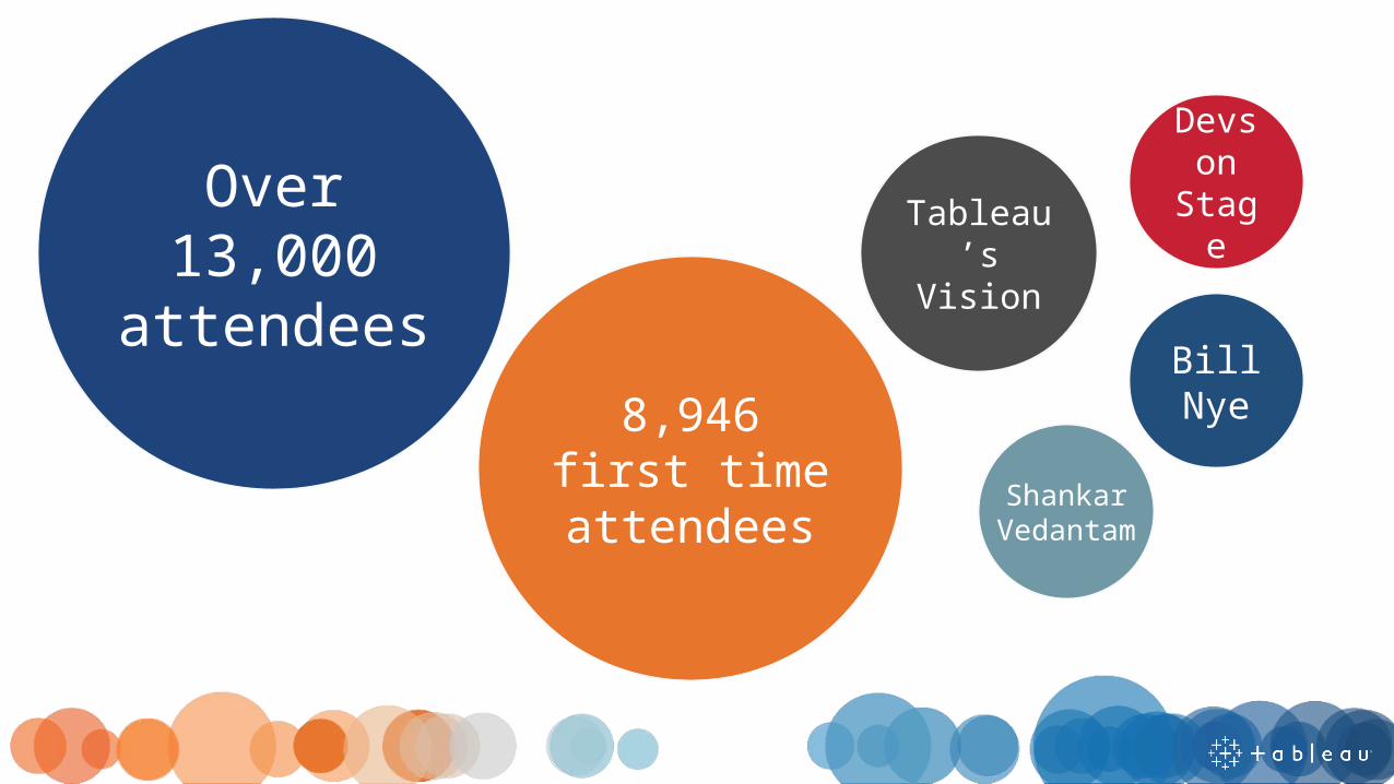
Over 13,000
attendees8,946 first
time attendees
Bill Nye
ShankarVedantam
Devs on
StageTableau’s Vision
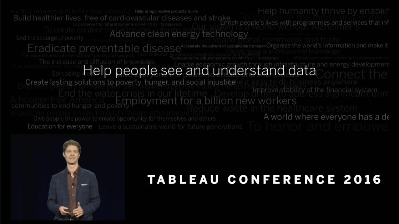
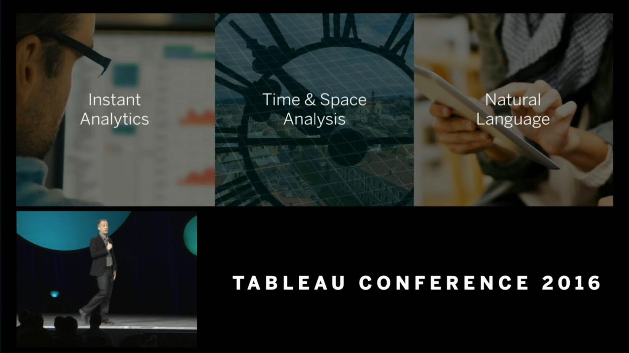
Keynote – Tableau’s Vision


1. Visualizations within visualizations – As you hover over data points, related visualizations will appear and provide even more insight
2. Layering – easier to visualize data sets that simply share common dimensionalities (like geography)
3. Improvements in multi-dimensional animation and teasing out changes in the data
Key Takeaways from Christian


Visual Analytics

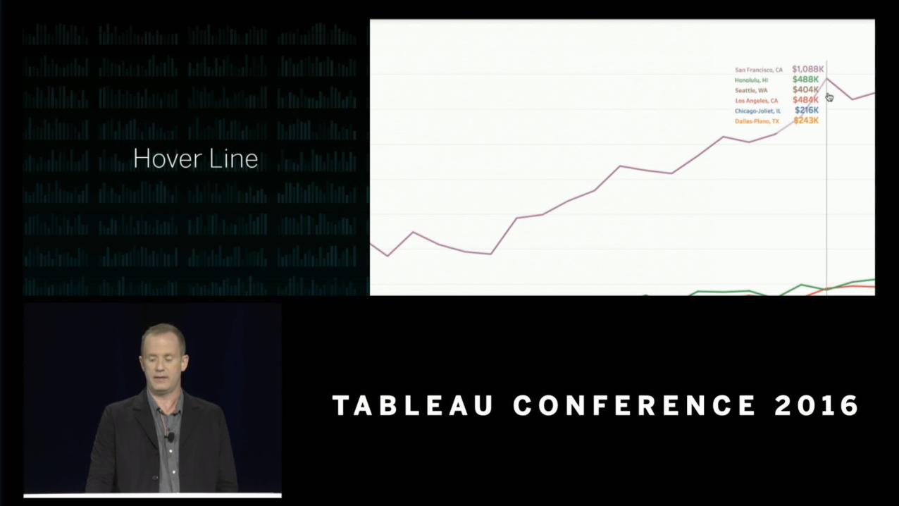


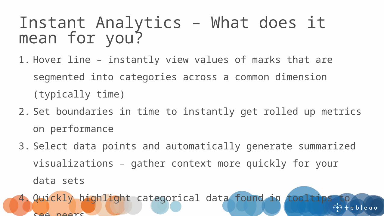
1. Hover line – instantly view values of marks that are segmented into categories across a common dimension (typically time)
2. Set boundaries in time to instantly get rolled up metrics on performance
3. Select data points and automatically generate summarized visualizations – gather context more quickly for your data sets
4. Quickly highlight categorical data found in tooltips to see peers5. Find and describe the commonalities identified through Tableau’s
clustering capabilities
Instant Analytics – What does it mean for you?
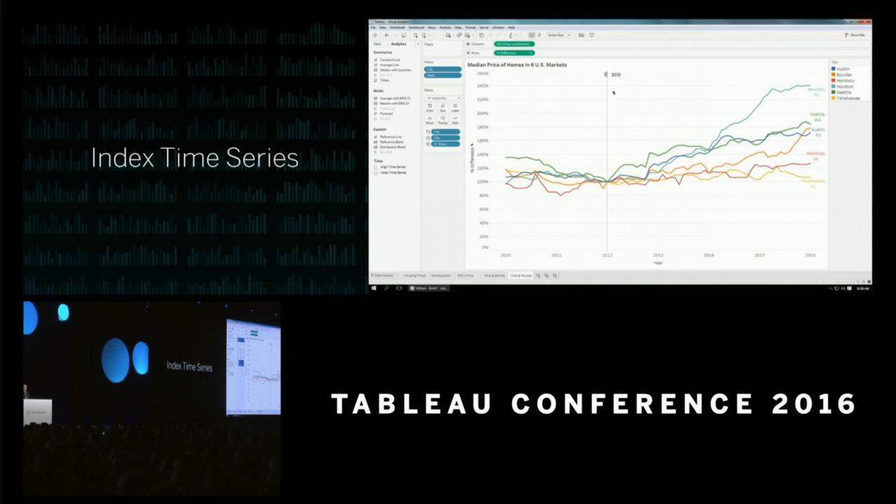

1. Most common ways to visualize time will be integrated into the Analytics pane
2. No need to index time using table calculations to find a common starting point
3. Integrated hover line can change the starting (anchor) point for analysis related to change over time
Time & Space Analysis – What does it mean for you?
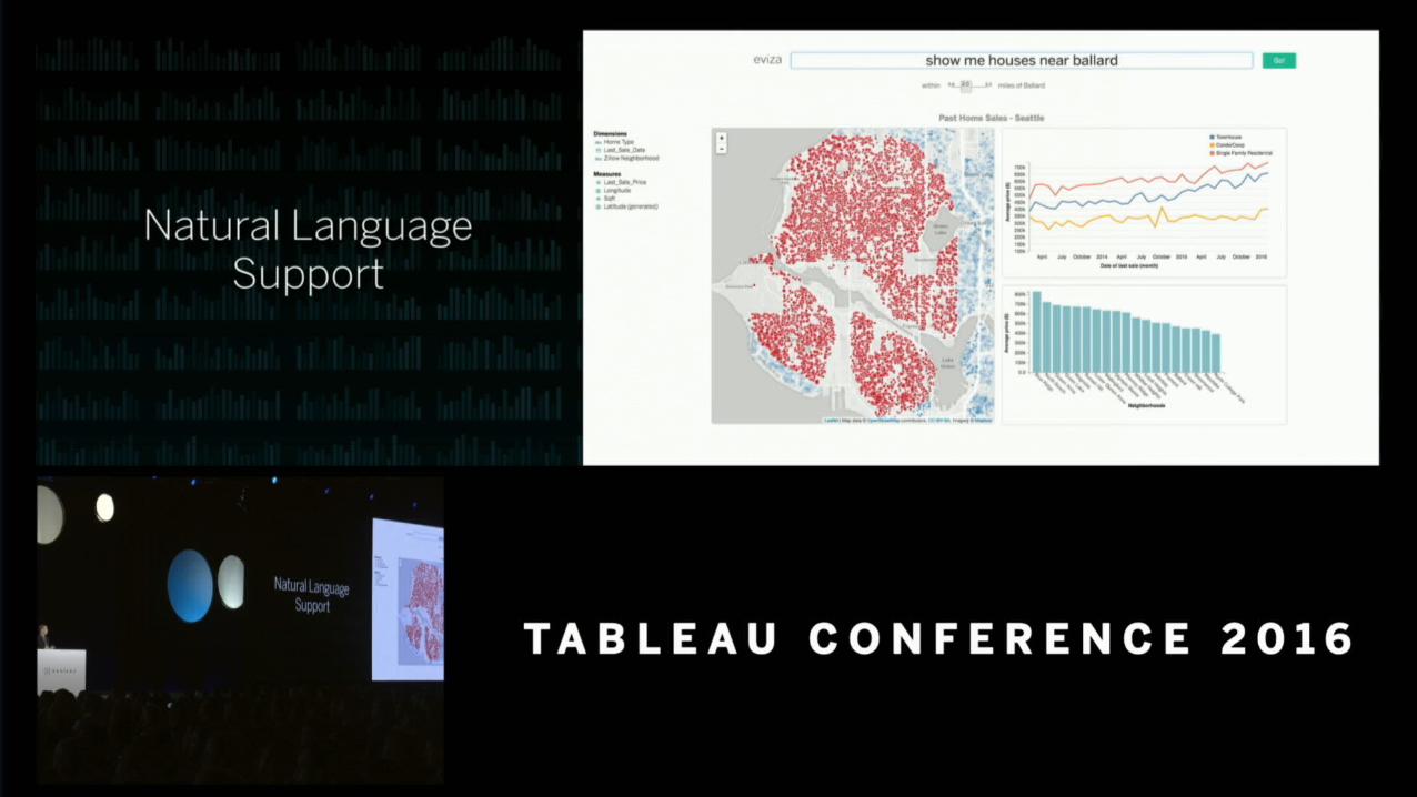


1. Interact with your data similar to a search engine
2. Considers fuzzy logic and builds out flexible tools to interact with it (think automatically creating distance filters)
3. Direct answer to Cortana integration in Microsoft’s Power BI
Natural Language Support – What does it mean for you?

Data Engine

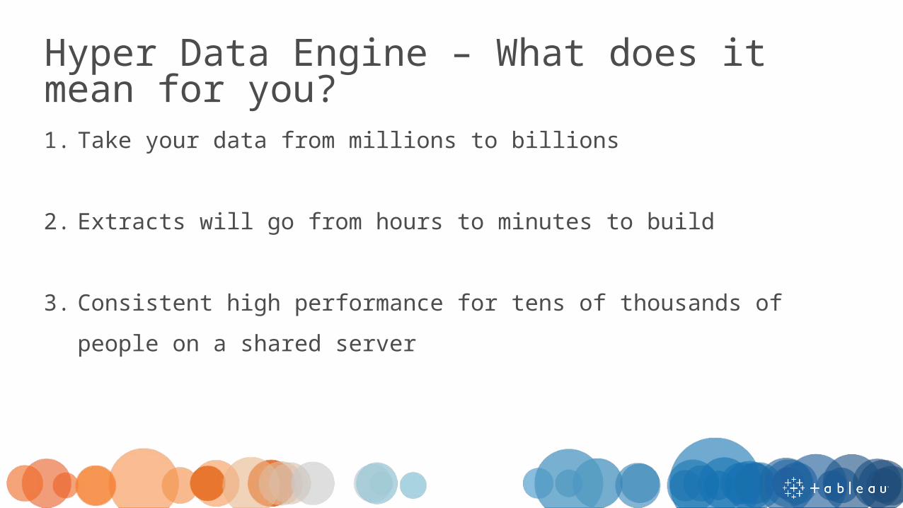
1. Take your data from millions to billions
2. Extracts will go from hours to minutes to build
3. Consistent high performance for tens of thousands of people on a shared server
Hyper Data Engine – What does it mean for you?
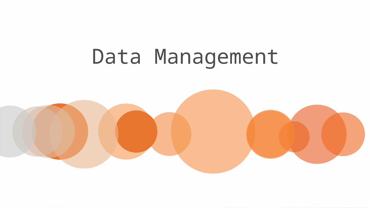
Data Management

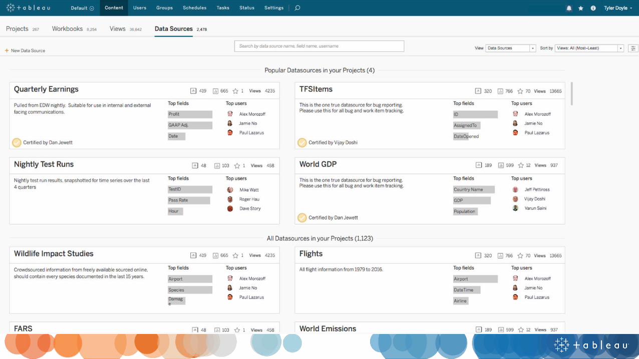
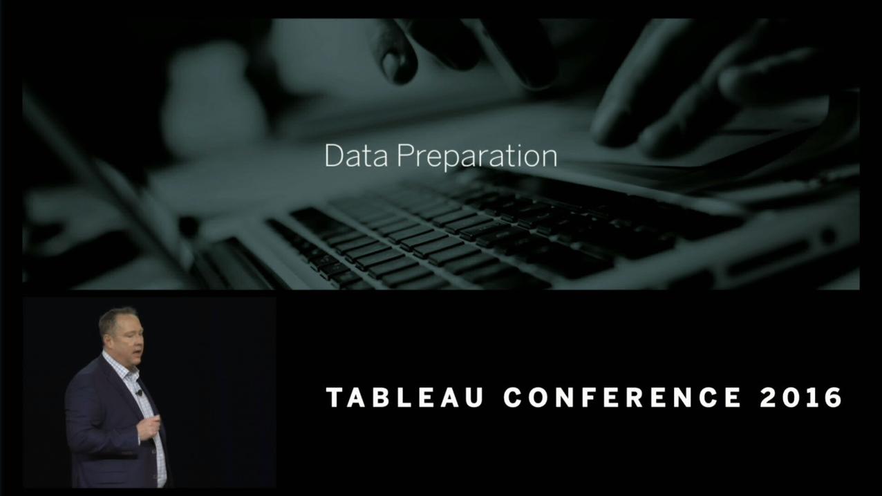
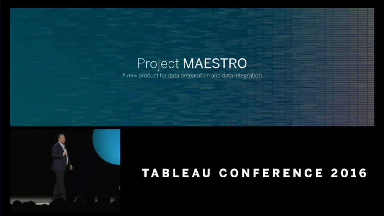

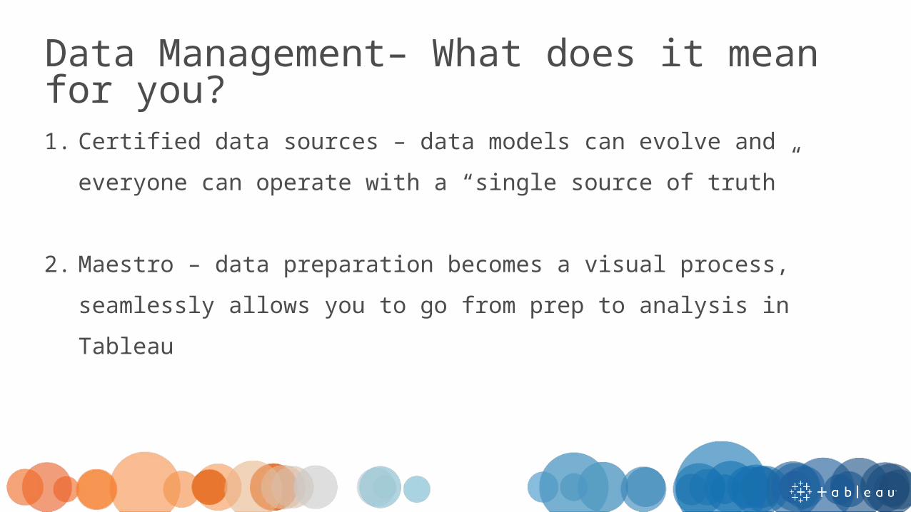
1. Certified data sources – data models can evolve and everyone can operate with a “single source of truth”
2. Maestro – data preparation becomes a visual process, seamlessly allows you to go from prep to analysis in Tableau
Data Management– What does it mean for you?

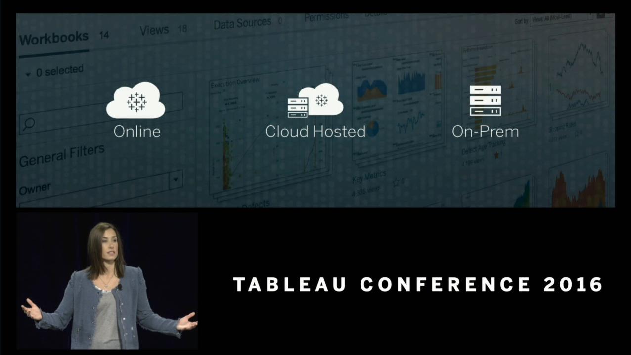
Cloud
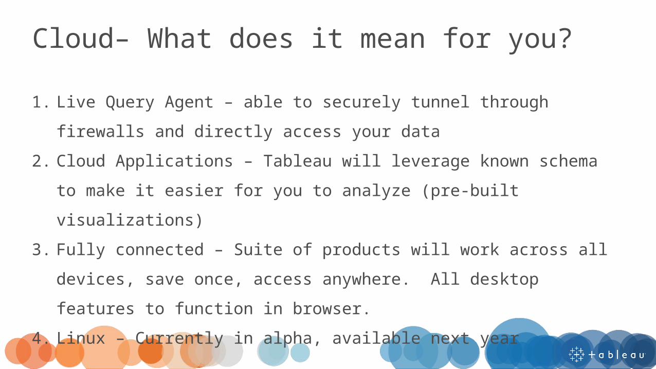
1. Live Query Agent – able to securely tunnel through firewalls and directly access your data
2. Cloud Applications – Tableau will leverage known schema to make it easier for you to analyze (pre-built visualizations)
3. Fully connected – Suite of products will work across all devices, save once, access anywhere. All desktop features to function in browser.
4. Linux – Currently in alpha, available next year
Cloud– What does it mean for you?

Collaboration

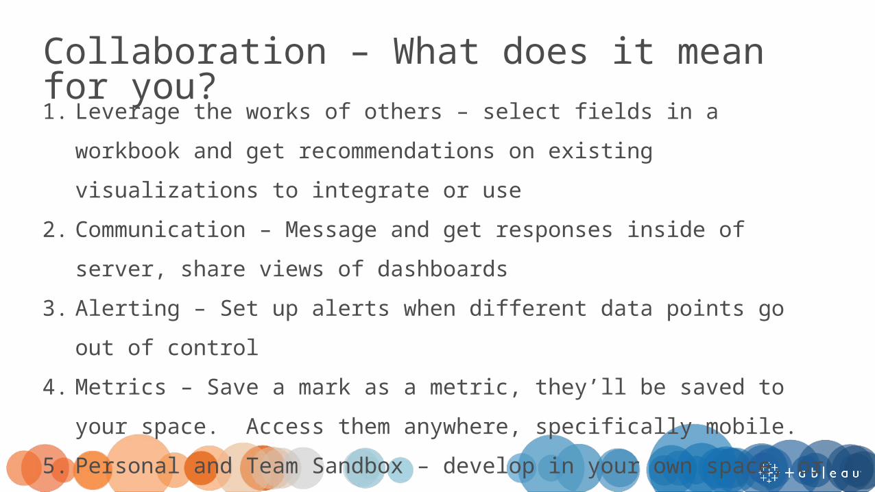
1. Leverage the works of others – select fields in a workbook and get recommendations on existing visualizations to integrate or use
2. Communication – Message and get responses inside of server, share views of dashboards
3. Alerting – Set up alerts when different data points go out of control4. Metrics – Save a mark as a metric, they’ll be saved to your space.
Access them anywhere, specifically mobile.5. Personal and Team Sandbox – develop in your own space, or
collaborate with peers
Collaboration – What does it mean for you?

Devs on Stage

Analytics
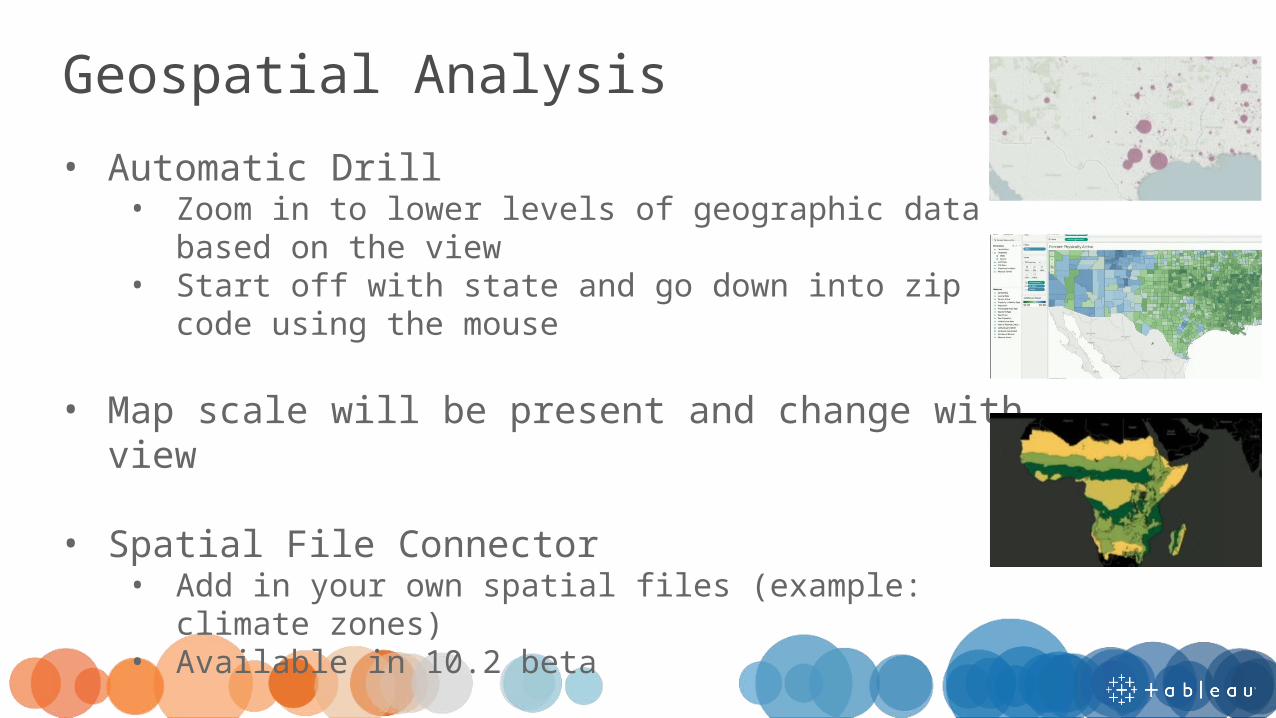
Geospatial Analysis• Automatic Drill
• Zoom in to lower levels of geographic data based on the view
• Start off with state and go down into zip code using the mouse
• Map scale will be present and change with view
• Spatial File Connector• Add in your own spatial files (example: climate
zones)• Available in 10.2 beta

Statistics & Tooltip Selection• Python Integration
• Use Python code (typically used for machine learning and advanced analytics)
• Code can be embedded in a Tableau calculation
• Tooltip Selection• Select any categorical field from a tooltip• Acts as a quick highlighter• Use to quickly understand more about your data
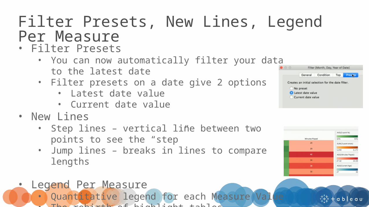
Filter Presets, New Lines, Legend Per Measure• Filter Presets
• You can now automatically filter your data to the latest date
• Filter presets on a date give 2 options• Latest date value• Current date value
• New Lines• Step lines – vertical line between two points to see
the “step”• Jump lines – breaks in lines to compare lengths
• Legend Per Measure• Quantitative legend for each Measure Value• The rebirth of highlight tables
Dashboards & Stories

Improved Design Capabilities• Distribute Evenly
• Take sheets within a layout container and automatically distribute them evenly across the container
• Margin & Padding Control• Adjust external space, including each margin
side individually• Can also adjust padding between elements
• Borders• Add a border to any object on your dashboard
• Expressive Text Editor• Images, hyperlinks, bulleted lists, horizontal rules, and
columns
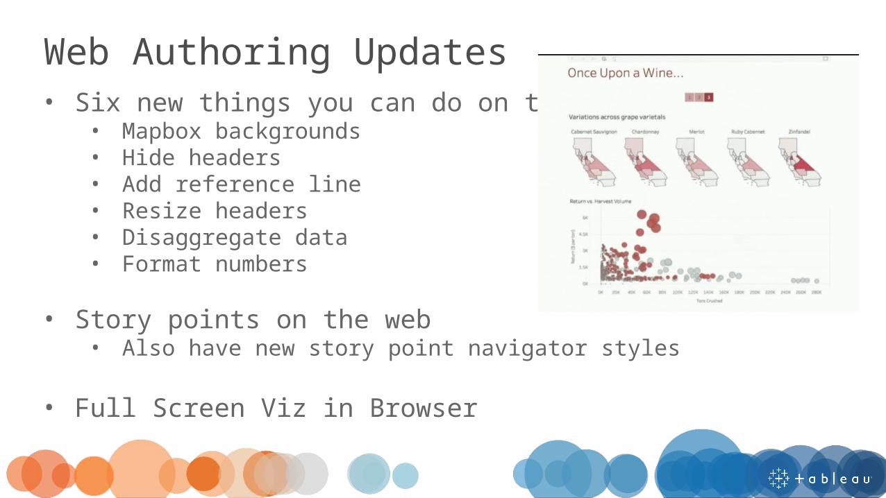
Web Authoring Updates• Six new things you can do on the web
• Mapbox backgrounds• Hide headers• Add reference line• Resize headers• Disaggregate data• Format numbers
• Story points on the web• Also have new story point navigator styles
• Full Screen Viz in Browser
Mobile

Mobile Updates• Direct linking
• Go from an email link directly to the app• Smooth tooltips
• Crosshair appears to pick a mark• Tooltip is docked at bottom of screen
• Commenting• Similar to collaboration, comment in app on visualizations
• Offline interactivity• Can now interact with visualizations offline• Selections, tooltips, and highlighting interactivity all
available without WiFi

Data

Data Improvements• Join Calculations
• Create a join calculation (combine fields) and then join the fields together
• Database Union• Drag and drop tables from the database and union them
• PDF Connector• Grab tables from PDFs• Use same union/data prep tools available for other tables
• JSON Connector• View and adjust the schema for JSON files• Tableau will infer the schema
Extensibility
Pushing the Limits & Open Source• Server Client Library
• Can now automate moves from development to production• Document API
• Allows for simple retargeting to production data sources• REST API
• High resolution images• JSON & CORS support – deeply embed Tableau in your
websites• getData()
• Integrate with 3rd party charting libraries (like D3)• Demo of D3 visualization connected to Spotify music
available on github• Mobile App Boostrap
• Vizzes embedded in your own mobile apps

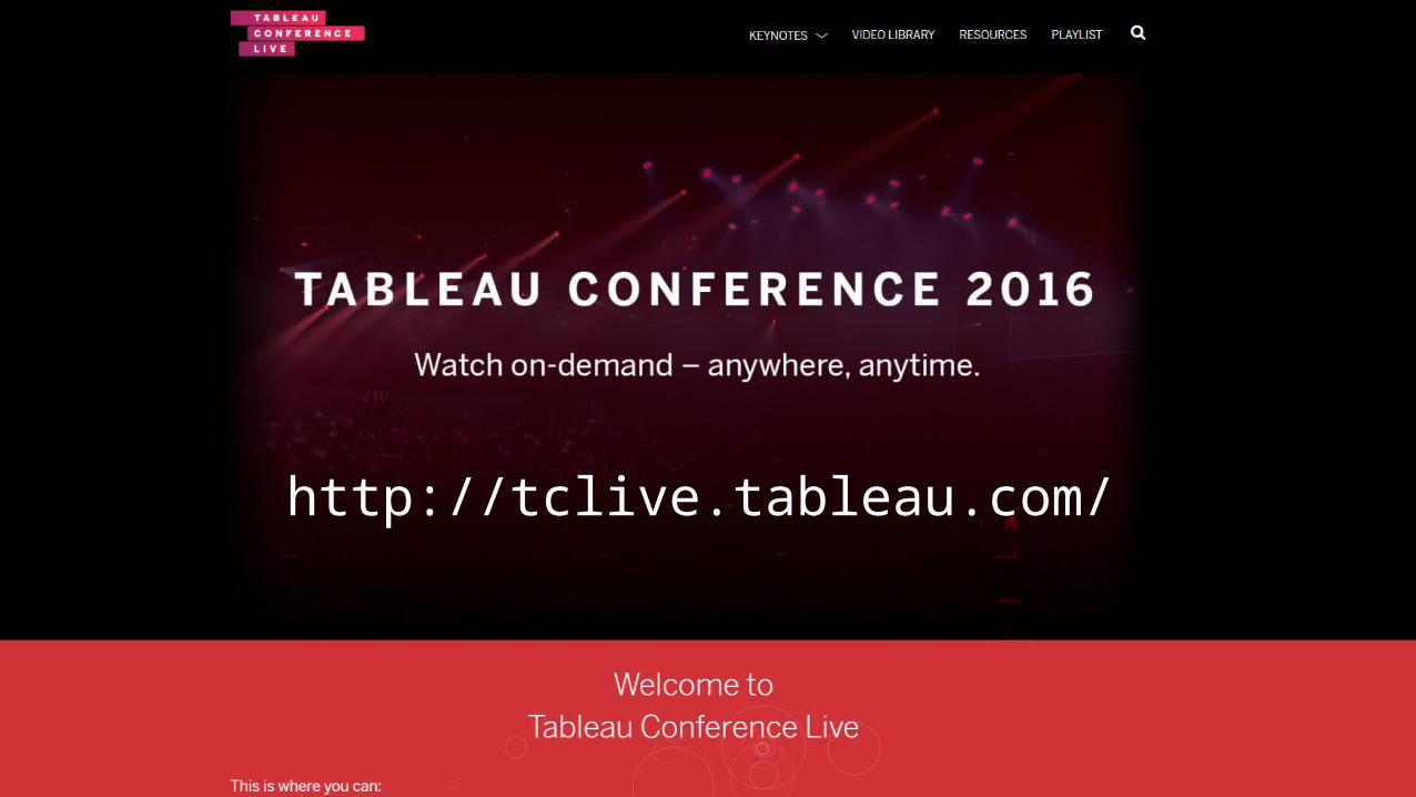
http://tclive.tableau.com/
Related Documents