CAN DESIGNS

TASK 7- EVALUATIONS
Jul 21, 2015
Welcome message from author
This document is posted to help you gain knowledge. Please leave a comment to let me know what you think about it! Share it to your friends and learn new things together.
Transcript
CAN DESIGNS
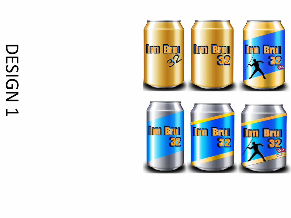
DES IG
N 1
For my first design I was quite unprepared and had only thought about the font styling before the actual design of the can; I wanted the font to stand out so I decided to overlay the text 3 times to create an bigger impact and by using different colours that clashed nicely with each other It have me the results that I wanted. A problem that I had during this process was getting the text aliened all together and tried to perfect this effect so that it gives my finished product an professional look. In my first design I also wanted the ‘32’ to be in different font for it to stand out compared to the rest of the texts but during testing out different fonts I had discovered that it was quite hard to get the effect that I wanted with most texts so I decided that it would be more suitable to use the same font. Once I had completed the font styling I realised that I had left the actual can packaging just plain gold which did not look professional at all, even though I tried so hard getting my fonts to a professional standard the packaging was lowering the quality of my design. To make my packaging look higher quality I started to play around with different shapes and different colour (of blue and orange to keep the house styling). I came up with the idea of creating a blue stripe going across the text to make the orange coloured font stand out more and added a silhouette of an athlete so that It makes the cover look more full and professional. For the diet design of this packaging I minimised the use of the orange colour and created a thin boarder around the blue banner, I didn't want to create to much difference between the original packaging and the diet packaging as I didn't want to confuse the audience.
DES IG
N 2
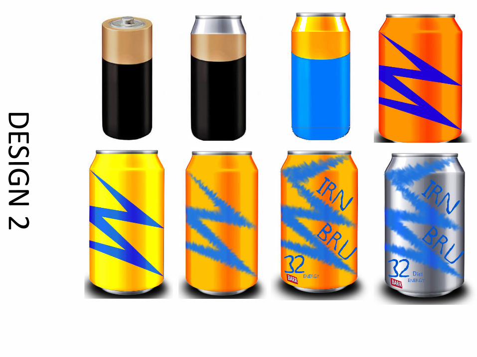
For my second design I had the initial idea to design a can in a shape of a battery (which I had gotten inspired from an website), when starting the production I realised that it was going to be hard to get the batteries features with the use of the Irn Bru house styling colours. I proceeded and tried the colour scheme with the battery design but as I predicted it didn't work out as I had planned I decided to not carry on with the design.I began a brand new simple design where I used the orange as the background colour and the blue colour for the detailing to use different features to the original packaging however I found myself struggling to find a right shade of orange and blue as either they were to dark or to bright and didn't compliment each other to well so I had to experiment with a couple of different shades.I decided to use a lightning shape to represent energy and also it worked as a frame for the texts placements on the product, when I first added the lightning shape it looked very structured and I experimented with the smudge tool and liked the end result and decided to keep the effect. One of the struggles that I found with this effect was that because the smudges are not neat it was hard placing the text and finding a font to balance out with the smudge effect.For the diet option of the can I decided to not use any of the orange colour and changed the background colour to silver which is a symbolic home styling colour for diet coke.
DES IG
N 3
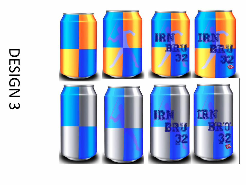
For my third and final design I wanted to try a simple design and work with simpler shapes, with this design I was able to bring the features I liked together from my previous designs and create this design. I didn't have many issues with the production stages of this design except with making the squares symmetrical but over all I was very happy with the end result. As I already had the plan of the design ready in my head the production stages didn't take that long but once having the completed product I noticed that it was missing something and the product needed a centre piece that would tie the whole product together, so I choose to include the same silhouette in my first design use it. When I included the silhouette it caught the eye and looked very rough so I played around with different effect and transformed the silhouette into a watermark and which made the overall product look much softer and much more professional.For the diet version of the product I again wanted to keep the theme of the silver and blue which worked which worked out better with this product instead of the previous design.
FINAL PRODUCT EVALUATION- CAN DESIGN
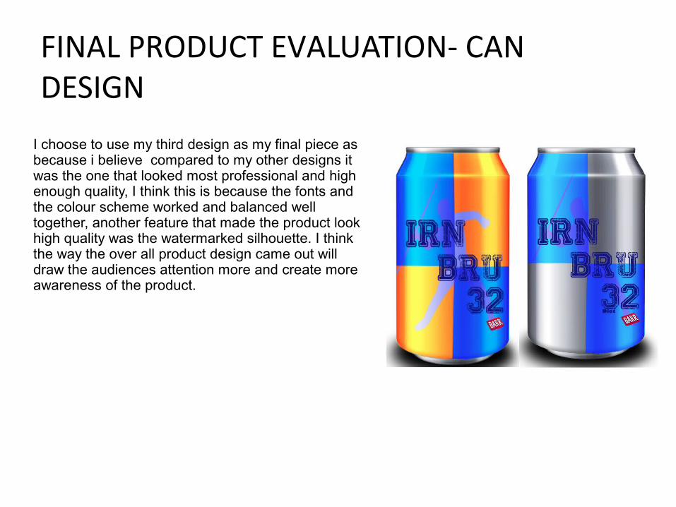
I choose to use my third design as my final piece as because i believe compared to my other designs it was the one that looked most professional and high enough quality, I think this is because the fonts and the colour scheme worked and balanced well together, another feature that made the product look high quality was the watermarked silhouette. I think the way the over all product design came out will draw the audiences attention more and create more awareness of the product.
POSTER DESGINS
DES IG
N 1
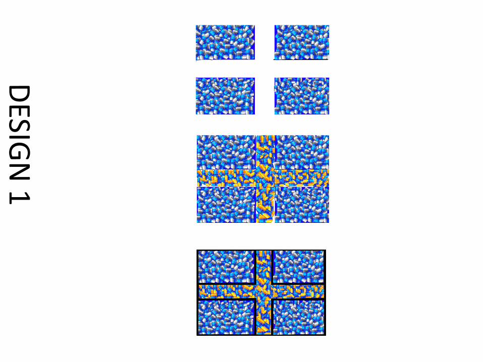
For my first poster design I wanted to create a poster with a stained glass effect which would be appropriate advertisement for bus stops and shop windows, my initial plan was to pick my final can design and create the Scottish flag with the normal and diet cans. When I started the production of this product it took longer then I had expected and I struggled with some technical issues such as layering the cans and the scaling of the size and the position of the cans and once I had finished the long process the over all look of the product looked very busy and very low quality. Because the product didn't meet my expectation I tried to play around with the layers and tried to minimise the amount of cans by taking away certain sections of the cans but unfortunately nothing seemed to work and I had to leave the this design without completing it as I had spent to much time on this poster during the production stages.
DES IG
N 2
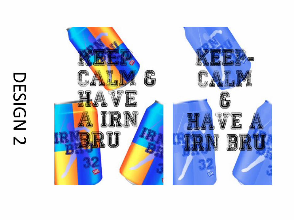
For my second design I had to decide on a simple design due to having to spend so much time on previous design. I decided to create a poster with the theme of 'Keep calm and ..” , I choose this theme because it is such a classic and is recognised by the majority of the country and I also think that it will help with the publicity of the product. I choose to lay out my design using a white background with 3 scattered Irn Bru cans around it, when I first layered out the cans and added the text to overlay the cans I realised that I may have a problem with the font colour clashing with the colours of the cans so I first experimented with different colours for the font but wasn't satisfied with any of the results so instead I decided to play around with the colour of the cans and added filters on them. For my end result I decided to just add a simple light blue layer to cans so that the black coloured font is able to stand out. The things that I would of improved on if I had more time is I may have experimented with different background colours and textures to see how it would of effected my end result.
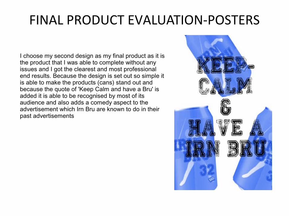
FINAL PRODUCT EVALUATION-POSTERS
I choose my second design as my final product as it is the product that I was able to complete without any issues and I got the clearest and most professional end results. Because the design is set out so simple it is able to make the products (cans) stand out and because the quote of 'Keep Calm and have a Bru' is added it is able to be recognised by most of its audience and also adds a comedy aspect to the advertisement which Irn Bru are known to do in their past advertisements
WEB BANNERS
DES IG
N 1
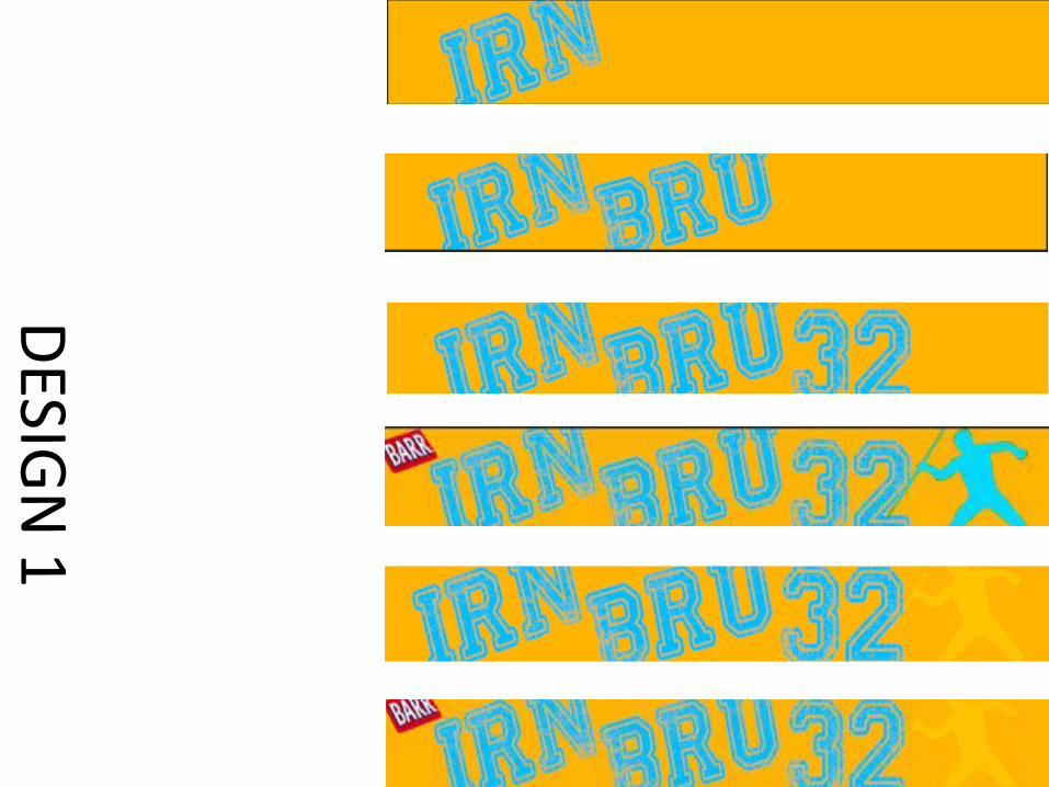
For my first web design I tried to keep the design suitable with the house styling of the previous products. The design it self is quite simple as I used colours and details that I had used in previous products to help the make the advertisements link with each other which will make them hopefully recognisable for the audiences. As I already had a brief idea of of what I wanted with my design so the process of production was very easy and quick. I choose to use the same shade of orange and blue that I used in previous product designs which clashed nicely with the shade of blue/turquoise that I choose for my font colour, i also included the silhouette of the athlete that I had used in a couple of my can designs which added a familiar touch to my web banner; during the stages of production I had some confusions about the colour of the silhouette as I had originally changed the colour to the turquoise colour that I had also used for my font colour but after asking my peers I agreed that with the silhouette being the same colour as the font it doesn't allow the main focus to be the text so I changes the colour to a lighter tone of the background which gave the silhouette a soft tone. Another aspect that I kept the same house styling with my web banner was the font that I used, I choose to use the same font because I found that because the font is bold it created a statement piece on the web banner.
DES IG
N 2
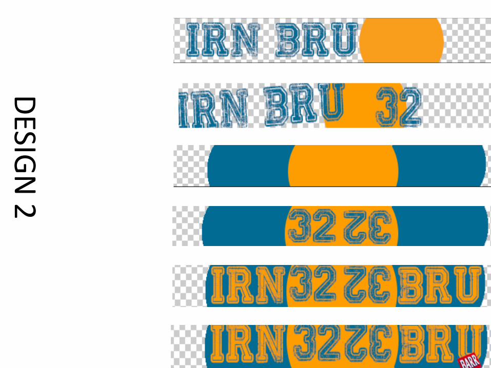
For my second design I decided create something different compared to my first web banner. I started out with a circle shape and added the the font and after I had laid out my main features that I wanted to add to by banner I was able to have a more developed idea of what I wanted for my web banner. I decided to start again, I wanted improve on my initial idea of working with circular shapes so I started the production process by laying out my frame for the text which I created from circles by using the same colours from my previous work to continue the use of house styling. I added the text which were separated by the circles and added the number 32 in the in between the “Irn Bru” which created a nice contrast, once I had completed the process of adding all the text I noticed that the banner didn't look complete and empty. I didn't want to repeat the silhouette again and wanted to try something different so I decided to repeat the “32” but flip it upside down to create a different aspect to the web banner which I believe worked out very well. If I were to change anything in this web banner it would be the shade of blue that I used, the reason I wanted to use a different shade of blue to experiment and try something different compared to the previous products but I believe it may have not worked out as well as the other shade of blue that I had used.
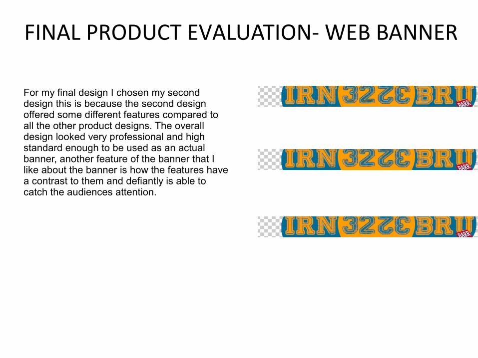
FINAL PRODUCT EVALUATION- WEB BANNER
For my final design I chosen my second design this is because the second design offered some different features compared to all the other product designs. The overall design looked very professional and high standard enough to be used as an actual banner, another feature of the banner that I like about the banner is how the features have a contrast to them and defiantly is able to catch the audiences attention.
Related Documents