Style board

Welcome message from author
This document is posted to help you gain knowledge. Please leave a comment to let me know what you think about it! Share it to your friends and learn new things together.
Transcript

Style board

Fonts
Bebas Neue- This is the font that I want to use as it is quite simplistic and I think that simplistic fonts have the best effect. Although using the one that looks like graffiti would make the magazine more recognisable I don’t feel it would fit with what I want the aesthetics of my magazine to look like, as this font is just right as it is simple and I want my magazine to have a simple but effective layout whereas that font is quite out there and different.
Mank Sans- I think that I will use this font for things such as cover lines as it is quite similar to Bebas neue but not as thick as it. As it is similar but not as thick it shows that what you may be reading is going to be important or interesting, but still not as important as the title.
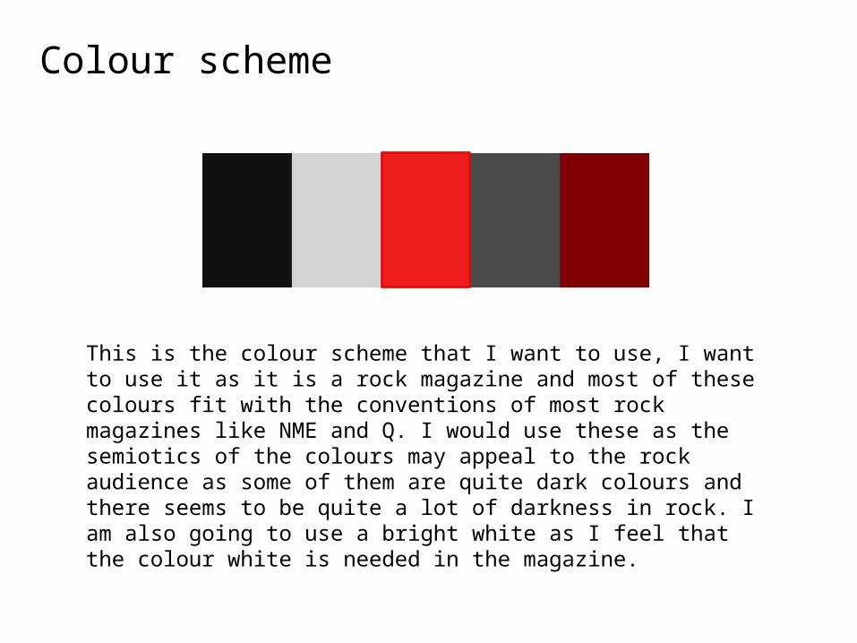
Colour scheme
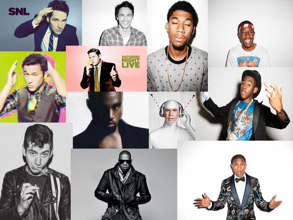
This is the colour scheme that I want to use, I want to use it as it is a rock magazine and most of these colours fit with the conventions of most rock magazines like NME and Q. I would use these as the semiotics of the colours may appeal to the rock audience as some of them are quite dark colours and there seems to be quite a lot of darkness in rock. I am also going to use a bright white as I feel that the colour white is needed in the magazine.
Related Documents