103 – Bar chart - You should spend about 20 minutes on this task. The chart below shows the percentage change in the share of international students among university graduates in different Canadian provinces between 2001 and 2006. Summarise the information by selecting and reporting the main features, and make comparisons where relevant. Write at least 150 words. Source: Statistics Canada, Postsecondary Student Information System Test Tip In Task 1 of the IELTS Writing modules, you may be asked to describe a graph which shows changes over a period of time. To do this you need to use language expressing change and appropriate tenses. In the exam, make sure you leave time to edit your written answer. You will lose marks if you make too many mistakes in grammar and vocabulary. Model answer The chart shows changes in the share of international students who graduated from universities in different Canadian provinces over a period of 5 years. In 2001, this share had a relatively narrow range, from 3% in Ontario to 7.0% in New Brunswick. Nova Scotia had the second highest

Welcome message from author
This document is posted to help you gain knowledge. Please leave a comment to let me know what you think about it! Share it to your friends and learn new things together.
Transcript
103 – Bar chart - You should spend about 20 minutes on this task.
The chart below shows the percentage change in the share of international students among university graduates in different Canadian provinces between 2001 and 2006.
Summarise the information by selecting and reporting the main features, and make comparisons where relevant.
Write at least 150 words.
Source: Statistics Canada, Postsecondary Student Information System
Test TipIn Task 1 of the IELTS Writing modules, you may be asked to describe agraph which shows changes over a period of time. To do this you need to use language expressing change and appropriate tenses. In the exam,make sure you leave time to edit your written answer. You will lose marks if you make too many mistakes in grammar and vocabulary.
Model answer
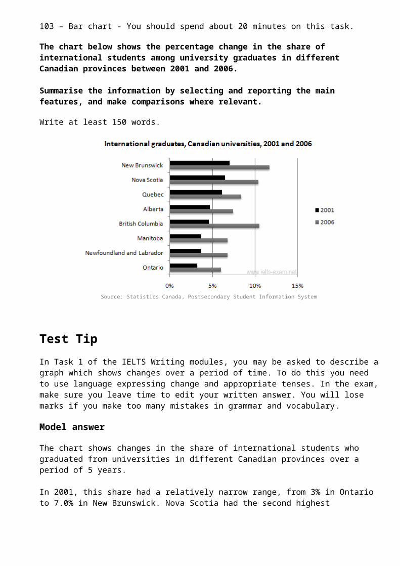
The chart shows changes in the share of international students who graduated from universities in different Canadian provinces over a period of 5 years.
In 2001, this share had a relatively narrow range, from 3% in Ontario to 7.0% in New Brunswick. Nova Scotia had the second highest

proportion at 6.5%. Five years later, the figures for most provinces had risen, with the exception of Alberta. There, the figures fell by 1% to just over 4%.
By 2006, some parts of Canada experienced a considerable increase in their share of international graduates. Growth in this share was especially strong in the case of New Brunswick, where the figures rosefrom 7% to 12%. The largest growth occurred in British Columbia, whereit more than doubled to 11%.
Over this five-year period, changes in the proportion of internationalgraduates have been very uneven across the provinces of Canada. However, New Brunswick remained the province with the highest percentage overall.
(158 words)
IELTS Writing Task 1 #102
You should spend about 20 minutes on this task.
The diagrams show a structure that is used to generate electricity from wave power.
Summarise the information by selecting and reporting the main features, and make comparisons where relevant.
Write at least 150 words.
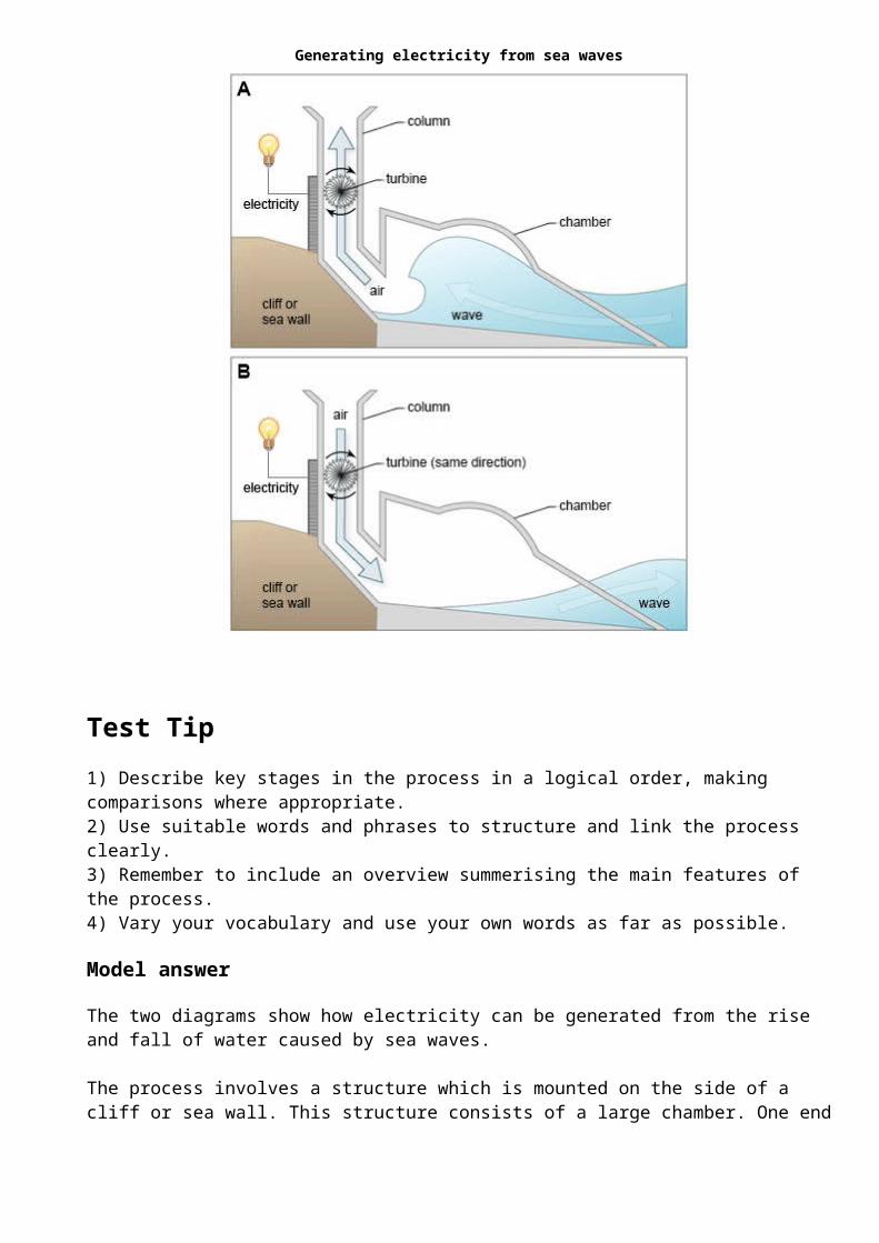
Generating electricity from sea waves
Test Tip1) Describe key stages in the process in a logical order, making comparisons where appropriate.2) Use suitable words and phrases to structure and link the process clearly.3) Remember to include an overview summerising the main features of the process.4) Vary your vocabulary and use your own words as far as possible.
Model answer
The two diagrams show how electricity can be generated from the rise and fall of water caused by sea waves.
The process involves a structure which is mounted on the side of a cliff or sea wall. This structure consists of a large chamber. One end
is open to the sea, and the other leads into a vertical column, which is open to the atmosphere. A turbine is installed inside this column and this is used to generate the electricity in two phases.
The first diagram indicates that when a wave approaches the device, water is forced into the chamber, applying pressure on the air within the column. This air escapes to atmosphere through the turbine, thereby producing electricity.
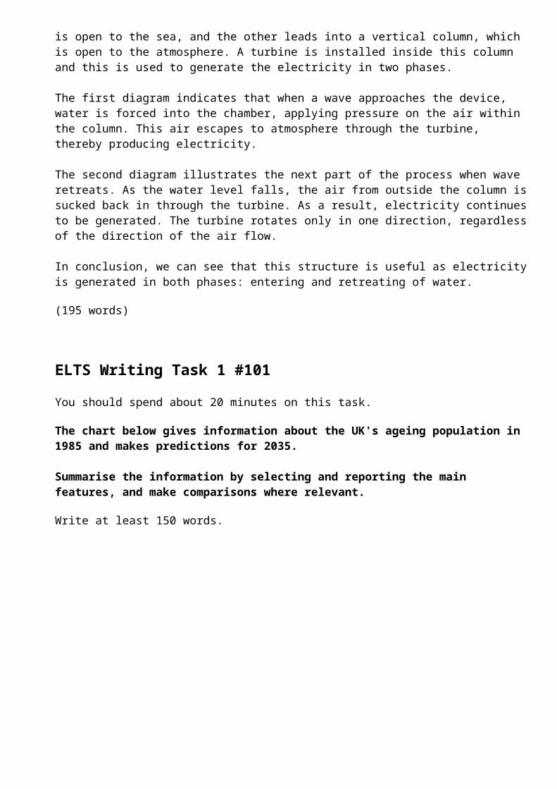
The second diagram illustrates the next part of the process when wave retreats. As the water level falls, the air from outside the column issucked back in through the turbine. As a result, electricity continuesto be generated. The turbine rotates only in one direction, regardlessof the direction of the air flow.
In conclusion, we can see that this structure is useful as electricityis generated in both phases: entering and retreating of water.
(195 words)
ELTS Writing Task 1 #101
You should spend about 20 minutes on this task.
The chart below gives information about the UK's ageing population in 1985 and makes predictions for 2035.
Summarise the information by selecting and reporting the main features, and make comparisons where relevant.
Write at least 150 words.
Source: Office for National Statistics, National Records of Scotland, Northern Ireland Statistics andResearch Agency
Test TipIn Task 1 of the IELTS Writing modules, you may be asked to interpret and describe data presented in graph form. There are three basic typesof graph: pie charts, bar charts and line graphs.
Bar charts are useful for comparing the quantities of different categories. Bar charts are constructed such that the lengths of the different bars are proportional to the size of the category they represent. Bar charts usually show the numbers or percentages on the y-axis and the different categories that are being measured along the x-axis. Both axes are labeled to show what they refer to. Sometimes each category along the x-axis can be divided into two further sub-groups, e.g. 1985/2035, so that these sub-groups can be compared.
Model answer
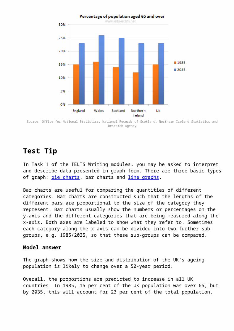
The graph shows how the size and distribution of the UK's ageing population is likely to change over a 50-year period.
Overall, the proportions are predicted to increase in all UK countries. In 1985, 15 per cent of the UK population was over 65, but by 2035, this will account for 23 per cent of the total population.
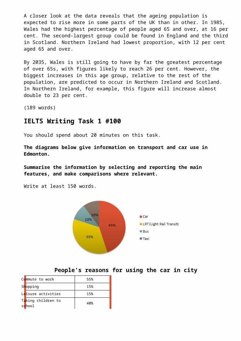
A closer look at the data reveals that the ageing population is expected to rise more in some parts of the UK than in other. In 1985, Wales had the highest percentage of people aged 65 and over, at 16 percent. The second-largest group could be found in England and the thirdin Scotland. Northern Ireland had lowest proportion, with 12 per cent aged 65 and over.
By 2035, Wales is still going to have by far the greatest percentage of over 65s, with figures likely to reach 26 per cent. However, the biggest increases in this age group, relative to the rest of the population, are predicted to occur in Northern Ireland and Scotland. In Northern Ireland, for example, this figure will increase almost double to 23 per cent.
(189 words)
IELTS Writing Task 1 #100
You should spend about 20 minutes on this task.
The diagrams below give information on transport and car use in Edmonton.
Summarise the information by selecting and reporting the main features, and make comparisons where relevant.
Write at least 150 words.
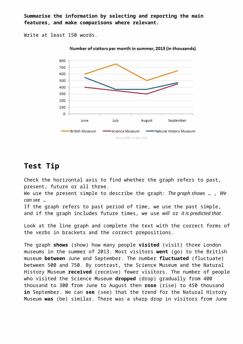
People’s reasons for using the car in cityCommute to work 55%Shopping 15%Leisure activities 15%Taking children to school 40%

Business 45%
Test TipIn IELTS Writing Task 1, when you must describe two figures, ask yourself the following:
1) What do both figures relate to?2) What kind of relationship is evident? (a similarity, a difference, a cause and effect relationship or some other type of relationship)3) Which aspects of each figure should be highlighted?4) Should I describe the figures in separate paragraphs, or should I compare different aspects of the figures within a series of paragraph?
Model answer
The table shows the reason why people in Edmonton use their cars in the city and the pie chart explains what type of transport people prefer to use most of the time.
Looking at the pie chart first, it is clear that the car is the most popular means of transport in this city. 45% of the people say that they prefer to commute by car. The second most popular form of transport is the LRT, while busses and taxis are the main means of transport for the rest of the people.
The table gives more detailed information about why people use their cars. Surprisingly, 55% of the people need to commute to work by car. Cars are also used a lot for taking children to school or business purposes. Only 15% of drivers are doing their shopping and, similarly,15% need to travel by car for leisure.
Overall, people in Edmonton make good use of alternative methods of transport but there is a heavy dependence on cars for work.
(170 words)
IELTS Writing Task 1 #99
You should spend about 20 minutes on this task.
The line graph below gives information about the number of visitors tothree London museums between June and September 2013.
Summarise the information by selecting and reporting the main features, and make comparisons where relevant.
Write at least 150 words.
Test TipCheck the horizontal axis to find whether the graph refers to past, present, future or all three.We use the present simple to describe the graph: The graph shows … , We can see …If the graph refers to past period of time, we use the past simple, and if the graph includes future times, we use will or it is predicted that.
Look at the line graph and complete the text with the correct forms ofthe verbs in brackets and the correct prepositions.
The graph shows (show) how many people visited (visit) three London museums in the summer of 2013. Most visitors went (go) to the British museum between June and September. The number fluctuated (fluctuate) between 500 and 750. By contrast, the Science Museum and the Natural History Museum received (receive) fewer visitors. The number of peoplewho visited the Science Museum dropped (drop) gradually from 400 thousand to 300 from June to August then rose (rise) to 450 thousand in September. We can see (see) that the trend for the Natural History Museum was (be) similar. There was a sharp drop in visitors from June
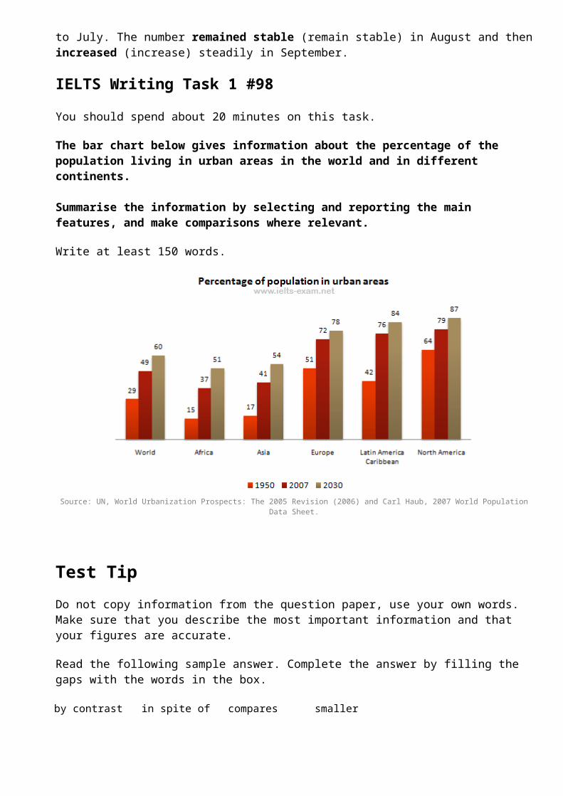
to July. The number remained stable (remain stable) in August and thenincreased (increase) steadily in September.
IELTS Writing Task 1 #98
You should spend about 20 minutes on this task.
The bar chart below gives information about the percentage of the population living in urban areas in the world and in different continents.
Summarise the information by selecting and reporting the main features, and make comparisons where relevant.
Write at least 150 words.
Source: UN, World Urbanization Prospects: The 2005 Revision (2006) and Carl Haub, 2007 World PopulationData Sheet.
Test TipDo not copy information from the question paper, use your own words. Make sure that you describe the most important information and that your figures are accurate.
Read the following sample answer. Complete the answer by filling the gaps with the words in the box.
by contrast in spite of compares smaller
shows marked double highest
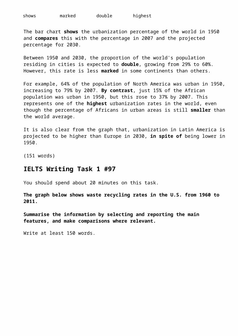
The bar chart shows the urbanization percentage of the world in 1950 and compares this with the percentage in 2007 and the projected percentage for 2030.
Between 1950 and 2030, the proportion of the world's population residing in cities is expected to double, growing from 29% to 60%. However, this rate is less marked in some continents than others.
For example, 64% of the population of North America was urban in 1950,increasing to 79% by 2007. By contrast, just 15% of the African population was urban in 1950, but this rose to 37% by 2007. This represents one of the highest urbanization rates in the world, even though the percentage of Africans in urban areas is still smaller thanthe world average.
It is also clear from the graph that, urbanization in Latin America isprojected to be higher than Europe in 2030, in spite of being lower in1950.
(151 words)
IELTS Writing Task 1 #97
You should spend about 20 minutes on this task.
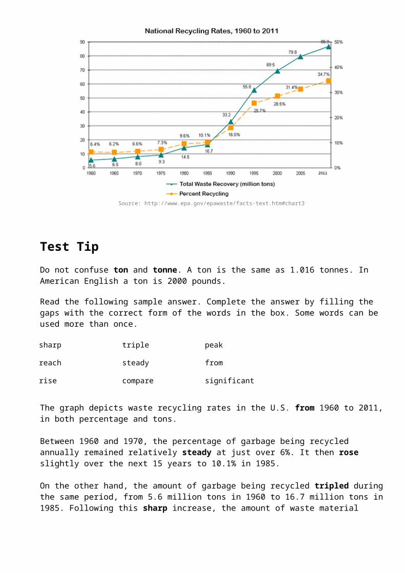
The graph below shows waste recycling rates in the U.S. from 1960 to 2011.
Summarise the information by selecting and reporting the main features, and make comparisons where relevant.
Write at least 150 words.
Source: http://www.epa.gov/epawaste/facts-text.htm#chart3
Test TipDo not confuse ton and tonne. A ton is the same as 1.016 tonnes. In American English a ton is 2000 pounds.
Read the following sample answer. Complete the answer by filling the gaps with the correct form of the words in the box. Some words can be used more than once.
sharp triple peak
reach steady from
rise compare significant
The graph depicts waste recycling rates in the U.S. from 1960 to 2011,in both percentage and tons.
Between 1960 and 1970, the percentage of garbage being recycled annually remained relatively steady at just over 6%. It then rose slightly over the next 15 years to 10.1% in 1985.
On the other hand, the amount of garbage being recycled tripled duringthe same period, from 5.6 million tons in 1960 to 16.7 million tons in1985. Following this sharp increase, the amount of waste material
being recycled has risen significantly between 1985 and 2011 when it peaked at 86.9 million tons.
Similarly, the recycling rate continued to grow sharply from 1985 to 1995, and then at a slower rate over the next 15 years until it reached a peak of 34.7% in 2011. However, this figure is still disappointing compared to the total amount of waste being recycled each year.
Show Answer - Hide Answer
(150 words)
IELTS Writing Task 1 #96
You should spend about 20 minutes on this task.
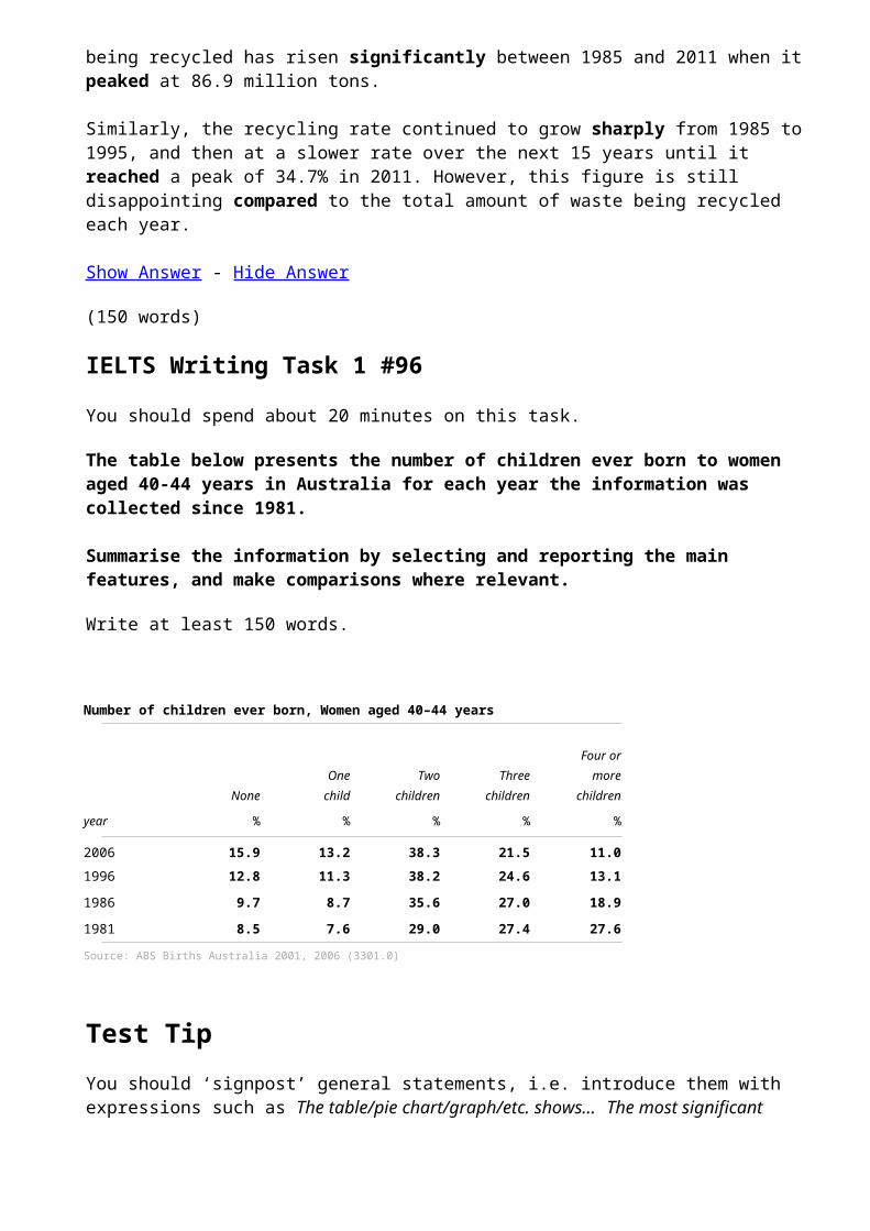
The table below presents the number of children ever born to women aged 40-44 years in Australia for each year the information was collected since 1981.
Summarise the information by selecting and reporting the main features, and make comparisons where relevant.
Write at least 150 words.
Number of children ever born, Women aged 40–44 years
Four or One Two Three more
None child children children children
year % % % % %
2006 15.9 13.2 38.3 21.5 11.01996 12.8 11.3 38.2 24.6 13.11986 9.7 8.7 35.6 27.0 18.91981 8.5 7.6 29.0 27.4 27.6Source: ABS Births Australia 2001, 2006 (3301.0)
Test TipYou should ‘signpost’ general statements, i.e. introduce them with expressions such as The table/pie chart/graph/etc. shows... The most significant

change... Another noticeable trend... Overall...You must also support general statements with detailed information from the table/graph/etc.
model answer:
The table shows the number of children born to women aged 40–44 years in Australia in 1981, 1986, 1996 and 2001.
In 1981, women aged 40-44 years were only marginally more likely to have had two children than three children (29% vs 27.4%) or four or more children (27.6%). Similarly, by 1986, women of this age were considerably more likely to have given birth to two children than three children (35.6% vs 27%) or four or more children (18.9%).
In 1996 and 2006, the proportions of women aged 40-44 years who had given birth to two children were almost identical, though the proportions who had given birth to three children or to four or more children had decreased. In these more recent periods, women were more likely to have had two children than three or more children - a trend that was most marked in the most recent period (38.2% vs 24.6% in 1996; 38.3% vs 21.5% in 2006).
While two-child families now predominate, the number of women who had given birth to only one child increased progressively from 7.6% in 1981 to 13.2% in 2006.
In 1981, similar proportions of women aged in their early forties werechildless or had given birth to only one child (8.5% and 7.6% respectively). By 2006, 15.9% of women were childless and 13.2% had given birth to only one child.
Overall, by age 40-44 years, the proportion of women who have had three or more children has fallen considerably since the 1980s, while the proportions who have had no children, or only one or two children has increased.
(266 words)
You should spend about 20 minutes on this task.
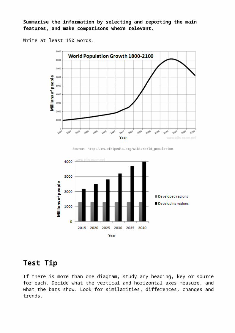
The graphs below provide information on global population figures and figures for urban populations in different world regions.
Summarise the information by selecting and reporting the main features, and make comparisons where relevant.
Write at least 150 words.
Source: http://en.wikipedia.org/wiki/World_population
Test TipIf there is more than one diagram, study any heading, key or source for each. Decide what the vertical and horizontal axes measure, and what the bars show. Look for similarities, differences, changes and trends.
model answer:
The first graph shows the trend in world population growth between 1800 and 2100, while the second graph gives predicted urban populationfigures for the next 25 years.
The world population has experienced continuous growth since 1800. Between 1800 and 1950, the population grew slowly from just under 1 billion to 2.5 billion people. After that, the growth rate increased and currently the figure is around 6.5 billion. Projections show a continued increase in population in the near future, but a steady decline in the population growth rate. The global population is expected to peak at 8.2 billion by 2050, and then decline to around 6.2 billion by 2100.
The predictions also show that almost all urban population growth in the next 25 years will occur in cities of developing countries. In developed regions, on the other hand, the urban population is expectedto remain unchanged at about 1.3 billion people over the next two decades.
The graphs show that the global population increase will not occur evenly throughout the world, but will be greater in some areas than others.
(180 words)
IELTS Writing Task 1 #94
You should spend about 20 minutes on this task.
The chart below shows the percentage of male and female teachers in six different types of educational setting in the UK in 2010.
Summarise the information by selecting and reporting the main features, and make comparisons where relevant.
Write at least 150 words.

Test TipYou only have 20 minutes to do Writing Task 1, so make sure the pointsyou include are:
Relevant – you will waste time and lose marks if you don’t follow the instructions. Don’t speculate or add your own opinions.Not repetitive – don’t say the same thing in different words, or writesimilar sentences about all the figures. Describe something different in every point. Make comparisons and describe trends rather than focuson individual numbers.Accurate – giving the wrong information loses marks, so study the question carefully and interpret data or diagrams correctly.
model answer:
The bar chart gives information about the gender of teachers in six types of educational institutions in the UK in 2010. It shows what percentage of teachers was male and what percentage was female.
Women dominated the teaching profession in primary education, but lessso at lower and upper secondary education. It was particularly true ofnursery school, where the share of female teachers was above 95%. Similarly one-sided was the situation in primary school, where over 90% of teachers were also female.

At secondary and upper secondary level this pattern was less pronounced, where there were nearly equal proportions of male and female teachers. On the other hand, male teachers outnumbered female teachers in high-level education, where the proportion of men was twice that for women.
Overall, the higher the level of education, the more male teachers dominated, and the reverse occurred with respect to female teachers.
(150 words)
IELTS Writing Task 1 #93
You should spend about 20 minutes on this task.
The diagrams below show UK students' responses to the question of to what extent would they describe themselves as financially organised.
Summarise the information by selecting and reporting the main features, and make comparisons where relevant.
Write at least 150 words.
Very organised %All students 21 Age up to 22 years 18Age 23-25 years 26Age over 26 years 35
Source: http://www.unite-group.co.uk/binaries/MungoBlobs-1350377092294.pdf

Test TipIn IELTS Writing Task 1, you do not need to describe all the information given. To summarise, you must select the main features from what is shown. Information is often given in the form of a graph, a chart, or a table. Read any headings, key and sources for the data to understand what it relates to. The data may show differences or changes over time, between places, or between groups of people. Try toidentify significant contrasts, similarities, or trends.
model answer:
The two diagrams show students' responses to the question of how good they are at managing their finances. The pie chart illustrates the ability of UK students to manage their finances and the table shows the proportion of students, by age, who think they are very organised at managing their finances.
More than three-quarters of students (76%) believe they are either ‘very’ or ‘fairly’ organised financially, while one in five (20%) say they are not very organised in this area. Only 4% of students rate themselves as ‘not at all’ competent.
The ability to manage one’s finances well would seem to develop with age and experience as older students are almost twice as likely to saythey are ‘very’ organised than younger ones (31% of students aged 26 or over compared to just 17% for those aged up to 22).
Overall, the findings suggest that students generally manage their finances well.
(151 words)
IELTS Writing Task 1 #92
You should spend about 20 minutes on this task.
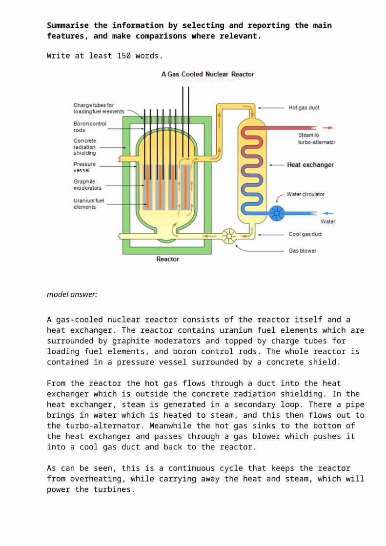
The diagram below shows the production of steam using a gas cooled nuclear reactor.
Summarise the information by selecting and reporting the main features, and make comparisons where relevant.
Write at least 150 words.
model answer:
A gas-cooled nuclear reactor consists of the reactor itself and a heat exchanger. The reactor contains uranium fuel elements which aresurrounded by graphite moderators and topped by charge tubes for loading fuel elements, and boron control rods. The whole reactor is contained in a pressure vessel surrounded by a concrete shield.
From the reactor the hot gas flows through a duct into the heat exchanger which is outside the concrete radiation shielding. In the heat exchanger, steam is generated in a secondary loop. There a pipebrings in water which is heated to steam, and this then flows out tothe turbo-alternator. Meanwhile the hot gas sinks to the bottom of the heat exchanger and passes through a gas blower which pushes it into a cool gas duct and back to the reactor.
As can be seen, this is a continuous cycle that keeps the reactor from overheating, while carrying away the heat and steam, which willpower the turbines.
(161 words)
You should spend about 20 minutes on this task.
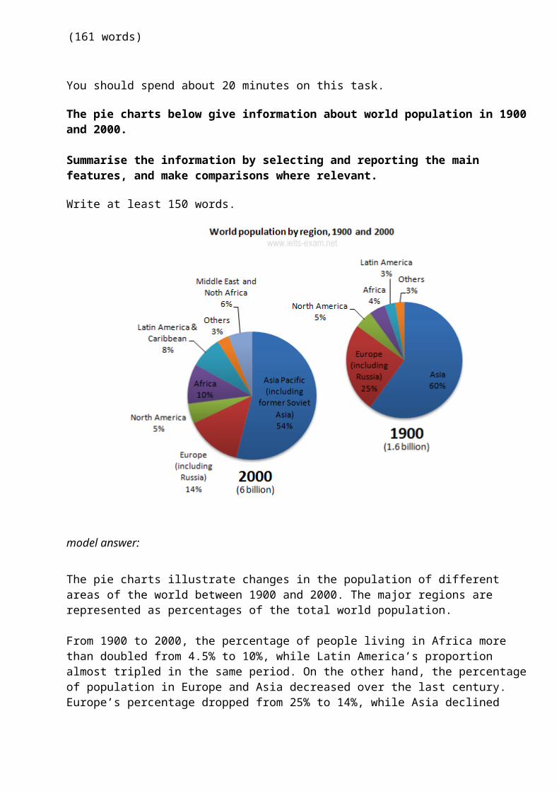
The pie charts below give information about world population in 1900and 2000.
Summarise the information by selecting and reporting the main features, and make comparisons where relevant.
Write at least 150 words.
model answer:
The pie charts illustrate changes in the population of different areas of the world between 1900 and 2000. The major regions are represented as percentages of the total world population.
From 1900 to 2000, the percentage of people living in Africa more than doubled from 4.5% to 10%, while Latin America’s proportion almost tripled in the same period. On the other hand, the percentageof population in Europe and Asia decreased over the last century. Europe’s percentage dropped from 25% to 14%, while Asia declined
from 60% to 54%. North America’s percentage however, remained constant at 5% in 1900 and 2000. The Middle East and North Africa, anew category in 2000, represented 6% of world population.
Overall, this represents a huge increase in the number of humans on the planet, from 1.6 billion to 6 billion in just one century. Most of this population growth has occurred in developing countries.
(151 words)
You should spend about 20 minutes on this task.
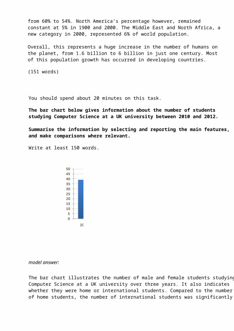
The bar chart below gives information about the number of students studying Computer Science at a UK university between 2010 and 2012.
Summarise the information by selecting and reporting the main features, and make comparisons where relevant.
Write at least 150 words.
model answer:
The bar chart illustrates the number of male and female students studyingComputer Science at a UK university over three years. It also indicates whether they were home or international students. Compared to the number of home students, the number of international students was significantly
smaller. Nevertheless, there was clear statistical growth in the latter group from 2010-2012. Furthermore, the number of female home students eventually overtook the number of males from the same group, reaching a high of 45 in 2012.
The year 2011 saw the most dramatic developments; the number of male homestudents fell from just below 40 to 24 and the number of females rose from 32 to 44. There was also significant growth in the number of male students from overseas, climbing from 20 in 2010 to 39 in 2012. Overall, we can see an upward trend in the number of students at the university.
(150 words)
You should spend about 20 minutes on this task.
The graph below gives information from Annual Energy Outlook 2008 about consumption of energy in the USA since 1980 with projection until 2030.
Summarise the information by selecting and reporting the main features, and make comparisons where relevant.
Write at least 150 words.
Source: http://www.eia.gov/oiaf/aeo/pdf/0383(2008).pdf
model answer:
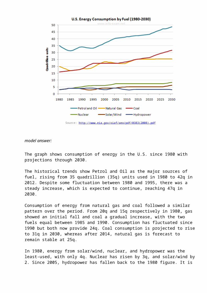
The graph shows consumption of energy in the U.S. since 1980 with projections through 2030.
The historical trends show Petrol and Oil as the major sources of fuel, rising from 35 quadrillion (35q) units used in 1980 to 42q in 2012. Despite some fluctuation between 1980 and 1995, there was a steady increase, which is expected to continue, reaching 47q in 2030.
Consumption of energy from natural gas and coal followed a similar pattern over the period. From 20q and 15q respectively in 1980, gas showed an initial fall and coal a gradual increase, with the two fuels equal between 1985 and 1990. Consumption has fluctuated since 1990 but both now provide 24q. Coal consumption is projected to riseto 31q in 2030, whereas after 2014, natural gas is forecast to remain stable at 25q.
In 1980, energy from solar/wind, nuclear, and hydropower was the least-used, with only 4q. Nuclear has risen by 3q, and solar/wind by2. Since 2005, hydropower has fallen back to the 1980 figure. It is
expected to remain approximately constant through 2030, while the others are projected to rise gradually after 2025.
Overall, fossil fuels will remain the chief energy source for the US, with a little bit of hydroelectric, nuclear and a smidgen of renewables like wind and solar.
(215 words)
IELTS Writing Task 1 #88You should spend about 20 minutes on this task.
The chart below shows the total number of minutes (in millions) of telephone calls in Finland, divided into three categories, from 1995– 2004.
Summarise the information by selecting and reporting the main features, and make comparisons where relevant.
Write at least 150 words.
model answer:
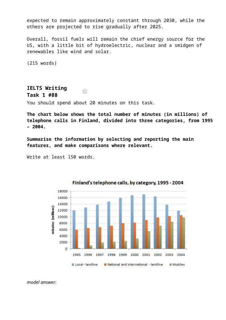
The chart shows the time spent by Finland’s residents on different types of telephone calls between 1995 and 2004.
Local landline calls were the highest throughout the period, rising from 12000 million minutes in 1995 to just under 17000 million in 2000. After peaking at 17000 million the following year, these callshad fallen back to the 1995 figure by 2004.
National and international landline calls grew steadily from 6000 million to 10500 million at the end of the period in question, though the growth slowed over the last two years.
There was a dramatic increase in mobile calls from 250 to 9800 million minutes. This rise was particularly noticeable between 2000 and 2004, during which time the use of mobile phones tripled.
To sum up, although local landline calls were still the most popularin 2004, the gap between the three categories had narrowed considerately over the second half of the period in question.
(155 words)
ELTS Writing Task1 #87You should spend about 20 minutes on this task.
The graph below gives information about international tourist arrivals in five countries.
Summarise the information by selecting and reporting the main features, and make comparisons where relevant.
Write at least 150 words.
model answer:
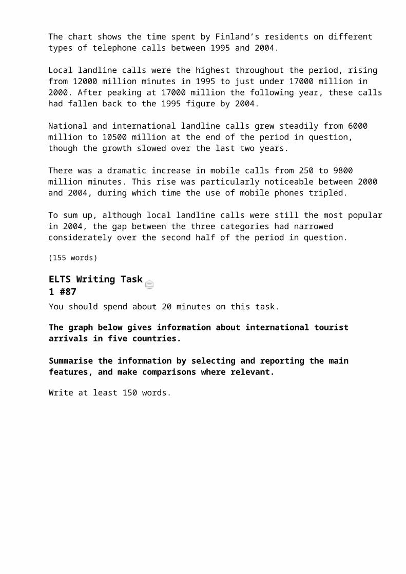
The graph shows the overall numbers of tourist arrivals in five countries between 1995 and 2010. In 1995 over 70 million tourists visited the United States, more than twice as many as the next mostpopular destination shown, France. However, between 2005 and 2010 there was a decrease of approximately 1,500,000 in the numbers going to the United States whereas there was an increase of nearly 20 million tourists visiting France. The result was that in 2010 the number of tourists arriving in the United States and France wasalmost equal at around 90 million each.
The number of tourists visiting Malaysia rose steadily over the whole period but by 2010 the total was still under 50 million. The countries with the fewest tourist arrivals were Brazil and Egypt. The number of tourists going there was similar between 1995 and 2000 but after that there was a greater increase in tourists going to Egypt than to Brazil.
(157 words)
IELTS Writing Task 1 #86Monday, 08 October 2012
Tweet
Complete the description of the table using an appropriate word, words ornumber.
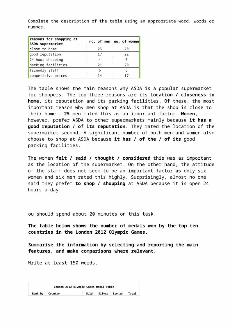
reasons for shopping at ASDA supermarket no. of men no. of women
close to home 25 20good reputation 17 2224-hour shopping 4 0parking facilities 21 20friendly staff 6 6competitive prices 14 17
The table shows the main reasons why ASDA is a popular supermarket for shoppers. The top three reasons are its location / closeness tohome, its reputation and its parking facilities. Of these, the mostimportant reason why men shop at ASDA is that the shop is close to their home – 25 men rated this as an important factor. Women, however, prefer ASDA to other supermarkets mainly because it has a good reputation / of its reputation. They rated the location of thesupermarket second. A significant number of both men and women alsochoose to shop at ASDA because it has / of the / of its good parking facilities.
The women felt / said / thought / considered this was as important as the location of the supermarket. On the other hand, the attitudeof the staff does not seem to be an important factor as only six women and six men rated this highly. Surprisingly, almost no one said they prefer to shop / shopping at ASDA because it is open 24 hours a day.
ou should spend about 20 minutes on this task.
The table below shows the number of medals won by the top ten countries in the London 2012 Olympic Games.
Summarise the information by selecting and reporting the main features, and make comparisons where relevant.
Write at least 150 words.
London 2012 Olympic Games Medal Table
Rank by Country Gold Silver Bronze Total
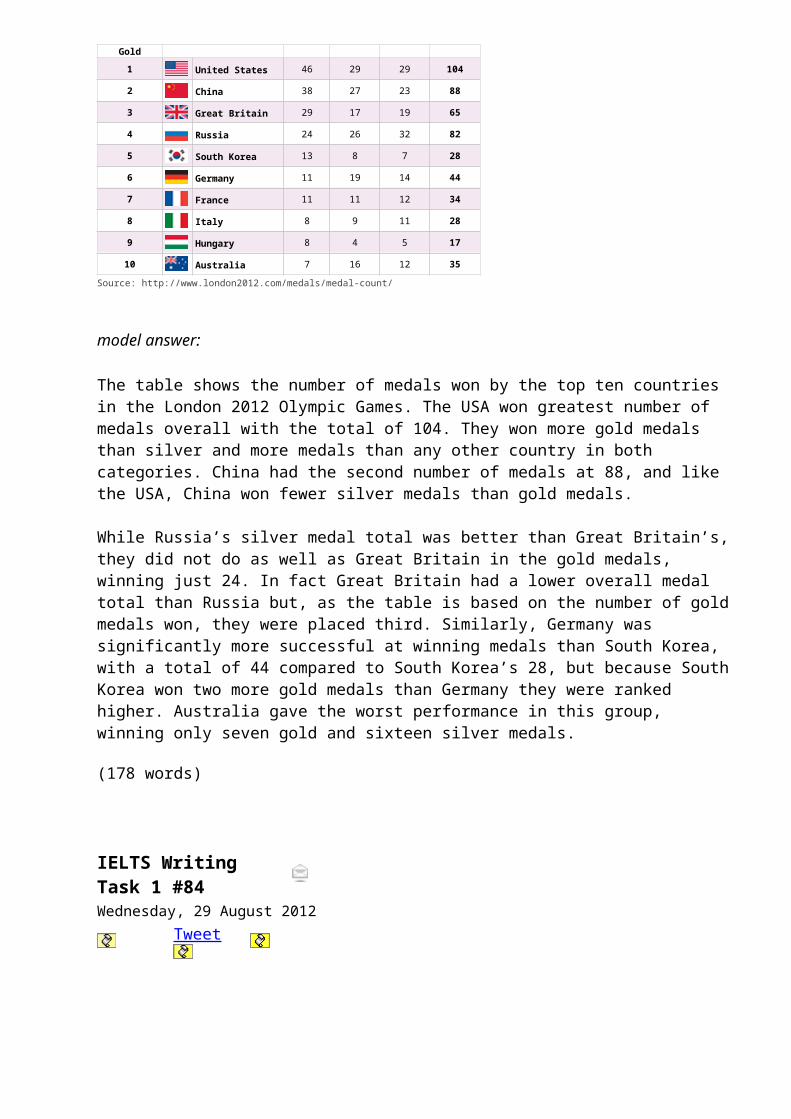
Gold1 United States 46 29 29 104
2 China 38 27 23 88
3 Great Britain 29 17 19 65
4 Russia 24 26 32 82
5 South Korea 13 8 7 28
6 Germany 11 19 14 44
7 France 11 11 12 34
8 Italy 8 9 11 28
9 Hungary 8 4 5 17
10 Australia 7 16 12 35
Source: http://www.london2012.com/medals/medal-count/
model answer:
The table shows the number of medals won by the top ten countries in the London 2012 Olympic Games. The USA won greatest number of medals overall with the total of 104. They won more gold medals than silver and more medals than any other country in both categories. China had the second number of medals at 88, and like the USA, China won fewer silver medals than gold medals.
While Russia’s silver medal total was better than Great Britain’s,they did not do as well as Great Britain in the gold medals, winning just 24. In fact Great Britain had a lower overall medal total than Russia but, as the table is based on the number of goldmedals won, they were placed third. Similarly, Germany was significantly more successful at winning medals than South Korea, with a total of 44 compared to South Korea’s 28, but because SouthKorea won two more gold medals than Germany they were ranked higher. Australia gave the worst performance in this group, winning only seven gold and sixteen silver medals.
(178 words)
IELTS Writing Task 1 #84Wednesday, 29 August 2012
Tweet
You should spend about 20 minutes on this task.
The pie charts below show the average household expenditures in a country in 1950 and 2010.
Summarise the information by selecting and reporting the main features, and make comparisons where relevant.
Write at least 150 words.
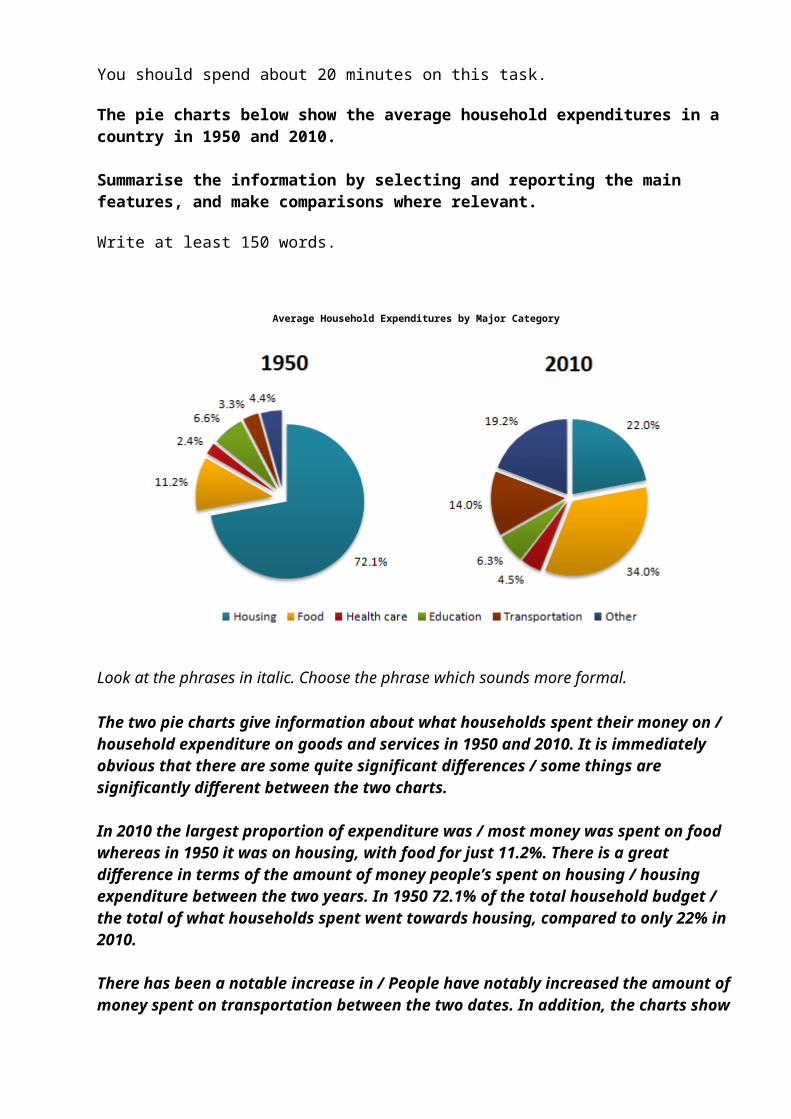
Average Household Expenditures by Major Category
Look at the phrases in italic. Choose the phrase which sounds more formal.
The two pie charts give information about what households spent their money on / household expenditure on goods and services in 1950 and 2010. It is immediately obvious that there are some quite significant differences / some things are significantly different between the two charts.
In 2010 the largest proportion of expenditure was / most money was spent on food whereas in 1950 it was on housing, with food for just 11.2%. There is a great difference in terms of the amount of money people’s spent on housing / housing expenditure between the two years. In 1950 72.1% of the total household budget / the total of what households spent went towards housing, compared to only 22% in 2010.
There has been a notable increase in / People have notably increased the amount of money spent on transportation between the two dates. In addition, the charts show
a significant rise in the proportion of money spent on health care / that people spent more on health care in 2010 compared to 1950.
There are some similarities, however. For example, in both 1950 and 2010 people spent a similar proportion on education. / the proportion of education expenditure was roughly the same.
Show Answer - The two pie charts give information about household expenditure on goods and services in 1950 and 2010. It is immediately obvious that there are some quite significant differences between the two charts.
In 2010 the largest proportion of expenditure was on food whereas in 1950 it was on housing, with food for just 11.2%. There is a great difference in terms of housing expenditure between the two years. In 1950 72.1% of the total household budget went towards housing, compared to only 22% in 2010.
There has been a notable increase in the amount of money spent on transportation between the two dates. In addition, the charts show a significant rise in the proportion of money spent on health care in 2010 compared to 1950.
There are some similarities, however. For example, in both 1950 and 2010 the proportionof education expenditure was roughly the same.
ELTS Writing Task1 #83Saturday, 25 August 2012
Tweet
You should spend about 20 minutes on this task.
The table below shows the average band scores for students from different language groups taking the IELTS General Test in 2010.
Summarise the information by selecting and reporting the main features, and make comparisons where relevant.
Write at least 150 words.
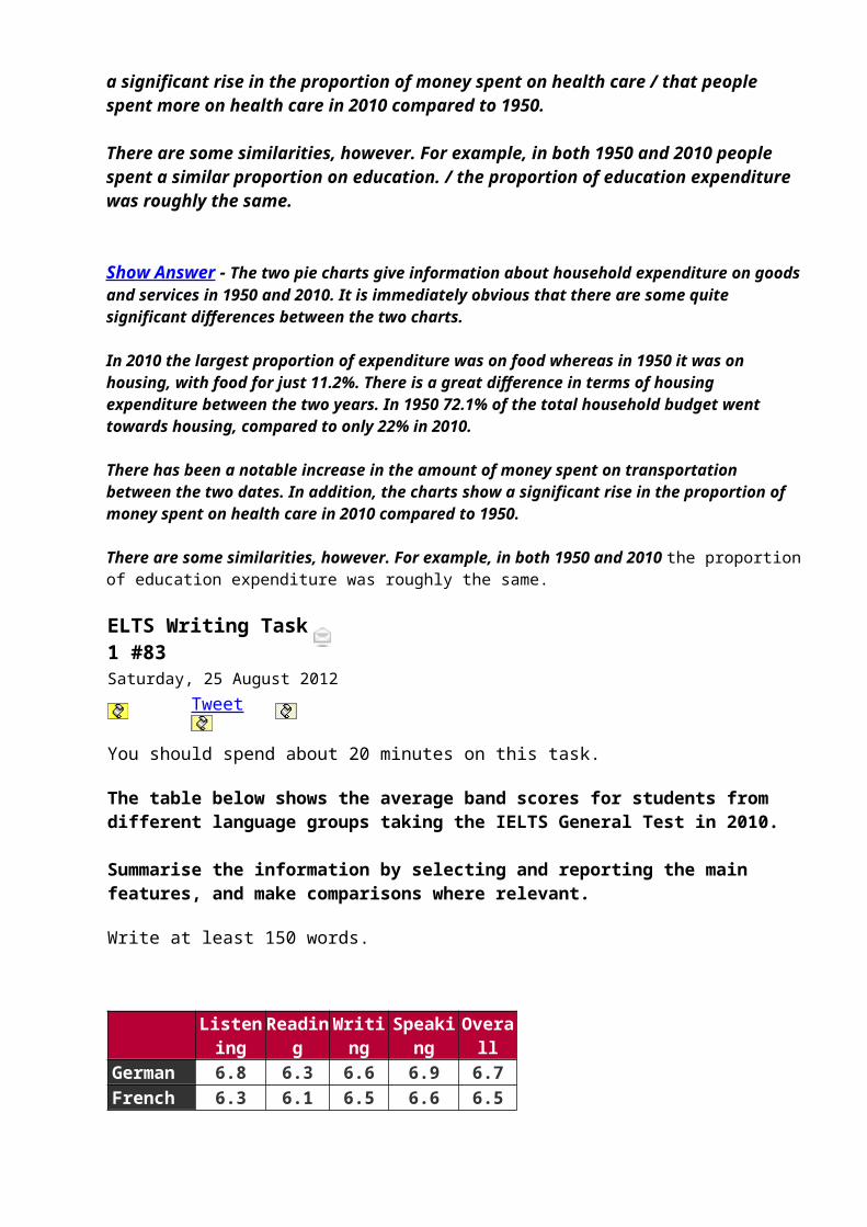
Listening
Reading
Writing
Speaking
Overall
German 6.8 6.3 6.6 6.9 6.7French 6.3 6.1 6.5 6.6 6.5

Indonesian 6.3 6.1 6.1 6.7 6.3
Malay 6.2 6.4 6.0 6.6 6.4
model answer:
The table illustrates the breakdown of scores for the IELTS General Test in 2010. It shows separate scores for all four sections (Listening, Reading, Writing and Speaking), together withthe overall score for students from four different language groupsaround the world.
From an overall perspective, German speakers achieved the highest grades with an average score of 6.7 across all four sections. Moreover, they scored the highest of all four language groups in three sections of the four sections (Listening, Writing, Speaking).
French speakers scored the second highest scores overall, closely followed by Malay and Indonesian speakers. Although French speakers did not do so well in the Reading, Speaking and Listeningsections compared to Indonesian and Malay speakers, there was a significant difference in their grades for the Writing section. These grades were high relative to Indonesian and Malay candidates. Surprisingly, Malay speakers, who achieved the second lowest results overall, achieved the highest results of all four language groups for the Reading section.
As a final point, it is interesting to note that the scores for each section show that all students on average scored the highest marks for the Speaking section and the lowest marks for the Reading section.
(200 words)
IELTS Writing Task 1 #82
Tweet
You should spend about 20 minutes on this task.
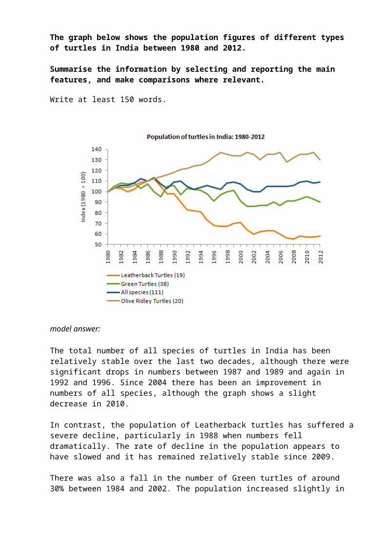
The graph below shows the population figures of different types of turtles in India between 1980 and 2012.
Summarise the information by selecting and reporting the main features, and make comparisons where relevant.
Write at least 150 words.
model answer:
The total number of all species of turtles in India has been relatively stable over the last two decades, although there were significant drops in numbers between 1987 and 1989 and again in 1992 and 1996. Since 2004 there has been an improvement in numbers of all species, although the graph shows a slight decrease in 2010.
In contrast, the population of Leatherback turtles has suffered asevere decline, particularly in 1988 when numbers fell dramatically. The rate of decline in the population appears to have slowed and it has remained relatively stable since 2009.
There was also a fall in the number of Green turtles of around 30% between 1984 and 2002. The population increased slightly in
2010 but it had dropped again by 2012.
It is only Olive Ridley turtles that have seen a steady increase in population over this period. Their numbers dropped slightly in2007 and again in 2012 but the overall trend has been a positive one.
(162 words)IELTS Writing Task 1 #81Thursday, 16 August 2012
Tweet
You should spend about 20 minutes on this task.
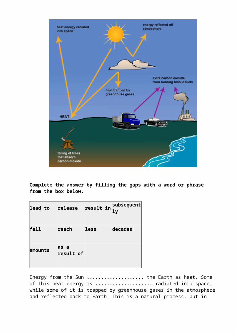
The following diagram shows how greenhouse gases trap energy fromthe Sun.
Write a report for a university lecturer describing the information shown below.
Write at least 150 words.
Complete the answer by filling the gaps with a word or phrase from the box below.
lead to release result in subsequently
fell reach less decades
amounts as a result of
Energy from the Sun .................... the Earth as heat. Some of this heat energy is .................... radiated into space, while some of it is trapped by greenhouse gases in the atmosphereand reflected back to Earth. This is a natural process, but in
recent ...................., human activities have.................... an increase in the .................... of greenhouse gases in the atmosphere which is now trapping too muchheat.
One of the main greenhouse gases is carbon dioxide, and extra quantities of this .................... into the atmosphere.................... burning fossil fuels as a source of energy in power stations, factories and homes. Exhaust gases from cars and lorries .................... further emissions of carbon dioxide.
Plants serve to remove some of the carbon dioxide from the atmosphere by absorbing it through their leaves. However, as large areas of forest .................... in the Amazon and elsewhere, .................... carbon dioxide is removed in thisway.
Show Answer Energy from the Sun reaches the Earth as heat. Some of this heat energy is subsequently/then radiated into space, while some of it is trapped by greenhouse gases in the atmosphere and reflected back to Earth. This is a natural process, but in recent decades, human activities have led to an increase in the amounts of greenhouse gases in the atmosphere which is now trapping too much heat.
One of the main greenhouse gases is carbon dioxide, and extra quantities of this are released/have been released into the atmosphere as a result of burning fossil fuels as a source of energy in power stations, factories and homes. Exhaust gases from cars and lorries result in/have resulted in further emissions of carbon dioxide.
Plants serve to remove some of the carbon dioxide from the atmosphere by absorbing it through their leaves. However, as large areas of forestare (being) felled/have been felled in the Amazon and elsewhere, less carbon dioxide is removed in this way.
Academic Writing Sample Task 1 #80
Tweet
You should spend about 20 minutes on this task.
The bar chart below shows the estimated sales of jeans for two companies next year in Turkey. The pie chart shows the projected
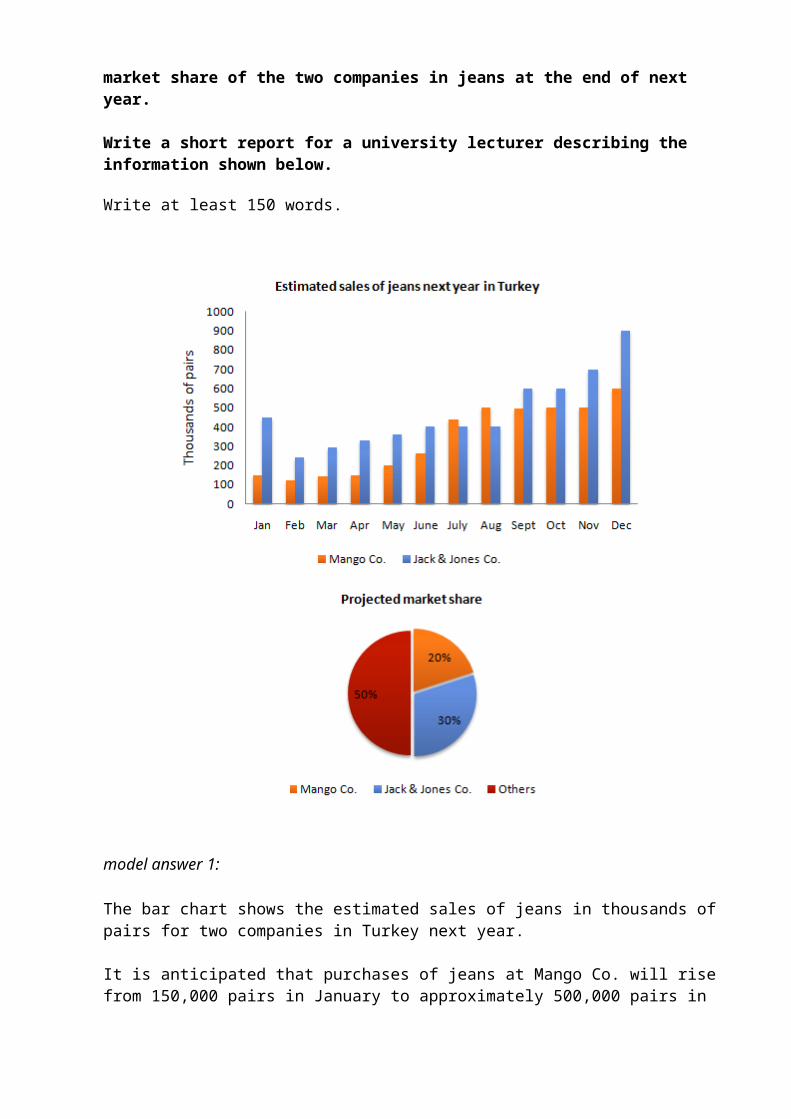
market share of the two companies in jeans at the end of next year.
Write a short report for a university lecturer describing the information shown below.
Write at least 150 words.
model answer 1:
The bar chart shows the estimated sales of jeans in thousands ofpairs for two companies in Turkey next year.
It is anticipated that purchases of jeans at Mango Co. will risefrom 150,000 pairs in January to approximately 500,000 pairs in
August, and will remain there until November. For December, sales are expected to be in the region of 600,000 pairs.
Meanwhile, it is estimated that the sales of jeans for Jack & Jones Co. will begin the year at around 450,000 pairs in January, falling to about 250,000, before increasing to around 400,000 in June. For the next two months until August, sales areforecast to remain steady at this level, after which they are expected to rise steadily to hit a peak of approximately 900,000pairs in December.
The pie chart shows that, at the end of next year, the anticipated market share for Mango Co. and Jack & Jones Co. is 20% and 30% respectively.
As can be seen from the chart, the overall sales trends for bothcompanies are forecast to be upwards.
(178 words)
model answer 2:
The bar chart shows the predicted sales of jeans in thousands ofpairs for two companies in Turkey; Mango Co. and Jack & Jones Co. for next year.
The most striking feature is that sales will increase for both companies, It is anticipated that sales of Jack & Jones Co. willstart at 450,000 pairs in January decreasing by 200,000 pairs following month with a gradual recover over the subsequent four months reaching 400,000 pairs in June. Those of Jack & Jones Co.are predicted to be stable until August peaking up to 600,000 pairs in September and October.
Sales of Jack & Jones will reach a peak of 900,000 in December, For those of Mango Co. is forecasted a gradual increase with thelargest sale of 600,000 pairs in December. In the beginning of the next year those of Mango Co. will stand at 150,000 pairs falling back to 100,000 pairs in February, rising steadily to 250,000 in June, In subsequent months sales will reach 450,000 pairs increasing to 500,000 pairs in August, staying stable until November,
Regarding the pie chart the sales of Jack & Jones Co. will share30% of market whereas those of Mango Co. 20%. 50% of market is set to be shared by other companies.
(211 words)
This answer would probably exceed Band 8Academic Writing Sample Task 1 #79Thursday, 09 August 2012
Tweet
You should spend about 20 minutes on this task.
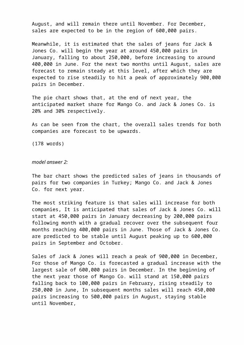
The table below shows the monthly expenditure of an average Australian family in 1991 and 2001.
Summarise the information by selecting and reporting the main features, and make comparisons where relevant.
Write at least 150 words.
1991 2001
Australian DollarPer Month
Food 155 160 Electricity and Water 75 120
Clothing 30 20 Housing 95 100 Transport 70 45 Other goods and services* 250 270
Total 675 715*Other goods and services: non-essential goods and services
model answer:
The table shows changes in the spending patterns of an average Australian household between 1999 and 2001. In general,

Australian household spending was high in 2001 than in 1991 but the difference was not significant (AUD $715 per month and AUD $675 per month respectively).
The amount of monthly spending on electricity and water saw a dramatic increase over the 10-year period from $75 to $120. Yet in terms of the expenditure on non-essential goods and services,the rising trend was less obvious with a minor increase of $20. At the same time, the amount of money spent on food and housing rose only slightly from $155 to $160 and $95 to $100 respectively.
However, there was a decrease in expenditure on the other two items. Australians spent one third less on clothing, which fell from $30 to $20. Similarly, expenditure on transport dropped from $70 in 1991 to $45 in 2001.
It seems that food and “other goods and services” were the two biggest items of expenditure. Altogether, they accounted for more than half of the total household spending. By comparison, Australians spent little on dressing up.
(188 words)
Academic Writing Sample Task 1 #78You should spend about 20 minutes on this task.
The pie charts below show electricity generation by source in New Zealand and Germany in 1980 and 2010.
Summarise the information by selecting and reporting the main features, and make comparisons where relevant.
Write at least 150 words.
Electricity Generation by Source in New Zealand
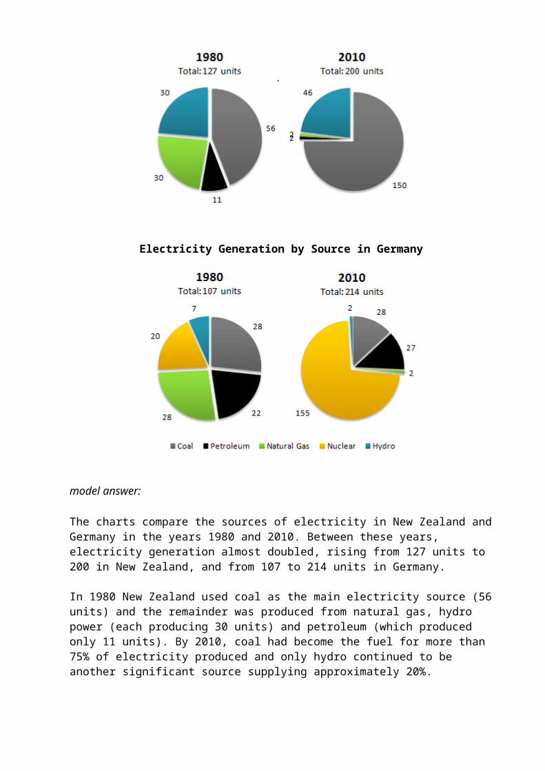
Electricity Generation by Source in Germany
model answer:
The charts compare the sources of electricity in New Zealand andGermany in the years 1980 and 2010. Between these years, electricity generation almost doubled, rising from 127 units to 200 in New Zealand, and from 107 to 214 units in Germany.
In 1980 New Zealand used coal as the main electricity source (56units) and the remainder was produced from natural gas, hydro power (each producing 30 units) and petroleum (which produced only 11 units). By 2010, coal had become the fuel for more than 75% of electricity produced and only hydro continued to be another significant source supplying approximately 20%.
In contrast, Germany used coal as a source for only 28 units of electricity in 1980, which was matched by natural gas. The remaining 49 units were produced largely from petroleum and nuclear power, with hydro contributing only 7 units. But by 2010nuclear power, which was not used at all in New Zealand, had developed into the main source, producing almost 75% of electricity, at 155 units, while coal and petroleum together produced only 55 units. Other sources were no longer significant.
Overall, it is clear by 2010 these two countries relied on different principal fuel sources: New Zealand relied on coal andGermany on nuclear power.
(210 words)
Academic Writing Sample Task 1 #77
Tweet
You should spend about 20 minutes on this task.
The graph below shows the changes in maximum number of Asian elephants between 1994 and 2007.
Summarise the information by selecting and reporting the main features, and make comparisons where relevant.
Write at least 150 words.
model answer:
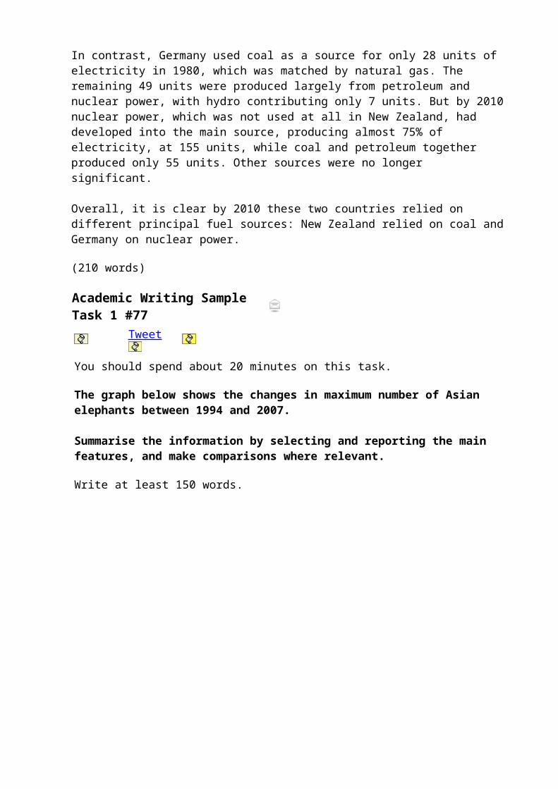
The graph shows the estimated maximum population of elephants in a range of Asian countries in both 1997 and 2004.
In most of the countries included in the graph, the population fell. This was most noticeable in Malaysia and Thailand, where the number of elephants was thought to be less than half the figure in 1997. In the former, the number of elephants dropped as low as 1000. India remained the country with by far the largest elephant population, but experienced a dramatic fall innumbers so that in 2004 there may have been as few as 7500. Despite its size, China had a very small population of at most 500 elephants by 2004.
Although the trend was downwards overall, elephant populations were thought to have remained stable in Laos and Vietnam at approximately 1200. The only country where elephants showed signs of recovering was Cambodia, where numbers may have risen by up to 200.
(155 words)cademic Writing Sample Task 1 #76Thursday, 02 August 2012
Tweet
You should spend about 20 minutes on this task.
The chart below shows the GDP growth per year for three countries between 2007 and 2010.
Summarise the information by selecting and reporting the main features, and make comparisons where relevant.
Write at least 150 words.
model answer:
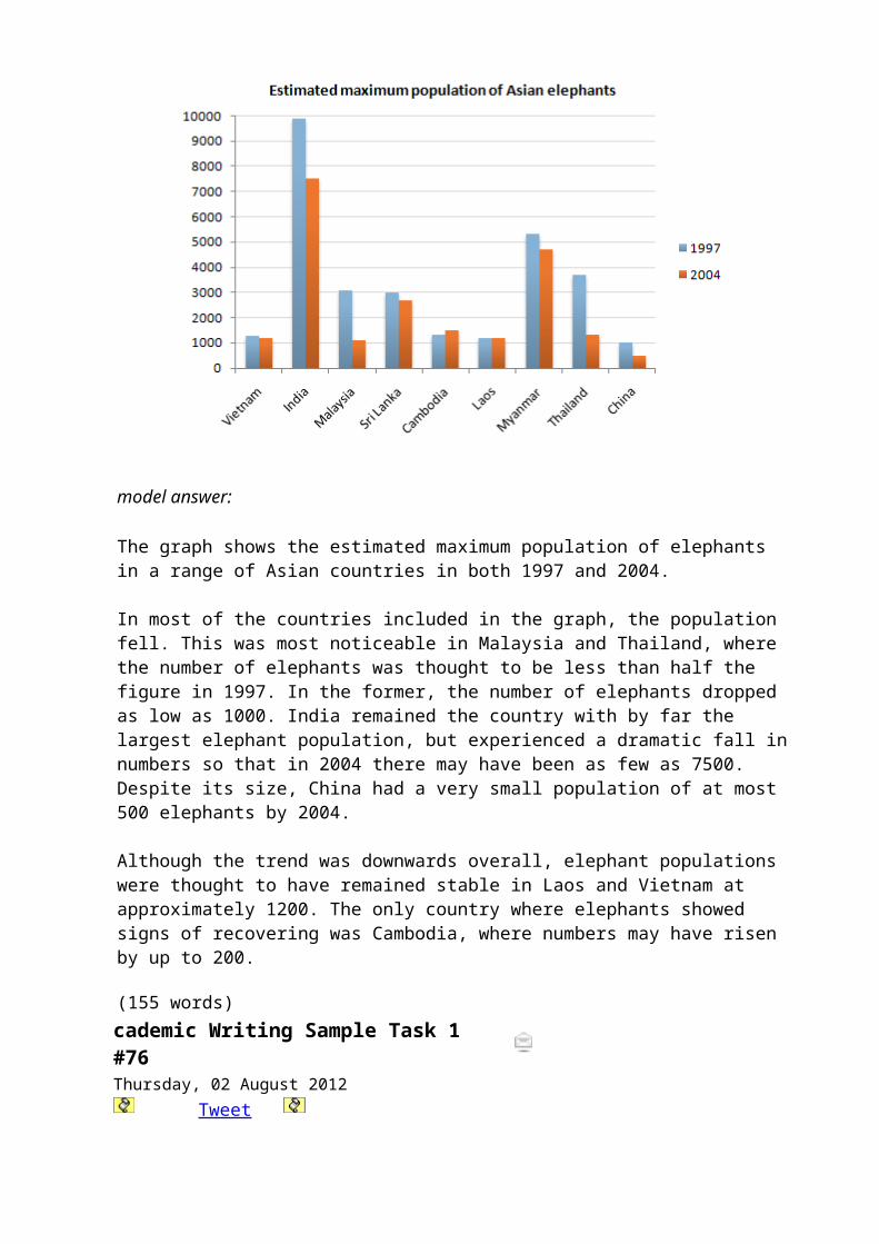
The chart shows the annual GDP growth for three countries from 2007 to 2010. By the year 2007 the figure for Tunisia was by far the highest at close to 6.3% per annum.This figure is double that of Ecuador and three times that of Japan on a global level.
However by 2008 this trend has changed considerably; the Japanese doubled their annual GDP over this period and there was also an increase in the GDP of Ecuador, while Tunisia fell to 4.5% per year. In 2009 and 2010, the downward trend for Tunisia continued falling to a low of 3% at the end of this period.
For Ecuador, the GDP fell sharply to just under 1.5% in the year 2009 and rose only slightly in 2010 to 2.3%. ON the other
hand, for Japan, the GDP figure rose significantly throughout this time and by the year 2010 had more than matched the GDP figures for Tunisia of the year 2007.
(162 words) Academic Writing Sample Task 1 #75Wednesday, 01 August 2012
Tweets1~slight~s2~slightly~s3~impressive~s4~impressively~s5~dramatically~s6~dramatic~s7~steadily~s8~steady~s9~steeply~s10~sharply~s11~steep~s12~sharps1~....................~s2~....................~s3~....................~s4~....................~s5~....................~s6~....................~s7~....................~s8~....................~s9~....................~s10~....................~s11~....................~s12~....................
Adjective or Adverb?
Complete the answer by filling the gaps with an adverb or adjective from the box below.
dramatic dramatically
impressive
impressively
slight slightly steady steadily
sharp sharply steep steeply
The world population grew dramatically between 1960 and 2000.
The world population experienced a dramatic growth between 1960 and 2000.
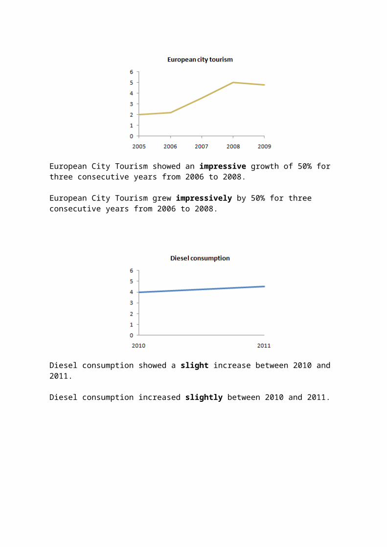
European City Tourism showed an impressive growth of 50% for three consecutive years from 2006 to 2008.
European City Tourism grew impressively by 50% for three consecutive years from 2006 to 2008.
Diesel consumption showed a slight increase between 2010 and 2011.
Diesel consumption increased slightly between 2010 and 2011.
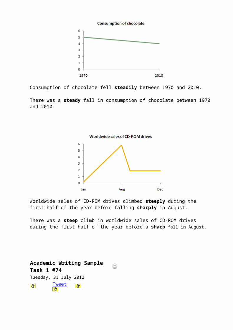
Consumption of chocolate fell steadily between 1970 and 2010.
There was a steady fall in consumption of chocolate between 1970and 2010.
Worldwide sales of CD-ROM drives climbed steeply during the first half of the year before falling sharply in August.
There was a steep climb in worldwide sales of CD-ROM drives during the first half of the year before a sharp fall in August.
Academic Writing Sample Task 1 #74Tuesday, 31 July 2012
Tweet
You should spend about 20 minutes on this task.
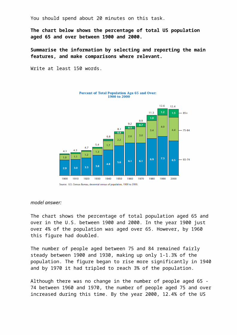
The chart below shows the percentage of total US population aged 65 and over between 1900 and 2000.
Summarise the information by selecting and reporting the main features, and make comparisons where relevant.
Write at least 150 words.
model answer:
The chart shows the percentage of total population aged 65 and over in the U.S. between 1900 and 2000. In the year 1900 just over 4% of the population was aged over 65. However, by 1960 this figure had doubled.
The number of people aged between 75 and 84 remained fairly steady between 1900 and 1930, making up only 1-1.3% of the population. The figure began to rise more significantly in 1940and by 1970 it had tripled to reach 3% of the population.
Although there was no change in the number of people aged 65 -74 between 1960 and 1970, the number of people aged 75 and overincreased during this time. By the year 2000, 12.4% of the US
population had reached the age of 65 or more, although this wasslightly lower than in 1990 when it peaked at 12.6%.
The chart shows that today people in the U.S. can expect to live longer than in 1900. By the year 2000 more than 12% of thepopulation had managed to live to the age of 65 and over compared to only 4.1% in 1900.
(187 words)
Academic Writing Sample Task 1 #73You should spend about 20 minutes on this task.
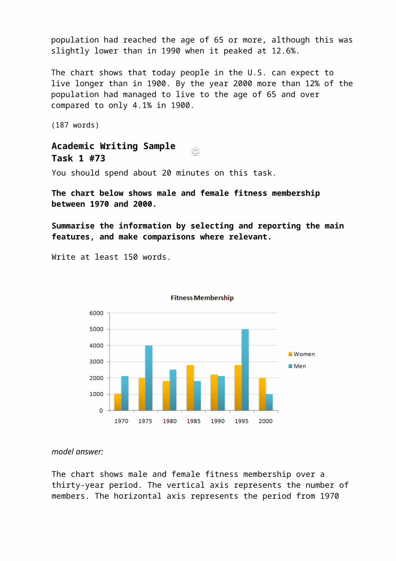
The chart below shows male and female fitness membership between 1970 and 2000.
Summarise the information by selecting and reporting the main features, and make comparisons where relevant.
Write at least 150 words.
model answer:
The chart shows male and female fitness membership over a thirty-year period. The vertical axis represents the number ofmembers. The horizontal axis represents the period from 1970
to 2000.
Overall, the chart indicates that there were greater fluctuations in fitness membership among men than among women.The number of male members started the period at just over twothousand and reached highs of four thousand in 1975 and five thousand around 1995. The lowest rates were in 1985 and more recently in 2000 when the rate dipped as low as one thousand.
Female fitness membership began lower at one thousand, doubledby 1975, and then fluctuated between two and three thousand for the remainder of the period. When male rates were at theirlowest, female rates were higher. This was particularly true in 1985 when over three thousand women held fitness membership.
In brief, there were marked differences in rates of male and female fitness memberships in the period covered.
(161 words)
Academic Writing Sample Task 1 #72
Tweets0~period~s1~hovering~s2~fluctuated~s3~trend~s4~peak~s5~plummeted~s6~rocketed~s7~steadily~s8~Meanwhiles0~....................~s1~....................~s2~....................~s3~....................~s4~....................~s5~....................~s6~....................~s7~....................~s8~....................
Complete the answer by filling the gaps with a word or phrase from the box below.
steadily hovering trend meanwhile
rocketed fluctuated peak plummeted
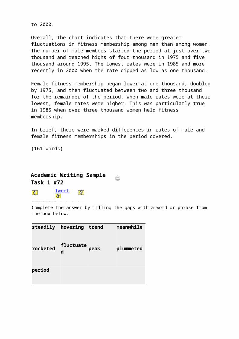
period
The chart shows the average daily viewing figures for Channel One News over a 12-month period. The figure for the 1pm News remained fairly stable, hovering at around 1.3 million throughout the year. The figure for the 6pm News began the yearat 4.8 million. It fluctuated, but the general trend was downwards, and it ended the year at 3.4 million.
The figure for the 9:30 News gradually increased from 3.2 million viewers per day in January to a peak of 3.8 million in May. However, this month saw the introduction of the 11pm News,and the figure for the 9:30 News plummeted, hitting a low-pointof 1.1 million in August. In the same period, the figure for the 11pm news rocketed from 0.2 million to 4.1 million. At thispoint, the trend reversed. From August onwards, the figure for the 9:30 news grew steadily, reaching 3 million by the end of the year. Meanwhile, the figure for the 11pm News declined sharply, and in December fell below the 1 million mark.Academic Writing Sample Task 1#71
Tweet
You should spend about 20 minutes on this task.
The chart below shows information about the challenges people face when they go to live in other countries.
Summarise the information by selecting and reporting the main features, and make comparisons where relevant.
Write at least 150 words.
model answer:
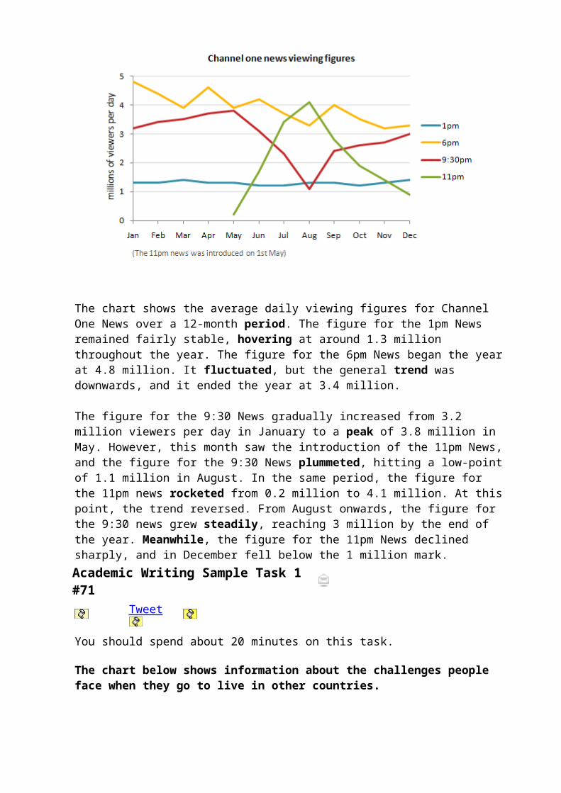
The chart shows the challenges people face when they settle in a new country and how the challenges vary according to people’sages.
The most challenging aspect for young people aged 18 to 34 is making new friends, a problem experienced by 46% of the people in this age group. However, only 36% of 35 - 54 year olds find it hard to make friends, while even fewer people over 55 (23%) have this problem.
54% of the older age group finds learning the local language the biggest obstacle when settling. In comparison, the youngestage group finds this easier, and the percentage of people who have problems learning the language is much lower, at only 29%.
In contrast to their language-learning difficulties, only 22% of people in the oldest age group have trouble finding accommodation. However, this is the second most significant problem for the other two age groups with 39% to 40% of the
people in each group finding it hard.
In general, all age groups experience the same problems to someextent, but people over the age of 55 reported that they face markedly fewer challenges settling in a new country than their younger respondents.
(198 words)Academic Writing Sample Task 1 #70Tuesday, 29 May 2012
Tweets1~predominated~s2~compared~s3~accounted~s4~opposed/compared~s5~dropped/fell~s6~fell/dropped~s7~recovered~s8~stood~s9~increaseds1~....................~s2~....................~s3~....................~s4~....................~s5~....................~s6~....................~s7~....................~s8~....................~s9~....................
The charts A and B show the share of the UK and Australian cinema market in 2001 and cinema admission in the UK and Australia from 1976 to 2006.
Write a report for a university lecture describing the information shown below.
You should write at least 150 words.
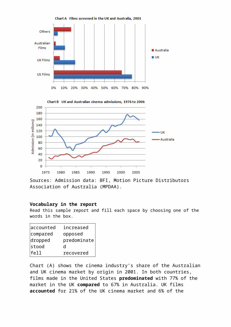
Sources: Admission data: BFI, Motion Picture Distributors Association of Australia (MPDAA).
Vocabulary in the reportRead this sample report and fill each space by choosing one of the words in the box.
accountedcompareddroppedstoodfell
increasedopposedpredominatedrecovered
Chart (A) shows the cinema industry’s share of the Australian and UK cinema market by origin in 2001. In both countries, films made in the United States predominated with 77% of the market in the UK compared to 67% in Australia. UK films accounted for 21% of the UK cinema market and 6% of the

Australian market. On the other hand, while 11% of the films shown in Australia were Australian, no Australian films were shown in the UK. Films from other countries had 16% of the market share in Australia as opposed/compared to just 2% in theUK.
Chart (B) shows cinema admissions in the UK and Australia since1976. In both countries cinema admissions dropped/fell in the early 1980s. In Australia admissions fell/dropped from just under 40 million in 1980 to about 30 million in 1984–6 while inthe UK the decrease was far more dramatic (from 100 million in 1980 to less than 60 million in 1984). Since then, however, theindustry has recovered in both countries. In 2001, cinema admissions in the UK stood at over 150 million, whereas in Australia they reached 90 million.
Overall, the charts show that the cinema has increased in popularity in both countries over the last 15 years, but that the origins of the films projected in Australia are more diverse than in the UK.
Academic Writing Sample Task 1 #69
Tweet
You should spend about 20 minutes on this task.
The graph below shows the demand for electricity in England during typical days in winter and summer.The pie chart shows how electricity is used in an average English home.
Summarise the information by selecting and reporting the main features and make comparisons where relevant.
You should write at least 150 words.
model answer:
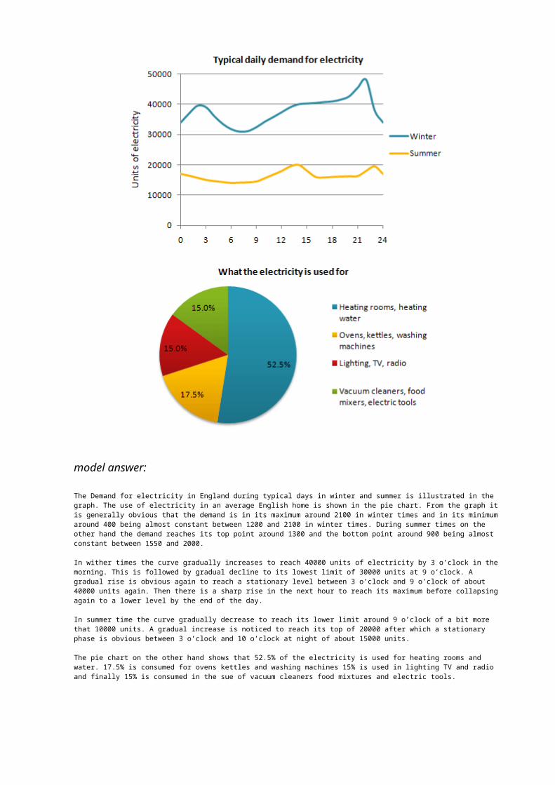
The Demand for electricity in England during typical days in winter and summer is illustrated in the graph. The use of electricity in an average English home is shown in the pie chart. From the graph itis generally obvious that the demand is in its maximum around 2100 in winter times and in its minimumaround 400 being almost constant between 1200 and 2100 in winter times. During summer times on the other hand the demand reaches its top point around 1300 and the bottom point around 900 being almost constant between 1550 and 2000.
In wither times the curve gradually increases to reach 40000 units of electricity by 3 o’clock in themorning. This is followed by gradual decline to its lowest limit of 30000 units at 9 o’clock. A gradual rise is obvious again to reach a stationary level between 3 o’clock and 9 o’clock of about 40000 units again. Then there is a sharp rise in the next hour to reach its maximum before collapsingagain to a lower level by the end of the day.
In summer time the curve gradually decrease to reach its lower limit around 9 o’clock of a bit more that 10000 units. A gradual increase is noticed to reach its top of 20000 after which a stationary phase is obvious between 3 o’clock and 10 o’clock at night of about 15000 units.
The pie chart on the other hand shows that 52.5% of the electricity is used for heating rooms and water. 17.5% is consumed for ovens kettles and washing machines 15% is used in lighting TV and radio and finally 15% is consumed in the sue of vacuum cleaners food mixtures and electric tools.
(285 words)
This answer would probably exceed Band 6Academic Writing Sample Task 1 #68Sunday, 27 May 2012
Tweet
You should spend about 20 minutes on this task.
The chart below shows the number of girls per 100 boys enrolled in different levels of school education.
Write a short report for a university lecturer describing the information shown below.
You should write at least 150 words.
model answer:
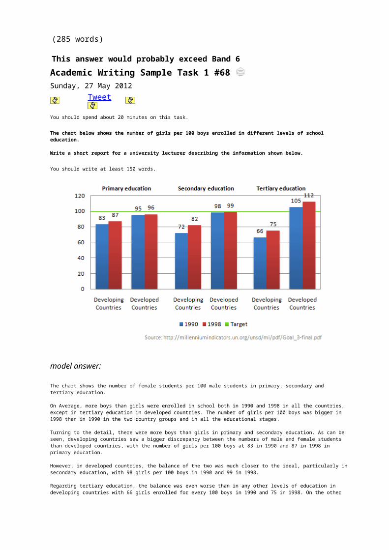
The chart shows the number of female students per 100 male students in primary, secondary and tertiary education.
On Average, more boys than girls were enrolled in school both in 1990 and 1998 in all the countries, except in tertiary education in developed countries. The number of girls per 100 boys was bigger in 1998 than in 1990 in the two country groups and in all the educational stages.
Turning to the detail, there were more boys than girls in primary and secondary education. As can be seen, developing countries saw a bigger discrepancy between the numbers of male and female students than developed countries, with the number of girls per 100 boys at 83 in 1990 and 87 in 1998 in primary education.
However, in developed countries, the balance of the two was much closer to the ideal, particularly insecondary education, with 98 girls per 100 boys in 1990 and 99 in 1998.
Regarding tertiary education, the balance was even worse than in any other levels of education in developing countries with 66 girls enrolled for every 100 boys in 1990 and 75 in 1998. On the other
hand, in developing countries, the number of girls overtook that of boys at 105 per 100 boys in 1990 and 112 in 1998.
(213 words)
This answer would probably exceed Band 7
Academic Writing Sample Task 1 #67You should spend about 20 minutes on this task.
The graph below shows the unemployment rates in the US and Japan between March 1993and March 1999.
Write a short report for a university lecturer describing the information shown below.
You should write at least 150 words.
model answer:
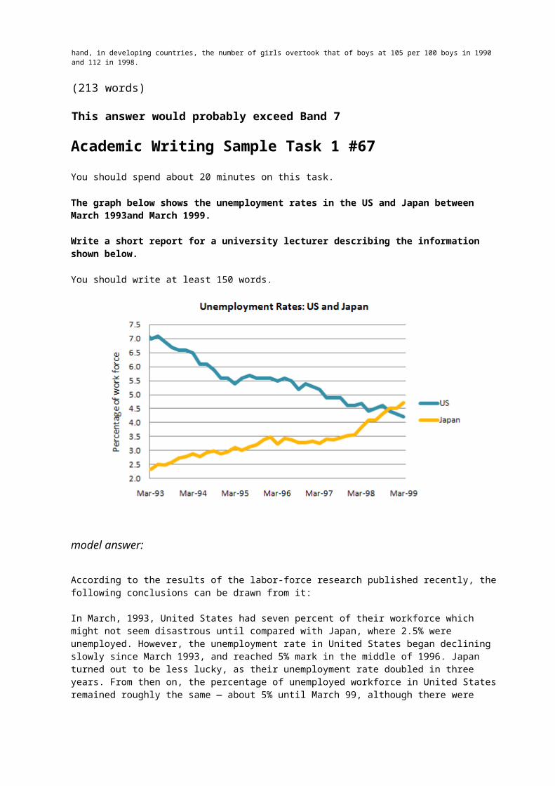
According to the results of the labor-force research published recently, the following conclusions can be drawn from it:
In March, 1993, United States had seven percent of their workforce which might not seem disastrous until compared with Japan, where 2.5% were unemployed. However, the unemployment rate in United States began declining slowly since March 1993, and reached 5% mark in the middle of 1996. Japan turned out to be less lucky, as their unemployment rate doubled in three years. From then on, the percentage of unemployed workforce in United States remained roughly the same — about 5% until March 99, although there were
minor falls and rises in the unemployment rate.
As for Japan, the percentage of unemployed fell rapidly by 0.5—0.6% after March 1996, but from summer 1996 and onwards it grew steadily and without anyfalls to reach 5.0% boundary in March 1999.
The major conclusion that I’ve drawn using the graph, is that number of unemployed in USA decreased by about 2.0% in the course of six years, while in Japan it actually increased by 2.5% percent. As a result, in March 99, both Japan and US had about 5% of their work force unemployed.
(198 words)
EXAMINER’S EXPLANATIONBand 7
“This is a good account of the information presented in the graph, although occasionally the organisation of the data is slightly unusual. The writer grasps all the key points, however,and supports these with figures, before providing a summary of the main points. Sentence structures are more than adequate, although the writer has some problems with the use of tenses andprepositions. There are minor examples of unsuitable register (e.g. ‘turned out’, ‘disastrous’, and one contracted verb form),but as there are only a few instances of this, the candidate hasnot been penalised.”
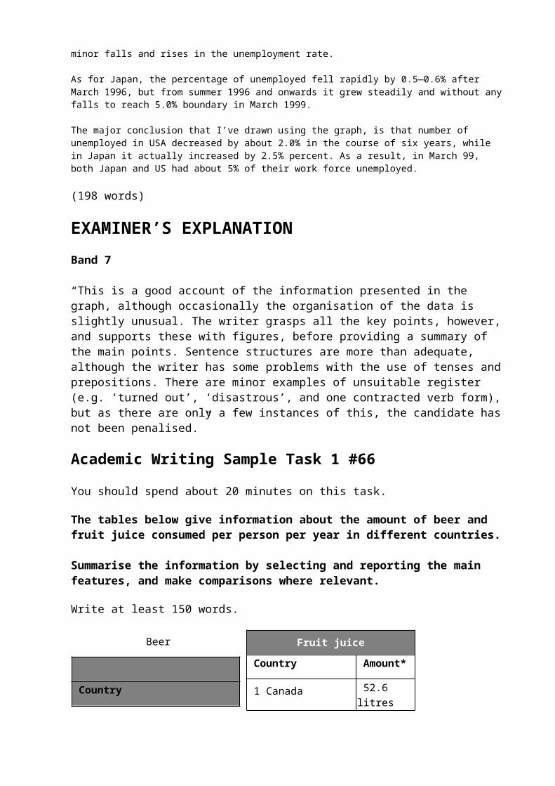
Academic Writing Sample Task 1 #66
You should spend about 20 minutes on this task.
The tables below give information about the amount of beer and fruit juice consumed per person per year in different countries.
Summarise the information by selecting and reporting the main features, and make comparisons where relevant.
Write at least 150 words.
Beer
Country
Fruit juice
Country Amount*
1 Canada 52.6 litres


peaked at $80 per share in mid-98. From then until 2000 their value fell consistently but there was a slight rise in mid-2000.
Related Documents