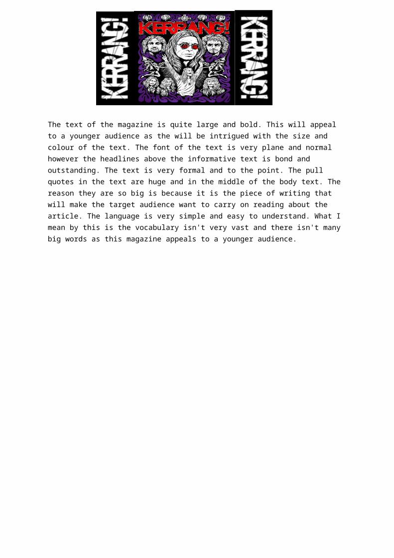
The text of the magazine is quite large and bold. This will appeal to a younger audience as the will be intrigued with the size and colour of the text. The font of the text is very plane and normal however the headlines above the informative text is bond and outstanding. The text is very formal and to the point. The pull quotes in the text are huge and in the middle of the body text. The reason they are so big is because it is the piece of writing that will make the target audience want to carry on reading about the article. The language is very simple and easy to understand. What I mean by this is the vocabulary isn't very vast and there isn't many big words as this magazine appeals to a younger audience.

Welcome message from author
This document is posted to help you gain knowledge. Please leave a comment to let me know what you think about it! Share it to your friends and learn new things together.
Transcript
The text of the magazine is quite large and bold. This will appeal to a younger audience as the will be intrigued with the size and colour of the text. The font of the text is very plane and normal however the headlines above the informative text is bond and outstanding. The text is very formal and to the point. The pull quotes in the text are huge and in the middle of the body text. The reason they are so big is because it is the piece of writing that will make the target audience want to carry on reading about the article. The language is very simple and easy to understand. What I mean by this is the vocabulary isn't very vast and there isn't many big words as this magazine appeals to a younger audience.
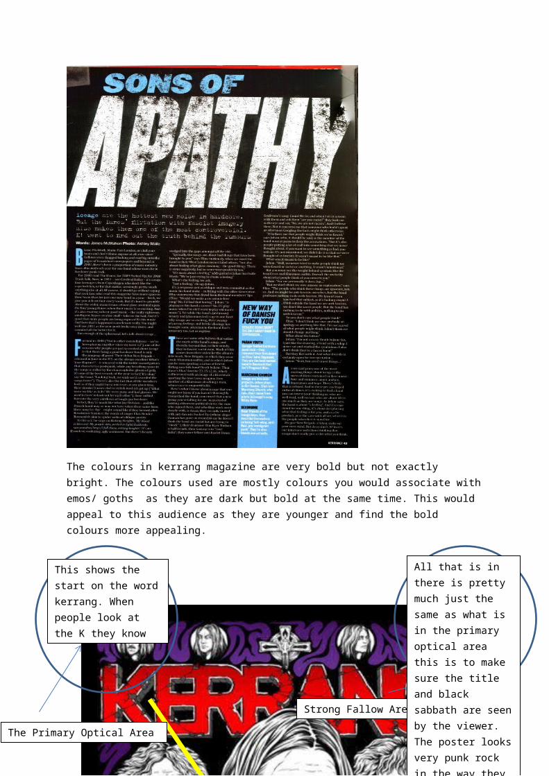
The colours in kerrang magazine are very bold but not exactly bright. The colours used are mostly colours you would associate with emos/ goths as they are dark but bold at the same time. This would appeal to this audience as they are younger and find the bold colours more appealing.
The Primary Optical Area
Strong Fallow Area
Axis of Orientation
This shows the start on the word kerrang. When people look at the K they know they are buying kerrang.
All that is in there is pretty much just the same as what is in the primary optical area this is to make sure the title and black sabbath are seen by the viewer. The poster looks very punk rock in the way they have put the name of the magazine at the top of the cover
All that is here is the rest of the imagem nobody really looks here. Mostly you will see the free CDs and Free products.
All that is in the terminal area is some more information about the Artist such as the issue of the magazine barcode and the date.

Genre codes and conventions
The genre of the magazine is a rock genre and it will appeal to the people who like grundgy punk rock music and like the bands that are issued in the magazine. As the main part of the magazine features around black Sabbath this issue would appeal to an older audience. But the colours of the magazine appeal to the younger audience.
The text in Q magazine is extremely different to what is in kerrang magazine. The two magazines are both music magazines so they have allot of similarities however the colours are brighter in Q magazine as it is still rock but it also does chart music so they can’t really have allot of dark colours as it won’t go with the theme.

The Primary Optical Area
Strong Fallow Area
Axis of Orientation
This shows the letter Q so people know what they are buying as this is wher poepe look first.
In this section is the sub head so people know what story to look for with the most information in it.
All that is her is information on what is being talked about in the magazine.
All that is in the terminal area is some more information about the Artist such as the issue of the magazine barcode and the date.
Related Documents