Social Action and Community Media Existing Product Research

Welcome message from author
This document is posted to help you gain knowledge. Please leave a comment to let me know what you think about it! Share it to your friends and learn new things together.
Transcript

Social Action and Community Media
Existing Product Research
2
Case Study: Marine Conservation Society
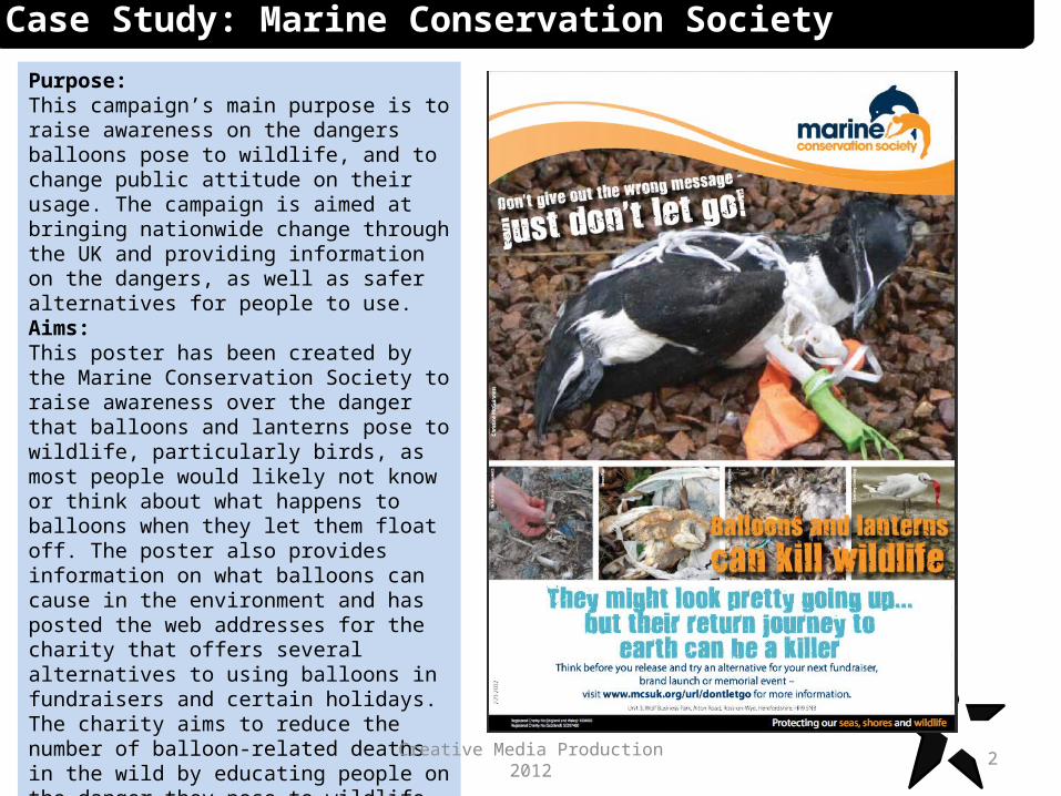
Purpose:This campaign’s main purpose is to raise awareness on the dangers balloons pose to wildlife, and to change public attitude on their usage. The campaign is aimed at bringing nationwide change through the UK and providing information on the dangers, as well as safer alternatives for people to use.Aims:This poster has been created by the Marine Conservation Society to raise awareness over the danger that balloons and lanterns pose to wildlife, particularly birds, as most people would likely not know or think about what happens to balloons when they let them float off. The poster also provides information on what balloons can cause in the environment and has posted the web addresses for the charity that offers several alternatives to using balloons in fundraisers and certain holidays. The charity aims to reduce the number of balloon-related deaths in the wild by educating people on the danger they pose to wildlife and encouraging people to use alternatives, such as releasing balloons inside or using tethered balloons, as a sculpture or arch.
Creative Media Production 2012

3
Techniques:This campaign makes use of a white, blue and orange colour scheme that ties into the group’s environmental agenda, which is aimed towards protecting the coastal environment and wildlife. This helps to make the leaflet feel more like a reminder to the public rather than a telling off, which might use dark, bold colours and lots of punctuation to make the text seem more dramatic and give the impression that it is a warning to the public. This campaign uses a lot of unedited shock imagery of animals entangled in man-made rubbish in order to incite certain feelings within the viewer and make them feel sympathetic for their cause. Coloured, bold text is used to highlight the main dangers of balloons as well as the campaign’s tagline ‘Don’t Let Go!’ which helps to draw attention to the main points that the poster is putting across, allowing somebody to skim across and know the meaning behind the post without reading into the finer details. The charity has used a weathered font for this poster in order to create the idea that balloons are a genuine issue and can cause serious damage if something is not done about them. The charity behind the campaign has included their contact details at the bottom as well as their personal website, which allows people who wish to know more to log on and receive more information than the poster can convey by itself.
Creative Media Production 2012
Case Study: Marine Conservation Society
4
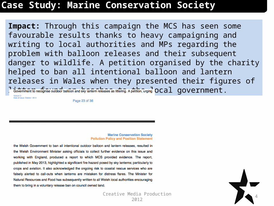
Impact: Through this campaign the MCS has seen some favourable results thanks to heavy campaigning and writing to local authorities and MPs regarding the problem with balloon releases and their subsequent danger to wildlife. A petition organised by the charity helped to ban all intentional balloon and lantern releases in Wales when they presented their figures of litter found on beaches to the local government.
Creative Media Production 2012
Case Study: Marine Conservation Society

5
Case Study: Shelter
Purpose:This campaign’s purpose is to raise awareness about the number of young children who are homeless in Scotland. It is intended to change attitudes about homeless people by highlighting their plight and giving them more of a human representation so that people will be able to connect with them. The campaign also provides information and builds relationships with subjects with the figures of how many children are in temporary accommodation.Aims:By creating this poster, Shelter aims to reduce the number of children who will be living in temporary accommodation by Christmas. They do this by using imagery that helps the audience connect with what these homeless people might be feeling, as well as using a happy, festive occasion such as Christmas to highlight how alone they really are. The charity also aims to raise more money for their campaign and get more signatures for a petition that will be presented to the government. The charity hopes to put pressure on the government to build more accommodation and housing in response to the crisis.
Creative Media Production 2012
6
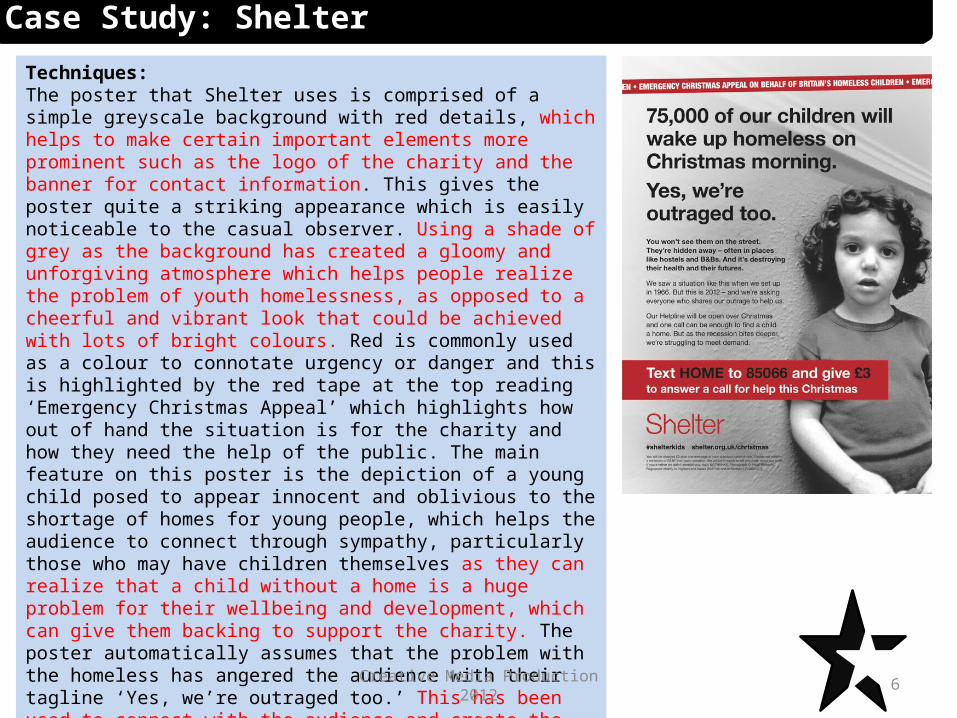
Techniques:The poster that Shelter uses is comprised of a simple greyscale background with red details, which helps to make certain important elements more prominent such as the logo of the charity and the banner for contact information. This gives the poster quite a striking appearance which is easily noticeable to the casual observer. Using a shade of grey as the background has created a gloomy and unforgiving atmosphere which helps people realize the problem of youth homelessness, as opposed to a cheerful and vibrant look that could be achieved with lots of bright colours. Red is commonly used as a colour to connotate urgency or danger and this is highlighted by the red tape at the top reading ‘Emergency Christmas Appeal’ which highlights how out of hand the situation is for the charity and how they need the help of the public. The main feature on this poster is the depiction of a young child posed to appear innocent and oblivious to the shortage of homes for young people, which helps the audience to connect through sympathy, particularly those who may have children themselves as they can realize that a child without a home is a huge problem for their wellbeing and development, which can give them backing to support the charity. The poster automatically assumes that the problem with the homeless has angered the audience with their tagline ‘Yes, we’re outraged too.’ This has been used to connect with the audience and create the impression that the figure for homeless children is extremely worrying and concerning. This is a tactic used to reassure the public that they are thinking the same way as the charity and their support is wanted.
Creative Media Production 2012
Case Study: Shelter
7
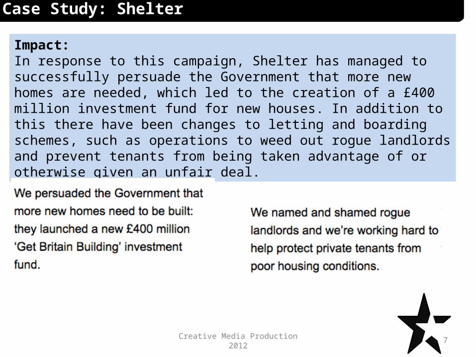
Impact:In response to this campaign, Shelter has managed to successfully persuade the Government that more new homes are needed, which led to the creation of a £400 million investment fund for new houses. In addition to this there have been changes to letting and boarding schemes, such as operations to weed out rogue landlords and prevent tenants from being taken advantage of or otherwise given an unfair deal.
Creative Media Production 2012
Case Study: Shelter

8
Case Study: Conservative election campaign
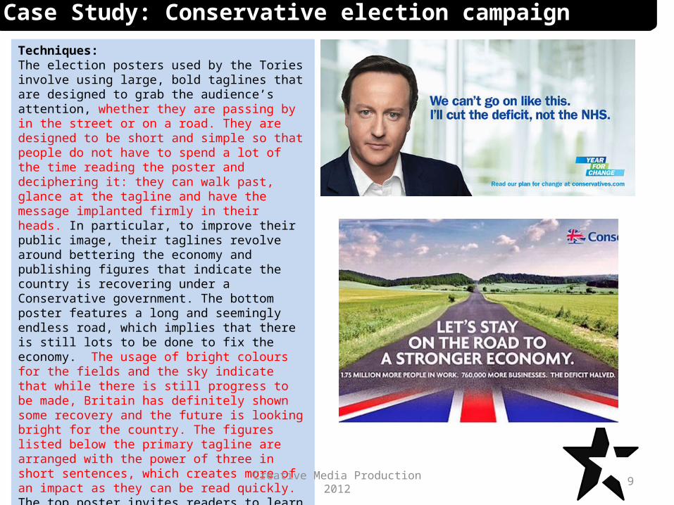
Purpose:The purpose of this poster is to change the voting behaviour of those who vote for different parties other than the conservatives, evident by the tagline ‘We can’t go on like this’ which highlights that the current party in power is inadequate. The poster is also used for campaigning for the Conservatives in order to secure more votes.Aims:The Conservatives have created this poster with the aim of acquiring more votes in the general election over their opponents. The poster is aimed at painting the party in a more positive light with their tagline, which promises to cut the deficit instead of the NHS. This gives the impression that the Conservatives have the British people in mind by putting the health service first and fixing the economy.
Creative Media Production 2012
9
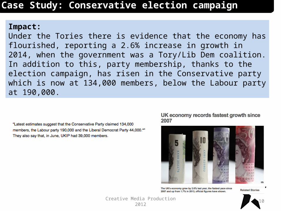
Techniques:The election posters used by the Tories involve using large, bold taglines that are designed to grab the audience’s attention, whether they are passing by in the street or on a road. They are designed to be short and simple so that people do not have to spend a lot of the time reading the poster and deciphering it: they can walk past, glance at the tagline and have the message implanted firmly in their heads. In particular, to improve their public image, their taglines revolve around bettering the economy and publishing figures that indicate the country is recovering under a Conservative government. The bottom poster features a long and seemingly endless road, which implies that there is still lots to be done to fix the economy. The usage of bright colours for the fields and the sky indicate that while there is still progress to be made, Britain has definitely shown some recovery and the future is looking bright for the country. The figures listed below the primary tagline are arranged with the power of three in short sentences, which creates more of an impact as they can be read quickly. The top poster invites readers to learn more about the party’s plans by posting their web address on the poster, meaning that the Conservatives are offering more information than a poster can convey which helps to encourage people to support the party.
Creative Media Production 2012
Case Study: Conservative election campaign
10
Impact:Under the Tories there is evidence that the economy has flourished, reporting a 2.6% increase in growth in 2014, when the government was a Tory/Lib Dem coalition. In addition to this, party membership, thanks to the election campaign, has risen in the Conservative party which is now at 134,000 members, below the Labour party at 190,000.
Creative Media Production 2012
Case Study: Conservative election campaign

11
Case Study: Accessible Arts and Media
Purpose:The purpose of this charity is to create access to media production for non-traditional groups by organizing different activities for all ages. It is also trying to create and strengthen community ties by educating them about issues that they may not know a lot about. This charity also tries to infiltrate mainstream media by letting disadvantaged people have a say.Aims:This poster is aimed at bringing together people with disabilities or special needs and giving them an outlet that may not be available elsewhere. The charity aims to give disadvantaged people a voice and create better representations of who they are. The charity primarily aims to do this through engaging activities and workshops to allow disabled and disadvantaged people to express themselves through creativity.
Creative Media Production 2012

12
Techniques:The main website for the group uses easily legible, colour font and lots of childish elements which ties in to the charity’s youth-orientated nature. The usage of lots of different colours in the website’s elements gives solidifies the idea that they are an all-inclusive organization, with different colours on the site representing different groups of people. The choice colours also creates a timeless atmosphere where they are appealing to all the age groups without any specific colours. The logo for AAM itself is designed to represent the drive to allow disabled people to express themselves through creativity, hence the paint splatter. The website includes lots of pictures of its members partaking in activities which it uses to both advertise itself as a friendly and welcoming organization and to show off their different offerings for the community. To make itself more accessible to disadvantaged people the site uses coloured tabs at the top for navigation which makes to distinguish between pages. The site has also included a ‘night’ setting which allows the site to be easier to read in the dark or for people with reading difficulties, which is part of their drive for accessibility for all types of people. The information on the website is a combination of long and short sentences that is beneficial to those who have trouble reading more complex sentences. The site also includes lots of links to pages where people can contact them for support and also to send donations to the charity.
Creative Media Production 2012
Case Study: Accessible Arts and Media

13
Impact: Thanks to the charity’s activities, it was awarded £1000 from the Hull and East Riding Charitable Trust and £500 from the James Reckitt charity in order to be able to continue their group in East Riding. The charity also received £1500 from the Charles Ruddock Trust which was used to continue support for the Hands & Voices singing choir.
Creative Media Production 2012
Case Study: Accessible Arts and Media
14
Case Study: Stonewall
Purpose:This charity’s purpose is to challenge dominant representation and agendas, to change attitudes, to bring global change, to campaign, and to raise awareness.Aims:This charity is dedicated to campaigning for equal rights, especially for the LGBT minority, which still suffers from discrimination in the 21st century. Its main goal is to get people to stop using the word ‘gay’ as a derogatory insult when the subject is not gay at all. The charity is also fighting for people to accept gay people for who they are instead of making a big fuss about their sexuality. This is an attempt to make people realise that homosexuality is something that should be supported fully instead of being demonized.
Creative Media Production 2012

15
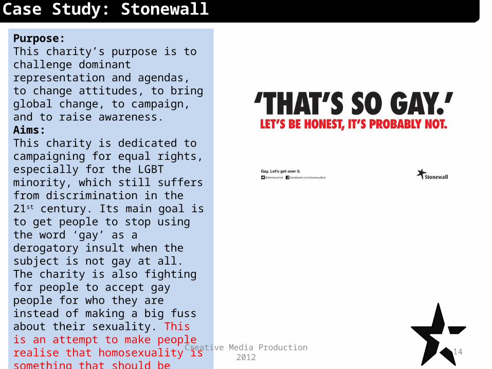
Techniques:These posters by Stonewall rely on a simple yet effective approach, being comprised only of text and a blank white background the emphasize the message on hand. The main element of the poster is the debunking that the word ‘gay’ should not be used as a simple derogatory term as it wrongly implies that the subject is homosexual and trivialises the meaning of the word. The two main colours are black and red on a white background which gives the poster a very striking yet simple appearance and makes it easily recognizable in public spaces or on the internet.At the bottom of the poster Stonewall has included their social media links, such as Facebook and Twitter, as well as their web address. This allows people wanting to know more to be able to log on to these sites and have a look at the charity and it’s activities for themselves. The poster also includes a Twitter hashtag, allowing people to spread the campaign’s message quickly and easily. This helps to make more people aware of the campaign and get them to pledge their support.
Creative Media Production 2012
Case Study: Stonewall

16
Impact:Thanks to the efforts of Stonewall and other equal rights charities, rights for the LGBT minority has increased in many European countries, such as the UK, Iceland, France, Spain, and most of Scandinavia. Following a push by the charity, same-sex marriage was legalised in the UK in 2014, which was a major milestone for LGBT rights.
Creative Media Production 2012
Case Study: Stonewall
Related Documents