University of Calgary PRISM: University of Calgary's Digital Repository Graduate Studies The Vault: Electronic Theses and Dissertations 2014-01-20 Sustainability and Public Transportation Theory and Analysis Miller, Patrick Miller, P. (2014). Sustainability and Public Transportation Theory and Analysis (Unpublished doctoral thesis). University of Calgary, Calgary, AB. doi:10.11575/PRISM/27943 http://hdl.handle.net/11023/1277 doctoral thesis University of Calgary graduate students retain copyright ownership and moral rights for their thesis. You may use this material in any way that is permitted by the Copyright Act or through licensing that has been assigned to the document. For uses that are not allowable under copyright legislation or licensing, you are required to seek permission. Downloaded from PRISM: https://prism.ucalgary.ca

Welcome message from author
This document is posted to help you gain knowledge. Please leave a comment to let me know what you think about it! Share it to your friends and learn new things together.
Transcript

University of Calgary
PRISM: University of Calgary's Digital Repository
Graduate Studies The Vault: Electronic Theses and Dissertations
2014-01-20
Sustainability and Public Transportation Theory and
Analysis
Miller, Patrick
Miller, P. (2014). Sustainability and Public Transportation Theory and Analysis (Unpublished
doctoral thesis). University of Calgary, Calgary, AB. doi:10.11575/PRISM/27943
http://hdl.handle.net/11023/1277
doctoral thesis
University of Calgary graduate students retain copyright ownership and moral rights for their
thesis. You may use this material in any way that is permitted by the Copyright Act or through
licensing that has been assigned to the document. For uses that are not allowable under
copyright legislation or licensing, you are required to seek permission.
Downloaded from PRISM: https://prism.ucalgary.ca

UNIVERSITY OF CALGARY
Sustainability and Public Transportation
Theory and Analysis
by
Patrick Burke Vernon Miller
A THESIS
SUBMITTED TO THE FACULTY OF GRADUATE STUDIES
IN PARTIAL FULFILMENT OF THE REQUIREMENTS FOR THE
DEGREE OF DOCTOR OF PHILOSOPHY
DEPARTMENT OF CIVIL ENGINEERING
CALGARY, ALBERTA
JANUARY, 2014
© Patrick Burke Vernon Miller 2014

ii
Abstract
In the 21st century there is a need to provide sustainable transportation systems in
cities to ensure that they remain centres of innovation, quality of life, and economic
development. Public transit is often framed as a high potential mode of sustainable
urban travel and while much research has been done on other modes of travel,
comprehensive research into its sustainability benefits of public transit has been
limited. This thesis first reviews the literature on sustainability and sustainable
transport to develop a framework to analyze public transit and then applies the
framework to 33 mass transit systems from the USA using the National Transit
Database. The Public Transit Sustainable Mobility Analysis Project (PTSMAP)
framework developed in this thesis utilizes environmental, economic, social and
system effectiveness factors to compare the relative performance of Heavy Rail and
Light rail systems while demonstrating how composite sustainability index techniques
can be applied to public transit analysis. An application of this framework to a real
world transit planning scenario is also presented using data from the TransLink UBC
Line Phase 2 study report. Both demonstrations of the PTSMAP framework
demonstrate a new way to analyze transit based on sustainability and aid in future
research and decision making scenarios.

iii
Acknowledgements
To my supervisors – Alex, Lina, and Chan – I cannot express enough gratitude for your
consistent and constant mentorship, support, critical questions, and guidance over
the past few years. The research and learning contained in this thesis would never
have been possible without your encouragement to pursue graduate studies when I
was an undergraduate along with your continued support and guidance that has
remained from day one through internships, a fellowship, and medical challenges.
Your supervision and mentorship has encouraged me to think more clearly,
scientifically, and critically about not just transport planning or my research, but
about my role as a citizen in this world and even if I wrote another thesis on all I have
learned in the years I have worked with you three it would not capture it all. I thank
you each for sharing your unique expertise with me, helping me exceed my potential,
reach for new opportunities, and overcome my challenges.
Mom, Dad, George, Joanna, and my whole family – as far back as I remember you
have been a caring family that has encouraged me to reach for my dreams no matter
what form they take. If I wanted to fly, you helped me soar, if I wanted the clouds,
you pushed me to the stars. Thank you for always being there for me and helping me
through my medical issues to finish this thesis.
Many thanks also to all of my colleagues in Engineers Without Borders and the EWB13
team who pushed me to grow as a leader and as a human being over the past few
years. There are too many of you to name, but I appreciate your friendship and
support as I worked away on this thesis and volunteered with all of you. Many warm
thanks to Dr. Ed Nowicki for encouraging me to pursue my studies and being a strong
mentor. Thank you to Saied who has been a constant thought partner, classmate, and
lab mate. We have developed and explored many ideas together – let’s continue to do
so into the future.
どうもありがとうございました。Thank you to Dr. Maruyama, Dr. Mizokami
(Kumamoto University) and Dr. Kato (University of Tokyo) for their advice and
mentorship during my Japanese Society for the Promotion of Science Fellowship in

iv
2012. You all exposed me to new ideas, introduced me to inspiring Japanese transport
planning concepts, and helped me look more critically at my own research with a
fresh and motivating perspective. Many thanks to Keisuke, Rosey, Koutaro, and all my
friends in Japan who enabled me to make the most of my JSPS Fellowship and greatly
expand the research contained in this thesis. Further, thank you to the wonderful and
humble staff at JSPS and NSERC for facilitating the placement.
I would also like to thank the staff at Steer Davies Gleave for their support with my
Natural Sciences and Engineering Research Council Industrial Post Graduate
Scholarship as well as their mentorship and advice during my two internships with the
company. The training, resources, and career development they facilitated not only
greatly expanded my research, it helped me grow as a professional and dive into the
world of transport consulting. The whole team I worked with across Canada and the
company offered great advice as I developed this thesis project and entered into the
world of transport planning and consulting.
I wish to also acknowledge the Natural Sciences and Engineering Research Council of
Canada for funding this degree and research with an NSERC IPS award. Their
investment in sustainability and transport research made this research possible.
I am also grateful to my fellow grad students, friends, and colleagues who helped me
along on the journey to completing this thesis. Especially Sara, Marc, Fraser, Simon
and Mike – even though we were in different fields, I found our conversations thought
provoking and helpful. Also, thank you to Chelsea for your consistent support,
encouragement, and proof reading. You all helped make this thesis and degree
possible.
Thank you to all of you who helped me on my way.

v
Dedication
For everyone working to make our cities more sustainable, vibrant, and liveable.

vi
Table of Contents
Chapter 1: Introduction ........................................................................... 1
Background and Motivation .......................................................... 1
Problem Statement .................................................................... 4
Objectives and Contributions ........................................................ 4
Scope and Methods Overview ....................................................... 6
Overview of Thesis .................................................................... 8
Sustainability and Sustainable Development .................................. 10
Chapter Overview ..................................................................... 10
Sustainability and Sustainable Development Definitions ...................... 11
2.2.1 Defining Sustainability and Sustainable Development ....................... 11
2.2.2 Applying the Definition........................................................... 14
Select Sustainability Frameworks .................................................. 16
2.3.1 Triple Bottom Line ................................................................ 16
2.3.2 Footprint Analysis ................................................................. 20
2.3.3 Weak vs. Strong- two characterizations of sustainability ................... 22
Conclusion .............................................................................. 23
Overview of Sustainable transportation Concepts ........................... 25
3.1 Chapter Overview ..................................................................... 25
3.2 Sustainable Transportation: mobility, systems, and definitions ............. 25
3.2.1 What is a Sustainable Transportation System? ................................ 25
3.3 Problem of Unsustainable Transport .............................................. 31
3.3.1 Transportation Challenges ....................................................... 31
3.3.2 Auto Dependence and Sprawl – perspectives on compromised
sustainability ................................................................................ 33
3.4 Environmental ......................................................................... 35

vii
3.4.1 Overview of Impacts .............................................................. 35
3.4.2 Energy and resource consumption .............................................. 35
3.4.3 CO2 and Climate Change ......................................................... 37
3.4.4 Emissions and Pollutants ......................................................... 38
3.4.5 Ecological disturbance ........................................................... 39
Economic ............................................................................... 39
3.5.1 Impacts on Economic Activity and Infrastructure Costs ..................... 39
3.5.2 Pricing of Transport Activities .................................................. 40
Social .................................................................................... 40
3.6.1 Community, Inclusivity, Equity, and Access .................................. 41
3.6.2 Health – Injury and Emissions .................................................. 41
Potential Solutions to Sustainability Challenges ................................ 42
3.7.1 Key Concepts ...................................................................... 42
3.7.2 Distance Reduction – Accessibility vs. Mobility ............................... 44
3.7.3 Push and Pull / Stick and Carrot Policy Lenses ............................... 45
Public Transit .......................................................................... 46
3.8.1 Why Focus on Public Transit and Sustainability? ............................. 46
3.8.2 Defining Transit – Characteristics and Modes ................................. 48
3.8.3 A Review of Modal Comparison ................................................. 52
3.9 Conclusion .............................................................................. 59
Sustainable Transportation Assessment ....................................... 60
4.1 Chapter Overview ..................................................................... 60
4.2 Literature Review Scope ............................................................ 60
4.3 Transportation Decision Making Methodology ................................... 61
4.3.1 Overview of Literature ........................................................... 61
viii
4.3.2 Sustainability Analysis ............................................................ 61
4.3.3 Analysis and Decision Making Across Multiple Dimensions ................. 64
Sustainable Transport Studies ...................................................... 68
4.4.1 Overview of Past Studies......................................................... 68
4.4.2 Review of Past Studies ........................................................... 69
4.4.3 Summary ........................................................................... 71
4.5 Indicators, Metrics, and Indices .................................................... 73
4.5.1 Indicator Selection - Literature Practices ..................................... 73
4.5.2 Overview of Composite Indicators .............................................. 76
4.5.3 Index Technique – Z score normalization / Standardization ................ 77
4.5.4 Index Technique –Rescaling and Distance to Reference ..................... 77
4.5.5 Weighting Discussion ............................................................. 78
4.5.6 Survey of Indicator Sets .......................................................... 80
4.5.7 Indicator Selection Criteria ...................................................... 89
4.5.8 Public Transit Goals and Objectives ........................................... 89
Environmental Indicators ............................................................ 93
4.6.1 Energy .............................................................................. 93
4.6.2 Emissions – local and global pollutants ........................................ 97
4.6.3 Noise ............................................................................... 101
4.6.4 Habitat and Ecological Impacts Indicator .................................... 102
Economic Indicators ................................................................ 103
4.7.1 Operating cost Efficiency ....................................................... 103
4.7.2 User Costs ......................................................................... 103
4.7.3 Recovery and Subsidy ........................................................... 104
4.7.4 Transit Activity and Economic Activity ....................................... 104
ix
Social Indicators ..................................................................... 104
4.8.1 Affordability ...................................................................... 104
4.8.2 Human health impacts .......................................................... 105
4.8.3 Accessibility ...................................................................... 105
Effectiveness Indicators ........................................................... 107
4.9.1 Reliability and Capacity Utilization ........................................... 107
4.9.2 System Usage ..................................................................... 108
4.10 Conclusion ......................................................................... 109
Chapter 5: Mass Transit Composite Sustainability Assessment Methodology ......... 110
5.1 Chapter Overview ................................................................... 110
5.2 Overview of Methodology ......................................................... 110
5.2.1 Part 1 – Research Inputs ........................................................ 115
5.2.2 Part 2- Sustainability Analysis of Data ........................................ 117
5.2.3 Part 3 – Calculating the CSI ..................................................... 121
5.3 Discussion and Selection of Indicators and Factors .......................... 123
5.4 Environmental Category ........................................................... 123
5.4.1 Energy Factors .................................................................... 123
5.4.2 Pollution – emissions and noise ................................................ 124
5.4.3 Land consumption and ecosystem degradation .............................. 125
5.4.4 Global Climate Change- Green House Gas Emissions ....................... 126
5.5 Economic Category ................................................................. 127
5.5.1 Total Operating Costs ........................................................... 127
5.5.2 Capital Costs ...................................................................... 128
5.5.3 Recovery and Subsidy ........................................................... 129
5.5.4 Transit Usage Relative to Economic Activity ................................. 129
x
5.5.5 User Costs ......................................................................... 130
5.6 Social Category ...................................................................... 130
5.6.1 Accessibility ...................................................................... 130
5.6.2 Health ............................................................................. 133
5.6.3 Safety .............................................................................. 134
5.7 Effectiveness Category ............................................................. 135
5.7.1 Operating and Capacity Factors............................................... 135
5.7.2 System Usage Factors ........................................................... 136
5.8 Application of Methodology – Normalization and Weighting ................ 136
5.8.1 Technique 1: z-score function ................................................ 137
5.8.2 Technique 2: Distance to Reference Based Approach ...................... 138
5.8.3 Technique 3: Re-scaling ......................................................... 139
5.8.4 Comparison of techniques ...................................................... 140
5.8.5 Weighting ......................................................................... 141
5.9 Application for System Comparison Scenarios ................................ 141
5.10 Applications for Decision Making Scenarios ................................. 142
5.10.1 Applications for Decision Making Scenario 1 ................................. 144
5.10.2 Applications for Decision Making Scenario 2 ................................. 145
5.11 Comparison to Past Studies ..................................................... 146
5.11.1 Kennedy 2002 ..................................................................... 146
5.11.2 Jeon 2007, Jeon et al 2009 ..................................................... 146
5.11.3 Haghshenas & Vaziri 2012 ...................................................... 147
5.12 Conclusion ......................................................................... 147
Application of Mass Transit Composite Sustainability Assessment ........ 148
6.1 Chapter Overview ................................................................... 148
xi
6.2 PTSMAP Part 1: Data Discussion and Factor Selection ....................... 148
6.2.1 Available Data .................................................................... 148
6.2.2 NTD ................................................................................ 149
6.2.3 BRT ................................................................................. 150
6.2.4 Other Sources ..................................................................... 150
6.3 PTSMAP Part 1: Data Selection .................................................. 150
6.3.1 Overview of Data ................................................................. 150
6.3.2 Data Challenges .................................................................. 152
6.4 PTSMAP Part 2: Data Treatment and Expansion .............................. 156
6.4.1 Data Treatment and Expansion: Environment ............................... 156
6.4.2 Data Treatment and Expansion: Economy .................................... 160
6.4.3 Data Treatment and Expansion: Social ....................................... 163
6.4.4 Data Treatment and Expansion: Effectiveness .............................. 168
6.5 PTSMAP part 2: Data analysis and results ...................................... 170
6.5.1 Environmental Factors .......................................................... 171
6.5.2 Economic Factors ................................................................ 195
6.5.3 Social Factors ..................................................................... 228
6.5.4 System Effectiveness Factors .................................................. 259
6.5.5 PTSMAP Part 2 Conclusion ..................................................... 273
Composite Sustainability Assessment ........................................... 274
6.6.1 Application Of Methodology .................................................... 274
6.6.2 Methodology 1 z-score .......................................................... 274
6.6.3 Methodology 2: Utility ........................................................... 288
6.6.4 Method 3: Re-Scaling ............................................................ 299
6.7 CSI Results Analysis ................................................................. 309

xii
6.7.1 Method 1: z-score ................................................................ 309
6.7.2 Method 2: Utility ................................................................. 318
6.7.3 Method 3: Rescaling ............................................................. 328
6.7.4 Comparison of Methods for assessing Sustainability Performance –
potential biases in interpretation ....................................................... 340
Sensitivity Analysis and Discussion .............................................. 342
6.8.1 Sensitivity Analysis ............................................................... 342
6.8.2 Sensitivity Summary ............................................................. 373
PTSMAP Application to Decision Making: Vancouver UBC Corridor ....... 375
Introduction .......................................................................... 375
7.1.1 Overview .......................................................................... 375
7.1.1 UBC/Broadway Corridor Study Selection and Scope ........................ 375
Study Background ................................................................... 376
7.2.1 Overview .......................................................................... 376
7.2.2 Study Objectives ................................................................. 377
7.2.3 Study Structure- Evaluation and Data ......................................... 378
UBC Line Options .................................................................... 379
Case Study Methodology ........................................................... 381
7.4.1 Accounts, Indicators, and Data ................................................ 381
7.4.2 Environmental Indicators ....................................................... 383
7.4.3 Economic Indicators ............................................................. 384
7.4.4 Social Indicators .................................................................. 385
7.4.5 System Effectiveness Indicators ............................................... 386
7.4.6 Analysis Methodology ............................................................ 387
Sustainability Calculations ........................................................ 388
xiii
7.5.1 Environmental Factors .......................................................... 388
7.5.2 Economic Factors ................................................................ 390
7.5.3 Social Factors ..................................................................... 391
7.5.4 System Effectiveness Factors .................................................. 393
7.5.5 UBC Line CSI ...................................................................... 394
Conclusion ............................................................................ 395
Sustainable Transportation Conceptual Case study: Calgary, Alberta,
Canada 397
Introduction .......................................................................... 397
8.1.1 Overview .......................................................................... 397
8.1.2 Chapter Organization ............................................................ 398
8.2 Overview of Calgary ................................................................ 398
8.2.1 Context ............................................................................ 398
8.2.2 Geographic and Demographic data .......................................... 398
8.2.3 Economic Overview ............................................................. 399
8.3 Transportation System Challenges and Opportunities in Calgary .......... 400
8.3.1 System Overview ................................................................ 400
8.3.2 Auto Network ..................................................................... 400
8.3.3 Transit Network .................................................................. 400
8.3.4 Active Mode Network ............................................................ 401
8.4 Mobility Challenges – Analysis of Unsustainable Transport ................. 402
8.4.1 Problem Framing – Sprawl and Automobile Dependence ................... 402
8.4.2 Mode Split – an early warning for unsustainable transport ................ 403
8.4.3 Further Analysis of Auto Dependence ......................................... 404
8.4.4 Environmental, Social, and Economic Impacts of Car Dependence ...... 405

xiv
8.4.5 Mode Split Explored – TDM and Transit Development ...................... 406
8.4.6 Future Options for Calgary ..................................................... 407
8.5 Transit Improvements through TDM and Policy ............................... 408
8.5.1 Plan Overview and Selection ................................................... 408
8.6 Exploration of Potential Measures ............................................... 410
8.6.1 Transit Improvements: short term ............................................ 411
8.6.2 Transit Improvements: middle term .......................................... 412
8.6.3 Transit Improvements: long term ............................................. 414
8.7 Next Steps and Conclusion ........................................................ 415
8.7.1 Next Steps ......................................................................... 415
8.7.2 Conclusion ........................................................................ 416
Conclusion and Recommendations ............................................ 417
Summary .............................................................................. 417
Key Contributions ................................................................... 418
9.2.1 Framework Development ....................................................... 419
9.2.2 Modal Sustainability Analysis ................................................... 420
9.2.3 Decision Support Demonstration ............................................... 421
Key Findings ......................................................................... 421
9.3.1 Limitations ........................................................................ 423
9.3.2 Future Research .................................................................. 424
References ....................................................................................... 427
Appendix A: Inputs.............................................................................. 443
Appendix B: Energy Emissions Table ......................................................... 447
Appendix C: Income Per Capita ............................................................... 450
Appendix D: Method 3 Sustainability Analysis Graphs ..................................... 451

xv
Equations
Equation 5-1 Category Index Equation ....................................................... 120
Equation 5-2 Composite Sustainability Equation ........................................... 122
Equation 5-3 z-score equation ................................................................ 137
Equation 5-4 Positive Impact Factor Equation .............................................. 138
Equation 5-5 Negative Impact Factor Equation ............................................ 139
Equation 5-6 Re-Scaling Equation ............................................................ 139
Equation 6-1 Emissions Factor Calculation .................................................. 158
Equation 6-2 CO2 Equivalency Equation ..................................................... 158
Equation 6-3 Operating Cost Factor Equation .............................................. 161
Equation 6-4 Average System Fare Factor Equation ....................................... 161
Equation 6-5 Average Travel Time Cost Factor Equation ................................. 162
Equation 6-6 Recovery Factor Equation ..................................................... 162
Equation 6-7 Transport-Relative to Economic Activity .................................... 163
Equation 6-8 Accessibility Factor Equation ................................................. 165
Equation 6-9 Average Journey Length Factor Equation ................................... 166
Equation 6-10 Affordability Factor Equation ................................................ 166
Equation 6-11 User Accessibility Factor Equation .......................................... 167
Equation 6-12 Potential pkm Calculation ................................................... 169
Equation 6-13 Capacity Utilization Factor Equation ....................................... 169
Equation 6-14 Trips per Service Population Capita Factor Equation .................... 170
xvi
Figures
Figure 3-1 Calgary C-Train LRT ................................................................ 49
Figure 3-2 Heavy Rail Systems in Tokyo ...................................................... 50
Figure 3-3BRT – TransMilenio, Bogota ........................................................ 52
Figure 4-1 Classification of MCA Approaches ................................................ 66
Figure 4-2 Indicator Best Practices ............................................................ 74
Figure 5-1 Public Transport Sustainable Mobility Analysis Project Framework ........ 112
Figure 5-2 Modal or Alternative Comparison ............................................... 117
Figure 5-3 Visualisation of Sustainability Assessment ..................................... 119
Figure 6-1 Energy Consumption Ranges for Light Rail and Heavy Rail Transit Systems
.................................................................................................... 177
Figure 6-2 Passenger Kilometres Travelled and Energy for Propulsion for LRT and HRT
Systems ........................................................................................... 179
Figure 6-3 Passenger Kilometres Travelled and Energy for Propulsion for LRT and HRT
Systems ........................................................................................... 180
Figure 6-4 CO2E/pkm Ranges for Heavy Rail and Light Rail Transit Systems .......... 185
Figure 6-5 Operating cost/pkm ranges for Heavy Rail and Light Rail Transit Systems 201
Figure 6-6 Log Scale Passenger Kilometres Travelled and Operating Costs for
Propulsion for Heavy Rail and Light Rail Transit Systems ................................. 203
Figure 6-7 Passenger Kilometres Travelled and Operating Cost for Propulsion for HR
and LR Transit Systems ........................................................................ 204
Figure 6-8 Average Travel Time for Heavy and Light Rail Transit Systems ............. 208
Figure 6-9 Average Travel Time Costs for Heavy Rail and Light Rail Transit Systems 209
Figure 6-10 Average User Fare Costs for Heavy Rail and Light Rail Transit Systems .. 213
Figure 6-11 Average User Fare Cost Ranges for Heavy Rail and Light Rail Transit
Systems ........................................................................................... 215
Figure 6-12 Economic Recovery from Fares for Heavy Rail and Light Rail Transit
Systems ........................................................................................... 218
Figure 6-13 Economic Recovery Ranges for Heavy Rail and Light Rail Transit Systems
.................................................................................................... 220
xvii
Figure 6-14 pkm/GDP for Heavy Rail and Light Rail Transit Systems ................... 223
Figure 6-15 pkm/GDP Ranges for Heavy Rail and Light Rail Transit Systems .......... 224
Figure 6-16 System Accessibility for Heavy and Light Rail Transit Systems ............ 234
Figure 6-17 Accessibility Factor for Heavy Rail and Light Rail Transit Systems ....... 236
Figure 6-18 Accessibility Factor as a Function of Density ................................. 240
Figure 6-19 Affordability Factor for Heavy Rail and Light Rail Transit Systems ....... 243
Figure 6-20 Affordability Ranges for Heavy and Light Rail Transit Systems ............ 245
Figure 6-21 Average Journey Length for Heavy Rail and Light Rail Transit Systems .. 250
Figure 6-22 Average Journey Length (km) for Heavy Rail and Light Rail Transit Systems
.................................................................................................... 251
Figure 6-23 Average trip length as a function of directional length for Heavy Rail and
Light Rail Transit Systems ..................................................................... 255
Figure 6-24 pkm/pkm theoretical for Heavy Rail and Light Rail Transit Systems ..... 264
Figure 6-25 pkm/ pkm theoretical Ranges for Heavy and Light Rail Transit Systems 265
Figure 6-26 Trips/Capita for Heavy Rail and Light Rail Transit Systems ................ 269
Figure 6-27 Trips/capita Ranges for Heavy Rail and Light Rail Transit Systems ....... 270
Figure 6-28 Radar Diagram for Method 2 .................................................... 327
Figure 6-29 Sustainability Graph for MTA New York ....................................... 338
Figure 6-30 Sustainability Graph for the Greater Cleveland Regional Transit Authority
(LR) ............................................................................................... 339
Figure 7-1 Phase 2 Report: UBC Corridor Mission and Objectives ....................... 377
Figure 7-2 UBC Line Account Description Table ............................................ 379
Figure 7-3 UBC Line Alternatives ............................................................. 380

xviii
Tables
Table 2-1 Summary of Key Category Considerations ....................................... 17
Table 3-1 Transportation Impacts ............................................................. 32
Table 3-2 Modal Comparison Summary ....................................................... 58
Table 4-1 Key Concepts from Sustainability Studies ........................................ 72
Table 4-2 Litman 2013 Sustainability Indicators ............................................ 81
Table 4-3 Dobranskyte-Niskota et al 2007 Sustainability Indicators ...................... 84
Table 4-4 Haghshenas & Vaziri 2012 Sustainability Indicators ............................ 86
Table 4-5 Bongardt et al 2011 Sustainability Indicators ................................... 87
Table 4-6 Jeon et al 2009 Sustainability Indicators ......................................... 87
Table 4-7 Sustainability Goals and Objectives for Mass Transit ........................... 90
Table 4-8 Summary of Energy Indicator Studies ............................................. 96
Table 4-9 Transit Emission Studies ........................................................... 101
Table 5-1 Energy Indicators ................................................................... 124
Table 5-2 Pollution Indicators ................................................................. 125
Table 5-3 Land Use Indicator .................................................................. 126
Table 5-4 Global Climate Change Indicator ................................................. 127
Table 5-5 Operating Cost Factors ............................................................ 128
Table 5-6 Capital Cost Factors ................................................................ 129
Table 5-7 Recovery and Subsidy Factors .................................................... 129
Table 5-8 Transit Usage Relative To Economic Activity ................................... 130
Table 5-9 User Cost Factors ................................................................... 130
Table 5-10 Accessibility Factors .............................................................. 133
Table 5-11 Health Factors ..................................................................... 134
Table 5-12 Safety Factors ..................................................................... 135
Table 5-13 Operating and Capacity Indicators ............................................. 136
Table 5-14 System Usage Factors ............................................................. 136
Table 5-15 Alignment between MADM and PTSMAP ........................................ 143
Table 6-1 NTD Input Data for Analysis ....................................................... 151
Table 6-2 Systems Selected for Analysis..................................................... 155

xix
Table 6-3 Global Warming Potential for Common Greenhouse Gasses ................. 159
Table 6-4 Environmental Factors ............................................................. 160
Table 6-5 Economic Factors ................................................................... 163
Table 6-6 Social Factors ....................................................................... 168
Table 6-7 System Effectiveness Factors ..................................................... 170
Table 6-8 Environmental Factors for Heavy and Light Rail Systems ..................... 173
Table 6-9 Energy Efficiency per Unit of Travel for Heavy and Light Rail Transit Systems
.................................................................................................... 175
Table 6-10 Energy Consumption Ranges for Light Rail and Heavy Rail Transit Systems
.................................................................................................... 177
Table 6-11 CO2E for Heavy Rail and Light Rail Transit Systems ......................... 183
Table 6-12 Green House Gas Emission for Heavy Rail and Light Rail Transit Systems 184
Table 6-13 SO2 Emissions Ranking for Heavy Rail and Light Rail Transit Systems ..... 187
Table 6-14 NOx Emissions Ranking for Heavy Rail and Light Rail Transit Systems .... 188
Table 6-15 Hg Pollution Rankings for Heavy Rail and Light Rail Transit Systems ...... 190
Table 6-16 Pollutant Emission Ranges for Heavy Rail and Light Rail Transit Systems 191
Table 6-17 Summary of Analysis of Environmental Factors ............................... 194
Table 6-18 Economic for Heavy Rail and Light Rail Transit Systems .................... 197
Table 6-19 Operating Costs/pkm for Heavy Rail and Light Rail Transit Systems ...... 199
Table 6-20 Operating Cost/pkm ranges for Heavy Rail and Light Rail Transit Systems
.................................................................................................... 200
Table 6-21 Average Travel Time Costs for Heavy Rail and Light Rail Transit Systems 206
Table 6-22 Travel Time Cost Ranges for Heavy Rail and Light Rail Transit Systems .. 209
Table 6-23 Average User Fare Cost for Heavy Rail and Light Rail Transit Systems .... 211
Table 6-24 Average User Fare Cost Ranges for Heavy Rail and Light Rail Transit
Systems ........................................................................................... 214
Table 6-25 Fare Recovery of Operating cost for Heavy Rail and Light Rail Transit
Systems ........................................................................................... 216
Table 6-26 Economic Recovery Ranges for Heavy Rail and Light Rail Transit Systems
.................................................................................................... 219
Table 6-27 pkm/GDP for Heavy Rail and Light Rail Transit Systems .................... 221
xx
Table 6-28 pkm/GDP ranges for Heavy Rail and Light Rail Transit Systems ........... 224
Table 6-29 Average pkm and GDP for Heavy Rail and Light Rail Transit Systems ..... 225
Table 6-30 Summary of Economic Analysis .................................................. 227
Table 6-31 Social Factors for Heavy Rail and Light Rail Transit Systems ............... 230
Table 6-32 System Accessibility Ranking for Heavy Rail and Light Rail Transit Systems
.................................................................................................... 232
Table 6-33 Accessibility Ranges for Heavy Rail and Light Rail Transit Systems........ 235
Table 6-34 Density and System Accessibility for Heavy Rail and Light Rail Transit
Systems ........................................................................................... 237
Table 6-35 Affordability Factor for Heavy Rail and Light Rail Transit Systems ........ 241
Table 6-36 System Affordability Factor Ranges for Heavy and Light Rail Transit
Systems ........................................................................................... 244
Table 6-37 Comparison of Fare and Affordability Ranking ................................ 246
Table 6-38 Average Journey Length for Heavy Rail and Light Rail Transit Systems ... 248
Table 6-39 Average Journey Length Ranges for Heavy Rail and Light Rail Transit
Systems ........................................................................................... 251
Table 6-40 Directional Route Length and Average Journey Length for Heavy Rail and
Light Rail Transit Systems ..................................................................... 253
Table 6-41 User Accessibility Factor for Heavy Rail and Light Rail Transit Systems .. 256
Table 6-42 Social Factors Conclusion ........................................................ 258
Table 6-43 System Effectiveness Factors for Heavy Rail and Light Rail Transit Systems
.................................................................................................... 260
Table 6-44 pkm/pkm theoretical for Heavy Rail and Light Rail Transit Systems ...... 262
Table 6-45 pkm/ pkm theoretical ranges for Heavy Rail and Light Rail Transit Systems
.................................................................................................... 265
Table 6-46 Annual Trips/Capita for Heavy Rail and Light Rail Transit Systems ....... 267
Table 6-47 Trips/Capita Ranges for Heavy Rail and Light Rail Transit Systems ....... 270
Table 6-48 System Effectiveness Conclusions .............................................. 272
Table 6-49 Environmental Index Calculation ............................................... 276
Table 6-50 Economic Index Calculation ..................................................... 278
Table 6-51 Social Index Calculation .......................................................... 280

xxi
6-52 System Effectiveness Index Calculation ............................................... 282
Table 6-53 Weighting Factors for Index Calculation ....................................... 283
Table 6-54 Category Indices for Heavy Rail and Light Rail Transit Systems ............ 284
Table 6-55 Category Index Weights .......................................................... 286
Table 6-56 CSI Values for Heavy and Light Rail Systems .................................. 287
Table 6-57 Environment Utility Calculations ............................................... 289
Table 6-58 Economic Utility Calculations ................................................... 291
Table 6-59 Social Utility Calculations ........................................................ 293
Table 6-60 System Effectiveness Utility Calculations ..................................... 295
Table 6-61 Category Indices for Heavy Rail and Light Rail Transit Systems ............ 297
Table 6-62 CSI Values for Method 2 .......................................................... 298
Table 6-63 Environmental Rescaling Calculations ........................................ 300
Table 6-64 Economic Rescaling Calculations .............................................. 302
Table 6-65 Social Rescaling Calculations ................................................... 303
Table 6-66 System Effectiveness Rescaling Calculations ................................ 305
Table 6-67 Category Indices for Method 3 .................................................. 307
Table 6-68 CSI Values for Method 3 ........................................................ 308
Table 6-69 EI Ranking For Method 1.......................................................... 311
Table 6-70 EcI Ranking For Method 1 ........................................................ 312
Table 6-71 SI Ranking for Method 1 .......................................................... 313
Table 6-72 SeI Ranking for Method 1 ......................................................... 314
Table 6-73 System Designations for Method 1 .............................................. 316
Table 6-74 CSI Method 1 Ranking ............................................................. 317
Table 6-75 EI Ranking for Method 2 .......................................................... 319
Table 6-76 EcI Ranking for Method 2 ......................................................... 320
Table 6-77 SI Ranking for Method 2 .......................................................... 321
Table 6-78 SeI Ranking for Method 2 ......................................................... 322
Table 6-79 System Classifications for Method 2 ............................................ 324
Table 6-80 CSI Ranking for Method 2 ........................................................ 325
Table 6-81 EI Ranking for Method 3 .......................................................... 328
Table 6-82 Eci Ranking for Method 3 ......................................................... 330
xxii
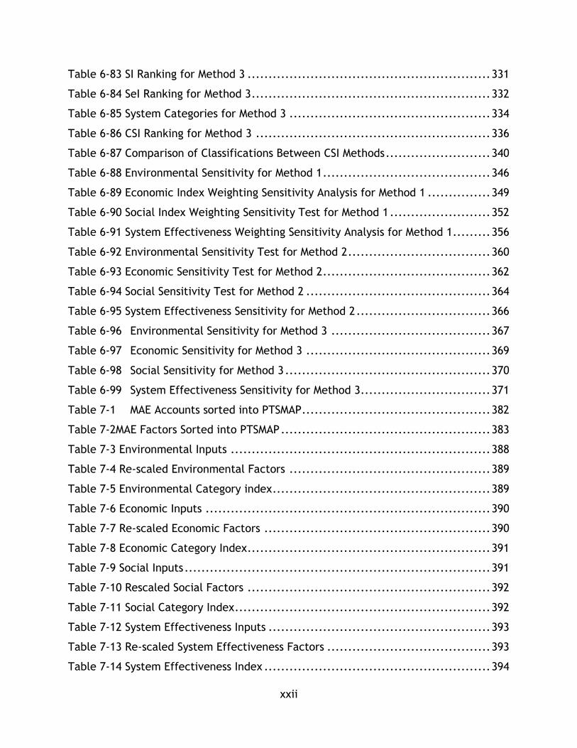
Table 6-83 SI Ranking for Method 3 .......................................................... 331
Table 6-84 SeI Ranking for Method 3 ......................................................... 332
Table 6-85 System Categories for Method 3 ................................................ 334
Table 6-86 CSI Ranking for Method 3 ........................................................ 336
Table 6-87 Comparison of Classifications Between CSI Methods ......................... 340
Table 6-88 Environmental Sensitivity for Method 1 ........................................ 346
Table 6-89 Economic Index Weighting Sensitivity Analysis for Method 1 ............... 349
Table 6-90 Social Index Weighting Sensitivity Test for Method 1 ........................ 352
Table 6-91 System Effectiveness Weighting Sensitivity Analysis for Method 1......... 356
Table 6-92 Environmental Sensitivity Test for Method 2 .................................. 360
Table 6-93 Economic Sensitivity Test for Method 2 ........................................ 362
Table 6-94 Social Sensitivity Test for Method 2 ............................................ 364
Table 6-95 System Effectiveness Sensitivity for Method 2 ................................ 366
Table 6-96 Environmental Sensitivity for Method 3 ...................................... 367
Table 6-97 Economic Sensitivity for Method 3 ............................................ 369
Table 6-98 Social Sensitivity for Method 3 ................................................. 370
Table 6-99 System Effectiveness Sensitivity for Method 3 ............................... 371
Table 7-1 MAE Accounts sorted into PTSMAP ............................................. 382
Table 7-2MAE Factors Sorted into PTSMAP .................................................. 383
Table 7-3 Environmental Inputs .............................................................. 388
Table 7-4 Re-scaled Environmental Factors ................................................ 389
Table 7-5 Environmental Category index .................................................... 389
Table 7-6 Economic Inputs .................................................................... 390
Table 7-7 Re-scaled Economic Factors ...................................................... 390
Table 7-8 Economic Category Index .......................................................... 391
Table 7-9 Social Inputs ......................................................................... 391
Table 7-10 Rescaled Social Factors .......................................................... 392
Table 7-11 Social Category Index ............................................................. 392
Table 7-12 System Effectiveness Inputs ..................................................... 393
Table 7-13 Re-scaled System Effectiveness Factors ....................................... 393
Table 7-14 System Effectiveness Index ...................................................... 394

xxiii
Table 7-15 UBC Line CSI Values ............................................................... 394
Table 8-1: Average Daily Mode Split for Calgary 2009 ..................................... 403
Table 8-2: Average Travel to Downtown Mode Split Calgary in 2010 ................... 404
Table 8-3: Unsustainable Auto-Dependence ................................................ 405
Table 8-4: Selected Problem Solving Measures ............................................. 409
Table 8-5: Transit Improvements and Costs ................................................ 411
Table 8-6: Middle Term Transit Measures ................................................... 413
xxiv
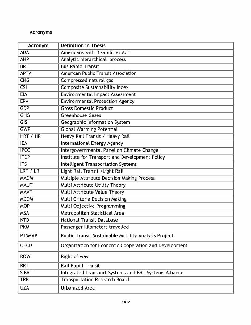
Acronyms
Acronym Definition in Thesis
ADA Americans with Disabilities Act
AHP Analytic hierarchical process
BRT Bus Rapid Transit
APTA American Public Transit Association
CNG Compressed natural gas
CSI Composite Sustainability Index
EIA Environmental Impact Assessment
EPA Environmental Protection Agency
GDP Gross Domestic Product
GHG Greenhouse Gases
GIS Geographic Information System
GWP Global Warming Potential
HRT / HR Heavy Rail Transit / Heavy Rail
IEA International Energy Agency
IPCC Intergovernmental Panel on Climate Change
ITDP Institute for Transport and Development Policy
ITS Intelligent Transportation Systems
LRT / LR Light Rail Transit /Light Rail
MADM
Multiple Attribute Decision Making Process
MAUT Multi Attribute Utility Theory
MAVT Multi Attribute Value Theory
MCDM Multi Criteria Decision Making
MOP Multi Objective Programming
MSA Metropolitan Statistical Area
NTD National Transit Database
PKM Passenger kilometers travelled
PTSMAP Public Transit Sustainable Mobility Analysis Project
OECD Organization for Economic Cooperation and Development
ROW Right of way
RRT Rail Rapid Transit
SIBRT Integrated Transport Systems and BRT Systems Alliance
TRB Transportation Research Board
UZA Urbanized Area

xxv
Table of Symbols
Symbol Definition in Thesis
w Weighting for various factors
f Represents factors used in the thesis
Ei represents environmental factors i-j used in this study
Si represents social factors i-j used in this study
Ni represents economic factors i-j used in this study
Yi represents economic factors i-j used in this study
As Service Area
Ps Service Area Population
Lr Route Length
Ld Directional Route km
nop Vehicles Operated Max Service
nmax Vehicles Available Max Service
pkm Passenger KM Travelled
τ Unlinked Passenger Trips
Vkm Vehicle or Train Rev km
Vh Vehicle Or Train Rev Hours
E Energy for propulsion
L Fuel for propulsion
λ Operating Cost
r Revenue
c Vehicle capacity
ρ Vehicle annual revenue km travelled
𝐸𝐸𝑗 Energy consumed by system j per passenger km travelled
𝐸𝑔𝑗 Energy consumed by system j per passenger km travelled
𝐸𝑆𝑂2𝑗 𝐸𝑁𝑂𝑋 𝑗 𝐸𝐻𝐺 𝑗 Energy consumed by system j per passenger km travelled
𝑁𝑜,𝑗 Operating costs per passenger km travelled on system j
𝑁𝑓,𝑗 Average fare per trip on system j
𝑁𝑡,𝑗 Average travel time cost per trip on system j
𝑁𝑧,𝑗 Cost recovery on system j
Ng,j Transit use per economic activity on system j
𝑆𝑎,𝑗 Accessibility factor for system j
𝑆𝑓,𝑗 Average fare / income per capita for system j
𝑆𝑙,𝑗 Average travel length per trip for system j
𝑆𝑢,𝑗 % of stations that are ADA compliant on system j
𝑌𝑐,𝑗 Capacity utilization factor for system j
𝑌𝑡,𝑗 Trips per service population capita for system j

xxvi
“We can’t solve problems by using the same kind of thinking we used when we
created them.”
~Albert Einstein

1
Chapter 1: Introduction
Background and Motivation
Cities rely on effective and efficient transportation systems to drive social and
economic development. Transportation has been called the “lifeblood” of cities in
recognition of the role it plays shaping communities and enabling opportunities for
their inhabitants (Vuchic V. R., 1999). In the Twentieth Century, along with an
increase in standard of living and rapid economic development, much of the western
world experienced rapid growth and progress in the development of urban and
intercity transportation systems. New technologies allowed higher degrees of personal
mobility, while new policies and infrastructure investment led to the development of
vast urban and regional transportation networks that enabled a speed and magnitude
of travel that had never before existed. However, these increases in mobility have
been accompanied by challenges, problems, and issues that have impacted the social,
environmental and economic wellbeing of individuals and communities.
In the latter half of the 20th century, many of these transportation challenges became
very apparent. Advances in economics, environmental sciences, engineering, social
sciences and planning have brought increased awareness and nuance to many of the
impacts of transportation, ranging from global climate change to local economic
inefficiency. Of particular note is the challenge associated with automobile centric
development. Cities around the world suffer from heavily congested roads as urban
centers are becoming more reliant on the automobile as a primary mode of
transportation (Moavenzadeh, Hanaki, & Baccini, 2002). Communities have been
segregated by large automobile oriented freeways contributing to a variety of social
issues, while the pollution from cars that use freeways contribute to local and global
environmental issues (Banister, 2005). In Canada, for example, 28% of all greenhouse
gas emissions originate from transportation – the second largest source of emissions
after stationary power generation (Environment Canada, 2012). On an urban level,
similar emissions are observed with 36% of all emissions in the City of Toronto
originating from trucks and cars (ICF International, 2007).

2
These impacts are a by-product of the rapid development of transportation in the 20th
century, where urban form was designed and engineered to accommodate the
automobile as the principle and, in some cases, sole transportation mode (Newman &
Kenworthy, 1999). With congestion and automobile dependence come increased
emissions and pollution, impacts on human health, and economic hindrance, all of
which are symptoms of one overarching problem: unsustainable transportation
systems (Banister, 2005).
In the developed world one needs not look further than the daily occurrence of
congested roadways carrying commuters to see a clear example of this problem. Many
cities have grown to accommodate high levels of automobile use in such a way that
the sustainability of transportation of entire cities and regions has been negatively
impacted (Newman & Kenworthy, 1999). This pattern of automobile focussed
transportation development observed in North American cities has led to deeply
rooted problems that detrimentally affect the livability of cities (Vuchic V. R., 1999).
In the developing world, mobility issues and transportation related problems affect
the quality of life, economic processes and opportunities available to citizens
(Robinson & Thagesen, 2004). Poor access to adequate transportation infrastructure
and services limits the mobility of citizens and the accessibility of essential needs and
basic public services (e.g. health, education). Poorly planned and maintained
transportation systems also stifle economic growth (World Bank, 2002). It has been
argued that the creation of strong transportation infrastructure is an essential aspect
of a community’s development, both in terms of economic activity and the
opportunities available to community members (Simon, 1996).
In the early 21st century more than half of humanity lived in cities. It is expected that
in the 21st century the vast majority of humans will continue to live in urban, instead
of rural, areas (Moavenzadeh & Markow, 2007). As a shift from rural living to urban
centres already occurred in the developed world during the 20th century, the majority
of this shift will occur in developing countries. As populations in urban centres in Asia,
Africa, and Latin America continue to increase into the 21st century the need for well-

3
planned and engineered transportation solutions is apparent if cities will avoid the
same unsustainable pattern of auto-oriented transport development.
Transportation systems found in cities in many developed countries are plagued with
sustainability challenges covering a wide spectrum of issues – social, economic, and
environmental (Banister, 2005). Research has shown that, in North American cities,
transit and not the automobile contribute to more sustainable transportation across
economic, social, and environmental dimensions, however there are always trade-offs
between modes. For example, a study of the City of Toronto demonstrated that
public transit outperformed private transport on environmental and economic scales.
However, under social criteria neither mode was clearly superior (Kennedy C. A.,
2002).
These challenges are an important reminder that the development of sustainable
transportation systems should be better understood in order to minimize the negative
impacts of transport. The development of new sustainability oriented systems and the
retrofitting of old systems to be more sustainable is emerging as a trend in developed
nations. For example, the use of ITS to manage demand and new investments in larger
and more efficient public transport systems points towards a strong interest in more
sustainable travel.
Not all nations are resigned to unsustainable transport; many governments, agencies,
and institutions are taking a proactive stance on facilitating the development of
sustainable transportation systems. The TransMilenio BRT System in Colombia, and
the many new BRT systems being developed in Africa and Latin America, are all
examples of a shift towards public transport as a mechanism for sustainable
development. BRT development has also expanded to North America with different
BRT variants being constructed in many cities. However, there are many instances of
rapid growth in auto use that have brought forward sustainability challenges. For
example, in some Indian cities private auto vehicle use is on the rise, and with this
increase in use has come severe congestion and air pollution (Agarwal & Zimmerman,
2008). Further, there is currently little knowledge on the relative sustainability

4
benefits of different types of mass transit systems found within the literature and
field of practice.
Problem Statement
With the trends of rapid urbanization in developing countries and automobile
dominance in many developed nations there is a need to explore policies and plans
that will allow transportation to enable quality of life for urban citizens in a
sustainable manner. Mass public transportation systems, such as Heavy Rail, LRT and
BRT systems, are often cited in research and planning documents as true alternatives
to auto dependence for both urbanizing and developed cities. Despite awareness of
the value of sustainable transportation and the technical operation of transit systems,
few studies exist that compare and contrast the sustainable transportation
contributions of major mass transit systems. Typical studies focus on one or two
indicators, such as energy consumed or capacity, but do not look at the sustainability
of a system in a holistic manner. An assessment of literature on the topic of
sustainable transportation shows several robust theoretical frameworks for the
analysis of transportation which are applicable for comparing different modes, but
few implementations of these frameworks. This thesis synthesizes these frameworks
in order to create a methodology that is useful for both planning transit systems to
maximize sustainability while also investigating the performance of three major mass
transit modes (BRT, LRT, HR) under a variety of sustainability parameters.
Objectives and Contributions
This research seeks to apply an understanding of sustainability to public
transportation planning in order to provide deeper understanding to the issues
presented in section 1.2. The two guiding questions of this research are:
1. How are the contributions of public transit to sustainable mobility measured?
2. How do different rapid transit modes and systems compare in the delivery of
sustainable mobility?
Specifically, the objectives of this thesis are:

5
1) To utilize existing sustainability knowledge along with analysis methodologies
and studies focused on sustainable transportation to develop and test a
framework that can assess the contributions to sustainable transportation of
rapid transit systems. This framework utilizes performance criteria that relate
to the major dimensions of sustainable transportation in order to develop
composite sustainability indices.
2) To use the framework from goal 1 to analyze a set of public transit systems
from various contexts in order to develop an understanding of how these
systems contribute to sustainable transportation. The results of this analysis
can be used in transport systems planning in a range of contexts, including
rapidly urbanizing cities, new rapid transit projects, systems expansion, as
well as in further sustainable transportation research.
3) To apply the outputs of goal 1 and 2 on specific case studies and decision
making problems to demonstrate the variety of applications for sustainable
transportation assessment in research and planning. This included
demonstrating the framework as decision support tool.
These objectives are structured around three contributions to the transportation
planning profession and transportation field of research:
1) A new framework for sustainability assessment that synthesizes past studies
and methodologies is presented and critiqued. The framework is shared for
use with both historical and model data, as well as using analytical equations.
This framework may be used in future research endeavours or planning.
2) A sample use of the tool for the comparison of a set of 33 public
transportation systems using publically available data.
3) A case study applying sustainability assessment and sustainable transportation
concepts to real world transport system planning.
The following additional goals have been developed for this thesis project:
To develop familiarity with a variety of mass transit system concepts in a global
context.
To develop an understanding of the sustainability performance of mass transit
systems in a global context.

6
To complement course based learning and transportation planning experience
with an in-depth study into sustainability and sustainable transportation.
Scope and Methods Overview
Sustainability is a vast interdisciplinary area of study that combines concepts from
many disciplines including biology, chemistry, engineering, development studies, and
planning. As a result, any inquiry into a sustainability topic has a large boundary of
investigation. For the purposes of this thesis project, a clear scope has been
developed in order to frame and guide research endeavors.
The scope of this thesis is broken up into three components. First, a survey of
literature in three areas is included: sustainability and sustainable development,
sustainable transportation and mobility concepts, and transportation decision
technique within the field of sustainable transportation research. The scope of these
sections is to probe existing literature and represent contemporary understanding,
research, and methodologies within each area. As all three areas are quite broad, the
study is not exhaustive and has been limited to areas that are directly relevant to the
problem this research is exploring. These sections are included to provide a logical
argument and progression of thoughts for the type of sustainability analysis included
in this study. As the majority of past research in this area has focussed on defining,
contextualizing, and framing sustainable transportation as part of sustainable
development, as well as the methods to measure it, there is a body of information to
draw upon.
The second component is an outline of a composite sustainability index analysis tool
for mass transit system analysis. This tool is designed to utilize model and historical
data, such as ridership counts or energy consumption, along with technical details,
such as route length and design, to calculate a numerical representation of
sustainability. This tool also can utilize planning data to provide commentary on the
overall sustainability of plan alternatives when compared to existing systems or
amongst plan alternatives. As indicators and metrics are the common form of

7
sustainability assessment methodologies, this tool takes a similar approach. This
research sorts sustainability impacts, positive and negative, into four overall
categories (environment, economy, social, and system effectiveness) in order to
streamline analysis. Analytical equations that are based on past transport research
are also included in the scope when necessary to expand data analysis. These
equations provide a method to conceptually understand and estimate sustainability
performance based on a set of input values. Modelling techniques and software are
not the focus of this thesis so their use is only commented on and not explored
rigorously. Three normalizing techniques were used in the calculation of composite
sustainability indicators during the assessment process - z-score, linear utility, and re-
scaling. This approach allows inputs and negative and positive impacts of public
transit to be combined into a single index and is an effective tool for exploring both
research questions.
Lifecycle costs of the physical infrastructure itself are not included in this study as
the focus of this study is on the sustainability performance of the system itself, as
opposed to the infrastructure. Therefore embedded impact, such as CO2 production
or water consumption, within guide ways, station areas, or other pieces of
infrastructure are not included in this analysis. The conclusion of the research
comments on how they may be integrated into future research.
While this tool could be applied to any number of transport systems worldwide, data
is difficult to access and often costly to collect. Therefore the tool is demonstrated
using readily available public data – using 33 systems from NTD dataset from the
United States of America. This set includes 13 Heavy Rail and 20 Light Rail Transit
systems, which were analyzed across 14 indicators from 4 categories of sustainability -
environmental, economic, social, and system effectiveness. Sensitivity testing on
composite equation weighting is included to demonstrate how different weights can
impact the development of the index. The comparison of factor performance to urban
factors, such as accessibility to density, are also in scope. This part of the research is
intended to provide further discussion on how mass transit is enabled by urban
8
environment, while also commenting on the influence of factors on overall
representation of sustainability but is not the overall focus of this research.
The final component is a set of case studies that demonstrate how the tools and
theory contained in this thesis can be applied. The scope of this component includes a
case study on urban environment and transit use and public transport’s role in
creating sustainable communities.
Overview of Thesis
This thesis is composed of 9 chapters, including this introductory chapter. Chapter 2
of the thesis contains the literature review for sustainability and sustainable
development. This chapter is intended to frame the discussion on sustainability and
provide the common theories, frameworks, and methodologies common to
sustainability research. This chapter is included as background material in the form of
a critical literature review.
Chapter 3 of the thesis is a literature review on the definitions of sustainable
transportation and transportation planning topics. This chapter is intended to outline
the key theories that shape the analysis of sustainable transportation in the composite
sustainability analysis tool. Like chapter 2, this chapter is a literature review intended
to establish background information that informs the methods used to analyze the
research problem.
Chapter 4 contains a literature review of decision making and analysis tools used in
sustainable transportation research and planning. Various frameworks, as well as the
theories behind the use of indicators and indices are explored in this chapter.
Chapter 5 synthesizes the findings of the literature review in order to create a
methodology that is useful for tackling the research questions of this thesis project.
This methodology contains indicators utilized for transit analysis in this study, along
with an outline of how to use the tool. This tool is applied in chapter 6 to the National
9
Public Transit Database from the USA in order to explore the relative strengths of LRT
and Heavy Rail networks in a variety of cities.
Chapter 6 outlines how the database was used and shares findings including composite
sustainability indices from two methodologies and relation of sustainability
parameters to urban factors such as density.
Chapter 7 applies the analysis methodology to data from the Metro Vancouver region
in British Columbia, Canada in order to demonstrate how this tool can be utilized in
decision making. This chapter complements the research demonstration in chapter 6.
Chapter 8 is a case study of sustainability concepts in the city of Calgary. Concepts
from the literature review are articulated using commentary on the sustainability of
the City of Calgary. This exercise is included to highlight sustainability analysis
techniques.
Chapter 9 provides concluding thoughts on this research. The contributions of this
research are reframed along with limitations, potential applications, and future
follow up research.
10
Sustainability and Sustainable Development
Chapter Overview
The concept of sustainable development is at the heart of this research. In order to
assess the contributions to sustainable transportation of various public transport
systems, a clear understanding of sustainability and sustainable development must
first be researched and articulated. The goal of this research is not to challenge the
discussion on key sustainability concepts, such as climate change, but rather to apply
them into an analysis framework. Therefore, this literature review seeks to gather
current thinking and ideas on key sustainability concepts in order to inform the
development of a transportation analysis tool.
This chapter presents a literature review on the common concepts of sustainable
development based on text books, research articles, and reports from academia as
well as the field of practice consisting of civil society organizations, governments, and
consultants.
The goal of this chapter is to provide an overview of the key concepts to sustainability
which will serve as background for chapter 3’s discussion of sustainable
transportation. As the field of sustainability intersects with many disciplines and areas
of research activities, this chapter’s scope is limited to the broader ideas of
sustainability. Chapters 3 and 4 dive deep into the specifics of sustainability as it
pertains to transportation engineering and planning research.
First, this chapter will share the most common and accepted definitions of sustainable
development and sustainability in section 2.2. Section 2.3 then outlines a variety of
frameworks and key concepts such as footprint analysis, which are useful for
understanding and applying sustainability concepts. The final section presents how
these ideas are applied within this research and concludes the chapter.

11
Sustainability and Sustainable Development Definitions
2.2.1 Defining Sustainability and Sustainable Development
Sustainability is a complex field of research, with many contributing theories, that
explores how human society is able to thrive while not compromising the systems that
are essential to maintain quality of life. This exploration of sustainability attempts to
draw upon the diversity of theories and definitions of sustainability in order to
present a balanced perspective on the many definitions of sustainability found in the
literature.
Given the interdisciplinary nature of the field, there are many nuanced definitions of
sustainability. Many of the foundational concepts embedded into the present notion
of sustainability have roots prior to the emergence of the term. The concept of
sustainability can be traced back into the mid twentieth century where awareness of
human industry’s impacts on the environment became more apparent due to
breakthroughs in a number of fields (The World Conservation Union, 2006).
Sustainability is commonly explored in terms of the theories of sustainable
development. A commonly used definition of sustainability comes from the Brundtland
Commission’s report “Our Common Future - “Sustainable development is development
that meets the needs of the present without compromising the ability of future
generations to meet their own needs” ( World Commission on Environment and
Development, 1987). While this definition was not the first use of the idea of
sustainable development, it is seen as the first widely utilized definition and the
report is commonly referred to as the first credible study on this subject (Theis,
2012).
While there is common acknowledgement of the Brundtland definition of
sustainability as both a foundational definition for work in the sustainability field, in
both practice and research, essential literature in the sustainable transportation field
also use this definition as a starting point. This literature, which is cited throughout
this review, includes Newman and Kenworthy (1999), Black (2010), Banister (2005),
and Jeon (2007), as well as others.
12
Newman and Kenworthy 1999 both paraphrases and expands upon the definition by
providing a history of sustainability as well as a summary of the report itself and key
literature in the field. Sustainable development or sustainability is paraphrased as
social and economic development in the global context should improve and not harm
the environment (Newman & Kenworthy, 1999). Newman and Kenworthy suggest
sustainability has its routes at the 1972 UN Conference on the Human Environment
where 113 nations pledged to contribute to cleaning up the environment and
contributing to environmental issues on a global scale. Issues of pollution and
resource depletion caused by human activity were of concern; however these
challenges were also contrasted with human development challenges or goals whose
solutions may come at odds with environmental goals (Newman & Kenworthy, 1999).
This dichotomy of human activity being held at odds with the environment led to the
development of the World Commission on Environment and Development, which
eventually published the Brundtland report in 1987 (Newman & Kenworthy, 1999).
As mentioned previously, many authors suggest this report as the key launching point
for sustainability in academia, policy, and practice. Newman and Kenworthy suggest
this report gave form to a set of language and ideas, which would later be explored at
the 1992 Earth Summit, for balancing the tension between environment, social, and
economic development, in effect creating a platform for exploring how nations and
communities can meet their development goals without repeating the same resource
consumption and pollution patterns of the past. The authors suggest that global
sustainability is oriented around 4 principles:
1. “The Elimination of poverty, especially in the Third World, is necessary not just
on human grounds but as an environmental issue”
2. “The First World must reduce its consumption of resources and production of
wastes.”
3. “Global Cooperation on environmental issues is no longer a soft option.”
13
4. “Change towards sustainability can occur only with community based
approaches that take local cultures seriously.”
(Newman & Kenworthy, 1999)
These principles can be used as guiding points to understand the complex interactions
imbedded within sustainable development – namely the need to simultaneously
advance environmental and human development outcomes at global and local
community levels.
Theis (2012), Black (2010), Jeon (2007), Kennedy (2005), Newman & Kenworthy
(1999), Banister (2005), the 1987 Brundtland report, and others consider sustainable
development issues fitting under the same three overarching boxes or categories –
economy, environment, and society. These categories are seen as a useful way to
further subdivide the definition and increase its applicability. Sustainable
development is able to balance the competing issues from within each category and
ensure the goals of sustainability are met (Banister, 2005) (Newman & Kenworthy,
1999). This is referred to commonly as a triple bottom line approach and is further
described throughout the thesis.
Theis (2012) suggests that the Brundtland Report emphasizes that sustainability is a
normative concept or social construct targeted at ensuring human development.
Technological and economic progress can enable sustainability, however the social
element (access to education, justice, healthcare) and ecological access (equitable
distribution of ecological goods and services) are all essential for sustainable
development and safe guarding generational interests (Theis, 2012).
While other definitions of sustainability do exist (see p 16-17 of (Moavenzadeh &
Markow, 2007) for a summary of many definitions particularly those that pertain to
urban and transport issues) most are oriented around the Brundtland definition or
have expanded upon it. Although, there are some departures in the literature which
Markow and Moavenzadeh summarize:

14
Some authors suggest that sustainability is often anthropocentric and that all
nature or life should be considered under quality of life
Other authors push for a temporal element and that the intergenerational
equity element of the Brundtland definition must be heavily considered,
especially with respect to how future generations should be compensated for
changes to the environment.
(Moavenzadeh & Markow, 2007, p. 20)
The authors suggest that the second point on intergenerational equity is a point of
debate in the literature with two dominant schools representing the poles of the
discussion. One school is the neoclassicists who argue that future generations should
have at least as much capital wealth as present generations, which would imply that
human assets can substitute natural assets. The second school is an ecological school
that argues future generations should have access to the same level of human and
natural wealth as the present generation.
In practice most discussions of sustainability are oriented around balancing human
development issues (social and economic) with ecological concerns.
2.2.2 Applying the Definition
While the commonly applied ideas of sustainability resonate with a key definition, the
application of the concept can often be muddled and is indeed at the heart of this
thesis project. This sub chapter introduces key concepts on the application of the
concept of sustainability and draws links to key concepts and frameworks that can
elucidate its application throughout this thesis.
Banister (2005) comments on the definition of sustainability – “ it has been used by
most researchers and decision-makers interested in the environment and like many of
the terms that are used and supported, it is difficult to define precisely” (Banister,
Unsustainable Transport: City transport in the new century, 2005, p. 2). Transferring
the definition of sustainability into a useful tool for evaluating projects or in this
thesis’ case, transit, is a challenge given the scope of the definitions commonly used,
as well as the number of definitions. Moavenzadeh and Markow in 2007 suggested that
15
while there are many definitions of sustainability based on their review of definitions
found throughout the literature, most definitions have similar key ideas represented
within them. Their definition is as follows:
“Sustainable development seeks to preserve environmental quality- whether for less
advantaged populations, future generations, or the sake of environmental diversity
itself – while pursuing opportunities for economic advancement, all leading to
improved quality of life” (Moavenzadeh & Markow, 2007, p. 15).
Within this definition is a key link to the triple bottom line framework of
sustainability that explicitly looks at sustainability as a balancing act between social
(quality of life), economic (Economic advancement), and environmental concerns
(environmental quality).
The authors argue that sustainability policies must be “holistic” in their ability to
consider local and regional impacts across environmental, social, and economic
categories (Moavenzadeh & Markow, 2007). The crux of their suggestion is that for
sustainability to be applied to decision making, the techniques used must employ
criteria and methodologies that distil a holistic understanding of the issues at hand,
rather than focussing on a specific aspect of the challenge, issue, or project being
considered, such as an economic consideration (Moavenzadeh & Markow, 2007). The
authors further argue that in applying sustainability and sustainable development to
decision making that there needs to be greater recognition for the value of the
environment, concepts of equity applied to different segments of society as well as to
future generations, a greater understanding of sustainability by decision makers, and
a stronger set of project evaluation methods for the sustainability context.
Kenworthy and Newman (1997) have outlined the application of sustainability
principles in a variety of settings, including in cities, which is an important element of
sustainability at the heart of this research.

16
Select Sustainability Frameworks
The ideas and tools used to understand sustainability come from a variety of
disciplines, including ecology, environmental sciences, economics, development
studies, and engineering. Inasmuch, there are many different tools used to explore
sustainability both qualitatively and quantitatively. Three ideas used to understand
sustainability are presented briefly – the triple bottom line, which is adapted for this
thesis, footprint analysis, which is used to understand sustainability using ecological
concepts, and the strong and weak sustainability framework. Within sustainability,
there are tensions and differing perspectives on the nature of sustainability as a field
of theory. The discussion on weak vs. strong sustainability in this sub chapter is one
such discussion within the field. This thesis aims to present prominent theories and
provide commentary on their relevance and contribution to sustainable
transportation.
2.3.1 Triple Bottom Line
The triple bottom line framework deconstructs sustainability into three spheres-
ecological/environmental, economic, and social (Pei, Amekudzi, Meyer, Barella, &
Ross, 2010). Pei, Amekudzi, Meyer, Barella, and Ross (2010) suggest the advantages of
this framework are that its approach to categorizing and developing indicators for
sustainability are easily applied to it and it can be applied in a multi criteria decision
making (MCDM) approach. MCDM is discussed in chapter 4.
The triple bottom line framework is a natural extension of the previous definitions of
sustainability that were outlined with three bottom lines (environmental/ecological),
social, economic that are commonly used as bins or boxes to collect issues or
sustainability ideas. The key issues contained within each “box” have been
approached differently by a number of authors dependent on their overarching
philosophy, discipline, and perspective on sustainability among other influences. Theis
(2012) provides a summary of the key ideas contained within each element drawing on

17
a number of sources, including the Brundtland report. These ideas are summarized in
Table 2-1.
Table 2-1 Summary of Key Category Considerations
Economic Environmental Social (Socio-political)
- Decision-making frameworks
- Flows of financial capital
- Facilitation of Commerce
- Diversity and interdependence of living systems
- Goods and services produced by ecosystems
- Impacts of human wastes
- Interactions between institutions and firms
- Functions expressive of human values
- Aspirations and well-being
- Ethical issues - Decision-making
dependent on collective action
(Text adapted from Theis, 2012)
The environmental or ecological dimension considers the impacts of human activities
and developments on changing local and global environments (Low, 2003). Low argues
that human society and its growth is limited by environmental constraints on a local
and global level and as a result the environmental dimension of sustainability must be
approached from both local and global perspectives. Common environmental issues
include consumption of resources, anthropogenic climate change and the degradation
of local environments due to pollution.
When discussing sustainability, a key issue that accompanies these discussions is
climate change. The world’s leading climate scientists have reached consensus that
human activity in the form of greenhouse gas (GHg) emissions is warming the planet in
ways that will have profound and unsettling impacts on natural resources, energy use,
ecosystems, economic activity, and potentially quality of life (Transportation
Research Board, 2008)
Climate is defined as the average weather over long time scales and changes in
climate are driven by a variety of complex processes which involve insolation, albedo,
and the composition of the Earth’s atmosphere (Snodgrass, 2012). The climate system
is a set of complex interactions involving landmasses, snow and ice, bodies of water,

18
and living beings on the planet (IPCC, 2007). According to the Intergovernmental
Panel on Climate Change (IPCC) the climate is always evolving over time based on its
own internal dynamics and changes in external factors which are called forcings. An
example of an external forcing would be a natural phenomenon such as a volcanic
eruption that displaces ash into the atmosphere (IPCC, 2007). Solar radiation drives
the Earth’s climate and changes to the way solar energy interacts with the Earth’s
climate system are what causes climate change (Snodgrass, 2012) (Thompkins, 2012)
(IPCC, 2007). Climate change can manifest in a number of ways – changes in
precipitation, a reduction in snow cover, or an increase in overall global surface
temperature – are a few examples (Lenzen, Dey, & Hamilton, 2003).
While discussing climate change and the composition of the Earth’s atmosphere, it is
important to consider the greenhouse effect. The greenhouse effect is a natural
phenomenon where the Earth’s atmosphere responds to different wavelengths of
electromagnetic radiation and retains energy, essentially warming the Earth (Lenzen,
Dey, & Hamilton, 2003). Since 1750, due to industrialization, there has been a marked
atmospheric increase of greenhouse gases including CO2 and methane (IPCC, 2007)
(Lenzen, Dey, & Hamilton, 2003). According to Lensen, Dey, & Hamilton (2003), since
human activity began to utilize wide scale combustion of fossil fuels in the eighteenth
century, the concentration of CO2 in the atmosphere has increased from
approximately 280 ppm to approximately 365 ppm in 1998. This increase in CO2 has
also led to an increase in radiative forcing due to concentrations of greenhouse gases,
which has an impact on global climate (IPCC, 2007).
Economic development is the process of a community’s growth or progress towards
economic goals, such as increased wealth, employment, productivity or ultimately
welfare (Litman, 2013). Under a triple bottom line framework, the primary economic
considerations are ensuring development occurs that advance economic activity in
coherence with the two other sustainability categories over time (Banister, 2005).
Within the literature, there are varying definitions on what sustainable economic
19
development entails. Some perspectives outline that growth can come with
established intentional trade-offs in other sustainability sectors (see previous
discussions and the discussion on strong vs. weak) while others suggest that economic
development towards goals such as employment cannot come at the cost of the
environment as human capital cannot replace environmental capital (Low, 2003).
The social dimension of sustainability often is described as dealing with issues of
equity and inclusion. Equity can be considered, as previously discussed, among
current populations on a global scale, a local scale, but also an intergenerational
scale (Moavenzadeh & Markow, 2007) (Low, 2003). Moavenzadeh and Markow suggest
a direct linkage between sustainability and the welfare of future generations, through
an intergenerational lens, as the concept of sustainability is defined around the status
of future generations not being worsened by present actions. On a global scale, the
discussion of equality and sustainable development often focuses on the status of
nations and large regions, and the historic conditions that have impacted the
wellbeing of their inhabitants.
Low (2003) presents a discussion on social sustainability through a lens of ensuring
that society is not only served by economic progress (as opposed to society serving
economic progress) but that elements of local and global society are integrated in a
just and equitable manner. Rather than focussing on sustaining a set social system,
social sustainability is focussed on ‘sustaining progress towards the kind of fair society
in which the good of each (individually) coincides with the good of all (collectively).’
(Low, 2003).
In the literature these three dimensions have been displayed in different ways
including pillars, concentric circles, and overlapping circles (The World Conservation
Union, 2006). One approach, dating back to the 1970s, put forward by Passet as
summarized by Joumard and Nicolas, represents the three ideas as three concentric
circles inside one another, with environment being the largest, the social, and finally
economy (Joumard & Nicolas, Transport project assessment methodology within the
framework of sustainable development, 2010). This approach indicates a hierarchy,
20
whereas the pillars represent the contribution of each element to sustainable
development . Finally, the interlocking circles approach recognizes the need to
balance all three elements, as well as the often interlinked natures of issues within
each aspect of sustainability (The World Conservation Union, 2006). As with all
frameworks, these differing views express alternative ways to view sustainability and
imbed the concept within research and policy.
On top of these three categories, many frameworks reviewed for this thesis also
include elements of decision making and policy formulation as well as systemic issues
as essential for sustainability. These tools are used in conjunction with the triple
bottom line framework, or are used in alternative frameworks. Banister (2005)
describes these two areas of consideration as participatory involvement of all actors
(diverse stakeholder groups) as well as good governance mechanisms. These two areas
occur under different forms throughout other frameworks including work by Litman
(2013) and Kennedy et al. (2005). While not integrated into the ‘triple bottom line’
framework, they are seen as expansions to it and part of achieving sustainable
development processes and are included in this discussion. Other studies, such as
those by Jeon (2007) and Jeon et al (2009) expand the triple bottom line to include
system factors. Such approaches are becoming more common in analysis and are
worth noting.
2.3.2 Footprint Analysis
Footprint analysis is a concept used in discussing sustainability that reflects the
amount of land required to provide a unit of populations (person, household,
community, etc.) consumption (Rees, 1992). Since its original publication, the tool
has seen use in a number of contexts and has been expanded, refined, and challenged
in policy and research,
Rees’ work was the definitive introduction to this topic that framed the issue of
humanity’s urban existence through the lens of urban ecology – a system of flows of
energy and material in the process of resource allocation. Rees argues that
economics, in theory, as a field of study plays a similar role for the study of society’s

21
allocation of resources however it has become reductionist in nature and does not
take into consideration many of the principles that ecology might take into account –
such as the inseparable link between human activity and the environment it takes
place in.
From this framing, Rees suggested that traditional environmental economics may view
environmental issues in urban development as an issue of ‘deteriorating amenities’ –
such as a loss of open space or air pollution. – with a common solution being cost
internalization or other economic incentives. The ecologic point of view espoused in
Rees’ work puts forth an exploration of the connection between sustainability and
human activity through an analysis of material/energy flows, rather than just
considering deterioration. Under this analysis the concept of carrying capacity, the
population that can be sustained on a given amount of land, is used to suggest that if
all human society lived within a regional carrying capacity that society would in effect
be sustainable (Rees, 1992). Rees uses a concept of human carrying capacity as
follows:
“maximum rate of resource consumption and waste discharge that can be sustained
indefinitely in a region without progressively impairing the functional integrity and
productivity of the relevant ecosystem” (Rees, 1992, p. 125)
From this definition, the land required for continual production of materials like food
and energy, as well as the land required to absorb pollution, like greenhouse gases,
are often considered in footprint analysis and the output is measured in units of area –
typically hectares – required to produce these inputs. Rees outlines how this
framework shows how the footprint of a city is usually larger than the city’s contained
area.
The ecological footprint concept essentially measures the amount of capacity
required for all the material and energy flows, as well as impacts, which a given
population of humans needs to maintain their life style. For example, Rees cites
calculations for the Fraser Valley Region to illustrate the concept – ‘if the entire
world population of 5.2 billion consumed productive land at the rate of our Fraser
22
Valley Example, the total requirement would be 25.5 billion hectares’ (Rees, 1992, p.
129). Rees is quick to mention the Earth’s finite capacity of 13 billion hectares. With
a finite amount of carrying capacity on the planet, this tool challenges policy makers,
researchers, and decision makers to reconsider urban development.
However, in practice, the framework has been criticized – Fiala (2008) developed a
critique of the methodology and reviewed previous critical studies of the framework.
The overall critique of the framework included a number of relevant points that could
be used to refine the framework in practice, or could be used as rationale for
selecting another framework for understanding sustainability. First, Fiala identifies an
inability to address the overall sustainability of consumption and issues that arise with
consumption. Second, a lack of attention to land degradation due to production for
human consumption is noted – if land is degraded in producing for human
consumption, it is possible using more land can have an efficiency gain than using less
land, in effect damaging less land in the long run. According to Fiala, this would
indicate a larger foot print could be more sustainable depending on the usage and the
types of land involved. Another point raised is that a common focus on sequestration
of greenhouse gas emissions or land required for greenhouse gases may limit the
scope of analysis. Fiala’s ultimate conclusion is that for research, it may be more
useful to use sustainability measures rather than footprint due to its limitations.
Despite these critiques, the footprint analysis still sees wide use as a means of
communicating impacts of human activity as well as disparity between carrying
capacity of a population and the overall carrying capacity of the planet. The simple
output, expressing sustainability as a comparison of two land areas, is clearly
communicated which is where the true value of this framework lies.
2.3.3 Weak vs. Strong- two characterizations of sustainability
In the literature, a framework for characterizing sustainability that emerges is strong
and weak sustainability. The Sustainable Transportation Indicators Subcommittee of
the Transportation Research Board (TRB) in 2009 described the weak vs. strong

23
dichotomy in terms of substitutions being allowed or disallowed. The following
definitions and examples were employed:
Weak –natural capital (natural resources, ecological systems) can be replaced
by human capital (i.e. industrial productive capacity). In a transport example,
a system improvement is allowed if it enables economic development or if
negative impacts can be offset by other sectors. A second example provided
was on fish stocks –wild fish can be replaced if equal or greater fish populations
are provided in the aquaculture.
Strong – natural capital cannot be substituted with human capital. In a
transport context, this would mean that reductions of impacts from transport
would be the focus of transport projects. The fish example used states that the
intrinsic value of wild fish should be maintained.
(Sustainable Transportation Indicators Subcommittee , 2009)
Both concepts are useful for exploring sustainability evaluation and can be built into
frameworks for evaluation and researching sustainable transportation benefits of mass
transit systems. These two descriptions of sustainability can also be compared to the
neoclassical and ecological schools of sustainability previously discussed, with weak
sustainability presenting a strong alignment with the neoclassical outlook and strong
sustainability aligning with the ecological outlook.
Conclusion
Sustainability is a complex field spanning many academic fields including
environmental science, biology, chemistry, physics, sociology, economics, and
branches of engineering. Inasmuch, a complete treatment of sustainability is not
possible in this thesis, rather the intention is to present key and commonly recurrent
concepts in a clear manner that have informed the development of ideas presented in
subsequent chapters.
The concepts of sustainability that have been developed over the past 40 years
provide a powerful tool set to better understand human society’s internal impacts,
24
intergenerational impacts, and impact on the planet caused by the pursuit of
development. By combining a variety of fields in interdisciplinary study and policy
formulation sustainability allows researchers, consultants, and decision makers to
better understand complex problems and make more informed decisions in
conjunction with diverse stakeholders in order to improve the outlook for humanity
and the planet.

25
Overview of Sustainable transportation Concepts
3.1 Chapter Overview
Chapter three outlines the basic concepts of mass transit which are essential for
further discussions on sustainability assessment of mass transit systems. These
foundational concepts are derived from a literature review that spanned a variety of
sources including textbooks, journal articles, and guidelines/reports from public and
private sectors. This section covers the different types of mass transit along with
traditional public transit analytical tools that are relevant to sustainability analysis.
3.2 Sustainable Transportation: mobility, systems, and definitions
3.2.1 What is a Sustainable Transportation System?
Transportation systems enable cities to flourish and grow – enabling day to day
activities, economic interactions, and quality of life. Vibrant and liveable cities are
supported by effective transportation systems (Vuchic V. R., 1999). This is recognized
in academic research, the field of practice, and in public discourse. It is common for
transportation issues to be top of mind during election cycles and in livability and
ranking scales, such as the Mercer quality of living survey and the Economist
Intelligence Unit’s global livability report, include a variety of transportation issues
when ranking cities or livability. Transportation is a common element of day to day
life and is recognized as essential for liveability and progress. However, defining and
applying definitions of sustainable transport can create a degree of confusion due to
the inherit complexity of both topics.
The analysis of transportation systems is an in depth topic with many elements
including human behaviour, network configuration, geography of the system,
prevailing influences on the system (politics and economics, for example), and the
types of mode of travel that are available (Manheim, 1979). Transportation systems
can be considered as consisting of:
Physical elements
Infrastructure (roads, runways, rail roads)

26
Vehicles
Individual Choices
When to travel
Where to travel
How to travel
Institutions that enable travel through the provision of information, goods, and
services that influence choices
Markets
Companies
Governments
Other actors and institutions that influence choice
(Manheim, 1979) (Cidell, 2012)
With the interaction of all these elements, transportation system analysis and
planning is a complex process.
As previously explored, sustainability is also a very complex topic that explores all
elements of human welfare (the social aspects of sustainability), human economic
expansion, and the impacts of human growth and development on the environment.
Given the degree of complexity in both topics, combining the two into a common field
creates a challenging topic to address (Cidell, 2012). The question of sustainable
transport can be traced back to the question of how transportation is viewed. Hensher
(2005) provides two view points on transport – one is the Napoleonic view that
transport drives the broader social, political, and economic framework. Under this
view transport is a means to achieve policy and should be regulated and controlled.
The second view Hensher puts forward is the Anglo Saxon view that transport is ‘just
another market sector’ and it should be provided as effectively as possible with little
interference. Recalling the discussion on sustainable development, the former view of
transport is adopted for the discussion of sustainable transportation.
27
However, even before sustainability became a topic of common discourse in the late
1980s, the need to address a variety of impacts of transportation systems was
suggested and even enforced or strongly encouraged by eminent authors or
researchers in the field. For example, Manheim (1979) wrote in his influential text
“Fundamentals of Transportation Systems Analysis - Volume 1: Basic Concepts” on
setting up boundaries for transport system analysis and a variety of the impacts
transport system changes may have that should be considered by the analyst or
researcher. Manheim’s approach encouraged viewing transportation systems as
holistic entities, with a focus on multimodal solutions that take into account social,
economic, political, environmental, and other considerations. This approach was
written before the age of sustainability language, but is in line with the principles of
sustainability and the goals set out in the Brundtland report, and other authors who
have since studied and expanded upon the sustainability concept.
While issues of environmental, social, and economic impacts have been present in
transportation discourse prior to the emergence of sustainability as a major area of
study, since the late 80s there has been great interest in the growing field of
sustainable transportation.
Schiller, Bruun, and Kenworthy (2010) explore the emergence of sustainable
transportation in terms of three main concepts:
1. Concerns on transport’s impacts and the counter productivity of conventional
highway-oriented planning that emerged from the 1970s onward
2. Recognition that reducing traffic in cities (either through calming, or
pedestrianization) achieved health and environmental benefits
3. Increased sustainability awareness of sustainability concepts after the
Brundtland report was published
(Schiller, Bruun, & Kenworthy, 2010)
With these three factors, as well as the state of practice and study in transportation
leaning towards holistic analysis, the field of sustainable transport was able to
emerge. Since then several studies that have set out to establish indicators,
28
definitions, and analyses of theoretical and existing systems based on sustainability
terms have been undertaken.
Black suggests that a sustainable transport system is one that applies the Brundtland
definition or simply said “transport that satisfies the current transport and mobility
needs without compromising the ability of future generations to meet those needs”
(Black W. , 2010). As transport has a variety of negative impacts, specific focus on
economic, social, and environmental issues should be included in a definition of
sustainable transport and its application to decision making (Bongardt, Schmid,
Cornie, & Litman, 2011).
According to Schiller, Bruun, and Kenworthy (2010), a sustainable transportation
system contributes to community needs and aspirations, while limiting its negative
impacts on the environment and society as well as its financial costs. This outline of
sustainable transportation fits into the triple-bottom line conception of sustainability.
Shiller, Bruun, and Kenworthy also suggest that technical factors (i.e. fuel efficiency,
or improved traffic systems) can play a major role, but that it is important to consider
multiple dimensions such as land use planning and broader public visioning in order to
create truly sustainable transportation systems and communities.
Within the literature there is no accepted single definition of sustainable transport or
how to measure it (Bongardt, Schmid, Cornie, & Litman, 2011). However, one
definition commonly referred to in the literature is that of the Centre for Sustainable
Transportation, which outlines three key elements of sustainable transport:
Allows the basic access needs of individuals and societies to be met safely and
in a manner consistent with human and ecosystem health, and with equity
within and between generations.
Is affordable, operates efficiently, offers choice of transport mode, and
supports a vibrant economy.
Limits emissions and waste within the planet’s ability to absorb them,
minimizes consumption of non-renewable resources, limits consumption of
29
renewable resources to the sustainable yield level, reuses and recycles its
components, and minimizes the use of land and the production of noise.
(The Centre for Sustainable Transportation, 2005)
In essence, there is more to sustainability than limiting emissions through technical
progress – instead the whole system must be improved and integrated into the
broader community. To create sustainable transportation involves society at large –
including aspects of planning, policy, economics, and citizen involvement, not just
technical progress (Schiller, Bruun, & Kenworthy, 2010).
Transferring this definition into use can involve the general sustainability frameworks
outlined earlier in chapter 2, such as the triple bottom line framework. Previous
sustainable transportation studies have utilized such frameworks to effectively
develop useful analytical tools from definitions. One of the major studies on
sustainable transportation in the Civil Engineering field was conducted by Jeon in
2007. This dissertation suggests that all frameworks should in the bare minimum
consider:
How effective the transportation system is
Impacts of the system on economic development
Impacts of the system on social quality of life
Impacts of the system on environmental integrity
(Jeon, 2007)
The 2007 Jeon framework is comprehensive, recognizable, and useable in that it
utilizes the three common terms from the triple bottom line framework, but it also
explicitly treats transport effectiveness as a key element of sustainability.
Banister outlines a sustainable transportation paradigm composed of four aspects:
Actions to reduce the need to travel
Encouragement of modal shift

30
Short trip lengths
Increased efficiency
(Banister, Cities, Mobility, and Climate Change, 2008)
Another thorough attempt to outline a definition of sustainable transportation comes
from Kennedy et al. (2005). Sustainable transport is framed as a critical urban issue
intersecting with complex global issues, such as climate change, as well as local issues
like human health. Similar to other frameworks, the authors frame sustainable urban
transport as a balance between economy, environment and society, however the
difference is in how this balance is developed. Four pillars are suggested:
Governance: “the establishment of effective bodies for integrated land-use
transportation planning”
Funding: “the creation of fair, efficient, and stable funding mechanisms”
Infrastructure: “strategic investment in major infrastructure”
Neighborhoods: “the support of investments through local design”
(Kennedy, Miller, Shalaby, Maclean, & Coleman, 2005)
Finally, Banister (2005) provides 7 key principles for establishing sustainable
transport policy:
1. Reduce the need to travel
2. Reduce the absolute levels of car use and road freight in urban areas
3. Promote more energy efficient modes of travel for both passenger and
freight
4. Reduce noise and vehicle emissions at source
5. Encourage a more efficient and environmentally sensitive use of vehicle
stock
6. Improve safe pedestrians and all road users
7. Improve the attractiveness of cities for residents, workers, shoppers, and
visitors
(Banister, Unsustainable Transport: City transport in the new century, 2005)

31
These definitions of sustainability carry common elements in that all revolve around
improving urban or even regional, national, and global society through transport
services and infrastructure that maximize welfare and economic development while
also limiting environmental impact.
3.3 Problem of Unsustainable Transport
The following sub chapter outlines key challenges associated with transportation that
inform the development of sustainability analysis tools, as well as a greater
understanding of urban sustainability issues. This section outlines some of the key
issues addressed in the literature when unsustainable transport is discussed.
3.3.1 Transportation Challenges
Transportation intersects with many segments of society and the environment and can
create many benefits for human welfare. It can enable economic growth and connect
people to necessary services. However, it can also create a number of challenges.
This chapter section outlines a brief overview of some of these challenges, while
sections 3.4-3.5 provide greater detail. These sections are not intended to contain
every sustainability issue, but to rather provide insight into common issues as
discussed within the literature review.
Table 3-1 shares a list of transportation impacts as assembled by Litman & Burwell.
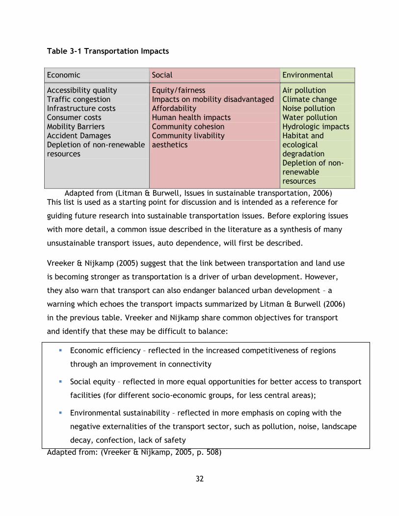
32
Table 3-1 Transportation Impacts
Adapted from (Litman & Burwell, Issues in sustainable transportation, 2006) This list is used as a starting point for discussion and is intended as a reference for
guiding future research into sustainable transportation issues. Before exploring issues
with more detail, a common issue described in the literature as a synthesis of many
unsustainable transport issues, auto dependence, will first be described.
Vreeker & Nijkamp (2005) suggest that the link between transportation and land use
is becoming stronger as transportation is a driver of urban development. However,
they also warn that transport can also endanger balanced urban development – a
warning which echoes the transport impacts summarized by Litman & Burwell (2006)
in the previous table. Vreeker and Nijkamp share common objectives for transport
and identify that these may be difficult to balance:
Adapted from: (Vreeker & Nijkamp, 2005, p. 508)
Economic Social Environmental
Accessibility quality Traffic congestion Infrastructure costs Consumer costs Mobility Barriers Accident Damages Depletion of non-renewable resources
Equity/fairness Impacts on mobility disadvantaged Affordability Human health impacts Community cohesion Community livability aesthetics
Air pollution Climate change Noise pollution Water pollution Hydrologic impacts Habitat and ecological degradation Depletion of non-renewable resources
Economic efficiency – reflected in the increased competitiveness of regions
through an improvement in connectivity
Social equity – reflected in more equal opportunities for better access to transport
facilities (for different socio-economic groups, for less central areas);
Environmental sustainability – reflected in more emphasis on coping with the
negative externalities of the transport sector, such as pollution, noise, landscape
decay, confection, lack of safety

33
Vreeker and Nijkamp do suggest that a challenge of these objectives is the integration
of new fields and developments into transport planning and reconciling these
different interests. These objectives mirror triple bottom line objectives set out in
sustainability assessment as well as the transport impacts identified by Litman &
Burwell and are a useful set of objectives for further formulating an objective
oriented definition of sustainable transport to be used in decision making tools that
will be discussed in chapter 4.
3.3.2 Auto Dependence and Sprawl – perspectives on compromised sustainability
Research is pointing to a conclusion that current trends in transportation are
unsustainable – when the major definitions of sustainability are applied to
transportation and land use patterns there is a pressing need to adopt low carbon
solutions for transportation, while also reducing the need for travel (Banister, 2008)
(Newman & Kenworthy, 1999). Automobile dependant development is seen as the
major issue related to unsustainable transport on an urban scale. While other issues
originate from unsustainable transport – such as fuel consumption from increased air
travel, the focus of this thesis is on urban transport.
Auto dependence has been discussed at length by Schiller et al (2010) and Newman,
and Kenworthy (1999) as a critical issue impacting not just the sustainability of
transportation but of cities and indeed society at large. Auto-dependence has been
described as a set of transport infrastructure and land use development patterns that
favour the automobile and hypermobility that have occurred primarily in North
America as well as other parts of the world in the 20th century (Schiller, Bruun, &
Kenworthy, 2010) (Newman & Kenworthy, 1999). Schiller et al (2010) write that due
to the decreased travel time and increased personal mobility bestowed by
automobiles, cities were able to expand greatly with fewer hurdles than when cities
were governed by other modes of travel. This rapid growth of automobile focused
land use patterns highlights the link between transportation and land use. This growth
is most common in North America while in other parts of the world, such as East Asia
or Europe, cities are denser and the development patterns are less stratified (i.e.

34
mixed use) which makes the automobile a less dominant mode (Newman &
Kenworthy, 1999) (Banister, 2008) (Schiller et al, 2010).
Auto dependent cities tend to have lower density development patterns, which in
turn contribute to increased energy requirements for transportation (Newman &
Kenworthy, 1999). Newman and Kenworthy also stress that in the low density auto-
dependant cities, such as many cities in the USA, the role of transit and alternative
modes is also limited. It is suggested that since automobiles use more energy and
create more pollution per trip on average, that this greatly limits the sustainability of
these cities.
One issue that is emergent in auto dependent cities that greatly impacts their
sustainability is congestion. Congestion is characterized by low traffic flow rate, and
high density of vehicles and is a key issue associated with auto dependence.
Congestion has been deemed a worldwide phenomenon that is caused by increasing
automobile dependence (Moavenzadeh & Markow, 2007). Negative impacts include –
loss of economic productivity, increases pollution, and human health impacts.
When a system fails to provide acceptable levels of mobility for different trip
purposes and different modes it is considered unsustainable from an economic and
social point of view (Banister, Unsustainable Transport: City transport in the new
century, 2005). There may also be environmental impacts associated with having a
single mode or a single type of user dominating a transport system.
The literature also links auto dependent transport and land uses to social
sustainability issues:
“If our communities are not walkable or bikeable, we need to drive to schools,
shops, parks, entertainment, play dates, etc. Thus we become more
sedentary. A sedentary lifestyle increases the risk of overall mortality(2 to 3-
fold), cardiovascular disease (3 to 5-fold), and some types of cancer, including
colon and breast cancer.” (Cidell, 2012)
35
3.4 Environmental
3.4.1 Overview of Impacts
In general, transportation consumes resources from the environment for movement –
electricity that powers light rail vehicles, gasoline fuel that powers cars, or food that
enables active modes of travel all utilize resources to enable mobility. However, the
utilization of these resources comes at a cost to the environment. Transportation
systems are also considered part of the environment, in that they create a new
quality of environment for humans (Low, 2003). As transportation systems interact
with, consume environmental resources, and are integrated with the environment,
discussing their impacts on the environment is essential for a discussion on sustainable
transport. This section of the literature review covers literature on the impacts of
travel on the environment.
Transportation is a large contributor to pollution and apart from energy generation
and industrial processing, transport is the largest contributor to air pollution
(Dobranskyte-Niskota, Perujo, & Pregl, 2007) Environmental impacts can occur in
local, regional, or global levels and vary in the magnitude of impact (Rothengatter,
2003).
Many of the impacts discussed will continue to see growth in developing nations,
nations undergoing rapid industrial growth, such as China, and nations in transition,
such as those in Eastern Europe (Rothengatter, 2003). Rothengatter in 2003 suggests
that increases in automobile use, specifically in cities, will lead to continued growth
in environmental impacts of transport. A second argument made by Rothengatter is
that the impact per trip will also increase as the market share of less environmentally
friendly modes may increase, consuming the market share previously held by rail,
coach, or other less environmentally impactful modes.
3.4.2 Energy and resource consumption
Private motorized transport, freight, and aviation have consumed and will continue to
consume the most resources out of all transport modes. Transportation energy use has
been on the rise – over the past forty years it has risen from between 15-20% of all

36
energy use to almost 35% (Potter, 2003). Much of this energy use is automobile
oriented – due to the fossil fuel dependent nature of automobile travel (Potter, 2003)
(Black W. , 2010) (Newman & Kenworthy, 1999) (Schiller, Bruun, & Kenworthy, 2010).
Despite oil being a non-renewable resource, it is unlikely that any shift away from oil
will be driven by physical constraints in the near future (Johansson, 2003)
Potter suggests that urban transit consumes very little energy overall (only 4% in the
United Kingdom) and has not contributed greatly to this increase. Research has been
conducted into systems that provide more energy efficient travel, including work that
has shown a general decrease in energy required per trip as density increases
(Newman & Kenworthy, 1999).
Energy Security is another issue for discussion. Much of transport relies on fossil fuels
that are products with a limited supply (Bongardt, Schmid, Cornie, & Litman, 2011).
This limits the long term viability of transport systems as key energy sources can be
disrupted or depleted.
Kennedy’s study of sustainability in Toronto found that public transit modes attained
superior energy performance compared to private auto. Public transit ranged between
0.42 MJ/seat.km and 0.66 MJ/seat.km while automobile ranged from 1.47 to 1.58
MJ/seat.km (Kennedy C. A., 2002). For crush loads, Kennedy reported even greater
performance for public transit modes: streetcars 0.17 MJ/person.km, subways 0.10
MJ/person.km and commuter rail 0.33 MJ/person.km.
The following are key issues common to existing transportation systems:
Current transport systems rely on fossil fuels and are considered energy
intensive, violating sustainability principles due to a reliance on non-renewable
energy
Current transport systems are largely focussed on private auto which is not the
most energy efficient mode

37
A shift to denser urban form, other modes of transport (i.e. cycling public
transit), and other technologies can reduce energy use, although there is
scepticism about technology shift
3.4.3 CO2 and Climate Change
Transportation systems are major emitters of greenhouse gases, such as CO2 that
contribute to climate change (Schipper & Fulton, 2003). Bongardt, Schmid, Cornie,
and Littman in 2011 stated “overall transportation is responsible for 13% of global GHg
emissions and 23% of energy related CO2 emissions”.
According to the US EPA, the average automobile emits 423 grams of CO2 per mile
(Office of Transportation and Air Quality United States Environmental Protection
Agency, 2011). Various studies have shown that other modes of transport have
attained much greater environmental performance, such as Kennedy’s study of
Toronto where the subway mode achieved 7.7 g C/pkm. However, in the case of
Toronto, this can be attributed to a blend of low carbon energy supplying power to
the transit system, including Hydro electricity (Kennedy C. A., 2002).
In the literature there is much discussion about the relative performance of different
nations on many environmental factors, in particular energy consumption and CO2E
emissions. For example Banister (2005) summarizes a steep performance difference in
the average emissions per capita in different contexts and associates this difference
with different philosophies in planning (car oriented, vs. dense) as well as political
outlooks (little climate change mitigation vs. precautions against climate change) .
Car ownership is framed as a key driving force for emissions growth, as outlined in the
auto dependence sub chapter, with certain nations, namely North American nations,
having car ownership and car travel growth rates greatly increasing – at rates higher
than that of GDP (Banister, Unsustainable Transport: City transport in the new
century, 2005).

38
3.4.4 Emissions and Pollutants
Transportation systems can produce environmental impacts in the form of air quality
emissions. Emissions are often directly tied to energy consumption due to the use of
many fuel types (Banister, Unsustainable Transport: City transport in the new
century, 2005). These emissions are considered local pollutants because they
contribute to a negative local environment. Potter summarizes these pollutants as
follows:
Carbon Monoxide: a highly toxic gas, transport is the major source of CO (90%
originates from cars).
Nitrogen Oxides (NOx): contribute to acid rain, low level ozone, and
respiratory problems. Diesel vehicles are a key source.
Hydrocarbons (HCs): these are known carcinogens.
Particulate Matter (PM): these aggravate respiratory diseases, while PM10 may
be carcinogenic.
(Potter, 2003)
Additional emissions that are considered are toxins, which are linked to serious health
issues or may be carcinogenic can be considered an environmental and social
sustainability issue (Homen & Niemeir, 2003). CO2 and other greenhouse gases can be
considered as emission, however they are not included in this list because within
sustainability literature they are often discussed based on the extent to which they
contribute to climate change. Greenhouse gases are discussed in 4.4.3.
Environmental policy should be designed to protect against losses, including serious
losses of unknown probability, including damage to health due to environmental
emissions (Rothengatter, 2003). Legislation exists in many jurisdictions to protect
individuals and communities from emissions, such as vehicle emission standards
embedded in the Canadian Environmental Protection Act as of September 1999
(Industry Canada, 2011) .

39
Noise is another key pollutant creating environmental impacts both for humans and
ecosystems. For example, transportation systems, including airports, seaports,
roadways, and transit systems, all create noise throughout their operations which can
have detrimental impacts on human health as well as surrounding ecosystems
(Dhingra, Rao, & Tom, 2003) (Hanson, Towers, & Meister, 2006).
3.4.5 Ecological disturbance
A key issue is the physical footprint of transport system (road or railway) that can
alter the ecological diversity of a region (Dhingra, Rao, & Tom, 2003). Projects are
built in a way that changes the local environment and can create a variety of
detrimental impacts to local flora and fauna.
The authors suggest two types of ecological impacts that occur over varying time
scales and scopes of human activities:
1. Direct impacts from construction of right of way (roads, railway) and enabling
infrastructure
2. Induced development from new transportation infrastructure
(Dhingra, Rao, & Tom, 2003)
Economic
The economic dimension of sustainable transport is grounded in understanding how
transport contributes to or accelerates economic development (Litman, 2013). On the
converse, unsustainable transport can impede transport’s role in a healthy economy
due to a variety of factors.
3.5.1 Impacts on Economic Activity and Infrastructure Costs
Transportation is responsible for moving goods and people – if a system is unable to do
so it will have impacts on the economic viability of a community (Garrison & Ward,
2000). It is also argued that transportation is intertwined with economic development
for nations and communities –adequate movement of people and goods is a
determinant of the advancement of welfare and economic development (Vreeker &
Nijkamp, 2005). In some situations congestion can cause delays that cost economies

40
billions of dollars and limit the overall economic viability of a region or municipality
due to workers and goods being stalled (Moavenzadeh & Markow, 2007). On top of
congestion, there are additional direct economic costs caused by accidents/collisions
(Schiller, Bruun, & Kenworthy, 2010).
A long term impact of unsustainable transport can be an impact on the urban
development of a city leading to low density growth – this leads to higher costs to
provide populations with necessary services (Newman & Kenworthy, 1999) (Schiller,
Bruun, & Kenworthy, 2010). Schiller et al. (2010) also suggest that operating cost
recovery is lower in less sustainable cities, meaning that transit systems require more
subsidies to operate. Other issues the authors highlight as costs include a loss of
useful productive rural land as cities expand.
3.5.2 Pricing of Transport Activities
An economic issue often discussed is the challenge of paying for transportation. Who
should pay for which elements of transportation and how? Who should pay for the
impacts? Banister writes that at present there is little incentive for drivers to change
their behaviour due to unbalanced pricing schemes – drivers pay for none of the
environmental costs of their travel so there is very little incentive for them to alter
their behaviour (Banister, 2005). The general argument expressed by Banister is
common in transportation economics – users often do not cover the costs, direct or
the externalities, of their activities. From Banister’s argument, which is common in
the sustainability literature, it may be essential for users to begin to absorb more of
their costs for transport in their activities – including the costs to society and the
environment as well as the costs to the economy (such as congestion charges) and the
cost of infrastructure. These elements are often seen in sustainability indicator sets
as discussed in chapter 4.
Social
Compared to other types of impacts, social impacts are difficult to measure and
assessment methodologies are relatively inexact (Sinha & Labi, 2007). However, there

41
has been progress in defining and exploring social impacts – positive and negative – in
recent years. This sections explores the social impacts of transportation.
3.6.1 Community, Inclusivity, Equity, and Access
The benefit to welfare of transportation systems are their ability to connect people to
other peoples and places (Cidell, 2012) (Vuchic V. R., 1999). However, in auto
dependant and unsustainable transportation systems, the creation of equitable and
accessible transport is often not achieved. Cidell (2012) describes the case of
American transport systems where the lack of personal automobile access leads to a
breakdown in accessibility (auto dependence) as a failure of the transport system.
Further, people who are disadvantaged, either economically, socially, or physically
should have transport options that meet their needs. A sustainable transport system
provides households access to public services, activities, and employments in an
equitable fashion regardless of disadvantaged status (EPA, 2011). Conversely, it is also
suggested that unsustainable transport systems are ones that do not provide mobility
for all and can isolate citizens and exclude them from activities, essentially removing
them as active members of society – decreasing their participatory role (Schiller,
Bruun, & Kenworthy, 2010).
These issues can also be explored through the ideas of severance - intensive highway
development severs communities from one another (Schiller, Bruun, & Kenworthy,
2010). It is argued that these situations decrease interactions between neighbors and
can fragment communities and lead to community deterioration - with sprawl,
communities can become bedroom communities with little interaction or sense of
community (Newman & Kenworthy, 1999). Many of these issues can be related to the
types of land use promoted by transportation. While both density and mixed land-use
contribute to travel demand.
3.6.2 Health – Injury and Emissions
Due to the above mentioned pollution and congestion, transportation can have
negative impacts on human health. Noise and air pollution can decrease quality of
42
environment, causing health impacts on the long term, or have direct impacts via
pollutants such as particulate matter (Moavenzadeh & Markow, 2007).
The world health organization sets out standards for air quality to reduce disease and
mortality burden due to emissions. Systems that are unsustainable will demonstrate
high levels or injury or fatality due to traffic accidents or other road related risks
(World Bank, 2002). Transportation can cause serious health issues in the form of
physical impairment, injury, and death due to collisions. According to the World
Health Organization, each year 1.24 million people are killed in road related incidents
and between 20-50 million sustain other injuries (World Health Organization, 2013).
Road accidents will likely become the third largest cause of death by 2030.
Potential Solutions to Sustainability Challenges
3.7.1 Key Concepts
Improving transportation systems to develop a more sustainable system or promote
sustainability within an urban area can be achieved through many measures.
Moavenzadeh and Markow (2007) suggest the following strategies that are based on
learning from multiple contexts:
Focusing on demand and supply – managing demand along with the physical
infrastructure’s ability to handle passenger demand can create improved
mobility and accessibility outcomes.
Improving existing transport system performance – focusing on specific
performance measures or features (safety, design features)
Understanding the need for trade-offs – recognizing the sometimes
competitive and contradictory nature of policies and objectives can be an
essential part of trade-off analysis.
Improving management capability – improving agency or institution
management capacity can allow better decisions to be made based on better
information.
Source: (Moavenzadeh & Markow, 2007, pp. 10-11)

43
In this research, trade-off analysis and system performance improvement are key
considerations, and will be explored in later chapters in greater depth. It is
acknowledged that there is no ‘ideal’ transport system or one size fits all solution and
that performance needs to be optimized and that trade-offs will be taken in this
process.
In the literature the following mechanisms have been discussed as potential
mechanisms for transforming public transit systems to become more sustainable.
These techniques have been drawn from a number of sources and can be seen as
measures that can be adopted by travellers, institutions, and firms to transform the
overall system.
Travel demand management (e.g. promoting active modes/transit, parking
control, promoting behavior change user pricing, congestion pricing.)
Investment in public transit
Investment in active modes (biking, walking)
Policy that combines transportation and land use planning (Transit Oriented
Development)
Promotion of denser mixed land use cities to reduce the need to travel
Freight management
Technological innovation (reduced emission engines, Intelligent Transportation
Systems)
(Banister, 2005) (Black W. , 2010) (Cairns, et al., 2008) (Garrison & Ward, 2000) (Banister, 2008) (Schiller, Bruun, & Kenworthy, 2010)
Improving the sustainability of a given transportation system is a complex task and
there are whole books, papers, and volumes written on each of these subjects. While
this thesis is focused on public transit, these ideas are stated here for completion’s
sake. Future research which could analyze a city’s transport system holistically could
analyze the outcomes produced by these measures, and more, to determine the total
44
sustainability of the system, while this research intends to only analyze public
transportation.
Transport policy can be viewed from a number of lenses – even the above
mechanisms, which may be seen to benefit certain aspects of sustainable transport
have further nuance. The following two sub sections present two further levels of
nuance to transport policy to further advance the exploration of sustainable transport
and transportation policy.
3.7.2 Distance Reduction – Accessibility vs. Mobility
In the literature a discussion which has been present is between planning for
accessibility (ensuring individuals are able to access the services and activities they
need) and mobility (predicting and modelling for traffic, without taking into account
changes in how people travel) (Cidell, 2012). Cidell and Litman (2013) position these
two concepts as paradigms in planning with planning for accessibility being rooted in
providing more sustainable transportation and creating a more deliberate and
inclusive process that is based on intentional decision making, whereas mobility based
planning is founded on the principal of planning systems to meet the growing needs of
traffic – for example expanding a freeway to meet the ever increasing demand of
traffic.
Litman (2003) defines mobility as measuring the movement of goods and people and
suggests that a mobility paradigm is grounded in the idea that any increase in travel is
a benefit to society (Litman, Measuring Transportation, 2003). Litman suggests that
this paradigm and the policies that fall under it see constraints to physical movement
as key issues or problems to be solved and have therefore historically favoured
freeways and auto modes, although transit has been integrated as well. As a result,
active modes have suffered, suggests Litman.
Accessibility, in this context, is defined as an approach to enable individuals to reach
opportunities (destinations, goods, or services) (Litman, Measuring Transportation,
2003). Litman has framed this planning approach as one that considers mobility issues
(removing barriers to travel) but also the land use elements of people’s ability to

45
access services. To that end, it is a more integrated planning paradigm and does not
carry the inherent biases to the auto mode, freeways, and ultimately auto
dependence that mobility centric planning policies do (Litman, Measuring
Transportation, 2003).
These two perspectives can be used to understand sustainability policy with
interesting nuance. For example, a plan to expand a congested freeway may decrease
sustainability through disruption of habitat, increase of emissions, and risk of injury.
An alternative rail link may not carry the same extreme sustainability disruptions,
however there are still emissions from travel and land use disruptions from
construction. Both are under a mobility paradigm and an astute sustainability analyst
would ask the question: would an accessibility oriented policy that shifts the demand
through integrated land use and transport policies provide better sustainability
outcomes? This is just a thought experiment and is not intended to provide an answer
either way, but outlines the difference between both paradigms and their
implications on policy.
3.7.3 Push and Pull / Stick and Carrot Policy Lenses
In transportation policy formulation, especially in the discussion of measures to direct
transport behaviour, two terms are often used to describe policy: push and pull. This
binary set of terms can be a useful set in analyzing different types of policy as well as
formulating research in the sustainable transportation arena. These terms are briefly
summarized here for use in case study discussions.
Push measures are described as measures that direct individuals away from a
certain behaviour - in the case of auto transport, research has found that these
types of policies may be less favorable to the public (Eriksson, Garvill, &
Nordlund, 2008). Work by Eriksson et al. (2008) as well as Schuitema et al
.(2011) are examples of studies that attempt to understand the fairness and
public acceptability of push measures such as pricing.
Pull measures, on the other hand, are measures intended to attract individuals
towards an alternative behaviour and away from a less ideal behaviour and may

46
be seen as more fair compared to push measures (Pridmore & Miola, 2011). Pull
measure examples could include improving public transit or cycling
infrastructure.
Similar to the accessibility-mobility paradigm, these two concepts can be used to
understand sustainable transportation policy. Neither is superior in every given
context and should rather be used to analyze or develop policy and conduct research
and develop the greatest sustainability benefits. These terms are often used in
transport demand management related research and policy and further discussion can
be found in that subject. As this thesis focuses on public transit and understanding its
benefits, its research can be thought of as a pull measure, however often times public
transit corridors do interact with other modes and public transit can be both a push
and pull factor.
Public Transit
3.8.1 Why Focus on Public Transit and Sustainability?
Before addressing sustainable transportation, this section of the literature review will
provide basic concepts on public transit systems. For the intents and purposes of the
research mass transit systems are considered as a subset of public transit systems that
are focused on the delivery of rapid mobility for large quantities of passengers in an
urban setting.
Public transit’s benefits exist outside of the realm of direct transport service – for
example, the Canadian Urban Transit Association (CUTA) estimates that there is a $10
billion benefit to the Canadian economy each year due to transit (Canadian Urban
Transit Association, 2010). Littman and Burwell in 2007 suggest that in the past,
planning has focussed on providing improved service for the fastest or newest mode,
which has led to an automobile focused paradigm. Sustainable transport planning
focuses on providing the most ideal strategies that do not necessarily mean faster
travel (Litman & Burwell, Issues in sustainable transportation, 2006). Further, transit
can provide energy efficient transport in an urban setting that competes with the
speed of private automobile travel (Schiller, Bruun, & Kenworthy, 2010). Given the

47
link between energy consumption and pollution, this positions the study of transit as a
key provider of sustainable mobility.
Schiller et al (2010) also write on the space efficiency and social benefits of transit
across a suite of sustainability criteria and conclude that transit can be a key factor in
reducing auto travel and auto dependence in cities. Banister also suggests that a
mode shift to transit can achieve sustainable development and urbanization goals,
however this mode shift must be accompanied by a reallocation of the public space
that was once used for auto travel (Banister, 2008).
Newman and Kenworthy discuss a concept of ‘Transit Leverage’ – the notion that
substituting a transit trip with a car trip has great benefits for the transportation
system – in general replacing a car trip with a transit trip greatly reduces the
passenger km travelled by that individual. They articulate four major points that
support transit as a key transportation intervention for promoting sustainability in
cities:
Good transit options cause businesses and people to adjust their location
behaviour
People who take transit combine trips into single trips – rather than separate
car trips (reducing the total number of trips)
Households that use transit give up a car
Transit users often use walking or cycling to get to stations or stops
There is great optimism in the literature reviewed for this thesis that public transit
has a profound role to play in improving the sustainability of cities and society. Given
the potential expressed by past work there is a need to better articulate the
sustainable transportation performance of public transport. This thesis focusses on
public transit to better understand the sustainability benefits of public transit systems
under a sustainable transport lens to aid in local decision making.

48
3.8.2 Defining Transit – Characteristics and Modes
Public transit systems are often characterized by a predominant mode or technology
that is utilized along with sets of operating criteria. Throughout the literature a
varied set of criteria are used to quantify the performance of transit, its impacts on a
society, the economy, and the environment, as well as the inputs required for
successful operation. These criteria and mode are used to characterize transit
systems.
As this study is oriented around comparing the performance of different predominant
modes for mass transit under sustainability criteria, these terms are necessary and
useful.
Modes are an important starting point for the study of mass transit. There are often
four predominant modes of mass transit or mass rapid transit that are described in the
literature: busways/bus rapid transit (BRT), light rail transit (LRT), metros/heavy rail
(HR), and sub-urban rail or regional rail. (Halcrow Fox, 2000). Although, as this
research is only concerned with urban transit, suburban rail will not be a focus.
Vuchic (2005) provides useful criteria to classify and describe public transit systems.
One of these is a descriptive set of right of way definitions. Right of way is the space
in which transit operates and Vuchic has set up three classifications which have seen
acceptance in the literature, including seminal sustainable transportation works such
as Schiller, Bruun, and Kenworthy (2010). These classifications are:
Category A: transit service has full control over right of way, no access by
other vehicles – it can be a tunnel, elevated right of way, or at grade.
Category B: the right of way is longitudinally physically separated from other
traffic but has crossings at intersections.
Category C: the right of way is on surface streets with mixed traffic.
(Vuchic V. R., Urban Transit Operations, Planning, and Economics, 2005)
Arguably, right of way is one of the largest determinants of transit performance
(Schiller, Bruun, & Kenworthy, 2010). Schiller et al (2010) suggest that right of way

49
can be related to the type of city a transit system serves – the larger the city the
more essential it is for a higher right of way. For example, right of way B can be used
to add increased efficiency to congested transit systems, improving ridership.
LRT has multiple configurations and operating parameters. Vuchic defines LRT as –
“Electric rail vehicles, usually articulated in one to three-car trains operating mostly
on ROW category B but also A (e.g., tunnels) and C (in pedestrian zones). The wide
range of designs goes from tramway-type lines with priority treatments to small size
rapid transit” (Vuchic V. R., Urban Transit Operations, Planning, and Economics,
2005). According to the Light Rail Transit Association there are 556 light rail type
systems operating in the world - including light rail, tramways, and electric light
railways (Light Rail Transit Association, 2013). However, this research is only focussed
on urban systems designed to provide mass transit, which would exclude street car
and suburban or interurban systems included in that count.
Figure 3-1 Calgary C-Train LRT
The Calgary C-train is an example of an LRT that operates at right of way A and B.
Heavy rail, rail rapid transit, or metros are rapid transit using rail technologies and
are typically defined by their grade separated right of way (Vuchic V. R., Urban

50
Transit Operations, Planning, and Economics, 2005). According to the World Metro
Database, there are 188 metros as of 2013 (World Metro Database, 2013).
Figure 3-2 Heavy Rail Systems in Tokyo
Tokyo features a variety of urban heavy rail systems that are elevated and
underground (right of way A), providing high capacity service.
Bus Rapid Transit (BRT) or busways are mass transit systems that are “generally
segregated sections of roadway within major corridors, with horizontal protection
from other traffic, and priority over other traffic at junctions, which are generally
signalised.” (Halcrow Fox, 2000). Similar to LRT, there are many different
configurations for BRT or busway type systems. One definition, which encapsulates
much of the discourse on BRT is that BRT systems are improved bus systems designed
to emulate the performance of rail systems using buses and may include a number of
features including pre-paid boarding, high frequency high capacity service (10 seconds
in highest performance cases), specialized stations, and higher quality vehicles (ITDP,
2007) (Spencer & Wang, 1996).

51
The distinction between BRT and busway varies depending on literature; however the
term busway is often applied to BRT type service with separate right of way. Spencer
and Wang (1996) suggest that in order for a busway style BRT system to achieve true
rail level performance it must have a variety of features including: off bus ticketing,
signal priority, and overtaking lanes at stops to prevent queuing as well as to allow
express bus passing among other design features. According to brtdata.org there are
156 cities with operational BRT systems as of 2013 – although, given the diversity of
design features in BRT, it can be argued there is a high degree of variability in
performance between these systems. Recent studies of BRT have been descriptive of
existing systems, such as Menckhoff’s (2005) review of Latin American BRT systems
that focussed on system characteristics including length, stops, feeder buses,
passenger volumes, and costs.
There are a variety of propulsion systems for buses which may be adapted for bus
including diesel, hybrid-diesel, electric battery, biogas, biodiesel, and compressed
natural gas. According to the brtdata.org dataset diesel, methane, and compressed
natural gas (CNG) have been reported as BRT fuels, however most agencies have not
reported a fuel type (EMBARQ, 2012). Alternative fuels, such as biogas, may offer
reduced environmental impacts and improved financial benefits (Baltic Biogas Bus,
2012). However, the technology is still new and has yet to be implemented on a wide
scale or in BRT style operations.
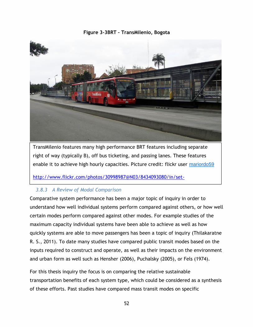
52
Figure 3-3BRT – TransMilenio, Bogota
3.8.3 A Review of Modal Comparison
Comparative system performance has been a major topic of inquiry in order to
understand how well individual systems perform compared against others, or how well
certain modes perform compared against other modes. For example studies of the
maximum capacity individual systems have been able to achieve as well as how
quickly systems are able to move passengers has been a topic of inquiry (Thilakaratne
R. S., 2011). To date many studies have compared public transit modes based on the
inputs required to construct and operate, as well as their impacts on the environment
and urban form as well such as Hensher (2006), Puchalsky (2005), or Fels (1974).
For this thesis inquiry the focus is on comparing the relative sustainable
transportation benefits of each system type, which could be considered as a synthesis
of these efforts. Past studies have compared mass transit modes on specific
TransMilenio features many high performance BRT features including separate
right of way (typically B), off bus ticketing, and passing lanes. These features
enable it to achieve high hourly capacities. Picture credit: flickr user mariordo59
http://www.flickr.com/photos/30998987@N03/8434093080/in/set-
72157632660880766
53
parameters, such as emissions or energy consumption (such as Fels (1974) or
Puchalsky (2005)), or focussed on specific geographic contexts – such as the study
comparing light rail or busway in Beijing by Spencer and Andong in 1996. However, as
an older study this study’s main focus was on loadings and costs – a comprehensive
sustainability analysis would include other considerations.
Vuchic’s work covering planning public transit in two major texts, Urban Transit
Systems and Technology (2007) and Urban Transit Operations, Planning, and
Economics (2005) both provide insight into the planning, development, and
implementation of transit systems as well as the performance of transit systems. A
variety of indicators and methods to assess performance are put forward as well as
demonstrated for theoretical systems and operational systems. These works are
foundational for transit studies and summarize the key concepts in transit analysis
and planning.
Vuchic classified modal comparison studies in terms of four types:
I. Theoretical comparisons of typical modes in a hypothetical area
II. Analyses of general characteristics of different modes
III. Comparison of different modes serving similar areas
IV. Comparison of different modes planned for a given area
(Vuchic V. R., Urban Transit Operations, Planning, and Economics, 2005)
This break down can provide great insight into formulating a multimodal sustainability
study, as well as reviewing past studies. Vuchic suggests that studies should focus on
the complete mode as costs are often incurred in developing the right of way that
serves the mode, and not the technology (i.e. the bus or type of light rail vehicle)
itself.
Many recent studies have focussed on the comparison of a newer form of rapid
transit, BRT, with heavy rail and light rail transit. Research has shown there is
growing support for BRT or bus way systems as an alternative to heavy rail and light

54
rail modes by offering comparable service at a lower cost (Hensher, Sustainable public
transport systems: Moving towards a value for money and network-based approach
and away from blind commitment, 2006). BRT planning guidelines state that a typical
BRT system can cost 4 to 20 times less than an LRT system and 10 to 100 times less
than a metro, which has found it to be an ideal mobility solution in low income
nations as well as jurisdictions seeking economic efficiency (ITDP, 2007). However,
these studies do not provide a large sample of BRT projects or specific reference to
the operating conditions necessary for corridors to provide this high capacity service.
Hensher (2006) cites the TransMilenio system’s (in Bogota) capacity of 38,000 as an
example of a high capacity BRT system. However, research has shown that bus
technology creates greater emissions per passenger km travelled overall compared to
LRT and that these emissions are localized, which raises questions about the
environmental benefits of this technology (Puchalsky, 2005).
Spencer and Andong (1996) completed an early study comparing BRT and LRT based
on theoretical plans for Beijing. The paper also included a “skytrain” alternative that
would operate similar to a metro or heavy rail system, only with reduced capacity.
The alternative has a separate right of way that is elevated (ROW A) and uses smaller
vehicles. Through analytical modelling, the paper provided a comparison based on
running time, provided capacity derived from vehicle capacity and headway, and
ultimately cost/benefit. The paper found that for the alignments considered, the bus
way option provided the greatest cost/benefit performance, however there were
limitations to the study such as a lack of user perspectives and environmental
considerations.
While the paper is framed as a comparison of BRT, LRT, and skytrain technologies, the
paper can also be considered as a comparison of specific scenarios and conditions that
were framed based on benchmarks from other BRT and LRT case studies (as well as a
skytrain plan drafted for Beijing) which is an important consideration when
investigating modal comparison.
55
Another perspective on modal comparison has considered performance in a
progressive nature – from low velocity and capacity to high capacity (Thilakaratne R.
S., 2011). This outlook considers gradual development of a corridor based on the
demand for travel and need for mobility starting with local service, and gradual
moving through express bus, BRT/bus way, LRT, and eventually to metro.
Bruun, in Schiller et al. (2010) provides research into the relative performance and
costs of major rapid transit modes. Similar to Puchalsky, local pollution is reported as
a disadvantage of BRT, along with noise levels. The increase of operating speeds and
capacity reported by Bruun follows a BRTLRT HR (also noted as Metro and Rail
Rapid Transit) progression (Schilleret al, 2010). All values are reported for ‘wealthy
nation standards’ meaning operational configurations and level of service that are
experienced in developed nations, which may differ from the low and middle income
nations that other BRT data are reported from. For example, Schiller et al. (2010)
report that in some Latin American or Asian countries there may be a higher tolerance
for crowding than in North America. Capacity achieved on one bus line or system is
often not a function of the mode, but rather numerous factors associated with the
overall system layout (Vuchic V. R., Urban Transit Operations, Planning, and
Economics, 2005).
However, Vuchic (2005) does provide a theoretical progression of capacity based on
increasing vehicle size parameters, headways (minimum and maximum) , operating
speed, and capacity ratios which shows a similar progression from standard bus(single
stop) articulated bus (single stop) mixed stop 50% standard 50% articulated
High Capacity Bus Street Car ROW C LRT ROW B Automated Guideway Transit
(several options are presented) RRT (several options are presented) Regional
Rail (diesel) Regional Rail (electric). As these options are theoretical, there can be
some exceptions based on system configuration; however they do provide some
interesting points of discussion for the relative baseline performance of different
types of public transit systems.
56
Bruun from Schiller, Bruun, and Kenworthy (2010) reports price ranges for vehicle
costs, indicating BRT vehicles cost $500-$1,500 thousand, LRT $2.5-$3.5 million, and
RRT $2-$3 million. These figures are aligned with the lower capital cost for BRT
notion provided by Hensher (2006); however they are focussed on vehicles only, not
right of way. Operating costs are provided as well, indicating that RRT is cheaper than
LRT per vehicle mile ($7-$13 dollars, compared to $7-$18) however BRT costs are
provided in vehicle hours, and no direct comparison can be made.
The thesis by Thilakaratne (2011), based on data from transit systems from a variety
of global contexts, stratifies the mobility performance of major transit modes. This
stratification can raise questions to the claims by Hensher (2006) and ITDP about the
performance equivalence of BRT/Busway systems to LRT and Metro. While the data
from the thesis study shows that the highest performing busways can achieve 25,000
passengers per hour per direction in capacity, which is greater than the 18,892
reported for LRT the general trends reported in the study indicates a general
progression of modes within a corridor. The reports by Hensher and ITDP are based on
the highest performance systems, such as TransMilenio in Bogota which utilize large
right of ways and have established demand, so comparable performance may not be
as commonly attained. This raises the question of case by case analysis, vs. the use of
best in class benchmarking.
Another study by Agarwal and Zimmerman (2008) that reports the sustainable mobility
experiences of Urban India views modal comparison in a different light. The authors
frame the discussion not necessarily of capacity, but in terms of city factors and what
sort of trips are being served by the system. Metro is described as a useful system
type for dense cities with linear travel corridors, whereas a bus system may be more
suited for cities that are lower density and are multinucleated (Agarwal &
Zimmerman, 2008). This discussion adds further nuance to the modal debate.
Another comparison between modes was completed by Rahman in 2009, this major
study focussed on estimating the entire lifecycle energy requirements for both BRT
and LRT. Ottawa, Canada was used as a case study and vehicle and infrastructure

57
energy usage were considered (Rahman, 2009). From the study it was found that
energy consumption is very context specific and depends on system configuration,
however in a non-tunnel running configuration LRT consumes approximately 12% more
energy than BRT over the entire lifecycle, while with a tunnel configuration the
energy intensities are similar. The study also found that indirect energy accounted for
66% of the total energy consumed.
Table 3-2 provides a summary of performance issues related to planning and operating
LRT, BRT, and RRT/Metro systems.
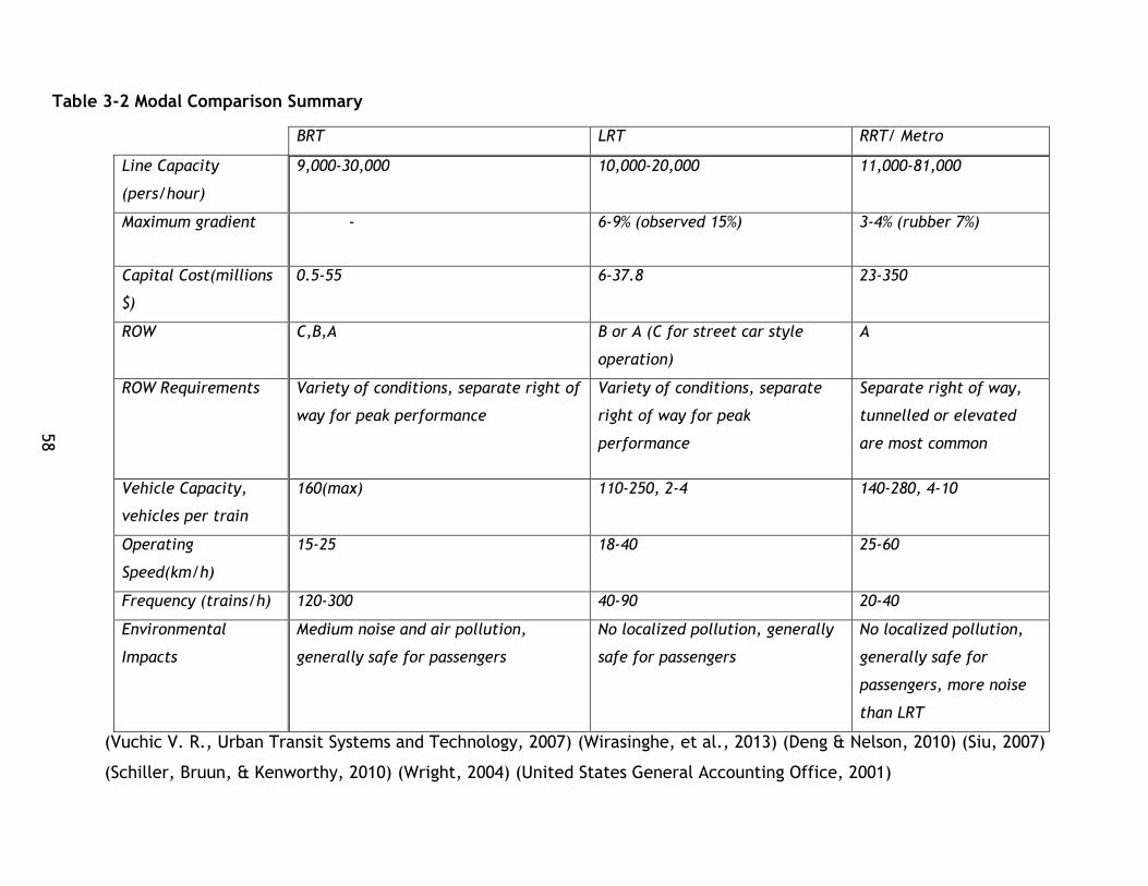
58
Table 3-2 Modal Comparison Summary
BRT LRT RRT/ Metro
Line Capacity
(pers/hour)
9,000-30,000 10,000-20,000 11,000-81,000
Maximum gradient - 6-9% (observed 15%) 3-4% (rubber 7%)
Capital Cost(millions
$)
0.5-55 6-37.8 23-350
ROW C,B,A B or A (C for street car style
operation)
A
ROW Requirements Variety of conditions, separate right of
way for peak performance
Variety of conditions, separate
right of way for peak
performance
Separate right of way,
tunnelled or elevated
are most common
Vehicle Capacity,
vehicles per train
160(max) 110-250, 2-4 140-280, 4-10
Operating
Speed(km/h)
15-25 18-40 25-60
Frequency (trains/h) 120-300 40-90 20-40
Environmental
Impacts
Medium noise and air pollution,
generally safe for passengers
No localized pollution, generally
safe for passengers
No localized pollution,
generally safe for
passengers, more noise
than LRT
(Vuchic V. R., Urban Transit Systems and Technology, 2007) (Wirasinghe, et al., 2013) (Deng & Nelson, 2010) (Siu, 2007)
(Schiller, Bruun, & Kenworthy, 2010) (Wright, 2004) (United States General Accounting Office, 2001)
59
3.9 Conclusion
In the literature there is a common practice of comparing individual technologies
based on specific case studies or specific indicators or characteristics of transit.
Research by authors such as the Spencer and Andong (1996), Puchalsky (2005), Fels
(1974), the ITDP (2007), Agarwal and Zimmerman (2008) greatly inform or expand the
knowledge base of transit and have developed a foundation for further research and
systems planning. However, thus far there has not been enough research that
compares entire transit systems and their ability to provide sustainable mobility. As
noted in the introduction, there are studies into indicator sets and studies that apply
individual indicators or select indicators but few studies have compared modes or
systems holistically – this positions this research quite well among the continuum of
public transit research.
While the studies above are able to highlight differences, weaknesses, and strengths
that may be generally applied to technologies or modes there is a gap in the
literature for covering transit from a sustainability lens that combines these
perspectives along with other sustainability criteria. There is no one set of
characteristics for any one mode, but rather a diverse set of characteristics shaped by
the context the system is delivered in (Vuchic V. R., Urban Transit Systems and
Technology, 2007)
60
Sustainable Transportation Assessment
4.1 Chapter Overview
A specific literature review in sustainability analysis as it pertains to transportation
analysis was also conducted in order to inform this thesis project. This chapter
contains this literature review as well as commentary on the papers, theses, and
reports utilized for it. Section 4.2 provides a scope for this literature review while
Section 4.3 provides an overview of the literature used on decision making
methodologies and then provides analysis on the key methodologies used for this
thesis’ guiding research questions. Section 4.4 contains a summary of the literature
review on the use of indicators, metrics, and indices for sustainable transportation
research as well as survey of papers that covered the subject from a more general
basis. This section also provides tables of commonly occurring indicators in the
literature and commentary on the frequency and use for the analysis of sustainable
transportation. This literature review seeks to find indicators that will be useful for
the comparison of systems under sustainable transportation criteria. Techniques used
to create indices, normalize indicators, and select indicators are also covered within
this section. Section 4.5 contains a review of key studies of sustainable transportation
that informed this thesis research. Finally, section 4.6 provides concluding comments
on the literature review and what can be applied for this particular study.
4.2 Literature Review Scope
This section of the literature review is focussed on understanding the current state of
research into sustainable transportation analysis by exploring sustainable
transportation studies and research focussed on two areas:
The development of effective indicators, metrics, and indices to quantify and
measure sustainable transportation
Past studies of sustainable transportation that have either applied indicators,
metrics, and indices, or have utilized another technique to measure sustainable
transportation

61
The literature review surveyed papers, theses, reports and texts from a variety of
fields including civil engineering, environmental science, economics, urban planning,
and geography.
4.3 Transportation Decision Making Methodology
4.3.1 Overview of Literature
The field of public transit performance analysis has an established literature base of
theory and applied studies that have analyzed the performance of transit under a
variety of lenses including efficiency, effectiveness, economic performance, and
environmental impact. In the twentieth century, as larger data sets became available
to study existing systems, larger studies could be conducted and more research was
undertaken. Early studies were concerned with operating parameters of transit
systems, such as operating expense per passenger, and were developed to understand
economic efficiency(e.g. revenue vehicle miles per vehicle) or to understand vehicle
utilization. Vreeker & Nijkamp (2005) suggests that transport planning problems have
a degree of complexity that requires the application of both theory and practical
policy. As research in transit and other fields has developed considerably in the late
20th and early 21st this literature review will survey key contributions from a variety of
authors and fields to aid in the development of sustainability research that will build
upon previous transit research from fields of theory and practice.
4.3.2 Sustainability Analysis
As previously discussed, sustainability has emerged as a key set of practice and
research over the past two decades amongst a backdrop of increased awareness of
sustainability issues, improved analytical tools, and increased interdisciplinary
research endeavours. Most sustainability assessment research utilizes tools for a
variety of fields in order to look at issues from multiple perspectives (for example,
triple bottom line) and in a holistic light.
Various high level frameworks have been developed and considered in the literature,
in policy, and in practice. Jeon and Amekudzi (2005) conducted a thorough review of
sustainability analysis as well as definitions of sustainability and tools commonly used.

62
The authors have broken sustainability frameworks into the following categories based
on terminology commonly used in the literature:
Linkage based frameworks: tools that attempt to utilize indicators and
metrics to understand particular conditions affecting sustainability and the
impacts of these conditions as well as what actions can be taken to address
them.
Impacts based frameworks: tools that focus on the impacts of
actions/projects/plans on the sustainability of a particular system being
analysed or considered. Three dimensional frameworks (i.e. economic, social,
environmental) fall under this category.
Influence Oriented Frameworks: tools that categorize indicators or metrics
based on their level of influence and the control that the responsible agency
has over them.
(Jeon & Amekudzi, 2005)
The authors share that regardless of the framework used, effort should be taken to
balance the use of inputs and outcomes or impacts as measures of transport
sustainability. Jeon and Amekudzi (2005) also suggest that these frameworks can be
synthesized or integrated in order to ensure agencies have the right analysis and
indicator system.
Pope, Annadale, and Morrison-Saunders (2004) describe sustainability assessment as a
process of exploring the implications of existing policies, plans, programmes,
projects, or pieces of legislations, or existing practise or activities on sustainability.
The authors suggest that while there are many attempts to assess sustainability, many
could be declared as extensions of an EIA framework, that reflect a triple bottom line
conception of sustainability, but do not necessarily truly contribute to sustainable
practice (Pope, Annandale, & Morrison-Saunders, 2004). The authors suggest that
most definitions and approaches to sustainability assessment are generic and describe
a suite of processes and that more rigorous approaches are necessary to truly use
assessment to promote sustainability.
63
Analysing and planning transport systems relies on indicators to understand trends and
model or analyse impacts (Sustainable Transportation Indicators Subcommittee ,
2009). The Subcommittee also suggests that comprehensive and balanced indicator
sets should include indicators from all major categories of issues in order to improve
the decision making framework. Littman and Burwell (2006) suggest that conventional
evaluation techniques used in transportation analysis mostly consider motorized travel
and may not fulfil sustainable transport objectives – meaning there is a need for
expanded indicators and methodologies for sustainability analysis (Litman & Burwell,
Issues in sustainable transportation, 2006).
Sustainability in transport is a widely acknowledged necessity due to triple bottom
line impacts - indicators allow impacts of transport to be recognized and measured
and can be used as a basis for policy making (Bongardt, Schmid, Cornie, & Litman,
2011). While there is much discussion on indicators and their application, a paper
found that few studies use sustainability indicators to compare systems (Haghshenas &
Vaziri, 2012). While studies are emerging that are applying ‘holistic’ sustainability
analysis, such as Haghshenas and Vaziri (2012), Jeon (2007), and Kennedy (2002), all
of which focus on different elements of transportation – ranging from macroscopic
analysis of cities (Haghshenas and Vaziri), to a detailed analysis of one city (Kennedy).
While these studies contribute to a much needed hole in the research, they do not
focus explicitly on transit and how transit performs under sustainability criteria.
There is a current deficit of major studies that have compared a wide range of transit
systems using comprehensive sustainability analysis. This study aims to contribute to
this gap by comparing transit systems, however, first a review of indicators and
sustainability analysis techniques is required.
Ramani et al (2011) proposed a general sustainability assessment framework for
transport agencies along with a review of key sustainable transportation concepts.
This framework presents a 5 step process, with feedback loops between each level of
the process. The five components of the process are:
64
understanding sustainability
transportation sustainability goal development
development of objectives
development of performance measures
performance measure application
While this study is assessing projects from the lens of an agency, it seeks to develop a
useful analytic tool so this 5 step process is applicable to this research. Indeed, the
literature review portion can be seen as covering the understanding of sustainability
as well as the development of goals, objectives, and performance measures while
chapter 6 is the application. This general framework is a foundation case for which
sustainability studies and analyses can be based upon.
Vreeker & Nijkamp (2005) suggest that given the complexity of transportation
planning and the increasingly multidimensional nature of the problems encountered
by transport planners and those engaged in transport planning, a new set of tools is
required to effectively tackle these challenges. Traditional approaches of simply
analyzing a particular indicator or performance measure does not capture the
richness, complexity, or competing objectives that sustainability issues may present
which requires a different tool – multi criteria decision making.
4.3.3 Analysis and Decision Making Across Multiple Dimensions
Key sustainability studies including work by Jeon(2007), Kennedy(2002), Castillo and
Pitfield (2010), and Haghshenas & Vaziri (2012) as prime studies in the literature to
consider sustainability analysis as a problem with multiple dimensions or criteria.
These studies utilize analysis that break down various aspects of sustainable transport
into sets of criteria or accounts of analysis and evaluate these criteria/accounts in
order to understand the sustainability implications of the system or problem being
explored. Vreeker & Nijkamp (2005) provides a primer on using multicriteria
evaluation for transport policies and problems. Other studies have utilized analytical
modelling outputs and frameworks of wellbeing for individuals and whole communities

65
to inform sustainable transportation (Johnston, 2008). All these studies are focussed
on exploring sustainability through multiple dimensions. From both a theoretical and
practical lens, the applicability of multi criteria tools for sustainability analysis is well
established and will further be explored in this sub chapter.
Throughout the literature, Multi Criteria Analysis (MCA) and Multi Criteria Decision
Making (MCDM) are common types of tools utilized in sustainability analysis, both
within the transportation field, as well as in other disciplines. In both research and
practice, a variety of MCA/MCDM types of tools have been used in studies that have
influenced this thesis. Evaluating transportation projects using multiple criteria, as
opposed to a single criteria enables a more holistic analysis as well as the
perspectives and concerns of multiple stakeholder groups to be considered (Sinha &
Labi, 2007). Whereas fixed or “rigid evaluation techniques” may encounter issues of
not covering all issues necessary in the planning environment, multi criteria
techniques offer the opportunity to explore and account for a variety of issues
(Vreeker & Nijkamp, 2005). Vreeker & Nijkamp suggest this reduces bias in decision
making.
Jansen and Munda from Vreeker and Nijkamp (2005) provide a system to classify MCA
methodologies based on four distinctions. This system is shown in Figure 4-1.

66
Figure 4-1 Classification of MCA Approaches
Adapted from (Vreeker & Nijkamp, 2005, p. 513)
These core principles for characterizing MCA approach can also be utilized in
structuring and designing an analytical process. Vreeker and Nijkamp also outline
1. The set of the alternatives: discrete versus continuous problems. In
evaluation practices, a distinction is often made between discrete and
continuous problems. Discrete decision problems involve a finite set of
alternatives. Continuous problems are characterized by an infinite
number of feasible alternatives.
2. The measurement scale: quantitative versus qualitative attribute scale.
Some problems include a mixture of qualitative and quantitative
information. Qualitative and mixed evaluation methods can handle this
type of information to analyze alternatives.
3. The decision rule: price or priorities. The decision rules is unique for each
method. Priorities used in MCA reflect the relative importance of the
criteria considered in the analysis. In CBA, prices are used to calculate
benefit-cost ratios. These prices are derived directly or indirectly from
market prices or are assessed by means of various valuation methods.
4. The valuation functions: standardization versus valuation. In order to
make score comparable, they must be transformed into a common
dimension or into a common dimensionless unit. This can be done by
transforming the scores into standardised scores by means or a linear
standardization function, or by using value or utility functions. Utility and
value functions transform information measured on physical
measurement scales into a utility or value index.

67
three approaches to applying MCA in making decisions: utility or value approaches,
programming methods, and outranking methods.
In utility and value approaches, the problem is turned into an optimization problem
where the multicriteria problem is reduced to a uniciterion optimization problem
based on a hypothesis that a value or utility function can be defined for the decision
problem and the alternatives being considered (Vreeker & Nijkamp, 2005). The
authors draw attention to the distinction between multi attribute utility theory
(MAUT, which requires the computation of an expected utility for each alternative)
and multi attribute value theory (MAVT, which draws upon a value function to
represent outcomes) functions – utility functions may be value functions, but value
functions may not be utility functions. They state that in MAUT and MAVT the decision
makers are involved in a two-step process – 1) developing functions for each criteria
and 2) calculating the expected utility of the aggregated utility functions.
Vreeker & Nijkamp (2005) also outline the programming method, multi-objective
programming (MOP), which aims to reach a set of goals that are predefined
maximizing or minimizing objectives. MOP works to find feasible solutions and divide
them into efficient and inefficient solutions - the decision maker may then chooses
the best solution from the most efficient solution set (Vreeker & Nijkamp, 2005).
Finally, the authors also explore outranking methods, which is also called the French
School. This technique does not develop a mathematical model that represents the
decision maker’s preferences, but rather directly compares alternatives.
As suggested by its application in past studies, MCDM is a useful tool for sustainability
analysis as sustainability calls for an approach where multiple issues may be evaluated
at once (Jeon & Amekudzi, 2005). This tool has fit into the transport analyst and
researcher’s tool box in a useful way beyond sustainability for just this reason – where
as other tools are tailored for specific issues (i.e. monetizing GHg emissions or noise)
MCDM allows a more holistic view of problems and perspectives to be integrated into
the decision making process (Sinha & Labi, 2007).
68
While there are no absolute definitions for MCDM, a common definition is that MCDM
is a tool used to improve decision making by balancing multiple objectives explicitly
(Zeleny, 1982). Gwo-Hsiung and Jih–Jeng (2011) set out 5 steps to consider when
developing MCDM decision making processes:
Step 1: “Define the nature of the problem;”
Step 2: “Construct a hierarchy system for its evaluation;”
Step 3: “Select the appropriate evaluation model;”
Step 4: “Obtain the relative weights and performance score of each attribute
with respect to each alternative;”
Step 5: “Determine the best alternative according to the synthetic utility
values, which are the aggregation value of relative weights, and performance
scores corresponding to alternatives.”
(Gwo-Hshiung & Jih-Jeng, 2011, p. 15)
This process is utilized in chapter 5 to develop decision making and support tools, as
well as to conceptualize sustainability as a multi criteria problem. This is a brief
treatment of MCDM, however the discussion is continued in the review of past studies
and this is intended as an introduction to the subject. Its application, in particular
issues on weighting, defining the nature of the problem, and selecting alternatives,
are discussed in length in chapter 5 and 6, and also in subsequent chapter 4 sub
sections.
Sustainable Transport Studies
4.4.1 Overview of Past Studies
Key studies were utilized to inform this research into sustainability analysis including
Kennedy’s Comparison of the Sustainability of Public and Private Transportation
Systems: Study of the Greater Toronto Area (2002), Jeon, Amekudzi, and Guensler’s
Evaluating Plan Alternatives for Transportation System Sustainability in the Atlanta
Metropolitan Region (2009), and Haghshenas and Vaziri’s Urban Sustainable
Transportation Indicators for Global Comparison (2012).
69
Vincent and Walsh’s The Electric Rail Dilemma(2003), and Puchalsky’s Comparison of
Emissions from Light Rail Transit and Bus Rapid Transit (2005) were reviewed as
papers that demonstrated comparisons of modes and systems based on environmental
criteria, while also highlighting useful techniques and resources for sustainability
analysis. These papers are discussed throughout the thesis and are not mentioned
here.
4.4.2 Review of Past Studies
Kennedy’s 2002 paper is classified as a modal comparison study as it is an in depth
comparison of private and public transportation in the Greater Toronto Region. This
study greatly contributes to the field of sustainability analysis by conducting a holistic
triple bottom line comparison of the benefits and negative impacts of private and
public transport within a fixed geographic area. A set of indicators are set out and
data is collected that combined historical sources with analytical models or estimates
where appropriate to conduct a rigorous analysis. Unlike the other two studies
mentioned in this section, there is no effort made to aggregate the data collected or
the indicators used for composite indicators or indices, however, the results are
clearly explored through in depth analysis.
The analysis finds that there are benefits to both types of travel for the Toronto
region due to the level of sophistication in analysis and the number of indicators used.
As there are multiple indicators under each category, the potential trade-offs, costs,
and benefits within each sustainability category, as well as within each system can be
observed and better understood. The key take away from this study is the general
approach to setting out indicators and categories for analysis as well as systems being
compared as well as setting a clear scope for analysis.
Jeon (2007) and Jeon et al. (2009) approach for evaluating different plan alternatives
presents a methodology for sustainability analysis grounded in MCDM. First, the article
provides a literature review of sustainability based in the triple bottom line paradigm,
and sustainability indicator frameworks that reviews common frameworks for utilizing
indicators in sustainability analysis. A review of MCDM techniques including the history
70
of MCDM in decision making as well as recent innovative developments is also included
to provide context for the analysis techniques proposed. These studies stem from the
same dissertation, Jeon (2007), focussed on applying composite indicator or index
techniques to analyzing sustainability plans in a geographic region to both better
understand how different plans perform under rigorous sustainability analysis and also
contribute to the state of applying holistic sustainability research to decision making
problems.
These studies, henceforth referred to as the Jeon studies, break down sustainability
into four categories as an expansion of the triple bottom line framework:
environmental, social, economic, and system effectiveness. These four categories
measure the impacts of different plan alternatives on the city and transportation
system, as well as those who live there. Two alternative transportation-network-land
use scenarios for the Atlanta Metropolitan region were modelled and the outputs with
respect to 30 indicators were analyzed and compared to a 2005 base case scenario.
These indicators were aggregated into indices by sustainability category and then into
a composite indicator based on single attribute utility functions. Weighting for these
functions were assigned equally at both the composite indicator level as well as the
sustainability category level.
Sensitivity testing, which changed the values of weighting, was conducted to
demonstrate how different weightings impact the overall composite index value as
well. The study demonstrated how to apply a MCDM based decision support tool for
sustainable transport analysis, analyzed various indicator frameworks, demonstrated
how to calculate composite indicators or indices, and discussed how these tools can
be made to explore trade-offs between different elements of sustainability goals.
The key takeaways from the Jeon studies is the methodology of how to use composite
indices with a modified triple bottom line framework under a MCDM environment in
order to compare the overall sustainability of multiple systems or plan alternatives.
This technique can be adapted to for public transit analysis by determining
71
appropriate measures or indicators of public transit sustainability and selecting
appropriate data.
The second study that greatly informs this research focuses on the comparison of
multiple cities based on their overall transportation systems. Haghshenas and Vaziri
(2012) presented a study of cities and their transportation systems from a holistic
sustainability lens. Similar to Jeon (2007) and Jeon, Amekudzi, and Guensler (2009)
the study utilized an approach grounded in MCDM with different sustainability
categories each with a set of factors represented by an indicator. Also similar to Jeon
studies, this study utilized a weighted sum equation to create composite sustainability
indices for each city. This study utilized the UITP’s (International Association of Public
Transport) millennium cities database for sustainable transportation, which contains
100 cities, along with environmental, economic, and social indicators to rank all cities
in the database based on their relative sustainability performance.
Z scores of all indicators are calculated to normalize all indicators and generate
composite indices for each sustainability category as well as a composite
sustainability index. Developed Asia and Europe have the best CSI for transportation.
The key conclusions of the study were that denser cities tend to have higher
composite sustainability results, higher auto share lowers environmental sustainability
index, and that urban area has a negative correlation with composite sustainability
index.
The overall contributions of the article are oriented around the development of
composite indicators using weighed sum techniques, similar to the Jeon studies, as
well as basic insight into denser cities having more sustainable transportation
systems.
4.4.3 Summary
Each of these studies greatly informs the development of this research and key
contributions have been selected from each paper to develop the methodology that
will be utilized to assess the sustainability of public transit within this study. The key
concepts taken from each study has been summarized in Table 4-1.

72
Table 4-1 Key Concepts from Sustainability Studies
Author Key Concepts
Kennedy (2002) Analyzed two different types of travel in the
GTA
Developed clear indicators and use them to
explore benefits, costs, trade-offs based on
triple bottom line
Developed a rigorous analysis for each area of
sustainability
Jeon (2007), Jeon,
Amekudzi, and
Guensler (2009)
Analysed three scenarios in the Atlanta
Metropolitan area
Used 30 indicators based on an expanded
triple bottom line to understand trade-offs
and costs/benefits as well as to develop
composite sustainability index
Normalization based on single attribute
utility, weights equally assigned
Haghshenas and Vaziri
(2012)
Analysed the transport systems of 100 cities
based on a variety of sustainability factors
Used z-score normalization and weights that
were equally assigned
73
4.5 Indicators, Metrics, and Indices
4.5.1 Indicator Selection - Literature Practices
Indicators are used for a variety of purposes including measurement, policy
formulation, and project assessment (Joumard & Gudmundsson, 2010)
Performance measures are measurable criteria that are utilized to evaluate progress
towards goals (Ramani, Zietsman, Gudmundsson, Hall, & Marsden, 2011). Bongardt, et
al.(2011) also suggest that indicators should be used to measure progress, inputs, and
outputs of a transport project. Selecting indicators is at the heart of this research
project. As there are a large number of indicators for evaluating sustainability and
transportation performance, reviewing how past studies have selected indicators or
suggest how to select indicators will inform the development of this thesis’ indicator
framework. As outlined previously, sustainability studies often use a triple bottom
line approach focusing on exploring sustainability through a lens of environmental
social, and economic issues. In transportation research, sustainability studies also use
a similar framework to explore sustainability issues.
In a variety of fields, including environmental analysis of transport projects, indicator
selection is the first challenge encountered. (Rothengatter, 2003) This statement can
be expanded to all areas which are impacted by transportation. In formulating a
study, indicator selection is the first issue analysts often encounter. Understanding
the issues being addressed or researched and the right set of indicators can become
challenging with a topic as broad as sustainability (see discussion in chapters 2 and 3
). It is important to note that the indicators that are selected can greatly influence
the results of the analysis (Litman & Burwell, 2006). So great care must be practiced
when selecting indicators. Unlike studying the GHg emissions of a roadway, which is a
finite problem, there is inherit ambiguity in sustainability and the analysts own biases
can be built into the problem definition.
To aid in limiting this bias, best practices, foundational literature, explicit statement
of research goals, and past studies can be used in aiding the development of indicator
frameworks. Litman (2013) has summarized best practice for indicator selection from

74
a number of authors. Figure 4-2 contains an excerpt from the Litman summary for use
in this thesis.
Figure 4-2 Indicator Best Practices
(Litman, 2013, p. 71)
Comprehensive – Indicators should reflect various economic,
social and environmental impacts, and various transport
activities (such as both personal and freight transport).
Quality – Data collection practices should reflect high
standards to insure that information is accurate and
consistent.
Comparable – Data collection should be clearly defined and
standardized to facilitate comparisons between various
jurisdictions, times and groups. For example, “Number of
people with good access to food shopping” should specify
‘good access’ and ‘food shopping.’
Understandable – Indicators must understandable to
decision-makers and the general public. The more
information condensed into an index the less meaning it has
for specific decisions.
Accessible and transparent – Indicators (and the raw data
they are based on) and analysis details should be available to
all stakeholders.
Cost effective – Indicators should be cost effective to collect.
Net effects – Indicators should differentiate between net
(total) impacts and shifts of impacts to different locations
and times.
Functional – select indicators suitable for establishing usable
performance targets
75
In their outline of the ELASTIC framework, Castillo and Pitfield (2010) share the
following useful criteria for indicator selection based on their research drawn from
the field and other literature:
Measurability: “indicators must be measurable in a theoretically sound,
dependable and easily understood manner.”
Ease of availability: “it should be possible to easily and at a reasonable cost,
collect reliable data on the indicator or calculate/forecast the value of the
indicator using accepted models.”
Speed of availability: “data from which the indicator is derived or calculated
should be regularly updatable with a view to ensuring the shortest lag between
the state of affairs being measured and the indicator becoming available”
Interpretability: “an indicator and its calculation should yield clear,
unambiguous information that is easily understood by all stakeholders.”
Transport’s Impact isolatable: “it should be possible to isolate transport’s
share of the impact that the indicator is purporting to measure.”
(Castillo & Pitfield, 2010)
These criteria are useful for selecting and formalizing indicators, however they are
specified for the elastic process, specifically to aid with the selection of indicators for
the elastic methodology and may not be completely applicable in all analysis
frameworks.
Hensher (2005) also provides guidance for the development of performance measures.
Indicators should relate to the objectives of the organization and include
internal and external factors.
Indicators must be clearly defined and unambiguous – their numeric values or
changes in values should be clearly good or bad.
indicators must distinguish between factors that the organization can and
cannot control.
76
Indicators must be comprehendible by those who can influence them
The results from the measure must be related to the overall analysis of
performance. “This requires an unambiguous definition of an improvement in
performance”
Drawn and adapted from (Hensher, Performance Evaluation Frameworks, 2005, p.
87)
Hensher’s performance measure suggestions are targeted at the development of
performance measurement in public and private sector organizations so their inclusion
has merit in the development of a tool that has utility in both research and decision
making contexts.
4.5.2 Overview of Composite Indicators
As this study seeks to develop a useful tool to analyse sustainable transportation
contributions of public transit systems, composite indicators will be utilized similar to
past studies. To aid in the study of sustainable transportation, a review of composite
indicators is included. The OECD “Handbook on constructing composite indicators:
methodology and user guide” was utilized in this study due to its depth of detail,
citations in other studies, and the quantity of techniques discussed within it. In
addition, two transportation studies that utilize sustainability concepts and composite
indicators greatly inform this literature review – Jeon’s 2007 dissertation and the
additional articles co-authored by her, as well as Haghshenas and Vaziri (2012). These
works are foundational to the application of composite indices or indicators to
transportation system analysis for sustainability analysis.
Composite indicators allow comparison of different entities under complex fields and
conditions (Nardo M. , et al., 2005). Nardo et al suggest key pros of the composite
indicator or index tool, summarized sources, including that they can present ideas
easier than sharing several indicators at once, they are useful for ranking entities on
complex issues, and are useful communication tools. However the authors also share
negative aspects or cons including they also run the risk of misleading policy if they

77
are not carefully constructed or if certain dimensions or indicators are ignored, and
can be misused if weighting becomes a political exercise . Given the pros and cons,
the authors state that the construction and use of composite indicators is much more
like mathematical or computer modelling than a universal science in that it does
ultimately rely on the judgement of the researcher or analyst who constructs the tool.
Nardo and Saisana write “As a result, the model of the system will reflect not only
(some of) the characteristics of the real system but also the choices made” (Nardo &
Saisana, 2005)
4.5.3 Index Technique – Z score normalization / Standardization
The z score normalization, or standardisation was utilized in the study by Haghshenas
and Vaziri (2012). Essentially, this technique utilizes statistical concepts, the z score
equation, on the indicator data to normalize all data to a common scale. Nardo et al
describe this technique as follows: “… converts indicators to a common scale with a
mean of zero and standard deviation of one. Indicators with extreme values thus have
a greater effect on the composite indicator. This might be desirable if the intention is
to reward exceptional behaviour. That is, if an extremely good result on a few
indicators is thought to be better than a lot of average scores.” (Nardo M. , et al.,
2005)
4.5.4 Index Technique –Rescaling and Distance to Reference
Two other techniques to be discussed are the rescaling and distance to reference
techniques. The manual by Nardo et al (2005) was also used to inform the thesis
project’s use of these techniques.
The first technique, re-scaling, normalises the set of values for a particular indicator
to have an identical range of values (Nardo M. , et al., 2005). The authors suggest
that this transformation can be used to set up an identical range (for example 0-1).
However, Nardo et al (2005) describe that extreme values, leverage data points, and
outliers can have distorting events on the transformed datasets – meaning higher

78
performing values will be closer to maximum, and lower performing values will be
closer to the minimum. The authors caution that this could stretch data across a
greater distance than it was prior to normalization for some indicators, which may
have implications for the composite indicator.
Distance to a reference measures the position of a given indicator relative to a
reference point – as described by Nardo et al there are a few types of reference
points that can be used:
Temporal targets – goals to be reached by a set point in time (i.e. a CO2
reduction goal) are used as a reference point or target.
External benchmarks – using a system (i.e. a country that other countries will
be compared to) as a benchmark that is used as a reference point or target.
Average target – the average value for the data being analysed is used as
reference point or target.
Group Leader target – the highest performing value in the data set or group is
used as a reference point or target.
Adapted from (Nardo M. , et al., 2005)
The “utility” technique was used by Jeon (2007) and Jeon et al. (2009) for evaluating
different plan alternatives in Metropolitan Atlanta. This technique, as applied in the
study, essentially compares all indicators to the highest performing indicator in the
same category, and normalizes them between 0 and 1 (inclusive). This technique is
similar to the one described by Nardo et al (2005) namely rescaling and ‘distance to
reference’. In particular it could be described as applying these techniques with the
group leader target.
The application of these techniques is discussed in the methodology chapter.
4.5.5 Weighting Discussion
Conducting an exercise to determine weighting will be out of scope for this thesis,
however techniques will still be discussed in brief to both inform the placement of
79
this thesis among the literature but to also allow future studies to take off where it
leaves off. According to Sinha and Labi (2007) in MCDM type process, weighting is a
critical issue and allocating weights of each criteria relative to one another is a key
step to determining the overall decision making framework (Sinha & Labi, 2007).
Nardo et al (2005) also stress the importance of rigorous weighting approaches and
provide a summary of techniques and their uses in the development of composite
indicators (Nardo M. , et al., 2005). Similar to the Jeon studies and Haghshenas &
Vaziri (2012), applying a weighting technique to this study is outside of the scope of
the project. There are also interesting questions posed by applying a weighting tool to
the project – if multiple systems are used, should local stakeholders from each
system’s locale be consulted in the development of the weighting or overall should
experts be sought for weighting?
A variety of techniques have been reviewed in texts and studies including Jeon
(2007), Sinha and Labi (2007), and Nardo et al (2005). Nardo et al provide a more
general overview of weighting techniques, while the others provide transport specific
approaches. These techniques include equal weighting, direct weighting, regression-
based observer derived weighting, the Delphi technique, and the analytic hierarchical
process (AHP). The equal weighting approach utilized in this study, as well as Jeon's
study is critiqued for its simplicity by Sinha and Labi as it does not incorporate
preferences that may exist between some criteria.
In recent years, transport and sustainable transport studies have aimed to enrich
MCDM and weighting techniques in numerous ways. For example, diverse stakeholder
opinions can be utilized in an AHP process, such as the methods applied by Castillo
and Pitfield (2010) through surveys and questionnaires. Weighting was developed in
their study from transport planners and academics for both weighting criteria for
indicator selection as well as objectives for sustainable transport. It is possible these
techniques can be used to reach a wider stakeholder audience when broader
participation is desired.

80
4.5.6 Survey of Indicator Sets
To date, many research and reporting efforts have compiled technical reports and
research articles that contain sustainable transport indicators. In particular,
Dobranskyte-Niskota & Pregl (2007), Haghshenas & Vaziri (2012), Jeon, Amekudzi, &
Guensler (2009), Litman & Burwell (2006), Litman (2013), and the Sustainable
Transportation Indicators Subcommittee (2009). Jeon and Amekudzi (2005) also
reviewed 16 initiatives and developed a long list of transport measures of
sustainability along with their review of sustainability frameworks and definitions.
This section of the thesis shares the major summary tables or indicator sets used by
the authors. There is no consensus on where certain indicators should fit into
sustainability frameworks – for example Jeon, Amekdudzi, & Guensler (2009) include
travel time as a user cost in the economics category whereas Dobranskyte-Niskota &
Pregl (2007) include it as a factor of accessibility.
These discrepancies speak to the complexity of sustainability but also how
sustainability analysis is open to interpretation. As a result, it has been a challenging
endeavor to build upon these established frameworks, as well as research into key
elements of transport, such as accessibility, with consistency. In the following
sections these indicators will be explored in greater detail and an explanation of how
to apply them to transit research will be provided.

81
Table 4-2 Litman 2013 Sustainability Indicators
Sustainability Goals Objectives Performance Indicators
I. Economic Economic productivity Transport system
efficiency. Transport
system integration.
Maximize accessibility.
Efficient pricing and incentives.
Per capita GDP and income. Portion of budgets devoted
to transport. Per capita congestion
delay. Efficient pricing (road,
parking, insurance, fuel, etc.). Efficient prioritization of
facilities (roads and parking).
Economic development Economic and business development
Access to education and employment opportunities. Support for local
industries.
Energy efficiency Minimize energy costs, particularly petroleum imports.
Per capita transport energy consumption Per capita use of imported
fuels.
Affordability All residents can afford access to basic
(essential) services and activities.
Availability and quality of affordable modes (walking, cycling, ridesharing and public transport). Portion of low-income
households that spend more than 20% of
budgets on transport.
Efficient transport operations
Efficient operations and asset management maximizes cost efficiency.
Performance audit results. Service delivery unit costs
compared with peers. Service quality.
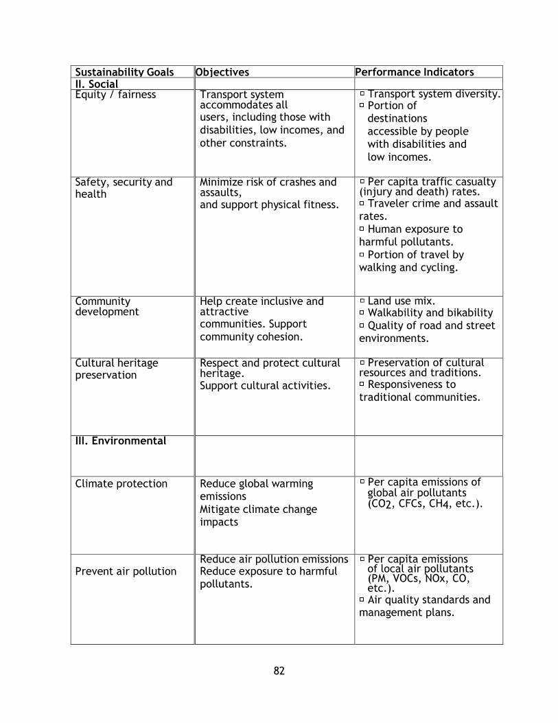
82
Sustainability Goals Objectives Performance Indicators II. Social Equity / fairness Transport system
accommodates all users, including those with
disabilities, low incomes, and
other constraints.
Transport system diversity. Portion of destinations
accessible by people with disabilities and
low incomes.
Safety, security and health
Minimize risk of crashes and assaults, and support physical fitness.
Per capita traffic casualty (injury and death) rates. Traveler crime and assault
rates. Human exposure to
harmful pollutants. Portion of travel by
walking and cycling.
Community development
Help create inclusive and attractive communities. Support
community cohesion.
Land use mix. Walkability and bikability Quality of road and street
environments.
Cultural heritage preservation
Respect and protect cultural heritage. Support cultural activities.
Preservation of cultural resources and traditions. Responsiveness to
traditional communities.
III. Environmental
Climate protection Reduce global warming emissions
Mitigate climate change impacts
Per capita emissions of global air pollutants (CO2, CFCs, CH4, etc.).
Prevent air pollution
Reduce air pollution emissions Reduce exposure to harmful pollutants.
Per capita emissions of local air pollutants (PM, VOCs, NOx, CO, etc.). Air quality standards and
management plans.
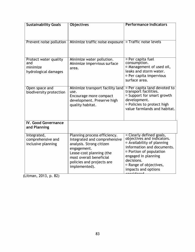
83
Sustainability Goals Objectives Performance Indicators
Prevent noise pollution Minimize traffic noise exposure Traffic noise levels
Protect water quality and minimize
hydrological damages
Minimize water pollution. Minimize impervious surface area.
Per capita fuel consumption. Management of used oil,
leaks and storm water. Per capita impervious
surface area.
Open space and biodiversity protection
Minimize transport facility land use. Encourage more compact
development. Preserve high
quality habitat.
Per capita land devoted to transport facilities. Support for smart growth
development. Policies to protect high
value farmlands and habitat.
IV. Good Governance and Planning
Integrated, comprehensive and
inclusive planning
Planning process efficiency. Integrated and comprehensive
analysis. Strong citizen
engagement.
Lease-cost planning (the
most overall beneficial
policies and projects are
implemented).
Clearly defined goals, objectives and indicators. Availability of planning
information and documents. Portion of population
engaged in planning decisions. Range of objectives,
impacts and options considered. Transport funds can be
spent on alternative modes and demand
management if most beneficial overall.
(Litman, 2013, p. 82)
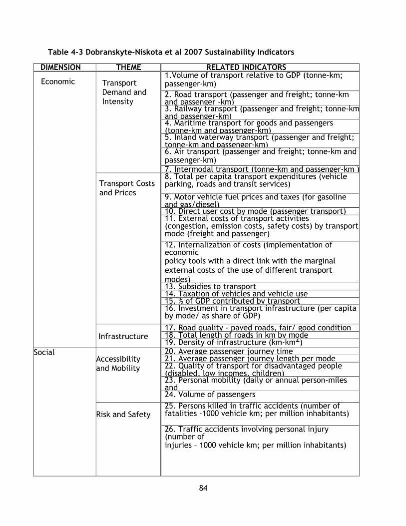
84
Table 4-3 Dobranskyte-Niskota et al 2007 Sustainability Indicators
DIMENSION THEME RELATED INDICATORS
Economic
Transport Demand and Intensity
1.Volume of transport relative to GDP (tonne-km; passenger-km)
2. Road transport (passenger and freight; tonne-km and passenger -km) 3. Railway transport (passenger and freight; tonne-km and passenger-km) 4. Maritime transport for goods and passengers (tonne-km and passenger-km) 5. Inland waterway transport (passenger and freight; tonne-km and passenger-km) 6. Air transport (passenger and freight; tonne-km and passenger-km) 7. Intermodal transport (tonne-km and passenger-km )
Transport Costs and Prices
8. Total per capita transport expenditures (vehicle parking, roads and transit services)
9. Motor vehicle fuel prices and taxes (for gasoline and gas/diesel) 10. Direct user cost by mode (passenger transport) 11. External costs of transport activities (congestion, emission costs, safety costs) by transport mode (freight and passenger)
12. Internalization of costs (implementation of economic policy tools with a direct link with the marginal external costs of the use of different transport modes) 13. Subsidies to transport 14. Taxation of vehicles and vehicle use 15. % of GDP contributed by transport 16. Investment in transport infrastructure (per capita by mode/ as share of GDP)
Infrastructure
17. Road quality - paved roads, fair/ good condition 18. Total length of roads in km by mode 19. Density of infrastructure (km-km2)
Social Accessibility and Mobility
20. Average passenger journey time 21. Average passenger journey length per mode 22. Quality of transport for disadvantaged people (disabled, low incomes, children) 23. Personal mobility (daily or annual person-miles and trips by income group) 24. Volume of passengers
Risk and Safety
25. Persons killed in traffic accidents (number of fatalities -1000 vehicle km; per million inhabitants)
26. Traffic accidents involving personal injury (number of injuries – 1000 vehicle km; per million inhabitants)

85
DIMENSION THEME Health Impacts
RELATED INDICATORS
Social Health 27. Population exposed to and annoyed by traffic noise, by noise category and by mode associated with health and other effects
28. Cases of chronic respiratory diseases, cancer, headaches. Respiratory restricted activity days and premature deaths due to motor vehicle pollution
Affordability
29. Private car ownership 30. Affordability (portion of households income devoted to transport)
Environmental Transport Emissions
32. NOx emissions (per capita) 33. VOCs emissions (per capita) 34. PM10 and PM2.5 emissions (per capita) 35. SOx emissions (per capita) 36. O3 concentration (per capita)
37. CO2 emissions (per capita)
38. N20 emissions (per capita) Energy Efficiency
40. Energy consumption by transport mode (tonne-oil equivalent per vehicle km) 41. Fuel consumption (vehicles-km by mode)
Impacts on Environmental Resources
42. Habitat and ecosystem disruption
43. Land take by transport infrastructure mode
Environmental Risks and Damages
44. Polluting accidents (land, air, water) 45. Hazardous materials transported by mode
Renewables 46. Use of renewable energy sources (numbers of
alternative-fuelled vehicles) - use of biofuels
Technical and operational
Occupancy of Transportation
47. Occupancy rate of passenger vehicles
48. Load factors for freight transport (LDV, HDV)
Technology Status
49. Average age of vehicle fleet
50. Size of vehicle fleet (vehicle/ 1 mln. inhabitants) 51. Proportion of vehicle fleet meeting certain air emission standards (Euro IV, Euro V etc.) Institutional
Measures to Improve Transport Sustainability
52. R&D expenditure on “eco vehicles” and clean transport Fuels
53. Total expenditure on pollution prevention and clean-up 54. Measures taken to improve public transport
Institutional Development
55. Uptake of strategic environmental assessment in the transport sector
Adapted from (Dobranskyte-Niskota, Perujo, & Pregl, 2007)

86
Table 4-4 Haghshenas & Vaziri 2012 Sustainability Indicators
Indicator Description Unit
Environmental
Energy Transport energy use per capita Mj
Land Use land consumption for transportation infrastructure per
capita
M
Emissions Emissions of local air pollutants (CO, VOC, NOx) per
capita
kg
Economic
Cost for
Government
Local government expenditure on transport per GDP %
Direct
transportation
cost per user
Average daily cost over GDP per capita %
Indirect
Transportation
Cost
Average time spent in traffic Minutes
Social
Safety Fatalities per capita Persons
Accessibility Sum of transportation systems for every citizen
passenger km per area
M
Variety Sum of transportation option vehicles per capita divided
per maximum of that option vehicle per capita in all
cities
-
(Haghshenas & Vaziri, 2012)
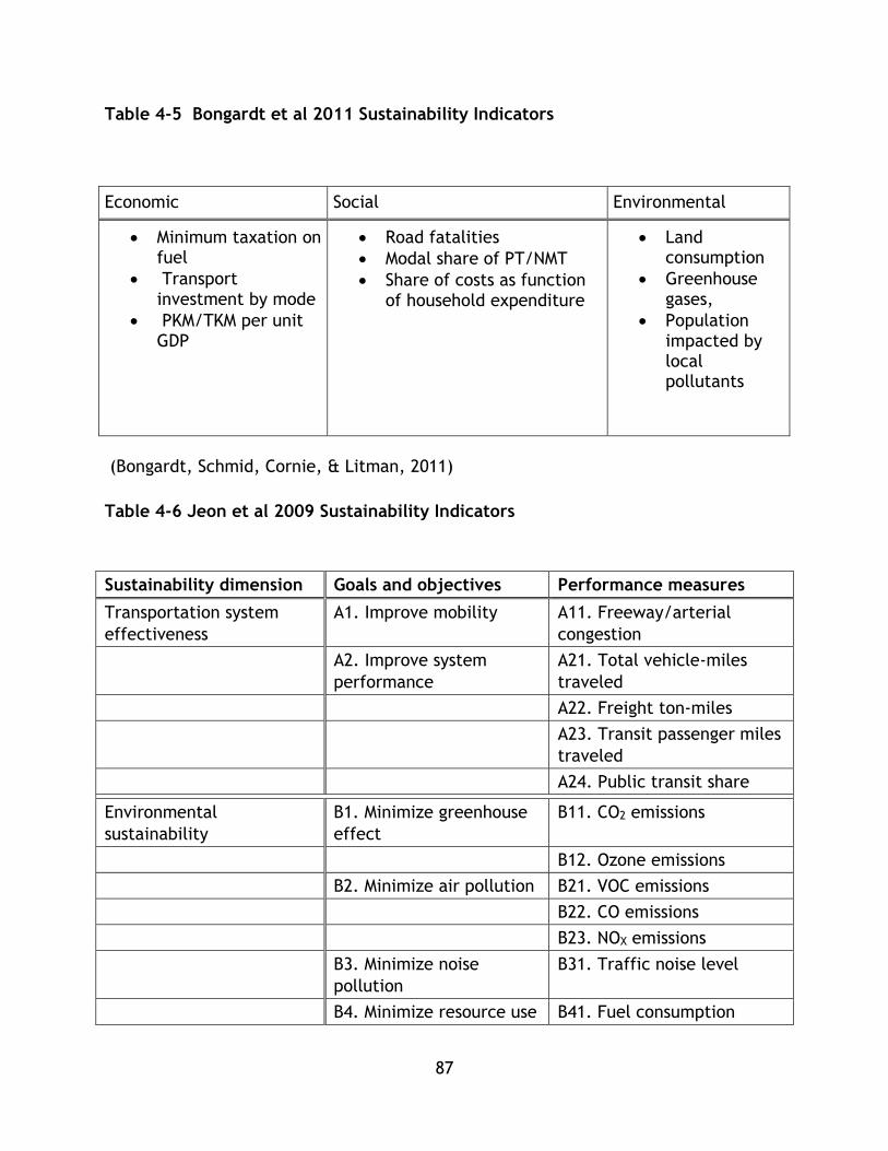
87
Table 4-5 Bongardt et al 2011 Sustainability Indicators
(Bongardt, Schmid, Cornie, & Litman, 2011)
Table 4-6 Jeon et al 2009 Sustainability Indicators
Sustainability dimension Goals and objectives Performance measures
Transportation system
effectiveness
A1. Improve mobility A11. Freeway/arterial
congestion
A2. Improve system
performance
A21. Total vehicle-miles
traveled
A22. Freight ton-miles
A23. Transit passenger miles
traveled
A24. Public transit share
Environmental
sustainability
B1. Minimize greenhouse
effect
B11. CO2 emissions
B12. Ozone emissions
B2. Minimize air pollution B21. VOC emissions
B22. CO emissions
B23. NOX emissions
B3. Minimize noise
pollution
B31. Traffic noise level
B4. Minimize resource use B41. Fuel consumption
Economic Social Environmental
Minimum taxation on fuel
Transport investment by mode
PKM/TKM per unit GDP
Road fatalities
Modal share of PT/NMT
Share of costs as function of household expenditure
Land consumption
Greenhouse gases,
Population impacted by local pollutants

88
B42. Land consumption
Economic sustainability C1. Maximize economic
efficiency
C11. User welfare changes
C12. Total time spent in
traffic
C2. Maximize affordability C21. Point-to-point travel
cost
C3. Promote economic
development
C31. Improved accessibility
C32. Increased employment
C33. Land consumed by
retail/service
Social sustainability D1. Maximize equity D11. Equity of welfare
changes
D12. Equity of exposure to
emissions
D13. Equity of exposure to
noise
D2. Improve public health D21. Exposure to emissions
D22. Exposure to noise
D3. Increase safety and
security
D31. Accidents per VMT
D32. Crash disabilities
D33. Crash fatalities
D4. Increase accessibility D41. Access to activity
centers
D42. Access to major
services
D43. Access to open space
(Jeon, Amekudzi, & Guensler, Evaluating Plan Alternatives for Transportation System
Sustainability: Atlanta Metropolitan Region, 2009)

89
4.5.7 Indicator Selection Criteria
From the indicators outlined previously, a selection has been made for a short list to
be considered for further analysis for this thesis based upon the best practices for
indicator selection from the literature review. The overall criteria utilized for this
selection process were adapted from Litman (2013) as well as Castillo and Pitfield
(2010).
4.5.8 Public Transit Goals and Objectives
Based on the literature review of sustainable transportation and public transit, a
synthetic set of goals and objectives has been assembled to aid in public transit
sustainability analysis. This table draws upon the frameworks, indicator sets, and
sustainability discussion of numerous authors included in chapters 2,3 and 4 and is
intended as a heuristic to guide the selection of public transit indicators for this
research project.
Each sustainability goal has been framed as an objective which could be expressed
mathematically in future research as part of an objective equation minimization or
maximization process. In the next section, each goal and objective will be discussed
in-depth in terms of past studies and methods for handling data or measuring the
indicator. Further considerations for each goal and objective are included in chapters
5 and 6. It should be noted that this table contains goals as specified for this research
and sustainability analysis should be a living analysis, meaning revision and adaptation
to new knowledge and emergent issues should be common.

90
Table 4-7 Sustainability Goals and Objectives for Mass Transit
Goal Objective Linked to
Envir
onm
ent
Decrease passenger Energy
Use
Minimize energy
consumed/pkm
(Dobranskyte-Niskota, Perujo, & Pregl),
(Haghshenas & Vaziri), (Litman)
Decrease passenger
contribution to climate
Change
Minimize ghg emissions /pkm (Dobranskyte-Niskota, Perujo, & Pregl),
(Haghshenas & Vaziri), (Bongardt, Schmid,
Cornie, & Litman), (Jeon, Amekudzi, &
Guensler), (Litman)
Decrease Pollution - Land,
air, water
Minimize pollutants or
emissions/pkm
(Dobranskyte-Niskota, Perujo, & Pregl), (
Haghshenas & Vaziri), (Jeon, Amekudzi, &
Guensler) , (Litman)
Limit Ecological
Disturbance
Minimize disruption by right
of way and system
construction
(Dobranskyte-Niskota, Perujo, & Pregl),
(Haghshenas & Vaziri), (Bongardt, Schmid,
Cornie, & Litman), (Jeon, Amekudzi, &
Guensler), (Litman)
Econom
y
Reduce user cost
Reduce Travel Time (Dobranskyte-Niskota, Perujo, & Pregl – as
social), (Haghshenas & Vaziri), (Jeon,
Amekudzi, & Guensler), (Litman)
Reduce direct monetary
costs
(Dobranskyte-Niskota, Perujo, & Pregl),
(Litman)

91
Goal Objective Linked to
Increase system economic
efficiency
Reduce operating cost per
unit of travel
(Dobranskyte-Niskota, Perujo, & Pregl),
(Haghshenas & Vaziri)
Reduce capital cost (Dobranskyte-Niskota, Perujo, & Pregl),
(Haghshenas & Vaziri)
Improve System
independence
Maximize recovery or reduce
required subsidy.
(Dobranskyte-Niskota, Perujo, & Pregl)
Increase demand relative to
GDP
Maximize passenger km
travelled relative to GDP
(Dobranskyte-Niskota, Perujo, & Pregl),
(Bongardt, Schmid, Cornie, & Litman)
Socia
l
Improve affordability
Minimize cost of transit as
portion of user or household
income
(Dobranskyte-Niskota, Perujo, & Pregl),
(Jeon, Amekudzi, & Guensler), (Litman)
Increase accessibility
Maximize accessibility across
multiple dimensions (user,
system)
(Dobranskyte-Niskota, Perujo, & Pregl),
(Haghshenas & Vaziri), (Bongardt, Schmid,
Cornie, & Litman), (Jeon, Amekudzi, &
Guensler), (Litman)
Limit health impacts
Minimize exposure to and
illness/death fro, human
health impacting emissions
(Dobranskyte-Niskota, Perujo, & Pregl),
(Bongardt, Schmid, Cornie, & Litman),
(Jeon, Amekudzi, & Guensler),

92
Goal Objective Linked to
Limit safety impacts
Minimize injury and death
from system operation
(Dobranskyte-Niskota, Perujo, & Pregl),
(Bongardt, Schmid, Cornie, & Litman),
(Jeon, Amekudzi, & Guensler), (Litman)
Syst
em
Eff
ecti
veness
Improve operations and
capacity utilization
Maximize reliability and
capacity utilization
(Dobranskyte-Niskota, Perujo, & Pregl),
(Litman)
System Usage Maximize the ridership of
transit
(Bongardt, Schmid, Cornie, & Litman),
(Jeon, Amekudzi, & Guensler), (Litman)

93
These goals and objectives can be utilized in analysing proposals or existing systems.
As outlined in the table, efforts have been made to select a diversity of indicators
utilizing elements from past studies as well indicators from these reviews of indicator
sets that are reflective of the general state of research in sustainable transportation.
The following sections outline techniques from the literature, where appropriate, or
state common methods to measure and utilize these indicators.
Environmental Indicators
4.6.1 Energy
Sustainable transportation systems should reduce their consumption of energy
(Banister, Unsustainable Transport: City transport in the new century, 2005)
Inasmuch, when comparing transit systems on sustainability performance, energy
consumed per unit of mobility produced has been selected as an indicator. Potter’s
(2003) review of energy and emission studies for automobiles finds that the majority
of emission and energy comes from usage, he suggests that this may hold true for
urban transit as well. Other studies have shown that there are large amounts of
energy embedded in right of way construction (Rahman, 2009). This thesis is
concerned largely with system operation, and not the life cycle – however future
studies may be able to take into account Rahman’s findings on a larger scale.
Using energy as an indicator either requires a reliable data source on energy
consumption, or the ability to estimate energy consumption from transit parameters.
An early study of energy consumption by Fels in 1974 considered the entire life cycle
of transportation – that is, the energy embedded in the manufacture of the vehicle,
the guide way, and the operation. This study focussed on auto, bus, and rapid rail
transit systems, along with personal rapid transit and estimates for dial a ride and
motorcycle transport. This study used reported values from agencies for major modes,
as well as analytical estimates where necessary and reported all findings in terms of
energy required per vehicle mile.
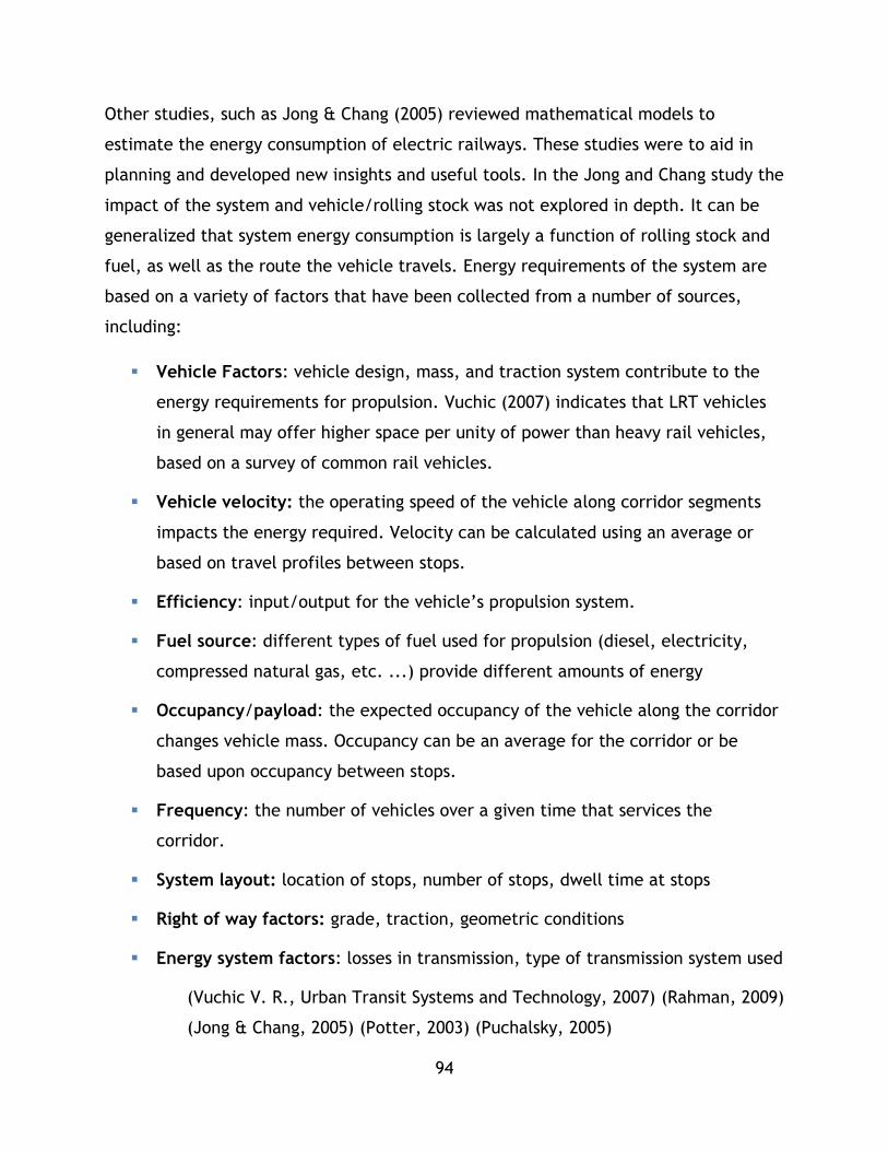
94
Other studies, such as Jong & Chang (2005) reviewed mathematical models to
estimate the energy consumption of electric railways. These studies were to aid in
planning and developed new insights and useful tools. In the Jong and Chang study the
impact of the system and vehicle/rolling stock was not explored in depth. It can be
generalized that system energy consumption is largely a function of rolling stock and
fuel, as well as the route the vehicle travels. Energy requirements of the system are
based on a variety of factors that have been collected from a number of sources,
including:
Vehicle Factors: vehicle design, mass, and traction system contribute to the
energy requirements for propulsion. Vuchic (2007) indicates that LRT vehicles
in general may offer higher space per unity of power than heavy rail vehicles,
based on a survey of common rail vehicles.
Vehicle velocity: the operating speed of the vehicle along corridor segments
impacts the energy required. Velocity can be calculated using an average or
based on travel profiles between stops.
Efficiency: input/output for the vehicle’s propulsion system.
Fuel source: different types of fuel used for propulsion (diesel, electricity,
compressed natural gas, etc. ...) provide different amounts of energy
Occupancy/payload: the expected occupancy of the vehicle along the corridor
changes vehicle mass. Occupancy can be an average for the corridor or be
based upon occupancy between stops.
Frequency: the number of vehicles over a given time that services the
corridor.
System layout: location of stops, number of stops, dwell time at stops
Right of way factors: grade, traction, geometric conditions
Energy system factors: losses in transmission, type of transmission system used
(Vuchic V. R., Urban Transit Systems and Technology, 2007) (Rahman, 2009)
(Jong & Chang, 2005) (Potter, 2003) (Puchalsky, 2005)
95
While past studies have made efforts to estimate energy consumption along a rail line
or for a bus route, many agencies report energy consumption for propulsion. For
example, in the United States of America, all agencies that receive federal transit
funding report their consumption of energy to the Federal Transit Administration for
the National Transit Database in terms of either in Kilowatt Hours or gallons of diesel
(Federal Transit Administration, 2013). Other studies, such as Puchalsky (2005) use
NTD as a starting point for energy analysis.
In his review of public and private transport in Toronto, Kennedy utilized historical
data to capture energy consumption as well (Kennedy C. A., 2002). This analysis
includes a review of past studies that highlights life cycle energy costs of vehicles, as
well as infrastructure. Estimates are utilized where historic data is not available.
These studies provide key insights that can inform how to estimate or accurately
measure the energy use indicator for public transit for this thesis research. These are
summarized in Table 4-8.
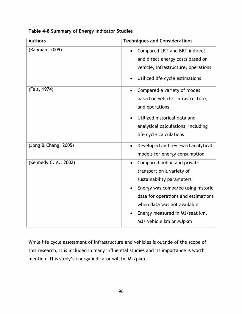
96
Table 4-8 Summary of Energy Indicator Studies
Authors Techniques and Considerations
(Rahman, 2009) Compared LRT and BRT indirect
and direct energy costs based on
vehicle, infrastructure, operations
Utilized life cycle estimations
(Fels, 1974) Compared a variety of modes
based on vehicle, infrastructure,
and operations
Utilized historical data and
analytical calculations, including
life cycle calculations
(Jong & Chang, 2005) Developed and reviewed analytical
models for energy consumption
(Kennedy C. A., 2002) Compared public and private
transport on a variety of
sustainability parameters
Energy was compared using historic
data for operations and estimations
when data was not available
Energy measured in MJ/seat km,
MJ/ vehicle km or MJpkm
While life cycle assessment of infrastructure and vehicles is outside of the scope of
this research, it is included in many influential studies and its importance is worth
mention. This study’s energy indicator will be MJ/pkm.

97
4.6.2 Emissions – local and global pollutants
Emissions are a nearly universal indicator for sustainable mobility. All frameworks
reviewed for this thesis included elements of greenhouse gas and local emissions, such
as PM, NOx, SOx, and other pollutants. This thesis considers emissions in terms of
their raw value, as a pollutant to the environment, as well as an impact on human
health. This perspective captures past discussions that consider damage to
environmental capital and intergenerational equality as well as ensuring systems limit
overall negative impact on environment independent of human considerations.
Past studies can be applied to include and analyze emissions indicators in this thesis.
Puchalsky (2005) put forward a study focussed entirely on the emissions factor. His
efforts utilized a useful methodology based on the National Transit Database and
emission factors. By using energy consumption levels from the Light Rail mode as well
as passenger mile travelled values, Puchalsky was able to calculate average energy
per unit of passenger travel. These values were then multiplied by emission factors to
determine mass of pollutant for volatile organic compounds, CO, and NOx. The best
case and average LRT were compared to hybrid, CNG, and normal bus systems based
on previous studies. Upstream processes (energy costs in production of fuel) were not
counted in either BRT or LRT models, only energy generation at plant, line loses, and
LRV vehicle uses were included in the LRT case, and bus fuel delivery and bus
emissions in the BRT case.
The overall findings were that BRT produced greater emissions than LRT despite
improvements in diesel combustion technology (Puchalsky, 2005). As this thesis seeks
to work with large data sets in the comparison of mass transit systems, this
methodology can be adapted – including the use of the Leonardo Academy factors. For
studies where high level energy data and grid data are known, this approach is useful.
Puchalsky’s equation for calculating emissions from eGrid values as well as NTD
emissions and PKM values has been adapted with minor modifications for general
public transit vehicles as displayed below:
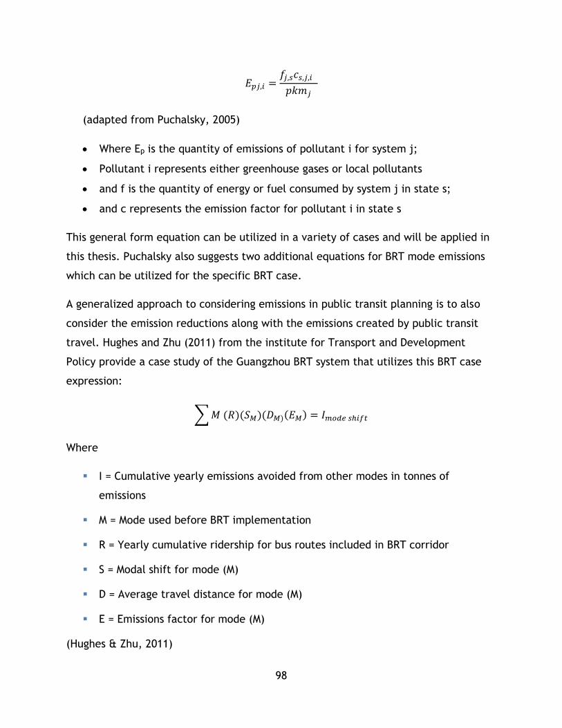
98
𝐸𝑝𝑗,𝑖 =𝑓𝑗,𝑠𝑐𝑠,𝑗,𝑖
𝑝𝑘𝑚𝑗
(adapted from Puchalsky, 2005)
Where Ep is the quantity of emissions of pollutant i for system j;
Pollutant i represents either greenhouse gases or local pollutants
and f is the quantity of energy or fuel consumed by system j in state s;
and c represents the emission factor for pollutant i in state s
This general form equation can be utilized in a variety of cases and will be applied in
this thesis. Puchalsky also suggests two additional equations for BRT mode emissions
which can be utilized for the specific BRT case.
A generalized approach to considering emissions in public transit planning is to also
consider the emission reductions along with the emissions created by public transit
travel. Hughes and Zhu (2011) from the institute for Transport and Development
Policy provide a case study of the Guangzhou BRT system that utilizes this BRT case
expression:
∑ 𝑀 (𝑅)(𝑆𝑀)(𝐷𝑀)(𝐸𝑀) = 𝐼𝑚𝑜𝑑𝑒 𝑠ℎ𝑖𝑓𝑡
Where
I = Cumulative yearly emissions avoided from other modes in tonnes of
emissions
M = Mode used before BRT implementation
R = Yearly cumulative ridership for bus routes included in BRT corridor
S = Modal shift for mode (M)
D = Average travel distance for mode (M)
E = Emissions factor for mode (M)
(Hughes & Zhu, 2011)

99
While this case is intended for BRT, it is general and can be used for any mode as long
as the equation’s parameters are known. Specific BRT equations for impacts on
vehicle speed on emissions are also provided within the report. These equations can
be applied for all emissions for which emissions factors are known, including climate
change impacting emissions.
Climate change gases can be considered using the same approach as outlined
previously for emissions, only with a special class of emissions for CO2 and other
greenhouse gases that can be measured as CO2E or individually. CO2 Emissions are
strongly linked to energy consumption for modes that utilize fossil fuel energy sources
(Banister, Cities, Mobility, and Climate Change, 2008). This has two interesting
implications:
Public transit presents an opportunity to lower emissions of GHgs per trip
(more passengers per vehicle, different fuel sources and fuel efficiencies), as
well as for the overall system (diverting trips to public modes, improving
efficiencies of other modes), thus reducing a transport system’s contribution
to global climate change (Hughes & Zhu, 2011) (Schiller, Bruun, & Kenworthy,
2010).
However, many public transit systems still use fossil fuels directly (diesel
buses) or indirectly (electricity purchased for electric light rail vehicles)
These implications must be considered when considering system impacts on climate
change.
In general, emissions can be considered as a function of:
Vehicle technology and operations: how the vehicle utilizes the fuel in the
case of internal combustion.
Energy Source: either the fuel or the power plant/transmission system
providing energy to the transit system.

100
As they fall into the field of power engineering and vehicle design, further
discussion of these factors are outside of the scope of this thesis, but are worth
mentioning. Emission studies are summarized in Table 4-9.
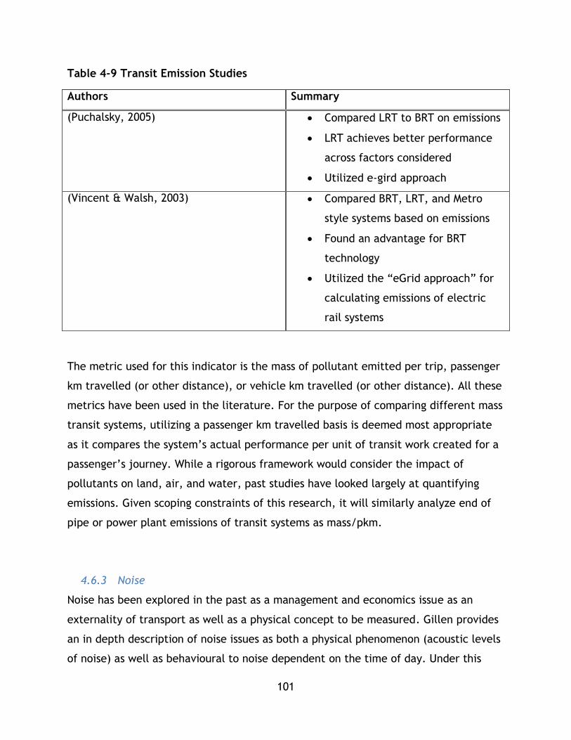
101
Table 4-9 Transit Emission Studies
Authors Summary
(Puchalsky, 2005) Compared LRT to BRT on emissions
LRT achieves better performance
across factors considered
Utilized e-gird approach
(Vincent & Walsh, 2003) Compared BRT, LRT, and Metro
style systems based on emissions
Found an advantage for BRT
technology
Utilized the “eGrid approach” for
calculating emissions of electric
rail systems
The metric used for this indicator is the mass of pollutant emitted per trip, passenger
km travelled (or other distance), or vehicle km travelled (or other distance). All these
metrics have been used in the literature. For the purpose of comparing different mass
transit systems, utilizing a passenger km travelled basis is deemed most appropriate
as it compares the system’s actual performance per unit of transit work created for a
passenger’s journey. While a rigorous framework would consider the impact of
pollutants on land, air, and water, past studies have looked largely at quantifying
emissions. Given scoping constraints of this research, it will similarly analyze end of
pipe or power plant emissions of transit systems as mass/pkm.
4.6.3 Noise
Noise has been explored in the past as a management and economics issue as an
externality of transport as well as a physical concept to be measured. Gillen provides
an in depth description of noise issues as both a physical phenomenon (acoustic levels
of noise) as well as behavioural to noise dependent on the time of day. Under this

102
treatment, noise occurring from transport can be measured in terms of decibels
occurring from the transport project and be compared to acceptable values. The
second category, the behavioural response, can be assessed based on choice models
that aim to understand how noise impacts an individual’s selection of housing location
(Gillen, 2003). Alternative techniques, such as the use of expert opinion may also be
used to understand the behavioural response to noise.
In the USA, large transit projects normally require noise assessments as part of their
environmental impact assessments (Hanson, Towers, & Meister, 2006). As a result
there are methodologies to understand the noise impacts of transit projects that are
well developed and very nuanced. Hanson et al (2006) developed an in depth
evaluation protocol for the Federal Transit Administration that provides insight into
basic noise concepts, noise impact criteria, including an overview of noise sensitive
land use, and considerations for applying noise criteria. The procedures included in
the manual provide in-depth evaluation criteria for how to evaluate specific transit
projects as well as useful calculations and standards . As this study is focussed on
comparison of multiple systems, such an approach is not practical due to the
enormous data collection and calculation efforts that would be required.
4.6.4 Habitat and Ecological Impacts Indicator
Dhingra et al (2003) discuss the environmental impact assessment (EIA) approach to
ecological impact based on area impacted by the transportation project. While this
indicator is often included in sustainability frameworks, the authors have suggested
that these impacts are not always recognized because systems are built on a project
by project basis and ecological impacts can occur over time. The methodology
provided by the authors is to combine qualitative and quantitative methods to
measure impacts of the system. For the quantitative measurement two principles are
provided:
Damage to an area is proportional to the length of the transport option to be
provided
Damage is severe if the ecology is high quality
(Dhingra et al, 2003)

103
The authors provide two weighted sum equations: ∑ 𝑊𝑚𝑗𝐿𝑗 amd ∑ 𝑊𝑛𝑗𝐿𝑗 where W is a
weight, L is the system length running through a segment of natural or man-made
ecosystem, Wm represents the importance or weight of man-made ecosystem j, and
Wn represents the importance or weight of man-made natural ecosystems j. These
equations can be used to calculate the impact of different alternatives, or in theory
existing systems if known weights exist. Reference tables are provided by the authors.
This technique is recommended for calculating ecological disturbance, however it is
overly reliant on reference weights for ecologies so these reference weights need to
be applied consistently if this technique is to be used. Systems seek to minimize their
impact score.
An alternative technique is to measure the land footprint of the system. This
technique simply measures the overall right of way area of the system as a proxy
indicator for system impact on ecology. However, this technique lacks the rigour of
weighting different types of ecology. The trade-off is that it deals in area as opposed
to just length – perhaps a hybrid indicator can be utilized in future studies that
combines the weighted impact described by Dhingra, Rao, and Tom with an area
methodology.
Economic Indicators
4.7.1 Operating cost Efficiency
Frameworks in the literature, particularly summaries by Littman (2013) and
Dobranskyte-Niskota, Perujo, & Pregl, (2007) emphasize cost effectiveness as a key
sustainable transportation indicator. Efficiency can be expressed as the cost of
operating a vehicle, the cost of a trip, or the cost of a km of service.
4.7.2 User Costs
Time and monetary costs are counted in multiple frameworks as key indicators
assessing economic sustainability. In Litman’s 2013 review of indicators, cost
efficiency is listed as an economic indicator of sustainable transportation and a lower
value is considered ideal. Performance comparison between other systems in

104
particular is suggested. In the comparison of alternatives or systems, the system that
minimizes user costs is said to have the best cost efficiency.
Other studies, such as Jeon (2007), and Kane’s (2010) study on sustainable transport
indicators in cape town also included average journey time. In the case of Jeon,
travel time was specified by an analytical model, while it can also be studied through
historical data as well.
4.7.3 Recovery and Subsidy
Past discussions highlighted how systems should cover the costs of their transportation
services in order for transport to be sustainable. While these discussions covered toll
roads and private auto, the discussion can also be extended to transit systems. This
indicator analyses how much of the costs of a transit system are able to be recovered
by user costs. As provided in the indicator sets, this is measured as a percentage
point.
4.7.4 Transit Activity and Economic Activity
This indicator is outlined by Dobranskyte-Niskota, Perujo, & Pregl (2007) as a given
transportation modes activity relative to GDP.
Social Indicators
As previously discussed, social impacts of transportation are difficult to quantify and
analyze. As a result, performance measures for social impacts differ in scale, severity,
and intensity depending on the frame of analysis (Sinha & Labi, 2007).
4.8.1 Affordability
In Litman’s 2013 review of sustainable indicators, affordability is listed as both an
economic and a social indicator. As direct user costs are counted as an economic
indicator in this study, affordability, as interpreted in the literature review will be
counted as a social indicator. Affordability is expressed as the portion of income
utilized for transport expenditures (Litman, 2013) (Dobranskyte-Niskota, Perujo, &
Pregl, 2007). While indicator sets often express this as portion of household income,
other denominations could be utilized as well – such as individual income.
105
4.8.2 Human health impacts
A number of studies measure human health impacts – two to be discussed are Jeon
(2007) and Kennedy (2003). The first is health impact by emissions, which mirrors the
discussion put forward in chapter 3.These indicators consider both physical injury due
to collision or impact as well as emission related illness or health impacts.
In addition, future frameworks or research should consider the relative health
benefits of transit systems based on their integration with active transport (i.e.
walking or cycling). This integration would show higher levels of activity and would
reflect improved fitness as a result of transit use. However, these issues may be
difficult to quantify.
4.8.3 Accessibility
Accessibility is commonly noted as a key indicator in the literature for social aspects
of transportation. However, Silva and Pinho argue there is no universal definition in
the literature for this commonly used concept (Silva & Pinho, 2006). Silva and Pinho
suggest accessibility is difficult to define because it considers many ideas -
distribution of destinations, magnitude, quality and character of activities,
performance of system, characteristics of individuals, and times for which they
participate in activities.
Geurs & Wee (2004) provide an overview of accessibility and its role in evaluation of
transportation. This paper provides an overview of different perspectives on
accessibility as well as how to utilize different measures to inform evaluation (Geurs
& Wee, 2004). Within the paper, accessibility is defined as “the extent to which land-
use and transport systems enable (groups of) individuals to reach activities or
destinations by means of a (combination of) transport mode(s).” (Geurs & Wee, 2004).
For this study, a review was conducted of public transit indicators related to
accessibility. A key study was conducted by Al Mamun and Lownes in 2011 on
composite public transit accessibility indices. In this study the authors propose
accessibility is based on three components – trip coverage (transit links travellers to
their destinations), spatial coverage (transit is closer to their home/destination), and

106
temporal coverage (transit is available at the time of travel) (Al Mamun & Lownes,
2011). Under this framework, accessibility can be considered as the system’s ability
to provide a connective service in close proximity to the user’s home/destination in
reasonable time. The authors conducted a thorough review of existing accessibility
measures and have developed a new measure grounded in GIS techniques and
accessibility theory. Three techniques are used in the study:
Local Index of Transit Availability (LITA) – which considers capacity, frequency,
and coverage.
Transit Capacity and Quality of Service Manual
Time-of-Day Tool
Accessibility is also treated in Hagshenas & Vaziri (2012) where it is considered on a
city level. Their study of sustainability focusses on developing a composite
accessibility measure that combines the accessibility gains of all systems within a city
via the following equation:
𝑇𝑟𝑎𝑛𝑠𝑝𝑜𝑟𝑡𝑎𝑡𝑖𝑜𝑛 𝐴𝑐𝑐𝑒𝑠𝑠𝑖𝑏𝑖𝑙𝑖𝑡𝑦 = ∑
𝑝𝑘𝑚𝑖
𝐶𝑎𝑝𝑖𝑡𝑎
urban area
𝑗
𝑖=1
• Where 𝑝𝑘𝑚𝑗 is the passenger km travelled for system i;
• urban area and population are derived from the city being studied
• i represents the set of systems or modes available in the city
This indicator is useful as it relies on high level data (pkm, population, area) which
are readily available compared to the data needed for some of the GIS and other
accessibility based indicators that are reviewed in this literature. However, it also
lacks nuance and rigour as a result.
Cumulative opportunity measures are one of the simplest activity based accessibility
measures measuring either the number of opportunities reachable within a travel
time, distance or cost, or the average travel time, distance, and cost to reach a fixed
number of opportunities (Silva & Pinho, 2006).

107
In Kane’s South African study, an accessibility indicator was put forward that analyzed
accessibility in terms of access by elderly, disadvantaged, and children (Kane, 2010).
Within the literature is a push to also consider transportation’s ability to provide
service to a diverse set of user’s needs under the banner of ‘accessibility’. This
includes a focus on indicators that measure whether a system provides access for
users with special physical needs (Litman, 2013). Indicators can be derived from the
percentage of facilities or vehicles that are equipped to handle special user’s needs.
Effectiveness Indicators
Many works cover the topic of transit system performance and the evaluation of
public transportation efficiency and effectiveness. Vuchic’s 2007 text Urban Transit
Systems and Technology covers the foundational topics in measuring and assessing the
performance of a given transit system –these concepts are considered essential for
developing a comprehensive transit evaluation framework. Vuchic outlines transport
as the movement of a number of objects, over a distance, during a period of time.
Based on these three elements 6 basic performance attributes are defined:
• Speed: space/time and Slowness: time/space
• Density: objects/space and Spacing: space/objects
• Frequency: objects/time and Headway: time/objects
(Vuchic V. R., Urban Transit Systems and Technology, 2007)
These basic concepts are useful foundations for understanding more advanced transit
concepts and are included here for discussion and completeness’ sake.
4.9.1 Reliability and Capacity Utilization
The first two indicators are reliability and capacity utilization, which are common in
transit analysis. Reliability can be measured in numerous ways, but a common
definition is the percentage of vehicles in revenue service that adhere to their
scheduled arrival time – Vuchic discusses the value of improved reliability on transit
service having numerous benefits across the entire system (Vuchic V. R., 2005). These
108
benefits can include fewer delays, more effective passenger loading, more economic
vehicle operations, better allocation of fleet, improved service for passengers, and
other benefits which can improve transit’s overall performance leading to reduced
economic costs (cross cutting benefits) and improved ridership.
Along with the basic attributes of transit performance Vuchic outlined that were
previously discussed, Vuchic also discussed a concept called “Transportation Work”
denoted with ‘w’ described as the ‘number of objects multiplied by the distance over
which they are carried’ (Vuchic V. R., 2007). This parameter can be useful for
measuring the effectiveness of a system and can be measured using a number of units
such as passenger km travelled or vehicle km travelled.
In terms of measuring the utilized capacity, work provides a useful concept. If a
transit system is imagined as having an overall theoretical capacity that is linked to
work and is defined as the total work that a system can do as defined by the number
of passenger kms travelled a system can produce for a given period of time, as
measured by the kms travelled by every unit of seat and standing capacity of every
vehicle based on the definitions created by Vuchic, then the effectiveness measure
proposed is based on the actual amount of passenger kms travelled on that system
divided by the work produced is proposed. This indicator uses work utilized to
measure the amount of capacity utilized.
4.9.2 System Usage
System usage factors are suggested in frameworks such as Jeon, Amekudzi, &
Guensler (2009)and Dobranskyte-Niskota, Perujo, & Pregl (2007). Dobranskyte-
Niskota, Perujo, & Pregl suggest using pkm as a measure, however these frameworks
are for looking at systems holistically as opposed to just transit so these measures are
not suggested to be applied directly in this study. If studying the overall sustainability
of a transport system (composed of active modes, auto, transit, etc. . . ) these
indicators may be more suitable. However, in this study, multiple transit systems are
being compared so pkm can be used as a standardizing factor for comparing factors
(such as GHg emissions) between systems. In this case an additional measure of
109
system usage should be adopted. Raw ridership numbers cannot be utilized as smaller
cities will be shown to be less sustainable in comparison to larger cities in the case
that larger cities may have larger trip or pkm due to population. In This case, pkm or
trips per capita should be used, or systems should be compared by population levels.
Mode share is an alternative.
4.10 Conclusion
Chapter 4 reviewed the literature on sustainable transport analysis, using MCDM tools
for research and decision making in the transport sustainability field, past studies of
transportation system sustainability, tools for using composite indicators/indices, and
indicator frameworks. These concepts are presented to demonstrate the wide breadth
of the subjects and introduce enough depth for the construction of the research
project’s framework and research methodology in chapter 5, where a new
methodology that builds on past research is presented.
The general finding from this literature review is that MCDM type tools are useful for
sustainable transportation analysis as they enable the researcher or analyst to
consider problems in terms of multiple perspectives and develop an analysis that
takes these perspectives into account, as opposed to other decision making tools
which may only allow one or two issues to be considered. When using sustainability
frameworks, such as the triple bottom line, this is ideal. Composite indicators allow a
MCDM type process to be communicated simply by returning multiple accounts or
categories of analysis into a single index or indicator for comparison – in the case of
the Jeon studies and Haghshenas and Vaziri (2012) a composite indicator of
transportation system sustainability. From this review a basic set of objectives and
goals were formulated in the vein of past indicator frameworks and studies to be used
for public transit studies. Specific information from past studies and texts on assessing
each goal and objective has been provided for the development of the framework –
this information will be relied upon in chapters 5 and 6.

110
Chapter 5: Mass Transit Composite Sustainability Assessment Methodology
5.1 Chapter Overview
This chapter outlines the methodology developed for sustainable transportation
analysis and how it has been set up for this study. First, the chapter presents an
overview of the methodology and how it can be used in different contexts to study
sustainable transportation or assist in analysis and decision making through the use of
indicators and indices. This overview outlines the key steps of the methodology
including data selection and collection (methodology part 1), data analysis and
treatment in order to run a sustainability analysis (methodology part 2), and selection
of techniques to create a composite index (methodology part 3).
Next, the chapter details the specific indicators that have been selected for studying
mass transit systems based on current practice and understanding of sustainable
transportation within the literature. As outlined in chapter 4, there are numerous
indicators that can be used for sustainable transportation assessment – this chapter
shares the ones adapted for this methodology along with how they can be applied.
Continuing, the chapter shares how the methodology is applied including information
on data collection through three alternative techniques for calculating composite
indices – the z score approach, the reference value approach, and the rescaling
approach. Next, chapter 5 continues by comparing these three approaches for
calculating composite sustainability indices, and contrasts this methodology to other
sustainability analysis methodologies from the literature. Finally, the chapter
concludes with limitations of this methodology and how it could be expanded or
improved in future studies to provide a more comprehensive understanding of the
sustainability of public transportation.
5.2 Overview of Methodology
The methodology used in this study has been named the “Public Transport Sustainable
Mobility Analysis Project” or PTSMAP and has been developed based on the goals and
framing of this study outlined within chapter 1, along with key learning, best
practices, and current thinking on sustainable mobility and mass transit systems that

111
have been identified in the literature review. The development of this methodology
and the demonstration of its implementation explores research question 1.
The overall framework is based on principles discussed in the literature review. In the
literature, sustainability framework, principles, and the science behind them have
been discussed at length along with their application to the analysis of transportation
systems. This research’s contribution is in synthesizing relevant aspects of different
frameworks and tools in order to provide a framework for the analysis of mass transit.
This methodology represents the synthesis of these concepts, along with the selection
of relevant indicators in order to effectively study the research questions posed by
this research – how can the contributions of mass transit to sustainability be
measured, and how do different mass transit modes contribute to sustainable
mobility? This framework has been developed to address both questions: 1) providing
an analytical tool to analyze and research transit sustainability and 2) use current
data to explore the different sustainability characteristics of transit systems and
modes. In essence, the goal of this framework is to develop a conceptual platform
that can use a variety of data sources, either from models or collected data, along
with evolving understanding of sustainability to inform both planning and research of
mass transit systems. Figure 5-1 shares a graphical outline of the methodology:

112
Figure 5-1 Public Transport Sustainable Mobility Analysis Project Framework
The foundation of the PTSMAP framework is an “Impacts Based Framework”, as
described in the literature review, which includes an explicit focus on the analysis of
a mass transit system’s impacts on different dimensions of sustainability within the
system, the city it serves, the broader geographic context, and global climate. This
framework is focussed on first collecting and sorting data based on its type and use
for the analysis (part 1), and then treating, expanding, and utilizing the data for
calculating indices for individual sustainability categories based on inputs and outputs
of transit provision (part 2), and finally generating a composite sustainability index
and case studies to inform understanding of mass transit and sustainable mobility
(part 3).
The framework can be generally applied in four scenarios:
Model Outputs
Historical
Data
Public Transport
Sustainable Mobility
Analysis Context
Information
Composite Sustainability
Index
Sustainable Mobility
Case Studies
Part 2 – Sustainability Analysis of Data (Research Question 1)
Part 3 - Sustainability Analysis (Research
question 2)
Part 1 – Research Inputs
Benchmark Values

113
System Comparison 1: application of the PTSMAP framework for comparison of
transit systems in order to determine the relative contributions of each system
towards sustainable mobility. This comparison is determined through the
calculation of composite sustainability indices.
System Comparison 2: application of the PTSMAP framework for comparison of
transit systems in order to determine their contributions to sustainable mobility
based on a set of absolute benchmark values for each factor that are based on
policy, research, or other criteria.
Decision Making 1: application of the PTSMAP framework for decision making
purposes. This framework can be applied beyond research for aiding decision
makers in selecting which mass transit system development can produce the
greatest contributions to sustainable mobility.
Decision Making 2: application of the PTSMAP framework for decision making
purposes. In this scenario the framework is applied to determine which system
provides the best performance towards a set of pre-determined benchmark
values that are based on policy, research, or other criteria.
For this thesis project, this methodology is utilized in two scenarios based on thesis
goals and available data:
1. The analysis of multiple mass transit systems (multiple modes, geographic
contexts) for research question 2 based on historic data. (System comparison
1)
2. The analysis of potential mass transit systems on a specific corridor or area for
system expansion to determine which alternative offers the greatest
sustainable mobility benefits. (Decision Making 1)
In both scenarios, the different systems being analyzed are characterized as discrete
entities with comparable traits for which data is collected and analyzed in order to
not only draw comparisons, but also develop understanding on transit and

114
sustainability based on the broader context in which transit is provided. In this
analysis sustainability is measured comparatively based on relative system
performance on a set factors. This framework could be used to compare systems to
set benchmarks on factors that are set as sustainability targets; however that is
outside the scope of this research and could be conducted by agencies, governments,
transportation professionals, or as future research. With the provided indicator set
and methodology, this framework could be expanded with other indicators and data
to be used in other scenarios and research projects as well.
The methodology described in this chapter is called the default methodology, which
essentially follows scenario 1 and 2 – which is for all intents and purposes identical
until the analysis stage where for scenario 1 the purpose is developing novel
understanding of transit systems and sustainable mobility, whereas 2 is focussed on
making a choice for a transit alternative.
Referring to the classification of MCA tools in chapter 4 taken from Vreeker and
Nijkamp (2005), this tool can be classified as follows:
Discrete or Continuous? – Discrete - the tool is intended to analyse a fixed set
of transit systems although future research could improve it to incorporate
linear programming to be involved in design and development.
Quantitative, Qualitative or Mixed? – Quantitative- the tool mainly uses
quantitative data and only uses qualitative data to contextualize data (i.e.
historical information to explain why some systems perform better or why some
system alternatives may perform a certain way, which are followed up with
empirical studies)
Prices or Priorities? – Priorities- the tool is focused on analysing transport
contributions and impacts to sustainability through a sustainability lens and is
not focussed on monetizing these impacts or pricing them using market
structures.
Linear or Functions? – Linear –the tool uses a weighted sum process to
calculate a composite sustainability index although future tools could include

115
analytical hierarchical processes to integrate decision maker behaviour, or
decision maker utility or value functions.
Referring back to Janssen and Munda as cited in Vreeker and Nijkamp (2005) this
process would be referred to as a value approach to MCA. Subsequent sections further
outline the logic and functioning of the PTSMAP methodology and its integration of
MCA and MCDM concepts through its three part framework.
5.2.1 Part 1 – Research Inputs
Part 1 of the framework is concerned with the selection of data for use in the PTSMAP
framework. The data that is collected is based on sustainability categories and factors
which are used in this study – these requirements and their identification are outlined
in section 5.3.
All data used in this framework is labeled as a research input. Research inputs refer to
a variety of information sources which can be used to analyze planned or
implemented mass transit systems.
In this framework they have been broken down into four categories. Model outputs
represents data acquired through analytical modelling which is typically conducted
through software, such as EMME. These outputs would be used when the framework is
utilized to compare alternatives during planning, or research is being conducted on
sustainability on potential improvements to a system or potential new systems, as an
example. Alternatively, model outputs can be used to supplement historical data for
analyzing existing systems where historical data is either incomplete or cannot be
collected.
The second category, historical data, refers to historical or operational quantitative
data collected from transit systems. This data is utilized to compare existing systems
to better understand how mass transit modes, technologies, and systems
configurations, as well as urban factors such as density and economic considerations
all impact transit’s ability to yield sustainable mobility outcomes. This data can be
obtained through transit agencies, such as Calgary Transit or Translink, large open
databases, such as the National Transit Database, public transit associations, such as
116
American Public Transit Association’s (APTA) fact book, government agencies,
universities, past research, or non-profit organizations.
Context information in this framework refers to information about the transit system,
or the city, region or broader geographic area it operates in, which informs the
broader understanding of sustainable mobility that is used to inform analysis.
Definitions of sustainability in the literature and regional or municipal plans that are
subjective are examples of contextual information that inform the development of
the composite sustainability index. A second role of qualitative information is in the
development of sustainability case studies. After a CSI has been developed, to further
the research and enable a deeper understanding of sustainable mobility, qualitative
data can be included to provide more in-depth context for the CSI value developed in
the quantitative portion of the methodology which is the bulk of this chapter. For
analysis, a blend of all types of data can be used. Within this research, the focus has
been placed on this quantitative data through the development of indices and factors
for measuring sustainability.
Finally, for specific analysis exercises only, benchmark values reflect specific
objectives, goals, or targets for sustainability factors which are loaded into the
framework. Benchmark values are only used in decision making applications of the
framework when comparing how different mass transit systems perform compared to
an absolute set of values as determined by policy, research, or other processes. For
this research, these values are discussed, but not applied directly.
The data collection step of this framework follows these steps:
1. Outline data requirements for the study based on framework
application/scenario
2. Sort data by indicator/factor and by system/mode being compared
The collection and treatment of data is further outlined in this chapter. In chapter 6
actual data is treated in the analysis.

117
5.2.2 Part 2- Sustainability Analysis of Data
Part 2 of the methodology is concerned with utilizing the data gathered and treated
in part 1 to run an analysis based on sustainability principles. The process for part 2
follows data collection with the comparison of separate transit systems or modes by
sorting data based on a variety of indicators which have been sorted into categories
which represent this research’s working definition of sustainable mobility. In the
analysis stage, the framework considers system inputs, such as operational costs or
quantity of energy for vehicle movement, as well as system outputs, such as number
of people moved or emissions of greenhouse gases, which are part of providing mass
transit services.
This process is illustrated in Figure 5-2, where inputs, and system impacts of different
transportation systems separated by mode are considered. Although this process could
also be used for different transit plan alternatives that are of similar mode, this
research is focussed on exploring the sustainability performance of transit systems by
mode to determine if there is an inherent difference in the performance achieved by
these modes.
Figure 5-2 Modal or Alternative Comparison
Light Rail Transit
Heavy Rail Transit
BRT
System Inputs
System Impacts
118
The analysis is structured based on multi criteria analysis, as outlined within the
literature, and utilized in various sustainability analysis studies, notably Kennedy in
2002, Jeon in 2007, Jeon et al in 2009, and Haghshenas and Vaziri in 2012. For this
analysis a structure has been developed based on treating the data from part 1 of the
framework in order to develop a composite sustainability index as described in Jeon
et al, Jeon, and Haghshenas and Vaziri, which is based on adding weighted
sustainability categories together in part 3 of the framework. These four works
provide both a theoretical foundational structure as well as mathematical
underpinning for which this methodology is based upon.
In essence, this analysis methodology outlines the appropriate categories for mass
transit sustainability analysis to enable data sorting, treatment and expansion,
normalization, and ultimately the calculation of indices for each sustainability
category used in the study. Four categories have been selected for this study based on
work by Jeon in 2007 and Jeon et al (2010), as well as foundational concepts in urban
transit and sustainability analysis.
Three categories are typical in sustainability discourse and research: environmental,
economic, and social. The fourth is system effectiveness, which was utilized in the
ground breaking research by Jeon in 2007, as well as Jeon et al in 2010 to analyze
auto network transport in the Atlanta region. Effectiveness of public transit and
broader transportation systems has been studied at length; however, its inclusion in
comprehensive sustainability analysis is recently emergent in the literature. Each
category contains both costs and benefits – or positive and negative impacts. This
approach determines how well a system balances the four categories – the better a
system performs in each category, the more balanced it is towards contributing to
sustainable mobility. This relationship is outlined in Figure 5-3.
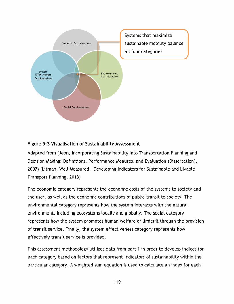
119
Figure 5-3 Visualisation of Sustainability Assessment
Adapted from (Jeon, Incorporating Sustainability Into Transportation Planning and
Decision Making: Definitions, Performance Meaures, and Evaluation (Dissertation),
2007) (Litman, Well Measured - Developing Indicators for Sustainable and Livable
Transport Planning, 2013)
The economic category represents the economic costs of the systems to society and
the user, as well as the economic contributions of public transit to society. The
environmental category represents how the system interacts with the natural
environment, including ecosystems locally and globally. The social category
represents how the system promotes human welfare or limits it through the provision
of transit service. Finally, the system effectiveness category represents how
effectively transit service is provided.
This assessment methodology utilizes data from part 1 in order to develop indices for
each category based on factors that represent indicators of sustainability within the
particular category. A weighted sum equation is used to calculate an index for each
Economic Considerations
Environmental Considerations
Social Considerations
System Effectiveness
Considerations
Systems that maximize
sustainable mobility balance
all four categories

120
category based on factors that fit into that category. The structure of analysis used is
as follows:
Indices – represent the weighted sum of all factors within a category (i.e.
environmental index) or the sum of all categorical indices (CSI)
Factors – numerical representations of the indicators of benefits, costs, or
impacts of mass transit within a certain category. Factors are grouped together
under categories. (i.e. climate change emissions is an environmental factor)
Indicators – set descriptors for a performance measure of sustainable mobility
factors. (i.e. CO2 and CH4 emissions are indicators for climate change
emissions)
The calculation of indices follows equation 5-1:
𝐼 = ∑ 𝑤𝑖𝑓𝑖
𝑗
𝑖=1
Equation 5-1 Category Index Equation
Where I represents an index for a sustainability category;
w represents the weighting of factor i.
and f represents factor i of category I which has been transformed through an
index methodology. Positive impacts are added, negative impacts are
subtracted or signed negative – these are discussed in section 5.3-5.7;
Each index can be useful for comparing mass transit systems based on that particular
category, for example, environmental terms, in addition to being used for calculating
the composite sustainability index.
Each category has one index which may be composed of any number of factors based
on the objectives and scope of the analysis and available data. Indicator selection and
factors are outlined in section 5.3.
121
To summarize, the following process is followed for the part 2 methodology:
1. Treatment and expansion: select the relevant data from part 1 for factor j
and apply relevant treatment and expansion as required by the data. Based on
the data set being used, standardize the data for cross comparison. For
example, when comparing GHg emissions, the standardization process is
dividing by annual system wide pkm travelled.
2. Performance Analysis: analyze the performance of each system under each
indicator based on the raw data.
3. Normalization: use techniques that allow all the data to be combined into a
composite indicator.
5.2.3 Part 3 – Calculating the CSI
Part 3 of the methodology is concerned with the development of a composite
sustainability index as well as sustainability case studies to inform sustainability
research.
In order to calculate a CSI, a weighted sum equation is utilized as adapted from the
work of Jeon et al (2009) and Haghshenas and Vaziri (2012)– both of whom applied a
similar methodology to use a composite sustainability index to study sustainable
mobility in different contexts as outlined in chapter 4. Similar to both methods, this
methodology utilizes weighting of overall factors for each sustainability category
index, - in this case environmental, social, economic, and effectiveness – as well as
weighting for each factor that represents each index (this is described in part 2).
Equation 5-2 represents the calculation of a composite sustainability index for this
methodology including the four categories and their factors.

122
Equation 5-2 Composite Sustainability Equation
Adapted from (Jeon, 2007) (Haghshenas & Vaziri, 2012).
Where:
CSI represents the composite sustainability index for a system q
w represents either weighting value for the environmental, social, economic,
or system effectiveness category, or factor i within that category;
e represents environmental factors;
y represents system factor;
s represents social factor;
n represents economic factor;
Ei represents normalized environmental factors i-L used in this study;
Si represents normalized social factors i-M used in this study;
Ni represents normalized economic factors i-N used in this study;
and Yi represents normalized system effectiveness factors i-O used in this study
In this formulation all weighting factors for category indices as well as factors
must sum to 1, that is:
𝑤𝑒 + 𝑤𝑠 + 𝑤𝑛 + 𝑤𝑦 = 1
And
∑ 𝑤𝑖
𝑗
𝑖=1
= 1
𝐶𝑆𝐼𝑞 = 𝑤𝑒 ∑ 𝑤𝑖𝐸𝑖,𝑞𝐿𝑖=1 + 𝑤𝑠 ∑ 𝑤𝑖𝑆𝑖,𝑞
𝑀𝑖=1 + 𝑤𝑛 ∑ 𝑤𝑖𝑁𝑖,𝑞
𝑁𝑖=1 + 𝑤𝑦 ∑ 𝑤𝑖𝑌𝑖,𝑞
𝑂𝑖=1

123
Once the CSI values are generated, an analysis can be conducted based on
sustainability principles and urban factors of the individual systems. These are
discussed in the analysis section.
5.3 Discussion and Selection of Indicators and Factors
For this study, a collection of factors from the literature review have been selected
for inclusion based on their relevance to the research questions as well as criteria
that establish quality indicators from the literature review on decision making.
5.4 Environmental Category
The environmental category has four factor sets: energy use, pollution, land use and
consumption, and greenhouse gas emissions.
5.4.1 Energy Factors
This factor is concerned with the amount of energy required to move mass transit
vehicles and ultimately passengers as part of mass transit service provision. Energy
consumed should be calculated on a per passenger distance travelled basis for overall
sustainability analysis. For this study, energy required to develop and construct
transit systems has not been considered; however this could be included in future
revisions through the inclusion of life cycle methodologies.
Many agencies and researchers have stressed the need for decreased energy
consumption for transport to tend towards greater sustainability, as is reflected in the
literature review.
As discussed previously in the literature review, in terms of environmental efficiency,
sustainable systems aim to provide high capacity mobility with lower energy
expenditure than private modes so all energy indicators should be normalized on a per
passenger km travelled basis.
Two indicators for the energy factor are worth including in this section – for systems
that use electrical vehicles, such as typical LRT systems or metro systems, an energy
indicator is proposed. For vehicles that use fuel, typically diesel, such as a diesel
fueled BRT system, a fuel indicator is listed for use, which may be converted into an

124
energy value either based on a known average energy content of the fuel, or an
approximation based on fuel standards. All energy indicators are considered negative
impacts.
Table 5-1 Energy Indicators
Indicators Metric Data Requirements and notes
Quantity of energy consumed
MJ consumed /pkm
Energy supply data (electric powered systems), source of electricity and quantity either by route/line or for full system
Quantity of fuel consumed
Litres consumed/pkm
Fuel supply data - quantity and type either by route/line or for full system
Fuel supply ultimately will be converted into energy
5.4.2 Pollution – emissions and noise
The pollution factor set is this framework’s facility for considering pollutants that
have a localized impact including NOX, VOC, PM, SOx, and noise. The factor utilizes
two indicators for the analysis of environmental sustainability. The first is concerned
with pollutants produced in the operation of transit to provide mobility. Localized
pollution has many impacts on the environment, as outlined within the literature
review chapters, including the formation of photochemical smog.
In the case of this factor set, common pollutants associated with the particular set of
mass transit systems being researched may be chosen or in the case of utilizing this
framework as a decision support system, based on the technologies and modes
involved in the decision being considered, the appropriate pollutants may be selected
using knowledge about the choices being considered. Any number of indicators could
be used in this case. Indicators should be added using environmental research on
regulation or impacts of technology being reached or analyzed in order to determine
which indicators are relevant. The second indicator, noise, similarly may use historic

125
data or model data; however, the use of noise, as discussed in the literature review,
is difficult in high level studies due to the quality of data and complexity of analysis
required. For this study, pollution released during the construction of the transit
systems has not been considered, however this could be included in future revisions
through the inclusion of life cycle methodologies. All pollution indicators are
considered negative impacts.
Table 5-2 Pollution Indicators
Indicators Metric Data Requirements
Mass of pollutant (i.e. NOx, VOC, CO, SO2, PM, Hg) emitted into soil, air, and water
kg/pkm
For research of existing systems: o Emission inventories o If inventories are unavailable,
these items can be derived by looking at energy data including fuel source and quantity burned.
o Emissions can be done systemically or for individual components or routes.
Models, technological details, forecasts may be used as a data source for these indicators
Noise Decibels on corridor/pkm
Models Available noise data.
5.4.3 Land consumption and ecosystem degradation
Land consumption measures the amount of physical environment consumed to provide
the transit service. Typically, this land is consumed in the development of guide way
(roads, tracks ) and station or stop area. Land consumption is a proxy indicator for
variety of environmental impacts –ecosystem disruption, run off due to impermeable
surface, and use of urban environment or limited land resources to provide mobility
rather than environmental services. Land consumption should be normalized as a
percent of total urban area. All land use indicators are considered negative impacts.

126
An alternative measure is the Dhingra, Rao, and Tom (2003) measure that utilizes
right of way length and ecological impact weights to measure ecological impact of the
system. This indicator can be used in studies but requires consistency in the
application of weights.
Table 5-3 Land Use Indicator
Indicators Metric Data Requirements
Land area consumed by transit facilities
metres2
Design details and system plans, The length of a particular system,
as well as its width. Station footprints Area can be done systemically or
for individual components or routes.
Ecological impacts of right of way
meters Design length of system Types of areas impacted by system
and their relative weights
5.4.4 Global Climate Change- Green House Gas Emissions
GHg emissions represent the system’s impact on global climate change via the
greenhouse effect The GHgs included in this methodology are: CO2, CH4, and N20.
They are added together and included as a single indicator of CO2 equivalents. For
this study, greenhouse gases released during the construction of the transit systems
have not been considered, however this could be included in future revisions through
the inclusion of life cycle methodologies which have been used in studies by other
authors such as Rahman (2009). All GHg indicators are considered negative impacts.
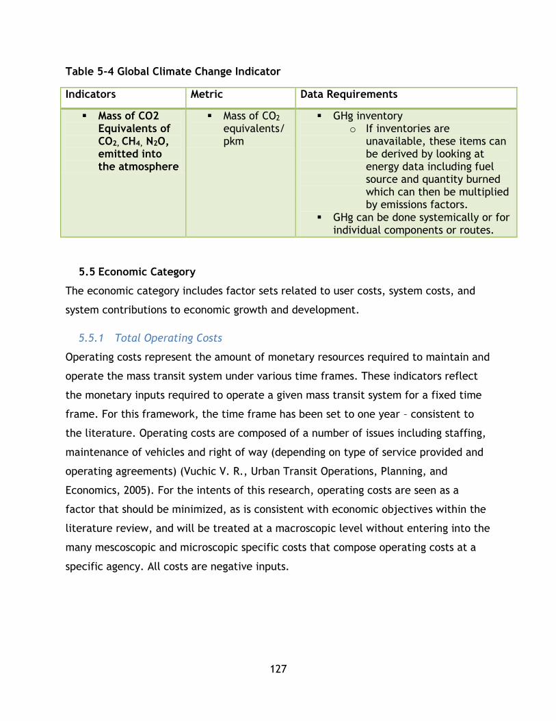
127
Table 5-4 Global Climate Change Indicator
Indicators Metric Data Requirements
Mass of CO2 Equivalents of CO2, CH4, N2O, emitted into the atmosphere
Mass of CO2 equivalents/pkm
GHg inventory o If inventories are
unavailable, these items can be derived by looking at energy data including fuel source and quantity burned which can then be multiplied by emissions factors.
GHg can be done systemically or for individual components or routes.
5.5 Economic Category
The economic category includes factor sets related to user costs, system costs, and
system contributions to economic growth and development.
5.5.1 Total Operating Costs
Operating costs represent the amount of monetary resources required to maintain and
operate the mass transit system under various time frames. These indicators reflect
the monetary inputs required to operate a given mass transit system for a fixed time
frame. For this framework, the time frame has been set to one year – consistent to
the literature. Operating costs are composed of a number of issues including staffing,
maintenance of vehicles and right of way (depending on type of service provided and
operating agreements) (Vuchic V. R., Urban Transit Operations, Planning, and
Economics, 2005). For the intents of this research, operating costs are seen as a
factor that should be minimized, as is consistent with economic objectives within the
literature review, and will be treated at a macroscopic level without entering into the
many mescoscopic and microscopic specific costs that compose operating costs at a
specific agency. All costs are negative inputs.
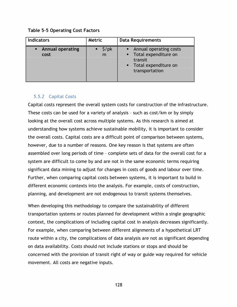
128
Table 5-5 Operating Cost Factors
Indicators Metric Data Requirements
Annual operating cost
$/pkm
Annual operating costs Total expenditure on
transit Total expenditure on
transportation
5.5.2 Capital Costs
Capital costs represent the overall system costs for construction of the infrastructure.
These costs can be used for a variety of analysis – such as cost/km or by simply
looking at the overall cost across multiple systems. As this research is aimed at
understanding how systems achieve sustainable mobility, it is important to consider
the overall costs. Capital costs are a difficult point of comparison between systems,
however, due to a number of reasons. One key reason is that systems are often
assembled over long periods of time – complete sets of data for the overall cost for a
system are difficult to come by and are not in the same economic terms requiring
significant data mining to adjust for changes in costs of goods and labour over time.
Further, when comparing capital costs between systems, it is important to build in
different economic contexts into the analysis. For example, costs of construction,
planning, and development are not endogenous to transit systems themselves.
When developing this methodology to compare the sustainability of different
transportation systems or routes planned for development within a single geographic
context, the complications of including capital cost in analysis decreases significantly.
For example, when comparing between different alignments of a hypothetical LRT
route within a city, the complications of data analysis are not as significant depending
on data availability. Costs should not include stations or stops and should be
concerned with the provision of transit right of way or guide way required for vehicle
movement. All costs are negative inputs.

129
Table 5-6 Capital Cost Factors
Indicators Metric Data Requirements
System wide capital costs
$ Raw or adjusted cost data per right of way length across the system
Station costs are not included, cost should only include right of way.
Individual route capital costs
$ Raw or adjusted cost data for individual routes
Station costs are not included, cost should only include right of way.
5.5.3 Recovery and Subsidy
This factor set looks at the total recovery of costs due to fares. This represents the
short term economic sustainability of the system. It is argued in the literature that for
truly sustainable mobility individuals need to pay the full cost of their travel. It is also
argued that as transit approaches 100% recovery, it will reach economic
sustainability. In both instances, as these indicators are percentages they require no
normalization for comparison. Both of these indicators are seen as positive.
Table 5-7 Recovery and Subsidy Factors
Indicators Metric Data Requirements
% of costs recovered
% Passenger revenue/total operating cost.
% of costs subsidized
% Subsidization scheme data
5.5.4 Transit Usage Relative to Economic Activity
This factor measures the utilization of the transit systems relative to economic
activity in the communities served by the transit system.
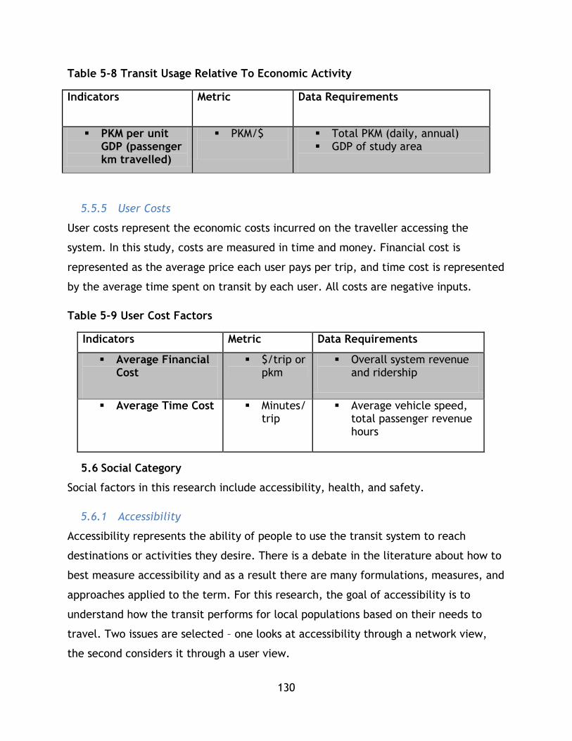
130
Table 5-8 Transit Usage Relative To Economic Activity
Indicators Metric Data Requirements
PKM per unit GDP (passenger km travelled)
PKM/$
Total PKM (daily, annual) GDP of study area
5.5.5 User Costs
User costs represent the economic costs incurred on the traveller accessing the
system. In this study, costs are measured in time and money. Financial cost is
represented as the average price each user pays per trip, and time cost is represented
by the average time spent on transit by each user. All costs are negative inputs.
Table 5-9 User Cost Factors
Indicators Metric Data Requirements
Average Financial Cost
$/trip or pkm
Overall system revenue and ridership
Average Time Cost Minutes/trip
Average vehicle speed, total passenger revenue hours
5.6 Social Category
Social factors in this research include accessibility, health, and safety.
5.6.1 Accessibility
Accessibility represents the ability of people to use the transit system to reach
destinations or activities they desire. There is a debate in the literature about how to
best measure accessibility and as a result there are many formulations, measures, and
approaches applied to the term. For this research, the goal of accessibility is to
understand how the transit performs for local populations based on their needs to
travel. Two issues are selected – one looks at accessibility through a network view,
the second considers it through a user view.
131
The first accessibility indicator is selected due to the high level nature of this
framework. While GIS tools can be utilized to perform specific accessibility studies on
specific transit networks, this study is designed to compare multiple networks so an
agile indicator is ideal. The accessibility network index has been used in CSI studies to
assess how overall transport systems provide mobility (Haghshenas & Vaziri, 2012).
Based on its past utility, it is used first in lieu of rigorous methods which require
specific in-depth data and analytic techniques outside of the scope of this study.
According to Haghshenas & Vaziri (2012) accessibility can be calculated as passenger
km per capita/urban area. This factor essentially represents the average amount of
passenger kms traveled by each person per unit of urban area – a higher value
indicating a more accessible system. This indicator is a proxy for how well the system
serves the population of a given urban area based on the amount of work the system
creates per person per unity of area in the city.
In situations where a more comprehensive data set or analytical toolset is available,
the cumulative opportunity accessibility index is suggested as a second accessibility
indicator which would be used instead of, not in conjunction with, the accessibility
network index.
Transit access is the third indicator in the accessibility set. It utilizes the percent of
urban area within a planning distance (example, 400 m radius catchment area) of
mass transit stations. In situations where cumulative opportunity is not possible, this
indicator can provide an estimate of accessibility by indicating transit coverage.
Average user trip length is the next indicator which is a companion to indicators which
focus on system accessibility. This indicator is concerned with the amount of distance
each individual must travel on the system to get to their destinations. This indicator is
a representation of how accessible the system is to the user’s day to day needs and a
lower average trip length is desirable.
The next indicator covers accessibility based on the end user by analyzing
affordability. Average cost is divided by income per capita to represent, in general,
how much access costs are in proportion to an individual’s income within the area
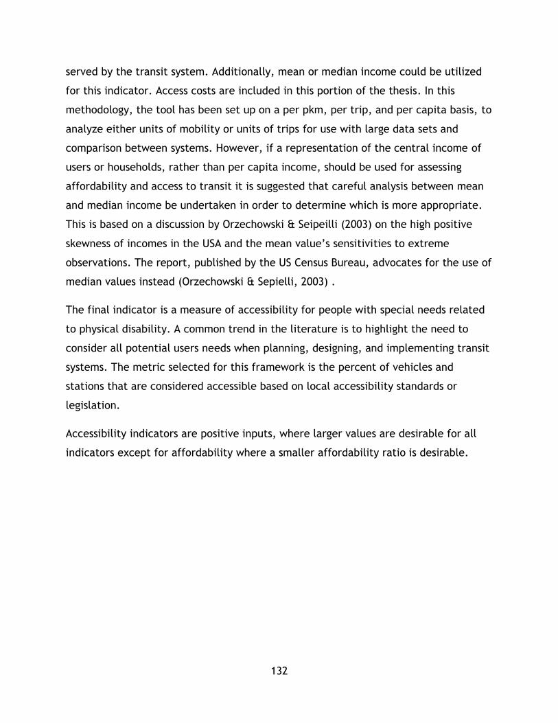
132
served by the transit system. Additionally, mean or median income could be utilized
for this indicator. Access costs are included in this portion of the thesis. In this
methodology, the tool has been set up on a per pkm, per trip, and per capita basis, to
analyze either units of mobility or units of trips for use with large data sets and
comparison between systems. However, if a representation of the central income of
users or households, rather than per capita income, should be used for assessing
affordability and access to transit it is suggested that careful analysis between mean
and median income be undertaken in order to determine which is more appropriate.
This is based on a discussion by Orzechowski & Seipeilli (2003) on the high positive
skewness of incomes in the USA and the mean value’s sensitivities to extreme
observations. The report, published by the US Census Bureau, advocates for the use of
median values instead (Orzechowski & Sepielli, 2003) .
The final indicator is a measure of accessibility for people with special needs related
to physical disability. A common trend in the literature is to highlight the need to
consider all potential users needs when planning, designing, and implementing transit
systems. The metric selected for this framework is the percent of vehicles and
stations that are considered accessible based on local accessibility standards or
legislation.
Accessibility indicators are positive inputs, where larger values are desirable for all
indicators except for affordability where a smaller affordability ratio is desirable.

133
Table 5-10 Accessibility Factors
Indicators Metric or Unit Data Requirements
System Accessibility Index
Passenger km per capita/urban area
Network length or route length, passenger totals, urban area
Cumulative Opportunity
Jobs/Activity centres linked by transit system
GIS data on travel between zones using transit for jobs, activity centres
Transit Access % of urban area within planning distance of transit station
Planning data on stop location, urban area
Average User Distance
Distance travelled per trip
Number of trips and total pkm per year
Affordability Fare/ income per capita
Portion of household income devoted to public transport
Fare rates Household expenditures on
transit and transport
User Accessibility % of stations accessible to all users
% of vehicles accessible to all users
Stations equipped with accessibility features
Vehicles equipped with accessibility features
5.6.2 Health
This factor set analyzes the population exposed to pollution and its negative impacts.
As discussed in the literature review, emissions due to all forms of motorized
transport create health risks. For transit systems that emit localized pollutants, the
negative impacts can be captured and quantified.

134
The first indicator utilizes available data on population living, working, and accessing
activity centres surrounding transit lines as well as pollution models to calculate the
population exposed to types of pollutants. The second indicator uses city wide data
and mathematical models to calculate the disease burden related to the quantity of
transit pollutants.
Both health indicators are negative impacts.
As mentioned in Chapter 4, future research could include another health indicator
that is based on the extent to which the use of transit promotes positive individual
health – such as improved fitness resulting from increased physical activity.
Table 5-11 Health Factors
Indicators Metric or Unit Data Requirements
Population exposed to emissions related to transit.
People
Data on population surrounding transit lines or power sources
Pollution models
Disease burden related to transit systems
Number of deaths
Data on deaths due to diseases that can be attributed to transport pollution
5.6.3 Safety
This factor analyzes the toll on human life of the transit system based on two
indicators – fatalities and accidents. These indicators are already based on operations
and do not need to be normalized as a result.
Both safety indicators are negative impacts.
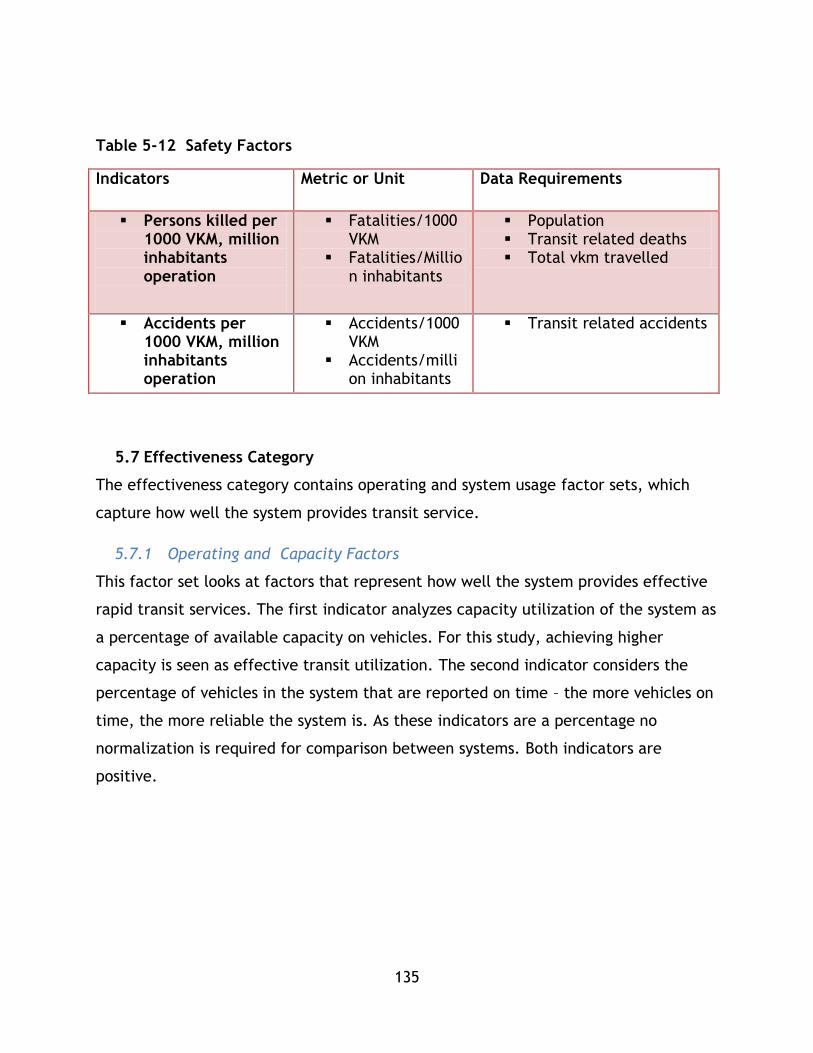
135
Table 5-12 Safety Factors
Indicators Metric or Unit Data Requirements
Persons killed per 1000 VKM, million inhabitants operation
Fatalities/1000 VKM
Fatalities/Million inhabitants
Population Transit related deaths Total vkm travelled
Accidents per 1000 VKM, million inhabitants operation
Accidents/1000VKM
Accidents/million inhabitants
Transit related accidents
5.7 Effectiveness Category
The effectiveness category contains operating and system usage factor sets, which
capture how well the system provides transit service.
5.7.1 Operating and Capacity Factors
This factor set looks at factors that represent how well the system provides effective
rapid transit services. The first indicator analyzes capacity utilization of the system as
a percentage of available capacity on vehicles. For this study, achieving higher
capacity is seen as effective transit utilization. The second indicator considers the
percentage of vehicles in the system that are reported on time – the more vehicles on
time, the more reliable the system is. As these indicators are a percentage no
normalization is required for comparison between systems. Both indicators are
positive.
136
Table 5-13 Operating and Capacity Indicators
Indicators Metric Data Requirements
Average Occupancy rate of passenger vehicles
% Data on occupancy and ridership for the system or specific routes
Types of vehicles in fleet, number of seats, operational configuration of vehicles
Reliability % on time Reliability data
5.7.2 System Usage Factors
The indicator for system usage is annual trips per capita in the urban area served by
the transit system. It can also be represented by modesplit. This indicator represents
the system’s ability to attract riders and generate trips as a proxy indicator for level
of service of the transit system. This indicator is a positive input.
Table 5-14 System Usage Factors
Indicators Metric Data Requirements
Annual Trips per Capita
Number of trips/Population in the city
Data on daily and annual trip totals per system or route
Modesplit
% of trips Mode split data
5.8 Application of Methodology – Normalization and Weighting
Parts 1-3 of the methodology can be applied to assess the comparable contributions to
sustainability of transit systems. With the factors and indicators identified along with
data requirements, part 1 of the methodology can be followed and data can be
collected. Parts 2 and 3 can then be followed to conduct a sustainability analysis;
however, in order to complete parts 2 and 3, data must be normalized. In this section
of the chapter three techniques used in the literature to develop composite indices –

137
the z-score, utility techniques, and rescaling – are discussed which are required to
conduct the analysis discussed in parts 2 and 3.
Nardo (2005) described normalization as the process of ensuring different variables
can be summed up by making them comparable. Different normalization techniques
are available and it is important to select one that matches the objectives of the
composite index (Nardo & Saisana, OECD/JRC Handbook on constructing composite
indicators. Putting theory into practice., 2005). These techniques general involve
comparison within a set of factors (i.e. comparing all user fare costs) in order to
generate a data set that represents original range of data, but can now be combined
with other factors to create a composite indicator. For example, in their raw form,
the amount of energy consumed and the mass of emissions released are in different
units and are not readily combined to construct an index. However, once normalized
they will be unit-less and combined based on weighting.
5.8.1 Technique 1: z-score function
The first methodology for calculating the composite sustainability index has been
utilized by Haghshenas & Vaziri (2012) in their calculations of composite sustainability
indices for the global comparison of municipalities’ transportation systems. This
approach utilizes a z -core equation to treat each individual factor for each system
being analyzed. In this approach, indices are real numbers – with larger positive
indices representing greater contributions to sustainable mobility.
Equation 5-3 is utilized:
𝑍 =𝑥 − 𝜇
𝜎
Equation 5-3 z-score equation
Where:
x represents the factor being analysed;
𝜇 represents the arithmetic mean of that factor for all systems;
and 𝜎 represents the standard deviation of that factor for all systems

138
For this methodology the following steps are followed:
1. Calculate the standard deviation and mean for all factors considered in the
analysis
2. Calculate z-score values for each factor, for each system
3. Set weights for each factor and index
4. Part 2: Apply the category index equation for each category to generate
categories as described in part 2
5. Part 3: Apply the composite sustainability index equation to generate the CSI
as described in part 3
5.8.2 Technique 2: Distance to Reference Based Approach
This approach to calculating the CSI was utilized in Jeon (2007) and Jeon et al (2009)
for calculating a CSI in the Atlanta metropolitan area. In both approaches, each factor
is normalized based on a linear single attribute utility function in order to compare
among plan alternatives. Nardo et al (2005) refer to this as a reference value based
approach because the data is normalized to a set reference. In the case of Jeon
(2007) and Jeon et al (2009) the highest performer is used as a reference value. In
this methodology, indices and normalized factors are real numbers between 0 and 1,
where the greatest performing system within a single factor receives a score of 1.
For this methodology, a similar approach has been adopted where factors are
normalized between systems based on the following process:
For factors that are positive impacts:
Equation 5-4 Positive Impact Factor Equation
𝒏𝒊 =𝒙𝒊
𝑴𝒂𝒙 (𝒂𝒍𝒍 𝒙)
Where x is a factor, n is the normalized factor, and i represents a particular
system.
For factors that are negative impacts:

139
Equation 5-5 Negative Impact Factor Equation
𝒏𝒊 =𝑴𝒊𝒏 (𝒂𝒍𝒍 𝒙)
𝒙𝒊
For this methodology the following steps are followed:
1. Calculate linear scaled values for each factor
2. Set weights for each factor and index
3. Part 2: Apply the category index equation for each category to generate
categories as described in part 2
4. Part 3: Apply the composite sustainability index equation to generate as CSI as
described in part 3
5.8.3 Technique 3: Re-scaling
Nardo et al (2005) outlined rescaling as a useful technique to normalize data. This
technique is similar to technique 2 in that it is the range and not the standard
deviation that normalizes the data (Nardo M. , et al., 2005). It is a general form which
has been adapted as follows in Equation 5-6:
Equation 5-6 Re-Scaling Equation
𝑛𝑖 =𝑥𝑖 − min (𝑎𝑙𝑙 𝑥)
max(𝑎𝑙𝑙 𝑥) − min (𝑎𝑙𝑙 𝑥)
Adapted from Nardo et al 2005 - where n is the normalized factor, x represents the
factor in raw form, and i represents the system being analysed. The max and min
relate to the leader (max) and laggard (min) for the particular variable. Nardo et al
caution that extreme values or outliers may cause the normalized data to be
distorted.
For this process the same steps are followed as in technique 2.

140
5.8.4 Comparison of techniques
These techniques have been used in studies to apply sustainability concepts to the
analysis of transportation systems. While both techniques can develop a composite
sustainability index, they have different purposes. The utility approach was outlined
for use in decision making amongst a set amount of alternatives in Jeon (2007), while
the z-score approach was outlined for comparison in Haghshenas & Vaziri (2012). This
thesis employs both techniques to demonstrate their application within this
methodology.
The z-score technique utilizes statistical concepts and was employed in Haghshenas &
Vaziri (2012) to compare multiple cities from a global database on several
transportation factors. The results of this study allowed interesting trends, relating
sustainability factors to urban factors, such as density, to be identified for a large
data set. This technique compares each factor based on its value relative to the
average value of the data set.
The utility approach was employed by Jeon (2007) and Jeon et al (2009) for
comparing plan alternatives and is reliant on decision making principles. The output
of this approach is an index between 0 and 1, which may be clearer when
communicated to decision makers and easier to use in conjunction with visualization
tools such as the polygon used in Jeon (2007). Jeon analyzed three cases, rather than
the expansive data set used in Haghshenas & Vaziri (2012) to demonstrate how to use
sustainability in decision making between plan alternatives. This technique ranks
system factors based on their utility compared to the best alternative (in the case of
a positive factor) or the worst alternative (in the case of a negative factor) and is
intended for decision making scenarios – outlining a more sustainable alternative
amongst a set of plan alternative modes to better understand how each system
compares based on sustainability criteria to make a decision.

141
5.8.5 Weighting
Weighting for each factor and category index is an essential aspect of calculating the
CSI. In this methodology an appropriate weighting tool should be selected based on
the scenario that the PTSMAP framework is being used for. Analytical Hierarchical
process involving experts, values set by policy, or other tools may be used. Weighting
is outside the scope of this research and its absence is discussed in the conclusion of
this chapter.
5.9 Application for System Comparison Scenarios
This section outlines how to utilize the PTSMAP framework for system comparison
scenarios. For system comparison 1, the default methodology can be followed as
described within the preceding sections of this chapter. This methodology is detailed
in chapter 5 with a sample data set in order to demonstrate research question 1 and
explore research question 2.
For system comparison 2, the following process can be followed:
Part 1: benchmark values are loaded into the framework as a “benchmark
system”. These values are treated the same as data from any other system.
Part 2: the benchmark system is used in the calculation of factors for all
systems involved in the study. For both the z-score and utility methods the
benchmark values are treated as a “system” for the calculation of all category
indices.
Part 3: CSI values are calculated for each system, including the benchmark
system. The systems are ranked based on index enabling direct comparison to
the benchmark values.
When conducting a system comparison scenario, all weights for all factors and
categorical indices should be equivalent – for example, across all systems the same
value for GHg emission weighting should be used. In decision making scenarios, which
look at one system or geographic context, an individual set of weights that re based
on expert opinion, policy, or other evidence should be used.
142
System comparison 2 is not addressed directly within this research, but could be used
by transit authorities, consultants, or future researchers in exploring the use of the
PTSMAP framework or an expanded framework to better develop sustainable mobility
through transit systems.
5.10 Applications for Decision Making Scenarios
Previously the framework has been discussed in terms of calculating CSI values for
researching how different modes contribute to sustainable mobility, next the
framework’s use in decision making will be discussed. The PTSMAP framework can be
applied for researching public transit sustainability but also for improving how
decision makers select transit system improvements. The overall framework follows
the principles set out by Gwo-Hshiung & Jih-Jeng in 2011 for a Multiple Attribute
Decision Making Process. The parallel structure of the PTSMAP framework’s approach
compared to the 5 step approach set out by Gwo-Hshiung & Jih-Jeng (2011) is set out
in Table 5-15.

143
Table 5-15 Alignment between MADM and PTSMAP
Gwo-Hshiung & Jih-Jeng PTSMAP approach
Step 1: Define the nature of the problem Literature Review of Sustainable Mobility
Principles
Step 2: Construct a hierarchy system for its
evaluation
Selection of indicators for research project.
Step 3: Select the appropriate evaluation
model
Development of PTSMAP framework using
literature review information. Indicators are
selected using current research.
Step 4: Obtain the relative weights and
performance score of each attribute with
respect to each alternative;
In this study, use of default weights, in
practice AHP or other decision tools may be
used. Application of PTSMAP framework part
2 and 3 to calculate indices – categorical and
CSI to aid in understanding how alternatives
compare to one another.
Step 5: Determine the best alternative
according to the synthetic utility values, which
are the aggregation value of relative weights,
and performance scores corresponding to
alternatives.
Ranking of systems by CSI or categorical
index values to determine which alternative
has the desired sustainability performance.
The application of the PTSMAP framework to the two decision making scenarios varies
based on scenario specification as well as the nature of the application of the PTSMAP
framework. The following two sections outline the application of the methodology.

144
5.10.1 Applications for Decision Making Scenario 1
Applying the PTSMAP framework for decision making without benchmark criteria can
be utilized in two ways – in both cases forecasted performance is required:
1. Deciding between a set of discrete alternatives for developing a transit system
irrespective of the system’s overall performance to a broader set of transit
systems (such as other transit systems in the country or the world).
2. Considering how the set of transit system improvements would improve the
system’s sustainable mobility relative to other systems.
Method 1 is used when the decision maker only desires to know which system
alternative has the strongest CSI performance relative to the set of alternatives. It
does not comment on the broader impacts choosing an alternative on the system’s
overall sustainability – for example selecting a particular LRT expansion out of several
options for an existing LRT network - nor does it allow further discussion on the
alternative’s performance due to a lack of benchmarks or comparison to other
systems.
The methodology is relatively simple and the framework described in this chapter can
be followed as it is outlined. Regardless of if the z-score or utility method is employed
in part 3, CSI scores are then calculated and used to inform the decision making
process, with higher scored systems being preferable to achieve sustainability goals.
For application 2, an adaptation of the default PTSMAP framework described in this
chapter is required. This methodology is used when a decision maker wishes to see
how a transit system improvement can improve sustainable mobility compared to
existing mass transit systems. This methodology requires more data than the previous
methodology, however it shares greater insight into how the system performs relative
to a larger range of transit systems. The adapted methodology is operated as follows:

145
Defining the problem - for a decision making problem with n plan alternatives
there will be n runs of the PTSMAP framework comparing each alternative to a
set of j systems. For alternatives that will expand an existing system, an initial
step should be run that will calculate the system’s default CSI value relative to
all j systems.
Considering factors – for a plan alternative that connects to an existing mass
transit system (i.e. an expansion) add all forecasted values to existing data
(i.e. GHg emission forecasts to existing, revenue forecasts to historic revenue),
for a new system treat all factors as a discrete system.
Calculating the CSI – calculate the CSI as in the default framework using either
the z-score or utility approach.
Once the initial CSI values are calculated the plan alternatives can be evaluated
based on the PTSMAP framework. For system alternatives that are an extension to an
existing mass transit system, the alternative that yields the greatest improvement
relative to the set of j existing systems is most favourable in the PTSMAP framework.
For alternatives that are not an extension, the highest ranking alternatives are most
favourable.
Method 1 is demonstrated in chapter 6 using Translink data from an on-going study for
mass transit expansion.
5.10.2 Applications for Decision Making Scenario 2
Decision Making Scenario 2 follows a similar set up to Decision Making Scenario 1 with
one exception: the inclusion of benchmark values, either from policy, research, or
other sources that are included as an additional system in the calculation of CSI
values through all parts of PTSMAP framework.
146
5.11 Comparison to Past Studies
In the literature review, past transportation sustainability studies were reviewed and
analyzed in order to inform the development of this methodology.
5.11.1 Kennedy 2002
Kennedy 2002 informed this methodology through its use of historic and model data in
an impact based framework to research how different modes (public and private)
contribute to sustainable mobility in the Toronto area. The characterization of private
and public transit as different travel systems, which can be compared through
different sustainability categories based on indicators and available data, informed
the development of this methodology as shown through the category and factor
selection in this framework. However, this methodology’s focus on comparing
multiple public transit systems has limited the factors to those pertinent to public
transit. Kennedy’s study also looked at broader economic integration at greater detail
using data available to the Toronto area. This study’s scope has focussed on
comparing a larger sample of systems at lower resolution and has thus neglected some
of the factors included in Kennedy’s work. Unlike Kennedy’s study, this work presents
a methodology to calculate composite indices.
5.11.2 Jeon 2007, Jeon et al 2009
Jeon et al 2009 and Jeon 2007 both demonstrate how to use an expanded impact
based framework along with model outputs and a utility methodology to calculate a
composite sustainability index and utilize it for research purposes into decision
making. The indicators for these studies were focused on the broader transportation
network, with a special attention given to automobile networks, and were more
specific to the goals of the Atlanta region. This study aims to create a transit specific
framework that is not specific to any given context. The CSI structure and four
categories are the same between frameworks, along with the weighting structure.
147
5.11.3 Haghshenas & Vaziri 2012
Finally Haghshenas & Vaziri’s 2012 study of global cities and their transportation
systems presented a final methodology for sustainability analysis which informed this
approach. The approach from 2012 focussed on using specific transportation factors to
assess overall transport systems’ ability to contribute to sustainable mobility using a
global data base. A similar formulation is used in this methodology, including the use
of a CSI and weighted sum equation. However, this study is focussed on the
comparison of transit systems and inasmuch transit specific factors have been
selected along with the inclusion of system effectiveness as a fourth category of
sustainability as was done by Jeon 2007 and Jeon et al 2009.
5.12 Conclusion
This chapter presents a 3 part framework, the PTSMAP Framework for assessing how
public transit systems contribute to sustainable mobility. This framework first guides
the selection of data through categories and factors. Then it outlines how to
normalize and formulate the data for development of category indices and finally
composite sustainability indices. This chapter also presented a selection of factors for
each category along with potential data sources and relevant discussion on their use
in sustainability analysis. Chapter 6 utilizes this methodology using data from the
National Transit Database to demonstrate its use and also explore research question
2.

148
Application of Mass Transit Composite Sustainability Assessment
6.1 Chapter Overview
Chapter 6 demonstrates a direct application of the PTSMAP framework in order to
show its utility for researching public transit sustainability as well as to provide
insight into the second research question of this thesis project: what are the relative
contributions to sustainable mobility of different mass transit modes? This chapter
begins with a discussion of data and factor selection, based on the methodology of
the PTSMAP framework, which includes an overview of how data was sought out for
this project and which data sets were considered to demonstrate the framework’s
utility as well as explore the research question. Next, the chapter outlines how 33
heavy and light rail transit systems from the National Transit Database (NTD) were
treated and expanded for utilization under each set of factors – environmental,
economic, social, and system effectiveness. Next, the results of each sustainability
category are discussed in comparison to past research. Continuing, the chapter shares
composite sustainability indices based on the methods and techniques outlined in
chapter 5 and comments on the relative ranking of the 33 transit systems. Analysis is
also provided based on how urban factors such as density relate to individual category
indices, as well as overall CSI values. Next, a sensitivity analysis is outlined where
weighting values have been adjusted for category indices in the calculation of CSI
values. This analysis demonstrates how different policy scenarios can change the CSI
and also shows how this research could be expanded through the inclusion of decision
tools, such as analytical hierarchy processes, to inform weighting. Finally, the chapter
shares overall conclusions, limitations, and opportunities for further research.
6.2 PTSMAP Part 1: Data Discussion and Factor Selection
The first section of this chapter is concerned with the application of part 1 of the
PTSMAP framework and the collection of suitable data to explore research question 2.
6.2.1 Available Data
To conduct a study that compares multiple mass transit systems based on primary
mode, for example LRT, BRT, heavy rail, a large data set is required that contains
149
information on a variety of indicators. The factors specified in the methodology cover
a range of information that reflect public transit interaction with sustainable
mobility, as defined through the literature review, and represent a thorough study.
However, in reality, complete data may not always be readily available, which can
hinder the direct application of this methodology. It is important to note that the
PTSMAP is modular and appropriate proxy factors may be utilized in the place of the
factors presented in the methodology. When analyzing systems, some proxy factors
may be used when direct data is not available, or data may need to be expanded to
generate a representation of a factor using analytical modelling or other techniques.
Given the scope of this PTSMAP framework, several data sets were reviewed to find a
set with a large enough quantity of systems as well as enough breadth of data to
utilize the PTSMAP framework’s indicator set. In addition to data sets, transportation
agencies in a variety of geographic contexts were contacted with data requests to
construct an alternative database. Due to low rate of reply, open data sets were
pursued over a constructed data set.
6.2.2 NTD
The National Transit Database is a comprehensive dataset updated annually in the
USA that contains operational information for all transit systems that receive federal
funding (Department of Transportation, 2013). Over 660 transit providers and
agencies submit data to this internet based database making it an invaluable tool for
research and planning purposes. The database is mandated by congress and
maintained by the Department of Transportation, while the data is submitted by
agencies across the USA independently – inasmuch, the data is not verified by any
third party. For research purposes, this data set was deemed adequate for the
following considerations:
Breadth of data: the data set covers a variety of information for several transit
related indicators including operational performance, financial information,
system overview, and energy consumption based on mode.
150
Quantity of Systems: the data set includes a large number of systems from a
variety of contexts from throughout the United States, which provide excellent
opportunity to comment on the relative benefits of different mass transit
system modes for providing sustainable mobility.
6.2.3 BRT
Global BRT Data (http://www.brtdata.org/) is an online database produced by
EMBARQ and the BRT Observatory in partnership with the International Energy Agency
(IEA) and the Integrated Transport Systems and BRT Systems Alliance (SIBRT). As a
public database, it contains information on a growing number of BRT systems around
the world based on a number of parameters including system length, fuel usage,
passengers per day, and bus age. However, at the time of conducting this research,
not all systems had a complete set of indicators available, which limited the utility of
this data set for a large scale study applying the PTSMAP framework. As the data set
grows, it may be used in conjunction with other multi modal datasets to conduct
PTSMAP scale studies, however currently only some systems have a wide array of
indicator data available so the Global BRT Data set was not selected for this research.
6.2.4 Other Sources
Other data sources were considered for use in this study, including additional national
statistics such as the United Kingdom’s Department for Transport open statistics site,
however similar to the Global BRT data set, they did not have the wide variety of
indicators required to complete this study. In particular energy or fuel consumption
was a difficult figure to obtain.
6.3 PTSMAP Part 1: Data Selection
6.3.1 Overview of Data
A basic set of data is provided in the NTD dataset which covers several factors
reported by transit agencies. For this research, a sub selection of these indicators
deemed relevant for sustainability analysis have been selected and listed in Table 6-1.
The NTD dataset is composed of numerous spreadsheets where data is stored based on
agency. For this research, only agencies that operate LRT and Heavy Rail modes were

151
selected. For these agencies, the indicators listed in Table 6-1 were extracted from
their relevant spreadsheets. Note - Imperial units in the database for length, area,
and volume (miles, miles2, and gallons) were converted to metric units for this study –
km, km2 , and litres.
Table 6-1 NTD Input Data for Analysis
Data Units Symbol Info
Route Length Km Lr Length of system
Directional Route km Km Ld Length of all directions of
route (i.e. a 2 km track
with service in both
directions is 4km)
Vehicles Operated Max
Service
Number of
vehicles
nop The number of vehicles
operated during maximum
service
Vehicles Available Max
Service
Number of
vehicles
nmax The number of vehicles
available total at max
service
Passenger KM Travelled pkm pkm Total annual passenger
km travelled on the
system
Unlinked Passenger Trips Trips τ Number of passenger
unlinked trips on the
system
Vehicle or Train Rev km Km Vkm The total km travelled by
vehicles during revenue
service in the system
Vehicle Or Train Rev Hours Hours Vh The total hours of
revenue service for
vehicles in the system
Energy for propulsion kWh E The total energy used for
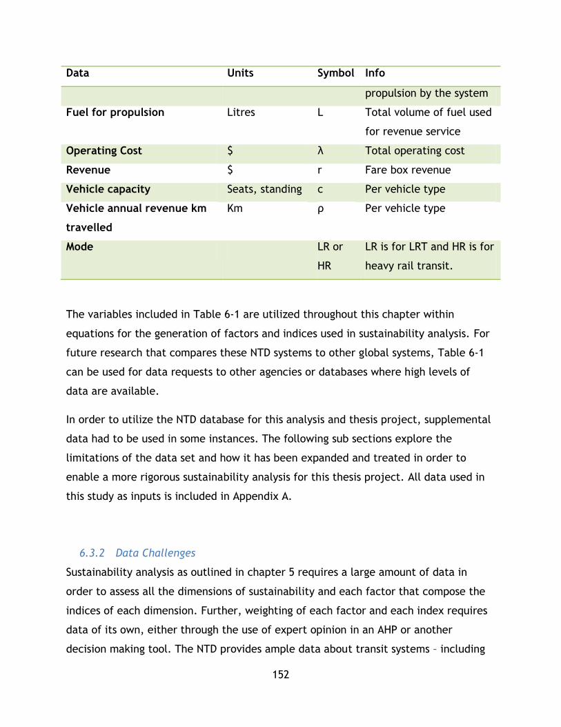
152
Data Units Symbol Info
propulsion by the system
Fuel for propulsion Litres L Total volume of fuel used
for revenue service
Operating Cost $ λ Total operating cost
Revenue $ r Fare box revenue
Vehicle capacity Seats, standing c Per vehicle type
Vehicle annual revenue km
travelled
Km ρ Per vehicle type
Mode LR or
HR
LR is for LRT and HR is for
heavy rail transit.
The variables included in Table 6-1 are utilized throughout this chapter within
equations for the generation of factors and indices used in sustainability analysis. For
future research that compares these NTD systems to other global systems, Table 6-1
can be used for data requests to other agencies or databases where high levels of
data are available.
In order to utilize the NTD database for this analysis and thesis project, supplemental
data had to be used in some instances. The following sub sections explore the
limitations of the data set and how it has been expanded and treated in order to
enable a more rigorous sustainability analysis for this thesis project. All data used in
this study as inputs is included in Appendix A.
6.3.2 Data Challenges
Sustainability analysis as outlined in chapter 5 requires a large amount of data in
order to assess all the dimensions of sustainability and each factor that compose the
indices of each dimension. Further, weighting of each factor and each index requires
data of its own, either through the use of expert opinion in an AHP or another
decision making tool. The NTD provides ample data about transit systems – including

153
operational information, inputs, and outputs useful for sustainability analysis - and it
has been employed in past studies. However, it does not provide high resolution data
about operations, such as scheduling or vehicle configuration which does not enable
further comparison of systems based on capacity utilization. There are other gaps and
limitations which prevent a complete sustainability analysis without expansion and
treatment, which have been addressed, where possible, within this research.
For most factors, indicators can be estimated by expanding the data with outside data
sources or through other data treatment. Given the nature of this research and the
depth and breadth of data available within the NTD dataset, despite its limitations, it
is still deemed the most appropriate data source to test this methodology and explore
the research question.
Throughout this chapter the use of the NTD for each index and the factors associated
with it, along with specific limitations for each factor are explored in greater detail.
It is important to note two major overall limitations that are not possible to overcome
within this research thesis:
1. A complete sustainability analysis between all BRT, LRT, and heavy rail or
metro is not possible with the NTD due to the fact that data for BRT is not
available at present. Therefore this analysis will focus on comparing LRT and
heavy rail modes.
2. A complete analysis as described in the preceding chapter has been attempted,
although some omissions have been made due to data and technical limitations
within this dataset and research. These limitations can be removed with
further research or data collection that are outside of the scope of this study.
33 systems were utilized in this study – 13 heavy rail (coded HR) and 20 LRT (coded
LR). These do not include all systems coded as HR and LR within the data set. For
the remainder of this chapter, LRT will be referred to as LR and heavy rail will be
referred to as HR to keep consistency with the NTD dataset.
154
Systems that operate as a streetcar type service are included in the LR designation
and have not been included in data set due to this study’s focus on mass transit
comparison and understanding how each system mode is able to realize
sustainable mobility benefits. Systems that do not operate in an urban
context/serve a contiguous dense metropolitan area or are intended to function as
a connector for spread out cities, such as the Sprinter system in California were
removed from this study as the focus of this study is on urban mass transit
systems. In some cases, mass transit systems have been removed due to challenges
in data interpretation that could not be overcome with this methodology. Of
particular note, the New Jersey Transit Corporation light rail systems are not
included in the analysis as it would appear the diesel powered River Line’s data is
included with the other systems operated by this operator. The River Line would
not be included in this study because its service is similar to Sprinter in that it can
also be characterized as an intercity service with stops serving smaller
communities between.
Table 6-2 Systems Selected for Analysis outlines the systems included within this
study as well as their system ID in the NTD database:

155
Table 6-2 Systems Selected for Analysis
System ID Operator Name
HR
1003 Massachusetts Bay Transportation Authority
2008 MTA New York City Transit
2098 Port Authority Trans-Hudson Corporation
2099 Staten Island Rapid Transit Operating Authority
3019 Southeastern Pennsylvania Transportation Authority
3030 Washington Metropolitan Area Transit Authority
3034 Maryland Transit Administration
4022 Metropolitan Atlanta Rapid Transit Authority
4034 Miami-Dade Transit
5015 The Greater Cleveland Regional Transit Authority
5066 Chicago Transit Authority
9003 San Francisco Bay Area Rapid Transit District
9154 Los Angeles County Metropolitan Transportation Authority
LR
0008 Tri-County Metropolitan Transportation District of Oregon
0040 Central Puget Sound Regional Transit Authority
1003 Massachusetts Bay Transportation Authority
2004 Niagara Frontier Transportation Authority
3022 Port Authority of Allegheny County
3034 Maryland Transit Administration
4008 Charlotte Area Transit System
5015 The Greater Cleveland Regional Transit Authority
5027 Metro Transit
6008 Metropolitan Transit Authority of Harris County, Texas
6056 Dallas Area Rapid Transit
7006 Bi-State Development Agency
8001 Utah Transit Authority
8006 Denver Regional Transportation District
9013 Santa Clara Valley Transportation Authority
9015 San Francisco Municipal Railway
9019 Sacramento Regional Transit District
9026 San Diego Metropolitan Transit System
9154 Los Angeles County Metropolitan Transportation Authority
9209 Valley Metro Rail, Inc.

156
6.4 PTSMAP Part 2: Data Treatment and Expansion
The following sub sections demonstrate data treatment and expansion for each
category for the NTD dataset for the PTSMAP framework. As data specific
methodologies are required for some expansions they are described and outlined
where necessary along with required literature references.
6.4.1 Data Treatment and Expansion: Environment
Within the dataset, the major environmental information available is energy or fuel
required to operate the system on an annual basis. The other factor that can be
related to the environmental index is system length, which can be tied to the
environment disruption factor.
When conducting sustainability analysis, the first factor considered for the
environmental index is the energy factor. The NTD raw data provided data in terms of
kWh utilized per each system for propulsion of vehicles per year of operation which
may be used as an indicator for sustainability analysis when normalized to a MJ/pkm
basis. This is a unit conversion and normalization calculation that is conducted as
follows. Given:
1 𝑊 = 1𝐽
𝑆 therefore 1 𝑘𝑊ℎ = 3.6𝑀𝐽
𝐸𝐸𝑗 =3.6𝐸𝑗
𝑝𝑘𝑚𝑗𝑀J
Where 𝐸𝐸𝑗 is the environmental factor for energy consumption per passenger
kilometer travelled for system j in units of MJ/pkm.
The second set of factors for the environmental index is pollution oriented. From the
methodology chapter, there are two types of pollution – noise and emission of
pollutants such as gasses and particulate matter. Unfortunately, for this study noise
cannot be qualified or quantified due to a lack of available data within the NTDB so it
has been omitted from this analysis. While resources exist, such as the Department of
Transportation’s 2006 Transit Noise and Vibration Impact Assessment Manual, which
157
can help quantify the impact of noise given a wide range of input data, the NTDB does
not provide appropriate input information for these techniques.
The NTDB does not provide direct information on emissions from individual systems;
the data can be expanded in order to use information on energy usage to approximate
emissions. A simple spreadsheet model has been developed that is consistent with
techniques used by Vincent and Walsh (2003) and Puchalsky(2005) for expanding
energy data from rail systems in the USA in order to comment on the emissions of
these systems. As outlined in chapter 4, these authors utilized the NTDB to determine
overall energy utilized by particular transit systems and then used a state level
emissions factor table to determine the emissions of the modes they were comparing,
in the case of their research BRT and LR (Vincent & Walsh, 2003) (Puchalsky, 2005).
The Emissions & Generation Resource Integrated Database (eGRID) is an inventory of
environmental attributes of all electrical generating plants in the USA (E.H. Pechan &
Associates, Inc., April 2007). The current eGrid dataset contains emission rates for
2007, which Leonardo Academy Inc. has prepared in its white paper for use in a
variety of contexts. While these rates do not match the 2010 year used in the NTD
data used for this study, they do provide the temporally closest emission rates out of
any available data set and are considered appropriate for calculating emission
estimates for this study. It is assumed that for this analysis these rates are acceptable
and in future studies up to date estimates can be plugged into the analytical
framework.
This model was created using a table from a Leonardo Academy Inc. white paper,
which was generated in 2011 from a 2007 United Stated Environment Information
Administration (EIA) eGrid data set (Leonardo Academy Inc., 2011). These factors take
into account a base loss of 5.9% due to transmission and distribution and are based on
2007 data, which is the latest official e-Grid data available from the USA EIA. The
eGrid data set provides information and data on emission rates for regions and states
in the USA and the Leonardo Academy Inc. white paper synthesizes the rates into an
easy to use table for the development of models and equations.
158
Essentially, the model used in this thesis multiplies state level emission factors by the
kWh system data provided in the NTD dataset. In turn, these factors are based on the
emission averages that are in turn based on electricity generation mixes (Leonardo
Academy Inc., 2011) (E.H. Pechan & Associates, Inc., April 2007).
This data expansion methodology can be expressed mathematically as follows in
Equation 6-1:
Equation 6-1 Emissions Factor Calculation
𝐸𝑝𝑗,𝑖 =𝑓𝑗,𝑠𝑐𝑠,𝑗,𝑖
𝑝𝑘𝑚𝑗
(adapted from Puchalsky, 2005)
Where Ep is the quantity of emissions of pollutant i for system j;
Pollutant i represents either greenhouse gases or local pollutants
and f is the quantity of energy or fuel consumed by system j in state s;
and c represents the emission factor for pollutant i in state s
For greenhouse gases, a CO2 equivalency factor is included in the calculation
known as global warming potential. These values are obtained from work by
Forster et al (2007) for the IPCC . e-GRID includes the following greenhouse gases:
CO2, NH4, N2O and values from the IPCC in this research. The values from Forster
et al reflect the global warming potential of a particular gas relative to CO2. These
GWP factors allow a single CO2E mass to be calculated for each transportation
system involved in this study through Equation 6-3:
Equation 6-2 CO2 Equivalency Equation
mass CO2 Eq. = (mass of gas) (GWP)
Adapted from (Forster, et al., 2007).
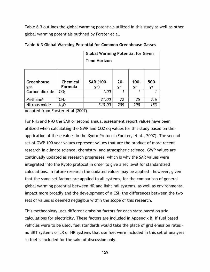
159
Table 6-3 outlines the global warming potentials utilized in this study as well as other
global warming potentials outlined by Forster et al.
Table 6-3 Global Warming Potential for Common Greenhouse Gasses
Global Warming Potential for Given
Time Horizon
Greenhouse gas
Chemical Formula
SAR (100-yr)
20-yr
100-yr
500-yr
Carbon dioxide CO2 1.00 1 1 1
Methanec CH4 21.00 72 25 7.6
Nitrous oxide N2O 310.00 289 298 153
Adapted from Forster et al (2007).
For NH4 and N2O the SAR or second annual assessment report values have been
utilized when calculating the GWP and CO2 eq values for this study based on the
application of these values in the Kyoto Protocol (Forster, et al., 2007). The second
set of GWP 100 year values represent values that are the product of more recent
research in climate science, chemistry, and atmospheric science. GWP values are
continually updated as research progresses, which is why the SAR values were
integrated into the Kyoto protocol in order to give a set level for standardized
calculations. In future research the updated values may be applied – however, given
that the same set factors are applied to all systems, for the comparison of general
global warming potential between HR and light rail systems, as well as environmental
impact more broadly and the development of a CSI, the differences between the two
sets of values is deemed negligible within the scope of this research.
This methodology uses different emission factors for each state based on grid
calculations for electricity. These factors are included in Appendix B. If fuel based
vehicles were to be used, fuel standards would take the place of grid emission rates –
no BRT systems or LR or HR systems that use fuel were included in this set of analyses
so fuel is included for the sake of discussion only.

160
The final environmental factor, land consumption, is also not readily utilized given
the NTD dataset. While data on system length is included, finding a meaningful way to
utilize this data requires further information on the specific geographic context of the
cities themselves. Impacts on land and natural environment by each system are not
readily discerned from available data without external data. Within the scope of this
study, there are not any specific expansions to the data that could be carried out to
directly compare each system.
Based on data limitations and possible expansions, the factors that are utilized within
this research for the calculation of the environmental index are listed below in Table
6-4 Environmental Factors.
Table 6-4 Environmental Factors
Factor Description
𝐸𝐸𝑗 Energy consumed by system j per
passenger km travelled
𝐸𝑔𝑗 CO2 equivalents system j per passenger
km travelled
𝐸𝑆𝑂2𝑗 𝐸𝑁𝑂𝑋 𝑗 𝐸𝐻𝐺 𝑗 Local emissions per passenger km
travelled
6.4.2 Data Treatment and Expansion: Economy
In the literature review and methodology section it was discussed that the economic
index and the factors that comprise it are more common elements of transportation
planning and engineering and rely on more readily available data. This holds true for
the NTD dataset. The basic data used from the NTD set includes total operating costs
and total revenue, as well as other operational data which can be used to calculate a
number of factors for the calculation of the economic index.
The first factor under the economic index used in this study is operating cost, which is
normalized by dividing by pkm. Operating costs are broken down in the NTD data set
based on several categories for reporting purposes. For this research, total operating

161
cost is required so these sub categories are summed. Capital costs are not used in this
study for reasons discussed in preceding chapters, as well as a lack of data in the
NTD. The NTD only contains capital data for the year of the data set, which does not
reflect the needs of this study so it has been omitted. Operating costs can be
considered as followed in Equation 6-3:
Equation 6-3 Operating Cost Factor Equation
𝑁𝑜,𝑗 = λ𝑗
𝑝𝑘𝑚𝑗
• Where 𝜆𝑗 represents the operating costs of system j;
• pkMJ represents the annual passenger kilometres travelled on system j;
• and 𝑁𝑜,𝑗 represents the factor for operating costs per passenger kilometer
travelled on system j
The next set of factors are: 1) user costs, which are represented by average fare and
2) average travel time. Average fare is calculated by dividing the annual revenue from
fares by the total annual revenue trips. This is shown in Equation 6-4:
Equation 6-4 Average System Fare Factor Equation
𝑁𝑓,𝑗 =𝑟𝑗
𝜏𝑗
• Where r is the revenue for system j;
• 𝜏𝑗 is the total unlinked trips for system j;
• and Nf,j represents the factor for average fare on system j
Average travel time is calculated using the system wide average for vehicle travel
speed (a system effectiveness factor) as well the average trip length. Average trip
length is based on annual passenger kilometers travelled in the system divided by
total trips. Calculation of travel speed is a multi-step process which is explored in the
data treatment section for system factors. Average passenger km per trip travelled is
divided by average speed to calculate average travel time as displayed in Equation
6-5.
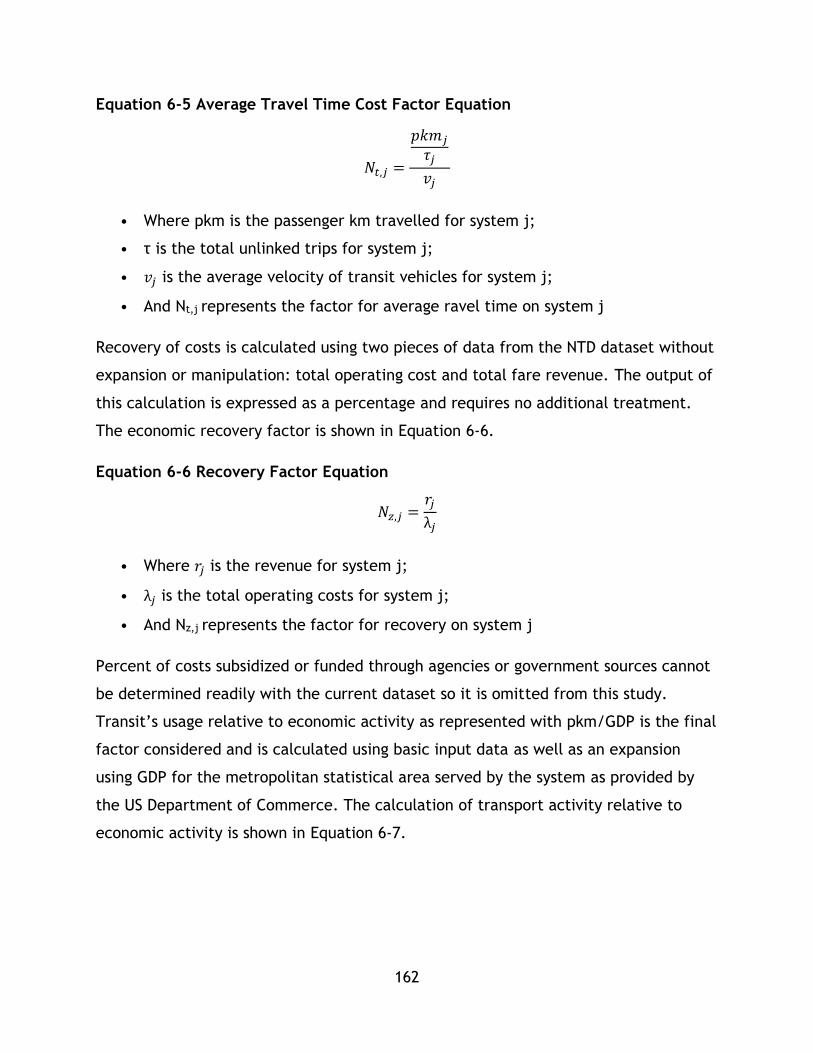
162
Equation 6-5 Average Travel Time Cost Factor Equation
𝑁𝑡,𝑗 =
𝑝𝑘𝑚𝑗
𝜏𝑗
𝑣𝑗
• Where pkm is the passenger km travelled for system j;
• τ is the total unlinked trips for system j;
• 𝑣𝑗 is the average velocity of transit vehicles for system j;
• And Nt,j represents the factor for average ravel time on system j
Recovery of costs is calculated using two pieces of data from the NTD dataset without
expansion or manipulation: total operating cost and total fare revenue. The output of
this calculation is expressed as a percentage and requires no additional treatment.
The economic recovery factor is shown in Equation 6-6.
Equation 6-6 Recovery Factor Equation
𝑁𝑧,𝑗 =𝑟𝑗
λ𝑗
• Where 𝑟𝑗 is the revenue for system j;
• λ𝑗 is the total operating costs for system j;
• And Nz,j represents the factor for recovery on system j
Percent of costs subsidized or funded through agencies or government sources cannot
be determined readily with the current dataset so it is omitted from this study.
Transit’s usage relative to economic activity as represented with pkm/GDP is the final
factor considered and is calculated using basic input data as well as an expansion
using GDP for the metropolitan statistical area served by the system as provided by
the US Department of Commerce. The calculation of transport activity relative to
economic activity is shown in Equation 6-7.

163
Equation 6-7 Transport-Relative to Economic Activity
𝑁𝑔,𝑗 =𝑝𝑘𝑚𝑗
GDP𝑗
• Where 𝑝𝑘𝑚𝑗 is the passenger km travelled for system j;
• 𝑔𝑑𝑝𝑗 is gross domestic product of the host urban area of system j;
• And Ng,j represents the factor for transit economic interaction for system j
Based on the limitations in the data set only 5 factors in the economic category are
utilized in this study. To summarize, they are displayed in Table 6-5.
Table 6-5 Economic Factors
Factor Description
𝑁𝑜,𝑗 Operating costs per passenger km
travelled on system j.
𝑁𝑓,𝑗 Average fare per trip on system j.
𝑁𝑡,𝑗 Average travel time cost per trip on
system j.
𝑁𝑧,𝑗 Cost recovery on system j.
Ng,j Transit use per economic activity on
system j.
6.4.3 Data Treatment and Expansion: Social
The NTD data set presented challenges for calculating a complete set of social
indicators as presented in other studies particularly with respect to health impacts
due to the lack of high resolution data on particular routes. The NTD data set’s
strength is in providing a large amount of data on a large number of systems,
however, high detail data is not available, which does limit the ability of some
aspects of the PTSMAP framework inquiry. Due to this health factors related to
emissions as well as death and injury are not included in this study.
164
The first two factors considered are abstractions of the user’s ability to access the
system. Factor one was utilized by Haghshenas & Vaziri (2012) for calculating how
different transport modes enable access throughout global cities. In this research, the
indicator has been adopted for comparing transit system accessibility. The factor is
passenger km travelled per capita per unit of urban area. This factor has been
adopted for this study for two reasons. First, it is a measure of accessibility that can
be calculated using data from the NTD data set. Second, as per the definition of the
factor – it shares on average how many km per person originate per unit of urban area
- it is a decent indicator of the ability of the transit system to enable connectivity and
access through the city.
It is important to note that the definition of urban area used in this research was a
point of concern. In the NTD urban areas are provided as UZA or Urbanized Area,
which is based on the 2000 US Census (Federal Transit Administration, 2013). The NTD
also provides areas as service areas. However, service areas mix bus and rail routes so
this value is not immediately useful for this mass transit inquiry. More nuanced data
could be used in future studies as it could be argued that feeder bus service to mass
transit stations could be counted as increased accessibility, although a discussion of
transfer penalties would need to be included.
Data from the US census for population and urban area was also collected for urban
areas and populations to be used in the calculation of this indicator in addition to
what was provided by the NTD. This step is included for some systems that do not
explicitly serve multiple cities within a larger metropolitan area. For example, New
York MTA is listed as serving New York-Newark, NY-NJ-CT, a broader metropolitan
area. However, the subway system itself only serves New York city meaning that the
values for population and area included with the NTD data will not represent the
subway’s accessibility accurately. Other systems have further challenges with this
factor, such as Port Authority Trans-Hudson Corporation (PATH), which serves
multiple cities and according to the NTD reported data would therefore have a large
population and area for this factor (New York-Newark, NY-NJ-CT). These challenges
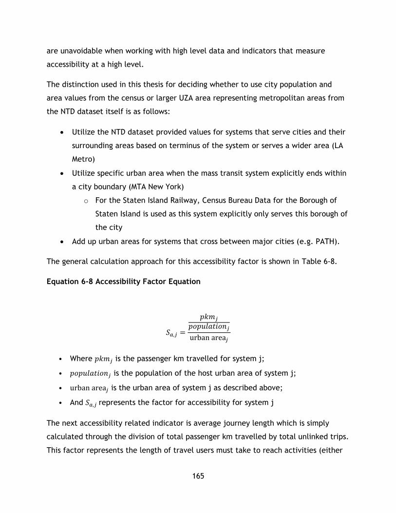
165
are unavoidable when working with high level data and indicators that measure
accessibility at a high level.
The distinction used in this thesis for deciding whether to use city population and
area values from the census or larger UZA area representing metropolitan areas from
the NTD dataset itself is as follows:
Utilize the NTD dataset provided values for systems that serve cities and their
surrounding areas based on terminus of the system or serves a wider area (LA
Metro)
Utilize specific urban area when the mass transit system explicitly ends within
a city boundary (MTA New York)
o For the Staten Island Railway, Census Bureau Data for the Borough of
Staten Island is used as this system explicitly only serves this borough of
the city
Add up urban areas for systems that cross between major cities (e.g. PATH).
The general calculation approach for this accessibility factor is shown in Table 6-8.
Equation 6-8 Accessibility Factor Equation
𝑆𝑎,𝑗 =
𝑝𝑘𝑚𝑗
𝑝𝑜𝑝𝑢𝑙𝑎𝑡𝑖𝑜𝑛𝑗
urban area𝑗
• Where 𝑝𝑘𝑚𝑗 is the passenger km travelled for system j;
• 𝑝𝑜𝑝𝑢𝑙𝑎𝑡𝑖𝑜𝑛𝑗 is the population of the host urban area of system j;
• urban area𝑗 is the urban area of system j as described above;
• And 𝑆𝑎,𝑗 represents the factor for accessibility for system j
The next accessibility related indicator is average journey length which is simply
calculated through the division of total passenger km travelled by total unlinked trips.
This factor represents the length of travel users must take to reach activities (either

166
personal, employment, or residential) – due to the high level nature of the data used
in this study it is a second measure of accessibility used in conjunction with system
accessibility. Higher scores on this factor indicate that users must travel further on
average to reach their activities, indicating the system and land use of the region it
serves are not as integrated or that the system has lower user accessibility. However,
the factor is a high level proxy for accessibility and future studies should consider a
complete accessibility indicator. Average journey length is calculated by Equation 6-
9.
Equation 6-9 Average Journey Length Factor Equation
𝑆𝑙,𝑗 =𝑝𝑘𝑚𝑗
τ𝑗
• Where 𝑝𝑘𝑚𝑗 is the passenger km travelled for system j;
• τ𝑗 is the total trips for system j;
• And 𝑆𝑙,𝑗 represents the factor for average journey length for system j
The next factor considered in this application of the methodology is affordability as
expressed by average fare divided by income per capita. While average fare
represents the direct cost a user pays for the system, this factor represents the
quantity of an individual’s income they must utilize for a trip on the system and
therefore another degree of access or affordability of the system. Where average fare
per GDP per capita is calculated by dividing fare revenue by total unlinked trips, and
dividing the result by income per capita as recovered from the American Census Fact
Finder Website. The affordability factor can be calculated using Equation 6-10.
Equation 6-10 Affordability Factor Equation
𝑆𝑓,𝑗 =
𝑟𝑗
𝜏 𝑗
𝑖𝑛𝑐𝑜𝑚𝑒𝑚

167
• Where 𝑟𝑗 is the fare revenue for system j;
• τ𝑗 is the total unlinked trips for system j;
• 𝑖𝑛𝑐𝑜𝑚𝑒𝑚 is the income per capita in the MSA serviced by the system operator
as stated by the American Census (contained in Appendix C);
• And 𝑆𝑓,𝑗 represents the factor for average fare per GDP per capita for system j
The final social factor considered in this study is user accessibility, which is based on
local accessibility of stations and vehicles for users with physical disabilities. The NTD
database contains data on the number of stations for each system that are compliant
with the Americans with Disabilities Act of 1990. According to the NTD website, ADA
compliant stations are those that do not restrict access for individuals with physical
disabilities, including those with wheel chairs, while providing ready access without
physical barriers (Federal Transit Administration, 2013). The percentage of stations
within a system that satisfy the ADA definition requirements based on NTD reporting
definition is adopted for this research as the metric for the user accessibility factor.
Within the NTD dataset, information on the number of ADA compliant stations as well
as the total number of stations is available. This factor is simply calculated by
Equation 6-11.
Equation 6-11 User Accessibility Factor Equation
𝑆𝑢,𝑗 =𝑠𝑡𝑎𝑡𝑖𝑜𝑛𝑠𝑎𝑑𝑎,𝑗
𝑠𝑡𝑎𝑡𝑖𝑜𝑛𝑠𝑗
• Where 𝑠𝑡𝑎𝑡𝑖𝑜𝑛𝑠𝑎𝑑𝑎,𝑗 is the number of ADA compliant station on system j;
• 𝑠𝑡𝑎𝑡𝑖𝑜𝑛𝑠𝑗 is the total number of stations on system j;
• And 𝑆𝑢,𝑗 represents the factor for user accessibility for system j
Based on the limitations for the data set selected for this analysis, only 4 factors can
be used for this inquiry. To summarize, the 4 social factors are contained in Table 6-6
Social Factors.
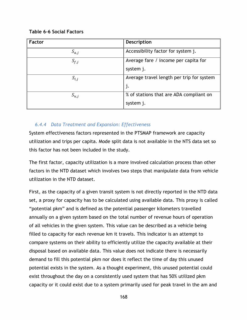
168
Table 6-6 Social Factors
Factor Description
𝑆𝑎,𝑗 Accessibility factor for system j.
𝑆𝑓,𝑗 Average fare / income per capita for
system j.
𝑆𝑙,𝑗 Average travel length per trip for system
j.
𝑆𝑢,𝑗 % of stations that are ADA compliant on
system j.
6.4.4 Data Treatment and Expansion: Effectiveness
System effectiveness factors represented in the PTSMAP framework are capacity
utilization and trips per capita. Mode split data is not available in the NTS data set so
this factor has not been included in the study.
The first factor, capacity utilization is a more involved calculation process than other
factors in the NTD dataset which involves two steps that manipulate data from vehicle
utilization in the NTD dataset.
First, as the capacity of a given transit system is not directly reported in the NTD data
set, a proxy for capacity has to be calculated using available data. This proxy is called
“potential pkm” and is defined as the potential passenger kilometers travelled
annually on a given system based on the total number of revenue hours of operation
of all vehicles in the given system. This value can be described as a vehicle being
filled to capacity for each revenue km it travels. This indicator is an attempt to
compare systems on their ability to efficiently utilize the capacity available at their
disposal based on available data. This value does not indicate there is necessarily
demand to fill this potential pkm nor does it reflect the time of day this unused
potential exists in the system. As a thought experiment, this unused potential could
exist throughout the day on a consistently used system that has 50% utilized pkm
capacity or it could exist due to a system primarily used for peak travel in the am and
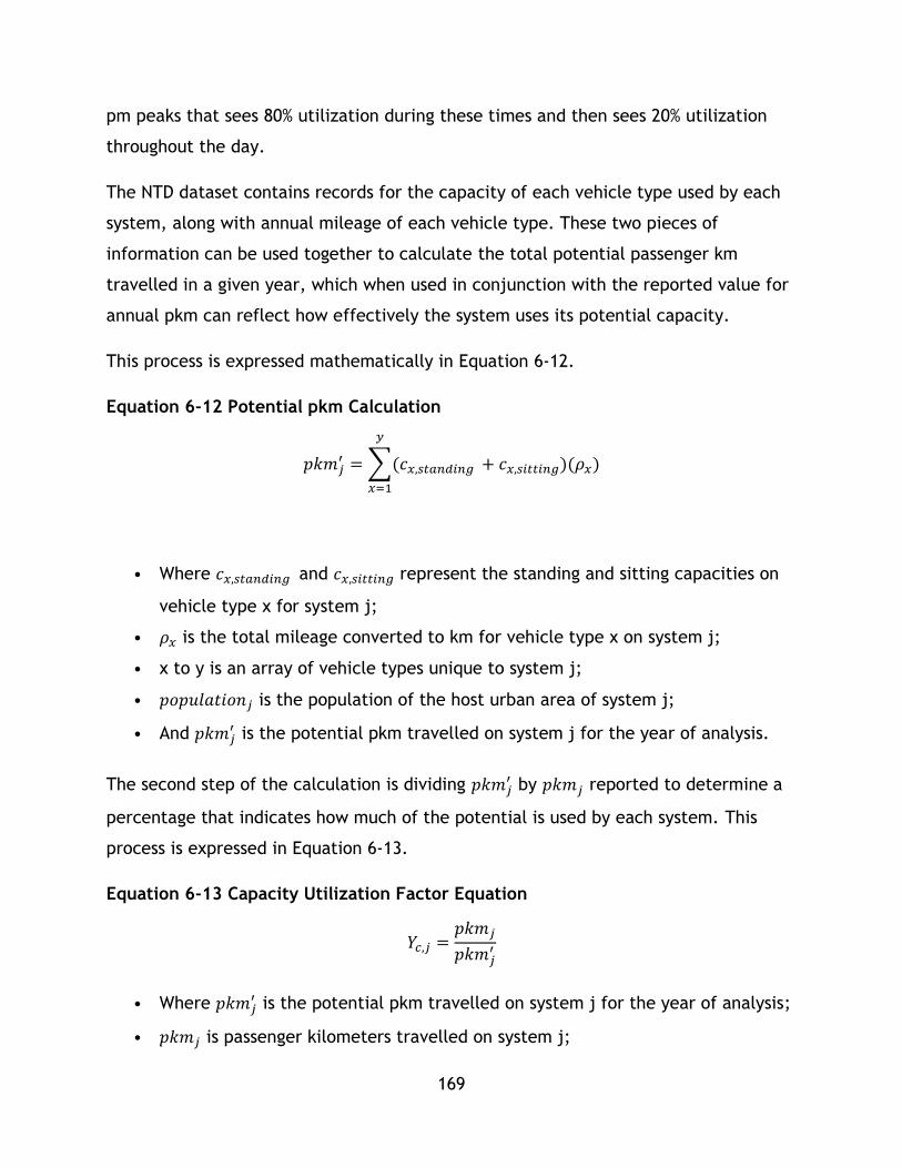
169
pm peaks that sees 80% utilization during these times and then sees 20% utilization
throughout the day.
The NTD dataset contains records for the capacity of each vehicle type used by each
system, along with annual mileage of each vehicle type. These two pieces of
information can be used together to calculate the total potential passenger km
travelled in a given year, which when used in conjunction with the reported value for
annual pkm can reflect how effectively the system uses its potential capacity.
This process is expressed mathematically in Equation 6-12.
Equation 6-12 Potential pkm Calculation
𝑝𝑘𝑚𝑗′ = ∑(𝑐𝑥,𝑠𝑡𝑎𝑛𝑑𝑖𝑛𝑔
𝑦
𝑥=1
+ 𝑐𝑥,𝑠𝑖𝑡𝑡𝑖𝑛𝑔)(𝜌𝑥)
• Where 𝑐𝑥,𝑠𝑡𝑎𝑛𝑑𝑖𝑛𝑔 and 𝑐𝑥,𝑠𝑖𝑡𝑡𝑖𝑛𝑔 represent the standing and sitting capacities on
vehicle type x for system j;
• 𝜌𝑥 is the total mileage converted to km for vehicle type x on system j;
• x to y is an array of vehicle types unique to system j;
• 𝑝𝑜𝑝𝑢𝑙𝑎𝑡𝑖𝑜𝑛𝑗 is the population of the host urban area of system j;
• And 𝑝𝑘𝑚𝑗′ is the potential pkm travelled on system j for the year of analysis.
The second step of the calculation is dividing 𝑝𝑘𝑚𝑗′ by 𝑝𝑘𝑚𝑗 reported to determine a
percentage that indicates how much of the potential is used by each system. This
process is expressed in Equation 6-13.
Equation 6-13 Capacity Utilization Factor Equation
𝑌𝑐,𝑗 =𝑝𝑘𝑚𝑗
𝑝𝑘𝑚𝑗′
• Where 𝑝𝑘𝑚𝑗′ is the potential pkm travelled on system j for the year of analysis;
• 𝑝𝑘𝑚𝑗 is passenger kilometers travelled on system j;
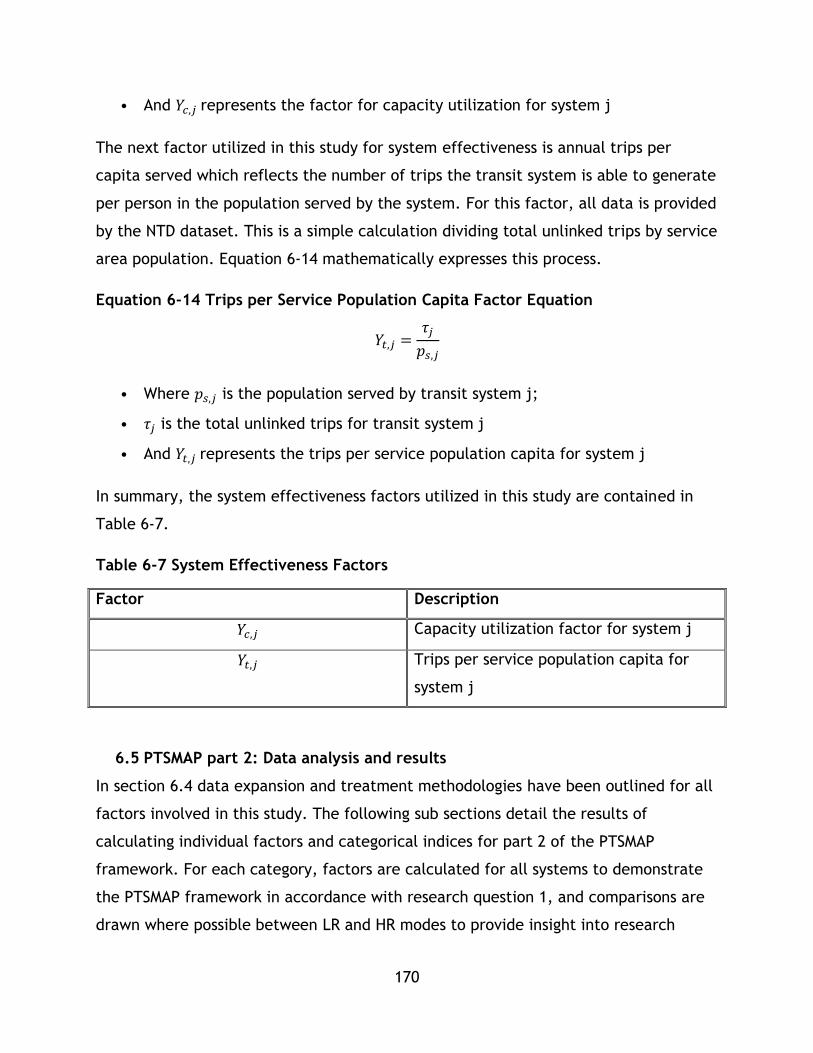
170
• And 𝑌𝑐,𝑗 represents the factor for capacity utilization for system j
The next factor utilized in this study for system effectiveness is annual trips per
capita served which reflects the number of trips the transit system is able to generate
per person in the population served by the system. For this factor, all data is provided
by the NTD dataset. This is a simple calculation dividing total unlinked trips by service
area population. Equation 6-14 mathematically expresses this process.
Equation 6-14 Trips per Service Population Capita Factor Equation
𝑌𝑡,𝑗 =𝜏𝑗
𝑝𝑠,𝑗
• Where 𝑝𝑠,𝑗 is the population served by transit system j;
• 𝜏𝑗 is the total unlinked trips for transit system j
• And 𝑌𝑡,𝑗 represents the trips per service population capita for system j
In summary, the system effectiveness factors utilized in this study are contained in
Table 6-7.
Table 6-7 System Effectiveness Factors
Factor Description
𝑌𝑐,𝑗 Capacity utilization factor for system j
𝑌𝑡,𝑗 Trips per service population capita for
system j
6.5 PTSMAP part 2: Data analysis and results
In section 6.4 data expansion and treatment methodologies have been outlined for all
factors involved in this study. The following sub sections detail the results of
calculating individual factors and categorical indices for part 2 of the PTSMAP
framework. For each category, factors are calculated for all systems to demonstrate
the PTSMAP framework in accordance with research question 1, and comparisons are
drawn where possible between LR and HR modes to provide insight into research
171
question 2. To draw comparisons, the maximum, minimum, and average performance
for factors are compared along with relevant statistical analysis with accompanying
graphs. The percent difference between the two system types for mean, highest, and
lowest performance – calculated by the difference between HR and LR divided by the
average of both values – is also calculated for all indicators. All systems have been
ranked for each factors and sorted into performance categories based on quartiles to
aid in analysis.
6.5.1 Environmental Factors
Three environmental factors were calculated for this application of the PTSMAP
framework and inquiry into transit system sustainability: energy consumption,
contribution to climate change (GHg gas emissions), and environmental emissions.
The first environmental factor, energy consumption, which reflects the energy
required by the system per unit of travel required no additional treatment or
expansion of data. The NTD database provided propulsion energy in units of kilowatt
hours, which have been converted into MJs for future comparison for ease of
comparison with other modes on a unit of energy input basis.
The second environmental factor, greenhouse gas emissions, reflects the system’s
global environmental impact required per unit of travel. It is measured in CO2
equivalents per passenger km travelled and was derived following the methodology
described within this chapter based on the energy requirements provided within the
NTD and the eGrid methodology as adapted from Leonardo Academy Inc. (2011),
Vincent & Walsh (2003), and Puchalsky (2005). These CO2E values are shared in terms
of kilograms CO2E emitted per passenger kilometer of travel.
The third environmental factor reflects environmental emissions, which have a range
of impacts on atmospheric and ecosystem conditions, that are released due to the
energy requirements of public transit . Using the NTD database energy values and the
eGrid emissions factors as well as the methodologies as adapted from Leonardo
Academy Inc. (2011), Vincent & Walsh (2003), and Puchalsky (2005) values for NOx
and SOx emissions for 35 transit systems and Hg values for 33 transit systems have

172
been calculated on a passenger kilometre basis. The values for these three factors are
displayed in Table 6-8 Environmental Factors for Heavy and Light Rail Systems.
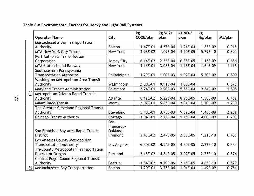
173
Table 6-8 Environmental Factors for Heavy and Light Rail Systems
Operator Name City
kg CO2E/pkm
kg SO2/ pkm
kg NOx/ pkm
kg Hg/pkm MJ/pkm
HR
Massachusetts Bay Transportation Authority Boston 1.47E-01 4.57E-04 1.24E-04 1.82E-09 0.915
MTA New York City Transit New York 3.98E-02 1.09E-04 4.10E-05 5.79E-10 0.395
Port Authority Trans-Hudson Corporation Jersey City 6.14E-02 2.33E-04 6.38E-05 1.15E-09 0.656
MTA Staten Island Railway New York 1.13E-01 3.08E-04 1.16E-04 1.64E-09 1.118
Southeastern Pennsylvania Transportation Authority Philadelphia 1.29E-01 1.00E-03 1.92E-04 5.20E-09 0.800
Washington Metropolitan Area Transit Authority Washington 2.50E-01 8.91E-04 3.80E-04 0.673
Maryland Transit Administration Baltimore 3.24E-01 2.90E-03 5.55E-04 9.34E-09 1.808
Metropolitan Atlanta Rapid Transit Authority Atlanta 8.12E-02 5.22E-04 8.96E-05 1.58E-09 0.432
Miami-Dade Transit Miami 2.07E-01 5.85E-04 3.31E-04 1.70E-09 1.230
The Greater Cleveland Regional Transit Authority Cleveland 5.40E-01 3.73E-03 9.32E-04 1.43E-08 2.232
Chicago Transit Authority Chicago 1.04E-01 2.72E-04 1.15E-04 4.00E-09 0.703
San Francisco Bay Area Rapid Transit District
San Francisco-Oakland-Fremont 3.43E-02 2.47E-05 2.33E-05 1.21E-10 0.453
Los Angeles County Metropolitan Transportation Authority Los Angeles 6.30E-02 4.54E-05 4.30E-05 2.22E-10 0.834
LR
Tri-County Metropolitan Transportation District of Oregon Portland 3.15E-02 4.84E-05 3.92E-05 2.75E-10 0.574
Central Puget Sound Regional Transit Authority Seattle 1.84E-02 8.79E-06 2.15E-05 4.65E-10 0.529
Massachusetts Bay Transportation Boston 1.20E-01 3.75E-04 1.01E-04 1.49E-09 0.751

174
Operator Name City
kg CO2E/pkm
kg SO2/ pkm
kg NOx/ pkm
kg Hg/pkm MJ/pkm
Authority
Niagara Frontier Transportation Authority Buffalo 1.28E-01 3.50E-04 1.32E-04 1.87E-09 1.273
Port Authority of Allegheny County Pittsburgh 3.36E-01 2.60E-03 5.00E-04 1.35E-08 2.078
Maryland Transit Administration Baltimore 2.48E-01 2.22E-03 4.25E-04 7.16E-09 1.385
Charlotte Area Transit System Charlotte 1.45E-01 7.06E-04 1.23E-04 3.16E-09 0.875
The Greater Cleveland Regional Transit Authority Cleveland 4.44E-01 3.06E-03 7.65E-04 1.18E-08 1.832
Metro Transit Minneapolis 1.42E-01 3.30E-04 2.82E-04 2.68E-09 0.696
Metropolitan Transit Authority of Harris County, Texas Houston 1.12E-01 2.12E-04 7.31E-05 2.09E-09 0.640
Dallas Area Rapid Transit Dallas 2.19E-01 4.15E-04 1.43E-04 4.09E-09 1.252
Bi-State Development Agency St. Louis 1.42E-01 4.69E-04 1.89E-04 3.39E-09 0.593
Utah Transit Authority Salt Lake City 2.35E-01 1.60E-04 4.15E-04 9.18E-10 0.907
Denver Regional Transportation District Denver 1.80E-01 2.51E-04 2.55E-04 1.62E-09 0.744
Santa Clara Valley Transportation Authority San Jose 7.56E-02 5.44E-05 5.15E-05 2.66E-10 1.000
San Francisco Municipal Railway San Francisco 6.93E-02 4.99E-05 4.72E-05 2.44E-10 0.916
Sacramento Regional Transit District Sacramento 7.16E-02 5.16E-05 4.88E-05 2.52E-10 0.948
San Diego Metropolitan Transit System San Diego 3.49E-02 2.51E-05 2.38E-05 1.23E-10 0.461
Los Angeles County Metropolitan Transportation Authority Los Angeles 4.87E-02 3.51E-05 3.32E-05 1.72E-10 0.644
Valley Metro Rail, Inc. Phoenix 8.44E-02 7.27E-05 1.08E-04 1.05E-09 0.535

175
The first factor, energy required per unit of travel (MJ/pkm), has been calculated for
all systems and the systems have been sorted from most to least efficient. The
systems have also been sorted into quartile performance categories. These rankings
are displayed in Table 6-9.
Table 6-9 Energy Efficiency per Unit of Travel for Heavy and Light Rail Transit Systems
Rank Operator Mode MJ/pkm Performance
1 MTA New York City Transit HR 0.39511 Highest
2 Metropolitan Atlanta Rapid Transit Authority HR 0.43243 LR
3 San Francisco Bay Area Rapid Transit District HR 0.45308 5
4 San Diego Metropolitan Transit System LR 0.46117 HR
5 Central Puget Sound Regional Transit Authority LR 0.52880 3
6 Valley Metro Rail, Inc. LR 0.53504
7 Tri-County Metropolitan Transportation District of Oregon LR 0.57382
8 Bi-State Development Agency LR 0.59336
9 Metropolitan Transit Authority of Harris County, Texas LR 0.63994 High
10 Los Angeles County Metropolitan Transportation Authority LR 0.64404 LR
11 Port Authority Trans-Hudson Corporation HR 0.65585 5
12 Washington Metropolitan Area Transit Authority HR 0.67271 HR
13 Metro Transit LR 0.69604 3
14 Chicago Transit Authority HR 0.70337
15 Denver Regional Transportation District LR 0.74351
16 Massachusetts Bay Transportation Authority LR 0.75055
17 Southeastern Pennsylvania Transportation Authority HR 0.79964 Low
18 Los Angeles County Metropolitan Transportation Authority HR 0.83372 LR
19 Charlotte Area Transit System LR 0.87525 5
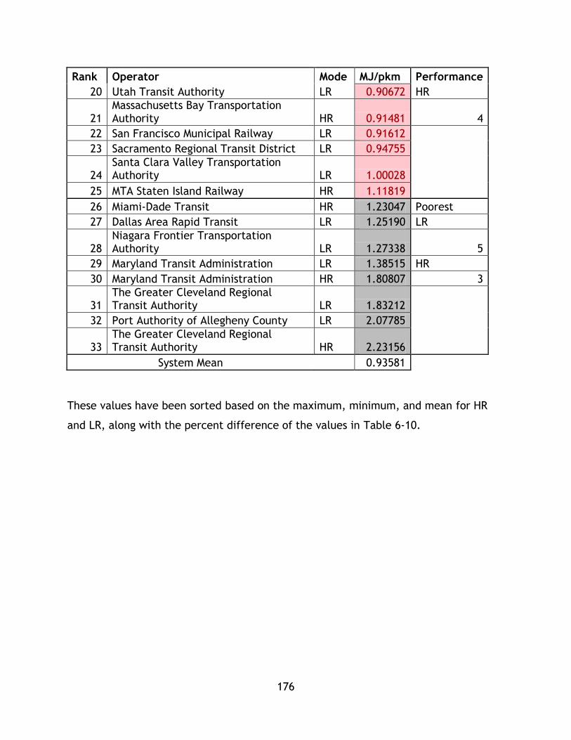
176
Rank Operator Mode MJ/pkm Performance
20 Utah Transit Authority LR 0.90672 HR
21 Massachusetts Bay Transportation Authority HR 0.91481 4
22 San Francisco Municipal Railway LR 0.91612
23 Sacramento Regional Transit District LR 0.94755
24 Santa Clara Valley Transportation Authority LR 1.00028
25 MTA Staten Island Railway HR 1.11819
26 Miami-Dade Transit HR 1.23047 Poorest
27 Dallas Area Rapid Transit LR 1.25190 LR
28 Niagara Frontier Transportation Authority LR 1.27338 5
29 Maryland Transit Administration LR 1.38515 HR
30 Maryland Transit Administration HR 1.80807 3
31 The Greater Cleveland Regional Transit Authority LR 1.83212
32 Port Authority of Allegheny County LR 2.07785
33 The Greater Cleveland Regional Transit Authority HR 2.23156
System Mean 0.93581
These values have been sorted based on the maximum, minimum, and mean for HR
and LR, along with the percent difference of the values in Table 6-10.

177
Table 6-10 Energy Consumption Ranges for Light Rail and Heavy Rail Transit Systems
Energy per Unit of Travel MJ/pkm
HR LR
% Difference
Maximum
The Greater Cleveland Regional Transit Authority 2.232
Port Authority of Allegheny County 2.078 7.134%
Minimum MTA New York City Transit 0.395
San Diego Metropolitan Transit System 0.461 15.430%
Mean 0.942 0.932 1.131%
% Difference max and min 139.83% 127.35%
These ranges are also graphed for LR and HR transit systems in Figure 6-1.
Figure 6-1 Energy Consumption Ranges for Light Rail and Heavy Rail Transit Systems
As noted in the preceding tables and figure, the maximum and minimum values of
energy consumptions for both modes do not vary greatly. In the maximum energy
consumption per passenger km travelled case, which represents systems with poorer
energy performance, the percent difference is 7.13%, with LR by Port Authority of
Allegheny County providing better performance than the Greater Cleveland Regional
Transit Authority. The low value demonstrates little disparity between poor
performing systems between these modes. When comparing the high performance
0.000
0.500
1.000
1.500
2.000
2.500
Maximum Minimum Mean
Energ
y p
er
pkm
(M
J/k
m) Heavy Rail
LRT

178
cases, the HR system, New York (MTA), outperforms the LR system, San Diego
Metropolitan Transit system, and the percent difference is 15.43%, which while
greater than the less energy efficient systems, is not a pronounced difference.
A t-test was conducted to compare the means of each system with a null hypothesis
that the difference of the means of the systems is statistically significant. With a
value of -0.047250901 the null hypothesis can be rejected at a 95% confidence
interval. When the maximum and minimum values are analyzed in the context of this
rejection as well as the value of the percent difference of the means, 1.131% it can
be argued that within the NTD dataset systems analyzed on average that there is not
a clear distinction between LR and HR systems based on technology/mode choice in
terms of energy efficiency for sustainable mobility. In order to further explore energy
efficiency, MJ spent by each system and the total passenger pm travelled on each
system have been graphed in Figure 6-32 and Figure 6-43. Given the wide range of
data, Figure 6-32 is in log scale in order to show the full range of data, while the
second focuses on values excluding MTA New York from the displayed range.

179
Figure 6-2 Passenger Kilometres Travelled and Energy for Propulsion for LRT and HRT Systems
y = 217.58x0.7238
R² = 0.9547
y = 93.458x0.7466
R² = 0.7918
0.00
2,000,000,000.00
4,000,000,000.00
6,000,000,000.00
8,000,000,000.00
10,000,000,000.00
12,000,000,000.00
14,000,000,000.00
16,000,000,000.00
1,000,000.00 10,000,000.00 100,000,000.00 1,000,000,000.00 10,000,000,000.00
Energ
y o
r pro
puls
ion (
mj)
Passenger Kilometres Travelled (pkm)
Heavy Rail
Light Rail Transit
Power (Heavy Rail)
Power (Light Rail Transit)

180
Figure 6-3 Passenger Kilometres Travelled and Energy for Propulsion for LRT and HRT Systems
y = 217.58x0.7238
R² = 0.9547
y = 93.458x0.7466
R² = 0.7918
0.00
200,000,000.00
400,000,000.00
600,000,000.00
800,000,000.00
1,000,000,000.00
1,200,000,000.00
1,400,000,000.00
1,600,000,000.00
1,800,000,000.00
2,000,000,000.00
1.00E+06 5.01E+08 1.00E+09 1.50E+09 2.00E+09 2.50E+09
Ene
rgy
for
Pro
pu
lsio
n (
MJ)
Passenger Kilometres Travelled (km)
Heavy Rail
Light Rail Transit
Power (Heavy Rail)
Power (Light RailTransit)

181
From the graphs and trend lines, the analysis indicates that there is a an observable
trend of LR systems yielding greater energy efficiency results than HR systems. Both
trend lines exhibit a high r squared value indicating a high level of fit. However, the
threshold for LR was at 536,448,373.64 pkm/year, whereas HR systems served heavier
levels of demand and it is uncertain whether the trend can be extrapolated to higher
levels of demand for LR. However, for the HR systems that have similar levels of pkm
performance, the majority of LR systems provide superior energy efficiency
performance. Of the highest performing systems, 5 are LR, although the top three are
HR indicating that well planned and efficiently operated HR can outperform LR,
although on average LR systems achieve higher energy efficiency. This finding is in
alignment with Vuchic (2007) – where it is shared that LRT vehicles typically require
lower power per unit space ratings than HR vehicles. From a technical viewpoint,
individual vehicles may present energy efficiency benefits due to their mechanical
characteristics, capacity, and design features, however system design takes into
account other complex considerations, which is what this data represents.
While the maximums and minimums between modes do not vary greatly, within the
mode sets of data there is great disparity between the max and min values. For HR,
the minimum value for MTA New York differed from The Greater Cleveland Regional
Transit Authority by 139.83% , while for LR systems the difference between Port
Authority of Allegheny County and San Diego Metropolitan Transit System was
127.35%. Both great differences highlight the need to explore how system factors
beyond mode type influence energy consumption.
A suite of operating (i.e. headway, type of vehicle configurations, dwell times,
acceleration, etc.), system (i.e. length of system) , and urban factors (i.e. density,
supporting land use) may influence energy efficiency per unit travel more than mode
choice. This viewpoint is represented in the dataset where operators operate both
modes – operators with poor energy efficiency ranking in one mode feature poor
energy efficiency in the other mode as well, for example Cleveland has poor energy
efficiency in both categories. These factors could be the focus of future study.

182
When taking a systemic view, this data analysis suggests that both LR and HR systems
can achieve similar levels of energy efficiency in the delivery of mobility, although
the graphical methods employed in this study do demonstrate higher efficiencies for
some LR systems. However, given that the majority of HR systems report higher levels
of pkm a direct comparison is not possible.
For the second and third factors, in depth comparison of mode is not provided in this
thesis as they are based on factors exogenous to the systems themselves multiplied by
the energy consumed by the system – i.e. the power grid emission factors are
multiplied by individual system energy consumptions to determine emissions for
factors two and three. These emission factors are based on the power available to the
systems and are directly calculated from the energy consumption values provided by
system operators.
However, given that emissions are a crucial component of the environmental impacts
of transportation and therefore an essential element of a sustainable mobility
analysis, they are still presented for discussion and calculation of the composite
sustainability index. Additionally, if emission reductions are an important goal of
system development or expansion, understanding the performance of rapid transit
alternatives , benchmarking for comparison to other similar rapid transit systems
based on performance can enable more effective decision making. Minimizing
emission may be an important policy or master plan strategic outcome so
demonstrating the PTSMAP’s procedure for evaluating emissions is a crucial element
of this study. Finally, factors 2 and 3 demonstrate the dependence of public transit
systems on their fuel or energy source on ensuring they achieve desirable
environmental performance.
The second factor, greenhouse gases emitted per unit of travel by the public transit
systems has been calculated for each system and is displayed ranked smallest to
largest by performance levels in Table 6-11.
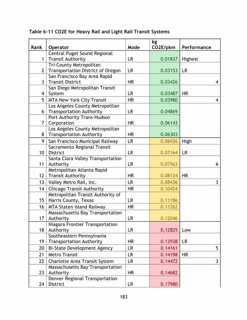
183
Table 6-11 CO2E for Heavy Rail and Light Rail Transit Systems
Rank Operator Mode kg CO2E/pkm Performance
1 Central Puget Sound Regional Transit Authority LR 0.01837 Highest
2 Tri-County Metropolitan Transportation District of Oregon LR 0.03153 LR
3 San Francisco Bay Area Rapid Transit District HR 0.03426 4
4 San Diego Metropolitan Transit System LR 0.03487 HR
5 MTA New York City Transit HR 0.03980 4
6 Los Angeles County Metropolitan Transportation Authority LR 0.04869
7 Port Authority Trans-Hudson Corporation HR 0.06143
8 Los Angeles County Metropolitan Transportation Authority HR 0.06303
9 San Francisco Municipal Railway LR 0.06926 High
10 Sacramento Regional Transit District LR 0.07164 LR
11 Santa Clara Valley Transportation Authority LR 0.07563 6
12 Metropolitan Atlanta Rapid Transit Authority HR 0.08124 HR
13 Valley Metro Rail, Inc. LR 0.08436 3
14 Chicago Transit Authority HR 0.10424
15 Metropolitan Transit Authority of Harris County, Texas LR 0.11186
16 MTA Staten Island Railway HR 0.11262
17 Massachusetts Bay Transportation Authority LR 0.12046
18 Niagara Frontier Transportation Authority LR 0.12825 Low
19 Southeastern Pennsylvania Transportation Authority HR 0.12938 LR
20 Bi-State Development Agency LR 0.14161 5
21 Metro Transit LR 0.14198 HR
22 Charlotte Area Transit System LR 0.14472 3
23 Massachusetts Bay Transportation Authority HR 0.14682
24 Denver Regional Transportation District LR 0.17980

184
Rank Operator Mode kg CO2E/pkm Performance
25 Miami-Dade Transit HR 0.20701
26 Dallas Area Rapid Transit LR 0.21883 Poorest
27 Utah Transit Authority LR 0.23495 LR
28 Maryland Transit Administration LR 0.24823 5
29 Washington Metropolitan Area Transit Authority HR 0.25009 HR
30 Maryland Transit Administration HR 0.32402 3
31 Port Authority of Allegheny County LR 0.33618
32 The Greater Cleveland Regional Transit Authority LR 0.44355
33 The Greater Cleveland Regional Transit Authority HR 0.54026
System Mean 0.15088
These values have also been segmented into maximum, minimum and mean values.
These values are displayed in Table 6-12.
Table 6-12 Green House Gas Emission for Heavy Rail and Light Rail Transit Systems
GHg per unit of travel (kg CO2E/pm)
HR LR % Difference
Max
The Greater Cleveland Regional Transit Authority 0.5403
The Greater Cleveland Regional Transit Authority 0.444 19.66%
Min
San Francisco Bay Area Rapid Transit District 0.0343
Central Puget Sound Regional Transit Authority 0.018 60.39%
Mean 0.161 0.144 11.04%
% Difference max and min 176.15% 184.10%
These ranges have also been graphed and are shown in Figure 6-4.

185
Figure 6-4 CO2E/pkm Ranges for Heavy Rail and Light Rail Transit Systems
These tables and graphs show similar findings to the energy analysis – there is great
disparity within modes as expected due to the same energy range between modes.
There is a greater disparity between the minimum CO2E emissions than with energy
between systems, however this can be accounted for due to the differing emission
factors between states. Not all states will have the same emissions factors meaning
some systems may have much different CO2E emissions despite having similar energy
consumptions, or systems with slight disparity in energy consumption may have
greater disparity in emissions . According to the US EPA, the average automobile
emits 423 grams of CO2 per mile (Office of Transportation and Air Quality United
States Environmental Protection Agency, 2011). When converted to units utilized in
this study, the average emission value is 262 grams/km. Of the systems in this study,
29 of the 33 exceeded this level of environmental performance including 11 HR and 18
LR. These findings are in line with the literature review’s hierarchy of modes, as well
as past studies that find transit system performance to exceed private auto
performance under the greenhouse gas criteria.
When comparing the highest performing systems of each mode, it is evident that
Central Puget Sound Transit Authority (LR), offers better energy efficiency than San
0.0000
0.1000
0.2000
0.3000
0.4000
0.5000
0.6000
Max Min Mean
kg C
O2E/p
km
Heavy Rail
Light Rail
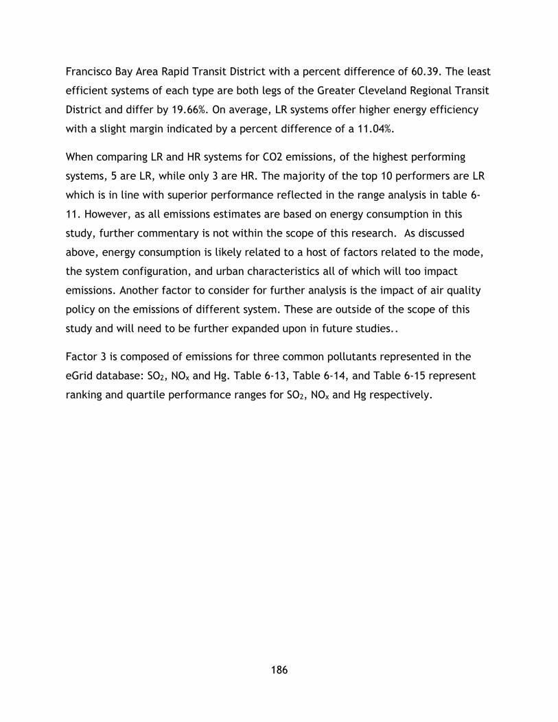
186
Francisco Bay Area Rapid Transit District with a percent difference of 60.39. The least
efficient systems of each type are both legs of the Greater Cleveland Regional Transit
District and differ by 19.66%. On average, LR systems offer higher energy efficiency
with a slight margin indicated by a percent difference of a 11.04%.
When comparing LR and HR systems for CO2 emissions, of the highest performing
systems, 5 are LR, while only 3 are HR. The majority of the top 10 performers are LR
which is in line with superior performance reflected in the range analysis in table 6-
11. However, as all emissions estimates are based on energy consumption in this
study, further commentary is not within the scope of this research. As discussed
above, energy consumption is likely related to a host of factors related to the mode,
the system configuration, and urban characteristics all of which will too impact
emissions. Another factor to consider for further analysis is the impact of air quality
policy on the emissions of different system. These are outside of the scope of this
study and will need to be further expanded upon in future studies..
Factor 3 is composed of emissions for three common pollutants represented in the
eGrid database: SO2, NOx and Hg. Table 6-13, Table 6-14, and Table 6-15 represent
ranking and quartile performance ranges for SO2, NOx and Hg respectively.

187
Table 6-13 SO2 Emissions Ranking for Heavy Rail and Light Rail Transit Systems
Rank Operator Mode kg SO2/pkm Performance
1 Central Puget Sound Regional Transit Authority LR 8.79E-06 Highest
2 San Francisco Bay Area Rapid Transit District HR 2.47E-05 LR
3 Los Angeles County Metropolitan Transportation Authority LR 2.51E-05 6
4 Valley Metro Rail, Inc. LR 3.51E-05 HR
5 Los Angeles County Metropolitan Transportation Authority HR 4.54E-05 2
6 Tri-County Metropolitan Transportation District of Oregon LR 4.84E-05
7 Sacramento Regional Transit District LR 4.99E-05
8 San Diego Metropolitan Transit System LR 5.16E-05
9 San Francisco Municipal Railway LR 5.44E-05 High
10 MTA New York City Transit HR 1.09E-04 LR
11 Denver Regional Transportation District LR 1.60E-04 5
12 Dallas Area Rapid Transit LR 2.12E-04 HR
13 Port Authority Trans-Hudson Corporation HR 2.33E-04 4
14 Port Authority of Allegheny County LR 2.37E-04
15 Santa Clara Valley Transportation Authority LR 2.51E-04
16 Chicago Transit Authority HR 2.72E-04
17 MTA Staten Island Railway HR 3.08E-04
18 Metropolitan Transit Authority of Harris County, Texas LR 3.30E-04 Low
19 Niagara Frontier Transportation Authority LR 3.50E-04 LR
20 Massachusetts Bay Transportation Authority LR 3.75E-04 5
21 Bi-State Development Agency LR 4.15E-04 HR
22 Massachusetts Bay Transportation Authority HR 4.57E-04 3
23 Utah Transit Authority LR 4.69E-04
24 Metropolitan Atlanta Rapid Transit Authority HR 5.22E-04
25 Miami-Dade Transit HR 5.85E-04
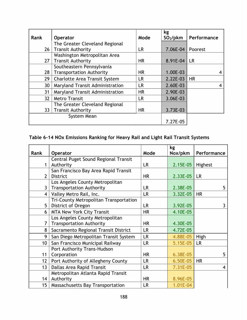
188
Rank Operator Mode kg SO2/pkm Performance
26 The Greater Cleveland Regional Transit Authority LR 7.06E-04 Poorest
27 Washington Metropolitan Area Transit Authority HR 8.91E-04 LR
28 Southeastern Pennsylvania Transportation Authority HR 1.00E-03 4
29 Charlotte Area Transit System LR 2.22E-03 HR
30 Maryland Transit Administration LR 2.60E-03 4
31 Maryland Transit Administration HR 2.90E-03
32 Metro Transit LR 3.06E-03
33 The Greater Cleveland Regional Transit Authority HR 3.73E-03
System Mean 7.27E-05
Table 6-14 NOx Emissions Ranking for Heavy Rail and Light Rail Transit Systems
Rank Operator Mode kg Nox/pkm Performance
1 Central Puget Sound Regional Transit Authority LR 2.15E-05 Highest
2 San Francisco Bay Area Rapid Transit District HR 2.33E-05 LR
3 Los Angeles County Metropolitan Transportation Authority LR 2.38E-05 5
4 Valley Metro Rail, Inc. LR 3.32E-05 HR
5 Tri-County Metropolitan Transportation District of Oregon LR 3.92E-05 3
6 MTA New York City Transit HR 4.10E-05
7 Los Angeles County Metropolitan Transportation Authority HR 4.30E-05
8 Sacramento Regional Transit District LR 4.72E-05
9 San Diego Metropolitan Transit System LR 4.88E-05 High
10 San Francisco Municipal Railway LR 5.15E-05 LR
11 Port Authority Trans-Hudson Corporation HR 6.38E-05 5
12 Port Authority of Allegheny County LR 6.50E-05 HR
13 Dallas Area Rapid Transit LR 7.31E-05 4
14 Metropolitan Atlanta Rapid Transit Authority HR 8.96E-05
15 Massachusetts Bay Transportation LR 1.01E-04

189
Rank Operator Mode kg Nox/pkm Performance
Authority
16 Chicago Transit Authority HR 1.15E-04
17 MTA Staten Island Railway HR 1.16E-04
18 The Greater Cleveland Regional Transit Authority LR 1.23E-04 Low
19 Massachusetts Bay Transportation Authority HR 1.24E-04 LR
20 Niagara Frontier Transportation Authority LR 1.32E-04 6
21 Bi-State Development Agency LR 1.43E-04 HR
22 Utah Transit Authority LR 1.89E-04 2
23 Southeastern Pennsylvania Transportation Authority HR 1.92E-04
24 Santa Clara Valley Transportation Authority LR 2.55E-04
25 Metropolitan Transit Authority of Harris County, Texas LR 2.82E-04
26 Miami-Dade Transit HR 3.31E-04 Poorest
27 Washington Metropolitan Area Transit Authority HR 3.80E-04 LR
28 Denver Regional Transportation District LR 4.15E-04 4
29 Charlotte Area Transit System LR 4.25E-04 HR
30 Maryland Transit Administration LR 5.00E-04 4
31 Maryland Transit Administration HR 5.55E-04
32 Metro Transit LR 7.65E-04
33 The Greater Cleveland Regional Transit Authority HR 9.32E-04
System Mean 1.08E-04
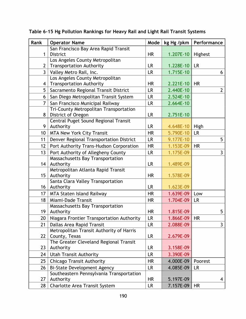
190
Table 6-15 Hg Pollution Rankings for Heavy Rail and Light Rail Transit Systems
Rank Operator Name Mode kg Hg /pkm Performance
1 San Francisco Bay Area Rapid Transit District HR 1.207E-10 Highest
2 Los Angeles County Metropolitan Transportation Authority LR 1.228E-10 LR
3 Valley Metro Rail, Inc. LR 1.715E-10 6
4 Los Angeles County Metropolitan Transportation Authority HR 2.221E-10 HR
5 Sacramento Regional Transit District LR 2.440E-10 2
6 San Diego Metropolitan Transit System LR 2.524E-10
7 San Francisco Municipal Railway LR 2.664E-10
8 Tri-County Metropolitan Transportation District of Oregon LR 2.751E-10
9 Central Puget Sound Regional Transit Authority LR 4.648E-10 High
10 MTA New York City Transit HR 5.790E-10 LR
11 Denver Regional Transportation District LR 9.177E-10 5
12 Port Authority Trans-Hudson Corporation HR 1.153E-09 HR
13 Port Authority of Allegheny County LR 1.175E-09 3
14 Massachusetts Bay Transportation Authority LR 1.489E-09
15 Metropolitan Atlanta Rapid Transit Authority HR 1.578E-09
16 Santa Clara Valley Transportation Authority LR 1.623E-09
17 MTA Staten Island Railway HR 1.639E-09 Low
18 Miami-Dade Transit HR 1.704E-09 LR
19 Massachusetts Bay Transportation Authority HR 1.815E-09 5
20 Niagara Frontier Transportation Authority LR 1.866E-09 HR
21 Dallas Area Rapid Transit LR 2.088E-09 3
22 Metropolitan Transit Authority of Harris County, Texas LR 2.679E-09
23 The Greater Cleveland Regional Transit Authority LR 3.158E-09
24 Utah Transit Authority LR 3.390E-09
25 Chicago Transit Authority HR 4.000E-09 Poorest
26 Bi-State Development Agency LR 4.085E-09 LR
27 Southeastern Pennsylvania Transportation Authority HR 5.197E-09 4
28 Charlotte Area Transit System LR 7.157E-09 HR
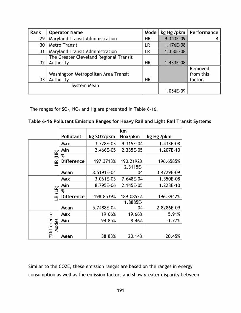
191
Rank Operator Name Mode kg Hg /pkm Performance
29 Maryland Transit Administration HR 9.343E-09 4
30 Metro Transit LR 1.176E-08
31 Maryland Transit Administration LR 1.350E-08
32 The Greater Cleveland Regional Transit Authority HR 1.433E-08
33 Washington Metropolitan Area Transit Authority HR
Removed from this factor.
System Mean 1.054E-09
The ranges for SO2, NOx and Hg are presented in Table 6-16.
Table 6-16 Pollutant Emission Ranges for Heavy Rail and Light Rail Transit Systems
Pollutant kg SO2/pkm
km Nox/pkm kg Hg /pkm
HR (
HR)
Max 3.728E-03 9.315E-04 1.433E-08
Min 2.466E-05 2.335E-05 1.207E-10
% Difference 197.3713% 190.2192% 196.6585%
Mean 8.5191E-04 2.3115E-
04 3.4729E-09
LR (
LR)
Max 3.061E-03 7.648E-04 1.350E-08
Min 8.795E-06 2.145E-05 1.228E-10
% Difference 198.8539% 189.0852% 196.3942%
Mean 5.7488E-04 1.8885E-
04 2.8286E-09
%D
iffe
rence
Modes
Max 19.66% 19.66% 5.91%
Min 94.85% 8.46% -1.77%
Mean 38.83% 20.14% 20.45%
Similar to the CO2E, these emission ranges are based on the ranges in energy
consumption as well as the emission factors and show greater disparity between

192
maximum and minimum within modes than energy does. The disparity within and
across system sets compared to energy can be associated with the variation in factors
across grids. For Hg and SO2, 6 of the highest performing systems are LR, for NOx 5 of
the top performers are LR. These results are a combination of energy efficiency and
grid efficiency. For SO2 the minimum (high performance) system, LR achieves superior
performance with a percent difference of 94.85%, while for the maximum( low
performance) LR also attains greater performance with 19.66% difference, while for
the mean LR achieves greater performance at a percent difference of 38.83%. For
NOX,in both the highest and least performing systems, LR achieves greater
performance with differences of 19.66% and 8.46% respectively, while on average LR
achieves greater results with a difference of 20.14%. In Hg pollution, or the highest
performing systems, LR system outperforms HR at 5.91%, however the lowest
performing HR outperforms the lowest performing LR by 1.77%. Based on average
performance LR offers lower emissions per pkm with a difference of 20.45%.
To conclude, the environmental factors considered in this study represent a host of
environmental impacts of travel – energy consumption, global climate change
impacts, and environmental pollutants. Based on the systems analyzed through trend
line analysis, LR systems on average may provide greater energy efficiency per
passenger km travelled, however it is unknown whether or not this trend continues
into higher levels of system capacity as LR systems are typically planned for lower
capacities than HR systems and there are no LR systems that provide higher capacities
within the dataset. Between both system sets there is little disparity between the
maximum, minimum, and average values, indicating similar levels of performance
overall.
29 out of 33 systems included in the study exceed environmental performance of a
single occupancy automobile based on EPA figures for greenhouse gas emissions
indicating that transit is a sustainable mode in line with the literature review. Within
the second and third environmental factors, the slight disparities observed in the first
193
factor, energy, expanded greatly. These differences are not due to system type, but
due to factors exogenous to system design – the grids from which systems purchase
power.
It is essential to note that energy consumption influences the second and third factors
greatly in this research and that outside of system mode, other factors such as system
layout and operational variables such as running speed and acceleration time have
great influence on energy consumption and these factors must be further researched
in future studies to better outline the sustainability performance of these systems.
Overall conclusions based on direct numerical comparison are summarized in the
following Table 6-17:

194
Table 6-17 Summary of Analysis of Environmental Factors
Highest Performance
Systems
Lowest
Performance
Systems
Mean Trend
Energy High end HR systems
achieve better
performance than LR
systems, LR systems are
better represented.
LR attains
greater
performance
than HR.
Null hypothesis
(difference
between means
is statistically
significant)
rejected at
95%.
LR trend
line
indicates
higher
efficiency.
CO2E LR systems are better
represented.
LR attains
slightly greater
performance
than HR.
LR attains
greater
performance.
N/A
SO2 LR systems are better
represented.
LR attains
slightly greater
performance
than HR.
LR attains
much greater
performance.
N/A
NOx LR systems are better
represented.
LR attains
slightly greater
performance
than HR.
LR attains
greater
performance.
N/A
Hg LR systems are better
represented.
LR achieves
better
performance
than HR systems.
LR attains
greater
performance.
N/A
From the numerical analysis, these preliminary results indicate overall better
environmental performance for LR systems when compared to HR systems. The first
195
factor, energy consumption shows balanced performance for HR with a distribution
across the four performance quartiles from high to low of 3,3,4,3 and for LR or
5,5,5,5. While the top three systems are HR, the majority of top tier systems are LR
indicating better performance in general for LR. For CO2E the performance
breakdowns are 4,3,3,3, for HR and 4,6, 5, 5 for LR. LR is better represented in the
upper tiers, indicating better overall performance. However, this indicator has
balanced performance for both system sets. For SOx the performance breakdowns are
2,4,3,4 for HR and 6,5,5,4 for LR, indicating LR has better performance than HR. For
NOx the performance breakdowns are 3,4,2,4 for HR and 5,5,6,4 for LR, indicating
balanced performance for LR, but overall better performance for LR. For Hg the
performance breakdowns are 2,3,5,3 for HR and 6,5,5,4 for HR, indicating better
performance for LR. Despite being directly related to energy consumption and factors
not in the control of the system itself, emissions are still counted as they are related
to the system’s sustainable mobility and inasmuch they are included in the
comprehensive sustainable mobility analysis presented in this thesis for system
comparison. However, in the context of modal comparison, emission performance
analysis should be taken in the context of grid and energy consumption.
While LR systems attain in general better performance by measure of representation
in higher tier performance categories, both system sets have high and low
performance systems. There is a spectrum of environmental performance across all
factors given the complexity of the grids involved and the complexity involved in
energy consumption.
6.5.2 Economic Factors
The first four economic factors, operating cost per passenger km, average fare per
trip, average travel time, and cost recovery were calculated using data directly from
the NTD and required no additional expansion or treatment. The final factor, transit
economy interactions required the use of gross domestic product for the urban area
served by the transit system. GDP values were obtained using data provided by the
Bureau of Economic Analysis from the U.S. Department of Commerce (Bureau of
Economic Analysis, 2011). For this study the GDP value of the host city of the transit

196
agency, as stated within the NTD was utilized. For systems that serve a broader area,
such as MTA New York or Port Authority Trans-Hudson Corporation, the GDP of the
metropolitan statistical area was utilized.
Only factor one is normalized per passenger kilometre travelled, while factor two
utilizes pkm in its calculation and is based on an average. Factor three is an average
based on trips and factor four is a percentage calculated for each system, while
factor five is based on pkm and GDP. All factors are shown in Table 6-18.

197
Table 6-18 Economic Factors for Heavy Rail and Light Rail Transit Systems
Operator Name City
op cost/pkm
Average travel time costs(minutes)
Average Fare $ (USD)
Recovery (%) PKM/GDP
HR
Massachusetts Bay Transportation Authority Boston $0.39 12.084 1.102 49.98% 2.729E-09
MTA New York City Transit New York $0.21 13.111 0.983 71.68% 1.361E-08
Port Authority Trans-Hudson Corporation Jersey City $0.53 13.769 1.261 35.14% 4.929E-10
MTA Staten Island Railway New York $0.49 16.696 0.854 18.30% 6.320E-11
Southeastern Pennsylvania Transportation Authority Philadelphia $0.24 13.637 0.892 51.12% 2.184E-09
Washington Metropolitan Area Transit Authority Washington $0.30 13.592 1.698 61.96% 6.873E-09
Maryland Transit Administration Baltimore $0.58 10.480 0.858 21.42% 7.117E-10
Metropolitan Atlanta Rapid Transit Authority Atlanta $0.22 14.431 0.756 34.27% 3.213E-09
Miami-Dade Transit Miami $0.37 15.572 1.026 23.40% 8.853E-10
The Greater Cleveland Regional Transit Authority Cleveland $0.54 20.738 1.112 18.03% 4.419E-10
Chicago Transit Authority Chicago $0.22 19.875 1.135 53.07% 4.379E-09
San Francisco Bay Area Rapid Transit District
San Francisco-Oakland-Fremont $0.21 21.695 3.060 71.56% 7.575E-09
Los Angeles County Metropolitan Transportation Authority Los Angeles $0.24 13.174 0.730 38.73% 5.568E-10
LR
Tri-County Metropolitan
Transportation District of Oregon Portland $0.32 21.375 0.869 34.70% 2.761E-09
Central Puget Sound Regional Transit Authority Seattle $0.46 22.961 1.227 23.22% 4.323E-10

198
Operator Name City
op cost/pkm
Average travel time costs(minutes)
Average Fare $ (USD)
Recovery (%) PKM/GDP
Massachusetts Bay Transportation Authority Boston $0.56 15.145 1.064 49.47% 8.778E-10
Niagara Frontier Transportation Authority Buffalo $0.90 14.415 0.723 19.08% 6.539E-10
Port Authority of Allegheny County Pittsburgh $0.93 21.694 1.130 15.79% 5.246E-10
Maryland Transit Administration Baltimore $0.45 20.829 0.869 17.80% 6.774E-10
Charlotte Area Transit System Charlotte $0.58 17.422 0.988 20.02% 2.665E-10
The Greater Cleveland Regional Transit Authority Cleveland $0.58 22.565 1.112 20.36% 2.323E-10
Metro Transit Minneapolis $0.29 21.195 0.991 40.26% 4.930E-10
Metropolitan Transit Authority of Harris County, Texas Houston $0.38 11.559 0.545 39.06% 1.101E-10
Dallas Area Rapid Transit Dallas $0.55 24.087 0.794 12.62% 5.813E-10
Bi-State Development Agency St. Louis $0.24 20.830 1.075 31.55% 1.905E-09
Utah Transit Authority Salt Lake City $0.30 17.845 0.777 37.18% 1.531E-09
Denver Regional Transportation District Denver $0.32 22.803 1.107 31.12% 1.548E-09
Santa Clara Valley Transportation Authority San Jose $0.70 19.878 0.883 15.19% 4.799E-10
San Francisco Municipal Railway San Francisco $0.80 17.797 0.771 22.51% 7.154E-10
Sacramento Regional Transit District Sacramento $0.36 16.446 0.943 30.21% 1.593E-09
San Diego Metropolitan Transit System San Diego $0.20 20.441 1.085 54.26% 1.933E-09
Los Angeles County Metropolitan Transportation Authority Los Angeles $0.31 18.914 0.662 18.30% 8.002E-10
Valley Metro Rail, Inc. Phoenix $0.23 29.920 0.764 28.08% 8.137E-10
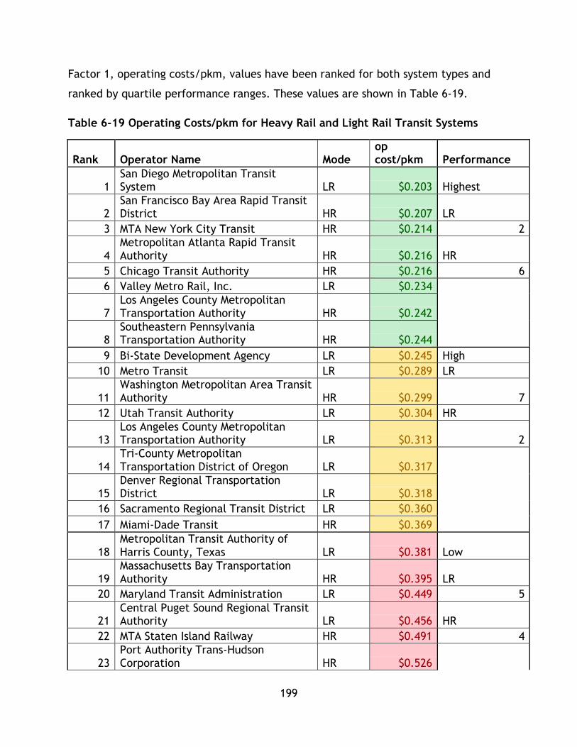
199
Factor 1, operating costs/pkm, values have been ranked for both system types and
ranked by quartile performance ranges. These values are shown in Table 6-19.
Table 6-19 Operating Costs/pkm for Heavy Rail and Light Rail Transit Systems
Rank Operator Name Mode op cost/pkm Performance
1 San Diego Metropolitan Transit System LR $0.203 Highest
2 San Francisco Bay Area Rapid Transit District HR $0.207 LR
3 MTA New York City Transit HR $0.214 2
4 Metropolitan Atlanta Rapid Transit Authority HR $0.216 HR
5 Chicago Transit Authority HR $0.216 6
6 Valley Metro Rail, Inc. LR $0.234
7 Los Angeles County Metropolitan Transportation Authority HR $0.242
8 Southeastern Pennsylvania Transportation Authority HR $0.244
9 Bi-State Development Agency LR $0.245 High
10 Metro Transit LR $0.289 LR
11 Washington Metropolitan Area Transit Authority HR $0.299 7
12 Utah Transit Authority LR $0.304 HR
13 Los Angeles County Metropolitan Transportation Authority LR $0.313 2
14 Tri-County Metropolitan Transportation District of Oregon LR $0.317
15 Denver Regional Transportation District LR $0.318
16 Sacramento Regional Transit District LR $0.360
17 Miami-Dade Transit HR $0.369
18 Metropolitan Transit Authority of Harris County, Texas LR $0.381 Low
19 Massachusetts Bay Transportation Authority HR $0.395 LR
20 Maryland Transit Administration LR $0.449 5
21 Central Puget Sound Regional Transit Authority LR $0.456 HR
22 MTA Staten Island Railway HR $0.491 4
23 Port Authority Trans-Hudson Corporation HR $0.526
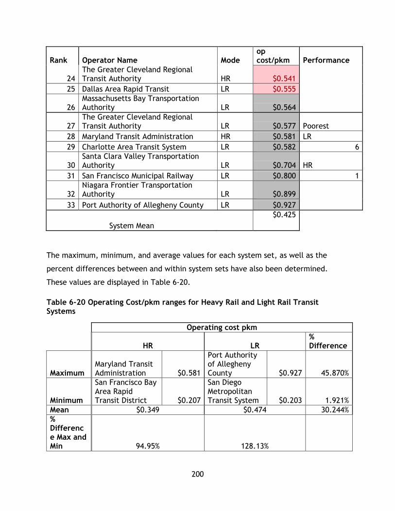
200
Rank Operator Name Mode op cost/pkm Performance
24 The Greater Cleveland Regional Transit Authority HR $0.541
25 Dallas Area Rapid Transit LR $0.555
26 Massachusetts Bay Transportation Authority LR $0.564
27 The Greater Cleveland Regional Transit Authority LR $0.577 Poorest
28 Maryland Transit Administration HR $0.581 LR
29 Charlotte Area Transit System LR $0.582 6
30 Santa Clara Valley Transportation Authority LR $0.704 HR
31 San Francisco Municipal Railway LR $0.800 1
32 Niagara Frontier Transportation Authority LR $0.899
33 Port Authority of Allegheny County LR $0.927
System Mean
$0.425
The maximum, minimum, and average values for each system set, as well as the
percent differences between and within system sets have also been determined.
These values are displayed in Table 6-20.
Table 6-20 Operating Cost/pkm ranges for Heavy Rail and Light Rail Transit Systems
Operating cost pkm
HR LR
% Difference
Maximum Maryland Transit Administration $0.581
Port Authority of Allegheny County $0.927 45.870%
Minimum
San Francisco Bay Area Rapid Transit District $0.207
San Diego Metropolitan Transit System $0.203 1.921%
Mean $0.349 $0.474 30.244%
% Difference Max and Min 94.95% 128.13%
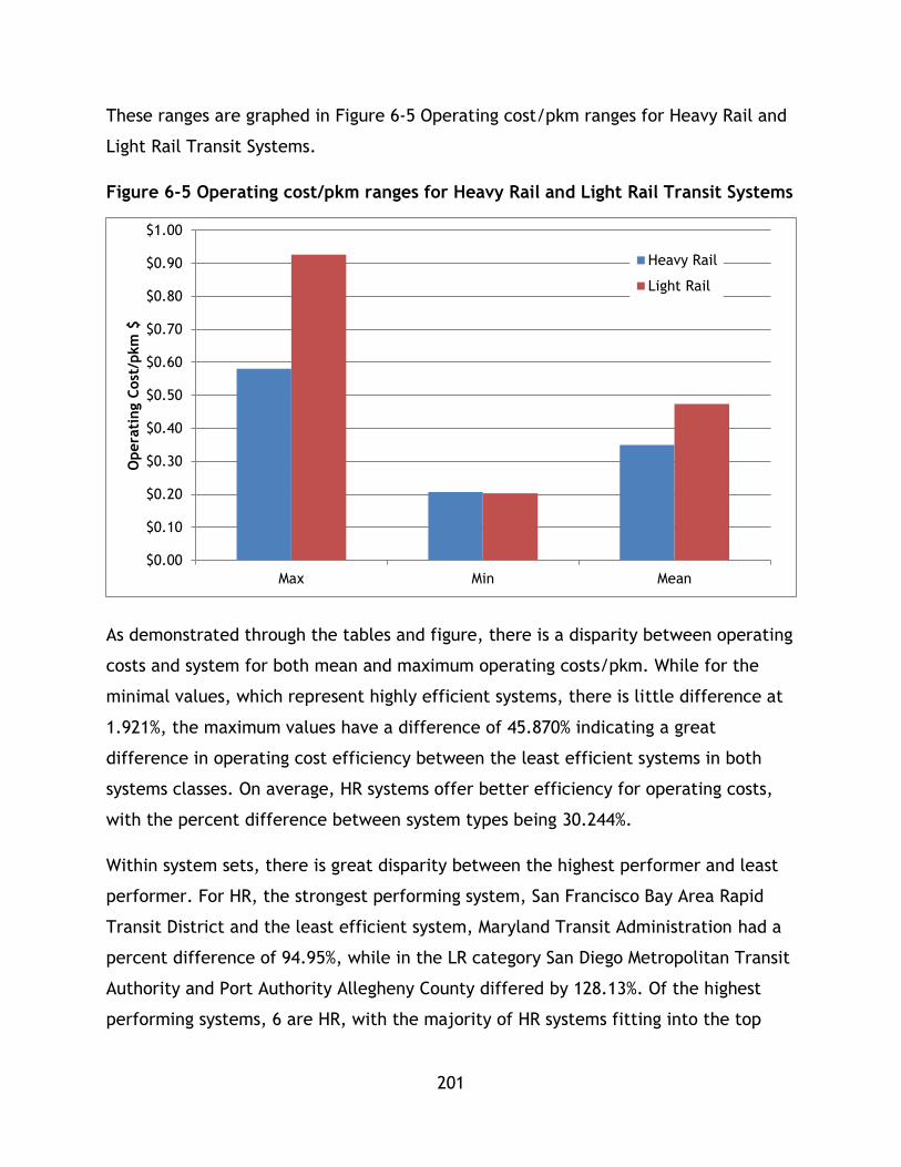
201
These ranges are graphed in Figure 6-5 Operating cost/pkm ranges for Heavy Rail and
Light Rail Transit Systems.
Figure 6-5 Operating cost/pkm ranges for Heavy Rail and Light Rail Transit Systems
As demonstrated through the tables and figure, there is a disparity between operating
costs and system for both mean and maximum operating costs/pkm. While for the
minimal values, which represent highly efficient systems, there is little difference at
1.921%, the maximum values have a difference of 45.870% indicating a great
difference in operating cost efficiency between the least efficient systems in both
systems classes. On average, HR systems offer better efficiency for operating costs,
with the percent difference between system types being 30.244%.
Within system sets, there is great disparity between the highest performer and least
performer. For HR, the strongest performing system, San Francisco Bay Area Rapid
Transit District and the least efficient system, Maryland Transit Administration had a
percent difference of 94.95%, while in the LR category San Diego Metropolitan Transit
Authority and Port Authority Allegheny County differed by 128.13%. Of the highest
performing systems, 6 are HR, with the majority of HR systems fitting into the top
$0.00
$0.10
$0.20
$0.30
$0.40
$0.50
$0.60
$0.70
$0.80
$0.90
$1.00
Max Min Mean
Opera
ting C
ost
/pkm
$
Heavy Rail
Light Rail

202
two performance categories. In general, HR offer better cost performance overall
compared to LR systems based on ranking and range performance.
To further explore system cost performance, two graphs have been generated. Figure 6-6 uses a log scale graph to show all systems on one figure, while
Figure 6-7 shows 33 systems, excluding MTA New York to show the 33 systems on a
regular scale graph.

203
Figure 6-6 Log Scale Passenger Kilometres Travelled and Operating Costs for Propulsion for Heavy Rail and Light Rail Transit Systems
y = 15.507x0.81
R² = 0.9693
y = 48.033x0.7454
R² = 0.7493
$0.00
$500,000,000.00
$1,000,000,000.00
$1,500,000,000.00
$2,000,000,000.00
$2,500,000,000.00
$3,000,000,000.00
$3,500,000,000.00
$4,000,000,000.00
1,000,000.00 10,000,000.00 100,000,000.00 1,000,000,000.00 10,000,000,000.00
Opera
ting c
ost
($)
Passenger Kilometres Travelled (km)
Heavy Rail
Light Rail
Power (HeavyRail)
Power (LightRail)
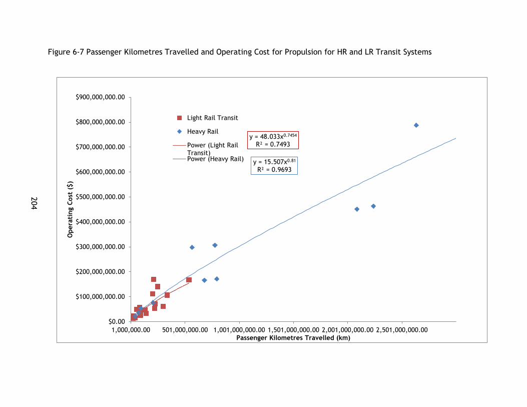
204
Figure 6-7 Passenger Kilometres Travelled and Operating Cost for Propulsion for HR and LR Transit Systems
y = 48.033x0.7454
R² = 0.7493
y = 15.507x0.81
R² = 0.9693
$0.00
$100,000,000.00
$200,000,000.00
$300,000,000.00
$400,000,000.00
$500,000,000.00
$600,000,000.00
$700,000,000.00
$800,000,000.00
$900,000,000.00
1,000,000.00 501,000,000.00 1,001,000,000.00 1,501,000,000.00 2,001,000,000.00 2,501,000,000.00
Opera
ting C
ost
($)
Passenger Kilometres Travelled (km)
Light Rail Transit
Heavy Rail
Power (Light RailTransit)Power (Heavy Rail)

205
As noted in the figures, the trend is for LR systems to present lower operating costs
per passenger km travelled than HR systems. Both trend lines present high r square
values indicating a high level of fit. This result is in contrast to the high performance
and average operating cost/pkm findings for the range analysis above. This may be
due to the strong performance of high performance systems in the LR category
influencing the trend line. Similar to the energy discussion, no data points exist for
high pkm LR systems so it is important to note that this trend line may not be
extrapolated to higher capacity systems. As operating costs are determined by
maintenance, labour, and other fees paid by the operator to provide transit service
that are outside of the scope of this study, further research can supplement this
rudimentary analysis.
It is important to note that factors that influence operating costs, such as labour
costs, material costs, and cost of fuel/energy may be influenced by regional or local
factors which are not analyzed within this study. While there is a trend showing lower
operating costs, in general, for LR systems on the graphs, there are other factors that
need to be included in future studies that take into account local impacts on
operating costs that go beyond mode choice.
The second factor, average travel time, which represents the time cost incurred per
trip on average by system users is displayed from least travel time to most travel time
and ranked by performance level for each system in Table 6-21. These values are also
graphed in Figure 6-8 indicating the full range of values for average travel time across
both system sets.
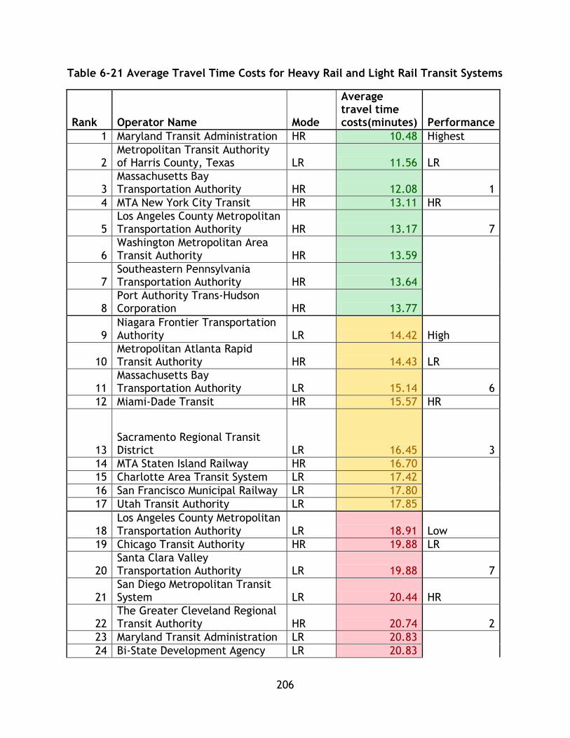
206
Table 6-21 Average Travel Time Costs for Heavy Rail and Light Rail Transit Systems
Rank Operator Name Mode
Average travel time costs(minutes) Performance
1 Maryland Transit Administration HR 10.48 Highest
2 Metropolitan Transit Authority of Harris County, Texas LR 11.56 LR
3 Massachusetts Bay Transportation Authority HR 12.08 1
4 MTA New York City Transit HR 13.11 HR
5 Los Angeles County Metropolitan Transportation Authority HR 13.17 7
6 Washington Metropolitan Area Transit Authority HR 13.59
7 Southeastern Pennsylvania Transportation Authority HR 13.64
8 Port Authority Trans-Hudson Corporation HR 13.77
9 Niagara Frontier Transportation Authority LR 14.42 High
10 Metropolitan Atlanta Rapid Transit Authority HR 14.43 LR
11 Massachusetts Bay Transportation Authority LR 15.14 6
12 Miami-Dade Transit HR 15.57 HR
13 Sacramento Regional Transit District LR 16.45 3
14 MTA Staten Island Railway HR 16.70
15 Charlotte Area Transit System LR 17.42
16 San Francisco Municipal Railway LR 17.80
17 Utah Transit Authority LR 17.85
18 Los Angeles County Metropolitan Transportation Authority LR 18.91 Low
19 Chicago Transit Authority HR 19.88 LR
20 Santa Clara Valley Transportation Authority LR 19.88 7
21 San Diego Metropolitan Transit System LR 20.44 HR
22 The Greater Cleveland Regional Transit Authority HR 20.74 2
23 Maryland Transit Administration LR 20.83
24 Bi-State Development Agency LR 20.83
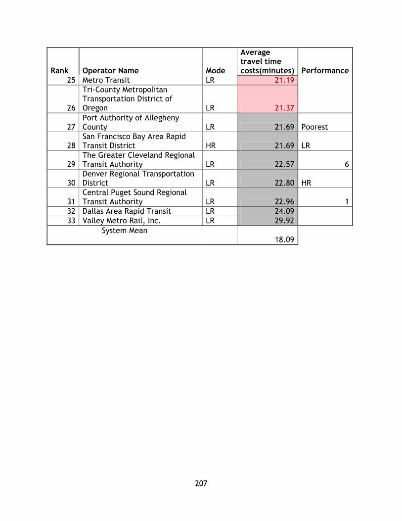
207
Rank Operator Name Mode
Average travel time costs(minutes) Performance
25 Metro Transit LR 21.19
26
Tri-County Metropolitan Transportation District of Oregon LR 21.37
27 Port Authority of Allegheny County LR 21.69 Poorest
28 San Francisco Bay Area Rapid Transit District HR 21.69 LR
29 The Greater Cleveland Regional Transit Authority LR 22.57 6
30 Denver Regional Transportation District LR 22.80 HR
31 Central Puget Sound Regional Transit Authority LR 22.96 1
32 Dallas Area Rapid Transit LR 24.09
33 Valley Metro Rail, Inc. LR 29.92
System Mean 18.09
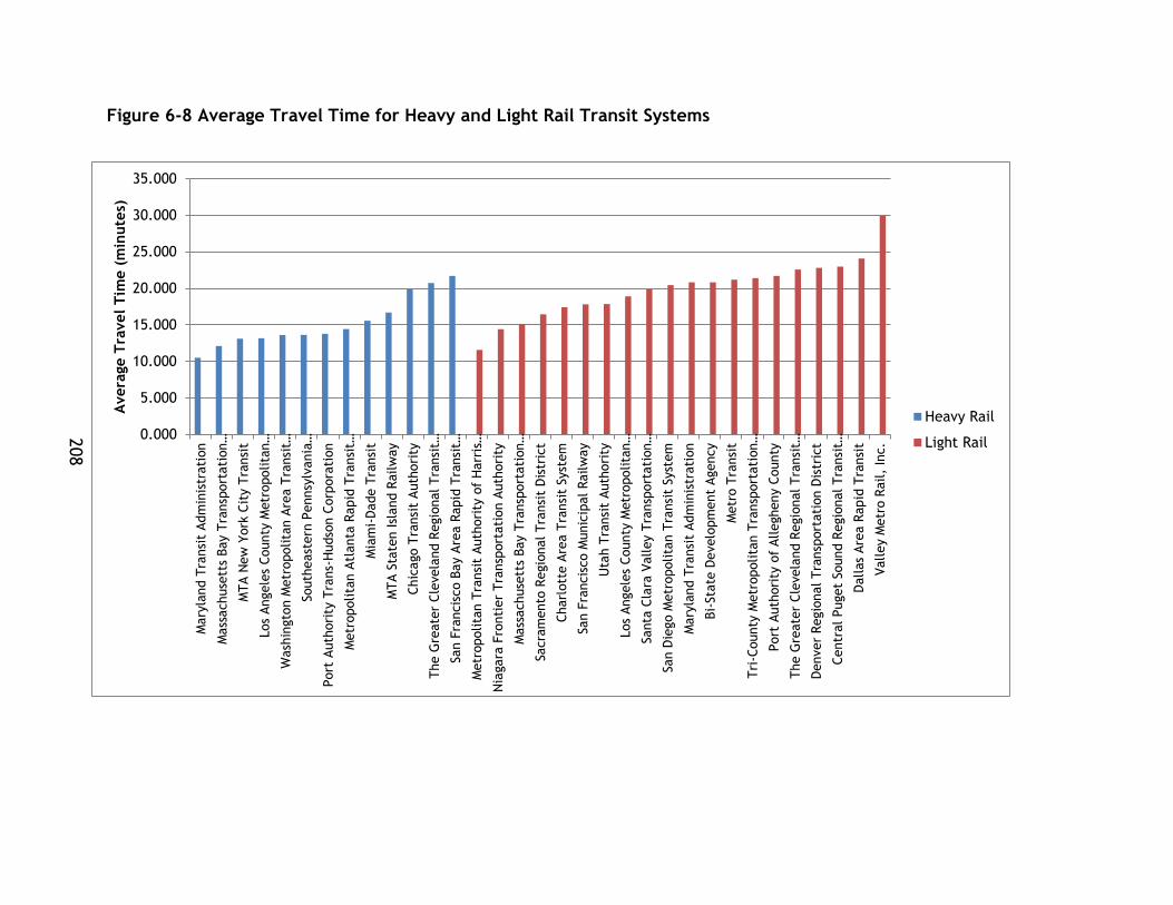
208
Figure 6-8 Average Travel Time for Heavy and Light Rail Transit Systems
0.000
5.000
10.000
15.000
20.000
25.000
30.000
35.000
Mary
land T
ransi
t Adm
inis
trati
on
Mass
achuse
tts
Bay T
ransp
ort
ati
on…
MTA N
ew
York
Cit
y T
ransi
t
Los
Angele
s County
Metr
opolita
n…
Wash
ingto
n M
etr
opolita
n A
rea T
ransi
t…
South
east
ern
Pennsy
lvania
…
Port
Auth
ori
ty T
rans-
Hudso
n C
orp
ora
tion
Metr
opolita
n A
tlanta
Rapid
Tra
nsi
t…
Mia
mi-
Dade T
ransi
t
MTA S
tate
n Isl
and R
ailw
ay
Chic
ago T
ransi
t Auth
ori
ty
The G
reate
r Cle
vela
nd R
egio
nal Tra
nsi
t…
San F
rancis
co B
ay A
rea R
apid
Tra
nsi
t…
Metr
opolita
n T
ransi
t Auth
ori
ty o
f H
arr
is…
Nia
gara
Fro
nti
er
Tra
nsp
ort
ati
on A
uth
ori
ty
Mass
achuse
tts
Bay T
ransp
ort
ati
on…
Sacra
mento
Regio
nal Tra
nsi
t D
istr
ict
Charl
ott
e A
rea T
ransi
t Syst
em
San F
rancis
co M
unic
ipal Railw
ay
Uta
h T
ransi
t Auth
ori
ty
Los
Angele
s County
Metr
opolita
n…
Santa
Cla
ra V
alley T
ransp
ort
ati
on…
San D
iego M
etr
opolita
n T
ransi
t Syst
em
Mary
land T
ransi
t Adm
inis
trati
on
Bi-
Sta
te D
evelo
pm
ent
Agency
Metr
o T
ransi
t
Tri
-County
Metr
opolita
n T
ransp
ort
ati
on…
Port
Auth
ori
ty o
f Allegheny C
ounty
The G
reate
r Cle
vela
nd R
egio
nal Tra
nsi
t…
Denver
Regio
nal Tra
nsp
ort
ati
on D
istr
ict
Centr
al Puget
Sound R
egio
nal Tra
nsi
t…
Dallas
Are
a R
apid
Tra
nsi
t
Valley M
etr
o R
ail,
Inc.
Avera
ge T
ravel
Tim
e (
min
ute
s)
Heavy Rail
Light Rail
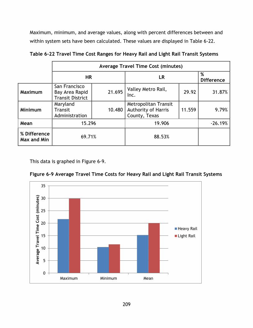
209
Maximum, minimum, and average values, along with percent differences between and
within system sets have been calculated. These values are displayed in Table 6-22.
Table 6-22 Travel Time Cost Ranges for Heavy Rail and Light Rail Transit Systems
Average Travel Time Cost (minutes)
HR LR % Difference
Maximum San Francisco Bay Area Rapid Transit District
21.695 Valley Metro Rail, Inc.
29.92 31.87%
Minimum Maryland Transit Administration
10.480 Metropolitan Transit Authority of Harris County, Texas
11.559 9.79%
Mean 15.296 19.906 -26.19%
% Difference Max and Min
69.71% 88.53%
This data is graphed in Figure 6-9.
Figure 6-9 Average Travel Time Costs for Heavy Rail and Light Rail Transit Systems
0
5
10
15
20
25
30
35
Maximum Minimum Mean
Avera
ge T
ravel
Tim
e C
ost
(m
inute
s)
Heavy Rail
Light Rail
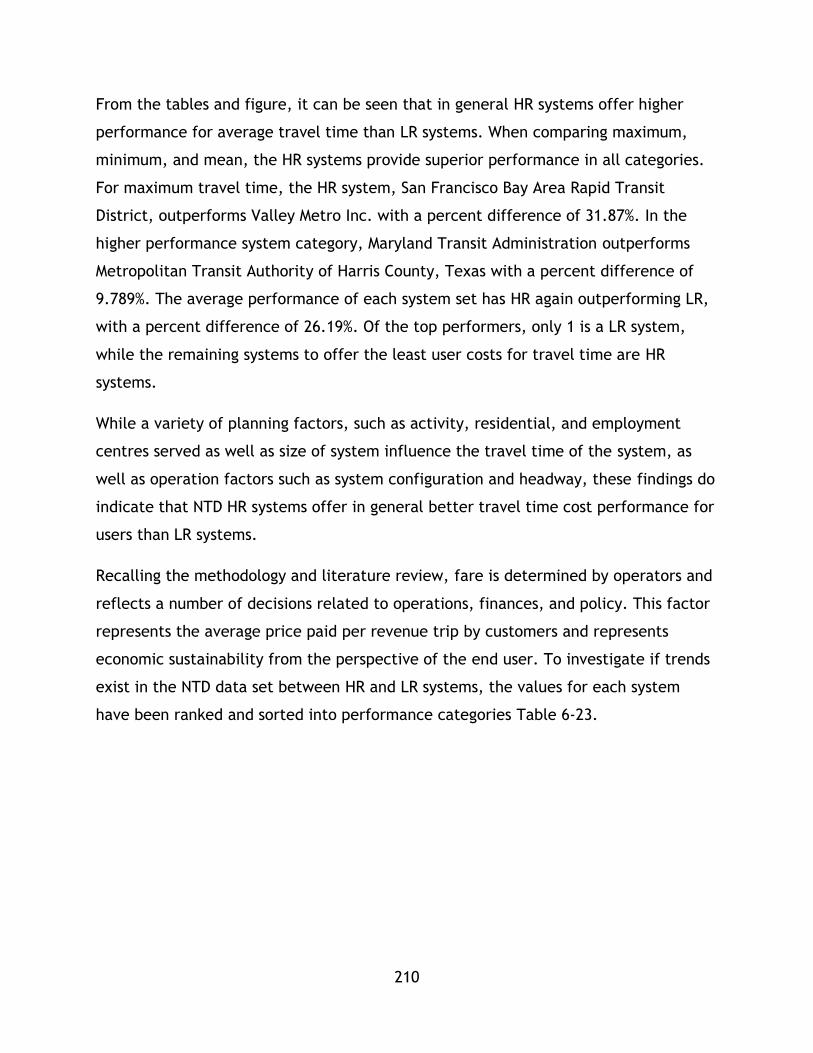
210
From the tables and figure, it can be seen that in general HR systems offer higher
performance for average travel time than LR systems. When comparing maximum,
minimum, and mean, the HR systems provide superior performance in all categories.
For maximum travel time, the HR system, San Francisco Bay Area Rapid Transit
District, outperforms Valley Metro Inc. with a percent difference of 31.87%. In the
higher performance system category, Maryland Transit Administration outperforms
Metropolitan Transit Authority of Harris County, Texas with a percent difference of
9.789%. The average performance of each system set has HR again outperforming LR,
with a percent difference of 26.19%. Of the top performers, only 1 is a LR system,
while the remaining systems to offer the least user costs for travel time are HR
systems.
While a variety of planning factors, such as activity, residential, and employment
centres served as well as size of system influence the travel time of the system, as
well as operation factors such as system configuration and headway, these findings do
indicate that NTD HR systems offer in general better travel time cost performance for
users than LR systems.
Recalling the methodology and literature review, fare is determined by operators and
reflects a number of decisions related to operations, finances, and policy. This factor
represents the average price paid per revenue trip by customers and represents
economic sustainability from the perspective of the end user. To investigate if trends
exist in the NTD data set between HR and LR systems, the values for each system
have been ranked and sorted into performance categories Table 6-23.

211
Table 6-23 Average User Fare Cost for Heavy Rail and Light Rail Transit Systems
Rank Operator Name Mode
Average User Fare Cost ($ USD) Performance
1 Metropolitan Transit Authority of Harris County, Texas LR $0.55 Highest
2 Los Angeles County Metropolitan Transportation Authority LR $0.66 LR
3 Niagara Frontier Transportation Authority LR $0.72 6
4 Los Angeles County Metropolitan Transportation Authority HR $0.73 HR
5 Metropolitan Atlanta Rapid Transit Authority HR $0.76 2
6 Valley Metro Rail, Inc. LR $0.76
7 San Francisco Municipal Railway LR $0.77
8 Utah Transit Authority LR $0.78
9 Dallas Area Rapid Transit LR $0.79 High
10 MTA Staten Island Railway HR $0.85 LR
11 Maryland Transit Administration HR $0.86 5
12 Maryland Transit Administration LR $0.87 HR
13 Tri-County Metropolitan Transportation District of Oregon LR $0.87 4
14 Santa Clara Valley Transportation Authority LR $0.88
15 Southeastern Pennsylvania Transportation Authority HR $0.89
16 Sacramento Regional Transit District LR $0.94
17 MTA New York City Transit HR $0.98
18 Charlotte Area Transit System LR $0.99 Low
19 Metro Transit LR $0.99 LR
20 Miami-Dade Transit HR $1.03 7
21 Massachusetts Bay Transportation Authority LR $1.06 HR
22 Bi-State Development Agency LR $1.08 2
23 San Diego Metropolitan Transit System LR $1.08
24 Massachusetts Bay Transportation Authority HR 1.10
25 Denver Regional Transportation District LR $1.11
26 The Greater Cleveland Regional Transit Authority LR $1.11

212
Rank Operator Name Mode
Average User Fare Cost ($ USD) Performance
27 The Greater Cleveland Regional Transit Authority HR $1.11 Poorest
28 Port Authority of Allegheny County LR $1.13 LR
29 Chicago Transit Authority HR $1.14 2
30 Central Puget Sound Regional Transit Authority LR $1.23 HR
31 Port Authority Trans-Hudson Corporation HR $1.26 5
32 Washington Metropolitan Area Transit Authority HR $1.70
33 San Francisco Bay Area Rapid Transit District HR $3.06
System Mean $1.03
These values are represented in Figure 6-10.
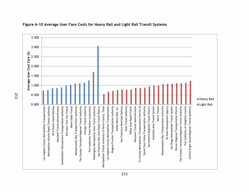
213
213
Figure 6-10 Average User Fare Costs for Heavy Rail and Light Rail Transit Systems
0.000
0.500
1.000
1.500
2.000
2.500
3.000
3.500
Los
Angele
s County
Metr
opolita
n T
ransp
ort
ati
on…
Metr
opolita
n A
tlanta
Rapid
Tra
nsi
t Auth
ori
ty
MTA S
tate
n Isl
and R
ailw
ay
Mary
land T
ransi
t Adm
inis
trati
on
South
east
ern
Pennsy
lvania
Tra
nsp
ort
ati
on A
uth
ori
ty
MTA N
ew
York
Cit
y T
ransi
t
Mia
mi-
Dade T
ransi
t
Mass
achuse
tts
Bay T
ransp
ort
ati
on A
uth
ori
ty
The G
reate
r Cle
vela
nd R
egio
nal Tra
nsi
t Auth
ori
ty
Chic
ago T
ransi
t Auth
ori
ty
Port
Auth
ori
ty T
rans-
Hudso
n C
orp
ora
tion
Wash
ingto
n M
etr
opolita
n A
rea T
ransi
t Auth
ori
ty
San F
rancis
co B
ay A
rea R
apid
Tra
nsi
t D
istr
ict
Metr
opolita
n T
ransi
t Auth
ori
ty o
f H
arr
is C
ounty
, Texas
Los
Angele
s County
Metr
opolita
n T
ransp
ort
ati
on…
Nia
gara
Fro
nti
er
Tra
nsp
ort
ati
on A
uth
ori
ty
Valley M
etr
o R
ail,
Inc.
San F
rancis
co M
unic
ipal Railw
ay
Uta
h T
ransi
t Auth
ori
ty
Dallas
Are
a R
apid
Tra
nsi
t
Mary
land T
ransi
t Adm
inis
trati
on
Tri
-County
Metr
opolita
n T
ransp
ort
ati
on D
istr
ict
of…
Santa
Cla
ra V
alley T
ransp
ort
ati
on A
uth
ori
ty
Sacra
mento
Regio
nal Tra
nsi
t D
istr
ict
Charl
ott
e A
rea T
ransi
t Syst
em
Metr
o T
ransi
t
Mass
achuse
tts
Bay T
ransp
ort
ati
on A
uth
ori
ty
Bi-
Sta
te D
evelo
pm
ent
Agency
San D
iego M
etr
opolita
n T
ransi
t Syst
em
Denver
Regio
nal Tra
nsp
ort
ati
on D
istr
ict
The G
reate
r Cle
vela
nd R
egio
nal Tra
nsi
t Auth
ori
ty
Port
Auth
ori
ty o
f Allegheny C
ounty
Centr
al Puget
Sound R
egio
nal Tra
nsi
t Auth
ori
ty
Avera
ge U
ser
Cost
Fare
($)
Heavy Rail
Light Rail

214
The maximum, minimum, and average values for each mode, as well as percent
differences within and between system modes are presented in Table 6-24
Table 6-24 Average User Fare Cost Ranges for Heavy Rail and Light Rail Transit Systems
Average User Fare Cost ($)
HR LR
% Difference
Maximum San Francisco Bay Area Rapid Transit District $3.06
Central Puget Sound Regional Transit Authority $1.23 85.515%
Minimum
Los Angeles County Metropolitan Transportation Authority $0.73
Metropolitan Transit Authority of Harris County, Texas $0.56 29.028%
Mean $1.19 $0.92 25.70%
% Difference Max and Min 122.93% 74.86%
This data is graphed in Figure 6-11.
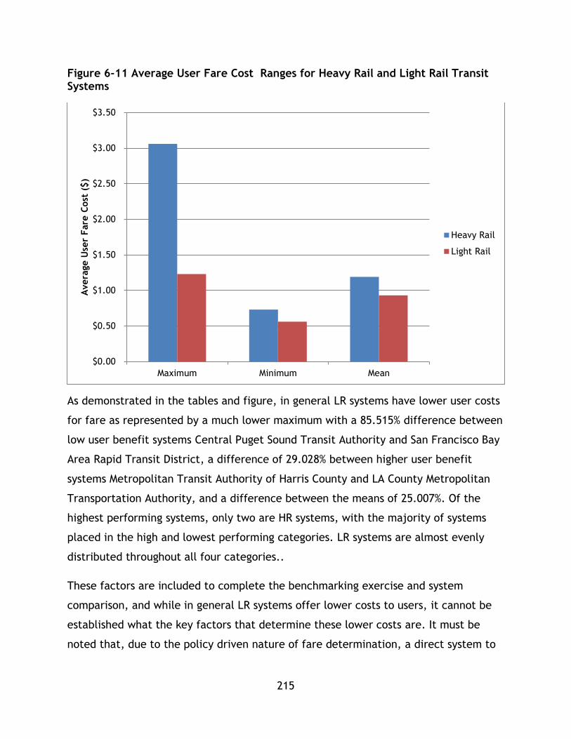
215
Figure 6-11 Average User Fare Cost Ranges for Heavy Rail and Light Rail Transit Systems
As demonstrated in the tables and figure, in general LR systems have lower user costs
for fare as represented by a much lower maximum with a 85.515% difference between
low user benefit systems Central Puget Sound Transit Authority and San Francisco Bay
Area Rapid Transit District, a difference of 29.028% between higher user benefit
systems Metropolitan Transit Authority of Harris County and LA County Metropolitan
Transportation Authority, and a difference between the means of 25.007%. Of the
highest performing systems, only two are HR systems, with the majority of systems
placed in the high and lowest performing categories. LR systems are almost evenly
distributed throughout all four categories..
These factors are included to complete the benchmarking exercise and system
comparison, and while in general LR systems offer lower costs to users, it cannot be
established what the key factors that determine these lower costs are. It must be
noted that, due to the policy driven nature of fare determination, a direct system to
$0.00
$0.50
$1.00
$1.50
$2.00
$2.50
$3.00
$3.50
Maximum Minimum Mean
Avera
ge U
ser
Fare
Cost
($)
Heavy Rail
Light Rail

216
system comparison must be complemented with further research into other factors
and hence no trends can be firmly established with this data.
The fourth factor represents the recovery of operating costs from user fees. The
systems have been ranked and sorted by recovery % in Table 6-25.
Table 6-25 Fare Recovery of Operating cost for Heavy Rail and Light Rail Transit Systems
Rank Operator Name Mode Recovery (%) Performance
1 MTA New York City Transit HR 71.68% Highest
2 San Francisco Bay Area Rapid Transit District HR 71.56% LR
3 Washington Metropolitan Area Transit Authority HR 61.96% 2
4 San Diego Metropolitan Transit System LR 54.26% HR
5 Chicago Transit Authority HR 53.07% 6
6 Southeastern Pennsylvania Transportation Authority HR 51.12%
7 Massachusetts Bay Transportation Authority HR 49.98%
8 Massachusetts Bay Transportation Authority LR 49.47%
9 Metro Transit LR 40.26% High
10 Metropolitan Transit Authority of Harris County, Texas LR 39.06% LR
11 Los Angeles County Metropolitan Transportation Authority HR 38.73% 6
12 Utah Transit Authority LR 37.18% HR
13 Port Authority Trans-Hudson Corporation HR 35.14% 3
14 Tri-County Metropolitan Transportation District of Oregon LR 34.70%
15 Metropolitan Atlanta Rapid Transit Authority HR 34.27%
16 Bi-State Development Agency LR 31.55%
17 Denver Regional Transportation District LR 31.12%
18 Sacramento Regional Transit District LR 30.21% Low
19 Valley Metro Rail, Inc. LR 28.08% LR

217
Rank Operator Name Mode Recovery (%) Performance
20 Miami-Dade Transit HR 23.40% 7
21 Central Puget Sound Regional Transit Authority LR 23.22% HR
22 San Francisco Municipal Railway LR 22.51% 2
23 Maryland Transit Administration HR 21.42%
24 The Greater Cleveland Regional Transit Authority LR 20.36%
25 Charlotte Area Transit System LR 20.02%
26 Niagara Frontier Transportation Authority LR 19.08%
27 MTA Staten Island Railway HR 18.30% Poorest
28 Los Angeles County Metropolitan Transportation Authority LR 18.30% LR
29 The Greater Cleveland Regional Transit Authority HR 18.03% 5
30 Maryland Transit Administration LR 17.80% HR
31 Port Authority of Allegheny County LR 15.79% 2
32 Santa Clara Valley Transportation Authority LR 15.19%
33 Dallas Area Rapid Transit LR 12.62%
System Mean 33.62%
These values have been graphed in Figure 6-12:

218
Figure 6-12 Economic Recovery from Fares for Heavy Rail and Light Rail Transit Systems
0.00%
10.00%
20.00%
30.00%
40.00%
50.00%
60.00%
70.00%
80.00%
MTA N
ew
York
Cit
y T
ransi
t
San F
rancis
co B
ay A
rea R
apid
Tra
nsi
t…
Wash
ingto
n M
etr
opolita
n A
rea T
ransi
t…
Chic
ago T
ransi
t Auth
ori
ty
South
east
ern
Pennsy
lvania
…
Mass
achuse
tts
Bay T
ransp
ort
ati
on…
Los
Angele
s County
Metr
opolita
n…
Port
Auth
ori
ty T
rans-
Hudso
n C
orp
ora
tion
Metr
opolita
n A
tlanta
Rapid
Tra
nsi
t…
Mia
mi-
Dade T
ransi
t
Mary
land T
ransi
t Adm
inis
trati
on
MTA S
tate
n Isl
and R
ailw
ay
The G
reate
r Cle
vela
nd R
egio
nal Tra
nsi
t…
San D
iego M
etr
opolita
n T
ransi
t Syst
em
Mass
achuse
tts
Bay T
ransp
ort
ati
on…
Metr
o T
ransi
t
Metr
opolita
n T
ransi
t A
uth
ori
ty o
f H
arr
is…
Uta
h T
ransi
t Auth
ori
ty
Tri
-County
Metr
opolita
n T
ransp
ort
ati
on…
Bi-
Sta
te D
evelo
pm
ent
Agency
Denver
Regio
nal Tra
nsp
ort
ati
on D
istr
ict
Sacra
mento
Regio
nal Tra
nsi
t D
istr
ict
Valley M
etr
o R
ail,
Inc.
Centr
al Puget
Sound R
egio
nal Tra
nsi
t…
San F
rancis
co M
unic
ipal
Railw
ay
The G
reate
r Cle
vela
nd R
egio
nal Tra
nsi
t…
Charl
ott
e A
rea T
ransi
t Syst
em
Nia
gara
Fro
nti
er
Tra
nsp
ort
ati
on…
Los
Angele
s County
Metr
opolita
n…
Mary
land T
ransi
t Adm
inis
trati
on
Port
Auth
ori
ty o
f Allegheny C
ounty
Santa
Cla
ra V
alley T
ransp
ort
ati
on…
Dallas
Are
a R
apid
Tra
nsi
t
Econom
ic R
ecovery
fro
m F
are
s (%
)
Heavy Rail
Light Rail
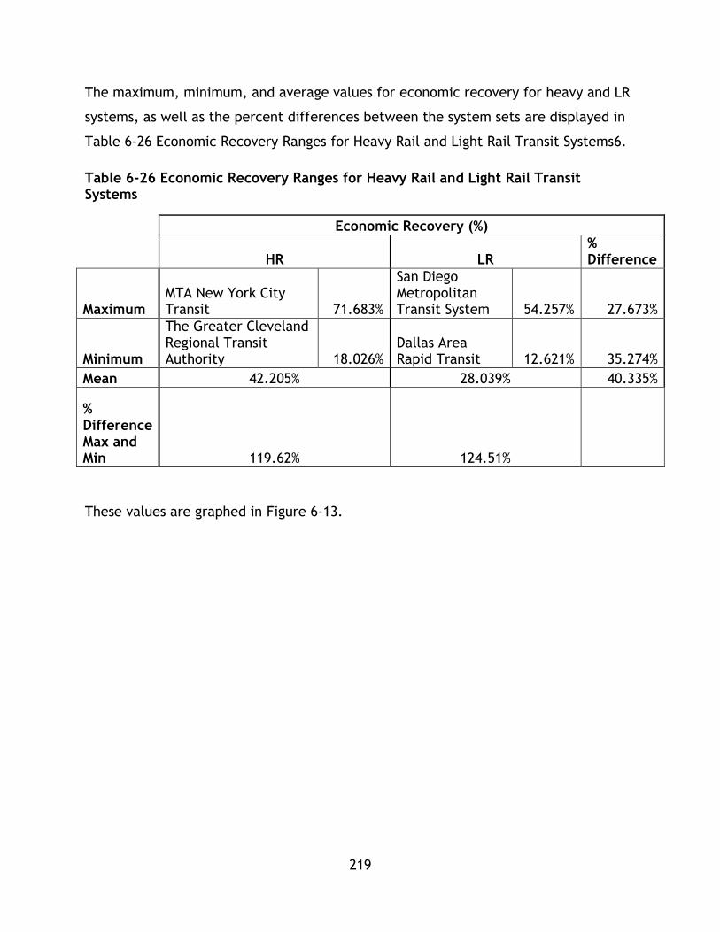
219
The maximum, minimum, and average values for economic recovery for heavy and LR
systems, as well as the percent differences between the system sets are displayed in
Table 6-26 Economic Recovery Ranges for Heavy Rail and Light Rail Transit Systems6.
Table 6-26 Economic Recovery Ranges for Heavy Rail and Light Rail Transit Systems
Economic Recovery (%)
HR LR
% Difference
Maximum MTA New York City Transit 71.683%
San Diego Metropolitan Transit System 54.257% 27.673%
Minimum
The Greater Cleveland Regional Transit Authority 18.026%
Dallas Area Rapid Transit 12.621% 35.274%
Mean 42.205% 28.039% 40.335%
% Difference Max and Min 119.62% 124.51%
These values are graphed in Figure 6-13.

220
Figure 6-13 Economic Recovery Ranges for Heavy Rail and Light Rail Transit Systems
Economic recovery performance varies between the system sets with HR systems
generally attaining higher levels of performance. The highest performing HR system,
MTA New York City Transit outperforms San Diego Metropolitan Transit System by
27.673%, while the lowest performing systems, The Greater Cleveland Regional
Transit Authority and Dallas Area Rapid Transit, have a percent difference of 35.274%.
The means of the system sets differ by 40.335% indicating the average performance of
HR systems exceeds LR for economic recovery. In the highest performance category 6
systems are HR and only 2 are LR. Similar to the previous factors, the initial finding
that HR systems offer superior performance will require additional follow up research
as other factors such as fare policy and planning/operational details of the system
influence revenue beyond mode choice.
The final economic factor in this study is pkm/GDP, which measures the amount of
transit utilization or transit travel generation with respect to economic activity in the
0.000%
10.000%
20.000%
30.000%
40.000%
50.000%
60.000%
70.000%
80.000%
Max Min Mean
Econom
ic R
ecovery
%
Heavy Rail
Light Rail
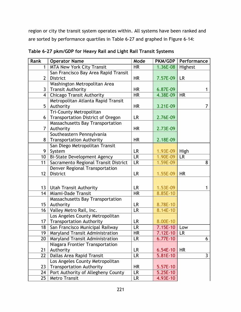
221
region or city the transit system operates within. All systems have been ranked and
are sorted by performance quartiles in Table 6-27 and graphed in Figure 6-14:
Table 6-27 pkm/GDP for Heavy Rail and Light Rail Transit Systems
Rank Operator Name Mode PKM/GDP Performance
1 MTA New York City Transit HR 1.36E-08 Highest
2 San Francisco Bay Area Rapid Transit District HR 7.57E-09 LR
3 Washington Metropolitan Area Transit Authority HR 6.87E-09 1
4 Chicago Transit Authority HR 4.38E-09 HR
5 Metropolitan Atlanta Rapid Transit Authority HR 3.21E-09 7
6 Tri-County Metropolitan Transportation District of Oregon LR 2.76E-09
7 Massachusetts Bay Transportation Authority HR 2.73E-09
8 Southeastern Pennsylvania Transportation Authority HR 2.18E-09
9 San Diego Metropolitan Transit System LR 1.93E-09 High
10 Bi-State Development Agency LR 1.90E-09 LR
11 Sacramento Regional Transit District LR 1.59E-09 8
12 Denver Regional Transportation District LR 1.55E-09 HR
13 Utah Transit Authority LR 1.53E-09 1
14 Miami-Dade Transit HR 8.85E-10
15 Massachusetts Bay Transportation Authority LR 8.78E-10
16 Valley Metro Rail, Inc. LR 8.14E-10
17 Los Angeles County Metropolitan Transportation Authority LR 8.00E-10
18 San Francisco Municipal Railway LR 7.15E-10 Low
19 Maryland Transit Administration HR 7.12E-10 LR
20 Maryland Transit Administration LR 6.77E-10 6
21 Niagara Frontier Transportation Authority LR 6.54E-10 HR
22 Dallas Area Rapid Transit LR 5.81E-10 3
23 Los Angeles County Metropolitan Transportation Authority HR 5.57E-10
24 Port Authority of Allegheny County LR 5.25E-10
25 Metro Transit LR 4.93E-10
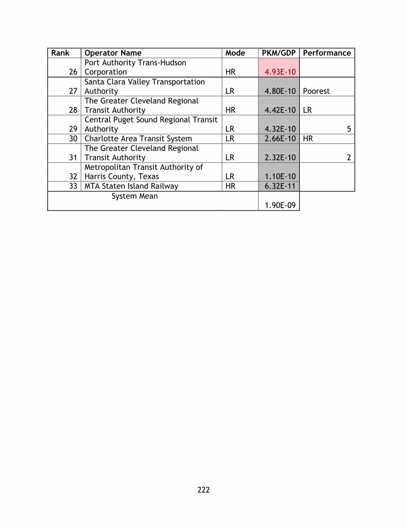
222
Rank Operator Name Mode PKM/GDP Performance
26 Port Authority Trans-Hudson Corporation HR 4.93E-10
27 Santa Clara Valley Transportation Authority LR 4.80E-10 Poorest
28 The Greater Cleveland Regional Transit Authority HR 4.42E-10 LR
29 Central Puget Sound Regional Transit Authority LR 4.32E-10 5
30 Charlotte Area Transit System LR 2.66E-10 HR
31 The Greater Cleveland Regional Transit Authority LR 2.32E-10 2
32 Metropolitan Transit Authority of Harris County, Texas LR 1.10E-10
33 MTA Staten Island Railway HR 6.32E-11
System Mean 1.90E-09

223
Figure 6-14 pkm/GDP for Heavy Rail and Light Rail Transit Systems
0.000E+00
2.000E-09
4.000E-09
6.000E-09
8.000E-09
1.000E-08
1.200E-08
1.400E-08
1.600E-08
MTA S
tate
n Isl
and R
ailw
ay
The G
reate
r Cle
vela
nd R
egio
nal Tra
nsi
t…
Port
Auth
ori
ty T
rans-
Hudso
n C
orp
ora
tion
Los
Angele
s County
Metr
opolita
n…
Mary
land T
ransi
t Adm
inis
trati
on
Mia
mi-
Dade T
ransi
t
South
east
ern
Pennsy
lvania
Tra
nsp
ort
ati
on…
Mass
achuse
tts
Bay T
ransp
ort
ati
on A
uth
ori
ty
Metr
opolita
n A
tlanta
Rapid
Tra
nsi
t…
Chic
ago T
ransi
t Auth
ori
ty
Wash
ingto
n M
etr
opolita
n A
rea T
ransi
t…
San F
rancis
co B
ay A
rea R
apid
Tra
nsi
t…
MTA N
ew
York
Cit
y T
ransi
t
Metr
opolita
n T
ransi
t A
uth
ori
ty o
f H
arr
is…
The G
reate
r Cle
vela
nd R
egio
nal Tra
nsi
t…
Charl
ott
e A
rea T
ransi
t Syst
em
Centr
al Puget
Sound R
egio
nal Tra
nsi
t…
Santa
Cla
ra V
alley T
ransp
ort
ati
on A
uth
ori
ty
Metr
o T
ransi
t
Port
Auth
ori
ty o
f Allegheny C
ounty
Dallas
Are
a R
apid
Tra
nsi
t
Nia
gara
Fro
nti
er
Tra
nsp
ort
ati
on A
uth
ori
ty
Mary
land T
ransi
t Adm
inis
trati
on
San F
rancis
co M
unic
ipal
Railw
ay
Los
Angele
s County
Metr
opolita
n…
Valley M
etr
o R
ail,
Inc.
Mass
achuse
tts
Bay T
ransp
ort
ati
on A
uth
ori
ty
Uta
h T
ransi
t Auth
ori
ty
Denver
Regio
nal Tra
nsp
ort
ati
on D
istr
ict
Sacra
mento
Regio
nal Tra
nsi
t D
istr
ict
Bi-
Sta
te D
evelo
pm
ent
Agency
San D
iego M
etr
opolita
n T
ransi
t Syst
em
Tri
-County
Metr
opolita
n T
ransp
ort
ati
on…
pkm
/GD
P (
$/k
m)
Heavy Rail
Light Rail
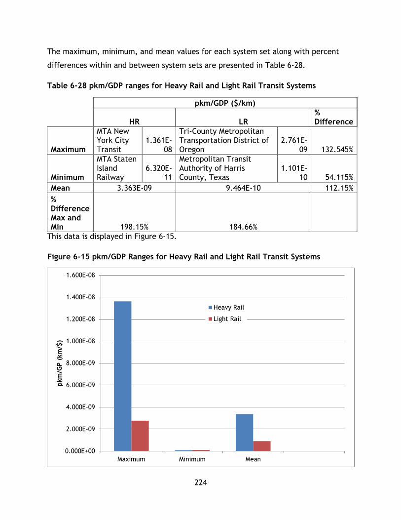
224
The maximum, minimum, and mean values for each system set along with percent
differences within and between system sets are presented in Table 6-28.
Table 6-28 pkm/GDP ranges for Heavy Rail and Light Rail Transit Systems
pkm/GDP ($/km)
HR LR
% Difference
Maximum
MTA New York City Transit
1.361E-08
Tri-County Metropolitan Transportation District of Oregon
2.761E-09 132.545%
Minimum
MTA Staten Island Railway
6.320E-11
Metropolitan Transit Authority of Harris County, Texas
1.101E-10 54.115%
Mean 3.363E-09 9.464E-10 112.15%
% Difference Max and Min 198.15% 184.66%
This data is displayed in Figure 6-15.
Figure 6-15 pkm/GDP Ranges for Heavy Rail and Light Rail Transit Systems
0.000E+00
2.000E-09
4.000E-09
6.000E-09
8.000E-09
1.000E-08
1.200E-08
1.400E-08
1.600E-08
Maximum Minimum Mean
pkm
/GP (
km
/$)
Heavy Rail
Light Rail
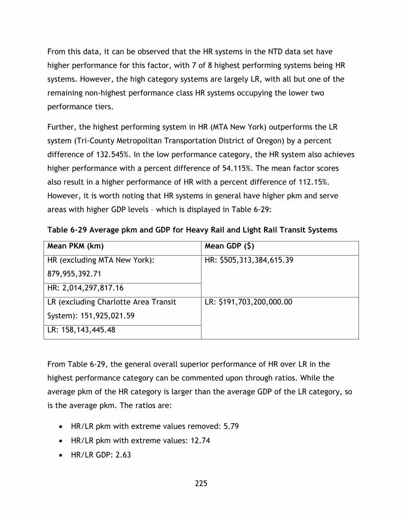
225
From this data, it can be observed that the HR systems in the NTD data set have
higher performance for this factor, with 7 of 8 highest performing systems being HR
systems. However, the high category systems are largely LR, with all but one of the
remaining non-highest performance class HR systems occupying the lower two
performance tiers.
Further, the highest performing system in HR (MTA New York) outperforms the LR
system (Tri-County Metropolitan Transportation District of Oregon) by a percent
difference of 132.545%. In the low performance category, the HR system also achieves
higher performance with a percent difference of 54.115%. The mean factor scores
also result in a higher performance of HR with a percent difference of 112.15%.
However, it is worth noting that HR systems in general have higher pkm and serve
areas with higher GDP levels – which is displayed in Table 6-29:
Table 6-29 Average pkm and GDP for Heavy Rail and Light Rail Transit Systems
Mean PKM (km) Mean GDP ($)
HR (excluding MTA New York):
879,955,392.71
HR: $505,313,384,615.39
HR: 2,014,297,817.16
LR (excluding Charlotte Area Transit
System): 151,925,021.59
LR: $191,703,200,000.00
LR: 158,143,445.48
From Table 6-29, the general overall superior performance of HR over LR in the
highest performance category can be commented upon through ratios. While the
average pkm of the HR category is larger than the average GDP of the LR category, so
is the average pkm. The ratios are:
HR/LR pkm with extreme values removed: 5.79
HR/LR pkm with extreme values: 12.74
HR/LR GDP: 2.63

226
With this rudimentary analysis, it can be seen that the much greater level of pkm
attained by HR systems, on average, compensates for the higher average GDP of the
areas served by the systems. This can explain the general superior performance of HR
systems for the pkm/GDP factor for the NTD data set systems – however, further
analysis is needed to understand the causation of this superior performance. This
factor aims to comment on the sustainability of the system for prevailing economic
conditions through its ability to create ridership.
It is important to note that this research is not focussing on transit-economic
contributions at this stage, but rather on benchmarking performance to determine if
performance patterns emerge in order to comment on the sustainability of different
transit systems. This factor does not seek to establish a link between economic
development and transit usage – it is not insinuating that HR systems or higher transit
usage stimulate economic development. Rather, it is solely measuring transit
utilization in relation to economic activity in the area served by transit. In this case,
for example, it could be argued that for a decision maker benchmarking to improve
LR service relative to economic sustainability in Metropolitan Transit Authority of
Harris County, Texas, improving the amount of ridership and pkm relative to
economic output in the service area could be a key factor. However, given the
complexity of economic analysis, this research does not comment on the ability of
transit to increase or decrease GDP.
To summarize and conclude, throughout all economic factors, further research is
required to determine causes of performance differences between modes. Five
economic factors have been analyzed and performance levels have been set for 33
transit systems from the NTD database – operating cost, average travel time, average
fare, recovery %, and pkm/GDP. In these factors, mixed performance results were
attained, with neither mode attaining a dominant performance standard throughout
the various analyses conducted. However, in general, HR systems were found to
achieve all around better performance in the highest performance category
throughout all factors except average fare cost. The results of analysis for each factor
are outlined in Table 6-30:

227
Table 6-30 Summary of Economic Analysis
Highest
Performance
Systems
Lowest
Performance
Systems
Mean Trend
Operating
Cost
HR systems
achieve better
performance
than LR.
HR systems
perform slightly
better than LR
systems.
HR mean value
indicates
better
performance.
LR trend
line
indicates
higher
efficiency
Average
Travel Time
HR systems
achieve much
greater
performance
than LR.
HR systems
achieve better
performance
than LR.
HR mean value
indicates
better
performance.
N/A
Average User
Fare
LR systems
achieve slightly
greater
performance
than HR.
LR attains
greater
performance
than HR.
LR mean value
indicates
better
performance.
N/A
Recovery % HR systems
achieve better
performance
than LR.
HR systems
perform slightly
better than LR
systems.
HR mean value
indicates
better
performance.
N/A
pkm/GDP HR systems
achieve better
performance
than LR.
HR systems
perform slightly
better than LR
systems.
HR mean value
indicates
better
performance.
N/A
Overall results indicate that in general, HR systems perform better overall in the
economic analysis than LR systems. This can be observed in factor by factor analysis
228
where HR outperforms LR under 4/5 factors. First, for the operating cost/pkm factor,
HR follows a distribution of 6,2,4,1 and LR follows a distribution of 2,7,5,6. Both
system sets have the majority of their systems in the higher two tiers, however HR is
better represented in the highest performance tier. Average travel time has a HR
distribution of 7,3,2,1 and LR distribution of 1,6,7,6. HR is most represented in the
top categories, while LR is most represented in the lowest, indicating better HR
performance. Next, for the average user fare factor, HR systems follow a 2, 4, 2, 5
distribution, with most systems falling into the lowest two categories, while LR follow
a 6,5,7,2 distribution with most systems in the highest two categories. This represents
higher performance by LR systems. Under the Fare Recovery factor HR had a 6,3, 2, 2
distribution, with the most systems in the highest performance categories. While LR
has a distribution of 2,6,7,5, with the middle categories representing the majority of
the systems. These distributions indicate general greater performance by HR systems.
For the pkm/GDP factor, HR systems showed a 7,1,3,2 distribution, with the highest
performance categories having the greatest representation of systems, while LR had a
1,8,6,5 with the middle performance categories having the greatest representation of
systems. This indicates that in general, HR offered better performance for this factor.
However, in factor 3, average fare, LR systems do in general outperform HR systems.
There is a gradient present in performance, meaning that regardless of mode,
systems can attain a high degree of performance across all factors. When generalized,
HR systems are able to achieve better results. This conclusion is a statement of
correlation, not a statement of causality. Again, all factors are based on a variety of
variables that are outside of the scope of this study, meaning future research needs
to account for this limitation.
6.5.3 Social Factors
In this methodology, three social factors were successfully computed using the NTD
dataset with some expansion. No factors are explicitly normalized. These factors all
assess accessibility in a unique way and are system accessibility, affordability, and
average journey length, which all reflect the transit system’s social sustainability.
Health impacts as well as more nuanced accessibility factors were not included in this
229
section of the study due to data limitations. The first factor, system accessibility,
reflects how well the transit system is integrated into the broader urban area and is a
proxy for the system’s ability to serve a diversity of trip needs. The second factor is a
proxy for accessibility through an economic exclusion lens by looking at how users
may be unable to pay and therefore excluded from using transit thus incurring social
costs, this factor relies on the same GDP data utilized in the economic section. The
final factor, average journey length measures accessibility from an individual lens
based on the individual journey length a user must travel to meet their needs. Table
6-31 displays the factors for all systems separated by mode.

230
Table 6-31 Social Factors for Heavy Rail and Light Rail Transit Systems
Operator Name System Accessibility
Affordability (fare/per capita GDP)
Average Journey Length (km)
User Accessibility
HR (
HR)
Massachusetts Bay Transportation Authority 0.043 1.762E-05 5.585 92.45%
MTA New York City Transit 2.489 1.619E-05 6.406 18.80%
Port Authority Trans-Hudson Corporation 0.073 2.076E-05 6.818 53.85%
MTA Staten Island Railway 0.188 1.406E-05 9.501 21.74%
Southeastern Pennsylvania Transportation Authority 0.586 1.710E-05 7.134 40.00%
Washington Metropolitan Area Transit Authority 0.223 2.474E-05 9.164 100.00%
Maryland Transit Administration 0.025 1.796E-05 6.897 100.00%
Metropolitan Atlanta Rapid Transit Authority 0.045 1.613E-05 10.211 100.00%
Miami-Dade Transit 0.015 2.447E-05 11.894 100.00%
The Greater Cleveland Regional Transit Authority 0.014 2.449E-05 11.392 72.22%
Chicago Transit Authority 1.003 2.254E-05 9.896 62.94%
San Francisco Bay Area Rapid Transit District 0.508 4.489E-05 20.669 100.00%
Los Angeles County Metropolitan Transportation Authority 0.007 1.397E-05 7.792 100.00%
LR (
LR)
Tri-County Metropolitan Transportation District of Oregon 0.173 1.590E-05 7.915 100.00%
Central Puget Sound Regional Transit Authority 0.153 2.011E-05 11.585 100.00%
Massachusetts Bay Transportation Authority 0.014 1.702E-05 3.815 48.65%

231
Operator Name System Accessibility
Affordability (fare/per capita GDP)
Average Journey Length (km)
User Accessibility
Niagara Frontier Transportation Authority 0.212 2.049E-05 4.218 100.00%
Port Authority of Allegheny County 0.014 2.581E-05 7.723 100.00%
Maryland Transit Administration 0.024 1.818E-05 10.872 100.00%
Charlotte Area Transit System 0.032 1.680E-05 8.479 100.00%
The Greater Cleveland Regional Transit Authority 0.007 2.449E-05 9.460 26.47%
Metro Transit 0.016 1.799E-05 8.518 100.00%
Metropolitan Transit Authority of Harris County, Texas 0.003 9.176E-06 3.664 100.00%
Dallas Area Rapid Transit 0.013 1.457E-05 11.339 100.00%
Bi-State Development Agency 0.049 2.616E-05 13.914 100.00%
Utah Transit Authority 0.173 1.452E-05 6.873 100.00%
Denver Regional Transportation District 0.087 1.942E-05 11.169 100.00%
Santa Clara Valley Transportation Authority 0.078 9.676E-06 8.253 100.00%
San Francisco Municipal Railway 2.060 1.131E-05 4.280 100.00%
Sacramento Regional Transit District 0.100 2.432E-05 8.668 97.92%
San Diego Metropolitan Transit System 0.000 2.162E-05 9.851 100.00%
Los Angeles County Metropolitan Transportation Authority 0.011 1.267E-05 11.559 100.00%
Valley Metro Rail, Inc. 0.023 1.848E-05 11.647 100.00%
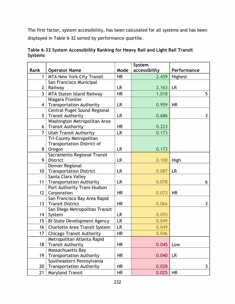
232
The first factor, system accessibility, has been calculated for all systems and has been
displayed in Table 6-32 sorted by performance quartile.
Table 6-32 System Accessibility Ranking for Heavy Rail and Light Rail Transit Systems
Rank Operator Name Mode System accessibility Performance
1 MTA New York City Transit HR 2.439 Highest
2 San Francisco Municipal Railway LR 2.163 LR
3 MTA Staten Island Railway HR 1.018 5
4 Niagara Frontier Transportation Authority LR 0.959 HR
5 Central Puget Sound Regional Transit Authority LR 0.686 3
6 Washington Metropolitan Area Transit Authority HR 0.223
7 Utah Transit Authority LR 0.173
8
Tri-County Metropolitan Transportation District of Oregon LR 0.173
9 Sacramento Regional Transit District LR 0.100 High
10 Denver Regional Transportation District LR 0.087 LR
11 Santa Clara Valley Transportation Authority LR 0.078 6
12 Port Authority Trans-Hudson Corporation HR 0.073 HR
13 San Francisco Bay Area Rapid Transit District HR 0.066 3
14 San Diego Metropolitan Transit System LR 0.055
15 Bi-State Development Agency LR 0.049
16 Charlotte Area Transit System LR 0.049
17 Chicago Transit Authority HR 0.046
18 Metropolitan Atlanta Rapid Transit Authority HR 0.045 Low
19 Massachusetts Bay Transportation Authority HR 0.040 LR
20 Southeastern Pennsylvania Transportation Authority HR 0.028 3
21 Maryland Transit HR 0.025 HR

233
Rank Operator Name Mode System accessibility Performance
Administration
22 Maryland Transit Administration LR 0.024 5
23 Valley Metro Rail, Inc. LR 0.023
24 Metro Transit LR 0.016
25 Miami-Dade Transit HR 0.015
26 Port Authority of Allegheny County LR 0.014 Poorest
27 The Greater Cleveland Regional Transit Authority HR 0.014 LR
28 Massachusetts Bay Transportation Authority LR 0.014 6
29 Dallas Area Rapid Transit LR 0.013 HR
30 Metropolitan Transit Authority of Harris County, Texas LR 0.012 2
31
Los Angeles County Metropolitan Transportation Authority LR 0.011
32
Los Angeles County Metropolitan Transportation Authority HR 0.007
33 The Greater Cleveland Regional Transit Authority LR 0.007
System Mean 0.27
Accessibility scores are also displayed by system in Figure 6-16.
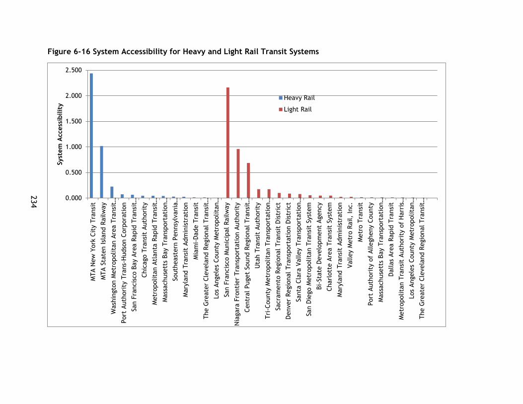
234
Figure 6-16 System Accessibility for Heavy and Light Rail Transit Systems
0.000
0.500
1.000
1.500
2.000
2.500
MTA N
ew
York
Cit
y T
ransi
t
MTA S
tate
n Isl
and R
ailw
ay
Wash
ingto
n M
etr
opolita
n A
rea T
ransi
t…
Port
Auth
ori
ty T
rans-
Hudso
n C
orp
ora
tion
San F
rancis
co B
ay A
rea R
apid
Tra
nsi
t…
Chic
ago T
ransi
t Auth
ori
ty
Metr
opolita
n A
tlanta
Rapid
Tra
nsi
t…
Mass
achuse
tts
Bay T
ransp
ort
ati
on…
South
east
ern
Pennsy
lvania
…
Mary
land T
ransi
t Adm
inis
trati
on
Mia
mi-
Dade T
ransi
t
The G
reate
r Cle
vela
nd R
egio
nal Tra
nsi
t…
Los
Angele
s County
Metr
opolita
n…
San F
rancis
co M
unic
ipal
Railw
ay
Nia
gara
Fro
nti
er
Tra
nsp
ort
ati
on A
uth
ori
ty
Centr
al Puget
Sound R
egio
nal Tra
nsi
t…
Uta
h T
ransi
t Auth
ori
ty
Tri
-County
Metr
opolita
n T
ransp
ort
ati
on…
Sacra
mento
Regio
nal Tra
nsi
t D
istr
ict
Denver
Regio
nal Tra
nsp
ort
ati
on D
istr
ict
Santa
Cla
ra V
alley T
ransp
ort
ati
on…
San D
iego M
etr
opolita
n T
ransi
t Syst
em
Bi-
Sta
te D
evelo
pm
ent
Agency
Charl
ott
e A
rea T
ransi
t Syst
em
Mary
land T
ransi
t Adm
inis
trati
on
Valley M
etr
o R
ail,
Inc.
Metr
o T
ransi
t
Port
Auth
ori
ty o
f Allegheny C
ounty
Mass
achuse
tts
Bay T
ransp
ort
ati
on…
Dallas
Are
a R
apid
Tra
nsi
t
Metr
opolita
n T
ransi
t A
uth
ori
ty o
f H
arr
is…
Los
Angele
s County
Metr
opolita
n…
The G
reate
r Cle
vela
nd R
egio
nal Tra
nsi
t…
Syst
em
Access
ibilit
y
Heavy Rail
Light Rail
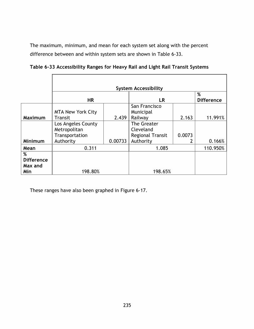
235
The maximum, minimum, and mean for each system set along with the percent
difference between and within system sets are shown in Table 6-33.
Table 6-33 Accessibility Ranges for Heavy Rail and Light Rail Transit Systems
System Accessibility
HR LR
% Difference
Maximum MTA New York City Transit 2.439
San Francisco Municipal Railway 2.163 11.991%
Minimum
Los Angeles County Metropolitan Transportation Authority 0.00733
The Greater Cleveland Regional Transit Authority
0.00732 0.166%
Mean 0.311 1.085 110.950%
% Difference Max and Min 198.80% 198.65%
These ranges have also been graphed in Figure 6-17.

236
Figure 6-17 Accessibility Factor for Heavy Rail and Light Rail Transit Systems
It can be observed from the graphs and tables that LR systems in general have
achieved better performance for the system accessibility factor. In terms of highest
performing systems, LR systems attained 5 of the highest ranking spot. In the second
highest performance category, LR systems achieved greater performance, with only 2
HR system present. MTA New York city, the highest performing HR system, and San
Francisco Municipal Railway had a percent difference of 11.991% greater, but not
vastly superior performance by the top HR system. For the lowest performing systems,
LA metro outperformed The Greater Cleveland Regional Transit Authority with a
percent difference of 0.166%. The means of each system sets had a percent
difference of 58.432%, favouring HR systems. While the highest performing maximum
and minimum systems are HR, LR populated the higher performance categories.
From these figures and graphs, in general Light Rail systems have achieved better
performance for the accessibility factor better than HR systems for the NTD data set.
0.000
0.500
1.000
1.500
2.000
2.500
Max Min Mean
Syst
em
Access
ibilit
y F
acto
r
Heavy Rail
Light Rail
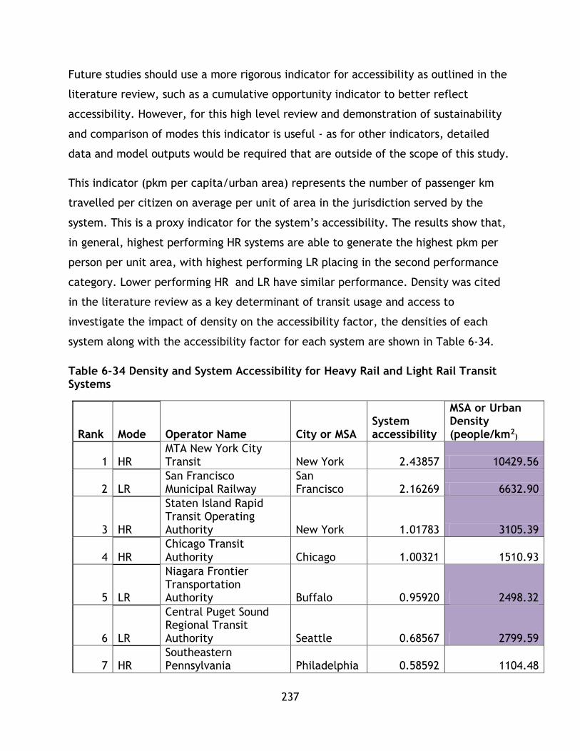
237
Future studies should use a more rigorous indicator for accessibility as outlined in the
literature review, such as a cumulative opportunity indicator to better reflect
accessibility. However, for this high level review and demonstration of sustainability
and comparison of modes this indicator is useful - as for other indicators, detailed
data and model outputs would be required that are outside of the scope of this study.
This indicator (pkm per capita/urban area) represents the number of passenger km
travelled per citizen on average per unit of area in the jurisdiction served by the
system. This is a proxy indicator for the system’s accessibility. The results show that,
in general, highest performing HR systems are able to generate the highest pkm per
person per unit area, with highest performing LR placing in the second performance
category. Lower performing HR and LR have similar performance. Density was cited
in the literature review as a key determinant of transit usage and access to
investigate the impact of density on the accessibility factor, the densities of each
system along with the accessibility factor for each system are shown in Table 6-34.
Table 6-34 Density and System Accessibility for Heavy Rail and Light Rail Transit Systems
Rank Mode Operator Name City or MSA System accessibility
MSA or Urban Density (people/km2
)
1 HR MTA New York City Transit New York 2.43857 10429.56
2 LR San Francisco Municipal Railway
San Francisco 2.16269 6632.90
3 HR
Staten Island Rapid Transit Operating Authority New York 1.01783 3105.39
4 HR Chicago Transit Authority Chicago 1.00321 1510.93
5 LR
Niagara Frontier Transportation Authority Buffalo 0.95920 2498.32
6 LR
Central Puget Sound Regional Transit Authority Seattle 0.68567 2799.59
7 HR Southeastern Pennsylvania Philadelphia 0.58592 1104.48

238
Rank Mode Operator Name City or MSA System accessibility
MSA or Urban Density (people/km2
)
Transportation Authority
8 HR
Washington Metropolitan Area Transit Authority Washington 0.22334 1312.79
9 LR Utah Transit Authority Salt Lake City 0.17342 1483.65
10 LR
Tri-County Metropolitan Transportation District of Oregon Portland 0.17288 1289.56
11 LR Sacramento Regional Transit District Sacramento 0.09970 1458.08
12 LR Denver Regional Transportation District Denver 0.08746 1535.81
13 LR
Santa Clara Valley Transportation Authority San Jose 0.07768 2284.40
14 HR Port Authority Trans-Hudson Corporation
New York, Newark, Harrison, Hoboken, and Jersey City 0.07342 9820.89
15 HR San Francisco Bay Area Rapid Transit District
San Francisco-Oakland-Fremont 0.06638 2365.41
16 LR San Diego Metropolitan Transit System San Diego 0.05541 1320.47
17 LR Bi-State Development Agency St. Louis 0.04937 967.66
18 LR Charlotte Area Transit System Charlotte 0.04887 948.69
19 HR Metropolitan Atlanta Rapid Transit Authority Atlanta 0.04461 688.38
20 HR
Massachusetts Bay Transportation Authority Boston 0.04042 896.86
21 HR Maryland Transit Administration Baltimore 0.02510 1173.77
22 LR Maryland Transit Baltimore 0.02389 1173.77

239
Rank Mode Operator Name City or MSA System accessibility
MSA or Urban Density (people/km2
)
Administration
23 LR Valley Metro Rail, Inc. Phoenix 0.02345 1404.78
24 LR Metro Transit Minneapolis 0.01610 1031.59
25 HR Miami-Dade Transit Miami 0.01453 1701.84
26 LR Port Authority of Allegheny County Pittsburgh 0.01399 794.47
27 HR
The Greater Cleveland Regional Transit Authority Cleveland 0.01392 1066.19
28 LR
Massachusetts Bay Transportation Authority Boston 0.01378 896.86
29 LR Dallas Area Rapid Transit Dallas 0.01336 1137.63
30 LR
Metropolitan Transit Authority of Harris County, Texas Houston 0.01193 1351.93
31 LR
Los Angeles County Metropolitan Transportation Authority Los Angeles 0.01053 2728.98
32 HR
Los Angeles County Metropolitan Transportation Authority Los Angeles 0.00733 2728.98
33 LR
The Greater Cleveland Regional Transit Authority Cleveland 0.00732 1066.19
Urban or Discrete Area and Population (census)
MSA Area (NTD)
As mentioned previously, systems that serve only an urban area or a discrete area
utilize the area and population figures from the census for that area for the
calculation, while systems that serve a broader metropolitan area utilize figures from
the NTD for the calculation. These values are shown in Figure 6-18.

240
Figure 6-18 Accessibility Factor as a Function of Density
There is a small trend tying this accessibility factor to density, as indicated by a low
r2 value and general scattered data, however the data does not match the trend
strongly. This is in line with literature review findings (such as discussions put forward
by Kenworthy and Newman (1999), Schiller, Bruun, and Kenworthy (2003), and
Banister (2008)) on policy and past research tying accessible transport for generating
trips and linking transport into land use with denser cities, however, the trend is not
strongly established and further research needs to be conducted on the application of
this type of accessibility factor over other accessibility factors such as time of day or
GIS based factors.
y = -2E-08x2 + 0.0004x - 0.3223R² = 0.474
-0.50000
0.00000
0.50000
1.00000
1.50000
2.00000
2.50000
3.00000
0.00 2000.00 4000.00 6000.00 8000.00 10000.00 12000.00
Access
ibilit
y F
acto
r
Density (people/km2)
System accessibility
Poly. (Systemaccessibility)
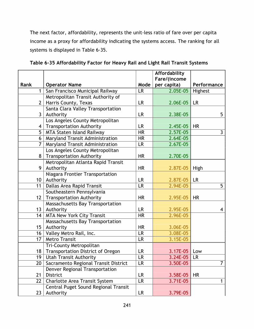
241
The next factor, affordability, represents the unit-less ratio of fare over per capita
income as a proxy for affordability indicating the systems access. The ranking for all
systems is displayed in Table 6-35.
Table 6-35 Affordability Factor for Heavy Rail and Light Rail Transit Systems
Rank Operator Name Mode
Affordability Fare/(income per capita) Performance
1 San Francisco Municipal Railway LR 2.05E-05 Highest
2 Metropolitan Transit Authority of Harris County, Texas LR 2.06E-05 LR
3 Santa Clara Valley Transportation Authority LR 2.38E-05 5
4 Los Angeles County Metropolitan Transportation Authority LR 2.45E-05 HR
5 MTA Staten Island Railway HR 2.57E-05 3
6 Maryland Transit Administration HR 2.64E-05
7 Maryland Transit Administration LR 2.67E-05
8 Los Angeles County Metropolitan Transportation Authority HR 2.70E-05
9 Metropolitan Atlanta Rapid Transit Authority HR 2.87E-05 High
10 Niagara Frontier Transportation Authority LR 2.87E-05 LR
11 Dallas Area Rapid Transit LR 2.94E-05 5
12 Southeastern Pennsylvania Transportation Authority HR 2.95E-05 HR
13 Massachusetts Bay Transportation Authority LR 2.95E-05 4
14 MTA New York City Transit HR 2.96E-05
15 Massachusetts Bay Transportation Authority HR 3.06E-05
16 Valley Metro Rail, Inc. LR 3.08E-05
17 Metro Transit LR 3.15E-05
18 Tri-County Metropolitan Transportation District of Oregon LR 3.17E-05 Low
19 Utah Transit Authority LR 3.24E-05 LR
20 Sacramento Regional Transit District LR 3.50E-05 7
21 Denver Regional Transportation District LR 3.58E-05 HR
22 Charlotte Area Transit System LR 3.71E-05 1
23 Central Puget Sound Regional Transit Authority LR 3.79E-05
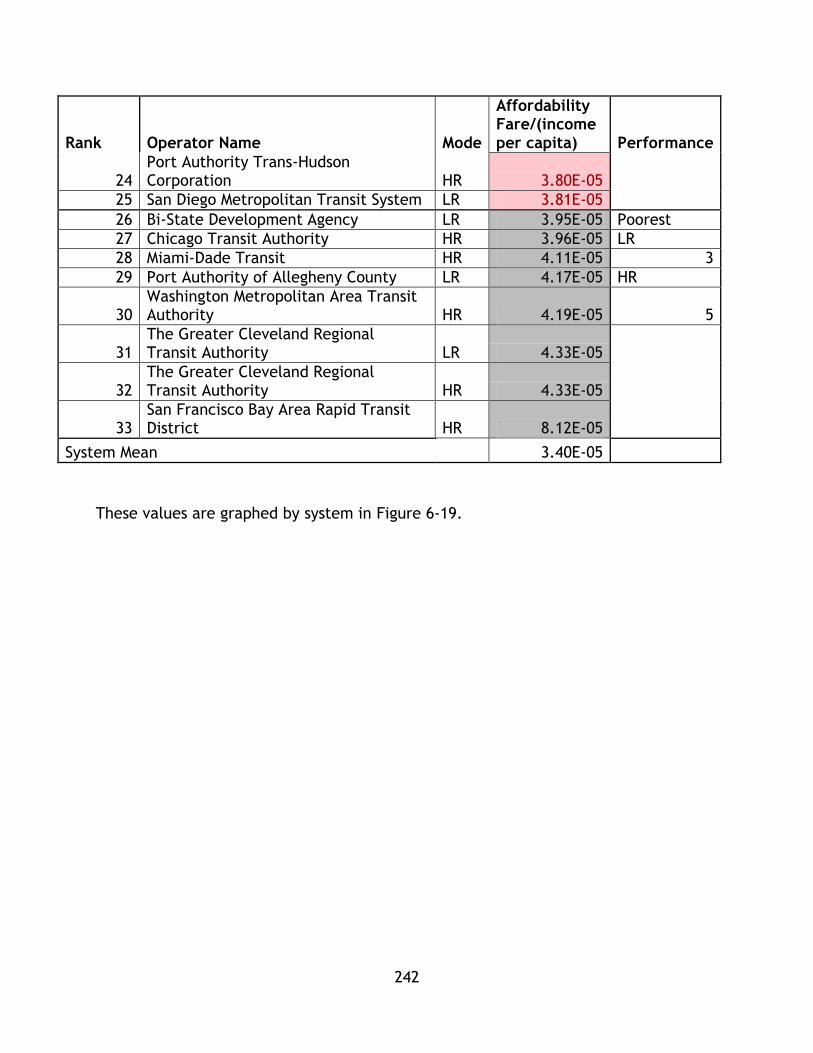
242
Rank Operator Name Mode
Affordability Fare/(income per capita) Performance
24 Port Authority Trans-Hudson Corporation HR 3.80E-05
25 San Diego Metropolitan Transit System LR 3.81E-05
26 Bi-State Development Agency LR 3.95E-05 Poorest
27 Chicago Transit Authority HR 3.96E-05 LR
28 Miami-Dade Transit HR 4.11E-05 3
29 Port Authority of Allegheny County LR 4.17E-05 HR
30 Washington Metropolitan Area Transit Authority HR 4.19E-05 5
31 The Greater Cleveland Regional Transit Authority LR 4.33E-05
32 The Greater Cleveland Regional Transit Authority HR 4.33E-05
33 San Francisco Bay Area Rapid Transit District HR 8.12E-05
System Mean 3.40E-05
These values are graphed by system in Figure 6-19.
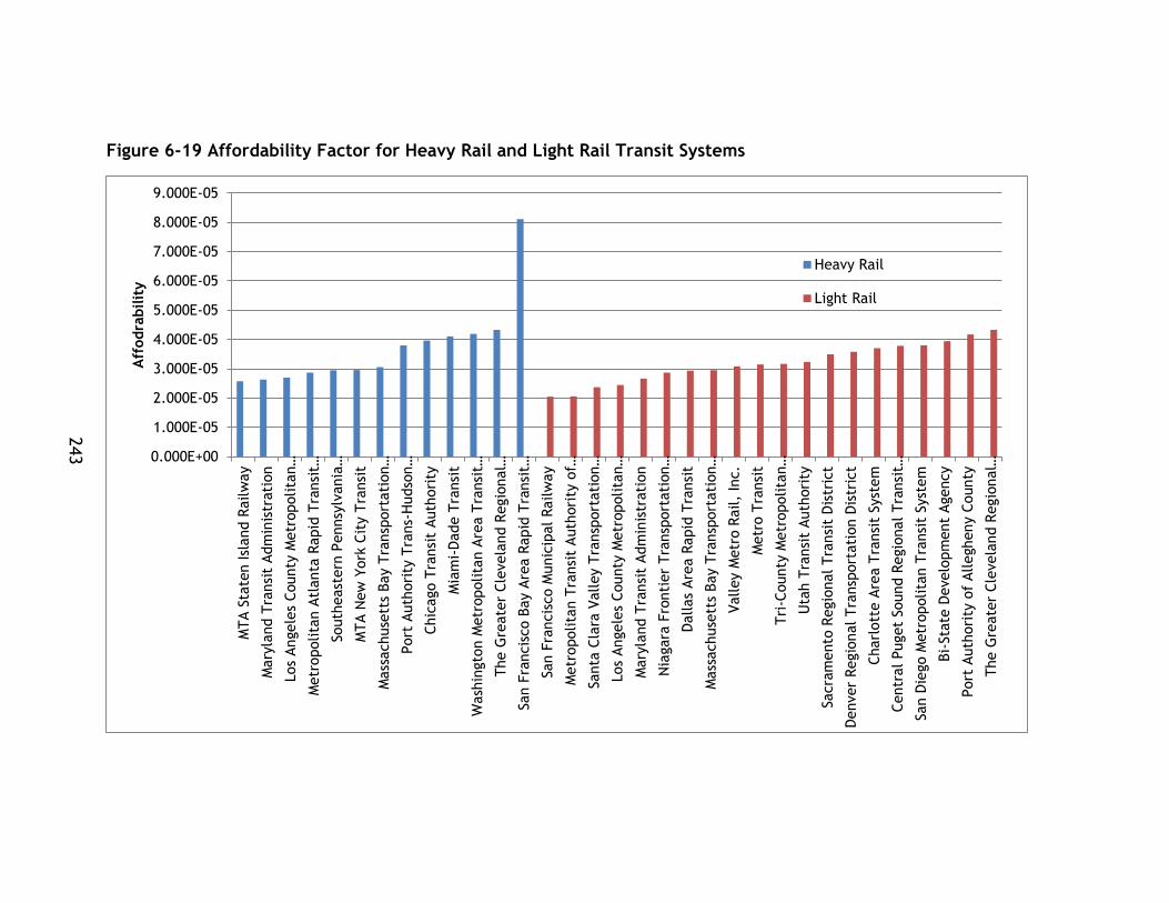
243
Figure 6-19 Affordability Factor for Heavy Rail and Light Rail Transit Systems
0.000E+00
1.000E-05
2.000E-05
3.000E-05
4.000E-05
5.000E-05
6.000E-05
7.000E-05
8.000E-05
9.000E-05
MTA S
tate
n Isl
and R
ailw
ay
Mary
land T
ransi
t Adm
inis
trati
on
Los
Angele
s County
Metr
opolita
n…
Metr
opolita
n A
tlanta
Rapid
Tra
nsi
t…
South
east
ern
Pennsy
lvania
…
MTA N
ew
York
Cit
y T
ransi
t
Mass
achuse
tts
Bay T
ransp
ort
ati
on…
Port
Auth
ori
ty T
rans-
Hudso
n…
Chic
ago T
ransi
t Auth
ori
ty
Mia
mi-
Dade T
ransi
t
Wash
ingto
n M
etr
opolita
n A
rea T
ransi
t…
The G
reate
r Cle
vela
nd R
egio
nal…
San F
rancis
co B
ay A
rea R
apid
Tra
nsi
t…
San F
rancis
co M
unic
ipal
Railw
ay
Metr
opolita
n T
ransi
t A
uth
ori
ty o
f…
Santa
Cla
ra V
alley T
ransp
ort
ati
on…
Los
Angele
s County
Metr
opolita
n…
Mary
land T
ransi
t Adm
inis
trati
on
Nia
gara
Fro
nti
er
Tra
nsp
ort
ati
on…
Dallas
Are
a R
apid
Tra
nsi
t
Mass
achuse
tts
Bay T
ransp
ort
ati
on…
Valley M
etr
o R
ail,
Inc.
Metr
o T
ransi
t
Tri
-County
Metr
opolita
n…
Uta
h T
ransi
t Auth
ori
ty
Sacra
mento
Regio
nal Tra
nsi
t D
istr
ict
Denver
Regio
nal Tra
nsp
ort
ati
on D
istr
ict
Charl
ott
e A
rea T
ransi
t Syst
em
Centr
al Puget
Sound R
egio
nal Tra
nsi
t…
San D
iego M
etr
opolita
n T
ransi
t Syst
em
Bi-
Sta
te D
evelo
pm
ent
Agency
Port
Auth
ori
ty o
f Allegheny C
ounty
The G
reate
r Cle
vela
nd R
egio
nal…
Aff
odra
bilit
y
Heavy Rail
Light Rail

244
The maximum, minimum, and mean values for the affordability ratio have also been
calculated and are displayed in Table 6-36.
Table 6-36 System Affordability Factor Ranges for Heavy and Light Rail Transit Systems
System Affordability
HR LR
% Difference
Maximum
San Francisco Bay Area Rapid Transit District 8.12E-05
The Greater Cleveland Regional Transit Authority 4.33E-05 60.849%
Minimum MTA Staten Island Railway 2.57E-05
San Francisco Municipal Railway 2.05E-05 22.801%
Mean 3.71E-05 3.19E-05 15.081%
% Difference Max and Min 103.75% 71.67%
These ranges are graphed in Figure 6-20.
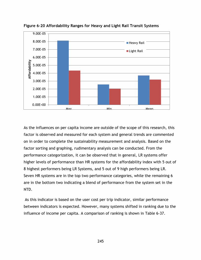
245
Figure 6-20 Affordability Ranges for Heavy and Light Rail Transit Systems
As the influences on per capita income are outside of the scope of this research, this
factor is observed and measured for each system and general trends are commented
on in order to complete the sustainability measurement and analysis. Based on the
factor sorting and graphing, rudimentary analysis can be conducted. From the
performance categorization, it can be observed that in general, LR systems offer
higher levels of performance than HR systems for the affordability index with 5 out of
8 highest performers being LR Systems, and 5 out of 9 high performers being LR.
Seven HR systems are in the top two performance categories, while the remaining 6
are in the bottom two indicating a blend of performance from the system set in the
NTD.
As this indicator is based on the user cost per trip indicator, similar performance
between indicators is expected. However, many systems shifted in ranking due to the
influence of income per capita. A comparison of ranking is shown in Table 6-37.
0.00E+00
1.00E-05
2.00E-05
3.00E-05
4.00E-05
5.00E-05
6.00E-05
7.00E-05
8.00E-05
9.00E-05
Max Min Mean
Aff
ord
abilit
y
Heavy Rail
Light Rail

246
Table 6-37 Comparison of Fare and Affordability Ranking
Mode Operator User Fare Cost Rank
Affordability Rank
LR Metropolitan Transit Authority of Harris County, Texas 1 2
LR Los Angeles County Metropolitan Transportation Authority 2 8
LR Niagara Frontier Transportation Authority 3 10
HR Los Angeles County Metropolitan Transportation Authority 4 8
HR Metropolitan Atlanta Rapid Transit Authority 5 9
LR Valley Metro Rail, Inc. 6 16
LR San Francisco Municipal Railway 7 1
LR Utah Transit Authority 8 19
LR Dallas Area Rapid Transit 9 11
HR MTA Staten Island Railway 10 5
HR Maryland Transit Administration 11 6
LR Maryland Transit Administration 12 7
LR Tri-County Metropolitan Transportation District of Oregon 13 18
LR Santa Clara Valley Transportation Authority 14 3
HR Southeastern Pennsylvania Transportation Authority 15 12
LR Sacramento Regional Transit District 16 20
HR MTA New York City Transit 17 14
LR Charlotte Area Transit System 18 22
LR Metro Transit 19 17
HR Miami-Dade Transit 20 28
LR Massachusetts Bay Transportation Authority 21 13
LR Bi-State Development Agency 22 26
LR San Diego Metropolitan Transit System 23 25
HR Massachusetts Bay Transportation Authority 24 15
LR Denver Regional Transportation District 25 21
LR The Greater Cleveland Regional Transit Authority 26 31
HR The Greater Cleveland Regional Transit Authority 27 32
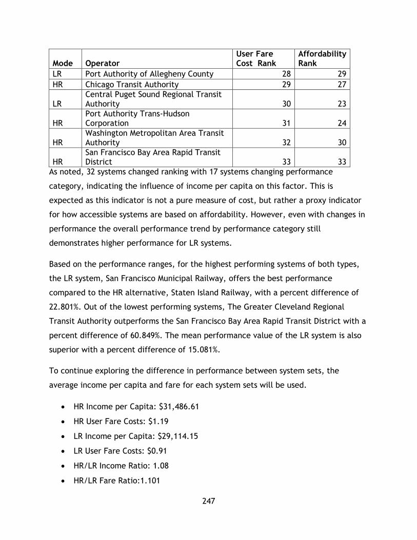
247
Mode Operator User Fare Cost Rank
Affordability Rank
LR Port Authority of Allegheny County 28 29
HR Chicago Transit Authority 29 27
LR Central Puget Sound Regional Transit Authority 30 23
HR Port Authority Trans-Hudson Corporation 31 24
HR Washington Metropolitan Area Transit Authority 32 30
HR San Francisco Bay Area Rapid Transit District 33 33
As noted, 32 systems changed ranking with 17 systems changing performance
category, indicating the influence of income per capita on this factor. This is
expected as this indicator is not a pure measure of cost, but rather a proxy indicator
for how accessible systems are based on affordability. However, even with changes in
performance the overall performance trend by performance category still
demonstrates higher performance for LR systems.
Based on the performance ranges, for the highest performing systems of both types,
the LR system, San Francisco Municipal Railway, offers the best performance
compared to the HR alternative, Staten Island Railway, with a percent difference of
22.801%. Out of the lowest performing systems, The Greater Cleveland Regional
Transit Authority outperforms the San Francisco Bay Area Rapid Transit District with a
percent difference of 60.849%. The mean performance value of the LR system is also
superior with a percent difference of 15.081%.
To continue exploring the difference in performance between system sets, the
average income per capita and fare for each system sets will be used.
HR Income per Capita: $31,486.61
HR User Fare Costs: $1.19
LR Income per Capita: $29,114.15
LR User Fare Costs: $0.91
HR/LR Income Ratio: 1.08
HR/LR Fare Ratio:1.101
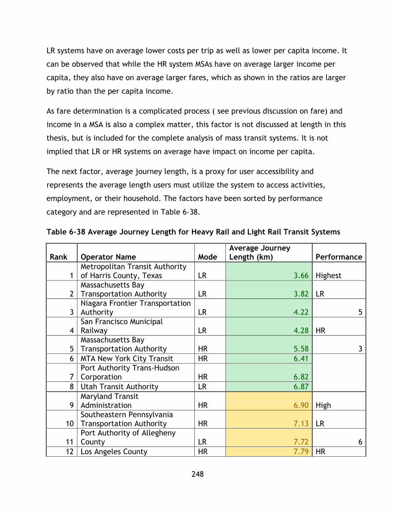
248
LR systems have on average lower costs per trip as well as lower per capita income. It
can be observed that while the HR system MSAs have on average larger income per
capita, they also have on average larger fares, which as shown in the ratios are larger
by ratio than the per capita income.
As fare determination is a complicated process ( see previous discussion on fare) and
income in a MSA is also a complex matter, this factor is not discussed at length in this
thesis, but is included for the complete analysis of mass transit systems. It is not
implied that LR or HR systems on average have impact on income per capita.
The next factor, average journey length, is a proxy for user accessibility and
represents the average length users must utilize the system to access activities,
employment, or their household. The factors have been sorted by performance
category and are represented in Table 6-38.
Table 6-38 Average Journey Length for Heavy Rail and Light Rail Transit Systems
Rank Operator Name Mode Average Journey Length (km) Performance
1 Metropolitan Transit Authority of Harris County, Texas LR 3.66 Highest
2 Massachusetts Bay Transportation Authority LR 3.82 LR
3 Niagara Frontier Transportation Authority LR 4.22 5
4 San Francisco Municipal Railway LR 4.28 HR
5 Massachusetts Bay Transportation Authority HR 5.58 3
6 MTA New York City Transit HR 6.41
7 Port Authority Trans-Hudson Corporation HR 6.82
8 Utah Transit Authority LR 6.87
9 Maryland Transit Administration HR 6.90 High
10 Southeastern Pennsylvania Transportation Authority HR 7.13 LR
11 Port Authority of Allegheny County LR 7.72 6
12 Los Angeles County HR 7.79 HR

249
Rank Operator Name Mode Average Journey Length (km) Performance
Metropolitan Transportation Authority
13
Tri-County Metropolitan Transportation District of Oregon LR 7.91 3
14 Santa Clara Valley Transportation Authority LR 8.25
15 Charlotte Area Transit System LR 8.48
16 Metro Transit LR 8.52
17 Sacramento Regional Transit District LR 8.67
18 Washington Metropolitan Area Transit Authority HR 9.16 Low
19 The Greater Cleveland Regional Transit Authority LR 9.46 LR
20 MTA Staten Island Railway HR 9.50 4
21 San Diego Metropolitan Transit System LR 9.85 HR
22 Chicago Transit Authority HR 9.90 4
23 Metropolitan Atlanta Rapid Transit Authority HR 10.21
24 Maryland Transit Administration LR 10.87
25 Denver Regional Transportation District LR 11.17
26 Dallas Area Rapid Transit LR 11.34 Poorest
27 The Greater Cleveland Regional Transit Authority HR 11.39 LR
28
Los Angeles County Metropolitan Transportation Authority LR 11.56 5
29 Central Puget Sound Regional Transit Authority LR 11.59 HR
30 Valley Metro Rail, Inc. LR 11.65 3
31 Miami-Dade Transit HR 11.89
32 Bi-State Development Agency LR 13.91
33 San Francisco Bay Area Rapid Transit District HR 20.67
System Mean 9.00
These values are graphed in Figure 6-21
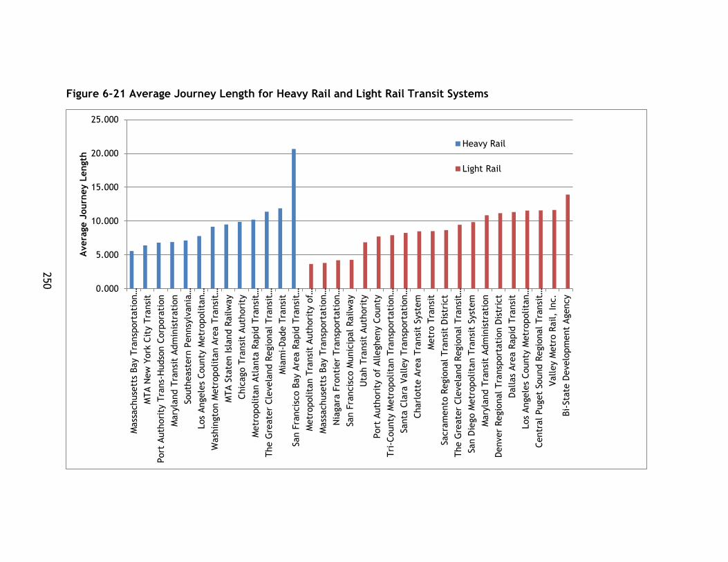
250
Figure 6-21 Average Journey Length for Heavy Rail and Light Rail Transit Systems
0.000
5.000
10.000
15.000
20.000
25.000
Mass
achuse
tts
Bay T
ransp
ort
ati
on…
MTA N
ew
York
Cit
y T
ransi
t
Port
Auth
ori
ty T
rans-
Hudso
n C
orp
ora
tion
Mary
land T
ransi
t Adm
inis
trati
on
South
east
ern
Pennsy
lvania
…
Los
Angele
s County
Metr
opolita
n…
Wash
ingto
n M
etr
opolita
n A
rea T
ransi
t…
MTA S
tate
n Isl
and R
ailw
ay
Chic
ago T
ransi
t Auth
ori
ty
Metr
opolita
n A
tlanta
Rapid
Tra
nsi
t…
The G
reate
r Cle
vela
nd R
egio
nal Tra
nsi
t…
Mia
mi-
Dade T
ransi
t
San F
rancis
co B
ay A
rea R
apid
Tra
nsi
t…
Metr
opolita
n T
ransi
t A
uth
ori
ty o
f…
Mass
achuse
tts
Bay T
ransp
ort
ati
on…
Nia
gara
Fro
nti
er
Tra
nsp
ort
ati
on…
San F
rancis
co M
unic
ipal
Railw
ay
Uta
h T
ransi
t Auth
ori
ty
Port
Auth
ori
ty o
f Allegheny C
ounty
Tri
-County
Metr
opolita
n T
ransp
ort
ati
on…
Santa
Cla
ra V
alley T
ransp
ort
ati
on…
Charl
ott
e A
rea T
ransi
t Syst
em
Metr
o T
ransi
t
Sacra
mento
Regio
nal Tra
nsi
t D
istr
ict
The G
reate
r Cle
vela
nd R
egio
nal Tra
nsi
t…
San D
iego M
etr
opolita
n T
ransi
t Syst
em
Mary
land T
ransi
t Adm
inis
trati
on
Denver
Regio
nal Tra
nsp
ort
ati
on D
istr
ict
Dallas
Are
a R
apid
Tra
nsi
t
Los
Angele
s County
Metr
opolita
n…
Centr
al Puget
Sound R
egio
nal Tra
nsi
t…
Valley M
etr
o R
ail,
Inc.
Bi-
Sta
te D
evelo
pm
ent
Agency
Avera
ge J
ourn
ey L
ength
Heavy Rail
Light Rail

251
The data set for this factor has been sorted into performance ranges that are
displayed in Table 6-39
Table 6-39 Average Journey Length Ranges for Heavy Rail and Light Rail Transit Systems
Average Journey Length
HR LR % Difference
Maximum San Francisco Bay Area Rapid Transit District 20.67
Bi-State Development Agency 13.91 39.064%
Minimum
Massachusetts Bay Transportation Authority 5.58
Metropolitan Transit Authority of Harris County, Texas 3.66 41.547%
Mean 9.49 8.69 8.791%
% Difference Max and Min 114.91% 116.63%
These ranges have been graphed in Figure 6-22
Figure 6-22 Average Journey Length (km) for Heavy Rail and Light Rail Transit Systems
0.00
5.00
10.00
15.00
20.00
25.00
Max Min Mean
Avera
ge J
ourn
ey L
ength
(km
)
Heavy Rail
Light Rail

252
As indicated by the figures and tables, the HR systems have a balanced performance
profile, with representation in each quartile, as do the LR systems. However, LR
systems are more represented in the Highest performance categories, indicating
better performance for the average trip length factor. In terms of the highest
performing systems in each set, Metropolitan Transit Authority of Harris County, a LR
system outperforms the HR System, Massachusetts Bay Transportation Authority with
a percent difference of 41.547%. For the lowest performing systems, Bi-State
Development Agency, a LR system outperforms the HR San Francisco Bay Area Rapid
Transit District system with a percent difference of 39.064%. For the system averages,
there is a percent difference of 8.791%.
A t test was conducted with a hypothesis that the difference between the means of
the systems is greater than zero and a null hypothesis that the difference between
the means is zero. The t test returns a value of 0.18546, which is less than 1.9723
indicating that the null hypothesis cannot be rejected at 95% confidence level.
While this factor intends to measure the transit system’s ability to provide accessible
transit service to its customers, there are other factors to consider which may provide
a low score. The NTD dataset provides information on system length. As shorter
systems may score greater on this factor than their longer counterparts, an
investigation has been conducted in Table 6-40 and Figure 6-23. It is also worth noting
that longer systems may also be intended to serve a downtown system and operate as
more of a commuter style system as well, which would also reinforce longer trips. As
the highest performing system, Metropolitan Transit Authority of Harris County,
Texas, is also a short system (23.83433 directional km) that serves a small area of
Houston it may be the case that small systems are over represented in this factor. By
investigating the influence of system length on average journey length the suitability
of this factor can be commented on.
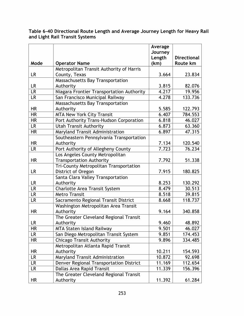
253
Table 6-40 Directional Route Length and Average Journey Length for Heavy Rail and Light Rail Transit Systems
Mode Operator Name
Average Journey Length (km)
Directional Route km
LR Metropolitan Transit Authority of Harris County, Texas 3.664 23.834
LR Massachusetts Bay Transportation Authority 3.815 82.076
LR Niagara Frontier Transportation Authority 4.217 19.956
LR San Francisco Municipal Railway 4.278 133.736
HR Massachusetts Bay Transportation Authority 5.585 122.793
HR MTA New York City Transit 6.407 784.553
HR Port Authority Trans-Hudson Corporation 6.818 46.027
LR Utah Transit Authority 6.873 63.360
HR Maryland Transit Administration 6.897 47.315
HR Southeastern Pennsylvania Transportation Authority 7.134 120.540
LR Port Authority of Allegheny County 7.723 76.234
HR Los Angeles County Metropolitan Transportation Authority 7.792 51.338
LR Tri-County Metropolitan Transportation District of Oregon 7.915 180.825
LR Santa Clara Valley Transportation Authority 8.253 130.292
LR Charlotte Area Transit System 8.479 30.513
LR Metro Transit 8.518 39.815
LR Sacramento Regional Transit District 8.668 118.737
HR Washington Metropolitan Area Transit Authority 9.164 340.858
LR The Greater Cleveland Regional Transit Authority 9.460 48.892
HR MTA Staten Island Railway 9.501 46.027
LR San Diego Metropolitan Transit System 9.851 174.453
HR Chicago Transit Authority 9.896 334.485
HR Metropolitan Atlanta Rapid Transit Authority 10.211 154.593
LR Maryland Transit Administration 10.872 92.698
LR Denver Regional Transportation District 11.169 112.654
LR Dallas Area Rapid Transit 11.339 156.396
HR The Greater Cleveland Regional Transit Authority 11.392 61.284
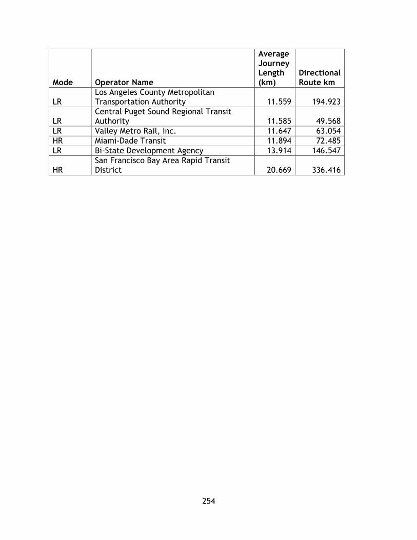
254
Mode Operator Name
Average Journey Length (km)
Directional Route km
LR Los Angeles County Metropolitan Transportation Authority 11.559 194.923
LR Central Puget Sound Regional Transit Authority 11.585 49.568
LR Valley Metro Rail, Inc. 11.647 63.054
HR Miami-Dade Transit 11.894 72.485
LR Bi-State Development Agency 13.914 146.547
HR San Francisco Bay Area Rapid Transit District 20.669 336.416

255
Figure 6-23 Average trip length as a function of directional length for Heavy Rail and Light Rail Transit Systems
y = 0.0177x + 7.0494R² = 0.2159
0
5
10
15
20
25
0 100 200 300 400 500 600 700 800 900
Avera
ge T
rip L
ength
Directional Length (km)
MTA New York
LR and HR
Linear (LR and HR)
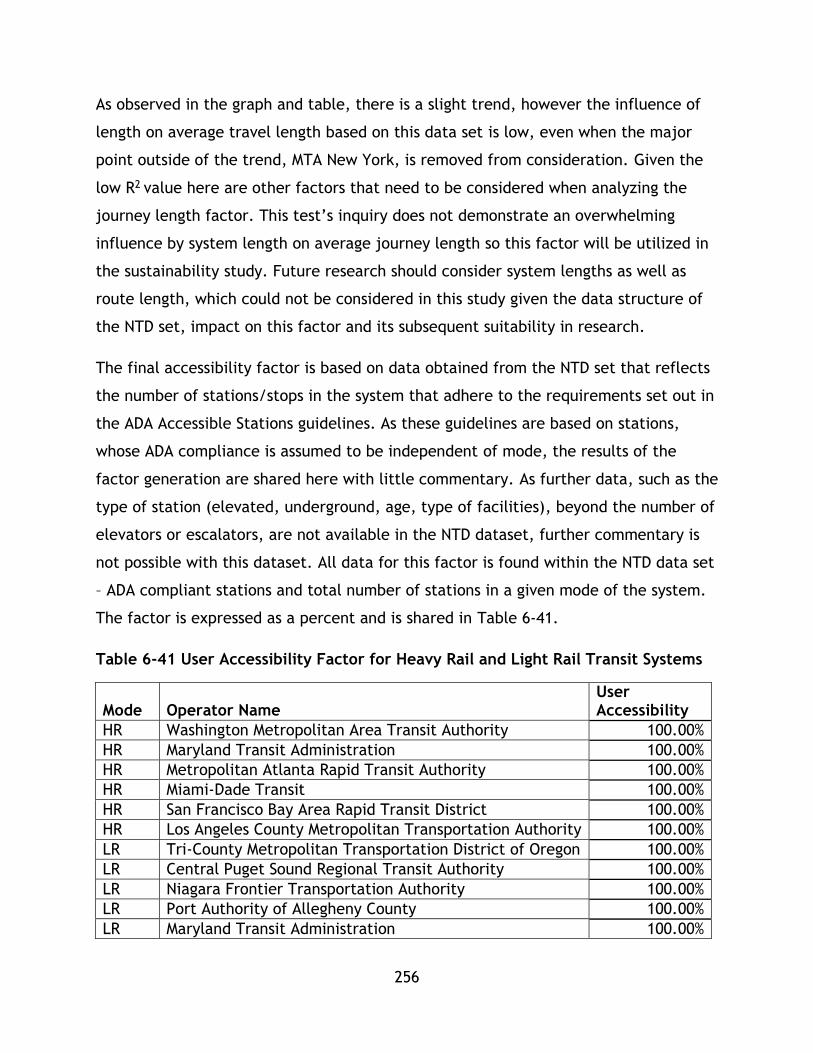
256
As observed in the graph and table, there is a slight trend, however the influence of
length on average travel length based on this data set is low, even when the major
point outside of the trend, MTA New York, is removed from consideration. Given the
low R2 value here are other factors that need to be considered when analyzing the
journey length factor. This test’s inquiry does not demonstrate an overwhelming
influence by system length on average journey length so this factor will be utilized in
the sustainability study. Future research should consider system lengths as well as
route length, which could not be considered in this study given the data structure of
the NTD set, impact on this factor and its subsequent suitability in research.
The final accessibility factor is based on data obtained from the NTD set that reflects
the number of stations/stops in the system that adhere to the requirements set out in
the ADA Accessible Stations guidelines. As these guidelines are based on stations,
whose ADA compliance is assumed to be independent of mode, the results of the
factor generation are shared here with little commentary. As further data, such as the
type of station (elevated, underground, age, type of facilities), beyond the number of
elevators or escalators, are not available in the NTD dataset, further commentary is
not possible with this dataset. All data for this factor is found within the NTD data set
– ADA compliant stations and total number of stations in a given mode of the system.
The factor is expressed as a percent and is shared in Table 6-41.
Table 6-41 User Accessibility Factor for Heavy Rail and Light Rail Transit Systems
Mode Operator Name User Accessibility
HR Washington Metropolitan Area Transit Authority 100.00%
HR Maryland Transit Administration 100.00%
HR Metropolitan Atlanta Rapid Transit Authority 100.00%
HR Miami-Dade Transit 100.00%
HR San Francisco Bay Area Rapid Transit District 100.00%
HR Los Angeles County Metropolitan Transportation Authority 100.00%
LR Tri-County Metropolitan Transportation District of Oregon 100.00%
LR Central Puget Sound Regional Transit Authority 100.00%
LR Niagara Frontier Transportation Authority 100.00%
LR Port Authority of Allegheny County 100.00%
LR Maryland Transit Administration 100.00%
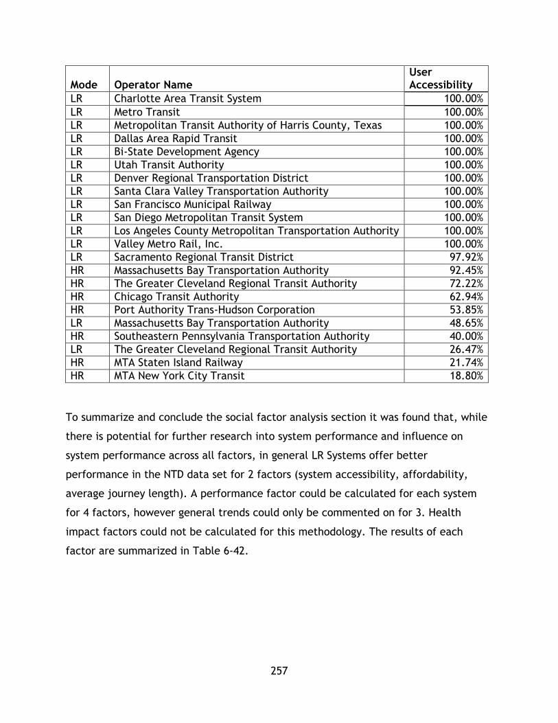
257
Mode Operator Name User Accessibility
LR Charlotte Area Transit System 100.00%
LR Metro Transit 100.00%
LR Metropolitan Transit Authority of Harris County, Texas 100.00%
LR Dallas Area Rapid Transit 100.00%
LR Bi-State Development Agency 100.00%
LR Utah Transit Authority 100.00%
LR Denver Regional Transportation District 100.00%
LR Santa Clara Valley Transportation Authority 100.00%
LR San Francisco Municipal Railway 100.00%
LR San Diego Metropolitan Transit System 100.00%
LR Los Angeles County Metropolitan Transportation Authority 100.00%
LR Valley Metro Rail, Inc. 100.00%
LR Sacramento Regional Transit District 97.92%
HR Massachusetts Bay Transportation Authority 92.45%
HR The Greater Cleveland Regional Transit Authority 72.22%
HR Chicago Transit Authority 62.94%
HR Port Authority Trans-Hudson Corporation 53.85%
LR Massachusetts Bay Transportation Authority 48.65%
HR Southeastern Pennsylvania Transportation Authority 40.00%
LR The Greater Cleveland Regional Transit Authority 26.47%
HR MTA Staten Island Railway 21.74%
HR MTA New York City Transit 18.80%
To summarize and conclude the social factor analysis section it was found that, while
there is potential for further research into system performance and influence on
system performance across all factors, in general LR Systems offer better
performance in the NTD data set for 2 factors (system accessibility, affordability,
average journey length). A performance factor could be calculated for each system
for 4 factors, however general trends could only be commented on for 3. Health
impact factors could not be calculated for this methodology. The results of each
factor are summarized in Table 6-42.

258
Table 6-42 Social Factors Conclusion
Highest
Performance
Systems
Lowest
Performance
Systems
Mean Trend
System
Accessibility
LR Systems
achieve better
performance,
highest
performing
system is HR.
LR Systems are
better
represented in
this category.
Lowest
performers
attain
comparable
performance.
LR mean value
higher.
N/A
Affordability LR Systems
achieve better
performance.
LR System
attains better
performance.
LR systems
attain greater
performance.
N/A
Average
Journey
Length
LR Systems
achieve better
performance.
LR System
attains better
performance.
Null hypothesis
(difference
between means
is statistically
significant)
rejected at
95%.
N/A
User
Accessibility
N/A
Overall results indicate that LR systems tend to attain higher results throughout the
factors. However, the highest performing HR systems attain comparable results. For
the System Accessibility, the HR systems attain a balanced profile, with 3 systems in
the highest performance indicator sets (6 total), and 5 and 2 in the lower two

259
performance sets. LR has balanced performance as well, with 5,6,3, and 6 systems
from highest to lowest. In the Affordability factor set, HR systems are represented
3,4,1, and 5 from highest to lowest, while LR systems present a 5, 5, 7, 3 split. This
indicates HR is weighted heaviest in the top 2 and lowest category, while LR is
weighted heaviest in the middle two categories. In the Average Journey length factor,
HR follows a 3,3, 4, 3 distribution through the performance categories – showing a
heaviest concentration in the middle two performance quartiles. LR shows a 5,6, 4, 5,
distribution, with the largest clustering in the top two performance categories
indicating highest performance for LR systems. Overall, while some HR systems offer
high levels of performance, the general trend is for LR to offer greater performance
in the social set. However, there is a gradient of performance with systems of both
types attaining high and low performance regardless of their system type.
6.5.4 System Effectiveness Factors
For this implementation of the PTSMAP framework, two system effectiveness
measures have been calculated. These measures utilize data from within the NTD and
are only expanded with the same population data utilized to calculate the social
system accessibility factor. The first factor, pkm/pkm theoretical is a proxy for
capacity utilization or also could be considered as a transport work efficiency factor.
This factor utilizes vehicle capacity and mileage data, along with system pkm data
from within the NTD dataset and required no expansion to calculate for all 33
systems. A second factor, trips per capita, which was utilized in the calculation of a
previous factor, system accessibility, was also calculated for all 33 systems.
The results for all 33 systems for both factors are shown in Table 6-43.
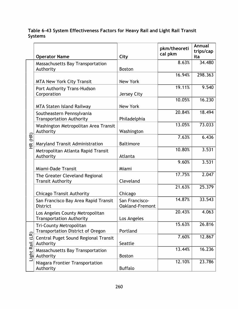
260
Table 6-43 System Effectiveness Factors for Heavy Rail and Light Rail Transit Systems
Operator Name City
pkm/theoretical pkm
Annual trips/capita
HR (
HR)
Massachusetts Bay Transportation Authority Boston
8.63% 34.480
MTA New York City Transit New York
16.94% 298.363
Port Authority Trans-Hudson Corporation Jersey City
19.11% 9.540
MTA Staten Island Railway New York
10.05% 16.230
Southeastern Pennsylvania Transportation Authority Philadelphia
20.84% 18.494
Washington Metropolitan Area Transit Authority Washington
13.05% 73.033
Maryland Transit Administration Baltimore
7.63% 6.436
Metropolitan Atlanta Rapid Transit Authority Atlanta
10.80% 3.531
Miami-Dade Transit Miami
9.60% 3.531
The Greater Cleveland Regional Transit Authority Cleveland
17.75% 2.047
Chicago Transit Authority Chicago
21.63% 25.379
San Francisco Bay Area Rapid Transit District
San Francisco-Oakland-Fremont
14.87% 33.543
Los Angeles County Metropolitan Transportation Authority Los Angeles
20.43% 4.063
Lig
ht
Rail (
LR)
Tri-County Metropolitan Transportation District of Oregon Portland
15.63% 26.816
Central Puget Sound Regional Transit Authority Seattle
7.60% 12.867
Massachusetts Bay Transportation Authority Boston
13.44% 16.236
Niagara Frontier Transportation Authority Buffalo
12.10% 23.786
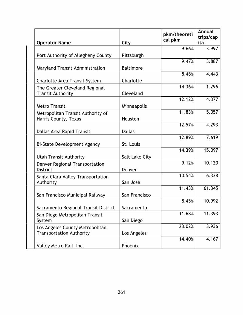
261
Operator Name City
pkm/theoretical pkm
Annual trips/capita
Port Authority of Allegheny County Pittsburgh
9.66% 3.997
Maryland Transit Administration Baltimore
9.47% 3.887
Charlotte Area Transit System Charlotte
8.48% 4.443
The Greater Cleveland Regional Transit Authority Cleveland
14.36% 1.296
Metro Transit Minneapolis
12.12% 4.377
Metropolitan Transit Authority of Harris County, Texas Houston
11.83% 5.057
Dallas Area Rapid Transit Dallas
12.57% 4.293
Bi-State Development Agency St. Louis
12.89% 7.619
Utah Transit Authority Salt Lake City
14.39% 15.097
Denver Regional Transportation District Denver
9.12% 10.120
Santa Clara Valley Transportation Authority San Jose
10.54% 6.338
San Francisco Municipal Railway San Francisco
11.43% 61.345
Sacramento Regional Transit District Sacramento
8.45% 10.992
San Diego Metropolitan Transit System San Diego
11.68% 11.393
Los Angeles County Metropolitan Transportation Authority Los Angeles
23.02% 3.936
Valley Metro Rail, Inc. Phoenix
14.40% 4.167
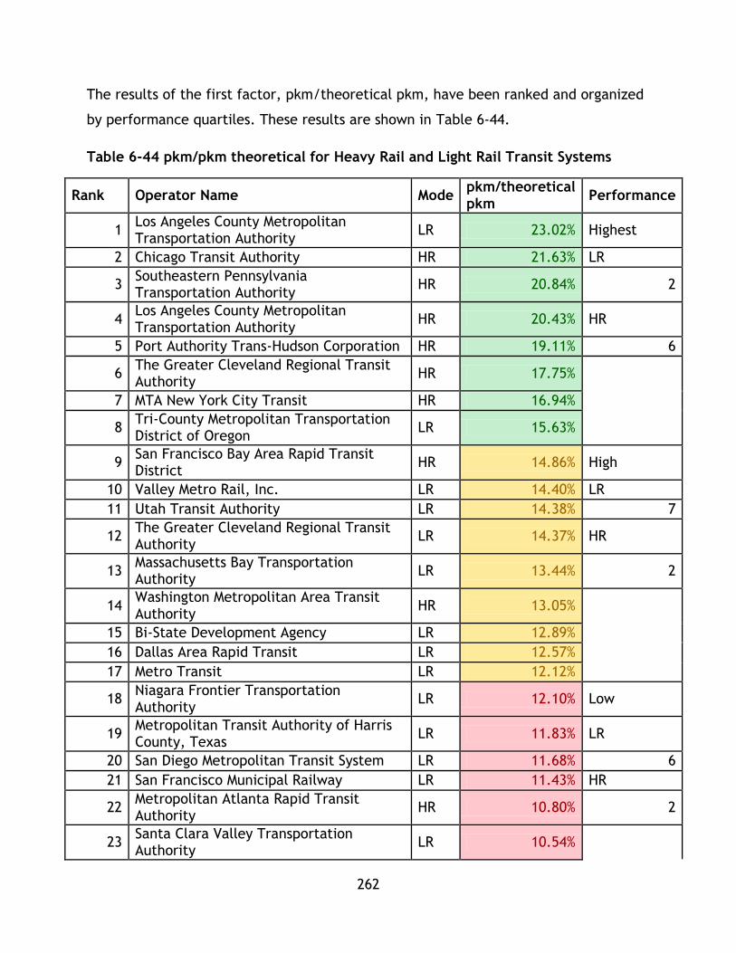
262
The results of the first factor, pkm/theoretical pkm, have been ranked and organized
by performance quartiles. These results are shown in Table 6-44.
Table 6-44 pkm/pkm theoretical for Heavy Rail and Light Rail Transit Systems
Rank Operator Name Mode pkm/theoretical pkm
Performance
1 Los Angeles County Metropolitan Transportation Authority
LR 23.02% Highest
2 Chicago Transit Authority HR 21.63% LR
3 Southeastern Pennsylvania Transportation Authority
HR 20.84% 2
4 Los Angeles County Metropolitan Transportation Authority
HR 20.43% HR
5 Port Authority Trans-Hudson Corporation HR 19.11% 6
6 The Greater Cleveland Regional Transit Authority
HR 17.75%
7 MTA New York City Transit HR 16.94%
8 Tri-County Metropolitan Transportation District of Oregon
LR 15.63%
9 San Francisco Bay Area Rapid Transit District
HR 14.86% High
10 Valley Metro Rail, Inc. LR 14.40% LR
11 Utah Transit Authority LR 14.38% 7
12 The Greater Cleveland Regional Transit Authority
LR 14.37% HR
13 Massachusetts Bay Transportation Authority
LR 13.44% 2
14 Washington Metropolitan Area Transit Authority
HR 13.05%
15 Bi-State Development Agency LR 12.89%
16 Dallas Area Rapid Transit LR 12.57%
17 Metro Transit LR 12.12%
18 Niagara Frontier Transportation Authority
LR 12.10% Low
19 Metropolitan Transit Authority of Harris County, Texas
LR 11.83% LR
20 San Diego Metropolitan Transit System LR 11.68% 6
21 San Francisco Municipal Railway LR 11.43% HR
22 Metropolitan Atlanta Rapid Transit Authority
HR 10.80% 2
23 Santa Clara Valley Transportation Authority
LR 10.54%
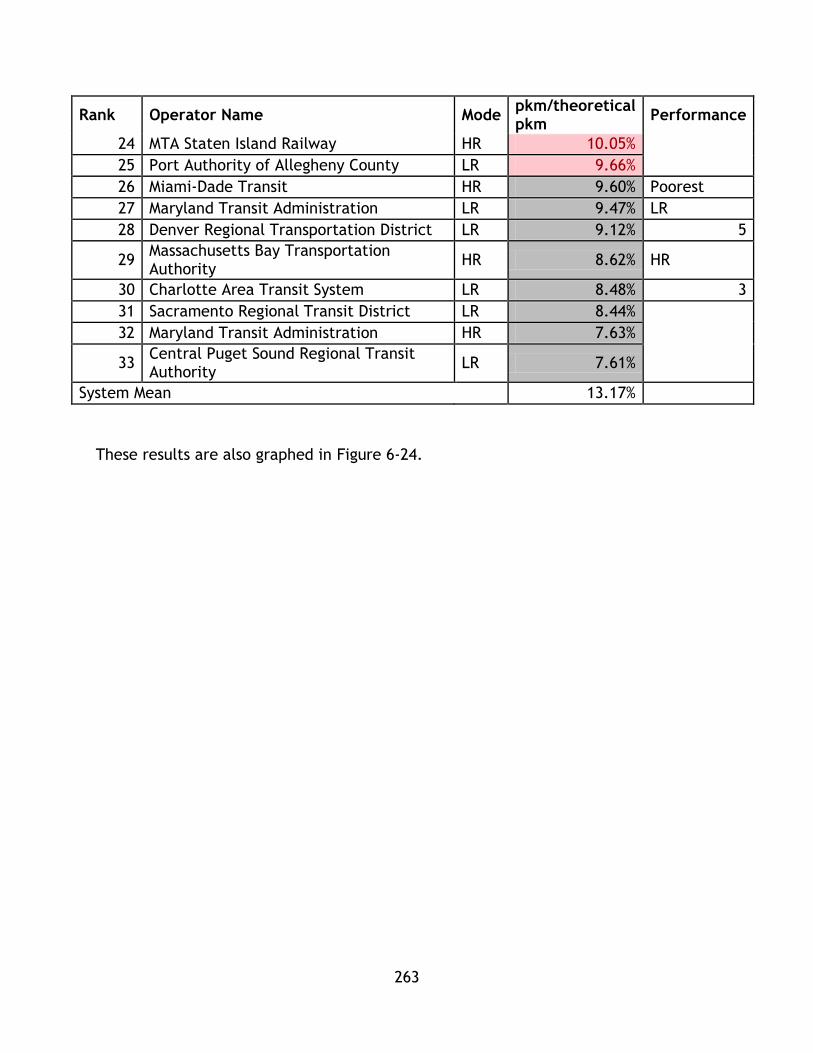
263
Rank Operator Name Mode pkm/theoretical pkm
Performance
24 MTA Staten Island Railway HR 10.05%
25 Port Authority of Allegheny County LR 9.66%
26 Miami-Dade Transit HR 9.60% Poorest
27 Maryland Transit Administration LR 9.47% LR
28 Denver Regional Transportation District LR 9.12% 5
29 Massachusetts Bay Transportation Authority
HR 8.62% HR
30 Charlotte Area Transit System LR 8.48% 3
31 Sacramento Regional Transit District LR 8.44%
32 Maryland Transit Administration HR 7.63%
33 Central Puget Sound Regional Transit Authority
LR 7.61%
System Mean 13.17%
These results are also graphed in Figure 6-24.

264
Figure 6-24 pkm/pkm theoretical for Heavy Rail and Light Rail Transit Systems
0.00%
5.00%
10.00%
15.00%
20.00%
25.00%C
hic
ago
Tra
nsi
t A
uth
ori
ty
Sou
thea
ster
n P
enn
sylv
ania
Tra
nsp
ort
atio
n…
Los
An
gele
s C
ou
nty
Met
rop
olit
an…
Po
rt A
uth
ori
ty T
ran
s-H
ud
son
Co
rpo
rati
on
The
Gre
ater
Cle
vela
nd
Reg
ion
al T
ran
sit…
MTA
New
Yo
rk C
ity
Tran
sit
San
Fra
nci
sco
Bay
Are
a R
apid
Tra
nsi
t D
istr
ict
Was
hin
gto
n M
etr
op
olit
an A
rea
Tran
sit…
Me
tro
po
litan
Atl
anta
Rap
id T
ran
sit…
MTA
Sta
ten
Isla
nd
Rai
lway
Mia
mi-
Dad
e T
ran
sit
Mas
sach
use
tts
Bay
Tra
nsp
ort
atio
n…
Mar
ylan
d T
ran
sit
Ad
min
istr
atio
n
Los
An
gele
s C
ou
nty
Met
rop
olit
an…
Tri-
Co
un
ty M
etro
po
litan
Tra
nsp
ort
atio
n…
Val
ley
Met
ro R
ail,
Inc.
Uta
h T
ran
sit
Au
tho
rity
The
Gre
ater
Cle
vela
nd
Reg
ion
al T
ran
sit…
Mas
sach
use
tts
Bay
Tra
nsp
ort
atio
n…
Bi-
Stat
e D
evel
op
men
t A
gen
cy
Dal
las
Are
a R
apid
Tra
nsi
t
Me
tro
Tra
nsi
t
Nia
gara
Fro
nti
er T
ran
spo
rtat
ion
Au
tho
rity
Me
tro
po
litan
Tra
nsi
t A
uth
ori
ty o
f H
arri
s…
San
Die
go M
etro
po
litan
Tra
nsi
t Sy
ste
m
San
Fra
nci
sco
Mu
nic
ipal
Rai
lway
San
ta C
lara
Val
ley
Tran
spo
rtat
ion
Au
tho
rity
Po
rt A
uth
ori
ty o
f A
llegh
en
y C
ou
nty
Mar
ylan
d T
ran
sit
Ad
min
istr
atio
n
De
nve
r R
egio
nal
Tra
nsp
ort
atio
n D
istr
ict
Ch
arlo
tte
Are
a Tr
ansi
t Sy
ste
m
Sacr
amen
to R
egi
on
al T
ran
sit
Dis
tric
t
Ce
ntr
al P
uge
t So
un
d R
egi
on
al T
ran
sit…
Heavy Rail
Light Rail
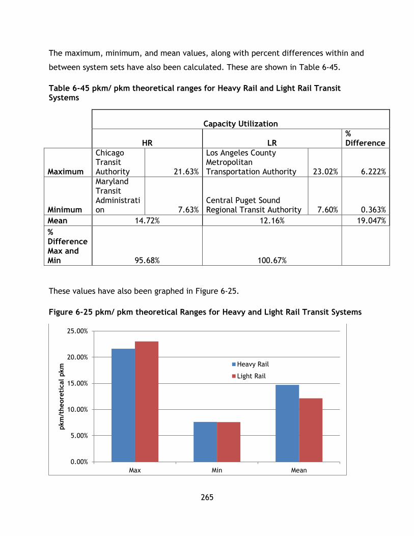
265
The maximum, minimum, and mean values, along with percent differences within and
between system sets have also been calculated. These are shown in Table 6-45.
Table 6-45 pkm/ pkm theoretical ranges for Heavy Rail and Light Rail Transit Systems
Capacity Utilization
HR LR
% Difference
Maximum
Chicago Transit Authority 21.63%
Los Angeles County Metropolitan Transportation Authority 23.02% 6.222%
Minimum
Maryland Transit Administration 7.63%
Central Puget Sound Regional Transit Authority 7.60% 0.363%
Mean 14.72% 12.16% 19.047%
% Difference Max and Min 95.68% 100.67%
These values have also been graphed in Figure 6-25.
Figure 6-25 pkm/ pkm theoretical Ranges for Heavy and Light Rail Transit Systems
0.00%
5.00%
10.00%
15.00%
20.00%
25.00%
Max Min Mean
pkm
/theore
tical
pkm
Heavy Rail
Light Rail

266
It can be observed from the tables and figures that, in general, HR systems have
achieved better performance for the pkm/pkm theoretical indicator for the systems
in the NTD data set. Within the highest performance category, 6 systems were HR
systems, while only two were LR. For the second performance tier, LR systems have 7
of 9 slots, and HR systems have 2. While HR systems have the highest performance, LR
achieve more balanced performance.
A LR system, Los Angeles County Metropolitan Transportation Authority, achieves the
highest performance and there is a percent difference of 6.222% when compared to
the top HR system, Chicago Transit Authority. This is a small difference, highlighting
how LR and HR systems can both achieve similar levels of performance. There is little
difference between the two lowest performing systems. There is a 19.047% difference
between the means of the system sets, with HR having a greater mean performance.
This factor is a proxy for the level of efficiency and effectiveness built into the
planning of the overall transit system. Systems that score well have planned their
operations to offer services commensurate with ridership. A high performing system
will use more of its available capacity, while a poorly performing system will use little
of its capacity indicating it is over providing service for the amount of ridership it
generates. As this indicator is based on the annual pkm it takes into account all
potential trips the system can generate with its rolling stock. However, performance
level considerations, such as crowding, waiting time, and transfers are not included in
this factor so it is a very high level abstraction of performance measurement. As these
details are not available within the NTD dataset, follow up investigation is outside of
the scope of this implementation of the PTSMAP framework.
The next factor, annual trips/capita, which reflects the system’s ability to generate
trips from its population, has been calculated for each system and sorted by
performance quartile. These values are shown in Table 6-46.

267
Table 6-46 Annual Trips/Capita for Heavy Rail and Light Rail Transit Systems
Rank Operator Name Mode Annual trips/capita Performance
1 MTA New York City Transit HR 298.36 Highest
2 Washington Metropolitan Area Transit Authority HR 73.03 LR
3 San Francisco Municipal Railway LR 61.34 3
4 Massachusetts Bay Transportation Authority HR 34.48 HR
5 San Francisco Bay Area Rapid Transit District HR 33.54 5
6 Tri-County Metropolitan Transportation District of Oregon LR 26.82
7 Chicago Transit Authority HR 25.38
8 Niagara Frontier Transportation Authority LR 23.79
9 Southeastern Pennsylvania Transportation Authority HR 18.49 High
10 Massachusetts Bay Transportation Authority LR 16.24 LR
11 MTA Staten Island Railway HR 16.23 6
12 Utah Transit Authority LR 15.10 HR
13 Central Puget Sound Regional Transit Authority LR 12.87 3
14 San Diego Metropolitan Transit System LR 11.39
15 Sacramento Regional Transit District LR 10.99
16 Denver Regional Transportation District LR 10.12
17 Port Authority Trans-Hudson Corporation HR 9.54
18 Bi-State Development Agency LR 7.62 Low
19 Maryland Transit Administration HR 6.44 LR
20 Santa Clara Valley Transportation Authority LR 6.34 7
21 Metropolitan Transit Authority of Harris County, Texas LR 5.06 HR
22 Charlotte Area Transit System LR 4.44 1
23 Metro Transit LR 4.38
24 Dallas Area Rapid Transit LR 4.29
25 Valley Metro Rail, Inc. LR 4.17
26 Los Angeles County Metropolitan Transportation Authority HR 4.06 Poorest
27 Port Authority of Allegheny County LR 4.00 LR
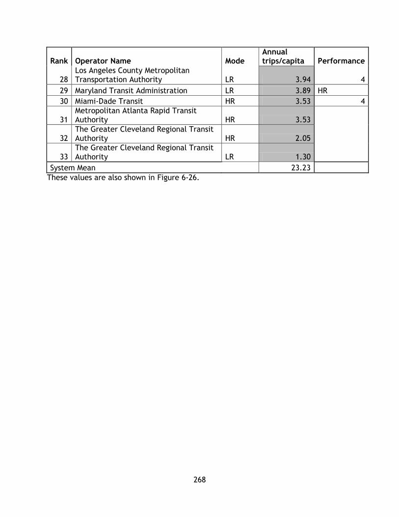
268
Rank Operator Name Mode Annual trips/capita Performance
28 Los Angeles County Metropolitan Transportation Authority LR 3.94 4
29 Maryland Transit Administration LR 3.89 HR
30 Miami-Dade Transit HR 3.53 4
31 Metropolitan Atlanta Rapid Transit Authority HR 3.53
32 The Greater Cleveland Regional Transit Authority HR 2.05
33 The Greater Cleveland Regional Transit Authority LR 1.30
System Mean 23.23
These values are also shown in Figure 6-26.

269
Figure 6-26 Trips/Capita for Heavy Rail and Light Rail Transit Systems
0
50
100
150
200
250
300
350
MTA N
ew
York
Cit
y T
ransi
t
Wash
ingto
n M
etr
opolita
n A
rea T
ransi
t…
Mass
achuse
tts
Bay T
ransp
ort
ati
on A
uth
ori
ty
San F
rancis
co B
ay A
rea R
apid
Tra
nsi
t…
Tri
-County
Metr
opolita
n T
ransp
ort
ati
on…
Chic
ago T
ransi
t Auth
ori
ty
South
east
ern
Pennsy
lvania
Tra
nsp
ort
ati
on…
MTA S
tate
n Isl
and R
ailw
ay
Port
Auth
ori
ty T
rans-
Hudso
n C
orp
ora
tion
Mary
land T
ransi
t Adm
inis
trati
on
Los
Angele
s County
Metr
opolita
n…
Metr
opolita
n A
tlanta
Rapid
Tra
nsi
t…
Mia
mi-
Dade T
ransi
t
The G
reate
r Cle
vela
nd R
egio
nal Tra
nsi
t…
San F
rancis
co M
unic
ipal
Railw
ay
Nia
gara
Fro
nti
er
Tra
nsp
ort
ati
on A
uth
ori
ty
Mass
achuse
tts
Bay T
ransp
ort
ati
on A
uth
ori
ty
Uta
h T
ransi
t Auth
ori
ty
Centr
al Puget
Sound R
egio
nal Tra
nsi
t…
San D
iego M
etr
opolita
n T
ransi
t Syst
em
Sacra
mento
Regio
nal Tra
nsi
t D
istr
ict
Denver
Regio
nal Tra
nsp
ort
ati
on D
istr
ict
Bi-
Sta
te D
evelo
pm
ent
Agency
Santa
Cla
ra V
alley T
ransp
ort
ati
on A
uth
ori
ty
Metr
opolita
n T
ransi
t A
uth
ori
ty o
f H
arr
is…
Charl
ott
e A
rea T
ransi
t Syst
em
Metr
o T
ransi
t
Dallas
Are
a R
apid
Tra
nsi
t
Valley M
etr
o R
ail,
Inc.
Port
Auth
ori
ty o
f Allegheny C
ounty
Los
Angele
s County
Metr
opolita
n…
Mary
land T
ransi
t Adm
inis
trati
on
The G
reate
r Cle
vela
nd R
egio
nal Tra
nsi
t…
Tri
ps/
capit
a
Heavy Rail
Light Rail
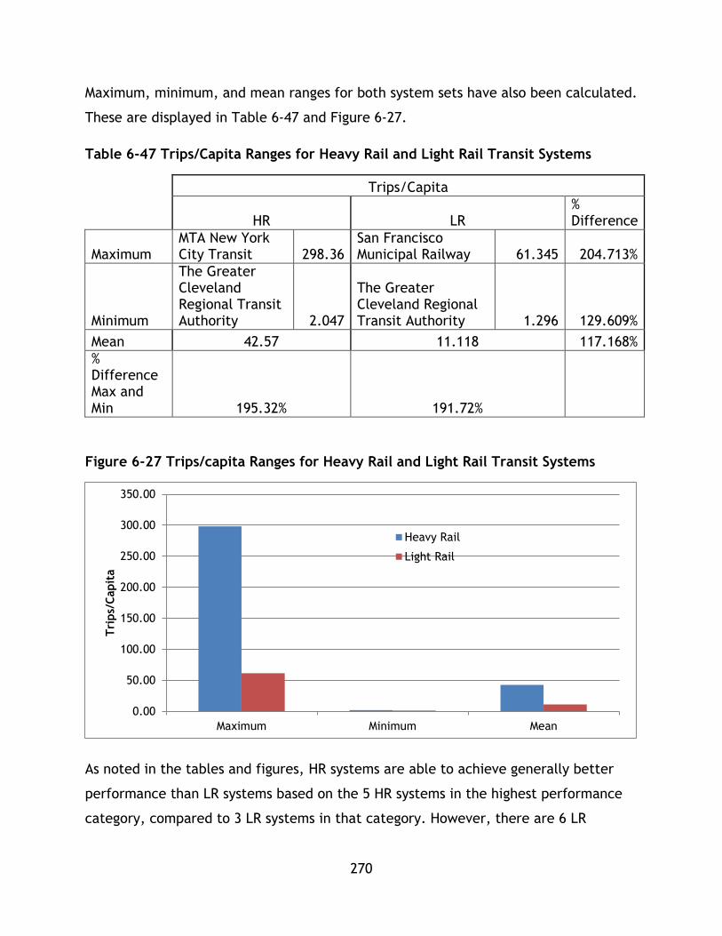
270
Maximum, minimum, and mean ranges for both system sets have also been calculated.
These are displayed in Table 6-47 and Figure 6-27.
Table 6-47 Trips/Capita Ranges for Heavy Rail and Light Rail Transit Systems
Trips/Capita
HR LR
% Difference
Maximum MTA New York City Transit 298.36
San Francisco Municipal Railway 61.345 204.713%
Minimum
The Greater Cleveland Regional Transit Authority 2.047
The Greater Cleveland Regional Transit Authority 1.296 129.609%
Mean 42.57 11.118 117.168%
% Difference Max and Min 195.32% 191.72%
Figure 6-27 Trips/capita Ranges for Heavy Rail and Light Rail Transit Systems
As noted in the tables and figures, HR systems are able to achieve generally better
performance than LR systems based on the 5 HR systems in the highest performance
category, compared to 3 LR systems in that category. However, there are 6 LR
0.00
50.00
100.00
150.00
200.00
250.00
300.00
350.00
Maximum Minimum Mean
Tri
ps/
Capit
a
Heavy Rail
Light Rail
271
systems in the second highest performance category, compared to 3 HR indicating
higher level LR are able to achieve a better level of performance compared to
moderate and lower grade HR systems.
The maximum performing HR system, MTA New York City Transit, greatly outperforms
the competing LR system, San Francisco Municipal Railway, with a % difference of
204.713%. The lowest performing systems are the same system operator, The Greater
Cleveland Regional Transit Authority, and have a difference of 129.609%. HR systems
have a greater mean compared to LR, with a percent difference of 117.168%.
The performance breakdown generally favours HR systems, with LR systems achieving
superiority in the middle performance tiers. Future research can analyze level of
service factors for systems as well as accessibility factors, such as density along
transit corridors, as they relate to ridership generation in order to understand which
factors shape this performance. As ridership generation is a complex process, further
research on the matter is required.
To summarize, both factors (pkm/pkm theoretical , and trips/capita) were calculated for
both system sets. These effectiveness indicators represent the system’s ability to
generate ridership and provide an effective transit service and it was shown that in
general HR systems outperform LR systems. However given the high level nature of
both factors used, no causal connections could be drawn as to why some systems
performed better and others did not. In future studies, with higher resolution data
these issues can be explored. The general conclusions are outlined in Table 6-48.

272
Table 6-48 System Effectiveness Conclusions
Highest
Performance
Systems
Lowest
Performance
Systems
Mean Trend
pkm/pkm
theoretical
HR Systems
achieve better
performance,
highest
performing
system is LR.
LR Systems are
better
represented in
this category.
Lowest
performers
attain
comparable
performance.
HR mean value
higher.
N/A
Trips/capita HR systems
achieve better
performance.
LR Systems are
better
represented in
this category.
Lowest
performers
attain
comparable
performance.
HR systems
attain greater
performance.
N/A
HR systems follow a 6,2,2,3 distribution for pkm/pkm theoretical demonstrating the
greatest performance out of the two system sets. However, LR systems follow a 2,7,6,
5 distribution and have a greater number of systems in the top two performance tiers
(9 compared to 8) indicating that high level LR systems, while not as effective as high
performing HR, greatly outperform mid-level HR.
For the trips/capita indicator, HR follows a 5,3,1,4 distribution, again having the
greatest performing systems. However, LR also has more systems in the top
273
performance categories (9 compared to 8) and follows a 3,6,7,4 distribution. Again,
LR systems in the middle range outperform middle level HR.
6.5.5 PTSMAP Part 2 Conclusion
This research was successful in comparing the performance of LR and HR transit
systems based on a complete set of sustainability factors. However, for most of the
factors in depth analysis as to where the differing performance levels arise could not
be completed given scope and data limitations. As this research is set out to establish
a sustainability framework and apply it to determine the differing performance levels
for a set of sustainability factors on a modal basis, future research will have to
determine the nuance behind each factor.
The overarching conclusion that can be drawn from this analysis is found in the
distributions of systems amongst each quartile. As no one indicator was completely
populated by one system set for high performance, this research has shown that in
general comparable sustainability performance can be achieved by both modes. For
some indicators, such as system effectiveness, there is a difference between high HR
and high LR, however, in general there is comparable performance between modes
with at least one system from each set populating each tier at a comparable level of
performance to the opposing system set. This indicates that modal parameters, which
often inform the transit debate, may not be as important as other factors when
planning and developing a system to meet sustainability criteria. As many factors are
normalized by a pkm basis, this research shows that highest performing systems are
able to minimize their inputs (i.e. energy, operating costs) and outputs (i.e.
emissions) with respect to ridership. Under this framework, comparable performance
is observed between high and low end systems. Lower end systems have too high an
input for their level of performance. Rather than continue the discussion based
strictly on technology, the discussion should be informed on providing the best
performance for sustainable mobility, which as demonstrated, the PTSMAP framework
is able to provide guidance on. However, it is also noteworthy that no one system
attained highest performance in all categories. This reflects the complexity of
sustainability – when analyzing transit systems from multiple criteria as opposed to
274
the few criteria in traditional analysis, there are few systems that will achieve top
performance across all criteria. These conclusions will be expanded upon with the
calculation of composite sustainability and categorical indices in the following
section.
Composite Sustainability Assessment
6.6.1 Application Of Methodology
n the previous section, values for each factor were calculated.. Chapter 7 follows this
chapter’s analysis of individual factors through the synthesis of factors into
categorical indices for environmental, economic, social ,and system effectiveness
indices as well as composite sustainability indices for each system. These values will
now be used to calculate indices for each category as well as for part 3 of the PTSMAP
framework to calculate a CSI index. These indices can be calculated in the following
ways:
Technique 1: z-score
Technique 2: utility
Technique 3: Re-scaling
This section of the chapter contains the complete steps for both methodologies
including:
Calculating the inputs for categorical indices
Calculating the categorical indices
Calculating the CSI
6.6.2 Methodology 1 z-score
The first step of this methodology is to calculate the four categorical indices. In order
to do so, recall equation 3-3:
𝑍 =𝑥 − 𝜇
𝜎

275
Z must be calculated for each factor value – larger values indicate a higher rank
relative to the mean value, while smaller values indicate a lower rank relative to the
mean. Recalling that the score a system achieves is summed up based on the
weighting of each factor, or sub factor, in order to develop a categorical index. The
results of these calculations are shown in Table 6 49,Table 6-50, Table 6 51, and 6-52
representing each set of factors for each category. Table 6 53 displays the weighting
values to be used in index calculation.
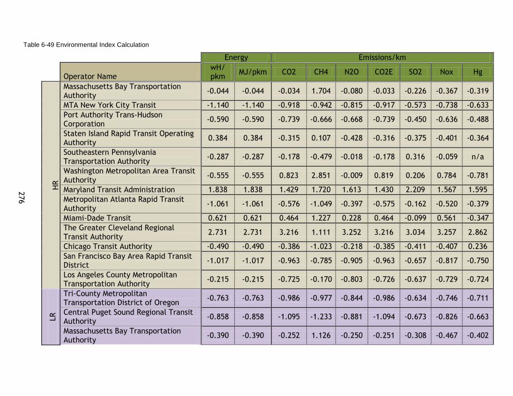
276
Table 6-49 Environmental Index Calculation
Energy Emissions/km
Operator Name
wH/ pkm
MJ/pkm CO2 CH4 N2O CO2E SO2 Nox Hg
HR
Massachusetts Bay Transportation Authority
-0.044 -0.044 -0.034 1.704 -0.080 -0.033 -0.226 -0.367 -0.319
MTA New York City Transit -1.140 -1.140 -0.918 -0.942 -0.815 -0.917 -0.573 -0.738 -0.633
Port Authority Trans-Hudson Corporation
-0.590 -0.590 -0.739 -0.666 -0.668 -0.739 -0.450 -0.636 -0.488
Staten Island Rapid Transit Operating Authority
0.384 0.384 -0.315 0.107 -0.428 -0.316 -0.375 -0.401 -0.364
Southeastern Pennsylvania Transportation Authority
-0.287 -0.287 -0.178 -0.479 -0.018 -0.178 0.316 -0.059 n/a
Washington Metropolitan Area Transit Authority
-0.555 -0.555 0.823 2.851 -0.009 0.819 0.206 0.784 -0.781
Maryland Transit Administration 1.838 1.838 1.429 1.720 1.613 1.430 2.209 1.567 1.595
Metropolitan Atlanta Rapid Transit Authority
-1.061 -1.061 -0.576 -1.049 -0.397 -0.575 -0.162 -0.520 -0.379
Miami-Dade Transit 0.621 0.621 0.464 1.227 0.228 0.464 -0.099 0.561 -0.347
The Greater Cleveland Regional Transit Authority
2.731 2.731 3.216 1.111 3.252 3.216 3.034 3.257 2.862
Chicago Transit Authority -0.490 -0.490 -0.386 -1.023 -0.218 -0.385 -0.411 -0.407 0.236
San Francisco Bay Area Rapid Transit District
-1.017 -1.017 -0.963 -0.785 -0.905 -0.963 -0.657 -0.817 -0.750
Los Angeles County Metropolitan Transportation Authority
-0.215 -0.215 -0.725 -0.170 -0.803 -0.726 -0.637 -0.729 -0.724
LR
Tri-County Metropolitan Transportation District of Oregon
-0.763 -0.763 -0.986 -0.977 -0.844 -0.986 -0.634 -0.746 -0.711
Central Puget Sound Regional Transit Authority
-0.858 -0.858 -1.095 -1.233 -0.881 -1.094 -0.673 -0.826 -0.663
Massachusetts Bay Transportation Authority
-0.390 -0.390 -0.252 1.126 -0.250 -0.251 -0.308 -0.467 -0.402
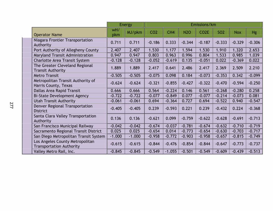
277
Energy Emissions/km
Operator Name
wH/ pkm
MJ/pkm CO2 CH4 N2O CO2E SO2 Nox Hg
Niagara Frontier Transportation Authority
0.711 0.711 -0.186 0.333 -0.344 -0.187 -0.333 -0.329 -0.306
Port Authority of Allegheny County 2.407 2.407 1.530 1.177 1.594 1.530 1.910 1.320 2.653
Maryland Transit Administration 0.947 0.947 0.803 0.963 0.996 0.804 1.533 0.985 1.039
Charlotte Area Transit System -0.128 -0.128 -0.052 -0.619 0.135 -0.051 0.022 -0.369 0.022
The Greater Cleveland Regional Transit Authority
1.889 1.889 2.417 0.641 2.486 2.417 2.369 2.509 2.210
Metro Transit -0.505 -0.505 -0.075 0.098 0.184 -0.073 -0.353 0.342 -0.099
Metropolitan Transit Authority of Harris County, Texas
-0.624 -0.624 -0.321 -0.855 -0.427 -0.322 -0.470 -0.594 -0.250
Dallas Area Rapid Transit 0.666 0.666 0.564 -0.224 0.146 0.561 -0.268 -0.280 0.258
Bi-State Development Agency -0.722 -0.722 -0.077 -0.849 0.077 -0.077 -0.214 -0.073 0.081
Utah Transit Authority -0.061 -0.061 0.694 -0.364 0.727 0.694 -0.522 0.940 -0.547
Denver Regional Transportation District
-0.405 -0.405 0.239 -0.593 0.221 0.239 -0.432 0.224 -0.368
Santa Clara Valley Transportation Authority
0.136 0.136 -0.621 0.099 -0.759 -0.622 -0.628 -0.691 -0.713
San Francisco Municipal Railway -0.042 -0.042 -0.674 -0.037 -0.781 -0.674 -0.632 -0.710 -0.719
Sacramento Regional Transit District 0.025 0.025 -0.654 0.014 -0.773 -0.654 -0.630 -0.703 -0.717
San Diego Metropolitan Transit System -1.000 -1.000 -0.958 -0.772 -0.903 -0.958 -0.657 -0.815 -0.749
Los Angeles County Metropolitan Transportation Authority
-0.615 -0.615 -0.844 -0.476 -0.854 -0.844 -0.647 -0.773 -0.737
Valley Metro Rail, Inc. -0.845 -0.845 -0.549 -1.055 -0.501 -0.549 -0.609 -0.439 -0.513
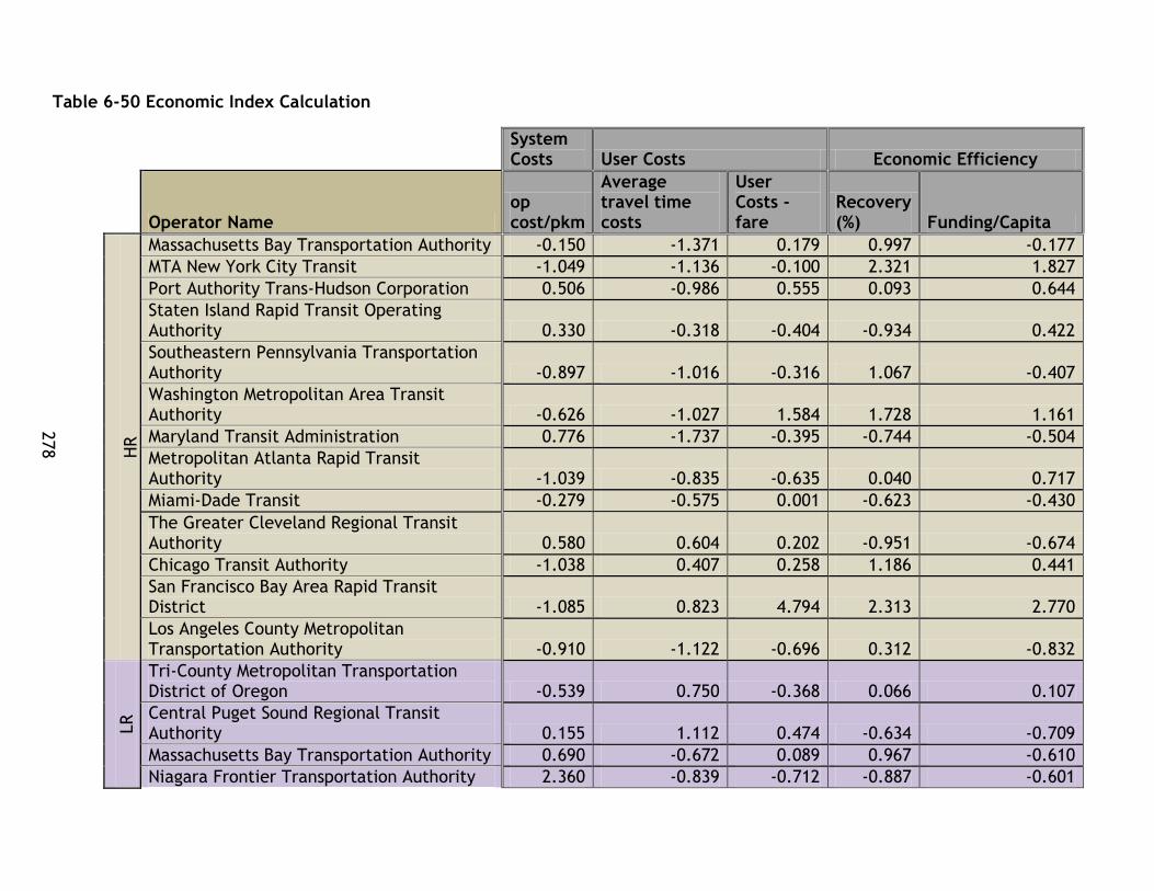
278
Table 6-50 Economic Index Calculation
System Costs User Costs Economic Efficiency
Operator Name
op cost/pkm
Average travel time costs
User Costs - fare
Recovery (%) Funding/Capita
HR
Massachusetts Bay Transportation Authority -0.150 -1.371 0.179 0.997 -0.177
MTA New York City Transit -1.049 -1.136 -0.100 2.321 1.827
Port Authority Trans-Hudson Corporation 0.506 -0.986 0.555 0.093 0.644
Staten Island Rapid Transit Operating Authority 0.330 -0.318 -0.404 -0.934 0.422
Southeastern Pennsylvania Transportation Authority -0.897 -1.016 -0.316 1.067 -0.407
Washington Metropolitan Area Transit Authority -0.626 -1.027 1.584 1.728 1.161
Maryland Transit Administration 0.776 -1.737 -0.395 -0.744 -0.504
Metropolitan Atlanta Rapid Transit Authority -1.039 -0.835 -0.635 0.040 0.717
Miami-Dade Transit -0.279 -0.575 0.001 -0.623 -0.430
The Greater Cleveland Regional Transit Authority 0.580 0.604 0.202 -0.951 -0.674
Chicago Transit Authority -1.038 0.407 0.258 1.186 0.441
San Francisco Bay Area Rapid Transit District -1.085 0.823 4.794 2.313 2.770
Los Angeles County Metropolitan Transportation Authority -0.910 -1.122 -0.696 0.312 -0.832
LR
Tri-County Metropolitan Transportation District of Oregon -0.539 0.750 -0.368 0.066 0.107
Central Puget Sound Regional Transit Authority 0.155 1.112 0.474 -0.634 -0.709
Massachusetts Bay Transportation Authority 0.690 -0.672 0.089 0.967 -0.610
Niagara Frontier Transportation Authority 2.360 -0.839 -0.712 -0.887 -0.601

279
System Costs User Costs Economic Efficiency
Operator Name
op cost/pkm
Average travel time costs
User Costs - fare
Recovery (%) Funding/Capita
Port Authority of Allegheny County 2.497 0.823 0.245 -1.087 -0.276
Maryland Transit Administration 0.121 0.625 -0.369 -0.965 -0.614
Charlotte Area Transit System 0.783 -0.152 -0.088 -0.829 -0.583
The Greater Cleveland Regional Transit Authority 0.758 1.021 0.202 -0.809 -0.815
Metro Transit -0.676 0.709 -0.082 0.405 -0.789
Metropolitan Transit Authority of Harris County, Texas -0.218 -1.491 -1.132 0.332 -0.910
Dallas Area Rapid Transit 0.647 1.369 -0.546 -1.280 -0.014
Bi-State Development Agency -0.895 0.625 0.117 -0.126 -0.424
Utah Transit Authority -0.601 -0.056 -0.586 0.217 -0.745
Denver Regional Transportation District -0.530 1.076 0.191 -0.152 -0.538
Santa Clara Valley Transportation Authority 1.392 0.408 -0.336 -1.124 -0.377
San Francisco Municipal Railway 1.869 -0.067 -0.600 -0.677 2.701
Sacramento Regional Transit District -0.321 -0.375 -0.194 -0.208 -0.262
San Diego Metropolitan Transit System -1.104 0.537 0.139 1.258 -0.647
Los Angeles County Metropolitan Transportation Authority -0.556 0.188 -0.857 -0.934 -0.607
Valley Metro Rail, Inc. -0.951 2.700 -0.616 -0.338 1.755
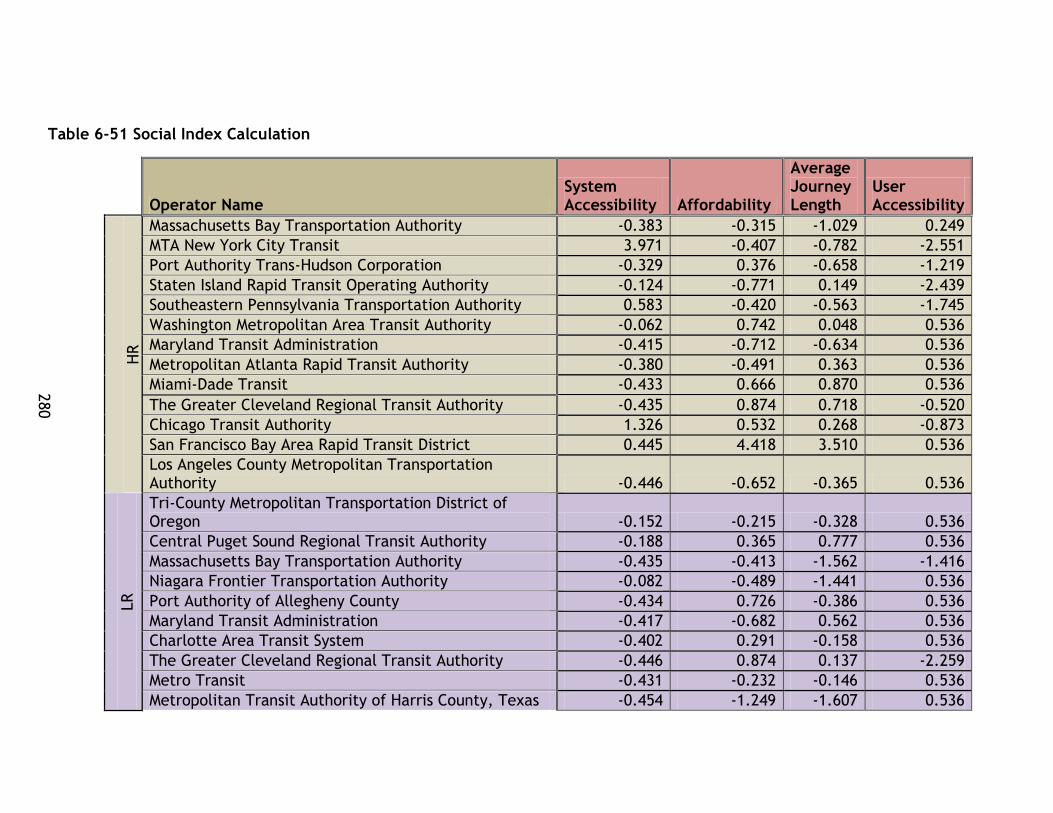
280
Table 6-51 Social Index Calculation
Operator Name
System Accessibility Affordability
Average Journey Length
User Accessibility
HR
Massachusetts Bay Transportation Authority -0.383 -0.315 -1.029 0.249
MTA New York City Transit 3.971 -0.407 -0.782 -2.551
Port Authority Trans-Hudson Corporation -0.329 0.376 -0.658 -1.219
Staten Island Rapid Transit Operating Authority -0.124 -0.771 0.149 -2.439
Southeastern Pennsylvania Transportation Authority 0.583 -0.420 -0.563 -1.745
Washington Metropolitan Area Transit Authority -0.062 0.742 0.048 0.536
Maryland Transit Administration -0.415 -0.712 -0.634 0.536
Metropolitan Atlanta Rapid Transit Authority -0.380 -0.491 0.363 0.536
Miami-Dade Transit -0.433 0.666 0.870 0.536
The Greater Cleveland Regional Transit Authority -0.435 0.874 0.718 -0.520
Chicago Transit Authority 1.326 0.532 0.268 -0.873
San Francisco Bay Area Rapid Transit District 0.445 4.418 3.510 0.536
Los Angeles County Metropolitan Transportation Authority -0.446 -0.652 -0.365 0.536
LR
Tri-County Metropolitan Transportation District of Oregon -0.152 -0.215 -0.328 0.536
Central Puget Sound Regional Transit Authority -0.188 0.365 0.777 0.536
Massachusetts Bay Transportation Authority -0.435 -0.413 -1.562 -1.416
Niagara Frontier Transportation Authority -0.082 -0.489 -1.441 0.536
Port Authority of Allegheny County -0.434 0.726 -0.386 0.536
Maryland Transit Administration -0.417 -0.682 0.562 0.536
Charlotte Area Transit System -0.402 0.291 -0.158 0.536
The Greater Cleveland Regional Transit Authority -0.446 0.874 0.137 -2.259
Metro Transit -0.431 -0.232 -0.146 0.536
Metropolitan Transit Authority of Harris County, Texas -0.454 -1.249 -1.607 0.536
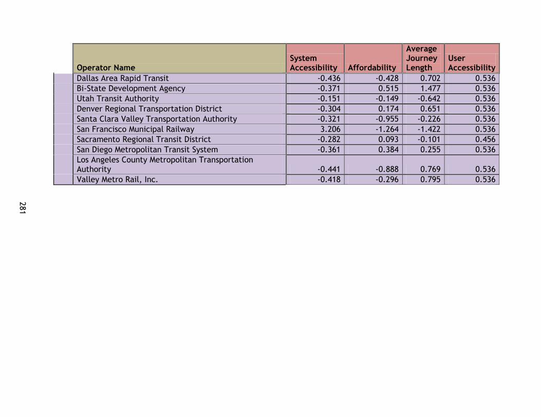
281
Operator Name
System Accessibility Affordability
Average Journey Length
User Accessibility
Dallas Area Rapid Transit -0.436 -0.428 0.702 0.536
Bi-State Development Agency -0.371 0.515 1.477 0.536
Utah Transit Authority -0.151 -0.149 -0.642 0.536
Denver Regional Transportation District -0.304 0.174 0.651 0.536
Santa Clara Valley Transportation Authority -0.321 -0.955 -0.226 0.536
San Francisco Municipal Railway 3.206 -1.264 -1.422 0.536
Sacramento Regional Transit District -0.282 0.093 -0.101 0.456
San Diego Metropolitan Transit System -0.361 0.384 0.255 0.536
Los Angeles County Metropolitan Transportation Authority -0.441 -0.888 0.769 0.536
Valley Metro Rail, Inc. -0.418 -0.296 0.795 0.536

282
6-52 System Effectiveness Index Calculation
Operator Name
pkm/theoretical pkm
Annual trips/capita
HR
Massachusetts Bay Transportation Authority -0.922 0.216
MTA New York City Transit 0.638 5.289
Port Authority Trans-Hudson Corporation 1.044 -0.263
Staten Island Rapid Transit Operating Authority -0.656 -0.135
Southeastern Pennsylvania Transportation Authority 1.369 -0.091
Washington Metropolitan Area Transit Authority -0.093 0.957
Maryland Transit Administration -1.109 -0.323
Metropolitan Atlanta Rapid Transit Authority -0.515 -0.379
Miami-Dade Transit -0.739 -0.379
The Greater Cleveland Regional Transit Authority 0.789 -0.407
Chicago Transit Authority 1.517 0.041
San Francisco Bay Area Rapid Transit District 0.248 0.198
Los Angeles County Metropolitan Transportation Authority 3.628 -0.369
LR
Tri-County Metropolitan Transportation District of Oregon 0.392 0.069
Central Puget Sound Regional Transit Authority -1.114 -0.199
Massachusetts Bay Transportation Authority -0.019 -0.135
Niagara Frontier Transportation Authority -0.272 0.011
Port Authority of Allegheny County -0.729 -0.370
Maryland Transit Administration -0.765 -0.372
Charlotte Area Transit System -0.951 -0.361
The Greater Cleveland Regional Transit Authority 0.154 -0.422
Metro Transit -0.267 -0.363
Metropolitan Transit Authority of Harris County, Texas -0.322 -0.349
Dallas Area Rapid Transit -0.183 -0.364
Bi-State Development Agency -0.123 -0.300
Utah Transit Authority 0.158 -0.156
Denver Regional Transportation District -0.830 -0.252
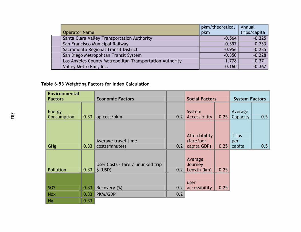
283
Operator Name
pkm/theoretical pkm
Annual trips/capita
Santa Clara Valley Transportation Authority -0.564 -0.325
San Francisco Municipal Railway -0.397 0.733
Sacramento Regional Transit District -0.956 -0.235
San Diego Metropolitan Transit System -0.350 -0.228
Los Angeles County Metropolitan Transportation Authority 1.778 -0.371
Valley Metro Rail, Inc. 0.160 -0.367
Table 6-53 Weighting Factors for Index Calculation
Environmental Factors Economic Factors Social Factors System Factors
Energy Consumption 0.33 op cost/pkm 0.2
System Accessibility 0.25
Average Capacity 0.5
GHg 0.33 Average travel time costs(minutes) 0.2
Affordability (fare/per capita GDP) 0.25
Trips per capita 0.5
Pollution 0.33 User Costs - fare / unlinked trip $ (USD) 0.2
Average Journey Length (km) 0.25
SO2 0.33 Recovery (%) 0.2 user accessibility 0.25
Nox 0.33 PKM/GDP 0.2
Hg 0.33
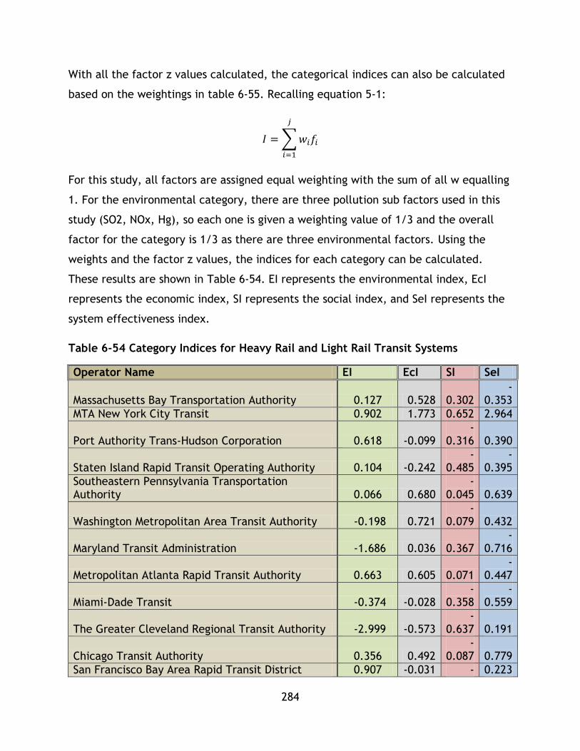
284
With all the factor z values calculated, the categorical indices can also be calculated
based on the weightings in table 6-55. Recalling equation 5-1:
𝐼 = ∑ 𝑤𝑖𝑓𝑖
𝑗
𝑖=1
For this study, all factors are assigned equal weighting with the sum of all w equalling
1. For the environmental category, there are three pollution sub factors used in this
study (SO2, NOx, Hg), so each one is given a weighting value of 1/3 and the overall
factor for the category is 1/3 as there are three environmental factors. Using the
weights and the factor z values, the indices for each category can be calculated.
These results are shown in Table 6-54. EI represents the environmental index, EcI
represents the economic index, SI represents the social index, and SeI represents the
system effectiveness index.
Table 6-54 Category Indices for Heavy Rail and Light Rail Transit Systems
Operator Name EI EcI SI SeI
Massachusetts Bay Transportation Authority 0.127 0.528 0.302 -
0.353
MTA New York City Transit 0.902 1.773 0.652 2.964
Port Authority Trans-Hudson Corporation 0.618 -0.099 -
0.316 0.390
Staten Island Rapid Transit Operating Authority 0.104 -0.242 -
0.485 -
0.395
Southeastern Pennsylvania Transportation Authority 0.066 0.680
-0.045 0.639
Washington Metropolitan Area Transit Authority -0.198 0.721 -
0.079 0.432
Maryland Transit Administration -1.686 0.036 0.367 -
0.716
Metropolitan Atlanta Rapid Transit Authority 0.663 0.605 0.071 -
0.447
Miami-Dade Transit -0.374 -0.028 -
0.358 -
0.559
The Greater Cleveland Regional Transit Authority -2.999 -0.573 -
0.637 0.191
Chicago Transit Authority 0.356 0.492 -
0.087 0.779
San Francisco Bay Area Rapid Transit District 0.907 -0.031 - 0.223

285
Operator Name EI EcI SI SeI
1.737
Los Angeles County Metropolitan Transportation Authority 0.546 0.510 0.277 1.630
Tri-County Metropolitan Transportation District of Oregon 0.815 0.107 0.232 0.230
Central Puget Sound Regional Transit Authority 0.891 -0.582 -
0.198 -
0.657
Massachusetts Bay Transportation Authority 0.345 0.098 0.031 -
0.077
Niagara Frontier Transportation Authority -0.067 -0.430 0.596 -
0.131
Port Authority of Allegheny County -1.966 -1.030 -
0.060 -
0.549
Maryland Transit Administration -0.979 -0.357 0.060 -
0.568
Charlotte Area Transit System 0.096 -0.393 0.000 -
0.656
The Greater Cleveland Regional Transit Authority -2.223 -0.679 -
0.929 -
0.134
Metro Transit 0.205 -0.011 0.121 -
0.315
Metropolitan Transit Authority of Harris County, Texas 0.461 0.505 0.734
-0.336
Dallas Area Rapid Transit -0.377 -0.646 -
0.044 -
0.274
Bi-State Development Agency 0.289 0.006 -
0.457 -
0.212
Utah Transit Authority -0.197 0.265 0.294 0.001
Denver Regional Transportation District 0.119 -0.203 -
0.148 -
0.541
Santa Clara Valley Transportation Authority 0.388 -0.621 0.349 -
0.444
San Francisco Municipal Railway 0.468 -0.462 1.607 0.168
Sacramento Regional Transit District 0.438 0.114 0.046 -
0.596
San Diego Metropolitan Transit System 0.900 0.340 -
0.116 -
0.289
Los Angeles County Metropolitan Transportation Authority 0.726 -0.022 0.054 0.703
Valley Metro Rail, Inc. 0.638 -0.373 -
0.095 -
0.103

286
With these indices calculated for each system, the composite sustainability index
values for the 33 systems can be calculated. Recalling equation 5-2:
The category weights used for this methodology are listed in Table 6-55.
Table 6-55 Category Index Weights
Index Weights
EI 0.25
EcI 0.25
SI 0.25
SeI 0.25
Based on these weights, the CSI values for each system have been calculated. These
values are displayed in Table 6-56.
𝐶𝑆𝐼𝑞 = 𝑤𝑒 ∑ 𝑤𝑖𝐸𝑖,𝑞𝐿𝑖=1 + 𝑤𝑠 ∑ 𝑤𝑖𝑆𝑖,𝑞
𝑀𝑖=1 + 𝑤𝑛 ∑ 𝑤𝑖𝑁𝑖,𝑞
𝑁𝑖=1 + 𝑤𝑦 ∑ 𝑤𝑖𝑌𝑖,𝑞
𝑂𝑖=1
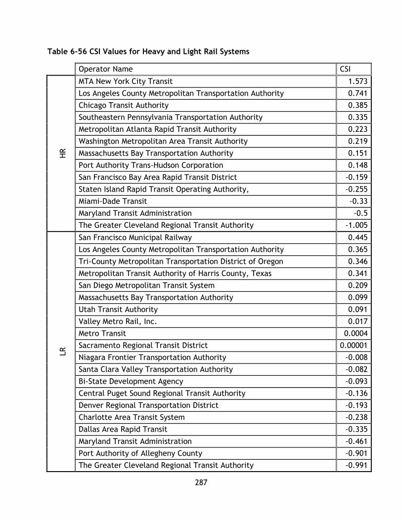
287
Table 6-56 CSI Values for Heavy and Light Rail Systems
Operator Name CSI H
R
MTA New York City Transit 1.573
Los Angeles County Metropolitan Transportation Authority 0.741
Chicago Transit Authority 0.385
Southeastern Pennsylvania Transportation Authority 0.335
Metropolitan Atlanta Rapid Transit Authority 0.223
Washington Metropolitan Area Transit Authority 0.219
Massachusetts Bay Transportation Authority 0.151
Port Authority Trans-Hudson Corporation 0.148
San Francisco Bay Area Rapid Transit District -0.159
Staten Island Rapid Transit Operating Authority, -0.255
Miami-Dade Transit -0.33
Maryland Transit Administration -0.5
The Greater Cleveland Regional Transit Authority -1.005
LR
San Francisco Municipal Railway 0.445
Los Angeles County Metropolitan Transportation Authority 0.365
Tri-County Metropolitan Transportation District of Oregon 0.346
Metropolitan Transit Authority of Harris County, Texas 0.341
San Diego Metropolitan Transit System 0.209
Massachusetts Bay Transportation Authority 0.099
Utah Transit Authority 0.091
Valley Metro Rail, Inc. 0.017
Metro Transit 0.0004
Sacramento Regional Transit District 0.00001
Niagara Frontier Transportation Authority -0.008
Santa Clara Valley Transportation Authority -0.082
Bi-State Development Agency -0.093
Central Puget Sound Regional Transit Authority -0.136
Denver Regional Transportation District -0.193
Charlotte Area Transit System -0.238
Dallas Area Rapid Transit -0.335
Maryland Transit Administration -0.461
Port Authority of Allegheny County -0.901
The Greater Cleveland Regional Transit Authority -0.991

288
6.6.3 Methodology 2: Utility
The first step is to calculate the utility values for each factor. This calculation
compares each systems factor value to the highest performing system. Recall
equations 5-4 and 5-5:
For factors that are positive impacts:
𝑛𝑖 =𝑥𝑖
𝑀𝑎𝑥 (𝑎𝑙𝑙 𝑥)
For factors that are negative impacts:
𝑛𝑖 =𝑀𝑖𝑛 (𝑎𝑙𝑙 𝑥)
𝑥𝑖
Where n is the utility value for each factor. As n tends towards 1 it indicated higher
performance by the system, while lower values of n indicate poorer performance. The
utility values for each factor are shown in Table 6-57, Table 6-58, Table 6-59, and
Table 6 60.

289
Table 6-57 Environment Utility Calculations
Operator Name wH/pkm MJ/pkm CO2 CH4 N2O CO2E SO2 Nox Hg
HR
Massachusetts Bay Transportation Authority 0.4319 0.4319 0.1250 0.0878 0.1280 0.1251 0.0192 0.1735 0.0665
MTA New York City Transit 1.0000 1.0000 0.4607 0.4928 0.5722 0.4615 0.0809 0.5230 0.2084
Port Authority Trans-Hudson Corporation 0.6024 0.6024 0.2985 0.3324 0.3382 0.2990 0.0378 0.3363 0.1047
Staten Island Rapid Transit Operating Authority 0.3534 0.3534 0.1628 0.1741 0.2022 0.1631 0.0286 0.1848 0.0737
Southeastern Pennsylvania Transportation Authority 0.4941 0.4941 0.1419 0.2727 0.1200 0.1420 0.0088 0.1115 0.0232
Washington Metropolitan Area Transit Authority 0.5873 0.5873 0.0733 0.0647 0.1190 0.0734 0.0099 0.0564 -
Maryland Transit Administration 0.2185 0.2185 0.0567 0.0874 0.0459 0.0567 0.0030 0.0387 0.0129
Metropolitan Atlanta Rapid Transit Authority 0.9137 0.9137 0.2259 0.6056 0.1923 0.2261 0.0169 0.2395 0.0765
Miami-Dade Transit 0.3211 0.3211 0.0886 0.1031 0.0965 0.0887 0.0150 0.0649 0.0708
The Greater Cleveland Regional Transit Authority 0.1771 0.1771 0.0340 0.1076 0.0283 0.0340 0.0024 0.0230 0.0084
Chicago Transit Authority 0.5617 0.5617 0.1761 0.5734 0.1497 0.1762 0.0323 0.1869 0.0302
San Francisco Bay Area Rapid Transit District 0.8721 0.8721 0.5348 0.3866 1.0000 0.5361 0.3566 0.9189 1.0000
Los Angeles County Metropolitan Transportation Authority 0.4739 0.4739 0.2906 0.2101 0.5434 0.2914 0.1938 0.4993 0.5434
LR
Tri-County Metropolitan Transportation District of Oregon 0.6886 0.6886 0.5818 0.5248 0.6644 0.5826 0.1818 0.5475 0.4387
Central Puget Sound Regional Transit Authority 0.7472 0.7472 1.0000 1.0000 0.8368 1.0000 1.0000 1.0000 0.2596
Massachusetts Bay Transportation Authority 0.5264 0.5264 0.1524 0.1070 0.1560 0.1525 0.0235 0.2114 0.0810
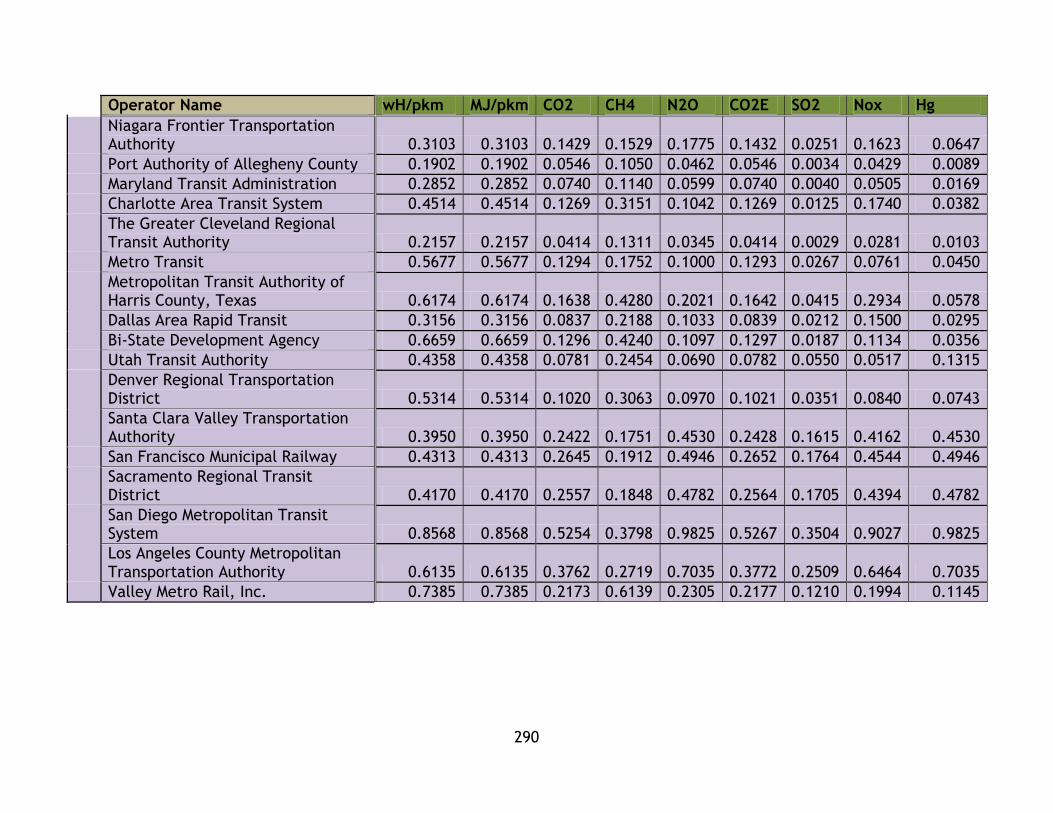
290
Operator Name wH/pkm MJ/pkm CO2 CH4 N2O CO2E SO2 Nox Hg
Niagara Frontier Transportation Authority 0.3103 0.3103 0.1429 0.1529 0.1775 0.1432 0.0251 0.1623 0.0647
Port Authority of Allegheny County 0.1902 0.1902 0.0546 0.1050 0.0462 0.0546 0.0034 0.0429 0.0089
Maryland Transit Administration 0.2852 0.2852 0.0740 0.1140 0.0599 0.0740 0.0040 0.0505 0.0169
Charlotte Area Transit System 0.4514 0.4514 0.1269 0.3151 0.1042 0.1269 0.0125 0.1740 0.0382
The Greater Cleveland Regional Transit Authority 0.2157 0.2157 0.0414 0.1311 0.0345 0.0414 0.0029 0.0281 0.0103
Metro Transit 0.5677 0.5677 0.1294 0.1752 0.1000 0.1293 0.0267 0.0761 0.0450
Metropolitan Transit Authority of Harris County, Texas 0.6174 0.6174 0.1638 0.4280 0.2021 0.1642 0.0415 0.2934 0.0578
Dallas Area Rapid Transit 0.3156 0.3156 0.0837 0.2188 0.1033 0.0839 0.0212 0.1500 0.0295
Bi-State Development Agency 0.6659 0.6659 0.1296 0.4240 0.1097 0.1297 0.0187 0.1134 0.0356
Utah Transit Authority 0.4358 0.4358 0.0781 0.2454 0.0690 0.0782 0.0550 0.0517 0.1315
Denver Regional Transportation District 0.5314 0.5314 0.1020 0.3063 0.0970 0.1021 0.0351 0.0840 0.0743
Santa Clara Valley Transportation Authority 0.3950 0.3950 0.2422 0.1751 0.4530 0.2428 0.1615 0.4162 0.4530
San Francisco Municipal Railway 0.4313 0.4313 0.2645 0.1912 0.4946 0.2652 0.1764 0.4544 0.4946
Sacramento Regional Transit District 0.4170 0.4170 0.2557 0.1848 0.4782 0.2564 0.1705 0.4394 0.4782
San Diego Metropolitan Transit System 0.8568 0.8568 0.5254 0.3798 0.9825 0.5267 0.3504 0.9027 0.9825
Los Angeles County Metropolitan Transportation Authority 0.6135 0.6135 0.3762 0.2719 0.7035 0.3772 0.2509 0.6464 0.7035
Valley Metro Rail, Inc. 0.7385 0.7385 0.2173 0.6139 0.2305 0.2177 0.1210 0.1994 0.1145
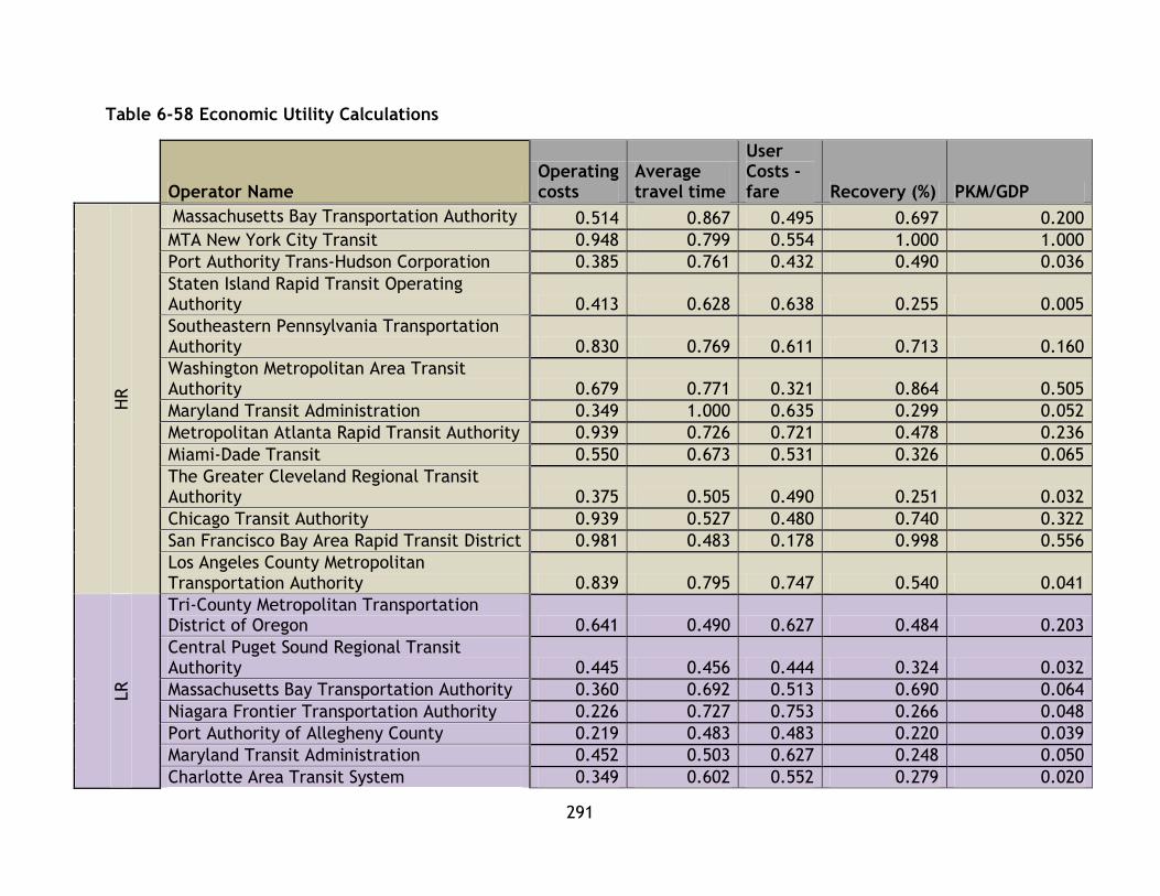
291
Table 6-58 Economic Utility Calculations
Operator Name
Operating costs
Average travel time
User Costs - fare Recovery (%) PKM/GDP
HR
Massachusetts Bay Transportation Authority 0.514 0.867 0.495 0.697 0.200
MTA New York City Transit 0.948 0.799 0.554 1.000 1.000
Port Authority Trans-Hudson Corporation 0.385 0.761 0.432 0.490 0.036
Staten Island Rapid Transit Operating Authority 0.413 0.628 0.638 0.255 0.005
Southeastern Pennsylvania Transportation Authority 0.830 0.769 0.611 0.713 0.160
Washington Metropolitan Area Transit Authority 0.679 0.771 0.321 0.864 0.505
Maryland Transit Administration 0.349 1.000 0.635 0.299 0.052
Metropolitan Atlanta Rapid Transit Authority 0.939 0.726 0.721 0.478 0.236
Miami-Dade Transit 0.550 0.673 0.531 0.326 0.065
The Greater Cleveland Regional Transit Authority 0.375 0.505 0.490 0.251 0.032
Chicago Transit Authority 0.939 0.527 0.480 0.740 0.322
San Francisco Bay Area Rapid Transit District 0.981 0.483 0.178 0.998 0.556
Los Angeles County Metropolitan Transportation Authority 0.839 0.795 0.747 0.540 0.041
LR
Tri-County Metropolitan Transportation District of Oregon 0.641 0.490 0.627 0.484 0.203
Central Puget Sound Regional Transit Authority 0.445 0.456 0.444 0.324 0.032
Massachusetts Bay Transportation Authority 0.360 0.692 0.513 0.690 0.064
Niagara Frontier Transportation Authority 0.226 0.727 0.753 0.266 0.048
Port Authority of Allegheny County 0.219 0.483 0.483 0.220 0.039
Maryland Transit Administration 0.452 0.503 0.627 0.248 0.050
Charlotte Area Transit System 0.349 0.602 0.552 0.279 0.020

292
Operator Name
Operating costs
Average travel time
User Costs - fare Recovery (%) PKM/GDP
The Greater Cleveland Regional Transit Authority 0.352 0.464 0.490 0.284 0.017
Metro Transit 0.702 0.494 0.550 0.562 0.036
Metropolitan Transit Authority of Harris County, Texas 0.533 0.907 1.000 0.545 0.008
Dallas Area Rapid Transit 0.366 0.435 0.687 0.176 0.043
Bi-State Development Agency 0.829 0.503 0.507 0.440 0.140
Utah Transit Authority 0.667 0.587 0.702 0.519 0.112
Denver Regional Transportation District 0.637 0.460 0.493 0.434 0.114
Santa Clara Valley Transportation Authority 0.288 0.527 0.617 0.212 0.035
San Francisco Municipal Railway 0.254 0.589 0.707 0.314 0.053
Sacramento Regional Transit District 0.563 0.637 0.578 0.421 0.117
San Diego Metropolitan Transit System 1.000 0.513 0.503 0.757 0.142
Los Angeles County Metropolitan Transportation Authority 0.648 0.554 0.823 0.255 0.059
Valley Metro Rail, Inc. 0.869 0.350 0.713 0.392 0.060
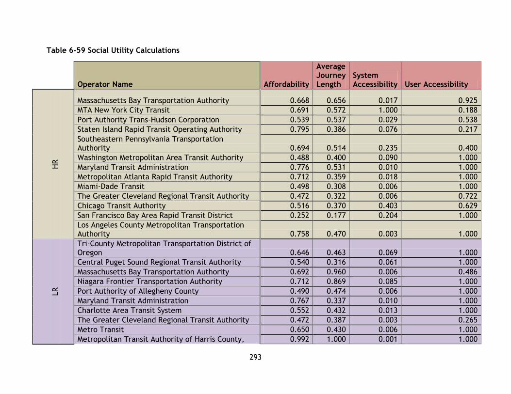
293
Table 6-59 Social Utility Calculations
Operator Name Affordability
Average Journey Length
System Accessibility User Accessibility
HR
Massachusetts Bay Transportation Authority 0.668 0.656 0.017 0.925
MTA New York City Transit 0.691 0.572 1.000 0.188
Port Authority Trans-Hudson Corporation 0.539 0.537 0.029 0.538
Staten Island Rapid Transit Operating Authority 0.795 0.386 0.076 0.217
Southeastern Pennsylvania Transportation Authority 0.694 0.514 0.235 0.400
Washington Metropolitan Area Transit Authority 0.488 0.400 0.090 1.000
Maryland Transit Administration 0.776 0.531 0.010 1.000
Metropolitan Atlanta Rapid Transit Authority 0.712 0.359 0.018 1.000
Miami-Dade Transit 0.498 0.308 0.006 1.000
The Greater Cleveland Regional Transit Authority 0.472 0.322 0.006 0.722
Chicago Transit Authority 0.516 0.370 0.403 0.629
San Francisco Bay Area Rapid Transit District 0.252 0.177 0.204 1.000
Los Angeles County Metropolitan Transportation Authority 0.758 0.470 0.003 1.000
LR
Tri-County Metropolitan Transportation District of Oregon 0.646 0.463 0.069 1.000
Central Puget Sound Regional Transit Authority 0.540 0.316 0.061 1.000
Massachusetts Bay Transportation Authority 0.692 0.960 0.006 0.486
Niagara Frontier Transportation Authority 0.712 0.869 0.085 1.000
Port Authority of Allegheny County 0.490 0.474 0.006 1.000
Maryland Transit Administration 0.767 0.337 0.010 1.000
Charlotte Area Transit System 0.552 0.432 0.013 1.000
The Greater Cleveland Regional Transit Authority 0.472 0.387 0.003 0.265
Metro Transit 0.650 0.430 0.006 1.000
Metropolitan Transit Authority of Harris County, 0.992 1.000 0.001 1.000
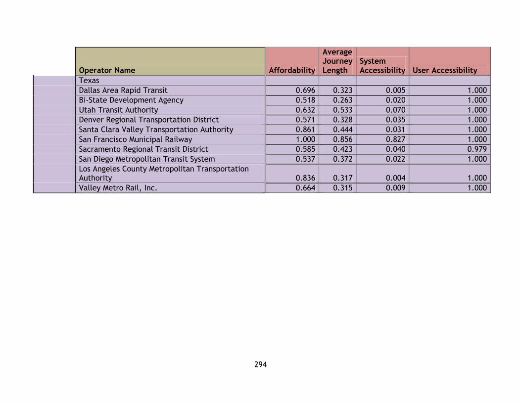
294
Operator Name Affordability
Average Journey Length
System Accessibility User Accessibility
Texas
Dallas Area Rapid Transit 0.696 0.323 0.005 1.000
Bi-State Development Agency 0.518 0.263 0.020 1.000
Utah Transit Authority 0.632 0.533 0.070 1.000
Denver Regional Transportation District 0.571 0.328 0.035 1.000
Santa Clara Valley Transportation Authority 0.861 0.444 0.031 1.000
San Francisco Municipal Railway 1.000 0.856 0.827 1.000
Sacramento Regional Transit District 0.585 0.423 0.040 0.979
San Diego Metropolitan Transit System 0.537 0.372 0.022 1.000
Los Angeles County Metropolitan Transportation Authority 0.836 0.317 0.004 1.000
Valley Metro Rail, Inc. 0.664 0.315 0.009 1.000

295
Table 6-60 System Effectiveness Utility Calculations
Operator Name
pkm/theoretical pkm Annual trips/capita
HR
Massachusetts Bay Transportation Authority 0.262 0.116
MTA New York City Transit 0.515 1.000
Port Authority Trans-Hudson Corporation 0.581 0.032
Staten Island Rapid Transit Operating Authority 0.306 0.054
Southeastern Pennsylvania Transportation Authority 0.634 0.062
Washington Metropolitan Area Transit Authority 0.397 0.245
Maryland Transit Administration 0.232 0.022
Metropolitan Atlanta Rapid Transit Authority 0.328 0.012
Miami-Dade Transit 0.292 0.012
The Greater Cleveland Regional Transit Authority 0.540 0.007
Chicago Transit Authority 0.658 0.085
San Francisco Bay Area Rapid Transit District 0.452 0.112
Los Angeles County Metropolitan Transportation Authority 1.000 0.014
LR
Tri-County Metropolitan Transportation District of Oregon 0.475 0.090
Central Puget Sound Regional Transit Authority 0.231 0.043
Massachusetts Bay Transportation Authority 0.409 0.054
Niagara Frontier Transportation Authority 0.368 0.080
Port Authority of Allegheny County 0.294 0.013
Maryland Transit Administration 0.288 0.013
Charlotte Area Transit System 0.258 0.015
The Greater Cleveland Regional Transit Authority 0.437 0.004
Metro Transit 0.369 0.015
Metropolitan Transit Authority of Harris County, Texas 0.360 0.017
Dallas Area Rapid Transit 0.382 0.014
Bi-State Development Agency 0.392 0.026
Utah Transit Authority 0.438 0.051
Denver Regional Transportation District 0.277 0.034
Santa Clara Valley Transportation Authority 0.320 0.021
San Francisco Municipal Railway 0.347 0.206
Sacramento Regional Transit District 0.257 0.037
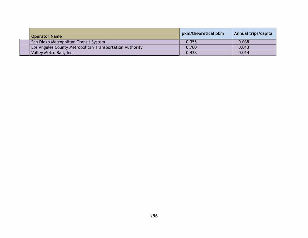
296
Operator Name
pkm/theoretical pkm Annual trips/capita
San Diego Metropolitan Transit System 0.355 0.038
Los Angeles County Metropolitan Transportation Authority 0.700 0.013
Valley Metro Rail, Inc. 0.438 0.014

297
With all factor utility values calculated the category indices for each system can be
calculated. The same formulation and weights used in method 1 are utilized in
method 2. The indices are shown in Table 6-61.
Table 6-61 Category Indices for Heavy Rail and Light Rail Transit Systems
Operator Name EI EcI SI SeI
HR
Massachusetts Bay Transportation Authority 0.214 0.555 0.567 0.189
MTA New York City Transit 0.577 0.860 0.613 0.758
Port Authority Trans-Hudson Corporation 0.354 0.421 0.411 0.307
Staten Island Rapid Transit Operating Authority 0.204 0.388 0.368 0.180
Southeastern Pennsylvania Transportation Authority 0.228 0.617 0.461 0.348
Washington Metropolitan Area Transit Authority 0.228 0.628 0.494 0.321
Maryland Transit Administration 0.098 0.467 0.579 0.127
Metropolitan Atlanta Rapid Transit Authority 0.417 0.620 0.522 0.170
Miami-Dade Transit 0.153 0.429 0.453 0.152
The Greater Cleveland Regional Transit Authority 0.074 0.331 0.380 0.273
Chicago Transit Authority 0.274 0.602 0.480 0.371
San Francisco Bay Area Rapid Transit District 0.722 0.639 0.408 0.282
Los Angeles County Metropolitan Transportation Authority 0.392 0.592 0.558 0.507
LR
Tri-County Metropolitan Transportation District of Oregon 0.553 0.489 0.545 0.283
Central Puget Sound Regional Transit Authority 0.833 0.340 0.479 0.137
Massachusetts Bay Transportation Authority 0.261 0.464 0.536 0.232
Niagara Frontier Transportation Authority 0.179 0.404 0.666 0.224
Port Authority of Allegheny County 0.088 0.289 0.493 0.154
Maryland Transit Administration 0.128 0.376 0.528 0.150
Charlotte Area Transit System 0.218 0.360 0.499 0.136
The Greater Cleveland Regional Transit Authority 0.090 0.322 0.282 0.221
Metro Transit 0.249 0.469 0.522 0.192
Metropolitan Transit Authority of Harris County, Texas 0.304 0.598 0.748 0.188
Dallas Area Rapid Transit 0.155 0.341 0.506 0.198
Bi-State Development Agency 0.284 0.484 0.450 0.209
Utah Transit Authority 0.198 0.517 0.559 0.244
Denver Regional Transportation District 0.233 0.428 0.484 0.156
Santa Clara Valley Transportation Authority 0.327 0.336 0.584 0.171
San Francisco Municipal Railway 0.357 0.383 0.921 0.277
Sacramento Regional Transit District 0.345 0.463 0.507 0.147
San Diego Metropolitan Transit System 0.710 0.583 0.483 0.197
Los Angeles County Metropolitan Transportation Authority 0.508 0.468 0.539 0.357
Valley Metro Rail, Inc. 0.367 0.477 0.497 0.226

298
With the category indices calculated, finally the CSI values can be calculated for each
system. The CSI values are shown in Table 6-62.
Table 6-62 CSI Values for Method 2
Operator Name CSI
HR
MTA New York City Transit 0.702
San Francisco Bay Area Rapid Transit District 0.513
Los Angeles County Metropolitan Transportation Authority 0.512
Metropolitan Atlanta Rapid Transit Authority 0.432
Chicago Transit Authority 0.432
Washington Metropolitan Area Transit Authority 0.418
Southeastern Pennsylvania Transportation Authority 0.413
Massachusetts Bay Transportation Authority 0.381
Port Authority Trans-Hudson Corporation 0.373
Maryland Transit Administration 0.318
Miami-Dade Transit 0.297
Staten Island Rapid Transit Operating Authority 0.285
The Greater Cleveland Regional Transit Authority 0.265
LR
San Diego Metropolitan Transit System 0.493
San Francisco Municipal Railway 0.484
Los Angeles County Metropolitan Transportation Authority 0.468
Tri-County Metropolitan Transportation District of Oregon 0.467
Metropolitan Transit Authority of Harris County, Texas 0.46
Central Puget Sound Regional Transit Authority 0.448
Valley Metro Rail, Inc. 0.392
Utah Transit Authority 0.379
Massachusetts Bay Transportation Authority 0.373
Niagara Frontier Transportation Authority 0.368
Sacramento Regional Transit District 0.366
Metro Transit 0.358
Bi-State Development Agency 0.357
Santa Clara Valley Transportation Authority 0.354
Denver Regional Transportation District 0.325
Charlotte Area Transit System 0.303
Dallas Area Rapid Transit 0.3
Maryland Transit Administration 0.296
Port Authority of Allegheny County 0.256
The Greater Cleveland Regional Transit Authority 0.229

299
6.6.4 Method 3: Re-Scaling
The first step is to re-scale all values based on equation 5-6:
𝑛𝑖 =𝑥𝑖 − min (𝑎𝑙𝑙 𝑥)
max(𝑎𝑙𝑙 𝑥) − min (𝑎𝑙𝑙 𝑥)
The min value is assigned to the ‘loser’ – the system with the lowest performance,
while the max value is assigned to the ‘winner’ – the system with the highest
performance. Tables 6-63 to 6-66 show the rescaled values across all categories.
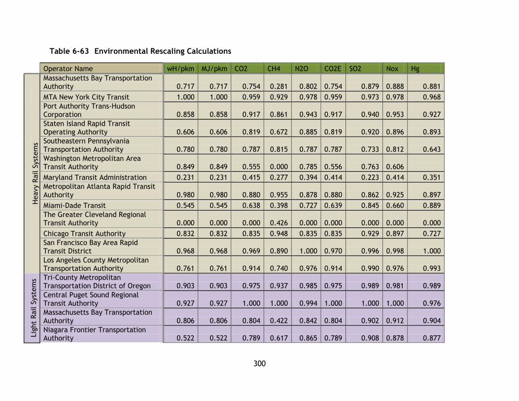
300
Table 6-63 Environmental Rescaling Calculations
Operator Name wH/pkm MJ/pkm CO2 CH4 N2O CO2E SO2 Nox Hg
Heavy R
ail S
yst
em
s
Massachusetts Bay Transportation Authority 0.717 0.717 0.754 0.281 0.802 0.754 0.879 0.888 0.881
MTA New York City Transit 1.000 1.000 0.959 0.929 0.978 0.959 0.973 0.978 0.968
Port Authority Trans-Hudson Corporation 0.858 0.858 0.917 0.861 0.943 0.917 0.940 0.953 0.927
Staten Island Rapid Transit Operating Authority 0.606 0.606 0.819 0.672 0.885 0.819 0.920 0.896 0.893
Southeastern Pennsylvania Transportation Authority 0.780 0.780 0.787 0.815 0.787 0.787 0.733 0.812 0.643
Washington Metropolitan Area Transit Authority 0.849 0.849 0.555 0.000 0.785 0.556 0.763 0.606
Maryland Transit Administration 0.231 0.231 0.415 0.277 0.394 0.414 0.223 0.414 0.351
Metropolitan Atlanta Rapid Transit Authority 0.980 0.980 0.880 0.955 0.878 0.880 0.862 0.925 0.897
Miami-Dade Transit 0.545 0.545 0.638 0.398 0.727 0.639 0.845 0.660 0.889
The Greater Cleveland Regional Transit Authority 0.000 0.000 0.000 0.426 0.000 0.000 0.000 0.000 0.000
Chicago Transit Authority 0.832 0.832 0.835 0.948 0.835 0.835 0.929 0.897 0.727
San Francisco Bay Area Rapid Transit District 0.968 0.968 0.969 0.890 1.000 0.970 0.996 0.998 1.000
Los Angeles County Metropolitan Transportation Authority 0.761 0.761 0.914 0.740 0.976 0.914 0.990 0.976 0.993
Lig
ht
Rail S
yst
em
s Tri-County Metropolitan Transportation District of Oregon 0.903 0.903 0.975 0.937 0.985 0.975 0.989 0.981 0.989
Central Puget Sound Regional Transit Authority 0.927 0.927 1.000 1.000 0.994 1.000 1.000 1.000 0.976
Massachusetts Bay Transportation Authority 0.806 0.806 0.804 0.422 0.842 0.804 0.902 0.912 0.904
Niagara Frontier Transportation Authority 0.522 0.522 0.789 0.617 0.865 0.789 0.908 0.878 0.877
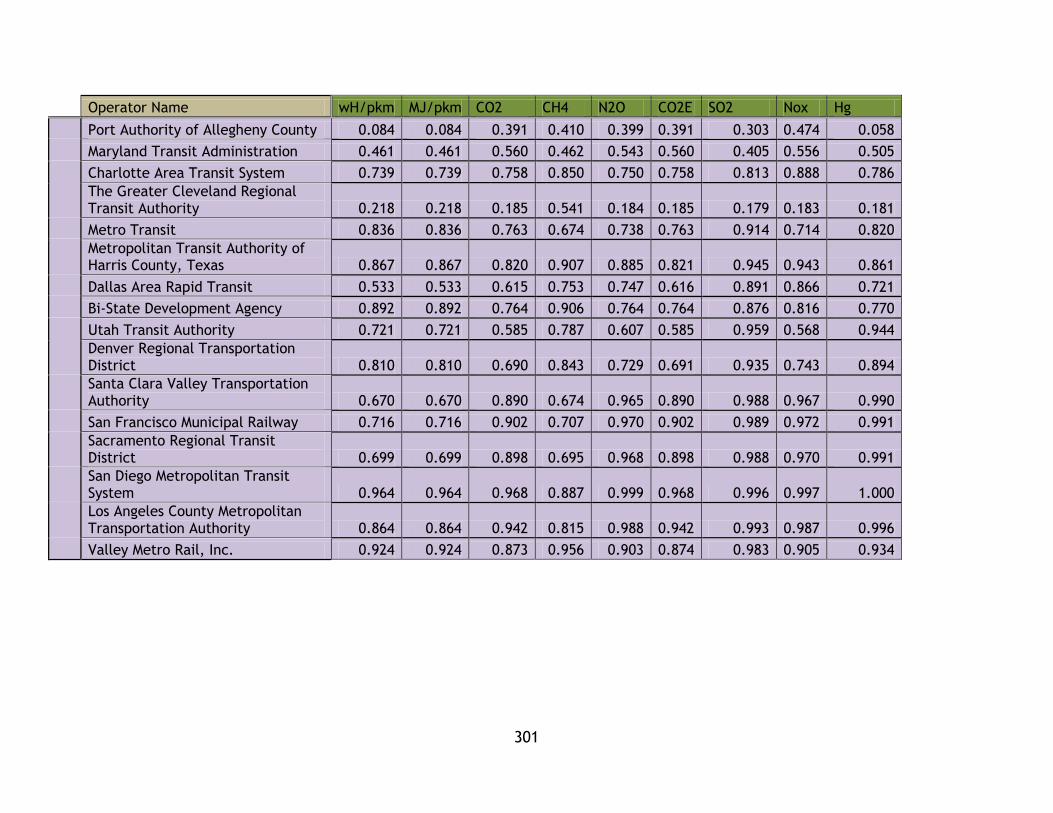
301
Operator Name wH/pkm MJ/pkm CO2 CH4 N2O CO2E SO2 Nox Hg
Port Authority of Allegheny County 0.084 0.084 0.391 0.410 0.399 0.391 0.303 0.474 0.058
Maryland Transit Administration 0.461 0.461 0.560 0.462 0.543 0.560 0.405 0.556 0.505
Charlotte Area Transit System 0.739 0.739 0.758 0.850 0.750 0.758 0.813 0.888 0.786
The Greater Cleveland Regional Transit Authority 0.218 0.218 0.185 0.541 0.184 0.185 0.179 0.183 0.181
Metro Transit 0.836 0.836 0.763 0.674 0.738 0.763 0.914 0.714 0.820
Metropolitan Transit Authority of Harris County, Texas 0.867 0.867 0.820 0.907 0.885 0.821 0.945 0.943 0.861
Dallas Area Rapid Transit 0.533 0.533 0.615 0.753 0.747 0.616 0.891 0.866 0.721
Bi-State Development Agency 0.892 0.892 0.764 0.906 0.764 0.764 0.876 0.816 0.770
Utah Transit Authority 0.721 0.721 0.585 0.787 0.607 0.585 0.959 0.568 0.944
Denver Regional Transportation District 0.810 0.810 0.690 0.843 0.729 0.691 0.935 0.743 0.894
Santa Clara Valley Transportation Authority 0.670 0.670 0.890 0.674 0.965 0.890 0.988 0.967 0.990
San Francisco Municipal Railway 0.716 0.716 0.902 0.707 0.970 0.902 0.989 0.972 0.991
Sacramento Regional Transit District 0.699 0.699 0.898 0.695 0.968 0.898 0.988 0.970 0.991
San Diego Metropolitan Transit System 0.964 0.964 0.968 0.887 0.999 0.968 0.996 0.997 1.000
Los Angeles County Metropolitan Transportation Authority 0.864 0.864 0.942 0.815 0.988 0.942 0.993 0.987 0.996
Valley Metro Rail, Inc. 0.924 0.924 0.873 0.956 0.903 0.874 0.983 0.905 0.934

302
Table 6-64 Economic Rescaling Calculations
Operator Name
op cost/pkm
Average travel time costs(minutes)
User Costs - fare / unlinked trip $ (USD)
Recovery (%) PKM/GDP
Heavy R
ail S
yst
em
s
Massachusetts Bay Transportation Authority 0.948 0.799 0.554 1.000 1.000
MTA New York City Transit 0.981 0.483 0.178 0.998 0.556
Port Authority Trans-Hudson Corporation 0.839 0.795 0.747 0.540 0.041
Staten Island Rapid Transit Operating Authority 1.000 0.513 0.503 0.757 0.142
Southeastern Pennsylvania Transportation Authority 0.254 0.589 0.707 0.314 0.053
Washington Metropolitan Area Transit Authority 0.648 0.554 0.823 0.255 0.059
Maryland Transit Administration 0.641 0.490 0.627 0.484 0.203
Metropolitan Atlanta Rapid Transit Authority 0.533 0.907 1.000 0.545 0.008
Miami-Dade Transit 0.445 0.456 0.444 0.324 0.032
The Greater Cleveland Regional Transit Authority 0.939 0.726 0.721 0.478 0.236
Chicago Transit Authority 0.939 0.527 0.480 0.740 0.322
San Francisco Bay Area Rapid Transit District 0.679 0.771 0.321 0.864 0.505
Los Angeles County Metropolitan Transportation Authority 0.830 0.769 0.611 0.713 0.160
Lig
ht
Rail S
yst
em
s
Tri-County Metropolitan Transportation District of Oregon 0.869 0.350 0.713 0.392 0.060
Central Puget Sound Regional Transit Authority 0.514 0.867 0.495 0.697 0.200
Massachusetts Bay Transportation Authority 0.667 0.587 0.702 0.519 0.112
Niagara Frontier Transportation Authority 0.360 0.692 0.513 0.690 0.064
Port Authority of Allegheny County 0.385 0.761 0.432 0.490 0.036
Maryland Transit Administration 0.226 0.727 0.753 0.266 0.048
Charlotte Area Transit System 0.563 0.637 0.578 0.421 0.117
The Greater Cleveland Regional Transit Authority 0.702 0.494 0.550 0.562 0.036
Metro Transit 0.829 0.503 0.507 0.440 0.140
Metropolitan Transit Authority of Harris County, Texas 0.288 0.527 0.617 0.212 0.035
Dallas Area Rapid Transit 0.637 0.460 0.493 0.434 0.114
Bi-State Development Agency 0.349 1.000 0.635 0.299 0.052
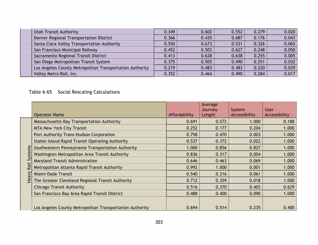
303
Utah Transit Authority 0.349 0.602 0.552 0.279 0.020
Denver Regional Transportation District 0.366 0.435 0.687 0.176 0.043
Santa Clara Valley Transportation Authority 0.550 0.673 0.531 0.326 0.065
San Francisco Municipal Railway 0.452 0.503 0.627 0.248 0.050
Sacramento Regional Transit District 0.413 0.628 0.638 0.255 0.005
San Diego Metropolitan Transit System 0.375 0.505 0.490 0.251 0.032
Los Angeles County Metropolitan Transportation Authority 0.219 0.483 0.483 0.220 0.039
Valley Metro Rail, Inc. 0.352 0.464 0.490 0.284 0.017
Table 6-65 Social Rescaling Calculations
Operator Name Affordability
Average Journey Length
System Accessibility
User Accessibility
Heavy R
ail S
yst
em
s
Massachusetts Bay Transportation Authority 0.691 0.572 1.000 0.188
MTA New York City Transit 0.252 0.177 0.204 1.000
Port Authority Trans-Hudson Corporation 0.758 0.470 0.003 1.000
Staten Island Rapid Transit Operating Authority 0.537 0.372 0.022 1.000
Southeastern Pennsylvania Transportation Authority 1.000 0.856 0.827 1.000
Washington Metropolitan Area Transit Authority 0.836 0.317 0.004 1.000
Maryland Transit Administration 0.646 0.463 0.069 1.000
Metropolitan Atlanta Rapid Transit Authority 0.992 1.000 0.001 1.000
Miami-Dade Transit 0.540 0.316 0.061 1.000
The Greater Cleveland Regional Transit Authority 0.712 0.359 0.018 1.000
Chicago Transit Authority 0.516 0.370 0.403 0.629
San Francisco Bay Area Rapid Transit District 0.488 0.400 0.090 1.000
Los Angeles County Metropolitan Transportation Authority 0.694 0.514 0.235 0.400
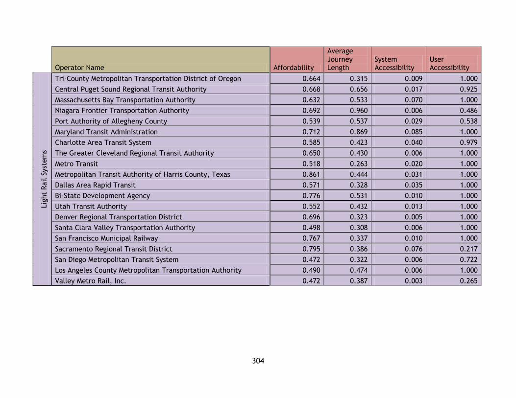
304
Operator Name Affordability
Average Journey Length
System Accessibility
User Accessibility
Lig
ht
Rail S
yst
em
s
Tri-County Metropolitan Transportation District of Oregon 0.664 0.315 0.009 1.000
Central Puget Sound Regional Transit Authority 0.668 0.656 0.017 0.925
Massachusetts Bay Transportation Authority 0.632 0.533 0.070 1.000
Niagara Frontier Transportation Authority 0.692 0.960 0.006 0.486
Port Authority of Allegheny County 0.539 0.537 0.029 0.538
Maryland Transit Administration 0.712 0.869 0.085 1.000
Charlotte Area Transit System 0.585 0.423 0.040 0.979
The Greater Cleveland Regional Transit Authority 0.650 0.430 0.006 1.000
Metro Transit 0.518 0.263 0.020 1.000
Metropolitan Transit Authority of Harris County, Texas 0.861 0.444 0.031 1.000
Dallas Area Rapid Transit 0.571 0.328 0.035 1.000
Bi-State Development Agency 0.776 0.531 0.010 1.000
Utah Transit Authority 0.552 0.432 0.013 1.000
Denver Regional Transportation District 0.696 0.323 0.005 1.000
Santa Clara Valley Transportation Authority 0.498 0.308 0.006 1.000
San Francisco Municipal Railway 0.767 0.337 0.010 1.000
Sacramento Regional Transit District 0.795 0.386 0.076 0.217
San Diego Metropolitan Transit System 0.472 0.322 0.006 0.722
Los Angeles County Metropolitan Transportation Authority 0.490 0.474 0.006 1.000
Valley Metro Rail, Inc. 0.472 0.387 0.003 0.265

305
Table 6-66 System Effectiveness Rescaling Calculations
Operator Name
pkm/theoretical pkm
Annual trips/capita
Heavy R
ail S
yst
em
s
Massachusetts Bay Transportation Authority 0.515 1.000
MTA New York City Transit 0.452 0.112
Port Authority Trans-Hudson Corporation 1.000 0.014
Staten Island Rapid Transit Operating Authority 0.355 0.038
Southeastern Pennsylvania Transportation Authority 0.347 0.206
Washington Metropolitan Area Transit Authority 0.700 0.013
Maryland Transit Administration 0.475 0.090
Metropolitan Atlanta Rapid Transit Authority 0.360 0.017
Miami-Dade Transit 0.231 0.043
The Greater Cleveland Regional Transit Authority 0.328 0.012
Chicago Transit Authority 0.658 0.085
San Francisco Bay Area Rapid Transit District 0.397 0.245
Los Angeles County Metropolitan Transportation Authority 0.634 0.062
Lig
ht
Rail S
yst
em
s
Tri-County Metropolitan Transportation District of Oregon 0.438 0.014
Central Puget Sound Regional Transit Authority 0.262 0.116
Massachusetts Bay Transportation Authority 0.438 0.051
Niagara Frontier Transportation Authority 0.409 0.054
Port Authority of Allegheny County 0.581 0.032
Maryland Transit Administration 0.368 0.080
Charlotte Area Transit System 0.257 0.037
The Greater Cleveland Regional Transit Authority 0.369 0.015
Metro Transit 0.392 0.026
Metropolitan Transit Authority of Harris County, Texas 0.320 0.021
Dallas Area Rapid Transit 0.277 0.034
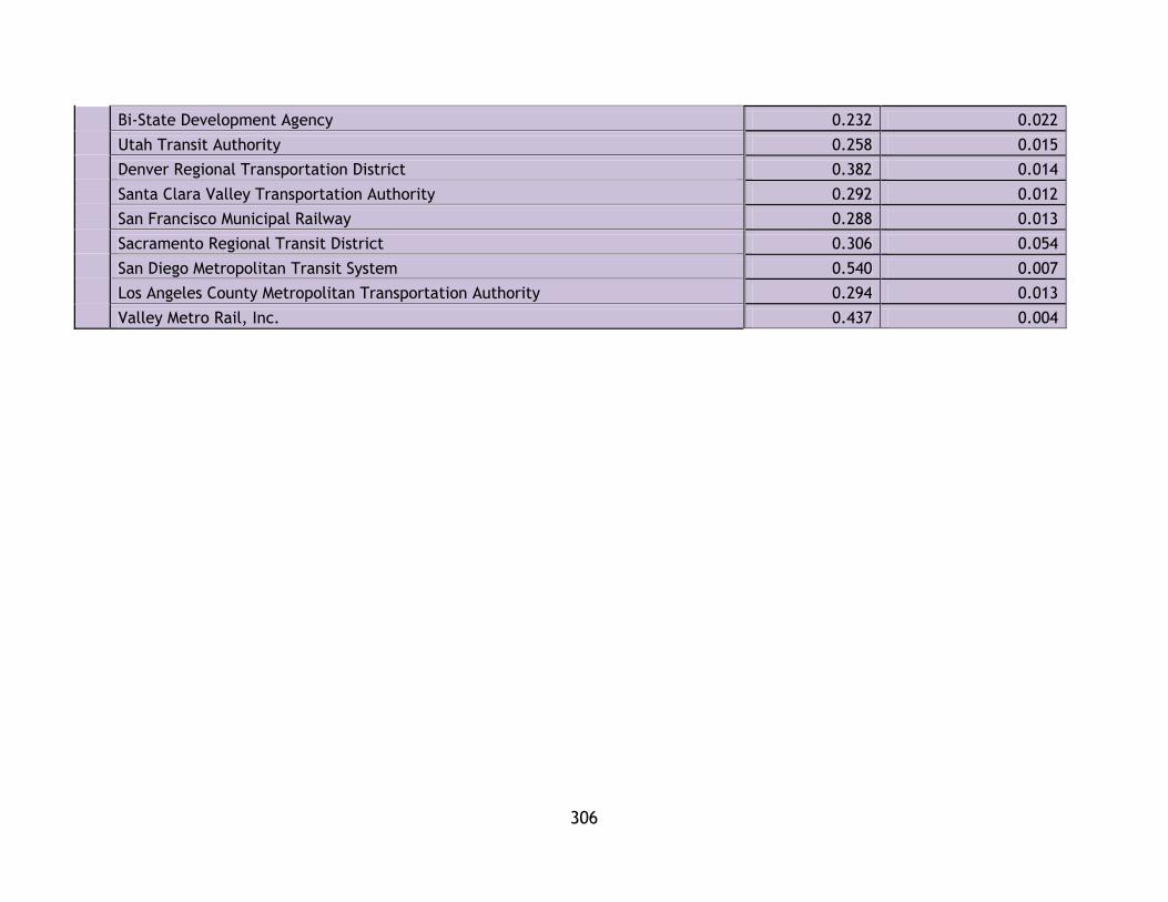
306
Bi-State Development Agency 0.232 0.022
Utah Transit Authority 0.258 0.015
Denver Regional Transportation District 0.382 0.014
Santa Clara Valley Transportation Authority 0.292 0.012
San Francisco Municipal Railway 0.288 0.013
Sacramento Regional Transit District 0.306 0.054
San Diego Metropolitan Transit System 0.540 0.007
Los Angeles County Metropolitan Transportation Authority 0.294 0.013
Valley Metro Rail, Inc. 0.437 0.004
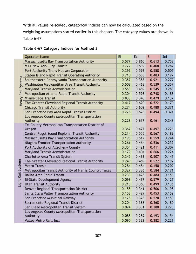
307
With all values re-scaled, categorical indices can now be calculated based on the
weighting assumptions stated earlier in this chapter. The category values are shown in
Table 6-67.
Table 6-67 Category Indices for Method 3
Operator Name EI EcI SI SeI
Heavy R
ail S
yst
em
s
Massachusetts Bay Transportation Authority 0.577 0.860 0.613 0.758
MTA New York City Transit 0.722 0.639 0.408 0.282
Port Authority Trans-Hudson Corporation 0.392 0.592 0.558 0.507
Staten Island Rapid Transit Operating Authority 0.710 0.583 0.483 0.197
Southeastern Pennsylvania Transportation Authority 0.357 0.383 0.921 0.277
Washington Metropolitan Area Transit Authority 0.508 0.468 0.539 0.357
Maryland Transit Administration 0.553 0.489 0.545 0.283
Metropolitan Atlanta Rapid Transit Authority 0.304 0.598 0.748 0.188
Miami-Dade Transit 0.833 0.340 0.479 0.137
The Greater Cleveland Regional Transit Authority 0.417 0.620 0.522 0.170
Chicago Transit Authority 0.274 0.602 0.480 0.371
San Francisco Bay Area Rapid Transit District 0.228 0.628 0.494 0.321
Los Angeles County Metropolitan Transportation Authority 0.228 0.617 0.461 0.348
Lig
ht
Rail S
yst
em
s
Tri-County Metropolitan Transportation District of Oregon 0.367 0.477 0.497 0.226
Central Puget Sound Regional Transit Authority 0.214 0.555 0.567 0.189
Massachusetts Bay Transportation Authority 0.198 0.517 0.559 0.244
Niagara Frontier Transportation Authority 0.261 0.464 0.536 0.232
Port Authority of Allegheny County 0.354 0.421 0.411 0.307
Maryland Transit Administration 0.179 0.404 0.666 0.224
Charlotte Area Transit System 0.345 0.463 0.507 0.147
The Greater Cleveland Regional Transit Authority 0.249 0.469 0.522 0.192
Metro Transit 0.284 0.484 0.450 0.209
Metropolitan Transit Authority of Harris County, Texas 0.327 0.336 0.584 0.171
Dallas Area Rapid Transit 0.233 0.428 0.484 0.156
Bi-State Development Agency 0.098 0.467 0.579 0.127
Utah Transit Authority 0.218 0.360 0.499 0.136
Denver Regional Transportation District 0.155 0.341 0.506 0.198
Santa Clara Valley Transportation Authority 0.153 0.429 0.453 0.152
San Francisco Municipal Railway 0.128 0.376 0.528 0.150
Sacramento Regional Transit District 0.204 0.388 0.368 0.180
San Diego Metropolitan Transit System 0.074 0.331 0.380 0.273
Los Angeles County Metropolitan Transportation Authority 0.088 0.289 0.493 0.154
Valley Metro Rail, Inc. 0.090 0.322 0.282 0.221

308
Using default weighting values, CSI values have been calculated from the category
index values.
Table 6-68 CSI Values for Method 3
Operator Name CSI
Heavy R
ail S
yst
em
s
MTA New York City Transit 0.702
Los Angeles County Metropolitan Transportation Authority 0.513
Chicago Transit Authority 0.512
San Francisco Municipal Railway 0.493
Los Angeles County Metropolitan Transportation Authority 0.484
Tri-County Metropolitan Transportation District of Oregon 0.468
Metropolitan Transit Authority of Harris County, Texas 0.467
San Diego Metropolitan Transit System 0.460
Southeastern Pennsylvania Transportation Authority 0.448
Metropolitan Atlanta Rapid Transit Authority 0.432
Massachusetts Bay Transportation Authority 0.432
Washington Metropolitan Area Transit Authority 0.418
Port Authority Trans-Hudson Corporation 0.413
Lig
ht
Rail S
yst
em
s
Utah Transit Authority 0.392
Valley Metro Rail, Inc. 0.381
Massachusetts Bay Transportation Authority 0.379
San Francisco Bay Area Rapid Transit District 0.373
Metro Transit 0.373
Sacramento Regional Transit District 0.368
Bi-State Development Agency 0.366
Niagara Frontier Transportation Authority 0.358
Central Puget Sound Regional Transit Authority 0.357
Santa Clara Valley Transportation Authority 0.354
Denver Regional Transportation District 0.325
Charlotte Area Transit System 0.318
Miami-Dade Transit 0.303
Staten Island Rapid Transit Operating Authority 0.300
Dallas Area Rapid Transit 0.297
Maryland Transit Administration 0.296
Maryland Transit Administration 0.285
Port Authority of Allegheny County 0.265
The Greater Cleveland Regional Transit Authority 0.256
The Greater Cleveland Regional Transit Authority 0.229

309
6.7 CSI Results Analysis
This section provides commentary on the results of the category and composite
sustainability index analysis. The quartile performance break down used in the factor
analysis is reused here to offer up further commentary on overall performance of the
systems based on the default weightings. This default weighting is considered the
base case scenario. Under this scenario it is assumed all factors have identical value
and all categories are valued equally. Systems are also sorted into performance
categories based on their ranking under each index to add a secondary analysis to go
along with the CSI measure. Section 6.8 outlines sensitivity testing based on changes
to weightings of the index level scores to explore how rankings and CSI values change
with different categorical indices.
6.7.1 Method 1: z-score
Referring to the category indices for both system sets it is important to observe that
aside from MTA New York city, no system achieves a high degree of performance in all
4 categories in either system set. This reflects the notion that developing a system
that is optimized for all elements of sustainability mobility is a complex process with
many competing factors and trade-offs. Some systems are able to achieve
performance spikes in individual categories, such as San Francisco Bay Area Rapid
Transit District’s high score of 0.907 in the EI category or San Francisco Municipal
Railway ‘s score of 1.607 under SI. These systems however do not achieve high
performance in the other three factors. Other systems can be characterized as
balanced performance, with above average performance in 3 out of 4 factors, such as
Chicago Transit Authority that achieves high or highest performance in indices.
Systems are sorted into the following performance categories:
Specialized Performance: Highest/high performance under 1-2 indices, the
remaining are low or poorest.
Balanced Performance (high): High or highest performance in ¾ indices
Balanced Performance (medium): 3-4 indices above poor performance. 1
index above low performance
Low Performance: low or poorest performance across all indices

310
Superior Performance: Highest performance across all 4 factors
To aid in sorting and analysis performance tables for each system by each index are
listed below in Table 6-69, Table 6-70, Table 6-71, and Table 6-72. These tables also
include the numbers of each system in each performance tier – for example, there are
5 LR and 3 HR systems under the highest performance tear in the environmental index
(EI).

311
Table 6-69 EI Ranking For Method 1
Rank Operator Name Mode EI Performance
1 San Francisco Bay Area Rapid Transit District HR 0.907 Highest
2 MTA New York City Transit HR 0.902 LR
3 San Diego Metropolitan Transit System LR 0.900 5
4 Central Puget Sound Regional Transit Authority LR 0.891 HR
5 Tri-County Metropolitan Transportation District of Oregon LR 0.815 3
6 Los Angeles County Metropolitan Transportation Authority LR 0.726
7 Metropolitan Atlanta Rapid Transit Authority HR 0.663
8 Valley Metro Rail, Inc. LR 0.638
9 Port Authority Trans-Hudson Corporation HR 0.618 High
10 Los Angeles County Metropolitan Transportation Authority HR 0.546 LR
11 San Francisco Municipal Railway LR 0.468 6
12 Metropolitan Transit Authority of Harris County, Texas LR 0.461 HR
13 Sacramento Regional Transit District LR 0.438 3
14 Santa Clara Valley Transportation Authority LR 0.388
15 Chicago Transit Authority HR 0.356
16 Massachusetts Bay Transportation Authority LR 0.345
17 Bi-State Development Agency LR 0.289
18 Metro Transit LR 0.205 Low
19 Massachusetts Bay Transportation Authority HR 0.127 LR
20 Southeastern Pennsylvania Transportation Authority HR 0.126 5
21 Denver Regional Transportation District LR 0.119 HR
22 Staten Island Rapid Transit Operating Authority HR 0.104 4
23 Charlotte Area Transit System LR 0.096
24 Niagara Frontier Transportation Authority LR -0.067
25 Washington Metropolitan Area Transit Authority HR -0.112
26 Utah Transit Authority LR -0.197
27 Miami-Dade Transit HR -0.374 Poorest
28 Dallas Area Rapid Transit LR -0.377 LR
29 Maryland Transit Administration LR -0.979 4
30 Maryland Transit Administration HR -1.686 HR
31 Port Authority of Allegheny County LR -1.966 3
32 The Greater Cleveland Regional Transit Authority LR -2.223
33 The Greater Cleveland Regional Transit Authority HR -2.999

312
Table 6-70 EcI Ranking For Method 1
Rank Operator Name Mode EcI Performance
1 MTA New York City Transit HR 1.773 Highest
2 Washington Metropolitan Area Transit Authority HR 0.721 LR
3 Southeastern Pennsylvania Transportation Authority HR 0.680 1
4 Metropolitan Atlanta Rapid Transit Authority HR 0.605 HR
5 Massachusetts Bay Transportation Authority HR 0.528 7
6 Los Angeles County Metropolitan Transportation Authority HR 0.510
7 Metropolitan Transit Authority of Harris County, Texas LR 0.505
8 Chicago Transit Authority HR 0.492
9 San Diego Metropolitan Transit System LR 0.340 High
10 Utah Transit Authority LR 0.265 LR
11 Sacramento Regional Transit District LR 0.114 8
12 Tri-County Metropolitan Transportation District of Oregon LR 0.107 HR
13 Massachusetts Bay Transportation Authority LR 0.098 1
14 Maryland Transit Administration HR 0.036
15 Bi-State Development Agency LR 0.006
16 Metro Transit LR -0.011
17 Los Angeles County Metropolitan Transportation Authority LR -0.022
18 Miami-Dade Transit HR -0.028 Low
19 San Francisco Bay Area Rapid Transit District HR -0.031 LR
20 Port Authority Trans-Hudson Corporation HR -0.099 5
21 Denver Regional Transportation District LR -0.203 HR
22 Staten Island Rapid Transit Operating Authority HR -0.242 4
23 Maryland Transit Administration LR -0.357
24 Valley Metro Rail, Inc. LR -0.373
25 Charlotte Area Transit System LR -0.393
26 Niagara Frontier Transportation Authority LR -0.430
27 San Francisco Municipal Railway LR -0.462 Poorest
28 The Greater Cleveland Regional Transit Authority HR -0.573 LR
29 Central Puget Sound Regional Transit Authority LR -0.582 6
30 Santa Clara Valley Transportation Authority LR -0.621 HR
31 Dallas Area Rapid Transit LR -0.646 1
32 The Greater Cleveland Regional Transit Authority LR -0.679
33 Port Authority of Allegheny County LR -1.030
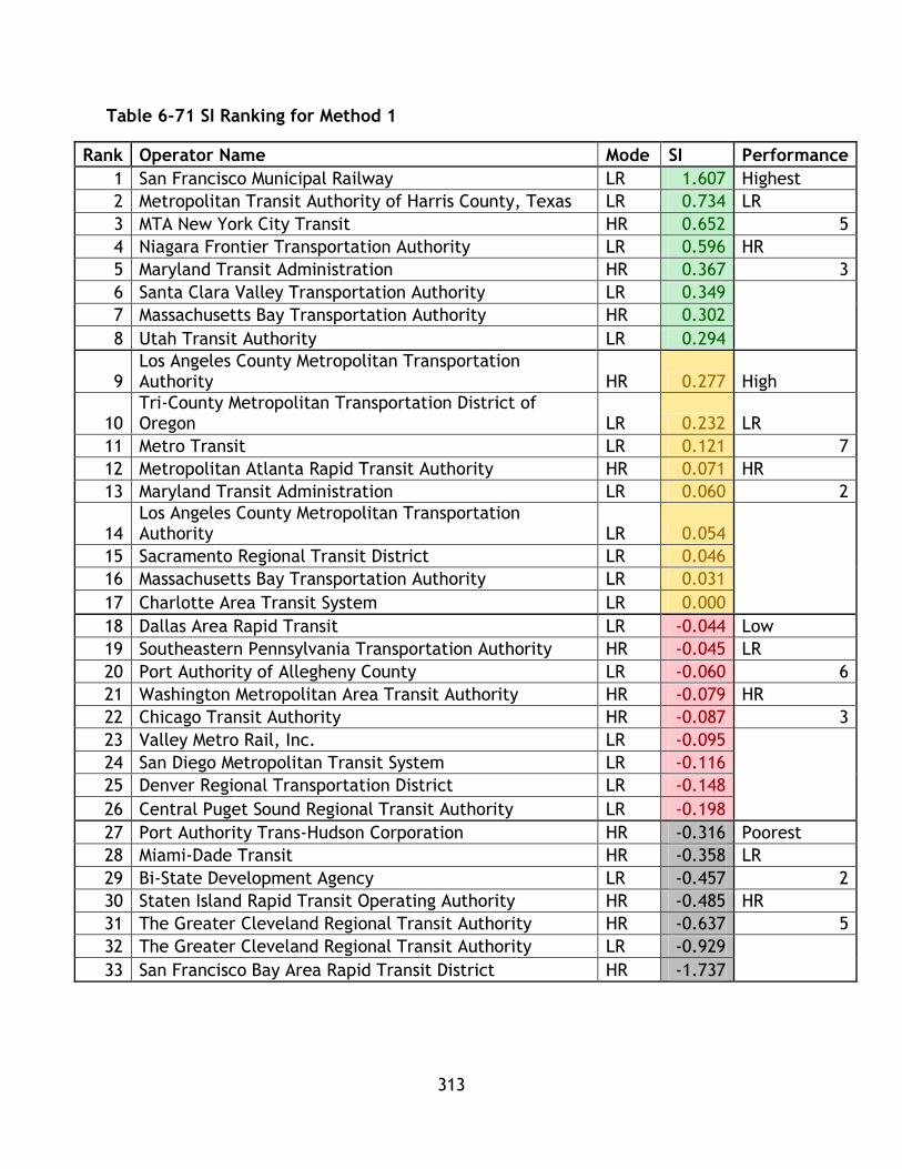
313
Table 6-71 SI Ranking for Method 1
Rank Operator Name Mode SI Performance
1 San Francisco Municipal Railway LR 1.607 Highest
2 Metropolitan Transit Authority of Harris County, Texas LR 0.734 LR
3 MTA New York City Transit HR 0.652 5
4 Niagara Frontier Transportation Authority LR 0.596 HR
5 Maryland Transit Administration HR 0.367 3
6 Santa Clara Valley Transportation Authority LR 0.349
7 Massachusetts Bay Transportation Authority HR 0.302
8 Utah Transit Authority LR 0.294
9 Los Angeles County Metropolitan Transportation Authority HR 0.277 High
10 Tri-County Metropolitan Transportation District of Oregon LR 0.232 LR
11 Metro Transit LR 0.121 7
12 Metropolitan Atlanta Rapid Transit Authority HR 0.071 HR
13 Maryland Transit Administration LR 0.060 2
14 Los Angeles County Metropolitan Transportation Authority LR 0.054
15 Sacramento Regional Transit District LR 0.046
16 Massachusetts Bay Transportation Authority LR 0.031
17 Charlotte Area Transit System LR 0.000
18 Dallas Area Rapid Transit LR -0.044 Low
19 Southeastern Pennsylvania Transportation Authority HR -0.045 LR
20 Port Authority of Allegheny County LR -0.060 6
21 Washington Metropolitan Area Transit Authority HR -0.079 HR
22 Chicago Transit Authority HR -0.087 3
23 Valley Metro Rail, Inc. LR -0.095
24 San Diego Metropolitan Transit System LR -0.116
25 Denver Regional Transportation District LR -0.148
26 Central Puget Sound Regional Transit Authority LR -0.198
27 Port Authority Trans-Hudson Corporation HR -0.316 Poorest
28 Miami-Dade Transit HR -0.358 LR
29 Bi-State Development Agency LR -0.457 2
30 Staten Island Rapid Transit Operating Authority HR -0.485 HR
31 The Greater Cleveland Regional Transit Authority HR -0.637 5
32 The Greater Cleveland Regional Transit Authority LR -0.929
33 San Francisco Bay Area Rapid Transit District HR -1.737

314
Table 6-72 SeI Ranking for Method 1
Rank Operator Name Mode SeI Performance
1 MTA New York City Transit HR 2.96 Highest
2 Los Angeles County Metropolitan Transportation Authority HR 1.63 LR
3 Chicago Transit Authority HR 0.78 2
4 Los Angeles County Metropolitan Transportation Authority LR 0.70 HR
5 Southeastern Pennsylvania Transportation Authority HR 0.64 6
6 Washington Metropolitan Area Transit Authority HR 0.43
7 Port Authority Trans-Hudson Corporation HR 0.39
8 Tri-County Metropolitan Transportation District of Oregon LR 0.23
9 San Francisco Bay Area Rapid Transit District HR 0.22 High
10 The Greater Cleveland Regional Transit Authority HR 0.19 LR
11 San Francisco Municipal Railway LR 0.17 7
12 Utah Transit Authority LR 0.00 HR
13 Massachusetts Bay Transportation Authority LR -0.08 2
14 Valley Metro Rail, Inc. LR -0.10
15 Niagara Frontier Transportation Authority LR -0.13
16 The Greater Cleveland Regional Transit Authority LR -0.13
17 Bi-State Development Agency LR -0.21
18 Dallas Area Rapid Transit LR -0.27 Low
19 San Diego Metropolitan Transit System LR -0.29 LR
20 Metro Transit LR -0.31 6
21 Metropolitan Transit Authority of Harris County, Texas LR -0.34 HR
22 Massachusetts Bay Transportation Authority HR -0.35 3
23 Staten Island Rapid Transit Operating Authority HR -0.40
24 Santa Clara Valley Transportation Authority LR -0.44
25 Metropolitan Atlanta Rapid Transit Authority HR -0.45
26 Denver Regional Transportation District LR -0.54
27 Port Authority of Allegheny County LR -0.55 Poorest
28 Miami-Dade Transit HR -0.56 LR
29 Maryland Transit Administration LR -0.57 5
30 Sacramento Regional Transit District LR -0.60 HR
31 Charlotte Area Transit System LR -0.66 2
32 Central Puget Sound Regional Transit Authority LR -0.66
33 Maryland Transit Administration HR -0.72
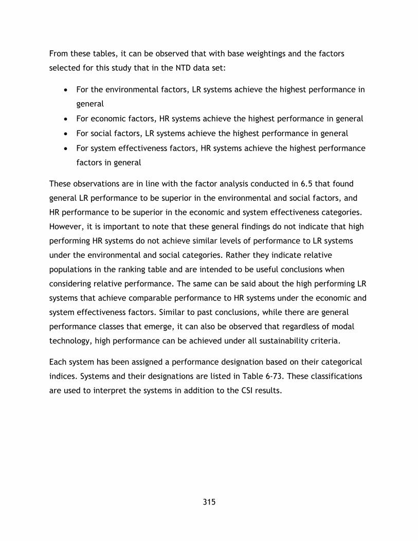
315
From these tables, it can be observed that with base weightings and the factors
selected for this study that in the NTD data set:
For the environmental factors, LR systems achieve the highest performance in
general
For economic factors, HR systems achieve the highest performance in general
For social factors, LR systems achieve the highest performance in general
For system effectiveness factors, HR systems achieve the highest performance
factors in general
These observations are in line with the factor analysis conducted in 6.5 that found
general LR performance to be superior in the environmental and social factors, and
HR performance to be superior in the economic and system effectiveness categories.
However, it is important to note that these general findings do not indicate that high
performing HR systems do not achieve similar levels of performance to LR systems
under the environmental and social categories. Rather they indicate relative
populations in the ranking table and are intended to be useful conclusions when
considering relative performance. The same can be said about the high performing LR
systems that achieve comparable performance to HR systems under the economic and
system effectiveness factors. Similar to past conclusions, while there are general
performance classes that emerge, it can also be observed that regardless of modal
technology, high performance can be achieved under all sustainability criteria.
Each system has been assigned a performance designation based on their categorical
indices. Systems and their designations are listed in Table 6-73. These classifications
are used to interpret the systems in addition to the CSI results.
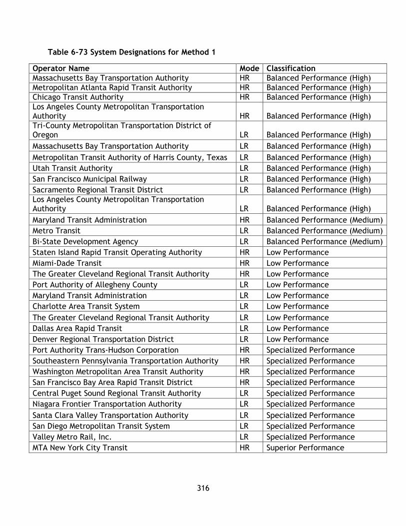
316
Table 6-73 System Designations for Method 1
Operator Name Mode Classification
Massachusetts Bay Transportation Authority HR Balanced Performance (High)
Metropolitan Atlanta Rapid Transit Authority HR Balanced Performance (High)
Chicago Transit Authority HR Balanced Performance (High)
Los Angeles County Metropolitan Transportation Authority HR Balanced Performance (High)
Tri-County Metropolitan Transportation District of Oregon LR Balanced Performance (High)
Massachusetts Bay Transportation Authority LR Balanced Performance (High)
Metropolitan Transit Authority of Harris County, Texas LR Balanced Performance (High)
Utah Transit Authority LR Balanced Performance (High)
San Francisco Municipal Railway LR Balanced Performance (High)
Sacramento Regional Transit District LR Balanced Performance (High)
Los Angeles County Metropolitan Transportation Authority LR Balanced Performance (High)
Maryland Transit Administration HR Balanced Performance (Medium)
Metro Transit LR Balanced Performance (Medium)
Bi-State Development Agency LR Balanced Performance (Medium)
Staten Island Rapid Transit Operating Authority HR Low Performance
Miami-Dade Transit HR Low Performance
The Greater Cleveland Regional Transit Authority HR Low Performance
Port Authority of Allegheny County LR Low Performance
Maryland Transit Administration LR Low Performance
Charlotte Area Transit System LR Low Performance
The Greater Cleveland Regional Transit Authority LR Low Performance
Dallas Area Rapid Transit LR Low Performance
Denver Regional Transportation District LR Low Performance
Port Authority Trans-Hudson Corporation HR Specialized Performance
Southeastern Pennsylvania Transportation Authority HR Specialized Performance
Washington Metropolitan Area Transit Authority HR Specialized Performance
San Francisco Bay Area Rapid Transit District HR Specialized Performance
Central Puget Sound Regional Transit Authority LR Specialized Performance
Niagara Frontier Transportation Authority LR Specialized Performance
Santa Clara Valley Transportation Authority LR Specialized Performance
San Diego Metropolitan Transit System LR Specialized Performance
Valley Metro Rail, Inc. LR Specialized Performance
MTA New York City Transit HR Superior Performance

317
The results of the CSI calculation have been sorted by rank and then segmented into
performance quartiles. These results are shown in table 6-74.
Table 6-74 CSI Method 1 Ranking
Rank Operator Name Mode CSI Performance
1 MTA New York City Transit HR 1.573 Highest
2 Los Angeles County Metropolitan Transportation Authority HR 0.741 LR
3 San Francisco Municipal Railway LR 0.445 4
4 Chicago Transit Authority HR 0.385 HR
5 Los Angeles County Metropolitan Transportation Authority LR 0.365 4
6 Tri-County Metropolitan Transportation District of Oregon LR 0.346
7 Metropolitan Transit Authority of Harris County, Texas LR 0.341
8 Southeastern Pennsylvania Transportation Authority HR 0.335
9 Metropolitan Atlanta Rapid Transit Authority HR 0.223 High
10 Washington Metropolitan Area Transit Authority HR 0.219 LR
11 San Diego Metropolitan Transit System LR 0.209 5
12 Massachusetts Bay Transportation Authority HR 0.151 HR
13 Port Authority Trans-Hudson Corporation HR 0.148 4
14 Massachusetts Bay Transportation Authority LR 0.099
15 Utah Transit Authority LR 0.091
16 Valley Metro Rail, Inc. LR 0.017
17 Sacramento Regional Transit District LR 0.0004
18 Metro Transit LR 0.00001 Low
19 Niagara Frontier Transportation Authority LR -0.008 LR
20 Santa Clara Valley Transportation Authority LR -0.082 7
21 Bi-State Development Agency LR -0.093 HR
22 Central Puget Sound Regional Transit Authority LR -0.136 2
23 San Francisco Bay Area Rapid Transit District HR -0.159
24 Denver Regional Transportation District LR -0.193
25 Charlotte Area Transit System LR -0.238
26 Staten Island Rapid Transit Operating Authority HR -0.255
27 Miami-Dade Transit HR -0.330 Poorest
28 Dallas Area Rapid Transit LR -0.335 LR
29 Maryland Transit Administration LR -0.461 4
30 Maryland Transit Administration HR -0.500 HR
31 Port Authority of Allegheny County LR -0.901 3
32 The Greater Cleveland Regional Transit Authority LR -0.991
33 The Greater Cleveland Regional Transit Authority HR -1.005
As observed in the table, the highest performing systems are Heavy Rail systems;
however the population in the highest performance categories is balanced between
Heavy and Light Rail indicating that both systems can achieve comparable
sustainability performance based on the weighing and criteria used in this study.

318
However, the majority of HR systems (8/13) are ranked in the highest performance
categories, compared to less than half of the LR systems (9/20). In general, the
highest performing HR systems outperform the highest performing LR systems and the
high performance HR systems outperform the high performance LR systems. However,
with the exception of MTA New York and Los Angeles County Metropolitan Transit
Authority, the two top HR systems, the differences between the closely ranked HR
and LR systems are small, indicating comparable performance is possible between
the modes.
6.7.2 Method 2: Utility
A similar approach is utilized to classify and analyze results for method 2 as for
method one. As additional technique to interpret results is employed for the utility
method based on Jeon (2007). Jeon 2007 was the source of the utility formula and
also utilized radar graphs to display results. This technique will also be used to
demonstrate differences under each sustainability category for the top 5 systems for
the method 2 CSI results.
First, the performance under each category based on quartiles is shown in Table 6-75,
Table 6-76, Table 6-77, and Table 6-78.

319
Table 6-75 EI Ranking for Method 2
Rank Operator Name Mode EI Performance
1 Central Puget Sound Regional Transit Authority LR 0.833 Highest
2 San Francisco Bay Area Rapid Transit District HR 0.722 LR
3 San Diego Metropolitan Transit System LR 0.710 4
4 MTA New York City Transit HR 0.577 HR
5 Tri-County Metropolitan Transportation District of Oregon LR 0.553 4
6 Los Angeles County Metropolitan Transportation Authority LR 0.508
7 Metropolitan Atlanta Rapid Transit Authority HR 0.417
8 Los Angeles County Metropolitan Transportation Authority HR 0.392
9 Valley Metro Rail, Inc. LR 0.367 High
10 San Francisco Municipal Railway LR 0.357 LR
11 Port Authority Trans-Hudson Corporation HR 0.354 7
12 Sacramento Regional Transit District LR 0.345 HR
13 Santa Clara Valley Transportation Authority LR 0.327 2
14 Metropolitan Transit Authority of Harris County, Texas LR 0.304
15 Bi-State Development Agency LR 0.284
16 Chicago Transit Authority HR 0.274
17 Massachusetts Bay Transportation Authority LR 0.261
18 Metro Transit LR 0.249 Low
19 Denver Regional Transportation District LR 0.233 LR
20 Southeastern Pennsylvania Transportation Authority HR 0.228 5
21 Washington Metropolitan Area Transit Authority HR 0.228 HR
22 Charlotte Area Transit System LR 0.218 4
23 Massachusetts Bay Transportation Authority HR 0.214
24 Staten Island Rapid Transit Operating Authority HR 0.204
25 Utah Transit Authority LR 0.198
26 Niagara Frontier Transportation Authority LR 0.179
27 Dallas Area Rapid Transit LR 0.155 Poorest
28 Miami-Dade Transit HR 0.153 LR
29 Maryland Transit Administration LR 0.128 4
30 Maryland Transit Administration HR 0.098 HR
31 The Greater Cleveland Regional Transit Authority LR 0.090 3
32 Port Authority of Allegheny County LR 0.088
33 The Greater Cleveland Regional Transit Authority HR 0.074

320
Table 6-76 EcI Ranking for Method 2
Rank Operator Name Mode EcI Performance
1 MTA New York City Transit HR 0.860 Highest
2 San Francisco Bay Area Rapid Transit District HR 0.639 LR
3 Washington Metropolitan Area Transit Authority HR 0.628 1
4 Metropolitan Atlanta Rapid Transit Authority HR 0.620 HR
5 Southeastern Pennsylvania Transportation Authority HR 0.617 7
6 Chicago Transit Authority HR 0.602
7 Metropolitan Transit Authority of Harris County, Texas LR 0.598
8 Los Angeles County Metropolitan Transportation Authority HR 0.592
9 San Diego Metropolitan Transit System LR 0.583 High
10 Massachusetts Bay Transportation Authority HR 0.555 LR
11 Utah Transit Authority LR 0.517 7
12 Tri-County Metropolitan Transportation District of Oregon LR 0.489 HR
13 Bi-State Development Agency LR 0.484 2
14 Valley Metro Rail, Inc. LR 0.477
15 Metro Transit LR 0.469
16 Los Angeles County Metropolitan Transportation Authority LR 0.468
17 Maryland Transit Administration HR 0.467
18 Massachusetts Bay Transportation Authority LR 0.464 Low
19 Sacramento Regional Transit District LR 0.463 LR
20 Miami-Dade Transit HR 0.429 6
21 Denver Regional Transportation District LR 0.428 HR
22 Port Authority Trans-Hudson Corporation HR 0.421 3
23 Niagara Frontier Transportation Authority LR 0.404
24 Staten Island Rapid Transit Operating Authority HR 0.388
25 San Francisco Municipal Railway LR 0.383
26 Maryland Transit Administration LR 0.376
27 Charlotte Area Transit System LR 0.360 Poorest
28 Dallas Area Rapid Transit LR 0.341 LR
29 Central Puget Sound Regional Transit Authority LR 0.340 6
30 Santa Clara Valley Transportation Authority LR 0.336 HR
31 The Greater Cleveland Regional Transit Authority HR 0.331 1
32 The Greater Cleveland Regional Transit Authority LR 0.322
33 Port Authority of Allegheny County LR 0.289

321
Table 6-77 SI Ranking for Method 2
Rank Operator Name Mode SI Performance
1 San Francisco Municipal Railway LR 0.921 Highest
2 Metropolitan Transit Authority of Harris County, Texas LR 0.748 LR
3 Niagara Frontier Transportation Authority LR 0.666 5
4 MTA New York City Transit HR 0.613 HR
5 Santa Clara Valley Transportation Authority LR 0.584 3
6 Maryland Transit Administration HR 0.579
7 Massachusetts Bay Transportation Authority HR 0.567
8 Utah Transit Authority LR 0.559
9 Los Angeles County Metropolitan Transportation Authority HR 0.558 High
10 Tri-County Metropolitan Transportation District of Oregon LR 0.545 LR
11 Los Angeles County Metropolitan Transportation Authority LR 0.539 7
12 Massachusetts Bay Transportation Authority LR 0.536 HR
13 Maryland Transit Administration LR 0.528 2
14 Metropolitan Atlanta Rapid Transit Authority HR 0.522
15 Metro Transit LR 0.522
16 Sacramento Regional Transit District LR 0.507
17 Dallas Area Rapid Transit LR 0.506
18 Charlotte Area Transit System LR 0.499 Low
19 Valley Metro Rail, Inc. LR 0.497 LR
20 Washington Metropolitan Area Transit Authority HR 0.494 6
21 Port Authority of Allegheny County LR 0.493 HR
22 Denver Regional Transportation District LR 0.484 3
23 San Diego Metropolitan Transit System LR 0.483
24 Chicago Transit Authority HR 0.480
25 Central Puget Sound Regional Transit Authority LR 0.479
26 Southeastern Pennsylvania Transportation Authority HR 0.461
27 Miami-Dade Transit HR 0.453 Poorest
28 Bi-State Development Agency LR 0.450 LR
29 Port Authority Trans-Hudson Corporation HR 0.411 2
30 San Francisco Bay Area Rapid Transit District HR 0.408 HR
31 The Greater Cleveland Regional Transit Authority HR 0.380 5
32 Staten Island Rapid Transit Operating Authority HR 0.368
33 The Greater Cleveland Regional Transit Authority LR 0.282

322
Table 6-78 SeI Ranking for Method 2
Rank Operator Name Mode SeI Performance
1 MTA New York City Transit HR 0.758 Highest
2 Los Angeles County Metropolitan Transportation Authority HR 0.507 LR
3 Chicago Transit Authority HR 0.371 2
4 Los Angeles County Metropolitan Transportation Authority LR 0.357 HR
5 Southeastern Pennsylvania Transportation Authority HR 0.348 6
6 Washington Metropolitan Area Transit Authority HR 0.321
7 Port Authority Trans-Hudson Corporation HR 0.307
8 Tri-County Metropolitan Transportation District of Oregon LR 0.283
9 San Francisco Bay Area Rapid Transit District HR 0.282 High
10 San Francisco Municipal Railway LR 0.277 LR
11 The Greater Cleveland Regional Transit Authority HR 0.273 7
12 Utah Transit Authority LR 0.244 HR
13 Massachusetts Bay Transportation Authority LR 0.232 2
14 Valley Metro Rail, Inc. LR 0.226
15 Niagara Frontier Transportation Authority LR 0.224
16 The Greater Cleveland Regional Transit Authority LR 0.221
17 Bi-State Development Agency LR 0.209
18 Dallas Area Rapid Transit LR 0.198 Low
19 San Diego Metropolitan Transit System LR 0.197 LR
20 Metro Transit LR 0.192 6
21 Massachusetts Bay Transportation Authority HR 0.189 HR
22 Metropolitan Transit Authority of Harris County, Texas LR 0.188 3
23 Staten Island Rapid Transit Operating Authority HR 0.180
24 Santa Clara Valley Transportation Authority LR 0.171
25 Metropolitan Atlanta Rapid Transit Authority HR 0.170
26 Denver Regional Transportation District LR 0.156
27 Port Authority of Allegheny County LR 0.154 Poorest
28 Miami-Dade Transit HR 0.152 LR
29 Maryland Transit Administration LR 0.150 5
30 Sacramento Regional Transit District LR 0.147 HR
31 Central Puget Sound Regional Transit Authority LR 0.137 2
32 Charlotte Area Transit System LR 0.136
33 Maryland Transit Administration HR 0.127

323
As this method compares each system to the highest performer, rather than the
average, in order to calculate the indices, there are some differences compared to
method 1. The overall trends observed in this data set are:
In the environmental category, the general trend is for LR systems to achieve
greater performance based on a criterion analyzing the highest and high
performance categories. While there were 4 systems of each set in the highest
category, the high category contains 7 LR, compared to 2 HR. However, it can
be observed in this method, that for the highest systems relatively similar
levels of performance can be achieved.
In the economic category, the highest category is populated with 7 HR systems
and 1 LR system, indicating overall superior performance by HR for this
category. Similar to the last indicator, the high category has more LR than HR
systems (7 to 2); however the performance levels are quite similar between all
systems. This indicates that high level LR systems perform at a similar level to
middle level HR systems.
In the social category, there are 5 LR and 3 HR in the highest performance
category and a similar 7 to 2 split as seen in the environmental and economic
categories. This indicates a performance advantage by the LR systems, with
High level HR systems competing with mid-level LR systems.
In the system effectiveness category, 6 HR systems populate the highest
category, compared to 2 LR, while the same 7 to 2 split occurs in the high
category. Again, this indicated that the best performing LR out perform with
the second tier of HR systems.
The overall results do not differ greatly from methodology 1 – populations may shift
by 1 between methodologies. However, there is a difference between the rankings
that each system receives. Again, as this method is based on the highest performer,
rather than the mean, the values a system receives in the calculation process will
vary. The classifications for each system are listed in Table 6-79. Below, in Table 6-
80, the quartile ranking for the CSI values under method 2 are displayed.
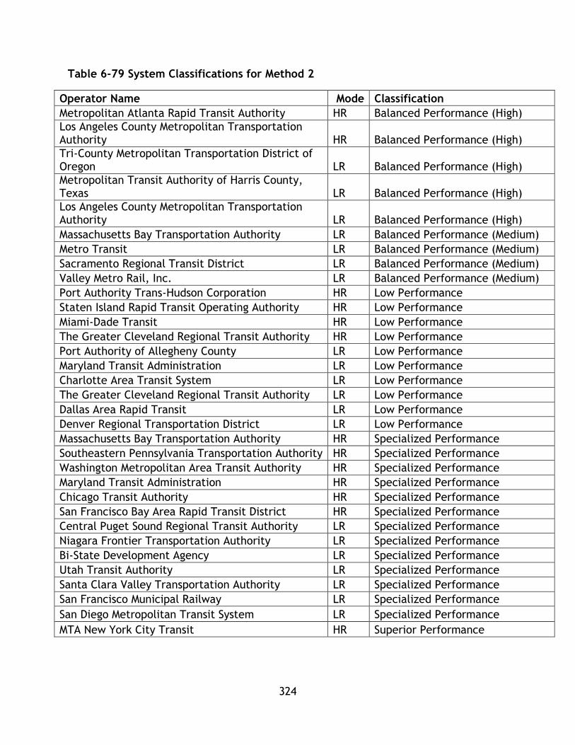
324
Table 6-79 System Classifications for Method 2
Operator Name Mode Classification
Metropolitan Atlanta Rapid Transit Authority HR Balanced Performance (High)
Los Angeles County Metropolitan Transportation Authority HR Balanced Performance (High)
Tri-County Metropolitan Transportation District of Oregon LR Balanced Performance (High)
Metropolitan Transit Authority of Harris County, Texas LR Balanced Performance (High)
Los Angeles County Metropolitan Transportation Authority LR Balanced Performance (High)
Massachusetts Bay Transportation Authority LR Balanced Performance (Medium)
Metro Transit LR Balanced Performance (Medium)
Sacramento Regional Transit District LR Balanced Performance (Medium)
Valley Metro Rail, Inc. LR Balanced Performance (Medium)
Port Authority Trans-Hudson Corporation HR Low Performance
Staten Island Rapid Transit Operating Authority HR Low Performance
Miami-Dade Transit HR Low Performance
The Greater Cleveland Regional Transit Authority HR Low Performance
Port Authority of Allegheny County LR Low Performance
Maryland Transit Administration LR Low Performance
Charlotte Area Transit System LR Low Performance
The Greater Cleveland Regional Transit Authority LR Low Performance
Dallas Area Rapid Transit LR Low Performance
Denver Regional Transportation District LR Low Performance
Massachusetts Bay Transportation Authority HR Specialized Performance
Southeastern Pennsylvania Transportation Authority HR Specialized Performance
Washington Metropolitan Area Transit Authority HR Specialized Performance
Maryland Transit Administration HR Specialized Performance
Chicago Transit Authority HR Specialized Performance
San Francisco Bay Area Rapid Transit District HR Specialized Performance
Central Puget Sound Regional Transit Authority LR Specialized Performance
Niagara Frontier Transportation Authority LR Specialized Performance
Bi-State Development Agency LR Specialized Performance
Utah Transit Authority LR Specialized Performance
Santa Clara Valley Transportation Authority LR Specialized Performance
San Francisco Municipal Railway LR Specialized Performance
San Diego Metropolitan Transit System LR Specialized Performance
MTA New York City Transit HR Superior Performance
325
Table 6-80 CSI Ranking for Method 2
Rank Operator Name Mode CSI Performance
1 MTA New York City Transit HR 0.702 Highest
2 San Francisco Bay Area Rapid Transit District HR 0.513 LR
3 Los Angeles County Metropolitan Transportation Authority HR 0.512 5
4 San Diego Metropolitan Transit System LR 0.493 HR
5 San Francisco Municipal Railway LR 0.484 3
6 Los Angeles County Metropolitan Transportation Authority LR 0.468
7 Tri-County Metropolitan Transportation District of Oregon LR 0.467
8 Metropolitan Transit Authority of Harris County, Texas LR 0.460
9 Central Puget Sound Regional Transit Authority LR 0.448 High
10 Metropolitan Atlanta Rapid Transit Authority HR 0.432 LR
11 Chicago Transit Authority HR 0.432 4
12 Washington Metropolitan Area Transit Authority HR 0.418 HR
13 Southeastern Pennsylvania Transportation Authority HR 0.413 5
14 Valley Metro Rail, Inc. LR 0.392
15 Massachusetts Bay Transportation Authority HR 0.381
16 Utah Transit Authority LR 0.379
17 Massachusetts Bay Transportation Authority LR 0.373
18 Port Authority Trans-Hudson Corporation HR 0.373 Low
19 Niagara Frontier Transportation Authority LR 0.368 LR
20 Sacramento Regional Transit District LR 0.366 7
21 Metro Transit LR 0.358 HR
22 Bi-State Development Agency LR 0.357 2
23 Santa Clara Valley Transportation Authority LR 0.354
24 Denver Regional Transportation District LR 0.325
25 Maryland Transit Administration HR 0.318
26 Charlotte Area Transit System LR 0.303
27 Dallas Area Rapid Transit LR 0.300 Poorest
28 Miami-Dade Transit HR 0.297 LR
29 Maryland Transit Administration LR 0.296 4
30 Staten Island Rapid Transit Operating Authority HR 0.285 HR
31 The Greater Cleveland Regional Transit Authority HR 0.265 3
32 Port Authority of Allegheny County LR 0.256
33 The Greater Cleveland Regional Transit Authority LR 0.229

326
The category index values for the top five systems are graphed in Figure 6-28.This
technique along with the four category sustainability model, and utility method were
all used by Jeon in her 2007 dissertation to outline the comparative benefits of
different plan alternatives for the transport network in Atlanta. These techniques
have now been applied to transit systems for composite sustainability analysis. As
seen in the figure, some systems present balanced performance, while others have
specialized performance, but aside from MTA New York, none of the top systems
achieve strong scores in all categories. While New York is the top system in economic
and system effectiveness, it does not achieve overall best performance across all
categories.

327
Figure 6-28 Radar Diagram for Method 2
0.000
0.100
0.200
0.300
0.400
0.500
0.600
0.700
0.800
0.900
1.000
EI
EcI
SI
SeI
MTA New York City Transit
San Francisco Bay Area Rapid Transit District
Los Angeles County MetropolitanTransportation Authority
San Diego Metropolitan Transit System
San Francisco Municipal Railway

328
6.7.3 Method 3: Rescaling
A similar approach is utilized to classify and analyze results for method 3 as the past
two methods.
Table 6-81 EI Ranking for Method 3
Rank Operator Name Mode EI Performance
1 San Francisco Bay Area Rapid Transit District
HR 0.979 Highest
2 MTA New York City Transit HR 0.977 LR
3 San Diego Metropolitan Transit System LR 0.977 5
4 Central Puget Sound Regional Transit Authority
LR 0.973 HR
5 Tri-County Metropolitan Transportation District of Oregon
LR 0.955 3
6 Los Angeles County Metropolitan Transportation Authority
LR 0.933
7 Metropolitan Atlanta Rapid Transit Authority
HR 0.918
8 Valley Metro Rail, Inc. LR 0.913
9 Port Authority Trans-Hudson Corporation HR 0.905 High
10 Los Angeles County Metropolitan Transportation Authority
HR 0.887 LR
11 Metropolitan Transit Authority of Harris County, Texas
LR 0.868 6
12 San Francisco Municipal Railway LR 0.868 HR
13 Sacramento Regional Transit District LR 0.860 3
14 Santa Clara Valley Transportation Authority LR 0.847
15 Chicago Transit Authority HR 0.840
16 Massachusetts Bay Transportation Authority LR 0.839
17 Bi-State Development Agency LR 0.825
18 Metro Transit LR 0.805 Low
19 Denver Regional Transportation District LR 0.786 LR
20 Massachusetts Bay Transportation Authority HR 0.784 5
21 Staten Island Rapid Transit Operating Authority, dba: MTA Staten Island Railway
HR 0.776 HR
22 Charlotte Area Transit System LR 0.775 3
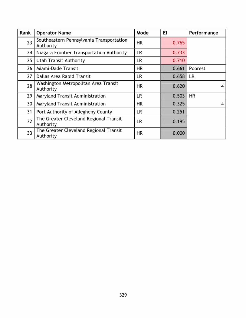
329
Rank Operator Name Mode EI Performance
23 Southeastern Pennsylvania Transportation Authority
HR 0.765
24 Niagara Frontier Transportation Authority LR 0.733
25 Utah Transit Authority LR 0.710
26 Miami-Dade Transit HR 0.661 Poorest
27 Dallas Area Rapid Transit LR 0.658 LR
28 Washington Metropolitan Area Transit Authority
HR 0.620 4
29 Maryland Transit Administration LR 0.503 HR
30 Maryland Transit Administration HR 0.325 4
31 Port Authority of Allegheny County LR 0.251
32 The Greater Cleveland Regional Transit Authority
LR 0.195
33 The Greater Cleveland Regional Transit Authority
HR 0.000
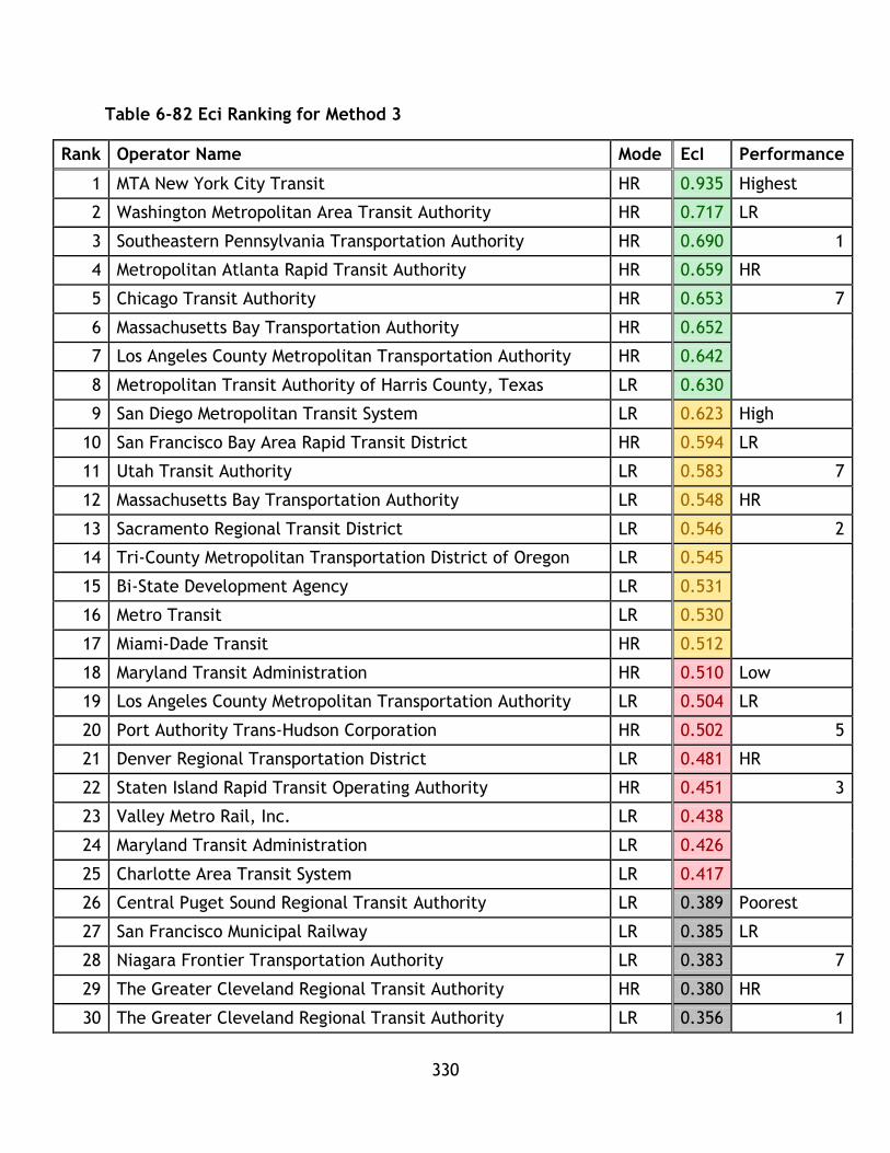
330
Table 6-82 Eci Ranking for Method 3
Rank Operator Name Mode EcI Performance
1 MTA New York City Transit HR 0.935 Highest
2 Washington Metropolitan Area Transit Authority HR 0.717 LR
3 Southeastern Pennsylvania Transportation Authority HR 0.690 1
4 Metropolitan Atlanta Rapid Transit Authority HR 0.659 HR
5 Chicago Transit Authority HR 0.653 7
6 Massachusetts Bay Transportation Authority HR 0.652
7 Los Angeles County Metropolitan Transportation Authority HR 0.642
8 Metropolitan Transit Authority of Harris County, Texas LR 0.630
9 San Diego Metropolitan Transit System LR 0.623 High
10 San Francisco Bay Area Rapid Transit District HR 0.594 LR
11 Utah Transit Authority LR 0.583 7
12 Massachusetts Bay Transportation Authority LR 0.548 HR
13 Sacramento Regional Transit District LR 0.546 2
14 Tri-County Metropolitan Transportation District of Oregon LR 0.545
15 Bi-State Development Agency LR 0.531
16 Metro Transit LR 0.530
17 Miami-Dade Transit HR 0.512
18 Maryland Transit Administration HR 0.510 Low
19 Los Angeles County Metropolitan Transportation Authority LR 0.504 LR
20 Port Authority Trans-Hudson Corporation HR 0.502 5
21 Denver Regional Transportation District LR 0.481 HR
22 Staten Island Rapid Transit Operating Authority HR 0.451 3
23 Valley Metro Rail, Inc. LR 0.438
24 Maryland Transit Administration LR 0.426
25 Charlotte Area Transit System LR 0.417
26 Central Puget Sound Regional Transit Authority LR 0.389 Poorest
27 San Francisco Municipal Railway LR 0.385 LR
28 Niagara Frontier Transportation Authority LR 0.383 7
29 The Greater Cleveland Regional Transit Authority HR 0.380 HR
30 The Greater Cleveland Regional Transit Authority LR 0.356 1
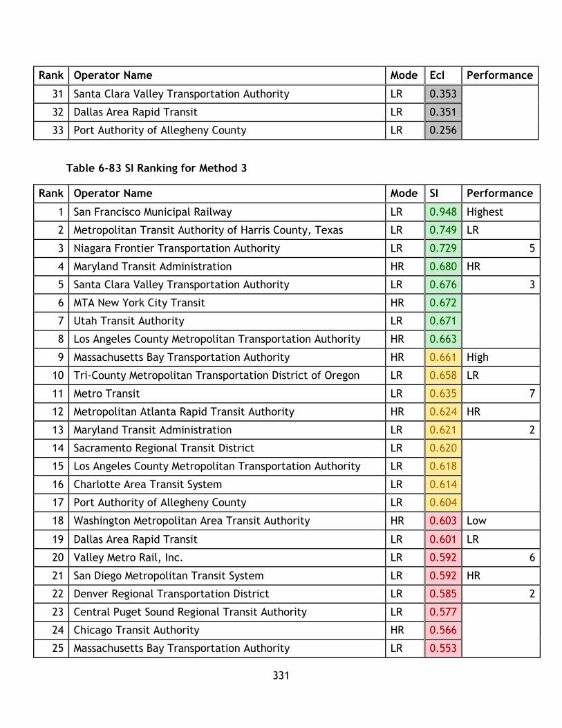
331
Rank Operator Name Mode EcI Performance
31 Santa Clara Valley Transportation Authority LR 0.353
32 Dallas Area Rapid Transit LR 0.351
33 Port Authority of Allegheny County LR 0.256
Table 6-83 SI Ranking for Method 3
Rank Operator Name Mode SI Performance
1 San Francisco Municipal Railway LR 0.948 Highest
2 Metropolitan Transit Authority of Harris County, Texas LR 0.749 LR
3 Niagara Frontier Transportation Authority LR 0.729 5
4 Maryland Transit Administration HR 0.680 HR
5 Santa Clara Valley Transportation Authority LR 0.676 3
6 MTA New York City Transit HR 0.672
7 Utah Transit Authority LR 0.671
8 Los Angeles County Metropolitan Transportation Authority HR 0.663
9 Massachusetts Bay Transportation Authority HR 0.661 High
10 Tri-County Metropolitan Transportation District of Oregon LR 0.658 LR
11 Metro Transit LR 0.635 7
12 Metropolitan Atlanta Rapid Transit Authority HR 0.624 HR
13 Maryland Transit Administration LR 0.621 2
14 Sacramento Regional Transit District LR 0.620
15 Los Angeles County Metropolitan Transportation Authority LR 0.618
16 Charlotte Area Transit System LR 0.614
17 Port Authority of Allegheny County LR 0.604
18 Washington Metropolitan Area Transit Authority HR 0.603 Low
19 Dallas Area Rapid Transit LR 0.601 LR
20 Valley Metro Rail, Inc. LR 0.592 6
21 San Diego Metropolitan Transit System LR 0.592 HR
22 Denver Regional Transportation District LR 0.585 2
23 Central Puget Sound Regional Transit Authority LR 0.577
24 Chicago Transit Authority HR 0.566
25 Massachusetts Bay Transportation Authority LR 0.553
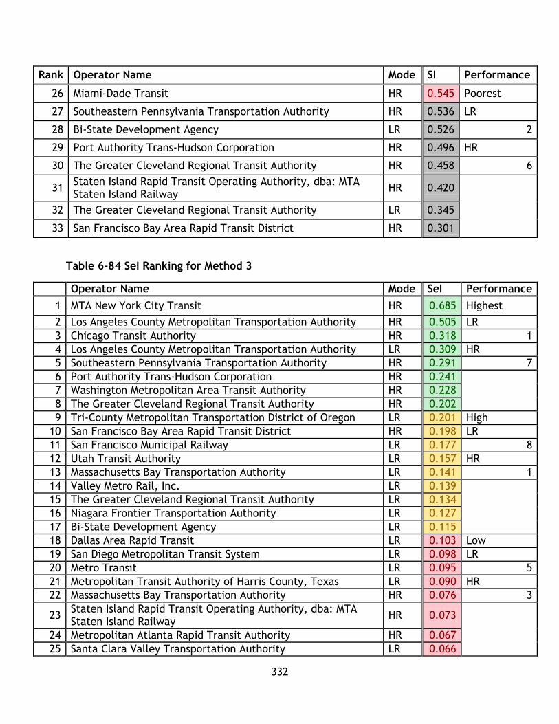
332
Rank Operator Name Mode SI Performance
26 Miami-Dade Transit HR 0.545 Poorest
27 Southeastern Pennsylvania Transportation Authority HR 0.536 LR
28 Bi-State Development Agency LR 0.526 2
29 Port Authority Trans-Hudson Corporation HR 0.496 HR
30 The Greater Cleveland Regional Transit Authority HR 0.458 6
31 Staten Island Rapid Transit Operating Authority, dba: MTA Staten Island Railway
HR 0.420
32 The Greater Cleveland Regional Transit Authority LR 0.345
33 San Francisco Bay Area Rapid Transit District HR 0.301
Table 6-84 SeI Ranking for Method 3
Operator Name Mode SeI Performance
1 MTA New York City Transit HR 0.685 Highest
2 Los Angeles County Metropolitan Transportation Authority HR 0.505 LR
3 Chicago Transit Authority HR 0.318 1
4 Los Angeles County Metropolitan Transportation Authority LR 0.309 HR
5 Southeastern Pennsylvania Transportation Authority HR 0.291 7
6 Port Authority Trans-Hudson Corporation HR 0.241
7 Washington Metropolitan Area Transit Authority HR 0.228
8 The Greater Cleveland Regional Transit Authority HR 0.202
9 Tri-County Metropolitan Transportation District of Oregon LR 0.201 High
10 San Francisco Bay Area Rapid Transit District HR 0.198 LR
11 San Francisco Municipal Railway LR 0.177 8
12 Utah Transit Authority LR 0.157 HR
13 Massachusetts Bay Transportation Authority LR 0.141 1
14 Valley Metro Rail, Inc. LR 0.139
15 The Greater Cleveland Regional Transit Authority LR 0.134
16 Niagara Frontier Transportation Authority LR 0.127
17 Bi-State Development Agency LR 0.115
18 Dallas Area Rapid Transit LR 0.103 Low
19 San Diego Metropolitan Transit System LR 0.098 LR
20 Metro Transit LR 0.095 5
21 Metropolitan Transit Authority of Harris County, Texas LR 0.090 HR
22 Massachusetts Bay Transportation Authority HR 0.076 3
23 Staten Island Rapid Transit Operating Authority, dba: MTA Staten Island Railway
HR 0.073
24 Metropolitan Atlanta Rapid Transit Authority HR 0.067
25 Santa Clara Valley Transportation Authority LR 0.066

333
Operator Name Mode SeI Performance
26 Port Authority of Allegheny County LR 0.045 Poorest
27 Denver Regional Transportation District LR 0.045 LR
28 Miami-Dade Transit HR 0.043 6
29 Maryland Transit Administration LR 0.041 HR
30 Sacramento Regional Transit District LR 0.033 2
31 Charlotte Area Transit System LR 0.023
32 Central Puget Sound Regional Transit Authority LR 0.019
33 Maryland Transit Administration HR 0.009
Similar to method 2, method 3 compares each system to the highest performer,
rather than the average, in order to calculate the indices. There are some differences
compared to method 1.
In the environmental category, the general trend is for LR systems to achieve
greater performance based on a criterion analyzing the highest and high
performance categories. In the two highest categories, LR had 5 and 6 spots
respectively.
In the economic category, the highest category is populated with 7 HR systems
and 1 LR system, indicating overall superior performance by HR for this
category. Similar to the environmental category indicator, the high category
has more LR than HR systems (7 to 2); however the performance levels are
quite similar between all systems. This indicates that high performance LR
systems perform at a similar level to middle level HR systems.
In the social category, there are 6 LR and 2 HR in the highest performance
category and 5 and 4 of each in the high category. This indicates a slight
performance advantage by the LR systems, with high level HR systems
competing with mid-level LR systems.
In the system effectiveness category, 7 HR systems populate the highest
category, compared to 1 LR, in the high category there are 8 LR and 1 HR –
suggesting the highest performance LR systems in the USA achieve better
results than the middle HR systems.

334
All systems have been categorized based on their categorical index results in Table
6-84.
Table 6-85 System Categories for Method 3
Operator Name Mode Classification
Massachusetts Bay Transportation Authority HR Balanced Performance (High)
MTA New York City Transit HR Superior Performance
Port Authority Trans-Hudson Corporation HR Balanced Performance (Medium)
Staten Island Rapid Transit Operating Authority HR Low Performance
Southeastern Pennsylvania Transportation Authority HR Specialized Performance
Washington Metropolitan Area Transit Authority HR Balanced Performance (High)
Maryland Transit Administration HR Specialized Performance
Metropolitan Atlanta Rapid Transit Authority HR Specialized Performance
Miami-Dade Transit HR Specialized Performance
The Greater Cleveland Regional Transit Authority HR Specialized Performance
Chicago Transit Authority HR Balanced Performance (High)
San Francisco Bay Area Rapid Transit District HR Specialized Performance
Los Angeles County Metropolitan Transportation Authority HR Balanced Performance (High)
Tri-County Metropolitan Transportation District of Oregon LR Balanced Performance (High)
Central Puget Sound Regional Transit Authority LR Specialized Performance
Massachusetts Bay Transportation Authority LR LR Balanced Performance (Medium)
Niagara Frontier Transportation Authority LR Specialized Performance
Port Authority of Allegheny County LR Specialized Performance
Maryland Transit Administration LR Low Performance
Charlotte Area Transit System LR Specialized Performance
The Greater Cleveland Regional Transit Authority LR Specialized Performance
Metro Transit LR Balanced Performance (Medium)
Metropolitan Transit Authority of Harris County, Texas LR Balanced Performance (High)
Dallas Area Rapid Transit LR Low Performance
Bi-State Development Agency LR Balanced Performance (High)
Utah Transit Authority LR Balanced Performance (High)
Denver Regional Transportation District LR Low Performance
Santa Clara Valley Transportation Authority LR Balanced Performance
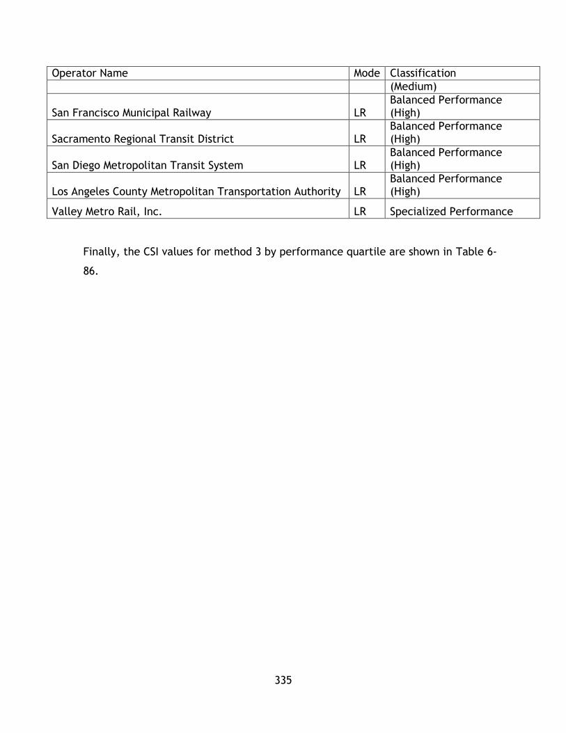
335
Operator Name Mode Classification
(Medium)
San Francisco Municipal Railway LR Balanced Performance (High)
Sacramento Regional Transit District LR Balanced Performance (High)
San Diego Metropolitan Transit System LR Balanced Performance (High)
Los Angeles County Metropolitan Transportation Authority LR Balanced Performance (High)
Valley Metro Rail, Inc. LR Specialized Performance
Finally, the CSI values for method 3 by performance quartile are shown in Table 6-
86.

336
Table 6-86 CSI Ranking for Method 3
Rank Operator Name Mode CSI Performance
1 MTA New York City Transit HR 0.817 Highest
2 Los Angeles County Metropolitan Transportation Authority
HR 0.674 LR
3 Chicago Transit Authority HR 0.594 5
4 San Francisco Municipal Railway LR 0.594 HR
5 Los Angeles County Metropolitan Transportation Authority
LR 0.591 3
6 Tri-County Metropolitan Transportation District of Oregon
LR 0.590
7 Metropolitan Transit Authority of Harris County, Texas LR 0.584
8 San Diego Metropolitan Transit System LR 0.572
9 Southeastern Pennsylvania Transportation Authority HR 0.571 High
10 Metropolitan Atlanta Rapid Transit Authority HR 0.567 LR
11 Massachusetts Bay Transportation Authority HR 0.543 3
12 Washington Metropolitan Area Transit Authority HR 0.542 HR
13 Port Authority Trans-Hudson Corporation HR 0.536 6
14 Utah Transit Authority LR 0.530
15 Valley Metro Rail, Inc. LR 0.520
16 Massachusetts Bay Transportation Authority LR 0.520
17 San Francisco Bay Area Rapid Transit District HR 0.518
18 Metro Transit LR 0.516 Low
19 Sacramento Regional Transit District LR 0.515 LR
20 Bi-State Development Agency LR 0.499 8
21 Niagara Frontier Transportation Authority LR 0.493 HR
22 Central Puget Sound Regional Transit Authority LR 0.490 0
23 Santa Clara Valley Transportation Authority LR 0.486
24 Denver Regional Transportation District LR 0.474
25 Charlotte Area Transit System LR 0.457
26 Miami-Dade Transit HR 0.440 Poorest
27 Staten Island Rapid Transit Operating Authority HR 0.430 LR
28 Dallas Area Rapid Transit LR 0.428 4
29 Maryland Transit Administration LR 0.398 HR
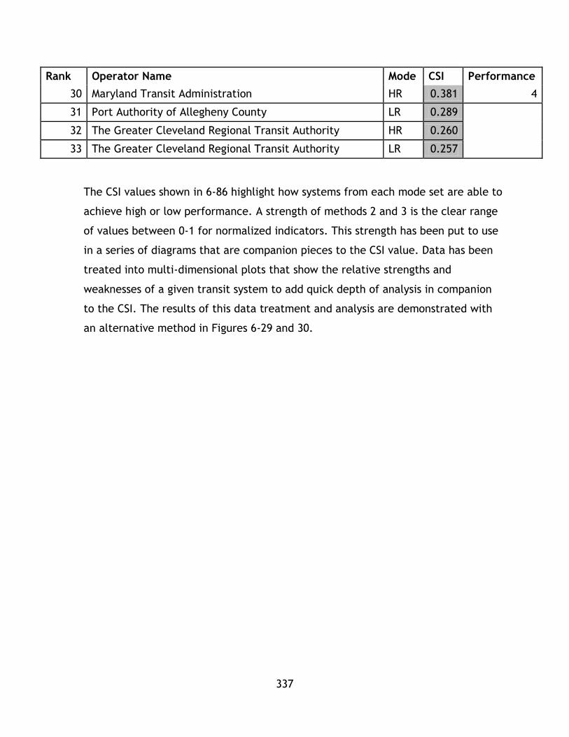
337
Rank Operator Name Mode CSI Performance
30 Maryland Transit Administration HR 0.381 4
31 Port Authority of Allegheny County LR 0.289
32 The Greater Cleveland Regional Transit Authority HR 0.260
33 The Greater Cleveland Regional Transit Authority LR 0.257
The CSI values shown in 6-86 highlight how systems from each mode set are able to
achieve high or low performance. A strength of methods 2 and 3 is the clear range
of values between 0-1 for normalized indicators. This strength has been put to use
in a series of diagrams that are companion pieces to the CSI value. Data has been
treated into multi-dimensional plots that show the relative strengths and
weaknesses of a given transit system to add quick depth of analysis in companion
to the CSI. The results of this data treatment and analysis are demonstrated with
an alternative method in Figures 6-29 and 30.
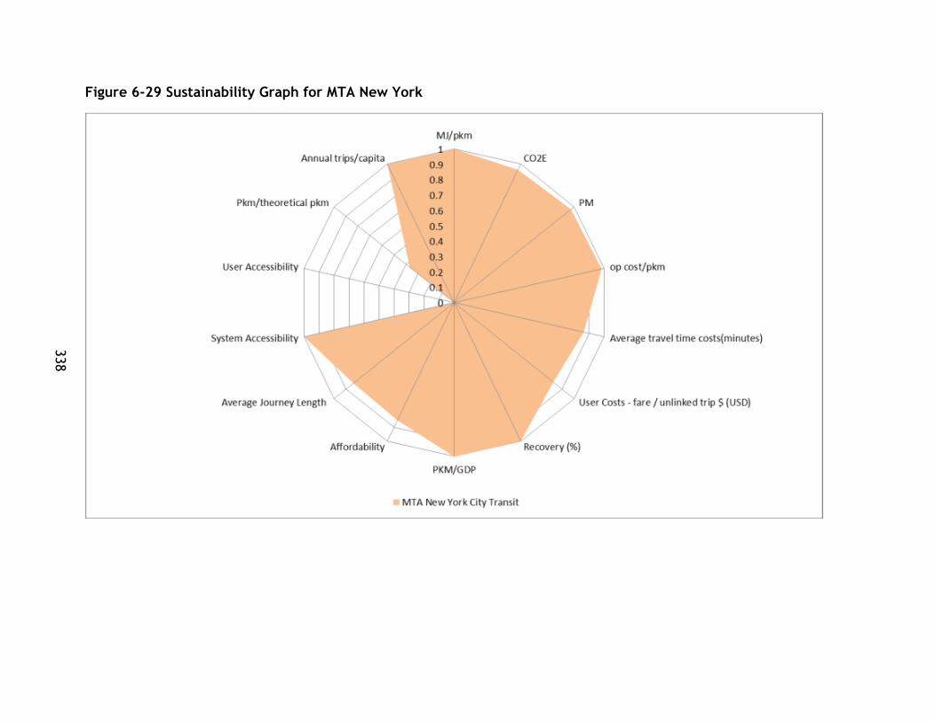
338
Figure 6-29 Sustainability Graph for MTA New York

339
Figure 6-30 Sustainability Graph for the Greater Cleveland Regional Transit Authority (LR)
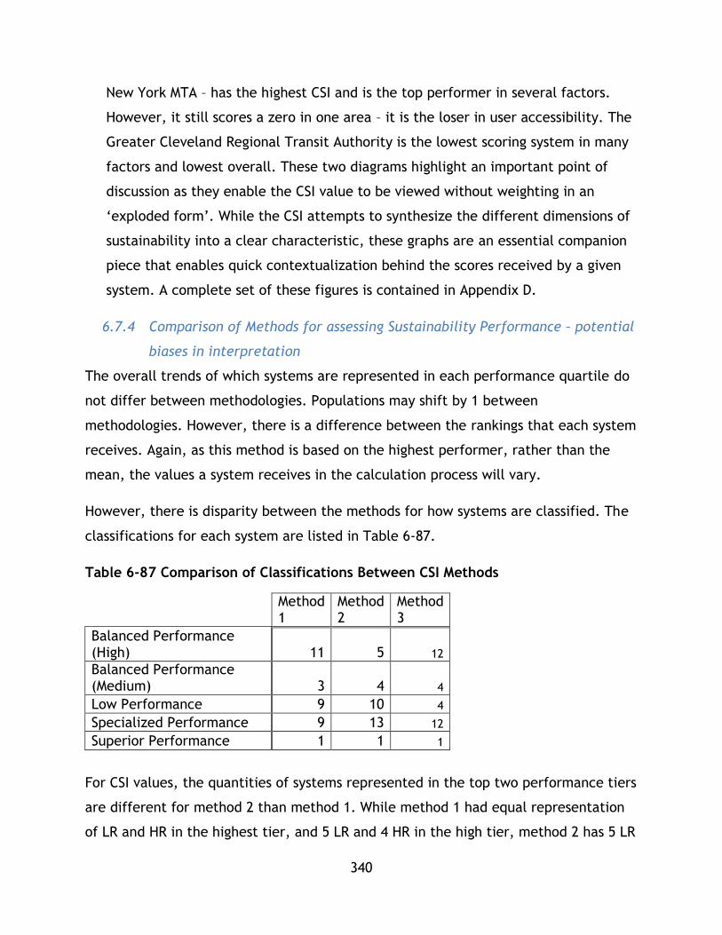
340
New York MTA – has the highest CSI and is the top performer in several factors.
However, it still scores a zero in one area – it is the loser in user accessibility. The
Greater Cleveland Regional Transit Authority is the lowest scoring system in many
factors and lowest overall. These two diagrams highlight an important point of
discussion as they enable the CSI value to be viewed without weighting in an
‘exploded form’. While the CSI attempts to synthesize the different dimensions of
sustainability into a clear characteristic, these graphs are an essential companion
piece that enables quick contextualization behind the scores received by a given
system. A complete set of these figures is contained in Appendix D.
6.7.4 Comparison of Methods for assessing Sustainability Performance – potential
biases in interpretation
The overall trends of which systems are represented in each performance quartile do
not differ between methodologies. Populations may shift by 1 between
methodologies. However, there is a difference between the rankings that each system
receives. Again, as this method is based on the highest performer, rather than the
mean, the values a system receives in the calculation process will vary.
However, there is disparity between the methods for how systems are classified. The
classifications for each system are listed in Table 6-87.
Table 6-87 Comparison of Classifications Between CSI Methods
Method 1
Method 2
Method 3
Balanced Performance (High) 11 5 12 Balanced Performance (Medium) 3 4 4
Low Performance 9 10 4
Specialized Performance 9 13 12
Superior Performance 1 1 1
For CSI values, the quantities of systems represented in the top two performance tiers
are different for method 2 than method 1. While method 1 had equal representation
of LR and HR in the highest tier, and 5 LR and 4 HR in the high tier, method 2 has 5 LR

341
and 3 HR in the highest tier, and 4 LR and 5 HR in the high tier. Method 3 has the
same representation as method 1. For the bottom two tiers the populations are the
same.
Method 2 and 3 calculations produced a greater number of specialized systems and
fewer high performance systems. Medium and Low performance system populations
were nearly equal size in both methods. In all methods only MTA New York City
Transit achieved superior performance. A total of 11 systems changed classification
between methodologies. These differences occur due to the nature of how indices are
calculated – normalization varies between methods.
In method 1, systems can have negative values associated with low performance,
while in method 2 they just have a lower positive value. Further, in method 1, there
are signs attached to individual weights – negative signs to factors that should be
minimized and positive to signs that should be maximized, while in method 2 all signs
are positive. As a result, poor performance can count against high performance in
method 1, whereas in method 2 all performance is additive. This explains the
discrepancy between models. This can also be explained using a thought experiment –
imagine two systems, i and j, for category index x which has three factors: a, b, and
c. For i factors a and b are middle performers, while c is low. For j, factor a is a high
performer, while b and c are both very low performers.
Under method 1, for i factors a and b are low above zero values, while c is a
negative value. Upon summing the index for I is a low positive. For j, upon
summing, the factor is zero due to the negative values calculated for b and c.
o Despite the superior performance under factor a, j still has a lower
category index.
However, under method 2, for both systems all factors are above zero. As 1 is
the maximum and 0 is the minimum value, depending on the performance of j,
it can sum up to be greater than i in this scenario.

342
Further, in method 3, a system in each set for each indicator will receive a
zero score and a 1 score – meaning the minimum score is lower than method 2,
but still constrained between 0-1.
Whether or not there is a difference between the methods is based on whether
performance is uniform across all factors in a category (i.e. all factors are
above zero in method 1).
The sustainability performance measured by the three methodologies results in a
clear ranking system that enables further research into particular sustainable
transportation system issues. It also emphasizes the notion that strong performance
across all 14 factors considered in this study is possible regardless of mode – indicating
further research in this field is required that analyzes the intersection of operations,
design, and planning along with urban factors. What factors shape and influence poor
or strong performance? These issues need further exploration.
Continuing from the previous discussion it is important to note that the ranking
system developed in this tool attempts to aggregate indicators to inform
understanding of a transit system’s sustainability. However, high scoring systems
often do have at least one indicator with poor performance. MTA New York, for
example, receives a zero in User Accessibility under method 3, and the lowest scores
under the other two methods because it has the least number of stations that are ADA
compliant. However, in all three methods it has the highest score overall. This
underscores the need for both the holistic look at sustainability along with the
nuanced multidimensional look provided by all three methods.
Sensitivity Analysis and Discussion
6.8.1 Sensitivity Analysis
A limitation of this study is that it does not present a complete application of MCA
techniques – base weighting values have been applied for analysis factors and indices
in order to calculate a composite sustainability index and comment on sustainability
across different modes or transit technologies, however these weightings did not have
rigorous analysis, such as consultation or an analytical hierarchical process imbedded

343
within them. In order to expand this study beyond this limitation, the following sub
section presents a sensitivity analysis. This sensitivity analysis incorporated new index
weights in a total of 12 new tests which comment on how the CSI scores for each
system may shift based on how different priorities are placed on different
sustainability indexes.
In the original analysis formulation, each weight was set to a value of 0.25 and all
four weights were set to sum to 1. In this set of tests, the four weights must still sum
to 1, however, in each test one of the weights is increased above 0.25 and the
difference is split evenly among the other three weights. Each weight has three tests
– one with an increase of 0.05, an increase of 0.1, and finally an increase of 0.15.
These tests are thought to reflect three elements previously missing from this
research in that they:
Provide insight into how a more nuanced approach to weighting, such as the
application of an analytical hierarchical process or other in depth MCA
technique, may inform future research into sustainable mobility and mass
transit with the application of CSI tools
Comment on how diverse views on sustainability and various goals within public
transit system operation and service provision, planning and development, as
well as debate in sustainability analysis itself, all of which can shape the
implementation of public transit systems, can be applied within this research
framework. For example, a strong value placed on reducing greenhouse gasses
may be reflected in a heavy environmental weighting that may lead to systems
that are more cost effective but less environmentally sound performing lower
in a CSI framework.
Compute additional CSI values demonstrating further application of the
framework and techniques.
The tests are formulated as follows:
Recalling that 𝑤𝑒 + 𝑤𝑠 + 𝑤𝑛 + 𝑤𝑦 = 1

344
Test Increased
Value
Decreased Values Description
Test 1
Test 2
Test 3
𝑤𝑒 = 0.3
𝑤𝑒 = 0.35
𝑤𝑒 = 0.40
𝑤𝑠 = 𝑤𝑛 = 𝑤𝑦 = 0.2333
𝑤𝑠 = 𝑤𝑛 = 𝑤𝑦 = 0.2167
𝑤𝑠 = 𝑤𝑛 = 𝑤𝑦 = 0.2
Heavier weight put on
environmental factors.
Example – strongest
emphasis is put on
environmental policy to
limit emissions and
greenhouse gases.
Test 4
Test 5
Test 6
𝑤𝑛 = 0.3
𝑤𝑛 = 0.35
𝑤𝑛 = 0.40
𝑤𝑠 = 𝑤𝑒 = 𝑤𝑦 = 0.2333
𝑤𝑠 = 𝑤𝑒 = 𝑤𝑦 = 0.2167
𝑤𝑠 = 𝑤𝑒 = 𝑤𝑦 = 0.2
Heavier weight put on
economic factors. Example
– strongest emphasis is put
on economic policy to run
a cost effective system.
Test 7
Test 8
Test 9
𝑤𝑠 = 0.3
𝑤𝑠 = 0.35
𝑤𝑠 = 0.40
𝑤𝑛 = 𝑤𝑒 = 𝑤𝑦 = 0.2333
𝑤𝑛 = 𝑤𝑒 = 𝑤𝑦 = 0.2167
𝑤𝑛 = 𝑤𝑒 = 𝑤𝑦 = 0.2
Heavier weight put on
social factors. Example –
strongest emphasis is put
on social policy develop an
inclusive system with social
benefits.
Test 10
Test 11
Test 12
𝑤𝑦 = 0.3
𝑤𝑦 = 0.35
𝑤𝑦 = 0.40
𝑤𝑛 = 𝑤𝑒 = 𝑤𝑠 = 0.2333
𝑤𝑛 = 𝑤𝑒 = 𝑤𝑠 = 0.2167
𝑤𝑛 = 𝑤𝑒 = 𝑤𝑠 = 0.2
Heavier weight put on
system effectiveness
factors. Example –
strongest emphasis is put
on running a high capacity
system at peak
effectiveness.

345
The first set of sensitivity tests are for the z-score method (method 1) in Table 6-88,
Table 6-89, Table 6-90, and Table 6-91, followed by analysis. The following colour
scheme is used to represent HR and LR systems:
HR
LR
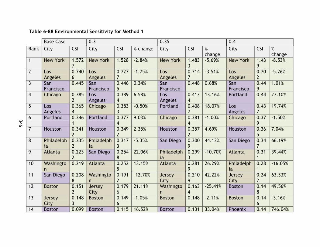
346
346
Table 6-88 Environmental Sensitivity for Method 1
Base Case 0.3 0.35 0.4
Rank City CSI City CSI % change City CSI % change
City CSI % change
1 New York 1.5727
New York 1.528 -2.84% New York 1.4833
-5.69% New York 1.439
-8.53%
2 Los Angeles
0.7406
Los Angeles
0.7277
-1.75% Los Angeles
0.7147
-3.51% Los Angeles
0.702
-5.26%
3 San Francisco
0.445 San Francisco
0.4465
0.34% San Francisco
0.448 0.68% San Francisco
0.449
1.01%
4 Chicago 0.3852
Los Angeles
0.3894
6.58% Los Angeles
0.4134
13.16% Portland 0.44 27.10%
5 Los Angeles
0.3654
Chicago 0.3833
-0.50% Portland 0.4087
18.07% Los Angeles
0.437
19.74%
6 Portland 0.3461
Portland 0.3774
9.03% Chicago 0.3814
-1.00% Chicago 0.379
-1.50%
7 Houston 0.3412
Houston 0.3492
2.35% Houston 0.3572
4.69% Houston 0.365
7.04%
8 Philadelphia
0.3352
Philadelphia
0.3173
-5.35% San Diego 0.3009
44.13% San Diego 0.347
66.19%
9 Atlanta 0.2232
San Diego 0.2548
22.06% Philadelphia
0.2993
-10.70% Atlanta 0.311
39.44%
10 Washington
0.219 Atlanta 0.2525
13.15% Atlanta 0.2819
26.29% Philadelphia
0.281
-16.05%
11 San Diego 0.2088
Washington
0.1912
-12.70% Jersey City
0.2109
42.22% Jersey City
0.242
63.33%
12 Boston 0.1512
Jersey City
0.1796
21.11% Washington
0.1634
-25.41% Boston 0.148
49.56%
13 Jersey City
0.1483
Boston 0.1496
-1.05% Boston 0.148 -2.11% Boston 0.146
-3.16%
14 Boston 0.099 Boston 0.115 16.52% Boston 0.131 33.04% Phoenix 0.14 746.04%
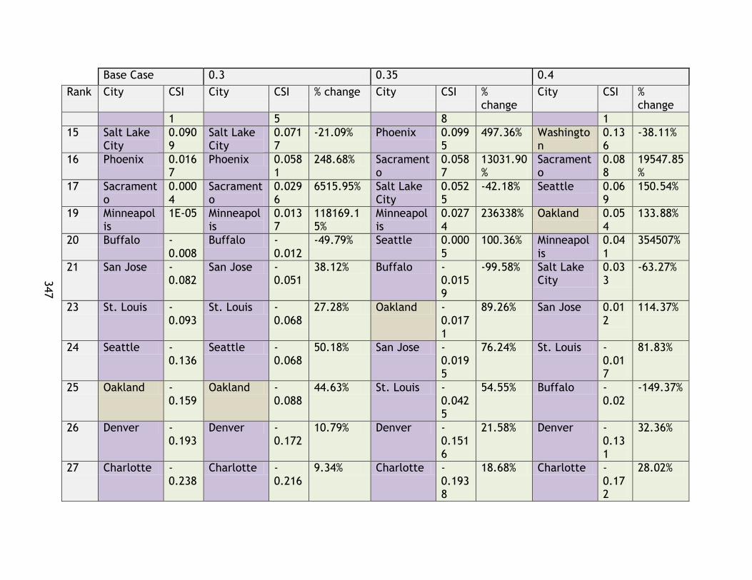
347
347
Base Case 0.3 0.35 0.4
Rank City CSI City CSI % change City CSI % change
City CSI % change
1 5 8 1
15 Salt Lake City
0.0909
Salt Lake City
0.0717
-21.09% Phoenix 0.0995
497.36% Washington
0.136
-38.11%
16 Phoenix 0.0167
Phoenix 0.0581
248.68% Sacramento
0.0587
13031.90%
Sacramento
0.088
19547.85%
17 Sacramento
0.0004
Sacramento
0.0296
6515.95% Salt Lake City
0.0525
-42.18% Seattle 0.069
150.54%
19 Minneapolis
1E-05 Minneapolis
0.0137
118169.15%
Minneapolis
0.0274
236338% Oakland 0.054
133.88%
20 Buffalo -0.008
Buffalo -0.012
-49.79% Seattle 0.0005
100.36% Minneapolis
0.041
354507%
21 San Jose -0.082
San Jose -0.051
38.12% Buffalo -0.0159
-99.58% Salt Lake City
0.033
-63.27%
23 St. Louis -0.093
St. Louis -0.068
27.28% Oakland -0.0171
89.26% San Jose 0.012
114.37%
24 Seattle -0.136
Seattle -0.068
50.18% San Jose -0.0195
76.24% St. Louis -0.017
81.83%
25 Oakland -0.159
Oakland -0.088
44.63% St. Louis -0.0425
54.55% Buffalo -0.02
-149.37%
26 Denver -0.193
Denver -0.172
10.79% Denver -0.1516
21.58% Denver -0.131
32.36%
27 Charlotte -0.238
Charlotte -0.216
9.34% Charlotte -0.1938
18.68% Charlotte -0.172
28.02%
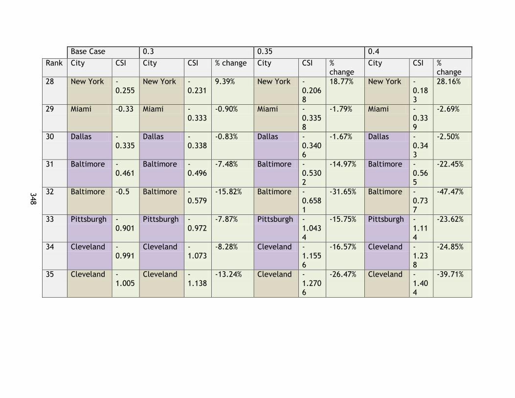
348
348
Base Case 0.3 0.35 0.4
Rank City CSI City CSI % change City CSI % change
City CSI % change
28 New York -0.255
New York -0.231
9.39% New York -0.2068
18.77% New York -0.183
28.16%
29 Miami -0.33 Miami -0.333
-0.90% Miami -0.3358
-1.79% Miami -0.339
-2.69%
30 Dallas -0.335
Dallas -0.338
-0.83% Dallas -0.3406
-1.67% Dallas -0.343
-2.50%
31 Baltimore -0.461
Baltimore -0.496
-7.48% Baltimore -0.5302
-14.97% Baltimore -0.565
-22.45%
32 Baltimore -0.5 Baltimore -0.579
-15.82% Baltimore -0.6581
-31.65% Baltimore -0.737
-47.47%
33 Pittsburgh -0.901
Pittsburgh -0.972
-7.87% Pittsburgh -1.0434
-15.75% Pittsburgh -1.114
-23.62%
34 Cleveland -0.991
Cleveland -1.073
-8.28% Cleveland -1.1556
-16.57% Cleveland -1.238
-24.85%
35 Cleveland -1.005
Cleveland -1.138
-13.24% Cleveland -1.2706
-26.47% Cleveland -1.404
-39.71%

349
349
Table 6-89 Economic Index Weighting Sensitivity Analysis for Method 1
Base Case 0.3 0.35 0.4
Rank City CSI City CSI
% change from base City CSI
% change from base City CSI
% change from base
1 New York 1.572
7 New York 1.58
6 0.850% New York 1.59
9 1.700% New York 1.61
3 2.55%
2 Los Angeles
0.7406
Los Angeles
0.725 -2.073%
Los Angeles
0.710 -4.145%
Los Angeles
0.695 -6.22%
3 San Francisco
0.4450 Chicago
0.392 1.851% Chicago
0.399 3.702% Chicago
0.407 5.55%
4 Chicago 0.385
2 San Francisco
0.385 -13.589%
Philadelphia
0.381 13.720%
Philadelphia
0.404 20.58%
5 Los Angeles
0.3654
Philadelphia
0.358 6.860% Houston
0.363 6.383% Houston
0.374 9.57%
6 Portland 0.346
1 Houston 0.35
2 3.191% San Francisco
0.324 -27.178%
Washington
0.319 45.85%
7 Houston 0.341
2 Los Angeles
0.340 -7.061% Portland
0.314 -9.197% Atlanta
0.300 34.25%
8 Philadelphia
0.3352 Portland
0.330 -4.599%
Los Angeles
0.314 -14.122% Portland
0.298 -13.80%
9 Atlanta 0.223
2 Washington
0.252 15.284%
Washington
0.286 30.569%
Los Angeles
0.288 -21.18%
10 Washington
0.2190 Atlanta
0.249 11.415% Atlanta
0.274 22.831%
San Francisco
0.264 -40.77%
11 San Diego 0.208
8 San Diego 0.21
8 4.187% San Diego 0.22
6 8.374% San Diego 0.23
5 12.56%
12 Boston 0.151
2 Boston 0.17
6 16.625% Boston 0.20
1 33.249% Boston 0.22
7 49.87%
13 Jersey City
0.1483
Jersey City
0.132 -11.103%
Jersey City
0.115 -22.206%
Salt Lake City
0.126 38.39%

350
350
Base Case 0.3 0.35 0.4
Rank City CSI City CSI
% change from base City CSI
% change from base City CSI
% change from base
14 Boston 0.099
1 Salt Lake City
0.102 12.796%
Salt Lake City
0.114 25.592%
Jersey City
0.099 -33.31%
15 Salt Lake City
0.0909 Boston
0.099 -0.105% Boston
0.099 -0.210% Boston
0.099 -0.32%
16 Phoenix 0.016
7 Sacramento
0.008
1693.558%
Sacramento
0.016
3387.115%
Sacramento
0.023
5080.67%
17 Sacramento
0.0004
Minneapolis
-0.00
1
-6560.956
% Minneapolis
-0.00
2
-13121.91
1% Minneapolis
-0.00
2
-19682.87
%
19 Minneapolis
0.0000 Phoenix
-0.00
9
-155.865
% Phoenix
-0.03
5 -311.731% Phoenix
-0.06
1 -467.60%
20 Buffalo
-0.008
0 Buffalo
-0.03
6
-353.471
% Buffalo
-0.06
4 -706.943% St. Louis
-0.07
4 21.26%
21 San Jose
-0.082
1 St. Louis
-0.08
7 7.085% St. Louis
-0.08
0 14.171% Buffalo
-0.09
2
-1060.41
%
23 St. Louis
-0.093
5 San Jose
-0.11
8 -43.708% Oakland
-0.14
2 10.754% Oakland
-0.13
4 16.13%
24 Seattle
-0.136
5 Oakland
-0.15
1 5.377% San Jose
-0.15
4 -87.416% San Jose
-0.19
0 -131.12%
25 Oakland
-0.159
3 Seattle
-0.16
6 -21.744% Denver
-0.19
5 -0.686% Denver
-0.19
5 -1.03%
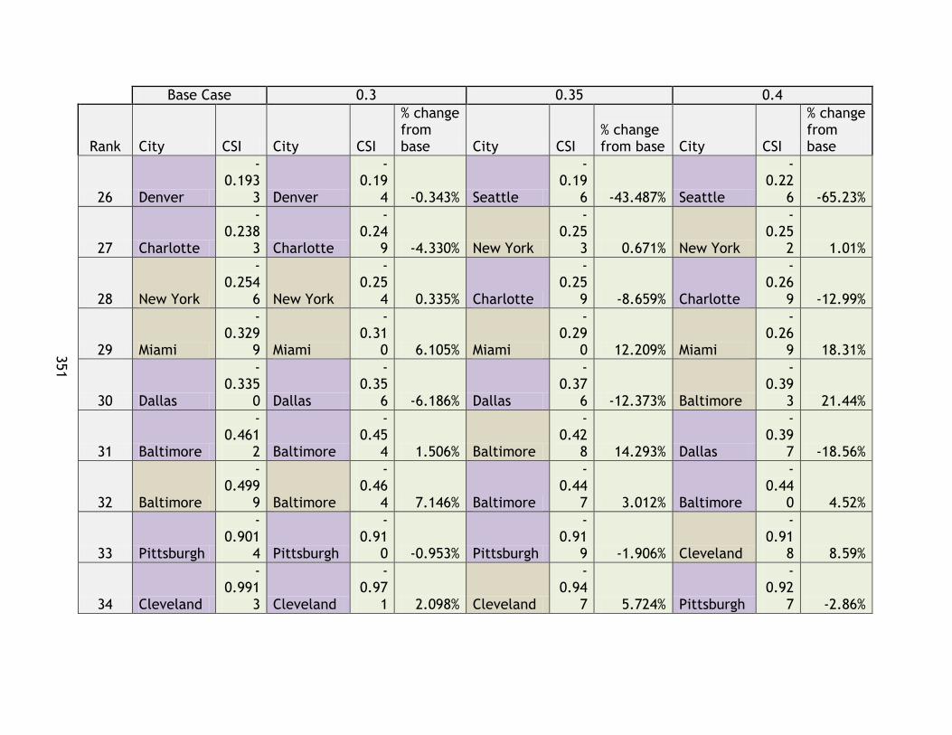
351
351
Base Case 0.3 0.35 0.4
Rank City CSI City CSI
% change from base City CSI
% change from base City CSI
% change from base
26 Denver
-0.193
3 Denver
-0.19
4 -0.343% Seattle
-0.19
6 -43.487% Seattle
-0.22
6 -65.23%
27 Charlotte
-0.238
3 Charlotte
-0.24
9 -4.330% New York
-0.25
3 0.671% New York
-0.25
2 1.01%
28 New York
-0.254
6 New York
-0.25
4 0.335% Charlotte
-0.25
9 -8.659% Charlotte
-0.26
9 -12.99%
29 Miami
-0.329
9 Miami
-0.31
0 6.105% Miami
-0.29
0 12.209% Miami
-0.26
9 18.31%
30 Dallas
-0.335
0 Dallas
-0.35
6 -6.186% Dallas
-0.37
6 -12.373% Baltimore
-0.39
3 21.44%
31 Baltimore
-0.461
2 Baltimore
-0.45
4 1.506% Baltimore
-0.42
8 14.293% Dallas
-0.39
7 -18.56%
32 Baltimore
-0.499
9 Baltimore
-0.46
4 7.146% Baltimore
-0.44
7 3.012% Baltimore
-0.44
0 4.52%
33 Pittsburgh
-0.901
4 Pittsburgh
-0.91
0 -0.953% Pittsburgh
-0.91
9 -1.906% Cleveland
-0.91
8 8.59%
34 Cleveland
-0.991
3 Cleveland
-0.97
1 2.098% Cleveland
-0.94
7 5.724% Pittsburgh
-0.92
7 -2.86%

352
352
Base Case 0.3 0.35 0.4
Rank City CSI City CSI
% change from base City CSI
% change from base City CSI
% change from base
35 Cleveland
-1.004
7 Cleveland
-0.97
6 2.862% Cleveland
-0.95
0 4.197% Cleveland
-0.92
9 6.29%
Table 6-90 Social Index Weighting Sensitivity Test for Method 1
Base Case 0.3 0.35 0.4
Rank City CSI City CSI
% change from base City CSI
% change from base City CSI
% change from base
1 New York 1.57
3 New York 1.51
1 -3.90% New York 1.45
0 -7.80% New York 1.38
9 -11.70%
2 Los Angeles
0.741
Los Angeles
0.710 -4.18%
Los Angeles
0.679 -8.35%
San Francisco
0.677 52.22%
3 San Francisco
0.445
San Francisco
0.522 17.41%
San Francisco
0.600 34.81%
Los Angeles
0.648 -12.53%
4 Chicago 0.38
5 Houston 0.36
7 7.69% Houston 0.39
4 15.37% Houston 0.42
0 23.06%
5 Los Angeles
0.365 Chicago
0.354 -8.17% Portland
0.331 -4.41% Portland
0.323 -6.61%
6 Portland 0.34
6 Los Angeles
0.345 -5.69%
Los Angeles
0.324 -11.38%
Los Angeles
0.303 -17.07%
7 Houston 0.34
1 Portland 0.33
8 -2.20% Chicago 0.32
2 -16.34% Chicago 0.29
1 -24.51%
8 Philadelphia
0.335
Philadelphia
0.310 -7.55%
Philadelphia
0.285 -15.11%
Philadelphia
0.259 -22.66%

353
353
Base Case 0.3 0.35 0.4
Rank City CSI City CSI
% change from base City CSI
% change from base City CSI
% change from base
9 Atlanta 0.22
3 Atlanta 0.21
3 -4.55% Atlanta 0.20
3 -9.09% Atlanta 0.19
3 -13.64%
10 Washington
0.219
Washington
0.199 -9.07%
Washington
0.179 -18.15% Boston
0.181 20.00%
11 San Diego 0.20
9 San Diego 0.18
7 -10.37% Boston 0.17
1 13.33% Washington
0.159 -27.22%
12 Boston 0.15
1 Boston 0.16
1 6.67% San Diego 0.16
5 -20.73% San Diego 0.14
4 -31.10%
13 Jersey City 0.14
8 Jersey City 0.11
7 -20.89% Salt Lake City
0.118 29.79%
Salt Lake City
0.131 44.69%
14 Boston 0.09
9 Salt Lake City
0.104 14.90% Boston
0.090 -9.16% Buffalo
0.113 1518.04%
15 Salt Lake City
0.091 Boston
0.095 -4.58% Jersey City
0.086 -41.77% Boston
0.085 -13.74%
16 Phoenix 0.01
7 Buffalo 0.03
2 506.01% Buffalo 0.07
3 1012.02% Jersey City 0.05
5 -62.66%
17 Sacramento
0.000 Phoenix
0.009 -44.82%
Minneapolis
0.016
139152.97%
Minneapolis
0.024
208729.45%
19 Minneapolis
0.000
Minneapolis
0.008
69576.48%
Sacramento
0.006 1352.42%
Sacramento
0.010 2028.63%
20 Buffalo
-0.00
8 Sacramento
0.003 676.21% Phoenix
0.002 -89.65% San Jose
0.004 104.98%
21 San Jose
-0.08
2 San Jose
-0.05
3 34.99% San Jose
-0.02
5 69.99% Phoenix
-0.00
6 -134.47%
23 St. Louis - St. Louis - -25.94% St. Louis - -51.87% Seattle - -9.08%

354
354
Base Case 0.3 0.35 0.4
Rank City CSI City CSI
% change from base City CSI
% change from base City CSI
% change from base
0.093
0.118
0.142
0.149
24 Seattle
-0.13
6 Seattle
-0.14
1 -3.03% Seattle
-0.14
5 -6.05% St. Louis
-0.16
6 -77.81%
25 Oakland
-0.15
9 Denver
-0.19
0 1.55% Denver
-0.18
7 3.09% Denver
-0.18
4 4.64%
26 Denver
-0.19
3 Charlotte
-0.22
2 6.67% Charlotte
-0.20
6 13.35% Charlotte
-0.19
1 20.02%
27 Charlotte
-0.23
8 Oakland
-0.26
5 -66.01% New York
-0.28
5 -12.09% Dallas
-0.27
7 17.40%
28 New York
-0.25
5 New York
-0.27
0 -6.04% Dallas
-0.29
6 11.60% New York
-0.30
1 -18.13%
29 Miami
-0.33
0 Dallas
-0.31
6 5.80% Miami
-0.33
4 -1.15% Baltimore
-0.32
7 34.68%
30 Dallas
-0.33
5 Miami
-0.33
2 -0.57% Oakland
-0.37
0 -132.01% Miami
-0.33
6 -1.72%
31 Baltimore
-0.46
1 Baltimore
-0.42
6 7.53% Baltimore
-0.38
4 23.12% Baltimore
-0.35
7 22.59%
32 Baltimore - Baltimore - 11.56% Baltimore - 15.06% Oakland - -198.02%
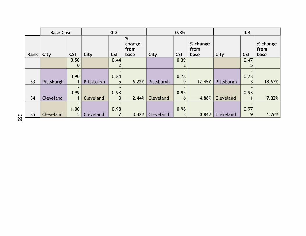
355
355
Base Case 0.3 0.35 0.4
Rank City CSI City CSI
% change from base City CSI
% change from base City CSI
% change from base
0.500
0.442
0.392
0.475
33 Pittsburgh
-0.90
1 Pittsburgh
-0.84
5 6.22% Pittsburgh
-0.78
9 12.45% Pittsburgh
-0.73
3 18.67%
34 Cleveland
-0.99
1 Cleveland
-0.98
0 2.44% Cleveland
-0.95
6 4.88% Cleveland
-0.93
1 7.32%
35 Cleveland
-1.00
5 Cleveland
-0.98
7 0.42% Cleveland
-0.98
3 0.84% Cleveland
-0.97
9 1.26%
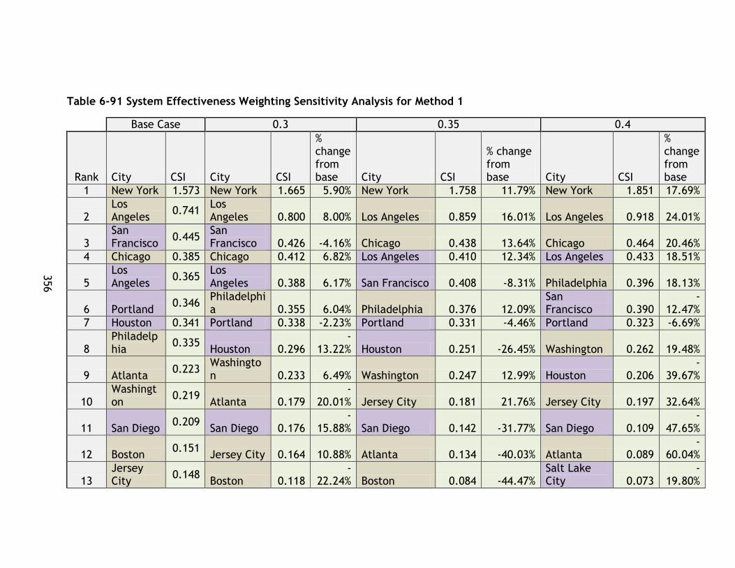
356
356
Table 6-91 System Effectiveness Weighting Sensitivity Analysis for Method 1
Base Case 0.3 0.35 0.4
Rank City CSI City CSI
% change from base City CSI
% change from base City CSI
% change from base
1 New York 1.573 New York 1.665 5.90% New York 1.758 11.79% New York 1.851 17.69%
2 Los Angeles
0.741 Los Angeles 0.800 8.00% Los Angeles 0.859 16.01% Los Angeles 0.918 24.01%
3 San Francisco
0.445 San Francisco 0.426 -4.16% Chicago 0.438 13.64% Chicago 0.464 20.46%
4 Chicago 0.385 Chicago 0.412 6.82% Los Angeles 0.410 12.34% Los Angeles 0.433 18.51%
5 Los Angeles
0.365 Los Angeles 0.388 6.17% San Francisco 0.408 -8.31% Philadelphia 0.396 18.13%
6 Portland 0.346
Philadelphia 0.355 6.04% Philadelphia 0.376 12.09%
San Francisco 0.390
-12.47%
7 Houston 0.341 Portland 0.338 -2.23% Portland 0.331 -4.46% Portland 0.323 -6.69%
8 Philadelphia
0.335 Houston 0.296
-13.22% Houston 0.251 -26.45% Washington 0.262 19.48%
9 Atlanta 0.223
Washington 0.233 6.49% Washington 0.247 12.99% Houston 0.206
-39.67%
10 Washington
0.219 Atlanta 0.179
-20.01% Jersey City 0.181 21.76% Jersey City 0.197 32.64%
11 San Diego 0.209
San Diego 0.176 -
15.88% San Diego 0.142 -31.77% San Diego 0.109 -
47.65%
12 Boston 0.151
Jersey City 0.164 10.88% Atlanta 0.134 -40.03% Atlanta 0.089 -
60.04%
13 Jersey City
0.148 Boston 0.118
-22.24% Boston 0.084 -44.47%
Salt Lake City 0.073
-19.80%

357
357
Base Case 0.3 0.35 0.4
Rank City CSI City CSI
% change from base City CSI
% change from base City CSI
% change from base
14 Boston 0.099
Boston 0.087 -
11.83% Salt Lake City 0.079 -13.20% Boston 0.064 -
35.50%
15 Salt Lake City
0.091 Salt Lake City 0.085 -6.60% Boston 0.076 -23.67% Boston 0.050
-66.71%
16 Phoenix 0.017
Phoenix 0.009 -
47.99% Phoenix 0.001 -95.98% Phoenix -0.007
-143.97
%
17 Sacramento
0.000 Buffalo
-0.016
-102.75
% Buffalo -0.024 -205.50% Buffalo -0.032
-308.25
%
19 Minneapolis
0.000 Minneapolis
-0.021
-181184
.67% Minneapolis -0.042
-362369.3
5% Minneapolis -0.063
-543554
.02%
20 Buffalo
-0.008
Sacramento
-0.039
-8885.7
2% Sacramento -0.079
-17771.43
% Oakland -0.083 48.00%
21 San Jose -
0.082 St. Louis -
0.101 -8.42% Oakland -0.108 32.00% St. Louis -0.117 -
25.27%
23 St. Louis
-0.093
San Jose -
0.106 -
29.41% St. Louis -0.109 -16.85% Sacramento -0.119
-26657.
15%
24 Seattle -
0.136 Oakland -
0.134 16.00% San Jose -0.130 -58.82% San Jose -0.155 -
88.22%
25 Oakland -
0.159 Seattle -
0.171 -
25.41% Seattle -0.206 -50.82% Seattle -0.241 -
76.24%
26 Denver -
0.193 Denver -
0.216 -
11.99% Denver -0.240 -23.98% Denver -0.263 -
35.98%
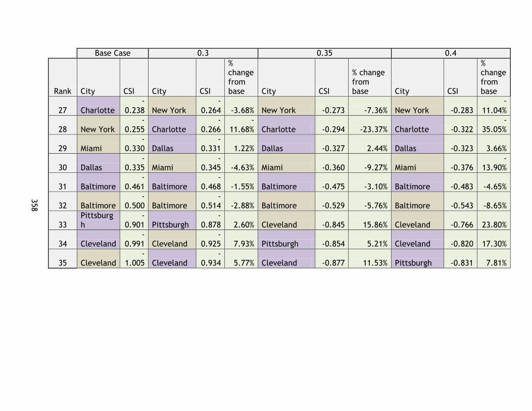
358
358
Base Case 0.3 0.35 0.4
Rank City CSI City CSI
% change from base City CSI
% change from base City CSI
% change from base
27 Charlotte -
0.238 New York -
0.264 -3.68% New York -0.273 -7.36% New York -0.283 -
11.04%
28 New York -
0.255 Charlotte -
0.266 -
11.68% Charlotte -0.294 -23.37% Charlotte -0.322 -
35.05%
29 Miami -
0.330 Dallas -
0.331 1.22% Dallas -0.327 2.44% Dallas -0.323 3.66%
30 Dallas -
0.335 Miami -
0.345 -4.63% Miami -0.360 -9.27% Miami -0.376 -
13.90%
31 Baltimore -
0.461 Baltimore -
0.468 -1.55% Baltimore -0.475 -3.10% Baltimore -0.483 -4.65%
32 Baltimore -
0.500 Baltimore -
0.514 -2.88% Baltimore -0.529 -5.76% Baltimore -0.543 -8.65%
33 Pittsburgh
-0.901 Pittsburgh
-0.878 2.60% Cleveland -0.845 15.86% Cleveland -0.766 23.80%
34 Cleveland -
0.991 Cleveland -
0.925 7.93% Pittsburgh -0.854 5.21% Cleveland -0.820 17.30%
35 Cleveland -
1.005 Cleveland -
0.934 5.77% Cleveland -0.877 11.53% Pittsburgh -0.831 7.81%
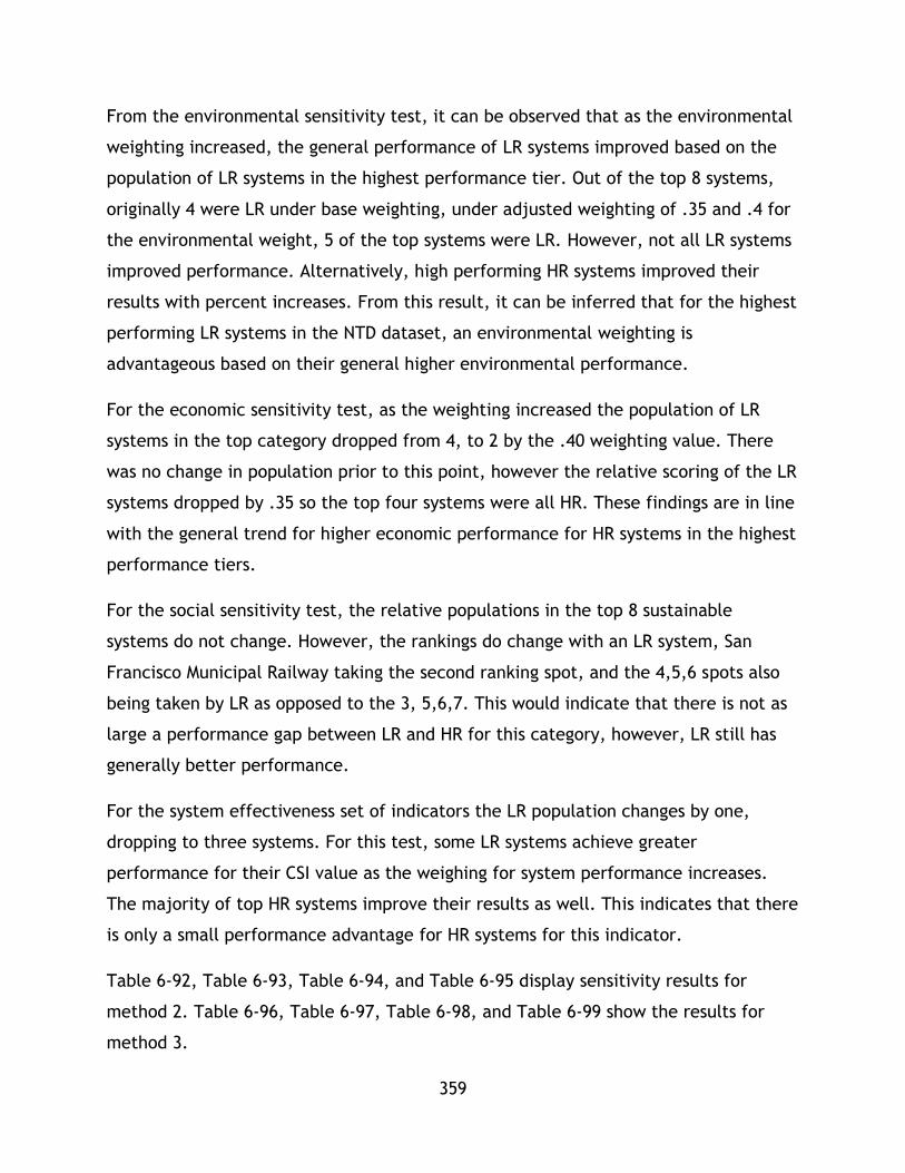
359
From the environmental sensitivity test, it can be observed that as the environmental
weighting increased, the general performance of LR systems improved based on the
population of LR systems in the highest performance tier. Out of the top 8 systems,
originally 4 were LR under base weighting, under adjusted weighting of .35 and .4 for
the environmental weight, 5 of the top systems were LR. However, not all LR systems
improved performance. Alternatively, high performing HR systems improved their
results with percent increases. From this result, it can be inferred that for the highest
performing LR systems in the NTD dataset, an environmental weighting is
advantageous based on their general higher environmental performance.
For the economic sensitivity test, as the weighting increased the population of LR
systems in the top category dropped from 4, to 2 by the .40 weighting value. There
was no change in population prior to this point, however the relative scoring of the LR
systems dropped by .35 so the top four systems were all HR. These findings are in line
with the general trend for higher economic performance for HR systems in the highest
performance tiers.
For the social sensitivity test, the relative populations in the top 8 sustainable
systems do not change. However, the rankings do change with an LR system, San
Francisco Municipal Railway taking the second ranking spot, and the 4,5,6 spots also
being taken by LR as opposed to the 3, 5,6,7. This would indicate that there is not as
large a performance gap between LR and HR for this category, however, LR still has
generally better performance.
For the system effectiveness set of indicators the LR population changes by one,
dropping to three systems. For this test, some LR systems achieve greater
performance for their CSI value as the weighing for system performance increases.
The majority of top HR systems improve their results as well. This indicates that there
is only a small performance advantage for HR systems for this indicator.
Table 6-92, Table 6-93, Table 6-94, and Table 6-95 display sensitivity results for
method 2. Table 6-96, Table 6-97, Table 6-98, and Table 6-99 show the results for
method 3.

360
Table 6-92 Environmental Sensitivity Test for Method 2
Base Case 0.3 0.35 0.4
Rank City CSI City CSI % change City CSI
% change City CSI
% change
1 New York 0.702 New York 0.694 -1.18% New York 0.685 -2.37% New York 0.677 -3.55%
2 Oakland 0.513 Oakland 0.527 2.72% Oakland 0.541 5.44% Oakland 0.555 8.15%
3 Los Angeles 0.512 San Diego 0.507 2.93% San Diego 0.522 5.86% San Diego 0.536 8.79%
4 San Diego 0.493 Los Angeles 0.504 -1.56% Seattle 0.499 11.49% Seattle 0.525 17.24%
5 San Francisco 0.484
San Francisco 0.476 -1.75%
Los Angeles 0.496 -3.12%
Los Angeles 0.488 -4.68%
6 Los Angeles 0.468 Seattle 0.473 5.75% Portland 0.479 2.45% Portland 0.485 3.68%
7 Portland 0.467 Portland 0.473 1.23% Los Angeles 0.473 1.14%
Los Angeles 0.476 1.71%
8 Houston 0.460 Los Angeles 0.471 0.57% San Francisco 0.467 -3.50%
San Francisco 0.459 -5.25%
9 Seattle 0.448 Houston 0.449 -2.26% Houston 0.439 -4.51% Atlanta 0.429 -0.71%
10 Atlanta 0.432 Atlanta 0.431 -0.24% Atlanta 0.430 -0.48% Houston 0.429 -6.77%
11 Chicago 0.432 Chicago 0.421 -2.44% Chicago 0.411 -4.88% Chicago 0.400 -7.32%
12 Washington 0.418 Washington 0.405 -3.03%
Washington 0.392 -6.07% Phoenix 0.387 -1.26%
13 Philadelphia 0.413 Philadelphia 0.401 -2.99%
Philadelphia 0.389 -5.98%
Washington 0.380 -9.10%
14 Phoenix 0.392 Phoenix 0.390 -0.42% Phoenix 0.388 -0.84% Philadelphia 0.376 -8.97%
15 Boston 0.381 Jersey City 0.372 -0.35% Jersey City 0.370 -0.69% Jersey City 0.369 -1.04%
16 Salt Lake City 0.379 Boston 0.370 -2.92%
Sacramento 0.363 -0.74%
Sacramento 0.362 -1.11%
17 Boston 0.373 Salt Lake City 0.367 -3.19% Boston 0.359 -5.83% Boston 0.351 -5.99%
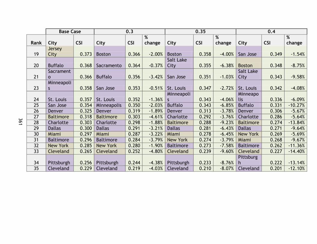
361
Base Case 0.3 0.35 0.4
Rank City CSI City CSI % change City CSI
% change City CSI
% change
19 Jersey City 0.373 Boston 0.366 -2.00% Boston 0.358 -4.00% San Jose 0.349 -1.54%
20 Buffalo 0.368 Sacramento 0.364 -0.37% Salt Lake City 0.355 -6.38% Boston 0.348 -8.75%
21 Sacramento 0.366 Buffalo 0.356 -3.42% San Jose 0.351 -1.03%
Salt Lake City 0.343 -9.58%
23 Minneapolis 0.358 San Jose 0.353 -0.51% St. Louis 0.347 -2.72% St. Louis 0.342 -4.08%
24 St. Louis 0.357 St. Louis 0.352 -1.36% Minneapolis 0.343 -4.06%
Minneapolis 0.336 -6.09%
25 San Jose 0.354 Minneapolis 0.350 -2.03% Buffalo 0.343 -6.85% Buffalo 0.331 -10.27%
26 Denver 0.325 Denver 0.319 -1.89% Denver 0.313 -3.78% Denver 0.306 -5.67%
27 Baltimore 0.318 Baltimore 0.303 -4.61% Charlotte 0.292 -3.76% Charlotte 0.286 -5.64%
28 Charlotte 0.303 Charlotte 0.298 -1.88% Baltimore 0.288 -9.23% Baltimore 0.274 -13.84%
29 Dallas 0.300 Dallas 0.291 -3.21% Dallas 0.281 -6.43% Dallas 0.271 -9.64%
30 Miami 0.297 Miami 0.287 -3.22% Miami 0.278 -6.45% New York 0.269 -5.69%
31 Baltimore 0.296 Baltimore 0.284 -3.79% New York 0.274 -3.79% Miami 0.268 -9.67%
32 New York 0.285 New York 0.280 -1.90% Baltimore 0.273 -7.58% Baltimore 0.262 -11.36%
33 Cleveland 0.265 Cleveland 0.252 -4.80% Cleveland 0.239 -9.60% Cleveland 0.227 -14.40%
34 Pittsburgh 0.256 Pittsburgh 0.244 -4.38% Pittsburgh 0.233 -8.76% Pittsburgh 0.222 -13.14%
35 Cleveland 0.229 Cleveland 0.219 -4.03% Cleveland 0.210 -8.07% Cleveland 0.201 -12.10%

362
Table 6-93 Economic Sensitivity Test for Method 2
Base Case 0.3 0.35 0.4
Rank City CSI City CSI % change City CSI
% change City CSI
% change
1 New York 0.702 New York 0.713 1.50% New York 0.723 3.01% New York 0.734 4.51%
2 Oakland 0.513 Oakland 0.521 1.64% Oakland 0.530 3.28% Oakland 0.538 4.92%
3 Los Angeles 0.512 Los Angeles 0.518 1.04% Los Angeles 0.523 2.08%
Los Angeles 0.528 3.12%
4 San Diego 0.493 San Diego 0.499 1.21% San Diego 0.505 2.43% San Diego 0.511 3.64%
5 San Francisco 0.484
San Francisco 0.478 -1.39% Houston 0.478 4.02% Houston 0.488 6.03%
6 Los Angeles 0.468 Houston 0.469 2.01% San Francisco 0.471 -2.79% Portland 0.472 0.92%
7 Portland 0.467 Portland 0.469 0.31% Portland 0.470 0.62% Atlanta 0.470 8.68%
8 Houston 0.460 Los Angeles 0.468 0.00% Los Angeles 0.468 0.00%
Los Angeles 0.468 0.00%
9 Seattle 0.448 Atlanta 0.445 2.89% Atlanta 0.457 5.79% Chicago 0.466 7.88%
10 Atlanta 0.432 Chicago 0.443 2.63% Chicago 0.454 5.25% San Francisco 0.464 -4.18%
11 Chicago 0.432 Seattle 0.440 -1.60% Washington 0.446 6.71%
Washington 0.460 10.07%
12 Washington 0.418 Washington 0.432 3.36% Philadelphia 0.440 6.56%
Philadelphia 0.454 9.84%
13 Philadelphia 0.413 Philadelphia 0.427 3.28% Seattle 0.433 -3.20% Seattle 0.426 -4.79%
14 Phoenix 0.392 Phoenix 0.397 1.45% Boston 0.404 6.07% Boston 0.416 9.11%
15 Boston 0.381 Boston 0.393 3.04% Phoenix 0.403 2.90% Phoenix 0.409 4.34%
16 Salt Lake City 0.379
Salt Lake City 0.389 2.42%
Salt Lake City 0.398 4.85%
Salt Lake City 0.407 7.27%
17 Boston 0.373 Boston 0.379 1.62% Boston 0.385 3.24% Boston 0.391 4.85%
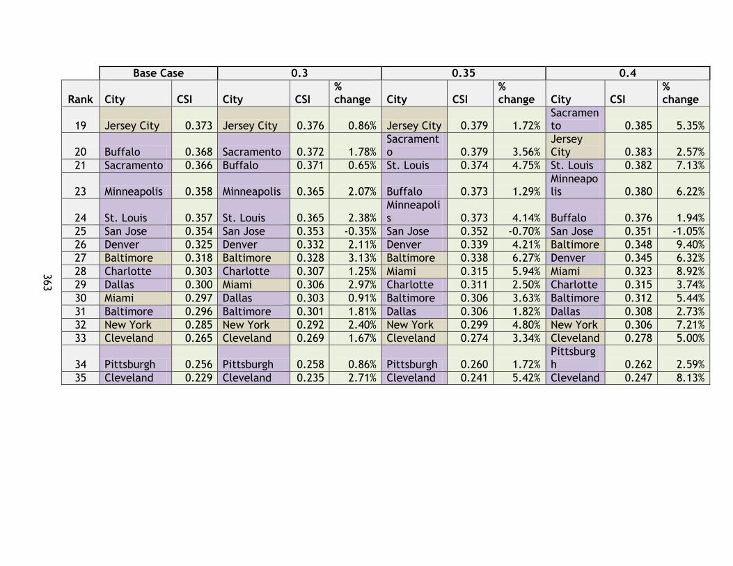
363
Base Case 0.3 0.35 0.4
Rank City CSI City CSI % change City CSI
% change City CSI
% change
19 Jersey City 0.373 Jersey City 0.376 0.86% Jersey City 0.379 1.72% Sacramento 0.385 5.35%
20 Buffalo 0.368 Sacramento 0.372 1.78% Sacramento 0.379 3.56%
Jersey City 0.383 2.57%
21 Sacramento 0.366 Buffalo 0.371 0.65% St. Louis 0.374 4.75% St. Louis 0.382 7.13%
23 Minneapolis 0.358 Minneapolis 0.365 2.07% Buffalo 0.373 1.29% Minneapolis 0.380 6.22%
24 St. Louis 0.357 St. Louis 0.365 2.38% Minneapolis 0.373 4.14% Buffalo 0.376 1.94%
25 San Jose 0.354 San Jose 0.353 -0.35% San Jose 0.352 -0.70% San Jose 0.351 -1.05%
26 Denver 0.325 Denver 0.332 2.11% Denver 0.339 4.21% Baltimore 0.348 9.40%
27 Baltimore 0.318 Baltimore 0.328 3.13% Baltimore 0.338 6.27% Denver 0.345 6.32%
28 Charlotte 0.303 Charlotte 0.307 1.25% Miami 0.315 5.94% Miami 0.323 8.92%
29 Dallas 0.300 Miami 0.306 2.97% Charlotte 0.311 2.50% Charlotte 0.315 3.74%
30 Miami 0.297 Dallas 0.303 0.91% Baltimore 0.306 3.63% Baltimore 0.312 5.44%
31 Baltimore 0.296 Baltimore 0.301 1.81% Dallas 0.306 1.82% Dallas 0.308 2.73%
32 New York 0.285 New York 0.292 2.40% New York 0.299 4.80% New York 0.306 7.21%
33 Cleveland 0.265 Cleveland 0.269 1.67% Cleveland 0.274 3.34% Cleveland 0.278 5.00%
34 Pittsburgh 0.256 Pittsburgh 0.258 0.86% Pittsburgh 0.260 1.72% Pittsburgh 0.262 2.59%
35 Cleveland 0.229 Cleveland 0.235 2.71% Cleveland 0.241 5.42% Cleveland 0.247 8.13%

364
Table 6-94 Social Sensitivity Test for Method 2
Base Case 0.3 0.35 0.4
Rank City CSI City CSI % change City CSI
% change City CSI
% change
1 New York 0.702 New York 0.696 -0.85% New York 0.690 -1.70% New York 0.684 -2.54%
2 Oakland 0.513 Los Angeles 0.515 0.59% San Francisco 0.543 12.01%
San Francisco 0.572 18.02%
3 Los Angeles 0.512 San Francisco 0.514 6.01% Los Angeles 0.518 1.18%
Los Angeles 0.521 1.77%
4 San Diego 0.493 Oakland 0.506 -1.36% Oakland 0.499 -2.72% Houston 0.518 12.55%
5 San Francisco 0.484 San Diego 0.492 -0.14% Houston 0.498 8.37% Oakland 0.492 -4.08%
6 Los Angeles 0.468 Houston 0.479 4.18% San Diego 0.492 -0.27% San Diego 0.491 -0.41%
7 Portland 0.467 Los Angeles 0.473 1.02% Portland 0.478 2.20% Portland 0.483 3.30%
8 Houston 0.460 Portland 0.473 1.10% Los Angeles 0.477 2.03% Los Angeles 0.482 3.05%
9 Seattle 0.448 Seattle 0.450 0.47% Seattle 0.452 0.95% Seattle 0.454 1.42%
10 Atlanta 0.432 Atlanta 0.438 1.39% Atlanta 0.444 2.77% Atlanta 0.450 4.16%
11 Chicago 0.432 Chicago 0.435 0.74% Chicago 0.438 1.48% Chicago 0.441 2.23%
12 Washington 0.418 Washington 0.423 1.22% Washington 0.428 2.45% Washington 0.433 3.67%
13 Philadelphia 0.413 Philadelphia 0.416 0.76% Philadelphia 0.420 1.53% Buffalo 0.428 16.18%
14 Phoenix 0.392 Phoenix 0.399 1.79% Buffalo 0.408 10.79% Philadelphia 0.423 2.29%
15 Boston 0.381 Boston 0.394 3.24% Boston 0.406 6.48% Boston 0.418 9.72%
16 Salt Lake City 0.379 Salt Lake City 0.391 3.15% Phoenix 0.406 3.59%
Salt Lake City 0.415 9.44%
17 Boston 0.373 Buffalo 0.388 5.39% Salt Lake City 0.403 6.29% Phoenix 0.413 5.38%
19 Jersey City 0.373 Boston 0.384 2.91% Boston 0.395 5.82% Boston 0.406 8.73%

365
Base Case 0.3 0.35 0.4
Rank City CSI City CSI % change City CSI
% change City CSI
% change
20 Buffalo 0.368 Jersey City 0.376 0.68% San Jose 0.385 8.63% San Jose 0.400 12.95%
21 Sacramento 0.366 Sacramento 0.375 2.58% Sacramento 0.384 5.15% Sacramento 0.394 7.73%
23 Minneapolis 0.358 San Jose 0.370 4.32% Minneapolis 0.380 6.11% Minneapolis 0.390 9.16%
24 St. Louis 0.357 Minneapolis 0.369 3.05% Jersey City 0.378 1.36% Jersey City 0.381 2.03%
25 San Jose 0.354 St. Louis 0.363 1.75% St. Louis 0.369 3.50% St. Louis 0.375 5.25%
26 Denver 0.325 Denver 0.335 3.26% Baltimore 0.353 10.98% Baltimore 0.370 16.46%
27 Baltimore 0.318 Baltimore 0.335 5.49% Denver 0.346 6.51% Denver 0.357 9.77%
28 Charlotte 0.303 Charlotte 0.316 4.30% Charlotte 0.329 8.61% Charlotte 0.343 12.91%
29 Dallas 0.300 Dallas 0.314 4.57% Dallas 0.328 9.14% Baltimore 0.342 15.74%
30 Miami 0.297 Baltimore 0.311 5.25% Baltimore 0.327 10.49% Dallas 0.341 13.71%
31 Baltimore 0.296 Miami 0.307 3.51% Miami 0.318 7.01% Miami 0.328 10.52%
32 New York 0.285 New York 0.291 1.95% New York 0.296 3.90% Pittsburgh 0.303 18.54%
33 Cleveland 0.265 Cleveland 0.272 2.92% Pittsburgh 0.287 12.36% New York 0.302 5.85%
34 Pittsburgh 0.256 Pittsburgh 0.271 6.18% Cleveland 0.280 5.83% Cleveland 0.288 8.75%
35 Cleveland 0.229 Cleveland 0.232 1.55% Cleveland 0.236 3.11% Cleveland 0.239 4.66%
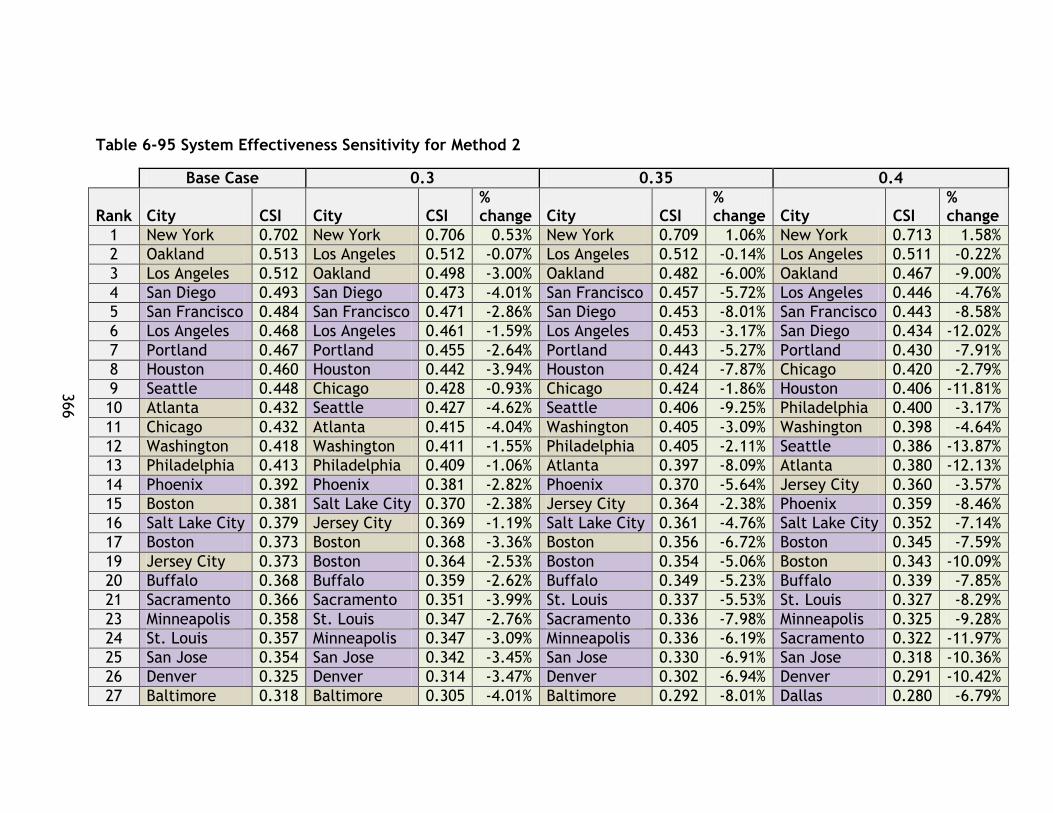
366
Table 6-95 System Effectiveness Sensitivity for Method 2
Base Case 0.3 0.35 0.4
Rank City CSI City CSI % change City CSI
% change City CSI
% change
1 New York 0.702 New York 0.706 0.53% New York 0.709 1.06% New York 0.713 1.58%
2 Oakland 0.513 Los Angeles 0.512 -0.07% Los Angeles 0.512 -0.14% Los Angeles 0.511 -0.22%
3 Los Angeles 0.512 Oakland 0.498 -3.00% Oakland 0.482 -6.00% Oakland 0.467 -9.00%
4 San Diego 0.493 San Diego 0.473 -4.01% San Francisco 0.457 -5.72% Los Angeles 0.446 -4.76%
5 San Francisco 0.484 San Francisco 0.471 -2.86% San Diego 0.453 -8.01% San Francisco 0.443 -8.58%
6 Los Angeles 0.468 Los Angeles 0.461 -1.59% Los Angeles 0.453 -3.17% San Diego 0.434 -12.02%
7 Portland 0.467 Portland 0.455 -2.64% Portland 0.443 -5.27% Portland 0.430 -7.91%
8 Houston 0.460 Houston 0.442 -3.94% Houston 0.424 -7.87% Chicago 0.420 -2.79%
9 Seattle 0.448 Chicago 0.428 -0.93% Chicago 0.424 -1.86% Houston 0.406 -11.81%
10 Atlanta 0.432 Seattle 0.427 -4.62% Seattle 0.406 -9.25% Philadelphia 0.400 -3.17%
11 Chicago 0.432 Atlanta 0.415 -4.04% Washington 0.405 -3.09% Washington 0.398 -4.64%
12 Washington 0.418 Washington 0.411 -1.55% Philadelphia 0.405 -2.11% Seattle 0.386 -13.87%
13 Philadelphia 0.413 Philadelphia 0.409 -1.06% Atlanta 0.397 -8.09% Atlanta 0.380 -12.13%
14 Phoenix 0.392 Phoenix 0.381 -2.82% Phoenix 0.370 -5.64% Jersey City 0.360 -3.57%
15 Boston 0.381 Salt Lake City 0.370 -2.38% Jersey City 0.364 -2.38% Phoenix 0.359 -8.46%
16 Salt Lake City 0.379 Jersey City 0.369 -1.19% Salt Lake City 0.361 -4.76% Salt Lake City 0.352 -7.14%
17 Boston 0.373 Boston 0.368 -3.36% Boston 0.356 -6.72% Boston 0.345 -7.59%
19 Jersey City 0.373 Boston 0.364 -2.53% Boston 0.354 -5.06% Boston 0.343 -10.09%
20 Buffalo 0.368 Buffalo 0.359 -2.62% Buffalo 0.349 -5.23% Buffalo 0.339 -7.85%
21 Sacramento 0.366 Sacramento 0.351 -3.99% St. Louis 0.337 -5.53% St. Louis 0.327 -8.29%
23 Minneapolis 0.358 St. Louis 0.347 -2.76% Sacramento 0.336 -7.98% Minneapolis 0.325 -9.28%
24 St. Louis 0.357 Minneapolis 0.347 -3.09% Minneapolis 0.336 -6.19% Sacramento 0.322 -11.97%
25 San Jose 0.354 San Jose 0.342 -3.45% San Jose 0.330 -6.91% San Jose 0.318 -10.36%
26 Denver 0.325 Denver 0.314 -3.47% Denver 0.302 -6.94% Denver 0.291 -10.42%
27 Baltimore 0.318 Baltimore 0.305 -4.01% Baltimore 0.292 -8.01% Dallas 0.280 -6.79%

367
Base Case 0.3 0.35 0.4
Rank City CSI City CSI % change City CSI
% change City CSI
% change
28 Charlotte 0.303 Dallas 0.293 -2.26% Dallas 0.287 -4.53% Baltimore 0.280 -12.02%
29 Dallas 0.300 Charlotte 0.292 -3.67% Charlotte 0.281 -7.34% Charlotte 0.270 -11.01%
30 Miami 0.297 Miami 0.287 -3.25% Miami 0.278 -6.51% Miami 0.268 -9.76%
31 Baltimore 0.296 Baltimore 0.286 -3.27% Baltimore 0.276 -6.55% Baltimore 0.267 -9.82%
32 New York 0.285 New York 0.278 -2.46% New York 0.271 -4.91% Cleveland 0.266 0.65%
33 Cleveland 0.265 Cleveland 0.265 0.22% Cleveland 0.266 0.43% New York 0.264 -7.37%
34 Pittsburgh 0.256 Pittsburgh 0.249 -2.66% Pittsburgh 0.242 -5.32% Pittsburgh 0.235 -7.99%
35 Cleveland 0.229 Cleveland 0.228 -0.23% Cleveland 0.227 -0.46% Cleveland 0.227 -0.70%
Table 6-96 Environmental Sensitivity for Method 3
Base Case 0.3 0.35 0.4
Rank City CSI City CSI % change City CSI
% change City CSI
% change
1 New York 0.787 New York 0.801 1.73% New York 0.801 1.73% New York 0.814 3.45%
2 Los Angeles 0.643 Los Angeles 0.660 2.72% Los Angeles 0.660 2.72% Los Angeles 0.678 5.44%
3 Los Angeles 0.643 Los Angeles 0.660 2.72% Los Angeles 0.660 2.72% Los Angeles 0.678 5.44%
4 Oakland 0.607 Oakland 0.633 4.38% Oakland 0.633 4.38% Oakland 0.660 8.75%
5 Chicago 0.589 Chicago 0.607 3.04% Chicago 0.607 3.04% San Diego 0.632 9.99%
6 Portland 0.578 Portland 0.604 4.66% Portland 0.604 4.66% Portland 0.631 9.33%
7 San Diego 0.575 San Diego 0.603 4.99% San Diego 0.603 4.99% Chicago 0.625 6.07%
8 San Francisco 0.554 San Francisco 0.576 4.04% San Francisco 0.576 4.04% Atlanta 0.601 9.65%
9 Atlanta 0.548 Atlanta 0.574 4.83% Atlanta 0.574 4.83% San Francisco 0.599 8.08%

368
Base Case 0.3 0.35 0.4
Rank City CSI City CSI % change City CSI
% change City CSI
% change
10 Houston 0.545 Houston 0.568 4.23% Houston 0.568 4.23% Houston 0.591 8.46%
11 Philadelphia 0.543 Jersey City 0.563 4.91% Jersey City 0.563 4.91% Jersey City 0.589 9.83%
12 Jersey City 0.536 Philadelphia 0.558 2.94% Philadelphia 0.558 2.94% Philadelphia 0.574 5.87%
13 Washington 0.530 Boston 0.539 3.62% Boston 0.539 3.62% Seattle 0.565 13.69%
14 Boston 0.521 Boston 0.539 3.62% Boston 0.539 3.62% Boston 0.558 7.24%
15 Boston 0.521 Phoenix 0.537 5.69% Phoenix 0.537 5.69% Boston 0.558 7.24%
16 Phoenix 0.508 Washington 0.537 1.21% Washington 0.537 1.21% Sacramento 0.558 9.94%
17 Sacramento 0.507 Sacramento 0.532 4.97% Sacramento 0.532 4.97% St. Louis 0.546 9.33%
19 Salt Lake City 0.507 Seattle 0.531 6.84% Seattle 0.531 6.84% Washington 0.543 2.42%
20 St. Louis 0.499 St. Louis 0.523 4.67% St. Louis 0.523 4.67% Minneapolis 0.542 8.80%
21 Minneapolis 0.498 Salt Lake City 0.521 2.86% Salt Lake City 0.521 2.86%
Salt Lake City 0.536 5.73%
23 Seattle 0.497 Minneapolis 0.520 4.40% Minneapolis 0.520 4.40% San Jose 0.514 12.15%
24 Buffalo 0.467 Denver 0.489 4.90% Denver 0.489 4.90% Denver 0.512 9.80%
25 Denver 0.466 San Jose 0.486 6.08% San Jose 0.486 6.08% Buffalo 0.505 8.16%
26 San Jose 0.458 Buffalo 0.486 4.08% Buffalo 0.486 4.08% Charlotte 0.498 10.22%
27 Charlotte 0.452 Charlotte 0.475 5.11% Charlotte 0.475 5.11% Miami 0.468 7.34%
28 Miami 0.436 Miami 0.452 3.67% Miami 0.452 3.67% New York SI 0.458 13.09%
29 New York SI 0.405 New York SI 0.432 6.54% New York SI 0.432 6.54% Dallas 0.439 9.08%
30 Dallas 0.403 Dallas 0.421 4.54% Dallas 0.421 4.54% Baltimore 0.329 -0.24%
31 Baltimore 0.330 Baltimore 0.330 -0.12% Baltimore 0.330 -0.12% Baltimore 0.329 -0.24%
32 Baltimore 0.330 Baltimore 0.330 -0.12% Baltimore 0.330 -0.12% Pittsburgh 0.266 -0.95%
33 Pittsburgh 0.269 Pittsburgh 0.268 -0.47% Pittsburgh 0.268 -0.47% Cleveland 0.196 -14.29%
34 Cleveland 0.228 Cleveland 0.212 -7.14% Cleveland 0.212 -7.14% Cleveland 0.196 -14.29%
35 Cleveland 0.228 Cleveland 0.212 -7.14% Cleveland 0.212 -7.14% Phoenix 0.566 11.38%

369
Table 6-97 Economic Sensitivity for Method 3
Base Case 0.3 0.35 0.4
Rank City CSI City CSI % change City CSI % change City CSI
% change
1 New York 0.512 New York 0.522 1.96% New York 0.522 1.96% New York 0.532 3.92%
2 Los Angeles 0.784 Los Angeles 0.795 1.37% Los Angeles 0.795 1.37% Los Angeles 0.806 2.74%
3 Los Angeles 0.509 Los Angeles 0.509 -0.10% Los Angeles 0.509 -0.10% Los Angeles 0.508 -0.20%
4 Oakland 0.383 Chicago 0.388 1.26% Chicago 0.388 1.26% Chicago 0.393 2.52%
5 Chicago 0.538 Oakland 0.548 2.03% Oakland 0.548 2.03% Oakland 0.559 4.06%
6 San Diego 0.537 San Diego 0.550 2.40% San Diego 0.550 2.40% Washington 0.563 4.80%
7 Portland 0.343 Portland 0.355 3.49% Portland 0.355 3.49% San Diego 0.367 6.98%
8 Philadelphia 0.531 Washington 0.540 1.73% Washington 0.540 1.73% Philadelphia 0.549 3.45%
9 Washington 0.426 Philadelphia 0.433 1.44% Philadelphia 0.433 1.44% Portland 0.439 2.87%
10 Atlanta 0.253 Atlanta 0.262 3.56% Atlanta 0.262 3.56% Atlanta 0.271 7.12%
11 Houston 0.577 Houston 0.582 0.95% Houston 0.582 0.95% Houston 0.588 1.90%
12 San Francisco 0.581 Boston 0.582 0.16% Boston 0.582 0.16% Boston 0.583 0.31%
13 Boston 0.626 Boston 0.628 0.18% Boston 0.628 0.18% Boston 0.629 0.37%
14 Boston 0.550 San Francisco 0.550 -0.06% San Francisco 0.550 -0.06% Salt Lake City 0.550 -0.13%
15 Jersey City 0.458 Jersey City 0.453 -1.08% Jersey City 0.453 -1.08% Jersey City 0.448 -2.16%
16 Salt Lake City 0.512 Salt Lake City 0.522 1.96% Salt Lake City 0.522 1.96% San Francisco 0.532 3.92%
17 Sacramento 0.443 Sacramento 0.439 -0.96% Sacramento 0.439 -0.96% Sacramento 0.435 -1.93%
19 Minneapolis 0.269 Minneapolis 0.268 -0.36% Minneapolis 0.268 -0.36% Minneapolis 0.267 -0.72%
20 St. Louis 0.343 St. Louis 0.355 3.49% St. Louis 0.355 3.49% St. Louis 0.367 6.98%
21 Phoenix 0.428 Phoenix 0.427 -0.19% Phoenix 0.427 -0.19% Phoenix 0.426 -0.38%
23 Seattle 0.253 Seattle 0.262 3.56% Seattle 0.262 3.56% Denver 0.271 7.12%
24 Denver 0.480 Denver 0.484 0.75% Denver 0.484 0.75% Seattle 0.487 1.50%
25 Buffalo 0.529 Buffalo 0.537 1.36% Buffalo 0.537 1.36% Miami 0.544 2.71%
26 Charlotte 0.382 Miami 0.380 -0.59% Miami 0.380 -0.59% Buffalo 0.378 -1.18%
27 Miami 0.480 Charlotte 0.483 0.77% Charlotte 0.483 0.77% Charlotte 0.487 1.53%
28 San Jose 0.498 San Jose 0.504 1.21% San Jose 0.504 1.21% San Jose 0.510 2.42%
29 New York SI 0.446 New York SI 0.448 0.57% New York SI 0.448 0.57% New York SI 0.451 1.13%
30 Dallas 0.425 Dallas 0.420 -1.21% Dallas 0.420 -1.21% Dallas 0.415 -2.43%
31 Baltimore 0.522 Baltimore 0.512 -1.88% Baltimore 0.512 -1.88% Baltimore 0.502 -3.75%
32 Baltimore 0.486 Baltimore 0.490 0.87% Baltimore 0.490 0.87% Baltimore 0.495 1.74%

370
Base Case 0.3 0.35 0.4
Rank City CSI City CSI % change City CSI % change City CSI
% change
33 Pittsburgh 0.551 Pittsburgh 0.556 0.93% Pittsburgh 0.556 0.93% Cleveland 0.561 1.87%
34 Cleveland 0.626 Cleveland 0.628 0.18% Cleveland 0.628 0.18% Cleveland 0.629 0.37%
35 Cleveland 0.476 Cleveland 0.474 -0.58% Cleveland 0.474 -0.58% Pittsburgh 0.471 -1.17%
Table 6-98 Social Sensitivity for Method 3
Base Case 0.3 0.35 0.4
Rank City CSI City CSI % change City CSI
% change City CSI
% change
1 New York 0.755 New York 0.737 -2.44% New York 0.737 -2.44% New York 0.718 -4.88%
2 Los Angeles 0.615 Los Angeles 0.604 -1.72% Los Angeles 0.604 -1.72% Los Angeles 0.594 -3.44%
3 Los Angeles 0.615 Los Angeles 0.604 -1.72% Los Angeles 0.604 -1.72% Los Angeles 0.594 -3.44%
4 Oakland 0.578 Oakland 0.576 -0.34% Oakland 0.576 -0.34% Oakland 0.574 -0.68%
5 Chicago 0.565 Chicago 0.558 -1.15% Chicago 0.558 -1.15% San Francisco 0.565 4.08%
6 Portland 0.547 San Francisco 0.554 2.04% San Francisco 0.554 2.04% Chicago 0.552 -2.30%
7 San Francisco 0.543 Portland 0.544 -0.61% Portland 0.544 -0.61% Portland 0.541 -1.21%
8 San Diego 0.542 San Diego 0.538 -0.73% San Diego 0.538 -0.73% San Diego 0.534 -1.46%
9 Washington 0.524 Washington 0.525 0.07% Washington 0.525 0.07% Washington 0.525 0.14%
10 Houston 0.521 Houston 0.519 -0.27% Houston 0.519 -0.27% Houston 0.518 -0.55%
11 Atlanta 0.516 Atlanta 0.511 -1.03% Atlanta 0.511 -1.03% Atlanta 0.506 -2.05%
12 Philadelphia 0.515 Philadelphia 0.504 -2.15% Philadelphia 0.504 -2.15% Boston 0.500 -0.20%
13 Jersey City 0.502 Boston 0.501 -0.10% Boston 0.501 -0.10% Salt Lake City 0.498 0.72%
14 Boston 0.501 Salt Lake City 0.496 0.36% Salt Lake City 0.496 0.36% Philadelphia 0.493 -4.31%
15 Salt Lake City 0.494 Jersey City 0.494 -1.58% Jersey City 0.494 -1.58% Jersey City 0.486 -3.17%
16 Sacramento 0.482 Sacramento 0.483 0.10% Sacramento 0.483 0.10% Sacramento 0.483 0.21%
17 Minneapolis 0.476 Minneapolis 0.476 -0.01% Minneapolis 0.476 -0.01% Minneapolis 0.476 -0.03%
19 Phoenix 0.476 Phoenix 0.472 -0.73% Phoenix 0.472 -0.73% Phoenix 0.469 -1.45%
20 Phoenix 0.476 Phoenix 0.472 -0.73% Phoenix 0.472 -0.73% Phoenix 0.469 -1.45%
21 St. Louis 0.473 St. Louis 0.470 -0.62% St. Louis 0.470 -0.62% Buffalo 0.467 2.92%
23 Seattle 0.463 Seattle 0.464 0.11% Seattle 0.464 0.11% St. Louis 0.467 -1.23%

371
24 Buffalo 0.454 Buffalo 0.461 1.46% Buffalo 0.461 1.46% Seattle 0.464 0.21%
25 Denver 0.445 Denver 0.446 0.27% Denver 0.446 0.27% Denver 0.447 0.54%
26 Charlotte 0.433 Charlotte 0.438 1.11% Charlotte 0.438 1.11% Charlotte 0.443 2.21%
27 San Jose 0.432 San Jose 0.433 0.36% San Jose 0.433 0.36% San Jose 0.435 0.73%
28 Miami 0.423 Miami 0.426 0.71% Miami 0.426 0.71% Miami 0.429 1.41%
29 Dallas 0.387 Dallas 0.390 0.70% Dallas 0.390 0.70% Dallas 0.392 1.40%
30 New York SI 0.368 New York SI 0.357 -2.99% New York SI 0.357 -2.99% Baltimore 0.360 5.80%
31 Baltimore 0.341 Baltimore 0.350 2.90% Baltimore 0.350 2.90% Baltimore 0.360 5.80%
32 Baltimore 0.341 Baltimore 0.350 2.90% Baltimore 0.350 2.90% New York SI 0.346 -5.99%
33 Pittsburgh 0.287 Pittsburgh 0.305 6.00% Pittsburgh 0.305 6.00% Pittsburgh 0.322 12.00%
34 Cleveland 0.255 Cleveland 0.265 3.97% Cleveland 0.265 3.97% Cleveland 0.275 7.94%
35 Cleveland 0.255 Cleveland 0.265 3.97% Cleveland 0.265 3.97% Cleveland 0.275 7.94%
Table 6-99 System Effectiveness Sensitivity for Method 3
Base Case 0.3 0.35 0.4
Rank City CSI City CSI % change City CSI
% change City CSI
% change
1 New York 0.768 New York 0.762 -0.77% New York 0.762 -0.77% New York 0.756 -1.54%
2 Los Angeles 0.617 Los Angeles 0.609 -1.30% Los Angeles 0.609 -1.30% Los Angeles 0.601 -2.61%
3 Los Angeles 0.617 Los Angeles 0.609 -1.30% Los Angeles 0.609 -1.30% Los Angeles 0.601 -2.61%
4 Oakland 0.555 Chicago 0.537 -3.05% Chicago 0.537 -3.05% Chicago 0.521 -6.09%
5 Chicago 0.554 Oakland 0.529 -4.60% Oakland 0.529 -4.60% Oakland 0.504 -9.19%
6 Portland 0.527 Portland 0.504 -4.41% Portland 0.504 -4.41% Portland 0.481 -8.82%
7 San Diego 0.516 Philadelphia 0.495 -3.08% Philadelphia 0.495 -3.08% Philadelphia 0.479 -6.15%
8 Philadelphia 0.511 San Diego 0.486 -5.79% San Diego 0.486 -5.79% Washington 0.465 -7.81%
9 San Francisco 0.508 Washington 0.485 -3.91% Washington 0.485 -3.91% San Francisco 0.461 -9.32%
10 Washington 0.504 San Francisco 0.484 -4.66% San Francisco 0.484 -4.66% San Diego 0.456 -11.58%
11 Houston 0.493 Jersey City 0.474 -3.64% Jersey City 0.474 -3.64% Jersey City 0.456 -7.28%
12 Jersey City 0.492 Houston 0.465 -5.84% Houston 0.465 -5.84% Houston 0.436 -11.68%
13 Atlanta 0.491 Atlanta 0.461 -6.17% Atlanta 0.461 -6.17% Atlanta 0.431 -12.34%
14 Boston 0.473 Salt Lake City 0.448 -4.75% Salt Lake City 0.448 -4.75% Salt Lake City 0.425 -9.50%
15 Boston 0.473 Boston 0.445 -5.99% Boston 0.445 -5.99% Boston 0.417 -11.99%
16 Salt Lake City 0.470 Boston 0.445 -5.99% Boston 0.445 -5.99% Boston 0.417 -11.99%

372
17 Phoenix 0.457 Phoenix 0.434 -4.97% Phoenix 0.434 -4.97% Phoenix 0.411 -9.93%
19 Sacramento 0.452 St. Louis 0.428 -5.32% St. Louis 0.428 -5.32% St. Louis 0.404 -10.65%
20 St. Louis 0.452 Minneapolis 0.425 -5.64% Minneapolis 0.425 -5.64% Minneapolis 0.400 -11.29%
21 Minneapolis 0.451 Sacramento 0.422 -6.62% Sacramento 0.422 -6.62% Sacramento 0.392 -13.24%
23 Seattle 0.433 Buffalo 0.405 -5.02% Buffalo 0.405 -5.02% Buffalo 0.383 -10.04%
24 Buffalo 0.426 Seattle 0.404 -6.82% Seattle 0.404 -6.82% Seattle 0.374 -13.64%
25 Denver 0.417 Denver 0.390 -6.37% Denver 0.390 -6.37% Denver 0.364 -12.75%
26 San Jose 0.406 San Jose 0.382 -5.97% San Jose 0.382 -5.97% San Jose 0.357 -11.95%
27 Charlotte 0.402 Charlotte 0.375 -6.74% Charlotte 0.375 -6.74% Charlotte 0.347 -13.48%
28 Miami 0.395 Miami 0.370 -6.36% Miami 0.370 -6.36% Miami 0.345 -12.72%
29 Dallas 0.366 Dallas 0.347 -5.13% Dallas 0.347 -5.13% Dallas 0.328 -10.25%
30 New York SI 0.358 New York SI 0.338 -5.68% New York SI 0.338 -5.68% New York SI 0.318 -11.35%
31 Baltimore 0.309 Baltimore 0.288 -6.93% Baltimore 0.288 -6.93% Baltimore 0.266 -13.86%
32 Baltimore 0.309 Baltimore 0.288 -6.93% Baltimore 0.288 -6.93% Baltimore 0.266 -13.86%
33 Pittsburgh 0.255 Pittsburgh 0.240 -5.88% Pittsburgh 0.240 -5.88% Cleveland 0.236 -2.35%
34 Cleveland 0.242 Cleveland 0.239 -1.17% Cleveland 0.239 -1.17% Cleveland 0.236 -2.35%
35 Cleveland 0.242 Cleveland 0.239 -1.17% Cleveland 0.239 -1.17% Pittsburgh 0.225 -11.76%
373
Across all sets of tables similar results are observed. However, there are differences
in ranking across all tests. For test 2, there are no changes to the overall populations
of the highest tier except for in the economic test and system effectiveness test
where the population changes by 1. However, the quantities of LR and HR systems in
the top 5 systems did not change. This indicates that the method 2 results are much
more stable than the method 1 results likely due to the lack of negative values as well
as the greater range of values in the method 1 index set. For method 3 analysis, a
similar stability is observed. There are four HR and one LR system in each category’s
top performance set under base conditions, however for environmental and social
sensitivity testing it is observed that the split becomes three HR and two LR.
6.8.2 Sensitivity Summary
Across all three tests similar findings were observed with varying degrees of
sensitivity:
For environmental sensitivity testing it is found that LR systems in the highest
performance tier receive beneficial results, however some HR systems do as
well. Although most see a negative change. In general LR performs better in
the environmental category.
For economic sensitivity, HR systems increase in rank while some top
performing LR systems decrease in rank. Overall, there are more HR systems in
the top tier at the .40 weighting mark, indicating that higher economic
weighting favours high performance HR systems and that high performance HR
systems may perform in general better under the economic category.
For the social sensitivity test, the ranking changes with LR systems seeing great
increases, and most HR seeing small changes. This indicates overall better
performance under the social category for high performing LR systems.
For the system effectiveness sensitivity one LR system leaves the highest
performance category and is replaced by a HR system under the 0.40 weighting
level. Otherwise, there is little change in ranking, however most systems see a
decrease in CSI under these tests. The change in ranking is due to smaller

374
decreases rather than gains, which shows that HR may have a slight advantage,
in general, in this category, which is a similar finding to method 1.
375
PTSMAP Application to Decision Making: Vancouver UBC Corridor
Introduction
7.1.1 Overview
This chapter provides a second demonstration of the PTSMAP framework utilizing
study data from Vancouver, British Columbia. No unique data has been developed for
this research and chapter. Instead data available in the study report was used to
demonstrate the decision making context of the tool.
While the previous chapter focussed on the research applications of the PTSMAP
framework, Chapter 7 provides an example of decision making scenario 1. In this
scenario the overall PTSMAP sustainability categories are applied, however different
factors have been substituted due to availability of data in the UBC study. The goal of
this chapter is to demonstrate how the PTSMAP framework along with CSI
methodologies can be used in a common transportation planning situation – in this
case, selecting a preferred alternative for developing rapid transit along a corridor.
7.1.1 UBC/Broadway Corridor Study Selection and Scope
The PTSMAP framework is proposed as an alternative decision making tool that would
complement the results of the in-depth study by presenting them in a sustainability
focussed manner. While other techniques such as cost benefit analysis may be used in
decision making, the PTSMAP framework offers another indication of how each
project performs in developing a sustainable transportation system. In chapter 5
decision making applications of the framework were specified:
Decision Making 1: the use of the PTSMAP methodology to compare within a set
of alternatives being evaluated
Decision Making 2: the use of the PTSMAP methodology to compare alternatives
to previously developed targets or benchmarks.
The analysis contained in this chapter is based on data provided publically by
TransLink in the UBC Line Rapid Transit Study Phase 2 Evaluation report -

376
http://www.translink.ca/~/media/Documents/plans_and_projects/rapid_transit_proj
ects/UBC/alternatives_evaluation/UBC_Line_Rapid_Transit_Study_Phase_2_Alternativ
es_Evaluation.ashx - based on work conducted by consultants. As public transit
planning projects are considerably complex – typically involving large teams of
experts for modelling, visioning, and option development (among other tasks) – this
section of the thesis is not focussed on planning new modes or the creation of
planning studies. These efforts are considered out of scope of this research.
Rather, this thesis will demonstrate the ability of the PTSMAP framework to be
applied in the Decision Making 1 Scenario based on the outputs provided by a planning
study. This study was selected because it presented multiple public transit options for
consideration, has a well-documented multiple account evaluation that is considered
appropriate for adopting into a PTSMAP evaluation, and also considered multiple
transit modes. This multi-modal nature of the study allows further comparison of
modes in a unique context.
Study Background
7.2.1 Overview
The UBC Line study focussed on analysing the potential for rapid transit along
Vancouver’s Broadway corridor. The UBC Line routes included in the study run east to
west in Vancouver from Commercial Drive to the University of British Columbia. While
different routes were proposed for the study, the Broadway corridor, running west
from Commercial Drive, was the focal route of the study. As Central Broadway is
expected to continue to grow in population and employment, the area is considered
an important transit destination where further rapid transit development would be
beneficial (Steer Davies Gleave, 2012).
The Phase 2 report analysed in this thesis focussed on evaluating a short list of transit
alternatives for the corridor based on a Multiple Account Evaluation approach.
Multiple Account Evaluation techniques allow decision makers to assess the strengths
and weaknesses of each option using qualitative and quantitative data. Each account

377
represents a priority area or theme for the project and is composed of sub criteria
and inputs – similar to the categorical indices and factors in the PTSMAP formulation.
While the aim of the study was to assist in the selection of an alternative to progress,
as of October 2013 no option has been selected and further discussions on how to
proceed in the corridor are underway.
7.2.2 Study Objectives
The study and alternative development process for the UBC Line project was oriented
around a project mission with accompanying objectives. These objectives formed the
basis for developing the accounts used in the multiple-account evaluation. Figure 7-1
shows the mission and objectives of the study.
Figure 7-1 Phase 2 Report: UBC Corridor Mission and Objectives

378
(Steer Davies Gleave, 2012, p. 19)
7.2.3 Study Structure- Evaluation and Data
MAE frameworks use quantitative and qualitative data across a number of accounts
composed of inputs/criteria. Each account represents an important goal or objective
for the project or future transit system and the individual criteria or inputs are direct
ways the project’s impact on the account can be assessed. The study utilized direct
comparison for inputs/criteria that have quantitative scores while qualitative
evaluations used a 7 point scale composed of significant benefit, moderate benefit,
slight benefit, neutral, slightly adverse, moderately adverse, and significantly
adverse.
Seven accounts were selected and developed for the study. Each account has a
number of criteria that assess an option’s progress towards the given metric. A time
frame was set to compare options in 2021 as well as 2041, although not all indicators
were developed for both years. The accounts used in this study as well as their
associated inputs/criteria, as stated in the report, are shared in Figure 7-2. As noted
in the figure, there are a variety of accounts that cover a significant breadth of
transportation and urban issues that are associated with the development of a new
transit system.
For this thesis, only select quantitative data has been utilized in the PTSMAP
framework from the various accounts to demonstrate how a study such as this could
utilize the framework to interpret the results based on sustainability. The inputs that
are evaluated on the benefit/adverse scale used for qualitative factors are not
treated in this thesis.
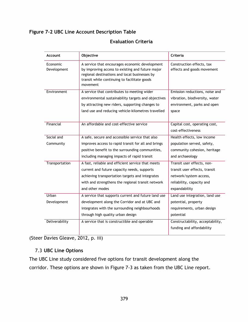
379
Figure 7-2 UBC Line Account Description Table
Evaluation Criteria
Account Objective Criteria
Economic
Development
A service that encourages economic development
by improving access to existing and future major
regional destinations and local businesses by
transit while continuing to facilitate goods
movement
Construction effects, tax
effects and goods movement
Environment A service that contributes to meeting wider
environmental sustainability targets and objectives
by attracting new riders, supporting changes to
land use and reducing vehicle-kilometres travelled
Emission reductions, noise and
vibration, biodiversity, water
environment, parks and open
space
Financial An affordable and cost-effective service Capital cost, operating cost,
cost-effectiveness
Social and
Community
A safe, secure and accessible service that also
improves access to rapid transit for all and brings
positive benefit to the surrounding communities,
including managing impacts of rapid transit
Health effects, low income
population served, safety,
community cohesion, heritage
and archaeology
Transportation A fast, reliable and efficient service that meets
current and future capacity needs, supports
achieving transportation targets and integrates
with and strengthens the regional transit network
and other modes
Transit user effects, non-
transit user effects, transit
network/system access,
reliability, capacity and
expandability
Urban
Development
A service that supports current and future land use
development along the Corridor and at UBC and
integrates with the surrounding neighbourhoods
through high quality urban design
Land use integration, land use
potential, property
requirements, urban design
potential
Deliverability A service that is constructible and operable Constructability, acceptability,
funding and affordability
(Steer Davies Gleave, 2012, p. iii)
UBC Line Options
The UBC Line study considered five options for transit development along the
corridor. These options are shown in Figure 7-3 as taken from the UBC Line report.
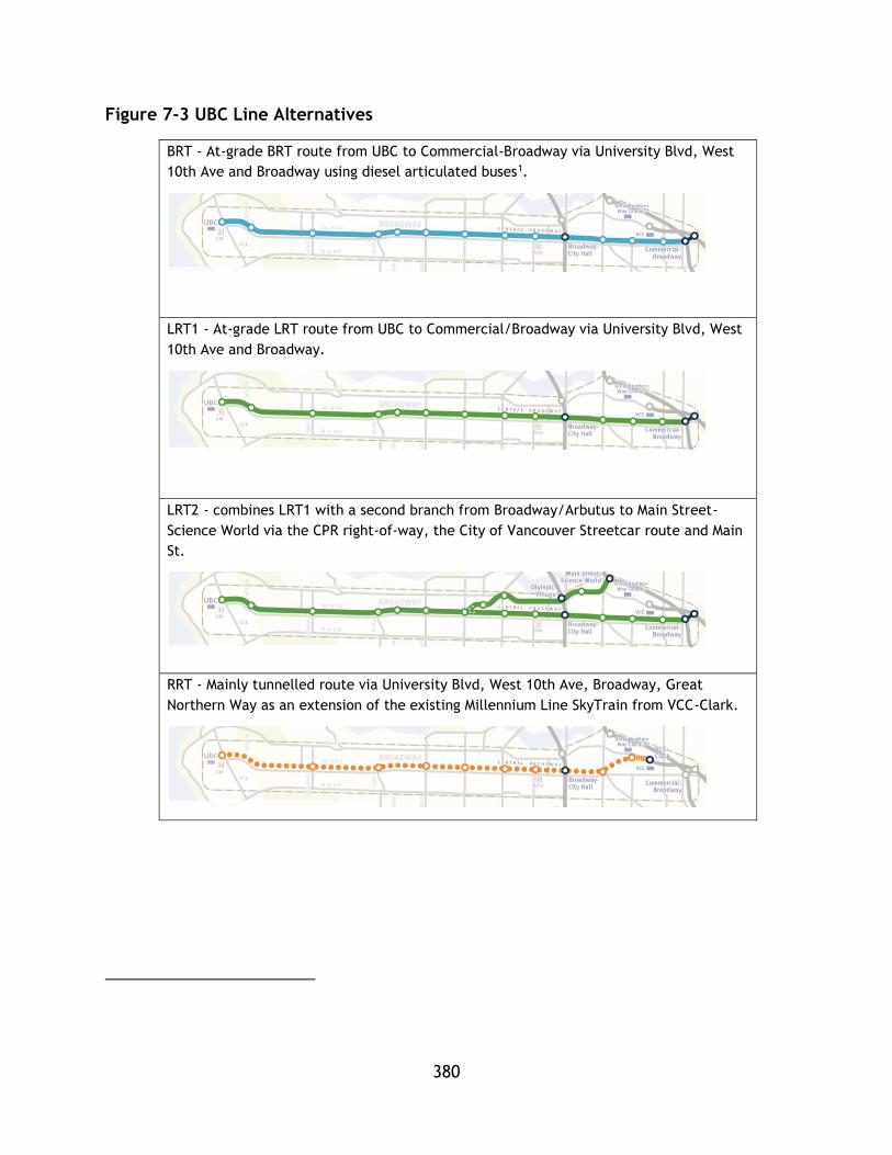
380
Figure 7-3 UBC Line Alternatives
BRT - At-grade BRT route from UBC to Commercial-Broadway via University Blvd, West
10th Ave and Broadway using diesel articulated buses1.
LRT1 - At-grade LRT route from UBC to Commercial/Broadway via University Blvd, West
10th Ave and Broadway.
LRT2 - combines LRT1 with a second branch from Broadway/Arbutus to Main Street-
Science World via the CPR right-of-way, the City of Vancouver Streetcar route and Main
St.
RRT - Mainly tunnelled route via University Blvd, West 10th Ave, Broadway, Great
Northern Way as an extension of the existing Millennium Line SkyTrain from VCC-Clark.
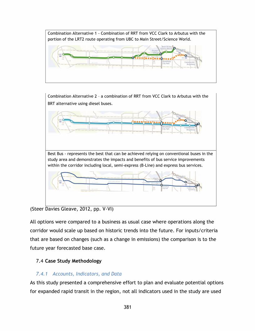
381
Combination Alternative 1 - Combination of RRT from VCC Clark to Arbutus with the
portion of the LRT2 route operating from UBC to Main Street/Science World.
Combination Alternative 2 – a combination of RRT from VCC Clark to Arbutus with the
BRT alternative using diesel buses.
Best Bus - represents the best that can be achieved relying on conventional buses in the
study area and demonstrates the impacts and benefits of bus service improvements
within the corridor including local, semi-express (B-Line) and express bus services.
(Steer Davies Gleave, 2012, pp. V-VI)
All options were compared to a business as usual case where operations along the
corridor would scale up based on historic trends into the future. For inputs/criteria
that are based on changes (such as a change in emissions) the comparison is to the
future year forecasted base case.
Case Study Methodology
7.4.1 Accounts, Indicators, and Data
As this study presented a comprehensive effort to plan and evaluate potential options
for expanded rapid transit in the region, not all indicators used in the study are used

382
in this thesis. Rather, a selection of indicators contained within the report have been
put forward and aligned with the quadruple bottom line framework suggested by Jeon
(2007) and adapted for this research in Chapters 5 & 6.
The accounts put forward by the study, and shared in Figure7-2, have been sorted
into the four quadruple bottom line framework shown in Table 7-1. The following sub
sections of this section outline which indicators have been selected and the rationale
behind their use. Discrepancies between the indicators used in chapters4-6 are also
discussed.
Table 7-1 MAE Accounts sorted into PTSMAP
Environmental Social
- Environment
- Social and community
- Transportation
Economic Effectiveness
- Economic development
- Financial
- Deliverability
- Transportation
- Urban Development
As shown in table 7-1, there is not a clear delineation of accounts into the quadruple
bottom line framework. The individual inputs/criteria of each account are therefore
sorted. These sorted criteria are shown in table 7-2. Only criteria used in the analysis
are shown. Factors showing a (+) are to be maximized and factors showing a (-) are to
be minimized.

383
Table 7-2MAE Factors Sorted into PTSMAP
Category Factor Indicators Category Factor Indicators
Environment
GHgs
+ Change in Transit GHg
Social
Accessibility
+ Low Income Population served
- Transit GHg from Construction
+ Access to population
Pollutants
+Change in criteria air contaminants (NH3, NOx, PM10, PM2.5, SOx, VOC)
+ Access to employment
Health + Collision Cost Savings (Millions pv)
Economic
System Costs
- Capital
System Effectiveness
System Usage
+ Trip generation
- Operating + Mode share & Auto pkm reduction
Transit Use and Economy + Contributions GDP
+ pkm on Transit
User Costs - Travel Time
7.4.2 Environmental Indicators
Of the environmental indicators considered in the study the following are considered -
greenhouse gas (GHg) emissions (construction/life cycle, and operation) as well as
criteria air contaminants emissions.

384
GHg emissions are based on the emissions of constructing the system as well as
emissions from the vehicles themselves based on the form of energy used. An
analytical model was used to calculate the reduction in emissions of GHgs due to a
decrease in vehicle kilometres travelled (VKT) with the addition of a new rapid transit
system. Two inputs are used from the report: the change in GHg due to the new
transit systems and the emissions of the system construction. For this thesis a
combination of change in transit emissions and change in auto fleet is considered as
one indicator representing GHg emissions for operation while a second indicator is
shown to represent GHg emissions of construction.
Emissions of criteria air contaminants, which include NH3, NOx, PM10, PM2.5, SOx,
VOC, are also considered in the study and in this thesis. These emissions are similarly
based on first modelling the change in VKT and the resulting change in emissions. In
this thesis the indicator is used as presented in the report. All emission values will be
weighted equally to sum and create one factor/indicator.
The following inputs are not considered as they are treated in a qualitative manner in
the report:
Noise and vibrations;
Biodiversity;
Water environments
Parks and open spaces
Raw energy consumption is not provided by the report so this factor is not discussed in
this analysis.
7.4.3 Economic Indicators
Economic indicators used in this thesis are capital costs, operating costs, contribution
to GDP, and user costs in the form of travel time. As all systems exist in the same
region it is likely that a similar user monetary cost/fare will be incurred for all
developments so this factor is not considered.

385
Capital costs are based on the cost of constructing each system – the variances occur
due to differences in technology and alignment. Different construction windows are
set for each option to reflect the different needs of each system type.
Operating costs are based on a number of factors (Vehicle Operations- wages, Vehicle
Operations- fuel/power, Vehicle Maintenance, Administration). Costs are based on
operating assumptions from the AM peak that were annualized. Contribution to GDP
was calculated using the BC Input Output Model and capital costs. Values as stated in
the report were used for all three factors (capital costs, operating costs, and
contribution to GDP).
Travel time as a user cost was based on a runtime model using basic transit system
assumptions. The values used in this analysis are taken directly from the report.
Additional factors not used in this analysis include the following economic
development inputs:
Operating effects;
Taxes; and
Goods movement.
As well as the cost effectiveness finance input. In the report, the cost effectiveness
input is based on a number of savings accrued due to improved transit service and is
portrayed as a benefit/cost ratio for each mode. This thesis seeks to provide a
complimentary measure of project sustainability through the calculation of a CSI so
the benefit/cost ratios were not included as indicators.
7.4.4 Social Indicators
The social indicators considered in this analysis represent both health and
accessibility. The indicators for accessibility are: low income population served in the
catchment area, population in catchment area, and employment in the catchment
area. While the study utilized 800m and 400m catchment areas, only the 800m
catchment areas are considered in this study.

386
The study report used census data to generate the low income population served. Low
income population was defined based on a cut-off of after-tax income where families
spend at least 20 % more of their after-tax income than the average family on food,
shelter and clothing. This factor is considered a measure of accessibility in line with
the findings of the literature review and is consistent with the definition of
sustainability utilized in this research. Access opportunities for low income families
can be considered in line with notions of advancing or sustaining social
progress/justice.
The second two accessibility factors, which represent population and jobs served by
the area are also in line with the theory behind accessibility measurement outlined in
the literature review. Both these indicators were under the transportation account in
the report. While a more precise tool may be used in future work, these two
indicators together demonstrate how well the transit service can directly serve
individuals in the community.
Unlike the analysis of NTD systems, this analysis does contain a health metric. In this
instance health benefits are measured financially through an estimate of the
reduction in costs due to road accidents of the system.
The following social indicators were not included as they were measured
qualitatively:
Safety and security
Community cohesion
Heritage and archaeology
7.4.5 System Effectiveness Indicators
While various urban development and transportation account inputs could be used to
assess system effectiveness, only trip generation, mode share, and auto pkm
reductions were considered.

387
Trip generation outlines the system’s ability to generate trips – in terms that are
consistent with the definition of effectiveness used in this thesis. This indicator is
derived from analytical modelling and uses number of trips as a count. Passenger
kilometer travelled or pkm represents the total distance travelled on the system and
is another reflection of use. In this case, the pkm difference from the base case is
used as a metric. An additional lens on system effectiveness is mode split. Modesplit
represents the relative attractiveness and uptake of the mode.
Finally, reduction in auto pkm should be included as it further represents the system’s
ability to mitigate the need for auto based travel. However, the planning window for
this indicator did not match the others (2021) so it has been excluded. Mode split can
be used as a stand in and it is argued that the reduction in auto vkt is represented in
the environmental indicators – however the impact of improved transit on the broader
transport networks effectiveness is correlated to reduced VKT, but due to the nature
of this indicator it is not measured in this research.
7.4.6 Analysis Methodology
This case study uses CSI technique 3 (re-scaling) on all the indicators mentioned
above. Recalling equation 5-6, individual indicator scores may be normalized with the
following equation:
𝑛𝑖 =𝑥𝑖 − min (𝑎𝑙𝑙 𝑥)
max(𝑎𝑙𝑙 𝑥) − min (𝑎𝑙𝑙 𝑥)
Where min values are the least performing options and max values are the greatest
performing options. The procedure for decision making scenario 1 is followed for the
analysis of all inputs. First, the values are normalized within categories and then
categorical indices are calculated. Finally, a CSI value is derived.
Weighting values are set to equal values within indicators and for summing category
indices – similar to the approach used in chapter 6. With weightings and normalized
values, a CSI can be calculated using equation 5-2.
𝐶𝑆𝐼𝑞 = 𝑤𝑒 ∑ 𝑤𝑖𝐸𝑖,𝑞𝑗𝑖=1 + 𝑤𝑠 ∑ 𝑤𝑖𝑆𝑖,𝑞
𝑗𝑖=1 + 𝑤𝑛 ∑ 𝑤𝑖𝑁𝑖,𝑞
𝑗𝑖=1 +𝑤𝑦 ∑ 𝑤𝑖𝑌𝑖,𝑞
𝑗𝑖=1
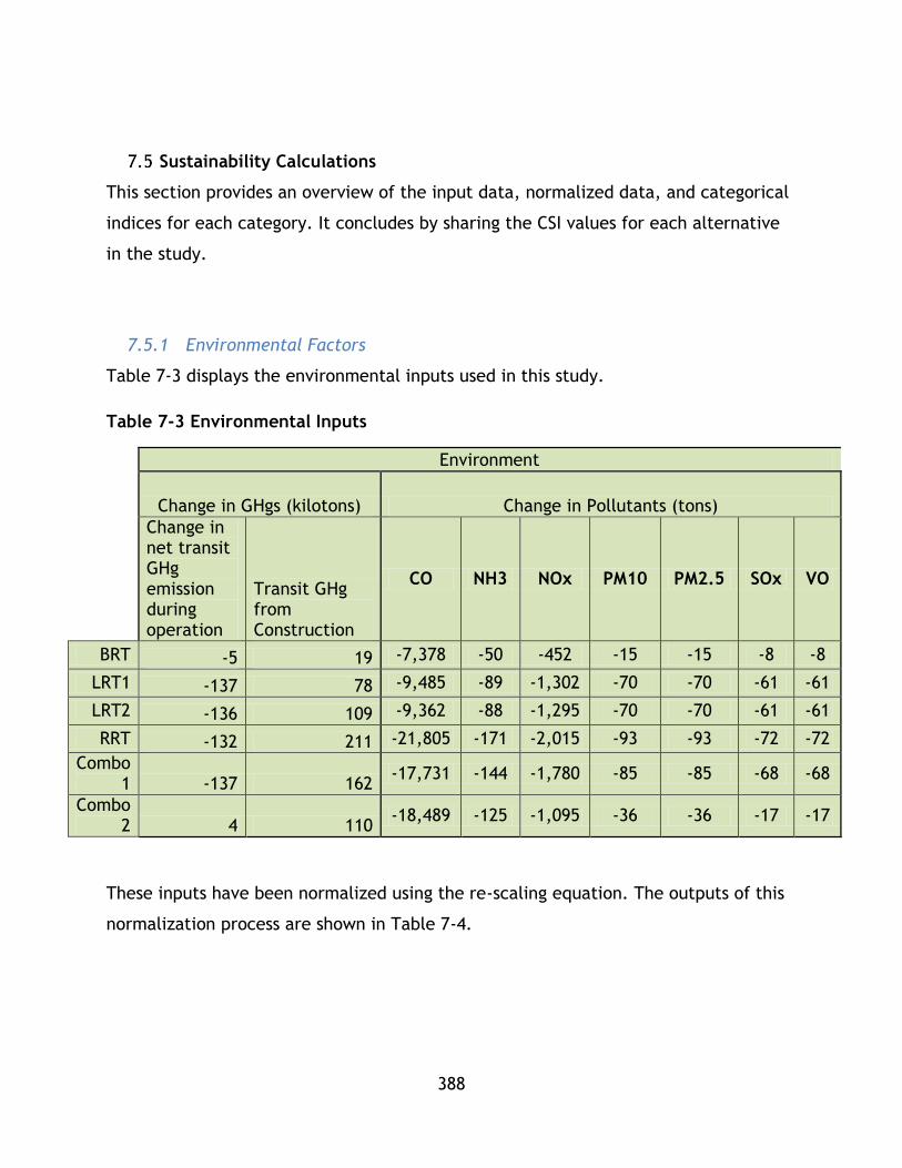
388
Sustainability Calculations
This section provides an overview of the input data, normalized data, and categorical
indices for each category. It concludes by sharing the CSI values for each alternative
in the study.
7.5.1 Environmental Factors
Table 7-3 displays the environmental inputs used in this study.
Table 7-3 Environmental Inputs
Environment
Change in GHgs (kilotons) Change in Pollutants (tons)
Change in net transit GHg emission during operation
Transit GHg from Construction
CO NH3 NOx PM10 PM2.5 SOx VO
BRT -5 19 -7,378 -50 -452 -15 -15 -8 -8
LRT1 -137 78 -9,485 -89 -1,302 -70 -70 -61 -61
LRT2 -136 109 -9,362 -88 -1,295 -70 -70 -61 -61
RRT -132 211 -21,805 -171 -2,015 -93 -93 -72 -72
Combo 1 -137 162
-17,731 -144 -1,780 -85 -85 -68 -68
Combo 2 4 110
-18,489 -125 -1,095 -36 -36 -17 -17
These inputs have been normalized using the re-scaling equation. The outputs of this
normalization process are shown in Table 7-4.
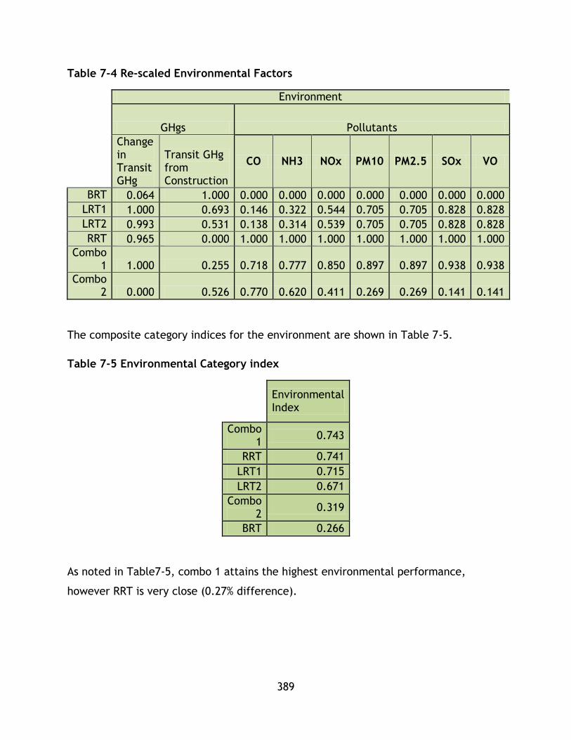
389
Table 7-4 Re-scaled Environmental Factors
Environment
GHgs Pollutants
Change in Transit GHg
Transit GHg from Construction
CO NH3 NOx PM10 PM2.5 SOx VO
BRT 0.064 1.000 0.000 0.000 0.000 0.000 0.000 0.000 0.000
LRT1 1.000 0.693 0.146 0.322 0.544 0.705 0.705 0.828 0.828
LRT2 0.993 0.531 0.138 0.314 0.539 0.705 0.705 0.828 0.828
RRT 0.965 0.000 1.000 1.000 1.000 1.000 1.000 1.000 1.000
Combo 1 1.000 0.255 0.718 0.777 0.850 0.897 0.897 0.938 0.938
Combo 2 0.000 0.526 0.770 0.620 0.411 0.269 0.269 0.141 0.141
The composite category indices for the environment are shown in Table 7-5.
Table 7-5 Environmental Category index
Environmental Index
Combo 1
0.743
RRT 0.741
LRT1 0.715
LRT2 0.671
Combo 2
0.319
BRT 0.266
As noted in Table7-5, combo 1 attains the highest environmental performance,
however RRT is very close (0.27% difference).
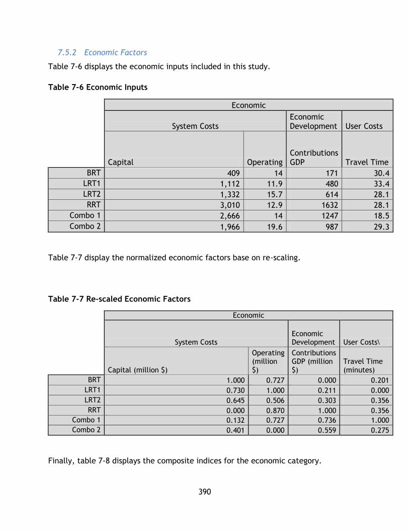
390
7.5.2 Economic Factors
Table 7-6 displays the economic inputs included in this study.
Table 7-6 Economic Inputs
Economic
System Costs
Economic Development User Costs
Capital Operating
Contributions GDP Travel Time
BRT 409 14 171 30.4
LRT1 1,112 11.9 480 33.4
LRT2 1,332 15.7 614 28.1
RRT 3,010 12.9 1632 28.1
Combo 1 2,666 14 1247 18.5
Combo 2 1,966 19.6 987 29.3
Table 7-7 display the normalized economic factors base on re-scaling.
Table 7-7 Re-scaled Economic Factors
Economic
System Costs
Economic Development User Costs\
Capital (million $)
Operating (million $)
Contributions GDP (million $)
Travel Time (minutes)
BRT 1.000 0.727 0.000 0.201
LRT1 0.730 1.000 0.211 0.000
LRT2 0.645 0.506 0.303 0.356
RRT 0.000 0.870 1.000 0.356
Combo 1 0.132 0.727 0.736 1.000
Combo 2 0.401 0.000 0.559 0.275
Finally, table 7-8 displays the composite indices for the economic category.
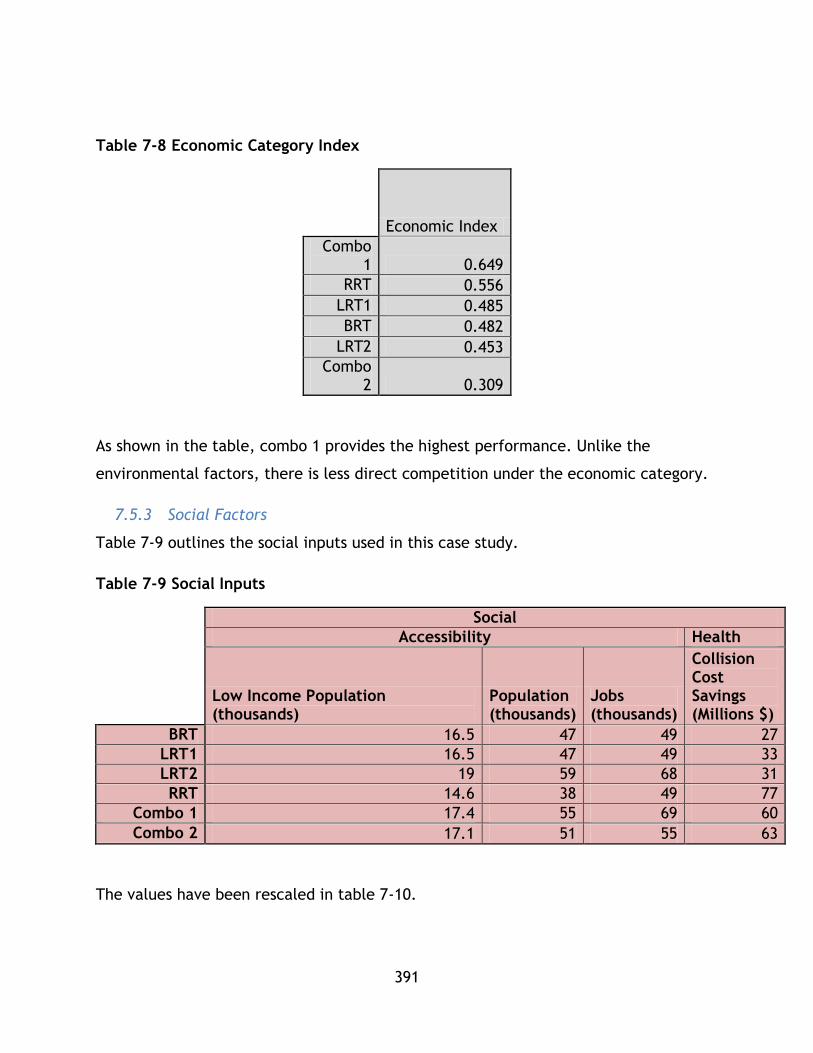
391
Table 7-8 Economic Category Index
Economic Index
Combo 1 0.649
RRT 0.556
LRT1 0.485
BRT 0.482
LRT2 0.453
Combo 2 0.309
As shown in the table, combo 1 provides the highest performance. Unlike the
environmental factors, there is less direct competition under the economic category.
7.5.3 Social Factors
Table 7-9 outlines the social inputs used in this case study.
Table 7-9 Social Inputs
Social
Accessibility Health
Low Income Population (thousands)
Population (thousands)
Jobs (thousands)
Collision Cost Savings (Millions $)
BRT 16.5 47 49 27
LRT1 16.5 47 49 33
LRT2 19 59 68 31
RRT 14.6 38 49 77
Combo 1 17.4 55 69 60
Combo 2 17.1 51 55 63
The values have been rescaled in table 7-10.

392
Table 7-10 Rescaled Social Factors
Social
Accessibility Health
Low Income Population Population Jobs
Collision Cost Savings (Millions pv)
BRT 0.432 0.429 0.000 0.000
LRT1 0.432 0.429 0.000 0.120
LRT2 1.000 1.000 0.950 0.080
RRT 0.000 0.000 0.000 1.000
Combo 1 0.636 0.810 1.000 0.660
Combo 2 0.568 0.619 0.300 0.720
Finally, the category indices for the social category are shown in table 7-11.
Table 7-11 Social Category Index
Social Index
Combo 1 0.738
Combo 2 0.608
LRT2 0.532
RRT 0.500
LRT1 0.203
BRT 0.143
Again, combination 1 provides the highest performance. Unlike previous options,
combination 2 provides a high level of performance.
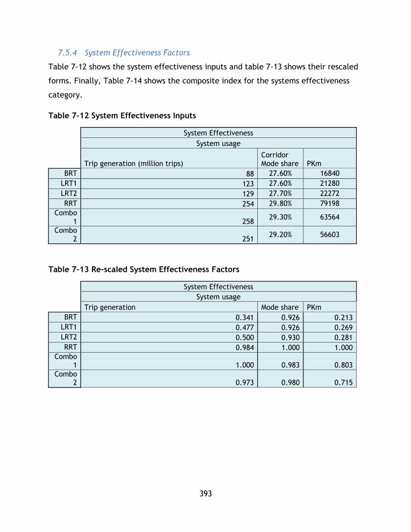
393
7.5.4 System Effectiveness Factors
Table 7-12 shows the system effectiveness inputs and table 7-13 shows their rescaled
forms. Finally, Table 7-14 shows the composite index for the systems effectiveness
category.
Table 7-12 System Effectiveness Inputs
System Effectiveness
System usage
Trip generation (million trips)
Corridor Mode share PKm
BRT 88 27.60% 16840
LRT1 123 27.60% 21280
LRT2 129 27.70% 22272
RRT 254 29.80% 79198
Combo 1 258
29.30% 63564
Combo 2 251
29.20% 56603
Table 7-13 Re-scaled System Effectiveness Factors
System Effectiveness
System usage
Trip generation Mode share PKm
BRT 0.341 0.926 0.213
LRT1 0.477 0.926 0.269
LRT2 0.500 0.930 0.281
RRT 0.984 1.000 1.000
Combo 1 1.000 0.983 0.803
Combo 2 0.973 0.980 0.715

394
Table 7-14 System Effectiveness Index
System Effectiveness
Index
RRT 0.995
Combo 1 0.929
Combo 2 0.889
LRT2 0.570
LRT1 0.557
BRT 0.493
Based on the system effectiveness analysis, RRT is shown to provide the greatest
performance.
7.5.5 UBC Line CSI
With all category indices calculated, the CSI values for each system can be
determined. As with the past examples, each category index receives the same
weighting. The CSI values for each mode are shown in table 7-15.
Table 7-15 UBC Line CSI Values
CSI
Combo 1 0.76465739
RRT 0.69810636
LRT2 0.55635245
Combo 2 0.53112909
LRT1 0.4901048
BRT 0.34620165
From this analysis it is shown that Combo 1 provides the highest CSI value. Throughout
all category assessments combo 1 always achieved high performance, which is
reflected in this assessment. Combo 1 combines LRT and RRT options in order to
provide a blend of rapid transit alternatives in one complete line – which is noticeable
in the ranking. This option has similar benefits to the RRT but also is lower cost due to
395
its LRT component. Due to the combination of the system, it even exceeds RRT in
performance.
From this assessment there are two major takeaways:
The option with the highest CSI performance doesn’t need to have the highest
scores in each category. Composite indicators require strong performance
across a number of options, but may perform lower in others – such as the
lower performance on capital costs of the Combo 1 or RRT values.
While all options were specifically designed for the corridor, the combination 1
option attains highest performance. This could be associated with the unique
blend of services used to create this option. This highlights ideas in the
literature review as well as findings in the NTD case study – sustainability
performance and high transit performance can be traced back to context
specific solutions.
Conclusion
This chapter highlights how to apply the PTSMAP framework to a study that was not
developed with PTSMAP in mind. Due to the MAE nature of the study there were few
issues adapting the basic data to the PTSMAP framework. However, it is important to
note that this case study is limited.
First, a number of indicators were not used in the PTSMAP case study. Currently the
PTSMAP framework can use qualitative data for contextualizing the CSI scores, but
does not have an explicit methodology to treat qualitative assessment. Further
research is required into how to better incorporate these aspects of research and
planning studies.
Secondly, some factors with quantitative values were not included – either to avoid
double counting or due to incompatibility with timing. Refining the framework in
future research to have improved flexibility may increase its uptake and utilization.
396
An important point from this case study is that the PTSMAP framework also has
further room to expand and better represent sustainable transportation. The
consideration of broader urban issues and land development impacts, which were not
included in the PTSMAP framework, presents an important idea that is in line with the
literature reviewed in this thesis. This study included urban development goals as part
of transit analysis – while these goals would have been difficult to measure with the
PTSMAP framework used with the NTD set, further analysis and development of transit
and urban development could lead to a standardized set of indicators similar to the
environmental or economic issues currently considered in the PTSMAP framework.
Urban development and changes in land use are inextricably linked to transit – their
exclusion in the chapter 5&6 framework may limit the potential applicability of this
research in further contexts or in decision making. Further development is required.
However, the framework was designed to manage specifically mobility issues and
transit. Future research should seek to resolve this. Two path ways that immediately
exist could be by adding urban indicators more extensively into the four bottom lines
or adding a fifth category that explicitly collects these factors. The former, is in line
with the sustainability approach espoused in this research – to break down
sustainability concepts into buckets or sectors of analysis and use appropriate
indicators to track progress. Urban issues could fit into these categories as well – and
under such a framework, urban issues would be seen under an environmental, social,
economic, or effectiveness lens, rather than as being a distinct issue as part of
sustainability.

397
Sustainable Transportation Conceptual Case study: Calgary, Alberta,
Canada
Introduction
8.1.1 Overview
This thesis includes case studies to explore the conceptual, theoretical, and analytical
dimensions of sustainable transportation using real world examples. By drawing upon
case study specific literature, including research papers and municipal plans and
documents, as well as concepts outlined in Chapters 2 and 3 this case study analyzes
transportation and sustainability for the City of Calgary in Canada. Calgary has been
selected as a case study because it provides an excellent opportunity to engage with
challenges associated with unsustainable auto oriented transportation and policies
that attempt to grapple with these challenges.
Specifically, this case study uses high level transportation data to outline trends in
travel behavior in the city in order to frame the challenge of unsustainable auto
oriented travel. This challenge is highlighted as it is one of great relevance in the 21st
century with energy intensive transport related to many global issues. Auto
dependant development is also of relevance in many cities around the world and is
cautioned against within many rapidly developing cities in urbanizing countries for
which this research is applicable as a decision support tool. Furthermore, many of the
concepts illustrated in the literature review sections, such as push and pull factors for
sustainable transport policy, auto dependence, and social/economic/environment
issues in sustainability, were ideal for exploring within the Calgary context.
This study was conducted with limited engagement with official institutions, such as
the municipal government, and thus only data available in public reports, plans, and
presentations was available. Inasmuch, this study was conducted as a high level
analysis of the city’s transport system – as operational and high resolution data were
unavailable, they have not been used. This was a significant limitation of the study;
therefore, the study is focused on different measures for improvement and suggests

398
ways to continue the analysis and dive deeper into the issues as more data becomes
available.
8.1.2 Chapter Organization
In section 2, an overview of the city is provided to help the reader understand the
context of the city. In section 3 the city’s transportation system is explored and
outlined. In section 4 the case study’s problem is explicitly framed as auto oriented
travel and its associated sprawl based urban growth. The need to explore alternatives
from a half century growth cycle of car oriented transportation and sprawl oriented
land use in order to develop a more sustainable city that mitigates the various
economic, social, and environmental impacts that come along with sprawl and auto
dependence are also framed. Section 5 outlines theoretical plans for how to approach
this problem through transit oriented measures for short, middle, and long term
systemic development. Section6 outlines specific improvements that will facilitate
this plan. Finally, section 7 provides a summary of the case study and
recommendations for further research and next steps.
8.2 Overview of Calgary
8.2.1 Context
The City of Calgary is the major population centre in the southern half of the Province
of Alberta in Canada. As Canada’s fourth largest city by population, Calgary is a
rapidly expanding economic hub. Geographically, the city is over 704 square
kilometres in area and is divided into four quadrants: NW, SW, NE, and SE (Statistics
Canada, 2012). The broader area surrounding The City is composed of communities
and suburbs that together form the Calgary Metropolitan Area (CMA), which is the
fourth most populous metropolitan area in the nation, after Toronto, Montreal,
Vancouver, and Ottawa.
8.2.2 Geographic and Demographic data
As of the 2011 census the population of The City was 1,090,936, while the CMA was
home to 1,365,200 inhabitants (Statistics Canada, 2006). These figures highlight the
City’s role as the key population centre of the CMA. The City’s annual growth of
399
population in 2010 was 1.81%, which is in line with growth trends from the previous
decade (Statistics Canada, 2006). Of this growth about half is due to natural increase,
while the remaining half is due to migration from other parts of the province and the
country. The CMA saw a growth of 2.2% in 2010 (Calgary Economic Development,
2009). The City of Calgary and surrounding population centres are low density
settlements with the city having a density of 1,360.2 people per km2 (Statistics
Canada, 2006). Continued growth will be driven by migration and natural growth,
similar to growth observed in the city and CMA over the past 10 years. By 2020 it is
expected the CMA will be home to 1,519,400 inhabitants, while the city will hold
1,244,800 inhabitants (Calgary Economic Development, 2009). By 2030 the city is
expected to be almost 1.6 million people and host to over 900,000 jobs. By 2030
seniors will make up a larger portion of the population than youth, which may have
serious ramifications of economic activity. The City has a progressive parks and
recreation policy which has provided the city’s population with many parks and green
space. The total area covered by green space in Calgary is over 80 square kilometres,
which accounts for over 12% of the city’s footprint (City of Calgary, 2009b).
8.2.3 Economic Overview
As of 2006, 770,000 people were employed across a variety of sectors in the City of
Calgary (Statistics Canada, 2011). Calgary is home to a diverse economy with
contributions from a variety of sectors with Oil and Gas, Construction, Finances,
Professional Services, and Manufacturing being the major sectors. Employment is also
dispersed throughout diverse areas, with professional services (such as health care,
engineering, finances), manufacturing, and construction being large employers.
Despite high employment and economic growth, over 12.5% of Calgarians lived below
the low income poverty line (income of $19,261/inhabitant) as of 2003. Poverty can
be viewed as a radicalized issue in Calgary, with new comers and first
nation/aboriginal populations over represented in the below poverty line income
bracket (City of Calgary, 2009a).
400
8.3 Transportation System Challenges and Opportunities in Calgary
8.3.1 System Overview
The City of Calgary features an expansive network of roadways, pathways, and transit
ways that facilitate multimodal transportation. The City saw most of its urban growth
in the automobile era, and as a result, the transportation system that has been
developed has an automobile bias. While there is provision for active modes and
transit, there is still a heavy auto focus within the trip making behaviour of
Calgarians. As noted in the literature review, auto trips and auto networks tend
towards unsustainable transport and unsustainable travel.
8.3.2 Auto Network
The transportation system contains a large network of roads that fit into a hierarchal
set of road types that include freeways, arterial, collector, and local roads. A
“Skeletal Network” of major east-west and north-south freeways and arterials has
been developed to facilitate automobile flow around the city effectively (City of
Calgary, 2002). While all the roadways in this network provide access to downtown,
none directly pass through it in an effort to encourage localized activity and local
trips. In 2011, less than half of all commute trips destined to downtown were
conducted using automobiles (33% were auto trips), however 77% of all daily trips
across the city are auto trips (City of Calgary, 2009d) (City of Calgary, 2012).
8.3.3 Transit Network
The City of Calgary runs a public transportation service known as “Calgary Transit”.
Calgary Transit has provided transit services for over 100 years in the region, with its
original inception being an electric street car company. Over the years Calgary Transit
evolved as an integral component of the city’s transportation network and currently
provides a wide variety of services for Calgarians including LRT, traditional bus, light
BRT, and para-transit. In 2011 there were 96,215,000 trips taken by Calgary Transit
passengers (City of Calgary, 2009d).

401
As of January 2012, the bus system is composed of 161 routes that provide a variety of
travel choices for Calgarians including circular routes, feeder routes (to BRT or LRT),
local routes, and arterial/corridor travel options. The BRT network has 5 routes,
including access to the airport, that provide larger buses for typically longer routes.
Currently, these BRT routes are lacking many characteristics of many of the highest
performance BRT systems around the world – especially with regards to separated
right of ways and off bus ticketing. However, they do provide frequent service on high
capacity buses that integrate ITS technologies. According to the RouteAhead,
Calgary’s long term transit plan there are currently plans to greatly expand the BRT
network with a variety of BRT services. These projects include southwest and north
cross town in street BRT routes with signal priorities (Calgary Transit, 2013).
Additional BRT projects using ‘transitways’, which direct transit on either transit only
lanes on an existing road, a right of way separated from traffic or shoulders on an
existing roadway , either separately or in combination, are also in the planning stages
(Calgary Transit, 2013).
The 2011 BRT Network Plan also outlines current considerations to expand BRT service
and provide North-South mobility to South Western communities not served by LRT
through transit only or busway style service (Calgary Transit, 2011).
An LRT network of 48.8 km and two routes (South to North West, North East to
Downtown) is also provided (City of Calgary, 2009d). The two routes share a transit
corridor with BRT and bus service along 7th ave in the downtown core. The LRT system
is called the “C-Train” and it has average of 252,600 weekday boardings, (APTA,
2011).
8.3.4 Active Mode Network
The city has developed an extensive pathway system for active modes that provides
over 635 km of paved surface for cyclists and pedestrians. An additional 290km of on
street bikeways are provided. These bikeways are integrated, where possible, to the
pathway system (City of Calgary, 2009d).

402
8.4 Mobility Challenges – Analysis of Unsustainable Transport
8.4.1 Problem Framing – Sprawl and Automobile Dependence
The City of Calgary’s transportation system does a decent job providing high
reliability and high level of service transportation for most citizens. According to
Statistics Canada, Calgary has the second lowest average commute time, at 26
minutes, out of all major cities in Canada (Turcotte, 2010). In global quality of living
scales, such as the Economist Intelligence Unit annual liveability analysis, Calgary also
typically fares well in the transportation category. From a travel time perspective,
this frames the system very positively; however, when the lens is expanded to look at
a whole suite of systemic factors, including environmental, social, and economic
issues, there are many “under the surface challenges” that need to be explored and
addressed to enable long term sustainable growth in the Calgary region. Low travel
time is facilitated by a focus on auto oriented development for most trips – as a result
the road network has been over developed contributing to auto dominance and
sprawl. The essential challenge in hand is the current sprawl-auto dependent
development pattern that the city is locked in. The following sections will explore
indicators for this problem and some of the impacts in order to frame the challenges
at hand. While chapter 4 will outline potential measures that can form a set of
solutions.
These challenges have also been identified in Plan-it Calgary, a community visioning
process and strategy (City of Calgary, 2009b). As part of the costs and benefits of
different potential development patterns for Calgary, Plan-it Calgary discusses two
potential growth scenarios – one scenario continues to see Calgary grow in a dispersed
manner characterized by heavy auto use and sprawled suburbs – a business as usual
approach (BAU approach).The second focused on a recommended direction that
focuses on density and transit oriented development as guiding principles
(recommended approach) (City of Calgary, 2009c). Given the previously discussed
increases in population, continued road development to fuel the above mode split as
a means of mobility will be an expensive prospect – both in terms of development and
implementation costs, but also in terms of lost potential for a more sustainable urban

403
form. In essence, the auto oriented mode split provides an important warning signal
for unsustainable mobility and land development.
8.4.2 Mode Split – an early warning for unsustainable transport
In order to better understand the present and future challenges of Calgary’s
transportation system mode share can be used as an initial indicator. While it is not a
precise indicator for any particular transportation challenge, it is a strong starting
point as it can reflect energy usage, the amount of infrastructure required to provide
transport, and key socioeconomic trends in trip making behaviour. Inasmuch, the City
has selected mode split as an important indicator for land use and mobility planning –
used for both evaluation and goal setting (City of Calgary, 2011). Table 8-1 outlines
the daily average mode share of Calgary’s transportation system as of 2009.
Table 8-1: Average Daily Mode Split for Calgary 2009
Mode of Transportation Per cent of all daily trips
Walk/Cycle 14
Transit
9
Vehicles (SOV & HOV) 77
Adapted from: Calgary Transportation Plan (City of Calgary, 2009d)
As noted in the table, when analyzing all travel, the automobile mode dominates
transportation in the City. As mentioned in the system outline, the City of Calgary has
grown and evolved in the automobile era. The high auto mode share reflects this
trend in urban development. Intensive infrastructure spending in roadways,
particularly large multilane freeways, within the municipal area has facilitated rapid
mobility for automobile users that live in the suburbs. However, these same roadways
have also contributed to negative transportation land use interactions and a high
degree of sprawl, with a few major activity centres, such as the downtown core and
the University of Calgary and its 2 teaching hospitals amongst large sprawling

404
residential areas. The problems associated with sprawl are well known – in the long
term these auto oriented development patterns hinder sustainable growth.
8.4.3 Further Analysis of Auto Dependence
As a centre of employment, transportation within and into the downtown core has
been closely studied in order to understand how Calgarians access employment and
commute to work. In order to better understand the model split in Calgary, downtown
trip behaviour can be analysed using available data.
Table 8-2 outlines the breakdown of trips to downtown Calgary for the am peak, on
average, in 2010.
Table 8-2: Average Travel to Downtown Mode Split Calgary in 2010
Mode of Transportation Per cent of all daily trips
Walk/Cycle 11
Transit
50
Auto - driver 33
Auto- passenger 6
Adapted from: Calgary Transportation Plan (City of Calgary, 2009d)
For commuter trips in the AM peak to downtown, the majority of trips use transit,
rather than private auto. The majority of these trips are based on the bus, BRT, and
LRT networks that funnel travellers downtown. A brief analysis of the difference
between overall trips and trips to downtown presents the possibility that the system
works well to move commuters into downtown on transit, but for non-commute trips
and trips to other locations, the capacity provided by non-auto modes is either being
underutilized or is not yet been developed.
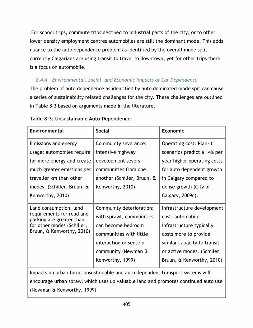
405
For school trips, commute trips destined to industrial parts of the city, or to other
lower density employment centres automobiles are still the dominant mode. This adds
nuance to the auto dependence problem as identified by the overall mode split –
currently Calgarians are using transit to travel to downtown, yet for other trips there
is a focus on automobile.
8.4.4 Environmental, Social, and Economic Impacts of Car Dependence
The problem of auto dependence as identified by auto dominated mode spit can cause
a series of sustainability related challenges for the city. These challenges are outlined
in Table 8-3 based on arguments made in the literature.
Table 8-3: Unsustainable Auto-Dependence
Environmental Social Economic
Emissions and energy
usage: automobiles require
far more energy and create
much greater emissions per
traveller km than other
modes. (Schiller, Bruun, &
Kenworthy, 2010)
Community severance:
intensive highway
development severs
communities from one
another (Schiller, Bruun, &
Kenworthy, 2010)
Operating cost: Plan-It
scenarios predict a 14% per
year higher operating costs
for auto dependent growth
in Calgary compared to
dense growth (City of
Calgary, 2009c).
Land consumption: land requirements for road and parking are greater than for other modes (Schiller, Bruun, & Kenworthy, 2010)
Community deterioration:
with sprawl, communities
can become bedroom
communities with little
interaction or sense of
community (Newman &
Kenworthy, 1999)
Infrastructure development
cost: automobile
infrastructure typically
costs more to provide
similar capacity to transit
or active modes. (Schiller,
Bruun, & Kenworthy, 2010)
Impacts on urban form: unsustainable and auto dependent transport systems will
encourage urban sprawl which uses up valuable land and promotes continued auto use
(Newman & Kenworthy, 1999)
406
Exact data for the difference in emissions, land consumption, and social impacts are
not available at this time due to the difficult nature of quantification – these
challenges are identified from the literature to explore potential issues and direct
future research. If it is assumed that the basic understanding of auto dependence and
sprawl problems, as developed in the literature review, is held to represent reality,
an increase in auto oriented development will increase emissions and land
consumption, damage social fabric, and contribute to sprawl. The economic
considerations are better developed and model output based data is available. Based
on projections, a BAU case of auto intensive development would require 3300 km of
new lanes and roads, while a denser form would require only 1100 km. If an average
price of $ 5 million per/km is assumed, a stark contrast in capital costs for
transportation can be drawn, with denser urban form being cheaper to develop and
maintain (City of Calgary, 2009c).
8.4.5 Mode Split Explored – TDM and Transit Development
An analysis of the policy behind the limited role of auto for moving travellers
downtown can provide insights into how mode shift solutions may be developed
throughout the wider transportation network. The downtown mode shift provides an
ideal example of travel behaviour for the city; however, it is unlikely that the city
will ever see a net mode share smaller than 50% for auto (projections for the future
lower the share to 60%) (City of Calgary, 2009d). Even so, key principles for shifting
travel mode can be drawn and explored for broader implementation in the city. Both
push and pull factors that have encouraged a gradual move away from automobile for
downtown travel are noted in policy and evaluation documentation. The following
factors are considered highly effective.
Push factors include:
Limited parking: from 1996-2006 the parking stall availability in Calgary has
decreased from 46.7 stalls per 100 employees to35.5 stalls per 100
employees. Current policy has put a moratorium on increasing parking in
407
the downtown core. This has led to increased parking prices and limited
ability for employees to drive to work. (City of Calgary, 2010)
Limited Road Development: there are currently no plans to increase auto
capacity within the downtown core. Arterial development around
downtown has continued, which has allowed larger volumes of traffic to
reach or circumvent downtown; however, there is no stated plan to add
additional capacity at entrance points or through roads. (City of Calgary,
2002)
Pull factors include:
Effective use of park and rides: C-train and BRT stations have been given
free and large park and ride lots with the intention to make transit lines
more accessible for travellers. While this doesn’t eliminate automobile
travel and its challenges (emissions, heavy land use for roads and parking)
it limits the need for road expansion in the city and makes transit more
accessible (Hubbel, 2006).
Public Transit Priority: transit has been given priority at major
intersections, queue jump lanes on freeways, and ITS tools (such as
advanced traveller information and transit signal priority) in order to make
it more attractive and encourage mode transition (City of Calgary, 2009d).
The above factors can be considered in terms of capacity reduction and displacement,
as well as use of new technologies and policies to facilitate transition to other modes
for a geographic area. However, in the broader Calgary context little reduction has
been seen.
8.4.6 Future Options for Calgary
The connection between increased sprawl and auto dependence is a complex
relationship with no one cause or solution. As the sprawl-car dependence associated
with the Calgary BAU growth scenario creates long environmental, social, and
economic challenges that undermine the sustainability of a city further analysis is
required. Given the challenges it presents to sustainable mobility and urbanism it is
408
important to consider measures to reduce its impact and eventually halt its spread.
The policies identified in this sub chapter are interesting considerations for how to
trigger mode shift. Chapter 4 builds on these principles to suggest measures to limit
sprawl and diversify mode share.
8.5 Transit Improvements through TDM and Policy
8.5.1 Plan Overview and Selection
As outlined in the previous chapter, the long term sustainability mobility of Calgary is
challenged by a dependence on automobile travel and increasing urban sprawl. This
chapter outlines a set of measures – both policy and technical – that can be
implemented to help promote sustainable transit policy. These suggestions are
presented to be consistent with the results of the literature review as well as the
composite sustainability analysis.
Mode split was used as a key point of analysis for sustainable transport in section 7.3 –
it has also been discussed in chapter 3 as a metric for sustainable mobility. Inasmuch,
this chapter’s measures focus on increasing the uptake of transit for non-commuter
trips as a means to contribute to halting the sprawl-car dependence loop. The
measures selected have been described in literature and their selection is based upon
their description in chapter 3. The proposed measures are focused on using policy and
technical improvements that act as push and pull factors to attract more travellers to
use transit. By building on existing policy and systemic factors that enable transit
usage, while enacting push factors that will challenge more travellers to use transit,
these measures will gradually increase transit mode share. The key factors to improve
are transit service delivery over the short, middle, and longer term, as well as
accompanying TDM measures to be discussed in chapter 5. The target for Plan-it
Calgary over the long term is to achieve a total 17.5% mode share for transit. All
proposed measures will be with regards to this goal (City of Calgary, 2009c).
The overall framework for tackling the auto-dependence and sprawl problem is based
on the following principles:
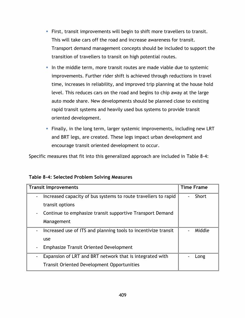
409
First, transit improvements will begin to shift more travellers to transit.
This will take cars off the road and increase awareness for transit.
Transport demand management concepts should be included to support the
transition of travellers to transit on high potential routes.
In the middle term, more transit routes are made viable due to systemic
improvements. Further rider shift is achieved through reductions in travel
time, increases in reliability, and improved trip planning at the house hold
level. This reduces cars on the road and begins to chip away at the large
auto mode share. New developments should be planned close to existing
rapid transit systems and heavily used bus systems to provide transit
oriented development.
Finally, in the long term, larger systemic improvements, including new LRT
and BRT legs, are created. These legs impact urban development and
encourage transit oriented development to occur.
Specific measures that fit into this generalized approach are included in Table 8-4:
Table 8-4: Selected Problem Solving Measures
Transit Improvements Time Frame
- Increased capacity of bus systems to route travellers to rapid
transit options
- Continue to emphasize transit supportive Transport Demand
Management
- Short
- Increased use of ITS and planning tools to incentivize transit
use
- Emphasize Transit Oriented Development
- Middle
- Expansion of LRT and BRT network that is integrated with
Transit Oriented Development Opportunities
- Long

410
This plan was selected as it has a direct indicator to measure (proportion of trips
taken by transit) which allows for analysis and understanding of impacts. It was also
selected as it enables city and transport planners to build on existing strong points,
including the high downtown mode share, in order to shift travellers from cars to
transit. Furthermore, it uses ideas prototyped in the downtown context that have
worked, which speaks to the validity of attempting these ideas in a different manner
within the Calgary context. Finally, this plan was also considered as it combines push
and pull factors along with standard transit system improvements to encourage a
gradual change in transit ridership. As this plan tackles sustainability from multiple
perspectives, it is believed to be more effective.
8.6 Exploration of Potential Measures
Both the policy and transit improvements will now be analysed based on their
potential to mitigate the problem of sprawl and auto dependence. The transit
improvements have been developed in such a way that they can be scaled up over
time, allowing gradual and self-reinforcing improvements to the mode split to occur.
These measures are not analysed in considerable depth due to the nature of this case
study and limited availability of data. This exercise is to explore the theoretical
potential of these measures, which will need to be researched more thoroughly using
up to date models, and data internal to the city and Calgary Transit. The costs of the
following options are first generalized and then the specifics of each option are
explored.

411
Table 8-5: Transit Improvements and Costs
8.6.1 Transit Improvements: short term
The first proposed improvement is to stimulate increased transit ridership by
providing more services that connect communities outside of walking distance from
mass transit (either BRT or LRT) to these services. This increase in capacity should be
characterized by improved headways, route allocation, and reliability. Transit level of
service is a complex factor to determine, however there are some fundamental
determinants it relies upon including reliable headways and service frequency
(Dowling, 2009) . This measure suggests improvements for these two factors as well as
changes to service delivery with a focus on utilizing available road space for
traditional bus service where it is, on average, quicker than using the bus route to
feed into a mass transit option. When the combined trip time of the mass transit
option is quicker the bus route should become a feeder. Overall route structure
should be based on land use/activity centres present and planned, as well as
current/historic travel behaviour.
Transit Improvements Potential Source of Costs
- Increased capacity of traditional
bus systems to route travellers to
rapid transit options
- Implementation and rerouting of
service
- Additional rolling stock
- Additional staffing
- Increased use of ITS and planning
tools to incentivize transit use
- Development of institutional
capacity for ITS/TDM work
- Running and maintaining online
services
- Expansion of LRT and BRT
network
- Construction, planning, and
operation costs
412
In essence, this measure seeks to minimize travel time through route selection based
on current trip potential. As this is a service adjustment, it could be piloted with
select communities or corridors in order to understand how to effectively run route
adjustment in the Calgary context before being implemented more broadly. The
efficacy of this program can be assessed based on ridership changes and travel surveys
that indicate changes in personal travel time. These initial data present a system
wide (ridership) and individual (travel time) perspective. While this will not
immediately reduce sprawl, it has the potential to contribute to decreased auto usage
which is a first step to the problem.
Trip planning as part of a suite of transport demand management (TDM) activities, at
either a workplace or residential level has seen promising results in the UK (City of
Calgary, 2009b). Trip planning involves working with passengers individually or in
groups to develop new travel behaviours using a variety of tools and approaches. This
may be applicable in the Calgary context to encourage a shift to transit.
8.6.2 Transit Improvements: middle term
A plan to improve public transport should also include a middle-term planning, ITS
and marketing/TDM program that aims to complement improvements to service
delivery with increased demand. This program should be focused on helping travellers
make more informed choices for route selection, while improving high demand routes
with regards to reliability and travel time. Integrating pull factors, such as reliable
traveller information, improvements to travel time via signal priority and queue jump
lanes for routes on busy corridors, and trip planning tools are a few options that have
been tested in other cities with positive results (Cairns, et al., 2008). Trip planning
tools, such as online tools or household travel consultations, are an effective way to
encourage individuals to move from the auto mode.

413
Table 8-6: Middle Term Transit Measures
Measure Metric for Effectiveness
Signal Priority and Queue Jump Lanes for
Busy Routes
- Decrease in route travel time,
increase in reliability for circle
routes
- Increase in ridership
Traveller Information, trip planning - Utilization of tool
- Changes in ridership
It is recommended that these measures be piloted in specific circumstances in order
to better understand the benefits that can be derived. For example, implementing
trip planning or counselling in an under capacity corridor could help transition some
automobile users to transit. For signal priority and queue jump lanes, implementation
should be based on feasibility (cost, geographic factors, traffic characteristics) and
benefits (potential in saved travel time). These factors should be piloted and scaled
up where possible in the middle term.
In order to finance these measures it is recommended that they be distributed
throughout the appropriate business units within the city. For example,
Transportation Planning, who handles network expansion and modification, could
handle bus queue jump lanes, while the Calgary Traffic Centre would handle the
analysis of where to include signal priority. Trip planning could be an expansion of
typical Calgary Transit services that expands on already existing online trip planning
platforms. City policy should be set so to include these costs within the day to day
expenditures of already existing business units.

414
8.6.3 Transit Improvements: long term
Finally, in the long term, major systemic improvements in infrastructure could be
explored. First, BRT routes can be provided on high potential corridors that either
have high auto usage but underutilized transit potential and also on future LRT
routes. The city has recently delivered a third LRT leg (Downtown to West), with two
more legs (SE through downtown and North through Downtown) undergoing various
stages of planning (City of Calgary, 2009d). Using BRT where possible in the middle-
long term to provide mass transit and later upgrading to LRT is a strategy that mirrors
the express bus to LRT mode progression used in the 70s and 80s during the initial
round of LRT development (Hubbel, 2006). This approach develops familiarity with
the route and created a greater induced demand effect. BRT would first be focussed
on because it is a lower cost alternative to LRT and can be implemented in the
shorter term while requiring less space. While the capacity may be lower than LRT,
similar to the express bus approach in the 70s, it can be used to increase demand and
raise interest in transit.
LRT is seen as the ultimate mode choice for the city’s heavy transit corridors based on
demand estimations that do not exceed 40,000 pphd – the barrier between heavy
rail/metro and LRT (Thilakaratne R. S., 2011). LRT is also a less invasive system to
develop than metro with typical lower costs. Given that large network expansions of
over 60km are recommended by the plan-it framework, LRT is seen as an ideal choice.
It can cover longer distances that are in line with Calgary’s large footprint at a
considerably smaller price. Financing these projects is a great concern due to their
associated costs.
Developing the 60 km of additional rail could cost several billion dollars alone due to
land acquisition, construction, and planning costs. Sources of funding include
provincial and federal money for municipal improvements, as well as municipal
funding for transit system upgrades (City of Calgary, 2009c). Other potential funding
could come from exploring P3s, or public private partnerships. Such a model was
recently explored for funding ring-road development in Calgary between the
government of Alberta and a consortium of private sector partners. As transit system

415
is expensive and an ever present need, a wide variety of funding options should be
considered. P3 measures for transit projects have started in Canada, with the first
major project being the P3 to design, build, partially finance, and operate the Canada
Line rail transit system that serves the Metro Vancouver region (Vancouver
International Airport, Richmond, and Vancouver) in British Columbia (inTransitBC,
2012). A second example of the P3 model’s use in transit development is the
Confederation Line in Ottawa, a 12.5 km Light Rail Transit system that is being
procured through a design, build, finance, and maintain structure (City of Ottawa,
2012).
Further analytical work, including market research and modelling, is required to
understand the complete benefits for the case of the City of Calgary. As this case
study is conducted to explore sustainability concepts, such work is seen as outside of
the scope of this research.
8.7 Next Steps and Conclusion
8.7.1 Next Steps
The above outlined transit measures require further research and planning to be fully
outlined. In order to continue the development an international best practice review
of similar measures in other cities Calgary’s size is recommended. This best practice
review should outline other potential costs, benefits, and pathways to
implementation that were not included in this basic analysis. A follow up step would
include analytical modelling for system improvements along with stakeholder
engagement to begin to understand the broader implications of systemic change.
Institutional analysis for short and medium term measures to better understand which
business units can shoulder costs and how service improvements can be implemented
in a cost effective measure should also be completed.
Overall, it is believed that these measures can provide an opportunity to encourage
less auto use in the short term and shape urban growth in the long term to begin to
break the cycle of sprawl. These measures contribute to improved transit service
delivery and access under the assumption that improvements to the background

416
network will allow a similar mode shift to occur for all trips that occurred for
downtown trips. Again, it is important to note that complementary land use policies
are essential, including ones that reduce parking, foster transit oriented
development, and penalize auto movement when possible.
As these measures are a start for improvement on the selected problem, further
measures are included in the literature review. These additional measures are
intended to complement these transit oriented measures. The problems of car
dependence and sprawl are difficult to mitigate and will take concerted and well
organized measures that span push and pull factors. Improving the sustainability of
Calgary’s transportation system is no small feat, but it is believed that well thought
out transit measures can play an important role to reduce the negative impacts of
heavy car ownership while the city’s structures that give rise to car dependence are
improved upon.
8.7.2 Conclusion
This Chapter provided an overview of the economic and geographic context of the
City of Calgary as well as its current transportation network. As a growing Canadian
city with a history of auto dependent development coupled with effective transit
policies, Calgary is an interesting case study to contribute to the growing dialogue on
sustainable transportation planning. This paper specifically has positioned Calgary’s
development within the context of sustainable transportation and auto dependence
and has commented on the policies utilized by the city to induce demand for transit
use through the use of push-pull, TDM, and sustainable transportation terminology. A
temporal framework for building on the foundations laid by present policy is
presented in order to maximize transit usage and reduce auto dependence.
417
Conclusion and Recommendations
Summary
This thesis developed a multi criteria decision making framework that is applicable
for sustainability analysis of existing transit systems as well as in decision making for
future system development. The PTSMAP framework is a flexible tool that represents
current theory and approaches in transport planning and sustainability science. This
framework is characterized by its ability to be used in four scenarios depending on the
analyst or researcher’s needs – two scenarios for monitoring and evaluation and two
for comparing or developing alternatives.
Monitoring and evaluation of existing transit systems, such as the systems analyzed in
this research, is conducted in this framework based on a holistic sustainability
framework. This research analyzed 33 systems -13 Heavy Rail and 20 Light Rail
systems in the USA – which demonstrates the applicability of the tool for
understanding system performance in a nuanced and holistic way. This analysis
identifies strengths, weaknesses, and opportunities for improvement which are
identified based on their annual performance and existing system configurations. All
data expansion and treatment calculations were included in the analysis in order to
demonstrate how sustainable mobility analysis can be conducted.
For each factor, performance was compared using performance quartiles. These
performance quartiles were also used for category indices and ultimately composite
sustainability indices. To further aid in data interpretation, performance categories
have been established. Both the quartiles and the performance categories can enable
researchers and decision makers to quickly contextualize or understand a system’s
performance in sustainability terms.
Sensitivity testing was also used for the analysis of the 33 scenarios in order to
demonstrate the influence of expert opinion or policy scenarios on sustainability. This
process expanded the reach of the findings and showed how different weightings can
influence scoring.
418
The framework was also tested for decision support purposes using data from the
TransLink UBC Line Phase 2 report. The methodology that underpins this research can
be adapted to work with a number of inputs, as shown in Chapter 7. This chapter
demonstrates the versatility of the tool – showing how a set of different inputs can be
fitted to the PTSMAP framework to develop measures of sustainability.
In both contexts the composite indicator has been calculated in a methodology
consistent with past research by prominent sustainability studies as well as general
methods in transport planning and engineering . These approaches are informed by
common techniques in composite indicator development and decision making. This
approach has room for continued refinement and it is hoped that future research will
build on it by integrating advanced concepts and tools that will create a higher
precision sustainability analysis. Additionally, sustainability is an ever evolving field so
over time the framework will need to be adapted to include new theories and ideas.
This thesis also presents a review of sustainable development, sustainable transport,
and decision making for sustainable transportation. These three reviews are
synthesized and adapted to create an approach to assessing the degree to which mass
public transit systems contribute to sustainable transportation in urban areas. As a
thesis, the body of work presented is intended to be useful as a primer on
sustainability concepts, a demonstration of sustainability analysis, as well as a useful
analysis of 33 heavy and light rail transit systems in the United States that can be
built on by consultants and researchers around the world.
Key Contributions
This thesis sought to synthesize past research in order to develop a new framework
for the analysis of public transit systems. The research also intended to apply this
framework to explore the sustainability performance of different modes of rapid
transit. Finally, the research was also intended to generate decision making case
studies to aid in future research and planning endeavors.
419
The key contributions of this thesis are:
1) Framework Development: a new framework for analysing public transit
sustainability based on the indicator approaches of past studies
2) Modal Sustainability Analysis: an in-depth analysis of 33 mass transit systems
in the USA that comments on the modal debate. In the past, there has been a
general sense of trying to establish modal superiority, however this research
demonstrates rather conclusively that both LRT and HR systems can achieve
high performance per passenger km across multiple sustainability areas, as
well as high performance in other areas not measured per passenger km.
3) Decision Support Demonstration: a demonstration of how the framework can
be used to inform decision making by using data and framing from the
TransLink UBC Line Phase 2 report. This demonstration shows how indicator
selection and CSI methodologies can provide another indicator for decision
makers when considering transit projects.
9.2.1 Framework Development
The framework that was developed for this research draws on a wealth of literature
and past studies in order to be consistent with these works, but also provide a new
approach to analysis. This approach is comprehensive and combines many factors for
transit planning that may traditionally be looked at in isolation into one overarching
framework.
While the framework has roots in work by Jeon (2007), Jeon et al (2009), Haghshenas
& Vaziri (2012), and Kennedy (2002) it offers a unique approach based on the
selection of indicators solely for transit analysis. The framework successfully
synthesizes diverse sustainability research into the quadruple-bottom line framework
proposed and demonstrated by Jeon (2007) and Jeon et al (2009) to offer a new way
to assess public transit.
While the foundations of this framework are based on these works, the framework
itself offers a novel way to assess public transit. While past studies have proposed
indicators and approaches, this study assembles these different ideas, methodologies,
and sustainability theories into one comprehensive and inclusive framework that can
be used in both research and decision making contexts. Additionally, the inclusion of
420
system effectiveness as a major pillar of sustainability echoes the idea pioneered by
Jeon (2007) but also shows how transit can be assessed based on the traditional triple
bottom line categories with the addition of effectiveness.
The framework’s key strengths are its versatility and adaptability – which allows it to
contribute to future research and planning projects. The framework presents a
method to analyze how systems are performing or how future systems may perform.
This can allow decision makers to analyze their existing system and identify gaps in
performance, and then test future scenarios to see which ones improve the system’s
sustainability. For example, an analysis may show a system is strong in economic
indicators, such as cost effectiveness for operators but weak in social issues, such as
user accessibility.
The PTSMAP framework can clearly identify such strengths and weaknesses. Future
plans can be designed to improve on these weaknesses and then the plans can be
tested among themselves to see which one offers the best benefit. It may be that
some changes intended to resolve the challenges with low performance social
indicators could cause economic or environmental losses, while others may improve
the system holistically. This framework complements multiple account evaluations by
adding a stronger quantitative measure, and also complements cost benefit analyses
by offering an expanded measure of system performance.
In terms of adaptability, the framework can be used in many contexts due to its
ability to leverage expert opinion for weightings – either in planning or research. This
also enables a variety of scenarios to be tested, as shown with the sensitivity testing.
Furthermore, usability was built into the tool. It can easily be used with simple excel
models, which allows it to be used by planners, engineers, and decision makers
working in a variety of contexts.
9.2.2 Modal Sustainability Analysis
Previous studies in transit system analysis typically considered only a few factors.
Sustainability may be described in terms of social, economic, or environmental terms,
but the norm in most studies is to look at a single variable – such as energy

421
consumption. This research implements a holistic framework to understand transit
system performance based on mode (HR or LR) and offers observations on how these
modes perform.
By analyzing 33 systems, this thesis contributes to a new understanding of how a
variety of systems as single entities perform on sustainability terms, but also shares
how they perform relative to each other. These findings contribute to the modal
debate in transit planning and also can provide benchmarks or aspirational values for
system planning and expansion.
The complexity of analysis is underscored through three different techniques, which
all share slightly different results. The thesis shows how the type of normalization
used can impact the transit sustainability score.
9.2.3 Decision Support Demonstration
Finally, this research also demonstrated how this framework could be used in a real
world decision making scenario. The application of the PTSMAP framework to the
TransLink UBC corridor study outlines how existing data can be readily used through
the framework to provide a new perspective on transit decision making. This approach
is complementary to cost benefit ratios or other traditional analytic techniques and
allows decision makers to now assess transit options quantitatively based on their
contribution to sustainability.
Key Findings
This framework’s application to 33 systems from the USA provides new insights into
the relative performance of HR and LR systems. Past studies have only looked at
single or few variables and indicators, this study applied a framework containing 4
sustainability categories and 14 indicators to offer a new perspective on comparative
performance. As cities around the world strive for sustainable development, this
framework and these results can be a helpful aid in future research and planning
exercises.
422
While further research is still required, this study represents a major and new effort
to compare a breadth of transit systems using an in depth sustainability lens. From
this research the following general results were observed:
For environmental performance, light rail systems attain generally better
performance
For economic performance, heavy rail systems attain generally better
performance
For social performance, light rail systems generally attain better performance
For system effectiveness, heavy rail systems generally attain better
performance
These findings were reinforced by sensitivity testing that showed as weightings
increased so did the general level of performance for the modes noted above.
However, the most important finding of this research is that across all performance
tiers, there are systems from both sets for all factors and indices. This demonstrates
the overarching conclusion of this study – that there is not a clear cut performance
difference under comprehensive sustainability analysis based on modal technology,
rather comparable performance can be observed in both system sets. This study set
out to understand how different modes may compare under sustainable mobility
analysis – and while some general findings could be drawn from the data, the
distribution of HR and LR systems throughout all indicators, categorical indices, and
CSIs shows that either mode can attain good performance – or poor.
There is great complexity behind what allows a system to succeed – and this research
reflects that mode may only be one factor among many. However, this research does
share a general range of performance under many sustainability indicators that can be
used in setting expectations for future mode planning.
This finding underscores the need for further research on sustainable mobility
performance as well as on what factors shape performance. If a similar study would
be repeated using global data, the findings may change based on the types of systems

423
used and the contexts in which they operate. For example, high density Japanese
cities served by HR may have much higher CSI values when compared to American
public transit.
9.3.1 Limitations
While this study was able to provide commentary on the performance differences of
transit modes and also present a new framework for analysis, there are limitations
that could be addressed in future research. There were three major limitations to this
study that hindered in depth or rigorous analysis of the different performance levels
between the systems. These limitations were:
Scope: – the scope of this study was to demonstrate the PTSMAP framework
and use it to compare between the two system types.
Data: – where possible within scope, additional analysis was attempted.
However, given the need to utilize the NTD dataset, which is a high level data
set that contains very little operational or city factor data, it is difficult to
conduct regression analysis or utilize other tools to determine what shapes
performance between the system sets.
Benchmarking: In the actual analysis, benchmarking was conducted using
values from within the data set – meaning it was assumed that benchmarking
and comparing systems on a per pkm basis or through other normalization
techniques would allow a ‘best in operation’ comparison to be conducted.
While this process was effective for a first stage of research, further research
using programming, modelling, and other techniques can seek out optimums to
compare systems to. For example, MTA New York may have ranked highest
overall and highest in some categories, however, these results may not be the
best results possible for a sustainable transit system. This research presents the
tool to conduct analysis and future research will need to identify clearer
targets.
An additional limitation is that not all PTSMAP factors could be utilized in this
implementation. However, in future studies these additional factors, including health

424
impacts, can be implemented with system specific data. Another final limitation of
the study is that it was reliant on set weights. While sensitivity testing demonstrated
how different weighting at a category level could do to the results, future research
should apply a weighting technique to all factor and category weights to demonstrate
further how the results may change under a variety of scenarios.
A final limitation worth noting is that, as previously discussed, the tool’s results need
to be scrutinized with a level of critical thought. The literature review stated that
tools to aid in research and decision making through composite indices should be
easily interpreted, and arguably the final outputs of both methodologies are. Single
digits representing a complex issue are – however – in their essence limited. By
synthesizing competing issues into one single representation, meaning may be lost.
Referring to the New York case, where MTA New York achieved high performance
across all four categories but not uniform performance on all indicators.
While the results of this study show that some systems, such as MTA New York,
achieve a degree of sustainability that is greater than others, when sustainability is
broken up into the components measured in this implementation of the PTSMAP
framework, it is seen there are strengths and weaknesses to each system. If the
complete analysis is not represented, there is potential for tools such as this to be
used to misrepresent a system as ‘sustainable’ rather than progressing towards
sustainability. It is important to note that this tool is also important for identifying
areas for improvement on sustainability and not just the single CSI score.
9.3.2 Future Research
This research can be expanded upon through the following key areas. The first is
through increasing the scope and level of data for a select set of high and low systems
to determine which variables impact factor performance. Such a study would greatly
improve understanding of how systems perform under sustainable mobility analysis.
This research should focus on operational/systemic factors, as well as urban factors.
A second expansion to the research should be to improve the set of indicators used.
This research had to remove several factors, and also had to limit others. Future
425
research can expand the PTSMAP framework to include other sustainable mobility
factors for a more robust assessment of sustainable mobility, either for this dataset or
another complementary data set. This will improve both the state of practice for
sustainability assessment, but also improve understanding of sustainable mobility
performance in an even more nuanced manner. Some factors include level of service
or a more nuanced version of accessibility.
A third improvement would be to include life cycle assessment and capital costs,
where possible, to better inform not just how systems compare under sustainable
mobility from an operations lens, but also from a construction and operations lens.
Such a study would complement existing literature on life cycle analysis of transport
infrastructure and further inform the debate on what it means to have a truly
sustainable transportation system. The focus of this study is on the operation of
transit in the provision of mobility. In order to provide a holistic view point, future
work could also analyze construction and maintenance emissions, pollution, costs,
system effectiveness and social impacts that are not included in this study.
Fourth, many factors stand in for rider experience, however, this section of the
research could be expanded in future revisions. Sustainable transportation needs to
meet user needs. In transportation planning and research the level of service concept
is used to understand how well a transit system reflect user needs. In this study
methodology, costs and accessibility were included, but future studies could delve
deeper and consider a more nuanced reflection on passenger satisfaction as part of
sustainability.
Next, this framework does not utilize a nuanced accessibility factor as explored in the
literature review. Whole studies have been dedicated to exploring how transit
improves access to residential, service, activity, and employment centres. Due to the
scope of this research, these factors are not included in this study. Future research
could use GIS frameworks or other tools to better explore accessibility.
Additionally, improving the aggregation, normalization, and comparison of data in
methods 1, 2, and 3 or perhaps through an additional method can remove the biases
426
that occur and limit CSI scores that may be artificially high.. Further development of
the statistical and mathematical techniques used in this PTSMAP framework, including
an expansion of the methods suggested by Jeon (2007) and Haghshenas & Vaziri (2012)
to mitigate extreme values as well as create a CSI that is not as influenced by high
and low performance. Additionally, the inclusion of AHP or other decision tools as an
explicit part of the framework may improve its rigour and applicability in research
and decision making.
In the literature review, transit oriented development and land use integration are
discussed as key drivers of sustainable mobility and sustainable urbanization.
However, in this methodology they are absent. As this research had to focus on select
factors and tools, some depth of sustainability, such as an investigation into transit
oriented development, should be included in future research. Future studies should
include how specific transit systems integrate into density, land use planning, and
long range planning in order to ensure sustainable mobility.
Finally, this study could be expanded through global comparison. Utilizing data from
other jurisdictions to compare performance from different urban contexts and
operational configurations, including BRT, would greatly improve the applicability and
refinement of these techniques. Further, developing a ranking scheme or
characterization scheme for systems based on mode and geographic context (high
density, low density) to aid in sustainability characterization would further improve
this research.
427
References
World Commission on Environment and Development. (1987). Our Common Future.
Oxford: Oxford University press.
Agarwal, O. P., & Zimmerman, S. L. (2008). Toward Sustainable Mobility in Urban
India. Transportation Research Record: Journal of the Transportation Research
Board , 1-7.
Al Mamun, M. S., & Lownes, N. E. (2011). A Composite Index of Public Transit
Accessibility. Journal of Public Transportation, 14(2), 69-87.
APTA. (2011, December). Ridership Increase in Third Quarter. Retrieved 29 2012,
January, from American Public Transit Association:
http://www.apta.com/resources/statistics/Documents/Ridership/2011-q3-
ridership-APTA.pdf
Baltic Biogas Bus. (2012, August). Baltic Biogas Bus. Retrieved from
http://www.balticbiogasbus.eu/web/Upload/doc/BBBAugust2012Low.pdf
Banister, D. (2005). Unsustainable Transport: City transport in the new century. New
York: Routledge.
Banister, D. (2008). Cities, Mobility, and Climate Change. Journal of Industrial
Ecology, 7-10.
Black, W. (2010). Sustainable Transportation: Problems and Solutions. New York:
Guilford Press.
Black, W. R. (2004). Recent Developments in US Transport Geography. In D. A.
Hensher, & K. J. Button (Eds.), Handbook of Transport Geography and Spatial
Systems (pp. 13-26). Oxford: Elsevier Ltd.
Bongardt, D., Schmid, D., Cornie, H., & Litman, T. (2011). Sustainable Transport
Evaluation. Eschborn: GIZ.

428
Bureau of Economic Analysis. (2011, September 13). ECONOMIC GROWTH WIDESPREAD
ACROSS METROPOLITAN AREAS IN 2010. Retrieved 12 2012, July, from Bureau
of Economic Analysis U.S. Department of Economic Analysis:
http://www.bea.gov/newsreleases/regional/gdp_metro/2011b/pdf/gdp_metro
0211b.pdf
Cairns, S., Sloman, L., Newson, C., Anable, J., Kirkbride, A., & Goodwin, P. (2008).
Smarter Choices: Assessing the Potential to Achieve Traffic Reduction Using
‘Soft Measures’. Transport Reviews, 593-618.
Calgary Economic Development. (2009). Demographics. Retrieved January 1, 2012,
from Calgary Economic Development:
http://www.calgaryeconomicdevelopment.com/live-work-
play/live/demographics
Calgary Economic Development. (2011). GDP by Industry. Retrieved January 3, 2012,
from Calgary Economic Development:
http://www.calgaryeconomicdevelopment.com/relocate/calgarys-
economy/gdp
Calgary Transit. (2011). Bus Rapid Transit (BRT) Network Plan for Calgary. Calgary:
City of Calgary.
Calgary Transit. (2013). Route Ahead. Calgary: Calgary Transit.
Canadian Urban Transit Association. (2010, May). Measuring success: the economic
impact of transit investment in Canada. Retrieved from Canadian Urban Transit
Association:
http://www.cutaactu.ca/en/publicationsandresearch/resources/Issue_Paper_3
5E.pdf
Castillo, H., & Pitfield, D. E. (2010). ELASTIC - a methodological framework for
identifying and selecting sustainable transport indicators. Transportation
Research Part D, 179-188.

429
Cervero, R., Sarmiento, O. L., Enrique, J., Gomez, L. F., & Neiman, A. (2009).
Influences of Built Environment on Walking and Cycling: Lessons from Bogota.
International Journal of Sustainable Transportation.
Chertow, M. (2000). The IPAT Equation and Its Variants. Journal of Industrial Ecology,
13-29.
Chery, C. R., Deakin, E., Higgins, N., & Huey, B. S. (2005). Systems-Level Approach to
Sustainable Urban Artrial Revitalization. Transportation Research Record:
Journal of the Transportation Research Board, 206-213.
Cidell, J. (2012). Sustainable Transportation: Accessibility, Mobility, and Derived
Demand. In T. Theis, & J. Tomkin (Eds.), Sustainability: A Comprehensive
Foundation (pp. 566-576). U of I Open Source Textbook Initiative. Retrieved
October 8, 2012, from http://cnx.org/content/m42717/1.2/
City of Calgary. (2002). Inner City Transportation Management System. Calgary: City
of Calgary.
City of Calgary. (2009a). Inequality in Calgary. Calgary: City of Calgary.
City of Calgary. (2009b). Municipal Development Plan. Calgary: City of Calgary.
City of Calgary. (2009b). Municipal Development Plan. Calgary: City of Calgary.
City of Calgary. (2009c). Proposed Transit Investments for Calgary. Calgary: City of
Calgary.
City of Calgary. (2009c). The Implications Of Alternative Growth Patterns on
Infrastructure Costs. Calgary: City of Calgary.
City of Calgary. (2009d). Calgary Transportation Plan. Calgary: City of Calgary.
City of Calgary. (2010). Mobility Monitor April 2010. Calgary: City of Calgary.
City of Calgary. (2011). Core Indicators for Land use and Development. Retrieved
January 1, 2012, from www.calgary.ca:
430
http://www.calgary.ca/Transportation/TP/Pages/Planning/Calgary-
Transportation-Plan/Core-Indicators-for-Land-Use-and-Mobility.aspx
City of Calgary. (2012, March). Mobility Monitor March 2012. Retrieved July 13, 2012,
from Transportation Data:
http://www.calgary.ca/Transportation/TP/Documents/data/2012/mobility_m
onitor_march_2012.pdf?noredirect=1
City of Ottawa. (2012). Confederation Line Partnership. Retrieved June 13, 2013,
from onfederatioConfederation Line: http://www.ottawalightrail.ca/#&panel1-
146
Corkery, J. (2009). A Carbon Tax - Onwards. Revenue Law Journal, 19(1).
Deng, T., & Nelson, J. D. (2010). Recent Developments in Bus Rapid. Transport
Reviews: A Transnational Transdisciplinary Journal, 69-96.
Department of Transportation. (2013, January 26). What is the National Transit
Database? Retrieved January 29, 2013, from National Transit Database:
http://www.ntdprogram.gov/ntdprogram/ntd.htm
Dhingra, S. L., Rao, K. V., & Tom, V. (2003). Environmental Impact Assessment for
Sustainable Transportation. In Handbook of Transport and the Environment
(pp. 309-329). Oxford: Elsevier.
Dobranskyte-Niskota, A., Perujo, A., & Pregl, M. (2007). Indicators to Assess
Sustainability of Transportation Activities. Ispra: European Commission Joint
Research Centre Institute for Environment and Sustainability.
Dowling, R. (2009). Multimodal Level of Service Analysis for Urban Streets: User's
Guide. Oakland: NCHRP.
E.H. Pechan & Associates, Inc. (April 2007). THE EMISSIONS & GENERATION RESOURCE
INTEGRATED DATABASE FOR 2006 (eGRID2006) TECHNICAL SUPPORT
DOCUMENT. Washington: U.S. Environmental Protection Agency.
431
EMBARQ. (2012). Global BRT Data. Retrieved May 3, 2013, from Global BRT Data:
www.brtdata.org
Environment Canada. (2012). National Inventory Report: greenhouse gas sources and
sinks. Ottawa: Environment Canada.
EPA. (2011, August). Guide to Sustainable Transportation Performance Measures.
Retrieved February 9, 2012, from
http://www.epa.gov/smartgrowth/pdf/Sustainable_Transpo_Performance.pdf
Eriksson, L., Garvill, J., & Nordlund, A. (2008). Acceptability of single and combined
transport policy measures: The importance of environmental and policy specific
beliefs. Transportation Research Part A, 1117-1128.
Farrell, S., McNamara, D., & Caulfield, B. (2010). Estimating the Potential Success of
Sustainable Transport Measures for a Small Town. Transportation Research
Record: Journal of the Transportation Research Board, 97-102.
Federal Transit Administration. (2013, January 27). NTD Glossary. Retrieved February
12, 2013, from NTD Program:
http://www.ntdprogram.gov/ntdprogram/Glossary.htm
Fels, M. F. (1974). Comparative Energy Costs of Urban Transportation Systems.
Transportation Research, 9, 297-308.
Fiala, N. (2008). Measuring sustainability: Why the ecological footprint is bad
economics and bad environmental science. Ecological Economics, 67(4), 519-
525.
Forster, P., Ramaswamy, V., Artaxo, P. B., Richard, B., Fahey, D. W., Haywood, J., .
. . Van Dorland, R. (2007). Changes in Atmospheric Constituents and in
Radiative Forcing. In S. Solomon, Q. D., M. M., C. Z., M. M., A. K.B., . . . M.
H.L. (Eds.), Climate Change 2007: The Physical Science Basis. Contribution of
Working Group I to the Fourth Assessment Report of the Intergovernmental
432
Panel on Climate Change. Cambridge, United Kingdom: Cambridge University
Press.
Garrison, W. L., & Ward, J. D. (2000). Tomorrow's Transportation: Changing Cities,
Economies, and Lives. Norwood: Artech House inc.
Geurs, K. T., & Wee, B. v. (2004). Accessibility evaluation of land-use and transport
strategies: review and research directions. Journal of Transport Geography,
12, 127-140.
Gillen, D. (2003). The Economics of Noise. In Handbook of Transport and the
Environment (pp. 81-95). Oxford: Elsevier.
Gwo-Hshiung, T., & Jih-Jeng, H. (2011). Multiple Attribute Decision Making : Methods
. Boca Raton: Chapman & Hall/CRC Press.
Haghshenas, H., & Vaziri, M. (2012). Urban sustainable transportation indicators for
global comparison. Ecological Indicators, 115-121.
Halcrow Fox. (2000). World Bank Urban Transport Strategy Review – Mass Rapid
Transit in Developing Countries. Halcrow Group Limited.
Hanson, C. E., Towers, D. A., & Meister, L. D. (2006). Transit Noise and Vibration
Impact Assessment. Washington: Federal Transit Administration.
Hensher, D. A. (2005). Performance Evaluation Frameworks. In K. J. Button, & D. A.
Hensher (Eds.), Handbook of Transport Strategy, Policy and Institutions (pp.
83-95). Oxford.
Hensher, D. A. (2006). Sustainable public transport systems: Moving towards a value
for money and network-based approach and away from blind commitment.
Transport Policy, 98-102.
Homen, B. A., & Niemeir, D. A. (2003). Air Quality. In K. J. Button, & D. Hensher
(Eds.), Hanbook of Transport and the Environment (pp. 59-77). Oxford:
Elsevier.

433
Hubbel, J. (2006). Light Rail Transit in Calgary . Calgary: Calgary Transit.
Hughes, C., & Zhu, X. (2011, 2011 May). China Bus Rapid Transit Emissions Impact
Analysis. Guangzhou: ITDP. Retrieved May 2, 2013, from ITDP:
http://www.itdp.org/documents/20110810-ITDP-GZBRTImpacts.pdf
ICF International. (2007). Greenhouse Gases and Air Pollutants in the City of Toronto
-Toward a Harmonized Strategy for Reducing Emissions. Toronto: City of
Toronto.
Industry Canada. (2011, 10 31). Emission Regulations. Retrieved July 3, 2012, from
Industry Canada: http://www.ic.gc.ca/eic/site/auto-
auto.nsf/eng/am01205.html
inTransitBC. (2012). About The Canada Line. Retrieved June 13, 2013, from The
Canada Line.
IPCC. (2007). Climate Change 2007 The Physical Science Basis. New York: Cambridge
University Press.
ITDP. (2007). Bus Rapid Transit Planning Guide. New York: Institute for
Transportation & Development Policy.
Jeon, C. M. (2007). Incorporating Sustainability Into Transportation Planning and
Decision Making: Definitions, Perfomance Meaures, and Evaluation
(Dissertation). Retrieved from
https://smartech.gatech.edu/xmlui/bitstream/handle/1853/19782/jeon_mihy
eon_c_200712_phd.pdf
Jeon, C. M., & Amekudzi, A. (2005). Addressing Sustainability in Transportation
Systems: Definitions, Indicators, and Metrics. JOURNAL OF INFRASTRUCTURE
SYSTEMS, 31-50.
Jeon, C. M., Amekudzi, A. A., & Guensler, R. L. (2009). Evaluating Plan Alternatives
for Transportation System Sustainability: Atlanta Metropolitan Region.
International Journal of Sustainable Transportation, 227-247.

434
Johansson, B. (2003). Transportation Fuels - A System Perspective. In D. Hensher, &
K. Buton (Eds.), Handbook of Transport and the Environment (pp. 141-157).
Oxford: Elsevier.
Johnston, R. A. (2008). Indicators for Sustainable Transportation Planning.
Transportation Research Record: Journal of the Transportation Research
Board, 146-154.
Jong, J.-C., & Chang, E.-F. (2005). Models for estimating energy consumption of
electric trains. Journal of the Eastern Asia Society for Transportation Studies,
6, 278-291.
Joumard, R., & Gudmundsson, H. (2010). Indicators of environmental sustainability in
transport. Lyngby, Denmark: Les collections de l’INRETS.
Joumard, R., & Nicolas, J.-P. (2010). Transport project assessment methodology
within the framework of sustainable development. Ecological Indicators, 136-
142.
Kane, L. (2010). Sustainable transport indicators for Cape Town, South Africa:
Advocacy, negotiation and partnership in transport planning practice. Natural
Resources Forum(4), 289-302.
Kennedy, C. A. (2002). A comparison of the sustainability of public and private
transportation systems: Study of the Greater Toronto Area. Transportation,
29(4), 459-493.
Kennedy, C., Miller, E., Shalaby, A., Maclean, H., & Coleman, J. (2005). The Four
Pillars of Sustainable Urban Transportation. Transport Reviews, 25(4), 393-414.
Klein-Banai, C. (n.d.). Case Study: Greenhouse Gases and Climate Change. In T. Tom,
& J. Tomkin (Eds.), Sustainability: A Comprehensive Foundation . U of I Open
Source Textbook Initiative. Retrieved October 8, 2012, from
http://cnx.org/content/m41726/1.3/

435
Lenzen, M., Dey, C., & Hamilton, C. (2003). Climate Change. In D. A. Hensher, & K. J.
Button (Eds.), Handbook of Transportation and the Envrionment (pp. 37-60).
Oxford: Elsevier.
Leonardo Academy Inc. (2011, September 19). Retrieved June 2, 2012, from Cleaner
Energy:
http://www.cleanerandgreener.org/download/Leonardo%20Academy%20C&G%
20Emission%20Factors%20and%20Energy%20Prices.pdf
Light Rail Transit Association. (2013, May 29). A world of trams and urban transit.
Retrieved May 29, 2013, from LRTA:
http://www.lrta.org/world/worldind.html#index
Litman, T. (2003). Measuring Transportation. Retrieved July 7, 2012, from Victoria
Transport Policy Institute: http://www.vtpi.org/measure.pdf
Litman, T. (2013). Well Measured - Developing Indicators for Sustainable and Livable
Transport Planning. Victoria: Victoria Transport Policy Institute.
Litman, T., & Burwell, D. (2006). Issues in sustainable transportation. International
Journal Global Environmental Issues, 331-347.
Lopez-Ruiz, H. G., & Crozet, Y. (2010). Sustainable Transport in France: is a 75%
Reduction in Carbon Dioxide Emissions Attainable? Transportation Research
Record: Journal of the Transportation Research Board, 124-132.
Low, N. (2003). Is Urban Transport Sustainable? In Making Urban Transport
Sustainable (pp. 1-22). New York: Palgrave Macmillian.
Lydens, J. A., Lucena, J., & Schneider, J. (2010). Engineering and Sustainable
Community Development. Morgan and Claypool.
Manheim, M. L. (1979). Fundamentals of Transportation Systems Analysis - Volume 1:
Basic Concepts. Cambridge: MIT Press.
436
Marsden, G., Kimble, M., Nellthorp, J., & Kelly, C. (2009). International Journal of
Sustainable Transportation. Sustainability Assessment: The Definition Defecit,
189-211.
Menckhoff, G. (2005). LATIN AMERICAN EXPERIENCE WITH BUS RAPID TRANSIT . Annual
Meeting – Institute of Transportation Engineers (pp. 1-21). Melbourne: Institute
of Transportation Engineers .
Moavenzadeh, F., & Markow, M. (2007). Moving Millions: Transport Strategies for
Sustainable Development in Megacities. Dordrecht: Springer.
Moavenzadeh, F., Hanaki, K., & Baccini, P. (2002). Future Cities: Dyanmics and
Sustainability. Norwell: Kluwer Academic Publishers.
Nardo, M., & Saisana, M. (2005). OECD/JRC Handbook on constructing composite
indicators. Putting theory into practice. OECD.
Nardo, M., Saisana, M., Saltelli, M., Tarantola, S., Hoffman, A., & Giovannini, E.
(2005). Handbook on constructing composite indicators: methodology and user
guide. OECD.
Newman, P., & Kenworthy, J. (1999). Sustainability and Cities. Washington: Island
Press.
Office of Transportation and Air Quality United States Environmental Protection
Agency. (2011, December). Greenhouse Gas Emissions from a Typical Passenger
Vehicle. Retrieved from United States Environmental Protection Agency:
http://www.epa.gov/otaq/climate/documents/420f11041.pdf
Orzechowski, S., & Sepielli, P. (2003). Net Worth and Asset Ownership of Households:
1998 and 2000. Washington D.C.: US Census Bureau.
Pei, L. Y., Amekudzi, A. A., Meyer, M. D., Barella, E. M., & Ross, C. L. (2010).
Performance Measurement Frameworks and Development of Effective
Sustainable Transport Strategies and Indicators. Transportation Research
Record: Journal of the Transportation Research Board, 73-80.

437
Perrels, A., Himanen, V., & Lee-Gosselin, M. (2008). Building Blocks for Sustainable
Transport. Bingley: Emerald Group Publishing Limited.
Pope, J., Annandale, D., & Morrison-Saunders, A. (2004). Conceptualising
sustainability assessment. Environmental Impact Assessment Review, 595-616.
Potter, S. (2003). Transport Energy and Emissions: Urban Public Transport. In K. J.
Button, & D. A. Hensher (Eds.), Handbook of Transport and the Environment.
Oxford: Elsevier.
Pridmore, A., & Miola, A. (2011). Public Acceptability of Sustainable Transport
Measures - A Review of the Literature. Institute for Environment and
Sustainability.
Puchalsky, C. M. (2005). Comparison of Emissions from Light Rail Transit and Bus
Rapid Transi. Transportation Research Record: Journal of the Transportation
Research Board, 31-37.
Rahman, A. M. (2009). Estimation of direct and indirect energy requirements for bus
rapid transit (BRT) and light rail transit (LRT). Ann Arbor: ProQuest, UMI
Dissertations Publishing. Retrieved from
http://ezproxy.lib.ucalgary.ca/login?url=http://search.proquest.com.ezproxy.l
ib.ucalgary.ca/docview/238014490?accountid=9838
Ramani, T. L., Zietsman, J., Gudmundsson, H., Hall, R. P., & Marsden, G. (2011). A
Generally Applicable Sustainability Assesment Framework For Transportation
Agencies. Transportation Research Board 2011 Annual Meeting. Washington.
Rees, W. E. (1992). Ecological footprints and appropriated carrying capacity: what
urban economics leaves out. Environment and Urbanization, 4(2), 121-130.
Robinson, R., & Thagesen, B. (2004). Road Engineering For Development Second
Edition. London: Spon Press.
438
Rothengatter, W. (2003). Environmental Concepts - Physical and Economic. In D.
Hensher, & K. Button (Eds.), Handbook of Transport and the Environment (pp.
9-35). Oxford: Elsevier Ltd.
Schiller, P. L., Bruun, E. C., & Kenworthy, J. R. (2010). An Introduction to Sustainable
Transportation: policy, planning, and implementation. Washington: Earthscan.
Schipper, L. J., & Fulton, L. (2003). Carbon Dioxide Emissions From Transportation:
Trends. Driving Factors, and Forces for Change. In K. J. Button, & S. A. Hensher
(Eds.), Handbook of Transport and the Environment. Oxford: Elsevier.
Schuitema, G., Steg, L., & Kruining, M. V. (2011). When Are Transport Pricing Policies
Fair and Acceptable. Social Justice Research, 66-84.
Silva Lima, R. D., Rodrigues da Silva, N., Egami, C. T., & Zerbini, L. F. (n.d.).
Promoting More Efficient Use of Urban Areas in Developing Countries.
Transportation Research Record:Journal of the Transportation Research Board,
8-15.
Silva, C., & Pinho, P. (2006). A methodology to assess the contribution of the land use
and transport systems to sustainable urban mobility. European Transport
Conference.
Simon, D. (1996). Transport and Development in the Third World. New York:
Routledge.
Sinha, K. C., & Labi, S. (2007). Transportation Decision Making - Principles of Project
Evaluation and Programming. Hoboken, New Jersey: John Wiley & Sons.
Siu, K. L. (2007). Innovative Lightweight Transit Technologies for Sustainable
Transportation. Journal of Transportation Systems Engineering and Information
Technology, 63-71.
Snodgrass, E. (2012). "Modern Climate Change". In T. Theis, & J. Thompkin (Eds.),
Sustainability: a Comprehensive Foundation (pp. 76-97). U of I Open Source

439
Textbook Initiative. Retrieved October 8, 2012, from
http://cnx.org/content/m41579/1.6/
Spencer, A. H., & Wang, A. (1996). Light rail or busway? A comparative evaluation for
a corridor in Beijing. Journal of Transport Geography, 239-251.
Statistics Canada. (2006). Population and dwelling counts, for Canada, provinces and
territories, and urban areas, 2006 and 2001 censuses - 100% data. Retrieved 1
1, 2012, from StatsCan.ca:
http://www12.statcan.ca/english/census06/data/popdwell/Table.cfm?T=802&
PR=48&S=0&O=A&RPP=25
Statistics Canada. (2006). Population and dwelling counts, for Canada, provinces and
territories, and urban areas, 2006 and 2001 censuses - 100% data. Retrieved 1
1, 2012, from StatsCan.ca:
http://www12.statcan.ca/english/census06/data/popdwell/Table.cfm?T=802&
PR=48&S=0&O=A&RPP=25
Statistics Canada. (2011). Labour Force Characteristics. Retrieved January 3, 2012,
from statscan.ca: http://www40.statcan.gc.ca/l01/cst01/labor35-eng.htm
Statistics Canada. (2012, October 24). Statistics Canada. 2012. Calgary, Alberta (Code
0115) and Alberta (Code 48) (table). Census Profile. 2011 Census. Statistics
Canada Catalogue no. 98-316-XWE. Ottawa. Retrieved July 31, 2013, from
http://www12.statcan.gc.ca/census-recensement/2011/dp-pd/prof/
Steer Davies Gleave. (2012). UBC Line Rapid Transit Study - Phase 2 Evaluation
Report. Vancouver: South Coast British Columbia Transportation Authority -
TransLink. Retrieved June 1, 2013, from
http://www.translink.ca/~/media/Documents/plans_and_projects/rapid_trans
it_projects/UBC/alternatives_evaluation/UBC_Line_Rapid_Transit_Study_Phase
_2_Alternatives_Evaluation.ashx

440
Sustainable Transportation Indicators Subcommittee . (2009). Sustainable
Transportation Indicators - A Recommended Research Program For Developing
Sustainable Transportation Indicators and Data. Transportation Research
Board.
The Centre for Sustainable Transportation. (2005, March 31). DEFINING SUSTAINABLE
TRANSPORTATION. Retrieved June 23, 2011, from
http://cst.uwinnipeg.ca/documents/Defining_Sustainable_2005.pdf
The World Conservation Union. (2006). The Future of Sustainability Re-thinking
Environment and Development in the Twenty-first Century . The World
Conservation Union .
The World Conservation Union. (2006). The Future of Sustainability: Re-thinking
Environment and Development in the Twenty-first Century. IUCN.
Theis, T. (2012). What is Sustainability? In T. Theis, & J. Tompkins, Sustainability: A
Comprehensive Foundation. Houston: Connexions. Retrieved October 1, 2012,
from http://cnx.org/content/m41188/1.7/
Thilakaratne, R. S. (2011). Mode Succession in a Public Transit Corridor (thesis).
Calgary: University of Calgary.
Thilakaratne, R., Wirasinghe, S., & Hubbell, J. (2011). Analysis of flow and speeds of
urban transport systems for consideration of modal transition in a corridor.
Urban Transport.
Thompkins, J. (2012). Climate Processes; External and Internal Controls. In T. Theis,
& J. Thompkins (Eds.), Sustainability: A Comprehensive Foundation (pp. 50-
63). U of I Open Source Textbook Initiative. Retrieved October 8, 2012, from
http://cnx.org/content/m38482/1.17/
Transportation Research Board. (2008). Transportation Research Board Special Report
290 - Potential Impacts of Climate CHange on U.S. Transportation. Washington
D.C.: National Research Council of the National Academies.
441
Turcotte, M. (2010). Commuting to Work. Ottawa: Statistics Canada.
U.S. Census Bureau. (2013, May 12). 2010 American Community Survey 1-year
Estimates, Table - B19301; Generated by Patrick Miller; Using American
FactFinder;. Retrieved from http://factfinder2.census.gov.
United States General Accounting Office. (2001, September). Bus Rapid Transit Shows
Promise. Retrieved 2013 6, October, from United States General Accounting
Office: http://www.gao.gov/new.items/d01984.pdf
Vincent, B., & Walsh, B. (2003). The Electric Rail Dilemma - Clean Transportation
from Dirty Electricity? Washington: Breakthrough Technologies Institute.
Vreeker, R., & Nijkamp, P. (2005). Multicriteria Evaluation of Transport Policies. In K.
J. Button, & D. A. Hensher (Eds.), Handbook of Transport Strategy, Policy and
Institutions (pp. 507-526). Oxford: Elsevier.
Vuchic, V. R. (1999). Transportation for Livable Cities. New Brunswick, New Jersey:
Centre for Urban Policy Research.
Vuchic, V. R. (2005). Urban Transit Operations, Planning, and Economics. Hoboken:
John Wiley & Sons inc.
Vuchic, V. R. (2007). Urban Transit Systems and Technology. Hoboken: John WIley &
Sons.
Wachs, M. (2010). Transportation Policy, Poverty, and Sustainability. Transportation
Research Record: Journal of the Transportation Research Board, 5-12.
Walters, P., & Kongnetiman, S. (2010, August 27). Migration to Drive Population
Growth. Retrieved January 1, 2012, from Calgary.ca:
http://www.calgary.ca/CA/fs/Documents/economics/population_projection/p
opulation_outlook_2010.pdf

442
Wirasinghe, S., Kattan, L., Rahman, M. M., Hubbell, J., Thilakaratne, R., & Anowar,
S. (2013). Bus rapid transit – a review. International Journal of Urban Sciences,
1-31.
World Bank. (2002). Cities on the Move: A World Bank Urban Transport Strategy
Review. Washington: The World Bank.
World Health Organization. (2013, March). 10 Facts on Global Road Safety. Retrieved
April 18, 2013, from World Health Organization:
http://www.who.int/features/factfiles/roadsafety/en/index.html
World Metro Database. (2013). Retrieved March 9, 2013, from Metro Bits: http://mic-
ro.com/metro/table.html
Wright, L. (2004). Planning Guide: Bus Rapid Transit. GTZ: Deutsche Gesellschaft fur
Technische Zusammenarbeit.
Zeleny, M. (1982). Multiple Criteria Decision Making. New York: McGraw-Hill Book
Company.
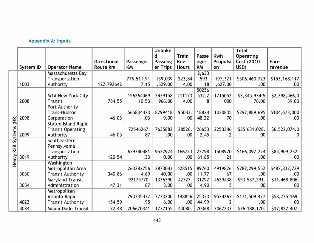
443
Appendix A: Inputs
System ID Operator Name
Directional Route km
Passenger KM
Unlinked Passenger Trips
Train Rev Hours
Passenger KM
Kwh Propulsion
Total Operating Cost (2010 USD)
Fare revenue
Heavy R
ail S
yst
em
s (H
R)
1003
Massachusetts Bay Transportation Authority 122.792642
776,511,917.15
139,039,529.00
223,844.00
2,633,593.
18 197,321,627.00
$306,460,723.00
$153,168,117.00
2008 MTA New York City Transit 784.55
15626406910.53
2439158966.00
2111734.00
50256532.2
8 1715052
000 $3,345,934,5
76.00 $2,398,466,0
39.00
2098
Port Authority Trans-Hudson Corporation 46.03
565834473.03
82994189.00
95043.00
1882448.22
103083570
$297,889,695.00
$104,673,000.00
2099
Staten Island Rapid Transit Operating Authority 46.03
72546267.87
7635882.00
28526.00
266532.45
22533462
$35,631,028.00
$6,522,074.00
3019
Southeastern Pennsylvania Transportation Authority 120.54
679340481.33
95229240.00
166723.00
2279861.85
150897021
$166,097,224.00
$84,909,232.00
3030
Washington Metropolitan Area Transit Authority 340.86
2632827564.69
287304340.00
428515.00
8976011.77
491982667
$787,299,552.00
$487,832,729.00
3034 Maryland Transit Administration 47.31
92175770.87
13363903.00
42727.00
312924.90
46294385
$53,537,291.00
$11,468,806.00
4022
Metropolitan Atlanta Rapid Transit Authority 154.59
793735472.95
77732006.00
148856.00
2537344.99
95342672
$171,509,427.00
$58,775,169.00
4034 Miami-Dade Transit 72.48 206620341 1737155 43080. 70368 7062237 $76,188,170. $17,827,407.

444
System ID Operator Name
Directional Route km
Passenger KM
Unlinked Passenger Trips
Train Rev Hours
Passenger KM
Kwh Propulsion
Total Operating Cost (2010 USD)
Fare revenue
.43 3.00 00 2.31 0 00 00
5015
The Greater Cleveland Regional Transit Authority 61.28
41664821.25
3657501.00
46583.00
128708.58
25827150
$22,552,608.00
$4,065,336.00
5066 Chicago Transit Authority 334.49
2086497431.46
210849074.00
604261.00
6770042.76
407659190
$451,039,566.00
$239,349,891.00
9003
San Francisco Bay Area Rapid Transit District 336.42
2238446544.18
108297950.00
252091.00
7388487.99
281721374
$463,074,086.00
$331,361,008.00
9154
Los Angeles County Metropolitan Transportation Authority 51.34
373263626.35
47905917.00
60648.00
1157762.41
86444000
$90,320,275.00
$34,983,345.00
Lig
ht
Rail (
LR)
0008
Tri-County Metropolitan Transportation District of Oregon 180.83
335996664.62
42452640.00
305050.00
261194.27
53556304
$106,374,746.00
$36,908,552.00
0040
Central Puget Sound Regional Transit Authority 49.57
90734399.30
7831905.00
71078.00
857472.45
13327909
$41,377,642.00 $9,608,740
1003
Massachusetts Bay Transportation Authority 82.08
249781103.75
65471593.00
346281.00
90232.48
52076193
$140,761,337.00
$69,637,279.00
2004
Niagara Frontier Transportation Authority 19.96
26216383.56
6215596.00
31992.00
75334.81 9273194
$23,571,179.00
$4,496,914.00
3022 Port Authority of Allegheny County 76.23
54111495.43
7006477.00
91102.00
278834.25
31232044
$50,135,809.00
$7,915,403.00
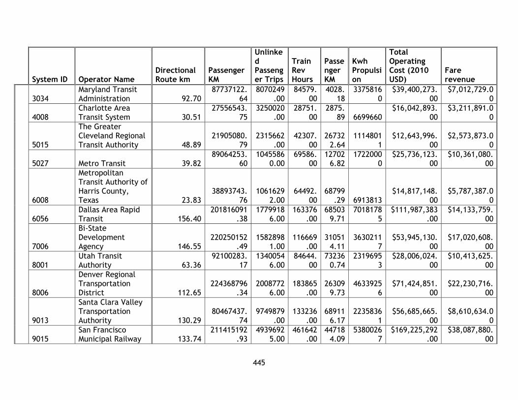
445
System ID Operator Name
Directional Route km
Passenger KM
Unlinked Passenger Trips
Train Rev Hours
Passenger KM
Kwh Propulsion
Total Operating Cost (2010 USD)
Fare revenue
3034 Maryland Transit Administration 92.70
87737122.64
8070249.00
84579.00
4028.18
33758160
$39,400,273.00
$7,012,729.00
4008 Charlotte Area Transit System 30.51
27556543.75
3250020.00
28751.00
2875.89 6699660
$16,042,893.00
$3,211,891.00
5015
The Greater Cleveland Regional Transit Authority 48.89
21905080.79
2315662.00
42307.00
267322.64
11148011
$12,643,996.00
$2,573,873.00
5027 Metro Transit 39.82 89064253.
60 1045586
0.00 69586.
00 12702
6.82 1722000
0 $25,736,123.
00 $10,361,080.
00
6008
Metropolitan Transit Authority of Harris County, Texas 23.83
38893743.76
10616292.00
64492.00
68799.29 6913813
$14,817,148.00
$5,787,387.00
6056 Dallas Area Rapid Transit 156.40
201816091.38
17799186.00
163376.00
685039.71
70181785
$111,987,383.00
$14,133,759.00
7006
Bi-State Development Agency 146.55
220250152.49
15828981.00
116669.00
310514.11
36302117
$53,945,130.00
$17,020,608.00
8001 Utah Transit Authority 63.36
92100283.17
13400546.00
84644.00
732360.74
23196953
$28,006,024.00
$10,413,625.00
8006
Denver Regional Transportation District 112.65
224368796.34
20087726.00
183865.00
263099.73
46339256
$71,424,851.00
$22,230,716.00
9013
Santa Clara Valley Transportation Authority 130.29
80467437.74
9749879.00
133236.00
689116.17
22358361
$56,685,665.00
$8,610,634.00
9015 San Francisco Municipal Railway 133.74
211415192.93
49396925.00
461642.00
447184.09
53800267
$169,225,292.00
$38,087,880.00
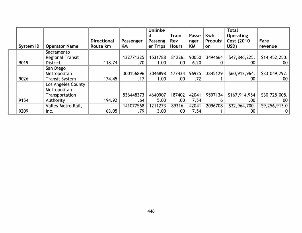
446
System ID Operator Name
Directional Route km
Passenger KM
Unlinked Passenger Trips
Train Rev Hours
Passenger KM
Kwh Propulsion
Total Operating Cost (2010 USD)
Fare revenue
9019
Sacramento Regional Transit District 118.74
132771325.70
15317881.00
81226.00
900506.20
34946640
$47,846,225.00
$14,452,250.00
9026
San Diego Metropolitan Transit System 174.45
300156896.17
30468981.00
177434.00
96925.72
38451291
$60,912,964.00
$33,049,792.00
9154
Los Angeles County Metropolitan Transportation Authority 194.92
536448373.64
46409075.00
187402.00
420417.54
95971346
$167,914,954.00
$30,725,008.00
9209 Valley Metro Rail, Inc. 63.05
141077568.79
12112733.00
89316.00
420417.54
20967081
$32,964,700.00
$9,256,913.00

447
Appendix B: Energy Emissions Table
ilbs/kwh
Code State CO2 CH4 N2O SO2 Nox Hg
AL Alabama 1.399 2.39E-05
2.28E-05
0.006671
0.001867
4.21E-08
AK Alaska
1.199 2.77E-05 7.24E
-06 0.00123
7 0.00390
9 1.80E
-09
AZ Arizona
1.246 1.68E-05 1.65E
-05 0.00107
8 0.00159
6 1.56E
-08
AR Arkansas
1.268 2.68E-05 2.20E
-05 0.00302
9 0.00157
2.25E-08
CA California
0.598 3.14E-05 4.48E
-06 0.00043
2 0.00040
9 2.11E
-09
CO Colorado
1.91 2.42E-05 2.81E
-05 0.00267
8 0.00272
6 1.73E
-08
CT Connecticut
0.73 6.30E-05 1.23E
-05 0.00247
4 0.00086
9 1.67E
-08
DE Delaware
1.907 2.60E-05 2.72E
-05 0.00844
4 0.00278
4 4.21E
-08
DC District of Columbia
2.94 1.26E-04 2.53E
-05 0.01051
1 0.00448
7 N/A
FL Florida
1.329 4.34E-05 1.71E
-05 0.00377
1 0.00213
2 1.10E
-08
GA Georgia
1.483 2.10E-05 2.44E
-05 0.00957
2 0.00164
4 2.90E
-08
HI Hawaii
1.632 1.09E-04 2.23E
-05 0.00831
5 0.00501
7 1.23E
-08
ID Idaho
0.148 1.43E-05 2.63E
-06 0.00026
6 0.00014
6 N/A
IL Illinois
1.17 1.37E-05 1.93E
-05 0.00307
1 0.00129
5 4.51E
-08
IN Indiana
2.168 2.51E-05 3.60E
-05 0.01168
7 0.00326
5 4.76E
-08
IA Iowa
1.883 2.22E-05 3.12E
-05 0.00607
4 0.00242
9 5.34E
-08
KS Kansas
1.819 2.12E-05 3.00E
-05 0.00488
4 0.00297
4 4.69E
-08
KY Kentucky
2.215 2.59E-05 3.74E
-05 0.00827
0.003814
3.96E-08
LA Louisiana
1.144 2.45E-05 1.23E
-05 0.00204
7 0.00143
1 1.34E
-08
ME Maine 0.558 2.07E-04 2.98E 0.00196 0.0012 2.96E
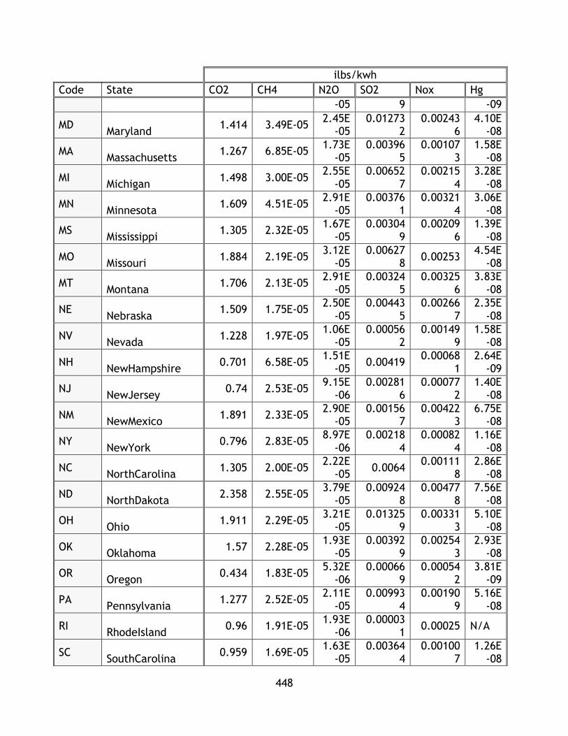
448
ilbs/kwh
Code State CO2 CH4 N2O SO2 Nox Hg
-05 9 -09
MD Maryland
1.414 3.49E-05 2.45E
-05 0.01273
2 0.00243
6 4.10E
-08
MA Massachusetts
1.267 6.85E-05 1.73E
-05 0.00396
5 0.00107
3 1.58E
-08
MI Michigan
1.498 3.00E-05 2.55E
-05 0.00652
7 0.00215
4 3.28E
-08
MN Minnesota
1.609 4.51E-05 2.91E
-05 0.00376
1 0.00321
4 3.06E
-08
MS Mississippi
1.305 2.32E-05 1.67E
-05 0.00304
9 0.00209
6 1.39E
-08
MO Missouri
1.884 2.19E-05 3.12E
-05 0.00627
8 0.00253
4.54E-08
MT Montana
1.706 2.13E-05 2.91E
-05 0.00324
5 0.00325
6 3.83E
-08
NE Nebraska
1.509 1.75E-05 2.50E
-05 0.00443
5 0.00266
7 2.35E
-08
NV Nevada
1.228 1.97E-05 1.06E
-05 0.00056
2 0.00149
9 1.58E
-08
NH NewHampshire
0.701 6.58E-05 1.51E
-05 0.00419
0.000681
2.64E-09
NJ NewJersey
0.74 2.53E-05 9.15E
-06 0.00281
6 0.00077
2 1.40E
-08
NM NewMexico
1.891 2.33E-05 2.90E
-05 0.00156
7 0.00422
3 6.75E
-08
NY NewYork
0.796 2.83E-05 8.97E
-06 0.00218
4 0.00082
4 1.16E
-08
NC NorthCarolina
1.305 2.00E-05 2.22E
-05 0.0064
0.001118
2.86E-08
ND NorthDakota
2.358 2.55E-05 3.79E
-05 0.00924
8 0.00477
8 7.56E
-08
OH Ohio
1.911 2.29E-05 3.21E
-05 0.01325
9 0.00331
3 5.10E
-08
OK Oklahoma
1.57 2.28E-05 1.93E
-05 0.00392
9 0.00254
3 2.93E
-08
OR Oregon
0.434 1.83E-05 5.32E
-06 0.00066
9 0.00054
2 3.81E
-09
PA Pennsylvania
1.277 2.52E-05 2.11E
-05 0.00993
4 0.00190
9 5.16E
-08
RI RhodeIsland
0.96 1.91E-05 1.93E
-06 0.00003
1 0.00025 N/A
SC SouthCarolina
0.959 1.69E-05 1.63E
-05 0.00364
4 0.00100
7 1.26E
-08
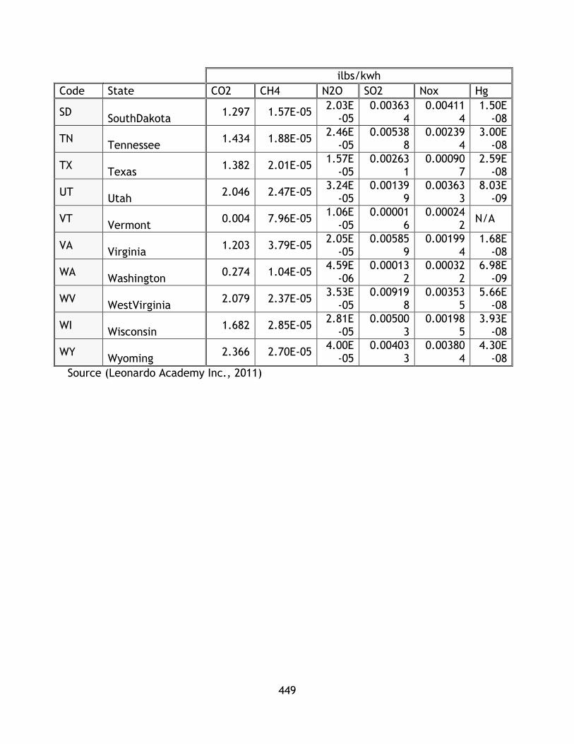
449
ilbs/kwh
Code State CO2 CH4 N2O SO2 Nox Hg
SD SouthDakota
1.297 1.57E-05 2.03E
-05 0.00363
4 0.00411
4 1.50E
-08
TN Tennessee
1.434 1.88E-05 2.46E
-05 0.00538
8 0.00239
4 3.00E
-08
TX Texas
1.382 2.01E-05 1.57E
-05 0.00263
1 0.00090
7 2.59E
-08
UT Utah
2.046 2.47E-05 3.24E
-05 0.00139
9 0.00363
3 8.03E
-09
VT Vermont
0.004 7.96E-05 1.06E
-05 0.00001
6 0.00024
2 N/A
VA Virginia
1.203 3.79E-05 2.05E
-05 0.00585
9 0.00199
4 1.68E
-08
WA Washington
0.274 1.04E-05 4.59E
-06 0.00013
2 0.00032
2 6.98E
-09
WV WestVirginia
2.079 2.37E-05 3.53E
-05 0.00919
8 0.00353
5 5.66E
-08
WI Wisconsin
1.682 2.85E-05 2.81E
-05 0.00500
3 0.00198
5 3.93E
-08
WY Wyoming
2.366 2.70E-05 4.00E
-05 0.00403
3 0.00380
4 4.30E
-08
Source (Leonardo Academy Inc., 2011)

450
Appendix C: Income Per Capita
MSA Income Per Capita (2010 USD)
Atlanta-Sandy Springs-Marietta, GA Metro Area 26333
Baltimore-Towson, MD Metro Area 32568
Boston-Cambridge-Quincy, MA-NH Metro Area 35999
Buffalo-Niagara Falls, NY Metro Area 25178
Charlotte-Gastonia-Rock Hill, NC-SC Metro Area 26657
Chicago-Joliet-Naperville, IL-IN-WI Metro Area 28630
Cleveland, TN Metro Area 19212
Dallas-Fort Worth-Arlington, TX Metro Area 27016
Denver-Aurora-Broomfield, CO Metro Area 30891
Houston-Sugar Land-Baytown, TX Metro Area 26440
Los Angeles-Long Beach-Santa Ana, CA Metro Area 27051
New York-Northern New Jersey-Long Island, NY-NJ-PA Metro Area 33208
Philadelphia-Camden-Wilmington, PA-NJ-DE-MD Metro Area 30250
Phoenix-Mesa-Glendale, AZ Metro Area 24809
Pittsburgh, PA Metro Area 27075
Portland-Vancouver-Hillsboro, OR-WA Metro Area 27451
Sacramento--Arden-Arcade--Roseville, CA Metro Area 26992
St. Louis, MO-IL Metro Area 27242
Salt Lake City, UT Metro Area 24006
San Diego-Carlsbad-San Marcos, CA Metro Area 28498
San Francisco-Oakland-Fremont, CA Metro Area 37693
San Jose-Sunnyvale-Santa Clara, CA Metro Area 37177
Seattle-Tacoma-Bellevue, WA Metro Area 32401
Washington-Arlington-Alexandria, DC-VA-MD-WV Metro Area 40528
(U.S. Census Bureau, 2013)

451
Appendix D: Method 3 Sustainability Analysis Graphs
This appendix contains graphs for each system analyzed in this research thesis. For
reference, these systems are:
Operator EI EcI SI SeI CSI
MTA New York City Transit HR 0.977 0.935 0.672 0.685 0.817
Los Angeles County Metropolitan Transportation Authority HR 0.887 0.642 0.663 0.505 0.674
Chicago Transit Authority HR 0.840 0.653 0.566 0.318 0.594
San Francisco Municipal Railway LR 0.868 0.385 0.948 0.177 0.594
Los Angeles County Metropolitan Transportation Authority LR 0.933 0.504 0.618 0.309 0.591
Tri-County Metropolitan Transportation District of Oregon LR 0.955 0.545 0.658 0.202 0.590
Metropolitan Transit Authority of Harris County, Texas LR 0.868 0.630 0.749 0.090 0.584
San Diego Metropolitan Transit System LR 0.977 0.623 0.592 0.098 0.572
Southeastern Pennsylvania Transportation Authority HR 0.765 0.690 0.536 0.291 0.571
Metropolitan Atlanta Rapid Transit Authority HR 0.918 0.659 0.624 0.067 0.567
Massachusetts Bay Transportation Authority HR 0.784 0.652 0.661 0.076 0.543
Washington Metropolitan Area Transit Authority HR 0.620 0.717 0.603 0.228 0.542
Port Authority Trans-Hudson Corporation HR 0.905 0.502 0.496 0.241 0.536
Utah Transit Authority LR 0.710 0.583 0.671 0.157 0.530
Valley Metro Rail, Inc. LR 0.913 0.438 0.592 0.139 0.520
Massachusetts Bay Transportation Authority LR 0.839 0.548 0.553 0.141 0.520
San Francisco Bay Area Rapid Transit District HR 0.979 0.594 0.301 0.198 0.518
Metro Transit LR 0.805 0.530 0.635 0.095 0.516
Sacramento Regional Transit District LR 0.860 0.546 0.620 0.033 0.515
Bi-State Development Agency LR 0.825 0.531 0.526 0.115 0.499
Niagara Frontier Transportation Authority LR 0.733 0.383 0.729 0.127 0.493
Central Puget Sound Regional Transit Authority LR 0.973 0.389 0.577 0.019 0.490
Santa Clara Valley Transportation Authority LR 0.847 0.353 0.676 0.066 0.486
Denver Regional Transportation District LR 0.786 0.481 0.585 0.045 0.474
Charlotte Area Transit System LR 0.775 0.417 0.614 0.023 0.457
Miami-Dade Transit HR 0.661 0.512 0.545 0.043 0.440
Staten Island Rapid Transit Operating Authority, dba: MTA Staten Island Railway HR 0.776 0.451 0.420 0.073 0.430
Dallas Area Rapid Transit LR 0.658 0.351 0.601 0.103 0.428
Maryland Transit Administration LR 0.503 0.426 0.621 0.041 0.398
Maryland Transit Administration HR 0.325 0.510 0.680 0.009 0.381
Port Authority of Allegheny County LR 0.251 0.256 0.604 0.045 0.289
The Greater Cleveland Regional Transit Authority HR 0.000 0.380 0.458 0.202 0.260
The Greater Cleveland Regional Transit Authority LR 0.195 0.356 0.345 0.134 0.257
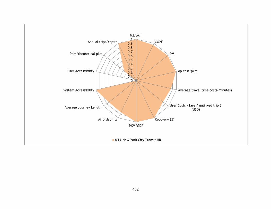
452
0
0.1
0.2
0.3
0.4
0.5
0.6
0.7
0.8
0.9
1MJ/pkm
CO2E
PM
op cost/pkm
Average travel time costs(minutes)
User Costs - fare / unlinked trip $(USD)
Recovery (%)
PKM/GDP
Affordability
Average Journey Length
System Accessibility
User Accessibility
Pkm/theoretical pkm
Annual trips/capita
MTA New York City Transit HR

453
00.10.20.30.40.50.60.70.80.9
1MJ/pkm
CO2E
PM
op cost/pkm
Average travel timecosts(minutes)
User Costs - fare / unlinked trip $(USD)
Recovery (%)
PKM/GDP
Affordability
Average Journey Length
System Accessibility
User Accessibility
Pkm/theoretical pkm
Annual trips/capita
Los Angeles County Metropolitan Transportation Authority HR

454
0
0.1
0.2
0.3
0.4
0.5
0.6
0.7
0.8
0.9
1
MJ/pkm
CO2E
PM
op cost/pkm
Average travel timecosts(minutes)
User Costs - fare / unlinkedtrip $ (USD)
Recovery (%)
PKM/GDP
Affordability
Average Journey Length
System Accessibility
User Accessibility
Pkm/theoretical pkm
Annual trips/capita
San Francisco Municipal Railway LR

455
0
0.1
0.2
0.3
0.4
0.5
0.6
0.7
0.8
0.9
1
MJ/pkm
CO2E
PM
op cost/pkm
Average travel timecosts(minutes)
User Costs - fare / unlinked trip$ (USD)
Recovery (%)
PKM/GDP
Affordability
Average Journey Length
System Accessibility
User Accessibility
Pkm/theoretical pkm
Annual trips/capita
Los Angeles County Metropolitan Transportation Authority LR
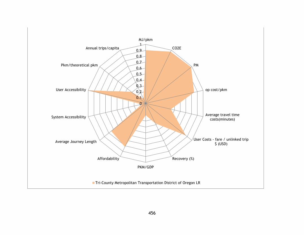
456
0
0.1
0.2
0.3
0.4
0.5
0.6
0.7
0.8
0.9
1
MJ/pkm
CO2E
PM
op cost/pkm
Average travel timecosts(minutes)
User Costs - fare / unlinked trip$ (USD)
Recovery (%)
PKM/GDP
Affordability
Average Journey Length
System Accessibility
User Accessibility
Pkm/theoretical pkm
Annual trips/capita
Tri-County Metropolitan Transportation District of Oregon LR
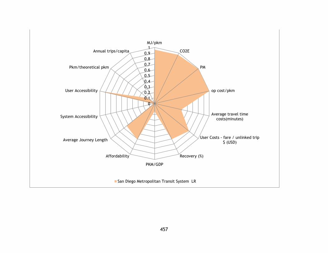
457
0
0.1
0.2
0.3
0.4
0.5
0.6
0.7
0.8
0.9
1
MJ/pkm
CO2E
PM
op cost/pkm
Average travel timecosts(minutes)
User Costs - fare / unlinked trip$ (USD)
Recovery (%)
PKM/GDP
Affordability
Average Journey Length
System Accessibility
User Accessibility
Pkm/theoretical pkm
Annual trips/capita
San Diego Metropolitan Transit System LR

458
0
0.1
0.2
0.3
0.4
0.5
0.6
0.7
0.8
0.9
1
MJ/pkm
CO2E
PM
op cost/pkm
Average travel timecosts(minutes)
User Costs - fare / unlinked trip$ (USD)
Recovery (%)
PKM/GDP
Affordability
Average Journey Length
System Accessibility
User Accessibility
Pkm/theoretical pkm
Annual trips/capita
Southeastern Pennsylvania Transportation Authority HR

459
0
0.1
0.2
0.30.40.50.6
0.7
0.8
0.9
1MJ/pkm
CO2E
PM
op cost/pkm
Average travel timecosts(minutes)
User Costs - fare / unlinked trip $(USD)
Recovery (%)
PKM/GDP
Affordability
Average Journey Length
System Accessibility
User Accessibility
Pkm/theoretical pkm
Annual trips/capita
Metropolitan Atlanta Rapid Transit Authority HR

460
00.10.20.30.40.50.60.70.80.9
1MJ/pkm
CO2E
PM
op cost/pkm
Average travel timecosts(minutes)
User Costs - fare / unlinked trip $(USD)
Recovery (%)
PKM/GDP
Affordability
Average Journey Length
System Accessibility
User Accessibility
Pkm/theoretical pkm
Annual trips/capita
Massachusetts Bay Transportation Authority HR

461
0
0.1
0.2
0.3
0.4
0.5
0.6
0.7
0.8
0.9
1
MJ/pkm
CO2E
PM
op cost/pkm
Average travel timecosts(minutes)
User Costs - fare / unlinked trip$ (USD)
Recovery (%)
PKM/GDP
Affordability
Average Journey Length
System Accessibility
User Accessibility
Pkm/theoretical pkm
Annual trips/capita
Washington Metropolitan Area Transit Authority HR
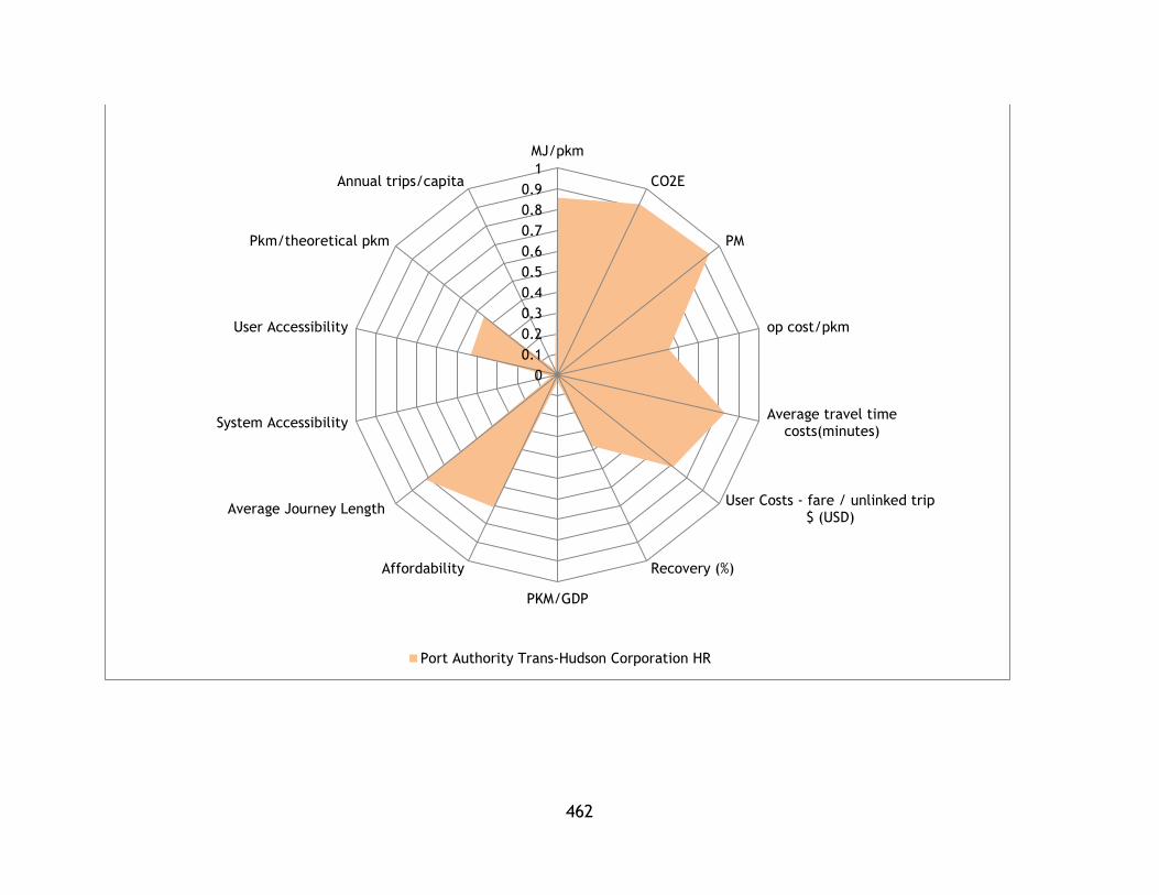
462
0
0.1
0.2
0.3
0.4
0.5
0.6
0.7
0.8
0.9
1
MJ/pkm
CO2E
PM
op cost/pkm
Average travel timecosts(minutes)
User Costs - fare / unlinked trip$ (USD)
Recovery (%)
PKM/GDP
Affordability
Average Journey Length
System Accessibility
User Accessibility
Pkm/theoretical pkm
Annual trips/capita
Port Authority Trans-Hudson Corporation HR
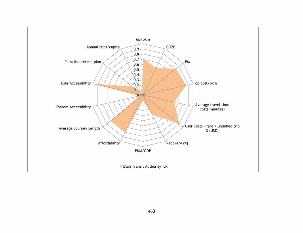
463
0
0.1
0.2
0.3
0.4
0.5
0.6
0.7
0.8
0.9
1
MJ/pkm
CO2E
PM
op cost/pkm
Average travel timecosts(minutes)
User Costs - fare / unlinked trip$ (USD)
Recovery (%)
PKM/GDP
Affordability
Average Journey Length
System Accessibility
User Accessibility
Pkm/theoretical pkm
Annual trips/capita
Utah Transit Authority LR
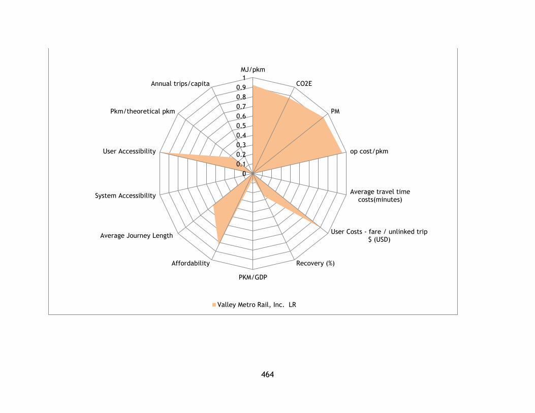
464
0
0.1
0.2
0.3
0.4
0.5
0.6
0.7
0.8
0.9
1
MJ/pkm
CO2E
PM
op cost/pkm
Average travel timecosts(minutes)
User Costs - fare / unlinked trip$ (USD)
Recovery (%)
PKM/GDP
Affordability
Average Journey Length
System Accessibility
User Accessibility
Pkm/theoretical pkm
Annual trips/capita
Valley Metro Rail, Inc. LR

465
0
0.1
0.2
0.3
0.4
0.5
0.6
0.7
0.8
0.9
1
MJ/pkm
CO2E
PM
op cost/pkm
Average travel timecosts(minutes)
User Costs - fare / unlinked trip $(USD)
Recovery (%)
PKM/GDP
Affordability
Average Journey Length
System Accessibility
User Accessibility
Pkm/theoretical pkm
Annual trips/capita
Massachusetts Bay Transportation Authority LR
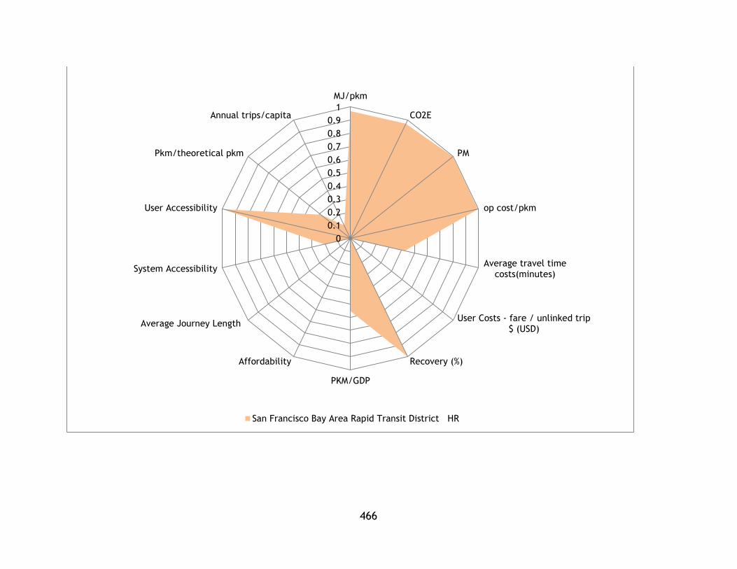
466
0
0.1
0.2
0.3
0.4
0.5
0.6
0.7
0.8
0.9
1
MJ/pkm
CO2E
PM
op cost/pkm
Average travel timecosts(minutes)
User Costs - fare / unlinked trip$ (USD)
Recovery (%)
PKM/GDP
Affordability
Average Journey Length
System Accessibility
User Accessibility
Pkm/theoretical pkm
Annual trips/capita
San Francisco Bay Area Rapid Transit District HR

467
0
0.1
0.2
0.3
0.4
0.5
0.6
0.7
0.8
0.9
1MJ/pkm
CO2E
PM
op cost/pkm
Average travel timecosts(minutes)
User Costs - fare / unlinked trip$ (USD)
Recovery (%)
PKM/GDP
Affordability
Average Journey Length
System Accessibility
User Accessibility
Pkm/theoretical pkm
Annual trips/capita
Metro Transit LR

468
0
0.1
0.2
0.3
0.4
0.5
0.6
0.7
0.8
0.9
1
MJ/pkm
CO2E
PM
op cost/pkm
Average travel timecosts(minutes)
User Costs - fare / unlinked trip$ (USD)
Recovery (%)
PKM/GDP
Affordability
Average Journey Length
System Accessibility
User Accessibility
Pkm/theoretical pkm
Annual trips/capita
Sacramento Regional Transit District LR

469
0
0.1
0.2
0.3
0.4
0.5
0.6
0.7
0.8
0.9
1
MJ/pkm
CO2E
PM
op cost/pkm
Average travel timecosts(minutes)
User Costs - fare / unlinked trip$ (USD)
Recovery (%)
PKM/GDP
Affordability
Average Journey Length
System Accessibility
User Accessibility
Pkm/theoretical pkm
Annual trips/capita
Bi-State Development Agency LR
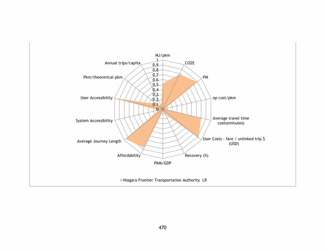
470
0
0.1
0.2
0.3
0.4
0.5
0.6
0.7
0.8
0.9
1MJ/pkm
CO2E
PM
op cost/pkm
Average travel timecosts(minutes)
User Costs - fare / unlinked trip $(USD)
Recovery (%)
PKM/GDP
Affordability
Average Journey Length
System Accessibility
User Accessibility
Pkm/theoretical pkm
Annual trips/capita
Niagara Frontier Transportation Authority LR
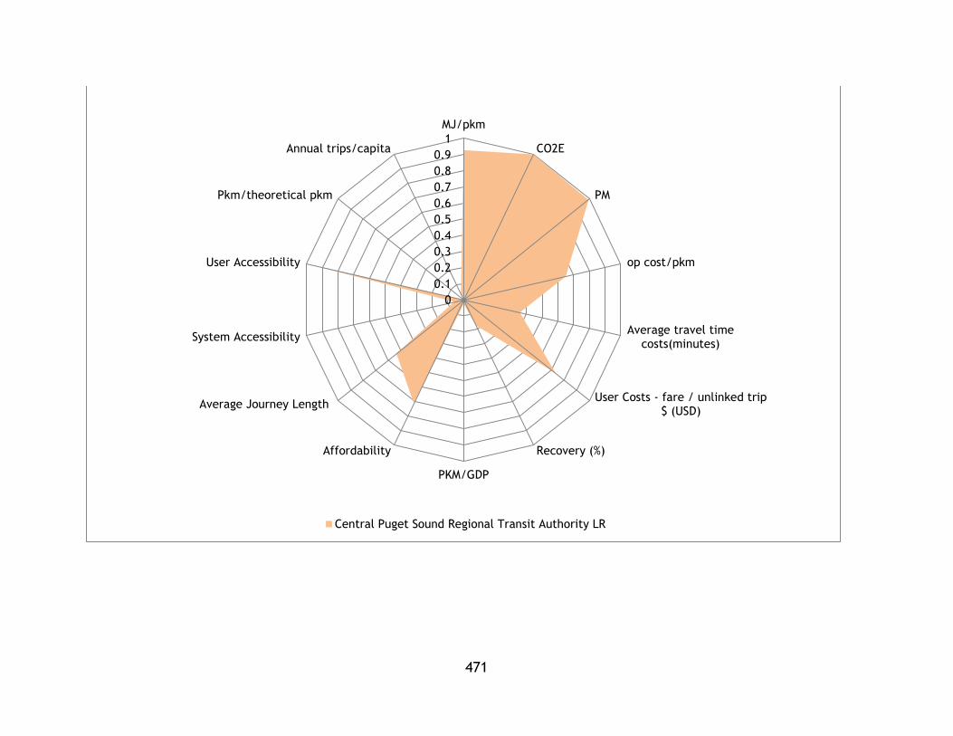
471
0
0.1
0.2
0.3
0.4
0.5
0.6
0.7
0.8
0.9
1
MJ/pkm
CO2E
PM
op cost/pkm
Average travel timecosts(minutes)
User Costs - fare / unlinked trip$ (USD)
Recovery (%)
PKM/GDP
Affordability
Average Journey Length
System Accessibility
User Accessibility
Pkm/theoretical pkm
Annual trips/capita
Central Puget Sound Regional Transit Authority LR

472
0
0.1
0.2
0.3
0.4
0.5
0.6
0.7
0.8
0.9
1
MJ/pkm
CO2E
PM
op cost/pkm
Average travel timecosts(minutes)
User Costs - fare / unlinked trip $(USD)
Recovery (%)
PKM/GDP
Affordability
Average Journey Length
System Accessibility
User Accessibility
Pkm/theoretical pkm
Annual trips/capita
Santa Clara Valley Transportation Authority LR

473
0
0.1
0.2
0.3
0.4
0.5
0.6
0.7
0.8
0.9
1
MJ/pkm
CO2E
PM
op cost/pkm
Average travel timecosts(minutes)
User Costs - fare / unlinked trip$ (USD)
Recovery (%)
PKM/GDP
Affordability
Average Journey Length
System Accessibility
User Accessibility
Pkm/theoretical pkm
Annual trips/capita
Denver Regional Transportation District LR

474
0
0.1
0.2
0.3
0.4
0.5
0.6
0.7
0.8
0.9
1
MJ/pkm
CO2E
PM
op cost/pkm
Average travel timecosts(minutes)
User Costs - fare / unlinked trip$ (USD)
Recovery (%)
PKM/GDP
Affordability
Average Journey Length
System Accessibility
User Accessibility
Pkm/theoretical pkm
Annual trips/capita
Charlotte Area Transit System LR

475
0
0.1
0.2
0.3
0.4
0.5
0.6
0.7
0.8
0.9
1
MJ/pkm
CO2E
PM
op cost/pkm
Average travel timecosts(minutes)
User Costs - fare / unlinked trip$ (USD)
Recovery (%)
PKM/GDP
Affordability
Average Journey Length
System Accessibility
User Accessibility
Pkm/theoretical pkm
Annual trips/capita
Miami-Dade Transit HR

476
0
0.1
0.2
0.3
0.4
0.5
0.6
0.7
0.8
0.9
1
MJ/pkm
CO2E
PM
op cost/pkm
Average travel timecosts(minutes)
User Costs - fare / unlinked trip$ (USD)
Recovery (%)
PKM/GDP
Affordability
Average Journey Length
System Accessibility
User Accessibility
Pkm/theoretical pkm
Annual trips/capita
Staten Island Rapid Transit Operating Authority, dba: MTA Staten Island Railway HR
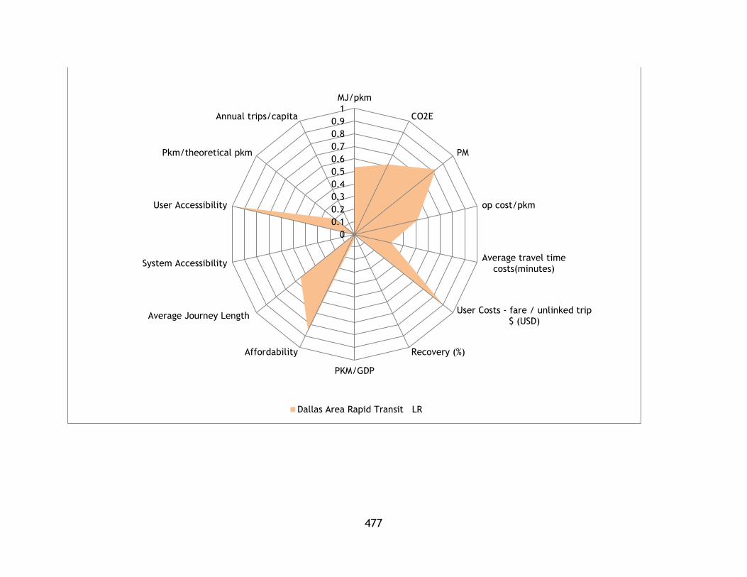
477
0
0.1
0.2
0.3
0.4
0.5
0.6
0.7
0.8
0.9
1
MJ/pkm
CO2E
PM
op cost/pkm
Average travel timecosts(minutes)
User Costs - fare / unlinked trip$ (USD)
Recovery (%)
PKM/GDP
Affordability
Average Journey Length
System Accessibility
User Accessibility
Pkm/theoretical pkm
Annual trips/capita
Dallas Area Rapid Transit LR

478
0
0.1
0.2
0.3
0.4
0.5
0.6
0.7
0.8
0.9
1
MJ/pkm
CO2E
PM
op cost/pkm
Average travel timecosts(minutes)
User Costs - fare / unlinked trip$ (USD)
Recovery (%)
PKM/GDP
Affordability
Average Journey Length
System Accessibility
User Accessibility
Pkm/theoretical pkm
Annual trips/capita
Maryland Transit Administration LR

479
0
0.1
0.2
0.3
0.4
0.5
0.6
0.7
0.8
0.9
1
MJ/pkm
CO2E
PM
op cost/pkm
Average travel timecosts(minutes)
User Costs - fare / unlinked trip$ (USD)
Recovery (%)
PKM/GDP
Affordability
Average Journey Length
System Accessibility
User Accessibility
Pkm/theoretical pkm
Annual trips/capita
Maryland Transit Administration HR

480
0
0.1
0.2
0.3
0.4
0.5
0.6
0.7
0.8
0.9
1
MJ/pkm
CO2E
PM
op cost/pkm
Average travel timecosts(minutes)
User Costs - fare / unlinked trip$ (USD)
Recovery (%)
PKM/GDP
Affordability
Average Journey Length
System Accessibility
User Accessibility
Pkm/theoretical pkm
Annual trips/capita
Port Authority of Allegheny County LR

481
0
0.1
0.2
0.3
0.4
0.5
0.6
0.7
0.8
MJ/pkm
CO2E
PM
op cost/pkm
Average travel timecosts(minutes)
User Costs - fare / unlinked trip$ (USD)
Recovery (%)
PKM/GDP
Affordability
Average Journey Length
System Accessibility
User Accessibility
Pkm/theoretical pkm
Annual trips/capita
The Greater Cleveland Regional Transit Authority HR
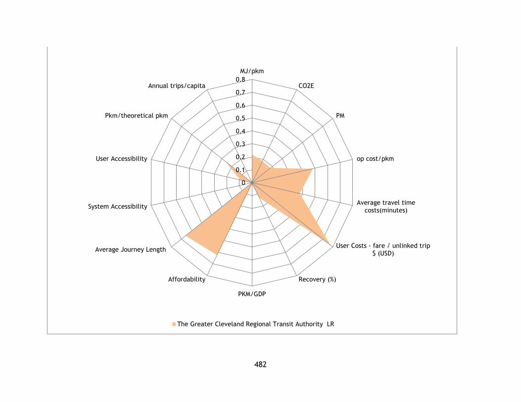
482
0
0.1
0.2
0.3
0.4
0.5
0.6
0.7
0.8
MJ/pkm
CO2E
PM
op cost/pkm
Average travel timecosts(minutes)
User Costs - fare / unlinked trip$ (USD)
Recovery (%)
PKM/GDP
Affordability
Average Journey Length
System Accessibility
User Accessibility
Pkm/theoretical pkm
Annual trips/capita
The Greater Cleveland Regional Transit Authority LR
Related Documents