No. 08‐2 Subprime Facts: What (We Think) We Know about the Subprime Crisis and What We Don’t Christopher L. Foote, Kristopher Gerardi, Lorenz Goette, and Paul S. Willen Abstract: Using a variety of datasets, we document some basic facts about the current subprime crisis. Many of these facts are applicable to the crisis at a national level, while some illustrate problems relevant only to Massachusetts and New England. We conclude by discussing some outstanding questions about which the data, we believe, are not yet conclusive. JEL Classifications: D11, D12, G21, R20 Christopher Foote and Paul Willen are senior economists and policy advisors, Lorenz Goette is a senior economist, and Kristopher Gerardi is a research associate at the Federal Reserve Bank of Boston. Gerardi will join the Federal Reserve Bank of Atlanta in September as a research economist. Their email addresses are [email protected] , [email protected] , [email protected] , and [email protected] respectively. We thank participants at various forums, summits, breakfasts, brownbags, seminars, and other gatherings for helpful comments and suggestions. We also thank Tim Warren and Alan Pasnik of The Warren Group, and Dick Howe Jr., the Register of Deeds of North Middlesex County, Massachusetts, for providing us with data, advice, and insight. Finally, we thank Elizabeth Murry for providing helpful comments and edits. This paper, which may be revised, is available on the web site of the Federal Reserve Bank of Boston at http://www.bos.frb.org/economic/ppdp/2008/ppdp0802.htm . The views expressed in this paper are solely those of the authors and not necessarily those of the Federal Reserve Bank of Boston or the Federal Reserve System. This version: May 30, 2008

Welcome message from author
This document is posted to help you gain knowledge. Please leave a comment to let me know what you think about it! Share it to your friends and learn new things together.
Transcript
No. 08‐2
Subprime Facts: What (We Think) We Know about the Subprime Crisis
and What We Don’t
Christopher L. Foote, Kristopher Gerardi, Lorenz Goette, and Paul S. Willen
Abstract: Using a variety of datasets, we document some basic facts about the current subprime crisis. Many of these facts are applicable to the crisis at a national level, while some illustrate problems relevant only to Massachusetts and New England. We conclude by discussing some outstanding questions about which the data, we believe, are not yet conclusive. JEL Classifications: D11, D12, G21, R20 Christopher Foote and Paul Willen are senior economists and policy advisors, Lorenz Goette is a senior economist, and Kristopher Gerardi is a research associate at the Federal Reserve Bank of Boston. Gerardi will join the Federal Reserve Bank of Atlanta in September as a research economist. Their email addresses are [email protected], [email protected], [email protected], and [email protected] respectively. We thank participants at various forums, summits, breakfasts, brownbags, seminars, and other gatherings for helpful comments and suggestions. We also thank Tim Warren and Alan Pasnik of The Warren Group, and Dick Howe Jr., the Register of Deeds of North Middlesex County, Massachusetts, for providing us with data, advice, and insight. Finally, we thank Elizabeth Murry for providing helpful comments and edits. This paper, which may be revised, is available on the web site of the Federal Reserve Bank of Boston at http://www.bos.frb.org/economic/ppdp/2008/ppdp0802.htm. The views expressed in this paper are solely those of the authors and not necessarily those of the Federal Reserve Bank of Boston or the Federal Reserve System. This version: May 30, 2008
Overview
The Federal Reserve Bank of Boston’s research project on foreclosures began in March
2007, when the Bank’s then-president, Cathy E. Minehan, asked us in the research de-
partment why the foreclosure rate in New England was rising so rapidly. To answer this
question, we gathered data, starting with a list of foreclosures that had occurred in the week
immediately prior to our initial discussion with Cathy. Over time, we added datasets that
covered, in various ways and to varying degrees, every borrower and every mortgage issued
in Massachusetts since 1987. This paper presents some of what we have learned from these
data and discusses some of the issues that still puzzle us. Our results focus on Massachusetts
because this is the state for which we have the most data and the most knowledge. In some
cases, as we will discuss, we think the basic findings hold for the nation as a whole. In other
cases, we think findings are relevant only for Massachusetts or New England.
We view this paper as a resource for policymakers. To this end, we have eschewed the
use of mathematical formulas and jargon typical in scholarly economics papers. But we also
hope that researchers find this paper valuable, both as a description of the strengths and
weaknesses of available data, and as an outline of some basic findings about the mortgage
market and the recent subprime crisis.
We distill our findings into what we think are seven basic “facts” about the foreclosure
wave that started in 2006, which we list and briefly review in the first section. We then
discuss some outstanding questions to which we can find no satisfactory answers.
The facts are:
1. Interest-rate resets are not the main problem in the subprime market.
2. Higher foreclosure rates stem from falling house prices.
3. Prime lenders would have rejected most of the loans originated by subprime lenders.
4. Many recent foreclosees put little money down and had lived in their homes a short
time.
5. Current Massachusetts foreclosures involve a disproportionate number of multi-family
dwellings.
6. Most recent foreclosures in Massachusetts involved homes that were initially purchased
with prime mortgages.
7. Almost half of the residential foreclosures in Massachusetts came on subprime mort-
gages, including subprime refinances of prime purchase mortgages.
1
1 Seven Subprime Facts: A Brief Review
Fact 1: Interest-rate resets are not the main problem in the subprime mar-
ket
One of the most enduring claims about the origins of the subprime mortgage crisis centers
on the resets of hybrid adjustable-rate mortgages (ARMs). The typical criticism of these
mortgages is as follows: hybrid ARMs offer borrowers extremely low fixed interest rates
during an initial “teaser” period, but then the rate “explodes” to something much higher a
few years after origination. Lenders find such loans attractive because of the high post-reset
interest rates. Borrowers find them attractive because of the low teaser rates, but later
regret their decisions when they find themselves paying high interest rates and thus higher
mortgage payments. Finally, the subprime mortgage crisis emerged when a large number
of ARM rates reset and previously solvent borrowers found themselves facing unaffordable
monthly payments.1
We will illustrate that virtually everything about the above story is wrong. Subprime
teaser rates were not exceptionally low; in fact, by reasonable standards, these rates were
exceptionally high. The interest-rate resets, although not trivial, were not explosive.2 The
high post-reset rates were not the attraction for lenders, because most borrowers prepaid
such mortgages prior to or shortly after the reset, a fact anticipated by lenders.3 And finally,
loan-level data show little relationship between the timing of the resets and delinquency and
foreclosure activity, even among the most recent foreclosures.4
Though we minimize the specific importance of resets to the subprime market, in some
respects our conclusion is more pessimistic than press accounts that focus on resets alone.
Recent declines in short-term interest rates have lowered the rates at which subprime mort-
gages will reset this year. In some cases, the new interest rate will be quite close to the
initial rate on the subprime loan. Unfortunately, the fact that so many subprime borrowers
are having problems keeping their loans current even at the lower initial rates means that
problems in the subprime market are likely to continue for reasons unrelated to interest-rate
resets.
1This theory has appeared innumerable times in the media. Gretchen Morgenson writes in The New York
Times on April 8, 2007, “Especially ingenious – for lenders, at least – were so-called exploding A.R.M.’s thatlured borrowers with unusually low teaser rates that then reset skyward two or three years later (typicallypegged to the London Interbank Offered Rate, plus six percentage points).”
2See Table 3 on page 14 for a table of teaser rates and resets.3See Figure 2 on page 16 for data on refinancing activity among subprime ARMs.4See Figure 4 on page 19 for a graph of default probabilities among subprime adjustable-rate mortgages.
2
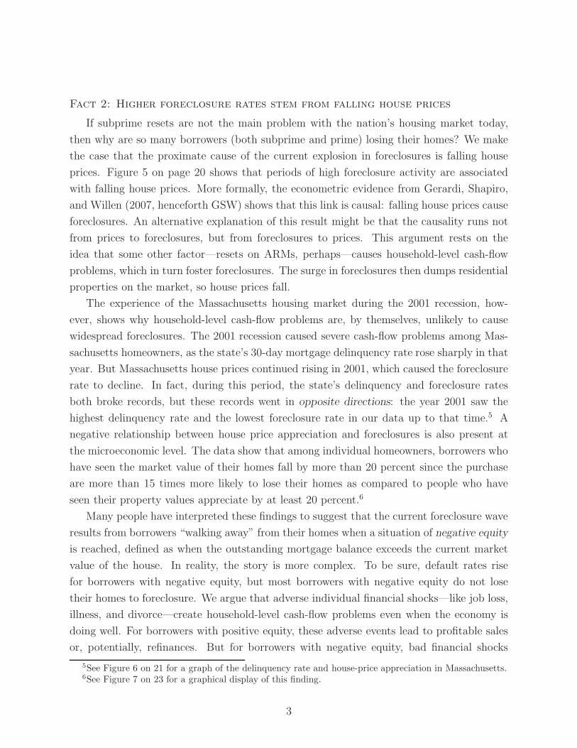
Fact 2: Higher foreclosure rates stem from falling house prices
If subprime resets are not the main problem with the nation’s housing market today,
then why are so many borrowers (both subprime and prime) losing their homes? We make
the case that the proximate cause of the current explosion in foreclosures is falling house
prices. Figure 5 on page 20 shows that periods of high foreclosure activity are associated
with falling house prices. More formally, the econometric evidence from Gerardi, Shapiro,
and Willen (2007, henceforth GSW) shows that this link is causal: falling house prices cause
foreclosures. An alternative explanation of this result might be that the causality runs not
from prices to foreclosures, but from foreclosures to prices. This argument rests on the
idea that some other factor—resets on ARMs, perhaps—causes household-level cash-flow
problems, which in turn foster foreclosures. The surge in foreclosures then dumps residential
properties on the market, so house prices fall.
The experience of the Massachusetts housing market during the 2001 recession, how-
ever, shows why household-level cash-flow problems are, by themselves, unlikely to cause
widespread foreclosures. The 2001 recession caused severe cash-flow problems among Mas-
sachusetts homeowners, as the state’s 30-day mortgage delinquency rate rose sharply in that
year. But Massachusetts house prices continued rising in 2001, which caused the foreclosure
rate to decline. In fact, during this period, the state’s delinquency and foreclosure rates
both broke records, but these records went in opposite directions: the year 2001 saw the
highest delinquency rate and the lowest foreclosure rate in our data up to that time.5 A
negative relationship between house price appreciation and foreclosures is also present at
the microeconomic level. The data show that among individual homeowners, borrowers who
have seen the market value of their homes fall by more than 20 percent since the purchase
are more than 15 times more likely to lose their homes as compared to people who have
seen their property values appreciate by at least 20 percent.6
Many people have interpreted these findings to suggest that the current foreclosure wave
results from borrowers “walking away” from their homes when a situation of negative equity
is reached, defined as when the outstanding mortgage balance exceeds the current market
value of the house. In reality, the story is more complex. To be sure, default rates rise
for borrowers with negative equity, but most borrowers with negative equity do not lose
their homes to foreclosure. We argue that adverse individual financial shocks—like job loss,
illness, and divorce—create household-level cash-flow problems even when the economy is
doing well. For borrowers with positive equity, these adverse events lead to profitable sales
or, potentially, refinances. But for borrowers with negative equity, bad financial shocks
5See Figure 6 on 21 for a graph of the delinquency rate and house-price appreciation in Massachusetts.6See Figure 7 on 23 for a graphical display of this finding.
3

typically presage foreclosure. Thus, many of the borrowers defaulting today are experiencing
a “life event,” like a job loss or divorce, that has little to do with the falling market value of
their homes, but much to do with their ability to meet their monthly mortgage payments.
Fact 3: Prime lenders would have rejected most of the loans originated
by subprime lenders
Some commentators and policymakers have argued that a substantial fraction of bor-
rowers who obtained subprime loans could have qualified for prime loans. The main evi-
dence offered to support this view is that, as the subprime lending activity increased in the
mid-2000s, an increasing fraction of subprime borrowers were not “traditional” subprime
borrowers, meaning borrowers with poor credit histories. Instead, borrowing from subprime
lenders grew rapidly among individuals with good credit histories. Using our data, we repli-
cate the finding that an increasing fraction of subprime loans were made to borrowers with
FICO scores above 620, which is generally considered the cutoff point between prime and
subprime borrowers.7
However, our data also show that prime lenders would probably not have given these
high-score borrowers the loans that they actually obtained in the subprime market. The
reason is that a low FICO score is not the only reason that a prime lender will reject a loan
application. Prime lenders also frown on high loan-to-value ratios, high payment-to-income
ratios, and an unwillingness to fully document income and assets. In our data, about 70
percent of subprime loans were taken out by borrowers with high FICO scores at the height
of the housing boom, but less than 10 percent of these loans met all of the tests for obtaining
a loan from a prime lender.8 Furthermore, under the risk-based pricing model used by most
subprime lenders, borrowers who came close to qualifying for prime loans were able to obtain
near-prime interest rates as well.
Fact 4: Many recent foreclosees put little money down and had lived in
their homes a short time.
In 2007, 40 percent of Massachusetts residents who lost their homes to foreclosure had
put no money down when they bought their homes. More than half made less than a
5 percent downpayment. Furthermore, almost half of recent Massachusetts foreclosees had
owned their house for less than three years, a period which encompasses the entire foreclosure
7FICO is the acronym for Fair Isaac & Co., which developed a widely used score designed to evaluatecreditworthiness. See the top line of the upper left panel of Figure 9 on page 30 for data on the share ofhigh-FICO borrowers in the subprime pool.
8See the bottom line of the upper left panel of Figure 9 on page 30.
4

process.9 Both the lack of initial equity in the housing investment and the short average
tenure for the typical foreclosee represent a change from previous Massachusetts foreclosure
waves. In 1991 and 1992, when foreclosures last peaked in the state, the typical foreclosee
had invested a substantial amount in the original downpayment and had lived in the house
for much longer.
Fact 5: Current Massachusetts foreclosures involve a disproportionate
number of multi-family dwellings
Multi-family dwellings, meaning properties containing between two and four separate
units, account for slightly more than 10 percent of residential purchases in Massachusetts,
but they account for almost 30 percent of current foreclosures. Because most of the units
in multi-family dwellings are rented, and because lenders typically evict renters when they
foreclose, the prevalence of multi-family foreclosures means that the pool of Massachusetts
families directly affected by the current foreclosure wave significantly exceeds the number
of foreclosures.
The prevalence of multi-family foreclosures provides another contrast between the cur-
rent foreclosure wave in Massachusetts and the earlier one. The early 1990s foreclosure
episode followed a burst of residential construction in Massachusetts, in which new condo-
miniums were often used as investment vehicles. When this building boom ended and house
prices fell, many of these investment properties ended up in foreclosure. By contrast, resi-
dential construction was much more subdued in Massachusetts during the early 2000s boom.
The condominium share of foreclosures has been replaced to some extent by foreclosures of
multi-family properties, many of which are probably also attributable to investments gone
bad. Unfortunately, the negative external effects from multi-family foreclosures are gener-
ally more serious than from condominium foreclosures, due to the eviction of renters living
in the multi-family dwellings.
Fact 6: Most recent foreclosures in Massachusetts involved homes that
were initially purchased with prime mortgages
Because of their high sensitivity to house prices, homes purchased with subprime mort-
gages are experiencing higher default rates than homes purchased with prime mortgages.
Yet, by our measures, subprime purchases accounted for less than 15 percent of all resi-
dential purchases in Massachusetts, even at the peak of subprime purchases in 2005. This
small share means that even though subprime purchasers are more likely to default, these
9From first delinquency to the lender’s repossession of the house, the foreclosure process in Massachusettscan easily extend for more than a year.
5
purchases account for only about 30 percent of all current foreclosures, with prime pur-
chases making up the other 70 percent. Looking deeper into the pool of prime-purchase
foreclosures, we see that, as expected, borrowers who purchased their homes at the peak of
the recent housing boom are more likely to default, because their owners are less likely to
have accumulated positive equity in their homes. However, most homes in Massachusetts
were purchased before the early 2000s boom, so homes purchased before 1999 account for
42.6 percent of the prime-purchase foreclosures in 2006 and 2007.
Fact 7: Almost half of the residential foreclosures in Massachusetts came
on subprime mortgages, including subprime refinances of prime purchase
mortgages
The presence of homes purchased before 1999 in the current foreclosure pool raises an
interesting question. Since 1999, according to our measures, the cumulative increase in
Massachusetts house prices has been more than 60 percent. How could a home that was
purchased when house prices were so much lower be lost to foreclosure today? The most
likely reason is that the owner withdrew and spent some of the accumulated housing equity
in a cash-out refinance. Data limitations prevent us from measuring the precise amount of
equity removed from foreclosed homes. But we are able to show that refinancing activity is
higher for foreclosed homes, especially among cohorts of homes that were purchased before
the recent boom in housing prices. The intensity of this refinancing activity brings us back
to the important role that subprime lending has played in the current foreclosure wave. As
noted above, 70 percent of the homes lost to foreclosure in 2006 and 2007 were purchased
with prime loans, leaving the subprime share at 30 percent. But a little less than half (45.2
percent) of all defaulted mortgages in 2006 and 2007 were subprime mortgages. The latter
subprime share is higher than 30 percent because many people who purchased homes with
prime mortgages refinanced into subprime mortgages and then defaulted.
Some outstanding questions
We conclude by discussing outstanding questions relevant to policymakers as they ad-
dress the current housing crisis:
• Were adjustable-rate subprime mortgages good deals for subprime borrowers?
• How many subprime borrowers were inappropriately “steered” into their mortgages?
• Did subprime lending cause the house-price boom of the early 2000s?
• Did subprime lending increase the homeownership rate?
Each of these questions is important for policymakers tasked with addressing the current
6
subprime crisis and ensuring that this type of crisis does not happen again. Unfortunately,
for various reasons, each question is also difficult to answer with currently available data.
Our concluding section discusses why these questions are hard to answer and what type of
data would be needed to make headway on them. In an appendix, we present some initial
work designed to address the first question, which relates to the pricing and performance
of subprime ARMs. Specifically, Appendix A compares the interest rates paid on subprime
ARMs with those of subprime fixed-rate mortgages (FRMs). This appendix also compares
the default probabilities of ARMs versus FRMs as house prices fall. The data show that
subprime ARMs default more quickly than FRMs as house prices decline. Additionally,
ARMs also have initial interest rates that are strikingly close to interest rates on FRMs.10
Unfortunately, it is hard to know whether these patterns are generated by intrinsic differ-
ences in the structure of ARMs and FRMs, or instead by differences in the types of persons
who are likely to choose ARMs rather than FRMs.
The remainder of the paper is organized as follows. Section 2 describes the two main
datasets we have used in our analysis. Section 3 outlines our findings, and Section 4 con-
cludes with the outstanding questions.
2 Background
2.1 The Warren Group’s Registry of Deeds Data
The most fundamental dataset in our research was supplied by The Warren Group, a
private Boston firm that has been tracking real estate transactions in New England for more
than a century.11 The Warren Group dataset is a standardized, electronic version of publicly
available real estate transaction records filed at Massachusetts Registry of Deeds offices
during the past twenty years. The dataset includes the universe of purchase mortgages,
refinance mortgages, home equity loans, and purchase deeds transacted in Massachusetts
from January 1987 through March 2008. Foreclosure deeds are available starting in 1989.
So, for every house purchased in the state during the sample period, we know the location
and price of the house, the size of all mortgages associated with the sale,12 and the identity
of the mortgage lender, among other variables. From these data, we can construct a variety
10One would expect that initial interest rates on subprime ARMs would be much lower than rates onFRMs, because ARM borrowers should be compensated for the possibility that their interest rates will risein the future.
11Among other things, the Warren Group publishes the newspaper Banker and Tradesman, which providesup-to-date information on housing-market trends and foreclosure statistics for the New England area. Thecompany began collecting data and publishing Banker and Tradesman in 1872.
12Specifically, we see second mortgages (“piggybacks”) as well any other mortgage secured by the home.
7

of useful statistics. For example, because we know the loan amounts for all mortgages
associated with a house purchase, as well the sale price, we can calculate the combined
loan-to-value ratio (LTV) for each home purchase in the data.
Figure 1: Sales and Foreclosures in Massachusetts, 1990–2007
Foreclosure Deeds (right scale)
Sale Deeds (left scale)
050
0010
000
For
eclo
sure
Dee
ds
060
000
1200
00S
ale
Dee
ds
1987 1991 1995 1999 2003 2007Year
Figure 1 presents Massachusetts sales and foreclosures by year obtained from the Warren
Group dataset. The graph clearly illustrates the state’s two foreclosure waves during the
past two decades. The first of these occurred in the early 1990s, when the combination of
a severe recession and a significant downturn in the housing market resulted in a dramatic
increase in foreclosures. In 2006 and 2007, we see mounting evidence of the state’s current
foreclosure wave.
A crucial benefit of the Warren Group dataset is that it includes a special identifier
that allows us to link mortgages taken out by a single homeowner during the entire time he
occupied a given house, a period that we term an ownership experience. By constructing
ownership experiences, we can carry variables generated at the time of purchase through
all of the periods that the owner lives in the home, even if he refinances out of the initial
purchase mortgage. An example of such a variable is the homeowner’s initial LTV ratio,
which correlates with eventual foreclosure probabilities. Table 1 presents LTV ratios for the
complete sample of Massachusetts ownership experiences, as well as for those ownerships
that end in foreclosure. The first lesson from the table is that average purchase LTVs have
risen over time, from 79 percent in 1990 to 84 percent in 2007. (The increase is even greater
8
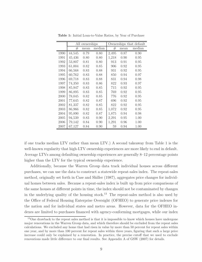
Table 1: Initial Loan-to-Value Ratios, by Year of Purchase
All ownerships Ownerships that default# mean median # mean median
1990 44,545 0.79 0.80 2,495 0.87 0.901991 45,436 0.80 0.80 1,218 0.90 0.951992 53,807 0.81 0.80 913 0.91 0.951993 61,004 0.82 0.85 906 0.92 0.951994 66,568 0.83 0.88 931 0.92 0.951995 60,762 0.83 0.88 850 0.94 0.971996 69,718 0.83 0.88 831 0.94 0.981997 74,350 0.83 0.86 822 0.93 0.971998 85,947 0.83 0.85 715 0.92 0.951999 86,895 0.83 0.85 769 0.92 0.952000 78,045 0.82 0.85 776 0.92 0.952001 77,645 0.82 0.87 696 0.92 0.952002 81,337 0.82 0.85 822 0.92 0.952003 86,966 0.82 0.85 1,072 0.92 0.952004 95,890 0.82 0.87 1,875 0.94 0.982005 94,539 0.83 0.90 2,291 0.95 1.002006 79,142 0.84 0.90 1,291 0.96 1.002007 67,127 0.84 0.90 59 0.94 1.00
if one tracks median LTV rather than mean LTV.) A second takeaway from Table 1 is the
well-known regularity that high-LTV ownership experiences are more likely to end in default.
Average LTVs among defaulting ownership experiences are generally 8–12 percentage points
higher than the LTV for the typical ownership experience.
Additionally, because the Warren Group data track individual houses across different
purchases, we can use the data to construct a statewide repeat-sales index. The repeat-sales
method, originally set forth in Case and Shiller (1987), aggregates price changes for individ-
ual homes between sales. Because a repeat-sales index is built up from price comparisons of
the same houses at different points in time, the index should not be contaminated by changes
in the underlying quality of the housing stock.13 The repeat-sales method is also used by
the Office of Federal Housing Enterprise Oversight (OFHEO) to generate price indexes for
the nation and for individual states and metro areas. However, data for the OFHEO in-
dexes are limited to purchases financed with agency-conforming mortgages, while our index
13One drawback to the repeat sales method is that it is impossible to know which houses have undergonemajor renovations in the Warren Group data, and which therefore should be excluded from the repeat salescalculations. We excluded any home that had risen in value by more than 50 percent for repeat sales withinone year, and by more than 100 percent for repeat sales within three years, figuring that such a large priceincrease could only be explained by a renovation. In practice, the precise cutoff that we used to excluderenovations made little difference to our final results. See Appendix A of GSW (2007) for details.
9

includes all home purchases in Massachusetts.14 Because agency-conforming mortgages are
generally prime mortgages, and because our paper focuses on subprime lending, the use
of a broader price index is important. In Appendix B, we compare our price index with
OFHEO’s, as well as with the S&P/Case-Shiller price index for Boston. The latter includes
homes purchased with both conforming and non-conforming mortgages, but only for the
Boston area. In general, all three indexes are in close agreement in the periods where they
overlap. However, the two indexes that include non-conforming mortgages (our statewide
index and the S&P/Case-Shiller index for Boston) show larger price declines during the
housing downturns of the early 1990s and the mid-to-late 2000s.
The wide coverage and breadth of variables in the Warren Group dataset make it
uniquely useful for housing research. However, the dataset does have some important short-
comings. The most significant is a lack of information on interest rates. Massachusetts law
does not require interest rates on fixed-rate loans to be recorded at deed registries. For
ARMs, interest rates are included in special riders to the main transaction records, but the
Warren Group has not yet transcribed this information electronically (with some exceptions
discussed below). Another disadvantage of the Warren Group dataset is that it does not
tell us when any particular mortgage is paid off, or discharged. The lack of information
on discharges prevents us from calculating the amount of cash-out refinancing at various
points.15 Finally, the Warren Group dataset does not include any demographic information
about borrowers, such as income, race, or previous credit history.
2.2 LoanPerformance Data
Most of our information on interest rates and other detailed mortgage characteristics
comes from FirstAmerican LoanPerformance (LP). This firm collects information on indi-
vidual loans that have been packaged into non-agency, mortgage-backed securities (MBS)
and sold to investors on the secondary mortgage market. We refer to two separate LP
14An agency-conforming mortgage is one that conforms to limits set for the two major government-sponsored agencies in the secondary mortgage market, the Federal Home Loan Mortgage Corporation(Freddie Mac) and the Federal National Mortgage Association (Fannie Mae). Agency-conforming mort-gages are generally prime mortgages that do not exceed a certain limit, which until recently was $417,000for single-family homes. Recently, Congress enacted a temporary raise of this limit to $729,750 in certainhigh-cost areas.
15Obviously, if a new mortgage is used to pay off an old one, then the amount of cash left over for thehomeowner will be much smaller than if the old mortgage remains on the books. Therefore, calculatingthe amount of equity taken out of the house with any degree of accuracy requires us to know when andif a particular mortgage is discharged. Discharges are officially registered at Massachusetts deeds officesand we are currently looking into ways of adding them to the Warren Group data. An obvious case wheredischarges can be inferred with the data we do have is when a house is sold, in which case all outstandingmortgages are discharged.
10
datasets in our research. The first is a loan-level dataset that the Boston Fed purchased
from LP in mid-2007. This dataset covers Massachusetts, Connecticut, and Rhode Island
from 1992 through August 2007.16 Elsewhere in this paper, we will refer to summary statis-
tics generated by a nationwide LP dataset that was purchased by the Board of Governors
of the Federal Reserve System in Washington, D.C., and used by research economists there.
The major strength of the LP dataset is its extensive loan-level information on interest
rates and other lending terms. It also contains information regarding the type of MBS each
loan was packaged into—subprime, Alt-A, or prime.17 In addition, the LP dataset also
includes information on borrowers. For approximately 97 percent of the loans in our sample
we know the borrower’s credit score. For 60 percent of the loans we know the debt-to-income
ratio (DTI), which is simply the borrower’s monthly debt payment divided by his monthly
income,18 while for virtually every loan in our sample we know the combined LTV ratio
implied by the size of the loan and the value of the house.19 A major shortcoming of the LP
dataset is the inability to create complete ownership experiences by matching loans made to
the same borrower on the same house. Also, the LP dataset has only limited information on
borrowers. Like the Warren Group dataset, the LP dataset does not include demographic
information such as race, education, or gender.20
2.3 Defining the “Subprime” Market
A paper discussing facts about the subprime market obviously needs a definition of “sub-
prime” lending, but there is no single way to define the subprime market. One description
could be based on the characteristics of borrowers. A subprime borrower could be some-
16To be specific, 1992 was the first year in which a pool of securitized mortgages was included in theLoanPerformance dataset. However, the mortgage pools sometimes include mortgages that were originatedwell before the securitization process was initiated. Thus, there are mortgages in the dataset that wereoriginated before 1992, but because of sample selection issues, we do not use any information from thosemortgages.
17The Alt-A classification is for loans whose riskiness falls between that of the subprime and primeclassifications. Because the LP data cover only non-agency securities, the prime loans included in the LPdata are typically jumbo loans. Jumbo loans exceed the federally mandated limit for securitization byFreddie Mac or Fannie Mae.
18This calculation includes the amount of the monthly mortgage payment, as well as other types of debt,such as credit card debt, car loans, education loans, and medical loans. In the housing-finance literature,this debt-to-income ratio is typically referred to as the “back-end” debt-to-income ratio. The “front-end”ratio involves only the home mortgage debt itself.
19The LTV ratio in the LoanPerformance data includes second mortgages, but (unlike the Warren Groupdataset) LP does not include home-equity loans or home equity lines of credit. For purchases, the value ofthe house is assumed to be the purchase price, while for refinances, the appraised value of the house is used.
20The LP dataset does contain zip codes, however, so demographic information can be matched to loansat the zip-code level. The same is true of the Warren Group data.
11

one who has missed a mortgage payment during the past year or two, who has filed for
bankruptcy in the past few years, or who has a low FICO score for other reasons. However,
as noted above, many borrowers with good credit scores also made use of the subprime
market, especially at the height of the housing boom. Alternatively, a subprime definition
could be based on lenders. Many lenders typically, but not exclusively, originated loans to
subprime borrowers, generally with high fees and interest rates. Yet these same lenders also
made loans to prime borrowers.21 Finally, we can construct a subprime designation using
information on characteristics of the loans. For example, we could define a subprime loan
to be a mortgage that was packaged into a subprime MBS.
The availability of different information in our two main datasets leads to different
definitions of the subprime market. The Warren Group dataset does not contain mortgage
interest rates or credit scores, so we use the identity of the lender to characterize individual
mortgages as subprime or prime. Our list of subprime lenders comes from the Department
of Housing and Urban Development (HUD), which has maintained a list of predominantly
subprime lenders since 1993. HUD bases this list on characteristics of lenders’ business
models that are generally associated with subprime lending.22 By standardizing this list
across years and matching it to the lender variable in the Warren Group dataset, we can
designate loans in this dataset as subprime or prime. A drawback of this approach is
that subprime lenders sometimes make prime loans. To get a sense of the misclassification
that the use of the HUD list is likely to generate, we checked our subprime classification
against interest rates in a small subsample of ARMs that the Warren Group had recorded
electronically. The results were gratifying. Of the mortgages in the Warren Group data
that were identified as subprime from the HUD list, and for which interest rate information
is available, approximately 93 percent had an initial rate of at least 200 basis points23 above
an equivalent prime mortgage rate, or had an associated margin of at least 350 basis points
above the typical benchmark interest rate used for determining subprime rates.24
21An example of such a firm is Countrywide.22Specifically, a lender makes the HUD list if most of its business is in refinance rather than purchase
loans, and if the lender does not sell a significant portion of its portfolio to the two government-sponsoredhousing agencies (Fannie Mae and Freddie Mac). Recently HUD has checked its subprime list againstthe designation of “high-cost” loans in a dataset generated by the Home Mortgage Disclosure Act, whichbegan tracking high-cost loans in 2004. This exercise has found that the HUD lender list is in generalagreement with the HMDA high-cost variable. The HUD list and supporting documentation is available athttp://www.huduser.org/datasets/manu.html.
23A basis point is one one-hundredth of a percentage point, so 200 basis points equals 2 percentage points.24More extensive robustness checks for the subprime classification in the Warren Group dataset are
found in Appendix B of GSW (2007). A “margin” on a subprime adjustable-rate mortgage is the constantdifference between a benchmark interest rate (typically 6-month LIBOR) and the “fully indexed” interestrate, which obtains when the subprime ARM is reset. We discuss the institutional details involved in thepricing of subprime adjustable-rate mortgages more extensively below.
12
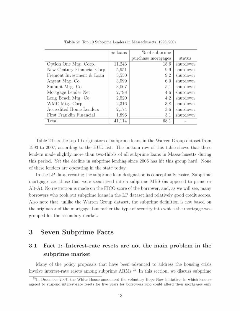
Table 2: Top 10 Subprime Lenders in Massachusetts, 1993–2007
# loans % of subprimepurchase mortgages status
Option One Mtg. Corp. 11,243 18.6 shutdownNew Century Financial Corp. 5,951 9.9 shutdownFremont Investment & Loan 5,550 9.2 shutdownArgent Mtg. Co. 3,599 6.0 shutdownSummit Mtg. Co. 3,067 5.1 shutdownMortgage Lender Net 2,798 4.6 shutdownLong Beach Mtg. Co. 2,520 4.2 shutdownWMC Mtg. Corp. 2,316 3.8 shutdownAccredited Home Lenders 2,174 3.6 shutdownFirst Franklin Financial 1,896 3.1 shutdownTotal 41,114 68.1 -
Table 2 lists the top 10 originators of subprime loans in the Warren Group dataset from
1993 to 2007, according to the HUD list. The bottom row of this table shows that these
lenders made slightly more than two-thirds of all subprime loans in Massachusetts during
this period. Yet the decline in subprime lending since 2006 has hit this group hard. None
of these lenders are operating in the state today.
In the LP data, creating the subprime loan designation is conceptually easier. Subprime
mortgages are those that were securitized into a subprime MBS (as opposed to prime or
Alt-A). No restriction is made on the FICO score of the borrower, and, as we will see, many
borrowers who took out subprime loans in the LP dataset had relatively good credit scores.
Also note that, unlike the Warren Group dataset, the subprime definition is not based on
the originator of the mortgage, but rather the type of security into which the mortgage was
grouped for the secondary market.
3 Seven Subprime Facts
3.1 Fact 1: Interest-rate resets are not the main problem in the
subprime market
Many of the policy proposals that have been advanced to address the housing crisis
involve interest-rate resets among subprime ARMs.25 In this section, we discuss subprime
25In December 2007, the White House announced the voluntary Hope Now initiative, in which lendersagreed to suspend interest-rate resets for five years for borrowers who could afford their mortgages only
13
resets and show that they were not the main cause of the subprime crisis. Thus, policies
that address resets are unlikely to reduce the severity of the foreclosure crisis. We divide our
discussion into two sections. First, we show that the role of resets in the subprime “business
model” is widely misunderstood. We then show that there is little relationship between the
timing of interest-rate resets and the timing of defaults.
3.1.1 The subprime business model
Proponents of the centrality of resets in the current crisis based their view on the fol-
lowing logic. Subprime hybrid ARMs offer borrowers extremely low “teaser” rates for some
initial period (usually two or three years) but then these mortgages “explode” to high rates
thereafter. Lenders find such loans attractive because of the high post-reset interest rates.
Borrowers find them attractive because of the teaser, but then regret their decisions when
they find themselves paying high interest rates. Is this an accurate description of the sub-
prime lending model? No.
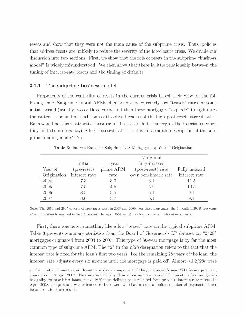
Table 3: Interest Rates for Subprime 2/28 Mortgages, by Year of Origination
Margin ofInitial 1-year fully-indexed
Year of (pre-reset) prime ARM (post-reset) rate Fully indexedOrigination interest rate rate over benchmark rate interest rate2004 7.3 3.9 6.1 11.52005 7.5 4.5 5.9 10.52006 8.5 5.5 6.1 9.12007 8.6 5.7 6.1 9.1
Note: The 2006 and 2007 cohorts of mortgages reset in 2008 and 2009. For these mortgages, the 6-month LIBOR two years
after origination is assumed to be 3.0 percent (the April 2008 value) to allow comparison with other cohorts.
First, there was never something like a low “teaser” rate on the typical subprime ARM.
Table 3 presents summary statistics from the Board of Governors’s LP dataset on “2/28”
mortgages originated from 2004 to 2007. This type of 30-year mortgage is by far the most
common type of subprime ARM. The “2” in the 2/28 designation refers to the fact that the
interest rate is fixed for the loan’s first two years. For the remaining 28 years of the loan, the
interest rate adjusts every six months until the mortgage is paid off. Almost all 2/28s were
at their initial interest rates. Resets are also a component of the government’s new FHASecure program,announced in August 2007. This program initially allowed borrowers who were delinquent on their mortgagesto qualify for new FHA loans, but only if these delinquencies resulted from previous interest-rate resets. InApril 2008, the program was extended to borrowers who had missed a limited number of payments eitherbefore or after their resets.
14

fully-amortized, meaning that the borrower repays some of the principal with every monthly
payment. Table 3 shows that the initial interest rate for subprime 2/28s ranged from 7.3
percent in 2004 to 8.6 percent in 2007. These initial rates are not low; on the contrary,
they are quite high. As the table shows, 2/28 borrowers paid rates that were about three
full percentage points higher than rates on the closest prime equivalent, a one-year prime
ARM. In short, subprime lenders did not need to wait until the resets occurred in order to
profit from these loans.
Second, the interest-rate adjustments at reset, while not trivial, were not “explosive.”
The “fully indexed” rate on a subprime 2/28 mortgage—the rate paid after the initial
interest rate expired—typically equaled a benchmark rate plus a fixed margin. Most often,
the benchmark interest rate was the 6-month London Interbank Offered Rate (LIBOR), and
the margin was about 6 percentage points. Table 3 illustrates the calculation, showing both
the average margin and the average fully indexed rates. When the 2004 cohort of mortgages
reset in 2006, the 6-month LIBOR was around 5 percent, so a margin of about 6 percentage
points generated fully indexed rates that averaged 11.3 percent. Similar numbers hold for
the 2005 loans, which reset in 2007.
A comparison of the first and last columns of Table 3 shows that the the fully indexed
interest rates were about three to four percentage points higher than initial rates for mort-
gages originated in 2004 and 2005. This would lead to a monthly payment increase, or
“payment shock,” of about 25 percent. While sizable, this payment shock is small com-
pared to, say, payment shocks in the credit card market, where interest rates can easily
increase by a factor of five when teaser rates expire. In addition, a simple comparison of
pre- and post-reset interest rates on 2/28 mortgages typically overstates the payment shocks
experienced by people who bought homes with subprime mortgages. During the height of
the housing boom, many subprime purchasers also used second mortgages (“piggybacks”)
when they bought their homes, because they did not make downpayments of at least 20 per-
cent. These second mortgages had high interest rates and short amortization schedules, so
they accounted for a disproportionate share of a borrower’s monthly house payment. More-
over, these mortgages were almost always fixed-rate loans, so they were not affected when
the interest rate adjusted on the main subprime loan. The presence of second mortgages
therefore limited the percentage increase in a borrower’s house payment that was caused by
the interest rate reset of the main 2/28 mortgage. Specifically, a reset on a 2/28 mortgage
only affected about 60 percent of the typical borrower’s monthly payment.26
26Consider a borrower with a $100,000 30-year first mortgage with an initial rate of 8.5 percent anda $25,000 10-year second mortgage with a contract rate of 12 percent. The initial payment on the firstmortgage is $776 and on the second is $358, making the pre-reset payment $1134 a month. At reset, assumethat the rate on the first mortgage jumps to 11 percent, so the payment on the first mortgage jumps by 22
15
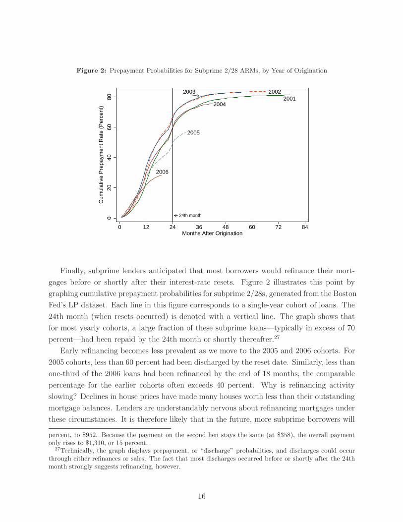
Figure 2: Prepayment Probabilities for Subprime 2/28 ARMs, by Year of Origination
2005
2006
20042001
20022003
24th month020
4060
80
0 12 24 36 48 60 72 84Months After Origination
Cum
ulat
ive
Pre
paym
ent R
ate
(Per
cent
)
Finally, subprime lenders anticipated that most borrowers would refinance their mort-
gages before or shortly after their interest-rate resets. Figure 2 illustrates this point by
graphing cumulative prepayment probabilities for subprime 2/28s, generated from the Boston
Fed’s LP dataset. Each line in this figure corresponds to a single-year cohort of loans. The
24th month (when resets occurred) is denoted with a vertical line. The graph shows that
for most yearly cohorts, a large fraction of these subprime loans—typically in excess of 70
percent—had been repaid by the 24th month or shortly thereafter.27
Early refinancing becomes less prevalent as we move to the 2005 and 2006 cohorts. For
2005 cohorts, less than 60 percent had been discharged by the reset date. Similarly, less than
one-third of the 2006 loans had been refinanced by the end of 18 months; the comparable
percentage for the earlier cohorts often exceeds 40 percent. Why is refinancing activity
slowing? Declines in house prices have made many houses worth less than their outstanding
mortgage balances. Lenders are understandably nervous about refinancing mortgages under
these circumstances. It is therefore likely that in the future, more subprime borrowers will
percent, to $952. Because the payment on the second lien stays the same (at $358), the overall paymentonly rises to $1,310, or 15 percent.
27Technically, the graph displays prepayment, or “discharge” probabilities, and discharges could occurthrough either refinances or sales. The fact that most discharges occurred before or shortly after the 24thmonth strongly suggests refinancing, however.
16
hit their resets and be forced to pay fully indexed rates.
While any increase in interest rates is bad news for borrowers, there is some cause for
optimism regarding the effect of future resets on today’s subprime borrowers. The first is
that the short-term interest rates on which post-reset rates are based have recently declined,
from 5.25 percent in early 2007 to less than 3 percent today. With margins of around 6
percentage points, fully indexed rates should therefore reset to around 9 percent in mid-
2008. This rate is quite close to the initial rate of about 8.5 percent relevant for subprime
2/28’s originated in 2006 and 2007.28 Secondly, new policy initiatives will also help mitigate
the effect of resets, by extending initial interest rates, or by allowing borrowers to refinance
into FHA loans.
3.1.2 Resets and foreclosures
On balance, however, we believe that subprime mortgages will continue to experience
high default and delinquency rates in 2008, because problems in the subprime market are
much broader than the problem of resetting interest rates. A very simple way to see this is
to note that the performance of fixed-rate subprime mortgages is also deteriorating. Figure
3 presents delinquency rates rates for subprime ARMs and FRMs in the United States,
as measured by the Mortgage Bankers Association. Until mid-2007, delinquency rates for
FRMs had not risen as much as those for ARMs. A common (but incorrect29) reading of this
pattern was that subprime FRMs were doing fine and the interest-rate resets of subprime
ARMs were causing all the trouble. In any case, past-due rates for FRMs have also started
rising, indicating that the problem is broader than resets alone.
An even more persuasive argument against a reset-based view of subprime problems
comes from noting that subprime borrowers typically fall behind on their mortgage payments
before their resets occur. Figure 4 displays default probabilities for three cohorts of the
subprime 2/28s from the Boston Fed’s LP dataset.30 Each line in the graph corresponds to
the default probability for a particular yearly cohort of loans. Default probabilities typically
28The bottom two rows of Table 3 assume that the short-term interest rates remain where they are nowfor the rest of 2008 and 2009. This is done to allow comparisons in post-reset interest rates across differentyearly cohorts.
29The series graphed in Figure 3 are past-due rates, so they can change either because of a change inthe number of past-due loans (the numerator of the past-due rate) or because a change in the number ofoutstanding loans (the denominator of the rate). A large number of subprime FRMs became delinquentbefore mid-2007, but this increase did not show up in the FRM past-due rate because of a coincident increasein the number of outstanding FRM loans. Because both the numerator and the denominator of the FRMpast-due rate were rising at the same time, problems among subprime FRMs were not apparent in simpleplots of the past-due rate. Given the increase in the FRM past-due rate since mid-2007, however, this is amoot point, so we do not elaborate on it further.
30Recall that this is a loan-level dataset covering only Massachusetts, Rhode Island, and Connecticut.
17
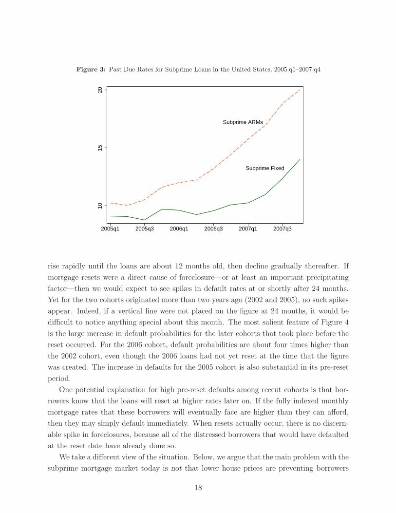
Figure 3: Past Due Rates for Subprime Loans in the United States, 2005:q1–2007:q4
Subprime ARMs
Subprime Fixed
1015
20
2005q1 2005q3 2006q1 2006q3 2007q1 2007q3
rise rapidly until the loans are about 12 months old, then decline gradually thereafter. If
mortgage resets were a direct cause of foreclosure—or at least an important precipitating
factor—then we would expect to see spikes in default rates at or shortly after 24 months.
Yet for the two cohorts originated more than two years ago (2002 and 2005), no such spikes
appear. Indeed, if a vertical line were not placed on the figure at 24 months, it would be
difficult to notice anything special about this month. The most salient feature of Figure 4
is the large increase in default probabilities for the later cohorts that took place before the
reset occurred. For the 2006 cohort, default probabilities are about four times higher than
the 2002 cohort, even though the 2006 loans had not yet reset at the time that the figure
was created. The increase in defaults for the 2005 cohort is also substantial in its pre-reset
period.
One potential explanation for high pre-reset defaults among recent cohorts is that bor-
rowers know that the loans will reset at higher rates later on. If the fully indexed monthly
mortgage rates that these borrowers will eventually face are higher than they can afford,
then they may simply default immediately. When resets actually occur, there is no discern-
able spike in foreclosures, because all of the distressed borrowers that would have defaulted
at the reset date have already done so.
We take a different view of the situation. Below, we argue that the main problem with the
subprime mortgage market today is not that lower house prices are preventing borrowers
18
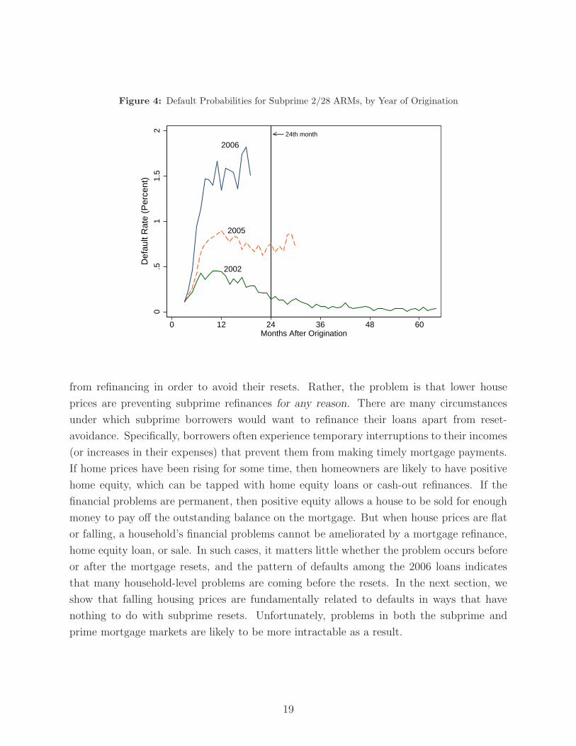
Figure 4: Default Probabilities for Subprime 2/28 ARMs, by Year of Origination
2006
2005
2002
24th month
0.5
11.
52
0 12 24 36 48 60Months After Origination
Def
ault
Rat
e (P
erce
nt)
from refinancing in order to avoid their resets. Rather, the problem is that lower house
prices are preventing subprime refinances for any reason. There are many circumstances
under which subprime borrowers would want to refinance their loans apart from reset-
avoidance. Specifically, borrowers often experience temporary interruptions to their incomes
(or increases in their expenses) that prevent them from making timely mortgage payments.
If home prices have been rising for some time, then homeowners are likely to have positive
home equity, which can be tapped with home equity loans or cash-out refinances. If the
financial problems are permanent, then positive equity allows a house to be sold for enough
money to pay off the outstanding balance on the mortgage. But when house prices are flat
or falling, a household’s financial problems cannot be ameliorated by a mortgage refinance,
home equity loan, or sale. In such cases, it matters little whether the problem occurs before
or after the mortgage resets, and the pattern of defaults among the 2006 loans indicates
that many household-level problems are coming before the resets. In the next section, we
show that falling housing prices are fundamentally related to defaults in ways that have
nothing to do with subprime resets. Unfortunately, problems in both the subprime and
prime mortgage markets are likely to be more intractable as a result.
19

3.2 Fact 2: Higher foreclosure rates stem from falling house prices
The easiest way to show the tight link between house prices and foreclosures is to plot
the data, as is done in Figure 5. The foreclosure rate is calculated directly from the Warren
Group data, and house price growth is based on the repeat-sales index we constructed
from the same dataset. The figure shows that Massachusetts house prices declined in the
early 1990s and late 2000s, precisely the times when foreclosures rose. In this section,
we provide evidence that this relationship is causal, in that falling housing prices cause
foreclosures. While a causal relationship between prices and foreclosures is a long-standing
tenet of housing research, we also argue that this relationship is more complex than it is
typically modelled in the literature.
Figure 5: Foreclosures and Housing Prices in Massachusetts, 1990:q1–2008:q1
Foreclosure Rate (left scale)
House Price Appreciation (right scale)
−10
−5
05
1015
4−Q
tr C
hang
e in
Hou
se P
rices
(P
erce
nt)
0.0
5.1
.15
For
eclo
sure
Rat
e (P
erce
nt)
1990q1 1993q1 1996q1 1999q1 2002q1 2005q1 2008q1Quarter
3.2.1 Falling prices, negative equity, and foreclosures
There are strong theoretical reasons to believe that falling house prices lead to rising
foreclosures. Lower prices increase the likelihood that a borrower has negative equity, which
occurs when the outstanding balance on the mortgage exceeds the value of the house.
Negative equity, in turn, is a necessary condition for default. A borrower whose house
is worth more than the mortgage can always sell the home, discharge the mortgage, and
20
pocket the difference. The only reason someone would find themselves in foreclosure is if
they had negative equity and could not retire the mortgage with a profitable sale.
The experience of the Massachusetts housing market during the 2001 recession pro-
vides striking support for the view that because negative equity is a necessary condition
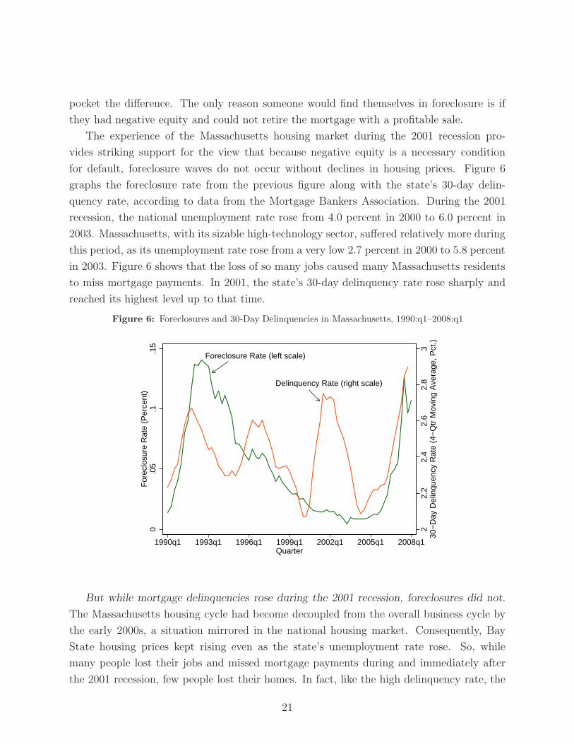
for default, foreclosure waves do not occur without declines in housing prices. Figure 6
graphs the foreclosure rate from the previous figure along with the state’s 30-day delin-
quency rate, according to data from the Mortgage Bankers Association. During the 2001
recession, the national unemployment rate rose from 4.0 percent in 2000 to 6.0 percent in
2003. Massachusetts, with its sizable high-technology sector, suffered relatively more during
this period, as its unemployment rate rose from a very low 2.7 percent in 2000 to 5.8 percent
in 2003. Figure 6 shows that the loss of so many jobs caused many Massachusetts residents
to miss mortgage payments. In 2001, the state’s 30-day delinquency rate rose sharply and
reached its highest level up to that time.
Figure 6: Foreclosures and 30-Day Delinquencies in Massachusetts, 1990:q1–2008:q1
Foreclosure Rate (left scale)
Delinquency Rate (right scale)
22.
22.
42.
62.
83
30−
Day
Del
inqu
ency
Rat
e (4
−Q
tr M
ovin
g A
vera
ge, P
ct.)
0.0
5.1
.15
For
eclo
sure
Rat
e (P
erce
nt)
1990q1 1993q1 1996q1 1999q1 2002q1 2005q1 2008q1Quarter
But while mortgage delinquencies rose during the 2001 recession, foreclosures did not.
The Massachusetts housing cycle had become decoupled from the overall business cycle by
the early 2000s, a situation mirrored in the national housing market. Consequently, Bay
State housing prices kept rising even as the state’s unemployment rate rose. So, while
many people lost their jobs and missed mortgage payments during and immediately after
the 2001 recession, few people lost their homes. In fact, like the high delinquency rate, the
21
Massachusetts foreclosure rate also set a record in 2001 — but in the opposite direction,
as foreclosures fell in 2001 to their their lowest level up to that time period. As theory
would predict, without a drop in house prices that generates a large number of homeowners
with negative equity, foreclosures will not rise. Owners will refinance or sell their homes in
response to income shocks that cause them to miss mortgage payments.31
3.2.2 Estimates of the effect of falling house prices on foreclosures
The preceding figures illustrate the close relationship between falling house prices and
foreclosures at the aggregate level. Because the Warren Group data include information
on individual ownership experiences, we are also able to estimate the direct effect of house
prices, or, more specifically, accumulated house price appreciation, on individual foreclo-
sures. Homeowners purchase their houses at different times, so two owners with otherwise
similar houses, living in the same neighborhood, have typically accumulated different lev-
els of house price appreciation. These differences in accumulated appreciation turn out to
be strong predictors of foreclosure. Figure 7 shows quarterly foreclosure probabilities for
homes with different levels of cumulative house price appreciation in the Warren Group
data. A borrower who has seen his property’s value fall by more than 20 percent since the
initial purchase is more than 15 times more likely to lose the home to foreclosure relative
to someone who has seen his property appreciate by 20 percent.
The econometric model of GSW (2007) allows a more precise estimate of the house-
price effect on foreclosures by controlling directly for other observable variables, such as
initial LTV ratios, neighborhood characteristics, interest and unemployment rates, and the
type of residence (that is, single-family, condominium, or multi-family). This model also
allows counterfactual experiments; for example, we can ask what foreclosures for a particular
purchase-year cohort of homes would have looked like if this cohort had enjoyed a different
level of house price appreciation. Figure 8 explores what would have happened to the 2005
cohort of borrowers had their homes appreciated as much as the 2002 borrowers’ homes,
all other factors held constant. The solid lines in this figure show that, in reality, the two
cohorts have displayed strikingly different foreclosure probabilities. Owners from the 2005
cohort, who bought at the peak of the recent housing boom, are defaulting much more often
than those from the 2002 cohort, who have enjoyed substantial house-price appreciation.
However, the econometric model implies that foreclosures among the 2005 cohort would
have more closely resembled the experience of the 2002 pool had the 2005 cohort enjoyed
31A practical implication of this fact is that the amount of home equity “destroyed” in foreclosure wavesis likely to be limited. If homeowners have much equity in their homes to lose, then foreclosures are unlikelyto occur in the first place.
22
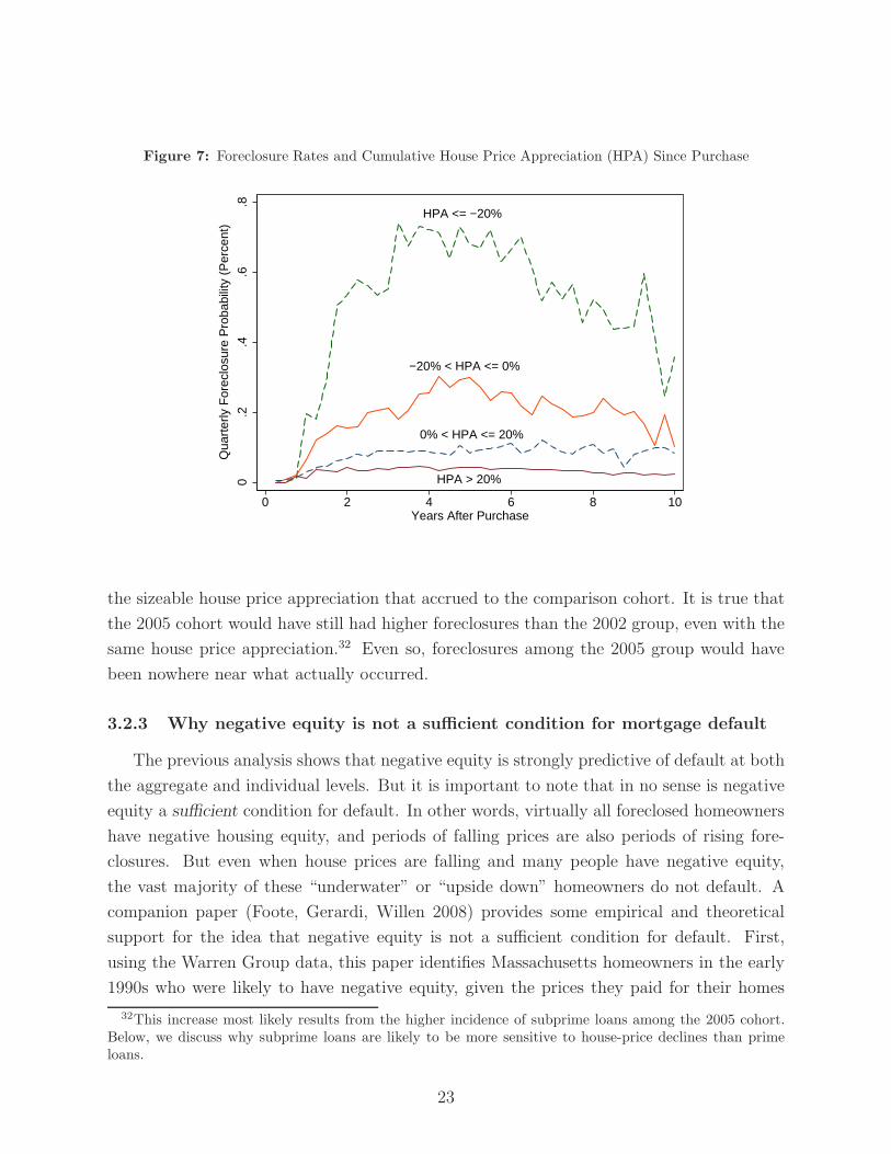
Figure 7: Foreclosure Rates and Cumulative House Price Appreciation (HPA) Since Purchase
HPA <= −20%
−20% < HPA <= 0%
0% < HPA <= 20%
HPA > 20%0.2
.4.6
.8
0 2 4 6 8 10Years After Purchase
Qua
rter
ly F
orec
losu
re P
roba
bilit
y (P
erce
nt)
the sizeable house price appreciation that accrued to the comparison cohort. It is true that
the 2005 cohort would have still had higher foreclosures than the 2002 group, even with the
same house price appreciation.32 Even so, foreclosures among the 2005 group would have
been nowhere near what actually occurred.
3.2.3 Why negative equity is not a sufficient condition for mortgage default
The previous analysis shows that negative equity is strongly predictive of default at both
the aggregate and individual levels. But it is important to note that in no sense is negative
equity a sufficient condition for default. In other words, virtually all foreclosed homeowners
have negative housing equity, and periods of falling prices are also periods of rising fore-
closures. But even when house prices are falling and many people have negative equity,
the vast majority of these “underwater” or “upside down” homeowners do not default. A
companion paper (Foote, Gerardi, Willen 2008) provides some empirical and theoretical
support for the idea that negative equity is not a sufficient condition for default. First,
using the Warren Group data, this paper identifies Massachusetts homeowners in the early
1990s who were likely to have negative equity, given the prices they paid for their homes
32This increase most likely results from the higher incidence of subprime loans among the 2005 cohort.Below, we discuss why subprime loans are likely to be more sensitive to house-price declines than primeloans.
23
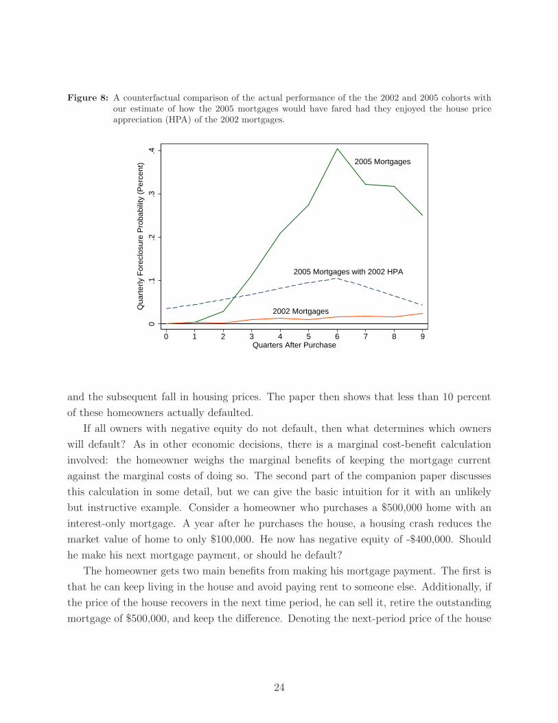
Figure 8: A counterfactual comparison of the actual performance of the the 2002 and 2005 cohorts withour estimate of how the 2005 mortgages would have fared had they enjoyed the house priceappreciation (HPA) of the 2002 mortgages.
2005 Mortgages
2002 Mortgages
2005 Mortgages with 2002 HPA
0.1
.2.3
.4
0 1 2 3 4 5 6 7 8 9Quarters After Purchase
Qua
rter
ly F
orec
losu
re P
roba
bilit
y (P
erce
nt)
and the subsequent fall in housing prices. The paper then shows that less than 10 percent
of these homeowners actually defaulted.
If all owners with negative equity do not default, then what determines which owners
will default? As in other economic decisions, there is a marginal cost-benefit calculation
involved: the homeowner weighs the marginal benefits of keeping the mortgage current
against the marginal costs of doing so. The second part of the companion paper discusses
this calculation in some detail, but we can give the basic intuition for it with an unlikely
but instructive example. Consider a homeowner who purchases a $500,000 home with an
interest-only mortgage. A year after he purchases the house, a housing crash reduces the
market value of home to only $100,000. He now has negative equity of -$400,000. Should
he make his next mortgage payment, or should he default?
The homeowner gets two main benefits from making his mortgage payment. The first is
that he can keep living in the house and avoid paying rent to someone else. Additionally, if
the price of the house recovers in the next time period, he can sell it, retire the outstanding
mortgage of $500,000, and keep the difference. Denoting the next-period price of the house
24
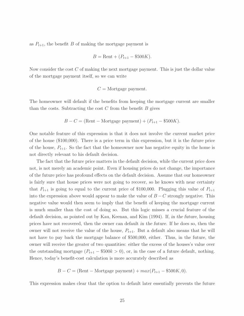
as Pt+1, the benefit B of making the mortgage payment is
B = Rent + (Pt+1 − $500K).
Now consider the cost C of making the next mortgage payment. This is just the dollar value
of the mortgage payment itself, so we can write
C = Mortgage payment.
The homeowner will default if the benefits from keeping the mortgage current are smaller
than the costs. Subtracting the cost C from the benefit B gives
B − C = (Rent − Mortgage payment) + (Pt+1 − $500K).
One notable feature of this expression is that it does not involve the current market price
of the house ($100,000). There is a price term in this expression, but it is the future price
of the house, Pt+1. So the fact that the homeowner now has negative equity in the home is
not directly relevant to his default decision.
The fact that the future price matters in the default decision, while the current price does
not, is not merely an academic point. Even if housing prices do not change, the importance
of the future price has profound effects on the default decision. Assume that our homeowner
is fairly sure that house prices were not going to recover, so he knows with near certainty
that Pt+1 is going to equal to the current price of $100,000. Plugging this value of Pt+1
into the expression above would appear to make the value of B −C strongly negative. This
negative value would then seem to imply that the benefit of keeping the mortgage current
is much smaller than the cost of doing so. But this logic misses a crucial feature of the
default decision, as pointed out by Kau, Keenan, and Kim (1994). If, in the future, housing
prices have not recovered, then the owner can default in the future. If he does so, then the
owner will not receive the value of the house, Pt+1. But a default also means that he will
not have to pay back the mortgage balance of $500,000, either. Thus, in the future, the
owner will receive the greater of two quantities: either the excess of the houses’s value over
the outstanding mortgage (Pt+1 − $500k > 0), or, in the case of a future default, nothing.
Hence, today’s benefit-cost calculation is more accurately described as
B − C = (Rent − Mortgage payment) + max(Pt+1 − $500K, 0).
This expression makes clear that the option to default later essentially prevents the future
25

“capital gain” term in the owner’s default decision from falling below zero. If this term
cannot fall below zero, then the entire expression B − C is much less likely to be negative,
and the probability of a default today is sharply reduced.
Two remarks are useful here. First, the reluctance of the homeowner to default in this
case has nothing to do with any transactions costs of defaulting. Even if the homeowner
faced no social or financial stigma from default (such as a lower credit score), he is still
better off keeping the mortgage current as long as the benefit-cost calculation above works
in favor of doing so. Second, it is true that the owner in our example could default on his
mortgage, and buy an otherwise identical house for only $100,000. He would then pay a
smaller monthly mortgage payment. However, as long as keeping his current home makes
sense given the cost-benefit calculation above, then he should purchase the additional home
and rent it out while keeping his current one. The fact that the second house is a “better
deal” than the first in no way reduces the profitability of keeping the first one.
3.2.4 Understanding why some people default and others do not
The benefit-cost logic of the previous subsection, sometimes called the frictionless option
model, is well-known in the housing finance literature. Even so, housing researchers have run
into trouble when confronting this theoretical model with empirical data. Specifically, in the
real world, borrowers with negative equity who appear to face the exact same benefit-cost
calculation often default at different rates. The challenge for housing research is to explain
this individual-level variation in default probabilities.
Much of the recent literature addresses this problem by positing that some homeowners
are more cold-hearted than others. While some homeowners might have qualms about
walking away from their mortgages—even if the benefit-cost calculation above implies that
default is the most profitable option—other homeowners may have no such qualms. This
explanation is sometimes called the “ruthless default” model, because it predicts that only
ruthless people are able to bear the psychic costs of dishonoring their debts or the emotional
toll of leaving their homes.33 A similar tack is taken by researchers who introduce other
costs into the cost-benefit calculation. Such costs might include moving expenses, or the
adverse consequences of damaged credit scores. If these more tangible costs of default vary
within a group of individuals, then default probabilities of these individuals will also vary.
We take a different approach to the problem, an approach we believe proves useful in
understanding the high rate of subprime defaults witnessed today. Empirical data often
show that individual default probabilities rise when the owner is both in a position of
33For a review of this literature, see Vandell (1995).
26
negative equity and is going through a difficult financial period, such as an enduring spell of
unemployment or elevated expenses. This empirical pattern is hard to reconcile with cost-
based explanations of default probabilities. For example, why should “more ruthless” people,
or people who face lower tangible default costs, be more likely to experience unemployment
or high medical costs? However, this empirical finding does suggest a theory of varying
default probabilities that is based on differences in the perceived benefits of staying in the
home. This theory posits that the benefits of staying in the home vary because the capital-
gain term in the cost-benefit calculation above is valued differently by different people.34
The previous benefit-cost calculation assumes that the homeowner values a dollar in the
next period the same as he values a dollar today. This approximation will be closer to
the truth for some homeowners than for others. Owners with stable jobs and some rainy-
day savings in the bank can afford to be patient with respect to future capital gains. In
economic terms, these owners have low discount rates, meaning that they do not value a
dollar in the future much less than they value a dollar today. Other homeowners are likely
to be in a different situation with respect to how they value the future versus the present.
Homeowners who have lost their jobs and have few financial resources to draw on are likely
to attach a steep discount to future payoffs. These homeowners need money now—not
later—so they are quite willing to give up potential future payoffs in return for current
gains.35 The high discount rates of these owners reduce their valuation of the expected
capital gain term above. If such owners are able to find places to live that cost less than
their current mortgage payments, then the loss of potential capital gain is less likely to keep
them from defaulting.
We can illustrate this implication with a concrete and realistic example. Consider some-
one who purchased a home in Massachusetts for $250,000 in 1989, which was the peak of the
state’s late-1980s/early-1990s housing cycle. By early 1993, this homeowner was likely to be
far underwater on his mortgage, because housing prices fell on average by nearly 25 percent
from 1989 to 1993. Fortunately, for this owner, large house price appreciation was soon to
accrue. Massachusetts housing prices started rising again in the late 1990s, and by 2007,
a house purchased for $250,000 in 1989 was worth $505,000, according to our repeat-sales
price index. Unfortunately, back in 1992, not every Massachusetts homeowner with negative
34In addition to the companion paper (Foote, Gerardi, Willen 2008), the following theoretical explanationis spelled out more formally in GSW (2007).
35In economic terms, homeowners who are unemployed and without savings are liquidity constrained,because they cannot access liquid funds easily or cheaply. The rate at which they discount future payoffsis essentially the rate at which they can borrow, and if they can only borrow on credit cards, then theirdiscount rates can easily exceed 20 percent. By contrast, for a homeowner with savings, the opportunitycost of consuming today versus the future is the rate of return on his savings; or, in economic terms, thecost of borrowing from himself. His discount rate is therefore much lower.
27

equity had the financial wherewithal to stay in his home, because of the severe effects of the
early 1990s recession. Those underwater owners who had lost their jobs and did not have
adequate precautionary savings did not have the luxury of weathering the drop in housing
prices in hopes of reaping price gains at a later date. Consequently, for these owners, the
future benefits of staying in the home were smaller than the immediate payoffs of default,
so they defaulted.
In short, we believe that it is more accurate to view differences in default probabilities
among owners with negative equity as a function of how these owners view the future payoffs
of staying in their homes, not in how they value the present costs of default. This line of
thinking is particularly useful for understanding today’s subprime foreclosure crisis. As
we will see, the subprime market essentially created a class of mortgage borrowers whose
ownership experiences were exceptionally sensitive to whether house prices were rising or
declining. When housing prices fell, subprime owners were more likely to experience negative
equity. And when negative equity occurred, subprime owners were more likely than other
underwater homeowners to default. To flesh out this story, we must understand more about
the risk characteristics of subprime loans, a task we take up in the next section.
3.3 Fact 3: Prime lenders would have rejected most of the loans
originated by subprime lenders
In popular accounts, the subprime market is primarily defined as one that serves borrow-
ers with poor credit histories.36 Yet the subprime mortgage market cannot be characterized
along the single dimension of borrower credit quality, because subprime loans were riskier
than prime loans for a number of other reasons as well.
Figure 9 presents information on the risk characteristics of subprime loans in Connecti-
cut, Massachusetts, and Rhode Island, as measured by the Boston Fed’s LoanPerformance
dataset. The upper left panel focuses on FICO scores. The higher line in the figure is simply
the fraction of subprime borrowers that had a FICO score of 620 or higher. This fraction
rises from slightly less than 40 percent in 1999 to around 70 percent by 2004. Increases in
the fraction of high-FICO borrowers in subprime pools have also been found in other na-
tionwide datasets. These increases suggest that the quality of the subprime pool is getting
better over time.
Yet plotting average credit scores presents an incomplete picture of the riskiness of
subprime loans along other relevant dimensions. The lower line in the upper left panel of
36As noted in the introduction, the dividing line that typically places a borrower in the subprime class isa FICO score of 620 or lower.
28
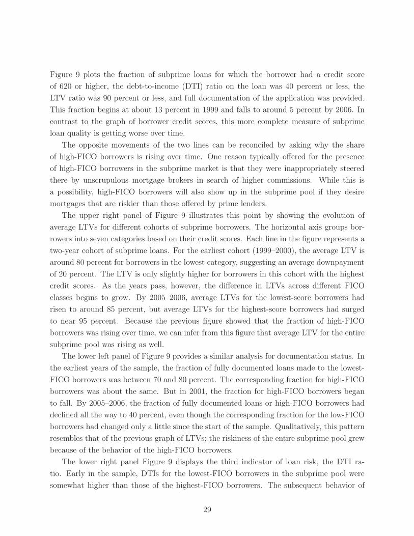
Figure 9 plots the fraction of subprime loans for which the borrower had a credit score
of 620 or higher, the debt-to-income (DTI) ratio on the loan was 40 percent or less, the
LTV ratio was 90 percent or less, and full documentation of the application was provided.
This fraction begins at about 13 percent in 1999 and falls to around 5 percent by 2006. In
contrast to the graph of borrower credit scores, this more complete measure of subprime
loan quality is getting worse over time.
The opposite movements of the two lines can be reconciled by asking why the share
of high-FICO borrowers is rising over time. One reason typically offered for the presence
of high-FICO borrowers in the subprime market is that they were inappropriately steered
there by unscrupulous mortgage brokers in search of higher commissions. While this is
a possibility, high-FICO borrowers will also show up in the subprime pool if they desire
mortgages that are riskier than those offered by prime lenders.
The upper right panel of Figure 9 illustrates this point by showing the evolution of
average LTVs for different cohorts of subprime borrowers. The horizontal axis groups bor-
rowers into seven categories based on their credit scores. Each line in the figure represents a
two-year cohort of subprime loans. For the earliest cohort (1999–2000), the average LTV is
around 80 percent for borrowers in the lowest category, suggesting an average downpayment
of 20 percent. The LTV is only slightly higher for borrowers in this cohort with the highest
credit scores. As the years pass, however, the difference in LTVs across different FICO
classes begins to grow. By 2005–2006, average LTVs for the lowest-score borrowers had
risen to around 85 percent, but average LTVs for the highest-score borrowers had surged
to near 95 percent. Because the previous figure showed that the fraction of high-FICO
borrowers was rising over time, we can infer from this figure that average LTV for the entire
subprime pool was rising as well.
The lower left panel of Figure 9 provides a similar analysis for documentation status. In
the earliest years of the sample, the fraction of fully documented loans made to the lowest-
FICO borrowers was between 70 and 80 percent. The corresponding fraction for high-FICO
borrowers was about the same. But in 2001, the fraction for high-FICO borrowers began
to fall. By 2005–2006, the fraction of fully documented loans or high-FICO borrowers had
declined all the way to 40 percent, even though the corresponding fraction for the low-FICO
borrowers had changed only a little since the start of the sample. Qualitatively, this pattern
resembles that of the previous graph of LTVs; the riskiness of the entire subprime pool grew
because of the behavior of the high-FICO borrowers.
The lower right panel Figure 9 displays the third indicator of loan risk, the DTI ra-
tio. Early in the sample, DTIs for the lowest-FICO borrowers in the subprime pool were
somewhat higher than those of the highest-FICO borrowers. The subsequent behavior of
29

Figure 9: Alternative Measures of Risk in the Subprime Pool. Figures are generated from all newly originated subprimemortgages in the Boston Fed’s LP dataset, including both purchase and refinance loans.
Fraction of new subprime borrowers with FICO score of 620 or higher
Fraction of new subprime borrowers with FICO score of 620 or higher,debt−to−income ratio of 40% or less,
loan−to−value ratio of 90% or less,and full documentation
0.1
.2.3
.4.5
.6.7
1999 2000 2001 2002 2003 2004 2005 2006Year
Fra
ctio
n of
Sub
prim
e B
orro
wer
s
Distribution of FICO Scores
1999−2000
2001−2002
2003−2004
2005−2006
8085
9095
Ave
rage
Com
bine
d Lo
an−
to−
Val
ue R
atio
(P
erce
nt)
< 540 [540,580) [580,620) [620,660) [660,700) [700,740) >= 740
FICO score
Loan−to−Value Ratios
1999−2000
2001−2002
2003−2004
2005−2006
.3.4
.5.6
.7.8
Fra
ctio
n of
Ful
ly D
ocum
ente
d Lo
ans
< 540 [540,580) [580,620) [620,660) [660,700) [700,740) >= 740
FICO score
Documentation Status
1999−2000
2001−2002
2003−2004
2005−2006
3638
4042
44A
vera
ge D
ebt−
to−
Inco
me
Rat
io (
Per
cent
)
< 540 [540,580) [580,620) [620,660) [660,700) [700,740) >= 740
FICO score
Debt−to−Income Ratios
30
this characteristic is different than that of the previous two characteristics, in that DTIs
deteriorated for borrowers of all FICO classes, not just the high-FICO borrowers. By the
end of the housing boom, average DTIs for all borrowers reached more than 42 percent.
Taken together, the three risk characteristics—LTVs, documentation status, and DTIs—
tell a consistent story. All of these indicators moved in the direction of greater risk as the
housing boom progressed and house prices moved higher. For LTVs and documentation
status, most of this movement was caused by borrowers with high credit scores who were
entering the subprime pool in larger numbers. In all likelihood, it would have been im-
possible for these borrowers to find prime lenders willing to make loans as risky as the
subprime loans they eventually obtained. Prime lenders would have required larger down-
payments, they would have insisted on lower DTI ratios, and they would have demanded
better documentation of income and assets.
From a policy perspective, a crucial question is whether some of the high-FICO borrowers
were inappropriately steered into loans whose risk characteristics made them unattractive
for the cheaper prime market. It is possible that little such coercion occurred. Mortgage
brokers may have simply found subprime lenders that were willing to make the loans that
high-FICO borrowers themselves had determined were appropriate, given the market prices
of the homes that these borrowers hoped to purchase. As housing prices moved higher,
perhaps the high-FICO borrowers felt comfortable buying increasingly expensive homes,
even though these purchases could only be financed with risky mortgages. We return to
this issue when we discuss some outstanding questions in the conclusion of the paper.
In any case, the problem of “potentially prime” borrowers stuck in subprime loans is
mitigated by the risk-based pricing models used by most subprime lenders. Using the LP
data, we calculated the percentage of subprime loans for owner-occupied homes that had
an LTV cutoff of 90 percent or below, that were fully documented, that had borrower FICO
scores of 620 or higher, and had a DTI of 45 percent or less. About 9.6 percent of the
subprime mortgages in the LP data met all of these criteria, so about 10 percent of the
borrowers with outstanding subprime loans could qualify for prime loans. The important
question is whether these borrowers are paying the onerous terms typically associated with
subprime loans. Of these borrowers, approximately 65 percent have a fixed interest rates.
Furthermore, the average initial interest rate for these loans is 6.7 percent, the median
is 6.6 percent, and the 90th percentile rate is 7.9 percent. By contrast, only 29 percent
of all subprime loans in the dataset are fixed-rate instruments, and the average interest
rate calculated over all subprime loans is 7.7 percent (90th percentile is 9.4 percent). This
calculation shows that the borrowers that can be identified as “potentially prime” already
have more favorable mortgage terms than the typical subprime borrower.
31

Analysis of changing risk characteristics among subprime mortgages also illustrates why
subprime mortgages have proven so vulnerable to declines in house prices. Recall that a
foreclosure typically occurs when two events happen at the same time: a borrower must
be underwater on the mortgage and must have experienced some shock that sharply raises
the value of a dollar received today relative to a dollar received later. An increase in any
of the risk characteristics analyzed in this section makes these conditions more likely when
housing prices drop:
• High loan-to-value ratios mean that at the time of purchase, the owner has little
equity in the house. A subsequent decline in house prices is therefore more likely to
result in the negative equity that is a necessary condition for default.
• High debt-to-income ratios indicate that the mortgage was burdensome to the
borrower even before any income shock lowered current consumption. Hence, the
increase in current consumption that occurs immediately after the mortgage payments
are suspended is greater, making default more likely.
• Low documentation has a “multiplier” effect that inflates the impact of the other
measured risk characteristics. A borrower who has exaggerated his income will have a
higher DTI ratio than is listed on his mortgage application. This makes the high-DTI
channel more likely to lead to foreclosure.
• Borrower credit scores have a subtle relationship with house-price sensitivities that
depends on why the borrower had a bad score to begin with. One reason for a low
FICO score is that the borrower has little outside wealth and is subject to large and
frequent income shocks. In the past, this combination might have led to defaults on
credit cards or other loans, but these characteristics also make mortgage defaults more
likely. Alternatively, the borrower could have a high discount rate, so that he values
consuming in the present much more than saving for the future. These preferences
would cause him to attach less value to future capital gains, again making default
more likely.
In summary, the reasons why subprime mortgages have defaulted with such frequency
as housing prices have fallen are varied and complex. The reasons are more complex, in
fact, than they are often claimed to be in popular media accounts. Commentators often use
the subprime crisis as Exhibit A for the claim that “some people should not own houses.”
Implicit in this view is the notion that the subprime market is wholly characterized by irre-
sponsible borrowers with low credit scores, who lack the financial or emotional wherewithal
32

to remain current on mortgages. Yet we have seen that subprime loans were also made to
borrowers with high credit scores; unfortunately, these borrowers were generally more likely
to have other risk characteristics that made them susceptible to price declines. Blaming
borrowers with low credit scores for the subprime mess is a vast oversimplification of the
problem.
3.4 Fact 4: Many recent foreclosees put little money down and
had lived in their homes a short time
As noted earlier, an advantage of the Warren Group dataset is that it can generate
complete ownership experiences by linking mortgages taken out by the same owner on the
same house. We can therefore calculate the amount of money that a foreclosee invested in
the home at the time of purchase, even if this owner subsequently refinanced into another
mortgage before defaulting. Table 4 presents the distribution of combined purchase LTVs37
for borrowers who lost their homes to foreclosure in various years. On average, recent
foreclosees bought their homes with mortgages that had high LTVs and (equivalently) low
downpayments. Among 2007 foreclosees, 40 percent bought their homes with no downpay-
ment at all, and more than half (53.4 percent) put down less than 5 percent. Of course,
we have no information about whether these owners subsequently invested money in home
improvements. But these figures provide strong evidence that most current foreclosees did
not lose much accumulated savings when they lost their homes. The experiences of recent
foreclosees contrasts sharply with those of Massachusetts residents who experienced foreclo-
sure in 1991 and 1992. The last two rows of Table 4 show that during the earlier foreclosure
wave, only about 10 percent of foreclosees put down less than 5 percent on their homes.
About one in three put down 20 percent or more.
The availability of complete ownership experiences in the Warren Group dataset also
allows us to measure the length of time that an owner lived in the home before foreclosure
occurred. For the most recent foreclosees, this time was typically short. Table 5 shows that
more than one quarter of 2006–2007 foreclosees owned their houses for less than two years,
and more than 40 percent owned them for less than three years. To be clear, this is the
entire homeownership experience, from the date that the owner closed on his new home to
the date that he lost the title to it through foreclosure. Since the Massachusetts foreclosure
process typically takes at least six months, these figures indicate that most recent foreclosees
spent little time in their homes before financial problems occurred. Here again there is a
37Recall that a combined purchase LTV takes into account all of the mortgages used to purchase thehome, including piggybacks.
33

contrast with the previous foreclosure wave. In the early 1990s, more than three quarters
of foreclosees had lived in their houses for more than three years.
Table 4: Loan-to-Value Ratios at Purchase Among Foreclosees, by Year of Foreclosure
≤ 80% (80%–95%] (95%–100%) ≥ 100%2006 8.6 41.1 15.7 34.52007 8.0 38.4 13.4 40.01991 35.9 53.9 1.9 8.21992 30.4 58.0 2.7 8.8
Table 5: Ownership-Experience Lengths Among Foreclosees, by Year of Foreclosure
≤ 1 year ≤ 2 years ≤3 years >3 years >5 years > 10 years2006 4.0 26.9 42.4 57.5 42.3 21.82007 3.1 25.8 45.1 54.9 38.8 21.11991 5.8 11.7 24.8 75.1 . .1992 3.2 6.6 15.3 84.6 . .
What explains the differences in time and money invested across foreclosure cohorts?
The most important factor is the different macroeconomic environments of the two foreclo-
sure waves. As noted earlier, the national recession of the early 1990s had deep ramifications
for Massachusetts. Additionally, a wave of residential overbuilding in the state during the
mid-1980s left the Massachusetts housing market saturated with supply just as this recession
occurred. High unemployment and previous overbuilding combined to exert strong down-
ward pressure on the state’s housing prices. According to the repeat-sales index constructed
from the Warren Group data, Massachusetts housing prices fell 22.7 percent from 1988:Q3
to 1993:Q1. Price declines of this size meant that even someone who made a substantial
initial downpayment was in danger of experiencing negative equity. During the current cy-
cle, Massachusetts house prices have yet to decline by a similar amount, falling 12.0 percent
from 2006:Q2 to 2008:Q1. The state’s unemployment rate has also edged down during this
time by 0.4 percentage point. A second factor affecting average LTVs among Massachusetts
foreclosees is that high-LTV purchases became more common in the 1990s and early 2000s,
as we saw in Table 1. To the extent that homeownerships are now more likely to begin with
higher LTVs (and thus lower equity), we should not be surprised to see higher purchase
LTVs among the current crop of foreclosees.
One influence on the time spent owning a home that is eventually lost to foreclosure is
whether the home was owned by a speculative investor. Owners who purchase properties
34

in hopes of “flipping” them for a profit later are usually among the first to default on their
mortgages when house prices start declining. During the early 1990s foreclosure wave, con-
temporary accounts suggested that soured investments were responsible for a substantial
fraction of foreclosures, especially among condominiums. This is somewhat puzzling given
our findings, because a large investor presence in the earlier wave would have reduced the
length of time that foreclosees owned their homes in that period. Unfortunately, identi-
fying investors with any precision is difficult in currently available data. Although some
investors do identify themselves as non-owner-occupants when applying for loans, many do
not because owner-occupants qualify for lower mortgage rates.
3.5 Fact 5: Current Massachusetts foreclosures involve a dispro-
portionate number of multi-family dwellings
From a theoretical standpoint, public policies addressing foreclosures are justified by
the negative externalities that foreclosures exert on their communities.38 Foreclosed houses
often sit empty and deteriorate, driving down the values of nearby properties. An additional
externality that often accompanies a multi-family foreclosure is the eviction of tenants who
rent apartments there. These evictions can make multi-family foreclosures more costly from
a social perspective than foreclosures on single-family homes or condominiums. Unfortu-
nately, multi-family defaults are especially numerous in Massachusetts today.
Figure 10 illustrates the importance of different types of residences in the state’s housing
market in general, and in the current foreclosure wave in particular. The left panel shows
that purchases of single-family homes make up the lion’s share of the Massachusetts housing
market, with condos second and multi-families third. The right panel graphs the number
of foreclosures.39 Foreclosures of single- and multi-family homes are now at or approaching
previous levels, but the number of condominium foreclosures is much smaller relative to
the previous foreclosure wave.40 Table 6 tabulates the shares of foreclosures during the two
foreclosure waves. During the most recent wave, multi-family homes accounted for 28.4
percent of foreclosures, up from 20.4 percent in the early 1990s. Currently, multi-family
residences are the only type of house whose foreclosure share is larger than its average
purchase share from 1990 to 2007.
38Formally, a negative externality occurs when a person does something to adversely affect the well-beingof others, but does not compensate them for doing so.
39Recall that the Warren Group dataset tracks purchases starting in 1987 and foreclosures starting in1989.
40This pattern is consistent with the earlier discussion about the importance of investor condominiumsduring the early-1990s foreclosure wave.
35

Figure 10: Purchases and Foreclosures in Massachusetts, by Type of Residence, 1987–2007
Single−Family
Condominium
Multi−Family
020
000
4000
060
000
8000
0P
urch
ases
1987 1991 1995 1999 2003 2007Year
Purchases
Single−Family
Condos
Multi−Family
010
0020
0030
0040
00F
orec
losu
res
1987 1991 1995 1999 2003 2007Year
Foreclosures
Table 6: Shares of Residence Types in Purchases and Foreclosures
Single-Family Condominium Multi-Family2006-2007 Foreclosures 58.3% 13.3% 28.4%1991-1992 Foreclosures 45.9% 33.7% 20.4%1990-2007 Purchases 68.8% 20.4% 10.8%
36
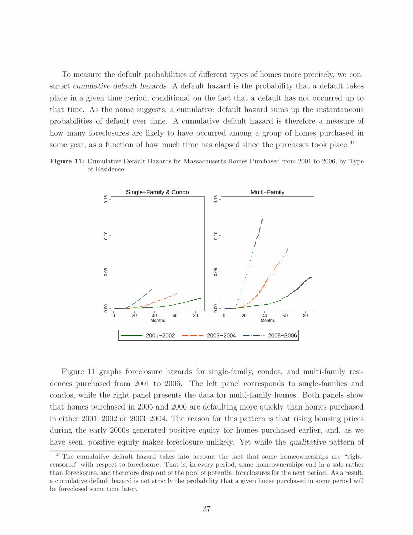
To measure the default probabilities of different types of homes more precisely, we con-
struct cumulative default hazards. A default hazard is the probability that a default takes
place in a given time period, conditional on the fact that a default has not occurred up to
that time. As the name suggests, a cumulative default hazard sums up the instantaneous
probabilities of default over time. A cumulative default hazard is therefore a measure of
how many foreclosures are likely to have occurred among a group of homes purchased in
some year, as a function of how much time has elapsed since the purchases took place.41
Figure 11: Cumulative Default Hazards for Massachusetts Homes Purchased from 2001 to 2006, by Typeof Residence
0.00
0.05
0.10
0.15
0 20 40 60 80Months
Single−Family & Condo
0.00
0.05
0.10
0.15
0 20 40 60 80Months
Multi−Family
2001−2002 2003−2004 2005−2006
Figure 11 graphs foreclosure hazards for single-family, condos, and multi-family resi-
dences purchased from 2001 to 2006. The left panel corresponds to single-families and
condos, while the right panel presents the data for multi-family homes. Both panels show
that homes purchased in 2005 and 2006 are defaulting more quickly than homes purchased
in either 2001–2002 or 2003–2004. The reason for this pattern is that rising housing prices
during the early 2000s generated positive equity for homes purchased earlier, and, as we
have seen, positive equity makes foreclosure unlikely. Yet while the qualitative pattern of
41The cumulative default hazard takes into account the fact that some homeownerships are “right-censored” with respect to foreclosure. That is, in every period, some homeownerships end in a sale ratherthan foreclosure, and therefore drop out of the pool of potential foreclosures for the next period. As a result,a cumulative default hazard is not strictly the probability that a given house purchased in some period willbe foreclosed some time later.
37

defaults is the same across the two panels, the quantitative level of foreclosures is not. In
the current foreclosure wave, multi-family homes are defaulting more than three times more
quickly than single-families and condos purchased at the same time.42
Figure 12: Average Massachusetts Loan-to-Value Ratios at Purchase, by Type of Residence
Multi−Family
Single−Family
Condominium
.7.8
.91
1987 1991 1995 1999 2003 2007
Ave
rage
Cum
ulat
ive
LTV
Rat
io
Why are multi-family foreclosure rates so high? To start with, multi-family houses are
typically purchased with higher LTV ratios than either single-family homes or condomini-
ums. Figure 12 graphs average LTV ratios for the three types of homes from 1987 to 2007.
We saw in Table 1 that purchase LTVs were rising over this period. Figure 12 shows average
LTVs for multi-family residences typically exceeded those for the other two types of homes
by several percentage points, reaching 90 percent during the height of the recent housing
boom. Multi-families would therefore be more likely to have negative equity as prices re-
ceded. Additionally, purchases of multi-family dwellings may have more of an “investment”
quality to them than purchases of single-family homes or condos. Purchasers of multi-family
residences sometimes qualified for purchase loans based on the rents they hoped to receive,
42In unreported work we replicated Figure 11 by breaking out foreclosure probabilities for three typesof homes separately. The foreclosure probabilities for condominiums look similar to those for single-familyhomes, which justifies the choice to group these two types of homes together in Figure 11. When we repeatthis exercise on foreclosures from the early 1990s, however, the data for condominiums looks much closerto that for multi-family homes. This is consistent with the view that condominiums were likely to be usedas investment vehicles during the earlier housing cycle.
38

even if the new owners planned to live in one of the units themselves. This strategy can
turn out poorly if rental income is more sporadic or lower than the new owners had hoped.
Table 7: Fractions of Massachusetts Foreclosees from Low-to-Moderate Income (LMI) or Minority Areas
LMI % of Minority Zip CodeForeclosure Ownerships Foreclosure Ownerships
2006 43.8 16.8 25 14.22007 44.2 17.0 25.6 14.31991 34.1 17.7 21.8 14.81992 38.8 17.6 23.3 14.7
At this point it is useful to consider how the facts we have discussed so far affect demo-
graphic patterns of foreclosures. If members of particular demographic groups tend to have
small downpayments, if they are more likely to have purchased homes recently, or if they
are more likely to live in multi-family homes, then we would expect these groups to be more
heavily represented among the current crop of foreclosees. A comparison of neighborhoods
affected by foreclosures indicates some demographic differences across the two foreclosure
waves. Compared to the early 1990s, recent foreclosees are more likely to come from zip
codes with a preponderance of low-to-moderate income (LMI) residents or minority house-
holds than was the case in the early 1990s.43 Table 7 indicates that among the 2006–2007
foreclosees, about 44 percent came from LMI communities, while about one quarter came
from zip codes with high levels of minority residents. These LMI and minority fractions
are much greater than the underlying fractions for all homes in Massachusetts (about 17
percent and 14 percent, respectively). Foreclosees in the early 1990s were also more likely
to come from LMI or minority areas, but these areas were not as highly represented among
foreclosures as they are today.
3.6 Fact 6: Most recently foreclosed homes in Massachusetts were
purchased with prime mortgages
The ability to construct complete ownership histories with the Warren Group data is
also helpful in assessing the role of subprime purchase mortgages among current foreclo-
sures. One of the ways in which subprime lending can raise the homeownership rate is by
43Low income zip-codes are defined to be zip codes in which the median household income is less thanor equal to 50 percent of the state median, while moderate income zip-codes have median income valuesbetween 50 percent and 80 percent of the state median.
39
providing a source of credit to segments of the market that have been traditionally under-
served. However, if subprime lending places people into homes that are inappropriate for
their financial circumstances, then the social benefits of subprime lending are obviously re-
duced. Knowing the precise fraction of foreclosed homes that was purchased with subprime
mortgages is therefore important for housing policy research. Unfortunately, obtaining this
measure is impossible unless mortgages within a single ownership experience can be linked
together.44
A clear message that emerges from the Warren Group data is that ownerships that begin
with subprime purchase mortgages end in default more often than ownerships that begin
with prime mortgages. Figure 13 presents cumulative foreclosure hazards broken down
by type of house, purchase year, and subprime-purchase status. This figure has the same
structure as Figure 11, but now the cumulative hazards for prime and subprime purchases
are presented separately. As we saw in Figure 11, homes purchased in 2001–2002 and 2003–
2004 are less likely to be foreclosed upon than homes purchased in 2005–2006. Looking
across the two columns, we see again that foreclosure rates for multi-family homes are
higher than for single-family homes and condos. But comparing the two rows, we see that
subprime purchases are more likely to default, no matter what the type of house. (Note the
different vertical scales in the two rows.) For prime single-families and condos purchased in
2005–2006, the cumulative default hazard reached about 1.3 percent at the end of 2007. For
the same types of homes purchased with subprime mortgages, the corresponding hazard was
11.9 percent. A large discrepancy in foreclosure rates also exists for multi-family homes.
The cumulative hazard for multi-families purchased with subprime mortgages in 2005–2006
reached nearly 25 percent by the end of 2007. The corresponding hazard for prime multi-
families was about 8 percent.
The high foreclosure probability among subprime purchases is a central finding of GSW
(2007). That paper estimates foreclosure probabilities of prime and subprime purchases
holding a number of other factors constant, such as LTV ratio at purchase, cumulative
price appreciation during the ownership experience, and type of residence. This exercise
shows that subprime purchases end up in foreclosure about six times more often than prime
purchases, all else equal.
While it is true that subprime purchases tend to default more quickly than prime pur-
chases, it is also true that in Massachusetts, subprime purchases, even at their peak, were
a small share of the overall real estate market. Table 8 presents subprime purchase shares
44Consider an owner who purchases a house with a subprime mortgage, but refinances into a primemortgage before he defaults. There is no way to know that this represents a default on a subprime purchaseunless the purchase mortgage and defaulted mortgage can be traced back to the same owner. The sameproblem obviously occurs when a prime purchaser takes out a subprime refinance before he defaults.
40
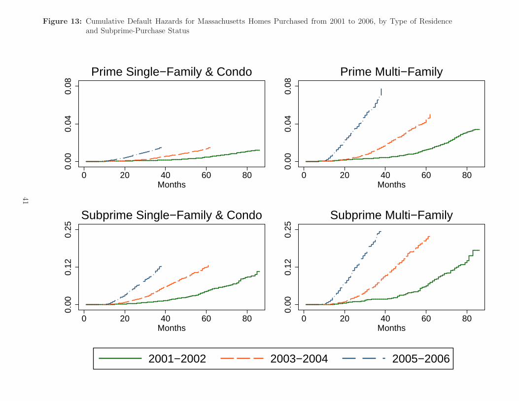
Figure 13: Cumulative Default Hazards for Massachusetts Homes Purchased from 2001 to 2006, by Type of Residenceand Subprime-Purchase Status
0.00
0.04
0.08
0 20 40 60 80Months
Prime Single−Family & Condo
0.00
0.04
0.08
0 20 40 60 80Months
Prime Multi−Family0.
000.
120.
25
0 20 40 60 80Months
Subprime Single−Family & Condo
0.00
0.12
0.25
0 20 40 60 80Months
Subprime Multi−Family
2001−2002 2003−2004 2005−2006
41
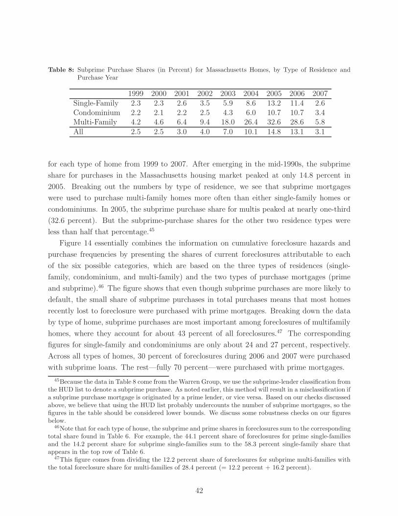
Table 8: Subprime Purchase Shares (in Percent) for Massachusetts Homes, by Type of Residence andPurchase Year
1999 2000 2001 2002 2003 2004 2005 2006 2007Single-Family 2.3 2.3 2.6 3.5 5.9 8.6 13.2 11.4 2.6Condominium 2.2 2.1 2.2 2.5 4.3 6.0 10.7 10.7 3.4Multi-Family 4.2 4.6 6.4 9.4 18.0 26.4 32.6 28.6 5.8All 2.5 2.5 3.0 4.0 7.0 10.1 14.8 13.1 3.1
for each type of home from 1999 to 2007. After emerging in the mid-1990s, the subprime
share for purchases in the Massachusetts housing market peaked at only 14.8 percent in
2005. Breaking out the numbers by type of residence, we see that subprime mortgages
were used to purchase multi-family homes more often than either single-family homes or
condominiums. In 2005, the subprime purchase share for multis peaked at nearly one-third
(32.6 percent). But the subprime-purchase shares for the other two residence types were
less than half that percentage.45
Figure 14 essentially combines the information on cumulative foreclosure hazards and
purchase frequencies by presenting the shares of current foreclosures attributable to each
of the six possible categories, which are based on the three types of residences (single-
family, condominium, and multi-family) and the two types of purchase mortgages (prime
and subprime).46 The figure shows that even though subprime purchases are more likely to
default, the small share of subprime purchases in total purchases means that most homes
recently lost to foreclosure were purchased with prime mortgages. Breaking down the data
by type of home, subprime purchases are most important among foreclosures of multifamily
homes, where they account for about 43 percent of all foreclosures.47 The corresponding
figures for single-family and condominiums are only about 24 and 27 percent, respectively.
Across all types of homes, 30 percent of foreclosures during 2006 and 2007 were purchased
with subprime loans. The rest—fully 70 percent—were purchased with prime mortgages.
45Because the data in Table 8 come from the Warren Group, we use the subprime-lender classification fromthe HUD list to denote a subprime purchase. As noted earlier, this method will result in a misclassification ifa subprime purchase mortgage is originated by a prime lender, or vice versa. Based on our checks discussedabove, we believe that using the HUD list probably undercounts the number of subprime mortgages, so thefigures in the table should be considered lower bounds. We discuss some robustness checks on our figuresbelow.
46Note that for each type of house, the subprime and prime shares in foreclosures sum to the correspondingtotal share found in Table 6. For example, the 44.1 percent share of foreclosures for prime single-familiesand the 14.2 percent share for subprime single-families sum to the 58.3 percent single-family share thatappears in the top row of Table 6.
47This figure comes from dividing the 12.2 percent share of foreclosures for subprime multi-families withthe total foreclosure share for multi-families of 28.4 percent (= 12.2 percent + 16.2 percent).
42
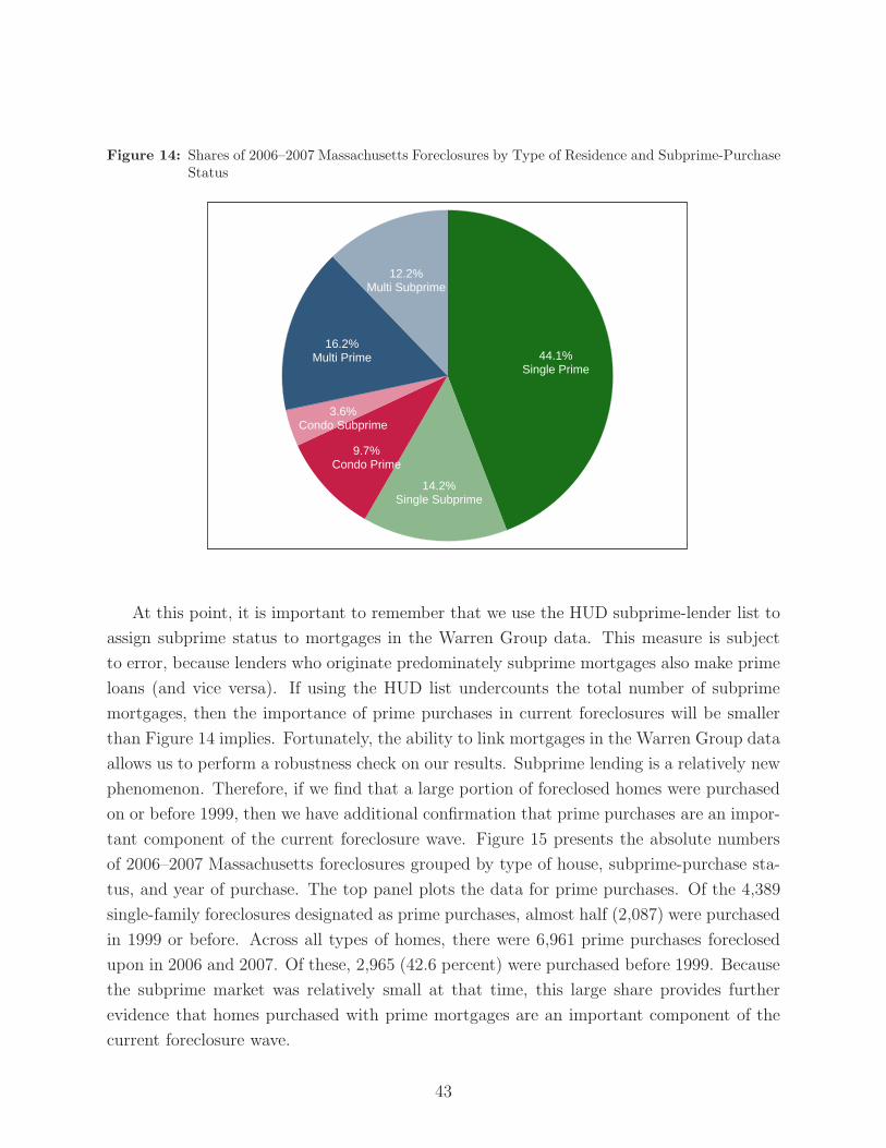
Figure 14: Shares of 2006–2007 Massachusetts Foreclosures by Type of Residence and Subprime-PurchaseStatus
44.1%
14.2%
9.7%
3.6%
16.2%
12.2%
Single Prime
Single Subprime
Condo Prime
Condo Subprime
Multi Prime
Multi Subprime
At this point, it is important to remember that we use the HUD subprime-lender list to
assign subprime status to mortgages in the Warren Group data. This measure is subject
to error, because lenders who originate predominately subprime mortgages also make prime
loans (and vice versa). If using the HUD list undercounts the total number of subprime
mortgages, then the importance of prime purchases in current foreclosures will be smaller
than Figure 14 implies. Fortunately, the ability to link mortgages in the Warren Group data
allows us to perform a robustness check on our results. Subprime lending is a relatively new
phenomenon. Therefore, if we find that a large portion of foreclosed homes were purchased
on or before 1999, then we have additional confirmation that prime purchases are an impor-
tant component of the current foreclosure wave. Figure 15 presents the absolute numbers
of 2006–2007 Massachusetts foreclosures grouped by type of house, subprime-purchase sta-
tus, and year of purchase. The top panel plots the data for prime purchases. Of the 4,389
single-family foreclosures designated as prime purchases, almost half (2,087) were purchased
in 1999 or before. Across all types of homes, there were 6,961 prime purchases foreclosed
upon in 2006 and 2007. Of these, 2,965 (42.6 percent) were purchased before 1999. Because
the subprime market was relatively small at that time, this large share provides further
evidence that homes purchased with prime mortgages are an important component of the
current foreclosure wave.
43

Figure 15: 2006–2007 Massachusetts Foreclosures by Type of Residence, Purchase Year, and Subprime-Purchase Status
2087
364514
759
158 287
1304
338633
239 101 177
Single−Family
Condominium
Multi−Family
01,
250
2,50
0
1999 or earlier 2000−2002 2003−2005 2006−2007
Houses Purchased with Prime Mortgages
62 6 18 157 25 80
1024
227
898
164 103 218
01,
250
2,50
0
1999 or earlier 2000−2002 2003−2005 2006−2007
Houses Purchased with Subprime Mortgages
44

Figure 15 also confirms our other findings. We have already seen (in Figures 11 and
13) that foreclosure rates are high for homes purchased when prices were at their peak,
because these homes never had a chance to amass much positive equity. As we would expect,
Figure 15 confirms that homes purchased in 2003-2005 are strongly represented in 2006-2007
foreclosures. Additionally, Figure 15 illustrates the high rates of foreclosure among multi-
family homes, particularly for multi-families purchased with subprime mortgages near the
height of the recent boom (2003–2005). The absolute number of subprime multi-family
foreclosures from the 2003–2005 cohort (898) is close to the number of subprime single-
family foreclosures in that cohort (1024), even though the multi-family purchases were far
less common than purchases of single-family homes in this period.
3.7 Fact 7: Almost half of residential defaults in Massachusetts
came on subprime mortgages, including subprime refinances
of prime purchase mortgages
Learning that many homes recently lost to foreclosure were purchased on or before
1999 confirms the importance of prime purchases in the current foreclosure wave. But this
finding also raises an interesting question. According to our state-wide repeat-sales index,
Massachusetts house prices have increased by more than 60 percent from 1999 to early 2008.
If positive equity forestalls foreclosure, why would any Massachusetts home purchased before
2000 suffer a foreclosure in 2006 or 2007? The most likely reason is that the homeowner
extracted the equity from the home through one or more cash-out refinances as house prices
rose.
Because the Warren Group data does not have the official mortgage-discharge records,
we cannot measure equity extraction on foreclosed properties directly. We can, however,
obtain a rough indication of whether equity extraction was taking place by counting the
number of mortgages in ownership experiences that eventually end in foreclosure. A large
number of mortgages for a single owner in a single house suggests higher refinancing activity
and more opportunities for cash-out refinancing.
Table 9 shows that homes recently lost to foreclosure experienced higher refinancing
activity than other homes, purchased at the same time, that have not yet been foreclosed
upon or sold. The first row of the table measures the total number of mortgages for homes
purchased in 1999. Homes that were purchased in that year and foreclosed upon in 2007
averaged 5.1 mortgages during their entire ownership experiences. For homes purchased
in 1999 that have not yet been foreclosed upon or sold, the average number of lifetime
mortgages is only 3.8. A similar discrepancy is present for homes purchased in 2000 through
45

Table 9: Average Number of Lifetime Mortgages for Massachusetts Ownership Experiences, for HomesPurchased 1999-2007
Foreclosed Ownership Experiences, Non-Foreclosedby Year of Foreclosure Ownership
1999 2000 2001 2002 2003 2004 2005 2006 2007 Experiences1999 1.6 1.6 1.6 1.8 2.2 2.6 3.5 4.3 5.1 3.82000 1.5 1.4 1.6 1.8 2.1 3.0 4.1 4.9 4.12001 1.3 1.3 1.5 1.8 2.5 3.9 4.1 3.6
Year 2002 1.6 1.4 1.5 2.2 3.0 3.7 3.1of 2003 1.3 1.2 1.8 2.3 3.0 2.4
Purchase 2004 1.1 1.6 2.0 2.4 2.22005 1.0 1.8 2.0 1.92006 1.8 1.8 1.72007 1.6 1.4
Note: Non-Foreclosed Ownership Experiences in the last column correspond to ownerships that had not ended with a sale by
the end of 2007.
2003.
Table 10: Average Number of Lifetime Subprime Mortgages for Massachusetts Ownership Experiences
Foreclosed Ownership Experiences, Non-Foreclosedby Year of Foreclosure Ownership
1999 2000 2001 2002 2003 2004 2005 2006 2007 Experiences1999 0.2 0.1 0.1 0.3 0.4 0.5 1.2 1.2 1.6 0.22000 0.0 0.1 0.4 0.6 0.5 0.7 1.5 1.4 0.22001 0.2 0.2 0.4 0.5 0.7 1.3 1.2 0.22002 0.3 0.2 0.5 0.7 1.1 1.2 0.22003 0.3 0.3 0.8 1.0 1.1 0.22004 0.4 0.7 1.0 1.1 0.22005 0.0 1.0 1.1 0.32006 0.8 0.9 0.22007 0.1 0.0
Note: Non-Foreclosed Ownership Experiences in the last column correspond to ownerships that had not ended with a sale by
the end of 2007.
What role did subprime refinances play in these foreclosure patterns? Table 10 repeats
this exercise but focuses only on the total number of subprime mortgages for various owner-
ship experiences. The top row shows that homes that were purchased in 1999 and foreclosed
upon in 2007 had an average of 1.6 subprime mortgages during their ownership experiences.
The comparable number for homes purchased in 1999 that have not yet been foreclosed
upon or sold is only 0.2.
The role of subprime lending in cash-out refinancing and subsequent defaults helps rec-
46

oncile the findings in this paper with those from other studies. We have found that in
Massachusetts, most homes foreclosed upon in 2006–2007 were purchased with prime mort-
gages. But other studies show that subprime loans account for a large share of current
defaults. Nothaft (2008), for example, uses data from the Mortgage Bankers Association’s
National Delinquency Survey to show that 52–56 percent of 2006–2007 defaults came on
subprime loans.48 However, because of refinancing, loans that default today may not be the
loans that were used to purchase homes. If prime borrowers often refinance with subprime
loans before they default, then a high subprime share of current defaults is consistent with
a lower subprime share among the purchase mortgages of foreclosed homes.
Table 11: Subprime Shares Among Defaulted Ownership Experiences and Mortgages, 2006–2007
Fraction of DefaultedOwnerships Purchased Subprime Fraction of
with Subprime Mortgages Defaulted MortgagesSingle-Family 24.3% 42.2%Condominium 27.3% 40.1%Multi-Family 43.0% 53.3%All 30.0% 45.2%
Table 11 illustrates this pattern in the Warren Group data. The first column of the
table reports the fraction of defaulted ownerships from 2006–2007 that were purchased with
subprime mortgages. As we have seen, this fraction is 30 percent across all types of homes.
The second column shows the percentage of defaulted mortgages from 2006–2007 that were
originated by subprime lenders. Consistent with the other studies, this fraction is much
higher. For all types of homes, the fraction is 45.2 percent. This number is close to, but
somewhat lower than, the 52–56 percent rate that Nothaft (2008) found. The discrepancy
of approximately 10 percentage points may reflect differences in the Massachusetts housing
market relative to the rest of the country, or differences in the way that the two studies
define subprime mortgages.
4 Conclusion: Some outstanding questions
We conclude with a discussion of outstanding questions relevant for the current housing-
policy debate:
48Nothaft (2008) finds that the precise subprime share of defaults varies by half-year period in 2006 and2007. But the share for any single half-year period ranges between 52 to 56 percent in these two years.
47
• Were subprime ARMs good deals for subprime borrowers?
Much of the criticism of subprime lending has focused on adjustable-rate mortgages
(ARMs). We have seen that interest-rate resets on subprime ARMs are not the main
problem in the subprime market, but subprime ARMs do warrant some scrutiny for several
reasons. First, as seen in Figure 3, subprime ARMs have higher delinquency rates than
subprime fixed-rate mortgages (FRMs). Secondly, as shown below in Appendix A, it is hard
to find much difference in the initial interest rates paid on subprime ARMs and those paid
on subprime FRMs. We would expect the initial rate on subprime ARMs to be substantially
lower than rates on FRMs, because the ARM borrower should be compensated for the risk
of future interest-rate increases. The higher default rates on subprime ARMs, along with
the apparent lack of a compensating premium for interest-rate risk, suggest that subprime
ARMs were not good deals for the borrowers that took them.
While this evidence against subprime ARMs is suggestive, we do not believe that it is
conclusive. This is because the interest-rate and default patterns among subprime ARMs
may have more to do with the types of borrowers that took ARMs, rather than the char-
acteristics of the ARMs themselves. For example, the typical ARM borrower may be more
tolerant of risk than the typical FRM borrower. This difference in risk-tolerance could play
an important role in explaining why ARM borrowers default more often, as well as why
they might have required only a small compensating premium for interest-rate risk. The
fact that ARM and FRM borrowers differ on observable characteristics (such as credit score
and willingness or ability to document income) suggests that these borrowers could also
differ along unobservable dimensions as well. Moreover, the premium that ARM borrowers
actually received may have been larger than we can measure with available data. Specifi-
cally, ARM borrowers might not have paid closing costs out-of-pocket when they originated
their loans, instead folding them into the loan itself and thereby raising the contract interest
rate. If FRM borrowers were less likely to do this, then the raw difference in initial rates
on ARMs and FRMs could be quite small, even though the ARM borrowers were in fact
receiving a substantial premium for interest-rate risk.
• How many subprime borrowers were inappropriately “steered” into their
mortgages?
Recent press reports have argued that the presence of high-FICO borrowers in the sub-
prime pool is prima facie evidence that they were steered into subprime loans by unscrupu-
lous mortgage lenders, perhaps in search of higher commissions. The fact that high-FICO
borrowers took out risky subprime loans undermines this claim, but it is still possible that
subprime borrowers received poor advice from lenders or other real estate professionals. For
48
example, borrowers could have been encouraged to stretch themselves into risky loans by
lenders or real estate brokers, on the basis of inflated expectations of future house price
increases. Related to the previous outstanding question, some subprime ARM borrowers
may have not been fully informed about the risks they were taking on with their loans. The
level of financial sophistication among subprime borrowers, and the quality of advice that
these borrowers received, should be active areas of future research.
Figure 16: House Price Appreciation and Subprime-Purchase Lending in Massachusetts, 1988–2007
−10
−5
05
1015
1988q1 1991q1 1994q1 1997q1 2000q1 2003q1 2006q1
4−Qtr Price Change Subprime Purchase Share
Per
cent
• Did subprime lending cause the house-price boom of the early 2000s?
The advent of subprime lending may have put upward pressure on prices during the
recent housing boom in the United States. Such pressure could arise if subprime lending
allowed more people to buy houses, or if it allowed existing buyers to bid higher amounts
for home purchases. But the causality could run in the other direction, from higher housing
prices to increased subprime lending. Using the Boston Fed’s LP dataset, we saw that more
and more high-FICO borrowers took out subprime loans as the housing boom progressed.
One reason may have been that these borrowers wanted to buy expensive houses, and the
subprime market was the only place that they could find the mortgages to do so. Another
piece of evidence in favor of the alternative-causality story is that, at least in Massachusetts,
housing prices started increasing well before subprime lending took off. Figure 16 shows
that Bay State housing prices were rising by more than 10 percent per year by the year
49
2000, when the subprime fraction of new purchases was still quite small. In short, figuring
out the ultimate effect of subprime lending on house prices, and vice versa, is a difficult
problem that will require innovative empirical approaches to answer.
• Did subprime lending increase the homeownership rate?
Subprime lending has complex effects on the national homeownership rate. Originally,
subprime lending was thought to boost homeownership by extending mortgage finance to
previously underserved populations. Aside from facilitating home purchases, subprime lend-
ing can also increase homeownership by preventing foreclosures. Recall that foreclosures
occur when borrowers cannot make their mortgage payments and have no positive equity
in their homes. To the extent that subprime lending facilitates refinances when equity is
positive but small, then subprime refinances can prevent foreclosures that otherwise would
have occurred. Of course, subprime lending could also have less favorable effects on home-
ownership. We have seen that some people who bought their homes with prime mortgages
later refinanced into subprime mortgages and then defaulted. If subprime lending encour-
ages owners to take “too much” equity out of their homes, so that they are in danger of
having negative equity if house prices fall, then subprime lending can actually reduce the
homeownership rate.
Quantifying the role of subprime lending therefore requires a better understanding of
both subprime purchases and subprime refinances. Regarding purchases, we need to learn
the extent to which subprime lending helps people who would have no other option if the
subprime market did not exist. More difficult to know is the effect of subprime refinances on
prime mortgages. How often do subprime refinances help homeowners get through difficult
financial periods, and how often do these refinances actually cause difficult financial periods
through the unwise extraction of equity? Answering these questions is difficult with current
data, but doing so should be a goal of future research.
50
Appendix A Behavior of Subprime ARMs and FRMs
An outstanding puzzle in subprime research involves the pricing of fixed-rate versus
hybrid adjustable-rate mortgages. We would expect the initial interest rate for a hybrid
ARM to be much lower than the interest rate on an FRM, because the ARM borrower is
taking on interest-rate risk. If, in reality, the difference in rates between ARMs and FRMs
is small, then policymakers may want to encourage borrowers to take a close look at FRMs
as a way of reducing their risk exposure. In the data, initial rates on ARMs and FRMs
are strikingly close. But it is hard to know whether subprime ARMs and FRMs are in fact
mispriced to a degree that would warrant public policies encouraging subprime lenders to
offer only fixed-rate mortgages.
Table A-1: Initial Interest Rate Differentials between Fixed-Rate and Adjustable-Rate Subprime Mort-gages: 1998-2007
Interest Rate Differential:Initial FRM Rate less Initial ARM Rate
(1) Raw Difference -0.086 (0.042)
(2) Controlling for borrower’s FICO score 0.141 (0.033)
(3) Controlling for borrower’s FICO score,presence of second mortgage, documentationstatus, and LTVs on first and second mortgages 0.199 (0.038)
(4) Controls as in previous row,using 2005–2007 data only 0.163 (0.015)
Notes: Estimates are generated by Ordinary Least Sqaures (OLS) regressions of initial subprime interest rates on a dummy
that equals 1 if the loan is a fixed-rate loan (and other controls as noted). All regressions include quarterly dummies. FICO
score controls in rows 2-4 are piece-wise linear controls. Standard errors are in parentheses. Rows 1-3 cluster the standard
errors by quarter. Row 4 does not, because of the small number of quarters available.
Table A-1 presents interest-rate differentials on FRMs versus ARMs from regressions
run on 1998–2007 data from the Boston Fed’s LoanPerformance dataset.49 Row 1 shows
that the typical interest rate on a fixed-rate loan appears lower than the typical initial ARM
rate when we perform a simple comparison of raw averages. This difference may not be the
true cost of using a fixed-rate product, however, if there are systematic differences between
borrowers that choose ARMs and those that choose FRMs. In fact, fixed-rate borrowers
49The data for the table come from subprime first-lien mortgages used for home purchases only.
51

do tend to have better FICO scores and lower LTVs than ARM borrowers, and they are
also more likely to fully document their mortgage applications. These good characteristics
partially explain why FRM borrowers enjoy relatively low interest rates. Row (2) controls
for differences in borrower credit histories by adding a flexible control for borrower FICO
scores in the regression. The interest-rate differential turns positive and equals about 14
basis points. While this estimate is statistically significant, it is small in magnitude.50 In
row (3), we add some additional controls, but the difference remains quantitatively small.
Finally, row (4) uses data from 2005–2007 only, but the regression again implies a small
difference in interest rates of slightly more than 16 basis points.
This small differential is difficult to explain. One possible interpretation is that ARM
borrowers do not bother to demand a risk premium because they expect to refinance before
their resets hit. Alternatively, ARM borrowers could be more likely to fold their closing costs
into their mortgages, paying these costs with a higher interest rate. If so, then the resulting
increase in the ARM interest rate could mask a true rate differential between FRMs and
ARMs that actual borrowers face in the market. Unfortunately, our data do not allow us
to test this hypothesis directly.
Another puzzle between FRMs and ARMs concerns the rate at which these mortgages
default when house prices fall. Figure A-1 shows estimated foreclosure probabilities for
adjustable-rate and fixed-rate subprime mortgages during the first 24 months of the loans.51
The estimation procedure controls for FICO scores, LTVs, the presence of second mortgages,
and documentation status; the gray bars in the figure are standard-error bands. The figure
shows that when house prices grow rapidly (at more than 10 percent per year), there is no
significant difference in foreclosure rates between FRMs and ARMs.52 However, as house
price growth decelerates and falls below 10 percent, a difference does emerge. Moving from
right to left in the figure, the average default rate on ARMs rises much more rapidly as
prices fall than does the default rate on FRMs. Once house price growth becomes negative,
the standard error bands no longer overlap, suggesting a statistically significant difference
in foreclosure propensities between the two types of loans.53
50A difference of 14 basis points is only 14 one-hundredths of a percentage point, so this implies anadjustable-rate mortgage with an 8 percent interest rate could be replaced with a fixed-rate mortgage withan 8.14 percent interest rate.
51Unlike in GSW (2007), we do not model the full hazard of foreclosure for a mortgage. Instead, wecollapse the data to just one observation per mortgage: the dependent variable is one if the mortgage wentinto foreclosure over the first 24 months, and zero otherwise. Like in Table A-1, the sample is restricted tofirst-lien mortgages for home purchases in Massachusetts, Rhode Island, and Connecticut.
52The standard error bars overlap, indicating that any difference may stem from statistical uncertaintysurrounding the estimates.
53An F-test on the profiles rejects equality at the 0.1 percent level.
52
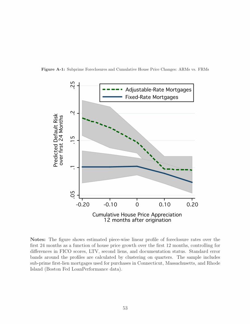
Figure A-1: Subprime Foreclosures and Cumulative House Price Changes: ARMs vs. FRMs.0
5.1
.15
.2.2
5
Pre
dic
ted D
efa
ult
Ris
kover
firs
t 2
4 M
onth
s
-0.20 -0.10 0 0.10 0.20
Cumulative House Price Appreciation12 months after origination
Adjustable-Rate Mortgages
Fixed-Rate Mortgages
Notes: The figure shows estimated piece-wise linear profile of foreclosure rates over thefirst 24 months as a function of house price growth over the first 12 months, controlling fordifferences in FICO scores, LTV, second liens, and documentation status. Standard errorbands around the profiles are calculated by clustering on quarters. The sample includessub-prime first-lien mortgages used for purchases in Connecticut, Massachusetts, and RhodeIsland (Boston Fed LoanPerformance data).
53

Once again, ARM refinancing may underlie this feature of the data. Hybrid ARM
borrowers might expect to refinance within the fixed-rate period of their mortgages. When
house prices fall, these borrowers may (correctly) surmise that their chances to refinance
have been reduced. If they know that they cannot afford the fully indexed interest rate, then
they may default immediately. (Fixed-rate mortgages, by contrast, offer more flexibility in
refinancing due to the lack of a specific reset date.) The implication is that the design of
adjustable-rate mortgages may make them more vulnerable to changes in house prices than
fixed-rate mortgages. Alternatively, the differences in default probabilities may result from
the selection of particular borrowers into adjustable-rate loans. ARM buyers may have had
higher expectations for future price appreciation than FRM borrowers. ARM borrowers
may also be less “financially literate,” with the implication that ARM borrowers are more
likely to run into liquidity problems during periods of declining house prices than FRM
borrowers. Financial literacy could also play a role in explaining the interest-rate patterns
discussed earlier. If ARM borrowers are unable to quantify the degree of interest-rate risk
they take on with an adjustable-rate product, then these borrowers may not demand to be
compensated for this risk with lower initial interest rates.
Appendix B Alternative Measures of Housing Prices
As noted in the introduction, all references to price statistics in this paper are based on
a repeat-sales index of house prices that we constructed using the Warren Group data.54
Figure B-1 compares our price index to the Massachusetts index constructed by the Office of
Federal Housing Enterprise Oversight (OFHEO). The OFHEO index also uses the repeat-
sales method, but is based solely on purchases financed with agency-conforming mortgages.
The two indexes are in strong general agreement during periods of overlap, though our
index shows larger price declines during the two housing downturns of the past two decades.
Figure B-2 compares our index with the S&P/Case-Shiller repeat-sales index for Boston.
This index includes non-conforming mortgages, but, as the name suggests, includes data only
from the Boston area. Our index is in stronger agreement with the S&P index during the
two housing downturns, suggesting that the homes financed with non-conforming mortgages
suffered larger price declines during these two periods.
54A town-level version of this index was also used in GSW (2007).
54
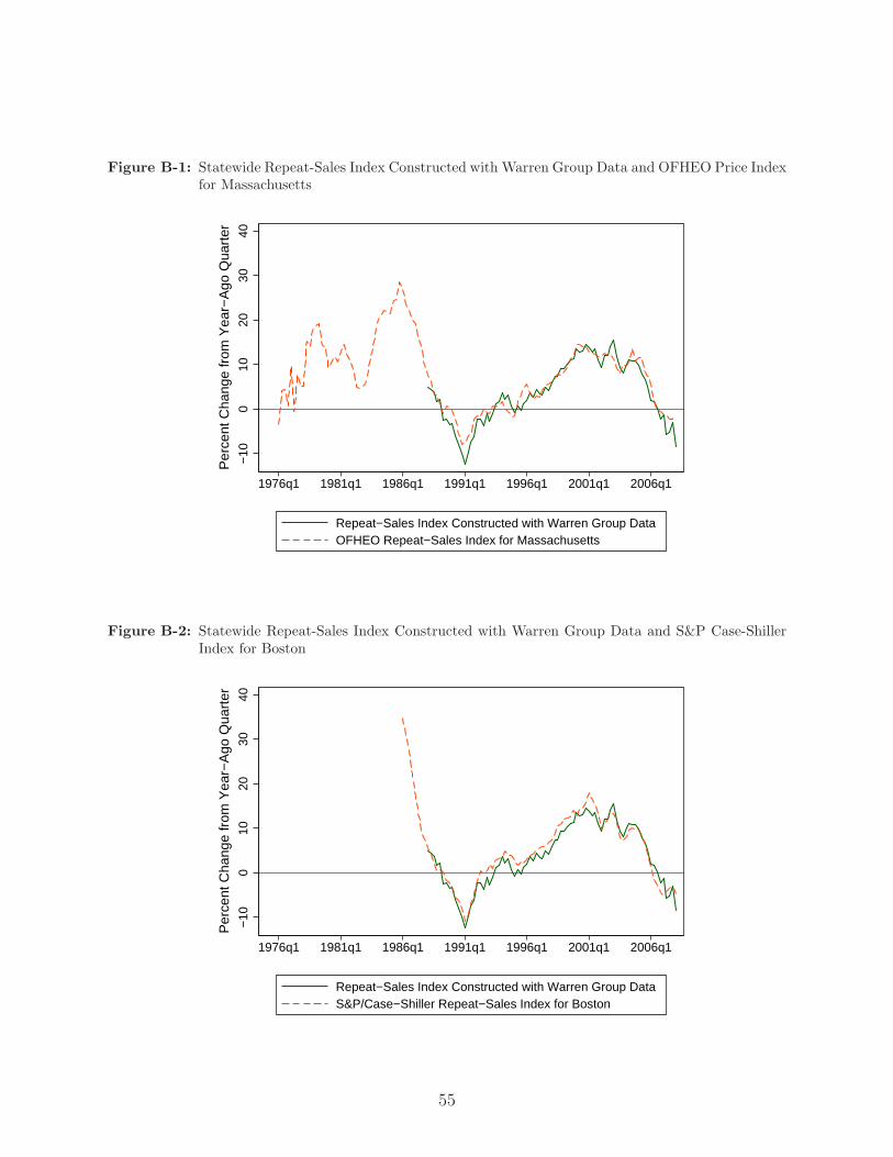
Figure B-1: Statewide Repeat-Sales Index Constructed with Warren Group Data and OFHEO Price Indexfor Massachusetts
−10
010
2030
40
1976q1 1981q1 1986q1 1991q1 1996q1 2001q1 2006q1
Repeat−Sales Index Constructed with Warren Group DataOFHEO Repeat−Sales Index for Massachusetts
Per
cent
Cha
nge
from
Yea
r−A
go Q
uart
er
Figure B-2: Statewide Repeat-Sales Index Constructed with Warren Group Data and S&P Case-ShillerIndex for Boston
−10
010
2030
40
1976q1 1981q1 1986q1 1991q1 1996q1 2001q1 2006q1
Repeat−Sales Index Constructed with Warren Group DataS&P/Case−Shiller Repeat−Sales Index for Boston
Per
cent
Cha
nge
from
Yea
r−A
go Q
uart
er
55

References
[1] Case, Karl, and Robert J. Shiller, 1987. “Prices of Single Family Homes Since 1970:
New Indexes For Four Cities.” NBER Working Paper No. 2393.
[2] Foote, Christopher L., Kristopher Gerardi, and Paul S. Willen, 2008. “Negative Equity
and Foreclosure: Theory and Evidence,” Federal Reserve Bank of Boston Working No.
08-03.
[3] Gerardi, Kristopher, Adam Hale Shapiro, and Paul S. Willen [GSW], 2007. “Subprime
Outcomes: Risky Mortgages, Homeownership Experiences, and Foreclosures,” Federal
Reserve Bank of Boston Working Paper No. 07-15.
[4] Kau J., D. Keenan, and T. Kim, 1994. “Default Probabilities for Mortgages.” Journal
of Urban Economics 35: 278–296.
[5] Nothaft, Frank E., 2008. “The Mortgage and Housing Market Outlook,” Presentation
for the National Economists Club, March 27.
[6] Vandell K., 1995. “How Ruthless is Mortgage Default? A Review and Synthesis of the
Evidence.” Journal of Housing Research 6(2): 245–264.
56
Related Documents