Statistical Practice in Epidemiology with Computer exercises SDC May 2017 http://bendixcarstensen.com/SPE 2 Compiled Monday 5 th June, 2017, 12:42 from: /home/bendix/teach/SPE/2017/pracs/pracs.tex Esa L¨ a¨ ar¨ a Department of Mathematical Sciences, University of Oulu, Finland [email protected] http://math.oulu.fi/en/personnel/esalaara.html Martyn Plummer International Agency for Research on Cancer, Lyon, France [email protected] Bendix Carstensen Steno Diabetes Center Copenhagen, Gentofte, Denmark & Dept. of Biostatistics, University of Copenhagen, Denmark [email protected] http://BendixCarstensen.com Krista Fischer Estonian Genome Center, University of Tartu, Estonia. [email protected] Janne Pitk¨ aniemi Finnish Cancer Registry, Helsinki, Finland [email protected]

Welcome message from author
This document is posted to help you gain knowledge. Please leave a comment to let me know what you think about it! Share it to your friends and learn new things together.
Transcript

Statistical Practice in Epidemiology
withComputer exercises
SDCMay 2017
http://bendixcarstensen.com/SPE
2
Compiled Monday 5th June, 2017, 12:42from: /home/bendix/teach/SPE/2017/pracs/pracs.tex
Esa Laara Department of Mathematical Sciences, University of Oulu, [email protected]
http://math.oulu.fi/en/personnel/esalaara.html
Martyn Plummer International Agency for Research on Cancer, Lyon, [email protected]
Bendix Carstensen Steno Diabetes Center Copenhagen, Gentofte, Denmark& Dept. of Biostatistics, University of Copenhagen, [email protected]
http://BendixCarstensen.com
Krista Fischer Estonian Genome Center, University of Tartu, [email protected]
Janne Pitkaniemi Finnish Cancer Registry, Helsinki, [email protected]

Contents
Program . . . . . . . . . . . . . . . . . . . . . . . . . . . . . . . . . . . . . . . . . 1
1 Exercises 1Introduction to practicals . . . . . . . . . . . . . . . . . . . . . . . . . . . . . . . 11.1 Practice with basic R . . . . . . . . . . . . . . . . . . . . . . . . . . . . . . . 21.2 Reading data into R . . . . . . . . . . . . . . . . . . . . . . . . . . . . . . . 151.3 Tabulation . . . . . . . . . . . . . . . . . . . . . . . . . . . . . . . . . . . . . 211.4 Graphics in R . . . . . . . . . . . . . . . . . . . . . . . . . . . . . . . . . . . 241.5 Simple simulation . . . . . . . . . . . . . . . . . . . . . . . . . . . . . . . . . 291.6 Calculation of rates, RR and RD . . . . . . . . . . . . . . . . . . . . . . . . 311.7 Logistic regression (GLM) . . . . . . . . . . . . . . . . . . . . . . . . . . . . 371.8 Estimation of effects: simple and more complex . . . . . . . . . . . . . . . . 421.9 Estimation and reporting of curved effects . . . . . . . . . . . . . . . . . . . 501.10 Graphics meccano . . . . . . . . . . . . . . . . . . . . . . . . . . . . . . . . . 571.11 Survival analysis: Oral cancer patients . . . . . . . . . . . . . . . . . . . . . 611.12 Time-splitting, time-scales and SMR . . . . . . . . . . . . . . . . . . . . . . 701.13 Causal inference . . . . . . . . . . . . . . . . . . . . . . . . . . . . . . . . . . 761.14 Nested case-control study and case-cohort study:
Risk factors of coronary heart disease . . . . . . . . . . . . . . . . . . . . . . 801.15 Renal complications:
Time-dependent variables and multiple states . . . . . . . . . . . . . . . . . 89
2 Solutions 972.3 Tabulation . . . . . . . . . . . . . . . . . . . . . . . . . . . . . . . . . . . . . 982.4 Graphics in R . . . . . . . . . . . . . . . . . . . . . . . . . . . . . . . . . . . 1042.5 Simple simulation . . . . . . . . . . . . . . . . . . . . . . . . . . . . . . . . . 1092.6 Calculation of rates, RR and RD . . . . . . . . . . . . . . . . . . . . . . . . 1112.7 Logistic regression (GLM) . . . . . . . . . . . . . . . . . . . . . . . . . . . . 1202.8 Estimation of effects: simple and more complex . . . . . . . . . . . . . . . . 1362.9 Estimation and reporting of curved effects . . . . . . . . . . . . . . . . . . . 1552.11 Survival analysis: Oral cancer patients . . . . . . . . . . . . . . . . . . . . . 1742.12 Time-splitting, time-scales and SMR . . . . . . . . . . . . . . . . . . . . . . 1962.13 Causal inference . . . . . . . . . . . . . . . . . . . . . . . . . . . . . . . . . . 2152.14 Nested case-control study and case-cohort study:
Risk factors of coronary heart disease . . . . . . . . . . . . . . . . . . . . . . 2202.15 Renal complications:
Time-dependent variables and multiple states . . . . . . . . . . . . . . . . . 237
ii

1
Program
Daily timetable9:00 – 9:30 Recap of yesterday’s practicals9:30 – 10:30 Lecture
10:30 – 10:50 Coffee break10:50 – 12:50 Practical12:50 – 14:00 Lunch14:00 – 14:30 Recap of morning’s practical14:30 – 15:30 Lecture15:30 – 16:00 Tea break16:00 – 18:00 Practical
Thursday 1 June9:00 – 9:15 Welcome (KF)9:15 – 10:30 Introduction to R language and commands reading data (MP)
10:30 – 10:50 Coffeee break10:50 – 12:50 Practical: Practice with basic R
Simple reading and data input12:50 – 14:00 Lunch14:00 – 14:30 Recap of morning practical14:30 – 15:30 Language, indexing, subset(), ifelse(), attach(), detach(),
search. Simple simulation. Simple graphics. (KF)15:30 – 16:00 Tea break16:00 – 18:00 Practical: Simple simulation
TabulationIntroduction to graphs in R
18:00 – 19:00 Tour of the genome center before the19:00 – 21:00 Welcome reception at the
Estonian Genome Center (Eesti Geenivaramu), Riia 23b.
Friday 2 June9:00 – 9:30 Recap of yesterday’s practicals.9:30 – 10:30 Poisson regression for follow-up studies — likelihood for a constant rate
Logistic regression for cc-studies (JP)10:30 – 10:50 Coffeee break10:50 – 12:50 Practical: Rates, rate ratio and rate difference with glm
Logistic regression with glm
12:50 – 14:00 Lunch14:00 – 14:30 Recap of morning practical14:30 – 15:45 Linear and generalized linear models (EL)
All you ever wanted to know about splines (MP)15:45 – 16:15 Tea break16:15 – 18:00 Practical: Simple estimation of effects
Estimation and reporting of linear and curved effects

2 SPE practicals
Saturday 3 June9:00 – 9:30 Recap of yesterday’s practicals9:30 – 10:30 More advanced graphics in R, including ggplot2 (MP)
10:30 – 10:50 Coffee break.10:50 – 12:50 Practical: Graphical meccano12:50 – 14:00 LunchAfternoon Orienteering and visit at the Estonian National Museum (optional)
Sunday 4 June9:00 – 9:30 Recap of yesterday’s practicals9:30 – 10:30 Survival analysis: Kaplan Meier & simple Cox-model. Simple competing
risks and relative survival. (JP)10:30 – 10:50 Tea break10:50 – 12:50 Practical: Survival and competing risks in oral cancer. Relative survival.12:50 – 14:00 Lunch14:00 – 14:30 Recap of morning practical14:30 – 15:30 Dates in R; follow up representation in Lexis objects, time-splitting,
multistate model and SMR. (BxC)15:30 – 16:00 Coffee break.16:00 – 18:00 Practical: Time-splitting and SMR (Danish diabetes patients)
Monday 5 June9:00 – 9:30 Recap of yesterday’s practicals9:30 – 10:30 Nested and matched cc-studies & Case-cohort studies (EL)
10:30 – 10:50 Coffee break.10:50 – 12:50 Practical: CC study: Risk factors for Coronary heart disease12:50 – 14:00 Lunch14:00 – 14:30 Recap of morning practical14:30 – 15:30 Causal inference. (KF)15:30 – 16:00 Coffee break.16:00 – 18:00 Practical: Simulation and causal inference19:00 – Course dinner at Wilde
Tuesday 6 June9:00 – 9:30 Recap of yesterday’s practicals9:30 – 10:30 Multistate models, Poisson models for rates and simulation of Lexis
objects (BxC)10:30 – 10:50 Coffee break.10:50 – 12:30 Practical: Multistate-model: Renal complications12:30 – 13:00 Recap of morning practical13:00 – 13:15 Wrap-up and farewell.13:15 – 14:15 Lunch
Further material will appear at this year’s course website:http://bendixcarstensen.com/SPE/2017

Chapter 1
Exercises
Datasets for the practicals in this course will be available on the local machines and on thecourse homepage, in http://BendixCarstensen.com/SPE/data. This is where you willalso find the “housekeeping” scripts designed to save you typing.
The R-scripts used during the course for the recaps in the morning will be available inhttp://BendixCarstensen.com/SPE/recap.
The general convention is that when R-functions are mentioned in the text they willnormally not be explained in any great detail. Hence you should get into the habit ofconsulting the help page for any function that you are not entirely familiar with by typingone of
?Lexis
args( Lexis )
The first form brings up a help-page and the second just a listing of the function argumentswith their defaults (without any explanation).
At the end of each help-page is (normally) an example showing some aspects of the useof the function. This example can be run in your R-session by typing:
example( Lexis )
This has the advantage that you can play around with the function, because the datastructures used for illustration will be available in your R-session.
When running the exercises it is a good idea to use a text editor instead of typing yourcommands directly at the R prompt. On Windows and macOS, R comes with a basicgraphical user interface including a built-in text editor. Many people like to use theRStudio interface to R, which includes a very powerful syntax-highlighting editor.
1

2 1.1 Practice with basic R SPE: Exercises
basic-e: Practice with basic R
1.1 Practice with basic R
The main purpose of this session is to give participants who have not had much (or any)experience with using R a chance to practice the basics and to ask questions. For others, itshould serve as a reminder of some of the basic features of the language.
R can be installed on all major platforms (i.e. Windows, macOS, Linux). We do notassume in this exercise that you are using any particular platform. Many people like to usethe RStudio graphical user interface (GUI), which gives the same look and feel across allplatforms.
1.1.1 The working directory
A key concept in R is the working directory (or folder in the terminology of Windows). Theworking directory is where R looks for data files that you may want to read in and where Rwill write out any files you create. It is a good idea to keep separate working directories fordifferent projects. In this course we recommend that you keep a separate working directoryfor each exercise.
If you are working on the command line in a terminal, then you can change to thecorrect working directory and then launch R by typing “R”.
If you are using a GUI then you will typically need to change to the correct workingdirectory after starting R. In RStudio, you can change directory from the “Session” menu.However it is much more useful to create a new project to keep your source files and data.When you open a project in the RStudio GUI, your working directory is automaticallychanged to the directory associated with the project.
You can quit R by typing
q()
at the R command prompt. You will be asked if you want to save your workspace. Werecommend that you answer “no” to this question. If you answer “yes” then R will write afile named .RData into the working directory containing all the objects you created duringyour session so that they will be available next time you start R. This may seem convenientbut you will soon find that your workspace becomes cluttered with old objects.
You can display the current working directory with the getwd() function and set it withthe setwd() function. The function dir() can be used to see what files you have in theworking directory.
1.1.2 Read-evaluate-print
The simplest use of R is interactively. R will read in the command you type, evaluate them,then print out the answer. This is called the read-eval-print loop, or REPL for people whodon’t like words. In this exercise, we recommend that you work interactively. As the courseevolves you will find that you need to switch to script files. We come back to this issue atthe end of the exercise.

University of Tartu, 2017 1.1 Practice with basic R 3
It is important to remember that R is case sensitive, so that A is different from a.Commands in R are generally separated by a newline, although a semi-colon can also beused.
1.1.3 Using R as a calculator
Try using R as a calculator by typing different arithmetic expressions on the command line.Note that R allows you to recall previous commands using the vertical arrow key. You canedit a recalled command and then resubmit it by pressing the return key. Keeping that inmind, try the following:
12+16
(12+16)*5
sqrt((12+16)*5) # square root
round(sqrt((12+16)*5),2) # round to two decimal places
The hash symbol # denotes the start of a comment. Anything after the hash is ignored byR.
Round braces are used a lot in R. In the above expressions, they are used in two differentways. Firstly, they can be used to establish the order of operations. In the example
> (12+16)*5
[1] 140
they ensure that 12 is added to 16 before the result is multiplied by 5. If you omit thebraces then you get a different answer
> 12+16*5
[1] 92
because multiplication has higher precedence than addition. The second use of roundbraces is in a function call (e.g. sqrt, round). To call a function in R, type the namefollowed by the arguments inside round braces. Some functions take multiple arguments,and in this case they are separated by commas.
You can see that complicated expressions in R can have several levels of nested braces.To keep track of these, it helps to use a syntax-highlighting editor. For example, inRStudio, when you type an opening bracket “(”, RStudio will automatically add a closingbracket “)”, and when the cursor moves past a closing bracket, RStudio will automaticallyhighlight the corresponding opening bracket (in grey). Features like this can make it mucheasier to write R code free from syntax errors.
Instead of printing the result you can store it in an object, say
a <- round(sqrt((12+16)*5),2)
In this case R does not print anything to the screen. You can see the results of thecalculation, stored in the object a, by typing a and also use a for further calculations, e.g:
exp(a)
log(a) # natural logarithm
log10(a) # log to the base 10

4 1.1 Practice with basic R SPE: Exercises
The left arrow expression <-, pronounced “gets”, is called the assignment operator, and isobtained by typing < followed by - (with no space in between). It is also possible to use theequals sign = for assignment. Note that some R experts do not like this and recommend touse only “gets” for assignment, reserving = for function arguments,
You can also use a right arrow, as in
round(sqrt((12+16)*5),2) -> a
1.1.4 Vectors
All commands in R are functions which act on objects. One important kind of object is avector, which is an ordered collection of numbers, or character strings (e.g. “CharlesDarwin”) , or logical values (TRUE or FALSE). The components of a vector must be of thesame type (numeric, character, or logical). The combine function c(), together with theassignment operator, is used to create vectors. Thus
> v <- c(4, 6, 1, 2.2)
creates a vector v with components 4, 6, 1, 2.2 and assigns the result to the vector v.A key feature of the R language is that many operations are vectorized, meaning that you
can carry out the same operation on each element of a vector in a single operation. Try
> v> 3+v> 3*v
and you will see that R understands what to do in each case.R extends ordinary arithmetic with the concept of a missing value represented by the
symbol NA (Not Available). Any operation on a missing value creates another missing value.You can see this by repeating the same operations on a vector containing a missing value:
> v <- c(4, 6, NA)> 3 + v> 3 * v
The fact that every operation on a missing value produces a missing value can be anuisance when you want to create a summary statistic for a vector:
> mean(v)[1] NA
While it is true that the mean of v is unknown because the value of the third element ismissing, we normally want the mean of the non-missing elements. Fortunately the mean
function has an optional argument called na.rm which can be used for this.
> mean(v, na.rm=TRUE)[1] 5
Many functions in R have optional arguments that can be omitted, in which case they taketheir default value (in this case na.rm=FALSE), or can be explicitly given in the functioncall to override the default behaviour.
You can get a description of the structure of any object using the function str(). Forexample, str(v) shows that v is numeric with 4 components. If you just want to know thelength of a vector then it is much easier to use the length function.
> length(v)

University of Tartu, 2017 1.1 Practice with basic R 5
1.1.5 Sequences
There are short-cut functions for creating vectors with a regular structure. For example, ifyou want a vector containing the sequence of integers from 1 to 10, you can use
> 1:10
The seq() function allows the creation of more general sequences. For example, the vector(15, 20, 25, ... ,85) can be created with
> seq(from=15, to=85, by=5)
The objects created by the “:” operator and the seq() function are ordinary vectors, andcan be combined with other vectors using the combine function:
> c(5, seq(from=20, to=85, by=5))
You can learn more about functions by typing ? followed by the function name. Forexample ?seq gives information about the syntax and usage of the function seq().
1. Create a vector w with components 1, -1, 2, -2
2. Display this vector
3. Obtain a description of w using str()
4. Create the vector w+1, and display it.
5. Create the vector v with components (5, 10, 15, ... , 75) using seq().
6. Now add the components 0 and 1 to the beginning of v using c().
7. Find the length of this vector.
1.1.6 Displaying and changing parts of a vector (indexing)
Square brackets in R are used to extract parts of vectors. So x[1] gives the first element ofvector x. Since R is vectorized you can also supply a vector of integer index values insidethe square brackets. Any expression that creates an integer vector will work.
Try the following commands:
> x <- c(2, 7, 0, 9, 10, 23, 11, 4, 7, 8, 6, 0)> x[4]> x[3:5]> x[c(1,5,8)]> x[(1:6)*2]> x[-1]
Negative subscripts mean “drop this element”. So x[-1] returns every element of x exceptthe first.
Trying to extract an element that is beyond the end of the vector is, surprisingly, not anerror. Instead, this returns a missing value
> N <- length(x)> x[N + 1]
[1] NA

6 1.1 Practice with basic R SPE: Exercises
There is a reason for this behaviour, which we will discuss in the recap.R also allows logical subscripting. Try the following
> x > 10> x[x > 10]
The first expression creates a logical vector of the same length as x, where each element hasthe value TRUE or FALSE depending on whether or not the corresponding element of x isgreater than 10. If you supply a logical vector as an index, R selects only those elements forwhich the conditions is TRUE.
You can combine two logical vectors with the operators & (“logical and”) and | (“logicalor”). For example, to select elements of x that are between 10 and 20 we combine twoone-sided logical conditions for x ≥ 10 and x ≤ 20:
> x[x >= 10 & x <= 20]
The remaining elements of x that are either less than 10 or greater than 20 are selectedwith
> x[x < 10 | x > 20]
Indexing can also be used to replace parts of a vector:
> x[1] <- 1000> x
This replaces the first element of x. Logical subscripting is useful for replacing parts of avector that satisfy a certain condition. For example to replace all elements that take thevalue 0 with the value 1:
> x[x==0] <- 1> x
If you want to replace parts of a vector then you need to make sure that the replacementvalue is either a single value, as in the example above, or a vector equal in length to thenumber of elements to be replaced. For example, to replace elements 2, 3, and 4 we need tosupply a vector of replacement values of length 3.
> x[2:4] <- c(0, 8, 1)> x
It is important to remember this when you are using logical subscripting because thenumber of elements to be replaced is not given explicitly in the R code, and it is easy to getconfused about how many values need to be replaced. If we want to add 3 to every elementthat is less than 3 then we can break the operation down into 3 steps:
> y <- x[x < 3]> y <- y + 3> x[x < 3] <- y> x
First we extract the values to be modified, then we modify them, then we write back themodified values to the original positions. R experts will normally do this in a singleexpression.
> x[x < 3] <- x[x < 3] + 3

University of Tartu, 2017 1.1 Practice with basic R 7
Remember, if you are confused by a complicated expression you can usually break it downinto simpler steps.
If you want to create an entirely new vector based on some logical condition then use theifelse() function. This function takes three arguments: the first is a logical vector; thesecond is the value taken by elements of the logical vector that are TRUE; and the third isthe value taken by elements that are FALSE.
In this example, we use the remainder operator %% to identify elements of x that havevalue 0 when divided by 2 (i.e. the even numbers) and then create a new character vectorwith the labels “even” and “odd”:
> x %% 2> ifelse(x %% 2 == 0,"even","odd")
Now try the following:
8. Display elements that are less than 10, but greater than 4
9. Modify the vector x, replacing by 10 all values that are greater than 10
10. Modify the vector x, multiplying by 2 all elements that are smaller than 5(Remember you can do this in steps).
1.1.7 Lists
Collections of components of different types are called lists, and are created with thelist() function. Thus
> m <- list(4, TRUE, "name of company")> m
creates a list with 3 components: the first is numeric, the second is logical and the third ischaracter. A list element can be any object, including another list. This flexibility meansthat functions that need to return a lot of complex information, such as statisticalmodelling functions, often return a list.
As with vectors, single square brackets are used to take a subset of a list, but the resultwill always be another list, even if you select only one element
> m[1:2] #A list containing first two elements of m> m[3] #A list containing the third element of m
If you just want to extract a single element of a list then you must use double squarebraces:
> m[[3]] #Extract third element
Lists are more useful when their elements are named. You can name an element by usingthe syntax name=value in the call to the list function:
> mylist <- list(name=c("Joe","Ann","Jack","Tom"),+ age=c(34,50,27,42))> mylist
This creates a new list with the elements “name”, a character vector of names, and “age” anumeric vector of ages. The components of the list can be extracted with a dollar sign $
> mylist$name> mylist$age

8 1.1 Practice with basic R SPE: Exercises
1.1.8 Data frames
Data frames are a special structure used when we want to store several vectors of the samelength, and corresponding elements of each vector refer to the same record. For example,here we create a simple data frame containing the names of some individuals along withtheir age in years, their sex (coded 1 or 2) and their height in cm.
> mydata <- data.frame(name=c("Joe","Ann","Jack","Tom"),+ age=c(34,50,27,42),sex=c(1,2,1,1),+ height=c(185,170,175,182))
The construction of a data frame is just like a named list (except that we use theconstructor function data.frame instead of list). In fact data frames are lists so, forexample, you can extract vectors using the dollar sign or other extraction methods for lists:
> mydata$height> mydata[[4]]
On the other hand, data frames are also two dimensional objects:
> mydata
name age sex height1 Joe 34 1 1852 Ann 50 2 1703 Jack 27 1 1754 Tom 42 1 182
When you print a data frame, each variable appears in a separate column. You can usesquare brackets with two comma-separated arguments to take subsets of rows or columns.
> mydata[1,]> mydata[,c("age", "height")]> mydata[2,4]
We will look into indexing of data frames in more detail below.Now let’s create another data frame with more individuals than the first one:
> yourdata <- data.frame(name=c("Ann","Peter","Sue","Jack","Tom","Joe","Jane"),+ weight=c(67,81,56,90,72,79,69))
This new data frame contains the weights of the individuals. The two data sets can bejoined together with the merge function.
> newdata <- merge(mydata, yourdata)> newdata
The merge function uses the variables common to both data frames – in this case thevariable “name” – to uniquely identify each row. By default, only rows that are in bothdata frames are preserved, the rest are discarded. In the above example, the records forPeter, Sue, and Jane, which are not in mydata are discarded. If you want to keep them, usethe optional argument all=TRUE.
> newdata <- merge(mydata, yourdata, all=TRUE)> newdata
This keeps a row for all individuals but since Peter, Sue and Jane have no recorded age,height, or sex these are missing values.

University of Tartu, 2017 1.1 Practice with basic R 9
1.1.9 Working with built-in data frames
We shall use the births data which concern 500 mothers who had singleton births (i.e. notwins) in a large London hospital. The outcome of interest is the birth weight of the baby,also dichotomised as normal or low birth weight. These data are available in the Epipackage:
> library(Epi)> data(births)> objects()
The function objects() shows what is in your workspace. To find out a bit more aboutbirths try
help(births)
11. The dataframe "diet" in the Epi package contains data from a follow-up study withcoronary heart disease as the end-point. Load these data with
> data(diet)
and print the contents of the data frame to the screen..
12. Check that you now have two objects, births, and diet in your workspace.
13. Get help on the object diet.
14. Remove the object diet with the command
> remove(diet)
Check that the object diet is no longer in your workspace.
1.1.10 Referencing parts of the data frame (indexing)
Typing births will list the entire data frame – not usually very helpful. You can use thehead function to see just the first few rows of a data frame
> head(births)
Now try
> births[1,"bweight"]
This will list the value taken by the first subject for the bweight variable. Alternatively
> births[1,2]
will list the value taken by the first subject for the second variable (which is bweight).Similarly
> births[2,"bweight"]
will list the value taken by the second subject for bweight, and so on. To list the data forthe first 10 subject for the bweight variable, try

10 1.1 Practice with basic R SPE: Exercises
> births[1:10, "bweight"]
and to list all the data for this variable, try
> births[, "bweight"]
To list the data for the first subject try
> births[1, ]
An empty index before the comma means “all rows” and an empty index after the commameans “all columns”.
15. Display the data on the variable gestwks for row 7 in the births data frame.
16. Display all the data in row 7.
17. Display the first 10 rows for the variable gestwks.
The subset function is another way of getting subsets from a data frame.To select allsubjects with height less than 180 cm from the data frame mydata we use
> subset(mydata, height < 180)
The subset function is usually clearer than the equivalent code using []:
> mydata[mydata$height < 180, ]
Another advantage of subset is that it will drop observations with missing values. Comparethe following
> newdata[newdata$height < 180, ]> subset(newdata, height < 180)
If height is missing then subset will drop that row. But [] will do something you mightnot expect. It will include the rows with missing height, but will replace every element inthose rows with the missing value NA.
1.1.11 Summaries
A good way to start an analysis is to ask for a summary of the data by typing
> summary(births)
This prints some summary statistics (minimum, lower quartile, mean, median, upperquartile, maximum). For variables with missing values, the number of NAs is also printed.
To see the names of the variables in the data frame try
> names(births)
Variables in a data frame can be referred to by name, but to do so it is necessary also tospecify the name of the data frame. Thus births$hyp refers to the variable hyp in thebirths data frame, and typing births$hyp will print the data on this variable. Tosummarize the variable hyp try
> summary(births$hyp)
Alternatively you can use
> with(births, summary(hyp))

University of Tartu, 2017 1.1 Practice with basic R 11
1.1.12 Generating new variables
New variables can be produced using assignment together with the usual mathematicaloperations and functions. For example
> logbw <- log(births$bweight)
produces the variable logbw in your workspace, while
> births$logbw <- log(births$bweight)
produces the variable logbw in the births data frame.You can also replace existing variables. For example bweight measures birth weight in
grams. To convert the units to kilograms we replace the original variable with a new one:
> births$bweight <- births$bweight/1000
1.1.13 Turning a variable into a factor
In R categorical variables are known as factors, and the different categories are called thelevels of the factor. Variables such as hyp and sex are originally coded using integer codes,and by default R will interpret these codes as numeric values taken by the variables.Factors will become very important later in the course when we study modelling functions,where factors and numeric variables are treated very differently. For the moment, you canthink of factors as “value labels” that are more informative than numeric codes.
For R to recognize that the codes refer to categories it is necessary to convert thevariables to be factors, and to label the levels. To convert the variable hyp to be a factor,try
> births$hyp <- factor(births$hyp, labels=c("normal", "hyper"))
This takes the original numeric codes (0, 1) and replaces them with informative labels“normal” and “hyper” for normal blood pressure and hypertension, respectively.
18. Convert the variable sex into a factor with labels "M" and "F" for values 1 and 2,respectively
1.1.14 Frequency tables
When starting to look at any new data frame the first step is to check that the values ofthe variables make sense and correspond to the codes defined in the coding schedule. Forcategorical variables (factors) this can be done by looking at one-way frequency tables andchecking that only the specified codes (levels) occur. The most useful function for makingsimple frequency tables is table. The distribution of the factor hyp can be viewed using
> with(births, table(hyp))
or by specifying the data frame as in
> table(births$hyp)
For simple expressions the choice is a matter of taste, but with is shorter for morecomplicated expressions.

12 1.1 Practice with basic R SPE: Exercises
19. Find the frequency distribution of sex.
20. If you give two or more arguments to the table function then it producescross-tabulations. Find the two-way frequency distribution of sex and hyp.
21. Create a logical variable called early according to whether gestwks is less than 30 ornot. Make a frequency table of early.
1.1.15 Grouping the values of a numeric variable
For a numeric variable like matage it is often useful to group the values and to create a newfactor which codes the groups. For example we might cut the values taken by matage intothe groups 20–29, 30–34, 35–39, 40–44, and then create a factor called agegrp with 4 levelscorresponding to the four groups. The best way of doing this is with the function cut. Try
> births$agegrp <- cut(births$matage, breaks=c(20,30,35,40,45), right=FALSE)> with(births, table(agegrp))
By default the factor levels are labelled [20-25), [25-30), etc., where [20-25) refers tothe interval which includes the left hand end (20) but not the right hand end (25). This isthe reason for right=FALSE. When right=TRUE (which is the default) the intervals includethe right hand end but not the left hand.
Observations which are not inside the range specified by the breaks argument result inmissing values for the new factor. Hence it is important that the first element in breaks issmaller than the smallest value in your data, and the last element is larger than the largestvalue.
22. Summarize the numeric variable gestwks, which records the length of gestation forthe baby, and make a note of the range of values.
23. Create a new factor gest4 which cuts gestwks at 20, 35, 37, 39, and 45 weeks,including the left hand end, but not the right hand. Make a table of the frequenciesfor the four levels of gest4.
1.1.16 Saving and loading data
As noted in section 1.1.1, at the end of the session, R will offer to save your workspace and,if you accept, it will create a file .RData in your working directory. In fact you can saveany R object to disc. For example, to save the data frame births try
> save(births, file="births.RData")
which will save the births data frame in the file births.RData. If you send this file to acolleague then they can read the data back into R with
> load("births.RData")
The commands save() and load() can be used with any R objects, but they areparticularly useful when dealing with large data frames. The binary format created by thesave() functions is the same across all platforms and between R versions.

University of Tartu, 2017 1.1 Practice with basic R 13
1.1.17 The search path
When you load a package with the library() function, the functions in that packagebecome available for you to use via a mechanism called the search path. The command
> search()
shows the positions on the search path. The first position is “.GlobalEnv”. This is theglobal environment, which is another name for your workspace. The second entry on thesearch path is the Epi package, the third is a package of commands called methods, thefourth is a package called stats, and so on. To see what is in the workspace try
> objects()
You should see the objects that you have created in this session. To see what is in the Epipackage, try
> objects(2)
You can also refer to a package by name, not position
> objects("package:Epi")
When you type the name of an object R looks for it in the order of the search path and willreturn the first object with this name that it finds.
1.1.18 Attaching a data frame
The search path can also be modified by attaching a data frame. For example:
> attach(births)
This places a copy of the variables in the births data frame in position 2 of the searchpath. You can verify this with
> search()> objects(2)
which shows the objects in this position are the variables from the births data frame.Attaching a data frame makes the variables in it directly accessible. For example, when
you type the command:
> hyp
you should get the variable hyp from the births data set without having to use the dollarsign. The detach() function removes the data frame from the search path.
> detach()
when no arguments are given, the detach() function removes the second entry on thesearch path (after the global environment).
This seems like an attractive feature, especially for people who are used to otherstatistical software (e.g. SAS, Stata) in which the variables in the “current workingdataset” are directly accessible in this way. However, attaching data frames causes moreproblems than it solves and should be avoided. In particular:

14 1.1 Practice with basic R SPE: Exercises
• Since the attached data frame appears second in the search path, it comes after theglobal environment. If you have an object hyp in the global environment then youwill get this, instead of the variable from the births data frame. This is calledmasking. R will warn you about masking, but only once for each variable.
• Attaching a data frame creates a copy of all the variables in it. Subsequent changesto the data frame (e.g. selecting rows or recoding variables) are not reflected in theattached copy, which is a snapshot of the data frame when it was attached.
• If you forget to detach() the data frame when you are finished with it, then you maycreate multiple attached copies on your search path, especially when using a script.
It is best to stick to using the dollar sign to select variables in a data frame, or to use thewith() function. Many R functions (but not all of them) have a data argument which canbe used to specify a data frame that should be searched before the search path.
1.1.19 Interactive use vs scripting
You can work with R simply by typing function calls at the command prompt and readingthe results as they are printed. This is OK for simple use but rapidly becomescumbersome. If the results of one calculation are used to feed into the next calculation, itcan be difficult to go back if you find you have made a mistake, or if you want to repeat thesame commands with different data.
When working with R it is best to use a text editor to prepare a batch file (or script)which contains R commands and then to run them from the script. If you are using a GUIthen you can use the built-in script editor, or you can use your favourite text editor insteadif you prefer.
One major advantage of running all your R commands from a script is that you end upwith a record of exactly what you did which can be repeated at any time. This will alsohelp you redo the analysis in the (highly likely) event that your data changes before youhave finished all analyses.

University of Tartu, 2017 1.2 Reading data into R 15
dinput-e: Simple reading and data input
1.2 Reading data into R
1.2.1 Introduction
It is said that Mrs Beeton, the 19th century cook and writer, began her recipe for rabbitstew with the instruction “First catch your rabbit”. Sadly, the story is untrue, but it doescontain an important moral. R is a language and environment for data analysis. If youwant to do something interesting with it, you need data.
For teaching purposes, data sets are often embedded in R packages. The base Rdistribution contains a whole package dedicated to data which includes around 100 datasets. This is attached towards the end of the search path, and you can see its contents with
> objects("package:datasets")
A description of all of these objects is available using the help() function. For example
> help(Titanic)
gives an explanation of the Titanic data set, along with references giving the source of thedata.
The Epi package also contains some data sets. These are not available automaticallywhen you load the Epi package, but you can make a copy in your workspace using thedata() function. For example
> library(Epi)> data(bdendo)
will create a data frame called bdendo in your workspace containing data from acase-control study of endometrial cancer. Datasets in the Epi package also have help pages:type help(bdendo) for further information.
To go back to the cooking analogy, these data sets are the equivalent of microwave readymeals, carefully packaged and requiring minimal work by the consumer. Your own data willnever be able in this form and you must work harder to read it in to R.
This exercise introduces you to the basics of reading external data into R. It consists ofreading the same data from different formats. Although this may appear repetitive, itallows you to see the many options available to you, and should allow you to recognizewhen things go wrong.
You will need the following files in the sub-directory data of your working directory:fem.dat, fem-dot.dat, fem.csv, fem.dta (Reminder: use setwd() to set your workingdirectory).
1.2.2 Data sources
Sources of data can be classified into three groups:
1. Data in human readable form, which can be inspected with a text editor.

16 1.2 Reading data into R SPE: Exercises
2. Data in binary format, which can only be read by a program that understands thatformat (SAS, SPSS, Stata, Excel, ...).
3. Online data from a database management system (DBMS)
This exercise will deal with the first two forms of data. Epidemiological data sets are rarelylarge enough to justify being kept in a DBMS. If you want further details on this topic, youcan consult the “R Data Import/Export” manual that comes with R.
1.2.3 Data in text files
Human-readable data files are generally kept in a rectangular format, with individualrecords in single rows and variables in columns. Such data can be read into a data frame inR.
Before reading in the data, you should inspect the file in a text editor and ask threequestions:
1. How are columns in the table separated?
2. How are missing values represented?
3. Are variable names included in the file?
The file fem.dat contains data on 118 female psychiatric patients. The data set containsnine variables.
ID Patient identifierAGE Age in yearsIQ Intelligence Quotient (IQ) scoreANXIETY Anxiety (1=none, 2=mild, 3=moderate,4=severe)DEPRESS Depression (1=none, 2=mild, 3=moderate or severe)SLEEP Sleeping normally (1=yes, 2=no)SEX Lost interest in sex (1=yes, 2=no)LIFE Considered suicide (1=yes, 2=no)WEIGHT Weight change (kg) in previous 6 months
Inspect the file fem.dat with a text editor to answer the questions above.The most general function for reading in free-format data is read.table(). This
function reads a text file and returns a data frame. It tries to guess the correct format ofeach variable in the data frame (integer, double precision, or text).
Read in the table with:
> fem <- read.table("./data/fem.dat", header=TRUE)
Note that you must assign the result of read.table() to an object. If this is not done, thedata frame will be printed to the screen and then lost.
You can see the names of the variables with
> names(fem)
The structure of the data frame can be seen with

University of Tartu, 2017 1.2 Reading data into R 17
> str(fem)
You can also inspect the top few rows with
> head(fem)
Note that the IQ of subject 9 is -99, which is an illegal value: nobody can have a negativeIQ. In fact -99 has been used in this file to represent a missing value. In R the special valueNA (“Not Available”) is used to represent missing values. All R functions recognize NA
values and will handle them appropriately, although sometimes the appropriate response isto stop the calculation with an error message.
You can recode the missing values with
> fem$IQ[fem$IQ == -99] <- NA
Of course it is much better to handle special missing value codes when reading in the data.This can be done with the na.strings argument of the read.table() function. See below.
1.2.4 Things that can go wrong
Sooner or later when reading data into R, you will make a mistake. The frustrating part ofreading data into R is that most mistakes are not fatal: they simply cause the function toreturn a data frame that is not what you wanted. There are three common mistakes, whichyou should learn to recognize.
1.2.4.1 Forgetting the headers
The first row of the file fem.dat contains the variable names. The read.table() functiondoes not assume this by default so you have to specify this with the argumentheader=TRUE. See what happens when you forget to include this option:
> fem2 <- read.table("data/fem.dat")> str(fem2)> head(fem2)
and compare the resulting data frame with fem. What are the names of the variables in thedata frame? What is the class of the variables?
Explanation: Remember that read.table() tries to guess the mode of thevariables in the text file. Without the header=TRUE option it reads the firstrow, containing the variable names, as data, and guesses that all the variablesare character, not numeric. By default, all character variables are coerced tofactors by read.table. The result is a data frame consisting entirely of factors(You can prevent the conversion of character variables to factors with theargument as.is=TRUE).
If the variable names are not specified in the file, then they are given default names V1,
V2, .... You will soon realise this mistake if you try to access a variable in the data frameby, for example
> fem2$IQ
as the variable will not existThere is one case where omitting the header=TRUE option is harmless (apart from the
situation where there is no header line, obviously). When the first row of the file containsone less value than subsequent lines, read.table() infers that the first row contains thevariable names, and the first column of every subsequent row contains its row name.

18 1.2 Reading data into R SPE: Exercises
1.2.4.2 Using the wrong separator
By default, read.table assumes that data values are separated by any amount of whitespace. Other possibilities can be specified using the sep argument. See what happens whenyou assume the wrong separator, in this case a tab, which is specified using the escapesequence "\t"
> fem3 <- read.table("data/fem.dat", sep="\t")> str(fem3)
How many variables are there in the data set?
Explanation: If you mis-specify the separator, read.table() reads the wholeline as a single character variable. Once again, character variables are coercedto factors, so you get a data frame with a single factor variable.
1.2.4.3 Mis-specifying the representation of missing values
The file fem-dot.dat contains a version of the FEM dataset in which all missing values arerepresented with a dot. This is a common way of representing missing values, but is notrecognized by default by the read.table() function, which assumes that missing valuesare represented by “NA”.
Inspect the file with a text editor, and then see what happens when you read the file inincorrectly:
> fem4 <- read.table("data/fem-dot.dat", header=TRUE)> str(fem4)
You should have enough clues by now to work out what went wrong.You can read the data correctly using the na.strings argument
> fem4 <- read.table("data/fem-dot.dat", header=TRUE, na.strings=".")
1.2.5 Spreadsheet data
Spreadsheets have become a common way of exchanging data. All spreadsheet programscan save a single sheet in comma-separated variable (CSV) format, which can then be readinto R. There are two functions in R for reading in CSV data: read.csv() andread.csv2().
To understand why there are two functions, inspect the contents of the functionread.csv() by typing its name
> read.csv
function (file, header = TRUE, sep = ",", quote = "\"", dec = ".",fill = TRUE, comment.char = "", ...)
read.table(file = file, header = header, sep = sep, quote = quote,dec = dec, fill = fill, comment.char = comment.char, ...)
<bytecode: 0x76a89b8><environment: namespace:utils>
The first two lines show the arguments to the read.csv() function and their defaultvalues (header=TRUE, etc) The next two lines show the body of the function, which shows

University of Tartu, 2017 1.2 Reading data into R 19
that the default arguments are simply passed verbatim onto the read.table() function.Hence read.csv() is a wrapper function that chooses the correct arguments forread.table() for you. You only need to supply the name of the CSV file and all the otherdetails are taken care of.
Now inspect the read.csv2 function to find the difference between this function andread.csv.
Explanation: The CSV format is not a single standard. The file formatdepends on the locale of your computer – the settings that determine hownumbers are represented. In some countries, the decimal separator is a point “.”and the variable separator in a CSV file is a comma “,”. In other countries, thedecimal separator is a comma “,” and the variable separator is a semi-colon “;”.The read.csv() function is used for the first format and the read.csv2()
function is used for the second format.
The file fem.csv contains the FEM dataset in CSV format. Inspect the file to work outwhich format is used, and read it into R.
On Microsoft Windows, you can copy values directly from an open Excel spreadsheetusing the clipboard. Highlight the cells you want to copy in the spread sheet and selectcopy from the pull-down edit menu. Then type read.table(file="clipboard") to readthe data in. Beware, however, that the clipboard on Windows operates on the WYSIWYGprinciple (what-you-see-is-what-you-get). If you have a value 1.23456789 in yourspreadsheet, but have formatted the cell so it is displayed to two decimal places, then thevalue read into R will be the truncated value 1.23.
1.2.6 Binary data
The foreign package allows you to read data in binary formats used by other statisticalpackages. Since R is an open source project, it can only read binary formats that arethemselves “open”, in the sense that the standards for reading and writing data arewell-documented. For example, there is a function in the foreign package for reading SASXPORT files, a format that has been adopted as a standard by the US Food and DrugAdministration (http://www.sas.com/govedu/fda/faq.html). However, there is nofunction in the foreign package for reading native SAS binaries (SAS7BDAT files). Otherpackages are available from CRAN (http://cran.r-project.org) that offer thepossibility of reading SAS binary files: see the haven and sas7bdat packages.
The file fem.dta contains the FEM dataset in the format used by Stata. Read it into Rwith
> library(foreign)> fem5 <- read.dta("data/fem.dta")> head(fem5)
The Stata data set contains value and variable labels. Stata variables with value labels areautomatically converted to factors.
There is no equivalent of variable labels in an R data frame, but the original variablelabels are not lost. They are still attached to the data frame as an invisible attribute, whichyou can see with

20 1.2 Reading data into R SPE: Exercises
> attr(fem5, "var.labels")
A lot of meta-data is attached to the data in the form of attributes. You can see the wholelist of attributes with
> attributes(fem5)
or just the attribute names with
> names(attributes(fem5))
The read.dta() function can only read data from Stata versions 5–12. The R CoreTeam has not been able to keep up with changes in the Stata format. You may wish to trythe haven package and the readstata13 package, both available from CRAN.
1.2.7 Summary
In this exercise we have seen how to create a data frame in R from an external text file. Wehave also reviewed some common mistakes that result in garbled data.
The capabilities of the foreign package for reading binary data have also beendemonstrated with a sample Stata data set.

University of Tartu, 2017 1.3 Tabulation 21
tab-e: Tabulation
1.3 Tabulation
1.3.1 Introduction
R and its add-on packages provide several different tabulation functions with differentcapabilities. The appropriate function to use depends on your goal. There are at leastthree different uses for tables.
The first use is to create simple summary statistics that will be used for furthercalculations in R. For example, a two-by-two table created by the table function can bepassed to fisher.test, which will calculate odds ratios and confidence intervals. Theappearance of these tables may, however, be quite basic, as their principal goal is to createnew objects for future calculations.
A quite different use of tabulation is to make “production quality” tables for publication.You may want to generate reports from for publication in paper form, or on the WorldWide Web. The package xtable provides this capability, but it is not covered by thiscourse.
An intermediate use of tabulation functions is to create human-readable tables fordiscussion within your work-group, but not for publication. The Epi package provides afunction stat.table for this purpose, and this practical is designed to introduce thisfunction.
1.3.2 The births data
We shall use the births data which concern 500 mothers who had singleton births in a largeLondon hospital. The outcome of interest is the birth weight of the baby, also dichotomisedas normal or low birth weight. These data are available in the Epi package:
> library(Epi)> data(births)> help(births)> names(births)> head(births)
In order to work with this data set we need to transform some of the variables into factors.This is done with the following commands:
> births$hyp <- factor(births$hyp,labels=c("normal","hyper"))> births$sex <- factor(births$sex,labels=c("M","F"))> births$agegrp <- cut(births$matage,breaks=c(20,25,30,35,40,45),right=FALSE)> births$gest4 <- cut(births$gestwks,breaks=c(20,35,37,39,45),right=FALSE)
Now use str(births) to examine the modified data frame. We have transformed thebinary variables hyp and sex into factors with informative labels. This will help whendisplaying the tables. We have also created grouped variables agegrp and gest4 from thecontinuous variables matage and gestwks so that they can be tabulated.
1.3.3 One-way tables
The simplest table one-way table is created by

22 1.3 Tabulation SPE: Exercises
> stat.table(index = sex, data = births)
This creates a count of individuals, classified by levels of the factor sex. Compare this tablewith the equivalent one produced by the table function. Note that stat.table has a data
argument that allows you to use variables in a data frame without specifying the frame.You can display several summary statistics in the same table by giving a list of
expressions to the contents argument:
> stat.table(index = sex, contents = list(count(), percent(sex)), data=births)
Only a limited set of expressions are allowed: see the help page for stat.table for details.You can also calculate marginal tables by specifying margin=TRUE in your call to
stat.table. Do this for the above table. Check that the percentages add up to 100 andthe total for count() is the same as the number of rows of the data frame births. To seehow the mean birth weight changes with sex, try
> stat.table(index = sex, contents = mean(bweight), data=births)
Add the count to this table. Add also the margin with margin=TRUE. As an alternativeto bweight we can look at lowbw with
> stat.table(index = sex, contents = percent(lowbw), data=births)
All the percentages are 100! To use the percent function the variable lowbw must also bein the index, as in
> stat.table(index = list(sex,lowbw), contents = percent(lowbw), data=births)
The final column is the percentage of babies with low birth weight by different categories ofgestation.
1. Obtain a table showing the frequency distribution of gest4.
2. Show how the mean birth weight changes with gest4.
3. Show how the percentage of low birth weight babies changes with gest4.
Another way of obtaining the percentage of low birth weight babies by gestation is to usethe ratio function:
> stat.table(gest4,ratio(lowbw,1,100),data=births)
This only works because lowbw is coded 0/1, with 1 for low birth weight.Tables of odds can be produced in the same way by using ratio(lowbw, 1-lowbw). The
ratio function is also very useful for making tables of rates with (say) ratio(D,Y,1000)where D is the number of failures, and Y is the follow-up time. We shall return to rates in alater practical.

University of Tartu, 2017 1.3 Tabulation 23
1.3.4 Improving the Presentation of Tables
The stat.table function provides default column headings based on the contents
argument, but these are not always very informative. Supply your own column headingsusing tagged lists as the value of the contents argument, within a stat.table call:
> stat.table(gest4,contents = list( N=count(),+ "(%)" = percent(gest4)),data=births)
This improves the readability of the table. It remains to give an informative title to theindex variable. You can do this in the same way: instead of giving gest4 as the index
argument to stat.table, use a named list:
> stat.table(index = list("Gestation time" = gest4),data=births)
1.3.5 Two-way Tables
The following call gives a 2× 2 table showing the mean birth weight cross-classified by sex
and hyp.
> stat.table(list(sex,hyp), contents=mean(bweight), data=births)
Add the count to this table and repeat the function call using margin = TRUE to calculatethe marginal tables. Use stat.table with the ratio function to obtain a 2× 2 table ofpercent low birth weight by sex and hyp. You can have fine-grained control over whichmargins to calculate by giving a logical vector to the margin argument. Usemargin=c(FALSE, TRUE) to calculate margins over sex but not hyp. This might not bewhat you expect, but the margin argument indicates which of the index variables are to bemarginalized out, not which index variables are to remain.
1.3.6 Printing
Just like every other R function, stat.table produces an object that can be saved andprinted later, or used for further calculation. You can control the appearance of a tablewith an explicit call to print()
There are two arguments to the print method for stat.table. The width argumentwhich specifies the minimum column width, and the digits argument which controls thenumber of digits printed after the decimal point. This table
> odds.tab <- stat.table(gest4, list("odds of low bw" = ratio(lowbw,1-lowbw)),+ data=births)> print(odds.tab)
shows a table of odds that the baby has low birth weight. Use width=15 and digits=3 andsee the difference.

24 1.4 Graphics in R SPE: Exercises
graph-intro: Introduction to graphs in R
1.4 Graphics in R
There are three kinds of plotting functions in R:
1. Functions that generate a new plot, e.g. hist() and plot().
2. Functions that add extra things to an existing plot, e.g. lines() and text().
3. Functions that allow you to interact with the plot, e.g. locator() and identify().
The normal procedure for making a graph in R is to make a fairly simple initial plot andthen add on points, lines, text etc., preferably in a script.
1.4.1 Simple plot on the screen
Load the births data and get an overview of the variables:
> library( Epi )> data( births )> str( births )
Now attach the dataframe and look at the birthweight distribution with
> attach(births)> hist(bweight)
The histogram can be refined – take a look at the possible options with
> help(hist)
and try some of the options, for example:
> hist(bweight, col="gray", border="white")
To look at the relationship between birthweight and gestational weeks, try
> plot(gestwks, bweight)
You can change the plot-symbol by the option pch=. If you want to see all the plot symbolstry:
> plot(1:25, pch=1:25)
4. Make a plot of the birth weight versus maternal age with
> plot(matage, bweight)
5. Label the axes with
> plot(matage, bweight, xlab="Maternal age", ylab="Birth weight (g)")

University of Tartu, 2017 1.4 Graphics in R 25
1.4.2 Colours
There are many colours recognized by R. You can list them all by colours() or,equivalently, colors() (R allows you to use British or American spelling). To colour thepoints of birthweight versus gestational weeks, try
> plot(gestwks, bweight, pch=16, col="green")
This creates a solid mass of colour in the centre of the cluster of points and it is no longerpossible to see individual points. You can recover this information by overwriting thepoints with black circles using the points() function.
> points(gestwks, bweight, pch=1 )
1.4.3 Adding to a plot
The points() function just used is one of several functions that add elements to anexisting plot. By using these functions, you can create quite complex graphs in small steps.
Suppose we wish to recreate the plot of birthweight vs gestational weeks using differentcolours for male and female babies. To start with an empty plot, try
> plot(gestwks, bweight, type="n")
Then add the points with the points function.
> points(gestwks[sex==1], bweight[sex==1], col="blue")> points(gestwks[sex==2], bweight[sex==2], col="red")
To add a legend explaining the colours, try
> legend("topleft", pch=1, legend=c("Boys","Girls"), col=c("blue","red"))
which puts the legend in the top left hand corner.Finally we can add a title to the plot with
> title("Birth weight vs gestational weeks in 500 singleton births")
1.4.3.1 Using indexing for plot elements
One of the most powerful features of R is the possibility to index vectors, not only to getsubsets of them, but also for repeating their elements in complex sequences.
Putting separate colours on males and female as above would become very clumsy if wehad a 5 level factor instead of sex.
Instead of specifying one color for all points, we may specify a vector of colours of thesame length as the gestwks and bweight vectors. This is rather tedious to do directly, butR allows you to specify an expression anywhere, so we can use the fact that sex takes thevalues 1 and 2, as follows:
First create a colour vector with two colours, and take look at sex:
> c("blue","red")> sex
Now see what happens if you index the colour vector by sex:

26 1.4 Graphics in R SPE: Exercises
> c("blue","red")[sex]
For every occurrence of a 1 in sex you get "blue", and for every occurrence of 2 you get"red", so the result is a long vector of "blue"s and "red"s corresponding to the males andfemales. This can now be used in the plot:
> plot( gestwks, bweight, pch=16, col=c("blue","red")[sex] )
The same trick can be used if we want to have a separate symbol for mothers over 40 say.We first generate the indexing variable:
> oldmum <- ( matage >= 40 ) + 1
Note we add 1 because ( matage >= 40 ) generates a logic variable, so by adding 1 we geta numeric variable with values 1 and 2, suitable for indexing:
> plot( gestwks, bweight, pch=c(16,3)[oldmum], col=c("blue","red")[sex] )
so where oldmum is 1 we get pch=16 (a dot) and where oldmum is 2 we get pch=3 (a cross).R will accept any kind of complexity in the indexing as long as the result is a valid
index, so you don’t need to create the variable oldmum, you can create it on the fly:
> plot( gestwks, bweight, pch=c(16,3)[(matage>=40 )+1], col=c("blue","red")[sex] )
6. Make a three level factor for maternal age with cutpoints at 30 and 40 years usingthe cut function. (Recall that the breaks argument must include lower and upperlimits beyond the range of the data, or you will get some missing values).
7. Use this to make the plot of bweight versus gestational weeks with three differentplotting symbols. (Hint: Indexing with a factor automatically gives indexes 1,2,3etc.).
1.4.3.2 Generating colours
R has functions that generate a vector of colours for you. For example,
> rainbow(4)
produces a vector with 4 colours (not immediately human readable, though). There are afew other functions that generates other sequences of colours, type ?rainbow to see them.The color function (or colour function if you prefer) returns a vector of the colour namesthat R knows about. These names can also be used to specify colours.
Gray-tones are produced by the function gray (or grey), which takes a numericalargument between 0 and 1; gray(0) is black and gray(1) is white. Try:
> plot( 0:10, pch=16, cex=3, col=gray(0:10/10) )> points( 0:10, pch=1, cex=3 )

University of Tartu, 2017 1.4 Graphics in R 27
1.4.4 Interacting with a plot
The locator() function allows you to interact with the plot using the mouse. Typinglocator(1) shifts you to the graphics window and waits for one click of the left mousebutton. When you click, it will return the corresponding coordinates.
You can use locator() inside other graphics functions to position graphical elementsexactly where you want them. Recreate the birth-weight plot,
> plot(gestwks, bweight, pch = c(16, 3)[(matage >= 40) + 1], col = c("blue",+ "red")[sex])
and then add the legend where you wish it to appear by typing
> legend(locator(1), pch=1, legend=c("Boys","Girls"), col=c("blue","red") )
The identify() function allows you to find out which records in the data correspond topoints on the graph. Try
> identify(gestwks, bweight)
When you click the left mouse button, a label will appear on the graph identifying the rownumber of the nearest point in the data frame births. If there is no point nearby, R willprint a warning message on the console instead. To end the interaction with the graphicswindow, right click the mouse: the identify function returns a vector of identified points.
1. Use identify() to find which records correspond to the smallest and largest numberof gestational weeks.
2. View all the variables corresponding to these records with
> births[identify(gestwks, bweight), ]
1.4.5 Saving your graphs for use in other documents
Once you have a graph on the screen you can click on File→ Save as , and choose theformat you want your graph in. The PDF (Acrobat reader) format is normally the mosteconomical, and Acrobat reader has good options for viewing in more detail on the screen.The Metafile format will give you an enhanced metafile .emf, which can be imported intoa Word document by Insert→ Picture→ From File . Metafiles can be resized and editedinside Word (This graphics device is only available on Windows).
If you want exact control of the size of your plot-file you can start a non-interactivegraphics device before doing the plot. Instead of appearing on the screen, the plot will bewritten directly to a file. After the plot has been completed you will need to close thedevice again in order to be able to access the file. Try:
> pdf(file="plot1.pdf", height=3, width=4)> plot(gestwks, bweight)> dev.off()
This will give you a portable document file plot1.pdf with a graph which is 3 inches talland 4 inches wide.

28 1.4 Graphics in R SPE: Exercises
1.4.6 The par() command
It is possible to manipulate any element in a graph, by using the graphics options. Theseare collected on the help page of par(). For example, if you want axis labels always to behorizontal, use the command par(las=1). This will be in effect until a new graphics deviceis opened.
Look at the typewriter-version of the help-page with
> help(par)
or better, use the the html-version through Help→ Html help→ Packages→graphics→ P→ par .
It is a good idea to take a print of this (having set the text size to “smallest” because it islong) and carry it with you at any time to read in buses, cinema queues, during boringlectures etc. Don’t despair, few R-users can understand what all the options are for.par() can also be used to ask about the current plot, for example par("usr") will give
you the exact extent of the axes in the current plot.If you want more plots on a single page you can use the command
> par( mfrow=c(2,3) )
This will give you a layout of 2 rows by 3 columns for the next 6 graphs you produce. Theplots will appear by row, i.e. in the top row first. If you want the plots to appearcolumnwise, use par( mfcol=c(2,3) ) (you still get 2 rows by 3 columns).
To restore the layout to a single plot per page use
> par(mfrow=c(1,1))
If you want a more detailed control over the layout of multiple graphs on a single page lookat ?layout.

University of Tartu, 2017 1.5 Simple simulation 29
simulation-e: Simple simulation
1.5 Simple simulation
Monte Carlo methods are computational procedures dealing with simulation of artificialdata from given probability distributions with the purpose of learning about the behaviourof phenomena involving random variability. These methods have a wide range ofapplications in statistics as well as in several branches of science and technology. By solvingthe following exercises you will learn to use some basic tools of statistical simulation.
1. Whenever using a random number generator (RNG) for a simulation study (or foranother purpose, such as for producing a randomization list to be used in a clinicaltrial or for selecting a random sample from a large cohort), it is a good practice to setfirst the seed. It is a number that determines the initial state of the RNG, from whichit starts creating the desired sequence of pseudo-random numbers. Explicitspecification of the seed enables the reproducibility of the sequence. – Instead of thenumber 5462319 below you may use your own seed of choice.
> set.seed(5462319)
2. Generate a random sample of size 20 from a normal distribution with mean 100 andstandard deviation 10. Draw a histogram of the sampled values and compute theconventional summary statistics
> x <- rnorm(20, 100, 10)> hist(x)> c(mean(x), sd(x))
Repeat the above lines and compare the results.
3. Now replace the sample size 20 by 1000 and run again twice the previous commandlines with this size but keeping the parameter values as before. Compare the resultsbetween the two samples here as well as with those in the previous item.
4. Generate 500 observations from a Bernoulli(p) distribution, or Bin(1, p) distribution,taking values 1 and 0 with probabilities p and 1− p, respectively, when p = 0.4:
> X <- rbinom(500, 1, 0.4)> table(X)
5. Now generate another 0/1 variable Y , being dependent on previously generated X, sothat P (Y = 1|X = 1) = 0.2 and P (Y = 1|X = 0) = 0.1.
> Y <- rbinom(500,1,0.1*X+0.1)> table(X,Y)> prop.table(table(X,Y),1)

30 1.5 Simple simulation SPE: Exercises
6. Generate data obeying a simple linear regression model yi = 5 + 0.1xi + εi,i = 1, . . . 100, in which εi ∼ N(0, 102), and xi values are integers from 1 to 100. Plotthe (xi, yi)-values, and estimate the parameters of that model.
> x <- 1:100> y <- 5 + 0.1*x + rnorm(100,0,10)> plot(x,y)> abline(lm(y~x))> summary(lm(y~x))$coef
Are your estimates consistent with the data-generating model? Run the code acouple of times to see the variability in the parameter estimates.

University of Tartu, 2017 1.6 Calculation of rates, RR and RD 31
rates-rrrd-e: Rates, rate ratio and rate difference with glm
1.6 Calculation of rates, RR and RD
This exercise is very prescriptive, so you should make an effort to really understandeverything you type into R. Consult the relevant slides of the lecture on “Poisson regressionfor rates . . . ”
1.6.1 Hand calculations for a single rate
Let λ be the true hazard rate or theoretical incidence rate, its estimator being theempirical incidence rate λ = D/Y = ’no. cases/person-years’. Recall that the standard
error of the empirical rate is SE(λ) = λ/√D.
The simplest approximate 95% confidence interval (CI) for λ is given by
λ± 1.96× SE(λ)
An alternative approach is based on logarithmic transformation of the empirical rate.The standard error of the log-rate θ = log(λ) is SE(θ) = 1/
√D. Thus, a simple
approximate 95% confidence interval for the log-hazard θ = log(λ) is obtained from
θ ± 1.96/√D = log(λ)± 1.96/
√D
When taking the exponential from the above limits, we get another approximate confidenceinterval for the hazard λ itself:
exp{log(λ)± 1.96/√D} = λ
×÷ EF,
where EF = exp{1.96× SE[log(λ)]} is the error factor associated with the 95% interval.This approach provides a more accurate approximation with very small numbers of cases.(However, both these methods fail when D = 0, in which case an exact method or onebased on profile-likelihood is needed.)
1. Suppose you have 15 events during 5532 person-years. Let’s use R as a simple deskcalculator to derive the rate (in 1000 person-years) and the first version of anapproximate confidence interval:
> library( Epi )> options(digits=4) # to cut down decimal points in the output
> D <- 15> Y <- 5.532 # thousands of years> rate <- D / Y> SE.rate <- rate/sqrt(D)> c(rate, SE.rate, rate + c(-1.96, 1.96)*SE.rate )
2. Compute now the approximate confidence interval using the method based onlog-transformation and compare the result with that in item (a)
> SE.logr <- 1/sqrt(D)> EF <- exp( 1.96 * SE.logr )> c(log(rate), SE.logr)> c( rate, EF, rate/EF, rate*EF )

32 1.6 Calculation of rates, RR and RD SPE: Exercises
1.6.2 Poisson model for a single rate with logarithmic link
You are able to estimate λ and compute its CI with a Poisson model, as described in therelevant slides in the lecture handout.
3. Use the number of events as the response and the log-person-years as an offset term,and fit the Poisson model with log-link
> m <- glm( D ~ 1, family=poisson(link=log), offset=log(Y) )> summary( m )
What is the interpretation of the parameter in this model?
4. The summary method produces too much output. You can extract CIs for the modelparameters directly from the fitted model on the scale determined by the linkfunction with the ci.lin()-function. Thus, the estimate, SE, and confidence limitsfor the log-rate θ = log(λ) are obtained by:
> ci.lin( m )
However, to get the confidence limits for the rate λ = exp(θ) on the original scale, theresults must be exp-transformed:
> ci.lin( m, Exp=T)
To get just the point estimate and CI for λ from log-transformed quantities you arerecommended to use function ci.exp(), which is actually a wrapper of ci.lin():
> ci.exp( m)> ci.lin( m, Exp=T)[, 5:7]
Both functions are found from Epi package. – Note that the test statistic andP -value are rarely interesting quantities for a single rate.
5. There is an alternative way of fitting a Poisson model: Use the empirical rateλ = D/Y as a scaled Poisson response, and the person-years as weight instead ofoffset (albeit it will give you a warning about non-integer response in a Poissonmodel, but you can ignore this warning):
> mw <- glm( D/Y ~ 1, family=poisson, weight=Y )> ci.exp( mw )
Verify that this gave the same results as above.

University of Tartu, 2017 1.6 Calculation of rates, RR and RD 33
1.6.3 Poisson model for a single rate with identity link
The advantage of the approach based on weighting is that it allows sensible use of theidentity link. The response is the same but the parameter estimated is now the rate itself,not the log-rate.
6. Fit the Poisson model with identity link
> mi <- glm( D/Y ~ 1, family=poisson(link=identity), weight=Y )> coef( mi )
What is the meaning of the intercept in this model?
Verify that you actually get the same rate estimate as before.
7. Now use ci.lin() to produce the estimate and the confidence intervals from thismodel:
> ci.lin( mi )> ci.lin( mi )[, c(1,5,6)]
1.6.4 Poisson model assuming same rate for several periods
Now, suppose the events and person years are collected over three periods.
8. Read in the data and compute period-specific rates
> Dx <- c(3,7,5)> Yx <- c(1.412,2.783,1.337)> Px <- 1:3> rates <- Dx/Yx> rates
9. Fit the same model as before, assuming a single rate to the data for the separateperiods. Compare the result from previous ones
> m3 <- glm( Dx ~ 1, family=poisson, offset=log(Yx) )> ci.exp( m3 )
10. Now test whether the rates are the same in the three periods: Try to fit a model withthe period as a factor in the model:
> mp <- glm( Dx ~ factor(Px), offset=log(Yx), family=poisson )
and compare the two models using anova() with the argument test="Chisq":
> anova( m3, mp, test="Chisq" )
Compare the test statistic to the deviance of the model mp.
What is the deviance good for?

34 1.6 Calculation of rates, RR and RD SPE: Exercises
1.6.5 Analysis of rate ratio
We now switch to comparison of two rates λ1 and λ0, i.e. the hazard in an exposed groupvs. that in an unexposed one.
Consider first estimation of the true rate ratio ρ = λ1/λ0 between the groups. Supposewe have pertinent empirical data (cases and person-times) from both groups, (D1, Y1) and(D0, Y0). The point estimate of ρ is the empirical rate ratio
RR =D1/Y1D0/Y0
It is known that the variance of log(RR), that is, the difference of the log of the empirical
rates log(λ1)− log(λ0) is estimated as
var(log(RR)) = var{log(λ1/λ0)}= var{log(λ1)}+ var{log(λ0)}= 1/D1 + 1/D0
Based on a similar argument as before, an approximate 95% CI for the true rate ratioλ1/λ0 is then:
RR×÷ exp
(1.96
√1
D1
+1
D0
)Suppose you have 15 events during 5532 person-years in an unexposed group and 28 eventsduring 4783 person-years in an exposed group:
11. Calculate the the rate-ratio and CI by direct application of the above formulae:
> D0 <- 15 ; D1 <- 28> Y0 <- 5.532 ; Y1 <- 4.783> RR <- (D1/Y1)/(D0/Y0)> SE.lrr <- sqrt(1/D0+1/D1)> EF <- exp( 1.96 * SE.lrr)> c( RR, RR/EF, RR*EF )
12. Now achieve this using a Poisson model:
> D <- c(D0,D1) ; Y <- c(Y0,Y1); expos <- 0:1> mm <- glm( D ~ factor(expos), family=poisson, offset=log(Y) )
What do the parameters mean in this model?
13. You can extract the exponentiated parameters in two ways:
> ci.exp( mm )> ci.lin( mm, E=T )[,5:7]

University of Tartu, 2017 1.6 Calculation of rates, RR and RD 35
1.6.6 Analysis of rate difference
For the true rate difference δ = λ1 − λ0, the natural estimator is the empirical ratedifference
δ = λ1 − λ0 = D1/Y1 −D0/Y0 = RD.
Its variance is just the sum of the variances of the two rates (since the latter are based onindependent samples):
var(RD) = var(λ1) + var(λ0)
= D1/Y21 +D0/Y
20
14. Use this formula to compute the rate difference and a 95% confidence interval for it:
> rd <- diff( D/Y )> sed <- sqrt( sum( D/Y^2 ) )> c( rd, rd+c(-1,1)*1.96*sed )
15. Verify that this is the confidence interval you get when you fit an additive model withexposure as factor:
> ma <- glm( D/Y ~ factor(expos),+ family=poisson(link=identity), weight=Y )> ci.lin( ma )[, c(1,5,6)]
1.6.7 Calculations using matrix tools
NB. This subsection requires some familiarity with matrix algebra.
16. Explore the function ci.mat(), which lets you use matrix multiplication (operator'%*%' in R) to produce a confidence interval from an estimate and its standard error(or CIs from whole columns of estimates and SEs):
> ci.mat> ci.mat()
As you see, this function returns a 2× 3 matrix (2 rows, 3 columns) containingfamiliar numbers.
17. When you combine the single rate and its standard error into a row vector of length2, i.e. a 1× 2 matrix, and multiply this by the 2× 3 matrix above, the computationreturns a 1× 3 matrix containing the point estimate and the confidence limit. –Apply this method to the single rate calculations in 1.6.1; first creating the 1× 2matrix and then performing the matrix multiplication.
> rateandSE <- c( rate, SE.rate )> rateandSE> rateandSE %*% ci.mat()

36 1.6 Calculation of rates, RR and RD SPE: Exercises
18. When the confidence interval is based on the log-rate and its standard error, theresult is obtained by appropriate application of the exp-function on the pertinentmatrix product
> lograndSE <- c( log(rate), SE.logr )> lograndSE> exp( lograndSE %*% ci.mat() )
19. For computing the rate ratio and its CI as in 1.6.5, matrix multiplication withci.mat() should give the same result as there:
> exp( c( log(RR), SE.lrr ) %*% ci.mat() )
20. The main argument in function ci.mat() is alpha, which sets the confidence level:1− α. The default value is alpha = 0.05, corresponding to the level 1− 0.05 = 95%. If you wish to get the confidence interval for the rate ratio at the 90 % level (=1− 0.1), for instance, you may proceed as follows:
> ci.mat( alpha=0.1 )> exp( c( log(RR), SE.lrr ) %*% ci.mat(alpha=0.1) )
21. Look again to the model used to analyse the rate ratio in 1.6.5. Often one would liketo get simultaneously both the rates and the ratio between them. This can beachieved in one go using the contrast matrix argument ctr.mat to ci.lin() orci.exp(). Try:
> CM <- rbind( c(1,0), c(1,1), c(0,1) )> rownames( CM ) <- c("rate 0","rate 1","RR 1 vs. 0")> CM> mm <- glm( D ~ factor(expos),+ family=poisson(link=log), offset=log(Y) )> ci.exp( mm, ctr.mat=CM )
22. Use the same machinery to the additive model to get the rates and the rate-differencein one go. Note that the annotation of the resulting estimates are via thecolumn-names of the contrast matrix.
> rownames( CM ) <- c("rate 0","rate 1","RD 1 vs. 0")> ma <- glm( D/Y ~ factor(expos),+ family=poisson(link=identity), weight=Y )> ci.lin( ma, ctr.mat=CM )[, c(1,5,6)]

University of Tartu, 2017 1.7 Logistic regression (GLM) 37
logistic-e: Logistic regression with glm
1.7 Logistic regression (GLM)
1.7.1 Malignant melanoma in Denmark
In the mid-80s a case-control study on risk factors for malignant melanoma was conductedin Denmark (Østerlind et al. The Danish case-control study of cutaneous malignantmelanoma I: Importance of host factors. Int J Cancer 1988; 42: 200-206).
The cases were patients with skin melanoma (excluding lentigo melanoma), newlydiagnosed from 1 Oct, 1982 to 31 March, 1985, aged 20-79, from East Denmark, and theywere identified from the Danish Cancer Registry.
The controls (twice as many as cases) were drawn from the residents of East Denmark inApril, 1984, as a random sample stratified by sex and age (within the same 5 year agegroup) to reflect the sex and age distribution of the cases. This is called group matching,and in such a study, it is necessary to control for age and sex in the statistical analysis.(Yes indeed: In spite of the fact that stratified sampling by sex and age removed thestatistical association of these variables with melanoma from the final case-control data set,the analysis must control for variables which determine the probability of selecting subjectsfrom the base population to the study sample.)
The population of East Denmark is a dynamic one. Sampling the controls only at onetime point is a rough approximation of incidence density sampling, which ideally wouldspread out over the whole study period. Hence the exposure odds ratios calculable from thedata are estimates of the corresponding hazard rate ratios between the exposure groups.
After exclusions, refusals etc., 474 cases (92% of eligible cases) and 926 controls (82%)were interviewed. This was done face-to-face with a structured questionnaire by trainedinterviewers, who were not informed about the subject’s case-control status.
For this exercise we have selected a few host variables from the study in an ascii-file,melanoma.dat. The variables are listed in table 2.1.
1.7.2 Reading the data
Start R and load the Epi package using the function library(). Read the data set fromthe file melanoma.dat found in the course website to a data frame with name mel using theread.table() function. Remember to specify that missing values are coded ”.”, and thatvariable names are in the first line of the file. View the overall structure of the data frame,and list the first 20 rows of mel.
> library(Epi)> mel <- read.table("http://bendixcarstensen.com/SPE/data/melanoma.dat", header=TRUE, na.strings=".")> str(mel)> head(mel, n=20)
1.7.3 House keeping
The structure of the data frame mel tells us that all the variables are numeric (integer), sofirst you need to do a bit of house keeping. For example the variables sex, skin, hair,

38 1.7 Logistic regression (GLM) SPE: Exercises
Table 1.1: Variables in the melanoma dataset.
Variable Units or Coding Type Name
Case-control status 1=case, 0=control numeric cc
Sex 1=male, 2=female numeric sex
Age at interview age in years numeric age
Skin complexion 0=dark, 1=medium, 2=light numeric skin
Hair colour 0=dark brown/black, 1=light brown,2=blonde, 3=red numeric hair
eye colour 0=brown, 1=grey, green, 2=blue numeric eyes
Freckles 1=many, 2=some, 3=none numeric freckles
Naevi, small no. naevi < 5mm numeric nvsmall
Naevi, largs no. naevi ≥ 5mm numeric nvlarge
eye need to be converted to factors, with labels, and freckles which is coded 4 for nonedown to 1 for many (not very intuitive) needs to be recoded, and relabelled.
To avoid too much typing and to leave plenty of time to think about the analysis, thesehouse keeping commands are in a script file called melanoma-house.r. You should studythis script carefully before running it. The coding of freckles can be reversed bysubtracting the current codes from 4. Once recoded the variable needs to be converted to afactor with labels ”none”, etc. Age is currently a numeric variable recording age to thenearest year, and it will be convenient to group these values into (say) 10 year age groups,using cut. In this case we choose to create a new variable, rather than change the original.
> source("http://bendixcarstensen.com/SPE/data/melanoma-house.r")
Look again at the structure of the data frame mel and note the changes. Use thecommand summary(mel) to look at the univariate distributions.
This is enough housekeeping for now - let’s turn to something a bit more interesting.
1.7.4 One variable at a time
As a first step it is a good idea to start by looking at the numbers of cases and controls byeach variable separately, ignoring age and sex. Try
> with(mel, table(cc,skin))> stat.table(skin, contents=ratio(cc,1-cc), data=mel)
to see the numbers of cases and controls, as well as the odds of being a case by skin colourNow use effx() to get crude estimates of the hazard ratios for the effect of skin colour.
> effx(cc, type="binary", exposure=skin, data=mel)
• Look at the crude effect estimates of hair, eyes and freckles in the same way.

University of Tartu, 2017 1.7 Logistic regression (GLM) 39
1.7.5 Generalized linear models with binomial family and logitlink
The function effx() is just a wrapper for the glm() function, and you can show this byfitting the glm directly with
> mf <- glm(cc ~ freckles, family="binomial", data=mel)> round(ci.exp( mf ),2)>
Comparison with the output from effx() shows the results to be the same.Note that in effx() the type of response is “binary” whereas in glm() the family of
probability distributions used to fit the model is “binomial”. There is a 1-1 relationshipbetween type of response and family:
metric gaussianbinary binomialfailure/count poisson
1.7.6 Controlling for age and sex
Because the probability that a control is selected into the study depends on age and sex itis necessary to control for age and sex. For example, the effect of freckles controlled for ageand sex is obtained with
> effx(cc, typ="binary", exposure=freckles, control=list(age.cat,sex),data=mel)
or
> mfas <- glm(cc ~ freckles + age.cat + sex, family="binomial", data=mel)> round(ci.exp(mfas), 2)
Do the adjusted estimates differ from the crude ones that you computed with effx()?
1.7.7 Likelihood ratio tests
There are 2 effects estimated for the 3 levels of freckles, and glm() provides a test foreach effect separately, but to test for no effect at all of freckles you need a likelihoodratio test. This involves fitting two models, one without freckles and one with, andrecording the change in deviance. Because there are some missing values for freckles it isnecessary to restrict the first model to those subjects who have values for freckles.
> mas <- glm(cc ~ age.cat + sex, family="binomial", data=subset(mel, !is.na(freckles)) )> anova(mas, mfas, test="Chisq")
The change in residual deviance is 1785.9− 1737.1 = 48.8 on 1389− 1387 = 2 degrees offreedom. The P -value corresponding to this change is obtained from the upper tail of thecumulative distribution of the χ2-distribution with 2 df:
> 1 - pchisq(48.786, 2)
• There are 3 effects for the 4 levels of hair colour (hair). To obtain adjusted estimatesfor the effect of hair colour and to test the pertinent null hypothesis fit the relevant models,print the and use anova to test for no effects of hair colour. Compare the estimates withthe crude ones and assess the evidence against the null hypothesis.

40 1.7 Logistic regression (GLM) SPE: Exercises
1.7.8 Relevelling
From the above you can see that subjects at each of the 3 levels light-brown, blonde, andred, are at greater risk than subjects with dark hair, with similar odds ratios. This suggestscreating a new variable hair2 which has just two levels, dark and the other three. TheRelevel() function in Epi has been used for this in the house keeping script.
• Use effx() to compute the odds-ratio of melanoma between persons with red, blondeor light brown hair versus those with dark hair. Reproduce these results by fitting anappropriate glm. Use also a likelihood ratio test to test for the effect of hair2.
1.7.9 Controlling for other variables
When you control the effect of an exposure for some variable you are asking a questionabout what would the effect be if the variable is kept constant. For example, consider theeffect of freckles controlled for hair2. We first stratify by hair2 with
> effx(cc, type="binary", exposure=freckles,+ control=list(age.cat,sex), strata=hair2, data=mel)
The effect of freckles is still apparent in each of the two strata for hair colour. Use effx()
to control for hair2, too, in addition to age.cat and sex.
> effx(cc, type="binary", exposure=freckles,+ control=list(age.cat,sex,hair2), data=mel)
It is tempting to control for variables without thinking about the question you are therebyasking. This can lead to nonsense.
1.7.10 Stratification using glm()
We shall reproduce the output from
> effx(cc, type="binary", exposure=freckles,+ control=list(age.cat,sex), strata=hair2,data=mel)
using glm(). To do this requires a nested model formula:
> mfas.h <- glm(cc ~ hair2/freckles + age.cat + sex, family="binomial", data=mel)> ci.exp(mfas.h )
In amongst all the other effects you can see the two effects of freckles for dark hair (1.61and 2.84) and the two effects of freckles for other hair (1.42 and 3.15).
1.7.11 Naevi
The distributions of nvsmall and nvlarge are very skew to the right. You can see thiswith
> with(mel, stem(nvsmall))> with(mel, stem(nvlarge))
Because of this it is wise to categorize them into a few classes
– small naevi into four: 0, 1, 2-4, and 5+;

University of Tartu, 2017 1.7 Logistic regression (GLM) 41
– large naevi into three: 0, 1, and 2+.
This has been done in the house keeping script.
• Look at the joint frequency distribution of these new variables using with(mel,
table( )). Are they strongly associated?
• Compute the sex- and age-adjusted OR estimates (with 95% CIs) associated with thenumber of small naevi first by using effx(), and then by fitting separate glms includingsex, age.cat and nvsma4 in the model formula.
• Do the same with large naevi nvlar3.
• Now fit a glm containing age.cat, sex, nvsma4 and nvlar3. What is theinterpretation of the coefficients for nvsma4 and nvlar3?
1.7.12 Treating freckles as a numeric exposure
The evidence for the effect of freckles is already convincing. However, to demonstratehow it is done, we shall perform a linear trend test by treating freckles as a numericexposure.
> mel$fscore<-as.numeric(mel$freckles)> effx(cc, type="binary", exposure=fscore, control=list(age.cat,sex), data=mel)
You can check for linearity of the log odds of being a case with fscore by comparing themodel containing freckles as a factor with the model containing freckles as numeric.
> m1 <- glm(cc ~ freckles + age.cat + sex, family="binomial", data=mel)> m2 <- glm(cc ~ fscore + age.cat + sex, family="binomial", data=mel)> anova(m2, m1, test="Chisq")
There is no evidence against linearity (p = 0.22).It is sometimes helpful to look at the linearity in more detail with
> m1 <- glm(cc ~ C(freckles, contr.cum) + age.cat + sex, family="binomial",data=mel)> round(ci.exp(m1 ), 2)> m2 <- glm(cc ~ fscore + age.cat + sex, family="binomial",data=mel)> round(ci.exp(m2), 2)
The use of C(freckles, contr.cum) makes each odds ratio to compare the odds at thatlevel versus the previous level; not against the baseline (except for the 2nd level). If thelog-odds are linear then these odds ratios should be the same (and the same as the oddsratio for fscore in m2.
1.7.13 Graphical displays
The odds ratios (with CIs) can be graphically displayed using function plotEst() in Epi.It uses the value of ci.lin() evaluated on the fitted model object. As the intercept andthe effects of age and sex are of no interest, we shall drop the corresponding rows (the 7first ones) from the matrix produced by ci.lin(), and the plot is based just on the 1st,5th and the 6th column of this matrix:
> m <- glm(cc ~ nvsma4 + nvlar3 + age.cat + sex, family="binomial",data=mel)> plotEst( exp( ci.lin(m)[ 2:5, -(2:4)] ), xlog=T, vref=1 )
The xlog argument makes the OR axis logarithmic.

42 1.8 Estimation of effects: simple and more complex SPE: Exercises
effects-e: Simple estimation of effects
1.8 Estimation of effects: simple and more complex
This exercise deals with analysis of metric or continuous response variables. We start withsimple estimation of effects of a binary, categorical or a numeric explanatory variable, theexposure variable of interest. Then evaluation of potential modification confoundingand/or by other variables is considered by stratification by and adjustment or control forthese variables. Use of function effx() for such tasks is introduced together with functionslm() and glm() that can be used for more general linear and generalized linear models.Finally, more complex polynomial models for the effect of a numeric exposure variable areillustrated.
1.8.1 Response and explanatory variables
Identifying the response or outcome variable correctly is the key to analysis. The maintypes are:
• Metric (a measurement taking many values, usually with units)
• Binary (two values coded 1/0)
• Failure (does the subject fail at end of follow-up, coded 1/0, and how long wasfollow-up, measurement of time)
• Count (aggregated data on failures in a group)
All these response variable are numeric.Variables on which the response may depend are called explanatory variables. They can
be categorical factors or numeric variables. A further important aspect of explanatoryvariables is the role they will play in the analysis.
• Primary role: exposure.
• Secondary role: confounder and/or modifier.
The word effect is a general term referring to ways of comparing the values of theresponse variable at different levels of an explanatory variable. The main measures of effectare:
• Differences in means for a metric response.
• Ratios of odds for a binary response.
• Ratios of rates for a failure or count response.
Other measures of effect include ratios of geometric means for positive-valued metricoutcomes, differences and ratios between proportions (risk difference and risk ratio), anddifferences between failure rates.

University of Tartu, 2017 1.8 Estimation of effects: simple and more complex 43
1.8.2 Data set births
We shall use the births data to illustrate different aspects in estimating effects of variousexposures on a metric response variable bweight = birth weight, recorded in grams.
1. Load the Epi package and the data set and look at its content
> library(Epi)> data(births)> str(births)
2. Because all variables are numeric we need first to do a little housekeeping. Two ofthem are directly converted into factors, and categorical versions are created of twocontinuous variables by function cut().
> births$hyp <- factor(births$hyp, labels = c("normal", "hyper"))> births$sex <- factor(births$sex, labels = c("M", "F"))> births$agegrp <- cut(births$matage,+ breaks = c(20, 25, 30, 35, 40, 45), right = FALSE)> births$gest4 <- cut(births$gestwks,+ breaks = c(20, 35, 37, 39, 45), right = FALSE)
3. Have a look at univariate summaries of the different variables in the data; especiallythe location and dispersion of the distribution of bweight.
> summary(births)> with(births, sd(bweight) )
1.8.3 Simple estimation with effx(), lm() and glm()
We are ready to analyze the “effect” of sex on bweight. A binary exposure variable, likesex, leads to an elementary two-group comparison of group means for a metric response.
4. Comparison of two groups is commonly done by the conventional t-test and theassociated confidence interval.
> with( births, t.test(bweight ~ sex, var.equal=T) )
The P -value refers to the test of the null hypothesis that there is no effect of sex onbirth weight (quite an uninteresting null hypothesis in itself!). However, t.test()does not provide the point estimate for the effect of sex; only the test result and aconfidence interval.
5. The function effx() in Epi is intended to introduce the estimation of effects inepidemiology, together with the related ideas of stratification and controlling, i.e.adjustment for confounding, without the need for familiarity with statisticalmodelling. It is in fact a wrapper of function glm() that fits generalized linearmodels. – Now, do the same analysis with effx()
> effx(response=bweight, type="metric", exposure=sex, data=births)

44 1.8 Estimation of effects: simple and more complex SPE: Exercises
The estimated effect of sex on birth weight, measured as a difference in meansbetween girls and boys, is −197 g. Either the output from t.test() above or thecommand
> stat.table(sex, mean(bweight), data=births)
confirms this (3032.8− 3229.9 = −197.1).
6. The same task can easily be performed by lm() or by glm(). The main argument inboth is the model formula, the left hand side being the response variable and theright hand side after ∼ defines the explanatory variables and their joint effects on theresponse. Here the only explanatory variable is the binary factor sex. With glm()
one specifies the family, i.e. the assumed distribution of the response variable, but incase you use lm(), this argument is not needed, because lm() fits only models formetric responses assuming Gaussian distribution.
> m1 <- glm(bweight ~ sex, family=gaussian, data=births)> summary(m1)
Note the amount of output that summary() method produces. The point estimateplus confidence limits can, though, be concisely obtained by ci.lin().
> round( ci.lin(m1)[ , c(1,5,6)] , 1)
7. Now, use effx() to find the effect of hyp (maternal hypertension) on bweight.
1.8.4 Factors on more than two levels
The variable gest4 became as the result of cutting gestwks into 4 groups with left-closedand right-open boundaries [20,35) [35,37) [37,39) [39,45).
8. We shall find the effects of gest4 on the metric response bweight.
> effx(response=bweight,typ="metric",exposure=gest4,data=births)
There are now 3 effect estimates:
[35,37) vs [20,35) 857
[37,39) vs [20,35) 1360
[39,45) vs [20,35) 1668
The command
> stat.table(gest4,mean(bweight),data=births)
confirms that the effect of agegrp (level 2 vs level 1) is 2590− 1733 = 857, etc.
9. Compute these estimates by lm() and find out how the coefficients are related to thegroup means
> m2 <- lm(bweight ~ gest4, data = births)> round( ci.lin(m2)[ , c(1,5,6)] , 1)

University of Tartu, 2017 1.8 Estimation of effects: simple and more complex 45
1.8.5 Stratified effects and interaction or effect modification
We shall now examine whether and to what extent the effect of hyp on bweight varies bygest4.
10. The following “interaction plot” shows how the mean bweight depends jointly on hyp
and gest4
> par(mfrow=c(1,1))> with( births, interaction.plot(gest4, hyp, bweight) )
It appears that the mean difference in bweight between normotensive andhypertensive mothers is inversely related to gestational age.
11. Let us get numerical values for the mean differences in the different gest4 categories:
> effx(bweight, type="metric", exposure=hyp, strata=sex,data=births)
The estimated effects of hyp in the different strata defined by gest4 thus range fromabout −100 g among those with ≥ 39 weeks of gestation to about −700 g amongthose with < 35 weeks of gestation. The error margin especially around the latterestimate is quite wide, though. The P -value 0.055 from the test for effectmodification indicates weak evidence against the null hypothesis of “no interactionbetween hyp and gest4”. On the other hand, this test may well be not very sensitivegiven the small number of preterm babies in these data.
12. Stratified estimation of effects can also be done by lm(), and you should get the sameresults:
> m3 <- lm(bweight ~ gest4/hyp, data = births)> round( ci.lin(m3)[ , c(1,5,6)], 1)
13. An equivalent model with an explicit interaction term between gest4 and hyp isfitted as follows
> m3I <- lm(bweight ~ gest4 + hyp + gest4:hyp, data = births)> round( ci.lin(m3I)[ , c(1,5,6)], 1)
From this output you would find a familiar estimate −673 g for those < 35gestational weeks. The remaining coefficients are estimates of the interaction effectssuch that e.g. 515 = −158− (−673) g describes the contrast in the effect of hyp onbweight between those 35 to < 37 weeks and those < 35 weeks of gestation.
14. Perhaps a more appropriate reference level for the categorized gestational age wouldbe the highest one. Changing the reference level, here to be the 4th category, can bedone by Relevel() function in the Epi package, after which an equivalent interactionmodel is fitted, now using a shorter expression for it in the model formula:

46 1.8 Estimation of effects: simple and more complex SPE: Exercises
> births$gest4b <- Relevel( births$gest4, ref = 4)> m3Ib <- lm(bweight ~ gest4b*hyp, data = births)> round( ci.lin(m3Ib)[ , c(1,5,6)], 1)
Notice now the coefficient −91.6 for hyp. It estimates the effect of hyp on bweight
among those with ≥ 39 weeks of gestation. The estimate −88.5 g = −180.1− (−91.6)g describes the additional effect of hyp in the category 37 to 38 weeks of gestationupon that in the reference class.
15. At this stage it is interesting to compare the results from the interaction models tothose from the corresponding main effects model, in which the effect of hyp isassumed not to be modified by gest4:
> m3M <- lm(bweight ~ gest4 + hyp, data = births)> round( ci.lin(m3M)[ , c(1,5,6)], 1)
The estimate −201 g describing the overall effect of hyp is obtained as a weightedaverage of the stratum-specific estimates obtained by effx() above. It is ameaningful estimate adjusting for gest4 insofar as it is reasonable to assume that theeffect of hyp is not modified by gest4. This assumption or the “no interaction” nullhypothesis can formally be tested by a common deviance test.
> anova(m3I, m3M)
The P -value is practically the same as before when the interaction was tested ineffx(). However, in spite of obtaining a “non-significant” result from this test, thepossibility of a real interaction should not be ignored in this case.
16. Now, use effx() to stratify (i) the effect of hyp on bweight by sex and then (ii)perform the stratified analysis using the two ways of fitting an interaction model withlm.
Look at the results. Is there evidence for the effect of hyp being modified by sex?
1.8.6 Controlling or adjusting for the effect of hyp for sex
The effect of hyp is controlled for – or adjusted for – sex by first looking at the estimatedeffects of hyp in the two stata defined by sex, and then combining these effects if theyseem sufficiently similar. In this case the estimated effects were −496 and −380 which lookquite similar (and the P -value against “no interaction” was quite large, too), so we canperhaps combine them, and control for sex.
17. The combining is done by declaring sex as a control variable:
> effx(bweight, type="metric", exposure=hyp, control=sex, data=births)
18. The same is done with lm() as follows:
> m4 <- lm(bweight ~ sex + hyp, data = births)> ci.lin(m4)[ , c(1,5,6)]

University of Tartu, 2017 1.8 Estimation of effects: simple and more complex 47
The estimated effect of hyp on bweight controlled for sex is thus −448 g. There canbe more than one control variable, e.g control=list(sex,agegrp).
Many people go straight ahead and control for variables which are likely to confoundthe effect of exposure without bothering to stratify first, but usually it is useful tostratify first.
1.8.7 Numeric exposures
If we wished to study the effect of gestation time on the baby’s birth weight then gestwks
is a numeric exposure.
19. Assuming that the relationship of the response with gestwks is roughly linear (for ametric response) we can estimate the linear effect of gestwks, both with effx() andwith lm() as follows:
> effx(response=bweight, type="metric", exposure=gestwks,data=births)> m5 <- lm(bweight ~ gestwks, data=births) ; ci.lin(m5)[ , c(1,5,6)]
We have fitted a simple linear regression model and obtained estimates of the tworegression coefficient: intercept and slope. The linear effect of gestwks is thusestimated by the slope coefficient, which is 197 g per each additional week ofgestation.
20. You cannot stratify by a numeric variable, but you can study the effects of a numericexposure stratified by (say) agegrp with
> effx(bweight, type="metric", exposure=gestwks, strata=agegrp, data=births)
You can control/adjust for a numeric variable by putting it in the control list.
1.8.8 Checking the assumptions of the linear model
At this stage it will be best to make some visual check concerning our model assumptionsusing plot(). In particular, when the main argument for the generic function plot() is afitted lm object, it will provide you some common diagnostic graphs.
21. To check whether bweight goes up linearly with gestwks try
> with(births, plot(gestwks,bweight))> abline(m5)
22. Moreover, take a look at the basic diagnostic plots for the fitted model.
> par(mfrow=c(2,2))> plot(m5)
What can you say about the agreement with data of the assumptions of the simplelinear regression model, like linearity of the systematic dependence, homoskedasticityand normality of the error terms?

48 1.8 Estimation of effects: simple and more complex SPE: Exercises
1.8.9 Third degree polynomial of gestwks
A common practice to assess possible deviations from linearity is to compare the fit of thesimple model with models having higher order polynomial terms. In perinatal epidemiologya popular model for describing the relationship between gestational age and birth weight isa 3rd degree polynomial.
23. For fitting a third degree polynomial of gestwks we can update our previous simplelinear model by adding the quadratic and cubic terms of gestwks using the insulateoperator I()
> m6 <- update(m5, . ~ . + I(gestwks^2) + I(gestwks^3))> round(ci.lin(m6)[, c(1,5,6)], 1)
The intercept and linear coefficients are really spectacular – but don’t make any sense!
24. A more elegant way of fitting polynomial models is to utilize orthogonal polynomials,which are linear transformations of the original polynomial terms such that they aremutually uncorrelated. However, they are scaled in such a way that the estimatedregression coefficients are also difficult to interpret, apart from the intercept term.
25. As function poly() creating orthogonal polynomials does not accepet missing values,we shall only include babies whose value of gestwks is not missing. Let us alsoperform an F test for the null hypothesis of simple linear effect against the 3rd degreepolynomial model
> births2 <- subset(births, !is.na(gestwks))> m.ortpoly <- lm(bweight ~ poly(gestwks, 3), data= births2 )> round(ci.lin(m.ortpoly)[, c(1,5,6)], 1)> anova(m5, m.ortpoly)
Note that the estimated intercept 3138 g has the same value as the mean birth weightamong all those babies who are included, i.e. whose gestational age was known.
There seems to be strong evidence against simple linear regression; addition of thequadratic and the cubic term appears to have reduced the residual sum of squares“highly significantly”.
26. Irrespective of whether the polynomial terms were orthogonalized or not, the fitted orpredicted values for the response variable remain the same. As the next step we shallpresent graphically the fitted polynomial curve together with 95 % confidence limitsfor the expected responses as well as 95 % prediction intervals for individualobservations in new data comprising gestational weeks from 24 to 45 in steps of 0.25weeks.
> nd <- data.frame(gestwks = seq(24, 45, by = 0.25) )> fit.poly <- predict( m.ortpoly, newdata=nd, interval="conf" )> pred.poly <- predict( m.ortpoly, newdata=nd, interval="pred" )> par(mfrow=c(1,1))> with( births, plot( bweight ~ gestwks, xlim = c(23, 46), cex.axis= 1.5, cex.lab = 1.5 ) )> matlines( nd$gestwks, fit.poly, lty=1, lwd=c(3,2,2), col=c('red','blue','blue') )> matlines( nd$gestwks, pred.poly, lty=1, lwd=c(3,2,2), col=c('red','green','green') )

University of Tartu, 2017 1.8 Estimation of effects: simple and more complex 49
The fitted curve fits nicely within the range of observed values of the regressor.However, the tail behaviour in polynomial models tends to be problematic.
We shall continue the analysis in the next practical, in which the apparently curvedeffect of gestwks is modelled by a penalized spline. Also, key details in fitting linearregression models and spline models are covered in the lecture of this afternoon.
1.8.10 Extra (if you have time): Frequency data
Data from very large studies are often summarized in the form of frequency data, whichrecords the frequency of all possible combinations of values of the variables in the study.Such data are sometimes presented in the form of a contingency table, sometimes as a dataframe in which one variable is the frequency. As an example, consider the UCBAdmissions
data, which is one of the standard R data sets, and refers to the outcome of applications to6 departments in the graduate school at Berkeley by gender.
27. Let us have a look at the data
> UCBAdmissions
You can see that the data are in the form of a 2× 2× 6 contingency table for thethree variables Admit (admitted/rejected), Gender (male/female), and Dept
(A/B/C/D/E/F). Thus in department A 512 males were admitted while 312 wererejected, and so on. The question of interest is whether there is any bias againstadmitting female applicants.
28. The next command coerces the contingency table to a data frame, and shows the first10 lines.
> ucb <- as.data.frame(UCBAdmissions)> head(ucb)
The relationship between the contingency table and the data frame should be clear.
29. Let us turn Admit into a numeric variable coded 1 for rejection, 0 for admission
> ucb$Admit <- as.numeric(ucb$Admit)-1
The effect of Gender on Admit is crudely estimated by
> effx(Admit,type="binary",exposure=Gender,weights=Freq,data=ucb)
The odds of rejection for female applicants thus appear to be 1.84 times the odds formales (note the use of weights to take account of the frequencies). A crude analysistherefore suggests there is a strong bias against admitting females.
30. Continue the analysis by stratifying the crude analysis by department - does this stillsupport a bias against females? What is the effect of gender controlled fordepartment?

50 1.9 Estimation and reporting of curved effects SPE: Exercises
cont-eff-e: Estimation and reporting of linear and curved effects
1.9 Estimation and reporting of curved effects
This exercise deals with modelling of curved effects of continuous explanatory variablesboth on a metric response assuming the Gaussian distribution and on a count or rateoutcome based on the Poisson family.
In the first part we continue our analysis on gestational age on birth weight focussing onfitting spline models, both unpenalized and a penalized one.
In the second part we analyse the testisDK data found in the Epi package. It containsthe numbers of cases of testis cancer and mid-year populations (person-years) in 1-year agegroups in Denmark during 1943–96. In this analysis we apply Poisson regression on theincidence rates treating age and calendar time, first as categorical but then fitting apenalized spline model.
1.9.1 Data births: Simple linear regression and 3rd degreepolynomial
Recall what was done in items 17 to 24 of the Exercise on simple estimation of effects, inwhich a simple linear regression and a 3rd degree polynomial were fitted. The main resultsare also shown on slides 6, 8, 9, and 20 of the lecture on linear models.
1. Make a basic scatter plot and draw the fitted line from a simple linear regression onit.
> library(Epi)> data(births)> with(births, plot(gestwks, bweight))> mlin <- lm(bweight ~ gestwks, data = births )> abline(mlin)
2. Repeat also the diagnostic plots of this simple model
> par(mfrow=c(2,2))> plot(mlin)
Some deviation from the linear model is apparent.
1.9.2 Fitting a natural cubic spline
A popular approach for flexible modelling is based on natural regression splines, which havemore reasonable tail behaviour than polynomial regression.
3. By the following piece of code you can fit a natural cubic spline with 5 pre-specifiedknots to be put at 28, 34, 38, 40 and 43 weeks of gestation, respectively, determiningthe degree of smoothing.

University of Tartu, 2017 1.9 Estimation and reporting of curved effects 51
> library(splines)> mNs5 <- lm( bweight ~ Ns( gestwks,+ knots = c(28,34,38,40,43)), data = births)> round(ci.lin(mNs5)[ , c(1,5,6)], 1)
These regression coefficients are even less interpretable than those in the polynomialmodel.
4. A graphical presentation of the fitted curve together with the confidence andprediction intervals is more informative:
> nd <- data.frame(gestwks = seq(24, 45, by = 0.25) )> fit.Ns5 <- predict( mNs5, newdata=nd, interval="conf" )> pred.Ns5 <- predict( mNs5, newdata=nd, interval="pred" )> with(births, plot(bweight ~ gestwks, xlim=c(23, 46),cex.axis= 1.5,cex.lab = 1.5 ) )> matlines( nd$gestwks, fit.Ns5, lty=1, lwd=c(3,2,2), col=c('red','blue','blue') )> matlines( nd$gestwks, pred.Ns5, lty=1, lwd=c(3,2,2), col=c('red','green','green') )
Compare this with the 3rd order curve previously fitted (see slide 20 of the lecture).In a natural spline the curve is constrained to be linear beyond the extreme knots.
5. Take a look at the basic diagnostic plots from the spline model.
> par(mfrow=c(2,2))> plot(mNs5)
How would you interpret these plots?
The choice of the number of knots and their locations can be quite arbitrary, and theresults are often sensitive to these choices.
6. To illustrate arbitrariness and associated problems with specification of knots, youmay now fit another natural spline model like the one above but now with 10 knotsat the following sequence of points: seq(25, 43, by = 2). Display graphically theresults The behaviour of the curve is really wild for small values of gestwks!
1.9.3 Penalized spline model
One way to go around the arbitrariness in the specification of knots is to fit a penalizedspline model, which imposes a “roughness penalty” on the curve. Even though a bignumber of knots are initially allowed, the resulting fitted curve will be optimally smooth.
You cannot fit a penalized spline model with lm() or glm(), Instead, function gam() inpackage mgcv can be used for this purpose.
7. You must first install R package mgcv into your computer.
8. When calling gam(), the model formula contains expression ’s(X)’ for anyexplanatory variable X, for which you wish to fit a smooth function
> library(mgcv)> mPs <- gam( bweight ~ s(gestwks), data = births)> summary(mPs)

52 1.9 Estimation and reporting of curved effects SPE: Exercises
From the output given by summary() you find that the estimated intercept is here,too, equal to the overall mean birth weight in the data. The estimated residualvariance is given by “Scale est.” or from subobject sig2 of the fitted gam object.Taking square root you will obtain the estimated residual standard deviation: 445.2g.
> mPs$sig2> sqrt(mPs$sig2)
The degrees of freedom in this model are not computed as simply as in previousmodels, and they typically are not integer-valued. However, the fitted spline seems toconsume only a little more degrees of freedom as the 3rd degree polynomial above.
9. As in previous models we shall plot the fitted curve together with 95 % confidenceintervals for the mean responses and 95 % prediction intervals for individualresponses. Obtaining these quantities from the fitted gam object requires a bit morework than with lm objects
> pr.Ps <- predict( mPs, newdata=nd, se.fit=T)> par(mfrow=c(1,1))> with(births, plot(bweight ~ gestwks, xlim=c(24, 45), cex.axis=1.5, cex.lab=1.5) )> matlines( nd$gestwks, cbind(pr.Ps$fit,+ pr.Ps$fit - 2*pr.Ps$se.fit, pr.Ps$fit + 2*pr.Ps$se.fit),+ lty=1, lwd=c(3,2,2), col=c('red','blue','blue') )> matlines( nd$gestwks, cbind(pr.Ps$fit,+ pr.Ps$fit - 2*sqrt( pr.Ps$se.fit^2 + mPs$sig2),+ pr.Ps$fit + 2*sqrt( pr.Ps$se.fit^2 + mPs$sig2)),+ lty=1, lwd=c(3,2,2), col=c('red','green','green') )
The fitted curve is indeed clearly more reasonable than the polynomial.
1.9.4 Testis cancer: Data input and housekeeping
We shall now switch to analyzing the incidence of testis cancer in Denmark during1943–1998 by age and calendar time or period.
10. Load the data and inspect its structure:
> library( Epi )> data( testisDK )> str( testisDK )> summary( testisDK )> head( testisDK )
11. There are nearly 5000 observations from 90 one-year age groups and 54 calendaryears. To get a clearer picture of what’s going one we do some housekeeping. The agerange will be limited to 15–79 years, and age and period are both categorised into5-year intervals – according to the time-honoured practice in epidemiology.
> tdk <- subset(testisDK, A > 14 & A < 80)> tdk$Age <- cut(tdk$A, br = 5*(3:16), include.lowest=T, right=F)> nAge <- length(levels(tdk$Age))> tdk$P <- tdk$P - 1900> tdk$Per <- cut(tdk$P, br = seq(43, 98, by = 5),+ include.lowest=T, right=F)> nPer <- length(levels(tdk$Per))

University of Tartu, 2017 1.9 Estimation and reporting of curved effects 53
1.9.5 Some descriptive analysis
Computation and tabulation of incidence rates
12. Tabulate numbers of cases and person-years, and compute the incidence rates (per100,000 y) in each 5 y × 5 y cell using stat.table()
> tab <- stat.table( index = list(Age, Per),+ contents = list(D = sum(D), Y = sum(Y/1000),+ rate = ratio(D, Y, 10^5) ),+ margins = TRUE, data = tdk )> print(tab, digits=c(sum=0, ratio=1))
Look at the incidence rates in the column margin and in the row margin. In whichage group is the marginal age-specific rate highest? Do the period-specific marginalrates have any trend over time?
13. From the saved table object tab you can plot an age-incidence curve for each periodseparately, after you have checked the structure of the table, so that you know therelevant dimensions in it.
> str(tab)> par(mfrow=c(1,1))> plot( c(15,80), c(1,30), type='n', log='y', cex.lab = 1.5, cex.axis = 1.5,+ xlab = "Age (years)", ylab = "Incidence rate (per 100000 y)")> for (p in 1:nPer)+ lines( seq(17.5, 77.5, by = 5), tab[3, 1:nAge, p], type = 'o', pch = 16 ,+ lty = rep(1:6, 2)[p] )
Is there any common pattern in the age-incidence curves across the periods?
1.9.6 Age and period as categorical factors
We shall first fit a Poisson regression model with log link on age and period model in thetraditional way, in which both factors are treated as categorical. The model is additive onthe log-rate scale. It is useful to scale the person-years to be expressed in 105 y.
14. > mCat <- glm( D ~ Age + Per, offset=log(Y/100000), family=poisson, data= tdk )> round( ci.exp( mCat ), 2)
What do the estimated rate ratios tell about the age and period effects?
15. A graphical inspection of point estimates and confidence intervals can be obtained asfollows. In the beginning it is useful to define shorthands for the pertinent mid-ageand mid-period values of the different intervals
> aMid <- seq(17.5, 77.5, by = 5)> pMid <- seq(45, 95, by = 5)> par(mfrow=c(1,2))> plot( c(15,80), c(0.6, 6), type='n', log='y', cex.lab = 1.5, cex.axis = 1.5,+ xlab = "Age (years)", ylab = "Rate ratio")> lines( aMid, c( 1, ci.exp(mCat)[2:13, 1] ), type = 'o', pch = 16 )> segments( aMid[-1], ci.exp(mCat)[2:13, 2], aMid[-1], ci.exp(mCat)[2:13, 3] )

54 1.9 Estimation and reporting of curved effects SPE: Exercises
> plot( c(43, 98), c(0.6, 6), type='n', log='y', cex.lab = 1.5, cex.axis = 1.5,+ xlab = "Calendar year - 1900", ylab = "Rate ratio")> lines( pMid, c( 1, ci.exp(mCat)[14:23, 1] ), type = 'o', pch = 16 )> segments( pMid[-1], ci.exp(mCat)[14:23, 2], pMid[-1], ci.exp(mCat)[14:23, 3] )
16. In the fitted model the reference category for each factor was the first one. As age isthe dominating factor, it may be more informative to remove the intercept from themodel. As a consequence the age effects describe fitted rates at the reference level ofthe period factor. For the latter one could choose the middle period 1968-72.
> tdk$Per70 <- Relevel(tdk$Per, ref = 6)> mCat2 <- glm( D ~ -1 + Age +Per70, offset=log(Y/100000), family=poisson, data= tdk )> round( ci.exp( mCat2 ), 2)
We shall plot just the point estimates from the latter model
> par(mfrow=c(1,2))> plot( c(15,80), c(2, 20), type='n', log='y', cex.lab = 1.5, cex.axis = 1.5,+ xlab = "Age (years)", ylab = "Incidence rate (per 100000 y)")> lines( aMid, c(ci.exp(mCat2)[1:13, 1] ), type = 'o', pch = 16 )> plot( c(43, 98), c(0.4, 2), type='n', log='y', cex.lab = 1.5, cex.axis = 1.5,+ xlab = "Calendar year - 1900", ylab = "Rate ratio")> lines( pMid, c(ci.exp(mCat2)[14:18, 1], 1, ci.exp(mCat2)[19:23, 1]),+ type = 'o', pch = 16 )
1.9.7 Generalized additive model with penalized splines
It is obvious that the age effect on the log-rate scale is highly non-linear, but it is less clearwhether the true period effect deviates from linearity. Nevertheless, there are goodindications to try fitting smooth continuous functions for both.
17. As the next task we fit a generalized additive model for the log-rate on continuousage and period applying penalized splines with default settings of function gam() inpackage mgcv. In this fitting an “optimal” value for the penalty parameter is chosenbased on an AIC-like criterion known as UBRE.
> library(mgcv)> mPen <- gam( D ~ s(A) + s(P), offset = log(Y/100000),+ family = poisson, data = tdk)> summary(mPen)
The summary is quite brief, and the only estimated coefficient is the intercept, whichsets the baseline level for the log-rates, against which the relative age effects andperiod effects will be contrasted. On the rate scale the baseline level (per 100000 y) isobtained by exp(1.7096)
18. See also the default plot for the fitted curves (solid lines) describing the age and theperiod effects which are interpreted as contrasts to the baseline level on the log-ratescale.

University of Tartu, 2017 1.9 Estimation and reporting of curved effects 55
> par(mfrow=c(1,2))> plot(mPen, seWithMean=T)> abline(v = 68, lty=3)> abline(h = 0, lty=3)
The dashed lines describe the 95 % confidence band for the pertinent curve. Onecould get the impression that year 1968 would be some kind of reference value for theperiod effect, as it was in the categorical model previously fitted. This is not the case,however, because gam() by default parametrizes the spline effects such that thereference level, at which the spline effect is nominally zero, is the overall “grandmean” value of the log-rate in the data. This corresponds to the principle of sumcontrasts (contr.sum) for categorical explanatory factors.
From the summary you will also find that the degrees of freedom value required forthe age effect is nearly the same as the default dimension k − 1 = 9 of the part of themodel matrix (or basis) initially allocated for each smooth function. (Here k refers tothe relevant argument that determines the basis dimension when specifying a smoothterm by s() in the model formula). On the other hand the period effect takes justabout 3 df.
19. It is a good idea to do some diagnostic checking of the fitted model
> gam.check(mPen)
The four diagnostic plots are analogous to some of those used in the context of linearmodels for Gaussian responses, but not all of them may be as easy to interpret. – Payattention to the note given in the printed output about the value of k.
20. Let us refit the model but now with an increased k for age:
> mPen2 <- gam( D ~ s(A, k=20) + s(P), offset = log(Y/100000),+ family = poisson, data = tdk)> summary(mPen2)> gam.check(mPen2)
With this choice of k the df value for age became about 11, which is well belowk − 1 = 19. Let us plot the fitted curves from this fitting, too
> par(mfrow=c(1,2))> plot(mPen2, seWithMean=T)> abline(v = 68, lty=3)> abline(h = 0, lty=3)
There does not seem to have happened any essential changes from the previouslyfitted curves, so maybe 8 df could, after all, be quite enough for the age effect.
21. Graphical presentation of the effects can be improved from that supported byplot.gam(). We can, for instance, present the age curve to describe the “mean”incidence rates by age, averaged over the 54 years. For that purpose we need to mergethe intercept with the age effect. The period curve will be expressed in terms of rateratios in relation to the fitted baseline rate, as determined by the model intercept.

56 1.9 Estimation and reporting of curved effects SPE: Exercises
In order to produce these plots one needs to extract certain items from the fitted gam
object mPen2 and do some calculations. A source script named “plotPenSplines.R”that does all of that can be found from the /R subdirectory on the course website.
> source("http://bendixcarstensen.com/SPE/R/plotPenSplines.R")
One could continue the analysis of these data by fitting an age-cohort model as analternative to the age-period model, as well as an age-cohort-period model.

University of Tartu, 2017 1.10 Graphics meccano 57
graphics-e: Graphical meccano
1.10 Graphics meccano
The plot below is from a randomized study of the effect of Tamoxifen treatment on bonemineral metabolism, in a group of patients who were treated for breast cancer.
Months after randomization
Per
cen
t ch
ang
e in
ser
um
alk
alin
e p
ho
sph
atas
e
0 3 6 9 12 18 24
-40
-35
-30
-25
-20
-15
-10
-5
0
5
10
15
20
25
30
23 23 23 23 22 21 21Control20 20 20 19 19 18 17Tamoxifen
The data are available in the file alkfos.csv (using comma as separator, so read.csv
will read it).
> alkfos <- read.csv("./data/alkfos.csv") # change filename as needed
The purpose of this exercise is to show you how to build a similar graph using basegraphics in R. This will take you through a number of fundamental techniques. Theexercise will also walk you through creating the graph using ggplot2.
To get started, run the code in the housekeeping script alkfos-house.r . You probablyshould not study the code in too much detail at this point. The script create the followingobjects in your workspace.
• times, a vector of length 7 giving the observation times
• means, a 2× 7 matrix giving the mean percentage change at each time point. Eachgroup has its own row.
• sems, a 2× 7 matrix giving standard errors of the means, used to create the errorbars.

58 1.10 Graphics meccano SPE: Exercises
• available, a 2× 7 matrixing giving the number of participants still available
Use the objects() to see the objects created function to see them.
1.10.1 Base graphics
Now we start building the plot. It is important that you use some form of script to holdthe R code since you will frequently have to modify and rerun previously entered code.
1. First, plot the means for group 1 (i.e. means[1,]) against times, using type="b"
(look up what this does)
2. Then add a similar curve for group 2 to the plot using points or lines. Notice thatthe new points are below the y scale of the plot, so you need to revise the initial plotby setting a suitable ylim value.
3. It is not too important here (it was for some other variables in the study), but theS-PLUS plot has the points for the second group offset horizontally by a smallamount (.25) to prevent overlap. Redo the plot with this modification.
4. Add the error bars using segments. (You can calculate the endpoints using upper <-
means + sems etc.). You may have to adjust the ylim again.
5. Add the horizontal line at y = 0 using abline
6. Use xlab and ylab in the initial plot call to give better axis labels.
7. We need a nonstandard x axis. Use xaxt="n" to avoid plotting it at first, then add acustom axis with axis
8. The counts below the x axis can be added using mtext on lines 5 and 6 below thebottom of the plot, but you need to make room for the extra lines. Use par(mar=.1
+ c(8,4,4,2)) before plotting anything to achieve this.
9. Further things to fiddle with: Get rid of the bounding box. Add Control/Tamoxifenlabels to the lines of counts. Perhaps use different plotting symbols. Rotate the yaxis values. Modify the line widths or line styles.
10. Finally, try plotting to the pdf() device and view the results using Acrobat Reader.You may need to change the pointsize option and/or the plot dimensions foroptimal appearance. You might also try saving the plot as a metafile and include it ina Word document.
1.10.2 Using ggplot2
The housekeeping script alkfos-house.r also creates a data frame ggdata containing thevariables in long format. The code for generating the data frame is shown below, but youdo not need to repeat it if you have run the script.

University of Tartu, 2017 1.10 Graphics meccano 59
> ggdata <- data.frame(+ times = rep(times, 2),+ means = c(means[1,], means[2,]),+ sds = c(sds[1,], sds[2,]),+ available = c(available[1,], available[2,]),+ treat = rep(c("placebo","tamoxifen"), each=7)+ )> ggdata <- transform(ggdata, sems = sds/sqrt(available))
To create a first approximation to the plot in ggplot2 we use the qplot function (short for“quick plot”). First you must install the ggplot2 package from CRAN and then load it:
> library(ggplot2)> qplot(x=times, y=means, group=treat, geom=c("point", "line") , data=ggdata)
The first arguments to qplot are called “aesthetics” in the grammar of graphics. Here wewant to plot y=means by x=times grouped by group=treat. The aesthetics are used bythe “geometries”, which are specified with the geom argument. Here we want to plot bothpoints and lines. The data argument tells qplot to get the aesthetics from the data frameggdata.
To add the error bars, we add a new geometry “linerange” which uses the aesthetics yminand ymax
> p <- qplot(x=times, y=means, group=treat, ymin=means-sems, ymax=means+sems,+ yintercept=0, geom=c("point", "line", "linerange"), data=ggdata)> print(p)
In this case we are saving the output of qplot to an R object p. This means the plot willnot appear automatically when we call qplot. Instead, we must explicitly print it.
Note how the y axes are automatically adjusted to include the error bars. This isbecause they are included in the call to qplot and not added later (as was the case withbase graphics).
It remains to give informative axis labels and put the right tick marks on the x-axis.This is done by adding scales to the plot
> p <- p ++ scale_x_continuous(name="Months after randomization", breaks=times[1:7]) ++ scale_y_continuous(name="% change in alkaline phosphatase")> print(p)
We can also change the look and feel of the plot by adding a theme (in this case the blackand white theme).
> p + theme_bw()
As an alternative to qplot, we can use the ggplot function to define the data and thecommon aesthetics, then add the geometries with separate function calls. All the grobs(graphical objects) created by these function calls are combined with the + operator:
> p <- ggplot(data=ggdata,+ aes(x=times, y=means, ymin=means-sems, ymax=means+sems, group=treat)) ++ geom_point() ++ geom_line() ++ geom_linerange() ++ geom_hline(yintercept=0, colour="darkgrey") ++ scale_x_continuous(breaks=times[1:7])

60 1.10 Graphics meccano SPE: Exercises
This call adds another geometry “hline” which uses the aesthetic yintercept to add ahorizontal line at 0 on the y-axis. Note that this alternate syntax allows each geometry tohave its own aesthetics: here we draw the horizontal line in darkgrey instead of the defaultblack.
1.10.3 Grid graphics
As a final, advanced topic, this subsection shows how viewports from the grid package maybe used to display the plot and the table in the same graph. First we create a text table:
> tab <- ggplot(data=ggdata, aes(x=times, y=treat, label=available)) ++ geom_text(size=3) + xlab(NULL) + ylab(NULL) ++ scale_x_continuous(breaks=NULL)> tab
Then we create a layout that will contain the graph above the table. Most of the space istaken by the graph. The grid.show.layout allows you to preview the layout.
> library(grid)> Layout <- grid.layout(nrow = 2, ncol = 1, heights = unit(c(2, 0.25),+ c("null", "null")))> grid.show.layout(Layout)
The units are relative (“null”) units. You can specify exact sizes in centimetres, inches, orlines if you prefer.
We then print the graph and the table in the appropriate viewports
> grid.newpage() #Clear the page> pushViewport(viewport(layout=Layout))> print(p, vp=viewport(layout.pos.row=1, layout.pos.col=1))> print(tab, vp=viewport(layout.pos.row=2, layout.pos.col=1))
Notice that the left margins do not match. One way to get the margins to match is to usethe plot_grid function from the cowplot package.
> library(cowplot)> plot_grid(p, tab, align="v", ncol=1, nrow=2, rel_heights=c(5,1))

University of Tartu, 2017 1.11 Survival analysis: Oral cancer patients 61
oral-e: Survival and competing risks in oral cancer
1.11 Survival analysis: Oral cancer patients
1.11.1 Description of the data
File oralca2.txt, that you may access from a url address to be given in the practical,contains data from 338 patients having an oral squamous cell carcinoma diagnosed andtreated in one tertiary level oncological clinic in Finland since 1985, followed-up formortality until 31 December 2008. The dataset contains the following variables:
sex = sex, a factor with categories 1 = "Female", 2 = "Male",age = age (years) at the date of diagnosing the cancer,stage = TNM stage of the tumour (factor): 1 = "I", ..., 4 = "IV", 5 = "unkn",time = follow-up time (in years) since diagnosis until death or censoring,event = event ending the follow-up (numeric):
0 = censoring alive, 1 = death from oral cancer, 2 = death from other causes.
1.11.2 Loading the packages and the data
11. Load the R packages Epi, mstate, and survival needed in this exercise.
> library(Epi)> library(survival)
12. Read the datafile oralca2.txt from a website, whose precise address will be given inthe practical, into an R data frame named orca. Look at the head, structure and thesummary of the data frame. Using function table() count the numbers of censoringsas well as deaths from oral cancer and other causes, respectively, from the event
variable.
> orca <- read.table("oralca2.txt", header=T)> head(orca) ; str(orca) ; summary(orca)
1.11.3 Total mortality: Kaplan–Meier analyses
1. We start our analysis of total mortality pooling the two causes of death into a singleoutcome. First, construct a survival object orca$suob from the event variable andthe follow-up time using function Surv(). Look at the structure and summary oforca$suob .
> orca$suob <- Surv(orca$time, 1*(orca$event > 0) )> str(orca$suob)> summary(orca$suob)
2. Create a survfit object s.all, which does the default calculations for aKaplan–Meier analysis of the overall (marginal) survival curve.

62 1.11 Survival analysis: Oral cancer patients SPE: Exercises
> s.all <- survfit(suob ~ 1, data=orca)
See the structure of this object and apply print() method on it, too. Look at theresults; what do you find?
> s.all> str(s.all)
3. The summary method for a survfit object would return a lengthy life table.However, the plot method with default arguments offers the Kaplan–Meier curve fora conventional illustration of the survival experience in the whole patient group.Alternatively, instead of graphing survival proportions, one can draw a curvedescribing their complements: the cumulative mortality proportions. This curve isdrawn together with the survival curve as the result of the second command linebelow.
> plot(s.all)> lines(s.all, fun = "event", mark.time=F, conf.int=F)
The effect of option mark.time=F is to omit marking the times when censoringsoccurred.
1.11.4 Total mortality by stage
Tumour stage is an important prognostic factor in cancer survival studies.
1. Plot separate cumulative mortality curves for the different stage groups markingthem with different colours, the order which you may define yourself. Also find themedian survival time for each stage.
> s.stg <- survfit(suob ~ stage, data= orca)> col5 <- c("green", "blue", "black", "red", "gray")> plot(s.stg, col= col5, fun="event", mark.time=F )> s.stg
2. Create now two parallel plots of which the first one describes the cumulative hazardsand the second one graphs the log-cumulative hazards against log-time for thedifferent stages. Compare the two presentations with each other and with the one inthe previous item.
> par(mfrow=c(1,2))> plot(s.stg, col= col5, fun="cumhaz", main="cum. hazards" )> plot(s.stg, col= col5, fun="cloglog", main = "cloglog: log cum.haz" )
3. If the survival times were exponentially distributed in a given (sub)population thecorresponding cloglog-curve should follow an approximately linear pattern. Couldthis be the case here in the different stages?

University of Tartu, 2017 1.11 Survival analysis: Oral cancer patients 63
4. Also, if the survival distributions of the different subpopulations would obey theproportional hazards model, the vertical distance between the cloglog-curves shouldbe approximately constant over the time axis. Do these curves indicate seriousdeviation from the proportional hazards assumption?
5. In the lecture handouts (p. 34, 37) it was observed that the crude contrast betweenmales and females in total mortality appears unclear, but the age-adjustment in theCox model provided a more expected hazard ratio estimate. We shall examine theconfounding by age somewhat closer. First categorize the continuous age variableinto, say, three categories by function cut() using suitable breakpoints, like 55 and75 years, and cross-tabulate sex and age group:
> orca$agegr <- cut(orca$age, br=c(0,55,75, 95))> stat.table( list( sex, agegr), list( count(), percent(agegr) ),+ margins=T, data = orca )
Male patients are clearly younger than females in these data.
Now, plot Kaplan–Meier curves jointly classified by sex and age.
> s.agrx <- survfit(suob ~ agegr + sex, data=orca)> par(mfrow=c(1,1))> plot(s.agrx, fun="event", mark.time=F, xlim = c(0,15),+ col=rep(c("red", "blue"),3), lty=c(2,2, 1,1, 5,5))
In each ageband the mortality curve for males is on a higher level than that forfemales.
1.11.5 Event-specific cumulative mortality curves
We move on to analysing cumulative mortalities for the two causes of death separately, firstoverall and then by prognostic factors.
1. Use the survfit-function in survival package with option type="mstate".
> library(survival)> cif1 <- survfit( Surv( time, event, type="mstate") ~ 1,+ data = orca)> str(cif1)
2. One could apply here the plot method of the survfit object to plot the cumulativeincidences for each cause. However, we suggest that you use instead a simple functionplotCIF() found in the Epi package. The main arguments are
data = data frame created by function survfit(), (1.1)
event = indicator for the event: values 1 or 2. (1.2)
Other arguments are like in the ordinary plot() function.
3. Draw two parallel plots describing the overall cumulative incidence curves for bothcauses of death

64 1.11 Survival analysis: Oral cancer patients SPE: Exercises
> par(mfrow=c(1,2))> plotCIF(cif1, 1, main = "Cancer death")> plotCIF(cif1, 2, main= "Other deaths")
4. Compute the estimated cumulative incidences by stage for both causes of death. Nowyou have to add variable stage to survfit-function.
See the structure of the resulting object, in which you should observe strata variablecontaining the stage grouping variable. Plot the pertinent curves in two parallelgraphs. Cut the y-axis for a more efficient graphical presentation
> col5 <- c("green", "blue", "black", "red", "gray")> cif2 <- survfit( Surv( time, event, type="mstate") ~ stage,+ data = orca)> str(cif2)> par(mfrow=c(1,2))> plotCIF(cif2, 1, main = "Cancer death by stage",+ col = col5, ylim = c(0, 0.7) )> plotCIF(cif2, 2, main= "Other deaths by stage",+ col=col5, ylim = c(0, 0.7) )
Compare the two plots. What would you conclude about the effect of stage on thetwo causes of death?
5. Using another function stackedCIF() in Epi you can put the two cumulativeincidence curves in one graph but stacked upon one another such that the lower curveis for the cancer deaths and the upper curve is for total mortality, and the verticaldifference between the two curves describes the cumulative mortality from othercauses. You can also add some colours for the different zones:
> par(mfrow=c(1,1))> stackedCIF(cif1, colour = c("gray70", "gray85"))
1.11.6 Regression modelling of overall mortality.
1. Fit the semiparametric proportional hazards regression model, a.k.a. the Cox model,on all deaths including sex, age and stage as covariates. Use function coxph() inpackage survival. It is often useful to center and scale continuous covariates like age
here. The estimated rate ratios and their confidence intervals can also here bedisplayed by applying ci.lin() on the fitted model object.
> options(show.signif.stars = F)> m1 <- coxph(suob ~ sex + I((age-65)/10) + stage, data= orca)> summary( m1 )> round( ci.exp(m1 ), 4 )
Look at the results. What are the main findings?
2. Check whether the data are sufficiently consistent with the assumption ofproportional hazards with respect to each of the variables separately as well asglobally, using the cox.zph() function.

University of Tartu, 2017 1.11 Survival analysis: Oral cancer patients 65
> cox.zph(m1)
3. No evidence against proportionality assumption could apparently be found.Moreover, no difference can be observed between stages I and II in the estimates. Onthe other hand, the group with stage unknown is a complex mixture of patients fromvarious true stages. Therefore, it may be prudent to exclude these subjects from thedata and to pool the first two stage groups into one. After that fit a model in thereduced data with the new stage variable.
> orca2 <- subset(orca, stage != "unkn")> orca2$st3 <- Relevel( orca2$stage, list(1:2, 3, 4:5) )> levels(orca2$st3) = c("I-II", "III", "IV")> m2 <- update(m1, . ~ . - stage + st3, data=orca2 )> round( ci.exp(m2 ), 4)
4. Plot the predicted cumulative mortality curves by stage, jointly stratified by sex andage, focusing only on 40 and 80 year old patients, respectively, based on the fittedmodel m2. You need to create a new artificial data frame containing the desiredvalues for the covariates.
> newd <- data.frame( sex = c( rep("Male", 6), rep("Female", 6) ),+ age = rep( c( rep(40, 3), rep(80, 3) ), 2 ),+ st3 = rep( levels(orca2$st3), 4) )> newd> col3 <- c("green", "black", "red")> par(mfrow=c(1,2))> plot( survfit(m2, newdata= subset(newd, sex=="Male" & age==40)),+ col=col3, fun="event", mark.time=F)> lines( survfit(m2, newdata= subset(newd, sex=="Female" & age==40)),+ col= col3, fun="event", lty = 2, mark.time=F)> plot( survfit(m2, newdata= subset(newd, sex=="Male" & age==80)),+ ylim = c(0,1), col= col3, fun="event", mark.time=F)> lines( survfit(m2, newdata= subset(newd, sex=="Female" & age==80)),+ col=col3, fun="event", lty=2, mark.time=F)>
1.11.7 Modelling event-specific hazards and hazards of thesubdistribution
1. Fit the Cox model for the cause-specific hazard of cancer deaths with the samecovariates as above. In this case only cancer deaths are counted as events and deathsfrom other causes are included into censorings.
> m2haz1 <- coxph( Surv( time, event==1) ~ sex + I((age-65)/10) + st3 , data=orca2 )> round( ci.exp(m2haz1 ), 4)> cox.zph(m2haz1)
Compare the results with those of model m2. What are the major differences?
2. Fit a similar model for deaths from other causes and compare the results.

66 1.11 Survival analysis: Oral cancer patients SPE: Exercises
> m2haz2 <- coxph( Surv( time, event==2) ~ sex + I((age-65)/10) + st3 , data=orca2 )> round( ci.exp(m2haz2 ), 4)> cox.zph(m2haz2)
3. Finally, fit the Fine–Gray model for the hazard of the subdistribution for cancerdeaths with the same covariates as above. For this you have to first load packagecmprsk, containing the necessary function crr(), and attach the data frame.
> library(cmprsk)> attach(orca2)> m2fg1 <- crr(time, event, cov1 = model.matrix(m2), failcode=1)> summary(m2fg1, Exp=T)
Compare the results with those of model m2 and m2haz1.
4. Fit a similar model for deaths from other causes and compare the results.
> m2fg2 <- crr(time, event, cov1 = model.matrix(m2), failcode=2)> summary(m2fg2, Exp=T)
1.11.8 Analysis of relative survival
1. Load package popEpi for the estimation of relative survival. Use the (simulated)female Finnish breast cancer patients diagnosed between 1993-2012, called sibr.
> library(popEpi)> head(sibr)
2. Prepare the data by using lexpand command in the popEpi package, define follow-uptime intervals, (calendar time) period that you are interested and where are thepopulation mortality figures. Calculate 5-year observed survival (2008-2012) usingperiod method by Ederer II (default)
> ## pretend some are male> set.seed(1L)> sire$sex <- rbinom(nrow(sire), 1, 0.01)> BL <- list(fot = seq(0, 5, 1/12))> x <- lexpand(sire,+ birth = bi_date,+ entry = dg_date,+ exit = ex_date,+ status = status,+ breaks = BL,+ pophaz = popmort,+ aggre = list(sex, fot))
3. Calculate 5-year relative survival (2008-2012) using period method by Ederer II(default)
> st.e2 <- survtab_ag(fot ~ sex, data = x,+ surv.type = "surv.rel",+ pyrs = "pyrs", n.cens = "from0to0",+ d = c("from0to1", "from0to2"))> plot(st.e2, y = "r.e2", col = c("black", "red"),lwd=4)>

University of Tartu, 2017 1.11 Survival analysis: Oral cancer patients 67
1.11.9 Lexis object with multi-state set-up
Before entering to analyses of cause-specific mortality it might be instructive to apply someLexis tools to illustrate the competing-risks set-up. More detailed explanation of thesetools will be given by Bendix in this afternoon.
1. Form a Lexis object from the data frame and print a summary of it. We shall namethe main (and only) time axis in this object as stime.
> orca.lex <- Lexis(exit = list(stime = time),+ exit.status = factor(event,+ labels = c("Alive", "Oral ca. death", "Other death")),+ data = orca)> summary(orca.lex)
2. Draw a box diagram of the two-state set-up of competing transitions. Run first thefollowing command line
boxes( orca.lex )
Now, move the cursor to the point in the graphics window, at which you wish to putthe box for “Alive”, and click. Next, move the cursor to the point at which you wishto have the box for “Oral ca. death”, and click. Finally, do the same with the box for“Other death”. If you are not happy with the outcome, run the command line againand repeat the necessary mouse moves and clicks.
1.11.10 Poisson regression as an alternative to Cox model
It can be shown that the Cox model with an unspecified form for the baseline hazard λ0(t)is mathematically equivalent to the following kind of Poisson regression model. Time istreated as a categorical factor with a dense division of the time axis into disjoint intervalsor timebands such that only one outcome event occurs in each timeband. The modelformula contains this time factor plus the desired explanatory terms.
A sufficient division of time axis is obtained by first setting the break points betweenadjacent timebands to be those time points at which an outcome event has been observedto occur. Then, the pertinent lexis object is created and after that it will be splitaccording to those breakpoints. Finally, the Poisson regression model is fitted on thesplitted lexis object using function glm() with appropriate specifications.
We shall now demonstrate the numerical equivalence of the Cox model m2haz1 for oralcancer mortality that was fitted above, and the corresponding Poisson regression.
1. First we form the necessary lexis object by just taking the relevant subset of thealready available orca.lex object. Upon that the three-level stage factor st3 iscreated as above.
> orca2.lex <- subset(orca.lex, stage != "unkn" )> orca2.lex$st3 <- Relevel( orca2$stage, list(1:2, 3, 4:5) )> levels(orca2.lex$st3) = c("I-II", "III", "IV")

68 1.11 Survival analysis: Oral cancer patients SPE: Exercises
Then, the break points of time axis are taken from the sorted event times, and thelexis object is split by those breakpoints. The timeband factor is defined accordingto the splitted survival times stored in variable stime.
> cuts <- sort(orca2$time[orca2$event==1])> orca2.spl <- splitLexis( orca2.lex, br = cuts, time.scale="stime" )> orca2.spl$timeband <- as.factor(orca2.spl$stime)
As a result we now have an expanded lexis object in which each subject has severalrows; as many rows as there are such timebands during which he/she is still at risk.The outcome status lex.Xst has value 0 in all those timebands, over which thesubject stays alive, but assumes the value 1 or 2 at his/her last interval ending at thetime of death. – See now the structure of the splitted object.
> str(orca2.spl)> orca2.spl[ 1:20, ]
2. We are ready to fit the desired Poisson model for oral cancer death as the outcome.The splitted person-years are contained in lex.dur, and the explanatory variablesare the same as in model m2haz1. – This fitting may take some time . . .
> m2pois1 <- glm( 1*(lex.Xst=="Oral ca. death") ~+ -1 + timeband + sex + I((age-65)/10) + st3,+ family=poisson, offset = log(lex.dur), data = orca2.spl)
We shall display the estimation results graphically for the baseline hazard (per 1000person-years) and numerically for the rate ratios associated with the covariates.Before doing that it is useful to count the length ntb of the block occupied bybaseline hazard in the whole vector of estimated parameters. However, owing to howthe splitting to timebands was done, the last regression coefficient is necessarily zeroand better be omitted when displaying the results. Also, as each timeband isquantitatively named accoding to its leftmost point, it is good to compute themidpoint values tbmid for the timebands
> tb <- as.numeric(levels(orca2.spl$timeband)) ; ntb <- length(tb)> tbmid <- (tb[-ntb] + tb[-1])/2 # midpoints of the intervals> round( ci.exp(m2pois1 ), 3)> par(mfrow=c(1,1))> plot( tbmid, 1000*exp(coef(m2pois1)[1:(ntb-1)]),+ ylim=c(5,3000), log = "xy", type = "l")
Compare the regression coefficients and their error margins to those model m2haz1.Do you find any differences? How does the estimated baseline hazard look like?
3. The estimated baseline looks quite ragged when based on 71 separate parameters. Asmoothed estimate may be obtained by spline modelling using the tools contained inpackage splines (see the practical of Saturday 25 May afternoon). With thefollowing code you will be able to fit a reasonable spline model for the baseline hazardand draw the estimated curve (together with a band of the 95% confidence limitsabout the fitted values). From the same model you should also obtain quite familiarresults for the rate ratios of interest.

University of Tartu, 2017 1.11 Survival analysis: Oral cancer patients 69
> library(splines)> m2pspli <- update(m2pois1, . ~ ns(stime, df = 6, intercept = F) ++ sex + I((age-65)/10) + st3)> round( ci.exp( m2pspli ), 3)> news <- data.frame( stime = seq(0,25, length=301), lex.dur = 1000, sex = "Female",+ age = 65, st3 = "I-II")> blhaz <- predict(m2pspli, newdata = news, se.fit = T, type = "link")> blh95 <- cbind(blhaz$fit, blhaz$se.fit) %*% ci.mat()> par(mfrow=c(1,1))> matplot( news$stime, exp(blh95), type = "l", lty = c(1,1,1), lwd = c(2,1,1) ,+ col = rep("black", 3), log = "xy", ylim = c(5,3000) )
70 1.12 Time-splitting, time-scales and SMR SPE: Exercises
DMDK-e: Time-splitting and SMR (Danish diabetes patients)
1.12 Time-splitting, time-scales and SMR
1. First load the data and take a look at the data:
> library( Epi )> library( mgcv )> library( splines )> sessionInfo()> data( DMlate )> str( DMlate )
You can get a more detailed explanation of the data by referring to the help page:
> ?DMlate
2. Set up the dataset as a Lexis object with age, calendar time and duration of diabetesas timescales, and date of death as event. Make sure that you know what each of thearguments to Lexis mean:
> LL <- Lexis( entry = list( A = dodm-dobth,+ P = dodm,+ dur = 0 ),+ exit = list( P = dox ),+ exit.status = factor( !is.na(dodth),+ labels=c("Alive","Dead") ),+ data = DMlate )
Take a look at the first few lines of the resulting dataset using head().
3. Get an overall overview of the mortality by using stat.table to tabulate no. deaths,person-years and the crude mortality rate by sex.
4. If we want to assess how mortality depends on age, calendar time and duration, weshould in principle split the follow-up along all three time scales. In practice it issufficient to split it along one of the time-scales and then just use the value of each ofthe time-scales at the left endpoint of the intervals. Use splitLexis to split thefollow-up along the age-axis in sutiable intervals:
> SL <- splitLexis( LL, breaks=seq(0,125,1/2), time.scale="A" )> summary( SL )
How many records are now in the dataset? How many person-years? Compare to theoriginal Lexis-dataset.
5. Now estimate an age-specific mortality curve for men and women separately, usingnatural splines:

University of Tartu, 2017 1.12 Time-splitting, time-scales and SMR 71
> library( splines )> r.m <- glm( (lex.Xst=="Dead") ~ ns( A, df=10 ),+ offset = log( lex.dur ),+ family = poisson,+ data = subset( SL, sex=="M" ) )> r.f <- update( r.m,+ data = subset( SL, sex=="F" ) )
Make sure you understand all the components on this modeling statement.
6. Now try to get the estimated rates by using the wrapper function ci.pred thatcomputes predicted rates and confidence limits for these. Note that lex.dur is acovariate in the context of prediction; by putting this to 1000 in the predictiondataset we get the rates in units of deaths per 1000 PY:
> nd <- data.frame( A = seq(10,90,0.5),+ lex.dur = 1000)> p.m <- ci.pred( r.m, newdata = nd )> str( p.m )
7. Plot the predicted rates for men and women together - using for example matplot.
8. Try to fit a model using a penalized spline instead, by using gam from the mgcv
package:
> library( mgcv )> s.m <- gam( (lex.Xst=="Dead") ~ s(A,k=20),+ offset = log( lex.dur ),+ family = poisson,+ data = subset( SL, sex=="M" ) )
Note that when the offset is given as a argument instead of as a term in the modelformula, the offset variable is ignored in the prediction, and hence the prediction ismade for an offset of 0 = log(1), that is rates per 1 unit of lex.dur. Thus you mustmultiply to get the rate in the desired units of cases per 1000 PY (because lex.dur isin units of 1 PY):
> p.m <- ci.pred( s.m, newdata = nd ) * 1000
How does this compare to the simple approach with ns?
Period and duration effects
9. We now want to model the mortality rates among diabetes patients also includingcurrent date and duration of diabetes, using penalized splines. Use the argumentbs="cr" to s() to get cubic splines indstead of thin plate ("tp") splines which is ithedefault, and check if you have a reasonable fit:

72 1.12 Time-splitting, time-scales and SMR SPE: Exercises
> Mtp <- gam( (lex.Xst=="Dead") ~ s( A, bs="cr", k=10 ) ++ s( P, bs="cr", k=10 ) ++ s( dur, bs="cr", k=20 ),+ offset = log( lex.dur/1000 ),+ family = poisson,+ data = subset( SL, sex=="M" ) )> summary( Mcr )> gam.check( Mcr )
Fit the same model for women as well.
10. Plot the effects estimated, using the default plot method for gam objects. Rememberthat there are three effects estimated, so it ise useful set up a multi-panel display, andfor the sake of comparability to set ylim to the same for men and women:
> par( mfrow=c(2,3) )> plot( Mcr, ylim=c(-3,3) )> plot( Fcr, ylim=c(-3,3) )
11. Compare the fit of the naive model with just age and the three-factor models, usinganova, e.g.:
> anova( Mcr, r.m, test="Chisq" )
12. The model we fitted has three time-scales: current age, current date and currentduration of diabetes, so the effects that we report are not immediately interpretable,as they are (as in any kind of multiple regressions) to be interpreted as “all else equal”which they are not, as the three time scales advance simultaneously at the same pace.The reporting would therefore more naturally be only on the mortality scale as afunction of age, but showing the mortality for persons diagnosed in different ages,using separate displays for separate years of diagnosis. This is most easily done usingthe ci.pred function with the newdata= argument. So a person diagnosed in age 50in 1995 will have a mortality measured in cases per 1000 PY as:
> pts <- seq(0,20,1/2)> nd <- data.frame( A = 50+pts,+ P = 1995+pts,+ dur = pts,+ lex.dur = 1000 )> m.pr <- ci.pred( Mcr, newdata=nd )
Note however, that if you have used the offset=) argument in the mdel specificationrather than the + offset() the offset specification in nd will be ignored, andprediction be made for the scale chosen in the model specification. Now take a lookat the result from the ci.pred statement and construct prediction of mortality formen and women diagnosed in a range of ages, say 50, 60, 70, and plot these togetherin the same graph:
> cbind( nd, ci.pred( Mcr, newdata=nd ) )

University of Tartu, 2017 1.12 Time-splitting, time-scales and SMR 73
13. From figure 2.4 it seems that the duration effect is dramatically over-modeled, so werefit constraining the d.f. to 4:
> Mcr <- gam( (lex.Xst=="Dead") ~ s( A, bs="cr", k=10 ) ++ s( P, bs="cr", k=10 ) ++ s( dur, bs="cr", k=4 ),+ offset = log( lex.dur/1000 ),+ family = poisson,+ data = subset( SL, sex=="M" ) )> Fcr <- update( Mcr, data = subset( SL, sex=="F" ) )> mpr <- fpr <- NULL> pts <- seq(0,20,0.1)> for( ip in c(1995,2005) )+ for( ia in c(50,60,70) )+ {+ nd <- data.frame( A=ia+pts,+ P=ip+pts,+ dur= pts,+ lex.dur=1000 )+ mpr <- cbind( mpr, ci.pred( Mcr, nd ) )+ fpr <- cbind( fpr, ci.pred( Fcr, nd ) )+ }> par( mfrow=c(1,2) )> matplot( cbind(50+pts,60+pts,70+pts)[,rep(1:3,2,each=3)],+ cbind( mpr[,1:9], fpr[,1:9] ), ylim=c(5,500),+ log="y", xlab="Age", ylab="Mortality, diagnosed 1995",+ type="l", lwd=c(4,1,1), lty=1,+ col=rep(c("blue","red"),each=9) )> matplot( cbind(50+pts,60+pts,70+pts)[,rep(1:3,2,each=3)],+ cbind( mpr[,1:9+9], fpr[,1:9+9] ), ylim=c(5,500),+ log="y", xlab="Age", ylab="Mortality, diagnosed 2005",+ type="l", lwd=c(4,1,1), lty=1,+ col=rep(c("blue","red"),each=9) )
1.12.1 SMR
The SMR is the Standardized Mortality Ratio, which is the mortality rate-ratio betweenthe diabetes patients and the general population. In real studies we would subtract thedeaths and the person-years among the diabetes patients from those of the generalpopulation, but since we do not have access to these, we make the comparison to thegeneral population at large, i.e. also including the diabetes patients.
14. We will use the former approach, that is in the diabetes dataset to include as anextra variable the population mortality as available from the data set M.dk. Firstcreate the variables in the diabetes dataset that we need for matching with thepopulation mortality data, that is age, date and sex at the midpoint of each of theintervals (or rater at a point 3 months after the left endpoint of the interval — recallwe split the follow-up in 6 month intervals). We need to have variables of the sametype when we merge, so we must transform the sex variable in M.dk to a factor, andmust for each follow-up interval in the SL data have an age and a period variable thatcan be used in merging with the population data.

74 1.12 Time-splitting, time-scales and SMR SPE: Exercises
50 60 70 80 90
5
10
20
50
100
200
500
Age
Mor
talit
y, d
iagn
osed
199
5
50 60 70 80 90
5
10
20
50
100
200
500
Age
Mor
talit
y, d
iagn
osed
200
5
Figure 1.1: Mortality rates for diabetes patients diagnosed 1995 and 2005 in ages 50, 60 and70; as estimated by penalized splines. Men blue, women red.
> str( SL )> SL$Am <- floor( SL$A+0.25 )> SL$Pm <- floor( SL$P+0.25 )> data( M.dk )> str( M.dk )> M.dk <- transform( M.dk, Am = A,+ Pm = P,+ sex = factor( sex, labels=c("M","F") ) )> str( M.dk )
Then match the rates from M.dk into SL — sex, Am and Pm are the common variables,and therefore the match is on these variables:
> SLr <- merge( SL, M.dk[,c("sex","Am","Pm","rate")] )> dim( SL )> dim( SLr )
This merge only takes rows that have information from both datasets, hence theslightly fewer rows in SLr than in SL.
15. Compute the expected number of deaths as the person-time multiplied by thecorresponding population rate, and put it in a new variable, E, say (expected). Usestat.table to make a table of observed, expected and the ratio (SMR) by age(suitably grouped) and sex.
16. Now model the SMR using age and date of diagnosis and diabetes duration asexplanatory variables, including the log-expected-number instead of the

University of Tartu, 2017 1.12 Time-splitting, time-scales and SMR 75
log-person-years as offset, using separate models for men and women. You can re-usethe code you used for fitting models for the rates, you only need to use the expedtdnumbers instead of the person-years. But remember to exclude those units where nodeaths in the population occur (that is where the rate is 0) — an offset of −∞ willcrash gam. Plot the estimated smooth effects from both models using e.g. plot.gam.What do you see?
17. Plot the predicted rates from the models for men and women diagnosed in ages 50, 60and 70 in 1995 and 2005, respectively. What do you see?
18. Try to simplify the model to one with a simple linear effect of age and date offollow-up, and a smooth effect of duration, giving an estimate of the change in SMRby age and calendar time. Also try to restrict How much does SMR change by eachyear of age? And by each calendar year?
19. Use your previous code to plot the predicted mortality from this model too. Are thepredicted mortality curves credible?
20. (optional) We may deem the curves non-credible and ultimately resort to a brutalparametric assumption without any penalty. If we choss a natural spline for theduration with knost at 0,1,3,6 years we get a model with 3 parameters, try:
> dim( Ns(SLr$dur, knots=c(0,1,3,6) ) )
Now fit the same model as above using this:
> Mglm <- glm( (lex.Xst=="Dead") ~ I(A-60) ++ I(P-2000) ++ Ns( dur, knots=c(0,1,3,6) ),+ offset = log( E ),+ family = poisson,+ data = subset( SLr, sex=="M" ) )> Fglm <- update( Mglm, data = subset( SLr, sex=="F" ) )> show.mort( Mglm, Fglm )
What happens if you move the last knot around, for example to 10? Try toincorprate the knots as an argument in a function so that you can see the effect ofvarying the parameter immediately.

76 1.13 Causal inference SPE: Exercises
causal-e: Simulation and causal inference
1.13 Causal inference
1.13.1 Proper adjustment for confounding in regression models
The first exercise of this session will ask you to simulate some data according topre-specified causal structure (don’t take the particular example too seriously) and see howyou should adjust the analysis to obtain correct estimates of the causal effects.
Suppose one is interested in the effect of beer-drinking on body weight. Let’s assumethat in addition to the potential effect of beer on weight, the following is true in reality:
• Men drink more beer than women
• Men have higher body weight than women
• People with higher body weight tend to have higher blood pressure
• Beer-drinking increases blood pressure
The task is to simulate a dataset in accordance with this model, and subsequentlyanalyse it to see, whether the results would allow us to conclude the true associationstructure.
1. Sketch a causal graph (not necessarily with R) to see, how should one generate thedata
2. Suppose the actual effect sizes are following:
• The probability of beer-drinking is 0.2 for females and 0.7 for males
• Men weigh on average 10kg more than women
• One kg difference in body weight corresponds in average to 0.5mmHg differencein (systolic) blood pressures
• Beer-drinking increases blood pressure by 10mmHg in average.
• Beer-drinking has no effect on body weight
The R commands to generate the data are:
> bdat= data.frame(sex = c(rep(0,500),rep(1,500)) )> # a data frame with 500 females, 500 males> bdat$beer <- rbinom(1000,1,0.2+0.5*bdat$sex)> bdat$weight <- 60 + 10*bdat$sex + rnorm(1000,0,7)> bdat$bp <- 110 + 0.5*bdat$weight + 10*bdat$beer + rnorm(1000,0,10)
3. Now fit the following models for body weight as dependent variable and beer-drinkingas independent variable. Look, what is the estimated effect size:
(a) Unadjusted (just simple linear regression)
(b) Adjusted for sex

University of Tartu, 2017 1.13 Causal inference 77
(c) Adjusted for sex and blood pressure
4. What would be the conclusions on the effect of beer on weight, based on the threemodels? Do they agree? Which (if any) of the models gives an unbiased estimate ofthe actual causal effect of interest?
5. How can the answer be seen from the graph?
6. Now change the data-generation algorithm so, that in fact beer-drinking does increasethe body weight by 2kg. Look, what are the conclusions in the above models now.Thus the data is generated as before, but the weight variable is computed as:
> bdat$weight <- 60 + 10*bdat$sex + 2*bdat$beer + rnorm(1000,0,7)
7. Suppose one is interested in the effect of beer-drinking on blood pressure instead, andis fitting a) an unadjusted model for blood pressure, with beer as an only covariate;b) a model with beer, weight and sex as covariates. Would either a) or b) give anunbiased estimate for the effect? (You may double-check whether the simulated datais consistent with your answer).
1.13.2 Instrumental variables estimation, Mendelianrandomization and assumptions
In the lecture slides it was shown that in a model for blood glucose level (associated withthe risk of diabetes), both BMI and FTO genotype were significant. Seeing such result in areal dataset may misleadingly be interpreted as an evidence of a direct effect of FTOgenotype on glucose. Conduct a simulation study to verify that one may see a significantgenotype effect on outcome in such model if in fact the assumptions for InstrumentalVariables estimation (Mendelian Randomization) are valid – genotype has a direct effect onthe exposure only, whereas exposure-outcome association is confounded.
1. Start by generating the genotype variable as Binomial(2,p), with p = 0.2:
> n <- 10000> mrdat <- data.frame(G = rbinom(n,2,0.2))> table(mrdat$G)
2. Also generate the confounder variable U
> mrdat$U <- rnorm(n)
3. Generate a continuous (normally distributed) exposure variable BMI so that itdepends on G and U . Check with linear regression, whether there is enough power toget significant parameter estimates. For instance:
> mrdat$BMI <- with(mrdat, 25 + 0.7*G + 2*U + rnorm(n) )
4. Finally generate Y (”Blood glucose level”) so that it depends on BMI and U (butnot on G).

78 1.13 Causal inference SPE: Exercises
> mrdat$Y <- with(mrdat, 3 + 0.1*BMI - 1.5*U + rnorm(n,0,0.5) )
5. Verify, that simple regression model for Y , with BMI as a covariate, results in abiased estimate of the causal effect (parameter estimate is different from what wasgenerated) How different is the estimate from 0.1?
6. Estimate a regression model for Y with two covariates, G and BMI. Do you see asignificant effect of G? Could you explain analytically, why one may see a significantparameter estimate for G there?
7. Find an IV (instrumental variables) estimate, using G as an instrument, by followingthe algorithm in the lecture notes (use two linear models and find a ratio of theparameter estimates). Does the estimate get closer to the generated effect size?
> mgx<-lm(BMI ~ G, data=mrdat)> ci.lin(mgx) # check the instrument effect> bgx<-mgx$coef[2] # save the 2nd coefficient (coef of G)> mgy<-lm(Y ~ G, data=mrdat)> ci.lin(mgy)> bgy<-mgy$coef[2]> causeff <- bgy/bgx> causeff # closer to 0.1?
8. A proper simulation study would require the analysis to be run several times, to seethe extent of variability in the parameter estimates. A simple way to do it here wouldbe using a for-loop. Modify the code as follows (exactly the same commands asexecuted so far, adding a few lines of code to the beginning and to the end):
> n <- 10000> # initializing simulations:> # 30 simulations (change it, if you want more):> nsim<-30> mr<-rep(NA,nsim) # empty vector for the outcome parameters> for (i in 1:nsim) { # start the loop+ ### Exactly the same commands as before:+ mrdat <- data.frame(G = rbinom(n,2,0.2))+ mrdat$U <- rnorm(n)+ mrdat$BMI <- with(mrdat, 25 + 0.7*G + 2*U + rnorm(n) )+ mrdat$Y <- with(mrdat, 3 + 0.1*BMI - 1.5*U + rnorm(n,0,0.5) )+ mgx<-lm(BMI ~ G, data=mrdat)+ bgx<-mgx$coef[2]+ mgy<-lm(Y ~ G, data=mrdat)+ bgy<-mgy$coef[2]+ # Save the i'th parameter estimate:+ mr[i]<-bgy/bgx+ } # end the loop
Now look at the distribution of the parameter estimate:
> summary(mr)
9. (optional) Change the code of simulations so that the assumptions are violated: adda weak direct effect of the genotype G to the equation that generates Y :

University of Tartu, 2017 1.13 Causal inference 79
> mrdat$Y <- with(mrdat, 3 + 0.1*BMI - 1.5*U + 0.05*G + rnorm(n,0,0.5) )
Repeat the simulation study to see, what is the bias in the average estimated causaleffect of BMI on Y .
10. (optional) Using library sem and function tsls, obtain a two-stage least squaresestimate for the causal effect. Do you get the same estimate as before?
> library(sem)> summary(tsls(Y ~ BMI, ~G, data=mrdat))
Why are simulation exercises useful for causal inference?
If we simulate the data, we know the data-generating mechanism and the “true” causaleffects. So this is a way to check, whether an analysis approach will lead to estimates thatcorrespond to what is generated. One could expect to see similar phenomena in real dataanalysis, if the data-generation mechanism is similar to what was used in simulations.

80 1.14 Nested case-control study and case-cohort study:Risk factors of coronary heart disease SPE: Exercises
occoh-caco-e: Nested case-control and case-cohort study
1.14 Nested case-control study and case-cohort study:
Risk factors of coronary heart disease
In this exercise we shall apply both the nested case-control (NCC) design and thecase-cohort (CC) design in sampling control subjects from a defined cohort or closed studypopulation. The case group comprises those cohort members who die from coronary heartdisease (CHD) during a > 20 years follow-up of the cohort. The risk factors of interest arecigarette smoking, systolic blood pressure, and total cholesterol level.
Our study population is an occupational cohort comprising 1501 men working inblue-collar jobs in one Nordic country. Eligible subjects had no history of coronary heartdisease when recruited to the study in the early 1990s. Smoking habits and many otheritems were inquired at baseline by a questionnaire, and blood pressure was measured by aresearch nurse, the values being written down on the questionnaire. Serum samples werealso taken from the cohort members at the same time and were stored in a freezer. Forsome reason, the data in the questionnaires were not entered to any computer file, but thequestionnaires were kept in a safe storehouse for further purposes. Also, no biochemicalanalyses were initially performed for the sera collected from the participants. However,dates of birth and dates of entry to the study were recorded in an electronic file.
In 2010 the study was suddenly reactivated by those investigators of the original teamwho were still alive then. As the first step mortality follow-up of the cohort members wasexecuted by record linkage to the national population register, from which the dates ofdeath and emigration were obtained. Another linkage was performed with the nationalregister of causes of death in order to get the deaths from coronary heard disease identified.As a result a data file occoh.txt was completed containing the following variables:
id = identification number,birth = date of birth,entry = date of recruitment and baseline measurements,exit = date of exit from mortality follow-up,
death = indicator for vital status at the end of follow-up,= 1, if dead from any cause, and = 0, if alive,
chdeath = indicator for death from coronary heart disease,= 1, if “yes”, and 0, if “no”.
This exercise is divided into five main parts:
(1) Description of the study base or the follow-up experience of the whole cohort,identification of the cases and illustrating the risk sets.
(2) Nested case-control study within the cohort: (i) selection of controls by risk set ortime-matched sampling using function ccwc() in package Epi, (ii) collection ofexposure data for cases and controls from the pertinent data base of the whole cohortto the case-control data set using function merge(), and (iii) analysis of case-controldata using function clogit() in package survival(),

University of Tartu, 20171.14 Nested case-control study and case-cohort study:
Risk factors of coronary heart disease 81
(3) Case-cohort study within the cohort: (i) selection of a subcohort by simple randomsampling from the cohort, (ii) fitting the Cox model to the data by weighted partiallikelihood using function coxph() in package survival() with appropriate weightingand correction of estimated covariance matrix for the model coefficients; also usingfunction cch() in package survival() for the same task.
(4) Comparison of results from all previous analyses, also with those from a full cohortdesign.
(5) Further tasks and homework.
1.14.1 Reading the cohort data, illustrating the study base andrisk sets
11. Load the packages Epi and survival. Read in the cohort data file and name theresulting data frame as oc. See its structure and print the univariate summaries.
> library(Epi)> library(survival)> url <- "http://bendixcarstensen.com/SPE/data"> oc <- read.table( paste(url, "occoh.txt", sep = "/"), header=T)> str(oc)> summary(oc)
12. It is convenient to change all the dates into fractional calendar years
> oc$ybirth <- cal.yr(oc$birth)> oc$yentry <- cal.yr(oc$entry)> oc$yexit <- cal.yr(oc$exit)
We shall also compute the age at entry and at exit, respectively, as age will be themain time scale in our analyses.
> oc$agentry <- oc$yentry - oc$ybirth> oc$agexit <- oc$yexit - oc$ybirth
13. As the next step we shall create a lexis object from the data frame along thecalendar period and age axes, and as the outcome event we specify the coronarydeath.
> oc.lex <- Lexis( entry = list( per = yentry,+ age = yentry - ybirth ),+ exit = list( per = yexit),+ exit.status = chdeath,+ id = id, data = oc)> str(oc.lex)> summary(oc.lex)

82 1.14 Nested case-control study and case-cohort study:Risk factors of coronary heart disease SPE: Exercises
14. At this stage it is informative to examine a graphical presentation of the follow-uplines and outcome cases in a conventional Lexis diagram. To rationalize your work wehave created a separate source file plots-caco-ex.R to do the graphics for this tas aswell as for some forthcoming ones. The source source file is found in the same folderwhere the data sets are.located – Load the source file and have a look at the contentof the first function in it
> source( paste(url,"plots-caco-ex.R", sep = "/") )> plot1
Function plot1() makes the graph required here. No arguments are needed whencalling the function
> plot1()
15. As age is here the main time axis, we shall illustrate the study base or the follow-uplines and outcome events along the age scale, being ordered by age at exit. Functionplot2() in the same source file does the work. Vertical lines at those ages when newcoronary deaths occur are drawn to identify the pertinent risk sets. For that purposeit is useful first to sort the data frame and the lexis object jointly by age at exit &age at entry, and to give a new ID number according to that order.
> oc.ord <- cbind(ID = 1:1501, oc[ order( oc$agexit, oc$agentry), ] )> oc.lexord <- Lexis( entry = list( age = agentry ),+ exit = list( age = agexit),+ exit.status = chdeath,+ id = ID, data = oc.ord)> plot2> plot2()
Using function plot3() in the same source file we now zoom the graphicalillustration of the risk sets into event times occurring between 50 to 58 years.
> plot3> plot3()
1.14.2 Nested case-control study
We shall now employ the strategy of risk-set sampling or time-matched sampling ofcontrols, i.e. we are conducting a nested case-control study within the cohort.
16. The risk sets are defined according to the age at diagnosis of the case. Furthermatching is applied for age at entry by 1-year agebands. For this purpose we firstgenerate a categorical variable agen2 for age at entry
> oc.lex$agen2 <- cut(oc.lex$agentry, br = seq(40, 62, 1) )

University of Tartu, 20171.14 Nested case-control study and case-cohort study:
Risk factors of coronary heart disease 83
Matched sampling from risk sets may be carried out using function ccwc() found inthe Epi package. Its main arguments are the times of entry and exit which specifythe time at risk along the main time scale (here age), and the outcome variable to begiven in the fail argument. The number of controls per case is set to be two, andthe additional matching factor is given. – After setting the RNG seed (with your ownnumber), make a call of this function and see the structure of the resulting dataframe cactrl containing the cases and the chosen individual controls.
> set.seed(9863157)> cactrl <-+ ccwc(entry=agentry, exit=agexit, fail=chdeath,+ controls = 2, match= agen2,+ include = list(id, agentry),+ data=oc.lex, silent=F)> str(cactrl)
Check the meaning of the four first columns of the case-control data frame from thehelp page of function ccwc().
17. Now we shall start collecting data on the risk factors for the cases and their matchedcontrols, including determination of the total cholesterol levels from the frozen sera!The storehouse of the risk factor measurements for the whole cohort is fileoccoh-Xdata.txt. It contains values of the following variables.
id = identification number, the same as in occoh.txt,smok = cigarette smoking with categories,
1: “never”, 2: “former”, 3: “1-14/d”, 4: “15+/d”,sbp = systolic blood pressure (mmHg),
tchol = total cholesterol level (mmol/l).
> ocX <- read.table( paste(url, "occoh-Xdata.txt", sep = "/"), header=T)> str(ocX)
18. In the next step we collect the values of the risk factors for our cases and controls bymerging the case-control data frame and the storehouse file. In this operation we usethe id variable in both files as the key to link each individual case and control withhis own data on risk factors.
> oc.ncc <- merge(cactrl, ocX[, c("id", "smok", "tchol", "sbp")],+ by = "id")> str(oc.ncc)
19. We shall treat smoking as categorical and total cholesterol and systolic bloodpressure as quantitative risk factors, but the values of the latter will be divided by 10to get more interpretable effect estimates.
Convert the smoking variable into a factor.

84 1.14 Nested case-control study and case-cohort study:Risk factors of coronary heart disease SPE: Exercises
> oc.ncc$smok <- factor(oc.ncc$smok,+ labels = c("never", "ex", "1-14/d", ">14/d"))
20. It is useful to start the analysis of case-control data by simple tabulations by thecategorized risk factors. Crude estimates of the rate ratios associated with them, inwhich matching is ignored, can be obtained as instructed in Janne’s lecture onPoisson and logistic models on Saturday 23 May. We shall focus on smoking
> stat.table( index = list( smok, Fail ),+ contents = list( count(), percent(smok) ),+ margins = T, data = oc.ncc )> smok.crncc <- glm( Fail ~ smok, family=binomial, data = oc.ncc)> round(ci.lin(smok.crncc, Exp=T)[, 5:7], 3)
21. A proper analysis takes into account matching that was employed in the selection ofcontrols for each case from the pertinent risk set further restricted to subjects whowere about the same age at entry as the case was. Also, adjustment for the other riskfactors is desirable. In this analysis function clogit() in survival package isutilized. It is in fact a wrapper of function coxph().
> m.clogit <- clogit( Fail ~ smok + I(sbp/10) + tchol ++ strata(Set), data = oc.ncc )> summary(m.clogit)> round(ci.exp(m.clogit), 3)
Compare these with the crude estimates obtained above.
1.14.3 Case-cohort study
Now we start applying the second major outcome-selective sampling strategy for collectingexposure data from a big study population
22. The subcohort is selected as a simple random sample (n = 260) from the wholecohort. The id-numbers of the individuals that are selected will be stored in vectorsubcids, and subcind is an indicator for inclusion to the subcohort.
> N <- 1501; n <- 260> set.seed(1579863)> subcids <- sample(N, n )> oc.lex$subcind <- 1*(oc.lex$id %in% subcids)
23. We form the data frame oc.cc to be used in the subsequent analysis selecting theunion of the subcohort members and the case group from the data frame of the fullcohort. After that we collect the data of the risk factors from the data storehouse forthe subjects in the case-cohort data
> oc.cc <- subset( oc.lex, subcind==1 | chdeath ==1)> oc.cc <- merge( oc.cc, ocX[, c("id", "smok", "tchol", "sbp")],+ by ="id")> str(oc.cc)

University of Tartu, 20171.14 Nested case-control study and case-cohort study:
Risk factors of coronary heart disease 85
24. Function plot4() in the same source file creates a graphical illustration of thelifelines contained in the case-cohort data. Lines for the subcohort non-cases are greywithout bullet at exit, those for subcohort cases are blue with blue bullet at exit, andfor cases outside the subcohort the lines are black and dotted with black bullets atexit.
> plot4> plot4()
25. Define the categorical smoking variable again.
> oc.cc$smok <- factor(oc.cc$smok,+ labels = c("never", "ex", "1-14/d", ">14/d"))
A crude estimate of the hazard ratio for the various smoking categories k vs.non-smokers (k = 1) can be obtained by tabulating cases (Dk) and person-years (yk)in the subcohort by smoking and then computing the relevant exposure odds ratio foreach category:
HRcrudek =
Dk/D1
yk/y1
> sm.cc <- stat.table( index = smok,+ contents = list( Cases = sum(lex.Xst), Pyrs = sum(lex.dur) ),+ margins = T, data = oc.cc)> print(sm.cc, digits = c(sum=0, ratio=1))> HRcc <- (sm.cc[ 1, -5]/sm.cc[ 1, 1])/(sm.cc[ 2, -5]/sm.cc[2, 1])> round(HRcc, 3)
26. To estimate jointly the rate ratios associated with the categorized risk factors we nowfit the pertinent Cox model applying the method of weighted partial likelihood aspresented by Ling & Ying (1993) and Barlow (1994). The weights for all cases andnon-cases in the subcohort are first computed and added to the data frame.
> N.nonc <- N-sum(oc.lex$chdeath) # non-cases in whole cohort> n.nonc <- sum(oc.cc$subcind * (1-oc.cc$chdeath)) # non-cases in subcohort> wn <- N.nonc/n.nonc # weight for non-cases in subcohort> c(N.nonc, n.nonc, wn)> oc.cc$w <- ifelse(oc.cc$subcind==1 & oc.cc$chdeath==0, wn, 1)
Next, the Cox model is fitted by the method of weighted partial likelihood usingcoxph(), such that the robust covariance matrix will be used as the source ofstandard errors for the coefficients.
> oc.cc$surob <- with(oc.cc, Surv(agentry, agexit, chdeath) )> cc.we <- coxph( surob ~ smok + I(sbp/10) + tchol, robust = T,+ weight = w, data = oc.cc)> summary(cc.we)> round( ci.exp(cc.we), 3)

86 1.14 Nested case-control study and case-cohort study:Risk factors of coronary heart disease SPE: Exercises
The covariance matrix for the coefficients may also be computed by thedfbeta-method. After that a comparison is made between standard errors from thenaive, robust and dfbeta covariance matrix, respectively. You will see that the naiveSEs are essentially smaller than those obtained by the robust and the dfbeta method,respectively.
> dfbw <- resid(cc.we, type='dfbeta')> covdfb.we <- cc.we$naive.var ++ (n.nonc*(N.nonc-n.nonc)/N.nonc)*var(dfbw[ oc.cc$chdeath==0, ] )> cbind( sqrt(diag(cc.we$naive.var)), sqrt(diag(cc.we$var)),+ sqrt(diag(covdfb.we)) )
27. The same analysis can also be done using function cch() in package survival withmethod = "LinYing" as follows:
> cch.LY <- cch( surob ~ smok + I(sbp/10) + tchol, stratum=NULL,+ subcoh = ~subcind, id = ~id, cohort.size = N, data = oc.cc,+ method ="LinYing" )> summary(cch.LY)
28. The summary() method for the cch() object does not print the standard errors forthe coefficients. The following comparison demonstrates numerically that the methodof Lin & Ying is the same as weighted partial likelihood coupled with dfbetacovariance matrix.
> cbind( coef( cc.we), coef(cch.LY) )> round( cbind( sqrt(diag(cc.we$naive.var)), sqrt(diag(cc.we$var)),+ sqrt(diag(covdfb.we)), sqrt(diag(cch.LY$var)) ), 3)
1.14.4 Full cohort analysis and comparisons
Finally, suppose the investigators could afford to collect the data of risk factors from thestorehouse for the whole cohort.
29. Let us form the data frame corresponding to the full cohort design and convert againsmoking to be categorical.
> oc.full <- merge( oc.lex, ocX[, c("id", "smok", "tchol", "sbp")],+ by.x = "id", by.y = "id")> oc.full$smok <- factor(oc.full$smok,+ labels = c("never", "ex", "1-14/d", ">14/d"))
Juts for comparison with the corresponding analysis in case-cohort data perform asimilar crude estimation of hazard ratios associated with smoking.
> sm.coh <- stat.table( index = smok,+ contents = list( Cases = sum(lex.Xst), Pyrs = sum(lex.dur) ),+ margins = T, data = oc.full)> print(sm.coh, digits = c(sum=0, ratio=1))> HRcoh <- (sm.coh[ 1, -5]/sm.coh[ 1, 1])/(sm.coh[ 2, -5]/sm.coh[2, 1])> round(HRcoh, 3)

University of Tartu, 20171.14 Nested case-control study and case-cohort study:
Risk factors of coronary heart disease 87
30. Fit now the Cox model to the full cohort, and there is no need to employ extra tricksupon the ordinary coxph() fit.
> cox.coh <- coxph( Surv(agentry, agexit, chdeath) ~+ smok + I(sbp/10) + tchol, data = oc.full)> summary(cox.coh)
31. Lastly, a comparison of the point estimates and standard errors between the differentdesigns, including variants of analysis for the case-cohort design, can be performed.
> betas <- round(cbind( coef(cox.coh),+ coef(m.clogit),+ coef(cc.we), coef(cch.LY) ), 3)> colnames(betas) <- c("coh", "ncc", "cc.we", "cch.LY")> betas> SEs <- round(cbind( sqrt(diag(cox.coh$var)),+ sqrt(diag(m.clogit$var)), sqrt(diag(cc.we$naive.var)),+ sqrt(diag(cc.we$var)), sqrt(diag(covdfb.we)),+ sqrt(diag(cch.LY$var)) ), 3)> colnames(SEs) <- c("coh", "ncc", "ccwe-nai",+ "ccwe-rob", "ccwe-dfb", "cch-LY")> SEs
You will notice that the point estimates of the coefficients obtained from the fullcohort, nested case-control, and case-cohort analyses, respectively, are somewhatvariable.
However, the standard errors across the NCC and different proper CC analyses arerelatively similar. Those from a naive covariance matrix of a CC analysis, though, arepractically equal to the SEs from the full cohort analysis, reflecting the fact that thenaive analysis implicitly assumes there being as much information available as thereis with full cohort data.
1.14.5 Further exercises and homework
32. If you have time, you could run both the NCC study and CC study again but nowwith a larger control group or subcohort; for example 4 controls per case in NCC andn = 520 as the subcohort size in CC. Remember resetting the seed first. Payattention in the results to how much closer will be the point estimates and the properSEs to those obtained from the full cohort design.
33. Instead of simple linear terms for sbp and tchol you could try to fit spline models todescribe their effects.
34. A popular alternative to weighted partial likelihood in the analysis of case-cohortdata is the pseudo-likelihood method (Prentice 1986), which is based on “late entry” tofollow-up of the case subjects not belonging to the subcohort. A longer way ofapplying this approach, which you could try at home after the course, would firstrequire manipulation of the oc.cc data frame, as outlined on slide 34. Then coxph()
would be called like in model object cc.we above but now with weights = 1. Similar

88 1.14 Nested case-control study and case-cohort study:Risk factors of coronary heart disease SPE: Exercises
corrections on the covariance matrix are needed, too. However, a shorter way isprovided by function cch() which you can apply directly to the case-cohort dataoc.cc as before but now with method = "Prentice". – Try this and compare theresults with those obtained by weighted partial likelihood in models cc.we andcch.LY.
35. Yet another computational solution for maximizing weighted partial likelihood isprovided by a combination of functions twophase() and svycoxph() of the survey
package. The approach is illustrated with an example in a vignette “Two-phasedesigns in epidemiology” by Thomas Lumley (seehttp://cran.r-project.org/web/packages/survey/vignettes/epi.pdf, p. 4–7).– You can try this at home and check that you would obtain similar results as withmodels cc.we and cch.LY.

University of Tartu, 20171.15 Renal complications:
Time-dependent variables and multiple states 89
renal-e: Multistate-model: Renal complications
1.15 Renal complications:
Time-dependent variables and multiple states
The following practical exercise is based on the data from paper:
P Hovind, L Tarnow, P Rossing, B Carstensen, and HH Parving: Improved survival inpatients obtaining remission of nephrotic range albuminuria in diabetic nephropathy.Kidney Int, 66(3):1180–1186, Sept 2004.
You can find a .pdf-version of the paper here:http://BendixCarstensen.com/~bxc/AdvCoh/papers/Hovind.2004.pdf
1.15.1 The renal failure dataset
The dataset renal.dta contains data on follow up of 125 patients from Steno DiabetesCenter. They enter the study when they are diagnosed with nephrotic range albuminuria(NRA). This is a condition where the levels of albumin in the urine is exceeds a certainlevel as a sign of kidney disease. The levels may however drop as a consequence oftreatment, this is called remission. Patients exit the study at death or kidney failure(dialysis or transplant).
Table 1.2: Variables in renal.dta.
id Patient idsex 1=male, 2=femaledob Date of birthdoe Date of entry into the study (2.5 years after NRA)dor Date of remission. Missing if no remission has occurreddox Date of exit from study
event Exit status: 1,2,3=event (death, ESRD), 0=censored
1. The dataset is in Stata-format, so you must read the dataset using read.dta fromthe foreign package (which is part of the standard R-distribution). At the sametime, convert sex to a proper factor:
> library( Epi ) ; clear()> library( foreign )> renal <- read.dta( "http://BendixCarstensen.com/SPE/data/renal.dta" )> renal$sex <- factor( renal$sex, labels=c("M","F") )> head( renal )
2. Use the Lexis function to declare the data as survival data with age, calendar timeand time since entry into the study as timescales. Label any event > 0 as “ESRD”,i.e. renal death (death of kidney (transplant or dialysis), or person). Note that you

90 1.15 Renal complications:Time-dependent variables and multiple states SPE: Exercises
must make sure that the “alive” state (here NRA) is the first, as Lexis assumes thateveryone starts in this state (unless of course entry.status is specified):
> Lr <- Lexis( entry = list( per=doe,+ age=doe-dob,+ tfi=0 ),+ exit = list( per=dox ),+ exit.status = factor( event>0, labels=c("NRA","ESRD") ),+ data = renal )> str( Lr )> summary( Lr )
Make sure you know what the variables in Lr stand for.
3. Visualize the follow-up in a Lexis-diagram, by using the plot method for Lexisobjects.
> plot( Lr, col="black", lwd=3 )> subset( Lr, age<0 )
What is wrong here? List the data for the person with negative entry age.
4. Correct the data and make a new plot, for example by:
> Lr <- transform( Lr, dob = ifelse( dob>2000, dob-100, dob ),+ age = ifelse( dob>2000, age+100, age ) )> subset( Lr, id==586 )> plot( Lr, col="black", lwd=3 )
5. (Optional, esoteric) We can produce a slightly more fancy Lexis diagram. Note thatwe have a x-axis of 40 years, and a y-axis of 80 years, so when specifying the outputfile adjust the total width of the plot so that the use mai (look up the help page forpar) to specify the margins of the plot so that it leaves a plotting area twice as highas wide. The mai argument to par gives the margins in inches, so the total size of thehorizontal and vertical margins is 1 inch each, to which we add 80/5 in the height, and40/5 in the horizontal direction, each giving exactly 5 years per inch in physical size.
6. Now make a Cox-regression analysis of the enpoint ESRD with the variables sex andage at entry into the study, using time since entry to the study as time scale.
> library( survival )> mc <- coxph( Surv( lex.dur, lex.Xst=="ESRD" ) ~+ I(age/10) + sex, data=Lr )> summary( mc )
What is the The hazard ratio between males and females? Between two persons whodiffer 10 years in age at entry?
7. The main focus of the paper was to assess whether the occurrence of remission(return to a lower level of albumin excretion, an indication of kidney recovery)influences mortality. “Remission” is a time-dependent variable which is initially 0, buttakes the value 1 when remission occurs. In order to handle this, each person whosees a remission must have two records:

University of Tartu, 20171.15 Renal complications:
Time-dependent variables and multiple states 91
• One record for the time before remission, where entry is doe, exit is dor,remission is 0, and event is 0.
• One record for the time after remission, where entry is dor, exit is dox, remissionis 1, and event is 0 or 1 according to whether the person had an event at dox.
This is accomplished using the cutLexis function on the Lexis object, where weintroduce a remission state “Rem”. You must declare the “NRA” state as a precursorstate, i.e. a state that is less severe than “Rem” in the sense that a person who see aremission will stay in the “Rem” state unless he goes to the “ESRD” state. Also usesplit.state=TRUE to have different ESRD states according to whether a person hadhad remission or not prioer to ESRD. The statement to do this is:
> Lc <- cutLexis( Lr, cut = Lr$dor, # where to cut follow up+ timescale = "per", # what timescale are we referring to+ new.state = "Rem", # name of the new state+ split.state = TRUE, # different states sepending on previous+ precursor.states = "NRA" ) # which states are less severe> summary( Lc )
List the records from a few slect persons (choose values for lex.id, using for examplesubset( Lc, lex.id %in% c(5,7,9) ), or other numbers).
8. Now show how the states are connected and the number of transitions between themby using boxes. This is an interactive command that requires you to click in thegraph window:
> boxes( Lc )
It has a copule of fancy arguments, try:
> boxes( Lc, boxpos=TRUE, scale.R=100, show.BE=TRUE, hm=1.5, wm=1.5 )
You may even be tempted to read the help page . . .
9. Plot a Lexis diagram where different coloring is used for different segments of thefollow-up. The plot.Lexis function draws a line for each record in the dataset, soyou can index the coloring by lex.Cst and lex.Xst as appropriate — indexing by afactor corresponds to indexing by the index number of the factor levels, so you mustbe know which order the factor levels are in:
> par( mai=c(3,3,1,1)/4, mgp=c(3,1,0)/1.6 )> plot( Lc, col=c("red","limegreen")[Lc$lex.Cst],+ xlab="Calendar time", ylab="Age",+ lwd=3, grid=0:20*5, xlim=c(1970,2010), ylim=c(0,80), xaxs="i", yaxs="i", las=1 )> points( Lc, pch=c(NA,NA,16)[Lc$lex.Xst],+ col=c("red","limegreen","transparent")[Lc$lex.Cst])> points( Lc, pch=c(NA,NA,1)[Lc$lex.Xst],+ col="black", lwd=2 )

92 1.15 Renal complications:Time-dependent variables and multiple states SPE: Exercises
10. Make Cox-regression of mortality (i.e. endpoint “ESRD” or “ESRD(Rem)”) with sex,age at entry and remission as explanatory variables, using time since entry astimescale, and include lex.Cst as time-dependent variable, and indicate that eachrecord represents follow-up from tfi to tfi+lex.dur. Make sure that you know whywhat goes where here
> ( EP <- levels(Lc)[3:4] )> m1 <- coxph( Surv( tfi, # from+ tfi+lex.dur, # to+ lex.Xst %in% EP ) ~ # event+ sex + I((doe-dob-50)/10) ++ (lex.Cst=="Rem"), # time-dependent variable+ data = Lc )> summary( m1 )
What is the effect of of remission on the rate of ESRD?
11. The assumption in this model about the two rates of remission is that they areproportional as functions of time since remission. This can tested with the cox.zph
function:
> cox.zph( m1 )
Is there indication of non-proportionality between the rates of ESRD?
1.15.2 Splitting the follow-up time
In order to explore the effect of remission on the rate of ESRD, we shall split the datafurther into small pieces of follow-up. To this end we use the function splitLexis. Therates can then be modeled using a Poisson-model, and the shape of the underlying rates beexplored. Furthermore, we can allow effects of both time since NRA and current age. Tothis end we will use splines, so we need the splines and also the mgcv packages.
12. Now split the follow-up time every month after entry, and verify that the number ofevents and risk time is the same as before and after the split:
> sLc <- splitLexis( Lc, "tfi", breaks=seq(0,30,1/12) )> summary( Lc, scale=100 )> summary(sLc, scale=100 )
13. Try to fit the Poisson-model corresponding to the Cox-model we fitted previously.The function ns() produces a model matrix corresponding to a piece-wise cubicfunction, modeling the baseline hazard explicitly (think of the ns terms as thebaseline hazard that is not visible in the Cox-model)
> library( splines )> mp <- glm( lex.Xst %in% EP ~ ns( tfi, df=4 ) ++ sex + I((doe-dob-40)/10) + I(lex.Cst=="Rem"),+ offset = log(lex.dur),+ family = poisson,+ data = sLc )> ci.exp( mp )

University of Tartu, 20171.15 Renal complications:
Time-dependent variables and multiple states 93
How does the effects of sex change from the Cox-model?
14. Try instead using the gam function from the mgcv package — a function that allows s,that optimizes the number as well as the location of the knots:
> library( mgcv )> mx <- gam( (lex.Xst %in% EP) ~ s( tfi, k=10 ) ++ sex + I((doe-dob-40)/10) + I(lex.Cst=="Rem"),+ offset = log(lex.dur),+ family = poisson,+ data = sLc )> ci.exp( mp, subset=c("I","sex") )> ci.exp( mx, subset=c("I","sex") )
15. Extract the regression parameters from the models using ci.exp and compare withthe estimates from the Cox-model:
> ci.exp( mx, subset=c("sex","dob","Cst"), pval=TRUE )> ci.exp( m1 )> round( ci.exp( mp, subset=c("sex","dob","Cst") ) / ci.exp( m1 ), 2 )
How lare is the difference in estimated regression parameters?
16. The model has the same assumptions as the Cox-model about proportionality ofrates, but there is an additional assumption that the hazard is a smooth function oftime since entry. It seems to be a sensible assumption (well, restriction) to put on therates that they vary smoothly by time. No such restriction is made in the Cox model.The gam model optimizes the shape of the smoother by general cross-validation. Tryto look at the shape of the estimated effect of tfi:
> plot( mx )
Is this a useful plot?
17. However, plot does not give you the absolute level of the underlying rates because itbypasses the intercept. So try to predict the rates as a function of tfi and thecovariates, by setting up a prediction data frame. Note that age in the modelspecification is entered as doe-dob, hence the prediction data frame must have thesetwo variables and not the age, but it is onlythe difference that matters for theprediction:
> nd <- data.frame( tfi = seq(0,20,0.1),+ sex = "M",+ doe = 1990,+ dob = 1940,+ lex.Cst = "NRA",+ lex.dur = 1 )> str( nd )> matplot( nd$tfi, ci.pred( mx, newdata=nd )*100,+ type="l", lty=1, lwd=c(3,1,1), col="black",+ log="y", xlab="Time since entry (years)",+ ylab="ESRD rate (per 100 PY) for 50 year man" )

94 1.15 Renal complications:Time-dependent variables and multiple states SPE: Exercises
Try to overlay with the corresponding prediction from the glm model using ns.
18. Apart from the baseline timescale, time since NRA, the time since remission might beof interest in describing the mortality rate. However this is only relevant for personswho actually have a remission, but there is only 28 persons in this group and 8 events— this can be read of the plot with the little boxes, figure 2.11. With this ratherlimited number of events we can certainly not expect to be able to model anythingmore complicated than a linear trend with time since remission. The variable wewant to have in the model is current date (per) minus date of remission (dor):per-dor), but only positive values of it. This can be fixed by using pmax(), but wemust also deal with all those who have missing values, so construct a variable whichis 0 for persons in “NRA” and time since remission for persons in “Rem”:
> sLc <- transform( sLc, tfr = pmax( (per-dor)/10, 0, na.rm=TRUE ) )
19. Expand the model with this variable:
> mPx <- gam( lex.Xst %in% EP ~ s( tfi, k=10 ) ++ factor(sex) + I((doe-dob-40)/10) ++ I(lex.Cst=="Rem") + tfr,+ offset = log(lex.dur/100),+ family = poisson,+ data = sLc )> round( ci.exp( mPx ), 3 )
What can ou say about the effect of tinesince remisssion on the rate of ESRD?
1.15.3 Prediction in a multistate model
If we want to make proper statements about the survival and disease probabilities we mustknow not only how the occurrence of remission influences the rate of death/ESRD, but wemust also model the occurrence rate of remission itself.
20. The rates of ESRD were modelled by a Poisson model with effects of age and timesince NRA — in the models mp and mx. But if we want to model whole process wemust also model the remission rates transition from “NRA” to “Rem”, but the numberof events is rather small so we restrict covariates in this model to only time since NRAand sex. Note that only the records that relate to the “NRA” state can be used:
> mr <- gam( lex.Xst=="Rem" ~ s( tfi, k=10 ) + sex,+ offset = log(lex.dur),+ family = poisson,+ data = subset( sLc, lex.Cst=="NRA" ) )> ci.exp( mr, pval=TRUE )
What is the remission rate-ration between men and women?
21. If we want to predict the probability of being in each of the three states using theseestimated rates, we may resort to analytical calculations of the probabilities from theestimated rates, which is doable in this case, but which will be largely intractable formore complicated models. Alternatively we can simulate the life course for a large

University of Tartu, 20171.15 Renal complications:
Time-dependent variables and multiple states 95
group of (identical) individuals through a model using the estimated rates. That willgive a simulated cohort (in the form of a Lexis object), and we can then just countthe number of persons in each state at each of a set of time points. This isaccomplished using the function simLexis. The input to this is the initial status ofthe persons whose life-course we shall simulate, and the transition rates in suitableform:
• Suppose we want predictions for men aged 50 at NRA. The input is in the formof a Lexis object (where lex.dur and lex.Xst will be ignored). Note that inorder to carry over the time.scales and the time.since attributes, weconstruct the input object using subset to select columns, and NULL to selectrows (see the example in the help file for simLexis):
> inL <- subset( sLc, select=1:11 )[NULL,]> str( inL )> timeScales(inL)> inL[1,"lex.id"] <- 1> inL[1,"per"] <- 2000> inL[1,"age"] <- 50> inL[1,"tfi"] <- 0> inL[1,"lex.Cst"] <- "NRA"> inL[1,"lex.Xst"] <- NA> inL[1,"lex.dur"] <- NA> inL[1,"sex"] <- "M"> inL[1,"doe"] <- 2000> inL[1,"dob"] <- 1950> inL <- rbind( inL, inL )> inL[2,"sex"] <- "F"> inL> str( inL )
• The other input for the simulation is the transitions, which is a list with anelement for each transient state (that is “NRA” and “Rem”), each of which isagain a list with names equal to the states that can be reached from thetransient state. The content of the list will be glm objects, in this case themodels we just fitted, describing the transition rates:
> Tr <- list( "NRA" = list( "Rem" = mr,+ "ESRD" = mx ),+ "Rem" = list( "ESRD(Rem)" = mx ) )
With this as input we can now generate a cohort, using N=10 to simulate life courseof 10 persons (for each set of starting values in inL):
> ( iL <- simLexis( Tr, inL, N=10 ) )> summary( iL, by="sex" )
What type of obejct have you got as iL. Simulate a couple of thousand persons.
22. Now generate the life course of 5,000 persons, and look at the summary. Thesystem.time command is just to tell you how long it took, you may want to startwith 1000 just to see how long that takes.

96 1.15 Renal complications:Time-dependent variables and multiple states SPE: Exercises
> system.time(+ sM <- simLexis( Tr, inL, N=5000 ) )> summary( sM, by="sex" )
Why are there so many ESRD-events in the resulting data set?
23. Now count how many persons are present in each state at each time for the first 10years after entry (which is at age 50). This can be done by using nState. Try:
> nStm <- nState( subset(sM,sex=="M"), at=seq(0,10,0.1), from=50, time.scale="age" )> nStf <- nState( subset(sM,sex=="F"), at=seq(0,10,0.1), from=50, time.scale="age" )> head( nStf )
What is tn the object nStf?
24. With the counts of persons in each state at the designated time points (in nStm),compute the cumulative fraction over the states, arranged in order given by perm:
> ppm <- pState( nStm, perm=c(1,2,4,3) )> ppf <- pState( nStf, perm=c(1,2,4,3) )> head( ppf )> tail( ppf )
What do the entries in ppf represent?
25. Try to plot the cumulative probabilities using the plot method for pState objects:
> plot( ppf )
Is this useful?
26. Now try to improve the plot so that it is easier to read, and easier to comapre menand women:
> par( mfrow=c(1,2) )> plot( ppm, col=c("red","limegreen","forestgreen","#991111") )> lines( as.numeric(rownames(ppm)), ppm[,"Rem"], lwd=4 )> text( 59.5, 0.95, "Men", adj=1, col="white", font=2, cex=1.2 )> axis( side=4, at=0:10/10 )> axis( side=4, at=1:99/100, labels=NA, tck=-0.01 )> plot( ppf, col=c("red","limegreen","forestgreen","#991111"), xlim=c(60,50) )> lines( as.numeric(rownames(ppf)), ppf[,"Rem"], lwd=4 )> text( 59.5, 0.95, "Women", adj=0, col="white", font=2, cex=1.2 )> axis( side=2, at=0:10/10 )> axis( side=2, at=1:99/100, labels=NA, tck=-0.01 )
What is the 10-year risk of remission for men and women respectively?

Chapter 2
Solutions
There is a chapter for each of the exercises used at the course. This is either a printout ofthe R-program that performs the analyses, as well as the graphs produced by theprograms, or output from an R-weave solution file with a bit more elaborate text.
The code and the output from these programs are also available from the coursehomepage in http://BendixCarstensen/SPE/R; they are called xxx-s.R; just before eachchapter you will find a line with the text xxx-s, indicating that the name of the script willbe xxx-s.R
97

98 2.3 Tabulation SPE: Solutions
tab-s: Tabulation
2.3 Tabulation
2.3.1 Introduction
R and its add-on packages provide several different tabulation functions with differentcapabilities. The appropriate function to use depends on your goal. There are at leastthree different uses for tables.
The first use is to create simple summary statistics that will be used for furthercalculations in R. For example, a two-by-two table created by the table function can bepassed to fisher.test, which will calculate odds ratios and confidence intervals. Theappearance of these tables may, however, be quite basic, as their principal goal is to createnew objects for future calculations.
A quite different use of tabulation is to make “production quality” tables for publication.You may want to generate reports from for publication in paper form, or on the WorldWide Web. The package xtable provides this capability, but it is not covered by thiscourse.
An intermediate use of tabulation functions is to create human-readable tables fordiscussion within your work-group, but not for publication. The Epi package provides afunction stat.table for this purpose, and this practical is designed to introduce thisfunction.
2.3.2 The births data
We shall use the births data which concern 500 mothers who had singleton births in a largeLondon hospital. The outcome of interest is the birth weight of the baby, also dichotomisedas normal or low birth weight. These data are available in the Epi package:
> library(Epi)> data(births)> help(births)> names(births)
[1] "id" "bweight" "lowbw" "gestwks" "preterm" "matage" "hyp" "sex"
> head(births)
id bweight lowbw gestwks preterm matage hyp sex1 1 2974 0 38.52 0 34 0 22 2 3270 0 NA NA 30 0 13 3 2620 0 38.15 0 35 0 24 4 3751 0 39.80 0 31 0 15 5 3200 0 38.89 0 33 1 16 6 3673 0 40.97 0 33 0 2
The housekeeping file for these data is births-house.r, which you can download from alocation to be specified in the practical. Assuming that you have copied the housekeepingfile into the subdirectory /data of your working directory, you should now start the sessionby running this file with the command:
> source("data/births-house.r")
Make sure you know what the script file has done using str(births).

University of Tartu, 2017 2.3 Tabulation 99
2.3.3 One-way tables
The simplest table one-way table is created by
> stat.table(index = sex, data = births)
--------------sex count()--------------M 264F 236--------------
This creates a count of individuals, classified by levels of the factor sex. Compare this tablewith the equivalent one produced by the table function. Note that stat.table has a data
argument that allows you to use variables in a data frame without specifying the frame.You can display several summary statistics in the same table by giving a list of
expressions to the contents argument:
> stat.table(index = sex, contents = list(count(), percent(sex)), data=births)
---------------------------sex count() percent(sex)---------------------------M 264 52.8F 236 47.2---------------------------
Only a limited set of expressions are allowed: see the help page for stat.table for details.You can also calculate marginal tables by specifying margin=TRUE in your call to
stat.table. Do this for the above table. Check that the percentages add up to 100 andthe total for count() is the same as the number of rows of the data frame births.
> stat.table(index = sex, contents = list(count(), percent(sex)),+ margin=TRUE, data=births)
-----------------------------sex count() percent(sex)-----------------------------M 264 52.8F 236 47.2
Total 500 100.0-----------------------------
To see how the mean birth weight changes with sex, try
> stat.table(index = sex, contents = mean(bweight), data=births)
--------------------sex mean(bweight)--------------------M 3229.90F 3032.83--------------------
Add the count to this table. Add the margin with margin=TRUE.
> stat.table(index = sex, contents = list(count(), mean(bweight)),+ margin=T, data=births)

100 2.3 Tabulation SPE: Solutions
------------------------------sex count() mean(bweight)------------------------------M 264 3229.90F 236 3032.83
Total 500 3136.88------------------------------
As an alternative to bweight we can look at lowbw with
> stat.table(index = sex, contents = percent(lowbw), data=births)---------------------sex percent(lowbw)---------------------M 100.0F 100.0---------------------
All the percentages are 100! To use the percent function the variable lowbw must also bein the index, as in
> stat.table(index = list(sex,lowbw), contents = percent(lowbw), data=births)----------------------
------lowbw------sex 0 1----------------------M 89.8 10.2F 86.0 14.0----------------------
The final column is the percentage of babies with low birth weight by different categories ofgestation.
1. Obtain a table showing the frequency distribution of gest4.
2. Show how the mean birth weight changes with gest4.
3. Show how the percentage of low birth weight babies changes with gest4.
> stat.table(index = gest4, contents = count(), data=births)
------------------gest4 count()------------------[20,35) 31[35,37) 32[37,39) 167[39,45) 260------------------
> stat.table(index = gest4, contents = mean(bweight), data=births)
------------------------gest4 mean(bweight)------------------------[20,35) 1733.74[35,37) 2590.31[37,39) 3093.77[39,45) 3401.26------------------------

University of Tartu, 2017 2.3 Tabulation 101
> stat.table(index = list(lowbw,gest4), contents = percent(lowbw), data=births)
------------------------------------------------------gest4--------------
lowbw [20,35) [35,37) [37,39) [39,45)----------------------------------------0 19.4 59.4 89.2 98.81 80.6 40.6 10.8 1.2----------------------------------------
Another way of obtaining the percentage of low birth weight babies by gestation is to usethe ratio function:
> stat.table(gest4,ratio(lowbw,1,100),data=births)
-----------------------gest4 ratio(lowbw,
1, 100)-----------------------[20,35) 80.65[35,37) 40.62[37,39) 10.78[39,45) 1.15-----------------------
This only works because lowbw is coded 0/1, with 1 for low birth weight.Tables of odds can be produced in the same way by using ratio(lowbw, 1-lowbw). The
ratio function is also very useful for making tables of rates with (say) ratio(D,Y,1000)where D is the number of failures, and Y is the follow-up time. We shall return to rates in alater practical.
2.3.4 Improving the Presentation of Tables
The stat.table function provides default column headings based on the contents
argument, but these are not always very informative. Supply your own column headingsusing tagged lists as the value of the contents argument, within a stat.table call:
> stat.table(gest4,contents = list( N=count(),+ "(%)" = percent(gest4)),data=births)
--------------------------gest4 N (%)--------------------------[20,35) 31 6.3[35,37) 32 6.5[37,39) 167 34.1[39,45) 260 53.1--------------------------
This improves the readability of the table. It remains to give an informative title to theindex variable. You can do this in the same way: instead of giving gest4 as the index
argument to stat.table, use a named list:
> stat.table(index = list("Gestation time" = gest4),data=births)
--------------------Gestation count()time--------------------

102 2.3 Tabulation SPE: Solutions
[20,35) 31[35,37) 32[37,39) 167[39,45) 260--------------------
2.3.5 Two-way Tables
The following call gives a 2× 2 table showing the mean birth weight cross-classified by sex
and hyp.
> stat.table(list(sex,hyp), contents=mean(bweight), data=births)----------------------
-------hyp-------sex normal hyper----------------------M 3310.75 2814.40F 3079.50 2699.72----------------------
Add the count to this table and repeat the function call using margin = TRUE to calculatethe marginal tables.
> stat.table(list(sex,hyp), contents=list(count(), mean(bweight)),+ margin=T, data=births)--------------------------------
-----------hyp-----------sex normal hyper Total--------------------------------M 221 43 264
3310.75 2814.40 3229.90
F 207 29 2363079.50 2699.72 3032.83
Total 428 72 5003198.90 2768.21 3136.88
--------------------------------
Use stat.table with the ratio function to obtain a 2× 2 table of percent low birth weightby sex and hyp.
> stat.table(list(sex,hyp), contents=list(count(),mean(bweight)),margin=T, data=births)--------------------------------
-----------hyp-----------sex normal hyper Total--------------------------------M 221 43 264
3310.75 2814.40 3229.90
F 207 29 2363079.50 2699.72 3032.83
Total 428 72 5003198.90 2768.21 3136.88
--------------------------------

University of Tartu, 2017 2.3 Tabulation 103
> stat.table(list(sex,hyp), contents=list(count(),ratio(lowbw,1,100)),margin=T, data=births)
-------------------------------------------hyp-----------
sex normal hyper Total--------------------------------M 221 43 264
6.79 27.91 10.23
F 207 29 23612.08 27.59 13.98
Total 428 72 5009.35 27.78 12.00
--------------------------------
You can have fine-grained control over which margins to calculate by giving a logicalvector to the margin argument. Use margin=c(FALSE, TRUE) to calculate margins oversex but not hyp. This might not be what you expect, but the margin argument indicateswhich of the index variables are to be marginalized out, not which index variables are toremain.
2.3.6 Printing
Just like every other R function, stat.table produces an object that can be saved andprinted later, or used for further calculation. You can control the appearance of a tablewith an explicit call to print()
There are two arguments to the print method for stat.table. The width argumentwhich specifies the minimum column width, and the digits argument which controls thenumber of digits printed after the decimal point. This table
> odds.tab <- stat.table(gest4, list("odds of low bw" = ratio(lowbw,1-lowbw)),+ data=births)> print(odds.tab)------------------gest4 odds of
low bw------------------[20,35) 4.17[35,37) 0.68[37,39) 0.12[39,45) 0.01------------------
shows a table of odds that the baby has low birth weight. Use width=15 and digits=3 andsee the difference.
> print(odds.tab, width=15, digits=3)--------------------------gest4 odds of low bw--------------------------[20,35) 4.167[35,37) 0.684[37,39) 0.121[39,45) 0.012--------------------------

104 2.4 Graphics in R SPE: Solutions
graph-intro-s: Introduction to graphs in R
2.4 Graphics in R
There are three kinds of plotting functions in R:
1. Functions that generate a new plot, e.g. hist() and plot().
2. Functions that add extra things to an existing plot, e.g. lines() and text().
3. Functions that allow you to interact with the plot, e.g. locator() and identify().
The normal procedure for making a graph in R is to make a fairly simple initial plot andthen add on points, lines, text etc., preferably in a script.
2.4.1 Simple plot on the screen
Load the births data and get an overview of the variables:
> library( Epi )> data( births )> str( births )
Now look at the birthweight distribution with
> hist(births$bweight)
The histogram can be refined – take a look at the possible options with
> help(hist)
and try some of the options, for example:
> hist(births$bweight, col="gray", border="white")
To look at the relationship between birthweight and gestational weeks, try
> with(births, plot(gestwks, bweight))
You can change the plot-symbol by the option pch=. If you want to see all the plot symbolstry:
> plot(1:25, pch=1:25)
4. Make a plot of the birth weight versus maternal age with
> with(births, plot(matage, bweight) )
5. Label the axes with
> with(births, plot(matage, bweight, xlab="Maternal age", ylab="Birth weight (g)") )

University of Tartu, 2017 2.4 Graphics in R 105
2.4.2 Colours
There are many colours recognized by R. You can list them all by colours() or,equivalently, colors() (R allows you to use British or American spelling). To colour thepoints of birthweight versus gestational weeks, try
> with(births, plot(gestwks, bweight, pch=16, col="green") )
This creates a solid mass of colour in the centre of the cluster of points and it is no longerpossible to see individual points. You can recover this information by overwriting thepoints with black circles using the points() function.
> with(births, points(gestwks, bweight, pch=1) )
Note: when the number of data points on a scatter plot is large, you may also want todecrease the point size: to get points that are 50% of the original size, add the parametercex=0.5 (or another number <1 for different sizes).
2.4.3 Adding to a plot
The points() function just used is one of several functions that add elements to anexisting plot. By using these functions, you can create quite complex graphs in small steps.
Suppose we wish to recreate the plot of birthweight vs gestational weeks using differentcolours for male and female babies. To start with an empty plot, try
> with(births, plot(gestwks, bweight, type="n"))
Then add the points with the points function.
> with(births, points(gestwks[sex==1], bweight[sex==1], col="blue"))> with(births, points(gestwks[sex==2], bweight[sex==2], col="red"))
To add a legend explaining the colours, try
> legend("topleft", pch=1, legend=c("Boys","Girls"), col=c("blue","red"))
which puts the legend in the top left hand corner.Finally we can add a title to the plot with
> title("Birth weight vs gestational weeks in 500 singleton births")
2.4.3.1 Using indexing for plot elements
One of the most powerful features of R is the possibility to index vectors, not only to getsubsets of them, but also for repeating their elements in complex sequences.
Putting separate colours on males and female as above would become very clumsy if wehad a 5 level factor instead of sex.
Instead of specifying one color for all points, we may specify a vector of colours of thesame length as the gestwks and bweight vectors. This is rather tedious to do directly, butR allows you to specify an expression anywhere, so we can use the fact that sex takes thevalues 1 and 2, as follows:
First create a colour vector with two colours, and take look at sex:

106 2.4 Graphics in R SPE: Solutions
> c("blue","red")> births$sex
Now see what happens if you index the colour vector by sex:
> c("blue","red")[births$sex]
For every occurrence of a 1 in sex you get "blue", and for every occurrence of 2 you get"red", so the result is a long vector of "blue"s and "red"s corresponding to the males andfemales. This can now be used in the plot:
> with(births, plot( gestwks, bweight, pch=16, col=c("blue","red")[sex]) )
The same trick can be used if we want to have a separate symbol for mothers over 40 say.We first generate the indexing variable:
> births$oldmum <- ( births$matage >= 40 ) + 1
Note we add 1 because ( matage >= 40 ) generates a logic variable, so by adding 1 we geta numeric variable with values 1 and 2, suitable for indexing:
> with(births, plot( gestwks, bweight, pch=c(16,3)[oldmum], col=c("blue","red")[sex] ))
so where oldmum is 1 we get pch=16 (a dot) and where oldmum is 2 we get pch=3 (a cross).R will accept any kind of complexity in the indexing as long as the result is a valid
index, so you don’t need to create the variable oldmum, you can create it on the fly:
> with(births, plot( gestwks, bweight, pch=c(16,3)[(matage>=40 )+1], col=c("blue","red")[sex] ))
2.4.3.2 Generating colours
R has functions that generate a vector of colours for you. For example,
> rainbow(4)
produces a vector with 4 colours (not immediately human readable, though). There are afew other functions that generates other sequences of colours, type ?rainbow to see them.The color function (or colour function if you prefer) returns a vector of the colour namesthat R knows about. These names can also be used to specify colours.
Gray-tones are produced by the function gray (or grey), which takes a numericalargument between 0 and 1; gray(0) is black and gray(1) is white. Try:
> plot( 0:10, pch=16, cex=3, col=gray(0:10/10) )> points( 0:10, pch=1, cex=3 )
2.4.4 Saving your graphs for use in other documents
If you need to use the plot in a report or presentation, you can save it in a graphics file.Once you have generated the script (sequence of R commands) that produce the graph(and it looks ok on screen), you can start a non-interactive graphics device and then re-runthe script. Instead of appearing on the screen, the plot will now be written directly to afile. After the plot has been completed you will need to close the device again in order tobe able to access the file. Try:

University of Tartu, 2017 2.4 Graphics in R 107
> pdf(file="bweight_gwks.pdf", height=4, width=4)> with(births, plot( gestwks, bweight, col=c("blue","red")[sex]) )> legend("topleft", pch=1, legend=c("Boys","Girls"), col=c("blue","red"))> dev.off()
This will give you a portable document file bweight_gwks.pdf with a graph which is 4inches tall and 4 inches wide.
Instead of pdf, other formats can be used (jpg, png, tiff, . . . ). See help(Devices) for theavailable options.
In window-based environments (R GUI for Windows, R-Studio) you may also use the
menu ( File→ Save as . . . or Export ) to save the active graph as a file and even
copy-paste may work (from R graphics window to Word, for instance) – however, writing itmanually into the file is recommended for reproducibility purposes (in case you need toredraw your graph with some modifications).
2.4.5 The par() command
It is possible to manipulate any element in a graph, by using the graphics options. Theseare collected on the help page of par(). For example, if you want axis labels always to behorizontal, use the command par(las=1). This will be in effect until a new graphics deviceis opened.
Look at the typewriter-version of the help-page with
> help(par)
or better, use the the html-version through Help→ Html help→ Packages→graphics→ P→ par .
It is a good idea to take a print of this (having set the text size to “smallest” because it islong) and carry it with you at any time to read in buses, cinema queues, during boringlectures etc. Don’t despair, few R-users can understand what all the options are for.par() can also be used to ask about the current plot, for example par("usr") will give
you the exact extent of the axes in the current plot.If you want more plots on a single page you can use the command
> par( mfrow=c(2,3) )
This will give you a layout of 2 rows by 3 columns for the next 6 graphs you produce. Theplots will appear by row, i.e. in the top row first. If you want the plots to appearcolumnwise, use par( mfcol=c(2,3) ) (you still get 2 rows by 3 columns).
To restore the layout to a single plot per page use
> par(mfrow=c(1,1))
If you want a more detailed control over the layout of multiple graphs on a single page lookat ?layout.
2.4.6 Interacting with a plot
The locator() function allows you to interact with the plot using the mouse. Typinglocator(1) shifts you to the graphics window and waits for one click of the left mousebutton. When you click, it will return the corresponding coordinates.

108 2.4 Graphics in R SPE: Solutions
You can use locator() inside other graphics functions to position graphical elementsexactly where you want them. Recreate the birth-weight plot,
> with(births, plot(gestwks, bweight, col = c("blue", "red")[sex]) )
and then add the legend where you wish it to appear by typing
> legend(locator(1), pch=1, legend=c("Boys","Girls"), col=c("blue","red") )
The identify() function allows you to find out which records in the data correspond topoints on the graph. Try
> with(births, identify(gestwks, bweight))
When you click the left mouse button, a label will appear on the graph identifying the rownumber of the nearest point in the data frame births. If there is no point nearby, R willprint a warning message on the console instead. To end the interaction with the graphicswindow, right click the mouse: the identify function returns a vector of identified points.
1. Use identify() to find which records correspond to the smallest and largest numberof gestational weeks and view the corresponding records:
> with(births, births[identify(gestwks, bweight), ])

University of Tartu, 2017 2.5 Simple simulation 109
simulation-s: Simple simulation
2.5 Simple simulation
Monte Carlo methods are computational procedures dealing with simulation of artificialdata from given probability distributions with the purpose of learning about the behaviourof phenomena involving random variability. These methods have a wide range ofapplications in statistics as well as in several branches of science and technology. By solvingthe following exercises you will learn to use some basic tools of statistical simulation.
1. Whenever using a random number generator (RNG) for a simulation study (or foranother purpose, such as for producing a randomization list to be used in a clinicaltrial or for selecting a random sample from a large cohort), it is a good practice to setfirst the seed. It is a number that determines the initial state of the RNG, from whichit starts creating the desired sequence of pseudo-random numbers. Explicitspecification of the seed enables the reproducibility of the sequence. – Instead of thenumber 5462319 below you may use your own seed of choice.
> set.seed(5462319)
2. Generate a random sample of size 20 from a normal distribution with mean 100 andstandard deviation 10. Draw a histogram of the sampled values and compute theconventional summary statistics
> x <- rnorm(20, 100, 10)> hist(x)> c(mean(x), sd(x))
Repeat the above lines and compare the results.
> x <- rnorm(20, 100, 10)> hist(x)> c(mean(x), sd(x))
3. Now replace the sample size 20 by 1000 and run again twice the previous commandlines with this size but keeping the parameter values as before. Compare the resultsbetween the two samples here as well as with those in the previous item.
> x <- rnorm(1000, 100, 10)> hist(x)> c(mean(x), sd(x))
> x <- rnorm(1000, 100, 10)> hist(x)> c(mean(x), sd(x))
4. Generate 500 observations from a Bernoulli(p) distribution, or Bin(1, p) distribution,taking values 1 and 0 with probabilities p and 1− p, respectively, when p = 0.4:

110 2.5 Simple simulation SPE: Solutions
> X <- rbinom(500, 1, 0.4)> table(X)
5. Now generate another 0/1 variable Y , being dependent on previously generated X, sothat P (Y = 1|X = 1) = 0.2 and P (Y = 1|X = 0) = 0.1.
> Y <- rbinom(500,1,0.1*X+0.1)> table(X,Y)> prop.table(table(X,Y),1)
6. Generate data obeying a simple linear regression model yi = 5 + 0.1xi + εi,i = 1, . . . 100, in which εi ∼ N(0, 102), and xi values are integers from 1 to 100. Plotthe (xi, yi)-values, and estimate the parameters of that model.
> x <- 1:100> y <- 5 + 0.1*x + rnorm(100,0,10)> plot(x,y)> abline(lm(y~x))> summary(lm(y~x))$coef
Are your estimates consistent with the data-generating model? Run the code acouple of times to see the variability in the parameter estimates.

University of Tartu, 2017 2.6 Calculation of rates, RR and RD 111
rates-rrrd-s: Rates, rate ratio and rate difference with glm
2.6 Calculation of rates, RR and RD
This exercise is very prescriptive, so you should make an effort to really understandeverything you type into R. Consult the relevant slides of the lecture on “Poisson regressionfor rates . . . ”
2.6.1 Hand calculations for a single rate
Let λ be the true hazard rate or theoretical incidence rate, its estimator being theempirical incidence rate λ = D/Y = ’no. cases/person-years’. Recall that the standard
error of the empirical rate is SE(λ) = λ/√D.
The simplest approximate 95% confidence interval (CI) for λ is given by
λ± 1.96× SE(λ)
An alternative approach is based on logarithmic transformation of the empirical rate.The standard error of the log-rate θ = log(λ) is SE(θ) = 1/
√D. Thus, a simple
approximate 95% confidence interval for the log-hazard θ = log(λ) is obtained from
θ ± 1.96/√D = log(λ)± 1.96/
√D
When taking the exponential from the above limits, we get another approximate confidenceinterval for the hazard λ itself:
exp{log(λ)± 1.96/√D} = λ
×÷ EF,
where EF = exp{1.96× SE[log(λ)]} is the error factor associated with the 95% interval.This approach provides a more accurate approximation with very small numbers of cases.(However, both these methods fail when D = 0, in which case an exact method or onebased on profile-likelihood is needed.)
1. Suppose you have 15 events during 5532 person-years. Let’s use R as a simple deskcalculator to derive the rate (in 1000 person-years) and the first version of anapproximate confidence interval:
> library( Epi )> options(digits=4) # cut the number of decimals in the output
> D <- 15> Y <- 5.532 # thousands of years> rate <- D / Y> SE.rate <- rate/sqrt(D)> c(rate, SE.rate, rate + c(-1.96, 1.96)*SE.rate )
[1] 2.7115 0.7001 1.3393 4.0837

112 2.6 Calculation of rates, RR and RD SPE: Solutions
2. We then compute the approximate confidence interval using the method based onlog-transformation and compare the result with that in item (a)
> SE.logr <- 1/sqrt(D)> EF <- exp( 1.96 * SE.logr )> c(log(rate), SE.logr)
[1] 0.9975 0.2582
> c( rate, EF, rate/EF, rate*EF )
[1] 2.711 1.659 1.635 4.498
2.6.2 Poisson model for a single rate with logarithmic link
We can estimate the rate λ and compute its CI with a Poisson model, as described in thelecture.
3. Use the number of events as the response and the log-person-years as an offset term,and fit the Poisson model with log-link
> m <- glm( D ~ 1, family=poisson(link=log), offset=log(Y) )> summary( m )
Call:glm(formula = D ~ 1, family = poisson(link = log), offset = log(Y))
Deviance Residuals:[1] 0
Coefficients:Estimate Std. Error z value Pr(>|z|)
(Intercept) 0.998 0.258 3.86 0.00011
(Dispersion parameter for poisson family taken to be 1)
Null deviance: 0 on 0 degrees of freedomResidual deviance: 0 on 0 degrees of freedomAIC: 6.557
Number of Fisher Scoring iterations: 3
What is the interpretation of the parameter in this model?
4. The summary method produces a lot of output, so we extract CIs for the modelparameters directly from the fitted model on the scale determined by the linkfunction with the ci.lin()-function. Thus, the estimate, SE, and confidence limitsfor the log-rate θ = log(λ) are obtained by:
> ci.lin( m )
Estimate StdErr z P 2.5% 97.5%(Intercept) 0.9975 0.2582 3.863 0.0001119 0.4914 1.504

University of Tartu, 2017 2.6 Calculation of rates, RR and RD 113
However, to get the confidence limits for the rate λ = exp(θ) on the original scale, theresults must be exp-transformed, we can either do:
> ci.lin( m, Exp=TRUE )
Estimate StdErr z P exp(Est.) 2.5% 97.5%(Intercept) 0.9975 0.2582 3.863 0.0001119 2.711 1.635 4.498
or if we just want the point estimate and CI for λ from log-transformed quantities wecan use ci.exp(), which is actually a wrapper of ci.lin(); optionally with p-values:
> ci.exp( m )
exp(Est.) 2.5% 97.5%(Intercept) 2.711 1.635 4.498
> ci.exp( m, pval=TRUE )
exp(Est.) 2.5% 97.5% P(Intercept) 2.711 1.635 4.498 0.0001119
Both functions are found from Epi package. Note that the test statistic and P -valueare rarely interesting quantities for a single rate.
5. There is an alternative way of fitting a Poisson model: Use the empirical rateλ = D/Y as a scaled Poisson response, and the person-years as weight instead ofoffset (albeit it will give you a warning about non-integer response in a Poissonmodel, but you can ignore this warning):
> mw <- glm( D/Y ~ 1, family=poisson, weight=Y )> ci.exp( mw, pval=T )
exp(Est.) 2.5% 97.5% P(Intercept) 2.711 1.635 4.498 0.0001119
We see that this gives exactly the same results as above.
2.6.3 Poisson model for a single rate with identity link
The advantage of the approach based on weighting is that it allows sensible use of theidentity link. The response is the same but the parameter estimated is now the rate itself,not the log-rate.
6. Fit the Poisson model with identity link
> mi <- glm( D/Y ~ 1, family=poisson(link=identity), weight=Y )> coef( mi )
(Intercept)2.711
What is the meaning of the intercept in this model?
Verify that you actually get the same rate estimate as before.

114 2.6 Calculation of rates, RR and RD SPE: Solutions
7. Now use ci.lin() to produce the estimate and the confidence intervals from thismodel:
> ci.lin( mi )
Estimate StdErr z P 2.5% 97.5%(Intercept) 2.711 0.7001 3.873 0.0001075 1.339 4.084
> ci.lin( mi )[, c(1,5,6)]
Estimate 2.5% 97.5%2.711 1.339 4.084
The confidence limits are not the same as from the multiplicative model, becausethey are derived from an approximation of the distribution of the rate being normallydistributed, whereas the multiplicative model uses an assumption thet the log-rate isnormally distributed.
The confidence limits from this model are based on the 2nd derivative of thelog-likelihood with respect to the rate, and not as before with respect to the log rate,and therefore they are different — they are symmetrical on the rate-scale and not onthe log-rate scale:
`(λ) = D ln(λ)− λY `′(λ) = D/λ− Y `′′(λ) = −D/λ2∣∣λ=D/Y
= −Y 2/D
Thus the observed information is Y 2/D and hence the approximate standarddeviation of the rate is square root of the inverse of this,
√D/Y , which is exactly the
standard deviation you got from the model:
> ci.lin( mi )
Estimate StdErr z P 2.5% 97.5%(Intercept) 2.711 0.7001 3.873 0.0001075 1.339 4.084
> sqrt(D)/Y
[1] 0.7001
2.6.4 Poisson model assuming same rate for several periods
Now, suppose the events and person years are collected over three periods.
8. Read in the data and compute period-specific rates
> Dx <- c(3,7,5)> Yx <- c(1.412,2.783,1.337)> Px <- 1:3> rates <- Dx/Yx> rates
[1] 2.125 2.515 3.740
9. We fit the same model as before, assuming a single constant rate across the separateperiods; and we get the same result:

University of Tartu, 2017 2.6 Calculation of rates, RR and RD 115
> m3 <- glm( Dx ~ 1, family=poisson, offset=log(Yx) )> ci.exp( m3 )
exp(Est.) 2.5% 97.5%(Intercept) 2.711 1.635 4.498
10. We can test whether the rates are the same in the three periods by fitting a modelwith the period as a factor in the model:
> mp <- glm( Dx ~ factor(Px), offset=log(Yx), family=poisson )
and compareing the two models using anova() with the argument test="Chisq":
> options( digits=7 )> anova( m3, mp, test="Chisq" )
Analysis of Deviance Table
Model 1: Dx ~ 1Model 2: Dx ~ factor(Px)Resid. Df Resid. Dev Df Deviance Pr(>Chi)
1 2 0.700032 0 0.00000 2 0.70003 0.7047
We see that the deviance of the model with the constant rates is the same as thelikelihood-ratio test versus the model with three separate rates. The deviance isnamely in general the likelihood-ratio test of a given model versus the most detailedmodel possible for the dataset. And in this case, with a dataset of 3 observations, themost detailed model is exactly the one we fitted with one rate per line in the dataset.
2.6.5 Analysis of a rate ratio
We now switch to comparison of two rates λ1 and λ0, i.e. the hazard in an exposed groupvs. that in an unexposed one. Consider first estimation of the true rate ratio ρ = λ1/λ0between the groups. Suppose we have pertinent empirical data (cases and person-times)from both groups, (D1, Y1) and (D0, Y0). The point estimate of ρ is the empirical rate ratio
RR =D1/Y1D0/Y0
It is known that the variance of log(RR), that is, the difference of the log of the empirical
rates log(λ1)− log(λ0) is estimated as
var(log(RR)) = var{log(λ1/λ0)}= var{log(λ1)}+ var{log(λ0)}= 1/D1 + 1/D0
Based on a similar argument as before, an approximate 95% CI for the true rate ratioλ1/λ0 is then:
RR×÷ exp
(1.96
√1
D1
+1
D0
)Suppose you have 15 events during 5532 person-years in an unexposed group and 28 eventsduring 4783 person-years in an exposed group:

116 2.6 Calculation of rates, RR and RD SPE: Solutions
11. Calculate the the rate-ratio and CI by direct application of the above formulae:
> D0 <- 15 ; D1 <- 28> Y0 <- 5.532 ; Y1 <- 4.783> RR <- (D1/Y1)/(D0/Y0)> SE.lrr <- sqrt(1/D0+1/D1)> EF <- exp( 1.96 * SE.lrr)> c( RR, RR/EF, RR*EF )
[1] 2.158980 1.153146 4.042153
12. Now achieve this using a Poisson model:
> D <- c(D0,D1) ; Y <- c(Y0,Y1); expos <- 0:1> mm <- glm( D ~ factor(expos), family=poisson, offset=log(Y) )
What do the parameters mean in this model?
13. You can extract the exponentiated parameters in two ways:
> ci.exp( mm)
exp(Est.) 2.5% 97.5%(Intercept) 2.711497 1.634669 4.497678factor(expos)1 2.158980 1.153160 4.042106
> ci.lin( mm, E=T)[,5:7]
exp(Est.) 2.5% 97.5%(Intercept) 2.711497 1.634669 4.497678factor(expos)1 2.158980 1.153160 4.042106
2.6.6 Analysis of rate difference
For the true rate difference δ = λ1 − λ0, the natural estimator is the empirical ratedifference
δ = λ1 − λ0 = D1/Y1 −D0/Y0 = RD.
Its variance is just the sum of the variances of the two rates (since the latter are based onindependent samples):
var(RD) = var(λ1) + var(λ0)
= D1/Y21 +D0/Y
20
14. Use this formula to compute the rate difference and a 95% confidence interval for it:
> rd <- diff( D/Y )> sed <- sqrt( sum( D/Y^2 ) )> c( rd, rd+c(-1,1)*1.96*sed )
[1] 3.1425697 0.5764816 5.7086578

University of Tartu, 2017 2.6 Calculation of rates, RR and RD 117
15. Verify that this is the confidence interval you get when you fit an additive model withexposure as factor:
> ma <- glm( D/Y ~ factor(expos),+ family=poisson(link=identity), weight=Y )> ci.lin( ma )[, c(1,5,6)]
Estimate 2.5% 97.5%(Intercept) 2.711497 1.3393153 4.083678factor(expos)1 3.142570 0.5765288 5.708611
2.6.7 Calculations using matrix tools
NB. This subsection requires some familiarity with matrix algebra.
16. Explore the function ci.mat(), which lets you use matrix multiplication (operator'%*%' in R) to produce a confidence interval from an estimate and its standard error(or CIs from whole columns of estimates and SEs):
> ci.mat
function (alpha = 0.05, df = Inf){
ciM <- rbind(c(1, 1, 1), qt(1 - alpha/2, df) * c(0, -1, 1))colnames(ciM) <- c("Estimate", paste(formatC(100 * alpha/2,
format = "f", digits = 1), "%", sep = ""), paste(formatC(100 *(1 - alpha/2), format = "f", digits = 1), "%", sep = ""))
ciM}<bytecode: 0x7bab378><environment: namespace:Epi>
> ci.mat()
Estimate 2.5% 97.5%[1,] 1 1.000000 1.000000[2,] 0 -1.959964 1.959964
As you see, this function returns a 2× 3 matrix (2 rows, 3 columns) containingfamiliar numbers.
17. When you combine the single rate and its standard error into a row vector of length2, i.e. a 1× 2 matrix, and multiply this by the 2× 3 matrix above, the computationreturns a 1× 3 matrix containing the point estimate and the confidence limit. –Apply this method to the single rate calculations in 1.6.1; first creating the 1× 2matrix and then performing the matrix multiplication.
> rateandSE <- c( rate, SE.rate )> rateandSE
[1] 2.7114967 0.7001054
> rateandSE %*% ci.mat()

118 2.6 Calculation of rates, RR and RD SPE: Solutions
Estimate 2.5% 97.5%[1,] 2.711497 1.339315 4.083678
18. When the confidence interval is based on the log-rate and its standard error, theresult is obtained by appropriate application of the exp-function on the pertinentmatrix product
> lograndSE <- c( log(rate), SE.logr )> lograndSE
[1] 0.9975008 0.2581989
> exp( lograndSE %*% ci.mat() )
Estimate 2.5% 97.5%[1,] 2.711497 1.634669 4.497678
19. For computing the rate ratio and its CI as in 1.6.5, matrix multiplication withci.mat() should give the same result as there:
> exp( c( log(RR), SE.lrr ) %*% ci.mat() )
Estimate 2.5% 97.5%[1,] 2.15898 1.15316 4.042106
20. The main argument in function ci.mat() is alpha, which sets the confidence level:1− α. The default value is alpha = 0.05, corresponding to the level 1− 0.05 = 95%. If you wish to get the confidence interval for the rate ratio at the 90 % level (=1− 0.1), for instance, you may proceed as follows:
> ci.mat(alpha=0.1)
Estimate 5.0% 95.0%[1,] 1 1.000000 1.000000[2,] 0 -1.644854 1.644854
> exp( c( log(RR), SE.lrr ) %*% ci.mat(alpha=0.1) )
Estimate 5.0% 95.0%[1,] 2.15898 1.275491 3.654429
21. Look again the model used to analyse the rate ratio in 1.6.5. Often one would like toget simultaneously both the rates and the ratio between them. This can be achievedin one go using the contrast matrix argument ctr.mat to ci.lin() or ci.exp().Try:
> CM <- rbind( c(1,0), c(1,1), c(0,1) )> rownames( CM ) <- c("rate 0","rate 1","RR 1 vs. 0")> CM
[,1] [,2]rate 0 1 0rate 1 1 1RR 1 vs. 0 0 1

University of Tartu, 2017 2.6 Calculation of rates, RR and RD 119
> mm <- glm( D ~ factor(expos),+ family=poisson(link=log), offset=log(Y) )> ci.exp( mm, ctr.mat=CM)
exp(Est.) 2.5% 97.5%rate 0 2.711497 1.634669 4.497678rate 1 5.854066 4.041994 8.478512RR 1 vs. 0 2.158980 1.153160 4.042106
22. Use the same machinery to the additive model to get the rates and the rate-differencein one go. Note that the annotation of the resulting estimates are via thecolumn-names of the contrast matrix.
> rownames( CM ) <- c("rate 0","rate 1","RD 1 vs. 0")> ma <- glm( D/Y ~ factor(expos),+ family=poisson(link=identity), weight=Y )> ci.lin( ma, ctr.mat=CM )[, c(1,5,6)]
Estimate 2.5% 97.5%rate 0 2.711497 1.3393153 4.083678rate 1 5.854066 3.6857298 8.022403RD 1 vs. 0 3.142570 0.5765288 5.708611

120 2.7 Logistic regression (GLM) SPE: Solutions
logistic-s: Logistic regression with glm
2.7 Logistic regression (GLM)
2.7.1 Malignant melanoma in Denmark
In the mid-80s a case-control study on risk factors for malignant melanoma was conductedin Denmark (Østerlind et al. The Danish case-control study of cutaneous malignantmelanoma I: Importance of host factors. Int J Cancer 1988; 42: 200-206).
The cases were patients with skin melanoma (excluding lentigo melanoma), newlydiagnosed from 1 Oct, 1982 to 31 March, 1985, aged 20-79, from East Denmark, and theywere identified from the Danish Cancer Registry.
The controls (twice as many as cases) were drawn from the residents of East Denmark inApril, 1984, as a random sample stratified by sex and age (within the same 5 year agegroup) to reflect the sex and age distribution of the cases. This is called group matching,and in such a study, it is necessary to control for age and sex in the statistical analysis.(Yes indeed: In spite of the fact that stratified sampling by sex and age removed thestatistical association of these variables with melanoma from the final case-control data set,the analysis must control for variables which determine the probability of selecting subjectsfrom the base population to the study sample.)
The population of East Denmark is a dynamic one. Sampling the controls only at onetime point is a rough approximation of incidence density sampling, which ideally wouldspread out over the whole study period. Hence the exposure odds ratios calculable from thedata are estimates of the corresponding hazard rate ratios between the exposure groups.
After exclusions, refusals etc., 474 cases (92% of eligible cases) and 926 controls (82%)were interviewed. This was done face-to-face with a structured questionnaire by trainedinterviewers, who were not informed about the subject’s case-control status.
For this exercise we have selected a few host variables from the study in an ascii-file,melanoma.dat. The variables are listed in table 2.1.
2.7.2 Reading the data
Start R and load the Epi package using the function library(). Read the data set fromthe file melanoma.dat found in the course website to a data frame with name mel using theread.table() function. Remember to specify that missing values are coded ”.”, and thatvariable names are in the first line of the file. View the overall structure of the data frame,and list the first 20 rows of mel.
> library(Epi)> mel <- read.table("http://bendixcarstensen.com/SPE/data/melanoma.dat", header=TRUE, na.strings=".")> str(mel)
'data.frame': 1400 obs. of 9 variables:$ cc : int 1 1 1 0 1 0 0 0 0 1 ...$ sex : int 2 1 2 2 2 2 2 1 2 2 ...$ age : int 71 68 42 66 36 68 68 39 75 49 ...$ skin : int 2 2 1 0 1 2 0 2 2 2 ...$ hair : int 0 0 1 2 0 2 0 0 0 1 ...$ eyes : int 2 2 2 1 2 2 1 2 2 2 ...$ freckles: int 2 1 3 2 3 2 2 2 1 2 ...

University of Tartu, 2017 2.7 Logistic regression (GLM) 121
Table 2.1: Variables in the melanoma dataset.
Variable Units or Coding Type Name
Case-control status 1=case, 0=control numeric cc
Sex 1=male, 2=female numeric sex
Age at interview age in years numeric age
Skin complexion 0=dark, 1=medium, 2=light numeric skin
Hair colour 0=dark brown/black, 1=light brown,2=blonde, 3=red numeric hair
eye colour 0=brown, 1=grey, green, 2=blue numeric eyes
Freckles 1=many, 2=some, 3=none numeric freckles
Naevi, small no. naevi < 5mm numeric nvsmall
Naevi, largs no. naevi ≥ 5mm numeric nvlarge
$ nvsmall : int 2 3 22 0 1 0 0 3 5 6 ...$ nvlarge : int 0 0 1 0 0 0 0 0 0 0 ...
> head(mel, n=20)
cc sex age skin hair eyes freckles nvsmall nvlarge1 1 2 71 2 0 2 2 2 02 1 1 68 2 0 2 1 3 03 1 2 42 1 1 2 3 22 14 0 2 66 0 2 1 2 0 05 1 2 36 1 0 2 3 1 06 0 2 68 2 2 2 2 0 07 0 2 68 0 0 1 2 0 08 0 1 39 2 0 2 2 3 09 0 2 75 2 0 2 1 5 010 1 2 49 2 1 2 2 6 011 0 1 48 2 1 2 3 4 012 1 2 67 0 0 2 2 1 013 0 1 50 1 0 2 3 4 014 1 2 38 2 0 1 3 8 015 0 2 33 2 1 2 2 3 016 0 2 39 1 0 1 3 0 217 0 2 39 1 1 2 3 0 018 1 1 50 0 1 1 1 3 119 0 2 35 2 0 2 2 1 020 0 2 35 2 0 1 3 5 0
2.7.3 House keeping
The structure of the data frame mel tells us that all the variables are numeric (integer), sofirst you need to do a bit of house keeping. For example the variables sex, skin, hair,
eye need to be converted to factors, with labels, and freckles which is coded 4 for nonedown to 1 for many (not very intuitive) needs to be recoded, and relabelled.

122 2.7 Logistic regression (GLM) SPE: Solutions
To avoid too much typing and to leave plenty of time to think about the analysis, thesehouse keeping commands are in a script file called melanoma-house.r. You should studythis script carefully before running it. The coding of freckles can be reversed bysubtracting the current codes from 4. Once recoded the variable needs to be converted to afactor with labels ”none”, etc. Age is currently a numeric variable recording age to thenearest year, and it will be convenient to group these values into (say) 10 year age groups,using cut. In this case we choose to create a new variable, rather than change the original.
> source("http://bendixcarstensen.com/SPE/data/melanoma-house.r")
Look again at the structure of the data frame mel and note the changes. Use thecommand summary(mel) to look at the univariate distributions.
> str(mel)
'data.frame': 1400 obs. of 13 variables:$ cc : int 1 1 1 0 1 0 0 0 0 1 ...$ sex : Factor w/ 2 levels "M","F": 2 1 2 2 2 2 2 1 2 2 ...$ age : int 71 68 42 66 36 68 68 39 75 49 ...$ skin : Factor w/ 3 levels "dark","medium",..: 3 3 2 1 2 3 1 3 3 3 ...$ hair : Factor w/ 4 levels "dark","light_brown",..: 1 1 2 3 1 3 1 1 1 2 ...$ eyes : Factor w/ 3 levels "brown","grey-green",..: 3 3 3 2 3 3 2 3 3 3 ...$ freckles: Factor w/ 3 levels "none","some",..: 2 3 1 2 1 2 2 2 3 2 ...$ nvsmall : int 2 3 22 0 1 0 0 3 5 6 ...$ nvlarge : int 0 0 1 0 0 0 0 0 0 0 ...$ age.cat : Factor w/ 6 levels "[20,30)","[30,40)",..: 6 5 3 5 2 5 5 2 6 3 ...$ hair2 : Factor w/ 2 levels "dark","other": 1 1 2 2 1 2 1 1 1 2 ...$ nvsma4 : Factor w/ 4 levels "[0,1)","[1,2)",..: 3 3 4 1 2 1 1 3 4 4 ...$ nvlar3 : Factor w/ 3 levels "[0,1)","[1,2)",..: 1 1 2 1 1 1 1 1 1 1 ...
> summary(mel)
cc sex age skin hair eyesMin. :0.0000 M:584 Min. :21.00 dark :318 dark :690 brown :1871st Qu.:0.0000 F:816 1st Qu.:42.00 medium:594 light_brown:548 grey-green:450Median :0.0000 Median :53.00 light :478 blonde : 61 blue :757Mean :0.3386 Mean :52.89 NA's : 10 red :101 NA's : 63rd Qu.:1.0000 3rd Qu.:64.00Max. :1.0000 Max. :81.00
freckles nvsmall nvlarge age.cat hair2 nvsma4 nvlar3none:633 Min. : 0.000 Min. : 0.0000 [20,30): 61 dark :690 [0,1) :922 [0,1) :1263some:526 1st Qu.: 0.000 1st Qu.: 0.0000 [30,40):202 other:710 [1,2) :192 [1,2) : 95many:237 Median : 0.000 Median : 0.0000 [40,50):347 [2,5) :176 [2,15): 35NA's: 4 Mean : 1.163 Mean : 0.1565 [50,60):296 [5,50):103 NA's : 7
3rd Qu.: 1.000 3rd Qu.: 0.0000 [60,70):307 NA's : 7Max. :46.000 Max. :14.0000 [70,85):187NA's :7 NA's :7
This is enough housekeeping for now - let’s turn to something a bit more interesting.
2.7.4 One variable at a time
As a first step it is a good idea to start by looking at the numbers of cases and controls byeach variable separately, ignoring age and sex. Try
> with(mel, table(cc,skin))

University of Tartu, 2017 2.7 Logistic regression (GLM) 123
skincc dark medium light0 232 391 2961 86 203 182
> stat.table(skin, contents=ratio(cc,1-cc), data=mel)
-------------------skin ratio(cc,
1 - cc)-------------------dark 0.37medium 0.52light 0.61-------------------
to see the numbers of cases and controls, as well as the odds of being a case by skin colourNow use effx() to get crude estimates of the hazard ratios for the effect of skin colour.
> effx(cc, type="binary", exposure=skin, data=mel)
---------------------------------------------------------------------------response : cctype : binaryexposure : skin
skin is a factor with levels: dark / medium / lightbaseline is darkeffects are measured as odds ratios---------------------------------------------------------------------------
effect of skin on ccnumber of observations 1390
Effect 2.5% 97.5%medium vs dark 1.40 1.04 1.89light vs dark 1.66 1.22 2.26
Test for no effects of exposure on 2 df: p-value= 0.00499
• Look at the crude effect estimates of hair, eyes and freckles in the same way.
> with(mel, table(cc,hair))
haircc dark light_brown blonde red0 490 341 36 591 200 207 25 42
> stat.table(hair, contents=ratio(cc,1-cc), data=mel)
------------------------hair ratio(cc,
1 - cc)------------------------dark 0.41light_brown 0.61blonde 0.69red 0.71------------------------
> effx(cc,type="binary",exposure=hair,data=mel)
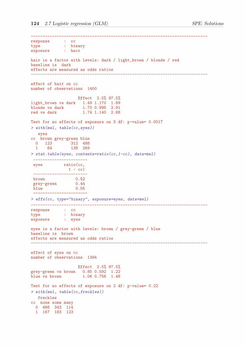
124 2.7 Logistic regression (GLM) SPE: Solutions
---------------------------------------------------------------------------response : cctype : binaryexposure : hair
hair is a factor with levels: dark / light_brown / blonde / redbaseline is darkeffects are measured as odds ratios---------------------------------------------------------------------------
effect of hair on ccnumber of observations 1400
Effect 2.5% 97.5%light_brown vs dark 1.49 1.170 1.89blonde vs dark 1.70 0.995 2.91red vs dark 1.74 1.140 2.68
Test for no effects of exposure on 3 df: p-value= 0.0017
> with(mel, table(cc,eyes))
eyescc brown grey-green blue0 123 312 4881 64 138 269
> stat.table(eyes, contents=ratio(cc,1-cc), data=mel)
-----------------------eyes ratio(cc,
1 - cc)-----------------------brown 0.52grey-green 0.44blue 0.55-----------------------
> effx(cc, type="binary", exposure=eyes, data=mel)
---------------------------------------------------------------------------response : cctype : binaryexposure : eyes
eyes is a factor with levels: brown / grey-green / bluebaseline is browneffects are measured as odds ratios---------------------------------------------------------------------------
effect of eyes on ccnumber of observations 1394
Effect 2.5% 97.5%grey-green vs brown 0.85 0.592 1.22blue vs brown 1.06 0.756 1.48
Test for no effects of exposure on 2 df: p-value= 0.22
> with(mel, table(cc,freckles))
frecklescc none some many0 466 343 1141 167 183 123

University of Tartu, 2017 2.7 Logistic regression (GLM) 125
> stat.table(freckles, contents=ratio(cc,1-cc),data=mel)
---------------------freckles ratio(cc,
1 - cc)---------------------none 0.36some 0.53many 1.08---------------------
> effx(cc, type="binary", exposure=freckles, data=mel)
---------------------------------------------------------------------------response : cctype : binaryexposure : freckles
freckles is a factor with levels: none / some / manybaseline is noneeffects are measured as odds ratios---------------------------------------------------------------------------
effect of freckles on ccnumber of observations 1396
Effect 2.5% 97.5%some vs none 1.49 1.16 1.92many vs none 3.01 2.21 4.11
Test for no effects of exposure on 2 df: p-value= 2.15e-11
2.7.5 Generalized linear models with binomial family and logitlink
The function effx() is just a wrapper for the glm() function, and you can show this byfitting the glm directly with
> mf <- glm(cc ~ freckles, family="binomial", data=mel)> round(ci.exp( mf ),2)
exp(Est.) 2.5% 97.5%(Intercept) 0.36 0.30 0.43frecklessome 1.49 1.16 1.92frecklesmany 3.01 2.21 4.11
>
Comparison with the output from effx() shows the results to be the same.Note that in effx() the type of response is “binary” whereas in glm() the family of
probability distributions used to fit the model is “binomial”. There is a 1-1 relationshipbetween type of response and family:
metric gaussianbinary binomialfailure/count poisson

126 2.7 Logistic regression (GLM) SPE: Solutions
2.7.6 Controlling for age and sex
Because the probability that a control is selected into the study depends on age and sex itis necessary to control for age and sex. For example, the effect of freckles controlled for ageand sex is obtained with
> effx(cc, typ="binary", exposure=freckles, control=list(age.cat,sex),data=mel)
---------------------------------------------------------------------------response : cctype : binaryexposure : frecklescontrol vars : age.cat sex
freckles is a factor with levels: none / some / manybaseline is noneeffects are measured as odds ratios---------------------------------------------------------------------------
effect of freckles on cccontrolled for age.cat sex
number of observations 1396
Effect 2.5% 97.5%some vs none 1.51 1.17 1.95many vs none 3.07 2.24 4.22
Test for no effects of exposure on 2 df: p-value= 2.55e-11
or
> mfas <- glm(cc ~ freckles + age.cat + sex, family="binomial", data=mel)> round(ci.exp(mfas), 2)
exp(Est.) 2.5% 97.5%(Intercept) 0.41 0.23 0.72frecklessome 1.51 1.17 1.95frecklesmany 3.07 2.24 4.22age.cat[30,40) 0.90 0.49 1.67age.cat[40,50) 0.91 0.51 1.62age.cat[50,60) 0.97 0.54 1.75age.cat[60,70) 0.82 0.45 1.48age.cat[70,85) 0.89 0.48 1.65sexF 0.94 0.74 1.19
Do the adjusted estimates differ from the crude ones that you computed with effx()?
2.7.7 Likelihood ratio tests
There are 2 effects estimated for the 3 levels of freckles, and glm() provides a test foreach effect separately, but to test for no effect at all of freckles you need a likelihoodratio test. This involves fitting two models, one without freckles and one with, andrecording the change in deviance. Because there are some missing values for freckles it isnecessary to restrict the first model to those subjects who have values for freckles.
> mas <- glm(cc ~ age.cat + sex, family="binomial", data=subset(mel, !is.na(freckles)) )> anova(mas, mfas, test="Chisq")

University of Tartu, 2017 2.7 Logistic regression (GLM) 127
Analysis of Deviance Table
Model 1: cc ~ age.cat + sexModel 2: cc ~ freckles + age.cat + sexResid. Df Resid. Dev Df Deviance Pr(>Chi)
1 1389 1785.92 1387 1737.1 2 48.786 2.549e-11
The change in residual deviance is 1785.9− 1737.1 = 48.8 on 1389− 1387 = 2 degrees offreedom. The P -value corresponding to this change is obtained from the upper tail of thecumulative distribution of the χ2-distribution with 2 df:
> 1 - pchisq(48.786, 2)
[1] 2.548328e-11
• There are 3 effects for the 4 levels of hair colour (hair). To obtain adjusted estimatesfor the effect of hair colour and to test the pertinent null hypothesis fit the relevant models,print the and use anova to test for no effects of hair colour.
exp(Est.) 2.5% 97.5%(Intercept) 0.39 0.22 0.69hairlight_brown 1.50 1.18 1.91hairblonde 1.68 0.98 2.88hairred 1.78 1.16 2.75age.cat[30,40) 0.98 0.53 1.79age.cat[40,50) 0.98 0.55 1.75age.cat[50,60) 1.17 0.65 2.11age.cat[60,70) 0.98 0.55 1.77age.cat[70,85) 1.13 0.61 2.08sexF 1.00 0.79 1.26
Analysis of Deviance Table
Model 1: cc ~ age.cat + sexModel 2: cc ~ hair + age.cat + sexResid. Df Resid. Dev Df Deviance Pr(>Chi)
1 1393 1790.72 1390 1775.2 3 15.434 0.001481
Compare the estimates with the crude ones and assess the evidence against the nullhypothesis.
2.7.8 Relevelling
From the above you can see that subjects at each of the 3 levels light-brown, blonde, andred, are at greater risk than subjects with dark hair, with similar odds ratios. This suggestscreating a new variable hair2 which has just two levels, dark and the other three. TheRelevel() function in Epi has been used for this in the house keeping script.
• Use effx() to compute the odds-ratio of melanoma between persons with red, blondeor light brown hair versus those with dark hair.
> effx(cc, type="binary", exposure=hair2, control=list(age.cat,sex), data=mel)

128 2.7 Logistic regression (GLM) SPE: Solutions
---------------------------------------------------------------------------response : cctype : binaryexposure : hair2control vars : age.cat sex
hair2 is a factor with levels: dark / otherbaseline is darkeffects are measured as odds ratios---------------------------------------------------------------------------
effect of hair2 on cccontrolled for age.cat sex
number of observations 1400
Effect 2.5% 97.5%1.55 1.24 1.95
Test for no effects of exposure on 1 df: p-value= 0.000124
Reproduce these results by fitting an appropriate glm.
> mh2 <- glm(cc ~ hair2 + age.cat + sex, family="binomial",+ data = subset(mel, !is.na(hair2)) )> ci.exp(mh2 )
exp(Est.) 2.5% 97.5%(Intercept) 0.3894010 0.2199868 0.6892829hair2other 1.5541887 1.2396159 1.9485894age.cat[30,40) 0.9740838 0.5302331 1.7894756age.cat[40,50) 0.9872390 0.5539667 1.7593852age.cat[50,60) 1.1722458 0.6529651 2.1044926age.cat[60,70) 0.9847738 0.5491367 1.7660074age.cat[70,85) 1.1277140 0.6121944 2.0773447sexF 1.0034944 0.7978073 1.2622108
Use also a likelihood ratio test to test for the effect of hair2.
> m1 <- glm(cc ~ age.cat + sex, data = subset(mel, !is.na(hair2)) )> anova(m1, mh2,test="Chisq")
Analysis of Deviance Table
Model 1: cc ~ age.cat + sexModel 2: cc ~ hair2 + age.cat + sexResid. Df Resid. Dev Df Deviance Pr(>Chi)
1 1393 313.172 1392 1775.93 1 -1462.8
2.7.9 Controlling for other variables
When you control the effect of an exposure for some variable you are asking a questionabout what would the effect be if the variable is kept constant. For example, consider theeffect of freckles controlled for hair2. We first stratify by hair2 with
> effx(cc, type="binary", exposure=freckles,+ control=list(age.cat,sex), strata=hair2, data=mel)

University of Tartu, 2017 2.7 Logistic regression (GLM) 129
---------------------------------------------------------------------------response : cctype : binaryexposure : frecklescontrol vars : age.cat sexstratified by : hair2
freckles is a factor with levels: none / some / manybaseline is nonehair2 is a factor with levels: dark/othereffects are measured as odds ratios---------------------------------------------------------------------------
effect of freckles on cccontrolled for age.cat sex
stratified by hair2
number of observations 1396
Effect 2.5% 97.5%strata dark level some vs none 1.61 1.11 2.34strata other level some vs none 1.42 1.00 2.01strata dark level many vs none 2.84 1.76 4.58strata other level many vs none 3.15 2.06 4.80
Test for effect modification on 2 df: p-value= 0.757
The effect of freckles is still apparent in each of the two strata for hair colour. Use effx()
to control for hair2, too, in addition to age.cat and sex.
> effx(cc, type="binary", exposure=freckles,+ control=list(age.cat,sex,hair2), data=mel)
---------------------------------------------------------------------------response : cctype : binaryexposure : frecklescontrol vars : age.cat sex hair2
freckles is a factor with levels: none / some / manybaseline is noneeffects are measured as odds ratios---------------------------------------------------------------------------
effect of freckles on cccontrolled for age.cat sex hair2
number of observations 1396
Effect 2.5% 97.5%some vs none 1.51 1.17 1.95many vs none 3.02 2.19 4.15
Test for no effects of exposure on 2 df: p-value= 6.9e-11
It is tempting to control for variables without thinking about the question you are therebyasking. This can lead to nonsense.

130 2.7 Logistic regression (GLM) SPE: Solutions
2.7.10 Stratification using glm()
We shall reproduce the output from
> effx(cc, type="binary", exposure=freckles,+ control=list(age.cat,sex), strata=hair2,data=mel)---------------------------------------------------------------------------response : cctype : binaryexposure : frecklescontrol vars : age.cat sexstratified by : hair2
freckles is a factor with levels: none / some / manybaseline is nonehair2 is a factor with levels: dark/othereffects are measured as odds ratios---------------------------------------------------------------------------
effect of freckles on cccontrolled for age.cat sex
stratified by hair2
number of observations 1396
Effect 2.5% 97.5%strata dark level some vs none 1.61 1.11 2.34strata other level some vs none 1.42 1.00 2.01strata dark level many vs none 2.84 1.76 4.58strata other level many vs none 3.15 2.06 4.80
Test for effect modification on 2 df: p-value= 0.757
using glm(). To do this requires a nested model formula:
> mfas.h <- glm(cc ~ hair2/freckles + age.cat + sex, family="binomial", data=mel)> ci.exp(mfas.h )
exp(Est.) 2.5% 97.5%(Intercept) 0.3169581 0.1725855 0.5821023hair2other 1.5639083 1.0920425 2.2396650age.cat[30,40) 0.9286674 0.5004220 1.7233920age.cat[40,50) 0.9573093 0.5328744 1.7198068age.cat[50,60) 1.0464308 0.5776057 1.8957872age.cat[60,70) 0.8495081 0.4692660 1.5378570age.cat[70,85) 0.9351315 0.5020370 1.7418455sexF 0.9012339 0.7114142 1.1417014hair2dark:frecklessome 1.6123583 1.1106965 2.3406026hair2other:frecklessome 1.4196216 1.0015163 2.0122743hair2dark:frecklesmany 2.8378600 1.7567458 4.5842996hair2other:frecklesmany 3.1469251 2.0628414 4.8007266
In amongst all the other effects you can see the two effects of freckles for dark hair (1.61and 2.84) and the two effects of freckles for other hair (1.42 and 3.15).
2.7.11 Naevi
The distributions of nvsmall and nvlarge are very skew to the right. You can see thiswith

University of Tartu, 2017 2.7 Logistic regression (GLM) 131
> with(mel, stem(nvsmall))
The decimal point is at the |
0 | 00000000000000000000000000000000000000000000000000000000000000000000+10342 | 00000000000000000000000000000000000000000000000000000000000000000000+654 | 000000000000000000000000000000000000000000000000000000000006 | 000000000000000000000000008 | 0000000000000000000010 | 000000000012 | 0014 | 000000016 |18 | 00020 | 022 | 00024 | 026 |28 |30 |32 |34 |36 | 038 |40 |42 |44 |46 | 0
> with(mel, stem(nvlarge))
The decimal point is at the |
0 | 00000000000000000000000000000000000000000000000000000000000000000000+11831 | 00000000000000000000000000000000000000000000000000000000000000000000+152 | 0000000000000000003 | 00000004 | 00005 | 0006 |7 |8 |9 | 010 |11 |12 | 013 |14 | 0
Because of this it is wise to categorize them into a few classes
– small naevi into four: 0, 1, 2-4, and 5+;
– large naevi into three: 0, 1, and 2+.
This has been done in the house keeping script.
• Look at the joint frequency distribution of these new variables using with(mel,
table( )). Are they strongly associated?
> stat.table(list(nvsma4,nvlar3),contents=percent(nvlar3),data=mel)

132 2.7 Logistic regression (GLM) SPE: Solutions
------------------------------------------nvlar3----------
nvsma4 [0,1) [1,2) [2,15)---------------------------------[0,1) 93.9 4.9 1.2[1,2) 89.6 8.3 2.1[2,5) 85.8 9.7 4.5[5,50) 71.8 16.5 11.7---------------------------------
> #High frequencies on the diagonal shows a strong association
• Compute the sex- and age-adjusted OR estimates (with 95% CIs) associated with thenumber of small naevi first by using effx(), and then by fitting separate glms includingsex, age.cat and nvsma4 in the model formula.
> effx(cc,type="binary",exposure=nvsma4,control=list(age.cat,sex),data=mel)
---------------------------------------------------------------------------response : cctype : binaryexposure : nvsma4control vars : age.cat sex
nvsma4 is a factor with levels: [0,1) / [1,2) / [2,5) / [5,50)baseline is [0,1)effects are measured as odds ratios---------------------------------------------------------------------------
effect of nvsma4 on cccontrolled for age.cat sex
number of observations 1393
Effect 2.5% 97.5%[1,2) vs [0,1) 1.59 1.15 2.21[2,5) vs [0,1) 2.47 1.77 3.43[5,50) vs [0,1) 5.06 3.28 7.81
Test for no effects of exposure on 3 df: p-value= <2e-16
> mns <- glm(cc ~ nvsma4 + age.cat + sex, family="binomial",data=mel)> round(ci.exp(mns), 2)
exp(Est.) 2.5% 97.5%(Intercept) 0.36 0.20 0.64nvsma4[1,2) 1.59 1.15 2.21nvsma4[2,5) 2.47 1.77 3.43nvsma4[5,50) 5.06 3.28 7.81age.cat[30,40) 0.96 0.51 1.80age.cat[40,50) 1.02 0.56 1.85age.cat[50,60) 1.16 0.64 2.13age.cat[60,70) 1.07 0.58 1.96age.cat[70,85) 1.17 0.62 2.21sexF 0.96 0.76 1.21
• Do the same with large naevi nvlar3.
> effx(cc, type="binary", exposure=nvlar3, control=list(age.cat,sex), data=mel)

University of Tartu, 2017 2.7 Logistic regression (GLM) 133
---------------------------------------------------------------------------response : cctype : binaryexposure : nvlar3control vars : age.cat sex
nvlar3 is a factor with levels: [0,1) / [1,2) / [2,15)baseline is [0,1)effects are measured as odds ratios---------------------------------------------------------------------------
effect of nvlar3 on cccontrolled for age.cat sex
number of observations 1393
Effect 2.5% 97.5%[1,2) vs [0,1) 1.82 1.19 2.78[2,15) vs [0,1) 3.58 1.78 7.21
Test for no effects of exposure on 2 df: p-value= 4.81e-05
> mnl <- glm(cc ~ nvlar3 + age.cat + sex, family="binomial", data=mel)> round(ci.exp(mnl), 2)
exp(Est.) 2.5% 97.5%(Intercept) 0.49 0.28 0.85nvlar3[1,2) 1.82 1.19 2.78nvlar3[2,15) 3.58 1.78 7.21age.cat[30,40) 0.90 0.49 1.66age.cat[40,50) 0.92 0.52 1.63age.cat[50,60) 1.07 0.60 1.91age.cat[60,70) 0.89 0.50 1.60age.cat[70,85) 1.00 0.54 1.84sexF 1.03 0.82 1.29
• Now fit a glm containing age.cat, sex, nvsma4 and nvlar3. What is theinterpretation of the coefficients for nvsma4 and nvlar3?
> mnls <- glm(cc ~ nvsma4 + nvlar3 + age.cat + sex, family="binomial", data=mel)> # Coeffs for nvsma4 are the effects of nvsma4 controlled for age.cat, sex, and nvlar3.> # Similarly for the coefficients for nvlar3.
2.7.12 Treating freckles as a numeric exposure
The evidence for the effect of freckles is already convincing. However, to demonstratehow it is done, we shall perform a linear trend test by treating freckles as a numericexposure.
> mel$fscore<-as.numeric(mel$freckles)> effx(cc, type="binary", exposure=fscore, control=list(age.cat,sex), data=mel)
---------------------------------------------------------------------------response : cctype : binaryexposure : fscorecontrol vars : age.cat sex

134 2.7 Logistic regression (GLM) SPE: Solutions
fscore is numericeffects are measured as odds ratios---------------------------------------------------------------------------
effect of an increase of 1 unit in fscore on cccontrolled for age.cat sex
number of observations 1396
Effect 2.5% 97.5%1.72 1.47 2.00
Test for no effects of exposure on 1 df: p-value= 6.2e-12
You can check for linearity of the log odds of being a case with fscore by comparing themodel containing freckles as a factor with the model containing freckles as numeric.
> m1 <- glm(cc ~ freckles + age.cat + sex, family="binomial", data=mel)> m2 <- glm(cc ~ fscore + age.cat + sex, family="binomial", data=mel)> anova(m2, m1, test="Chisq")Analysis of Deviance Table
Model 1: cc ~ fscore + age.cat + sexModel 2: cc ~ freckles + age.cat + sexResid. Df Resid. Dev Df Deviance Pr(>Chi)
1 1388 1738.62 1387 1737.1 1 1.5206 0.2175
There is no evidence against linearity (p = 0.22).It is sometimes helpful to look at the linearity in more detail with
> m1 <- glm(cc ~ C(freckles, contr.cum) + age.cat + sex, family="binomial",data=mel)> round(ci.exp(m1 ), 2)
exp(Est.) 2.5% 97.5%(Intercept) 0.41 0.23 0.72C(freckles, contr.cum)2 1.51 1.17 1.95C(freckles, contr.cum)3 2.03 1.49 2.78age.cat[30,40) 0.90 0.49 1.67age.cat[40,50) 0.91 0.51 1.62age.cat[50,60) 0.97 0.54 1.75age.cat[60,70) 0.82 0.45 1.48age.cat[70,85) 0.89 0.48 1.65sexF 0.94 0.74 1.19
> m2 <- glm(cc ~ fscore + age.cat + sex, family="binomial",data=mel)> round(ci.exp(m2), 2)
exp(Est.) 2.5% 97.5%(Intercept) 0.23 0.12 0.42fscore 1.72 1.47 2.00age.cat[30,40) 0.90 0.49 1.67age.cat[40,50) 0.91 0.51 1.63age.cat[50,60) 0.97 0.54 1.75age.cat[60,70) 0.81 0.45 1.47age.cat[70,85) 0.89 0.48 1.66sexF 0.94 0.74 1.18
The use of C(freckles, contr.cum) makes each odds ratio to compare the odds at thatlevel versus the previous level; not against the baseline (except for the 2nd level). If thelog-odds are linear then these odds ratios should be the same (and the same as the oddsratio for fscore in m2.

University of Tartu, 2017 2.7 Logistic regression (GLM) 135
2.7.13 Graphical displays
The odds ratios (with CIs) can be graphically displayed using function plotEst() in Epi.It uses the value of ci.lin() evaluated on the fitted model object. As the intercept andthe effects of age and sex are of no interest, we shall drop the corresponding rows (the 7first ones) from the matrix produced by ci.lin(), and the plot is based just on the 1st,5th and the 6th column of this matrix:
> m <- glm(cc ~ nvsma4 + nvlar3 + age.cat + sex, family="binomial",data=mel)> plotEst( exp( ci.lin(m)[ 2:5, -(2:4)] ), xlog=T, vref=1 )
The xlog argument makes the OR axis logarithmic.

136 2.8 Estimation of effects: simple and more complex SPE: Solutions
effects-s: Simple estimation of effects
2.8 Estimation of effects: simple and more complex
This exercise deals with analysis of metric or continuous response variables. We start withsimple estimation of effects of a binary, categorical or a numeric explanatory variable, theexposure variable of interest. Then evaluation of potential modification confoundingand/or by other variables is considered by stratification by and adjustment or control forthese variables. Use of function effx() for such tasks is introduced together with functionslm() and glm() that can be used for more general linear and generalized linear models.Finally, more complex polynomial models for the effect of a numeric exposure variable areillustrated.
2.8.1 Response and explanatory variables
Identifying the response or outcome variable correctly is the key to analysis. The maintypes are:
• Metric (a measurement taking many values, usually with units)
• Binary (two values coded 1/0)
• Failure (does the subject fail at end of follow-up, coded 1/0, and how long wasfollow-up, measurement of time)
• Count (aggregated data on failures in a group)
All these response variable are numeric.Variables on which the response may depend are called explanatory variables. They can
be categorical factors or numeric variables. A further important aspect of explanatoryvariables is the role they will play in the analysis.
• Primary role: exposure.
• Secondary role: confounder and/or modifier.
The word effect is a general term referring to ways of comparing the values of theresponse variable at different levels of an explanatory variable. The main measures of effectare:
• Differences in means for a metric response.
• Ratios of odds for a binary response.
• Ratios of rates for a failure or count response.
Other measures of effect include ratios of geometric means for positive-valued metricoutcomes, differences and ratios between proportions (risk difference and risk ratio), anddifferences between failure rates.

University of Tartu, 2017 2.8 Estimation of effects: simple and more complex 137
2.8.2 Data set births
We shall use the births data to illustrate different aspects in estimating effects of variousexposures on a metric response variable bweight = birth weight, recorded in grams.
1. Load the Epi package and the data set and look at its content
> library(Epi)> data(births)> str(births)
'data.frame': 500 obs. of 8 variables:$ id : num 1 2 3 4 5 6 7 8 9 10 ...$ bweight: num 2974 3270 2620 3751 3200 ...$ lowbw : num 0 0 0 0 0 0 0 0 0 0 ...$ gestwks: num 38.5 NA 38.2 39.8 38.9 ...$ preterm: num 0 NA 0 0 0 0 0 0 0 0 ...$ matage : num 34 30 35 31 33 33 29 37 36 39 ...$ hyp : num 0 0 0 0 1 0 0 0 0 0 ...$ sex : num 2 1 2 1 1 2 2 1 2 1 ...
2. Because all variables are numeric we need first to do a little housekeeping. Two ofthem are directly converted into factors, and categorical versions are created of twocontinuous variables by function cut().
> births$hyp <- factor(births$hyp, labels = c("normal", "hyper"))> births$sex <- factor(births$sex, labels = c("M", "F"))> births$agegrp <- cut(births$matage,+ breaks = c(20, 25, 30, 35, 40, 45), right = FALSE)> births$gest4 <- cut(births$gestwks,+ breaks = c(20, 35, 37, 39, 45), right = FALSE)
3. Have a look at univariate summaries of the different variables in the data; especiallythe location and dispersion of the distribution of bweight.
> summary(births)
id bweight lowbw gestwks preterm matageMin. : 1.0 Min. : 628 Min. :0.00 Min. :24.69 Min. :0.0000 Min. :23.001st Qu.:125.8 1st Qu.:2862 1st Qu.:0.00 1st Qu.:37.94 1st Qu.:0.0000 1st Qu.:31.00Median :250.5 Median :3188 Median :0.00 Median :39.12 Median :0.0000 Median :34.00Mean :250.5 Mean :3137 Mean :0.12 Mean :38.72 Mean :0.1286 Mean :34.033rd Qu.:375.2 3rd Qu.:3551 3rd Qu.:0.00 3rd Qu.:40.09 3rd Qu.:0.0000 3rd Qu.:37.00Max. :500.0 Max. :4553 Max. :1.00 Max. :43.16 Max. :1.0000 Max. :43.00
NA's :10 NA's :10hyp sex agegrp gest4
normal:428 M:264 [20,25): 2 [20,35): 31hyper : 72 F:236 [25,30): 68 [35,37): 32
[30,35):200 [37,39):167[35,40):194 [39,45):260[40,45): 36 NA's : 10
> with(births, sd(bweight) )
[1] 637.4515

138 2.8 Estimation of effects: simple and more complex SPE: Solutions
2.8.3 Simple estimation with effx(), lm() and glm()
We are ready to analyze the “effect” of sex on bweight. A binary exposure variable, likesex, leads to an elementary two-group comparison of group means for a metric response.
4. Comparison of two groups is commonly done by the conventional t-test and theassociated confidence interval.
> with( births, t.test(bweight ~ sex, var.equal=T) )
Two Sample t-test
data: bweight by sext = 3.4895, df = 498, p-value = 0.0005269alternative hypothesis: true difference in means is not equal to 095 percent confidence interval:86.11032 308.03170
sample estimates:mean in group M mean in group F
3229.902 3032.831
The P -value refers to the test of the null hypothesis that there is no effect of sex onbirth weight (quite an uninteresting null hypothesis in itself!). However, t.test()does not provide the point estimate for the effect of sex; only the test result and aconfidence interval.
5. The function effx() in Epi is intended to introduce the estimation of effects inepidemiology, together with the related ideas of stratification and controlling, i.e.adjustment for confounding, without the need for familiarity with statisticalmodelling. It is in fact a wrapper of function glm() that fits generalized linearmodels. – Now, do the same analysis with effx()
> effx(response=bweight, type="metric", exposure=sex, data=births)
---------------------------------------------------------------------------response : bweighttype : metricexposure : sex
sex is a factor with levels: M / Fbaseline is Meffects are measured as differences in means---------------------------------------------------------------------------
effect of sex on bweightnumber of observations 500
Effect 2.5% 97.5%-197.0 -308.0 -86.4
Test for no effects of exposure on 1 df: p-value= 0.000484
The estimated effect of sex on birth weight, measured as a difference in meansbetween girls and boys, is −197 g. Either the output from t.test() above or thecommand

University of Tartu, 2017 2.8 Estimation of effects: simple and more complex 139
> stat.table(sex, mean(bweight), data=births)
--------------------sex mean(bweight)--------------------M 3229.90F 3032.83--------------------
confirms this (3032.8− 3229.9 = −197.1).
6. The same task can easily be performed by lm() or by glm(). The main argument inboth is the model formula, the left hand side being the response variable and theright hand side after ∼ defines the explanatory variables and their joint effects on theresponse. Here the only explanatory variable is the binary factor sex. With glm()
one specifies the family, i.e. the assumed distribution of the response variable, but incase you use lm(), this argument is not needed, because lm() fits only models formetric responses assuming Gaussian distribution.
> m1 <- glm(bweight ~ sex, family=gaussian, data=births)> summary(m1)
Call:glm(formula = bweight ~ sex, family = gaussian, data = births)
Deviance Residuals:Min 1Q Median 3Q Max
-2536.90 -267.40 70.67 371.12 1323.10
Coefficients:Estimate Std. Error t value Pr(>|t|)
(Intercept) 3229.90 38.80 83.244 < 2e-16sexF -197.07 56.48 -3.489 0.000527
(Dispersion parameter for gaussian family taken to be 397442.7)
Null deviance: 202765853 on 499 degrees of freedomResidual deviance: 197926455 on 498 degrees of freedomAIC: 7869.3
Number of Fisher Scoring iterations: 2
Note the amount of output that summary() method produces. The point estimateplus confidence limits can, though, be concisely obtained by ci.lin().
> round( ci.lin(m1)[ , c(1,5,6)] , 1)
Estimate 2.5% 97.5%(Intercept) 3229.9 3153.9 3305.9sexF -197.1 -307.8 -86.4
7. Now, use effx() to find the effect of hyp (maternal hypertension) on bweight.

140 2.8 Estimation of effects: simple and more complex SPE: Solutions
---------------------------------------------------------------------------response : bweighttype : metricexposure : hyp
hyp is a factor with levels: normal / hyperbaseline is normaleffects are measured as differences in means---------------------------------------------------------------------------
effect of hyp on bweightnumber of observations 500
Effect 2.5% 97.5%-431 -585 -276
Test for no effects of exposure on 1 df: p-value= 4.9e-08
2.8.4 Factors on more than two levels
The variable gest4 became as the result of cutting gestwks into 4 groups with left-closedand right-open boundaries [20,35) [35,37) [37,39) [39,45).
8. We shall find the effects of gest4 on the metric response bweight.
> effx(response=bweight,typ="metric",exposure=gest4,data=births)
---------------------------------------------------------------------------response : bweighttype : metricexposure : gest4
gest4 is a factor with levels: [20,35) / [35,37) / [37,39) / [39,45)baseline is [20,35)effects are measured as differences in means---------------------------------------------------------------------------
effect of gest4 on bweightnumber of observations 490
Effect 2.5% 97.5%[35,37) vs [20,35) 857 620 1090[37,39) vs [20,35) 1360 1180 1540[39,45) vs [20,35) 1670 1490 1850
Test for no effects of exposure on 3 df: p-value= <2e-16
There are now 3 effect estimates:
[35,37) vs [20,35) 857
[37,39) vs [20,35) 1360
[39,45) vs [20,35) 1668
The command

University of Tartu, 2017 2.8 Estimation of effects: simple and more complex 141
> stat.table(gest4,mean(bweight),data=births)
------------------------gest4 mean(bweight)------------------------[20,35) 1733.74[35,37) 2590.31[37,39) 3093.77[39,45) 3401.26------------------------
confirms that the effect of agegrp (level 2 vs level 1) is 2590− 1733 = 857, etc.
9. Compute these estimates by lm() and find out how the coefficients are related to thegroup means
> m2 <- lm(bweight ~ gest4, data = births)> round( ci.lin(m2)[ , c(1,5,6)] , 1)
Estimate 2.5% 97.5%(Intercept) 1733.7 1565.3 1902.1gest4[35,37) 856.6 620.3 1092.9gest4[37,39) 1360.0 1176.7 1543.4gest4[39,45) 1667.5 1489.4 1845.7
2.8.5 Stratified effects and interaction or effect modification
We shall now examine whether and to what extent the effect of hyp on bweight varies bygest4.
10. The following “interaction plot” shows how the mean bweight depends jointly on hyp
and gest4
> par(mfrow=c(1,1))> with( births, interaction.plot(gest4, hyp, bweight) )

142 2.8 Estimation of effects: simple and more complex SPE: Solutions
1500
2000
2500
3000
gest4
mea
n of
bw
eigh
t
[20,35) [35,37) [37,39) [39,45)
hyp
normalhyper
It appearsthat the mean difference in bweight between normotensive and hypertensive mothersis inversely related to gestational age.
11. Let us get numerical values for the mean differences in the different gest4 categories:
> effx(bweight, type="metric", exposure=hyp, strata=sex,data=births)
---------------------------------------------------------------------------response : bweighttype : metricexposure : hypstratified by : sex
hyp is a factor with levels: normal / hyperbaseline is normalsex is a factor with levels: M/Feffects are measured as differences in means---------------------------------------------------------------------------
effect of hyp on bweightstratified by sex
number of observations 500
Effect 2.5% 97.5%

University of Tartu, 2017 2.8 Estimation of effects: simple and more complex 143
strata M level hyper vs normal -496 -696 -297strata F level hyper vs normal -380 -617 -142
Test for effect modification on 1 df: p-value= 0.462
The estimated effects of hyp in the different strata defined by gest4 thus range fromabout −100 g among those with ≥ 39 weeks of gestation to about −700 g amongthose with < 35 weeks of gestation. The error margin especially around the latterestimate is quite wide, though. The P -value 0.055 from the test for effectmodification indicates weak evidence against the null hypothesis of “no interactionbetween hyp and gest4”. On the other hand, this test may well be not very sensitivegiven the small number of preterm babies in these data.
12. Stratified estimation of effects can also be done by lm(), and you should get the sameresults:
> m3 <- lm(bweight ~ gest4/hyp, data = births)> round( ci.lin(m3)[ , c(1,5,6)], 1)
Estimate 2.5% 97.5%(Intercept) 1929.1 1732.1 2126.2gest4[35,37) 710.5 431.9 989.2gest4[37,39) 1197.0 984.7 1409.3gest4[39,45) 1479.9 1273.9 1685.8gest4[20,35):hyphyper -673.0 -1038.8 -307.3gest4[35,37):hyphyper -158.0 -510.5 194.5gest4[37,39):hyphyper -180.1 -366.4 6.2gest4[39,45):hyphyper -91.6 -297.5 114.4
13. An equivalent model with an explicit interaction term between gest4 and hyp isfitted as follows
> m3I <- lm(bweight ~ gest4 + hyp + gest4:hyp, data = births)> round( ci.lin(m3I)[ , c(1,5,6)], 1)
Estimate 2.5% 97.5%(Intercept) 1929.1 1732.1 2126.2gest4[35,37) 710.5 431.9 989.2gest4[37,39) 1197.0 984.7 1409.3gest4[39,45) 1479.9 1273.9 1685.8hyphyper -673.0 -1038.8 -307.3gest4[35,37):hyphyper 515.0 7.1 1023.0gest4[37,39):hyphyper 492.9 82.5 903.4gest4[39,45):hyphyper 581.5 161.7 1001.2
From this output you would find a familiar estimate −673 g for those < 35gestational weeks. The remaining coefficients are estimates of the interaction effectssuch that e.g. 515 = −158− (−673) g describes the contrast in the effect of hyp onbweight between those 35 to < 37 weeks and those < 35 weeks of gestation.
14. Perhaps a more appropriate reference level for the categorized gestational age wouldbe the highest one. Changing the reference level, here to be the 4th category, can bedone by Relevel() function in the Epi package, after which an equivalent interactionmodel is fitted, now using a shorter expression for it in the model formula:

144 2.8 Estimation of effects: simple and more complex SPE: Solutions
> births$gest4b <- Relevel( births$gest4, ref = 4)> m3Ib <- lm(bweight ~ gest4b*hyp, data = births)> round( ci.lin(m3Ib)[ , c(1,5,6)], 1)
Estimate 2.5% 97.5%(Intercept) 3409.0 3349.1 3468.9gest4b[20,35) -1479.9 -1685.8 -1273.9gest4b[35,37) -769.3 -975.3 -563.4gest4b[37,39) -282.9 -382.0 -183.8hyphyper -91.6 -297.5 114.4gest4b[20,35):hyphyper -581.5 -1001.2 -161.7gest4b[35,37):hyphyper -66.4 -474.7 341.8gest4b[37,39):hyphyper -88.5 -366.3 189.2
Notice now the coefficient −91.6 for hyp. It estimates the effect of hyp on bweight
among those with ≥ 39 weeks of gestation. The estimate −88.5 g = −180.1− (−91.6)g describes the additional effect of hyp in the category 37 to 38 weeks of gestationupon that in the reference class.
15. At this stage it is interesting to compare the results from the interaction models tothose from the corresponding main effects model, in which the effect of hyp isassumed not to be modified by gest4:
> m3M <- lm(bweight ~ gest4 + hyp, data = births)> round( ci.lin(m3M)[ , c(1,5,6)], 1)
Estimate 2.5% 97.5%(Intercept) 1792.1 1621.6 1962.6gest4[35,37) 861.0 627.0 1095.1gest4[37,39) 1337.8 1155.7 1519.9gest4[39,45) 1626.2 1447.9 1804.4hyphyper -201.0 -322.9 -79.1
The estimate −201 g describing the overall effect of hyp is obtained as a weightedaverage of the stratum-specific estimates obtained by effx() above. It is ameaningful estimate adjusting for gest4 insofar as it is reasonable to assume that theeffect of hyp is not modified by gest4. This assumption or the “no interaction” nullhypothesis can formally be tested by a common deviance test.
> anova(m3I, m3M)
Analysis of Variance Table
Model 1: bweight ~ gest4 + hyp + gest4:hypModel 2: bweight ~ gest4 + hypRes.Df RSS Df Sum of Sq F Pr(>F)
1 482 1071954932 485 108883306 -3 -1687813 2.5297 0.05659
The P -value is practically the same as before when the interaction was tested ineffx(). However, in spite of obtaining a “non-significant” result from this test, thepossibility of a real interaction should not be ignored in this case.

University of Tartu, 2017 2.8 Estimation of effects: simple and more complex 145
16. Now, use effx() to stratify (i) the effect of hyp on bweight by sex and then (ii)perform the stratified analysis using the two ways of fitting an interaction model withlm.
---------------------------------------------------------------------------response : bweighttype : metricexposure : hypstratified by : sex
hyp is a factor with levels: normal / hyperbaseline is normalsex is a factor with levels: M/Feffects are measured as differences in means---------------------------------------------------------------------------
effect of hyp on bweightstratified by sex
number of observations 500
Effect 2.5% 97.5%strata M level hyper vs normal -496 -696 -297strata F level hyper vs normal -380 -617 -142
Test for effect modification on 1 df: p-value= 0.462
Estimate 2.5% 97.5%(Intercept) 3310.7 3230.1 3391.4sexF -231.2 -347.2 -115.3sexM:hyphyper -496.4 -696.1 -296.6sexF:hyphyper -379.8 -617.4 -142.2
Estimate 2.5% 97.5%(Intercept) 3310.7 3230.1 3391.4sexF -231.2 -347.2 -115.3hyphyper -496.4 -696.1 -296.6sexF:hyphyper 116.6 -193.8 427.0
Look at the results. Is there evidence for the effect of hyp being modified by sex?
2.8.6 Controlling or adjusting for the effect of hyp for sex
The effect of hyp is controlled for – or adjusted for – sex by first looking at the estimatedeffects of hyp in the two stata defined by sex, and then combining these effects if theyseem sufficiently similar. In this case the estimated effects were −496 and −380 which lookquite similar (and the P -value against “no interaction” was quite large, too), so we canperhaps combine them, and control for sex.
17. The combining is done by declaring sex as a control variable:
> effx(bweight, type="metric", exposure=hyp, control=sex, data=births)
---------------------------------------------------------------------------response : bweighttype : metric

146 2.8 Estimation of effects: simple and more complex SPE: Solutions
exposure : hypcontrol vars : sex
hyp is a factor with levels: normal / hyperbaseline is normaleffects are measured as differences in means---------------------------------------------------------------------------
effect of hyp on bweightcontrolled for sex
number of observations 500
Effect 2.5% 97.5%-448 -601 -295
Test for no effects of exposure on 1 df: p-value= 9.07e-09
18. The same is done with lm() as follows:
> m4 <- lm(bweight ~ sex + hyp, data = births)> ci.lin(m4)[ , c(1,5,6)]
Estimate 2.5% 97.5%(Intercept) 3302.8845 3225.0823 3380.6867sexF -214.9931 -322.4614 -107.5249hyphyper -448.0817 -600.8911 -295.2723
The estimated effect of hyp on bweight controlled for sex is thus −448 g. There canbe more than one control variable, e.g control=list(sex,agegrp).
Many people go straight ahead and control for variables which are likely to confoundthe effect of exposure without bothering to stratify first, but usually it is useful tostratify first.
2.8.7 Numeric exposures
If we wished to study the effect of gestation time on the baby’s birth weight then gestwks
is a numeric exposure.
19. Assuming that the relationship of the response with gestwks is roughly linear (for ametric response) we can estimate the linear effect of gestwks, both with effx() andwith lm() as follows:
> effx(response=bweight, type="metric", exposure=gestwks,data=births)
---------------------------------------------------------------------------response : bweighttype : metricexposure : gestwks
gestwks is numericeffects are measured as differences in means---------------------------------------------------------------------------

University of Tartu, 2017 2.8 Estimation of effects: simple and more complex 147
effect of an increase of 1 unit in gestwks on bweightnumber of observations 490
Effect 2.5% 97.5%197 180 214
Test for no effects of exposure on 1 df: p-value= <2e-16
> m5 <- lm(bweight ~ gestwks, data=births) ; ci.lin(m5)[ , c(1,5,6)]
Estimate 2.5% 97.5%(Intercept) -4489.1398 -5157.2891 -3820.9905gestwks 196.9726 179.7482 214.1971
We have fitted a simple linear regression model and obtained estimates of the tworegression coefficient: intercept and slope. The linear effect of gestwks is thusestimated by the slope coefficient, which is 197 g per each additional week ofgestation.
20. You cannot stratify by a numeric variable, but you can study the effects of a numericexposure stratified by (say) agegrp with
> effx(bweight, type="metric", exposure=gestwks, strata=agegrp, data=births)
---------------------------------------------------------------------------response : bweighttype : metricexposure : gestwksstratified by : agegrp
gestwks is numericagegrp is a factor with levels: [20,25)/[25,30)/[30,35)/[35,40)/[40,45)effects are measured as differences in means---------------------------------------------------------------------------
effect of an increase of 1 unit in gestwks on bweightstratified by agegrp
number of observations 490
Effect 2.5% 97.5%strata [20,25) 85 -191 361strata [25,30) 206 167 245strata [30,35) 198 171 225strata [35,40) 202 168 235strata [40,45) 175 124 226
Test for effect modification on 4 df: p-value= 0.8
You can control/adjust for a numeric variable by putting it in the control list.
2.8.8 Checking the assumptions of the linear model
At this stage it will be best to make some visual check concerning our model assumptionsusing plot(). In particular, when the main argument for the generic function plot() is afitted lm object, it will provide you some common diagnostic graphs.

148 2.8 Estimation of effects: simple and more complex SPE: Solutions
21. To check whether bweight goes up linearly with gestwks try
> with(births, plot(gestwks,bweight))> abline(m5)
●
●
●
●
● ●
●
●
●
●
●
●●
●
●
●
●
●
●
●
●
●
●
●
●
●
●
●
●
●●
●
●
●
●●
●
●
● ●
●
●
●
●
● ●
●
●
●
●
●
●
●
●
●
●
●
●
●
●
●
●
●●
●●
●
●
●
●
●
●●
●
●
●
●
●
●●
●
●
●
●●
●
●
●
●
●
●
●
●
●●
●
●
●
●
●●
●●
●
●
● ●
●
●
●
● ●
●
●
●●
●
●
●●
●●
●
●
●
●
●
●●
●
●
●
●
●
●
●●
●
●●
●
●
●
●
●●●
●
●
●●
●●
●
●
●
●
●
●
●
●
●
●
●
●
●
● ●
●
●
●●
●
●
●
●
●
●
●
●
●
●
●●
●
●
●
●
●
●
●
●
● ●
●
●
●
●
●
●
●
●
●
●
●
●●●
●
●
●●
●
●
●
●●
●
●
●
●
●
●
●
●
● ●
●
●
●
●
●
●
●
●
● ●●
●
●
●
●
●
●●
●
●
●
●
●
●
●
●
●
●
●
●
●
●
●
●
●
●
●
●
●
●
●
●
●
●
●
●●
●
●
●
●
●
●
●●
●
●
●
●
●
●
●●
●
● ●
●
●
●
●
●
●●
●
●
●
●●
●
●●
●●
●
●
●
●
●
●
●
●
●
●
●●
●
●
●
●
●
●
●
●●
●
●
● ●
●
●
●
●●
●
●
●
●
●
●●
●●
●
●
●
●
●
●
●
●
●
●
●
●
●
●
●
●
●
●
●
●
●
●
●
●
●●
●
●
●
●
●
●●
●●
●
●
●
●
●
●
●
●
●
●
●
●
●●
●
●●
●
●
●
●
●
● ● ●
●
●
●
●●
●
●●
●
●
●
●
●
●
●●
●
●
●
●
●
●
●
●
●
●
●
●
●
●
●
●
●
●
●
●
●
●●
●
●
●
●
●
●
●
●
●
●
●
●
●
● ●
●
●
●
●
●
●
●●
●
●
●●
●
●
●●●
●
●
●●
●●
●
●●
●
25 30 35 40
1000
2000
3000
4000
gestwks
bwei
ght
22. Moreover, take a look at the basic diagnostic plots for the fitted model.
> par(mfrow=c(2,2))> plot(m5)

University of Tartu, 2017 2.8 Estimation of effects: simple and more complex 149
1000 2000 3000 4000
−20
00−
500
1000
Fitted values
Res
idua
ls
●
●
●
● ●
●
●●●
●
●●
●
●
●●
●
●●
●
●
●●
●
●●●
●
●
●●
●●
●●
●
●●●
●
●
●
●
●●
●● ● ●●
●
●
●●
●
●
●
●
●
● ●
●●
●
●
●●
●
●
●●●●
●●
●
●
●
●●
●
●●
●●
●●
●
●
●●
●●
●
●
●
●
●
●●●
●
●
● ●●
●
●
●
●●
●●
●
●
●●
●
●
●
●●
●
●
●●
●
●
●●●
●
●
●
●
●
●
● ●●
●●
●
●
●
●●
●●
●●
●●
●
●●●
● ●
●
●
●
● ●
●
●
●
●●
●
●●
●
●
●
●●
●
●
●
●
●
●●
●
●●
●
●
●
●
●
●●
●
●
●
●
●
●
●
●
●●
●
●
●●●
●
●
●●
●
●
●
● ●●
●●●
●●
●
●
●
●
●
● ●
●●
●●●
●
●●
●
●
●
●
●
●
●
●
●
●
●● ●●
●
● ●●
●
●
●
●●
●
●
●●
●
●
●●
●
●
●●
●
●
●● ●
●
●●
●
●●
●
●●
●
●
●
●●
●
●
●●
●
●
●●
●
●
●●
●
●
●●●
●
● ●
●
●
●
●●●
●
●
●
●
●
●
●
●●●
●
●
●
● ●
●●
●
●●
●●
●●
●
●●
●
●●
●
●
●
●●
● ●●
●
●● ●
●
●●
●
●
●
●●
●● ●
●
●
●●
●
●
●
●
●●
●●●
●
●●
●
●
●
●
●
●
●
●
●●
●
●
●
●
●●
●●
●
●●●
●
●
●●
●
●
●
●
●
●●
●
●
●
●●
●
●
●●
●
●
●
●
● ●
●
●
●●
●
●
●
●
●
●
●●
●
●●
●●
●●
●
●
●
●
●
●
●
●
●
●●
●
●
●
●●
●
●
●●
●
●●●
●
●●
●
●
●
●
●●
●●
Residuals vs Fitted
30124
78
●
●
●
●●
●
●●●
●
●●
●
●
●●
●
●●
●
●
●●
●
●●●
●
●
●●
●●
●●
●
●●●
●
●
●
●
●●
●●●
●●
●
●
●●
●
●
●
●
●
●●
●●
●
●
●●
●
●
●●●●
●●
●
●
●
●●
●
●
●
●●
●●
●
●
●●
●●
●
●
●
●
●
●●●
●
●
●●
●●
●
●
●●
●●
●
●
●
●
●
●
●
●●
●
●
●●
●
●
●●●
●
●
●
●
●
●
●●●
●●
●
●
●
●●
●●
●●
●●
●
●●
●
●●
●
●
●
●●
●
●
●
●●
●
●●
●
●
●
●●
●
●
●
●
●
●●
●
●●
●
●
●
●
●
●●
●
●
●
●
●
●
●
●
●●
●
●
●●●
●
●
●●
●
●
●
●●
●
●●●
●●
●
●
●
●
●
●●
●●
●●●
●
●●
●
●
●
●
●
●
●
●
●
●
●
●●●
●
●●●
●
●
●
●
●
●
●
●●
●
●
●●
●
●
●●
●
●
●●●
●
●●
●
●
●
●
●●
●
●
●
●●
●
●
●
●
●
●
●●
●
●
●●
●
●
●●●
●
●●
●
●
●
●●●
●
●
●
●
●
●
●
●●
●
●
●
●
●●
●●
●
●●
●●
●●
●
●●
●
●●
●
●
●
●●
●●●
●
●●●
●
●●
●
●
●
●●
●●●
●
●
●●
●
●
●
●
●●
●●●
●
●●
●
●
●
●
●
●
●
●
●●
●
●
●
●
●●
●
●
●
●●●
●
●
●●
●
●
●
●
●
●●
●
●
●
●●
●
●
●●
●
●
●
●
●●
●
●
●●
●
●
●
●
●
●
●●
●
●●
●●
●
●
●
●
●
●
●
●
●
●
●
●●
●
●
●
●●
●
●
●●
●
●●●
●
●
●
●
●
●
●
●●
●●
−3 −2 −1 0 1 2 3
−4
−2
02
Theoretical Quantiles
Sta
ndar
dize
d re
sidu
als
Normal Q−Q
30124
78
1000 2000 3000 4000
0.0
0.5
1.0
1.5
2.0
Fitted values
Sta
ndar
dize
d re
sidu
als
●
● ●
●
●
●
●
●●
●●●
●●
●●
●
●
●
●
●
●
●
●
●
●●
●
●
●●
●●
●
●
●
●
●
●
●●
●
●
●
●
●●
●
●
●
●
●
●
●
●
●
●
●
●
● ●
●●
●
●
●
●
●
●
●●
●
●
●
●
●
●
●
●
●
●
●
●
●●
●
●
●
●
●
●
●
●
●
●
●
●
●
●
●
● ●
●
●
●●
●
●
●
●
●●
●
●●
●
●
●●
●
●●
●
●
●
●
●
●
●
●
●
●
●
●
●
●●
●●
●
●
● ●
●●
●
●
●
●
●
●
●
●
●
●
●
●
● ●●
●
●● ●
●
●
●
●
●
●
●
●●
●●
●●
●
●
●
●●
●
●
●
●●
●
●
●
●
●●
●●
●
●●●●
●
●
●●
●
●
●
●●
●
●
●
●
●
●
●
●●
●
●●
●
●●
●
●
●
●
●
●●
●
●
●
●●
●●
●
●
●
●●
●
●●
●
●
●
●
● ●●●
●●
●
●●
●
●
●
●
●●
●
●●
●●
●
●●●
●
●●
● ●
●●●
●
●
●●
●
●
●
●
●
●●
●
● ●
●
●
●
●
●
●
●
●
●
●
●
●
●●
●
● ●
●
●
●
●
●●
●
●
●●
●
●●
●●
●
●
●
●
●●
●
●●
●
●
●●
●●
●
●
●
●
●
●
●
●●
●
● ●●
●
●
●
● ●
●
●
●
●
●●
●
●
●
●
●
●
●
●
●
●●
●
●
●
●
●
●
●
●
●●
●●
●
●
●
●●●
●●
●
●●
●
●
●●●
●
●
●●
●
●
●
●
●
●
●
●
●
●
●
●
●
●
●
●
●●
●
●
●
●
●
●
● ●
●
●
●
●
●
●
●●
●
●
●●
●
●
●
●●
●
●
●
●
●
●
●
●
●
●
●
●●
●
●
●
●
●
●
●●
●
●
●
●●
●
●
●
●
●
●
●●
●
●
●
Scale−Location30
12478
0.00 0.02 0.04 0.06 0.08
−4
−2
02
Leverage
Sta
ndar
dize
d re
sidu
als
●
●
●
●●
●
●●●
●
●●
●
●
●●
●
●●
●
●
●●
●
●●●
●
●
●●
●●
●●●
●●●
●
●
●
●
●●
●●●●
●
●
●
●●
●
●
●
●
●
●●
●●
●
●
●●
●
●
●● ●●
●●
●
●
●
●●
●
●●
●●
●●
●
●
●●
●●
●
●
●
●
●
●●●●
●
●●●●
●
●
●●
●●
●
●
●●
●
●
●
●●
●
●
●●
●
●
●●●●
●
●
●
●
●
●●●
●●
●
●
●
●●
●●
●●
●●
●
●●●
●●
●
●
●
●●
●
●
●
●●
●
●●
●
●
●
● ●
●
●
●
●
●
●●
●
●●
●
●
●
●
●
●●
●
●
●
●
●
●
●
●
●●
●
●
●●●
●
●
●●
●
●
●
●●●
●●●
●●
●
●
●
●
●
●●
●●
●● ●
●
●●
●
●
●
●
●
●
●
●
●
●
●●●●
●
● ●●
●
●
●
●●
●
●
●●
●
●
●●
●
●
●●
●
●
●●●
●
●●
●
●●
●
●●
●
●
●
●●
●
●
●●
●
●
●●
●
●
●●
●
●
●●●
●
●●
●
●
●
●●●
●
●
●
●
●
●
●
● ●●
●
●
●
●●
●●
●
●●● ●
●●
●
●●
●
●●
●
●
●
●●
● ●●
●
●●●
●
●●
●
●
●
●●
●●●
●
●
●●●
●
●
●
●●
●●●
●
●●
●
●
●
●
●
●
●
●
●●
●
●
●
●
●●
●●
●
●●●
●
●
●●●
●
●
●
●
●●
●
●
●
●●●
●
●●
●
●
●
●
●●
●
●
●●
●
●
●
●
●
●
●●
●
●●
●●●
●
●
●
●
●
●
●
●
●
●
● ●
●
●
●
●●●
●
●●
●
●●●●
●●
●
●
●
●
●●●●
Cook's distance 0.5
0.5
Residuals vs Leverage
275
253328
What canyou say about the agreement with data of the assumptions of the simple linearregression model, like linearity of the systematic dependence, homoskedasticity andnormality of the error terms?
2.8.9 Third degree polynomial of gestwks
A common practice to assess possible deviations from linearity is to compare the fit of thesimple model with models having higher order polynomial terms. In perinatal epidemiologya popular model for describing the relationship between gestational age and birth weight isa 3rd degree polynomial.
23. For fitting a third degree polynomial of gestwks we can update our previous simplelinear model by adding the quadratic and cubic terms of gestwks using the insulateoperator I()
> m6 <- update(m5, . ~ . + I(gestwks^2) + I(gestwks^3))> round(ci.lin(m6)[, c(1,5,6)], 1)
Estimate 2.5% 97.5%(Intercept) 42830.6 12412.2 73249.0gestwks -4058.6 -6700.3 -1416.8I(gestwks^2) 125.6 49.8 201.3I(gestwks^3) -1.2 -1.9 -0.5

150 2.8 Estimation of effects: simple and more complex SPE: Solutions
The intercept and linear coefficients are really spectacular – but don’t make any sense!
24. A more elegant way of fitting polynomial models is to utilize orthogonal polynomials,which are linear transformations of the original polynomial terms such that they aremutually uncorrelated. However, they are scaled in such a way that the estimatedregression coefficients are also difficult to interpret, apart from the intercept term.
25. As function poly() creating orthogonal polynomials does not accepet missing values,we shall only include babies whose value of gestwks is not missing. Let us alsoperform an F test for the null hypothesis of simple linear effect against the 3rd degreepolynomial model
> births2 <- subset(births, !is.na(gestwks))> m.ortpoly <- lm(bweight ~ poly(gestwks, 3), data= births2 )> round(ci.lin(m.ortpoly)[, c(1,5,6)], 1)
Estimate 2.5% 97.5%(Intercept) 3138.0 3098.7 3177.4poly(gestwks, 3)1 10079.9 9208.9 10950.8poly(gestwks, 3)2 -740.6 -1611.5 130.4poly(gestwks, 3)3 -1478.5 -2349.4 -607.6
> anova(m5, m.ortpoly)
Analysis of Variance Table
Model 1: bweight ~ gestwksModel 2: bweight ~ poly(gestwks, 3)Res.Df RSS Df Sum of Sq F Pr(>F)
1 488 986986982 486 95964282 2 2734416 6.9241 0.001084
Note that the estimated intercept 3138 g has the same value as the mean birth weightamong all those babies who are included, i.e. whose gestational age was known.
There seems to be strong evidence against simple linear regression; addition of thequadratic and the cubic term appears to have reduced the residual sum of squares“highly significantly”.
26. Irrespective of whether the polynomial terms were orthogonalized or not, the fitted orpredicted values for the response variable remain the same. As the next step we shallpresent graphically the fitted polynomial curve together with 95 % confidence limitsfor the expected responses as well as 95 % prediction intervals for individualobservations in new data comprising gestational weeks from 24 to 45 in steps of 0.25weeks.
> nd <- data.frame(gestwks = seq(24, 45, by = 0.25) )> fit.poly <- predict( m.ortpoly, newdata=nd, interval="conf" )> pred.poly <- predict( m.ortpoly, newdata=nd, interval="pred" )> par(mfrow=c(1,1))> with( births, plot( bweight ~ gestwks, xlim = c(23, 46), cex.axis= 1.5, cex.lab = 1.5 ) )> matlines( nd$gestwks, fit.poly, lty=1, lwd=c(3,2,2), col=c('red','blue','blue') )> matlines( nd$gestwks, pred.poly, lty=1, lwd=c(3,2,2), col=c('red','green','green') )

University of Tartu, 2017 2.8 Estimation of effects: simple and more complex 151
●
●
●
●
● ●
●
●
●
●
●
●●
●
●
●
●
●
●
●
●
●
●
●
●
●
●
●
●
●●
●
●
●
●●
●
●
● ●
●
●
●
●
● ●
●
●
●
●
●
●
●
●
●
●
●
●
●
●
●
●
●●
●●
●
●
●
●
●
●●
●
●
●
●
●
●●
●
●
●
●●
●
●
●
●
●
●
●
●
●●
●
●
●
●
●●
●●
●
●
● ●
●
●
●
● ●
●
●
●●
●
●
●●
●●
●
●
●
●
●
●●
●
●
●
●
●
●
●●
●
●●
●
●
●
●
●●●
●
●
●●
●●
●
●
●
●
●
●
●
●
●
●
●
●
●
● ●
●
●
●●
●
●
●
●
●
●
●
●
●
●
●●
●
●
●
●
●
●
●
●
● ●
●
●
●
●
●
●
●
●
●
●
●
●●●
●
●
●●
●
●
●
●●
●
●
●
●
●
●
●
●
● ●
●
●
●
●
●
●
●
●
● ●●
●
●
●
●
●
●●
●
●
●
●
●
●
●
●
●
●
●
●
●
●
●
●
●
●
●
●
●
●
●
●
●
●
●
●●
●
●
●
●
●
●
●●
●
●
●
●
●
●
●●
●
● ●
●
●
●
●
●
●●
●
●
●
●●
●
●●
●●
●
●
●
●
●
●
●
●
●
●
●●
●
●
●
●
●
●
●
●●
●
●
● ●
●
●
●
●●
●
●
●
●
●
●●
●●
●
●
●
●
●
●
●
●
●
●
●
●
●
●
●
●
●
●
●
●
●
●
●
●
●●
●
●
●
●
●
●●
●●
●
●
●
●
●
●
●
●
●
●
●
●
●●
●
●●
●
●
●
●
●
● ●●
●
●
●
●●
●
●●
●
●
●
●
●
●
●●
●
●
●
●
●
●
●
●
●
●
●
●
●
●
●
●
●
●
●
●
●
●●
●
●
●
●
●
●
●
●
●
●
●
●
●
● ●
●
●
●
●
●
●
●●
●
●
●●
●
●
●●●
●
●
●●
●●
●
●●
●
25 30 35 40 45
1000
2000
3000
4000
gestwks
bwei
ght
The fittedcurve fits nicely within the range of observed values of the regressor. However, thetail behaviour in polynomial models tends to be problematic.
We shall continue the analysis in the next practical, in which the apparently curvedeffect of gestwks is modelled by a penalized spline. Also, key details in fitting linearregression models and spline models are covered in the lecture of this afternoon.
2.8.10 Extra (if you have time): Frequency data
Data from very large studies are often summarized in the form of frequency data, whichrecords the frequency of all possible combinations of values of the variables in the study.Such data are sometimes presented in the form of a contingency table, sometimes as a dataframe in which one variable is the frequency. As an example, consider the UCBAdmissions
data, which is one of the standard R data sets, and refers to the outcome of applications to6 departments in the graduate school at Berkeley by gender.
27. Let us have a look at the data
> UCBAdmissions
, , Dept = A
GenderAdmit Male Female

152 2.8 Estimation of effects: simple and more complex SPE: Solutions
Admitted 512 89Rejected 313 19
, , Dept = B
GenderAdmit Male FemaleAdmitted 353 17Rejected 207 8
, , Dept = C
GenderAdmit Male FemaleAdmitted 120 202Rejected 205 391
, , Dept = D
GenderAdmit Male FemaleAdmitted 138 131Rejected 279 244
, , Dept = E
GenderAdmit Male FemaleAdmitted 53 94Rejected 138 299
, , Dept = F
GenderAdmit Male FemaleAdmitted 22 24Rejected 351 317
You can see that the data are in the form of a 2× 2× 6 contingency table for thethree variables Admit (admitted/rejected), Gender (male/female), and Dept
(A/B/C/D/E/F). Thus in department A 512 males were admitted while 312 wererejected, and so on. The question of interest is whether there is any bias againstadmitting female applicants.
28. The next command coerces the contingency table to a data frame, and shows the first10 lines.
> ucb <- as.data.frame(UCBAdmissions)> head(ucb)
Admit Gender Dept Freq1 Admitted Male A 5122 Rejected Male A 3133 Admitted Female A 894 Rejected Female A 195 Admitted Male B 3536 Rejected Male B 207

University of Tartu, 2017 2.8 Estimation of effects: simple and more complex 153
The relationship between the contingency table and the data frame should be clear.
29. Let us turn Admit into a numeric variable coded 1 for rejection, 0 for admission
> ucb$Admit <- as.numeric(ucb$Admit)-1
The effect of Gender on Admit is crudely estimated by
> effx(Admit,type="binary",exposure=Gender,weights=Freq,data=ucb)
---------------------------------------------------------------------------response : Admittype : binaryexposure : Gender
Gender is a factor with levels: Male / Femalebaseline is Maleeffects are measured as odds ratios---------------------------------------------------------------------------
effect of Gender on Admitnumber of observations 24
Effect 2.5% 97.5%1.84 1.62 2.09
Test for no effects of exposure on 1 df: p-value= <2e-16
The odds of rejection for female applicants thus appear to be 1.84 times the odds formales (note the use of weights to take account of the frequencies). A crude analysistherefore suggests there is a strong bias against admitting females.
30. Continue the analysis by stratifying the crude analysis by department - does this stillsupport a bias against females? What is the effect of gender controlled fordepartment?
---------------------------------------------------------------------------response : Admittype : binaryexposure : Genderstratified by : Dept
Gender is a factor with levels: Male / Femalebaseline is MaleDept is a factor with levels: A/B/C/D/E/Feffects are measured as odds ratios---------------------------------------------------------------------------
effect of Gender on Admitstratified by Dept
number of observations 24
Effect 2.5% 97.5%strata A level Female vs Male 0.349 0.209 0.584strata B level Female vs Male 0.803 0.340 1.890

154 2.8 Estimation of effects: simple and more complex SPE: Solutions
strata C level Female vs Male 1.130 0.855 1.500strata D level Female vs Male 0.921 0.686 1.240strata E level Female vs Male 1.220 0.825 1.810strata F level Female vs Male 0.828 0.455 1.510
Test for effect modification on 5 df: p-value= 0.00114
---------------------------------------------------------------------------response : Admittype : binaryexposure : Gendercontrol vars : Dept
Gender is a factor with levels: Male / Femalebaseline is Maleeffects are measured as odds ratios---------------------------------------------------------------------------
effect of Gender on Admitcontrolled for Dept
number of observations 24
Effect 2.5% 97.5%0.905 0.772 1.060
Test for no effects of exposure on 1 df: p-value= 0.216

University of Tartu, 2017 2.9 Estimation and reporting of curved effects 155
cont-eff-s: Estimation and reporting of linear and curved effects
2.9 Estimation and reporting of curved effects
This exercise deals with modelling of curved effects of continuous explanatory variablesboth on a metric response assuming the Gaussian distribution and on a count or rateoutcome based on the Poisson family.
In the first part we continue our analysis on gestational age on birth weight focussing onfitting spline models, both unpenalized and a penalized one.
In the second part we analyse the testisDK data found in the Epi package. It containsthe numbers of cases of testis cancer and mid-year populations (person-years) in 1-year agegroups in Denmark during 1943–96. In this analysis we apply Poisson regression on theincidence rates treating age and calendar time, first as categorical but then fitting apenalized spline model.
2.9.1 Data births: Simple linear regression and 3rd degreepolynomial
Recall what was done in items 17 to 24 of the Exercise on simple estimation of effects, inwhich a simple linear regression and a 3rd degree polynomial were fitted. The main resultsare also shown on slides 6, 8, 9, and 20 of the lecture on linear models.
1. Make a basic scatter plot and draw the fitted line from a simple linear regression onit.
> library(Epi)> data(births)> with(births, plot(gestwks, bweight))> mlin <- lm(bweight ~ gestwks, data = births )> abline(mlin)

156 2.9 Estimation and reporting of curved effects SPE: Solutions
●
●
●
●
● ●
●
●
●
●
●
●●
●
●
●
●
●
●
●
●
●
●
●
●
●
●
●
●
●●
●
●
●
●●
●
●
● ●
●
●
●
●
● ●
●
●
●
●
●
●
●
●
●
●
●
●
●
●
●
●
●●
●●
●
●
●
●
●
●●
●
●
●
●
●
●●
●
●
●
●●
●
●
●
●
●
●
●
●
●●
●
●
●
●
●●
●●
●
●
● ●
●
●
●
● ●
●
●
●●
●
●
●●
●●
●
●
●
●
●
●●
●
●
●
●
●
●
●●
●
●●
●
●
●
●
●●●
●
●
●●
●●
●
●
●
●
●
●
●
●
●
●
●
●
●
● ●
●
●
●●
●
●
●
●
●
●
●
●
●
●
●●
●
●
●
●
●
●
●
●
● ●
●
●
●
●
●
●
●
●
●
●
●
●●●
●
●
●●
●
●
●
●●
●
●
●
●
●
●
●
●
● ●
●
●
●
●
●
●
●
●
● ●●
●
●
●
●
●
●●
●
●
●
●
●
●
●
●
●
●
●
●
●
●
●
●
●
●
●
●
●
●
●
●
●
●
●
●●
●
●
●
●
●
●
●●
●
●
●
●
●
●
●●
●
● ●
●
●
●
●
●
●●
●
●
●
●●
●
●●
●●
●
●
●
●
●
●
●
●
●
●
●●
●
●
●
●
●
●
●
●●
●
●
● ●
●
●
●
●●
●
●
●
●
●
●●
●●
●
●
●
●
●
●
●
●
●
●
●
●
●
●
●
●
●
●
●
●
●
●
●
●
●●
●
●
●
●
●
●●
●●
●
●
●
●
●
●
●
●
●
●
●
●
●●
●
●●
●
●
●
●
●
● ● ●
●
●
●
●●
●
●●
●
●
●
●
●
●
●●
●
●
●
●
●
●
●
●
●
●
●
●
●
●
●
●
●
●
●
●
●
●●
●
●
●
●
●
●
●
●
●
●
●
●
●
● ●
●
●
●
●
●
●
●●
●
●
●●
●
●
●●●
●
●
●●
●●
●
●●
●
25 30 35 40
1000
2000
3000
4000
gestwks
bwei
ght
2. Repeat also the diagnostic plots of this simple model
> par(mfrow=c(2,2))> plot(mlin)

University of Tartu, 2017 2.9 Estimation and reporting of curved effects 157
1000 2000 3000 4000
−20
00−
500
1000
Fitted values
Res
idua
ls
●
●
●
● ●
●
●●●
●
●●
●
●
●●
●
●●
●
●
●●
●
●●●
●
●
●●
●●
●●
●
●●●
●
●
●
●
●●
●● ● ●●
●
●
●●
●
●
●
●
●
● ●
●●
●
●
●●
●
●
●●●●
●●
●
●
●
●●
●
●●
●●
●●
●
●
●●
●●
●
●
●
●
●
●●●
●
●
● ●●
●
●
●
●●
●●
●
●
●●
●
●
●
●●
●
●
●●
●
●
●●●
●
●
●
●
●
●
● ●●
●●
●
●
●
●●
●●
●●
●●
●
●●●
● ●
●
●
●
● ●
●
●
●
●●
●
●●
●
●
●
●●
●
●
●
●
●
●●
●
●●
●
●
●
●
●
●●
●
●
●
●
●
●
●
●
●●
●
●
●●●
●
●
●●
●
●
●
● ●●
●●●
●●
●
●
●
●
●
● ●
●●
●●●
●
●●
●
●
●
●
●
●
●
●
●
●
●● ●●
●
● ●●
●
●
●
●●
●
●
●●
●
●
●●
●
●
●●
●
●
●● ●
●
●●
●
●●
●
●●
●
●
●
●●
●
●
●●
●
●
●●
●
●
●●
●
●
●●●
●
● ●
●
●
●
●●●
●
●
●
●
●
●
●
●●●
●
●
●
● ●
●●
●
●●
●●
●●
●
●●
●
●●
●
●
●
●●
● ●●
●
●● ●
●
●●
●
●
●
●●
●● ●
●
●
●●
●
●
●
●
●●
●●●
●
●●
●
●
●
●
●
●
●
●
●●
●
●
●
●
●●
●●
●
●●●
●
●
●●
●
●
●
●
●
●●
●
●
●
●●
●
●
●●
●
●
●
●
● ●
●
●
●●
●
●
●
●
●
●
●●
●
●●
●●
●●
●
●
●
●
●
●
●
●
●
●●
●
●
●
●●
●
●
●●
●
●●●
●
●●
●
●
●
●
●●
●●
Residuals vs Fitted
30124
78
●
●
●
●●
●
●●●
●
●●
●
●
●●
●
●●
●
●
●●
●
●●●
●
●
●●
●●
●●
●
●●●
●
●
●
●
●●
●●●
●●
●
●
●●
●
●
●
●
●
●●
●●
●
●
●●
●
●
●●●●
●●
●
●
●
●●
●
●
●
●●
●●
●
●
●●
●●
●
●
●
●
●
●●●
●
●
●●
●●
●
●
●●
●●
●
●
●
●
●
●
●
●●
●
●
●●
●
●
●●●
●
●
●
●
●
●
●●●
●●
●
●
●
●●
●●
●●
●●
●
●●
●
●●
●
●
●
●●
●
●
●
●●
●
●●
●
●
●
●●
●
●
●
●
●
●●
●
●●
●
●
●
●
●
●●
●
●
●
●
●
●
●
●
●●
●
●
●●●
●
●
●●
●
●
●
●●
●
●●●
●●
●
●
●
●
●
●●
●●
●●●
●
●●
●
●
●
●
●
●
●
●
●
●
●
●●●
●
●●●
●
●
●
●
●
●
●
●●
●
●
●●
●
●
●●
●
●
●●●
●
●●
●
●
●
●
●●
●
●
●
●●
●
●
●
●
●
●
●●
●
●
●●
●
●
●●●
●
●●
●
●
●
●●●
●
●
●
●
●
●
●
●●
●
●
●
●
●●
●●
●
●●
●●
●●
●
●●
●
●●
●
●
●
●●
●●●
●
●●●
●
●●
●
●
●
●●
●●●
●
●
●●
●
●
●
●
●●
●●●
●
●●
●
●
●
●
●
●
●
●
●●
●
●
●
●
●●
●
●
●
●●●
●
●
●●
●
●
●
●
●
●●
●
●
●
●●
●
●
●●
●
●
●
●
●●
●
●
●●
●
●
●
●
●
●
●●
●
●●
●●
●
●
●
●
●
●
●
●
●
●
●
●●
●
●
●
●●
●
●
●●
●
●●●
●
●
●
●
●
●
●
●●
●●
−3 −2 −1 0 1 2 3
−4
−2
02
Theoretical Quantiles
Sta
ndar
dize
d re
sidu
als
Normal Q−Q
30124
78
1000 2000 3000 4000
0.0
0.5
1.0
1.5
2.0
Fitted values
Sta
ndar
dize
d re
sidu
als
●
● ●
●
●
●
●
●●
●●●
●●
●●
●
●
●
●
●
●
●
●
●
●●
●
●
●●
●●
●
●
●
●
●
●
●●
●
●
●
●
●●
●
●
●
●
●
●
●
●
●
●
●
●
● ●
●●
●
●
●
●
●
●
●●
●
●
●
●
●
●
●
●
●
●
●
●
●●
●
●
●
●
●
●
●
●
●
●
●
●
●
●
●
● ●
●
●
●●
●
●
●
●
●●
●
●●
●
●
●●
●
●●
●
●
●
●
●
●
●
●
●
●
●
●
●
●●
●●
●
●
● ●
●●
●
●
●
●
●
●
●
●
●
●
●
●
● ●●
●
●● ●
●
●
●
●
●
●
●
●●
●●
●●
●
●
●
●●
●
●
●
●●
●
●
●
●
●●
●●
●
●●●●
●
●
●●
●
●
●
●●
●
●
●
●
●
●
●
●●
●
●●
●
●●
●
●
●
●
●
●●
●
●
●
●●
●●
●
●
●
●●
●
●●
●
●
●
●
● ●●●
●●
●
●●
●
●
●
●
●●
●
●●
●●
●
●●●
●
●●
● ●
●●●
●
●
●●
●
●
●
●
●
●●
●
● ●
●
●
●
●
●
●
●
●
●
●
●
●
●●
●
● ●
●
●
●
●
●●
●
●
●●
●
●●
●●
●
●
●
●
●●
●
●●
●
●
●●
●●
●
●
●
●
●
●
●
●●
●
● ●●
●
●
●
● ●
●
●
●
●
●●
●
●
●
●
●
●
●
●
●
●●
●
●
●
●
●
●
●
●
●●
●●
●
●
●
●●●
●●
●
●●
●
●
●●●
●
●
●●
●
●
●
●
●
●
●
●
●
●
●
●
●
●
●
●
●●
●
●
●
●
●
●
● ●
●
●
●
●
●
●
●●
●
●
●●
●
●
●
●●
●
●
●
●
●
●
●
●
●
●
●
●●
●
●
●
●
●
●
●●
●
●
●
●●
●
●
●
●
●
●
●●
●
●
●
Scale−Location30
12478
0.00 0.02 0.04 0.06 0.08
−4
−2
02
Leverage
Sta
ndar
dize
d re
sidu
als
●
●
●
●●
●
●●●
●
●●
●
●
●●
●
●●
●
●
●●
●
●●●
●
●
●●
●●
●●●
●●●
●
●
●
●
●●
●●●●
●
●
●
●●
●
●
●
●
●
●●
●●
●
●
●●
●
●
●● ●●
●●
●
●
●
●●
●
●●
●●
●●
●
●
●●
●●
●
●
●
●
●
●●●●
●
●●●●
●
●
●●
●●
●
●
●●
●
●
●
●●
●
●
●●
●
●
●●●●
●
●
●
●
●
●●●
●●
●
●
●
●●
●●
●●
●●
●
●●●
●●
●
●
●
●●
●
●
●
●●
●
●●
●
●
●
● ●
●
●
●
●
●
●●
●
●●
●
●
●
●
●
●●
●
●
●
●
●
●
●
●
●●
●
●
●●●
●
●
●●
●
●
●
●●●
●●●
●●
●
●
●
●
●
●●
●●
●● ●
●
●●
●
●
●
●
●
●
●
●
●
●
●●●●
●
● ●●
●
●
●
●●
●
●
●●
●
●
●●
●
●
●●
●
●
●●●
●
●●
●
●●
●
●●
●
●
●
●●
●
●
●●
●
●
●●
●
●
●●
●
●
●●●
●
●●
●
●
●
●●●
●
●
●
●
●
●
●
● ●●
●
●
●
●●
●●
●
●●● ●
●●
●
●●
●
●●
●
●
●
●●
● ●●
●
●●●
●
●●
●
●
●
●●
●●●
●
●
●●●
●
●
●
●●
●●●
●
●●
●
●
●
●
●
●
●
●
●●
●
●
●
●
●●
●●
●
●●●
●
●
●●●
●
●
●
●
●●
●
●
●
●●●
●
●●
●
●
●
●
●●
●
●
●●
●
●
●
●
●
●
●●
●
●●
●●●
●
●
●
●
●
●
●
●
●
●
● ●
●
●
●
●●●
●
●●
●
●●●●
●●
●
●
●
●
●●●●
Cook's distance 0.5
0.5
Residuals vs Leverage
275
253328
Somedeviation from the linear model is apparent.
2.9.2 Fitting a natural cubic spline
A popular approach for flexible modelling is based on natural regression splines, which havemore reasonable tail behaviour than polynomial regression.
3. By the following piece of code you can fit a natural cubic spline with 5 pre-specifiedknots to be put at 28, 34, 38, 40 and 43 weeks of gestation, respectively, determiningthe degree of smoothing.
> library(splines)> mNs5 <- lm( bweight ~ Ns( gestwks,+ knots = c(28,34,38,40,43)), data = births)> round(ci.lin(mNs5)[ , c(1,5,6)], 1)
Estimate 2.5% 97.5%(Intercept) 987.1 696.2 1278.1Ns(gestwks, knots = c(28, 34, 38, 40, 43))1 1996.9 1678.0 2315.8Ns(gestwks, knots = c(28, 34, 38, 40, 43))2 2234.2 2005.2 2463.2Ns(gestwks, knots = c(28, 34, 38, 40, 43))3 3271.0 2618.1 3924.0Ns(gestwks, knots = c(28, 34, 38, 40, 43))4 2265.8 1886.3 2645.3
These regression coefficients are even less interpretable than those in the polynomialmodel.

158 2.9 Estimation and reporting of curved effects SPE: Solutions
4. A graphical presentation of the fitted curve together with the confidence andprediction intervals is more informative:
> nd <- data.frame(gestwks = seq(24, 45, by = 0.25) )> fit.Ns5 <- predict( mNs5, newdata=nd, interval="conf" )> pred.Ns5 <- predict( mNs5, newdata=nd, interval="pred" )> with(births, plot(bweight ~ gestwks, xlim=c(23, 46),cex.axis= 1.5,cex.lab = 1.5 ) )> matlines( nd$gestwks, fit.Ns5, lty=1, lwd=c(3,2,2), col=c('red','blue','blue') )> matlines( nd$gestwks, pred.Ns5, lty=1, lwd=c(3,2,2), col=c('red','green','green') )
●
●
●
●
● ●
●
●
●
●
●
●●
●
●
●
●
●
●
●
●
●
●
●
●
●
●
●
●
●●
●
●
●
●●
●
●
● ●
●
●
●
●
● ●
●
●
●
●
●
●
●
●
●
●
●
●
●
●
●
●
●●
●●
●
●
●
●
●
●●
●
●
●
●
●
●●
●
●
●
●●
●
●
●
●
●
●
●
●
●●
●
●
●
●
●●
●●
●
●
● ●
●
●
●
● ●
●
●
●●
●
●
●●
●●
●
●
●
●
●
●●
●
●
●
●
●
●
●●
●
●●
●
●
●
●
●●●
●
●
●●
●●
●
●
●
●
●
●
●
●
●
●
●
●
●
● ●
●
●
●●
●
●
●
●
●
●
●
●
●
●
●●
●
●
●
●
●
●
●
●
● ●
●
●
●
●
●
●
●
●
●
●
●
●●●
●
●
●●
●
●
●
●●
●
●
●
●
●
●
●
●
● ●
●
●
●
●
●
●
●
●
● ●●
●
●
●
●
●
●●
●
●
●
●
●
●
●
●
●
●
●
●
●
●
●
●
●
●
●
●
●
●
●
●
●
●
●
●●
●
●
●
●
●
●
●●
●
●
●
●
●
●
●●
●
● ●
●
●
●
●
●
●●
●
●
●
●●
●
●●
●●
●
●
●
●
●
●
●
●
●
●
●●
●
●
●
●
●
●
●
●●
●
●
● ●
●
●
●
●●
●
●
●
●
●
●●
●●
●
●
●
●
●
●
●
●
●
●
●
●
●
●
●
●
●
●
●
●
●
●
●
●
●●
●
●
●
●
●
●●
●●
●
●
●
●
●
●
●
●
●
●
●
●
●●
●
●●
●
●
●
●
●
● ●●
●
●
●
●●
●
●●
●
●
●
●
●
●
●●
●
●
●
●
●
●
●
●
●
●
●
●
●
●
●
●
●
●
●
●
●
●●
●
●
●
●
●
●
●
●
●
●
●
●
●
● ●
●
●
●
●
●
●
●●
●
●
●●
●
●
●●●
●
●
●●
●●
●
●●
●
25 30 35 40 45
1000
2000
3000
4000
gestwks
bwei
ght
Comparethis with the 3rd order curve previously fitted (see slide 20 of the lecture). In anatural spline the curve is constrained to be linear beyond the extreme knots.
5. Take a look at the basic diagnostic plots from the spline model.
> par(mfrow=c(2,2))> plot(mNs5)

University of Tartu, 2017 2.9 Estimation and reporting of curved effects 159
500 1500 2500 3500
−20
00−
500
500
1500
Fitted values
Res
idua
ls
●
●
●
●●
●
● ●●
●
● ●●
●
●●
●
●●
●●
●●
●
●●●
●
●
●●
●●
●
●●
●●
●●
●
●
●
●●
●● ●
●●
●
●
●●
●
●
●
●
●
● ●
●●
●
●● ●
●
●
●●●●
●●
●
●
●
●●
●
●
●
●●
●●
●
●
●●
●
●
●
●
●
●
●
●●●
●
●
● ●
●●
●
●
●●
●●
●
●●
●
●
●
●
●●
●
●
●●
●●
●●
●
●
●
●
●
●
●
● ●●
●●
●
●
●●●
●● ●●●●
●
●●●
● ●
●
●
●
● ●
●
●
●●
●
●
●●
●
●
●
●●
●
●
●
●
●
● ●
●
●
●
●
●
●
●
●
●●
●
●
●
●
●
●
●
●
●●●
●
●●●
●
●
●●
●
●
●
●●
●
●●
●
●●
●●
●
●
●
●●
●●
●
●●
●
●●
●
●
●
●
●●
●
●
●
●
●●
●●
●
●
●●
●
●
●
●●
●
●
●●
●
●
●●
● ●
●●
●
●
●
● ●
●
●●
●
●
●
●
●●
●
●
●
●●
●
●
●●
●
●
●●
●
● ●●
●
●
●
●●
●
●●
●
●
●
●●●
●
●
●
●
●
●
●
●●
●
●●
●
●●
●●
●
●●
●●
●●
●
● ●
●
●●
●
●
●●●
●●
●
●
●●
●
●
●●
●
●
●
●
●
●●●
●
●
●●
●
●●
●
●●
●●
●
●
●●
●
●
●
●
●
●
●
●
●●
●
●
●
●
●●
●
●
●
●●●
●
●
●●
●
●
●
●
●●
●
●
●
●●
● ●
●
●●
●
●
●
●
●●
●
●
●●
●
●
●
●●
●
●●
●
●●
●●
●●
●
●
●
●
●
●
●
●
●
●●
●
●
●
●●
●
●
●●
●
●●●●
●
●
●
●
●●
●● ●●
Residuals vs Fitted
30124
78
●
●
●
●●
●
●●
●
●
●●●
●
●
●
●
●●
●●
●●
●
●●●
●
●
●●
●●
●
●●
●●
●●
●
●
●
●●
●●●
●●
●
●
●●
●
●
●
●
●
●●
●●
●
●●●
●
●
●●●
●
●●
●
●
●
●●
●
●
●
●●
●●
●
●
●●
●
●
●
●
●
●
●
●●●
●
●
●●
●●
●
●
●●
●●
●
●●
●
●
●
●
●●
●
●
●●
●
●
●●
●
●
●
●
●
●
●
●●●
●●
●
●
●●
●
●●●●●
●
●
●●
●
●●
●
●
●
●●
●
●
●●
●
●
●●
●
●
●
●●
●
●
●
●
●
●●
●
●
●
●
●
●
●
●
●●
●
●
●
●
●
●
●
●
●●●
●
●●●
●
●
●●
●
●
●
●●
●
●●
●
●●
●●
●
●
●
●●
●●
●
●●
●
●●
●
●
●
●
●
●
●
●
●
●
●
●●
●
●
●
●●
●
●
●
●●
●
●
●●
●
●
●●
●●
●●
●
●
●
●●
●
●●
●
●
●
●
●●
●
●
●
●●
●
●
●
●
●
●
●●
●
●●●
●
●
●
●●
●
●●
●
●
●
●●●
●
●
●
●
●
●
●
●●
●
●●
●
●●
●●
●
●●
●●
●●
●
●●
●
●●
●
●
●●
●
●●
●
●
●●
●
●
●●
●
●
●
●
●
●●●
●
●
●●
●
●●
●
●●
●●
●
●
●●
●
●
●
●
●
●
●
●
●●
●
●
●
●
●●
●
●
●
●●●
●
●
●●
●
●
●
●
●●
●
●
●
●●
●●
●
●
●
●
●
●
●
●
●
●
●
●●
●
●
●
●●
●
●●
●
●●
●●
●●
●
●
●
●
●
●
●
●
●
●●
●
●
●
●●
●
●
●●
●
●●●●
●
●
●
●
●●
●●
●●
−3 −2 −1 0 1 2 3
−4
−2
02
Theoretical Quantiles
Sta
ndar
dize
d re
sidu
als
Normal Q−Q
30124
78
500 1500 2500 3500
0.0
0.5
1.0
1.5
2.0
Fitted values
Sta
ndar
dize
d re
sidu
als
●
●●
●
●
●
● ●
●
●● ●
●●
●
●
●
●
●
●
●
●
●
●
●
●●
●
●
●●
●●
●
●
●
●
●
●
●●
●
●
●
●
●●
●
●●
●
●
●●
●
●
●
●
●
●●
●●
●
●
● ●
●
●
●●
●●
●●
●
●
●
●
●
●
●
●
●●
●
● ●
●
●
●●
●
●
●
●
●
●
●
●
● ●
●
●
●
●
●
●
●
●
●
●
●
●
●
●
●
●●
●
●●
●
●
●
●
●
●
●
●
●
●
●
●
●
●
●
●
●●
●●
●
● ●
●●
●
●●
●
●
●
●
●●●
●●
●
●
●
●●
●
●
●
●
●
●
●
●●
●
●
●●
●
●
●
● ●
●●
●
●
●
●
●
●
●
●●
●●
●
●
●
●●
●
●
●●
●
●
●●
●
●
●
●●
●
●
●
●●
●
●
●
●
●
●●
●
●
●
●
●
●
●
●
●
●
●
●
●
●
●
●
●●
●
●
●
●
●
●
●
●
●
●
●
●
●
●
● ●
●
●
●
●●
●
●
●
●
●●
●●
●●
●
●
●
● ●
●
●●
●
●
●●
●●
●
●
●
●●
●
●●
●
●
●
●
●
●●
●●
●
●
●
●●
●●
●
●
●
●
●
●
●
●
●
●●
●
●●●
●
●
●●
●
●
●
●●
●
●
●
●
●
●●
●● ●
●
●
●
●
●
●
●
●●
●
●
●
●
●
●
●
●
●
●
●●
●
●
●
●
●
●
●
●● ●
●
●
●
●
●
●
●
●
●
●●
●●
●
●
●
●●
●
●
●
●●
●●
●
●
●
●
●
●
●
●
●●
●
●
●
●
●
●
●
● ●
●
●
●
●
●
●●●
●
●
●
●
●
●
●
●
●
●●
●
●
●
●
●
●
●
●
●
●●
●●
●
●
●
●
●
●
●●
●
●
●
●
●●
●
●●
●
●
●●●
●
●
●●
●
●
●
●
●
●
●
●●
●●
Scale−Location30
12478
0.0 0.1 0.2 0.3
−4
−2
02
Leverage
Sta
ndar
dize
d re
sidu
als
●
●
●
●●
●
● ●
●
●
●●●
●
●●
●
●●
●●
●●
●
●●●
●
●
●●
●●
●
●●●●●●
●
●
●
●●
●●●
●●
●
●
●●
●
●
●
●
●
●●
●●
●
●● ●
●
●
●●●●
●●
●
●
●
●●
●
●
●
●●
●●
●
●
●●
●
●
●
●
●
●
●
●●●
●
●
●●
●●
●
●
●●
●●
●
●●
●
●
●
●
●●
●
●
●●
●●
●●
●
●
●
●
●
●
●
●●●
●●
●
●
●●●
●● ●●●●
●
●●●
●●
●
●
●
●●
●
●
●●●
●
●●
●
●
●
● ●
●
●
●
●
●
●●
●
●
●
●
●
●
●
●
●●
●
●
●
●
●
●
●
●
●●●
●
●●●
●
●
● ●
●
●
●
●●●
●●
●
●●
●●●
●
●
●●
●●
●
●●
●
●●
●
●
●
●
●●
●
●
●
●
●●●●
●
●
●●
●
●
●
●●
●
●
●●
●
●
●●
●●
●●
●
●
●
●●
●
●●
●
●
●
●
●●
●
●
●
●●
●
●
●●
●
●
●●
●
● ●●
●
●
●
●●
●
●●
●
●
●
●●●
●
●
●
●
●
●
●
●●
●
●●
●
●●
●●
●
●●●
●
●●
●
●●
●
●●
●
●
●●●
●●
●
●
●●●
●
●●
●
●
●
●
●
●●●
●
●
●●●
●●
●
●●
●●●
●
●●
●
●
●
●
●
●
●
●
●●
●
●
●
●
●●
●
●
●
●●●
●
●
●●●
●
●
●
●●●
●
●
●●●●
●
●●
●
●
●
●
●●
●
●
●●
●
●
●
●●
●
●●
●
●●
●●
●●
●
●
●
●
●
●
●
●
●
●●
●
●
●
●●●
●
●●
●
●●●●
●
●
●
●
●●
●●●●
Cook's distance1
0.5
0.5
1
Residuals vs Leverage
275364
253
How wouldyou interpret these plots?
The choice of the number of knots and their locations can be quite arbitrary, and theresults are often sensitive to these choices.
6. To illustrate arbitrariness and associated problems with specification of knots, youmay now fit another natural spline model like the one above but now with 10 knotsat the following sequence of points: seq(25, 43, by = 2). Display graphically theresults
Estimate 2.5% 97.5%(Intercept) 799.9 48.7 1551.1Ns(gestwks, knots = seq(25, 43, by = 2))1 692.5 -1453.2 2838.3Ns(gestwks, knots = seq(25, 43, by = 2))2 467.2 -620.5 1554.9Ns(gestwks, knots = seq(25, 43, by = 2))3 989.9 1.8 1978.0Ns(gestwks, knots = seq(25, 43, by = 2))4 1608.1 762.9 2453.3Ns(gestwks, knots = seq(25, 43, by = 2))5 1989.6 1202.3 2776.9Ns(gestwks, knots = seq(25, 43, by = 2))6 2515.0 1745.8 3284.2Ns(gestwks, knots = seq(25, 43, by = 2))7 2796.4 2089.2 3503.7Ns(gestwks, knots = seq(25, 43, by = 2))8 2508.1 796.7 4219.4Ns(gestwks, knots = seq(25, 43, by = 2))9 3117.4 2204.7 4030.1

160 2.9 Estimation and reporting of curved effects SPE: Solutions
●
●
●
●
● ●
●
●
●
●
●
●●
●
●
●
●
●
●
●
●
●
●
●
●
●
●
●
●
●●
●
●
●
●●
●
●
● ●
●
●
●
●
● ●
●
●
●
●
●
●
●
●
●
●
●
●
●
●
●
●
●●
●●
●
●
●
●
●
●●
●
●
●
●
●
●●
●
●
●
●●
●
●
●
●
●
●
●
●
●●
●
●
●
●
●●
●●
●
●
● ●
●
●
●
● ●
●
●
●●
●
●
●●
●●
●
●
●
●
●
●●
●
●
●
●
●
●
●●
●
●●
●
●
●
●
●●●
●
●
●●
●●
●
●
●
●
●
●
●
●
●
●
●
●
●
● ●
●
●
●●
●
●
●
●
●
●
●
●
●
●
●●
●
●
●
●
●
●
●
●
● ●
●
●
●
●
●
●
●
●
●
●
●
●●●
●
●
●●
●
●
●
●●
●
●
●
●
●
●
●
●
● ●
●
●
●
●
●
●
●
●
● ●●
●
●
●
●
●
●●
●
●
●
●
●
●
●
●
●
●
●
●
●
●
●
●
●
●
●
●
●
●
●
●
●
●
●
●●
●
●
●
●
●
●
●●
●
●
●
●
●
●
●●
●
● ●
●
●
●
●
●
●●
●
●
●
●●
●
●●
●●
●
●
●
●
●
●
●
●
●
●
●●
●
●
●
●
●
●
●
●●
●
●
● ●
●
●
●
●●
●
●
●
●
●
●●
●●
●
●
●
●
●
●
●
●
●
●
●
●
●
●
●
●
●
●
●
●
●
●
●
●
●●
●
●
●
●
●
●●
●●
●
●
●
●
●
●
●
●
●
●
●
●
●●
●
●●
●
●
●
●
●
● ●●
●
●
●
●●
●
●●
●
●
●
●
●
●
●●
●
●
●
●
●
●
●
●
●
●
●
●
●
●
●
●
●
●
●
●
●
●●
●
●
●
●
●
●
●
●
●
●
●
●
●
● ●
●
●
●
●
●
●
●●
●
●
●●
●
●
●●●
●
●
●●
●●
●
●●
●
25 30 35 40 45
1000
2000
3000
4000
gestwks
bwei
ght
Thebehaviour of the curve is really wild for small values of gestwks!
2.9.3 Penalized spline model
One way to go around the arbitrariness in the specification of knots is to fit a penalizedspline model, which imposes a “roughness penalty” on the curve. Even though a bignumber of knots are initially allowed, the resulting fitted curve will be optimally smooth.
You cannot fit a penalized spline model with lm() or glm(), Instead, function gam() inpackage mgcv can be used for this purpose.
7. You must first install R package mgcv into your computer.
8. When calling gam(), the model formula contains expression ’s(X)’ for anyexplanatory variable X, for which you wish to fit a smooth function
> library(mgcv)> mPs <- gam( bweight ~ s(gestwks), data = births)> summary(mPs)
Family: gaussianLink function: identity
Formula:bweight ~ s(gestwks)

University of Tartu, 2017 2.9 Estimation and reporting of curved effects 161
Parametric coefficients:Estimate Std. Error t value Pr(>|t|)
(Intercept) 3138.01 20.11 156 <2e-16
Approximate significance of smooth terms:edf Ref.df F p-value
s(gestwks) 3.321 4.189 124.7 <2e-16
R-sq.(adj) = 0.516 Deviance explained = 51.9%GCV = 1.9995e+05 Scale est. = 1.9819e+05 n = 490
From the output given by summary() you find that the estimated intercept is here,too, equal to the overall mean birth weight in the data. The estimated residualvariance is given by “Scale est.” or from subobject sig2 of the fitted gam object.Taking square root you will obtain the estimated residual standard deviation: 445.2g.
> mPs$sig2
[1] 198186
> sqrt(mPs$sig2)
[1] 445.1808
The degrees of freedom in this model are not computed as simply as in previousmodels, and they typically are not integer-valued. However, the fitted spline seems toconsume only a little more degrees of freedom as the 3rd degree polynomial above.
9. As in previous models we shall plot the fitted curve together with 95 % confidenceintervals for the mean responses and 95 % prediction intervals for individualresponses. Obtaining these quantities from the fitted gam object requires a bit morework than with lm objects
> pr.Ps <- predict( mPs, newdata=nd, se.fit=T)> par(mfrow=c(1,1))> with(births, plot(bweight ~ gestwks, xlim=c(24, 45), cex.axis=1.5, cex.lab=1.5) )> matlines( nd$gestwks, cbind(pr.Ps$fit,+ pr.Ps$fit - 2*pr.Ps$se.fit, pr.Ps$fit + 2*pr.Ps$se.fit),+ lty=1, lwd=c(3,2,2), col=c('red','blue','blue') )> matlines( nd$gestwks, cbind(pr.Ps$fit,+ pr.Ps$fit - 2*sqrt( pr.Ps$se.fit^2 + mPs$sig2),+ pr.Ps$fit + 2*sqrt( pr.Ps$se.fit^2 + mPs$sig2)),+ lty=1, lwd=c(3,2,2), col=c('red','green','green') )

162 2.9 Estimation and reporting of curved effects SPE: Solutions
●
●
●
●
● ●
●
●
●
●
●
●●
●
●
●
●
●
●
●
●
●
●
●
●
●
●
●
●
●●
●
●
●
●●
●
●
● ●
●
●
●
●
● ●
●
●
●
●
●
●
●
●
●
●
●
●
●
●
●
●
●●
●●
●
●
●
●
●
●●
●
●
●
●
●
●●
●
●
●
●●
●
●
●
●
●
●
●
●
●●
●
●
●
●
●●
●●
●
●
● ●
●
●
●
● ●
●
●
●●
●
●
●●
●●
●
●
●
●
●
●●
●
●
●
●
●
●
●●
●
●●
●
●
●
●
●●●
●
●
●●
●●
●
●
●
●
●
●
●
●
●
●
●
●
●
● ●
●
●
●●
●
●
●
●
●
●
●
●
●
●
●●
●
●
●
●
●
●
●
●
● ●
●
●
●
●
●
●
●
●
●
●
●
●●●
●
●
●●
●
●
●
●●
●
●
●
●
●
●
●
●
● ●
●
●
●
●
●
●
●
●
● ●●
●
●
●
●
●
●●
●
●
●
●
●
●
●
●
●
●
●
●
●
●
●
●
●
●
●
●
●
●
●
●
●
●
●
●●
●
●
●
●
●
●
●●
●
●
●
●
●
●
●●
●
● ●
●
●
●
●
●
●●
●
●
●
●●
●
●●
●●
●
●
●
●
●
●
●
●
●
●
●●
●
●
●
●
●
●
●
●●
●
●
● ●
●
●
●
●●
●
●
●
●
●
●●
●●
●
●
●
●
●
●
●
●
●
●
●
●
●
●
●
●
●
●
●
●
●
●
●
●
●●
●
●
●
●
●
●●
●●
●
●
●
●
●
●
●
●
●
●
●
●
●●
●
●●
●
●
●
●
●
● ●●
●
●
●
●●
●
●●
●
●
●
●
●
●
●●
●
●
●
●
●
●
●
●
●
●
●
●
●
●
●
●
●
●
●
●
●
●●
●
●
●
●
●
●
●
●
●
●
●
●
●
● ●
●
●
●
●
●
●
●●
●
●
●●
●
●
●●●
●
●
●●
●●
●
●●
●
25 30 35 40 45
1000
2000
3000
4000
gestwks
bwei
ght
The fittedcurve is indeed clearly more reasonable than the polynomial.
2.9.4 Testis cancer: Data input and housekeeping
We shall now switch to analyzing the incidence of testis cancer in Denmark during1943–1998 by age and calendar time or period.
10. Load the data and inspect its structure:
> library( Epi )> data( testisDK )> str( testisDK )
'data.frame': 4860 obs. of 4 variables:$ A: num 0 1 2 3 4 5 6 7 8 9 ...$ P: num 1943 1943 1943 1943 1943 ...$ D: num 1 1 0 1 0 0 0 0 0 0 ...$ Y: num 39650 36943 34588 33267 32614 ...
> summary( testisDK )
A P D YMin. : 0.0 Min. :1943 Min. : 0.000 Min. : 471.71st Qu.:22.0 1st Qu.:1956 1st Qu.: 0.000 1st Qu.:18482.2Median :44.5 Median :1970 Median : 1.000 Median :28636.0

University of Tartu, 2017 2.9 Estimation and reporting of curved effects 163
Mean :44.5 Mean :1970 Mean : 1.812 Mean :26239.83rd Qu.:67.0 3rd Qu.:1983 3rd Qu.: 2.000 3rd Qu.:36785.5Max. :89.0 Max. :1996 Max. :17.000 Max. :47226.8
> head( testisDK )
A P D Y1 0 1943 1 39649.502 1 1943 1 36942.833 2 1943 0 34588.334 3 1943 1 33267.005 4 1943 0 32614.006 5 1943 0 32020.33
11. There are nearly 5000 observations from 90 one-year age groups and 54 calendaryears. To get a clearer picture of what’s going one we do some housekeeping. The agerange will be limited to 15–79 years, and age and period are both categorised into5-year intervals – according to the time-honoured practice in epidemiology.
> tdk <- subset(testisDK, A > 14 & A < 80)> tdk$Age <- cut(tdk$A, br = 5*(3:16), include.lowest=T, right=F)> nAge <- length(levels(tdk$Age))> tdk$P <- tdk$P - 1900> tdk$Per <- cut(tdk$P, br = seq(43, 98, by = 5),+ include.lowest=T, right=F)> nPer <- length(levels(tdk$Per))
2.9.5 Some descriptive analysis
Computation and tabulation of incidence rates
12. Tabulate numbers of cases and person-years, and compute the incidence rates (per100,000 y) in each 5 y × 5 y cell using stat.table()
> tab <- stat.table( index = list(Age, Per),+ contents = list(D = sum(D), Y = sum(Y/1000),+ rate = ratio(D, Y, 10^5) ),+ margins = TRUE, data = tdk )> print(tab, digits=c(sum=0, ratio=1))
---------------------------------------------------------------------------------------------------------------------------------------------------------Per-----------------------------------------------
Age [43,48) [48,53) [53,58) [58,63) [63,68) [68,73) [73,78) [78,83) [83,88) [88,93) [93,98] Total----------------------------------------------------------------------------------------------------------[15,20) 10 7 13 13 15 33 35 37 49 51 41 304
774 744 794 973 1052 961 953 1011 1005 930 670 98661.3 0.9 1.6 1.3 1.4 3.4 3.7 3.7 4.9 5.5 6.1 3.1
[20,25) 30 31 46 49 55 85 110 140 151 150 112 959813 745 722 771 960 1054 967 953 1020 1017 761 97833.7 4.2 6.4 6.4 5.7 8.1 11.4 14.7 14.8 14.7 14.7 9.8
[25,30) 55 62 63 82 87 103 153 201 214 268 194 1482791 782 723 699 765 963 1056 961 956 1032 836 95627.0 7.9 8.7 11.7 11.4 10.7 14.5 20.9 22.4 26.0 23.2 15.5

164 2.9 Estimation and reporting of curved effects SPE: Solutions
[30,35) 56 66 82 88 103 124 164 207 209 258 251 1608799 775 769 712 700 770 960 1045 955 957 821 92647.0 8.5 10.7 12.4 14.7 16.1 17.1 19.8 21.9 27.0 30.6 17.4
[35,40) 53 56 56 67 99 124 142 152 188 209 199 1345769 783 760 760 712 702 767 952 1036 949 764 89546.9 7.2 7.4 8.8 13.9 17.7 18.5 16.0 18.2 22.0 26.1 15.0
[40,45) 35 47 65 64 67 85 103 119 121 155 126 987694 754 768 750 757 710 697 758 940 1024 755 86065.0 6.2 8.5 8.5 8.9 12.0 14.8 15.7 12.9 15.1 16.7 11.5
[45,50) 29 30 37 54 45 64 63 66 92 86 96 662622 677 738 753 738 746 698 682 743 923 818 81394.7 4.4 5.0 7.2 6.1 8.6 9.0 9.7 12.4 9.3 11.7 8.1
[50,55) 16 28 22 27 46 36 50 49 61 64 51 450539 600 654 715 733 718 724 676 661 721 702 74433.0 4.7 3.4 3.8 6.3 5.0 6.9 7.3 9.2 8.9 7.3 6.0
[55,60) 6 14 16 25 26 29 28 43 42 34 45 308471 513 571 623 681 698 684 686 641 628 545 67401.3 2.7 2.8 4.0 3.8 4.2 4.1 6.3 6.6 5.4 8.3 4.6
[60,65) 9 12 11 13 20 18 28 23 26 15 10 185403 435 475 528 573 627 643 628 630 591 464 59972.2 2.8 2.3 2.5 3.5 2.9 4.4 3.7 4.1 2.5 2.2 3.1
[65,70) 13 9 10 13 8 8 21 24 15 13 16 150328 358 386 420 463 501 548 563 549 553 421 50924.0 2.5 2.6 3.1 1.7 1.6 3.8 4.3 2.7 2.4 3.8 2.9
[70,75) 9 6 5 7 8 16 12 14 19 12 8 116230 269 295 317 342 374 405 443 458 449 365 39473.9 2.2 1.7 2.2 2.3 4.3 3.0 3.2 4.1 2.7 2.2 2.9
[75,80] 6 3 7 11 6 8 5 9 1 10 10 76140 167 196 215 229 246 268 290 319 336 263 26704.3 1.8 3.6 5.1 2.6 3.2 1.9 3.1 0.3 3.0 3.8 2.8
Total 327 371 433 513 585 733 914 1084 1188 1325 1159 86327375 7601 7851 8236 8703 9070 9371 9649 9913 10109 8185 960644.4 4.9 5.5 6.2 6.7 8.1 9.8 11.2 12.0 13.1 14.2 9.0
----------------------------------------------------------------------------------------------------------
Look at the incidence rates in the column margin and in the row margin. In whichage group is the marginal age-specific rate highest? Do the period-specific marginalrates have any trend over time?
13. From the saved table object tab you can plot an age-incidence curve for each periodseparately, after you have checked the structure of the table, so that you know therelevant dimensions in it.
> str(tab)

University of Tartu, 2017 2.9 Estimation and reporting of curved effects 165
stat.table [1:3, 1:14, 1:12] 10 773.81 1.29 30 813.02 ...- attr(*, "dimnames")=List of 3..$ contents: Named chr [1:3] "D" "Y" "rate".. ..- attr(*, "names")= chr [1:3] "D" "Y" "rate"..$ Age : chr [1:14] "[15,20)" "[20,25)" "[25,30)" "[30,35)" .....$ Per : chr [1:12] "[43,48)" "[48,53)" "[53,58)" "[58,63)" ...- attr(*, "table.fun")= chr [1:3] "sum" "sum" "ratio"
> par(mfrow=c(1,1))> plot( c(15,80), c(1,30), type='n', log='y', cex.lab = 1.5, cex.axis = 1.5,+ xlab = "Age (years)", ylab = "Incidence rate (per 100000 y)")> for (p in 1:nPer)+ lines( seq(17.5, 77.5, by = 5), tab[3, 1:nAge, p], type = 'o', pch = 16 ,+ lty = rep(1:6, 2)[p] )
20 30 40 50 60 70 80
12
510
20
Age (years)
Inci
denc
e ra
te (
per
1000
00 y
)
●
●
● ● ●
●●
●
●
●
● ●●
●
●
●●
●
●
●●
● ●●
●
●●
●
●
●
●
●
●
●
●
●
●
●
●
●
●
●●
● ●
●
●●
●
●
●
●
●
●
●
●●
●
● ●
●●
●
●
●
●
●
●
●●
●
●
●
●
●
●
●
●
●
●
●
●●
●
●
●
●●
●
●
●
●
●
●●
● ●
●
●
●
●
●
● ●
●
●
● ●
●
● ●
●
●
●
●
●
●
●
● ●
●
●
●●
●
●●
●●
●
●
●
●
●
●
●
●
●
●
●
●
●
Is there anycommon pattern in the age-incidence curves across the periods?
2.9.6 Age and period as categorical factors
We shall first fit a Poisson regression model with log link on age and period model in thetraditional way, in which both factors are treated as categorical. The model is additive onthe log-rate scale. It is useful to scale the person-years to be expressed in 105 y.
14. > mCat <- glm( D ~ Age + Per, offset=log(Y/100000), family=poisson, data= tdk )> round( ci.exp( mCat ), 2)

166 2.9 Estimation and reporting of curved effects SPE: Solutions
exp(Est.) 2.5% 97.5%(Intercept) 1.47 1.26 1.72Age[20,25) 3.13 2.75 3.56Age[25,30) 4.90 4.33 5.54Age[30,35) 5.50 4.87 6.22Age[35,40) 4.78 4.22 5.42Age[40,45) 3.66 3.22 4.16Age[45,50) 2.60 2.27 2.97Age[50,55) 1.94 1.68 2.25Age[55,60) 1.47 1.25 1.72Age[60,65) 0.98 0.82 1.18Age[65,70) 0.92 0.76 1.12Age[70,75) 0.90 0.73 1.12Age[75,80] 0.86 0.67 1.11Per[48,53) 1.12 0.96 1.30Per[53,58) 1.30 1.13 1.50Per[58,63) 1.53 1.33 1.76Per[63,68) 1.68 1.47 1.92Per[68,73) 1.98 1.74 2.25Per[73,78) 2.33 2.05 2.64Per[78,83) 2.66 2.35 3.01Per[83,88) 2.83 2.50 3.20Per[88,93) 3.08 2.73 3.47Per[93,98] 3.31 2.93 3.74
What do the estimated rate ratios tell about the age and period effects?
15. A graphical inspection of point estimates and confidence intervals can be obtained asfollows. In the beginning it is useful to define shorthands for the pertinent mid-ageand mid-period values of the different intervals
> aMid <- seq(17.5, 77.5, by = 5)> pMid <- seq(45, 95, by = 5)> par(mfrow=c(1,2))> plot( c(15,80), c(0.6, 6), type='n', log='y', cex.lab = 1.5, cex.axis = 1.5,+ xlab = "Age (years)", ylab = "Rate ratio")> lines( aMid, c( 1, ci.exp(mCat)[2:13, 1] ), type = 'o', pch = 16 )> segments( aMid[-1], ci.exp(mCat)[2:13, 2], aMid[-1], ci.exp(mCat)[2:13, 3] )> plot( c(43, 98), c(0.6, 6), type='n', log='y', cex.lab = 1.5, cex.axis = 1.5,+ xlab = "Calendar year - 1900", ylab = "Rate ratio")> lines( pMid, c( 1, ci.exp(mCat)[14:23, 1] ), type = 'o', pch = 16 )> segments( pMid[-1], ci.exp(mCat)[14:23, 2], pMid[-1], ci.exp(mCat)[14:23, 3] )

University of Tartu, 2017 2.9 Estimation and reporting of curved effects 167
20 40 60 80
12
5
Age (years)
Rat
e ra
tio
●
●
●
●
●
●
●
●
●
●● ●
●
50 70 90
12
5
Calendar year − 1900
Rat
e ra
tio
●
●
●
●
●
●
●
●●
●●
16. In the fitted model the reference category for each factor was the first one. As age isthe dominating factor, it may be more informative to remove the intercept from themodel. As a consequence the age effects describe fitted rates at the reference level ofthe period factor. For the latter one could choose the middle period 1968-72.
> tdk$Per70 <- Relevel(tdk$Per, ref = 6)> mCat2 <- glm( D ~ -1 + Age +Per70, offset=log(Y/100000), family=poisson, data= tdk )> round( ci.exp( mCat2 ), 2)
exp(Est.) 2.5% 97.5%Age[15,20) 2.91 2.55 3.33Age[20,25) 9.12 8.31 10.01Age[25,30) 14.28 13.11 15.55Age[30,35) 16.03 14.72 17.46Age[35,40) 13.94 12.76 15.23Age[40,45) 10.66 9.71 11.71Age[45,50) 7.57 6.83 8.39Age[50,55) 5.67 5.05 6.36Age[55,60) 4.28 3.75 4.88Age[60,65) 2.85 2.43 3.35Age[65,70) 2.68 2.25 3.19Age[70,75) 2.63 2.16 3.20Age[75,80] 2.51 1.98 3.18Per70[43,48) 0.51 0.44 0.58Per70[48,53) 0.57 0.50 0.64

168 2.9 Estimation and reporting of curved effects SPE: Solutions
Per70[53,58) 0.66 0.58 0.74Per70[58,63) 0.77 0.69 0.87Per70[63,68) 0.85 0.76 0.95Per70[73,78) 1.18 1.07 1.30Per70[78,83) 1.35 1.22 1.48Per70[83,88) 1.43 1.30 1.57Per70[88,93) 1.56 1.42 1.70Per70[93,98] 1.67 1.53 1.84
We shall plot just the point estimates from the latter model
> par(mfrow=c(1,2))> plot( c(15,80), c(2, 20), type='n', log='y', cex.lab = 1.5, cex.axis = 1.5,+ xlab = "Age (years)", ylab = "Incidence rate (per 100000 y)")> lines( aMid, c(ci.exp(mCat2)[1:13, 1] ), type = 'o', pch = 16 )> plot( c(43, 98), c(0.4, 2), type='n', log='y', cex.lab = 1.5, cex.axis = 1.5,+ xlab = "Calendar year - 1900", ylab = "Rate ratio")> lines( pMid, c(ci.exp(mCat2)[14:18, 1], 1, ci.exp(mCat2)[19:23, 1]),+ type = 'o', pch = 16 )
20 40 60 80
25
1020
Age (years)
Inci
denc
e ra
te (
per
1000
00 y
)
●
●
●
●
●
●
●
●
●
●● ●
●
50 70 90
0.5
1.0
1.5
2.0
Calendar year − 1900
Rat
e ra
tio
●
●
●
●
●
●
●
●
●
●
●
2.9.7 Generalized additive model with penalized splines
It is obvious that the age effect on the log-rate scale is highly non-linear, but it is less clearwhether the true period effect deviates from linearity. Nevertheless, there are good

University of Tartu, 2017 2.9 Estimation and reporting of curved effects 169
indications to try fitting smooth continuous functions for both.
17. As the next task we fit a generalized additive model for the log-rate on continuousage and period applying penalized splines with default settings of function gam() inpackage mgcv. In this fitting an “optimal” value for the penalty parameter is chosenbased on an AIC-like criterion known as UBRE.
> library(mgcv)> mPen <- gam( D ~ s(A) + s(P), offset = log(Y/100000),+ family = poisson, data = tdk)> summary(mPen)
Family: poissonLink function: log
Formula:D ~ s(A) + s(P)
Parametric coefficients:Estimate Std. Error z value Pr(>|z|)
(Intercept) 1.70960 0.01793 95.33 <2e-16
Approximate significance of smooth terms:edf Ref.df Chi.sq p-value
s(A) 8.143 8.765 2560 <2e-16s(P) 3.046 3.790 1054 <2e-16
R-sq.(adj) = 0.714 Deviance explained = 53.6%UBRE = 0.082051 Scale est. = 1 n = 3510
The summary is quite brief, and the only estimated coefficient is the intercept, whichsets the baseline level for the log-rates, against which the relative age effects andperiod effects will be contrasted. On the rate scale the baseline level (per 100000 y) isobtained by exp(1.7096)
18. See also the default plot for the fitted curves (solid lines) describing the age and theperiod effects which are interpreted as contrasts to the baseline level on the log-ratescale.
> par(mfrow=c(1,2))> plot(mPen, seWithMean=T)> abline(v = 68, lty=3)> abline(h = 0, lty=3)

170 2.9 Estimation and reporting of curved effects SPE: Solutions
20 40 60 80
−1.
5−
1.0
−0.
50.
00.
51.
0
A
s(A
,8.1
4)
50 70 90
−1.
5−
1.0
−0.
50.
00.
51.
0
P
s(P,
3.05
)
The dashedlines describe the 95 % confidence band for the pertinent curve. One could get theimpression that year 1968 would be some kind of reference value for the period effect,as it was in the categorical model previously fitted. This is not the case, however,because gam() by default parametrizes the spline effects such that the reference level,at which the spline effect is nominally zero, is the overall “grand mean” value of thelog-rate in the data. This corresponds to the principle of sum contrasts (contr.sum)for categorical explanatory factors.
From the summary you will also find that the degrees of freedom value required forthe age effect is nearly the same as the default dimension k − 1 = 9 of the part of themodel matrix (or basis) initially allocated for each smooth function. (Here k refers tothe relevant argument that determines the basis dimension when specifying a smoothterm by s() in the model formula). On the other hand the period effect takes justabout 3 df.
19. It is a good idea to do some diagnostic checking of the fitted model
> gam.check(mPen)
Method: UBRE Optimizer: outer newtonfull convergence after 7 iterations.Gradient range [-8.706859e-10,1.34696e-06](score 0.0820511 & scale 1).Hessian positive definite, eigenvalue range [0.0002209238,0.0003823692].

University of Tartu, 2017 2.9 Estimation and reporting of curved effects 171
Model rank = 19 / 19
Basis dimension (k) checking results. Low p-value (k-index<1) mayindicate that k is too low, especially if edf is close to k'.
k' edf k-index p-values(A) 9.00 8.14 0.93 <2e-16s(P) 9.00 3.05 0.95 0.075
The four diagnostic plots are analogous to some of those used in the context of linearmodels for Gaussian responses, but not all of them may be as easy to interpret. – Payattention to the note given in the printed output about the value of k.
20. Let us refit the model but now with an increased k for age:
> mPen2 <- gam( D ~ s(A, k=20) + s(P), offset = log(Y/100000),+ family = poisson, data = tdk)> summary(mPen2)
Family: poissonLink function: log
Formula:D ~ s(A, k = 20) + s(P)
Parametric coefficients:Estimate Std. Error z value Pr(>|z|)
(Intercept) 1.70863 0.01795 95.17 <2e-16
Approximate significance of smooth terms:edf Ref.df Chi.sq p-value
s(A) 11.132 13.406 2553 <2e-16s(P) 3.045 3.788 1054 <2e-16
R-sq.(adj) = 0.714 Deviance explained = 53.7%UBRE = 0.081809 Scale est. = 1 n = 3510
> gam.check(mPen2)
Method: UBRE Optimizer: outer newtonfull convergence after 6 iterations.Gradient range [-1.546248e-12,4.091392e-09](score 0.08180917 & scale 1).Hessian positive definite, eigenvalue range [0.00022158,0.0009322223].Model rank = 29 / 29
Basis dimension (k) checking results. Low p-value (k-index<1) mayindicate that k is too low, especially if edf is close to k'.
k' edf k-index p-values(A) 19.00 11.13 0.93 0.005s(P) 9.00 3.05 0.95 0.095
With this choice of k the df value for age became about 11, which is well belowk − 1 = 19. Let us plot the fitted curves from this fitting, too

172 2.9 Estimation and reporting of curved effects SPE: Solutions
> par(mfrow=c(1,2))> plot(mPen2, seWithMean=T)> abline(v = 68, lty=3)> abline(h = 0, lty=3)
20 40 60 80
−1.
5−
1.0
−0.
50.
00.
51.
0
A
s(A
,11.
13)
50 70 90
−1.
5−
1.0
−0.
50.
00.
51.
0
P
s(P,
3.05
)
There doesnot seem to have happened any essential changes from the previously fitted curves, somaybe 8 df could, after all, be quite enough for the age effect.
21. Graphical presentation of the effects can be improved from that supported byplot.gam(). We can, for instance, present the age curve to describe the “mean”incidence rates by age, averaged over the 54 years. For that purpose we need to mergethe intercept with the age effect. The period curve will be expressed in terms of rateratios in relation to the fitted baseline rate, as determined by the model intercept.
In order to produce these plots one needs to extract certain items from the fitted gam
object mPen2 and do some calculations. A source script named “plotPenSplines.R”that does all of that can be found from the /R subdirectory on the course website.
> source("http://bendixcarstensen.com/SPE/R/plotPenSplines.R")
num [1:66, 1:3] 1.33 1.86 2.57 3.5 4.64 ...- attr(*, "dimnames")=List of 2..$ : chr [1:66] "1" "2" "3" "4" .....$ : chr [1:3] "Estimate" "2.5%" "97.5%"

University of Tartu, 2017 2.9 Estimation and reporting of curved effects 173
20 40 60 80
12
510
20
Age (y)
Fitt
ed a
vera
ge r
ate
(/10
0,00
0 y)
50 70 90
0.4
0.6
0.8
1.0
1.4
1.8
Year
Rat
e ra
tio
One could continue the analysis of these data by fitting an age-cohort model as analternative to the age-period model, as well as an age-cohort-period model.

174 2.11 Survival analysis: Oral cancer patients SPE: Solutions
oral-s: Survival and competing risks in oral cancer
2.11 Survival analysis: Oral cancer patients
2.11.1 Description of the data
File oralca2.txt, that you may access from a url address to be given in the practical,contains data from 338 patients having an oral squamous cell carcinoma diagnosed andtreated in one tertiary level oncological clinic in Finland since 1985, followed-up formortality until 31 December 2008. The dataset contains the following variables:
sex = sex, a factor with categories 1 = "Female", 2 = "Male",age = age (years) at the date of diagnosing the cancer,stage = TNM stage of the tumour (factor): 1 = "I", ..., 4 = "IV", 5 = "unkn",time = follow-up time (in years) since diagnosis until death or censoring,event = event ending the follow-up (numeric):
0 = censoring alive, 1 = death from oral cancer, 2 = death from other causes.
2.11.2 Loading the packages and the data
22. Load the R packages Epi, and survival needed in this exercise.
> library(Epi)> library(survival)
23. Read the datafile oralca2.txt from a website, whose precise address will be given inthe practical, into an R data frame named orca. Look at the head, structure and thesummary of the data frame. Using function table() count the numbers of censoringsas well as deaths from oral cancer and other causes, respectively, from the event
variable.
> orca <- read.table("./data/oralca2.txt", header=T)> head(orca) ; str(orca) ; summary(orca)
sex age stage time event1 Male 65.42274 unkn 5.081 02 Female 83.08783 III 0.419 13 Male 52.59008 II 7.915 24 Male 77.08630 I 2.480 25 Male 80.33622 IV 2.500 16 Female 82.58132 IV 0.167 2
'data.frame': 338 obs. of 5 variables:$ sex : Factor w/ 2 levels "Female","Male": 2 1 2 2 2 1 2 2 1 2 ...$ age : num 65.4 83.1 52.6 77.1 80.3 ...$ stage: Factor w/ 5 levels "I","II","III",..: 5 3 2 1 4 4 2 5 4 2 ...$ time : num 5.081 0.419 7.915 2.48 2.5 ...$ event: int 0 1 2 2 1 2 0 1 1 0 ...
sex age stage time eventFemale:152 Min. :15.15 I :50 Min. : 0.085 Min. :0.0000Male :186 1st Qu.:53.24 II :77 1st Qu.: 1.333 1st Qu.:0.0000
Median :64.86 III :72 Median : 3.869 Median :1.0000

University of Tartu, 2017 2.11 Survival analysis: Oral cancer patients 175
Mean :63.51 IV :68 Mean : 5.662 Mean :0.99413rd Qu.:74.29 unkn:71 3rd Qu.: 8.417 3rd Qu.:2.0000Max. :92.24 Max. :23.258 Max. :2.0000
2.11.3 Total mortality: Kaplan–Meier analyses
1. We start our analysis of total mortality pooling the two causes of death into a singleoutcome. First, construct a survival object orca$suob from the event variable andthe follow-up time using function Surv(). Look at the structure and summary oforca$suob .
> orca$suob <- Surv(orca$time, 1*(orca$event > 0) )> str(orca$suob)
Surv [1:338, 1:2] 5.081+ 0.419 7.915 2.480 2.500 0.167 5.925+ 1.503 13.333 7.666+ ...- attr(*, "dimnames")=List of 2..$ : NULL..$ : chr [1:2] "time" "status"- attr(*, "type")= chr "right"
> summary(orca$suob)
time statusMin. : 0.085 Min. :0.00001st Qu.: 1.333 1st Qu.:0.0000Median : 3.869 Median :1.0000Mean : 5.662 Mean :0.67753rd Qu.: 8.417 3rd Qu.:1.0000Max. :23.258 Max. :1.0000
2. Create a survfit object s.all, which does the default calculations for aKaplan–Meier analysis of the overall (marginal) survival curve.
> s.all <- survfit(suob ~ 1, data=orca)
See the structure of this object and apply print() method on it, too. Look at theresults; what do you find?
> s.all
Call: survfit(formula = suob ~ 1, data = orca)
n events median 0.95LCL 0.95UCL338.00 229.00 5.42 4.33 6.92
> str(s.all)
List of 13$ n : int 338$ time : num [1:251] 0.085 0.162 0.167 0.17 0.246 0.249 0.252 0.329 0.334 0.413 ...$ n.risk : num [1:251] 338 336 334 330 328 327 326 323 322 321 ...$ n.event : num [1:251] 2 2 4 2 1 1 3 1 1 1 ...$ n.censor : num [1:251] 0 0 0 0 0 0 0 0 0 0 ...$ surv : num [1:251] 0.994 0.988 0.976 0.97 0.967 ...$ type : chr "right"

176 2.11 Survival analysis: Oral cancer patients SPE: Solutions
$ std.err : num [1:251] 0.0042 0.00595 0.00847 0.0095 0.00998 ...$ upper : num [1:251] 1 1 0.993 0.989 0.987 ...$ lower : num [1:251] 0.986 0.977 0.96 0.953 0.949 ...$ conf.type: chr "log"$ conf.int : num 0.95$ call : language survfit(formula = suob ~ 1, data = orca)- attr(*, "class")= chr "survfit"
3. The summary method for a survfit object would return a lengthy life table.However, the plot method with default arguments offers the Kaplan–Meier curve fora conventional illustration of the survival experience in the whole patient group.Alternatively, instead of graphing survival proportions, one can draw a curvedescribing their complements: the cumulative mortality proportions. This curve isdrawn together with the survival curve as the result of the second command linebelow.
> plot(s.all)> lines(s.all, fun = "event", mark.time=F, conf.int=F)
0 5 10 15 20
0.0
0.2
0.4
0.6
0.8
1.0
The effect of option mark.time=F is to omit marking the times when censoringsoccurred.
2.11.4 Total mortality by stage
Tumour stage is an important prognostic factor in cancer survival studies.

University of Tartu, 2017 2.11 Survival analysis: Oral cancer patients 177
1. Plot separate cumulative mortality curves for the different stage groups markingthem with different colours, the order which you may define yourself. Also find themedian survival time for each stage.
> s.stg <- survfit(suob ~ stage, data= orca)> col5 <- c("green", "blue", "black", "red", "gray")> plot(s.stg, col= col5, fun="event", mark.time=F )> s.stg
Call: survfit(formula = suob ~ stage, data = orca)
n events median 0.95LCL 0.95UCLstage=I 50 25 10.56 6.17 NAstage=II 77 51 7.92 4.92 13.34stage=III 72 51 7.41 3.92 9.90stage=IV 68 57 2.00 1.08 4.82stage=unkn 71 45 3.67 2.83 8.17
0 5 10 15 20
0.0
0.2
0.4
0.6
0.8
1.0
2. Create now two parallel plots of which the first one describes the cumulative hazardsand the second one graphs the log-cumulative hazards against log-time for thedifferent stages. Compare the two presentations with each other and with the one inthe previous item.
> par(mfrow=c(1,2))> plot(s.stg, col= col5, fun="cumhaz", main="cum. hazards" )> plot(s.stg, col= col5, fun="cloglog", main = "cloglog: log cum.haz" )

178 2.11 Survival analysis: Oral cancer patients SPE: Solutions
0 5 10 15 20
0.0
0.5
1.0
1.5
2.0
2.5
cum. hazards
0.1 0.2 0.5 1.0 2.0 5.0 10.0 20.0
−4
−3
−2
−1
01
cloglog: log cum.haz
3. If the survival times were exponentially distributed in a given (sub)population thecorresponding cloglog-curve should follow an approximately linear pattern. Couldthis be the case here in the different stages?
4. Also, if the survival distributions of the different subpopulations would obey theproportional hazards model, the vertical distance between the cloglog-curves shouldbe approximately constant over the time axis. Do these curves indicate seriousdeviation from the proportional hazards assumption?
5. In the lecture handouts (p. 34, 37) it was observed that the crude contrast betweenmales and females in total mortality appears unclear, but the age-adjustment in theCox model provided a more expected hazard ratio estimate. We shall examine theconfounding by age somewhat closer. First categorize the continuous age variableinto, say, three categories by function cut() using suitable breakpoints, like 55 and75 years, and cross-tabulate sex and age group:
> orca$agegr <- cut(orca$age, br=c(0,55,75, 95))> stat.table( list( sex, agegr), list( count(), percent(agegr) ),+ margins=T, data = orca )
-------------------------------------------------------agegr--------------
sex (0,55] (55,75] (75,95] Total-----------------------------------------Female 29 74 49 152
19.1 48.7 32.2 100.0
Male 71 86 29 18638.2 46.2 15.6 100.0
Total 100 160 78 33829.6 47.3 23.1 100.0
-----------------------------------------
Male patients are clearly younger than females in these data.
Now, plot Kaplan–Meier curves jointly classified by sex and age.

University of Tartu, 2017 2.11 Survival analysis: Oral cancer patients 179
> s.agrx <- survfit(suob ~ agegr + sex, data=orca)> par(mfrow=c(1,1))> plot(s.agrx, fun="event", mark.time=F, xlim = c(0,15),+ col=rep(c("red", "blue"),3), lty=c(2,2, 1,1, 5,5))
0 5 10 15
0.0
0.2
0.4
0.6
0.8
1.0
In each ageband the mortality curve for males is on a higher level than that forfemales.
2.11.5 Event-specific cumulative mortality curves
We move on to analysing cumulative mortalities for the two causes of death separately, firstoverall and then by prognostic factors.
1. Use the survfit-function in survival package with option type="mstate".
> cif1 <- survfit( Surv( time, event, type="mstate") ~ 1,+ data = orca)> str(cif1)
List of 18$ n : int 338$ time : num [1:251] 0.085 0.162 0.167 0.17 0.246 0.249 0.252 0.329 0.334 0.413 ...$ n.risk : int [1:251, 1:3] 0 0 0 0 0 0 0 0 0 0 ...$ n.event : int [1:251, 1:3] 2 2 2 1 1 0 2 1 1 1 ...$ n.censor : int [1:251] 0 0 0 0 0 0 0 0 0 0 ...$ pstate : num [1:251, 1:3] 0.00592 0.01183 0.01775 0.02071 0.02367 ...$ p0 : num [1:3(1d)] 0 0 1..- attr(*, "dimnames")=List of 1

180 2.11 Survival analysis: Oral cancer patients SPE: Solutions
.. ..$ : chr [1:3] "1" "2" ""$ cumhaz : num [1:3, 1:3, 1:251] 0 0 0.00592 0 0 ...$ std.err : num [1:251, 1:3] 0.00417 0.00588 0.00718 0.00775 0.00827 ...$ sp0 : num [1:3] 0 0 0$ transitions: 'table' int [1:3, 1:2] 0 0 122 0 0 107..- attr(*, "dimnames")=List of 2.. ..$ from: chr [1:3] "1" "2" "".. ..$ to : chr [1:2] "1" "2"$ lower : num [1:251, 1:3] 0 0.000238 0.003573 0.00541 0.007327 ...$ upper : num [1:251, 1:3] 0.0141 0.0233 0.0317 0.0358 0.0397 ...$ conf.type : chr "log"$ conf.int : num 0.95$ states : chr [1:3] "1" "2" ""$ type : chr "mright"$ call : language survfit(formula = Surv(time, event, type = "mstate") ~ 1, data = orca)- attr(*, "class")= chr [1:2] "survfitms" "survfit"
2. One could apply here the plot method of the survfit object to plot the cumulativeincidences for each cause. However, we suggest that you use instead a simple functionplotCIF() found in the Epi package. The main arguments are
data = data frame created by function survfit(), (2.1)
event = indicator for the event: values 1 or 2. (2.2)
Other arguments are like in the ordinary plot() function.
3. Draw two parallel plots describing the overall cumulative incidence curves for bothcauses of death
> par(mfrow=c(1,2))> plotCIF(cif1, 1, main = "Cancer death")> plotCIF(cif1, 2, main= "Other deaths")

University of Tartu, 2017 2.11 Survival analysis: Oral cancer patients 181
0 5 10 15 20
0.0
0.2
0.4
0.6
0.8
1.0
Cancer death
Time
Cum
ulat
ive
inci
denc
e
0 5 10 15 20
0.0
0.2
0.4
0.6
0.8
1.0
Other deaths
Time
Cum
ulat
ive
inci
denc
e
4. Compute the estimated cumulative incidences by stage for both causes of death. Nowyou have to add variable stage to survfit-function.
See the structure of the resulting object, in which you should observe strata variablecontaining the stage grouping variable. Plot the pertinent curves in two parallelgraphs. Cut the y-axis for a more efficient graphical presentation
> col5 <- c("green", "blue", "black", "red", "gray")> cif2 <- survfit( Surv( time, event, type="mstate") ~ stage,+ data = orca)> str(cif2)
List of 19$ n : int [1:5] 50 77 72 68 71$ time : num [1:307] 0.17 0.498 0.665 0.832 1.166 ...$ n.risk : int [1:307, 1:3] 0 0 0 0 0 0 0 0 0 0 ...$ n.event : int [1:307, 1:3] 0 1 1 0 1 1 0 1 1 0 ...$ n.censor : int [1:307] 0 0 0 0 0 0 1 0 0 0 ...$ pstate : num [1:307, 1:3] 0 0.02 0.04 0.04 0.06 ...$ p0 : num [1:5, 1:3] 0 0 0 0 0 0 0 0 0 0 .....- attr(*, "dimnames")=List of 2.. ..$ : chr [1:5] "stage=I" "stage=II" "stage=III" "stage=IV" ..... ..$ : chr [1:3] "1" "2" ""$ transitions: 'table' int [1:3, 1:2] 0 0 122 0 0 107..- attr(*, "dimnames")=List of 2

182 2.11 Survival analysis: Oral cancer patients SPE: Solutions
.. ..$ from: chr [1:3] "1" "2" ""
.. ..$ to : chr [1:2] "1" "2"$ strata : Named int [1:5] 49 75 62 58 63..- attr(*, "names")= chr [1:5] "stage=I" "stage=II" "stage=III" "stage=IV" ...$ std.err : num [1:307, 1:3] 0 0.0198 0.0277 0.0277 0.0336 ...$ sp0 : num [1:5, 1:3] 0 0 0 0 0 0 0 0 0 0 ...$ cumhaz : num [1:3, 1:3, 1:307] 0 0 0 0 0 0.02 0 0 -0.02 0 ...$ lower : num [1:307, 1:3] 0 0 0 0 0 ...$ upper : num [1:307, 1:3] 0 0.058 0.0928 0.0928 0.1236 ...$ conf.type : chr "log"$ conf.int : num 0.95$ states : chr [1:3] "1" "2" ""$ type : chr "mright"$ call : language survfit(formula = Surv(time, event, type = "mstate") ~ stage, data = orca)- attr(*, "class")= chr [1:2] "survfitms" "survfit"
> par(mfrow=c(1,2))> plotCIF(cif2, 1, main = "Cancer death by stage",+ col = col5, ylim = c(0, 0.7) )> plotCIF(cif2, 2, main= "Other deaths by stage",+ col=col5, ylim = c(0, 0.7) )
0 5 10 15 20
0.0
0.1
0.2
0.3
0.4
0.5
0.6
0.7
Cancer death by stage
Time
Cum
ulat
ive
inci
denc
e
0 5 10 15 20
0.0
0.1
0.2
0.3
0.4
0.5
0.6
0.7
Other deaths by stage
Time
Cum
ulat
ive
inci
denc
e
Compare the two plots. What would you conclude about the effect of stage on thetwo causes of death?
5. Using another function stackedCIF() in Epi you can put the two cumulativeincidence curves in one graph but stacked upon one another such that the lower curveis for the cancer deaths and the upper curve is for total mortality, and the verticaldifference between the two curves describes the cumulative mortality from othercauses. You can also add some colours for the different zones:
> par(mfrow=c(1,1))> stackedCIF(cif1,colour = c("gray70", "gray85"))

University of Tartu, 2017 2.11 Survival analysis: Oral cancer patients 183
0 5 10 15 20
0.0
0.2
0.4
0.6
0.8
1.0
Time
Cum
ulat
ive
inci
denc
e
2.11.6 Regression modelling of overall mortality.
1. Fit the semiparametric proportional hazards regression model, a.k.a. the Cox model,on all deaths including sex, age and stage as covariates. Use function coxph() inpackage survival. It is often useful to center and scale continuous covariates like age
here. The estimated rate ratios and their confidence intervals can also here bedisplayed by applying ci.lin() on the fitted model object.
> options(show.signif.stars = F)> m1 <- coxph(suob ~ sex + I((age-65)/10) + stage, data= orca)> summary( m1 )
Call:coxph(formula = suob ~ sex + I((age - 65)/10) + stage, data = orca)
n= 338, number of events= 229
coef exp(coef) se(coef) z Pr(>|z|)sexMale 0.35139 1.42104 0.14139 2.485 0.012947I((age - 65)/10) 0.41603 1.51593 0.05641 7.375 1.65e-13stageII 0.03492 1.03554 0.24667 0.142 0.887421stageIII 0.34545 1.41262 0.24568 1.406 0.159708stageIV 0.88542 2.42399 0.24273 3.648 0.000265stageunkn 0.58441 1.79393 0.25125 2.326 0.020016

184 2.11 Survival analysis: Oral cancer patients SPE: Solutions
exp(coef) exp(-coef) lower .95 upper .95sexMale 1.421 0.7037 1.0771 1.875I((age - 65)/10) 1.516 0.6597 1.3573 1.693stageII 1.036 0.9657 0.6386 1.679stageIII 1.413 0.7079 0.8728 2.286stageIV 2.424 0.4125 1.5063 3.901stageunkn 1.794 0.5574 1.0963 2.935
Concordance= 0.674 (se = 0.021 )Rsquare= 0.226 (max possible= 0.999 )Likelihood ratio test= 86.76 on 6 df, p=1.11e-16Wald test = 80.5 on 6 df, p=2.776e-15Score (logrank) test = 82.86 on 6 df, p=8.882e-16
> round( ci.exp(m1 ), 4 )
exp(Est.) 2.5% 97.5%sexMale 1.4210 1.0771 1.8748I((age - 65)/10) 1.5159 1.3573 1.6932stageII 1.0355 0.6386 1.6793stageIII 1.4126 0.8728 2.2864stageIV 2.4240 1.5063 3.9007stageunkn 1.7939 1.0963 2.9354
Look at the results. What are the main findings?
2. Check whether the data are sufficiently consistent with the assumption ofproportional hazards with respect to each of the variables separately as well asglobally, using the cox.zph() function.
> cox.zph(m1)
rho chisq psexMale -0.00137 0.000439 0.983I((age - 65)/10) 0.07539 1.393597 0.238stageII -0.04208 0.411652 0.521stageIII -0.06915 1.083755 0.298stageIV -0.10044 2.301780 0.129stageunkn -0.09663 2.082042 0.149GLOBAL NA 4.895492 0.557
3. No evidence against proportionality assumption could apparently be found.Moreover, no difference can be observed between stages I and II in the estimates. Onthe other hand, the group with stage unknown is a complex mixture of patients fromvarious true stages. Therefore, it may be prudent to exclude these subjects from thedata and to pool the first two stage groups into one. After that fit a model in thereduced data with the new stage variable.
> orca2 <- subset(orca, stage != "unkn")> orca2$st3 <- Relevel( orca2$stage, list(1:2, 3, 4:5) )> levels(orca2$st3) = c("I-II", "III", "IV")> m2 <- update(m1, . ~ . - stage + st3, data=orca2 )> round( ci.exp(m2 ), 4)

University of Tartu, 2017 2.11 Survival analysis: Oral cancer patients 185
exp(Est.) 2.5% 97.5%sexMale 1.3284 0.9763 1.8074I((age - 65)/10) 1.4637 1.2959 1.6534st3III 1.3657 0.9547 1.9536st3IV 2.3900 1.6841 3.3919
4. Plot the predicted cumulative mortality curves by stage, jointly stratified by sex andage, focusing only on 40 and 80 year old patients, respectively, based on the fittedmodel m2. You need to create a new artificial data frame containing the desiredvalues for the covariates.
> newd <- data.frame( sex = c( rep("Male", 6), rep("Female", 6) ),+ age = rep( c( rep(40, 3), rep(80, 3) ), 2 ),+ st3 = rep( levels(orca2$st3), 4) )> newd
sex age st31 Male 40 I-II2 Male 40 III3 Male 40 IV4 Male 80 I-II5 Male 80 III6 Male 80 IV7 Female 40 I-II8 Female 40 III9 Female 40 IV10 Female 80 I-II11 Female 80 III12 Female 80 IV
> col3 <- c("green", "black", "red")> par(mfrow=c(1,2))> plot( survfit(m2, newdata= subset(newd, sex=="Male" & age==40)),+ col=col3, fun="event", mark.time=F)> lines( survfit(m2, newdata= subset(newd, sex=="Female" & age==40)),+ col= col3, fun="event", lty = 2, mark.time=F)> plot( survfit(m2, newdata= subset(newd, sex=="Male" & age==80)),+ ylim = c(0,1), col= col3, fun="event", mark.time=F)> lines( survfit(m2, newdata= subset(newd, sex=="Female" & age==80)),+ col=col3, fun="event", lty=2, mark.time=F)>
2.11.7 Modelling event-specific hazards and hazards of thesubdistribution
1. Fit the Cox model for the cause-specific hazard of cancer deaths with the samecovariates as above. In this case only cancer deaths are counted as events and deathsfrom other causes are included into censorings.
> m2haz1 <- coxph( Surv( time, event==1) ~ sex + I((age-65)/10) + st3 , data=orca2 )> round( ci.exp(m2haz1 ), 4)
exp(Est.) 2.5% 97.5%sexMale 1.0171 0.6644 1.5569I((age - 65)/10) 1.4261 1.2038 1.6893st3III 1.5140 0.9012 2.5434st3IV 3.1813 1.9853 5.0978

186 2.11 Survival analysis: Oral cancer patients SPE: Solutions
> cox.zph(m2haz1)
rho chisq psexMale 0.0651 0.405 0.5246I((age - 65)/10) 0.2355 6.001 0.0143st3III -0.1120 1.174 0.2785st3IV -0.1858 3.163 0.0753GLOBAL NA 9.352 0.0529
Compare the results with those of model m2. What are the major differences?
2. Fit a similar model for deaths from other causes and compare the results.
> m2haz2 <- coxph( Surv( time, event==2) ~ sex + I((age-65)/10) + st3 , data=orca2 )> round( ci.exp(m2haz2 ), 4)
exp(Est.) 2.5% 97.5%sexMale 1.8103 1.1528 2.8431I((age - 65)/10) 1.4876 1.2491 1.7715st3III 1.2300 0.7488 2.0206st3IV 1.6407 0.9522 2.8270
> cox.zph(m2haz2)
rho chisq psexMale -0.04954 0.22019 0.639I((age - 65)/10) 0.03484 0.10107 0.751st3III 0.01369 0.01639 0.898st3IV -0.00411 0.00149 0.969GLOBAL NA 0.45596 0.978
3. Finally, fit the Fine–Gray model for the hazard of the subdistribution for cancerdeaths with the same covariates as above. For this you have to first load packagecmprsk, containing the necessary function crr(), and attach the data frame.
> library(cmprsk)> attach(orca2)> m2fg1 <- crr(time, event, cov1 = model.matrix(m2), failcode=1)> summary(m2fg1, Exp=T)
Competing Risks Regression
Call:crr(ftime = time, fstatus = event, cov1 = model.matrix(m2), failcode = 1)
coef exp(coef) se(coef) z p-valuesexMale -0.0808 0.922 0.2118 -0.381 7.0e-01I((age - 65)/10) 0.2791 1.322 0.0918 3.039 2.4e-03st3III 0.3739 1.453 0.2588 1.445 1.5e-01st3IV 1.0346 2.814 0.2327 4.446 8.8e-06
exp(coef) exp(-coef) 2.5% 97.5%sexMale 0.922 1.084 0.609 1.40I((age - 65)/10) 1.322 0.756 1.104 1.58st3III 1.453 0.688 0.875 2.41st3IV 2.814 0.355 1.783 4.44
Num. cases = 267Pseudo Log-likelihood = -493Pseudo likelihood ratio test = 32.1 on 4 df,

University of Tartu, 2017 2.11 Survival analysis: Oral cancer patients 187
Compare the results with those of model m2 and m2haz1.
4. Fit a similar model for deaths from other causes and compare the results.
> m2fg2 <- crr(time, event, cov1 = model.matrix(m2), failcode=2)> summary(m2fg2, Exp=T)
Competing Risks Regression
Call:crr(ftime = time, fstatus = event, cov1 = model.matrix(m2), failcode = 2)
coef exp(coef) se(coef) z p-valuesexMale 0.558 1.748 0.2264 2.467 0.014I((age - 65)/10) 0.187 1.205 0.0775 2.412 0.016st3III 0.086 1.090 0.2428 0.354 0.720st3IV -0.225 0.799 0.2795 -0.803 0.420
exp(coef) exp(-coef) 2.5% 97.5%sexMale 1.748 0.572 1.122 2.72I((age - 65)/10) 1.205 0.830 1.036 1.40st3III 1.090 0.918 0.677 1.75st3IV 0.799 1.252 0.462 1.38
Num. cases = 267Pseudo Log-likelihood = -438Pseudo likelihood ratio test = 9.43 on 4 df,
2.11.8 Analysis of relative survival
1. Load package popEpi for the estimation of relative survival. Use the (simulated)female Finnish breast cancer patients diagnosed between 1993-2012, called sibr.
> library(popEpi)> head(sibr)
sex bi_date dg_date ex_date status dg_age1: 1 1932-08-20 2009-06-12 2012-12-31 0 76.809962: 1 1950-02-19 2002-03-08 2012-12-31 0 52.046583: 1 1915-06-11 2002-05-26 2003-01-30 1 86.956164: 1 1936-02-11 2012-10-12 2012-12-31 0 76.666675: 1 1934-12-05 1993-06-21 2012-12-31 0 58.542476: 1 1956-01-09 2002-08-15 2012-12-31 0 46.59732
2. Prepare the data by using lexpand command in the popEpi package, define follow-uptime intervals, (calendar time) period that you are interested and where are thepopulation mortality figures. Calculate 5-year observed survival (2008-2012) usingperiod method by Ederer II (default)
> ## pretend some are male> set.seed(1L)> sire$sex <- rbinom(nrow(sire), 1, 0.01)> BL <- list(fot = seq(0, 5, 1/12))> x <- lexpand(sire,+ birth = bi_date,

188 2.11 Survival analysis: Oral cancer patients SPE: Solutions
+ entry = dg_date,+ exit = ex_date,+ status = status,+ breaks = BL,+ pophaz = popmort,+ aggre = list(sex, fot))
3. Calculate 5-year relative survival (2008-2012) using period method by Ederer II(default)
> st.e2 <- survtab_ag(fot ~ sex, data = x,+ surv.type = "surv.rel",+ pyrs = "pyrs", n.cens = "from0to0",+ d = c("from0to1", "from0to2"))> plot(st.e2, y = "r.e2", col = c("black", "red"),lwd=4)>
0 1 2 3 4 5
0.5
0.6
0.7
0.8
0.9
1.0
Time from entry
Net
sur
viva
l
2.11.9 Lexis object with multi-state set-up
Before entering to analyses of cause-specific mortality it might be instructive to apply someLexis tools to illustrate the competing-risks set-up. More detailed explanation of thesetools will be given by Bendix in this afternoon.

University of Tartu, 2017 2.11 Survival analysis: Oral cancer patients 189
1. Form a Lexis object from the data frame and print a summary of it. We shall namethe main (and only) time axis in this object as stime.
> orca.lex <- Lexis(exit = list(stime = time),+ exit.status = factor(event,+ labels = c("Alive", "Oral ca. death", "Other death")),+ data = orca)
NOTE: entry.status has been set to "Alive" for all.NOTE: entry is assumed to be 0 on the stime timescale.
> summary(orca.lex)
Transitions:To
From Alive Oral ca. death Other death Records: Events: Risk time: Persons:Alive 109 122 107 338 229 1913.67 338
2. Draw a box diagram of the two-state set-up of competing transitions. Run first thefollowing command line
boxes( orca.lex )
Now, move the cursor to the point in the graphics window, at which you wish to putthe box for “Alive”, and click. Next, move the cursor to the point at which you wishto have the box for “Oral ca. death”, and click. Finally, do the same with the box for“Other death”. If you are not happy with the outcome, run the command line againand repeat the necessary mouse moves and clicks.
2.11.10 Poisson regression as an alternative to Cox model
It can be shown that the Cox model with an unspecified form for the baseline hazard λ0(t)is mathematically equivalent to the following kind of Poisson regression model. Time istreated as a categorical factor with a dense division of the time axis into disjoint intervalsor timebands such that only one outcome event occurs in each timeband. The modelformula contains this time factor plus the desired explanatory terms.
A sufficient division of time axis is obtained by first setting the break points betweenadjacent timebands to be those time points at which an outcome event has been observedto occur. Then, the pertinent lexis object is created and after that it will be splitaccording to those breakpoints. Finally, the Poisson regression model is fitted on thesplitted lexis object using function glm() with appropriate specifications.
We shall now demonstrate the numerical equivalence of the Cox model m2haz1 for oralcancer mortality that was fitted above, and the corresponding Poisson regression.
1. First we form the necessary lexis object by just taking the relevant subset of thealready available orca.lex object. Upon that the three-level stage factor st3 iscreated as above.
> orca2.lex <- subset(orca.lex, stage != "unkn" )> orca2.lex$st3 <- Relevel( orca2$stage, list(1:2, 3, 4:5) )> levels(orca2.lex$st3) = c("I-II", "III", "IV")

190 2.11 Survival analysis: Oral cancer patients SPE: Solutions
Then, the break points of time axis are taken from the sorted event times, and thelexis object is split by those breakpoints. The timeband factor is defined accordingto the splitted survival times stored in variable stime.
> cuts <- sort(orca2$time[orca2$event==1])> orca2.spl <- splitLexis( orca2.lex, br = cuts, time.scale="stime" )> orca2.spl$timeband <- as.factor(orca2.spl$stime)
As a result we now have an expanded lexis object in which each subject has severalrows; as many rows as there are such timebands during which he/she is still at risk.The outcome status lex.Xst has value 0 in all those timebands, over which thesubject stays alive, but assumes the value 1 or 2 at his/her last interval ending at thetime of death. – See now the structure of the splitted object.
> str(orca2.spl)
Classes ‘Lexis’ and 'data.frame': 12637 obs. of 14 variables:$ lex.id : int 2 2 2 2 2 2 3 3 3 3 ...$ stime : num 0 0.085 0.162 0.252 0.329 0.413 0 0.085 0.162 0.252 ...$ lex.dur : num 0.085 0.077 0.09 0.077 0.084 0.006 0.085 0.077 0.09 0.077 ...$ lex.Cst : Factor w/ 3 levels "Alive","Oral ca. death",..: 1 1 1 1 1 1 1 1 1 1 ...$ lex.Xst : Factor w/ 3 levels "Alive","Oral ca. death",..: 1 1 1 1 1 2 1 1 1 1 ...$ sex : Factor w/ 2 levels "Female","Male": 1 1 1 1 1 1 2 2 2 2 ...$ age : num 83.1 83.1 83.1 83.1 83.1 ...$ stage : Factor w/ 5 levels "I","II","III",..: 3 3 3 3 3 3 2 2 2 2 ...$ time : num 0.419 0.419 0.419 0.419 0.419 ...$ event : int 1 1 1 1 1 1 2 2 2 2 ...$ suob : Surv [1:12637, 1:2] 0.419 0.419 0.419 0.419 0.419 0.419 7.915 7.915 7.915 7.915 .....- attr(*, "dimnames")=List of 2.. ..$ : NULL.. ..$ : chr "time" "status"..- attr(*, "type")= chr "right"$ agegr : Factor w/ 3 levels "(0,55]","(55,75]",..: 3 3 3 3 3 3 1 1 1 1 ...$ st3 : Factor w/ 3 levels "I-II","III","IV": 2 2 2 2 2 2 1 1 1 1 ...$ timeband: Factor w/ 72 levels "0","0.085","0.162",..: 1 2 3 4 5 6 1 2 3 4 ...- attr(*, "breaks")=List of 1..$ stime: num 0.085 0.162 0.252 0.329 0.413 0.419 0.496 0.498 0.504 0.58 ...- attr(*, "time.scales")= chr "stime"- attr(*, "time.since")= chr ""
> orca2.spl[ 1:20, ]
lex.id stime lex.dur lex.Cst lex.Xst sex age stage time event suob agegr1 2 0.000 0.085 Alive Alive Female 83.08783 III 0.419 1 0.419 (75,95]2 2 0.085 0.077 Alive Alive Female 83.08783 III 0.419 1 0.419 (75,95]3 2 0.162 0.090 Alive Alive Female 83.08783 III 0.419 1 0.419 (75,95]4 2 0.252 0.077 Alive Alive Female 83.08783 III 0.419 1 0.419 (75,95]5 2 0.329 0.084 Alive Alive Female 83.08783 III 0.419 1 0.419 (75,95]6 2 0.413 0.006 Alive Oral ca. death Female 83.08783 III 0.419 1 0.419 (75,95]7 3 0.000 0.085 Alive Alive Male 52.59008 II 7.915 2 7.915 (0,55]8 3 0.085 0.077 Alive Alive Male 52.59008 II 7.915 2 7.915 (0,55]9 3 0.162 0.090 Alive Alive Male 52.59008 II 7.915 2 7.915 (0,55]10 3 0.252 0.077 Alive Alive Male 52.59008 II 7.915 2 7.915 (0,55]11 3 0.329 0.084 Alive Alive Male 52.59008 II 7.915 2 7.915 (0,55]12 3 0.413 0.006 Alive Alive Male 52.59008 II 7.915 2 7.915 (0,55]13 3 0.419 0.077 Alive Alive Male 52.59008 II 7.915 2 7.915 (0,55]

University of Tartu, 2017 2.11 Survival analysis: Oral cancer patients 191
14 3 0.496 0.002 Alive Alive Male 52.59008 II 7.915 2 7.915 (0,55]15 3 0.498 0.006 Alive Alive Male 52.59008 II 7.915 2 7.915 (0,55]16 3 0.504 0.076 Alive Alive Male 52.59008 II 7.915 2 7.915 (0,55]17 3 0.580 0.003 Alive Alive Male 52.59008 II 7.915 2 7.915 (0,55]18 3 0.583 0.003 Alive Alive Male 52.59008 II 7.915 2 7.915 (0,55]19 3 0.586 0.003 Alive Alive Male 52.59008 II 7.915 2 7.915 (0,55]20 3 0.589 0.076 Alive Alive Male 52.59008 II 7.915 2 7.915 (0,55]
st3 timeband1 III 02 III 0.0853 III 0.1624 III 0.2525 III 0.3296 III 0.4137 I-II 08 I-II 0.0859 I-II 0.16210 I-II 0.25211 I-II 0.32912 I-II 0.41313 I-II 0.41914 I-II 0.49615 I-II 0.49816 I-II 0.50417 I-II 0.5818 I-II 0.58319 I-II 0.58620 I-II 0.589
2. We are ready to fit the desired Poisson model for oral cancer death as the outcome.The splitted person-years are contained in lex.dur, and the explanatory variablesare the same as in model m2haz1. – This fitting may take some time . . .
> m2pois1 <- glm( 1*(lex.Xst=="Oral ca. death") ~+ -1 + timeband + sex + I((age-65)/10) + st3,+ family=poisson, offset = log(lex.dur), data = orca2.spl)
We shall display the estimation results graphically for the baseline hazard (per 1000person-years) and numerically for the rate ratios associated with the covariates.Before doing that it is useful to count the length ntb of the block occupied bybaseline hazard in the whole vector of estimated parameters. However, owing to howthe splitting to timebands was done, the last regression coefficient is necessarily zeroand better be omitted when displaying the results. Also, as each timeband isquantitatively named accoding to its leftmost point, it is good to compute themidpoint values tbmid for the timebands
> tb <- as.numeric(levels(orca2.spl$timeband)) ; ntb <- length(tb)> tbmid <- (tb[-ntb] + tb[-1])/2 # midpoints of the intervals> round( ci.exp(m2pois1 ), 3)
exp(Est.) 2.5% 97.5%timeband0 0.049 0.012 0.205timeband0.085 0.027 0.004 0.200timeband0.162 0.024 0.003 0.177timeband0.252 0.029 0.004 0.211

192 2.11 Survival analysis: Oral cancer patients SPE: Solutions
timeband0.329 0.027 0.004 0.195timeband0.413 1.486 0.521 4.239timeband0.419 0.030 0.004 0.220timeband0.496 2.317 0.552 9.724timeband0.498 0.390 0.053 2.865timeband0.504 0.031 0.004 0.228timeband0.58 0.787 0.107 5.785timeband0.583 0.792 0.108 5.821timeband0.586 0.797 0.108 5.856timeband0.589 0.063 0.015 0.265timeband0.665 0.402 0.055 2.957timeband0.671 0.032 0.004 0.235timeband0.747 0.824 0.112 6.052timeband0.75 0.413 0.056 3.033timeband0.756 0.067 0.016 0.283timeband0.83 1.281 0.174 9.408timeband0.832 0.063 0.015 0.264timeband0.914 1.772 0.423 7.425timeband0.917 0.066 0.016 0.276timeband0.999 0.100 0.031 0.329timeband1.081 6.554 2.874 14.946timeband1.084 0.108 0.033 0.355timeband1.166 0.998 0.136 7.311timeband1.169 0.074 0.018 0.308timeband1.251 0.038 0.005 0.275timeband1.333 1.051 0.144 7.687timeband1.336 0.082 0.020 0.343timeband1.413 1.300 0.312 5.421timeband1.418 1.113 0.152 8.146timeband1.421 0.021 0.003 0.154timeband1.58 0.016 0.004 0.069timeband1.999 0.052 0.007 0.382timeband2.067 0.036 0.005 0.266timeband2.166 1.811 0.248 13.237timeband2.168 1.216 0.166 8.891timeband2.171 0.023 0.003 0.168timeband2.33 0.043 0.006 0.317timeband2.415 0.088 0.021 0.367timeband2.5 0.024 0.003 0.178timeband2.661 0.044 0.006 0.318timeband2.752 0.016 0.002 0.120timeband2.998 0.013 0.002 0.092timeband3.329 0.705 0.097 5.148timeband3.335 0.026 0.004 0.189timeband3.502 0.055 0.008 0.402timeband3.581 0.729 0.100 5.323timeband3.587 0.018 0.003 0.134timeband3.833 0.014 0.002 0.101timeband4.17 0.030 0.004 0.215timeband4.331 0.009 0.001 0.063timeband4.914 0.034 0.005 0.245timeband5.079 0.014 0.002 0.105timeband5.503 0.007 0.001 0.049timeband6.587 0.049 0.007 0.354timeband6.749 0.050 0.007 0.364timeband6.913 2.867 0.394 20.860timeband6.916 0.022 0.003 0.158timeband7.329 0.023 0.003 0.168timeband7.748 0.044 0.006 0.321

University of Tartu, 2017 2.11 Survival analysis: Oral cancer patients 193
timeband7.984 0.010 0.001 0.074timeband9.084 0.015 0.002 0.111timeband9.919 0.030 0.004 0.220timeband10.42 0.013 0.002 0.097timeband11.671 0.237 0.033 1.734timeband11.748 0.014 0.002 0.105timeband13.166 0.134 0.018 0.979timeband13.333 0.061 0.008 0.445timeband13.755 0.000 0.000 InfsexMale 1.015 0.663 1.554I((age - 65)/10) 1.423 1.201 1.685st3III 1.509 0.898 2.535st3IV 3.178 1.983 5.093
> par(mfrow=c(1,1))> plot( tbmid, 1000*exp(coef(m2pois1)[1:(ntb-1)]),+ ylim=c(5,3000), log = "xy", type = "l")
0.05 0.10 0.20 0.50 1.00 2.00 5.00 10.00
510
2050
100
200
500
2000
tbmid
1000
* e
xp(c
oef(
m2p
ois1
)[1:
(ntb
− 1
)])
Compare the regression coefficients and their error margins to those model m2haz1.Do you find any differences? How does the estimated baseline hazard look like?
3. The estimated baseline looks quite ragged when based on 71 separate parameters. Asmoothed estimate may be obtained by spline modelling using the tools contained inpackage splines (see the practical of Saturday 25 May afternoon). With the

194 2.11 Survival analysis: Oral cancer patients SPE: Solutions
following code you will be able to fit a reasonable spline model for the baseline hazardand draw the estimated curve (together with a band of the 95% confidence limitsabout the fitted values). From the same model you should also obtain quite familiarresults for the rate ratios of interest.
> library(splines)> m2pspli <- update(m2pois1, . ~ ns(stime, df = 6, intercept = F) ++ sex + I((age-65)/10) + st3)> round( ci.exp( m2pspli ), 3)
exp(Est.) 2.5% 97.5%(Intercept) 0.028 0.008 0.101ns(stime, df = 6, intercept = F)1 6.505 1.776 23.823ns(stime, df = 6, intercept = F)2 2.678 0.560 12.803ns(stime, df = 6, intercept = F)3 0.976 0.227 4.187ns(stime, df = 6, intercept = F)4 0.423 0.105 1.699ns(stime, df = 6, intercept = F)5 1.567 0.082 29.939ns(stime, df = 6, intercept = F)6 0.434 0.121 1.558sexMale 1.021 0.667 1.563I((age - 65)/10) 1.431 1.208 1.696st3III 1.514 0.901 2.543st3IV 3.185 1.988 5.104
> news <- data.frame( stime = seq(0,25, length=301), lex.dur = 1000, sex = "Female",+ age = 65, st3 = "I-II")> blhaz <- predict(m2pspli, newdata = news, se.fit = T, type = "link")> blh95 <- cbind(blhaz$fit, blhaz$se.fit) %*% ci.mat()> par(mfrow=c(1,1))> matplot( news$stime, exp(blh95), type = "l", lty = c(1,1,1), lwd = c(2,1,1) ,+ col = rep("black", 3), log = "xy", ylim = c(5,3000) )

University of Tartu, 2017 2.11 Survival analysis: Oral cancer patients 195
0.1 0.2 0.5 1.0 2.0 5.0 10.0 20.0
510
2050
100
200
500
2000
news$stime
exp(
blh9
5)

196 2.12 Time-splitting, time-scales and SMR SPE: Solutions
DMDK-s: Time-splitting and SMR (Danish diabetes patients)
2.12 Time-splitting, time-scales and SMR
1. First, we load the Epi package and the dataset, and take a look at it:
options( width=90 )library( Epi )library( mgcv )data( DMlate )str( DMlate )
'data.frame': 10000 obs. of 7 variables:$ sex : Factor w/ 2 levels "M","F": 2 1 2 2 1 2 1 1 2 1 ...$ dobth: num 1940 1939 1918 1965 1933 ...$ dodm : num 1999 2003 2005 2009 2009 ...$ dodth: num NA NA NA NA NA ...$ dooad: num NA 2007 NA NA NA ...$ doins: num NA NA NA NA NA NA NA NA NA NA ...$ dox : num 2010 2010 2010 2010 2010 ...
head( DMlate )
sex dobth dodm dodth dooad doins dox50185 F 1940.256 1998.917 NA NA NA 2009.997307563 M 1939.218 2003.309 NA 2007.446 NA 2009.997294104 F 1918.301 2004.552 NA NA NA 2009.997336439 F 1965.225 2009.261 NA NA NA 2009.997245651 M 1932.877 2008.653 NA NA NA 2009.997216824 F 1927.870 2007.886 2009.923 NA NA 2009.923
summary( DMlate )
sex dobth dodm dodth dooad doinsM:5185 Min. :1898 Min. :1995 Min. :1995 Min. :1995 Min. :1995F:4815 1st Qu.:1930 1st Qu.:2000 1st Qu.:2002 1st Qu.:2001 1st Qu.:2001
Median :1941 Median :2004 Median :2005 Median :2004 Median :2005Mean :1942 Mean :2003 Mean :2005 Mean :2004 Mean :20043rd Qu.:1951 3rd Qu.:2007 3rd Qu.:2008 3rd Qu.:2007 3rd Qu.:2007Max. :2008 Max. :2010 Max. :2010 Max. :2010 Max. :2010
NA's :7497 NA's :4503 NA's :8209dox
Min. :19951st Qu.:2010Median :2010Mean :20093rd Qu.:2010Max. :2010
2. We then set up the dataset as a Lexis object with age, calendar time and duration ofdiabetes as timescales, and date of death as event.
In the dataset we have a date of exit dox which is either the day of censoring or thedate of death:
with( DMlate, table( dead=!is.na(dodth),same=(dodth==dox), exclude=NULL ) )

University of Tartu, 2017 2.12 Time-splitting, time-scales and SMR 197
samedead TRUE <NA>FALSE 0 7497TRUE 2503 0
So we can set up the Lexis object by specifying the timescales and the exit status via!is.na(dodth):
LL <- Lexis( entry = list( A = dodm-dobth,P = dodm,
dur = 0 ),exit = list( P = dox ),
exit.status = factor( !is.na(dodth),labels=c("Alive","Dead") ),
data = DMlate )
NOTE: entry.status has been set to "Alive" for all.
Note that we made sure the the first level of exit.status is alive, because thedefault is the use the first level as entry status when entry.status is not given asargument.
The 4 persons are persons that have identical date of diabetes and date of death;they can be found by using keep.dropped=TRUE:
LL <- Lexis( entry = list( A = dodm-dobth,P = dodm,
dur = 0 ),exit = list( P = dox ),
exit.status = factor( !is.na(dodth),labels=c("Alive","Dead") ),
data = DMlate,keep = TRUE )
NOTE: entry.status has been set to "Alive" for all.
The dropped persons are:
attr( LL, 'dropped' )
sex dobth dodm dodth dooad doins dox173047 M 1917.863 1999.457 1999.457 NA NA 1999.457361856 F 1936.067 1996.984 1996.984 NA NA 1996.984245324 M 1917.877 1999.906 1999.906 NA NA 1999.906318694 F 1919.060 2006.794 2006.794 NA NA 2006.794
We can get an overview of the data by using the summary function on the object:
summary( LL )
Transitions:To
From Alive Dead Records: Events: Risk time: Persons:Alive 7497 2499 9996 2499 54273.27 9996
head( LL )

198 2.12 Time-splitting, time-scales and SMR SPE: Solutions
A P dur lex.dur lex.Cst lex.Xst lex.id sex dobth dodm50185 58.66119 1998.917 0 11.0800821 Alive Alive 1 F 1940.256 1998.917307563 64.09035 2003.309 0 6.6885695 Alive Alive 2 M 1939.218 2003.309294104 86.25051 2004.552 0 5.4455852 Alive Alive 3 F 1918.301 2004.552336439 44.03559 2009.261 0 0.7364819 Alive Alive 4 F 1965.225 2009.261245651 75.77550 2008.653 0 1.3442847 Alive Alive 5 M 1932.877 2008.653216824 80.01643 2007.886 0 2.0369610 Alive Dead 6 F 1927.870 2007.886
dodth dooad doins dox50185 NA NA NA 2009.997307563 NA 2007.446 NA 2009.997294104 NA NA NA 2009.997336439 NA NA NA 2009.997245651 NA NA NA 2009.997216824 2009.923 NA NA 2009.923
3. A crude picture of the mortality by sex can be obtained by the stat.table function:
stat.table( sex,list( D=sum( lex.Xst=="Dead" ),
Y=sum( lex.dur ),rate=ratio( lex.Xst=="Dead", lex.dur, 1000 ) ),
data=LL )
-------------------------------sex D Y rate-------------------------------M 1343.00 27614.21 48.63F 1156.00 26659.05 43.36-------------------------------
So not surprising, we see that men have a higher mortality than women.
4. We now assess how mortality depends on age, calendar time and duration. Inprinciple we could split the follow-up along all three time scales, but in practice it issufficient to split it along one of the time-scales and then just use the value of each ofthe time-scales at the left endpoint of the intervals.
We note that the total follow-up time was some 54,000 person-years, so if we split thefollow-up in 6-month intervals we should get a bit more than 110,000 records:
SL <- splitLexis( LL, breaks=seq(0,125,1/2), time.scale="A" )summary( SL )
Transitions:To
From Alive Dead Records: Events: Risk time: Persons:Alive 115974 2499 118473 2499 54273.27 9996
summary( LL )
Transitions:To
From Alive Dead Records: Events: Risk time: Persons:Alive 7497 2499 9996 2499 54273.27 9996

University of Tartu, 2017 2.12 Time-splitting, time-scales and SMR 199
We see that the number of records have increased, but the number of persons, eventsand person-years is still the same as in LL. Thus the amount of follow-up informationis still the same; it is just distributed over more records, and hence allowing moredetailed analyses.
5. We now use this dataset to estimate models with age-specific mortality curves formen and women separately, using natural splines (the function ns from the splines
package).
library( splines )r.m <- glm( (lex.Xst=="Dead") ~ ns( A, df=10 ),
offset = log( lex.dur ),family = poisson,data = subset( SL, sex=="M" ) )
r.f <- update( r.m, data = subset( SL, sex=="F" ) )
Here we are modeling the follow-up (events ((lex.Xst=="Dead")) and person-years(lex.dur) ) as a non-linear function of age — represented by the spline function ns.
6. From these objects we could get the estimated log-rates by using predict, bysupplying a data frame of values for the variables used as predictors in the model.These will be values of age — the ages where we want to see the predicted rates andlex.dur.
The default predict.glm function is a bit clunky as it gives the prediction and thestandard errors of these in two different elements of a list, so in Epi there is awrapper function ci.pred that uses this and computes predicted rates andconfidence limits for these, which is usually what is needed.
Note that lex.dur is a covariate too; by setting this to 1000 throughout the dataframe nd we get the rates in units of deaths per 1000 PY:
nd <- data.frame( A = seq(10,90,0.5),lex.dur = 1000)
p.m <- ci.pred( r.m, newdata = nd )p.f <- ci.pred( r.f, newdata = nd )str( p.m )
num [1:161, 1:3] 1.33 1.34 1.34 1.34 1.35 ...- attr(*, "dimnames")=List of 2..$ : chr [1:161] "1" "2" "3" "4" .....$ : chr [1:3] "Estimate" "2.5%" "97.5%"
7. We can then plot the predicted rates for men and women together using matplot:
matplot( nd$A, cbind(p.m,p.f),type="l", col=rep(c("blue","red"),each=3), lwd=c(3,1,1), lty=1,log="y", xlab="Age", ylab="Mortality of DM ptt per 1000 PY")
From the figure 2.1 we see that the mortality rates are presumably both over- andunder-modeled, over-modeled in the middle, and under-modeled in the beginning.

200 2.12 Time-splitting, time-scales and SMR SPE: Solutions
20 40 60 80
1e−03
1e−01
1e+01
Age
Mor
talit
y of
DM
ptt
per
1000
PY
Figure 2.1: Age-specific mortality rates for Danish diabetes patients as estimated from amodel with only age. Blue: men, red: women.
8. However there are also other considerations when choosing knots, namely the actualshape of the curve, we may inadvertently over-model a curve if we just allocate knotsby the distribution of events — the curved get too wiggly. Hence, we should use apenalty to model the curves. This is available from the gam function in the mgcv
package. Note that gam objects inherits from glm, so ci.pred is immediatelyapplicable, except that when the offset is given as a argument instead of a term in themodel formula, the offset variable is ignored in the prediction, and hence theprediction is made for an offset of 0 = log(1), that is rates in the units of lex.dur:
library( mgcv )s.m <- gam( (lex.Xst=="Dead") ~ s(A,k=20),
offset = log( lex.dur ),family = poisson,data = subset( SL, sex=="M" ) )
s.f <- update( s.m, data = subset( SL, sex=="F" ) )p.m <- ci.pred( s.m, newdata = nd ) * 1000p.f <- ci.pred( s.f, newdata = nd ) * 1000
matplot( nd$A, cbind(p.m,p.f),type="l", col=rep(c("blue","red"),each=3), lwd=c(3,1,1), lty=1,log="y", xlab="Age", ylab="Mortality of DM ptt per 1000 PY")

University of Tartu, 2017 2.12 Time-splitting, time-scales and SMR 201
20 40 60 80
0.1
0.5
1.0
5.0
10.0
50.0
100.0
Age
Mor
talit
y of
DM
ptt
per
1000
PY
Figure 2.2: Age-specific mortality rates for Danish diabetes patients as estimated from amodel with only age, but with penalized splines (s()). Blue: men, red: women.
From figure 2.2 we see that the penalized splines render curves that are much lesswiggly then the ns.
Period and duration effects
9. We model the mortality rates among diabetes patients also including current date andduration of diabetes. However, we shall not just use the positioning of knots for thesplines as provided by ns, but model the rates using penalized splines — note that wefor later prediction purposes use lex.dur/1000 in order to get predicted rates per1000 PY — essentially just to avoid multiplying the result of ci.pred by 1000.
Mcr <- gam( (lex.Xst=="Dead") ~ s( A, k=10 ) +s( P, k=10 ) +s( dur, k=10 ),
offset = log( lex.dur/1000 ),family = poisson,data = subset( SL, sex=="M" ) )
summary( Mcr )
Family: poissonLink function: log
Formula:

202 2.12 Time-splitting, time-scales and SMR SPE: Solutions
(lex.Xst == "Dead") ~ s(A, k = 10) + s(P, k = 10) + s(dur, k = 10)
Parametric coefficients:Estimate Std. Error z value Pr(>|z|)
(Intercept) 3.35005 0.04132 81.07 <2e-16
Approximate significance of smooth terms:edf Ref.df Chi.sq p-value
s(A) 1.006 1.012 996.82 < 2e-16s(P) 1.002 1.004 18.25 1.98e-05s(dur) 7.784 8.618 68.03 2.21e-11
R-sq.(adj) = -0.0256 Deviance explained = 9.8%UBRE = -0.80534 Scale est. = 1 n = 60347
gam.check( Mcr )
Method: UBRE Optimizer: outer newtonfull convergence after 3 iterations.Gradient range [-6.856334e-08,6.41637e-07](score -0.8053414 & scale 1).Hessian positive definite, eigenvalue range [6.019462e-08,1.709613e-05].Model rank = 28 / 28
Basis dimension (k) checking results. Low p-value (k-index<1) mayindicate that k is too low, especially if edf is close to k'.
k' edf k-index p-values(A) 9.00 1.01 0.90 0.02s(P) 9.00 1.00 0.93 0.34s(dur) 9.00 7.78 0.93 0.42
Fcr <- update( Mcr, data = subset( SL, sex=="F" ) )
It is not possible to attach any meaning to the single parameters from the model, sowe shall look at the estimated non-linear effects of each of the variables.
10. We can now plot the estimated effects for men and women:
par( mfrow=c(2,3) )plot( Mcr, ylim=c(-3,3) )plot( Fcr, ylim=c(-3,3) )
However,
11. Not surprisingly, these models fit substantially better than the model with only ageas we can see from this comparison:
anova( Mcr, r.m, test="Chisq" )
Analysis of Deviance Table
Model 1: (lex.Xst == "Dead") ~ s(A, k = 10) + s(P, k = 10) + s(dur, k = 10)Model 2: (lex.Xst == "Dead") ~ ns(A, df = 10)Resid. Df Resid. Dev Df Deviance Pr(>Chi)
1 60335 117262 60347 11808 -11.634 -82.252 1.052e-12

University of Tartu, 2017 2.12 Time-splitting, time-scales and SMR 203
0 20 40 60 80 100
−3
−2
−1
0
1
2
3
A
s(A
,1.0
1)
1995 2000 2005 2010
−3
−2
−1
0
1
2
3
P
s(P,
1)
0 5 10 15
−3
−2
−1
0
1
2
3
dur
s(du
r,7.7
8)
0 20 40 60 80 100
−3
−2
−1
0
1
2
3
A
s(A
,2.6
4)
1995 2000 2005 2010
−3
−2
−1
0
1
2
3
P
s(P,
1.88
)
0 5 10 15
−3
−2
−1
0
1
2
3
dur
s(du
r,6.4
9)
Figure 2.3: Plot of the estimated smooth terms for men (top) and women (bottom).
anova( Fcr, r.f, test="Chisq" )
Analysis of Deviance Table
Model 1: (lex.Xst == "Dead") ~ s(A, k = 10) + s(P, k = 10) + s(dur, k = 10)Model 2: (lex.Xst == "Dead") ~ ns(A, df = 10)Resid. Df Resid. Dev Df Deviance Pr(>Chi)
1 58112 102032 58126 10258 -14.329 -54.658 1.262e-06
12. Since the fitted model has three time-scales: current age, current date and currentduration of diabetes, so the effects that we see from the plot.gam are not reallyinterpretable; they are (as in any kind of multiple regressions) to be interpreted as

204 2.12 Time-splitting, time-scales and SMR SPE: Solutions
“all else equal” which they are not; the three time scales advance simultaneously atthe same pace.
The reporting would therefore more naturally be only on one time scale, showing themortality for persons diagnosed in different ages in a given year.
This is most easily done using the ci.pred function with the newdata= argument. Soa person diagnosed in age 50 in 1995 will have a mortality measured in cases per 1000PY as:
pts <- seq(0,20,0.5)nd <- data.frame( A = 50+pts,
P = 1995+pts,dur = pts,
lex.dur=1 )head( cbind( nd$A, ci.pred( Mcr, newdata=nd ) ) )
Estimate 2.5% 97.5%1 50.0 26.81645 21.60309 33.287922 50.5 19.58864 16.22047 23.656223 51.0 15.45083 12.63960 18.887324 51.5 14.18007 11.63244 17.285665 52.0 14.72059 12.11987 17.879386 52.5 15.75391 12.91155 19.22198
Note, that since we used offset=log(lex.dur/1000)) as argument in the modelspecification rather than the + offset() the offset specification in nd will be ignored,and prediction be made for the scale chosen in the model specification; so in this caseas events per 1000 PY (since lex.dur is in units of single person-years).
Since there is no duration beyond 18 years in the dataset we only make predictionsfor 20 years of duration, and do it for persons diagnosed in 1995 and 2005 — thelatter is quite dubious too because we are extrapolating calendar time trends waybeyond data.
We form matrices of predictions with confidence intervals, that we will plot in thesame frame:
mpr <- fpr <- NULLpts <- seq(0,20,0.1)for( ip in c(1995,2005) )for( ia in c(50,60,70) )
{nd <- data.frame( A=ia+pts,
P=ip+pts,dur= pts,
lex.dur=1 )mpr <- cbind( mpr, ci.pred( Mcr, nd ) )fpr <- cbind( fpr, ci.pred( Fcr, nd ) )
}str( fpr )
num [1:201, 1:18] 14.6 14.1 13.6 13 12.6 ...- attr(*, "dimnames")=List of 2..$ : chr [1:201] "1" "2" "3" "4" .....$ : chr [1:18] "Estimate" "2.5%" "97.5%" "Estimate" ...

University of Tartu, 2017 2.12 Time-splitting, time-scales and SMR 205
These 18 columns are 9 columns for 1995, and 9 for 2005, each of these chunks areestimate and lower and upper confidence bound for persons diagnosed in ages 50, 60and 70.
These can now be plotted:
par( mfrow=c(1,2) )matplot( cbind(50+pts,60+pts,70+pts)[,rep(1:3,2,each=3)],
cbind( mpr[,1:9], fpr[,1:9] ), ylim=c(5,500),log="y", xlab="Age", ylab="Mortality, diagnosed 1995",type="l", lwd=c(4,1,1), lty=1,col=rep(c("blue","red"),each=9) )
matplot( cbind(50+pts,60+pts,70+pts)[,rep(1:3,2,each=3)],cbind( mpr[,1:9+9], fpr[,1:9+9] ), ylim=c(5,500),log="y", xlab="Age", ylab="Mortality, diagnosed 2005",type="l", lwd=c(4,1,1), lty=1,col=rep(c("blue","red"),each=9) )
50 60 70 80 90
5
10
20
50
100
200
500
Age
Mor
talit
y, d
iagn
osed
199
5
50 60 70 80 90
5
10
20
50
100
200
500
Age
Mor
talit
y, d
iagn
osed
200
5
Figure 2.4: Mortality rates for diabetes patients diagnosed 1995 and 2005 in ages 50, 60 and70; as estimated by penalized splines. Men blue, women red.
13. From figure 2.4 it seems that the duration effect is dramatically over-modeled, so werefit constraining the d.f. to 4:
Mcr <- gam( (lex.Xst=="Dead") ~ s( A, bs="cr", k=10 ) +s( P, bs="cr", k=10 ) +s( dur, bs="cr", k=4 ),
offset = log( lex.dur/1000 ),family = poisson,data = subset( SL, sex=="M" ) )

206 2.12 Time-splitting, time-scales and SMR SPE: Solutions
Fcr <- update( Mcr, data = subset( SL, sex=="F" ) )mpr <- fpr <- NULLpts <- seq(0,20,0.1)for( ip in c(1995,2005) )for( ia in c(50,60,70) )
{nd <- data.frame( A=ia+pts,
P=ip+pts,dur= pts,
lex.dur=1000 )mpr <- cbind( mpr, ci.pred( Mcr, nd ) )fpr <- cbind( fpr, ci.pred( Fcr, nd ) )
}par( mfrow=c(1,2) )matplot( cbind(50+pts,60+pts,70+pts)[,rep(1:3,2,each=3)],
cbind( mpr[,1:9], fpr[,1:9] ), ylim=c(5,500),log="y", xlab="Age", ylab="Mortality, diagnosed 1995",type="l", lwd=c(4,1,1), lty=1,col=rep(c("blue","red"),each=9) )
matplot( cbind(50+pts,60+pts,70+pts)[,rep(1:3,2,each=3)],cbind( mpr[,1:9+9], fpr[,1:9+9] ), ylim=c(5,500),log="y", xlab="Age", ylab="Mortality, diagnosed 2005",type="l", lwd=c(4,1,1), lty=1,col=rep(c("blue","red"),each=9) )
50 60 70 80 90
5
10
20
50
100
200
500
Age
Mor
talit
y, d
iagn
osed
199
5
50 60 70 80 90
5
10
20
50
100
200
500
Age
Mor
talit
y, d
iagn
osed
200
5
Figure 2.5: Mortality rates for diabetes patients diagnosed 1995 and 2005 in ages 50, 60 and70; as estimated by penalized splines. Men blue, women red.

University of Tartu, 2017 2.12 Time-splitting, time-scales and SMR 207
2.12.1 SMR
There are two ways to make the comparison of the diabetes mortality to the populationmortality; one is to amend (stack) the diabetes patient dataset with the populationmortality dataset and then analyze the rate-ratio between persons with and withoutdiabetes. The other (classical) one is to include the population mortality rates as a fixedvariable in the calculations.
The latter requires that each analytic unit in the diabetes patient dataset is amendedwith a variable with the population mortality rate for the corresponding sex, age andcalendar time.
This can be achieved in two ways: Either we just use the current split of follow-up timeand allocate the population mortality rates for some suitably chosen (mid-)point of thefollow-up in each, or we make a second split by date, so that follow-up in the diabetespatients is in the same classification of age and data as the population mortality table.
14. Using the former approach we shall include as an extra variable the populationmortality as available from the data set M.dk.
First create the variables in the diabetes dataset that we need for matching with theage and period classification of the population mortality data, that is age, date (andsex) at the midpoint of each of the intervals (or rater at a point 3 months after theleft endpoint of the interval — recall we split the follow-up in 6 month intervals).
We need to have variables of the same type when we merge, so we must transformthe sex variable in M.dk to a factor, and must for each follow-up interval in the SL
data have an age and a period variable that can be used in merging with thepopulation data.
str( SL )
Classes ‘Lexis’ and 'data.frame': 118473 obs. of 14 variables:$ lex.id : int 1 1 1 1 1 1 1 1 1 1 ...$ A : num 58.7 59 59.5 60 60.5 ...$ P : num 1999 1999 2000 2000 2001 ...$ dur : num 0 0.339 0.839 1.339 1.839 ...$ lex.dur: num 0.339 0.5 0.5 0.5 0.5 ...$ lex.Cst: Factor w/ 2 levels "Alive","Dead": 1 1 1 1 1 1 1 1 1 1 ...$ lex.Xst: Factor w/ 2 levels "Alive","Dead": 1 1 1 1 1 1 1 1 1 1 ...$ sex : Factor w/ 2 levels "M","F": 2 2 2 2 2 2 2 2 2 2 ...$ dobth : num 1940 1940 1940 1940 1940 ...$ dodm : num 1999 1999 1999 1999 1999 ...$ dodth : num NA NA NA NA NA NA NA NA NA NA ...$ dooad : num NA NA NA NA NA NA NA NA NA NA ...$ doins : num NA NA NA NA NA NA NA NA NA NA ...$ dox : num 2010 2010 2010 2010 2010 ...- attr(*, "breaks")=List of 3..$ A : num 0 0.5 1 1.5 2 2.5 3 3.5 4 4.5 .....$ P : NULL..$ dur: NULL- attr(*, "time.scales")= chr "A" "P" "dur"- attr(*, "time.since")= chr "" "" ""
SL$Am <- floor( SL$A+0.25 )SL$Pm <- floor( SL$P+0.25 )data( M.dk )str( M.dk )

208 2.12 Time-splitting, time-scales and SMR SPE: Solutions
'data.frame': 7800 obs. of 6 variables:$ A : num 0 0 0 0 0 0 0 0 0 0 ...$ sex : num 1 2 1 2 1 2 1 2 1 2 ...$ P : num 1974 1974 1975 1975 1976 ...$ D : num 459 303 435 311 405 258 332 205 312 233 ...$ Y : num 35963 34383 36099 34652 34965 ...$ rate: num 12.76 8.81 12.05 8.97 11.58 ...- attr(*, "Contents")= chr "Number of deaths and risk time in Denmark"
M.dk <- transform( M.dk, Am = A,Pm = P,sex = factor( sex, labels=c("M","F") ) )
str( M.dk )
'data.frame': 7800 obs. of 8 variables:$ A : num 0 0 0 0 0 0 0 0 0 0 ...$ sex : Factor w/ 2 levels "M","F": 1 2 1 2 1 2 1 2 1 2 ...$ P : num 1974 1974 1975 1975 1976 ...$ D : num 459 303 435 311 405 258 332 205 312 233 ...$ Y : num 35963 34383 36099 34652 34965 ...$ rate: num 12.76 8.81 12.05 8.97 11.58 ...$ Am : num 0 0 0 0 0 0 0 0 0 0 ...$ Pm : num 1974 1974 1975 1975 1976 ...
We then match the rates from M.dk into SL — sex, Am and Pm are the commonvariables, and therefore the match is on these variables:
SLr <- merge( SL, M.dk[,c("sex","Am","Pm","rate")] )dim( SL )
[1] 118473 16
dim( SLr )
[1] 118454 17
This merge only takes rows that have information from both data sets, hence theslightly fewer rows in SLr than in SL — there are a few record in SL with age andperiod values that do not exist in the population mortality data.
15. We compute the expected number of deaths as the person-time multiplied by thecorresponding population rate recalling that the rate is given in units of deaths per1000 PY, whereas lex.dur is in units of 1 PY:
SLr$E <- SLr$lex.dur * SLr$rate / 1000stat.table( sex,
list( D = sum(lex.Xst=="Dead"),Y = sum(lex.dur),E = sum(E),
SMR = ratio(lex.Xst=="Dead",E) ),data = SLr,margin = TRUE )

University of Tartu, 2017 2.12 Time-splitting, time-scales and SMR 209
-----------------------------------------sex D Y E SMR-----------------------------------------M 1342.00 27611.40 796.11 1.69F 1153.00 26654.52 747.77 1.54
Total 2495.00 54265.91 1543.88 1.62-----------------------------------------
stat.table( list( sex, Age = floor(pmax(A,39)/10)*10 ),list( D = sum(lex.Xst=="Dead"),
Y = sum(lex.dur),E = sum(E),
SMR = ratio(lex.Xst=="Dead",E) ),data = SLr )
-----------------------------------------------------------------------------------------Age---------------------------
sex 30 40 50 60 70 80 90--------------------------------------------------------------M 6.00 32.00 119.00 275.00 486.00 348.00 76.00
2129.67 3034.15 6273.51 7940.22 5842.90 2165.80 225.141.94 9.47 48.48 142.38 275.67 254.92 63.263.09 3.38 2.45 1.93 1.76 1.37 1.20
F 5.00 15.00 62.00 157.00 331.00 423.00 160.002576.33 2742.03 4491.68 6112.30 6383.09 3786.78 562.31
1.24 5.01 22.00 74.00 204.44 318.81 122.264.02 2.99 2.82 2.12 1.62 1.33 1.31
--------------------------------------------------------------
We see that the SMR is pretty much the same for women and men, but also thatthere is a steep decrease in SMR by age.
16. We can treat SMR exactly as mortality rates by including the log expected numbersinstead of the log person-years as offset, again using separate models for men andwomen.
We exclude those records where no deaths in the population occur (that is where therate is 0) — you could say that this correspond to parts of the data where nofollow-up on the population mortality scale is available. The rest is essentially just arepeat of the analyses for mortality rates:
SLr <- subset( SLr, E>0 )Msm <- gam( (lex.Xst=="Dead") ~ s( A, k=10 ) +
s( P, k=10 ) +s( dur, k=10 ),
offset = log( E ),family = poisson,
data = subset( SLr, sex=="M" ) )Fsm <- update( Msm, data = subset( SLr, sex=="F" ) )summary( Msm )
Family: poissonLink function: log
Formula:

210 2.12 Time-splitting, time-scales and SMR SPE: Solutions
(lex.Xst == "Dead") ~ s(A, k = 10) + s(P, k = 10) + s(dur, k = 10)
Parametric coefficients:Estimate Std. Error z value Pr(>|z|)
(Intercept) 0.77183 0.04088 18.88 <2e-16
Approximate significance of smooth terms:edf Ref.df Chi.sq p-value
s(A) 1.009 1.017 59.213 1.53e-14s(P) 1.004 1.008 1.994 0.159s(dur) 7.735 8.585 68.320 1.98e-11
R-sq.(adj) = -0.0258 Deviance explained = 1.12%UBRE = -0.80544 Scale est. = 1 n = 60333
summary( Fsm )
Family: poissonLink function: log
Formula:(lex.Xst == "Dead") ~ s(A, k = 10) + s(P, k = 10) + s(dur, k = 10)
Parametric coefficients:Estimate Std. Error z value Pr(>|z|)
(Intercept) 0.75441 0.05385 14.01 <2e-16
Approximate significance of smooth terms:edf Ref.df Chi.sq p-value
s(A) 1.702 2.154 53.220 4.51e-12s(P) 1.811 2.274 6.889 0.0375s(dur) 6.526 7.652 40.675 1.90e-06
R-sq.(adj) = -0.0229 Deviance explained = 1.03%UBRE = -0.8242 Scale est. = 1 n = 58099
par( mfrow=c(2,3) )plot( Msm, ylim=c(-1,2) )plot( Fsm, ylim=c(-1,2) )
17. We then compute the predicted rates from the models for men and women diagnosedin ages 50, 60 and 70 in 1995 and 2005, respectively, and show them in plots side byside. We are going to make this type of plot for other models (well, pairs, for menand women) so we wrap it in a function:
show.mort <-function( Msm, Fsm )
{mpr <- fpr <- NULLpts <- seq(0,15,0.1)for( ip in c(1995,2005) )for( ia in c(50,60,70) )
{nd <- data.frame( A=ia+pts,
P=ip+pts,dur= pts,E=1 )

University of Tartu, 2017 2.12 Time-splitting, time-scales and SMR 211
0 20 40 60 80 100
−1.0
−0.5
0.0
0.5
1.0
1.5
2.0
A
s(A
,1.0
1)
1995 2000 2005 2010
−1.0
−0.5
0.0
0.5
1.0
1.5
2.0
P
s(P,
1)
0 5 10 15
−1.0
−0.5
0.0
0.5
1.0
1.5
2.0
dur
s(du
r,7.7
3)
0 20 40 60 80 100
−1.0
−0.5
0.0
0.5
1.0
1.5
2.0
A
s(A
,1.7
)
1995 2000 2005 2010
−1.0
−0.5
0.0
0.5
1.0
1.5
2.0
P
s(P,
1.81
)
0 5 10 15
−1.0
−0.5
0.0
0.5
1.0
1.5
2.0
dur
s(du
r,6.5
3)
Figure 2.6: Estimated effects of age, calendar time and duration on SMR — top men, bottomwomen
mpr <- cbind( mpr, ci.pred( Msm, nd ) )fpr <- cbind( fpr, ci.pred( Fsm, nd ) )
}par( mfrow=c(1,2) )matplot( cbind(50+pts,60+pts,70+pts)[,rep(1:3,2,each=3)],
cbind( mpr[,1:9], fpr[,1:9] ), ylim=c(0.5,5),log="y", xlab="Age", ylab="SMR, diagnosed 1995",type="l", lwd=c(4,1,1), lty=1,col=rep(c("blue","red"),each=9) )
abline( h= 1)matplot( cbind(50+pts,60+pts,70+pts)[,rep(1:3,2,each=3)],
cbind( mpr[,1:9+9], fpr[,1:9+9] ), ylim=c(0.5,5),log="y", xlab="Age", ylab="SMR, diagnosed 2005",type="l", lwd=c(4,1,1), lty=1,col=rep(c("blue","red"),each=9) )
abline( h= 1)}
show.mort( Msm, Fsm )
From figure 2.7 we see that like for mortality there is a clear peak at diagnosis andflattening after approximately 2 years. But also that the duration is possiblyover-modeled.
18. It would be natural to simplify the model to one with a non-linear effect of durationand linear effects of age at diagnosis and calendar time, and moreover to squeeze thenumber of d.f. for the non-linear smooth term for duration:

212 2.12 Time-splitting, time-scales and SMR SPE: Solutions
50 55 60 65 70 75 80 85
0.5
1.0
2.0
5.0
Age
SM
R, d
iagn
osed
199
5
50 55 60 65 70 75 80 85
0.5
1.0
2.0
5.0
Age
SM
R, d
iagn
osed
200
5
Figure 2.7: Mortality rates for diabetes patients diagnosed 1995 and 2005 in ages 50, 60 and70; as estimated by penalized splines. Men blue, women red.
llsm <- gam( (lex.Xst=="Dead") ~ I(A-60) +I(P-2000) +s( dur, k=5 ),
offset = log( E ),family = poisson,data = subset( SLr, sex=="M" ) )
summary( llsm )
Family: poissonLink function: log
Formula:(lex.Xst == "Dead") ~ I(A - 60) + I(P - 2000) + s(dur, k = 5)
Parametric coefficients:Estimate Std. Error z value Pr(>|z|)
(Intercept) 0.859946 0.056739 15.156 < 2e-16I(A - 60) -0.018744 0.002423 -7.735 1.04e-14I(P - 2000) -0.011595 0.008287 -1.399 0.162
Approximate significance of smooth terms:edf Ref.df Chi.sq p-value
s(dur) 3.74 3.959 34.32 4.14e-07
R-sq.(adj) = -0.0258 Deviance explained = 0.844%UBRE = -0.80502 Scale est. = 1 n = 60333
gam.check( llsm )
Method: UBRE Optimizer: outer newtonfull convergence after 3 iterations.

University of Tartu, 2017 2.12 Time-splitting, time-scales and SMR 213
Gradient range [2.184495e-08,2.184495e-08](score -0.8050214 & scale 1).Hessian positive definite, eigenvalue range [5.603088e-06,5.603088e-06].Model rank = 7 / 7
Basis dimension (k) checking results. Low p-value (k-index<1) mayindicate that k is too low, especially if edf is close to k'.
k' edf k-index p-values(dur) 4.00 3.74 0.94 0.77
llsf <- update( llsm, data = subset( SLr, sex=="F" ) )round( (cbind( ci.exp( llsm, subset="-" ),
ci.exp( llsf, subset="-" ) )-1)*100, 1 )
exp(Est.) 2.5% 97.5% exp(Est.) 2.5% 97.5%I(A - 60) -1.9 -2.3 -1.4 -2.0 -2.5 -1.4I(P - 2000) -1.2 -2.7 0.5 -2.1 -3.8 -0.3
Thus the change in SMR per year of age is about 2% / year for both sexes and 1.2%per calendar year for man, but 2.1% per year for women.
19. We can use the previous code to show the predicted mortality under this model:
show.mort( llsm, llsf )
50 55 60 65 70 75 80 85
0.5
1.0
2.0
5.0
Age
SM
R, d
iagn
osed
199
5
50 55 60 65 70 75 80 85
0.5
1.0
2.0
5.0
Age
SM
R, d
iagn
osed
200
5
Figure 2.8: Mortality rates for diabetes patients diagnosed 1995 and 2005 in ages 50, 60 and70; as estimated by penalized splines. Men blue, women red.

214 2.12 Time-splitting, time-scales and SMR SPE: Solutions
20. If we deem the curves non-credible, we may resort to a brutal parametric assumptionwithout any penalization of curvature involved. If we choose a natural spline for theduration with knots at 0,1,3,6 years we get a model with 3 parameters, try:
dim( Ns(SLr$dur, knots=c(0,1,3,6) ) )
[1] 118432 3
Now fit the same model as above using this:
Mglm <- glm( (lex.Xst=="Dead") ~ I(A-60) +I(P-2000) +Ns( dur, knots=c(0,1,3,6) ),
offset = log( E ),family = poisson,data = subset( SLr, sex=="M" ) )
Fglm <- update( Mglm, data = subset( SLr, sex=="F" ) )show.mort( Mglm, Fglm )
We can wrap the knots in a function so we can inspect the effect of moving knotsaround:
move.kn <-function( kn )
{Mglm <- glm( (lex.Xst=="Dead") ~ I(A-60) +
I(P-2000) +Ns( dur, knots=kn ),
offset = log( E ),family = poisson,data = subset( SLr, sex=="M" ) )
Fglm <- update( Mglm, data = subset( SLr, sex=="F" ) )show.mort( Mglm, Fglm )
}
The main conclusion seem to be that SMR decrease by a factor 2 during the first 2years after diagnosis and after that increases a bit whereafter it is stable for men anddecreasing for women. Depending on how we choose the knots, we may conclude thatthe long-terms SMR for women is smaller the younger the diagnosis, where as formen it is the other way round but to a much lesser degree.

University of Tartu, 2017 2.13 Causal inference 215
causal-s: Simulation and causal inference
2.13 Causal inference
2.13.1 Proper adjustment for confounding in regression models
The first exercise of this session will ask you to simulate some data according topre-specified causal structure (don’t take the particular example too seriously) and see howyou should adjust the analysis to obtain correct estimates of the causal effects.
Suppose one is interested in the effect of beer-drinking on body weight. Let’s assumethat in addition to the potential effect of beer on weight, the following is true in reality:
• Men drink more beer than women
• Men have higher body weight than women
• People with higher body weight tend to have higher blood pressure
• Beer-drinking increases blood pressure
The task is to simulate a dataset in accordance with this model, and subsequentlyanalyse it to see, whether the results would allow us to conclude the true associationstructure.
1. Sketch a causal graph (not necessarily with R) to see, how should one generate thedata
2. Suppose the actual effect sizes are following:
• The probability of beer-drinking is 0.2 for females and 0.7 for males
• Men weigh on average 10kg more than women
• One kg difference in body weight corresponds in average to 0.5mmHg differencein (systolic) blood pressures
• Beer-drinking increases blood pressure by 10mmHg in average.
• Beer-drinking has no effect on body weight
The R commands to generate the data are:
> set.seed(02062017)> bdat= data.frame(sex = c(rep(0,500),rep(1,500)) )> # a data frame with 500 females, 500 males> bdat$beer <- rbinom(1000,1,0.2+0.5*bdat$sex)> bdat$weight <- 60 + 10*bdat$sex + rnorm(1000,0,7)> bdat$bp <- 110 + 0.5*bdat$weight + 10*bdat$beer + rnorm(1000,0,10)
3. Now fit the following models for body weight as dependent variable and beer-drinkingas independent variable. Look, what is the estimated effect size:
(a) Unadjusted (just simple linear regression)

216 2.13 Causal inference SPE: Solutions
(b) Adjusted for sex
(c) Adjusted for sex and blood pressure
> library( Epi )> m1a<-lm(weight~beer, data=bdat)> m2a<-lm(weight~beer+sex, data=bdat)> m3a<-lm(weight~beer+sex+bp, data=bdat)> ci.lin(m1a)> ci.lin(m2a)> ci.lin(m3a)
4. What would be the conclusions on the effect of beer on weight, based on the threemodels? Do they agree? Which (if any) of the models gives an unbiased estimate ofthe actual causal effect of interest?
5. How can the answer be seen from the graph?
6. Now change the data-generation algorithm so, that in fact beer-drinking does increasethe body weight by 2kg. Look, what are the conclusions in the above models now.Thus the data is generated as before, but the weight variable is computed as:
> bdat$weight <- 60 + 10*bdat$sex + 2*bdat$beer + rnorm(1000,0,7)
> bdat$bp <- 110 +0.5*bdat$weight + 10*bdat$beer+ rnorm(1000,0,10) #> m1b<-lm(weight~beer,data=bdat)> m2b<-lm(weight~beer+sex,data=bdat)> m3b<-lm(weight~beer+sex+bp,data=bdat)> ci.lin(m1b)> ci.lin(m2b) # the correct model> ci.lin(m3b)
7. Suppose one is interested in the effect of beer-drinking on blood pressure instead, andis fitting a) an unadjusted model for blood pressure, with beer as an only covariate;b) a model with beer, weight and sex as covariates. Would either a) or b) give anunbiased estimate for the effect? (You may double-check whether the simulated datais consistent with your answer).
> m1bp<-lm(bp~beer,data=bdat)> m2bp<-lm(bp~beer+weight+sex,data=bdat)> m3b<-lm(weight~beer+sex+bp,data=bdat)> ci.lin(m1bp)> ci.lin(m2bp) # the correct model

University of Tartu, 2017 2.13 Causal inference 217
2.13.2 Instrumental variables estimation, Mendelianrandomization and assumptions
In the lecture slides it was shown that in a model for blood glucose level (associated withthe risk of diabetes), both BMI and FTO genotype were significant. Seeing such result in areal dataset may misleadingly be interpreted as an evidence of a direct effect of FTOgenotype on glucose. Conduct a simulation study to verify that one may see a significantgenotype effect on outcome in such model if in fact the assumptions for InstrumentalVariables estimation (Mendelian Randomization) are valid – genotype has a direct effect onthe exposure only, whereas exposure-outcome association is confounded.
1. Start by generating the genotype variable as Binomial(2,p), with p = 0.2:
> n <- 10000> mrdat <- data.frame(G = rbinom(n,2,0.2))> table(mrdat$G)
2. Also generate the confounder variable U
> mrdat$U <- rnorm(n)
3. Generate a continuous (normally distributed) exposure variable BMI so that itdepends on G and U . Check with linear regression, whether there is enough power toget significant parameter estimates. For instance:
> mrdat$BMI <- with(mrdat, 25 + 0.7*G + 2*U + rnorm(n) )
4. Finally generate Y (”Blood glucose level”) so that it depends on BMI and U (butnot on G).
> mrdat$Y <- with(mrdat, 3 + 0.1*BMI - 1.5*U + rnorm(n,0,0.5) )
5. Verify, that simple regression model for Y , with BMI as a covariate, results in abiased estimate of the causal effect (parameter estimate is different from what wasgenerated)
> mxy<-lm(Y ~ BMI, data=mrdat)> ci.lin(mxy)
How different is the estimate from 0.1?
6. Estimate a regression model for Y with two covariates, G and BMI. Do you see asignificant effect of G? Could you explain analytically, why one may see a significantparameter estimate for G there?
> mxyg<-lm(Y ~ G + BMI, data=mrdat)> ci.lin(mxyg)

218 2.13 Causal inference SPE: Solutions
7. Find an IV (instrumental variables) estimate, using G as an instrument, by followingthe algorithm in the lecture notes (use two linear models and find a ratio of theparameter estimates). Does the estimate get closer to the generated effect size?
> mgx<-lm(BMI ~ G, data=mrdat)> ci.lin(mgx) # check the instrument effect> bgx<-mgx$coef[2] # save the 2nd coefficient (coef of G)> mgy<-lm(Y ~ G, data=mrdat)> ci.lin(mgy)> bgy<-mgy$coef[2]> causeff <- bgy/bgx> causeff # closer to 0.1?
8. A proper simulation study would require the analysis to be run several times, to seethe extent of variability in the parameter estimates. A simple way to do it here wouldbe using a for-loop. Modify the code as follows (exactly the same commands asexecuted so far, adding a few lines of code to the beginning and to the end):
> n <- 10000> # initializing simulations:> # 30 simulations (change it, if you want more):> nsim<-30> mr<-rep(NA,nsim) # empty vector for the outcome parameters> for (i in 1:nsim) { # start the loop+ ### Exactly the same commands as before:+ mrdat <- data.frame(G = rbinom(n,2,0.2))+ mrdat$U <- rnorm(n)+ mrdat$BMI <- with(mrdat, 25 + 0.7*G + 2*U + rnorm(n) )+ mrdat$Y <- with(mrdat, 3 + 0.1*BMI - 1.5*U + rnorm(n,0,0.5) )+ mgx<-lm(BMI ~ G, data=mrdat)+ bgx<-mgx$coef[2]+ mgy<-lm(Y ~ G, data=mrdat)+ bgy<-mgy$coef[2]+ # Save the i'th parameter estimate:+ mr[i]<-bgy/bgx+ } # end the loop
Now look at the distribution of the parameter estimate:
> summary(mr)
9. (optional) Change the code of simulations so that the assumptions are violated: adda weak direct effect of the genotype G to the equation that generates Y :
> mrdat$Y <- with(mrdat, 3 + 0.1*BMI - 1.5*U + 0.05*G + rnorm(n,0,0.5) )
Repeat the simulation study to see, what is the bias in the average estimated causaleffect of BMI on Y .
10. (optional) Using library sem and function tsls, obtain a two-stage least squaresestimate for the causal effect. Do you get the same estimate as before?
> library(sem)> summary(tsls(Y ~ BMI, ~G, data=mrdat))

University of Tartu, 2017 2.13 Causal inference 219
Why are simulation exercises useful for causal inference?
If we simulate the data, we know the data-generating mechanism and the “true” causaleffects. So this is a way to check, whether an analysis approach will lead to estimates thatcorrespond to what is generated. One could expect to see similar phenomena in real dataanalysis, if the data-generation mechanism is similar to what was used in simulations.

220 2.14 Nested case-control study and case-cohort study:Risk factors of coronary heart disease SPE: Solutions
occoh-caco-s: CC study: Risk factors for Coronary heart disease
2.14 Nested case-control study and case-cohort study:
Risk factors of coronary heart disease
In this exercise we shall apply both the nested case-control (NCC) design and thecase-cohort (CC) design in sampling control subjects from a defined cohort or closed studypopulation. The case group comprises those cohort members who die from coronary heartdisease (CHD) during a > 20 years follow-up of the cohort. The risk factors of interest arecigarette smoking, systolic blood pressure, and total cholesterol level.
Our study population is an occupational cohort comprising 1501 men working inblue-collar jobs in one Nordic country. Eligible subjects had no history of coronary heartdisease when recruited to the study in the early 1990s. Smoking habits and many otheritems were inquired at baseline by a questionnaire, and blood pressure was measured by aresearch nurse, the values being written down on the questionnaire. Serum samples werealso taken from the cohort members at the same time and were stored in a freezer. Forsome reason, the data in the questionnaires were not entered to any computer file, but thequestionnaires were kept in a safe storehouse for further purposes. Also, no biochemicalanalyses were initially performed for the sera collected from the participants. However,dates of birth and dates of entry to the study were recorded in an electronic file.
In 2010 the study was suddenly reactivated by those investigators of the original teamwho were still alive then. As the first step mortality follow-up of the cohort members wasexecuted by record linkage to the national population register, from which the dates ofdeath and emigration were obtained. Another linkage was performed with the nationalregister of causes of death in order to get the deaths from coronary heard disease identified.As a result a data file occoh.txt was completed containing the following variables:
id = identification number,birth = date of birth,entry = date of recruitment and baseline measurements,exit = date of exit from mortality follow-up,
death = indicator for vital status at the end of follow-up,= 1, if dead from any cause, and = 0, if alive,
chdeath = indicator for death from coronary heart disease,= 1, if “yes”, and 0, if “no”.
This exercise is divided into five main parts:
(1) Description of the study base or the follow-up experience of the whole cohort,identification of the cases and illustrating the risk sets.
(2) Nested case-control study within the cohort: (i) selection of controls by risk set ortime-matched sampling using function ccwc() in package Epi, (ii) collection ofexposure data for cases and controls from the pertinent data base of the whole cohortto the case-control data set using function merge(), and (iii) analysis of case-controldata using function clogit() in package survival(),

University of Tartu, 20172.14 Nested case-control study and case-cohort study:
Risk factors of coronary heart disease 221
(3) Case-cohort study within the cohort: (i) selection of a subcohort by simple randomsampling from the cohort, (ii) fitting the Cox model to the data by weighted partiallikelihood using function coxph() in package survival() with appropriate weightingand correction of estimated covariance matrix for the model coefficients; also usingfunction cch() in package survival() for the same task.
(4) Comparison of results from all previous analyses, also with those from a full cohortdesign.
(5) Further tasks and homework.
2.14.1 Reading the cohort data, illustrating the study base andrisk sets
11. Load the packages Epi and survival. Read in the cohort data file and name theresulting data frame as oc. See its structure and print the univariate summaries.
> library(Epi)> library(survival)> url <- "http://bendixcarstensen.com/SPE/data"> oc <- read.table( paste(url, "occoh.txt", sep = "/"), header=T)> str(oc)
'data.frame': 1501 obs. of 6 variables:$ id : int 1 2 3 4 5 6 7 8 9 10 ...$ birth : Factor w/ 1349 levels "1929-08-01","1929-12-23",..: 811 230 537 566 266 336 913 790 769 33 ...$ entry : Factor w/ 302 levels "1990-08-14","1990-08-15",..: 1 1 1 1 1 1 2 2 2 2 ...$ exit : Factor w/ 290 levels "1992-02-25","1992-04-06",..: 290 290 290 290 203 229 227 218 290 290 ...$ death : int 0 0 0 0 1 1 1 1 0 0 ...$ chdeath: int 0 0 0 0 0 0 0 1 0 0 ...
> summary(oc)
id birth entry exit deathMin. : 1 1931-02-19: 3 1990-08-18: 12 2009-12-31:1205 Min. :0.00001st Qu.: 376 1931-08-24: 3 1991-04-10: 12 2000-01-23: 2 1st Qu.:0.0000Median : 751 1933-02-28: 3 1991-04-24: 11 2000-10-04: 2 Median :0.0000Mean : 751 1939-04-25: 3 1991-12-18: 11 2001-10-13: 2 Mean :0.19723rd Qu.:1126 1941-07-01: 3 1990-11-07: 10 2008-02-09: 2 3rd Qu.:0.0000Max. :1501 1943-04-16: 3 1991-03-30: 10 2008-03-23: 2 Max. :1.0000
(Other) :1483 (Other) :1435 (Other) : 286chdeath
Min. :0.000001st Qu.:0.00000Median :0.00000Mean :0.079953rd Qu.:0.00000Max. :1.00000
12. It is convenient to change all the dates into fractional calendar years
> oc$ybirth <- cal.yr(oc$birth)> oc$yentry <- cal.yr(oc$entry)> oc$yexit <- cal.yr(oc$exit)

222 2.14 Nested case-control study and case-cohort study:Risk factors of coronary heart disease SPE: Solutions
We shall also compute the age at entry and at exit, respectively, as age will be themain time scale in our analyses.
> oc$agentry <- oc$yentry - oc$ybirth> oc$agexit <- oc$yexit - oc$ybirth
13. As the next step we shall create a lexis object from the data frame along thecalendar period and age axes, and as the outcome event we specify the coronarydeath.
> oc.lex <- Lexis( entry = list( per = yentry,+ age = yentry - ybirth ),+ exit = list( per = yexit),+ exit.status = chdeath,+ id = id, data = oc)> str(oc.lex)
Classes ‘Lexis’ and 'data.frame': 1501 obs. of 17 variables:$ per :Classes 'cal.yr', 'numeric' num [1:1501] 1991 1991 1991 1991 1991 ...$ age :Classes 'cal.yr', 'numeric' num [1:1501] 47.5 56.1 51.4 51.1 55.5 ...$ lex.dur:Classes 'cal.yr', 'numeric' num [1:1501] 19.4 19.4 19.4 19.4 15.6 ...$ lex.Cst: num 0 0 0 0 0 0 0 0 0 0 ...$ lex.Xst: int 0 0 0 0 0 0 0 1 0 0 ...$ lex.id : int 1 2 3 4 5 6 7 8 9 10 ...$ id : int 1 2 3 4 5 6 7 8 9 10 ...$ birth : Factor w/ 1349 levels "1929-08-01","1929-12-23",..: 811 230 537 566 266 336 913 790 769 33 ...$ entry : Factor w/ 302 levels "1990-08-14","1990-08-15",..: 1 1 1 1 1 1 2 2 2 2 ...$ exit : Factor w/ 290 levels "1992-02-25","1992-04-06",..: 290 290 290 290 203 229 227 218 290 290 ...$ death : int 0 0 0 0 1 1 1 1 0 0 ...$ chdeath: int 0 0 0 0 0 0 0 1 0 0 ...$ ybirth :Classes 'cal.yr', 'numeric' num [1:1501] 1943 1935 1939 1940 1935 ...$ yentry :Classes 'cal.yr', 'numeric' num [1:1501] 1991 1991 1991 1991 1991 ...$ yexit :Classes 'cal.yr', 'numeric' num [1:1501] 2010 2010 2010 2010 2006 ...$ agentry:Classes 'cal.yr', 'numeric' num [1:1501] 47.5 56.1 51.4 51.1 55.5 ...$ agexit :Classes 'cal.yr', 'numeric' num [1:1501] 66.9 75.5 70.8 70.5 71.1 ...- attr(*, "time.scales")= chr "per" "age"- attr(*, "time.since")= chr "" ""- attr(*, "breaks")=List of 2..$ per: NULL..$ age: NULL
> summary(oc.lex)
Transitions:To
From 0 1 Records: Events: Risk time: Persons:0 1381 120 1501 120 25280.91 1501
14. At this stage it is informative to examine a graphical presentation of the follow-uplines and outcome cases in a conventional Lexis diagram. To rationalize your work wehave created a separate source file plots-caco-ex.R to do the graphics for this tas aswell as for some forthcoming ones. The source source file is found in the same folderwhere the data sets are. – Load the source file and have a look at the content of thefirst function in it

University of Tartu, 20172.14 Nested case-control study and case-cohort study:
Risk factors of coronary heart disease 223
> source( paste(url,"plots-caco-ex.R", sep = "/") )> plot1
function (){
plot(oc.lex, grid = list(seq(1990, 2010, 5), seq(35, 85,5)), xlim = c(1990, 2010), ylim = c(35, 85), lty.grid = 1,xaxs = "i", yaxs = "i", xlab = "Calendar year", ylab = "Age (years)")
points(oc.lex, pch = c(NA, 16)[oc.lex$lex.Xst + 1], cex = 0.5)}
Function plot1() makes the graph required here. No arguments are needed whencalling the function
> plot1()
1990 1995 2000 2005 2010
4050
6070
80
Calendar year
Age
(ye
ars) ●
●
●
●
●
●
●●
●
●
●
●●
●
●
●
●
●
●
●
●
●
●
●
●
●
●
● ●
●
●
●●
●
●
●
●
●
●
●
●
●
●
●
●
●
●
●
●
●●
●
●
●
●
●
●
●
●
●
●
●
●
●
●
●
●
●
●
●
●
●
● ●
●
●
●
●
●
●
●
●
●
●
●
●
●
●
●
●
●
●●
●
●
●
●●
●
●
●●●
●
●
●
●
●●
●
●
●
●
●
●
●
●
●
● ●
15. As age is here the main time axis, we shall illustrate the study base or the follow-uplines and outcome events along the age scale, being ordered by age at exit. Functionplot2() in the same source file does the work. Vertical lines at those ages when newcoronary deaths occur are drawn to identify the pertinent risk sets. For that purposeit is useful first to sort the data frame and the lexis object jointly by age at exit &age at entry, and to give a new ID number according to that order.

224 2.14 Nested case-control study and case-cohort study:Risk factors of coronary heart disease SPE: Solutions
> oc.ord <- cbind(ID = 1:1501, oc[ order( oc$agexit, oc$agentry), ] )> oc.lexord <- Lexis( entry = list( age = agentry ),+ exit = list( age = agexit),+ exit.status = chdeath,+ id = ID, data = oc.ord)> plot2
function (){
plot(oc.lexord, time.scale = "age", xlim = c(40, 80), xlab = "Age (years)")points(oc.lexord, time.scale = "age", pch = c(NA, 16)[oc.lexord$lex.Xst +
1], cex = 0.5)with(subset(oc.lexord, lex.Xst == 1), abline(v = agexit,
lty = 3, lwd = 0.5))}
> plot2()
40 50 60 70 80
050
010
0015
00
Age (years)
id n
umbe
r
● ● ● ●● ●●●● ● ● ●● ● ● ●●●●
●●
●●●
●●
●
●●●●●●●●
●●●●●●●
●●●
●●●●●●●●●●●●●
●●●●
●
●●●●●●
●●●●●
●●●●●●
●●●
●●●●●
●●●●
●●●●●●●●
●●●●●●
●
●●●
●●
●●●
●●●●
●
Using function plot3() in the same source file we now zoom the graphicalillustration of the risk sets into event times occurring between 50 to 58 years.
> plot3
function (){

University of Tartu, 20172.14 Nested case-control study and case-cohort study:
Risk factors of coronary heart disease 225
plot(oc.lexord, time.scale = "age", ylim = c(5, 65), xlim = c(50,58), xlab = "Age (years)")
points(oc.lexord, time.scale = "age", pch = c(NA, 16)[oc.lexord$lex.Xst +1], cex = 0.5)
with(subset(oc.lexord, lex.Xst == 1), abline(v = agexit,lty = 3, lwd = 0.5))
}
> plot3()
50 52 54 56 58
1020
3040
5060
Age (years)
id n
umbe
r
●
●
●
●
●
●
●
●
●
●
●
●
●
●
●
●
●
●
●
●
2.14.2 Nested case-control study
We shall now employ the strategy of risk-set sampling or time-matched sampling ofcontrols, i.e. we are conducting a nested case-control study within the cohort.
16. The risk sets are defined according to the age at diagnosis of the case. Furthermatching is applied for age at entry by 1-year agebands. For this purpose we firstgenerate a categorical variable agen2 for age at entry
> oc.lex$agen2 <- cut(oc.lex$agentry, br = seq(40, 62, 1) )
Matched sampling from risk sets may be carried out using function ccwc() found inthe Epi package. Its main arguments are the times of entry and exit which specify

226 2.14 Nested case-control study and case-cohort study:Risk factors of coronary heart disease SPE: Solutions
the time at risk along the main time scale (here age), and the outcome variable to begiven in the fail argument. The number of controls per case is set to be two, andthe additional matching factor is given. – After setting the RNG seed (with your ownnumber), make a call of this function and see the structure of the resulting dataframe cactrl containing the cases and the chosen individual controls.
> set.seed(9863157)> cactrl <-+ ccwc(entry=agentry, exit=agexit, fail=chdeath,+ controls = 2, match= agen2,+ include = list(id, agentry),+ data=oc.lex, silent=F)
Sampling risk sets: ........................................................................................................................
> str(cactrl)
'data.frame': 360 obs. of 7 variables:$ Set : num 1 1 1 2 2 2 3 3 3 4 ...$ Map : num 8 1155 614 95 204 ...$ Time : num 63.9 63.9 63.9 66.7 66.7 ...$ Fail : num 1 0 0 1 0 0 1 0 0 1 ...$ agen2 : Factor w/ 22 levels "(40,41]","(41,42]",..: 8 8 8 8 8 8 8 8 8 8 ...$ id : int 8 1155 614 95 204 292 115 351 526 504 ...$ agentry: num 47.7 47 47.4 47.5 47.6 ...
Check the meaning of the four first columns of the case-control data frame from thehelp page of function ccwc().
17. Now we shall start collecting data on the risk factors for the cases and their matchedcontrols, including determination of the total cholesterol levels from the frozen sera!The storehouse of the risk factor measurements for the whole cohort is fileoccoh-Xdata.txt. It contains values of the following variables.
id = identification number, the same as in occoh.txt,smok = cigarette smoking with categories,
1: “never”, 2: “former”, 3: “1-14/d”, 4: “15+/d”,sbp = systolic blood pressure (mmHg),
tchol = total cholesterol level (mmol/l).
> ocX <- read.table( paste(url, "occoh-Xdata.txt", sep = "/"), header=T)> str(ocX)
'data.frame': 1501 obs. of 6 variables:$ id : int 1 2 3 4 5 6 7 8 9 10 ...$ birth: Factor w/ 1349 levels "1929-08-01","1929-12-23",..: 811 230 537 566 266 336 913 790 769 33 ...$ entry: Factor w/ 302 levels "1990-08-14","1990-08-15",..: 1 1 1 1 1 1 2 2 2 2 ...$ smok : int 4 3 3 1 2 2 1 2 1 1 ...$ sbp : int 130 128 157 102 138 119 155 154 164 124 ...$ tchol: num 7.56 6.55 8.13 5.93 7.92 5.9 7.28 7.43 5.34 6.24 ...

University of Tartu, 20172.14 Nested case-control study and case-cohort study:
Risk factors of coronary heart disease 227
18. In the next step we collect the values of the risk factors for our cases and controls bymerging the case-control data frame and the storehouse file. In this operation we usethe id variable in both files as the key to link each individual case and control withhis own data on risk factors.
> oc.ncc <- merge(cactrl, ocX[, c("id", "smok", "tchol", "sbp")],+ by = "id")> str(oc.ncc)
'data.frame': 360 obs. of 10 variables:$ id : int 2 4 8 13 15 37 41 42 43 47 ...$ Set : num 16 93 1 25 50 5 5 9 18 96 ...$ Map : num 2 4 8 13 15 37 41 42 43 47 ...$ Time : num 59 63.7 63.9 70.2 60.8 ...$ Fail : num 0 0 1 0 0 0 1 1 1 0 ...$ agen2 : Factor w/ 22 levels "(40,41]","(41,42]",..: 17 12 8 15 19 1 1 17 15 21 ...$ agentry: num 56.1 51.1 47.7 54.9 59 ...$ smok : int 3 1 2 2 2 3 4 2 3 1 ...$ tchol : num 6.55 5.93 7.43 5.28 6.03 5.15 6.09 5.41 5.72 6.22 ...$ sbp : int 128 102 154 153 147 116 125 156 128 154 ...
19. We shall treat smoking as categorical and total cholesterol and systolic bloodpressure as quantitative risk factors, but the values of the latter will be divided by 10to get more interpretable effect estimates.
Convert the smoking variable into a factor.
> oc.ncc$smok <- factor(oc.ncc$smok,+ labels = c("never", "ex", "1-14/d", ">14/d"))
20. It is useful to start the analysis of case-control data by simple tabulations by thecategorized risk factors. Crude estimates of the rate ratios associated with them, inwhich matching is ignored, can be obtained as instructed in Janne’s lecture onPoisson and logistic models on Saturday 23 May. We shall focus on smoking
> stat.table( index = list( smok, Fail ),+ contents = list( count(), percent(smok) ),+ margins = T, data = oc.ncc )
-------------------------------------------Fail-----------
smok 0 1 Total---------------------------------never 89 31 120
37.1 25.8 33.3
ex 44 19 6318.3 15.8 17.5
1-14/d 73 42 11530.4 35.0 31.9
>14/d 34 28 6214.2 23.3 17.2

228 2.14 Nested case-control study and case-cohort study:Risk factors of coronary heart disease SPE: Solutions
Total 240 120 360100.0 100.0 100.0
---------------------------------
> smok.crncc <- glm( Fail ~ smok, family=binomial, data = oc.ncc)> round(ci.lin(smok.crncc, Exp=T)[, 5:7], 3)
exp(Est.) 2.5% 97.5%(Intercept) 0.348 0.231 0.524smokex 1.240 0.631 2.437smok1-14/d 1.652 0.946 2.885smok>14/d 2.364 1.239 4.511
21. A proper analysis takes into account matching that was employed in the selection ofcontrols for each case from the pertinent risk set further restricted to subjects whowere about the same age at entry as the case was. Also, adjustment for the other riskfactors is desirable. In this analysis function clogit() in survival package isutilized. It is in fact a wrapper of function coxph().
> m.clogit <- clogit( Fail ~ smok + I(sbp/10) + tchol ++ strata(Set), data = oc.ncc )> summary(m.clogit)
Call:coxph(formula = Surv(rep(1, 360L), Fail) ~ smok + I(sbp/10) +
tchol + strata(Set), data = oc.ncc, method = "exact")
n= 360, number of events= 120
coef exp(coef) se(coef) z Pr(>|z|)smokex 0.06792 1.07028 0.34415 0.197 0.84355smok1-14/d 0.47116 1.60185 0.30430 1.548 0.12154smok>14/d 0.92657 2.52584 0.33378 2.776 0.00550I(sbp/10) 0.15898 1.17231 0.05544 2.868 0.00413tchol 0.35010 1.41921 0.11182 3.131 0.00174
exp(coef) exp(-coef) lower .95 upper .95smokex 1.070 0.9343 0.5452 2.101smok1-14/d 1.602 0.6243 0.8823 2.908smok>14/d 2.526 0.3959 1.3131 4.859I(sbp/10) 1.172 0.8530 1.0516 1.307tchol 1.419 0.7046 1.1399 1.767
Rsquare= 0.069 (max possible= 0.519 )Likelihood ratio test= 25.78 on 5 df, p=9.842e-05Wald test = 22.03 on 5 df, p=0.0005164Score (logrank) test = 24.34 on 5 df, p=0.0001867
> round(ci.exp(m.clogit), 3)
exp(Est.) 2.5% 97.5%smokex 1.070 0.545 2.101smok1-14/d 1.602 0.882 2.908smok>14/d 2.526 1.313 4.859I(sbp/10) 1.172 1.052 1.307tchol 1.419 1.140 1.767
Compare these with the crude estimates obtained above.

University of Tartu, 20172.14 Nested case-control study and case-cohort study:
Risk factors of coronary heart disease 229
2.14.3 Case-cohort study
Now we start applying the second major outcome-selective sampling strategy for collectingexposure data from a big study population
22. The subcohort is selected as a simple random sample (n = 260) from the wholecohort. The id-numbers of the individuals that are selected will be stored in vectorsubcids, and subcind is an indicator for inclusion to the subcohort.
> N <- 1501; n <- 260> set.seed(1579863)> subcids <- sample(N, n )> oc.lex$subcind <- 1*(oc.lex$id %in% subcids)
23. We form the data frame oc.cc to be used in the subsequent analysis selecting theunion of the subcohort members and the case group from the data frame of the fullcohort. After that we collect the data of the risk factors from the data storehouse forthe subjects in the case-cohort data
> oc.cc <- subset( oc.lex, subcind==1 | chdeath ==1)> oc.cc <- merge( oc.cc, ocX[, c("id", "smok", "tchol", "sbp")],+ by ="id")> str(oc.cc)
Classes ‘Lexis’ and 'data.frame': 355 obs. of 22 variables:$ id : int 6 8 18 27 28 37 40 41 42 43 ...$ per : num 1991 1991 1991 1991 1991 ...$ age : num 54.4 47.7 50.1 49.3 58.4 ...$ lex.dur: num 16.8 16.2 19.4 19.4 19.4 ...$ lex.Cst: num 0 0 0 0 0 0 0 0 0 0 ...$ lex.Xst: int 0 1 0 0 0 0 0 1 1 1 ...$ lex.id : int 6 8 18 27 28 37 40 41 42 43 ...$ birth : Factor w/ 1349 levels "1929-08-01","1929-12-23",..: 336 790 639 680 101 1285 1010 1290 186 349 ...$ entry : Factor w/ 302 levels "1990-08-14","1990-08-15",..: 1 2 3 4 4 6 6 6 6 6 ...$ exit : Factor w/ 290 levels "1992-02-25","1992-04-06",..: 229 218 290 290 290 290 25 285 167 159 ...$ death : int 1 1 0 0 0 0 1 1 1 1 ...$ chdeath: int 0 1 0 0 0 0 0 1 1 1 ...$ ybirth : num 1936 1943 1941 1941 1932 ...$ yentry : num 1991 1991 1991 1991 1991 ...$ yexit : num 2007 2007 2010 2010 2010 ...$ agentry: num 54.4 47.7 50.1 49.3 58.4 ...$ agexit : num 71.3 63.9 69.5 68.7 77.8 ...$ agen2 : Factor w/ 22 levels "(40,41]","(41,42]",..: 15 8 11 10 19 1 6 1 17 15 ...$ subcind: num 1 0 1 1 1 1 1 1 1 0 ...$ smok : int 2 2 1 4 1 3 4 4 2 3 ...$ tchol : num 5.9 7.43 3.34 8.31 4.56 5.15 5.88 6.09 5.41 5.72 ...$ sbp : int 119 154 130 140 230 116 141 125 156 128 ...- attr(*, "breaks")=List of 2..$ per: NULL..$ age: NULL- attr(*, "time.scales")= chr "per" "age"- attr(*, "time.since")= chr "" ""
24. Function plot4() in the same source file creates a graphical illustration of thelifelines contained in the case-cohort data. Lines for the subcohort non-cases are grey

230 2.14 Nested case-control study and case-cohort study:Risk factors of coronary heart disease SPE: Solutions
without bullet at exit, those for subcohort cases are blue with blue bullet at exit, andfor cases outside the subcohort the lines are black and dotted with black bullets atexit.
> plot4
function (){
plot(subset(oc.lexord, chdeath == 0 & id %in% subcids), time.scale = "age",xlim = c(40, 80), xlab = "Age (years)")
lines(subset(oc.lexord, chdeath == 1 & id %in% subcids),time.scale = "age", lwd = 0.5, col = "blue")
points(subset(oc.lexord, chdeath == 1 & id %in% subcids),time.scale = "age", pch = 16, col = "blue", cex = 0.5)
lines(subset(oc.lexord, chdeath == 1 & !(id %in% subcids)),time.scale = "age", lty = 3, lwd = 0.5, col = "black")
points(subset(oc.lexord, chdeath == 1 & !(id %in% subcids)),time.scale = "age", pch = 16, col = "black", cex = 0.5)
}
> plot4()
40 50 60 70 80
050
010
0015
00
Age (years)
id n
umbe
r
●● ●
●
●
●
●●
●
●●
●
●
●
●
●
●
●
●●
●●
●
●
●
● ● ● ● ●●●● ● ●● ● ●●●●
●●
●●●
●
●●●●●●●
●●●●●
●●
●●●●●●●●●●●
●●●●
●●●●●
●●●●
●●●●●
●●●
●●●●●
●●●●●●●
●●●●
●
●●
●●
●●
●●●●
25. Define the categorical smoking variable again.

University of Tartu, 20172.14 Nested case-control study and case-cohort study:
Risk factors of coronary heart disease 231
> oc.cc$smok <- factor(oc.cc$smok,+ labels = c("never", "ex", "1-14/d", ">14/d"))
A crude estimate of the hazard ratio for the various smoking categories k vs.non-smokers (k = 1) can be obtained by tabulating cases (Dk) and person-years (yk)in the subcohort by smoking and then computing the relevant exposure odds ratio foreach category:
HRcrudek =
Dk/D1
yk/y1
> sm.cc <- stat.table( index = smok,+ contents = list( Cases = sum(lex.Xst), Pyrs = sum(lex.dur) ),+ margins = T, data = oc.cc)> print(sm.cc, digits = c(sum=0, ratio=1))
-------------------------smok Cases Pyrs-------------------------never 31 1824ex 19 11071-14/d 42 1463>14/d 28 916
Total 120 5310-------------------------
> HRcc <- (sm.cc[ 1, -5]/sm.cc[ 1, 1])/(sm.cc[ 2, -5]/sm.cc[2, 1])> round(HRcc, 3)
never ex 1-14/d >14/d1.000 1.010 1.689 1.798
26. To estimate jointly the rate ratios associated with the categorized risk factors we nowfit the pertinent Cox model applying the method of weighted partial likelihood aspresented by Ling & Ying (1993) and Barlow (1994). The weights for all cases andnon-cases in the subcohort are first computed and added to the data frame.
> N.nonc <- N-sum(oc.lex$chdeath) # non-cases in whole cohort> n.nonc <- sum(oc.cc$subcind * (1-oc.cc$chdeath)) # non-cases in subcohort> wn <- N.nonc/n.nonc # weight for non-cases in subcohort> c(N.nonc, n.nonc, wn)
[1] 1381.000000 235.000000 5.876596
> oc.cc$w <- ifelse(oc.cc$subcind==1 & oc.cc$chdeath==0, wn, 1)
Next, the Cox model is fitted by the method of weighted partial likelihood usingcoxph(), such that the robust covariance matrix will be used as the source ofstandard errors for the coefficients.
> oc.cc$surob <- with(oc.cc, Surv(agentry, agexit, chdeath) )> cc.we <- coxph( surob ~ smok + I(sbp/10) + tchol, robust = T,+ weight = w, data = oc.cc)> summary(cc.we)

232 2.14 Nested case-control study and case-cohort study:Risk factors of coronary heart disease SPE: Solutions
Call:coxph(formula = surob ~ smok + I(sbp/10) + tchol, data = oc.cc,
weights = w, robust = T)
n= 355, number of events= 120
coef exp(coef) se(coef) robust se z Pr(>|z|)smokex -0.08862 0.91519 0.29229 0.35196 -0.252 0.80120smok1-14/d 0.52294 1.68697 0.23852 0.30705 1.703 0.08855smok>14/d 0.95799 2.60644 0.26625 0.34746 2.757 0.00583I(sbp/10) 0.11754 1.12472 0.04025 0.05615 2.093 0.03632tchol 0.31095 1.36471 0.07488 0.09890 3.144 0.00167
exp(coef) exp(-coef) lower .95 upper .95smokex 0.9152 1.0927 0.4591 1.824smok1-14/d 1.6870 0.5928 0.9242 3.079smok>14/d 2.6064 0.3837 1.3191 5.150I(sbp/10) 1.1247 0.8891 1.0075 1.256tchol 1.3647 0.7328 1.1242 1.657
Concordance= 0.673 (se = 0.029 )Rsquare= 0.1 (max possible= 0.988 )Likelihood ratio test= 37.28 on 5 df, p=5.275e-07Wald test = 19.86 on 5 df, p=0.001328Score (logrank) test = 38.89 on 5 df, p=2.496e-07, Robust = 19.31 p=0.00168
(Note: the likelihood ratio and score tests assume independence ofobservations within a cluster, the Wald and robust score tests do not).
> round( ci.exp(cc.we), 3)
exp(Est.) 2.5% 97.5%smokex 0.915 0.459 1.824smok1-14/d 1.687 0.924 3.079smok>14/d 2.606 1.319 5.150I(sbp/10) 1.125 1.008 1.256tchol 1.365 1.124 1.657
The covariance matrix for the coefficients may also be computed by thedfbeta-method. After that a comparison is made between standard errors from thenaive, robust and dfbeta covariance matrix, respectively. You will see that the naiveSEs are essentially smaller than those obtained by the robust and the dfbeta method,respectively.
> dfbw <- resid(cc.we, type='dfbeta')> covdfb.we <- cc.we$naive.var ++ (n.nonc*(N.nonc-n.nonc)/N.nonc)*var(dfbw[ oc.cc$chdeath==0, ] )> cbind( sqrt(diag(cc.we$naive.var)), sqrt(diag(cc.we$var)),+ sqrt(diag(covdfb.we)) )
[,1] [,2] [,3][1,] 0.29228810 0.35196386 0.35264298[2,] 0.23852023 0.30704672 0.30196106[3,] 0.26624784 0.34746199 0.34506911[4,] 0.04025171 0.05615061 0.05147001[5,] 0.07487715 0.09890058 0.10029199

University of Tartu, 20172.14 Nested case-control study and case-cohort study:
Risk factors of coronary heart disease 233
27. The same analysis can also be done using function cch() in package survival withmethod = "LinYing" as follows:
> cch.LY <- cch( surob ~ smok + I(sbp/10) + tchol, stratum=NULL,+ subcoh = ~subcind, id = ~id, cohort.size = N, data = oc.cc,+ method ="LinYing" )> summary(cch.LY)
Case-cohort analysis,x$method, LinYingwith subcohort of 260 from cohort of 1501
Call: cch(formula = surob ~ smok + I(sbp/10) + tchol, data = oc.cc,subcoh = ~subcind, id = ~id, stratum = NULL, cohort.size = N,method = "LinYing")
Coefficients:Coef HR (95% CI) p
smokex -0.089 0.915 0.459 1.825 0.801smok1-14/d 0.523 1.687 0.934 3.047 0.083smok>14/d 0.958 2.607 1.326 5.123 0.005I(sbp/10) 0.118 1.125 1.017 1.244 0.022tchol 0.311 1.365 1.121 1.661 0.002
28. The summary() method for the cch() object does not print the standard errors forthe coefficients. The following comparison demonstrates numerically that the methodof Lin & Ying is the same as weighted partial likelihood coupled with dfbetacovariance matrix.
> cbind( coef( cc.we), coef(cch.LY) )
[,1] [,2]smokex -0.08862081 -0.0888895smok1-14/d 0.52293602 0.5229370smok>14/d 0.95798562 0.9580133I(sbp/10) 0.11753848 0.1175287tchol 0.31094520 0.3109491
> round( cbind( sqrt(diag(cc.we$naive.var)), sqrt(diag(cc.we$var)),+ sqrt(diag(covdfb.we)), sqrt(diag(cch.LY$var)) ), 3)
[,1] [,2] [,3] [,4]smokex 0.292 0.352 0.353 0.352smok1-14/d 0.239 0.307 0.302 0.302smok>14/d 0.266 0.347 0.345 0.345I(sbp/10) 0.040 0.056 0.051 0.051tchol 0.075 0.099 0.100 0.100
2.14.4 Full cohort analysis and comparisons
Finally, suppose the investigators could afford to collect the data of risk factors from thestorehouse for the whole cohort.
29. Let us form the data frame corresponding to the full cohort design and convert againsmoking to be categorical.

234 2.14 Nested case-control study and case-cohort study:Risk factors of coronary heart disease SPE: Solutions
> oc.full <- merge( oc.lex, ocX[, c("id", "smok", "tchol", "sbp")],+ by.x = "id", by.y = "id")> oc.full$smok <- factor(oc.full$smok,+ labels = c("never", "ex", "1-14/d", ">14/d"))
Juts for comparison with the corresponding analysis in case-cohort data perform asimilar crude estimation of hazard ratios associated with smoking.
> sm.coh <- stat.table( index = smok,+ contents = list( Cases = sum(lex.Xst), Pyrs = sum(lex.dur) ),+ margins = T, data = oc.full)> print(sm.coh, digits = c(sum=0, ratio=1))
-------------------------smok Cases Pyrs-------------------------never 31 10363ex 19 48791-14/d 42 6246>14/d 28 3793
Total 120 25281-------------------------
> HRcoh <- (sm.coh[ 1, -5]/sm.coh[ 1, 1])/(sm.coh[ 2, -5]/sm.coh[2, 1])> round(HRcoh, 3)
never ex 1-14/d >14/d1.000 1.302 2.248 2.468
30. Fit now the Cox model to the full cohort, and there is no need to employ extra tricksupon the ordinary coxph() fit.
> cox.coh <- coxph( Surv(agentry, agexit, chdeath) ~+ smok + I(sbp/10) + tchol, data = oc.full)> summary(cox.coh)
Call:coxph(formula = Surv(agentry, agexit, chdeath) ~ smok + I(sbp/10) +
tchol, data = oc.full)
n= 1501, number of events= 120
coef exp(coef) se(coef) z Pr(>|z|)smokex 0.10955 1.11577 0.29240 0.375 0.707922smok1-14/d 0.72567 2.06612 0.23704 3.061 0.002203smok>14/d 0.95054 2.58711 0.26198 3.628 0.000285I(sbp/10) 0.14372 1.15456 0.04096 3.509 0.000450tchol 0.26517 1.30366 0.07089 3.740 0.000184
exp(coef) exp(-coef) lower .95 upper .95smokex 1.116 0.8962 0.629 1.979smok1-14/d 2.066 0.4840 1.298 3.288smok>14/d 2.587 0.3865 1.548 4.323I(sbp/10) 1.155 0.8661 1.065 1.251tchol 1.304 0.7671 1.135 1.498

University of Tartu, 20172.14 Nested case-control study and case-cohort study:
Risk factors of coronary heart disease 235
Concordance= 0.681 (se = 0.029 )Rsquare= 0.027 (max possible= 0.653 )Likelihood ratio test= 41.16 on 5 df, p=8.72e-08Wald test = 42.05 on 5 df, p=5.753e-08Score (logrank) test = 43.29 on 5 df, p=3.225e-08
31. Lastly, a comparison of the point estimates and standard errors between the differentdesigns, including variants of analysis for the case-cohort design, can be performed.
> betas <- round(cbind( coef(cox.coh),+ coef(m.clogit),+ coef(cc.we), coef(cch.LY) ), 3)> colnames(betas) <- c("coh", "ncc", "cc.we", "cch.LY")> betas
coh ncc cc.we cch.LYsmokex 0.110 0.068 -0.089 -0.089smok1-14/d 0.726 0.471 0.523 0.523smok>14/d 0.951 0.927 0.958 0.958I(sbp/10) 0.144 0.159 0.118 0.118tchol 0.265 0.350 0.311 0.311
> SEs <- round(cbind( sqrt(diag(cox.coh$var)),+ sqrt(diag(m.clogit$var)), sqrt(diag(cc.we$naive.var)),+ sqrt(diag(cc.we$var)), sqrt(diag(covdfb.we)),+ sqrt(diag(cch.LY$var)) ), 3)> colnames(SEs) <- c("coh", "ncc", "ccwe-nai",+ "ccwe-rob", "ccwe-dfb", "cch-LY")> SEs
coh ncc ccwe-nai ccwe-rob ccwe-dfb cch-LYsmokex 0.292 0.344 0.292 0.352 0.353 0.352smok1-14/d 0.237 0.304 0.239 0.307 0.302 0.302smok>14/d 0.262 0.334 0.266 0.347 0.345 0.345I(sbp/10) 0.041 0.055 0.040 0.056 0.051 0.051tchol 0.071 0.112 0.075 0.099 0.100 0.100
You will notice that the point estimates of the coefficients obtained from the fullcohort, nested case-control, and case-cohort analyses, respectively, are somewhatvariable.
However, the standard errors across the NCC and different proper CC analyses arerelatively similar. Those from a naive covariance matrix of a CC analysis, though, arepractically equal to the SEs from the full cohort analysis, reflecting the fact that thenaive analysis implicitly assumes there being as much information available as thereis with full cohort data.
2.14.5 Further exercises and homework
32. If you have time, you could run both the NCC study and CC study again but nowwith a larger control group or subcohort; for example 4 controls per case in NCC andn = 520 as the subcohort size in CC. Remember resetting the seed first. Payattention in the results to how much closer will be the point estimates and the properSEs to those obtained from the full cohort design.

236 2.14 Nested case-control study and case-cohort study:Risk factors of coronary heart disease SPE: Solutions
33. Instead of simple linear terms for sbp and tchol you could try to fit spline models todescribe their effects.
34. A popular alternative to weighted partial likelihood in the analysis of case-cohortdata is the pseudo-likelihood method (Prentice 1986), which is based on “late entry” tofollow-up of the case subjects not belonging to the subcohort. A longer way ofapplying this approach, which you could try at home after the course, would firstrequire manipulation of the oc.cc data frame, as outlined on slide 34. Then coxph()
would be called like in model object cc.we above but now with weights = 1. Similarcorrections on the covariance matrix are needed, too. However, a shorter way isprovided by function cch() which you can apply directly to the case-cohort dataoc.cc as before but now with method = "Prentice". – Try this and compare theresults with those obtained by weighted partial likelihood in models cc.we andcch.LY.
35. Yet another computational solution for maximizing weighted partial likelihood isprovided by a combination of functions twophase() and svycoxph() of the survey
package. The approach is illustrated with an example in a vignette “Two-phasedesigns in epidemiology” by Thomas Lumley (seehttp://cran.r-project.org/web/packages/survey/vignettes/epi.pdf, p. 4–7).– You can try this at home and check that you would obtain similar results as withmodels cc.we and cch.LY.

University of Tartu, 20172.15 Renal complications:
Time-dependent variables and multiple states 237
renal-s: Multistate-model: Renal complications
2.15 Renal complications:
Time-dependent variables and multiple states
2.15.1 The renal failure dataset
The dataset renal.dta contains data on follow up of 125 patients from Steno DiabetesCenter. They enter the study when they are diagnosed with nephrotic range albuminuria(NRA). This is a condition where the levels of albumin in the urine is exceeds a certainlevel as a sign of kidney disease. The levels may however drop as a consequence oftreatment, this is called remission. Patients exit the study at death or kidney failure(dialysis or transplant).
1. The dataset is in Stata-format, so we read the dataset using read.dta from theforeign package (which is part of the standard R-distribution):
library( Epi ) ; clear()library( foreign )renal <- read.dta( "http://BendixCarstensen.com/SPE/data/renal.dta" )renal$sex <- factor( renal$sex, labels=c("M","F") )head( renal )
id sex dob doe dor dox event1 17 M 1967.944 1996.013 NA 1997.094 22 26 F 1959.306 1989.535 1989.814 1996.136 13 27 F 1962.014 1987.846 NA 1993.239 34 33 M 1950.747 1995.243 1995.717 2003.993 05 42 F 1961.296 1987.884 1996.650 2003.955 06 46 F 1952.374 1983.419 NA 1991.484 2
2. We use the Lexis function to declare the data as survival data with age, calendartime and time since entry into the study as timescales. Note that any coding of event> 0 will be labeled “ESRD”, i.e. renal death (death of kidney (transplant or dialysis),or person).
Note that you must make sure that the “alive” state (here NRA) is the first, as Lexis
assumes that everyone starts in this state (unless of course entry.status isspecified):
Lr <- Lexis( entry = list( per=doe,age=doe-dob,tfi=0 ),
exit = list( per=dox ),exit.status = factor( event>0, labels=c("NRA","ESRD") ),
data = renal )
NOTE: entry.status has been set to "NRA" for all.
str( Lr )

238 2.15 Renal complications:Time-dependent variables and multiple states SPE: Solutions
Classes ‘Lexis’ and 'data.frame': 125 obs. of 14 variables:$ per : num 1996 1990 1988 1995 1988 ...$ age : num 28.1 30.2 25.8 44.5 26.6 ...$ tfi : num 0 0 0 0 0 0 0 0 0 0 ...$ lex.dur: num 1.08 6.6 5.39 8.75 16.07 ...$ lex.Cst: Factor w/ 2 levels "NRA","ESRD": 1 1 1 1 1 1 1 1 1 1 ...$ lex.Xst: Factor w/ 2 levels "NRA","ESRD": 2 2 2 1 1 2 2 1 2 1 ...$ lex.id : int 1 2 3 4 5 6 7 8 9 10 ...$ id : num 17 26 27 33 42 46 47 55 62 64 ...$ sex : Factor w/ 2 levels "M","F": 1 2 2 1 2 2 1 1 2 1 ...$ dob : num 1968 1959 1962 1951 1961 ...$ doe : num 1996 1990 1988 1995 1988 ...$ dor : num NA 1990 NA 1996 1997 ...$ dox : num 1997 1996 1993 2004 2004 ...$ event : num 2 1 3 0 0 2 1 0 2 0 ...- attr(*, "time.scales")= chr "per" "age" "tfi"- attr(*, "time.since")= chr "" "" ""- attr(*, "breaks")=List of 3..$ per: NULL..$ age: NULL..$ tfi: NULL
summary( Lr )
Transitions:To
From NRA ESRD Records: Events: Risk time: Persons:NRA 48 77 125 77 1084.67 125
3. We can visualize the follow-up in a Lexis-diagram, using the plot method for Lexisobjects.
plot( Lr, col="black", lwd=3 )subset( Lr, age<0 )
per age tfi lex.dur lex.Cst lex.Xst lex.id id sex dob doe dor88 1989.343 -38.81143 0 3.495893 NRA ESRD 88 586 M 2028.155 1989.343 NA
dox event88 1992.839 1
The result is the left hand plot in figure 2.9, and we see a person entering at anegative age, clearly because he is born way out in the future.
4. So we correct the data and make the correct plot, as seen in the right hand plot infigure 2.9:
Lr <- transform( Lr, dob = ifelse( dob>2000, dob-100, dob ),age = ifelse( dob>2000, age+100, age ) )
subset( Lr, id==586 )
per age tfi lex.dur lex.Cst lex.Xst lex.id id sex dob doe dor88 1989.343 61.18857 0 3.495893 NRA ESRD 88 586 M 1928.155 1989.343 NA
dox event88 1992.839 1
plot( Lr, col="black", lwd=3 )

University of Tartu, 20172.15 Renal complications:
Time-dependent variables and multiple states 239
1980 2000 2020 2040 2060 2080
−40
−20
0
20
40
60
per
age
1980 1990 2000 2010 2020
20
30
40
50
60
per
age
Figure 2.9: Default Lexis diagram before and after correction of the obvious data outlier.
5. We can produce a slightly more fancy Lexis diagram. Note that we have a x-axis of40 years, and a y-axis of 80 years, so when specifying the output file adjust the totalwidth of the plot so that the use mai to specify the margins of the plot leaves aplotting area twice as high as wide. The mai argument to par gives the margins ininches, so the total size of the horizontal and vertical margins is 1 inch, to which weadd 80/5 in the height, and 40/5 in the horizontal direction, each giving exactly 5years per inch in physical size.
pdf( "./graph/renal-Lexis-fancy", height=80/5+1, width=40/5+1 )par( mai=c(3,3,1,1)/4, mgp=c(3,1,0)/1.6 )plot( Lr, 1:2, col=c("blue","red")[Lr$sex], lwd=3, grid=0:20*5,
xlab="Calendar time", ylab="Age",xlim=c(1970,2010), ylim=c(0,80), xaxs="i", yaxs="i", las=1 )
dev.off()
null device1
6. We now do a Cox-regression analysis with the variables sex and age at entry into thestudy, using time since entry to the study as time scale.
library( survival )mc <- coxph( Surv( lex.dur, lex.Xst=="ESRD" ) ~
I(age/10) + sex, data=Lr )summary( mc )
Call:coxph(formula = Surv(lex.dur, lex.Xst == "ESRD") ~ I(age/10) +
sex, data = Lr)
n= 125, number of events= 77
coef exp(coef) se(coef) z Pr(>|z|)I(age/10) 0.5514 1.7357 0.1402 3.932 8.43e-05

240 2.15 Renal complications:Time-dependent variables and multiple states SPE: Solutions
1970 1980 1990 2000 20100
20
40
60
80
Calendar time
Age
Figure 2.10: The more fancy version of the Lexis diagram for the renal data.
sexF -0.1817 0.8338 0.2727 -0.666 0.505
exp(coef) exp(-coef) lower .95 upper .95I(age/10) 1.7357 0.5761 1.3186 2.285sexF 0.8338 1.1993 0.4886 1.423
Concordance= 0.612 (se = 0.036 )Rsquare= 0.121 (max possible= 0.994 )Likelihood ratio test= 16.07 on 2 df, p=0.0003237Wald test = 16.38 on 2 df, p=0.0002774Score (logrank) test = 16.77 on 2 df, p=0.0002282
The hazard ratio between males and females is 1.19 (0.70–2.04) (the inverse of the c.i.for female vs male) and between two persons who differ 10 years in age at entry it is1.74 (1.32–2.29).
7. The main focus of the paper was to assess whether the occurrence of remission(return to a lower level of albumin excretion, an indication of kidney recovery)

University of Tartu, 20172.15 Renal complications:
Time-dependent variables and multiple states 241
influences mortality.
“Remission” is a time-dependent variable which is initially 0, but takes the value 1when remission occurs. This is accomplished using the cutLexis function on theLexis object, where we introduce a remission state “Rem”. We declare the “NRA”state as a precursor state, i.e. a state that is less severe than “Rem” in the sense thata person who see a remission will stay in the “Rem” state unless he goes to the“ESRD” state. The statement to do this is:
Lc <- cutLexis( Lr, cut = Lr$dor, # where to cut follow uptimescale = "per", # what timescale are we referring tonew.state = "Rem", # name of the new state
split.state = TRUE, # different states sepending on previousprecursor.states = "NRA" ) # which states are less severe
summary( Lc )
Transitions:To
From NRA Rem ESRD ESRD(Rem) Records: Events: Risk time: Persons:NRA 24 29 69 0 122 98 824.77 122Rem 0 24 0 8 32 8 259.90 32Sum 24 53 69 8 154 106 1084.67 125
Note that we have two different ESRD states depending on wheter the person was inremission or not at the time of ESRD.
To illustrate how the cutting of follow-up has worked we can list the records for selectpersons before and after the split:
subset( Lr, lex.id %in% c(2:4,21) )[,c(1:9,12)]
per age tfi lex.dur lex.Cst lex.Xst lex.id id sex dor2 1989.535 30.22895 0 6.60061602 NRA ESRD 2 26 F 1989.8143 1987.846 25.83196 0 5.39322382 NRA ESRD 3 27 F NA4 1995.243 44.49589 0 8.74982888 NRA NRA 4 33 M 1995.71721 1992.952 32.35626 0 0.07905544 NRA NRA 21 152 F NA
subset( Lc, lex.id %in% c(2:4,21) )[,c(1:9,12)]
per age tfi lex.dur lex.Cst lex.Xst lex.id id sex dor2 1989.535 30.22895 0.0000000 0.27891855 NRA Rem 2 26 F 1989.814127 1989.814 30.50787 0.2789185 6.32169747 Rem ESRD(Rem) 2 26 F 1989.8143 1987.846 25.83196 0.0000000 5.39322382 NRA ESRD 3 27 F NA4 1995.243 44.49589 0.0000000 0.47330595 NRA Rem 4 33 M 1995.717129 1995.717 44.96920 0.4733060 8.27652293 Rem Rem 4 33 M 1995.71721 1992.952 32.35626 0.0000000 0.07905544 NRA NRA 21 152 F NA
8. We can show how the states are connected and the number of transitions betweenthem by using boxes. This is an interactive command that requires you to click inthe graph window
Alternatively you can let R try to place the boxes for you, and even compute rates(in this case in units of events per 100 PY):
# boxes( Lc, boxpos=TRUE, scale.R=100, show.BE=TRUE, hm=1.5, wm=1.5 )boxes( Relevel(Lc,c(1,2,4,3)),
boxpos=TRUE, scale.R=100, show.BE=TRUE, hm=1.5, wm=1.5 )

242 2.15 Renal complications:Time-dependent variables and multiple states SPE: Solutions
NRA824.8
122 24
Rem259.9
3 24
ESRD(Rem)0 8
ESRD0 69
29(3.5)
69(8.4)
8(3.1)
NRA824.8
122 24
Rem259.9
3 24
ESRD(Rem)0 8
ESRD0 69
NRA824.8
122 24
Rem259.9
3 24
ESRD(Rem)0 8
ESRD0 69
Figure 2.11: States and transitions between them.The number in the boxes are the person-years and the number of persons starting (left) andending (right) their follow-up in each state; the numbers on the arrows are the number oftransitions and the overall transition rates (in per 100 PY, by the scale.R=100).
9. We can make a Lexis diagram where different coloring is used for different segmentsof the follow-up. The plot.Lexis function draws a line for each record in thedataset, so we can just index the coloring by lex.Cst and lex.Xst as appropriate —indexing by a factor corresponds to indexing by the index number of the factor levels,so you must be know which order the factor levels are in.
par( mai=c(3,3,1,1)/4, mgp=c(3,1,0)/1.6 )plot( Lc, col=c("red","limegreen")[Lc$lex.Cst],
xlab="Calendar time", ylab="Age",lwd=3, grid=0:20*5, xlim=c(1970,2010), ylim=c(0,80), xaxs="i", yaxs="i", las=1 )
points( Lc, pch=c(NA,NA,16,16)[Lc$lex.Xst],col=c("red","limegreen","transparent")[Lc$lex.Cst])
points( Lc, pch=c(NA,NA,1,1)[Lc$lex.Xst],col="black", lwd=2 )
10. We now make Cox-regression of mortality (i.e. endpoint “ESRD”) with sex, age atentry and remission as explanatory variables, using time since entry as timescale.
We include lex.Cst as time-dependent variable, and indicate that each recordrepresents follow-up from tfi to tfi+lex.dur.

University of Tartu, 20172.15 Renal complications:
Time-dependent variables and multiple states 243
1970 1980 1990 2000 20100
20
40
60
80
Calendar time
Age
●
●
●
●●
●
●
●
●
●
●
●
●
●
●
●
●
● ●
●●
●
●
●
●
●
●●
●
●
●
●
●
●
●
●●
●
●
●
●
●
●
●
●
●
●
●
●
●
●
●
●
●●
●
●
●
●
●
●
●
●
●
●
●
●●
●
●
●
●●
●
●●
●
●
●
●
●●
●
●
●
●
●
●
●
●
●
●
●
●
● ●
●●
●
●
●
●
●
●●
●
●
●
●
●
●
●
●●
●
●
●
●
●
●
●
●
●
●
●
●
●
●
●
●
●●
●
●
●
●
●
●
●
●
●
●
●
●●
●
●
●
●●
●
●●
●
Figure 2.12: Lexis diagram for the split data, where time after remission is shown in green.
( EP <- levels(Lc)[3:4] )
[1] "ESRD" "ESRD(Rem)"
m1 <- coxph( Surv( tfi, # fromtfi+lex.dur, # tolex.Xst %in% EP ) ~ # event
sex + I((doe-dob-50)/10) +(lex.Cst=="Rem"), # time-dependent variabledata = Lc )
summary( m1 )
Call:coxph(formula = Surv(tfi, tfi + lex.dur, lex.Xst %in% EP) ~ sex +
I((doe - dob - 50)/10) + (lex.Cst == "Rem"), data = Lc)
n= 154, number of events= 77
coef exp(coef) se(coef) z Pr(>|z|)sexF -0.05534 0.94616 0.27500 -0.201 0.840517I((doe - dob - 50)/10) 0.52190 1.68522 0.13655 3.822 0.000132lex.Cst == "Rem"TRUE -1.26241 0.28297 0.38483 -3.280 0.001036

244 2.15 Renal complications:Time-dependent variables and multiple states SPE: Solutions
exp(coef) exp(-coef) lower .95 upper .95sexF 0.9462 1.0569 0.5519 1.6220I((doe - dob - 50)/10) 1.6852 0.5934 1.2895 2.2024lex.Cst == "Rem"TRUE 0.2830 3.5339 0.1331 0.6016
Concordance= 0.664 (se = 0.036 )Rsquare= 0.179 (max possible= 0.984 )Likelihood ratio test= 30.31 on 3 df, p=1.189e-06Wald test = 27.07 on 3 df, p=5.683e-06Score (logrank) test = 29.41 on 3 df, p=1.84e-06
We see that the rate of ESRD is less than a third among those who obtain remission— 0.28 (0.13–0.60), showing that we can be pretty sure that the rate is at leasthalved.
11. The assumption in this model about the two rates of remission is that they areproportional as functions of time since remission. This could be tested quickly withthe cox.zph function:
cox.zph( m1 )
rho chisq psexF 0.1172 1.010 0.315I((doe - dob - 50)/10) 0.0512 0.221 0.638lex.Cst == "Rem"TRUE 0.0982 0.667 0.414GLOBAL NA 1.974 0.578
. . . which shows no sign of interaction between remission state and time since entry tothe study. Possibly because of the limited amount of data.
2.15.2 Splitting the follow-up time
12. We split the follow-up time every month after entry, and verify that the number ofevents and risk time is the same as before and after the split:
sLc <- splitLexis( Lc, "tfi", breaks=seq(0,30,1/12) )summary( Lc, scale=100 )
Transitions:To
From NRA Rem ESRD ESRD(Rem) Records: Events: Risk time: Persons:NRA 24 29 69 0 122 98 8.25 122Rem 0 24 0 8 32 8 2.60 32Sum 24 53 69 8 154 106 10.85 125
summary(sLc, scale=100 )
Transitions:To
From NRA Rem ESRD ESRD(Rem) Records: Events: Risk time: Persons:NRA 9854 29 69 0 9952 98 8.25 122Rem 0 3139 0 8 3147 8 2.60 32Sum 9854 3168 69 8 13099 106 10.85 125

University of Tartu, 20172.15 Renal complications:
Time-dependent variables and multiple states 245
Thus both the cutting and splitting preserves the number of ESRD events and theperson-years. The cut added the “Rem” events, but these were preserved by thesplitting.
13. Now we fit the Poisson-model corresponding to the Cox-model we fitted previously.The function ns() produces a model matrix corresponding to a piece-wise cubicfunction, modeling the baseline hazard explicitly (think of the ns terms as thebaseline hazard that is not visible in the Cox-model)
library( splines )mp <- glm( lex.Xst %in% EP ~ ns( tfi, df=4 ) +
sex + I((doe-dob-40)/10) + I(lex.Cst=="Rem"),offset = log(lex.dur),family = poisson,data = sLc )
ci.exp( mp )
exp(Est.) 2.5% 97.5%(Intercept) 0.01947508 0.004668007 0.08125065ns(tfi, df = 4)1 8.22796527 1.991595738 33.99254734ns(tfi, df = 4)2 4.16595828 1.061953178 16.34272469ns(tfi, df = 4)3 32.83537666 1.258092475 856.98148780ns(tfi, df = 4)4 11.85323802 1.420085073 98.93720747sexF 0.92272066 0.539031663 1.57952393I((doe - dob - 40)/10) 1.70211078 1.300925413 2.22701555I(lex.Cst == "Rem")TRUE 0.27843103 0.130842869 0.59249569
We see that the effecst are pretty much the same as from the Cox-model.
14. We may instead use the gam function from the mgcv package:
library( mgcv )mx <- gam( (lex.Xst %in% EP) ~ s( tfi, k=10 ) +
sex + I((doe-dob-40)/10) + I(lex.Cst=="Rem"),offset = log(lex.dur),family = poisson,data = sLc )
ci.exp( mp, subset=c("I","sex") )
exp(Est.) 2.5% 97.5%(Intercept) 0.01947508 0.004668007 0.08125065I((doe - dob - 40)/10) 1.70211078 1.300925413 2.22701555I(lex.Cst == "Rem")TRUE 0.27843103 0.130842869 0.59249569sexF 0.92272066 0.539031663 1.57952393
ci.exp( mx, subset=c("I","sex") )
exp(Est.) 2.5% 97.5%(Intercept) 0.09162171 0.06910499 0.1214751I((doe - dob - 40)/10) 1.69920683 1.29952246 2.2218191I(lex.Cst == "Rem")TRUE 0.27846637 0.13094484 0.5921846sexF 0.93099914 0.54355096 1.5946240
We see that there is virtually no difference between the two approaches in terms ofthe regression parameters.

246 2.15 Renal complications:Time-dependent variables and multiple states SPE: Solutions
15. We extract the regression parameters from the models using ci.exp and comparewith the estimates from the Cox-model:
ci.exp( mx, subset=c("sex","dob","Cst"), pval=TRUE )
exp(Est.) 2.5% 97.5% PsexF 0.9309991 0.5435510 1.5946240 0.7945537031I((doe - dob - 40)/10) 1.6992068 1.2995225 2.2218191 0.0001066911I(lex.Cst == "Rem")TRUE 0.2784664 0.1309448 0.5921846 0.0008970954
ci.exp( m1 )
exp(Est.) 2.5% 97.5%sexF 0.9461646 0.5519334 1.621985I((doe - dob - 50)/10) 1.6852196 1.2895097 2.202360lex.Cst == "Rem"TRUE 0.2829710 0.1330996 0.601599
round( ci.exp( mp, subset=c("sex","dob","Cst") ) / ci.exp( m1 ), 2 )
exp(Est.) 2.5% 97.5%sexF 0.98 0.98 0.97I((doe - dob - 40)/10) 1.01 1.01 1.01I(lex.Cst == "Rem")TRUE 0.98 0.98 0.98
Thus we see that it has an absolute minimal influence on the regression parameters toimpose the assumption of smoothly varying rates or not.
16. The model has the same assumptions as the Cox-model about proportionality ofrates, but there is an additional assumption that the hazard is a smooth function oftime since entry. It seems to be a sensible assumption (well, restriction) to put on therates that they vary smoothly by time. No such restriction is made in the Cox model.The gam model optimizes the shape of the smoother by general cross-validation:
plot( mx )
17. However, termplot does not give you the absolute level of the underlying ratesbecause it bypasses the intercept. If we want this we can predict the rates as afunction of the covariates:
nd <- data.frame( tfi = seq(0,20,.1),sex = "M",doe = 1990,dob = 1940,
lex.Cst = "NRA",lex.dur = 1 )
str( nd )
'data.frame': 201 obs. of 6 variables:$ tfi : num 0 0.1 0.2 0.3 0.4 0.5 0.6 0.7 0.8 0.9 ...$ sex : Factor w/ 1 level "M": 1 1 1 1 1 1 1 1 1 1 ...$ doe : num 1990 1990 1990 1990 1990 1990 1990 1990 1990 1990 ...$ dob : num 1940 1940 1940 1940 1940 1940 1940 1940 1940 1940 ...$ lex.Cst: Factor w/ 1 level "NRA": 1 1 1 1 1 1 1 1 1 1 ...$ lex.dur: num 1 1 1 1 1 1 1 1 1 1 ...

University of Tartu, 20172.15 Renal complications:
Time-dependent variables and multiple states 247
0 5 10 15 20
−2
−1
0
1
2
3
tfi
s(tfi
,3.9
3)
Figure 2.13: Estimated non-linear effect of tfi as estimated by gam.
matplot( nd$tfi, cbind( ci.pred( mx, newdata=nd )*100,ci.pred( mp, newdata=nd )*100 ),
type="l", lty=1, lwd=c(4,1,1), col=rep(c("gray","black"), each=3),log="y", xlab="Time since entry (years)",
ylab="ESRD rate (per 100 PY) for 50 year man" )
18. Apart from the baseline timescale, time since NRA, the time since remission might beof interest in describing the mortality rate. However this is only relevant for personswho actually have a remission, but there is only 28 persons in this group and 8 events— this can be read of the plot with the little boxes, figure 2.11.
The variable we want to have in the model is current date (per) minus date ofremission (dor): per-dor), but only positive values of it. This can be fixed by usingpmax(), but we must also deal with all those who have missing values, so construct avariable which is 0 for persons in “NRA” and time since remission for persons in“Rem”:
sLc <- transform( sLc, tfr = pmax( (per-dor)/10, 0, na.rm=TRUE ) )
19. We can now expand the model with this variable:

248 2.15 Renal complications:Time-dependent variables and multiple states SPE: Solutions
0 5 10 15 20
1
2
5
10
20
50
100
200
Time since entry (years)
ES
RD
rat
e (p
er 1
00 P
Y)
for
50 y
ear
man
Figure 2.14: Rates of ESRD by time since NRA for a man aged 50 at start of NRA. Thegray line is the curve fitted by gam, the black the one fitted by an ordinary glm using ns with4 d.f.
mPx <- gam( lex.Xst %in% EP ~ s( tfi, k=10 ) +factor(sex) + I((doe-dob-40)/10) +I(lex.Cst=="Rem") + tfr,
offset = log(lex.dur/100),family = poisson,data = sLc )
round( ci.exp( mPx ), 3 )
exp(Est.) 2.5% 97.5%(Intercept) 9.173 6.919 12.162factor(sex)F 0.927 0.539 1.592I((doe - dob - 40)/10) 1.701 1.301 2.224I(lex.Cst == "Rem")TRUE 0.302 0.093 0.981tfr 0.884 0.212 3.693s(tfi).1 2.403 0.569 10.149s(tfi).2 7.876 0.121 511.580s(tfi).3 0.491 0.135 1.784s(tfi).4 0.623 0.052 7.524s(tfi).5 1.551 0.410 5.867s(tfi).6 0.450 0.054 3.762s(tfi).7 1.829 0.477 7.016s(tfi).8 12.544 0.009 17964.281s(tfi).9 1.881 0.278 12.746

University of Tartu, 20172.15 Renal complications:
Time-dependent variables and multiple states 249
We see that the rate of ESRD decreases about 12% per year in remission, but notsignificantly so — in fact we cannot exclude large effects of time since remission ineither direction, at least 3 fold in either direction is perfectly compatible with data.There is no information on this question in the data.
2.15.3 Prediction in a multistate model
If we want to make proper statements about the survival and disease probabilities we mustknow not only how the occurrence of remission influences the rate of death/ESRD, but wemust also model the occurrence rate of remission itself.
20. The rates of ESRD were modelled by a Poisson model with effects of age and timesince NRA — in the models mp and mx. But if we want to model whole process wemust also model the remission rates transition from “NRA” to “Rem”, but the numberof events is rather small (see figure 2.11), so we restrict covariates in this model toonly time since NRA and sex. Note that only the records that relate to the “NRA”state can be used:
mr <- gam( lex.Xst=="Rem" ~ s( tfi, k=10 ) + sex,offset = log(lex.dur),family = poisson,data = subset( sLc, lex.Cst=="NRA" ) )
ci.exp( mr, pval=TRUE )
exp(Est.) 2.5% 97.5% P(Intercept) 0.02466228 0.0148675 0.04090991 1.255532e-46sexF 2.60593044 1.2549319 5.41134814 1.019750e-02s(tfi).1 1.00280757 0.9164889 1.09725609 9.513196e-01s(tfi).2 0.99788151 0.8528556 1.16756868 9.788845e-01s(tfi).3 0.99899866 0.9390756 1.06274547 9.746765e-01s(tfi).4 0.99893713 0.9142049 1.09152270 9.812395e-01s(tfi).5 0.99911474 0.9418672 1.05984177 9.765307e-01s(tfi).6 0.99897084 0.9255211 1.07824963 9.789171e-01s(tfi).7 1.00094972 0.9438566 1.06149638 9.747279e-01s(tfi).8 0.99688411 0.7535273 1.31883465 9.825635e-01s(tfi).9 0.94804631 0.6368367 1.41133790 7.927002e-01
We see that there is a clear effect of sex; women have a remission rate 2.6 timeshigher than for men, bote when using glm and ns and gam with s.
21. In order to use the function simLexis we must have as input to this the initial statusof the persons whose life-course we shall simulate, and the transition rates in suitableform:
• Suppose we want predictions for men aged 50 at NRA. The input is in the formof a Lexis object (where lex.dur and lex.Xst will be ignored). Note that inorder to carry over the time.scales and the time.since attributes, weconstruct the input object using subset to select columns, and NULL to selectrows (see the example in the help file for simLexis):
inL <- subset( sLc, select=1:11 )[NULL,]str( inL )

250 2.15 Renal complications:Time-dependent variables and multiple states SPE: Solutions
Classes ‘Lexis’ and 'data.frame': 0 obs. of 11 variables:$ lex.id : int$ per : num$ age : num$ tfi : num$ lex.dur: num$ lex.Cst: Factor w/ 4 levels "NRA","Rem","ESRD",..:$ lex.Xst: Factor w/ 4 levels "NRA","Rem","ESRD",..:$ id : num$ sex : Factor w/ 2 levels "M","F":$ dob : num$ doe : num- attr(*, "time.scales")= chr "per" "age" "tfi"- attr(*, "time.since")= chr "" "" ""- attr(*, "breaks")=List of 3..$ per: NULL..$ age: NULL..$ tfi: num 0 0.0833 0.1667 0.25 0.3333 ...
timeScales(inL)
[1] "per" "age" "tfi"
inL[1,"lex.id"] <- 1inL[1,"per"] <- 2000inL[1,"age"] <- 50inL[1,"tfi"] <- 0inL[1,"lex.Cst"] <- "NRA"inL[1,"lex.Xst"] <- NAinL[1,"lex.dur"] <- NAinL[1,"sex"] <- "M"inL[1,"doe"] <- 2000inL[1,"dob"] <- 1950inL <- rbind( inL, inL )inL[2,"sex"] <- "F"inL
lex.id per age tfi lex.dur lex.Cst lex.Xst id sex dob doe1 1 2000 50 0 NA NRA <NA> NA M 1950 20002 1 2000 50 0 NA NRA <NA> NA F 1950 2000
str( inL )
Classes ‘Lexis’ and 'data.frame': 2 obs. of 11 variables:$ lex.id : num 1 1$ per : num 2000 2000$ age : num 50 50$ tfi : num 0 0$ lex.dur: num NA NA$ lex.Cst: Factor w/ 4 levels "NRA","Rem","ESRD",..: 1 1$ lex.Xst: Factor w/ 4 levels "NRA","Rem","ESRD",..: NA NA$ id : num NA NA$ sex : Factor w/ 2 levels "M","F": 1 2$ dob : num 1950 1950$ doe : num 2000 2000- attr(*, "breaks")=List of 3..$ per: NULL..$ age: NULL..$ tfi: num 0 0.0833 0.1667 0.25 0.3333 ...- attr(*, "time.scales")= chr "per" "age" "tfi"- attr(*, "time.since")= chr "" "" ""
• The other input for the simulation is the transitions, which is a list with anelement for each transient state (that is “NRA” and “Rem”), each of which is

University of Tartu, 20172.15 Renal complications:
Time-dependent variables and multiple states 251
again a list with names equal to the states that can be reached from thetransient state. The content of the list will be glm objects, in this case themodels we just fitted, describing the transition rates:
Tr <- list( "NRA" = list( "Rem" = mr,"ESRD" = mx ),
"Rem" = list( "ESRD(Rem)" = mx ) )
22. Now generate the life course of 5,000 persons (of each sex), and look at the summary.The system.time command is just to tell you how long it took, you may want tostart with 1000 just to see how long that takes.
system.time(sM <- simLexis( Tr, inL, N=5000 ) )
user system elapsed103.233 7.376 110.615
summary( sM, by="sex" )
$M
Transitions:To
From NRA Rem ESRD ESRD(Rem) Records: Events: Risk time: Persons:NRA 0 1215 3785 0 5000 5000 9533.19 5000Rem 0 1 0 1214 1215 1214 5338.61 1215Sum 0 1216 3785 1214 6215 6214 14871.80 5000
$F
Transitions:To
From NRA Rem ESRD ESRD(Rem) Records: Events: Risk time: Persons:NRA 0 2516 2484 0 5000 5000 7615.17 5000Rem 0 4 0 2512 2516 2512 11711.16 2516Sum 0 2520 2484 2512 7516 7512 19326.33 5000
The many ESRD-events in the resulting data set is attributable to the fact that wesimulate for a very long follow-up time.
23. Now we want to count how many persons are present in each state at each time forthe first 10 years after entry (which is at age 50). This can be done by using nState:
nStm <- nState( subset(sM,sex=="M"), at=seq(0,10,0.1), from=50, time.scale="age" )nStf <- nState( subset(sM,sex=="F"), at=seq(0,10,0.1), from=50, time.scale="age" )head( nStf )
Statewhen NRA Rem ESRD ESRD(Rem)50 5000 0 0 050.1 4744 163 92 150.2 4514 309 175 250.3 4268 451 275 650.4 4051 583 354 1250.5 3835 719 428 18

252 2.15 Renal complications:Time-dependent variables and multiple states SPE: Solutions
We see that we get a count of perosn in each state at timepoints 0,0.1,0.2,. . . yearsafter 50 on the age time scale.
24. Once we have the counts of persons in each state at the designated time points, wecompute the cumulative fraction over the states, arranged in order given by perm:
ppm <- pState( nStm, perm=c(1,2,4,3) )ppf <- pState( nStf, perm=c(1,2,4,3) )head( ppf )
Statewhen NRA Rem ESRD(Rem) ESRD50 1.0000 1.0000 1.0000 150.1 0.9488 0.9814 0.9816 150.2 0.9028 0.9646 0.9650 150.3 0.8536 0.9438 0.9450 150.4 0.8102 0.9268 0.9292 150.5 0.7670 0.9108 0.9144 1
tail( ppf )
Statewhen NRA Rem ESRD(Rem) ESRD59.5 0 0.0668 0.5032 159.6 0 0.0640 0.5032 159.7 0 0.0628 0.5032 159.8 0 0.0614 0.5032 159.9 0 0.0592 0.5032 160 0 0.0576 0.5032 1
25. Try to plot the cumulative probabilities using the plot method for pState objects:
plot( ppf )
26. Now try to improve the plot so that it is easier to read, and easier to comapre menand women:
par( mfrow=c(1,2) )plot( ppm, col=c("red","limegreen","forestgreen","#991111") )lines( as.numeric(rownames(ppm)), ppm[,"Rem"], lwd=4 )text( 59.5, 0.95, "Men", adj=1, col="white", font=2, cex=1.2 )axis( side=4, at=0:10/10 )axis( side=4, at=1:99/100, labels=NA, tck=-0.01 )plot( ppf, col=c("red","limegreen","forestgreen","#991111"), xlim=c(60,50) )lines( as.numeric(rownames(ppf)), ppf[,"Rem"], lwd=4 )text( 59.5, 0.95, "Women", adj=0, col="white", font=2, cex=1.2 )axis( side=2, at=0:10/10 )axis( side=2, at=1:99/100, labels=NA, tck=-0.01 )
We see that the probability that a 50-year old man with NRA sees a remission fromNRA during the next 10 years is about 25% whereas the same for a woman is about50%. Also it is apparent that no new remissions occur after about 5 years since NRA— mainly because only perons with remission are alive after 5 years.

University of Tartu, 20172.15 Renal complications:
Time-dependent variables and multiple states 253
50 52 54 56 58 600.0
0.2
0.4
0.6
0.8
1.0
Time
Pro
babi
lity
Figure 2.15: The default plot for a pState object, bottom to top: Alive no remissiom, aliveremission, dead remission, dead no remission.

254 2.15 Renal complications:Time-dependent variables and multiple states SPE: Solutions
50 52 54 56 58 600.0
0.2
0.4
0.6
0.8
1.0
Time
Pro
babi
lity
Men
0.0
0.1
0.2
0.3
0.4
0.5
0.6
0.7
0.8
0.9
1.0
60 58 56 54 52 500.0
0.2
0.4
0.6
0.8
1.0
Time
Pro
babi
lity
Women
0.0
0.1
0.2
0.3
0.4
0.5
0.6
0.7
0.8
0.9
1.0
Figure 2.16: Predicted state occupancy for men and women entering at age 50. The greenareas are remission, the red without remission; the black line is the survival curve.
Related Documents